Back in April, I included a Ticker mention of reader Jim Vilk and two of his DIY projects: a Lego version of the 1976 Cavs/Bullets playoff matchup and a soccer game made from elecric football figurines. Now he’s back with several more projects to share. Here’s the first one:
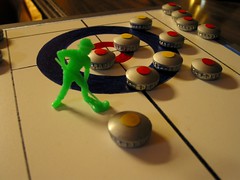
Smmer just started, but with the Winter Olympics coming next year, I wanted to you my DIY curling game. It’s a white particle board with the designs drawn in permanent marker, covered with furniture polish for a smooth glide.
I haven’t figured out how to incorporate the sweeping technique in this game, but I included a toy farmer with a hoe because he looks as if he’s sweeping.
The stones are wooden buttons painted gray, then glued to bottle caps. I went with a U.S. vs. Canada theme, so I used the most appropriate American beer I could think of (Rolling Rock) and a Canadian beer with a cool maple leaf design (I think it’s Molson Canadian). I glued some red and yellow circles to the tops of the stones so you could tell them apart without turning them over to see the bottle caps.
Anyway, it’s an entertaining game. Only have a few months to work on my DIY ski jump now.
Jim also described a DIY apparel project from 15 years ago:
Back in 1994 my wife Liz made me a Steelers jersey out of a hooded sweatshirt (my son is wearing it in these pictures). We took the sleeve stripes off an old jersey, then she sewed them onto the sweatshirt, along with some homemade numbers. She sewed the gold stripe on the hood and painted the Steelers logo with fabric paint. I’m surprised the NFL hasn’t done this themselves, using the hood as a helmet.
Jim’s right about the hoodie/helmet thing. Remember Matt Powers’s Princeton DIY sweatshirt? This seems like a gimme, no? How come the NFL has never come out with this kind of product line?
Jim also sent one non-DIY contribution: an unusual bottle cap. “I’ve had it for years,” he says. “I love the old Pitt design (although it’s not 100% accurate because there are no helmet stripes).” I’ve never seen a bottle cap like this — anyone else?
A few days after Jim e-mailed all that stuff to me, a package showed up at my house. Inside were three vintage publications that Jim was donating to the Uni Watch library: the 1970 Punt Pass & Kick tips booklet (I’ve scanned the whole thing here; as you may recall from a while back, I also have scans of the entire 1969 booklet), a CFL magazine, and the Super Bowl XVI program. Pretty nice, right? Jim directed my attention to this page in the program, which he’d bookmarked with this photo. “That’s me wearing one of the HelmetHats (while playing ‘drivewayball’ with my neighbor),” he wrote.
Big thanks for all the great contributions, Jim — much obliged.

July Raffle: As if all the preceding material weren’t enough, Jim has also provided an authentic Man City jersey to raffle off. It’s size 2XL. To enter, send a blank e-mail with your name in the subject line to the raffle address (not to the usual Uni Watch e-mail address, please) by next Tuesday, July 14th. One entry per person, but anyone enrolled in the Uni Watch membership program at the time of the drawing can send four entries. I’ll announce the winner on Wednesday.
Uni Watch News Ticker: Spent yesterday afternoon out at Giants Stadium, where Jints equipment director Joe Skiba had some veeerrry interesting things to show me. Details next week-ish. ”¦ Dallas Hicks has created tons of vintage hockey DIY jerseys. ”¦ Reprinted from yesterday’s comments: Dodgers pitcher Hiroki Kuroda is wearing a specially padded shoe because the mounds in America are firmer than those in Japan. ”¦ Yesterday I ran video game screen shots of Miami University’s new football uniforms. Here’s a photo gallery of the real things. Additional details here (with thanks to Peter Schinkai). ”¦ “I’m all for fitted caps, but this is going too far,” says Michael Kearney. ”¦ Here’s a really fascinating design-related lawsuit: Bounty is suing Brawny (big thanks to Jason Hillyer). ”¦ The single-A Peoria Chiefs will wear special jerseys to honor Illinois State University on August 14th (with thanks to Mickey Seward). ”¦ Info on LeBron’s latest sneakers here and here. ”¦ The A’s are preparing to retire Rickey’s number (with thanks to Brinke Guthrie). ”¦ HHH, inspired by this old Steelers jersey, has come up with a bunch of jersey concepts based on city flags and crests. ”¦ Randy Wolfe has changed uni numbers, going from 21 to 43. Mike Petriello notes that this means Wolf has now worn four different numbers with the Dodgers — well, if you count his introductory press conference. Of course, that’s not the single-team record. ”¦ Today is the 35th anniversary of the first World Football League game, and gumball king Bill Jones has marked the occasion by creating this helmet set. ”¦ Paul Mazzarella spotted this authentic Jay Cutler jersey at a mall near Chicago. “Pretty sure that’s an upside-down 9, not a 6,” he says. ”¦ Here’s a sneakers blog I hadn’t previously been aware of. ”¦ Been a while since I caught up with some of Rob Ullman‘s pin-up illustrations, so check out his awesome renderings of the Nordiques, Cubs, Brew Crew, Packers, Auburn, Pens, Cards, Whalers, Kings, Stanley Cup Final, and a special design he whipped up for Independence Day. Killer stuff, one and all. ”¦ Andrew Hartzell has tried his hand at designing a few Tecmo Bowl T-shirts. Check them out here.
Paul– The link for the DIY heritage hockey sweaters didn’t come out as a link.
If the Tecmo Bowl LA shirt showed Bo Jackson running the sweep (RUN 1) for a touchdown every time, I’d buy.
Hi folks. I’m sure this has been answered previously (but I can’t find the answer in a simple search): Can anyone tell me why Manny Delcarmen of the Red Sox has a handwritten “9-9-07” above each ear of his cap?
Thanks.
I am SO ready to buy a Baltimore Ravens City Flag Jersey, and I’m not even a fan! That is AWESOME, HHH. Ravens, do this now.
HHH, inspired by this old Steelers jersey, has come up with a bunch of jersey concepts based on city flags and crests.
I’ve been a Dolphins fan my whole life, and never realized their colors came from the city. I knew the Steelers used the Pittsburgh city colors; I wonder how many professional teams use their city’s ‘official’ colors?
[quote comment=”338998″]Hi folks. I’m sure this has been answered previously (but I can’t find the answer in a simple search): Can anyone tell me why Manny Delcarmen of the Red Sox has a handwritten “9-9-07” above each ear of his cap?
Thanks.[/quote]
A quick google search says that is when his son was born.
HelmetHats! Oh, how I wish I could find mine. I had the Steelers AND the Pitt script.
Came across a Citgo sign on craigslist. I want to build a green monster, but I have no space.
link
Apologies if this has been previously covered, Yesterday Paul’s ESPN column mentioned the Flyers Cooperalls, (one of my uniform guilty pleasures dontcha know) anyway he says that the foray into longpantaloons was a one season (1982-1983) thing, yet the two pictures he shows, illustrating striped and non striped pants, show two different jerseys. The narrow shoulder striping, (’67-1979 or so)
link
and the wider striping in which they lost all those Cup Finals to all those teams.
link
I’m sure you people will make short work of this, so I thank you in advance for the schooling I will get on my guilty pleasure.
adam
There are helmet-hooded sweatshirts out there already made by the NFL, but not entire jersey’s.
link
The pinup girl picture of the Stanley Cup final is incorrect because the Penguins wore the Pittsburgh 250 shoulder patch only in 2008, not 2009.
[quote comment=”339000″]HHH, inspired by this old Steelers jersey, has come up with a bunch of jersey concepts based on city flags and crests.
I’ve been a Dolphins fan my whole life, and never realized their colors came from the city. I knew the Steelers used the Pittsburgh city colors; I wonder how many professional teams use their city’s ‘official’ colors?[/quote]
Fred, I think the Knicks’ blue and orange are New York’s official colors, dating back to the Dutch New Amsterdam days.
There was another team that wore orange and black in New York, but they seem to be going with a different black-based scheme these days.
[quote comment=”339005″]There are helmet-hooded sweatshirts out there already made by the NFL, but not entire jersey’s.
link
link
I do have the adult-sized version of this hoodie. Reebok did a nice job of adding a little zip pocket on the sleeve for a cell phone or iPod.
[quote comment=”339006″]The pinup girl picture of the Stanley Cup final is incorrect because the Penguins wore the Pittsburgh 250 shoulder patch only in 2008, not 2009.[/quote]
The Pens played in the ’08 final, and wore both patches:
link
[quote comment=”339004″]Apologies if this has been previously covered, Yesterday Paul’s ESPN column mentioned the Flyers Cooperalls, (one of my uniform guilty pleasures dontcha know) anyway he says that the foray into longpantaloons was a one season (1982-1983) thing, yet the two pictures he shows, illustrating striped and non striped pants, show two different jerseys. The narrow shoulder striping, (’67-1979 or so)
link
and the wider striping in which they lost all those Cup Finals to all those teams.
link
I’m sure you people will make short work of this, so I thank you in advance for the schooling I will get on my guilty pleasure.
adam[/quote]
The Whalers wore the cooperalls for one season (82-83), the Flyers for two (81-82 and 82-83).
regarding the comments yesterday about LSU’s white baseball uniforms
-the pinstriped version is what LSU wears for midweek home games
-the solid whites last year and traditionally were worn on fridays. this year, they were worn on Saturdays, with our golds worn on Friday night, and usually purple on sundays. i believe the friday night picther, senior louis coleman requested it
LSU supersticiously (sp?) wears the gold in postseason whenever possible- a nod to the championship 1996 team which debuted the golds and didnt lose in them
[quote comment=”339010″][quote comment=”339004″]Apologies if this has been previously covered, Yesterday Paul’s ESPN column mentioned the Flyers Cooperalls, (one of my uniform guilty pleasures dontcha know) anyway he says that the foray into longpantaloons was a one season (1982-1983) thing, yet the two pictures he shows, illustrating striped and non striped pants, show two different jerseys. The narrow shoulder striping, (’67-1979 or so)
link
and the wider striping in which they lost all those Cup Finals to all those teams.
link
I’m sure you people will make short work of this, so I thank you in advance for the schooling I will get on my guilty pleasure.
adam[/quote]
The Whalers wore the cooperalls for one season (82-83), the Flyers for two (81-82 and 82-83).[/quote]
Correct. That was my bad.
I wonder if that “helmet hat” that joe greene is wearing has the stiller logo only on one side?
link
what was that space age material that those hats were made of? I remember hats i had as a kid, It was like a cross between polyester and styrofoam… glad that disappeared
whats the brand of that Dodgers pitchers shoe?
As for Rob Ullman’s Auburn pin-up, all I can say is WAR DAMN EAGLE!
[quote comment=”339000″]HHH, inspired by this old Steelers jersey, has come up with a bunch of jersey concepts based on city flags and crests.
I’ve been a Dolphins fan my whole life, and never realized their colors came from the city. I knew the Steelers used the Pittsburgh city colors; I wonder how many professional teams use their city’s ‘official’ colors?[/quote]
The link used to… Think its fair to say its good they stopped…
supersticiously (sp?)
Close!
superstitiously is the correct spelling.
presented as a public service by the save the apostrophe committee
Of course, McKnight doesn’t have the all-time MLB record either. Chuck Klein wore six different numbers (1, 3, 8, 26, 29, 36) with the Phillies.
Randy Wolf not Wolfe
According to Baseball by the Numbers, in 1942, the Cardinals’ Mort Cooper wore 13 and was stuck after winning game 13. He changed his luck by switching to 14 and picked up win #14. He then switched jerseys with teammates up the ladder to a 21-win season.
He had previously worn 25 and 30 in earlier seasons and 24 in another season.
I suppose we could credit Cooper with 12 jersey numbers, if one-game switches are permitted.
[quote comment=”339017″][quote comment=”339000″]HHH, inspired by this old Steelers jersey, has come up with a bunch of jersey concepts based on city flags and crests.
I’ve been a Dolphins fan my whole life, and never realized their colors came from the city. I knew the Steelers used the Pittsburgh city colors; I wonder how many professional teams use their city’s ‘official’ colors?[/quote]
The link used to… Think its fair to say its good they stopped…[/quote]
Indeed, but sometimes the ghastly throwbacks are the most fun (as we no doubt will see when the Broncos trot out in yellow-gold and seal brown this fall).
Philadelphia Bell of the World Football League used those colors (powder and light gold) and I never knew why, until now.
—Ricko
More Language Cop citations: Independence Day is one “n” short. But no matter how it is spelled that makes me proud (or at least happy) to be an American.
I have to start making Lego stadiums. It will finally convince my wife that I have gone completely around the bend.
[quote comment=”339007″][quote comment=”339000″]HHH, inspired by this old Steelers jersey, has come up with a bunch of jersey concepts based on city flags and crests.
I’ve been a Dolphins fan my whole life, and never realized their colors came from the city. I knew the Steelers used the Pittsburgh city colors; I wonder how many professional teams use their city’s ‘official’ colors?[/quote]
Fred, I think the Knicks’ blue and orange are New York’s official colors, dating back to the Dutch New Amsterdam days.
[/quote]
Way to go, Mark. 19 out of 20 New Yorkers can’t tell you our city colors, much less where they came from. The Knicks are, of course, the Knickerbockers, derived from Dietrich Knickerbocker, the characater invented by Washington Irving to narrate Irving’s (pretty funny) “History of New Amsterdam.” One of the hallmarks of Irving and his Anglo-Saxon buddies at the Salmagundi Club was to call good-natured attention to New York’s Dutch past, usually by just making things up. Thus we have “Rip Van Winkle,” “Legend of Sleepy Hollow,” and – lest we forget – Clement Moore’s Saint Nicholas (a saint much favored by the Dutch) morphing into today’s Santa Claus. Don’t forget that stoop and boss are Dutch.
Anyway. I could go on (and on).
Great project to base unis on municipal flags, by the way. But it does seem to me that few cities really care about their flags or use their flag elements in other examples of municipal iconography. Two exceptions may be Chicago, with its singular design of sky blue stripes and red six-pointed stars, and Washington DC, with its red stripes and red stars (derived from George Washington’s family coat-of-arms). Sadly, none of the pro teams in either city pick up on the flag designs. Too bad in DC’s case especially: the Wizards could sure use a new look.
I believe Rob’s Stanley Cup pin-up was created last year in anticipation/hope that Pittsburgh would win the Cup. Pretty sure there’s a new one celebrating the Penguins triumph this year.
[quote comment=”339017″][quote comment=”339000″]HHH, inspired by this old Steelers jersey, has come up with a bunch of jersey concepts based on city flags and crests.
I’ve been a Dolphins fan my whole life, and never realized their colors came from the city. I knew the Steelers used the Pittsburgh city colors; I wonder how many professional teams use their city’s ‘official’ colors?[/quote]
The link used to… Think its fair to say its good they stopped…[/quote]
Sorry, Beard, I like ’em! But I’m a sucker for blue-and-yellow. If the Eagles were to go back to Kelly Green or just plain-old green, that might be very cool. But the current murky green-silver-black-and-white is, imho, an eyesore of the first order.
The upside-down 9 is the least of the problems with that link. The stripes and the font of Halas’ initials are all wrong.
The Bears’ alt jerseys are essentially the same as their link with the orange and blue colors flipped, so they have link (not alternating solid-color stripes like link with the orange and white flipped).
Speaking of Bears jerseys, isn’t it about time they get rid of the GSH on the sleeve? It looks stupid and he’s been gone for quite a while now…
[quote comment=”339000″]
I’ve been a Dolphins fan my whole life, and never realized their colors came from the city. [/quote]
No way. Firstly, the colors on the city flag are orange & green (more like Miami Hurricanes) not orange & aqua. Plus I’m nearly certain that design & logo postdate the appearance of the Dolphins.
[quote comment=”339028″]Speaking of Bears jerseys, isn’t it about time they get rid of the GSH on the sleeve? It looks stupid and he’s been gone for quite a while now…[/quote]
No.
[quote comment=”338999″]I am SO ready to buy a Baltimore Ravens City Flag Jersey, and I’m not even a fan! That is AWESOME, HHH. Ravens, do this now.[/quote]
What do you think it would take for the Ravens to change their colors to Black and Gold?
With mention of the Knicks, I once again suggest that the LeBron (or whoever they sign next year) era should start with a new logo. The triangle logo of the 90s [http://bit.ly/18mhPz] has run its course (especially after they added the unnecessary “NEW YORK” to it [http://bit.ly/3g1wG].
What should the new logo of the Knicks look like? Should they even go as far as Cleveland did and start marketing themselves as the Knickerbockers instead of the Knicks?
HHH,
As a Baltimore guy, I love the Baltimore City Flag jersey. I think that I’d love it even more as a soccer jersey, but it definitely deserves kudos!
I always thought that Saint Louis has one of the cooler link
I’d love for the Cards to incorporate a fleur de lis type crest like the Browns used to link.
The Blues or Rams could do well to use some wavy river lines somewhere too.
I love that the pin-ups for the Brew Crew and Cards are wearing stirrups!
Also, that Baltimore City flag jersey is awesome! Definitely much better as a soccer jersey than football though.
This is tangentially uni related and may have been mentioned before, but someone is taking old football program cover art and turning them into posters. It’s a commercial site, but the it’s worth just looking at the covers.
link
I really like link
Ullman’s PensFinal rendering has one error: he includes the Pittsburgh 250 patch on the right sleeve, which was worn last year but not this. Also, the Pens were wearing their road whites in Game 7, but that’s nitpicking.
[quote comment=”339037″]Ullman’s PensFinal rendering has one error: he includes the Pittsburgh 250 patch on the right sleeve, which was worn last year but not this. Also, the Pens were wearing their road whites in Game 7, but that’s nitpicking.[/quote]
Sorry to nitpick on your nitpick, but this was for the 2008 Stanley Cup Finals.
[quote comment=”339024″]
Great project to base unis on municipal flags, by the way. But it does seem to me that few cities really care about their flags or use their flag elements in other examples of municipal iconography. Two exceptions may be Chicago, with its singular design of sky blue stripes and red six-pointed stars, and Washington DC, with its red stripes and red stars (derived from George Washington’s family coat-of-arms). Sadly, none of the pro teams in either city pick up on the flag designs. [/quote]
Not true about Chicago — the Chicago Red Stars of the new league called Womens Pro Soccer have used the flag in their logo:
link
Anyway, here is my version of a New York City football uniform:
link
The name and number stand for Andrew H. Green, the visionary who orchestrated New York City’s consolidation in 1898.
There is a new soccer team which is using the flag of the Borough of Queens!
link
Here is the logo of F.C. New York, who plan to play in the USL First Division (second tier of U.S. soccer) next season:
link
And, finally, my attempt at a football uniform based on this flag:
link
[quote comment=”339028″]Speaking of Bears jerseys, isn’t it about time they get rid of the GSH on the sleeve? It looks stupid and he’s been gone for quite a while now…[/quote]
NO
Check out the link in the 1975 Sears Catalog
[quote comment=”339031″][quote comment=”338999″]I am SO ready to buy a Baltimore Ravens City Flag Jersey, and I’m not even a fan! That is AWESOME, HHH. Ravens, do this now.[/quote]
What do you think it would take for the Ravens to change their colors to Black and Gold?[/quote]
Being as there is no “gold” on a Raven, nothing short of a miracle. We do have the Maryland flag in our logo crest:
link
link
[quote comment=”339039″][quote comment=”339024″]
Great project to base unis on municipal flags, by the way. But it does seem to me that few cities really care about their flags or use their flag elements in other examples of municipal iconography. Two exceptions may be Chicago, with its singular design of sky blue stripes and red six-pointed stars, and Washington DC, with its red stripes and red stars (derived from George Washington’s family coat-of-arms). Sadly, none of the pro teams in either city pick up on the flag designs. [/quote]
Not true about Chicago — the Chicago Red Stars of the new league called Womens Pro Soccer have used the flag in their logo:
link
Anyway, here is my version of a New York City football uniform:
link
The name and number stand for Andrew H. Green, the visionary who orchestrated New York City’s consolidation in 1898.
There is a new soccer team which is using the flag of the Borough of Queens!
link
Here is the logo of F.C. New York, who plan to play in the USL First Division (second tier of U.S. soccer) next season:
link
And, finally, my attempt at a football uniform based on this flag:
link
You are one cool, stirringly-obsessive dude, Ferdinand. Go Queens! [World Capital of Xenophilia]
I also believe the Oakland Athletics count as a team that wears the colors of the city flag.
[quote comment=\”339040\”][quote comment=\”339028\”]Speaking of Bears jerseys, isn\’t it about time they get rid of the GSH on the sleeve? It looks stupid and he\’s been gone for quite a while now…[/quote]
NO[/quote]
Well, enjoy living in the past and the rest of the league laughing at your uniforms (as if the silly number font isn\’t bad enough).
RE: What do you think it would take for the Ravens to change their colors to Black and Gold?
Well since the main division rival are the Steelers, I would guess that would not be something that would happen. Plus, how much would it cost to replace the 75,000 purple seats in the stadium.
[quote comment=”339042″][quote comment=”339031″][quote comment=”338999″]I am SO ready to buy a Baltimore Ravens City Flag Jersey, and I’m not even a fan! That is AWESOME, HHH. Ravens, do this now.[/quote]
What do you think it would take for the Ravens to change their colors to Black and Gold?[/quote]
Being as there is no “gold” on a Raven, nothing short of a miracle. We do have the Maryland flag in our logo crest:
link
link
Well, right. Plus, I can’t imagine the Ravens wanting to look that much like the team that beat them three times last year.
I never realized how cool the Buffalo flag was. Lightning bolts = cool!
Those vintage hockey jerseys are absolutely fantastic. What I wouldn’t give to be able to make one of those myself. I’ve been dying to find a place to buy the Montreal AAA jersey, now that I see it is possible maybe I will just make one. Same goes for the Wanderers jersey. Even the Kenora Thistles are there, how excellent! Well done! I wonder, Dallas, have you had any thoughts about maybe making a 1910’s Princeton jersey to honor Hobey Baker? It would be great to see one done.
[quote comment=”339039″]
Not true about Chicago — the Chicago Red Stars of the new league called Womens Pro Soccer have used the flag in their logo:
link
[/quote]
It’s not just the logo. Their link are based on the flag as well. And the Fire used to have an alternate jersey that was similar. (link is the best pic I can find.)
And I’ll be damned if I can find ANY photo that clearly shows it, but in the early/mid ’90s the White Sox had a city flag sticker on their batting helmets.
L. to R. Hector Blake, Lou Groza, Ben Jones
link
[quote comment=”339045″][quote comment=\”339040\”][quote comment=\”339028\”]Speaking of Bears jerseys, isn\’t it about time they get rid of the GSH on the sleeve? It looks stupid and he\’s been gone for quite a while now…[/quote]
NO[/quote]
Well, enjoy living in the past and the rest of the league laughing at your uniforms (as if the silly number font isn\’t bad enough).[/quote]
Out of curiosity, what would you like to see them do with their uniforms to modernize them (and make them less laughable)?
And if you could humor me, please list your top 5/bottom 5 NFL unis.
Just to clarify…the one with the Pens girl standing on the defeated Wings girl was my ill-advised illo for 1998’s finals, obviously done link This year I tried to apply link…which seemingly paid off. The girl with the cup was done link, once I felt like it was okay to celebrate!
[quote comment=”339045″][quote comment=\”339040\”][quote comment=\”339028\”]Speaking of Bears jerseys, isn\’t it about time they get rid of the GSH on the sleeve? It looks stupid and he\’s been gone for quite a while now…[/quote]
NO[/quote]
Well, enjoy living in the past and the rest of the league laughing at your uniforms (as if the silly number font isn\’t bad enough).[/quote]
Must be a cheesehead, everyone else things the uni’s are classic (other than the orange alt monstrosity)
[quote comment=”339043″][quote comment=”339039″][quote comment=”339024″]
Great project to base unis on municipal flags, by the way. But it does seem to me that few cities really care about their flags or use their flag elements in other examples of municipal iconography. Two exceptions may be Chicago, with its singular design of sky blue stripes and red six-pointed stars, and Washington DC, with its red stripes and red stars (derived from George Washington’s family coat-of-arms). Sadly, none of the pro teams in either city pick up on the flag designs. [/quote]
Not true about Chicago — the Chicago Red Stars of the new league called Womens Pro Soccer have used the flag in their logo:
link
Anyway, here is my version of a New York City football uniform:
link
The name and number stand for Andrew H. Green, the visionary who orchestrated New York City’s consolidation in 1898.
There is a new soccer team which is using the flag of the Borough of Queens!
link
Here is the logo of F.C. New York, who plan to play in the USL First Division (second tier of U.S. soccer) next season:
link
And, finally, my attempt at a football uniform based on this flag:
link
You are one cool, stirringly-obsessive dude, Ferdinand. Go Queens! [World Capital of Xenophilia][/quote]
Also forgot is the Washington Capitals. Their new primary logo incorporates the three stars from the district’s flag.
link
[quote comment=”339015″]whats the brand of that Dodgers pitchers shoe?[/quote]
SSK
[quote comment=”339013″]I wonder if that “helmet hat” that joe greene is wearing has the stiller logo only on one side?
link
what was that space age material that those hats were made of? I remember hats i had as a kid, It was like a cross between polyester and styrofoam… glad that disappeared[/quote]
I know the one I had as a kid was correct and only had the logo on the one side.
[quote comment=”339045″][quote comment=\”339040\”][quote comment=\”339028\”]Speaking of Bears jerseys, isn\’t it about time they get rid of the GSH on the sleeve? It looks stupid and he\’s been gone for quite a while now…[/quote]
NO[/quote]
Well, enjoy living in the past and the rest of the league laughing at your uniforms (as if the silly number font isn\’t bad enough).[/quote]
WHAT?!?! Who is this guy?! It’s called “Tradition” and “Heritage”. I’m not even gonna waste my time on this.
One DC team that has incorporated elements of the city flag…The Caps. When they returned to the red, white and blue look in ’07, they incorporated the three stars over the Capitals crest. The three stars came from George Washington’s family shield, but has also become known to represent the District, Maryland and Virginia.
Oh and that Jay Cutler jersey featured in the ticker is a counterfeit. Knockoff jerseys are popping up all over the place. There’s too much sheen on the number, the stripes on the sleeve are incorrect, and it appears that part of the sleeve is made of open-hole mesh instead of solid dazzle.
I just want to point out that its pretty funny the Peoria Chiefs are doing that considering Peoria is the home of Bradley University and they have a pretty big rivalry with Illinois State.
[quote comment=”339060″]Oh and that Jay Cutler jersey featured in the ticker is a counterfeit. Knockoff jerseys are popping up all over the place. There’s too much sheen on the number, the stripes on the sleeve are incorrect, and it appears that part of the sleeve is made of open-hole mesh instead of solid dazzle.[/quote]
I don’t understand how stores can get away with selling counterfeits. Reebok should hire Uniwatchers to go out to stores in their local areas looking for fakes, and then reward us with free merchandise.
Here is another view of Pittsburgh’s Throwback 1994 flag jerseys.
link
I was given a piece of candy this morning called “Red Bird Brand” est. 1890, and the logo is very familiar. link
If anyone knows anything about inexpensive ($150-ish) camcorders, please get in touch with me. Thanks.
[quote comment=”338997″]If the Tecmo Bowl LA shirt showed Bo Jackson running the sweep (RUN 1) for a touchdown every time, I’d buy.[/quote]
As much as I’d love to rip off a sponsor of this site, No Mas has almost that exact shirt: link
[quote comment=”339016″]As for Rob Ullman’s Auburn pin-up, all I can say is WAR DAMN EAGLE![/quote]
When I was 3 or 4 I briefly liked Auburn and never knew why. Think I just became a fan again…
[quote comment=”339002″]HelmetHats! Oh, how I wish I could find mine. I had the Steelers AND the Pitt script.[/quote]
I forgot they did colleges. I’d love a Pitt script one!
[quote comment=”339008″][quote comment=”339005″]There are helmet-hooded sweatshirts out there already made by the NFL, but not entire jersey’s.
link
link
I do have the adult-sized version of this hoodie. Reebok did a nice job of adding a little zip pocket on the sleeve for a cell phone or iPod.[/quote]
Ah, but they fail for putting the Steeler logo on the wrong side. The others do look nice, though.
great work on the DIY jim!
Would love to see the Regina Caps jersey from the DIY hockey jersey set as the current namesake’s third jersey.
The summer of 1969: The amazing P,P&K instruction booklet comes out just as I, at nine, am finding my interest in illustration and sports logos and uniforms blossoming. Plus, I win the local contest! That same summer, man walks on the moon! It was a great time to be a kid.
Rob Ullman’s work is just so wonderful. Such joy those illustrations.
[quote comment=”339070″]great work on the DIY jim![/quote]
Thanks! Surprised they were featured over Rob Ullman’s pinups, though. Wonder what Mrs. V would look like in a jersey?? I gotta do some research…
“Yesterday I ran video game screen shots of Miami University’s new football uniforms. Here’s a photo gallery of the real things.”
I know that the skin-tight, superhero look is what colleges are going for now, but does anyone else think that those are especially tight? Like, uncomfortable and restrictive??
From last night’s comments:
Hey, Tecmo guys – link
[quote comment=”339075″]”Yesterday I ran video game screen shots of Miami University’s new football uniforms. Here’s a photo gallery of the real things.”
I know that the skin-tight, superhero look is what colleges are going for now, but does anyone else think that those are especially tight? Like, uncomfortable and restrictive??[/quote]
Yes.
Also from last night’s comments:
Packers have Cheeseheads, MLS Houston Dynamo have Tacoheads link
[quote comment=”339018″]supersticiously (sp?)
Close!
superstitiously is the correct spelling.
presented as a public service by the save the apostrophe committee[/quote]
Don’t forget “elecric” in place of electric…
I absolutely love the DIY curling game.
I curled for many years as a youth, and one of my friends and I created two different DIY curling games. The simpler one was a piece of particle board with rings drawn in marker, and pennies as rocks. The much more elaborate game involved the freezing rain covered snow in my backyard and margarine containers filled with water. We cut the handles off of laundry detergent bottles, inserted then through holes in the margarine container lids and froze them in the freezer. These makeshift rocks would even curl a little bit. The fact that we were playing the actual game 4 days a week didn’t alter our enthusiasm for the homemade version.
[quote comment=”339063″]Here is another view of Pittsburgh’s Throwback 1994 flag jerseys.
link
My favorite 1994 jersey !!!
[quote comment=”339028″]Speaking of Bears jerseys, isn’t it about time they get rid of the GSH on the sleeve? It looks stupid and he’s been gone for quite a while now…[/quote]
The initials are literally part of the jersey. The Bears make the point that this is not a case of “honorary initials” or anything like that.
Paul’s scan from the ’69 Punt, Pass and Kick guide (Thanks, Paul!) includes a page with all the NFL helmets — still one of my favorite recurring sports visuals. Note that it has the black Saints helmet used only in the ’69 preseason.
link
Forgive me if someone has already answered this question definitively. But its appearance in a league publication would seem to refute the idea that the Saints made the change, then changed back because they didn’t have league permission.
My favorite Rob Ullman:
link
[quote comment=”339084″]My favorite Rob Ullman:
link
Rob, did you illustrate for the cartoon “Maya and Miguel”? The Atom Bomb Bikini girl to the right of the Oriole girl looks like a grown-up version of Maya.
Anyone else think the Brewer girl link looks like Samantha from “Bewitched”?
What would be the easiest way to affix an All-Star patch onto the sleeve of an authentic jersey that I have?
[quote comment=”339085″]Anyone else think the Brewer girl link looks like Samantha from “Bewitched”?[/quote]
I’d like to be in Milwaukee right now.
[quote comment=”339086″]What would be the easiest way to affix an All-Star patch onto the sleeve of an authentic jersey that I have?[/quote]
Honestly, if you don’t sew…use just a bit Elmer’s glue (or straight pins) to put it in precisely the position it should be. Then ask a tailor shop what they’d charge to sew it on. Or maybe a co-worker sews and would just do it some night while watching TV…for nothing.
—Ricko
Anyone else think the Brewer girl link… looks like Samantha from “Bewitched”?
Wow, I love the choice of the first road jersey for the pinup! Well done, Mr. Ullman.
[quote comment=”339088″] Or maybe a co-worker sews and would just do it some night while watching TV…for nothing.[/quote]
Ricko, you must work in a pretty good place.
:-)))
[quote comment=”339085″][quote comment=”339084″]My favorite Rob Ullman:
link
Rob, did you illustrate for the cartoon “Maya and Miguel”? The Atom Bomb Bikini girl to the right of the Oriole girl looks like a grown-up version of Maya.
Anyone else think the Brewer girl link looks like Samantha from “Bewitched”?[/quote]
Hope the ‘bewitched’ look is a compliment…it’s my wife! Even better than Elizabeth Montgomery ever was…
You guys should really treat yourselves and invest in one. Shoot Rob Ullman a line at his link
He’s fantastic to work with, detail oriented, and what you get is not only the original art, but all the sketches, drawings he makes along the way.
[quote comment=”339089″]Anyone else think the Brewer girl link… looks like Samantha from “Bewitched”?
Wow, I love the choice of the first road jersey for the pinup! Well done, Mr. Ullman.[/quote]
The striped stirrups were definitely my idea too…they never actually wore ’em – but they should have.
Next step, much like the War Eagle honey, I’ll try to get a pic of her holding the art…
Frosty
[quote comment=”339091″][quote comment=”339085″][quote comment=”339084″]My favorite Rob Ullman:
link
Rob, did you illustrate for the cartoon “Maya and Miguel”? The Atom Bomb Bikini girl to the right of the Oriole girl looks like a grown-up version of Maya.
Anyone else think the Brewer girl link looks like Samantha from “Bewitched”?[/quote]
Hope the ‘bewitched’ look is a compliment…it’s my wife! Even better than Elizabeth Montgomery ever was…
You guys should really treat yourselves and invest in one. Shoot Rob Ullman a line at his link
He’s fantastic to work with, detail oriented, and what you get is not only the original art, but all the sketches, drawings he makes along the way.[/quote]
Defintitely a compliment, my friend!
[quote comment=”339090″][quote comment=”339088″] Or maybe a co-worker sews and would just do it some night while watching TV…for nothing.[/quote]
Ricko, you must work in a pretty good place.
:-)))[/quote]
Just about every company has it’s “grandma.” LOL
[quote comment=”339050″]
And I’ll be damned if I can find ANY photo that clearly shows it, but in the early/mid ’90s the White Sox had a city flag sticker on their batting helmets.[/quote]So JTH, would this be the current black & whites, or the former Red/White/Blue uni’s?
I don’t recall it on the B&W’s, official as of ’91 IIRC.
[quote comment=”339094″]
Just about every company has it’s “grandma.” LOL[/quote]Yeah, well the ones I know wouldn’t be doing it for free.
I’ll try to find the unofficial Latin motto of Chicago, but it translates to “Where’s mine?” :-)
[quote comment=”339096″][quote comment=”339094″]
Just about every company has it’s “grandma.” LOL[/quote]Yeah, well the ones I know wouldn’t be doing it for free.
I’ll try to find the unofficial Latin motto of Chicago, but it translates to “Where’s mine?” :-)[/quote]
Not for free? Oh, come on. Where’s that boyish, helpless-man-who-can’t-sew, charm?
Y’know, reverse the tactic of, “Mmmm…I’m sure a big strong man like you could carry that Barkalounger up two flights of stairs.”
—Ricko
So, you probably heard about the early game last night between the Nationals and Astros, in which they continued a game from May that started at Washington. They finished the game in an inning, and Joel Hanrahan, who is now with the Pirates got the win. Take a look link. Is anyone else disappointed that Washington was dressed in their away uniforms, and Houston in their home?
.
Is anyone else disappointed that Washington was dressed in their away uniforms, and Houston in their home?
That’s way down on my list of disappointments associated with the Nats this year.
[quote comment=”339092″][quote comment=”339089″]Anyone else think the Brewer girl link… looks like Samantha from “Bewitched”?
Wow, I love the choice of the first road jersey for the pinup! Well done, Mr. Ullman.[/quote]
The striped stirrups were definitely my idea too…they never actually wore ’em – but they should have.
Next step, much like the War Eagle honey, I’ll try to get a pic of her holding the art…
Frosty[/quote]
are you the first Frosty (York) or the Second Frosty (Sargent)?
KC flag is red for chiefs, blue for royals. Yeah, right.
link.,%2Bflag%26gbv%3D2%26hl%3Den%26sa%3DG&ei=r4FXSsT0C9jMlQefyfzjBA
but the logo has a nice double meaning.
link
complete slide show of all 18 of the new Bundesliga kits for the new season
Looking for the Script one, but here is a Pitt helmet hoodie.
link
[quote comment=”339100″][quote comment=”339092″][quote comment=”339089″]Anyone else think the Brewer girl link… looks like Samantha from “Bewitched”?
Wow, I love the choice of the first road jersey for the pinup! Well done, Mr. Ullman.[/quote]
The striped stirrups were definitely my idea too…they never actually wore ’em – but they should have.
Next step, much like the War Eagle honey, I’ll try to get a pic of her holding the art…
Frosty[/quote]
are you the first Frosty (York) or the Second Frosty (Sargent)?[/quote]
I almost coughed out my last bite of lunch laughing at that one!
[quote comment=”339023″]
I have to start making Lego stadiums. It will finally convince my wife that I have gone completely around the bend.[/quote]
I wrote link on this phenomenon on HBIC. Check out some of the amazing creations!
[quote comment=\”339088\”][quote comment=\”339086\”]What would be the easiest way to affix an All-Star patch onto the sleeve of an authentic jersey that I have?[/quote]
Honestly, if you don\’t sew…use just a bit Elmer\’s glue (or straight pins) to put it in precisely the position it should be. Then ask a tailor shop what they\’d charge to sew it on. Or maybe a co-worker sews and would just do it some night while watching TV…for nothing.
—Ricko[/quote]
Thanks Ricko. We have plenty of sewers here. And plenty of people who sew too. (Damn homonyms!)
[quote comment=”339053″]Just to clarify…the one with the Pens girl standing on the defeated Wings girl was my ill-advised illo for 1998’s finals, obviously done link This year I tried to apply link…which seemingly paid off. The girl with the cup was done link, once I felt like it was okay to celebrate![/quote]
I’m assuming you meant 2008, and not 1998, Rob. Pittsburgh was #2 in the East in 1998, but lost in the first round to the Montreal Canadiens 4-2.
Detroit thumped Washington in a four-game sweep in the 1998 Final. ;o)
[quote comment=”339099″]That’s way down on my list of disappointments associated with the Nats this year.[/quote]
Fair ‘nuf.
Good stuff today. Nice hodgepodge of ideas from the tables and flag shirts. I am a long time gumball collector and fan. I liked the old style better.
[quote comment=”339036″]This is tangentially uni related and may have been mentioned before, but someone is taking old football program cover art and turning them into posters. It’s a commercial site, but the it’s worth just looking at the covers.
link
I really like link[/quote]
I love those posters
And hey squiddie exactly what did you type in to find the Wisconsin Ohio State 1961 pictures from Life archives yesterday? I tired late last night and no luck. I saw in comments you posted a few more too and said it was more about homecoming.
[quote comment=”339105″][quote comment=”339023″]
I have to start making Lego stadiums. It will finally convince my wife that I have gone completely around the bend.[/quote]
I wrote link on this phenomenon on HBIC. Check out some of the amazing creations![/quote]
Wow! My son was speechless. Now he wants to build a Lego baseball stadium. Great article, Teebz!
[quote comment=”339089″]Anyone else think the Brewer girl link… looks like Samantha from “Bewitched”?
Wow, I love the choice of the first road jersey for the pinup! Well done, Mr. Ullman.[/quote]
Maybe Rob could make them into trading cards. Nah, then we’d have a bunch of Rick Manning/Dennis Eckersley jokes…
Ok, Dallas Hicks has put me out of the DIY jersey business. I can’t compete with that!
Thanks Ricko. We have plenty of sewers here. And plenty of people who sew too. (Damn homonyms!)
technically, that’s a homograph :)
By the way, I’d love to DIY a Canadian football game. I can’t think of an inexpensive way to do it. Any DIYers want to brainstorm that one?
I actually typed 1998? Of course I meant 2008. Ye Gods…
Thanks SO MUCH for the kind words about my work, everybody…I’ve gotten to know and work with a large number of Uni Watchers over the last year and a half or so, and the experience has consistently been fantastic. You guys are awesome.
Speaking of awesome… I couldn’t be more in live with those vintage hockey jerseys. And that 1994 Steelers throwback is classic! You gotta wonder why Mitchell & Ness or someone else hasn’t made a replica yet. Steelers fans are legion…but there really aren’t too many options for jersey buying beyond home and away (and I guess the recent throwback), since they so seldom change ’em. Hell, I’d buy one with a 26 on it…it’s just so weird!
[quote comment=”339114″]Thanks Ricko. We have plenty of sewers here. And plenty of people who sew too. (Damn homonyms!)
technically, that’s a homograph :)[/quote]
I guess I fell asleep that day in English class. :^P
[quote comment=”339104″][quote comment=”339100″][quote comment=”339092″][quote comment=”339089″]Anyone else think the Brewer girl link… looks like Samantha from “Bewitched”?
Wow, I love the choice of the first road jersey for the pinup! Well done, Mr. Ullman.[/quote]
The striped stirrups were definitely my idea too…they never actually wore ’em – but they should have.
Next step, much like the War Eagle honey, I’ll try to get a pic of her holding the art…
Frosty[/quote]
are you the first Frosty (York) or the Second Frosty (Sargent)?[/quote]
I almost coughed out my last bite of lunch laughing at that one![/quote]
aaahhttttt!!! Good stuff! What was his name, darren wasn’t it? When I was sick from school when I was a kid – I tried like hell to watch and like that show…usually Family Feud won out. You know…JR was in that too…No wait – that was I Dreamed Of Jeanie.
Detroit thumped Washington in a four-game sweep in the 1998 Final. ;o)
and 2nd seeded pittsburgh bowed down to 7th seeded montreal in the first round 4-2. :)
Yesterday in grocery store I glanced through an SI that had a where are they now special.
They had a couple of good AFL early pictures. One was Buffalo and Denver in what I think it said was 2nd AFL game. b&w though
And a Dallas Texan Houston Oiler early game,
And a couple more. One had Paul Lowe possibly. I forget for sure. he was holding the Chargers helmet with the shield on front.
I did not buy the issue.
[quote comment=”339116″]I actually typed 1998? Of course I meant 2008. Ye Gods…
Thanks SO MUCH for the kind words about my work, everybody…I’ve gotten to know and work with a large number of Uni Watchers over the last year and a half or so, and the experience has consistently been fantastic. You guys are awesome.
Speaking of awesome… that 1994 Steelers throwback is classic! You gotta wonder why Mitchell & Ness or someone else hasn’t made a replica yet. Steelers fans are legion…but there really aren’t too many options for jersey buying beyond home and away (and I guess the recent throwback), since they so seldom change ’em. Hell, I’d buy one with a 26 on it…it’s just so weird![/quote]
TOTALLY AGREE …
I see these replicas go for big $$$$ on EBAY on the rare occassions they are offered. Same for the similar Bears 1994 throwback.
I guess the M&N manufacterers believe that the world isn’t complete without 10,000 more 1958 Giants Sam Huff jerseys ….
GIVE THE PEOPLE WHAT THEY WANT !!!
[quote comment=”339118″][quote comment=”339104″][quote comment=”339100″][quote comment=”339092″][quote comment=”339089″]Anyone else think the Brewer girl link… looks like Samantha from “Bewitched”?
Wow, I love the choice of the first road jersey for the pinup! Well done, Mr. Ullman.[/quote]
The striped stirrups were definitely my idea too…they never actually wore ’em – but they should have.
Next step, much like the War Eagle honey, I’ll try to get a pic of her holding the art…
Frosty[/quote]
are you the first Frosty (York) or the Second Frosty (Sargent)?[/quote]
I almost coughed out my last bite of lunch laughing at that one![/quote]
aaahhttttt!!! Good stuff! What was his name, darren wasn’t it? When I was sick from school when I was a kid – I tried like hell to watch and like that show…usually Family Feud won out. You know…JR was in that too…No wait – that was I Dreamed Of Jeanie.[/quote]
Uh oh, get ready for the epic Samantha vs. Jeanie debate (I’ll go on record as voting for Sam wearing Jeanie’s outfit).
Yes, that was Darren Stephens…I mean THEY were Darren Stephens. That show won out over Family Feud all the time at our house.
[quote comment=”339098″]So, you probably heard about the early game last night between the Nationals and Astros, in which they continued a game from May that started at Washington. They finished the game in an inning, and Joel Hanrahan, who is now with the Pirates got the win. Take a look link. Is anyone else disappointed that Washington was dressed in their away uniforms, and Houston in their home?
.[/quote]
The interviewed Joel Hanrahan on Baseball Tonite last night on ESPN. He said he was taking a nap at the time he “earned” the W.
Also, apparently Ryan Zimmerman texted him and said “You’re welcome, use that in arbitration”
Pretty funny situation.
[quote comment=”339097″]
Y’know, reverse the tactic of, “Mmmm…I’m sure a big strong man like you could carry that Barkalounger up two flights of stairs.”[/quote]The women I tend to meet usually are the type who could toss a Barcalounger up two stories.
“Ubi est mea” is the phrase I was searching for before.
So, you probably heard about the early game last night between the Nationals and Astros, in which they continued a game from May that started at Washington. They finished the game in an inning, and Joel Hanrahan, who is now with the Pirates got the win. Take a look here. Is anyone else disappointed that Washington was dressed in their away uniforms, and Houston in their home?
.
was this game off the board in vegas?
think tejada needed a bathroom break?
I’m not sure in which year this Army-Navy game photo was taken, but Navy definitely had the link.
[quote comment=”339095″][quote comment=”339050″]
And I’ll be damned if I can find ANY photo that clearly shows it, but in the early/mid ’90s the White Sox had a city flag sticker on their batting helmets.[/quote]So JTH, would this be the current black & whites, or the former Red/White/Blue uni’s?
I don’t recall it on the B&W’s, official as of ’91 IIRC.[/quote]
The flag decal was on the helmets with the current uni set (BTW, they started wearing them for the last homestand in the old park, so I guess it’s “official since 1990”). I can’t remember if they had them with the red/navy “pigtail C” unis, but I don’t think so.
I can’t remember when exactly they wore them, but what I do rememeber is
A) The first season or so, the decals were relatively huge and then they switched to a smaller size (think iPod vs. iPod nano).
B) They must have worn them at least through the 1994 season because I remember having a conversation with a co-worker about them. We worked together from November of ’93 to February of ’97 and I know that we never talked about anything not work-related for at least the first six months I was there.
[quote comment=\”339102\”]http://www.kicker.de/news/fussball/slideshow/slideRes/3000/object/511229/
complete slide show of all 18 of the new Bundesliga kits for the new season[/quote]
A.J.
Thanks for that! Some funky looks for my Dortmund lads!
However I will await the official look of the kits when I get my copy of this year\’s kicker Bundesliga sonderheft in the mail in about a month from now.
All the Bundesliga, 2. Bundesliga and 3. Liga team photos!!! The kicker BL issue is the best of its kind on the planet. I have them all from 1976-77 on.
That Rob Ullman pic listed as the Nordiques is a look-alike. That is not the igloo/stick/puck logo, and the fleur-de-lys have been replaced by atomic energy symbols.
JTH, regarding that faux Cutler: Good work on the stripes, but even the “G” that’s visible looks bogus, doesn’t it?
My bottom five NFL wouldn’t be limited to just five; but off the top of my head Jax, the Falcons and Tennessee come to mind. But they’re all after the Kings of Crap, Baltimore.
(BTW, I know my list is dominated by uni-changers. So be it.)
[quote comment=”339126″]I’m not sure in which year this Army-Navy game photo was taken, but Navy definitely had the link.[/quote]
Looks as if Army is about to score: the goat is always supposed to face the same direction as the Navy team.
Another late item form yesterday’s comments:
The photgrapher from this site is selling b/w USFL photos. link
He used to work the Houston Gamblers games. Great shots – I bought one from the Gamblers/Federals gallery.
[quote comment=”339036″]This is tangentially uni related and may have been mentioned before, but someone is taking old football program cover art and turning them into posters. It’s a commercial site, but the it’s worth just looking at the covers.
link
I really like link[/quote]Squiddie: LOVE that stuff!
There’s a link (probably here) to a site, it might be the one you have. All sorts of great cover art. The (not unexpected) thing is that so much of that art was “off the rack”, as in “not team-specific”.
Still, quite evocative of the era. For me, that was what programs are supposed to look like; but I know we will never return to that style.
OH! MY! CORNMOTHER! JIM VILK IS BRILLIANT!!!!
this is the greatest thing i have ever seen. i loved the lego games, but this is as solid as it gets. and the farmer?! are you fucking kidding me?! i am in love with you. i am putting petrol in the buggy, and driving to pittsburgh to give you a happy ending massage. i know, we are both straight, i don’t care. lock yer door jim, i’m on my way.
do you mind if i make one of these? i have some extra table hockey rods, maybe i can play with that as the “sweeper”. jim, my mind has esplorded, and if i didn’t have to get ready for the art walk tonight, i would go on and on about what a fucking genius you are. my chainsaw lullaby surf dirg band, rainbow has a moustache, is going to write a song about you too, it will be called jim vilk mutha fucka, and it will go something like this, exploding guitars yada yada then quite simply…
keith rainbow screams: jim vilk!
sally moustache sings: mutha fucka
keith rainbow screams: jim vilk!
sally moustache sings: mutha fucka
keith rainbow screams: jim vilk!
sally moustache sings: mutha fucka
i think it’s a hit.
[quote comment=”339134″]OH! MY! CORNMOTHER! JIM VILK IS BRILLIANT!!!!
this is the greatest thing i have ever seen. i loved the lego games, but this is as solid as it gets. and the farmer?! are you fucking kidding me?! i am in love with you. i am putting petrol in the buggy, and driving to pittsburgh to give you a happy ending massage. i know, we are both straight, i don’t care. lock yer door jim, i’m on my way.
do you mind if i make one of these? i have some extra table hockey rods, maybe i can play with that as the “sweeper”. jim, my mind has esplorded, and if i didn’t have to get ready for the art walk tonight, i would go on and on about what a fucking genius you are. my chainsaw lullaby surf dirg band, rainbow has a moustache, is going to write a song about you too, it will be called jim vilk mutha fucka, and it will go something like this, exploding guitars yada yada then quite simply…
keith rainbow screams: jim vilk!
sally moustache sings: mutha fucka
keith rainbow screams: jim vilk!
sally moustache sings: mutha fucka
keith rainbow screams: jim vilk!
sally moustache sings: mutha fucka
i think it’s a hit.[/quote]
I just realized that I’ve been on here all day and I haven’t given Jim his props. I echo everything Robert has so eloquently stated here. Well, maybe not the happy ending business*, but that curling set is kick-ass. Using the hoeing farmer as a sweeper was indeed brilliant.
~~~~~~~~~~~~~~~~~~~~~~~~~~~~~~~~~
* mabye if you learn to properly balance the QUOTE tags in your comments, I’ll reconsider the happy ending.
i have a 35.06 ounce bag of chappurines in the studio. um, those are dried grasshopers ala mexicana. if i get this joint cleaned in time, i am going to dip them in choclate and serve them with the wine at open studio in jim’s honour. it will be even better then figs and licorice night!
jim vilk!
mutha fucka
jim vilk
mutha fucka
[quote comment=”339135″][quote comment=”339134″]OH! MY! CORNMOTHER! JIM VILK IS BRILLIANT!!!!
this is the greatest thing i have ever seen. i loved the lego games, but this is as solid as it gets. and the farmer?! are you fucking kidding me?! i am in love with you. i am putting petrol in the buggy, and driving to pittsburgh to give you a happy ending massage. i know, we are both straight, i don’t care. lock yer door jim, i’m on my way.
do you mind if i make one of these? i have some extra table hockey rods, maybe i can play with that as the “sweeper”. jim, my mind has esplorded, and if i didn’t have to get ready for the art walk tonight, i would go on and on about what a fucking genius you are. my chainsaw lullaby surf dirg band, rainbow has a moustache, is going to write a song about you too, it will be called jim vilk mutha fucka, and it will go something like this, exploding guitars yada yada then quite simply…
keith rainbow screams: jim vilk!
sally moustache sings: mutha fucka
keith rainbow screams: jim vilk!
sally moustache sings: mutha fucka
keith rainbow screams: jim vilk!
sally moustache sings: mutha fucka
i think it’s a hit.[/quote]
I just realized that I’ve been on here all day and I haven’t given Jim his props. I echo everything Robert has so eloquently stated here. Well, maybe not the happy ending business*, but that curling set is kick-ass. Using the hoeing farmer as a sweeper was indeed brilliant.
~~~~~~~~~~~~~~~~~~~~~~~~~~~~~~~~~
* mabye if you learn to properly balance the QUOTE tags in your comments, I’ll reconsider the happy ending.[/quote]
Thanks to both of you! Disclaimer time: I don’t live in Pittsburgh – just wish I did. I live….um, somewhere within a 100-mile radius. I do have relatives there who might appreciate a happy ending. I’ll let them know you’re coming…
By all means, make yourself a curling game. I’d love to see it. That’s right, Mr. Marshall – you make the table hockey games. I need to take some photos of another soccer game I made. I took an old table hockey game, painted the ice green and presto – indoor soccer. Where’s that camera??
[quote comment=”339137″]i have a 35.06 ounce bag of chappurines in the studio. um, those are dried grasshopers ala mexicana. if i get this joint cleaned in time, i am going to dip them in choclate and serve them with the wine at open studio in jim’s honour. it will be even better then figs and licorice night!
jim vilk!
mutha fucka
jim vilk
mutha fucka[/quote]
Funny thing – not the first time I’ve been hailed as such. One of my ex-coworkers was a rapper, and after he got to know me he said, “You know, you are one different type of mutha f….”
Don’t you drink buffalo grass vodka, Robert? You should serve that tonight as well. I got a sample of some good Polish buff. grass vodka (that’s right, Russia, WE invented the stuff!) and it’s good. Have a great time at the art walk!
mexicali chocolate covered grasshoppers and polish buffalo grass vodka it is. i will have to come up with a cocktail tonight and name it a vilk-rickey
as for your brilliant creation, may i recommend some spray silicon lubricant to you? it will give the game a real “ice” feel, sort of like the sand on a shuffleboard game. i am soooo stoked about today’s post, which is killing me, because i am waaaay behind.
jv!
mf.
jv!
mf.
And in the flag color in your uniform department, both of Phiily’s new soccer teams, the Union (MLS) and the Independence (WPS) will incorporate the city’s colors – light blue and gold – into their uniform and logo scheme next season. The Union is more of a Vegas Gold, though, while the Independence (The Indys?) will use light yellow.
[quote comment=”339138″][quote comment=”339135″][quote comment=”339134″]That’s right, Mr. Marshall – you make the table hockey games. I need to take some photos of another soccer game I made. I took an old table hockey game, painted the ice green and presto – indoor soccer. Where’s that camera??[/quote]
Found my camera:
link
link
link
Can’t believe I forgot about this old thing in my closet.
Hello all, a few tidbits:
1. Gross:
link
2. Rob Ullmann, I am just itching to send you a pic of my wife to have an illo done….Great work.
Whoever the Auburn cutie is, I will DEFINITELY be rooting for the Tigers alongside War Damn Eagle this fall.
3. Check out this very cool cross promotion between Nike and Hasbro…Dig the packaging:
link
4. Lebron’s kicks for the upcoming season:
link
link
HOLY SHIT,
From a novice DIYer…Incredible work Jim!
[quote comment=”339144″]HOLY SHIT,
From a novice DIYer…Incredible work Jim![/quote]
novice?!
this guy is the king!!!
i am screenprinting my first UW tshirt at the opening tonight, i have been inspired. i already know the second one, and it is about the big teebowski.
dude! those futball players are just super swell. i dig it man, i really do.
i have a 35.06 ounce bag of chappurines in the studio. um, those are dried grasshopers ala mexicana. if i get this joint cleaned in time, i am going to dip them in choclate and serve them with the wine at open studio in jim’s honour. it will be even better then figs and licorice night!
jim vilk!
mutha fucka
jim vilk
mutha fucka
I would have to eat 35.06 ounces of something else to eat even one grasshopper.
HOLY SHIT,
From a novice DIYer…Incredible work Jim!
novice?!
this guy is the king!!!
i am screenprinting my first UW tshirt at the opening tonight, i have been inspired. i already know the second one, and it is about the big teebowski.
dude! those futball players are just super swell. i dig it man, i really do.
Oh no,no,no!
The compliment was coming FROM the novice DIYer!
Jim IS the king.
Bryan, yours will always be my inspiration and Dallas…WOW!
[quote comment=”339143″]Hello all, a few tidbits:
1. Gross:
link
2. Rob Ullmann, I am just itching to send you a pic of my wife to have an illo done….Great work.
Whoever the Auburn cutie is, I will DEFINITELY be rooting for the Tigers alongside War Damn Eagle this fall.
3. Check out this very cool cross promotion between Nike and Hasbro…Dig the packaging:
link
4. Lebron’s kicks for the upcoming season:
link
link
If that Pirates hat was fitted that would be awesome!
[quote comment=”339148″][quote comment=”339143″]Hello all, a few tidbits:
1. Gross:
link
2. Rob Ullmann, I am just itching to send you a pic of my wife to have an illo done….Great work.
Whoever the Auburn cutie is, I will DEFINITELY be rooting for the Tigers alongside War Damn Eagle this fall.
3. Check out this very cool cross promotion between Nike and Hasbro…Dig the packaging:
link
4. Lebron’s kicks for the upcoming season:
link
link
If that Pirates hat was fitted that would be awesome![/quote]
Kinda like running boards on a 2010 Corvette, init?
I mean vintage sometimes doesn’t meld with contemporary all that well.
Although it’s an interesting notion, I’ll give them that.
(Frankly, I’ve always kinda wondered what that would look like. Now I know: marginal.)
—Ricko
A farmer with a hoe?
How’d his wife feel about that?
[quote comment=”339150″]A farmer with a hoe?
How’d his wife feel about that?[/quote]
tshirt #3 has a blue bronco and under it…what would ricko say
[quote comment=”339151″][quote comment=”339150″]A farmer with a hoe?
How’d his wife feel about that?[/quote]
tshirt #3 has a blue bronco and under it…what would ricko say[/quote]
“Hey, somebody got it right!”
Nah, better to quote someone else.
“It looks like a big ink blot.”
link
I found out from watching the Tigers broadcast tonight that the Cleveland Indians will be wearing the Cleveland Buckeyes Jerseys tomorrow night.
Tigers will be wearing these for the 15th Annual Negro League Night
link
More Astros uni goofery — they’re wearing “Houston Fire” [department] caps tonight. More info here: link
Pin whites at home tonight, BTW.
[quote comment=”339143″]
2. Rob Ullmann, I am just itching to send you a pic of my wife to have an illo done….Great work.
[/quote]
Please do.
(While you’re at it, got more pictures of your kitchen?) ;-)
[quote comment=”339156″]More Astros uni goofery — they’re wearing “Houston Fire” [department] caps tonight. More info here: link
Pin whites at home tonight, BTW.[/quote]
Good for the Astros. My dad was a volunteer firefighter for 33 years. Nice to see them go a shout out.
[quote comment=”339062″][quote comment=”339060″]Oh and that Jay Cutler jersey featured in the ticker is a counterfeit. Knockoff jerseys are popping up all over the place. There’s too much sheen on the number, the stripes on the sleeve are incorrect, and it appears that part of the sleeve is made of open-hole mesh instead of solid dazzle.[/quote]
I don’t understand how stores can get away with selling counterfeits. Reebok should hire Uniwatchers to go out to stores in their local areas looking for fakes, and then reward us with free merchandise.[/quote]
I endorse this concept.
jim~
i figured out the brooms, send me an email at link.
~robert
Does anyone know what the 27 on the right sleeve on the Indians jersey is for? I am sorry if this has been covered already.
[quote comment=”339161″]Does anyone know what the 27 on the right sleeve on the Indians jersey is for? I am sorry if this has been covered already.[/quote]
Southpaw pitcher turned broadcaster Herb Score.
[quote comment=”339147″]HOLY SHIT,
From a novice DIYer…Incredible work Jim!
novice?!
this guy is the king!!!
i am screenprinting my first UW tshirt at the opening tonight, i have been inspired. i already know the second one, and it is about the big teebowski.
dude! those futball players are just super swell. i dig it man, i really do.
Oh no,no,no!
The compliment was coming FROM the novice DIYer!
Jim IS the king.
Bryan, yours will always be my inspiration and Dallas…WOW![/quote]
Wow, guys, thanks. Sure beats the usual “Got too much time on your hands, I see” reaction I get from my friends who don’t “Get It.” You guys are great. And Robert, I dig the t-shirt!
Reasons I will never understand CFL:
#12: Currently watching Calgary vs. Winnipeg,
and the color commentator says after a failed 3-down by Calgary:
“It looks like a little a life from the Stamps just got licked…”
…do they seriously call a team “the Stamps” for short…and did he really have to make THAT analogy?
So if anyone’s watching the CFL game in Winnipeg between the Stamps and the Blue Bombers on Comcast Network in Philly, Ballermaur or DC, or an America One…
“ZE GOGGLES! ZEY DO NOTHING!”
Winnipeg in gold jerseys.
#13: CFL
There’s a #0 on defense for Winnipeg (Charlton)…sorry for lack of screen grab, but I found this ironic:
link
apparently he was cut from the Detroit Lions last season…
[quote comment=”339164″]Reasons I will never understand CFL:
#12: Currently watching Calgary vs. Winnipeg,
and the color commentator says after a failed 3-down by Calgary:
“It looks like a little a life from the Stamps just got licked…”
…do they seriously call a team “the Stamps” for short…and did he really have to make THAT analogy?[/quote]
Must be Chris Cuthbert. He always has a line for the Stamps. Grey Cup 2001 – As time runs out Cuthbert describes the final play and concludes with, “And the revamped Stamps are champs again!”
(that was strictly from memory – some groaners just get stuck in your head and never leave)
He said something quite similar at the end of last year’s cup, something like, “Henry Burris and the Stamps are champs!”
And yet I can’t remember what my wife told me yesterday…
[quote comment=”339166″]#13: CFL
There’s a #0 on defense for Winnipeg (Charlton)…sorry for lack of screen grab, but I found this ironic:
link
apparently he was cut from the Detroit Lions last season…[/quote]
You’ll love receivers wearing numbers in the 70s link
[quote comment=”339162″][quote comment=”339161″]Does anyone know what the 27 on the right sleeve on the Indians jersey is for? I am sorry if this has been covered already.[/quote]
Southpaw pitcher turned broadcaster Herb Score.[/quote]
Thank you very much. I figured it was a player just did not know which one.
Whoever the Color Comm. is, (im watching a TSN broadcast on MSG+ right now…god I want the NFL to start), he sucks…
2) I never knew Canada has College Canadian Football (has those UNI’s EVER been discussed here?)
Are #’s just thrown to whoever calls them (i.e. a QB can be 68 and a Center #3?) Are they assigned like in the NFL?
[quote comment=”339170″]Whoever the Color Comm. is, (im watching a TSN broadcast on MSG+ right now…god I want the NFL to start), he sucks…
2) I never knew Canada has College Canadian Football (has those UNI’s EVER been discussed here?)
Are #’s just thrown to whoever calls them (i.e. a QB can be 68 and a Center #3?) Are they assigned like in the NFL?[/quote]
I think there’s a system, just not as rigid as the NFL’s. I like it. I liked when Flutie wore #22 for BC (and the NJ Generals). I wish Bernie Kosar could have worn #20 for the Browns.
After a while the differences don’t seem that weird. Enjoy the rest of the game!
[quote comment=”339157″][quote comment=”339143″]
2. Rob Ullmann, I am just itching to send you a pic of my wife to have an illo done….Great work.
[/quote]
Please do.
(While you’re at it, got more pictures of your kitchen?) ;-)[/quote]
if you send a pic to rob, you have to send a pic to everybody (kinda like chewing gum and enough for the whole class)
2. Rob Ullmann, I am just itching to send you a pic of my wife to have an illo done….Great work.
Please do.
(While you’re at it, got more pictures of your kitchen?) ;-)
if you send a pic to rob, you have to send a pic to everybody (kinda like chewing gum and enough for the whole class)
A bit Cheeky, aren’t we?
[quote comment=”339022″][quote comment=”339017″][quote comment=”339000″]HHH, inspired by this old Steelers jersey, has come up with a bunch of jersey concepts based on city flags and crests.
Indeed, but sometimes the ghastly throwbacks are the most fun (as we no doubt will see when the Broncos trot out in yellow-gold and seal brown this fall).
—Ricko[/quote]
Too bad the Broncos couldn’t use this design from the Jacksonville city flag link
Don’t know how I missed this earlier – it’s my favorite of the bunch, although it wouldn’t work for the Jaguars. Great job, HHH.
Chris Jakubauskas is facing Jarrod Saltalamacchia right now. Yes, it’s the longest combination of names to face each other in a Major League at-bat.
[quote comment=”339168″][quote comment=”339166″]#13: CFL
There’s a #0 on defense for Winnipeg (Charlton)…sorry for lack of screen grab, but I found this ironic:
link
apparently he was cut from the Detroit Lions last season…[/quote]
You’ll love receivers wearing numbers in the 70s link
Ah, Brian Kelly, WR, Eskimoes.
Back then three of Edmonton’s receivers wore numbers in the 70s. WR Waddell Smith wore 71 and Slotback Bryan Fryar 77. The other SB, Tom Scott, a CFL all-timer who was a target of Sonny Sixkiller’s at Washington, wore 22.
—Ricko
The reason CFL receivers had numbers in the 70s was because, when the league did go to a numbering system (mid to late 1950’s, I think), numbers for backs stopped at 39. Centers were numbered in the 40s, guards in the 50s, tackles in the 60s, ends in the 70s.
So as odd as it was to see wideouts wearing 70s, a center in the 40s looked pretty weird, too.
—Ricko
Let’s make that “Eskimos”
(it’s late)
—Ricko
I missed seeing the Blue Bombers in gold.
I see the Tiger Cats are ahead of BC 24-14
Did I just see correctly in the Angels/Yankees game? 10 runs for the Angels = free buffalo wings?
[quote comment=”339133″][quote comment=”339036″]This is tangentially uni related and may have been mentioned before, but someone is taking old football program cover art and turning them into posters. It’s a commercial site, but the it’s worth just looking at the covers.
link
I really like link[/quote]Squiddie: LOVE that stuff!
There’s a link (probably here) to a site, it might be the one you have. All sorts of great cover art. The (not unexpected) thing is that so much of that art was “off the rack”, as in “not team-specific”.
Still, quite evocative of the era. For me, that was what programs are supposed to look like; but I know we will never return to that style.[/quote]
link makes me wish I’d gone to Princeton.