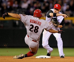
Here’s something that’s been going on for a couple of weeks, so I’m surprised nobody else has noticed (or at least nobody has spoken up about it): Diamondbacks outfielder Alex Romero has brought a new twist to the high-cuffed look. Instead of just wearing red socks, he appears to have short black socks over his red hose. The resulting effect is sort of like low whites in the NFL, only they’re low blacks.
But is Romero really wearing socks? Maybe it’s just black ankle tape, especially since he appears to wear the black tape (or socks, or whatever) even with the D-Backs’ black alt uniform. But why wear the tape over the socks, instead of under? Doesn’t that ruin the socks? And why not wear tape that matches the sock color? Is this all some sort of superstition, or what?
I called Diamondbacks equipment manager Roger Riley and left a message but haven’t heard back from him yet — will advise. While we’re waiting, I did some quick photo research, which suggests that Romero had gone pajama-pantsed until very recently, so it’s not clear if he’s always employed the tape-over-hose motif.
Meanwhile, this raises an interesting question: Does this look good? I think you could argue that it does — black is a D-Backs team color, after all (even though it probably shouldn’t be). At the very least, this presents some interesting possibilities for two-tone baseball socks, which used to be fairly common. Personally, I’m in favor of anything that gets more players to hike up their pants. And if it takes two-tone hose to get them to do it, that works for me.
ITEM! Celebration Planned for NYC’s Best Triple-A Team: On July 21st, I’m going to be participating in an evening of Mets-themed readings and presentations at the Two Boots on Grand Street in Manhattan. Other participants will include Jon Springer of Mets by the Numbers, Greg Prince of Faith and Fear in Flushing, and Mets historian/author Matt Silverman. First pitch at 7pm; not sure who’s reading first. Also not sure of the topic on which I’ll be holding forth, although I’m thinking of administering a Mets uniform quiz. One thing I am sure of: the T-shirt I’ll be wearing. See you there.
Quick Shout-Out: Yo, Joe Alvaro, please give me a shout. Thanks.
Uni Watch News Ticker: Junior Griffey usually wears dark batting gloves, but last night he wore one white glove for his first plate appearance, as a tribute to Michael Jackson. And his walk-up music was “Billie Jean.” He went back to his usual glove protocal for the rest of the game (with thanks to Matt McBride). ”¦ A little birdie tells me all MLB teams will be using a new template for next season’s batting practice caps. No visuals yet. ”¦ Speaking of BP caps, here’s what they’ll look like for the All-Star Game. ”¦ I’ve run plenty of photos of Gary Roenicke’s faceguard. But here’s something new: According to the seventh-to-last graf in this article, mask was taken from Bert Jones’s football helmet. Only problem with that story is that Roenicke’s mask doesn’t seem to match any of the designs that Jones wore (with thanks to Bryan Duklewski). ”¦ The college football video game market is being hit by a very interesting lawsuit (with thanks to David Muir). ”¦ And speaking of lawsuits, do these two logos look similar to you? The Rays think they do. ”¦ Reprinted from yesterday’s comments: Someone sees a connection between the South African national soccer jersey and a certain art supply package. ”¦ Doug Keklak notes that the Adam LaRoche’s NOB is solid on his home and road, but there’s a bit of a space on his black alt. As for brother Andy, he’s solid on the road and at home, with a very slight hint of a sliver of extra space on the Sunday alt. ”¦ Meanwhile, check out the varying amount of space between the insignia and the uni number on Adam LaR. And Joel Hanrahan. ”¦ MLS has unveiled its MLS Cup 2009 logo for this November’s match in Seattle (with thanks to Markus Kamp). ”¦ Bit of an armband controversy in the rugby world (with thanks to Caleb Borchers). ”¦ eBay finds: really nice soccer pins, a cool hoops jersey, and a great practice tee. ”¦ Remember that brief period when NFL officials wore the full name of their positions on their backs? ”¦ New football uniforms for Air Force and Wyoming (with thanks to Mike Althouse and Brendan Fitzgerald, respectively). ”¦ Speaking of college football, apparently there was a rumor floating around that Tennessee might wear black jerseys at some point this year, but that rumor has now been debunked (with thanks to Lee Wilds). ”¦ And in Division II news, new uniforms for Northern State. Lots of additional photos here. ”¦ “I recently changed my Twitter background to an SF Giants background from TwitterBackgrounds.com,” writes Evan Aczon. “I was checking it today and found that the player in the background was a college player, not a Giants player. Any idea what uniform that is?” Nope. Anyone? ”¦ Yesterday I said gumball maven Bill Jones would no doubt be creating a set of Tecmo Bowl helmets. Sure enough, he’s already designed the decal sheet, along with an additional sheet for a more recent video game called Blitz — The League. ”¦ “Saw this guy on my way to work Tuesday morning,” writes Jeff Meyers. “Not sure if its a DIY job or something he bought. Couldn’t get on the other side of him to see if there was a logo on both sides. You can insert your own Ben Roethlisberger joke wherever you like.” ”¦ Jason Varitek is auctioning off his Captain America gear (with thanks to Greg Beaulieu). ”¦ “Last weekend in my hometown of Michigan City, Indiana (birthplace of Don Larsen by the way), was the annual Drum and Bugle competition featuring the best bands from around the country,” writes Dylan Buell. “We have our 4th of July parade during the day, which all these bands march in, and then the competition takes place in the evening on our high school football field.” He took lots of pics of the band uniforms, many of which are very interesting, which you can see here. ”¦ Has anyone else noticed that Jayson Werth’s home jersey has really long sleeves? Like, really long (as spotted by James Allen). ”¦ Another Tecmo follow-up, this time from Gus Money, who writes: “Tecmo Super Bowl, which followed Tecmo Bowl, officially licensed teams and players were included. But the members of the Quarterback Club (a self-selected group of starting NFL QBs of the era) were not part of the NFLPA license and therefore did not appear in the game, sorta. These players were represented simply by the title ‘QB
Not uniform-related, but an interesting story on page one of the Journal today about ball hawks and mileston HRs.
link
From the Rays link:
“…Major League Baseball always is on the lookout for counterfeit merchandise, especially at big events such as the All-Star Game and playoffs, said spokesman Matt Bourne. He said it’s to protect fans from subpar merchandise. He also said Major League Baseball licenses its name and logos only to manufacturers who make high-quality goods, because “we want to make sure it meets our standards of quality.”…”
Um…I don’t really think if any of us bought subpar merchandise for a low price we’d care if it fell apart after a year or two. I’m gussing if you’re buying shirts from a guy with a dufflebag for $5 on a street corner you’re not getting quality licensed merchandise. What a load, it’s obvious just to get money out of the mrfs. It’s sad because there are people out there who can make good shirt designs but are bound by stupid laws. I’m sure we all have plenty of great ideas for apparel but would probably be bankrupted trying to actually get anything sold.
One of Paul’s other obsessions is featured in today’s NY Times: link
Paul,
You’ve got your “Quick shout out” listed twice. The first of which is in your 2nd paragraph about Romero.
Low blacks?
Really ugly.
—Ricko
No pics, but I was watching the Braves/Cubs game on WGN last night, and Bobby Cox still has the light blue ribbon from Father’s Day on his jacket.
Interesting item on SportsCenter in the Jays-Rays highlight package last night (7/7).
When they showed the Jays’ starter that evening, Rzepczynski, combining the cumbersome font for the NOB with the radial arching, it looked like a Saltalamacchia moment. BTW, if last names were legal in the game of Scrabble, which would be worth more points on multiple word and letter scores, Rzepczynski or Saltalamacchia?
[quote comment=”338522″]Low blacks?
Really ugly.
—Ricko[/quote]
rick, they’re on a diamondbacks uni, of course they’re gonna look ugly…plus the guy wears his socks high, pants nfl-length short and unbloused (or at least with just the elastic as the bottom), a look we both don’t like
not that low blacks would necessarily look good on a yankees or dodgers uni either, but i’d be interested to see that in another complimentary color on a different team — might not look much better, but i’d like to see it (at least once, then i can pronounce it “really ugly” too)
The SF Giants Twitter background player looks like an Arizona State player to me. Do they have a jersey that just has ‘DEVILS’ on it?
The prices the livestrong jerseys in Australia used over the weekend are getting quite high.
link
Here’s the Australian rules prices.
link
Re: Tecmo Super Bowl pics….
Its nice to see my Bills finally as Champions!!!!
[quote comment=\”338526\”]The SF Giants Twitter background player looks like an Arizona State player to me. Do they have a jersey that just has \’DEVILS\’ on it?[/quote]
Maybe this one?
[quote comment=”338528″]“Re: Tecmo Super Bowl pics….
“It’s nice to see my Bills finally as Champions!!!!”[/quote]
Wide right, missing helmet, Leon Lett…
*brings up old wounds*
hilarious youtube video (from tecmo super bowl, but still great). Bo Jackson has a 1:45 run for a touchdown!
link
[quote comment=”338526″]The SF Giants Twitter background player looks like an Arizona State player to me. Do they have a jersey that just has ‘DEVILS’ on it?[/quote]
This jersey:
link
and this jersey:
link
both say “Devils” but don’t have any gold trim.
They do have a jersey with the “AS” logo on the chest, and it has gold trim:
link
but not down the pant leg
The low blacks look stupid. If the D-Backs went to a old-time 2-tone stocking, fine. But it’s not part of their official uniform now. Cardinals can’t wear solid red socks or any other variation. They have to wear the official striped socks, team rule [F. Vina and E. Reneria tried solid red several years ago, and ownership/management quashed that]. Wish more of them did wear the stripes showing. But it’s an organizational minor league requirement that they go high-cuffed and the veterans in StL rarely do it.
[quote comment=”338521″]Paul,
You’ve got your “Quick shout out” listed twice. The first of which is in your 2nd paragraph about Romero.[/quote]
Yikes. Thanks. Now fixed.
[quote comment=”338534″][quote comment=”338521″]Paul,
You’ve got your “Quick shout out” listed twice. The first of which is in your 2nd paragraph about Romero.[/quote]
Yikes. Thanks. Now fixed.[/quote]
Also, it looks like your two ticker items about Tennessee and Northern State ran together. It reads like this:
[quote“I recently changed my Twitter background to an SF Giants background from TwitterBackgrounds.com,” writes Evan Aczon. “I was checking it today and found that the player in the background was a college player, not a Giants player. Any idea what uniform that is?” Nope. Anyone?[/quote]
Looks like link to me… Just photoshopped in the yellow piping all over it and the pipes down the front.
[quote comment=”338532″][quote comment=”338526″]The SF Giants Twitter background player looks like an Arizona State player to me. Do they have a jersey that just has ‘DEVILS’ on it?[/quote]
This jersey:
link
and this jersey:
link
both say “Devils” but don’t have any gold trim.
They do have a jersey with the “AS” logo on the chest, and it has gold trim:
link
but not down the pant leg[/quote]
Godammit… This is why I need to click ‘refresh’ before I post anything after trying to find a pic… And you used the same picture I did…
Me = FAIL
[quote comment=”338534″][quote comment=”338521″]Paul,
You’ve got your “Quick shout out” listed twice. The first of which is in your 2nd paragraph about Romero.[/quote]
Yikes. Thanks. Now fixed.[/quote]
I thought you just really wanted the guy to get in touch with you!
[quote comment=”338531″]hilarious youtube video (from tecmo super bowl, but still great). Bo Jackson has a 1:45 run for a touchdown!
link
LOL…..Makes me think if Barry Sanders would have surpassed Emmitt Smith as leading rusher if lateral yards were included. In any case, I’d love to see a rushing stat. that included lateral yards gained.
LOVE the low blacks actually.
and on jayson werth: those long sleeves are reminiscant of derek bell’s jersey when he was with the mets in 2000. anyone have a good pic of that?
[quote comment=”338535″][quote comment=”338534″][quote comment=”338521″]Paul,
You’ve got your “Quick shout out” listed twice. The first of which is in your 2nd paragraph about Romero.[/quote]
Yikes. Thanks. Now fixed.[/quote]
Also, it looks like your two ticker items about Tennessee and Northern State ran together. It reads like this:
[/quote]
Double-yikes. Now fixed.
Andruw Jones wore high cuffs every once in a while with the Braves, and it was usually the solid sock, which is probably the official uniform sock for Atlanta.
link
But he broke out the old-school Braves sock for a few games earlier in the decade, and no one got upset about it. It seemed to be ok b/c it still worked with the current uniform, and it harkened back to a classic look. I just wish I could find a picture of it.
It was the same as the classic stirrup, but I think it was a solid sock.
link
Actually Gary Roenicke’s mask does look like this one…but painted black of course.
link
Looks like the low blacks could be neoprene type sleeve ankle braces. They’re more comfortable worn outside the sock.
And I think it’s great that some of the Cardinals have the cojones to wear the striped socks. The look great, and spruce up an otherwise bland uniform.
I wish someone on the Red Sox would dare to request a pair of the classic socks/stirrups from the equipment manager and wear them during a game.
link
It would do wonders for their new road uniform.
I hope the Steelers’ helmets a DIY job. Logo is on the wrong side.
Sure looks to me like Alex Romero is wearing a compression-type ankle brace if you look at how it wrinkles/bunches
link
not sure why he owuld need to wear it outside of his hose though.
ah, Berto beat me.
[quote comment=”338543″]Actually Gary Roenicke’s mask does look like this one…but painted black of course.
link
I’m think the bars on Roenicke’s mask were farther apart.
Can’t believe Deadspin got this first
link
[quote comment=”338544″]Looks like the low blacks could be neoprene type sleeve ankle braces. They’re more comfortable worn outside the sock.[/quote]
Never worn one. Why are they more comfy outside the sock?
[quote comment=”338539″][quote comment=”338531″]hilarious youtube video (from tecmo super bowl, but still great). Bo Jackson has a 1:45 run for a touchdown!
link
LOL…..Makes me think if Barry Sanders would have surpassed Emmitt Smith as leading rusher if lateral yards were included. In any case, I’d love to see a rushing stat. that included lateral yards gained.[/quote]
i can see the stat line: Bo Jackson: 1 rush, 538 yards (439 lateral), 1 TD
And, the “QB Eagles” jersey from Tecmo Super Bowl was great. But didn’t they all have #00? I’m also trying to remember who else got QB Team Name treatment… Jim Kelly was “QB Bills”. Bernie Kosar?
We need more random-ass cut scenes in our video games!
Imagine if Youkilis or Varitek wore those for a game. People would go nuts, and then perhaps more people would give them a shot (hopefully this would include Brad Penny).
Because this:
link
looks better than this:
link
And this:
link
looks better thans this:
link
Also can’t believe we don’t have a screen shot of the Jays starter from last night
link
this was the d-bell effect i was talking about. he did it with the ‘stros also apparently, but it looked more pronounced on the mets’ jerseys because of the low-riding, sleeve piping:
link
[quote comment=”338519″]
Um…I don’t really think if any of us bought subpar merchandise for a low price we’d care if it fell apart after a year or two. I’m gussing if you’re buying shirts from a guy with a dufflebag for $5 on a street corner you’re not getting quality licensed merchandise. What a load, it’s obvious just to get money out of the mrfs. It’s sad because there are people out there who can make good shirt designs but are bound by stupid laws. I’m sure we all have plenty of great ideas for apparel but would probably be bankrupted trying to actually get anything sold.[/quote]
And we ought to be.
Intellectual theft is theft, plain and simple. If you have to use somebody else’s property in your idea, it isn’t your idea.
“I’m calling it Shea” is a perfect example – makes its point, great design, doesn’t have to steal.
[quote comment=”338546″]I hope the Steelers’ helmets a DIY job. Logo is on the wrong side.[/quote]
ya might wanna take a link.
[quote comment=”338555″]Also can’t believe we don’t have a screen shot of the Jays starter from last night
link
I searched high and low last night for a shot of the back of his jersey. And the media in TeeBay let me down. lol
[quote comment=”338531″]hilarious youtube video (from tecmo super bowl, but still great). Bo Jackson has a 1:45 run for a touchdown!
link
I hate to bring this up, but it looks like Tecmo Bo might have had some Tecmo PEDs with how he carved up that defense.
[quote comment=”338556″]this was the d-bell effect i was talking about. he did it with the ‘stros also apparently, but it looked more pronounced on the mets’ jerseys because of the low-riding, sleeve piping:
link
Yeah, but he didn’t just have long sleeves — his entire uni was super-baggy. Like, so baggy that it made Manny’s uni look snug. At the time, Bell said he was “doing it for my hip-hop community.” But the league office put the kibosh on it after a few games.
[quote comment=”338558″][quote comment=”338546″]I hope the Steelers’ helmets a DIY job. Logo is on the wrong side.[/quote]
ya might wanna take a link.[/quote]
good catch… i didn’t notice that 2nd helmet the first time i looked at the pic.
And speaking of lawsuits, do these two logos look similar to you? The Rays think they do. …
I have no love lost for MLB and am completely indifferent to the Rays’ ownership, but in fairness to both it should be pointed out that this is a CRIMINAL complaint, and that it’s not the Rays who think the logos are similar, it’s the Pinellas-Pasco State Attorney’s Office. If the t-shirt designer is convicted, neither the Rays nor MLB will see a dime from it.
[quote comment=”338532″][quote comment=”338526″]The SF Giants Twitter background player looks like an Arizona State player to me. Do they have a jersey that just has ‘DEVILS’ on it?[/quote]
This jersey:
link
and this jersey:
link
both say “Devils” but don’t have any gold trim.
They do have a jersey with the “AS” logo on the chest, and it has gold trim:
link
but not down the pant leg[/quote]
I’m going out on a limb and say it’s a Nike-sponsored school. However, I don’t think it’s ASU. I thought that at first, too; but, that looks like a backwards “3” on the jersey, and ASU’s unis don’t have the number on the chest.
[quote comment=”338561″][quote comment=”338556″]this was the d-bell effect i was talking about. he did it with the ‘stros also apparently, but it looked more pronounced on the mets’ jerseys because of the low-riding, sleeve piping:
link
Yeah, but he didn’t just have long sleeves — his entire uni was super-baggy. Like, so baggy that it made Manny’s uni look snug. At the time, Bell said he was “doing it for my hip-hop community.” But the league office put the kibosh on it after a few games.[/quote]
For some reason I remember his sleeves being mentioned during a playoff series vs. the Braves (back in the days of the Killer B’s). They said something to the effect that he asked for longer sleeves b/c he felt tight sleeves prohibited his range of motion. His Astros jersey doesn’t look altogether baggy in these pics, just the sleeves. Same for his undershirt when he played in Pittsburgh. Maybe he went totally baggy while with the Mets.
link
link
link
the giants twitter image is flipped…
here’s how it should look when properly oriented
don’t know if this helps ID the guy/team
Love the new Air Force jerseys, the lightning bolt on the shoulders and pants make it!
Low blacks? Yeah some sort of ankle brace. I see a lot of soccer players that wear ankle braces outside their socks.
Glad to see MLB finally gave up on putting “American” and “National” on the BP caps, and instead just did the the first letter. Those are actually buyable now.
Et tu? Air Force? Why does Air Force need black on their jersey?
Wyoming will look like crap no matter what combo they wear.
Northern State, pretty solid, minus the monochrome red home set.
Rzepczynski or Saltalamacchia in scrabble? Totally Rzepczynski. 2 Zs, a P, a Y and a K. Most of Salty’s name is 1 pt. letters. Of course, you would need a blank tile for Rzepczynski, since there is only one Z in a scrabble game.
[quote comment=”338566″]the giants twitter image link…
here’s how it should look link
don’t know if this helps ID the guy/team[/quote]
Could be Florida State:
link
Bo Jackson gets all sorts of hoopla in TSB circles, but if you really wanted to win you had to pick the Giants. LT was the defensive equivalent to Bo and Ottis Anderson was Bo Lite. He was a beast. On top of that, you get that great LB crew that the Giants had, a fine starter in Simms, a capable backup with Hostetler, and the sure hands of Bavaro.
I feel like Paul should set up a comments section under that essay so us TSB geeks can heavily debate the virtues of using 3-wideout sets with the ‘Skins vs. 4-wideouts with Houston…or why Merril Hoge was just to unstoppable of a CPU player, but sucked when you get to use him (same goes for Reggie Cobb).
[quote comment=\”338549\”][quote comment=\”338543\”]Actually Gary Roenicke\’s mask does look like this one…but painted black of course.
link
I\’m think the bars on Roenicke\’s mask were farther apart.[/quote]
To allow for the horn.
USC
Arizona State
Minnesota
Florida State
Nike + Maroon & Yellow schools that I could think of.
Somewhat uni-related incident in last night’s Nats/Rox game. Apparently routine grounder to DC second baseman Willie Harris takes an inopportune bounce upwards at the last minute, so we all learned taht Harris wasn’t wearing a cup, as he paused to writhe in agony. Runners safe. Announcers somewhat dumbfounded at this odd way to avoid an out. Rox color man George Frazier mentions that his onetime teammate Garry Templeton used to brag about not wearing a cup.
Why does Air Force need black on their jersey?
Stealth
[quote comment=”338572″]USC
Arizona State
Minnesota
Florida State
Nike + Maroon & Yellow schools that I could think of.[/quote]
Could be USC:
link
and it looks like they wear the Nike helmets, too:
link
Gophers:
link
Since solid socks have displaced stirrups as the legwear of choice for the high-cuffed- two tone socks are something that could work very well for certain teams.
I\’m thinking White Sox, A\’s, Pirates, Orioles and Marlins off the top of my head.
The key, to me, would be to have a high ratio of the dominant color. Partly so they don\’t look like NFL socks, partly because I think more players would wear them and partly because I just think that would look best. But I prefer 40s/50s style stirrups to the 60s/70s stirrups.
[quote comment=”338572″]USC
Arizona State
Minnesota
Florida State
Nike + Maroon & Yellow schools that I could think of.[/quote]
The yellow looks to bright to be real. I’m guessing that part is photoshopped…
Heck, it could be Texas A&M, Miss St, Montana, etc.
Crap brown and Pee yellow. What was Wyoming thinking when picking colors?
i’d say, with 90% certainty…that our giants twitter fellow plays for fsu
busy now, but if anyone wants to search for a righty batting, wearing that uni, i bet we find a match
[quote comment=”338559″][quote comment=”338555″]Also can’t believe we don’t have a screen shot of the Jays starter from last night
link
I searched high and low last night for a shot of the back of his jersey. And the media in TeeBay let me down. lol[/quote]
Majestic could pull another typo and nobody would even notice.
[quote comment=”338579″]i’d say, with 90% certainty…that our giants twitter fellow link
busy now, but if anyone wants to search for a righty batting, wearing that uni, i bet we find a match[/quote]
I dunno… that 3 or whatever it is just doesn’t look like it matches up with the FSU jersey… I’d almost say its part of a logo, not a number
found this yesterday. Pretty much sapped my productivity.
link
You can play all the old NES games including both Tecmo bowls, blades of steel (hockey), RBI baseball, Baseball Stars etc….
other than RBI baseball and Super Tecmo Bowl, these games all have made-up teams, logos, colors etc….
Here is wayyyyyyyyyyyyyy more than you would ever, ever, ever want to know about Tecmo Super Bowl…
link
shit…meant to include this with last post
side by side
not an exact match, of course, but pretty close…the pants stripes are the key — none of the other schools (at least in the quick search i performed) had the maroon/yellow on the pant leg…belt loops are slightly different and batter is facing opposite direction…
but i’d say its a pretty good match
Braves backup 2B Brooks Conrad was wearing Nike spikes again last night vs. the Cubs.
link
This is consistent with what he wore during Spring Training:
link
But during his first game after being called up (vs. the Nationals, last weekend), he was wearing Mizuno spikes. He hit a crucial 3-run HR, too.
link
[quote comment=”338581″][quote comment=”338579″]i’d say, with 90% certainty…that our giants twitter fellow link
busy now, but if anyone wants to search for a righty batting, wearing that uni, i bet we find a match[/quote]
I dunno… that 3 or whatever it is just doesn’t look like it matches up with the FSU jersey… I’d almost say its part of a logo, not a number[/quote]
And he’s wearing a TPX helmet, not Nike.
[quote comment=”338584″]shit…meant to include this with last post
link
not an exact match, of course, but pretty close…the pants stripes are the key — none of the other schools (at least in the quick search i performed) had the maroon/yellow on the pant leg…belt loops are slightly different and batter is facing opposite direction…
but i’d say its a pretty good match[/quote]
Very different belt loops, too. The Twitter pic has the traditional loops, but the FSU player is sporting a Detroit Tigers-esque pair of pants.
Paul,
Roenicke’s mask is a Riddell BD-9 (two bar) mask. It appears that it has been cut in half, vertically and spray painted black. That is the same mask Jones wore in the first few years with the Colts. (There are a few photos of Jone s wearing a grey one in the second row of the Jones photo grouping.)
Has anyone on this board ever tracked the amount of NHL, NFL, MLB and NBA logos including their respective sports ball/stick by sport?
I seem to think we have spoken about it, but how many NHL logos have hockey sticks, NBA logos have basketballs, etc.
[quote comment=”338551″][quote comment=”338544″]Looks like the low blacks could be neoprene type sleeve ankle braces. They’re more comfortable worn outside the sock.[/quote]
Never worn one. Why are they more comfy outside the sock?[/quote]
If those are anything like the old mcdavid lace-up ankle braces, it’d be terribly uncomfortable to wear those under the sock. the rubbing against the skin would be too much, the sock would act like the prewrap when you use athletic tape.
Now, I have no experience with the newer braces, but I wore the old ones on both ankles in high school.
Imagining a woman in stands: “I’ve been looking at those Air Force players’ football pants…their bolts are really tiny, aren’t they.”
[quote comment=”338545″]And I think it’s great that some of the Cardinals have the cojones to wear the striped socks. The look great, and spruce up an otherwise bland uniform.
I wish someone on the Red Sox would dare to request a pair of the classic socks/stirrups from the equipment manager and wear them during a game.
link
It would do wonders for their new road uniform.[/quote]
I would second that motion. I’m also with Ricko, low black just doesn’t work for me. If it is some sort of brace, I understand why it would feel more comfortable outside the sock, but back in the day when I was involved in sports, we’d wear two pair of socks. Do they do that anymore? If so, couldn’t the brace be worn outside the first pair of socks then the (sans)stirrup outside that?
I could live with low-whites. Just makes since with the White Sox. If the ChiSox went with that look, they also could reintroduce a new stripe pattern each year. That was pretty cool. Again, back in the day.
[quote comment=”338551″][quote comment=”338544″]Looks like the low blacks could be neoprene type sleeve ankle braces. They’re more comfortable worn outside the sock.[/quote]
Never worn one. Why are they more comfy outside the sock?[/quote]
My experience (and the experience of guys I’ve played with) is that the neoprene or rubber sleeve braces can chafe after a while. I think it’s partly the material and partly the compression. After you sweat a bit and start moving around your skin can get pretty irritated around the edge of the brace. Most guys I played with wore them outside the sock. So did I.
[quote comment=”338587″][quote comment=”338584″]shit…meant to include this with last post
link
not an exact match, of course, but pretty close…the pants stripes are the key — none of the other schools (at least in the quick search i performed) had the maroon/yellow on the pant leg…belt loops are slightly different and batter is facing opposite direction…
but i’d say its a pretty good match[/quote]
Very different belt loops, too. The Twitter pic has the traditional loops, but the FSU player is sporting a Detroit Tigers-esque pair of pants.[/quote]
It could be a stock photo either taken for stock purposes and thus made up of of whatever the photographer had on hand. It could also be a stock photo that’s been photoshopped a million times for various uses.
[quote comment=”338593″][quote comment=”338551″][quote comment=”338544″]Looks like the low blacks could be neoprene type sleeve ankle braces. They’re more comfortable worn outside the sock.[/quote]
Never worn one. Why are they more comfy outside the sock?[/quote]
My experience (and the experience of guys I’ve played with) is that the neoprene or rubber sleeve braces can chafe after a while. I think it’s partly the material and partly the compression. After you sweat a bit and start moving around your skin can get pretty irritated around the edge of the brace. Most guys I played with wore them outside the sock. So did I.[/quote]
So, as someone said, then why not wear a second sock cover it?
Although, what with Barry Bonds’ elbow pad and all, the “braced up for battle” look is kind of in these days, isn’t it. Wanna look, if at all possible, like a wounded warrior persevering through the pain.
How macho.
—Ricko
Didn’t mean you, Berto. Meant in The show.
Yuck. link, long before the Phiten logo invaded hosiery. (Blame War Damn Eagle in Comment #48 for originally posting that picture.)
[quote comment=”338589″]Has anyone on this board ever tracked the amount of NHL, NFL, MLB and NBA logos including their respective sports ball/stick by sport?
I seem to think we have spoken about it, but how many NHL logos have hockey sticks, NBA logos have basketballs, etc.[/quote]
NHL: Atlanta, Florida, Los Angeles, New York Islanders, Pittsburgh, San Jose, Washington.
Those seven teams use hockey sticks in their logos.
[quote comment=”338597″]Yuck. link, long before the Phiten logo invaded hosiery. (Blame War Damn Eagle in Comment #48 for originally posting that picture.)[/quote]
Ha. I never even noticed the socks. I was focused on the sleeves. Nice catch.
[quote comment=”338595″][quote comment=”338593″][quote comment=”338551″][quote comment=”338544″]Looks like the low blacks could be neoprene type sleeve ankle braces. They’re more comfortable worn outside the sock.[/quote]
Never worn one. Why are they more comfy outside the sock?[/quote]
My experience (and the experience of guys I’ve played with) is that the neoprene or rubber sleeve braces can chafe after a while. I think it’s partly the material and partly the compression. After you sweat a bit and start moving around your skin can get pretty irritated around the edge of the brace. Most guys I played with wore them outside the sock. So did I.[/quote]
So, as someone said, then why not wear a second sock cover it?
Although, what with Barry Bonds’ elbow pad and all, the “braced up for battle” look is kind of in these days, isn’t it. Wanna look, if at all possible, like a wounded warrior persevering through the pain.
How macho.
—Ricko[/quote]
No worries Ricko, I got’cha.
As for the second sock to cover the brace for a lot of guys it would end up being a third sock. I (and many of my former teammates) wear a wicking running sock under my uniform sock. That sock doesn’t help protect the skin from the brace because the sock is cut low and doesn’t cover the ankle
If I added another sock just for looks I’d have to buy bigger shoes. Much like Ed McCaffrey I want to have as little on as possible, especially around my feet. I also think having tha much going on down there would throw off the ability to run, cut, etc. At some point the sock on sock madness must end!
You Mets purists will appreciate next week’s cover of Sports Illustrated:
link
[quote comment=”338573″]Somewhat uni-related incident in last night’s Nats/Rox game. Apparently routine grounder to DC second baseman Willie Harris takes an inopportune bounce upwards at the last minute, so we all learned taht Harris wasn’t wearing a cup, as he paused to writhe in agony. Runners safe. Announcers somewhat dumbfounded at this odd way to avoid an out. Rox color man George Frazier mentions that his onetime teammate Garry Templeton used to brag about not wearing a cup.[/quote]
Hell, link didn’t wear underwear when he played; at third base, no less!
And here’s a shout-out to Cardinals’ shortstop link, rockin’ striped low stirrups… the same basic pattern the Cards have worn since the Gas House Gang!
Dylan – Love the link pictures. Ironically, I was in LaPorte, IN on the 4th and went to their parade. Michigan City HS Band marched in LaPorte’s parade too and I remember thinking, “Wow, couldn’t they wear more than just a t-shirt and shorts?”. I could be mistaking them for another school though as I’m not from the area (My Dad is). MC’s parade looked much more fun as I like the HS bands the most.
[quote comment=”338595″][quote comment=”338593″][quote comment=”338551″][quote comment=”338544″]Looks like the low blacks could be neoprene type sleeve ankle braces. They’re more comfortable worn outside the sock.[/quote]
Never worn one. Why are they more comfy outside the sock?[/quote]
My experience (and the experience of guys I’ve played with) is that the neoprene or rubber sleeve braces can chafe after a while. I think it’s partly the material and partly the compression. After you sweat a bit and start moving around your skin can get pretty irritated around the edge of the brace. Most guys I played with wore them outside the sock. So did I.[/quote]
So, as someone said, then why not wear a second sock cover it?
Although, what with Barry Bonds’ elbow pad and all, the “braced up for battle” look is kind of in these days, isn’t it. Wanna look, if at all possible, like a wounded warrior persevering through the pain.
How macho.
—Ricko[/quote]
Oh come on. I mean, I hear what you’re saying when it comes to elbow pads and ankle pads, but a neophrene ankle brace? That makes you look like a wounded warrior?
And wearing another sock over an ankle brace? That would look horrible. The sock would have a bunched up look and we’d all probably complain about that.
It’s funny how some of us harken back to the day when football players wore those forearm pads, etc but today’s baseball players are too macho when they do, essentially the same thing.
[quote comment=”338601″]You Mets purists will appreciate next week’s cover of Sports Illustrated:
link
I noticed the name “Dravecky” on the SI cover. That’s Dave, right?
On Tecmo Super Bowl, I thought it was former USFLers who got the QB (Team) treatment. Marino was in the QB Club and his name appeared in the game. Kelly played in the USFL, Cunningham was drafted by a USFL team, and Kosar was courted by the USFL.
[quote comment=”338598″][quote comment=”338589″]Has anyone on this board ever tracked the amount of NHL, NFL, MLB and NBA logos including their respective sports ball/stick by sport?
I seem to think we have spoken about it, but how many NHL logos have hockey sticks, NBA logos have basketballs, etc.[/quote]
NHL: Atlanta, Florida, Los Angeles, New York Islanders, Pittsburgh, San Jose, Washington.
Those seven teams use hockey sticks in their logos.[/quote]
For MLB using the teams official logos from link.
Ball in logo (11): Rockies, Marlins, Dodgers, Brewers, Mets, Giants, Nationals, Twins, Yankees, Mariners, Rangers
Bat(s) in logo (3): Pirates, Cardinals, Yankees
Plate in logo (1): Padres
Diamond in logo (1): Rays
No baseball equipment in logo (15)
Are socks (sox) considered baseball equipment?
[quote comment=”338600″][quote comment=”338595″][quote comment=”338593″][quote comment=”338551″][quote comment=”338544″]Looks like the low blacks could be neoprene type sleeve ankle braces. They’re more comfortable worn outside the sock.[/quote]
Never worn one. Why are they more comfy outside the sock?[/quote]
My experience (and the experience of guys I’ve played with) is that the neoprene or rubber sleeve braces can chafe after a while. I think it’s partly the material and partly the compression. After you sweat a bit and start moving around your skin can get pretty irritated around the edge of the brace. Most guys I played with wore them outside the sock. So did I.[/quote]
So, as someone said, then why not wear a second sock cover it?
Although, what with Barry Bonds’ elbow pad and all, the “braced up for battle” look is kind of in these days, isn’t it. Wanna look, if at all possible, like a wounded warrior persevering through the pain.
How macho.
—Ricko[/quote]
No worries Ricko, I got’cha.
As for the second sock to cover the brace for a lot of guys it would end up being a third sock. I (and many of my former teammates) wear a wicking running sock under my uniform sock. That sock doesn’t help protect the skin from the brace because the sock is cut low and doesn’t cover the ankle
If I added another sock just for looks I’d have to buy bigger shoes. Much like Ed McCaffrey I want to have as little on as possible, especially around my feet. I also think having tha much going on down there would throw off the ability to run, cut, etc. At some point the sock on sock madness must end![/quote]
Good, you knew what I meant, namely that in The Bigs, getting a half-size bigger shoe (or some other solution) would be nothing.
I guess I don’t get a guy looking down at those low blacks and not thinking, “Well, that looks like shit”. Especially when the entire equipment world is at his disposal to KEEP IT from looking like shit.
But, as I said, today’s players look at such things as a sign of their individual battle-readiness. And that’s more important to them than wearing the team uniform well.
—Ricko
NFL from official team logos here
Browns (helmet)
Dolphins (helmet)
Jets (football)
[quote comment=”338605″][quote comment=”338601″]You Mets purists will appreciate next week’s cover of Sports Illustrated:
link
I noticed the name “Dravecky” on the SI cover. That’s Dave, right?[/quote]
man…i’d give my left ar…
n/m
yes, link
[quote comment=”338610″]NFL from official team logos link
Browns (helmet)
Dolphins (helmet)
Jets (football)[/quote]
fixed link
No baseball equipment in logo (15)
…and haven’t you ever seen a batter tomahawk a high pitch?
[quote comment=”338606″]On Tecmo Super Bowl, I thought it was former USFLers who got the QB (Team) treatment. Marino was in the QB Club and his name appeared in the game. Kelly played in the USFL, Cunningham was drafted by a USFL team, and Kosar was courted by the USFL.[/quote]
except that Dan Marino was in fact drafted by a USFL club.
Tecmo Super Bowl is the greatest game ever. We used to modify the game on the computer and put all our own names and attributes and build teams. We would have tournaments at work. Great way to get fired. But luckily that never happened. Anyway, link
a screen shot of the action.
[quote comment=”338604″][quote comment=”338595″][quote comment=”338593″][quote comment=”338551″][quote comment=”338544″]Looks like the low blacks could be neoprene type sleeve ankle braces. They’re more comfortable worn outside the sock.[/quote]
Never worn one. Why are they more comfy outside the sock?[/quote]
My experience (and the experience of guys I’ve played with) is that the neoprene or rubber sleeve braces can chafe after a while. I think it’s partly the material and partly the compression. After you sweat a bit and start moving around your skin can get pretty irritated around the edge of the brace. Most guys I played with wore them outside the sock. So did I.[/quote]
So, as someone said, then why not wear a second sock cover it?
Although, what with Barry Bonds’ elbow pad and all, the “braced up for battle” look is kind of in these days, isn’t it. Wanna look, if at all possible, like a wounded warrior persevering through the pain.
How macho.
—Ricko[/quote]
Oh come on. I mean, I hear what you’re saying when it comes to elbow pads and ankle pads, but a neophrene ankle brace? That makes you look like a wounded warrior?
And wearing another sock over an ankle brace? That would look horrible. The sock would have a bunched up look and we’d all probably complain about that.
It’s funny how some of us harken back to the day when football players wore those forearm pads, etc but today’s baseball players are too macho when they do, essentially the same thing.[/quote]
All I was saying was there doesn’t seem to be a great deal of concern for making the uni look good, especially if the issue is some kind of equipment… a brace, a pad.
Just saying they sometimes they come off as a bit of an affectation.
And, to tweak you a little…baseball players need forearm pads? ;)
—Ricko
[quote comment=”338612″][quote comment=”338610″]NFL from official team logos link
Browns (helmet)
Dolphins (helmet)
Jets (football)[/quote]
fixed link[/quote]
Add Bucs (ball) and Raiders (helmet).
[quote comment=”338569″][quote comment=”338566″]the giants twitter image link…
here’s how it should look link
don’t know if this helps ID the guy/team[/quote]
Could be Florida State:
link
I think it’s Florida State. The photo appears to be from last year’s College World Series. Note the patch on the sleeve.
Patch
link
Photo
link
[quote comment=”338612″][quote comment=”338610″]NFL from official team logos link
Browns (helmet)
Dolphins (helmet)
Jets (football)[/quote]
fixed link[/quote]
Tampa Bay’s logo has a football on it.
And technically, the Raiders have a helmet in their logo (sans facemask)
Serious question. Don’t MLB rules indicate that any kind of brace, etc., has to be covered?
So then I suppose the issue is whether those ankle supports are braces or not.
Don’t have the answer, just asking the question.
(Then again, a white glove on a pitcher is illegal, and we know how well that one’s been enforced).
—Ricko
Viking dude sporting a helmet, as well.
[quote comment=”338620″]Serious question. Don’t MLB rules indicate that any kind of brace, etc., has to be covered?
So then I suppose the issue is whether those ankle supports are braces or not.
Don’t have the answer, just asking the question.
(Then again, a white glove on a pitcher is illegal, and we know how well that one’s been enforced).
—Ricko[/quote]
If a brace is to be covered, why aren’t shin pads, elbow contraptions, and other “protective gear” covered as well?
totally not uni related…but for you numbers geeks (and im sure we have a few)…
today’s a big day, time wise
[quote comment=”338622″][quote comment=”338620″]Serious question. Don’t MLB rules indicate that any kind of brace, etc., has to be covered?
So then I suppose the issue is whether those ankle supports are braces or not.
Don’t have the answer, just asking the question.
(Then again, a white glove on a pitcher is illegal, and we know how well that one’s been enforced).
—Ricko[/quote]
If a brace is to be covered, why aren’t shin pads, elbow contraptions, and other “protective gear” covered as well?[/quote]
That’s why I asked. Catching gear, of course, would be an exception. I know than in men’s softball, any kind of leg braces, etc., are to covered. Don’t see it enforced much until you get to, say, state tournament level, though. And again, that’s specific to leg braces. I think, anyway.
Ask Powers or Robert Marshall or any other umps here, maybe?
—Ricko
[quote comment=”338623″]totally not uni related…but for you numbers geeks (and im sure we have a few)…
link, time wise[/quote]
Wouldn’t 5 minutes and 6 seconds past 4 in the morning be the better number pattern?
04:05:06
07/08/09
as opposed to
12:34:56
07/08/09
Or if you really want to make it work starting from 1, you fudge the date format a little more (since it’s already fudged to drop the 20):
12:34:56
7/8/9
~~~~~~~~~~~~~~~~~~~~~
My anti-spam word agrees with me: “BETTER”
[quote comment=”338609″][quote comment=”338600″][quote comment=”338595″][quote comment=”338593″][quote comment=”338551″][quote comment=”338544″]Looks like the low blacks could be neoprene type sleeve ankle braces. They’re more comfortable worn outside the sock.[/quote]
Never worn one. Why are they more comfy outside the sock?[/quote]
My experience (and the experience of guys I’ve played with) is that the neoprene or rubber sleeve braces can chafe after a while. I think it’s partly the material and partly the compression. After you sweat a bit and start moving around your skin can get pretty irritated around the edge of the brace. Most guys I played with wore them outside the sock. So did I.[/quote]
So, as someone said, then why not wear a second sock cover it?
Although, what with Barry Bonds’ elbow pad and all, the “braced up for battle” look is kind of in these days, isn’t it. Wanna look, if at all possible, like a wounded warrior persevering through the pain.
How macho.
—Ricko[/quote]
No worries Ricko, I got’cha.
As for the second sock to cover the brace for a lot of guys it would end up being a third sock. I (and many of my former teammates) wear a wicking running sock under my uniform sock. That sock doesn’t help protect the skin from the brace because the sock is cut low and doesn’t cover the ankle
If I added another sock just for looks I’d have to buy bigger shoes. Much like Ed McCaffrey I want to have as little on as possible, especially around my feet. I also think having tha much going on down there would throw off the ability to run, cut, etc. At some point the sock on sock madness must end![/quote]
Good, you knew what I meant, namely that in The Bigs, getting a half-size bigger shoe (or some other solution) would be nothing.
I guess I don’t get a guy looking down at those low blacks and not thinking, “Well, that looks like shit”. Especially when the entire equipment world is at his disposal to KEEP IT from looking like shit.
But, as I said, today’s players look at such things as a sign of their individual battle-readiness. And that’s more important to them than wearing the team uniform well.
—Ricko[/quote]
I see what you’re saying. Personally I wouldn’t want a bigger shoe, I’d feel like a clown. Maybe I’m a diva, but I like my feet to feel a certain way when I’m running.
Still, with “the entire equipment world at his disposal” you’d think you could get the braces in a color that matched the sock. Unless the brace is a new thing in which case it make take some time for the company to come through with the special order.
Of course this all assumes that it is in fact a brace.
As for the wounded warrior look I knew I was over doing it when members of the opposing backline were calling out their defensive assignments, pointing at me and saying “I’ve got tape! I’ve got tape!”
[quote comment=”338598″][quote comment=”338589″]Has anyone on this board ever tracked the amount of NHL, NFL, MLB and NBA logos including their respective sports ball/stick by sport?
I seem to think we have spoken about it, but how many NHL logos have hockey sticks, NBA logos have basketballs, etc.[/quote]
NHL: Atlanta, Florida, Los Angeles, New York Islanders, Pittsburgh, San Jose, Washington.
Those seven teams use hockey sticks in their logos.[/quote]
. . . and the Avs include a puck in the logo.
[quote comment=”338627″][quote comment=”338598″][quote comment=”338589″]Has anyone on this board ever tracked the amount of NHL, NFL, MLB and NBA logos including their respective sports ball/stick by sport?
I seem to think we have spoken about it, but how many NHL logos have hockey sticks, NBA logos have basketballs, etc.[/quote]
NHL: Atlanta, Florida, Los Angeles, New York Islanders, Pittsburgh, San Jose, Washington.
Those seven teams use hockey sticks in their logos.[/quote]
. . . and the Avs include a puck in the logo.[/quote]
Pucks are too subjective. Any round object could be conveyed as a puck. Thus, the entire Bruins logo could be a puck.
Tecmo Bowl Related:
One of my buddies is the subject in the below linked article. (I hope the link still works, I can’t access it from work) Anyway, my friend had a Tecmo League with his college Fraternity Bros, including playoffs, strength of schedule weighting, and more. I’ll try to dig up more info, if anyone’s interested.
link
-C
I guess we could flog the snot out of this “low blacks” thing (pointing out that virtually all vintage “two-tone” socks in MLB had white stirrups because of dye issues, etc., thereby sticking to the same athletic-sock look of other sports), and it still will come down to each individual’s reaction.
Me, I still say this…
link
…looks like “Lenny & Squiggy Play Softball”.
LOL
—Ricko
[quote comment=”338628″][quote comment=”338627″][quote comment=”338598″][quote comment=”338589″]Has anyone on this board ever tracked the amount of NHL, NFL, MLB and NBA logos including their respective sports ball/stick by sport?
I seem to think we have spoken about it, but how many NHL logos have hockey sticks, NBA logos have basketballs, etc.[/quote]
NHL: Atlanta, Florida, Los Angeles, New York Islanders, Pittsburgh, San Jose, Washington.
Those seven teams use hockey sticks in their logos.[/quote]
. . . and the Avs include a puck in the logo.[/quote]
Pucks are too subjective. Any round object could be conveyed as a puck. Thus, the entire Bruins logo could be a puck.[/quote]
True enough, but I’d have to say that there’s not much doubt that the thing in the lower right portion of the link is a puck.
I should point out that this…
link
…would look just as stupid if he were wearing low whites, as stupid as if an NFL player wore stirrups on the outside.
—Ricko
[quote comment=”338631″][quote comment=”338628″][quote comment=”338627″][quote comment=”338598″][quote comment=”338589″]Has anyone on this board ever tracked the amount of NHL, NFL, MLB and NBA logos including their respective sports ball/stick by sport?
I seem to think we have spoken about it, but how many NHL logos have hockey sticks, NBA logos have basketballs, etc.[/quote]
NHL: Atlanta, Florida, Los Angeles, New York Islanders, Pittsburgh, San Jose, Washington.
Those seven teams use hockey sticks in their logos.[/quote]
. . . and the Avs include a puck in the logo.[/quote]
Pucks are too subjective. Any round object could be conveyed as a puck. Thus, the entire Bruins logo could be a puck.[/quote]
True enough, but I’d have to say that there’s not much doubt that the thing in the lower right portion of the link is a puck.[/quote]
It’s not a snow tire?
heh…searching for an example of low blacks (found “low whites” in the following pic)…i just noticed one of them movie errors
see if you can spot it
[quote comment=”338631″][quote comment=”338628″][quote comment=”338627″][quote comment=”338598″][quote comment=”338589″]Has anyone on this board ever tracked the amount of NHL, NFL, MLB and NBA logos including their respective sports ball/stick by sport?
I seem to think we have spoken about it, but how many NHL logos have hockey sticks, NBA logos have basketballs, etc.[/quote]
NHL: Atlanta, Florida, Los Angeles, New York Islanders, Pittsburgh, San Jose, Washington.
Those seven teams use hockey sticks in their logos.[/quote]
. . . and the Avs include a puck in the logo.[/quote]
Pucks are too subjective. Any round object could be conveyed as a puck. Thus, the entire Bruins logo could be a puck.[/quote]
True enough, but I’d have to say that there’s not much doubt that the thing in the lower right portion of the link is a puck.[/quote]
No, I agree about the Avs, but what about the LA Kings? They have dark circular images all over their logo. Could they be pucks? Yes. Are they? Hard to tell.
[quote comment=”338634″]heh…searching for an example of low blacks (found “low whites” in the following pic)…i just noticed one of them movie errors
link[/quote]
ST. (LOUIS) on the jersey CINTI on the scoreboard?
[quote comment=”338634″]heh…searching for an example of low blacks (found “low whites” in the following pic)…i just noticed one of them movie errors
link[/quote]
Well, the white plastic sole of the second basemen’s cleats is an anachonism. Brown leather was more likely in 1917. Minor, to be sure, but noticeable for shoe geeks, of which there are a few here if I’m not mistaken.
—Ricko
[quote comment=”338634″]heh…searching for an example of low blacks (found “low whites” in the following pic)…i just noticed one of them movie errors
link[/quote]
I’ll take a stab at it: Uni of guy sliding doesn’t match team on scoreboard?
[quote comment=”338636″][quote comment=”338634″]heh…searching for an example of low blacks (found “low whites” in the following pic)…i just noticed one of them movie errors
link[/quote]
ST. (LOUIS) on the jersey CINTI on the scoreboard?[/quote]
The flag should only have 48 stars.
Nah, I agree with the scoreboard thing.
[quote comment=”338634″]heh…searching for an example of low blacks (found “low whites” in the following pic)…i just noticed one of them movie errors
link[/quote]
Depending on which year this game is taking place, the “Cracker Jack” sailor was not introduced as a trademark until 1918, and wasn’t used in packaging until 1919… meaning that weathered scoreboard was produced long before Cracker Jack was even an idea as for the candy.
james is the winner…
if that’s supposed to be game 3 of the 1919 world series (which is what the scoreboard is indicating)…the player sliding shouldn’t be a member of the browns
[quote comment=”338640″][quote comment=”338634″]heh…searching for an example of low blacks (found “low whites” in the following pic)…i just noticed one of them movie errors
link[/quote]
Depending on which year this game is taking place, the “Cracker Jack” sailor was not introduced as a trademark until 1918, and wasn’t used in packaging until 1919… meaning that weathered scoreboard was produced long before Cracker Jack was even an idea as for the candy.[/quote]
Was gonna check that. You beat me to it.
—Ricko
(Hey, Teebz, you check out the Robert Riger hockey art in that old SI yet?)
[quote comment=”338642″][quote comment=”338640″][quote comment=”338634″]heh…searching for an example of low blacks (found “low whites” in the following pic)…i just noticed one of them movie errors
link[/quote]
Depending on which year this game is taking place, the “Cracker Jack” sailor was not introduced as a trademark until 1918, and wasn’t used in packaging until 1919… meaning that weathered scoreboard was produced long before Cracker Jack was even an idea as for the candy.[/quote]
Was gonna check that. You beat me to it.
—Ricko
(Hey, Teebz, you check out the Robert Riger hockey art in that old SI yet?)[/quote]
impossible to tell from this pic, which is supposedly from game 3 of the 1919 WS, but they probably butchered the entire look of the outfield wall and ads
but i was more talking about the teams playing not jiving with the teams listed on the scoreboard
[quote comment=”338641″]james is the winner…
if that’s supposed to be game 3 of the 1919 world series (which is what the scoreboard is indicating)…the player sliding shouldn’t be a member of the browns[/quote]
Oh, and white soled cleats are accurate to 1917 ???
LOL
—Ricko
Obviously, you can expect to hear from my attorney.
Okay, as to Roger Riger hockey art…for those so interested…
link
Nine pages, beginning on thumbnail page 67
—Ricko
[quote comment=”338635″]No, I agree about the Avs, but what about the LA Kings? They have dark circular images all over their logo. Could they be pucks? Yes. Are they? Hard to tell.[/quote]
I’d say no, those are supposed to be jewels. But I can see your argument, especially since the top of link looks like a pair of crossed sticks to me.
[quote comment=”338646″][quote comment=”338635″]No, I agree about the Avs, but what about the LA Kings? They have dark circular images all over their logo. Could they be pucks? Yes. Are they? Hard to tell.[/quote]
I’d say no, those are supposed to be jewels. But I can see your argument, especially since the top of link looks like a pair of crossed sticks to me.[/quote]
…which you already pointed out when you mentioned LA on your list of teams with sticks in the logo.
[quote comment=”338642″][quote comment=”338640″][quote comment=”338634″]heh…searching for an example of low blacks (found “low whites” in the following pic)…i just noticed one of them movie errors
link[/quote]
Depending on which year this game is taking place, the “Cracker Jack” sailor was not introduced as a trademark until 1918, and wasn’t used in packaging until 1919… meaning that weathered scoreboard was produced long before Cracker Jack was even an idea as for the candy.[/quote]
Was gonna check that. You beat me to it.
—Ricko
(Hey, Teebz, you check out the Robert Riger hockey art in that old SI yet?)[/quote]
I did. It’s phenomenal. I’m trying to figure out how I can rip the entire page off the SI site for each page of the magazine.
Otherwise, SI doesn’t give me a lot of “contact us” options on their site.
Damn, link won’t work.
SI Vault, December 14, 1959.
Starts on thumbnail page 67.
[quote comment=”338649″]Damn, link won’t work.
SI Vault, December 14, 1959.
Starts on thumbnail page 67.[/quote]
here
[quote comment=”338648″][quote comment=”338642″][quote comment=”338640″][quote comment=”338634″]heh…searching for an example of low blacks (found “low whites” in the following pic)…i just noticed one of them movie errors
link[/quote]
Depending on which year this game is taking place, the “Cracker Jack” sailor was not introduced as a trademark until 1918, and wasn’t used in packaging until 1919… meaning that weathered scoreboard was produced long before Cracker Jack was even an idea as for the candy.[/quote]
Was gonna check that. You beat me to it.
—Ricko
(Hey, Teebz, you check out the Robert Riger hockey art in that old SI yet?)[/quote]
I did. It’s phenomenal. I’m trying to figure out how I can rip the entire page off the SI site for each page of the magazine.
Otherwise, SI doesn’t give me a lot of “contact us” options on their site.[/quote]
Could go this route…
link
[quote comment=”338601″]You Mets purists will appreciate next week’s cover of Sports Illustrated:
link
I’m no Mets fan, but I appreciate this too. I always look forward to the Where Are They Now issue – best recurring SI issue (non-swimsuit division).
LSU becomes the final SEC team to put their name on their football jerseys.
link
[quote comment=”338652″][quote comment=”338601″]You Mets purists will appreciate next week’s cover of Sports Illustrated:
link
I’m no Mets fan, but I appreciate this too. I always look forward to the Where Are They Now issue – best recurring SI issue (non-swimsuit division).[/quote]
Really? I think that issue for the most part is lame, depressing, and uninteresting.
[quote comment=”338651″][quote comment=”338648″][quote comment=”338642″][quote comment=”338640″][quote comment=”338634″]heh…searching for an example of low blacks (found “low whites” in the following pic)…i just noticed one of them movie errors
link[/quote]
Depending on which year this game is taking place, the “Cracker Jack” sailor was not introduced as a trademark until 1918, and wasn’t used in packaging until 1919… meaning that weathered scoreboard was produced long before Cracker Jack was even an idea as for the candy.[/quote]
Was gonna check that. You beat me to it.
—Ricko
(Hey, Teebz, you check out the Robert Riger hockey art in that old SI yet?)[/quote]
I did. It’s phenomenal. I’m trying to figure out how I can rip the entire page off the SI site for each page of the magazine.
Otherwise, SI doesn’t give me a lot of “contact us” options on their site.[/quote]
Could go this route…
link
Except it costs more to ship it than it does to buy it, and I’m really only interested in those few pages.
However, through a little ZapGrab magic, I link.
[quote comment=”338632″]I should point out that this…
link
…would look just as stupid if he were wearing low whites, as stupid as if an NFL player wore stirrups on the outside.
—Ricko[/quote]
I think I’m gonna have to disagree with you there.
The low whites (or that “sand” accent color) might work. Here’s a link showing that.
[quote comment=”338654″]Really? I think that issue for the most part is lame, depressing, and uninteresting.[/quote]
Exactly which one is lame, depressing, etc.? The Swimsuit issue, or the Where are they now issue issue?
[quote comment=”338656″]I think I’m gonna have to disagree with you there.
The low whites (or that “sand” accent color) might work. Here’s a link showing that.[/quote]
At least in that quick-and-dirty photoshop, the whites almost can be mistaken for stirrups.
Almost.
[quote comment=”338625″][quote comment=”338623″]totally not uni related…but for you numbers geeks (and im sure we have a few)…
link, time wise[/quote]
Wouldn’t 5 minutes and 6 seconds past 4 in the morning be the better number pattern?
04:05:06
07/08/09
as opposed to
12:34:56
07/08/09
Or if you really want to make it work starting from 1, you fudge the date format a little more (since it’s already fudged to drop the 20):
12:34:56
7/8/9
~~~~~~~~~~~~~~~~~~~~~
My anti-spam word agrees with me: “BETTER”[/quote]
Yes. Big time.
[quote comment=”338653″]LSU becomes the final SEC team to put their name on their football jerseys.
link
Coincidently, three LSU players can actually write “LSU” in the correct order on their first attempt.
Does anyone remember the t shirts from the late 80’s early 90’s that were cartoon type drawings of the players? I am trying to find some online but dont know what to call them and am not having much luck. I remember having a Bo Jackson one..and maybe even Jerome Walton.
[quote comment=”338657″][quote comment=”338654″]Really? I think that issue for the most part is lame, depressing, and uninteresting.[/quote]
Exactly which one is lame, depressing, etc.? The Swimsuit issue, or the Where are they now issue issue?[/quote]
I’ve always thought (but been to afraid to say) that the low-insertcolorhere was a nice look:
link
Anybody want to do a quick mock-up of the 2009 Chicago White Sox home unis in this style? I think that’s the perfect solution to “why don’t they wear white socks?!”
I’m surprised by any disapproval of Wyoming’s colors. I think doo doo brown and pee pee yellow look fantastic together. We all do the ones and twos.
Also, why don’t any colleges have black and silver as their school colors (I don’t count Oregon)? It’s become such a popular combo.
I’ve heard that VA Tech did back in the day, but I’ve never seen it.
[quote comment=”338662″][quote comment=”338657″][quote comment=”338654″]Really? I think that issue for the most part is lame, depressing, and uninteresting.[/quote]
Exactly which one is lame, depressing, etc.? The Swimsuit issue, or the Where are they now issue issue?[/quote]
I’ve always thought (but been to afraid to say) that the low-insertcolorhere was a nice look:
link
Anybody want to do a quick mock-up of the 2009 Chicago White Sox home unis in this style? I think that’s the perfect solution to “why don’t they wear white socks?!”[/quote]
Yeah, totally quoted the wrong comment…. but, uh, yeah….
[quote comment=”338634″]heh…searching for an example of low blacks (found “low whites” in the following pic)…i just noticed one of them movie errors
link[/quote]
To pile on:
The scoreboard correctly depicts the score in the seventh inning of game three. However, the reds went 3 up, 3 down in that inning, so the turning of a double play depicted in the photo could not have taken place. (And positraction is not available on the 1964 Buick skylark)!
just sayin…..
[quote comment=”338661″]Does anyone remember the t shirts from the late 80’s early 90’s that were cartoon type drawings of the players?
I am trying to find some online but dont know what to call them and am not having much luck. I remember having a Bo Jackson one..and maybe even Jerome Walton.[/quote]
I guess caricature t-shirt would be what to call them… and i have found some online. I use to love those shirts…for some reason.
That Twitter Background thing that Evan was talking about, it isn’t just reserved to the Giants. My Red Sox one has the same player.
[quote comment=”338602″][quote comment=”338573″]Somewhat uni-related incident in last night’s Nats/Rox game. Apparently routine grounder to DC second baseman Willie Harris takes an inopportune bounce upwards at the last minute, so we all learned taht Harris wasn’t wearing a cup, as he paused to writhe in agony. Runners safe. Announcers somewhat dumbfounded at this odd way to avoid an out. Rox color man George Frazier mentions that his onetime teammate Garry Templeton used to brag about not wearing a cup.[/quote]
Hell, link didn’t wear underwear when he played; at third base, no less!
And here’s a shout-out to Cardinals’ shortstop link, rockin’ striped low stirrups… the same basic pattern the Cards have worn since the Gas House Gang![/quote]
It appears that “Boog” is wearing the right stirrup backwards in this shot . . .
[quote comment=\”338623\”]totally not uni related…but for you numbers geeks (and im sure we have a few)…
link, time wise[/quote]
Phil, appreciate the post and certainly not directed at you but it seems like something like this happens every other month. Or other day. Just on Sunday it was 05/07/09. Three odd consecutive odd numbers happens only three times a century! Then next month we\’ll have seventh day of eight month in ninth year. Then next year we\’ll have 10:10:10 on 10/10/10, this year we\’ll have 9:09:09 on 09/09/09…it goes on and on!
[quote comment=”338667″]That Twitter Background thing that Evan was talking about, it isn’t just reserved to the Giants. My Red Sox one has the same player.[/quote]
Got a link for the other pictures? Not that I don’t believe you, I think it would actually help us to see another version while trying to figure out what college team it is.
[quote comment=”338557″][quote comment=”338519″]
Um…I don’t really think if any of us bought subpar merchandise for a low price we’d care if it fell apart after a year or two. I’m gussing if you’re buying shirts from a guy with a dufflebag for $5 on a street corner you’re not getting quality licensed merchandise. What a load, it’s obvious just to get money out of the mrfs. It’s sad because there are people out there who can make good shirt designs but are bound by stupid laws. I’m sure we all have plenty of great ideas for apparel but would probably be bankrupted trying to actually get anything sold.[/quote]
And we ought to be.
Intellectual theft is theft, plain and simple. If you have to use somebody else’s property in your idea, it isn’t your idea.
“I’m calling it Shea” is a perfect example – makes its point, great design, doesn’t have to steal.[/quote]
Thats what I’m saying, but it seems too many times the owners walk in and say something resemble what they own too much, and it gets nowhere. I am not saying we should be able to mass produce fake Yankees t-shirts and not be expected to have to pay for it, but I look at some of the non-uniform options out there (like NASCAR hats for instance) and the selection is awful.
[quote comment=”338662″]I’ve always thought (but been to afraid to say) that the low-insertcolorhere was a nice look:
link
Anybody want to do a quick mock-up of the 2009 Chicago White Sox home unis in this style? I think that’s the perfect solution to “why don’t they wear white socks?!”[/quote]
quick & dirty
(hmmm…gives me another idea for down the road)
[quote comment=”338672″][quote comment=”338662″]I’ve always thought (but been to afraid to say) that the low-insertcolorhere was a nice look:
link
Anybody want to do a quick mock-up of the 2009 Chicago White Sox home unis in this style? I think that’s the perfect solution to “why don’t they wear white socks?!”[/quote]
link
(hmmm…gives me another idea for down the road)[/quote]
I like it!
And yes, Phil, I’m going back to writing….
“In the year 2525″……
(gratuitous pop culture reference revealing age perameters of poster)
…”if man is still alive”
then i believe it’s “if woman can survive”…
anyway, if they do they’ll have some fun with the numerology
[quote comment=”338672″][quote comment=”338662″]I’ve always thought (but been to afraid to say) that the low-insertcolorhere was a nice look:
link
Anybody want to do a quick mock-up of the 2009 Chicago White Sox home unis in this style? I think that’s the perfect solution to “why don’t they wear white socks?!”[/quote]
link
(hmmm…gives me another idea for down the road)[/quote]
See! I love that look. On certain teams, of course.
Thanks Phil.
That should have been “paramaters”.
[quote comment=”338543″]Actually Gary Roenicke’s mask does look like this one…but painted black of course.
link
damn you ricko! i was all over that, bert jones being my favourite football player of all time after all. i even grabbed the same link. i guess that is the price i pay for working at night, and getting to uw late.
In regards to the college player in the background, I am about 99% sure he is from Virginia Tech.
The picture is backwards and there is a #3 on the chest, alng with the interlocking VT logo.
[quote comment=”338654″][quote comment=”338652″][quote comment=”338601″]You Mets purists will appreciate next week’s cover of Sports Illustrated:
link
I’m no Mets fan, but I appreciate this too. I always look forward to the Where Are They Now issue – best recurring SI issue (non-swimsuit division).[/quote]
Really? I think that issue for the most part is lame, depressing, and uninteresting.[/quote]
I don’t know, I just find it interesting to get updates on people I haven’t seen/heard from in awhile. Similar to why I thought facebook was fun (at least for a while) – instead of catching up with old athletes, I caught up with old classmates, etc.
[quote comment=”338678″]In regards to the college player in the background, I am about 99% sure he is from Virginia Tech.
The picture is backwards and there is a #3 on the chest, alng with the interlocking VT logo.[/quote]
Its not Tech
[quote comment=”338665″][quote comment=”338634″]heh…searching for an example of low blacks (found “low whites” in the following pic)…i just noticed one of them movie errors
link[/quote]
To pile on:
The scoreboard correctly depicts the score in the seventh inning of game three. However, the reds went 3 up, 3 down in that inning, so the turning of a double play depicted in the photo could not have taken place. (And positraction is not available on the 1964 Buick skylark)!
just sayin…..[/quote]
To pile on further, the game was played in Comiskey Park I, so why is CINTI is listed second on scoreboard – usually where the “home” team would be? And why is the flagpole in play at Comiskey Park I? And why is the scoreboard in let-center field? And where are the outfield bleachers?(link)
[quote comment=”338660″][quote comment=”338653″]LSU becomes the final SEC team to put their name on their football jerseys.
link
Coincidently, three LSU players can actually write “LSU” in the correct order on their first attempt.[/quote]
I guess it’s more like LSU is the final team to have it’s school-name/nickname/logo on the front of the jersey.
Alabama (“A” logo)
link
Arkansas (it effin says “Arkansas” in huge-ass letters)
link
Auburn (small “Auburn”)
link
Florida (Gator head logo on chest)
link
Georgia (“G” logo)
link
Kentucky (says “Kentucky”)
link
Ole Miss (says “Ole Miss”)
link
Miss State (says “Mississippi State”)
link
South Carolina (says “Carolina”)
link
Tennessee (“T” logo)
link
Vanderbilt (“V” logo)
link
Here’s the Bama pic – I screwed that link up:
link
[quote comment=”338680″][quote comment=”338678″]In regards to the college player in the background, I am about 99% sure he is from Virginia Tech.
The picture is backwards and there is a #3 on the chest, alng with the interlocking VT logo.[/quote]
Its not Tech[/quote]
I still think it is, but I have been wrong before. It’s a recent pic because of the sticker on the helmet, and obviously a Nike school. I am still going with VT.
[quote comment=”338670″][quote comment=”338667″]That Twitter Background thing that Evan was talking about, it isn’t just reserved to the Giants. My Red Sox one has the same player.[/quote]
Got a link for the other pictures? Not that I don’t believe you, I think it would actually help us to see another version while trying to figure out what college team it is.[/quote]
The Orioles one is the same thing. Here’s the link for most of the MLB teams:
link
[quote comment=”338684″][quote comment=”338680″][quote comment=”338678″]In regards to the college player in the background, I am about 99% sure he is from Virginia Tech.
The picture is backwards and there is a #3 on the chest, alng with the interlocking VT logo.[/quote]
Its not Tech[/quote]
I still think it is, but I have been wrong before. It’s a recent pic because of the sticker on the helmet, and obviously a Nike school. I am still going with VT.[/quote]
We don’t have any uniforms that really look close to that, and for the most part, if its not the pinstripes, its a vest.
[quote comment=”338684″][quote comment=”338680″][quote comment=”338678″]In regards to the college player in the background, I am about 99% sure he is from Virginia Tech.
The picture is backwards and there is a #3 on the chest, alng with the interlocking VT logo.[/quote]
Its not Tech[/quote]
I still think it is, but I have been wrong before. It’s a recent pic because of the sticker on the helmet, and obviously a Nike school. I am still going with VT.[/quote]
i flipped & made bigger the pic
there’s a patch on the left sleeve (CWS???) and clearly the pants piping (2 color) is also repeated on the sleeves, but not on the placket…also, pretty clear is the #3 but not so much the logo
upon further review, i’d say my earlier pronunciation of it being “90% fsu” is clearly wrong
this is going to bug the shit out of me all day now
Interesting pic of the Washington Chiefs……looks familier link
[quote comment=”338624″][quote comment=”338622″][quote comment=”338620″]Serious question. Don’t MLB rules indicate that any kind of brace, etc., has to be covered?
So then I suppose the issue is whether those ankle supports are braces or not.
Don’t have the answer, just asking the question.
(Then again, a white glove on a pitcher is illegal, and we know how well that one’s been enforced).
—Ricko[/quote]
If a brace is to be covered, why aren’t shin pads, elbow contraptions, and other “protective gear” covered as well?[/quote]
That’s why I asked. Catching gear, of course, would be an exception. I know than in men’s softball, any kind of leg braces, etc., are to covered. Don’t see it enforced much until you get to, say, state tournament level, though. And again, that’s specific to leg braces. I think, anyway.
Ask Powers or Robert Marshall or any other umps here, maybe?
—Ricko[/quote]
dear lord, my 7 night a week hell spills over into my one outlet. damn you ricko x2 today:)
all exposed metal is to be covered, it is as simple as that, anything more then that and you have an ump that is making the game about himself. so if you have a pad and cover the buckles with tape, you are okay, making someone sleeve it is stupid. and i don’t sweat that even. if you loose an eve because of a 1/4 inch rounded buckle, you are one unlucky mofo, and deserve it. and i think i missed what ankle brace you speak of, so i can’t comment on that specifically. the sandy alomar jr. relax-o-matic?
i am not a stickler for that sort of shit, i even allow metal spikes unless someone comments. until i blew mine out last year, i wore the same pair of metal spikes for 23 years(nikes and i blacked out the swoosh). a spike is a spike, either way they hurt if they catch you, so what’s the dif? but if you are the kind of ass-clown that comes in spikes high in softball, i’ll toss yer salad on general principle.
i don’t even know if i answered the question i just got a phone call about umping, and i lost my train of thought.
[quote comment=”338686″][quote comment=”338684″][quote comment=”338680″][quote comment=”338678″]In regards to the college player in the background, I am about 99% sure he is from Virginia Tech.
The picture is backwards and there is a #3 on the chest, alng with the interlocking VT logo.[/quote]
Its not Tech[/quote]
I still think it is, but I have been wrong before. It’s a recent pic because of the sticker on the helmet, and obviously a Nike school. I am still going with VT.[/quote]
We don’t have any uniforms that really look close to that, and for the most part, if its not the pinstripes, its a vest.[/quote]
Right now I have no “REAL” proof. But I’d bet it’s Arizona State. The company/website that provides these twitter backgrounds is out of Tempe, AZ (their contact number has area code 480 – same as Tempe, AZ).
I just need to find the right uniform picture now.
Ok, Ricko. I spent my lunch hour building those pages back piece by piece using ZapGrab.
For all those interested, here’s SI’s look at the “strange game” of hockey from December 14, 1959 in its entirety. I would have done them in a slideshow, but the slides reduce the size of the picture so that the words aren’t legible.
link
link
link
link
link
link
link
link
link
[quote comment=”338690″][quote comment=”338686″][quote comment=”338684″][quote comment=”338680″][quote comment=”338678″]In regards to the college player in the background, I am about 99% sure he is from Virginia Tech.
The picture is backwards and there is a #3 on the chest, alng with the interlocking VT logo.[/quote]
Its not Tech[/quote]
I still think it is, but I have been wrong before. It’s a recent pic because of the sticker on the helmet, and obviously a Nike school. I am still going with VT.[/quote]
We don’t have any uniforms that really look close to that, and for the most part, if its not the pinstripes, its a vest.[/quote]
Right now I have no “REAL” proof. But I’d bet it’s Arizona State. The company/website that provides these twitter backgrounds is out of Tempe, AZ (their contact number has area code 480 – same as Tempe, AZ).
I just need to find the right uniform picture now.[/quote]
Yeah, I’m thinking Arizona St as well. Especially since the piping is still maroon and yellow on the background of other teams, like the Phillies and Nationals.
I still think the yellow was doctored, though.
[quote comment=”338682″][quote comment=”338660″][quote comment=”338653″]LSU becomes the final SEC team to put their name on their football jerseys.
link
Coincidently, three LSU players can actually write “LSU” in the correct order on their first attempt.[/quote]
I guess it’s more like LSU is the final team to have it’s school-name/nickname/logo on the front of the jersey.
Alabama (“A” logo)
link
Arkansas (it effin says “Arkansas” in huge-ass letters)
link
Auburn (small “Auburn”)
link
Florida (Gator head logo on chest)
link
Georgia (“G” logo)
link
Kentucky (says “Kentucky”)
link
Ole Miss (says “Ole Miss”)
link
Miss State (says “Mississippi State”)
link
South Carolina (says “Carolina”)
link
Tennessee (“T” logo)
link
Vanderbilt (“V” logo)
link
As a life-long LSU fan and alumnus of LSU…I hate it. It says “LSU” on the helmet. I usually like the logos on the chests or on the backs above the numbers…but this is dumb. Sorry.
[quote comment=”338692]Yeah, I’m thinking Arizona St as well. Especially since the piping is still maroon and yellow on the background of other teams, like the Phillies and Nationals.
I still think the yellow was doctored, though.[/quote]
Dammit, it can’t be Arizona St, as they wear Wilson uniforms.
Fucking A! Who is that batter?
here’s a pic from the USC media guide, unfortunately in B&W. The helmet is an exact match though, and there’s no script or anything on the front of the jersey.
link
[quote comment=”338524″]Interesting item on SportsCenter in the Jays-Rays highlight package last night (7/7).
When they showed the Jays’ starter that evening, Rzepczynski, combining the cumbersome font for the NOB with the radial arching, it looked like a Saltalamacchia moment. BTW, if last names were legal in the game of Scrabble, which would be worth more points on multiple word and letter scores, Rzepczynski or Saltalamacchia?[/quote]
I mentioned this in the comments last night – Rzepczynski is 40 points, Saltalamacchia is 23 points. Although (as was pointed out in a subsequent comment last night) you can’t actually spell Rzepczynski in Scrabble because there aren’t two z’s
My hat goes off and my glass goes up for Joe Sakic, oe of the classiest guys to ever don a hockey sweater.
that’s from the 2006-2007 media guide, BTW
#3 is Michael Torres
#13 Spencer Pabst
[quote comment=”338598″][quote comment=”338589″]Has anyone on this board ever tracked the amount of NHL, NFL, MLB and NBA logos including their respective sports ball/stick by sport?
I seem to think we have spoken about it, but how many NHL logos have hockey sticks, NBA logos have basketballs, etc.[/quote]
NHL: Atlanta, Florida, Los Angeles, New York Islanders, Pittsburgh, San Jose, Washington.
Those seven teams use hockey sticks in their logos.[/quote]
How would you count the Canucks with the stick in their alternate logo?
[quote comment=”338675″][quote comment=”338672″][quote comment=”338662″]I’ve always thought (but been to afraid to say) that the low-insertcolorhere was a nice look:
link
Anybody want to do a quick mock-up of the 2009 Chicago White Sox home unis in this style? I think that’s the perfect solution to “why don’t they wear white socks?!”[/quote]
link
(hmmm…gives me another idea for down the road)[/quote]
See! I love that look. On certain teams, of course.
Thanks Phil.[/quote]
Certain football teams like Alabama, that is.
And Penn State.
Seems to work for Notre Dame, too.
;)
—Ricko
[quote comment=”338696″]here’s a pic from the USC media guide, unfortunately in B&W. The helmet is an exact match though, and there’s no script or anything on the front of the jersey.
link
actually, scrap that…there is script on all the players in the background, but it’s obscured by his arm. The script could also be hidden or just PSed out in the twitter background image.
[quote comment=”338700″][quote comment=”338598″][quote comment=”338589″]Has anyone on this board ever tracked the amount of NHL, NFL, MLB and NBA logos including their respective sports ball/stick by sport?
I seem to think we have spoken about it, but how many NHL logos have hockey sticks, NBA logos have basketballs, etc.[/quote]
NHL: Atlanta, Florida, Los Angeles, New York Islanders, Pittsburgh, San Jose, Washington.
Those seven teams use hockey sticks in their logos.[/quote]
How would you count the Canucks with the stick in their alternate logo?[/quote]
Nope. Not their primary logo. I discounted all alternate logos or past logos.
well, I find an album of super-sized pics from USC in 2007 and they don’t have the yellow piping
link
[quote comment=”338704″]well, I find an album of super-sized pics from USC in 2007 and they don’t have the yellow piping
link
I’m still voting for the “stock photo” theory.
[quote comment=”338693″][quote comment=”338682″][quote comment=”338660″][quote comment=”338653″]LSU becomes the final SEC team to put their name on their football jerseys.
link
Coincidently, three LSU players can actually write “LSU” in the correct order on their first attempt.[/quote]
I guess it’s more like LSU is the final team to have it’s school-name/nickname/logo on the front of the jersey.
Alabama (“A” logo)
link
Arkansas (it effin says “Arkansas” in huge-ass letters)
link
Auburn (small “Auburn”)
link
Florida (Gator head logo on chest)
link
Georgia (“G” logo)
link
Kentucky (says “Kentucky”)
link
Ole Miss (says “Ole Miss”)
link
Miss State (says “Mississippi State”)
link
South Carolina (says “Carolina”)
link
Tennessee (“T” logo)
link
Vanderbilt (“V” logo)
link
As a life-long LSU fan and alumnus of LSU…I hate it. It says “LSU” on the helmet. I usually like the logos on the chests or on the backs above the numbers…but this is dumb. Sorry.[/quote]
I second that Kerry P. It is very unnecessary.
[quote comment=”338701″][quote comment=”338675″][quote comment=”338672″][quote comment=”338662″]I’ve always thought (but been to afraid to say) that the low-insertcolorhere was a nice look:
link
Anybody want to do a quick mock-up of the 2009 Chicago White Sox home unis in this style? I think that’s the perfect solution to “why don’t they wear white socks?!”[/quote]
link
(hmmm…gives me another idea for down the road)[/quote]
See! I love that look. On certain teams, of course.
Thanks Phil.[/quote]
Certain football teams like Alabama, that is.
And Penn State.
Seems to work for Notre Dame, too.
;)
—Ricko[/quote]
So link really doesn’t do it for you? Is it just too old timey for current tastes, or do you think it looked bad in 1922?
Just curious.
[quote comment=”338707″]So link really doesn’t do it for you? Is it just too old timey for current tastes, or do you think it looked bad in 1922?
Just curious.[/quote]
i had a semi-lengthy discussion just last evening with ricko on stirrups (among other things)…and he’s got certain “rules” on this (and other important uniform decorum)
i happen to sorta like that look (even today), but then again, i’d basically do anything just to see socks (nevermind stirrups) return to the diamond
i think, on a few teams, that could work…
[quote comment=”338688″]“Interesting pic of the Washington Chiefs……looks familiar…” link
So THAT’S where Bucco Bruce has been hiding!
[quote comment=”338697″]“I mentioned this in the comments last night – Rzepczynski is 40 points, Saltalamacchia is 23 points. Although (as was pointed out in a subsequent comment last night) you can’t actually spell Rzepczynski in Scrabble because there aren’t two z’s.”[/quote]
Although you can use a blank tile as a “z” if possible…
How can there be a Tecmo Bowl discussion without anyone mentioning the “Tecmo Bo” shirt from No Mas?
link
[quote comment=”338707″][quote comment=”338701″][quote comment=”338675″][quote comment=”338672″][quote comment=”338662″]I’ve always thought (but been to afraid to say) that the low-insertcolorhere was a nice look:
link
Anybody want to do a quick mock-up of the 2009 Chicago White Sox home unis in this style? I think that’s the perfect solution to “why don’t they wear white socks?!”[/quote]
link
(hmmm…gives me another idea for down the road)[/quote]
See! I love that look. On certain teams, of course.
Thanks Phil.[/quote]
Certain football teams like Alabama, that is.
And Penn State.
Seems to work for Notre Dame, too.
;)
—Ricko[/quote]
So link really doesn’t do it for you? Is it just too old timey for current tastes, or do you think it looked bad in 1922?
Just curious.[/quote]
Yes, some things seem just TOO old-timey to translate well, I guess.
Plus baseball wore those white stirrups out of necessity (dyes, infection, et al), and as soon as they could get the stirrups to be colored, they went with it.
Football and basketball, which began WITHOUT knee high socks, evolved from the beginning with the white crew sock look.
So I guess I see the white ankles in baseball, and it just makes me think of an era when they COULDN’T have stirrups showing. They had no choice.
Stirrups (when worn) over white has been the preferred look in baseball for a long, long time. White ankles look like off-day practice from the 30s or 40s. Or like a football ref. Just don’t look MLB game-ready.
I realize that’s just my take on it. I may have, as PHil said, my “rules” for how thing ought to be worn. But they’re my rules, not THE rules.
—Ricko
Follow up.
Now, if you put some stripes on to socks in Phil’s down and dirty image you get a sort of late 70s, early 80s White Sox look, which I liked. Were intentionally a harkback.
White ankles definitely don’t work with the black shirts, that’s maybe also why Phil’s image doesn’t resonate for me, I guess…not vintage enough.
—Ricko
[quote comment=”338687″][quote comment=”338684″][quote comment=”338680″][quote comment=”338678″]In regards to the college player in the background, I am about 99% sure he is from Virginia Tech.
The picture is backwards and there is a #3 on the chest, alng with the interlocking VT logo.[/quote]
Its not Tech[/quote]
I still think it is, but I have been wrong before. It’s a recent pic because of the sticker on the helmet, and obviously a Nike school. I am still going with VT.[/quote]
i link the pic
there’s a patch on the left sleeve (CWS???) and clearly the pants piping (2 color) is also repeated on the sleeves, but not on the placket…also, pretty clear is the #3 but not so much the logo
upon further review, i’d say my earlier pronunciation of it being “90% fsu” is clearly wrong
this is going to bug the shit out of me all day now[/quote]
Looking at the phot it looks like it is a player from “The U”. It looks like the “U” logo to me on the chest. And the ASU uni is made by Wilson not Nike.
[quote comment=”338711″]How can there be a Tecmo Bowl discussion without anyone mentioning the “Tecmo Bo” shirt from No Mas?
link
It was mentioned yesterday 2-3 times.
[quote comment=”338714″][quote comment=”338687″][quote comment=”338684″][quote comment=”338680″][quote comment=”338678″]In regards to the college player in the background, I am about 99% sure he is from Virginia Tech.
The picture is backwards and there is a #3 on the chest, alng with the interlocking VT logo.[/quote]
Its not Tech[/quote]
I still think it is, but I have been wrong before. It’s a recent pic because of the sticker on the helmet, and obviously a Nike school. I am still going with VT.[/quote]
i link the pic
there’s a patch on the left sleeve (CWS???) and clearly the pants piping (2 color) is also repeated on the sleeves, but not on the placket…also, pretty clear is the #3 but not so much the logo
upon further review, i’d say my earlier pronunciation of it being “90% fsu” is clearly wrong
this is going to bug the shit out of me all day now[/quote]
Looking at the phot it looks like it is a player from “The U”. It looks like the “U” logo to me on the chest. And the ASU uni is made by Wilson not Nike.[/quote]
The Canes have the number and logo on the same side of the chest.
Interesting stat from ESPN Magazine: greatest number of pro events held at currently occupied venues:
Wrigley
Fenway
Dodger Stadium
Anaheim Stadium
Oakland/Alemeda Coliesium
Madison Square
You’d think that MSG would have exceeded the 1960’s outdoor arenas: that many more playoff opportunites if nothing else.
There’s a pie chart waiting to happen somewhere… :-)
Also, from the SI “where are they now” issue, a challenge for the blog.
There’s a full-page picture of Earl Weaver sitting on the steps of a 3rd base dugout, in vistor’s uni. The shot faces the outfield, and shows a double-decked LF with no roof. Where was it taken?
Toronto? That’s about the only place I can think of with that configuration. It really doesn’t appear to be Minnesota.
[quote comment=”338717″]You’d think that MSG would have exceeded the 1960’s outdoor arenas: that many more playoff opportunites if nothing else.
There’s a pie chart waiting to happen somewhere… :-)[/quote]
except MSG (the one located above penn station) didn’t open until 1968
so there you go
[quote comment=”338712″][quote comment=”338707″][quote comment=”338701″][quote comment=”338675″][quote comment=”338672″][quote comment=”338662″]I’ve always thought (but been to afraid to say) that the low-insertcolorhere was a nice look:
link
Anybody want to do a quick mock-up of the 2009 Chicago White Sox home unis in this style? I think that’s the perfect solution to “why don’t they wear white socks?!”[/quote]
link
(hmmm…gives me another idea for down the road)[/quote]
See! I love that look. On certain teams, of course.
Thanks Phil.[/quote]
Certain football teams like Alabama, that is.
And Penn State.
Seems to work for Notre Dame, too.
;)
—Ricko[/quote]
So link really doesn’t do it for you? Is it just too old timey for current tastes, or do you think it looked bad in 1922?
Just curious.[/quote]
Yes, some things seem just TOO old-timey to translate well, I guess.
Plus baseball wore those white stirrups out of necessity (dyes, infection, et al), and as soon as they could get the stirrups to be colored, they went with it.
Football and basketball, which began WITHOUT knee high socks, evolved from the beginning with the white crew sock look.
So I guess I see the white ankles in baseball, and it just makes me think of an era when they COULDN’T have stirrups showing. They had no choice.
Stirrups (when worn) over white has been the preferred look in baseball for a long, long time. White ankles look like off-day practice from the 30s or 40s. Or like a football ref. Just don’t look MLB game-ready.
I realize that’s just my take on it. I may have, as PHil said, my “rules” for how thing ought to be worn. But they’re my rules, not THE rules.
—Ricko[/quote]
Fair enough. I think we can all agree that link beat link all day, every day.
[quote comment=”338706″]As a life-long LSU fan and alumnus of LSU…I hate it. It says “LSU” on the helmet. I usually like the logos on the chests or on the backs above the numbers…but this is dumb. Sorry.
I second that Kerry P. It is very unnecessary.[/quote]
Put me down as a vote for “cheesy” also. Never liked it, IIRC the first time I saw it on a “big time” school it was Oklahoma and I thought “that’s stupid, looks like a HS uniform now”.
[quote comment=”338676″]That should have been “paramaters”.[/quote]
Not for Teebz.
:-))))
Phil, check your email. It’s done.
[quote comment=”338716″][quote comment=”338714″][quote comment=”338687″][quote comment=”338684″][quote comment=”338680″][quote comment=”338678″]In regards to the college player in the background, I am about 99% sure he is from Virginia Tech.
The picture is backwards and there is a #3 on the chest, alng with the interlocking VT logo.[/quote]
Its not Tech[/quote]
I still think it is, but I have been wrong before. It’s a recent pic because of the sticker on the helmet, and obviously a Nike school. I am still going with VT.[/quote]
i link the pic
there’s a patch on the left sleeve (CWS???) and clearly the pants piping (2 color) is also repeated on the sleeves, but not on the placket…also, pretty clear is the #3 but not so much the logo
upon further review, i’d say my earlier pronunciation of it being “90% fsu” is clearly wrong
this is going to bug the shit out of me all day now[/quote]
Looking at the phot it looks like it is a player from “The U”. It looks like the “U” logo to me on the chest. And the ASU uni is made by Wilson not Nike.[/quote]
The Canes have the number and logo on the same side of the chest.[/quote]
Okay, here’s my best guess – Baron Frost of USC.
link
The belt loops, gloves, cleats, helmet all look like a match…
[quote comment=”338711″]How can there be a Tecmo Bowl discussion without anyone mentioning the “Tecmo Bo” shirt from No Mas?
link
“You cannot stop him. You cannot contain him. You can only hope to tape his goal to goal to goal and back to goal runs with your newfangled VCR, wait twenty years and then upload the video to youtube and forward it to your friends.”
Hilarious.
[quote comment=”338718″]Also, from the SI “where are they now” issue, a challenge for the blog.
There’s a full-page picture of Earl Weaver sitting on the steps of a 3rd base dugout, in vistor’s uni. The shot faces the outfield, and shows a double-decked LF with no roof. Where was it taken?
Toronto? That’s about the only place I can think of with that configuration. It really doesn’t appear to be Minnesota.[/quote]
link
Its not Exhibition Stadium (which wasn’t double-decked) – looks like Minneapolis to me
link
[quote comment=”338724″][quote comment=”338716″][quote comment=”338714″][quote comment=”338687″][quote comment=”338684″][quote comment=”338680″][quote comment=”338678″]In regards to the college player in the background, I am about 99% sure he is from Virginia Tech.
The picture is backwards and there is a #3 on the chest, alng with the interlocking VT logo.[/quote]
Its not Tech[/quote]
I still think it is, but I have been wrong before. It’s a recent pic because of the sticker on the helmet, and obviously a Nike school. I am still going with VT.[/quote]
i link the pic
there’s a patch on the left sleeve (CWS???) and clearly the pants piping (2 color) is also repeated on the sleeves, but not on the placket…also, pretty clear is the #3 but not so much the logo
upon further review, i’d say my earlier pronunciation of it being “90% fsu” is clearly wrong
this is going to bug the shit out of me all day now[/quote]
Looking at the phot it looks like it is a player from “The U”. It looks like the “U” logo to me on the chest. And the ASU uni is made by Wilson not Nike.[/quote]
The Canes have the number and logo on the same side of the chest.[/quote]
Okay, here’s my best guess – Baron Frost of USC.
link
The belt loops, gloves, cleats, helmet all look like a match…[/quote]
I’m actually gonna say that it’s LSU in their rarely seen whites….can’t find a good shot though.
[quote comment=”338726″][quote comment=”338718″]Also, from the SI “where are they now” issue, a challenge for the blog.
There’s a full-page picture of Earl Weaver sitting on the steps of a 3rd base dugout, in vistor’s uni. The shot faces the outfield, and shows a double-decked LF with no roof. Where was it taken?
Toronto? That’s about the only place I can think of with that configuration. It really doesn’t appear to be Minnesota.[/quote]
link
Its not Exhibition Stadium (which wasn’t double-decked) – looks like Minneapolis to me
link
Sure looks like Met Stadium to me.
—Ricko
it looks like the pistons will be wearing a chuck daly patch next year.
link
huh… while i was looking for something else, i found this website: link. Seems to be abandoned, 2005.
The guy or girl is trying to create suggested uniform for several sports team.
some examples: link and link
i have to say i like Cleveland’s stirrup link.
looking at the photo of the daly patch it looks as if it has the number 2 below CD. they retired the number 2 for daly for his 2 championships.
[quote comment=”338730″]huh… while i was looking for something else, i found this website: link. Seems to be abandoned, 2005.
The guy or girl is trying to create suggested uniform for several sports team.
some examples: link and link
i have to say i like Cleveland’s stirrup link.[/quote]
Under his XHL designs, he has a few “vintage” designs from fantasy hockey teams that, I assume, no longer exist. He uses some former logos and current logos, but link for a CBJ alternate? I really like the look of that!
[quote comment=”338730″]huh… while i was looking for something else, i found this website: link. Seems to be abandoned, 2005.
The guy or girl is trying to create suggested uniform for several sports team.
some examples: link and link
i have to say i like Cleveland’s stirrup link.[/quote]
Looks like UW readers crashed the server. Or maybe my internet is dying here at work.
[quote comment=”338733″][quote comment=”338730″]huh… while i was looking for something else, i found this website: link. Seems to be abandoned, 2005.
The guy or girl is trying to create suggested uniform for several sports team.
some examples: link and link
i have to say i like Cleveland’s stirrup link.[/quote]
Looks like UW readers crashed the server. Or maybe my internet is dying here at work.[/quote]
It’s a Geoshitties site, so that’s more than likely.
[quote comment=”338719″]except MSG (the one located above penn station) didn’t open until 1968 so there you go[/quote]
Right, but Oakland didn’t open until the end of 1966 and the A’s didn’t move until 1968: so two years of the Raiders (offset by their LA foray) vs. the two-sport playoff possibilities at MSG: advantage Oakland apparently.
Anaheim opened in 1966. I didn’t think there was a two year advantage for them (mostly because I thought MSG opened earlier than ’68).
[quote comment=”338726″]
Its not Exhibition Stadium (which wasn’t double-decked) – looks like Minneapolis to me
[/quote]
Thanks to Mike and Ricko.
I guess all that blue sky confused me, it sure didn’t scream “Bloomington” when I glanced at it.
[quote comment=”338717″]Interesting stat from ESPN Magazine: greatest number of pro events held at currently occupied venues:
Wrigley
Fenway
Dodger Stadium
Anaheim Stadium
Oakland/Alemeda Coliesium
Madison Square
You’d think that MSG would have exceeded the 1960’s outdoor arenas: that many more playoff opportunites if nothing else.
There’s a pie chart waiting to happen somewhere… :-)[/quote]
Until you get to MSG, that’s just the list of the five oldest ballparks in MLB. 81 home games a year does that to a list.
[quote comment=”338732″][quote comment=”338730″]huh… while i was looking for something else, i found this website: link. Seems to be abandoned, 2005.
The guy or girl is trying to create suggested uniform for several sports team.
some examples: link and link
i have to say i like Cleveland’s stirrup link.[/quote]
Under his XHL designs, he has a few “vintage” designs from fantasy hockey teams that, I assume, no longer exist. He uses some former logos and current logos, but link for a CBJ alternate? I really like the look of that![/quote]
CBJ are based on a civil war premise. That logo would be a revolutionary war themed logo. Tricorn hats weren’t worn in the 1860s.
Would work great for the pats though.
[quote comment=”338735″][quote comment=”338719″]except MSG (the one located above penn station) didn’t open until 1968 so there you go[/quote]
Right, but Oakland didn’t open until the end of 1966 and the A’s didn’t move until 1968: so two years of the Raiders (offset by their LA foray) vs. the two-sport playoff possibilities at MSG: advantage Oakland apparently.
Anaheim opened in 1966. I didn’t think there was a two year advantage for them (mostly because I thought MSG opened earlier than ’68).[/quote]
fair point…but the number of games in a regular season for baseball (home=81) is almost identical to the combined home games (82) for basketball/hockey arenae…add in 8 per season for football and you have a plus 7 for each season…of course, you had strikes in all the leagues, including the cancelling of an entire nhl season…so lets call that a wash
seven extra home games, plus playoffs, for football/baseball stadia (obviously wrigley may have had football, but not for decades-same with the fens, but their starts in the 1910’s give them such a head start it’s inconsequential), especially in stadia built before arenae…even with playoff opportunties for both nhl/nfl, the head starts are still tough to overcome…it wasn’t like the rangers/knicks always made the playoffs, and even when they did, may have only had 2 or 4 extra home games in any given season…tough to overcome seven guaranteed extra games per year, plus whatever playoff games the football/baseball tenants may have added on…even if they all “started” in 1968
fair point about the raiders/a’s (especially in the raiders’ 10 year absence)…
did those facts/figures also include soccer (or indoor soccer/lax) and what about usfl, or say, boxing events?
if you factor in all the crap that wasn’t puck or hoop that MSG had, im actually wondering if it didn’t “gain” on oakland during some years
[quote comment=”338736″][quote comment=”338726″]
Its not Exhibition Stadium (which wasn’t double-decked) – looks like Minneapolis to me
[/quote]
Thanks to Mike and Ricko.
I guess all that blue sky confused me, it sure didn’t scream “Bloomington” when I glanced at it.[/quote]
LOL. It does if you remember that about the time that photo was taken, the area beyond left field was still, for several miles, mostly open spaces (formerly farm fields) leading to the bluffs above where the Minnesota River flows into the Mississippi.
—Ricko
[quote comment=”338738″][quote comment=”338732″][quote comment=”338730″]huh… while i was looking for something else, i found this website: link. Seems to be abandoned, 2005.
The guy or girl is trying to create suggested uniform for several sports team.
some examples: link and link
i have to say i like Cleveland’s stirrup link.[/quote]
Under his XHL designs, he has a few “vintage” designs from fantasy hockey teams that, I assume, no longer exist. He uses some former logos and current logos, but link for a CBJ alternate? I really like the look of that![/quote]
CBJ are based on a civil war premise. That logo would be a revolutionary war themed logo. Tricorn hats weren’t worn in the 1860s.
Would work great for the pats though.[/quote]
So… just swap the hats to link? Wouldn’t be too hard.
Posted this site late last night as a great place to get lost for a few hours.
Especially like the 1953 Bowman Color, and the Topps from ’57, ’62, ’63 and ’64. Great looks at unis of the time.
The colorizing of the many of the ’54 Topps will make you crazy, though, and sadly the site hasn’t been updated for some time now.
The ’52 Bowmans are paintings, but still great looking, especially for a glimpse of the Browns in color.
link
—Ricko
From that site, one of the “cards that never were.”
In addition to the look at a pair of classic stirrups, I post it because I have a question: Who is the third baseman? Feel like I should know, but can’t put a name with the face.
link
—Ricko
[quote comment=”338743″]From that site, one of the “cards that never were.”
In addition to the look at a pair of classic stirrups, I post it because I have a question: Who is the third baseman? Feel like I should know, but can’t put a name with the face.
link
—Ricko[/quote]
Rembered, I think. Dalton Jones, maybe?
—Ricko
[quote comment=”338744″][quote comment=”338743″]From that site, one of the “cards that never were.”
In addition to the look at a pair of classic stirrups, I post it because I have a question: Who is the third baseman? Feel like I should know, but can’t put a name with the face.
link
—Ricko[/quote]
Rembered, I think. Dalton Jones, maybe?
—Ricko[/quote]
Yeah, Dalton Jones. ’67 Series. Brock made it to third a couple of times in games 3 & 4 in St Louis. Joe Foy played 3rd in game 5.
Saw a clip of the Astros today- never seen those home whites, ever. Usually the pinstripes.
I was out for a run in Boston this afternoon and saw an Aer Lingus jet coming in for a landing. The shamrock that is the Aer Lingus corporate logo had a black memorial style band running on a steep diagonal across the left side. It was essentially cutting off the left leaf from the main body of the shamrock. Any idea what this was all about or what they could be memorializing?
link
[quote comment=”338742″]Posted this site late last night as a great place to get lost for a few hours.
Especially like the 1953 Bowman Color, and the Topps from ’57, ’62, ’63 and ’64. Great looks at unis of the time.
The colorizing of the many of the ’54 Topps will make you crazy, though, and sadly the site hasn’t been updated for some time now.
The ’52 Bowmans are paintings, but still great looking, especially for a glimpse of the Browns in color.
link
—Ricko[/quote]
Sorta in the same vein, I think I still have a monster book that came out in the mid-80’s that had a color photographic image of every baseball card in every Topps baseball set going back to the redbacks/bluebacks sets of 1951.
Beautiful thing. Anyone else have a copy of this gem?
So I am reading up on Le Tour and come across Lance’s Time Trial Helmet. Future Chargers helmet design?
link
Rangers’ Vicente Padilla with a big handwritten AA on his cap tonight. Presumably for Alexis Arguello
link
[quote comment=”338749″][quote comment=”338742″]Posted this site late last night as a great place to get lost for a few hours.
Especially like the 1953 Bowman Color, and the Topps from ’57, ’62, ’63 and ’64. Great looks at unis of the time.
The colorizing of the many of the ’54 Topps will make you crazy, though, and sadly the site hasn’t been updated for some time now.
The ’52 Bowmans are paintings, but still great looking, especially for a glimpse of the Browns in color.
link
—Ricko[/quote]
Sorta in the same vein, I think I still have a monster book that came out in the mid-80’s that had a color photographic image of every baseball card in every Topps baseball set going back to the redbacks/bluebacks sets of 1951.
Beautiful thing. Anyone else have a copy of this gem?[/quote]
holy shit, timmy!
why yes, yes i do…somewhere, i think
i had a buddy who worked in retail back in the late 80’s and one xmas, he gave it to me as a present…knowing him, he probably got it for like a buck from the discount rack (he worked in either marshalls or tj maxx at the time)
but yessir! i do (or did) have a copy of that book
[quote comment=”338751″]Rangers’ Vicente Padilla with a big handwritten AA on his cap tonight. Presumably for Alexis Arguello
link
either that or step 8
Rangers announcers discussed the AA and Josh Lewin told a story I hadn’t heard before. They talked about Jose Lima’s constant tributes caused MLB to institute a rule against it, but also mentioned that Steve Kline, presumably sick of all the tributes himself, once wrote A-Z on one side of his cap and 1-99 on the other side, and he said that way he had everyone covered.
Found a link about that one:
link
[quote comment=”338748″]http://mondesishouse.blogspot.com/2009/07/santonios-td-in-tecmo-bowl-form.html[/quote]
They fucked that up in a big way. Both of his feet were actually in bounds.
heh, first two links from Google about Jose Lima cap initials:
link
link
Anyone know why there are an assortment of helms in the Seattle bullpen?
link
this look like techmo to anyone else?
[quote comment=”338757″]Anyone know why there are an assortment of helms in the Seattle bullpen?[/quote]
oh i dunno, could be the direct relationship of helms and mariners etc…
link
this one too!
I keep forgetting that Bucky wore white tops and red pants for the 1999 Rose Bowl. Off the tops of my head I can’t remember why they started it, or gave it up.
Any help from fellow Cheeseheads?
link
The Flyers orange dot represents a hockey puck IIRC…