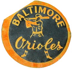
Maybe it’s just coincidence, but I was in Baltimore two weeks ago and now Baltimore’s own Joe Hilseberg has found a site that has what he describes as “the greatest local collection of jerseys I have even seen!”
The site is Parkway Pastimes, and it’s run by some serious collectors of Baltimore/DC game-used gear. Plug “jersey” or “helmet” into the site’s search engine and you get hundreds of results. Among the many, many highlights (for all these pages, click on the thumbnails for larger versions of the photos):
• Here’s a full, intact set of the O’s solid orange uniform. And here’s a prototype for a different orange design, which I’d never seen before.
• But if you really want to see a cool orange jersey, look at this one.
• Speaking of orange, check out the Rawlings sleeve patch on this jersey, along with the 30th-anniversary patch on the other sleeve.
• Joe says, “I think this jersey design only made it on the field one time. Angelos hated the orange neck trim.”
• Dig the lowercase lettering on this NOB.
• Speaking of NOBs, remember that brief period when the Caps used negatively arched lettering? Note that the lettering appears to be direct-sewn, which means the nameplate shown at NHLuniforms.com is apparently wrong.
• Here’s a gorgeous jersey from the minor league Orioles days.
• And speaking of the minor league O’s, look at this incredible sleeve patch!
• Jeez, ya think the Terps were trying to rip off the Nats jersey design or what?
• Here are two different Brooksie helmets, both with the shortened brim.
• Unusual finds here: two Senators caps, both with old-fashioned protective insert liners.
• I don’t think Mike Devereaux has ever shown up on our running list of MLB players who’ve worn faceguard attachments. But he appears to have had one.
• Maybe my favorite thing on the site: an old Colts marching band uni from the AAFC days when green was one of the team’s color.
• Look at all the different Caps socks these guys have collected.
• If you search on “pants,” you’ll see lots of Washington Bullets warmup pants — including one from Manute Bol. Check out the inseam listing on the tagging!
• Check out the totally boss Bullets warmup jackets here, here, and here.
• Love this killer Colts championship jacket.
And so on. There’s a lot more on the site — have fun poking around on it.
Uni Watch News Ticker: The Jays wore their annual Canada Day uniforms yesterday, complete with CNOB and a flag sleeve patch. Additional pics here. ”¦ The Des Moines Register has put up a gallery of old Little League photos from the 1950s and ’60s, many of which feature interesting cap and jersey designs. Highly recommended clicking — check it out here (big thanks to Ryan Simmelink). ”¦ Very nice Forbes Field cartoon here (with thanks to Joel Basknight). ”¦ Latest installment of the North Stars uni history project is up (with thanks to Cole Jones). ”¦ Two new Australian soccer teams: the North Queensland Fury (here’s their road kit) and Gold Coast United (with thanks to Jeremy Brahm). ”¦ Also from Jeremy: A store in Japan is hosting a Yomiuri Giants exhibit that includes a gallery where six designers have come up with new Giants uni concepts. ”¦ Good story here about Charlie Hayes’s 1994 facemasks. Didn’t realize he’d worn the Rip Hamilton-style version (big thanks to Bo Baize). ”¦ Recently spotted at Shea: Someone in a Mets jersey with “Buckner 86” on the back (with thanks to Dan Herr). ”¦ Great shots of Hank Aaron serving as a Korean batting instructor, circa 1982, on this page (Jeremy again). ”¦ Andy Bruinewoud recently visited the Canadian Baseball Hall of Fame and took some photos. ”¦ Boy, this really makes me proud to be from Long Island (with thanks to Alan Kreit). ”¦ Ryan Church was wearing some seriously ridiculous bell-bottoms yesterday (thanks, Phil). ”¦ Just what I always wanted: a baseball map of Taiwan (Jeremy yet again). ”¦ Tyler Kepner asked Brian Bruney about his blank-backed cap: “Wish I had a more exciting report for you,” he writes, “but Bruney said he simply
wears the same hat for everything — spring training, pre-game, in-game —
and the iron-on logo on the back peeled off.” ”¦ Wow, I didn’t remember this patch being so big. ”¦ Interesting question posed by Derek Blodgett, who asks: “What’s with the upside-down triangle and NHL team logos? Three teams use the triangle: the Penguins, Sharks, and Predators. Is there any significance to that?” Hmmmm. ”¦ With the all the AFL throwback hoopla just around the corner, Phil reports that the excellent Remember the AFL site has been expanded. Worth checking out. ”¦ Speaking of something worth checking out, look at this players-vs.-umps episode of Family Feud (genius find by Chris Flinn). ”¦That new football stadium in Dallas finally has a logo. ”¦ RIP, Thin Man.

Holiday Schedule: We’ll have regular content tomorrow. Phil was planning something for Saturday, but I insisted that he take the holiday off, so instead we’ll just have a photo that captures the spirit of America (I really wanted to use that one, but the date kinda ruins it for July 4th purposes). And then Phil will do his usual thing on Sunday. OK? OK.
Not sure if anyone has seen this yet, but the new Arsenal third jersey is out.
link
I kind of like it. Very simple design for Nike.
I’m pretty sure that the triangle in the Penguins is supposed to represent the “Golden Triangle” of Pittsburgh’s downtown, like those “Batman” Steeler jerseys Paul mentioned a few weeks ago. The triangle was gold in the logo even before the Penguins had gold as a uniform color, so that would make sense. I can’t say why the Sharks and Preds have a triangle, though.
Church can wear whatever he wants, as long as he keeps hitting game winning RBI’s! haha
Don’t worry Paul, I’ve found a better picture to celebrate the 4th.
link
PM, you are correct about Pittsburgh’s golden triangle.
My guess is that the Sharks and Preds used the triangle thinking that it’s just some sort of logo holder – unaware of why Pittsburgh actually used it. Ha!
Awesome that site finally made the blog…I thought is was worthy of a prime spot!
Note – Manute Bol link is pointing to wrong item
Not sure if this has been mentioned yet, but according to Newsweek, MLB will celebrate the 70th anniversary of Lou Gehrig’s speech at all 15 games on July 4 by kicking off their 4ALS campaign.
Per Newsweek: “At all 15 games on July 4, the 4ALS logo will be prominently displayed on uniforms, batting helmets, and first base, and there will be live and video readings of Gehrig’s speech as well as fundraising activities.”
So it looks like there will be a special uniform patch to go with the Amercian Flag caps.
another important 70th anniversary:
link
[quote comment=”337700″]another important 70th anniversary:
link
bless your heart! i love that stuff!!! lol
i’m not one to “bag” on jerseys, but this looks like he should be pumping gas at BP
link
I’m guessing the triangle in the Sharks logo represents the bay area cities: San Jose, San Francisco and Oakland.
Awesome O’s links!
On the front of today’s USA Today sports page, Manny Ramirez seems to wearing different pants than his Inland Empire teammates. No stripes.
link
The Carolina Hurricanes have a triangle behind their alternate logo. I would guess it represents the Research Triangle area in North Carolina.
[quote comment=”337702″]i’m not one to “bag” on jerseys, but this looks like he should be pumping gas at BP
link
Haha! Not the one across from Edgewood Crime Center!
Loved the Remember the AFL site, lots of good information. I would give just about anything to hear Charlie Jones call one more Chargers-Broncos game.
Even as a Sox fan, I have to admit, that Buckner jersey is very funny.
[quote comment=”337698″]Manute Bol link is pointing to wrong item[/quote]
Now fixed. Thanks!
[quote comment=”337697″]PM, you are correct about Pittsburgh’s golden triangle.
My guess is that the Sharks and Preds used the triangle thinking that it’s just some sort of logo holder – unaware of why Pittsburgh actually used it. Ha![/quote]
Yep Golden Triangle: link
Sharks and Preds just copied. According to wiki (so it MUST be true), the Sharks claim their triangle representative of the “red triangle” a section of the pacific ocean that’s known for a shark population.
[quote comment=”337699″]Not sure if this has been mentioned yet, but according to Newsweek, MLB will celebrate the 70th anniversary of Lou Gehrig’s speech at all 15 games on July 4 by kicking off their 4ALS campaign.
Per Newsweek: “At all 15 games on July 4, the 4ALS logo will be prominently displayed on uniforms, batting helmets, and first base, and there will be live and video readings of Gehrig’s speech as well as fundraising activities.”
So it looks like there will be a special uniform patch to go with the Amercian Flag caps.[/quote]
Correct — as originally reported here back in March.
That new football stadium in Dallas finally has a logo.
I love the PR-speak and how the Startlegram quotes the buzzwords: “mark”, “energetic, modern, timeless”.
It’s timeless until they get the Cowboys get the money they were expecting for naming rights…
Searched ‘helmet’ at Parkway Pastimes and WoW, you made my day. This is actually link(not theisman’s), with that trademark low angled one bar.
I’d love to get my hands on a jersey like Ellis Burks is wearing in the Family Feud video. Anyone know anything about it?
Hmmm. What could the triangle mean for the Knicks and Bucks?
That was a huge Starter logo on Rick Sucliff’s shoulder in the family fued.
Re: Cowboys Stadium Logo
Does anyone besides me think of St. Louis when they see the logo?
Parkway site is pretty cool. Too bad the jersey photos are in landscape view. Makes it awkward to view.
[quote comment=”337701″][quote comment=”337700″]another important 70th anniversary:
link
bless your heart! i love that stuff!!! lol[/quote]
Man, everyone in my family except for me, got terribly sick back in Christmas like ten years ago and I haven’t been able to enjoy old bay shrimp since.
I have to buy the Herr’s potato chips to get my fix.
Happy B-Day, O-Bay.
PS-my brother and I always thought that Old Bay should have sponsored the “Play of the Day” on broadcasts. Back when Jason Bay was on the team, they could have found any excuse to get him the award every game.
Announcer voice: that was Jason Bay with the Old Bay Play of the Day brought to you by Old Bay.
Regarding triangle logos: might it be possible that the Sharks and Preds (and possibly the Bucks and Knicks), liked the triangle asthetically and then find some reason to backfit the logo to give it a deeper meaning?
Do mine eyes deceive me? Scroll to the bottom link
Anybody know anything about where the AAFC uniforms were made? I’d heard a while back they were manufactured in the same building that I work, but I have only read one article a while back. I’m in Terre Haute, IN, btw.
I did find this on Wikipedia though: “The first person to design a bar face mask on a football helmet was Vern McMillan, the owner of a sporting goods store in Terre Haute, Indiana. It was a rubber-covered wire mask on a leather helmet. This kind was used in the mid-1930s.”
The triangle in the new Sharks logo is shaped like a shark’s tooth.
hard to see (much easier in the print version), but Prince is wearing white logo socks here. But seriously, he looks like a hobo.
link
[quote comment=”337710″]According to wiki (so it MUST be true), the Sharks claim their triangle representative of the “red triangle” a section of the pacific ocean that’s known for a shark population.[/quote]
Oh, so that explains why the triangle on their logo is red.
Uh, wait…
Linked over from the ‘Remember the AFL’ site, got to give props to Klaus Gebhard for his wonderfully illustrated site on AFL helmets.
link
Uh-oh, Ricko’s gonna go ballistic: Remember the AFL now shows in its uniform section the ’62 Broncos sporting not only the brown horsey but brown numbers & stripes as well.
Hey, Mike P….
Now that I’m back home, I’ll dig out the Sauer-for-Seahawk art photo and post it sometime tonight or tomorrow.
And everyone…
I’m going to start painting again soon, so I’m looking for suggestions regarding the subject for the first one. Much easier to have ideas than stare at all this crap of mine and think, “Damn, what should I paint?”
I know for sure I’m planning a series of 8 on the original AFL…getting the 1960 unis correct, thank you very much. They’ll be in vertical format on 30″ x 40″ watercolor board, and each will feature at least two memorable players from the original team, to show the home and roads. Y’know, Tripucka and Taylor for Broncos, maybe Kemp and Lowe (Chargers), Blanda and Hennigan (Oilers)….that kind of thing.
So, other than that….got any ideas?
—Ricko
new dallas cowboys stadium logo revealed
link
The Penguins triangle is definitely the link. Even though other teams give explanations, I’m sure it’s mainly a design thing — sort of like the team/logo exploding updward.
Anyway, triangles are common in the NBA, too:
link
link
link
link
Baseball doesn’t have them, but there are a lot of homeplate backgrounds, which is a similar shape. The NFL surprisingly doesn’t have any either, although the Raiders shield is close.
[quote comment=”337727″]Uh-oh, Ricko’s gonna go ballistic: Remember the AFL now shows in its uniform section the ’62 Broncos sporting not only the brown horsey but brown numbers & stripes as well.[/quote]
Right, Jack Faulkner makes a HUGE deal out of changing the team colors to orange and blue and then orders orange and brown unis.
Oh, yeah, that’s logical.
Are these people brain dead, for chrissakes?
—Ricko
[quote comment=”337730″]The Penguins triangle is definitely the link. Even though other teams give explanations, I’m sure it’s mainly a design thing — sort of like the team/logo exploding updward.
Anyway, triangles are common in the NBA, too:
link
link
link
link
Baseball doesn’t have them, but there are a lot of homeplate backgrounds, which is a similar shape. The NFL surprisingly doesn’t have any either, although the Raiders shield is close.[/quote]
I don’t consider those to be triangles for the Mavs and Nets. Triangles are three-sided with straight line segments.
No ideas off the top of my head ricko, but looking forward to seeing your work!
[quote comment=”337728″]Hey, Mike P….
Now that I’m back home, I’ll dig out the Sauer-for-Seahawk art photo and post it sometime tonight or tomorrow.
And everyone…
I’m going to start painting again soon, so I’m looking for suggestions regarding the subject for the first one. Much easier to have ideas than stare at all this crap of mine and think, “Damn, what should I paint?”
I know for sure I’m planning a series of 8 on the original AFL…getting the 1960 unis correct, thank you very much. They’ll be in vertical format on 30″ x 40″ watercolor board, and each will feature at least two memorable players from the original team, to show the home and roads. Y’know, Tripucka and Taylor for Broncos, maybe Kemp and Lowe (Chargers), Blanda and Hennigan (Oilers)….that kind of thing.
So, other than that….got any ideas?
—Ricko[/quote]
Thanks Ricko, for the Sauer pic., as well as, pickin’ up the brush again. Can’t wait to see the results.
[quote comment=”337732″][quote comment=”337730″]The Penguins triangle is definitely the link. Even though other teams give explanations, I’m sure it’s mainly a design thing — sort of like the team/logo exploding updward.
Anyway, triangles are common in the NBA, too:
link
link
link
link
Baseball doesn’t have them, but there are a lot of homeplate backgrounds, which is a similar shape. The NFL surprisingly doesn’t have any either, although the Raiders shield is close.[/quote]
I don’t consider those to be triangles for the Mavs and Nets. Triangles are three-sided with straight line segments.[/quote]
and besides…as paul pointed out in his mothership piece…the nets thing is partially a ball going through a hoop…which, logically, has no net
and, another team who uses a triangle, albeit not an upside down one, are the canes, which, as beardface and others have pointed out, actually is in reference to the famous research triangle in raleigh/durham
[quote comment=”337731″][quote comment=”337727″]Uh-oh, Ricko’s gonna go ballistic: Remember the AFL now shows in its uniform section the ’62 Broncos sporting not only the brown horsey but brown numbers & stripes as well.[/quote]
Right, Jack Faulkner makes a HUGE deal out of changing the team colors to orange and blue and then orders orange and brown unis.
Oh, yeah, that’s logical.
Are these people brain dead, for chrissakes?
—Ricko[/quote]
There’s this color photo on the Broncos pate of that site of Charlie Hennigan beating Bronco Willie Brown for a touchdown, showing blue numbers on the white Bronco jersey. And, yeah, we can’t tell the color of the dark stripes on the pants because they covered with mud. Oh, wait, that would make them look brown, so they must BE brown.
link
—Ricko
[quote comment=”337718″]Parkway site is pretty cool. Too bad the jersey photos are in landscape view. Makes it awkward to view.[/quote]
Yep. The landscape format is brutal.
If you’re using Firefox, there’s an add-on called link that’ll let you see the jerseys the way God intended.
Unfortunately, it doesn’t work seemlessly with that site. Once you rotate an image, it stays there in memory, so for example, if you’re looking at the front view and you return to the summary page and click to zoom in on the back view, the rotated front view pops up again. So you need to reload the summary page before clicking on any other images.
Awesome post today!! I’m off work for surgery this week, so I now have the opportunity to get lost on a website FULL of Baltimore memories!! (and I thought that the black Orioles jersey with the orange around the neck made it on the field a few times that year….)
[quote comment=”337703″]I’m guessing the triangle in the Sharks logo represents the bay area cities: San Jose, San Francisco and Oakland.[/quote]
This is correct.
It actually surprises me that, given the geographic region, there’s no lacrosse memorabilia, either from College Park or one of the other colleges, or the several pro franchises that have called the area home.
Considering the Terps have been around a whole lot longer then the Natinals, maybe Nats are the bad font thieves.
Just for reference, the Canadian flag patch on the Jays red jerseys also appears on all of their normal jerseys.
[quote comment=”337737″][quote comment=”337718″]Parkway site is pretty cool. Too bad the jersey photos are in landscape view. Makes it awkward to view.[/quote]
Yep. The landscape format is brutal.
If you’re using Firefox, there’s an add-on called link that’ll let you see the jerseys the way God intended.
Unfortunately, it doesn’t work seemlessly with that site. Once you rotate an image, it stays there in memory, so for example, if you’re looking at the front view and you return to the summary page and click to zoom in on the back view, the rotated front view pops up again. So you need to reload the summary page before clicking on any other images.[/quote]
Whatever you do, don’t hit the ‘for sale’ link, I did, and it almost crashed the internet.
Totally dig caps with piping. zhttp://parkwaypastimes.com/item.php?id=1232
[quote comment=”337744″]Totally dig caps with piping. link
link fixed
[quote comment=”337745″][quote comment=”337744″]Totally dig caps with piping. link
link fixed[/quote]
better view
link
The actual Pittsburgh Golden Triangle looks more like an arrowhead than a triangle to me… perhaps the residents were in favour of moving to Kansas :D
[quote comment=”337728″]Hey, Mike P….
Now that I’m back home, I’ll dig out the Sauer-for-Seahawk art photo and post it sometime tonight or tomorrow.
And everyone…
I’m going to start painting again soon, so I’m looking for suggestions regarding the subject for the first one. Much easier to have ideas than stare at all this crap of mine and think, “Damn, what should I paint?”
I know for sure I’m planning a series of 8 on the original AFL…getting the 1960 unis correct, thank you very much. They’ll be in vertical format on 30″ x 40″ watercolor board, and each will feature at least two memorable players from the original team, to show the home and roads. Y’know, Tripucka and Taylor for Broncos, maybe Kemp and Lowe (Chargers), Blanda and Hennigan (Oilers)….that kind of thing.
So, other than that….got any ideas?
—Ricko[/quote]
Can you add a 9th for the officials?
I understand that triangles will be featured prominently in this year’s Lingerie Bowl.
[quote comment=”337749″]I understand that triangles will be featured prominently in this year’s Lingerie Bowl.[/quote]
Bermuda Triangle?
Brazillian Triangle?
– I don’t think Mike Devereaux has ever shown up on our running list of MLB players who’ve worn faceguard attachments. But he appears to have had one.
Devereaux got plunked in the face by a pitch. And by “plunked,” I mean “drilled so hard it looked like his nose exploded like a tomato.” They had to clean up the bloodied dirt around home and the plate itself needed some work, too. Maybe 1993 or 1994, if memory serves. It was before he came back for that one last year, I’m pretty sure. He didn’t ever seem to be the same at the plate after that.
[quote comment=”337717″]Does anyone besides me think of St. Louis when they see the logo?[/quote]
Jackie Smith? Jim Hart? Don Coryell?
[quote comment=”337702″]i’m not one to “bag” on jerseys, but this looks like he should be pumping gas at BP
link
Yeah, that one I don’t like, but the road jersey: link I do like. I’ve always thought a team should combine light and dark green, the way Villanova and the Toronto Argonauts combine light and dark blue.
I’m guessing the triangle in the Sharks logo represents the bay area cities: San Jose, San Francisco and Oakland.
The San Jose Earthquakes logo is triangular-shaped for precisely the same reason.
[quote comment=”337728″]Hey, Mike P….
Now that I’m back home, I’ll dig out the Sauer-for-Seahawk art photo and post it sometime tonight or tomorrow.
And everyone…
I’m going to start painting again soon, so I’m looking for suggestions regarding the subject for the first one. Much easier to have ideas than stare at all this crap of mine and think, “Damn, what should I paint?”
I know for sure I’m planning a series of 8 on the original AFL…getting the 1960 unis correct, thank you very much. They’ll be in vertical format on 30″ x 40″ watercolor board, and each will feature at least two memorable players from the original team, to show the home and roads. Y’know, Tripucka and Taylor for Broncos, maybe Kemp and Lowe (Chargers), Blanda and Hennigan (Oilers)….that kind of thing.
So, other than that….got any ideas?
—Ricko[/quote]
Classic CFL! ’50s to ’80s.
[quote comment=”337750″][quote comment=”337749″]I understand that triangles will be featured prominently in this year’s Lingerie Bowl.[/quote]
Bermuda Triangle?
Brazillian Triangle?[/quote]
I’m not even going to explain how a “Brazilian Triangle” would never exist. LOL
Anyone else find it refreshing to see the Bluejays in something besides black? Even the Jays in red is an upgrade from their sorry excuse for a uniform.
Why does the headline for the Hayes story say “ROCKIVES”? That’s really bizarre…
[quote comment=”337736″][quote comment=”337731″][quote comment=”337727″]Uh-oh, Ricko’s gonna go ballistic: Remember the AFL now shows in its uniform section the ’62 Broncos sporting not only the brown horsey but brown numbers & stripes as well.[/quote]
Right, Jack Faulkner makes a HUGE deal out of changing the team colors to orange and blue and then orders orange and brown unis.
Oh, yeah, that’s logical.
Are these people brain dead, for chrissakes?
—Ricko[/quote]
There’s this color photo on the Broncos pate of that site of Charlie Hennigan beating Bronco Willie Brown for a touchdown, showing blue numbers on the white Bronco jersey. And, yeah, we can’t tell the color of the dark stripes on the pants because they covered with mud. Oh, wait, that would make them look brown, so they must BE brown.
link
—Ricko[/quote]
That picture is a piece of art! It just became the new background photo for my computer.
In that Family Feud clip: two of the umps had ABG patches on their right sleeves. That was for Bart Giamatti, right?
One of them (Dan Morrison) also had a #2 patch on his left sleeve. Any idea who was being memorialized there?
[quote comment=”337742″]Just for reference, the Canadian flag patch on the Jays red jerseys also appears on all of their normal jerseys.[/quote]
No, the Jays regular sleeve patch is simply a red maple leaf, not the Canadian flag:
link
[quote comment=”337740″]It actually surprises me that, given the geographic region, there’s no lacrosse memorabilia, either from College Park or one of the other colleges, or the several pro franchises that have called the area home.[/quote]
And there are no items from the Washington Federals or the Baltimore Blast. Should have known not to get my hopes up…
Still a nice website, though.
[quote comment=”337752″][quote comment=”337717″]Re: Cowboys Stadium Logo
Does anyone besides me think of St. Louis when they see the logo?[/quote]
Jackie Smith? Jim Hart? Don Coryell?[/quote]
no…it looks like the Gateway Arch. I guess I’m the only one who sees that.
[quote comment=”337729″]new dallas cowboys stadium logo revealed
link
And not a star anywhere on it. How can you have a logo in Texas for anything without a star? Jerry’s lost his mind!
[quote comment=”337757″]Anyone else find it refreshing to see the Bluejays in something besides black? Even the Jays in red is an upgrade from their sorry excuse for a uniform.[/quote]
Yes.
[quote comment=”337758″]Why does the headline for the Hayes story say “ROCKIVES”? That’s really bizarre…[/quote]
Rockies’ Archives. A little kludge-y, but I guess it works.
[quote comment=”337746″][quote comment=”337745″][quote comment=”337744″]Totally dig caps with piping. link
link fixed[/quote]
better view
link
I agree. I’d like to see the Pirates with piping. Beats the pillbox look anyday.
Incredible stuff in the main entry today, Paul, sideways or not. The rest of my day is now officially shot all the hell. Makes me very homesick and nostalgic. That Colts’ championship jacket may be the single coolest item you’ve ever featured. I’d kill to have one of those.
[quote comment=”337764″]And not a star anywhere on it. How can you have a logo in Texas for anything without a star? Jerry’s lost his mind![/quote]
No, more likely that Jerry has lost his $pon$or. Or whatever you call the entity that would have paid him royaltie$.
[quote comment=”337756″]I’m not even going to explain how a “Brazilian Triangle” would never exist. LOL[/quote]Yeah, and a few so-called triangles will be “brazilian” in that Underwear Bowl (because I can’t spell the French word, it’s going to be Underwear bowl for me Teebz).
BTW, looks like Reinsdorf will be getting the Phoenix franchise: I guess his bid is contingent on reworking the lease with the Glendale city fathers, and I’d say they’d want a part of something rather than a lot of nothing.
no mas will have to come up with a “I’m calling it Underwear” shirt…
[quote comment=”337770″]no mas will have to come up with a “I’m calling it Underwear” shirt…[/quote]
LOL!!
Or Victoria’s Secret could come out with the logo on panties.
[quote comment=”337693″]Not sure if anyone has seen this yet, but the new Arsenal third jersey is out.
link
I kind of like it. Very simple design for Nike.[/quote]
as an arsenal fan, i hate it. white shirts are historically the color of our biggest rival. the only consolation i have is this past season’s third kit had a white shirt and we almost never wore it.
Manchester City has new kits, and they are really, really good
Home: link
Away: link
[quote comment=”337774″]Manchester City has new kits, and they are really, really good
Home: link
Away: link
What’s Man City doing wearing Man U colors away? Maybe it’s tradition, I’m not sure, but it definitely looks bizarre to me.
[quote comment=”337772″]Or Victoria’s Secret could come out with the logo on panties.[/quote]
Logo creep is bad enough on uniforms. Let’s not give them any ideas…
link
link
Appropriate 4th of July photos? How about link?
[quote comment=”337777″]link
link
Appropriate 4th of July photos? How about link?[/quote]
I’d love to turn that model into a train set. Very cool.
Wouldn’t good ol’ Pat Patriot be about as good an image as any for July 4th at this site?
[quote comment=”337762″][quote comment=”337740″]It actually surprises me that, given the geographic region, there’s no lacrosse memorabilia, either from College Park or one of the other colleges, or the several pro franchises that have called the area home.[/quote]
And there are no items from the Washington Federals or the Baltimore Blast. Should have known not to get my hopes up…
Still a nice website, though.[/quote]
don’t know – this might help
link
y’know…him?
link
What is an upside-down triangle? Is there a right side up on a triagle?
Did somebody mention Jackie Smith?
link
(have you hailed your skins today?)
What’s with the Cubs player in the Fued video, His pinstripes cut off around the buttons and collar of his jersey – that can’t be normal?
[quote comment=”337780″][quote comment=”337762″][quote comment=”337740″]It actually surprises me that, given the geographic region, there’s no lacrosse memorabilia, either from College Park or one of the other colleges, or the several pro franchises that have called the area home.[/quote]
And there are no items from the Washington Federals or the Baltimore Blast. Should have known not to get my hopes up…
Still a nice website, though.[/quote]
don’t know – this might help
link
Thanks! I’ve been on a few other sites, but this one looks different.
[quote comment=”337781″]y’know…him?
link
dynamite choice!
you deserve a pat on the back!
[quote comment=”337786″][quote comment=”337781″]y’know…him?
link
dynamite choice!
you deserve a pat on the back![/quote]
…errrhh you know what i mean.
[quote]have you hailed your skins today?[/quote]
not yet…prolly later this evening
[quote comment=”337781″]y’know…him?
link
Hey, look at that tri-cornered hat: still ANOTHER triangle. Cue the Twilight Zone theme music.
I watched an old movie with my sister yesterday, Holes, and I noticed at the end of the movie a there was a uni related peculiarity: in the commercial for Sploosh!, Clyde “sweet feet” Livingston’s jersey was a 1980s Texas Rangers jersey with #84 on it. Sounds strange, as the character in the movie was the star player on the team. Just making a note.
What is an upside-down triangle?
link
(think this one’s an isosceles)
[quote comment=”337791″]What is an upside-down triangle?[/quote]
The weird coincidences just never end! This is a triangle of triangles!!
Okay, so Lincoln’s secretary (named Kennedy) told him not to go to the theater, and Kennedy’s secretary…
link
[quote comment=”337741″]Considering the Terps have been around a whole lot longer then the Natinals, maybe Nats are the bad font thieves.[/quote]
[quote comment=\”337741\”]Considering the Terps have been around a whole lot longer then the Natinals, maybe Nats are the bad font thieves.[/quote]
Those UMD jerseys were introduced in 2005 or 2006 with the hope of jumping on the hype machine that was the return of baseball to DC. Since then it’s been modified to a more rounded font, but still in the same type of arch.
The Parkway site is way cool. As a Baltimore/DC guy, I can’t believe I’ve never found it before! My only gripe is that there are over 400 images to load on that single page of a “jersey” search as well as the On Sale part, and it locked up my work computer both times I tried to bring them up. I’m sure my home ‘puter has more memory to give.
One note, a newer right-handed (left flap) Orioles helmet on there is listed as Mike Mussina’s with #35 on the back. Moose was a lefty hitter, but throws right-handed.
[quote comment=”337777″]link
link
Appropriate 4th of July photos? How about link?[/quote]
Aw man, how cool is that planning model?! I think there are only three Gateway Towers that look like that – am I right? And what is that rectangular feature down in Point State Park?
[quote comment=”337790″]I watched an old movie with my sister yesterday, Holes, and I noticed at the end of the movie a there was a uni related peculiarity: in the commercial for Sploosh!, Clyde “sweet feet” Livingston’s jersey was a 1980s Texas Rangers jersey with #84 on it. Sounds strange, as the character in the movie was the star player on the team. Just making a note.[/quote]
The movies I watch must be REALLY old.
The Mighty Ducks had a sort-of triangle in their original logo, too. I just assumed it was a popular motif in the 90s, when all those logos (other than Pittsburgh, of course) were designed.
The Sharks’ triangle likely represents the big Bay Area towns as previously noted above.
The San Jose Earthquakes do the same with their shield.
If you think about it geographically, each town is very similar to an upside down triangle:
SF————Oakland
\ /
\ /
\ /
\ /
San Jose
[quote comment=”337796″][quote comment=”337777″]link
link
Appropriate 4th of July photos? How about link?[/quote]
Aw man, how cool is that planning model?! I think there are only three Gateway Towers that look like that – am I right? And what is that rectangular feature down in Point State Park?[/quote]
It looks like a reflecting pool. To reflect the plumes of water from the fountain, maybe?
[quote comment=”337800″][quote comment=”337796″][quote comment=”337777″]link
link
Appropriate 4th of July photos? How about link?[/quote]
Aw man, how cool is that planning model?! I think there are only three Gateway Towers that look like that – am I right? And what is that rectangular feature down in Point State Park?[/quote]
It looks like a reflecting pool. To reflect the plumes of water from the fountain, maybe?[/quote]
good call
Love the stirrup club idea and recently saw this golf oriented link. Maybe, just maybe, there’s someone out there that likes argyle as much as me.
Any chance the next round of the stirrup club will be similar to the ones link wore last night?
better view of the golden triangle…too bad the photo’s undated
[quote comment=”337736″][quote comment=”337731″][quote comment=”337727″]Uh-oh, Ricko’s gonna go ballistic: Remember the AFL now shows in its uniform section the ’62 Broncos sporting not only the brown horsey but brown numbers & stripes as well.[/quote]
Right, Jack Faulkner makes a HUGE deal out of changing the team colors to orange and blue and then orders orange and brown unis.
Oh, yeah, that’s logical.
Are these people brain dead, for chrissakes?
—Ricko[/quote]
There’s this color photo on the Broncos pate of that site of Charlie Hennigan beating Bronco Willie Brown for a touchdown, showing blue numbers on the white Bronco jersey. And, yeah, we can’t tell the color of the dark stripes on the pants because they covered with mud. Oh, wait, that would make them look brown, so they must BE brown.
link
—Ricko[/quote]
But if we look at the picture directly below, we can clearly see NO BROWN!
[quote] if we look at the picture directly below, we can clearly see NO BROWN[/quote]
cept that picture is from ’66…ricko’s
obsessionpoint is the 62 unis (and in particular, the pre-seasonbrownblue pony on the helmet), which was changed to white for the reglar seasonÂ
here’s the uni scheme they claim for 1962 (with the brown pony)…seems convincing enough
[quote comment=”337805″][quote] if we look at the picture directly below, we can clearly see NO BROWN[/quote]
cept that picture is from ’66…ricko’s
obsessionpoint is the 62 unis (and in particular, the pre-seasonbrownblue pony on the helmet), which was changed to white for the reglar season[/quote]oops..
you can strike my comment from the record Counselor Hecken
[quote comment=”337805″][quote] if we look at the picture directly below, we can clearly see NO BROWN[/quote]
cept that picture is from ’66…ricko’s
obsessionpoint is the 62 unis (and in particular, the pre-seasonbrownblue pony on the helmet), which was changed to white for the reglar seasonÂ
here’s the link they claim for 1962 (with the brown pony)…seems convincing enough[/quote]
And that little promo card maybe should have said “There’s lots new in ’62…orange, blue and white will be the colorful array of the Broncos (well, except for a brown horsey)” ?
I love it when people show a black and white photo as proof the horsey was brown, but every other artifact or story (and simple logic, as it would have been applied in 1962, not 2009) almost certainly suggest it would have been royal blue.
Not to mention that one story I recall from back then said it “looked like a big ink blot.” I don’t think “ink blot” would have come to mind upon seeing a smear of brown.
—Ricko
link
I thought of Uni Watch as soon as I saw this… very interesting use of uniforms.
[quote comment=”337807″][quote comment=”337805″][quote] if we look at the picture directly below, we can clearly see NO BROWN[/quote]
cept that picture is from ’66…ricko’s
obsessionpoint is the 62 unis (and in particular, the pre-seasonbrownblue pony on the helmet), which was changed to white for the reglar seasonÂ
here’s the link they claim for 1962 (with the brown pony)…seems convincing enough[/quote]
And that little promo card maybe should have said “There’s lots new in ’62…orange, blue and white will be the colorful array of the Broncos (well, except for a brown horsey)” ?
I love it when people show a black and white photo as proof the horsey was brown, but every other artifact or story (and simple logic, as it would have been applied in 1962, not 2009) almost certainly suggest it would have been royal blue.
Not to mention that one story I recall from back then said it “looked like a big ink blot.” I don’t think “ink blot” would have come to mind upon seeing a smear of brown.
—Ricko[/quote]
im not trying to argue with you rick…im simply pointing to the “notes” in the pdf, which twice make mention of the brown horsey:
to wit: “Caricature bronco logo designed by The Denver Post’s Bob Bowie. Brown logo used
the first 4-5 games of the season before the logo color was changed to white by the 6th
game.”
and
“Brown helmet logo was the only color carry-over from the 1960-’61 uniforms (see Fig. 62-3 below),
but was used for only 4-5 games, replaced with white logo (See Fig. 62-2) by 6th game of the season
(Oct 14 at Oakland)”
just sayin’ that’s pretty convincing…not saying it’s correct ;)
– Speaking of NOBs, remember that brief period when the Caps used negatively arched lettering? Note that the lettering appears to be direct-sewn, which means the nameplate shown at NHLuniforms.com is apparently wrong.
The nameplate is there. I saved the picture to my desktop and viewed it at full size, there is a distinct line of black fabric around the letters and it even curves along the bottom of the arched letters.
I had seen the AFL site before but have not checked it out in a while. It is a fun site
[quote comment=”337809″][quote comment=”337807″][quote comment=”337805″][quote] if we look at the picture directly below, we can clearly see NO BROWN[/quote]
cept that picture is from ’66…ricko’s
obsessionpoint is the 62 unis (and in particular, the pre-seasonbrownblue pony on the helmet), which was changed to white for the reglar seasonÂ
here’s the link they claim for 1962 (with the brown pony)…seems convincing enough[/quote]
And that little promo card maybe should have said “There’s lots new in ’62…orange, blue and white will be the colorful array of the Broncos (well, except for a brown horsey)” ?
I love it when people show a black and white photo as proof the horsey was brown, but every other artifact or story (and simple logic, as it would have been applied in 1962, not 2009) almost certainly suggest it would have been royal blue.
Not to mention that one story I recall from back then said it “looked like a big ink blot.” I don’t think “ink blot” would have come to mind upon seeing a smear of brown.
—Ricko[/quote]
im not trying to argue with you rick…im simply pointing to the “notes” in the pdf, which twice make mention of the brown horsey:
to wit: “Caricature bronco logo designed by The Denver Post’s Bob Bowie. Brown logo used
the first 4-5 games of the season before the logo color was changed to white by the 6th
game.”
and
“Brown helmet logo was the only color carry-over from the 1960-’61 uniforms (see Fig. 62-3 below),
but was used for only 4-5 games, replaced with white logo (See Fig. 62-2) by 6th game of the season
(Oct 14 at Oakland)”
just sayin’ that’s pretty convincing…not saying it’s correct ;)[/quote]
I know you aren’t arguing with me. Just saying “convincing” doesn’t mean “logical”. The Flat Earth Society probably could pretty convincing, too, I imagine.
It says Bowie designed the horse, but did it say HE said it was brown. Did Jack Faulkner say it was brown? Specifically, has anyone ever asked them, “What color was that first logo on the orange helmet, the one before you changed it to white?” Don’t plant any thoughts by giving them choices, just, “What color was it?” Then ask, “Do you even REMEMBER what color it was?”
I’m still amazed that the Broncos were so far ahead of their time, thinking they’d carry over a color from a previous design…inventing a “throwback/tribute” philosophy way back in ’62..for y’know, the fans’ long tradition of two whole seasons of futility on and off the field…or something. Everyone hated those original team colors, so of course the team would want to keep using them. Isn’t that the key to introducing a new branding scheme, a re-packaging of your product: Keep something around to remind people of the old, unsuccessful version?
Right.
That’s like saying the first Baltimore Orioles hats in 1954 actually had brown visors…to honor the St. Louis Browns. I know, they look black in the photos, but until someone comes up with a color photo, I’ll say they were brown….because my logic, though totally lame, is going to be repeated on a really great looking website. I might even mock up a “vintage hat” and post a photo of it. That will definitely make it so.
—Ricko
[quote comment=”337697″]PM, you are correct about Pittsburgh’s golden triangle.
My guess is that the Sharks and Preds used the triangle thinking that it’s just some sort of logo holder – unaware of why Pittsburgh actually used it. Ha![/quote]
One of Pittsbugh’s nicknames is the “Golden Triangle” (due to the three rivers) so that is definitely what their triangle is all about.
Also, as they are today, Pittsburgh was the defending Stanley Cup Champions when San Jose came into the league in 1993 and I’m pretty sure that I remember reading somewhere during that time that the Sharks’ logo was supposed to be of a shark eating the Penguin and snapping the stick the Penguin was holding. It was their way of announcing their presence to the league.
Finally, I’m sure that their market includes San Francisco and Oakland as well as San Jose so that was probably being represented as well.
[quote comment=”337812″]I might even mock up a “vintage hat” and post a photo of it. That will definitely make it so.
—Ricko[/quote]
start with this
Jeeze, that Parkway Pastimes site shows a great collection, but I am actually DIZZY right now from looking at all those sideways pictures and having to tilt my head for a better view. It’s completely ridiculous that whoever runs the site put all that effort and hardwork into creating it, but doesn’t bother to position the pictures so they aren’t sideways. What a joke!
[quote comment=”337801″][quote comment=”337800″][quote comment=”337796″][quote comment=”337777″]link
link
Appropriate 4th of July photos? How about link?[/quote]
Aw man, how cool is that planning model?! I think there are only three Gateway Towers that look like that – am I right? And what is that rectangular feature down in Point State Park?[/quote]
It looks like a reflecting pool. To reflect the plumes of water from the fountain, maybe?[/quote]
link[/quote]
Whatever’s in the planning model would obscure the remains of Fort Duquesne. The outline of the fort is what you see in the photos.
[quote comment=”337701″][quote comment=”337700″]another important 70th anniversary:
link
bless your heart! i love that stuff!!! lol[/quote]
And White Castle must be 88 years old today. Some banner ad on my email is offering a free slider to celebrate.
[quote comment=”337817″]…And White Castle must be 88 years old today…[/quote]Ah, I wish it was so. The ads for the 88th anniversary are ubiquitous on TV in Chicago. And they have been for about a month now.
No math! :-(
[quote comment=”337817″][quote comment=”337701″][quote comment=”337700″]another important 70th anniversary:
link
bless your heart! i love that stuff!!! lol[/quote]
And White Castle must be 88 years old today. Some banner ad on my email is offering a free slider to celebrate.[/quote]
“Pardon me, Waiter, what wine goes with sliders?”
[quote comment=”337819″][quote comment=”337817″][quote comment=”337701″][quote comment=”337700″]another important 70th anniversary:
link
bless your heart! i love that stuff!!! lol[/quote]
And White Castle must be 88 years old today. Some banner ad on my email is offering a free slider to celebrate.[/quote]
“Pardon me, Waiter, what wine goes with sliders?”[/quote]
I recommend an ’09 Chateau de Pepto.
[quote comment=”337820″][quote comment=”337819″][quote comment=”337817″][quote comment=”337701″][quote comment=”337700″]another important 70th anniversary:
link
bless your heart! i love that stuff!!! lol[/quote]
And White Castle must be 88 years old today. Some banner ad on my email is offering a free slider to celebrate.[/quote]
“Pardon me, Waiter, what wine goes with sliders?”[/quote]
I recommend an ’09 Chateau de Pepto.[/quote]
We were thinking Silver Satin or Thunderbird.
From the beer list, perhaps Fox DeLuxe or Buckhorn (Do they even MAKE those anymore? LOL)?
WTF?
baltimore sun does a poll, asking what team’s fans are the “most obnoxious” but doesn’t even include a listing of their own
guess who “won”
[quote comment=”337821″][quote comment=”337820″][quote comment=”337819″][quote comment=”337817″][quote comment=”337701″][quote comment=”337700″][/quote]
And White Castle must be 88 years old today. Some banner ad on my email is offering a free slider to celebrate.[/quote]
“Pardon me, Waiter, what wine goes with sliders?”[/quote]
I recommend an ’09 Chateau de Pepto.[/quote]
We were thinking Silver Satin or Thunderbird.
From the beer list, perhaps Fox DeLuxe or Buckhorn (Do they even MAKE those anymore? LOL)?[/quote]
Something tells me those would make Schlitz taste like a microbrew??
[quote comment=”337823″][quote comment=”337821″][quote comment=”337820″][quote comment=”337819″][quote comment=”337817″][quote comment=”337701″][quote comment=”337700″][/quote]
And White Castle must be 88 years old today. Some banner ad on my email is offering a free slider to celebrate.[/quote]
“Pardon me, Waiter, what wine goes with sliders?”[/quote]
I recommend an ’09 Chateau de Pepto.[/quote]
We were thinking Silver Satin or Thunderbird.
From the beer list, perhaps Fox DeLuxe or Buckhorn (Do they even MAKE those anymore? LOL)?[/quote]
Something tells me those would make Schlitz taste like a microbrew??[/quote]
I do remember pooling resources and then deciding whether to buy a six-pack of Bud or a case of Fox DeLuxe.
That oughta tell you something.
That MLB episode of Family Feud reminded me of this: on Game Show Network a couple years ago, I saw an episode of Family Feud from 1994 that was AFC qbs vs NFC qbs. It woulda made the most sense to have the gameshow host dressed like a ref but he had a football uniform on with number 100 as his jersey number. Pretty stupid. I searched YouTube for this episode but I couldn’t find it.
Anyway, here are the lineups/contestants. Each player wore their jersey from their respective team:
AFC
Boomer Esiason (Jets)
Jim Kelly (Bills)
Warren Moon (Oilers)
Stan Gelbaugh (Seahawks)
Vince Evans (Raiders)
NFC
Steve Young (49ers)
Jim Harbaugh (Bears)
Andre Ware (Lions)
Steve Beuerlein (Cardinals)
Wade Wilson (Saints)
When asked, “Besides a part of their body, what’s something women would like bigger?”, Jim Harbaugh said “Their husbands.” !!!!
[quote comment=”337824″][quote comment=”337823″][quote comment=”337821″][quote comment=”337820″][quote comment=”337819″][quote comment=”337817″][quote comment=”337701″][quote comment=”337700″][/quote]
And White Castle must be 88 years old today. Some banner ad on my email is offering a free slider to celebrate.[/quote]
“Pardon me, Waiter, what wine goes with sliders?”[/quote]
I recommend an ’09 Chateau de Pepto.[/quote]
We were thinking Silver Satin or Thunderbird.
From the beer list, perhaps Fox DeLuxe or Buckhorn (Do they even MAKE those anymore? LOL)?[/quote]
Something tells me those would make Schlitz taste like a microbrew??[/quote]
I do remember pooling resources and then deciding whether to buy a six-pack of Bud or a case of Fox DeLuxe.
That oughta tell you something.[/quote]
Ah, the old quality vs. quantity conundrum. If you’re eating sliders I’d go with quantity.
[quote comment=”337825″]That MLB episode of Family Feud reminded me of this: on Game Show Network a couple years ago, I saw an episode of Family Feud from 1994 that was AFC qbs vs NFC qbs. It woulda made the most sense to have the gameshow host dressed like a ref but he had a football uniform on with number 100 as his jersey number. Pretty stupid. I searched YouTube for this episode but I couldn’t find it.
Anyway, here are the lineups/contestants. Each player wore their jersey from their respective team:
AFC
Boomer Esiason (Jets)
Jim Kelly (Bills)
Warren Moon (Oilers)
Stan Gelbaugh (Seahawks)
Vince Evans (Raiders)
NFC
Steve Young (49ers)
Jim Harbaugh (Bears)
Andre Ware (Lions)
Steve Beuerlein (Cardinals)
Wade Wilson (Saints)
When asked, “Besides a part of their body, what’s something women would like bigger?”, Jim Harbaugh said “Their husbands.” !!!![/quote]
Someone check him for a concussion right now.
That show was probably Stan Gelbaugh’s claim to fame. Steve Beurlein’s as well.
[quote comment=”337729″]new dallas cowboys stadium logo revealed
link
That logo’s been around for awhile- I found it middle of May.
The newest EA Sports NHL 10 video shows the Flyers in their orange retros (rumored to be their primary homes next year) without their white nameplate. It also has a shot of the new ref uniforms. I haven\’t noticed any other uni changes. Here’s a screenshot.
link
unreal.
link
[quote comment=”337812″][quote comment=”337809″][quote comment=”337807″][quote comment=”337805″][quote] if we look at the picture directly below, we can clearly see NO BROWN[/quote]
cept that picture is from ’66…ricko’s
obsessionpoint is the 62 unis (and in particular, the pre-seasonbrownblue pony on the helmet), which was changed to white for the reglar seasonÂ
here’s the link they claim for 1962 (with the brown pony)…seems convincing enough[/quote]
And that little promo card maybe should have said “There’s lots new in ’62…orange, blue and white will be the colorful array of the Broncos (well, except for a brown horsey)” ?
I love it when people show a black and white photo as proof the horsey was brown, but every other artifact or story (and simple logic, as it would have been applied in 1962, not 2009) almost certainly suggest it would have been royal blue.
Not to mention that one story I recall from back then said it “looked like a big ink blot.” I don’t think “ink blot” would have come to mind upon seeing a smear of brown.
—Ricko[/quote]
im not trying to argue with you rick…im simply pointing to the “notes” in the pdf, which twice make mention of the brown horsey:
to wit: “Caricature bronco logo designed by The Denver Post’s Bob Bowie. Brown logo used
the first 4-5 games of the season before the logo color was changed to white by the 6th
game.”
and
“Brown helmet logo was the only color carry-over from the 1960-’61 uniforms (see Fig. 62-3 below),
but was used for only 4-5 games, replaced with white logo (See Fig. 62-2) by 6th game of the season
(Oct 14 at Oakland)”
just sayin’ that’s pretty convincing…not saying it’s correct ;)[/quote]
I know you aren’t arguing with me. Just saying “convincing” doesn’t mean “logical”. The Flat Earth Society probably could pretty convincing, too, I imagine.
It says Bowie designed the horse, but did it say HE said it was brown. Did Jack Faulkner say it was brown? Specifically, has anyone ever asked them, “What color was that first logo on the orange helmet, the one before you changed it to white?” Don’t plant any thoughts by giving them choices, just, “What color was it?” Then ask, “Do you even REMEMBER what color it was?”
I’m still amazed that the Broncos were so far ahead of their time, thinking they’d carry over a color from a previous design…inventing a “throwback/tribute” philosophy way back in ’62..for y’know, the fans’ long tradition of two whole seasons of futility on and off the field…or something. Everyone hated those original team colors, so of course the team would want to keep using them. Isn’t that the key to introducing a new branding scheme, a re-packaging of your product: Keep something around to remind people of the old, unsuccessful version?
Right.
That’s like saying the first Baltimore Orioles hats in 1954 actually had brown visors…to honor the St. Louis Browns. I know, they look black in the photos, but until someone comes up with a color photo, I’ll say they were brown….because my logic, though totally lame, is going to be repeated on a really great looking website. I might even mock up a “vintage hat” and post a photo of it. That will definitely make it so.
—Ricko[/quote]
Wait, I thought there were players who said it was brown? I mean, I know memories can fade, but since it was such a strange mismatch, it seems like something that would stick in their mind.
[quote comment=”337830″]unreal.
link
Ugh. Jacko had so many amazing dance moves from his videos, why not copy one of those? Hell, even a crotch grab. Would have been a more low-key celebration and the tribute would have been clearer.
(Uh-oh, I hope I didn’t give Ochocinco any ideas.)
[quote comment=”337821″][quote comment=”337820″][quote comment=”337819″][quote comment=”337817″][quote comment=”337701″][quote comment=”337700″]another important 70th anniversary:
link
bless your heart! i love that stuff!!! lol[/quote]
And White Castle must be 88 years old today. Some banner ad on my email is offering a free slider to celebrate.[/quote]
“Pardon me, Waiter, what wine goes with sliders?”[/quote]
I recommend an ’09 Chateau de Pepto.[/quote]
We were thinking Silver Satin or Thunderbird.
From the beer list, perhaps Fox DeLuxe or Buckhorn (Do they even MAKE those anymore? LOL)?[/quote]
Every story about people finding unexpected items in a bottle of beer revolved around Buckhorn. It was the stuff that legends were made of.
Recently, someone was looking for Hauenstein’s Beer. That was Schell’s low buck beer. I think they may have dumped the label when they went upscale. Or it might still be out there.
“Speaking of NOBs, remember that brief period when the Caps used negatively arched lettering? Note that the lettering appears to be direct-sewn, which means the nameplate shown at NHLuniforms.com is apparently wrong.”
That’s not the only wrong thing to appear on NHLuniforms.com. Their Hartford Whalers pages showing uniforms from 1979-92 show an incorrect logo that was actually never worn by the team. The logo shown is actually a hybrid between the REAL 79-92 logo, and the 92-97 logo; it has the shape of the 92-97 logo (without the silver background), but the colors of the 79-92 background-free logo. On the NHLuniforms.com 92-97 Whalers uni page, it says “The shape of their logo stayed the same, incorporating the team’s new colors.” This is NOT TRUE! For the 1992 uniform update, yes, the new colors were incorporated, but the shape of the Whalers logo was tweaked; both the whale tail and the W were changed. To most people it would probably be hard to notice these subtle changes right away, but to hardcore Whalers fans like myself, the differences are OBVIOUS. I emailed the webmaster of the site a couple months ago and told him about this error, but he never wrote me back and the incorrect logo still appears on the site.
The other website that shows an incorrect Whalers logo is sportslogos.net. This site also shows a weird hybrid of the 79-92 and 92-97 Whalers logos that the team NEVER wore. The logo shown for seasons 79-92 is NOT what the Whalers wore during those seasons. Go here to see it: link
Anyway, I emailed the webmaster of this site a couple months ago too, but again, no response, and the incorrect logo still appears on the site.
Ironically, one GOOD thing that results from this weird incorrect hybrid logo appearing on these sites, is it makes it easier to spot fake and DIY Whalers jerseys, especially those being sold on eBay as “authentic.” Maybe the error on these sites is actually doing hockey and Whalers collectors a favor!
Go here to see the correct Hartford Whalers logo for seasons 92-97:
link
And go here to see the correct logo for seasons 79-92:
link
If you compare the two side-by-side, you’ll notice the differences in shape right away. Note how the whale tail is bigger in the 79-92 logo, and how the center vertical line in the W is taller in the 92-97 logo.
I need some stirrup help. In softball, I’m wearing some royal blue stirrups that I found from my dad’s college baseball playing days. I’ve also found a pair a yellow stirrups. So far, I’ve done well hitting with the blue stirrups, yet being superstitious, if I try yellow stirrups with blue socks, I’m afraid I’ll just foul out in all my at bats. What do you think? Give it a go?
link
[quote comment=”337830″]unreal.
link
You have no idea how distasteful it was. He ripped his shoulder pads and jersey off in one motion, and then lied in the end zone with his arms folded over his chest like a corpse.
As a fan, I enjoy a good touchdown celebration, but that was offensive. And far too soon.
And to make matters worse, no one knew what he was doing until Bruce was asked by a reporter. The sideline reporter asked him why he just didn’t do the moonwalk as a tribute, and Arland Bruce’s response was something along the lines of “because Michael Jackson ain’t doing the moonwalk no more”.
Classless with a gigantic “C”.
[quote comment=”337827″][quote comment=”337825″]That MLB episode of Family Feud reminded me of this: on Game Show Network a couple years ago, I saw an episode of Family Feud from 1994 that was AFC qbs vs NFC qbs. It woulda made the most sense to have the gameshow host dressed like a ref but he had a football uniform on with number 100 as his jersey number. Pretty stupid. I searched YouTube for this episode but I couldn’t find it.
Anyway, here are the lineups/contestants. Each player wore their jersey from their respective team:
AFC
Boomer Esiason (Jets)
Jim Kelly (Bills)
Warren Moon (Oilers)
Stan Gelbaugh (Seahawks)
Vince Evans (Raiders)
NFC
Steve Young (49ers)
Jim Harbaugh (Bears)
Andre Ware (Lions)
Steve Beuerlein (Cardinals)
Wade Wilson (Saints)
When asked, “Besides a part of their body, what’s something women would like bigger?”, Jim Harbaugh said “Their husbands.” !!!![/quote]
Someone check him for a concussion right now.
That show was probably Stan Gelbaugh’s claim to fame. Steve Beurlein’s as well.[/quote]
And probably the best televised performance for Andre Ware in a Lions jersey!
Aikman wearing #8 AIKMAN Padres jersey in SD. Check Yahoo Sports, I tried to put the link here and it’s the size of Rhode Island.
[quote comment=”337836″][quote comment=”337830″]unreal.
link
You have no idea how distasteful it was. He ripped his shoulder pads and jersey off in one motion, and then lied in the end zone with his arms folded over his chest like a corpse.
As a fan, I enjoy a good touchdown celebration, but that was offensive. And far too soon.
And to make matters worse, no one knew what he was doing until Bruce was asked by a reporter. The sideline reporter asked him why he just didn’t do the moonwalk as a tribute, and Arland Bruce’s response was something along the lines of “because Michael Jackson ain’t doing the moonwalk no more”.
Classless with a gigantic “C”.[/quote]
Yes, but he also simultaneously honored Leo Tolstoy, Wild Bill Hickok, Fatty Arbuckle, Henry Fonda, Lester Patrick, Notorious B-I-G, Mel Blanc, Eleanor Roosevelt, George Mikan, Louie Zimmerman (my neighbor when I was a kid) and millions of others, reaching across all economic and ethnic groups, with that, um, posture.
Ah, the poignant universality of it.
(eyeroll)
—Ricko
[quote comment=”337831″][quote comment=”337812″][quote comment=”337809″][quote comment=”337807″][quote comment=”337805″][quote] if we look at the picture directly below, we can clearly see NO BROWN[/quote]
cept that picture is from ’66…ricko’s
obsessionpoint is the 62 unis (and in particular, the pre-seasonbrownblue pony on the helmet), which was changed to white for the reglar seasonÂ
here’s the link they claim for 1962 (with the brown pony)…seems convincing enough[/quote]
And that little promo card maybe should have said “There’s lots new in ’62…orange, blue and white will be the colorful array of the Broncos (well, except for a brown horsey)” ?
I love it when people show a black and white photo as proof the horsey was brown, but every other artifact or story (and simple logic, as it would have been applied in 1962, not 2009) almost certainly suggest it would have been royal blue.
Not to mention that one story I recall from back then said it “looked like a big ink blot.” I don’t think “ink blot” would have come to mind upon seeing a smear of brown.
—Ricko[/quote]
im not trying to argue with you rick…im simply pointing to the “notes” in the pdf, which twice make mention of the brown horsey:
to wit: “Caricature bronco logo designed by The Denver Post’s Bob Bowie. Brown logo used
the first 4-5 games of the season before the logo color was changed to white by the 6th
game.”
and
“Brown helmet logo was the only color carry-over from the 1960-’61 uniforms (see Fig. 62-3 below),
but was used for only 4-5 games, replaced with white logo (See Fig. 62-2) by 6th game of the season
(Oct 14 at Oakland)”
just sayin’ that’s pretty convincing…not saying it’s correct ;)[/quote]
I know you aren’t arguing with me. Just saying “convincing” doesn’t mean “logical”. The Flat Earth Society probably could pretty convincing, too, I imagine.
It says Bowie designed the horse, but did it say HE said it was brown. Did Jack Faulkner say it was brown? Specifically, has anyone ever asked them, “What color was that first logo on the orange helmet, the one before you changed it to white?” Don’t plant any thoughts by giving them choices, just, “What color was it?” Then ask, “Do you even REMEMBER what color it was?”
I’m still amazed that the Broncos were so far ahead of their time, thinking they’d carry over a color from a previous design…inventing a “throwback/tribute” philosophy way back in ’62..for y’know, the fans’ long tradition of two whole seasons of futility on and off the field…or something. Everyone hated those original team colors, so of course the team would want to keep using them. Isn’t that the key to introducing a new branding scheme, a re-packaging of your product: Keep something around to remind people of the old, unsuccessful version?
Right.
That’s like saying the first Baltimore Orioles hats in 1954 actually had brown visors…to honor the St. Louis Browns. I know, they look black in the photos, but until someone comes up with a color photo, I’ll say they were brown….because my logic, though totally lame, is going to be repeated on a really great looking website. I might even mock up a “vintage hat” and post a photo of it. That will definitely make it so.
—Ricko[/quote]
Wait, I thought there were players who said it was brown? I mean, I know memories can fade, but since it was such a strange mismatch, it seems like something that would stick in their mind.[/quote]
Players–even equipment guys—especially back then when unis weren’t the object of such focus, are notoriously bad sources. We’re lucky if they remember the pants had stripes.
I’ll say again, absolutely NO relevant 1962-era logic for it being brown. That and common sense say it was royal blue. Until a color photo turns up to show otherwise, I’ll stick with blue. I was around at the time, watching that league’s (and all sports’) unis like a hawk. Also again, a brown horsey wouldn’t seem likely lead someone who saw it to say it looked like a “big ink blot”. Blue certainly might. Brown, not so much.
—Ricko
I love the Baltimore jerseys, especially the link Also love command+shift+4.
You know what might be an interesting idea? Little League jersey um, formats? For example, the first LL team I was on had sleeveless jerseys- actually sewn-in sleeves – with one stripe piping around the shoulders and Red Sox piping around the neck and front. All the teams in the league had the same style, each with different color sleeves, piping and old english lettered team name. The teams had MLB names (with one exception), however, only a few team colors matched up with their MLB counterparts. I was on the Athletics, color was purple.
We were a “minor” league, and all our uni’s were grey flannel. The older kids league wore the same design, but all in home white. So every game was grey vs grey – the sleeve colors being distinctly different. Unlike real MLB, only one team wore blue. We had real stirrups, with three white stripes. One exception – the team that wore red- I think it was the Senators- had to wear the same purple stirrups that our team had. Most likely an ordering snafu. Looked pretty cool, though.
All teams had the same style cap- it was in the team’s color – and just had two block letters in front. I think it was two S’s, which would have stood for South Shore. I could be wrong on the exact letters- I just know it stood for the specific regional little league. (Yes, 2 S’s would have freaked the WWII veteran coach’s…)
These would have been pretty fucking vintage by todays standards. We were all given a speech about respecting the uniform, yadda yadda, only wearing it to actual games. I’m sure this was to cut down on unnecessary wear and tear. I once wore mine to the corner store, and at least a couple of kids reprimanded me.
Hey, Mike P….
Here’s that Sauer photo.
link
—Ricko
[quote comment=”337838″]Aikman wearing #8 AIKMAN Padres jersey in SD. Check Yahoo Sports, I tried to put the link here and it’s the size of Rhode Island.[/quote]
use link to tame cut that gigantic URL down to size.
[quote comment=”337835″]I need some stirrup help. In softball, I’m wearing some royal blue stirrups that I found from my dad’s college baseball playing days. I’ve also found a pair a yellow stirrups. So far, I’ve done well hitting with the blue stirrups, yet being superstitious, if I try yellow stirrups with blue socks, I’m afraid I’ll just foul out in all my at bats. What do you think? Give it a go?
link
Stick with blue over yellow unless you fall into a slump and you really feel you need to change things up to bust out of it.
[quote comment=”337843″][quote comment=”337838″]Aikman wearing #8 AIKMAN Padres jersey in SD. Check Yahoo Sports, I tried to put the link here and it’s the size of Rhode Island.[/quote]
use link to tame cut that gigantic URL down to size.[/quote]
that’s awesome james, but doesn’t just pasting the url here get “automatically” tamed?
or your could just use html codes, yes?
Back when the O’s first wore those all-orange uniforms, SI wrote in a story that they were manufactured by Brooks Robinson’s own company. Anyone have any knowledge of that or whether the company did any other business with MLB teams?
[quote comment=”337844″][quote comment=”337835″]I need some stirrup help. In softball, I’m wearing some royal blue stirrups that I found from my dad’s college baseball playing days. I’ve also found a pair a yellow stirrups. So far, I’ve done well hitting with the blue stirrups, yet being superstitious, if I try yellow stirrups with blue socks, I’m afraid I’ll just foul out in all my at bats. What do you think? Give it a go?
link
Stick with blue over yellow unless you fall into a slump and you really feel you need to change things up to bust out of it.[/quote]
agreed…the yellow over blue (sorry for the quick & dirty) might look something like this…
and fwiw…the brewer look is better imho
[quote comment=”337845″][quote comment=”337843″][quote comment=”337838″]Aikman wearing #8 AIKMAN Padres jersey in SD. Check Yahoo Sports, I tried to put the link here and it’s the size of Rhode Island.[/quote]
use link to tame cut that gigantic URL down to size.[/quote]
that’s awesome james, but doesn’t just pasting the url here get “automatically” tamed?
or your could just use link codes, yes?[/quote]
Yeah. HTML is preferable. And usually, just pasting works, but sometimes the addresses will have characters that cause them to get truncated. That doesn’t happen with the tinyurls.
[quote comment=”337844″][quote comment=”337835″]I need some stirrup help. In softball, I’m wearing some royal blue stirrups that I found from my dad’s college baseball playing days. I’ve also found a pair a yellow stirrups. So far, I’ve done well hitting with the blue stirrups, yet being superstitious, if I try yellow stirrups with blue socks, I’m afraid I’ll just foul out in all my at bats. What do you think? Give it a go?
link
Stick with blue over yellow unless you fall into a slump and you really feel you need to change things up to bust out of it.[/quote]
Stick with the blue over the yellow, period. It’s classic. If you need a change try the belt, but leave the stirrups alone.
Like your opponents’ tiger jerseys, by the way.
[quote comment=”337836″][quote comment=”337830″]unreal.
link
You have no idea how distasteful it was. He ripped his shoulder pads and jersey off in one motion, and then lied in the end zone with his arms folded over his chest like a corpse.
As a fan, I enjoy a good touchdown celebration, but that was offensive. And far too soon.
And to make matters worse, no one knew what he was doing until Bruce was asked by a reporter. The sideline reporter asked him why he just didn’t do the moonwalk as a tribute, and Arland Bruce’s response was something along the lines of “because Michael Jackson ain’t doing the moonwalk no more”.
Classless with a gigantic “C”.[/quote]
The CFL and the NFL should nip this in the bud and say anything other than a moonwalk will result in an automatic ejection.
Don’t get me wrong – I pick on the “No Fun League” all the time, and one of my favorite players growing up was Billy White Shoes Johnson, but he had some class about it. A lot of these guys today don’t “get it.”
Here we go – the officials could tell these guys, “You can celebrate however you want, but if someone from the other team gets you with a cheap shot, we’re looking the other way. Your choice.” That might restore some sanity to the world of spontaneous-ish touchdown celebrations.
[quote comment=”337850″][quote comment=”337836″][quote comment=”337830″]unreal.
link
You have no idea how distasteful it was. He ripped his shoulder pads and jersey off in one motion, and then lied in the end zone with his arms folded over his chest like a corpse.
As a fan, I enjoy a good touchdown celebration, but that was offensive. And far too soon.
And to make matters worse, no one knew what he was doing until Bruce was asked by a reporter. The sideline reporter asked him why he just didn’t do the moonwalk as a tribute, and Arland Bruce’s response was something along the lines of “because Michael Jackson ain’t doing the moonwalk no more”.
Classless with a gigantic “C”.[/quote]
The CFL and the NFL should nip this in the bud and say anything other than a moonwalk will result in an automatic ejection.
Don’t get me wrong – I pick on the “No Fun League” all the time, and one of my favorite players growing up was Billy White Shoes Johnson, but he had some class about it. A lot of these guys today don’t “get it.”
Here we go – the officials could tell these guys, “You can celebrate however you want, but if someone from the other team gets you with a cheap shot, we’re looking the other way. Your choice.” That might restore some sanity to the world of spontaneous-ish touchdown celebrations.[/quote]
I saw that play in a highlights online and thought how stupid and uncalled for it was.
Cub Aaron Heilman rocking ‘rups tonight against the Brewers and Milwaukee announcers noticed and even got a camera close-up, saying you have to dig deep in the Wrigley closet to find those and noting that you can’t even find them in the store anymore.
[quote comment=”337852″]Cub Aaron Heilman rocking ‘rups tonight against the Brewers and Milwaukee announcers noticed and even got a camera close-up, saying you have to dig deep in the Wrigley closet to find those and noting that you can’t even find them in the store anymore.[/quote]
Good, the comeback keeps gaining momentum.
[quote comment=”337853″][quote comment=”337852″]Cub Aaron Heilman rocking ‘rups tonight against the Brewers and Milwaukee announcers noticed and even got a camera close-up, saying you have to dig deep in the Wrigley closet to find those and noting that you can’t even find them in the store anymore.[/quote]
Good, the comeback keeps gaining momentum.[/quote]
I like the fact that they noticed, but to say you have to dig deep in the Wrigley closet for them is a bit of a stretch. Heilman’s only been wearing them for the last few weeks, but it’s not like he’s the only Cub to wear them this decade. Reed Johnson’s been wearing them all this year and last.
Before Johnson, there were Juan Pierre and Mark Prior.
[quote comment=”337853″][quote comment=”337852″]Cub Aaron Heilman rocking ‘rups tonight against the Brewers and Milwaukee announcers noticed and even got a camera close-up, saying you have to dig deep in the Wrigley closet to find those and noting that you can’t even find them in the store anymore.[/quote]
Good, the comeback keeps gaining momentum.[/quote]
The revolution will be televised!
[quote comment=”337842″]Hey, Mike P….
Here’s that Sauer photo.
link
—Ricko[/quote]
That is quite amazing to see, I’ve gotta say. I have been wondering for sometime now who the original player/source was, seeing the exact pic. etc. Thanks again Ricko. I will be putting this up on the Illustrated NFL site tomorrow, along with some other updates.
[quote comment=”337856″][quote comment=”337842″]Hey, Mike P….
Here’s that Sauer photo.
link
—Ricko[/quote]
That is quite amazing to see, I’ve gotta say. I have been wondering for sometime now who the original player/source was, seeing the exact pic. etc. Thanks again Ricko. I will be putting this up on the Illustrated NFL site tomorrow, along with some other updates.[/quote]
Hey Mike P., I know I had asked for some USFL posters, but there might be more demand for some ’70s and ’80s CFL-era posters. I know I’d like me some…
[quote comment=”337790″]I watched an old movie with my sister yesterday, Holes, and I noticed at the end of the movie a there was a uni related peculiarity: in the commercial for Sploosh!, Clyde “sweet feet” Livingston’s jersey was a 1980s Texas Rangers jersey with #84 on it. Sounds strange, as the character in the movie was the star player on the team. Just making a note.[/quote]
Funny you put this in here today. I just finished reading that book to my students this week. BTW, for those who’ve never seen it, “Sweet Feet” was played by L.A. Laker Rick Fox.
Nashville Predators logo triangle: link.
[quote comment=”337751″]– I don’t think Mike Devereaux has ever shown up on our running list of MLB players who’ve worn faceguard attachments. But he appears to have had one.
Devereaux got plunked in the face by a pitch. And by “plunked,” I mean “drilled so hard it looked like his nose exploded like a tomato.” They had to clean up the bloodied dirt around home and the plate itself needed some work, too. Maybe 1993 or 1994, if memory serves. It was before he came back for that one last year, I’m pretty sure. He didn’t ever seem to be the same at the plate after that.[/quote]
it was chad ogea of the indians who drilled him and it was (to many, including me) intentional. i could be wrong but i think it was 1992, because i think he had the star patch for the all star game in baltimore on his sleeve when it happened. either way, he was a great oriole. also, lets lay off the nats for a while. they’re trying.
[quote comment=”337850″]
Here we go – the officials could tell these guys, “You can celebrate however you want, but if someone from the other team gets you with a cheap shot, we’re looking the other way. Your choice.” That might restore some sanity to the world of spontaneous-ish touchdown celebrations.[/quote]
The Stampeders and Blue Bombers had some elaborate celebrations a few years ago. All 4 receivers pretending to ride a bobsled or a bicycle. Pretending the ball was a champagne bottle and pouring drinks and celebrating.
In Calgary at least, the coach put an end to it – basically told them they looked like idiots and (worse than that) it left the impression they were spending practice working on their celebrations rather than working on, you know, football. That pretty much ended it.
[quote comment=”337861″][quote comment=”337850″]
Here we go – the officials could tell these guys, “You can celebrate however you want, but if someone from the other team gets you with a cheap shot, we’re looking the other way. Your choice.” That might restore some sanity to the world of spontaneous-ish touchdown celebrations.[/quote]
The Stampeders and Blue Bombers had some elaborate celebrations a few years ago. All 4 receivers pretending to ride a bobsled or a bicycle. Pretending the ball was a champagne bottle and pouring drinks and celebrating.
In Calgary at least, the coach put an end to it – basically told them they looked like idiots and (worse than that) it left the impression they were spending practice working on their celebrations rather than working on, you know, football. That pretty much ended it.[/quote]
And they ended up being champs. For once life makes sense!
Saw highlights of the Stamps/Als game. Some Montreal receiver scored, tossed the ball aside and did a few chest bumps with the guys. No problem with that at all.
[quote comment=”337858″][quote comment=”337790″]I watched an old movie with my sister yesterday, Holes, and I noticed at the end of the movie a there was a uni related peculiarity: in the commercial for Sploosh!, Clyde “sweet feet” Livingston’s jersey was a 1980s Texas Rangers jersey with #84 on it. Sounds strange, as the character in the movie was the star player on the team. Just making a note.[/quote]
Funny you put this in here today. I just finished reading that book
to my students this week. BTW, for those who’ve never seen it, “Sweet Feet” was played by L.A. Laker Rick Fox.[/quote]
No wonder he looked kinda familiar, Paul should write about this or something like unis in books and movies
[quote comment=”337863″][quote comment=”337858″][quote comment=”337790″]I watched an old movie with my sister yesterday, Holes, and I noticed at the end of the movie a there was a uni related peculiarity: in the commercial for Sploosh!, Clyde “sweet feet” Livingston’s jersey was a 1980s Texas Rangers jersey with #84 on it. Sounds strange, as the character in the movie was the star player on the team. Just making a note.[/quote]
Funny you put this in here today. I just finished reading that book
to my students this week. BTW, for those who’ve never seen it, “Sweet Feet” was played by L.A. Laker Rick Fox.[/quote]
No wonder he looked kinda familiar, Paul should write about this or something like unis in books and movies[/quote]
The uniforms were pretty good in Little Big League. This was before the pandemic virus that is alternate softball tops really took off. Also the first time I ever saw the TC logo the Twins once used and, eventually, would reprise.
[quote comment=”337864″][quote comment=”337863″][quote comment=”337858″][quote comment=”337790″]I watched an old movie with my sister yesterday, Holes, and I noticed at the end of the movie a there was a uni related peculiarity: in the commercial for Sploosh!, Clyde “sweet feet” Livingston’s jersey was a 1980s Texas Rangers jersey with #84 on it. Sounds strange, as the character in the movie was the star player on the team. Just making a note.[/quote]
Funny you put this in here today. I just finished reading that book
to my students this week. BTW, for those who’ve never seen it, “Sweet Feet” was played by L.A. Laker Rick Fox.[/quote]
No wonder he looked kinda familiar, Paul should write about this or something like unis in books and movies[/quote]
The uniforms were pretty good in Little Big League. This was before the pandemic virus that is alternate softball tops really took off. Also the first time I ever saw the TC logo the Twins once used and, eventually, would reprise.[/quote]
I have to wonder if he hasn’t already written about that. If not, it would make a good feature on Page 2, perhaps with Bill Simmons and his encyclopedic knowledge of movies.
As to the unis in “Little Big League”: I never saw the whole thing, but that just reminded me of “Major League.” I seem to recall the unis in that movie being pretty accurate. They featured many of the teams that played in the Cactus League at the time. For some reason I still like those unis the Giants wore with the “SF” logo on the left chest, not that I don’t like what they wear now.
Almost every uniform out there right now has a concern. There are very few teams that are flawless. Every team should strive for flawlessness. Very few have accomplished that.
For the record, I’m simultaneously writing new wave lyrics.
I’m feelin true to grit.
[quote comment=”337857″][quote comment=”337856″][quote comment=”337842″]Hey, Mike P….
Here’s that Sauer photo.
link
—Ricko[/quote]
That is quite amazing to see, I’ve gotta say. I have been wondering for sometime now who the original player/source was, seeing the exact pic. etc. Thanks again Ricko. I will be putting this up on the Illustrated NFL site tomorrow, along with some other updates.[/quote]
Hey Mike P., I know I had asked for some USFL posters, but there might be more demand for some ’70s and ’80s CFL-era posters. I know I’d like me some…[/quote]
I would love to see some illustrated CFL posters. Particularly, some 70s era team line.
[quote comment=”337860″][quote comment=”337751″]– I don’t think Mike Devereaux has ever shown up on our running list of MLB players who’ve worn faceguard attachments. But he appears to have had one.
Devereaux got plunked in the face by a pitch. And by “plunked,” I mean “drilled so hard it looked like his nose exploded like a tomato.” They had to clean up the bloodied dirt around home and the plate itself needed some work, too. Maybe 1993 or 1994, if memory serves. It was before he came back for that one last year, I’m pretty sure. He didn’t ever seem to be the same at the plate after that.[/quote]
it was chad ogea of the indians who drilled him and it was (to many, including me) intentional. i could be wrong but i think it was 1992, because i think he had the star patch for the all star game in baltimore on his sleeve when it happened. either way, he was a great oriole. also, lets lay off the nats for a while. they’re trying.[/quote]
It was 1994, Chad Ogea’s rookie season, that he nailed Devereaux in the face. The next season with the Braves, Devo was surprisingly the NLCS MVP, but it was pretty much all downhill for the rest of his career beginning in 1996 when he returned to Baltimore.
Love the Buckner jersey but it shoudln’t have the Citi Field patch. It shoudl actually have the 25th Anniversary patch.