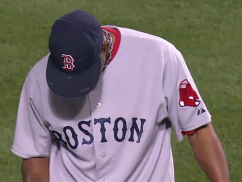
Check out all the little scribblings on Ramon Ramirez’s cap last night. They’re a little smudged, but they’re definitely handwritten inscriptions arranged in a symmetrical pattern, not just random bits of resin or something like that.
After reader Tom Hedrick tipped me off to this phenomenon, I went back and checked Ramirez’s previous appearance, which was on June 25th — sure enough. Has he been doing this all season? Anyone know what it’s about?
New ESPN column today — look here.
Raffle Results: The following lucky folks have each won a pair of tickets to see Wilco next month: For the Brooklyn show, Dan Grunfield and Max Meyer; for Wappingers Falls, Joel Keller and Matt Comeau; for Wilmington, Michael Princip and Brett Klopp; and for Lowell, Skylar Nipps and Bob Sughrue. I’ll be in touch with all of you shortly to go over the particulars.
Uni Watch News Ticker: Interesting article on PBA jerseys here (with thanks to Brian Russell). ”¦ Jeff Scott notes that the Cardinals are using different NOB type formats for Mark DeRosa, Tony LaRussa, and Kyle McClellan. ”¦ Brendon Yarian attended the World Junior Football Championships, being held in Canton, and provided a bunch of pics. ”¦ Magglio Ordonez is auctioning off some of hair for charity. And so reasonably priced (with thanks to James Huening). ”¦ Awesome sporting goods tag here. Comes from this jacket. ”¦ Spoke yesterday with Rangers equipment manager Zach Minasian, who said Josh Hamilton’s half-and-half jersey was a gift from a fan and that Hamilton, who’s on the DL, just wore it for kicks during pregame warm-ups. ”¦ Did you know there were special sneakers just for skateboarding? OK, so you probably did if your name is Matt Powers, but I didn’t, at leat not until Russ Havens pointed me toward this exhibit. ”¦ Absolutely killer Topps baseball card blog here (great find by Mike Hersh). ”¦ The Supreme Court has decided to hear that American Needle case. ”¦ Check this out: MLB has apparently created an old-timey version of the silhouetted batter logo. Adam Elkana-Hale spotted it on one of those decorative arches being used to promote the All-Star Game in St. Looey. ”¦ Surprising that Fernando Nieve gets away with wearing this glove (which he’s been wearing for a while), especially since, as Phil points out, section 1.15(a) of the rulebook stipulates that “[t]he pitcher’s glove may not be white or gray.” ”¦ Here’s Chuck Daly memorial patch that the Pistons will be wearing next season. ”¦ Nebraska will wear throwbacks on September 26th, to mark the team’s 300th consecutive sellout. ”¦ New soccer kit for Hull City (with thanks to Les Motherby). ”¦ I’d totally forgotten about this tiger-striped mask from 2003. ”¦ Brutal news buried in the middle of this article: “[I]t appears as if [Josh] Outman’s season is over. He was placed on the 60-day DL … and there is a strong chance he will need Tommy John surgery. … [H]e could be looking at missing the rest of this season and all of next season. … His entire locker has been packed up.” Get better soon, Josh — your arm may be sore, but your shins inspired an entire nation.
And new a quick word from Bryan: Last week, when Paul told you of my latest bike mishap, he also mentioned the rest of the stuff that’s gone awry for me this year. I know a lot of you out there have gone through similar or worse things (OK, maybe with fewer bike crashes), so it was especially heartening to receive such a generous gift.
More than the dollar amount, which was certainly nice, I’m thankful for your thoughtfulness and care. My wife and I have been the beneficiaries of such compassion time and again this year (pretty much all my fault), and we’re no less grateful now. Thank you.
Nike has an entire line of SB shoes.
link
Most popular are the Nike Dunk, which were originally hoops shoes:
link
They come in a THOUSANDS of assorted colors and are adorned with clever nicknames which collectors affectionately use to call them.
link
Nike’s flagship SB shoe, the P-Rod is named for Paul Rodriguez, a popular skateboarder.
link
And this is just Nike’s entry into this world.
Companies such as Vans, DC shoes, Hurley, Etnies and Osiris make great shoes as well.
BTW, my favorite dunks:
The Newcastles:
link
Heinekens were cool too:
link
The American Needle lawsuit brings to mind a recent story I saw on the battle to cash in on Jordan’s HOF induction. I haven’t seen this posted here before, but may have missed it. One guess who’s involved.
link
Powers, do you watch Run’s House? One of his kids was in a sneaker store last night and I thought of you!!!
Was catching up with yesterday’s comments and I was excited to see some content dedicated to the CFL this coming weekend.
Obviously in a forum like this, a debate starts about how NFL teams would destroy CFL teams, blah, blah, blah. Sure they would, in most cases.
No one should be arguing that. I’ve always been a fan of the CFL, from the ’82 strike when games were telvised and I’ve followed it afar, despite sketchy US TV coverage. Before Fox Sports changed the Atlantic, Central and Pacific digital channels to the college sports format (bad move if you ask me because I liked watching other markets’ sports reports and other FSN programming) you could catch some of the TSN games on the Atlantic and Pacific channels.
Sure the superior athletes play for the big bucks in the states but from a fun/excitement factor, the CFL wins hands down. Oh, and it’s only going to get better this year because they’ve changed the rules to allow the wildcat formation (prior to this year the QB had to be the player under center or directly behind him in a shotgun, therefore, the stuff the dolphins did all season would have been illegal).
That old timey shadowed batter logo is used for the “Cooperstown Collection” of throwback caps and apparel.
link
Wow… that Made For Skate exhibit series looks PHENOMENAL. I wish they’d do one in the states. I’m a little surprised by how Nike-centric it appears, but maybe that’s just me.
As a young skater in the late 80s/early 90s, my favorite kicks were Airwalks, and the Prototype line in particular. They had some truly inspired designs back then:
link
link
link (I bet you love those, eh Paul?)
link
I had a pair of these as a kid:
link
At the time, some of the popular pros were spray painting theirs, so I of course followed suit. Mine ended up school bus yellow. Such an idiot…
Fernando Nieve was using an off-white/cream colored glove while he was with the Astros: link
But, he’s used a black glove in the past: link
and a tan glove: link
[quote comment=”337327″]That old timey shadowed batter logo is used for the “Cooperstown Collection” of throwback caps and apparel.
link
that image is from a cooperstown collection sales kiosk
great site to check for daily updates on new jerseys throughout the soccer world, covers anything from English Premiership to the Dutch League 2 to the Argentine Leagues. Footballshirtculture.com
Did anyone notice that the fonts on the Nebraska helmet and uniform didn’t match?
[quote]Jeff Scott notes that the Cardinals are using different NOB type formats for link, link, and link.[/quote]
And then there’s link.
[quote comment=”337323″]BTW, my favorite dunks:
The Newcastles:
link
Heinekens were cool too:
link
do they make bass ale? lol
Airwalk has been making skate shoes since I was a little kid in the mid 80s.
I sported these in Jr. High:
link
The flap is to protect your laces from grip tape.
These classics were one of my favorites in high school:
link
Again, the big rubber toe was to keep your shoe from dying to fast from grip tape wear.
That old-timey MLB logo has been used for Cooperstown Collection merch since at least 1991. I’ve got a Cooperstown Collection ’65 Twins sweatshirt from that year with the old-timey MLB logo on it. As a vintage baseball player, I’m a huge fan and wish baseball would use it more consistently on Cooperstown Collection stuff.
[quote comment=”337327″]That old timey shadowed batter logo is used for the “Cooperstown Collection” of throwback caps and apparel.
link
Interesting… all of the other logos on the arches are team logos (Browns, Cardinals, even the Federal League Terriers) or logos from St. Louis-hosted All-Star Games of the past.
I guess I shouldn’t be surprised that MLB would sneak an apparel line logo in there, but it seems out of place.
[quote comment=”337335″]Airwalk has been making skate shoes since I was a little kid in the mid 80s…
Again, the big rubber toe was to keep your shoe from dying to fast from grip tape wear.[/quote]
Should be “too fast” it’s still early here.
[quote comment=”337333″][quote]Jeff Scott notes that the Cardinals are using different NOB type formats for link, link, and link.[/quote]
And then there’s link.[/quote]
At least there’s a reason for La Russa’s to be different: his last name is two words.
Gotta say I’m very surprised that skate footwear is news to you, Paul.
In addition to the dozen or so brands that have already been mentioned, there’s also Emerica, Lakai, éS, Vision…
I’ve worn Etnies, Airwalk and multiple pairs of Vans.
[quote comment=”337333″][quote]Jeff Scott notes that the Cardinals are using different NOB type formats for link, link, and link.[/quote]
And then there’s link.[/quote]
“link. What the hell?!?”
Something others may want to do.
Last night, in tribute to Michael Jackson, all the players on my softball team wore only one glove on defense.
It was quite moving.
Until we realized the other team was doing it, too.
—Ricko
[quote comment=”337342″]Something others may want to do.
Last night, in tribute to Michael Jackson, all the players on my softball team wore only one glove on defense.
It was quite moving.
Until we realized the other team was doing it, too.
—Ricko[/quote]
And you all adjusted your cups and squealed at the same time too? ;o)
[quote comment=”337326″]Was catching up with yesterday’s comments and I was excited to see some content dedicated to the CFL this coming weekend.
Obviously in a forum like this, a debate starts about how NFL teams would destroy CFL teams, blah, blah, blah. Sure they would, in most cases.
No one should be arguing that. I’ve always been a fan of the CFL, from the ’82 strike when games were telvised and I’ve followed it afar, despite sketchy US TV coverage. Before Fox Sports changed the Atlantic, Central and Pacific digital channels to the college sports format (bad move if you ask me because I liked watching other markets’ sports reports and other FSN programming) you could catch some of the TSN games on the Atlantic and Pacific channels.
Sure the superior athletes play for the big bucks in the states but from a fun/excitement factor, the CFL wins hands down. Oh, and it’s only going to get better this year because they’ve changed the rules to allow the wildcat formation (prior to this year the QB had to be the player under center or directly behind him in a shotgun, therefore, the stuff the dolphins did all season would have been illegal).[/quote]
kek,
No shame at all in loving the CFL. I do, and it helps bridge the gap tremendously until the NFL gets in gear. I have followed it since 1971 and I am trying to trace the Canadian TV history of the CFL going back to the early 50’s.
I thought it was so cool when CBC and CTV shared the coverage in the 70’s and 80’s, with as an example CTV guys Pat Marsden, Leif Pettersen and Frank Rigney from CTV working the first half, then Don Wittman, Ron Lancaster (PA native) and Leo Cahill of the CBC calling the second half.
I also loved the Argos’ huge “A” on the helmet and the late Ottawa Rough Riders monster “R” on the helmets!
The TiCats striped sleeves were awesome as well.
Saw a couple of game at Ivor Wynne in the day and had a blast.
Don’t forget, the Grey Cup champs coach, the Stamps John Hufnagel was a PSU All-American QB in the early 1970’s!
I have a Milwaukee Brewers Cooperstown Therma Base Fleece and can verify that the old school batter is used on the tag, and on the back of the neck. It is part of the cooperstown collection:
link
[quote comment=”337345″]Cooperstown Therma Base Fleece[/quote]
Those words just do not look right when they’re next to each other.
[quote comment=”337343″][quote comment=”337342″]Something others may want to do.
Last night, in tribute to Michael Jackson, all the players on my softball team wore only one glove on defense.
It was quite moving.
Until we realized the other team was doing it, too.
—Ricko[/quote]
And you all adjusted your cups and squealed at the same time too? ;o)[/quote]
Nope. Only did the one-glove thing. Wanted it to be classy and understated. Cuz that’s how Michael was.
(eyeroll)
Well, and also one of ours guys is nicknamed “Monk.” Last night we called him “Bubbles” instead (yes, I know, the real Bubbles is alive and well at 29 and retired in Florida…well, he IS).
—Ricko
“… Brendon Yarian attended the World Junior Football Championships, being held in Canton, and provided a bunch of pics. … ”
Very very interesting. Great to see national “American Football” unis on unlikely suspects, eg, Sweden and Japan. A little distressing (to this old coot) that no country seemed particularly attracted to a classic, old-school look. My favorite is Mexico, I guess.
Anyone else?
[quote comment=”337336″]That old-timey MLB logo has been used for Cooperstown Collection merch since at least 1991. I’ve got a Cooperstown Collection ’65 Twins sweatshirt from that year with the old-timey MLB logo on it. As a vintage baseball player, I’m a huge fan and wish baseball would use it more consistently on Cooperstown Collection stuff.[/quote]
I also like this logo — the regular one is kind of ambiguous, but in this gold-shaded logo, the batter is explicitly left-handed. In almost every other baseball logo that has some kind of handedness in it, it’s for right-handers.
(This is why I dislike the ball-in-glove Brewers logo — very clever, but the glove is on the wrong hand. Call the team the Drinkers, or the Dunkelbiers, and then you could make a great ball-in-glove logo.)
What other left-handed sports logos are there? I’m betting that they’re ina tiny minority.
[quote comment=”337348″]”… Brendon Yarian attended the World Junior Football Championships, being held in Canton, and provided a bunch of pics. … ”
Very very interesting. Great to see national “American Football” unis on unlikely suspects, eg, Sweden and Japan. A little distressing (to this old coot) that no country seemed particularly attracted to a classic, old-school look. My favorite is Mexico, I guess.
Anyone else?[/quote]
Is that a feather on New Zealand’s helmets? Kinda cool.
link
—Ricko
[quote comment=”337347″]Last night we called him “Bubbles” instead (yes, I know, the real Bubbles is alive and well at 29 and retired in Florida…well, he IS).
—Ricko[/quote]
i thought he lived in the sunnyvale trailer park in nova scotia
[quote comment=”337351″][quote comment=”337347″]Last night we called him “Bubbles” instead (yes, I know, the real Bubbles is alive and well at 29 and retired in Florida…well, he IS).
—Ricko[/quote]
i thought he lived in the link in nova scotia[/quote]
Sigh. So many Bubbles imitators out there.
[quote comment=”337350″][quote comment=”337348″]”… Brendon Yarian attended the World Junior Football Championships, being held in Canton, and provided a bunch of pics. … ”
Very very interesting. Great to see national “American Football” unis on unlikely suspects, eg, Sweden and Japan. A little distressing (to this old coot) that no country seemed particularly attracted to a classic, old-school look. My favorite is Mexico, I guess.
Anyone else?[/quote]
Is that a feather on New Zealand’s helmets? Kinda cool.
link
—Ricko[/quote]
Or is it a long plant leaf of some sort?
A-ha!
link
[quote comment=”337353″][quote comment=”337350″][quote comment=”337348″]”… Brendon Yarian attended the World Junior Football Championships, being held in Canton, and provided a bunch of pics. … ”
Very very interesting. Great to see national “American Football” unis on unlikely suspects, eg, Sweden and Japan. A little distressing (to this old coot) that no country seemed particularly attracted to a classic, old-school look. My favorite is Mexico, I guess.
Anyone else?[/quote]
Is that a feather on New Zealand’s helmets? Kinda cool.
link
—Ricko[/quote]
Or is it a long plant leaf of some sort?[/quote]
Fern, dude, fern. I can’t tell you what species – presumably endemic to NZ – but it’s on all their national unis, which are always as black as home-and-away rules allow. The All-Blacks in rugby are probably the best known.
[quote comment=”337349″][quote comment=”337336″]That old-timey MLB logo has been used for Cooperstown Collection merch since at least 1991. I’ve got a Cooperstown Collection ’65 Twins sweatshirt from that year with the old-timey MLB logo on it. As a vintage baseball player, I’m a huge fan and wish baseball would use it more consistently on Cooperstown Collection stuff.[/quote]
I also like this logo — the regular one is kind of ambiguous, but in this gold-shaded logo, the batter is explicitly left-handed. In almost every other baseball logo that has some kind of handedness in it, it’s for right-handers.
(This is why I dislike the ball-in-glove Brewers logo — very clever, but the glove is on the wrong hand. Call the team the Drinkers, or the Dunkelbiers, and then you could make a great ball-in-glove logo.)
What other left-handed sports logos are there? I’m betting that they’re ina tiny minority.[/quote]
A hypothetical Milwaukee Drinkers logo would be retarded because the M would then be backwards. That little serif needs to be the web that connects from the thumb to the index finger.
As for lefty logos, the first one that came to mind was the link logo.
And if you’re like most people who believe link, then take pride in the fact that West is dribbling with his left hand at this very moment.
[quote comment=”337344″][quote comment=”337326″]Was catching up with yesterday’s comments and I was excited to see some content dedicated to the CFL this coming weekend.
Obviously in a forum like this, a debate starts about how NFL teams would destroy CFL teams, blah, blah, blah. Sure they would, in most cases.
No one should be arguing that. I’ve always been a fan of the CFL, from the ’82 strike when games were telvised and I’ve followed it afar, despite sketchy US TV coverage. Before Fox Sports changed the Atlantic, Central and Pacific digital channels to the college sports format (bad move if you ask me because I liked watching other markets’ sports reports and other FSN programming) you could catch some of the TSN games on the Atlantic and Pacific channels.
Sure the superior athletes play for the big bucks in the states but from a fun/excitement factor, the CFL wins hands down. Oh, and it’s only going to get better this year because they’ve changed the rules to allow the wildcat formation (prior to this year the QB had to be the player under center or directly behind him in a shotgun, therefore, the stuff the dolphins did all season would have been illegal).[/quote]
kek,
No shame at all in loving the CFL. I do, and it helps bridge the gap tremendously until the NFL gets in gear. I have followed it since 1971 and I am trying to trace the Canadian TV history of the CFL going back to the early 50’s.
I thought it was so cool when CBC and CTV shared the coverage in the 70’s and 80’s, with as an example CTV guys Pat Marsden, Leif Pettersen and Frank Rigney from CTV working the first half, then Don Wittman, Ron Lancaster (PA native) and Leo Cahill of the CBC calling the second half.
I also loved the Argos’ huge “A” on the helmet and the late Ottawa Rough Riders monster “R” on the helmets!
The TiCats striped sleeves were awesome as well.
Saw a couple of game at Ivor Wynne in the day and had a blast.
Don’t forget, the Grey Cup champs coach, the Stamps John Hufnagel was a PSU All-American QB in the early 1970’s![/quote]
Within my top ten favorite football jerseys are thelink, and the link
[quote comment=”337354″]A-ha!
link
Damn, you are good, Ricko!
[quote comment=”337356″]… the first one that came to mind was the link logo.
And if you’re like most people who believe link, then take pride in the fact that West is dribbling with his left hand at this very moment.[/quote]
The fact that the HOF logo is shooting left-handed means that the player is right-handed 90% of the time.
[quote comment=”337339″][quote comment=”337333″][quote]Jeff Scott notes that the Cardinals are using different NOB type formats for link, link, and link.[/quote]
And then there’s link.[/quote]
At least there’s a reason for La Russa’s to be different: his last name is two words.[/quote]
There doesn’t seem to be any rhyme or reason for the Cards’ current (non-) use of lower-case caps: link also gets the “space” treatment of LA RUSSA and MC KAY… Mark McGwire also got the “MC GWIRE” treatment, but I couldn’t find a good picture showing his nameplate.
Man, I gotta agree with Broadway Connie on this one.
No classics. Guess it’s the day and age we live in, no?
Although, the New Zealand All Blacks inspired look really grows on you
[quote comment=\”337349\”][quote comment=\”337336\”]
What other left-handed sports logos are there? I\’m betting that they\’re ina tiny minority.[/quote]
The New Orleans Hornet is likely a south-paw.
link
[quote comment=”337349″][quote comment=”337336″]What other left-handed sports logos are there? I’m betting that they’re ina tiny minority.[/quote]
Portland’s Lucky Beaver is left-handed
link
[quote comment=”337344″][quote comment=”337326″]Was catching up with yesterday’s comments and I was excited to see some content dedicated to the CFL this coming weekend.
Obviously in a forum like this, a debate starts about how NFL teams would destroy CFL teams, blah, blah, blah. Sure they would, in most cases.
No one should be arguing that. I’ve always been a fan of the CFL, from the ’82 strike when games were telvised and I’ve followed it afar, despite sketchy US TV coverage. Before Fox Sports changed the Atlantic, Central and Pacific digital channels to the college sports format (bad move if you ask me because I liked watching other markets’ sports reports and other FSN programming) you could catch some of the TSN games on the Atlantic and Pacific channels.
Sure the superior athletes play for the big bucks in the states but from a fun/excitement factor, the CFL wins hands down. Oh, and it’s only going to get better this year because they’ve changed the rules to allow the wildcat formation (prior to this year the QB had to be the player under center or directly behind him in a shotgun, therefore, the stuff the dolphins did all season would have been illegal).[/quote]
kek,
No shame at all in loving the CFL. I do, and it helps bridge the gap tremendously until the NFL gets in gear. I have followed it since 1971 and I am trying to trace the Canadian TV history of the CFL going back to the early 50’s.
I thought it was so cool when CBC and CTV shared the coverage in the 70’s and 80’s, with as an example CTV guys Pat Marsden, Leif Pettersen and Frank Rigney from CTV working the first half, then Don Wittman, Ron Lancaster (PA native) and Leo Cahill of the CBC calling the second half.
I also loved the Argos’ huge “A” on the helmet and the late Ottawa Rough Riders monster “R” on the helmets!
The TiCats striped sleeves were awesome as well.
Saw a couple of game at Ivor Wynne in the day and had a blast.
Don’t forget, the Grey Cup champs coach, the Stamps John Hufnagel was a PSU All-American QB in the early 1970’s![/quote]
Speaking of the early ’80s CFL…
You’ll live a long time before you find a better sports name than joe Paopao (pronounced “Pow-pow” for those of you who’ve not heard of the former BC Lions QB and CFL coach).
Well, maybe Sonny Sixkiller.
—Ricko
[quote comment=”337360″][quote comment=”337339″][quote comment=”337333″][quote]Jeff Scott notes that the Cardinals are using different NOB type formats for link, link, and link.[/quote]
And then there’s link.[/quote]
At least there’s a reason for La Russa’s to be different: his last name is two words.[/quote]
There doesn’t seem to be any rhyme or reason for the Cards’ current (non-) use of lower-case caps: link also gets the “space” treatment of LA RUSSA and MC KAY… Mark McGwire also got the “MC GWIRE” treatment, but I couldn’t find a good picture showing his nameplate.[/quote]
link is probably about as good as it gets.
And for what it’s worth, McGwire got the link in Oakland.
Found a few more lefties…
The Fort Wayne Piston: link
The old Denver Nugget prospector (circa 1950): link
The Philadelphia Warrior (1952-62): link
[quote comment=”337343″][quote comment=”337342″]Something others may want to do.
Last night, in tribute to Michael Jackson, all the players on my softball team wore only one glove on defense.
It was quite moving.
Until we realized the other team was doing it, too.
—Ricko[/quote]
And you all adjusted your cups and squealed at the same time too? ;o)[/quote]
you should have picked a lucky family in attendance and kid-napped them just for the game. lol
[quote comment=”337342″]Until we realized the other team was doing it, too.[/quote]
This was a leaguewide tribute in my area.
There were also a few who were so moved they grabbed their crotch for a moment.
[quote comment=”337361″]Man, I gotta agree with Broadway Connie on this one.
No classics. Guess it’s the day and age we live in, no?
Although, the New Zealand All Blacks inspired look really grows on you[/quote]
Yeah, I’m not a fan of the monochrome football look, but for NZ, link.
Other than that, I give passing grades to both link. The jerseys/helmets link was sporting are probably the closest to what you might call a “classic” look. The pants… not so much.
[quote comment=”337343″]And you all adjusted your cups and squealed at the same time too? ;o)[/quote]Ah, I should have known that Teebz would have gotten in ahead of me.
(I’m studiously avoiding any reference to the word “beat” here.)
[quote comment=”337366″]Found a few more lefties…
The Fort Wayne Piston: link
The old Denver Nugget prospector (circa 1950): link
The Philadelphia Warrior (1952-62): link
Or how about this rare bit of trivia? Chief Wahoo was a switch hitter.
link or link.
[quote comment=”337352″]Sigh. So many Bubbles imitators out there.[/quote]
And every one of them is angling for that lucrative tell-all book deal now that the confidentiality agreement is moot.
[quote comment=”337371″] Chief Wahoo was a switch hitter.[/quote]Not that there’s anything WRONG with that….
Oops. I gave link the short shrift. The individual elements of their uni are link, it’s just too bad they went red-on-red.
[quote comment=”337364″]
Speaking of the early ’80s CFL…
You’ll live a long time before you find a better sports name than joe Paopao (pronounced “Pow-pow” for those of you who’ve not heard of the former BC Lions QB and CFL coach).
Well, maybe Sonny Sixkiller.
—Ricko[/quote]
There have been a few awesome names since.
Tom Canada, a California-born d-lineman, played for the Bombers, and joked about playing for the country on his back. He was cut recently due to his lofty salary.
The Bombers did go out and sign Siddeeq Shabazz, though.
Angus Reid is no longer doing polling. He’s an offensive lineman for the BC Lions.
Ken-Yon Rambo of the Calgary Stampeders always has to be mentioned.
Lin-J Shell will lineup for the Argonauts this season. What kind of name is Lin-J?
A good article about team logos from the Philly Daily News. link
[quote comment=”337344″][quote comment=”337326″]Was catching up with yesterday’s comments and I was excited to see some content dedicated to the CFL this coming weekend.
Obviously in a forum like this, a debate starts about how NFL teams would destroy CFL teams, blah, blah, blah. Sure they would, in most cases.
No one should be arguing that. I’ve always been a fan of the CFL, from the ’82 strike when games were telvised and I’ve followed it afar, despite sketchy US TV coverage. Before Fox Sports changed the Atlantic, Central and Pacific digital channels to the college sports format (bad move if you ask me because I liked watching other markets’ sports reports and other FSN programming) you could catch some of the TSN games on the Atlantic and Pacific channels.
Sure the superior athletes play for the big bucks in the states but from a fun/excitement factor, the CFL wins hands down. Oh, and it’s only going to get better this year because they’ve changed the rules to allow the wildcat formation (prior to this year the QB had to be the player under center or directly behind him in a shotgun, therefore, the stuff the dolphins did all season would have been illegal).[/quote]
kek,
No shame at all in loving the CFL. I do, and it helps bridge the gap tremendously until the NFL gets in gear. I have followed it since 1971 and I am trying to trace the Canadian TV history of the CFL going back to the early 50’s.
I thought it was so cool when CBC and CTV shared the coverage in the 70’s and 80’s, with as an example CTV guys Pat Marsden, Leif Pettersen and Frank Rigney from CTV working the first half, then Don Wittman, Ron Lancaster (PA native) and Leo Cahill of the CBC calling the second half.
I also loved the Argos’ huge “A” on the helmet and the late Ottawa Rough Riders monster “R” on the helmets!
The TiCats striped sleeves were awesome as well.
Saw a couple of game at Ivor Wynne in the day and had a blast.
Don’t forget, the Grey Cup champs coach, the Stamps John Hufnagel was a PSU All-American QB in the early 1970’s![/quote]
Also, Bishop McCort and Penn State alum Steve Smear played in Montreal for a Grey Cup winner.
My high school teammate Geroy Simon has made a nice career north of the border with Winnipeg and BC.
Benfica’s 2009/2010 home jersey, GK jersey, and training gear:
link
[quote comment=”337376″]A good article about team logos from the Philly Daily News. link
Cool read, but I always thought the Albuquerque team (known as the Dukes for generations) jumped on a Simpsons bandwagon. From what I heard and remember, a Simpsons episode once had the Springfield Isotopes (a reference to Monty Burns’ nuclear empire) moving or pondering a move to Albuquerque, therefore giving life to the Albuquerque Isotopes.
[quote comment=”337377″]
My high school teammate Geroy Simon has made a nice career north of the border with Winnipeg and BC.[/quote]
Warren Moon had a pretty good career on both sides of the border. And that Flutie kid… Doug, I think was his name… he did alright. Damon Allen, brother of Marcus Allen, had a great career in the three-down game. Milt Stegall, former Cincinnati Bengal, broke a few receiving records in Canada. Joe Horn got his start in the CFL before moving on to the Saints.
The CFL may not have the marketing that the NFL does, but our balls are still bigger. LOL
[quote comment=”337325″]Powers, do you watch Run’s House? One of his kids was in a sneaker store last night and I thought of you!!![/quote]
I’d be remiss if I didn’t mention that Run was wearing a David Wright Mets’ jersey at one point of the episode….too bad it was a black one!
[quote comment=”337375″][quote comment=”337364″]
Speaking of the early ’80s CFL…
You’ll live a long time before you find a better sports name than joe Paopao (pronounced “Pow-pow” for those of you who’ve not heard of the former BC Lions QB and CFL coach).
Well, maybe Sonny Sixkiller.
—Ricko[/quote]
There have been a few awesome names since.
Tom Canada, a California-born d-lineman, played for the Bombers, and joked about playing for the country on his back. He was cut recently due to his lofty salary.
The Bombers did go out and sign Siddeeq Shabazz, though.
Angus Reid is no longer doing polling. He’s an offensive lineman for the BC Lions.
Ken-Yon Rambo of the Calgary Stampeders always has to be mentioned.
Lin-J Shell will lineup for the Argonauts this season. What kind of name is Lin-J?[/quote]
For great names, I was always a fan of Junior Ah You (played for the Alouettes in the 1970s)
And Joe Paopao had perhaps the greatest football nickname of all time, The Throwin’ Samoan.
[quote comment=”337382″]And Joe Paopao had perhaps the greatest football nickname of all time, The Throwin’ Samoan.[/quote]
There was a QB out of the Pac 10 (from one of the schools in either Washington or Oregon) who had that nickname too. I don’t know who was before whom though.
[quote comment=”337379″][quote comment=”337376″]A good article about team logos from the Philly Daily News. link
Cool read, but I always thought the Albuquerque team (known as the Dukes for generations) jumped on a Simpsons bandwagon. From what I heard and remember, a Simpsons episode once had the Springfield Isotopes (a reference to Monty Burns’ nuclear empire) moving or pondering a move to Albuquerque, therefore giving life to the Albuquerque Isotopes.[/quote]
You’re absolutely correct on the name origins
(The Isotopes moved there from Calgary, I got to watch the process far too closely when the move was going on in 2002)
[quote comment=”337383″][quote comment=”337382″]And Joe Paopao had perhaps the greatest football nickname of all time, The Throwin’ Samoan.[/quote]
There was a QB out of the Pac 10 (from one of the schools in either Washington or Oregon) who had that nickname too. I don’t know who was before whom though.[/quote]
Jack Thompson, Washington State, drafted #1 by the Bengals. Sort of a pre-Akili Smith maneuver.
—Ricko
Thanks for the link to the Topps Baseball Card blog. It is a great site.
[quote comment=”337383]Nebraska will wear throwbacks on September 26th, to mark the team’s 300th consecutive sellout.[/quote]Both Nebraska players who can actually count to 300 will be recognized at halftime.
[quote comment=”337383″][quote comment=”337382″]And Joe Paopao had perhaps the greatest football nickname of all time, The Throwin’ Samoan.[/quote]
There was a QB out of the Pac 10 (from one of the schools in either Washington or Oregon) who had that nickname too. I don’t know who was before whom though.[/quote]
You’re probably thinking of link (and later link).
Should have done this to accompany my earlier post re: Jack Thompson.
link
[quote comment=”337388″][quote comment=”337383″][quote comment=”337382″]And Joe Paopao had perhaps the greatest football nickname of all time, The Throwin’ Samoan.[/quote]
There was a QB out of the Pac 10 (from one of the schools in either Washington or Oregon) who had that nickname too. I don’t know who was before whom though.[/quote]
You’re probably thinking of link (and later link).[/quote]
His name is almost as bad as Tshimanga “Tim” Biakabutuka. I preferred his nickname of “Touchdown Tim”.
[quote comment=”337388″]You’re probably thinking of link (and later link).[/quote]
Well, between the help provided by you and Ricko I’d have to say it was Thompson. He fits the era I recall first hearing the nickname much better than Manu’s son; and that link calls him the “Throwin’ Samoan” too.
Another great name out of the past in that ESPN link: Mosi Tatupu. :-)
[quote comment=”337390″]His name is almost as bad as Tshimanga “Tim” Biakabutuka.[/quote]
Yes, another one of those exotic foreigners who traveled far from his place of birth to play American football in a place where they didn’t understand the culture…
:-)
[quote comment=”337392″][quote comment=”337390″]His name is almost as bad as Tshimanga “Tim” Biakabutuka.[/quote]
Yes, another one of those exotic foreigners who traveled far from his place of birth to play American football in a place where they didn’t understand the culture…
:-)[/quote]
Ladies and gentlemen…Ricky Rubio (“My mother doesn’t like Minnesota, it’s cold there.”).
re: Today’s lead photo. Y’know, I’m really trying to like those new Red Sox road jerseys.
The Night Before Christmas socks ad a bit of color, yes, but I just can’t get into the navy fancy block “BOSTON”.
No explanation, just doesn’t work for me. Want it to, but no such luck.
—Ricko
re: JackThomspon…
link
[quote comment=”337394″]re: Today’s lead photo. Y’know, I’m really trying to like those new Red Sox road jerseys.
The Night Before Christmas socks ad a bit of color, yes, but I just can’t get into the navy fancy block “BOSTON”.
No explanation, just doesn’t work for me. Want it to, but no such luck.
—Ricko[/quote]
I HATED THEM at first, but after watching the Sox every day, I really don’t think they’re that bad anymore. Sure I loved the two-tone lettering from 1989-2008, but the new jerseys are pretty nostalgic, and I love the new sleeve patch.
[quote comment=”337394″]re: Today’s lead photo. Y’know, I’m really trying to like those new Red Sox road jerseys.
The Night Before Christmas socks ad a bit of color, yes, but I just can’t get into the navy fancy block “BOSTON”.
No explanation, just doesn’t work for me. Want it to, but no such luck.
—Ricko[/quote]
I feel the same way. The one-color treatment seems so plain, esp. on the back of the jersey. Feels a bit minor league-ish to me.
Today’s ESPN column is up:
link
[quote comment=”337377″]
My high school teammate Geroy Simon has made a nice career north of the border with Winnipeg and BC.[/quote]
Geroy’s probably the best receiver the BC Lions ever had – certainly up there with “Swervin'” Mervyn Fernandez and “Dirty 30” Jim Young. Growing up in Canada the CFL has always been the football of choice for me – and in general the uniforms have been good too (except for the American expansion in the mid-90’s).
[quote comment=”337398″]Today’s ESPN column is up:
link
Paul, does the poll on the side of the article count the Natinals horrible font matching?
[quote comment=”337399″][quote comment=”337377″]
My high school teammate Geroy Simon has made a nice career north of the border with Winnipeg and BC.[/quote]
Geroy’s probably the best receiver the BC Lions ever had – certainly up there with “Swervin'” Mervyn Fernandez and “Dirty 30” Jim Young. Growing up in Canada the CFL has always been the football of choice for me – and in general the uniforms have been good too (except for the American expansion in the mid-90’s).[/quote]
Of course I have a bit of a biased opinion but he might go down as not only BC’s greatest but one of the league’s all-time greats. He had a great ’07 and even with some injuries last year he was near the top of the stat sheets for the league.
Geroy wore a Jim Young throwback in warmups last year prior to a game in which he broke one of Young’s team records.
It looks like the Comcast Network (formerly CN8) will be broadcasting some CFL games this year. Friday night is BC/Saskatchewan. I’ll be excited to not have to watch a game on my PC monitor but an actually TV!
[quote comment=”337384″][quote comment=”337379″][quote comment=”337376″]A good article about team logos from the Philly Daily News. link
Cool read, but I always thought the Albuquerque team (known as the Dukes for generations) jumped on a Simpsons bandwagon. From what I heard and remember, a Simpsons episode once had the Springfield Isotopes (a reference to Monty Burns’ nuclear empire) moving or pondering a move to Albuquerque, therefore giving life to the Albuquerque Isotopes.[/quote]
You’re absolutely correct on the name origins
(The Isotopes moved there from Calgary, I got to watch the process far too closely when the move was going on in 2002)[/quote]
Yes, the idea came from the show, and that’s probably why 2/3 of poll voters picked it from the team’s possible names. I love the name, and it shows how a minor league team can use the name for national marketing. Unlike, say, the Gwinnett Braves, St. Lucie Mets, and all the others that use the parent team’s name.
Paul – Thanks for calling out the Warriors uni’s, they would be number one on my list.
Their mascot used to be named THUNDER, and he is that stupid blue man you see holding the lightning in some of the logos. I thought for sure we would get a new Uni-Set after another team actually used the name Thunder, but here we are in year three.
The whole team is in a stagnant go-ing nowhere feel, no foundation for a championship and no uniform set to make them look good while loosing…
Paul, I understand the reasons why you put the White Sox on your suckiest uniform list in today’s column, but when you step back and look at all of the other uniforms on this list, there is no comparison. That is by far the best looking uniform on your list of 10, and I would think it has to be in the the top half, if not top 10 of current baseball uniforms. Where the heck are the Rockies on your list?
Great article as always Paul, although you kinda cheated giving the White Sox 20 for Karma!
I’m a huge Sox fan, and I’m torn. I love the current unis, I love the fact that they’re aging gracefully and are a “tradition” so to speak now.
However, all of my life I also loved the fact that the Sox always pushed the boundries (often stubmling over them) on uni design. The 77-81 uni’s with the collar are my favorite of all time.
Unfortunatlely they can’t do both- be classic, and re-invent themselves every 5 years.
Paul:
I for one do not think Penn State’s uniforms should change. I would also like Pitt to revert to the 1970/1980s look with the current color scheme.
[quote comment=”337404″]Paul, I understand the reasons why you put the White Sox on your suckiest uniform list in today’s column, but when you step back and look at all of the other uniforms on this list, there is no comparison. That is by far the best looking uniform on your list of 10, and I would think it has to be in the the top half, if not top 10 of current baseball uniforms. Where the heck are the Rockies on your list?[/quote]
I’m 1/2 in agreement with you, but I think the list is not a “worst unis of all time” list. Its a list of teams that need a makeover- for different reasons.
The White Sox used to be (near) the ultimate in uniform lore, if you will. Because they changed so much.
Paul’s sort-of saying they owe us that again, which I can see. Sort-of.
Paul,
To chime in on the White Sox defense: I agree with you that they could use an update (a tweak, not a full overhaul), but how in God’s name can you give them a karma rating of 20? The franchise has a grand total of 3 World Series championships and one of them came while they were wearing this uni set.
I realize that “Is there some aspect of the uniform that makes no sense?” is one of the three criteria you considered, but the WS win has to offset at least some of the 20 points.
I think you needed a different definition for the “K” category in this instance (knuckleheadedness?). Or maybe you should have given them a 20 in the “U” category for wearing the black socks.
And where are the Mets on this list? Don’t they score a 10 in all four categories? Have you just abandoned all hope of them ever doing the right thing with their unis?
[quote comment=”337397″][quote comment=”337394″]re: Today’s lead photo. Y’know, I’m really trying to like those new Red Sox road jerseys.
The Night Before Christmas socks ad a bit of color, yes, but I just can’t get into the navy fancy block “BOSTON”.
No explanation, just doesn’t work for me. Want it to, but no such luck.
—Ricko[/quote]
I feel the same way. The one-color treatment seems so plain, esp. on the back of the jersey. Feels a bit minor league-ish to me.[/quote]
have not posted in a while, so let’s see if i remember how…you two crackheads smoke crack. it is boston, so i despise it, loooooooooathe the site of it. but as a uni, it is top notch, they just need the classic stirrup, not that this is intended to be timely. cornmother damn bahsten and their wicked awesome uni.
july 4th mixed doubles bags tourney:
*i be smokin a beef brisket. the rub is mine, the sauce my pineapple is bringing back from kansas city today. i will also be making my horseradish slaw. the frankfurter to person ratio will be 5:1, and the mustard will be 4xpolish, no catsup allowed.
*schlitz beer
*corn eating contest
*at the end of the night we cut the lock off my warehouse building’s roof for the 360 panoramic shot of chicago’s southside firework splendor. and if you have never seen the ‘works in pilsen, you nary seen a ‘work.
*schlitz beer
…you know how to get in touch, this is the last time i mention this event.
[quote comment=”337349″][quote comment=”337336″]That old-timey MLB logo has been used for Cooperstown Collection merch since at least 1991. I’ve got a Cooperstown Collection ’65 Twins sweatshirt from that year with the old-timey MLB logo on it. As a vintage baseball player, I’m a huge fan and wish baseball would use it more consistently on Cooperstown Collection stuff.[/quote]
I also like this logo — the regular one is kind of ambiguous, but in this gold-shaded logo, the batter is explicitly left-handed. In almost every other baseball logo that has some kind of handedness in it, it’s for right-handers.
(This is why I dislike the ball-in-glove Brewers logo — very clever, but the glove is on the wrong hand. Call the team the Drinkers, or the Dunkelbiers, and then you could make a great ball-in-glove logo.)
What other left-handed sports logos are there? I’m betting that they’re ina tiny minority.[/quote]
Wait, what? Yes, this link is worn on the left hand. But it’s a right-handed glove worn by a right-handed player.
I am not a White Sox fan, but I think they have some of the most “classic” uniforms in baseball. Perhaps they are slightly stale, but I can’t believe those unis are even on the list with the rest of the “worst in sports.”
In my opinion the Bengals and Bills are hands down the worst, no one comes close. (But man, those Sabres unis are bad too…).
[quote comment=”337409″]you two crackheads smoke crack. it is boston, so i despise it, loooooooooathe the site of it. but as a uni, it is top notch, they just need the classic stirrup, not that this is intended to be timely. cornmother damn bahsten and their wicked awesome uni.[/quote]
Robert,
You are aware that it’s the road uni (AKA Ambien in doubleknit form) that was being lambasted, not the home uni, right?
[quote comment=”337409″][quote comment=”337397″][quote comment=”337394″]re: Today’s lead photo. Y’know, I’m really trying to like those new Red Sox road jerseys.
The Night Before Christmas socks ad a bit of color, yes, but I just can’t get into the navy fancy block “BOSTON”.
No explanation, just doesn’t work for me. Want it to, but no such luck.
—Ricko[/quote]
I feel the same way. The one-color treatment seems so plain, esp. on the back of the jersey. Feels a bit minor league-ish to me.[/quote]
have not posted in a while, so let’s see if i remember how…you two crackheads smoke crack. it is boston, so i despise it, loooooooooathe the site of it. but as a uni, it is top notch, they just need the classic stirrup, not that this is intended to be timely. cornmother damn bahsten and their wicked awesome uni.
july 4th mixed doubles bags tourney:
*i be smokin a beef brisket. the rub is mine, the sauce my pineapple is bringing back from kansas city today. i will also be making my horseradish slaw. the frankfurter to person ratio will be 5:1, and the mustard will be 4xpolish, no catsup allowed.
*schlitz beer
*corn eating contest
*at the end of the night we cut the lock off my warehouse building’s roof for the 360 panoramic shot of chicago’s southside firework splendor. and if you have never seen the ‘works in pilsen, you nary seen a ‘work.
*schlitz beer
…you know how to get in touch, this is the last time i mention this event.[/quote]
Probably the only time I have ever wished I lived somewhere that snow existed..
(AKA Ambien in doubleknit form)
Also applicable to current White Sox road unis.
That sauce better be from Jack’s Stack or Oklahoma Joe’s.
On another note- got my stirrups today with a big thanks to Robert Marshall for the legwork.
[quote comment=”337412″][quote comment=”337409″]you two crackheads smoke crack. it is boston, so i despise it, loooooooooathe the site of it. but as a uni, it is top notch, they just need the classic stirrup, not that this is intended to be timely. cornmother damn bahsten and their wicked awesome uni.[/quote]
Robert,
You are aware that it’s the road uni (AKA Ambien in doubleknit form) that was being lambasted, not the home uni, right?[/quote]
i do indeed. the road is better then the home. i know, i am the only one who thinks so as always.
[quote comment=”337415″]That sauce better be from Jack’s Stack or Oklahoma Joe’s.
On another note- got my stirrups today with a big thanks to Robert Marshall for the legwork.[/quote]
we have a winner!!!! it is jack’s, pineapple’s favourite.
[quote comment=”337410″][quote comment=”337349″][quote comment=”337336″]That old-timey MLB logo has been used for Cooperstown Collection merch since at least 1991. I\’ve got a Cooperstown Collection ’65 Twins sweatshirt from that year with the old-timey MLB logo on it. As a vintage baseball player, I’m a huge fan and wish baseball would use it more consistently on Cooperstown Collection stuff.[/quote]
I also like this logo — the regular one is kind of ambiguous, but in this gold-shaded logo, the batter is explicitly left-handed. In almost every other baseball logo that has some kind of handedness in it, it’s for right-handers.
Jack’s Stack’s lamb ribs and burnt ends combo is easily at the top of the list for the last meal. Their sauce is nectar from the gods.
[quote comment=”337414″](AKA Ambien in doubleknit form)
Also applicable to current White Sox road unis.[/quote]
Good point. And on that note, how many teams actually have good road unis that are also interesting? (There are plenty that are shitty but interesting and plenty that are boring but good.) I can’t think of very many off the top of my head.
I hate to say it because it’s got some serious flaws, but the Cubs’ road uni might be the winner of that tallest midget contest.
[quote comment=”337404″]Paul, I understand the reasons why you put the White Sox on your suckiest uniform list in today’s column, but when you step back and look at all of the other uniforms on this list, there is no comparison. That is by far the best looking uniform on your list of 10, and I would think it has to be in the the top half, if not top 10 of current baseball uniforms. Where the heck are the Rockies on your list?[/quote]
Right on both points. The old CWS used to be like today’s Oregon football. Radical — sometimes good, sometimes bad. But you can’t penalize them now for finally finding something that stands the test of time.
As for the Rockies, I give them credit for basically sticking with their link all these years. But the lettering is horrible and weak-looking, especially when it is silver letters on a white jersey. And the colors are used the wrong way. I wish they would take advantage of their purple team color, instead of hiding it behind the black.
define “interesting”
Kansas City has great road uniforms, the old-time script is fantastic. LA Dodgers for the same reason.
[quote comment=”337410″][quote comment=”337349″]
I also like this logo — the regular one is kind of ambiguous, but in this gold-shaded logo, the batter is explicitly left-handed. In almost every other baseball logo that has some kind of handedness in it, it’s for right-handers.
(This is why I dislike the ball-in-glove Brewers logo — very clever, but the glove is on the wrong hand. Call the team the Drinkers, or the Dunkelbiers, and then you could make a great ball-in-glove logo.)
What other left-handed sports logos are there? I’m betting that they’re in a tiny minority.[/quote]
Wait, what? Yes, this link is worn on the left hand. But it’s a right-handed glove worn by a right-handed player.[/quote]
Which is why it’s “wrong”, to a left-hander like me. When I said “other”, I meant “other than the COoperstown MLB logo”, not “other than the Brewers'”.
Great to see a few other lefty or at least neutral logos. Now I’m starting to like Chief Wahoo!
From the Cincinnati Enquirer:
“All MLB teams playing on July 4th will be wearing BLUE “Stars & Stripes” caps.”
Unless this is a misprint, I guess teams like the Reds and Astros will look bad this time around, like the Yankees and Brewers on Memorial Day, with the red caps.
If they are going to produce both hats in the same season, why not let teams choose?
[quote comment=”337422″]define “interesting”[/quote]
I’m not sure if I can really put my finger on it. It’s just something that I know when you I see it. For starters, a gray version of the home uni automatically relegates you to “boring” status.
For example, the Cardinals’ road uni is good, but extremely boring. It’s just a gray version of the home uni with a blue cap instead of a red one.
The Tigers’ road uni isn’t necessarily good, but it’s definitely interesting that it’s got orange in it whereas the home uni is just blue and white.
White Sox roads? Even though they’re completely different from the homes, they also qualify as “boring but good” in my book.
[quote comment=”337401″][quote comment=”337399″][quote comment=”337377″]
My high school teammate Geroy Simon has made a nice career north of the border with Winnipeg and BC.[/quote]
Geroy’s probably the best receiver the BC Lions ever had – certainly up there with “Swervin'” Mervyn Fernandez and “Dirty 30” Jim Young. Growing up in Canada the CFL has always been the football of choice for me – and in general the uniforms have been good too (except for the American expansion in the mid-90’s).[/quote]
Of course I have a bit of a biased opinion but he might go down as not only BC’s greatest but one of the league’s all-time greats. He had a great ’07 and even with some injuries last year he was near the top of the stat sheets for the league.
Geroy wore a Jim Young throwback in warmups last year prior to a game in which he broke one of Young’s team records.
It looks like the Comcast Network (formerly CN8) will be broadcasting some CFL games this year. Friday night is BC/Saskatchewan. I’ll be excited to not have to watch a game on my PC monitor but an actually TV![/quote]
Comcast has had a deal to broadcast CFL games for the last couple of years. Every now and then, whenever there has been a blackout, I usually resort to flipping around on my DirecTv to watch the game – albeit it won’t be in HD…
Uh,
something that I know when
youI see it[quote comment=”337426″][quote comment=”337422″]define “interesting”[/quote]
I’m not sure if I can really put my finger on it. It’s just something that I know when you I see it. For starters, a gray version of the home uni automatically relegates you to “boring” status.
For example, the Cardinals’ road uni is good, but extremely boring. It’s just a gray version of the home uni with a blue cap instead of a red one.
The Tigers’ road uni isn’t necessarily good, but it’s definitely interesting that it’s got orange in it whereas the home uni is just blue and white.
White Sox roads? Even though they’re completely different from the homes, they also qualify as “boring but good” in my book.[/quote]
so it can’t be a home uni in gray (which would be good but boring), it could have a color not found in the home uni (tigers), and it must be different (possibly significantly different) from the home uni (cubs, chisox)
where do you rank the pods? yanks? sawks? mets? they’re all significanly different…boring? shitty?
just trying to establish the groundrules ;)
For Teebz and kek (and other interested parties),
To follow up on last week’s report on the Pittsburgh Penguins yellow or white home sweater issues from 1981-82 thru 1984-85.
I did take another pilgrimmage to the PA state library to see what exactly was worn at the Igloo by the Pens in 1982-83, when they were the worst team in the NHL.
Courtesy of the Press and Post-Gazette, this is what I found:
Six games (11/13 Calgary, 1/22 Quebec, 1/26 Washington, 1/29 Rangers, 2/26 New Jersey, 3/10 Islanders) are not accounted for.
The first 5 home games, the Pens wore yellow. A two game stretch in January, they also wore yellow. All other games that I found (26) a photo for, they wore white sweaters at home.
The breakdown:
26 games in white
7 games in gold
7 games ?
Hope to monitor the 1983-84 season very soon.
[quote comment=”337430″]For Teebz and kek (and other interested parties),
To follow up on last week’s report on the Pittsburgh Penguins yellow or white home sweater issues from 1981-82 thru 1984-85.
I did take another pilgrimmage to the PA state library to see what exactly was worn at the Igloo by the Pens in 1982-83, when they were the worst team in the NHL.
Courtesy of the Press and Post-Gazette, this is what I found:
Six games (11/13 Calgary, 1/22 Quebec, 1/26 Washington, 1/29 Rangers, 2/26 New Jersey, 3/10 Islanders) are not accounted for.
The first 5 home games, the Pens wore yellow. A two game stretch in January, they also wore yellow. All other games that I found (26) a photo for, they wore white sweaters at home.
The breakdown:
27 games in white
7 games in gold
6 games ?
Hope to monitor the 1983-84 season very soon.[/quote]
I meant 27 in white and 6 unaccounted. Sorry.
in⋅ter⋅est⋅ing  /ˈɪntərəstɪŋ, -trəstɪŋ, -təˌrɛstɪŋ/ [in-ter-uh-sting, -truh-sting, -tuh-res-ting]
—adjective 1. engaging or exciting and holding the attention or curiosity: an interesting book.
2. arousing a feeling of interest: an interesting face.
–Idiom3. in an interesting condition, (of a woman) pregnant.
No.6 New York Yankees. NOT Kidding.
Their look is mind-numbingly stale(10 points), Way beyond ugly(10), Extremely dated(10), karma wise I give them a 2 because they haven’t done squat this century(2). Add it up it’s a 32.
[quote comment=”337431″][quote comment=”337430″]For Teebz and kek (and other interested parties),
To follow up on last week’s report on the Pittsburgh Penguins yellow or white home sweater issues from 1981-82 thru 1984-85.
I did take another pilgrimmage to the PA state library to see what exactly was worn at the Igloo by the Pens in 1982-83, when they were the worst team in the NHL.
Courtesy of the Press and Post-Gazette, this is what I found:
Six games (11/13 Calgary, 1/22 Quebec, 1/26 Washington, 1/29 Rangers, 2/26 New Jersey, 3/10 Islanders) are not accounted for.
The first 5 home games, the Pens wore yellow. A two game stretch in January, they also wore yellow. All other games that I found (26) a photo for, they wore white sweaters at home.
The breakdown:
27 games in white
7 games in gold
6 games ?
Hope to monitor the 1983-84 season very soon.[/quote]
I meant 27 in white and 6 unaccounted. Sorry.[/quote]
You’re doing awesome work Timmy, keep it up! You thought about expressing your findings graphically on webspace? If so, and you need help, let me know.
More CFL talk here.
We went to the CFL Hall of Fame a few weeks ago. As we headed to Niagara Falls I wanted to stop at a Walmart to get a Tiger Cats tshirt. But we missed it. So when I got home I made myself a Hamilton Tiger Cats shirt for myself.
Went out for a few beers the other night and the bartender says “Hamilton Tiger Cats. Where did you get that shirt?” He wanted one and started talking about the CFL
A couple of days late on this.
My brother told my mom that Billy Mays died. He asked her if she knew who he was. She said yes the baseball player.
The “say hey” kid. She was thinking Willie Mays
Apparently the Natinals are interested in Pirate Nyger Morgan…..I wonder if his stirrups would make the trip too.
[quote comment=”337429″]
where do you rank the pods? yanks? sawks? mets? they’re all significanly different…boring? shitty?[/quote]
SD: interesting/horrible
NYY: boring/good
BOS: boring/bad
NYM: interesting/borderline bad (take the dropshadows off the jersey and pair it with the blue cap and this is definitely a “good”)
I’ll add a few more.
Giants: boring/good
Natinals: interesting/bad
Jays: interesting/horrible
Reds: interesting/bad
Read the PBA article, then clicked at the bottom to see all the available jerseys. Man, they’re hideous. It’s as if the 1990s met the 1960s in a dark alley, then they dropped some acid and went on a wild designing binge. Whatever happened to this? link
or even this? link
Heck, anymore I just wear a Hawaiian shirt to bowl. Do I really need the latest moisture-wicking fabric in an array of frightening designs?
[quote comment=”337323″]BTW, my favorite dunks:
The Newcastles:
link
Heinekens were cool too:
link
Love the Newcastles! Do they make Guinnesses? how about an Iron City shoe?
[quote comment=”337351″][quote comment=”337347″]Last night we called him “Bubbles” instead (yes, I know, the real Bubbles is alive and well at 29 and retired in Florida…well, he IS).
—Ricko[/quote]
i thought he lived in the link in nova scotia[/quote]
Bubbles lives in Baltimore, yo.
link
[quote comment=”337437″]Pirate Nyger Morgan[/quote]
Woah…easy there.
Nyjer.
[quote comment=”337404″]Paul, I understand the reasons why you put the White Sox on your suckiest uniform list in today’s column, but when you step back and look at all of the other uniforms on this list, there is no comparison. That is by far the best looking uniform on your list of 10, and I would think it has to be in the the top half, if not top 10 of current baseball uniforms. Where the heck are the Rockies on your list?[/quote]
The list isn’t about the best- or worst-looking teams. It’s about who’s most in need of a redesign, and more things go into that than just “They look good” or “They look bad.”
[quote comment=”337419″]Jack’s Stack’s lamb ribs and burnt ends combo is easily at the top of the list for the last meal. Their sauce is nectar from the gods.[/quote]
Jack Stack’s lamb ribs are on my Very Short List of the best bbq I’ve ever eaten. And I’ve eaten a LOT of it.
[quote comment=”337326″]Was catching up with yesterday’s comments and I was excited to see some content dedicated to the CFL this coming weekend.
Obviously in a forum like this, a debate starts about how NFL teams would destroy CFL teams, blah, blah, blah. Sure they would, in most cases.
No one should be arguing that. I’ve always been a fan of the CFL, from the ’82 strike when games were telvised and I’ve followed it afar, despite sketchy US TV coverage. Before Fox Sports changed the Atlantic, Central and Pacific digital channels to the college sports format (bad move if you ask me because I liked watching other markets’ sports reports and other FSN programming) you could catch some of the TSN games on the Atlantic and Pacific channels.
Sure the superior athletes play for the big bucks in the states but from a fun/excitement factor, the CFL wins hands down. Oh, and it’s only going to get better this year because they’ve changed the rules to allow the wildcat formation (prior to this year the QB had to be the player under center or directly behind him in a shotgun, therefore, the stuff the dolphins did all season would have been illegal).[/quote]
I agree. I’ll watch the Steelers first, but otherwise I’ll watch a CFL game over most NFL matchups. Football’s supposed to be fun as well as hard-hitting. The CFL “Gets It.”
Actor Jason Lee, probably most famous now for playing the main character on the tv show My Name Is Earl, was a pro skateboarder in the late 80’s and early 90’s. According to Wikipedia: “Lee and Tony Hawk were the first two skateboarders to receive a signature shoe with Airwalk.” Airwalk was one of the first brands of sneakers designed for skateboarding.
Also, about Nieve’s white glove: obviously it’s against the rules since section 1.15(a) of the rulebook says that “[t]he pitcher’s glove may not be white or gray.” But what boggles my mind is, MLB has a rule against white/gray gloves because I’m assuming they’re concerned the ball, on it’s way to the plate, would blend in visually with the glove or confuse a batter who sees 2 white spots instead of one. If this is the actual reason for this rule, um, HELLO, what about the all-white and all-gray uniforms?!?! Wouldn’t a pitcher’s all-white uniform blend in visually with the ball when it’s pitched???? Time for MLB to make the ball a super-high-visibility neon green or orange. Or if they want to keep the ball white, make the pitcher wear a dark color from head to toe, kinda like how soccer goalies have to wear an odd-colored jersey.
Just look at this, and you’d agree with me that a ball coming at you at 100 mph would be hard to make out against that pitcher’s all-white uni:
link
Liked the Page 2 article, but I’d rank both Kings franchises as most needing an update. Not because they have purple…just really dislike both looks. Neither franchise appears as regal as they previously did.
Agreed on the Bengals, though, except for the helmets. Leave them and change everything else.
link
I kinda like those 70s link.
[quote comment=”337448″]link
I kinda like those 70s link.[/quote]
Be an interesting DIY, huh.
Except, of course, for it being purple.
;)
—Ricko
[quote comment=”337447″]Liked the Page 2 article, but I’d rank both Kings franchises as most needing an update. Not because they have purple…just really dislike both looks. Neither franchise appears as regal as they previously did.
Agreed on the Bengals, though, except for the helmets. Leave them and change everything else.[/quote]
Yep. I’ll take tiger stripes over the BENGALS non-logo any day.
Could have done a whole SUCK-metric article on NHL EDGE abominations. I HATE the Flames’ look. Vertical stripes, horizontal stripes, non-stripe “swoops” on the socks, too much black, the flag patches (you’re not “Alberta’s Team,” the Oilers play too, and you’re definitely not “Canada’s Team”)…YUCK.
But great column. 0 for 40 on the SUCK scale. :-)
Great article, however I’m suprised the flames weren’t on there
Hey timmy b, when you were researching the Penguins sweaters from the 80s, did you come across any photos of the Pittsburgh Spirit? I’d love to get some photos of them from the 83-84 MISL season.
[quote comment=”337446″]Actor Jason Lee, probably most famous now for playing the main character on the tv show My Name Is Earl, was a pro skateboarder in the late 80’s and early 90’s. According to Wikipedia: “Lee and Tony Hawk were the first two skateboarders to receive a signature shoe with Airwalk.” Airwalk was one of the first brands of sneakers designed for skateboarding.
Also, about Nieve’s white glove: obviously it’s against the rules since section 1.15(a) of the rulebook says that “[t]he pitcher’s glove may not be white or gray.” But what boggles my mind is, MLB has a rule against white/gray gloves because I’m assuming they’re concerned the ball, on it’s way to the plate, would blend in visually with the glove or confuse a batter who sees 2 white spots instead of one. If this is the actual reason for this rule, um, HELLO, what about the all-white and all-gray uniforms?!?! Wouldn’t a pitcher’s all-white uniform blend in visually with the ball when it’s pitched???? Time for MLB to make the ball a super-high-visibility neon green or orange. Or if they want to keep the ball white, make the pitcher wear a dark color from head to toe, kinda like how soccer goalies have to wear an odd-colored jersey.
Just look at this, and you’d agree with me that a ball coming at you at 100 mph would be hard to make out against that pitcher’s all-white uni:
link
I saw Jason Lee skate in a demo (at Shady Skates in Pittsburgh) and got his autograph. It said, “Jason Lee – I suck”. He was a really cool guy, and a great skater!
[quote comment=”337450″] I HATE the Flames’ look. Vertical stripes, horizontal stripes, non-stripe “swoops” on the socks, too much black, the flag patches (you’re not “Alberta’s Team,” the Oilers play too, and you’re definitely not “Canada’s Team”)…YUCK.
But great column. 0 for 40 on the SUCK scale. :-)[/quote]
Agree completely – what makes it the most aggravating is that they had an awesome look prior to the Reebok redesign.
Former Tennessee and Bronco LB Al Wilson on meeting with Lane and Monte Kiffin including his thoughts on the black jersey rumours.
link
Black adidas jerseys are showing up in stores in Knoxville and Nashville. Some pretty reliable sources have debunked the rumours saying that the black jerseys are fashion only and will not be worn on the field. But when Al Wilson, one of the biggest icons in recent Vol history, gives the okay…who knows.
If it happens, I’m claiming it is a true throwback. UT wore black jerseys with orange piping in the early 1900’s. As late as the 1930’s, the spring game was known as the Orange and Black Game.
Fine, pick on the Bengals. We Cincinnatians can take it. We have been the brunt of many jokes for decades now. But why, Paul, go with this picture?
link
Kick us when we’re down…
On a more serious note, the Bills are far worse in my opinion. If the Bengals would just ditch those sidepanels and stop mixing and matching so much, those unis wouldn’t be so bad.
Nationals better lay in a supply of stirrups. They just acquired Nyjer Morgan.
It’s a sad day for UniWatch when a player with stirrups as nice as Nyjer Morgan gets traded to a team that screws up their uniforms as much as the Nationals :-(
To chime in on the White Sox defense: I agree with you that they could use an update (a tweak, not a full overhaul), but how in God’s name can you give them a karma rating of 20? The franchise has a grand total of 3 World Series championships and one of them came while they were wearing this uni set.
Put a wing on the secondary sock logo (so as to resemble the logo from the 50s), actually wear white socks, and we’re all set.
Time for MLB to make the ball a super-high-visibility neon green or orange.
Charlie Finley suggested this back in the day.
The biggest problem with the Bengals’ current uniforms (and, yes, I realize there are many) are that all those stripes everywhere else detract from the delicious awesomeness of the helmets. Look at the old uniforms and see how comparatively thin the bands of stripes on the shoulders and pants are. So, sure, tone down the uniforms, but leave the helmets alone- they’re the best in the NFL in my book and they beat decal-stripe-decal any day.
[quote comment=”337444″][quote comment=”337419″]Jack’s Stack’s lamb ribs and burnt ends combo is easily at the top of the list for the last meal. Their sauce is nectar from the gods.[/quote]
Jack Stack’s lamb ribs are on my Very Short List of the best bbq I’ve ever eaten. And I’ve eaten a LOT of it.[/quote]
you will be missing out on the bbe my friend, that’s best briscuit ever. ha ha ha.
…and i couldn’t resist the 6-4-3 twin killing earlier on disagreeing with both you and ricko at the same time.
[quote comment=”337463″]you will be missing out on the bbe my friend, that’s best briscuit ever. ha ha ha.[/quote]
The extra ‘B’ is for ‘BYOBB’
[quote comment=”337464″][quote comment=”337463″]you will be missing out on the bbe my friend, that’s best briscuit ever. ha ha ha.[/quote]
The extra ‘B’ is for ‘BYOBB'[/quote]
there will be plenty of ice cold schlitz beer my friend. link
Today the newest D-League team, the Springfield Armor, unveiled their logo, colors, and NBA affiliates (NJ, NY, PHI). Even for D-League standards (Mobile Revelers, Charleston LowGators, anyone?) this has to be the worst logo/team name I’ve seen in recent years. Anyways, see for yourself:
link
[quote comment=”337466″]Today the newest D-League team, the Springfield Armor, unveiled their logo, colors, and NBA affiliates (NJ, NY, PHI). Even for D-League standards (Mobile Revelers, Charleston LowGators, anyone?) this has to be the worst logo/team name I’ve seen in recent years. Anyways, see for yourself:
link
Well, for starters, they spelled armour wrong.
link
Funny. The title of today’s post reminded me of the lyrics to Rancid’s “Time Bomb”
So guess what song came on the radio as I was pulling out of the parking lot after work today…
Black coat, white shoes, black hat, Cadillac
Yeah, the boy’s a time bomb
[quote comment=”337387″][quote comment=”337383]Nebraska will wear throwbacks on September 26th, to mark the team’s 300th consecutive sellout.[/quote]Both Nebraska players who can actually count to 300 will be recognized at halftime.[/quote]
Just a point of fact, Nebraska has produced more Academic All Americans than any other D1 program, ever.
Now back to the important stuff, the uniforms. I have to say as a life long Husker fan I am excited to see this. I know they aren’t super exciting but this is the first throw back anything for Big Red and only the 3rd different uniform that we’ve seen in 40 years. We all want to forget about the ill advised experiment of 2002.
I have been able to decipher the scribblings on Ramon Ramirez’ cap:
on the left: “Babe”
middle : “Bucky”
on the right: “Buckner”
on top: “Boone”
[quote comment=”337458″]Nationals better lay in a supply of stirrups. They just acquired Nyjer Morgan.[/quote]
Okay, let’s start an Andrew McCutchen watch. How long before the Bucs trade him? Heck, let’s trade the parrot and the racing pierogis too. I’d almost welcome back those dreaded pillbox hats in return for a winning season.
[quote comment=”337348″]”… Brendon Yarian attended the World Junior Football Championships, being held in Canton, and provided a bunch of pics. … ”
Very very interesting. Great to see national “American Football” unis on unlikely suspects, eg, Sweden and Japan. A little distressing (to this old coot) that no country seemed particularly attracted to a classic, old-school look. My favorite is Mexico, I guess.
Anyone else?[/quote]
Pretty sure the reason for no “old time” logos/uniforms was the fact that Under Armour sponsored everyone.
My favorite, New Zealand, basically used the motif of their world famous rugby team – The All Blacks.
[quote comment=”337469″]Funny. The title of today’s post reminded me of the lyrics to Rancid’s “Time Bomb”
So guess what song came on the radio as I was pulling out of the parking lot after work today…
Black coat, white shoes, black hat, Cadillac
Yeah, the boy’s a time bomb[/quote]
a’ight, a’ight, i can go one more. in answer to your question “will it be too blue for a kid?” i offer it will be like link ronnie james dio song where the wheels fall off the apple cart at the end. shouldn’t someone be telling me to stick to the unis? i agree, this was the last one. sorry, just having a little fun before work
[quote comment=”337435″]More CFL talk here.
We went to the CFL Hall of Fame a few weeks ago. As we headed to Niagara Falls I wanted to stop at a Walmart to get a Tiger Cats tshirt. But we missed it. So when I got home I made myself a Hamilton Tiger Cats shirt for myself.
Went out for a few beers the other night and the bartender says “Hamilton Tiger Cats. Where did you get that shirt?” He wanted one and started talking about the CFL[/quote]
Love the Ti-Cats and the Stamps. Used to like seeing receivers wear numbers in the 70s. Anyone still do that up there? I think one Hamilton receiver wore 77 a couple of years ago.
Arsenal launched their new 3rd kit today: link
According to this link link the nets will ditch there blue road jerseys and wear their red alternates on the road
[quote comment=”337476″]Arsenal launched their new 3rd kit today: link
Looks nice.
Other then the ad and the swoosh, that is.
[quote comment=”337475″][quote comment=”337435″]More CFL talk here.
We went to the CFL Hall of Fame a few weeks ago. As we headed to Niagara Falls I wanted to stop at a Walmart to get a Tiger Cats tshirt. But we missed it. So when I got home I made myself a Hamilton Tiger Cats shirt for myself.
Went out for a few beers the other night and the bartender says “Hamilton Tiger Cats. Where did you get that shirt?” He wanted one and started talking about the CFL[/quote]
Love the Ti-Cats and the Stamps. Used to like seeing receivers wear numbers in the 70s. Anyone still do that up there? I think one Hamilton receiver wore 77 a couple of years ago.[/quote]
That was undoubtedly Tony Gabriel, one of the best ever, who wore 77 for the TiCats and the Ottawa Rough Riders.
[quote comment=”337325″]Powers, do you watch Run’s House? One of his kids was in a sneaker store last night and I thought of you!!![/quote]
I have seen bits of it…as for last night, I was umping the bases!
[quote comment=”337471″]I have been able to decipher the scribblings on Ramon Ramirez’ cap:
on the left: “Babe”
middle : “Bucky”
on the right: “Buckner”
on top: “Boone”[/quote]
POTD
awesome
watching mets vs. crew now…jason kendall at bat…not only does he choke up, but he doesn’t wear batting gloves
besides vlad, what other mlbers still go completely gloveless? any?
No list of clever sports names can be without:
1. God Shammgod
2. Majestic Mapp
3. Exree Hip
4. Treg Lee played hoops for TOSU. His mother took the first initials of his father’s best friends.
5. Shavlike Randolph…at first I thought he was a foreigner but I then learned that his parents used his grandfather’s surname. Ronnie Shavlik was an outstanding hoopster…at UNC.
BTW, Sweden’s unis are great as are New Zealand’s.
The only mono-black uni that I will ever like:
link
Phil, Posada doesn’t wear gloves either.
Last night we called him “Bubbles” instead (yes, I know, the real Bubbles is alive and well at 29 and retired in Florida…well, he IS).
–Ricko
i thought he lived in the sunnyvale trailer park in nova scotia
Bubbles lives in Baltimore, yo.
link…
By far, my favorite television series ever…hands down.
Although an argument COULD be made for Areested Development:
link
[quote comment=”337440″][quote comment=”337323″]BTW, my favorite dunks:
The Newcastles:
link
Heinekens were cool too:
link
Love the Newcastles! Do they make Guinnesses? how about an Iron City shoe?[/quote]
Nike had to stop making the Heinekens because of a dispute with the beer maker over Nike’s use of the red star.
[quote comment=”337479″][quote comment=”337475″][quote comment=”337435″]More CFL talk here.
We went to the CFL Hall of Fame a few weeks ago. As we headed to Niagara Falls I wanted to stop at a Walmart to get a Tiger Cats tshirt. But we missed it. So when I got home I made myself a Hamilton Tiger Cats shirt for myself.
Went out for a few beers the other night and the bartender says “Hamilton Tiger Cats. Where did you get that shirt?” He wanted one and started talking about the CFL[/quote]
Love the Ti-Cats and the Stamps. Used to like seeing receivers wear numbers in the 70s. Anyone still do that up there? I think one Hamilton receiver wore 77 a couple of years ago.[/quote]
That was undoubtedly Tony Gabriel, one of the best ever, who wore 77 for the TiCats and the Ottawa Rough Riders.[/quote]
No, this was REALLY recent, like two years ago. Some kid out of Maryland, I think. I hadn’t seen any before him since the late ’80s (not that I get to see a whole lot).
I have to admit, when I first saw receivers with those numbers I thought it made them look slow. I got over it pretty quickly, though.
This guy would have looked fast even if he was wearing 52. Billy White Shoes Johnson wearing 24 for the Alouettes: link
[quote comment=”337487″][quote comment=”337479″][quote comment=”337475″][quote comment=”337435″]
This guy would have looked fast even if he was wearing 52. Billy White Shoes Johnson wearing 24 for the Alouettes: link
And IMHO, the Argos and Als never looked better than in this photo.
[quote comment=”337482″]watching mets vs. crew now…jason kendall at bat…not only does he choke up, but he doesn’t wear batting gloves
besides vlad, what other mlbers still go completely gloveless? any?[/quote]
I’m pretty sure that Jamie Moyer bats gloveless, but you have to wait every fifth day to see him at the plate.
Anyone recall the post a few months ago about the guy who made up the ficticious Canadian baseball league complete with the stadium drawings (I recall one with a train track going thru the field). Damned if I can remember his name or I’d search for it myself. Also, I have recollection of a minor baseball league having the foul lines flared out behind first and third bases so as to give the batters less foul territory and more field of play. This would have been in the early to late 1980’s. Ring a bell with anyone?
P.S: I love the term “old-timey”
[quote comment=”337485″]
Although an argument COULD be made for Areested Development:
link
Powers, are you a never-nude?
[quote comment=”337490″]Anyone recall the post a few months ago about the guy who made up the ficticious Canadian baseball league complete with the stadium drawings (I recall one with a train track going thru the field). Damned if I can remember his name or I’d search for it myself. Also, I have recollection of a minor baseball league having the foul lines flared out behind first and third bases so as to give the batters less foul territory and more field of play. This would have been in the early to late 1980’s. Ring a bell with anyone?
P.S: I love the term “old-timey”[/quote]
Here ya go…
link
[quote comment=”337481″][quote comment=”337471″]I have been able to decipher the scribblings on Ramon Ramirez’ cap:
on the left: “Babe”
middle : “Bucky”
on the right: “Buckner”
on top: “Boone”[/quote]
POTD
awesome[/quote]
Whoa. I’ll say.
Momofuku,
did you clean up the images via some kind of photoshoppery? If so, is there any chance you could post those doctored-up pics here?
Surprising that Fernando Nieve gets away with wearing this glove (which he’s been wearing for a while), especially since, as Phil points out, section 1.15(a) of the rulebook stipulates that “[t]he pitcher’s glove may not be white or gray.”
Scott Feldman is wearing the same-colored glove tonight.
link
link
I guess if it’s considered sand, it’s not white or gray?
better look at Feldman’s glove
[img] link [/img]
grr, just click
link
Has Nyjer Morgan been wearing the stirrups lately? I recall he’d dropped them during a slump (shortly after I saw them in person at Nationals Park), and I don’t know if he ever resumed wearing them.
[quote comment=”337496″]grr, just click
link
Ya gotta use HTML, can’t use BB code, and you cna’t embed images.
yeah, I know–I just forget sometimes.
My problem with the White Sox uniform is exactly like my problem with the Yankees. There is too much of a difference between the home and roads. Put “Sox” and “NY” on the roads, and get rid of the ridiculous piping.
Is link new to anyone? I thought of Uni Watch immediately when I saw it.
[quote comment=”337501″]Is link new to anyone? I thought of Uni Watch immediately when I saw it.[/quote]
link
[quote comment=”337493″][quote comment=”337481″][quote comment=”337471″]I have been able to decipher the scribblings on Ramon Ramirez’ cap:
on the left: “Babe”
middle : “Bucky”
on the right: “Buckner”
on top: “Boone”[/quote]
POTD
awesome[/quote]
Whoa. I’ll say.
Momofuku,
did you clean up the images via some kind of photoshoppery? If so, is there any chance you could post those doctored-up pics here?[/quote]
I didn’t have to doctor any photos, but there was one suspicious picture not included in the original post, on the rear of his cap, looked like it said “douche”, I can’t imagine who Ramirez could have been referring to. Wait…….
[quote comment=”337387″][quote comment=”337383]Nebraska will wear throwbacks on September 26th, to mark the team’s 300th consecutive sellout.[/quote]Both Nebraska players who can actually count to 300 will be recognized at halftime.[/quote]
The most accomplished football program in the nation at producing CoSIDA Academic All-Americans, Nebraska has captured a nation-leading 93 CoSIDA Academic All-America awards. Before CoSIDA started recognizing the nation’s finest student-athletes for their work in the classroom in 1952, three other Husker football players earned academic All-America honors from other sources.
anotherguy is obviously anotheridiotcoloradofan
[quote comment=”337482″]watching mets vs. crew now…jason kendall at bat…not only does he choke up, but he doesn’t wear batting gloves
besides vlad, what other mlbers still go completely gloveless? any?[/quote]
a few years ago i could have told you everyone, but i don’t keep up on the league like i used to. real men piss on their hands or soak them in pickle juice and don’t wear gloves. like the stirrup, gloveless batters are unfortunately few and far between. isn’t alou a met? he’s a hand pisser.
[quote comment=”337502″][quote comment=”337501″]Is link new to anyone? I thought of Uni Watch immediately when I saw it.[/quote]
link
T_T
[quote comment=”337482″]watching mets vs. crew now…jason kendall at bat…not only does he choke up, but he doesn’t wear batting gloves
besides vlad, what other mlbers still go completely gloveless? any?[/quote]
Nate Schierholtz, Giants
[quote comment=”337448″]link
I kinda like those 70s link.[/quote]
Sixkiller was also one of the players on The Mean Machine football team from the 70’s movie “The Longest Yard”.
[quote comment=”337466″]Today the newest D-League team, the Springfield Armor, unveiled their logo, colors, and NBA affiliates (NJ, NY, PHI). Even for D-League standards (Mobile Revelers, Charleston LowGators, anyone?) this has to be the worst logo/team name I’ve seen in recent years. Anyways, see for yourself:
link
The logo looks like the guy from the He-Man cartoon I watched as a kid!
Re: ESPN SUCK article. Sacramento’s alt unis from the mid-90s were nice. Most teams just used the same uniform design with their 3rd color or something silly (Bucks angry deer). The Kings and Bulls black alts were probably the best from that era.
The Washington Wizards need to change their name, logo and colors (although I like the gold jersey/black shorts alt uniform). Same for the Thunder.
Here it is, Ram-Man from the old He-Man cartoon. (Way to go Springfield, if you were going to pick a cartoon to rip off, why not the Simpsons?)
link
Has Nyjer Morgan been wearing the stirrups lately?
He didn’t Sunday, but did Monday.
[quote comment=”337461″]Time for MLB to make the ball a super-high-visibility neon green or orange.
Charlie Finley suggested this back in the day.[/quote]
I’d never heard of Charlie Finley until just now, and I googled him, and he seems like one interesting character! He had a lot of innovative ideas for baseball! I really like how he’d pay players to grow mustaches (that’s how Rollie Fingers’ trademark handlebars got started). Also, he once decided not to sign a player just because he didn’t have a catchy nickname! Charlie definitely had an eye for talent; he hired a teenage Stanley Burrell as Bat Boy and Executive Vice President of the Oakland A’s after seeing him dance outside the stadium. We all know Burrell now as M.C. Hammer!
[quote comment=”337466″]Today the newest D-League team, the Springfield Armor, unveiled their logo, colors, and NBA affiliates (NJ, NY, PHI). Even for D-League standards (Mobile Revelers, Charleston LowGators, anyone?) this has to be the worst logo/team name I’ve seen in recent years. Anyways, see for yourself:
link
WOW! That is one of the worst logos for a professional sports team I have ever seen, especially a brand-new team from the modern era! It was created (probably in 5 minutes) by Six-Point Creative Works, a local company in Springfield, Mass. It was good of the team to hire somebody local, but seriously, don’t you think you should look at their portfolio first to see what kind of work they produce?
The blame for a team having a shitty logo is three-fold: a shitty designer creating shitty designs, and team executives who have the power of choosing the official logo having no eye for good design and therefore picking something that looks like shit. Also, a low budget can be blamed, so the team probably almost had to pay some bum on the street to sketch something on cardboard in exchange for a McDonald’s Value Meal. But if budget was the problem, hold a logo-design contest, or visit a local college that offers classes in graphic design and have a talented student design it! A student would do it for free just to be able to show it in their portfolio and put in on their resume!
Anyway, one seriously laughable and suspect thing about Six-Point Creative Works’ website (link below): at the top of the site, their clickable navigation bar reads as follows, from left to right: “Stuff We’ve Done,” “How We Do It,” “Who We Did It To.” Yes, you read that right, “Who We Did It TO.” Not, “Who We Did It FOR.” Well, Six-Point, you definitely did it TO the Springfield Armor!!!
link
[quote comment=”337382″][quote comment=”337375″][quote comment=”337364″]
Speaking of the early ’80s CFL…
You’ll live a long time before you find a better sports name than joe Paopao (pronounced “Pow-pow” for those of you who’ve not heard of the former BC Lions QB and CFL coach).
Well, maybe Sonny Sixkiller.
—Ricko[/quote]
There have been a few awesome names since.
Tom Canada, a California-born d-lineman, played for the Bombers, and joked about playing for the country on his back. He was cut recently due to his lofty salary.
The Bombers did go out and sign Siddeeq Shabazz, though.
Angus Reid is no longer doing polling. He’s an offensive lineman for the BC Lions.
Ken-Yon Rambo of the Calgary Stampeders always has to be mentioned.
Lin-J Shell will lineup for the Argonauts this season. What kind of name is Lin-J?[/quote]
For great names, I was always a fan of Junior Ah You (played for the Alouettes in the 1970s)
And Joe Paopao had perhaps the greatest football nickname of all time, The Throwin’ Samoan.[/quote]
“The Throwin’ Samoan” is a great nickname, but the greatest football REAL name of all time has got to be Chuck Long, NFL quarterback and Heisman runner-up. “Chuck” as in throw, and “Long” as in far distance. The guy was destined to be a quarterback! (Either that, or a javelin thrower.) According to Wikipedia, he “was the runner-up for the Heisman Trophy to Bo Jackson of Auburn in the closest race in the award’s history, losing by just 45 points.”
Other funny/ironic/appropriate athlete names:
Grant Balfour: last name pronounced “ball four,” aka the ball you throw that walks the batter. Not exactly the best name to have as a pitcher! That’s like a qb having the last name Incompletion, or Interception.
Chris Moneymaker: professional poker player. Not an athlete, but has made several appearances on ESPN during poker tournaments. Can you get a more appropriate last name than that? The only possible thing that would be better is if his last name was Royalflush, but then he could’ve also grown up to become a plumber.
Swift family: a whole clan of really good distance runners, all with the last name Swift.
Johnny Bench: a very good catcher, his name is ironic because he was hardly ever on the bench.
Rusty Kuntz: KC Royals 1st base coach. Funny for obvious reasons.
Milton Bradley: baseball player. He plays games!
Flo Hyman: olympic volleyball player (died during a game). Has one of the more unfortunate names of anybody in history.
Coco Crisp: he’s a baseball player, AND a breakfast cereal!
Scott Player: NFL punter, probably the most generic last name for an athlete ever.
Mike Hunt: (Don’t say this one fast!) PCL star, he outlined Dennis Snelling’s “The Pacific Coast League.”
“Ugly” Johnny Dickshot: outfielder, no comment
Bong Jung-Keun: Bong is actually the last name (I guess in Korean names the family name goes first), so he had “Bong” on the back of his jersey.
JJ Putz: baseball player, no comment
Tim Spooneybarger: MLB pitcher, I heard a spooneybarger is some kind of sexual position that takes spooning to a whole new level
John Madden: NHL, I guess Madden got sick of eating turducken and getting rich from his video game and decided to try something else!
Jordin Tootoo: NHL, as graceful as a ballerina
Jonathan Cheechoo: NHL, checks people like a freight train
Dennis Wideman: NHL, let’s hope he’s not overweight
Thiago Thiago: MLS, did I stutter?
Rusty Pierce: MLS, better get your tetanus shot!
Ambiorix Burgos: MLB, he must be an ambidextrous switch hitter…?
Randy Johnson: MLB, “randy” is british slang for horny, johnson obviously slang for penis
Huston Street: MLB, isn’t that a street in NYC?
Angel Pagan: MLB, I didn’t think pagans believed in angels
Prince Fielder / Cecil Fielder: MLB, ironic because they are both 1st basemen, not outfielders
Takeo Spikes: NFL, has the name of a piece of equipment
Curome Cox: NFL, sounds like a brand of silver dildos
Alvis Whitted: NFL, let’s hope he doesn’t have an acne problem
Atari Bigby and Pacman Jones: NFL, not surprising two guys born in the early 80’s would have video-game names. They should be on the same team!
Lousaka Polite: NFL, as in, every time I hit someone, I try to do it politely
Jeff Feagles: was funny when he played for the Eagles, since his name rhymed
Guy Whimper: NFL, now THAT’S a tough name!
Dick Butkus: aka Dick Butt-kiss
Arnaz Battle, T.J. Slaughter, Webster Slaughter: not as tough-sounding as “Whimper,” but close!
Richie Incognito: NFL, the only player in the league to not have a jersey number
Kerry Cash: NFL, this is like the opposite of those signs people put in their cars that say “Driver Carries No Cash”
Carlos Boozer: NBA, I heard he’s staightedge
Jack Glasscock: MLB, what’s worse than a glassjaw? Bingo!
Bob Cluck and Jimmy Gobble: MLB, birds of a feather
Clyde Kluttz, Mickey Klutts: MLB, obviously very graceful players
Wonderful Terrific Monds III: MLB, I heard Chad OchoCinco will soon change his name again, to Wonderful Terrific OchoCinco
Mike Sweeney: MLB, say it fast and it sounds like “Mike’s weenie”
Cannonball Titcomb: MLB, no comment
Charlie Spikes: Baseball, like Takeo, the name of equipment
James Cockman: MLB, no comment
Urban Shocker: minor league baseball, sounds like the name of a direct-to-DVD Jean Claude Van-Damme movie
Albert Pujols: MLB, I never noticed this but apparently his last name is pronounced the same as “poo holes.” There is a dirty joke related to this coincidence. Google it if you dare!
Also, I think it would be cool to start a list of athletes with colors for names, so you could have an all-time roster covering the whole spectrum. Here are a few to start the list:
Reggie White
Red Grange
Darrell Green
Kevin Greene
Robert Blackmon
There is a baseball player with the last name of Orange. I think he played in the World Baseball Classic (or something). His strange last name was talked about on SportsCenter once, while they showed a highlight of his. I think he plays second base.
2 more funny/ironic/appropriate athlete names:
Mack Strong: NFL fullback, “Mack” as in Mack Truck, and “Strong” as in physically powerful. Perfect name for a fullback!
Les Barley: Connecticut Coyotes arena football player, his name sounds like a promotional phrase you’d see on a beer label: “Now with less barley!”
[quote comment=”337479″][quote comment=”337475″][quote comment=”337435″]More CFL talk here.
We went to the CFL Hall of Fame a few weeks ago. As we headed to Niagara Falls I wanted to stop at a Walmart to get a Tiger Cats tshirt. But we missed it. So when I got home I made myself a Hamilton Tiger Cats shirt for myself.
Went out for a few beers the other night and the bartender says “Hamilton Tiger Cats. Where did you get that shirt?” He wanted one and started talking about the CFL[/quote]
Love the Ti-Cats and the Stamps. Used to like seeing receivers wear numbers in the 70s. Anyone still do that up there? I think one Hamilton receiver wore 77 a couple of years ago.[/quote]
That was undoubtedly Tony Gabriel, one of the best ever, who wore 77 for the TiCats and the Ottawa Rough Riders.[/quote]
Those of you who are a bit older might remember the great Brian Kelly, who wore 70 for Edmonton. Also, don’t forget kicker Troy Westwood, who wore 74.
Does anyone know if the 58-59 Reds Striped Hat is the same as the one in the mid 90s?