New ESPN column today — link coming soon. tomorrow.
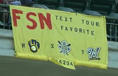
Meanwhile: Several uni-related discussions during yesterday’s ballgames. Let’s start in Milwaukee, where the combination of a blowout game and one of those stupid text-vote promotions gave Brewers broadcasters Brian Anderson and Bill Schroeder the opportunity to have the following uni dialogue:
Brian Anderson: Our U.S. Cellular Text to Vote: your favorite logo. The ball-in-glove is W, the X logo is, uh, I don’t know what you call that one, a crest? And then the current Brewers logo is Y.
Bill Schroeder: A crest?
Anderson: I don’t know what’d you guys call that one?
Schroeder: It was a Notre Dame logo.
Anderson: Notre Dame?
Schroeder: Kind of reminder me of the ND.
Anderson: Is that something you’re comin’ up with, or is that what they called it?
Schroeder: Just looked like it to me.
Anderson: Kind of blew my crest out of the water there, and then you came back with a Notre Dame logo!
Schroeder: I’m tryin’ to help.
Anderson: Sitting here in Marquette country and you’re gonna drop a Notre Dame on us.
Schroeder: That logo didn’t last long. It really didn’t.
Anderson: That wasn’t, it wasn’t, that wasn’t a high point. And it was associated with some pretty bad ballclubs as well.
Schroeder: Yeah. The dark days in Brewer history.
Anderson: You were in the ball-in-glove era”¦
Schroeder: Yes sir.
Anderson: ”¦and you were in the California Angels era, right?
Schroeder: Right. The Brewer era with the baby-blue road uniforms, pool-over jerseys [I swear that’s how he pronounced it — PL], the no-belt look
Anderson: A nice tight fit.
Schroeder: The Mod Squad era.
Anderson: I think more teams should bring back the baby blues. I know the Royals have done it. ”¦ Had a question about the ball-in-glove uniforms earlier in the homestand. I was walking through the stands on the way out, and it used to be every Friday they’d have Retro Friday. Now it’s once a month. [Cameraman obligingly shows this fan.] The ball-in-glove with the cheese hat — that’s about as Milwaukee as you can get right there. ”¦ Your Notre Dame logo was used from ’94 to ’99.
Schroeder: Longer than I thought.
Anderson: Yeah. Some decent years in there. Phil Garner”¦
Schroeder [interrupting]: I associate that with the John Jaha era of Brewer baseball. He could hit.
Anderson: What about Barrel Man? Barrel Man was a popular logo in the ’70s. That didn’t make our U.S. Cellular list today.
Schroeder: That was, uh, the first one, right?
Anderson: Yup. That was the very first logo coming from Seattle, when they were the Pilots. [They had] Barrel Man for about eight years. Most of the ’70s it was Barrel Man, until the late ’70s, when the ball-in-glove made it. Tommy Meindel designed that ball-in-glove logo. He was an art history student at UW-Eau Claire, and he won the contest. It’s one of the greatest logos in the history of the game.
Schroeder: What do you think he got for it?
Anderson: I heard he got”¦
Schroeder: Coupla tickets?
Anderson: A couple of grand. [That is correct, at least according to this article. — PL]
Schroeder: Tickets, maybe a bat.
Anderson: He got a big “Attaboy.”
Geoff Poole, who tipped me off to this discussion, adds the following: “By the way, the ball-in-glove logo won the poll question with nearly 75% of the vote. I’d say the Brewers’ fans have good taste.”
Meanwhile, over in Pittsburgh, Pirates broadcasters Tim Neverett and Bob Walk engaged in a bit of helmet banter when Royals catcher Brayan Peña was batting:
Tim Neverett: Peña, a switch-hitter. See, he doesn’t have to have two helmets because he uses one with the double flap. Sometimes a switch-hitter likes having only one helmet. Other times they’ll get one with the ear cut off on either side. You don’t see the double-flaps a ton at the big league level. Most of the time it’s cut off on one side or the other.
Bob Walk: Somewhere we saw someone wearing a double-flap who was not even a switch-hitter, which you really don’t see very often. Was it with the Indians? The left fielder, I think..?
Neverett: It was, uh, Shin-Soo Choo.
Walk: Yeah.
Neverett: He’s a left-handed hitter, but he has the double-flap. That’s something you rarely see.
Walk: I knew who it was, but I was gonna wait for you to pronounce the name.
Would’ve been nice if they’d mentioned that double-flaps are mandatory in the minors, but this was generally a much higher level of uni observation than we see from most broadcast teams. Slowly but surely, the rest of the world is catching up to us.
Finally, there was also some uni-related discussion during yesterday’s blue vs. blue game in Arlington, where Rangers broadcasters Josh Lewin and Tom Grieve were getting a lot of e-mail from their viewers:
Josh Lewin: Bo,y one e-mail theme we’re definitely getting tonight is everybody is HATING this look of both teams being in blue.
Tom Grieve: Boy, I can’t agree more.
Lewin: It’s a different shade of blue”¦
Grieve: There should be a rule against it.
Lewin: Padres are the only team on the field with the sand-colored pants, however. That’s one way you can discern between the two tonight.
Grieve: I mean, at the very least, the home team should declare their uniform, and the visitor should NOT be able to wear a dark-colored jersey. They should have to wear a light-colored road jersey.
Lewin: I agree with you, and in the NBA when the Mavs choose to wear their home greens and they happen to be playing Boston, the Celtics, I guarantee you, would not also be wearing green.
Grieve: Nope.
[Unfortunately the conversation ends abruptly when Scott Hairston hits one out of the park. Later in the game, however, the discussion resumes.]
Lewin: What do you think of the blue and sand uniforms for San Diego?
Grieve: I’m not a big fan.
Lewin: Better though than the old, brown orange and yellow?
Grieve: Yeah, I wasn’t a fan of those either.
Lewin: What about the original mustard-color, all-yellow, Nate Colbert/Mike Ivie style?
Grieve: Ha, no… Served its purpose, but not a fan.
Lewin: Rangers are classic baseball Americana. They feature the red, white, and blue of that Texas state flag…
Grieve: Yeah I’m still a traditionalist. For a home game I like the all-white uniform. I love the red for a weekend game like the Rangers have been using it… The uniforms in this game make it look like a Spring Training game.
Lewin: Agreed. But, just back to the old brown, orange, and yellow… that’s the one that Steve Garvey said made him look like a taco.
Grieve: There’ve been some doozies of uniforms over the years. Cleveland’s all-red one comes to mind…
Lewin: Ugh. Nolan was the only guy I thought that made the Astros’ paint sampler uniform look good.
Grieve: Yeah, that was obviously a different-looking uniform. Of all the ones we’re talking about though, I would prefer that one over the other ones.
Lewin: They never made you wear the 1977 White Sox short shorts?
Grieve: Ha, no. Played against the White Sox when they wore ’em though.
Lewin: Putting Wilbur Wood in that uniform was just not, not fair.
Grieve: The jerseys that they wore were made to hang out of their uniform, and even when they weren’t wearing shorts they wore that year, they wore them with a collar on them. Kind of a little V-neck, with a collar. Tapered and tailored to hang out of their pants. To not be tucked in.
Lewin: To maximize dorkiness.
Grieve: They were probably very comfortable. If you weren’t self-conscious about what you looked like.
Lewin: Was that considered stylish at that time? I mean I was like 9…
Grieve: Well, it was stylish in that they were the only ones wearing it. It wasn’t stylish enough to catch on anywhere else as far as I know.
Special thanks to pseudonymous reader u2-horn for providing the transcript of that last one.
Research Request: If anyone out there watched a lot of MTV in the 1980s and would like to assist me with a research project, please give me a shout. Don’t worry, I promise it has nothing to do with Michael Jackson and plenty to do with uniforms. Thanks.
Raffle Reminder: Thanks to everyone who donated to Bryan’s relief fund. That project is now closed, and today’s the last day to enter the raffle for the Wilco tickets. If you haven’t already entered, submit your entry (one per person, except for Membership Program enrollees, who can submit four entries) by sending a blank e-mail to the raffle address. The subject line should have your name and which of these four shows you wish to attend. If you can attend more than one, please list them in order of preference. I’ll announce the winners tomorrow.
Uni Watch News Ticker: Ebbets Field Flannels prexy Jerry Cohen has started a new historical blog, Flannel of the Month. ”¦ Nice feature on awful soccer kits here (with thanks to T. Faust). ”¦ Bruins blogger Greg Ezell has begun a historical survey of the team’s uniforms, beginning with the 1920s. ”¦ Good soccer patch contribution from James Robertson, who writes: “FIFA came up with unique tournament patches for each team in the Confederations Cup, featuring a silhouette of the trophy that the team won to get to the tournament. Spain has the European Champions trophy on their sleeve patch, for example, and the U.S. has the Gold Cup theirs.” ”¦ Interesting to see that Rodrigue Beaubois had a little French flag on his French cuffs at the NBA Draft (with thanks to Mike Verna). ”¦ The Edmonton Eskimos will wear 1960s throwbacks for three games this season. Further details here. ”¦ NHL draft prospects discuss their favorite and least-favorite jerseys here (with thanks to Thomas Leibowitz). ”¦ If you click here, you’ll see the lead singer from a Boston band called the Fools giving a tour of Fenway Park. It’s only a so-so clip, but the interesting thing is that he’s wearing a Red Sox cap I’ve never seen before, featuring the standard B combined with the hanging socks. Just a fashion cap, natch, but it’s a new one to me. ”¦ Good article here about the development of the Philadelphia Union brand. If you want more, this article suggests that the team’s logo was ripped off from Nike. ”¦ Interesting merchandising legal case at issue here. ”¦ Last section of this article mention’s David Eckstein’s penchant for wearing NFL receiver’s gloves instead of batting gloves (with thanks to Dusty McGowan) ”¦ “Marathon Gas Stations sold these Kentucky Colonels tumblers in like ’70 or ’71,” writes Brinke Guthrie. “They are called Pro Star Portraits, by the artist Jim Volpe. You got them with a fill-up. They came in 8×10 format, or in a poster I believe with all the photos on it, and these tumblers. We used to trade these in school like crazy. Just got ’em on eBay for like 14.95 or so — the seller forgot to use the word ‘Volpe’ in the title or they would’ve sold for a lot more.” ”¦ Knicks draft picks Jordan Hill and Toney Douglas donned Mets gear prior to Friday night’s game at Shea. ”¦ Adam Elkana-Hale was Kilkenny vs. Galway in the Leinster provincial hurling semifinals when he saw the Kilkenny goalie wearing a Chicago Bears cap. “It’s not even a color match, because Kilkenny is black/gold,” notes Adam. Bizarre. ”¦. Chris Mayberry snapped this shot at a recent Royals game. ”¦ Cerveceros vs. Gigantes in Milwaukee on Saturday night. ”¦ The Royals and Pirates did the Negro Leagues thing on Friday and Saturday nights. First time I can recall back-to-back throwback games. As you can see, KC had some color-coordination issues. ”¦ Reprinted from Saturday’s comments: Josh Hamilton, who’s on the DL, wore some sort of bizarro half-and-half jersey while stretching before Saturday’s Rangers/Padres game. The NOB is his nickname (also found on his batting gloves), but what’s the deal with the Lokai and Bele jersey treatment? Do the Rangers routinely do this for players who are rehabbing while on the DL? I’ll try to find out. ”¦ I love the jackets in this photo. ”¦ Denis Repp reports that the Heinz History Center in Pittsburgh has a new exhibit on Forbes Field. “It includes a nice uni find: a Homestead Grays uniform, circa 1947,” he writes. “It was worn by Euthumn Napier, who became the Grays’ starting catcher in 1947 after Josh Gibson died the previous winter.” There’s also a Pennsylvania Turnpike exhibit with a toll clerk’s uniform. You can see both uniforms here. ”¦ Latest CFL team to unveil a throwback element: the Calgary Stampeders (with thanks to DeForest Maitland). ”¦ Yet another Nats problem, as explained by Dave Raglin: “The Nats have had a problem with the out-of-town scoreboard ever since moving into Nats Park. This picture is from Tuesday 6/23, and it shows #63 as the winning pitcher for the Tigers and #37 the loser for the Cubs. Those uni numbers are switched — 37 is Brandon Lyon, the winner for the Tigers, and 63 is Kevin Gregg, the loser for the Cubs. The funny thing is that it only affects finals, not games in progress (note in the Reds/Jays game on the board, for example that #51 for the Reds is Jared Burton and #54 for the Jays is Jason Frasor, and those are correct).” ”¦ You have got to be kidding me (blame Hugh McBride). ”¦ A museum in Germany has been exhibiting someone’s collection of over 2000 sports trophies (with thanks to Rob Walker). ”¦ Somewhat bizarre uni note from Matthew Hiett, who writes: “The Coca-Cola bottle at Turner Field is covered in authentic MLB equipment, including red alternate jerseys. They used Cool Base jerseys, and now the ventilated pits have faded more than the rest of the jerseys.” ”¦ Tim Wood has singled out an interesting little sub-niche of sports design: private yacht signal flags, many of which are gorgeous. “For years, I’ve had this flag, which belonged to my wife’s mother’s boat, hanging in my office,” he writes. He’s scanned a bunch of pages from the 1948 Lloyd’s Register of American Yachts and put them here. “The signals in the book are arranged based on the dominant color(s) in the design,” he explains. “At first I thought that this had something to do with making it simpler to print. But a better explanation might be that it made the book more useful as an identification guide. If you see a yacht signal and want to know who it belongs to, you can start by looking in the section with the signal’s main color and work from there –much easier than if they were arranged alphabetically or chronologically or some other way that would require looking through all the designs until you found the right one.” ”¦ Alain Nana-Sinkam was driving through Media, Pennsylvania the other day when he spotted two Eagles helmet carts — one featuring the team’s current helmt design, one from the Jaworski era — parked in back of a gas station. “They were in a body shop/junkyard type of lot that was fenced off, so I asked a guy that worked there if I could take some pictures,” he writes. “He checked with the owner and then came back and said the owner refused to let me take any pictures since ‘he makes them for the Eagles.’ So I left but did my best James Bond and snapped a couple of pics with my phone as I drove away. Unfortunately, I was too far away to get much detail, but the modern one is unlike any helmet cart I’ve ever seen. It looked like it was bolted on an actual vehicle, as opposed to the golf cart kind I’ve normally seen.” … Last week Mariano Rivera wore Alfredo Aceves’s batting helmet. Last night he wore Cody Ransom’s (screen shot courtesy of Terence O’Donohue). ”¦ In other Yankees headwear news, still no Yankee Stadium patch or MLB logo on Brian Bruney’s cap (with thanks to Chris Gordon for the screen shot). ”¦ Chad Todd just got back from Baltimore, where he wore these stirrups for a visit to Camden Yards. “Got lots of compliments,” he says. “Can’t thank Robert Marshall enough for pulling some strings to get this all done in time for the game.” … Reprinted from last night’s comments: Lengthy article about stirrups here. Recommended reading.
Please tell me this ( link ) is fake
I mean, at the very least, the home team should declare their uniform, and the visitor should NOT be able to wear a dark-colored jersey. They should have to wear a light-colored road jersey.
Now this doesn’t make much sense. What if the visiting team doesn’t have a light colored jersey? Should every team be forced to make a dull gray (or perhaps khaki) uniform for road games where the home team wants to wear a dark color?
Every home team, on the other hand, has a white jersey, so the home team should wear white if the visitor is wearing color. Traveling teams can only pack so many variations, whereas the home team can dig an alternate out on short notice.
It’s Brian Bruney, not Bob Bruney.
Looks like Todd Radom is also responsible for the Washington Nationals logo. Now I feel bad for bashing it a few weeks ago…
I guess I will blame that on the club, because he has created some good looking logos in his portfolio.
link
Neat photo of Camden Yards. Note how far from the field one is, even in the first row of the deck just above the field level.
Maybe those older parks, with their pillars, made more sense for more people. When I was at Camden Yards years ago they offered field glasses for rent from even that area. The charge was $7 then.
Look at the Stampeders shot of the quarterback
link
The 2s are different, one with a diagonal and the other without.
Looking at those soccer kits reminds me of just how bad the 1990s were for design. Some of those are really, really, really bad – but I don’t think they were too out of the norm for the time, were they?
link
It feels like this is happening all the time these days, but those link worn by KC would look a lot better if they didn’t leave all that space (enough to fit a NOB in) above the number.
The Brewers not using ball in glove is almost as big a crime as the Chargers not using the powder blues full time… what other fantastic uni’s do teams ignore in favor of current garbage?
The mets with their silly black hats is a minor example. When they go full Yankee imitation and wear b/w pinstripes at home it will be time for an intervention.
[quote comment=”337198″]The Brewers not using ball in glove is almost as big a crime as the Chargers not using the powder blues full time… what other fantastic uni’s do teams ignore in favor of current garbage?
The mets with their silly black hats is a minor example. When they go full Yankee imitation and wear b/w pinstripes at home it will be time for an intervention.[/quote]
Ah you’re going to get me all fired up and start talking about Pitt script again!!!!!
Great stuff at the Heinz History Museum, I’m going to have to go check that out.
On a random note, whether the player is a switch-hitter or not, I’ve always thought the double-flap helmet looked totally bush league on MLB players. Just my opinion.
great call on the Pitt script. (even though I’m a PSU alum and I went there when the PSU/Pitt thing was actually alive and intense)
the new ID is just um, a bit off
[quote comment=”337200″]great call on the Pitt script. (even though I’m a PSU alum and I went there when the PSU/Pitt thing was actually alive and intense)
the new ID is just um, a bit off[/quote]
Yeah, it seems like the Brewers ball/glove logo and the Pitt script are in familiar territory with fanbases wishing for them to come back. I doubt if any Pitt broadcast would let their be an online poll because the powers-that-be would be showed that despite them believing what they want to believe, they are wrong.
Of course I’m a broken record when it comes to this topic so I don’t lament on it too much these days.
I feel obliged now to just refer people to the old character that Molly Shannon played on SNL, Jeannie Darcy the comedienne:
Don’t get me started, don’t EVEN get me started.
It’s funny, whenever there is a worst soccer jerseys ever debate they always choose Hull City’s 1992 tiger stripe affir, yet the kit that replaced it was far worse.
The club had some kind of fall out with matchwinner who produced the kits, and switched to Pelada. Because the new company couldn’t magic up a kit immediately, and because the club wanted to keep a tiger stripe pattern as it was a popular seller, they just stuck Pelada patches over the Matchwinner logos. Matchwinner threatened to sue, and Pelada rushed out a replacement kit that was less tiger stripe and more leopard print, it was truly hideous.
link
[quote comment=”337190″]
Now this doesn’t make much sense. What if the visiting team doesn’t have a light colored jersey? Should every team be forced to make a dull gray (or perhaps khaki) uniform for road games where the home team wants to wear a dark color?
[/quote]
Yes, every team SHOULD have grays or off-whites to wear on the road. Maybe that is all they should pack, and then the sort of nonsense where teams go color on color would stop.
[quote comment=”337192″]Looks like Todd Radom is also responsible for the Washington Nationals logo. Now I feel bad for bashing it a few weeks ago…
I guess I will blame that on the club, because he has created some good looking logos in his portfolio.
link
I always complained that the Nationals jerseys (especially the wordmark) looked too similar to the Brooklyn Cyclones. Now I see why, because they were done by the same guy!
Can a home team force the road team to wear their official uniform? Too many color on color games, can someone please stop it?
[quote comment=”337194″]Look at the Stampeders shot of the quarterback
link
The 2s are different, one with a diagonal and the other without.[/quote]
Maybe they copied the look (and differing number fonts) from these guys:
link
… Cerveceros vs. Gigantes in Milwaukee on Saturday night. …
about time we got Sabado Gigantes! :)
[quote comment=”337201″][quote comment=”337200″]great call on the Pitt script. (even though I’m a PSU alum and I went there when the PSU/Pitt thing was actually alive and intense)
the new ID is just um, a bit off[/quote]
Yeah, it seems like the Brewers ball/glove logo and the Pitt script are in familiar territory with fanbases wishing for them to come back. I doubt if any Pitt broadcast would let their be an online poll because the powers-that-be would be showed that despite them believing what they want to believe, they are wrong.
Of course I’m a broken record when it comes to this topic so I don’t lament on it too much these days.
I feel obliged now to just refer people to the old character that Molly Shannon played on SNL, Jeannie Darcy the comedienne:
Don’t get me started, don’t EVEN get me started.[/quote]
I play in an alumni softball league in DC, CAN (Capital Alumni Network). For the Auburn Tigers, of course. 70 schools participate in the softball league (well, 69, as Fla. State was given the 1-year death penalty just a few weeks ago, but that’s another story.) Anyway, for as long as I’ve been playing, Pitt has always worn jerseys with this logo:
link
White jersey with the blue/gold lettering.
This season, however, they’ve gone retro, wearing a royal blue jersey with this logo:
link
A major change for the better. They look really sharp.
Hey JTH: if you have Sox/Cubs on your DVR, the blog may be interested in screen grab of the guy sitting behind home plate Friday and Saturday-the guy wearing a full mask of a goat’s head. :-) Saturday he apparently was wearing the “L” shirt.
[quote comment=”337207″][quote comment=”337194″]Look at the Stampeders shot of the quarterback
link
The 2s are different, one with a diagonal and the other without.[/quote]
Maybe they copied the look (and differing number fonts) from these guys:
link
Bad link:
Here’s what I meant to link to –
link
link
Different helmet and jersey number fonts
The batting helmets with the Pirates “P” completely clashed with those awesome throwbacks.
Nice article on Forbes Fields’ 100th Birthday: link
Most Brewers fans these days are clueless hayseed bandwagon jumpers who just started following the team 3 years ago.
Those are the same people who vote for the ball-in-glove logo because it’s all they’ve ever known. Luckily that logo is finally being phased out and the current team can have their own identity.
[quote comment=”337190″]
Now this doesn’t make much sense. What if the visiting team doesn’t have a light colored jersey? Should every team be forced to make a dull gray (or perhaps khaki) uniform for road games where the home team wants to wear a dark color?
[/quote]
But all teams currently do have grays (except for the Padres with the sand). I bet that’s always been the case, too. (If you include powder blues as a light colored road jersey)
[quote comment=”337212″]The batting helmets with the Pirates “P” completely clashed with those awesome throwbacks.[/quote]
Yes, as did the Royals’ blue spikes and helmets.
I’m not jumping on you Scott, because this comes up a lot when teams throwback.
A throwback of the nature the Pirates did brings up a dilemma: batting helmets weren’t mandatory until the early 70s. Technically there is no helmet to throwback to.
Could the Pirates and Royals afforded to do matching helmets and in the Royals’ case matching undershirts and spikes? Sure. But it’s not practical.
[quote comment=”337210″]Hey JTH: if you have Sox/Cubs on your DVR, the blog may be interested in screen grab of the guy sitting behind home plate Friday and Saturday-the guy wearing a full mask of a goat’s head. :-) Saturday he apparently was wearing the “L” shirt.[/quote]
Seeing Cub fans link leads to this comeback…
“What’s that stand for… ‘Woe Is Me?'”
[quote comment=”337215″][quote comment=”337190″]
Now this doesn’t make much sense. What if the visiting team doesn’t have a light colored jersey? Should every team be forced to make a dull gray (or perhaps khaki) uniform for road games where the home team wants to wear a dark color?
[/quote]
But all teams currently do have grays (except for the Padres with the sand). I bet that’s always been the case, too. (If you include powder blues as a light colored road jersey)[/quote]
In the ’70s, teams such as the Indians, A’s and Braves had only dark or colored road jerseys (no grays), but they were filed with MLB as their road uniforms, thereby making it fairly obvious that the home team would wear their whites those days. Home white/Road gray sort of devolved into Home White/Road Not-White.
Just saying, that’s a simple enough way to handle the logistics, basing things on what teams register as their standard uniforms, that is. Of course, they’d actually have to stick with the program, which sometimes seems beyond MLB’s capabilities.
—Ricko
[quote comment=”337214″]Most Brewers fans these days are clueless hayseed bandwagon jumpers who just started following the team 3 years ago.
Those are the same people who vote for the ball-in-glove logo because it’s all they’ve ever known. Luckily that logo is finally being phased out and the current team can have their own identity.[/quote]
I hear you, but I don’t understand. The Yankees never deviated from the pinstripes and the interlocking NY, despite the rough years that basically coincided with the Mattingly era. They weren’t so eager to make a new identity; instead, they stuck with what made them iconic.
I don’t see how going away from one of the best logos in sports (let alone baseball) can ever be a good thing. They’ve traded the awesome ball-in-glove logo and perfectly good royal and gold uniforms in favor of an identity that looks all at once like Miller adverts (stylized M + barley + Miller Park = subliminal ad), Cheers (silly wordmark), and Notre Dame in Marquette Country (navy + metallic gold = ND, even after the Todd Radom logo in between). Now please tell me why this is a good thing? I’m interested to hear your opinion, even though I’ll disagree.
Some leagues or organizations force teams to have colors that are at least 50% of one color. Also, the FIVB (volleyball) says that teams have to have three sets of uniforms, and at least one has to be white.
[quote comment=”337219″][quote comment=”337214″]Most Brewers fans these days are clueless hayseed bandwagon jumpers who just started following the team 3 years ago.
Those are the same people who vote for the ball-in-glove logo because it’s all they’ve ever known. Luckily that logo is finally being phased out and the current team can have their own identity.[/quote]
I hear you, but I don’t understand. The Yankees never deviated from the pinstripes and the interlocking NY, despite the rough years that basically coincided with the Mattingly era. They weren’t so eager to make a new identity; instead, they stuck with what made them iconic.
I don’t see how going away from one of the best logos in sports (let alone baseball) can ever be a good thing. They’ve traded the awesome ball-in-glove logo and perfectly good royal and gold uniforms in favor of an identity that looks all at once like Miller adverts (stylized M + barley + Miller Park = subliminal ad), Cheers (silly wordmark), and Notre Dame in Marquette Country (navy + metallic gold = ND, even after the Todd Radom logo in between). Now please tell me why this is a good thing? I’m interested to hear your opinion, even though I’ll disagree.[/quote]
Interesting bit of semantics here. If a team forsakes a logo, can they still call it “traditional”?
Seems to me the way a logo (or uniform) becomes such a thing is if a team sticks with it—despite the temptation to “modernize” or “update”—from era to another to another. Yankees, Cubs and Tigers home sets (among others in other sports) sort of fall into that category.
If the Brewer ball-glove were to return, it might be “classic” but not “traditional”. It’s very ’70s, to be sure. And the Yankees “NY” might be very 1920s…but because they never abandoned it, it sort of loses that time distinction.
Make sense? Agree? Disagree?
—Ricko
[quote comment=”337217″]Seeing Cub fans link leads to this comeback…
“What’s that stand for… ‘Woe Is Me?'”[/quote]
I have heard of (but never personally seen) a MMV flag, for 2005: I guess when you live in a neighborhood full of grown men who walk around waving the W flag at the drop of a hat you have to have some fun of your own. :-)
[quote comment=”337221″]
Interesting bit of semantics here. If a team forsakes a logo, can they still call it “traditional”?
Seems to me the way a logo (or uniform) becomes such a thing is if a team sticks with it—despite the temptation to “modernize” or “update”—from era to another to another. Yankees, Cubs and Tigers home sets (among others in other sports) sort of fall into that category.
If the Brewer ball-glove were to return, it might be “classic” but not “traditional”. It’s very ’70s, to be sure. And the Yankees “NY” might be very 1920s…but because they never abandoned it, it sort of loses that time distinction.
Make sense? Agree? Disagree?
—Ricko[/quote]
I fail to see how a logo can be traditional. A tradition is a practice done over and over again. For example: putting a dead tree in your living room to celebrate Christmas.
A logo cannot be traditional. Timeless? Yes. Traditional? No.
Turkey=three strikes in a row
Hambone=four strikes in a row
DON’CHA KNOW!?!?!?
MMV?
[quote comment=”337221″]Interesting bit of semantics here. If a team forsakes a logo, can they still call it “traditional”?
Seems to me the way a logo (or uniform) becomes such a thing is if a team sticks with it—despite the temptation to “modernize” or “update”—from era to another to another. Yankees, Cubs and Tigers home sets (among others in other sports) sort of fall into that category.
If the Brewer ball-glove were to return, it might be “classic” but not “traditional”. It’s very ’70s, to be sure. And the Yankees “NY” might be very 1920s…but because they never abandoned it, it sort of loses that time distinction.
Make sense? Agree? Disagree?
—Ricko[/quote]
I’m a big fan of the Yankee, Dodger, Cards Tigers(home only) look. I think that if you change your look on a whim in an attempt to sell to the “modern” kids you need to go as far back as humanly possible (speaking of the Brewers) and stick with it thru at least a few “modernizations” by other teams before you can say you now have a traditional uniform.
As a Sox fan, I lament the idea that the Sox will never have what’s considered a “traditonal” look, at least not in my lifetime. (I console myself with the Bears, Bulls and Hawks.)
[quote comment=”337225″]MMV?[/quote]I think that’s Roman numerals for 2005, isn’t it?
[quote comment=”337225″]MMV?[/quote]
MMV=2005 (roman numerals)
That picture of the Aberdeen baseball team kind of stood out to me. If you look at the man in the front middle his black cat in the ptch is facing his left shoulder whereas everyone elses seems to be facing their right shoulder. Just seemed weird to me….
This should be interesting …
link
Today marks the anniversary of Archibald “Moonlight” Graham’s single game in the majors. Break out the Field of Dreams or if you’re a purist, Shoeless Joe.
They run a Doc Graham scholarship fund up in Chisholm. They raise money by selling baseball cards and Fields of Dream stuff. You can read about it link.
[quote comment=”337218″][quote comment=”337215″][quote comment=”337190″]
Now this doesn’t make much sense. What if the visiting team doesn’t have a light colored jersey? Should every team be forced to make a dull gray (or perhaps khaki) uniform for road games where the home team wants to wear a dark color?
[/quote]
But all teams currently do have grays (except for the Padres with the sand). I bet that’s always been the case, too. (If you include powder blues as a light colored road jersey)[/quote]
In the ’70s, teams such as the Indians, A’s and Braves had only dark or colored road jerseys (no grays), but they were filed with MLB as their road uniforms, thereby making it fairly obvious that the home team would wear their whites those days. Home white/Road gray sort of devolved into Home White/Road Not-White.[/quote]
Indeed; the Cubs wore royal blue jerseys with white pants on the road all the way up until the Don Zimmer era, before switching to gray in the early 1990s, and then (because gray is so dull) almost immediately brought out a royal blue alternate, which looks much better than their boring gray jersey on the road.
Today in the Japanese leagues, white for the home team and color for the visitors is almost standard. Just about every team has worn a dark jersey as their regular road uniform in recent years, with the exception of the Hanshin Tigers. (Colored home alternates are rarely seen, thankfully.)
[quote]Just saying, that’s a simple enough way to handle the logistics, basing things on what teams register as their standard uniforms, that is. Of course, they’d actually have to stick with the program, which sometimes seems beyond MLB’s capabilities.
[/quote]
I think the problem lies not with the visiting teams, who can’t be expected to carry multiple sets of luggage (and wait until aviation oil surcharges go up again!), but rather with the home teams who want to wear what should be road colors in their home park. I say let the road teams pack whatever they like (as long as it’s not white), and then let the home teams adjust to them. If that means the home teams can’t wear their red or blue alternates or whatever, too bad; they can stick with basic white.
Growing up in the Southeast didn’t present many opportunities to follow the Brewers. So, the ball-in-glove logo never captured me then. (It is a great logo though.) So when they switched to that interlocking MB, I was fine with it. It was what they wore when entering the NL, so that’s what I got to see more often than their AL days.
But then they switched to the wheat M logo, which I like way better than the MB. It does look more beer-related (probably those Miller connections at work), and I like it. I wouldn’t mind if they just keep this blue, white, gold scheme, using the blue/gold as an occasional throwback. Going back to something old doesn’t always work, and if they wore blue and gold all the time, it wouldn’t look as nice, IMO.
[quote comment=”337211″][quote comment=”337207″][quote comment=”337194″]Look at the Stampeders shot of the quarterback
link
The 2s are different, one with a diagonal and the other without.[/quote]
Maybe they copied the look (and differing number fonts) from these guys:
link
Bad link:
Here’s what I meant to link to –
link
link
Different helmet and jersey number fonts[/quote]
I agree. The mismatching helmet and jersey numerals have always perplexed me. I don’t see why they can’t match them. Of course, back in the day, teams didn’t even try to match them(Note: I’m assuming these throwbacks are accurate. I know, big assumption.)
link
link
link
[quote comment=”337234″][quote comment=”337211″][quote comment=”337207″][quote comment=”337194″]Look at the Stampeders shot of the quarterback
link
The 2s are different, one with a diagonal and the other without.[/quote]
Maybe they copied the look (and differing number fonts) from these guys:
link
Bad link:
Here’s what I meant to link to –
link
link
Different helmet and jersey number fonts[/quote]
I agree. The mismatching helmet and jersey numerals have always perplexed me. I don’t see why they can’t match them. Of course, back in the day, teams didn’t even try to match them(Note: I’m assuming these throwbacks are accurate. I know, big assumption.)
link
link
link
Can’t put a 2009 template onto 1959. The world hasn’t always been as it is today. Teams back then simply weren’t as devoted to details, AND there only were very few decal fonts and colors available (black and white were about it). Custom numbers rarely were offered or requested. It was more about ID’ing helmets on the sidelines any sense of a design element. Teams either stuck the numbers on the sides, or simply put them on the rear at the base of the helmet on either side of the stripe (Giants, for example). Some put them both front and rear (Steelers). Sizes of the numbers varied, too.
—Ricko
It was all stock stuff, that’s the short way of saying it.
I lament what Jeff Lurie (and/or his wife who played a role in the design) did to the Phila Eagles’ color scheme and uniform when he bought the team. Taking away the great and widely popular Kelly Green and Silver combo and changing to Midnight Green (whatever that is, a lawn in the dark?) Silver and White still does not sit well with the majority of the fandom. The hideous black third jersey and cartoonish eagle head just adds to the misery.
I get that a new owner wants to put his mark on the team, but why mess with the things that the fans identity with the most.
[quote comment=”337230″]This should be interesting …
link
Yep. Look for an easy NFL victory on the issue.
Bring back the ball and glove. I love that logo.
[quote comment=”337233″]…But then they switched to the wheat M logo, which I like way better than the MB. It does look more beer-related (probably those Miller connections at work), and I like it.[/quote]
Uh, I think the logo looks more “beer-related” because their name is the BREWERS.
[quote comment=”337232″]
Indeed; the Cubs wore royal blue jerseys with white pants on the road all the way up until the Don Zimmer era, before switching to gray in the early 1990s, and then (because gray is so dull) almost immediately brought out a royal blue alternate, which looks much better than their boring gray jersey on the road.
[/quote]
Gray is “so dull”? Nonsense. It’s a traditional color that looks great on baseball teams. The Cubs look ridiculous when they wear there blue softball uniforms.
Good work tracking Bruney’s missing patch. As an owner of one of the new stadium hats, the patch is unlike the normal ones, as it is not sewn on ( link ). It’s a felt patch which is most likely ironed on somehow. Owning one it is very easy to see with much wear and tear, how it could fall off.
[quote]I say let the road teams pack whatever they like (as long as it’s not white)[/quote]
like, for example, gray
[quote comment=”337233″]Growing up in the Southeast didn’t present many opportunities to follow the Brewers. So, the ball-in-glove logo never captured me then. (It is a great logo though.) So when they switched to that interlocking MB, I was fine with it. It was what they wore when entering the NL, so that’s what I got to see more often than their AL days.
But then they switched to the wheat M logo, which I like way better than the MB. It does look more beer-related (probably those Miller connections at work), and I like it. I wouldn’t mind if they just keep this blue, white, gold scheme, using the blue/gold as an occasional throwback. Going back to something old doesn’t always work, and if they wore blue and gold all the time, it wouldn’t look as nice, IMO.[/quote]
At least they had a proper road uni back in the late 90s, regardless of what you thought of that logo/colorscheme:
link
But I’ll agree with some of the others on here and say that this is more akin to what the Brewers should look like on the road:
link
Here’s a curious looking photo:
Probably a 1969 or 1970 KC Royals road uni. Interesting that the script lettering is vertically arched, but the tailsweep is straight across the jersey and well away from the lettering:
link
Doesn’t look like the representation on Dressed to the Nines:
link
[quote comment=”337243″][quote]I say let the road teams pack whatever they like (as long as it’s not white)[/quote]
like, for example, gray[/quote]
Or just make a rule, either that….
1. Home teams must wear white
or…
2. Visiting teams must wear gray
or…
3. “Alternate” jerseys in any color other than gray or white (as filed with MLB as “alternates”) may not be wore by both teams in any game.
Given that Alts apparently are here to stay, would that be so difficult?
—Ricko
Looks like something from Royals’ first-ever spring training in 1969 that never got farther than that.
link
[quote comment=”337246″][quote comment=”337243″][quote]I say let the road teams pack whatever they like (as long as it’s not white)[/quote]
like, for example, gray[/quote]
Or just make a rule, either that….
1. Home teams must wear white
or…
2. Visiting teams must wear gray
or…
3. “Alternate” jerseys in any color other than gray or white (as filed with MLB as “alternates”) may not be wore by both teams in any game.
Given that Alts apparently are here to stay, would that be so difficult?
—Ricko[/quote]
And I suppose someone would say, “What about the pitchers picking the jersey they like to wear?”
To which I would reply, “Oh, bite me.”
Interesting article here about Germany’s U-21 side choosing to wear red despite being designated the home team in the European U-21 Finals against England:
link
[quote comment=”337245″]Here’s a curious looking photo:
Probably a 1969 or 1970 KC Royals road uni. Interesting that the script lettering is vertically arched, but the tailsweep is straight across the jersey and well away from the lettering:
link
Doesn’t look like the representation on Dressed to the Nines:
link
I don’t know – other than the amount of arching, it looks like the same jersey. Look at the detail in the ‘y’.
link
Another warm up jacket, but with a vertical USA
[quote comment=”337250″][quote comment=”337245″]Here’s a curious looking photo:
Probably a 1969 or 1970 KC Royals road uni. Interesting that the script lettering is vertically arched, but the tailsweep is straight across the jersey and well away from the lettering:
link
Doesn’t look like the representation on Dressed to the Nines:
link
I don’t know – other than the amount of arching, it looks like the same jersey. Look at the detail in the ‘y’.[/quote]
Speaking of that letter…
I really don’t like the way that the tail cuts across the Y on the link. For some reason, it doesn’t bother me so much on the link, though. I’m guessing it’s because the Y is the last letter on the road jersey that I have a problem with it.
Instead of having the Y do a double loop down and then back (resulting in a pretzel shape), couldn’t they just have had the Y’s tail come down and then just take a single turn to form the wordmark’s tail without any unnecessary looping?
It’d kinda-sorta be like a reverse of the link, where the bottom of the C forms the tail .
[quote comment=”337252″][quote comment=”337250″][quote comment=”337245″]Here’s a curious looking photo:
Probably a 1969 or 1970 KC Royals road uni. Interesting that the script lettering is vertically arched, but the tailsweep is straight across the jersey and well away from the lettering:
link
Doesn’t look like the representation on Dressed to the Nines:
link
I don’t know – other than the amount of arching, it looks like the same jersey. Look at the detail in the ‘y’.[/quote]
Speaking of that letter…
I really don’t like the way that the tail cuts across the Y on the link. For some reason, it doesn’t bother me so much on the link, though. I’m guessing it’s because the Y is the last letter on the road jersey that I have a problem with it.
Instead of having the Y do a double loop down and then back (resulting in a pretzel shape), couldn’t they just have had the Y’s tail come down and then just take a single turn to form the wordmark’s tail without any unnecessary looping?
It’d kinda-sorta be like a reverse of the link, where the bottom of the C forms the tail .[/quote]
Or just go to school on the Athletics’ one-year wonders of 1961.
link
[quote comment=”337253″][quote comment=”337252″][quote comment=”337250″][quote comment=”337245″]Here’s a curious looking photo:
Probably a 1969 or 1970 KC Royals road uni. Interesting that the script lettering is vertically arched, but the tailsweep is straight across the jersey and well away from the lettering:
link
Doesn’t look like the representation on Dressed to the Nines:
link
I don’t know – other than the amount of arching, it looks like the same jersey. Look at the detail in the ‘y’.[/quote]
Speaking of that letter…
I really don’t like the way that the tail cuts across the Y on the link. For some reason, it doesn’t bother me so much on the link, though. I’m guessing it’s because the Y is the last letter on the road jersey that I have a problem with it.
Instead of having the Y do a double loop down and then back (resulting in a pretzel shape), couldn’t they just have had the Y’s tail come down and then just take a single turn to form the wordmark’s tail without any unnecessary looping?
It’d kinda-sorta be like a reverse of the link, where the bottom of the C forms the tail .[/quote]
Or just go to school on the Athletics’ one-year wonders of 1961.
link
Yeah. That’s much better.
But if you MUST have a tail on the wordmark, I prefer my idea to what they’ve got now.
[quote comment=”337254″]if you MUST have a tail on the wordmark, I prefer my idea to what they’ve got now.[/quote]
can’t find, but am pretty sure that, the nj nets had one of them script logos where the “y” just kinda runs underneath the word, rather than doing the loopty-loop thingy
did find this gem in a quick search however…now THAT’S some tail
if i wasn’t clear above, that should read where they had a script New Jersey logo where the “y” ran underneath
[quote comment=”337195″]Looking at those soccer kits reminds me of just how bad the 1990s were for design. Some of those are really, really, really bad – but I don’t think they were too out of the norm for the time, were they?[/quote]
I agree. I loved the designs of the 80s, but the 90s were just too over the top for me.
[quote comment=”337238″][quote comment=”337230″]This should be interesting …
link
Yep. Look for an easy NFL victory on the issue.[/quote]
Yeah, that’s what I’m expecting, but I hope American needle manages to win. Reebok makes crappy hats, and they have nothing fitted. Closest they have are strech fitted, and most of those are those damn mesh hats.
[quote comment=”337200″]great call on the Pitt script. (even though I’m a PSU alum and I went there when the PSU/Pitt thing was actually alive and intense)
the new ID is just um, a bit off[/quote]
Everyone who goes to a Pitt game should wear the script Pitt on their person in one form or another. Then the powers that be would have to acknowledge the demand for it.
[quote comment=”337238″]Yep. Look for an easy NFL victory on the issue.[/quote]
Not that I’m a legal scholar, but I definitely agree with the idea of “putting an end to costly, frivilous lawsuits”.
The Washington DC dry cleaners case is example one of where the loser should have paid legal fees and damages.
Okay, back to the usual uniform talk now.
For those who don’t recall those single-season Athletic unis of 1961…
link|66%3A2|39%3A1|72%3A1240|240%3A1318|301%3A1|293%3A1|294%3A50#ebayphotohosting
link|66%3A2|39%3A1|72%3A1240|240%3A1318|301%3A1|293%3A1|294%3A50#ebayphotohosting
link
link
—Ricko
[quote comment=”337235″][quote comment=”337234″][quote comment=”337211″][quote comment=”337207″][quote comment=”337194″]Look at the Stampeders shot of the quarterback
link
The 2s are different, one with a diagonal and the other without.[/quote]
Maybe they copied the look (and differing number fonts) from these guys:
link
Bad link:
Here’s what I meant to link to –
link
link
Different helmet and jersey number fonts[/quote]
I agree. The mismatching helmet and jersey numerals have always perplexed me. I don’t see why they can’t match them. Of course, back in the day, teams didn’t even try to match them(Note: I’m assuming these throwbacks are accurate. I know, big assumption.)
link
link
link
Can’t put a 2009 template onto 1959. The world hasn’t always been as it is today. Teams back then simply weren’t as devoted to details, AND there only were very few decal fonts and colors available (black and white were about it). Custom numbers rarely were offered or requested. It was more about ID’ing helmets on the sidelines any sense of a design element. Teams either stuck the numbers on the sides, or simply put them on the rear at the base of the helmet on either side of the stripe (Giants, for example). Some put them both front and rear (Steelers). Sizes of the numbers varied, too.
—Ricko[/quote]
I always liked the numbers on the helmets, and as detail-oriented as I can be, I never thought about the fonts being different than on the jerseys. I just accepted it.
Yeah, the Stampeders look like ‘Bama, but I still like their retros. The Eskimos throwbacks link are cool as well. I will get over the fact that they didn’t have the EE logo back then, because I like the striped socks so much.
Actually, Stamps throwbacks shouldn’t look THAT much like Alabama:
NW-style sleeve stripes and gray/silver pants with red and white striping. If they they get it right, they’ll have the same stripes on the high socks as on the sleeves, too.
Plus, they’re scarlet like the Montana-era 49ers, not the crimson of ‘Bama.
Details, to be sure, but especially the gray pants should quickly separate them from the Crimson Tide.
—Ricko
Actually, the pants were a sort of grayish-khaki something or other.
(self-correcting here)
[quote comment=”337263″]Actually, Stamps throwbacks shouldn’t look THAT much like Alabama:
NW-style sleeve stripes and gray/silver pants with red and white striping. If they they get it right, they’ll have the same stripes on the high socks as on the sleeves, too.
Plus, they’re scarlet like the Montana-era 49ers, not the crimson of ‘Bama.
Details, to be sure, but especially the gray pants should quickly separate them from the Crimson Tide.
—Ricko[/quote]
Nice to see Edmonton will be wearing throwbacks this year. Too bad I can not watch any CFL football here in Ohio.
[quote comment=”337263″]Actually, Stamps throwbacks shouldn’t look THAT much like Alabama:
NW-style sleeve stripes and gray/silver pants with red and white striping. If they they get it right, they’ll have the same stripes on the high socks as on the sleeves, too.
Plus, they’re scarlet like the Montana-era 49ers, not the crimson of ‘Bama.
Details, to be sure, but especially the gray pants should quickly separate them from the Crimson Tide.
—Ricko[/quote]
You’re totally right, Ricko. Based on the 2nd photo in the article, there are plenty of differences. I was focusing on the pic of the current player in practice gear. The plain white practice jersey with no TV numbers and black shorts looked like a dead-ringer for an Alabama player.
link
link
[quote comment=”337256″]if i wasn’t clear above, that should read where they had a script New Jersey logo where the “y” ran underneath[/quote]
You can’t find a picture because it never existed.
This is the only Nets jersey to have New Jersey in cursive.
link
[quote comment=”337213″]Nice article on Forbes Fields’ 100th Birthday: link
Ahh Forbes Field. The first place I saw a major league game. When my dad took me there as a kid. A few years ago my brother bought a book/model of it but it has not been put together yet.
Forbes Field was a cool place and I have great childhood memories of it.
[quote comment=”337208″]… Cerveceros vs. Gigantes in Milwaukee on Saturday night. …
about time we got Sabado Gigantes! :)[/quote]
NOOOO!!!
This is the first time I’ve seen them wear the Gigantes on the road. And after an ending like that, I hope it’s the last.
No ESPN column today after all. Bumped to tomorrow.
If I remember correctly. When the NHL went to the 3rd jersey program or wearing other then “required” they made it know to the league and other teams so the opponents knew what to pack.
man…never noticed this before…in link of mariano batting last night (and wearing #12)…look at how “blue” his numbers appear … like, several shades lighter than the sleeve stripes and helmet…it almost looks like he’s wearing a replica or something…weird how the lighting (and im assuming a flash as well) brings out the lighter hues of the midnight blue in the letters
is this just something i’ve always missed, and is is the way the yanks numbers have always shown up, colorwise, in comparison to the other midnight blue in their uni? or do their numbers usually appear much closer in color to the sleeve stripe?
In the five times the Brewers have done the Cerveceros promotion, this is the first time they have had “Cerveceros” on their blue alts.
link
As a Brewer fan, I kind of like that the ball-in-glove unis are used once in a while. I think if they over use that logo, more and more people will end up not liking it. But it’s nice to every now and again get a little taste of it.
It was the early 90’s when I really started following the Crew closely, so the “crest” logo is burned in my brain.
I really liked the plain “M” on the hat in the mid 90’s. Not the “Notre Dame” style, but this one:
link
obviously that hat is stylized, and black, but you get the idea.
[quote comment=”337240″][quote comment=”337233″]…But then they switched to the wheat M logo, which I like way better than the MB. It does look more beer-related (probably those Miller connections at work), and I like it.[/quote]
Uh, I think the logo looks more “beer-related” because their name is the BREWERS.[/quote]
Thank goodness I didn’t have to say it.
I love the brewers ball and glove logo, but i also think the current unis are sharp as well, and I like the current logo too. The ball and glove may be more “traditional”, but the Brewers never won a World Series in any logo, unlike the Yanks who have won how many??? I could see the argument if the Brewers had a great championship tradition in the ball and gloves, but I actually like the current arrangement with the new threads, and the old ball and glove unis as a harkbark to a nice logo once in a while. If I could make one change, since they are not exact copies anyway, I would wear the retro white pinstripe unis with the old away hats with teh yellow front panel.
I grew up through the 70’s, so teams wearing colored shirts and white pants on the road seems pretty normal to me. The A’s with green jerseys over white pants IS their away uniforms in my history. The Pads with the Brown/yellow over white, the Indians with red or blue over white, the Giants with Orange and black over white. And then the Pirates, with yellow over black or vice versa. I personally would support the “home team wears white if the other team wears colors” rule.
Major league teams would never agree to this though, as the alts are meant to sell more jerseys, and they get maximum home fan exposure at home. I don’t think it is that much more packing for the road team to take the greys (khakis) along on every trip, since EVERY team in MLB currently has a grey uni set.
Isn’t the idea of having a competition between two teams that they are different? And since the home team is the *home team,* they should have the say as to what color they wear. And doesn’t they gray thing go back to when they didn’t always have cleaning available on the road? And I really hate turning on a game and having to look at their pants to see who’s home if I don’t recognize the stadium or see the scoreboard.
[quote]I really liked the plain “M” on the hat in the mid 90’s. Not the “Notre Dame” style[/quote]
learn something new everyday on UW…i’d never heard of the radom mb logo referred to as ‘notre dame’ style…but, shit…
change the colors, and remove the bats and superfluous stuff… and look at that
/i don’t feel any smarter, but i did learn something
Is it fair to say that 3-color MLB teams just don’t look right? I’m not including the color white or gray here. MLB teams that feature 1 or 2 colors are consistently ranked ahead of 3-color teams for their aesthetic appeal, right?
For example, the Braves are scarlet and navy, the Giants are black and orange, the Red Sox are scarlet and navy, the Phillies are red and royal, etc.
I am wrong here? Are there 3-color schemes that work?
When you think about the Brewers “crest” logo, the a big problem was that it was “busy,” and that might have been due to the 3 color they employed: navy, gold and green. Same for the Nats and their use of gold as an accent color, any of the teams that throw black in as a third color, and the use of silver as a 3rd color. The Indians ditched silver as an accent color, and most people agree that their uniforms look much better as a result.
What 3-color teams pull it off the best?
Here’s the list of teams using 3 non-white colors:
Mets (orange, royal, black)
Nationals (red, navy, gold)
Marlins (black, teal, sparkly silver)
Astros (burnt sienna, tan, black)
Rockies (black, purple, silver)
D-backs (See Astros, Houston)
Jays (black, blue, silver)
Mariners (green, navy, silver)
[quote comment=”337248″][quote comment=”337246″][quote comment=”337243″][quote]I say let the road teams pack whatever they like (as long as it’s not white)[/quote]
like, for example, gray[/quote]
Or just make a rule, either that….
1. Home teams must wear white
or…
2. Visiting teams must wear gray
or…
3. “Alternate” jerseys in any color other than gray or white (as filed with MLB as “alternates”) may not be wore by both teams in any game.
Given that Alts apparently are here to stay, would that be so difficult?
—Ricko[/quote]
And I suppose someone would say, “What about the pitchers picking the jersey they like to wear?”
To which I would reply, “Oh, bite me.”[/quote]
Even simpler and more logical is this:
1. Both teams pick what they want
2. If there’s a clash (in the view of the umpires) then the one team (home ideally, but away might be more practical) gets priority and the away team changes.
It’s a lot better than forcing one team to wear a specific colour all the time – it’s not like there’s any practical reason for light v dark in every game (and before anyone pipes up about colour blindness – there’s plenty of other visual cues to which team is which.) And plus it’d make the teams seem a whole lot less distinct.
[quote comment=”337266″]Nice to see Edmonton will be wearing throwbacks this year. Too bad I can not watch any CFL football here in Ohio.[/quote]
If you have broadband, you should be able to see a lot of CFL games on espn360.com
Hope you do. cfl.ca should also have broadband coverage.
[quote comment=”337263″]Actually, Stamps throwbacks shouldn’t look THAT much like Alabama:
NW-style sleeve stripes and gray/silver pants with red and white striping. If they they get it right, they’ll have the same stripes on the high socks as on the sleeves, too.
Plus, they’re scarlet like the Montana-era 49ers, not the crimson of ‘Bama.
Details, to be sure, but especially the gray pants should quickly separate them from the Crimson Tide.
—Ricko[/quote]
True. I hope they do all the details with the striping and such.
I forgot about the gray pants. First CFL game I ever saw on TV was the Stamps vs. the Roughriders. My sister walked into the room and asked, “Who’s the team in the gray pants?” I said, “Oh you mean the ones in the red jerseys.” She responded, “Well, I wasn’t looking that high up.” Guess she liked someone’s tight end…
Even if Calgary doesn’t go with all the uni details, they’ll still look different than ‘Bama…with those darn sponsor patches on the jerseys.
i’d never heard of the radom mb logo referred to as ‘notre dame’ style…but, shit…
It might have originated with then-manager Phil Gardner. He noted the navy blue, metallic gold, and green, and joked that it was odd for a good Baptist boy such as himself to wear Notre Dame colors.
I don’t know if anyone has said this already, but it looks like Brian Bruney’s first season patch just fell off the back of his cap, and he hasn’t bothered to get a new one yet. I don’t think the Yankees caps have the MLB logo under the patch, so it would make sense that his cap is just blank now. I’ve had the same problem with a 59/50 cap with a patch that kept falling off, tried to iron it back on myself and burnt the cap.
[quote comment=”337280″][quote comment=”337266″]Nice to see Edmonton will be wearing throwbacks this year. Too bad I can not watch any CFL football here in Ohio.[/quote]
If you have broadband, you should be able to see a lot of CFL games on espn360.com
Hope you do. cfl.ca should also have broadband coverage.[/quote]
Funny you say that since I just got off the phone with my brother and he said to check out things like channelsurfing and online for CFL games.
I literally just got off the phone and 2 minutes later I see your post timmyb,
Thanks
[quote comment=”337280″][quote comment=”337266″]Nice to see Edmonton will be wearing throwbacks this year. Too bad I can not watch any CFL football here in Ohio.[/quote]
If you have broadband, you should be able to see a lot of CFL games on espn360.com
Hope you do. cfl.ca should also have broadband coverage.[/quote]
try tsn.ca as well, i’ve watched a lot of cfl games there in the past
[quote comment=”337273″]man…never noticed this before…in link of mariano batting last night (and wearing #12)…look at how “blue” his numbers appear … like, several shades lighter than the sleeve stripes and helmet…it almost looks like he’s wearing a replica or something…weird how the lighting (and im assuming a flash as well) brings out the lighter hues of the midnight blue in the letters
is this just something i’ve always missed, and is is the way the yanks numbers have always shown up, colorwise, in comparison to the other midnight blue in their uni? or do their numbers usually appear much closer in color to the sleeve stripe?[/quote]
I still maintain that NYY use black paint on their helmets (it may be true, but unknown to me). Having had access to both Detroit and New York official helmets (both listed as “Midnight blue”), I can see the blue in the Tigers helmets, but nothing in the Yankees’ lids.
Perhaps it is the matte finish on one and the high gloss on the other?
[quote]pool-over jerseys [I swear that’s how he pronounced it – PL][/quote]
Hey now!
You know, in some areas of the country those are homophones.
As a Giants fan, it was really strange seeing Giants/Giagantes on the road uniform. They could have just kept “San Francisco” since it’s already Spanish.
[quote comment=”337287″][quote]pool-over jerseys [I swear that’s how he pronounced it – PL][/quote]
Hey now!
You know, in some areas of the country those are homophones.[/quote]
Not that there’s anything wrong with that…
[quote comment=”337288″]As a Giants fan, it was really strange seeing Giants/Giagantes on the road uniform. They could have just kept “San Francisco” since it’s already Spanish.[/quote]
They should have changed it to SAINT FRANCIS for the occasion.
[quote comment=”337266″]Nice to see Edmonton will be wearing throwbacks this year. Too bad I can not watch any CFL football here in Ohio.[/quote]
In Louisiana we get one rerun CFL game each week.
I firmly believe that the ONLY logical explanation for the CFL to largely be absent from U.S. television – despite HUNDREDS of cable channels with thousands of hours of programming to fill – is because the NFL quietly “blocks” the cable networks from putting those games on-air.
Look at your local newspaper – often you can’t even find a CFL box score, much less stats or pictures or articles …
How do they do it? Well, how about access to NFL games, suites, Superbowls and other events, how about if they say “OK, Versus Network., go ahead and run the CFL – but see if you EVER get another Superbowl ticket, or access to an event.
WHY does the NFL do this … I believe that it has to do with MERCHANDISING !!!
If NASCAR can sell $300.00 jackets in inner city markets, and if even hideous throwback product (design, quality, accuracy) can sell, we could expect that CFL product at some point wpuld catch onm, and maybe help the viewership in tandem with the sales.
I believe the NFL would mwboutm
[quote comment=”337291″][quote comment=”337266″]Nice to see Edmonton will be wearing throwbacks this year. Too bad I can not watch any CFL football here in Ohio.[/quote]
In Louisiana we get one rerun CFL game each week.
[/quote]
Louisiana used to have a CFL team and they didn’t support it, why should they get more than one broadcast a week?
(kidding, kidding)
Its a good point – in a world where there are sports channels filled with darts, poker tournaments, etc., I wonder why CFL games aren’t being picked up in the US?
One guess (and this is just a guess) – we have Stampeder season tickets and last year I took a couple of guys from Houston to a game. After 30 minutes of the wide field, unlimited motion before the snap, single points on field goals and punting on third down, my friends literally wanted to go home. It was so much like US football but just different enough to make them uncomfortable.
It takes some time to get to understand the game and the different strategy, and it might not work on US television for the casual football viewer.
Just a guess.
[quote comment=”337259″][quote comment=”337200″]great call on the Pitt script. (even though I’m a PSU alum and I went there when the PSU/Pitt thing was actually alive and intense)
the new ID is just um, a bit off[/quote]
Everyone who goes to a Pitt game should wear the script Pitt on their person in one form or another. Then the powers that be would have to acknowledge the demand for it.[/quote]
That is exactly what happened with the New Orleans Saints relative to the original 1967 “Iron Jaw” Saint logo (holding the Saint’s shield).
After Tom Benson bought the Saints in the mid- 1980’s, he essentially banished the older logos, including the Iron Jaw Saint, in the belief that the earlier era and logos worn prior to his purchase were associated with the losing 1960’s-1970’s era and attitude.
After Hurricane Katrina in 2006 fans of the Saints somehow connected the Iron Jaw Saint logo to the nostalgia and determination to overcome the Katrina devastation and to show their support for the Saints. Literally THOUSANDS of bootleg t-shirts and caps were produced, often a dozen at a time by fans to wear privately – very few were sold anywhere – and soon the Superdome had concourses full of fans wearing the older, banished logo. Part of this was also connected to the rumors just after Hurricane Katrina that the Saints may be relocated – sort of a spit to the eye of the ownership.
Suffice it to say, Tom Benson and the Saints won’t let a monetary opportunity pass, and in 2007 onward you could pay $20.00-$45.00 for an older logo, Iron Jaw Saint t-shirt ….
[quote]It was so much like US football but just different enough to make them uncomfortable.[/quote]
which part? 12 man sides? 3 downs? one point field goals & punts (i love that)? 120 yard td runs (on kicks)? 27 men in motion? huge giant fields? 20 second play clocks?
some of it is cool, wish the nfl would adopt…other stuff might make traditionalists cringe…
ya know what would be cool, but would never happen? have the stillers (or reigning nfl champ) play the stamps (or reigning grey cup champ) using cfl rules on a cfl size field
shit mike…perhaps if i’d read the prior sentence in the paragraph i quoted above, i’d have seen you said “wide field, unlimited motion before the snap, single points on field goals and punting on third down”
mea culpa
[quote comment=”337294″][quote]It was so much like US football but just different enough to make them uncomfortable.[/quote]
which part? 12 man sides? 3 downs? one point field goals & punts (i love that)? 120 yard td runs (on kicks)? 27 men in motion? huge giant fields? 20 second play clocks?
some of it is cool, wish the nfl would adopt…other stuff might make traditionalists cringe…
ya know what would be cool, but would never happen? have the stillers (or reigning nfl champ) play the stamps (or reigning grey cup champ) using cfl rules on a cfl size field[/quote]
There was actually an exhibition game in the 1960’s where the Buffalo bills played a CFL team.
I do not know which rules were used, etc., but I believe it can be traced down. I will look at it and post wjhat I find.
With all the CFL talk, I had to make sure this wasn’t uniwatch.CA. lol
I wanted to let you know, Phil, that I’ll be submitting a revision to the article we worked on.
Let me know via email if you want me to add anything else. I have some photos you may want.
[quote comment=”337297″]With all the CFL talk, I had to make sure this wasn’t uniwatch.CA. lol
I wanted to let you know, Phil, that I’ll be submitting a revision to the article we worked on.
Let me know via email if you want me to add anything else. I have some photos you may want.[/quote]
ya…check yer email buddy…
was working on it as we speak…lol
Nick,
I saw a site about the CFL NFL games and looked it up now.
link
link
[quote comment=”337295″]shit mike…perhaps if i’d read the prior sentence in the paragraph i quoted above, i’d have seen you said “wide field, unlimited motion before the snap, single points on field goals and punting on third down”
mea culpa[/quote]
No worries!
The other major difference I forgot is the 20 yard end zone – it doesn’t sound like a huge deal but it changes the red zone strategy completely (an awful lot more territory to for defence to protect).
Like I said, after about a half with the score 19-11 or something similarly goofy, my American friends had just about given up trying to figure out what was going on.
And further to your idea on having the defending champs play each other, I’m pretty sure the Lions (never mind the Steelers) would kill the Grey Cup champion.
The CFL is exciting because the teams are competitive with each other, but its not NFL calibre. The players are WAY smaller and the skill level isn’t as high.
[quote comment=”337301″]And further to your idea on having the defending champs play each other, I’m pretty sure the Lions (never mind the Steelers) would kill the Grey Cup champion.
[/quote]
i think you’re giving the lions waaaaaayyy too much credit
but seriously, make an nfl team play by cfl rules, even with a little prepping by coaches and perhaps some former cflers…i bet they’d have a hard time adapting
ya know…like when thunderlips took on the stallion… or charlie hustle met the undertaker
take ’em out of their element, ya know…see what happens
besides, the lions might even win a game
maybe it was kane (cain?), i donno rasslin
Not to belabor the point, but my “lack of CFL on TV” rant has a real UW connection ….
As I firmly believe that the lack of CFL coverage in the USA has to do with the NFL not wanting the MERCHANDISING of CFL product to catch on in the USA.
Can you imagine going into the mall and having a casual NFL fan, or a Throwback jersey buyer chosing between a Hamilton Ti-Cats throwback or one of the more bland jerseys currently offered by M&N?
I’m pretty close to having a dozen 1960’s Ti-Cats
jerseys made, as I will never live to see them sold in the USA otherwise …
[quote comment=”337304″]I’m pretty close to having a dozen 1960’s Ti-Cats
jerseys made, as I will never live to see them sold in the USA otherwise …[/quote]
wow nick…i throught fer sher you’d have been a pirates fan/collector ;)
[quote comment=”337305″][quote comment=”337304″]I’m pretty close to having a dozen 1960’s Ti-Cats
jerseys made, as I will never live to see them sold in the USA otherwise …[/quote]
wow nick…i throught fer sher you’d have been a link fan/collector ;)[/quote]
Shreveport is a LONGGGGGGG way away from New Orleans, plus, as much as I liked the Baltimore CFL Colts and the way they tried to stick it to the National (GLUTONOUS) Football League of Money, I never was on board with the U.S. CFL teams, in part because of the blackout that occurred during the seasons that they existed – which I believe to totally be at the behest of the NFL.
I do not believe that I ever saw a Photo, jersey, article, box score, etc. of the CFL Shreveport Pirates the entire time they played in Louisiana.
Later on, through he magic of EBAY, I actually saw a jersey and a helmet, in separate auctions – perhaps in separate decades – of course.
I have always loved the Brewers ball and glove logo. However, I don’t recall ever liking it as the logo on the hat. I prefer teams to have the letter, or letters, of the city they represent. The combination of the m and b always seemed silly. Like the Angels during their short-lived “CA” era. The ball and glove is clever like a mug, but it always seemed more appropriate for a sleeve. No theory is perfect, however. I couldn’t imagine the A’s with an “O” instead of “A’s”. The Twins “TC” logo also has me perplexed. It looks so good, but is it tantamount to the Lightning wearing BOLTS on their jersey?
I get the sense that this site seems to shut down earlier in the night than a one red light town of 361 people.
Is it hat, or are you all silently mourning Michael Jackson in your own, lonesome solitude?
[quote comment=”337292″][quote comment=”337291″][quote comment=”337266″]
Its a good point – in a world where there are sports channels filled with darts, poker tournaments, etc., I wonder why CFL games aren’t being picked up in the US?
One guess (and this is just a guess) – we have Stampeder season tickets and last year I took a couple of guys from Houston to a game. After 30 minutes of the wide field, unlimited motion before the snap, single points on field goals and punting on third down, my friends literally wanted to go home. It was so much like US football but just different enough to make them uncomfortable.
It takes some time to get to understand the game and the different strategy, and it might not work on US television for the casual football viewer.
Just a guess.[/quote]
I disagree. Back when I had ESPN, and they actually showed sporting events, I fell in love instantly with the CFL. Their rules shouldn’t make “traditionalists” cringe, by the way, since their game is older.
Also, my wife isn’t a big NFL fan at all. But when she wanted to go see Phantom in Toronto I said sure…on one condition – she’d go see a Tiger-Cats game with me. Surprisingly she fell for the deal, and even more surprisingly she fell in love with the CFL. I took her to one Steelers game and she wasn’t impressed, but I’ve taken her to three Ti-Cats games and an Argos game and she’s enjoyed them all.
I think it’s not shown in the states as much becasue the No Fun League doesn’t like us seeing entertaining football played in 2 1/2 to 3 hours. Mike, if I’m ever in Calgary and you have a spare ticket, I’d love to see the Stamps. Whatever happened to Mike McTague and JT Hay, by the way?
Well, Paul, I think today’s comments show there is a demand for it – can we have a CFL uni review? Season starts this week!
[quote comment=”337310″]Well, Paul, I think today’s comments show there is a demand for it – can we have a CFL uni review? Season starts this week![/quote]
you might wanna stay tuned this weekend, jim…not quite what you have in mind, but mr. teebz and me got a lil sumpin cookin
Dude…jorts with stirrups? Seriously?! That’s not the Oriole Way! Also, I’m looking forward to the CFL season. Not sure how many games CBC will show though.
[quote comment=”337312″]Dude…jorts with stirrups? Seriously?! That’s not the Oriole Way! Also, I’m looking forward to the CFL season. Not sure how many games CBC will show though.[/quote]
None – games are exclusively on TSN through 2012. OK for me living in Canada, sucks if you live near the border and watch games over the air.
A CFL uniform review would be interesting, if predictable – with Reebok outfitting every team and redesigning the whole league a few years ago, they’re pretty much what you’d expect, a patchwork of odd piping, patches, and general weirdness.
On the Brewers’ use of the ball and glove –
While the fans really like it, the players actually aren’t the biggest fans of the throwbacks.
Before last season, the Brewers hadn’t made the playoffs in 25 years, so the use of the ball and glove was nostalgic and an homage to the last great team.
But the current players are kind of over it and feel like it’s time to stop talking about the old stuff and start focusing on what’s on the field now. They feel like they did the 25th anniversary thing, but once that season passed, it’s now time to move on.
They want their own identity.
From an aesthetic/girly point of view – You can’t wear navy and black together, so I like the royal blue because you can wear jeans or black, but with the navy, you’re narrowed down on what to wear with it.
Silly, I know, but I go to about 40 games a year and a majority of my Brewers gear is navy and when it’s 90 and humid and raining so the roof is closed, I don’t want to be stuck wearing anything as heavy as jeans. It’s the practical side of being a fan
[quote comment=”337303″]maybe it was kane (cain?), i donno rasslin[/quote]
Yep, Kane — he’s Taker’s “half-brother”. (At least he was when I paid attention to that sort of thing. They’ve probably retconned his backstory by now.)
One of his nicknames is “The Big Red Machine”, hence the feud with Rose.
[quote comment=”337312″]Dude…jorts with stirrups? Seriously?! That’s not the Oriole Way! Also, I’m looking forward to the CFL season. Not sure how many games CBC will show though.[/quote]
link are jorts?
I was under the impression that they must be made of denim to qualify as jorts. Y’know, like link.
[quote comment=”337308″]I get the sense that this site seems to shut down earlier in the night than a one red light town of 361 people.
Is it hat, or are you all silently mourning Michael Jackson in your own, lonesome solitude?[/quote]
It shuts down really early, yeah. Always has. No clue why.
I’ve found that you can take the number of comments at 1pm, double it, and you’ll get approximately the total number of comments for that day.
[quote comment=”337311″][quote comment=”337310″]Well, Paul, I think today’s comments show there is a demand for it – can we have a CFL uni review? Season starts this week![/quote]
you might wanna stay tuned this weekend, jim…not quite what you have in mind, but mr. teebz and me got a lil sumpin cookin[/quote]
I’m intrigued…and I’ll be checking it out!
[quote comment=”337314″]On the Brewers’ use of the ball and glove –
While the fans really like it, the players actually aren’t the biggest fans of the throwbacks.
Before last season, the Brewers hadn’t made the playoffs in 25 years, so the use of the ball and glove was nostalgic and an homage to the last great team.
But the current players are kind of over it and feel like it’s time to stop talking about the old stuff and start focusing on what’s on the field now. They feel like they did the 25th anniversary thing, but once that season passed, it’s now time to move on.
They want their own identity.
From an aesthetic/girly point of view – You can’t wear navy and black together, so I like the royal blue because you can wear jeans or black, but with the navy, you’re narrowed down on what to wear with it.
Silly, I know, but I go to about 40 games a year and a majority of my Brewers gear is navy and when it’s 90 and humid and raining so the roof is closed, I don’t want to be stuck wearing anything as heavy as jeans. It’s the practical side of being a fan[/quote]
Jeans are “fine” like the anti spam word I plugged in to make this comment. I am pleased to read your thoughts on coordinating, it’s my primary concern when dressing, but it’s somewhat unimportant when talking about a uniform. I am not disrespecting your idea by any means, and I am saying what I said in the nicest of manners. Is anyone even reading this at this hour?
Extremely short NOB to look out for as Fu-Te Ni is called up by the Tigers:
link
I’m late to the game here, but there’s one thing the Hamilton court jester jersey has going for it: no crazy wart font that the on-the-field authentics have.
The Brewers “ball in glove” logo is an amazing piece of design.
I love how the fingers of the glove form the m for Milwaukee, and the thumb+palm make the b for Brewers.
I went to a Texas/Yankees game recently where both were wearing red hats (not sure why the Yanks were). It was really annoying to have two teams wearing the same color hat. That double-blue uniform game would have annoyed me too.