So guess what: I kinda like them.
I mean, I don’t like them the way I like USC’s uni set, or Michigan’s. But it’s sooooo much better than what they’ve worn for the past few years. Like it or not (and I’m in the “not” camp myself), Oregon is its own aesthetic category these days, and this is the best look that the category has come up with so far.
Would it be nice if they stuck to one helmet? Yes. Is it nuts for any team to have two different white jerseys? Yes. Did I crack up during the press conference when Nike’s Todd Van Horne boasted that the little D-rings on the belt are now made of titanium and are therefore 50% lighter? Yes. Is the center stripe on the texture-patterned helmet totally silly? Yes, yes, yes, yes, yes.
But let’s count the positives:
• The wings are a huge improvement over the diamondplate. In fact, if the wings had been used back in the 1940s by the Eagles or any other bird-named team, we’d all think it was a classic design and wish someone would resurrect it.
• No more yellow helmet.
• No more yellow pants.
• No more vertical “Oregon” wordmark on the thighs.
• Number font has been improved (although it still has a long way to go).
• I think this look is great — vintage Oakland Raiders! You say these colors have nothing to do with Oregon or its heritage? Dude, this football program hasn’t had anything to do with Oregon’s heritage in a long time. Just dig the look and be glad it doesn’t have a cape or something.
• I’m actually fine with the patterned helmet thingie. Up close it looks textured; from a distance it just looks gray. As gimmicks go, this one’s reasonably subtle.
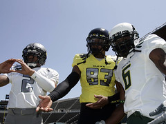
• Look at this photo. Now put your hand over the yellow-jerseyed guy on the far right, and try to forget that this team has worn a bunch of bad superhero costumes for the past few years. Just look at the other four guys and be honest. Not so bad, right?
No, not bad at all.
Two points that you might have missed unless you were watching the press conference: First, although it’s not shown in any of the official photos, the set does include a white set of pants. Yes, this just adds to the mix-and-match nonsense, but it’s hard to argue with white pants. And second, you may have noticed that the gray helmet had a pale-gray logo decal on one side and yellow on the other. They will not be worn at the same time; the idea is that they can switch decals depending on which jersey the helmet is paired with. And one thing I missed myself until I saw this photo: The gray pants apparently have a white stripe.
Oh, and I realize Nike and Oregon aren’t using the word “gray,” but I refuse to go along with any of their comic book color names, and I hope nobody else will either, at least on this site. Look, no matter what they call it, it’s green, yellow, gray, and black, the end. Don’t believe me? Just ask Mrs. Blandings’s painter.
As for all the “lighter, faster, dryer” performance points, nobody cares. Wake me when there’s a new uni set that doesn’t make all these claims. Until then, it’s dog bites man.
Anyway, I’m more interested in how it looks. And although I didn’t expect to be saying this, some of it looks stupid, but a lot more of it looks good. Who’da thunk?
Raffle/Redemske Reminder: Many thanks to those of you who’ve donated to the Bryan Redemske Relief Fund while entering the Wilco ticket raffle. For those of you who don’t know what I’m referring to, please look here.
Uni Watch News Ticker: Check this out: Barbie foosball (with thanks to Ryan Connelly). ”¦ Remember all those charts from yesterday’s post? There’s an interview with the guy who designed all of them here (with thanks to Jennifer Muller). ”¦ And here’s an even better chart, but someone else. Further info here (with thanks to longtime Uni Watch pal Rob Walker, whose Murketing blog remains essential reading). ”¦ High school teams can’t sell ad space on their uniforms, but they could do so on warm-ups and practice gear (with thanks to Jason Hillyer). ”¦ Jeff Provo has a pet peeve: “In 1994, the Raiders wore a throwback uniform with a white helmet shield, which was supposed to represent the 1963 helmet. This has since perpetuated into every single using a white shield to represent the 1963 uniform. But the shield used in 1963 was not white. It was un-filled, and thus silver. Please help stop the spread of the white shield myth.” Consider it done. Happily, they appear to have gotten it right for the upcoming AFL throwbacks. ”¦ Thirty years ago, a Westbury, Long Island catcher named Tom Donohue had a cup of coffee with the Angels. “When the Angels came to Yankee stadium in June of that year, the town of Westbury announced ‘Tom Donohue Day’ and actually had it recognized on the Yankee Stadium field before the game,” writes Donohue’s nephew and Uni Watch reader Bryan Molloy. “But Angels manager Jim Fregosi, with probably half the town of Westbury in attendance, benched him the entire game. My dad still curses the mention of Fergosi to this day.” So last weekend, Molloy and a bunch of his relatives decided to throw a surprise party to commemorate the 30th anniversary of Tom Donohue Day. “I’m a graphic designer,” says Molloy, “so I wanted to treat it as if Tom Donohue was a superstar player (he was to us). I tried to come up with something that would be a fitting design if a MLB team was honoring one of their best players. The next thing I knew we were not just getting T-shirts, but ice cream helmets, jersey patches, a giant banner, giant cardboard cut outs of my uncle from his minor league days, and more.” Very nice — you can see photos from the event here. ”¦ The 76ers have officially gone back to their classic logo. According to a team source, “Uniforms will be announced at a later date, but will be an updated interpretation of the Hardwood Classics uniforms,” which is consistent with what I’ve seen and heard from other quarters. ”¦ Here’s the annual Roger Federer Wimbledon/fashion article (with thanks to Stephen Wong). ”¦ Darren Rovell called me yesterday to let me know he’d just written a CNBC scoop about Sammy Sosa’s elasticized sleeve cuffs. He seemed a bit disappointed when I told him I’d written about that many times over the years. I also don’t agree with his analysis that Sosa was trying to make his biceps look bigger, but hey, that’s just me. ”¦ Anyone know what logo is on Tom Brady’s cap? (As spotted by Matt Englander.) ”¦ There used to be a watchmaker’s school in Elgin, Illinois. And their basketball team was called, of course, the Watch Makers (with thanks to Jonee Eisen). ”¦ Second photo in this slideshow shows Wilt wearing No. 16. What’s the deal with that? (With thanks to Shawn Bleiler.) ”¦ Brutal Tiger Stadium demolition photos here (with thanks to Ethan Shull). ”¦ Reader Will Horowitz tipped me wise to golfer Anna Rawson, who has some interesting ideas about golfwear. ”¦ The Jets are the latest NFL team to opt for ads on their practice jerseys (with thanks to Brooks Simpson). ”¦ Nice story from Jonathan Backstrom, who writes: “I recently got married on June 13th, and we were able to get Carl Beane, the voice of the Red Sox, to announce our wedding party at the reception. He ended up bringing his two World Series rings with him for guests to take photos with. Our uni numbers alluded to the date of the wedding.” ”¦ Doug Keklak notes that Pirates pitching coach Joe Kerrigan was wearing the wrong cap last night. ”¦ Corporate naming rights aren’t just for stadiums anymore. The subway station in question is eight blocks from my house. As Brad Thomas suggests, I might need to make an “I’m Calling It Pacific St.” shirt. … Here are the shirts that the Reds gave out at the Civil Rights Game. “They were shirts, not vests, had the sponsor logo on the right sleeve, used black instead of navy blue, and the nameplate was one-color black instead of red with navy blue border,” gripes Mike Miller. On the plus side, the scoreboard featured old logos. Look closely and you can see that old Comiskey in the background of that shot. Meanwhile, you may know that Bill Cosby donned a Homestead Grays uni for the pregame festivities, but did you know he didn’t wear shoes? “He said the groundskeeper told him he would kill him if he did any damage to the field wearing spikes,” says Mike. And one final detail: “The White Sox coaching staff didn’t have navy shirts to wear under their jerseys, they wore their normal black instead.” ”¦ New Bundesliga jerseys here (with thanks to A.J. Zydzik).
I like them. They are without doubt improved. I hated the diamond plate. However I wish the kept the yellow and nixed the “steel”.
I was watching TSN today as I was getting ready for work, and they were showing the ESPN coverage of Wimbledon. Before Sharapova’s match, they had a round-table discussion regarding the thought of a “shot clock” in tennis.
Basically, the clock would run between the end of one point until the serve to start the next point. If a player took too long between points, he or she would be penalized in some fashion. Essentially, it would be like a playclock in football.
Phil and tennis people, your thoughts on this seemingly radical idea?
Is that a white stripe on the Oregon grey pants or a whole white ass panel?
The Tom Brady logo is, well, the Tom Brady logo.
link
There is text in the black line on the carbon helmet.
GO OREGON
GO DUCKS
GO HARD
I like the wings too. I did when they went with the all-black set last season, and I like that they’re going with it across the boards. I also like the “carbon fiber” helmet – totally works. However, and I can’t believe I’m saying this, but I think the pants are missing something. They have so many interesting textures/finishes/whatever up top that the relatively plain pants look like… I don’t know, practice pants or something. Still, pretty big improvement.
Anna Rawson in theory, I can’t tell how long the skirt is, but if the wind was really blowing wouldn’t it get in the way of her swing?
Another team that tried link on the link. Yikes.
[quote]Phil and tennis people[/quote]
tennis people? you mean fans?
while there is no “shot clock” per se, players are actually given 25 seconds between points, and the referee is supposed to keep that time on a stop watch…repeated violations of this rule are supposed to result in warning, loss of point, loss of game then loss of match, although i can’t remember any player ever losing more than a point for repeated violations
i don’t buy a “hard and fast” sticking to this rule, so long as the player (or players) aren’t abusing the time limit, but there is a rule already in place to keep the pace of play moving
another “rule” is that the receiver is supposed to play at the pace of the server, although this is not something that is stringently enforced (in other words, if the server is ready, you’d better be ready to receive the serve, not toweling off or walking around behind the court and shit), but this infraction is usually dealt with by speaking to the players during the changeover, not normally by scolding them on the court
as far as a “shot clock” at a place like wimbledon, where the fans are generally reserved and respectful? probably wouldn’t make much of a difference, but at the us open during a late match when everyone’s been pounding cocktails all evening — might make for some interesting “FIVE…FOUR…THREE…TWO…ONE” chants…
Did Brandon Flowers of The Killers go to Oregon or something?
link
so i was intrigued by the picture of LPGA golfer Anna Rawson in her skirt and decided to check out her website. in doing so i stumbled upon this cell phone number she has established so she can tell her fans what she is doing and also let her fans leave her messages(213-785-7675)…an interactive twitter if you will, since she says she will call back some fans. if you have some time to kill, these can be entertaining…or totally creepy
Who knew that Dr. Huxtable is a ‘rups, man?
That put me in the mood for this gem from a last October!
link
aside from the “highlighter yellow” jersey, the new oregon sets are awesome. I really like the patterned gray helmet. innovative and creative. The wings on the jersey are not so “cartoony” to look ridiculous
Carl Beane, the Red Sox PA announcer is for hire for many weddings through his website.
link
A friend of mine had Carl at his wedding. Got my picture with the 2004 ring…thing was huge.
That wedding attire looks so awful
Oregon cleat suggestions:
link
link
[quote comment=”336603″]“Another team that tried link on the link.
“Yikes.”[/quote]
And who can remember when they played Minnesota with the “M” on the shoulders when Chris Fowler quoted Susan Powter: “Stop the insanity!”?
The Watch Makers should have been called the Clock Cleaners!
No, no, no. The new Oregon uni’s may be better than the previous Nike Oregon horror (and that’s debatable), but they’re still bad. I can maybe understand liking the new uni’s better than the old, but I not actually LIKING them! Is gray (or silver) going to be the new black now, with any old team using it? Why even have school colors?
From the Bundesliga kits link; Who let Reebok design soccer jerseys? Didn’t anyone see the NHL?
Those are atrocious.
In regard to Oregon’s new uni – I find the green colour they use – very muted – i.e. it’s a dull shade of green – which considering how they go for the shock value – is ironic.
I think teams that introduce this many uni combos (and this would apply to the Texas Rangers and the NY Mets) – it should be called a wardrobe unveiling – as opposed to an uniform unveiling – when you’re changing unis every game, there’s nothing uniform about it.
[quote comment=”336603″]Another team that tried link on the link. Yikes.[/quote]
I totally dig this Iowa winged jersey. Would go perfect with this link Or, how about a more modern take on this leather helmet, ala Michigan winged style.
A step in the right direction for Oregon. I think the winged-shoulders have a chance to be a keeper (but they’ll probably go with something else in a couple years; change for the sake of change). With that many combos, the pressure to use them all in one season is probably there from Nike. It’s likely they’ll wear a different combo for each of their 12 or 13 games, which is kinda dumb.
I’ll take this over Oregon’s unis any day of the week, and twice on Saturdays in the fall.
link
Paul,
If Sammy’s elastic sleeves weren’t about highlighting his muscles- what were they about?
I always figured they were a “look how strong I am” thing.
[quote comment=”336618″]A step in the right direction for Oregon. I think the winged-shoulders have a chance to be a keeper (but they’ll probably go with something else in a couple years; change for the sake of change). With that many combos, the pressure to use them all in one season is probably there from Nike. It’s likely they’ll wear a different combo for each of their 12 or 13 games, which is kinda dumb.
I’ll take this over Oregon’s unis any day of the week, and twice on Saturdays in the fall.
[/quote]
Shoot wrong link. Corrected.
link
link
RE: ’94 NFL Helmets
The NY Jets had an all green throwback that was WAY off…amazingly, this was the first Jets game I went to ever, and they played the Pats (who wore Pat Patriot helmets, sadly, those were correct)
link
What’s wrong with yellow pants? For a home uni, a green jersey with yellow pants makes the most sense to me.
Concerning the naming of a subway station… Aren’t things like subway stations, roadways, etc. supposed to be used to navigate around the area? Why would we ever sell naming rights to something like that? We don’t do that for roads (yet, thank God) and I hope we never will. Can you imagine?
Lost guy: “Hey, how do I get to the Marriott?”
Gas station guy: “You just head down the 408, brought to you by Sears, and take a right on the Citi 17th Street. Go a mile and the Marriott is on the left, right by the intersection of BestBuy Maple St. and Citi 17th…
Lost guy: “So, it’s by a Sears and a Best Buy?”
Gas station guy: “No… *sigh*”
And not to mention that it would completely negate the honor of having a street named after you… “Mommy, how much did Martin Luther King have to pay to have this street named after him?”
Slippery slope, my friends…
The Barack-lyn Cyclones played yesterday.
link
The Watchmakers reminded me of when Bullwinkle J. Moose QB’d his alma mater Whatsamatta U. to victory over the rival Watchmakers Technical Institute or Tick Tock Tech. Still makes me giggle.
[quote comment=”336617″][quote comment=”336603″]Another team that tried link on the link. Yikes.[/quote]
I totally dig this Iowa winged jersey. Would go perfect with this link Or, how about a more modern take on this leather helmet, ala Michigan winged style.[/quote]
When Iowa went to its banana-peel look, I didn’t think it was so awful. At the time, all teams looked too similar.
But the outfitter went out of business and Iowa went to a more traditional look until Kirk Ferentz came on board. Then he returned to the familiar Steelers style. It was a good move.
Still, they use the abbreviated striped pants occasionally for practice. With the plain jerseys they look a lot better.
Anyone know the thought behind the “Belotti” numbers that taper down? Looks odd to me, and makes it harder to read, no?
Also, I still HATE (and yes, I do mean HATE)the lighter top w/ the darker pants – other than white. Hate it when West Virginia, Cal, Oregon, Oregon St. Patriots, Titans – and even my beloved Mizzou do it.
What stood out to me the most was that backwards 5 number on the white shirt.
[quote comment=”336623″]Concerning the naming of a subway station… Aren’t things like subway stations, roadways, etc. supposed to be used to navigate around the area? Why would we ever sell naming rights to something like that? We don’t do that for roads (yet, thank God) and I hope we never will. Can you imagine?
We do sell naming rights to raods, at least for those people willing to do a clean-up. there is on-going battle in Illinois after a neo_nazi group got a sign installed sponsoring their clean-up efforts.
the legislature couln’t do anything about it so they decided to name the highway after a Holocaust survivor Rabbi. His family is now objecting becuase they do not want to be associated with the other group!!!
Great old baseball team photo on Shorpy…
link
Love the double buckle belt on the player in the back row.
On the mascot chart, just wondering which league the “Toronto Maple Leaves” play in?
[quote comment=”336621″]RE: ’94 NFL Helmets
The NY Jets had an all green throwback that was WAY off…amazingly, this was the first Jets game I went to ever, and they played the Pats (who wore Pat Patriot helmets, sadly, those were correct)
link
It seems like half the 1994 throwbacks were off. The Bills and Jets wore their regular helmets with retro decals, so instead of white they had red and green lids, respectively.
The Packers’ throwback uni still bugs me, fifteen years later. Didn’t anyone know that they actually had link in the 1940s, not link?
My 2 cents, as an Oregon alum, is that this bag is decidedly mixed.
I love the wings. An inspired choice.
Not so big on continuing to throw the school colors off a cliff. Green and gold are nothing to be ashamed of, but that’s the inescapable conclusion we can draw from the players’ love of black and now silver.
[quote comment=”336619″]Paul,
If Sammy’s elastic sleeves weren’t about highlighting his muscles- what were they about?
I always figured they were a “look how strong I am” thing.[/quote]
I just figured he liked a tight fit, for whatever reason.
[quote comment=”336627″]Anyone know the thought behind the “Belotti” numbers that taper down? Looks odd to me, and makes it harder to read, no?
[/quote]
The number typeface is awful. Someone needs to photoshop in the Penn State “collegiate”-style numerals and I bet it would look so much better. It’s the whole “fake tech” aspect that bothers the hell out of me.
Concerning the subway naming rights, the article wasn’t entirely correct. Boston did in fact sell the naming rights to link station in 1997. It was known as State/Citizens Bank, but the name didn’t really catch on. Mercifully, it failed miserably, and the interwebs are seemingly devoid of any photographic evidence of this farce. The failure is the reason why no bids were received on any of the other stations. Good for Barclay’s to throw their money away on something people are either gonna be outraged over or completely ignore.
On the naming rights:
City College of SF had an idea to sell naming rights to individual classes in order to save courses facing budget cuts.
link
[quote comment=”336635″][quote comment=”336619″]Paul,
If Sammy’s elastic sleeves weren’t about highlighting his muscles- what were they about?
I always figured they were a “look how strong I am” thing.[/quote]
I just figured he liked a tight fit, for whatever reason.[/quote]
Funny. I always saw it as a gun show as well.
I also find it really amusing that Mr. Rovell thought his column was a scoop. As if you wouldn’t have noticed it yourself or a reader wouldn’t have tipped you wise.
I think Oregon’s uniforms are STILL terrible. Yes, they might slightly less gaudy, but wings on the shoulder pads? What are they – Victoria’s Secret models? Plus, the uniform numbers are NOT an improvement – they are worse.
I can understand the sentiment that “well, the unis are better than they were”, but that’s probably what Nike was counting on, right? Make uniforms that are so hideous, that whatever they design next would look downright conservative in comparison.
But they aren’t fooling me – Oregon is still the worst-looking football team around.
Could the dude in the leisure suit be the mystery dude from the ’77 All Star Game?!
link
[quote comment=”336620″][quote comment=”336618″]A step in the right direction for Oregon. I think the winged-shoulders have a chance to be a keeper (but they’ll probably go with something else in a couple years; change for the sake of change). With that many combos, the pressure to use them all in one season is probably there from Nike. It’s likely they’ll wear a different combo for each of their 12 or 13 games, which is kinda dumb.
I’ll take this over Oregon’s unis any day of the week, and twice on Saturdays in the fall.
[/quote]
Shoot wrong link. Corrected.
link
link
Yep. Gotta love those Bears unis.
*wink*
Like the new Oregon wings OK. HATE everything else. Black=hideous. Whie a grey unis would look OK (aside from the helmet pattern), except for the fact steel or whatever isn’t a Oregon school color anymoer than black. Maybe Wisconsin should trot out a powder blue uni set. I know it isn’t one of the school colors, but hell, it’s trnedy right? And maybe have a pinstripe helmet because it works in baseball. Makes the same amount of sense no?
Orgeon football continues to be the abomination of all sports uniforms. Sorry Boise St, the title remains far out of your reach.
On the other hand, LOVE the 76ers return to the classic unis. As a huge late 70-s early 80’s Sixers fanatic, this is great news.
Honestly, I’ll come in as the devil’s advocate on the naming rights. The MTA is already short on funds, and I’d rather they raise the extra money through selling naming rights than raising the rates.
The Tom Donahue logo is great. The whole idea is really cool and the execution is phenomenal. What a nice way to celebrate a family member.
The Anna Rawson pic is hot. I’m def going to suggest that to my wife the next time we hit the links.
New Oregon unis are an improvement, but still some unsettling quantity/quality issues.
I’m thinking Oregon ought to change its nickname from the Ducks to the Drawingboards, because that’s what Nike designers are using them for.
Or maybe the Oregon Garanimals – a tribute to the children’s mix-and-match clothing line.
A nod of the head for an attempt with the shoulder “wing” design, although I think it would work even better if the mascot was a bird of prey (Eagles, Falcons, Hawks, etc.) or even something like the Ravens. But Ducks? Admit it – the first things you think of when you hear “duck” are bills and webbed feet.
[quote comment=”336642″][quote comment=”336620″][quote comment=”336618″]A step in the right direction for Oregon. I think the winged-shoulders have a chance to be a keeper (but they’ll probably go with something else in a couple years; change for the sake of change). With that many combos, the pressure to use them all in one season is probably there from Nike. It’s likely they’ll wear a different combo for each of their 12 or 13 games, which is kinda dumb.
I’ll take this over Oregon’s unis any day of the week, and twice on Saturdays in the fall.
[/quote]
Shoot wrong link. Corrected.
link
link
Yep. Gotta love those Bears unis.
*wink*[/quote]
Nice one. : )
[quote comment=”336614″]No, no, no. The new Oregon uni’s may be better than the previous Nike Oregon horror (and that’s debatable), but they’re still bad. I can maybe understand liking the new uni’s better than the old, but I not actually LIKING them! Is gray (or silver) going to be the new black now, with any old team using it? Why even have school colors?[/quote]
The Oregon unis don’t look too bad (given the recent history at Oregon, to be sure), but your point was one I made yesterday: Why stray so far from school colors? Evidently they have become largely meaningless.
To those who garroted me for knocking uniforms we hadn’t seen yet, I absolutely did NOT do that. I questioned the general design approach these days…that football players look better if they dress like motocross riders or performers in Cirque du Soleil. Go back and read if you don’t believe me.
And, to the overwrought and hypersensitive poster who called me “yellow”…see the post I added to yesterday.
—Ricko
[quote comment=”336604″][quote]Phil and tennis people[/quote]
tennis people? you mean fans?[/quote]
Is there a Tennis Wing? And if so, are you its president?
why didn’t oregon go back to something traditional and non-vomit inducing like these
link
link
If i was 17 again (I sound like a cranky old man) I don’t know how I could go to that University if they think that those uniforms are a representative of their institution…
they are beyond hideous
[quote comment=”336623″]. . .
Lost guy: “Hey, how do I get to the Marriott?”
Gas station guy: “You just head down the 408, brought to you by Sears, and take a right on the Citi 17th Street. Go a mile and the Marriott is on the left, right by the intersection of BestBuy Maple St. and Citi 17th…
Lost guy: “So, it’s by a Sears and a Best Buy?”
Gas station guy: “No… *sigh*”
…[/quote]
Or in the immortal words of Art Fern: “How do you get there? Let me tell you friends, how do you get there! You take the San Diego Freeway to the Ventura Freeway. You drive to the Slauson Cutoff, get out of your car, cut off your Slauson, get back in your car, then you drive six miles till you see the Giant Neon Vice-Squad Cop.”
[quote comment=”336632″]
The Packers’ throwback uni still bugs me, fifteen years later. Didn’t anyone know that they actually had link in the 1940s, not link?[/quote]
I guess they felt it gave the unis a more old-timey look.
IIRC, the helmets they wore with those were just their standard ones without the logo and stripes and they kept the green facemasks, right? To me, that’s even worse than the wrong color for the pants.
[quote comment=”336624″]The Barack-lyn Cyclones played yesterday.
link
Was at the game. Best two lines of the night-with two outs to go in the ninth and the Cyclones winning, the crowd starting chanting, “Yes we can! Yes we can!” which, after the pitcher gave up a long double to left and a hard hit single to right, was quickly followed by, “We want change! We want change!”
Pretty sure the Anna Rawson shot is from a photo shoot & doesn’t reflect her normal clothes on the links.
[quote comment=”336610″]That wedding attire looks so awful[/quote]
Now that the ice has been broken…
Maybe I’m just real old school — or maybe I just like when formal stays, well, formal — but I think it’s strange when weddings are denigrated with props, line dances or the bride and groom dressing like draft picks. Or Brady Quinn ( link ). I mean, you won’t find many more ardent Yankee and Giant fans than me, but the thought of throwing my Kerry Collins jersey on over my penguin suit or putting my Yankee hat on to cut the cake never ever crossed my mind.
(Carl Beane was a cool — and subtle enough — touch. Well played there.)
To each his own, I guess…
[quote comment=”336649″][quote comment=”336604″][quote]Phil and tennis people[/quote]
tennis people? you mean fans?[/quote]
Is there a Tennis Wing? And if so, are you its president?[/quote]
that would be brinke
Link again b/c I $uck…
link
Seeing the Auburn pictures had me thinking. Where do you guys stand on white cleats vs. black cleats in college football?
Any NBA fans wanna help with this:
link
Screenshot from last night’s Pirates/Indians game. At first I thought the guy had his jersey on backwards, then I thought it was a Gabriel Brothers’ special. Upon further review, the jersey looks right as far as the neckline, is that a line of clothing that is officially licensed?
So I’m watching Wimbledon now and I notice that Centre Court has a new scoreboard (I think it was there since last year).
For Ladies’ matches, the board used to have “Miss” (or Mrs. for married players? can’t recall) before the names of the female players but it seems they don’t do that anymore this year.
A shot from last year:
link
the Oregon uniforms are an improvement. I’m surprised the road steel uniforms got approved because the numbers will be completely unreadable by both fans and officials.
A couple of things regarding Oregon’s uniforms:
1) Don’t get too concerned with how they look. Phil Knight will change them in two or three years.
2) It is just a public relations gimmick. Why else would anyone be discussing Oregon football in June?
[quote comment=”336659″]Any NBA fans wanna help with this:
link
Screenshot from last night’s Pirates/Indians game. At first I thought the guy had his jersey on backwards, then I thought it was a Gabriel Brothers’ special. Upon further review, the jersey looks right as far as the neckline, is that a line of clothing that is officially licensed?[/quote]
I vote just a backwards jersey.
One thing I noticed on the mascot chart — the Tampa Bay Rays mascot “Raymond” is a sea dog, not a sting ray like it says. He’s been a sea dog since the team’s inception in 1998.
[quote comment=”336658″]Seeing the Auburn pictures had me thinking. Where do you guys stand on white cleats vs. black cleats in college football?[/quote]
I think it depends on the team. I think Alabama looks better in black shoes, but Auburn looks better in white shoes.
The thing these days is that shoes aren’t “white” or “black.” There are lots of white-and-black, and lots of other colors thrown in these days, too. Throw the spats-tape-jobs on there, also. It’s getting harder to tell if a team is wearing “white” or “black” shoes.
Better in black:
USC
Notre Dame
Alabama
Penn State
Michigan
Ohio State
Better in white:
Florida
LSU
Auburn
Texas
Oklahoma
Miami
UCLA
Tennessee
On subway stations naming, while the DC Metro hasn’t sold off any naming rights to station names, they do suffer from naming creep as every neighborhood tries to get their name onto the station name. First it was schools, so instead of, say, “College Park” its “College Park-UMD”. Then after Congress ordered Metro to change “National Airport” to the full “Washington Ronald Reagan National Airport”, other groups got into the act. So now, instead of simply “Grosvenor” like it was for twenty plus years, now it’s “Grosvenor-Strathmore”.
The 1964 Cincinnati Reds home uniform did use “black” in some areas. The particular uniform style, which was introduced in 1961, originally had no player names on the back. Also, the uniforms did not initially have the stripes around the vest sleeves, but I believe that one black band was added on the left sleeve when then, team owner, Powell Crosley, died before the 1961 season began. The second black band was added the following season and the look was kept for the duration of the uniform which was last worn in 1966. Not sure the exact year the names on the back were introduced but the road uniforms were in single color “black,” through 1966. I believe that the NOB of the home uniform might have initially been the same but eventually was red outlined in navy by 1964. The black bands around the vest sleeve openings were always in black and not navy.
BUCKEYES AND NIKE
TO EXPAND PALETTE
COLUMBUS, Ohio–Working with Nike, the Ohio State University will be changing things over the next few football seasons, adding to the traditional color scheme of red, gray/silver and black, it was announced at a news conference today.
“We will be working royal blue and kelly green into the look, expanding the color palette of the Ohio State University football program,” said Lindsay Finnucun, head of Nike’s football design team. “There will be, at a minimum, a royal jersey and a kelly jersey new to the mix.”
“Team colors have become essentially irrelevant,” she added. “The important thing is that between the visiting team’s colors and the numerous new Buckeye combinations, fans will be assumed that they will be having a once-in-a-lifetime visual experience at every home game.”
“And, of course, the players don’t want to wear the same thing EVERY GAME. How boring is THAT.”
The Nike media kit lists Finnucan’s design experience as spending two weeks as a student intern on the set of “Will & Grace” and one day of “thinking up ideas” for new uniforms for the local high school during eighth grade home economics class at Algonquin Middle School in Far Upper Dinghy, PA.
As the person who wrote the article on the history of the Ducks uniforms since 1994.
link
I’ll put in my two cents.
The Ducks went a little bit conservative with their color combos. Excluding the carbon helmet, that is something that I’ll talk about later.
We have seen how teams in all sports have gone from three color schemes to four and five. I can understand black as a simple addition color, but the silver also works well with the green.
I think that the Ducks could have chose yellow pants, but I am guessing that Nike took a ton of flack for the all yellow combination and said to the them, it is your call on those. Belotti probably said no to those as his first AD suggestion. Other wise the yellow pants would work with all of the color combinations.
The one thing that sits odd with me is the ability to change the decal color on the helmet. For Duck fans, we only know the O in two colors, yellow and green. This is where you start getting into the New Era hat color designs for every day of the year. After just going to watch the Mariners play the D’backs and going into the “fashion” hats from New Era, I was a little disgusted by all of the designs that were available. And not surprisingly, they were discounted 30% because no one is buying them. Getting back to the decal, if your team is matching it to the pants, something is wrong. The decal/logo is a major part of the identity of the school, not the pants (unless you are Levi’s). When you live in a state with a reputation for rain a grey O does not look good.
As for the helmets, I like them, but I bet the black and green helmets will stay in Eugene, while the white and carbon helmets will be on the road. A yellow helmet would have been a good touch to the history of Duck football, but not the flamed version. The carbon helmet to me is a bit of a stretch, but I’ll give them credit for taking a chance. I think that the vertical lettering on the stripe in the carbon is just weird, vertical lettering on a line that cannot be fully seen is just a horrible design.
link
link
All in all, it could have been worse with another all yellow combo, or different front and back color combinations like the Raptors. I like the look for the Ducks, now if they could just win games in November.
[quote comment=”336662″]A couple of things regarding Oregon’s uniforms:
1) Don’t get too concerned with how they look. Phil Knight will change them in two or three years.
2) It is just a public relations gimmick. Why else would anyone be discussing Oregon football in June?[/quote]
Bill they have a new coach, replacing the best coach in school history. They have some players from last year’s team transfer to other schools.
That is why you are talking about the Ducks in June.
The only teams that don’t change every two to three years are professional teams, excluding soccer in Europe.
been wanting to do my take on the new duck unis (in case anyone cares)…
i’d say im in agreement with mr. lukas on the entire first part of this post, from “should they have stuck to one color helmet” to “the silly 50% lighter D-rings”… however,
[quote]- The wings are a huge improvement over the diamondplate. In fact, if the wings had been used back in the 1940s by the Eagles or any other bird-named team, we’d all think it was a classic design and wish someone would resurrect it.[/quote]
um…no…these look more like what roman centurions wore than actual wings; supposedly they serve some purpose…not quite sure what that is (strengthening the material maybe?), but aesthetically, i don’t like them…are they better than the diamondplate? that’s like asking is it better to be boiled alive or hanged…i spose hanging is “better”
[quote]- No more yellow helmet.[/quote]
agreed
[quote]- No more yellow pants.[/quote]
this was the one feature (when combined with the yellow tops) of the old set i actually liked (was part of my uni-confession); so not having the all yellow option is now disappointing
[quote]- No more vertical “Oregon” wordmark on the thighs.[/quote]
so how will we know the team now?
[quote]- Number font has been improved (although it still has a long way to go).[/quote]
agreed — bellotti bold, while unique and screaming “we’re oregon football” is not the most aesthetically pleasing font; adding the serifs is a slight improvement
[quote]- I think this look is great – vintage Oakland Raiders! You say these colors have nothing to do with Oregon or its heritage? Dude, this football program hasn’t had anything to do with Oregon’s heritage in a long time. Just dig the look and be glad it doesn’t have a cape or something.[/quote]
tossing aside the fact that gray (slate/charcoal/clay/whateverthefuck you want to call it) isn’t a school color, it’s not a bad color…but completely unnecessary…at least it’s not black…
[quote]- I’m actually fine with the patterned helmet thingie. Up close it looks textured; from a distance it just looks gray. As gimmicks go, this one’s reasonably subtle.[/quote]
whatever…if this is the direction helmets are taking, and not just for oregon, then there’s other things to worry about…would i have preferred a solid gray matte finish to match the pants? yes
[quote]- Look at this photo. Now put your hand over the yellow-jerseyed guy on the far right, and try to forget that this team has worn a bunch of bad superhero costumes for the past few years. Just look at the other four guys and be honest. Not so bad, right?[/quote]
i’d rather see the yellow-jerseyed guy with yellow pants
[quote]No, not bad at all.[/quote]
agreed…not bad at all…i like the all matte finishes on the various combos — wish the helmets had that feature, but what’re ya gonna do
glad they kept the white pants, but that’s only so they can have at least 3 different (i bet they have more) away combos…green, gray, white, and i bet they wear the black pants at least once too
glad they dumped the puke yellow helmet…if it wasn’t going to match the highlighter yellow, then what was the point?
wish they’d have dropped the wings, although i spose it’s better than the diamondplate or “motocross” might have been…still don’t think it’s necessary…if it is necessary to ‘reinforce’ the uniform, do it with a same-color inlaid material
but overall? not bad…not bad
[quote comment=”336666″]On subway stations naming, while the DC Metro hasn’t sold off any naming rights to station names, they do suffer from naming creep as every neighborhood tries to get their name onto the station name. First it was schools, so instead of, say, “College Park” its “College Park-UMD”. Then after Congress ordered Metro to change “National Airport” to the full “Washington Ronald Reagan National Airport”, other groups got into the act. So now, instead of simply “Grosvenor” like it was for twenty plus years, now it’s “Grosvenor-Strathmore”.[/quote]
Yes, the station names are so long now, it borders on the ridiculous. Do we really need to be so P-C that there are 3-named metro stops?
U Street-Cardozo-African American Civil War Memorial
New York Ave.-Florida Ava.-Gallaudet Univ.
[quote comment=”336666″]On subway stations naming, while the DC Metro hasn’t sold off any naming rights to station names, they do suffer from naming creep as every neighborhood tries to get their name onto the station name. First it was schools, so instead of, say, “College Park” its “College Park-UMD”. Then after Congress ordered Metro to change “National Airport” to the full “Washington Ronald Reagan National Airport”, other groups got into the act. So now, instead of simply “Grosvenor” like it was for twenty plus years, now it’s “Grosvenor-Strathmore”.[/quote]
Adding the college name or other ID (like Archives, ___ Memorial etc)can help the many many many tourists in DC.
[quote comment=”336668″]BUCKEYES AND NIKE
TO EXPAND PALETTE
COLUMBUS, Ohio–Working with Nike, the Ohio State University will be changing things over the next few football seasons, adding to the traditional color scheme of red, gray/silver and black, it was announced at a news conference today.
“We will be working royal blue and kelly green into the look, expanding the color palette of the Ohio State University football program,” said Lindsay Finnucun, head of Nike’s football design team. “There will be, at a minimum, a royal jersey and a kelly jersey new to the mix.”
“Team colors have become essentially irrelevant,” she added. “The important thing is that between the visiting team’s colors and the numerous new Buckeye combinations, fans will be assumed that they will be having a once-in-a-lifetime visual experience at every home game.”
“And, of course, the players don’t want to wear the same thing EVERY GAME. How boring is THAT.”
The Nike media kit lists Finnucan’s design experience as spending two weeks as a student intern on the set of “Will & Grace” and one day of “thinking up ideas” for new uniforms for the local high school during eighth grade home economics class at Algonquin Middle School in Far Upper Dinghy, PA.[/quote]
Please tell me this is a joke. As an A’s fan I love Kelly Green but not at Ohio State. Team colors are irrelevant? The players are bored? NOOOOOOOOOOO! Can you miss the point any more than this?
By some of the responses here I think people have never seen uniforms before. It’s not like Oregon is the first team to wear a color that isn’t an official school color.
76ers new-old logo actually has a slightly altered 6. I think it makes it appear mismatched compared to the 7.
link
[quote comment=”336675″]By some of the responses here I think people have never seen uniforms before. It’s not like Oregon is the first team to wear a color that isn’t an official school color.[/quote]
Chris, I don’t think that’s what people are saying at all. Just recognizing that there is disconnect with designing uniforms.
What a team has official colors, then puts out a uniform where the primary color used is not part of that palette, well, unis enthusists are going to take note.
There is a huge difference betwen a team throwing in small black accents in a uniform versus that gray/white Oregon set.
[quote comment=”336675″]By some of the responses here I think people have never seen uniforms before. It’s not like Oregon is the first team to wear a color that isn’t an official school color.[/quote]
There is a HUGE difference between using additional colors as accents and using them as the dominant colors for a uni set.
“vintage Oakland Raiders”? What do the Raiders have to do with Oregon? Oh, wait, I forgot. The Duck Waders.
—Rick
[quote comment=”336673″][quote comment=”336666″]On subway stations naming, while the DC Metro hasn’t sold off any naming rights to station names, they do suffer from naming creep as every neighborhood tries to get their name onto the station name. First it was schools, so instead of, say, “College Park” its “College Park-UMD”. Then after Congress ordered Metro to change “National Airport” to the full “Washington Ronald Reagan National Airport”, other groups got into the act. So now, instead of simply “Grosvenor” like it was for twenty plus years, now it’s “Grosvenor-Strathmore”.[/quote]
Adding the college name or other ID (like Archives, ___ Memorial etc)can help the many many many tourists in DC.[/quote]
No, tourists will still get lost, whether you add 400 names to the metro stops or not. They will also continue to stand idly in front of the turnstiles, stand to the left on the escalators, stand in the doorways of metro traincars, and let their kids hang from the handle bars on the ceiling of the traincars.
[quote comment=”336645″]The Tom Donahue logo is great. The whole idea is really cool and the execution is phenomenal. What a nice way to celebrate a family member.
The Anna Rawson pic is hot. I’m def going to suggest that to my wife the next time we hit the links.[/quote]
I will also suggest that to my wife…honey, you stay home while I go golfing with Anna Rowson.
Mister Met is a mythological creature?
[quote comment=”336674″]Please tell me this is a joke. As an A’s fan I love Kelly Green but not at Ohio State. Team colors are irrelevant? The players are bored? NOOOOOOOOOOO! Can you miss the point any more than this?[/quote]
Ricko 1, Berto 0
[quote comment=\”336678\”][quote comment=\”336675\”]By some of the responses here I think people have never seen uniforms before. It\’s not like Oregon is the first team to wear a color that isn\’t an official school color.[/quote]
There is a HUGE difference between using additional colors as accents and using them as the dominant colors for a uni set.
\”vintage Oakland Raiders\”? What do the Raiders have to do with Oregon? Oh, wait, I forgot. The Duck Waders.
—Rick[/quote]
Vintage Oakland Raiders…that\’s coming from this site not Oregon itself. That is Paul\’s opinion not the Oregon reasoning behind the silver/grey/carbon whatever color.
My point is, I believe some of this is bashing Oregon just cause its Oregon. Other teams have gone beyond just adding accents. I don’t remember any cries about the lack of school colors when other schools brought out black unis and other colors. Why does no one have a problem when other schools do that…or similar things like taking small accent colors of traditional jerseys and make the accent color the dominant color?
1. I LOVE the Wedding pics! Nice touch.
2. Regarding Wilt and #16. Throughout history that number has been reserved for only the most prolific of men. Similar to how the number 18 is revered in Hebrew culture, 16 is a mythic marking, if you will. What connect these historical figures, is their unmatched prowess both on and off the field.
link
link
link
This gentleman, who scored almost a musch as Wilt:
link
and
link
[quote comment=”336649″][quote comment=”336604″][quote]Phil and tennis people[/quote]
tennis people? you mean fans?[/quote]
Is there a Tennis Wing? And if so, are you its president?[/quote]
There are no “wings” at Uni Watch. Paul decreed so.
We – the proud, the noble, the lovers of blood on ice – are formally called the Hockey Hall of UW. ;o) LOL
[quote comment=”336685″][quote comment=”336649″][quote comment=”336604″][quote]Phil and tennis people[/quote]
tennis people? you mean fans?[/quote]
Is there a Tennis Wing? And if so, are you its president?[/quote]
There are no “wings” at Uni Watch. Paul decreed so.
We – the proud, the noble, the lovers of blood on ice – are formally called the Hockey Hall of UW. ;o) LOL[/quote]
I thought Paul said he liked the wings on the Ducks’ jersey..
[quote comment=”336682″][quote comment=”336674″]Please tell me this is a joke. As an A’s fan I love Kelly Green but not at Ohio State. Team colors are irrelevant? The players are bored? NOOOOOOOOOOO! Can you miss the point any more than this?[/quote]
Ricko 1, Berto 0[/quote]
“Now look sad and say ‘d’oh.’ D’oh”
If I were a top-tier football recruit, I would eliminate Oregon from consideration on the basis of ridiculous uniforms alone.
[quote comment=”336679″]No, tourists will still get lost, whether you add 400 names to the metro stops or not. They will also continue to stand idly in front of the turnstiles, stand to the left on the escalators, stand in the doorways of metro traincars, and let their kids hang from the handle bars on the ceiling of the traincars.[/quote]
Fantastic post! Love the saltiness…
[quote comment=”336683″][quote comment=\”336678\”][quote comment=\”336675\”]By some of the responses here I think people have never seen uniforms before. It\’s not like Oregon is the first team to wear a color that isn\’t an official school color.[/quote]
There is a HUGE difference between using additional colors as accents and using them as the dominant colors for a uni set.
\”vintage Oakland Raiders\”? What do the Raiders have to do with Oregon? Oh, wait, I forgot. The Duck Waders.
—Rick[/quote]
Vintage Oakland Raiders…that\’s coming from this site not Oregon itself. That is Paul\’s opinion not the Oregon reasoning behind the silver/grey/carbon whatever color.
My point is, I believe some of this is bashing Oregon just cause its Oregon. Other teams have gone beyond just adding accents. I don’t remember any cries about the lack of school colors when other schools brought out black unis and other colors. Why does no one have a problem when other schools do that…or similar things like taking small accent colors of traditional jerseys and make the accent color the dominant color?[/quote]
OK, but I can’t think off the top of my head of another school that’s taken an accent, non-official color and make it the dominant color?
Is black an FSU color? Their black jersey comes to mind.
most of oregon hate-talk directed at nike.
[quote]I don’t remember any cries about the lack of school colors when other schools brought out black unis and other colors.[/quote]
no…paul has never opposed black for black’s sake or had a “ditch the black” thing going
[quote comment=”336683″]Why does no one have a problem when other schools do that…or similar things like taking small accent colors of traditional jerseys and make the accent color the dominant color?[/quote]
What? Noone has a problem with it? Duke is constantly bashed here for their black basketball unis.
Florida State has taken healthy amount of flak for their blackout unis.
I, for one, despised Indiana’s uniforms of the link and I was thrilled when they went to link.
This coming from a 20 year old college student. I love the new Oregon uni’s. They are simple and cool. The Wings are pretty sweet. A new number font would really help, but I love them.
[quote comment=”336688″]If I were a top-tier football recruit, I would eliminate Oregon from consideration on the basis of ridiculous uniforms alone.[/quote]
To be quite honest, were you a top tier football recruit, you would probably be one of the few who would not like that look. Many many many of today’s young athletes like the bright colors and are more likely to find the uniforms interesting than the rest of us. Now we all know that nike controls, but there is a reason they have current and former players on the design committee.
[quote comment=”336673″][quote comment=”336666″]On subway stations naming, while the DC Metro hasn’t sold off any naming rights to station names, they do suffer from naming creep as every neighborhood tries to get their name onto the station name. First it was schools, so instead of, say, “College Park” its “College Park-UMD”. Then after Congress ordered Metro to change “National Airport” to the full “Washington Ronald Reagan National Airport”, other groups got into the act. So now, instead of simply “Grosvenor” like it was for twenty plus years, now it’s “Grosvenor-Strathmore”.[/quote]
Adding the college name or other ID (like Archives, ___ Memorial etc)can help the many many many tourists in DC.[/quote]
Like the idiots they are, tourists almost always use the Smithsonian exit even though most of the popular museums are closer to other stations. Not to mention the silliness of the “Woodley Park-Zoo” station, the Zoo’s actual street entrance is closer (and much much less uphill) to the Cleveland Park station.
Another thing I’d like to add in the accent-to-dominant color debate is this: the examples given (FSU black, Duke black, etc) all still had elements of the school’s traditional colors.
That gray/white set is pretty much devoid of any green or yellow. That’s something I don’t believe we’ve seen before.
While some of the Oregon unis look pretty snazzy–particularly the green top/green pant and white w/ green number/green pant combos–the real issue is that ultimately, they will eff it up in practice by trotting out the worst possible of the 80 potential variations.
We’ll never see the “good” ones on the field…
in my above comment I used the term “us” but truth be told I have always like the oregon unis. the diamondplate made me go huh? but i never disliked it. but many of my uni opinions run contrary so i just stay quiet..
[quote comment=”336652″][quote comment=”336632″]
The Packers’ throwback uni still bugs me, fifteen years later. Didn’t anyone know that they actually had link in the 1940s, not link?[/quote]
I guess they felt it gave the unis a more old-timey look.
IIRC, the helmets they wore with those were just their standard ones without the logo and stripes and they kept the green facemasks, right? To me, that’s even worse than the wrong color for the pants.[/quote]
Ah, I’m actually a little more forgiving about that one, since it’s pretty subtle.
The pants color, OTOH, is a pretty big foul-up. I guess we ought to consider ourselves fortunate that they didn’t wear link.
[quote comment=”336683″][quote comment=\”336678\”][quote comment=\”336675\”]By some of the responses here I think people have never seen uniforms before. It\’s not like Oregon is the first team to wear a color that isn\’t an official school color.[/quote]
There is a HUGE difference between using additional colors as accents and using them as the dominant colors for a uni set.
\”vintage Oakland Raiders\”? What do the Raiders have to do with Oregon? Oh, wait, I forgot. The Duck Waders.
—Rick[/quote]
Vintage Oakland Raiders…that\’s coming from this site not Oregon itself. That is Paul\’s opinion not the Oregon reasoning behind the silver/grey/carbon whatever color.
My point is, I believe some of this is bashing Oregon just cause its Oregon. Other teams have gone beyond just adding accents. I don’t remember any cries about the lack of school colors when other schools brought out black unis and other colors. Why does no one have a problem when other schools do that…or similar things like taking small accent colors of traditional jerseys and make the accent color the dominant color?[/quote]
But…the end result is that the uni looks like the Raiders, not like Oregon. Are you saying Oregon and Nike are so dense they wouldn’t realize that themselves? It took Paul to call it to their attention? So the better question might be, “Where’s enough yellow and forest to make that set their own?”
I think there’s been plenty of criticism of BFBS, etc. here, btw, especially when black jerseys show up for no earthly reason.
And nobody’s picking on Oregon, at least I know I’m not. I LOVED the all-forest and all-yellow sets of a few years ago, the pre-black-added versions. Groundbreaking, inventive, fun. Now it’s like they do whatever they feel like doing and call it good, because they said so. Meaning Nike (and other providers do it, too).
It’s like they have great ideas but always take them just a little too far, and they end up pushing the needle over the “silliness” line.
As to the numerals, et al, not being readable, that doesn’t seem to matter to Nike (look at the Ducks’ black-on-black basketball set). That’s always seemed like missing a basic point, namely that part of uniform’s function is to identify teams and players.
Also, designing with a wide open field is one thing. Designing inside a set of constraints (such a limited list of colors) is something else, and sometimes far more difficult. Creating two distinctive home jerseys is easy if one can be green and the other black. Your task is complete almost as soon as you begin. Much tougher if both need to be green…but still distinctive.
I’m not saying Oregon and Nike shouldn’t be trying new things. I just think their refusal to stay within the disciplines of school colors, etc., is unprofessional, lazy and almost, well, childish. “Yeah, well, we’re don’t care what you say, we’re gonna do it our way.”
In other words, I truly expect better from them.
—Ricko
I am from Eugene. And a UO alum. In case you are wondering, many of the old-timer Duck fans around here are somewhat put-off by the wacky uniform designs and the disregard for actual school colors, but enjoy the fact that the football program is at least trying to be innovative and different. I actually liked the color of the yellow pants and helmets (except for the flames) from the previous set, so they ditched one of the few things I liked from before. Other than that, the new set is a clear improvement. Also, I think it nice that the Ducks have borrowed the black from OSU and the gray from WSU, so I look forward to the UW’s purple being added to the palette next time.
Not to push a commercial website, but link is the best reaction I’ve seen to the whole Favre might be coming to Minnesota debacle.
[quote comment=”336701″][quote comment=”336683″]
I’m not saying Oregon and Nike shouldn’t be trying new things. I just think their refusal to stay within the disciplines of school colors, etc., is unprofessional, lazy and almost, well, childish. “Yeah, well, we’re don’t care what you say, we’re gonna do it our way.”
–Ricko[/quote]
Totally agree with you here Ricko. It’s like some kid was hired to design the unis, and he’s a Raiders fan, hence, link.
[quote comment=”336704″]Not to push a commercial website, but link is the best reaction I’ve seen to the whole Favre might be coming to Minnesota debacle.[/quote]
That’s pretty clever. If I was a Wisconsinite I’d get one.
a look at this comparison of the two uni sets may prove instructive
the most glaring of the differences are apparent…one of the NICER changed, IMHO, is the removal of the shoulder pad color…all the uniforms (aside from the chicken wings added/diamondplate removed) are now SOLID in color, (and matte in finish, save for the numbers and the wings)
i think that’s a much better improvement than the two toned jerseys of the past
still…could do without four different helmets, but that’s the least of our worries
I remember those Hawkeye uniform-they had another one that looked like a high school team with IOWA on the chest and the tiger hawk on both sleeves. My cousins had just left Iowa right before they started switching things up-I had met Coach Fry a few times and was curious on how the man I met would switch to a hideous look! He had brought in those Steeler uniforms-very traditional.
I always like black shoes in college football-though LSU with their stripes and traditional helmets and pants looked better with black. Beyond that you guys did okay with that list!
-Stoops
[quote comment=”336682″]Ricko 1, Berto 0[/quote]
Ricko ripped off my resume for the original post: “Sitting around daydreaming about different uni’s in the eighth grade” is right on there under “accomplishments”.
Toronto FC of the MLS just announced they\’re going PINK tonight
link
[quote comment=”336599″]The Tom Brady logo is, well, the Tom Brady logo.
link
I see a T,B,2, and maybe an L in the logo…what’s the significance?
feh…I suppose it’s supposed to be a 12…that’s pretty awful.
[quote comment=”336706″][quote comment=”336704″]Not to push a commercial website, but link is the best reaction I’ve seen to the whole Favre might be coming to Minnesota debacle.[/quote]
That’s pretty clever. If I was a Wisconsinite I’d get one.[/quote]
How about one of link?
I guess since it is Oregon we are getting used to these wild and wacky looks. So I do not really mind them. But the color is not Oregon.
As a fan of old time football the uniforms from the late 1920’s and 1930’s were some of the best looking uniforms. In my opinion.
Oregon’s unis would have been so much nicer if they simply used their colors in the same way as the Packers, i.e., green jerseys and yellow pants at home and white jerseys and yellow pants on the road. Very identifiable and a great combination!
[quote comment=”336709″][quote comment=”336682″]Ricko 1, Berto 0[/quote]
Ricko ripped off my resume for the original post: “Sitting around daydreaming about different uni’s in the eighth grade” is right on there under “accomplishments”.[/quote]
Nobody tell Sentator Burris.
[quote comment=”336668″]BUCKEYES AND NIKE
TO EXPAND PALETTE
COLUMBUS, Ohio–Working with Nike, the Ohio State University will be changing things over the next few football seasons, adding to the traditional color scheme of red, gray/silver and black, it was announced at a news conference today.
“We will be working royal blue and kelly green into the look, expanding the color palette of the Ohio State University football program,” said Lindsay Finnucun, head of Nike’s football design team. “There will be, at a minimum, a royal jersey and a kelly jersey new to the mix.”
“Team colors have become essentially irrelevant,” she added. “The important thing is that between the visiting team’s colors and the numerous new Buckeye combinations, fans will be assumed that they will be having a once-in-a-lifetime visual experience at every home game.”
“And, of course, the players don’t want to wear the same thing EVERY GAME. How boring is THAT.”
The Nike media kit lists Finnucan’s design experience as spending two weeks as a student intern on the set of “Will & Grace” and one day of “thinking up ideas” for new uniforms for the local high school during eighth grade home economics class at Algonquin Middle School in Far Upper Dinghy, PA.[/quote]
No way no how.
[quote comment=”336707″]a look at this link may prove instructive
the most glaring of the differences are apparent…one of the NICER changed, IMHO, is the removal of the shoulder pad color…all the uniforms (aside from the chicken wings added/diamondplate removed) are now SOLID in color, (and matte in finish, save for the numbers and the wings)
i think that’s a much better improvement than the two toned jerseys of the past
still…could do without four different helmets, but that’s the least of our worries[/quote]
OK, I like the white helmet/white jersey/green pants look. The others all suck bad (both sets).
And Rosanne might be hotter than Rosie O’Donnell, but it doesn’t mean Rosanne isn’t still ugly!
The biggest issue for me is still the addition of grey/silver as a MAIN color, when it isn’t even a school color. How do you think USC would look in Notre Dame colors? ND’s unis are cool, bnut not for USC.
[quote comment=”336716″]Nobody tell Sentator Burris.[/quote]What are you talking about? That’s already right there on his tombstone.
—Rick[/quote]
I’m not saying Oregon and Nike shouldn’t be trying new things. I just think their refusal to stay within the disciplines of school colors, etc., is unprofessional, lazy and almost, well, childish. “Yeah, well, we’re don’t care what you say, we’re gonna do it our way.”
In other words, I truly expect better from them.
—Ricko[/quote]
To call Nike lazy and unprofessional is way off base here. Nike included Oregon athletic director Mike Bellotti, head coach Chip Kelly and current players Ed Dickson, Spencer Paysinger, Eddie Pleasant, Darron Thomas, Bo Thran and Walter Thurmond III in the design process.
Given Phil Knight’s connection to Oregon, I very much doubt that Nike said “Yeah, well, we’re don’t care what you say, we’re gonna do it our way.”
Something to keep in mind is that the players and the student body loved the old “diamond plate” uniforms and will probably love the new ones too.
I would say it’s childish to call Nike childish just because they didn’t approach the design process in they way you would like.
As a graphic designer myself, I am always looking for inspiration from wherever and from whomever. I know other designers often take a different approach than I would, that doesn’t make their work unprofessional or subpar.
[quote comment=”336712″]feh…I suppose it’s supposed to be a 12…that’s pretty awful.[/quote]
Look at the change in colours.
It is for sure supposed to be T.B. and 12
It’s ok for a personal logo (do you need one really?) but it reminds me of Lebrons.
[quote comment=”336718″][quote comment=”336707″]a look at this link may prove instructive
the most glaring of the differences are apparent…one of the NICER changed, IMHO, is the removal of the shoulder pad color…all the uniforms (aside from the chicken wings added/diamondplate removed) are now SOLID in color, (and matte in finish, save for the numbers and the wings)
i think that’s a much better improvement than the two toned jerseys of the past
still…could do without four different helmets, but that’s the least of our worries[/quote]
OK, I like the white helmet/white jersey/green pants look. The others all suck bad (both sets).
And Rosanne might be hotter than Rosie O’Donnell, but it doesn’t mean Rosanne isn’t still ugly!
The biggest issue for me is still the addition of grey/silver as a MAIN color, when it isn’t even a school color.
How do you think USC would look in Notre Dame colors? ND’s unis are cool, bnut not for USC.[/quote]
Who knows? Maybe the Nike people in charge of Oregon’s costumes Get Itâ„¢ after all. Obviously, they must have read link.
[quote comment=”336718″]Rosanne might be hotter than Rosie O’Donnell…[/quote]
Now there’s a real “tallest midget” contest.
[quote comment=”336624″]The Barack-lyn Cyclones played yesterday.
link
Interesting Promotion. Did anyone else read the article and notice that the Hudson Valley Renegades are having a “Women Only” night? I’m just waiting for that jackass lawyer from San Diego and Leon to get riled up about it. (haha j/k)
[quote comment=”336696″][quote comment=”336673″][quote comment=”336666″]On subway stations naming, while the DC Metro hasn’t sold off any naming rights to station names, they do suffer from naming creep as every neighborhood tries to get their name onto the station name. First it was schools, so instead of, say, “College Park” its “College Park-UMD”. Then after Congress ordered Metro to change “National Airport” to the full “Washington Ronald Reagan National Airport”, other groups got into the act. So now, instead of simply “Grosvenor” like it was for twenty plus years, now it’s “Grosvenor-Strathmore”.[/quote]
Adding the college name or other ID (like Archives, ___ Memorial etc)can help the many many many tourists in DC.[/quote]
Like the idiots they are, tourists almost always use the Smithsonian exit even though most of the popular museums are closer to other stations. Not to mention the silliness of the “Woodley Park-Zoo” station, the Zoo’s actual street entrance is closer (and much much less uphill) to the Cleveland Park station.[/quote]
My own complaint would be about the “T” (in Boston). There is a stop marked “Fenway Park” which is about 3-4 blocks away and forces you to walk through a hospital parking lot instead of getting off at “Kenmore Station” and walking 2 blocks. I don’t know if they do that to keep Kenmore less crowded as it is in a busier section of Boston, but it’s annoying.
Not sure if this has been mentioned here since I get my UniWatch fix via RSS (w/o the comments), but Feyenoord’s fans forced a redesign of the particularly egregious 2009-10 kit originally designed by Puma.
link
(apologies for the kid with the obscene finger)
Any chance we could do this for the Nationals?
“Team colors have become essentially irrelevant,”
Douchebag of the year award.
RE: Surely you jest sir. Oregon (Nike University) awful football uni’s are a complete travesty and the purest example of style over substance. It’s used to distract the students, alumni, potential recruits and fans that they haven’t been to a Rose Bowl since the Eisenhower administration. Since when is does silver and black represent their school colors anyway? Go quack yourselves UO!!
[quote comment=”336617″][quote comment=”336603″]Another team that tried link on the link. Yikes.[/quote]
I totally dig this Iowa winged jersey. Would go perfect with this link Or, how about a more modern take on this leather helmet, ala Michigan winged style.[/quote]
Iowa had some great looking unis in the 1930’s with those strips in front
[quote comment=”336666″]On subway stations naming, while the DC Metro hasn’t sold off any naming rights to station names, they do suffer from naming creep as every neighborhood tries to get their name onto the station name. First it was schools, so instead of, say, “College Park” its “College Park-UMD”. Then after Congress ordered Metro to change “National Airport” to the full “Washington Ronald Reagan National Airport”, other groups got into the act. So now, instead of simply “Grosvenor” like it was for twenty plus years, now it’s “Grosvenor-Strathmore”.[/quote]
“This is the Red Line train to Silver Spring. Next stop: Gallery Place, Chinatown, Verizon Center, Spy Museum, Greene Turtle, (your favorite neighborhood landmark here).”
oh, and God Bless the victims and families affected by Monday’s Metro tragedy. Red line service is going to be a mess for a while too.
[quote comment=”336727″]“Team colors have become essentially irrelevant,”
Douchebag of the year award.[/quote]
COME ON. That entire post is fictional. Really? THE Ohio State University…using Royal Blue and Kelly Green…???? C’mon folks, you guys are better than that
[quote]No way no how.[/quote]
[quote]Douchebag of the year award.[/quote]
ricko 3
“There used to be a watchmaker’s school in Elgin, Illinois.”
The site is now occupied by a different essential industry in today’s economy: Gambling. :-) That’s the riverboat’s address.
And Patty’s cousin Cathy is familar with Barclays’ Square, so Barclay’s Center in Brooklyn Heights isn’t a jarring change for her.
[quote comment=”336732″]ricko 3[/quote]
Now there’s three of him? OMG, no more of this blog for me. One was bad enough.
:-))))
[quote comment=”336731″][quote comment=”336727″]“Team colors have become essentially irrelevant,”
Douchebag of the year award.[/quote]
COME ON. That entire post is fictional. Really?
THE Ohio StateAny University…using Royal Blue and Kelly Green…???? C’mon folks,you guys are better than thatwe all know nobody uses those colors anymore. Only navy and dark forest![/quote]Fixed…sigh.
Ricko, should have saved that for April Fool’s Day.
[quote comment=”336696″][quote comment=”336673″][quote comment=”336666″]On subway stations naming, while the DC Metro hasn’t sold off any naming rights to station names, they do suffer from naming creep as every neighborhood tries to get their name onto the station name. First it was schools, so instead of, say, “College Park” its “College Park-UMD”. Then after Congress ordered Metro to change “National Airport” to the full “Washington Ronald Reagan National Airport”, other groups got into the act. So now, instead of simply “Grosvenor” like it was for twenty plus years, now it’s “Grosvenor-Strathmore”.[/quote]
Adding the college name or other ID (like Archives, ___ Memorial etc)can help the many many many tourists in DC.[/quote]
Like the idiots they are, tourists almost always use the Smithsonian exit even though most of the popular museums are closer to other stations. Not to mention the silliness of the “Woodley Park-Zoo” station, the Zoo’s actual street entrance is closer (and much much less uphill) to the Cleveland Park station.[/quote]
Because the Cleveland Park station is not named “Smithsonian” my girlfriend still doesn’t think it’s really closer even though we’ve gone to the Zoo from both stations. I mean really, the Woodley Park station does NOT even have a California Tortilla next to it!
[quote comment=”336736″]
Because the Cleveland Park station is not named “Smithsonian” my girlfriend still doesn’t think it’s really closer even though we’ve gone to the Zoo from both stations. I mean really, the Woodley Park station does NOT even have a California Tortilla next to it![/quote]
Dumb dumb dumb… I meant “Zoo”, not “Smithsonian in referring to the Woodley PArk station by (& downhill from) the DC zoo.
[quote comment=”336720″]—Rick[/quote]
I’m not saying Oregon and Nike shouldn’t be trying new things. I just think their refusal to stay within the disciplines of school colors, etc., is unprofessional, lazy and almost, well, childish. “Yeah, well, we’re don’t care what you say, we’re gonna do it our way.”
In other words, I truly expect better from them.
—Ricko[/quote]
To call Nike lazy and unprofessional is way off base here. Nike included Oregon athletic director Mike Bellotti, head coach Chip Kelly and current players Ed Dickson, Spencer Paysinger, Eddie Pleasant, Darron Thomas, Bo Thran and Walter Thurmond III in the design process.
Given Phil Knight’s connection to Oregon, I very much doubt that Nike said “Yeah, well, we’re don’t care what you say, we’re gonna do it our way.”
Something to keep in mind is that the players and the student body loved the old “diamond plate” uniforms and will probably love the new ones too.
I would say it’s childish to call Nike childish just because they didn’t approach the design process in they way you would like.
As a graphic designer myself, I am always looking for inspiration from wherever and from whomever. I know other designers often take a different approach than I would, that doesn’t make their work unprofessional or subpar.[/quote]
I said the refusal to stay inside the disciplines of school colors, etc., was lazy and childish (and if that includes members of the Oregon athletic department, et al, then it does). I never mentioned any other design element, not diamond-plating, not wings, not sloganeering on the helmet stripe.
Not the “way I would do it”? No, it wasn’t. I’d stay within the proper limits of their branding. In this case, in theory, that would be sticking—as best I could—to forest and yellow.
I seriously doubt you’d tell your clients you’d alter their corporate color schemes just because it suited you. And then sell it to them as being “innovative”. I’m certain you could do well by them without resorting to that.
—Ricko
[quote comment=”336734″][quote comment=”336732″]ricko 3[/quote]
Now there’s three of him? OMG, no more of this blog for me. One was bad enough.
:-))))[/quote]
LI Phil is keeping score.
Didn’t ask him to, but he is.
–Ricko
[quote comment=”336739″]LI Phil is keeping score.
Didn’t ask him to, but he is.[/quote]
Well, I think you’ve got a long way to go in order to beat 4/1/2009, but you may have the unoffical lead for the “comments” part of the blog.
Question: are you wearing an alt uniform today?
:-))))
[quote comment=”336738″][quote comment=”336720″]—Rick[/quote]
I’m not saying Oregon and Nike shouldn’t be trying new things. I just think their refusal to stay within the disciplines of school colors, etc., is unprofessional, lazy and almost, well, childish. “Yeah, well, we’re don’t care what you say, we’re gonna do it our way.”
In other words, I truly expect better from them.
—Ricko[/quote]
To call Nike lazy and unprofessional is way off base here. Nike included Oregon athletic director Mike Bellotti, head coach Chip Kelly and current players Ed Dickson, Spencer Paysinger, Eddie Pleasant, Darron Thomas, Bo Thran and Walter Thurmond III in the design process.
Given Phil Knight’s connection to Oregon, I very much doubt that Nike said “Yeah, well, we’re don’t care what you say, we’re gonna do it our way.”
Something to keep in mind is that the players and the student body loved the old “diamond plate” uniforms and will probably love the new ones too.
I would say it’s childish to call Nike childish just because they didn’t approach the design process in they way you would like.
As a graphic designer myself, I am always looking for inspiration from wherever and from whomever. I know other designers often take a different approach than I would, that doesn’t make their work unprofessional or subpar.[/quote]
I said the refusal to stay inside the disciplines of school colors, etc., was lazy and childish (and if that includes members of the Oregon athletic department, et al, then it does). I never mentioned any other design element, not diamond-plating, not wings, not sloganeering on the helmet stripe.
Not the “way I would do it”? No, it wasn’t. I’d stay within the proper limits of their branding. In this case, in theory, that would be sticking—as best I could—to forest and yellow.
I seriously doubt you’d tell your clients you’d alter their corporate color schemes just because it suited you. And then sell it to them as being “innovative”. I’m certain you could do well by them without resorting to that.
—Ricko[/quote]
My point is that the client (Oregon football) was involved in the process WITH Nike and that Nike has produced a design that is a hit with Oregon.
Nike may have come up with several preliminary designs that had more green and Yellow and they were nixed by Oregon, we have no way of knowing this. I’m sure if Oregon insisted on keeping to just two colors and a more “traditional” design, Nike would do that, just as they have done with Alabama, Penn State and USC. Nike has also done some great work for Carolina in which the stuck with the Carolina Blue and White color scheme. (exception being the Navy Blue football jersey that Butch Davis insisted on.)
Perhaps the designers at Nike were actually listening to their clients. In this case I doubt Oregon, their athletic department or their student body wanted to go with strictly Yellow and Green.
In any case I would not not refer to Nike’s designers as unprofessional, childish or lazy. If you don’t like the design or the additional colors or the thought procees behind it fine, but your characterization of the designers was off base.
Today was the first time I had seen these Quebec Nordiques sweaters, and it was a shock to the system seeing a non-blue color scheme:
link
(Thanks to Third String Goalie for providing the window to the past.)
Some Life photos
link
link
link
link
[quote comment=”336654″]Pretty sure the Anna Rawson shot is from a photo shoot & doesn’t reflect her normal clothes on the links.[/quote]
I’ve always enjoyed whatever “uniform” anna rawson has worn…
link
link
[quote comment=”336743″]Some Life photos
link
link
link
link[/quote]
Dale Long.
I have family pictures of older cousins wearing Davy Crockett shirts
I’m not a big fan of the gray unis for Oregon, but I’ll take them over that goofball number font any day.
That being said, let me paraphrase Paul: If the gray unis were used in the 1940s we’d all think it was a classic design. Then it could be like baseball – home whites and away grays.
I’m a fan of the softball-inspired baseball alternates, so I think I’m at least being consistent here. In the same way, I tolerate road grays in baseball, so I can do the same in football.
Paul, if you choose the basic UniWatch design for the membership card, what is that number font called? I ask because that is my favorite look and I would love to see someone photoshop that font onto the Nikes…uh, Ducks jerseys.
You could make another t-shirt, Paul. Use Oregon colors and say, “I’m Calling It Green, Yellow, Black and Gray.”
[quote comment=\”336724\”][quote comment=\”336624\”]The Barack-lyn Cyclones played yesterday.
link
Interesting Promotion. Did anyone else read the article and notice that the Hudson Valley Renegades are having a \”Women Only\” night? I\’m just waiting for that jackass lawyer from San Diego and Leon to get riled up about it. (haha j/k)[/quote]
you should attend!
leon :)
[quote comment=”336745″][quote comment=”336743″]Some Life photos
link
link
link
link[/quote]
Dale Long.
I have family pictures of older cousins wearing Davy Crockett shirts[/quote]
In the first pic of the relief scooter, notice the size of White’s letters/nameplate in reference to his number.
Oregon’s uniforms have been mis-critiqued for years. link are better than copycats like link or link. Oregon’s designs are thought of as wild and crazy. But when it comes down to it, the uniforms are actually dull. The craziness comes from the black (and now silver) colors, the strange helmet patterns, and the link numbers.
That being said, these current uniforms are a step in the wrong direction. I, for one, liked the diamond-plates. And the introduction of gray is not good, especially with a yellow or green backdrop. They need to move back to green and yellow only, and add some stripes or something. Do they even have a green/yellow combination anymore?
By the way, thanks to this site I now know that the old Ducks jerseys had a “diamondplate” design on the shoulders. I always called it the “manhole cover” look. I agree with Paul – the wings are a vast improvement!
Ricko, your press release is hilarious.
My biggest objection to the Oregon unis is a simple one: Gray and black are not school colors.
It’s one of the things I appreciate about college sports as opposed to the pros. Pro teams seem to change their colors and not think twice about it, but if I say “maize and blue,” almost every American sports fan knows immediately to which school I refer. The concept of school colors means something. Or, at least, it should.
When Northwestern, my alma mater, adopted black jerseys in the Barnett years, my first thought was “Black? That’s not a school color.”
Then they went to the Rose Bowl with that ugly combination, putting me in a real bind. ;-)
Not sure if this has been posted here, but here is some background info on the link.
Relief pitcher scooter (again) in action
Sweet mid-’60s County Stadium shot. Paging Chance Michaels, Johnny O et. al. …
[quote comment=”336747″][quote comment=\”336724\”][quote comment=\”336624\”]The Barack-lyn Cyclones played yesterday.
link
Interesting Promotion. Did anyone else read the article and notice that the Hudson Valley Renegades are having a \”Women Only\” night? I\’m just waiting for that jackass lawyer from San Diego and Leon to get riled up about it. (haha j/k)[/quote]
you should attend!
leon :)[/quote]
I’m not too fired up about the game. Naturally, I believe the broads belong in the kitchen cooking me a potroast and not at the ballpark!
[quote comment=”336743″]link[/quote]
This would make a good “guess the game from the scoreboard” challenge, wouldn’t it?
[quote comment=”336751″]Ricko, your press release is hilarious.[/quote]
Ix-nay on calling it Icko-ray’s ess-pray release!!
[quote comment=”336752″]Not sure if this has been posted here, but here is some background info on the link.[/quote]
That was posted by Jude a couple of days ago.
Here’s an alternative (to say the least) point of view.
link
I think the white stipe on the gray pants is the same material as the rivets (shoulders of their last uni) & was picked up from the flash of the camera…maybe? Sorry if this has been pointed out or discussed but I didn’t see that had been.
[quote comment=”336744″]
I’ve always enjoyed whatever “uniform” anna rawson has worn…
link
I don’t speak Vietnamese (or whatever language that is) but “Bong Hong” for those pictures is universal.
I think I have myself a new favorite golfer! (except for wanting to spend time with Tom Brady)
link
She does need to start making more cuts though, you know, for this to work.
link
link
“In the last game ever played at Crosley Field, Lee May and Johnny Bench hit back-to-back home runs in the eighth inning to give the Reds a 5-4 win.”
Except: That’s Carlton Fisk behind the plate, that’s a gray uni JB is wearing, which means that this is 75, not 70, and the World Series in Boston. Other than that, SI has the photo right.
[quote comment=”336704″]Not to push a commercial website, but link is the best reaction I’ve seen to the whole Favre might be coming to Minnesota debacle.[/quote]
If I were in GB I’d buy one of those STAT.
[quote comment=”336674″][quote comment=”336668″]BUCKEYES AND NIKE
TO EXPAND PALETTE
COLUMBUS, Ohio–Working with Nike, the Ohio State University will be changing things over the next few football seasons, adding to the traditional color scheme of red, gray/silver and black, it was announced at a news conference today.
“We will be working royal blue and kelly green into the look, expanding the color palette of the Ohio State University football program,” said Lindsay Finnucun, head of Nike’s football design team. “There will be, at a minimum, a royal jersey and a kelly jersey new to the mix.”
“Team colors have become essentially irrelevant,” she added. “The important thing is that between the visiting team’s colors and the numerous new Buckeye combinations, fans will be assumed that they will be having a once-in-a-lifetime visual experience at every home game.”
“And, of course, the players don’t want to wear the same thing EVERY GAME. How boring is THAT.”
The Nike media kit lists Finnucan’s design experience as spending two weeks as a student intern on the set of “Will & Grace” and one day of “thinking up ideas” for new uniforms for the local high school during eighth grade home economics class at Algonquin Middle School in Far Upper Dinghy, PA.[/quote]
Please tell me this is a joke. As an A’s fan I love Kelly Green but not at Ohio State. Team colors are irrelevant? The players are bored? NOOOOOOOOOOO! Can you miss the point any more than this?[/quote]
This is a joke. Will never happen.
On the positive side, Oregon’s new black and yellow shoes are OSHA approved…
[quote comment=”336761″]http://sportsillustrated.cnn.com/multimedia/photo_gallery/0806/history.june24/content.2.html
“In the last game ever played at Crosley Field, Lee May and Johnny Bench hit back-to-back home runs in the eighth inning to give the Reds a 5-4 win.”
Except: That’s Carlton Fisk behind the plate, that’s a gray uni JB is wearing, which means that this is 75, not 70, and the World Series in Boston. Other than that, SI has the photo right.[/quote]
well…SI has never gotten a caption wrong, but in this instance, i think they’re more concerned with getting what occurred on the date (june 24) correct than having the caption match what actually occurred on that date…that’d be like, really asking them to do more than find stock johnny bench photos
on another note…next photo in that sequence…when did link? did he just grab (what appears to be) a random no-flap helmet or what? Until his last years, he wore either 35 or 24 (and judging by that pullover and his hair, i’d say that was from his first stint in oakland…and even then, he didn’t wear 44…so what gives?
I know this isn’t the point of the entry at all, but could someone please explain the phrase “dog bites man” for me?
[quote comment=”336766″]I know this isn’t the point of the entry at all, but could someone please explain the phrase “dog bites man” for me?[/quote]
ah…wikipedia, is there anything you can’t do?
[quote comment=”336765″]
on another note…next photo in that sequence…when did link? did he just grab (what appears to be) a random no-flap helmet or what? Until his last years, he wore either 35 or 24 (and judging by that pullover and his hair, i’d say that was from his first stint in oakland…and even then, he didn’t wear 44…so what gives?[/quote]
That photo is from August 27, 1982. Rickey breaking the single-season stolen base record.
No mistaking Milwaukee County Stadium. I was there that night.
It looks like the number 2 is upside down to me in the white jersey gray pants set.
[quote comment=”336768″][quote comment=”336765″]
on another note…next photo in that sequence…when did link? did he just grab (what appears to be) a random no-flap helmet or what? Until his last years, he wore either 35 or 24 (and judging by that pullover and his hair, i’d say that was from his first stint in oakland…and even then, he didn’t wear 44…so what gives?[/quote]
That photo is from August 27, 1982. Rickey breaking the single-season stolen base record.
No mistaking Milwaukee County Stadium. I was there that night.[/quote]
According to Baseball Almanac, Cliff Johnson was 44 for the A’s that year. Dude was HUGE, Rickey could have taken a bath in Johnson’s helmet.
I’ll still remember Johnson best for wearing number 00 for the 1985 Blue Jays, after coming to Toronto midseason and finding 44 (Jeff Burroughs) and 0 (Al Oliver) already taken. Might be the only example of a team having a 0 and a 00 on the roster.
i think the best oregon combo would be green helmet, green jersey and gray pants.
Tom Donohue is fortunate to have a nephew like Bryan Molloy. Awesome job on the suprise party items!
Black, steele, white. They are all neutrals. The colors remain green and yellow but now you can use them in far more interesting ways.
The fact that with redesigns slated for every 3-4 years each recruiting class will have an opportunity to help design their uniforms. Seniors and captains vote on the combinations to be worn each Saturday.
Eugene will never compete with national powerhouses for recruiting, so through inventiveness, superior facilities, and clever branding, Oregon has developed new ways of attracting future players. The uniform itself has become a team building exercise and the fact the recruits often mention them first when speaking about Oregon proves that it’s working.
Lastly, don’t knock the performance aspect. Twenty five percent lighter adds up over a game and the fact that the uniforms don’t absorb moisture also improves performance in bad weather.
[quote comment=”336688″]If I were a top-tier football recruit, I would eliminate Oregon from consideration on the basis of ridiculous uniforms alone.[/quote]
If you were a top tier football recruit you would be 18-19 years old and LOVE these uniforms as well as the set they are replacing
[quote comment=”336648″][quote comment=”336614″]No, no, no. The new Oregon uni’s may be better than the previous Nike Oregon horror (and that’s debatable), but they’re still bad. I can maybe understand liking the new uni’s better than the old, but I not actually LIKING them! Is gray (or silver) going to be the new black now, with any old team using it? Why even have school colors?[/quote]
The Oregon unis don’t look too bad (given the recent history at Oregon, to be sure), but your point was one I made yesterday: Why stray so far from school colors? Evidently they have become largely meaningless.
To those who garroted me for knocking uniforms we hadn’t seen yet, I absolutely did NOT do that. I questioned the general design approach these days…that football players look better if they dress like motocross riders or performers in Cirque du Soleil. Go back and read if you don’t believe me.
And, to the overwrought and hypersensitive poster who called me “yellow”…see the post I added to yesterday.
—Ricko[/quote]
It’s interesting to me that you have every right to say whatever you want on this forum, but nobody else has the right to call you out on it, because, in your words, “we’re only talking about unis.”
Now, it’s one thing to say the uniforms are ugly, but you were insulting the artistic inspiration behind a design you’d never seen, and you were also insulting the designers’ intelligence with that Elmer Fudd quip. Considering it was the players who designed it, you were personally attacking them with your comments and that’s where I draw the line.
All I’m saying is that it’s easy to insult somebody when nobody can challenge you on it. You would never say those things if you were speaking directly to the players who designed it, so I strongly suggest that you watch what you say.
[quote comment=”336760″]She does need to start making more cuts though, you know, for this to work.
[/quote]
Anna K’s lack of success on the court has never hindered her endorsement income. ;-)
[quote comment=”336773″]Black, steele, white. They are all neutrals. The colors remain green and yellow but now you can use them in far more interesting ways.
The fact that with redesigns slated for every 3-4 years each recruiting class will have an opportunity to help design their uniforms. Seniors and captains vote on the combinations to be worn each Saturday.
Eugene will never compete with national powerhouses for recruiting, so through inventiveness, superior facilities, and clever branding, Oregon has developed new ways of attracting future players. The uniform itself has become a team building exercise and the fact the recruits often mention them first when speaking about Oregon proves that it’s working.
Lastly, don’t knock the performance aspect. Twenty five percent lighter adds up over a game and the fact that the uniforms don’t absorb moisture also improves performance in bad weather.[/quote]
The lighter for the uniforms really doesn’t matter that much with how light that part of it already is. Lighter pads and shoes, especially the shoes, could make a huge difference though.
[quote comment=”336728″] It’s used to distract the students, alumni, potential recruits and fans that they haven’t been to a Rose Bowl since the Eisenhower administration.[/quote]
Last Rose Bowl in 1994. When was Eisenhower president again? And no, they didn’t win. But they won the Fiesta Bowl in 2002, which was the Pac-10’s replacement for the Rose due to its use in the BCS rotation as the national title game. And for those of you that remember, the Ducks got totally screwed by the BCS and leapfrogged by Nebraska that year. They should have been in the Rose playing Miami that year.
The uniforms are well liked around Eugene and the state in general, unless you’re a bitter Beav fan. I like them, though I dislike the black helmet and hope that any of the “steel/carbon” uniform parts are worn with something green or yellow come game day. They cater to a younger crowd, I see little kids everywhere rocking the jerseys in each one of the 6 million colors they have. That’s where Nike is making their killing…$50 per jersey, multiple colors (and players), and you gotta shell out every three years if you’re going to have the latest one!
Oregon uni goodness:
link
The Oregon wings aren’t AS bad as I thought they would be. It reminds me of the Bengals breaking out the striped helmet in 1981. I got over it quickly, and now I like it a lot. I’m not so sure about the wings, however. They look like they might be better suited for an Affliction or Ed Hardy t-shirt. Maybe the players could wear Hardy long sleeved tees underneath. Brett Michaels would.
[quote comment=”336775″][quote comment=”336648″][quote comment=”336614″]No, no, no. The new Oregon uni’s may be better than the previous Nike Oregon horror (and that’s debatable), but they’re still bad. I can maybe understand liking the new uni’s better than the old, but I not actually LIKING them! Is gray (or silver) going to be the new black now, with any old team using it? Why even have school colors?[/quote]
The Oregon unis don’t look too bad (given the recent history at Oregon, to be sure), but your point was one I made yesterday: Why stray so far from school colors? Evidently they have become largely meaningless.
To those who garroted me for knocking uniforms we hadn’t seen yet, I absolutely did NOT do that. I questioned the general design approach these days…that football players look better if they dress like motocross riders or performers in Cirque du Soleil. Go back and read if you don’t believe me.
And, to the overwrought and hypersensitive poster who called me “yellow”…see the post I added to yesterday.
—Ricko[/quote]
It’s interesting to me that you have every right to say whatever you want on this forum, but nobody else has the right to call you out on it, because, in your words, “we’re only talking about unis.”
Now, it’s one thing to say the uniforms are ugly, but you were insulting the artistic inspiration behind a design you’d never seen, and you were also insulting the designers’ intelligence with that Elmer Fudd quip. Considering it was the players who designed it, you were personally attacking them with your comments and that’s where I draw the line.
All I’m saying is that it’s easy to insult somebody when nobody can challenge you on it. You would never say those things if you were speaking directly to the players who designed it, so I strongly suggest that you watch what you say.[/quote]
Draw all of the lines you want. Make strong suggestions all day. Regardless, we’re still just talking about uniforms. You are more prone to attacking people than anyone else on this site. Are the football players at Oregon aware that you think they are all irrational hot heads that settle everything with their fists? Speaking about someone behind their back just might be better than speaking for them.
link photo had me stumped: where and which two teams. I noticed the Braves logo on the sidecar – turns out that the Braves, after taking the tomahawk and piping off the jerseys in 63, had the link style similar to the early White Sox/Tigers/Reds(in the 70’s). I would have thought they looked like the current Braves NOB/#.
[quote comment=\\\\\\\”336655\\\\\\\”][quote comment=\\\\\\\”336610\\\\\\\”]That wedding attire looks so awful[/quote]
Now that the ice has been broken…
Maybe I\\\\\\\’m just real old school — or maybe I just like when formal stays, well, formal — but I think it\\\\\\\’s strange when weddings are denigrated with props, line dances or the bride and groom dressing like draft picks. Or Brady Quinn ( http://cache.deadspin.com/assets/images/11/2007/08/dancebradydance.jpg ). I mean, you won\\\\\\\’t find many more ardent Yankee and Giant fans than me, but the thought of throwing my Kerry Collins jersey on over my penguin suit or putting my Yankee hat on to cut the cake never ever crossed my mind.
(Carl Beane was a cool — and subtle enough — touch. Well played there.)
To each his own, I guess…[/quote]
Just need to clarify apparently:
We did wear traditional clothes for our wedding. I wore a tuxedo and my new bride wore a gown. We only did the jerseys as a stunt picture, not as our actual wedding attire. Here’s us coming out of the church for those who wish to see:
link
But thank you for those who did appreciate that we did show our love for our team on our wedding day.
[quote comment=”336783″][quote comment=\\\\\\\”336655\\\\\\\”][quote comment=\\\\\\\”336610\\\\\\\”]That wedding attire looks so awful[/quote]
Now that the ice has been broken…
Maybe I\\\\\\\’m just real old school — or maybe I just like when formal stays, well, formal — but I think it\\\\\\\’s strange when weddings are denigrated with props, line dances or the bride and groom dressing like draft picks. Or Brady Quinn ( http://cache.deadspin.com/assets/images/11/2007/08/dancebradydance.jpg ). I mean, you won\\\\\\\’t find many more ardent Yankee and Giant fans than me, but the thought of throwing my Kerry Collins jersey on over my penguin suit or putting my Yankee hat on to cut the cake never ever crossed my mind.
(Carl Beane was a cool — and subtle enough — touch. Well played there.)
To each his own, I guess…[/quote]
Just need to clarify apparently:
We did wear traditional clothes for our wedding. I wore a tuxedo and my new bride wore a gown. We only did the jerseys as a stunt picture, not as our actual wedding attire. Here’s us coming out of the church for those who wish to see:
link
But thank you for those who did appreciate that we did show our love for our team on our wedding day.[/quote]
thanks for clarifying, because the mention in the ticker said:
[quote]Nice story from Jonathan Backstrom, who writes: “I recently got married on June 13th, and we were able to get Carl Beane, the voice of the Red Sox, to announce our wedding party at the reception. He ended up bringing his two World Series rings with him for guests to take photos with. Our uni numbers alluded to the date of the wedding.”[/quote]
so that, while not implying you wore for the sox jerseys for the actual ceremony, certainly didn’t indicate otherwise…
condolencescongratulations, by the way!Nick Evans jersey missing the Mets logo patch on the left sleeve tonight.
[quote comment=”336785″]Nick Evans jersey missing the Mets logo patch on the left sleeve tonight.[/quote]
yup…good catch
why couldn’t he be missing the other patch instead?
If I’m playing guys who are dressed like a football team, and my team are dressed as futuristic cyborg warriors – admittedly, pretty damn cool futuristic cyborg warriors – I’d want my guys to have a great time with it.
[quote comment=\”336781\”][quote comment=\”336775\”][quote comment=\”336648\”][quote comment=\”336614\”]No, no, no. The new Oregon uni\’s may be better than the previous Nike Oregon horror (and that\’s debatable), but they\’re still bad. I can maybe understand liking the new uni\’s better than the old, but I not actually LIKING them! Is gray (or silver) going to be the new black now, with any old team using it? Why even have school colors?[/quote]
The Oregon unis don\’t look too bad (given the recent history at Oregon, to be sure), but your point was one I made yesterday: Why stray so far from school colors? Evidently they have become largely meaningless.
To those who garroted me for knocking uniforms we hadn\’t seen yet, I absolutely did NOT do that. I questioned the general design approach these days…that football players look better if they dress like motocross riders or performers in Cirque du Soleil. Go back and read if you don\’t believe me.
And, to the overwrought and hypersensitive poster who called me \”yellow\”…see the post I added to yesterday.
—Ricko[/quote]
It\’s interesting to me that you have every right to say whatever you want on this forum, but nobody else has the right to call you out on it, because, in your words, \”we\’re only talking about unis.\”
Now, it\’s one thing to say the uniforms are ugly, but you were insulting the artistic inspiration behind a design you\’d never seen, and you were also insulting the designers\’ intelligence with that Elmer Fudd quip. Considering it was the players who designed it, you were personally attacking them with your comments and that\’s where I draw the line.
All I\’m saying is that it\’s easy to insult somebody when nobody can challenge you on it. You would never say those things if you were speaking directly to the players who designed it, so I strongly suggest that you watch what you say.[/quote]
Draw all of the lines you want. Make strong suggestions all day. Regardless, we\’re still just talking about uniforms. You are more prone to attacking people than anyone else on this site. Are the football players at Oregon aware that you think they are all irrational hot heads that settle everything with their fists? Speaking about someone behind their back just might be better than speaking for them.[/quote]
I can almost guarantee that this isn’t helping, but dammit, I just can’t resist:
link
[quote comment=”336772″]Tom Donohue is fortunate to have a nephew like Bryan Molloy. Awesome job on the suprise party items![/quote]
I would BUY one of those tees!
The Rangers make their most recent bullpen callup carry out the sunflower seeds/etc out to the pen in this:
link
Brian Bruney seems to be missing the mlb logo on the back of his cap.
Apparently DJ Carrasco’s stirrups in the Civil Rights Game were a one-off. He’s back to the solid black socks tonight.
Some of you guys are acting like Oregon is the first team to wear black when black isn’t a school color. This is not a new trend.
Yeah, the silver/grey color is new, but you know it wasn’t just out of the blue, Nike going hmmm what’s another color we can add? I bet the idea came from the fact that the previous set of jerseys all had silver/grey on them with the diamond plating. In a sense it was just as prevalent as any other color because no matter what combo they were wearing silver/grey was there
Any chance of buying a Tom Donohue ice cream helmet? That would be a GREAT addition to my collection!
[quote comment=”336776″][quote comment=”336760″]She does need to start making more cuts though, you know, for this to work.
[/quote]
Anna K’s lack of success on the court has never hindered her endorsement income. ;-)[/quote]
I wasn’t meaning her endorsement success, but the pie in the sky dreams I had of her and I!
Ricko, your “press release” is Onion material… you should send it in. Friggin’ hilarious!
[quote comment=”336603″]Another team that tried link on the link. Yikes.[/quote]
This was and is a VERY good look that was over-done by the wordmark AND logo on the chest. Iowa should have kept this look without the chest busy-ness …
************************************
I like the new Oregon unis for the most part.
The wings look pretty good, and mesh with the fact that they are the Oregon DUCKS …
The Silver/Gray helmet/pants with White jersey combo appear to be the best of the lot – reminiscent of and EVEN better than my favorite Hawaii Rainbows unis of 3-4 years ago.
The Green monochromes have a too-drab shade of Green, should have been a truer Green all around.
The all-Black unis are so-so, even though I hate Black leotards, these work for a college team.
The Yellow jersey, which I love in college or H.S., is a dissappointment on many fronts. – Too drab a color Yellow, and the Silver numbers that are not really in synch with being viewed in a large stadium, and the Yellow jerseys akwardly do not seem to match with any of the uni combos.
They will probably be worn only once for marketing purposes, then put away.
UW’s critique is correct – you can’t really argue with White pants, hopefully the will use them in a few combos …
[quote comment=”336725″][quote comment=”336696″][quote comment=”336673″][quote comment=”336666″]On subway stations naming, while the DC Metro hasn’t sold off any naming rights to station names, they do suffer from naming creep as every neighborhood tries to get their name onto the station name. First it was schools, so instead of, say, “College Park” its “College Park-UMD”. Then after Congress ordered Metro to change “National Airport” to the full “Washington Ronald Reagan National Airport”, other groups got into the act. So now, instead of simply “Grosvenor” like it was for twenty plus years, now it’s “Grosvenor-Strathmore”.[/quote]
Adding the college name or other ID (like Archives, ___ Memorial etc)can help the many many many tourists in DC.[/quote]
Like the idiots they are, tourists almost always use the Smithsonian exit even though most of the popular museums are closer to other stations. Not to mention the silliness of the “Woodley Park-Zoo” station, the Zoo’s actual street entrance is closer (and much much less uphill) to the Cleveland Park station.[/quote]
My own complaint would be about the “T” (in Boston). There is a stop marked “Fenway Park” which is about 3-4 blocks away and forces you to walk through a hospital parking lot instead of getting off at “Kenmore Station” and walking 2 blocks. I don’t know if they do that to keep Kenmore less crowded as it is in a busier section of Boston, but it’s annoying.[/quote]
Not that is matters but the stop is just “Fenway” and it puts you onto Fenway St which is just off the Fens park area (not where the Sox play).
Onto uniform topics I agree with comment 161 that the “white” stripes are made of the reflective material and just showed up b/c of the flash.
Also having never played football I have a question: Do you need to “break in” a football helmet, it seems like it would be more comfortable after wearing it for a little while, would multiple helmets actually be a disadvantage?
Not liking Spurs’ new kits, with the gratuitious yellow stripes and side panels.
But hey, my team, Everton, may have the ugliest new kit, with the fake grey v-neck thing.
[quote comment=”336711″][quote comment=”336599″]The Tom Brady logo is, well, the Tom Brady logo.
link
I see a T,B,2, and maybe an L in the logo…what’s the significance?[/quote]
I’m guessing it’s TB2 because he’s Tom Brady, Jr.
Many of you people just do not seem to get the big picture. The Uni’s not only look just fine but they also attract recruits. This is the new age, and the players are helping in designing the jerseys. So for all the old farts who do not let their kids out of the house unless their jeans are strapped above the belly button, it’s 2009 – get with it. Oregon football has clearly made an effort to be outside of the box, so why should we expect anything different. Instead, we should embrace it.
[quote comment=”336798″]Also having never played football I have a question: Do you need to “break in” a football helmet, it seems like it would be more comfortable after wearing it for a little while, would multiple helmets actually be a disadvantage?[/quote]
Yes and no. The pads inside the helmet take the shape of the wearer’s head with each successive use. The shell doesn’t matter as much, as the interior pads can be swapped in and out when needed. This creates a lot of work for those in the ER, but it has been done before.
In the case of Oregon, I have been told before that the team wears that week’s helmet throughout the week of the game. This gives the equipment managers the time to make the necessary adjustments (i.e. air, switching facemasks, cleaning and polishing, etc.). I believe this to be the norm for the teams who wear multiple helmets based on home/road. That being said, there’s also teams that have a practice helmet AND a game helmet.
Personally, the one thing that would bother me the most is the simple idea of being able to wear more than one decal on a helmet. Personally, I don’t care for applying and reapplying decals through the year. But to do it every week on at least 60 helmets… damn. I’m waiting for the first game we spot decal color anomalies.
[quote comment=”336643″]Like the new Oregon wings OK. HATE everything else. Black=hideous. Whie a grey unis would look OK (aside from the helmet pattern), except for the fact steel or whatever isn’t a Oregon school color anymoer than black. Maybe Wisconsin should trot out a powder blue uni set. I know it isn’t one of the school colors, but hell, it’s trnedy right? And maybe have a pinstripe helmet because it works in baseball. Makes the same amount of sense no?
Orgeon football continues to be the abomination of all sports uniforms. Sorry Boise St, the title remains far out of your reach.
On the other hand, LOVE the 76ers return to the classic unis. As a huge late 70-s early 80’s Sixers fanatic, this is great news.[/quote]
Slight Disagreement with you on the ducks beating oise State here on the abomination scale.
Boise has added the vertical-name-on-the-pants feature to this years’ unis. The vertical-name-on-the-pants feature is an AUTOMATIC THREE (3) on the 1-10 scale of uni abominations. Therefore, the Ducks are severely handicapped with their voluntary elimination of this all-important abomination recent staple.
That’s my take on it – Boise wins for turd unis of the year ….. thus far.
[quote comment=”336668″]BUCKEYES AND NIKE
TO EXPAND PALETTE
COLUMBUS, Ohio–Working with Nike, the Ohio State University will be changing things over the next few football seasons, adding to the traditional color scheme of red, gray/silver and black, it was announced at a news conference today.
“We will be working royal blue and kelly green into the look, expanding the color palette of the Ohio State University football program,” said Lindsay Finnucun, head of Nike’s football design team. “There will be, at a minimum, a royal jersey and a kelly jersey new to the mix.”
“Team colors have become essentially irrelevant,” she added. “The important thing is that between the visiting team’s colors and the numerous new Buckeye combinations, fans will be assumed that they will be having a once-in-a-lifetime visual experience at every home game.”
“And, of course, the players don’t want to wear the same thing EVERY GAME. How boring is THAT.”
The Nike media kit lists Finnucan’s design experience as spending two weeks as a student intern on the set of “Will & Grace” and one day of “thinking up ideas” for new uniforms for the local high school during eighth grade home economics class at Algonquin Middle School in Far Upper Dinghy, PA.[/quote]
Friggin’ HILARIOUS !!!!
And topical !!!
[quote comment=”336800″][quote comment=”336711″][quote comment=”336599″]The Tom Brady logo is, well, the Tom Brady logo.
link
I see a T,B,2, and maybe an L in the logo…what’s the significance?[/quote]
I’m guessing it’s TB2 because he’s Tom Brady, Jr.[/quote]
the logo is TB 12. as in his uni number 12. The one is the bottom part of T.
[quote comment=”336627″]Anyone know the thought behind the “Belotti” numbers that taper down? Looks odd to me, and makes it harder to read, no?
Also, I still HATE (and yes, I do mean HATE)the lighter top w/ the darker pants – other than white.
Hate it when West Virginia, Cal, Oregon, Oregon St. Patriots, Titans – and even my beloved Mizzou do it.[/quote]
it tapers down to make the players look slimmer and bigger up top
As for Subway naming rights and Barclays Station, I’d rather have NYC and every other city sell naming rights for whatever it can than raise taxes.
Does anyone have a problem with Herald Square? (Named for the NY Herald) Times Square? (NY Times, formerly Longacre Square) Penn Station? (Named for the train company)
Then there are entire neighborhoods named for private entities or individuals such as Astoria (named to solicit money from John Jacob Astor) or Rego Park (named for the private company that developed the area.
If anything this move makes a lot more sense then arbitrary changes like the Triboro to the RFK.
I would officially love to see the Ducks wear capes.
As an Englishman that despises the hoopla that goes with Wimbledon, most Brits care not one bit about tennis for 50 weeks of the year and then make out they are afficionadoes during the two weeks of Wimbledon, I’m interested to know what Americans make of the tournament.
When covering it, the BBC’s commentators never offer a scintilla of technical analysis on the tennis, instead just droning on and on about how special the tournament is, and when interviewing American players ask loaded questions about how wonderful and marvellous they find it. I would love, just love, to see a player to say ‘I’m not really keen, I prefer Roland Garros’ and wipe the smug and servile grins from the interviewers faces.
I’m going to breathe slowly and deeply now in an attempt to reduce my blood pressure.
[quote comment=”336800″][quote comment=”336711″][quote comment=”336599″]The Tom Brady logo is, well, the Tom Brady logo.
link
I see a T,B,2, and maybe an L in the logo…what’s the significance?[/quote]
I’m guessing it’s TB2 because he’s Tom Brady, Jr.[/quote]
Seems like TB12 to me – if you squint a little. :)
[quote comment=”336806″][quote comment=”336627″]Anyone know the thought behind the “Belotti” numbers that taper down? Looks odd to me, and makes it harder to read, no?
Also, I still HATE (and yes, I do mean HATE)the lighter top w/ the darker pants – other than white.
Hate it when West Virginia, Cal, Oregon, Oregon St. Patriots, Titans – and even my beloved Mizzou do it.[/quote]
it tapers down to make the players look slimmer and bigger up top[/quote]
Thanks. And that’s dumb.
It’s expected to see NIKE play with the Ducks’ football unis. I get that and appreciate the stuff they are doing. The helmet is pretty damn cool. I hate the cutesy, sparkley paint that is the norm now anyway. But, what i can’t accept is the cleats. I hate those damn cleats!! Wear all black cleats. Stop the madness of the 2 color cleats. I guess I’m old school (like Paul and his striped socks). Give me USC’s black cleats with white laces and white socks any day (of course NIKE has now ruined USC too as they have moved to the 2 toned cleats).
I am a huge Oregon fan, and I think they are a vast improvement on the last-gen uniforms. A “WhiteOut” uni set should look very cool, and while I’m not sold on the gray yet, I think the yellow top with black pants and black helmet looks great. Also thankful they got rid of the writing on the pant legs.
They players love them because they helped design them. And it’s a big selling point to recruits. So, it doesn’t really matter what we think, but IMO THEY ROCK! Best uni’s in NCAA football and great for the program. Thanks NIKE, thanks Phil, the best alumnus of any NCAA university.
GO DUCKS!
Another photo of Wilt wearing #16: link
Oregon alum here, and one in Seattle, no less.
I really miss the football uniforms that the Ducks had while I was around (late 80s)…I loved the emerald green, the lemon yellow–those were always listed as the official school colors. All the uniform changes since have left me feeling…ambivalent.
I love the Ducks, have always loved the close-knit community that they always worked so hard to maintain. Now? The uniforms are a visual reminder of how much has changed on campus. Who knew a silly thing like football uniforms would end up illustrating a Pearl Buck-like university narrative.
Thoughts on Oregon football in June? Before this, all the Nike stuff was interchangeable packaging on a very solid, consistent product. Between Rich Brooks and Mike Bellotti, the consistency underlying all the ridiculousness was reassuring. How much of that changes with Chip Kelly at the helm? That’s what my college buddies and I are talking about instead of uniforms. :)