[Editor’s Note: DIYer Ryan Connelly returns today with a pair of excellent Pittsburgh-themed projects. Enjoy. — PL]
By Ryan Connelly
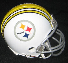
This is the pride and joy of all of my DIY projects: the white Steelers helmet.
I created this helmet back in august of 2007. It was a very tough time for me because my dad had just lost his fight against cancer, and I needed to find projects to take my mind off things. I had just finished painting my family’s shed to look like an old Mail Pouch barn (my dad drove a truck and would point out Mail Pouch barns to us on family trips), and I wanted to move on to a new, totally different project.
So i went out and bought a Steelers mini-helmet. I removed the facemask, chinstrap, and yellow stripe decal, and tucked the Riddell helmet bumper to the inside of the helmet. I took measurements of the helmet and also took measurements of the Steelers’ Northwestern sleeve stripes from an authentic jersey I have. Using AutoCAD, I scaled the sleeve stripe down to an appropriate size for the helmet.
I took the final measurements applied tape to the center area on the helmet. I did this process twice — once for the black stripes and once for yellow. The black is actually the black of the original helmet, as I taped over that to spray the rest of the helmet white. Then I taped the whole helmet except for where the yellow stripes would go… and sprayed yellow.
The outer edge of the helmet logo had about a 1/16″ clear edge, so I had to cut that off with an Xacto knife so that no black would show around the edge of the logo.
I taped over the logo with masking tape when i painted the whole helmet white. As a finishing touch I added my initials and the date. You can see the final results, which turned out quite well — enjoy!
Moving on to a more recent project, I wanted to design and create a Pittsburgh sports mash-up, but i didn’t want to do a “cartoony” mascot-type thing. I wanted it to look more like a logo of some sort itself.
So I started my research with our city flag/crest. I really love the castle, the light-blue checkerboard pattern, and the three coins, so I ran with that and incorporated into my AutoCAD design. So at this point, it was about the city itself, not just about Pittsburgh sports. After adding a little color, it looked like this.
I printed, cut, traced, and glued the logo onto felt. Here’s the castle, and the team logos, and the whole thing turned out like this. Here’s another view. It’s all glued together, but I’m still waiting to sew it. Overall dimensions are about 10″ x 13″.
And in case you’re wondering, here’s what my AutoCAD screen looks like at any given moment during a design process — a cluttered mess!
Uni Watch News Ticker: Paul here. Several readers sent me notes regarding the “3” having fallen off of Melky Cabrera’s helmet brim, but only Dave Berry provided visual evidence. ”¦ Not sure I’d ever seen this particular bumblebee combo before. Doug Keklak scanned that page from the 1978 Pirates Yearbook. He also dug out his Surf/Topps book of Pirates baseball cards and scanned the entire thing. Plus he was doing some microfilm research and came across shots of the 1973 ABA All-Star Game, the 1973 Pro Bowl, and a batboy with a fractional uni number. ”¦ And hey, who’s that? That’s Kek himself, at age seven. Let’s hope Coach didn’t fine him for that bit of stripe peeking out on his sannies. ”¦ Check it out: Bengals-themed beer! Details here. ”¦ Cool breakdown of the Philly Union’s new brand identity here (with thanks to Stephen Wong). ”¦ Many of you know about this already, but this year’s star/stripes caps will be red. Well, that should look just dandy on teams like the Mets, Rockies, Tigers, White Sox, Marlins, Yankees, A’s, et al. ”¦ A day in a life, as told via logos (with thanks to Chad Todd). ”¦ The Phillies did what championship teams always do (thanks, Vince). ”¦ Jared Weaver is still marking his cap with a Nick Adenhart memorial inscription (with thanks to David Martin). ”¦ Uni typo discovery by Jared Wheeler, who says Steve Bedrosian wore this jersey for one game in 1988, complete with his name misspelled inside and out. “I am searching for a picture of him in it,” he says. “Tough find, though.” ”¦ Check out these photos of the Spectrum floor being dismantled (with thanks to Robert Ruszczyk). ”¦ The Nats-related jokes just write themselves. ”¦ For those of you who get a blood rush from this sort of thing, here’s a buncha photos of the new Paul Pierce Nike Zoom Sharkley Premium PE. ”¦ What’s worse than a Yankees jersey with an NOB? A Yankees jersey with a misspelled NOB (with thanks to Jennifer Muller). ”¦ Check out Joe Namath’s old restaurant — and the uniforms worn by the employees (nice find by Ted Kerwin). ”¦ Those high-tech swimsuits that have rewritten the record book may be banned. ”¦ Someone at Auburn is wearing a faceguard on his batting helmet (with thanks to Chris Wright).
Philly Soul should probably read Philly Union, unless I’m missing the joke.
I usually breeze through DIYs since they don’t interest me that much. But today’s post by Ryan Connelly intrigued me for some reason. Great work, Ryan.
Are you sure the NYT article isn’t lifting from another blog?
Regarding the last item on the ticker… Could that guy have been a fan of Charlie O’ Brien?
And a question… I saw the Transformers 1 trailer and I noticed that the guy in the robot was wearing a Redskins jersey. Which one was he wearing?
[quote comment=”329917″]Regarding the last item on the ticker… Could that guy have been a fan of Charlie O’ Brien?
And a question… I saw the Transformers 1 trailer and I noticed that the guy in the robot was wearing a Redskins jersey. Which one was he wearing?[/quote]
pretty sure it’s portis
nice work ry!
Yeah, it was a stellar DIY on the helmet and on the barn…but I’d like to hear the story behind the helmet. I wasn’t aware the Steelers ever wore a white casque…Ryan, was this your own idea, what the helmet would look like in white?
[quote comment=”329920″]Yeah, it was a stellar DIY on the helmet and on the barn…but I’d like to hear the story behind the helmet. I wasn’t aware the Steelers ever wore a white casque…Ryan, was this your own idea, what the helmet would look like in white?[/quote]
thanks guys! yeah, my idea was simple… i just wanted to see what the steelers helmet would look like white with a thicker stripe down the middle. i always loved our sleeve stripes. just a different look to a classic helmet. turned out better than i thought it would! hope you all enjoy!
as a diehard yankee fan, i am absolutely incensed at the possibility that the Yankees will be wearing a cap that is dominated by the color of their main rival. its absolutely ridiculous and they shouldn’t be considering this.
terrible screen grab, i know…but thanks to the tip from Geoff L in the comments last night…
Stirrup Nation (TM) has it’s first sacker
JTH points out we still need a short stop…maybe this week?
link
Paul — Ricko sent you a collage of all nine Pirates 1977-79 combinations last year and it surfaced again a few weeks ago on this page.
Nice mashup, Ryan.
I love looking at people’s mashups.
[quote comment=”329922″]as a diehard yankee fan, i am absolutely incensed at the possibility that the Yankees will be wearing a cap that is dominated by the color of their main rival. its absolutely ridiculous and they shouldn’t be considering this.[/quote]
The Texas Rangers are the Yankees main rival?
Cuz the Red Sox don’t really wear much red. Certainly not in the hats!
Does it bother you that both the Red Sox and Yankees wear Navy Blue hats the rest of the time?
Interesting look on the Steelers helmet. It’s tough to take something really good, mix it up and come out with something good. But sometimes it happens. (Think Clapton and “Layla.”}
I’m not saying the white helmet rises to that level, but it’s pretty sweet. White helmets are an underrated look, and this one is just understated enough. Good job, Ryan. And sorry about your dad.
[quote comment=”329922″]as a diehard yankee fan, i am absolutely incensed at the possibility that the Yankees will be wearing a cap that is dominated by the color of their main rival. its absolutely ridiculous and they shouldn’t be considering this.[/quote]
Agreed, but as a diehard Yankee fan, you should be quite familiar with the fact that the Yankees never pass up a chance to “honor America” and make a buck at the same time.
[quote comment=”329925″]Nice mashup, Ryan.
I love looking at people’s mashups.[/quote]
BTW. According to the April 28 Ticker, you have to get it tattoed to your body or you’re a total … well, ya know.
Damn, Ry… good stuff!
Helmet: It’s very jarring for me to see the Steeler logo on anything other than a black helmet (I’m still getting used to the gold throwbacks), but this is a nice, clean look. And, as strange as it is at first, I think I really like the Northwestern stripes on a helmet. Should be used more.
Mashup: Your precision with felt boggles the mind. I love the castle, as well as the way the coins lay on top of each other. And to me, this is a much better look than, say, the Pirate Parrot (or that awful Captain Morgan-looking fool that patrols PNC Park) in a Penguins pose wearing a Steelers helmet.
Great job!
really like the white helmet and the logo mashup.
“Check out Joe Namath’s old restaurant – and the uniforms worn by the employees.”
15 cents for coffee!?! What’s the date on that photo?
Ryan, just wanted to say that your Pittsburgh sports mash-up crest is AMAZING… great job
[quote comment=”329923″]terrible screen grab, i know…but thanks to the tip from Geoff L in the comments last night…
link has it’s first sacker
JTH points out we still need a short stop…maybe this week?[/quote]
Chipper first came into the league as a SS, and he sported some solid stirrups. But I don’t think he’d qualify now (for either the position or the socks).
link
Thoroughly enjoyed reading about your helmet project Ryan. Love the planning, execution, and concept. Although, I’ll have to wait until I get home later to see the results(Flickr Blocked). Interesting that you use AutoCad. I use a similar program, actually same design code(AutoLisp), called Rhino. I use this to create quick 3D shapes, as well as, 2D shapes for logos.
Here’s a pic of a throwback uni I don’t remember the Braves wearing. Probably in 98 or 99, they wore Atlanta Black Crackers unis from the Negro Leagues.
link
link
copy and paste that, and then look near the end and jason heyward (top prospect for atlanta braves) is rocking stirups
A yes, Hudepohl bear. A local Cincinnati institution. When the bengals came up with the “Who Dey think gonna beat dem Bengals” thing, it was a natural for them.
Should we expect anything less with Ryan?
Great work, as usual.
As for Pierce’s shoes, another sheaker mashup from Nike that I do NOT like.
Pierce has his own signature shoe line anyway!
Jamie Walker LHP for the Orioles has joined Stirrup Nation. No pic though.
[quote comment=”329931″]”Check out Joe Namath’s old restaurant – and the uniforms worn by the employees.”
15 cents for coffee!?! What’s the date on that photo?[/quote]
I love how you can get a Roast Beef and a Coke for under a buck!!! Those were the days. The giant photo of Joe Willy in chef’s garb is awesome too.
[quote comment=”329937″]A yes, Hudepohl bear. A local Cincinnati institution. When the bengals came up with the “Who Dey think gonna beat dem Bengals” thing, it was a natural for them.[/quote]
Do you think Goodell would sign off on a Bengal themed beer for this season?
As for the felt, Ryan is a craftsman, but I find it MUCH easier to work with than any of the cottons that I have already worked with,
Hey Ryan, I’d love to say great job on the Steeler helmet, but since I’m a Browns fan… well, you get the idea. ;-)
(ah, what the hell… great job!)
[quote comment=”329924″]http://i214.photobucket.com/albums/cc45/dkblogphotos/scan0006-1.jpg
Paul — Ricko sent you a collage of all nine Pirates 1977-79 combinations last year and it surfaced again a few weeks ago on this page.[/quote]
Geeman, I know that collage is out there from Ricko, I think I helped him find one of the more rare combos (Yellow pants/white jersey or the other way around, I can’t remember).
I wasn’t necessarily submitting the photo as new information, just thought the format of a team’s yearbook to showcase their many uniform combos was cool. The shot of Candyman is a rare combo which I found noteworthy as well.
Ryan, outstanding stuff! I feel honored that I got a sneak peak of that logo mashup.
The Steelers’ helmet looks great. I tend to like white football helmets and you did that very well, I thought the sleeve stripe translated very well.
You should come out to my house and paint my shed like a Mail Pouch barn! That, along with looking at your AutoCAD screens while in progress, was the coolest part of the entry to me!
I find it funny the dismantled the “Spectrum” floor when I was there for the Pitt-Nova games this February, they had used the Wachovia Center floor… complete with Wachovia Center branding.
Re the 1977 Pirates…
…I know I’ve said this before, but in 1977, the Buccos used every combination possible for their unis, including caps, jerseys, pants, undersleeves and socks. They had two caps, three jerseys, three pants, two undersleeves and two socks. EVERY combo was worn both home and away the whole season.
In 1978 and 1979, they did start to wear certain combos instead of a full blown mix and match. Black caps were always worn with the yellow tops, Black caps usually worn with the white tops, and Yellow caps were always worn with the black tops. Also in ’79 they added NOB’s for the first time in team history.
By 1980, The colors were pretty much worn for road games only and they dropped the stripes (can’t call those things pinstripes, they wore a black-yellow-black combo) off the whites, wearing a straight white outfit for home and the black accessories (caps, sleeves, socks) at home exclusively.
This was intact from 1980-1984. However, I do think they had a homestand late in c.1982 which they called “back and gold days” where they did break out the colors for those games at Three Rivers.
[quote comment=”329945″]Ryan, outstanding stuff! I feel honored that I got a sneak peak of that logo mashup.
The Steelers’ helmet looks great. I tend to like white football helmets and you did that very well, I thought the sleeve stripe translated very well.
You should come out to my house and paint my shed like a Mail Pouch barn! That, along with looking at your AutoCAD screens while in progress, was the coolest part of the entry to me![/quote]
Man, a “Mail Pouch” shed would be the sh*t… What an awesome idea! Maybe you could put link signs leading from the house to the shed (just kiddin’… that shed idea is great, though!)
[quote comment=”329918″][quote comment=”329917″]Regarding the last item on the ticker… Could that guy have been a fan of Charlie O’ Brien?
And a question… I saw the Transformers 1 trailer and I noticed that the guy in the robot was wearing a Redskins jersey. Which one was he wearing?[/quote]
pretty sure it’s portis[/quote]
Yep, it’s a link.
[quote comment=”329948″][quote comment=”329945″]Ryan, outstanding stuff! I feel honored that I got a sneak peak of that logo mashup.
The Steelers’ helmet looks great. I tend to like white football helmets and you did that very well, I thought the sleeve stripe translated very well.
You should come out to my house and paint my shed like a Mail Pouch barn! That, along with looking at your AutoCAD screens while in progress, was the coolest part of the entry to me![/quote]
Man, a “Mail Pouch” shed would be the sh*t… What an awesome idea! Maybe you could put link signs leading from the house to the shed (just kiddin’… that shed idea is great, though!)[/quote]
Yeah, I think a Mail Pouch shed is a great idea…would probably be a tough sale to Mrs. Keklak on that one!!!!
Yes, I remember those Pirate uniform combos very well. The Buccos would also change uniforms for doubleheaders as well. The three best looks were the all black, all pinstripe, and yellow jersey with black pants, IMO.
Those unis will also bring back great memories, when the Bucs were one of the best teams of the 70s, and baseball was still the national pastime.
[quote comment=”329914″]Philly Soul should probably read Philly Union, unless I’m missing the joke.[/quote]
No it\’s the new Philly MLS team
[quote comment=”329937″]A yes, Hudepohl bear. A local Cincinnati institution. When the bengals came up with the “Who Dey think gonna beat dem Bengals” thing, it was a natural for them.[/quote]
Hudy beer, enjoy it at Price Hill Chili after your local high school team’s game … those cans remind me of days spent playing ping pong at my friend’s house where his dad collected beer cans and displayed them in the basement. the who-dey can was his crown jewel
[quote comment=”329947″]Re the 1977 Pirates…
…I know I’ve said this before, but in 1977, the Buccos used every combination possible for their unis, including caps, jerseys, pants, undersleeves and socks. They had two caps, three jerseys, three pants, two undersleeves and two socks. EVERY combo was worn both home and away the whole season.
In 1978 and 1979, they did start to wear certain combos instead of a full blown mix and match. Black caps were always worn with the yellow tops, Black caps usually worn with the white tops, and Yellow caps were always worn with the black tops. Also in ’79 they added NOB’s for the first time in team history.
By 1980, The colors were pretty much worn for road games only and they dropped the stripes (can’t call those things pinstripes, they wore a black-yellow-black combo) off the whites, wearing a straight white outfit for home and the black accessories (caps, sleeves, socks) at home exclusively.
This was intact from 1980-1984. However, I do think they had a homestand late in c.1982 which they called “back and gold days” where they did break out the colors for those games at Three Rivers.[/quote]
Timmy B, if I’m to understand you correctly, are you saying that in ’77 the Buccos could be seen with yellow hat with the yellow uniform? Wow, I had never seen/heard of that. I’ve seen the yellow cap worn with the white jersey/black pants combo but I don’t think I recall seeing it worn with the all whites.
Man, it would be great to get some kind of highlight film from ’77 to see all those combinations because you’re right, in ’78 and ’79 they were more set in stone (black pants/yellow stirrups, yellow pants/black stirrups, white pants/black stirrups). I’d love to just go through the hours of footage discovering all those combos in ’77.
[quote comment=”329949″][quote comment=”329918″][quote comment=”329917″]Regarding the last item on the ticker… Could that guy have been a fan of Charlie O’ Brien?
And a question… I saw the Transformers 1 trailer and I noticed that the guy in the robot was wearing a Redskins jersey. Which one was he wearing?[/quote]
pretty sure it’s portis[/quote]
Yep, it’s a link.[/quote]
Anthony Anderson, who started out on a uni-centric Saturday morning sit-com on NBC called “Hang Time”.
The show also starred Reggie Theus.
link
As a Baltimore Ravens and Washington Capitals fan, I can’t say I’m altogether fond of Pittsburgh sports (lol, especially this year). But, Ryan, those DIY projects are fantastic. I especially love the mashup crest. I think it’s the best I’ve ever seen, incorporating the city’s flag. And although my team loyalties may be at odds with Pittsburgh, I have to admit that they have some of the most aesthetically pleasing uniforms in all of sports, and I love that the teams are all yellow/black. I think more cities should do that.
So, take whatever compliment you can from a lousy Caps/Ratbirds fan. bravo!
[quote comment=”329948″]
Man, a “Mail Pouch” shed would be the sh*t… What an awesome idea! Maybe you could put link signs leading from the house to the shed (just kiddin’… that shed idea is great, though!)[/quote]
The duds of studs
In professional ball
Will confound the blood
Of one and all
UNI WATCH
I have received verbal confirmation from an extremely reliable source that Virginia Tech is going to be wearing new throwback uniforms next year. This includes a new throwback helmet (different from the white one last year). No official word on the details, but it sounds like it’ll be a maroon version of the throwbacks we wore last year and the helmet will be a maroon helmet with the old-style ‘stacked’ VT logo (T inside the V). These should be officially announced within the next few weeks.
No link, but count this as a done deal. My source is VT Athletics Director Jim Weaver and it was through a conversation I had with him last night at an Alumni event here in Raleigh.
[quote comment=”329957″][quote comment=”329948″]
Man, a “Mail Pouch” shed would be the sh*t… What an awesome idea! Maybe you could put link signs leading from the house to the shed (just kiddin’… that shed idea is great, though!)[/quote]
The duds of studs
In professional ball
Will confound the blood
Of one and all
UNI WATCH[/quote]
in haiku edited form~
UNI-Watch: The Haiku
The Duds of studs in
Pro-Ball will confound the blood
of us, one and all
[quote comment=”329931″]”Check out Joe Namath’s old restaurant – and the uniforms worn by the employees.”[/quote]
Didn’t Johnny Bench have a chain of restaurants called Home Plate?
[quote comment=”329946″]I find it funny the dismantled the “Spectrum” floor when I was there for the Pitt-Nova games this February, they had used the Wachovia Center floor… complete with Wachovia Center branding.[/quote]
Yet another case of structural identity crisis.
(for more information, visit hodges14.blogspot.com and look in the march section for the post, Structural identity crisis)
Along with those red hats are the teams going to be wearing these jersey’s? They better not be.
link
[quote comment=”329931″]15 cents for coffee!?! What’s the date on that photo?[/quote]Obviously taken before the law about disclosing calorie counts took effect.
[quote comment=”329963″]And hey, who’s that? That’s Kek himself, at age seven.[/quote]Are those Pony shoes?
[quote comment=”329946″]I find it funny the dismantled the “Spectrum” floor when I was there for the Pitt-Nova games this February, they had used the Wachovia Center floor… complete with Wachovia Center branding.[/quote]
2 things
1, Nova has their own floor style they use, and its replaceable, so I’m not surprised they just brought that one over and used it (if thats the case). 2, you do realize its the Wachovia Spectrum, right? So, its really not that outlandish to have a similar/same floor design as the Wachovia Center next door… Just sayin…
[quote comment=”329964″][quote comment=”329963″]And hey, who’s that? That’s Kek himself, at age seven.[/quote]Are those Pony shoes?[/quote]
Jox. A brand sold by Thom Mcan.
[quote comment=”329955″][quote comment=”329949″][quote comment=”329918″][quote comment=”329917″]Regarding the last item on the ticker… Could that guy have been a fan of Charlie O’ Brien?
And a question… I saw the Transformers 1 trailer and I noticed that the guy in the robot was wearing a Redskins jersey. Which one was he wearing?[/quote]
pretty sure it’s portis[/quote]
Yep, it’s a link.[/quote]
Anthony Anderson, who started out on a uni-centric Saturday morning sit-com on NBC called “Hang Time”.
The show also starred Reggie Theus.
link
Powers – didn’t you just incorporate a little Saved By The Bell into a “quote mashup” the other day? I like your Saturday morning TV style! LOL
[quote comment=”329962″]Along with those red hats are the teams going to be wearing these jersey’s? They better not be.
link
The jerseys are available only for (so far) the Yankees, Red Sox, Cubs, Mets, and Phillies.
I found this interesting. link All teams are using their “normal” cap logo except the Indians who will be wearing a modified version of their alternate. It is huge compared to the normal so that mlb can fit the stars and stripes. link
wahoo with the S&S deemed too offensive?
[quote comment=”329962″]Along with those red hats are the teams going to be wearing these jersey’s? They better not be.
link
“Fashion Jersey” should have been the giveaway that these won’t see the field…
That said, if they’re going to wear the dumb as fuck Stars & Stripes caps, they might as well wear these unis with them. At least then it would sort of look like they go together.
thanks for all the great compliments everyone, i REALLY appreciate it!!! makes it all well worth the time and effort that went into it!
so glad that a bunch of uni-traditionalists (and a browns fan and ravens fan ;-) ) , can enjoy these projects!
glad you like the mail pouch barn too!!!
Hey everyone, I was wondering if someone could help me. I found a 1980 Pirates authentic jersey at a thrift store. It even has the player number and year tag sewn in on the bottom. My question is, did the Pirates have names on the back of their jerseys in 1980? This jersey does not and I can’t find anywhere if they did or not that year. If anyone knows please e-mail me at
link
Thanks!
[quote comment=”329973″]Hey everyone, I was wondering if someone could help me. I found a 1980 Pirates authentic jersey at a thrift store. It even has the player number and year tag sewn in on the bottom. My question is, did the Pirates have names on the back of their jerseys in 1980? This jersey does not and I can’t find anywhere if they did or not that year. If anyone knows please e-mail me at
link
Thanks![/quote]
what color/style is it?
this pic is captioned:
[quote]01 Sep 1980, Pittsburgh, Pennsylvania, USA — 9/1/1980-Pittsburgh, PA: Astros’ second baseman Joe Morgan flies high to field a wild throw from catcher Alan Ashby in the first inning of the first game of a doubleheader. Morgan was trying to stop Pirate Omar Moreno from stealing second base, but the throw was wide, and Moreno was safe. The Astros won the first game 10-4; the Pirates won the second 7-5[/quote]
clearly this particular jersey has a NOB (all you pitty guys can prolly confirm if the others did)…but if it looks like this one, it does have NOB (bonus: joe morgan as a astro)
[quote comment=”329969″][quote comment=”329962″]Along with those red hats are the teams going to be wearing these jersey’s? They better not be.
link
The jerseys are available only for (so far) the Yankees, Red Sox, Cubs, Mets, and Phillies.
I found this interesting. link All teams are using their “normal” cap logo except the Indians who will be wearing a modified version of their alternate. It is huge compared to the normal so that mlb can fit the stars and stripes. link
link.
[quote comment=”329965″][quote comment=”329946″]I find it funny the dismantled the “Spectrum” floor when I was there for the Pitt-Nova games this February, they had used the Wachovia Center floor… complete with Wachovia Center branding.[/quote]
2 things
1, Nova has their own floor style they use, and its replaceable, so I’m not surprised they just brought that one over and used it (if thats the case). 2, you do realize its the Wachovia Spectrum, right? So, its really not that outlandish to have a similar/same floor design as the Wachovia Center next door… Just sayin…[/quote]
Nova uses the Sixers floor for games at the Wachovia Center and they did for the game against Pitt at the Spectrum…..The floor they dismantled was the one from the 80’s/Early 90’s at the Spectrum, they refurbished it and used it for the Sixers game there in March
[quote comment=”329973″]Hey everyone, I was wondering if someone could help me. I found a 1980 Pirates authentic jersey at a thrift store. It even has the player number and year tag sewn in on the bottom. My question is, did the Pirates have names on the back of their jerseys in 1980? This jersey does not and I can’t find anywhere if they did or not that year. If anyone knows please e-mail me at
link
Thanks![/quote]
Pirates started wearing NOB’s in 1979 and have ever since (except for the home whites in 1995).
[quote comment=”329967″][quote comment=”329955″][quote comment=”329949″][quote comment=”329918″][quote comment=”329917″]Regarding the last item on the ticker… Could that guy have been a fan of Charlie O’ Brien?
And a question… I saw the Transformers 1 trailer and I noticed that the guy in the robot was wearing a Redskins jersey. Which one was he wearing?[/quote]
pretty sure it’s portis[/quote]
Yep, it’s a link.[/quote]
Anthony Anderson, who started out on a uni-centric Saturday morning sit-com on NBC called “Hang Time”.
The show also starred Reggie Theus.
link
Powers – didn’t you just incorporate a little Saved By The Bell into a “quote mashup” the other day? I like your Saturday morning TV style! LOL[/quote]
Yesterday with the Hahvid quote.
Guess who literally grew up in a 250 year old converted barn without cable.growing up?
[quote comment=”329978″][quote comment=”329967″][quote comment=”329955″][quote comment=”329949″][quote comment=”329918″][quote comment=”329917″]Regarding the last item on the ticker… Could that guy have been a fan of Charlie O’ Brien?
And a question… I saw the Transformers 1 trailer and I noticed that the guy in the robot was wearing a Redskins jersey. Which one was he wearing?[/quote]
pretty sure it’s portis[/quote]
Yep, it’s a link.[/quote]
Anthony Anderson, who started out on a uni-centric Saturday morning sit-com on NBC called “Hang Time”.
The show also starred Reggie Theus.
link
Powers – didn’t you just incorporate a little Saved By The Bell into a “quote mashup” the other day? I like your Saturday morning TV style! LOL[/quote]
Yesterday with the Hahvid quote.
Guess who literally grew up in a 250 year old converted barn without cable.growing up?[/quote]
Without grammar check as well!
[quote comment=”329974″][quote comment=”329973″]Hey everyone, I was wondering if someone could help me. I found a 1980 Pirates authentic jersey at a thrift store. It even has the player number and year tag sewn in on the bottom. My question is, did the Pirates have names on the back of their jerseys in 1980? This jersey does not and I can’t find anywhere if they did or not that year. If anyone knows please e-mail me at
link
Thanks![/quote]
what color/style is it?
link is captioned:
[quote]01 Sep 1980, Pittsburgh, Pennsylvania, USA — 9/1/1980-Pittsburgh, PA: Astros’ second baseman Joe Morgan flies high to field a wild throw from catcher Alan Ashby in the first inning of the first game of a doubleheader. Morgan was trying to stop Pirate Omar Moreno from stealing second base, but the throw was wide, and Moreno was safe. The Astros won the first game 10-4; the Pirates won the second 7-5[/quote]
clearly this particular jersey has a NOB (all you pitty guys can prolly confirm if the others did)…but if it looks like this one, it does have NOB (bonus: joe morgan as a astro)[/quote]
Only the disgusting astro-turf is worse than Morgan in that pic.
My elbows burn just thinking about that surface.
[quote comment=”329970″]wahoo with the S&S deemed too offensive?[/quote]
The Indians wear the “fauxback” alts on weekends & holidays, so they will wear them on Memorial Day, the weekend of the 4th, and 9/11 is pretty close as a Friday, so that’s probably why they did the block “C” instead of Wahoo.
[quote]Only the disgusting astro-turf is worse than Morgan in that pic.
My elbows burn just thinking about that surface.[/quote]
sansabelts, double-knits, ponys on blue, white cleats (or possibly turf shoes, tho i think those are cleats)…it’s all
goodbad/only redeeming thing is the stirrups :)
Nats’ bats misnamed? And the beat goes on.
Why would you want a white Steelers helmet when the Steelers never wore white helmets? Good or stupid? STUPID!!!
[quote comment=”329977″][quote comment=”329973″]Hey everyone, I was wondering if someone could help me. I found a 1980 Pirates authentic jersey at a thrift store. It even has the player number and year tag sewn in on the bottom. My question is, did the Pirates have names on the back of their jerseys in 1980? This jersey does not and I can’t find anywhere if they did or not that year. If anyone knows please e-mail me at
link
Thanks![/quote]
Pirates started wearing NOB’s in 1979 and have ever since (except for the home whites in 1995).[/quote]
a lot of those jerseys had the nameplate ripped off and were sent down to the minor league team for them to wear. sometimes the number was even slightly changed. you can tell by little stitch marks in the material. and sometimes the color of the numbers are slightly different or one is a little more faded then the other. check for that, it’s probably real!
[quote comment=”329984″]Why would you want a white Steelers helmet when the Steelers never wore white helmets? Good or stupid? STUPID!!![/quote]
Wow! Thanks for chiming in.
Ugh, even the Nats get a red stars/stripes cap. Why, Lord, why? They already wear red hats AND they already have their own stars/stripes cap.
link
The only interesting thing about this is that they play on the road for Memorial Day and 9/11, so we’ll get to see if the red hats look better with their new road unis instead of the navy road caps. But they’ll probably keep the navy socks, which will clash things up a bit.
[quote comment=”329984″]Why would you want a white Steelers helmet when the Steelers never wore white helmets? Good or stupid? STUPID!!![/quote]
Seriously, WTF. Worst. Comment. Ever.
[quote comment=”329947″]Timmy B, if I’m to understand you correctly, are you saying that in ’77 the Buccos could be seen with yellow hat with the yellow uniform? Wow, I had never seen/heard of that. I’ve seen the yellow cap worn with the white jersey/black pants combo but I don’t think I recall seeing it worn with the all whites.
Man, it would be great to get some kind of highlight film from ’77 to see all those combinations because you’re right, in ’78 and ’79 they were more set in stone (black pants/yellow stirrups, yellow pants/black stirrups, white pants/black stirrups). I’d love to just go through the hours of footage discovering all those combos in ’77.[/quote]
Kek,
I am almost positive the Bucs sported every combo possible in ’77, including yellow caps with yellow tops and black caps with black tops. It probably looked a little yucky that way, so they probably kept same color cap/jersey combo to a minimum.
It may be tedious, but if someone wanted to check out microfilm of the Post-Gazette or Press to verify, that would be a worthwhile project to see at least what they wore at home for each game in 1977.
I went to three doubleheaders that year, and one DH vs the Phils, IIRC, the first game of a DH, they had black caps, the white striped tops and pants, yellow undersleevs and yellow socks. The second game, they simply switched the caps to yellow (I vivdly remember Phil Garner taking the field in his black cap, till the umps told him to turn around and get his yellow cap).
[quote comment=”329984″]Why would you want a white Steelers helmet when the Steelers never wore white helmets? Good or stupid? STUPID!!![/quote]
Why NOT???????
I think it’s kinda cool to see what a white Steeler helmet would look like. Way to go, Ryan!!
And a red 49ers helmet, a blue Patriots helmet, a yellow Vikings lid, a blue Cowboys helmet, a red Giants helmet, a green Packers helmet….why, think of the possibilities, Man!!
Ryan,
What kind of paint did you use for the helmet?
[quote comment=”329982″][quote]Only the disgusting astro-turf is worse than Morgan in that pic.
My elbows burn just thinking about that surface.[/quote]
sansabelts, double-knits, ponys on blue, white cleats (or possibly turf shoes, tho i think those are cleats)…it’s all
goodbad/only redeeming thing is the stirrups :)[/quote]
Yes, except that those super stretched pencil thin stirrups of the 70’s looked pretty awful.
I should have said 70’s AND 80’s.
[quote comment=”329990″]
And a red 49ers helmet, a blue Patriots helmet, a yellow Vikings lid, a blue Cowboys helmet, a red Giants helmet, a green Packers helmet….why, think of the possibilities, Man!![/quote]
Back in the day when black was all the uni rage (and the Jets had yet to revert to their permanent “retro” togs) I wondered what they would have looked like with black as the predominant color in the helmets and jerseys, with the kelly green as the secondary color…I always thought it would have looked damn cool but it only existed in my imagination.
The Lions’ helmet would look good with the colors swapped, too…silver lion on the Honolulu blue. And the Colts…blue helmets with the white horseshoe. Indeed, the Eagles used to have white helmets with green wings that looked awesome.
[quote comment=”329994″]Back in the day when black was all the uni rage (and the Jets had yet to revert to their permanent “retro” togs) I wondered what they would have looked like with black as the predominant color in the helmets and jerseys, with the kelly green as the secondary color…I always thought it would have looked damn cool but it only existed in my imagination.[/quote]
i’ve seen this fashion
piece of shitjersey for the past few years, usually for around 5 bucks in the discount racks of marshalls or tj maxx…while it’s not quite the same as what the ol’ jets lid and jersey would be (esp. w/green #s), it gives you an idea of just how awful such a combination would be (and i love the sioux third sweater, so it’s not the kelly green & black combo that’s bad…it’s the execution)
[quote comment=”329944″][quote comment=”329924″]http://i214.photobucket.com/albums/cc45/dkblogphotos/scan0006-1.jpg
Paul — Ricko sent you a collage of all nine Pirates 1977-79 combinations last year and it surfaced again a few weeks ago on this page.[/quote]
Geeman, I know that collage is out there from Ricko, I think I helped him find one of the more rare combos (Yellow pants/white jersey or the other way around, I can’t remember).
I wasn’t necessarily submitting the photo as new information, just thought the format of a team’s yearbook to showcase their many uniform combos was cool. The shot of Candyman is a rare combo which I found noteworthy as well.[/quote]
Love the pic of you in the all-gold! When I was in Little League we wore green jerseys and white pants, both with gold trim.
Regarding that black and green Jets fashion jersey – The kelly green and black combo isn’t the whole problem, but it’s a big chunk of it. Terrible.
[quote comment=”329994″][quote comment=”329990″]
And a red 49ers helmet, a blue Patriots helmet, a yellow Vikings lid, a blue Cowboys helmet, a red Giants helmet, a green Packers helmet….why, think of the possibilities, Man!![/quote]
Back in the day when black was all the uni rage (and the Jets had yet to revert to their permanent “retro” togs) I wondered what they would have looked like with black as the predominant color in the helmets and jerseys, with the kelly green as the secondary color…I always thought it would have looked damn cool but it only existed in my imagination.
The Lions’ helmet would look good with the colors swapped, too…silver lion on the Honolulu blue. And the Colts…blue helmets with the white horseshoe. Indeed, the Eagles used to have white helmets with green wings that looked awesome.[/quote]
link
could you imagine the vikes rolling out on game day with a yellow helmet?!?! packer nation would be SO pissed! haha. brings up some interesting helmet ideas though!
[quote comment=”329995″]
while it’s not quite the same as what the ol’ jets lid and jersey would be (esp. w/green #s), it gives you an idea of just how awful such a combination would be (and i love the sioux third sweater, so it’s not the kelly green & black combo that’s bad…it’s the execution)[/quote]
O my eyes. Massive fail on that one.
Speaking of TJ Maxx/Marshall’s, I don’t know what’s up, but local stores around here in NJ have a lot of Islanders merch on the racks. Some nice, some hideous, but I picked up a $70 Isles hoodie for 19.99 the other day. In NEW JERSEY!
[quote comment=”329991″]Ryan,
What kind of paint did you use for the helmet?[/quote]
spray paint and masking tape. nothing major. just wish i would have taken more pics of the process!
[quote comment=”329954″][quote comment=”329947″]Re the 1977 Pirates…
…I know I’ve said this before, but in 1977, the Buccos used every combination possible for their unis, including caps, jerseys, pants, undersleeves and socks. They had two caps, three jerseys, three pants, two undersleeves and two socks. EVERY combo was worn both home and away the whole season.
In 1978 and 1979, they did start to wear certain combos instead of a full blown mix and match. Black caps were always worn with the yellow tops, Black caps usually worn with the white tops, and Yellow caps were always worn with the black tops. Also in ’79 they added NOB’s for the first time in team history.
By 1980, The colors were pretty much worn for road games only and they dropped the stripes (can’t call those things pinstripes, they wore a black-yellow-black combo) off the whites, wearing a straight white outfit for home and the black accessories (caps, sleeves, socks) at home exclusively.
This was intact from 1980-1984. However, I do think they had a homestand late in c.1982 which they called “back and gold days” where they did break out the colors for those games at Three Rivers.[/quote]
Timmy B, if I’m to understand you correctly, are you saying that in ’77 the Buccos could be seen with yellow hat with the yellow uniform? Wow, I had never seen/heard of that. I’ve seen the yellow cap worn with the white jersey/black pants combo but I don’t think I recall seeing it worn with the all whites.
Man, it would be great to get some kind of highlight film from ’77 to see all those combinations because you’re right, in ’78 and ’79 they were more set in stone (black pants/yellow stirrups, yellow pants/black stirrups, white pants/black stirrups). I’d love to just go through the hours of footage discovering all those combos in ’77.[/quote]
I know I’ve said this before, so I hate to repeat myself, but my white whale is visual confirmation of the Pirates’ wearing all-pinstripes at Shea Stadium one summer Friday night in 1977 or 1978 (pretty sure it was July ’77).
And you Pirates fans can confirm this, but once the Pirates dropped the pinstripes from their white uniforms in 1980, they did not mix and match the whites with the gold and black uniforms anymore.
I found an interesting and appalling explanation for how CC Sabathia gets his pants so baggy.
link
Buccaneers question,
I remember last year the Bucs said they would wear the old orange uniforms sometime in the 2009 season. With new uniforms for the Jags, Lions, and 49ers released as well as all the AFL stuff, I would assume marketing people for the Bucs would have shown off the throwbacks by now so they could sell them and such, but I haven’t seen any kind of announcement.
Are they still going through with orange in ’09?
[quote comment=”330003″]I found an interesting and appalling explanation for how CC Sabathia gets his pants so baggy.
link[/quote]
A. Rob Cuccuzza places a size 72 pant in his
locker
B. CC struggles to pull them over his thighs
Since we seem to have some Twins fans here:
link
There’s a Twins O Gram about Rich Rollins hitting .338 and the photo was from a story on his 1962 season.
[quote comment=”329995″][quote comment=”329994″]Back in the day when black was all the uni rage (and the Jets had yet to revert to their permanent “retro” togs) I wondered what they would have looked like with black as the predominant color in the helmets and jerseys, with the kelly green as the secondary color…I always thought it would have looked damn cool but it only existed in my imagination.[/quote]
i’ve seen link for the past few years, usually for around 5 bucks in the discount racks of marshalls or tj maxx…
while it’s not quite the same as what the ol’ jets lid and jersey would be (esp. w/green #s), it gives you an idea of just how awful such a combination would be (and i love the sioux third sweater, so it’s not the kelly green & black combo that’s bad…it’s the execution)[/quote]
Are you implying the Titans throwbacks are a breath of fresh air? ’cause I don’t. I had the opportunity to buy one of them back in 2007, when the Jets played the Redskins, but instead, I opted for the crisp, fresh, green Kellen Clemens jersey. The Jets don’t look good in an alternate uniform, period.
Alright, today I need some help from the rest of the hockey wing. Tokay I found an old thermal shirt I didn’t know I had, and I wanted to turn it into a DIY jersey. The thing is, it’s black, and I don’t know any good jerseys that are black. Yeah, there are a bunch of black jerseys in the NHL, but I don’t really want do do any current uniform.
So the question is, does anyone have any suggestions for a good black DIY hockey jersey? I need a few ideas.
[quote comment=”330006″]
There’s a Twins O Gram about Rich Rollins hitting .338 and the photo was from a story on his 1962 season.[/quote]
Thanks for my new desktop background!
[quote comment=”330006″]Since we seem to have some Twins fans here:
link
There’s a Twins O Gram about Rich Rollins hitting .338 and the photo was from a story on his 1962 season.[/quote]
awesome pic lance…
you know what i love about pics like that? just from the visual clues, we can know where and approximately when it was taken
*obviously it’s in minnesota (twins on scoreboard is the “duh” clue)
*it’s outdoors, so we know it’s the met
*10 teams in MLB, so we know it’s 1962 or later
*wash & kc are AL teams, so we know it’s before 1971 (but most we know for sure it’s pre 68 because there’s KC but no “oakland”)
*in NL, “MIL” is playing San F. so we know it’s no later than 1965
*Minnesota is playing “Los Angeles” so we know it’s 1964 or earlier
im sure there are actual stadium (scoreboard or other) clues, and possibly uniform clues which could narrow it down further (and im sure i missed a few just from what i listed)
anyone else got anything that (if squiddie hadn’t posted the date) might help ID a pic from the visuals?
[quote comment=”330004″]Buccaneers question,
I remember last year the Bucs said they would wear the old orange uniforms sometime in the 2009 season. With new uniforms for the Jags, Lions, and 49ers released as well as all the AFL stuff, I would assume marketing people for the Bucs would have shown off the throwbacks by now so they could sell them and such, but I haven’t seen any kind of announcement.
Are they still going through with orange in ’09?[/quote]
All signs point to November 8th vs. Green Bay. Old division rival, and the unveiling of the Ring of Fame or whatever would probably be that weekend too.
[quote comment=”330008″]Alright, today I need some help from the rest of the hockey wing. Tokay I found an old thermal shirt I didn’t know I had, and I wanted to turn it into a DIY jersey. The thing is, it’s black, and I don’t know any good jerseys that are black. Yeah, there are a bunch of black jerseys in the NHL, but I don’t really want do do any current uniform.
So the question is, does anyone have any suggestions for a good black DIY hockey jersey? I need a few ideas.[/quote]
i know it’s not hockey, but i’d do a mash-up of this:
link
and this:
link
[quote comment=”330010″][quote comment=”330006″]Since we seem to have some Twins fans here:
link
There’s a Twins O Gram about Rich Rollins hitting .338 and the photo was from a story on his 1962 season.[/quote]
awesome pic lance…
you know what i love about pics like that? just from the visual clues, we can know where and approximately when it was taken
*obviously it’s in minnesota (twins on scoreboard is the “duh” clue)
*it’s outdoors, so we know it’s the met
*10 teams in MLB, so we know it’s 1962 or later
*wash & kc are AL teams, so we know it’s before 1971 (but most we know for sure it’s pre 68 because there’s KC but no “oakland”)
*in NL, “MIL” is playing San F. so we know it’s no later than 1965
*Minnesota is playing “Los Angeles” so we know it’s 1964 or earlier
im sure there are actual stadium (scoreboard or other) clues, and possibly uniform clues which could narrow it down further (and im sure i missed a few just from what i listed)
anyone else got anything that (if squiddie hadn’t posted the date) might help ID a pic from the visuals?[/quote]
The date on the scoreboard is June 24. According to Retrosheet, the Angels played in Minnesota on Sunday, June 24, 1962.
[quote comment=”330008″]Alright, today I need some help from the rest of the hockey wing. Tokay I found an old thermal shirt I didn’t know I had, and I wanted to turn it into a DIY jersey. The thing is, it’s black, and I don’t know any good jerseys that are black. Yeah, there are a bunch of black jerseys in the NHL, but I don’t really want do do any current uniform.
So the question is, does anyone have any suggestions for a good black DIY hockey jersey? I need a few ideas.[/quote]
Depends on how far back you want to go. You could commemorate this moment…
link
Or this championship team…
link
Or this…
link.jpg
Or this dude…
link
It all really depends on what you want, but none of those jerseys are exactly what are worn today, and they are primarily black teams.
[quote comment=”330000″][quote comment=”329991″]Ryan,
What kind of paint did you use for the helmet?[/quote]
spray paint and masking tape. nothing major. just wish i would have taken more pics of the process![/quote]
So just your normal, everyday cans of spray paint? Interesting.
[quote comment=”330014″][quote comment=”330008″]Alright, today I need some help from the rest of the hockey wing. Tokay I found an old thermal shirt I didn’t know I had, and I wanted to turn it into a DIY jersey. The thing is, it’s black, and I don’t know any good jerseys that are black. Yeah, there are a bunch of black jerseys in the NHL, but I don’t really want do do any current uniform.
So the question is, does anyone have any suggestions for a good black DIY hockey jersey? I need a few ideas.[/quote]
Depends on how far back you want to go. You could commemorate this moment…
link
Or this championship team…
link
Or this…
link.jpg
Or this dude…
link
It all really depends on what you want, but none of those jerseys are exactly what are worn today, and they are primarily black teams.[/quote]
Apparently, my bobby orr link didn’t load.
link
[quote comment=”330010″]
anyone else got anything that (if squiddie hadn’t posted the date) might help ID a pic from the visuals?[/quote]
Houston is playing so it has to be 1962 or later.
The Gluek brewery was demolished in 1966. The brand had been sold to G. Heileman in 1964.
[quote comment=”330011″][quote comment=”330004″]Buccaneers question,
I remember last year the Bucs said they would wear the old orange uniforms sometime in the 2009 season. With new uniforms for the Jags, Lions, and 49ers released as well as all the AFL stuff, I would assume marketing people for the Bucs would have shown off the throwbacks by now so they could sell them and such, but I haven’t seen any kind of announcement.
Are they still going through with orange in ’09?[/quote]
All signs point to November 8th vs. Green Bay. Old division rival, and the unveiling of the Ring of Fame or whatever would probably be that weekend too.[/quote]
Good – I’ll already be watching that game.
[quote comment=”330013″]
The date on the scoreboard is June 24. According to Retrosheet, the Angels played in Minnesota on Sunday, June 24, 1962.[/quote]
And in the interest of the totality of information, this was taken in the first game of a doubleheader. Twins won this one 3-2 in ten, and then dropped the back end 7-6 in regulation.
way to go ry fuckin co:
i’ll go in order. the helmet, great work, and i know how hard they are to paint(made one in college, in a landfill now). but what i like the most is the stripes are not only scaled right, but large, gives it a real 40’s no face mask era look.
now i don’t always like the mash-ups. wait, not true, i enjoy seeing them, they are always fun, but sometimes the execution is lacking. yours on the other hand is a total and complete success, in every way possible. i love that you didn’t try to combine the logos into one super logo, the use of the castle, and just the general introduction of the flag is brilliant.
now i know you are asking yourself, what do i do with this genius creation. you want to stitch it, but don’t, you will loose all those wonderfully clean edges. the only piece on this entire project that would be helped is the penguin eye, and maybe some of the crest edge, so it isn’t worth it. do not stitch this, you will regret it.
i personally feel this is worthy of a frame. first make it into a banner, like the flag, but thin and elongate the stripes. if you wanted, each stripe could hold the years of each teams titles, but that is something else all together. then mount it under glass. shit, too bad i don’t live in pittsburgh, i could custom cut a frame and glass for you to assemble for this. let’s email, i am going to send you some pixtures of framed art, maybe you can get an idea from them of how you want to finish things perfectly. and if you can’t get felt big enough to make a properly scaled banner, i will go to 2121 21st st here in chicago and get you the fabric you need, i could use it as packing material for the space invader. you made a wonderful piece here ry co, congrats.
[quote comment=”330018″][quote comment=”330011″][quote comment=”330004″]Buccaneers question,
I remember last year the Bucs said they would wear the old orange uniforms sometime in the 2009 season. With new uniforms for the Jags, Lions, and 49ers released as well as all the AFL stuff, I would assume marketing people for the Bucs would have shown off the throwbacks by now so they could sell them and such, but I haven’t seen any kind of announcement.
Are they still going through with orange in ’09?[/quote]
All signs point to November 8th vs. Green Bay. Old division rival, and the unveiling of the Ring of Fame or whatever would probably be that weekend too.[/quote]
Good – I’ll already be watching that game.[/quote]
Are there any plans to unveil the throwbacks anytime soon?
[quote comment=”330017″][quote comment=”330010″]
anyone else got anything that (if squiddie hadn’t posted the date) might help ID a pic from the visuals?[/quote]
Houston is playing so it has to be 1962 or later.
The Gluek brewery was demolished in 1966. The brand had been sold to G. Heileman in 1964.[/quote]
Check the lineups. Vic Power is at first (#28). He was only with Twins a couple of seasons. Was Bo Belinsky #33 for the Angels? Lennie Green is #7, I think, in centerfield for the Twins. Don’t that he was here after ’62. (Etc.)..
link
btw, the player in the photo is Angels rightfielder Leon Wagner (#27)
The date at the bottom of the Twins scoreboard is most likely the next home game. The picture is probably taken on Saturday. The scoreboard lists the actual numbers of the starting pictures around the league, so a trip to link or link will be all the detective work needed.
[quote comment=”330024″]The date at the bottom of the Twins scoreboard is most likely the next home game. The picture is probably taken on Saturday. The scoreboard lists the actual numbers of the starting pictures around the league, so a trip to link or link will be all the detective work needed.[/quote]
Good call. The starting pitcher for the Twins is 36 (Jim Kaat), he was the winning pitcher on June 23, 1962.
Phil –
I sent you an email with my Rangers schedule. Let me know what you think.
Thanks
The Mail Pouch Barn reference led me to research the subject. Here’s the link.
[quote comment=”330010″][quote comment=”330006″]Since we seem to have some Twins fans here:
link
There’s a Twins O Gram about Rich Rollins hitting .338 and the photo was from a story on his 1962 season.[/quote]
awesome pic lance…
you know what i love about pics like that? just from the visual clues, we can know where and approximately when it was taken
*obviously it’s in minnesota (twins on scoreboard is the “duh” clue)
*it’s outdoors, so we know it’s the met
*10 teams in MLB, so we know it’s 1962 or later
*wash & kc are AL teams, so we know it’s before 1971 (but most we know for sure it’s pre 68 because there’s KC but no “oakland”)
*in NL, “MIL” is playing San F. so we know it’s no later than 1965
*Minnesota is playing “Los Angeles” so we know it’s 1964 or earlier
im sure there are actual stadium (scoreboard or other) clues, and possibly uniform clues which could narrow it down further (and im sure i missed a few just from what i listed)
anyone else got anything that (if squiddie hadn’t posted the date) might help ID a pic from the visuals?[/quote]
My favorite part is the ad for Grain Belt Beer. Long live Grain Belt (as I dig my Grain Belt t-shirt out of the closet)!
Just to be complete. Here’s the Met stadium scoreboard again for
link
The game was looking promising at that point.
There’s a note about the score of the first game just to the right of the errors.
link (You can see the Mpls StP shoulder patch.)
link
Dig the link sign. (Schweigert hot dog clock just to the right of the door.)
[quote comment=”330017″]The Gluek brewery was demolished in 1966. The brand had been sold to G. Heileman in 1964.[/quote]
I wonder if the G. Heileman Brewing Company (of LaCrosse, WI) still has rights to that cartoon character? :-)
ok…here’s where i was going with that…
this photo is identified as “original Monster Scoreboard created by Bill Veeck in 1960, seen here in the late-70’s”
using all the intiutive skills you guys possessed above…can we ID this one? (obviously we know the stadium…)
[quote comment=”330031″]ok…here’s where i was going with that…
this photo is identified as “original Monster Scoreboard created by Bill Veeck in 1960, seen here in the late-70’s”
using all the intiutive skills you guys possessed above…can we ID this one? (obviously we know the stadium…)[/quote]
dammit… had to flickr it…
here’s that scoreboard pic again
[quote comment=”330027″]The Mail Pouch Barn reference led me to research the subject. Here’s the link.[/quote]
There was a good article about the Mail Pouch barn painters in Garage magazine #16. The article was about mainly Harley Warrick who was the last of the Mail Pouch barn painters.
There are some good photos link.
[quote comment=”330029″]Just to be complete. Here’s the Met stadium scoreboard again for
link
So why are their two dates of “next game” in the second half of the doublebill?
And either there was a significant number of rain delays, or most of the American League was also on the second half of a doubleheader.
[quote comment=”330032″]
here’s that link again[/quote]
Oh, to have that hi-res. *sigh*
[quote comment=”330032″]
here’s that link again[/quote]
1) Comiskey got crowds like that maybe once, twice a year. It’s Bat Day or Hat Day.
2) Looks like Terrry Forster on the mound from the hair, but I think he was gone by the time the Veeck uni’s came around.
3) Awfully tall/lanky looking 2bman, isn’t it?
4) The DH isn’t a DH, he’s a “B”. :-)
[quote comment=”330029″]Just to be complete. Here’s the Met stadium scoreboard again for
link
The game was looking promising at that point.
There’s a note about the score of the first game just to the right of the errors.
link (You can see the Mpls StP shoulder patch.)
link
Dig the link sign. (Schweigert hot dog clock just to the right of the door.)[/quote]
OK, I thought there was something wrong with the first statement. Why would Sundays DH list June 23 & 24 as upcoming games? (That’s what that part of the SB is.) And it’s 9:20pm. Pretty late for the second game to be in the third inning. In fact, TOO late! Well, unless it’s a twi-night DH, common today for two gates, but in the 60 – you almost always got a DH for the price of one game. So guess what? They also played a DH on Friday, June 22, first game score… Minn 3 LA 2.
Scroll down this page:
link
I’m sure you can find the stats on this site that line up with all the games listed.
BTW – the Sox scoreboard link didn’t work. It’s another useless subject I know everything about. I’m standing by…
[quote comment=”330035″]Oh, to have that hi-res. *sigh*[/quote]Lemme help you ought. Birthday greetings are going out to Lynn Elden and Doug Elden.
:-)
[quote comment=”330032″][quote comment=”330031″]ok…here’s where i was going with that…
this photo is identified as “link”
using all the intiutive skills you guys possessed above…can we ID this one? (obviously we know the stadium…)[/quote]
dammit… had to flickr it…
here’s that link again[/quote]
I believe that is April 15, 1981
link
So what’s the question about the Sox’ sb? Obviously mid-70’s pajama Sox.
[quote comment=”330037″][quote comment=”330029″]
link
So is this a negative image? Check out the shoes in the locker, one has his name written on it.[/quote]
[quote comment=”330039″]
I believe that is April 15, 1981
link
Friend, I think that picture of Comiskey has a few more than 13,000 people. :-)
[quote comment=”330020″]way to go ry fuckin co:
i’ll go in order. the helmet, great work, and i know how hard they are to paint(made one in college, in a landfill now). but what i like the most is the stripes are not only scaled right, but large, gives it a real 40’s no face mask era look.
now i don’t always like the mash-ups. wait, not true, i enjoy seeing them, they are always fun, but sometimes the execution is lacking. yours on the other hand is a total and complete success, in every way possible. i love that you didn’t try to combine the logos into one super logo, the use of the castle, and just the general introduction of the flag is brilliant.
now i know you are asking yourself, what do i do with this genius creation. you want to stitch it, but don’t, you will loose all those wonderfully clean edges. the only piece on this entire project that would be helped is the penguin eye, and maybe some of the crest edge, so it isn’t worth it. do not stitch this, you will regret it.
i personally feel this is worthy of a frame. first make it into a banner, like the flag, but thin and elongate the stripes. if you wanted, each stripe could hold the years of each teams titles, but that is something else all together. then mount it under glass. shit, too bad i don’t live in pittsburgh, i could custom cut a frame and glass for you to assemble for this. let’s email, i am going to send you some pixtures of framed art, maybe you can get an idea from them of how you want to finish things perfectly. and if you can’t get felt big enough to make a properly scaled banner, i will go to 2121 21st st here in chicago and get you the fabric you need, i could use it as packing material for the space invader. you made a wonderful piece here ry co, congrats.[/quote]
thanks robert!!! i love your take on the helmet stripe, and will definitely take your advise on the felt logo-mashup! just e-mailed you…
[quote comment=”330042″][quote comment=”330039″]
I believe that is April 15, 1981
link
Friend, I think that picture of Comiskey has a few more than 13,000 people. :-)[/quote]
Well, I can’t argue that. I came to that conclusion by the following:
Toronto is on the OOT scoreboard = 1977 or after.
The White sox wore that style of uniform through 1981
A quick scan of the MIL-CWS series between those years at comiskey yielded that game as the only one that was played with all of the AL and NL matchups as the same as in the pic.
[quote comment=”330044″][quote comment=”330042″][quote comment=”330039″]
I believe that is April 15, 1981
link
Friend, I think that picture of Comiskey has a few more than 13,000 people. :-)[/quote]
Well, I can’t argue that. I came to that conclusion by the following:
Toronto is on the OOT scoreboard = 1977 or after.
The White sox wore that style of uniform through 1981
A quick scan of the MIL-CWS series between those years at comiskey yielded that game as the only one that was played with all of the AL and NL matchups as the same as in the pic.[/quote]
Alright, I figured it out. It was April 14th instead of the 15th. The OOT scoreboard had the 15th’s games even though they were not being played that day. The attendance was over 51,000
link
[quote comment=”330045″]
Alright, I figured it out. It was April 14th instead of the 15th. The OOT scoreboard had the 15th’s games even though they were not being played that day. The attendance was over 51,000
link
Yeah, I thought it was a promo day but it was obviously Opening Day. Nice and sunny for 4/14.
Yes, it’s the White Sox home opener in 1981. Starting pitchers: #30 Ross Baumgarten for the Sox, #50 Pete Vuckovich for the Brewers.
[quote comment=”330045″][quote comment=”330044″][quote comment=”330042″][quote comment=”330039″]
I believe that is April 15, 1981
link
Friend, I think that picture of Comiskey has a few more than 13,000 people. :-)[/quote]
Well, I can’t argue that. I came to that conclusion by the following:
Toronto is on the OOT scoreboard = 1977 or after.
The White sox wore that style of uniform through 1981
A quick scan of the MIL-CWS series between those years at comiskey yielded that game as the only one that was played with all of the AL and NL matchups as the same as in the pic.[/quote]
Alright, I figured it out. It was April 14th instead of the 15th. The OOT scoreboard had the 15th’s games even though they were not being played that day. The attendance was over 51,000
link
Agreed.
According to the scoreboard, the pitcher for the Sox is 30, Ross Baumgarten, who was the winning pitcher on April 14th.
[quote comment=”330045″][quote comment=”330044″][quote comment=”330042″][quote comment=”330039″]
I believe that is April 15, 1981
link
Friend, I think that picture of Comiskey has a few more than 13,000 people. :-)[/quote]
Well, I can’t argue that. I came to that conclusion by the following:
Toronto is on the OOT scoreboard = 1977 or after.
The White sox wore that style of uniform through 1981
A quick scan of the MIL-CWS series between those years at comiskey yielded that game as the only one that was played with all of the AL and NL matchups as the same as in the pic.[/quote]
Alright, I figured it out. It was April 14th instead of the 15th. The OOT scoreboard had the 15th’s games even though they were not being played that day. The attendance was over 51,000
link
Ross Baumgarten pitched on April 14th and his number was 30. Scoreboard shows he’s pitching.
BTW, the This Bud’s For You Ad campaign was in introduced in 1979.
Nice look at Tiger Stadium’s scoreboard in 1976.
link
[quote comment=”330050″]Nice look at Tiger Stadium’s scoreboard in 1976.
link
Typical Tiger crowd about that time, too.
LOL
[quote comment=”330051″][quote comment=”330050″]Nice look at Tiger Stadium’s scoreboard in 1976.
link
Typical Tiger crowd about that time, too.
LOL[/quote]
haha…except for when The Bird pitched.
Obviously, that was taken while the Tigs were on a road trip.
The whole gallery is here:
link
Warning: It has music to it…mute the speakers if you are at work or in class.
[quote comment=”330006″]Since we seem to have some Twins fans here:
link
There’s a Twins O Gram about Rich Rollins hitting .338 and the photo was from a story on his 1962 season.[/quote]
During NFL games the scoreboard was titled Vikings Log.
The weird thing about the OOT games on the SB is 5 National League games are posted- three are not being played, but the match ups are ready for the next day’s games. But there is another NL game being played on the that day, LA at SF, which is not listed. Late game, so that’s probably why they didn’t bother, but still…
[quote comment=”330050″]Nice look at Tiger Stadium’s scoreboard in 1976.
link
I didn’t know this blog owned a bank.
If you are going to make a black DIY hockey jersey, there is really only one choice: link
[quote comment=”330056″]If you are going to make a black DIY hockey jersey, there is really only one choice: link
or this one
Hey, guess what! The Natinals did something stupid again!
And yes, Game Presentation is part of the uni, I have so deemed.
link
You guys are thinking way too recently for that DIY black jersey.
Try link. With colour, link.
[quote comment=”329988″][quote comment=”329984″]Why would you want a white Steelers helmet when the Steelers never wore white helmets? Good or stupid? STUPID!!![/quote]
Seriously, WTF. Worst. Comment. Ever.[/quote]
DITTO …
Good to see the project done. Why shouldn’t we see what a white Steelers helmet would look like?
Let the fan explore the possibilities. WTF
Hey, was Broadway Joe’s public?
If so, I would like to know if this is real…
link|66%3A2|65%3A12|39%3A1|240%3A1318|301%3A0|293%3A1|294%3A50
note: I would never pay $44.00 to ship a piece of paper…
[quote comment=”330062″]Hey, was Broadway Joe’s public?
If so, I would like to know if this is real…
link|66%3A2|65%3A12|39%3A1|240%3A1318|301%3A0|293%3A1|294%3A50[/quote]
According to the SEC, went public in 1968
link
(see the bottom of page 1 for details)
Q: What’s worse than the Mets two-tone Cool-Flo batting helmet?
A: Taking that same design and putting it on a standard flapless helmet.
Uggh
link
No screen grab, and I don’t know if it has been mentioned before, but on Monday, Twins pitcher R.A. Dickey was wearing sirrups.
This is mildly interesting. It seems Ronnie Brown has the fingers and most of the palm removed from a pair of Reebok Velocity gloves, and tapes over the wrist and thumb joint segments; however leaving the glove over the end of his thumb. Obviously I’ve seen many players tape their hands in a similar way, anyone else know of anybody who destroys gloves in this way to achieve the look?
[quote comment=”330067″]This is mildly interesting. It seems Ronnie Brown has the fingers and most of the palm removed from a pair of Reebok Velocity gloves, and tapes over the wrist and thumb joint segments; however leaving the glove over the end of his thumb. Obviously I’ve seen many players tape their hands in a similar way, anyone else know of anybody who destroys gloves in this way to achieve the look?
[/quote]
link
[quote comment=”329923″]terrible screen grab, i know…but thanks to the tip from Geoff L in the comments last night…
link has it’s first sacker
[/quote]
I hate to pour cold water on this, because I’m not sure I’m right. But I was at Tuesday’s game and looking at Millar’s socks & shoes. I concluded that the white that you see is not a sanitary peeking out, but the lip of the heel of his shoe. His shoes are black with white stripes/laces, FWIW.
Millar is a high cuffed guy, so it wouldn’t be out of the realm of possibility to be correct either way. I was just hoping we could nail this down with a higher quality image. Anyone help?
amazing logo/city mash up Ryan
[quote comment=”330069″][quote comment=”329923″]terrible screen grab, i know…but thanks to the tip from Geoff L in the comments last night…
linkhas it’s first sacker
[/quote]
I hate to pour cold water on this, because I’m not sure I’m right. But I was at Tuesday’s game and looking at Millar’s socks & shoes. I concluded that the white that you see is not a sanitary peeking out, but the lip of the heel of his shoe. His shoes are black with white stripes/laces, FWIW.
Millar is a high cuffed guy, so it wouldn’t be out of the realm of possibility to be correct either way. I was just hoping we could nail this down with a higher quality image. Anyone help?[/quote]
i took that screen grab in a rush this am, but he was definitely wearing ‘rups…they had a couple shots of millah, one of which was him going deep and rounding the bases, and the second was on the receiving end of a tremendous play by the third sacker…
clearly wearing stirrups (albeit the sanis were almost non existent)
Interesting look at a Steelers white helmet. I know there are a handful of Pittsburgh fans here and Steeler fans.
I am a Browns fan but I know about the Steelers history since my dad was a life long Steeler fan. And I was when I was a kid because of him.
I will have to check out some of the other tidbits here today. I did like the Mailpouch shed.
I have always thought it would be neat to put or paint old ads on a fence to make it look like old time baseball stadiums. Has anybody done such a thing?
[quote comment=”330071″][quote comment=”330069″][quote comment=”329923″]terrible screen grab, i know…but thanks to the tip from Geoff L in the comments last night…
linkhas it’s first sacker
[/quote]
I hate to pour cold water on this, because I’m not sure I’m right. But I was at Tuesday’s game and looking at Millar’s socks & shoes. I concluded that the white that you see is not a sanitary peeking out, but the lip of the heel of his shoe. His shoes are black with white stripes/laces, FWIW.
Millar is a high cuffed guy, so it wouldn’t be out of the realm of possibility to be correct either way. I was just hoping we could nail this down with a higher quality image. Anyone help?[/quote]
i took that screen grab in a rush this am, but he was definitely wearing ‘rups…they had a couple shots of millah, one of which was him going deep and rounding the bases, and the second was on the receiving end of a tremendous play by the third sacker…
clearly wearing stirrups (albeit the sanis were almost non existent)[/quote]
Cool. I’m happy to be wrong – and I hope he keeps it up.
[quote comment=”329984″]Why would you want a white Steelers helmet when the Steelers never wore white helmets? Good or stupid? STUPID!!![/quote]
That’s a matter of opinion and, well, nobody gives a rat’s ass about yours.
Final thought from Tuesday’s Jays/Pale Hose game….
If link, link, and link are all high-cuffed, then what the heck is link style? Mid-low cuff?
– jude
[quote comment=”330075″]Final thought from Tuesday’s Jays/Pale Hose game….
If link, link, and link are all high-cuffed, then what the heck is link style? Mid-low cuff?
– jude[/quote]
Wow, is he on his third number in three years? 27, to 22, now to 7. I think.
I just looked it up.
Fields moved from #22 to #7 for Scott Podsednik, who wore the number during his link with the White Sox.
Fields, a native of Oklahoma, link in honor of another native: Mickey Mantle.
(He wore #13 as quarterback of Oklahoma State.)
[quote comment=”330078″]I just looked it up.
Fields moved from #22 to #7 for Scott Podsednik, who wore the number during his link with the White Sox.
Fields, a native of Oklahoma, link in honor of another native: Mickey Mantle.
(He wore #13 as quarterback of Oklahoma State.)[/quote]
Very cool.
Honestly, my favorite part of Uni Watching is if people have special attachments to uniform numbers, what it is. Comes from my youth…I generally played on teams without numbers, or got #1 thrown at me because I was the hockey goalie. (I don’t like how #1 looks on goalies. Too skinny of a number for a guy with bulky pads. Plus, I always prefer multiples of 3. One team I was on had two goalie jerseys ready, #1 and #30. Guess which one I insisted on taking.) However, the “all-star teams” generally had uniforms made just for them, so the numbers would always be meaningful. Disappoints me when a pro athlete just takes the lowest possible number. Dude! They’ll make your jersey for you. Put a little thought into your choice.
(And yes, I have PL’s uni numbers column bookmarked. It’s my favorite. See above.)
Sorry I’m a little behind, but got sidetracked with my bro over and us watching a full docket of hockey, baseball and basketball tonight.
Geeman,
I’m 99.9999999% sure this is right but for the life of me, I seem to remember black pants worn with the solid white jersey on the rarest of occasion. The yearbook I thought that was in let me down but I’ll keep trying.
Geeman again,
What a stroke of dumb luck that was! My favorite team was the Pirates, I had sneakers that matched (remember when you were so young you just wore sneakers to play baseball!) and I ended up on the team that had my favorite team’s colors.
timmy b,
I have been working on a few side projects and been spending a lot of time in the library in Johnstown (so it’s the Tribune Democrat, not the Press or PG). I’m working my way through the 70s right now, so maybe when I get to ’77 I can see some of this and get some photos.
[quote comment=”330066″]No screen grab, and I don’t know if it has been mentioned before, but on Monday, Twins pitcher R.A. Dickey was wearing sirrups.[/quote]
He’s been doing that for link It’s a great look, but they should throw the “TC” back onto the stirrups. Now, if the rest of the bullpen could put three good innings together maybe the Pohlad’s would pony up and buy them all a set of ‘rups.
I also thought the white helmet was stupid. Adding white for the sake of adding white is a moronic idea. Also, the yellow stripes clash pretty hard with the gold hypocycloids.
On a more important uni-related note, Philly’s WPS franchise is named the Independence. Unis/color schemes, etc can be found here:
link
You did a great work!
The white helmet looks pretty good, as well as the Pittsburgh mash-up logo. I love the idea that you express your emotions in these projects.
Well done.
[quote comment=”329990″][quote comment=”329984″]
And a red 49ers helmet ….[/quote]
In an earlier incarnation, the 49ers actually wore red helmets.
I’m digging the Bob Clemente baseball card
Wow. The Twins are up 20-0 on the White Sox in the seventh.
The Auburn player with the faceguard is most likely 3B/DH Joseph Sanders. Joe broke his jaw when he was hit by a pitch a few weeks ago, and made it back into the lineup as a DH against alabama.