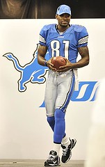
As we all know, NFL uniform changes are usually in the pipeline for a year or so before they’re unveiled. And it’s been less than seven months since the Lions fired Matt Millen, so he probably had a hand in the uniform redesign that the team unveiled yesterday. And that’s about the only possible explanation for how they botched such a golden opportunity to get this team back on the right aesthetic track.
Okay, one at a time:
• The color scheme: There are about three people in the entire country who like all the black trim on the Lions’ uniforms. Whatever else they were going to do, they had to ditch the black — that was job one. But they didn’t do it. I mean, come on, this team is still gonna wear black undersleeves and a black facemask? What a joke. Is it good or is it stupid? So stupid that most of the other changes barely matter.
• The new logo: This is one time when I don’t mind an animal logo looking a little meaner. Hell, lions are supposed to be ferocious, right? Yeah, the whole flowing-mane thing is silly, and the black outline is a major disappointment, but this doesn’t look any worse on the helmet than the last logo did. Not as good as it could have been, but not nearly as stupid as it could have been either.
• The new wordmark: You’re joking, right? You’re gonna use that in the NFC North, the heart of Midwest? They’re gonna laugh that shit right off the field. And why would you outline your logo in black but leave your wordmark without a black outline? I mean, I’m glad you didn’t add the outlining to the letters, but it seems a tad inconsistent, no? Stupid.
• The new helmet: As noted above, Bubbles looks fine. And much as I hate to admit it, the old color-white-color stripe pattern that so many teams have used for so long is finally starting to look a bit clunky, so the new stripe pattern, with thinner stripes (similar to the striping change the 49ers made over a decade ago), makes sense. Too bad two of those stripes have to be black, but whaddaya gonna do. Good.
• The new jersey collar and chest wordmark: It’s difficult to express how much I hated this design from the sternum up. This, while far from perfect, is an improvement. The black-silver-black collar is much better than black-blue-black (although getting rid of the black would be even better), and the the silver wordmark is soooooo much better than the black one. I don’t even mind the wordmark’s silly swoops and curves so much in this context, because it’s so small and the embroidery process smooths out some of the design’s excesses. Good.
• The new uni numbers: A complete disaster. You’re going to wear cutie-pie swoops and open-faced 4s (or both at the same time) in the Black and Blue Division? Look, the Bears can wear their thin, elongated numerals ’cause they’ve had ’em for decades, but otherwise this is a block-typeface division. And even if the Lions were a west coast or Sun Belt team with a sleek, streamlined image, this typeface still reeks of digital gimmickry for gimmickry’s sake. Seriously stupid.
• The new sleeve stripes: The old striping pattern has been revised, but whatever. The real story is that sleeve stripes on football jerseys — especially super-wide ones like the Lions use — don’t really work anymore because sleeves barely exist anymore, so this would’ve been a good time to narrow the stripes or scrap them altogether. Another missed opportunity. Stupid.
• The new pants striping: Again, they’ve copied the Niners, going from the old-style color-white-color (with annoying black outlining) to what is essentially a vertical Northwestern stripe. Not bad, but if they wanted to take ideas from the Niners, shouldn’t they have done it back when Mariucci was coaching for them? Anyway, the black outlining on the old design was so distracting that the design counts as addition by subtraction. Let’s call it good.
The new socks: For once, I don’t mind the black here, because this is as close as we’re gonna get to striped NFL socks these days. Not bad, right? Good.
All in all, it could’ve been a little bit worse, but it also could’ve been so, so much better. Next time, gang, ditch the black.
Uni Watch News Ticker: Big shout-out to bench coach emeritus Bryan Redemske, who was involved in a 30-mph cycling crash on Sunday and ended up in the hospital with stitches in his eyebrow. Rest up and feel better soon, Bry (and remember, girls love cool scars). ”¦ Nice little DIY patch project by Kimberly Kane, who made a bunch of Harry Kalas memorial patches for herself and her friends to wear at last Saturday’s game. “I used black and white fabric from Wal-Mart, and Heat N’ Bond adhesive iron-on paper,” she says. “I printed the letters and stenciled them onto the white fabric, then used the adhesive paper to iron them onto the black fabric (a technique picked up in my sorority days). I sewed my patch and my boyfriend’s patch onto our jerseys, but I only put a few stitches in them so we could remove them for washing. Everyone else pinned theirs on.” ”¦ Was Orestes Destrade wearing two jerseys in this shot? (With thanks to Mike Engle, who also provided a good shot of Benito Santiago’s No. 09 jersey.) ”¦ Why would Zigmund Palffy be wearing blue gloves with a green (and very ad-saturated) uniform? “I thought maybe he was wearing his old gloves from an NHL stop,” says Bryan Heaton. “But he wore black gloves with the Penguins and the Kings, and these blue gloves don’t match the ones he wore with the Islanders.” ”¦ There’s soooooo much to say about this, I barely know where to begin (find of the year by Randy Williams). ”¦ Hey look, even the Pope gets free jerseys. But he’s Benedict XVI, so why does the jersey have No. 10? “For the 2010 World Volleyball Championships, to be hosted by Italy,” says Jeremy Brahm. Further details here. ”¦ Jeremy also sent along a bunch of interesting pics from the FIVB Women’s World Championships qualifying matches. Among the highlights: Bermuda wore CNOB (so did the men’s team), the British Virgin Islands wore abbreviated CNOB, and St. Lucia had subscript (and vertically arched) CNOB. ”¦ And still more from Jeremy: a Hankyu Braves coach whose NOB includes a macron. “They were the first Japanese team to use them,” says Jeremy. ”¦ Anyone know if there’s video of this inside-the-park grand slam? ”¦ Still more from Jeremy: Check out this amazing Hanshin Tigers photo, circa 1942. He’s wearing a military hat! ”¦ Ah, those Yankees, always helping out the community. ”¦ “I just sell it. What they do with it is up to them.” What is being referred to in that quote? Octopi, of course. Highly recommended reading (with thanks to Jason Hillyer). ”¦ Small item buried in the middle of this page: “[Cleveland] first-base coach Luis Rivera was running out of storage space in the second inning Saturday. While the Indians were sending 17 men to the plate [against the Yankees], Rivera was collecting elbow pads, shin guards and batting gloves from the players when they reached first. ‘I was wearing two elbow protectors and a shin guard,’ said Rivera. ‘I had so many batting gloves, I was sticking them in the back of my pants. I finally had to call the bat boy out to come and get everything'” (thanks, Vince). ”¦ More Tequila Blue Curacao Sunrise action. That’s the Preston High School Indians wearing the striped sensations on Saturday against the Pocatello High School Indians. “Both PHS Indians — a scorekeeper’s nightmare,” says Frank Mercogliano. ”¦ Alex Warner notes that the Nats have just called up Jordan Zimmermann, presumably making them the first team to have a Zimmerman and a Zimmermann on the roster simultaneously. ”¦ Frank Hanney‘s blog has a recap of a nice little 1971 SI item about the Phillies’ usherettes. ”¦ Here’s something I didn’t know: Louisville Slugger bats made out of maple are marked with an “M” (and yes, this year’s bats also have LS’s 125th-anniversary logo, but we’ve already covered that; photo courtesy of Nicholas Schiavo). ”¦ Eeeeyikes! (Blame Tim Donovan.) ”¦ The old MECCA floor/court design now has a new home (with thanks to Jeff Ash, who used the MECCA design for his Uni Watch membership card) ”¦ Could the hockey uniform’s baggy jerseys and lack of exposed skin be hiding a doping problem in the NHL? This guy thinks so (with thanks to John Muir). ”¦ As we all know, back in 1981 the White Sox invited fans to submit a bunch of uni design concepts, some of which were made into prototypes and modeled at Comiskey. But what I didn’t know, until Chris Diserio told me, was that this got a bit of SI coverage back in the 6/8/81 issue. The text starts here and continues here and here. Illustrations here and — wait for it — here. ”¦ Next guy who designs a single-city logo mash-up has to get inked onto their body as a tattoo, or else you’re a total pussy. That photo comes from this page (with thanks to Mark Kaplowitz). ”¦ Great suggestion from Scott Taylor, who says the proper headline for the Nats jersey-typo story should have been “Oh No: No O!” ”¦ Could the Mets possibly get any more clueless? ”¦ Good spot by Tim Donovan, who writes: “I was watching a video of the final minutes of the Blackhawks/Red Wings playoff series in 1992 and they showed a shot of center Kevin Miller shaking the hands of the Blackhawks’ players and he was wearing an Osgood-style mask, complete with the neck guard.” ”¦ The NFL and Reebok conducted a big AFL throwback photo shoot last week. Here’s a small taste (not exactly a major revelation, since we’ve seen the Jets’ and Bills’ throwbacks on the field before), with dozens more photos to follow shortly. ”¦ Some pretty cool new stuff from Ebbets Field Flannels, including a Philadelaphia Hebrews jersey, and a New York Gothams jersey. ”¦ Yankee Stadium, a perfect place for a picnic (with thanks to Alan Tompas). ”¦ Majestic has officially apologized for (but not really explained) the Nats jersey snafu. ”¦ There’s a movement afoot to make UK cops wear uniform numbers (with thanks to Chris Falvey). ”¦ Larry Bodnovich made some When It Was a Game screen grabs of the 1942 Cubs. Man, is that a thing of beauty or what? ”¦ Texas Tech wore very cool throwbacks over the weekend (with thanks to Robert Snyder). ”¦ Check this out: Pirates third base coach Tony Beasley is wearing a Stargell Star! That screen grab came from Chad Morris, but Ryan Connelly sent a nearly identical shot and adds, “This is the first season since the Pirates changed their number font that the helmet number font matches the jersey numbers. The helmets used to have just basic block numbers, like this. ”¦ Today’s Wall Street Journal has a great article about stirrups in general and Twin City Knitting in particular. Check it out here. ”¦ Ethan Ganot notes that the Milwaukee Admirals wear some very odd two-tone socks. ”¦ Pretty cool how Simeon Varlamov’s mask features the Hershey Bears logo on one side and the Caps logo on the other (as pointed out by Al Stone). ”¦ Several people have sent me these Madden screen grabs, which suggest that the Dolphins are modifying and enlarging their helmet logo. To the best of my knowledge, however, that change is not happening on the field.
Chad and Ryan, great work on the Star screen grab. Is that a cloth sticker like they wore on the caps back in the day or a sticker?
It’s a good thing Beasley is such a micromanaging first base coach (I’ve never seen a 1B coach spend so much time talking to runners on base, normally they just stand their with the stopwatch to time the pitcher to plate and yell “BACK”), probably made getting that shot easier!
Some of the html is screwed up on some of your tags. The two that stick out are the one with the HK patches being worn as well as the blue tequila sunrise.
No matter what the Lions change their uniform to. It is still the same crappy team in a new package. Look past the jerseys and they still SUCK!
Were some of the Lions players pulled off the street at the last minute? Some didn’t even have time to buckle their belts!
[quote]Were some of the Lions players pulled off the street at the last minute?[/quote]
for the roster or the photo shoot?
Thank you Yankees…now I don’t feel as shitty the way your box office staff treated me yesterday (I don’t want to go into details, but trying to exchange my tickets for the PPD game yesterday was a nightmare…plus apparently “it’s not their problem and they have a line of people besides” me.. …you guys are equal opportunity assholes..
[quote comment=”324755″]Some of the html is screwed up on some of your tags. The two that stick out are the one with the HK patches being worn as well as the blue tequila sunrise.[/quote]
Both now fixed. Thanks.
Too bad the telegram isn’t still around. It would have been the perfect way for the Nats to announce their Zimmerman situation.
The drop shadows on the dolphins numbers are now blue (no longer black) in those Madden screen grabs.
I had always liked the Lion’s jerseys and these ones are a step up from what they previously were wearing. However, they use black in all the wrong ways. I thing it helps some parts of their uni’s to pop out and not look dull(like the helmet stripes), but they use it too much. Doesn’t need to be in the collar, doesn’t need to be so big in the shoulder stripes.
Atleast they didn’t do what the Vikings did and tried to incorporate those Bronco’s styled pants stripes. Is it just me or do those belong to teams with nicknames that have a bird or a beautifully tailed animal in it? I know Lions have tails, but I can’t see that design working for Detroit’s colors.
The only other part of it I don’t like are those little swooshes in the numbers and the new woodmark. That woodmark was classic and you can’t improve upon classic. I like the rounded numbers, but those little accents in it are Arena League/mid major conference crap.
I think I would like to see the Dolphins make their helmet logos bigger, because it looks pretty good in those Madden screen grabs!
Varly also has a *third* team’s logo on his helmet: he has a Yaroslavl Locomotiv sticker on the back of his helmet!
More information here: link
In regard to the Detroit Lions new uni – I guess it could have been a lot worse.
The thick sleeve stripe is a complete brain fart. If you’re going to update your uni, not cluing in on things like this, is a bit hard to believe
I suspect the casual fan might not even notice the uni has been changed
Thanks for the Twin City Knitting article. I never quite knew why they were called sanitaries until now.
-Greenie
Two things.
First, the major problem, for me, with the new Lions unis is that the changes, in terms of the overall look, are relatively minor for all the hoopla they created about them.
Second, did I get it wrong? I thought the Jets would be wearing the 1960 Titans unis. That’s the ’61 & ’62 version. The 60’s had no shoulder loops and no white at all (other than the facemasks, road jerseys, crew socks and shoelaces, of course).
The ’60s were more “Michigan-like”. Well, not the helmets, but the rest of the uni. It was simply navy and old gold. And, yes, they were very drab, especially considering that team led the AFL in scoring the first season.
—Ricko
[quote]The new pants striping: Again, they’ve copied the Niners, going from the old-style color-white-color (with annoying black outlining) to what is essentially a vertical Northwestern stripe…Anyway, the black outlining on the old design was so distracting that the design counts as addition by subtraction. Let’s call it good.[/quote]
I’m not following–the black outline on the pants striping is still there, no?
[quote comment=”324762″]The drop shadows on the dolphins numbers are now blue (no longer black) in those Madden screen grabs.[/quote]
Gray nose bumpers, too. I don’t think either of those changes will actually be happening on the field.
I believe the Lions’ logo would look much better without the superfluous white streaks (I guess it’s supposed to be sort of like a mane?) in the middle of the logo.
Here’s what it would look like without it:
link
Much Better.
I don’t think the Lions’ black ruins it at all. It is there to accent the blue and silver. I hated those old black unis, but these are still improvements over the previous.
that white jersey on the right…that’s a fashion jersey for
chicksyoung female fans, yes?that’s not what they’re actually going to wear on the field is it?
The only thing I don’t like about the Lions jersey are the numbers the rest is decent. They should focus on lowering ticket prices so they can have fans in the stadium.
When are they going to take down Yankee Stadium? I remember reading something back in the day when the Yankees were arguing for a new field that they’re going to take the structure down to the I guess would would call it Field Level and let colleges and high schools play there. The building of New Yankee Stadium is… well… criminal in an area where there is so little green area, some of the highest rate of asthma in kids around the country and you take out a park for the “Cathedral of Excess”
[quote comment=”324762″]The drop shadows on the dolphins numbers are now blue (no longer black) in those Madden screen grabs.[/quote]
Pretty sure they’ve never been black. Have always been navy, which can very easily look like black (ask all the casual fans who’ll try to tell you the Yankees wear black hats).
Timmy B, you around? LOL
—Ricko
[quote comment=”324768″][quote]The new pants striping: Again, they’ve copied the Niners, going from the old-style color-white-color (with annoying black outlining) to what is essentially a vertical Northwestern stripe…Anyway, the black outlining on the old design was so distracting that the design counts as addition by subtraction. Let’s call it good.[/quote]
I’m not following–the black outline on the pants striping is still there, no?[/quote]
Now they have two black STRIPES. Before they had black outlining ON THE BLUE STRIPES. Looked ridiculous. I’d still prefer no black at all, but at least the current version looks like a thought-out design, instead of an old design that had black arbitrarily added to it.
[quote comment=”324770″]I believe the Lions’ logo would look much better without the superfluous white streaks (I guess it’s supposed to be sort of like a mane?) in the middle of the logo.
Here’s what it would look like without it:
link
Much Better.[/quote]
Good job. Ask any of those here who design for a living. Less actually can be more.
—Ricko
hey ricko…
any truth to the rumor the broncos are gonna wear this midway through the 4th quarter of their throwback game, then switch to this before anyone notices?
I am only guessing, and have not photographic proof to back me up, but I assume that Palffy’s gloves might be from from his international play with Slovakia.
[quote comment=”324772″]that white jersey on the right…that’s a fashion jersey for
chicksyoung female fans, yes?that’s not what they’re actually going to wear on the field is it?[/quote]
That’s the road jersey:
link
Regarding the Lions new unis. Well, all in all, it could’ve been a little bit better(ditching the black), but it also could’ve been so, so much worse. I guess, the glass is half full with me on this.
Is it me or does Riddell have a new wordmark?
link
Or is that a throwback wordmark too?
[quote comment=”324754″]Chad and Ryan, great work on the Star screen grab. Is that a cloth sticker like they wore on the caps back in the day or a sticker?
It’s a good thing Beasley is such a micromanaging first base coach (I’ve never seen a 1B coach spend so much time talking to runners on base, normally they just stand their with the stopwatch to time the pitcher to plate and yell “BACK”), probably made getting that shot easier![/quote]
looked like a sticker, kek (a really awesome one at that). and i think beasley is the 3rd base coach… and one of the least-stuffy baseball people in the game today. always smiling, always having fun, and he sang the “peanut butter jelly” song on the big screen opening day.
speaking of… i have to keep saying, nyjer morgan is about everything a baseball player should be. both in uniform and attitude. i was at the win on saturday (and obviously many of his games before)… but he acknowledges the crowd before every inning and during breaks in play (most of the time). he plays hard. he has fun. he’s always smiling and looks like he’s just having a great time out there. he truely is a breath of fresh air on the buccos! just really fun to watch, and by far my favorite pirate! just sayin…
[quote comment=”324762″]The drop shadows on the dolphins numbers are now blue (no longer black) in those Madden screen grabs.[/quote]
Were they ever black? Haven’t they always been navy blue?
[quote comment=”324776″][quote comment=”324770″]I believe the Lions’ logo would look much better without the superfluous white streaks (I guess it’s supposed to be sort of like a mane?) in the middle of the logo.
Here’s what it would look like without it:
link
Much Better.[/quote]
Good job. Ask any of those here who design for a living. Less actually can be more.
—Ricko[/quote]
I would be one of those people. I definitely agree.
[quote comment=”324770″]I believe the Lions’ logo would look much better without the superfluous white streaks (I guess it’s supposed to be sort of like a mane?) in the middle of the logo.
Here’s what it would look like without it:
link
Much Better.[/quote]
i don’t mind the white stripes at all in the logo (aren’t the white stripes from detroit??? ahhh), but that does actually look better. great work chris! thanks for sharing!
Seriously…how hard would it have been to just have these again?
link
Stupid team…black was Millen’s idea and will forever be associated to his reign in Detroit. I do believe that my 7 year boycott of the team will continue.
[quote comment=”324777″]hey ricko…
any truth to the rumor the broncos are gonna link midway through the 4th quarter of their throwback game, then switch to link before anyone notices?[/quote]
Yes, because even now, almost 50 years later, the poor Bronco fans are still shaken and shattered over the loss of their loved and revered “Bronco Brown”, which their cherished for, um…two whole seasons. So indeed the team will “honor” the color, thereby helping all of Colorado through a trauma from which it has yet to fully recover.
—Ricko
[quote comment=”324762″]The drop shadows on the dolphins numbers are now blue (no longer black) in those Madden screen grabs.[/quote]
It has always been navy blue…to match the blue in the updated logo
link
link
link
[quote comment=\”324786\”]Seriously…how hard would it have been to just have these again?
link
Stupid team…black was Millen\’s idea and will forever be associated to his reign in Detroit. I do believe that my 7 year boycott of the team will continue.[/quote]
Well, for different reasons, my boycott of the Yankees (MLB) has become offical…it\’s just to get your money & they don\’t care…I\’m tired of defending them (though I\’m just as sad giving up my NY Jets tickets, but I refuse to pay more than $100 a seat) Let the corporate fans continue to kill sports..
[quote comment=”324786″]Seriously…how hard would it have been to just have these again?
link
Stupid team…black was Millen’s idea and will forever be associated to his reign in Detroit. I do believe that my 7 year boycott of the team will continue.[/quote]
Wow, I totally have to agree. What’s wrong with admitting you were wrong and doing what is right by returning to those old jerseys? Nothing!
[quote comment=”324789″][quote comment=\”324786\”]Seriously…how hard would it have been to just have these again?
link
Stupid team…black was Millen\’s idea and will forever be associated to his reign in Detroit. I do believe that my 7 year boycott of the team will continue.[/quote]
Well, for different reasons, my boycott of the Yankees (MLB) has become offical…it\’s just to get your money & they don\’t care…I\’m tired of defending them (though I\’m just as sad giving up my NY Jets tickets, but I refuse to pay more than $100 a seat) Let the corporate fans continue to kill sports..[/quote]
A long while back, after there’d been a work stoppage in MLB and games were beginning again, a Red Sox executive looked out at the Fenway crowd and offered one of my favorite lines of all time. “Who are we kidding, anyway; the game really belongs to the nine-year-olds with the stars in their eyes.”
Sadly, as you note, peter, that hasn’t been true for some time now.
—Ricko
RE: “Was Orestes Destrade wearing two jerseys in this shot?”
Looks like it, but the real question is how the hell is Orestes Destrade still on ESPN? He sounds like a 5th grader who can’t read…
I’m not too sure that the 1942 Cubs uniform is as sweet as you say it is. I could be wrong, but I have the feeling that if a team tried that same look today, you’d be giving it the ‘is it good or is it stupid?’ test.
I’m not a DIY’er, but I’m thinking that New York Gothams jersey would be the easiest DIY ever.
I’m just glad the Lions have sharpened their helmet logo – and it is obvious the lion has perfected the two-handed servicing technique!
[quote comment=”324769″][quote comment=”324762″]The drop shadows on the dolphins numbers are now blue (no longer black) in those Madden screen grabs.[/quote]
Gray nose bumpers, too. I don’t think either of those changes will actually be happening on the field.[/quote]
1. Maxpro was a helmet maufacturer that during the 80’s and 90’s used grey padding within the helmets as well as for their nose bumpers.
They looked AWFUL.
link
This was the start of the contrasting pad colr craze that was first seen by Derek Brown of the Jaguars in the late 90’s and continued now by schools like Hawaii, San Diego State, and Oregon.
Brown:
link
Hawaii:
link
San Diego State:
link
link
Oregon:
link
[quote comment=”324764″]Varly also has a *third* team’s logo on his helmet: he has a Yaroslavl Locomotiv sticker on the back of his helmet!
More information here: link
Very cool logo! I dig that he has both teams that he’s played for this season prominently on the front.
Not only did “PTI” go into great detail about the “Natinals” uni gaf, Howard Stern just spent some time making fun of it.
One of Howard’s sidekicks, Artie Lange, also mentioned that DC baseball is pretty much cursed and this should be of no surprise.
[quote comment=”324798″]Not only did “PTI” go into great detail about the “Natinals” uni gaf, Howard Stern just spent some time making fun of it.
One of Howard’s sidekicks, Artie Lange, also mentioned that DC baseball is pretty much cursed and this should be of no surprise.[/quote]
I rarely listen to Sports Radio during my morning drive, however this morning I was listening to Boomer Esiason and Carton, whatever his name is, and they went on and on about it.
Norman was asking about who made the jerseys…I nearly had to pull over…I got to school and never typed an e-mail or dialed a number so quickly in my life!
Preston, Idaho?
Nice take on the blue Curacao Sunrise uniforms, though. I’d guess these are newer ‘throwbacks’ rather than jerseys dug out from 30 years ago from the storage.
Majestic’s apology is nice. Now, we need to have the person at the Post who wrote the caption in the photo accompanying the Doc Gooden autograph story to learn how to spell ‘week’. And, someone needs to check on the spelling of Philadelphia in the ‘Philadelaphia Hebrews’ link.
Just sayin’.
[quote comment=”324793″]I’m not too sure that the 1942 Cubs uniform is as sweet as you say it is. I could be wrong, but I have the feeling that if a team tried that same look today, you’d be giving it the ‘is it good or is it stupid?’ test.[/quote]
I agree completely. That Cubs uniform is not a “thing of beauty”.
link
Also, I take offense to the line “the Bears can wear their thin, elongated numerals ’cause they’ve had ’em for decades, but otherwise this is a block-typeface division”.
If you like the numbers, that’s fine (I personally don’t care for them). But saying they’re ok just because they’ve worn them for a long time — now that’s stupid.
Yep, Preston, Idaho:
link
anyone see this on espn.com
link
aikman in a 9ers jersey…
My 5-year-old wanted to know why I was laughing when I opened link so he came over to see what was so funny.
After looking at the picture, his question (of course): “can we get those?”
That cubs uni is one ugly uniform, especially from the back. I totally agree you would harp on that uni big time if it was new today. From behind it looks like he is wearing a tank top over a sweater. Guh.
[quote comment=”324782″][quote comment=”324754″]Chad and Ryan, great work on the Star screen grab. Is that a cloth sticker like they wore on the caps back in the day or a sticker?
It’s a good thing Beasley is such a micromanaging first base coach (I’ve never seen a 1B coach spend so much time talking to runners on base, normally they just stand their with the stopwatch to time the pitcher to plate and yell “BACK”), probably made getting that shot easier![/quote]
looked like a sticker, kek (a really awesome one at that). and i think beasley is the 3rd base coach… and one of the least-stuffy baseball people in the game today. always smiling, always having fun, and he sang the “peanut butter jelly” song on the big screen opening day.
speaking of… i have to keep saying, nyjer morgan is about everything a baseball player should be. both in uniform and attitude. i was at the win on saturday (and obviously many of his games before)… but he acknowledges the crowd before every inning and during breaks in play (most of the time). he plays hard. he has fun. he’s always smiling and looks like he’s just having a great time out there. he truely is a breath of fresh air on the buccos! just really fun to watch, and by far my favorite pirate! just sayin…[/quote]
My bad. I was thinking of the guy from last year. Frazier I think.
Beasley is the guy that managed Altoona if I’m not mistaken.
Morgan has taken my “favorite Pirate” spot that has been vacant since the J.Bay trade. Not just the stirrups (which I actually don’t care for, I think he shows too much white), but his attitude. he seems to be a real neat guy, good interview, having fun out there, other baseball cliches, etc, etc.
[quote comment=”324804″]anyone see this on espn.com
link
aikman in a 9ers jersey…[/quote]
I\’d say blasphemy, but it’s just a mock draft, and when you are the WWL, you can pay for top notch Photoshop I suppose.
Barry Sanders as a Colt, and LT as a Packer look equally weird.
LeBron James’ newest shoe apparently harkens back to his middle school playing days.
link
I just realized something…Chris Isenberg has nothing to worry about in regards to competition.
I’ll let y’all figure out what’s wrong:
link
[quote comment=”324802″][quote comment=”324793″]I’m not too sure that the 1942 Cubs uniform is as sweet as you say it is. I could be wrong, but I have the feeling that if a team tried that same look today, you’d be giving it the ‘is it good or is it stupid?’ test.[/quote]
I agree completely. That Cubs uniform is not a “thing of beauty”.
link
Also, I take offense to the line “the Bears can wear their thin, elongated numerals ’cause they’ve had ’em for decades, but otherwise this is a block-typeface division”.
If you like the numbers, that’s fine (I personally don’t care for them). But saying they’re ok just because they’ve worn them for a long time — now that’s stupid.[/quote]
The other thing about the Bears’ numbers is that they’re really basic and not the least bit stylized. They’re about as simple as numerals can get. No serifs, no nothing. In many respects, they’re less “flashy” than even standard block numbers.
And add me to the list of those who think that the 1942 Cubs jersey looks terrible. The vest itself is OK (at least I think it’s a vest). I like the red stripes on the undersleeves, too. But the white shoulders fail the “is it good or is it stupid?” test.
[quote comment=”324810″]I just realized something…Chris Isenberg has nothing to worry about in regards to competition.
I’ll let y’all figure out what’s wrong:
link
link.
[quote comment=”324810″]I just realized something…Chris Isenberg has nothing to worry about in regards to competition.
I’ll let y’all figure out what’s wrong:
link
aside from the fact that you fucked up the apostrophe?
you already posted your one “look at me” pic for the week yesterday (and 5 on sunday)
and it’s craig carton
[quote comment=”324808″][quote comment=”324804″]anyone see this on espn.com
link
aikman in a 9ers jersey…[/quote]
I\’d say blasphemy, but it’s just a mock draft, and when you are the WWL, you can pay for top notch Photoshop I suppose.
Barry Sanders as a Colt, and LT as a Packer look equally weird.[/quote]
And after the mock draft are they gonna pick their five favorite episodes WITH Romulans and their five favorite episodes WITHOUT Romulans? Or maybe someone will photoshop Patrick Stewart on the bridge with Sulu, Chekov and Uhuru. That would be, like, so cool.
[quote comment=”324814″][quote comment=”324808″][quote comment=”324804″]anyone see this on espn.com
link
aikman in a 9ers jersey…[/quote]
I\’d say blasphemy, but it’s just a mock draft, and when you are the WWL, you can pay for top notch Photoshop I suppose.
Barry Sanders as a Colt, and LT as a Packer look equally weird.[/quote]
And after the mock draft are they gonna pick their five favorite episodes WITH Romulans and their five favorite episodes WITHOUT Romulans? Or maybe someone will photoshop Patrick Stewart on the bridge with Sulu, Chekov and Uhuru. That would be, like, so cool.[/quote]
Of course, while they’re doing that, I’ll be imagining what Lance Alworth would have looked like if he’d signed with the 49ers, the NFL team that drafted him.
LOL
—Ricko
[quote comment=”324802″][quote comment=”324793″]I’m not too sure that the 1942 Cubs uniform is as sweet as you say it is. I could be wrong, but I have the feeling that if a team tried that same look today, you’d be giving it the ‘is it good or is it stupid?’ test.[/quote]
I agree completely. That Cubs uniform is not a “thing of beauty”.
link
Also, I take offense to the line “the Bears can wear their thin, elongated numerals ’cause they’ve had ’em for decades, but otherwise this is a block-typeface division”.
If you like the numbers, that’s fine (I personally don’t care for them). But saying they’re ok just because they’ve worn them for a long time — now that’s stupid.[/quote]
not exactly sure WTF those jerseys are…either vests or actual shirts…but it’s definitely a bizarre design
on another note…the first EVER powder blues made their appearance in 41-42 — if ANYONE has a color pic (or even a b & w) of that uni, could you please send it my way?
/much appreciated, thanks!
[quote comment=”324814″][quote comment=”324808″][quote comment=”324804″]anyone see this on espn.com
link
aikman in a 9ers jersey…[/quote]
I\’d say blasphemy, but it’s just a mock draft, and when you are the WWL, you can pay for top notch Photoshop I suppose.
Barry Sanders as a Colt, and LT as a Packer look equally weird.[/quote]
And after the mock draft are they gonna pick their five favorite episodes WITH Romulans and their five favorite episodes WITHOUT Romulans? Or maybe someone will photoshop Patrick Stewart on the bridge with Sulu, Chekov and Uhuru. That would be, like, so cool.[/quote]
Do the Romulan episodes only count as half Romulan if the spawn of Tasha is the Commander?
[quote comment=”324816″][quote comment=”324802″][quote comment=”324793″]I’m not too sure that the 1942 Cubs uniform is as sweet as you say it is. I could be wrong, but I have the feeling that if a team tried that same look today, you’d be giving it the ‘is it good or is it stupid?’ test.[/quote]
I agree completely. That Cubs uniform is not a “thing of beauty”.
link
Also, I take offense to the line “the Bears can wear their thin, elongated numerals ’cause they’ve had ’em for decades, but otherwise this is a block-typeface division”.
If you like the numbers, that’s fine (I personally don’t care for them). But saying they’re ok just because they’ve worn them for a long time — now that’s stupid.[/quote]
not exactly sure WTF those link…either vests or actual shirts…but it’s definitely a bizarre design
on another note…the first EVER powder blues made their appearance in 41-42 — if ANYONE has a color pic (or even a b & w) of that uni, could you please link?
/much appreciated, thanks![/quote]
They were vests.
I thought Paul posted (or linked to) some b&w photos of those ’40s Cubs power blues a while back.
—Ricko
[quote comment=”324818″]I thought Paul posted (or linked to) some b&w photos of those ’40s Cubs power blues a while back.
—Ricko[/quote]
Here:
link
I still wanna know who else is getting new softball unis this year.
–Ricko
[quote comment=”324819″][quote comment=”324818″]I thought Paul posted (or linked to) some b&w photos of those ’40s Cubs power blues a while back.
—Ricko[/quote]
Here:
link
Ah, yes, the “pantywaist piece”. LOL.
[quote comment=”324817″][quote comment=”324814″][quote comment=”324808″][quote comment=”324804″]anyone see this on espn.com
link
aikman in a 9ers jersey…[/quote]
I\’d say blasphemy, but it’s just a mock draft, and when you are the WWL, you can pay for top notch Photoshop I suppose.
Barry Sanders as a Colt, and LT as a Packer look equally weird.[/quote]
And after the mock draft are they gonna pick their five favorite episodes WITH Romulans and their five favorite episodes WITHOUT Romulans? Or maybe someone will photoshop Patrick Stewart on the bridge with Sulu, Chekov and Uhuru. That would be, like, so cool.[/quote]
Do the Romulan episodes only count as half Romulan if the spawn of Tasha is the Commander?[/quote]
NO MORE! Please…I have a hard enough time explaining UW to people.
[quote comment=”324759″]Thank you Yankees…now I don’t feel as shitty the way your box office staff treated me yesterday (I don’t want to go into details, but trying to exchange my tickets for the PPD game yesterday was a nightmare…plus apparently “it’s not their problem and they have a line of people besides” me.. …you guys are equal opportunity assholes..[/quote]
For All hallows and all of the Yankee haters here is the site for you…
link
I think there could be some copyright issues though.
[quote comment=”324824″][quote comment=”324759″]Thank you Yankees…now I don’t feel as shitty the way your box office staff treated me yesterday (I don’t want to go into details, but trying to exchange my tickets for the PPD game yesterday was a nightmare…plus apparently “it’s not their problem and they have a line of people besides” me.. …you guys are equal opportunity assholes..[/quote]
For All hallows and all of the Yankee haters here is the site for you…
link
I think there could be some copyright issues though.[/quote]
Sorry, didn’t really mean to say haters, just for people angry at the yanks…
[quote comment=”324813″][quote comment=”324810″]I just realized something…Chris Isenberg has nothing to worry about in regards to competition.
I’ll let y’all figure out what’s wrong:
link
aside from the fact that you fucked up the apostrophe?
you already posted your one “look at me” pic for the week yesterday (and 5 on sunday)
and it’s craig carton[/quote]
Fine…Urine/Cereal???
I used the Pirates font in another slight to the Mets.
I assumed because of the picture below that the Mets adopted the Pirates/Giants font.
link
Upon further review, they share the Red Sox font.
link
link
found this today… link
seems like everyone is feeling the Yankee$ pinch
[quote comment=”324788″][quote comment=”324762″]The drop shadows on the dolphins numbers are now blue (no longer black) in those Madden screen grabs.[/quote]
It has always been navy blue…to match the blue in the updated logo
link
link
link
My bad…some how I never really noticed the shadows were blue and not black until now. Maybe my brain wouldn’t allow me to notice because I’ve always hated that blue in the rest of the Dolphins unis and logo like Paul hates the black in the Mets.
[quote]Fine…Urine/Cereal???[/quote]
as a matter of fact, yes…someone did piss in my post toasties this morning
/sorry for the rant…i was in a great mood this morning and then i got into work and the fit hit the shan…shouldn’t have taken it out on you
[quote comment=”324817″][quote comment=”324814″][quote comment=”324808″][quote comment=”324804″]anyone see this on espn.com
link
aikman in a 9ers jersey…[/quote]
I\’d say blasphemy, but it’s just a mock draft, and when you are the WWL, you can pay for top notch Photoshop I suppose.
Barry Sanders as a Colt, and LT as a Packer look equally weird.[/quote]
And after the mock draft are they gonna pick their five favorite episodes WITH Romulans and their five favorite episodes WITHOUT Romulans? Or maybe someone will photoshop Patrick Stewart on the bridge with Sulu, Chekov and Uhuru. That would be, like, so cool.[/quote]
Do the Romulan episodes only count as half Romulan if the spawn of Tasha is the Commander?[/quote]
Well, since she exists because of a time-travel episode from a future that no longer exists in the universe. . . .
I’m stopping right now.
miami’s drop shadow has always been navy. also, in the screen grab, did anyone notice that the hashmark lines are back in the sun.
I need a ruling on stirrups and softball unis. A fellow Uniwatch reader and I are debating whether or not one must wear stirrups in softball. I say YES. He feels they look ugly if worn with shorts. He is also a former student of mine. DId I not teach him well? What is correct here?
[quote comment=”324832″]I need a ruling on stirrups and softball unis. A fellow Uniwatch reader and I are debating whether or not one must wear stirrups in softball. I say YES. He feels they look ugly if worn with shorts. He is also a former student of mine. DId I not teach him well? What is correct here?[/quote]
Just my opinion, but I’ve always thought that stirrups with shorts really only looked good in the HS and college women’s game.
I don’t think there’s a right or wrong answer, just personal preference.
[quote comment=”324826″][quote comment=”324813″][quote comment=”324810″]I just realized something…Chris Isenberg has nothing to worry about in regards to competition.
I’ll let y’all figure out what’s wrong:
link
aside from the fact that you fucked up the apostrophe?
you already posted your one “look at me” pic for the week yesterday (and 5 on sunday)
and it’s craig carton[/quote]
Fine…Urine/Cereal???
I used the Pirates font in another slight to the Mets.
I assumed because of the picture below that the Mets adopted the Pirates/Giants font.
link
Upon further review, they share the Red Sox font.
link
link
Pretty sure that the previous year (’61) the first Angels and new Senators (at home) used that same font, too.
link
link
—Ricko
[quote comment=”324832″]I need a ruling on stirrups and softball unis. A fellow Uniwatch reader and I are debating whether or not one must wear stirrups in softball. I say YES. He feels they look ugly if worn with shorts. He is also a former student of mine. DId I not teach him well? What is correct here?[/quote]
no, they look effin’ genius when worn with shorts.
Larry B,
Since you know how to do that screen grab thing, I believe in WIWAG II, we have plenty of shots of the Cubs in their powder blues. When you get a chance, perhaps you can get one for Ricko to see.
Steve
[quote comment=”324829″][quote]Fine…Urine/Cereal???[/quote]
as a matter of fact, yes…someone did piss in my post toasties this morning
/sorry for the rant…i was in a great mood this morning and then i got into work and the fit hit the shan…shouldn’t have taken it out on you[/quote]
Check your e-mail…the offer stands…let me know ASAP!
[quote comment=”324835″][quote comment=”324832″]I need a ruling on stirrups and softball unis. A fellow Uniwatch reader and I are debating whether or not one must wear stirrups in softball. I say YES. He feels they look ugly if worn with shorts. He is also a former student of mine. DId I not teach him well? What is correct here?[/quote]
no, they look effin’ genius when worn with shorts.[/quote]
google “link“…
then look at what comes up on page 2:
 you’re good lukas, very good
Â
*EDITED…gah
/eff work
Â
Those sauna pants show how Belichick keeps his slim, trim figure
Wall Street Journal has an article on stirrups.
link
Never been a big fan of stirrups with shorts. If not gonna wear the pants, too, why bother?
Although sliding without at least kneehighs of some kind sure can be…abrasive.
Does remind me of BP for home games, though. When it was even remotely warm, we didn’t wear our flannel jerseys and pants until absolutely necessary (usually meaning just before the visiting team arrived).
—Ricko
[quote comment=”324832″]I need a ruling on stirrups and softball unis. A fellow Uniwatch reader and I are debating whether or not one must wear stirrups in softball. I say YES. He feels they look ugly if worn with shorts. He is also a former student of mine. DId I not teach him well? What is correct here?[/quote]
Check out the image Paul used to go along with the definition of “sanitaries” in the UW Glossary.
link
(this is the pic: link)
Oh…and google baseball stirrups (with moderate safesearch on) and look who’s picture is on page 1…
[quote comment=”324832″]I need a ruling on stirrups and softball unis. A fellow Uniwatch reader and I are debating whether or not one must wear stirrups in softball. I say YES. He feels they look ugly if worn with shorts.[/quote]
Ugly? I think not:
link
link
If not doing completely away with the black, they could’ve at least thinned it out in the areas where they do use it. From afar the numbers – which are somewhere between the Bears and the Arena League – don’t look bad, but the swooping detail is atrocious.
The typeface which they’ve used for the logo is the worst typeface in the NFL, which has some definite design disasters. link would be much more respectable, and I’m upset that they didn’t use it.
Can we stop calling this a unique font
link
Its basically this
link
The Lions must have done their homework. The commenters at underconsideration almost unanimously like the changes.
link
[quote comment=”324843″][quote comment=”324832″]I need a ruling on stirrups and softball unis. A fellow Uniwatch reader and I are debating whether or not one must wear stirrups in softball. I say YES. He feels they look ugly if worn with shorts.[/quote]
Ugly? I think not:
link
link
No doubt there are different stylin’ standards for men’s and women’s softball. Thought about mentioning that, and should have.
—Ricko
When are uniform designers going to stop designing on jerseys with sleeves? There are no sleeves anymore. Begin with a blank armhole jersey before you start. Nothing I hate more than stripes being cut off like the Loins show. At least the Steelers taper thier stripes a little, better than completely chopping them off…
link
Compare
link
to the Madden 2010 shot. Note the positioning of the dolphin compared to the sun. As a former developer over there at Tiburon, if they’re showing off screenshots like that right before the draft, it’s probably right. And they wouldn’t screw up the art for that team, not with all the Fins fans there.
[quote comment=”324849″]Compare
link
to the Madden 2010 shot. Note the positioning of the dolphin compared to the sun. As a former developer over there at Tiburon, if they’re showing off screenshots like that right before the draft, it’s probably right. And they wouldn’t screw up the art for that team, not with all the Fins fans there.[/quote]
Sounds logical, but that’s not correct.
The Dolphins logo will NOT be enlarged. It was simply a screenshot from an early build of the game. Later in the blog the designer mentions that they are working on correcting the size of the logo and that it is not an indication of any change:
“(P.S. we already are working on the Dolphins helmet logo being too large)”
wow…NY baseball really sucks for fans & players alike
link
Craig,
What we mean by a unique font is that no other team uses it.
Does that mean it is not a readily made design no?
I would say that almost all of the fonts we see are commercially available.
Maybe not the hand painted scribble that Sevilla used a couple of years ago.
link
link
[quote comment=”324848″]When are uniform designers going to stop designing on jerseys with sleeves? There are no sleeves anymore. Begin with a blank armhole jersey before you start. Nothing I hate more than stripes being cut off like the Loins show. At least the Steelers taper thier stripes a little, better than completely chopping them off…
link
Yup. We talked about that a while back. Why not just put the stripes on the undersleeves? Probably sell a pisspot full of “official NFL undersleeves” with Packer, Niner, Steeler or, say, Princeton-style striping for the Bengals….etc.
Cool. Fans would need to buy a jersey AND the undersleeves to get the complete look. Damn, that’d be a marketing masterstroke almost as brilliant as the guy who added “Repeat” to shampoo instructions.
—Ricko
is that masking tape on the sleeves?
[quote comment=\”324845\”]Can we stop calling this a unique font
link
Its basically this
link
Yes, the weights of some of the letters are quite similar, but that doesn\’t look like Serpentine to me. Look at the unique \”S\” in the Lions font.
Serpentine is not a font that I like, but it is used a lot in sports. It used to be the Ottawa Senators name and number font before everything was switched to the Reebok Edge jersey. Serprentine is definitely a crappy font for names, it\’s way too clunky.
[quote comment=”324855″]is that link on the sleeves?[/quote]
They ran out of “Hello, My Name is…” peel offs, maybe?
“Could the Mets possibly get any more clueless?”
Paul, could you please quit sucking-up to your heros?
The Lions have always had bad looking uniforms. The only time they have ever looked good was in the endzone. Really! And as that hasn’t happened much they are just ugly uniforms. Either fix them or better, get into the endzone more often.
Pointless observation, but the Dolphins helmet logo used to be about that size in 1966-1968. Usually the trend is for NFL teams to reduce the size of their logos – see Chiefs, Vikings, Saints, Dolphins… I can really only think of the Patriots of the ’80s who enlarged their logo.
I noticed that radials in the sun right off that bat on the Dolphins heltmet. I guess they dropped them since it doesn’t really show off too much from a distance.
My brother and I often over dress for pick up games of random sports, and by over dress I mean we just don’t grab things randomly to wear, we pick out basically a uniform to wear. We get ripped on from time to time for looking as though we are ready to jump into an organized league. However, we have a reason for dressing like that and that reason applies to this question of whether or not to wear stirrups, “If wearing it makes you feel good and makes you feel more confident, than wear it, because it will probably help you play better. If it doesn’t, don’t wear it.” A bunch of friends and I are organizing a Beerfest in which teams need to have uniforms and my best buddy and I have already agreed to wear these socks: link
We’re DIYing our own jerseys and shorts in a soccer theme(we don’t know of any professional drinking uniforms, other than ones with a vomit stains down the front) to go with these awesome socks, because it goes right along with that motto of if you feel good wearing it, you’ll probably play better!
As to aesthetics, the stirrups won’t look too out place as long as you’re wearing manly length shorts, because there will only be a little knee cap sticking out in between the bottom of the shorts and the stirrups. Unless you have chicken legs, in which case you probably don’t want to draw any attention to them (I have large calves, so I don’t know what you skinny legged people feel about drawing attention to that part of you body.
well that sock link didn’t work. Just orange and white striped hooped soccer socks.
It’s funny how the prototypes for the White Sox uniforms have a bunch of color, and they decided on Black and White. The one sketch of the uni’s in Aqua and Teal doesn’t really scream Chicago to me. Maybe if they moved to Miami.
[quote comment=”324853″]Craig,
What we mean by a unique font is that no other team uses it.
Does that mean it is not a readily made design no?
I would say that almost all of the fonts we see are commercially available.
Maybe not the hand painted scribble that Sevilla used a couple of years ago.
link
link
You’re missing my point. Serpentine is the basis for a lot of these basic word marks teams are sporting these days. If most people see a tangerine and taste a tangerine they call it an orange, capiche?
The problem with the new Bubbles is that the white lines in the middle make it look fuzzy when minimized. It came up on the NFL network ticker yesterday, and to me, it just looked like a blue and silver blob. I like the suggestion of taking out the two mane streaks in the middle.
Other than that, good update, comparable to the Chargers change of a few years ago. Minor changes, but nothing too complicated or radical to offend anyone.
[quote comment=”324860″]Pointless observation, but the Dolphins helmet logo used to be about that size in 1966-1968. Usually the trend is for NFL teams to reduce the size of their logos – see Chiefs, Vikings, Saints, Dolphins… I can really only think of the Patriots of the ’80s who enlarged their logo.[/quote]
They sure did. Generally, logos got smaller as facemasks got bigger, covering more space up the side of the helmet, and chinstrips began to snap in additional locations. Cages began to cover, for example, the front end of the Viking horn so there was no alternative but to make the decal a bit smaller. Just moving it back would have looked…off (the horns virtually would have met in the back).
For others, a larger logo often looked off-center as cages and snaps encroached on their space (‘Skins had to deal with the feathers hanging from the drum, for ex.), so they got smaller, too, simply for optical reasons.
Pats could get larger because its design allows it to look okay extending farther up and back onto the helmet.
—Ricko
[quote comment=”324863″]It’s funny how the prototypes for the White Sox uniforms have a bunch of color, and they decided on Black and White. [/quote]
Actually they decided on red, white, & blue at the time.
Lions –
When your colors are blue and silver, you don’t need black. Just like when your colors are black and silver, you don’t need blue. The lesson: Don’t put blue and black together on a uniform. Ever.
———————————————-
How did the NFC North end up with the Packers, Bears, and two arena league teams?
[quote comment=”324863″]It’s funny how the prototypes for the White Sox uniforms have a bunch of color, and they decided on Black and White. The one sketch of the uni’s in Aqua and Teal doesn’t really scream Chicago to me. Maybe if they moved to Miami.[/quote]
That contest didn’t lead to them choosing black and white. These unis were the result…
link
[quote comment=”324861″]I noticed that radials in the sun right off that bat on the Dolphins heltmet. I guess they dropped them since it doesn’t really show off too much from a distance.
My brother and I often over dress for pick up games of random sports, and by over dress I mean we just don’t grab things randomly to wear, we pick out basically a uniform to wear. We get ripped on from time to time for looking as though we are ready to jump into an organized league. However, we have a reason for dressing like that and that reason applies to this question of whether or not to wear stirrups, “If wearing it makes you feel good and makes you feel more confident, than wear it, because it will probably help you play better. If it doesn’t, don’t wear it.” A bunch of friends and I are organizing a Beerfest in which teams need to have uniforms and my best buddy and I have already agreed to wear these socks: link
We’re DIYing our own jerseys and shorts in a soccer theme(we don’t know of any professional drinking uniforms, other than ones with a vomit stains down the front) to go with these awesome socks, because it goes right along with that motto of if you feel good wearing it, you’ll probably play better!
As to aesthetics, the stirrups won’t look too out place as long as you’re wearing manly length shorts, because there will only be a little knee cap sticking out in between the bottom of the shorts and the stirrups. Unless you have chicken legs, in which case you probably don’t want to draw any attention to them (I have large calves, so I don’t know what you skinny legged people feel about drawing attention to that part of you body.[/quote]
Just FYI, the link takes you to Soccer America Shop’s main page. The socks he is referring to are these, I believe. link
[quote comment=”324867″][quote comment=”324863″]It’s funny how the prototypes for the White Sox uniforms have a bunch of color, and they decided on Black and White. [/quote]
Actually they decided on red, white, & blue at the time.[/quote]
Teams should only be one color!
Thanks Namhob! Those are it exactly
I’m sure I’m one of those three people that like the black trim on the Lions’ uni. I think these are an improvement…except the number typeface. It just seems forced. I like the new logo and wordmark.
[quote comment=”324866″][quote comment=”324860″]Pointless observation, but the Dolphins helmet logo used to be about that size in 1966-1968. Usually the trend is for NFL teams to reduce the size of their logos – see Chiefs, Vikings, Saints, Dolphins… I can really only think of the Patriots of the ’80s who enlarged their logo.[/quote]
‘Skins had to deal with the feathers hanging from the drum,
—Ricko[/quote]
From the what?
Maybe if Majestic spent less time ensuring their logo be slapped on every MLB jersey and jacket, they would have the time to do some proofreading… absurd…
[quote comment=”324874″][quote comment=”324866″][quote comment=”324860″]Pointless observation, but the Dolphins helmet logo used to be about that size in 1966-1968. Usually the trend is for NFL teams to reduce the size of their logos – see Chiefs, Vikings, Saints, Dolphins… I can really only think of the Patriots of the ’80s who enlarged their logo.[/quote]
‘Skins had to deal with the feathers hanging from the drum,
I never know whether that Redskins logo is a mandela-like dreamcatcher or a drumhead. But it’s got feathers hanging from it, which either of them would. LOL
—Ricko
—Ricko[/quote]
From the what?[/quote]
[quote comment=”324786″]Seriously…how hard would it have been to just have these again?
link
Stupid team…black was Millen’s idea and will forever be associated to his reign in Detroit. I do believe that my 7 year boycott of the team will continue.[/quote]
I love these old unis too. I would have used that as a template for minor tweaks and dumped the black (and I’m not a black hater, but not for the Lions).
I actually don’t think the new ones are too bad aside from not ditching the black. If they were keeping the black anyway, the new pants are actually really nice, and I like the new helmet logo. The jersey number isn’t too great, but overall it’s better than the 2008 unis, and at least (as of yet), no hideous black alt (though even that was better than the Eagles black Alt, which is the worst in the league).
[quote comment=”324876″][quote comment=”324874″][quote comment=”324866″][quote comment=”324860″]Pointless observation, but the Dolphins helmet logo used to be about that size in 1966-1968. Usually the trend is for NFL teams to reduce the size of their logos – see Chiefs, Vikings, Saints, Dolphins… I can really only think of the Patriots of the ’80s who enlarged their logo.[/quote]
‘Skins had to deal with the feathers hanging from the drum,
I never know whether that Redskins logo is a mandela-like dreamcatcher or a drumhead. But it’s got feathers hanging from it, which either of them would. LOL
—Ricko
—Ricko[/quote]
From the what?[/quote][/quote]
Okay, maybe it’s a circle, as in hoop dancers. Never thought of that. Figured it represented something, and went with drum or dreamcatcher. As I said, never thought of hoop dancers until just now.
—Ricko
[quote comment=”324876″][quote comment=”324874″][quote comment=”324866″][quote comment=”324860″]Pointless observation, but the Dolphins helmet logo used to be about that size in 1966-1968. Usually the trend is for NFL teams to reduce the size of their logos – see Chiefs, Vikings, Saints, Dolphins… I can really only think of the Patriots of the ’80s who enlarged their logo.[/quote]
‘Skins had to deal with the feathers hanging from the drum,
I never know whether that Redskins logo is a mandela-like dreamcatcher or a drumhead. But it’s got feathers hanging from it, which either of them would. LOL
—Ricko
—Ricko[/quote]
From the what?[/quote][/quote]
Ricko’s right. The Redskin profile inside the white circle with the yellow outline and the two feathers is supposed to represent a “war drum”. I saw that ages ago, and I can’t remember where. The original war drum was the “R” logo first used in 1970, and then modified in 1972.
[quote comment=”324876″][quote comment=”324874″][quote comment=”324866″][quote comment=”324860″]Pointless observation, but the Dolphins helmet logo used to be about that size in 1966-1968. Usually the trend is for NFL teams to reduce the size of their logos – see Chiefs, Vikings, Saints, Dolphins… I can really only think of the Patriots of the ’80s who enlarged their logo.[/quote]
‘Skins had to deal with the feathers hanging from the drum[/quote]
I never know whether that Redskins logo is a mandela-like dreamcatcher or a drumhead. But it’s got feathers hanging from it, which either of them would. LOL
—Ricko
—Ricko[/quote]
From the what?[/quote]
i think larry’s referring to wrapping the feathers under the drum (or circle or whatever it is) when they enlarged the logo
Those Dolphins helmets are the same as the original helmet design, except for the new cartoonish dolphin in the centre. Frankly, I think it’s an improvement on the current logo which looks too Arena League. And yes, the drop shadow is currently blue, but the screen shots make it much lighter than present on the real thing. Also, the Dolphins don’t wear orange belts.
Finally, if you want to see the worst application of black on modern sports uniforms, it’s on the Phins orange and black gloves. Horrendous.
[quote comment=”324843″][quote comment=”324832″]I need a ruling on stirrups and softball unis. A fellow Uniwatch reader and I are debating whether or not one must wear stirrups in softball. I say YES. He feels they look ugly if worn with shorts.[/quote]
Ugly? I think not:
link
link
Gotta put in a vote to disagree. Stirrups with shorts looks odd.
[quote comment=”324880″][quote comment=”324876″][quote comment=”324874″][quote comment=”324866″][quote comment=”324860″]Pointless observation, but the Dolphins helmet logo used to be about that size in 1966-1968. Usually the trend is for NFL teams to reduce the size of their logos – see Chiefs, Vikings, Saints, Dolphins… I can really only think of the Patriots of the ’80s who enlarged their logo.[/quote]
‘Skins had to deal with the feathers hanging from the drum[/quote]
I never know whether that Redskins logo is a mandela-like dreamcatcher or a drumhead. But it’s got feathers hanging from it, which either of them would. LOL
—Ricko
—Ricko[/quote]
From the what?[/quote]
i think larry’s referring to link (or circle or whatever it is) when they enlarged the logo[/quote]
Yup, what I meant, too. And then they eventually just made the whole thing smaller so feathers could return to their original position.
—Ricko
[quote comment=”324880″][quote comment=”324876″][quote comment=”324874″][quote comment=”324866″][quote comment=”324860″]Pointless observation, but the Dolphins helmet logo used to be about that size in 1966-1968. Usually the trend is for NFL teams to reduce the size of their logos – see Chiefs, Vikings, Saints, Dolphins… I can really only think of the Patriots of the ’80s who enlarged their logo.[/quote]
‘Skins had to deal with the feathers hanging from the drum[/quote]
I never know whether that Redskins logo is a mandela-like dreamcatcher or a drumhead. But it’s got feathers hanging from it, which either of them would. LOL
—Ricko
—Ricko[/quote]
From the what?[/quote]
i think larry’s referring to link (or circle or whatever it is) when they enlarged the logo[/quote]
The Bills logo went from medium to large.
link
link
[quote comment=”324879″][quote comment=”324876″][quote comment=”324874″][quote comment=”324866″][quote comment=”324860″]Pointless observation, but the Dolphins helmet logo used to be about that size in 1966-1968. Usually the trend is for NFL teams to reduce the size of their logos – see Chiefs, Vikings, Saints, Dolphins… I can really only think of the Patriots of the ’80s who enlarged their logo.[/quote]
‘Skins had to deal with the feathers hanging from the drum,
I never know whether that Redskins logo is a mandela-like dreamcatcher or a drumhead. But it’s got feathers hanging from it, which either of them would. LOL
—Ricko
—Ricko[/quote]
From the what?[/quote][/quote]
Ricko’s right. The Redskin profile inside the white circle with the yellow outline and the two feathers is supposed to represent a “war drum”. I saw that ages ago, and I can’t remember where. The original war drum was the “R” logo first used in 1970, and then modified in 1972.[/quote]
Never heard or knew that.
[quote comment=”324883″][quote comment=”324880″][quote comment=”324876″][quote comment=”324874″][quote comment=”324866″][quote comment=”324860″]Pointless observation, but the Dolphins helmet logo used to be about that size in 1966-1968. Usually the trend is for NFL teams to reduce the size of their logos – see Chiefs, Vikings, Saints, Dolphins… I can really only think of the Patriots of the ’80s who enlarged their logo.[/quote]
‘Skins had to deal with the feathers hanging from the drum[/quote]
I never know whether that Redskins logo is a mandela-like dreamcatcher or a drumhead. But it’s got feathers hanging from it, which either of them would. LOL
—Ricko
—Ricko[/quote]
From the what?[/quote]
i think larry’s referring to link (or circle or whatever it is) when they enlarged the logo[/quote]
Yup, what I meant, too. And then they eventually just made the whole thing smaller so feathers could return to their original position.
—Ricko[/quote]
I hope all these links work….
When the current helmet was introduced in 1972, the logo was huge. By the next year, it was slightly smaller. Even by 1981, it was still close to the original. When they returned to the straight feather in 1983, it was relatively tiny and is pretty much the same today.
And this bears out what Ricko said and it makes sense but somehow the link seem to manage, I kind wish the ‘Skins (and others) would too.
[quote comment=”324886″][quote comment=”324883″][quote comment=”324880″][quote comment=”324876″][quote comment=”324874″][quote comment=”324866″][quote comment=”324860″]Pointless observation, but the Dolphins helmet logo used to be about that size in 1966-1968. Usually the trend is for NFL teams to reduce the size of their logos – see Chiefs, Vikings, Saints, Dolphins… I can really only think of the Patriots of the ’80s who enlarged their logo.[/quote]
‘Skins had to deal with the feathers hanging from the drum[/quote]
I never know whether that Redskins logo is a mandela-like dreamcatcher or a drumhead. But it’s got feathers hanging from it, which either of them would. LOL
—Ricko
—Ricko[/quote]
From the what?[/quote]
i think larry’s referring to link (or circle or whatever it is) when they enlarged the logo[/quote]
Yup, what I meant, too. And then they eventually just made the whole thing smaller so feathers could return to their original position.
—Ricko[/quote]
I hope all these links work….
When the current helmet was introduced in 1972, the logo was huge. By the next year, it was slightly smaller. Even by 1981, it was still close to the original. When they returned to the straight feather in 1983, it was relatively tiny and is pretty much the same today.
And this bears out what Ricko said and it makes sense but somehow the link seem to manage, I kind wish the ‘Skins (and others) would too.[/quote]
1972: link
1973: link
1981: link|1&axs=0|71716465%2c82901090%2c82901079%2c78184585%2c82897368%2c82895234%2c82884420%2c84092612%2c77373808%2c84536147%2c80521638%2c79107698%2c78532961%2c78532960%2c78532940%2c76176972%2c1385995%2c1385994%2c84188239%2c81543357%2c78330177%2c78330174%2c80032589%2c80032587%2c83904907%2c81072978%2c259288%2c1385996%2c52799452%2c78330183%2c78330181%2c78330151%2c78330150%2c78330149%2c78330145%2c78533205%2c78533204%2c77259690%2c81446612%2c81445989%2c81369754%2c81346923%2c81735521%2c81735515%2c76105031%2c82950856%2c82903249%2c82903248%2c82900871%2c82892893%2c82370619%2c80370316%2c79378859%2c79378401%2c76232016%2c78306095%2c78306094%2c78306085%2c78306084%2c78306083|0
1983: link|1&axs=0|82897194%2c82895250%2c82897379%2c82895230%2c82895229%2c78765434%2c80370409%2c80370405%2c80370332%2c78595785%2c76940389%2c82884304%2c81722392%2c81281567%2c80147765%2c80147761%2c80147745%2c78533203%2c78533202%2c78331396%2c78331384%2c78331381%2c78331368%2c82064306%2c81345962%2c81722390%2c84093553%2c84092612%2c83721504%2c83721487%2c82951167%2c82951089%2c82950803%2c82907661%2c82902690%2c82902275%2c82897232%2c82897231%2c82897228%2c82897226%2c82897224%2c82897222%2c82897215%2c82897213%2c82897211%2c82897209%2c82897207%2c82897205%2c82897203%2c82897201%2c82897200%2c82897198%2c82897196%2c82895275%2c82895271%2c82895269%2c82895268%2c82895267%2c82895266%2c82895265|0
[quote comment=”324887″][quote comment=”324886″][quote comment=”324883″][quote comment=”324880″][quote comment=”324876″][quote comment=”324874″][quote comment=”324866″][quote comment=”324860″]Pointless observation, but the Dolphins helmet logo used to be about that size in 1966-1968. Usually the trend is for NFL teams to reduce the size of their logos – see Chiefs, Vikings, Saints, Dolphins… I can really only think of the Patriots of the ’80s who enlarged their logo.[/quote]
‘Skins had to deal with the feathers hanging from the drum[/quote]
I never know whether that Redskins logo is a mandela-like dreamcatcher or a drumhead. But it’s got feathers hanging from it, which either of them would. LOL
—Ricko
—Ricko[/quote]
From the what?[/quote]
i think larry’s referring to link (or circle or whatever it is) when they enlarged the logo[/quote]
Yup, what I meant, too. And then they eventually just made the whole thing smaller so feathers could return to their original position.
—Ricko[/quote]
I hope all these links work….
When the current helmet was introduced in 1972, the logo was huge. By the next year, it was slightly smaller. Even by 1981, it was still close to the original. When they returned to the straight feather in 1983, it was relatively tiny and is pretty much the same today.
And this bears out what Ricko said and it makes sense but somehow the link seem to manage, I kind wish the ‘Skins (and others) would too.[/quote]
1972: link
1973: link
1981: link|1&axs=0|71716465%2c82901090%2c82901079%2c78184585%2c82897368%2c82895234%2c82884420%2c84092612%2c77373808%2c84536147%2c80521638%2c79107698%2c78532961%2c78532960%2c78532940%2c76176972%2c1385995%2c1385994%2c84188239%2c81543357%2c78330177%2c78330174%2c80032589%2c80032587%2c83904907%2c81072978%2c259288%2c1385996%2c52799452%2c78330183%2c78330181%2c78330151%2c78330150%2c78330149%2c78330145%2c78533205%2c78533204%2c77259690%2c81446612%2c81445989%2c81369754%2c81346923%2c81735521%2c81735515%2c76105031%2c82950856%2c82903249%2c82903248%2c82900871%2c82892893%2c82370619%2c80370316%2c79378859%2c79378401%2c76232016%2c78306095%2c78306094%2c78306085%2c78306084%2c78306083|0
1983: link|1&axs=0|82897194%2c82895250%2c82897379%2c82895230%2c82895229%2c78765434%2c80370409%2c80370405%2c80370332%2c78595785%2c76940389%2c82884304%2c81722392%2c81281567%2c80147765%2c80147761%2c80147745%2c78533203%2c78533202%2c78331396%2c78331384%2c78331381%2c78331368%2c82064306%2c81345962%2c81722390%2c84093553%2c84092612%2c83721504%2c83721487%2c82951167%2c82951089%2c82950803%2c82907661%2c82902690%2c82902275%2c82897232%2c82897231%2c82897228%2c82897226%2c82897224%2c82897222%2c82897215%2c82897213%2c82897211%2c82897209%2c82897207%2c82897205%2c82897203%2c82897201%2c82897200%2c82897198%2c82897196%2c82895275%2c82895271%2c82895269%2c82895268%2c82895267%2c82895266%2c82895265|0[/quote]
1983: link|1&axs=0|82897194%2c82895250%2c82897379%2c82895230%2c82895229%2c78765434%2c80370409%2c80370405%2c80370332%2c78595785%2c76940389%2c82884304%2c81722392%2c81281567%2c80147765%2c80147761%2c80147745%2c78533203%2c78533202%2c78331396%2c78331384%2c78331381%2c78331368%2c82064306%2c81345962%2c81722390%2c84093553%2c84092612%2c83721504%2c83721487%2c82951167%2c82951089%2c82950803%2c82907661%2c82902690%2c82902275%2c82897232%2c82897231%2c82897228%2c82897226%2c82897224%2c82897222%2c82897215%2c82897213%2c82897211%2c82897209%2c82897207%2c82897205%2c82897203%2c82897201%2c82897200%2c82897198%2c82897196%2c82895275%2c82895271%2c82895269%2c82895268%2c82895267%2c82895266%2c82895265|0
I agree with you, Larry, but it does lead to this…
link
A certain amount of clutter covering the logo to be sure, which is unfortunate…but it’s the way helmets are these days.
—Ricko
That’s the second photo from post #130
[quote comment=”324885″][quote comment=”324879″][quote comment=”324876″][quote comment=”324874″][quote comment=”324866″][quote comment=”324860″]Pointless observation, but the Dolphins helmet logo used to be about that size in 1966-1968. Usually the trend is for NFL teams to reduce the size of their logos – see Chiefs, Vikings, Saints, Dolphins… I can really only think of the Patriots of the ’80s who enlarged their logo.[/quote]
‘Skins had to deal with the feathers hanging from the drum,
I never know whether that Redskins logo is a mandela-like dreamcatcher or a drumhead. But it’s got feathers hanging from it, which either of them would. LOL
—Ricko
—Ricko[/quote]
From the what?[/quote][/quote]
Ricko’s right. The Redskin profile inside the white circle with the yellow outline and the two feathers is supposed to represent a “war drum”. I saw that ages ago, and I can’t remember where. The original war drum was the “R” logo first used in 1970, and then modified in 1972.[/quote]
Never heard or knew that.[/quote]
Remember thinking when I saw the first “R” version that the ‘Skins helmets had gone from a feather to a lance to a drum. Or at least figuring that’s what the progression was.
—Ricko
[quote comment=”324889″]I agree with you, Larry, but it does lead to this…
p://assets.sbnation.com/assets/64372/bruce2_medium.jpg
A certain amount of clutter covering the logo to be sure, which is unfortunate…but it’s the way helmets are these days.
—Ricko[/quote]
Yeah, it’s just a matter of what bug one more. For myself, I’ll put up with covering some parts to have it larger. I always laughed at Dave Butz’s helmet (for more than one reason) but in particular how the helmet just swallowed up the logo.
link|1&axs=0|73644423%2c56403496%2c53007279%2c53007276%2c277246%2c84839965%2c53007278%2c53007277%2c53007275%2c53007274%2c53007273%2c53007272%2c53007271%2c82884325%2c82884315%2c53007270%2c53007269%2c53007268%2c52956409%2c52956412%2c81735302%2c53315034%2c78595785%2c80032589%2c80032587%2c78595290%2c82901092%2c53014965%2c53014475%2c80147655%2c80133988%2c80892921%2c78304382%2c78308374|0
[quote comment=”324892″][quote comment=”324889″]I agree with you, Larry, but it does lead to this…
p://assets.sbnation.com/assets/64372/bruce2_medium.jpg
A certain amount of clutter covering the logo to be sure, which is unfortunate…but it’s the way helmets are these days.
—Ricko[/quote]
Yeah, it’s just a matter of what bug one more. For myself, I’ll put up with covering some parts to have it larger. I always laughed at Dave Butz’s helmet (for more than one reason) but in particular how the helmet just swallowed up the logo.
link|1&axs=0|73644423%2c56403496%2c53007279%2c53007276%2c277246%2c84839965%2c53007278%2c53007277%2c53007275%2c53007274%2c53007273%2c53007272%2c53007271%2c82884325%2c82884315%2c53007270%2c53007269%2c53007268%2c52956409%2c52956412%2c81735302%2c53315034%2c78595785%2c80032589%2c80032587%2c78595290%2c82901092%2c53014965%2c53014475%2c80147655%2c80133988%2c80892921%2c78304382%2c78308374|0[/quote]
BTW, in my searching, I came across this: link|1&axs=0|71716465%2c82901090%2c82901079%2c78184585%2c82897368%2c82895234%2c82884420%2c84092612%2c77373808%2c84536147%2c80521638%2c79107698%2c78532961%2c78532960%2c78532940%2c76176972%2c1385995%2c1385994%2c84188239%2c81543357%2c78330177%2c78330174%2c80032589%2c80032587%2c83904907%2c81072978%2c259288%2c1385996%2c52799452%2c78330183%2c78330181%2c78330151%2c78330150%2c78330149%2c78330145%2c78533205%2c78533204%2c77259690%2c81446612%2c81445989%2c81369754%2c81346923%2c81735521%2c81735515%2c76105031%2c82950856%2c82903249%2c82903248%2c82900871%2c82892893%2c82370619%2c80370316%2c79378859%2c79378401%2c76232016%2c78306095%2c78306094%2c78306085%2c78306084%2c78306083|0
When are the Jags, Niners and Dolphins introducing new uniforms? I would think it would be this week.
[quote comment=”324892″][quote comment=”324889″]I agree with you, Larry, but it does lead to this…
p://assets.sbnation.com/assets/64372/bruce2_medium.jpg
A certain amount of clutter covering the logo to be sure, which is unfortunate…but it’s the way helmets are these days.
—Ricko[/quote]
Yeah, it’s just a matter of what bug one more. For myself, I’ll put up with covering some parts to have it larger. I always laughed at Dave Butz’s helmet (for more than one reason) but in particular how the helmet just swallowed up the logo.
link|1&axs=0|73644423%2c56403496%2c53007279%2c53007276%2c277246%2c84839965%2c53007278%2c53007277%2c53007275%2c53007274%2c53007273%2c53007272%2c53007271%2c82884325%2c82884315%2c53007270%2c53007269%2c53007268%2c52956409%2c52956412%2c81735302%2c53315034%2c78595785%2c80032589%2c80032587%2c78595290%2c82901092%2c53014965%2c53014475%2c80147655%2c80133988%2c80892921%2c78304382%2c78308374|0[/quote]
Dang, that helmet’s pristine by Butz’ standards. Totally not uni-related and not name-dropping to name-drop, but I met Butz and his wife a couple times back in ’83. Now, see, the point of this story is that, with someone has huge as he, you have to be really, really self-controlled when you’re shaking hands with him and for the first time and he says, “Hi. Dave Butz. This is my wife, Candy.”
—Ricko
[quote comment=”324895″][quote comment=”324892″][quote comment=”324889″]I agree with you, Larry, but it does lead to this…
p://assets.sbnation.com/assets/64372/bruce2_medium.jpg
A certain amount of clutter covering the logo to be sure, which is unfortunate…but it’s the way helmets are these days.
—Ricko[/quote]
Yeah, it’s just a matter of what bug one more. For myself, I’ll put up with covering some parts to have it larger. I always laughed at Dave Butz’s helmet (for more than one reason) but in particular how the helmet just swallowed up the logo.
link|1&axs=0|73644423%2c56403496%2c53007279%2c53007276%2c277246%2c84839965%2c53007278%2c53007277%2c53007275%2c53007274%2c53007273%2c53007272%2c53007271%2c82884325%2c82884315%2c53007270%2c53007269%2c53007268%2c52956409%2c52956412%2c81735302%2c53315034%2c78595785%2c80032589%2c80032587%2c78595290%2c82901092%2c53014965%2c53014475%2c80147655%2c80133988%2c80892921%2c78304382%2c78308374|0[/quote]
[quote comment=”324892″][quote comment=”324889″]I agree with you, Larry, but it does lead to this…
p://assets.sbnation.com/assets/64372/bruce2_medium.jpg
A certain amount of clutter covering the logo to be sure, which is unfortunate…but it’s the way helmets are these days.
—Ricko[/quote]
Yeah, it’s just a matter of what bug one more. For myself, I’ll put up with covering some parts to have it larger. I always laughed at Dave Butz’s helmet (for more than one reason) but in particular how the helmet just swallowed up the logo.
link|1&axs=0|73644423%2c56403496%2c53007279%2c53007276%2c277246%2c84839965%2c53007278%2c53007277%2c53007275%2c53007274%2c53007273%2c53007272%2c53007271%2c82884325%2c82884315%2c53007270%2c53007269%2c53007268%2c52956409%2c52956412%2c81735302%2c53315034%2c78595785%2c80032589%2c80032587%2c78595290%2c82901092%2c53014965%2c53014475%2c80147655%2c80133988%2c80892921%2c78304382%2c78308374|0[/quote]
Dang, that helmet’s pristine by Butz’ standards. Totally not uni-related and not name-dropping to name-drop, but I met Butz and his wife a couple times back in ’83. Now, see, the point of this story is that, with someone has huge as he, you have to be really, really self-controlled when you’re shaking hands with him and for the first time and he says, “Hi. Dave Butz. This is my wife, Candy.”
—Ricko[/quote]
Here, this is “better”
link
Hope he didn’t have those big mits on when he greeted you.
[quote comment=”324894″]When are the Jags, Niners and Dolphins introducing new uniforms? I would think it would be this week.[/quote]
Jags tomorrow. And trust me, it’s a doozy.
Niners at the end of the week, I think.
[quote comment=”324896″][quote comment=”324895″][quote comment=”324892″][quote comment=”324889″]I agree with you, Larry, but it does lead to this…
p://assets.sbnation.com/assets/64372/bruce2_medium.jpg
A certain amount of clutter covering the logo to be sure, which is unfortunate…but it’s the way helmets are these days.
—Ricko[/quote]
Yeah, it’s just a matter of what bug one more. For myself, I’ll put up with covering some parts to have it larger. I always laughed at Dave Butz’s helmet (for more than one reason) but in particular how the helmet just swallowed up the logo.
link|1&axs=0|73644423%2c56403496%2c53007279%2c53007276%2c277246%2c84839965%2c53007278%2c53007277%2c53007275%2c53007274%2c53007273%2c53007272%2c53007271%2c82884325%2c82884315%2c53007270%2c53007269%2c53007268%2c52956409%2c52956412%2c81735302%2c53315034%2c78595785%2c80032589%2c80032587%2c78595290%2c82901092%2c53014965%2c53014475%2c80147655%2c80133988%2c80892921%2c78304382%2c78308374|0[/quote]
[quote comment=”324892″][quote comment=”324889″]I agree with you, Larry, but it does lead to this…
p://assets.sbnation.com/assets/64372/bruce2_medium.jpg
A certain amount of clutter covering the logo to be sure, which is unfortunate…but it’s the way helmets are these days.
—Ricko[/quote]
Yeah, it’s just a matter of what bug one more. For myself, I’ll put up with covering some parts to have it larger. I always laughed at Dave Butz’s helmet (for more than one reason) but in particular how the helmet just swallowed up the logo.
link|1&axs=0|73644423%2c56403496%2c53007279%2c53007276%2c277246%2c84839965%2c53007278%2c53007277%2c53007275%2c53007274%2c53007273%2c53007272%2c53007271%2c82884325%2c82884315%2c53007270%2c53007269%2c53007268%2c52956409%2c52956412%2c81735302%2c53315034%2c78595785%2c80032589%2c80032587%2c78595290%2c82901092%2c53014965%2c53014475%2c80147655%2c80133988%2c80892921%2c78304382%2c78308374|0[/quote]
Dang, that helmet’s pristine by Butz’ standards. Totally not uni-related and not name-dropping to name-drop, but I met Butz and his wife a couple times back in ’83. Now, see, the point of this story is that, with someone has huge as he, you have to be really, really self-controlled when you’re shaking hands with him and for the first time and he says, “Hi. Dave Butz. This is my wife, Candy.”
—Ricko[/quote]
Here, this is “better”
link
Hope he didn’t have those big mits on when he greeted you.[/quote]
His mitts were big enough on their own, thank you very much. That’s why it was important to be in control of one’s Giggle Reflex in the wildly humorous anecdotal situation with which I previously regaled you.
—Ricko
Has anyone ever got a cap from Cooperstown Ball Cap Co?
Just ordered a 1915 Phillies home throwback and they look awesome, but somehow I never heard of this company before this morning. Any thoughts?
Hey, Bryan Redemske, there’s a memorial bicycle ride (Ride of Silence) for all cyclist killed or injured while riding. I myself have received what is known as “The Door Prize”, that is, cycling by a parked car that opens its door just as you’re going by.
This ride occurs simultaneously all around the world, BTW, so many, many can participate.
link
Paul…
Is there a chance you could line up a 1-on-1 with the people who do the re-branding of major sports teams (NFL, MLB, NBA, NHL)?
And letting us here who read your blog submit questions for you to ask?
I’d love to get straight answers to what exactly their thinking is. Good or bad. What really are the driving factors at work here?
For instance, during the re-branding of Detroit’s change, someone asked “are we going to keep the black?”. I’d love to know what that discussion was like, who/why they considered dropping it, and who/why they ultimately chose to keep it.
That sort of thing… I know I’d be interested, I am always curious about the process as a whole, not just the final result.
Lee
[quote]Why would Zigmund Palffy be wearing blue gloves with a green (and very ad-saturated) uniform?[/quote]
Answer: Because at that point, what effing difference does it make?
[quote comment=”324901″]Paul…
Is there a chance you could line up a 1-on-1 with the people who do the re-branding of major sports teams (NFL, MLB, NBA, NHL)?
And letting us here who read your blog submit questions for you to ask?
I’d love to get straight answers to what exactly their thinking is. Good or bad. What really are the driving factors at work here?
For instance, during the re-branding of Detroit’s change, someone asked “are we going to keep the black?”. I’d love to know what that discussion was like, who/why they considered dropping it, and who/why they ultimately chose to keep it.
That sort of thing… I know I’d be interested, I am always curious about the process as a whole, not just the final result.
Lee[/quote]
Not as easy to set up as you might think. A lot of this stuff is done in-house by the leagues, and the leagues don’t like to talk. Designers and branding firms that work for the leagues are bound by confidentiality agreements.
Basically, nobody’s in a big hurry to show you how the sausage got made.
[quote comment=”324899″]Has anyone ever got a cap from Cooperstown Ball Cap Co?
Just ordered a 1915 Phillies home throwback and they look awesome, but somehow I never heard of this company before this morning. Any thoughts?[/quote]
I only know that they are located in upstate NY and after looking at their website, i personally wouldn’t buy from someone who looks like they use MS Paint to draw their hats instead of actual pics.
just my opinion
[quote comment=”324882″][quote comment=”324843″][quote comment=”324832″]I need a ruling on stirrups and softball unis. A fellow Uniwatch reader and I are debating whether or not one must wear stirrups in softball. I say YES. He feels they look ugly if worn with shorts.[/quote]
Ugly? I think not:
link
link
Gotta put in a vote to disagree. Stirrups with shorts looks odd.[/quote]
I think I’m gonna have to cast another “yea” vote.
link
link
link
quote comment=\”324836\”]Larry B,
Since you know how to do that screen grab thing, I believe in WIWAG II, we have plenty of shots of the Cubs in their powder blues. When you get a chance, perhaps you can get one for Ricko to see.
Steve[/quote]
Thanks Steve, I did the part 1 so far and will now do part 2 and hopefully find those.
I for one knid of like the Cubs 1942 era uniform. Yes it is different for sure. Everybody has different tastes.
[quote comment=”324905″][quote comment=”324882″][quote comment=”324843″][quote comment=”324832″]I need a ruling on stirrups and softball unis. A fellow Uniwatch reader and I are debating whether or not one must wear stirrups in softball. I say YES. He feels they look ugly if worn with shorts.[/quote]
Ugly? I think not:
link
link
Gotta put in a vote to disagree. Stirrups with shorts looks odd.[/quote]
I think I’m gonna have to cast another “yea” vote.
link
link
link
Hey-hey-hey-now, the original question was about a “he” wearing stirrups with shorts.
I realize Jenny Finch is a heckuva distraction, though
(oh, go ahead, search “finch softball” at google images; see what you uncover.)
Not like finding Paul on the first page of “baseball stirrups,” but…
The Detroit Lions have unveiled their new uniforms today and here it is :
link
No to be outdone , the Detroit Tigers have released a new 90’s throw back t-shirt :
link
[quote comment=”324903″][quote comment=”324901″]Paul…
Is there a chance you could line up a 1-on-1 with the people who do the re-branding of major sports teams (NFL, MLB, NBA, NHL)?
And letting us here who read your blog submit questions for you to ask?
I’d love to get straight answers to what exactly their thinking is. Good or bad. What really are the driving factors at work here?
For instance, during the re-branding of Detroit’s change, someone asked “are we going to keep the black?”. I’d love to know what that discussion was like, who/why they considered dropping it, and who/why they ultimately chose to keep it.
That sort of thing… I know I’d be interested, I am always curious about the process as a whole, not just the final result.
Lee[/quote]
Not as easy to set up as you might think. A lot of this stuff is done in-house by the leagues, and the leagues don’t like to talk. Designers and branding firms that work for the leagues are bound by confidentiality agreements.
Basically, nobody’s in a big hurry to show you how the sausage got made.[/quote]
What about the changes of yesteryear? Surely the guys who, for example, designed the Broncos or Buccos revamps would be willing to talk about the process a dozen years after the fact.
[quote comment=”324906″][quote comment=\”324836\”]Larry B,
Since you know how to do that screen grab thing, I believe in WIWAG II, we have plenty of shots of the Cubs in their powder blues. When you get a chance, perhaps you can get one for Ricko to see.
Steve[/quote]
Thanks Steve, I did the part 1 so far and will now do part 2 and hopefully find those.
I for one knid of like the Cubs 1942 era uniform. Yes it is different for sure. Everybody has different tastes.[/quote]
ya…although im sure ricko wants the clip(s), it’s for the same reason as do i (hint: a doozy coming up this weekend), so if you could get those grabs to me, by friday, would be awesome!
thanks larry, you’re the best!
there’s just one teensy problem with this pic
[quote comment=”324911″]there’s just link with this pic[/quote]
There’s some kind of leech crawling up her right sanitary, just under the front stirrup?
I agree with the author – drop the black. Actually, a darker blue outline might work better. The changes are so minor that all press seems silly. They just did the same basic thing a couple years ago.
[quote comment=”324911″]there’s just link with this pic[/quote]
One!? How weird.
[quote comment=”324897″][quote comment=”324894″]When are the Jags, Niners and Dolphins introducing new uniforms? I would think it would be this week.[/quote]
Jags tomorrow. And trust me, it’s a doozy.
Niners at the end of the week, I think.[/quote]
Thanks for the update. What of the rumored Dolphins uni change? Seems timely in ilght of today’s top item.
FWIW I’m hoping that tomorrow’s “doozy” includes spots — like the Bengals use stripes only moreso.
[quote comment=”324911″]there’s just link with this pic[/quote]
That is the best Elvis impersonation I’ve ever seen!!
As for the Lions new look and helmet. I said yesterday to me the best look was the 2 blue stripes and just a blue lion on it.
The new helmet is not bad but I prefer the classic 60’s look.
[quote comment=”324911″]there’s just link with this pic[/quote]
Aye. Unfortunately, in every other picture I could find of her while she was A) at Texas and B) wearing stirrups, she was wearing pants.
[quote comment=”324841″]Never been a big fan of stirrups with shorts. If not gonna wear the pants, too, why bother?
Although sliding without at least kneehighs of some kind sure can be…abrasive.
Does remind me of BP for home games, though. When it was even remotely warm, we didn’t wear our flannel jerseys and pants until absolutely necessary (usually meaning just before the visiting team arrived).
—Ricko[/quote]
I have the same question – I’ve played softball in shorts, you only have to spend one evening picking hunks of gravel out of your knee and ass before you realize its a dumb idea.
I’m sure the NCAA fields are soft like sliding in baby powder, but for the rest of us playing on municipal fields paved with hard-packed crushed stone, I just can’t imagine playing in shorts.
When the Indians first base coach problems were mentioned in the News Ticker, it reminded me how much I hate that players are allowed to discard all of their armor after batting. I’ve always felt that the rule should be that if you have it on you while batting, you should have to wear or carry it while running the bases. No more handing it off to the base coach.
And according to the Lions press release, their font is a proprietary font called NFL Lions.
link
link
New ESPN Page 2 column about ‘fiercer’ logos.
[quote comment=”324921″]And according to the Lions press release, their font is a proprietary font called NFL Lions.
link
aka. Serpentine
[quote comment=”324919″][quote comment=”324841″]Never been a big fan of stirrups with shorts. If not gonna wear the pants, too, why bother?
Although sliding without at least kneehighs of some kind sure can be…abrasive.
Does remind me of BP for home games, though. When it was even remotely warm, we didn’t wear our flannel jerseys and pants until absolutely necessary (usually meaning just before the visiting team arrived).
—Ricko[/quote]
I have the same question – I’ve played softball in shorts, you only have to spend one evening picking hunks of gravel out of your knee and ass before you realize its a dumb idea.
I’m sure the NCAA fields are soft like sliding in baby powder, but for the rest of us playing on municipal fields paved with hard-packed crushed stone, I just can’t imagine playing in shorts.[/quote]
Or just quit sliding, remember it’s softball.
[quote comment=”324897″][quote comment=”324894″]When are the Jags, Niners and Dolphins introducing new uniforms? I would think it would be this week.[/quote]
Jags tomorrow. And trust me, it’s a doozy.
Niners at the end of the week, I think.[/quote]
Paul, you’re makin’ me nerrrrrrrrvous.
[quote comment=”324925″][quote comment=”324897″][quote comment=”324894″]When are the Jags, Niners and Dolphins introducing new uniforms? I would think it would be this week.[/quote]
Jags tomorrow. And trust me, it’s a doozy.
Niners at the end of the week, I think.[/quote]
Paul, you’re makin’ me nerrrrrrrrvous.[/quote]
Be afraid. Be very afraid…
[quote comment=”324924″]
Or just quit sliding, remember it’s softball.[/quote]
Do I need to bring out “Softball Guy” again? And no, not a picture of you, Mr. Powers. ;o) LOL
[quote comment=”324926″][quote comment=”324925″][quote comment=”324897″][quote comment=”324894″]When are the Jags, Niners and Dolphins introducing new uniforms? I would think it would be this week.[/quote]
Jags tomorrow. And trust me, it’s a doozy.
Niners at the end of the week, I think.[/quote]
Paul, you’re makin’ me nerrrrrrrrvous.[/quote]
Be afraid. Be very afraid…[/quote]
The Jaguars say their redesign has the Minnesota Vikings in mind, and allows for clear color combinations. Does that mean a really atrocious, unnecessary striping and piping job where the colors link is in store?
If you have to keep your mouth shut for another day, I understand, but I think I should get my barf bucket ready.
[quote comment=”324928″]The Jaguars say their redesign has the Minnesota Vikings in mind…[/quote]
Have they really said that? Where?
And no, I can’t say anything more. It’s only one day away, so just be patient….
[quote comment=”324904″][quote comment=”324899″]Has anyone ever got a cap from Cooperstown Ball Cap Co?
Just ordered a 1915 Phillies home throwback and they look awesome, but somehow I never heard of this company before this morning. Any thoughts?[/quote]
I only know that they are located in upstate NY and after looking at their website, i personally wouldn’t buy from someone who looks like they use MS Paint to draw their hats instead of actual pics.
just my opinion[/quote]
I have a couple of their caps purchased new through EBAY or from other secondary sellers, and I believe the caps are as good as any others.
I have never purchased directly from them.
I believe that they offer WAY TOO MANY teams and years and styles of caps to present photos of each offering, therefore accounting for the drawings instead of photos.
If anyone else knows more please let us know, as I am close to making a purchase from them.
Mike Engle said: If you have to keep your mouth shut for another day, I understand, but I think I should get my barf bucket ready.
Paul: Why do you have to keep your mouth shut? Not saying you SHOULD share early, but am curious as to why you have to.
(very curious today)
Lee
[quote comment=”324929″][quote comment=”324928″]The Jaguars say their redesign has the Minnesota Vikings in mind…[/quote]
Have they really said that? Where?
And no, I can’t say anything more. It’s only one day away, so just be patient….[/quote]
Oops. Shoddy memory. Just “reported similarity to the Vikings’ [and Falcons’] recent changes.”
(Nothing to see here…)
[quote comment=”324832″]I need a ruling on stirrups and softball unis. A fellow Uniwatch reader and I are debating whether or not one must wear stirrups in softball. I say YES. He feels they look ugly if worn with shorts. He is also a former student of mine. DId I not teach him well? What is correct here?[/quote]
I wear them with shorts when I play.
[quote comment=”324931″]Mike Engle said: If you have to keep your mouth shut for another day, I understand, but I think I should get my barf bucket ready.
Paul: Why do you have to keep your mouth shut? Not saying you SHOULD share early, but am curious as to why you have to.
(very curious today)
Lee[/quote]
He’s a journalist. Leak or break the gag order, and you’ll never be trusted with advance looks at future uni news again. And that’s probably not worth a hit in credibility.
[quote comment=”324930″][quote comment=”324904″][quote comment=”324899″]Has anyone ever got a cap from Cooperstown Ball Cap Co?
Just ordered a 1915 Phillies home throwback and they look awesome, but somehow I never heard of this company before this morning. Any thoughts?[/quote]
I only know that they are located in upstate NY and after looking at their website, i personally wouldn’t buy from someone who looks like they use MS Paint to draw their hats instead of actual pics.
just my opinion[/quote]
I have a couple of their caps purchased new through EBAY or from other secondary sellers, and I believe the caps are as good as any others.
I have never purchased directly from them.
I believe that they offer WAY TOO MANY teams and years and styles of caps to present photos of each offering, therefore accounting for the drawings instead of photos.
If anyone else knows more please let us know, as I am close to making a purchase from them.[/quote]
also check…
dugout-memories.com
link
Not shilling for the guy, just have bought from him a couple of times. Fast, great about exchanges if you guess wrong about size of some such.
—Ricko
[quote comment=”324931″]Mike Engle said: If you have to keep your mouth shut for another day, I understand, but I think I should get my barf bucket ready.
Paul: Why do you have to keep your mouth shut? Not saying you SHOULD share early, but am curious as to why you have to.
(very curious today)
Lee[/quote]
How to stop getting inside/advance info as a media person:
Show no respect for Release Dates.
[quote comment=”324934″][quote comment=”324931″]Mike Engle said: If you have to keep your mouth shut for another day, I understand, but I think I should get my barf bucket ready.
Paul: Why do you have to keep your mouth shut? Not saying you SHOULD share early, but am curious as to why you have to.
(very curious today)
Lee[/quote]
He’s a journalist. Leak or break the gag order, and you’ll never be trusted with advance looks at future uni news again. And that’s probably not worth a hit in credibility.[/quote]
So the Jaguars (& NFL) all ow him to view the changes in advance? That I didn’t know. I thought he was being fed the information ‘under-the-table’.
So yeah, if its coming on high, then I completely understand.
Lee
[quote comment=”324928″][quote comment=”324926″][quote comment=”324925″][quote comment=”324897″][quote comment=”324894″]When are the Jags, Niners and Dolphins introducing new uniforms? I would think it would be this week.[/quote]
Jags tomorrow. And trust me, it’s a doozy.
Niners at the end of the week, I think.[/quote]
Paul, you’re makin’ me nerrrrrrrrvous.[/quote]
Be afraid. Be very afraid…[/quote]
The Jaguars say their redesign has the Minnesota Vikings in mind, and allows for clear color combinations. Does that mean a really atrocious, unnecessary striping and piping job where the colors link is in store?
If you have to keep your mouth shut for another day, I understand, but I think I should get my barf bucket ready.[/quote]
Can we really wait for the confirmation of the new, All-Teal Jags unis?
I can’t wait any longer … I will try to watch movies in a theater all day and sleep all night until the final confirmation.
At last, the dream becomes reality .. All-Teal !!!
(Sarcasm included)
I happened to turn on the big ten network and noticed a softball game between Ohio State and Wisconsin. This is what the Badger batting helmets look like :
link
Just for the record OSU is wearing silver helmets and yes they have the Buckeye “stickers” on them.
The big reveal of the new Jags unis is going to be tough for me. I’m a big Jags fan, and I want to be excited about the new threads, but I know what’s coming on Wednesday afternoon and Thursday morning when I visit this blog: they aren’t going to do very well on Paul’s “is it good or is it stupid?” test. I have a good feeling the comments will be overwhelmingly negative, too.
Does anyone else know what I’m talking about? When it’s YOUR team with the new unis, it’s hard right? Especially if the unis suck, and you know they suck, but you’re a loyal fan so you want to stick up for them, even though deep down you know it’s a bad uni.
[quote comment=”324940″]The big reveal of the new Jags unis is going to be tough for me. I’m a big Jags fan, and I want to be excited about the new threads, but I know what’s coming on Wednesday afternoon and Thursday morning when I visit this blog: they aren’t going to do very well on Paul’s “is it good or is it stupid?” test. I have a good feeling the comments will be overwhelmingly negative, too.
Does anyone else know what I’m talking about? When it’s YOUR team with the new unis, it’s hard right? Especially if the unis suck, and you know they suck, but you’re a loyal fan so you want to stick up for them, even though deep down you know it’s a bad uni.[/quote]
Just bask in the glory that they don’t have Fishermen on them. LOL
And something I learned from Nick at the end of yesterdays post was about Indiana Hoosiers football team wearing light blue jerseys.
I found out it was in 1958.
link
link
Oct. 6, 1958
For the first time in the history of Indiana football the Hoosiers play in light blue jerseys when they take on the West Virginia Mountaineers. The Hoosiers pull a 13-12 upset and wear the jerseys at home for the remainder of the season.
[quote comment=”324761″]Too bad the telegram isn’t still around. It would have been the perfect way for the Nats to announce their Zimmerman situation.[/quote]
And Denver Gregg goes to his gold-standard WWI material!
[quote comment=”324940″]
Does anyone else know what I’m talking about? When it’s YOUR team with the new unis, it’s hard right? Especially if the unis suck, and you know they suck, but you’re a loyal fan so you want to stick up for them, even though deep down you know it’s a bad uni.[/quote]
Uhhh, yes, I know. I am a Vikings fan, and have been since 1973.
They went from some of the best looking uni’s to third from the bottom (only the Bengals & Bills are worse, IMO).
Lee
[quote comment=”324926″][quote comment=”324925″][quote comment=”324897″][quote comment=”324894″]When are the Jags, Niners and Dolphins introducing new uniforms? I would think it would be this week.[/quote]
Jags tomorrow. And trust me, it’s a doozy.
Niners at the end of the week, I think.[/quote]
Paul, you’re makin’ me nerrrrrrrrvous.[/quote]
Be afraid. Be very afraid…[/quote]
Weren’t you the one who said that the Jags design was around almost long enough to be a classic design? Saying that, how MUCH of a doozy is it to YOU? (I know I’m splitting hairs here…but unfortunately noone is leaking toy trucks this time)
[quote] When it’s YOUR team with the new unis, it’s hard right? Especially if the unis suck, and you know they suck, but you’re a loyal fan so you want to stick up for them, even though deep down you know it’s a bad uni.[/quote]
you have it somewhat easy, jon
try being a mets, giants (while classic, they need to do something with the aways), knicks and isles fan
[quote comment=”324941″][quote comment=”324940″]The big reveal of the new Jags unis is going to be tough for me. I’m a big Jags fan, and I want to be excited about the new threads, but I know what’s coming on Wednesday afternoon and Thursday morning when I visit this blog: they aren’t going to do very well on Paul’s “is it good or is it stupid?” test. I have a good feeling the comments will be overwhelmingly negative, too.
Does anyone else know what I’m talking about? When it’s YOUR team with the new unis, it’s hard right? Especially if the unis suck, and you know they suck, but you’re a loyal fan so you want to stick up for them, even though deep down you know it’s a bad uni.[/quote]
Just bask in the glory that they don’t have Fishermen on them. LOL[/quote]
Perhaps my expectations have been lowered enough that I might like them. Welcome to NFL branding, circa 2009!
I want to excited about this stuff, not dreading it. Like Giants fans or Jets fans when their teams went retro a decade ago. Or maybe even Bucs, Broncos, Falcons, or Patriots fans who saw a radical change to a modern look that actually worked (at least I think most people liked that change).
I don’t want to end up with a Vikings, Bills, Rams, Seahawks, Lions “WTF” moment.
link
[quote comment=”324931″]Mike Engle said: If you have to keep your mouth shut for another day, I understand, but I think I should get my barf bucket ready.
Paul: Why do you have to keep your mouth shut? Not saying you SHOULD share early, but am curious as to why you have to.
(very curious today)
Lee[/quote]
Because in this case, as often happens, I was provided certain information on the basis that I not divulge it until a certain date. I gave my word and my word is good.
The Wizards “link” is the best one of these, seriously.
link with a New York Yankees color scheme at Watkins Glen a few years back…
[quote]I don’t want to end up with a Vikings, Bills, Rams, Seahawks, Lions “WTF” moment.[/quote]
too late
[quote comment=\”324949\”][quote comment=\”324931\”]Mike Engle said: If you have to keep your mouth shut for another day, I understand, but I think I should get my barf bucket ready.
Paul: Why do you have to keep your mouth shut? Not saying you SHOULD share early, but am curious as to why you have to.
(very curious today)
Lee[/quote]
Because in this case, as often happens, I was provided certain information on the basis that I not divulge it until a certain date. I gave my word and my word is good.[/quote]
I guess I was assuming that you were \”leaked\” the info rather than it being provided legitimately. Obviously if the Jags and/or NFL showed it to you but asked you not share until a certain date, I understand 100%.
Lee
i think the rams new unis looked great when they wore the gold pants. as an outsider i like the giants aways, tho i understand why a fan wouldn’t like them. i’m a dolphins fan so i guess i’ll always have a spot in my heart for those giant aways.
[quote comment=”324953″][quote comment=\”324949\”][quote comment=\”324931\”]Mike Engle said: If you have to keep your mouth shut for another day, I understand, but I think I should get my barf bucket ready.
Paul: Why do you have to keep your mouth shut? Not saying you SHOULD share early, but am curious as to why you have to.
(very curious today)
Lee[/quote]
Because in this case, as often happens, I was provided certain information on the basis that I not divulge it until a certain date. I gave my word and my word is good.[/quote]
I guess I was assuming that you were \”leaked\” the info rather than it being provided legitimately. Obviously if the Jags and/or NFL showed it to you but asked you not share until a certain date, I understand 100%.
Lee[/quote]
It’s the same either way — people who leak things to me usually do so under certain conditions, because they don’t want to jeopardize their own access to information. I’m not saying whether my knowledge of the Jags’ design came from the league, the team, or another party, and it doesn’t matter — all that matters is that I promised not to reveal anything, and I’ve kept that promise.
I devoted a big blog entry to the subject of leaked designs a while back. Look here:
link
[quote comment=”324951″]link with a New York Yankees color scheme at Watkins Glen a few years back…[/quote]
Winston Cup? What is THAT
[quote comment=”324940″]The big reveal of the new Jags unis is going to be tough for me. I’m a big Jags fan, and I want to be excited about the new threads, but I know what’s coming on Wednesday afternoon and Thursday morning when I visit this blog: they aren’t going to do very well on Paul’s “is it good or is it stupid?” test. I have a good feeling the comments will be overwhelmingly negative, too.
Does anyone else know what I’m talking about? When it’s YOUR team with the new unis, it’s hard right? Especially if the unis suck, and you know they suck, but you’re a loyal fan so you want to stick up for them, even though deep down you know it’s a bad uni.[/quote]
Dude, I understand, trust me. In 2002 when the Seahawks unveiled the blue man group, I had a serious conniption. Yet, since then, I have found some positives/solace;i.e.logo still reflected the original style, old school monochromatic look, black shoes(totally dig the black shoes)…etc. Thus, they have grown on me, not literally thankfully, yet, just enough to carry me to the inevitable throwback, or, eventually(hoping/praying) cool alternate.
So, when Paul and co. rip into your beloved Jags tomorrow, just remember it’s not what they think, it’s what you think. If that doesn’t work, hold on to why you love your team in the first place, whatever that may be.
[quote comment=”324955″][quote comment=”324953″][quote comment=\”324949\”][quote comment=\”324931\”]Mike Engle said: If you have to keep your mouth shut for another day, I understand, but I think I should get my barf bucket ready.
Paul: Why do you have to keep your mouth shut? Not saying you SHOULD share early, but am curious as to why you have to.
(very curious today)
Lee[/quote]
Because in this case, as often happens, I was provided certain information on the basis that I not divulge it until a certain date. I gave my word and my word is good.[/quote]
I guess I was assuming that you were \”leaked\” the info rather than it being provided legitimately. Obviously if the Jags and/or NFL showed it to you but asked you not share until a certain date, I understand 100%.
Lee[/quote]
It’s the same either way — people who leak things to me usually do so under certain conditions, because they don’t want to jeopardize their own access to information. I’m not saying whether my knowledge of the Jags’ design came from the league, the team, or another party, and it doesn’t matter — all that matters is that I promised not to reveal anything, and I’ve kept that promise.
I devoted a big blog entry to the subject of leaked designs a while back. Look here:
link
Thanks! Missed that one.
Lee
DIY turns ugly:
link
[quote comment=”324944″][quote comment=”324940″]
Does anyone else know what I’m talking about? When it’s YOUR team with the new unis, it’s hard right? Especially if the unis suck, and you know they suck, but you’re a loyal fan so you want to stick up for them, even though deep down you know it’s a bad uni.[/quote]
Uhhh, yes, I know. I am a Vikings fan, and have been since 1973.
They went from some of the best looking uni’s to third from the bottom (only the Bengals & Bills are worse, IMO).
Lee[/quote]
I would completely agree…the Vikes use to have some sweet unis. I especially use to love those northwestern striped home unis. I literally can’t watch a vikes game anymore. Now my Steelers have kept it pretty consistent with one privision…those DAMN italic monstrosities they call numbers UGH!! My eyes, they burn!!
[quote comment=”324758″][quote]Were some of the Lions players pulled off the street at the last minute?[/quote]
for the roster or the photo shoot?[/quote]
ooo, good one.
Someone want to check my math on this one? I believe this is a photo of link. Didn’t he always wore a ? for his uni number?
I would think Cowboys would have some type of uni-refresh for moving into the new JerryWorld this summer.
[quote comment=”324940″]The big reveal of the new Jags unis is going to be tough for me. I’m a big Jags fan, and I want to be excited about the new threads, but I know what’s coming on Wednesday afternoon and Thursday morning when I visit this blog: they aren’t going to do very well on Paul’s “is it good or is it stupid?” test. I have a good feeling the comments will be overwhelmingly negative, too.
Does anyone else know what I’m talking about? When it’s YOUR team with the new unis, it’s hard right? Especially if the unis suck, and you know they suck, but you’re a loyal fan so you want to stick up for them, even though deep down you know it’s a bad uni.[/quote]
ABSOLUTELY
I feel the same way every season when I walk into the Superdome for the first home preseason game and realize that the Saints will be wearing Black Leotard Thug Pants with their uni that year, or better (worse), when they wear the Gold Pants for preseason Road Games in warm weather, only to break out the Black Leotard Thug Pants at the indoor games or late season road games.
I know what you mean. It’s your team, you love them, but you never know when it will get UGLY. The Saints are no help either, as they really don’t announce when they will wear which uni, particularly the pants. It also does not help that the media a sports talk types in N.O. pretty much ignore or refuse to talk about team unis, taking the “old School” hard-ass approach that unis don’t win on the field, and that it is somehow distracting to talk about such things.
And you just know that whenever the Saints do update their unis, IT WILL BE BAD, in a very VIKINGS/BENGALS/BILLS sort of way.
Because you know that the people that will chose the new Saints unis are the same people that have the staff play rap music between every play that the teams are in the huddle, the same people that think the Black Leotard Thug Pants will make the team look cool, or look tough, or look hip, and are the same people that think that in a barroom conversation about the cool, new, hip Black Leotard Thug Pants that maybe it will finally get them laid by some drunk floozy.
I just wish I had $800 Million to buy the team and save them from their Bengal-clone uni destiny.
you mean,
T WILL BE BAD, in a very FALCONS/CARDS/VIKINGS/BENGALS/BILLS sort of way.
And while I’m on the subject of the BENGALS, why didn’t the NFL drug test the people that designed and picked those beauties?
I mean, really, could Dennis Hopper at the height of his chemically-induced period have done ANY WORSE? JEEZ !!! Karen Black during the drugged-out cemetary scene in ‘Easy Rider” woulds have done better.
The BENGALS really, really need to start over.
With the exception of the numbers font (which is hideous), I like the modified Lions’ uniforms. With all due respect to Paul, I like the black trim and black facemasks.
They could have done alot worse with their uniforms (i.e. Bengals, Broncos, Bills, Seahawks and Chargers).
[quote comment=”324919″]
I have the same question – I’ve played softball in shorts, you only have to spend one evening picking hunks of gravel out of your knee and ass before you realize its a dumb idea.[/quote]
Ain’t that the truth
link
hmmm…im not sure if this is a really nice story; or something that never should have required this action in the first place
[quote comment=”324930″][quote comment=”324904″][quote comment=”324899″]Has anyone ever got a cap from Cooperstown Ball Cap Co?
Just ordered a 1915 Phillies home throwback and they look awesome, but somehow I never heard of this company before this morning. Any thoughts?[/quote]
I only know that they are located in upstate NY and after looking at their website, i personally wouldn’t buy from someone who looks like they use MS Paint to draw their hats instead of actual pics.
just my opinion[/quote]
I have a couple of their caps purchased new through EBAY or from other secondary sellers, and I believe the caps are as good as any others.
I have never purchased directly from them.
I believe that they offer WAY TOO MANY teams and years and styles of caps to present photos of each offering, therefore accounting for the drawings instead of photos.
If anyone else knows more please let us know, as I am close to making a purchase from them.[/quote]
Agreed on the website–I got no problems with the mac paint look. I can’t imagine that they have actually produced each of those caps.
We’ll see. I will post once I get it.
[quote comment=”324960″][quote comment=”324944″][quote comment=”324940″]
Does anyone else know what I’m talking about? When it’s YOUR team with the new unis, it’s hard right? Especially if the unis suck, and you know they suck, but you’re a loyal fan so you want to stick up for them, even though deep down you know it’s a bad uni.[/quote]
Uhhh, yes, I know. I am a Vikings fan, and have been since 1973.
They went from some of the best looking uni’s to third from the bottom (only the Bengals & Bills are worse, IMO).
Lee[/quote]
I would completely agree…the Vikes use to have some sweet unis. I especially use to love those northwestern striped home unis. I literally can’t watch a vikes game anymore. Now my Steelers have kept it pretty consistent with one privision…those DAMN italic monstrosities they call numbers UGH!! My eyes, they burn!![/quote]
I guess I’m the only one, but I don’t hate the Vikings unis, and I’m a Vikings fan. I hate the pants with the horn or whatever, and I hate the all-white look (thought I hated the old all-white look with the UCLA stripes just as much. But, I don’t really hate the jerseys, and I think if they just wore them with all white pants at home, and all purple pants on the road, they would be pretty cool. the Bills on the other hand, and the bengals, complate mess.
i’ve always hated the vikings uniforms, which is a shame cuz i think they have one of the great overall names in all of sport. “minnesota vikings” just sounds awsome. why they went with purple is beyond me. they should put the viking head logo on their helmets. maybe they could keep the purple as a secondary color but darker than the shade they use now. let yellow or gold be the primary color.
[quote comment=”324894″]When are the Jags, Niners and Dolphins introducing new uniforms? I would think it would be this week.[/quote]
Who said the Dolphins are introducing new uniforms? And why does that rumor keep getting perpetuated?
Slightly off topic, but does anyone know of a good place to get authentic jersey patches? I’m trying to get some MLB ones, and I can’t find what I’m looking for for the life of me.
[quote comment=”324973″][quote comment=”324894″]When are the Jags, Niners and Dolphins introducing new uniforms? I would think it would be this week.[/quote]
Who said the Dolphins are introducing new uniforms? And why does that rumor keep getting perpetuated?[/quote]
I swear, Mr Lukas once commented here, “I’m willing to say this much: the helmet logo remains unchanged.”
And I don’t think he was talking about the Jaguars, though that’s true for them as well.
[quote comment=”324970″]
Agreed on the website- link I got no problems with the mac paint look. I can’t imagine that they have actually produced each of those caps.
We’ll see. I will post once I get it.[/quote]
Wouldn’t it have been easier to simply take a picture of each the caps than to sit there and draw them all out? Especially in MSPaint??
May have already been posted…..saw last night the Reds 1st base coach was wearing a black brimmed helmet talking to a runner without the black brim….
All you Dolphins fans calm down. All I ever said (and I said it on April 1st, incidentally) was that the Dolphins were one of several teams getting a “uni update.” That can mean many, many things, people — big things or little things. In this case, trust me, it’s little.
[quote comment=”324956″][quote comment=”324951″]link with a New York Yankees color scheme at Watkins Glen a few years back…[/quote]
Winston Cup? What is THAT[/quote]
Not sure if you’re being facetious or not, but in the event that you’re not, Prior to Nextel/Sprint taking over sponsorship duties for the Cup Series, it was sponsored for the looooooooongest time (from 1973 to 2003) by Winston cigarettes.
[quote comment=”324973″][quote comment=”324894″]When are the Jags, Niners and Dolphins introducing new uniforms? I would think it would be this week.[/quote]
Who said the Dolphins are introducing new uniforms? And why does that rumor keep getting perpetuated?[/quote]
Please refer to the ticker item credited to Jerime Wargo in link from August 2008.
okay, there is some new info, paul. the key word is “little”. i was worried it would be a dramatic falcons-esque change. i feel better. altho i kinda dug the madden pic i saw. let’s just hope they get rid of the navy.
[quote comment=”324980″][quote comment=”324973″][quote comment=”324894″]When are the Jags, Niners and Dolphins introducing new uniforms? I would think it would be this week.[/quote]
Who said the Dolphins are introducing new uniforms? And why does that rumor keep getting perpetuated?[/quote]
Please refer to the ticker item credited to Jerime Wargo in link from August 2008.[/quote]
And which had since then been shot down by Paul as not going to happen. So……
Historians tell us that Vikings never wore horns on their helmets such as the famous Viking logo.
Recently in the Ohio high school state basketball finals for big schools both teams were called Vikings. And they used the Minnesota Viking horns. One kid even had the horns shaved in his hair
[quote comment=”324976″][quote comment=”324970″]
Agreed on the website- link -I got no problems with the mac paint look. I can’t imagine that they have actually produced each of those caps.
We’ll see. I will post once I get it.[/quote]
Wouldn’t it have been easier to simply take a picture of each the caps than to sit there and draw them all out? Especially in MSPaint??[/quote]
I’m pretty sure that they make the caps to order, which is why they don’t have them available to take photos of.
That said, they wqould do well to photograph at least a few of the caps hat they do produce in order to give buyers a sampling of their work.
when i was five i used to wonder why the vikings had a comet on their helmet. that shit looks retarded.
[quote comment=”324972″]i’ve always hated the vikings uniforms, which is a shame cuz i think they have one of the great overall names in all of sport. “minnesota vikings” just sounds awsome. why they went with purple is beyond me. they should put the viking head logo on their helmets. maybe they could keep the purple as a secondary color but darker than the shade they use now. let yellow or gold be the primary color.[/quote]
It’s generally understood (and accepted) that the Viking owners chose purple and gold because it was a “spin” on the U of M Gophers’ maroon and gold. In ’61 the Gophers where still a national championship contender and Rose Bowl caliber team…and were not too many years removed from their legendary decades of Bruce Smith, Bernie Bierman and all. Back then, Gopher football was king around here; their games were broadcast live on no less than five–count ’em , five—Twin Cities radio stations every Saturday.
So, the color choice made sense. No one else in the NFL worke purple, and pairing it with yellow-gold was a nod to local football tradition.
—Ricko
no, not retarded. bad. i meant to say bad. no offense.
[quote comment=”324985″]when i was five i used to wonder why the vikings had a comet on their helmet. that shit looks retarded.[/quote]
When the Vikings came to be, the “coolest” NFL helmets generally were thought to be the Eagles and Rams: no stripes and the identifying graphic covered much of the surface area. The Vikings opted for that style design. I’ll admit, from the side is a little recognizable. From the back, though, it looked pretty cool (back when the logo was bigger; see today’s earlier discussion of helmet logo size).
—Ricko
ricko…
it’s not always the size of the logo…it’s how you use it
[quote comment=”324982″][quote comment=”324980″][quote comment=”324973″][quote comment=”324894″]When are the Jags, Niners and Dolphins introducing new uniforms? I would think it would be this week.[/quote]
Who said the Dolphins are introducing new uniforms? And why does that rumor keep getting perpetuated?[/quote]
Please refer to the ticker item credited to Jerime Wargo in link from August 2008.[/quote]
And which had since then been shot down by Paul as not going to happen. So……[/quote]
Guess I missed the shootdown. Sorry ’bout that.
[quote comment=”324986″][quote comment=”324972″]i’ve always hated the vikings uniforms, which is a shame cuz i think they have one of the great overall names in all of sport. “minnesota vikings” just sounds awsome. why they went with purple is beyond me. they should put the viking head logo on their helmets. maybe they could keep the purple as a secondary color but darker than the shade they use now. let yellow or gold be the primary color.[/quote]
It’s generally understood (and accepted) that the Viking owners chose purple and gold because it was a “spin” on the U of M Gophers’ maroon and gold. In ’61 the Gophers where still a national championship contender and Rose Bowl caliber team…and were not too many years removed from their legendary decades of Bruce Smith, Bernie Bierman and all. Back then, Gopher football was king around here; their games were broadcast live on no less than five–count ’em , five—Twin Cities radio stations every Saturday.
So, the color choice made sense. No one else in the NFL worke purple, and pairing it with yellow-gold was a nod to local football tradition.
—Ricko[/quote]
purple apologist.
[quote comment=”324970″]
If anyone else knows more please let us know, as I am close to making a purchase from them.[/quote]
[/quote]
I have a Trenton Giants, a Fightin’ Phillies (logo from the 50s-era Topps cards), and a “Bingo Long Traveling All-Stars and Motor Kings” cap.
[quote comment=”324976″]
Wouldn’t it have been easier to simply take a picture of each the caps than to sit there and draw them all out? Especially in MSPaint??[/quote]
They make their hats to order; they don’t mass-produce them. They may not ever get a call to do, say, the 1935 Port-au-Prince Voodoo Skulls hat, so they won’t have a photo of it.
Someone mentioned during the Brewers/Mets series that Milwaukee pitcher Todd Coffey had something written on his hat brim. This article says it’s AT for his grandfather that died the same day as Game 2 of the NLDS last season.
link
I think the 49ers new color scheme will probably be similar to the Frank Gore photo they chose to put on their website’s splash page. link
[quote comment=”324963″]I would think Cowboys would have some type of uni-refresh for moving into the new JerryWorld this summer.[/quote]
You mean like actually picking one f’in silver/grey hue and using it consistently?
[quote comment=”324992″][quote comment=”324986″][quote comment=”324972″]i’ve always hated the vikings uniforms, which is a shame cuz i think they have one of the great overall names in all of sport. “minnesota vikings” just sounds awsome. why they went with purple is beyond me. they should put the viking head logo on their helmets. maybe they could keep the purple as a secondary color but darker than the shade they use now. let yellow or gold be the primary color.[/quote]
It’s generally understood (and accepted) that the Viking owners chose purple and gold because it was a “spin” on the U of M Gophers’ maroon and gold. In ’61 the Gophers where still a national championship contender and Rose Bowl caliber team…and were not too many years removed from their legendary decades of Bruce Smith, Bernie Bierman and all. Back then, Gopher football was king around here; their games were broadcast live on no less than five–count ’em , five—Twin Cities radio stations every Saturday.
So, the color choice made sense. No one else in the NFL worke purple, and pairing it with yellow-gold was a nod to local football tradition.
—Ricko[/quote]
purple apologist.[/quote]
Harsh dude. Just cause Mr. Lukas is a purple hater do we all have to fall inline with that mentality? I for one hate the teal-machine but I don’t begrudge someone for liking the color sheesh!
link
This is probably already on here, but I’m to lazy to go through them all
mets wearing black on the road tonight–no citi field patch. charlie s either doing a little extra work or they have a home and road set of the same top. guesses?
[quote comment=”325001″]mets wearing black on the road tonight–no citi field patch. charlie s either doing a little extra work or they have a home and road set of the same top. guesses?[/quote]
HAH…PL and I just exchanged e-mails saying the exact same thing
phil i was shocked to get in on this before either of you guys. i even missed the first batter of the game, ha.
i still say the script “mets” treatment on the black jersey could look great on the white tops–blue on white on orange. something just off about the shadowing they currently use (black) and as you pointed out the other day, the old one is maybe a bit plain.
I’m absolutely confused right now. For some reason, the Mets are wearing their HOME blacks tonight even though they’re on the ROAD in St. Louis. Did the equipment manager pack the wrong ones or something?
[quote comment=”325004″]I’m absolutely confused right now. For some reason, the Mets are wearing their HOME blacks tonight even though they’re on the ROAD in St. Louis. Did the equipment manager pack the wrong ones or something?[/quote]
Mets have done away with the black “New York” jerseys and will wear the ones with “Mets” at home and on the road.
Say what you will about the black jerseys, but there was at least some symmetry to having black ones with “New York” on them since their road grays also say “New York” on them.
Check uot the 2nd baseman for the Cardinals tonight – Breandan Ryan. He’s wearing awesome loking striped stirrups!
[quote comment=”324986″][quote comment=”324972″]i’ve always hated the vikings uniforms, which is a shame cuz i think they have one of the great overall names in all of sport. “minnesota vikings” just sounds awsome. why they went with purple is beyond me. they should put the viking head logo on their helmets. maybe they could keep the purple as a secondary color but darker than the shade they use now. let yellow or gold be the primary color.[/quote]
It’s generally understood (and accepted) that the Viking owners chose purple and gold because it was a “spin” on the U of M Gophers’ maroon and gold. In ’61 the Gophers where still a national championship contender and Rose Bowl caliber team…and were not too many years removed from their legendary decades of Bruce Smith, Bernie Bierman and all. Back then, Gopher football was king around here; their games were broadcast live on no less than five–count ’em , five—Twin Cities radio stations every Saturday.
So, the color choice made sense. No one else in the NFL worke purple, and pairing it with yellow-gold was a nod to local football tradition.
—Ricko[/quote]
Nope. They went with purple because in the “black & blue” division, you must have a color that can be found in a bruise. Bears had the dark blue of a really nasty fresh bruise; Lions were the lighter blue of a less severe bruise; Packers had the green of a fading bruise.
And the yellow gold was just to stick it to the cheeseheads because they were setting up shop in Pack country.
Cubs announcers are talking about link from Saturday night and making Don Cherry comparisons — uh-oh, conversation cut short because there’s a cat on the field. Cue the Santo shot… and there it is.
By the way, Rich Harden is pitching without long sleeves and it’s 42 degrees. I guess that Canadian blood is as thick as maple syrup.
Oh, and the White Sox are in their “alts” again tonight. That means they have yet to wear their “standard” gray jerseys this season.
[quote comment=”325006″]Check uot the 2nd baseman for the Cardinals tonight – Breandan Ryan. He’s wearing awesome loking striped stirrups![/quote]
link?
[quote comment=”324999″][quote comment=”324992″][quote comment=”324986″][quote comment=”324972″]i’ve always hated the vikings uniforms, which is a shame cuz i think they have one of the great overall names in all of sport. “minnesota vikings” just sounds awsome. why they went with purple is beyond me. they should put the viking head logo on their helmets. maybe they could keep the purple as a secondary color but darker than the shade they use now. let yellow or gold be the primary color.[/quote]
It’s generally understood (and accepted) that the Viking owners chose purple and gold because it was a “spin” on the U of M Gophers’ maroon and gold. In ’61 the Gophers where still a national championship contender and Rose Bowl caliber team…and were not too many years removed from their legendary decades of Bruce Smith, Bernie Bierman and all. Back then, Gopher football was king around here; their games were broadcast live on no less than five–count ’em , five—Twin Cities radio stations every Saturday.
So, the color choice made sense. No one else in the NFL worke purple, and pairing it with yellow-gold was a nod to local football tradition.
—Ricko[/quote]
purple apologist.[/quote]
Harsh dude. Just cause Mr. Lukas is a purple hater do we all have to fall inline with that mentality? I for one hate the teal-machine but I don’t begrudge someone for liking the color sheesh![/quote]
“mr.” lukas? geez, looks like you’re the one trying to curry favor. i have an independent dislike for purple. and if teal machine is a dolphins reference, i’ll have you know we wear aqua. dude my old lady picked purple for our wedding! our wedding!
Wow. First a cat on the field and now some guy sitting in what appears to be the Bartman seat reaches over the wall to make a catch. There was virtually no chance that Soriano was going to catch it, but the fans booed anyway.
[quote comment=”325008″]uh-oh, conversation cut short because there’s a cat on the field. Cue the Santo shot… and there it is.[/quote]
this one?
[quote comment=”324992″][quote comment=”324986″][quote comment=”324972″]i’ve always hated the vikings uniforms, which is a shame cuz i think they have one of the great overall names in all of sport. “minnesota vikings” just sounds awsome. why they went with purple is beyond me. they should put the viking head logo on their helmets. maybe they could keep the purple as a secondary color but darker than the shade they use now. let yellow or gold be the primary color.[/quote]
It’s generally understood (and accepted) that the Viking owners chose purple and gold because it was a “spin” on the U of M Gophers’ maroon and gold. In ’61 the Gophers where still a national championship contender and Rose Bowl caliber team…and were not too many years removed from their legendary decades of Bruce Smith, Bernie Bierman and all. Back then, Gopher football was king around here; their games were broadcast live on no less than five–count ’em , five—Twin Cities radio stations every Saturday.
So, the color choice made sense. No one else in the NFL worke purple, and pairing it with yellow-gold was a nod to local football tradition.
—Ricko[/quote]
purple apologist.[/quote]
An explanation and a bit of history/background is an apology?
—Ricko
Hey Redemske, quit showing off for the ladies!
link
[quote comment=”325012″][quote comment=”325008″]uh-oh, conversation cut short because there’s a cat on the field. Cue the Santo shot… and there it is.[/quote]
link?[/quote]
I was waiting for them to show that clip — no such luck. I just meant they put a camera on him in the radio booth.
Extended discussion by Yankee announcers on stirrups during bottom of 8th inning.
[quote comment=”324930″][quote comment=”324904″][quote comment=”324899″]Has anyone ever got a cap from Cooperstown Ball Cap Co?
Just ordered a 1915 Phillies home throwback and they look awesome, but somehow I never heard of this company before this morning. Any thoughts?[/quote]
I only know that they are located in upstate NY and after looking at their website, i personally wouldn’t buy from someone who looks like they use MS Paint to draw their hats instead of actual pics.
just my opinion[/quote]
I have a couple of their caps purchased new through EBAY or from other secondary sellers, and I believe the caps are as good as any others.
I have never purchased directly from them.
I believe that they offer WAY TOO MANY teams and years and styles of caps to present photos of each offering, therefore accounting for the drawings instead of photos.
If anyone else knows more please let us know, as I am close to making a purchase from them.[/quote]
I ordered a hat from them early this year…I ordered a ’76 Phillies hat…the pillbox was too floppy for my liking, it was kinda like one of those cadet type hats…the hat is extremely well made though, and cool fabrics…mine has a leather sweat band…Quick shipping as well.
Say goodnight Gracie
um, so i was watching the phillies game tonight, and they had bases loaded. the man on second was wearing what looked like either a pullover or a dugout jacket OVER his jersey. no screen cap though.
Lots of stirrups across the league tonight.
nfl shop has the 49ers new helmet up. Not a surprise of how it looks. Old helmet with newer logo.
link
[quote comment=”324998″][quote comment=”324963″]I would think Cowboys would have some type of uni-refresh for moving into the new JerryWorld this summer.[/quote]
You mean like actually picking one f’in silver/grey hue and using it consistently?[/quote]
How bout one shade of blue AND one shade of silver?
Washington Huskies: link
Spoiler: Purple WILL be heavily involved.
[quote comment=”325019″]um, so i was watching the phillies game tonight, and they had bases loaded. the man on second was wearing what looked like either a pullover or a dugout jacket OVER his jersey. no screen cap though.
[/quote]
Pitchers do that all the time.
[quote comment=”325018″]Say goodnight Gracie[/quote]
Good night, Gracie.
[quote comment=”325013″][quote comment=”324992″][quote comment=”324986″][quote comment=”324972″]i’ve always hated the vikings uniforms, which is a shame cuz i think they have one of the great overall names in all of sport. “minnesota vikings” just sounds awsome. why they went with purple is beyond me. they should put the viking head logo on their helmets. maybe they could keep the purple as a secondary color but darker than the shade they use now. let yellow or gold be the primary color.[/quote]
It’s generally understood (and accepted) that the Viking owners chose purple and gold because it was a “spin” on the U of M Gophers’ maroon and gold. In ’61 the Gophers where still a national championship contender and Rose Bowl caliber team…and were not too many years removed from their legendary decades of Bruce Smith, Bernie Bierman and all. Back then, Gopher football was king around here; their games were broadcast live on no less than five–count ’em , five—Twin Cities radio stations every Saturday.
So, the color choice made sense. No one else in the NFL worke purple, and pairing it with yellow-gold was a nod to local football tradition.
—Ricko[/quote]
purple apologist.[/quote]
An explanation and a bit of history/background is an apology?
—Ricko[/quote]
just a joke bro.
Giving the Pope uniform #10 makes sense… Pele’s number among others. You have to be something special (or think you are) to wear 10.
[quote comment=”324904″][quote comment=”324899″]Has anyone ever got a cap from Cooperstown Ball Cap Co?
Just ordered a 1915 Phillies home throwback and they look awesome, but somehow I never heard of this company before this morning. Any thoughts?[/quote]
I only know that they are located in upstate NY and after looking at their website, i personally wouldn’t buy from someone who looks like they use MS Paint to draw their hats instead of actual pics.
just my opinion[/quote]
My dad ordered a Washington Senators hat from them years ago, before the interwebs. Hat was of great quality. I don’t have any pics (he lost the hat at work), but they seem to do a good job period dating the type of hat. This was a much older Senators hat, where the crown was ‘floppy’, instead of being stiff like they are today.
The site looks kind of cheesey, but I think that is part of the charm. It has kept the same look as their catalogs throughout the years. I think for continuity reasons they didn’t post pictures of the caps, since as someone else pointed out they probably haven’t made all of the caps they offer, as they’re done on site, by hand.
I’ve been contemplating getting an old pillbox-style cap, just can’t decide on one.