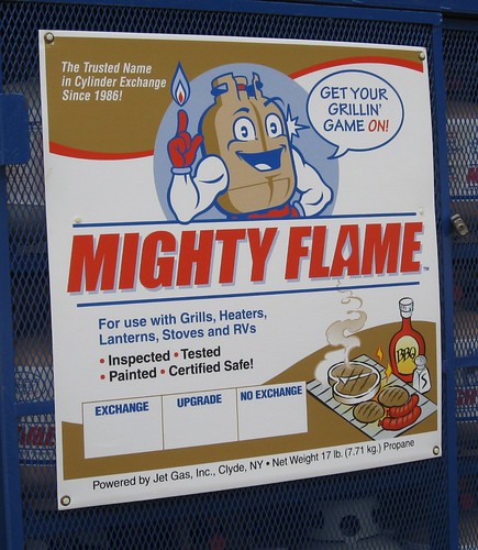
As we all know, one of the first rules of cartooning is that cartoon characters can only have four fingers. It’s the law. But that can cause problems if you want to show the character extending his index finger, as I learned in Pittsburgh the other day when I was stopping for gas and noticed this propane shack. All three signs on the shack show the same anthropomorphized propane tank, apparently named Mighty Flame. As you can see, if you just focus on the thumb side of his hand, it looks like he’s holding up his index finger. But when viewed from pinkie side, it looks more like he’s flipping the bird. I have no idea how widespread Mr. Mighty Flame is, but this might be one case where they’d be better off going with a five-fingered spokescharacter.
In case you missed it yesterday, ESPN caught me off-guard by posting my annual MLB season-preview column yesterday afternoon (it was originally slated to run today). Since we also had a full blog entry yesterday, we’ll just have a Ticker today. OK? OK. — Paul
Uni Watch News Ticker: Yes, yesterday’s post was an April Fool. However, I have it on good authority, seriously, that the ’Hawks were seriously considering a neon green alternate two years ago. Didn’t happen, thankfully. ”¦ Lookie what I just won. ”¦ Viral marketing? For details, look here (amazing find by Dave Ribar). ”¦ According to a small item buried deep in this story, the Buffalo Bisons’ foul poles have been painted orange. The Bisons, of course, are now the triple-A affiliate of the Mets, whose foul poles are also orange. ”¦ Could this guy possibly be a bigger douchebag? ”¦ Lots of torn jerseys, torn undershirts, and exposed pads in this hockey fight. ”¦ Last summer I added Montreal’s Mike Fitzgerald to our list of brimless-helmeted catchers. Now Andy Chalifour has made two related discoveries: (1) Fitzgerald also went brimless while with the Mets, and (2) his brimless helmet in Montreal included the little white dot on top. “I looked back at can’t find other brimless helmets with the dot,” says Andy. ”¦ Kevin Zdancewicz has been writing a “Jersey of the Week” column for his student newspaper at UVA. Check out his archive here. ”¦ Randy Williams lives near the Twin City Knitting outlet store in Conover, North Carolina, and sent me a buncha pics of the shop (plus he sent me an amazing pair of green/gold hoop socks, like the ones at lower-right in this shot). Check them out here. ”¦ Speaking of Randy and socks, he adds this: “I got married last November. My wonderful wife chose wedding colors of brown and orange. I happen to be a Browns fan, so it seemed only right that I sported my Browns socks under my tux.” ”¦ Check out this shot from the original Bad News Bears. Note the striping on the thin portion of the stirrup — hadn’t noticed that before (good spot by Jeff Rinker). ”¦ Steve Breaston plays for the Cardinals but grew up in Pittsburgh, which apparently explains why he was playing with the Steelers basketball team the other day (with thanks to Anthony LaBugenz). ”¦ Reprinted from yesterday’s comments: UNC will be wearing special Air Jordans for the Final Four. Here’s another view. ”¦ The Titans’ 50th-anniversary logo/patch design has been unveiled. ”¦ This looks like the start of a fun year. ”¦ Here’s the College Kickoff logo for this fall. And hey, aside from the number being too small on the ’Bama helmet, and the color of the VT facemask being wrong, and corporate logo, and the stupid-ass “distressed” typography at the bottom, it looks great! ”¦ Reprinted from last night’s comments: Killer monogrammed stirrups worn by Kentlake High School in Kent, Washington. ”¦ Looks like the Canada/IOC conflict has finally been resolved. ”¦ If you go to this page and click on “Blackhawks fans talk about their jerseys,” you’ll get a pretty good video clip (with thanks to James Huening). ”¦ Excellent article on Formula 1 liveries here (with thanks to Keith Baltzer). ”¦ Joe Scott of Cal State Fullerton is my kinda player (with thanks to Andy Luttrell). ”¦ Here’s a weird one: The NOB typeface on this Matt Cassel jersey is the Patriots’ font! (Great spot by Dave Singleton.) ”¦ Looks like there was some uni number confusion in yesterday’s Nats/Jays game (with thanks to Matthew Windsor).
Man, that Titans memorial logo is an absolute mess. I can appreciate the inclusion of the Oil derrick, but, man, that’s bush design.
Wait, yesterday’s post was an April Fool’s joke, but in the post itself you wrote that “this is no joke”? Isn’t that kind of weak, to outright claim your prank isn’t one?
I’m not going to lose sleep over it, but it just seems wrong.
[quote comment=”320945″]Wait, yesterday’s post was an April Fool’s joke, but in the post itself you wrote that “this is no joke”? Isn’t that kind of weak, to outright claim your prank isn’t one?
I’m not going to lose sleep over it, but it just seems wrong.[/quote]
Yeah, if there’s one thing I can’t stand, it’s a dishonest April Fool’s joke.
Judging by the 258 posts to yesterday column, more than a few people were taken.
For those who feel a little bit burnt from yesterday’s prank – I repost this picture from CNNSI – and pose the same question as I did Tuesday night – has this cheerleader adopted the Britney Spears underwear line?
link
I do have a uni-comment. I’ve always believed sports uniforms are simply another variations of military uniforms that have existed for hundreds of year. The leg stripe has existed forever. What I’m wondering is if the military/police started to take the same liberties to leg stripes – as NFL teams did, how ugly would it look.
For example – if the RCMP Mounties – gold stripe on black pants – took on the look of the Denver Broncos Swoosh?
I’m looking at link, and I bet he’s thankful that one of the digits in his number is a 1, because otherwise there wouldn’t be enough room to get that massive NOB across his back. If the Red Sox are going to insist on having NOBs on the road, they should use smaller or single-layer lettering so that they don’t look ridiculous.
Man, I have to say, I was honestly looking forward to seeing those green jerseys. Totally fooled.
Also, today’s lead is possibly the best lead ever.
And here’s Mighty Flames’ cousin: link
speaking of dishonest april fool’s jokes…
wanted to thank, in order, Jeremy Brahm, for ‘unwittingly’ giving me the idea, “Pretty Boy” Paulie Soto, for the phony seahawks logo slick, Michael Princip, for hosting said graphic on his board, and of course, Paul, for weaving it all together and running the “story”
/thanks guys!
[quote comment=”320951″]speaking of dishonest april fool’s jokes…
wanted to thank, in order, Jeremy Brahm, for ‘unwittingly’ giving me the idea, “Pretty Boy” Paulie Soto, for the phony seahawks logo slick, Michael Princip, for hosting said graphic on his board, and of course, Paul, for weaving it all together and running the “story”
/thanks guys![/quote]
you guys TOTALLY got me… course, i’m the most gullible human on earth.
well done!
[quote comment=”320950″]And here’s Mighty Flames’ cousin: link
Used to be giant (and I mean GIANT) neon Reddy Kilowatt sign above the Hennepin Avenue bridge in downtown Minneapolis.
Paul, I understand that the point of an April Fool’s joke is to be an actual untruth; I just thought it was odd that in the joke itself you denied its falsehood. There was just some weird sense of internal inconsistency or something. No biggie, really; I still thought it was a nifty gag.
If you’re ever in Rochester, NY, I’ll buy you a garbage plate to make amends. Deal?
I think Sid Finch wore neon green alternate BPs one year for St. Pattie’s Day.
Paul-
From what I’ve been hearing your assesment of VT’s facemask color being wrong might not necessarily be true…
Just sayin…
[quote comment=\”320946\”][quote comment=\”320945\”]Wait, yesterday\’s post was an April Fool\’s joke, but in the post itself you wrote that \”this is no joke\”? Isn\’t that kind of weak, to outright claim your prank isn\’t one?
I\’m not going to lose sleep over it, but it just seems wrong.[/quote]
Yeah, if there\’s one thing I can\’t stand, it\’s a dishonest April Fool\’s joke.[/quote]
Well, it\’s that it\’s dishonest… You don\’t think it kind of ruins the humor when you say \”This is not an April Fools\’ joke.
No really, this isn\’t an April Fools\’ joke.
Seriously, this isn\’t an April Fools\’ joke.
I mean it, this isn\’t an April Fools\’ joke.
Surprise! It WAS an April Fools\’ joke! Gotcha!\”
Uhh… random slashes?
It’s *not* that it’s dishonest. Wow, I’m on a roll today. And I’m excited for my impending banhammer.
Steve Breaston may be playing for the Steelers basketball team however he is stying true to the Cardinals by wearing Black and Red, commonly known as the Breds, Air Jordan XI’s.
link
And no, the wine and counter in the UNC O9 pic is not mine.
Revisiting the 1967 Broncos logoless helmet discussion of yesterday….
Is my face red. I totally forgot that one-year wonder. It was only when someone mentioned the helmet striping being different that the synapses finally started connecting in my memory lobes. Particularly, I recalled a certain photo of Al Denson in my files.
Basically, my thought processes then went something like this: “Holy shit, that’s right. That’s the uni that, when I first got quick looks at it in b&w highlights or grainy photos, appeared to be a plain royal helmet with a single blue stripe….and the sleeve striping looked like nothing more than one narrow white stripe bordered by two even narrower royal stripes.”
Why? Because the shade of the orange must have changed that year, too. It became far more dense, so that (in b&w) the orange and blue were of virtually the same value, a far cry from the previous set (I’ll post scans showing what I mean when I get home tonight). Shoot, I even did a rough sketch of what I THOUGHT the home uni looked like; now just have to see if I can FIND the damn thing. If I do find it, I’ll scan and post it).
Anyway, it finally all came back to me. Remember thinking it was one of the “minimalist” unis I’d ever seen. Then, when I finally did get a Bronco game on TV and could watch the light bounce differently off the unis, I realized there actually were very, very broad royal stripes on the jersey and a couple thin orange ones on the helmet.
Plus, I wonder if the orange was that dense only for a year or two, because in later b&w photos the difference in the orange and blue is far more pronounced (there’ll be photos of that, too).
Again, I apologize for the memory lapse. Obviously, I just went totally blank on it. Perhaps all the talk of brown horsey logos and whether or not the original Broncos had road whites filled up all my available “Bronco Recollection” space there for a while.
Now, as to the Seahawks lime greens. I figured April Fool or not, the look certainly was worth discussing. LOL
—Ricko
Wow…the Mets are bigger assholes than ever…are they going to kick every Philly fan out? Or is it a way to forcefully make people purchase their crappy dominoes laden stuff?
I think yesterday’s post and it’s subsequent chatter speaks more to the moronic nature of sports companies jersey decisions than the gullability of readership here.
We ate it because, on top of it being an elaborate and well executed hoax (good job, guys)… we all firmly believe it could happen. The Bears’ “parking cone” jerseys, Notre Dame’s “lucky” green jerseys… a neon green jersey with blue sleeves is a feasible way for Reebok, NFL, and all applicable parties to get the good people of Seattle to part with $80-200.
I think, while just as ugly, an ALL neon green jersey would have raised a red flag becuase it wasn’t a lousy enough idea. The blue sleeves look SO out of place, I would believe a CEO pushed it through maketing because he wanted to see his grandson’s design put to production.
Originally the column yesterday was going to be in the ticker with some uniform related things that would be close to real, so the readers would be confused as to what was real and what was fake.
Phil asked me do supply some things last week. I just happened to suggest that the Seahawks would be adding green as an alternate uniform. I looked at Seahawks Pro Shop online and only saw the Ladies fashion model.
link
link
Here is the original text that I sent to Phil,
“Due to the success of the fluorescent green color in the Seattle Seahawks color scheme, the Seahawks will introduce a new uniform for home games. The new home uniform is bright green on the top and silver on the bottom. Matt Hasselback who helped with the design said, ‘I thought that the blue ones did not fit the weather here. Silver or grey is normal for the rain and I needed the green to see my receivers downfield.’”
I sent this to Phil, and he said let’s see if Paulie, who had done the alternates on Monday, can do it.
Actually, I am a Seahawks fan and I even I was surprised with the article yesterday. I had seen it late Tuesday night in the comments and I thought, well my Seahawks suggestion was gone and would become reality.
But Phil sent me, before the comment on Tuesday night, an email saying that it would not be in the ticker and I would be happy tomorrow.
So I had to email Phil and ask him if it was real yesterday. He replied, it was your suggestion and Paul ran with it.
We have all been had, including the guy who suggested it, me.
Paul:
Question on the MLB preview ESPN piece.
The Twins are dumping the blue road alt and adding the throwback home jersey. Will they still also have the alt-home white vest? 4 different options at home (white, blue, vest, throwback) seems like more than a bit of overkill, no?
Kevin Zdancewicz definitely Gets It(TM)! Can we sign him up as a regular contributor?
yet another application of the best state flag ever designed!
link
Chef Duff was at Maryland last night and presented that cake!
[quote comment=”320968″]yet another application of the best state flag ever designed!
link
Chef Duff was at Maryland last night and presented that cake![/quote]
Is that fondant on the side of his cap?
[quote comment=”320966″]The Twins are dumping the blue road alt and adding the throwback home jersey. Will they still also have the alt-home white vest?[/quote]
Yes.
[quote comment=”320962″]Revisiting the 1967 Broncos logoless helmet discussion of yesterday….
Is my face red. I totally forgot that one-year wonder. It was only when someone mentioned the helmet striping being different that the synapses finally started connecting in my memory lobes. Particularly, I recalled a certain photo of Al Denson in my files.
Basically, my thought processes then went something like this: “Holy shit, that’s right. That’s the uni that, when I first got quick looks at it in b&w highlights or grainy photos, appeared to be a plain royal helmet with a single blue stripe….and the sleeve striping looked like nothing more than one narrow white stripe bordered by two even narrower royal stripes.”
Why? Because the shade of the orange must have changed that year, too. It became far more dense, so that (in b&w) the orange and blue were of virtually the same value, a far cry from the previous set (I’ll post scans showing what I mean when I get home tonight). Shoot, I even did a rough sketch of what I THOUGHT the home uni looked like; now just have to see if I can FIND the damn thing. If I do find it, I’ll scan and post it).
Anyway, it finally all came back to me. Remember thinking it was one of the “minimalist” unis I’d ever seen. Then, when I finally did get a Bronco game on TV and could watch the light bounce differently off the unis, I realized there actually were very, very broad royal stripes on the jersey and a couple thin orange ones on the helmet.
Plus, I wonder if the orange was that dense only for a year or two, because in later b&w photos the difference in the orange and blue is far more pronounced (there’ll be photos of that, too).
Again, I apologize for the memory lapse. Obviously, I just went totally blank on it. Perhaps all the talk of brown horsey logos and whether or not the original Broncos had road whites filled up all my available “Bronco Recollection” space there for a while.
Now, as to the Seahawks lime greens. I figured April Fool or not, the look certainly was worth discussing. LOL
—Ricko[/quote]
All is forgiven, Sir Ricko. In the past year or so, you have helped this fat ole boy more than you’ll ever know!!
I have seen the design for the new Canada jersey for Vancouver. Really not much of a difference from the current design other than the removal of the player on the front. The COC logo will be located on the back hem (and will be about the same size as the NHL shield) where I assume the IIHF will disappear because of these rules. And the VANOC logo will go where the vintage Canada logo was.
I will say this – it is much better than what Baseball Canada had to do with their jerseys for Beijing when they had the big-ass COC patch on the right sleeve. Same kind of deal though – just tweak the federation logo enough to pass muster
Gary Carter or Mike PIazza to catch a ceremonial pitch for the Mets?
What, Choo Choo Coleman wasn’t available?
It didn’t occur to me last night when I was watching that Blackhaws fans’ jerseys thing, but the guy who was being quizzed on the correct spelling of “Byfuglien” asked if he should spell it “the American way or the right way.” Um, dude, Dustin Byfuglien was born and raised in Minnesota.
Oh, wait. That’s just in the southern part of the link.
Nevermind.
“appeared to be a plain royal helmet with a single blue stripe…”
Ooops, that should be “a single WHITE stripe”.
—Ricko
I’ve spotted “Mighty Flame” in the Greater Cleveland area many times. As anthropomorphic characters go, he’s a pretty good rep, IMHO.
It’s funny Paul mentions Hank Hill in the headline and then mentions the three-fingered rule since “King Of The Hill” is a link, I tell you what.
[quote comment=”320967″]Kevin Zdancewicz definitely Gets It(TM)! Can we sign him up as a regular contributor?[/quote]
Kevin did a good job. He’s got the right attitude towards the promo jerseys.
And thanks for the link back to my blog, Kevin!
[quote comment=”320975″]”appeared to be a plain royal helmet with a single blue stripe…”[/quote]
see…THIS is how brown horsey rumors get started
[quote comment=”320976″]It’s funny Paul mentions Hank Hill in the headline and then mentions the three-fingered rule since “King Of The Hill” is a link, I tell you what.[/quote]
As was the short-lived link animated series. Clearly, that’s the reason it was short-lived.
[quote comment=”320979″][quote comment=”320976″]It’s funny Paul mentions Hank Hill in the headline and then mentions the three-fingered rule since “King Of The Hill” is a link, I tell you what.[/quote]
As was the short-lived link animated series. Clearly, that’s the reason it was short-lived.[/quote]
the simpsons did have one five fingered character
Deadspin has linked back to the April Fool’s joke now:
link
[quote comment=”320978″][quote comment=”320975″]”appeared to be a plain royal helmet with a single blue stripe…”[/quote]
see…THIS is how brown horsey rumors get started[/quote]
Well, at least I didn’t think it was a plain BROWN helmet with a single white stripe to “honor” the original Broncos who a) sucked and b) wore unis that everyone thought sucked.
At least my screwups aren’t absent logic.
:)
—Ricko
Tigers yesterday wore each other’s jerseys as an April Fool’s prank/show of unity, though I wonder where Ordonez got the Kaline jersey from.
[quote comment=”320981″]Deadspin has linked back to the April Fool’s joke now:
link
… and gives no credit or link back to those who did the work. Deadspin disappoints me.
[quote comment=”320947″]Judging by the 258 posts to yesterday column, more than a few people were taken.
For those who feel a little bit burnt from yesterday’s prank – I repost this picture from CNNSI – and pose the same question as I did Tuesday night – has this cheerleader adopted the Britney Spears underwear line?
link
It appears that the photo has been touched up a liitle.
[quote comment=”320986″][quote comment=”320947″]Judging by the 258 posts to yesterday column, more than a few people were taken.
For those who feel a little bit burnt from yesterday’s prank – I repost this picture from CNNSI – and pose the same question as I did Tuesday night – has this cheerleader adopted the Britney Spears underwear line?
link
It appears that the photo has been touched up a liitle.[/quote]
You mean like the Swimsuit Editions?
She’s got more on underneath that jersey than you’re wishing she didn’t. She’s a cheerleader. She doesn’t strip (from what we know).
Yes, yesterday’s post was an April Fool. However, I have it on good authority, seriously, that the ’Hawks were seriously considering a neon green alternate two years ago. Didn’t happen, thankfully.
I fully bought into that because I’ve seen those very jerseys in Just Sports. I can’t find a pic of the extra green home jersey, but here is the road one.
link
The white dot is probably just the white button sticker that American Baseball Company (ABC) puts on its helmets. It is just a white circle with a blue capital R and a circle around it.
Deadspin does have the link at the bottom of the page.
[quote comment=”320985″][quote comment=”320981″]Deadspin has linked back to the April Fool’s joke now:
link
… and gives no credit or link back to those who did the work. Deadspin disappoints me.[/quote]
sure there was…bottom of the page (you know, the link that listed yesteday’s story with yesterday’s title and then the bracketed “[uniwatch]”)
I was about nine tenths of the way through a scathing post re: the Seahawks and Paul Allen’s worship of fellow northwest plutocrat Phil Knight when I suddenly realized what day it was.
Good one.
I kept thinking about the logistic aspects of the uniform. I bet opposing QB’s would have great days because it would be impossible to disguise coverages and hide defensive backs when they were wearing road crew jerseys.
[quote comment=”320987″][quote comment=”320986″][quote comment=”320947″]Judging by the 258 posts to yesterday column, more than a few people were taken.
For those who feel a little bit burnt from yesterday’s prank – I repost this picture from CNNSI – and pose the same question as I did Tuesday night – has this cheerleader adopted the Britney Spears underwear line?
link
It appears that the photo has been touched up a liitle.[/quote]
You mean like the Swimsuit Editions?
She’s got more on underneath that jersey than you’re wishing she didn’t. She’s a cheerleader. She doesn’t strip (from what we know).[/quote]
That picture yesterday showed a little more down below, then it does now. I guess the someone at cnnsi caught wind of it.
[quote comment=”320991″][quote comment=”320985″][quote comment=”320981″]Deadspin has linked back to the April Fool’s joke now:
link
… and gives no credit or link back to those who did the work. Deadspin disappoints me.[/quote]
sure there was…bottom of the page (you know, the link that listed yesteday’s story with yesterday’s title and then the bracketed “[uniwatch]”)[/quote]
Afterthoughts do not count as credit to me. They should have had the link under the picture for full credit. Heck, you get second billing to the Seattle Uniform History despite them using your picture for their story.
It’s like:
Here’s my story.
Oh, and PS – here’s another few sites that you may want to check after you’ve read our story about Seattle’s new alts.
It just seems very unprofessional to me that Deadspin is unofficially claiming something is theirs when it was all you guys who did the work.
So I was thinking the Seahawks thing might be a prank, but what about your note that the other teams are getting uniform tweaks? Most importantly the Dolphins? I know there was another April Fools prank on the Phins going to blue jerseys, but I’ve been hoping for an update the the jerseys for years.
[quote comment=”320994″][quote comment=”320991″][quote comment=”320985″][quote comment=”320981″]Deadspin has linked back to the April Fool’s joke now:
link
… and gives no credit or link back to those who did the work. Deadspin disappoints me.[/quote]
sure there was…bottom of the page (you know, the link that listed yesteday’s story with yesterday’s title and then the bracketed “[uniwatch]”)[/quote]
Afterthoughts do not count as credit to me. They should have had the link under the picture for full credit. Heck, you get second billing to the Seattle Uniform History despite them using your picture for their story.
It’s like:
Here’s my story.
Oh, and PS – here’s another few sites that you may want to check after you’ve read our story about Seattle’s new alts.
It just seems very unprofessional to me that Deadspin is unofficially claiming something is theirs when it was all you guys who did the work.[/quote]
Deadspin isn’t about professionalism. It’s about spreading gossip and clevertude. And that’s fine. They linked back to UW, which is good, although it would’ve been even better if they’d linked to GreenGlare, since that’s where the logo slick first appeared (thanks, Michael!). I have no problem with their treatment of it.
I’m gone for the rest of the day, folks. Play nice.
[quote comment=”320993″]
That picture yesterday showed a little more down below, then it does now. I guess the someone at cnnsi caught wind of it.[/quote]
I saw the photo from the other day. It was still perfectly fine. She’s clearly wearing hosiery, and I’m pretty sure you don’t strip naked to take a picture in a hockey jersey for CNNSI.
[quote comment=”320951″]speaking of dishonest april fool’s jokes…
wanted to thank, in order, Jeremy Brahm, for ‘unwittingly’ giving me the idea, “Pretty Boy” Paulie Soto, for the phony seahawks logo slick, Michael Princip, for hosting said graphic on his board, and of course, Paul, for weaving it all together and running the “story”
/thanks guys![/quote]
Yea, this was fun. Paul was quite the acting coach with his tips for me to really sell this alt. green jersey slick. Didn’t take long for me to really geek out on it and explain the “green” in “Green Glare”. lol…………It’s really about the eye….really, both logos had the green glaring stare.
[quote comment=”320996″]
Deadspin isn’t about professionalism. It’s about spreading gossip and clevertude. And that’s fine. They linked back to UW, which is good, although it would’ve been even better if they’d linked to GreenGlare, since that’s where the logo slick first appeared (thanks, Michael!). I have no problem with their treatment of it.
I’m gone for the rest of the day, folks. Play nice.[/quote]
As long as you’re ok with it, I have no qualms. I guess I’m just big on crediting the people who do the work. Phil and I had this discussion last night as he tried to duck some credit I was giving him on another matter.
But if you’re ok, then dead issue. :o)
[quote comment=”320947″]For those who feel a little bit burnt from yesterday’s prank – I repost this picture from CNNSI – and pose the same question as I did Tuesday night – has this cheerleader adopted the Britney Spears underwear line?[/quote]
I love a good cheerleader pic as much as the next red-blooded American male; but IMHO you need a lot of imagination to think that you can tell anything about what is or isn’t under that jersey.
But speaking of red-blooded American males, that “Mighty Flame” mascot: isn’t there more than one way to interpret that name?
Not that there’s anything WRONG with that, of course.
[quote comment=”320996″]Deadspin isn’t about professionalism. It’s about spreading gossip and clevertude.[/quote]
The problems with Deadspin are 1) the closed commenting format, and 2) they claim that they’re fact-based rather than owning up to the idea that they don’t have a clue.
Deadspin is a sorry example of a UI education.
Claiming something is not a joke when it is? Gee, people must marvel at your incredible ability to fool others. Amazing.
Our school production of “Damn Yankees” opened up this past weekend and I snapped a few pics. I think that UW would be proud of how our Senators looked. Here are a few snapshots of the power hitter Joe Hardy, as well as manager Van Buren:
link
link
link
link
link
[quote comment=”320997″][quote comment=”320993″]
That picture yesterday showed a little more down below, then it does now. I guess the someone at cnnsi caught wind of it.[/quote]
I saw the photo from the other day. It was still perfectly fine. She’s clearly wearing hosiery, and I’m pretty sure you don’t strip naked to take a picture in a hockey jersey for CNNSI.[/quote]
Thanks Teebz, I was wondering if that was the case, as it seemed more provocative on Tuesday. Oh well, she’s still a lovely girl to look at.
I think this has been answered before – but can you clarify – is the orange in the Philadelphia Flyers new/old third jersey a hell of a lot brighter than the original – I mean that uni is one or two shades away from being florescent. I find it ironic for all this outcry about if Seattle Seahawks adopting neon, and yet one of the traditional toughest teams is going back to what is close to neon orange.
I actually think bright colours – can help create a certain amount of passion for teams. By far the biggest merchandise seller right now in the Canadian Football league is the Saskatchewan Roughriders – which is quite a bright shade of green (although far from Seahawks green).
Not to get carried away – but certain political movements adopt bright colours – i.e. the Ukrainian movement it was orange.
[quote comment=”320944″]Man, that Titans memorial logo is an absolute mess. I can appreciate the inclusion of the Oil derrick, but, man, that’s bush design.[/quote]
I like this quote from Bud Adams:
“It is hard to imagine how far pro football has come since 1960”
It isn’t THAT hard to imagine Bud. Seems like about 600 miles or so, from Houston to Nashville. About the same distance as your bankroll, but nowhere near the distance covered by your ego. :-)
[quote comment=”320953″][quote comment=”320950″]And here’s Mighty Flames’ cousin: link
Used to be giant (and I mean GIANT) neon Reddy Kilowatt sign above the Hennepin Avenue bridge in downtown Minneapolis.[/quote]
At least we still have the mighty link.
Speaking of Redi, I also miss the Minnegasco Indian Maiden. You still see link with that logo on them. (Here’s a link in her image.)
THATHERTON!
[quote comment=”321004″][quote comment=”320997″][quote comment=”320993″]
That picture yesterday showed a little more down below, then it does now. I guess the someone at cnnsi caught wind of it.[/quote]
I saw the photo from the other day. It was still perfectly fine. She’s clearly wearing hosiery, and I’m pretty sure you don’t strip naked to take a picture in a hockey jersey for CNNSI.[/quote]
Thanks Teebz, I was wondering if that was the case, as it seemed more provocative on Tuesday. Oh well, she’s still a lovely girl to look at.[/quote]
Absolutely. If I’m burning Phoenix down for their use of Jets jerseys, she’s the first person I’m rescuing. LOL
[quote comment=”321004″]I think this has been answered before – but can you clarify – is the orange in the Philadelphia Flyers new/old third jersey a hell of a lot brighter than the original – I mean that uni is one or two shades away from being florescent. I find it ironic for all this outcry about if Seattle Seahawks adopting neon,
and yet one of the traditional toughest teams is going back to what is close to neon orange.[/quote]
The orange is much more vivid. Here’s link compared to the Flyers of the early 1980s. Pretty similar, right?
Here are link.
The shade of orange is much brighter.
Oh, and if you happen to have a few thousand dollars lying around in this economy, you have a chance to own the Hollywood Wax Museum’s versions of Tiger Woods and Michael Jordan.
For the first time in the Museum’s history, they are link.
…compared to the link?
Does that link work?
[quote comment=”320998″][quote comment=”320951″]speaking of dishonest april fool’s jokes…
wanted to thank, in order, Jeremy Brahm, for ‘unwittingly’ giving me the idea, “Pretty Boy” Paulie Soto, for the phony seahawks logo slick, Michael Princip, for hosting said graphic on his board, and of course, Paul, for weaving it all together and running the “story”
/thanks guys![/quote]
Yea, this was fun. Paul was quite the acting coach with his tips for me to really sell this alt. green jersey slick. Didn’t take long for me to really geek out on it and explain the “green” in “Green Glare”. lol…………It’s really about the eye….really, both logos had the green glaring stare.[/quote]
you were the final piece, tho! no way this comes off without a “viable source” to have “leaked” the slick
thanks again
[quote comment=”321010″]…compared to the link?
Does that link work?[/quote]
Yep – is that Pat (it doesn’t appear I’ll ever get another NHL job again) Quinn.
[quote comment=”321012″][quote comment=”321010″]…compared to the link?
Does that link work?[/quote]
Yep – is that Pat (it doesn’t appear I’ll ever get another NHL job again) Quinn.[/quote]
The late John Ferguson Sr. with goaltender Phil Myre.
link
Champion gets together with Japanese brand to make vintage-style football jersey.
[quote comment=”321004″][quote comment=”320997″][quote comment=”320993″]
That picture yesterday showed a little more down below, then it does now. I guess the someone at cnnsi caught wind of it.[/quote]
I saw the photo from the other day. It was still perfectly fine. She’s clearly wearing hosiery, and I’m pretty sure you don’t strip naked to take a picture in a hockey jersey for CNNSI.[/quote]
Thanks Teebz, I was wondering if that was the case, as it seemed more provocative on Tuesday. Oh well, she’s still a lovely girl to look at.[/quote]
Here’s link as it originally ran.
[quote comment=”321013″][quote comment=”321013″]
Yep – is that Pat (it doesn’t appear I’ll ever get another NHL job again) Quinn.[/quote]
The late John Ferguson Sr. with goaltender Phil Myre.[/quote]
I should add that the site I snagged the photo from said it was Fergie. But it is very much is Quinn by my view as well.
Ha! Paul and everyone… you got me too! Hook, line, and sinker. Good job.
However, I have to say that I actually *liked* the idea of a green jersey. The reason I don’t like the green as-is, is because its such an afterthought. I don’t mind the color though.
[quote comment=”321015″]Here’s link as it originally ran.[/quote]
Thanks.
For me, my original comment stands: you need a lot of imagination to view that and make any sort of comment re: Brittany Spears.
You can call me jaded, or talk about my fading eyesight or whatever…
[quote comment=”321016″][quote comment=”321013″][quote comment=”321013″]
Yep – is that Pat (it doesn’t appear I’ll ever get another NHL job again) Quinn.[/quote]
The late John Ferguson Sr. with goaltender Phil Myre.[/quote]
I should add that the site I snagged the photo from said it was Fergie. But it is very much is Quinn by my view as well.[/quote]
Definitely Quinn – coached the Flyers in the late 70’s early 80’s.
Michael Princip,
Thanks for the help with the Green Seahawks uniform.
I can remember when the Seahawks came out with the new colors and there was barely anything available in green, everything was the metallic blue, which I do like.
But since the Super Bowl appearance, the green has really been accepted by the fans. Plus with the Sounders adopting the green for their home uniform, I really could see the Seahawks approaching this down the road. I’d prefer maybe a different shade, but still.
Even Seahawks Addicts gone it in on the act as well.
link
RE: Phoenix Coyotes Cheerleader
Maybe Rob Ullman can give her a better treatment!!
[quote comment=”321018″][quote comment=”321015″]Here’s link as it originally ran.[/quote]
Thanks.
For me, my original comment stands: you need a lot of imagination to view that and make any sort of comment re: Brittany Spears.
You can call me jaded, or talk about my fading eyesight or whatever…[/quote]
Yeah but it’s interesting that CNNSI took the time to modify it, which I would think is tacit admission, that a more provocative interpretation was not unreasonable.
gary carter. viewing from northern cali, not metro ny area, the way he and goose (carter showed gossage how to do it) whined and bitched way into hall of fame…
[quote comment=”321022″]Yeah but it’s interesting that CNNSI took the time to modify it, which I would think is tacit admission, that a more provocative interpretation was not unreasonable.[/quote]
Yep: maybe I should feel good. Maybe it’s some memories of real-life that make me look at that picture and say “been there, done that”. :-)
BTW, the spam word for this post is “gone”. Freudian? As in “those days are…?
Speaking of the little colored dot on the top of catchers/batting helmets….
Everyone here has their little pet peeves about sports uniforms. Mine, without a doubt, is when a team puts that dot on the helmet when their cap doesn’t have one.
An example being the Detroit Tigers. The away cap and helmet match, both have the orange “button”. The home cap does not match. Their batting helmet has a white “button” but their cap does not.
Drives me nuts!
[quote comment=”320956″]Paul-
From what I’ve been hearing your assesment of VT’s facemask color being wrong might not necessarily be true…
Just sayin…[/quote]
I’m intrigued…
I’m wondering if that also means the “retro” jerseys will go full time as rumored? (fingers crossed)
The discussion of the logoless Broncos helmet got me thinking that I had proof somewhere.
Found it. These screenshots are from the opening-credits sequence of the “Lost Treasures of NFL Films” episode devoted to the AFL. Floyd Little carrying the ball against the Dolphins in ’67, his rookie year.
link
Apologies for the bluish tint of the one image. I’m a newbie at the whole “point digital camera at freeze-frame, upload” thing.
I am proud to say that the University at Albany (my current school) Softball team, while having revolting jerseys, has nice hosiery.:
link
Interesting catcher’s gear for Mike Fitzerald. He’s got an All Star chest protector and Rawlings shin guards. I can’t I recall other cases of mismatched branding (although I’m sure there are more than a few).
[quote comment=”320944″]Man, that Titans memorial logo is an absolute mess. I can appreciate the inclusion of the Oil derrick, but, man, that’s bush design.[/quote]
why would you stop at “absolute mess” and “that’s a bush design” and NOT go any further??? tell why you think it’s SO bush…
Randy Williams, if you’re out there could you please e-mail me?
link
thanks!
[quote comment=”321003″]Our school production of “Damn Yankees” opened up this past weekend and I snapped a few pics. I think that UW would be proud of how our Senators looked. Here are a few snapshots of the power hitter Joe Hardy, as well as manager Van Buren:
link
link
link
link
link
VERY proud! great job powers!!!
No mention on he ESPN column about the Pirates vs. Tigers with the 1909 world series 100th Anniversary. with the teams wearing the 1909 Jerseys.
link
link
Apparently, the city of Fresno, California is getting a new Western States Hockey League team – the Fresno Monsters. Story link. Here’s the team link. And either they have no uniform set yet, or they are the worst uniforms ever.
[quote comment=”321023″]gary carter. viewing from northern cali, not metro ny area, the way he and goose (carter showed gossage how to do it) whined and bitched way into hall of fame…[/quote]
More from the Gary Carter’s a douchbag files.
I saw him absolutely accost Mark McGwire for autographs while McGwire was trying to get to BP. McGwire was embarrassed, hell I was embarrassed just watching. Unfortunately, “the Kid” wasn’t.
Also, Gary likes to call the press box to gripe at the official scorer DURING the game.
[quote comment=”320963″]Wow…the Mets are bigger assholes than ever…are they going to kick every Philly fan out? Or is it a way to forcefully make people purchase their crappy dominoes laden stuff?[/quote]
Well according to the story, he was in the press box and it its proper etiquette in press boxes to not wear any team logos whatsoever so maybe they were just following press box procedure
thought this was funny and a clever little april fools joke yesterday:
at the start of the pens game mike lange was describing what the players were wearing. when he described new jersey, he said they were wearing their white jerseys with green pants trimmed in red. my head almost exploded! i flew home to watch the game, and of course, flet like an ass (as usual). great little joke and they never mentioned it was a joke or never went back to it (which made it that much better).
just thought it was cool…
[quote comment=”321032″][quote comment=”321003″]Our school production of “Damn Yankees” opened up this past weekend and I snapped a few pics. I think that UW would be proud of how our Senators looked. Here are a few snapshots of the power hitter Joe Hardy, as well as manager Van Buren:
link
link
link
link
link
VERY proud! great job powers!!![/quote]
Those are some pretty decent uniforms, Matt. And I like that T-shirt!
[quote comment=”321036″][quote comment=”320963″]Wow…the Mets are bigger assholes than ever…are they going to kick every Philly fan out? Or is it a way to forcefully make people purchase their crappy dominoes laden stuff?[/quote]
Well according to the story, he was in the press box and it its proper etiquette in press boxes to not wear any team logos whatsoever so maybe they were just following press box procedure[/quote]
Except that he was neing forced to wear a St. john’s jacket… meaning he was supporting one team over another.
[quote comment=”321039″][quote comment=”321036″][quote comment=”320963″]Wow…the Mets are bigger assholes than ever…are they going to kick every Philly fan out? Or is it a way to forcefully make people purchase their crappy dominoes laden stuff?[/quote]
Well according to the story, he was in the press box and it its proper etiquette in press boxes to not wear any team logos whatsoever so maybe they were just following press box procedure[/quote]
Except that he was being forced to wear a St. john’s jacket… meaning he was supporting one team over another.[/quote]
Where’s that edit button? LOL
Speaking of cartoon charactesr, I was looking at the Brewers online store and noticed that they had Beer Barrel Man pennants (from Cooperstown and Mitchell & Ness) and a faux vintage T-shirt. (My links to store items don’t seem to work.)
How can they have sausage race bobbleheads and not a Beer Barrel Man bobblehead? Was the niche Beer Barrel Man market utterly destroyed by the promotional BBMB?
[quote comment=”321035″][quote comment=”321023″]gary carter. viewing from northern cali, not metro ny area, the way he and goose (carter showed gossage how to do it) whined and bitched way into hall of fame…[/quote]
More from the Gary Carter’s a douchbag files.
I saw him absolutely accost Mark McGwire for autographs while McGwire was trying to get to BP. McGwire was embarrassed, hell I was embarrassed just watching. Unfortunately, “the Kid” wasn’t.
Also, Gary likes to call the press box to gripe at the official scorer DURING the game.[/quote]
he was asking for andro, not autographs
/you ever get a call from kid, larry?
[quote comment=”321020″]Michael Princip,
Thanks for the help with the Green Seahawks uniform.
I can remember when the Seahawks came out with the new colors and there was barely anything available in green, everything was the metallic blue, which I do like.
But since the Super Bowl appearance, the green has really been accepted by the fans. Plus with the Sounders adopting the green for their home uniform, I really could see the Seahawks approaching this down the road. I’d prefer maybe a different shade, but still.
Even Seahawks Addicts gone it in on the act as well.
link
I wrote this yesterday and how I would really like to see the green utilized as a third jersey:
I see what you all mean with the possiblity of making a third alternate green, and having it go with the white pants as opposed to the blue, or darker blue. Yet, I would have to add that it’d be slicker if they donned the matte gray pants they had in ‘76, and went with a more evergreen(earthtone) for the jerseys. Of course, it would help if the stitch lines were cool too.
Now, mind you we still have a blue helmet to contend with. Much more accomodating with the silver. Too bad we couldn’t alternate the helmets with this uniform ensemble.
[quote comment=”321007″]THATHERTON![/quote]
LOL
link
That is the photo I posted yesterday for the Broncos with no logo on the helmet.
So the answer to a question about the last NFL team besides to Browns to not have any logo is the Broncos in 1967?
[quote comment=”321026″][quote comment=”320956″]Paul-
From what I’ve been hearing your assesment of VT’s facemask color being wrong might not necessarily be true…
Just sayin…[/quote]
I’m intrigued…
I’m wondering if that also means the “retro” jerseys will go full time as rumored? (fingers crossed)[/quote]
Yes, and from what I hear, maroon versions have already been ordered…
[quote comment=”320993″][quote comment=”320987″][quote comment=”320986″][quote comment=”320947″]Judging by the 258 posts to yesterday column, more than a few people were taken.
For those who feel a little bit burnt from yesterday’s prank – I repost this picture from CNNSI – and pose the same question as I did Tuesday night – has this cheerleader adopted the Britney Spears underwear line?
link
It appears that the photo has been touched up a liitle.[/quote]
You mean like the Swimsuit Editions?
She’s got more on underneath that jersey than you’re wishing she didn’t. She’s a cheerleader. She doesn’t strip (from what we know).[/quote]
That picture yesterday showed a little more down below, then it does now. I guess the someone at cnnsi caught wind of it.[/quote]
original or it didn’t happen
Kicking out a Phillies fan in a game the Mets aren’t even playing in? What’s next, them removing me from Yankee Stadium for not removing my Orioles cap in the owner’s box?
Me? If I was Reed Frazier, I would have bitched and bitched. “I’m only trying to do my job, man.” There sure seems to be a lot of New Yorkers named “Paul”.
[quote comment=”321008″][quote comment=”321004″][quote comment=”320997″][quote comment=”320993″]
That picture yesterday showed a little more down below, then it does now. I guess the someone at cnnsi caught wind of it.[/quote]
I saw the photo from the other day. It was still perfectly fine. She’s clearly wearing hosiery, and I’m pretty sure you don’t strip naked to take a picture in a hockey jersey for CNNSI.[/quote]
Thanks Teebz, I was wondering if that was the case, as it seemed more provocative on Tuesday. Oh well, she’s still a lovely girl to look at.[/quote]
Absolutely. If I’m burning Phoenix down for their use of Jets jerseys, she’s the first person I’m rescuing. LOL
[quote comment=”321004″]I think this has been answered before – but can you clarify – is the orange in the Philadelphia Flyers new/old third jersey a hell of a lot brighter than the original – I mean that uni is one or two shades away from being florescent. I find it ironic for all this outcry about if Seattle Seahawks adopting neon,
and yet one of the traditional toughest teams is going back to what is close to neon orange.[/quote]
The orange is much more vivid. Here’s link compared to the Flyers of the early 1980s. Pretty similar, right?
Here are link.
The shade of orange is much brighter.[/quote]
I’m not sure if its more to do with the shade being different than it is about the quality of photography.
Photos nowadays tend to be a lot brighter than they were back then. I’m sure that has more to do with it than the Flyers drastically altering their orange hue. That said, it wouldn’t surprise me to find out they went from more of a red-orange to a yellow-orange at some point…
Worst hockey trophy ever?
(It looks like it’s out of a Nintendo game!)
link
[quote comment=”321048″][quote comment=”320993″][quote comment=”320987″][quote comment=”320986″][quote comment=”320947″]Judging by the 258 posts to yesterday column, more than a few people were taken.
For those who feel a little bit burnt from yesterday’s prank – I repost this picture from CNNSI – and pose the same question as I did Tuesday night – has this cheerleader adopted the Britney Spears underwear line?
link
It appears that the photo has been touched up a liitle.[/quote]
You mean like the Swimsuit Editions?
She’s got more on underneath that jersey than you’re wishing she didn’t. She’s a cheerleader. She doesn’t strip (from what we know).[/quote]
That picture yesterday showed a little more down below, then it does now. I guess the someone at cnnsi caught wind of it.[/quote]
original or it didn’t happen[/quote]
Look at post #71……
About the Phillies jacket story, note Reed Frazier was never asked to take off his jacket by anyone with the Mets. He says the Mets staff were pleasant and accomodating.
If I had to guess, I’d say it was probably the head of his department who, not wanting to upset anyone with the Mets, overreacted. But we’re only hearing it from Frazier’s side.
[quote comment=”320962″]Revisiting the 1967 Broncos logoless helmet discussion of yesterday….
Is my face red. I totally forgot that one-year wonder. It was only when someone mentioned the helmet striping being different that the synapses finally started connecting in my memory lobes. Particularly, I recalled a certain photo of Al Denson in my files.
Basically, my thought processes then went something like this: “Holy shit, that’s right. That’s the uni that, when I first got quick looks at it in b&w highlights or grainy photos, appeared to be a plain royal helmet with a single blue stripe….and the sleeve striping looked like nothing more than one narrow white stripe bordered by two even narrower royal stripes.”
Why? Because the shade of the orange must have changed that year, too. It became far more dense, so that (in b&w) the orange and blue were of virtually the same value, a far cry from the previous set (I’ll post scans showing what I mean when I get home tonight). Shoot, I even did a rough sketch of what I THOUGHT the home uni looked like; now just have to see if I can FIND the damn thing. If I do find it, I’ll scan and post it).
Anyway, it finally all came back to me. Remember thinking it was one of the “minimalist” unis I’d ever seen. Then, when I finally did get a Bronco game on TV and could watch the light bounce differently off the unis, I realized there actually were very, very broad royal stripes on the jersey and a couple thin orange ones on the helmet.
Plus, I wonder if the orange was that dense only for a year or two, because in later b&w photos the difference in the orange and blue is far more pronounced (there’ll be photos of that, too).
Again, I apologize for the memory lapse. Obviously, I just went totally blank on it. Perhaps all the talk of brown horsey logos and whether or not the original Broncos had road whites filled up all my available “Bronco Recollection” space there for a while.
Now, as to the Seahawks lime greens. I figured April Fool or not, the look certainly was worth discussing. LOL
—Ricko[/quote]
I believe it was 1965, the year the Broncos switched to the great unis with the sleeve inserts, that they also darkened the orange considerably. I have a color 1965 team photo in which several players are still wearing the 1964 jerseys, and you can really see the difference. The SSUR.org database lists the “orange” color as “red-orange” from 1965-76. In 1977 they went back to a lighter shade of orange.
[quote comment=”321038″][quote comment=”321032″][quote comment=”321003″]Our school production of “Damn Yankees” opened up this past weekend and I snapped a few pics. I think that UW would be proud of how our Senators looked. Here are a few snapshots of the power hitter Joe Hardy, as well as manager Van Buren:
link
link
link
link
link
VERY proud! great job powers!!![/quote]
Those are some pretty decent uniforms, Matt. And I like that T-shirt![/quote]
Here are a few more pics from today’s peer performance:
link
link
link
[quote comment=”321055″][quote comment=”321038″][quote comment=”321032″][quote comment=”321003″]Our school production of “Damn Yankees” opened up this past weekend and I snapped a few pics. I think that UW would be proud of how our Senators looked. Here are a few snapshots of the power hitter Joe Hardy, as well as manager Van Buren:
link
link
link
link
link
VERY proud! great job powers!!![/quote]
Those are some pretty decent uniforms, Matt. And I like that T-shirt![/quote]
Here are a few more pics from today’s peer performance:
link
link
link
Had Paul waited to post his DIY column, these could have been included!
Thanks to the Creamer website, Bryan Justman, and UW, FSS had very legitimate 1953 Washington Senators unis.
[quote comment=”321049″]Kicking out a Phillies fan in a game the Mets aren’t even playing in? What’s next, them removing me from Yankee Stadium for not removing my Orioles cap in the owner’s box?
Me? If I was Reed Frazier, I would have bitched and bitched. “I’m only trying to do my job, man.” There sure seems to be a lot of New Yorkers named “Paul”.[/quote]
I just got my Yankees tickets in the mail and there’s a page in the stadium guide about visiting guests
“Visiting guests at Yankee Stadium should be treated as Yankees guests If there is a situation in which a visiting team guest is treated unfairly, alert nearby Yankee Stadium staff or send a text to 69900”
Interesting to see if this will be enforced
Re: What’s next, them removing me from Yankee Stadium for not removing my Orioles cap in the owner’s box?
That’s why Elaine Benes is my favorite TV character of all time!
[quote comment=”321058″]Re:
What’s next, them removing me from Yankee Stadium for not removing my Orioles cap in the owner’s box?
That’s why Elaine Benes is my favorite TV character of all time![/quote]
“It’s absurd to ask someone to take off a baseball cap at a baseball game!”
[quote comment=”321054″][quote comment=”320962″]Revisiting the 1967 Broncos logoless helmet discussion of yesterday….
Is my face red. I totally forgot that one-year wonder. It was only when someone mentioned the helmet striping being different that the synapses finally started connecting in my memory lobes. Particularly, I recalled a certain photo of Al Denson in my files.
Basically, my thought processes then went something like this: “Holy shit, that’s right. That’s the uni that, when I first got quick looks at it in b&w highlights or grainy photos, appeared to be a plain royal helmet with a single blue stripe….and the sleeve striping looked like nothing more than one narrow white stripe bordered by two even narrower royal stripes.”
Why? Because the shade of the orange must have changed that year, too. It became far more dense, so that (in b&w) the orange and blue were of virtually the same value, a far cry from the previous set (I’ll post scans showing what I mean when I get home tonight). Shoot, I even did a rough sketch of what I THOUGHT the home uni looked like; now just have to see if I can FIND the damn thing. If I do find it, I’ll scan and post it).
Anyway, it finally all came back to me. Remember thinking it was one of the “minimalist” unis I’d ever seen. Then, when I finally did get a Bronco game on TV and could watch the light bounce differently off the unis, I realized there actually were very, very broad royal stripes on the jersey and a couple thin orange ones on the helmet.
Plus, I wonder if the orange was that dense only for a year or two, because in later b&w photos the difference in the orange and blue is far more pronounced (there’ll be photos of that, too).
Again, I apologize for the memory lapse. Obviously, I just went totally blank on it. Perhaps all the talk of brown horsey logos and whether or not the original Broncos had road whites filled up all my available “Bronco Recollection” space there for a while.
Now, as to the Seahawks lime greens. I figured April Fool or not, the look certainly was worth discussing. LOL
—Ricko[/quote]
I believe it was 1965, the year the Broncos switched to the great unis with the sleeve inserts, that they also darkened the orange considerably. I have a color 1965 team photo in which several players are still wearing the 1964 jerseys, and you can really see the difference. The SSUR.org database lists the “orange” color as “red-orange” from 1965-76. In 1977 they went back to a lighter shade of orange.[/quote]
I don’t remember ’65, but I distinctly remember the redder shade of orange pre-1977 – excepting tearaway jerseys that were closer to the Tennessee Vols’ color.
[quote comment=”321060″][quote comment=”321054″][quote comment=”320962″]Revisiting the 1967 Broncos logoless helmet discussion of yesterday….
Is my face red. I totally forgot that one-year wonder. It was only when someone mentioned the helmet striping being different that the synapses finally started connecting in my memory lobes. Particularly, I recalled a certain photo of Al Denson in my files.
Basically, my thought processes then went something like this: “Holy shit, that’s right. That’s the uni that, when I first got quick looks at it in b&w highlights or grainy photos, appeared to be a plain royal helmet with a single blue stripe….and the sleeve striping looked like nothing more than one narrow white stripe bordered by two even narrower royal stripes.”
Why? Because the shade of the orange must have changed that year, too. It became far more dense, so that (in b&w) the orange and blue were of virtually the same value, a far cry from the previous set (I’ll post scans showing what I mean when I get home tonight). Shoot, I even did a rough sketch of what I THOUGHT the home uni looked like; now just have to see if I can FIND the damn thing. If I do find it, I’ll scan and post it).
Anyway, it finally all came back to me. Remember thinking it was one of the “minimalist” unis I’d ever seen. Then, when I finally did get a Bronco game on TV and could watch the light bounce differently off the unis, I realized there actually were very, very broad royal stripes on the jersey and a couple thin orange ones on the helmet.
Plus, I wonder if the orange was that dense only for a year or two, because in later b&w photos the difference in the orange and blue is far more pronounced (there’ll be photos of that, too).
Again, I apologize for the memory lapse. Obviously, I just went totally blank on it. Perhaps all the talk of brown horsey logos and whether or not the original Broncos had road whites filled up all my available “Bronco Recollection” space there for a while.
Now, as to the Seahawks lime greens. I figured April Fool or not, the look certainly was worth discussing. LOL
—Ricko[/quote]
I believe it was 1965, the year the Broncos switched to the great unis with the sleeve inserts, that they also darkened the orange considerably. I have a color 1965 team photo in which several players are still wearing the 1964 jerseys, and you can really see the difference. The SSUR.org database lists the “orange” color as “red-orange” from 1965-76. In 1977 they went back to a lighter shade of orange.[/quote]
I don’t remember ’65, but I distinctly remember the redder shade of orange pre-1977 – excepting tearaway jerseys that were closer to the Tennessee Vols’ color.[/quote]
Yes, the great kick returner Rick Upchurch used to wear tear-away jerseys that were noticeably lighter than his teammates’.
[quote comment=”321045″]http://vhmhelmetclub.com/broncos1967nologo.jpg
That is the photo I posted yesterday for the Broncos with no logo on the helmet.
So the answer to a question about the last NFL team besides to Browns to not have any logo is the Broncos in 1967?[/quote]
To be anal, the Broncos were in the AFL when they had no logo (1967). I think they were the last non Browns NFL-AFL team to sport no logo on the helmet.
The last non-Brown NFL team to have no logo on their lid was the 1962 Steelers (weeks 1-9, I believe)
UW Red Alert: 1964 Bills highlight film in color.
link
This is a link to Part 1 of 4. Other parts linked at the right, as per YouTube usual.
It’s not NFL Films caliber, but the color is decent.
[quote comment=”321045″]http://vhmhelmetclub.com/broncos1967nologo.jpg
That is the photo I posted yesterday for the Broncos with no logo on the helmet.
So the answer to a question about the last NFL team besides to Browns to not have any logo is the Broncos in 1967?[/quote]
Yes, that would be the answer. Hope you saw my post of early this a.m.
And, looking at your photo again today (I found a b&w from that same game, btw), I think the issue of colors compared to the previous unis is not that the orange got darker but that the blue got lighter.
More about it when I post photos from home tonight.
—Ricko
[quote comment=”321064″][quote comment=”321045″]http://vhmhelmetclub.com/broncos1967nologo.jpg
That is the photo I posted yesterday for the Broncos with no logo on the helmet.
So the answer to a question about the last NFL team besides to Browns to not have any logo is the Broncos in 1967?[/quote]
Yes, that would be the answer. Hope you saw my post of early this a.m.
And, looking at your photo again today (I found a b&w from that same game, btw), I think the issue of colors compared to the previous unis is not that the orange got darker but that the blue got lighter.
More about it when I post photos from home tonight.
—Ricko[/quote]
Or maybe, now that I read some of the new posts, was a little of both.
[quote comment=”321063″]UW Red Alert: 1964 Bills highlight film in color.
[/quote]
-It’s Orange!
-No, it’s Red I tell ya!
-Orange!
-Red!
:-)
BTW, the Denver game is right around 4:44 into the first link.
I wonder if the company that sponsored the film is still in business, and if they still own that skyscraper in Buffalo?
[quote comment=”321066″][quote comment=”321063″]UW Red Alert: 1964 Bills highlight film in color.
[/quote]
-It’s Orange!
-No, it’s Red I tell ya!
-Orange!
-Red!
:-)
BTW, the Denver game is right around 4:44 into the first link.
I wonder if the company that sponsored the film is still in business, and if they still own that skyscraper in Buffalo?[/quote]
Oh, it was orange, just a question the shade. I really don’t think that 45 years after the fact we’re going to suddenly discover that the Broncos wore red for a couple seasons.
Or are we back to talking about officials unis? LOL
[quote comment=”321064″][quote comment=”321045″]http://vhmhelmetclub.com/broncos1967nologo.jpg
That is the photo I posted yesterday for the Broncos with no logo on the helmet.
So the answer to a question about the last NFL team besides to Browns to not have any logo is the Broncos in 1967?[/quote]
Yes, that would be the answer. Hope you saw my post of early this a.m.
And, looking at your photo again today (I found a b&w from that same game, btw), I think the issue of colors compared to the previous unis is not that the orange got darker but that the blue got lighter.
More about it when I post photos from home tonight.
—Ricko[/quote]
Yes, I believe the 1967 orange was approximately the same shade as the ’65-’66 jerseys, which was darker than the ’62-’64 version. The blue in the socks appears to be slightly lighter in 1967 than in previous years…
[quote comment=”321066″]
I wonder if the company that sponsored the film is still in business, and if they still own that skyscraper in Buffalo?[/quote]
link
[quote comment=”321068″]Or are we back to talking about officials unis? LOL[/quote]
:-)
Yeah, for the second time I have tried to use italics when quoting someone else’s comment. Doesn’t work very well. (duh!)
So, it might have been a little more obvious if I had bolded instead of italicized.
I just threw the Denver comment in there so people would be able to very easily check on the colors, decals, etc.
Don’t worry: next Monday I’ll start talking about the lime green Seahawks uniforms. That’ll REALLY confuse people! :-)))
Silver helmets for Oregon…
link
[quote comment=”321068″]
Oh, it was orange, just a question the shade. I really don’t think that 45 years after the fact we’re going to suddenly discover that the Broncos wore red for a couple seasons.[/quote]
Sure they did — red helmets with brown horses.
My son’s school is very progressive. I just heard their their spring musical this year is “MotherFucking Yankees.”
Evidently they’ve updated the script to include the Steinbrenner years.
(rimshot)
[quote comment=”321073″][quote comment=”321068″]
Oh, it was orange, just a question the shade. I really don’t think that 45 years after the fact we’re going to suddenly discover that the Broncos wore red for a couple seasons.[/quote]
Sure they did — red helmets with brown horses.[/quote]
You’re thinking of the Denver Fire Department circa 1906.
Had those cool John Wayne style shirts with the big ass buttons, too.
[quote comment=”321070″]link[/quote]
Ha! If you would have given me a million years I would’t have put those two together. Ironic that the Buffalo bank is now the naming sponsor of Baltimore’s stadium.
Building is still there too…
link
Apparently brand-new back in 1964.
[quote comment=”321074″]My son’s school is very progressive. I just heard their their spring musical this year is “MotherFucking Yankees.”
Evidently they’ve updated the script to include the Steinbrenner years.
(rimshot)[/quote]
Speaking of which, Rod Blagovich will FINALLY be indicted today. Along with his wife and brother.
[quote comment=”321072″]Silver helmets for Oregon…
link
the changing sticker is pretty cool tidbit.
[quote comment=”321072″]Silver helmets for Oregon…
link
Oh boy.
I’ve got my popcorn ready….
:-)
[quote comment=”321072″]Silver helmets for Oregon…
link
holy shit…for a minute i thought this might be a april fools day joke, what with the date and the sid finch (should be two “d”s in sidd, no?)
…wait
Now that we’re back on April Fool’s pranks: looks like Car and Driver magazine is catching some flack for the “no more Nascar for Chevy/Dodge” thing. Somebody at Dodge fired off a nastygram today.
[quote comment=”321079″][quote comment=”321072″]Silver helmets for Oregon…
link
Oh boy.
I’ve got my popcorn ready….
:-)[/quote]
That’s the story than mentions Sidd Finch, right?
(Just sayin’, could be, oh, I dunno, a clue).
I’m surprised no one else has mentioned it, so here goes…
Once again, a team and public relations department who don’t know the difference between “seasons” and “anniversary”. The Titans patch correctly uses 1960-2009 for the “50th Season” celebration, but throughout the story, including the headline, the Titans people and media make reference to “50th Anniversary”. It’s NOT the 50th Anniversary until 2010. NEXT YEAR is the 50th Anniversary of the AFL’s first season. THIS YEAR is the 50th season for the franchises.
Why did this suddenly become difficult in the past 10 years? No one EVER made this mistake prior to around 8 to 10 years ago.
-Monty-
[quote comment=”321080″]should be two “d”s in finch, no?[/quote]
See, I thought so too! Especially with the flying monkees bit. I mean, Mickey Dolenz might break a hip these days if he started levitating and had a crash landing.
But once I realized that they didn’t have the right spelling of Sidd, I was convinced that this one is on the level.
[quote comment=”321082″]That’s the story than mentions Sidd Finch, right?
(Just sayin’, could be, oh, I dunno, a clue).[/quote]
That’s why I had my popcorn ready!
:-)))
[quote comment=”321041″]Speaking of cartoon charactesr, I was looking at the Brewers online store and noticed that they had Beer Barrel Man pennants (from Cooperstown and Mitchell & Ness) and a faux vintage T-shirt. (My links to store items don’t seem to work.)
How can they have sausage race bobbleheads and not a Beer Barrel Man bobblehead? Was the niche Beer Barrel Man market utterly destroyed by the promotional BBMB?[/quote]
In a pinch, you can just copy and paste them:
link
link
Not really the BBM, but what the heck:
link
[quote comment=”321083″]I’m surprised no one else has mentioned it, so here goes…
Once again, a team and public relations department who don’t know the difference between “seasons” and “anniversary”. The Titans patch correctly uses 1960-2009 for the “50th Season” celebration, but throughout the story, including the headline, the Titans people and media make reference to “50th Anniversary”. It’s NOT the 50th Anniversary until 2010. NEXT YEAR is the 50th Anniversary of the AFL’s first season. THIS YEAR is the 50th season for the franchises.
Why did this suddenly become difficult in the past 10 years? No one EVER made this mistake prior to around 8 to 10 years ago.
-Monty-[/quote]
So this would be the 8th to 10th anniversary of people making this mistake?
[quote comment=”321087″]So this would be the 8th to 10th anniversary of people making this mistake?[/quote]
LOL!
It’s the millennium bug thing.
2001 started the new millennium. 2000 was the final year of the preceding millennium.
Every since they we’ve just all this stuff screwed up.
My new son was born in September of ’04. Is he coming up on his fifth birthday, or the fourth anniversary of his first birthday? And is he living in his fifth year, or just finishing his fourth? And thank god we don’t live on the Firth of Forth or this would be really confusing.
Or maybe we should sit down with a fifth and try to figure this out.
(And please, nobody try to explain what I just asked. I’m tired enough as it is.)
—Ricko
link
link
And in honor of the cartoon references in todays column here are 2 color on on color football action shots from 1944
“Every since they we’ve just all this stuff screwed up.
And that sentence of my very own proves my point.
[quote comment=”321078″][quote comment=”321072″]Silver helmets for Oregon…
link
the changing sticker is pretty cool tidbit.[/quote]
“A flock of winged monkeys”?
Ummm…I’m pretty sure it’s still called a “troop”.
[quote comment=”321092″][quote comment=”321078″][quote comment=”321072″]Silver helmets for Oregon…
link
the changing sticker is pretty cool tidbit.[/quote]
“A flock of winged monkeys”?
Ummm…I’m pretty sure it’s still called a “troop”.[/quote]
I like adding the silver to the black to the forest to the yellow.
Nothing scarier than a flock of Raider Ducks.
You think I’m kidding? Ever looked into the steely remaining eye of a Mallard wearing a patch? Spooky.
[quote comment=”321089″]Or maybe we should sit down with a fifth and try to figure this out.
[/quote]
No, not sit down: we need to go forth with a fifth.
[quote comment=”321092″]Ummm…I’m pretty sure it’s still called a “troop”.[/quote]
I’m thinking it’s either a murder of winged monkees or a brace of winged monkees.
(This has something to do with metric vs. imperial conversions AFAIK.)
[quote comment=”321093″]Raider Ducks[/quote]
AFLAC!
[quote comment=”321072″]Silver helmets for Oregon…
link
Might want to take another look at the publishing date, as well as the name of the walk-on cornerback they quoted.
Anyone fancy a scavenger hunt?
Around 1988 or so, when David Cone was with the Mets, he did a local television commercial (I think it was for one of the local newspapers, but I can’t remember) wearing what appeared to be a Mets jersey, but instead of “Mets” in script across the chest it read “Cone” in script.
Anyone else remember this? Have a screen cap?
So what is going on with the pants in this pic:
link
[quote comment=”321100″]So what is going on with the pants in this pic:
link
Uh, he’s real happy to see you? :-)
LOL. I don’t know. I’m still mystified by the fascination with the cheerleader shot, so that shows how much I can get out of these pictures.
Someone in the section next to mine at SB XL was wearing a lime Shaun Alexander jersey, so the idea of lime alts isn’t ridiculously farfetched. (Ridiculously misguided if they actually did it, though.)
[quote comment=”321100″]So what is going on with the pants in this pic:
link
I assume you’re referring to the inserts in the thighs. Looks like they had a choice, get huge pants to fit his thighs and cut them down, or put the equivalent of “darts” into a pair of pants that fit him everywhere else. The latter would take take far less time (therefore costing less), and almost certainly fit better.
I don’t know much about sewing, but I paid for a lot of my college by working in men’s clothing stores. You get a sense of how tailoring works when you learn to chalk suits.
—Ricko
Next Seahawks joke can be a green helmet design. That way, you can add a side story of how the “radio dot” will not be visible and could allow all players to have communications in their helmets.
So was yesterdays’ entire post an April Fool, or just the Seahawks alternates? In other words, are the Lions really getting that new logo, and the other teams getting new uniform sets and stuff? Sorry, this is probably quite obvious…
So Cutler would be the first player to wear number 6 for the Bears since Kevin Butler, yes? Seems like a long time for no player to have worn a number without it being retired.
[quote comment=”321107″]So Cutler would be the first player to wear number 6 for the Bears since Kevin Butler, yes? Seems like a long time for no player to have worn a number without it being retired.[/quote]
Easy DIY project — convert your link into a Jay Cutler.
There’s a 200+ photo file in the Life archives under England Football. It’s a total mixed bag of soccer/football shots dated February 1951.
link
link
link
link (And link)
link
link
There are great crowd and stadium photos. Worth a look.
[quote comment=”321041″]Speaking of cartoon charactesr, I was looking at the Brewers online store and noticed that they had Beer Barrel Man pennants (from Cooperstown and Mitchell & Ness) and a faux vintage T-shirt. (My links to store items don’t seem to work.)
How can they have sausage race bobbleheads and not a Beer Barrel Man bobblehead? Was the niche Beer Barrel Man market utterly destroyed by the promotional BBMB?[/quote]
This was a promotion just last year. July 6, 2008 I got my Barrel Man Bobblehead. It is my favorite in my collection! Here is a pic. More upon request. I even have the box, which is pretty darn sweet too!
link
[quote comment=”321042″][quote comment=”321035″][quote comment=”321023″]gary carter. viewing from northern cali, not metro ny area, the way he and goose (carter showed gossage how to do it) whined and bitched way into hall of fame…[/quote]
More from the Gary Carter’s a douchbag files.
I saw him absolutely accost Mark McGwire for autographs while McGwire was trying to get to BP. McGwire was embarrassed, hell I was embarrassed just watching. Unfortunately, “the Kid” wasn’t.
Also, Gary likes to call the press box to gripe at the official scorer DURING the game.[/quote]
he was asking for andro, not autographs
/you ever get a call from kid, larry?[/quote]
Yeah, and as diplomatically as possible said “why the hell are you calling while you’re supposed to be managing”. Can’t remember just how it was said. Oh, and I didn’t change the call either.
[quote comment=”321108″][quote comment=”321107″]So Cutler would be the first player to wear number 6 for the Bears since Kevin Butler, yes? Seems like a long time for no player to have worn a number without it being retired.[/quote]
Easy DIY project — convert your link into a Jay Cutler.[/quote]
AOL has a list of Top 25 “Comebacks of the Year” today…stores, foods, trends, etc. One of them is making own clothes and DIY.
Just thought that was interesting. Another example of how UW is on the, um…”cutting edge”.
—Ricko
[quote comment=”321108″][quote comment=”321107″]So Cutler would be the first player to wear number 6 for the Bears since Kevin Butler, yes? Seems like a long time for no player to have worn a number without it being retired.[/quote]
Easy DIY project — convert your link into a Jay Cutler.[/quote]
That was my first thought when the news broke. Ok whose jersey could I get cheap and convert? When I found out that it was Butler who last wore it in ’95, I was surprised. I thought it was maybe unofficially retired, especially since the Bears have had plenty of QB’s come in and out of the city in that time period.
link
No wonder Amanda hurt her arm. Throwing off the top of the rubber…tisk, tisk.
With regard to Phil’s post about the Life Magazine gallery on Google, if you go to Life.com, the search functionality is 100 times better than on Google. As an example, Phil said if you search “Tom Seaver” in Google, you only come up with one hit. However if you conduct that same search on Life.com, you come up with 26 hits.
[quote comment=”320962″]Revisiting the 1967 Broncos logoless helmet discussion of yesterday….
Is my face red. I totally forgot that one-year wonder. It was only when someone mentioned the helmet striping being different that the synapses finally started connecting in my memory lobes. Particularly, I recalled a certain photo of Al Denson in my files.
link
Basically, my thought processes then went something like this: “Holy shit, that’s right. That’s the uni that, when I first got quick looks at it in b&w highlights or grainy photos, appeared to be a plain royal helmet with a single blue stripe….and the sleeve striping looked like nothing more than one narrow white stripe bordered by two even narrower royal stripes.”
link
link
Why? Because the shade of the orange must have changed that year, too. It became far more dense, so that (in b&w) the orange and blue were of virtually the same value, a far cry from the previous set (I’ll post scans showing what I mean when I get home tonight). Actually, it was the blue that got lighter, I think).
link
Shoot, I even did a rough sketch of what I THOUGHT the home uni looked like; now just have to see if I can FIND the damn thing. If I do find it, I’ll scan and post it).
(Colors didn’t scan so well)
link
Anyway, it finally all came back to me. Remember thinking it was one of the “minimalist” unis I’d ever seen. Then, when I finally did get a Bronco game on TV and could watch the light bounce differently off the unis, I realized there actually were very, very broad royal stripes on the jersey and a couple thin orange ones on the helmet.
In this photo you can begin to see the helmt and jersey stripes…
link
and here’s the previously posted color shot from that game. Clearly isn’t typical royal blue.
link
—Ricko
Again, should be looked like a “plain blue helmet with a single WHITE stripe.”
—Ricko
[quote comment=”321110″][quote comment=”321041″]Speaking of cartoon charactesr, I was looking at the Brewers online store and noticed that they had Beer Barrel Man pennants (from Cooperstown and Mitchell & Ness) and a faux vintage T-shirt. (My links to store items don’t seem to work.)
How can they have sausage race bobbleheads and not a Beer Barrel Man bobblehead? Was the niche Beer Barrel Man market utterly destroyed by the promotional BBMB?[/quote]
This was a promotion just last year. July 6, 2008 I got my Barrel Man Bobblehead. It is my favorite in my collection! Here is a pic. More upon request. I even have the box, which is pretty darn sweet too!
link
I’ll trade you my link for that. Hell, I’ll trade you all four of my Rickies for that.
[quote comment=”320967″]Kevin Zdancewicz definitely Gets It(TM)! Can we sign him up as a regular contributor?[/quote]
Thanks a lot for the comment, tosaman. And thanks to anyone else who stopped by the site today. Please come back if you liked what you read.
[quote comment=”320977″][quote comment=”320967″]Kevin Zdancewicz definitely Gets It(TM)! Can we sign him up as a regular contributor?[/quote]
Kevin did a good job. He’s got the right attitude towards the promo jerseys.
And thanks for the link back to my blog, Kevin![/quote]
No problem, Teebz. Everytime I searched for a hockey jersey your site seemed to come up (not surprisingly). Your “You’re Wearing That?” series was epic; I especially liked the IceCats rundown. Thanks for the comment!
[quote comment=”321118″][quote comment=”321110″][quote comment=”321041″]Speaking of cartoon charactesr, I was looking at the Brewers online store and noticed that they had Beer Barrel Man pennants (from Cooperstown and Mitchell & Ness) and a faux vintage T-shirt. (My links to store items don’t seem to work.)
How can they have sausage race bobbleheads and not a Beer Barrel Man bobblehead? Was the niche Beer Barrel Man market utterly destroyed by the promotional BBMB?[/quote]
This was a promotion just last year. July 6, 2008 I got my Barrel Man Bobblehead. It is my favorite in my collection! Here is a pic. More upon request. I even have the box, which is pretty darn sweet too!
link
I’ll trade you my link for that. Hell, I’ll trade you all four of my Rickies for that.[/quote]
Nice try, but no thanks. I already have a Weeks bobblehead anyways. And I have six tickets for the May 3rd Ryan Braun Bobblehead day! Whoo hoo!
link
To Powers and the sneakerhead Wing:
link
Was sad to see that Nyjer Morgan was NOT wearing stirrups in today’s game against the Reds (which was already depressing, as it was the Reds’ last spring training game in Sarasota, off to Arizona next year). He was just wearing plain old pants.
When I saw the Pirates play a couple of weeks ago he was rocking the stirrups.
Late to the party, but tried comparing the WBC unis to existing MLB and Asian club team uniforms. There were obvious templates at use, but some others may have been just coincidences or very subtle copies/homages, who knows :P
link
94 sonics on NBA network. I know they no longer exist, but LOVED those uni\’s with the green arch on the front and back
[quote comment=”321116″][quote comment=”320962″]Revisiting the 1967 Broncos logoless helmet discussion of yesterday….
Is my face red. I totally forgot that one-year wonder. It was only when someone mentioned the helmet striping being different that the synapses finally started connecting in my memory lobes. Particularly, I recalled a certain photo of Al Denson in my files.
link
Basically, my thought processes then went something like this: “Holy shit, that’s right. That’s the uni that, when I first got quick looks at it in b&w highlights or grainy photos, appeared to be a plain royal helmet with a single blue stripe….and the sleeve striping looked like nothing more than one narrow white stripe bordered by two even narrower royal stripes.”
link
link
Why? Because the shade of the orange must have changed that year, too. It became far more dense, so that (in b&w) the orange and blue were of virtually the same value, a far cry from the previous set (I’ll post scans showing what I mean when I get home tonight). Actually, it was the blue that got lighter, I think).
link
Shoot, I even did a rough sketch of what I THOUGHT the home uni looked like; now just have to see if I can FIND the damn thing. If I do find it, I’ll scan and post it).
(Colors didn’t scan so well)
link
Anyway, it finally all came back to me. Remember thinking it was one of the “minimalist” unis I’d ever seen. Then, when I finally did get a Bronco game on TV and could watch the light bounce differently off the unis, I realized there actually were very, very broad royal stripes on the jersey and a couple thin orange ones on the helmet.
In this photo you can begin to see the helmt and jersey stripes…
link
and here’s the previously posted color shot from that game. Clearly isn’t typical royal blue.
link
—Ricko[/quote]
Ricko, and anyone else who’s interested, I invite you to peruse my latest post on SportsLogos.net regarding Broncos uni history circa 1967…
link
[quote comment=”321089″]It’s the millennium bug thing.
2001 started the new millennium. 2000 was the final year of the preceding millennium.
Every since they we’ve just all this stuff screwed up.
My new son was born in September of ’04. Is he coming up on his fifth birthday, or the fourth anniversary of his first birthday? And is he living in his fifth year, or just finishing his fourth? And thank god we don’t live on the Firth of Forth or this would be really confusing.
Or maybe we should sit down with a fifth and try to figure this out.
(And please, nobody try to explain what I just asked. I’m tired enough as it is.)
—Ricko[/quote]
If you use the Gregorian Calendar and start the first millennium with the year 1 AD then the third millennium began with the year 2001 AD. But if you use the Common Era Calendar, in which years are numbered -2, -1, 0, 1, 2, …, and you begin the first millennium with the year 0 CE then the third millennium began with the year 2000 CE.
In light of the King of the Hill reference today, had to post this:
link
You can make out the five fingers and get a look at the unis of Tom Lndry Middle School!
I may have missed it before, but why are the Nuggets wearing green uniforms tonight?
Nevermind, this is why…
link
[quote comment=”321127″]
If you use the Gregorian Calendar and start the first millennium with the year 1 AD then the third millennium began with the year 2001 AD. But if you use the Common Era Calendar, in which years are numbered -2, -1, 0, 1, 2, …, and you begin the first millennium with the year 0 CE then the third millennium began with the year 2000 CE.[/quote]
No. It’s CE (Common/Christian/Current Era) and BCE (Before Common/Christian/Current Era). There is no “0th” year and the numbers are always positive.
AD 2009 is the same as 2009 CE. Likewise, 2009 BC is equivalent to 2009 BCE. 2009 BC(E) would not be represented as “-2008 CE”.
[quote comment=”321057″][quote comment=”321049″]Kicking out a Phillies fan in a game the Mets aren’t even playing in? What’s next, them removing me from Yankee Stadium for not removing my Orioles cap in the owner’s box?
Me? If I was Reed Frazier, I would have bitched and bitched. “I’m only trying to do my job, man.” There sure seems to be a lot of New Yorkers named “Paul”.[/quote]
I just got my Yankees tickets in the mail and there’s a page in the stadium guide about visiting guests
“Visiting guests at Yankee Stadium should be treated as Yankees guests If there is a situation in which a visiting team guest is treated unfairly, alert nearby Yankee Stadium staff or send a text to 69900”
Interesting to see if this will be enforced[/quote]
I’ll be there in May wearing an Orioles cap and cheering (fruitlessly) for the O’s. I’ll let you know how it goes.
link
Are the A’s the only team left wearing these terrible undershirts, years after they were discontinued leaguewide? They’re embarrassingly bad.
This pic is from tonight’s game in the Bay Bridge Series, the last spring series between the A’s & Giants.
Also, if you look here, the Mike Vrabel jersey has the same typeface. He came from NE in 2008.
link
You have made an awesome attempt and is doing consistanty good.