You know I love uniform catalogs and uniform style guides. But I also like (and collect) catalogs and style guides that have nothing to do with uniforms, and we’re going to take a look at a couple of those today, because I recently scored two of the greatest finds of my life. Seriously, people, these are two for the ages. They’re not sports-related, but they’re both rooted in the same kind of programmatic classification methodology that makes uniforms so compelling.
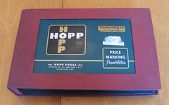
Let’s start with this tremendous Hopp Press grocery signage catalog, which dates back to 1954. It’s an extremely satisfying artifact right off the bat, because it’s SUBSTANTIAL — the heavy-duty binder measures 19″ x 12.5″ x 3.5″ thick, and it weighs a whopping 15 pounds! Why does it weigh so much? Because it’s filled with all sorts of metal and plastic signage.
It’s impossible to capture how incredible this thing is, but here are a few highlights:
• There’s something very pleasing about the way everything is bolted onto the heavy catalog leafs. It all feels so solid, like it could survive a fire or something. Actually, yes, it can!
• “Fresh foods look fresh!” — with synthetic rubber greens.
• Order by number! For those who want to read all the signage possibilities (which include “Yoke of Mutton Triangle,” “Old Rooster,” and “Fresh Pork Brains”), here’s a larger version.
• Liquor store shelf signage is pretty much the same today as it was in 1954, at least here in NYC. Do liquor stores in other towns still use this same system?
• There’s always a little letdown when you’re paging through something cool like this and then you get to the end and think to yourself, “Damn, that’s the end, now it’s over.” But not with this catalog, because there’s a little bonus catalog tucked into the inner back cover. It’s the gift that keeps on giving.
• My favorite thing about the entire catalog (aside from the general awesomeness permeating every single square millimeter of it) is how the Hopp folks used tagged their product line with all sorts of “modern” lingo, including Clamp-O-Frame, Direct-O (love that “4” with the arrows!), Reverso, Flexo, Adapt-O, Duratag, Picturama, Point-O-Frame, Price-O-Mat, Illustro, Extrudo, Embosso, Divid-O, and Ray-d-Glo (note the clever “h” stack at upper right). After that lineup, a name like Fits-All seems kinda limp by comparison.
Finally, check out the little anthropomorphized aluminum character here. Would you buy a signage system from this guy? I would.
And what did this treasure, which I found on eBay, end up costing me? A mere $14.28 plus $17 shipping. I think the high shipping charge must have scared people away, because there’s no way this should have sold for less than $100. Stupid people’s loss, my gain.
The other item I want to talk about today is somewhat NYC-oriented, but I think it’ll still be of interest to everyone. First some quick background: If you’ve ever ridden the New York subway system, even if only while visiting the city on vacation, you’re no doubt familiar with the iconic signage found throughout the system. Last November I linked to a stupendous article that told the story of how that signage system was designed and implemented, and the article in turn explained how all the signage specs had been laid out in a 1970 document called the New York City Transit Authority Graphics Standards Manual, which was created by the design firm Unimark.
A copy of that manual — essentially the Rosetta Stone for the entire NYC graphics program — is now in my possession.
Much like the other catalog, this thing is big — 15.5″ x 13.5″ x 3″. After a brief introduction, it proceeds with the nitty-gritty of how signs in the subway should be placed, designed (note the measurement specs), constructed, and deployed, along with info on typography, iconography (did you know the subway system used to have a QB and QJ line?), and so on. Among the many, many revelations:
• This is my favorite page. It shows exactly how an arrow being used on any transit sign should be drawn (sorry for the maxi-sized image, but you need to see all the details to get the full effect). Subsequent pages show the proper and improper (at bottom) ways the arrow can be deployed.
• My second-favorite thing: There’s a great discussion of letter spacing (i.e., kerning) here, followed by a chart that specifies the proper letter spacing for any possible combination of characters. Total control-freak obsessive genius! I’m fairly certain the MTA sign shop had a good laugh over this page and just ignored it, but it’s still an admirably comprehensive attempt at imposing visual uniformity throughout the system.
• One of most interesting thing about the manual is the discovery that the MTA — or maybe just Unimark — originally planned to equip every single subway station with a “directory,” which would show how to get from the given station to every other station in the system (further details here, and a partial view of one such directory is here). I’m not sure if this was attempted and then abandoned or if it just never got off the ground to begin with, but it was a hopeless idea from the start, because the system has always been plagued by so many service changes, reroutings, and so on (i.e., the fastest way to get from A to B today may not be the fastest way — or even be possible — two weeks from now). They’d have to constantly put little patches or stickers on all the directories to keep them up to date. I’m surprised this even made it into the manual.
• I love that they included specs for typography on turnstiles, doors on the platform, and street signage leading down or up.
• The only disappointment about the style guide is that there’s no color — except for these swatches, which show the official colors for the various subway lines. Interestingly, no Pantone numbers are listed (and yes, Pantone did exist in 1970).
• There’s a pretty cool glossary. If you want to read it, look here and here. (And if you want to see a larger version of any of the other pages I’ve shown, go to this gallery, click on the image you want, then click on “All Sizes” and then on “Original.”)
I can’t tell you how excited I am to own this. And I owe it all to Uni Watch, too. Here’s the deal: A UW reader who works for a group affiliated with the MTA found the manual in a closet and thought I might like to see photos of it, so he took some pics to show me. Once I saw the photos, I asked if him if he was looking to sell the manual (I didn’t realize that it wasn’t yet his property), and he said he wasn’t sure he was even allowed to take it out of the office. So he asked, and some idiot said, “Sure, go ahead, take it — it’s yours.” We then agreed on a fair price and I had my Holy Grail.
Whoever allowed this amazing artifact to leave the office should be fired. But at least now it’s getting the showcase treatment it deserves, instead of gathering dust in a closet.
Uni Watch News Ticker: Some commenters and e-mailers have been wondering if the officiating crews for next season’s AFL throwback games might be wearing period-appropriate orange zebra stripes. I figured there was no way this would happen, but I sent off a query to the NFL, just to be sure. The response: “Yes, they will be worn. Sidelines are also going to be in AFL style. It will really feel as though you are back in the ’60s.” How cool is that? Kudos to the league for going the extra mile on this one. Love the striped socks on the Pats uni, too. More photos coming soon. ”¦ As you know, the Mets have two Citi Field inaugural-season logos — the sleeve version and the cap version. Which one do you think will be appearing on baseballs used at the new stadium this season? Answer at the end of the Ticker. ”¦ Mizuno has answered Speedo’s LZR swimsuit with its own high-tech design (with thanks to Jeremy Brahm). ”¦ Yesterday’s Ticker included a mention of Italian roller hockey, which prompted Mike Hersh to send me this fantastic 1932 photo. ”¦ Odd phenomenon: A fairly high percentage of people who send me stirrups-related e-mail add a hyphen to the word — “stir-ups,” or sometimes “stirr-ups.” And no, I don’t think it’s because they’re cleverly suggesting that stirrups “stir things up.” Very strange. ”¦ We all know about quarterbacks wearing red practice jerseys, signifying “no contact.” But get this: At Brewers camp, if a player has a medical condition that limits his activity (a sort hammy, say), he wears this red jersey — with this on the back! Do other teams do this? ”¦ Speaking of Brewers camp, someone should tell them there’s no such thing as a “Wild Card Champion” (both of these Brewers items courtesy of Thomas Miller). ”¦ Better view of the Lions’ new uni design here. ”¦ Oooh, check these out! Those are old Gatorade lids. Full details here. ”¦ The NFL is considering putting advertising patches on practice jerseys. But that article doesn’t even mention that the Titans have been wearing an ad patch on their practice jerseys for years. Personally, I don’t much care what the players wear during practices, but I worry that this could be a stepping stone toward ads on game jerseys. ”¦ Whoa. Those are the Cincinnati Jungle Kats (af2). Additional photos of their helmet here (with thanks to Brian M. Willette). ”¦ Hey look, Nike has its own cable channel! OK, no it doesn’t (not yet), but that’s what James Huening momentarily thought when he saw his channel guide. “For the record, the old abbreviations were NICK (for Nickelodeon East) and NIKW (for Nickelodeon West), but then they changed NICK to NIKe.” … The Bulls did the Latino thing last night. According to this story, the team was considering going with Los Toros, but the league insisted on Los Bulls. League officials have told me that their market research indicates that Los Bulls (and Los Spurs, El Heat, etc.) is how Hispanic fans actually refer to these teams. ”¦ While looking for something else, I came across this photo. Lots going on there, what with the NNOB, the inside-out pocket, and the casual-Friday batboy. ”¦ Lots of new soccer kits have been leaked. ”¦ Check out these 1994 shots of Mark McGwire in an Oakland Oaks throwback uni (nice find by Eric Westover). ”¦ The Indians are giving away a logo-history fleece this season (thanks, Vince). ”¦ Reprinted from yesterday’s comments: About 100 old color NFL photos from the Life archive can be found here. ”¦ In a real breakthrough for the cause of naming rights, the city of Louisville is allowing KFC to advertise on filled potholes. ”¦ Always fun to see this uni design (with thanks to Ronnie Poore). ”¦ Good story about Hull City (EPL) attire here (with thanks to Les Motherby). … Good spot by Tris Wykes, who notes that the Richmond (Va.) Collegiate lacrosse team appears to have the Calgary Flames logo on their helmet. ”¦ And here’s your answer. Not the one I would’ve guessed (with thanks to Erik Bal).
Here’s a nice link from the Guardian with twelve past England national kits, in preparation for their new one being debuted tomorrow:
link
Is that 1970 picture of Jacksonville University from the 1970 Final Four when they played St. Bonaventure? If so any more pictures?
LOVE the standards manual! I do CAD (SolidWorks) for a living. Specs and attention to detail are my forte…(hmmm..guess that’s why I’m attracted to this site..haha)
The Flyers do the same thing with the red cross jersey. If a player is injured, but able to practice with the team. he wears the red jersey with the cross. Simon Gagne, who played hardly at all last season because of concussion, was quoted as saying he’d could wait for the day he could finally practice without the red jersey on.
Paul, I totally agree with your “Wild Card Champions” comment. I first remember seeing this on the outfield wall of Coors Field for the Rockies in 1996. How can a team that finishes in second place consider itself champions, especially when it doesn’t win anything in the playoffs?
[quote comment=”319815″]Paul, I totally agree with your “Wild Card Champions” comment. I first remember seeing this on the outfield wall of Coors Field for the Rockies in 1996. How can a team that finishes in second place consider itself champions, especially when it doesn’t win anything in the playoffs?[/quote]
it’s funny, ya know…since my beloved mets rarely seem to do anything right, but the way they show themselves as 1999 Wild Card Winners (as opposed to champions) seems a better way to do things
[quote comment=”319816″][quote comment=”319815″]Paul, I totally agree with your “Wild Card Champions” comment. I first remember seeing this on the outfield wall of Coors Field for the Rockies in 1996. How can a team that finishes in second place consider itself champions, especially when it doesn’t win anything in the playoffs?[/quote]
it’s funny, ya know…since my beloved mets rarely seem to do anything right, but the way they show themselves as 1999 Wild Card Winners (as opposed to champions) seems a better way to do things[/quote]
Not positive, but I *think* they originally had “champions” up there in 2000. But they took some media heat for it and changed the wording. At least that’s how I remember it.
Incidentally, a team isn’t the “Wild Card Winner” or “Wild Card Champion” — it is simply the “Wild Card,” the end.
Man… How about McGuire’s mullet in those Oaks pics? Defiant. unapologetic. Fluffy. A masterpiece.
League officials have told me that their market research indicates that Los Bulls (and Los Spurs, El Heat, etc.) is how Hispanic fans actually refer to these teams.
Here in San Antonio, I hear “Los Espurs” all the time. I’ve never heard “Los Spurs.”
I really liked the Green Arsenal shirt, yes it does remind one of a goalkeepers shirt, but, I shall still fork out my money to purchase one. I also agree about the Wild Card Champion business. Wild Card Champions is kind of meaningless.
the only one of those soccer teams i’ve heard about changing their away kits for next season is manchester united. the others just got new ones this past year, and they usually last two seasons. just my 2 cents
Regarding those manuals:
It is amazing how more in-depth my own interests are furthered by coming to this site.
I never thought of myself a font and typography addict until I came here.
Even the roadway signs that people bring up occasionally are thoroughly entrancing.
All the more reason to love Ryan Connelly’s DIY railroad stop sweater!
(Md[quote comment=”319819″]Man… How about McGuire’s mullet in those Oaks pics? Defiant. unapologetic. Fluffy. A masterpiece.[/quote]
15 years late, but props to the A’s for getting the shoes right. That would have looked pretty stupid with white cleats.
—Ricko
[quote comment=”319824″](Md[quote comment=”319819″]Man… How about McGuire’s mullet in those Oaks pics? Defiant. unapologetic. Fluffy. A masterpiece.[/quote]
15 years late, but props to the A’s for getting the shoes right. That would have looked pretty stupid with white cleats.
—Ricko[/quote]
Ricko’s right…the blacked out spikes look great as does the entire uni.
Regarding the Brewers redshirts, I think it makes them look like a practice QB, definitely, but it could be worse.
In other news…
This could be the next “I’m about to be cut by the team” shirt: link
Why the hell do the injured Brewers wear a link on their backs?
Good to see the AFL officials uniforms will be used. That made my day!
The JungleKatz still exist!? They were owned, operated and created by Ken Griffey Jr. and Sam Adams. Wow. Good to see they’re still around. I guess…
Ricko’s right…the blacked out spikes look great as does the entire uni.
Actually, each year Nike offers an “Anniversary” edition of whatever their general release cleats are.
They are nothing more than a blacked out version which was the “must-have” when I played ball in the mid to late 90’s.
link
link
link
[quote comment=”319829″]The JungleKatz still exist!? They were owned, operated and created by Ken Griffey Jr. and Sam Adams. Wow. Good to see they’re still around. I guess…[/quote]
Negatory, the JungleKatz are dead and gone.
link
[quote comment=”319827″]Why the hell do the injured Brewers wear a link on their backs?[/quote]
Cuz in Wisconsin an injured player gets to sit with the Oompah band, maybe?
[quote comment=”319830″]Ricko’s right…the blacked out spikes look great as does the entire uni.
Actually, each year Nike offers an “Anniversary” edition of whatever their general release cleats are.
They are nothing more than a blacked out version which was the “must-have” when I played ball in the mid to late 90’s.
link
link
link
Link fixed:
link
Today’s topic is giving me flashbacks to my days working at a grocery store during high school. So many things in the Hopp book are familiar, but I hadn’t thought about them in years.
And it never occurred to me that there was a catalog for those items, though it makes perfect sense that there was. Great stuff.
I wish that I had made off with one of the old price-marking guns from those days. They always fascinated me in much the same way that Paul loves the Braddock device (did I spell that right?).
Saturday, Sept 12 against the Royals for that Indians blanket, FYI.
[quote comment=”319830″]Ricko’s right…the blacked out spikes look great as does the entire uni.
Actually, each year Nike offers an “Anniversary” edition of whatever their general release cleats are.
They are nothing more than a blacked out version which was the “must-have” when I played ball in the mid to late 90’s.
link
link
link
If that’s the case, why does Nike so often say it’s “too difficult” to get a set of black cleats to a team for a throwback game?
I wondered that when someone mentioned it the other day (although I think the context might have been football). Either way, it begs the question: Generic black cleats with maybe a white swoosh are tough for them to find?
—Ricko
Pure gold.
Congratulations on acquiring this art.
“…beauty and durability.”
That Jacksonville basketball player is jumping so high, his hand fell off!
[quote comment=”319834″]I wish that I had made off with one of the old price-marking guns from those days. They always fascinated me in much the same way that Paul loves the Braddock device (did I spell that right?).[/quote]
Brannock. After its inventor, Charles Brannock.
I worked in a supermarket myself during high school. On my very first day, I picked up a huge cardboard box filled with cartons of eggs. The bottom came undone and all these eggs crashed to the floor, creating a mess that I spent the next hour or so cleaning up. It wasn’t until years later that I realized that this must have been a standard prank to play on the new guy.
I hope Chelsea isn’t going to use that awful kit. Their current uniform is top notch, particularly the shortsleeve with all the gold piping. Their past two kits have been gorgeous, why change to that?
If United gets rid of that flying V that wouldn’t be a bad kit to wear. I mean, anything beats what they’re wearing now anway.
[quote comment=”319839″][quote comment=”319834″]I wish that I had made off with one of the old price-marking guns from those days. They always fascinated me in much the same way that Paul loves the Braddock device (did I spell that right?).[/quote]
Brannock. After its inventor, Charles Brannock.
I worked in a supermarket myself during high school. On my very first day, I picked up a huge cardboard box filled with cartons of eggs. The bottom came undone and all these eggs crashed to the floor, creating a mess that I spent the next hour or so cleaning up. It wasn’t until years later that I realized that this must have been a standard prank to play on the new guy.[/quote]
Like fetching the ballboy to get a bucket of steam
or a left-handed fungo bat.
I worked for a contractor in college and he once sent me to the Hardware store to fetch a can of polk a dot spray paint.
AFter an hour, one of the employees put me out of my misery.
However, my father-in law has owned an-old school hardware store for 40 years and still has those old school pricing guns lying around:
link
link
Thought you all might find these interesting
link
link
[quote comment=”319838″]That Jacksonville basketball player is jumping so high, his hand fell off![/quote]
Kinda like Inspector Gadget, huh.
[quote comment=”319839″][quote comment=”319834″]I wish that I had made off with one of the old price-marking guns from those days. They always fascinated me in much the same way that Paul loves the Braddock device (did I spell that right?).[/quote]
Brannock. After its inventor, Charles Brannock.
I worked in a supermarket myself during high school. On my very first day, I picked up a huge cardboard box filled with cartons of eggs. The bottom came undone and all these eggs crashed to the floor, creating a mess that I spent the next hour or so cleaning up. It wasn’t until years later that I realized that this must have been a standard prank to play on the new guy.[/quote]
Our prank for new hires was to tell them to go into the basement to get the stretchers for the ice cream display. There was no basement, there were no such things as stretchers, and an ice cream display would obviously melt.
It always worked though, because the new guy wouldn’t want to look as if he didn’t know what he was doing. One guy damn near tore apart the back room looking for the door to a basement that didn’t exist.
[quote comment=”319832″][quote comment=”319827″]Why the hell do the injured Brewers wear a link on their backs?[/quote]
Cuz in Wisconsin an injured player gets to sit with the Oompah band, maybe?[/quote]
And perhaps enjoy a nice link while they’re at it?
link
the states edition
[quote comment=\”319815\”]Paul, I totally agree with your \”Wild Card Champions\” comment. I first remember seeing this on the outfield wall of Coors Field for the Rockies in 1996. How can a team that finishes in second place consider itself champions, especially when it doesn\’t win anything in the playoffs?[/quote]
Do you happen to have a picture of this anywhere?
link
Hey, Paul, are the teams gonna wear black cleats, too? I know, I know, too much detail for so early. But, man, been awhile since the Patriots wore black shoes. Not since mid-70s, maybe.
Likewise the Broncos, Oilers/Titans, Chargers, Chiefs and Raiders.
—Ricko
[quote comment=”319829″]The JungleKatz still exist!? They were owned, operated and created by Ken Griffey Jr. and Sam Adams. Wow. Good to see they’re still around. I guess…[/quote]
If you look at one of the links (to the message board that is hosting that image), it is from 2007. I think we originally saw it on UW when this happened. It looks like an away game in Green Bay (the image of the red seats and purple rails has been emblazoned in my mind after working in there for three af2 seasons).
[quote comment=”319819″]Man… How about McGuire’s mullet in those Oaks pics? Defiant. unapologetic. Fluffy. A masterpiece.[/quote]
The uniforms are fantastic. Have the A’s played other throwback games as the Oaks?
I used to have a collection of those old Gatorade lids. My friends and I had an elaborate football game using them. I had not thought of those in years, thanks for reviving a great old memory.
The Bulls did not have the “Noche Latina” patches last night on the jerseys, as they have their Van Leer/Kerr patch in the same location.
Additionally i find it stupid that none of the jerseys of participating teams have “The” in front, therefore negating the need for “Los”… but i think we covered that a while back.
Talking about tonight’s Sweet 16 Uni’s…
[quote comment=”319817″][quote comment=”319816″][quote comment=”319815″]Paul, I totally agree with your “Wild Card Champions” comment. I first remember seeing this on the outfield wall of Coors Field for the Rockies in 1996. How can a team that finishes in second place consider itself champions, especially when it doesn’t win anything in the playoffs?[/quote]
it’s funny, ya know…since my beloved mets rarely seem to do anything right, but the way they show themselves as link (as opposed to champions) seems a better way to do things[/quote]
Not positive, but I *think* they originally had “champions” up there in 2000. But they took some media heat for it and changed the wording. At least that’s how I remember it.
Incidentally, a team isn’t the “Wild Card Winner” or “Wild Card Champion” — it is simply the “Wild Card,” the end.[/quote]
Not only that, but whats the purpose of puffing your chest for winning an NLDS series? You don’t get a thing for it, no trophy, no lockerroom t-shirt and cap, no ring, nothing.
Essentially, they’re giving themselves a participant banner, which is just lame in every regard.
[quote comment=”319823″]Regarding those manuals:
It is amazing how more in-depth my own interests are furthered by coming to this site.
I never thought of myself a font and typography addict until I came here.
Even the roadway signs that people bring up occasionally are thoroughly entrancing.
All the more reason to love Ryan Connelly’s DIY railroad stop sweater![/quote]
thanks powers!!! i totally agree with you on the “font and typography” addiction!!!
first thing i did when i saw all the pages was find the name of the font used on the subway signs: “sans-serif (standard medium)” by the way!
although, i can’t find any good dimensions for the arrow page yet…
about the hopp book though… UN-FREAKIN’-REAL!!! love the number font for the “57” on the lower right of the metal sinage page!!!
totally with you though! both of those books blow my (AutoCAD) mind. haha. this is easily one of my favorite posts! thanks for sharing paul!!!
[quote comment=”319852″]The Bulls did not have the “Noche Latina” patches last night on the jerseys, as they have their Van Leer/Kerr patch in the same location.
Additionally i find it stupid that none of the jerseys of participating teams have “The” in front, therefore negating the need for “Los”… but i think we covered that a while back.[/quote]
Heres a pic of the jerseys sans Noche Latina patch-
link
[quote comment=”319841″]my father-in law has owned an-old school hardware store for 40 years and still has those old school pricing guns lying around:
link
link
where’s the pricing gun? or was this just an excuse to post pics of yourself? ;)
[quote comment=”319855″]both of those books blow my (AutoCAD) mind. haha. this is easily one of my favorite posts![/quote]
Thanks, man. I know many readers today will probably skip directly to the Ticker, but I’m glad to see some of you are enjoying the show-and-tell. These catalogs definitely push the same buttons in my head that uniforms do.
[quote comment=\”319844\”][quote comment=\”319839\”][quote comment=\”319834\”]I wish that I had made off with one of the old price-marking guns from those days. They always fascinated me in much the same way that Paul loves the Braddock device (did I spell that right?).[/quote]
Brannock. After its inventor, Charles Brannock.
I worked in a supermarket myself during high school. On my very first day, I picked up a huge cardboard box filled with cartons of eggs. The bottom came undone and all these eggs crashed to the floor, creating a mess that I spent the next hour or so cleaning up. It wasn\’t until years later that I realized that this must have been a standard prank to play on the new guy.[/quote]
Our prank for new hires was to tell them to go into the basement to get the stretchers for the ice cream display. There was no basement, there were no such things as stretchers, and an ice cream display would obviously melt.
It always worked though, because the new guy wouldn\’t want to look as if he didn\’t know what he was doing. One guy damn near tore apart the back room looking for the door to a basement that didn\’t exist.[/quote]
Similar to this, when I worked in a shoe store, we would have the new guy go and fetch the display shelf stretcher. We were affiliated with about 6 or 7 other shoe sellers in the mall, and every store was in on the gag, so the poor guy would go from store to store trying to find the non-existant shelf stretcher that had been \”lent\” out to the next store to be visited.
Good times…
[quote comment=”319858″][quote comment=”319841″]my father-in law has owned an-old school hardware store for 40 years and still has those old school pricing guns lying around:
link
link
where’s the pricing gun? or was this just an excuse to post pics of yourself? ;)[/quote]
There’s a typo on the sign in the front of the store. It seems someone put the space in the wrong location between the first two words. It says “herb lack paints” instead of “her black paints”. Man, I hope that typo hasn’t been around for 40 years! :-)
why would a team called “JungleKatz” feature a white cat on their uni?
[quote comment=”319860″][quote comment=”319855″]both of those books blow my (AutoCAD) mind. haha. this is easily one of my favorite posts![/quote]
Thanks, man. I know many readers today will probably skip directly to the Ticker, but I’m glad to see some of you are enjoying the show-and-tell. These catalogs definitely push the same buttons in my head that uniforms do.[/quote]
“These catalogs definitely push the same buttons in my head that uniforms do”
without a doubt!!! and i would’ve never knew they existed, or just ignored them, without Uni Watch!
not to be a fickle or anything but you said Hope Press… shouldn’t it be HOPP press as it shown on the cover of the book?
I love the subway system. One of the best things about New York. Seriously.
[quote comment=”319865″]I figured there was no way this would happen, but I sent off a query to the NFL, just to be sure. The response: “Yes, they will be worn. Sidelines are also going to be in AFL style. It will really feel as though you are back in the ’60s.” How cool is that? [/quote]
Okay, now the second question: will we be suffering thru the same swoopy, silly muscle shirt-style striping that the NFL has inflicted on us for the last 3-4 years only in orange?
Or will we TRULY see a return to the neat, vertical stripes of the 1960’s (and beyond)??
Of all the dumb, change-for-the-sake-of-change things that have been inflicted on sports, the insipid “improvements” to the NFL refs have to rank right up there. Are you really selling a lot more “improved, modern” REFEREE shirts at NFL Shop dot com?
[quote comment=”319845″]And perhaps enjoy a nice link while they’re at it?[/quote]
Oh ya hey dere, right down at da supper club, eh? Cripes sake, dat’s good eatin’ right there.
btw pt.1: AWESOME catalogs, Paul. i’m a designer and work with style guides all the time and i never cease to be in awe of the level of anal retentiveness involved in putting one of those suckers together. i absolutely LOVE the grocery signage!! excellent post.
btw pt. 2: simply AMAZING AFL throwbacks. the team unis are the cake and the ref’s unis are the icing.
btw pt. 3: of course latin fans call them “los bulls,” but even in english, teams are referred to conversationally as “the (whatever)s.” on a jersey, it is ludicrous to add a “the” where it simply doesn’t belong. conversely, it seems to me to make more sense to put “the magic” on a jersey rather than just “magic.” that always struck me as something you’d have seen link wearing. it wouldn’t make it anywhere near as cool as “the city,” but it would make a titanically stupid team name sound just regular stupid.
[quote comment=”319867″]
Okay, now the second question: will we be suffering thru the same swoopy, silly muscle shirt-style striping that the NFL has inflicted on us for the last 3-4 years only in orange?
Or will we TRULY see a return to the neat, vertical stripes of the 1960’s (and beyond)??
Of all the dumb, change-for-the-sake-of-change things that have been inflicted on sports, the insipid “improvements” to the NFL refs have to rank right up there. Are you really selling a lot more “improved, modern” REFEREE shirts at NFL Shop dot com?[/quote]
It appears what they have shown there is what will be worn- it’s pictured with the modern Pats and Raiders throwbacks.
I heard one of the reasons they changed the stripe style is the league was sick of all the bumbling officials being depicted in beer commercials.
[quote comment=”319863″]why would a team called “JungleKatz” feature a white cat on their uni?[/quote]
Fever?
;-)
[quote comment=”319858″][quote comment=”319841″]my father-in law has owned an-old school hardware store for 40 years and still has those old school pricing guns lying around:
link
link
where’s the pricing gun? or was this just an excuse to post pics of yourself? ;)[/quote]
all kidding aside…the pricing gu is always on the shelf to the right of the picture
And the West Virginia tee is an example of graphic design
On 4/21 the Phillies have a “Alternate Batting Helmet” giveaway. I suppose the Phils will have blue batting helmets for their alternate uniforms this year, unlike last year when they wore the standard red.
link
[quote comment=”319862″][quote comment=”319858″][quote comment=”319841″]my father-in law has owned an-old school hardware store for 40 years and still has those old school pricing guns lying around:
link
link
where’s the pricing gun? or was this just an excuse to post pics of yourself? ;)[/quote]
There’s a typo on the sign in the front of the store. It seems someone put the space in the wrong location between the first two words. It says “herb lack paints” instead of “her black paints”. Man, I hope that typo hasn’t been around for 40 years! :-)[/quote]
My father-in-law, Lenny Sullivan bought the store from Herb Lack 45 years ago and kept the name for recognition.
Paul’s awesome MTA find reminded me of the great tee shirts that were for sale about ten years ago in NYC.
link
[quote comment=”319814″]The Flyers do the same thing with the red cross jersey. If a player is injured, but able to practice with the team. he wears the red jersey with the cross. Simon Gagne, who played hardly at all last season because of concussion, was quoted as saying he’d could wait for the day he could finally practice without the red jersey on.[/quote]
When I think of non-football red “don’t touch me” jerseys, I think of link (forget which year).
BTW, are all the Latin Night NBA jerseys the away color?
Bulls (excuse me, Los Bulls) were in red last night. When they played the Latin Night game in Miami a few weeks back the Bulls played in white on the road.
[quote comment=”319858″][quote comment=”319841″]my father-in law has owned an-old school hardware store for 40 years and still has those old school pricing guns lying around:
link
link
where’s the pricing gun? or was this just an excuse to post pics of yourself? ;)[/quote]
And “seriously,” you couldn’t get your wife in the picture instead?
[quote comment=”319874″]My father-in-law, Lenny Sullivan bought the store from Herb Lack 45 years ago and kept the name for recognition.[/quote]
Well, you have to admit it’s not good for a paint store to have that peeling facade over the front door.
:-)
All in fun, friend. No harm intended.
[quote comment=”319877″][quote comment=”319858″][quote comment=”319841″]my father-in law has owned an-old school hardware store for 40 years and still has those old school pricing guns lying around:
link
link
where’s the pricing gun? or was this just an excuse to post pics of yourself? ;)[/quote]
And “seriously,” you couldn’t get your wife in the picture instead?[/quote]
Sorry to disappoint!
Nonetheless, I thought this was cool from the other day…That Maulers helmet was a brand new Schutt.
link
I love when schools/franchises use modern equipment to display vintage logos and such.
Naturally, I like what the NFL is doing with the AFl teams.
[quote comment=”319876″]BTW, are all the Latin Night NBA jerseys the away color?
Bulls (excuse me, Los Bulls) were in red last night. When they played the Latin Night game in Miami a few weeks back the Bulls played in white on the road.[/quote]
Bulls ever gonna wear a jersey for the hometown fans?
Y’know, “Da Bulz”.
[quote comment=”319878″]Order by number! For those who want to read all the signage possibilities (which include “Yoke of Mutton Triangle,” “Old Rooster,” and “Fresh Pork Brains”), here’s a larger version.[/quote]
I’m thinking that if you had the Meat Bracket with NUMBERS next year, it would definitely cut down on the whining from the Deadspin nutcases.
:-)
For the “Ditch the Black” contingent… I’m convinced one of the reasons my Mizzou Tigers won their Sweet Sixteen matchup with Memphis is they wore real link uniforms! The school’s colors are Black and Old Gold, but the “Gold” usually gets left in the lurch…
If only the football Tigers had avoided those damned link tops against the hated Jayhawks (sigh)…
Twins could have Scandahoovian Night.
Wear jerseys with…
“Dem Twince”
[quote comment=”319880″]Bulls ever gonna wear a jersey for the hometown fans?
Y’know, “Da Bulz”.[/quote]
It’s BULLZ, my friend.
And I’m thinking a minimum eight-peat.
[quote comment=”319884″][quote comment=”319880″]Bulls ever gonna wear a jersey for the hometown fans?
Y’know, “Da Bulz”.[/quote]
It’s BULLZ, my friend.
And I’m thinking a minimum eight-peat.[/quote]
Thanks. Was wondering about the proper spelling in that context. :)
[quote comment=”319878″][quote comment=”319874″]My father-in-law, Lenny Sullivan bought the store from Herb Lack 45 years ago and kept the name for recognition.[/quote]
Well, you have to admit it’s not good for a paint store to have that peeling facade over the front door.
:-)
All in fun, friend. No harm intended.[/quote]
No worries…You’re actually quite right…that is a an effect of the business being for sale.
Although as I type it, that doesn’t seem like a valid reason either!
[quote comment=”319882″]For the “Ditch the Black” contingent… I’m convinced one of the reasons my Mizzou Tigers won their Sweet Sixteen matchup with Memphis is they wore real link uniforms! The school’s colors are Black and Old Gold, but the “Gold” usually gets left in the lurch…[/quote]
heh…funny you mention that…was working on tomorrow’s column with
hockey wing presidentNHL fan teebz last night, and we couldn’t decide if that was mustard, old gold, vegas gold or pukeThe typeface in the MTA style guide is clearly link Helvetica, but the link signage is. Cap Q and R are giveaways, among others.
What gives?
does teebz have a blog / site? if so , what is it?
[quote comment=”319885″]Thanks. Was wondering about the proper spelling in that context. :)[/quote]
Almost had a heart attack when I saw how you spelled it.
That 1932 photo of the “SLA” Italian roller hockey team is really nice. Didn’t Patty Hearst play for them?
[quote comment=”319888″]heh…funny you mention that…was working on tomorrow’s column with
hockey wing presidentNHL fan teebz last night, and we couldn’t decide if that was mustard, old gold, vegas gold or puke[/quote]As an Illini, I can answer that for you: puke. Which is the same color they wear in Durham.
FWLIW, I know the Purdue folks are awfully persnickity about their particular shade of yellow/gold; but I wasn’t aware that Mizzou had any real hangups about it.
[quote comment=”319892″]That 1932 photo of the “SLA” Italian roller hockey team is really nice. Didn’t Patty Hearst play for them?[/quote]No, you’re thinking of Tanya.
[quote comment=”319888″][quote comment=”319882″]For the “Ditch the Black” contingent… I’m convinced one of the reasons my Mizzou Tigers won their Sweet Sixteen matchup with Memphis is they wore real link uniforms! The school’s colors are Black and Old Gold, but the “Gold” usually gets left in the lurch…[/quote]
heh…funny you mention that…was working on tomorrow’s column with
hockey wing presidentNHL fan teebz last night, and we couldn’t decide if that was mustard, old gold, vegas gold or puke[/quote]The discussion my friends and I had during the game decided the answer was puke. Though I shouldn’t talk too poorly of Mizzou’s unis when my team, Syracuse, struts around in those SOD monstrosities that inexplicably feature silver as a color.
[quote comment=”319890″]does teebz have a blog / site? if so , what is it?[/quote]
hockey-blog-in-canada dot blogspot dot com
[quote comment=”319882″]For the “Ditch the Black” contingent… I’m convinced one of the reasons my Mizzou Tigers won their Sweet Sixteen matchup with Memphis is they wore real link uniforms! The school’s colors are Black and Old Gold, but the “Gold” usually gets left in the lurch…
If only the football Tigers had avoided those damned link tops against the hated Jayhawks (sigh)…[/quote]
Our Student-Faculty basketball game is this evening and even OUR uniform designers have become afflicted by this problem:
link
[quote comment=”319885″][quote comment=”319884″][quote comment=”319880″]Bulls ever gonna wear a jersey for the hometown fans?
Y’know, “Da Bulz”.[/quote]
It’s BULLZ, my friend.
And I’m thinking a minimum eight-peat.[/quote]
Thanks. Was wondering about the proper spelling in that context. :)[/quote]
They used to have a mascot called “Da Bull”. link…
[quote comment=”319888″][quote comment=”319882″]For the “Ditch the Black” contingent… I’m convinced one of the reasons my Mizzou Tigers won their Sweet Sixteen matchup with Memphis is they wore real link uniforms! The school’s colors are Black and Old Gold, but the “Gold” usually gets left in the lurch…[/quote]
heh…funny you mention that…was working on tomorrow’s column with
hockey wing presidentNHL fan teebz last night, and we couldn’t decide if that was mustard, old gold, vegas gold or puke[/quote]Some possible benchmarks:
Pirates ’71 hats…Mustard.
NO Saints original helmets and pants…Old Gold.
Current Notre Dame pants…Vegas Gold.
Puke usually has chunks.
As a designer, I digested every piece of the story about the manuals and skipped the ticker entirely today, I was so happy/elated/satisfied with the main story.
The anal-retentive kerning chart in the MTA book is AMAZING. The lack of Pantones for very specific colors is surprising. The samples in grocery signage were great too and I can’t believe it “only” weighed 15lbs!
[quote comment=”319874″]
My father-in-law, Lenny Sullivan bought the store from Herb Lack 45 years ago and kept the name for recognition.[/quote]
Damn. I was hoping Herb Lack was your f-i-l’s name, which would make your wife’s maiden name Lack, so she could hyphenate her name as Lack-Powers.
Thoroughly enjoyed the show and tell today Paul. I’m quite the geek when it comes to this stuff; style guides and catalogs of any sort, for the most part. I recently picked up a gem of a lot from the 70s NFL Properties design team. I wouldn’t say holy grail, yet, it’s a nice inside look at how they developed and proofed the offical NFL magazine back in the day,’Pro!’. I plan on sharing scans and information, from this lot and more, through a new site I’m developing with a friend.
[quote comment=”319902″][quote comment=”319874″]
My father-in-law, Lenny Sullivan bought the store from Herb Lack 45 years ago and kept the name for recognition.[/quote]
Damn. I was hoping Herb Lack was your f-i-l’s name, which would make your wife’s maiden name Lack, so she could hyphenate her name as Lack-Powers.[/quote]
i believe it’s “austin” ;)
Â
*edit–i know it’s sullivan, should have deleted that part of the quote, so my reply would be at least an attempt at humor
I had been worried that the entire Orioles team would be low cuffed this year with the departure of link. I was glad to see that link has been going link in spring training. He seemed to alternate between link and link when he was a cubbie.
[quote comment=”319904″][quote comment=”319902″][quote comment=”319874″]
My father-in-law, Lenny Sullivan bought the store from Herb Lack 45 years ago and kept the name for recognition.[/quote]
Damn. I was hoping Herb Lack was your f-i-l’s name, which would make your wife’s maiden name Lack, so she could hyphenate her name as Lack-Powers.[/quote]
i believe it’s “austin” ;)
Â
*edit–i know it’s sullivan, should have deleted that part of the quote, so my reply would be at least an attempt at humor[/quote]
I’ve missed UW!:)
[quote comment=”319898″]They used to have a mascot called “Da Bull”. link…[/quote]
To go serious for a second: they did morph Benny in with “da Bull” and now their athletic, trampoline-using mascot is called Benny the Bull.
They really should let him drive out in a Bentley… :-)
[quote comment=”319868″][quote comment=”319845″]And perhaps enjoy a nice link while they’re at it?[/quote]
Oh ya hey dere, right down at da supper club, eh? Cripes sake, dat’s good eatin’ right there.[/quote]
Oh yah, and while yer at it, have yerself a Brandy Manhattan or a Leinie’s wit yer bratwurst
An appropriate link for today’s column.
A GOML story, when I was in college, I used to photo copy font sets and then cut and paste them when I needed lettering for signs. (And no, these weren’t ransom notes.)
[quote comment=”319902″][quote comment=”319874″]
My father-in-law, Lenny Sullivan bought the store from Herb Lack 45 years ago and kept the name for recognition.[/quote]
Damn. I was hoping Herb Lack was your f-i-l’s name, which would make your wife’s maiden name Lack, so she could hyphenate her name as Lack-Powers.[/quote]
:D
[quote comment=”319865″]not to be a fickle or anything but you said Hope Press… shouldn’t it be HOPP press as it shown on the cover of the book?[/quote]
Yup. Simple typo on my part. Now fixed.
[quote comment=”319907″][quote comment=”319898″]They used to have a mascot called “Da Bull”. link…[/quote]
To go serious for a second: they did morph Benny in with “da Bull” and now their athletic, trampoline-using mascot is called Benny the Bull.
They really should let him drive out in a Bentley… :-)[/quote]
on latin-american night, do they call him “benicio del toro”????
[quote comment=”319888″][quote comment=”319882″]For the “Ditch the Black” contingent… I’m convinced one of the reasons my Mizzou Tigers won their Sweet Sixteen matchup with Memphis is they wore real link uniforms! The school’s colors are Black and Old Gold, but the “Gold” usually gets left in the lurch…[/quote]
heh…funny you mention that…was working on tomorrow’s column with
hockey wing presidentNHL fan teebz last night, and we couldn’t decide if that was mustard, old gold, vegas gold or puke[/quote]I went with orange, but I was staring at one NCAA team’s particular alternate uniform. It burned into my retinas. LOL
And my blog is linked to my name. :o)
[quote comment=”319908″]Oh yah, and while yer at it, have yerself a Brandy Manhattan or a Leinie’s wit yer bratwurst[/quote]
Wat are talkin about wit Leine’s? Grab me a Point.
(I’m just about out now. Haven’t heard Johnny B’s “fishing guide” character in a while.)
[quote comment=”319912″]on latin-american night, do they call him “benicio del toro”????[/quote]Good one! The Bulls PR staff will rip off that one. :-)
[quote comment=”319908″][quote comment=”319868″][quote comment=”319845″]And perhaps enjoy a nice link while they’re at it?[/quote]
Oh ya hey dere, right down at da supper club, eh? Cripes sake, dat’s good eatin’ right there.[/quote]
Oh yah, and while yer at it, have yerself a Brandy Manhattan or a Leinie’s wit yer bratwurst[/quote]
Making a Manhattan with brandy. I love Wisconsin, but I don’t always pretend to understand her.
I am pretty sure that isnt University of Richmond for a couple reasons. 1- my brother went there and there colors aren blue and red. 2 – their nickname is the Spiders. 3 – I remember seeing cars in Richmond with that New Orleans Saints type logo on their back window. My Bro said it was for a local high school that is real big in sports. So this must be from a high school game in the Richmond Area. Also – UR does not have a men’s lacrosse team.
Subject: Names added to back of NHL sweaters
Alright, follow me here. This question came about when a Pittsburgh Post-Gazette blogger questioned this jersey choice:
link
The blogger referenced pittsburghhockey.net, which makes this claim:
Although it wasn’t an NHL rule yet, player’s names were added to the back of the jersey in 1970-71 for nationally televised games.
I’m not sure how to read this. Were the nameplates attached only for televised games, or were they there the entire season? Looking at nhluniforms.com, it shows only three teams with NOB that season, and only on the white (or gold) sweater.
And following our theme of hand-me-down uniforms, this item was buried in the pittsburghhockey.net page:
Within the year after, the Penguins sent their older jerseys to the Briere’s team in Shawinigan. The players wore them for 6 games and they lost the 6 games. They never officially wore them again.
Speaking of the NYC subway, you know about the great Christoph Niemann’s “Abstract City” blog for the NY Times, right? Some time ago he did a wonderful entry on his sons’ fascination with the subway and its signage:
link
I also love his Lego series:
link
Frickin’ brilliant.
[quote comment=”319909″]An appropriate link for today’s column.
A GOML story, when I was in college, I used to photo copy font sets and then cut and paste them when I needed lettering for signs. (And no, these weren’t ransom notes.)[/quote]
Think how well this one would have worked a week or two ago: link
[quote comment=”319917″]I am pretty sure that isnt University of Richmond for a couple reasons. 1- my brother went there and there colors aren blue and red. 2 – their nickname is the Spiders. 3 – I remember seeing cars in Richmond with that New Orleans Saints type logo on their back window. My Bro said it was for a local high school that is real big in sports. So this must be from a high school game in the Richmond Area. Also – UR does not have a men’s lacrosse team.[/quote]
I think the reference is to the Collegiate School in Richmond. Their colors seem to be green and gold (yellow? puke?).
link
[quote comment=”319846″]http://weburbanist.com/2008/01/06/7-more-abandoned-wonders-of-america-from-military-islands-to-mental-institutions/
the states edition[/quote]
Amazing stuff…thanks for the link
[quote comment=”319914″][quote comment=”319908″]Oh yah, and while yer at it, have yerself a Brandy Manhattan or a Leinie’s wit yer bratwurst[/quote]
Wat are talkin about wit Leine’s? Grab me a Point.
(I’m just about out now. Haven’t heard Johnny B’s “fishing guide” character in a while.)[/quote]
Hey dere – if we’re referencing Johnny B, gotta mention Fond du Lac, and to make it topical to the column: link
Now if I can only find me a picture of Babe Winkleman in a hockey jersey…
[quote comment=”319914″][quote comment=”319908″]Oh yah, and while yer at it, have yerself a Brandy Manhattan or a Leinie’s wit yer bratwurst[/quote]
Wat are talkin about wit Leine’s? Grab me a Point.
[/quote]
Both Leinies and Point (“When you’re out of beer, you’re out of town”) have gotten so fancy lately. What’s up with that? Like when they brought back link and made it pricey.
Have to start drinkin link, from God’s country.
Ob UW – Note the link on the sideline
Speaking of Brewers camp, someone should tell them there’s no such thing as a “Wild Card Champion”
Wow, a 26-year drought makes a team bar-closing-time desperate, doesn’t it?
As a lifelong Brewers fan, I would much rather they’d gone with “Wild Card Winners.”
Meanwhile … this blogger either is One of Us already, or should be.
link
[quote comment=”319924″][quote comment=”319914″][quote comment=”319908″]Oh yah, and while yer at it, have yerself a Brandy Manhattan or a Leinie’s wit yer bratwurst[/quote]
Wat are talkin about wit Leine’s? Grab me a Point.
[/quote]
Both Leinies and Point (“When you’re out of beer, you’re out of town”) have gotten so fancy lately. What’s up with that? Like when they brought back link and made it pricey.
Have to start drinkin link, from God’s country.
Ob UW – Note the link on the sideline[/quote]
Squiddle – don’t be surprised if Old Style suddenly becomes “pricey” a la the new “old” Schlitz.
Hey, there’s always Huber ;-)
HA!!!
link
[quote comment=”319847″][quote comment=\”319815\”]Paul, I totally agree with your \”Wild Card Champions\” comment. I first remember seeing this on the outfield wall of Coors Field for the Rockies in 1996. How can a team that finishes in second place consider itself champions, especially when it doesn\’t win anything in the playoffs?[/quote]
Do you happen to have a picture of this anywhere?[/quote]
Nope, sorry. It is just burned in my memory because I found it so odd.
For 1970-71 several NHL teams wore NOB’s on their white/yellow home sweaters for the whole season.
Pens, Rangers, Kings, Seals. Seals also (Golden) wore them on their road jerseys.
In 1973-74 and 1974-75 NBC telecasts had the two teams wear them on their jerseys. If they already had them on the homes, not an issue. But if they didn’t, then they either tacked on nameplates or had some second hand ones with a NOB added on.
You can tell the difference in – for example – the 1974 SC Final. Games 1 & 2, no NBC, so no NOB’s. Game 3, NBC, Flyers already had ’em on, but Bruins had NOB’s stuck on. Game 4, no NBC, so only Flyers had ’em on. Game 5, no NBC, neither team had NOB. Game 6 (clincher), NBC, Flyers already had ’em on, and B’s tacked’em on.
I always thought it was cool in the early-mid 70’s to see the numbers positioned so low on the back of the sweater so there was all this empty space on the upper back of the jersey.
Nope, sorry. It is just burned in my memory because I found it so odd.
I remember it, Kevin G. Same reaction, too: “They’re claiming THAT as a title?”
The MLB playoffs remain the most exclusive among the North American big four, and getting there represents the work of six months and 162 games. It can, and probably should, be celebrated.
But, by itself, it’s not the championship of anything.
[quote comment=”319838″]That Jacksonville basketball player is jumping so high, his hand fell off![/quote]
That is Artis Gilmore, correct? I know he was like 7’2″, but it appears he could hit his head on the rim while jumping.
[quote comment=”319850″][quote comment=”319819″]Man… How about McGuire’s mullet in those Oaks pics? Defiant. unapologetic. Fluffy. A masterpiece.[/quote]
The uniforms are fantastic. Have the A’s played other throwback games as the Oaks?[/quote]
They’ve got one coming up this year…May 2nd in Seattle. The Mariners are wearing Rainiers unis, Oakland will be the Oaks.
so the Richmond (Va.) Collegiate lacrosse team may have the calgary flames logo on their helmet, but their opponent has the quebec nordiques alternate on theirs. and the colours match too. yeah, i know its just a fleur de lis, but still.
[quote comment=”319926″
Squiddle – don’t be surprised if Old Style suddenly becomes “pricey” a la the new “old” Schlitz.
Hey, there’s always Huber ;-)[/quote]
Â
That’s really disturbing. Kinda like how PBR got to be big with the alternative kids.
I can’t really keep track of Huber. There’s that whole business with Berghoff and now they’re owned by a Canadian firm who contracts with the brewery in Monroe? All too confusing.
In its day, you couldn’t argue with Huber Bock for value and gotta love a name like Rhinelander.
Check out the link on this truck driver.
[quote comment=”319924″][quote comment=”319914″][quote comment=”319908″]Oh yah, and while yer at it, have yerself a Brandy Manhattan or a Leinie’s wit yer bratwurst[/quote]
Wat are talkin about wit Leine’s? Grab me a Point.
[/quote]
Both Leinies and Point (“When you’re out of beer, you’re out of town”) have gotten so fancy lately. What’s up with that? Like when they brought back link and made it pricey.
[/quote]
Hey, at least Miller brought back the original Schlitz receipe. That’s worth paying a little extra for.
[quote comment=”319935″][quote comment=”319924″][quote comment=”319914″][quote comment=”319908″]Oh yah, and while yer at it, have yerself a Brandy Manhattan or a Leinie’s wit yer bratwurst[/quote]
Wat are talkin about wit Leine’s? Grab me a Point.
[/quote]
Both Leinies and Point (“When you’re out of beer, you’re out of town”) have gotten so fancy lately. What’s up with that? Like when they brought back link and made it pricey.
[/quote]
Hey, at least Miller brought back the original Schlitz receipe. That’s worth paying a little extra for.[/quote]
There’s no such thing as an “original beer recipe” unlesss you’re using water from the same spring the original brewery used. You can tinker with the malt and hops all you want, but water is the key element that can’t be duplicated. That’s why breweries used to be distinctive, and why the move to expand a given brand’s production to many breweries spread out over a large area (a move pioneered by Schlitz) was the death knell for regionally distinctive beer.
In terms of the whole “Hispanic fans prefer it that way”… think of it this way… if there were a team from Mexico called Los Toros, would most English-speaking Americans call them “The Bulls?”
[quote comment=”319936″][quote comment=”319935″][quote comment=”319924″][quote comment=”319914″][quote comment=”319908″]Oh yah, and while yer at it, have yerself a Brandy Manhattan or a Leinie’s wit yer bratwurst[/quote]
Wat are talkin about wit Leine’s? Grab me a Point.
[/quote]
Both Leinies and Point (“When you’re out of beer, you’re out of town”) have gotten so fancy lately. What’s up with that? Like when they brought back link and made it pricey.
[/quote]
Hey, at least Miller brought back the original Schlitz receipe. That’s worth paying a little extra for.[/quote]
There’s no such thing as an “original beer recipe” unlesss you’re using water from the same spring the original brewery used. You can tinker with the malt and hops all you want, but water is the key element that can’t be duplicated. That’s why breweries used to be distinctive, and why the move to expand a given brand’s production to many breweries spread out over a large area (a move pioneered by Schlitz) was the death knell for regionally distinctive beer.[/quote]
Spring? Source would be more like it, and even if you’re removed from the source, you can get pretty damn close: link
And here’s a “different” Brewer’s uniform: link
Kudos to that dude – I’d never do anything brewing-related dressed that nicely
(sorta) new 49ers uniform news:
link
Chris, I call most Mexican soccer teams by their Spanish name. I don’t call the Tiburones Rojos, the Red Sharks. I think Noche Latina nights have more opportunity than selling jerseys.
Here’s a good one – link – checkerboard end zone.
Ladies and gentlemen, your link — the Houston Astros.
Someone asked about the Life archives in yesterdays comments. I thought I’d answer here.
Google has the Life photo archives online. If you do a Google image search and include source:life, you’ll only get images from the Life archives.
As others have noted, the search is a little difficult. Some photos are well labeled and pop right up while others you may have to page through multiple pages of thumbnails.
They do seem to be adding material. Some good stuff in color.
link
link
link
link
link
[quote comment=”319943″]link[/quote]
is he dead there? geez…give a living legend a break and lose that negative
[quote]link[/quote]
yeah…that seaver one has been up a while…i love how he’s pitchin’ southpaw to pops battin righty ;)
[quote comment=”319943″]Someone asked about the Life archives in yesterdays comments. I thought I’d answer here.
Google has the Life photo archives online. If you do a Google image search and include source:life, you’ll only get images from the Life archives.
As others have noted, the search is a little difficult. Some photos are well labeled and pop right up while others you may have to page through multiple pages of thumbnails.
They do seem to be adding material. Some good stuff in color.
link
link
link
link
link[/quote]
Love the reverse image of Seaver and Stargell!
[quote comment=”319943″]link[/quote]
I’d forgotten that Seaver was a southpaw. And that Pops batted righty. :-)
[quote comment=”319937″] In terms of the whole “Hispanic fans prefer it that way”… think of it this way… if there were a team from Mexico called Los Toros, would most English-speaking Americans call them “The Bulls?” [/quote]
I think they would. Many Latin American baseball teams are referred to in the English-language media by English-language versions of their names: Mexico City Reds = Diablos Rojos del México; Mexico City Tigers = Tigres del México; Santurce Crabbers = Cangrejeros de Santurce; Cibao Eagles = Aguilas Cibaeñas; Licey Tigers = Tigres del Licey.
[quote comment=”319943″][quote]link[/quote]
yeah…that seaver one has been up a while…i love how he’s pitchin’ southpaw to pops battin righty ;)[/quote]
From the looks of that background, it was probably something in spring training. An exhibition maybe? Backwards day possibly? :-)
[quote comment=”319944″][quote comment=”319943″]link[/quote]
is he dead there? geez…give a living legend a break and lose that negative
[quote]link[/quote]
yeah…that seaver one has been up a while…i love how he’s pitchin’ southpaw to pops battin righty ;)[/quote]
It’s about 3 months before Ruth died.
As for the flip. I should mention a lot of the photos are flipped. Ummm. link? I think that’s Al Oliver.
[quote comment=”319948″][quote comment=”319943″][quote]link[/quote]
yeah…that seaver one has been up a while…i love how he’s pitchin’ southpaw to pops battin righty ;)[/quote]
From the looks of that background, it was probably something in spring training. An exhibition maybe? Backwards day possibly? :-)[/quote]
Looks like good old Forbes Field
[quote comment=”319948″][quote comment=”319943″][quote]link[/quote]
yeah…that seaver one has been up a while…i love how he’s pitchin’ southpaw to pops battin righty ;)[/quote]
From the looks of that background, it was probably something in spring training. An exhibition maybe? Backwards day possibly? :-)[/quote]
Looks like the backdrop at Forbes Field to me.
ahhhh….much better
DAMMITgosh darn it squiddie ;)Â
*edit: shiat…i just noticed that the one you posted and the one i flipped are DIFFERENT…your pic IS of al oliver, and the reversed one is pops…pretty close
The overall helmet design of the Cincy Jungle Kats isn’t all that great (serioiusly – are they supposed to be albino tigers?! if so, do any of the players wear a red-tinted visor?!), but the fact that the nose bumper has the teeth of the Kat as the background was pretty freakin’ cool!
[quote comment=”319952″]ahhhh….link[/quote]
Perhaps better still: link
I definitely recognize link — Publix supermarkets (in the Southeast) used that style in their produce and deli sections at least up until the late 1980s.
[quote comment=”319840″]“I hope Chelsea isn’t going to use that awful kit.”[/quote]
Look like a man-ziere invented by Cosmo P. Kramer installed in that shirt. Red Bull New York already wears the white version…
[quote comment=”319935″][quote comment=”319924″][quote comment=”319914″][quote comment=”319908″]Oh yah, and while yer at it, have yerself a Brandy Manhattan or a Leinie’s wit yer bratwurst[/quote]
Wat are talkin about wit Leine’s? Grab me a Point.
[/quote]
Both Leinies and Point (“When you’re out of beer, you’re out of town”) have gotten so fancy lately. What’s up with that? Like when they brought back link and made it pricey.
[/quote]
Hey, at least Miller brought back the original Schlitz receipe. That’s worth paying a little extra for.[/quote]
So glad to see that my hometown of Stevens Point made it to this blog. Their beer is great!
link
I have relatives from Chicago who come to Stevens Point just to get a case of beer. And it’s true… when your outta Point, you’re outta town!
Another one of their slogans is “Choosing the name was easy, finding the right taste was hard”. Folk lore has it that a man by the named of Steven was the first bar patron in this area to serve whiskey and brandy by the pint. So that is why they called the city “Stevens Point”, short for “Steven’s pints”. Gosh, I love my home town!
Leinenkugal is a tremendous beer too.
link
Gotta love the German beer making tradition in Wisconsin!
To make this uni related… the official “Wild Card” locker room shirts do not indicate “Champions” or “winners”.
link
So unfortunately… the Brewers (and other teams in the past) made it up.
[quote comment=”319873″]“On
4/21the Phillies have a ‘Alternate Batting Helmet’ giveaway. I suppose the Phils will have blue batting helmets for their alternate uniforms this year, unlike last year when they wore the standard red.”[/quote]Date corrected. Although you may want to go to that game on the 21st of April for the free World Champions Ring Key Chain. I kinow I will!
Untucked DePaul jersey on ESPN.com link
[quote comment=”319882″]“For the ‘Ditch the Black’ contingent… I’m convinced one of the reasons my Mizzou Tigers won their Sweet Sixteen matchup with Memphis is they wore real link uniforms! The school’s colors are Black and Old Gold…”[/quote]
And the West Regions was the FUGLY UNI region with UConn’s Hoyawannabe gray, Purdue black on black and those awful Mizzou unis. Sadly, the best unis in that bracket (Memphis) is gone.
[quote comment=”319943″]
link[/quote]
Have they ever had a decent-looking trophy for the World Cup? And by “decent-looking,” I mean one that’s at least somewhat commensurate with the event it represents?
Look at the link compared to that glorified brandy snifter — and the Stanley Cup playoffs are contested annually by a mere 16 teams representing at most two countries.
Hell, my kid got a better looking participant trophy from the park district soccer league he was in than the one team England is holding in that photo.
Of course, that old cup has a distinct advantage over the link in that it’s an actual, y’know, cup.
[quote comment=”319962″][quote comment=”319943″]
link[/quote]
Have they ever had a decent-looking trophy for the World Cup? And by “decent-looking,” I mean one that’s at least somewhat commensurate with the event it represents?
Look at the link compared to that glorified brandy snifter — and the Stanley Cup playoffs are contested annually by a mere 16 teams representing at most two countries.
Hell, my kid got a better looking participant trophy from the park district soccer league he was in than the one team England is holding in that photo.
Of course, that old cup has a distinct advantage over the link in that it’s an actual, y’know, cup.[/quote]
Even the Grey Cup is an actual cup:link
[quote comment=”319963″][quote comment=”319962″][quote comment=”319943″]
link[/quote]
Have they ever had a decent-looking trophy for the World Cup? And by “decent-looking,” I mean one that’s at least somewhat commensurate with the event it represents?
Look at the link compared to that glorified brandy snifter — and the Stanley Cup playoffs are contested annually by a mere 16 teams representing at most two countries.
Hell, my kid got a better looking participant trophy from the park district soccer league he was in than the one team England is holding in that photo.
Of course, that old cup has a distinct advantage over the link in that it’s an actual, y’know, cup.[/quote]
Even the Grey Cup is an actual cup:link
DOH!
link
That Detroit Lion looks like he bit an electrical cord. Was it a suicide attempt?
Pure corporate think on the NBA’s part for not allowing the Bulls to call themselves Los Toros on a night designed to honor Hispanic fans. I understand branding and the desire to have your team’s name stay constant, but to me it seems demeaning that the NBA feels that it can just stamp “Los” in front of any team and Hispanic fans will flock to buy tickes and merchandise.
El Wollen1 (not uno)
[quote comment=”319847″][quote comment=\”319815\”]Paul, I totally agree with your \”Wild Card Champions\” comment. I first remember seeing this on the outfield wall of Coors Field for the Rockies in 1996. How can a team that finishes in second place consider itself champions, especially when it doesn\’t win anything in the playoffs?[/quote]
Do you happen to have a picture of this anywhere?[/quote]
Due to what I expect was a heaping load of ridicule the Rockies took down the 1995 Wild Card Champs outfield wall signage quite some time ago. Maybe in 2003? Thought I had a photo but can’t seem to find it. The strange thing is their 2007 NL Pennant is hidden away up in the main scoreboard. Barely noticable…ads for King Soopers, Coke, and Wells Fargo dwarf it.
Maybe the franchise has become a little gun-shy about bragging up and displaying their accomplishments.
“Some commenters and e-mailers have been wondering if the officiating crews for next season’s AFL throwback games might be wearing period-appropriate orange zebra stripes.”
I may be wrong, but I believe the stripes were actually red. The logo for the AFL was, not surprisingly, red, white and blue, so I don’t think it would have made much sense for the refs to wear orange stripes. A recent article on HelmetHut.com references “red striped referees,” and every color photo that I’ve seen from the era sure looks like they are red. I’d love to hear Ricko weigh in on this topic
Somebody posted link in a random pictures thread over on a hockey board I’m a member of.
City on the front of the helmet where the brand logo typically goes. And it looks to be a CCM, not an obscure brand or anything.
Odd.
[quote comment=”319958″]Leinenkugal is a tremendous beer too.
link
Gotta love the German beer making tradition in Wisconsin![/quote]
True story: Spent the night in the neighboring town of Eau Claire (yes, we did see the World’s Largest Six Pack) and heard about the Leinie’s brewery tour. Headed out there the next morning, I guess we missed the first tour so we’d have to wait for the next one. “Would you like a beer while you wait?” It’s probably about 9:15 am. Didn’t enjoy a beer until later in the day (don’t have to look at the license plate to tell they’re flatlanders, eh?), but the bar area was fully staffed that early by a sterotypical bartender: 265-270 lbs, walrus mustache and apron. :-)
I don’t claim to be either a legal expert or an authority on Latin culture. But I will ask a question: any possiblity that there is a team somewhere out there that calls itself “Los Toros” and that they use red and black?
Perhaps an overabundance of caution on the part of the lawyers and NBA Properties. Its one thing to use the longstanding “Bulls” name: nobody else can seriously claim that after years and years of exposure. Toros may be a different story. Just a thought.
Paul – i just felt compelled to say how much i love the blog. love the daily content. keep up the great work!
as for the missouri “old gold” debate; my vote is for puke.
rock chalk jayhawk,
brad
[quote comment=”319965″]“That Detroit Lion looks like he bit an electrical cord. Was it a suicide attempt?”[/quote]
Write your own jokes here…
[quote comment=”319974″][quote comment=”319965″]“That Detroit Lion looks like he bit an electrical cord. Was it a suicide attempt?”[/quote]
Write your own jokes here…[/quote]
“… we have learned that the mascot has a name…Owen Sixteen…”
Too easy?
[quote comment=”319972″]I don’t claim to be either a legal expert or an authority on Latin culture. But I will ask a question: any possiblity that there is a team somewhere out there that calls itself “Los Toros” and that they use red and black?
Perhaps an overabundance of caution on the part of the lawyers and NBA Properties. Its one thing to use the longstanding “Bulls” name: nobody else can seriously claim that after years and years of exposure. Toros may be a different story. Just a thought.[/quote]
Not red & black, but there’s the Austin Toros in the D-League. And hey, guess what their link.
[quote comment=”319968″]”Some commenters and e-mailers have been wondering if the officiating crews for next season’s AFL throwback games might be wearing period-appropriate orange zebra stripes.”
I may be wrong, but I believe the stripes were actually red. The logo for the AFL was, not surprisingly, red, white and blue, so I don’t think it would have made much sense for the refs to wear orange stripes. A recent article on HelmetHut.com references “red striped referees,” and every color photo that I’ve seen from the era sure looks like they are red. I’d love to hear Ricko weigh in on this topic[/quote]
I would have thought red, too but they were orange… link
Oh and the little writeup there? It was Marty Lyons, not Gastineau.
[quote comment=”319976″]Not red & black, but there’s the Austin Toros in the D-League. And hey, guess what their link.[/quote]
NBA owns the D-league, no? Hard to sue yourself (unless you’re Coke). And is anyone else as SICK of those *&^% advertisments as I am?
[quote comment=”319916″][quote comment=”319908″][quote comment=”319868″][quote comment=”319845″]And perhaps enjoy a nice link while they’re at it?[/quote]
Oh ya hey dere, right down at da supper club, eh? Cripes sake, dat’s good eatin’ right there.[/quote]
Oh yah, and while yer at it, have yerself a Brandy Manhattan or a Leinie’s wit yer bratwurst[/quote]
Making a Manhattan with brandy. I love Wisconsin, but I don’t always pretend to understand her.[/quote]
A brandy Manhattan is an excellent pre-dinner drink and, unfortunately, often-overlooked by
even the most discriminating imbibers.
Wisconsin just might lead the nation in consumption of brandy, despite that there’s a lot beer available there.
P.S. You don’t have to “understand” Wisconsin, you need merely enjoy her ….
Yes, the NCAA puts “ice hockey” at center ice!
[quote comment=”319979″][quote comment=”319916″][quote comment=”319908″][quote comment=”319868″][quote comment=”319845″]And perhaps enjoy a nice link while they’re at it?[/quote]
Oh ya hey dere, right down at da supper club, eh? Cripes sake, dat’s good eatin’ right there.[/quote]
Oh yah, and while yer at it, have yerself a Brandy Manhattan or a Leinie’s wit yer bratwurst[/quote]
Making a Manhattan with brandy. I love Wisconsin, but I don’t always pretend to understand her.[/quote]
A brandy Manhattan is an excellent pre-dinner drink and, unfortunately, often-overlooked by
even the most discriminating imbibers.
Wisconsin just might lead the nation in consumption of brandy, despite that there’s a lot beer available there.
P.S. You don’t have to “understand” Wisconsin, you need merely enjoy her ….[/quote]
I don’t know if this stat is true…but I have heard that Wisconsin drinks more brandy per year than all of the other states combined. That sounds about right to me. Has anyone on here outside Wisconsin ever had a “brandy old fashioned” or even know what one is or how you garnish them? We drink ’em like water here before dinner! Especially now during Friday Night Fish Frys!
Any one else notice that the new Lions design bears a resemblance to Ohio State in the way the helmet, pants and sleave stripes match up? Seems kinda strange for a team based firmly in Wolverine territory.
Glad to see the refs getting into the afl throwback mode….maybe the NFL will let the coaches wear suits(is this asking too much?)
[quote comment=”319970″][quote comment=”319958″]Leinenkugal is a tremendous beer too.
link
Gotta love the German beer making tradition in Wisconsin![/quote]
True story: Spent the night in the neighboring town of Eau Claire (yes, we did see the World’s Largest Six Pack) and heard about the Leinie’s brewery tour. Headed out there the next morning, I guess we missed the first tour so we’d have to wait for the next one. “Would you like a beer while you wait?” It’s probably about 9:15 am. Didn’t enjoy a beer until later in the day (don’t have to look at the license plate to tell they’re flatlanders, eh?), but the bar area was fully staffed that early by a sterotypical bartender: 265-270 lbs, walrus mustache and apron. :-)[/quote]
Actually, the World’s Largest Six Pack is in La Crosse, the home of Old Style.
In it’s former glory:
link
In it’s current state as cans of La Crosse Lager:
link
The Detroit News has contest results for their “design the new Lions logo” thing:
link
[quote comment=”319985″]Actually, the World’s Largest Six Pack is in La Crosse, the home of Old Style.[/quote]
D’oh!
I did see the six pack but it must have been a day or two later. Thanks for the correction.
How could I forget?
(in that deep, low tone…)
Old Style. Pure Brewed in God’s Country. G. Heilman Brewing Company, La Crosse, Wisconsin.
ZAGS? Is that their regular uniform? If so, it’s quite stupid.
How come I’ve never noticed that the N and S on Kansas’ jerseys look way too close together.
[quote comment=”319882″]For the “Ditch the Black” contingent… I’m convinced one of the reasons my Mizzou Tigers won their Sweet Sixteen matchup with Memphis is they wore real link uniforms! The school’s colors are Black and Old Gold, but the “Gold” usually gets left in the lurch…
If only the football Tigers had avoided those damned link tops against the hated Jayhawks (sigh)…[/quote]
@@@@@@@@@@@@@@@@@@@@@@@@@@@@@@@@@@@@@@@@
I Absolutely Agree.
Love those Mizzou OLD GOLD unis …
What is worse? Teams that should be wearing Old Gold instead wearing Vegas Gold, or wearing dark Yellow and calling it “GOLD”?
One of my main pet peeves in the world, is my beloved NFL Saints wearing that stupid cat piss colored Vegas Gold when they aren’t wearing their thuggish, idiot black leotard pants.
I don’t know how many of you are wrestling fans, but WWE wrestler CM Punk (Chicago native) has a wrestling attire set dedicated to the Cubs and Greg Maddux and Ferguson Jenkins.
Pictures can be found here. The images are flash, but you can see the logo and number in images 3-6 and 10.
[quote comment=”319851″]I used to have a collection of those old Gatorade lids. My friends and I had an elaborate football game using them. I had not thought of those in years, thanks for reviving a great old memory.[/quote]
Loved those caps..still have two of ’em c/o eBay.
Gataorade was great til they found out cyclamates killed lab rats or something.
[quote comment=”319975″]“We have learned that the mascot has a name…Owen Sixteen…”[/quote]
Lame.
I loved those gatorade lids as a kid. I had all the lids plus a standings board that you hung the lids on. I remember finally getting the Chargers lid to complete the set. I drank a lot of Gatorade out of glass bottles as a 12 year old and my mom always had the list of what teams I needed when she went grocery shopping.
[quote comment=”319820″]Here in San Antonio, I hear “Los Espurs” all the time. I’ve never heard “Los Spurs.”[/quote]
While that may be true, as I think I said the last time we had this discussion, Montreal broadcasters set the precedent on this before the NBA even existed. NHL teams are referred to in French as their proper names, EG they’re Les Blackhawks and Les Red Wings, not Les Faucons Noirs and Les Ailes Rouges. Unless someone can show me an example of European soccer announcers translating team names to local-language equivalents prior to WWII, the Habs example would seem to be the precedent.
(And, yes, I know that people who refer to them as the “Canadians” in English are therefore Doing It Wrong. I’m fine with that.)