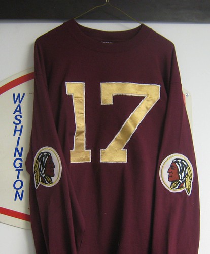
Mike Sherman’s family has a framed team portrait of the 1937 Redskins, which he recently used as the basis for the DIY jersey shown above. “I’m a complete novice, so I figured a jersey like this, which is very straightforward, would be a good first project,” he says. “I originally was planning on making a Sammy Baugh jersey, but I switched to Turk Edwards (#17), a Hall of Fame lineman whose career was ended by a freak knee injury after he turned away from an opening coin toss. I played the line in high school, and while my career was ended by a decided lack of talent, my knees weren’t very helpful, so it seemed like a better fit. Plus, I can’t wait to explain to people a zillion times that it’s not a Jason Campbell jersey.”
Sherman made the numbers himself and harvested the patches from a knockoff throwback jersey. “Since I only had a black-and-white photo to work with, I agonized over the colors,” he says. “The Redskins were constantly changing shades of burgundy and gold, so it’s tough to say how accurate my re-creation is, but I’m still thrilled with it.”
All of which is very appropriate, because my ESPN column on the DIY phenomenon is up now. — Paul
Today is Thursday”¦: And that means Scott M.X. Turner will be hosting his weekly Pub Quiz at Rocky Sullivan’s. And it’s right next door to Ikea, so you can get some Swedish meatballs (or annoyingly named furniture) along the way.
Uni Watch News Ticker: The Ernie Davis statue on the Syracuse campus has undergone a design revisions. Most notably, the Nike cleats and modern facemask from the original design have been changed to be more period-appropriate. Details here (with thanks to Jack Krabbe). ”¦ Google is inviting kids to mess around with its logo (with thanks to Jason Hillyer). ”¦ Check out this great Sacramento Solons sleeve patch. That screen shot is from this superb half-hour program that documents the history of Sacramento baseball. Also included: a shot of the Solons 1970s shorts (nice find by Mickey Seward). ”¦ One of you Canadian readers really ought to bid on this (with thanks to Tris Wykes). ”¦ Here’s something I (and probably you) hadn’t been aware of: the curse of Colonel Sanders (with thanks to Jeremy Brahm). ”¦ Interesting story from Matt Ryburn, who writes: “My alma mater, Azusa Pacific University, which is an NAIA school, hosted its men’s basketball conference tournament. APU advanced to the championship game but was the lower seed, so we were the designated visiting team that night — on our home floor. So our opponents (Fresno Pacific) wore their home whites and APU had to wear their road black uniforms [details here]. Fresno Pacific even used our normal ‘home’ team bench, and they were the home team on the scoreboard. I work at the games at the score table, and we had to be on our game to make sure we were accurate. Our PA guy had to make several announcements that the home team was not Azusa Pacific. I work the boards with who is in the game and their points and fouls, and I had to put stickers on my buttons to remind me which team was home and visitor.” ”¦ Here’s the logo for the 2011 Asian Cup soccer tournament (with thanks to Jeremy Brahm). ”¦ And as long as we’re talking about soccer, Manchester United has a new Club World Cup commemorative patch (with thanks to Skip Singleton). ”¦ “Oilers goalie prospect and current Springfield Falcon Devan Dubnyk is 6’5″ and only 180 pounds,” writes Tris Wykes. “Apparently his teammates refer to him as a giraffe, so he has one painted on his backplate.” ”¦ I was never able to turn up any wire service photos of Tuesday’s Rangers/Giants game — the one during which the Rangers supposedly wore stirrups. But reader Jake Melbye was in attendance and filed the following report: “I saw a few of the guys wearing them, and they had the Texas ‘T’ on them. I didn’t get any pictures, unfortunately, but I did get photos of Michael Young and Josh Hamilton with the solid blue high socks [which also appear to have been ‘T’-emblazoned — PL], so it clearly wasn’t team-wide. Although, other than pitchers, the entire team had the knee-high socks/stirrups visible.” ”¦ Good view here of Matheiu Garon’s new mask (with thanks to Mike Reilly). ”¦ New football helmets for New Mexico State (with thanks to Shane Maddox). ”¦ I suspect I’ve linked to this before at some point, but just in case: Here’s a site devoted to NASL jerseys (with thanks to Jeff Barak). ”¦ Saw Gomorrah yesterday (mildly disappointing) and was struck by how many Italians were shown wearing American jerseys, including a hitman wearing something that said, “CINCINATI” (yes, misspelled). ”¦ Sabres goalie Ryan Miller is planning on a new mask design. Details in the third graf of this entry on Miller’s blog. ”¦ Good story here about flat-brim caps (with thanks to Danny Weintraub). ”¦ Will Leslie has created a somewhat disorienting slideshow documenting the progression of new Leafs goalie Martin Gerber’s masks. “His new mask is a tribute to fomer Leafs Goalie Mike Palmateer (who also wore #29),” explains Will.
Hey Paul,
Can you link to galleries instead of the slide shows?
The slide shows are so ANNOYING!
Thanks
I’m referring to the flickr slide shows from yesterday.
Uniwatchers win one in Syracuse!
Wait a minute… “Turk Edwards (#17), a Hall of Fame lineman whose career was ended by a freak knee injury after he turned away from an opening coin toss.” This sounds like the Eddie character on “Cheers” who was run over by a Zamboni. Can we get more details?
Not only do Man United have the Cup Winner’s Cup patch on their shirt, they also have a patch on their right sleeve for having won last year’s Champions League. It’s not the best view but here it is on Cristiano Ronaldo’s shirt yesterday:
link
[quote comment=”317975″]Hey Paul,
Can you link to galleries instead of the slide shows?
The slide shows are so ANNOYING!
Thanks[/quote]
I’ve been using slideshows because it allows you to see a bunch of photos (over the course of 20 seconds or so) with one click. With a gallery, you get a bunch of thumbnails and have to do lots of additional clicking, so my thinking has been that slideshows are more efficient. But I’l consider changing this approach if lots of people agree with you.
What say ye?
Fellas,
The name of the Pittsburgh back-up goaltender is Matheiu Garon, with a G.
Not to be confused with former back-up Sebastian Caron, with a C.
I prefer the galleries over the slideshows. I like to be able to quickly scan the thumbnails and click on the ones that attract my attention.
The curse of the Colonel is a great story! I hope Hanshin doesn’t add a Colonel patch to the uni though.
Italian misspelling of Cincinnati is especially bad given link.
Always good to hear a reference to a Golden State Athletic Conference school
[quote comment=”317981″]Fellas,
The name of the Pittsburgh back-up goaltender is Matheiu Garon, with a G.[/quote]
Thanks — now fixed.
Flat brimmed caps look dumb, no matter what feeble excuse is given. Curved brims never stopped Willie Mays from getting to a ball, or from Keith Hernandez from winning 11 straight Gold Gloves. The caps rank in stupidness with long pants hooked under the shoes and open buttons on the shirts. Sloppy, sloppy, sloppy! And don’t get me started on the jewelry being worn on the field. Earrings? Necklaces? Ban ’em!
Anyone else notice the reflection on Mike’s Redskins team picture? His wife must not be one of those annoying women who always insist on the seat being down. :)
I like the slideshow because it shows many thumbnails.
Slideshow v. gallery: slideshow.
Note: there are usually controls on a slideshow to see the photos in gallery/thumbnail format. This is the case with the current Photoshop.com link. Look at the upper right-hand corner and there are a set of icons to switch the view preference: thumbnail (gallery), filmstrip, grid, ring (which is the default setting for this link.)
nice job on that DIY, mike!
~~~~~~~~~~~~~~~~~~~~~~~~~~~~~~~~~~~~~~~~
(btw…the seat IS down, it’s the LID that’s not [rolls eyes])
For those of you out there who appreciate that this week’s biggest sporting event is not any college conference basketball tournament, or the World Baseball Championship, that it is in fact – the Tim Horton’s Brier (Canadian Curling championship) – I have a question.
While watching last night’s game between Alberta and Manitoba – quite riveting TV, I noticed both teams wearing black pants – I started to wonder – is this a growing phenomenon – or something that’s been the case for years. If it’s a growing phenomenon, it represents another sport – where the trend to black has prevailed.
I thought Alberta (I could be wrong) use to wear pants – that same ugly shade of blue that appears on their shirt.
The other question I started to wonder – I thought Manitoba colour’s use to be Brown and Yellow – as opposed to Black and Yellow – but I could be wrong.
Can anyone help clarify?
In a completely unrelated topic…
Last night I’m in class and a girl walks in wearing an “O’s” hat. Towards the end of class, I simply looked at her and said, “Did you know your hat is gramatically incorrect?”
After explaining the whole “apostrophe vs. open quotation” issue, and noting the look on her face, I’m confident that that is one person who may never speak to me again. Oh well, I did my part to educate the world.
[quote comment=”317980″][quote comment=”317975″]Hey Paul,
Can you link to galleries instead of the slide shows?
The slide shows are so ANNOYING!
Thanks[/quote]
I’ve been using slideshows because it allows you to see a bunch of photos (over the course of 20 seconds or so) with one click. With a gallery, you get a bunch of thumbnails and have to do lots of additional clicking, so my thinking has been that slideshows are more efficient. But I’l consider changing this approach if lots of people agree with you.
What say ye?[/quote]
I prefer clicking.
Maybe It’s just me, but when I click on a link that’s a slide show, it goes straight to a black screen that takes a while to load. The regular gallery opens up quickly and I can go through the pics at my leisure (some pics require extra examination time).
Thank you for your consideration.
Great choice and great job, Mike.
great/classic DIY mike!!!
what are the numbers made of?
Not uni-related…
…but wtf? Descent NFL head coaches hired in an upstart league?
link
link
[quote comment=”317980″][quote comment=”317975″]Hey Paul,
Can you link to galleries instead of the slide shows?
The slide shows are so ANNOYING!
Thanks[/quote]
I’ve been using slideshows because it allows you to see a bunch of photos (over the course of 20 seconds or so) with one click. With a gallery, you get a bunch of thumbnails and have to do lots of additional clicking, so my thinking has been that slideshows are more efficient. But I’l consider changing this approach if lots of people agree with you.
What say ye?[/quote]
my vote:
do whatever is easiest for you paul! no biggie!
[quote comment=”317978″]Wait a minute… “Turk Edwards (#17), a Hall of Fame lineman whose career was ended by a freak knee injury after he turned away from an opening coin toss.” This sounds like the Eddie character on “Cheers” who was run over by a Zamboni. Can we get more details?[/quote]
‘Kipedia says that his cleat caught in the turf and he blew out his knee (which had been frequently injured in the past). The page also lists him with two career touchdowns, impressive for a lineman, but for all I know it was more common for them to score back in the early days.
Re: The slideshow thing. Aren’t there thumbnails at the bottom of the page, with a button to stop the pictures from scrolling? Or am I thinking of a different site?
[quote comment=”317992″]In a completely unrelated topic…
Last night I’m in class and a girl walks in wearing an “O’s” hat. Towards the end of class, I simply looked at her and said, “Did you know your hat is gramatically incorrect?”
After explaining the whole “apostrophe vs. open quotation” issue, and noting the look on her face, I’m confident that that is one person who may never speak to me again. Oh well, I did my part to educate the world.[/quote]
you really have a way with the ladies
:-D
oh, and I vote for gallery, not slideshow
If you look at that link with the Rangers, it looks like he’s got Blue stirrups with blue sanitaries, or a really convenient sock wrinkle making it look like he might be wearing a stirrup.
That DIY jersey is awesome! I was planning on making that exact thing myself!!!! Only I was going with Sammy’s numbers.
Now I have to live up to this example. Wow. Just incredible.
I hate the Maple Leafs, but I love Gerber’s neo-Palmeteer mask. Weird seeing the Canadian maple leaf in blue, though…used to seeing it in red as it is on the flag.
In that photo of Sir Alex and Giggs (the Manchester United pic in the ticker, you non-soccer fans), Giggs’ under shirt or workout jersey -or whatever he is wearing- has “58” on it. Odd because his number is and has always been “11”. He has only played for the club since he was a teenager, you think they could get him a proper training top.
galleries > slide shows
[quote comment=”317991″]For those of you out there who appreciate that this week’s biggest sporting event is not any college conference basketball tournament, or the World Baseball Championship, that it is in fact – the Tim Horton’s Brier (Canadian Curling championship) – I have a question.
While watching last night’s game between Alberta and Manitoba – quite riveting TV,
I noticed both teams wearing black pants – I started to wonder – is this a growing phenomenon – or something that’s been the case for years.
If it’s a growing phenomenon, it represents another sport – where the trend to black has prevailed.
I thought Alberta (I could be wrong) use to wear pants – that same ugly shade of blue that appears on their shirt.
The other question I started to wonder – I thought Manitoba colour’s use to be Brown and Yellow – as opposed to Black and Yellow – but I could be wrong.
Can anyone help clarify?[/quote]
Manitoba has been wearing black and yellow for some time now when representing the province. As for the pants, that’s totally up to the team, but the majority of times, they match the shirt and the pants. Black is a standard matching colour, especially since yellow or white pants would really stand out on Manitoba. The black pants basically go with any colour scheme, so 99% of teams use the black pants now.
During other tournaments, Stoughton and his team have link. Kerry Burtnyk, for example, has link for a long time. But, as you can see, the black pants fit with all of these, so most teams opt for that look.
As for Alberta, both Kevin Martin and Randy Ferbey have only worn black pants in all the pictures I have seen.
[quote comment=”318004″]I hate the Maple Leafs, but I love Gerber’s neo-Palmeteer mask. Weird seeing the Canadian maple leaf in blue, though…used to seeing it in red as it is on the flag.[/quote]
i just saw more pics of greber’s mask on the “last game” photos on the leafs website. that mask is SHARP!!! really great work!
by the way… isn’t the maple leaf blue on the away jerseys??? you must REALLY hate them! haha. only kidding…
[quote comment=”318005″]In that photo of Sir Alex and Giggs (the Manchester United pic in the ticker, you non-soccer fans), Giggs’ under shirt or workout jersey -or whatever he is wearing- has “58” on it. Odd because his number is and has always been “11”. He has only played for the club since he was a teenager, you think they could get him a proper training top.[/quote]
It was proper, it was just showing his age!
Seriously though, for training, the players just take any shirt, the numbers have no significance.
I’ve got Skylab coming out of the Galaxy bracket:
link
I prefer galleries to slide shows.
Today’s ESPN DIY column is up:
link
New Memphis basketball uniform from Nike. Now with sublimated stripes.
link
[quote comment=”318012″]Today’s ESPN DIY column is up:
link
I gotta get in on this deal. Does anyone know how to bend the rules of time and space so I have more time? LOL
[quote comment=”317991″]For those of you out there who appreciate that this week’s biggest sporting event is not any college conference basketball tournament, or the World Baseball Championship, that it is in fact – the Tim Horton’s Brier (Canadian Curling championship) – I have a question.
While watching last night’s game between Alberta and Manitoba – quite riveting TV,
I noticed both teams wearing black pants – I started to wonder – is this a growing phenomenon – or something that’s been the case for years.
If it’s a growing phenomenon, it represents another sport – where the trend to black has prevailed.
I thought Alberta (I could be wrong) use to wear pants – that same ugly shade of blue that appears on their shirt.
The other question I started to wonder – I thought Manitoba colour’s use to be Brown and Yellow – as opposed to Black and Yellow – but I could be wrong.
Can anyone help clarify?[/quote]
I don’t recall seeing mens curling pants in any colour other than black, ever. I’ve owned a few pants over the years and the ONLY variation I’ve seen is whether there’s a stripe down the seam or not.
I think the women have been more creative over the years, sometimes going with a nylon track suit look or kilts with tights.
(and I have tickets for the finals on Sunday!!!)
Fun column. Galleries > slideshows. Thanks for using the too-often ignored second person plural pronoun!
Put me in the “galleries” camp as well, if you’re keeping a tally.
[quote comment=”318015″]
I think the women have been more creative over the years, sometimes going with a nylon track suit look or kilts with tights.
(and I have tickets for the finals on Sunday!!!)[/quote]
Colleen Jones routinely has link. But every other picture I’ve seen, including the ladies from Scotland at the World Championships, have worn black pants.
Maybe it’s the standard?
[quote comment=”318014″][quote comment=”318012″]Today’s ESPN DIY column is up:
link
I gotta get in on this deal. Does anyone know how to bend the rules of time and space so I have more time? LOL[/quote]
the perfect time to work on a DIY project… while you’re sitting on a conference call!!! today i have my xacto knife, scissors, yet to be cut out stencils, and an hour long call @ 2! ha-ha
great article! i love seeing everyone’s great work!!!
[quote comment=”318018″][quote comment=”318015″]
I think the women have been more creative over the years, sometimes going with a nylon track suit look or kilts with tights.
(and I have tickets for the finals on Sunday!!!)[/quote]
Colleen Jones routinely has link. But every other picture I’ve seen, including the ladies from Scotland at the World Championships, have worn black pants.
Maybe it’s the standard?[/quote]
Somehow, I linked Burtnyk again. WTF?
Let’s try this: link.
[quote comment=”318014″][quote comment=”318012″]Today’s ESPN DIY column is up:
link
I gotta get in on this deal. Does anyone know how to bend the rules of time and space so I have more time? LOL[/quote]
Now there’s a question I’m sure many of us are asking.
Great work, all.
—Ricko
[quote comment=”318005″]In that photo of Sir Alex and Giggs (the Manchester United pic in the ticker, you non-soccer fans), Giggs’ under shirt or workout jersey -or whatever he is wearing- has “58” on it. Odd because his number is and has always been “11”. He has only played for the club since he was a teenager, you think they could get him a proper training top.[/quote]
I’m don’t know, but is the 58 a reference to the Munich air disaster?
[quote comment=”317979″]“Not only do Man United have the Cup Winner’s Cup patch on their shirt, they also have a patch on their right sleeve for having won last year’s Champions League. It’s not the best view but here it is on
Cristiano Ronaldo’slink yesterday.”[/quote]Fixed and corrected.
[quote comment=”318010″]I’ve got Skylab coming out of the Galaxy bracket:
link
Apollo 11 in the Nebula bracket after ecking out a double OT victory over a plucky Mars Pathfinder squad.
[quote comment=”318010″]I’ve got Skylab coming out of the Galaxy bracket:
link
Should’ve added this: any chance of a Uni-watch bracket? . . . Or not?
Nice job on that jersey, Mike. That has to be one of my favorites I’ve seen so far.
[quote comment=”318007″][quote comment=”317991″]For those of you out there who appreciate that this week’s biggest sporting event is not any college conference basketball tournament, or the World Baseball Championship, that it is in fact – the Tim Horton’s Brier (Canadian Curling championship) – I have a question.
While watching last night’s game between Alberta and Manitoba – quite riveting TV,
I noticed both teams wearing black pants – I started to wonder – is this a growing phenomenon – or something that’s been the case for years.
If it’s a growing phenomenon, it represents another sport – where the trend to black has prevailed.
I thought Alberta (I could be wrong) use to wear pants – that same ugly shade of blue that appears on their shirt.
The other question I started to wonder – I thought Manitoba colour’s use to be Brown and Yellow – as opposed to Black and Yellow – but I could be wrong.
Can anyone help clarify?[/quote]
Manitoba has been wearing black and yellow for some time now when representing the province. As for the pants, that’s totally up to the team, but the majority of times, they match the shirt and the pants. Black is a standard matching colour, especially since yellow or white pants would really stand out on Manitoba. The black pants basically go with any colour scheme, so 99% of teams use the black pants now.
During other tournaments, Stoughton and his team have link. Kerry Burtnyk, for example, has link for a long time. But, as you can see, the black pants fit with all of these, so most teams opt for that look.
As for Alberta, both Kevin Martin and Randy Ferbey have only worn black pants in all the pictures I have seen.[/quote]
In terms of the Manitoba colours – I found the folowing article – that mentioned they did have to wear brown from head to toe.
Dalene Heck
CALGARY — “It’s a curling game, not a fashion show,” says Mom.
I heard this a few times growing up. And she was right at the time — I mean, did it really matter if my hair scrunchy matched my curling jacket?
However, with the full exposure and the dozens of hours of TV time that the Brier gets, it is understandable that some of the boys are paying attention to what they are wearing on the ice… and, dare I say, even accessorizing!
I could write pages about fashion misses over the years. Dare I bring up Fred Maxie and his headband, circa 1994? Or what about the decades worth of national championships where Manitoba teams were required to wear the worst possible shade of brown from head to toe?
I’ll let the past be. This year’s Brier fashion has it’s own share of hits and misses to comment on…
– The time for the white belts has passed. Sorry Ontario — you made big waves a couple of years ago by breaking the standard and wearing white belts, kudos to you for that. However, you’ve pushed that fashion statement for long enough (photo above of Craig Savill). Please put those back in the closet after this week. Oh yeah, and toss the white shoes that you wore to the opening banquet in there with them.
– The time for jazzy belt buckles is here! Quebec and New Brunswick are leading the way with provincial flag (and superhero!) tributes.
– Fellas, please. You are going to be on national TV. Would it have killed you to get a haircut before getting on the plane to Calgary? You know who you are.
– Oh, Jamie Korab. When some of my friends knew I was going to be writing about fashion, they immediately attacked your hair. I jumped to your defense. While your current hairstyle isn’t entirely my thing, I understand you wanting to showcase your inner Kanye, and I’m okay with that. At least it’s actually a style that is current!
– The CCA and/or Mondetta must take a “hit” as well. I’m glad I was sitting at ice level for the New Brunswick versus Manitoba game otherwise I would have had no idea who was who. White letters on yellow shirts versus yellow letters on white shirts. Brilliant.
I should note that I am writing this post while relaxing on my couch in my giant-baby-one-piece-footed-pink-camouflage-fleece-pajamas. Now THAT is fashion, baby!
Flat bills look dorky. Ugly, ugly, ugly.
Those guys can say what they want, but flat brims make you look like a humongous lame-o.
Looks like James Hardy gave up his uni-number for T.O.
link
I wonder how much TO paid him?
[quote comment=”318029″]Looks like James Hardy gave up his uni-number for T.O.
link
I wonder how much TO paid him?[/quote]
Apparently nothing… link
[quote comment=”318030″][quote comment=”318029″]Looks like James Hardy gave up his uni-number for T.O.
link
I wonder how much TO paid him?[/quote]
Apparently nothing… link
lol from the article:
[quote]“I ain’t payin’ Hardy shit.”[/quote]
ok…so maybe TO didn’t say it, but why do i think this may be the shortest honeymoon in nfl history?
I’d prefer gallery.
[quote comment=”318028″]Flat bills look dorky. Ugly, ugly, ugly.
Those guys can say what they want, but flat brims make you look like a humongous lame-o.[/quote]
Didn’t that used to be considered the “Steal my lunch money” way to wear a hat?
And I’m sure there’s a remark to made about looking like they ride the special bus, but I won’t make it.
(admirable restraint, don’t you think?)
BTW, that site that advertises to test our IQ’s? It says the Lakers’ average IQ is 83.
No wonder the NBA doesn’t call traveling. Couldn’t very well expect a group like that to count their steps. I mean, c’mon, they’re exhausted from studying so hard to stay eligible in college. (major eye roll)
—Ricko
[quote comment=”318027″]Lots of fashion notes from Oakville…[/quote]
For Manitoba to have been wearing brown, you’re going back probably 20-30 years at minimum. Here’s the link in brown. The link wore what looks like black, but it could be dark brown. link could have been wearing brown at Nationals.
Curling back in the 1980s simply wasn’t what it was like it is today in terms of coverage. Going yellow and black is just a good aesthetic mix – the University of Manitoba wears it, after all.
[quote comment=”318030]
lol from the article:
[quote]“I ain’t payin’ Hardy shit.”[/quote]
ok…so maybe TO didn’t say it, but why do i think this may be the shortest honeymoon in nfl history?[/quote]
T.O.: making friends and influencing people already. :-0
I hope Hardy not only makes him pay cash, I hope he makes TO talk about it publicly.
[quote comment=”318033″]
BTW, that site that advertises to test our IQ’s? It says the Lakers’ average IQ is 83.
—Ricko[/quote]
Phil Jackson’s Road Trip Book Club Selection of the Week: the Cliff’s Notes edition of “Green Eggs and Ham”.
[quote comment=”317980″][quote comment=”317975″]Hey Paul,
Can you link to galleries instead of the slide shows?
The slide shows are so ANNOYING!
Thanks[/quote]
I’ve been using slideshows because it allows you to see a bunch of photos (over the course of 20 seconds or so) with one click. With a gallery, you get a bunch of thumbnails and have to do lots of additional clicking, so my thinking has been that slideshows are more efficient. But I’l consider changing this approach if lots of people agree with you.
What say ye?[/quote]
I hate them, personally. Slide shows are often slow, laden with unnecessary effects (fades, etc.).
I’d prefer a bunch of thumbs, I find that I can guess at which photos I want to see quicker.
Just my opinion…
I vote for Galleries
[quote comment=”318033″][quote comment=”318028″]Flat bills look dorky. Ugly, ugly, ugly.
Those guys can say what they want, but flat brims make you look like a humongous lame-o.[/quote]
Didn’t that used to be considered the “Steal my lunch money” way to wear a hat?
And I’m sure there’s a remark to made about looking like they ride the special bus, but I won’t make it.
(admirable restraint, don’t you think?)
BTW, that site that advertises to test our IQ’s? It says the Lakers’ average IQ is 83.
No wonder the NBA doesn’t call traveling. Couldn’t very well expect a group like that to count their steps. I mean, c’mon, they’re exhausted from studying so hard to stay eligible in college. (major eye roll)
—Ricko[/quote]
I was going to mention the appearance of being mentally challenged as well, Rick, but I too reigned it in….:0)
The “designer” of the New Mexico State football helmet should be fired.
That is all.
[quote comment=”318040″]The “designer” of the New Mexico State football helmet should be fired.
That is all.[/quote]
Agree! That’s pretty damn bad. Looks like they made no effort to do something nice and original there. Boring.
Hope this isn’t old news for this NY-centric blog, but here goes…
According to Google News, the New York Mass Transit system will NOT be naming the subway (?) station used by Mets fans after their new stadium’s sponsor.
For a number of reasons-good job.
I just remembered another DIY thing I did back in the early 1990s. A while ago I meantioned I made a 1984 Padres jersey using melted Crayons, a cheap brush, a hot plate & a white T-shirt. I made a cap to go along with that (which turns out was the 1973-79 version). I really wish I had pics or saved it. This is what I did:
I had a cheap 1985-90 Padres mesh cap. So what I did, was to create the curved yellow front panel, I laid down strips of masking tape from the button down to the brim, and then using cheap yellow fingerpaint, I brushed it on there. After it dried, I drew out my curved cutting line on each side with pencil, and very carefully using a razor blade, I trimmed both sides of each piece to create a curved panel. For the interlocking “SD” logo? Drew it out on white paper with a brown colored pencil, cut it out and glued it on the yellow panel. What was neat is it never bled or ran when I sweated in the cap, ’cause the masking tape protected the paint.
Bit of a uniform mystery. On a recent Sports Illustrated cover, SI’s picks for the Elite 8 are featured in a pretty cool link. The mystery comes from the uniform that Oklahoma’s Blake Griffin is wearing in the picture. I thought it was interesting that both the school name and nickname are on the jersey, don’t see that often — usually just double decker wordmarks for two-word names like George Mason. When I tried to find a picture of it so I could write a blog post about it (see my url link), I only turned up pictures of Griffin with Oklahoma or Sooners across the chest — not jerseys like the one in the picture. Has the team ever worn a jersey like that?
[quote comment=”318044″]Bit of a uniform mystery. On a recent Sports Illustrated cover, SI’s picks for the Elite 8 are featured in a pretty cool link. The mystery comes from the uniform that Oklahoma’s Blake Griffin is wearing in the picture. I thought it was interesting that both the school name and nickname are on the jersey, don’t see that often — usually just double decker wordmarks for two-word names like George Mason. When I tried to find a picture of it so I could write a blog post about it (see my url link), I only turned up pictures of Griffin with Oklahoma or Sooners across the chest — not jerseys like the one in the picture. Has the team ever worn a jersey like that?[/quote]
I believe I saw a picture here early in the season with OU wearing that uni.
[quote comment=”318002″]If you look at that link with the Rangers, it looks like he’s got Blue stirrups with blue sanitaries, or a really convenient sock wrinkle making it look like he might be wearing a stirrup.[/quote]
He’s right. You can also see that Josh Hamilton is doing the same thing too. But wearing stirrups with the same color sanitaries is definatley counter productive. I did find a photo on ESPN.com with link
[quote comment=”318002″]If you look at that link with the Rangers, it looks like he’s got Blue stirrups with blue sanitaries, or a really convenient sock wrinkle making it look like he might be wearing a stirrup.[/quote]
Yep, he’s definitley wearing blue sanitaries. I wonder why…
[quote comment=”317977″]Uniwatchers win one in Syracuse![/quote]
Good for Syracuse for understanding that accuracy is very important in such a tribute, and corporate branding should stay the hell out of the process, especially when the corporation didn’t even exist at the time Mr. Davis played.
I love the quote “..the Nike company had yet to be unleashed on the world when Davis played for the Orangemen…”. Doesn’t smallpox or cholera get unleashed on the world? I find it funny that 30 years ago I would have given my eye teeth for a pair of Nikes (cheap parents) and now I hold the company in lower regard than I do the commies.
[quote comment=”318045″][quote comment=”318044″]Bit of a uniform mystery. On a recent Sports Illustrated cover, SI’s picks for the Elite 8 are featured in a pretty cool link. The mystery comes from the uniform that Oklahoma’s Blake Griffin is wearing in the picture. I thought it was interesting that both the school name and nickname are on the jersey, don’t see that often — usually just double decker wordmarks for two-word names like George Mason. When I tried to find a picture of it so I could write a blog post about it (see my url link), I only turned up pictures of Griffin with Oklahoma or Sooners across the chest — not jerseys like the one in the picture. Has the team ever worn a jersey like that?[/quote]
I believe I saw a picture here early in the season with OU wearing that uni.[/quote]
Hear you go…they wore them against USC earlier this year. I love ’em.
link
[quote comment=”318034″][quote comment=”318027″]Lots of fashion notes from Oakville…[/quote]
I suspect it was early 1990\’s that Manitoba gave up the brown and yellow (although as I asked the question in the first place – I don\’t really know) – but why I say the early 1990\’s – is when I started watching Curling on TSN – and I think it was Connie Laliberte – who had to endure wearing the brown snow pants look – the first time I saw her in the Scott\’s.
As for the fashion comments from Oakville – I copied those comments from an article on the web – which I thought might be amusing for uni-watch participants South of the Border to read, as it shows how this iconic event, that is very much part of the Canadian culture (puzzling to most of the rest of the world) – the Brier – can produce a \”fashion\” review – not dissimilar to a uni-watch column.
[quote comment=”318050″][quote comment=”318034″]Lots of fashion notes from Oakville…[/quote]
I suspect it was early 1990\’s that Manitoba gave up the brown and yellow (although as I asked the question in the first place – I don\’t really know) – but why I say the early 1990\’s – is when I started watching Curling on TSN – and I think it was Connie Laliberte – who had to endure wearing the brown snow pants look – the first time I saw her in the Scott\’s.
As for the fashion comments from Oakville – I copied those comments from an article on the web – which I thought might be amusing for uni-watch participants South of the Border to read, as it shows how this iconic event, that is very much part of the Canadian culture (puzzling to most of the rest of the world) – the Brier – can produce a \”fashion\” review – not dissimilar to a uni-watch column.[/quote]
I’m not blaming you or anything, Oakville. Simply saying that you found that article with lots of fashion trends noted. I was just trying to offer the timeframe as to when they last wore brown uniforms. :o)
[quote comment=”318048″][quote comment=”317977″]Uniwatchers win one in Syracuse![/quote]
and now I hold the company in lower regard than I do the commies.[/quote]
just out of curosity… why SO low???
[quote]I was just trying to offer the timeframe as to when they last wore brown uniforms.[/quote]
i thought those went out of style in about 1943
[quote comment=”318053″][quote]I was just trying to offer the timeframe as to when they last wore brown uniforms.[/quote]
i thought those went out of style in about 1943[/quote]
Not really. UPS picked up on the trend, and, well….
I’m not blaming you or anything, Oakville. Simply saying that you found that article with lots of fashion trends noted. I was just trying to offer the timeframe as to when they last wore brown uniforms. :o)[/quote]
I don’t really like this trendy expression but I’ll say it anyways “no worries” – I’m amazed at your resourcefulness to pull out such classic pictures
[quote comment=”318055″][quote comment=”318055″]I’m not blaming you or anything, Oakville. Simply saying that you found that article with lots of fashion trends noted. I was just trying to offer the timeframe as to when they last wore brown uniforms. :o)[/quote]
I don’t really like this trendy expression but I’ll say it anyways “no worries” – I’m amazed at your resourcefulness to pull out such classic pictures[/quote]
I had to check out the Manitoba Sports Hall of Fame to get anything. Curling seems to be an Internet neophyte when it comes to its history. :o)
WOW Mike, I love that Redskin throwback.I enjoy seeing any DIY project whether it be pennants or jerseys. But not many are doing football throwbacks.
Awesome job Mike.
This may be a repeat, but the subject matter is off the usual discussions here so it might be new.
After the discussion of the WPS unis, I was poking around for photos of the Dick, Kerr Ladies and came across this:
link
54 images of women’s soccer teams from 1895 to 1952.
Villanova has some sort of GIANT wordmark on top of the NOB. think it is adidas but it is overshadowing every thing on the back of the jersey. horrible.
[quote comment=”318059″]Villanova has some sort of GIANT wordmark on top of the NOB. think it is adidas but it is overshadowing every thing on the back of the jersey. horrible.[/quote]
not sure what it is, but it ain’t adidas
[quote comment=”318060″][quote comment=”318059″]Villanova has some sort of GIANT wordmark on top of the NOB. think it is adidas but it is overshadowing every thing on the back of the jersey. horrible.[/quote]
link, but it ain’t link[/quote]
It’s the Big East logo I believe – all teams in the conference have it on the back of their jerseys
It looks like the Predators will have a 3rd jersey next season. Fortunately they say they are staying away from the mustard color this time.
link
Got this in the mail today too. They’re going to be giving away the jerseys to season ticket purchasers.
link
From link
According to the Ravens’ Web site, running back Willis McGahee has switched his number from No. 23 to No. 21, which he wore with the Buffalo Bills. Cornerback Chris McAlister, who was released last month, previously had No. 21
there is no such thing as a “good story about flat brimmed caps”. worst trend ever, cant explain why i hate it so. but i hope it really doesnt creap up from the college ranks to the pro’s.
All this stirrup talk of late, has got my mind a-ramblin’ and this is what Rusty done pondered.
During a similar timeframe, (back when the dyes could kill ya), why weren’t stirrups over sanis, de rigueur for football as well.
I understand that double plays and metal spikes may offer a more conducive opportunity for septicemia, but old-school, forward progress, givin’ him the business football seems pretty bloody too.
I’m sure the collective wisdom gathered here will make quick work of my little query.
Thanks in advance.
[quote comment=”318065″]All this stirrup talk of late, has got my mind a-ramblin’ and this is what Rusty done pondered.
During a similar timeframe, (back when the dyes could kill ya), why weren’t stirrups over sanis, de rigueur for football as well.
I understand that double plays and metal spikes may offer a more conducive opportunity for septicemia, but old-school, forward progress, givin’ him the business football seems pretty bloody too.
I’m sure the collective wisdom gathered here will make quick work of my little query.
Thanks in advance.[/quote]
The pictures I’ve seen of the Broncos’ vertically-striped sock bonfire looked like they were burning stirrups rather than footed socks, so I think stirrups were used in football, but since football socks were striped, the lower portion was white and less conspicuous.
Again I love the Redskins TB. I looked at the recent NFL history project since I was curious how many years the Redskins wore the gold numbers. That is simply a great look with the gold numbers and white outline and the sleeve logo.
I too am curious how you did the numbers and what you used for them.
Mike Sherman,
You sir, are AWESOME. The sleeve logos are perfect.
Beautiful!!
[quote comment=”318060″][quote comment=”318059″]Villanova has some sort of GIANT wordmark on top of the NOB. think it is adidas but it is overshadowing every thing on the back of the jersey. horrible.[/quote]
link, but it ain’t link[/quote]
Looks like link logo to me, too.
link
link
Redskins 1930’s
link
1937 Redskins figure
Here’s link from the NASL Jerseys site. Would that be a DDHNOB or a HDDNOB?
I guess Tom Cruise would be a fan of our boy Corey Wimberly.
From E online:
Fergie has new hair, which isn’t nearly as exciting as Katie Holmes’ extensions. And speaking of Katie, new pictures today reveal she was wearing stirrup leggings with her extensions the other night. Yes, this is very serious news.
Fellow Milwaukeeans:
I need your help. I am attempting to paint a replica of the old MECCA floor on a table, similar to what Tim Forster did (and can be seen in Paul’s latest ESPN article), but this time with the most beautiful, distinctive court in history. I can’t, however, any good pictures online. If you have anything out there that has accurate colors or shows details of the court, please share it. Thanks!
The NM State helmets are a big step backwards. Their old ones were pretty classic.
Never mind Colonel Sanders… They use DIVERS to go poking around for unexploded bombs??!!?
Now THAT’s some curse.