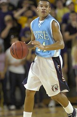
Let’s say you’re a high school basketball team and you show up for tournament game at a neutral site. Just one problem: You’ve brought along your home whites, but it turns out you’re actually the designated road team, so your opponent is dressed in white as well. You can’t borrow a set of road or practice uniforms from your opponent, because you’re at a neutral site — they don’t have access to any of their other gear. What to do?
That was the dilemma facing Terry Sanford High, a North Carolina school, on Saturday. They decided to borrow road uniforms from a nearby school, J.H. Rose High, which was just a few miles away. The weird thing is, they borrowed Rose’s jerseys but kept their white shorts, creating a very odd mismatched uniform set. It made for a really odd-looking game. (There’s a ton of additional photos here.)
According to this story, three of the Sanford players managed to get jerseys with their usual uni numbers; the rest were wearing new numbers. Good thing the borrowed jerseys were NNOB, or things would’ve been even more confusing at the scorer’s table.
I’m intrigued by the borrowed Rose jerseys, because Carolina blue and kelly green isn’t a color combo you see very often. I’m a big fan of each color individually, but I don’t think I like them together. What do you folks think?
(Thanks to Gerry Dincher for bringing this story to my attention.)
Uni Watch News Ticker: Check out this gorgeous 1958 photo of Pele. The sash says that Santos, his team in Brazil, was the 1958 Sao Paulo State Champion (great find by Jeremy Brahm). ”¦ Eagle-eyed Mike Page notes that Terrell Owens was holding a Tagliabue-signed football during his press conference the other day. “Then again, the Bills’ greatest successes came with that type of ball, so maybe that’s all they keep around,” he says. ”¦ Stephen Jennings saw a Little League game over the weekend in which several players were wearing gold stirrups over black sanitaries. ”¦ Although the Rangers have scrapped their two-tone batting helmet, I’m told that it appears in the MLB 09 The Show video game. Can anyone get some screen shots? ”¦ Absolutely spectacular old basketball uniform available here. ”¦ Yesterday I mentioned that I was unfamiliar with the term “basketball target socks,” as seen at bottom-right here. Terry Proctor quickly filled me in (and took me to task): “Paulie, you disappoint me. Back in the heyday of basketball, when teams ran real pattern offenses they would have the ‘star’ wear the shortie stirrups with the thought that they would be easier for his teammates to spot on the floor. He was the ‘target.’ Hence the name.” Interesting concept, but it also seems like borderline cheating — it’s basically having one guy dress differently than the rest of the team, which goes against the whole point of a uniform. ”¦ Always fun to see a rare shot of the Phillies’ alternate blue helmets (with thanks to Mike Engle). ”¦ The Detroit News recently held a contest to design a new logo for the Detroit Lions. Here’s a gallery of submissions, and this is what they chose as the winner, although I much prefer this one (with thanks to Craig Barker). ”¦ Tyree Evans of Kent State wore argyle socks against Akron on Sunday (good spot by Nicholas Popczun). ”¦ The U. of Minnesota’s hockey equipment manager is retiring (with thanks to Steve Christopher). ”¦ Here’s a really good shot showing how the Lakers’ shorts and jerseys didn’t match (with thanks to Alex Putelo). ”¦ Interesting batch of Russian hockey cards here (with thanks to Jerime Wargo). ”¦ It’s tough to see, but Michigan State appears to have a sublimated rear-jersey pattern, much like Duke. And three more schools will get a similar treatment for the NCAA tourney. Details here. ”¦ Whatever that little sticker is on Johan Santana’s brim, Phil notes that it was there at least as early as March 1st, and as recently as yesterday. ”¦ “The New Zealand Warriors rugby league team (note it’s a different sport than rugby) will be wearing a memorial patch for a fallen teammate this season,” reports Hadyn Green. ”¦ The 8th Annual New England Game-Worn Hockey Jerseys Expo will take place in Marlborough, Mass., on March 21st (with thanks to Mike Hersh). ”¦ Kudos to Brenham High School in Texas, whose high-cuffed baseball team wears northewestern-striped green socks (all photos courtesy of Yvonne Tomlinson). ”¦ John Philips transcribed a key juncture from NBC’s broadcast of the 1972 Opening Day game between the Mets and Padres. During the top of the 3rd, color analyst Sandy Koufax had this to say about the Mets’ change from flannels to polyester: “This year I think the Mets have new uniforms also. Teams like the Pirates, you can see that they’re new. They’re the double-knits. But the Mets got, not a different-appearing uniform, but evidently a different-feeling uniform. They’ve gone to the double-knit uniforms and all of the players have said that it’s the best feeling uniform they’ve ever worn. And I think that the new freedom of the double-knit has to make the players feel a lot better.” A second later, play-by-play man Jim Simpson noted that the Mets were wearing a memorial armband for Gil Hodges. ”¦ Not sure I see the point of the small caps here. Shouldn’t it be all caps, with proper spaces between all three elements? (Photo taken by Ed Ra.) ”¦ Here’s another school that uses a north/south center-ice logo: Oswego State (with thanks to Fab Panelli). ”¦ John Okray notes that Karim Garcia, who’s playing for Mexico in the WBC, is wearing a bracelet — or maybe a series of bracelets — on his right wrist. “The announcers talked about it a little bit, calling it a ‘superstitious thing.'” Anyone know if this is a new thing for Garcia, or if he’s been doing it during his recent stints playing in Japan and Korea? ”¦ No matter how many times I see this, it still looks ridiculous. ”¦ Brian Hughes reports that General Mills is apparently running a throwback cereal box campaign. ”¦ This chart appears on page 14 of the current issue of Newsweek. Guess they didn’t get the memo about the new NFL logo (with thanks to Nick Ruggeri).
D. Wade & El Heat went big last night in Espanol:
link
link
link
Too busy.
Nice to see Oswego State make the ticket!! Go Lakers!!!
I saw those retro cereal boxes in the store recently, I really like the Cocoa Puffs box. Here is an article discussing all of them: link
This detroit lions helmet link
reminds me of
link
Ding Ding!!
The color combo of the JH Rose jersey is a product of the way the school was formed. Two high schools were basically put together to form Rose during integration in the 70’s, meaning that the two dominant colors of the old schools were put together to form the colors of the new school. Rampants, their mascot, comes from the rams and panthers from the previous two high schools.
the only thing i don’t like about the rose jerseys is the capital “E”… other than that, i love those jerseys! but you know i like lite-blue, LOVE the number font, and LOVE NNOB!
There are two kinds of rugby: rugby union is essentially the amateur version; rugby league the professional version. However, there are amateur rugby league teams. There are different rules for each version. Perhaps a good analogy would be the difference between American and Canadian football.
Absolutely love the Rose High uniforms. Never thought to put those two colors together in a uniform but it has a real nice look to it. I’d love to see what pattern, if any, the shorts for Rose High look like. I know they would be a blue but what would be accented in green? The piping down the sides?
Whoever sent the picture, can he maybe check out a Rose High road game and get a picture for all of us???
I’d love to see some better shots of the Zags new sublimated jerseys. They sound great. Nike rules!
Is that new Detroit lions logo serious?
Are they really going to change their logo to the one that was linked as the winner, or was this just a competition for fans to ask “what if”?
I for one have always loved the Detroit Lions logo and uniforms. I could do without the black detailing on some of their more recent uniforms, but I never thought that the logo needed and alteration.
Although I am unable to find pictures at the moment, what’s even better than Greenville Rose’s basketball jerseys are their lettermans jackets. Unless they have changed, I remember them being either green in the torso with Carolina blue leather sleeves, or light blue torso with leather green sleeves.
When I was in school in NC I always noticed weird color trends. A lot of schools, especially in Eastern NC, have some tint of green, and others have blue. Some schools, like Athens Drive in Raleigh, used to use Carolina blue and orange, although a lot of their blue now is more royal (their letter jackets were pretty horrible too). Rose is interesting because they combined both trends, and I think it has been that way forever.
Link for “northewestern-striped green socks ” is the same one for the hockey jersey expo.
Re: the Lakers jerseys, the tops just look faded, like they were washed more than the shorts (ew). Check out the condition of the #52 on Jamaal Wilkes. Were they actually two different colors, though, and this was a shot to prove it? I’m not a big roundball guy.
Re: throwback cereal. As the economy continues to tank and society frays at the edges, more and more will you see this type of “retro” marketing and goings-on. A la recherche du temps perdu and all that.
Re: Valerio de los Santos. I think that “de los” should be in small caps (substituting for the lowercase) and agree with Paul that all three elements are appropriately separated by spaces. But “de los” is just a contraction (Valerio of the Saints) and no part of it should be capitalized.
Re: Karim Garcia — those are link
I personally wouldn’t use the word “superstitious” to describe them…
I can’t tell for sure, but is the neck logo on the Rose jersey the Colorado Rockies CR logo? It looks very smilier.
Really odd to see the league logo incorporated into a team logo concept. Many of the concepts make me wonder if the artists have ever watched football since a good logo is much simpler than these.
Why would a school named Terry Sanford have an F on the shorts?
Nice to see that with very few exceptions, all of the Detroit Lions logos went with the same exact theme, the open mouth lion. No outside the box thinking at all.
I also find it interesting that the “winner” is from Kentucky, and not Detroit. Good Job there.
[quote comment=”317721″]Why would a school named Terry Sanford have an F on the shorts?[/quote]
F for “Fayetteville.”
[quote comment=”317714″]Is that new Detroit lions logo serious?[/quote]
perhaps. article from Tom Kowalski, Lions beat writer for Mlive.com with some further evidence that a new logo is in the works link.
Karim Garcia with the Lotte Giants, yes with the bracelet
link
With Orix Buffaloes in Spring Training, no
link
Regular Season, no as well
link
[quote comment=”317711″]There are two kinds of rugby: rugby union is essentially the amateur version; rugby league the professional version. However, there are amateur rugby league teams. There are different rules for each version. Perhaps a good analogy would be the difference between American and Canadian football.[/quote]
rugby union went professional 14 years ago. That being said, Rugby union, is the more common form of the game that most people know, with Rugby Leauge only really being popular and played in the UK (England and Wales for the most part, France, Australia, and New Zealand.
I’ve come to realize that sports departments at newspapers and TV stations are just lazy. The Vikes changed their helmet horn years ago, but the local channels and the Strib still run the old graphic. The old Falcons and Cardinals logos still pop up from time to time as well.
Although I think that I WANT to like the Carolina blue/green combo… I’m just not there. Reminds me of Tulane (albeit reversed, at least typically).
link
[quote comment=”317723″][quote comment=”317721″]Why would a school named Terry Sanford have an F on the shorts?[/quote]
F for “Fayetteville.”[/quote]
Gotcha. Thanks
Does anyone know what the NBA rule is on gold uniforms? Are the Lakers the only team allowed to wear them at home?
Those cereal boxes are SWEEEET. I don’t eat any of those, frosted flakes is my choice but I think I’ll pick up a box of Sugary-O’s.
The Pele shot is sweet too.
The Detroit News held a fan contest to come up with a new Lions logo because the Lions did make mention of possible changes to their existing uniforms. The contest in no way reflects any changes the team may make…it was strickly a newspaper run contest.
…..strictly
[quote comment=”317730″]Does anyone know what the NBA rule is on gold uniforms? Are the Lakers the only team allowed to wear them at home?[/quote]
different kind of gold, but does washington wear their gold at home? i’m not sure because i’m not a HUGE nba fan.
[quote comment=”317734″][quote comment=”317730″]Does anyone know what the NBA rule is on gold uniforms? Are the Lakers the only team allowed to wear them at home?[/quote]
different kind of gold, but does washington wear their gold at home? i’m not sure because i’m not a HUGE nba fan.[/quote]
It appears they wear it on the road, and with black shorts, so I don’t really count that absurdity.
link
As a die-hard Chicago Bulls fan, I consider their uniform set to be pretty classic. I was surprised to find out last night (via the Miami Heat broadcast) that the Bulls are the only team in the NBA to have 5 uniforms. 5!!!!
Classic home white
Classic road red
Alternate road black
La noche Latina Los Bulls home white
St. Patrick’s Day green
They also wore home whites on the road last night, where the Heat wore Black “El Heat” unis at home. Strange though that the Bulls went with their typical road black sneakers with their home white jerseys, slightly visible here:
link
[quote comment=”317736″]I was surprised to find out last night (via the Miami Heat broadcast) that the Bulls are the only team in the NBA to have 5 uniforms. 5!!!![/quote]
while i’d have to check (and i don’t have the time today), i can pretty much GUARANTEE the cavs have more than that…
top of my head, they have: regular home, red road, blue road, and the two adidas throwbacks (blue and gold) they’ve worn this year already…prolly more than that tho, if anyone wants to check
The General Mills boxes brought me back to childhood and those tv commercials for cereal. There’s also a retro Cocoa Puffs box, one for me Lucky Charms, Cheerios, and Kix… It just shows that current cereal box design is much like the new uniform patch for a certain MLB New York baseball team that calls the borough of Queens its home.
link
link
[quote comment=”317736″]As a die-hard Chicago Bulls fan, I consider their uniform set to be pretty classic. I was surprised to find out last night (via the Miami Heat broadcast) that the Bulls are the only team in the NBA to have 5 uniforms. 5!!!!
Classic home white
Classic road red
Alternate road black
La noche Latina Los Bulls home white
St. Patrick’s Day green
They also wore home whites on the road last night, where the Heat wore Black “El Heat” unis at home. Strange though that the Bulls went with their typical road black sneakers with their home white jerseys, slightly visible here:
link
If Bulls on a road trip, why use up time and space to lug the home shoes for just one game? That would be seriously absurd. Bad enough to have to screw around with bringing the home unis…although admittedly they are a lot less cumbersome than an entire set of team footwear.
Plus, I wasn’t aware of any strict NBA league policy regarding home-road footwear. That’s an individual team thing, isn’t it? I mean, can’t the Bulls legitimately wear whatever they chose for any particular game?
(not a big follower of NBA. Not anymore, anyway).
[quote comment=”317738″][quote comment=”317736″]I was surprised to find out last night (via the Miami Heat broadcast) that the Bulls are the only team in the NBA to have 5 uniforms. 5!!!![/quote]
while i’d have to check (and i don’t have the time today), i can pretty much GUARANTEE the cavs have more than that…
top of my head, they have: regular home, red road, blue road, and the two adidas throwbacks (blue and gold) they’ve worn this year already…prolly more than that tho, if anyone wants to check[/quote]
Are those throwbacks or alternates? I thought the orange ones they were last year or the year before were the throwbacks.
I like both the royal blue and the gold, but if they are alternates they don’t blend with the team’s colors. The gold is part of the team’s history, but where did the royal blue come from?
The Phillies should have a blue helmet (with red brim of course) to wear with their daytime alt’s.
I have seen green and light blue together. It wasn’t kelly, though. It was forest.
Where?
Blades of Steel (Nintendo)
Probably around 1990. The Toronto team wore light blue and forest green.
Since I’ve been drawing uni’s since I was 5, I surely took notice.
I actually kind of liked the way it looked.
This guy’s missing the number on the front of his jersey:
link
Pic of players with number on front:
link
[quote comment=”317707″]I saw those retro cereal boxes in the store recently, I really like the Cocoa Puffs box. Here is an article discussing all of them: link
How can they do a “retro” Honey Nut Cheerios box? That product didn’t even exist back when the company was using that box design style.
That Lions contest shows how hard it is to come up with a good original logo. They all had pretty much the same idea with the open mouth lion. The other ones looked more like wolves or werewolves, and we all know werewolves play basketball.
[quote comment=”317746″]That Lions contest shows how hard it is to come up with a good original logo. They all had pretty much the same idea with the open mouth lion. The other ones looked more like wolves or werewolves, and we all know werewolves play basketball.[/quote]
It just goes to show how uninspired football creates uninspired fans…
It could be worse . . . Disney could buy the team and pull a “Mighty Ducks,” making the logo look like the “Lion King.”
link
Also of note is that Mo Cheeks has a different number font than the rest of the Sixers.
link
[quote comment=”317746″]That Lions contest shows how hard it is to come up with a good original logo. They all had pretty much the same idea with the open mouth lion. The other ones looked more like wolves or werewolves, and we all know werewolves play basketball.[/quote]
Right you are… link
[quote comment=”317716″]Link for “northewestern-striped green socks ” is the same one for the hockey jersey expo.[/quote]
Thanks. Now fixed.
[quote comment=”317718″]Re: Karim Garcia — those are link
I personally wouldn’t use the word “superstitious” to describe them…[/quote]
A chicken bone is a chicken bone in baseball. I like the history of superstition(or religion, if you prefer) in the game–plus it makes for good grabs for UW!
Upon further review, Toronto’s uni’s on Blades of steel were sky blue and teal. The teal looked like forrest green on my TV. Dog gone it.
“Plus, I wasn’t aware of any strict NBA league policy regarding home-road footwear. That’s an individual team thing, isn’t it? ”
Not sure there are necessarily guidelines on NBA footwear, but forever the Bulls would wear white shoes during the regular season, and then black shoes in the playoffs (just a team legacy thing). Then last year (I believe) they started wearing black shoes on the road, and continued with white shoes at home.
“while i’d have to check (and i don’t have the time today), i can pretty much GUARANTEE the cavs have more than that…”
As for the Cavs, I am sure you are right, didn’t do any work on it, just reported what the broadcast stated.
Re: DE Los SANTOS, maybe the Mets don’t want a relief pitcher coming into the game with LOSS in the middle of his nameplate.
Ryder Diekman [i]was[/i] thinking outside the box with his Lions helmet. To make the helmet shell itself different colors instead of the appliquéd elements is a great idea & I wonder why that isn’t done more often.
[quote comment=”317738″][quote comment=”317736″]I was surprised to find out last night (via the Miami Heat broadcast) that the Bulls are the only team in the NBA to have 5 uniforms. 5!!!![/quote]
while i’d have to check (and i don’t have the time today), i can pretty much GUARANTEE the cavs have more than that…
top of my head, they have: regular home, red road, blue road, and the two adidas throwbacks (blue and gold) they’ve worn this year already…prolly more than that tho, if anyone wants to check[/quote]
link
Interesting site. Still wondering where the royal blue comes from. . . .
Clarify: I mean the royal blue and gold uniforms they are wearing this year. I guess if you take the royal blue from the 1980s and the gold from the 1970s, you have it.
Also of some uni interest–that link above shows Brazilian Catholic saint jewelry. My wife is from Brazil and she has noted to me that these:
link
Are a very popular accessory for many Brazilian soccer players. They come from a church called Senhor do Bonfim(Lord of good luck) in Salvador, Bahia and apparently a lot of athletes make a pilgrimage there in the off season to get the bracelet, have it tied on and then wear it until it falls off and you have good luck.
Interestingly, the church combines Catholic tradition with Yoruba and Condomble–sort of voodoo from Brazil.
And we think baseball players are superstitious!
The Pele photo is great.
I thought a little background would help understand the “Sao Paulo State Championship” banner and its importance. Because Brazil is large and travel costs high, Brazil only started a national league in 1971 so the state championships have always been huge (they continue to this day).
Sao Paulo is a huge state (41 Million) with lots of big clubs, so in 1958 winning that state championship was probably the biggest thing a club team could accomplish. Players also played on state all-star teams amongst the 4 biggest states and I guess that was a big deal for a while as well(I am not sure if they did that in 1958).
I guess the royal blue and gold uniforms are “fauxbacks.”
link
[quote comment=”317741″][quote comment=”317738″][quote comment=”317736″]I was surprised to find out last night (via the Miami Heat broadcast) that the Bulls are the only team in the NBA to have 5 uniforms. 5!!!![/quote]
while i’d have to check (and i don’t have the time today), i can pretty much GUARANTEE the cavs have more than that…
top of my head, they have: regular home, red road, blue road, and the two adidas throwbacks (blue and gold) they’ve worn this year already…prolly more than that tho, if anyone wants to check[/quote]
Are those throwbacks or alternates? I thought the orange ones they were last year or the year before were the throwbacks.
I like both the royal blue and the gold, but if they are alternates they don’t blend with the team’s colors. The gold is part of the team’s history, but where did the royal blue come from?[/quote]
the royal came from the link.
FYI: the cavs have worn the dark blue “road” jersey at home this year… just last week vs. bucks(?), as a matter of fact.
Although the Rangers have scrapped their two-tone batting helmet, I’m told that it appears in the MLB 09 The Show video game. Can anyone get some screen shots?
I cannot, but I can tell you that the helmet showed up in a Rangers commercial here in Dallas last night. I guess they had already filmed it prior to the scrapping.
How can they do a “retro” Honey Nut Cheerios box? That product didn’t even exist back when the company was using that box design style.
It looks like they slapped the older white triangle graphic on an 80s era HNC box.
It appears one Lions logo submitter thought the team we’re really be called the link.
were… darn the lack of coffee
[quote comment=”317729″][quote comment=”317723″][quote comment=”317721″]Why would a school named Terry Sanford have an F on the shorts?[/quote]
F for “Fayetteville.”[/quote]
Gotcha. Thanks[/quote]
I’ve wondered… Houston’s high schools’ letter jackets all have “H” as their ‘award letter’ (though the the jackets are in individual school colors). Do other large city districts/multi school do this?
[quote comment=”317766″][quote comment=”317729″][quote comment=”317723″][quote comment=”317721″]Why would a school named Terry Sanford have an F on the shorts?[/quote]
F for “Fayetteville.”[/quote]
Gotcha. Thanks[/quote]
I’ve wondered… Houston’s high schools’ letter jackets all have “H” as their ‘award letter’ (though the the jackets are in individual school colors). Do other large city districts/multi school do this?[/quote]
Are you saying all the schools in HISD do this?
[quote comment=”317761″][quote comment=”317741″][quote comment=”317738″][quote comment=”317736″]I was surprised to find out last night (via the Miami Heat broadcast) that the Bulls are the only team in the NBA to have 5 uniforms. 5!!!![/quote]
while i’d have to check (and i don’t have the time today), i can pretty much GUARANTEE the cavs have more than that…
top of my head, they have: regular home, red road, blue road, and the two adidas throwbacks (blue and gold) they’ve worn this year already…prolly more than that tho, if anyone wants to check[/quote]
Are those throwbacks or alternates? I thought the orange ones they were last year or the year before were the throwbacks.
I like both the royal blue and the gold, but if they are alternates they don’t blend with the team’s colors. The gold is part of the team’s history, but where did the royal blue come from?[/quote]
the royal came from the link.
FYI: the cavs have worn the dark blue “road” jersey at home this year… just last week vs. bucks(?), as a matter of fact.[/quote]
Yes, I’ve got that now, but it would seem that the current royal would be trimmed with orange, not gold, unless it’s a faux-back.
Terry Sanford used to be known as Fayetteville High School. The change was made many, many years ago. It is far from the only high school in Fayetteville, but it is the only won to use an “F” on its unis. They have “F’s” on their football helmets and I think ballcaps.
New Detroit Lions DT Grady Jackson let slip in an interview that he liked the Lions new look, including a remark that he liked the new colors. The Lions are having a huge sale on their website store to get rid of the old merch.
this is the only detroit lions symbol i know of
link
Does anybody the font or something similar to Mexico national soccer jersey?
Thanks in advance.
Light blue & green reminds me of retail stores carpeting & clothes from the 1970s. It’s as bad as royal blue & light green. Ugly combo. Some of those Detroit Lions concepts remind me of the Bears’ growling head logo. The winning logo they chose in that contest looks like a stupid Minor League Baseball logo. And don’t tell me the Mets are still wearing black!
[quote comment=”317772″]Does anybody the font or something similar to Mexico national soccer jersey?
Thanks in advance.[/quote]
What jersey are you referring to? The only Mexican national jerseys I know of have a crest, but no wordmark.
Can you provide a link to what you are looking at?
link
Name and Number font.
here’s some Rangers’ helmet pics from MLB 09
link
link
link
link
By the way, when I loaded the game it told me there was a software update, but I declined just in case the update “fixed” the helmets.
[quote comment=”317776″]here’s some Rangers’ helmet pics from MLB 09
link
link
link
link
That first one looks like something out of a TROMA film: It looks like his brains are exposed in a gory mess…BASEBALL ZOMBIES vs. Texas Rangers….
[quote comment=”317768″][quote comment=”317761″][quote comment=”317741″][quote comment=”317738″][quote comment=”317736″]I was surprised to find out last night (via the Miami Heat broadcast) that the Bulls are the only team in the NBA to have 5 uniforms. 5!!!![/quote]
while i’d have to check (and i don’t have the time today), i can pretty much GUARANTEE the cavs have more than that…
top of my head, they have: regular home, red road, blue road, and the two adidas throwbacks (blue and gold) they’ve worn this year already…prolly more than that tho, if anyone wants to check[/quote]
Are those throwbacks or alternates? I thought the orange ones they were last year or the year before were the throwbacks.
I like both the royal blue and the gold, but if they are alternates they don’t blend with the team’s colors. The gold is part of the team’s history, but where did the royal blue come from?[/quote]
the royal came from the link.
FYI: the cavs have worn the dark blue “road” jersey at home this year… just last week vs. bucks(?), as a matter of fact.[/quote]
Yes, I’ve got that now, but it would seem that the current royal would be trimmed with orange, not gold, unless it’s a faux-back.[/quote]
I’m pretty sure this was covered on here a while ago, and I’m sorry I can’t find it, but those uniforms are “mash-ups”, for lack of a better term. They utilize elements from several eras of Cavs uniform history. I’m just glad they don’t include the ragged edge design that Shawn Kemp shuffled around in.
[quote comment=”317775″]http://www.worldsoccershop.com/shop-by-team-mexico-national-soccer-team-mexico-07-09-castillo-home-soccer-jersey.html
Name and Number font.[/quote]
great site!
mcfarlane… mets… black… ouch:
link
The Rangers’ decision to ditch their two-tone batting helmet was discussed briefly in yesterday’s ticker, but yesterday’s edition of Sports Business Daily had some more background on the decision – sounds like negative feedback from the fans was at least part of the reason. Actually I’m guessing that was the only reason, but they came up with a couple of other BS reasons to avoid just having to admit they were a bad idea.
Because the SBD is a subscription site I’m not sure if pasting a link will work so I’ll just paste the text here…
TWO-TONE OUT: In Ft. Worth, Anthony Andro reported the multicolor batting helmets the MLB Rangers “planned to debut this season will never see the field.” Rangers President Nolan Ryan said that the team “scrapped the idea because the team wouldn’t be wearing red on the road, therefore eliminating the need for the red-and-blue helmets.” Ryan: “The reaction wasn’t good on it and we were surprised. That weighed on the decision because they weren’t well received” (FT. WORTH STAR-TELEGRAM, 3/7). MLB.com’s T.R. Sullivan reported the Rangers “will wear blue helmets with blue jerseys and red helmets with red jerseys.” Rangers Exec VP/Communications John Blake: “The thinking being that since we were going to wear red jerseys for 16 games, trying to wear two-tone helmets for the other games was not going to work” (MLB.com, 3/6).
Those Catholic Saints bracelets were discussed here last year
link
Also transcribed recently:
ANNOUNCER #1: And the Yankees take the field!
ANNOUNCER #2: “Is it my imagination, or do the Yankees look a little different tonight? I can’t put my finger on it…”
ANNOUNCER #1: “Well, from what I understand, they’ve switched to cotton uniforms.”
ANNOUNCER #2: “They seem blousier, softer…”
ANNOUNCER #1: “Well, it is a natural fiber…”
“With thanks to Mike Hersh.” That, combined with the Boston-area-ness of the reference makes me wonder…”The Bar”? If it’s him, I’m sure he’ll know what I’m talking about.
This is the jersey the Lions should be wearing:
link
and they’re only $30 each.
“I’m intrigued by the borrowed Rose jerseys, because Carolina blue and kelly green isn’t a color combo you see very often. I’m a big fan of each color individually, but I don’t think I like them together. What do you folks think?”
I actually think it looks good. It definitely isn’t that common, but the contrast isn’t eye-popping or anything. Then again, I grew up a Eugene Emeralds fan (link) so I’ve always thought any combo of blue and green looked nice and think it should be used more often.
(Sorry for not having the link ‘working’ right. What happened to the buttons that used to be on here? I aint done know none-a this here code stuff.)
You know how every national sports uniform we have it always seems to read “USA”?
link
link
link
What would be wrong with having a basketball jersey read “United States”? like ASU does their jerseys.
link
Or what would be wrong with putting “America” on our uniforms? I know the official name of our country is The United States of America but the official name of Mexico is is the United Mexican States or UMS, or a spanish abbreviation would be EUM but they just put Mexico on their uniforms.
link
Plus i dont know any other country with America in their official name? jw i would like to hear any comments. sorry for the long post.
[quote comment=”317786″]Also transcribed recently:
ANNOUNCER #1: And the Yankees take the field!
ANNOUNCER #2: “Is it my imagination, or do the Yankees look a little different tonight? I can’t put my finger on it…”
ANNOUNCER #1: “Well, from what I understand, they’ve switched to cotton uniforms.”
ANNOUNCER #2: “They seem blousier, softer…”
ANNOUNCER #1: “Well, it is a natural fiber…”[/quote]
Did they wear them on Jon Voight Day at the Stadium?
[quote comment=”317783″]The Rangers’ decision to ditch their two-tone batting helmet was discussed briefly in yesterday’s ticker, but yesterday’s edition of Sports Business Daily had some more background on the decision – sounds like negative feedback from the fans was at least part of the reason. Actually I’m guessing that was the only reason, but they came up with a couple of other BS reasons to avoid just having to admit they were a bad idea.
Because the SBD is a subscription site I’m not sure if pasting a link will work so I’ll just paste the text here…
TWO-TONE OUT: In Ft. Worth, Anthony Andro reported the multicolor batting helmets the MLB Rangers “planned to debut this season will never see the field.” Rangers President Nolan Ryan said that the team “scrapped the idea because the team wouldn’t be wearing red on the road, therefore eliminating the need for the red-and-blue helmets.” Ryan: “The reaction wasn’t good on it and we were surprised. That weighed on the decision because they weren’t well received” (FT. WORTH STAR-TELEGRAM, 3/7). MLB.com’s T.R. Sullivan reported the Rangers “will wear blue helmets with blue jerseys and red helmets with red jerseys.” Rangers Exec VP/Communications John Blake: “The thinking being that since we were going to wear red jerseys for 16 games, trying to wear two-tone helmets for the other games was not going to work” (MLB.com, 3/6).[/quote]
After seeing the picture John Kruk in Phila. blue helmets in the Ticker, I thought wouldn’t it be a great idea to see a comprehensive history of major league batting helmets? You would only have to go back to the 1960s. Some teams duplicated the caps and others didn’t; some had alternate sets to match alternate caps, and some didn’t. Would be interesting to see how helmet designs evolved (e.g., the Orioles’ from black to orange-billed and then that business with the white front).
[quote comment=”317775″]http://www.worldsoccershop.com/shop-by-team-mexico-national-soccer-team-mexico-07-09-castillo-home-soccer-jersey.html
Name and Number font.[/quote]
That name and number font is an exclusive font made by Adidas.
They use is on several adidas national team jerseys. Here is it on the German team jerseys.
link
Here is a discussion I found online that provides a good contact for that font.
link
[quote comment=”317779″][quote comment=”317768″][quote comment=”317761″][quote comment=”317741″][quote comment=”317738″][quote comment=”317736″]I was surprised to find out last night (via the Miami Heat broadcast) that the Bulls are the only team in the NBA to have 5 uniforms. 5!!!![/quote]
while i’d have to check (and i don’t have the time today), i can pretty much GUARANTEE the cavs have more than that…
top of my head, they have: regular home, red road, blue road, and the two adidas throwbacks (blue and gold) they’ve worn this year already…prolly more than that tho, if anyone wants to check[/quote]
Are those throwbacks or alternates? I thought the orange ones they were last year or the year before were the throwbacks.
I like both the royal blue and the gold, but if they are alternates they don’t blend with the team’s colors. The gold is part of the team’s history, but where did the royal blue come from?[/quote]
the royal came from the link.
FYI: the cavs have worn the dark blue “road” jersey at home this year… just last week vs. bucks(?), as a matter of fact.[/quote]
Yes, I’ve got that now, but it would seem that the current royal would be trimmed with orange, not gold, unless it’s a faux-back.[/quote]
I’m pretty sure this was covered on here a while ago, and I’m sorry I can’t find it, but those uniforms are “mash-ups”, for lack of a better term. They utilize elements from several eras of Cavs uniform history. I’m just glad they don’t include the ragged edge design that Shawn Kemp shuffled around in.[/quote]
12/22/08 Ticker:
link
They apparently honor the Cavaliers’ social network, “CavFanatics”:
link
[quote comment=\”317790\”]You know how every national sports uniform we have it always seems to read \”USA\”?
link
link
link
What would be wrong with having a basketball jersey read \”United States\”? like ASU does their jerseys.
link
Or what would be wrong with putting \”America\” on our uniforms? I know the official name of our country is The United States of America but the official name of Mexico is is the United Mexican States or UMS, or a spanish abbreviation would be EUM but they just put Mexico on their uniforms.
link
Plus i dont know any other country with America in their official name? jw i would like to hear any comments. sorry for the long post.[/quote]
Funny you mention this, as I was thinking about this when the WBC started. For all sports, why not have home and away unis that read “America” for home and “United States” for road?
[quote comment=”317795″][quote comment=\”317790\”]You know how every national sports uniform we have it always seems to read \”USA\”?
link
link
link
What would be wrong with having a basketball jersey read \”United States\”? like ASU does their jerseys.
link
Or what would be wrong with putting \”America\” on our uniforms? I know the official name of our country is The United States of America but the official name of Mexico is is the United Mexican States or UMS, or a spanish abbreviation would be EUM but they just put Mexico on their uniforms.
link
Plus i dont know any other country with America in their official name? jw i would like to hear any comments. sorry for the long post.[/quote]
Funny you mention this, as I was thinking about this when the WBC started. For all sports, why not have home and away unis that read “America” for home and “United States” for road?[/quote]
Ya something like that would be really cool!
[quote comment=”317786″]Also transcribed recently:
ANNOUNCER #2: “They seem blousier, softer…”
ANNOUNCER #1: “Well, it is a natural fiber…”[/quote]
George likes his chicken spicy!
[quote comment=”317709″]The color combo of the JH Rose jersey is a product of the way the school was formed. Two high schools were basically put together to form Rose during integration in the 70’s, meaning that the two dominant colors of the old schools were put together to form the colors of the new school. Rampants, their mascot, comes from the rams and panthers from the previous two high schools.[/quote]
Sorta the same thing happened out here in Chicagoland when they combined Waukegan West (school colors: green and gold) and Waukegan East (school colors: purple and gold) High Schools to come up with Mardi Gras outfits used by Waukegan High School: (scroll though the team photos) link, or this: link
[quote comment=”317790″]You know how every national sports uniform we have it always seems to read “USA”?
link
link
link
What would be wrong with having a basketball jersey read “United States”? like ASU does their jerseys.
link
Or what would be wrong with putting “America” on our uniforms? I know the official name of our country is The United States of America but the official name of Mexico is is the United Mexican States or UMS, or a spanish abbreviation would be EUM but they just put Mexico on their uniforms.
link
Plus i dont know any other country with America in their official name? jw i would like to hear any comments. sorry for the long post.[/quote]
interesting thought…i knew of a couple of these, but there are actually many United States of … besides the US of A…
therefore, presupposing “our” united states with no qualifier, trumps all others, is both disingenuous and imperious at the same time
“america” too, by itself, would be interesting, but again, that term refers to not only to the “United States” (of America) but generally and specifically to ‘north,’ ‘south,’ ‘central,’ ‘latin’ americas as well
[quote comment=”317783″]The Rangers’ decision to ditch their two-tone batting helmet was discussed briefly in yesterday’s ticker, but yesterday’s edition of Sports Business Daily had some more background on the decision – sounds like negative feedback from the fans was at least part of the reason. Actually I’m guessing that was the only reason, but they came up with a couple of other BS reasons to avoid just having to admit they were a bad idea.
Because the SBD is a subscription site I’m not sure if pasting a link will work so I’ll just paste the text here…
TWO-TONE OUT: In Ft. Worth, Anthony Andro reported the multicolor batting helmets the MLB Rangers “planned to debut this season will never see the field.” Rangers President Nolan Ryan said that the team “scrapped the idea because the team wouldn’t be wearing red on the road, therefore eliminating the need for the red-and-blue helmets.” Ryan: “The reaction wasn’t good on it and we were surprised. That weighed on the decision because they weren’t well received” (FT. WORTH STAR-TELEGRAM, 3/7). MLB.com’s T.R. Sullivan reported the Rangers “will wear blue helmets with blue jerseys and red helmets with red jerseys.” Rangers Exec VP/Communications John Blake: “The thinking being that since we were going to wear red jerseys for 16 games, trying to wear two-tone helmets for the other games was not going to work” (MLB.com, 3/6).[/quote]
The Rangers were surprised that fan reaction to those hideous helmets was negative? Holy cow.
[quote comment=”317788″]This is the jersey the Lions should be wearing:
link
and they’re only $30 each.[/quote]
I never liked the silver numbers on those uniforms.
I still maintain that this is beautiful:
link
[quote comment=”317799″]
interesting thought…i knew of a couple of these, but there are actually link United States of … besides the US of A…
therefore, presupposing “our” united states with no qualifier, trumps all others, is both disingenuous and imperious at the same time
“america” too, by itself, would be interesting, but again, that term refers to not only to the “United States” (of America) but generally and specifically to ‘north,’ ‘south,’ ‘central,’ ‘latin’ americas as well[/quote]
Besides United Mexican States, those others no longer exist though.
anybody suggest this for detroit?
link
Just saw this on the link from Spring Training (by writer Carroll Rogers of the AJC):
Rumor is the Braves are going to wear their blue jerseys as their primary road jersey this year. Oy, their luck better change. ….and I also hear they’ll be wearing solid blue helmets, not blue with red brims.
This is the first I have heard of that. I love the road blues, but their record wearing them was pretty bad last year. Paul, any word on uni changes for the Braves this year?
~E~
Just got a tip from one of the writers on the Braves AJC beat blog.
Rumor is the Braves are going to wear their blue jerseys as their primary road jersey this year. Oy, their luck better change. ….and I also hear they’ll be wearing solid blue helmets, not blue with red brims.
Link link.
[quote comment=”317748″]It could be worse . . . Disney could buy the team and pull a “Mighty Ducks,” making the logo look like the “Lion King.”
link
Or maybe something like link?
[quote comment=”317804″]Just saw this on the link from Spring Training (by writer Carroll Rogers of the AJC):
Rumor is the Braves are going to wear their blue jerseys as their primary road jersey this year. Oy, their luck better change. ….and I also hear they’ll be wearing solid blue helmets, not blue with red brims.
This is the first I have heard of that. I love the road blues, but their record wearing them was pretty bad last year. Paul, any word on uni changes for the Braves this year?
~E~[/quote]
Dude, I saw that, too. I like the blue alt, but as a full-time road uni??? I think the road grey with “Atlanta” in red is a classic. So is that gonna be the “alt” road now? Disturbing, but I think GM Frank Wren reaaaaaaly likes those blue unis. They were his brainchild, after all.
Those gold over black stirrups are awful. This is how my son’s All star team rocked last summer.
link
Hey, it worked!. Here’s another
link
But wait…there’s more
link
link
[quote comment=”317799″][quote comment=”317790″]You know how every national sports uniform we have it always seems to read “USA”?
link
link
link
What would be wrong with having a basketball jersey read “United States”? like ASU does their jerseys.
link
Or what would be wrong with putting “America” on our uniforms? I know the official name of our country is The United States of America but the official name of Mexico is is the United Mexican States or UMS, or a spanish abbreviation would be EUM but they just put Mexico on their uniforms.
link
Plus i dont know any other country with America in their official name? jw i would like to hear any comments. sorry for the long post.[/quote]
interesting thought…i knew of a couple of these, but there are actually link United States of … besides the US of A…
therefore, presupposing “our” united states with no qualifier, trumps all others, is both disingenuous and imperious at the same time
“america” too, by itself, would be interesting, but again, that term refers to not only to the “United States” (of America) but generally and specifically to ‘north,’ ‘south,’ ‘central,’ ‘latin’ americas as well[/quote]
Very true but “america” by its self without any pretitle(not a word ha) such as “south” “north” “central” etc etc what would it be refered to? just the two whole continents of America? i think it would work on a jersey, since generally the name ‘america’ is almost always refered to the US of A, right?
[quote comment=”317808″]Those gold over black stirrups are awful. This is how my son’s All star team rocked last summer.
link
Yeah, was gonna caption those gold-over-blacks…
“When Bad Stirrup Combos Happen to Good Kids.”
There is, however, still something just odd about anything but true low cut cleats with stirrups.
That’s what really spurred the move to longer pants and the disappearance of stirrups. As I recall the progression, when players such as Eric Davis and Barry Bonds (the thinner, Pittsburgh version) began wearing higher cut cleats, the stirrup socks looked strange. Solid color socks (sans stirrup) or long pants extending all the way to shoe tops seemed to be the solutions to a look that was, well…kinda clunky.
—Ricko
The best Lions logos on that page are:
#3-Great Classic look, love the darker blue.
#62-although its just the old Jags logo with a mane, i like the idea of the updated lion on the two bars.
#57-I absolutely LOVE this. Its extremely well done, and i at first just went right past it thinking it was the detroit tigers logo, but upon noticing the L i fell in love. this should be the Lions logo. ditch the silhoutte, put this on the helmet.
I love link Lions logo concept – even as a Bears fan.
It’s the #57 that Adam just mentioned.
…a little off base today, but the Minnesota DNR is asking people to vote on the new state link. Personally, I’d like an option with link and/or pucks.
So the NHL GMs have proposed to tighten up fighting rules by ejecting players who fight immediately after a faceoff, to more aggressively call the instigator, a penalty that ejects someone who starts a fight, and will look into a rule that forces players to keep helmets on during fights in the future.
I’m sorry, but for a league that is already struggling to take one of the more entertaining aspects of it out like this is just absurd. The league suffers from cheap shots to star players, so now they want to completely eliminate one of the biggest deterrants from those sheapshots?
Unreal. Just shows how out-of-touch they are with reality.
I always thought an “Old English” lion on its back legs (blue outlined in black or silver), like the kind on a heraldry shield or coat of arms would be rather cool. Whole outline of the lion’s body, not just the head. Combine that with the Old English style “D” (like the Tigers use) and you would have something!
[quote comment=”317811″][quote comment=”317799″][quote comment=”317790″]You know how every national sports uniform we have it always seems to read “USA”?
link
link
link
What would be wrong with having a basketball jersey read “United States”? like ASU does their jerseys.
link
Or what would be wrong with putting “America” on our uniforms? I know the official name of our country is The United States of America but the official name of Mexico is is the United Mexican States or UMS, or a spanish abbreviation would be EUM but they just put Mexico on their uniforms.
link
Plus i dont know any other country with America in their official name? jw i would like to hear any comments. sorry for the long post.[/quote]
interesting thought…i knew of a couple of these, but there are actually link United States of … besides the US of A…
therefore, presupposing “our” united states with no qualifier, trumps all others, is both disingenuous and imperious at the same time
“america” too, by itself, would be interesting, but again, that term refers to not only to the “United States” (of America) but generally and specifically to ‘north,’ ‘south,’ ‘central,’ ‘latin’ americas as well[/quote]
Very true but “america” by its self without any pretitle(not a word ha) such as “south” “north” “central” etc etc what would it be refered to? just the two whole continents of America? i think it would work on a jersey, since generally the name ‘america’ is almost always refered to the US of A, right?[/quote]
huh… Canada in part of America but not of The United States of America.
If i remember correctly, the most memorable sport event as voted by ESPN was the Miracle on Ice. And what was on both hockey jersey in this game? USA and CCCP.
Nothing is wrong with USA on a jersey. :)
Gotta agree with BS, the Old English D with the inset L is very sharp.
[quote comment=”317742″]“The Phillies should have a blue helmet (with red brim of course) to wear with their daytime alts.”[/quote]
Well they are planning to do so this year, and a Chase Utley plastic model will be given away to the kids 14 and younger May 31st as well.
[quote comment=”317804″]Just saw this on the link from Spring Training (by writer Carroll Rogers of the AJC):
Rumor is the Braves are going to wear their blue jerseys as their primary road jersey this year. Oy, their luck better change. ….and I also hear they’ll be wearing solid blue helmets, not blue with red brims.
This is the first I have heard of that. I love the road blues, but their record wearing them was pretty bad last year. Paul, any word on uni changes for the Braves this year?
~E~[/quote]
The grays are still the official road uni, but of course that doesn’t mean they can’t wear the navy laternate jersey as often as they want — every road game, even.
The solid-blue cap is now the official road cap. So yes, it makes sense that they’d have helmets to match.
Regarding lettermen jackets, that’s unique with Houston school district. I’m pretty sure that in Pittsburgh (“the City League”), those kid’s jackets are school specific. then again, it’s a smaller district (only nine now play sports with the closer of South Vo-Tech a few years back)
Geeman, that Cavs History site is great, is that something you help out with or did you just come across it on a websearch?
I grew up near Rose High. I always liked their colors. I thought “Rampants” was a wierd mascot, but thanks to someone here I understand its a cross mascot.
Ironically, I went to school next to Rose and my Dad went to school next to Terry Sanford. Go figure.
[quote comment=\”317799\”][quote comment=\”317790\”]You know how every national sports uniform we have it always seems to read \”USA\”?
link
link
link
What would be wrong with having a basketball jersey read \”United States\”? like ASU does their jerseys.
link
Or what would be wrong with putting \”America\” on our uniforms? I know the official name of our country is The United States of America but the official name of Mexico is is the United Mexican States or UMS, or a spanish abbreviation would be EUM but they just put Mexico on their uniforms.
link
Plus i dont know any other country with America in their official name? jw i would like to hear any comments. sorry for the long post.[/quote]
interesting thought…i knew of a couple of these, but there are actually link United States of … besides the US of A…
therefore, presupposing \”our\” united states with no qualifier, trumps all others, is both disingenuous and imperious at the same time
\”america\” too, by itself, would be interesting, but again, that term refers to not only to the \”United States\” (of America) but generally and specifically to \’north,\’ \’south,\’ \’central,\’ \’latin\’ americas as well[/quote]
Why not Boratize it? U S and A!
How much?
The only time I ever saw the words “AMERICA” on a uniform were the Steve & Barry hockey jerseys.
And we all know what happened to that chain of stores.
[quote comment=”317817″]So the NHL GMs have proposed to tighten up fighting rules by ejecting players who fight immediately after a faceoff, to more aggressively call the instigator, a penalty that ejects someone who starts a fight, and will look into a rule that forces players to keep helmets on during fights in the future.
I’m sorry, but for a league that is already struggling to take one of the more entertaining aspects of it out like this is just absurd. The league suffers from cheap shots to star players, so now they want to completely eliminate one of the biggest deterrants from those sheapshots?
Unreal. Just shows how out-of-touch they are with reality.[/quote]
1. They are very in-touch with reality. The reality is that fights should be a a culmination of events that have happened previous to a fight. A pre-staged fight does nothing for either team, and only works if the crowd is into it. Since fights right after the game’s opening faceoff rarely work to inspire anyone except the drunk in the fourth row, cutting this sort of crap out is a good idea. It’s hockey, not the UFC.
2. Aggressively calling the instigator is entirely acceptable, and I whole-heartedly would embrace this. What the BoGs want to see is less fighting after a clean, legal check. Big hits are just as exciting as a huge goal, and the flow of the game and excitement generated by the hit are lost when some moron decides that the clean hit on a player who got caught needs to be taught a lesson. The lesson that should have already been learned? Don’t put yourself in a vulnerable position when skating up the ice. If your teammate wants to spend an additional two minutes in the box and have your team on the PK, go ahead and let him avenge the clean hit. Don’t complain when the other team is celebrating a powerplay goal because of his stupidity.
3. There is already a penalty for starting fights. It’s called the “instigator rule”. What the BoGs would like to see is the additional penalty of “instigation while wearing a visor” called. There has been only one of these penalties called this season – Rene Bourque of the Calgary Flames – and the BoGs feel that players are more inclined to start battles of there is little chance of having their faces smashed open. If the next rule doesn’t happen, this rule won’t either.
4. The OHL already has implemented the helmets-on rule, and it is designed to prevent players from cracking their heads on the ice when falling. Nick Kypreos had his career ended by that, and I’m pretty sure that the NHL doesn’t want any other players suffering that fate, or the fate of Don Sanderson. This is designed for safety, but I think you’ll see the NHLPA shoot this one down.
As much as we disagree, BF, these suggestions are relatively common sense. It surprises me that you feel this will kill off fighting and/or entertainment in the game. What it will do is put fighting back into the game the way it was originally done: you do something stupid or disrespectful, and you’ll pay for it.
And that’s what makes fighting an emotional attachement to the game for fans – you wronged my team, so now you’re gonna pay.
Re: The Lakers–purple often shows up blue in photos, just google it. In person those unis looked purple.
Even in that shot, Kareem’s pants look purple while his teammates look blue.
speaking of the phillies blue alts, i just picked up one of the hats on ebay over the weekend. this is the second i’ve owned, but the first is pretty worn out considering i’ve had it since 1996ish
link
(am too lazy for html. sorry, kids)
It is hard to believe the Lions may change the logo.
I AM CRAZY EXCITED ABOUT THIS!!!!!! I read this blog every day and I never though this day would come…I goto Jack Britt High School (the team terry sanford played and unfortunantly beat) and attended that game. We started a fire your equipment manager chant in the student section…it was great. UNfortunantly, we are purple and gold which is especially horrible in our tennis unis which feature purple and the mark of the beast. You can see me link in the middle with the eye black strips on.
MLB 2K9 has it worse than a simple monstrosity of helmet. The Milwaukee Brewers have some weird reversed typography alternate jerseys like the all dark blue Atlanta Braves, their retro Fridays have the current numbers and names on the back in all dark blue, and the ’82 retros have NOB!
I’m certain there are more flaws than that, but I’ve been too depressed as to how bad the game is to even play more of it.
[quote comment=”317801″][quote comment=”317788″]This is the jersey the Lions should be wearing:
link
and they’re only $30 each.[/quote]
I never liked the silver numbers on those uniforms.
I still maintain that this is beautiful:
link
[quote comment=\”317801\”][quote comment=\”317788\”]This is the jersey the Lions should be wearing:
link
and they\’re only $30 each.[/quote]
I never liked the silver numbers on those uniforms.
I still maintain that this is beautiful:
link
Affirmed. That is a good look, although this could work as a secondary logo.
link
It\’s too bad that organizations think a change in threads will immprove the product on the field.
That said, I was always impressed with the USFL\’s Michigan Panthers\’ helmet.
link
My guess is whatever they come up with, we\’ll be underwhelmed on this site.
[quote comment=”317828″]Re: The Lakers–purple often shows up blue in photos, just google it. In person those unis looked purple.
Even in that shot, Kareem’s pants look purple while his teammates look blue.[/quote]
The Lakers mismatched unis were discussed in the ticker last year too…
link
Paul linked to these photos in the ticker:
link
link
link
link
which prompted a link to this pic in the comments:
link
[quote comment=”317767″][quote comment=”317766″][quote comment=”317729″][quote comment=”317723″][quote comment=”317721″]Why would a school named Terry Sanford have an F on the shorts?[/quote]
F for “Fayetteville.”[/quote]
Gotcha. Thanks[/quote]
I’ve wondered… Houston’s high schools’ letter jackets all have “H” as their ‘award letter’ (though the the jackets are in individual school colors). Do other large city districts/multi school do this?[/quote]
Are you saying all the schools in HISD do this?[/quote]
Yup, I am referring to HISD schools. Seemed weird to me when I lived in the area.
Here are the two-tone Rangers helmets featured in MVP Baseball 2009, for the PC:
link
and
link
[quote comment=”317831″]I AM CRAZY EXCITED ABOUT THIS!!!!!! I read this blog every day and I never though this day would come…I goto Jack Britt High School (the team terry sanford played and unfortunantly beat) and attended that game. We started a fire your equipment manager chant in the student section…it was great. UNfortunantly, we are purple and gold which is especially horrible in our tennis unis which feature purple and the mark of the beast. You can see me link in the middle with the eye black strips on.[/quote]
We didn’t have that many attractive girls in my whole high school.
[quote comment=”317829″]speaking of the phillies blue alts, i just picked up one of the hats on ebay over the weekend. this is the second i’ve owned, but the first is pretty worn out considering i’ve had it since 1996ish
link
(am too lazy for html. sorry, kids)[/quote]
Oooh, the version with the thin “P”. Very nice. I had one my senior year of high school but it didn’t last the summer. (Damn growth spurts.)
so i am watching the bruins-blue jackets game and tim thomas’ mask broke. so after a ten minute delay thomas ends up wearing back-up manny fernandez’s mask.
hopefully i can find a picture tonight or tomorrow
This EXACT same thing happened to me freshman year of college. I was on the Virginia Tech rigby team and had been designated as the uniform mule for the semester. I showed up to the (neutral site) VRU state championship game with only our white jerseys. Our opponents also had white, and through some bizarre rule we had been designated as visitors. We ended up having to wear the jerseys of our women’s rugby team who had played earlier that day. There were some tight shirts on the firld that day. The women’s team loved it.
[quote comment=”317838″][quote comment=”317829″]speaking of the phillies blue alts, i just picked up one of the hats on ebay over the weekend. this is the second i’ve owned, but the first is pretty worn out considering i’ve had it since 1996ish
link
(am too lazy for html. sorry, kids)[/quote]
Oooh, the version with the thin “P”. Very nice. I had one my senior year of high school but it didn’t last the summer. (Damn growth spurts.)[/quote]
Not a blue alt., but thin letter-wise this one is great too.
link
[quote comment=”317839″]so i am watching the bruins-blue jackets game and tim thomas’ mask broke. so after a ten minute delay thomas ends up wearing back-up manny fernandez’s mask.
hopefully i can find a picture tonight or tomorrow[/quote]
Not sure if you are watching it on FSN Ohio, but Rimer (the play-by-play man) wondered if the “backup” helmet may have been the reason for the goal the jackets scored
Random question:
Gonzaga came out with those black ‘Zags’ jerseys earlier this year. Anyone else ever have a jersey that wasn’t their city/college name or their nickname (or shortened nickname ie Sens for the Senators)??
Just seems weird to me to have ‘Zags’ on them. I know its a common phrase for them, but still…they’re the Gonzaga Bulldogs.
how BOUT der nederlands!
The Tulane University Green Wave sports teams’ colors are traditionally olive green or kelly green and sky blue. Usually, Tulane uses green as the base color with light blue trim, but Tulane’s alt jerseys use a light blue base color with green trim.
link
link
[quote comment=”317727″]I’ve come to realize that sports departments at newspapers and TV stations are just lazy. The Vikes changed their helmet horn years ago, but the local channels and the Strib still run the old graphic. The old Falcons and Cardinals logos still pop up from time to time as well.[/quote]
See it all the time locally with the old (non-gold/black trim) Niners SF shield.
This is my buddy, Steve! link
So.. is the economy so bad that the Bills can’t purchase a new football?
link
What it should be: link
And while I’m on it.. what the hell is this? link
Tulane!
How did I think not of Tulane?
I can’t believe I never considered my version of Toronto on an early Nintendo game when I first saw Tulane couple the two.