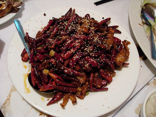
Pictured above is the plate of Spicy and Aromatic Soft-Shell Crab that a bunch of friends and I devoured last night — along with tea-smoked duck, lamb with cumin sauce, cured pork with garlic shoots, and a few other things — at Grand Sichuan House in Bay Ridge. I would’ve taken more photos but I was too busy eating. And then I almost left my camera at the restaurant, but fortunately the waitress got my attention just as we were walking out the door.
All of which has nothing to do with uniforms, but I have yet another ESPN column running today, so that’s as much of a lead entry as you’re gonna get today. Enjoy the Stupor Bowl, and remember what to watch during halftime. — Paul
“Look at me!” reminder: My “band” has a gig tonight at Sound Fix (part of a night-long extravaganza of free entertainment, all of which I recommend). Festivities commence at 8pm, and Liz and I will probably be going on at 9pm, or maybe a little sooner. See you there.
Uni Watch News Ticker: According to an item on this Q&A page (sent my way by Joe Carney), “[T]he larger issue [regarding the Pirates’ recent uniform changes] was that the players flat-out did not like the sleeveless model because of comfort. That extra black undershirt constricted and made hot days seem that much hotter. Some still wear an undershirt, even long sleeves, when weather dictates. But players like having the option of going without.” Now wait a minute — it’s extremely rare to see an MLB player without an undershirt. Greg Maddux often did it, and it always looked weird to see nothing but skin around his jersey collar, which is a measure of how atypical it is to go undershirt-free. So the above-stated rationale for the Buccos’ addition of sleeves doesn’t make any sense. ”¦ I usually scoff when other media outlets try to venture into Uni Watch territory, but the Daily News just ran a “worst uniforms ever” slideshow that’s actually pretty decent. Even if you don’t agree with all their choices (I certainly don’t), they’ve come up with some good photos I hadn’t seen before. Kudos to all involved (and also to Alan Tompas, who brought this to my attention). ”¦ How can you present a rundown of the best Super Bowl halftime shows and not include this? ”¦ New book on football uniforms in the pipeline. Should be available in a few weeks. ”¦ NOB snafu (with thanks to long-lost Kenn Tomasch). ”¦ And you thought I was nasty to Mrs. Kurt. ”¦ More Lions redesign rumors (with thanks to Timothy Fesmire). ”¦ Who knew Brazil had a curling team? (Tim Wood, that’s who, plus he sent along this great shot of the 1958 Amherst football uniforms). ”¦ The Ontario and New York fire departments recently faced off on the ice. Further details here (with thanks to Yancy Yeater). ”¦ Matt Powers is working on a bizarre DIY Bears mash-up sweatershirt with elements drawn from various points in the team’s history. The elements aren’t stitched on yet, but it’s shaping up quite nicely. … Some jerseys that were used in Leatherheads are available on eBay (good find by Dave Zalatoris).
three columns in one week – shit Paul, you are prolific. I’m prepared for the serious rebuke of the Cardinals Uni in the espn column?
RE: Worst Uniforms Ever
Maybe it’s just me, but I really like about 60% of every uniform listed. True some of them are acquired tastes, but that’s what makes them special.
Loved that slide show. However, I really liked those old Tampa Bay Buccaneers uniforms, clean and that logo is classic, not silly like their present day one. The Tampa Bay Rowdies is one of the best kits ever worn for an American soccer team. The Caribous of Colorado had a tremendous logo but the fringe on the shirt was a bit too much.
I also don’t know if its been mentioned or not, but did anyone else notice in the clip they ran several times this week about the Arizona mayor stomping on the terrible towel that the mayor was wearing some weird Cardinals jersey? It had weird striping on the sides and the sleeves (and no I’m not talking about the obnoxious piping on their regular sets).
link
there’s NEVER any love for fishsticks
/fuckers
That list has problems. Those Warriors unis are among the best ever, and how do the Bullets unis get on the list, while the Wizards’ getups of today not make the list?
[quote comment=”312568″]Loved that slide show. However, I really liked those old Tampa Bay Buccaneers uniforms, .[/quote]
Amen.
So, how long before Lukas complains about NC State’s pink shoes, pink warmup jerseys with the Yow Foundation emblem, and the “Yow” NOB (all of which, I think, they’re wearing for the rest of the year, perhaps thowing in the pink jerseys on the road) is overkill?
Oops, that should be “about NC State’s . . . BEING overkill”
I agree with No 3, on both the Tampa Bay unis. I find it completely inconsistent that one can put the Buccaneers on the list, but not the Tennessee Volunteers – which from what I can tell is the same shade of orange – and too me is a more washed out look. Also with the Bucs being from the orange state – the color seemed appropriate.
I also agree with both Washington Bullets – which I thought was a great uni, and Golden State as well
Maybe it was an attempt by the people who came up with this list, to bring something new to the table – but I think they’re mostly wrong -on their non-standard picks.
[quote comment=”312569″]I also don’t know if its been mentioned or not, but did anyone else notice in the clip they ran several times this week about the Arizona mayor stomping on the terrible towel that the mayor was wearing some weird Cardinals jersey? It had weird striping on the sides and the sleeves (and no I’m not talking about the obnoxious piping on their regular sets).
link
Looks to be an official Cardinals Super Bowl Jersey. You know the ugly ass ones they sell to get maore $$? Leave it to the mayor of my hometown..
I’ll bet Ravensteihl or is it Steelersteihl would never do something that stupid..
[quote comment=”312576″][quote comment=”312569″]I also don’t know if its been mentioned or not, but did anyone else notice in the clip they ran several times this week about the Arizona mayor stomping on the terrible towel that the mayor was wearing some weird Cardinals jersey? It had weird striping on the sides and the sleeves (and no I’m not talking about the obnoxious piping on their regular sets).
link
Looks to be an official Cardinals Super Bowl Jersey. You know the ugly ass ones they sell to get maore $$? Leave it to the mayor of my hometown..
I’ll bet Ravensteihl or is it Steelersteihl would never do something that stupid..[/quote]
er.. should say *more*
and his name is Ravenstahl not Ravensteihl.
Paul,
Is ths Salty Dog still a popular place on 3rd Avenue in Bay Ridge?
When I was in college, across the bridge in SI, we would travel over to BK and hang out there.
My college GF was actually from Dyker Heights ans we used to love Cafe Cafe on 3rd.
Anyway, back to unis: The Bears mash-up is based on a pic of Red Grange I found as well as my favorite collegiate player when I was a kid, Mike Stone breaker of ND.
link
The patches on the front, waist, and sleeve were leather and were designed to provide a better grip on the ball.
George Halas actually chose blue and orange as a tribute to the University of Illinois, both his and Grange’s alma mater. Notice the upside down V design on the Illini jersey:
link
That is a pic of Grange shaking the hands of TOSU captain.
AWESOME PROJECT MATT!!! what did you use for the fabric? and will you be adding any other elements??? either way, looks great!
Nice to the see the Rowdies get a mention. Not only one of the truly great nicknames ever but, I think, a great (although admittedly offbeat) uni, too.
And I know I keep asking this, but it just baffles me. Why do the Buccaneers consistently show up on “worst” lists because of their light orange but Tennessee never does…when it’s the same frickin’ color?
Generally speaking, that list seems to have been compiled by a member of the “dark is better cuz it’s tough, and anything bright is faggy” school of thought.
You know the ones, so insecure about their masculinity that they wouldn’t dare wear, say, a pink golf shirt in Aruba when it’s 101.
—Ricko
[quote comment=”312579″]AWESOME PROJECT MATT!!! what did you use for the fabric? and will you be adding any other elements??? either way, looks great![/quote]
The ornage fabric is very thin cotton that I picked up at Walmart for 1.79 a yard.
The white fabric is a heavier cotton, almost twill-like that wa a bit more difficult to work with.
I purchased a ten dollar Hanes sweatshirt from the same Walmart.
I used Under Wonder fusable iron-on to secure the cut fabric to the SS.
It’s actually all done except for the sewing which I am going to have a colleague at work do for me.
I am actually signing up for a course at a sewing shop within walking distance of my house.
My wife is the Brownie troop leader and they are actually going there today to earn a patch!
Ryan, your use of AutoCAd was very impressive. Your shapes were cut beautifully, especially since you used felt.
The more that I look at my Bears version, it seems busy. I still love it, but my next DIY will be a bit simpler.
Unfortunately, for everyone around me, these DIY’s are causing me to have a one-track mind!
What an absolute bunch of SHIT. First of all, nearly EVERY player wears an undershirt.
Sounds like more loser-crap from the Pirates. I’ve never heard any stories of the 1960 Pirates complaining about this, they just went out and beat the Yankees in the World Series.
Just another excuse. I suppose these shiny new sleeves will turn the team around as a winner
Here’s a cool story about a Baruch College student who won a contest to design the Freshman/Sophomore NBA game unis:
link
[quote comment=”312581″][quote comment=”312579″]AWESOME PROJECT MATT!!! what did you use for the fabric? and will you be adding any other elements??? either way, looks great![/quote]
The ornage fabric is very thin cotton that I picked up at Walmart for 1.79 a yard.
The white fabric is a heavier cotton, almost twill-like that wa a bit more difficult to work with.
I purchased a ten dollar Hanes sweatshirt from the same Walmart.
I used Under Wonder fusable iron-on to secure the cut fabric to the SS.
It’s actually all done except for the sewing which I am going to have a colleague at work do for me.
I am actually signing up for a course at a sewing shop within walking distance of my house.
My wife is the Brownie troop leader and they are actually going there today to earn a patch!
Ryan, your use of AutoCAd was very impressive. Your shapes were cut beautifully, especially since you used felt.
The more that I look at my Bears version, it seems busy. I still love it, but my next DIY will be a bit simpler.
Unfortunately, for everyone around me, these DIY’s are causing me to have a one-track mind![/quote]
thanks for the info matt! thanks also for the compliment! i just wish i didnt rush the logo… i’m my own worst critic, and i think i could have done a better job. but it kind of gives it a little character i think.
i started work on the other logo last night. so i’m excited about that!
i’ll have to go to walmart to see what they have. i pretty much bought all my supplies at michael’s, but i think i have to go to jo ann fabrics for the stripes.
if you ever want me to trace something out for you in autocad, just contact me or send it along. i’d be happy to!
… that goes for all uniwatchers/DIYers, by the way
Holy crap, those Caribou Jerseys are horrible! They look like a freaking sexy lady cowboy getup over a badly discolored undershirt! The funny thing is that they seem to have destroyed almost all record of the team playing in them, as I was only able to find one action shot.
link
I was flipping through the channels last night and I came across the Plymouth Whalers vs Erie Otters game. Not an overly exciting thing, until you see what Erie was wearing.
link
Here is also the home jersey.
link
These might go down (IMHO) as the worst jerseys of the year. What really kills me is that they’ve got a third jersey that’s rather respectable.
link
About the only ones they forgot were the first few seasons of The Kansas City Wiz, the 1980 Tuscon Toros, the Orlando Thunder, the 1933 Pittsburgh Steelers, and anything Jorge Campos ever wore.
[quote comment=”312581″][quote comment=”312579″]AWESOME PROJECT MATT!!! what did you use for the fabric? and will you be adding any other elements??? either way, looks great![/quote]
The ornage fabric is very thin cotton that I picked up at Walmart for 1.79 a yard.
The white fabric is a heavier cotton, almost twill-like that wa a bit more difficult to work with.
I purchased a ten dollar Hanes sweatshirt from the same Walmart.
I used Under Wonder fusable iron-on to secure the cut fabric to the SS.
It’s actually all done except for the sewing which I am going to have a colleague at work do for me.
I am actually signing up for a course at a sewing shop within walking distance of my house.
My wife is the Brownie troop leader and they are actually going there today to earn a patch!
Ryan, your use of AutoCAd was very impressive. Your shapes were cut beautifully, especially since you used felt.
The more that I look at my Bears version, it seems busy. I still love it, but my next DIY will be a bit simpler.
Unfortunately, for everyone around me, these DIY’s are causing me to have a one-track mind![/quote]
Matt’s got a hoodie on his back.
Great work there, Powers.
Now, regarding odd unis, how about this one?
CFL’s Ottawa Rough Riders, circa 1964.
link
—Ricko
[quote comment=”312584″][quote comment=”312581″][quote comment=”312579″]AWESOME PROJECT MATT!!! what did you use for the fabric? and will you be adding any other elements??? either way, looks great![/quote]
The ornage fabric is very thin cotton that I picked up at Walmart for 1.79 a yard.
The white fabric is a heavier cotton, almost twill-like that wa a bit more difficult to work with.
I purchased a ten dollar Hanes sweatshirt from the same Walmart.
I used Under Wonder fusable iron-on to secure the cut fabric to the SS.
It’s actually all done except for the sewing which I am going to have a colleague at work do for me.
I am actually signing up for a course at a sewing shop within walking distance of my house.
My wife is the Brownie troop leader and they are actually going there today to earn a patch!
Ryan, your use of AutoCAd was very impressive. Your shapes were cut beautifully, especially since you used felt.
The more that I look at my Bears version, it seems busy. I still love it, but my next DIY will be a bit simpler.
Unfortunately, for everyone around me, these DIY’s are causing me to have a one-track mind![/quote]
thanks for the info matt! thanks also for the compliment! i just wish i didnt rush the logo… i’m my own worst critic, and i think i could have done a better job. but it kind of gives it a little character i think.
i started work on the other logo last night. so i’m excited about that!
i’ll have to go to walmart to see what they have. i pretty much bought all my supplies at michael’s, but i think i have to go to jo ann fabrics for the stripes.
if you ever want me to trace something out for you in autocad, just contact me or send it along. i’d be happy to![/quote]
Thanks, Ryan.
I actually teach Design and Drawing for Production and AutoCad lite is one of the programs we use.
For logo re-creation, I usually find the item online and then copy it into MS Word.
Then I will resize it accordingly and then print it onto card-stock. With a matte knife, i cut out the shape leaving me with a template to cut my fabric with.
As with the Bears version, I found that cricles and irreular shapes are a pain, especially when they are double layered.
There is one problem…when the image is larger than 8.5 by 11, like the Bears numbers 58.
For that I used the multi-media projector in my classroom and projected the image onto a piece of cardstock and then traced the image that way in order to make the template.
I don’t know how people made uniforms before vinyl cutters and heat presses!
I actually like the old Buccaneers unis! I think the reason they get on these lists is more related to their poor on-field record. They lost a ton of games in those things.
[quote comment=”312587″]I was flipping through the channels last night and I came across the Plymouth Whalers vs Erie Otters game. Not an overly exciting thing, until you see what Erie was wearing.
link
Here is also the home jersey.
link
These might go down (IMHO) as the worst jerseys of the year. What really kills me is that they’ve got a third jersey that’s rather respectable.
link
Nice 3rd actually, but why is it badged as rbk (vector) and the others CCM, seems odd to me. I know there is a good reason, please someone refresh my memory….
After looking at the “Worst Uniforms Of All Time” I was checking out some of the other links to the right. Not sure if this has ever been posted, but check out this awesome pic of Rosie Brown. This is what I would call “excellemt game wear”!
link
[quote comment=”312591″]I actually like the old Buccaneers unis! I think the reason they get on these lists is more related to their poor on-field record. They lost a ton of games in those things.[/quote]
Exactly. Had the Bucs won even one game that first season, they probably wouldn’t get nearly the “anti-props” they do. In fact, might be just the opposite, they’d be noted for putting a “colorful spin on the classic Tennessee look”.
—Ricko
Russell Martin is adding a ‘J’ to his NOB to honor his mother this season: link
In regards to the FDNY Hockey team mention, you can purchase jerseys for some of their sports clubs from the FireZone, located at Rockefeller Center. It is an awesome place to go take the kids if they love fire stuff…or if you are an adult and love fire stuff.
link
Great job by Powers. I’ve had the same one track mind sickness for 3 years now.
link
Justman’s facebook page is a great place to meet up and talk tips. The hardest part is getting started, but you may even shock yourself!
David F.
[quote comment=”312592″][quote comment=”312587″]I was flipping through the channels last night and I came across the Plymouth Whalers vs Erie Otters game. Not an overly exciting thing, until you see what Erie was wearing.
link
Here is also the home jersey.
link
These might go down (IMHO) as the worst jerseys of the year. What really kills me is that they’ve got a third jersey that’s rather respectable.
link
Nice 3rd actually, but why is it badged as rbk (vector) and the others CCM, seems odd to me. I know there is a good reason, please someone refresh my memory….[/quote]
I can’t answer why it has CCM on the bad jerseys and RBK on the good one, but Reebok does own CCM these days. This is displayed at the bottom of the CCM home page like so:
Copyright © 2009 Reebok-CCM Hockey, Inc. All rights reserved.
(Shakes head) I remember when using CCM equipment meant something.
[quote comment=”312598″]Great job by Powers. I’ve had the same one track mind sickness for 3 years now.
link
Justman’s facebook page is a great place to meet up and talk tips. The hardest part is getting started, but you may even shock yourself!
David F.[/quote]
WOW!
How were those plackets done?
Where do you get the twill?
How did you cut it so sharply?
[quote comment=”312576″][quote comment=”312569″]I also don’t know if its been mentioned or not, but did anyone else notice in the clip they ran several times this week about the Arizona mayor stomping on the terrible towel that the mayor was wearing some weird Cardinals jersey? It had weird striping on the sides and the sleeves (and no I’m not talking about the obnoxious piping on their regular sets).
link
Looks to be an official Cardinals Super Bowl Jersey. You know the ugly ass ones they sell to get maore $$? Leave it to the mayor of my hometown..
I’ll bet Ravensteihl or is it Steelersteihl would never do something that stupid..[/quote]
You are correct Hott Rodd. The Arizona mayor is wearing an ugly-ass Super Bowl version of the Cards uni…which you can purchase at the nflshop for ONLY $59.99!
link
[quote comment=”312573″]So, how long before Lukas complains about NC State’s pink shoes, pink warmup jerseys with the Yow Foundation emblem, and the “Yow” NOB (all of which, I think, they’re wearing for the rest of the year, perhaps thowing in the pink jerseys on the road) is overkill?[/quote]
new category: LCNOB (Late Coach’s Name On Back)
I really liked the top 10 halftime shows slideshow. Of particular sartorial note is Justin Timberlake’s jeans for link. Does he have a Levi’s back pocket sewn on his left knee?
And the best halftime show ever was Prince, no contest.
Every time I see a reference to the link, their old fight song/radio jingle pops into my head.
The Rowdies run here
The Rowdies run there
They kick the ball around
The Rowdies run here
The Rowdies run there
Then they fall on the ground
Oh, The Rowdies, The Rowdieeeeeeees
The Rowdies aaaaaaaa-are…
A kick in the grass
I heard that damn thing every single day one summer when I was living with my cousins in St. Pete Beach.
As far as why the Bucs’ unis are derided while the Vols get a pass: maybe it has something to do with the Bucs using red as an accent color.
Nice roller derby article in this weekend’s NY Times Magazine, with a few pictures of the NYC All-Stars in uniform. link
[quote comment=”312603″]Of particular sartorial note is Justin Timberlake’s jeans for link. Does he have a Levi’s back pocket sewn on his left knee?[/quote]
I just want to know why Joan Rivers is standing next to him.
[quote comment=”312601″][quote comment=”312576″][quote comment=”312569″]I also don’t know if its been mentioned or not, but did anyone else notice in the clip they ran several times this week about the Arizona mayor stomping on the terrible towel that the mayor was wearing some weird Cardinals jersey? It had weird striping on the sides and the sleeves (and no I’m not talking about the obnoxious piping on their regular sets).
link
Looks to be an official Cardinals Super Bowl Jersey. You know the ugly ass ones they sell to get maore $$? Leave it to the mayor of my hometown..
I’ll bet Ravensteihl or is it Steelersteihl would never do something that stupid..[/quote]
You are correct Hott Rodd. The Arizona mayor is wearing an ugly-ass Super Bowl version of the Cards uni…which you can purchase at the nflshop for ONLY $59.99!
link
Phoenix Mayor.. but yeah… glad he is out there representing my city with such class.
[quote comment=”312600″][quote comment=”312598″]Great job by Powers. I’ve had the same one track mind sickness for 3 years now.
link
Justman’s facebook page is a great place to meet up and talk tips. The hardest part is getting started, but you may even shock yourself!
David F.[/quote]
WOW!
How were those plackets done?
Where do you get the twill?
How did you cut it so sharply?[/quote]
Thank you so much Matt. No, plackets were not done. I cut everything by hand…guess I’m a steady cut. I rip the logos from Chris Cremer’s logo page or draw by hand (if the team doesn’t exist) on to cardstock. Cut the templates, trace on the back of the twill in reverse, cut the get sewing. I keep all templates and have made same jerseys for friends / customers that have inquired.
The Braves Uecker one up close is pretty ridiculous..sure – inaccuracies, but that’s part of the fun. I get twill from a cutting house in Philly, but thanks to UW, I’ve also found this joint:
link
My next order will likely come from there – better prices per sq. ft. and ore colors availabe. W & W patches from ebay finish ’em up. If you’re not already on Justman’s FB page already:
link
See you there! David F.
[quote comment=”312599″][quote comment=”312592″][quote comment=”312587″]I was flipping through the channels last night and I came across the Plymouth Whalers vs Erie Otters game. Not an overly exciting thing, until you see what Erie was wearing.
link
Here is also the home jersey.
link
These might go down (IMHO) as the worst jerseys of the year. What really kills me is that they’ve got a third jersey that’s rather respectable.
link
Nice 3rd actually, but why is it badged as rbk (vector) and the others CCM, seems odd to me. I know there is a good reason, please someone refresh my memory….[/quote]
I can’t answer why it has CCM on the bad jerseys and RBK on the good one, but Reebok does own CCM these days. This is displayed at the bottom of the CCM home page like so:
Copyright © 2009 Reebok-CCM Hockey, Inc. All rights reserved.
(Shakes head) I remember when using CCM equipment meant something.[/quote]
….hangs head in shame and will spend the next 20 minutes looking at the yellow dot on big bens helmet and trying to figure out what that smudge is….sigh….
[quote comment=”312570″]there’s NEVER any love for link
/fuckers[/quote]
I carry the torch proudly, Phil. ;o)
[quote comment=”312610″][quote comment=”312570″]there’s NEVER any love for link
/fuckers[/quote]
I carry the torch proudly, Phil. ;o)[/quote]
So would that result in burnt fishsticks then?
I swear I saw a DIY project on Uni Watch in the last few months where a guy made a custom black sweatshirt with Baltimore Orioles jersey elements. Can anyone remind me when that column ran? Or, more directly, which vendor the guy used to buy his jersey crest/patches?
A thousand thanks. This DIY stuff has me all kinds of inspired.
[quote comment=”312611″][quote comment=”312610″][quote comment=”312570″]there’s NEVER any love for link
/fuckers[/quote]
I carry the torch proudly, Phil. ;o)[/quote]
So would that result in burnt fishsticks then?[/quote]
“We want fishsticks!!”
I don’t care what they say, this is supreme badass:
link
Vertical striped socks and all.
[quote comment=”312578″]Paul,
Is ths Salty Dog still a popular place on 3rd Avenue in Bay Ridge?
When I was in college, across the bridge in SI, we would travel over to BK and hang out there.
My college GF was actually from Dyker Heights ans we used to love Cafe Cafe on 3rd.
Anyway, back to unis: The Bears mash-up is based on a pic of Red Grange I found as well as my favorite collegiate player when I was a kid, Mike Stone breaker of ND.
link
The patches on the front, waist, and sleeve were leather and were designed to provide a better grip on the ball.
George Halas actually chose blue and orange as a tribute to the University of Illinois, both his and Grange’s alma mater. Notice the upside down V design on the Illini jersey:
link
That is a pic of Grange shaking the hands of TOSU captain.[/quote]
Sick that your favorite player was stonebreaker – me too. I check eBay for stonebreaker stuff all the time, just in case something decent pops up. game worn jerseys has some decent #42 jerseys in the older styles that could probably pass for one of his. Stonebreaker, Bolcar, Pritchett, etc…. what a corps. Oh, and i used to live 2 avenues from the salty dog in 00-01, was still very popular at that time. ton of good bars there, though i haven’t made it back in a while.
So way back in the beginning of the football ul ran a DIY Bills beer helmet, which inspired me to make the 1961 Cowboys throwback helmet, which I proudly wore to the Cowboys-Cardinals game in October, and which is even more proudly displayed on our entertainment center in the living room. Didn’t want to steal anyone’s thunder back then, but now that DIY seems to be an everyday occurance, I might dig up the pictures and post a link if anyone is interested.
[quote comment=”312598″]Great job by Powers. I’ve had the same one track mind sickness for 3 years now.
link
Justman’s facebook page is a great place to meet up and talk tips. The hardest part is getting started, but you may even shock yourself!
David F.[/quote]
stonebreaker has a facebook page – matt should send the project to him.
While the Devil Rays’ 1998-2000 uniforms would not appear on my list of ’10 best uniforms’, they wouldn’t appear in my ’10 worst uniforms’ either.
While I come across quite a bit of vitriol towards them, I have yet to hear a spelled out reason, as if just posting a picture of them is sufficient. I invariably say. “What’s so offensive about them? They’re basic with a multi-coloured text on them. And rather subdued at that. Again, nowhere near my favourite, but hardly grotesque.
this is far from happening…but here’s what LA’s new football team could be…
link
*(note: not the one I was looking for but found funny)
Oh man, check it Eagles fans:
link
[quote comment=”312617″][quote comment=”312598″]Great job by Powers. I’ve had the same one track mind sickness for 3 years now.
link
Justman’s facebook page is a great place to meet up and talk tips. The hardest part is getting started, but you may even shock yourself!
David F.[/quote]
stonebreaker has a facebook page – matt should send the project to him.[/quote]
His daddy, Steve Stonebreaker, played LB for the early Vikings and later the Saints. Had a beer with him once after a game outside old Met Stadium Well, he had a beer. I was too young and with my uncle.
A good friend (and former Steeler QB, ’46-’48) of my uncle’s named Bill Garnaas had a little gathering called the “OSC” (Outside Stadium Club) after Viking games right from the beginning. It’s from that group and their little purple and white OSC sign that tailgating at the Met sprung.
Imagine, players stopping by for a beer with fans after the game. Yup, really happened. All the time.
—Ricko
[quote comment=”312612″]I swear I saw a DIY project on Uni Watch in the last few months where a guy made a custom black sweatshirt with Baltimore Orioles jersey elements. Can anyone remind me when that column ran? Or, more directly, which vendor the guy used to buy his jersey crest/patches?
A thousand thanks. This DIY stuff has me all kinds of inspired.[/quote]
link
I found this guy a week ago myself…not sure if it’s same guy, but he’s got the O’s and other teams as well. Unfortunately no Brewers.
Mental Floss presents some cool sports stuff. This is a really cool history of the beginnings of professional football, complete with visual aids!
link
[quote comment=”312618″]While the Devil Rays’ 1998-2000 uniforms would not appear on my list of ’10 best uniforms’, they wouldn’t appear in my ’10 worst uniforms’ either.
While I come across quite a bit of vitriol towards them, I have yet to hear a spelled out reason, as if just posting a picture of them is sufficient. I invariably say. “What’s so offensive about them? They’re basic with a multi-coloured text on them. And rather subdued at that. Again, nowhere near my favourite, but hardly grotesque.[/quote]
I’ll give it a shot….
First of all the color fade is anything but subtle. It goes from purple to yellow, backwards. And the teal/blue/green in the middle isn’t even accurate with the rainbow. It just looks off.
Since it’s a baseball uniform, you have to compare it to baseball uniform aesthetics and tradition. Teal (and to a certain extent purple) never worked. It doesn’t look like a baseball color. Sure, trying to pull off a new color isn’t automatically bad- but its damn easy to fail when compared to classic baseball colors. This one failed.
Secondly, the font is a bastardization between “futuristic” and “classic sports script”. It doesn’t pull either off at all.
Even if you liked the wordmark- its merely slapped in the middle of the uni, far too large.
[quote comment=”312555″]GOD INVENTED SEX![/quote]Paris Hilton is way behind on royalty payments.
But the collection agency He runs is pretty good….
[quote comment=”312612″]I swear I saw a DIY project on Uni Watch in the last few months where a guy made a custom black sweatshirt with Baltimore Orioles jersey elements. Can anyone remind me when that column ran? Or, more directly, which vendor the guy used to buy his jersey crest/patches?
A thousand thanks. This DIY stuff has me all kinds of inspired.[/quote]
teampatch.com…it was about 4 or 5 Fridays ago in the ticker
Those whacky Padres uniforms came in handy when my nephew asked me to play a game. Randomly pick two M&M’s (standard issue, no holiday colors) from the bag and then state a team that has those colors.
Anyone know an answer for red and brown?
[quote comment=”312607″][quote comment=”312601″][quote comment=”312576″][quote comment=”312569″]I also don’t know if its been mentioned or not, but did anyone else notice in the clip they ran several times this week about the Arizona mayor stomping on the terrible towel that the mayor was wearing some weird Cardinals jersey? It had weird striping on the sides and the sleeves (and no I’m not talking about the obnoxious piping on their regular sets).
link
Looks to be an official Cardinals Super Bowl Jersey. You know the ugly ass ones they sell to get maore $$? Leave it to the mayor of my hometown..
I’ll bet Ravensteihl or is it Steelersteihl would never do something that stupid..[/quote]
You are correct Hott Rodd. The Arizona mayor is wearing an ugly-ass Super Bowl version of the Cards uni…which you can purchase at the nflshop for ONLY $59.99!
link
Phoenix Mayor.. but yeah… glad he is out there representing my city with such class.[/quote]
Sorry…typed too fast. How many of the special SB jerseys does the NFL actually sell? If you are going to buy a jersey, and want a SB reference, why not just buy a replica with a patch for $20 more? I’ll never understand those fashion SB jerseys.
[quote comment=”312617″][quote comment=”312598″]Great job by Powers. I’ve had the same one track mind sickness for 3 years now.
link
Justman’s facebook page is a great place to meet up and talk tips. The hardest part is getting started, but you may even shock yourself!
David F.[/quote]
stonebreaker has a facebook page – matt should send the project to him.[/quote]
I sent him a a message but about a mutal friend.
One of my good friends, Rob, is originally from Atlanta.
Rob was great friends and a teammate in HS of Wes Pritchett, one of the other linebackers at ND.
Theyve been communicating on FB.
Yesterday, Rob showed me a bunch of cool ND pics that Pritchett sent him, including Stonebreaker.
So Rob sent SB a message, breaking his balls.
[quote comment=”312627″]Those whacky Padres uniforms came in handy when my nephew asked me to play a game. Randomly pick two M&M’s (standard issue, no holiday colors) from the bag and then state a team that has those colors.
Anyone know an answer for red and brown?[/quote]
Brown University
I can’t make excuses for the shorts or the collars on the infamous White Sox uniforms, but does anyone else find the typography, the navy/white combo and the sock stripes to be particularly striking? All in all, I think their normal, non-shorts, uniform setup gets a bit of a bad rap.
[quote comment=”312603″]I really liked the top 10 halftime shows slideshow. Of particular sartorial note is Justin Timberlake’s jeans for link. Does he have a Levi’s back pocket sewn on his left knee?
And the best halftime show ever was Prince, no contest.[/quote]
Is Britney wearing NFL pants (with the swoosh)?
[quote comment=”312590″][quote comment=”312584″][quote comment=”312581″][quote comment=”312579″]AWESOME PROJECT MATT!!! what did you use for the fabric? and will you be adding any other elements??? either way, looks great![/quote]
The ornage fabric is very thin cotton that I picked up at Walmart for 1.79 a yard.
The white fabric is a heavier cotton, almost twill-like that wa a bit more difficult to work with.
I purchased a ten dollar Hanes sweatshirt from the same Walmart.
I used Under Wonder fusable iron-on to secure the cut fabric to the SS.
It’s actually all done except for the sewing which I am going to have a colleague at work do for me.
I am actually signing up for a course at a sewing shop within walking distance of my house.
My wife is the Brownie troop leader and they are actually going there today to earn a patch!
Ryan, your use of AutoCAd was very impressive. Your shapes were cut beautifully, especially since you used felt.
The more that I look at my Bears version, it seems busy. I still love it, but my next DIY will be a bit simpler.
Unfortunately, for everyone around me, these DIY’s are causing me to have a one-track mind![/quote]
thanks for the info matt! thanks also for the compliment! i just wish i didnt rush the logo… i’m my own worst critic, and i think i could have done a better job. but it kind of gives it a little character i think.
i started work on the other logo last night. so i’m excited about that!
i’ll have to go to walmart to see what they have. i pretty much bought all my supplies at michael’s, but i think i have to go to jo ann fabrics for the stripes.
if you ever want me to trace something out for you in autocad, just contact me or send it along. i’d be happy to![/quote]
Thanks, Ryan.
I actually teach Design and Drawing for Production and AutoCad lite is one of the programs we use.
For logo re-creation, I usually find the item online and then copy it into MS Word.
Then I will resize it accordingly and then print it onto card-stock. With a matte knife, i cut out the shape leaving me with a template to cut my fabric with.
As with the Bears version, I found that cricles and irreular shapes are a pain, especially when they are double layered.
There is one problem…when the image is larger than 8.5 by 11, like the Bears numbers 58.
For that I used the multi-media projector in my classroom and projected the image onto a piece of cardstock and then traced the image that way in order to make the template.
I don’t know how people made uniforms before vinyl cutters and heat presses![/quote]
wow! i have a plotter at work. shhhhhhhh! haha. i never thought of using word for logo recreation, great idea. i paste an image into autocad and trace it with the spline tool (mostly)… then i will draw a box 8.5 x 11 and resize the traced image accordingly. from there i just print it on regular paper, cut it out, and trace it onto the back of felt. i’d love to get into working with twill! i think that will be my next project. good ideas though!
someone on page 2 is trying to step into uniwatch territory…The best and worst of Pittsburgh jerseys
link
Anyone else think it’s really weird the “Puppy Bowl” website uses a Shea Stadium picture, with a football field pretty much photo-shopped on? Why not just use an actual football stadium? (Or, if they reallly want to use Shea, use a picture from when football was played there?)
Weird.
The “worst uni” inclusion of Broncos Mark II makes no sense, as they only objected to the logo. The rest of that uni was probably the best one in franchise history.
The selector(s) seem completely obsessed with basketball and obviously have it in for orange and yellow as colors. They omitted some even more dreadful kits with other colors:
link;
link;
link; and, of course,
Thug U – ok so there’s orange there, but they are butt ugly.
Ryan,
MS Word only works when you have the image or the font downloaded.
When you have to recreate anything, AutoCad would be much better.
[quote comment=”312636″]The “worst uni” inclusion of Broncos Mark II makes no sense, as they only objected to the logo. The rest of that uni was probably the best one in franchise history.
The selector(s) seem completely obsessed with basketball and obviously have it in for orange and yellow as colors. They omitted some even more dreadful kits with other colors:
link;
link;
link; and, of course,
Thug U – ok so there’s orange there, but they are butt ugly.[/quote]
How also do the Gretzky Blues manage to stay off the list when it has much the same problem as the fishsticks?
[quote comment=”312632″][quote comment=”312603″]I really liked the top 10 halftime shows slideshow. Of particular sartorial note is Justin Timberlake’s jeans for link. Does he have a Levi’s back pocket sewn on his left knee?
And the best halftime show ever was Prince, no contest.[/quote]
Is Britney wearing NFL pants (with the swoosh)?[/quote]
As long as “Joan Rivers” doesn’t have a “wardrone malfunction”, we’ll be fine.
Best Super Bowl halftimes shows — and no mention of Elvis Presto, the Elvis-impersonating magician, who did the world’s largest card trick at Super Bowl XXIII. Huh.
not even an attempt at accuracy like the stadiums previously posted on uniwatch, but still fun. snackfood stadium link
Not sports related, but fun nonetheless–Monopoly Board cake. By far the most elaborate cake I’ve ever done. Took six an a half hours to decorate.
link
More cakes and close ups here.
link
[quote comment=”312583″]Here’s a cool story about a Baruch College student who won a contest to design the Freshman/Sophomore NBA game unis:
link
Cool for that kid, but those jerseys he designed are hidious.
[quote comment=”312639″][quote comment=”312632″][quote comment=”312603″]I really liked the top 10 halftime shows slideshow. Of particular sartorial note is Justin Timberlake’s jeans for link. Does he have a Levi’s back pocket sewn on his left knee?
And the best halftime show ever was Prince, no contest.[/quote]
Is Britney wearing NFL pants (with the swoosh)?[/quote]
As long as “Joan Rivers” doesn’t have a “wardrone malfunction”, we’ll be fine.[/quote]
Those must be NFL pants, I can see the logo, but I don’t think that’s a swoosh, maybe a shadow.
[quote comment=”312634″]someone on page 2 is trying to step into uniwatch territory…The best and worst of Pittsburgh jerseys
link
i might understand if this was on a different website. but, to be on page 2 seems a little unoriginal. i only clicked the link because i thought it was paul’s new column, and was shocked when it wasn’t
Anyone notice that the Amherst McGregor (white) facemasks are on upside down?
Should look like this:
link
[quote comment=”312627″]Those whacky Padres uniforms came in handy when my nephew asked me to play a game. Randomly pick two M&M’s (standard issue, no holiday colors) from the bag and then state a team that has those colors.
Anyone know an answer for red and brown?[/quote]
Brown University
[quote comment=”312570″]there’s NEVER any love for link
/fuckers[/quote]
Ugh, those uniforms were awful. Really, really awful. Teal, Gordon’s Fisherman, terrible design = epic fail.
Paul,
Seeing that Chinese dish reminded me of something I ordered at Sammy’s Noodles in the Village. I think it was Beef with Black Chili sauce that the owner actually came over to me after I ordered it and said “You first white person to order this. Only Hendu and Packy order this dish!” Brother, it was hot and very freakin’ tasty! Their other dishes were great as well.
Paul and Co.
An update to the Washington Women’s uniform from last night. They have TWO pink themed uniforms… the home set has pink striping in place of the gold… thus creating a purple and pink color scheme… They will be wearing Pink roads at Oregon. The Whites have an unusual NOB as all players have “4 KAY” replacing their actual names… a salute to Kay Yow. All the coaches also wore pink coaching shirts with pink Nike hoop shoes.
Here’s the link to the game story with a good picture of the front and back
link
[quote comment=”312648″][quote comment=”312627″]Those whacky Padres uniforms came in handy when my nephew asked me to play a game. Randomly pick two M&M’s (standard issue, no holiday colors) from the bag and then state a team that has those colors.
Anyone know an answer for red and brown?[/quote]
Brown University[/quote]
If that’s already taken- St Lawrence University
[quote comment=”312649″][quote comment=”312570″]there’s NEVER any love for link
/fuckers[/quote]
Ugh, those uniforms were awful. Really, really awful. Teal, Gordon’s Fisherman, terrible design = epic fail.[/quote]
If using colour makes something an epic fail, we’re all doomed. The design was way ahead of its time, and the fisherman – while looking like Gorton’s – was far meaner than anything seen in the 1990s from the Islanders franchise.
Those are still one of the greatest uniforms in sports history simply because the Islanders were man enough to skate in them.
[quote comment=”312624″][quote comment=”312618″]While the Devil Rays’ 1998-2000 uniforms would not appear on my list of ’10 best uniforms’, they wouldn’t appear in my ’10 worst uniforms’ either.
While I come across quite a bit of vitriol towards them, I have yet to hear a spelled out reason, as if just posting a picture of them is sufficient. I invariably say. “What’s so offensive about them? They’re basic with a multi-coloured text on them. And rather subdued at that. Again, nowhere near my favourite, but hardly grotesque.[/quote]
I’ll give it a shot….
First of all the color fade is anything but subtle. It goes from purple to yellow, backwards. And the teal/blue/green in the middle isn’t even accurate with the rainbow. It just looks off.
Since it’s a baseball uniform, you have to compare it to baseball uniform aesthetics and tradition. Teal (and to a certain extent purple) never worked. It doesn’t look like a baseball color. Sure, trying to pull off a new color isn’t automatically bad- but its damn easy to fail when compared to classic baseball colors. This one failed.
Secondly, the font is a bastardization between “futuristic” and “classic sports script”. It doesn’t pull either off at all.
Even if you liked the wordmark- its merely slapped in the middle of the uni, far too large.[/quote]
I appreciate the comments Christopher! The colours are fadish and a bit large, but just not overwhelming to my eyes.
[quote comment=”312604″]Every time I see a reference to the link, their old fight song/radio jingle pops into my head.
The Rowdies run here
The Rowdies run there
They kick the ball around
The Rowdies run here
The Rowdies run there
Then they fall on the ground
Oh, The Rowdies, The Rowdieeeeeeees
The Rowdies aaaaaaaa-are…
A kick in the grass
I heard that damn thing every single day one summer when I was living with my cousins in St. Pete Beach.
As far as why the Bucs’ unis are derided while the Vols get a pass: maybe it has something to do with the Bucs using red as an accent color.[/quote]
“Then they fall on the ground”??? How can that possibly be motivating.
I think Bucco Bruce combined with the tangerine color is the #1 reason people slam the Bucs uniforms. But I do agree that the red is also a factor. With Tennessee, orange is the dominant color. With Tampa, the red makes the orange appears even lighter than it is.
Just came across this picture in an article about the ’63 Chargers’ steroid use:
link
What’s up with #79’s number?
[quote comment=”312613″][quote comment=”312611″][quote comment=”312610″][quote comment=”312570″]there’s NEVER any love for link
/fuckers[/quote]
I carry the torch proudly, Phil. ;o)[/quote]
So would that result in burnt fishsticks then?[/quote]
“We want fishsticks!!”[/quote]
To heck with the fishsticks..we want chili !!!! (Islander fans from the past will remember that)
Do any of you fine folks still have the link to the pro sports teams fonts that we had last week? I am specifically looking for NFL.
[quote comment=”312658″]Do any of you fine folks still have the link to the pro sports teams fonts that we had last week? I am specifically looking for NFL.[/quote]
link
I have a question regarding the DIY hoodie. When did the Bears have sleeve stripes like that? I only recall the orange and white being reversed. Being that nobody else has commented, I assume I’m innaccurate.
Paul,
You will definitely find this interesting.
We’re a College Summer Lacrosse Team based out of Milwaukee, WI. We’re sponsored by Heineken (go figure right, a Wisconsin college affiliated group with ties to a beer company.)
We’re called the “MILKMEN” and have dairy themed uniforms.
Check us out
[URL=”http://www.flickr.com/photos/34971334@N08/3239505906/in/set-72157613159712462/”]http://www.flickr.com/photos/34971334@N08/3239505906/in/set-72157613159712462/[/URL]
Today’s ESPN column is up:
link
oops, heres our link to the Heineken Milkmen
link
[quote comment=”312631″]I can’t make excuses for the shorts or the collars on the infamous White Sox uniforms, but does anyone else find the typography, the navy/white combo and the sock stripes to be particularly striking? All in all, I think their normal, non-shorts, uniform setup gets a bit of a bad rap.[/quote]
The thing about the shorts is that when people reference them, they often present it as though they were worn regularly. I believe they were worn a grand total of twice.
The collars were certainly horrible and the navy blue pants weren’t much better, but if you put that navy blue wordmark on a regular white or gray jersey, you go from the outhouse to the penthouse, aesthetically.
[quote comment=”312645″][quote comment=”312634″]someone on page 2 is trying to step into uniwatch territory…The best and worst of Pittsburgh jerseys
link
i might understand if this was on a different website. but, to be on page 2 seems a little unoriginal. i only clicked the link because i thought it was paul’s new column, and was shocked when it wasn’t[/quote]
To be fair, Dave Dameshek had that column up on his personal page a few days ago. I’m guessing the Page 2 editors asked to repost it.
On the other hand, Dameshek has also stated repeatedly on his podcasts that he wants to become Uniform Czar for all the major sports. So maybe a couple of shots are called for.
link article talking about companies sponsoring the names of sports stadiums and arenas, and why they should not be forced to give up these deals, even when they are begging the government for more money *cough*Citibank*cough*
i know this was a topic a couple of weeks ago, but Calvert Hall high school (MD) has hockey unis from reebok with the script logo on the front and the insignia on the back. Not a huge fan of the multiple logos.
link
link
OK, before you all start screaming, I’m aware that there’s a very big error in the ESPN column. Fixing it right now.
[quote comment=”312667″]i know this was a topic a couple of weeks ago, but Calvert Hall high school (MD) has hockey unis from reebok with the script logo on the front and the insignia on the back. Not a huge fan of the multiple logos.
link
link[/quote]
Why is the captain’s designation bigger than the school’s name? Is he more important?
[quote comment=”312667″]i know this was a topic a couple of weeks ago, but Calvert Hall high school (MD) has hockey unis from reebok with the script logo on the front and the insignia on the back. Not a huge fan of the multiple logos.
link
link[/quote]
Can’t wait to see the Reebok Thrashers take on the Reebok Rangers next year… should be an awesome series!
[quote comment=”312668″]OK, before you all start screaming, I’m aware that there’s a very big error in the ESPN column. Fixing it right now.[/quote]
link!
[quote comment=”312670″][quote comment=”312667″]i know this was a topic a couple of weeks ago, but Calvert Hall high school (MD) has hockey unis from reebok with the script logo on the front and the insignia on the back. Not a huge fan of the multiple logos.
link
link[/quote]
Can’t wait to see the Reebok Thrashers take on the Reebok Rangers next year… should be an awesome series![/quote]
Except that Reebok has already stated that the wordmark will not be used next season. So don’t hold your breath for too long.
[quote comment=”312655″]
“Then they fall on the ground”??? How can that possibly be motivating.[/quote]
Plus, there was another verse that I can’t quite remember. Something about magical toes and kicking with their heads instead of their feet.
And I seem to remember the tune sounding vaguely like the Slinky jingle — the verses at least, not so much the chorus.
The Rowdies run here (What walks down stairs)
The Rowdies run there (Alone or in pairs)
They kick the ball around (And makes a slikity sound?)
I never noticed last year that both teams had a Super Bowl sticker on their helmet.
link
How long has this been going on?
[quote comment=”312668″]OK, before you all start screaming, I’m aware that there’s a very big error in the ESPN column. Fixing it right now.[/quote]
Now I wanna know what the error was..
Powers, that shirt’s a veritable clusterfuck of designs… ever think you’ve gone a little overboard?
[quote comment=”312668″]OK, before you all start screaming, I’m aware that there’s a very big error in the ESPN column. Fixing it right now.[/quote]
folks around here rarely even notice that kind of stuff
Forgive me if mentioned, but another unicentric chant:
When Wyoming played Kansas in the Phog a few years back, the KU students ended the game with “U-P-S” chants
link
I’m sure it’s been covered before, but what kind of patch is Terry Bradshaw wearing in this pic.?
link
[quote comment=”312679″]I’m sure it’s been covered before, but what kind of patch is Terry Bradshaw wearing in this pic.?
link
Bicentenial patch for the 1976 season. I have seen the Cowboys with it on their sleeves, not sure if everyone had it.
[quote comment=”312680″][quote comment=”312679″]I’m sure it’s been covered before, but what kind of patch is Terry Bradshaw wearing in this pic.?
link
Bicentenial patch for the 1976 season. I have seen the Cowboys with it on their sleeves, not sure if everyone had it.[/quote]
just the super bowl teams i think… i could be wrong though…
[quote comment=”312675″][quote comment=”312668″]OK, before you all start screaming, I’m aware that there’s a very big error in the ESPN column. Fixing it right now.[/quote]
Now I wanna know what the error was..[/quote]
Fully gloved quarterback. XX years before Antwaan Randle El threw his pass, “The Punky QB, They Call ‘McMahon'” went double-gloved. Which makes Kurt Warner, presumably, next, not first.
Correcting link…
should say “slinkity”
Braves opened “Camp Roger” today at Turner Field. In this photo gallery (pic 4 of 8, I think) you can see President Jon Schuerholz rocking the satin Starter jacket instead of the newer Majestic team jackets.
link
[quote comment=”312659″][quote comment=”312658″]Do any of you fine folks still have the link to the pro sports teams fonts that we had last week? I am specifically looking for NFL.[/quote]
link
Thank you very much
[quote comment=”312681″][quote comment=”312680″][quote comment=”312679″]I’m sure it’s been covered before, but what kind of patch is Terry Bradshaw wearing in this pic.?
link
Bicentenial patch for the 1976 season. I have seen the Cowboys with it on their sleeves, not sure if everyone had it.[/quote]
just the super bowl teams i think… i could be wrong though…[/quote]
eBay has everything:
link
[quote comment=”312681″][quote comment=”312680″][quote comment=”312679″]I’m sure it’s been covered before, but what kind of patch is Terry Bradshaw wearing in this pic.?
link
Bicentenial patch for the 1976 season. I have seen the Cowboys with it on their sleeves, not sure if everyone had it.[/quote]
just the super bowl teams i think… i could be wrong though…[/quote]
Yup, just Super Bowl. Wasn’t an NFL patch. Was the Bicentennial patch. They wore it because the Super Bowl was one of the first major sporting events of calendar year 1976, kicking off (no pun intended) the year-long celebration.
—Ricko
amended:
“PART OF kicking off…”
LOL…further amended…
I meant that Super Bowl was the first time the patch appeared on NFL uniforms.
I gotta go home. Second head cold this winter. Crap.
Oh, nurse….
—Ricko
[quote comment=”312676″]Powers, that shirt’s a veritable clusterfuck of designs… ever think you’ve gone a little overboard?[/quote]
what would you have him do with his leftover ribbon?
[quote comment=”312676″]Powers, that shirt’s a veritable clusterfuck of designs… ever think you’ve gone a little overboard?[/quote]
Perhaps a tad…but thats why its DIY and it cost me next to nothing to make.
The striping and the 1920’s era “leather” patches might be extra!
Innovation is the improvement over an existing design. I have more than enough designs thought up already to better that one…
[quote comment=”312690″][quote comment=”312676″]Powers, that shirt’s a veritable clusterfuck of designs… ever think you’ve gone a little overboard?[/quote]
what would you have him do with his leftover ribbon?[/quote]
It’s busy, yes. But with the possible exception of the inverted colors on the sleeve stripes, it’s a fine-looking garment. I’m willing to overlook those because the script B on the pocket is brilliant.
And I think this is the first time I’ve ever seen the word “veritable” used in conjunction with “clusterfuck.” Could you work that one into your next piece for the Daily Emerald?
[quote]I have more than enough designs thought up already to better that one…[/quote]
care to share?
will the next one be a bona fide charlie foxtrot as well?
[quote comment=”312692″][quote comment=”312690″][quote comment=”312676″]Powers, that shirt’s a veritable clusterfuck of designs… ever think you’ve gone a little overboard?[/quote]
what would you have him do with his leftover ribbon?[/quote]
It’s busy, yes. But with the possible exception of the inverted colors on the sleeve stripes, it’s a fine-looking garment. I’m willing to overlook those because the script B on the pocket is brilliant.
And I think this is the first time I’ve ever seen the word “veritable” used in conjunction with “clusterfuck.” Could you work that one into your next piece for the Daily Emerald?[/quote]
DAMMIT!!!!!!!!!!!!!!!!!!!!!!!!!!!!!!!!!!!!!!
[quote comment=”312693″][quote]I have more than enough designs thought up already to better that one…[/quote]
care to share?
will the next one be a bona fide charlie foxtrot as well?[/quote]
Maybe a hoodie with a pouch on the BACK, too.
Y’know, for speed skaters.
Could do a Dan Jansen model.
No matter how you hang it, it falls down.
(ooo, harsh)
How will you sew the B on the front pocket- isn’t it impossible to put on the machine like that?
Check Out this team picture
link
This may have beeen addressed before but is Kurt Warner the only QB to have worn 3 different uniforms (design) in the Super Bowl?
(After Sunday of course)
[quote comment=”312698″]This may have beeen addressed before but is Kurt Warner the only QB to have worn 3 different uniforms (design) in the Super Bowl?
(After Sunday of course)[/quote]
I know what you mean as far as different designs with the Rams, but if we count home and away as being different uniforms, then Elway has worn 4.
I’m trying to come up with someone who may have worn more than Warner’s 3 different designs.
I liked the espn uni comparison – even though I’ll maintain my opinion – that the overall look of the Cardinals is not bad – and in many ways despite the unnecessary striping in places, because of vivid colors – is quite striking.
One question on the column – shouldn’t team colors be part of the judging consideration – that way teams that have god awful combinations would be penalized.
As to the old Tampa Bay Buccaneers helmet logo, that’s a case where the logo should not have been constrained by the team colors.
there are probably many, but i know that matt millen is the only player to have rings from three different teams (2 from dah raidahs – both LA & oak), niners, and skins…
so that’s 4 different unis (one black & one white for raiders)
not following the meticulous details that a true uni-watcher would, but still sick none the less….
link
What did that Pittsburgh Q&A column mean by “extra black undershirt”? Do they wear two undershirts with the sleeveless jerseys? That could be hot to wear.
Too many nice sweaters in this pic:
link
I like the ribbing on the dude front/right.
This may have beeen addressed before but is Kurt Warner the only QB to have worn 3 different uniforms (design) in the Super Bowl?
(After Sunday of course)
Mark Schlereth? – 2 Broncos & 1 Redskins
Deon Sanders? – Dallas & SF
[quote comment=”312701″]there are probably many, but i know that matt millen is the only player to have rings from three different teams (2 from dah raidahs – both LA & oak), niners, and skins…
so that’s 4 different unis (one black & one white for raiders)[/quote]
Nit-picking for sure, but Millen didn’t play in the Super Bowl when he was with the ‘Skins, although he still got the ring. I don’t even think he suited up.
Steve Young wore 3 (home, away, and throwback) although he was a backup for two of those.
[quote comment=”312692″][quote comment=”312690″][quote comment=”312676″]Powers, that shirt’s a veritable clusterfuck of designs… ever think you’ve gone a little overboard?[/quote]
what would you have him do with his leftover ribbon?[/quote]
It’s busy, yes. But with the possible exception of the inverted colors on the sleeve stripes, it’s a fine-looking garment. I’m willing to overlook those because the script B on the pocket is brilliant.
And I think this is the first time I’ve ever seen the word “veritable” used in conjunction with “clusterfuck.” Could you work that one into your next piece for the Daily Emerald?[/quote]
I’ll do my best… but I’m going to go out on a limb and say that the editor’s going to frown on that just a little bit.
Also, Phil, I think he could have used the ribbon to make custom shoelaces for his running shoes… it would have been just as Uni-Watchy, but wouldn’t have made people wonder about his sanity quite as much.
What about Charles Haley? The guy has more rings than anyone else…
I am a bit confused over the Steelers hypocycloids. The Steelers web site has orange, red and blue hypocycloids, yet their helmets have yellow, red and blue. What is up with the orange? What does the red hypocycloid represent?
[quote comment=”312709″]What about Charles Haley? The guy has more rings than anyone else…[/quote]
Let’s go to the book, shall we? Niners home and away, and Cowboys white jersey all 3 times. So 3 different uniform sets.
OK, I think I got it. Bill Romanowski played in 5 Super Bowls and wore 5 different uniforms.
Hope nobody else posted this yet – classic: link
Was watching a DVD of the 1977 AFC Championship game (Broncos/Raiders), and noticed different shades of blue on Bronco helmets. Most of the helmets were a lighter shade of blue (used until the radical change in 1997), but a few players, notably Billy Thompson, had a much darker shade of blue, which is consistent with the NFL films from the early 1970’s (i.e. the Ralston years). I don’t have grabs yet but will work on it.
This leads me to another thing I noticed about the older style helmet of the Broncos. One thing I used to notice alot was in newspaper pictures (esp. black & white), the darkness of the helmet seemed to change significantly depending on whether they were wearing home or road jerseys. I’m sure it was just a matter of how the light reflected off the jersey and surrounding area, and that’s just how the camera caught the image, but with the “road” jerseys, the helmets always seemed to be a MUCH lighter/paler shade of blue.
You’re right. Don’t know about home and away, but from the time the Broncos’ first went to blue helmets (with the orange road pants) until the last years before the switch to navy, their helmets became a decidedly lighter blue. seemingly in three steps. Started with what most would call royal (darn near navy as things were with helmets at the time), moved on to a more true royal (roughly the Red Miller era or shortly thereafter) and eventually came to be a color that uniform manufacturers often called “Air Force Blue”, “Sky Blue” or “Bright Blue.” Somewhere between bright royal and powder blue.
I can’t tell you specifically what years the changes came, but they are unmistakably there. Perhaps TimmyB has some precise insight? Or Helmet Hut?
—Ricko
[quote comment=”312715″]You’re right. Don’t know about home and away, but from the time the Broncos’ first went to blue helmets (with the orange road pants) until the last years before the switch to navy, their helmets became a decidedly lighter blue. seemingly in three steps. Started with what most would call royal (darn near navy as things were with helmets at the time), moved on to a more true royal (roughly the Red Miller era or shortly thereafter) and eventually came to be a color that uniform manufacturers often called “Air Force Blue”, “Sky Blue” or “Bright Blue.” Somewhere between bright royal and powder blue.
I can’t tell you specifically what years the changes came, but they are unmistakably there. Perhaps TimmyB has some precise insight? Or Helmet Hut?
—Ricko[/quote]
The other thing I remember of this team is that they had white facemasks (among the first, I think, along with the Chiefs) but Haven Moses still had a gray Sayers-style facemask.
[quote comment=”312709″]What about Charles Haley? The guy has more rings than anyone else…[/quote]
If you really want to get technical…Mike Woicik (conditioning coach of the Cowboys and Patriots) has more Super Bowl rings than anyone else with six total in his tenure.
[quote comment=”312710″]I am a bit confused over the Steelers hypocycloids. The Steelers web site has orange, red and blue hypocycloids, yet their helmets have yellow, red and blue.
What is up with the orange? What does the red hypocycloid represent?[/quote]
The Steelers logo is based on the steel industry logo:
link
link
[quote comment=”312696″]How will you sew the B on the front pocket- isn’t it impossible to put on the machine like that?[/quote]
No, sewing machines have a removable arm for sleeves and such!
I may very well be in the minority here, but I think that the Lions throwback uniforms are the most wonderful in all of sports. Additionally, when they dressed like that fer reals, they were a proud and storied franchise.
link
If I were in charge over there, i’d simply adopt the throwbacks as every Sunday garb.
[quote comment=”312712″]OK, I think I got it. Bill Romanowski played in 5 Super Bowls and wore 5 different uniforms.[/quote]
The original question was QB’s. I imagine there are several players who have worn different designs, I was just thinking of QBs.
Shorpy’s 2nd link today.
Both MONK and PSYCH (9 and 10 EST, USA Cable) tonight are football themed. Bob Costas is a guest on MONK.
Just in case there’s nothing else on.
—Ricko
[quote comment=”312578″]Paul,
Is ths Salty Dog still a popular place on 3rd Avenue in Bay Ridge?
When I was in college, across the bridge in SI, we would travel over to BK and hang out there.
My college GF was actually from Dyker Heights ans we used to love Cafe Cafe on 3rd.
Anyway, back to unis: The Bears mash-up is based on a pic of Red Grange I found as well as my favorite collegiate player when I was a kid, Mike Stone breaker of ND.
link
The patches on the front, waist, and sleeve were leather and were designed to provide a better grip on the ball.
George Halas actually chose blue and orange as a tribute to the University of Illinois, both his and Grange’s alma mater. Notice the upside down V design on the Illini jersey:
link
That is a pic of Grange shaking the hands of TOSU captain.[/quote]
Matt, I have that picture too. I wonder what color stripes teams wore in the 1910’s and 1920’s. I have seen several pictures of Red Grange and some years the stripes seem white and other they appear orange. Sometimes you can judge from black and white.
I meant to say Paul. Anyhow I love college football throwbacks from the 1950s and earlier. The 30’s and 20’s had some wild looking jerseys. Before teams had to put numbers on the front.
I should have mentioned it yesterday. TCM had all day long old football movies. Great stuff
[quote comment=”312723″]Shorpy’s 2nd link today.[/quote]
Great picture. Very sharp and clear. Same for the too many sweaters team. Appreciate them.
[quote comment=”312715″]You’re right. Don’t know about home and away, but from the time the Broncos’ first went to blue helmets (with the orange road pants) until the last years before the switch to navy, their helmets became a decidedly lighter blue. seemingly in three steps. Started with what most would call royal (darn near navy as things were with helmets at the time), moved on to a more true royal (roughly the Red Miller era or shortly thereafter) and eventually came to be a color that uniform manufacturers often called “Air Force Blue”, “Sky Blue” or “Bright Blue.” Somewhere between bright royal and powder blue.
I can’t tell you specifically what years the changes came, but they are unmistakably there. Perhaps TimmyB has some precise insight? Or Helmet Hut?
—Ricko[/quote]
Let me try a little digging on this and I hope to get back atcha tomorrow. This item has intrigued me quite a bit as well thru the years
Super Bowl 44 logo leak ?
link
[quote comment=”312684″]Braves opened “Camp Roger” today at Turner Field. In this photo gallery (pic 4 of 8, I think) you can see President Jon Schuerholz rocking the satin Starter jacket instead of the newer Majestic team jackets.
link
Not quite uni-related but doesn’t the AJC logo (I’m assuming it’s new) look way too similar to the HP logo? For comparison:
link
[quote comment=”312687″][quote comment=”312681″][quote comment=”312680″][quote comment=”312679″]I’m sure it’s been covered before, but what kind of patch is Terry Bradshaw wearing in this pic.?
link
Bicentenial patch for the 1976 season. I have seen the Cowboys with it on their sleeves, not sure if everyone had it.[/quote]
just the super bowl teams i think… i could be wrong though…[/quote]
Yup, just Super Bowl.
—Ricko[/quote]
Not quite, unless you exclude pre-season. Skins & Bengals wore it in the ’75 Hall of Fame Game. Yes, the ’75 game.
link
[quote comment=”312732″][quote comment=”312687″][quote comment=”312681″][quote comment=”312680″][quote comment=”312679″]I’m sure it’s been covered before, but what kind of patch is Terry Bradshaw wearing in this pic.?
link
Bicentenial patch for the 1976 season. I have seen the Cowboys with it on their sleeves, not sure if everyone had it.[/quote]
just the super bowl teams i think… i could be wrong though…[/quote]
Yup, just Super Bowl.
—Ricko[/quote]
Not quite, unless you exclude pre-season. Skins & Bengals wore it in the ’75 Hall of Fame Game. Yes, the ’75 game.
link
Leave it to the NFL to have to first. LOL
[quote comment=”312567″]RE: Worst Uniforms Ever
Maybe it’s just me, but I really like about 60% of every uniform listed. True some of them are acquired tastes, but that’s what makes them special.[/quote]
My pick ended up at #2. Nothing beats the Canucks. The White Sox outfit doesn’t really count to me- it was a novelty at best. And how DID they slide in those things?
I sent him a a message but about a mutal friend.
One of my good friends, Rob, is originally from Atlanta.
Rob was great friends and a teammate in HS of Wes Pritchett, one of the other linebackers at ND.
Theyve been communicating on FB.
Yesterday, Rob showed me a bunch of cool ND pics that Pritchett sent him, including Stonebreaker.
So Rob sent SB a message, breaking his balls.[/quote]
funny – i found out stonebreaker & pritchett both had pages b/c a guy i know was a 3 year walk-on at ND and i saw he joined some group called \’former nd players\’ or something like that. i looked up who was on it and saw those two guys. they still have fans in new york, if they care.
[quote comment=”312657″][quote comment=”312613″][quote comment=”312611″][quote comment=”312610″][quote comment=”312570″]there’s NEVER any love for link
/fuckers[/quote]
I carry the torch proudly, Phil. ;o)[/quote]
So would that result in burnt fishsticks then?[/quote]
“We want fishsticks!!”[/quote]
To heck with the fishsticks..we want chili !!!! (Islander fans from the past will remember that)[/quote]
Those of us who are Pittsburgh Spirit fans will also remember what the chili stood for.