Saturday’s get-together at Sheep Station was the best Uni Watch gathering ever, with more than 30 people in attendance. Here’s a quick rundown:
• Bench coach Phil Hecken had the balls to wear a cubist Coyotes jersey and was on the receiving end of lots of well-deserved praise for his weekend work. Thanks for being such a great right-hand man, buddy.
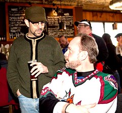
• I don’t think I’ve ever run a photo of Uni Watch webmaster John Ekdahl before (maybe because Saturday marked only the third time he and I have been in the same room). Here he is with his lovely fiancée, Amy. John’s been working hard on some major upgrades to the site, by the way — more news on that front next month.
• Uni Watch design director Scott M.X. Turner wore a characteristically gorgeous vintage flannel jersey, which was probably my favorite garment of the entire event.
• Here‘s Uni Watch librarian Carrie Klein and Uni Watch First Lady Kirsten Hively (aka Collateral Gammage), enjoying the late-afternoon sunlight.
• I was genuinely thrilled to have MLB logo designer Jerry Dior in attendance. We’ve been communicating for several months now, but this was my first chance to meet him in person, and it was no surprise to find that he’s a complete gentleman.
• In an odd coincidence, Scott Huston (wearing an awesome Cedar Rapids Reds jersey) actually worked with Jerry for two days several years ago. “He said he’d designed the MLB logo, so the next day I was going to have him autograph a ball for me,” said Scott. “But when I came in that day, he was gone — they said he’d retired!” Scott made the most of this second chance by bringing ball along to the party, which Jerry was happy to sign.
• Matt Powers has been so inspired by our recent DIY posts that he stayed up until 3am the night before the party making this Princeton hoodie sweatshirt, complete with NOB and vintage-style helmet striping. He promises to provide step-by-step photos of his next DIY project.
• Here’s Ed Hahn, looking sharp in a 1936 Tokyo Giants reproduction (with kanji on the back). Underneath, he had a Brownie T-shirt, plus he brought along a Cleveland Crusaders tee. (Ed also took a bunch of photos, including the one at the top of this page; you can see more of his shots here.)
• This is longtime contributor Bill Blevins, who paired his OSU windbreaker with an Aussie football cap (because his better half is from Melbourne, he explained).
• Brad Eckensberger wore a Braves jersey with a vertically arched NOB. Am I the only one who thinks the nameplate fabric is flaring out too far at the ends?
• I loved Ryan Swift‘s 2002 Rochester Red Wings jersey. Beautiful script.
• While the rest of us were sucking down beers, the always-sophisticated Giancarlo calmly sipped martinis. His shirt spells out “Miami Dolphins,” phonetically, in Hebrew.
• Alan Tompas looked my-t-fine in a Dan Fouts Chargers jersey, complete with silver anniversary patch.
• You know that raffle ticket image I always use? That was designed and submitted about two years ago by reader Ben Thoma, who I was happy to meet. He was wearing a shirt from his U. of Delaware club team, the Ligatures. (If you don’t know what a ligature is, look here, and then look at Ben’s shirt again.)
• Geekiest Shirt of the Day award goes to Jay Braiman, who wore a Klingon hockey jersey.
• Here’s Marc Rivlin, wearing a Mets logo I hadn’t seen before.
• Some beer spilled on my notes, so I’m not positive I’m getting this person‘s last name right, but I think she’s Jordyn Lextor (Jordyn, if I’m getting that wrong, please let me know and I’ll correct it). She wore a really cool Turkish soccer jersey, featuring some excellent patches.
• Jordyn came with her buddy Alex Gelman, who wore a 1967 Franklin & Marhsall club soccer shirt with a great Johnny collar and a cool number font. They made a super-cute couple (although I think they later said they’re not actually a couple, but whatever).
• If you’re gonna wear a plain Penn State jersey, it’s nice to dress it up a bit with an Orange Bowl patch. That’s Chris Burket.
• Ross Bergman said his Mt. Olympus jersey (with mythologically appropriate NOB) was from a summer camp team he played on.
• I really liked how Morgan Doninger‘s Cornwall Aces jersey had a fleur de lis on one shoulder and a flower on the other (to represent Cornwall’s French- and English-speaking populations, he explained).
• Steve Blum wore a killer No Mas tee and a 1917 Phillies cap. “This cap is like camouflage,” he said. “I can wear it in New York or Boston without people giving me shit.”
• Mets by the Numbers honcho Jon Springer made a brief appearance (that’s him on the left), just long enough for the two of us to grouse about the Mets’ sleeve patch.
• This is John Boras, who wore a classic John Riggins jersey.
• John brought along several of his buddies, including Hobie Price, Marc Levinson (that’s a Dan Marino Pitt jersey), and Rob Lapidus (who laughed when I noted that his drink of choice didn’t match his jersey).
• I’m sorry I didn’t get this guy‘s name before he left. Fortunately, his excellent Macon Whoopee jersey speaks for itself. Update: Turns out it’s Pete(r) Bonavita.
• As for me, I was a pretty happy fella.
Finally, there’s this: There was a middle-aged couple sitting at one of the tables. The woman — I think her name was Fern Devlin — noticed all the people in jerseys and said to somebody (I believe Alex Gelman), “What is this, a Uni Watch party?” Turns out she reads the site but hadn’t been keeping up with it lately, so she was unaware of the party and just happened to be on hand for the proceedings. Uni-kismet!
Uni Watch News Ticker: Just what the world needs: a Steelers-themed bar mitzvah (with thanks to Mike Edgerley). ”¦ Extremely amusing eBay item here. ”¦ Westminster Salmonbellies strike again! Not sure what year that’s from, but it sure is purdy (with thanks to Mike Hersh). ”¦ Reprinted from yesterday’s comments: I’ve previously run photos of Charlie Hayes wearing this mask and this mask. But now Glenn Chavez has provided a photo of the actual hardware, which was displayed at the Rockies’ recent fan-fest event. ”¦ Party follow-up from Alan Tompas, who writes: “A few of the guys at the party and I had a debate over whether the Mets ever wore an interlocking-NY jersey logo. I took this picture at the Vet back on July 4, 1983. It’s a batting practice jersey.” Bill Henderson’s compendium provides some info on this design, and also lists as this and this. I like that last one a lot. ”¦ Oral Roberts is gonna keep wearing their gold hoops uniforms until they lose (thanks, Phil). ”¦ Leicester City, a UK soccer team, will go sponsor-free as part of their 125th-anniversary celebrations (with thanks to Peter Schinkai). ”¦ Erkki Corpuz notes that the UCLA gymnastics team wore pink warm-up tees and pink-trimmed leotards on Sunday, and Cal wore pink leotards. ”¦ Also from Erkki: The UCLA swim team still uses the school’s old script. ”¦ Here’s a new one: denim-trimmed baseball gloves (with thanks to KJ Kearney). ”¦ Check out the two jerseys in this shot. Those are the uniforms for the upcoming NBA Rookies/Sophomores game, which will be played as part of the All-Star festivities. Man, is the one on the left an example of rookie hazing or what? Further details here (with thanks to Jordan Alpert). ”¦ Anyone ever seen these before? They’re part of this catalog. ”¦ Speaking of vintage catalogs, I love the cover design on this one. ”¦ Larry Bodnovich sent along a bunch of old color-on-color college football shots, including Pitt vs. Oklahoma, Ohio State vs. Cal (here’s an additional shot), and Princeton vs. Columbia, plus he also contributed a shot from the first-ever USC/Minnesota game in 1953. ”¦ Bizarre scene in the Caribbean World Series, as the Gigantes del Cibao went N#OB — that’s no number on back (and yes, those appear to be some odd shenanigans going on there). They had numbers on the front, however (very interesting find by Morris Levin). ”¦ I’m pretty sure I’ve linked to this before, but if you scroll down about toward the bottom of this page, you’ll get Brooks Robinson’s explanation for why he wore the short helmet brim (with thanks to Ben Traxel). ”¦ Paul Barrett and Doug McConnell sent along team portraits from the 1991 Carolina League All-Star Game — Northern Division (the teams are Prince William Cannons [NYY], the Lynchburg Red Sox [BOS], the Salem Buccaneers [PIT], and the Frederick Keys [BAL]) and Southern Division (Kinston Indians [CLE], Winston-Salem Spirits [CHC], Durham Bulls [ATL], and Peninsula Pilots [SEA]). ”¦ What do you do if your team goes 0-16? The answer comes from Jacob Brooks, who writes: “I heard on the radio Monday that the Detroit Lions are going to have (or are working on) a new logo for next year. Something more ferocious.” That sounds, uh, wonderful. ”¦ I really wish they wouldn’t do this. ”¦ Remember my recent post about Sidney Crosby’s lace bite? According to this story, Peter Taglianetti had the same problem and solved with plastic baggie filled with peanut butter (strange-but-true contribution from Matthew Sampson). ”¦ Interview with Todd Radom here.
Last night, at the start of the second quarter of the Timberwolves-Bucks game, the Bucks had these players on the court: Francisco Elson (#9), Tyronn Lue (#10), Joe Alexander (#11), Luc Richard Mbah a Moute (#12), and Luke Ridnour (#13).
Tulsa’s gonna keep wearing their gold hoops uniforms until they lose (thanks, Phil).
The article is about Oral Roberts, not Tulsa.
[quote comment=”311997″]Tulsa’s gonna keep wearing their gold hoops uniforms until they lose (thanks, Phil).
The article is about Oral Roberts, not Tulsa.[/quote]
Duh. Fixed. Thanks.
Notice that in this photo….
link
…Pitt ball carrier Bobby Epps has white laces in his cleats. That was pretty damn flashy for that era. I took a quick look through all the great color photos in this set and I believe those are the only white laces on anyone. I may have missed one, but that’s sort of the point…not many.
I love those color game photos of that era. SOOOOO hard to find. Big “thank you”, Larry.
—Ricko
link
Interesting that the above letters and numbers are reversed from those below.
link
They wore both on the road?
link
That’s like the Wisconsin-Illinois basketball game that Paul said a few days ago was the worst color-on-color game ever.
Ah, great photos! One day I will cross two bridges to get to a Uni Watch party. Paul, please consider a UW get-together in Hoboken or Montclair…or hell, even Newark for that old-school flavor.
A new Lions logo!? How about if they, in the words of Al Davis, “Just win baby!” That lion will look more ferocious with each win. (And for christ’s sake, ditch the black facemask and trim on the uniform).
[quote comment=”312001″]http://farm4.static.flickr.com/3093/3229138061_56466817f9_b.jpg
That’s like the Wisconsin-Illinois basketball game that Paul said a few days ago was the worst color-on-color game ever.[/quote]
Not quite as bad, LOL. Photo’s a little pink. Makes Pitt’s old gold look orange. So in person may have looked pretty good, actually. Navy-gold vs. Red-white.
You’re right — I thought that was Illinois for a second, but it’s Pitt. Plus, the jerseys are blue, so there’s a better contrast with the red jerseys.
Looks like NCAA basketball follows this old rule allowing color on color, but football still requires one team in white shirts.
[quote]Westminster Salmonbellies strike again![/quote]
Awesome jersey!
I still dont get the ligature thing…
Oklahoma looks more like Nebraska in that photo. Note the white helmets.
Last night while watching the Marquette Notre Dame game, did anyone notice the Marquette System of Dress unis? Since Converse is owned by Nike it appears that Converse obviously will use the same uniform technology.
Regarding these toys: link
I still have the Jets version (lower right portion of screen) – I remove the helmet and throw it at the TV whenever they play badly. Come to think of it, the damned thing has probably travelled for more yards over the last 20+ years than Browning Nagle threw for in his career – AARRGGH!!
Ah…now I feel better
Here is a link of the Marquette unis.
link
I like your sweater in that photo, Paul. Am I correct in assuming you got it at a vintage store?
The flower on the Cornwall Aces jersey is a white trillium, Ontario’s official flower. More info here: link
What is going on with the older logos on the wall? Can anyone identify the ones surrounding the Pistons logo? link
Maybe the Kings are the shield? I am befuddled.
yeah i have seen t hose “Huddles” before… the plush mascots with the helmet. My brother had a Bengals one because he collected Tiger stuff (our local schools mascot)…not because he liked the Bengals. I guess my mom thought i needed one too,so i had a Lions one.
oops heres the link for my ? above.
link
Any other band geeks disappointed when they clicked the “ligature” shirt and did not see this link ?
The Lions do need a new helmet logo. The one they have now looks more like an amoeba than a lion…
“Elise picked out a red and white color theme for the wedding, y’know napkins, tablecloths, bridesmaids, whole bit. Anyway, Eddie insisted on blue and white. Colts colors. He refused to give in.”
“So.”
“Well, you know how stubborn Eddie is.”
“Could have been worse. Could have been black and gold. Steelers colors.”
[quote comment=”312013″]What is going on with the older logos on the wall? Can anyone identify the ones surrounding the Pistons logo? link
Maybe the Kings are the shield? I am befuddled.[/quote]
The shield seems to say ROYALS, so Kansas City Royals, who became the Kings?
duh, I meant Cincinnati Royals
Being a Rochester resident, I love that someone wore a Red Wings jersey to the party!
I do like that jersey a lot better than their current road uni, seen here:
link
But, I have always been a fan of the ball/wing logo.
[quote comment=”312016″]Any other band geeks disappointed when they clicked the “ligature” shirt and did not see this link ?[/quote]
when i first read ligature all i could think was, what the hell instrument uses that?
I guess we all kinda knew Paul was a commie, but I didn’t know that he DRESSED like a commie! Ironic, because last night our local Fox station had the Seinfeld where Elaine’s commie boyfried recruited Kramer. Hilarious!
What is the pattern on those Freshman jerseys for the NBA All Star game thing? Are they pentagons? If they are pentagons, why?
Suns in front of stars on the rookie jerseys.
Looks like a good Uni Party. My faves are the Rochester jersey, old Phillies cap, and the Powers DIY hoodie.
if you read link, towards the end, Tom Lewand (team president) mentions changing the logo and uniform in 2010
Looks like it was a great day in Brooklyn. What is it about streaks of sunlight in a bar that looks so damn good?
[quote comment=”312010″]Here is a link of the Marquette unis.
link
Yea, that’s what I’m talkin’ ’bout.
Actually, those Marquette unis would probably look better without the yellow bit on the shoulders.
Brooks also sometimes wore that short brim helmet without the cartoon bird logo. I’m not sure how often. I used to watch him as a kid, and these things didn’t stand out. MASN plays classic O’s games and the birdless helmet appears in the ’70 Series.
MLB.com has highlights of the series and the birdless helmet appears in the opening montage and at about 6:50 into the clip when Brooks hits a home run.
’70 World Series Highlights
[quote comment=”312012″]The flower on the Cornwall Aces jersey is a white trillium, Ontario’s official flower. More info here: link
Also, the Aces were the Nordiques AHL farm team, so the fleur-de-lis is for them as much as the French heritage.
Anyone with even a modicum of style knows the original coyote jersey is vastly superior to the red and beige border collie they wear now.
Yo, Paul, Thanks for mentioning us and for spelling my name right. We had a great time at the party and the “Uni-kismet” made it even better. Rock on. — Fern Devlin
Man, I love those old Durham Bulls uniforms. So simple, yet you’re able to immediately pick them out of a crowd when you see them.
Kinda makes me wish the team nowadays would ditch their vests and go back to the sleeves.
[quote comment=”312007″]Oklahoma looks more like Nebraska in that photo. Note the white helmets.[/quote]
Here’s a pic of Tommie Harris sportin’ the throwbacks in the 2003 opener against UNT.
link
I was clicking around Google Earth today, and happened to notice that link has already begun.
Why am I posting this? The dudes are completely dressed up like medieval warriors! In the middle of Pittsburgh!
[quote comment=”312030″]Actually, those Marquette unis would probably look better without the yellow bit on the shoulders.[/quote]
For Converse (NIKE) I actually think there unis are one of the best in D-1, very origional. Also Arizona State has pretty origional unis.
[quote comment=”312033″]Anyone with even a modicum of style knows the original coyote jersey is vastly superior to the red and beige border collie they wear now.[/quote]
Not that there is anything wrong with a red and “beige” border collie. This is my boy Nemesis.
Forgot my link.
link
Everyone remembers the huddle mascots from the NFL!
Alot of teams also used them as on the field mascots. I think my cousin-who was a huge Cowboys fan-has the Dallas huddle. They were cool. I remember seeing them in stores then on the sidelines!!
Nice work in finding that Paul!!
[quote comment=”312037″]I was clicking around Google Earth today, and happened to notice that link has already begun.
Why am I posting this? The dudes are completely dressed up like medieval warriors! In the middle of Pittsburgh![/quote]
teebz, buddy…
sometimes you really frighten me :o)
[quote comment=”312016″]Any other band geeks disappointed when they clicked the “ligature” shirt and did not see this link ?[/quote]
Yes. I’m a jazz vibraphonist at McGill (my name links to my MySpace, with audio and video, if you’re interested), and my roommate is a saxophonist. So I automatically expected that kind of ligature.
[quote comment=”312036″][quote comment=”312007″]Oklahoma looks more like Nebraska in that photo. Note the white helmets.[/quote]
Here’s a pic of Tommie Harris sportin’ the throwbacks in the 2003 opener against UNT.
link
I remember those thowbacks. They missed the color by the mile on them. Were almost maroon. The Bud Wilkinson-era Sooners wore almost a burgundy red, not even close to as dark as those throwbacks…as evidenced by the Larry’s photo in today’s ticker.
Not saying there were scarlet, just saying they were a long, long way from maroon. By the end of the 60s they had darkened a bit, but the team with the long winning streak wore a much brighter shade. Close to what they wear now, actually.
—Ricko
[quote comment=”312033″]Anyone with even a modicum of style knows the original coyote jersey is vastly superior to the red and beige border collie they wear now.[/quote]
I’ll second that. In some dark recess of my closet, I’ve even got that old away jersey.
link
I’m not saying that it was the best jersey ever, but it was different in a way that said “Hello Southwest” without going over the top.
[quote comment=”312042″][quote comment=”312037″]I was clicking around Google Earth today, and happened to notice that link has already begun.
Why am I posting this? The dudes are completely dressed up like medieval warriors! In the middle of Pittsburgh![/quote]
teebz, buddy…
sometimes you really frighten me :o)[/quote]
Try being me! I was clicking through as me and guy here at work were looking at all the cool images of the arenas and stadiums at work.
I decided to go for a little stroll thanks to Google Maps, and a medieval battle is taking place in Pittsburgh! Who knew?
Homeland security, my ass! LOL
[quote comment=”312042″][quote comment=”312037″]I was clicking around Google Earth today, and happened to notice that link has already begun.
Why am I posting this? The dudes are completely dressed up like medieval warriors! In the middle of Pittsburgh![/quote]
teebz, buddy…
sometimes you really frighten me :o)[/quote]
Teebz frightens you? Medieval gear is odd?
Powers showed up at Sheep Station wearing a hood ornament, for pete’s sake.
link
—Ricko
Pirates uni-related discussion on Yahoo Sports:
link
[quote comment=”312037″]I was clicking around Google Earth today, and happened to notice that link has already begun.
Why am I posting this? The dudes are completely dressed up like medieval warriors! In the middle of Pittsburgh![/quote]
I could be wrong, but except for the shield (and, of course, the Nerf swords) they look more like Samurai to me.
NOOOOOOOOOOOOO!!!!!!!!! Dammit NBA!!!! I absolutely hate all forms of All-Star game uniforms, for any sport. MLB All Stat game and the NBA Rookies vs Sophomores game were the only events that allowed the players to wear their own team uniforms. It creates a cool myriad of colors and designs.
Those uniforms are BLOODY HIDEOUS!!!
[quote comment=”312039″][quote comment=”312033″]Anyone with even a modicum of style knows the original coyote jersey is vastly superior to the red and beige border collie they wear now.[/quote]
Not that there is anything wrong with a red and “beige” border collie. This is my boy Nemesis.[/quote]
Dunno, he looks a little too friendly to be a “Nemesis.”
[quote comment=”312051″][quote comment=”312039″][quote comment=”312033″]Anyone with even a modicum of style knows the original coyote jersey is vastly superior to the red and beige border collie they wear now.[/quote]
Not that there is anything wrong with a red and “beige” border collie. This is my boy Nemesis.[/quote]
It is one of those opposite name things. Like calling a fat guy “Slim.”
Dunno, he looks a little too friendly to be a “Nemesis.”[/quote]
[quote comment=”312052″][quote comment=”312051″][quote comment=”312039″][quote comment=”312033″]Anyone with even a modicum of style knows the original coyote jersey is vastly superior to the red and beige border collie they wear now.[/quote]
Not that there is anything wrong with a red and “beige” border collie. This is my boy Nemesis.[/quote]
It is one of those opposite name things. Like calling a fat guy “Slim.”
Dunno, he looks a little too friendly to be a “Nemesis.”[/quote][/quote]
Let me try this again. It is an opposite name thing. Like calling a fat guy “Slim.”
Sheesh! Leave it to Jerry Reinsdorf to make a few bucks in a sleezy way. All this Obama product pushing is starting to making me sick. It’s bad enough, every other edition, the Chicago Sun Times prints out “high quality” 11 x 7 photos of Obama. You see these photos hung in buisnesses like he’s Mao Zedong.
Any word on Purdue’s new BBall jersey. I assume that they will be like this link and have the gold and white strips up the sides.
[quote comment=”312049″]
I could be wrong, but except for the shield (and, of course, the Nerf swords) they look more like Samurai to me.[/quote]
Perhaps Tom Cruise wasn’t the last samurai.
Thanks, I’ll be here all week.
[quote comment=”312014″]yeah i have seen t hose “Huddles” before…
the plush mascots with the helmet. My brother had a Bengals one because he collected Tiger stuff (our local schools mascot)…not because he liked the Bengals. I guess my mom thought i needed one too,so i had a Lions one.[/quote]
I have the complete card set…lots of doubles if anyones interested…
No picture but spotted a man (read:40) wearing a Phillies cap with the flip down earflap a la Jimmy Rollins in the World Series. I mean, we got a little dusting of snow last night, but is that an excuse? I say no.
Speaking of lace bite, I was watching some of the NHL All Star Pre-game stuff and saw an interview with CBJs Rick Nash and he was going over his equipment and showed that he wears something like tights over his socks on his feet with padding in the front to prevent lace bite. Also had padding on sides and back for rubbing.
that OSU vs Cal photo makes me want to see an OSU vs Michigan game thats color on color. i think the NCAA should allow this one or two times a year for really big games.
“a 1917 Phillies cap. “This cap is like camouflage,” he said. “I can wear it in New York or Boston without people giving me shit.””
Why would someone in Boston give you shit for wearing a Phillies hat? I’ve been going to Fenway Park for decades, and just so you know, we don’t care what hat you’re wearing, unless it’s a Yankee hat. The only time Red Sox fans at Fenway would give shit to another non-Yankee team’s fans, is if they’re being obnoxious, like, turning around, taunting the home fans.
So Steve, please, feel free to wear your regular Phillies hat around Boston–in fact, most Sox fans I know including myself were rooting for Philly in the World Series. But even if we weren’t, all of our hatred goes in one direction, and it’s not yours.
It’s Super Bowl Media Day, kids. Who psyched up waiting for the next Brian-Urlacher-fined-for-wearing-Vitamin-Water-hat incident?
Also, check out this high-schooler hockey player who’s trying to design “camouflage” goalie pads. That should give the folks in the Hockey Wing something to chew on.
link
Lace bite — I wouldn’t raise too much talk about it. Seeing the way equipment is going, I wouldn’t be surprised if we see link system, or something like it, soon.
I’m not even kidding.
[quote comment=”312062″]Also, check out this high-schooler hockey player who’s trying to design “camouflage” goalie pads. That should give the folks in the Hockey Wing something to chew on.
link
I think we talked about that yesterday.
And not that it matters…I was under the impression that Phil was like, late twenties. Huh. Must have missed that one.
I’m not going to go all “Scott In Erie” and put you down though, buddy. :)
[quote comment=”312014″]yeah i have seen t hose “Huddles” before…
the plush mascots with the helmet. My brother had a Bengals one because he collected Tiger stuff (our local schools mascot)…not because he liked the Bengals. I guess my mom thought i needed one too,so i had a Lions one.[/quote]
I didn’t have the actual toys myself, but I do remembered the Huddles were featured in a children’s book — “Runners to the Rescue” — that I wish I still had. As a Packers fan, I remember that the Packers Huddle was a guy in a butcher’s apron, or something like that. I always thought it was kind of lame, but I don’t know how else you’d represent a Packer.
A little help here? Working from memory, I think the last MLB team to wear navy and light gold/yellow was the Boston Bees in about 1939. Is that right?
And, other than the Chargers and original Titans, I don’t think anyone in the NFL has ever worn that combination.
(I am fully prepared for a self-inflicted forehead slap because I forgot someone really obvious.)
—Ricko
[quote comment=”312061″]”a 1917 Phillies cap. “This cap is like camouflage,” he said. “I can wear it in New York or Boston without people giving me shit.””
Why would someone in Boston give you shit for wearing a Phillies hat? I’ve been going to Fenway Park for decades, and just so you know, we don’t care what hat you’re wearing, unless it’s a Yankee hat. The only time Red Sox fans at Fenway would give shit to another non-Yankee team’s fans, is if they’re being obnoxious, like, turning around, taunting the home fans.
So Steve, please, feel free to wear your regular Phillies hat around Boston–in fact, most Sox fans I know including myself were rooting for Philly in the World Series. But even if we weren’t, all of our hatred goes in one direction, and it’s not yours.[/quote]
that direction is the “Devil”, should have been contracted, Rays, ever since Game 7 of the ’04 ALCS, it’s just not the same
[quote comment=”312066″]A little help here? Working from memory, I think the last MLB team to wear navy and light gold/yellow was the Boston Bees in about 1939. Is that right?
And, other than the Chargers and original Titans, I don’t think anyone in the NFL has ever worn that combination.
(I am fully prepared for a self-inflicted forehead slap because I forgot someone really obvious.)
—Ricko[/quote]
Don’t the Brewers pretty much wear navy and light gold?
[quote comment=”312064″]Lace bite — I wouldn’t raise too much talk about it. Seeing the way equipment is going, I wouldn’t be surprised if we see link system, or something like it, soon.
I’m not even kidding.[/quote]
wouldn’t the wheels slip on the ice tho?
[quote]And not that it matters…I was under the impression that Phil was like, late twenties. Huh. Must have missed that one.
I’m not going to go all “Scott In Erie” and put you down though, buddy. :)[/quote]
what? i don’t look late 20’s to you?
[quote comment=”312068″][quote comment=”312066″]A little help here? Working from memory, I think the last MLB team to wear navy and light gold/yellow was the Boston Bees in about 1939. Is that right?
And, other than the Chargers and original Titans, I don’t think anyone in the NFL has ever worn that combination.
(I am fully prepared for a self-inflicted forehead slap because I forgot someone really obvious.)
—Ricko[/quote]
Don’t the Brewers pretty much wear navy and light gold?[/quote]
Yeah, thought of them. Close, but nope. Old gold, Vegas gold. Shiny. I’m talking more like West Virginia or Cal.
Hasn’t anyone figured out the Brewers gold is pretty much the uni equivalent of beer? Light beer, maybe, but beer. LOL
wouldn’t the wheels slip on the ice tho?
I knew I was setting myself up for that. *eyeroll*
[quote comment=”312025″]Suns in front of stars on the rookie jerseys.[/quote]
They look like bullet holes to me…and that would definitely fall under rookie hazing!
[quote comment=”312070″][quote comment=”312068″][quote comment=”312066″]A little help here? Working from memory, I think the last MLB team to wear navy and light gold/yellow was the Boston Bees in about 1939. Is that right?
And, other than the Chargers and original Titans, I don’t think anyone in the NFL has ever worn that combination.
(I am fully prepared for a self-inflicted forehead slap because I forgot someone really obvious.)
—Ricko[/quote]
Don’t the Brewers pretty much wear navy and light gold?[/quote]
Yeah, thought of them. Close, but nope. Old gold, Vegas gold. Shiny. I’m talking more like West Virginia or Cal.
Hasn’t anyone figured out the Brewers gold is pretty much the uni equivalent of beer? Light beer, maybe, but beer. LOL[/quote]
The Rams had navy blue helmets with yellow horns from ’79-99, even though the jerseys were royal blue. Same with the Giants for many many years; navy blue helmet, royal blue jersey.
You’re right, though, navy and yellow-gold is a rare, albeit attractive, combo. I love the old Titans design.
[quote comment=”311999″]Notice that in this photo….
link
…Pitt ball carrier Bobby Epps has white laces in his cleats. That was pretty damn flashy for that era. I took a quick look through all the great color photos in this set and I believe those are the only white laces on anyone. I may have missed one, but that’s sort of the point…not many.
I love those color game photos of that era. SOOOOO hard to find. Big “thank you”, Larry.
—Ricko[/quote]
Looking at the USC-Minnesota pic…of course, the obvious thing is that the RB has one of the clear, plastic face masks…along with one of the defenders and maybe another UM teammate.
But as for this being a color photo, I’m not sure…looks like a colored photo to me. Looking at the crowd it looks like they’re all white except for a few splotches of red that may have been added by the person doing the colorization. Even the stadium features above the bottom of the wall at the level of the playing field appear to be B/W.
[quote comment=”312042″][quote comment=”312037″]I was clicking around Google Earth today, and happened to notice that link has already begun.
Why am I posting this? The dudes are completely dressed up like medieval warriors! In the middle of Pittsburgh![/quote]
teebz, buddy…
sometimes you really frighten me :o)[/quote]
That seems more like Japanese Samurai to me… people do that stuff in Central Park and Washington Square Park in NYC
One other interesting thing from the Rockies FanFest over the weekend uni related. During a Q&A with the Rockies outfielders, newcomer Carlos Gonzales (acquired from Oakland in the Matt Holliday trade) was asked what he was most-looking forward to here playing in Colorado. His response?:
“Not wearing white shoes”
[quote comment=”312070″][quote comment=”312068″][quote comment=”312066″]A little help here? Working from memory, I think the last MLB team to wear navy and light gold/yellow was the Boston Bees in about 1939. Is that right?
And, other than the Chargers and original Titans, I don’t think anyone in the NFL has ever worn that combination.
(I am fully prepared for a self-inflicted forehead slap because I forgot someone really obvious.)
—Ricko[/quote]
Don’t the Brewers pretty much wear navy and light gold?[/quote]
Yeah, thought of them. Close, but nope. Old gold, Vegas gold. Shiny. I’m talking more like West Virginia or Cal.
Hasn’t anyone figured out the Brewers gold is pretty much the uni equivalent of beer? Light beer, maybe, but beer. LOL[/quote]
I think you’re right Ricko. I can only think of color combos that are more royal and yellow: early Brewers, Mariners first “S” cap, old Rams unis – although their helmet was more navy/yellow…
link
link comment=”312070″][quote comment=”312068″][quote comment=”312066″]A little help here? Working from memory, I think the last MLB team to wear navy and light gold/yellow was the Boston Bees in about 1939. Is that right?
And, other than the Chargers and original Titans, I don’t think anyone in the NFL has ever worn that combination.
(I am fully prepared for a self-inflicted forehead slap because I forgot someone really obvious.)
—Ricko[/quote]
Don’t the Brewers pretty much wear navy and light gold?[/quote]
Yeah, thought of them. Close, but nope. Old gold, Vegas gold. Shiny. I’m talking more like West Virginia or Cal.
Hasn’t anyone figured out the Brewers gold is pretty much the uni equivalent of beer? Light beer, maybe, but beer. LOL[/quote]
Boston (NL) and Philly both wear blue and gold in 1938, but it looks more royal than navy. Braves were back to red and navy in 1939.
link
link
I always liked the Coyotes cubist logo, and I don’t really understand the criticism of it. It ties together the team name and Native American heritage of the area. I think the current logo is a step down.
[quote comment=”312065″][quote comment=”312014″]yeah i have seen t hose “Huddles” before…
the plush mascots with the helmet. My brother had a Bengals one because he collected Tiger stuff (our local schools mascot)…not because he liked the Bengals. I guess my mom thought i needed one too,so i had a Lions one.[/quote]
I didn’t have the actual toys myself, but I do remembered the Huddles were featured in a children’s book — “Runners to the Rescue” — that I wish I still had. As a Packers fan, I remember that the Packers Huddle was a guy in a butcher’s apron, or something like that. I always thought it was kind of lame, but I don’t know how else you’d represent a Packer.[/quote]
Had to look this one up. Equipped with sausage links:
link
[quote comment=”312077″][quote comment=”312070″][quote comment=”312068″][quote comment=”312066″]A little help here? Working from memory, I think the last MLB team to wear navy and light gold/yellow was the Boston Bees in about 1939. Is that right?
And, other than the Chargers and original Titans, I don’t think anyone in the NFL has ever worn that combination.
(I am fully prepared for a self-inflicted forehead slap because I forgot someone really obvious.)
—Ricko[/quote]
Don’t the Brewers pretty much wear navy and light gold?[/quote]
Yeah, thought of them. Close, but nope. Old gold, Vegas gold. Shiny. I’m talking more like West Virginia or Cal.
Hasn’t anyone figured out the Brewers gold is pretty much the uni equivalent of beer? Light beer, maybe, but beer. LOL[/quote]
I think you’re right Ricko. I can only think of color combos that are more royal and yellow: early Brewers, Mariners first “S” cap, old Rams unis – although their helmet was more navy/yellow…
link
How close were the Packers’ uniforms when they wore a darker blue rather than green?
Seattle Pilots and the Brewers from 70s and 80s had blue and yellow-gold, but it’s definitely more royal than navy.
link
What about Milwaukee’s 1994 threads? Is the gold still too sparkly?
link
1990s Astros had the old gold w/ navy. Man, Ricko has stumbled onto something here. A team could definitely carve out a niche with navy and yellow gold in MLB.
San Diego’s gold is less “bass boat” than Milwaukee’s, but it’s still nothing approaching yellow-gold.
[quote comment=”312037″]I was clicking around Google Earth today, and happened to notice that link has already begun.
Why am I posting this? The dudes are completely dressed up like medieval warriors! In the middle of Pittsburgh![/quote]
You’ll notice that it’s taking place close to some hospitals.
I’d guess those are SCA (Society of Creative Anachronism) people. Pittsburgh is or was part of the debatable lands and the SCA people would fight every year to decide who had to take Pittsburgh.
Not to nit pick but the Salmonbellies play in
NEW Westminster, not just Westminster.
It is a suburb of Vancouver BC.
[quote comment=”312081″][quote comment=”312077″][quote comment=”312070″][quote comment=”312068″][quote comment=”312066″]A little help here? Working from memory, I think the last MLB team to wear navy and light gold/yellow was the Boston Bees in about 1939. Is that right?
And, other than the Chargers and original Titans, I don’t think anyone in the NFL has ever worn that combination.
(I am fully prepared for a self-inflicted forehead slap because I forgot someone really obvious.)
—Ricko[/quote]
Don’t the Brewers pretty much wear navy and light gold?[/quote]
Yeah, thought of them. Close, but nope. Old gold, Vegas gold. Shiny. I’m talking more like West Virginia or Cal.
Hasn’t anyone figured out the Brewers gold is pretty much the uni equivalent of beer? Light beer, maybe, but beer. LOL[/quote]
I think you’re right Ricko. I can only think of color combos that are more royal and yellow: early Brewers, Mariners first “S” cap, old Rams unis – although their helmet was more navy/yellow…
link
How close were the Packers’ uniforms when they wore a darker blue rather than green?
Link added: link
[quote comment=”312083″]1990s Astros had the old gold w/ navy. Man, Ricko has stumbled onto something here. A team could definitely carve out a niche with navy and yellow gold in MLB.
San Diego’s gold is less “bass boat” than Milwaukee’s, but it’s still nothing approaching yellow-gold.[/quote]
[quote comment=”312083″]1990s Astros had the old gold w/ navy. Man, Ricko has stumbled onto something here. A team could definitely carve out a niche with navy and yellow gold in MLB.
San Diego’s gold is less “bass boat” than Milwaukee’s, but it’s still nothing approaching yellow-gold.[/quote]
LOL. Yup, always figured–based on locale and lifetstyle—Padres wear Navy & Sand; Brewers Navy & Light Beer (or, okay, barley or whatever that is in shiny thread underscoring the “M” on the hat).
Actually, I brought this up cuz was thinking of the “40 years and no identity” for the Rangers.
Also, no one in MLB has ever worn Maroon/Burgundy & Gold (except the Rays last season in their St. Pete Pelicans unis from the senior league).
—Ricko
[quote comment=”312081″][quote comment=”312077″][quote comment=”312070″][quote comment=”312068″][quote comment=”312066″]A little help here? Working from memory, I think the last MLB team to wear navy and light gold/yellow was the Boston Bees in about 1939. Is that right?
And, other than the Chargers and original Titans, I don’t think anyone in the NFL has ever worn that combination.
(I am fully prepared for a self-inflicted forehead slap because I forgot someone really obvious.)
—Ricko[/quote]
Don’t the Brewers pretty much wear navy and light gold?[/quote]
Yeah, thought of them. Close, but nope. Old gold, Vegas gold. Shiny. I’m talking more like West Virginia or Cal.
Hasn’t anyone figured out the Brewers gold is pretty much the uni equivalent of beer? Light beer, maybe, but beer. LOL[/quote]
I think you’re right Ricko. I can only think of color combos that are more royal and yellow: early Brewers, Mariners first “S” cap, old Rams unis – although their helmet was more navy/yellow…
link
How close were the Packers’ uniforms when they wore a darker blue rather than green?[/quote]
Stupid tags…trying again…
Link added: link
Also this link for the Packers’ uniform history discusses navy/yellow and navy/gold for the Packers. link
re: Packers in Navy and Yellow Gold during, and after, the Don Hutson years.
See, told ya I was prepared for a self-inflicted forehead smack for forgetting one.
SMACK!
—Ricko
[quote comment=”312054″]Sheesh! Leave it to Jerry Reinsdorf to make a few bucks in a sleezy way. All this Obama product pushing is starting to making me sick. It’s bad enough, every other edition, the Chicago Sun Times prints out “high quality” 11 x 7 photos of Obama. You see these photos hung in buisnesses like he’s Mao Zedong.[/quote]
I don’t think it matters who’s in office nowadays, there will be somebody pushing products. I remember buying some right-leaning bumper stickers (not to put on my car, I hate that) and it came with my very own George W. Bush innaugural cigar.
i have the cowboys and rams plush toys still somewhere in the garage. the rams toy was nice with the horns sticking out of the helmet and the cowboy had velvet boots
Leinart probably made sure to start his media session with Maria Menounos
link
a good look at the Super Bowl patch on the Cardinals unis:
link
[quote comment=”312044″][quote comment=”312036″][quote comment=”312007″]Oklahoma looks more like Nebraska in that photo. Note the white helmets.[/quote]
Here’s a pic of Tommie Harris sportin’ the throwbacks in the 2003 opener against UNT.
link
I remember those thowbacks. They missed the color by the mile on them. Were almost maroon. The Bud Wilkinson-era Sooners wore almost a burgundy red, not even close to as dark as those throwbacks…as evidenced by the Larry’s photo in today’s ticker.
Not saying there were scarlet, just saying they were a long, long way from maroon. By the end of the 60s they had darkened a bit, but the team with the long winning streak wore a much brighter shade. Close to what they wear now, actually.
—Ricko[/quote]
That game was in a down pour so it did make them even darker.
Also OU is crimson & cream, not maroon…we OU fans are touchy when it comes to that as Nebraska (scarlet), Arkansas (cardinal), & aTm (maroon) are all teams in the region with various shades of red.
[quote comment=”312009″]Regarding these toys: link
I still have the Jets version (lower right portion of screen) – I remove the helmet and throw it at the TV whenever they play badly. Come to think of it, the damned thing has probably travelled for more yards over the last 20+ years than Browning Nagle threw for in his career – AARRGGH!!
Ah…now I feel better[/quote]
I have two of the Jets from my younger days. One that seems to be the same one as the catalog, and a much larger stuffed one that came with an almost regulation size helmet that could be taken off. When i was little, would play football outside and wear the “huddles” helmet. I believe these were also put on a wide range of items like sheets and the like. if you go to ebay and put in “huddles” and “nfl”, youc an see the wide variety of products available
With regard to the Pirates changing unis to promote that championship feel, the Rangers redesigning their unis, and the Lions thinking about tinkering with their logo after an 0-16 season, check out this comment about the Packers’ proposed uniform changes for the 1994 season (taken from the 1993 entry at this site: link
This re-design was never implemented. Ron Wolf was quoted in the St. Petersburg Times, discussing the re-design and explaining his decision to withdraw it:
“I never liked the yellow color in the Packers scheme,” Wolf said. “NFL books say it’s ‘green and gold’ but anybody can see it’s a Michigan kind of yellow, of maize, which didn’t sit well with me.
“I put together a proposal to change Green Bay uniforms, replacing the yellow with a gold much like we see on Rams uniforms and helmets. There were some other changes but I wasn’t messing with the “G’ on Packers helmets.
“Everything was approved by the seven-member executive committee that operates the Packers. All I had to do was give the go-ahead.
“I repeatedly looked over drawings of the new Packers uniform, thinking I would soon be pulling the trigger on changes. But, after a little more thought, decided it just didn’t fly. We needed to fix what was truly broken. What we really had to have was better people on the field.”
HELLO, Pirates??? HELLO, Lions??? HELLO, Rangers??? Anyone home??? Anyone Listening???
Y’know, the website link just keeps gettin’ better every day.
They just added the full history of the scotland kit from 1982-present.
[quote comment=”312098″]Y’know, the website link just keeps gettin’ better every day.
They just added the full history of the scotland kit from 1982-present.[/quote]
I MEANT 1872-present!!!
Wow…I am starting the Atkins, South Beach, Scarsdale, and whatever other diet is out there right now!
It is official, I have become that guy!
Great time was had by all…and I am working on DIY #2 right now. If there’s a snow day tomorrow, good chances I will finish sans the stitching.
[quote comment=”312021″]Being a Rochester resident, I love that someone wore a Red Wings jersey to the party!
I do like that jersey a lot better than their current road uni, seen here:
link
But, I have always been a fan of the ball/wing logo.[/quote]
Thanks! It looks like they’ve switched to a more throwback style road jersey since I’ve moved away from Rochester. I’m glad I grabbed this one before I left!
[quote comment=”312070″][quote comment=”312068″][quote comment=”312066″]A little help here? Working from memory, I think the last MLB team to wear navy and light gold/yellow was the Boston Bees in about 1939. Is that right?
And, other than the Chargers and original Titans, I don’t think anyone in the NFL has ever worn that combination.
(I am fully prepared for a self-inflicted forehead slap because I forgot someone really obvious.)
—Ricko[/quote]
Don’t the Brewers pretty much wear navy and light gold?[/quote]
Yeah, thought of them. Close, but nope. Old gold, Vegas gold. Shiny. I’m talking more like West Virginia or Cal.
Hasn’t anyone figured out the Brewers gold is pretty much the uni equivalent of beer? Light beer, maybe, but beer. LOL[/quote]
Hey Ricko… what about the L.A./ early St. L Rams? Or are we strictly talking MLB here?
i LOVE ed hahn’s crusaders shirt! great job, ed!
That definitley looked like fun. Hopefully, when I’m back on the East Coast, I can hit up a uniwatch party (perhaps wearing the DIY ‘Hawks jersey I’m currently working on?)
[quote comment=”312100″]Wow…I am starting the Atkins, South Beach, Scarsdale, and whatever other diet is out there right now!
It is official, I have become that guy![/quote]
I’m no slim jim either, but it would appear from pics that you were at least in the bottom 10% on the uniwatch weight scale…
[quote comment=”312102″][quote comment=”312070″][quote comment=”312068″][quote comment=”312066″]A little help here? Working from memory, I think the last MLB team to wear navy and light gold/yellow was the Boston Bees in about 1939. Is that right?
And, other than the Chargers and original Titans, I don’t think anyone in the NFL has ever worn that combination.
(I am fully prepared for a self-inflicted forehead slap because I forgot someone really obvious.)
—Ricko[/quote]
Don’t the Brewers pretty much wear navy and light gold?[/quote]
Yeah, thought of them. Close, but nope. Old gold, Vegas gold. Shiny. I’m talking more like West Virginia or Cal.
Hasn’t anyone figured out the Brewers gold is pretty much the uni equivalent of beer? Light beer, maybe, but beer. LOL[/quote]
Hey Ricko… what about the L.A./ early St. L Rams? Or are we strictly talking MLB here?[/quote]
Rick, what does the NFL style pages say about the Rams blue. I realize the helmet was a very dark or navy blue but the jerseys weren’t, were they?
[quote comment=”312100″]It is official, I have become that guy![/quote]
awwww, matt, don’t be so hard on yourself…you were always “that guy” ;)
[quote comment=”312106″][quote comment=”312102″][quote comment=”312070″][quote comment=”312068″][quote comment=”312066″]A little help here? Working from memory, I think the last MLB team to wear navy and light gold/yellow was the Boston Bees in about 1939. Is that right?
And, other than the Chargers and original Titans, I don’t think anyone in the NFL has ever worn that combination.
(I am fully prepared for a self-inflicted forehead slap because I forgot someone really obvious.)
—Ricko[/quote]
Don’t the Brewers pretty much wear navy and light gold?[/quote]
Yeah, thought of them. Close, but nope. Old gold, Vegas gold. Shiny. I’m talking more like West Virginia or Cal.
Hasn’t anyone figured out the Brewers gold is pretty much the uni equivalent of beer? Light beer, maybe, but beer. LOL[/quote]
Hey Ricko… what about the L.A./ early St. L Rams? Or are we strictly talking MLB here?[/quote]
Rick, what does the NFL style pages say about the Rams blue. I realize the helmet was a very dark or navy blue but the jerseys weren’t, were they?[/quote]
seems to be a bit of variation. you have link which seems kinda royal, but link looks more navy. i defer to ricko for a final say on the matter.
link
Small, but cool article about this year’s FBI/Secret Service charity game. Sweet jerseys, I must admit.
link
[quote comment=”312102″][quote comment=”312070″][quote comment=”312068″][quote comment=”312066″]A little help here? Working from memory, I think the last MLB team to wear navy and light gold/yellow was the Boston Bees in about 1939. Is that right?
And, other than the Chargers and original Titans, I don’t think anyone in the NFL has ever worn that combination.
(I am fully prepared for a self-inflicted forehead slap because I forgot someone really obvious.)
—Ricko[/quote]
Don’t the Brewers pretty much wear navy and light gold?[/quote]
Yeah, thought of them. Close, but nope. Old gold, Vegas gold. Shiny. I’m talking more like West Virginia or Cal.
Hasn’t anyone figured out the Brewers gold is pretty much the uni equivalent of beer? Light beer, maybe, but beer. LOL[/quote]
Hey Ricko… what about the L.A./ early St. L Rams? Or are we strictly talking MLB here?[/quote]
That was royal blue. Yeah, helmets were darker, but so were everyone’s who wore royal: Giants, Chargers… In that ’92 NFL uni specs guide I have, Rams, Giants, Seahawks, Bills, Patriots, Cowboys royal (and maybe others I’m forgetting) all have the same PMS spec for their blue. Lions, Cowboys navy, Broncos are different. As are, of course, Bears, Cowboys navy, Oilers. Dolphins.
Rams have worn navy only with old gold (their current color scheme) and that change came following their SB win.
—Ricko
[quote comment=”312107″][quote comment=”312100″]It is official, I have become that guy![/quote]
awwww, matt, don’t be so hard on yourself…you were always “that guy” ;)[/quote]
O, that’s a given…the fact that I’ve become 142% of “that guy” is what I need to go to work on!
By the way, the Rams jersey is DIY #3!
[quote]Rams have worn navy only with old gold (their current color scheme) and that change came following their SB win.[/quote]
seems to me the rams don’t wear old gold anymore…they really need to ditch the white and especially the blue pants pronto
[quote comment=”312111″][quote comment=”312102″][quote comment=”312070″][quote comment=”312068″][quote comment=”312066″]A little help here? Working from memory, I think the last MLB team to wear navy and light gold/yellow was the Boston Bees in about 1939. Is that right?
And, other than the Chargers and original Titans, I don’t think anyone in the NFL has ever worn that combination.
(I am fully prepared for a self-inflicted forehead slap because I forgot someone really obvious.)
—Ricko[/quote]
Don’t the Brewers pretty much wear navy and light gold?[/quote]
Yeah, thought of them. Close, but nope. Old gold, Vegas gold. Shiny. I’m talking more like West Virginia or Cal.
Hasn’t anyone figured out the Brewers gold is pretty much the uni equivalent of beer? Light beer, maybe, but beer. LOL[/quote]
Hey Ricko… what about the L.A./ early St. L Rams? Or are we strictly talking MLB here?[/quote]
That was royal blue. Yeah, helmets were darker, but so were everyone’s who wore royal: Giants, Chargers… In that ’92 NFL uni specs guide I have, Rams, Giants, Seahawks, Bills, Patriots, Cowboys royal (and maybe others I’m forgetting) all have the same PMS spec for their blue. Lions, Cowboys navy, Broncos are different. As are, of course, Bears, Cowboys navy, Oilers. Dolphins.
Rams have worn navy only with old gold (their current color scheme) and that change came following their SB win.
—Ricko[/quote]
thank for the clarification, sir! the helmet/jersey color mismatch reminds of the uni-clusterf*@k that is the cowboys’ silver.
I’m sure it’s been covered already. Just in case it hasn’t.
link
COLTS! Colts had the same royal blue PMS spec in that ’92 manual.
I knew I was forgetting someone (probably still am, LOL).
—Ricko
[quote comment=”312061″]”a 1917 Phillies cap. “This cap is like camouflage,” he said. “I can wear it in New York or Boston without people giving me shit.””
Why would someone in Boston give you shit for wearing a Phillies hat? I’ve been going to Fenway Park for decades, and just so you know, we don’t care what hat you’re wearing, unless it’s a Yankee hat. The only time Red Sox fans at Fenway would give shit to another non-Yankee team’s fans, is if they’re being obnoxious, like, turning around, taunting the home fans.
So Steve, please, feel free to wear your regular Phillies hat around Boston–in fact, most Sox fans I know including myself were rooting for Philly in the World Series. But even if we weren’t, all of our hatred goes in one direction, and it’s not yours.[/quote]
Not true at all… Sox fans are just as bad as Yankee’s fan… take it from an Orioles/Nationals fan living in Rhode Island ;)
[quote comment=”312087″][quote comment=”312083″]1990s Astros had the old gold w/ navy. Man, Ricko has stumbled onto something here. A team could definitely carve out a niche with navy and yellow gold in MLB.
San Diego’s gold is less “bass boat” than Milwaukee’s, but it’s still nothing approaching yellow-gold.[/quote]
[quote comment=”312083″]1990s Astros had the old gold w/ navy. Man, Ricko has stumbled onto something here. A team could definitely carve out a niche with navy and yellow gold in MLB.
San Diego’s gold is less “bass boat” than Milwaukee’s, but it’s still nothing approaching yellow-gold.[/quote]
LOL. Yup, always figured–based on locale and lifetstyle—Padres wear Navy & Sand; Brewers Navy & Light Beer (or, okay, barley or whatever that is in shiny thread underscoring the “M” on the hat).
Actually, I brought this up cuz was thinking of the “40 years and no identity” for the Rangers.
Also, no one in MLB has ever worn Maroon/Burgundy & Gold (except the Rays last season in their St. Pete Pelicans unis from the senior league).
—Ricko[/quote]
Always thought the Pads could carve out a nice niche with navy blue, scarlet, and gold. San Diego (where I served) is dominated by the Navy (navy blue) and Marines (scarlet), who share gold as a service color. No one else has those colors.
Back then, just about every team that wore a supposedly “royal” helmet actually had Navy (or almost navy) headgear. Only recently have Giants helmets actually been Royal.
Don’t know why, just the way it was. Sam Huff and the guys may have worn royal blue Giants jerseys…but their helmets were navy. Likewise Fouts, Winslow, Chandler and the rest of Air Coryell.
—Ricko
Nice uniform….hers, not his
link
[quote comment=”312109″]link[/quote]
the best part are the ref poses along the right and top
Call me crazy, but the Hokies numbers don’t look maroon!
link
[quote comment=”312108″][quote comment=”312106″][quote comment=”312102″][quote comment=”312070″][quote comment=”312068″][quote comment=”312066″]A little help here? Working from memory, I think the last MLB team to wear navy and light gold/yellow was the Boston Bees in about 1939. Is that right?
And, other than the Chargers and original Titans, I don’t think anyone in the NFL has ever worn that combination.
(I am fully prepared for a self-inflicted forehead slap because I forgot someone really obvious.)
—Ricko[/quote]
Don’t the Brewers pretty much wear navy and light gold?[/quote]
Yeah, thought of them. Close, but nope. Old gold, Vegas gold. Shiny. I’m talking more like West Virginia or Cal.
Hasn’t anyone figured out the Brewers gold is pretty much the uni equivalent of beer? Light beer, maybe, but beer. LOL[/quote]
Hey Ricko… what about the L.A./ early St. L Rams? Or are we strictly talking MLB here?[/quote]
Rick, what does the NFL style pages say about the Rams blue. I realize the helmet was a very dark or navy blue but the jerseys weren’t, were they?[/quote]
seems to be a bit of variation. you have link which seems kinda royal, but link looks more navy. i defer to ricko for a final say on the matter.[/quote]
Does anyone else listen to mike and mike? I think it was jack youngblood who was on talking about breaking his leg in the divisional round and playing the championship game and super bowl with a broken leg.
Picture of the Cardinals end zone at the Super Bowl – with the word link.
Talking about navy and yellow gold for an MLB team. Let’s say, oh, the Rangers….
The Great Lakes Naval Training Station WWII unis might be an okay jumping-off point for a look the Rangers could call distinctly their own.
Not saying JUST like any of this, just that they stir the imagination a little.
link
—Ricko
search “Great Lakes” on that link
[quote comment=”312124″]Picture of the Cardinals end zone at the Super Bowl – with the word link.[/quote]
That’s different. Anyone find a shot of Pittsburgh’s endzone?
[quote comment=”312103″]i LOVE ed hahn’s crusaders shirt! great job, ed![/quote]
If you really want one, call up the guys at Distant Replays – they might have more in their back room.
ed
[quote comment=”312126″]search “Great Lakes” on that link[/quote]
like this then?
I’m trying to figure out which part of the Sooners uniforms are cream, as opposed to white. The pants have to be white since I assume the road jerseys are white. The numbers, NOB looks a little creamish, what about the logo, the facemask???
Maybe it’s because 99% of America had no idea there was an NFL team called the Cardinals, much less that they’re located in Arizona. The other endzone could just have the Steelers’ logo and say “DUH.”
[quote comment=”312049″][quote comment=”312037″]I was clicking around Google Earth today, and happened to notice that link has already begun.
Why am I posting this? The dudes are completely dressed up like medieval warriors! In the middle of Pittsburgh![/quote]
I could be wrong, but except for the shield (and, of course, the Nerf swords) they look more like Samurai to me.[/quote]
If you change the angles it looks more like one samurai (who eventually loses) vs one shielded Celt (or Gael, or Scot or something). Also from the original link, look up. INVASION!
[quote comment=”312129″][quote comment=”312126″]search “Great Lakes” on that link[/quote]
link[/quote]
Yessir. Change lettering to “Rangers” script. Current hat in navy with yellow-gold T with white drop shadow. Yellow-gold numbers edged in navy; navy NOB. Maybe yellow-gold Texas Ranger “star” trimmed in navy on left sleeve. Navy sleeves and stirrups. Black shoes. Interesting look. Sure not like anyone else.
Roads gray with yellow-gold “TEXAS” edged in navy on chest. Rest same.
I will say this, Utah’s crimson was definitely a different shade than link.
I dunno who Utah’s kiddin’. They’ve been wearing flat out red (and calling it crimson) as long as I can remember. And that goes back to Lee Grosscup, for pete’s sake.
And, in 50+ years of following college football I have yet to see anything (helmet, jersey, pant, number or trim color) cream on an Oklahoma football uniform.
Indiana technically wears “cream”, too, I think. And put for that one strange set of unis while Sam Wyche was coaching them…
Super Bowl patch looks good on the Steelers
link
Just think, when Kelvin Sampson moved from OU to IU he didn’t even have to change attire – or his cell phone!!!
[quote comment=”312120″]Nice uniform….hers, not his
link
did this not load for anybody else?
The picture of the Hebrew Dolphins shirt made me think of this: around 2003 or 2004 the Brandeis University basketball team (either Men’s or Women’s or both, not sure) wore jerseys that had “DEIS” in faux Hebrew lettering written across the chest.
A Google search didn’t find any pics but I’ll keep searching the back issues o fthe school paper.
[quote comment=”312138″][quote comment=”312120″]Nice uniform….hers, not his
link
did this not load for anybody else?[/quote]
the dreaded “red x” here too
I know Reebok was denying that use of the word mark on the NHL jerseys. But it seems like they are moving everything over to the word mark. Check out the hats from Media Day. The vector logo has been replaced on the players hats
Sorry can’t post a link from work but Si.com has a picture gallery
[quote comment=”312140″][quote comment=”312138″][quote comment=”312120″]Nice uniform….hers, not his
link
did this not load for anybody else?[/quote]
the dreaded “red x” here too[/quote]
DRAT, how about now?
link
Dang! For a while I thought Major Dad was a big time old school Coyotes fan. Major props to the guy in the super cool Princeton hoodie. If I got one of those I could not only look awesome, but I could maybe convince people that I went to school somewhere other than ITT Tech.
[quote comment=”312141″]I know Reebok was denying that use of the word mark on the NHL jerseys. But it seems like they are moving everything over to the word mark. Check out the hats from Media Day. The vector logo has been replaced on the players hats
Sorry can’t post a link from work but Si.com has a picture gallery[/quote]
Here you go:
link
In regards to the Lions new logo discussion, I remember seeing a prototype online back when they added black to the color scheme:link (scroll down to the Detroit Lions section)
No idea how official this was, but I’ve seen it in a few different places. Maybe they’ll dust it off and use it?
Just saw that an artist whose works feature Roller Derby Girls will be exhibiting at the Flashpoint Gallery in DC this month.
link
ed
I just found this old (probably 4 years) article on the Springfield Cardinals and how they’re required to show their sock:
link
Also, a sleeved basketball team alert from a game I covered:
link
That’s the Marshfield (Mo.) Lady Blue Jays with the sleeves against the Waynesville Lady Tigers. I have a few more pics, too.
[quote comment=”312136″]Super Bowl patch looks good on the Steelers
link
Super Bowl patch looks good, Steelers logo patch looks dumb.
[quote comment=”312136″]Super Bowl patch looks good on the Steelers
link
It does look alright and not too big, but I really dislike the mesh torso of the jersey (for them and all other teams that use it).
Not sure I’d believe the “Lions new logo” rumor. I’m guessing the radio talk was based on this article on si.com yesterday:
link
Notice the mention of the Lions at the end, almost as joke.
F&M — GO DIPS!!!
The Lions are thinking of changing uniforms to reconnect with their fan base?
Ah, okay, they’ll be dressing like laid-off auto workers next season.
That’ll work.
MLS’s San Jose Earthquakes add Amway Global as jersey sopnsor:
link
from tim keown’s column on page 2 today…
– Kind of like a mullet, only plastic: The Rangers unveiled their new two-tone batting helmets — blue in front, red in back.
– The best thing is: Ron Washington says they all can get their names airbrushed onto the back.
i think that pretty much sums it up
link
should have read “sponsor”, there. :(
[quote comment=”312124″]Picture of the Cardinals end zone at the Super Bowl – with the word link.[/quote]
I believe that Super Bowl endzone paint jobs are now copies of the endzone paint jobs at each team’s stadium. I’m sure somebody will correct me if I am wrong. I believe it is a new trend.
[quote comment=”312129″][quote comment=”312126″]search “Great Lakes” on that link[/quote]
link[/quote]
Makes me think of this
link
Which makes me think–yep, that’s about right for the Rangers.
[quote comment=”312157″][quote comment=”312129″][quote comment=”312126″]search “Great Lakes” on that link[/quote]
link[/quote]
Makes me think of this
link
Which makes me think–yep, that’s about right for the Rangers.[/quote]
“…and a booger-eating moron.”
(Thus endeth certainly one of the great sports movie quotes of all time).
[quote comment=”312157″][quote comment=”312129″][quote comment=”312126″]search “Great Lakes” on that link[/quote]
link[/quote]
Makes me think of this
link
Which makes me think–yep, that’s about right for the Rangers.[/quote]
I guess Kelly Leak doesn’t drink Black Label.
[quote comment=”312135″]I dunno who Utah’s kiddin’. They’ve been wearing flat out red (and calling it crimson) as long as I can remember. And that goes back to Lee Grosscup, for pete’s sake.
And, in 50+ years of following college football I have yet to see anything (helmet, jersey, pant, number or trim color) cream on an Oklahoma football uniform.
Indiana technically wears “cream”, too, I think. And put for that one strange set of unis while Sam Wyche was coaching them…[/quote]
Agreed on all fronts. The school addresses the colors below…I have also never understood how University of Oklahoma translates to OU.
link
Cheers
After answering asinine questions about trading Tom Brady, Boston.com’s Mike Reiss gave this tidbit in his mailbag today.
“Mike, with the unveiling of the Patriots’ 50th season logo, does that mean we will be seeing more of their red jersey, white pants home uniforms that they so proudly wore before the new logo?
Joe
A: Yes, Joe, we will be seeing the old throwback uniforms in 2009. I believe the Patriots will be wearing them in two games.”
And no, I wasn’t the Joe who asked the question.
See full article here.
link
Wilbon and Kornheiser just debated the Super Bowl uniform comparison. They both went Steelers. However, they both like the Cardinals’ unis.
[quote comment=”312162″]Wilbon and Kornheiser just debated the Super Bowl uniform comparison. They both went Steelers. However, they both like the Cardinals’ unis.[/quote]
Not to open up last weeks debate, but…..
The Cardinals red uni
a) Has great colours and hasn’t added a 4th and 5th color – thank god.
b) A great helmet
c) Avoids monochrome
d) Avoids excessive side – panelling – yes there’s that white stripe – but it is modest – and looks kind of flashy – and suits the high flying offence.
I think even Paul has mellowed a little bit on this, as he only pointed out on his espn column – the fear of red monochrome (which would be awful) – as opposed to a complete lambasting of the Cardinals uni – although maybe it’s still coming?
[quote comment=”312061″]”a 1917 Phillies cap. “This cap is like camouflage,” he said. “I can wear it in New York or Boston without people giving me shit.””
Why would someone in Boston give you shit for wearing a Phillies hat? I’ve been going to Fenway Park for decades, and just so you know, we don’t care what hat you’re wearing, unless it’s a Yankee hat. The only time Red Sox fans at Fenway would give shit to another non-Yankee team’s fans, is if they’re being obnoxious, like, turning around, taunting the home fans.
So Steve, please, feel free to wear your regular Phillies hat around Boston–in fact, most Sox fans I know including myself were rooting for Philly in the World Series. But even if we weren’t, all of our hatred goes in one direction, and it’s not yours.[/quote]
Oh, you mean you wont catch any shit unless you act like a Red Sox fan. Got it. ;)
[quote comment=”312152″]The Lions are thinking of changing uniforms to reconnect with their fan base?
Ah, okay, they’ll be dressing like laid-off auto workers next season.
That’ll work.[/quote]
Hey…awesome! A joke about people losing their jobs. Have any other over-played jabs at Detroit?
STFU.
The Las Vegas Wranglers is having a “Rod Blagojevich Prison Uniform Night” here in Vegas. Here’s the website showing the Wranglers jersey. From what I heard, the visiting team will be wearing Orange.
link
[quote comment=”312165″][quote comment=”312152″]The Lions are thinking of changing uniforms to reconnect with their fan base?
Ah, okay, they’ll be dressing like laid-off auto workers next season.
That’ll work.[/quote]
Hey…awesome! A joke about people losing their jobs. Have any other over-played jabs at Detroit?
STFU.[/quote]
Yeah, right, it was aimed at city of Detroit and people of Detroit. Couldn’t possibly have been a comment on the kind of boneheaded, “we don’t have a clue” thinking we’ve come to expect from Lions management, could it.
[quote comment=”312118″]
Always thought the Pads could carve out a nice niche with navy blue, scarlet, and gold. San Diego (where I served) is dominated by the Navy (navy blue) and Marines (scarlet), who share gold as a service color. No one else has those colors.[/quote]
The Pads has a white, blue, and red color combo back in the 50’s when they were still in the PCL.
link
[quote comment=”312168″][quote comment=”312118″]
Always thought the Pads could carve out a nice niche with navy blue, scarlet, and gold. San Diego (where I served) is dominated by the Navy (navy blue) and Marines (scarlet), who share gold as a service color. No one else has those colors.[/quote]
The Pads has a white, blue, and red color combo back in the 50’s when they were still in the PCL.
link
Yup, was when they were a Cubs’ AAA affiliate with unis resembling the big club, including the unique red line under the royal lettering (same as Cubs’ roads).
I notice the Red/Crimson from all of my Oklahoma books-it was sometimes a tad red and varied to a shde lighter than Alabama. I went to Youngstown State and our colors were Scarlet, White and Black-which is closer to what Utah wears. Yet our Red is slightly darker than what Ohio State wears-which is considered Scarlet. And I have a few Red shirts from the University of Arizona and that is considered Cardinal Red. and University of Indiana is also listed as Crimson and Cream-and footballwise has gone from Red-to a Darker Red to a color close to Alabama.
i have the detroit lions huddle. i got it when i was 12. 1990 pro set nfl football cards featured one card with a few of the mascots on it.
[quote comment=”312133″][quote comment=”312129″][quote comment=”312126″]search “Great Lakes” on that link[/quote]
link[/quote]
Yessir. Change lettering to “Rangers” script. Current hat in navy with yellow-gold T with white drop shadow. Yellow-gold numbers edged in navy; navy NOB. Maybe yellow-gold Texas Ranger “star” trimmed in navy on left sleeve. Navy sleeves and stirrups. Black shoes. Interesting look. Sure not like anyone else.
Roads gray with yellow-gold “TEXAS” edged in navy on chest. Rest same.[/quote]
As a life-long Rangers fan, I would be totally ok with that change. It’s not like the team has any sort of tradition behind it (other than our fine tradition of losing). I get that people could say that the red, white and blue are the state colors, but really, who cares?
Of course, they can wear paper bags- if they start winning for once, I’m all for it.
[quote comment=”312172″][quote comment=”312133″][quote comment=”312129″][quote comment=”312126″]search “Great Lakes” on that link[/quote]
link[/quote]
Yessir. Change lettering to “Rangers” script. Current hat in navy with yellow-gold T with white drop shadow. Yellow-gold numbers edged in navy; navy NOB. Maybe yellow-gold Texas Ranger “star” trimmed in navy on left sleeve. Navy sleeves and stirrups. Black shoes. Interesting look. Sure not like anyone else.
Roads gray with yellow-gold “TEXAS” edged in navy on chest. Rest same.[/quote]
As a life-long Rangers fan, I would be totally ok with that change. It’s not like the team has any sort of tradition behind it (other than our fine tradition of losing). I get that people could say that the red, white and blue are the state colors, but really, who cares?
Of course, they can wear paper bags- if they start winning for once, I’m all for it.[/quote]
Did this in Paint, so not so swift, but it would look something like this. Pretty traditional in design, but the color scheme makes it a little different, anyway.
link
—Ricko
[quote comment=”312122″]Call me crazy, but the Hokies numbers don’t look maroon!
link
******Please Help…what font is used for the Hokies wordmark?
[quote comment=”312174″][quote comment=”312122″]Call me crazy, but the Hokies numbers don’t look maroon!
link
******Please Help…what font is used for the Hokies wordmark?[/quote]
forget it…its very close to century gothic
Ricko, those Rangers unis look sweet! Not a Rangers fan, but those are nice! Nice job with the Padres PCL post as well.
Question: Does anyone (Paul, or otherwise)know if New Era has altered the fabic blend on the “new” on field caps? Reason I’m asking is I have a variety of them and when they first came out, they were a total bitch to break in, aka the “Fudd” look and the sweatband was very rigid. Now it seems with some of my recent purchases (Nats new alt, Nats Welcome Back Vets) they break in much easier (though not like the 100% wool ones)Anyone?
Oops, mean fabric
Anybody recognize anyone from the Carolina League All-Star game picture? I see Bret Boone, Paul Sorrento and Brian Hunter (also Nolan Lane but only because he was a former teammate of mine the next year in the Fla. State League) but I don’t recognize any other players. I guess success in Single-A doesn’t necessarily translate.
[quote comment=”312152″]The Lions are thinking of changing uniforms to reconnect with their fan base?
Ah, okay, they’ll be dressing like laid-off auto workers next season.
That’ll work.[/quote]
Coming off an oh-fer, I’d change the players first.
But that’s just me.
[quote comment=”312175″][quote comment=”312174″][quote comment=”312122″]Call me crazy, but the Hokies numbers don’t look maroon!
link
******Please Help…what font is used for the Hokies wordmark?[/quote]
forget it…its very close to century gothic[/quote]
I have to say Powers…I love the sweatshirt
so random! alex gelman is a wesleyan alum. i knew i recognized him. gelman, if you’re out there, i’m an ’09 and i too have been reading for years.