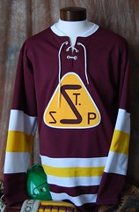
It’s not often that I devote the lead entry to a retail operation, but reader Scott Johnson recently told me about a truly impressive outfit called Vintage Minnesota Hockey. The good news is that you don’t have to be from Minnesota to appreciate their outstanding work; the better news is that they’ve got an online store featuring some gorgeous jerseys, which break down into two main categories:
• Classic Minnesota jerseys: This category features 60 spectacular hockey sweater reproductions — some from high schools, some from old pro teams, virtually all of them magnificent.
• U. of Minnesota jerseys: Eleven very nice Gophers designs. I particularly like this one, and you can’t beat the sleeve patch on this one.
Plus they’ve also got Frozen Four patches and game-used Gophers socks. And if you want a custom job, they claim to have over 30,000 fonts, which they’ll apply for reasonable prices. Not sure how these folks eluded my notice until now. Anyone out there ever dealt with them?
Meanwhile, speaking of good hockey jersey outlets, Stan Olechowski has found a site that sells uncrested sweaters from various leagues and affiliations — an excellent middle ground if you’re thinking about embarking on a DIY project but don’t want the hassle of applying all the stripes, yoke panels, etc.
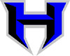
Was the XFL more influential than we thought?: In yesterday’s Ticker I mentioned that Hammonton High School in New Jersey appears to have taken its athletics program logo from the XFL’s NY/NJ Hitmen. That led several to several comments pointing out some other schools that have adopted the Hitmen’s stylized “H,” including Hebron High in Texas, Hillcrest High in South Carolina, and Highland Regional in New Jersey (sorry, no photo yet). Yes, I realize that lots of high schools “borrow” logos from professional and college teams, but c’mon, the XFL? Also, nobody has mentioned any high schools using other XFL logos — just the Hitmen’s mark. Seems like a very odd trope to me.
The Reebok Chronicles, Continued: As you may recall, a few weeks ago I reported that I’d been assured by a Reebok spokesman that the company’s wordmark will not be replacing the vector logo on NHL jerseys next season. Simple enough. But on Wednesday I was contacted by a sports retailer who sent me this image. That’s the cover of a new Reebok wholesale catalog. I spoke with the retailer, who said his Reebok sales rep had told him just that day that the wordmark would be used at the beginning of the 2009-10 season but that Reebok was being coy about it because they had a lot of unsold vector-clad merch that they wanted to clear out first.
Hmmmmm.
Late Wednesday afternoon I e-mailed the catalog image to Reebok corporate communications manager Dan Sarro (who was the one who’d originally told me that the wordmark wouldn’t be appearing on the jerseys) and asked if he’d like to amend his earlier statement. Later that evening he wrote back that the image was a “Photoshop error” and reiterated, “I can assure you that the logo treatment on the jerseys will not change next season.”
That sounded a little fishy to me, so yesterday I spoke with Sarro. The basic points of our conversation break down like this:
• He was surprised when he saw the catalog image, so he showed it to Reebok’s NHL uniform director, Keith Leach, who was also surprised but confirmed that the wordmark will not be appearing on NHL jerseys next season. (Sarro also offered to have Leach call me so I could hear this directly from him. This hasn’t happened yet, but it’s been less than 24 hours, so I don’t think that means anything one way or the other.)
• So why is the wordmark shown on the catalog image? Sarro basically said (I’m paraphrasing from memory here), “It’s true that we’ve been replacing the vector with the wordmark on a lot of product, so someone in the design department probably just got overzealous and thought it was changing on the NHL jerseys too, and then it ended up on the catalog cover without anyone catching it.” He also said there are no other images in the catalog that show the wordmark on an NHL jersey. I checked back with the retailer, who confirmed the accuracy of that statement.
• And what about the sales rep who told the retailer about the impending change? Sarro said any such claim is simply mistaken, and that Reebok will communicate with its sales force to make sure everyone’s on the same page.
If someone else had written this text and I’d just read it, I’d probably think, “Man, what a bunch of bullshitters — they’re totally gonna change the logo.” But I’ve interviewed a lot of people over the years, and I don’t think Sarro is bullshitting me. Do they need better quality control on their catalogs and better communication with their sales force? Yeah. But are they trying to pull a fast one here just so they can sell some merch that’s about to be obsolete? I don’t think so. I think Sarro is being straight with me.
So why am I even bothering to report this if the bottom line is that the situation remains unchanged? Because I suspect the catalog cover will be finding its way to other media outlets, so I want to nip this one in the bud before that happens.
Uni Watch News Ticker: The Pirates and Rangers will unveil new uni sets today. ”¦ According to this story, the Blackhawks will have a new alternate jersey next season — basically the same design they wore for the Winter Classic, except the tomahawk shoulder patch will be added. ”¦ The Patriots have unveiled a 50th-season logo. Not sure if it’ll be worn on jerseys, but I suspect the answer is yes. ”¦ Check out Paul Brown’s cap (with thanks to Jason Hillyer). ”¦ Coupla more close-ups of those Inauguration Day sneakers here. ”¦ Wait until you see the shorts on this old basketball uniform. ”¦ This dame is MLB’s newest mascot. Additional info here, and lots of photos here (with thanks to Nick Houser). ”¦ It’s late January, which means it’s time for the annual story about the factory that makes the Super Bowl footballs (with thanks to Stu Taylor). ”¦ Tons of great neon signage on display here (with thanks to Lee Wilds). ”¦ How great is this? Answer: Very, very great. That’s the logo of the Fenn College Foxes, now known as the Cleveland State Vikings (tremendous find by Stan Olechowski). ”¦ Jeremy Brahm reports that the Yakult Swallows have a new uni set: front, back, 40th-anniversary patch, road close-up (note the odd red top button). Also, a fifth-anniversary patch for the Rakuten Eagles. ”¦ RNOB alert: Tommie Liddell III of St. Louis (with thanks to Harrison Bobbins). ”¦ Nice shot of sleeved New Mexico State hoops jerseys here (with thanks to Brian Borkenhagen). ”¦ Happy birthday to my father, Irwin Lukas, who turns 85 today (and who totally Gets Itâ„¢). See you in a few hours, Pop.
Started on a Uni-watch football link and ended on this gem
NOt sure if I mentioned this yesterday, forgive if I did, but if the Pats are wearing a 50th Anni. patch, shouldn’t all of the original AFL teams be sporting one too?
I noticed that you didn’t mention the use of certain hockey uniforms used in the TV show, Bones, Is it likely you will show screen grabs on the ticker on Saturday, Paul?
[quote comment=”311243″]NOt sure if I mentioned this yesterday, forgive if I did, but if the Pats are wearing a 50th Anni. patch, shouldn’t all of the original AFL teams be sporting one too?[/quote]
It’s not an anniversary patch. It’s a 50th season patch. I guess they wanted to get the jump on the AFL’s 50th anniversary. (Although, next year technically is the AFL’s 50th anniversary, since it was founded in 1959.)
My favorite pictures today….thus far
link
link
link
link
I have never seen this Florida logo. Is it legit or one of those hollister/H&M logo shirts?
link|66%3A2|65%3A12|39%3A1|240%3A1318|301%3A0|293%3A1|294%3A50
[quote comment=”311245″][quote comment=”311243″]NOt sure if I mentioned this yesterday, forgive if I did, but if the Pats are wearing a 50th Anni. patch, shouldn’t all of the original AFL teams be sporting one too?[/quote]
It’s not an anniversary patch. It’s a 50th season patch. I guess they wanted to get the jump on the AFL’s 50th anniversary. (Although, next year technically is the AFL’s 50th anniversary, since it was founded in 1959.)[/quote]
I guess if the Bills added it, it would remind their fans how quickly that there won’t be another 50…I got ya ;) …
So, any inside info for the Jets donning a 50th patch/logo or a final season for the Meadowlands?
So we now see what Mr. Met does in his off-days. The hidden 2nd wife. In Cincy.
Mark me down as a supporter of the Reds’ new assistant mascot, Rosie Red. She looks quite charming.
I didn’t hear about a divorce, but I wondered what happened to Mrs. Met and why she hadn’t shown up a Shea recently. The only time we saw her recently was in commercials.
So who got the kids?
I am wondering if the red button on the white (looks white to me) Yakult jersey is meant to resemble the Japanese flag. At least that’s what came to mind immedietely when I saw it.
[quote comment=”311247″]I have never seen this Florida logo. Is it legit or one of those hollister/H&M logo shirts?
link|66%3A2|65%3A12|39%3A1|240%3A1318|301%3A0|293%3A1|294%3A50[/quote]
That was three logos ago. Now UF has the chomping gator head. Before that was a full body Albert with hands on hips. And before that was the logo you’ve linked to. I think it was used in the late 70s and 80s.
[quote comment=”311249″]So we now see what Mr. Met does in his off-days. The hidden 2nd wife. In Cincy.[/quote]
How dare you, sir. Mr. Redlegs would not stand for such a scandal.
random eBay finds…
link|66%3A4|65%3A12|39%3A1|240%3A1318|301%3A0|293%3A3|294%3A200
link|66%3A4|65%3A12|39%3A1|240%3A1318|301%3A0|293%3A4|294%3A200
link|66%3A4|65%3A12|39%3A1|240%3A1318|301%3A0|293%3A4|294%3A200
link|66%3A4|65%3A12|39%3A1|240%3A1318|301%3A0|293%3A3|294%3A200
SWEET PATCH!!
link|66%3A4|65%3A12|39%3A1|240%3A1318|301%3A0|293%3A3|294%3A200
I love the old Hawks ‘Pac-Man’ Jerseys
link|66%3A4|65%3A12|39%3A1|240%3A1318|301%3A1|293%3A3|294%3A200
and the horrid 90’s suns and jazz jerseys
link|66%3A4|65%3A12|39%3A1|240%3A1318|301%3A0|293%3A1|294%3A200
link|66%3A4|65%3A12|39%3A1|240%3A1318|301%3A0|293%3A1|294%3A200
they are total classics
I LOVE the ball-in-glove logo on the navy cap!
link
And how awesome are the two hockey sweater sites?
The deal on nameplate lettering and numbers is worth it alone!
I don’t know how they are only charging 100 dollars for this:
link
[quote comment=”311250″]Mark me down as a supporter of the Reds’ new assistant mascot, Rosie Red. She looks quite charming.[/quote]
I still think she looks like Rose O’Donnell in A LEAGUE OF THEIR OWN.
Which is okay, I guess, probably the last time she was entirely likeable.
—Ricko
[quote comment=”311253″][quote comment=”311247″]I have never seen this Florida logo. Is it legit or one of those hollister/H&M logo shirts?
link|66%3A2|65%3A12|39%3A1|240%3A1318|301%3A0|293%3A1|294%3A50[/quote]
That was three logos ago. Now UF has the chomping gator head. Before that was a full body Albert with hands on hips. And before that was the logo you’ve linked to. I think it was used in the late 70s and 80s.[/quote]
thanks!
[quote comment=”311247″]I have never seen this Florida logo. Is it legit or one of those hollister/H&M logo shirts?
link|66%3A2|65%3A12|39%3A1|240%3A1318|301%3A0|293%3A1|294%3A50[/quote]
It’s real logo. Goes back a way, though. 70’s. maybe.
—Ricko
[quote comment=”311258″][quote comment=”311250″]Mark me down as a supporter of the Reds’ new assistant mascot, Rosie Red. She looks quite charming.[/quote]
I still think she looks like Rose O’Donnell in A LEAGUE OF THEIR OWN.
Which is okay, I guess, probably the last time she was entirely likeable.
—Ricko[/quote]
hahahahahahahahahaha!
[quote comment=”311257″]I LOVE the ball-in-glove logo on the navy cap!
…I always thought it was the MB….never thought it was ball/glove….just like the old Montreal Expo “m” actaully had an M…E…and B in it for Montreal Expo Baseball
Reebok is stupid. They cant even control things in their own company about that ugly looking vector logo and word mark. They should just let their parent company, Adidas take over…but then I guess we would see 3 stripes on every damn thing like the NBA
Sorry, who cares, missed that you’d already answered the question about the Florida logo.
And the Brewers hat on Rollie just looks navy. It’s the regular royal hat. Brewers never had a navy version, at least not back then. The color is off on way too many covers in the SI Vault. Too much red in the “tint”…like a badly tuned TV.
—Ricko
I know it was brought up several times before in reference to some old baseball card photos, but that picture of link from the SI Vault looks like he is wearing a batting glove under his fielding glove. Judging from the date on the cover of the mag, I would guess it is a spring training pic, but still weird to see him pitching with it on.
~E~
Any images on those new Hawkeye uniforms yet? Probably SOD
I think Rosie red is a resurrection of Marge Schott, but they were missing some DNA so like in Jurassic Park they spliced in some other DNA. In this case from Mr. Met.
I don’t think Rosie is actually new. That is to say that I’ve been to a fair number of Reds games over the past handful of years and Rosie’s definitely been there. I can’t remember if I’ve actually seen the costume–I don’t usually get the good seats that involve mascots coming by–but she’s definitely part of the Skyline chili race.
Which, by the way, Mr. Redlegs has not won in any game I’ve been to. Despite this, I keep picking him. It’s got to be his time by now.
There are, I should add, 3 mascots: Mr. Redlegs (with pillbox hat and moustache), Rosie Red, and then the normal Mr. Red. Also, the Phanatic/Slider clone “Gapper.”
[quote comment=”311252″]I am wondering if the red button on the white (looks white to me) Yakult jersey is meant to resemble the Japanese flag. At least that’s what came to mind immedietely when I saw it.[/quote]
I had the same thought. It’s a simple and subtle thing.
[quote comment=”311268″]I don’t think Rosie is actually new. That is to say that I’ve been to a fair number of Reds games over the past handful of years and Rosie’s definitely been there. I can’t remember if I’ve actually seen the costume–I don’t usually get the good seats that involve mascots coming by–but she’s definitely part of the Skyline chili race.
Which, by the way, Mr. Redlegs has not won in any game I’ve been to. Despite this, I keep picking him. It’s got to be his time by now.
There are, I should add, 3 mascots: Mr. Redlegs (with pillbox hat and moustache), Rosie Red, and then the normal Mr. Red. Also, the Phanatic/Slider clone “Gapper.”[/quote]
Is Mr. Red the same thing as “Ol’ Bill”? I think this 1956 road uni is the only time he ever appeared on the front of the jersey.
link
link
—Ricko
Rosie, the new Reds co-mascot, has her roots in the Rosie Reds. The Rosie Reds are a ladies fan club that was organized in the 60s to increase the number of female fans of the Reds (as part of the team’s efforts to keep the team in Cincinnati). There’s a sweet vintage logo of the Rosie Reds in the link.
link
[quote comment=”311269″][quote comment=”311252″]I am wondering if the red button on the white (looks white to me) Yakult jersey is meant to resemble the Japanese flag. At least that’s what came to mind immedietely when I saw it.[/quote]
I had the same thought. It’s a simple and subtle thing.[/quote]
Probably so. On the whole these unis look like Japanese nascar to me.
Well how ’bout that….I didn’t realize I was so into Minn. hockey…;0)
Jeremiah,
I had also thought about the Japanese flag for the red button as well. But it doesn’t say anything in the press release. Here is a close-up of the patch on the left sleeve.
link
may be a stuipd question, but, any pittsburgh uni-watchers going to “piratefest” tonight?
Insanity and logo branding:
link
[quote comment=”311270″][quote comment=”311268″]I don’t think Rosie is actually new. That is to say that I’ve been to a fair number of Reds games over the past handful of years and Rosie’s definitely been there. I can’t remember if I’ve actually seen the costume–I don’t usually get the good seats that involve mascots coming by–but she’s definitely part of the Skyline chili race.
Which, by the way, Mr. Redlegs has not won in any game I’ve been to. Despite this, I keep picking him. It’s got to be his time by now.
There are, I should add, 3 mascots: Mr. Redlegs (with pillbox hat and moustache), Rosie Red, and then the normal Mr. Red. Also, the Phanatic/Slider clone “Gapper.”[/quote]
Is Mr. Red the same thing as “Ol’ Bill”? I think this 1956 road uni is the only time he ever appeared on the front of the jersey.
link
link
—Ricko[/quote]
I didn’t know that Mr. Red ever had any other name. They got rid of him in 72 when they realized the hypocrisy of not allowing facial hair, but having a mustachioed baseball as their mascot. Clean shaven Mr. Red got a new uni in 99 (matching the rest of the team) and was retired in 07. When a vintage Mr. Red who, according to Ricko, is named Ol’ Bill
link to the reds logo history on the cramer board
link
[quote comment=”311270″][quote comment=”311268″]I don’t think Rosie is actually new. That is to say that I’ve been to a fair number of Reds games over the past handful of years and Rosie’s definitely been there. I can’t remember if I’ve actually seen the costume–I don’t usually get the good seats that involve mascots coming by–but she’s definitely part of the Skyline chili race.
Which, by the way, Mr. Redlegs has not won in any game I’ve been to. Despite this, I keep picking him. It’s got to be his time by now.
There are, I should add, 3 mascots: Mr. Redlegs (with pillbox hat and moustache), Rosie Red, and then the normal Mr. Red. Also, the Phanatic/Slider clone “Gapper.”[/quote]
Is Mr. Red the same thing as “Ol’ Bill”? I think this 1956 road uni is the only time he ever appeared on the front of the jersey.
link
link
—Ricko[/quote]
Rosie actually lives in the same town as me.
One of her children go to the same nurset school that my 4 wife teaches in and my four year old attends.
And I have to agree…”A League of their Ow” and one of my personal favorites, “Beautiful Girls”.
[quote comment=”311267″]I think Rosie red is a resurrection of Marge Schott, but they were missing some DNA so like in Jurassic Park they spliced in some other DNA. In this case from Mr. Met.[/quote]
You are too quick to pass over Mr. Red link and Mr. Redlegs. link They, too, are of the same ilk as Mr. Met. link
I always found it cool that Mr. Red wore number 27. Numbers 1-25 represented the 25-man roster, number 26 was for the fans, and he wore 27.
Of course, I don’t think that he changed his number for the few years that rosters were trimmed to 24 instead of 25.
Here is my favorite version of Mr. Red. Nice stirrups, he is wearing real spikes, his number is visible, and he looks like a real go-getter.
link
I was not happy when the Reds had him run in the opposite direction when they changed their uniforms in the ’90s.
link
Paul, do you know what time the Rangers and Pirates are set to unveil their uniforms today?
That Classic Minnesota site has some solid jerseys on it.
The only problem is that the largest size they offer is XL. How am I supposed to wear the jersey over a jacket or sweater?
As for the NASCAR reference for Japanese baseball. When the teams were originally created, they were company owned and are still predominantly owned by companies. These company teams have tried to incorporate the city name into their team name, such as Hokkaido (island) Nippon Ham Fighters, Tohoku (Northeast) Rakuten Golden Eagles, Fukuoka Softbank Hawks, Saitama Seibu Lions, Chiba Lotte Marines, Tokyo Yakult Swallows and Hiroshima Toyo Carp.
The Yokohama BayStars are the only team with no “company” backing them. But the team is owned by three broadcasting companies. 1992 the team name was changed from the Yokohama Taiyo Whales to the Yokohama BayStars. The team was not a contender and the name was changed for a better team identity. It also didn’t help that President Clinton singled out Taiyo fisheries for whale hunting and that the team is called Whales.
link
The Swallows were owned by the Japanese National Railroad (fast as a swallow), a newspaper (Sankei), and finally a beverage company (Yakult).
Only in the last 15 years has Japanese baseball allowed advertisements on the uniform. This came about from the success of the J-League, which had uniform sponsorship from the beginning in 1992. Actually in Japanese baseball, even the different uniform manufacturers Asics, Mizuno and Descente would not even have their logos on the uniform on the outside. Only Nike and Adidas put their logos on the outside now.
The majority of these teams in the past had not been run like businesses. However, now these teams are encouraged to make money. The size of the patches that they have are fine and are small in nature.
If you think that the advertising is bad, take a look at this from the Italian Volleyball League.
link
These are smaller leagues and need the advertising money to survive. This league has teams change their names annually for sponsors.
It is the difference between US sports and foreign sports. Would we prefer not to have the sponsors on the uniforms, yes. But how many of us played Little League with a sponsor on our uniform? I would think a great deal of us did.
It appears that MSN is infringing on Uni Watch’s territory.
link
The list is seriously flawed. Not sure who John Grigg is, but he needs to hang out here more.
[quote comment=”311275″]may be a stuipd question, but, any pittsburgh uni-watchers going to “piratefest” tonight?[/quote]
I’m going. Just bought a 20-game plan so I can avoid the mind-numbingly long “autograph party” line. It’s the most poorly run fan fest I have ever attended.
A reebok Hockey rep came into my rink and presented new gear to my boss and I. They are still using the vector logo, without the trapezoid around it on the new gear. The wordmark will NOT appear on the rear of the jerseys.
[quote comment=”311275″]may be a stuipd question, but, any pittsburgh uni-watchers going to “piratefest” tonight?[/quote]
No for me. I’m on strike. That organization will not get one more red cent of my money until they make a legit, bonafide commitment to winning.
And let me say this, $7 million to Adam LaRoche is NOT a step in the right direction.
I’m actually sad to miss Piratefest, because I’ve gone to so many through the years. I always liked to see the prototypes of the promo items and there was always a nice display of uniforms on hand. I’m sure they would do this since they have some new alts to show off today.
I know the red vests, thankfully, are out (seriously, that idea will go the way of New Coke) but is there any word on the pins? Contrary to some belief in here, I actually like them, a lot and wouldn’t mind them keeping them for Sunday home games. I’m curious not only to see what the new alt looks like but what their plan to wear it is (day games? Fridays? random?).
I would love a retro Friday vibe like milwaukee has. Black pillbox, yellow jersey, black pants, updated with buttons and belts (or not).
The other uni I’d like them to sport, maybe for a throwback day is the
1940: link
or 1941: link
Preferrably the ’41 (better stirrup)
[quote comment=”311286″]It appears that MSN is infringing on Uni Watch’s territory.
link
The list is seriously flawed. Not sure who John Grigg is, but he needs to hang out here more.[/quote]
kings @ #5? pens @ #10? WTF…and no offense to the good people of st. louie, but yer jersey AIN’T #1
at least the trash, bolts, canes and sharks didn’t make the list…THAT would have been a complete mockery
*thrash
New Pirate alts are in the MLB store…(at least as a youth replica). They’re black with a yellow “P” on the left chest, and yellow and black piping on the sleeves and collar. Here’s a link: link
As a born-and-bred Minnesotan, I am dying to see that site, but can’t get it to pull up on this stupid work computer. If the site is as awesome as I’m hoping, I know where my next few birthday and Xmas presents will be coming from!
I’m hoping they have some vintage jerseys from my high school, whose teams won four of the first five MN high school hockey tournaments (and two in the ’90’s).
[quote comment=”311286″]It appears that MSN is infringing on Uni Watch’s territory.
link
The list is seriously flawed. Not sure who John Grigg is, but he needs to hang out here more.[/quote]
Teebz, you know I’ve got a lot of respect for you, so don’t take this as an attack on you, but this post brings out one of my pet peeves about Uni Watch when it comes to other opinions on the topic we love.
Please keep in mind:
a. This community is not the end all, be all of uni opinion. We should encourage more outlets to embrace a topic all of us hold so dear.
b. We’re talking about something highly subjective in that there is no “right answer”. One person’s trash is another’s treasure and even the most horrific uniform designs in the great majority have their fans. Oregon football? Pirates’ red vests? I’m sure there are some people that actually like those.
c. Specifically what’s wrong with the list? I don’t mean in just this case, but in all cases when there is a non-UW list story, people will just be all “this list sucks, they need to get over to UW”. Why is that? In the THN list, while I don’t agree with the order the teams are in, the only jersey I really disagree with being in a top ten is the Kings.
As a subscriber to THN, I think they do a nice job with covering different uniform styles, they always have some obscure jersey in the back near the crossword (when I am able to complete that crossword, only then will I ask for entrance to the hockey wing!)
Again, not trying to be inflammatory, just offering a different point of view.
Here’s the new Rangers home jersey: link.
[quote comment=”311290″][quote comment=”311286″]It appears that MSN is infringing on Uni Watch’s territory.
link
The list is seriously flawed. Not sure who John Grigg is, but he needs to hang out here more.[/quote]
kings @ #5? pens @ #10? WTF…and no offense to the good people of st. louie, but yer jersey AIN’T #1
at least the trash, bolts, canes and sharks didn’t make the list…THAT would have been a complete mockery[/quote]
The Blackhawks should be #1 on every list. I think it is gorgeous
[quote comment=”311292″]New Pirate alts are in the MLB store…(at least as a youth replica). They’re black with a yellow “P” on the left chest, and yellow and black piping on the sleeves and collar. Here’s a link: link
They could have done worse….but still, I am not that impressed
The top 10 NHL alternate list was hijacked by MSN from “The Hockey News”
[quote comment=”311279″][quote comment=”311267″]I think Rosie red is a resurrection of Marge Schott, but they were missing some DNA so like in Jurassic Park they spliced in some other DNA. In this case from Mr. Met.[/quote]
You are too quick to pass over Mr. Red link and Mr. Redlegs. link They, too, are of the same ilk as Mr. Met. link
Well, I was hoping they’d want to get a deeper gene pool for any future Red-lings.
this is the one i am referring to of course
link
That’s so strange about that XFL logo. The very first thought that went through my head when I saw the logo, before I read the item was, “is something going on with Hebron HS?”
[quote comment=”311295″]Here’s the new Rangers home jersey: link
Hey, does anyone know where the Rangers play? I can’t tell from this Jersey.
[quote comment=”311297″][quote comment=”311292″]New Pirate alts are in the MLB store…(at least as a youth replica). They’re black with a yellow “P” on the left chest, and yellow and black piping on the sleeves and collar. Here’s a link: link
They could have done worse….but still, I am not that impressed[/quote]
I love it!! I am a huge Pirates fan and this is something to my liking!!
I also miss the 94-era (i believe) Grey caps…I loved those!!
Now, if they could re-incorporate the copper…that would be perfect!!
[quote comment=”311245″][quote comment=”311243″]NOt sure if I mentioned this yesterday, forgive if I did, but if the Pats are wearing a 50th Anni. patch, shouldn’t all of the original AFL teams be sporting one too?[/quote]
It’s not an anniversary patch. It’s a 50th season patch. I guess they wanted to get the jump on the AFL’s 50th anniversary. (Although, next year technically is the AFL’s 50th anniversary, since it was founded in 1959.)[/quote]
I can only PRAY that the addition of Pat the Patriot might mean a game with throwbacks next year.
[quote comment=”311296″][quote comment=”311290″][quote comment=”311286″]It appears that MSN is infringing on Uni Watch’s territory.
link
The list is seriously flawed. Not sure who John Grigg is, but he needs to hang out here more.[/quote]
kings @ #5? pens @ #10? WTF…and no offense to the good people of st. louie, but yer jersey AIN’T #1
at least the trash, bolts, canes and sharks didn’t make the list…THAT would have been a complete mockery[/quote]
The Blackhawks should be #1 on every list. I think it is gorgeous[/quote]
Agreed. I’d go Blackhawks #1, Pens #2. Rework everything else in that list with the exception of the Kings. Boot LA and add either the Oilers or Canucks.
quote]
Hey, does anyone know where the Rangers play? I can’t tell from this Jersey.[/quote]
weak
Does anyone know a retailer in Chicago/Chicagoland area that would sell Steelers patches?
[quote comment=”311291″]*thrash[/quote]
No, you had it right the first time.
[quote comment=”311291″]*trash[/quote]
(fixed)
Here are what the 2009 NFL Draft hats will look like:
link
I can only find it at the Steelers store right now. I also have no clue why there is a Super Bowl patch on it if it’s a draft cap.
[quote comment=”311283″]That Classic Minnesota site has some solid jerseys on it.
[/quote]
I’m digging the front number on top of the Captain’s C on link.
[quote comment=”311310″]Here are what the 2009 NFL Draft hats will look like:
link
I can only find it at the Steelers store right now. I also have no clue why there is a Super Bowl patch on it if it’s a draft cap.[/quote]
I have to mention that they are not using the vector logo on the cap. Just like they didn’t on any post season stuff in the NFL. Does anyone know why that is?
[quote comment=”311310″]I also have no clue why there is a Super Bowl patch on it if it’s a draft cap.[/quote]
perhaps because it’s a “Reebok Pittsburgh Steelers 2009 Draft Hat with Super Bowl XLIII Logo”
[quote comment=”311310″]Here are what the 2009 NFL Draft hats will look like:
link
I can only find it at the Steelers store right now. I also have no clue why there is a Super Bowl patch on it if it’s a draft cap.[/quote]
Every year the Superbowl teams wear the template hat for the following Draft…and for putting a patch on it someone went “Oh shit! you know what I just realized….by putting on this 25 cent patch, we can sell even more to stupid people, I mean, consumers who collect this stuff!”
[quote comment=”311301″]That’s so strange about that XFL logo. The very first thought that went through my head when I saw the logo, before I read the item was, “is something going on with Hebron HS?”[/quote]
My guess is someone found (or already knew of) the logo, thought it was fairly good-looking (which it is), kinda liked the “Hitmen” aspect for a football team. and reasoned, rightly so, that no one was gonna come after them over copyright infringement.
So I’d wager it has more to do with liking the design that any affection for the XFL. But, hey, you never know. Maybe he’s now hoping for cameras in the cheerleaders’ locker room.
—Ricko
[quote comment=”311303″][quote comment=”311297″][quote comment=”311292″]New Pirate alts are in the MLB store…(at least as a youth replica). They’re black with a yellow “P” on the left chest, and yellow and black piping on the sleeves and collar. Here’s a link: link
They could have done worse….but still, I am not that impressed[/quote]
I love it!! I am a huge Pirates fan and this is something to my liking!!
I also miss the 94-era (i believe) Grey caps…I loved those!!
Now, if they could re-incorporate the copper…that would be perfect!![/quote]
I am highly disappointed.
I absolutely love the Pirates home whites and vests.
Their number/letter font is one of the most unique in sports and the colors are great.
They could have done much more than a cheap softball top.
The ClassicMN site isn’t working.
Yay us for crashing the site!
[quote comment=”311297″][quote comment=”311292″]New Pirate alts are in the MLB store…(at least as a youth replica). They’re black with a yellow “P” on the left chest, and yellow and black piping on the sleeves and collar. Here’s a link: link
They could have done worse….but still, I am not that impressed[/quote]
The Pirates should have done an old-school throwback with touches of red, sort of like the Indians and Phillies have done with their alternate home jerseys. If that’s the third jersey the Pirates will wear in 2009, it lacks any creativity or imagination.
I love the Paul Brown pic. he really was trying to make the Bengals in all ways-exactly like the Browns. Being an artist and former equipment manager-I drew helmets as a kid-and I was fascinated that both teams from Ohio had almost the same exact colors!! Then as I got older and my dad and uncle (who coached) told me about coaches-well let’s just say thats when my obsession started.
[quote comment=”311298″]The top 10 NHL alternate list was hijacked by MSN from “The Hockey News”[/quote]
Hijacked? THN.com is credited at the top and the bottom of the page.
~~~~~~~~~~~~~~~~~~~~~~~~~~~~~~
I’m officially off the “Pens’ alt is the best third jersey in the NHL” bandwagon. It’s a great look (definitely better than their regular sweaters), but the novelty has worn off.
~~~~~~~~~~~~~~~~~~~~~~~~~~~~~~
It’s not a link around the Reebok logo. It’s a rounded-off link.
~~~~~~~~~~~~~~~~~~~~~~~~~~~~~~
Swallows baseball unis? I thought they were in the BJ league. link.
[quote comment=\”311278\”][quote comment=\”311270\”][quote comment=\”311268\”]I don\’t think Rosie is actually new. That is to say that I\’ve been to a fair number of Reds games over the past handful of years and Rosie\’s definitely been there. I can\’t remember if I\’ve actually seen the costume–I don\’t usually get the good seats that involve mascots coming by–but she\’s definitely part of the Skyline chili race.
Which, by the way, Mr. Redlegs has not won in any game I\’ve been to. Despite this, I keep picking him. It\’s got to be his time by now.
There are, I should add, 3 mascots: Mr. Redlegs (with pillbox hat and moustache), Rosie Red, and then the normal Mr. Red. Also, the Phanatic/Slider clone \”Gapper.\”[/quote]
Is Mr. Red the same thing as \”Ol\’ Bill\”? I think this 1956 road uni is the only time he ever appeared on the front of the jersey.
link
link
—Ricko[/quote]
Rosie actually lives in the same town as me.
One of her children go to the same nursery school that my wife teaches in and my four year old attends.
And I have to agree…\”A League of their Own\” and one of my personal favorites, \”Beautiful Girls\” were the last films that I remotely enjoyed her in.[/quote]
I re-read the initial post and I just HAD to fix it. Sorry.
[quote comment=”311294″][quote comment=”311286″]It appears that MSN is infringing on Uni Watch’s territory.
link
The list is seriously flawed. Not sure who John Grigg is, but he needs to hang out here more.[/quote]
Teebz, you know I’ve got a lot of respect for you, so don’t take this as an attack on you, but this post brings out one of my pet peeves about Uni Watch when it comes to other opinions on the topic we love.
Please keep in mind:
a. This community is not the end all, be all of uni opinion. We should encourage more outlets to embrace a topic all of us hold so dear.
b. We’re talking about something highly subjective in that there is no “right answer”. One person’s trash is another’s treasure and even the most horrific uniform designs in the great majority have their fans. Oregon football? Pirates’ red vests? I’m sure there are some people that actually like those.
c. Specifically what’s wrong with the list? I don’t mean in just this case, but in all cases when there is a non-UW list story, people will just be all “this list sucks, they need to get over to UW”. Why is that? In the THN list, while I don’t agree with the order the teams are in, the only jersey I really disagree with being in a top ten is the Kings.
As a subscriber to THN, I think they do a nice job with covering different uniform styles, they always have some obscure jersey in the back near the crossword (when I am able to complete that crossword, only then will I ask for entrance to the hockey wing!)
Again, not trying to be inflammatory, just offering a different point of view.[/quote]
An opposing viewpoint is fine, but Grigg has no clue what an alternate jersey is.
However, he included Detroit’s throwback, which is not an alternate; Chicago’s throwback, which will be their alternate next season with some minor tweaks; and he included a Montreal Canadiens jersey that will not be worn again after this season.
He uses the term “retro” when describing the St. Louis alternate jersey. Retro, when talking about clothes, is defined as “a fashion reminiscent of the past”. Find me anywhere in St. Louis’ history where they wore the arch and this colour of blue.
It’s not retro at all. It’s brand-spanking new.
The Buffalo Sabres’ commentary is “[e]verything old is new again”, which is entirely wrong. The only thing old on the jersey is the retro logo. The design and colours are entirely different than their old 1970s/1980s look.
[quote comment=”311303″][quote comment=”311297″][quote comment=”311292″]New Pirate alts are in the MLB store…(at least as a youth replica). They’re black with a yellow “P” on the left chest, and yellow and black piping on the sleeves and collar. Here’s a link: link
They could have done worse….but still, I am not that impressed[/quote]
I love it!! I am a huge Pirates fan and this is something to my liking!!
I also miss the 94-era (i believe) Grey caps…I loved those!!
Now, if they could re-incorporate the copper…that would be perfect!![/quote]
I LOVE trim around the neck!
Anybody else read between the lines of the Reebok conversation and think that maybe we’ll see the wordmark replace the vector logo the year after next?
now…
this is outstanding
[quote comment=”311313″][quote comment=”311310″]I also have no clue why there is a Super Bowl patch on it if it’s a draft cap.[/quote]
perhaps because it’s a “Reebok Pittsburgh Steelers 2009 Draft Hat with Super Bowl XLIII Logo”[/quote]
hahahaha
[quote comment=”311317″]The ClassicMN site isn’t working.
Yay us for crashing the site![/quote]
The wrath of Uni Watch shall be felt by all!
link
colts draft hat
link|66%3A4|65%3A12|39%3A1|240%3A1318|301%3A0|293%3A3|294%3A200
[quote comment=”311307″]Does anyone know a retailer in Chicago/Chicagoland area that would sell Steelers patches?[/quote]
You might want to give Sports World (right across Addison street from Wrigley Field) a call: 773- 472-7701. Obviously, they have mostly MLB/Cubs stuff, but I’ve seen a ton of random crap in there as well. Plus, it’s football season and the Steelers are going to the Super Bowl. If they don’t have them, they might at least be able to at least point you in the right direction.
[quote comment=”311328″]http://www.nflshop.com/product/index.jsp?productId=2962521&cp=716614.2237538&parentPage=family
colts draft hat[/quote]
FYI, that’s the 2008 draft hat.
[quote comment=”311323″][quote comment=”311303″][quote comment=”311297″][quote comment=”311292″]New Pirate alts are in the MLB store…(at least as a youth replica). They’re black with a yellow “P” on the left chest, and yellow and black piping on the sleeves and collar. Here’s a link: link
They could have done worse….but still, I am not that impressed[/quote]
I love it!! I am a huge Pirates fan and this is something to my liking!!
I also miss the 94-era (i believe) Grey caps…I loved those!!
Now, if they could re-incorporate the copper…that would be perfect!![/quote]
I LOVE trim around the neck![/quote]
Joe,
I e-mailed you through the Name-Frame site…did you get it?
[quote comment=”311323″][quote comment=”311303″][quote comment=”311297″][quote comment=”311292″]New Pirate alts are in the MLB store…(at least as a youth replica). They’re black with a yellow “P” on the left chest, and yellow and black piping on the sleeves and collar. Here’s a link: link
They could have done worse….but still, I am not that impressed[/quote]
I love it!! I am a huge Pirates fan and this is something to my liking!!
I also miss the 94-era (i believe) Grey caps…I loved those!!
Now, if they could re-incorporate the copper…that would be perfect!![/quote]
I LOVE trim around the neck![/quote]
If you follow the links to the youth model home jersey, the Pirates white tops appear to have sprouted sleeves. Hmmm…
[quote comment=”311295″]Here’s the new Rangers home jersey: link
Can’t wait to get home and look at it with my 3D glasses on. Yippie skippie!!
Seriously now, there’sno need for 3 differnt outline colors.
[quote comment=”311313″][quote comment=”311310″]I also have no clue why there is a Super Bowl patch on it if it’s a draft cap.[/quote]
perhaps because it’s a “Reebok Pittsburgh Steelers 2009 Draft Hat with Super Bowl XLIII Logo”[/quote]
Thanks Phil. I guess my question was, “Why does a Draft cap have the Super Bowl logo on it?” I guess I didn’t realize that the SB teams “unveiled” the new cap every year. I also can’t find any Cardinals sideline caps anywhere. Are they all sold out?
Here is the AZ 2009 draft cap just for fun:
link
(and FWIW, that Cards draft cap was not on that site last night)
[quote comment=”311333″]
Joe,
I e-mailed you through the Name-Frame site…did you get it?[/quote]
Yeah…I replied to you on 01/19/2009 …did you not get that?
Paul Lukas: Uni Detective.
[quote comment=”311334″][quote comment=”311323″][quote comment=”311303″][quote comment=”311297″][quote comment=”311292″]New Pirate alts are in the MLB store…(at least as a youth replica). They’re black with a yellow “P” on the left chest, and yellow and black piping on the sleeves and collar. Here’s a link: link
They could have done worse….but still, I am not that impressed[/quote]
I love it!! I am a huge Pirates fan and this is something to my liking!!
I also miss the 94-era (i believe) Grey caps…I loved those!!
Now, if they could re-incorporate the copper…that would be perfect!![/quote]
I LOVE trim around the neck![/quote]
If you follow the links to the youth model home jersey, the Pirates white tops appear to have sprouted sleeves. Hmmm…[/quote]
This appears to be the Pirates new alt hat: link
[quote comment=”311330″][quote comment=”311307″]Does anyone know a retailer in Chicago/Chicagoland area that would sell Steelers patches?[/quote]
You might want to give Sports World (right across Addison street from Wrigley Field) a call: 773- 472-7701. Obviously, they have mostly MLB/Cubs stuff, but I’ve seen a ton of random crap in there as well. Plus, it’s football season and the Steelers are going to the Super Bowl. If they don’t have them, they might at least be able to at least point you in the right direction.[/quote]
I haven’t met my quota on using the phrase “at least” yet this month. I’ll be using it at least twice per post from now until at least the end of the month at least.
I have sent this in once before but can someone look into the Florida Gators pants stripes on their blue pants. It looks as though they are intentionally set on the back of the thigh rather than on the side of the leg. Please see lineman in back and Percy Harvin…
link
[quote comment=”311325″]now…
link[/quote]
No that is stupid.
And the Reds Chick coulda looked worse…they coulda made her look like Butch Schot
[quote comment=”311334″]If you follow the links to the youth model home jersey, the Pirates white tops appear to have sprouted sleeves. Hmmm…[/quote]
We have a winner!
Personally, I like the black jerseys more with the name & number on them. I’m not a huge fan of the front number placement, but the back of the jersey looks great. I just hope they look good on the field and, probably more importantly, they photograph well. That was my issue with the red jerseys–they looked ok in person, but were terrible when photographed and on TV.
[quote comment=”311330″][quote comment=”311307″]Does anyone know a retailer in Chicago/Chicagoland area that would sell Steelers patches?[/quote]
You might want to give Sports World (right across Addison street from Wrigley Field) a call: 773- 472-7701. Obviously, they have mostly MLB/Cubs stuff, but I’ve seen a ton of random crap in there as well. Plus, it’s football season and the Steelers are going to the Super Bowl. If they don’t have them, they might at least be able to at least point you in the right direction.[/quote]
Great, thanks. (And not too far away.)
[quote comment=”311247″]I have never seen this Florida logo. Is it legit or one of those hollister/H&M logo shirts?
link|66%3A2|65%3A12|39%3A1|240%3A1318|301%3A0|293%3A1|294%3A50[/quote]
That’s a real Florida logo. They were using that up until the late 80s. Shortly after Spurrier’s arrival marked the start of the modern Gator logo:
link
‘reebok’ has replaced the vector logo on all the new 09/10 soccer uniforms so far released……example:
link
[quote comment=”311322″][quote comment=”311294″][quote comment=”311286″]It appears that MSN is infringing on Uni Watch’s territory.
link
The list is seriously flawed. Not sure who John Grigg is, but he needs to hang out here more.[/quote]
Teebz, you know I’ve got a lot of respect for you, so don’t take this as an attack on you, but this post brings out one of my pet peeves about Uni Watch when it comes to other opinions on the topic we love.
Please keep in mind:
a. This community is not the end all, be all of uni opinion. We should encourage more outlets to embrace a topic all of us hold so dear.
b. We’re talking about something highly subjective in that there is no “right answer”. One person’s trash is another’s treasure and even the most horrific uniform designs in the great majority have their fans. Oregon football? Pirates’ red vests? I’m sure there are some people that actually like those.
c. Specifically what’s wrong with the list? I don’t mean in just this case, but in all cases when there is a non-UW list story, people will just be all “this list sucks, they need to get over to UW”. Why is that? In the THN list, while I don’t agree with the order the teams are in, the only jersey I really disagree with being in a top ten is the Kings.
As a subscriber to THN, I think they do a nice job with covering different uniform styles, they always have some obscure jersey in the back near the crossword (when I am able to complete that crossword, only then will I ask for entrance to the hockey wing!)
Again, not trying to be inflammatory, just offering a different point of view.[/quote]
An opposing viewpoint is fine, but Grigg has no clue what an alternate jersey is.
However, he included Detroit’s throwback, which is not an alternate; Chicago’s throwback, which will be their alternate next season with some minor tweaks; and he included a Montreal Canadiens jersey that will not be worn again after this season.
He uses the term “retro” when describing the St. Louis alternate jersey. Retro, when talking about clothes, is defined as “a fashion reminiscent of the past”. Find me anywhere in St. Louis’ history where they wore the arch and this colour of blue.
It’s not retro at all. It’s brand-spanking new.
The Buffalo Sabres’ commentary is “[e]verything old is new again”, which is entirely wrong. The only thing old on the jersey is the retro logo. The design and colours are entirely different than their old 1970s/1980s look.[/quote]
I do a agree with your blasting him for not knowing the difference between an alternate and a retro and that he’s lumping them into a catch-all third jersey category.
You’ll have to forgive my ignorance on Buffalo, is it a deeper shade of blue? It looks similar to the old ones to me. Yes, there are design changes but it’s close isn’t it?
[quote comment=”311322″][quote comment=”311294″][quote comment=”311286″]It appears that MSN is infringing on Uni Watch’s territory.
link
The list is seriously flawed. Not sure who John Grigg is, but he needs to hang out here more.[/quote]
Teebz, you know I’ve got a lot of respect for you, so don’t take this as an attack on you, but this post brings out one of my pet peeves about Uni Watch when it comes to other opinions on the topic we love.
Please keep in mind:
a. This community is not the end all, be all of uni opinion. We should encourage more outlets to embrace a topic all of us hold so dear.
b. We’re talking about something highly subjective in that there is no “right answer”. One person’s trash is another’s treasure and even the most horrific uniform designs in the great majority have their fans. Oregon football? Pirates’ red vests? I’m sure there are some people that actually like those.
c. Specifically what’s wrong with the list? I don’t mean in just this case, but in all cases when there is a non-UW list story, people will just be all “this list sucks, they need to get over to UW”. Why is that? In the THN list, while I don’t agree with the order the teams are in, the only jersey I really disagree with being in a top ten is the Kings.
As a subscriber to THN, I think they do a nice job with covering different uniform styles, they always have some obscure jersey in the back near the crossword (when I am able to complete that crossword, only then will I ask for entrance to the hockey wing!)
Again, not trying to be inflammatory, just offering a different point of view.[/quote]
An opposing viewpoint is fine, but Grigg has no clue what an alternate jersey is.
However, he included Detroit’s throwback, which is not an alternate; Chicago’s throwback, which will be their alternate next season with some minor tweaks; and he included a Montreal Canadiens jersey that will not be worn again after this season.
He uses the term “retro” when describing the St. Louis alternate jersey. Retro, when talking about clothes, is defined as “a fashion reminiscent of the past”. Find me anywhere in St. Louis’ history where they wore the arch and this colour of blue.
It’s not retro at all. It’s brand-spanking new.
The Buffalo Sabres’ commentary is “[e]verything old is new again”, which is entirely wrong. The only thing old on the jersey is the retro logo. The design and colours are entirely different than their old 1970s/1980s look.[/quote]
Plus he described the Pens jersey by saying that he is not sure about the baby blue trend. The Pens use of baby blue is not because of any trend, they are pure throwbacks to the 60’s.
[quote comment=”311322″][quote comment=”311294″][quote comment=”311286″]It appears that MSN is infringing on Uni Watch’s territory.
link
The list is seriously flawed. Not sure who John Grigg is, but he needs to hang out here more.[/quote]
Teebz, you know I’ve got a lot of respect for you, so don’t take this as an attack on you, but this post brings out one of my pet peeves about Uni Watch when it comes to other opinions on the topic we love.
Please keep in mind:
a. This community is not the end all, be all of uni opinion. We should encourage more outlets to embrace a topic all of us hold so dear.
b. We’re talking about something highly subjective in that there is no “right answer”. One person’s trash is another’s treasure and even the most horrific uniform designs in the great majority have their fans. Oregon football? Pirates’ red vests? I’m sure there are some people that actually like those.
c. Specifically what’s wrong with the list? I don’t mean in just this case, but in all cases when there is a non-UW list story, people will just be all “this list sucks, they need to get over to UW”. Why is that? In the THN list, while I don’t agree with the order the teams are in, the only jersey I really disagree with being in a top ten is the Kings.
As a subscriber to THN, I think they do a nice job with covering different uniform styles, they always have some obscure jersey in the back near the crossword (when I am able to complete that crossword, only then will I ask for entrance to the hockey wing!)
Again, not trying to be inflammatory, just offering a different point of view.[/quote]
An opposing viewpoint is fine, but Grigg has no clue what an alternate jersey is.
However, he included Detroit’s throwback, which is not an alternate; Chicago’s throwback, which will be their alternate next season with some minor tweaks; and he included a Montreal Canadiens jersey that will not be worn again after this season.
He uses the term “retro” when describing the St. Louis alternate jersey. Retro, when talking about clothes, is defined as “a fashion reminiscent of the past”. Find me anywhere in St. Louis’ history where they wore the arch and this colour of blue.
It’s not retro at all. It’s brand-spanking new.
The Buffalo Sabres’ commentary is “[e]verything old is new again”, which is entirely wrong. The only thing old on the jersey is the retro logo. The design and colours are entirely different than their old 1970s/1980s look.[/quote]
Teebz, to be fair, in Grigg’s article the title and first paragraph define an alternate jersey as anything different from the everyday ones. So including throwbacks in the list is ok with me.
Also, in addition to the Sabres logo, the stripes are close to the old stripes, aren’t they? And the laceup collar is retro.
And as for the Blues, while it’s not a throwback, the logo (and laceup collar and simple striping) certainly has a retro look to it.
[quote comment=”311292″]New Pirate alts are in the MLB store…(at least as a youth replica). They’re black with a yellow “P” on the left chest, and yellow and black piping on the sleeves and collar. Here’s a link: link
Are the getting rid of the sleeveless look altogether?
With all this hockey coverage lately (DIY, high school, Winter Classic etc.) I am starting to follow hockey more, I am a Islanders fan… I know not much to follow these days but I have this strange love for all things Pittsburgh so I am following the Penguins too.
I even thought about taking skating lessons, yesterday I was looking at hockey sweaters in the NHL store (40 bucks for a fucking Whalers shirt?!? It all started when I first saw the Whalers logo and fell in love with the Harpoon one, I am planning to make one as a DIY).
So thanks Paul and Phil cause now ALL my teams suck (Mets, Jets, Islanders, Knicks).
P.s. PAUL or PHIL how long do you think the party is going to last on Saturday cause I have to work from 1 to 4 in the city.
[quote comment=”311313″][quote comment=”311310″]I also have no clue why there is a Super Bowl patch on it if it’s a draft cap.[/quote]
perhaps because it’s a “Reebok Pittsburgh Steelers 2009 Draft Hat with Super Bowl XLIII Logo”[/quote]
The cap used for the Super Bowl always ends up being used as the style for the upcoming NFL Draft cap.
[quote comment=”311302″][quote comment=”311295″]Here’s the new Rangers home jersey: link
Hey, does anyone know where the Rangers play? I can’t tell from this Jersey.[/quote]
We should count ourselves lucky that the Rangers didn’t put a giant silhouette of the state all over the front of the jersey.
[quote comment=”311330″][quote comment=”311307″]Does anyone know a retailer in Chicago/Chicagoland area that would sell Steelers patches?[/quote]
You might want to give Sports World (right across Addison street from Wrigley Field) a call: 773- 472-7701. Obviously, they have mostly MLB/Cubs stuff, but I’ve seen a ton of random crap in there as well. Plus, it’s football season and the Steelers are going to the Super Bowl. If they don’t have them, they might at least be able to at least point you in the right direction.[/quote]
Speaking of Wrigley Field…surprised this hasn’t been mentioned yet (unless it has and I just missed it)…
The Chicago Cubs have sued Under Armour for allegedly reneging on a five-year, $10.8 million sponsorship contract to have its logo displayed on the outfield doors in left- and right-center fields. Under Armour disputes the suit, claiming the agreement was terminated after the second year, and a new deal was never signed.”
According to a statement from Under Armour received by SportsOneSource, Steve Battista, senior vice president, brand, said, “Under Armour entered into a three-year agreement with the previous management of the Chicago Cubs for a comprehensive marketing package that included the exclusive signage on Wrigley Field. This past summer the Cubs new management sent us a letter terminating the agreement after the second year. Unfortunately, we were unable to agree upon terms for a new deal and one was never signed.”
Battista added, “Under Armour will continue as always to aggressively market its brand and currently has signage in several historic stadiums, including Major League Baseball’s Fenway Park, Dodger Stadium and Camden Yards.”
In a complaint filed in U.S. District Court in Chicago, the ball club said Under Armour agreed in principle to the deal and is still using Cubs players and the team’s stadium, Wrigley Field, in advertisements for its products. According to the team’s complaint, Under Armour told the Cubs in a Dec. 12 letter it wouldn’t sponsor them for the next season and “would not meet any of its obligations under the agreement.” The Cubs are seeking full payment of the contract price.
“Under Armour’s abrupt, unilateral action has left the ball club with no choice but to file suit to enforce its rights,” the team said in a statement.
Two years ago, the team and Under Armour announced an agreement that allowed the clothing maker to become the first sponsor to place ads on two 7-foot-by-12-foot doors set into the ballpark’s ivy-covered left- and right-field walls, according to published reports. The agreement reached in 2007 also gave Under Armour access to the field and players to film commercials, and paired Under Armour with the Cubs to host a variety of events, according to the suit. The suit claims the deal “generated significant publicity” for Under Armour throughout the 2007 and 2008 seasons, which prompted its brand manager Colin Clark to enter a five-year agreement with the Cubs in September 2008.
Under Armour, in exchange for marketing benefits, agreed to give the Cubs $10.8 million to be the “Official Performance Brand” of the team from the 2009-13 seasons, according to the suit.
However, the suit claims that Under Armour’s year-end earnings were “lower than expected and did not meet industry expectations.” The company also said it expects its 2008 income to be $10 million less than 2007’s.
The suit contends that when Under Armour realized their financial situation in December, they breached the contract and told the team the $10.8 million would not be coming.
“Due to Under Armour’s breach of the sponsorship agreement in mid-December 2008, after most corporations have already committed themselves to sponsorship agreements for 2009, the Cubs have not been able to replace Under Armour sponsorship revenues,” the suit said.
[quote comment=”311351″]PAUL or PHIL how long do you think the party is going to last on Saturday cause I have to work from 1 to 4 in the city.[/quote]
I generally stick around as long as other people want to stick around. We’ll certainly go at least until 4; if enough other people are still hanging out, I’ll stay longer.
At the risk of appearing ignorant (it wouldn’t be the first time), why do Japansese baseball teams use English on the jersey. Obviously, we can read it but do that many people in Japan read English?
[quote comment=”311353″][quote comment=”311302″][quote comment=”311295″]Here’s the new Rangers home jersey: link
Hey, does anyone know where the Rangers play? I can’t tell from this Jersey.[/quote]
We should count ourselves lucky that the Rangers didn’t put a giant silhouette of the state all over the front of the jersey.[/quote]
They did that in link. Ewww.
[quote comment=”311250″]Mark me down as a supporter of the Reds’ new assistant mascot, Rosie Red. She looks quite charming.[/quote]
I’d like to see Rob Ullman’s take on this.
[quote comment=”311304″][quote comment=”311245″][quote comment=”311243″]NOt sure if I mentioned this yesterday, forgive if I did, but if the Pats are wearing a 50th Anni. patch, shouldn’t all of the original AFL teams be sporting one too
[/quote]
I can only PRAY that the addition of Pat the Patriot might mean a game with throwbacks next year.[/quote]
Ditto!
[quote]PAUL or PHIL how long do you think the party is going to last on Saturday cause I have to work from 1 to 4 in the city. [/quote]
i’d say it’ll go at least 2-3 hours, possibly longer…last year went till after 6:00 (but that was because we didn’t start till 4 pm), i’ll stick around as long as there are people hangin’
/bring an appetite too…good eats
[quote comment=”311353″][quote comment=”311302″][quote comment=”311295″]Here’s the new Rangers home jersey: link
Hey, does anyone know where the Rangers play? I can’t tell from this Jersey.[/quote]
We should count ourselves lucky that the Rangers didn’t put a giant silhouette of the state all over the front of the jersey.[/quote]
I don’t get it. Is the lettering that big? It seems fairly normal to me. Just because Paul implied it was large doesn’t mean you have to act like its insanely big. I think its just a case where the name only has five letters, so they (maybe) had to increase the size a little to fill the shirt. But I still don’t think it’s that big. Looks as big as this, for example.
link
Maybe someone can do an overlay analysis to prove me wrong.
OK, speaking of Wrigley Field and the Pirates…
Now that Mark Cuban buying the Cubs is a definite no-go, is there absolutely any chance of him buying the Pirates?
[quote comment=”311349″]
Teebz, to be fair, in Grigg’s article the title and first paragraph define an alternate jersey as anything different from the everyday ones. So including throwbacks in the list is ok with me.
Also, in addition to the Sabres logo, the stripes are close to the old stripes, aren’t they? And the laceup collar is retro.
And as for the Blues, while it’s not a throwback, the logo (and laceup collar and simple striping) certainly has a retro look to it.[/quote]
1) If that’s the definition of alternate jersey, then there a hundreds of minor-league “alternate” jerseys that were worn once.
Any time a patch is worn for an event would make that jersey an alternate as well because it’s different than what they normally wear. His definition is flawed.
An ALTERNATE means it can be worn as another option. Wearing something once does not fit that definition whatsoever.
2) A lace-up collar is not retro. Check out how many teams wore lace-up collars in 1979. None. Zero. Zilch. Sure, there were a bunch of teams that wore them up until the 1978-79 season, but they went AWOL after that. They didn’t show up again until 1997-98 when the NY Rangers re-introduced the lace-up neckline on their blue jerseys. The Kings were the first team to introduce the lace-up on their alternates in 1999-2000.
Lace-up is no longer retro since there are 18 jerseys using lace-up necks this season alone.
The term “retro” when describing teams who are using lace-ups is only applicable to teams who have worn lace-ups in the past. Even then, retro would only be applicable for the first couple of years, not 11 years after the Rangers re-introduced the trend.
3) How can something look “retro” if it was never worn before? That’s like saying “new and improved”. If it’s new, it can’t be improved. If it’s improved, it cannot be new.
The Blues jersey does not have a “retro” feel. It has never been worn. It cannot have a retro feeling.
4) The Sabres new jerseys are no where close to the old jerseys. Royal and yellow was the colour of Buffalo, not navy, gray and yellow. And apron straps didn’t exist in 1970 on hockey jerseys.
That Pirate ALT is old, I have had that one since 2004…I am looking through the database for it…
THat’s also not new because the RED is no longer present
As to that Cubs/Under Armour Suit, the best comment I read was from a man named David Fish – an Illinois lawyer who helped Ted Williams’ daughter recover a stolen baseball that was autographed by Babe Ruth for Ted Williams. He said:
“How does one respond to an allegation [in paragraph five of the complaint] that the ‘The Chicago Cubs are a successful professional baseball team?’ ”
on this site link
its states that hat is 1997 – present, so it s not new
I believe this will make Dallas the only city with four major sports franchises, none of which have the team name on the front of the jersey.
Mavs and Stars already have “Dallas”, Cowboys have nothing on their whites, and now the Rangers go with “Texas”.
[quote comment=”311363″]Lace-up is no longer retro since there are 18 jerseys using lace-up necks this season alone.
The term “retro” when describing teams who are using lace-ups is only applicable to teams who have worn lace-ups in the past. Even then, retro would only be applicable for the first couple of years, not 11 years after the Rangers re-introduced the trend.
[/quote]
“Pseudold-school” is a word I like to use to describe something entirely modern that’s trying to cash in on retro aesthetics (e.g. the Volkswagen New Beetle).
[quote comment=”311363″][quote comment=”311349″]
Teebz, to be fair, in Grigg’s article the title and first paragraph define an alternate jersey as anything different from the everyday ones. So including throwbacks in the list is ok with me.
Also, in addition to the Sabres logo, the stripes are close to the old stripes, aren’t they? And the laceup collar is retro.
And as for the Blues, while it’s not a throwback, the logo (and laceup collar and simple striping) certainly has a retro look to it.[/quote]
1) If that’s the definition of alternate jersey, then there a hundreds of minor-league “alternate” jerseys that were worn once.
Any time a patch is worn for an event would make that jersey an alternate as well because it’s different than what they normally wear. His definition is flawed.
An ALTERNATE means it can be worn as another option. Wearing something once does not fit that definition whatsoever.
2) A lace-up collar is not retro. Check out how many teams wore lace-up collars in 1979. None. Zero. Zilch. Sure, there were a bunch of teams that wore them up until the 1978-79 season, but they went AWOL after that. They didn’t show up again until 1997-98 when the NY Rangers re-introduced the lace-up neckline on their blue jerseys. The Kings were the first team to introduce the lace-up on their alternates in 1999-2000.
Lace-up is no longer retro since there are 18 jerseys using lace-up necks this season alone.
The term “retro” when describing teams who are using lace-ups is only applicable to teams who have worn lace-ups in the past. Even then, retro would only be applicable for the first couple of years, not 11 years after the Rangers re-introduced the trend.
3) How can something look “retro” if it was never worn before? That’s like saying “new and improved”. If it’s new, it can’t be improved. If it’s improved, it cannot be new.
The Blues jersey does not have a “retro” feel. It has never been worn. It cannot have a retro feeling.
4) The Sabres new jerseys are no where close to the old jerseys. Royal and yellow was the colour of Buffalo, not navy, gray and yellow. And apron straps didn’t exist in 1970 on hockey jerseys.[/quote]
In my book, something can be completely brand new and still have a retro look to it (Camden Yards, for example). Now if you say throwback, then yes, it must have existed first.
I guess we’ll just have to agree to disagree on this. But its all good.
[quote comment=”311351″]With all this hockey coverage lately (DIY, high school, Winter Classic etc.) I am starting to follow hockey more, I am a Islanders fan… I know not much to follow these days but I have this strange love for all things Pittsburgh so I am following the Penguins too.
I even thought about taking skating lessons, yesterday I was looking at hockey sweaters in the NHL store (40 bucks for a fucking Whalers shirt?!? It all started when I first saw the Whalers logo and fell in love with the Harpoon one, I am planning to make one as a DIY).
So thanks Paul and Phil cause now ALL my teams suck (Mets, Jets, Islanders, Knicks).
P.s. PAUL or PHIL how long do you think the party is going to last on Saturday cause I have to work from 1 to 4 in the city.[/quote]
Don’t worry, the Islanders will be skipping town soon.
OK. Regarding the Rangers’ new home jerseys:
I was always under the impression that home jerseys had your team nickname on them, because you’re at home, no reason that the fans would need to know where you play.
The road jerseys, one would think, would have the location of the road team. This functions both as 1) notification for the home fans where their opponents are from (this was a lot more important back in the day); and 2) sort of understates the road team uniforms. This is also why I believe road uniforms are traditionally gray, in order to let the home team’s whites “steal the show.”
So I really don’t see a reason why home jerseys would have the location of the team on them. Makes no sense at all to me.
Last season, in the AL, only the Orioles, Rays and Angels had their team nicknames on the road unis. All other teams had the nickname or logo (ChiSox, Yanks, Tigers) at home and the city name on the road. On the senior circuit, the Brewers, Phils and Cards have the team nickname on both jerseys, all others had logos (Cubs, Reds) or nicknames.
[quote comment=”311362″]OK, speaking of Wrigley Field and the Pirates…
Now that Mark Cuban buying the Cubs is a definite no-go, is there absolutely any chance of him buying the Pirates?[/quote]
None whatsoever.
[quote comment=”311345″][quote comment=”311247″]I have never seen this Florida logo. Is it legit or one of those hollister/H&M logo shirts?
link|66%3A2|65%3A12|39%3A1|240%3A1318|301%3A0|293%3A1|294%3A50[/quote]
That’s a real Florida logo. They were using that up until the late 80s. Shortly after Spurrier’s arrival marked the start of the modern Gator logo:
link
I wouldn’t trust that site. The team had the Gator head logo in the 1996 championship game (played in Jan 1997) and the site said it started in 1998. Also, the old circular UF logo can still be found around (on my class ring from 2003) as can the Albert logo.
[quote comment=”311350″][quote comment=”311292″]New Pirate alts are in the MLB store…(at least as a youth replica). They’re black with a yellow “P” on the left chest, and yellow and black piping on the sleeves and collar. Here’s a link: link
Are the getting rid of the sleeveless look altogether?[/quote]
I’m told the pinstriped vests are staying as the “Sunday uniform.”
[quote comment=”311369″]
In my book, something can be completely brand new and still have a retro look to it (Camden Yards, for example). Now if you say throwback, then yes, it must have existed first.
I guess we’ll just have to agree to disagree on this. But its all good.[/quote]
Camden Yards looked like old-time baseball stadiums. St. Louis’ alternate does not look like old hockey jerseys.
Major difference.
That is a REAL Florida logo. I believe they used it on the neck line on their football jerseys for a short time.
[quote]something can be completely brand new and still have a retro look to it (Camden Yards, for example). Now if you say throwback, then yes, it must have existed first.[/quote]
i think we tried to have a discussion/clarification on this point a couple of times before, but we couldn’t agree on terms…but you are pretty close, i think, to what should be UW-speak
to wit:
retro-old school “feel”, not something ever worn before (open to interpretation)
fauxback-similar to retro, takes elements of unis from the past (i.e. phillies alt) but was never actually a true uni worn before
throwback-recreation of a specific uni worn previously (i.e. 1968 A’s)
[quote comment=”311363″][quote comment=”311349″]
Teebz, to be fair, in Grigg’s article the title and first paragraph define an alternate jersey as anything different from the everyday ones. So including throwbacks in the list is ok with me.
Also, in addition to the Sabres logo, the stripes are close to the old stripes, aren’t they? And the laceup collar is retro.
And as for the Blues, while it’s not a throwback, the logo (and laceup collar and simple striping) certainly has a retro look to it.[/quote]
1) If that’s the definition of alternate jersey, then there a hundreds of minor-league “alternate” jerseys that were worn once.
Any time a patch is worn for an event would make that jersey an alternate as well because it’s different than what they normally wear. His definition is flawed.
An ALTERNATE means it can be worn as another option. Wearing something once does not fit that definition whatsoever.
2) A lace-up collar is not retro. Check out how many teams wore lace-up collars in 1979. None. Zero. Zilch. Sure, there were a bunch of teams that wore them up until the 1978-79 season, but they went AWOL after that. They didn’t show up again until 1997-98 when the NY Rangers re-introduced the lace-up neckline on their blue jerseys. The Kings were the first team to introduce the lace-up on their alternates in 1999-2000.
Lace-up is no longer retro since there are 18 jerseys using lace-up necks this season alone.
The term “retro” when describing teams who are using lace-ups is only applicable to teams who have worn lace-ups in the past. Even then, retro would only be applicable for the first couple of years, not 11 years after the Rangers re-introduced the trend.
3) How can something look “retro” if it was never worn before? That’s like saying “new and improved”. If it’s new, it can’t be improved. If it’s improved, it cannot be new.
The Blues jersey does not have a “retro” feel. It has never been worn. It cannot have a retro feeling.
4) The Sabres new jerseys are no where close to the old jerseys. Royal and yellow was the colour of Buffalo, not navy, gray and yellow. And apron straps didn’t exist in 1970 on hockey jerseys.[/quote]
Teebz, I agree, Griggs doesn’t know what he’s talking about and I agree with your analysis of what constitutes an alternate, but something in your explanation just comes off as link
Just kidding!
[quote comment=”311361″][quote comment=”311353″][quote comment=”311302″][quote comment=”311295″]Here’s the new Rangers home jersey: link
Hey, does anyone know where the Rangers play? I can’t tell from this Jersey.[/quote]
We should count ourselves lucky that the Rangers didn’t put a giant silhouette of the state all over the front of the jersey.[/quote]
I don’t get it. Is the lettering that big? It seems fairly normal to me. Just because Paul implied it was large doesn’t mean you have to act like its insanely big. I think its just a case where the name only has five letters, so they (maybe) had to increase the size a little to fill the shirt. But I still don’t think it’s that big. Looks as big as this, for example.
link
Maybe someone can do an overlay analysis to prove me wrong.[/quote]
My point was that the vast majority of teams in baseball have the team’s nickname on the white home jersey. The Boston jersey you linked to is an away jersey, which is supposed to have the city, region, or state name.
[quote]Don’t worry, the Islanders will be skipping town soon.[/quote]
is that a threat, or a promise :o)
Hockey Wing Alert…..
found this
link
great stuff from NHL all-start intros, best was the first, 1985, each player put on a cowboy hat (game was in calgary) when stepping on the ice. Chelios and Lemieux were rookies(!), unis not too bad either, but I always preferred the Prince of Wales and Campbell conference then the east/west stuff.
[quote comment=”311377″][quote]something can be completely brand new and still have a retro look to it (Camden Yards, for example). Now if you say throwback, then yes, it must have existed first.[/quote]
i think we tried to have a discussion/clarification on this point a couple of times before, but we couldn’t agree on terms…but you are pretty close, i think, to what should be UW-speak
to wit:
retro-old school “feel”, not something ever worn before (open to interpretation)
fauxback-similar to retro, takes elements of unis from the past (i.e. link) but was never actually a true uni worn before
throwback-recreation of a specific uni worn previously (i.e. link)[/quote]
Except that the word “retrospect” means “to look back upon something”.
Retro, in this case, would be to look back on a period of time where these jerseys were worn. If they were not worn, they are not retro.
The Blackhawks’ alternate of next season would be retro. Similar to what they used to wear, but not a true throwback.
The Blues is entirely similar to the Oilers’ alternate of the 1990s – brand-new and never been worn before.
Despite this conversation breaking down into semantics, the media shouldn’t be encouraging people to use words that are entirely wrong when describing the alternate uniforms. If anything, the media should be correcting the problem.
Inspired by the Pats 50 seasons logo yesterday, I drew this up, as tribute, for the 33 seasons of the Seattle Seahawks:
link
Included the two different fonts used, as well as, differing logos and colors, since, there is a 652 C Pantone blue.
[quote comment=”311295″]Here’s the new Rangers home jersey: link
Pitiful photoshop job.
[quote comment=”311380″][quote]Don’t worry, the Islanders will be skipping town soon.[/quote]
is that a threat, or a promise :o)[/quote]
Easy, big fella. You’d miss them if they were gone. I’ve been calling WFAN repeatedly the last few days to try to convince them to at least give some lip service to the Islanders.
I will not let the hockey team I have backed for 30 years go gently into that good night.
[quote comment=”311382″][Except that the word “retrospect” means “to look back upon something”.
Retro, in this case, would be to look back on a period of time where these jerseys were worn. If they were not worn, they are not retro.[/quote]
here’s a good explanation of retro:
[quote]This term was first employed in France in the early 1970s as an abbreviation of the term ‘rétrograde’ (‘rétro’) and was used to look back to past styles and fashions in a nostalgic way. It has entered common currency in the context of marketing past styles whether in terms of music, dress, furniture, appliances, architecture, or car styling. For example, in 1974, the whole of the Selfridge’s store window display in Oxford Street, London, was devoted to products and ephemera associated with the period in which the Paramount film, The Great Gatsby, was set, including Art Deco motifs, cocktails, and correspondent shoes. Such contemporary Deco ‘retro’ inclinations of the time were also evident in the Biba emporium in Kensington, with its glamorous Rainbow Room and other references to the glamour of the 1930s. Since then the term has been used almost indiscriminately as a marketing tool, but has also been seen in a more considered way in designs such as the reinterpretation of the Volkswagen Beetle car design by J. Meys in 1998.[/quote]
semantics schmantics…it’s all in the way we communicate things ;)
[quote comment=”311380″][quote]Don’t worry, the Islanders will be skipping town soon.[/quote]
is that a threat, or a promise :o)[/quote]
UGH I can’t be a Rangers fan… if Wang scaled down his project to just the arena he might get it.
P.s. I’ve been getting “trout” as my anti-spam for around 4 times now.
[quote comment=”311383″]Inspired by the Pats 50 seasons logo yesterday, I drew this up, as tribute, for the 33 seasons of the Seattle Seahawks:
link
Included the two different fonts used, as well as, differing logos and colors, since, there is a 652 C Pantone blue.[/quote]
Impressive job. Although, I would like it better with only two bird heads — the old one looking left (at the past) and the current one going right.
[quote comment=”311386″][quote comment=”311382″][quote]Except that the word “retrospect” means “to look back upon something”.
Retro, in this case, would be to look back on a period of time where these jerseys were worn. If they were not worn, they are not retro.[/quote]
here’s a good explanation of retro:
[quote]This term was first employed in France in the early 1970s as an abbreviation of the term ‘rétrograde’ (‘rétro’) and was used to look back to past styles and fashions in a nostalgic way. It has entered common currency in the context of marketing past styles whether in terms of music, dress, furniture, appliances, architecture, or car styling.
semantics schmantics…it’s all in the way we communicate things ;)[/quote]
Using my cunning linguistics in francais, “retrogarde” literally translates into “to look back upon” aka “retrospect” en anglais. ;o)
In any case, that Blues jersey does not resemble anything from the past whatsoever. The logo might have elements of feeling like an old-time logo, but the jersey has no retro aspects at all.
[quote comment=”311389″][quote comment=”311389″]Except that the word “retrospect” means “to look back upon something”.
Retro, in this case, would be to look back on a period of time where these jerseys were worn. If they were not worn, they are not retro.[/quote]
here’s a good explanation of retro:
[quote]This term was first employed in France in the early 1970s as an abbreviation of the term ‘rétrograde’ (‘rétro’) and was used to look back to past styles and fashions in a nostalgic way. It has entered common currency in the context of marketing past styles whether in terms of music, dress, furniture, appliances, architecture, or car styling.
semantics schmantics…it’s all in the way we communicate things ;)[/quote]
Using my cunning linguistics in francais, “retrogarde” literally translates into “to look back upon” aka “retrospect” en anglais. ;o)
In any case, that Blues jersey does not resemble anything from the past whatsoever. The logo might have elements of feeling like an old-time logo, but the jersey has no retro aspects at all.
Damned quote blocks! LOL
[/quote][/quote][quote comment=”311386″]
semantics schmantics…it’s all in the way we communicate things ;)[/quote]
Breakfast, shmreakfast. Look at the score, for Christ’s sake. It’s only the second period and I’m up 12 to 2. Breakfasts come and go. Now Hartford — The Whale — hey, they only beat Vancouver once, maybe twice in a lifetime.
I think I broke it good.
[quote comment=”311337″][quote comment=”311333″]
Joe,
I e-mailed you through the Name-Frame site…did you get it?[/quote]
Yeah…I replied to you on 01/19/2009 …did you not get that?[/quote]
nope
[quote comment=”311391″][/quote][/quote][quote comment=”311386″]
semantics schmantics…it’s all in the way we communicate things ;)[/quote]
Breakfast, shmreakfast. Look at the score, for Christ’s sake. It’s only the second period and I’m up 12 to 2. Breakfasts come and go. Now Hartford — The Whale — hey, they only beat Vancouver once, maybe twice in a lifetime.[/quote]
Love that movie! Mallrats with Jason Lee’s intro… one of the best hockey-related quotes ever.
Swingers is definitely up there too. LOL
[quote comment=”311391″][/quote][/quote][quote comment=”311386″]
semantics schmantics…it’s all in the way we communicate things ;)[/quote]
Breakfast, shmreakfast. Look at the score, for Christ’s sake. It’s only the second period and I’m up 12 to 2. Breakfasts come and go. Now Hartford — The Whale — hey, they only beat Vancouver once, maybe twice in a lifetime.[/quote]
no Kevin Smith quotes…..especially mallrats
even during my grandmother’s funeral when you told my relatives that you could see her nipples through her burial dress, i let that slide
I’ve breezed through the comments whilst catching up, and not noticed anything – with regards to NFL players wearing windbreakers, I always though Steve Grogan was the king of the Windbreaker?
Apologies if someone had already mentioned this.
The Texas Rangers have only made the playoffs in RED uniforms. THAT, and their pitching keep on holding them back, and in that order.
[quote comment=”311386″][quote comment=”311382″][Except that the word “retrospect” means “to look back upon something”.
Retro, in this case, would be to look back on a period of time where these jerseys were worn. If they were not worn, they are not retro.[/quote]
here’s a good explanation of retro:
[quote]This term was first employed in France in the early 1970s as an abbreviation of the term ‘rétrograde’ (‘rétro’) and was used to look back to past styles and fashions in a nostalgic way. It has entered common currency in the context of marketing past styles whether in terms of music, dress, furniture, appliances, architecture, or car styling. For example, in 1974, the whole of the Selfridge’s store window display in Oxford Street, London, was devoted to products and ephemera associated with the period in which the Paramount film, The Great Gatsby, was set, including Art Deco motifs, cocktails, and correspondent shoes. Such contemporary Deco ‘retro’ inclinations of the time were also evident in the Biba emporium in Kensington, with its glamorous Rainbow Room and other references to the glamour of the 1930s. Since then the term has been used almost indiscriminately as a marketing tool, but has also been seen in a more considered way in designs such as the reinterpretation of the Volkswagen Beetle car design by J. Meys in 1998.[/quote]
semantics schmantics…it’s all in the way we communicate things ;)[/quote]
But the key word in the article is “feel”, not “retro” or “throwback”. Saying something has a reto feel means it feels like a retro [something], even though it may have never existed before.
Its like saying my wife’s ring has a diamond feel to it, even though its really cubic zirconium.
Teebz, I totally respect your opinion that the Blues alt “does not look like old hockey jerseys”. You know a lot more about hockey history than I do. But to me, an average fan, it does have an old time/retro look.
Here are the Rangers new uniforms. They have a red alternate now. I, personally like it saying “Texas” on the front. The Yankees unifomrs don’t say “Yankees” on them.
link
what the f–k is the internet?
[quote comment=”311373″]
I wouldn’t trust that site. The team had the Gator head logo in the 1996 championship game (played in Jan 1997) and the site said it started in 1998. Also, the old circular UF logo can still be found around (on my class ring from 2003) as can the Albert logo.[/quote]
I second this. I could produce a photo of myself wearing a t-shirt with the “1992-1997” logo that was taken in 1987. I think all of those logos overlapped in time & originated earlier than indicated.
[quote comment=”311399″]
Teebz, I totally respect your opinion that the Blues alt “does not look like old hockey jerseys”. You know a lot more about hockey history than I do. But to me, an average fan, it does have an old time/retro look.[/quote]
I get you, Dave. Believe me, I’m not saying this is your fault or anything. If anything, I like this kind of debate, and your side certainly has weight and my respect.
I just find it hard to believe that a guy like Griggs, who has a job with a respected hockey media outlet like THN, is allowed to make the commentary he did when he knows better. Or should know better.
[quote]I just find it hard to believe that a guy like Griggs, who has a job with a respected hockey media outlet like THN, is allowed to make the commentary he did when he knows better. Or should know better.[/quote]
didn’t he write the forward for buccigross’ book?
I think the Florida logos do over lap when my cousin coached there in the late 90s I had stuff with Albert, the Gator head the the UF.
Wow Texas, I am sure your fans will be lining up in droves to get those exciting new jerseys. Snore.
may be a stuipd question, but, any pittsburgh uni-watchers going to “piratefest” tonight?
I’m going. Just bought a 20-game plan so I can avoid the mind-numbingly long “autograph party” line. It’s the most poorly run fan fest I have ever attended.
…hey “k in pa”, i’ll have a zip-up gray and black hooded sweatshirt that says “pirates” across the front and a white winter classic pens tuuk… so if you see me, say hey!
if that really is the new pirates 3rd… i’m on the fence about it… i’ll have to see it up close with the numbers on it
[quote comment=”311339″]This appears to be the Pirates new alt hat: link
Too bad it’s not this one:
link
[quote comment=”311408″][quote comment=”311339″]This appears to be the Pirates new alt hat: link
Too bad it’s not this one:
link
I have heard nothing about a new on-field cap.
[quote comment=”311408″][quote comment=”311339″]This appears to be the Pirates new alt hat: link
Too bad it’s not this one:
link
I already pointed out that is not a “new alt” (the yellow brim has been around since 97)
and fashion caps never should be ats
Pirates unveil their unis for real: link
but that picture of Rollie Fingers from the SI Vault looks like he is wearing a batting glove under his fielding glove. Judging from the date on the cover of the mag, I would guess it is a spring training pic, but still weird to see him pitching with it on.
It is a spring training pic. ’81 was Rollie’s first season with Milwaukee. (Man, were we Brewers fans happy to have him. I still wonder how the ’82 Series would have turned out if he’d been healthy …)
That’s the home cap over the road uni. The Brewers had the habit, in spring training in the ’80s, of doing that. I think they may have worn the road cap (gold front panel) over the home uni, but I’m less certain of that.
link
Please hold the laughter after this line:
I was checking out old Giants pics and found this one of Jim Burt…look at the spacing of his nameplate:
link
[quote comment=”311409″][quote comment=”311408″][quote comment=”311339″]This appears to be the Pirates new alt hat: link
Too bad it’s not this one:
link
I have heard nothing about a new on-field cap.[/quote]
New on field cap has white around the “P”, the yellow brim is not it.
[quote comment=”311410″][quote comment=”311408″][quote comment=”311339″]This appears to be the Pirates new alt hat: link
Too bad it’s not this one:
link
I already pointed out that is not a “new alt” (the yellow brim has been around since 97)
and fashion caps never should be ats[/quote]
Looks like there is a link.
Opinion time: It’s a little busy for a cap. It will look good because it will match the black tops (with respect to the outlining), but if I were a Pirates fan, I wouldn’t wear the alt hat by itself.
Prediction time: Get your screen grab software ready, because there will be inconsistencies. I’d count on one player wearing the wrong black hat every once in a while.
After seeing the new uni’s with the number….I wish they would have left the #’s on the back….oh, wel….not everything can be perfect….I still like them alot.
[quote comment=”311400″]Here are the Rangers new uniforms. They have a red alternate now. I, personally like it saying “Texas” on the front. The Yankees unifomrs don’t say “Yankees” on them.
link
They don’t say “New York” either.
@ 163: I actually saw the red jersey and thought about driving out to Arlington to get one. I know I’m getting the red cap at very least.
I love that they matched the NOB font with the front of the jersey. There was a picture on the Rangers website, that is now missing, and the NOB looks awesome.
Also of note, the new Rangers unis call for black shoes and belts, opposed to the old blue.
Regarding the St. Louis Blues’ alternate jersey, I would like to remind everyone of another group that “really likes these jerseys”, and proclaimed that the “new logo has that old-time hockey feel.”
link
Foreword by Ken the Otter
[quote comment=”311419″]@ 163: I actually saw the red jersey and thought about driving out to Arlington to get one. I know I’m getting the red cap at very least.
I love that they matched the NOB font with the front of the jersey. There was a picture on the Rangers website, that is now missing, and the NOB looks awesome.
Also of note, the new Rangers unis call for black shoes and belts, opposed to the old blue.[/quote]
Really? Ugh. NOB’s are prone to get really, really busy when overdone. Specialty font, outline, and drop-shadow? Yikes. I probably won’t like it, but I’d like to see pictures. Anyone care to post or link?
[quote comment=”311257″]I LOVE the ball-in-glove logo on the navy cap!
link
And how awesome are the two hockey sweater sites?
The deal on nameplate lettering and numbers is worth it alone!
I don’t know how they are only charging 100 dollars for this:
link
I’d say it it’s because it has no marketing costs to really recoup like reebok does. It’s still bullshit though….reebok that is!
Are they phasing out “Rangers?” Because that’s what it looks like based on their 4 new uniforms for 2009.
I thought the use of the old script “Rangers” on the BP jerseys was great. Why not use that for one of the 2 alternate jerseys? Anything, something. Geez.
Sure, they’re not the only team in MLB that does not use its nickname on any of its uniforms (Detroit Tigers, New York Yankees). But those two teams use unique letter-symbols on their home uniforms. Perhaps if the Rangers were using the “T” on the home uniform, it would be ok, but their using the full “Texas” on everything.
Who are the ad wizards who came up with that one?
Found it…
link
Maybe I’m just being a homer, but I really like what they did. Kind of interesting how Tom Hicks owns the Stars and the Rangers and both have gone to a simple design without the team name on most of their unis. The Stars away jersey is the only one, and they rarely wear that anymore.
Yeah, I’ve NEVER seen anything like those red Texas alts:
link
I have always hated the white outline on the TEXAS wordmark on the Rangers road grays – looks completely bush league, like they cut the letters off a white background and were too lazy to trim them. Plus, the white makes the thin red look even MORE pink than it does on the home jerseys.
The Rangers could have a nice, clean wordmark but it is ruined by multiple outlines and that stupid drop shadow.
Scariest part of the Rangers press release:
Home and road batting helmet: The helmet is blue and red with metallic finish. The front of the helmet is blue and the back is red. It has a white “T” outlined in blue and red on the front. All helmets will be vented.
That can’t be good. If the front is blue, and the back is red, then Paul, guess what the middle is…
fugly.
This is a rather odd-looking Cowboys shirt, huh?
link
I love the product description: “Show off your Superbowl Championship pride…Its high performance suspension gives baby a smooth ride.”
“Pirates unveil their unis for real: link… ”
why, why. why is that stupid pirate logo on the left sleeve?!?! i hate that thing!
Hopefully someone can straighten out a long held mystery for me.
The ’87 Topps McGwire card shows him in a very light green version of the A’s ’86 road uniforms
Now, I’ve long believed that Topps just screwed with the color on the card, but it seems off nonetheless.
It’s not a spring training jersey or anything, either.
Dressed to the Nines, as well as my brain, tells me that the only green jersey that year was the dark forest version. However, one look at the A’s listing for 2008 there tells you that there’s often a few things left out, as great a resource as that is.
So…my question: WAS there a light green version of the A’s uni that year? If so, does anyone have photos? How often was that uniform version worn? Or was this just Topps screwing with the Tint knob again?
sorry guys
link has a link up; notable for a couple of rare views of the Mets’ eminently spongeworthy link.
[quote comment=”311402″][quote comment=”311373″]
I wouldn’t trust that site. The team had the Gator head logo in the 1996 championship game (played in Jan 1997) and the site said it started in 1998. Also, the old circular UF logo can still be found around (on my class ring from 2003) as can the Albert logo.[/quote]
I second this. I could produce a photo of myself wearing a t-shirt with the “1992-1997” logo that was taken in 1987. I think all of those logos overlapped in time & originated earlier than indicated.[/quote]
All the logos are still used in some fashion, but the Gator Head replaced Albert as main Athletics logo in the early 90s (and wasn’t initially liked as much). The Academic side never uses the Gator Head, and now uses a simple UF monogram/wordmark.
link
link
[quote comment=”311425″]Yeah, I’ve NEVER seen anything like those red Texas alts:
link
They’re just falling in line with the rest of MLB…red is the new black! link
[quote comment=”311301″]That’s so strange about that XFL logo. The very first thought that went through my head when I saw the logo, before I read the item was, “is something going on with Hebron HS?”[/quote]
My guess as to why you don’t see the other XFL logos being used by high schools is that they just wouldn’t translate well. A logo with just one letter makes it very easily transferable regardless of the team nickname – like the “H” for the Hitmen. But all of the other logos don’t look to work well in other scenarios…a few would definitely have to be tweaked prior to using them. link
Although, I have seen several arena league logos transferred to the HS gridiron.
[quote comment=”311435″][quote comment=”311301″]That’s so strange about that XFL logo. The very first thought that went through my head when I saw the logo, before I read the item was, “is something going on with Hebron HS?”[/quote]
My guess as to why you don’t see the other XFL logos being used by high schools is that they just wouldn’t translate well. A logo with just one letter makes it very easily transferable regardless of the team nickname – like the “H” for the Hitmen. But all of the other logos don’t look to work well in other scenarios…a few would definitely have to be tweaked prior to using them. link[/quote]
They didn’t steal the logo, but Florida Atlantic got a deal on the Orlando Rage’s practice equipment after the XFL died. The red/blue colors kinda matched FAU’s colors too.
[quote comment=”311434″][quote comment=”311425″]Yeah, I’ve NEVER seen anything like those red Texas alts:
link
They’re just falling in line with the rest of MLB…red is the new black! link
I should clarify, I know that the Red Sox have had a red alt, but I guess I’m a little bummed that they removed all of the piping as my Matsuzaka jersey is now out of date!
[quote comment=”311435″]
My guess as to why you don’t see the other XFL logos being used by high schools is that they just wouldn’t translate well. A logo with just one letter makes it very easily transferable regardless of the team nickname – like the “H” for the Hitmen. But all of the other logos don’t look to work well in other scenarios…a few would definitely have to be tweaked prior to using them. link[/quote]
Are you saying a highschool wouldn’t want to use this for their identity? I’ve seen that kid at school!
link
[quote comment=”311324″]Anybody else read between the lines of the Reebok conversation and think that maybe we’ll see the wordmark replace the vector logo the year after next?[/quote]
That’s how I read it
Saw this on the Rangers’ website regarding their batting helmets: “The front of the helmet is blue and the back is red.” Can’t imagine that looking good.
Thought you might be interested in this site, Paul. It was on a local Albany, NY area blog:
link
[quote comment=”311416″][quote comment=”311410″][quote comment=”311408″][quote comment=”311339″]This appears to be the Pirates new alt hat: link
Too bad it’s not this one:
link
I already pointed out that is not a “new alt” (the yellow brim has been around since 97)
and fashion caps never should be ats[/quote]
Looks like there is a link.
Opinion time: It’s a little busy for a cap. It will look good because it will match the black tops (with respect to the outlining), but if I were a Pirates fan, I wouldn’t wear the alt hat by itself.
Prediction time: Get your screen grab software ready, because there will be inconsistencies. I’d count on one player wearing the wrong black hat every once in a while.[/quote]
I’m told that is indeed the hat that will be worn with the black alt jersey and that the white outline is really only visible up close.
[quote comment=”311430″]Hopefully someone can straighten out a long held mystery for me.
The ’87 Topps McGwire card shows him in a very light green version of the A’s ’86 road uniforms
Now, I’ve long believed that Topps just screwed with the color on the card, but it seems off nonetheless.
It’s not a spring training jersey or anything, either.
Dressed to the Nines, as well as my brain, tells me that the only green jersey that year was the dark forest version. However, one look at the A’s listing for 2008 there tells you that there’s often a few things left out, as great a resource as that is.
So…my question: WAS there a light green version of the A’s uni that year? If so, does anyone have photos? How often was that uniform version worn? Or was this just Topps screwing with the Tint knob again?[/quote]
I think it is the tint. The green on the waistband is basically the same so it’s either bad photo processing or Marks’s gear got too much bleach.
[quote comment=”311429″]”Pirates unveil their unis for real: link… ”
why, why. why is that stupid pirate logo on the left sleeve?!?! i hate that thing![/quote]
It’s being phased out.
[quote comment=”311400″]Here are the Rangers new uniforms. They have a red alternate now. I, personally like it saying “Texas” on the front. The Yankees unifomrs don’t say “Yankees” on them.
[/quote]
Who gives a fuck what the Yankees uniforms have on them.
[quote comment=”311414″]I was checking out old Giants pics and found this one of Jim Burt…look at the spacing of his nameplate:
link
More alarming is the spacing between Joe’s tibia and fibula.
Teebz, check message 136 yesterday, thanks!
[quote comment=”311420″]Regarding the St. Louis Blues’ alternate jersey, I would like to remind everyone of another group that “really likes these jerseys”, and proclaimed that the “new logo has that old-time hockey feel.”
link
Foreword by Ken the Otter[/quote]
Just to clarify, the “new logo has that old-time hockey feel” quote is exactly what I said earlier.
The logo has nothing to do with the rest of the jersey, though, which isn’t retro or old-time hockey.
Love the Yakult anniversary patch. In case anyone was wondering, the “YA” logos date back to when they were the Yakult Atoms… complete with ASTRO BOY sleeve patch.
link
link
[quote comment=”311448″]Teebz, check message 136 yesterday, thanks![/quote]
I had never seen that page! Someone is seriously misinforming the world with that page.
Good find, Husul, and I plan to email whoever is in charge of that page.
Did you hear about this? I may be a bit behind
~~~~~~~~~~~~~~~~~~~
In Florida, they’re getting ready for baseball’s spring training, and while teams look for ways to gain an edge on the field. John Zarrella sizes up the heavy competition for the very first all-male dance team in the majors.
link
really… who want to see men dancing on the baseball field… (shudder)
Astro Boy is also part of Osamu Tezuka’s work. He was only part of the uniform from 1966 to 1970.
Osamu Tezuka also did the mascot for the Seibu Lions.
Probably one of the few cartoonists to have two teams use their characters.
The Swallows even sold an Astro Boy doll with an Atoms’ uniform
link
[quote comment=”311449″]Just to clarify, the “new logo has that old-time hockey feel” quote is exactly what I said earlier.[/quote]
Can you provide other, older examples of hockey teams using this style of logo? The ones that are apparent are the Chicago Blackhawks (1926-55) and the London Knights (1965-78).
[quote comment=”311388″][quote comment=”311383″]Inspired by the Pats 50 seasons logo yesterday, I drew this up, as tribute, for the 33 seasons of the Seattle Seahawks:
link
Included the two different fonts used, as well as, differing logos and colors, since, there is a 652 C Pantone blue.[/quote]
Impressive job. Although, I would like it better with only two bird heads — the old one looking left (at the past) and the current one going right.[/quote]
Good idea. Tweaked it a bit.
link
Here are the new Pirates Uniforms…
link
[quote comment=”311266″]Any images on those new Hawkeye uniforms yet? Probably SOD[/quote]
Is this a basketball or football uni change? Please tell me it is football! They need to ditch those awful togs! :-)
[quote comment=”311457″]Here are the new Pirates Uniforms…
link
I think they should have maintained the classic sleeveless look on their primary home and road uniforms, but that’s only a minor complaint.
The pinstriped alts are nice, the black alts are a snooze.
[quote comment=”311455″][quote comment=”311449″]Just to clarify, the “new logo has that old-time hockey feel” quote is exactly what I said earlier.[/quote]
Can you provide other, older examples of hockey teams using this style of logo? The ones that are apparent are the Chicago Blackhawks (1926-55) and the London Knights (1965-78).[/quote]
Pittsburgh Penguins had that style of logo from 1968-71. The Cleveland Barons sort of had a logo like that from ’76-78. And, of course, the Wild have been using theirs for the last couple of years.
[quote comment=”311459″][quote comment=”311457″]Here are the new Pirates Uniforms…
link
I think they should have maintained the classic sleeveless look on their primary home and road uniforms, but that’s only a minor complaint.
The pinstriped alts are nice, the black alts are a snooze.[/quote]
They’ve got Pirattitude!
[quote comment=”311443″][quote comment=”311416″][quote comment=”311410″][quote comment=”311408″][quote comment=”311339″]This appears to be the Pirates new alt hat: link
Too bad it’s not this one:
link
I already pointed out that is not a “new alt” (the yellow brim has been around since 97)
and fashion caps never should be ats[/quote]
Looks like there is a link.
Opinion time: It’s a little busy for a cap. It will look good because it will match the black tops (with respect to the outlining), but if I were a Pirates fan, I wouldn’t wear the alt hat by itself.
Prediction time: Get your screen grab software ready, because there will be inconsistencies. I’d count on one player wearing the wrong black hat every once in a while.[/quote]
I’m told that is indeed the hat that will be worn with the black alt jersey and that the white outline is really only visible up close.[/quote]
All they did was take the white-outlined “P” from their BP cap and put it on the black game cap. It’s not awful, and it mimics the “P” on the black alt jersey. It’s pretty subtle for an alt cap.
Reminds me of the Braves’ caps during the 80s: royal blue with white A on the road, but the white A had a thin red outline at home b/c there was red incorporated in the home uniform.
Road:
link
Home:
link
Is it just me or have the folks over at MLB properties all recently attended the “Crappy Uniform Makeover 101” class this off season? From what I have seen (Nationals, Red Sox, Pirates, Baltimore, Rangers) very few bright spots. How many teams now have 4 unis (home/road/alt 1/alt 2)?
[quote comment=”311441″]Saw this on the Rangers’ website regarding their batting helmets: “The front of the helmet is blue and the back is red.” Can’t imagine that looking good.[/quote]
They’ll be two-tone coolflo helmets like the Mets wear.
link
Can’t really tell in this pic
link
Here is the video for the Rangers uni unveiling, the helmets are embarrassing to me as a Rangers fan.
link
All Minneapolis area UW-ers, don’t miss the US Pond Hockey Championships this weekend at Lake Nokomis. Always some interesting unis there, should be a good time!
First thing I thought of when I saw the Rosie Red picture was Bride of Chucky.
For the most part, I like the new PIT and TEX uni’s. No major complaints. Although, I’ve never been a fan of PIT using red…and definitely do not like that ‘red pirate’ logo.
I still can’t believe KC is going to get a NHL team. Especially before some of the other decent markets out there…
[quote comment=”311465″]Here is the video for the Rangers uni unveiling, the helmets are embarrassing to me as a Rangers fan.
link
Those are ridiculous. At least the blue and black look decent together.
[quote comment=”311465″]Here is the video for the Rangers uni unveiling, the helmets are embarrassing to me as a Rangers fan.
link
Uhh…strike my TEX comment from above. Good Lord those helmets are horrible! And the lettering on the back of the uni seems huge…but maybe it only stands out on the long names. And all of the lettering has black in the outline too?
that batting helmet is seriously fugly
The Rangers have the fugliest batting helmet I have ever seen.
When I read the description of the helmet, I thought that it meant the bill was blue and the crown red. That in itself would be odd with all of the Ranger unis, then I saw the actual helmet and made a mental note to attend 2 less games this upcoming season.
Ditto the Ranger’s batting helmet comments. Just, why? Way, way over on the ‘Stupid’ side of the ledger.
[quote]At least the blue and black look decent together.[/quote]
um…no, no they don’t (at least not on the mets batting helmets)
but you’re forgiven since compared to your fine school’s uniforms and color combos, that prolly does look decent ;)
[quote comment=”311465″]Here is the video for the Rangers uni unveiling, the helmets are embarrassing to me as a Rangers fan.
link
I’m stunned. Usually the stupid crap futuristic crap never ceases to amaze me, but holy hell!
Are you serious, Texas? Those batting helmets are laughable.
Selig needs to step up and limit each team to one alternate uniform that can be worn only at home a certain number of times. This is getting re-goddamn-diculous
may be a stuipd question, but, any pittsburgh uni-watchers going to “piratefest” tonight?
I didn’t go to PirateFest when they sent me free tickets as a partial season ticketholder (’89-’96), and I definitely won’t pay to go.
I’m told the pinstriped vests are staying as the “Sunday uniform.”
It figures. The solid vests looked fine; the nicest thing I can say about the pinstripes is that they’re hard to make out from the upper deck. The sleeves do nothing for me, especially with
…that stupid pirate logo on the left sleeve?!?! i hate that thing!
It’s being phased out.
Small favors.
“The solid vests looked fine”
Except, of course, for the red ones.
[quote comment=”311453″]Did you hear about this? I may be a bit behind
~~~~~~~~~~~~~~~~~~~
In Florida, they’re getting ready for baseball’s spring training, and while teams look for ways to gain an edge on the field. John Zarrella sizes up the heavy competition for the very first all-male dance team in the majors.
link
really… who want to see men dancing on the baseball field… (shudder)[/quote]
You are only a full season behind, but that’s understandable since the Marlins don’t get enough pub.
The link are definitely wonderful to watch/stare at, but the link sure got/get cheers too when they performed. Yes it’s a gimmick and unconventional, but where else can a fat guy get paid $40 to go to a weekend baseball game, AND get to bust a move!
[quote comment=”311463″]Is it just me or have the folks over at MLB properties all recently attended the “Crappy Uniform Makeover 101” class this off season? From what I have seen (Nationals, Red Sox, Pirates, Baltimore, Rangers) very few bright spots. How many teams now have 4 unis (home/road/alt 1/alt 2)?[/quote]
The Twins added a new retro alt, which is probably my favorite new uniform so far.
A ton of teams have at least four jerseys. Arizona, Atlanta, Colorado (if they still have the purples), Houston, Milwaukee, Pittsburgh, Boston, Cleveland, Kansas City (if they still have the royal blues), Minnesota, Oakland (if they still have the blacks and greens), Texas and Toronto.
The new Rangers helmets are awful.
Uncle Bud cares about money, nothing more, nothing less
[quote comment=”311460″][quote comment=”311455″][quote comment=”311449″]Just to clarify, the “new logo has that old-time hockey feel” quote is exactly what I said earlier.[/quote]
Can you provide other, older examples of hockey teams using this style of logo? The ones that are apparent are the Chicago Blackhawks (1926-55) and the London Knights (1965-78).[/quote]
Pittsburgh Penguins had that style of logo from 1968-71. The Cleveland Barons sort of had a logo like that from ’76-78. And, of course, the Wild have been using theirs for the last couple of years.[/quote]
So there’s really only one NHL team that used that style of logo for any considerable length of time. That’s why I feel it’s complete nonsense to say that the Blues alternate has any old-time hockey, nostalgic, or retro quality. The Sabres alternate is much more retro than the Blues.
I gotta agree with Kek here. John Grigg should have not gone with the retro description for the Blues, but otherwise his list is acceptable. His list does not match the UW list, but that’s just a difference of opinion. Mr. Grigg is being unfairly trashed.
Vintage Hockey Minnesota is great to deal with. In fact, he just left my house after dropping off a box of jerseys he did for me.
He’s a hockey fan and started the business after being frustrated with not being able to get jerseys customized right and figured he’d just have to do it himself. He’s got a real eye for details that matter to us, because it matters to him the same way.
Plus his inventory of vintage jerseys you can buy is unlike anything else you will find anywhere. You just TRY finding a Neal Broten Roseau Rams jersey someplace else!
The Iowa ref. was to their basketball uniforms!!
Why would the University of Iowa want to change their football uniforms? There is nothing wrong with them?
They tried a few times when Coach Fry was there and thankfully no one I knew was playing for the Hawkeyes at the time.
But they got smart and wenty back to what works.
They look great!
Why fix something that is not broken?
[quote comment=”311377″][quote]something can be completely brand new and still have a retro look to it (Camden Yards, for example). Now if you say throwback, then yes, it must have existed first.[/quote]
i think we tried to have a discussion/clarification on this point a couple of times before, but we couldn’t agree on terms…but you are pretty close, i think, to what should be UW-speak
to wit:
retro-old school “feel”, not something ever worn before (open to interpretation)
fauxback-similar to retro, takes elements of unis from the past (i.e. link) but was never actually a true uni worn before
throwback-recreation of a specific uni worn previously (i.e. link)[/quote]
To be correct, it should be e.g, not i.e. The abbreviation e.g. is Latin for exempli gratia, which signifies that an example is following, where as i.e. is Latin for id est, which signifies restatement of the previous statement. link
Those black Pirates alternates are an abomination! Just when you had hope that the Buccos might actually come up with something classy, they come up with that piece of crap. Yea, yea a step up from those ridiculous Mickey D’s rags, but still Pioneer League BS. They remind me of those knockoff you find in Wal-Mart. Stay Classy Pirates!
Then they insult us fans with the comment, “restoring the sleeves was that four of the franchise’s five championships were won in that fashion and that the move was made “as part of our return to championship-caliber baseball.” WTF! How about keeping the sleeves and investing the money you spent on designing those on some real ballplayers
Makes me wish Nate McLouth would have stood up to Nutting like Johnny Upton in Slapshot and told him what he really thinks about those turds. “Johnny Upton: I’m gonna walk down that stinkin’ runway, open up this faggot robe and wiggle my d*@k at ’em! And do you know why? Because I want you to have a heart-attack and die so we don’t have to do this $#!t again! You and your F@*#ing fashion shows!”
Yeah, you could say us Pirates fans have pretty much had enough. 16 years and counting! Hey only 72 days til we’re mathematically eliminated!
[quote comment=”311483″]Vintage Hockey Minnesota is great to deal with. In fact, he just left my house after dropping off a box of jerseys he did for me.
He’s a hockey fan and started the business after being frustrated with not being able to get jerseys customized right and figured he’d just have to do it himself. He’s got a real eye for details that matter to us, because it matters to him the same way.
Plus his inventory of vintage jerseys you can buy is unlike anything else you will find anywhere. You just TRY finding a Neal Broten Roseau Rams jersey someplace else![/quote]
Jeff, do they make jerseys any larger than XL?
I’d like one for my outdoor league.
[quote comment=”311482″][quote comment=”311460″][quote comment=”311455″][quote comment=”311449″]Just to clarify, the “new logo has that old-time hockey feel” quote is exactly what I said earlier.[/quote]
Can you provide other, older examples of hockey teams using this style of logo? The ones that are apparent are the Chicago Blackhawks (1926-55) and the London Knights (1965-78).[/quote]
Pittsburgh Penguins had that style of logo from 1968-71. The Cleveland Barons sort of had a logo like that from ’76-78. And, of course, the Wild have been using theirs for the last couple of years.[/quote]
So there’s really only one NHL team that used that style of logo for any considerable length of time. That’s why I feel it’s complete nonsense to say that the Blues alternate has any old-time hockey, nostalgic, or retro quality. The Sabres alternate is much more retro than the Blues.
I gotta agree with Kek here. John Grigg should have not gone with the retro description for the Blues, but otherwise his list is acceptable. His list does not match the UW list, but that’s just a difference of opinion. Mr. Grigg is being unfairly trashed.[/quote]
How is it unfair? He allows his opinion to be published, so he’s subject to the same scrutiny anyone else is.
Man, I wish I was on a plane for New York right now. Or had been earlier today.
Either that, or that a bunch of UWers were here ready for a field trip to the Pond Hockey Championships tomorrow. We could do like the kids from the daycare center, all hang onto a big robe.
LOL. “Dopes on a Rope” (kinda like SNAKES ON A PLANE only not so unbelievably stupid).
—Ricko
A trio of Pirate outfielders, 1955: Felipe Montemayor (later saw him play as a Dodger farmhand for the St. Paul Saints as his career wound down), Roman Mejias (a fan favorite for the original Colt .45s in ’62) and, of course, Roberto Clemente (who still, I don’t think, gets enough credit for being the amazing ballplayer he was).
link
I post this because of the similarities to the “new” Pirate unis and to point out that, while the Pirates may have won their titles wearing sleeves, this is NOT one of those uniforms. Actually, in the early 50’s this was the uniform of some of the worst major league teams ever assembled. Why you think the Pirates were chosen for the original ANGLES IN THE OUTFIELD. Cuz, well, Heaven help the Pirates.
So much for a “return to championship-caliber baseball”…uni-wise, anyway.
—Ricko
Three home runs today: The Minnesota hockey sweaters….the Fenn Fox!!! (I mean, come on!)…and, the best of all—where all potential uniform and logo designers should look first—the neon sign site linked by Lee Wilds. Fantastic. Thank you.
Did anyone post the Super Bowl XLIV logo here already? I bought the Super Bowl XLIII program last night at a store, which I’m enjoying by the way, and it had next year’s Super Bowl logo near the back.
I can post if needed.
Jason
[quote comment=”311492″]Did anyone post the Super Bowl XLIV logo here already? I can post if needed.[/quote]
please do!
Super Bowl XLIV logo found in SB XLIII program on page 238
[url=http://farm4.static.flickr.com/3498/3220869659_66dfdfed67_o.jpg]http://farm4.static.flickr.com/3498/3220869659_66dfdfed67_o.jpg[/url]
[quote comment=”311494″]Super Bowl XLIV logo found in SB XLIII program on page 238
[url=http://farm4.static.flickr.com/3498/3220869659_66dfdfed67_o.jpg]http://farm4.static.flickr.com/3498/3220869659_66dfdfed67_o.jpg[/url][/quote]
let me try this again…
link
[quote comment=”311493″][quote comment=”311492″]Did anyone post the Super Bowl XLIV logo here already? I can post if needed.[/quote]
please do![/quote]
Phil, don’t you ever sleep/work/eat????
I can count on three things…death, taxes, and LI Phil burning the UniWatch midnight oil….carry on, good sir
[quote comment=”311258″][quote comment=”311250″]Mark me down as a supporter of the Reds’ new assistant mascot, Rosie Red. She looks quite charming.[/quote]
I still think she looks like Rosie O’Donnell in A LEAGUE OF THEIR OWN.
Which is okay, I guess, probably the last time she was entirely likeable.
—Ricko[/quote]
Well, Rosie O’Donnell’s head does seem that big.
Whatever happened to SB logos with local flavor? They’ve gone and genericized one of the best parts of the whole gig.
Article on Subbuteo tournament if anyone is interested. Beware of typical BBC pun at end.
link
[quote comment=”311489″]Either that, or that a bunch of UWers were here ready for a field trip to the Pond Hockey Championships tomorrow. We could do like the kids from the daycare center, all hang onto a big robe.
—Ricko[/quote]
My Florida ass would freeze, but I’d love to go. Although I won’t be hanging onto your robe!
[quote comment=”311495″]
let me try this again…
link
Not a bad logo for next year. I like the 3D/perspective aspect of it.
[quote comment=”311468″][quote comment=”311465″]Here is the video for the Rangers uni unveiling, the helmets are embarrassing to me as a Rangers fan.
link
Those are ridiculous. At least the blue and black look decent together.[/quote]
Those helmets are TERRIBLE!!!!!!!!
[quote comment=”311429″]”Pirates unveil their unis for real: link… ”
why, why. why is that stupid pirate logo on the left sleeve?!?! i hate that thing![/quote]
That link ain’t makin’ it.
Texas new uni: Black belts and shoes look terrible, go back to the blue or red.
[quote comment=”311500″][quote comment=”311489″]Either that, or that a bunch of UWers were here ready for a field trip to the Pond Hockey Championships tomorrow. We could do like the kids from the daycare center, all hang onto a big robe.
—Ricko[/quote]
My Florida ass would freeze, but I’d love to go. Although I won’t be hanging onto your robe!
[quote comment=”311495″]
let me try this again…
link
Not a bad logo for next year. I like the 3D/perspective aspect of it.[/quote]
Seeing as I have a penchant for always overlooking at least one typo, I’ve decided to leave one obvious one in every post…like the Navajo, who supposedly always make one figure that doesn’t match the pattern in any blanket or other design they create. They believe to attempt perfection is an affront to the gods. So that’s my new plan (I don’t know if the Navajo really do that, but I read it in a Rex Allen comic book when I was a kind so it must be true).
—Ricko
Am I the only one who hates any alt jersey where the front number is not horizontal from the logo??
Bad:
Washington Nationals
Pittsburgh Pirates
Good:
Chicago White Sex…..I mean Sox
Cincinnati Reds
A 1965 program with the cover consisting of Rosie and Mr. Redlegs:
link
What is this??????
link
[quote comment=”311507″]What is this??????
link
A waste of money, even at 15 bucks.
[quote comment=”311507″]What is this??????
link
with this awesome new jersey from Majestic
Just like it says, a jersey from Majestic… in other words nothing more than a stupid fashion jersey.
[quote comment=”311505″]Am I the only one who hates any alt jersey where the front number is not horizontal from the logo??[/quote]
No, Marcus Hall from Baltimore, Hon!, you’re not alone. And why the hell are the numbers on the alt link? The black jersey’s got the most available space.
So they’re phasing out link? Good thing they’re using it as a sleeve patch on all their jerseys, including the undershirt of the vest.
I’m stoked that the Rangers are re-intorducing the Red cap. I will definately be getting me one of the Polyester versions. I will wear dang near every day this year. And for years to come.
Go Rangers!
[quote comment=”311507″]What is this??????
link
something you’ll see at a thrift store for 99 cents in about 2 weeks
tommie liddell, from what i remember, started using the roman numeral either in his sophomore year or his junior year. there was an article written about it in the St. Louis Post-Dispatch, but I cannot find the paper or a link to the story.
NASCAR night tonight in Charlotte with the Bobcats. Checkered side panels on the jerseys and shorts.
Video here: link
Photo gallery here: link
It’s good to see that after teams with no black in their traditional color scheme put out black jerseys, that the Pirates are behind the trend.
Okay, I’m sitting here indifferent about those helmets. It looks like a high school helmet, but they are unique. Maybe, just maybe, on a field, with the sun lighting them, they will look okay.
Kevin Durant is still wearing his one-sleeved undershirt with padding to protect his injured shoulder. No photos (yet) from his game tonight, but here’s links to recent games:
White shirt for home games: link
Dark shirt for away games: link
Those Rangers helmets look like total shit. And I hate the red Rangers jersey & cap. They never looked right in red. Blockshadows suck, way too much clutter.
observations:
1) Please please PLEASE get rid of the red in the Pirates’ logo. You’re phasing it out of jerseys and hats (finally), just make the bandana yellow! Please?!!??! And maybe get rid of the polka dots? Are they really necessary? The “alternate” logo they have of the skull instead of the Pirate head would be the most bad-ass logo ever (I’m referring to this: link)
2) Along those lines, why did they introduce another shade of yellow with the logo redesign? The darker “mustard yellow” used to be on the original black alternates, but now it’s not used in any uniform set, but it’s this shade of yellow that’s used in the logo for the “Pirates” wordmark. Doesn’t make any sense.
3) The black alts had so much promise… I woulda ditched the white online and gone straight yellow on black, and kept the same hat. I agree the size/location of the numbers to be weird, but it is an alternate jersey, so I can get by that. I just think the white outlines are unnecessary.
4) The Rangers helmets shake my faith in humanity.
Love the site! I’m in the NY area and would have loved to come rocking my old-school Jagr Pens 3rd, next time…