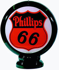
You know the gasoline brand Phillips 66? Back in the late 1940s they had an employees’ basketball team. They were called the Phillips 66ers, and they wore a “Phillips 66” insignia on their chest. And that’s where things get confusing.
I became interested in the 66ers after coming across this photo in the Life magazine archives. As you can see, both players facing the camera have two sets of front-jersey numbers. The script 66 is obviously part of the team insignia, but what about the block numbers? Never seen uni numbers positioned like that before. One guy’s got No. 66 (plus a 6 on his shorts, plus-plus presumably another 6 on his shorts that’s out of view), which just happens to be the name of the company, while the other guy’s got No. 33, which just happens to be exactly half of 66 — two mighty big coincidences. Maybe these are team identifiers, not uniform numbers. Did all the white-clad players have this block 66, I wondered, with all the dark-clad players wearing the block 33?
That’s the only photo I found that shows two teams of 66ers playing against each other. But I soon found several shots that show one team of 66ers playing against a non-66ers opponent, and an interesting pattern emerged for those upper-chest block numbers. This shot shows a player with a block 55; this one shows 11, 99, and 66 again (plus something not quite legible on the player bringing up the rear); this one shows 22; and I guess the photographer really liked that 66 guy, because he’s also shown here, here, and here (and yes, it appears to be the same player each time, despite switching from white to dark uniforms).
Obviously, those are all double numbers — boxcars, snake eyes, etc. First I thought, “Aha! Each player probably just has a single-digit uni number, and he also wears that number on each collarbone, creating the illusion of double numbers. It’s overkill, but it solves the mystery!” But if we go back to this photo, we see that one of the 66ers is wearing double-zero on his back, so that shoots down the single-digit theory.
“Aha again!” I thought. “They all have double-numeral uni numbers. It’s weird, but hey, it’s their style.” But then I went back to this shot, which shows a 66er wearing No. 34 on his back. So much for that theory.
Finally, I came across this shot, which seems to show a 66er wearing 90 on his chest. This is the only example I’ve seen in which the block numerals on the front of the jersey don’t repeat.
At the very least, this is a case of very unusual uni number placement. Toss in the boxcars/snake-eyes factor and the weird repetition of 66 and we’ve got a real puzzler. Got potential explanations? Let’s hear ’em.
Uni Watch News Ticker: My two cents on the Army/Navy shenanigans (already covered in depth by Phil yesterday): I thought Navy looked great — if they wore that uniform on a regular basis, that’d be jake with me. As for Army, if I wanted to watch G.I. Joe, I’d cue up this. ”¦ Speaking of the Army uniforms, here’s an article about the company that manufactured them (with thanks to Jesse Gavin). ”¦ The Cavs apparently like their throwbacks (thanks, Phil). ”¦ Check out this shot of FIU players warming up prior to Saturday’s game — tough to be sure, but it looks like No. 15 has a different piping pattern. ”¦ Wanna have your mind blown just a little bit? Try this on for size. That solid-green Packers portrait comes courtesy of Tom Farley, who sent along a bunch of mid-century NFL shots from his photo collection. “You can see that the Packers’ early-’50s green was much closer to kelly than the forest green Lombardi brought in,” he notes. The other pics he sent include a Colts/Packers shot from 1955 or ’55, an awesome Packers huddle from 12/10/61 at Kezar Stadium in SanFran, a late-’50s Colts/Niners shot (Kezar again), and a distant shot of the Packers and Cardinals, circa 1940 (“I know it’s at State Fair Park in Milwaukee — you can make out the dirt auto-racing track and the protective fence, complete with barbed wire, in the foreground — but I can’t recall if I ever established which game it was,” says Tom). Amazing stuff. ”¦ Now I’ve seen everything: Uni Watch cited (although mis-styled) in an eBay listing. And not just in the headline — note the first line of the item description (with thanks to Paul Hemingway). ”¦ Seattle’s new soccer team has unveiled its new uniforms. ”¦ What’s with the black heart patch on Eric Zeier’s jersey? (Photo courtesy of Taylor Darsey.) ”¦ Note the differing nameplate typography for the Sutter brothers in this shot (good find by Jeff Barak). ”¦ Bunch of really fun Georgia Tech 1950s program covers here (with thanks to Chris Wheeler). ”¦ Bill Radie notes that the jerseys in NHL 09 include an impressive detail: the stitching for the fight strap. ”¦ Interesting use of hockey-style jerseys here (with thanks to James T. Huening). ”¦ Here’s a memorial format I’ve never seen before: a long black strip. That’s the Indiana Ice of the USHL, whose team president Michael Schupay recently passed away. The strip (which was just worn this past weekend and will now be replaced by a patch) was even worn by the team’s mascot and cheerleaders (with thanks to David Soline). ”¦ Dylan Glickman notes that the Lebron logo, which was on Ohio State’s shorts as recently as November 24th, has more recently been replaced by a swoosh. Anyone know why? ”¦ Color vs. color alert: Maquette/Wisconsin from Saturday. ”¦ And here’s another one: UCF/USF, also from Saturday. But there’s a story behind this one, as explained by Doug Richards: “UCF had just finished a five-game road trip, and head coach Kirk Speraw wanted to do something special to pump up his team now that they were back home. The players headed out for warm-ups wearing their usual white home uniforms. But when they entered the locker room after pregame warm-ups, they found new gold uniforms waiting in their lockers.” ”¦ Nice to see Under Armour is now making police cars (with thanks to John Flanagan). ”¦ Decal problems yesterday for Antonio Pierce and Le’Ron McClain, on both sides of his helmet (screen grabs courtesy of Rob Perkey and John Okray, respectively). ”¦ If you choose to believe this article, those annoying biceps bands originated at Penn State (with thanks to Chris Flinn, who also put together a nice batch of Army/Navy screen grabs). ”¦ Great find by Jeremy Brahm: an Ichiro footwear timeline. Surprising to learn that the Broncos have a helmet cart featuring their pre-Nike design. “Apparently they use this to do parking lot promotions before games,” says Jeff Husted. “I asked if they had one with the current logo, but apparently they don’t.” ”¦ Doug Keklak got some good college football screen grabs showing unusual NOBs for Cincinnati’s Corey Smith and Tulsa’s Damaris and David Johnson (also note the rounded nameplates), plus decal problems for USF’s Benjamin Williams. ”¦ Dig this awesome shot of Sid Luckman. ”¦ The Bills had a “home” game in Toronto yesterday, so they wore this logo as a jersey patch. ”¦ Latest memorial for Bill Keightley: Kentucky wore black uniforms last night, and everyone had this NOB. ”¦ Moon over Baltimore last night (with thanks to Tim Burke). … Hopped in the car yesterday with my friends Jon Hammer and Karen McBurnie and headed down to Philly, where we checked out the R. Crumb and Peter Saul exhibits. On the way back, we stopped for adult beverages at the totally swell Jay’s Elbow Room (additional view here), where an unusual uni-related detail present itself: When we asked why the bar’s coaster design features an elephant, we were told that the original owner back in the ’40s was a big Philadelphia A’s fan. I trust you all get the connection.
Special treat for Paul. Some random fan at the Broncos/Chiefs game sporting the throwback DIY Frank Tripucka look. Enjoy the striped socks.
link
I know I’m not a basketball fan, whatsoever, but shouldn’t the guy in white be gaurding the guy, oh I don’t know, WITH THE BALL!
link
Just asking… (retreats to hockey wing)
re: the Uni Watch mention in the ebay listing
Perhaps Uni Watch should make some extra coin by endorsing vintage uniform and catalog sales on ebay. “This 1958 basketball onesie features the official Uni Watch hologram and seal of approval.”
Visanthe Shiancoe of the Vikings had a (non)uniform crisis on TV yesterday:
link
Hard to tell what the TV station was thinking. It is the locker room, after all…
[quote comment=”304095″]Visanthe Shiancoe of the Vikings had a (non)uniform crisis on TV yesterday:
link
Hard to tell what the TV station was thinking. It is the locker room, after all…[/quote]
that’s what can happen on any given sunday
(it’s SFW)
The Pioneer Press reports that there are screengrabs of the, uh, incident on link. Obviously NSFW.
The article on the Army Navy uniforms, I read yesterday in the sunday edition, at least a couple of times a year, Powers Manufacturing has a sale of clothes that are either defective or old (style). They used to make the uniforms for Michigan before they were cursed with Adidas.
I don’t have a screengrab or anything, but the Ravens’ RB’s helmet decal snapped in the cold temps in real time on SNF. It was clearly seen in real time and sure enough, the next shot of his helmet showed a large part of the Raven helmet decal missing.
Paul- There is no link for the FIU #15’s piping at the beginning of the Ticker
I happened to catch a little of the Oregon-Kansas St basketball game yesterday (Oregon’s white out unis = terrible… even in HD you can’t read any of the ‘ghost writing’) and Kansas St had some sort of coat of armor patch on their jerseys. Anyone have any idea what thats about?
The Ravens wore a black jersey with white pants for the first time last night, which was mentioned in the ticker the other day. I think it looked better than the unitard look of years past. I like the visual direction that the team has taken this year under Harbaugh, and who knows, maybe they’ll touch it up in years to come.
Saw this and immediately thought of uniwatch.
Cowboys helmet golf cart at Texas Stadium: $12,500
link
[quote comment=”304100″]Paul- There is no link for the FIU #15’s piping at the beginning of the Ticker[/quote]
Now fixed. Thanks!
[quote comment=”304099″]I don’t have a screengrab or anything, but the Ravens’ RB’s helmet decal snapped in the cold temps in real time on SNF. It was clearly seen in real time and sure enough, the next shot of his helmet showed a large part of the Raven helmet decal missing.[/quote]
From the ticker…
Decal problems yesterday for Antonio Pierce and Le’Ron McClain, on both sides of his helmet (screen grabs courtesy of Rob Perkey and John Okray, respectively).
I don’t know if/when it’s been mentioned before, but for Ravens players in last night’s game with visors on their helmets, the visor tabs had “Ravens” wordmarks. I don’t have a shot of it, but I noticed it on one of the numerous Ray Lewis close-ups. Is that NFL standard (neam name wordmark on the visor tabs), or does it vary from team to team?
Thanks for posting that link about the A’s and why they have a white elephant as their mascot. I’m a little embarrassed to admit that I never knew that.
Uni Watch = educational
HOFer Bob Kurland was perhaps the most famous Phillips 66er. Kurland wore #90. Kurland attended Oklahoma A&M (now Oklahoma State) and was George Mikan’s major rival during college. Kurland chose to work for Phillips 66 and play for their AAU team instead of playing professionally.
link
[quote comment=”304106″]I don’t know if/when it’s been mentioned before, but for Ravens players in last night’s game with visors on their helmets, the visor tabs had “Ravens” wordmarks. I don’t have a shot of it, but I noticed it on one of the numerous Ray Lewis close-ups. Is that NFL standard (neam name wordmark on the visor tabs), or does it vary from team to team?[/quote]
Varies. I wrote an ESPN piece about this (and other visor-related issues) a few years ago. Not sure how many of the photo links still work, but here it is:
link
Hey Tom Farley – amazing Packers photos. Simply stunning.
Stop by my blog when you have a sec, maybe drop me a line? I’d love to take a look at what else you have for my research, if that’s okay with you….
Great shot of the Jay’s sign…love the reflection in the right corner.
Most appealing: “PACKAGE GOODS”…
[quote comment=”304109″][quote comment=”304106″]I don’t know if/when it’s been mentioned before, but for Ravens players in last night’s game with visors on their helmets, the visor tabs had “Ravens” wordmarks. I don’t have a shot of it, but I noticed it on one of the numerous Ray Lewis close-ups. Is that NFL standard (neam name wordmark on the visor tabs), or does it vary from team to team?[/quote]
Varies. I wrote an ESPN piece about this (and other visor-related issues) a few years ago. Not sure how many of the photo links still work, but here it is:
link
Cool. I thought I remembered reading that, but I couldn’t directly recall.
Was in Build-A-Bear Workshop this weekend shopping for my nieces, and noticed this:
link.
It’s a shame a stuffed animal can look better than the real players.
~E~
Uni-related contest for the NHL’s Winter Classic.
link
[quote comment=”304114″]Was in Build-A-Bear Workshop this weekend shopping for my nieces, and noticed this:
link.
It’s a shame a stuffed animal can look better than the real players.
~E~[/quote]
I like that they call that an Authentic uniform.
Hey, this is Pattie and I was your waitress/owner at Jays Elbow Room. Enjoy the coasters!
[quote comment=”304110″]Hey Tom Farley – amazing Packers photos. Simply stunning.
Stop by my blog when you have a sec, maybe drop me a line? I’d love to take a look at what else you have for my research, if that’s okay with you….[/quote]
Ditto from this end, Tom. Was VERY interested to see the Colts in the night game NOT wearing sleeve stripes. I do understand that the Colts actually wore RED jerseys for a couple of night affairs in this era against the Lions. It’s possible that the Colts are sporting red jerseys here as well.
As for that wide view of the Packers-Cardinals game, I am guessing 1939 or 1940. Couldn’t be any later as the refs were wearing striped shirts starting in 1941.
Like chance I am doing deep research on the 1930-1958 era of uniforms and if you could please give me a holler Tom, I would really appreciate it.
Thanks for sharing and you are getting quite popular in these parts!!
Better look at that “Colts/Packers shot from 1955 or ’55” again. That’s Pittsburgh not Greenbay. I reference the Northwestern stripe as an indicator.
Packers ‘Green Team’ unis are bad, but not as bad as this mess: link
Very dilapidated link. I love how those numbers were constructed — in separate, unconnected parts!
[quote comment=”304115″]Uni-related contest for the NHL’s Winter Classic.
link
Yeah I just saw that. Someone from this site should certainly win.
One thing that has been overlooked with the Navy uniforms: the number font on the jersey is similar to the number font used on the sides of US Navy ships. Check out this picture of FFG-26 and compare to the one Paul posted of #26 for Navy. Beat Army!
link
[quote comment=”304119″]Better look at that “Colts/Packers shot from 1955 or ’55” again. That’s Pittsburgh not Greenbay. I reference the Northwestern stripe as an indicator.[/quote]
The Packers wore Northwestern stripes in the 1950s.
Here’s the picture of #26 for Navy. You can tell there was a lot of thought put into the uniform schemes.
link
[quote comment=”304124″][quote comment=”304119″]Better look at that “Colts/Packers shot from 1955 or ’55” again. That’s Pittsburgh not Greenbay. I reference the Northwestern stripe as an indicator.[/quote]
The Packers wore Northwestern stripes in the 1950s.[/quote]
Forgot to include the link.
[quote comment=”304121″]Very dilapidated link. I love how those numbers were constructed — in separate, unconnected parts![/quote]
Good treatment of that subject here (from Bill Henderson’s CD):
link
[quote comment=”304126″][quote comment=”304124″][quote comment=”304119″]Better look at that “Colts/Packers shot from 1955 or ’55” again. That’s Pittsburgh not Greenbay. I reference the Northwestern stripe as an indicator.[/quote]
The Packers wore Northwestern stripes in the 1950s.[/quote]
Forgot to include the link.[/quote]
Did they have a NW stripe on the socks too?
[quote comment=”304115″]Uni-related contest for the NHL’s Winter Classic.
link
im sorry but that’s fucking disgusting
look for the uniform with the missing reebok logo? how about make all of them that way? and they’re offering a prize to the one who spots it?
/rant off
$10 says the player without the logo is mysteriously scratched from the game before it starts…
Thing is, they don’t specify which logo is missing. It could be the rear logo, it could be either cuff logo, it could be the logo on a goalie’s hockey stick, it could be the logo on the goalie’s pads… who knows…
Watch it be a missing cuff logo and the player only gets in the game for a 20 second shift in the 3rd period…
[quote comment=”304130″]$10 says the player without the logo is mysteriously scratched from the game before it starts…
Thing is, they don’t specify which logo is missing. It could be the rear logo, it could be either cuff logo, it could be the logo on a goalie’s hockey stick, it could be the logo on the goalie’s pads… who knows…
I love how they say it’s for both the fans watching at home on the tube AND for the fans in the stands!!..Oh SURE…going to be easy to spot that baby from the Bleachers in Wrigley! LOL
Watch it be a missing cuff logo and the player only gets in the game for a 20 second shift in the 3rd period…[/quote]
[quote comment=”304131″]I love how they say it’s for both the fans watching at home on the tube AND for the fans in the stands!!..Oh SURE…going to be easy to spot that baby from the Bleachers in Wrigley! LOL
[/quote]
Well… I mean, they DO say they are handing out binocs for the fans at the stadium… lol, as if the NHL, a league starving for money, is going to be giving out binocs that are halfway decent enough for fans to see any kind of detail on jerseys from a few hundred feet away…
Oh, and for the viewers at home, yeah, it’ll be on NBC HD, but lets hope thats a really good signal, otherwise, good luck seeing any kind of detail. And for those watching from a non-HD set, hahahahahaha.
” … a late-’50s Colts/Niners shot (Kezar again) …”
Did the Niners wear gold in the ’50s? I thought they changed over in the mid-60s (’64?). The ’61 shot still shows them in silver (and that dude wearning #73 looks like his mom sewed the ‘7’ on …) and I doubt they changed back …
Great shots, still. Very nostalgic to see Kezar — but it was a *nasty* pit. Candlestick (a ridiculous, rusty hulk built on bay landfill by sleazy SF politicians — but I repeat myself) was actually a big upgrade.
Rick Barry claimed that his father played semi=pro ball in a league against the Phillips team. According to Barry, the Phillips team always scored exactly 66 and would stop scoring.
His father intentionally scored a basket in the wrong net to give them 68 points.
[quote comment=”304129″][quote comment=”304115″]Uni-related contest for the NHL’s Winter Classic.
link
im sorry but that’s fucking disgusting
look for the uniform with the missing reebok logo? how about make all of them that way? and they’re offering a prize to the one who spots it?
/rant off[/quote]
100% agreed, was going to post the story but see it already has. All I can say is that neither reebok or the NHL gets it.
It is just so stupid, its hard to believe that an entity like the NHL or a company like reebok, with the marketing and research capabilities they have have no clue (or ignore) the whole idea of UniWatch, and in fact go so far as to have a contest which almost rubs this fact right in our faces.
[quote comment=”304129″][quote comment=”304115″]Uni-related contest for the NHL’s Winter Classic.
link
im sorry but that’s fucking disgusting
look for the uniform with the missing reebok logo? how about make all of them that way? and they’re offering a prize to the one who spots it?
/rant off[/quote]
Um, no, Phil… you wanna know what’s disgusting?
“To enter, fans must be legal U.S. residents, 18 years or older.”
WTF? Yeah, a hockey-mad country of 30 million people don’t want to participate. Hey, Reebok… some of us bought tickets too, eff-wads!
I’m absolutely disgusted and insulted by that.
and secondly, the fella on ebay selling a jersey and using the UniWatch brand to try to sell it. Does this guy think because its simply some minor league jersey everyone with any interest in uniform related merchandise with flock to buy it?
Hey NHL fans, I’m selling an old pair of figure skates from when I was 12! get them before they’re gone!
NFL Logo Minutiae…
Anyone else notice the “Dial-A-Down” logo has been covered up while on NFL sidelines this year?
How they used to look…
link
How they look now…
link
link
hard to see…but there’s a clear absence of a logo.
[quote comment=”304136″][quote comment=”304129″][quote comment=”304115″]Uni-related contest for the NHL’s Winter Classic.
link
im sorry but that’s fucking disgusting
look for the uniform with the missing reebok logo? how about make all of them that way? and they’re offering a prize to the one who spots it?
/rant off[/quote]
Um, no, Phil… you wanna know what’s disgusting?
“To enter, fans must be legal U.S. residents, 18 years or older.”
WTF? Yeah, a hockey-mad country of 30 million people don’t want to participate. Hey, Reebok… some of us bought tickets too, eff-wads!
I’m absolutely disgusted and insulted by that.[/quote]
I guess that balances out all the CBC/HNIC contests I can never enter.
link
If I zoom in pretty far (thanks to my boss for the great screen), the number on the guy in the rear appears to be not a double number (for sure), and probably ’90’.
Did they have a NW stripe on the socks too?
They did, Craig. In the deep background, you can see the Longines clock atop the Milwaukee County Stadium scoreboard. The Packers and Colts played Saturday-night games there in ’54 and ’55, the only two years the Colts had blue helmets.
There was a period there where the Steelers and Packers looked nearly identical, especially in black and white. But that’s the Packers, without question.
[quote comment=”304133″]” … a late-’50s Colts/Niners shot (Kezar again) …”
Did the Niners wear gold in the ’50s? I thought they changed over in the mid-60s (’64?). The ’61 shot still shows them in silver (and that dude wearning #73 looks like his mom sewed the ‘7’ on …) and I doubt they changed back …
Great shots, still. Very nostalgic to see Kezar — but it was a *nasty* pit. Candlestick (a ridiculous, rusty hulk built on bay landfill by sleazy SF politicians — but I repeat myself) was actually a big upgrade.[/quote]
After looking at the picture of Kezar,it’s only amazing that it took another 30 years to collapse. It may be the picture, but the pressbox looks bowed.
[quote comment=”304139″]
I guess that balances out all the CBC/HNIC contests I can never enter.[/quote]
Yeah, that balances it out. Excuse me while I laugh that one off.
The fact that the CBC will be the only carrier of the game in Canada should be reason enough for the NHL to tell Reebok that this contest should be open to both sides of the border. It is a contest run by Reebok, not by the CBC.
If it were a CBC contest, you’d have every right to complain, but this is a major corporate sponsor of the NHL telling Canadians that we’re not important enough as customers.
And that’s a total kick in the nuts by Reebok.
Did the Niners wear gold in the ’50s? I thought they changed over in the mid-60s (’64?). The ‘61 shot still shows them in silver (and that dude wearning #73 looks like his mom sewed the ‘7′ on …) and I doubt they changed back …
They did, Valjean. They seem to vacillate between silver and gold for a period there from about ’57 to ’64. I’ve seen color footage from the ’57 Western Conference playoff at Kezar with the Niners in gold helmets and pants.
Even after they added the SF helmet logo in ’62, it appears (in photos I’ve seen) as though they’re still silver, and not gold until ’64. Paging Ricko …
As for that wide view of the Packers-Cardinals game, I am guessing 1939 or 1940. Couldn’t be any later as the refs were wearing striped shirts starting in 1941.
Thanks, timmy b. I just knew, when I sent the photos to Paul, that somebody here would pick out a detail to better establish the year. (I thought I wrote it down when I acquired the photo.)
And thanks for the kind words, everybody. A guy goes through life thinking he’s the only one into this stuff … :)
[quote comment=”304143″]
The fact that the CBC will be the only carrier of the game in Canada…[/quote]
I guess RDS will be broadcasting it in Quebec… so CBC only has the English-broadcast rights in Canada.
Still… brutal decision by Reebok. Yet another reason I won’t support that company in any way.
[quote comment=”304143″][quote comment=”304139″]
I guess that balances out all the CBC/HNIC contests I can never enter.[/quote]
Yeah, that balances it out. Excuse me while I laugh that one off.
The fact that the CBC will be the only carrier of the game in Canada should be reason enough for the NHL to tell Reebok that this contest should be open to both sides of the border. It is a contest run by Reebok, not by the CBC.
If it were a CBC contest, you’d have every right to complain, but this is a major corporate sponsor of the NHL telling Canadians that we’re not important enough as customers.
And that’s a total kick in the nuts by Reebok.[/quote]
Yeah, God forbid a US company wanting to keep their prize in the US to avoid the enormous taxation they would incur by awarding it to a Canadian resident, especially in this booming economy we have right now.
Sorry, I have no sympathy. For everything that Canadians do to try to separate themselves from the US at every turn, they sure seem to want that handout from south of the border whenever they can…
[quote comment=”304140″]http://tbn0.google.com/hosted/images/c?q=2e72c7f8d161cace_large
If I zoom in pretty far (thanks to my boss for the great screen), the number on the guy in the rear appears to be not a double number (for sure), and probably ’90’.[/quote]
Paul mentioned that and showed a pic of the 90
link
Oops, one more thing: timmy b, I’m not sure how to reach you. If Paul’s willing, maybe he could pass your e-mail address to me.
Um, beardface…do your research before making coments like that please…
Reebok is British and now owned by a german company…
Reebok International Limited is a producer of athletic footwear, apparel, and accessories and is currently a subsidiary of Adidas. The name comes from the Afrikaans spelling of rhebok, a type of African antelope or gazelle. The company, founded in Bolton, United Kingdom, in 1895, was originally called J.W. FOSTER & SONS but was renamed Reebok in 1958. The company’s founders, Joe and Jeff Foster, found the name in a dictionary won in a race by Joe Foster as a boy; the dictionary was a South African edition, hence the spelling.
[quote comment=”304146″][/quote]
Yeah, God forbid a US company wanting to keep their prize in the US to avoid the enormous taxation they would incur by awarding it to a Canadian resident, especially in this booming economy we have right now.
Sorry, I have no sympathy. For everything that Canadians do to try to separate themselves from the US at every turn, they sure seem to want that handout from south of the border whenever they can…[/quote]
Hey, Beardface, you should check your information before you start spewing crap from your talk-hole.
90% of the NHL uniforms are made in Quebec. Over half the Rbk NHL merchandise is made in Quebec.
Your economy is your problem. Reebok bought a Canadian-based company and is using them to churn out NHL merchandise. I believe we should be able to take part in a contest they run when we make the stuff you’re buying.
Thanks for the fabulous breakdown on the subject you know nothing about, though. That’s helpful.
[quote comment=”304150″][quote comment=”304146″]
Yeah, God forbid a US company wanting to keep their prize in the US to avoid the enormous taxation they would incur by awarding it to a Canadian resident, especially in this booming economy we have right now.
Sorry, I have no sympathy. For everything that Canadians do to try to separate themselves from the US at every turn, they sure seem to want that handout from south of the border whenever they can…[/quote]
Hey, Beardface, you should check your information before you start spewing crap from your talk-hole.
90% of the NHL uniforms are made in Quebec. Over half the Rbk NHL merchandise is made in Quebec.
Your economy is your problem. Reebok bought a Canadian-based company and is using them to churn out NHL merchandise. I believe we should be able to take part in a contest they run when we make the stuff you’re buying.
Thanks for the fabulous breakdown on the subject you know nothing about, though. That’s helpful.[/quote]
I hope that fixes the quotes.
and Canadians never ask for handouts…they are the best neighbors in the world….so…before you keep on saying negative things about Canada…realize that most hockey players are canadians…and that the anger you have for Canada, is truly unfounded…what has Canada ever done to you? forget to give you a looney instead of a twoonie?
Canada, won’t you be my neighbor?
[quote comment=”304152″]and Canadians never ask for handouts…they are the best neighbors in the world….so…before you keep on saying negative things about Canada…realize that most hockey players are canadians…and that the anger you have for Canada, is truly unfounded…what has Canada ever done to you? forget to give you a looney instead of a twoonie?
Canada, won’t you be my neighbor?[/quote]
Absolutely, Mr. Rogers. ;o) LOL
“90% of the NHL uniforms are made in Quebec. Over half the Rbk NHL merchandise is made in Quebec”.
…wouldn’t be easier just to blame the French?
I know that’s one thing Americans and Canadians can agree on….
back to UNI talk, eh!
[quote comment=”304092″]Special treat for Paul. Some random fan at the Broncos/Chiefs game sporting the throwback DIY Frank Tripucka look. Enjoy the striped socks.
link[/quote]
This is a great follow-up to last week’s DIY hockey sweaters, as I’m sure the vertically-striped socks aren’t off the rack. That’s probably true for most of the rest of the get-up as well.
[quote comment=”304149″]Um, beardface…do your research before making coments like that please…
Reebok is British and now owned by a german company…
Reebok International Limited is a producer of athletic footwear, apparel, and accessories and is currently a subsidiary of Adidas. The name comes from the Afrikaans spelling of rhebok, a type of African antelope or gazelle. The company, founded in Bolton, United Kingdom, in 1895, was originally called J.W. FOSTER & SONS but was renamed Reebok in 1958. The company’s founders, Joe and Jeff Foster, found the name in a dictionary won in a race by Joe Foster as a boy; the dictionary was a South African edition, hence the spelling.[/quote]
And the unit that is offering the contest is based in the US, and thus they are obiding US taxation regulation.
I know Reebok is a UK company, hard to miss with their old logo, but that doesn’t change what I said.
Well, how about someone call reebok and ask them specifically and end this argument…
[quote comment=”304141″]Did they have a NW stripe on the socks too?
They did, Craig. In the deep background, you can see the Longines clock atop the Milwaukee County Stadium scoreboard. The Packers and Colts played Saturday-night games there in ’54 and ’55, the only two years the Colts had blue helmets.
There was a period there where the Steelers and Packers looked nearly identical, especially in black and white. But that’s the Packers, without question.[/quote]
He’s right, but just to confirm here’s a pic of the link.
What is this, the South Park movie?
[quote comment=”304098″]The article on the Army Navy uniforms, I read yesterday in the sunday edition, at least a couple of times a year, Powers Manufacturing has a sale of clothes that are either defective or old (style). They used to make the uniforms for Michigan before they were cursed with Adidas.[/quote]
Michigan is link to US soldiers and veterans.
[quote comment=”304159″][quote comment=”304141″]Did they have a NW stripe on the socks too?
They did, Craig. In the deep background, you can see the Longines clock atop the Milwaukee County Stadium scoreboard. The Packers and Colts played Saturday-night games there in ’54 and ’55, the only two years the Colts had blue helmets.
There was a period there where the Steelers and Packers looked nearly identical, especially in black and white. But that’s the Packers, without question.[/quote]
He’s right, but just to confirm here’s a pic of the link.[/quote]
Steelers had a single black stripe on pants, Packers had no patns stripe. And I’m guessing the black jerseys would have tracked a bit darker, too.
I think the ballcarrier (#37) is Howie Ferguson and the QB in bkgd (#18) is Tobin Rote. So, because Packers wore Navy blue back then, it might be likely those Colt jerseys are indeed their red alternates (if that’s already been determined, I apologize; haven’t read all posts, been a busy day).
—Ricko
[quote comment=”304117″]Hey, this is Pattie and I was your waitress/owner at Jays Elbow Room. Enjoy the coasters![/quote]
Way to go, Pattie! Those coasters are world-class. How much did Paul and his pals spend on the fortifying beverages?
Tiny tiny political comment: Our dear USA is SO lucky in its neighbors. Yeah, Canada; Viva Mexico. Are you kidding? — They are the best next-door nations possible. Imagine if it were Germany and Afghanistan…
[quote comment=”304162″][quote comment=”304159″][quote comment=”304141″]Did they have a NW stripe on the socks too?
They did, Craig. In the deep background, you can see the Longines clock atop the Milwaukee County Stadium scoreboard. The Packers and Colts played Saturday-night games there in ’54 and ’55, the only two years the Colts had blue helmets.
There was a period there where the Steelers and Packers looked nearly identical, especially in black and white. But that’s the Packers, without question.[/quote]
He’s right, but just to confirm here’s a pic of the link.[/quote]
Steelers had a single black stripe on pants, Packers had no patns stripe. And I’m guessing the black jerseys would have tracked a bit darker, too.
I think the ballcarrier (#37) is Howie Ferguson and the QB in bkgd (#18) is Tobin Rote. So, because Packers wore Navy blue back then, it might be likely those Colt jerseys are indeed their red alternates (if that’s already been determined, I apologize; haven’t read all posts, been a busy day).
—Ricko[/quote]
The Packers did occasionally wear pants with single navy stripes from 1954 through 1958, though not with any regularity. The solid pants were much more common.
Hadn’t realized that the Cots wore red alternates. With blue helmets? Considering they’ve had such a consistent look for decades, hard to remember that they used to experiment with the best of them.
“The Packers did occasionally wear pants with single navy stripes from 1954 through 1958, though not with any regularity. The solid pants were much more common.”
Glad you said that, cuz even as I was typing had this nagging feeling about striped Packer pants in that era…but more in the years just before Lombardi, I thought. Y’know, that Hornung had maybe always played in striped pants for Green Bay. That’s a question based on imprecise memory, btw, not a statement of fact.
haha canadians are angry..
hockey sucks anyways
and yes you can call me an ignorant american because I only like american sports..imagine that
This Saturday, ESPN will air a re-broadcast of the 1958 NY Giants vs Balt Colts game. Whats uni-watch appropriate about this is that ESPN has colorized the footage so you get to see it like it truly was.
Saw a commercial for it over the weekend. Looks very well done. Definitely worth a watch.
link
In 1957 and 1958, Hornung would have played in Lisle Blackbourn’s navy and gold, sometimes with pants stripes and sometimes without.
I wish I could get a better handle on those days – the years in between Lambeau and Lombardi were characterized by wild uniform swings, including the monochrome seen above.
[quote comment=”304168″]and yes you can call me an ignorant american because I only like american sports..imagine that[/quote]
And what sports are specifically only played by Americans and only in America?
[quote comment=”304169″]This Saturday, ESPN will air a re-broadcast of the 1958 NY Giants vs Balt Colts game. Whats uni-watch appropriate about this is that ESPN has colorized the footage so you get to see it like it truly was.[/quote]
Wellll… mostly. Colorization isn’t exactly true to life. Still, it’ll be great to watch. Love to see more of these.
[quote comment=”304172″][quote comment=”304169″]This Saturday, ESPN will air a re-broadcast of the 1958 NY Giants vs Balt Colts game. Whats uni-watch appropriate about this is that ESPN has colorized the footage so you get to see it like it truly was.[/quote]
Wellll… mostly. Colorization isn’t exactly true to life. Still, it’ll be great to watch. Love to see more of these.[/quote]
It looks pretty true to form on the preview. Perhaps it won’t be exactly like it was, but it’ll be damn well close enough for me not to care.
I agree with you, I’d love to see this happen to more old broadcasts. There are some old MLB games that I would love to see colorized. Same for some old hockey games.
[quote comment=”304162″][quote comment=”304159″][quote comment=”304141″]Did they have a NW stripe on the socks too?
They did, Craig. In the deep background, you can see the Longines clock atop the Milwaukee County Stadium scoreboard. The Packers and Colts played Saturday-night games there in ’54 and ’55, the only two years the Colts had blue helmets.
There was a period there where the Steelers and Packers looked nearly identical, especially in black and white. But that’s the Packers, without question.[/quote]
He’s right, but just to confirm here’s a pic of the link.[/quote]
Steelers had a single black stripe on pants, Packers had no patns stripe. And I’m guessing the black jerseys would have tracked a bit darker, too.
I think the ballcarrier (#37) is Howie Ferguson and the QB in bkgd (#18) is Tobin Rote. So, because Packers wore Navy blue back then, it might be likely those Colt jerseys are indeed their red alternates (if that’s already been determined, I apologize; haven’t read all posts, been a busy day).
—Ricko[/quote]
Ricko, you beat me to the punch on the stripe on the Steelers pants and no stripe on the Packers pants from 1954-1958. That is the discernable difference. Of course, the Pack DID have a stripe on their away white pants in 1957 and 1958.
The Niners switched between gold, silver, white and red helmets in the 1950’s.
Red: 1953-1955
White: 1956
Gold: 1957-1959 (I think)
Silver: 1960-1961
Silver (with SF logo): 1962-1963
Gold (with SF logo): since 1964
Tom: email is link
[quote comment=”304168″]and yes you can call me an ignorant american because I only like american sports..imagine that[/quote]
Man, you must have been pissed when the Toronto Blue Jays went back to back in 92 and 93…
Team Canada Prototype 3rd Jersey….(no sir…I don’t like it)
link
And in more upbeat hockey news (unless you happen to be a Coyotes fan): the Blackhawks link last night.
chance et al,
I think this is how it went down for the Pack in 1957 and 1958.
With the NFL establishing an away white and a dark home jersey effective 1957, the Packers decided to go all white for away. Helmet, jersey, pants and socks. Helmet and pants had a navy stripe. jerseys and socks had the navy nw stripes.
Homes remained as was in 1954-1956 (with tv #s added in 1956): Yellow helmet and pants, with a navy stripe on the helmet only. Jersey and pants were navy with yellow nw stripes.
I’m pretty certain on this. Might there have been a mix and match on pants and helmet in ’57 & ’58??
[quote comment=”304098″]The article on the Army Navy uniforms, I read yesterday in the sunday edition, at least a couple of times a year, Powers Manufacturing has a sale of clothes that are either defective or old (style). They used to make the uniforms for Michigan before they were cursed with Adidas.[/quote]
I had NOTHING to do with this!
I think it is absolutely hysterical that Reebok is dividing anc conquering UniWatch!
Oh, and Blame Canada with their flapping heads!
link
[quote comment=”304178″]And in more upbeat hockey news (unless you happen to be a Coyotes fan): the Blackhawks link last night.[/quote]
Same thing happened to the Hurricanes last year about midway through the season. There were about 3 or 4 games where the horn sounded blown out.
[quote comment=”304180″][quote comment=”304098″]The article on the Army Navy uniforms, I read yesterday in the sunday edition, at least a couple of times a year, Powers Manufacturing has a sale of clothes that are either defective or old (style). They used to make the uniforms for Michigan before they were cursed with Adidas.[/quote]
I had NOTHING to do with this!
I think it is absolutely hysterical that Reebok is dividing anc conquering UniWatch!
Oh, and Blame Canada with their flapping heads!
link
They’re not even a real country anyway
Come on guys, you should know better than to fight with Canada! They do wonderful things for our economy, like provide us with Sidney Crosby and marijuana… you know, the essentials…
Now, to take the two finals today and be done with school for a month… can’t wait!
likely those Colt jerseys are indeed their red alternates
Leave it to Ricko. :) Red Colts alternates! I had no idea!
Might there have been a mix and match on pants and helmet in ‘57 & ‘58??
Seems entirely possible, Timmy B. I know in the City Stadium II (aka Lambeau) inaugural, the Packers went gold helmets, navy jerseys, gold pants. Likewise against the Giants later that season. Later in ’57, they appear to be white-white-white on the road.
I’m 99 percent certain that, in the ’58 home opener against the Bears, they went white-navy-white, but the jersey had white numerals instead of gold. (The photographic evidence I’ve found is iffy.) I think it’s possible they went entirely without gold in ’58, meaning white-white-white away.
The Packers updated their written uniform chronology over the summer. They claim that green was still in the mix in ’58, but I’ve not seen color-photo proof.
link
[quote comment=”304152″]and Canadians never ask for handouts…they are the best neighbors in the world….so…before you keep on saying negative things about Canada…realize that most hockey players are canadians…and that the anger you have for Canada, is truly unfounded…what has Canada ever done to you? forget to give you a looney instead of a twoonie?
Canada, won’t you be my neighbor?[/quote]
[quote comment=\”304152\”]and Canadians never ask for handouts…they are the best neighbors in the world….so…before you keep on saying negative things about Canada…realize that most hockey players are canadians…and that the anger you have for Canada, is truly unfounded…what has Canada ever done to you? forget to give you a looney instead of a twoonie?
Canada, won\’t you be my neighbor?[/quote]
Only if you admit its spelled neighbour.
Finally, link for one of the two teams that has actually worn them in a real game will be for sale
[quote comment=”304186″][quote comment=”304152″
Canada, won\’t you be my neighbor?[/quote]
Only if you admit its spelled neighbour.[/quote]
next thing is that you will be telling me its it’s Mr. Rodgers….
It’s funny we are talking about confusing Pittsburgh with Green Bay unis today because I have always thought, (in recent years) that some of the cold weather and sideline gear that the Pack and Steelers have look alike.
Steelers winter cap:
link
Pack:
link
This has been going on for a few years with sideline caps and such. Does anyone know of a site that has official pantone colors for teams? Do the Pack and Steelers have the same yellow? And I have always thought that the Jets and Pack have the same green as well.
Only if you admit its spelled neighbour.[/quote]
not to be off topic, but what is with the u? im not really seeing how it is needed. but i will say this much for canada, at least you guys get national health care.
[quote comment=”304190″]Only if you admit its spelled neighbour.[/quote]
not to be off topic, but what is with the u? im not really seeing how it is needed. but i will say this much for canada, at least you guys get national health care.[/quote]
It’s the British spelling. We’re still a Commonwealth country. You guys did away with the extra “U” sometime around 1776. ;o)
[quote comment=”304179″]chance et al,
I think this is how it went down for the Pack in 1957 and 1958.
With the NFL establishing an away white and a dark home jersey effective 1957, the Packers decided to go all white for away. Helmet, jersey, pants and socks. Helmet and pants had a navy stripe. jerseys and socks had the navy nw stripes.
Homes remained as was in 1954-1956 (with tv #s added in 1956): Yellow helmet and pants, with a navy stripe on the helmet only. Jersey and pants were navy with yellow nw stripes.
I’m pretty certain on this. Might there have been a mix and match on pants and helmet in ’57 & ’58??[/quote]
Might there have been? Absolutely.
[quote comment=”304179″]chance et al,
I think this is how it went down for the Pack in 1957 and 1958.
With the NFL establishing an away white and a dark home jersey effective 1957, the Packers decided to go all white for away. Helmet, jersey, pants and socks. Helmet and pants had a navy stripe. jerseys and socks had the navy nw stripes.
Homes remained as was in 1954-1956 (with tv #s added in 1956): Yellow helmet and pants, with a navy stripe on the helmet only. Jersey and pants were navy with yellow nw stripes.
I’m pretty certain on this. Might there have been a mix and match on pants and helmet in ’57 & ’58??[/quote]
Re: Packers all-white Roads. I’d buy that. I will tell you that as a kid watching those games (Twin Cities got ALL Packers games on tube back then) I kept looking at those road unis and thinking, “Are those ALL white? Sure look they are.” But, in the eyes of a kid it didn’t make sense that a team would have a full set of different road unis…even though at the time, or shortly before, the Chicago Cardinals wore white helmets at home and red on the road.
At the same time, though, I don’t ever remember thinking the helmets and/or pants looked white at home. Not saying wasn’t so, just don’t remember thinking they looked abnormally light….the way they did on the road. I mean, I like to think I’d have noticed they were the some shade as the visitors’ jerseys. (keep in mind, we’re talking 1950’s black and white TV here, lol)
When I’ve looked through my files in the years since, they sure do look all white. What makes it tough is the virtual absence of color photography and slipshod approach to football cards back then. Every Packer card I’ve ever seen is a dark jersey and gold pants. Or, if you go far enough back, the monochrome all-gold of the early 50s. In other words, to my knowledge there are no Packer cards of that era showing white jerseys.
Yeah, there’s one of Tom Bettis (’54 or ’55) but its a publicity photo from his days at Purdue.
Now, as to Navy or Forest Green, man, that’s really tough. Look a at the two cards posted here today (Starr and Ringo). Are those jerseys Forest or Navy? Honestly, I stare at them and stare at them (and I have both those actual cards, I think)…and I can’t tell. Look forest, but still….
—Ricko
[quote comment=”304190″]Only if you admit its spelled neighbour.[/quote]
not to be off topic, but what is with the u? im not really seeing how it is needed. but i will say this much for canada, at least you guys get national health care.[/quote]
Nationalized Health Care…
Good in concept. Fails miserably in execution.
[quote comment=”304189″]It’s funny we are talking about confusing Pittsburgh with Green Bay unis today because I have always thought, (in recent years) that some of the cold weather and sideline gear that the Pack and Steelers have look alike.
Steelers winter cap:
link
Pack:
link
This has been going on for a few years with sideline caps and such. Does anyone know of a site that has official pantone colors for teams? Do the Pack and Steelers have the same yellow? And I have always thought that the Jets and Pack have the same green as well.[/quote]
The Jets and Packers do have the same green.
There’s an amazing resource chronicling professional sports teams colors – link.
Jets are Hunter Green
Packers are Dark Green
[quote comment=”304196″]Jets are Hunter Green
Packers are Dark Green[/quote]
The descriptions are not the determining factor – the teams use the same Pantone values.
[quote comment=”304191″][quote comment=”304190″]Only if you admit its spelled neighbour.[/quote]
not to be off topic, but what is with the u? im not really seeing how it is needed. but i will say this much for canada, at least you guys get national health care.[/quote]
It’s the British spelling. We’re still a Commonwealth country. You guys did away with the extra “U” sometime around 1776. ;o)[/quote]
Heard it was mid-summer…
[quote comment=”304194″][quote comment=”304190″]Only if you admit its spelled neighbour.[/quote]
not to be off topic, but what is with the u? im not really seeing how it is needed. but i will say this much for canada, at least you guys get national health care.[/quote]
Nationalized Health Care…
Good in concept. Fails miserably in execution.[/quote]
Since we’re already off-topic…
Given the extremely high infant mortality rate in the US, not to mention the number of uninsured, we’re hardly in a position to cast stones at another nation’s health care system.
Interesting University of Oklahoma basketball notes:
The sooners introduced new uniforms at the begining of the year. The home whites said “Oklahoma” on the front on top of the number. The away crimsons were just the same with “Oklahoma” on top of the number. Both can be seen here…
link
link
But recently when the sooners played against USC they wore the home whites with “Oklahoma” on top of the numbers and “Sooners” below the number on the front.
link
I thought perhaps they would add the sooners to the away crimsons too, but last night against tulsa they did not have the “sooners”
link
Sorry if the links dont work this is my first time posting.
Rumors out of Blacksburg regarding VT’s football uniforms.
Apparently, the feedback over the white throwbacks have been so positive that Beamer and VT’s AD have contacted Nike requesting them to develop a maroon version. This was already confirmed by Beamer himself on his weekly call-in show earlier in the season.
The big news is that VT is likely going to scrap the ‘designer’ uniforms effective immediately. Since VT is the ‘home’ team for the Orange Bowl, there is a very good chance you’ll see them in a maroon version of the throwbacks for the OB, and going forward, that will be Virginia Tech’s permanent look on the gridiron.
This has actually been confirmed from someone close to the AD who has been leaking the weekly uniform choice of the team over this past season.
[quote comment=”304189″]It’s funny we are talking about confusing Pittsburgh with Green Bay unis today because I have always thought, (in recent years) that some of the cold weather and sideline gear that the Pack and Steelers have look alike.
Steelers winter cap:
link
Pack:
link
This has been going on for a few years with sideline caps and such. Does anyone know of a site that has official pantone colors for teams? Do the Pack and Steelers have the same yellow? And I have always thought that the Jets and Pack have the same green as well.[/quote]
Muahahaha! I love being responsible for this topic. Thanks for correcting my doubt. I know the Steelers have changed minimally over the years so i just wanted to make certain. The red Colts info was new to me as well. Anyone out there got a color image of that combo? I have one of the Lions alt red back in the 40’s I think.
[quote comment=”304197″][quote comment=”304196″]Jets are Hunter Green
Packers are Dark Green[/quote]
The descriptions are not the determining factor – the teams use the same Pantone values.[/quote]
so what is the “offical” Pantone then…because even side by side…the Pack look a shad e or two lighter..
proof the Jets and Packers ARE DIFFERENT GREENS!!!
Jets: 5566A
Pack: 5535C
link
[quote comment=”304187″]Finally, link for one of the two teams that has actually worn them in a real game will be for sale[/quote]
Only available in one store and not available for everyone else til April? That’s crap. MLB.com had them up for a day, and I ordered one for my dad for xmas. I got an email first saying it was backordered due to “unexpected demand”, then saying the manufacturer “recently” informed them that shipping the item would delayed, and if it wasn’t shipped in a month, the order would be cancelled.
Seriously, they didn’t see the demand for hats that no had seen before and that were featured in the World Series coming?
[quote comment=”304205″][quote comment=”304187″]Finally, link for one of the two teams that has actually worn them in a real game will be for sale[/quote]
Only available in one store and not available for everyone else til April? That’s crap. MLB.com had them up for a day, and I ordered one for my dad for xmas. I got an email first saying it was backordered due to “unexpected demand”, then saying the manufacturer “recently” informed them that shipping the item would delayed, and if it wasn’t shipped in a month, the order would be cancelled.
Seriously, they didn’t see the demand for hats that no had seen before and that were featured in the World Series coming?[/quote]
Ok, now I see that they’re supposed to be up on mlb.com by dec. 15; i got my email about 30 days till my order was cancelled nov. 14- does this mean I’ll get my hat?
[quote comment=”304205″][quote comment=”304187″]Finally, link for one of the two teams that has actually worn them in a real game will be for sale[/quote]
Only available in one store and not available for everyone else til April? That’s crap. MLB.com had them up for a day, and I ordered one for my dad for xmas. I got an email first saying it was backordered due to “unexpected demand”, then saying the manufacturer “recently” informed them that shipping the item would delayed, and if it wasn’t shipped in a month, the order would be cancelled.
Seriously, they didn’t see the demand for hats that no had seen before and that were featured in the World Series coming?[/quote]
Phanta Claus? Really?… Sometimes I really really hate the marketing that comes with Christmas.
[quote comment=”304192″][quote comment=”304179″]chance et al,
I think this is how it went down for the Pack in 1957 and 1958.
With the NFL establishing an away white and a dark home jersey effective 1957, the Packers decided to go all white for away. Helmet, jersey, pants and socks. Helmet and pants had a navy stripe. jerseys and socks had the navy nw stripes.
Homes remained as was in 1954-1956 (with tv #s added in 1956): Yellow helmet and pants, with a navy stripe on the helmet only. Jersey and pants were navy with yellow nw stripes.
I’m pretty certain on this. Might there have been a mix and match on pants and helmet in ’57 & ’58??[/quote]
Might there have been? Absolutely.[/quote]
chance,
might you be able to email on this? (email in post #80.
Thank you, my good man.
[quote comment=”304203″][quote comment=”304197″][quote comment=”304196″]Jets are Hunter Green
Packers are Dark Green[/quote]
The descriptions are not the determining factor – the teams use the same Pantone values.[/quote]
so what is the “offical” Pantone then…because even side by side…the Pack look a shad e or two lighter..[/quote]
PMS 5535-C.
I don’t believe that the Jets have publicly revealed their pantone (the Packers have), but the guy who runs link, and who has access to team guidelines, confirmed that they are the same color.
This was when Brett Favre was traded and all the news reports were saying things like “a different shade of green”. He pointed out with some joy that they were actually the same shade of green.
Paul, you might consider him for one of your spotlight interviews – his research is staggering, and there’s something quirky and cool about his focus on team colors.
[quote comment=”304204″]proof the Jets and Packers ARE DIFFERENT GREENS!!!
Jets: 5566A
Pack: 5535C
link
You are using two differnet scales there. The one you list for the Pack is the one both teams have listed under the Pantone. The one you have listed for the Jets is the one listed as the closest Isafil color, in wich the Pack doen’t have one listed.
I know this was talked about awile ago, but since I came across it on Life I thought it should be posted again (although I this is a new photo)
link
[quote comment=”304211″]I know this was talked about awile ago, but since I came across it on Life I thought it should be posted again (although I this is a new photo)
link
Ford Field should do this… not like the Lions are doing anything productive there.
Can’t wait for the Greatest Game Ever Played. I wish ESPN Classic would have programming like this. I’d love to see classic games from the 60s and 70s in their entirety. I know that many older games were lost when tapes were destroyed or recorded over, but there must be enough content to show some on a regular basis.
Way too much “classic” bowling or “classic” billiards on ESPN Classic right now.
*I respectfully withdraw my submission…I failed to see that…
But I know that they are different….didn’t paul once do something on this very topic once before 9Pantone colors of the Mets and other teams…
[quote comment=”304214″]*I respectfully withdraw my submission…I failed to see that…
But I know that they are different….didn’t paul once do something on this very topic once before 9Pantone colors of the Mets and other teams…[/quote]
Maybe they were different before Pantone colors. But now, I’ll take the word of the SSUR.
Unless somebody leaks, or the Jets release the information, that’s the best we’ll be able to get.
New uniforms for the AAA Columbus Clippers:
link
Want access to a team’s pantone specs. Call the closest franchise in the league, ask for someone in the PR or marketing department because you have a “quick question.”
As soon as they come on the line, sound a little busy and ask, “Hi. I’ve got a printing job here and the customer wants it ‘Packer green’. Can you check the Packer Pantone specs for me real quick?”
(Just fill in the team you need)
I’ve never yet been turned down.
—Ricko
[quote comment=”304189″]Does anyone know of a site that has official pantone colors for teams? Do the Pack and Steelers have the same yellow? And I have always thought that the Jets and Pack have the same green as well.[/quote]
link is a link to Official NFL Hex Color Codes, if that helps.
[quote comment=”304215″][quote comment=”304214″]*I respectfully withdraw my submission…I failed to see that…
But I know that they are different….didn’t paul once do something on this very topic once before 9Pantone colors of the Mets and other teams…[/quote]
Maybe they were different before Pantone colors. But now, I’ll take the word of the SSUR.
SSUR = USSR…..anyways…
If this was a legal case….since we can’t “officialy confirm” the Jets Pantone color is the same…I say hung jury…I truly believe as close as the Jets and Packers are in the Green…they are different shades….
Unless somebody leaks, or the Jets release the information, that’s the best we’ll be able to get.[/quote]
[quote comment=”304217″]Want access to a team’s pantone specs. Call the closest franchise in the league, ask for someone in the PR or marketing department because you have a “quick question.”
As soon as they come on the line, sound a little busy and ask, “Hi. I’ve got a printing job here and the customer wants it ‘Packer green’. Can you check the Packer Pantone specs for me real quick?”
(Just fill in the team you need)
I’ve never yet been turned down.
—Ricko[/quote]
*powers furiously begins dialing…*
[quote comment=”304219″]SSUR = USSR…..anyways…
[/quote]
Any reason for that?
[quote comment=”304221″][quote comment=”304219″]SSUR = USSR…..anyways…
[/quote]
Any reason for that?[/quote]
Anagrams…(plus your wording + anagram = wel…not funny to anyone else but me…)
Powers Manufacturing actually created maroon VT throwbacks for the Hokies to wear in the 2001 or 2002 season. Interesting thing to note about it… They have a Powers tag on the inside of the jersey, but the Nike maker’s mark on the chest (VT’s a Nike school). Its still unclear when these jerseys were actually worn. Many think it was in 2001 against UVa, but I swear I remember being at the VT-WVU game my freshman year in 2002 and they wore them then. Anyway, here’s a link to eBay with a picture, and you’ll see what I mean about the mismatching makers marks.
link
By the way, these never went on sale in Blacksburg, so with that in mind, unless things have changed, you’re not going to find the Navy or Army anywhere because they won’t be made.
[quote comment=”304222″][quote comment=”304221″][quote comment=”304219″]SSUR = USSR…..anyways…
[/quote]
Any reason for that?[/quote]
Anagrams…(plus your wording + anagram = wel…not funny to anyone else but me…)[/quote]
peter…you do know he’s referring to the society for sports uniforms research, yes?
Can Marquette buy a “r” in today’s post? I know that they’re not the tallest team in college basketball, but I’m pretty sure that they’re not a scale model of a team.
link
Funny stuff. Thought the Wisconsin red and Marquette gold looked slightly McDonald-esque at times. The baby-blues may have been a more pleasing appearance.
link
[quote comment=”304224″][quote comment=”304222″][quote comment=”304221″][quote comment=”304219″]SSUR = USSR…..anyways…
[/quote]
Any reason for that?[/quote]
Anagrams…(plus your wording + anagram = wel…not funny to anyone else but me…)[/quote]
peter…you do know he’s referring to link, yes?[/quote]
Yes, I read the page thoroughly…amazed I never knew about it before…
my mind works as so: he wrote:
“But now, I’ll take the word of the SSUR”…
and myself being of Russian heritage, thought the wordplay as funny…as all good Russians “take the word of the USSR”…
bah duh ching
I meant no offense
[quote comment=”304209″]
This was when Brett Favre was traded and all the news reports were saying things like “a different shade of green”. He pointed out with some joy that they were actually the same shade of green.[/quote]
I got a good laugh out of two morning news anchors who were talking about the trade and it went a little like this:
Female Anchor: “Wow, it’ll be so weird to see him in a different uniform.”
Male Anchor “Yes. It’s kinda hard to even imagine.”
FA: “He’s trading in Packers’ green for Jets’… uh, blue?”
MA: “………Time to check in with Tracy in the Weather Center.”
[quote comment=”304216″]New uniforms for the AAA Columbus Clippers:
link
Wow, how completely underwhelming.
Took a great looking cap, link , and killed it. link
Its bad enough that our government tells us what we can put in out bodies. Its worse that the government created and perpetuates a black market for drugs. Its terrible that the government can seize your property for owning drugs. Its unconscionable for a cop to stick an under armor logo on their seized car.
Fuck the pigs and logo creep.
[quote comment=”304195″][quote comment=”304189″]It’s funny we are talking about confusing Pittsburgh with Green Bay unis today because I have always thought, (in recent years) that some of the cold weather and sideline gear that the Pack and Steelers have look alike.
Steelers winter cap:
link
Pack:
link
This has been going on for a few years with sideline caps and such. Does anyone know of a site that has official pantone colors for teams? Do the Pack and Steelers have the same yellow? And I have always thought that the Jets and Pack have the same green as well.[/quote]
The Jets and Packers do have the same green.
There’s an amazing resource chronicling professional sports teams colors – link.[/quote]
I am a golf pro in Southern/Central Wisconsin, so no, I’m not too busy at work today =)
And thanks to all who have submitted sites to official team colors. I just can’t believe their isn’t a site that has all of these official colors and that they are correct. Doesn’t Home Depot have paint that matches team colors? Wouldn’t they have to have official pan tone colors for every team?
Anyone here have $500 million lying around? You might be able to grab the Chicago Cubs if you do.
link.
[quote comment=”304231″]Anyone here have $500 million lying around? You might be able to grab the Chicago Cubs if you do.
link.[/quote]
Ahhh shit, left it in my other pants… :)
[quote comment=”304232″][quote comment=”304231″]Anyone here have $500 million lying around? You might be able to grab the Chicago Cubs if you do.
Tribune Co. files for bankruptcy protection.[/quote]
Ahhh shit, left it in my other pants… :)[/quote]
Don’t you hate that, Jim? You think you have everything in the morning, leave the house, and then realize you can’t buy a baseball franchise.
Sonuvabeech. LOL
[quote comment=”304231″]Anyone here have $500 million lying around? You might be able to grab the Chicago Cubs if you do.
link.[/quote]
Not you, Mark Cuban. You’re money is no good in those parts.
Plus, what makes you think they will allow anyone to buy the company when you KNOW they’re next in line to whine about a bailout
[quote comment=”304230″][quote comment=”304195″][quote comment=”304189″]It’s funny we are talking about confusing Pittsburgh with Green Bay unis today because I have always thought, (in recent years) that some of the cold weather and sideline gear that the Pack and Steelers have look alike.
Steelers winter cap:
link
Pack:
link
This has been going on for a few years with sideline caps and such. Does anyone know of a site that has official pantone colors for teams? Do the Pack and Steelers have the same yellow? And I have always thought that the Jets and Pack have the same green as well.[/quote]
The Jets and Packers do have the same green.
There’s an amazing resource chronicling professional sports teams colors – link.[/quote]
I am a golf pro in Southern/Central Wisconsin, so no, I’m not too busy at work today =)
And thanks to all who have submitted sites to official team colors. I just can’t believe their isn’t a site that has all of these official colors and that they are correct. Doesn’t Home Depot have paint that matches team colors? Wouldn’t they have to have official pan tone colors for every team?[/quote]
Teams are (understandably) concerned about pirating. Some teams decide to play their cards close to their chests, and only release that information to licensees (such as the paint company which manufactures the paint and sets the blend ratio, not Home Depot itself).
Other teams, such as the Packers, have no such qualms and list the Pantones on their website.
The colors are available in the official team style guides, but those are held close for the same reason. Donovan, the guy behind the SSUR, has access to those and uses them for his database. But he’ll never reveal the actual values, for fear of losing that access.
[quote comment=”304231″]Anyone here have $500 million lying around? You might be able to grab the Chicago Cubs if you do.
link.[/quote]
Depends. How much can you guys loan me until payday?
(spit take).
[quote comment=”304234″][quote comment=”304231″]Anyone here have $500 million lying around? You might be able to grab the Chicago Cubs if you do.
link.[/quote]
Not you, Mark Cuban. You’re money is no good in those parts.
Plus, what makes you think they will allow anyone to buy the company when you KNOW they’re next in line to whine about a bailout[/quote]
Just like those Canadians you were talking about before, eh? Always asking for a handout…
SO, you wouldn’t want an American business man to purchase the Cubs….ok then, Don Trump has a few bucks lying around…
Teams are (understandably) concerned about pirating. Some teams decide to play their cards close to their chests, and only release that information to licensees (such as the paint company which manufactures the paint and sets the blend ratio, not Home Depot itself).
heh heh heh…So don’t call the team you WANT, call another team in the league. That’s the trick I learned. Act like, “Why some yutz around here would want ‘Jacksonville Jaguar teal’ on his brochure is beyond me, but I gotta make him happy…”
[quote comment=”304210″][quote comment=”304204″]proof the Jets and Packers ARE DIFFERENT GREENS!!!
Jets: 5566A
Pack: 5535C
link
You are using two differnet scales there. The one you list for the Pack is the one both teams have listed under the Pantone. The one you have listed for the Jets is the one listed as the closest Isafil color, in wich the Pack doen’t have one listed.[/quote]
I am very confused about what constitutes an official team color. One would assume the color of the team’s jersey would be the same as the team’s color. Or could it be the team’s primary logo that determines the official color. For example, under this site the color of the Giants is listed as light navy (which to me is an oxymoron). If I were judging by the home jersey, however, I would classify the color as more like a royal blue.
[quote comment=”304239″][quote comment=”304210″][quote comment=”304204″]proof the Jets and Packers ARE DIFFERENT GREENS!!!
Jets: 5566A
Pack: 5535C
link
You are using two differnet scales there. The one you list for the Pack is the one both teams have listed under the Pantone. The one you have listed for the Jets is the one listed as the closest Isafil color, in wich the Pack doen’t have one listed.[/quote]
I am very confused about what constitutes an official team color. One would assume the color of the team’s jersey would be the same as the team’s color. Or could it be the team’s primary logo that determines the official color. For example, under this site the color of the Giants is listed as light navy (which to me is an oxymoron). If I were judging by the home jersey, however, I would classify the color as more like a royal blue.[/quote]
That’s why the color descriptions are interesting but not terribly helpful – we’ve already seen that the Packers and Jets use different words to describe the same shade of green.
They might be using the term “light navy” (which seems as goofy to me) to describe a shade darker than standard royal blue but lighter than navy. Think Dodger Blue, which is darker than the Mets’ shade.
i have an NFL uniform standards guide at home from…oh, hell I don’t remember what year exactly. Pats still in red Grogans with shoulder loops, I know. Gorgeous piece. Has perforated tearoff PMS color chips for color matching an’ everything. Really cool.
Just for the hell of it tonight I’ll compare the specs on the blues of the Giants, Patriots, Bills and others. Likewise the reds of Chiefs Patriots, Falcons, et al. I know back then they were pretty standardized. Not like today.
If anyone would be interested, that is.
—Ricko
[quote comment=”304241″]
If anyone would be interested, that is.
[/quote]
Us? On this site?
Never.
Pages are quite large. Is bound together with those brass tack dealies that spread out like butterfly bolt, the ones we used for reports in grade school. I’ll scan a few interesting pages. Some of unis still quite the same. Some of unis long gone.
I think these official guides have been mentioned here before. NFL is, as someone mentioned, quite close to the vest with them.
I don’t know a think about the Phillips 66ers, but in the photos I was noticing the logos on the shorts. All the shorts seem to have the Phillips 66 logo on the right side of the shorts, though it’s hard to read on the dark unis. I can’t quite make out what’s on the left side. It looks like the uniform number there, but in one of the link it looks like a different number on the shorts than the jersey. The shorts numbers are most clear on #66 though, so it’s hard to tell if it’s the player number or the team.
[quote comment=”304200″]Interesting University of Oklahoma basketball notes:
The sooners introduced new uniforms at the begining of the year. The home whites said “Oklahoma” on the front on top of the number. The away crimsons were just the same with “Oklahoma” on top of the number. Both can be seen here…
link
link
But recently when the sooners played against USC they wore the home whites with “Oklahoma” on top of the numbers and “Sooners” below the number on the front.
link
I thought perhaps they would add the sooners to the away crimsons too, but last night against tulsa they did not have the “sooners”
link
Sorry if the links dont work this is my first time posting.[/quote]
Look closer at the “whites” they wore against USC.
link
[quote comment=”304150″][quote comment=”304146″][/quote]
Yeah, God forbid a US company wanting to keep their prize in the US to avoid the enormous taxation they would incur by awarding it to a Canadian resident, especially in this booming economy we have right now.
Sorry, I have no sympathy. For everything that Canadians do to try to separate themselves from the US at every turn, they sure seem to want that handout from south of the border whenever they can…[/quote]
Hey, Beardface, you should check your information before you start spewing crap from your talk-hole.
90% of the NHL uniforms are made in Quebec. Over half the Rbk NHL merchandise is made in Quebec.
Your economy is your problem. Reebok bought a Canadian-based company and is using them to churn out NHL merchandise. I believe we should be able to take part in a contest they run when we make the stuff you’re buying.
Thanks for the fabulous breakdown on the subject you know nothing about, though. That’s helpful.[/quote]
Not intending to prolong this dumb argument, but…
One of my odd-jobs I had over the years was working with a promotions company. I worked on a team that set up promotions and giveaways for various companies. It was our job to construct the fine print and make sure the contest was kosher on all legal levels (My favorite was the field goal for a million dollars).
Anyways, I wouldn’t be too offended by Reebok not extending the offer to Canadian residents. It is a fairly common practice to restrict promotions in only one country. Why? because most of the time it costs twice the amount of money to give away a single prize. There are also times where the promotion has to be called something else or altered slightly to be allowed in varying countries. Why is that? I have no idea. It is just the way it is.
I don’t think it is an intentional jab at Canadians on Reebok’s part.
The one thing I took away from that picture of the Packers in all green was that normal humans used to play that game, not gigantic “super hero” looking ultra althletes.
Just normal, though tough, people.
I mean, some of those guys look like they should be blocking for Reno Hightower at Taft High.
link
[quote comment=”304246″]
I don’t think it is an intentional jab at Canadians on Reebok’s part.[/quote]
I don’t think it is either… except that Reebok is an international company selling merchandise made in Canada worldwide.
I can understand the promotion being geared towards Americans to get them interested in the game, but the American dollar is what the world standard is judged against when it comes to converting monies.
By offering it to Canadians, they would actually save money if the Stanley Cup game was in Canada due to the weaker Canadian dollar. However, if two American teams end up in the Finals, it would still be the same price to send a Canadian fan to an American city as it would be to send an American fan.
Unless they couldn’t convince the NHL to apply for some sort of contest allowance in Canada, I fail to see why they would limit it to US residents. Especially if someone from Hawaii or Alaska wins.
[quote comment=”304228″][quote comment=”304216″]New uniforms for the AAA Columbus Clippers:
link
Wow, how completely underwhelming.
Took a great looking cap, link , and killed it. link
It’s an Awful, awful design, especially when compared to their previous navy unis (2006 and prior). It’s even bad when compared with the treatment the Nats gave them.
Here the local write up on them: link
The “C” is supposed to represent an anchor, but I think it looks suspiciously like an inverted Corpus Christi Hook: link
[quote comment=”304249″][quote comment=”304228″][quote comment=”304216″]New uniforms for the AAA Columbus Clippers:
link
Wow, how completely underwhelming.
Took a great looking cap, link , and killed it. link
It’s an Awful, awful design, especially when compared to their previous navy unis (2006 and prior). It’s even bad when compared with the treatment the Nats gave them.
Here the local write up on them: link
The “C” is supposed to represent an anchor, but I think it looks suspiciously like an inverted Corpus Christi Hook: link
You’re right. It’s a major downgrade.
[quote comment=”304248″][quote comment=”304246″]
I don’t think it is an intentional jab at Canadians on Reebok’s part.[/quote]
I don’t think it is either… except that Reebok is an international company selling merchandise made in Canada worldwide.
I can understand the promotion being geared towards Americans to get them interested in the game, but the American dollar is what the world standard is judged against when it comes to converting monies.
By offering it to Canadians, they would actually save money if the Stanley Cup game was in Canada due to the weaker Canadian dollar. However, if two American teams end up in the Finals, it would still be the same price to send a Canadian fan to an American city as it would be to send an American fan.
Unless they couldn’t convince the NHL to apply for some sort of contest allowance in Canada, I fail to see why they would limit it to US residents. Especially if someone from Hawaii or Alaska wins.[/quote]
I really wasn’t talking about the differences between the American and Canadian dollar. In order to run these promotions, you have to file a ton of paperwork with local, state, and federal governments. it actually costs a pretty decent amount to run a promotion at a national level. Add on the insurance that has to taken out (Yeah…insurance…I was surprised too)and you have a pretty hefty bill. Now in order to run the promotion in two countries Reebok would have to do all of this twice and adapt the contest to different laws. It is really a pain in the ass to do. I don’t miss the work.
Notice the pants striping? Was that way during Lombardi’s early years. Very much like the Giants, from where he’d come, of course.
link
On the Army-Navy game. i loved the army uniforms. The unit patch is a common thing up there, i know the lacrosse team does that with their kids. I dont get the navy though, because they dont have units like Army does. only the marines or Seals could do that. also, at the UNNA you pick your path later in your career, while most Cadets know what they are going into by Junior year.
ravens went black jersey white pants for the first time in recent years last night
i thought they looked great they minimalized the amount of purple just numbers and pant stripes i liked it a lot. i was in the stands, couldn’t even see the purple on the pants and it looked even better.
thoughts?
[quote comment=”304252″]
I really wasn’t talking about the differences between the American and Canadian dollar. In order to run these promotions, you have to file a ton of paperwork with local, state, and federal governments. it actually costs a pretty decent amount to run a promotion at a national level. Add on the insurance that has to taken out (Yeah…insurance…I was surprised too)and you have a pretty hefty bill. Now in order to run the promotion in two countries Reebok would have to do all of this twice and adapt the contest to different laws. It is really a pain in the ass to do. I don’t miss the work.[/quote]
As much as it is a pain in the ass, you’re telling 30 million people (not to mention those Canadians making the trek to Chicago to watch the game who will receive binoculars and be told to watch for the missing logo) that Reebok doesn’t need us as customer? I’m not too sure about the support Canada gives hockey… anyone?
Wow. That’s one helluva company not to need an entire populace of fans to support them. Would you file that under ignorance or arrogance?
[quote comment=”304252″][quote comment=”304248″][quote comment=”304246″]
I don’t think it is an intentional jab at Canadians on Reebok’s part.[/quote]
I don’t think it is either… except that Reebok is an international company selling merchandise made in Canada worldwide.
I can understand the promotion being geared towards Americans to get them interested in the game, but the American dollar is what the world standard is judged against when it comes to converting monies.
By offering it to Canadians, they would actually save money if the Stanley Cup game was in Canada due to the weaker Canadian dollar. However, if two American teams end up in the Finals, it would still be the same price to send a Canadian fan to an American city as it would be to send an American fan.
Unless they couldn’t convince the NHL to apply for some sort of contest allowance in Canada, I fail to see why they would limit it to US residents. Especially if someone from Hawaii or Alaska wins.[/quote]
I really wasn’t talking about the differences between the American and Canadian dollar. In order to run these promotions, you have to file a ton of paperwork with local, state, and federal governments. it actually costs a pretty decent amount to run a promotion at a national level. Add on the insurance that has to taken out (Yeah…insurance…I was surprised too)and you have a pretty hefty bill. Now in order to run the promotion in two countries Reebok would have to do all of this twice and adapt the contest to different laws. It is really a pain in the ass to do. I don’t miss the work.[/quote]
That, and if you’re basing the competition in the US, which they are, (i.e. they issued the competition in the US) then if you award a Canadian the prize, the US government is going to severely tax you on it. It is different than allowing a resident of Alaska or Hawaii to win, because that is still US money and does not have to pass through international barriers to reach the recipient. You’re only going to be getting charged a promotional tax on that amount.
Its why you rarely, if ever, see these types of promotions and competitions cross between Canada and the US. Its too expensive to pass the money across the border.
[quote comment=”304256″][quote comment=”304252″]
I really wasn’t talking about the differences between the American and Canadian dollar. In order to run these promotions, you have to file a ton of paperwork with local, state, and federal governments. it actually costs a pretty decent amount to run a promotion at a national level. Add on the insurance that has to taken out (Yeah…insurance…I was surprised too)and you have a pretty hefty bill. Now in order to run the promotion in two countries Reebok would have to do all of this twice and adapt the contest to different laws. It is really a pain in the ass to do. I don’t miss the work.[/quote]
As much as it is a pain in the ass, you’re telling 30 million people (not to mention those Canadians making the trek to Chicago to watch the game who will receive binoculars and be told to watch for the missing logo) that Reebok doesn’t need us as customer? I’m not too sure about the support Canada gives hockey… anyone?
Wow. That’s one helluva company not to need an entire populace of fans to support them. Would you file that under ignorance or arrogance?[/quote]
it isn’t arrogance as much as it is a business move (the two aren’t far apart). the thing about promotions is that they are all about deception. even though you noticed that only U.S. citizens are eligible, Reebok will have thousands of entries from Canadian citizens, and that is what Reebok wants. They want their name out there even if it means some people get upset.
Take this very website, for example. Looking at the top page I count about 10 companies that are paying Mr. Lukas to advertise. None of these companies will make a fraction off of these advertisements that Nike profits from this blog. Even though the entries almost always put down Nike and complain about the ridiculous design, Nike’s name is out there.
Anytime Nike has a new uniform design, it is posted for the masses to see. I would bet that comments on this site pales in comparison to the number of people visiting this page on a daily basis, and if a fraction of those people like what they see: $$$. This site is a free “what’s new” commercial for Nike.
Basically companies are smart and they don’t want to give away money and prizes. They just want their name out there…and they are pretty darn good at it.
[quote comment=”304256″][quote comment=”304252″]
I really wasn’t talking about the differences between the American and Canadian dollar. In order to run these promotions, you have to file a ton of paperwork with local, state, and federal governments. it actually costs a pretty decent amount to run a promotion at a national level. Add on the insurance that has to taken out (Yeah…insurance…I was surprised too)and you have a pretty hefty bill. Now in order to run the promotion in two countries Reebok would have to do all of this twice and adapt the contest to different laws. It is really a pain in the ass to do. I don’t miss the work.[/quote]
As much as it is a pain in the ass, you’re telling 30 million people (not to mention those Canadians making the trek to Chicago to watch the game who will receive binoculars and be told to watch for the missing logo) that Reebok doesn’t need us as customer? I’m not too sure about the support Canada gives hockey… anyone?
Wow. That’s one helluva company not to need an entire populace of fans to support them. Would you file that under ignorance or arrogance?[/quote]
Sorry, this is just sour grapes.
If the competition was run in Montreal or Toronto, for financial reasons, it would only be open to Canadian residents. Stop complaining and try to understand the financial ramifications of sending prize money across the border. Its simply too expensive.
[quote comment=”304257″]
I really wasn’t talking about the differences between the American and Canadian dollar. In order to run these promotions, you have to file a ton of paperwork with local, state, and federal governments. it actually costs a pretty decent amount to run a promotion at a national level. Add on the insurance that has to taken out (Yeah…insurance…I was surprised too)and you have a pretty hefty bill. Now in order to run the promotion in two countries Reebok would have to do all of this twice and adapt the contest to different laws. It is really a pain in the ass to do. I don’t miss the work.[/quote]
That, and if you’re basing the competition in the US, which they are, (i.e. they issued the competition in the US) then if you award a Canadian the prize, the US government is going to severely tax you on it. It is different than allowing a resident of Alaska or Hawaii to win, because that is still US money and does not have to pass through international barriers to reach the recipient. You’re only going to be getting charged a promotional tax on that amount.
Its why you rarely, if ever, see these types of promotions and competitions cross between Canada and the US. Its too expensive to pass the money across the border.[/quote]
Well said, Beardface. I see where you’re coming from, but this raises more questions than it answers.
Why would American companies only offer contests to the continental 48 states, excluding places like Hawaii, Alaska, and Puerto Rico? If any American company can do that, why not include everyone who pays taxes? Is it because some American companies are going to complain over the price of airfare from Anchorage, Honolulu, or San Juan when they are already giving away some sort of valuable prize?
I’m pretty sure the multi-billion dollar company known as Reebok can pony up the cash for a Canadian contest or for Canadians to participate. If they can’t, that’s pretty bush league for a “corporate leader” in Reebok.
And another thing…
Teebz, your anger is misplaced. You shouldn’t be crying about the fact that the contest is only for US residents, it should be that the Canadian branch of Reebok is not offering the same contest to Canadian residents.
But that might stem from the fact they think they’re popular enough in the hockey realm of Canada that they don’t think they need to pander to that crowd. Judging from your overreaction to this, that would be a correct assumption.
[quote comment=”304261″]And another thing…
Teebz, your anger is misplaced. You shouldn’t be crying about the fact that the contest is only for US residents, it should be that the Canadian branch of Reebok is not offering the same contest to Canadian residents.
But that might stem from the fact they think they’re popular enough in the hockey realm of Canada that they don’t think they need to pander to that crowd. Judging from your overreaction to this, that would be a correct assumption.[/quote]
Like, for example, I bet you’re going to see some sort of promotion done by Reebok, the NFL, or someone else for the Bills game in Toronto for Canadian residents this weekend. It would be directed at getting their name out there associated with football. Lets say Reebok does it. I bet there aren’t many football fans in Canada who associate NFL jerseys with Reebok. They might know of the jersey but I doubt many would know its made by Reebok. In the US, its a given. You wouldn’t need to brand Reebok with the NFL because its already there in the US. In Canada, who knows, probably not, so they will push that to make the connection.
Just like the hockey jerseys and Reebok. In Canada, EVERYONE knows Reebok makes the current jerseys. They don’t need to brand themselves because its common knowledge. No need to dump money in an area where you don’t really gain any meaningful exposure. In the US? Different story. There is a need to brand themselves in the US, hence contests like this.
NEWSFLASH: According to NESN, on Thursday, Dec. 11 the Red Sox will unveil some new logos and “select uniforms” ; is it just me or is this new frightening?
[quote comment=”304263″]NEWSFLASH: According to NESN, on Thursday, Dec. 11 the Red Sox will unveil some new logos and “select uniforms” ; is it just me or is this new frightening?[/quote]
A second source: link.
[quote comment=”304262″]
Like, for example, I bet you’re going to see some sort of promotion done by Reebok, the NFL, or someone else for the Bills game in Toronto for Canadian residents this weekend. It would be directed at getting their name out there associated with football. Lets say Reebok does it. I bet there aren’t many football fans in Canada who associate NFL jerseys with Reebok. They might know of the jersey but I doubt many would know its made by Reebok. In the US, its a given. You wouldn’t need to brand Reebok with the NFL because its already there in the US. In Canada, who knows, probably not, so they will push that to make the connection.
Just like the hockey jerseys and Reebok. In Canada, EVERYONE knows Reebok makes the current jerseys. They don’t need to brand themselves because its common knowledge. No need to dump money in an area where you don’t really gain any meaningful exposure. In the US? Different story. There is a need to brand themselves in the US, hence contests like this.[/quote]
That game already happened. Miami defeated Buffalo 16-3. “As part of its deal, Reebok will produce an exclusive line of NFL-licensed gear – featuring the Bills Toronto Series logo – that will be sold in various Sport Chek locations across the GTA.” Only in Toronto, nowhere else. If you had no interest in the NFL, would you buy the Bills Toronto Series merchandise? Probably not.
If they are worried about marketing, then perhaps they should market themselves accordingly… like giving away their branded merchandise via this contest instead of a trip to the Stanley Cup Finals.
If you don’t watch hockey, you won’t be at the game nor watch it on TV. So all they are doing is marketing the game to fans that already like hockey and watch hockey. Granted, all viewers won’t participate in the contest either, so all they are doing is “pandering” to a small percentage of hockey fans who may not be die-hard fans.
They are marketing themselves to a market share they already own plus a small percentage of newer fans. By giving away a trip to the Stanley Cup Finals, they are doing a swell job of marketing the NHL, but not their products. There isn’t even any fine print stating that you have to use the $1000 shopping spree on NHL.com for Rbk products!
ok seriously who cares about the freakin performance of Reebok you can’t be in the sweepstakes who cares. you probably wouldn’t have won anyway.
argument over
What’s with the black heart patch on Eric Zeier’s jersey?
I was a UGA student during Zeier’s career (1990-93). IIRC, then-coach Ray Goff had them put on the jerseys to remind the team to play with their hearts on their sleeves (leave it all on the field). Given that we were 4-7 in 1990, they probably needed the hint.
[quote comment=\”304266\”]ok seriously who cares about the freakin performance of Reebok you can\’t be in the sweepstakes who cares. you probably wouldn\’t have won anyway.
argument over[/quote]
Clever analysis.
[quote comment=”304264″][quote comment=”304263″]NEWSFLASH: According to NESN, on Thursday, Dec. 11 the Red Sox will unveil some new logos and “select uniforms” ; is it just me or is this new frightening?[/quote]
A second source: link
If I had to guess, its not going to be anything completely re-designed, but will be a shift from a red alternate jersey to a green alternate jersey with *possibly* green being used on the on-field cap and an alternate logo that somehow incorporates the color green into what they have.
They’re not going to overhaul, but with the amount of green they have in Fenway and the whole national movement toward ‘going green’, its the logical step, IMHO.
[quote comment=”304265″]
If you don’t watch hockey, you won’t be at the game nor watch it on TV. So all they are doing is marketing the game to fans that already like hockey and watch hockey. Granted, all viewers won’t participate in the contest either, so all they are doing is “pandering” to a small percentage of hockey fans who may not be die-hard fans.
They are marketing themselves to a market share they already own plus a small percentage of newer fans. By giving away a trip to the Stanley Cup Finals, they are doing a swell job of marketing the NHL, but not their products. There isn’t even any fine print stating that you have to use the $1000 shopping spree on NHL.com for Rbk products![/quote]
Thats not what I meant at all.
How bout this. There are many fans of football in the US who immediately connect Reebok to the NFL, and most importantly, the sport of football, because of the exposure we have to the Reebok logo on their apparel. Its everywhere, they don’t need to market to us because it would be pissing away money, so they don’t. However, the exposure they have to the Canadian football markets (not sure who owns the outfitting contract to the CFL, so not 100% sure how relative this is) might not be as great. The connection might not be there, so they have to market to those fans. That is why you saw that promotion last week for the NFL game in Toronto. They’re trying to develop that connection in Canada. They’re trying to brand themselves as a football outfitter.
Now, the reverse is true for hockey. In Canada, everyone and their grandmother knows that Reebok has the NHL uniform contract. Everyone knows about the Reebok EDGE jersey, and thus, everyone will immediately make the connection between Reebok and hockey. Sure, you might not like it, but you’re not going to be surprised when you see a Reebok hockey stick, helmet, pads, etc because you’ve already been over-exposed to it and don’t need to be reminded. A contest to get Reebok’s name out there in Canada won’t work because they’ve already saturated that market.
In the US, its different. There are hockey fans in the US who wouldn’t be able to tell you what brands are there. They wouldn’t be able to tell the difference between CCM, Bauer, Reebok, etc. In fact, most hockey fans in the US probably still don’t immediately make a connection between Reebok and hockey. To most, Reebok is a football only company. By having contests like this, they are trying to make it known to a larger audience, most of which are pretty damn ignorant to any details (even many that are going to be watching the game) of hockey, that Reebok is a company that makes hockey apparel and equipment.
[quote comment=”304267″]What’s with the black heart patch on Eric Zeier’s jersey?
I was a UGA student during Zeier’s career (1990-93). IIRC, then-coach Ray Goff had them put on the jerseys to remind the team to play with their hearts on their sleeves (leave it all on the field). Given that we were 4-7 in 1990, they probably needed the hint.[/quote]
Thank you from a senior student to an alumni!
I’ve been wondering about that since I saw that picture. I’ve been reading this site since the blackout game against auburn, and i knew i could find an answer here. I figured they would be some sort of memorial patch tho, but i think i like it better that its a motivational tool.
Speaking of the blackout game, anyone think they’ll be back on the field again?
[quote comment=”304270″][quote comment=”304265″]
If you don’t watch hockey, you won’t be at the game nor watch it on TV. So all they are doing is marketing the game to fans that already like hockey and watch hockey. Granted, all viewers won’t participate in the contest either, so all they are doing is “pandering” to a small percentage of hockey fans who may not be die-hard fans.
They are marketing themselves to a market share they already own plus a small percentage of newer fans. By giving away a trip to the Stanley Cup Finals, they are doing a swell job of marketing the NHL, but not their products. There isn’t even any fine print stating that you have to use the $1000 shopping spree on NHL.com for Rbk products![/quote]
Thats not what I meant at all.
How bout this. There are many fans of football in the US who immediately connect Reebok to the NFL, and most importantly, the sport of football, because of the exposure we have to the Reebok logo on their apparel. Its everywhere, they don’t need to market to us because it would be pissing away money, so they don’t. However, the exposure they have to the Canadian football markets (not sure who owns the outfitting contract to the CFL, so not 100% sure how relative this is) might not be as great. The connection might not be there, so they have to market to those fans. That is why you saw that promotion last week for the NFL game in Toronto. They’re trying to develop that connection in Canada. They’re trying to brand themselves as a football outfitter.
Now, the reverse is true for hockey. In Canada, everyone and their grandmother knows that Reebok has the NHL uniform contract. Everyone knows about the Reebok EDGE jersey, and thus, everyone will immediately make the connection between Reebok and hockey. Sure, you might not like it, but you’re not going to be surprised when you see a Reebok hockey stick, helmet, pads, etc because you’ve already been over-exposed to it and don’t need to be reminded. A contest to get Reebok’s name out there in Canada won’t work because they’ve already saturated that market.
In the US, its different. There are hockey fans in the US who wouldn’t be able to tell you what brands are there. They wouldn’t be able to tell the difference between CCM, Bauer, Reebok, etc. In fact, most hockey fans in the US probably still don’t immediately make a connection between Reebok and hockey. To most, Reebok is a football only company. By having contests like this, they are trying to make it known to a larger audience, most of which are pretty damn ignorant to any details (even many that are going to be watching the game) of hockey, that Reebok is a company that makes hockey apparel and equipment.[/quote]
I agree with this, abd well-stated. I just think Reebok could have done better by investing this marketing approach on both sides of the border. And Zac, I’m done now. :o)
I just needed to vent about Reebok today. Lots of reasons… all to do with Christmas gift-buying.
[quote comment=”304255″]ravens went black jersey white pants for the first time in recent years last night
i thought they looked great they minimalized the amount of purple just numbers and pant stripes i liked it a lot. i was in the stands, couldn’t even see the purple on the pants and it looked even better.
thoughts?[/quote]
We had a limited discussion about this yesterday. From what I recall, the consensus was that it was a definite upgrade. I also agree with the poster who suggested that black be the primary color for the ravens. The purple is fine as an accent color.
So Steve Smith is wearing a black t-shirt in warmups that has ‘Its nothing personal, just business’ on the front… with a fucking REEBOK wordmark beneath the collar.
How the fuck did Reebok trademark a line from The Godfather?!?!
Quick thoughts:
The clippers alternate logo looks like the Cleveland Cavs.
Joe, the Navy has various commands, ships, squadrons, etc. They send them into the team for the game.
While technically The UW-Marquette game was color vs color, The Golden Eagles wear their gold uniforms for major home games.
Look at it this way, every home game for Minnesota is color vs color.
[quote comment=”304276″]While technically The UW-Marquette game was color vs color, The Golden Eagles wear their gold uniforms for major home games.
Look at it this way, every home game for Minnesota is color vs color.[/quote]
With the LA Lakers, color vs color at the Staples Center is much more commonplace than white vs color at the Staples center. But we all knew that…
Pantone Debates and Border Relations…UW is F#$%ing Awesome!
From Yesterday’s comments:
[quote comment=”303995″][quote comment=”303937″][quote comment=”303936″][quote comment=”303920″][quote comment=”303916″]Sorry that this isn’t so much uni related but I hate it when people feel like they have to rip on Ohio State by putting things the “TOSU” to represent them. Get over the fact that they likely have a better program than the one year cheer for.[/quote]
That need to “rip on Ohio State” couldn’t possibly stem from the fact that NFL players feel the need to shout “THE!… Ohio State University” during TV introductions, could it?[/quote]
…ditto that. I don’t understand it, nor do I (or anyone from area outside 4-letter states with 3 vowels) think that it’s clever. It’s not as if there’s much confusion as to which state university in Ohio they’re referring to. It’s the galdarn flagship campus. We’re not dumb. We know this. Get down from your horse tOSU fans and please quit making the BigTen look bad by getting blown out in more national games.
Kudos, however, to tOSU for the sparkly helmets and Buckeyes (awesome), beautiful football unis and an amazing stadium.[/quote]
The College of New Jersey is like that, too. They even make the acronym “TCNJ” (selectively adding the “The” article but leaving out the “of”). Whenever my friends talk about going there I always say “How are things at THE CNJ?” to mock its emphasis.[/quote]
If your truly wish to twit your friends about their institution, try calling it by its original name, Trenton State College. The latter is world’s away from The College of New Jersey. :)[/quote]
You could concievably call it the original name from 1855, New Jersey State Normal School…
Beardface, I think Russell owns the CFL contract… I think.
[quote comment=”304273″][quote comment=”304255″]ravens went black jersey white pants for the first time in recent years last night
i thought they looked great they minimalized the amount of purple just numbers and pant stripes i liked it a lot. i was in the stands, couldn’t even see the purple on the pants and it looked even better.
thoughts?[/quote]
We had a limited discussion about this yesterday. From what I recall, the consensus was that it was a definite upgrade. I also agree with the poster who suggested that black be the primary color for the ravens. The purple is fine as an accent color.[/quote]
i concur – but i have a feeling that if this is a precursor to uniform changes for next year that we may end up with an arizona cardinals/atlanta falcons/buffalo bills concoction of a uniform
[quote comment=”304281″][quote comment=”304273″][quote comment=”304255″]ravens went black jersey white pants for the first time in recent years last night
i thought they looked great they minimalized the amount of purple just numbers and pant stripes i liked it a lot. i was in the stands, couldn’t even see the purple on the pants and it looked even better.
thoughts?[/quote]
We had a limited discussion about this yesterday. From what I recall, the consensus was that it was a definite upgrade. I also agree with the poster who suggested that black be the primary color for the ravens. The purple is fine as an accent color.[/quote]
i concur – but i have a feeling that if this is a precursor to uniform changes for next year that we may end up with an arizona cardinals/atlanta falcons/buffalo bills concoction of a uniform[/quote]
I’ve never liked black jerseys with white pants. To me, it looks too stark. Instead, I prefer black and gray or silver, depending on the team. Matte gray pants are amazing, I don’t understand why they’re not more prevalent.
Getting to Uniwatch a bit late today, but what a treat! I’m a Phillips baby, born in Bartlesville, and grew up hearing about the 66ers, Kurland in particular. My dad has some bizarre, non-uni-related numerological goings-on with the company. He grew up in link–not an independent municipality, but land actually owned by the company (hence the link)–and graduated from Phillips High School in link. Naturally, his first and only job out of grad school a few years later was with Phillips 66. I remember him playing basketball in an intra-company league back in the early ’80s. With the exponential increase in pro sports salaries, the notion of playing for a company team with the promise of future employment was outdated, but basketball seemed to have remained the company’s sport of choice.
[quote comment=”304280″]Beardface, I think Russell owns the CFL contract… I think.[/quote]
No, it’s definitely Reebok. It link, but Reebok link. link.
I actually had the THE Ohio State University thing explained to me once. Apparently the University of Ohio and Ohio State actually went to court over their names in the past. Apparently Ohio was getting annoyed at Ohio State calling them Ohio State University, and the courts agreed that it was borderlined too close, so their decision was to add ‘The’ to the name and become ‘The Ohio State University’, officially. Since then, as a job to Ohio U, they emphasize the ‘THE’ at the beginning of their name to practically make a point.
I’m sure I got some of those details wrong, but thats the general gyst of it. Hope it helps
[quote comment=”304283″]He grew up in link–not an independent municipality, but land actually owned by the company (hence the link)–and graduated from Phillips High School in link. [/quote]
So did the company do anything special in honor of the class of ’66?
Oh, and which one is your dad in that photo collage?
[quote comment=”304280″]Beardface, I think Russell owns the CFL contract… I think.[/quote]
one more thing meat…don’t think
…it can only hurt the team
[quote comment=”304287″][quote comment=”304280″]Beardface, I think Russell owns the CFL contract… I think.[/quote]
one more thing meat…don’t think
…it can only hurt the team[/quote]
Phil… go soak your head.
[quote comment=”304038″]welcome to the american dream…a billionaire using public funds to construct a private playground for the rich and powerful
CMB[/quote]
Hey, I just watched this, so now I know what this non-sequitur from last night was all about.
~~~~~~~~~~~~~~~~~~~~~~~~~~~~~~~~~
Enough of this vulgarity! Back to your brothel, harlots!
[quote comment=”304289″][quote comment=”304038″]welcome to the american dream…a billionaire using public funds to construct a private playground for the rich and powerful
CMB[/quote]
Hey, I just watched this, so now I know what this non-sequitur from last night was all about.
~~~~~~~~~~~~~~~~~~~~~~~~~~~~~~~~~
Enough of this vulgarity! Back to your brothel, harlots![/quote]
wanna bet on the ravens-skins game?
People, as much as I love politics, this ain’t the place. This site is about sports uniforms, not the crazy rules of a crazy contest. Not about health care, or who’s an awesome neighbor. Not about insulting people. I come on this site to read about sports uniforms, not about your personal beliefs. BACK TO THE UNIS PLEASE.
[quote comment=”304290″][quote comment=”304289″][quote comment=”304038″]welcome to the american dream…a billionaire using public funds to construct a private playground for the rich and powerful
CMB[/quote]
Hey, I just watched this, so now I know what this non-sequitur from last night was all about.
~~~~~~~~~~~~~~~~~~~~~~~~~~~~~~~~~
Enough of this vulgarity! Back to your brothel, harlots![/quote]
wanna bet on the ravens-skins game?[/quote]
Word around the campfire is that the Ravens will be wearing black jerseys and white pants for the FIRST TIME EVER!
Also, Visanthe Shiancoe will make his own fashion statement.
[quote comment=”304291″]People, as much as I love politics, this ain’t the place. This site is about sports uniforms, not the crazy rules of a crazy contest. Not about health care, or who’s an awesome neighbor. Not about insulting people. I come on this site to read about sports uniforms, not about your personal beliefs. BACK TO THE UNIS PLEASE.[/quote]
Dude, the last Canada/USA post was more than 3 1/2 hours ago. It was done for the day…let’s not revive it!
[quote]Visanthe Shiancoe will make his own fashion statement.[/quote]
*doing best lili von shtupp*
it’s twue
[quote comment=”304276″]While technically The UW-Marquette game was color vs color, The Golden Eagles wear their gold uniforms for major home games.
Look at it this way, every home game for Minnesota is color vs color.[/quote]
…some major games. I’m not sure how the decision goes, or if there’s a rule. Rumor was that
traitorCoach Crean didn’t like the gold jerseys. I think that they’ve worn white, gold and/or the light blue ones at home for both major and non-major games. Good point about the Gophers home golds. I can’t recall the last white home jersey at The Barn.Actually same for Michigan too – Does Michigan even wear white anymore?
[quote comment=”304281″][quote comment=”304273″][quote comment=”304255″]ravens went black jersey white pants for the first time in recent years last night
i thought they looked great they minimalized the amount of purple just numbers and pant stripes i liked it a lot. i was in the stands, couldn’t even see the purple on the pants and it looked even better.
thoughts?[/quote]
We had a limited discussion about this yesterday. From what I recall, the consensus was that it was a definite upgrade. I also agree with the poster who suggested that black be the primary color for the ravens. The purple is fine as an accent color.[/quote]
i concur – but i have a feeling that if this is a precursor to uniform changes for next year that we may end up with an arizona cardinals/atlanta falcons/buffalo bills concoction of a uniform[/quote]
What makes you say that, as opposed to all the other alternate jerseys which have been unveiled in the absence of a total overhaul?
[quote comment=”304274″]So Steve Smith is wearing a black t-shirt in warmups that has ‘Its nothing personal, just business’ on the front… with a fucking REEBOK wordmark beneath the collar.
How the fuck did Reebok trademark a line from The Godfather?!?![/quote]
Don’t think they trademarked it, only borrowed it for their t-shirt.
I’m hearing this might be the hat:
link
[quote comment=”304295″][quote comment=”304276″]While technically The UW-Marquette game was color vs color, The Golden Eagles wear their gold uniforms for major home games.
Look at it this way, every home game for Minnesota is color vs color.[/quote]
…some major games. I’m not sure how the decision goes, or if there’s a rule. Rumor was that
traitorCoach Crean didn’t like the gold jerseys. I think that they’ve worn white, gold and/or the light blue ones at home for both major and non-major games. Good point about the Gophers home golds. I can’t recall the last white home jersey at The Barn.Actually same for Michigan too – Does Michigan even wear white anymore?[/quote]
they do…
link
[quote comment=”304298″]I’m hearing this might be the hat:
link
That is definitely the cap.
It was on New Era’s site for a while, then pulled. Just like the new Orioles caps were before their unveiling.
[quote comment=”304296″][quote comment=”304281″][quote comment=”304273″][quote comment=”304255″]ravens went black jersey white pants for the first time in recent years last night
i thought they looked great they minimalized the amount of purple just numbers and pant stripes i liked it a lot. i was in the stands, couldn’t even see the purple on the pants and it looked even better.
thoughts?[/quote]
We had a limited discussion about this yesterday. From what I recall, the consensus was that it was a definite upgrade. I also agree with the poster who suggested that black be the primary color for the ravens. The purple is fine as an accent color.[/quote]
i concur – but i have a feeling that if this is a precursor to uniform changes for next year that we may end up with an arizona cardinals/atlanta falcons/buffalo bills concoction of a uniform[/quote]
What makes you say that, as opposed to all the other alternate jerseys which have been unveiled in the absence of a total overhaul?[/quote]
when’s the last time we had a major uni change???
Please excuse me if this has been proposed before:
Paul, perhaps the 66ers simply had no players with numbers from 0-9? That their number set was comprised of 00 and 10-99? And maybe they had a strong preference for multiples of 11?
[quote]when’s the last time we had a major uni change??? [/quote]
other than the ray lewis BFBS (or the helmet logo lawsuit thingy)?
[quote comment=”304299″][quote comment=”304295″][quote comment=”304276″]While technically The UW-Marquette game was color vs color, The Golden Eagles wear their gold uniforms for major home games.
Look at it this way, every home game for Minnesota is color vs color.[/quote]
…some major games. I’m not sure how the decision goes, or if there’s a rule. Rumor was that
traitorCoach Crean didn’t like the gold jerseys. I think that they’ve worn white, gold and/or the light blue ones at home for both major and non-major games. Good point about the Gophers home golds. I can’t recall the last white home jersey at The Barn.Actually same for Michigan too – Does Michigan even wear white anymore?[/quote]
they do…
link
link. Is it me, or does that photo look a like a link? I’ve got to dial down the coffee and computer time. From yesterday, the U-M unis do look different. If it’s the waistband stripe that’s now gone or whatever, I think that they do look really clean relative to the multitude of NCAA jerseys nowadays.
[quote comment=”304251″][quote comment=”304249″][quote comment=”304228″][quote comment=”304216″]New uniforms for the AAA Columbus Clippers:
link
Wow, how completely underwhelming.
Took a great looking cap, link , and killed it. link
It’s an Awful, awful design, especially when compared to their previous navy unis (2006 and prior). It’s even bad when compared with the treatment the Nats gave them.
Here the local write up on them: link
The “C” is supposed to represent an anchor, but I think it looks suspiciously like an inverted Corpus Christi Hook: link
You’re right. It’s a major downgrade.[/quote]
Why is it a downgrade, exactly? To me, the Clippers’ new caps and uniforms look pretty classy.
[quote comment=”304301″]when’s the last time we had a major uni change???[/quote]
Atlanta before the 2004 season
[quote comment=”304300″][quote comment=”304298″]I’m hearing this might be the hat:
link
That is definitely the cap.
It was on New Era’s site for a while, then pulled. Just like the new Orioles caps were before their unveiling.[/quote]
I guess they won’t be bringing back the white and red caps they sported several seasons ago?
[quote comment=”304306″][quote comment=”304301″]when’s the last time we had a major uni change???[/quote]
Atlanta before the 2004 season[/quote]
Didn’t Arizona revamp their uniforms after Atlanta?
[quote comment=”304308″][quote comment=”304306″][quote comment=”304301″]when’s the last time we had a major uni change???[/quote]
Atlanta before the 2004 season[/quote]
Didn’t Arizona revamp their uniforms after Atlanta?[/quote]
Might have been the same season
I know Atlanta because I went to VT and the Vick unis being sold in Blacksburg changed while I was there
[quote comment=”304308″][quote comment=”304306″][quote comment=”304301″]when’s the last time we had a major uni change???[/quote]
Atlanta before the 2004 season[/quote]
Didn’t Arizona
revampruin their uniforms after Atlanta?[/quote](fixed)
not that this should come as a surprise…
link
[quote comment=”304310″][quote comment=”304308″][quote comment=”304306″][quote comment=”304301″]when’s the last time we had a major uni change???[/quote]
Atlanta before the 2004 season[/quote]
Didn’t Arizona
revampruin their uniforms after Atlanta?[/quote](fixed)[/quote]
how can you ruin something this boring?
link
might as well just be a t-shirt. no kind of graphics, period. i could never watch the cardinals when they wore those. too dull.
[quote comment=”304312″]how can you ruin something this boring?
link
might as well just be a t-shirt. no kind of graphics, period. i could never watch the cardinals when they wore those. too dull.[/quote]
by doing this
Not sure the company did anything for that particular class. The community at large definitely benefited from living on company property. They paid no municipal taxes. The school as well as all emergency services were funded directly by Phillips 66. In fact, my grandfather, who was the school’s principal for 40 years, told me that the refinery manager basically told him, “If you need anything, let me know and we’ll cut you a check.” Needless to say, the school’s athletic facilities and supplies were top notch for such a tiny community. That’s how they do in Texas!
And in that link, my dad is directly above the hole in the second six.
[quote comment=”304307″][quote comment=”304300″][quote comment=”304298″]I’m hearing this might be the hat:
link
That is definitely the cap.
It was on New Era’s site for a while, then pulled. Just like the new Orioles caps were before their unveiling.[/quote]
I guess they won’t be bringing back the white and red caps they sported several seasons ago?[/quote]
Hmm. That could work, depending on what the rest of the uniform changes look like.
Speaking of uniforms for next baseball season (which can’t come fast enough), does anyone know if the Yankees will be sporting some version of this patch on their jersey next year?
link
[quote comment=”304308″][quote comment=”304306″][quote comment=”304301″]when’s the last time we had a major uni change???[/quote]
Atlanta before the 2004 season[/quote]
Didn’t Arizona revamp their uniforms after Atlanta?[/quote]
How about San Diego two or three seasons ago? Not major, but some little tweaks.
[quote comment=”304316″][quote comment=”304308″][quote comment=”304306″][quote comment=”304301″]when’s the last time we had a major uni change???[/quote]
Atlanta before the 2004 season[/quote]
Didn’t Arizona revamp their uniforms after Atlanta?[/quote]
How about San Diego two or three seasons ago? Not major, but some little tweaks.[/quote]
Ah, yes, I’d forgotten about San Diego. For awhile wasn’t there a team every year who would change their uniforms? I remember being excited to get the new NFL catalog to see which team it would be that year. Those were my pre-Uni Watch days. So if one team had to change unis for next year, who should be the team?
[quote comment=”304201″]Rumors out of Blacksburg regarding VT’s football uniforms.
Apparently, the feedback over the white throwbacks have been so positive that Beamer and VT’s AD have contacted Nike requesting them to develop a maroon version. This was already confirmed by Beamer himself on his weekly call-in show earlier in the season.
The big news is that VT is likely going to scrap the ‘designer’ uniforms effective immediately. Since VT is the ‘home’ team for the Orange Bowl, there is a very good chance you’ll see them in a maroon version of the throwbacks for the OB, and going forward, that will be Virginia Tech’s permanent look on the gridiron.
This has actually been confirmed from someone close to the AD who has been leaking the weekly uniform choice of the team over this past season.[/quote]
THANK HEAVENS !!!
VT wore a maroon version of the throwback jersey a few years ago for I believe two games in two separate seasons. any VT fan out there please confirm …
Some of the VT maroon throwback gamers have been sold on EBAY recently.
It is a GREAT LOOK that should solve any problem anyone has with maroon and orange as a color scheme !!!
[quote comment=”304315″][quote comment=”304307″][quote comment=”304300″][quote comment=”304298″]I’m hearing this might be the hat:
link
That is definitely the cap.
It was on New Era’s site for a while, then pulled. Just like the new Orioles caps were before their unveiling.[/quote]
I guess they won’t be bringing back the white and red caps they sported several seasons ago?[/quote]
Hmm. That could work, depending on what the rest of the uniform changes look like.
Speaking of uniforms for next baseball season (which can’t come fast enough), does anyone know if the Yankees will be sporting some version of this patch on their jersey next year?
link
Count on it.
[quote comment=”304305″][quote comment=”304251″][quote comment=”304249″][quote comment=”304228″][quote comment=”304216″]New uniforms for the AAA Columbus Clippers:
link
Wow, how completely underwhelming.
Took a great looking cap, link , and killed it. link
It’s an Awful, awful design, especially when compared to their previous navy unis (2006 and prior). It’s even bad when compared with the treatment the Nats gave them.
Here the local write up on them: link
The “C” is supposed to represent an anchor, but I think it looks suspiciously like an inverted Corpus Christi Hook: link
You’re right. It’s a major downgrade.[/quote]
Why is it a downgrade, exactly? To me, the Clippers’ new caps and uniforms look pretty classy.[/quote]
Compare these Old Home: link
Old Away:
link
Nats Home:
link
Nats Away:
link
Even the Old royal blues:
link
to this
link
[quote comment=”304313″][quote comment=”304312″]how can you ruin something this boring?
link
might as well just be a t-shirt. no kind of graphics, period. i could never watch the cardinals when they wore those. too dull.[/quote]
link[/quote]
The Cards look a whole lot better in that full red than the Texans did in theirs. But I always thought that helmet would improve with a red stripe down the middle. Too much white space now.
[quote comment=”304293″][quote comment=”304291″]People, as much as I love politics, this ain’t the place. This site is about sports uniforms, not the crazy rules of a crazy contest. Not about health care, or who’s an awesome neighbor. Not about insulting people. I come on this site to read about sports uniforms, not about your personal beliefs. BACK TO THE UNIS PLEASE.[/quote]
Dude, the last Canada/USA post was more than 3 1/2 hours ago. It was done for the day…let’s not revive it![/quote]
Sorry, just got tired of reading them every other comment. Didn’t get to the end of it.
Considering the offensive team supplies the balls in play, I thought it was interesting that the Army QB in the photo you linked was using a Navy ball.
Minnesota actually had a white alternate jersey the last few years. I don’t think they have one this year.
The women always wear white at home.