Even before the advent of internet uniform databases and Marc Okkonen books, most of us were pretty familiar with most of the MLB uniform designs since, say, 1960. But that’s not the case with football. There are several reasons for this: the general suckitude of football cards; the fact that the NFL barely acknowledges that it even existed prior to the Super Bowl era (or, really, prior to the merger); the fact that NFL teams play only about one-tenth as many games as MLB teams (and it used to be an even smaller percentage), which meant limited TV exposure and small photo archives; and so on.
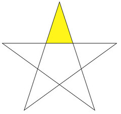
So while it’s fairly unthinkable that anyone reading this site would be unfamiliar with an MLB uni design from 1967, I’m willing to bet that many of you — maybe even most of you — haven’t seen this uniform, which is what the Steelers wore in 1966 and ’67. I’ve frequently seen it referred to as the “Batman design,” because the diamond-shaped yoke looks a bit like a cape (although it was Robin who had the yellow cape). But it turns out that there’s a good story behind the yoke — a story I hadn’t heard until reader Doug Keklak recently found it lurking on the Steelers’ web site. Here’s the relevant passage:
[In 1966] the City of Pittsburgh was trying to remake its image, trying to get away from the perception of a dirty, smoky city. One of the downtown areas being refurbished was called the Golden Triangle, because that was the shape of the land created by the Allegheny and Monongahela rivers flowing into the Ohio River. Dan Rooney decided to incorporate this unique bit of the city’s geography into the Steelers new uniforms, and that’s how the triangle design came to be a part of the jersey.
[”¦]
But if the intent of linking the team to its city was a nice idea, the practical execution of it didn’t always go smoothly. For example, washing the uniforms. In 1966, the Steelers’ preseason finale was against the Cleveland Browns in Birmingham, Ala., and they were to wear the black jerseys with the gold triangles, because the Browns always preferred to wear their white jerseys. But in laundering the Steelers’ jerseys, the black bled into the gold triangles and created an aesthetic mess.
And then, not everyone was able to make the connection between the Steelers’ jerseys and Pittsburgh’s geography. Midway through the 1966 season, the Steelers were set to play a game against the Cowboys in Dallas on Oct. 30. Shortly before kickoff, Dan Rooney appeared on the Cowboys’ pregame radio show where he was asked, “Are your wearing those uniforms because tomorrow is Halloween?”
Action photos of the Golden Triangle design are pretty rare (at least until Ricko digs into his archives — hint-hint), but I’ve compiled a small slideshow here. Meanwhile, tell me: Was I wrong, or has this design flown under most people’s radar? And had anyone else heard the Golden Triangle story before?
Membership News: We’re closing in on our 700th member, thanks to new enrollees like Chris Hart, whose card (shown at right; here’s a bigger view) is based on the Dayton Dragons. Interestingly, we’ve also had some recent sign-ups opting for the old-school Uni Watch design — sort of a membership throwback. As always, the full gallery of card designs is available for your inspection here. And yes, I’m still giving out a $10 Distant Replays gift card with every $15 membership — full sign-up details here.
Uni Watch News Ticker: Galatasaray’s goalie, Servet Cetin, wears a mask (with thanks to AJ Chalifour). ”¦ The Flyers’ orange alts have white nameplates, an element taken from their 1974 postseason design. But why did they go with white nameplates back then anyway? The answer comes from Christopher Dearth: “On Tuesday’s night’s Flyers telecast on Versus, broadcaster Mike Emerick mentioned that the Flyers didn’t have names on the back of their orange jerseys in 1974 but the NHL forced them to add NOBs when they made the playoffs. Story has it that they had no white letters so they improvised and added a white stripe (or even tape) and used the black letters.” ”¦ Really fun article here about the Browns’ PA announcer (nice find by Jason Hillyer). ”¦ Someone’s asking a mere $40,000 for a game-used Cali Seals jersey. Details here (with thanks to long-lost Vince Grzegorek, who also reports having a found a more reasonably priced NHL artifact). ”¦ Good uni cameo find by Andy Chalifour: Mike Hampton as a Mariner. ”¦ Wayman Tisdale has a Sooners-branded prosthetic leg (with thanks to Mark Kaplowitz). ”¦ Cool old uniform shown here, and check out the chest insignia here. ”¦ Very odd sleeve tailoring on this old Newark Rams jersey — sort of like a vest, but there are vestigal sleeves. ”¦ Susquehanna Industrial Tool & Die Co. guitarist Jon Hammer (who, much like Uni Watch fave Rob Ullman, knows a thing or two about creating killer pin-up art) recently tipped me wise to this Toots Shor documentary. Got myself a screener DVD and it’s awesome stuff, with lots of great sports-related content. I think it’s currently showing in L.A., plus it’s available on Netflix, or you can order a copy here. ”¦ Double-decker HNOB! That’s Whitesboro Senior High School in Marcy, New York (courtesy of Charlie Ryczek). ”¦ John Elway, one rude fucker (nice find, Phil). ”¦ Josh Danker-Dake was watching Fear Strikes Out and noticed that Tony Perkins’s Red Sox jersey was different than everyone else’s — no placket piping. Anyone know the story behind that? ”¦ It’s hard to see, but the home team in this photo is called the Hot Dogs, apparently because they play in Frankfort, Indiana. Details here. ”¦ NOG — that’s name on glove (good eye, Phil). ”¦ Minor league baseball news: New logos for the Mahoning Valley Scrappers (further details here), the Winston-Salem Warthogs will announce their new team name today, and the Lowell Spinners will unveil a new logo set tomorrow. ”¦ Greg Riffenburgh notes that Jake Delhomme and Brett Favre have been wearing turf shoes on grass. ”¦ “Jr.”-inclusive NOB alert: Anthony Mason Jr. (with thanks to Matt Shevin). ”¦ Reprinted from last night’s comments: Good article here about NFL equipment and gear. ”¦ Cavs wore their throwback uniforms and warm-ups last night. ”¦ Here are the Sens alts in action. ”¦ Small item buried on this page: “The Ravens won’t wear the usual all-black uniforms for national television [this Sunday night] because [coach John] Harbaugh doesn’t like the look. Instead, the players are expected to wear black jerseys with white pants” (with thanks to Tom Hedrick)”¦ West Ham United, whose previous jersey sponsor had gone belly-up, has a new sponsor (cheers to Alex Paine). ”¦ Pitt wore gold uniforms last night. ”¦ If you care to believe a completely unsubstantiated rumor started by some anonymous clown on a message board (isn’t that how we ended up in Iraq?), Army and Navy will have very special uniforms this weekend (I’m guessing Chris Mycoskie is the guy behind the rumor). ”¦ Exactly one year ago, I ran this rugby note from Eric Bangeman: “The Barbarians, an invitation-only rugby club that plays a handful of matches per year, took on the newly-crowned world champions South Africa. In addition to wearing classic black-and-white uniforms, the Barbarians ask each player to wear the socks from his home club, which makes for some interesting hosiery contrasts.” Now Bill Coughlan has a follow-up report: “I attended the Australia/Barbarians match last night and they were all wearing matching socks. The explanation comes from this article, which states: ‘The match was organised as part of the British Olympic Association’s celebrations of the centenary of the first Olympics in London, where the Games will return in four years’ time. Australia took the rugby union gold medal in 1908 with a 32-3 victory over Great Britain, represented by the English county of Cornwall. In honour of that match, the Barbarians all wore yellow Cornwall socks as they departed from their usual tradition of players wearing their club socks.” … Next time you spot a typo or other mistake I’ve made, keep in mind that I’m often working under somewhat distracting conditions.
so this was tha car in front of me this morning on my way to the office….
link
Only thing I know is that Paul was not driving!
living 2/3 of the year in pittsburgh and going to heinz field 6-7 times a year (for pitt games), id seen the jersey before. also, since i believe august, this has appeared in the steelers online store:
link
just to connect the “golden triangle” dots….
this city feature is also a part of the NHL penguins logo….
That FOX Glow Puck was awlful. I rememeber suffering though many hockey games watching that piece of crap.
ONLY thing I liked about it was that is it showed when the puck was going above a certain speed. Too bad it made it a HUGE RED COMET sreaking on the screen. WOuld be cool if the NHL did post shot speeds during the games. I’d be a fan for that.
Names/numbers on gloves is becoming very common in the NHL. If you try to look for it, you will find it more than you think.
[quote comment=”303384″]That FOX Glow Puck was awlful. I rememeber suffering though many hockey games watching that piece of crap.
ONLY thing I liked about it was that is it showed when the puck was going above a certain speed. Too bad it made it a HUGE RED COMET sreaking on the screen. WOuld be cool if the NHL did post shot speeds during the games. I’d be a fan for that.[/quote]
wait…the puck had LIGHTS in it?
all this time i thought that glow was from the bad windowpane i took back in the mid-1980s
Did Elway already own a car dealership his rookie season, or was he known as John Elway Dodge when he entered the league?
And, yes, I was aware of the golden triangle unis.
Props to John Harbaugh. Now we need to work on Tom Benson and Sean Payton to get rid of those horrible black pants the Saints keep wearing.
I’ve seen those Steelers uniforms before but I never knew there was such a story behind them.
On a not quite uni-related topic, I found this cool page that some of your may enjoy: the evoluntion of car manufacturers’ logos. There are some pretty sweet designs.
link
The Golden Triangle design is mentioned on the complete history of the Steelers DVD. Also, I think most of Pittsburgh is aware of it solely because they are entirely too emotionally attached to their football team.
The other day I mentioned I would like to see new sports art (re: Mark Penxa/Ullman/Kaplan)
Mark Penxa has posted this on his site, interesting collage
link
Yes, that short-lived Steelers uniform design was definitely under my radar.
You are correct about the NFL ignoring its pre-Super Bowl past. It makes me crazy that only the teams that won NFL Championships bother to remember them.
And the press is guilty of this as well. When was the last time that you saw a mainstream article that mentioned total NFL championships as opposed to merely Super Bowls won?
I got my Penn State Nittany Lion Club newsletter last night and there was an interesting little article that claims Penn State football is the originator of all those skinny bicep bands that players wear now –
article on page 8
Yes, they are the Hot Dogs because they play in Frankfort.
BTW, if you want to see their gymnasium it is the home court for Western U in “Blue Chips”. Yes, the high school gym for a small town team of no particular note is big enough to plausibly pass for a big-time college gym; only in Indiana.
[quote comment=”303392″]Yes, that short-lived Steelers uniform design was definitely under my radar.
You are correct about the NFL ignoring its pre-Super Bowl past. It makes me crazy that only the teams that won NFL Championships bother to remember them.
And the press is guilty of this as well. When was the last time that you saw a mainstream article that mentioned total NFL championships as opposed to merely Super Bowls won?[/quote]
We should be hearing about how great the Lions were in the 50’s…..HAHAHAHA…oh man, I couldn’t hold in the laughter!!
(seriously though…the NFL is also guilty of keeping CFL players out of the FOOTBALL Hall of Fame)
The can of Chunky soup that I grabbed out the pantry to take for lunch this morning had the old NFL logo on the top. I think it’s a fairly new can of soup, too. I hope.
The California Golden Seals were owned by Charlie Finley and like the A’s the had white footwear (skates). Link here link
The Seals moved to Cleveland and became the Barons. After two seasons the Barons merged with the Minnesota North Stars, who eventually moved to Dallas.
Man, I can’t wait to see the Toots Shor film. Thanks for the alert.
This world belongs to the cats. We are the distractions. :)
That new Scrappers logo looks an awful lot like the defunct Massachusetts Mad Dogs’ logo:
link
Both dogs now have chains and are crunching bats.
Here is a shot of the Cleveland Barons jersey
link
[quote comment=”303386″][quote comment=”303384″]That FOX Glow Puck was awlful. I rememeber suffering though many hockey games watching that piece of crap.
ONLY thing I liked about it was that is it showed when the puck was going above a certain speed. Too bad it made it a HUGE RED COMET sreaking on the screen. WOuld be cool if the NHL did post shot speeds during the games. I’d be a fan for that.[/quote]
wait…the puck had LIGHTS in it?
all this time i thought that glow was from the bad windowpane i took back in the mid-1980s[/quote]
Maybe I’m missing a joke due to all the overtime recently, but each puck had many thousands of dollars (was it each puck, the entire set, or the general technology being upwards of a quarter million dollars) of chips put in it. Fox would then turn the glow on which was blue (or white if it was obscured by people/boards), and it turned red when hitting certain speeds. When red, it would have a comet tail with a length related to the speed of the puck (and the speed graphic would come up on the bottom corner of the screen).
If I missed the joke, sorry, if not, then I don’t apologize.
[quote comment=”303386″][quote comment=”303384″]That FOX Glow Puck was awlful. I rememeber suffering though many hockey games watching that piece of crap.
ONLY thing I liked about it was that is it showed when the puck was going above a certain speed. Too bad it made it a HUGE RED COMET sreaking on the screen. WOuld be cool if the NHL did post shot speeds during the games. I’d be a fan for that.[/quote]
wait…the puck had LIGHTS in it?
all this time i thought that glow was from the bad windowpane i took back in the mid-1980s[/quote]
No, just an elaborate sensor system (seriously, look at the pictures of the glow-puck that has been dissected and the sensor system is giant compared to the size of a puck) that the TV cameras could pick up and broadcast so the viewers at home could see. It was an interesting concept, mainly because its nearly impossible to view the puck over analog tv, but it was executed miserably and it just looked extremely cheesy.
If you attended a game, you wouldn’t know a difference unless you caught an ‘out of play’ puck
icethetics posted this about various “ALTERNATIVE” 3rd jersey’s of the Coyotes
link
I’ve seen the Steelers logo before, but only on Madden. Didn’t know it had this interesting backstory.
The Winston-Salem Journal is reporting that the city’s minor league team is being re-branded as the “Dash.” link The logo/unis/etc. will be announced later today.
“The Dash” has become a popular nickname for the city, because of the dash between the two parts of the city name (which were separate towns back in the day). Yes, we’re a creative bunch in N.C.
[quote comment=”303394″]Yes, they are the Hot Dogs because they play in Frankfort.
BTW, if you want to see their gymnasium it is the home court for Western U in “Blue Chips”. Yes, the high school gym for a small town team of no particular note is big enough to plausibly pass for a big-time college gym; only in Indiana.[/quote]
Beat me to it, as an aside, the call the gym the “dog pound”, I always thought they should call it the Stock Pot or some other cooking vessel
[quote comment=”303405″]The Winston-Salem Journal is reporting that the city’s minor league team is being re-branded as the “Dash.” link The logo/unis/etc. will be announced later today.
“The Dash” has become a popular nickname for the city, because of the dash between the two parts of the city name (which were separate towns back in the day). Yes, we’re a creative bunch in N.C.[/quote]
The Dash brought to you by Nike and Mrs. Dash
(there’s a perfect blend of of Mascot/corporate sponsor!!)
link
[quote comment=”303389″]I’ve seen those Steelers uniforms before but I never knew there was such a story behind them.
[/quote]
That’s my experience as well – never made the connection between the yoke and the triangle in the Penguins’ logo.
It’s a beautiful Steelers jersey.
[quote comment=”303392″]Yes, that short-lived Steelers uniform design was definitely under my radar.
You are correct about the NFL ignoring its pre-Super Bowl past. It makes me crazy that only the teams that won NFL Championships bother to remember them.
And the press is guilty of this as well. When was the last time that you saw a mainstream article that mentioned total NFL championships as opposed to merely Super Bowls won?[/quote]
Anything written by the Green Bay Press-Gazette or the Milwaukee Journal Sentinel. :)
Now if we can just get the Packers to remember that they were “Est. 1919“, not 1921….
Maybe this is obvious to most, but that Elway card is a photoshop job. The original shows Elway with his first finger extended also.
link
Ooops
link
[quote comment=”303388″]Props to John Harbaugh. Now we need to work on Tom Benson and Sean Payton to get rid of those horrible black pants the Saints keep wearing.[/quote]
GIZZZILLION DITTOS …
I am a longtime Saints fan and
I believe that the black pants are horrible, low class, not even remotely traditional, and actually wreck their uniform template.
The whole point of uniform aesthetics, in my opinion, is for every team to do the best job possible with their given colors, logos, and budget. The black leotard pants foolishness worn most aggregiously by the NFL Saints, and followed by others, are the WORST USE of their logos, colors and budget.
Wear gold pants (traditional, fitting the template), wear white pants (a clean look from 1975-1984), but WILL THE SAINTS PLEASE get rid of the @#!%^^%#&*^* disgusting black pants !!!
[quote comment=”303411″]Ooops
link[/quote]
But why the heck did they add “Dodge” after his name?
I was wondering if anyone had any opinions on the gold Pitt unis? I was at the game last night, running late (as usual, I hate parking in Oakland…locals can back me on this!) and was in the team store making a Christmas purchase when I looked up at the monitor and said “are they were gold jerseys?” to my brother. I immediately shrugged it off saying, “oh it must be the lighting”. He says back “Doug, those are white numbers, they must be gold.” Nothing I saw in any of the pregame articles, game notes, etc, leaked this info so I was totally surprised.
At first I thought it was neat, I’ve been wanting them to go back to a gold/yellow set on limited basis for awhile now. Although, as the night wore on, I found the white numbers hard to pick up.
My brother thought it was “too Georgia Tech”.
I like the idea, maybe the design could have been a little better though. According to the Tribune Review they will be worn at select home games this year.
The game wasn’t on TV but there were some good shots on the normal outlets (Pitt site, newspaper sites, ESPN, Yahoo, etc). I’m going to see if the game was recorded for the local on demand channel. Maybe get some screen shots of some of the details that might have been missed in other photos.
[quote comment=”303414″]I was wondering if anyone had any opinions on the gold Pitt unis? I was at the game last night, running late (as usual, I hate parking in Oakland…locals can back me on this!) and was in the team store making a Christmas purchase when I looked up at the monitor and said “are they were gold jerseys?” to my brother. I immediately shrugged it off saying, “oh it must be the lighting”. He says back “Doug, those are white numbers, they must be gold.” Nothing I saw in any of the pregame articles, game notes, etc, leaked this info so I was totally surprised.
At first I thought it was neat, I’ve been wanting them to go back to a gold/yellow set on limited basis for awhile now. Although, as the night wore on, I found the white numbers hard to pick up.
My brother thought it was “too Georgia Tech”.
I like the idea, maybe the design could have been a little better though. According to the Tribune Review they will be worn at select home games this year.
The game wasn’t on TV but there were some good shots on the normal outlets (Pitt site, newspaper sites, ESPN, Yahoo, etc). I’m going to see if the game was recorded for the local on demand channel. Maybe get some screen shots of some of the details that might have been missed in other photos.[/quote]
That should read “are they wearing”
Here is an obscure question for someone. In the mid-1980’s the Southern Miss Golden Eagles football team were rewarded with “pride” stickers of an eagle. This would have been in the years just before Brett Favre played or maybe his freshman year. Is there anyone out there in Uniwatch land who might know what this eagle looked like? And as a secondary question, what about any pictures of the football team in the 1985-1988 years (other than the Brett Favre ones which are easily found). More specifically, pictures of the team in Black jersey’s with white pants.
[quote comment=”303389″]I’ve seen those Steelers uniforms before but I never knew there was such a story behind them.
On a not quite uni-related topic, I found this cool page that some of your may enjoy: the evoluntion of car manufacturers’ logos. There are some pretty sweet designs.
link
Pretty sweet logo set. Never knew Cadillac evolved from Ford. Then I hadn’t heard of the genesis of the Steelers’ yoke design, though I remember the design.
Anybody have pics of the Steelers in white pants during the Bradshaw era? Or know the backstory?
Flyers orange jersey NOB: According to the caption to this photo from the ’74 season link :
“NBC was covering an NHL Game of the Week and requested that both teams have nameplates identifying players. At that time the Flyers still hadn’t added nameplates on road orange jerseys, so for those games, they merely added the white nameplates that were on their home white jerseys. As well, there was a new maker of Flyers’ jerseys, and they had different styles for their #1 and #2. Mid-way in this season you can see the different styles for these numbers take place.”
I first remember seeing the Steelers “Batman” design on a football card for Andy Russell when I was around 10 years old and thought it looked awesome. In fact, I’ve always hoped that the Steelers would resurrect them as a throwback.
[quote comment=”303392″]Yes, that short-lived Steelers uniform design was definitely under my radar.
You are correct about the NFL ignoring its pre-Super Bowl past. It makes me crazy that only the teams that won NFL Championships bother to remember them.
And the press is guilty of this as well. When was the last time that you saw a mainstream article that mentioned total NFL championships as opposed to merely Super Bowls won?[/quote]
The Packers are pretty good about remembering their pre-Super Bowl championships.
[quote comment=”303420″][quote comment=”303392″]Yes, that short-lived Steelers uniform design was definitely under my radar.
You are correct about the NFL ignoring its pre-Super Bowl past. It makes me crazy that only the teams that won NFL Championships bother to remember them.
And the press is guilty of this as well. When was the last time that you saw a mainstream article that mentioned total NFL championships as opposed to merely Super Bowls won?[/quote]
The Packers are pretty good about remembering their pre-Super Bowl championships.[/quote]
The Eagles are one club where current ownership, until recently, only believed the franchise started in 1994 when Jeff Lurie bought them. Until the past couple of years, including their Swedish-tinged 75th anniversary squad, did they openly acknowledge their history. Maybe having won their last championship 48 years ago had something to do with it, but still, there is a rich past to look back on.
Now if we can just get the Packers to remember that they were “Est. 1919“, not 1921….
Chance is referring to the fact that you find some Packers materials that make reference to 1919, the year the club was founded, and some that say “Est. 1921,” i.e., the year they joined the league.
Anybody ever read this book?
link
The author did a lot of microfilm-examining research for the book, and tried to make the case that the 1919 Packers were merely a continuation of the previous years’ Green Bay town teams. I found some of his conclusions were selective.
Then there’s the matter of whether Curly Lambeau was actually the Packers’ NFL coach. This article, by a reporter with a great reputation as a Packers historian, convinced me Lambeau wasn’t:
link
[quote comment=”303392″]Yes, that short-lived Steelers uniform design was definitely under my radar.
You are correct about the NFL ignoring its pre-Super Bowl past. It makes me crazy that only the teams that won NFL Championships bother to remember them.
And the press is guilty of this as well. When was the last time that you saw a mainstream article that mentioned total NFL championships as opposed to merely Super Bowls won?[/quote]
In Detroit, we make sure to mention NFL Championships in every article that pertains to the Lions.
go dragons!
[quote comment=”303412″][quote comment=”303388″]Props to John Harbaugh. Now we need to work on Tom Benson and Sean Payton to get rid of those horrible black pants the Saints keep wearing.[/quote]
GIZZZILLION DITTOS …
I am a longtime Saints fan and
I believe that the black pants are horrible, low class, not even remotely traditional, and actually wreck their uniform template.
The whole point of uniform aesthetics, in my opinion, is for every team to do the best job possible with their given colors, logos, and budget. The black leotard pants foolishness worn most aggregiously by the NFL Saints, and followed by others, are the WORST USE of their logos, colors and budget.
Wear gold pants (traditional, fitting the template), wear white pants (a clean look from 1975-1984), but WILL THE SAINTS PLEASE get rid of the @#!%^^%#&*^* disgusting black pants !!![/quote]
Amen!!! Every Sunday, I turn on the game hoping to see the gold pants. With the white jerseys, the black pants are at beast tollerable. But with the black jerseys they’re just hideous. An embarrasment to an already lackluster franchise that we Saints fans love no matter what.
Ditch the black…pants.
[quote comment=”303425″][quote comment=”303412″][quote comment=”303388″]Props to John Harbaugh. Now we need to work on Tom Benson and Sean Payton to get rid of those horrible black pants the Saints keep wearing.[/quote]
GIZZZILLION DITTOS …
I am a longtime Saints fan and
I believe that the black pants are horrible, low class, not even remotely traditional, and actually wreck their uniform template.
The whole point of uniform aesthetics, in my opinion, is for every team to do the best job possible with their given colors, logos, and budget. The black leotard pants foolishness worn most aggregiously by the NFL Saints, and followed by others, are the WORST USE of their logos, colors and budget.
Wear gold pants (traditional, fitting the template), wear white pants (a clean look from 1975-1984), but WILL THE SAINTS PLEASE get rid of the @#!%^^%#&*^* disgusting black pants !!![/quote]
Amen!!! Every Sunday, I turn on the game hoping to see the gold pants. With the white jerseys, the black pants are at beast tollerable. But with the black jerseys they’re just hideous. An embarrasment to an already lackluster franchise that we Saints fans love no matter what.
Ditch the black…pants.[/quote]
the current pants…yes…
these pants, while still black, are much more preferable to this crap
i doubt the striped black pants will ever be brought back, but one can dream
[quote comment=”303426″][quote comment=”303425″][quote comment=”303412″][quote comment=”303388″]Props to John Harbaugh. Now we need to work on Tom Benson and Sean Payton to get rid of those horrible black pants the Saints keep wearing.[/quote]
GIZZZILLION DITTOS …
I am a longtime Saints fan and
I believe that the black pants are horrible, low class, not even remotely traditional, and actually wreck their uniform template.
The whole point of uniform aesthetics, in my opinion, is for every team to do the best job possible with their given colors, logos, and budget. The black leotard pants foolishness worn most aggregiously by the NFL Saints, and followed by others, are the WORST USE of their logos, colors and budget.
Wear gold pants (traditional, fitting the template), wear white pants (a clean look from 1975-1984), but WILL THE SAINTS PLEASE get rid of the @#!%^^%#&*^* disgusting black pants !!![/quote]
Amen!!! Every Sunday, I turn on the game hoping to see the gold pants. With the white jerseys, the black pants are at beast tollerable. But with the black jerseys they’re just hideous. An embarrasment to an already lackluster franchise that we Saints fans love no matter what.
Ditch the black…pants.[/quote]
the current pants…yes…
link, while still black, are much more preferable to link
i doubt the striped black pants will ever be brought back, but one can dream[/quote]
I’d be all for the return of the black striped pants if those awesome striped socks came back with them.
[quote comment=”303392″]
And the press is guilty of this as well. When was the last time that you saw a mainstream article that mentioned total NFL championships as opposed to merely Super Bowls won?[/quote]
In Education, the Mainstream refers to General Ed. classes.
So does that mean that if we at UW are not in that Mainstream, are we in Special Education?
On ‘Worst Persons’ last night, Olbermann stated that Sean Avery intentionally got his pussy self suspended before the Calgary game so Phaneuf wouldn’t pound the snot out of him just because.
I’d seen those Steeler jerseys before, but did not know the story. Oddly, both Denver and San Diego also have areas that some call “Golden Triangle”.
[quote comment=”303388″]Props to John Harbaugh. Now we need to work on Tom Benson and Sean Payton to get rid of those horrible black pants the Saints keep wearing.[/quote]
a preview of the Ravens’ look on sunday
link
1974, first season of World Team Tennis, featuring the legendary Ken Rosewall and the wonderfully named Evonne Goolagong, I give you…the Pittsburgh Triangles.
Colors were gold and black, too.
the guy who photoshopped the elway card probably added dodge as a little calling card to himself, because he’s so proud of his work and wants others to be proud of his ‘work’.
My grandma lives right down by Frankfot Indiana and I’ve got a Frankfort Hot Dogs shirt. How can you not get that kind of shirt? I’ll try and send a photo of the shirt this week.
Is it just me, or are the Ravens and Jaguars eliminating there primary colors in favor of black? Wasn’t black just a accent or trim color?
Why do they wanna look the same?
I’m not a fan of teal or purple, but it’s better than everybody in black and white…
[quote comment=”303428″][quote comment=”303392″]
And the press is guilty of this as well. When was the last time that you saw a mainstream article that mentioned total NFL championships as opposed to merely Super Bowls won?[/quote]
In Education, the Mainstream refers to General Ed. classes.
So does that mean that if we at UW are not in that Mainstream, are we in Special Education?[/quote]
Evidently.
[quote comment=”303405″]The Winston-Salem Journal is reporting that the city’s minor league team is being re-branded as the “Dash.” link The logo/unis/etc. will be announced later today.
“The Dash” has become a popular nickname for the city, because of the dash between the two parts of the city name (which were separate towns back in the day). Yes, we’re a creative bunch in N.C.[/quote]
I didn’t think they’d come up with such an uninspired nickname, especially after waiting so long to divulge it.
[quote comment=”303435″]Is it just me, or are the Ravens and Jaguars eliminating there primary colors in favor of black? Wasn’t black just a accent or trim color?
Why do they wanna look the same?
I’m not a fan of teal or purple, but it’s better than everybody in black and white…[/quote]
That’s my sentiment with all these teams using a black jersey as their alt look. It’s so unimaginative (and probably cheaper to design and produce).
[quote comment=”303429″]On ‘Worst Persons’ last night, Olbermann stated that Sean Avery intentionally got his pussy self suspended before the Calgary game so Phaneuf wouldn’t pound the snot out of him just because.[/quote]
If it makes any difference, check out link on their website.
Notice anyone missing? He’s done in Big Dee.
[quote comment=”303439″][quote comment=”303429″]On ‘Worst Persons’ last night, Olbermann stated that Sean Avery intentionally got his pussy self suspended before the Calgary game so Phaneuf wouldn’t pound the snot out of him just because.[/quote]
If it makes any difference, check out link on their website.
Notice anyone missing? He’s done in Big Dee.[/quote]
isn’t he hanging with marty brodeur on a beach somewhere now?
[quote comment=”303437″][quote comment=”303405″]The Winston-Salem Journal is reporting that the city’s minor league team is being re-branded as the “Dash.” link The logo/unis/etc. will be announced later today.
“The Dash” has become a popular nickname for the city, because of the dash between the two parts of the city name (which were separate towns back in the day). Yes, we’re a creative bunch in N.C.[/quote]
I didn’t think they’d come up with such an uninspired nickname, especially after waiting so long to divulge it.[/quote]
Uninspired? Just think of the link possibilities!
Frankfort is about a 20 mile drive from me. They are the “Hot Dogs” and their mascot is a dachsund.
Here’s a pic of the 1925 boys basketball champs:
link
[quote comment=”303422″]Now if we can just get the Packers to remember that they were “Est. 1919“, not 1921….
Chance is referring to the fact that you find some Packers materials that make reference to 1919, the year the club was founded, and some that say “Est. 1921,” i.e., the year they joined the league.
Anybody ever read this book?
link
The author did a lot of microfilm-examining research for the book, and tried to make the case that the 1919 Packers were merely a continuation of the previous years’ Green Bay town teams. I found some of his conclusions were selective.
Then there’s the matter of whether Curly Lambeau was actually the Packers’ NFL coach. This article, by a reporter with a great reputation as a Packers historian, convinced me Lambeau wasn’t:
link
I find some of Larry Names’ conclusions a little suspect myself, but that’s an amazing series of books.
In particular, his assertion that the Lambeau/Calhoun football team was a continuation of the town team founded in 1918 by Nate Abrams (with anti-Semitism being the reason such origin remains unacknowledged) is interesting, but the evidence he presents hardly rises to the level of compelling, not to mention conclusive.
In any case, the Packers have established 1919 as the official founding date, but the NFL insists on the link that they didn’t exist prior to joining the League in 1921. The Cardinals put “1898” everywhere in their stadium, but the Packers apparently refuse to buck the League on this. Drives me up the wall.
As far as the coaching goes, it’s a little complicated by the fact that the coach’s job then isn’t very much like the coach’s job now. Coaches were prohibited from sending in plays, so the on-field Captain (which was Lambeau from the first game on) was in charge during the games. So while Lambeau was certainly not called the head coach in the early years, he fulfilled most of the functions of the position.
[quote comment=”303439″][quote comment=”303429″]On ‘Worst Persons’ last night, Olbermann stated that Sean Avery intentionally got his pussy self suspended before the Calgary game so Phaneuf wouldn’t pound the snot out of him just because.[/quote]
If it makes any difference, check out link on their website.
Notice anyone missing? He’s done in Big Dee.[/quote]
Thank God. At this point, I don’t even care if he had been doing great on the ice (which he hadn’t), as a Stars’ fan, I want him gone. I can’t stand him and I hate the fact that now every time this story comes up, he’s shown in a Stars’ jersey.
[quote comment=”303416″]Here is an obscure question for someone. In the mid-1980’s the Southern Miss Golden Eagles football team were rewarded with “pride” stickers of an eagle. This would have been in the years just before Brett Favre played or maybe his freshman year. Is there anyone out there in Uniwatch land who might know what this eagle looked like? And as a secondary question, what about any pictures of the football team in the 1985-1988 years (other than the Brett Favre ones which are easily found). More specifically, pictures of the team in Black jersey’s with white pants.[/quote]
Try this
link
do a search on football
[quote comment=”303440″]
isn’t he hanging with marty brodeur on a beach somewhere now?[/quote]
I doubt it, considering that Brodeur wouldn’t shake Avery’s hand after his little act in the playoffs last year, along with his incessant “trash-talk” about Brodeur’s 2003 divorce.
If anything, you might see Avery’s body wash ashore if Brodeur had his way. :o)
[quote comment=”303442″]Frankfort is about a 20 mile drive from me. They are the “Hot Dogs” and their mascot is a dachsund.
Here’s a pic of the 1925 boys basketball champs:
link[/quote]
Boys? Two of the players in the back row look like they’re in their 40s.
[quote comment=”303446″][quote comment=”303440″]
isn’t he hanging with marty brodeur on a beach somewhere now?[/quote]
I doubt it, considering that Brodeur wouldn’t shake Avery’s hand after his little act in the playoffs last year, along with his incessant “trash-talk” about Brodeur’s 2003 divorce.
If anything, you might see Avery’s body wash ashore if Brodeur had his way. :o)[/quote]
link.
So while Lambeau was certainly not called the head coach in the early years, he fulfilled most of the functions of the position.
Exactly. This was a time when a coach couldn’t even send a play in from the sidelines, and substitutes weren’t allowed to speak. A different time, and a different definition of coach during the game.
I find some of Larry Names’ conclusions a little suspect myself, but that’s an amazing series of books.
I enjoyed them, too. It took somebody actually poring over the old Press-Gazettes and Sentinels to bring out those little details that enrich the stories.
[quote comment=”303440″][quote comment=”303439″][quote comment=”303429″]On ‘Worst Persons’ last night, Olbermann stated that Sean Avery intentionally got his pussy self suspended before the Calgary game so Phaneuf wouldn’t pound the snot out of him just because.[/quote]
If it makes any difference, check out link on their website.
Notice anyone missing? He’s done in Big Dee.[/quote]
isn’t he hanging with marty brodeur on a beach somewhere now?[/quote]
Right now he’s in Bettman’s office gettin’ a talkin’ to…
[quote comment=”303413″][quote comment=”303411″]Ooops
link[/quote]
But why the heck did they add “Dodge” after his name?[/quote]
There is a John Elway Dodge car dealership in Colorado. My guess is the photoshopper did not find any value in their commitment to service.
[quote comment=”303444″][quote comment=”303439″][quote comment=”303429″]On ‘Worst Persons’ last night, Olbermann stated that Sean Avery intentionally got his pussy self suspended before the Calgary game so Phaneuf wouldn’t pound the snot out of him just because.[/quote]
If it makes any difference, check out link on their website.
Notice anyone missing? He’s done in Big Dee.[/quote]
Thank God. At this point, I don’t even care if he had been doing great on the ice (which he hadn’t), as a Stars’ fan, I want him gone. I can’t stand him and I hate the fact that now every time this story comes up, he’s shown in a Stars’ jersey.[/quote]
I totally agree with you. What is it about Dallas that says, “Hey let’s bring every idiot who gets in trouble to Dallas.” i.e. Terrell Owens, Pacman Jones, Sammy Sosa, Milton Bradely.
It’s becoming hard to be a Dallas sports fan. I think we’re taking the title of Losertown away from Boston.
[quote comment=”303445″][quote comment=”303416″]Here is an obscure question for someone. In the mid-1980’s the Southern Miss Golden Eagles football team were rewarded with “pride” stickers of an eagle. This would have been in the years just before Brett Favre played or maybe his freshman year. Is there anyone out there in Uniwatch land who might know what this eagle looked like? And as a secondary question, what about any pictures of the football team in the 1985-1988 years (other than the Brett Favre ones which are easily found). More specifically, pictures of the team in Black jersey’s with white pants.[/quote]
Try this
link
do a search on football[/quote]
I did some more digging on that and did not find anything. I thought it worth a shot.
I was familiar with the “triangle” design. My father used to sell for Sand Knitting Mills, a clothing company that supplied many teams with their uniforms (Dad had the Detroit Lions in his territory). He always had samples around the house and this jersey was one of them.
The jerseys were heavy – made out of tackle twill with numbers of course sewn on. And the colors would definitely bleed if they weren’t washed carefully. It was fairly common to hear complaints about colors bleeding onto the white numbers.
[quote comment=”303414″]I was wondering if anyone had any opinions on the gold Pitt unis? I was at the game last night, running late (as usual, I hate parking in Oakland…locals can back me on this!) and was in the team store making a Christmas purchase when I looked up at the monitor and said “are they were gold jerseys?” to my brother. I immediately shrugged it off saying, “oh it must be the lighting”. He says back “Doug, those are white numbers, they must be gold.” Nothing I saw in any of the pregame articles, game notes, etc, leaked this info so I was totally surprised.
At first I thought it was neat, I’ve been wanting them to go back to a gold/yellow set on limited basis for awhile now. Although, as the night wore on, I found the white numbers hard to pick up.
My brother thought it was “too Georgia Tech”.
I like the idea, maybe the design could have been a little better though. According to the Tribune Review they will be worn at select home games this year.
The game wasn’t on TV but there were some good shots on the normal outlets (Pitt site, newspaper sites, ESPN, Yahoo, etc). I’m going to see if the game was recorded for the local on demand channel. Maybe get some screen shots of some of the details that might have been missed in other photos.[/quote]
a fellow pittsburgher? (well sort of…. i go to pitt, but i couldnt make it to the game last night). i commented on the unis real late last night. i think they were a great idea…but they fell short on one aspect: the moniker and numbers should have been blue outlined in black and white (like the football alts which im sure you saw in the team store) rather than white outlined in black and blue.
for those of you who werent at the pete last night, these are the football alts:
link
If they made that small change i’d say they were a fantastic alternate set that we should break out fairly often.
There is a big rumor going around ACC land that UnderArmor is close to signing a deal with the league to become the official outfitter of ACC athletics. This deal would force all schools to wear UA apparel. For those that already have contracts with other outfitters, UA would buy out the contract.
Considering the deals that some schools have with Nike (namely VT still reapin the proceeds of Vick and UNC with their Nike Jordan line) this would be something that you can be sure will not happen quietly.
Beardface, don’t forget Duke, they are souled out for Nike there.
This will be the first time the Ravens have worn the black jersey this year. They have been wearing the black pants with the white jersey all year instead of their normal white on white. I guess it’s the new coach putting his stamp on things.
And real Ravens are black. As for teal Jaguars, I haven’t seen one in nature yet.
In the Sports Guy podcast with Mike Lombardi posted today, Lombardi talks about how certain NFL teams uniforms should never be changed. Cites the Lions as the most egregious change he’s seen.
Link here: link
It’s in the last 5 minutes where they discuss it.
There is a mention of Singletary’s wooden cross in today’s Sacramento Bee (link) and since there was some discussion about it I figured I’d share:
Singletary on Wednesday was asked about the large wooden cross he wears around his neck at practice and on game days.
The coach said he came upon the cross in Green Lake, Wis., where he and his family vacation every year.
“It’s a little Baptist grounds, and we get together with about 50 or 60 family members and just have a blast,” he said.
Singletary said that God is the “number one thing in my life” and that he wears the cross “as a reminder of who I am and not lose my mind on the field and not become somebody else.”
He said he hasn’t asked the league — rigid when it comes to sideline apparel — for permission to wear the cross. But he said it wouldn’t be a problem if he were asked to take it off.
“If they say something about it, I would just move on,” Singletary said. “It’s not that big of an issue. It’s more in me than on me.”
[quote comment=”303451″][quote comment=”303413″][quote comment=”303411″]Ooops
link[/quote]
But why the heck did they add “Dodge” after his name?[/quote]
There is a John Elway Dodge car dealership in Colorado. My guess is the photoshopper did not find any value in their commitment to service.[/quote]
There was a John Elway Dodge dealership in Colorado – the first location was close to my parents’ house. Per link that matches my foggy recollection, he didn’t get into car dealerships until 1989 and sold them in 1997. The new owner removed the Elway name a couple years ago.
[quote comment=”303441″][quote comment=”303437″][quote comment=”303405″]The Winston-Salem Journal is reporting that the city’s minor league team is being re-branded as the “Dash.” link The logo/unis/etc. will be announced later today.
“The Dash” has become a popular nickname for the city, because of the dash between the two parts of the city name (which were separate towns back in the day). Yes, we’re a creative bunch in N.C.[/quote]
I didn’t think they’d come up with such an uninspired nickname, especially after waiting so long to divulge it.[/quote]
Uninspired? Just think of the link possibilities![/quote]
I lived in North Carolina for 17 years, including 6 in the Greensboro/Winston-Salem area. I never heard anyone refer to W-S as “The Dash”. It must be an “urban” thing. We always caleed it just “Winston”.
[quote comment=”303445″][quote comment=”303416″]Here is an obscure question for someone. In the mid-1980’s the Southern Miss Golden Eagles football team were rewarded with “pride” stickers of an eagle. This would have been in the years just before Brett Favre played or maybe his freshman year. Is there anyone out there in Uniwatch land who might know what this eagle looked like? And as a secondary question, what about any pictures of the football team in the 1985-1988 years (other than the Brett Favre ones which are easily found). More specifically, pictures of the team in Black jersey’s with white pants.[/quote]
Try this
link
do a search on football[/quote]
Thanks, I think I found one picture that had what I was looking for. WOW, that was great adrian!
Those were the first Steelers unis I remember.
Always liked those jerseys. In those days the Steelers were terrible. You rarely saw them on TV.
In ’70 and ’71 they went to an all white look for the road unis, which looks strange now.
link
[quote comment=”303458″]This will be the first time the Ravens have worn the black jersey this year. They have been wearing the black pants with the white jersey all year instead of their normal white on white. I guess it’s the new coach putting his stamp on things.
And real Ravens are black. As for teal Jaguars, I haven’t seen one in nature yet.[/quote]
A real scarcity of Honolulu blue and silver Lions, too.
Also very few navy and orange Broncos or Bears.
At least purple is a color that light often creates in the black of a raven’s feathers. So from a design standpoint, does hold up.
Otherwise, hey, colors and names rarely deal with biological accuracy.
Purple and white Wildcats? In Evanston, I guess so.
In Arizona, though, they’re navy and red.
Kentucky, royal and white.
And in South Florida, Bulls evidently are green.
(wink…Just jerkin’ your chain)
Lived in W-S for a while (my wife went to grad school at Wake) and in North Carolina most of my life. Never, ever have I heard the city referred to as “the Dash”–most folks just called it “Winston.” Sounds like something that some high school kids may have come up with recently. (Of late I’ve heard high schoolers calling our city–Roanoke, VA–“the ‘Noke.”)
BTW, if you read the boards on the Winston-Salem Journal site, people are not too enthused about the choice. (Also, W-S is known as a hot spot for local racing with the Bowman Gray track, thus the Racers, and, if I am not mistaken, the Wallbangers was a term they had, not for the drinks, but for the drivers who were constantly banging the wall around the track–either of those choices would have been great names with great local marketing potential.)
When we were there in the early 1990s, the team was called the link [this is the best picture I could find on the net–that’s Bill Kazmierczak from a collage that goes with a story on MILB] with a very generic bald eagle mascot and the uninspiring royal blue/red color scheme of their parent club, the Cubs. I seem to remember that the only swag they were only selling were the mesh trucker hats with the team logo screened on them. Mind you, this was after the movie “Bull Durham” came along and they still played in the Carolina League with W-S. Seems that the powers that be didn’t get then–don’t get it now.
As for re-branded teams, our local team in Salem, Virginia, went from being the link (the stylized link and their branding has grown on me) to the Red Sox. Fenway Sports bought the team and people have been excited because of the MLB attitude that comes with it. The first thing I noticed about the “big time baseball” effect was that all the prices just went up–even for the Kid’ Club membership doubled in price the day the announcement was made. “Whoa, Nelly!”
Servet Cetin is a center defender, definitely not a goalie. His mask is leather, which is oddly unlike the plastic masks several soccer players have worn, like in the NBA, to protect broken facial bones. He’s wearing it to protect a healing cheekbone.
Petr Cech, who is a goalie, wears a kind of helmet since fracturing his skull last season.
Paul,
Just wanted to say that little uniform anecdotes like today’s post are one of the major reasons I think this blog was a great idea. It has to be hard to come up with material everyday and I love the coverage of new uniforms/uniform changes, but interesting stories about obscure uniforms that many people don’t know about is such a great aspect that you can’t really find anywhere else.
[quote comment=”303465″]At least purple is a color that light often creates in the black of a raven’s feathers. So from a design standpoint, does hold up.
[/quote]
While it may be ornithologically defensible, I wouldn’t say that a scheme prominently featuring such similar colors as black and purple “holds up from a design standpoint.”
For comparison, here’s defender John Terry wearing a more typical plastic mask: , goalkeeper Mark Schwarzer doing the same: .
Finally, Cech’s helmet:
And Mr. Cech running around in his skivvies, helmet, and gloves (yes, it’s really him, and maybe that bump on the head rattled him a little more than first thought):
Paul told me to stop pimping my site in the comments a while ago, and I have, but I actually did an interview regarding Virginia’s new SoD uniforms for a column on a student-run UVA-focused online magazine so I am going to post it here, promise not to do it again, and hope that it doesn’t get deleted.
link
Paul said: Was I wrong, or has this design flown under most people’s radar?
——
That allows me to date an old Steeler Bobble-head doll I had. I used to collect them as a kid growing up in Baltimore and going to Colts games. Don’t have any of them anymore, but at one time I had the Colts, Redskins, Rams, and Steelers. The Steelers bobblehead uni had the contrasting top.
Wow, apparently I missed some tags there…
Terry link
Cech in his pants link
[quote comment=”303444″][quote comment=”303439″][quote comment=”303429″]On ‘Worst Persons’ last night, Olbermann stated that Sean Avery intentionally got his pussy self suspended before the Calgary game so Phaneuf wouldn’t pound the snot out of him just because.[/quote]
If it makes any difference, check out link on their website.
Notice anyone missing? He’s done in Big Dee.[/quote]
Thank God. At this point, I don’t even care if he had been doing great on the ice (which he hadn’t), as a Stars’ fan, I want him gone. I can’t stand him and I hate the fact that now every time this story comes up, he’s shown in a Stars’ jersey.[/quote]
Sorry, Terri. Here’s the NHL’s official stance on Avery missing from the roster, from link:
“A phone call to Dallas Stars PR department was made and the Avery omission was called a ‘technology issue.’
“When the NHL suspends a player – or registers a trade – the league computers switch players from web site to web site. Or in Avery’s case, take him right off the roster, as he is a suspended player and can not play.”
I guess he’s still with the team after all.
[quote comment=”303459″]In the Sports Guy podcast with Mike Lombardi posted today, Lombardi talks about how certain NFL teams uniforms should never be changed. Cites the Lions as the most egregious change he’s seen.
[/quote]
I heard that too. He’s written about it as well. I love how he associates Millen’s introduction of the black with the team’s worsening, as if the spirit of Alex Karras — and competitiveness — were being kept at bay by bad dress.
[quote comment=”303466″]Lived in W-S for a while (my wife went to grad school at Wake) and in North Carolina most of my life. Never, ever have I heard the city referred to as “the Dash”–most folks just called it “Winston.” Sounds like something that some high school kids may have come up with recently. (Of late I’ve heard high schoolers calling our city–Roanoke, VA–“the ‘Noke.”)
BTW, if you read the boards on the Winston-Salem Journal site, people are not too enthused about the choice. (Also, W-S is known as a hot spot for local racing with the Bowman Gray track, thus the Racers, and, if I am not mistaken, the Wallbangers was a term they had, not for the drinks, but for the drivers who were constantly banging the wall around the track–either of those choices would have been great names with great local marketing potential.)
When we were there in the early 1990s, the team was called the link [this is the best picture I could find on the net–that’s Bill Kazmierczak from a collage that goes with a story on MILB] with a very generic bald eagle mascot and the uninspiring royal blue/red color scheme of their parent club, the Cubs. I seem to remember that the only swag they were only selling were the mesh trucker hats with the team logo screened on them. Mind you, this was after the movie “Bull Durham” came along and they still played in the Carolina League with W-S. Seems that the powers that be didn’t get then–don’t get it now.
[/quote]
The Dash logo is equally bad. An angry baseball? Yawn.
link
Cech’s link
And a bonus for your patience: legendary Liverpool goalkeeper and nut job Bruce Grobbelaar in an link.
Sorry about the mess of a first post.
I always loved those Pittsburgh jerseys, as they were so distinctive. Of course, a few years after they changed to their current sleeve stripes they started to become a power for the first time, so there was no looking back.
[quote comment=”303474″]I guess he’s still with the team after all.[/quote]
Too bad. Wotta douche.
Sorry if someone already asked this, but have the Ravens ever worn black jerseys with white pants? Seems its also the all-black or purple on white.
Found this regarding Ravens’ uniforms, still not sure I’ve seen all of these in action:
link
[quote comment=”303474″][quote comment=”303444″][quote comment=”303439″][quote comment=”303429″]On ‘Worst Persons’ last night, Olbermann stated that Sean Avery intentionally got his pussy self suspended before the Calgary game so Phaneuf wouldn’t pound the snot out of him just because.[/quote]
If it makes any difference, check out link on their website.
Notice anyone missing? He’s done in Big Dee.[/quote]
Thank God. At this point, I don’t even care if he had been doing great on the ice (which he hadn’t), as a Stars’ fan, I want him gone. I can’t stand him and I hate the fact that now every time this story comes up, he’s shown in a Stars’ jersey.[/quote]
Sorry, Terri. Here’s the NHL’s official stance on Avery missing from the roster, from link:
“A phone call to Dallas Stars PR department was made and the Avery omission was called a ‘technology issue.’
“When the NHL suspends a player – or registers a trade – the league computers switch players from web site to web site. Or in Avery’s case, take him right off the roster, as he is a suspended player and can not play.”
I guess he’s still with the team after all.[/quote]
Yeah, but Tippet said this before the game last night in edmonton:
“From a coach’s standpoint, I try to build a team that has an atmosphere where players care about each other and play with each other and play with continuity, and I find it hard to believe that Sean could come back in that dressing room and we could find that continuity again,”
“My job is to build the best team possible. I don’t know if we can build the best team possible with Sean coming back.”
I don’t think Avery will be back.
[quote comment=”303420″][quote comment=”303392″]Yes, that short-lived Steelers uniform design was definitely under my radar.
You are correct about the NFL ignoring its pre-Super Bowl past. It makes me crazy that only the teams that won NFL Championships bother to remember them.
And the press is guilty of this as well. When was the last time that you saw a mainstream article that mentioned total NFL championships as opposed to merely Super Bowls won?[/quote]
The Packers are pretty good about remembering their pre-Super Bowl championships.[/quote]
As they should…the greatest “TEAM” of all time…when it was a game!!!
[quote comment=”303482″][quote comment=”303474″][quote comment=”303444″][quote comment=”303439″][quote comment=”303429″]On ‘Worst Persons’ last night, Olbermann stated that Sean Avery intentionally got his pussy self suspended before the Calgary game so Phaneuf wouldn’t pound the snot out of him just because.[/quote]
If it makes any difference, check out link on their website.
Notice anyone missing? He’s done in Big Dee.[/quote]
Thank God. At this point, I don’t even care if he had been doing great on the ice (which he hadn’t), as a Stars’ fan, I want him gone. I can’t stand him and I hate the fact that now every time this story comes up, he’s shown in a Stars’ jersey.[/quote]
Sorry, Terri. Here’s the NHL’s official stance on Avery missing from the roster, from link:
“A phone call to Dallas Stars PR department was made and the Avery omission was called a ‘technology issue.’
“When the NHL suspends a player – or registers a trade – the league computers switch players from web site to web site. Or in Avery’s case, take him right off the roster, as he is a suspended player and can not play.”
I guess he’s still with the team after all.[/quote]
Yeah, but Tippet said this before the game last night in edmonton:
“From a coach’s standpoint, I try to build a team that has an atmosphere where players care about each other and play with each other and play with continuity, and I find it hard to believe that Sean could come back in that dressing room and we could find that continuity again,”
“My job is to build the best team possible. I don’t know if we can build the best team possible with Sean coming back.”
I don’t think Avery will be back.[/quote]
Avery, Avery, Avery – whatever. The real issue facing the Stars is the fact they have to wear these:
link
Now THAT is their biggest problem!
I’m just saying even though most teams are doing the trendy black jersey, at least the color fits for the Ravens. Other colors in their logo scheme are gold and red and I would rather see a black jersey once or twice a season than either on of those.
Would I would love to see would be a Colts throw back in Baltimore. Obviously it would never happen, but if the Titans can wear Oilers throw backs…
[quote comment=”303471″]Paul told me to stop pimping my site in the comments a while ago, and I have, but I actually did an interview regarding Virginia’s new SoD uniforms for a column on a student-run UVA-focused online magazine so I am going to post it here, promise not to do it again, and hope that it doesn’t get deleted.
link
you can always pimp your site through the URI link, and this was an excellent instance of where it’s perfectly fine to do so in the comments (and good job with that article!)…
however (in general, not directed towards you), constantly posting your site in the comments or saying “HEY, CHECK OUT MY BLOG” just for the sake of so doing is not cool…and will be dealt with accordingly
RE: Sorry if someone already asked this, but have the Ravens ever worn black jerseys with white pants? Seems its also the all-black or purple on white.
No. This will be the first time.
[quote]I would love to see would be a Colts throw back in Baltimore. Obviously it would never happen, but if the Titans can wear Oilers throw backs…[/quote]
apples and oranges
the titans were the oilers…the ravens never were the colts…maybe you could petition the league to have the ravens wear browns throwbacks
(if you meant texans and not titans, then that’s a good analogy)
Re: Fox Glow Puck
The only real good thing about puck was when it was on the near boards and you knew where it was.
The whole concept of “We need a glowing puck so fans can see it” was stupid. You can’t SEE the ball in baseball, golf or on a good football play fake. But if you know the game of hockey, you know where the puck is, even if you can’t see it at all times.
[quote comment=”303485″]
Would I would love to see would be a Colts throw back in Baltimore. Obviously it would never happen, but if the Titans can wear Oilers throw backs…[/quote]
Wearing Browns throwbacks in Cleveland would be brilliant.
[quote comment=”303488″][quote]I would love to see would be a Colts throw back in Baltimore. Obviously it would never happen, but if the Titans can wear Oilers throw backs…[/quote]
apples and oranges
the titans were the oilers…the ravens never were the colts…maybe you could petition the league to have the ravens wear browns throwbacks
(if you meant texans and not titans, then that’s a good analogy)[/quote]
Then explain why the league allows the current Cleveland team to wear throwback Browns gear that technically belongs to the Baltimore franchise…
[quote comment=”303484″][quote comment=”303482″][quote comment=”303474″][quote comment=”303444″][quote comment=”303439″][quote comment=”303429″]On ‘Worst Persons’ last night, Olbermann stated that Sean Avery intentionally got his pussy self suspended before the Calgary game so Phaneuf wouldn’t pound the snot out of him just because.[/quote]
If it makes any difference, check out link on their website.
Notice anyone missing? He’s done in Big Dee.[/quote]
Thank God. At this point, I don’t even care if he had been doing great on the ice (which he hadn’t), as a Stars’ fan, I want him gone. I can’t stand him and I hate the fact that now every time this story comes up, he’s shown in a Stars’ jersey.[/quote]
Sorry, Terri. Here’s the NHL’s official stance on Avery missing from the roster, from link:
“A phone call to Dallas Stars PR department was made and the Avery omission was called a ‘technology issue.’
“When the NHL suspends a player – or registers a trade – the league computers switch players from web site to web site. Or in Avery’s case, take him right off the roster, as he is a suspended player and can not play.”
I guess he’s still with the team after all.[/quote]
Yeah, but Tippet said this before the game last night in edmonton:
“From a coach’s standpoint, I try to build a team that has an atmosphere where players care about each other and play with each other and play with continuity, and I find it hard to believe that Sean could come back in that dressing room and we could find that continuity again,”
“My job is to build the best team possible. I don’t know if we can build the best team possible with Sean coming back.”
I don’t think Avery will be back.[/quote]
Avery, Avery, Avery – whatever. The real issue facing the Stars is the fact they have to wear these:
link
Now THAT is their biggest problem![/quote]
Personally I too am getting tired of hearing about it. This is getting more press than other things that have happaned in the league than have been worse. Suspend him for 5 games, fine him and move on. Only thing is that DAL has all but come out and say “We don’t want him anymore” and have to figure out what to do with him.
The Ravens don’t own ANY part of the Browns history.
[quote]Then explain why the league allows the current Cleveland team to wear throwback Browns gear that technically belongs to the Baltimore franchise…[/quote]
prolly part of the deal negotiated with the league when the browns moved to baltimore…all that shit stays with cleveland…including the name, colors, etc. (i think the records too)
great point, tho, BF
[quote comment=”303482″]
Yeah, but Tippett said this before the game last night in edmonton:
“From a coach’s standpoint, I try to build a team that has an atmosphere where players care about each other and play with each other and play with continuity, and I find it hard to believe that Sean could come back in that dressing room and we could find that continuity again,”
“My job is to build the best team possible. I don’t know if we can build the best team possible with Sean coming back.”
I don’t think Avery will be back.[/quote]
Oh, I’m aware. Here are the scenarios as to what they can do:
1) Let him return. Probably the worst choice of the bunch as the locker room would be the most uncomfortable place in the entire city of Dallas.
2) Bury him in the minor leagues. Due to this one-way contract, he cannot be sent to the ECHL, but he can be placed on waivers and sent to the AHL. Because Dallas doesn’t have an affiliate all to their own, he can be sent anywhere in the AHL as long as the AHL team agrees. The problem is that his salary still counts towards the NHL salary cap because of his contract, so the Stars lose the problem, but can’t sign anyone to replace him. (I’ll come back to this one as I really support this idea)
3) Send him to Europe/Russia. Really, though, do you think anyone over there wants him?
4) Sit him all year, and buy him out in June when the buy-out period begins. Except that they buy-out counts against the cap, so the Stars lose a headache, but are still saddled with the problem.
The reason I support #2 is that they can send him to San Antonio of the AHL. He’s far enough from Dallas that he can’t really do much, and ,since San Antonio is 2-20-0-1 (5 pts in 23 games), they aren’t going to make the playoffs anytime soon.
If he’s in San Antonio, the Stars can keep an eye on him. He needs to be sent to the worst AHL team with that hopes that he either (a) quits on his own and voids his contract; or (b) shuts his mouth, plays the game hard, helps the Rampage, and becomes a hockey player instead of a media whore.
Again, Dallas takes a hit on the cap, but the chance for rehabilitation is there. Sending him to the worst team in the AHL would be some excellent punishment and a test of his mettle.
But all this is contingent on San Antonio agreeing to take him, of course.
Thanks for the posting of my membership, Paul! The Dragons design looks great – looking forward to getting it.
buddy just sent me this link…
things sean avery should have said, instead of referring to his former girlfriends as “sloppy seconds”…
[quote comment=”303494″][quote]Then explain why the league allows the current Cleveland team to wear throwback Browns gear that technically belongs to the Baltimore franchise…[/quote]
prolly part of the deal negotiated with the league when the browns moved to baltimore…all that shit stays with cleveland…including the name, colors, etc. (i think the records too)
great point, tho, BF[/quote]
Well if they’re going to allow them to do it, open it up for everyone. Let the Texans wear Oilers throwbacks, let the Ravens wear Colts throwbacks, let the Rams wear Cardinals throwbacks, let the Cowboys wear Texans throwbacks, etc.
Sorry, but in the case of the throwback being close to or exactly the name of another franchise, BFD. Not their fault that franchise chose to remain the same or rename themselves the name of a previous franchise. I would love to see a Colts vs Colts matchup. I would love to see Texans vs Texans, Browns vs Browns, Titans vs Titans, or hell, even Oilers vs Oilers. That would be awesome. Heck, I’d love to see Pittsburgh play Philly one year where they wear the respective home and away of the Steagles jerseys from back in the day.
Too bored to go searching through the previous 2 days of comments…
Fox announced on Tuesday that they will air the 2009 BCS Title game in 3-D at select theatres nationwide…
link
[quote comment=”303469″][quote comment=”303465″]At least purple is a color that light often creates in the black of a raven’s feathers. So from a design standpoint, does hold up.
[/quote]
While it may be ornithologically defensible, I wouldn’t say that a scheme prominently featuring such similar colors as black and purple “holds up from a design standpoint.”[/quote]
It does if you look at the colors that light creates on the feathers of a raven. That was my point. Lotta purple and dark blue, even some peacock green, kinda. Was just saying it was better choice of second (accent) color than red or kelly green or orange or sumpthin’.
That’s all.
[quote comment=”303499″]Too bored to go searching through the previous 2 days of comments…
Fox announced on Tuesday that they will air the 2009 BCS Title game in 3-D at select theatres nationwide…
link
Uniwatch point in the article…
“you wonder if many fans will want to wear goofy 3-D glasses. Not to worry, Hill says: “Tommy Hilfiger will make 3-D glasses, and there’ll be special ‘date’ glasses.”
And licensed ones, presumably, with official team logos.”
[quote comment=”303500″][quote comment=”303469″][quote comment=”303465″]At least purple is a color that light often creates in the black of a raven’s feathers. So from a design standpoint, does hold up.
[/quote]
While it may be ornithologically defensible, I wouldn’t say that a scheme prominently featuring such similar colors as black and purple “holds up from a design standpoint.”[/quote]
It does if you look at the colors that light creates on the feathers of a raven. That was my point. Lotta purple and dark blue, even some peacock green, kinda. Was just saying it was better choice of second (accent) color than red or kelly green or orange or sumpthin’.
That’s all.[/quote]
btw, Chance, I’ll be getting in touch with you over the weekend. Not ignoring you.
—Ricko
[quote comment=”303491″][quote comment=”303488″][quote]I would love to see would be a Colts throw back in Baltimore. Obviously it would never happen, but if the Titans can wear Oilers throw backs…[/quote]
apples and oranges
the titans were the oilers…the ravens never were the colts…maybe you could petition the league to have the ravens wear browns throwbacks
(if you meant texans and not titans, then that’s a good analogy)[/quote]
Then explain why the league allows the current Cleveland team to wear throwback Browns gear that technically belongs to the Baltimore franchise…[/quote]
Tom is correct – Modell left everything in Cleveland. Name, uniforms, records, everything.
The Ravens are an expansion franchise that was built from the Browns’ old roster.
[quote comment=”303502″][quote comment=”303500″][quote comment=”303469″][quote comment=”303465″]At least purple is a color that light often creates in the black of a raven’s feathers. So from a design standpoint, does hold up.
[/quote]
While it may be ornithologically defensible, I wouldn’t say that a scheme prominently featuring such similar colors as black and purple “holds up from a design standpoint.”[/quote]
It does if you look at the colors that light creates on the feathers of a raven. That was my point. Lotta purple and dark blue, even some peacock green, kinda. Was just saying it was better choice of second (accent) color than red or kelly green or orange or sumpthin’.
That’s all.[/quote]
btw, Chance, I’ll be getting in touch with you over the weekend. Not ignoring you.
—Ricko[/quote]
Hey! Where dat “Moderated” come from?
[quote comment=”303498″][quote comment=”303494″][quote]Then explain why the league allows the current Cleveland team to wear throwback Browns gear that technically belongs to the Baltimore franchise…[/quote]
prolly part of the deal negotiated with the league when the browns moved to baltimore…all that shit stays with cleveland…including the name, colors, etc. (i think the records too)
great point, tho, BF[/quote]
Well if they’re going to allow them to do it, open it up for everyone. Let the Texans wear Oilers throwbacks, let the Ravens wear Colts throwbacks, let the Rams wear Cardinals throwbacks, let the Cowboys wear Texans throwbacks, etc.
Sorry, but in the case of the throwback being close to or exactly the name of another franchise, BFD. Not their fault that franchise chose to remain the same or rename themselves the name of a previous franchise. I would love to see a Colts vs Colts matchup. I would love to see Texans vs Texans, Browns vs Browns, Titans vs Titans, or hell, even Oilers vs Oilers. That would be awesome. Heck, I’d love to see Pittsburgh play Philly one year where they wear the respective home and away of the Steagles jerseys from back in the day.[/quote]
The Browns are the exact same franchise that Paul Brown founded. It was just dormant for a couple years, like the Rams in WWII. The NFL isn’t “allow(ing) them to do” anything.
The Steagles wore standard Eagles uniforms home and away, FWIW.
[quote comment=\”303498\”][quote comment=\”303494\”][quote]Then explain why the league allows the current Cleveland team to wear throwback Browns gear that technically belongs to the Baltimore franchise…[/quote]
prolly part of the deal negotiated with the league when the browns moved to baltimore…all that shit stays with cleveland…including the name, colors, etc. (i think the records too)
great point, tho, BF[/quote]
Well if they\’re going to allow them to do it, open it up for everyone. Let the Texans wear Oilers throwbacks, let the Ravens wear Colts throwbacks, let the Rams wear Cardinals throwbacks, let the Cowboys wear Texans throwbacks, etc.
Sorry, but in the case of the throwback being close to or exactly the name of another franchise, BFD. Not their fault that franchise chose to remain the same or rename themselves the name of a previous franchise. I would love to see a Colts vs Colts matchup. I would love to see Texans vs Texans, Browns vs Browns, Titans vs Titans, or hell, even Oilers vs Oilers. That would be awesome. Heck, I\’d love to see Pittsburgh play Philly one year where they wear the respective home and away of the Steagles jerseys from back in the day.[/quote]
In the MLB there have been times when Milwaukee wore throwbacks while playing Atlanta and there were Braves v. Braves games. I like leaving the stats, jerseys, history behind, however. It has been shown to sometimes work in getting a franchise back (Cleveland), and give fans like those in Seattle they might get their Sonics back.
I also like the Ravens in all black. Uniforms that try to look somewhat like their mascot are cool…thats why I\’m one of the few to also like the Bengals uniforms.
[quote comment=”303505″]The Steagles wore standard Eagles uniforms home and away, FWIW.[/quote]
I know, I just want to watch my Stillers friends cringe when their team is wearing Eagles uniforms for a game
:-D
[quote comment=”303452″][quote comment=”303444″][quote comment=”303439″][quote comment=”303429″]On ‘Worst Persons’ last night, Olbermann stated that Sean Avery intentionally got his pussy self suspended before the Calgary game so Phaneuf wouldn’t pound the snot out of him just because.[/quote]
If it makes any difference, check out link on their website.
Notice anyone missing? He’s done in Big Dee.[/quote]
Thank God. At this point, I don’t even care if he had been doing great on the ice (which he hadn’t), as a Stars’ fan, I want him gone. I can’t stand him and I hate the fact that now every time this story comes up, he’s shown in a Stars’ jersey.[/quote]
I totally agree with you. What is it about Dallas that says, “Hey let’s bring every idiot who gets in trouble to Dallas.” i.e. Terrell Owens, Pacman Jones, Sammy Sosa, Milton Bradely.
It’s becoming hard to be a Dallas sports fan. I think we’re taking the title of Losertown away from Boston.[/quote]
You missed out on this Deviant moving to Dallas:
link
As Ryan said above, Servet Cetin is Galatasaray’s center back (defense for you soccer haters lol).
Although it is weird that his mask is made of what looks like leather, I feel it fits him. He has the reputation of being a big tough physical player, with crazy hair and facial hair. Kinda like George Parros of the LA Kings but with much more talent. He really is a beast of a man and his fan-given nickname literally translates to “a man who could choke a bear”……. Now that’s a fucking nickname!!
[quote comment=”303442″]Frankfort is about a 20 mile drive from me. They are the “Hot Dogs” and their mascot is a dachsund.
Here’s a pic of the 1925 boys basketball champs:
link[/quote]
Thanks for the link, I’d forgotten that Frankfort had 4 state titles under Everett Case. So it maybe isn’t as nondescript a program as I said but Frankfort is a small town and ’39 was a while ago.
Of course, the gym in Blue Chips is named for him.
He is also the reason that Indiana and Purdue got their brains bashed in this week by Tobacco Road teams. He carried the religion of basketball to NC after WWII taking the head job at NCSU.
[quote comment=”303510″][quote comment=”303442″]Frankfort is about a 20 mile drive from me. They are the “Hot Dogs” and their mascot is a dachsund.
Here’s a pic of the 1925 boys basketball champs:
link[/quote]
Thanks for the link, I’d forgotten that Frankfort had 4 state titles under Everett Case. So it maybe isn’t as nondescript a program as I said but Frankfort is a small town and ’39 was a while ago.
Of course, the gym in Blue Chips is named for him.
He is also the reason that Indiana and Purdue got their brains bashed in this week by Tobacco Road teams. He carried the religion of basketball to NC after WWII taking the head job at NCSU.[/quote]
I’m pretty sure that IU’s most recent beatdown is directly attributable to Kelvin Sampson, not Everett Case.
“Yes, they are the Hot Dogs because they play in Frankfort.”
Couldn’t they also be just the ” ‘Ers “?
I’ve seen those Steelers uniforms before too. I find it ironic that they created them because everyone was copying the Packer look, then a year later did pretty much the same thing.
The Padres unveiled their 40th Anniversary logo today.
I think it looks pretty nice.
link
[quote comment=”303466″]Lived in W-S for a while (my wife went to grad school at Wake) and in North Carolina most of my life. Never, ever have I heard the city referred to as “the Dash”–most folks just called it “Winston.” Sounds like something that some high school kids may have come up with recently. (Of late I’ve heard high schoolers calling our city–Roanoke, VA–“the ‘Noke.”)
BTW, if you read the boards on the Winston-Salem Journal site, people are not too enthused about the choice. (Also, W-S is known as a hot spot for local racing with the Bowman Gray track, thus the Racers, and, if I am not mistaken, the Wallbangers was a term they had, not for the drinks, but for the drivers who were constantly banging the wall around the track–either of those choices would have been great names with great local marketing potential.)
When we were there in the early 1990s, the team was called the link [this is the best picture I could find on the net–that’s Bill Kazmierczak from a collage that goes with a story on MILB] with a very generic bald eagle mascot and the uninspiring royal blue/red color scheme of their parent club, the Cubs. I seem to remember that the only swag they were only selling were the mesh trucker hats with the team logo screened on them. Mind you, this was after the movie “Bull Durham” came along and they still played in the Carolina League with W-S. Seems that the powers that be didn’t get then–don’t get it now.
As for re-branded teams, our local team in Salem, Virginia, went from being the link (the stylized link and their branding has grown on me) to the Red Sox. Fenway Sports bought the team and people have been excited because of the MLB attitude that comes with it. The first thing I noticed about the “big time baseball” effect was that all the prices just went up–even for the Kid’ Club membership doubled in price the day the announcement was made. “Whoa, Nelly!”[/quote]
Yes, the “Dash” nickname has only been around for the last 5 years or so. Better than other nicknames W-S has…
And I was actually rooting for them to choose “Dash.” I think “Racers” or “Aviators” are a bit boring as the name, but Dash allows them to use either racer or aviator iconography, as they have done with the smoke behind the mean baseball logo. (See link.)
“Wallbangers” — well, maybe I’ve got a dirty mind, but that just doesn’t sit right with me. I think most people expected the team to be the “Rhinos” becuase team bowner Billy Prim was the founder (he has sold out now) of the Blue Rhino propane tank exchange company.
[quote comment=”303514″]The Padres unveiled their 40th Anniversary logo today.
I think it looks pretty nice.
link
That’s nice.
Although the Padres have been scrambling for a halfway-decent identity for a couple decades now, I’ve always loved that (with the exceptions of a few years) they’ve kept the Swinging Friar logo.
Here’s a uni-geek challenge to remember. In the spring of ’69, before cable TV, when only SI offered any regular, timely color photos, try figuring out what these new Padres and Expos are wearing while you’re stuck in Basic Training in Rolla, Missouri (Ft. Leonard Wood).
(Geez, sound like Crankshaft, don’t I.)
—Ricko
[quote comment=”303516″][quote comment=”303514″]The Padres unveiled their 40th Anniversary logo today.
I think it looks pretty nice.
link
That’s nice.
Although the Padres have been scrambling for a halfway-decent identity for a couple decades now, I’ve always loved that (with the exceptions of a few years) they’ve kept the Swinging Friar logo.[/quote]
i’ll second that…always liked that logo; wish it weren’t in sand and navy, but that’s their current scheme…so…so be it
i actually prefer this swinging padre over this one, but both are iconically cartoonish without being clownish
good stuff…stay classy SD
[quote comment=”303518″][quote comment=”303516″][quote comment=”303514″]The Padres unveiled their 40th Anniversary logo today.
I think it looks pretty nice.
link
That’s nice.
Although the Padres have been scrambling for a halfway-decent identity for a couple decades now, I’ve always loved that (with the exceptions of a few years) they’ve kept the Swinging Friar logo.[/quote]
i’ll second that…always liked that logo; wish it weren’t in sand and navy, but that’s their current scheme…so…so be it
i actually prefer link swinging padre over link, but both are iconically cartoonish without being clownish
good stuff…stay classy SD[/quote]
I totally agree that the first logo is the best.
1974, first season of World Team Tennis, featuring the legendary Ken Rosewall and the wonderfully named Evonne Goolagong, I give you…the Pittsburgh Triangles.
Colors were gold and black, too.
The colors were actually green and yellow. Vitas Gerulaitis, who was there for all three years (as was Evonne) was the other Triangle of note. They beat your GoldenGaters to win the 1975 championship.
Dan Rooney tells the Steelers’ triangle/Batman story in Roy Blount’s excellent “About Three Bricks Shy of a Load”.
[quote comment=”303520″]1974, first season of World Team Tennis, featuring the legendary Ken Rosewall and the wonderfully named Evonne Goolagong, I give you…the Pittsburgh Triangles.
Colors were gold and black, too.
The colors were actually green and yellow. Vitas Gerulaitis, who was there for all three years (as was Evonne) was the other Triangle of note. They beat your GoldenGaters to win the 1975 championship.
Dan Rooney tells the Steelers’ triangle/Batman story in Roy Blount’s excellent “About Three Bricks Shy of a Load”.[/quote]
Y’know, you’re absolutely right, BurghFan, they did go with green and gold. I’d forgotten that. I was thinking of early conversations I had with one of the owners and the team’s PR guy about whether they’d stick with “Pittsburgh” colors, which was their first inclination. (I was the league’s PR director while the league was being put together and into the first season).
And I know I’ve mentioned the Golden Gaters here, but I actually was involved, in a very minority ownership way, with the Minnesota Buckskins franchise. The Buckskins, btw, were the first to defeat Billie Jean’s Philadelphia Freedoms. What a fun night that was. 14,000 or so at Met Center, one of WTT’s biggest crowds that season. Tribune sports editor Larry Batson, at year’s end, made that night his #1 sports highlight of the year.
Fortunately, that was during the Twins’ stinky period so we (and I can say “we”) were able to garner a fair amount of media attention. We actually had—and I know cuz I had access to real figures—WTT’s third-highest paid attendance for that initial season. Majority owner didn’t want to invest any more money, though, and couldn’t find a buyer so the franchise was returned to the league for ’75. Don’t remember, honestly, where it ended up.
—Ricko
[quote comment=”303514″]The Padres unveiled their 40th Anniversary logo today.
I think it looks pretty nice.
link
What is a 4Cth anniversary?
Virginia Tech is going to wear their white throwback uniforms for the ACC Championship this weekend. Why is this important? 2 things. 1, VT is the home team, they get to choose the uniform out of their entire set. 2, it was the players who chose the uniform.
With all Nike says about their look being a thing of recruiting potential, the VT squad sure has squashed that theory this year. Every game that Beamer has given them the option to choose what to wear, they have gone with the throwbacks. They did it vs Nebraska, FSU, and now the title game. With this trend likely continuing in the bowl game (ACC is the home team in the Orange Bowl this year, and regardless, whoever the title game loser faces in the Music City Bowl or Champs Sports Bowl will likely choose color) it could present a shift to a more traditional look for Virginia Tech going forward in the years to come.
[quote comment=\”303518\”][quote comment=\”303516\”][quote comment=\”303514\”]The Padres unveiled their 40th Anniversary logo today.
I think it looks pretty nice.
link
That\’s nice.
Although the Padres have been scrambling for a halfway-decent identity for a couple decades now, I\’ve always loved that (with the exceptions of a few years) they\’ve kept the Swinging Friar logo.[/quote]
i\’ll second that…always liked that logo; wish it weren\’t in sand and navy, but that\’s their current scheme…so…so be it
i actually prefer link swinging padre over link, but both are iconically cartoonish without being clownish
good stuff…stay classy SD[/quote]
I agree with you about the older Friar being the superior logo. It\’s just so good. I use it for my current Padres strat-o-matic team.
[quote comment=”303524″]Virginia Tech is going to wear their white throwback uniforms for the ACC Championship this weekend. Why is this important? 2 things. 1, VT is the home team, they get to choose the uniform out of their entire set. 2, it was the players who chose the uniform.
With all Nike says about their look being a thing of recruiting potential, the VT squad sure has squashed that theory this year. Every game that Beamer has given them the option to choose what to wear, they have gone with the throwbacks. They did it vs Nebraska, FSU, and now the title game. With this trend likely continuing in the bowl game (ACC is the home team in the Orange Bowl this year, and regardless, whoever the title game loser faces in the Music City Bowl or Champs Sports Bowl will likely choose color) it could present a shift to a more traditional look for Virginia Tech going forward in the years to come.[/quote]
yeah…but look at va tech color scheme…
which would YOU rather wear? this or this…or, worse yet…this…
no contest…could nike have done a better job with the design? absolutely…but it’s tough to make maroon and orange look good no matter who’s doing the uni
[quote comment=”303506″]In the MLB there have been times when Milwaukee wore throwbacks while playing Atlanta and there were Braves v. Braves games. I like leaving the stats, jerseys, history behind, however. It has been shown to sometimes work in getting a franchise back (Cleveland), and give fans like those in Seattle they might get their Sonics back.
I also like the Ravens in all black. Uniforms that try to look somewhat like their mascot are cool…thats why I\’m one of the few to also like the Bengals uniforms.[/quote]
Well, the current Browns most certainly are not the original Browns. All you have to see is how the Steelers kick their butt year in and year out to know that’s the case. The players, and thus their records, all went with the old Browns to Baltimore, whether the NFL ackowledges that or not. And I don’t think that helped get the pro football back to Cleveland in any way; what got pro football back was a new stadium.
I think the Pirates and Nationals went Grays vs. Grays earlier this season.
[quote comment=”303526″][quote comment=”303524″]Virginia Tech is going to wear their white throwback uniforms for the ACC Championship this weekend. Why is this important? 2 things. 1, VT is the home team, they get to choose the uniform out of their entire set. 2, it was the players who chose the uniform.
With all Nike says about their look being a thing of recruiting potential, the VT squad sure has squashed that theory this year. Every game that Beamer has given them the option to choose what to wear, they have gone with the throwbacks. They did it vs Nebraska, FSU, and now the title game. With this trend likely continuing in the bowl game (ACC is the home team in the Orange Bowl this year, and regardless, whoever the title game loser faces in the Music City Bowl or Champs Sports Bowl will likely choose color) it could present a shift to a more traditional look for Virginia Tech going forward in the years to come.[/quote]
yeah…but look at va tech color scheme…
which would YOU rather wear? link or link…or, worse yet…link…
no contest…could nike have done a better job with the design? absolutely…but it’s tough to make maroon and orange look good no matter who’s doing the uni[/quote]
Trust me, when you’re surrounded by those colors 24/7 you don’t view the combination as ugly. It very well may be ugly, but you get used to them very quickly and take pride in wearing them as a rep of the university. Believe me, the colors themselves are not a factor in the decision making of these players.
They chose the uniforms because they make them look like football players. The players prefer the design to any other one we have. Don’t be surprised if you see a maroon version of the throwback for next season and the current Nike-fied unis quickly phased out. The players just like them more.
[quote comment=”303515″][quote comment=”303466″]Lived in W-S for a while (my wife went to grad school at Wake) and in North Carolina most of my life. Never, ever have I heard the city referred to as “the Dash”–most folks just called it “Winston.” Sounds like something that some high school kids may have come up with recently. (Of late I’ve heard high schoolers calling our city–Roanoke, VA–“the ‘Noke.”)
BTW, if you read the boards on the Winston-Salem Journal site, people are not too enthused about the choice. (Also, W-S is known as a hot spot for local racing with the Bowman Gray track, thus the Racers, and, if I am not mistaken, the Wallbangers was a term they had, not for the drinks, but for the drivers who were constantly banging the wall around the track–either of those choices would have been great names with great local marketing potential.)
When we were there in the early 1990s, the team was called the link [this is the best picture I could find on the net–that’s Bill Kazmierczak from a collage that goes with a story on MILB] with a very generic bald eagle mascot and the uninspiring royal blue/red color scheme of their parent club, the Cubs. I seem to remember that the only swag they were only selling were the mesh trucker hats with the team logo screened on them. Mind you, this was after the movie “Bull Durham” came along and they still played in the Carolina League with W-S. Seems that the powers that be didn’t get then–don’t get it now.
As for re-branded teams, our local team in Salem, Virginia, went from being the link (the stylized link and their branding has grown on me) to the Red Sox. Fenway Sports bought the team and people have been excited because of the MLB attitude that comes with it. The first thing I noticed about the “big time baseball” effect was that all the prices just went up–even for the Kid’ Club membership doubled in price the day the announcement was made. “Whoa, Nelly!”[/quote]
Yes, the “Dash” nickname has only been around for the last 5 years or so. Better than other nicknames W-S has…
And I was actually rooting for them to choose “Dash.” I think “Racers” or “Aviators” are a bit boring as the name, but Dash allows them to use either racer or aviator iconography, as they have done with the smoke behind the mean baseball logo. (See link.)
“Wallbangers” — well, maybe I’ve got a dirty mind, but that just doesn’t sit right with me. I think most people expected the team to be the “Rhinos” becuase team bowner Billy Prim was the founder (he has sold out now) of the Blue Rhino propane tank exchange company.[/quote]
Why are they dropping “Warthogs”? Because the team was sold? The team should instead be named for the city’s greatest gifts to mankind…
link
or
link
The Winston-Salem One-Hump Donuts?
Has nobody posted this yet?
Sports Illustrated photo gallery “ranking” the NHL third jerseys
link
(not sure why, but the link tabs aren’t showing up on my screen… they used to, so sorry about the link
)*
forgot to close my parenthesis ;-)
[quote comment=”303531″]Has nobody posted this yet?
Sports Illustrated photo gallery “ranking” the NHL third jerseys
link
That almost sounds like I wrote the little quips. Oh, and notice the amount of COLOUR in the top 10. ‘Nuff said.
[quote comment=”303531″]Has nobody posted this yet?
Sports Illustrated photo gallery “ranking” the NHL third jerseys
link
(not sure why, but the link tabs aren’t showing up on my screen… they used to, so sorry about the link[/quote]
Anybody notice the link LA Kings silver and black features black helmets with a link word-mark decal?
There is a summer league team in Wilson, NC (tobacco farm country) named the Wilson Tobs. No shame in the cigarette game there.
Winston-Salem is also the home of Texas Pete, but I don\’t think that would work either…
Paul, there are plenty of places we can go around the ‘net for kitty porn; we don’t need to see it here. You should be ashamed.
I demand an apology. No, wait, make that a refund…
[quote comment=”303535″]There is a summer league team in Wilson, NC (tobacco farm country) named the Wilson Tobs. No shame in the cigarette game there.
Winston-Salem is also the home of Texas Pete, but I don\’t think that would work either…[/quote]
The Winston-Salem Winstons… or Salems… either one would work… the Salems would come with cool green uniforms…
[quote comment=”303533″][quote comment=”303531″]Has nobody posted this yet?
Sports Illustrated photo gallery “ranking” the NHL third jerseys
link
That almost sounds like I wrote the little quips. Oh, and notice the amount of COLOUR in the top 10. ‘Nuff said.[/quote]
DAMMIT TEEBZ…darn it…there goes a future column i was gonna work with you on…unless, of course, you don’t feel quite the same aboot those thirds…heh
/now, im obviously a bit prejudiced, but c’mon…you cannot seriousy rank the isles that low…not behind the sharks and yotes and canes (BFBS) or the B-O-L-T-S…sorry
I have no idea if this has been posted so I’m sorry if it has, but Pepsi has come out with 6 NFL limited edition bottles for some particular reason.
link
You can’t see it in this photo, but on the other side of the bottle is the new NFL shield and the NFL players association logo complete with the phrase “Believe in now” on it. I don’t know about you, but I am bolting out the door to get my limited edition Plaxico Burress bottle immediately!
I always liked those Steelers jerseys with the gold yolk… that’s the 1st uni I remember seeing the Steelers wear back when I learned about NFL football as a kid. BTW, don’t know if it was already mentioned but the Steelers also wore a jersey with diamonds on the sleeves back in the early 60’s-
link
[quote comment=”303538″][quote comment=”303533″][quote comment=”303531″]Has nobody posted this yet?
Sports Illustrated photo gallery “ranking” the NHL third jerseys
link
That almost sounds like I wrote the little quips. Oh, and notice the amount of COLOUR in the top 10. ‘Nuff said.[/quote]
DAMMIT TEEBZ…darn it…there goes a future column i was gonna work with you on…unless, of course, you don’t feel quite the same aboot those thirds…heh
/now, im obviously a bit prejudiced, but c’mon…you cannot seriousy rank the isles that low…not behind the sharks and yotes and canes (BFBS) or the B-O-L-T-S…sorry[/quote]
That’s why I said “almost”. ;o)
I’m sure most of us have been here: link
If not, it does seem to be the “Okkonen Equivalent” for the NFL. It also speaks to Paul’s contention of the lack of pre-1960 info.
probably already has been mentioned, but the gold triangle on the penguins logo is for the region as well.
Why the heck are the refs wearing their cold-weather gear tonight in San Diego?
[quote comment=”303527″][quote comment=”303506″]In the MLB there have been times when Milwaukee wore throwbacks while playing Atlanta and there were Braves v. Braves games. I like leaving the stats, jerseys, history behind, however. It has been shown to sometimes work in getting a franchise back (Cleveland), and give fans like those in Seattle they might get their Sonics back.
I also like the Ravens in all black. Uniforms that try to look somewhat like their mascot are cool…thats why I\’m one of the few to also like the Bengals uniforms.[/quote]
Well, the current Browns most certainly are not the original Browns. All you have to see is how the Steelers kick their butt year in and year out to know that’s the case. The players, and thus their records, all went with the old Browns to Baltimore, whether the NFL ackowledges that or not. And I don’t think that helped get the pro football back to Cleveland in any way; what got pro football back was a new stadium.
[/quote]
Well, heck. By that definition, then the 49ers stopped being the 49ers when the Yorks took over and the team flatlined. A franchise doesn’t need to spend a season or two dormant to be afflicted by bad management.
Personally, I think you have it backwards -the franchise staying in Cleveland built the new stadium.
[quote comment=”303538″][quote comment=”303533″][quote comment=”303531″]Has nobody posted this yet?
Sports Illustrated photo gallery “ranking” the NHL third jerseys
link
That almost sounds like I wrote the little quips. Oh, and notice the amount of COLOUR in the top 10. ‘Nuff said.[/quote]
DAMMIT TEEBZ…darn it…there goes a future column i was gonna work with you on…unless, of course, you don’t feel quite the same aboot those thirds…heh
/now, im obviously a bit prejudiced, but c’mon…you cannot seriousy rank the isles that low…not behind the sharks and yotes and canes (BFBS) or the B-O-L-T-S…sorry[/quote]
Agreed Phil – the Isles…. 15th?? The Blackhawks 5th?? Nice to see the Flyers right up there but my problem has always been that if you are going vintage, go all the way – as in, get rid of that silly Edge hemline/skirt issue.
[quote comment=”303531″]Has nobody posted this yet?
Sports Illustrated photo gallery “ranking” the NHL third jerseys
link
(not sure why, but the link tabs aren’t showing up on my screen… they used to, so sorry about the link[/quote]
Pretty good list actually, though I think I’d rank the Islanders a tad higher. Still SI got it right in naming the Pens jersey number one.
the U of Buffalo men’s bball team has nameplates that are are a bit lighter than the rest of their jerseys
[quote comment=”303497″]buddy just sent me link…
things sean avery should have said, instead of referring to his former girlfriends as “sloppy seconds”…[/quote]
Scooping up my loose pucks, yup that pretty much made my night.
The Steelers wore the yellow-yoke unis in Cleveland when I saw them lose to the Browns at old Cleveland Stadium on a Saturday night in 1967. That year was the first season the Steelers wore the yellow pants with the thick solid black stripe, which remains to this day. The Steelers had to change their jerseys in 1968, when the NFL required NOB’s and the yellow yoke would not accommodate the text. So the Steelers went with Browns-and-Packers-like Northwestern sleeve striping. They have also remained to this day.
LOL a player on Rutgers just got tackled by his dreads in their game vs Louisville and the tackle caused a few dreads to get ripped from his scalp… Ouch
[quote comment=”303533″][quote comment=”303531″]Has nobody posted this yet?
Sports Illustrated photo gallery “ranking” the NHL third jerseys
link
That almost sounds like I wrote the little quips. Oh, and notice the amount of COLOUR in the top 10. ‘Nuff said.[/quote]
Dear God, Dallas is even last when it comes to unis. I’m hiding under a rock until this season is over.
[quote comment=”303546″][quote comment=”303538″][quote comment=”303533″][quote comment=”303531″]Has nobody posted this yet?
Sports Illustrated photo gallery “ranking” the NHL third jerseys
link
That almost sounds like I wrote the little quips. Oh, and notice the amount of COLOUR in the top 10. ‘Nuff said.[/quote]
DAMMIT TEEBZ…darn it…there goes a future column i was gonna work with you on…unless, of course, you don’t feel quite the same aboot those thirds…heh
/now, im obviously a bit prejudiced, but c’mon…you cannot seriousy rank the isles that low…not behind the sharks and yotes and canes (BFBS) or the B-O-L-T-S…sorry[/quote]
Agreed Phil – the Isles…. 15th?? The Blackhawks 5th?? Nice to see the Flyers right up there but my problem has always been that if you are going vintage, go all the way – as in, get rid of that silly Edge hemline/skirt issue.[/quote]
In total agreement with the panel here about the Isles’ slight.
Other observations:
Buffalo has no business being ranked so high. Sure, it puts the Buffaslug to shame, but that stupid piping and the gray pits ruin it.
The Blues have a nice look, but #2 on the list? Really?
The Canucks should be much higher than #13 as well.
Oh, and if you’re going to lump all the Canadiens throwbacks together and rate them in one entry, then you should rate the Winter Classic jerseys as well.
Jim W: Blackhawks #5: too high or too low? I ask because #5 is about where I would put them.
The Steelers had to change their jerseys in 1968, when the NFL required NOB’s and the yellow yoke would not accommodate the text.
Zuchinni, the non-AFL teams were without NOB until 1970. I don’t dispute that the Steelers dropped the yoke for ’68, but it wasn’t to make room for a NOB.
The Steelers had to change their jerseys in 1968, when the NFL required NOBs and the yellow yoke would not accommodate the text.
Zuchinni, the non-AFL teams were without NOB until 1970. I don’t dispute that the Steelers dropped the yoke for ’68, but it wasn’t to make room for a NOB.
[quote comment=”303546″][quote comment=”303538″][quote comment=”303533″][quote comment=”303531″]Has nobody posted this yet?
Sports Illustrated photo gallery “ranking” the NHL third jerseys
link
That almost sounds like I wrote the little quips. Oh, and notice the amount of COLOUR in the top 10. ‘Nuff said.[/quote]
DAMMIT TEEBZ…darn it…there goes a future column i was gonna work with you on…unless, of course, you don’t feel quite the same aboot those thirds…heh
/now, im obviously a bit prejudiced, but c’mon…you cannot seriousy rank the isles that low…not behind the sharks and yotes and canes (BFBS) or the B-O-L-T-S…sorry[/quote]
Agreed Phil – the Isles…. 15th?? The Blackhawks 5th?? Nice to see the Flyers right up there but my problem has always been that if you are going vintage, go all the way – as in, get rid of that silly Edge hemline/skirt issue.[/quote]
The problem no one has pointed out is with Carolina. A hurricane warning is two of the flags on the front of the uniform not just one. One is for a storm warning.
link
Ladies and gentlemen, welcome your Carolina Storm.
I’m not a rumor starter… I just report what I find!
Sorry for the double post.
[quote comment=”303525″][quote comment=\”303518\”][quote comment=\”303516\”][quote comment=\”303514\”]The Padres unveiled their 40th Anniversary logo today.
I think it looks pretty nice.
link
That\’s nice.
Although the Padres have been scrambling for a halfway-decent identity for a couple decades now, I\’ve always loved that (with the exceptions of a few years) they\’ve kept the Swinging Friar logo.[/quote]
i\’ll second that…always liked that logo; wish it weren\’t in sand and navy, but that\’s their current scheme…so…so be it
i actually prefer link swinging padre over link, but both are iconically cartoonish without being clownish
good stuff…stay classy SD[/quote]
I agree with you about the older Friar being the superior logo. It\’s just so good. I use it for my current Padres strat-o-matic team.[/quote]
Lemme tell you why I hated the swinging friar as a kid. I was on a Little League team when I was 9 and we were the Padres. We had jerseys that looked like link, which was bad enough because
A) The obvious — they were hideous.
B) they were the previous season’s style. link was the look the Padres sported that year.
But the thing that pissed me off the most was instead of giving us the proper mesh replica cap with the interlocking SD, we got one with a crappy little swinging friar patch.
[quote comment=”303556″]The problem no one has pointed out is with Carolina. A hurricane warning is two of the flags on the front of the uniform not just one. One is for a storm warning.
link
Ladies and gentlemen, welcome your Carolina Storm.[/quote]
oh…i do beg to differ;) …UW is always on top of such things…
start reading from #181…i think this one spilled over into the next day too
[quote]Agreed Phil – the Isles…. 15th?? The Blackhawks 5th?? Nice to see the Flyers right up there but my problem has always been that if you are going vintage, go all the way – as in, get rid of that silly Edge hemline/skirt issue.[/quote]
i’d say one thing is certain about that list…pens are #1…no question
[quote comment=”303556″][quote comment=”303546″][quote comment=”303538″][quote comment=”303533″][quote comment=”303531″]Has nobody posted this yet?
Sports Illustrated photo gallery “ranking” the NHL third jerseys
link
That almost sounds like I wrote the little quips. Oh, and notice the amount of COLOUR in the top 10. ‘Nuff said.[/quote]
DAMMIT TEEBZ…darn it…there goes a future column i was gonna work with you on…unless, of course, you don’t feel quite the same aboot those thirds…heh
/now, im obviously a bit prejudiced, but c’mon…you cannot seriousy rank the isles that low…not behind the sharks and yotes and canes (BFBS) or the B-O-L-T-S…sorry[/quote]
Agreed Phil – the Isles…. 15th?? The Blackhawks 5th?? Nice to see the Flyers right up there but my problem has always been that if you are going vintage, go all the way – as in, get rid of that silly Edge hemline/skirt issue.[/quote]
The problem no one has pointed out is with Carolina. A hurricane warning is two of the flags on the front of the uniform not just one. One is for a storm warning.
link
Ladies and gentlemen, welcome your Carolina Storm.[/quote]
And here:
link
… starting at #105
[quote comment=”303560″][quote comment=”303556″]The problem no one has pointed out is with Carolina. A hurricane warning is two of the flags on the front of the uniform not just one. One is for a storm warning.
link
Ladies and gentlemen, welcome your Carolina Storm.[/quote]
oh…i do beg to differ;) …UW is always on top of such things…
link…i think this one spilled over into the next day too[/quote]
Before I discovered UW. Sorry, about that
[quote comment=”303561″][quote]Agreed Phil – the Isles…. 15th?? The Blackhawks 5th?? Nice to see the Flyers right up there but my problem has always been that if you are going vintage, go all the way – as in, get rid of that silly Edge hemline/skirt issue.[/quote]
i’d say one thing is certain about that list…pens are #1…no question[/quote]
Agreed Phil… again… – what’s your take on who should be on the bottom? I’m not a fan of all of the black thirds but the Stars’ is just plain boring and the Thrashers is godawful.
[quote comment=”303564″][quote comment=”303561″][quote]Agreed Phil – the Isles…. 15th?? The Blackhawks 5th?? Nice to see the Flyers right up there but my problem has always been that if you are going vintage, go all the way – as in, get rid of that silly Edge hemline/skirt issue.[/quote]
i’d say one thing is certain about that list…pens are #1…no question[/quote]
Agreed Phil… again… – what’s your take on who should be on the bottom? I’m not a fan of all of the black thirds but the Stars’ is just plain boring and the Thrashers is godawful.[/quote]
here’s my list…couple from 1-9 could maybe be moved up or down…but 10-19 are basically “FAIL”
1. pens
2. flyers
3. canucks
4. habs
5. oilers
6. leafs
7. hawks
8. broons
9. isles
———–
10. stars
11. kings
12. sabes
13. blues
14. sharks
15. canes
16. yotes
17. sens
18. bolts
19. thrashers
[quote comment=”303565″][quote comment=”303564″][quote comment=”303561″][quote]Agreed Phil – the Isles…. 15th?? The Blackhawks 5th?? Nice to see the Flyers right up there but my problem has always been that if you are going vintage, go all the way – as in, get rid of that silly Edge hemline/skirt issue.[/quote]
i’d say one thing is certain about that list…pens are #1…no question[/quote]
Agreed Phil… again… – what’s your take on who should be on the bottom? I’m not a fan of all of the black thirds but the Stars’ is just plain boring and the Thrashers is godawful.[/quote]
here’s my list…couple from 1-9 could maybe be moved up or down…but 10-19 are basically “FAIL”
1. pens
2. flyers
3. canucks
4. habs
5. oilers
6. leafs
7. hawks
8. broons
9. isles
———–
10. stars
11. kings
12. sabes
13. blues
14. sharks
15. canes
16. yotes
17. sens
18. bolts
19. thrashers[/quote]
I can agree with that list. Except, can the Thrashers be lower than 19. There is all kinds of fail in that jersey.
Florida is issuing new Tampa Bay Rays and Tampa Bay Buccaneers license plates. The Rays plate includes the new logo. The Bucs plate changed the “Buccaneers” logo to match how it is painted in the endzone. There is also a tennis themed plate and a Florida lighthouse one. I want to know why the lighthouse plate shows the Cape Hatteras Lighthouse from North Carolina?
Plate link: link
Cape Hatteras Lighthouse: link
[quote comment=”303567″]Florida is issuing new Tampa Bay Rays and Tampa Bay Buccaneers license plates. The Rays plate includes the new logo. The Bucs plate changed the “Buccaneers” logo to match how it is painted in the endzone. There is also a tennis themed plate and a Florida lighthouse one. I want to know why the lighthouse plate shows the Cape Hatteras Lighthouse from North Carolina?
Plate link: link
Cape Hatteras Lighthouse: link
juan…aside from being a UWer…im also a lighthouse buff…and while that is eerily similar to cape hatteras…it’s actually st. augustine…which, ironically, is located in florida
great spot tho!
[quote comment=”303542″]I’m sure most of us have been here: link
If not, it does seem to be the “Okkonen Equivalent” for the NFL. It also speaks to Paul’s contention of the lack of pre-1960 info.[/quote]
They don’t do shoes. They don’t do shoes… they’re not reputable.
link
Nike Enforcer Uni for the Army-Navy Game.
[quote comment=”303568″][quote comment=”303567″][/quote]
juan…aside from being a UWer…im also a lighthouse buff…
[/quote]
So exactly how often did you get beaten up as kid?
[quote comment=”303571″][quote comment=”303568″][quote comment=”303567″][/quote]
juan…aside from being a UWer…im also a lighthouse buff…
[/quote]
So exactly how often did you get beaten up as kid?[/quote]
Phil didn’t have a childhood. It was just assault after assault.
[quote comment=”303571″][quote comment=”303568″][quote comment=”303567″][/quote]
juan…aside from being a UWer…im also a lighthouse buff…
[/quote]
So exactly how often did you get beaten up as kid?[/quote]
strangely enough, i only got beat up by the women’s field hockey players
[quote comment=”303569″][quote comment=”303542″]I’m sure most of us have been here: link
If not, it does seem to be the “Okkonen Equivalent” for the NFL. It also speaks to Paul’s contention of the lack of pre-1960 info.[/quote]
They don’t do shoes. They don’t do shoes… they’re not reputable.[/quote]
Site has its share of errors, too, plenty of them, particulary in early AFL. And NFL about that time.
Oddly enough, I go to play Madden tonight with the Steelers and I see a uniform option “Yellow on black”
It’s the uniform we’ve discussed all day…
[quote comment=”303495″]
2) Bury him in the minor leagues. Due to this one-way contract, he cannot be sent to the ECHL, but he can be placed on waivers and sent to the AHL. Because Dallas doesn’t have an affiliate all to their own, he can be sent anywhere in the AHL as long as the AHL team agrees. The problem is that his salary still counts towards the NHL salary cap because of his contract, so the Stars lose the problem, but can’t sign anyone to replace him. (I’ll come back to this one as I really support this idea)
The reason I support #2 is that they can send him to San Antonio of the AHL. He’s far enough from Dallas that he can’t really do much, and ,since San Antonio is 2-20-0-1 (5 pts in 23 games), they aren’t going to make the playoffs anytime soon.
Again, Dallas takes a hit on the cap, but the chance for rehabilitation is there. Sending him to the worst team in the AHL would be some excellent punishment and a test of his mettle.
[/quote]
a.k.a. the “Vic Mackey solution”.
[quote comment=”303568″][quote comment=”303567″]Florida is issuing new Tampa Bay Rays and Tampa Bay Buccaneers license plates. The Rays plate includes the new logo. The Bucs plate changed the “Buccaneers” logo to match how it is painted in the endzone. There is also a tennis themed plate and a Florida lighthouse one. I want to know why the lighthouse plate shows the Cape Hatteras Lighthouse from North Carolina?
Plate link: link
Cape Hatteras Lighthouse: link
juan…aside from being a UWer…im also a lighthouse buff…and while that is eerily similar to cape hatteras…it’s actually link…which, ironically, is located in florida
great spot tho![/quote]
While I’m certainly no lighthouse buff, my immediate thought when I looked at that plate was “I think that’s St. Augustine’s lighthouse” and then I see Phil’s follow-up for my confirmation.
IT’s LIKE RAAAAAAIIIIAAAAAAIIIIIIIINNNN
ON YOUR WEDDING DAY…
OK, I’m following the logic SI used for the Canadiens and I’m factoring in both alts the Blackhawks will wear. And there are 20 entries on my list because the Red Wings will wear a throwback in the Winter Classic.
The only absolutes are 1 and 20, but there’s some wiggle room in the order within my groupings.
1. Pens
~~~~~~~~
2 – 6: Habs, Flyers, Hawks, Wings, Leafs
~~~~~~~~
7 – 11: Canucks, Oilers, Isles, Blues, Bruins
~~~~~~~~
12 – 15: Sharks, Kings, Sabres, Stars
~~~~~~~~
16-19: Canes, Yotes, Sens, Bolts
~~~~~~~~
20. thrashers
[quote comment=”303386″][quote comment=”303384″]That FOX Glow Puck was awlful. I rememeber suffering though many hockey games watching that piece of crap.
ONLY thing I liked about it was that is it showed when the puck was going above a certain speed. Too bad it made it a HUGE RED COMET sreaking on the screen. WOuld be cool if the NHL did post shot speeds during the games. I’d be a fan for that.[/quote]
wait…the puck had LIGHTS in it?
all this time i thought that glow was from the bad windowpane i took back in the mid-1980s[/quote]
The puck had sensors in it that the camera’s would pick up on and translate to said red-comet effect.
link
One quick note on the white NOBs on the Flyers’ alts.
The actual story was that NBC when they televised their game of the week in 1973-74 required the NOBs on the jerseys/sweaters for the purposes of identifying players on your TV screen, so the Flyers put the NOBs on the 1972-73 orange sweaters. The only time they wore them in post-season was in Game 4 of the Western Division quarterfinals against the Atlanta Flames.
Hi-Res of the army uni’s so you don’t have to register to that board – link