Two Fridays ago I ran a Ticker item about how Warren Spahn and Mort Cooper changed their uniform numbers with each additional victory late in the 1951 and 1942 seasons, respectively. That prompted an extraordinary communiqué from reader Charlie Frank, who pretty well blew my mind with the following story:
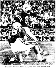
In 1964 and 1965, the University of Maryland football team had a placekicker, Bernardo Bramson, one of the first soccer-style kickers, whose uniform number changed in real time to match the number of points he scored.
Head football coach Tommy Nugent, who never missed a chance for publicity, called Bramson the “human scoreboard.” He’d start each season wearing zero, but whenever he scored on a field goal or extra point, the team equipment manager would affix tape to Bramson’s jersey to change the number. [A typical game for Bramson is described in this Sporting News article, dated October 17, 1964: “Against South Carolina recently, Bramson started the game with No. 3, changed to Nos. 4 and 5 after extra points, switched to No. 8 after a field goal, and finished with No. 9.” — PL]
Nugent originally wanted Bramson to have a question mark instead of a number but was told by the Atlantic Coast Conference that all players must have a number. The ACC green-lighted the tape idea, however [for details, see the last two grafs of this article — PL].
Sadly, when Nugent was replaced by Lou Saban in 1966, the “human scoreboard” concept was retired and Bramson was permanently assigned No. 3 for his final season [as noted in the last graf of this article — PL]. Maybe Lou should have reconsidered, because Bramson’s FG production sagged that year.
Amazing, right? Joe Hilseberg, how come you never told me about this?! It’s not clear how high Bramson’s uni number got during either of the human scoreboard seasons, but the last graf of this article, dated October 19th, 1964, says he was up to 19. Also worth noting: Bramson never wore shoulder pads.
That Tommy Nugent — the Terps coach who came up with the human scoreboard concept — was apparently quite the innovative chap. According to this item, he used a sideline traffic light to call signals and was also the first college coach to score on a two-point conversion, plus he introduced NOBs to the college ranks. Bill Veeck and Charlie Finley all rolled into one, with a whistle for good measure.

Raffle Reminder: I’m raffling off a free customized jersey from our friends at Classic Old School. For details, look here.
Uni Watch News Ticker: The current issue of Wired has a page showing a refrigerator door from the year 2020. Note the football tickets at upper-right. ”¦ Slideshow of the Portland Pirates’ Veterans Day jerseys here (with thanks to Jason Aarons). ”¦ Here’s some info on the Cancuks’ third jersey (rare mainstream contribution from Jeremy Brahm). ”¦ Those hick Nebraska farmers sure am stoopid (great find by Robert Eden). ”¦ It’s nice to know that even in a totally fucked-up economy, millionaire athletes can still do a brisk business buying and selling uniform numbers (thanks to Anthony Pellegrino). ”¦ Can anyone tell me who’s the opposing player getting bowled over by Earl Campbell, or at least the opposing team, in this 1977 video clip? I think it’s from UT’s 68-0 win over Virginia, but I’m trying to confirm that, and I’m unsure of the would-be tackler. ”¦ Several Rangers wore suits on the ice for an ad shoot the other day (with thanks to Alan Kreit). ”¦ What a bunch of douchebags. ”¦ Some very nice retro-styled Vancouver hockey designs available here (with thanks to David Cummings). ”¦ I love hockey and I love bowling, they’re two great tastes that definitely do not taste great together (blame Tris Wykes). ”¦ As usual, I’m completely footwear-indifferent, but Chris Yarolimek says this photo shows Jamarcus Russell wearing “old school Air Jordans.” ”¦ The Orioles will be unveiling their 2009 uniform set today, and there’s some early analysis here and here (with thanks to Joe Hilseberg, who’s all upset cuz he’s stuck out in Phoenix and can’t attend the event), and the new home jersey is here (with thanks to David Cline). The sleeve patch looks like this. You’ll have to wait to see the new road and alt. jerseys. ”¦ Disturbing note from: Jeff Vanden Langenberg, who writes: “The Green Bay CBS affiliate, WFRV, did a story on a new Reebok NFL prototype jersey design that looks ridiculous. They’re looking more and more like tank tops — the sleeves are even shorter than they are already, with elastic ends. The Packers’ equipment manager, Red Batty, was in the story and said the players like them as snug as can be, and they look reeeeal snug. Lots of breathable mesh. Also, he said the NFL is trying to streamline the jersey types and cloth, of which there are three currently being used. But it looked like more of a basketball jersey — the collar to sleeve was arcing inward instead of outward, just weird. The players wearing them say they’re lighter and cooler. Story said they’d appear on the field maybe by 2010.” Jeff says the video should appear soon on the WFRV web site (as of this morning, it’s not there yet), but meanwhile I have two questions: (1) Joe Skiba, I assume this is related to your super-secret Giants project, right? And (2) Is it just a coincidence that Green Bay has a TV station whose call letters sound like “Farve”? ”¦ Brian Hughes sent along a 1910 photo that makes me proud to be a Brooklynite. ”¦ Check out this old bicentennial-themed Ron Low mask. What’s with the backwards 1? (With thanks to Mike Williams.) ”¦ Two days ago I mentioned that webmaster John Ekdahl is having his Tiki Barber No. 21 jersey repurposed into a Steve Smith No. 12 jersey by a local shop. He’s documenting the whole process — here’s a slideshow of photos that show the first stages of the project. ”¦ Good sock-spotting by Jeff Lindquist, who writes: “Auburn’s Kodi Burns had his number (18) printed on his socks last Saturday. With a cursory search I found that he wore similar socks against West Virginia (isn’t it kind of odd that they were using a “AU” branded football while playing at Morgantown?) and Ole Miss, and he wore black socks with a smaller number against Tennessee and Louisiana-Monroe. I didn’t see any other Auburn players wearing their numbers on their socks — just Under Armor logo creep.”
This is for the Hemogoblin:
Christine Taylor:
link
as Sally Sitwell:
link
Married to Tony Wonder:
link
Who also played this part:
link
Oh, and here’s the South Lakes Seahawks links that didn’t work either:
link
link
isn’t it kind of odd that they were using a “AU” branded football while playing at Morgantown?)
No, in college, the team on offense uses their own footballs (manufacturer and branding).
I’m not that surprised by the “Microsoft Seahawks vs. Dubai Roughnecks” tickets on the Wired fridge. Heck, Rollerball has already warned us of the future of sports. (Thanks, James Caan!)
I was disturbed by the “I loved NY” magnet. As in past tense.
Made me lose my appetite for the six-legged turkey.
[quote] Several Rangers wore suits on the ice for an ad shoot the other day[/quote]
seems the rangers have a history of donning garb other than uniforms when they take the ice
Green Bay TV station’s call letters — WFRV — stand for Fox River Valley, where it is located. TV station arrived long before No. 4.
Paul,
Referring to the Auburn football used in Morgantown, teams use their own footballs, regardless if they are on the road or at home.
[quote comment=”299477″]I’m not that surprised by the “Microsoft Seahawks vs. Dubai Roughnecks” tickets on the Wired fridge. Heck, Rollerball has already warned us of the future of sports. (Thanks, James Caan!)
I was disturbed by the “I loved NY” magnet. As in past tense.
Made me lose my appetite for the six-legged turkey.[/quote]
What about the White board reminder to “defrost Grandpa” or the “Support our troops in Venezuela” magnet?
link
If baseball Uni’s still looked like this I would watch from Spring Ball through November. Unfortunately we have a whore-ed out league and teams and there is no ‘love of the game’. Its been replaced by ‘love of the green’
I got this email from the Orioles Warehouse Club I signed up for with a picture of the new home uniform. It shows the MD flag patch and the “new” bird hat. I’m still going to walk down to the rally at noon and see the unveiling. I will try to take some pictures and post them later today.
Home Uniform:
link
As for the fridge the Los Angeles moose magnet is a hoot
[quote comment=”299480″]Paul,
Referring to the Auburn football used in Morgantown, teams use their own footballs, regardless if they are on the road or at home.[/quote]
The offense always uses their own ball. The only level that I think this doesn’t occur at is the NFL, where the league supplies the balls.
Paul:
I hope that you remember that ED Kranepool wore #21 when he first came up to the Mets but gave it up (for free) to Warren Spahn and switched #7.
U of O’s next inspiration for their uniforms are going to be from this “classic”
link
I feel the urge to point out that the offense always uses their own balls (at home or away), but I’ll just avoid it at all costs.
And as far as the future fridge, I didn’t catch the “defront grandpa” reminder, but I did notice the coincidence of 3 letters sitting side by side in the middle…FTW
I heard Brian Roberts from the Orioles on a local radio show yesterday. The host asked him what the worst uniform he has ever worn was. He said his first year at UNC in 1997 was also the first year Nike took over their baseball uniforms. It was one of Nike’s first attempts at trying to get into the college baseball uniform scene so they wanted to make a splash (and I guess hasn’t stopped 11 years later.) The uniforms were navy blue pants and jerseys with Carolina light blue pinstripes. He said they were so ugly, but since they were Nike they were happy to wear them at the time. I guess it is true that some young athletes care more about who makes the uniform than the actual uniform itself.
Since I can’t view picture site hosted photos at work I’ll have to wait until I get home to see if Paul’s ‘dig’ at Nebraska farmers is going to piss me off. [grin]
And, yes, I do realize that ‘reading’ Uniwatch without being able to view most of the links is pretty “stooopid” as well.
who knew bees could cry? also dig the 500 euro chip and the ‘beautiful antarctica’ postcard
…for the win
Love the new Orioles sleeve patch. I’ve always thought MD had a cool-looking flag, and I’m always OK with pro teams actually acknowledging the state/region they’re in. (Les Alexander, are you listening? Fix those Rockets road jerseys.)
The Nats introduced two new players yesterday, but, of course, outfitted them in last season’s jerseys…sigh…
link
About Kodi Burns #18 socks… Maybe from the obvious dept, but he just turns the UnderArmor logo into an 8 and sticks a 1 in front. I’m guessing if he wore 19, he wouldn’t have numbers on his socks.
[quote comment=”299493″]The Nats introduced two new players yesterday, but, of course, outfitted them in last season’s jerseys…sigh…
link
Nice to see that Scott Olsen will be playing for the nati onals.
[quote comment=”299486″]Paul:
I hope that you remember that ED Kranepool wore #21 when he first came up to the Mets but gave it up (for free) to Warren Spahn and switched #7.[/quote]
And how could we forget the Giants’ punter, Jeff Feagles? #10 originally, then vacated it for Ole Miss star Eli Manning in exchange for Manning paying for a Feagles family vacation. Took #17 for a year, and then bartered it to Plaxico Burress (who wanted to “honor” his contract, signed on 17 March) in exchange for an outdoor kitchen for the Feagles’ Arizona home. Feagles is now #18, and probably hoping to make another deal.
Russel is wearing Air Jordan Retro 3, the same shoe Jordan wore when he won the slam dunk contest in Chicago .
here is a pic of the Jordan cleats
The backwards 1 on the Ron Low mask is to mirror the 1 on the other side of the mask.
link
lets try that again link
[quote comment=”299497″]Russel is wearing Air Jordan Retro 3, the same shoe Jordan wore when he won the slam dunk contest in Chicago .[/quote]
Here we go:
Each year that a Jordan shoe is retroed, Jordan Brand retails said Basketball shoe in a football model.
This year, it is the AJ III. Many players have been wearing them:
1. JaMarcus Russell
2. Dre Bly
3. T.O.
4. Shaun Rogers
5. Ahman Green
6. Jason Taylor
7. Chris Harris
To name a few.
Mark Mihalik has some great pics on his website:
PlayerExclusive.com
link
Interesting note…You will not see the Jordan Brand “Jumpman” logo on any of the cleats because they are not licensed by the NFL to outfit players.
[quote comment=”299501″][quote comment=”299497″]Russel is wearing Air Jordan Retro 3, the same shoe Jordan wore when he won the slam dunk contest in Chicago .[/quote]
Here we go:
Each year that a Jordan shoe is retroed, Jordan Brand retails said Basketball shoe in a football model.
This year, it is the AJ III. Many players have been wearing them:
1. JaMarcus Russell
2. Dre Bly
3. T.O.
4. Shaun Rogers
5. Ahman Green
6. Jason Taylor
7. Chris Harris
To name a few.
Mark Mihalik has some great pics on his website:
PlayerExclusive.com
link
Interesting note…You will not see the Jordan Brand “Jumpman” logo on any of the cleats because they are not licensed by the NFL to outfit players.[/quote]
Dwight Freeney, Marvin Harrison, and one of the Giants’ O Lineman as well!
Wow, 7 UA logos (Under Armor, not University of Auburn) visible in that final shot on a single player. And, we can’t see the other leg or his gloves. Plus, his cleats are probably UA, but have been spatted.
I don’t typically have a problem with logo creep, but that is a tad excessive.
[quote comment=”299493″]The Nats introduced two new players yesterday, but, of course, outfitted them in last season’s jerseys…sigh…
link
How will the 2009 home uniforms be any different than what those players are wearing?
[quote comment=”299490″]Since I can’t view picture site hosted photos at work I’ll have to wait until I get home to see if Paul’s ‘dig’ at Nebraska farmers is going to piss me off. [grin]
And, yes, I do realize that ‘reading’ Uniwatch without being able to view most of the links is pretty “stooopid” as well.[/quote]
The program at issue is a Missouri-issued program for a football game in 1979. It features a cartoon of a rube farmer being startled by a tiger hiding in a cornstalk. Paul’s dig was likely levied not at Nebraska farmers, but instead the manner in which the cartoon characterized them.
[quote comment=”299485″][quote comment=”299480″]Paul,
Referring to the Auburn football used in Morgantown, teams use their own footballs, regardless if they are on the road or at home.[/quote]
The offense always uses their own ball. The only level that I think this doesn’t occur at is the NFL, where the league supplies the balls.[/quote]
For our HS games the QB was the one that chose the balls too(generally 2 or 3), since he’d be the one handling it the most. I wouldn’t know if that’s how it is at other schools or even in college.
Tim Lincecum winning the NL Cy Young reminded me of a SF Giant uniform question I’ve been meaning to ask for awhile.
Has anyone else noticed that the SF Giants home white uniform is not quite as white as other team’s home whites? Does anyone know the history behind the slightly off-white color?
[quote]Can anyone tell me who’s the opposing player getting bowled over by Earl Campbell, or at least the opposing team, in this 1977 video clip? I think it’s from UT’s 68-0 win over Virginia, but I’m trying to confirm that, and I’m unsure of the would-be tackler[/quote]
Don’t think it could be Virginia. According to Helmet Project Virginia wore an orange helmet in 1977.
One youtube commenter said it was SMU, but I seem to remember hearing it was Baylor.
Just checked and they played SMU in Dallas, so that’s no good.
They did play Baylor at home in 1977.
[quote comment=”299504″][quote comment=”299493″]The Nats introduced two new players yesterday, but, of course, outfitted them in last season’s jerseys…sigh…
link
How will the 2009 home uniforms be any different than what those players are wearing?[/quote]
The sleeve patch will be the DC cap logo, not the DC “shield” logo.
[quote comment=”299504″][quote comment=”299493″]The Nats introduced two new players yesterday, but, of course, outfitted them in last season’s jerseys…sigh…
link
How will the 2009 home uniforms be any different than what those players are wearing?[/quote]
Sleeve patch. Used to be star-studded circular patch, now just a giant DC.
Question!!!!!!!!!
I was checking out some College FB and BB pics from last year.
How many schools, if any….use the same Number Font for all of their sports?
I know Kansas has that Trajan garbage, but are there any other schools?
[quote comment=”299504″][quote comment=”299493″]The Nats introduced two new players yesterday, but, of course, outfitted them in last season’s jerseys…sigh…
link
How will the 2009 home uniforms be any different than what those players are wearing?[/quote]
It’s just the shoulder patch. Went from an interlocking DC in a circle to just the interlocking DC. There’s no Nationals Park patch on either jersey, so they aren’t actually 2008 models either.
[quote comment=”299507″]Tim Lincecum winning the NL Cy Young reminded me of a SF Giant uniform question I’ve been meaning to ask for awhile.
Has anyone else noticed that the SF Giants home white uniform is not quite as white as other team’s home whites? Does anyone know the history behind the slightly off-white color?[/quote]
Upon moving to Pac Bell Park, owner Peter Magowan wanted the Giants’ uniforms to look as close as possible to the 1957 sets (first year in San Francisco), but with modern materials. As most wool flannel is generally slightly creamier than white (though the Dodgers always had very white flannels), the modern home “whites” are colored not-quite-white, using double-knit material.
[quote comment=”299511″]Question!!!!!!!!!
I was checking out some College FB and BB pics from last year.
How many schools, if any….use the same Number Font for all of their sports?
I know Kansas has that Trajan garbage, but are there any other schools?[/quote]
Boston College
OK, Paul, other than it’s Nike and it’s Oregon, what’s wrong with the blackout t-shirts? An O with wings rankles you like the Mets in black?
[quote comment=”299511″]Question!!!!!!!!!
I was checking out some College FB and BB pics from last year.
How many schools, if any….use the same Number Font for all of their sports?
I know Kansas has that Trajan garbage, but are there any other schools?[/quote]
I know I just said BC, but I know Miami (FL) does as well, and possibly Florida State
[quote comment=”299515″]OK, Paul, other than it’s Nike and it’s Oregon, what’s wrong with the blackout t-shirts? An O with wings rankles you like the Mets in black?[/quote]
The orgegon logos with the wings are really cool, since ducks DO have wings. Somebody just send Paul a pair of Nikes, one of those shirts and a Replica Oregon Football Jersey!
[quote comment=”299516″][quote comment=”299511″]Question!!!!!!!!!
I was checking out some College FB and BB pics from last year.
How many schools, if any….use the same Number Font for all of their sports?
I know Kansas has that Trajan garbage, but are there any other schools?[/quote]
I know I just said BC, but I know Miami (FL) does as well, and possibly Florida State[/quote]
So far we have:
1. BC
2. Miami, FLA
3. FSU
4. KU
Any more?
[quote comment=”299503″]Wow, 7 UA logos (Under Armor, not University of Auburn) visible in that final shot on a single player. And, we can’t see the other leg or his gloves. Plus, his cleats are probably UA, but have been spatted.
I don’t typically have a problem with logo creep, but that is a tad excessive.[/quote]
It seems to me that Under Armour’s UA logo is one the kids like to add wherever they can (those goofy bicep band-wraps). Nike sticks their logo wherever they can fit it…and doesn’t carry the ‘cool’ factor that UA seems to. I think we can blame the players as much as the company for the logo creep on that one.
[quote comment=”299513″][quote comment=”299507″]Tim Lincecum winning the NL Cy Young reminded me of a SF Giant uniform question I’ve been meaning to ask for awhile.
Has anyone else noticed that the SF Giants home white uniform is not quite as white as other team’s home whites? Does anyone know the history behind the slightly off-white color?[/quote]
Upon moving to Pac Bell Park, owner Peter Magowan wanted the Giants’ uniforms to look as close as possible to the 1957 sets (first year in San Francisco), but with modern materials. As most wool flannel is generally slightly creamier than white (though the Dodgers always had very white flannels), the modern home “whites” are colored not-quite-white, using double-knit material.[/quote]
Thanks for the response Mike
Ok, concerning the human scoreboard guy – did the team have two guys wearing the same number as a result of this gimmick, or did players have to relinquish their regular number to Bramson until he scored again? So, actually, there were three guys changing numbers each time he scored. And QB’s went along with this?
[quote comment=”299505″][quote comment=”299490″]Since I can’t view picture site hosted photos at work I’ll have to wait until I get home to see if Paul’s ‘dig’ at Nebraska farmers is going to piss me off. [grin]
And, yes, I do realize that ‘reading’ Uniwatch without being able to view most of the links is pretty “stooopid” as well.[/quote]
The program at issue is a Missouri-issued program for a football game in 1979. It features a cartoon of a rube farmer being startled by a tiger hiding in a cornstalk. Paul’s dig was likely levied not at Nebraska farmers, but instead the manner in which the cartoon characterized them.[/quote]
Thanks, Robert. Well if it was produced by Missou I’m sure it wasn’t very flattering. ;-)
Cincinatti
Virginia Tech
Colorado
Stanford
Clemson
A bit off topic, but anyone have any idea what the Mets patch may look like next year with the new stadium and everything?
Anyone???
[quote comment=”299523″]Cincinatti
Virginia Tech
Colorado
Stanford
Clemson[/quote]
Virginia Tech uses a variety of number styles for our sports.
Heck, we even have 2 number styles for football alone.
Wish I could find a pic of that crazy UNC jersey Brian Roberts was talking about. So far I can only find this image of Roberts at UNC; looks pretty much like what they wear right now:
link
[quote comment=”299525″][quote comment=”299523″]Cincinatti
Virginia Tech
Colorado
Stanford
Clemson[/quote]
Virginia Tech uses a variety of number styles for our sports.
Heck, we even have 2 number styles for football alone.[/quote]
You are correct, Beardface…I was thinking of the Wordmark!
Thanks!
Here’s BJ Surhoff’s crappy UNC jersey. Looks like an homage to the 80s White Sox or Astros:
link
Isn’t bowling and hockey together just curling? Just kidding, curling fans please do not stone me
In regards to the AU branded football being used at away games, All teams bring their own game balls on the road. They put their ball into play on offense which is why you see random home team equipment staffers on the visiting team bench.
A few notes in regard to Paul’s initial post…
I wish that bowling hockey jersey was in XL. Heck, I might even diet to fit in the Med. someday. You guys don’t realize how wonderful that is! I love hockey, I love hockey jerseys, and I love bowling! :) Can’t you see some dude, in a bowling league in Saskatchewan….rocking this jersey, drinking a Sleeman Cream Ale, donning his finest mullet, cursing out Larry Murphy….and naturally getting alllll the ladies.
Also- That Brooklyn picture is phenomenal! Are there more from that set, or is it just a single? That picture put me in a good mood.
link
What happened to the great Number font used bt Wake Forest during the Tim Duncan era?
[quote]curling fans please do not stone me[/quote]
*eyeroll*
you know what would make curling better? miniature golf windmills
(apologies to letterman)
[quote comment=”299525″][quote comment=”299523″]Cincinatti
Virginia Tech
Colorado
Stanford
Clemson[/quote]
Virginia Tech uses a variety of number styles for our sports.
Heck, we even have 2 number styles for football alone.[/quote]
And Stanford football definitely does not use the Blue Jays-esque basketball font.
Don’t have time to read the comments (German HW), but each team gets their own ball, Paul, so the Auburn branding is really just so that WVU doesn’t accidentally play with the wrong ball.
I loved that one of the stories on the number-changing kicker said that at one point he was so nervous he was “shaking like a guitar player.” Ah, 1964.
[quote comment=”299520″][quote comment=”299513″][quote comment=”299507″]Tim Lincecum winning the NL Cy Young reminded me of a SF Giant uniform question I’ve been meaning to ask for awhile.
Has anyone else noticed that the SF Giants home white uniform is not quite as white as other team’s home whites? Does anyone know the history behind the slightly off-white color?[/quote]
Upon moving to Pac Bell Park, owner Peter Magowan wanted the Giants’ uniforms to look as close as possible to the 1957 sets (first year in San Francisco), but with modern materials. As most wool flannel is generally slightly creamier than white (though the Dodgers always had very white flannels), the modern home “whites” are colored not-quite-white, using double-knit material.[/quote]
Thanks for the response Mike[/quote]
If he wanted the uniforms to look “as close as possible” to the 57 sets, then WHY is the 3 color piping on the sleeves right AT
link
the end of the sleeve, instead of a quarter inch away
link
like the originals?
[quote comment=”299530″]In regards to the AU branded football being used at away games, All teams bring their own game balls on the road. They put their ball into play on offense which is why you see random home team equipment staffers on the visiting team bench.[/quote]
Like trading pins at Disney World or the Olypics, teams often trade a few footballs.
We would receive a few Blems, or “factory-defect” footballs at the start of practice in August.
Every once in a while, we would find one from one of the bigger schools in the bunch.
My sophomore year, I somehow absconded with a Colorado stamped ball, before they went to Nike footballs!
[quote comment=”299535″]Don’t have time to read the comments (German HW), but each team gets their own ball, Paul, so the Auburn branding is really just so that WVU doesn’t accidentally play with the wrong ball.[/quote]
Guten Tag, HG, at least check out comment #1…Achtung!
[quote comment=”299491″]who knew link? also dig the 500 euro chip and the ‘beautiful antarctica’ postcard
…for the win[/quote]
The most troubling thing about that fridge door isn’t “troops in venezuela” or extinct polar bears and bees or NYC in the past tense… it’s that “Ziggy” will STILL be found on the funny pages.
[quote comment=”299515″]OK, Paul, other than it’s Nike and it’s Oregon, what’s wrong with the blackout t-shirts? An O with wings rankles you like the Mets in black?[/quote]
Same thing – it’s the black.
Oregon’s colors are green and gold. Green and gold. As an alum, I don’t mind them changing the shades, darkening the green and brightening the gold. But the colors are green and gold.
Bad enough to add black even as an accent color (a problem I have with Wisconsin, my other alma mater). But to go comepletely black? It’s an insult.
As the song goes, be true to your school. That includes your school colors.
[quote comment=”299475″]This is for the Hemogoblin:
Christine Taylor:
link
as Sally Sitwell:
link
Married to Tony Wonder:
link
Who also played this part:
link
Oh, and here’s the South Lakes Seahawks links that didn’t work either:
link
link
Hahaha. Funny.
[quote comment=”299487″]U of O’s next inspiration for their uniforms are going to be from this “classic”
link
It’d look better.
[quote comment=”299515″]OK, Paul, other than it’s Nike and it’s Oregon, what’s wrong with the blackout t-shirts? An O with wings rankles you like the Mets in black?[/quote]
No, it’s that it’s all black. Not so good. I plan on wearing yellow to the blackout.
WOOO!! Go run-on comments!
[quote comment=”299528″]Here’s BJ Surhoff’s crappy UNC jersey. Looks like an homage to the 80s White Sox or Astros:
link
No homage..it was the 80’s!
[quote comment=”299539″][quote comment=”299535″]Don’t have time to read the comments (German HW), but each team gets their own ball, Paul, so the Auburn branding is really just so that WVU doesn’t accidentally play with the wrong ball.[/quote]
Guten Tag, HG, at least check out comment #1…Achtung![/quote]
Ich liebe deine Mutter.
Juuuuust saying.
[quote comment=”299541″][quote comment=”299515″]OK, Paul, other than it’s Nike and it’s Oregon, what’s wrong with the blackout t-shirts? An O with wings rankles you like the Mets in black?[/quote]
Same thing – it’s the black.
Oregon’s colors are green and gold. Green and gold. As an alum, I don’t mind them changing the shades, darkening the green and brightening the gold. But the colors are green and gold.
Bad enough to add black even as an accent color (a problem I have with Wisconsin, my other alma mater). But to go comepletely black? It’s an insult.
As the song goes, be true to your school. That includes your school colors.[/quote]
Can anyone make out what the staduim name is on those tickets? Something Memorial Stadium in Seattle.
[quote comment=”299541″][quote comment=”299515″]OK, Paul, other than it’s Nike and it’s Oregon, what’s wrong with the blackout t-shirts? An O with wings rankles you like the Mets in black?[/quote]
Same thing – it’s the black.
Oregon’s colors are green and gold. Green and gold. As an alum, I don’t mind them changing the shades, darkening the green and brightening the gold. But the colors are green and gold.
Bad enough to add black even as an accent color (a problem I have with Wisconsin, my other alma mater). But to go comepletely black? It’s an insult.
As the song goes, be true to your school. That includes your school colors.[/quote]
I agree. My high school’s colors are blue and white, but they snuck in red as an accent color. GAaaaaaaaaaaaaarbage. Our uniforms look so generic now…
And Oregon… WHY?!!!
You want Under Armor logo creep from the Ole Miss-Auburn game? I was there, behind AU’s benches. The huge oscillating fans on their sideline have three HUGE Under Armor logos on them. You can see them from way high up in the stands. Under Armor fans. I’ve seen it all.
[Good sock-spotting by Jeff Lindquist, who writes: “Auburn’s Kodi Burns had his number (18) printed on his socks last Saturday. With a cursory search I found that he wore similar socks against West Virginia (isn’t it kind of odd that they were using a “AU” branded football while playing at Morgantown?) and Ole Miss, and he wore black socks with a smaller number against Tennessee and Louisiana-Monroe. I didn’t see any other Auburn players wearing their numbers on their socks – just Under Armor logo creep.”]
[quote comment=”299517″][quote comment=”299515″]OK, Paul, other than it’s Nike and it’s Oregon, what’s wrong with the blackout t-shirts? An O with wings rankles you like the Mets in black?[/quote]
The orgegon logos with the wings are really cool, since ducks DO have wings. Somebody just send Paul a pair of Nikes, one of those shirts and a Replica Oregon Football Jersey![/quote]
are those ‘things’ supposed to be wings…or feathers?
I would like to see more bat boys wear double-breasted jackets & ties.
[quote comment=”299537″][quote comment=”299520″][quote comment=”299513″][quote comment=”299507″]Tim Lincecum winning the NL Cy Young reminded me of a SF Giant uniform question I’ve been meaning to ask for awhile.
Has anyone else noticed that the SF Giants home white uniform is not quite as white as other team’s home whites? Does anyone know the history behind the slightly off-white color?[/quote]
Upon moving to Pac Bell Park, owner Peter Magowan wanted the Giants’ uniforms to look as close as possible to the 1957 sets (first year in San Francisco), but with modern materials. As most wool flannel is generally slightly creamier than white (though the Dodgers always had very white flannels), the modern home “whites” are colored not-quite-white, using double-knit material.[/quote]
Thanks for the response Mike[/quote]
If he wanted the uniforms to look “as close as possible” to the 57 sets, then WHY is the 3 color piping on the sleeves right AT
link
the end of the sleeve, instead of a quarter inch away
link
like the originals?[/quote]
Also, so then why does the link look like the link?
link and the Giants had switched to the vertical arched letters before they went to SF. I like the homage to the past with the color but the current word mark is looks like crap.
[quote comment=”299551″][quote comment=”299537″][quote comment=”299520″][quote comment=”299513″][quote comment=”299507″]Tim Lincecum winning the NL Cy Young reminded me of a SF Giant uniform question I’ve been meaning to ask for awhile.
Has anyone else noticed that the SF Giants home white uniform is not quite as white as other team’s home whites? Does anyone know the history behind the slightly off-white color?[/quote]
Upon moving to Pac Bell Park, owner Peter Magowan wanted the Giants’ uniforms to look as close as possible to the 1957 sets (first year in San Francisco), but with modern materials. As most wool flannel is generally slightly creamier than white (though the Dodgers always had very white flannels), the modern home “whites” are colored not-quite-white, using double-knit material.[/quote]
Thanks for the response Mike[/quote]
If he wanted the uniforms to look “as close as possible” to the 57 sets, then WHY is the 3 color piping on the sleeves right AT
link
the end of the sleeve, instead of a quarter inch away
link
like the originals?[/quote]
Also, so then why does the link look like the link?
Here is a shot of Sal Maglie and the Giants had switched to the vertical arched letters before they went to SF. I like the homage to the past with the color but the current word mark is looks like crap.[/quote]
Try this one: link
Not as good a look but it is the vertical arched version.
[quote comment=”299546″]Can anyone make out what the staduim name is on those tickets? Something Memorial Stadium in Seattle.[/quote]
Here’s a closer look at the ticket:
link
[quote comment=”299538″][quote comment=”299530″]In regards to the AU branded football being used at away games, All teams bring their own game balls on the road. They put their ball into play on offense which is why you see random home team equipment staffers on the visiting team bench.[/quote]
Like trading pins at Disney World or the Olypics, teams often trade a few footballs.
We would receive a few Blems, or “factory-defect” footballs at the start of practice in August.
Every once in a while, we would find one from one of the bigger schools in the bunch.
My sophomore year, I somehow absconded with a Colorado stamped ball, before they went to Nike footballs![/quote]
All Nike Stamped Footballs that are used carry the logo of the school as well, same with Nikes basketballs.
[quote comment=”299553″][quote comment=”299546″]Can anyone make out what the staduim name is on those tickets? Something Memorial Stadium in Seattle.[/quote]
Here’s a closer look at the ticket:
link
Steve Ballmer, CEO of Microsoft.
[quote comment=”299553″][quote comment=”299546″]Can anyone make out what the staduim name is on those tickets? Something Memorial Stadium in Seattle.[/quote]
Here’s a closer look at the ticket:
link
At the risk of stating the obvious, “Ballmer Memorial Stadium” is named after Steve Ballmer, CEO of Microsoft.
Do you think all the Oregon craziness, is because of an inferiority complex? I mean…as a nickname… a duck just isn’t that tough. But a duck with faux-stoneplated black armor, or a reflective duck might be tougher?
Trojans eat ducks. Bears eat ducks. Huskies eat ducks. I’m not sure what would happen if a beaver took on a duck, but I know the duck wouldn’t win.
Ugly colors + weak nickname = black infused inferiority complex?
[quote comment=”299478″][quote] Several Rangers link for an ad shoot the other day[/quote]
seems the rangers have a history of donning garb link when they link[/quote]
You know what’s funny about those two commercials (other than the four pussies skating around like fairies), is that in the first, the boys are singing “SASSOON” and in the second they sing “SASSON”. Somewhere in between Vidal sued and they had to change the pronunucation.
[quote comment=”299555″][quote comment=”299553″][quote comment=”299546″]Can anyone make out what the staduim name is on those tickets? Something Memorial Stadium in Seattle.[/quote]
Here’s a closer look at the ticket:
link
Steve Ballmer, CEO of Microsoft.[/quote]
which is funny because monkey boy isn’t dead…yet
I do not play golf, but maybe Phil would be interested in this…..
link
Orioles new away jerseys and hat:
link
Re: Yesterday’s Blue Hose discussion
Pat Forde (ESPN’s Minutes Column) is on the same page as me:
“The addition of Blue Hose (23) to the Division I lexicon. The Presbyterian Blue Hose actually moved up to the highest level last season, but this year they officially join a conference — the Big South. If the team doesn’t wear blue knee socks, The Minutes will be outraged.”
Naturally, against Duke…we saw short, white sox… booooo.
I like this years Grey Cup logo….
link
[quote comment=”299553″][quote comment=”299546″]Can anyone make out what the staduim name is on those tickets? Something Memorial Stadium in Seattle.[/quote]
Here’s a closer look at the ticket:
link
you’d think such “progressive” minds would avoid such un-PC terms and simply ask for “No reselling over face-value”
Pretty sweet…
link|65%3A1|39%3A1|240%3A1318
[quote comment=”299561″]Orioles new away jerseys and hat:
link
Why is the “e” smaller than the “a”? Like the piping though.
Wow, they’re putting Baltimore back on the road jerseys? About damn time… they never should’ve taken it off of them in the first place. Nobody in Washington was buying that the O’s were ‘their’ team just because the jerseys didn’t say Bawmer on them. Fah.
Also pretty sweet… check out the striped socks!
link|65%3A1|39%3A1|240%3A1318
[quote comment=”299566″][quote comment=”299561″]Orioles new away jerseys and hat:
link
Why is the “e” smaller than the “a”? Like the piping though.[/quote]
And that wasn’t a “why” like I don’t know why (its consistant with the shit current “Orioles” they use), it was “why did they do it, it looks stupid”
[quote comment=”299566″][quote comment=”299561″]Orioles new away jerseys and hat:
link
Why is the “e” smaller than the “a”? Like the piping though.[/quote]
Great looking script! I like the tapered look of the letters.
Weird ass hockey jersey with palm trees…
link|65%3A1|39%3A1|240%3A1318
[quote comment=”299569″][quote comment=”299566″][quote comment=”299561″]Orioles new away jerseys and hat:
link
Why is the “e” smaller than the “a”? Like the piping though.[/quote]
And that wasn’t a “why” like I don’t know why (its consistant with the shit current “Orioles” they use), it was “why did they do it, it looks stupid”[/quote]
Not saying the whole uni has to throwback to 1970 but this is whole lot better in terms of the lettering: link
[quote comment=”299570″][quote comment=”299566″][quote comment=”299561″]Orioles new away jerseys and hat:
link
Why is the “e” smaller than the “a”? Like the piping though.[/quote]
Great looking script! I like the tapered look of the letters.[/quote]
So if they had more letters, it would eventually disappear?
[quote comment=”299569″][quote comment=”299566″][quote comment=”299561″]Orioles new away jerseys and hat:
link
Why is the “e” smaller than the “a”? Like the piping though.[/quote]
And that wasn’t a “why” like I don’t know why (its consistant with the shit current “Orioles” they use), it was “why did they do it, it looks stupid”[/quote]
It doesn’t look like the numbers are the same color or fabric as the lettering. Maybe it’s just a difference in the thickness of the black outline, or it could be the lighting/angle. Doesn’t seem to match, though.
I like the way the ‘Baltimore’ tapers down toward the end.
[quote comment=”299508″][quote]Can anyone tell me who’s the opposing player getting bowled over by Earl Campbell, or at least the opposing team, in this 1977 video clip? I think it’s from UT’s 68-0 win over Virginia, but I’m trying to confirm that, and I’m unsure of the would-be tackler[/quote]
Don’t think it could be Virginia. According to Helmet Project Virginia wore an orange helmet in 1977.
One youtube commenter said it was SMU, but I seem to remember hearing it was Baylor.
Just checked and they played SMU in Dallas, so that’s no good.
They did play Baylor at home in 1977.[/quote]
Dad knew it was 1977 without even telling him (running out of the I). Home games were Boston College, Virginia, Rice, Texas Tech, TCU, Baylor.
What I have found so far:
Baylor wore a gold helmet
TCU wore silver helmets
Tech wore black with a super large TT and fat white/red stripes
Rice wore dark blue helmets with two white stripes and numbers on the side
Just trying to pin down if Tech or Rice wore all white in that game…
[quote comment=”299573″][quote comment=”299570″][quote comment=”299566″][quote comment=”299561″]Orioles new away jerseys and hat:
link
Why is the “e” smaller than the “a”? Like the piping though.[/quote]
Great looking script! I like the tapered look of the letters.[/quote]
So if they had more letters, it would eventually disappear?[/quote]
Another problem, another team with a friggin’ split letter!
[quote comment=”299561″]Orioles new away jerseys and hat:
link
On the whole, beautiful. I’m so thrilled they’re putting the city name on the roads that I’m willing to overlook the “speeding away” script.
Can’t help but notice that they’ve already got a little “Balttimore” problem….
WFRV.com has the video up and running now. Look for the link titled as: link.
It looks like Reebok will try to NHLize the NFL (and somewhat WNBA it, too) with one pattern for all teams, or at least a base pattern for all teams.
I’m not sure how well I like that news, especially because of the many teams that use older patterns and how they might be “encouraged” to modernize. Hopefully many will go the route of the Bruins or Red Wings and stay with the traditional looks, despite new patterns/materials.
[quote comment=”299506″][quote comment=”299485″][quote comment=”299480″]Paul,
Referring to the Auburn football used in Morgantown, teams use their own footballs, regardless if they are on the road or at home.[/quote]
The offense always uses their own ball. The only level that I think this doesn’t occur at is the NFL, where the league supplies the balls.[/quote]
For our HS games the QB was the one that chose the balls too(generally 2 or 3), since he’d be the one handling it the most. I wouldn’t know if that’s how it is at other schools or even in college.[/quote]
I work on the chain gang for the University of St Thomas in St Paul. Usually the equipment manager picks out the game balls. For conference games we’ll just use St. Thomas’s balls, as all MIAC teams use the same model. However when we play non conference teams we swap balls in and out so that the offense plays with their own model. This became quite a hassle in a game against Loras College a couple years ago when all Loras footballs would end up on one sideline and all St Thomas balls on another…..interestingly enough for kickoffs and punts, the kicking team would use the other team’s ball…..
[quote comment=”299576″][quote comment=”299573″][quote comment=”299570″][quote comment=”299566″][quote comment=”299561″]Orioles new away jerseys and hat:
link
Why is the “e” smaller than the “a”? Like the piping though.[/quote]
Great looking script! I like the tapered look of the letters.[/quote]
So if they had more letters, it would eventually disappear?[/quote]
Another problem, another team with a friggin’ split letter![/quote]
Yeah… first thing I noticed about the uni. Why do clubs continuously keep doing that?
That’s not Texas Tech in the Earl Campbell video. Based on the helmet and numeral style, it’s got to be either Virginia or Rice, depending on whether that’s a washed-out orange or washed-out blue helmet.
[quote comment=”299549″][quote comment=”299517″][quote comment=”299515″]OK, Paul, other than it’s Nike and it’s Oregon, what’s wrong with the blackout t-shirts? An O with wings rankles you like the Mets in black?[/quote]
The orgegon logos with the wings are really cool, since ducks DO have wings. Somebody just send Paul a pair of Nikes, one of those shirts and a Replica Oregon Football Jersey![/quote]
are those ‘things’ supposed to be wings…or feathers?[/quote]
The truly sad fact is that the “wings” have nothing to do with a Duck rather the true mascot of the school,the Greek Goddess of victory:
link
(laughing) If you would look at that close up shot of the tickets: look on the top — DNA Coded… no exchanges, no refunds, no scalping.
(chuckles) wow…
[quote comment=\”299549\”][quote comment=\”299517\”][quote comment=\”299515\”]OK, Paul, other than it\’s Nike and it\’s Oregon, what\’s wrong with the blackout t-shirts? An O with wings rankles you like the Mets in black?[/quote]
The orgegon logos with the wings are really cool, since ducks DO have wings. Somebody just send Paul a pair of Nikes, one of those shirts and a Replica Oregon Football Jersey![/quote]
are those \’things\’ supposed to be wings…or feathers?[/quote]
The truly sad fact is that the \”wings\” have nothing to do with a Duck rather the true mascot of the school,the Greek Goddess of victory:
link
I see that the Orioles are now subscribing to the link philosophy.
Wocka wocka wocka!
[quote comment=”299584″][quote comment=\”299549\”][quote comment=\”299517\”][quote comment=\”299515\”]OK, Paul, other than it\’s Nike and it\’s Oregon, what\’s wrong with the blackout t-shirts? An O with wings rankles you like the Mets in black?[/quote]
The orgegon logos with the wings are really cool, since ducks DO have wings. Somebody just send Paul a pair of Nikes, one of those shirts and a Replica Oregon Football Jersey![/quote]
are those \’things\’ supposed to be wings…or feathers?[/quote]
The truly sad fact is that the \”wings\” have nothing to do with a Duck rather the true mascot of the school,the Greek Goddess of victory:
link
Dammit, Matt!
Double posting=Double the funny=Not really
Oeioles road jersy
link
split “t” sucks!
Brewers fans are gonna be sad to see this TV personality leaving Milwaukee for bigger and better things…
link
[quote comment=”299578″]WFRV.com has the video up and running now. Look for the link titled as: link.
It looks like Reebok will try to NHLize the NFL (and somewhat WNBA it, too) with one pattern for all teams, or at least a base pattern for all teams.
I’m not sure how well I like that news, especially because of the many teams that use older patterns and how they might be “encouraged” to modernize. Hopefully many will go the route of the Bruins or Red Wings and stay with the traditional looks, despite new patterns/materials.[/quote]
Goodbye stripes!
When these things come into widespread use (and they will), football jerseys will have no real estate left at all for design elements beyond silly clown suit piping. In fact, they won’t be jerseys so much as tight outer shells that hold pads securely.
I think they should start putting “sleeve” stripes, like the kind the Browns and Steelers traditionally wear, on the compression undershirts – you’d get a mishmash of some players in stripes and some bare-armed….but at least there would be SOME stripes.
[quote comment=”299511″]Question!!!!!!!!!
I was checking out some College FB and BB pics from last year.
How many schools, if any….use the same Number Font for all of their sports?
I know Kansas has that Trajan garbage, but are there any other schools?[/quote]
Do you really mean ALL varsity sports or just the biggies?
For example, Indiana uses the same font for football, baseball and men’s basketball but a different one for men’s soccer and yet another for women’s basketball.
None of them are particularly distinctive — they’re all just block numbers, just different styles of block.
Further update:
My friend Bob, who went to school then and attended every home game, is 99 percent sure the Earl Campbell play occured at Rice.
[quote comment=”299577″][quote comment=”299561″]Orioles new away jerseys and hat:
link
On the whole, beautiful. I’m so thrilled they’re putting the city name on the roads that I’m willing to overlook the “speeding away” script.
Can’t help but notice that they’ve already got a little “Balttimore” problem….[/quote]
so, they’ve ditched the all-black hat?
er, against Rice.
The Oregon wings, feathers, whatever, look more like some kind of oriental weapon of death.
[quote comment=”299594″][quote comment=”299577″][quote comment=”299561″]Orioles new away jerseys and hat:
link
On the whole, beautiful. I’m so thrilled they’re putting the city name on the roads that I’m willing to overlook the “speeding away” script.
Can’t help but notice that they’ve already got a little “Balttimore” problem….[/quote]
so, they’ve ditched the all-black hat?[/quote]
does this also mean they’ll finally have a batting helmet with an orange brim? they’ve used an all-black helmet for several years, despite having the orange-brimmed hat at home.
link
If brought up one or twelve times, sorry, but I have to say I really like the slight tweaks to the Orioles jerseys. The Baltimore roads will look nice I think:
link
Somewhat uni-related… some of the ugly stuff @ SEMA….
link
Hey, I guess this shows how important that San Francisco/Arizona game was Monday night (unless I missed it while scrolling down)…
Did anyone get a screen grab of Tim Hightower’s helmet actually “blowing up” during the first half of Monday night’s game? I mean, there was an explosion at contact of about 10 different individual pieces of helmet. Did anyone else see it?
[quote comment=”299588″]Brewers fans are gonna be sad to see this TV personality leaving Milwaukee for bigger and better things…
link
I wonder why?
link
[quote comment=”299587″]Oeioles road jersy
link
split “t” sucks![/quote]
It seems this is a problem that could’ve been avoided. Split it after the T and no issues. I wonder if the buttoned jerseys are even used as a template in the planning and design process.
[quote comment=”299598″]If brought up one or twelve times, sorry, but I have to say I really like the slight tweaks to the Orioles jerseys. The Baltimore roads will look nice I think:
link
Would it be possible to straighten out the “L”? It’s almost sideways.
[quote comment=\”299501\”][quote comment=\”299497\”]Russel is wearing Air Jordan Retro 3, the same shoe Jordan wore when he won the slam dunk contest in Chicago .[/quote]
Here we go:
Each year that a Jordan shoe is retroed, Jordan Brand retails said Basketball shoe in a football model.
This year, it is the AJ III. Many players have been wearing them:
1. JaMarcus Russell
2. Dre Bly
3. T.O.
4. Shaun Rogers
5. Ahman Green
6. Jason Taylor
7. Chris Harris
To name a few.
Mark Mihalik has some great pics on his website:
PlayerExclusive.com
link
Interesting note…You will not see the Jordan Brand \”Jumpman\” logo on any of the cleats because they are not licensed by the NFL to outfit players.[/quote]
here a pic from my collection…
link
“Ballmer Memorial Stadium” — please tell me I’m not the only one who thought of link… today of all days…
here’s a pic of the black alt jersey, with “baltimore” on the right sleeve.
link
re: new Reebok NFL jerseys
Are we going to have to start calling them link now?
i think the “baltimore” on the right sleeve of the black alt, and the “orioles” on the right sleeve of the road gray are overkill. the left sleeve patch will already read “baltimore orioles” and “orioles baseball,” respectively. cluttering both sleeves leaves no room for the inevitable anniversary or rememberance patches.
[quote comment=”299589″][quote comment=”299578″]WFRV.com has the video up and running now. Look for the link titled as: link.
It looks like Reebok will try to NHLize the NFL (and somewhat WNBA it, too) with one pattern for all teams, or at least a base pattern for all teams.
I’m not sure how well I like that news, especially because of the many teams that use older patterns and how they might be “encouraged” to modernize. Hopefully many will go the route of the Bruins or Red Wings and stay with the traditional looks, despite new patterns/materials.[/quote]
Goodbye stripes!
When these things come into widespread use (and they will), football jerseys will have no real estate left at all for design elements beyond silly clown suit piping. In fact, they won’t be jerseys so much as tight outer shells that hold pads securely.
I think they should start putting “sleeve” stripes, like the kind the Browns and Steelers traditionally wear, on the compression undershirts – you’d get a mishmash of some players in stripes and some bare-armed….but at least there would be SOME stripes.[/quote]
it looked like brandon jacobs was wearing a prototype jersey sunday night.
Black Orioles jersey = fail. A long word on a sleeve?
[quote comment=”299606″]here’s a pic of the black alt jersey, with “baltimore” on the right sleeve.
link
shoot, it’s available on their website where the wallpaper images are. damn mlb.
link
Here is a collection of photos of the new O’s:
link
I have found a gem!
link
This is a collection of photos, newsclips, and movies from all of the Monon Bell Games (Wabash vs. Depauw) played! It goes way back and the movies are really great. They show a lot more of this pictures than the website. Here are a couple pics i thought you all would enjoy.
link
link
link
link
link
link
link
The last one is my favorite. Even though I went to Wabash, I found the ‘Bleach the Scarlet’ to be hilarious.
New home Orioles look = Good
New away Orioles look = Great
New Orioles Maryland patch = Pretty damn cool
New black Orioles alt = DOH!
New Baltimore patch on black Orioles alt = DOUBLE DOH!
[quote comment=”299610″]Black Orioles jersey = fail. A long word on a sleeve?[/quote]
[quote comment=”299616″]New home Orioles look = Good
New away Orioles look = Great
New Orioles Maryland patch = Pretty damn cool
New black Orioles alt = DOH!
New Baltimore patch on black Orioles alt = DOUBLE DOH![/quote]
The black alternate is not new, all they did was add “Baltimore” to the sleeve and announced that they would wear it on the road as well.
The new home/away BP jerseys and hats weren’t bad either.
[quote comment=”299617″][quote comment=”299610″]Black Orioles jersey = fail. A long word on a sleeve?[/quote][/quote]
exactly. it reminds me of the dodgers road uniform from a few years ago. it didn’t work for them, either.
link
any pics of the new bp jersey/caps?
BTW the last link is at the circle in Downtown Indianapolis
[quote comment=”299610″]Black Orioles jersey = fail. A long word on a sleeve?[/quote]
[quote comment=”299613″]http://baltimore.orioles.mlb.com/bal/fan_forum/wallpaper.jsp[/quote]
Looked awful when the Dodgers did it, looks awful now.
[quote comment=”299597″][quote comment=”299594″][quote comment=”299577″][quote comment=”299561″]Orioles new away jerseys and hat:
link
On the whole, beautiful. I’m so thrilled they’re putting the city name on the roads that I’m willing to overlook the “speeding away” script.
Can’t help but notice that they’ve already got a little “Balttimore” problem….[/quote]
so, they’ve ditched the all-black hat?[/quote]
does this also mean they’ll finally have a batting helmet with an orange brim? they’ve used an all-black helmet for several years, despite having the orange-brimmed hat at home.
link
From the BaltimoreSun.com:
“The team’s batting helmets will also feature an orange bill rather than being all black like previous season models.”
link
[quote comment=”299600″]Hey, I guess this shows how important that San Francisco/Arizona game was Monday night (unless I missed it while scrolling down)…
Did anyone get a screen grab of Tim Hightower’s helmet actually “blowing up” during the first half of Monday night’s game? I mean, there was an explosion at contact of about 10 different individual pieces of helmet. Did anyone else see it?[/quote]
It was the defender’s shield that exploded. Video is on YouTube.
[quote comment=”299620″]any pics of the new bp jersey/caps?[/quote]
Here is all of them:
link
The BP hat changes those stupid side panels to black with just an orange outline.
Black “Baltimore” BP is away, Orange is home and both now have NOB.
[quote comment=”299521″]Ok, concerning the human scoreboard guy – did the team have two guys wearing the same number as a result of this gimmick, or did players have to relinquish their regular number to Bramson until he scored again? So, actually, there were three guys changing numbers each time he scored. And QB’s went along with this?[/quote]
There is no rule against two players wearing the same number. They are just not supposed to wear it on the field at the same time. Per NCAA Rule 1, Section 4, Article 2-C: “No two players of the same team shall participate in the same down wearing identical numbers.” The penalty is five yards from the previous spot. Currently several NCAA teams have players with duplicate jersey numbers. I have no idea what the rule was during Bramson’s time.
By the way, Tom Nugent, who passed away at the age of 92 in January 2006, was also credited with the invention of the “I”-formation and the creation of the “typewriter” huddle (where instead of a circle, players stood in two rows facing the quarterback — think Len Dawson and the K.C. Chiefs). However, Nugent’s most important contribution was breaking the color barrier in the ACC when he had assistant coach Lee Corso pursue the recruitment of Daryl Hill in 1962. Hill transferred from the Naval Academy, where he had been their first African-American player, and played his first game at Maryland in September 1963.
[quote comment=”299608″]i think the “baltimore” on the right sleeve of the black alt, and the “orioles” on the right sleeve of the road gray are overkill. the left sleeve patch will already read “baltimore orioles” and “orioles baseball,” respectively. cluttering both sleeves leaves no room for the inevitable anniversary or rememberance patches.[/quote]
Indeed. Has any team ever really had regular patches (or maybe a logo on one sleeve and a number on the other) on both sleeves to begin with?
I am glad to have Baltimore back on the away jersey, but am disappointed in the cap and the Maryland patch. It looks like the O’s are trying too hard to acknowledge their home by coping the UMD logo and surrounding it with Orioles Baseball.
link
A small flag logo would have been fine. Also, adding script to the other sleeve seems like some overkill in the flair department.
Overall grade for the new unis= C+ (Kudos for the return of Baltimore, but too much of everything else)
[quote comment=”299625″][quote comment=”299620″]any pics of the new bp jersey/caps?[/quote]
Here is all of them:
link
The BP hat changes those stupid side panels to black with just an orange outline.
Black “Baltimore” BP is away, Orange is home and both now have NOB.[/quote]
didn’t get everything i wanted, BUT, i’m satisfied – away BP jersey with baltimore on it as well is a nice touch (even though i absolutely HATE the underarm panels)
all in all, i’ll grade it a B
Lost in all the O’s uniform changes was the change to the main logo itself. They got rid of the baseball diamond logo and went back to the script Orioles with the bird pertched on top. Much better!
I do agree that the script Orioles and Baltimore on the sleeves is a little overkill. They could have put the bird back on the sleeve. Overall I like the new changes and can’t wait to wear my new jersey on April 6 at Campden Yards against the Yankees!
I too am from B-more. I give it an A+. I was really afraid they would end up with the Toronto Blue Jay look. As for the flair on the sleeves….The script logo may be overkill but the Md. patch is great. It ties them to the Ravens, which in this town is a good thing. The addition of orange to the piping is great and the adding the orange bill to the helmet is long overdue. They still look like the Orioles and they didn’t mess that up. Good job overall.
[quote comment=”299581″]That’s not Texas Tech in the Earl Campbell video. Based on the helmet and numeral style, it’s got to be either Virginia or Rice, depending on whether that’s a washed-out orange or washed-out blue helmet.[/quote]
Pretty much narrowed it down to Rice – per uniforms of 1977 (even though I have yet to find photo proof of Rice wearing all white in that game) – one YouTuber claims the video was Rice as well. Now, the poor kid who would love to not be infamous… along with the Rice Media guide not wanting to cop to that dubious recognition and extensive digging have come up with no named player. The Rice media guide has a by the numbers section (with years). Looks like a single digit or maybe a couple of ones in the video.
In 1977, based on position:
1 Wes Hansen (PK)
2 Jesse James (DB)
3 Doug Loafman (DB-P-PK)
16 Kyle Hunter (DB)
Sadly, I got no hits when paired with Earl campbell.
New Team USA jerseys, worn by the women at the Four Nations Cup. My friend is the equipment manager and she isn’t sure if it’s going to apply for both mens and womens’ programs.
link
link
Gotta say I hate the TV number look on a hockey jersey…
[quote comment=”299604″][quote comment=\”299501\”][quote comment=\”299497\”]Russel is wearing Air Jordan Retro 3, the same shoe Jordan wore when he won the slam dunk contest in Chicago .[/quote]
Here we go:
Each year that a Jordan shoe is retroed, Jordan Brand retails said Basketball shoe in a football model.
This year, it is the AJ III. Many players have been wearing them:
1. JaMarcus Russell
2. Dre Bly
3. T.O.
4. Shaun Rogers
5. Ahman Green
6. Jason Taylor
7. Chris Harris
To name a few.
Mark Mihalik has some great pics on his website:
PlayerExclusive.com
link
Interesting note…You will not see the Jordan Brand \”Jumpman\” logo on any of the cleats because they are not licensed by the NFL to outfit players.[/quote]
here a pic from my collection…
link
The only major difference between your cleats and those that the NFLers are wearing is that yours are General Release…to the public. Thise WILL have the manufacturers’ logos. The PE’s that the players wear will not:
link
link
[quote comment=”299630″]Lost in all the O’s uniform changes was the change to the main logo itself. They got rid of the baseball diamond logo and went back to the script Orioles with the bird pertched on top. Much better!
I do agree that the script Orioles and Baltimore on the sleeves is a little overkill. They could have put the bird back on the sleeve. Overall I like the new changes and can’t wait to wear my new jersey on April 6 at Campden Yards against the Yankees![/quote]
good point – much simpler main logo – although i didn’t mind the diamond logo
[quote comment=”299591″][quote comment=”299511″]Question!!!!!!!!!
I was checking out some College FB and BB pics from last year.
How many schools, if any….use the same Number Font for all of their sports?
I know Kansas has that Trajan garbage, but are there any other schools?[/quote]
Do you really mean ALL varsity sports or just the biggies?
For example, Indiana uses the same font for football, baseball and men’s basketball but a different one for men’s soccer and yet another for women’s basketball.
None of them are particularly distinctive — they’re all just block numbers, just different styles of block.[/quote]
Lets say the nationally televised…yes biggies!
I picked the wrong day to bring this up, but Miami is a great example!
[quote comment=”299517″][quote comment=”299515″]OK, Paul, other than it’s Nike and it’s Oregon, what’s wrong with the blackout t-shirts? An O with wings rankles you like the Mets in black?[/quote]
The orgegon logos with the wings are really cool, since ducks DO have wings. Somebody just send Paul a pair of Nikes, one of those shirts and a Replica Oregon Football Jersey![/quote]
The incredible irony of Oregon donning black uniforms is, black is the main color of their arch rival Oregon State Beavers. Abso-freekin-lutely absurd. It’s like Michigan, Yale and Cal unveiling a set of red uniforms or Texas A&M sporting a burnt orange alternate.
Esthetically speaking U of 0 is the douche nozzle, Nike is the bag.
beautiful new o’s hat. wish the a’s would do something similar with their elephant.
[quote comment=”299637″][quote comment=”299517″][quote comment=”299515″]OK, Paul, other than it’s Nike and it’s Oregon, what’s wrong with the blackout t-shirts? An O with wings rankles you like the Mets in black?[/quote]
The orgegon logos with the wings are really cool, since ducks DO have wings. Somebody just send Paul a pair of Nikes, one of those shirts and a Replica Oregon Football Jersey![/quote]
The incredible irony of Oregon donning black uniforms is, black is the main color of their arch rival Oregon State Beavers.
Abso-freekin-lutely absurd.
It’s like Michigan, Yale and Cal unveiling a set of red uniforms or Texas A&M sporting a burnt orange alternate.
Esthetically speaking U of 0 is the douche nozzle, Nike is the bag.[/quote]
Where’s Oreogn?
dunno who the poor college boy was that got in earl’s way, but about 10 seconds into this is definitely isiah robertson:
link
Regarding John Ekdahl’s project: the NFL has taken a hard line approach to renumberiing/renaming NFL jerseys. They have shut down all of the large established lettering/customizing companies, and even gone after the small mom & pop/guy in basement businesses. Do not be surprised if you hear from the NFL’s attorneys – and if you do please share the letter, I would love to see what it says.
[quote comment=”299640″]dunno who the poor college boy was that got in earl’s way, but about 10 seconds into this is definitely isiah robertson:
link
It’s a shame that Campbell can barely walk now.
[quote comment=”299577″][quote comment=”299561″]Orioles new away jerseys and hat:
link
On the whole, beautiful. I’m so thrilled they’re putting the city name on the roads that I’m willing to overlook the “speeding away” script.
Can’t help but notice that they’ve already got a little “Balttimore” problem….[/quote]
Seems more like a Baltlimore, but I agree…
[quote comment=”299485″][quote comment=”299480″]Paul,
Referring to the Auburn football used in Morgantown, teams use their own footballs, regardless if they are on the road or at home.[/quote]
The offense always uses their own ball. The only level that I think this doesn’t occur at is the NFL, where the league supplies the balls.[/quote]
Some would argue if they really have any balls, as in Troy Palomalu
[quote comment=”299529″]Isn’t bowling and hockey together just curling? Just kidding, curling fans please do not stone me[/quote]
Do not STONE me…hehe. Good one.
Ummmm….The Orioles added BALTIMORE to their jerseys today. It only took them 36 years and 3 craptastic ones of the Nationals in our back yard to get it done.
Anyone…….? Bueller? Why do I hear crickets?
[quote comment=”299637″][quote comment=”299517″][quote comment=”299515″]OK, Paul, other than it’s Nike and it’s Oregon, what’s wrong with the blackout t-shirts? An O with wings rankles you like the Mets in black?[/quote]
The orgegon logos with the wings are really cool, since ducks DO have wings. Somebody just send Paul a pair of Nikes, one of those shirts and a Replica Oregon Football Jersey![/quote]
The incredible irony of Oregon donning black uniforms is, black is the main color of their arch rival Oregon State Beavers.[/quote]
Not only that, but Nike originally said they wouldn’t use a black helmet for Oregon “out of respect for Oregon State.” I got that straight from
the horse’sTinker Hatfield’s mouth:link
But now they’re apparently going to wear black helmets this weekend:
link
[quote comment=”299507″]Tim Lincecum winning the NL Cy Young reminded me of a SF Giant uniform question I’ve been meaning to ask for awhile.
Has anyone else noticed that the SF Giants home white uniform is not quite as white as other team’s home whites? Does anyone know the history behind the slightly off-white color?[/quote]
link
… And (2) Is it just a coincidence that Green Bay has a TV station whose call letters sound like “Farve”? …
Farve? Who’s Farve?
good job by baltimore livening up a pretty boring uniform set without going overboard. i love the return of “baltimore” (even though im prolly at least 20 years too young to have ever seen it before) and the maryland state flag patch is sweet. the new piping is awesome (although i would have liked them to go back to the black piping that surrounded the buttons and went around the collar). i agree the script logos on the right sleeves are overkill, but i think theyll be alright. can’t say they look like crap. i think they would look a LOT better if they were a lot smaller, however. maybe if they were the size of, for lack of a better example, a nike swoosh on a football jersey they would look cool. all in all well done.
also, a few years ago (before UA came), the university of maryland used to outfit all of its teams (or at least the ones that got their pictures on the website) in the font seen in the word “maryland” in this pagehttp://umterps.cstv.com/index-main.html
ok i swear i put a space in there… sorry
link
that should be better
Not really liking the o’s new jerseys. I almost always love it when teams put something that can identify their geographic area on the jersey (city, flag or whatever), but it looks like they were almost trying too hard to fit the entire city name into an arch similar to how Orioles is spelled out on the home jerseys. Also, the Maryland flag looks out of place with its colors. Similar to how the Calgary Flames have their flag on their jerseys despite the fact none of the colors match up.
By the way, I got my friend a Mitchell and Ness Mickey Mantle jersey for his birthday and was wondering if anybody knew of a place in the New York/New Jersey area that does jersey framing.
[quote]Farve? Who’s Farve?[/quote]
some dude who should be duck hunting
[quote]I got my friend a Mitchell and Ness Mickey Mantle jersey for his birthday and was wondering if anybody knew of a place in the New York/New Jersey area that does jersey framing.[/quote]
have you seen the ad at the top of this page? i think he’s baltimore (or that area) based, but im sure UPS goes there
i’d start there
Regarding the Oregon uni’s:
If I had to choose between the current Wannabe Bad-Ass Diamond Plate or the new Feather Necklace…I’d take the feathers no doubt. Although I prefer neither! But why black?? That’s the part that annoys me. I’m hoping this is the 4th alternate for next year and they still primarily use green, yellow, or white. Then again, we’re only see the tops. Maybe there are tail feathers on the pants, etc. It wouldnt surprise me at all.
But yeah, black is Oregon State’s main color. If they want to do something different, make a silver set or something. Just leave black alone.
I love what Phil said yesterday:
oregon…a uniform school with a football problem
That’s exactly right. I shouldnt have to question my season tickets year in and year out, right??
[quote comment=”299653″][quote]Farve? Who’s Farve?[/quote]
link[/quote]
That dude looks just like Brett Favre!
As for the Baltimore jerseys, I’m shocked and pleased to not once (yet) having heard them referred to as “retro” or “throwbacks” (as was done all-to-often with the Phillies alts).
[quote comment=”299646″]Ummmm….The Orioles added BALTIMORE to their jerseys today. It only took them 36 years and 3 craptastic ones of the Nationals in our back yard to get it done.
Anyone…….? Bueller? Why do I hear crickets?[/quote]
Can’t imagine why you would. This is huge news in Baltimore.
Final from 11/3/79: Nebraska 23, Mizzou 20.
[quote comment=”299641″]Regarding John Ekdahl’s project: the NFL has taken a hard line approach to renumberiing/renaming NFL jerseys. They have shut down all of the large established lettering/customizing companies, and even gone after the small mom & pop/guy in basement businesses. Do not be surprised if you hear from the NFL’s attorneys – and if you do please share the letter, I would love to see what it says.[/quote]
I have a hard time believing that the NFL would legally be able to pursue that type of policy. It’s my jersey, I own it. I’m not saying you’re wrong, but I guess we’ll see what happens.
[quote comment=”299627″][quote comment=”299608″]i think the “baltimore” on the right sleeve of the black alt, and the “orioles” on the right sleeve of the road gray are overkill. the left sleeve patch will already read “baltimore orioles” and “orioles baseball,” respectively. cluttering both sleeves leaves no room for the inevitable anniversary or rememberance patches.[/quote]
Indeed. Has any team ever really had regular patches (or maybe a logo on one sleeve and a number on the other) on both sleeves to begin with?[/quote]
The Cubs road jersey in the early ’90s had patches on both sleeves. link — the right sleeve had the same patch that the home jersey’s left sleeve did.
‘Twas not a good look.
Regarding the Auburn branded football at West Virginia – in college football (and maybe the pros but im not sure) teams bring their own balls which use when they are on offense. The only time you will see a player in college carrying a ball not branded with their schools logo will be on a kick-off, punt or turnover
[quote comment=”299639″]Where’s Oreogn?[/quote]
It’s a suburb of orgegon.
Here’s a much better video of the Earl-DB play…looks to be Rice
link
[quote comment=”299660″][quote comment=”299627″][quote comment=”299608″]i think the “baltimore” on the right sleeve of the black alt, and the “orioles” on the right sleeve of the road gray are overkill. the left sleeve patch will already read “baltimore orioles” and “orioles baseball,” respectively. cluttering both sleeves leaves no room for the inevitable anniversary or rememberance patches.[/quote]
Indeed. Has any team ever really had regular patches (or maybe a logo on one sleeve and a number on the other) on both sleeves to begin with?[/quote]
The Cubs road jersey in the early ’90s had patches on both sleeves. link — the right sleeve had the same patch that the home jersey’s left sleeve did.
‘Twas not a good look.[/quote]
They were still better than the 1995-96 version, the road “Cuba” jerseys.
link
[quote comment=”299647″][quote comment=”299637″][quote comment=”299517″][quote comment=”299515″]OK, Paul, other than it’s Nike and it’s Oregon, what’s wrong with the blackout t-shirts? An O with wings rankles you like the Mets in black?[/quote]
The orgegon logos with the wings are really cool, since ducks DO have wings. Somebody just send Paul a pair of Nikes, one of those shirts and a Replica Oregon Football Jersey![/quote]
The incredible irony of Oregon donning black uniforms is, black is the main color of their arch rival Oregon State Beavers.[/quote]
Not only that, but Nike originally said they wouldn’t use a black helmet for Oregon “out of respect for Oregon State.” I got that straight from the horse’s Tinker Hatfield’s mouth:
link
But now they’re apparently going to wear black helmets this weekend:
link
If this is just a special “lights out” uniform and not part of their regular unis, then I’m fine with it. I kinda dig the jersey and I’m looking forward to seeing the helmet. And I kinda want that hoodie.
[quote comment=”299664″][quote comment=”299660″][quote comment=”299627″][quote comment=”299608″]i think the “baltimore” on the right sleeve of the black alt, and the “orioles” on the right sleeve of the road gray are overkill. the left sleeve patch will already read “baltimore orioles” and “orioles baseball,” respectively. cluttering both sleeves leaves no room for the inevitable anniversary or rememberance patches.[/quote]
Indeed. Has any team ever really had regular patches (or maybe a logo on one sleeve and a number on the other) on both sleeves to begin with?[/quote]
The Cubs road jersey in the early ’90s had patches on both sleeves. link — the right sleeve had the same patch that the home jersey’s left sleeve did.
‘Twas not a good look.[/quote]
They were still better than the 1995-96 version, the road “Cuba” jerseys.
link
i actually was a fan of the “cuba” jersey
The Orioles need to ditch the hideaous alternate O’s cap and bring back the cartoon bird, at least as an alternate.
[quote comment=”299665″][quote comment=”299647″][quote comment=”299637″][quote comment=”299517″][quote comment=”299515″]OK, Paul, other than it’s Nike and it’s Oregon, what’s wrong with the blackout t-shirts? An O with wings rankles you like the Mets in black?[/quote]
The orgegon logos with the wings are really cool, since ducks DO have wings. Somebody just send Paul a pair of Nikes, one of those shirts and a Replica Oregon Football Jersey![/quote]
The incredible irony of Oregon donning black uniforms is, black is the main color of their arch rival Oregon State Beavers.[/quote]
Not only that, but Nike originally said they wouldn’t use a black helmet for Oregon “out of respect for Oregon State.” I got that straight from the horse’s Tinker Hatfield’s mouth:
link
But now they’re apparently going to wear black helmets this weekend:
link
If this is just a special “lights out” uniform and not part of their regular unis, then I’m fine with it. I kinda dig the jersey and I’m looking forward to seeing the helmet. And I kinda want that hoodie.[/quote]
Another Cosmo? Now that’s not something I see every day.
[quote comment=”299659″][quote comment=”299641″]Regarding John Ekdahl’s project: the NFL has taken a hard line approach to renumberiing/renaming NFL jerseys. They have shut down all of the large established lettering/customizing companies, and even gone after the small mom & pop/guy in basement businesses. Do not be surprised if you hear from the NFL’s attorneys – and if you do please share the letter, I would love to see what it says.[/quote]
I have a hard time believing that the NFL would legally be able to pursue that type of policy. It’s my jersey, I own it. I’m not saying you’re wrong, but I guess we’ll see what happens.[/quote]
You can do whatever you want with your own jersey, but a business (a sports lettering place or even a local seamstress) will get a cease and disist from the NFL. I believe it has something to do with licensing rights.
Check the NFL link on Exclusive Pro Sports’ website (they used to be the best place to get blank): link
Or ask the guys over at the jersey collecting site Nextleveltalk – every time they find a place to customize NFL jerseys it gets shut down.
link
This only applies to No Fun League jerseys – the NHL, MLB and NBA are not as psycho.
[quote comment=”299663″]Here’s a much better video of the Earl-DB play…looks to be Rice
link
That’s the one I got my numbers from – can anyone else tell what number he is? Some of you guys have a keen eye when it comes to these blurry videos!
Disclaimer: I’m from Baltimore, take what I say with a grain of salt…
They had a couple of goals here:
1. Acknowledge the fan base that has been screaming for “Baltimore” to return to the jersey.
1A. Prove that they’re serious about being Baltimore’s team, not simply a Baltimore/Washington Metro Area team.
2. Disassociate themselves from recent failures with a new look, while paying some homage to the past.
3. Increase merchandising revenues.
The Orioles uni changes all come back to the eternal question: Is it good, or is it stupid?
In this case, I think the good far outweighs the stupid.
[quote comment=”299671″][quote comment=”299663″]Here’s a much better video of the Earl-DB play…looks to be Rice
link
That’s the one I got my numbers from – can anyone else tell what number he is? Some of you guys have a keen eye when it comes to these blurry videos![/quote]
Looks like 3 to me, but could be 8 or 9 as well… single digit for sure, though.
[quote comment=”299633″]
Gotta say I hate the TV number look on a hockey jersey…[/quote]
The numbers were moved up because some company bought advertising space. Otherwise, they would be lower down. This happens at all the IIHF tournaments.
Also, that ridiculous Ducks-with-wings uniform thing reminded me of my video gaming days. I was addicted to Final Fantasy 7 in high school, and the first thing that popped into my head when I saw that was link – an evil force in the Final Fantasy series.
I know… I’m a nerd. LOL
[quote comment=”299671″][quote comment=”299663″]Here’s a much better video of the Earl-DB play…looks to be Rice
link
That’s the one I got my numbers from – can anyone else tell what number he is? Some of you guys have a keen eye when it comes to these blurry videos![/quote]
This link sure looks like a single digit at the 2:47 min mark. Really looks like a 5 – but there wasn’t one that year… My leading candidates are:
12 Jesse James (DB) – only played one year, I might have quit after getting schooled like that – especially at Rice (he wasn’t there to play football!)
3 Doug Loafman (DB-P-PK) – also only played one year.
No other single digits were defensive positions.
[quote comment=”299672″]The Orioles uni changes all come back to the eternal question: Is it good, or is it stupid?
In this case, I think the good far outweighs the stupid.[/quote]
I dunno. I like what they’ve done with the home jersey (no patch on the right sleeve, correct?). I’m not even gonna acknowledge the alternate, but as far as the road jersey goes:
Baltimore wordmark on front = good
Huge “Ba” trailing down to tiny “re” = stupid
Flag-inspired patch on left sleeve = good
Orioles wordmark on right sleeve = stupid
I’d say it’s a wash.
Imitation is the sincerest form of flattery. Is it just me or has Oregon become Oregon States little brother?
OSU wins a couple College Owrld Series’, the Ducks suddenly have to have a baseball program.
They can’t beat the Beav’s on the gridiron, so they’re going to copy our unifroms.
If Oregon buys a dairy farm and hires another Barak Obama relative to coach basketball, we’ll know something is up.
Sorry. I misspelled “World” above, don’t call the grammar police.
[quote comment=”299678″]Sorry. I misspelled “World” above, don’t call the grammar police.[/quote]
And “Barack”, but really, who’s keeping count……?
[quote comment=”299663″]Here’s a much better video of the Earl-DB play…looks to be Rice
link
Unfortunately, in part (apparently) because of his aggressive style of playing, Earl Campbell is now in fairly bad physical shape: he’s had a number of surgeries and often has to get around in a wheelchair. Sad to see this for such a decent human being and talented athlete. Athletic
competitive excellence often has a tragic price ….
Orioles away jerseys are sweet, no piping is always good in my book!
[quote comment=”299679″][quote comment=”299678″]Sorry. I misspelled “World” above, don’t call the grammar police.[/quote]
And “Barack”, but really, who’s keeping count……?[/quote]
And “uniforms”, but hey…
[quote comment=”299678″]Sorry. I misspelled “World” above, don’t call the grammar police.[/quote]
The Grammar Police were dispatched, but said it was outside their protocol. They turned the crime scene over to the Major Misspelling Unit. ;o) LOL
[quote comment=”299682″][quote comment=”299679″][quote comment=”299678″]Sorry. I misspelled “World” above, don’t call the grammar police.[/quote]
And “Barack”, but really, who’s keeping count……?[/quote]
And “uniforms”, but hey…[/quote]
man…you guys are sure hard on the old beaver
BTW, after the uniform rally, MASN host Tom Davis had a video segment going over the complete uniform history of the Orioles since they moved from St. Louis in 1954. He said he went over to the house of Steve Turman (sp?) of Potomac, MD, who he claimed was the foremost collector of Orioles jerseys. Is Mr. Turman out there somewhere reading the comments?
Hopefully they’ll post the report on masnsports.com soon. I watched up until 1964 before the video cut out on my computer. I didn’t know the Orioles used zippers on their jerseys instead of buttons! Was that a common thing in the late ’50s/early ’60s?
[quote comment=”299684″][quote comment=”299682″][quote comment=”299679″][quote comment=”299678″]Sorry. I misspelled “World” above, don’t call the grammar police.[/quote]
And “Barack”, but really, who’s keeping count……?[/quote]
And “uniforms”, but hey…[/quote]
man…you guys are sure hard on the old beaver[/quote]
That’s what SHE said.
[quote comment=”299684″][quote comment=”299682″][quote comment=”299679″][quote comment=”299678″]Sorry. I misspelled “World” above, don’t call the grammar police.[/quote]
And “Barack”, but really, who’s keeping count……?[/quote]
And “uniforms”, but hey…[/quote]
man…you guys are sure hard on the old beaver[/quote]
That’s what she said
damn
[quote comment=”299684″][quote comment=”299682″][quote comment=”299679″][quote comment=”299678″]Sorry. I misspelled “World” above, don’t call the grammar police.[/quote]
And “Barack”, but really, who’s keeping count……?[/quote]
And “uniforms”, but hey…[/quote]
man…you guys are sure hard on the old beaver[/quote]
So what’s the best way to get Sprite out of a laptop’s keyboard?
[quote comment=”299671″][quote comment=”299663″]Here’s a much better video of the Earl-DB play…looks to be Rice
link
That’s the one I got my numbers from – can anyone else tell what number he is? Some of you guys have a keen eye when it comes to these blurry videos![/quote]
It looks like a 5 to me, or possibly 15…especially in that George Michael clip.
i think the reason burns wears his number on his socks is he can expediently change the UA from the logo creep into an 8. so it’s really an anti-logo creep
[quote comment=”299685″]BTW, after the uniform rally, MASN host Tom Davis had a video segment going over the complete uniform history of the Orioles since they moved from St. Louis in 1954. He said he went over to the house of Steve Turman (sp?) of Potomac, MD, who he claimed was the foremost collector of Orioles jerseys. Is Mr. Turman out there somewhere reading the comments?
Hopefully they’ll post the report on masnsports.com soon. I watched up until 1964 before the video cut out on my computer. I didn’t know the Orioles used zippers on their jerseys instead of buttons! Was that a common thing in the late ’50s/early ’60s?[/quote]
Yep.
The link did it during their glory days in Milwaukee, the link did it for a while, as did the link, link, link, and link.
The link also did it, which is maybe where the Orioles got it from. After one year in button-downs, the Birds adopted zippers in link, keeping them until link, at least on the roads.
The Phillies, FWIW, were among the last to zip up, starting in link and keeping them into the late 1980s.
I wonder what ol’ Earl would think of the changes:
link
[quote comment=”299690″][quote comment=”299671″][quote comment=”299663″]Here’s a much better video of the Earl-DB play…looks to be Rice
link
That’s the one I got my numbers from – can anyone else tell what number he is? Some of you guys have a keen eye when it comes to these blurry videos![/quote]
It looks like a 5 to me, or possibly 15…especially in that George Michael clip.[/quote]
No 5 or 15 that year… :( Gotta be a 2 or a 3!
Orioles road jersey – very nice. The shortening of the letters in “Baltimore” keeps the script and the players number in a rectangular area. I guess they wanted to avoid having “Baltimore” run off to the left shoulder area. Works for me.
Here’s a video of the “Dem O’s” new unis
[quote comment=”299696″]Here’s a video of the “Dem O’s” new unis[/quote]
a video of “Dem O’s” new unis….
At 5t seconds in, we have a Balttimore sighting…
link
[quote comment=”299699″]link[/quote]
It’s so misguided that it can’t even spell!
[quote comment=\”299634\”]
The only major difference between your cleats and those that the NFLers are wearing is that yours are General Release…to the public. Thise WILL have the manufacturers\’ logos. The PE\’s that the players wear will not:
link
link
Actually David Diehl and Jamarcus Russel were both wearing a general release AJ cleats with the Jumpman grinded down, and the logo taken off the tongue, and I even mentioned Diehl\’s case yesterday. But then again, I\’m just showing the cleats version and the \”Slam Dunk\” version.
FSU uses the same font in every sport but softball, volleyball, and women’s soccer. I think it got that way after Nike redesigned everything in 1998. Prior to that, football was still using the block numerals and everybody did their own thing.
In Uni Watch, purple is death.
In Soviet Russia, death is PURPLE!!
Re: Rice game
My reference book lists Carlton Derrett, Bob Loper, Don Parrish and Steve Gleaves as starting DBs, but I went to high school with Gleaves and I’m pretty sure a bad knee made him into a punter only, but he wore 30, anyway.
Interesting blurb on the Huffington Post about link.
[quote comment=”299705″]Interesting blurb on the Huffington Post about link.[/quote]
Regardless of your politics, you gotta respect the dedication to his team and his cap.
Ontario Federation of Secondary Athletic Associations (OFSAA) Football at the Rogers Centre
As part of a June 17, 2008 press conference held at Rogers Centre, Bills Toronto Series organizers announced a sponsorship that will see the province’s finest high school football teams to return to Rogers Centre to play their championship games.
The OFSAA Football Bowl Championships will now be called the OFSAA Bills Toronto Series Football Bowls. As part of the partnership all high school teams participating in the Bowls will also wear Bills Toronto Series jersey patches.
regarding that Ranger commercial. Soon after, when they were swept out of the playoffs, I believe by Flyers, the MSG crowd sang “oh, la la…you suck” over and over. Classic moment.
Yes. As for the customization, the NFL will go hard at anyone trying to customize NFL jerseys w/o a license from the league. Ask Josh over at Exclusive Pro Sports. The Players Association is mainly behind this, and, or course, the NFL wants you to buy a new jersey so they can get the revenue from it. Reebok is just as guilty of it. I would watch your backs if I were you. It’s not right, but it is what it is even though it’s screwing hardcore jersey enthusiasts and collectors like ourselves.
Kind Regards,
-Chuck (pka ChuckPrez)
Moderator at Next Level Talk
link
I was at the Caps-Lightning game the other night and they had the usual “kids skate out and make a tunnel for the team” thing they usually do at the begining of the game. This time the team was the Metro Maple Leafs, a local team. I thought their uniforms were awesome, lots of great details. Here is a shot from the front: link
[quote comment=”299630″]Lost in all the O’s uniform changes was the change to the main logo itself. They got rid of the baseball diamond logo and went back to the script Orioles with the bird pertched on top. Much better!
I do agree that the script Orioles and Baltimore on the sleeves is a little overkill. They could have put the bird back on the sleeve. Overall I like the new changes and can’t wait to wear my new jersey on April 6 at Campden Yards against the Yankees![/quote]
How many baseball teams have permanent patches/ wordmarks/ numbers on both sleeves? I know the Yankees this year had patches on both sleeves, but those were ceremonial. Seems too cluttered to have both shoulders adorned with patches.
[quote comment=”299667″]The Orioles need to ditch the hideaous alternate O’s cap and bring back the cartoon bird, at least as an alternate.[/quote]
AMEN, it is not too late, come on O’s finish the deal.
To be put in the rarest of uni watch call outs…a Devils backup goalie number issue.
Scott Clemmensen, backup goalie of the Devils is wearing #35, even though he wore #40 last year, has 40 on his helmet and no other Devil wears #40…just something I noticed.
Kid Rick and Lil Wayne were both wearing Titans jerseys on the CMA Awards. Why Lil Wayne was on the CMA Awards is another issue.
link
[quote comment=”299694″][quote comment=”299690″][quote comment=”299671″][quote comment=”299663″]Here’s a much better video of the Earl-DB play…looks to be Rice
link
That’s the one I got my numbers from – can anyone else tell what number he is? Some of you guys have a keen eye when it comes to these blurry videos![/quote]
It looks like a 5 to me, or possibly 15…especially in that George Michael clip.[/quote]
No 5 or 15 that year… :( Gotta be a 2 or a 3![/quote]
I have a friend that has a “history of the SWC” VHS tape that just watched the video…he says it appears to be Rice and that the player is wearing number 5.
He also has an old media guide that credits Earl with a 16-yard TD run against Rice in 1977.
[quote comment=”299562″]Re: Yesterday’s Blue Hose discussion
Pat Forde (ESPN’s Minutes Column) is on the same page as me:
“The addition of Blue Hose (23) to the Division I lexicon. The Presbyterian Blue Hose actually moved up to the highest level last season, but this year they officially join a conference — the Big South. If the team doesn’t wear blue knee socks, The Minutes will be outraged.”
Naturally, against Duke…we saw short, white sox… booooo.[/quote]
They wear long whites with stripes in football
link
[quote comment=”299717″][quote comment=”299562″]Re: Yesterday’s Blue Hose discussion
Pat Forde (ESPN’s Minutes Column) is on the same page as me:
“The addition of Blue Hose (23) to the Division I lexicon. The Presbyterian Blue Hose actually moved up to the highest level last season, but this year they officially join a conference — the Big South. If the team doesn’t wear blue knee socks, The Minutes will be outraged.”
Naturally, against Duke…we saw short, white sox… booooo.[/quote]
They wear long whites with stripes in football
link
That’s a bad job by them! If it was long blue socks, with white stripes, we might be on to something….
[quote comment=”299704″]Re: Rice game
My reference book lists Carlton Derrett, Bob Loper, Don Parrish and Steve Gleaves as starting DBs, but I went to high school with Gleaves and I’m pretty sure a bad knee made him into a punter only, but he wore 30, anyway.[/quote]
Steve Gleaves is indeed liste as a DB and P. Bob Loper was 46, Don Parrish was 31, and Carlton Derrett I missed – he was 20.
This is the complete list I have of possible candidates:
1 Wes Hansen (PK)
2 Jesse James (DB) – only played one year
3 Doug Loafman (DB-P-PK) – only played one year
16 Kyle Hunter (DB)
20 Carlton Derrett (DB)
23 Tim Proctor (CB)
25 David Ross (LB) – only played one year
25 Guy Booker (LB) – only played one year (changed numbers and position)
27 Don Ruteledge (DB)
28 Robert Williamson (LB)
30 Steve Gleaves (DB-P)
31 Don parrish (DB)
33 John Stroman (LB)
34 Bobby Tincher (DB)
37 Steve Pasterchick (DB-DL)
40 Odis Mack (DB)
41 Ricky Evard (DB)
46 Bob Loper (DB)
49 Floyd Zacharie (LB)
50 Teddy Walker (LB) – only played one year
53 Darrell Simmons (LB)
54 Bernie Hogan (DL)
55 Jeff Brast (DL)
57 Jim Frith (DL)
58 Dennis Blair (DL)
61 Tony Hackebeil (LB)
63 Tommy adams (DL)
66 Mike Collier (DL)
78 Joey Bevill (DL)
82 Charles Drayden (DL)
90 Lary Ball (DL)
Still leaning towards #2 or #3…
[quote comment=”299716″][quote comment=”299694″][quote comment=”299690″][quote comment=”299671″][quote comment=”299663″]Here’s a much better video of the Earl-DB play…looks to be Rice
link
That’s the one I got my numbers from – can anyone else tell what number he is? Some of you guys have a keen eye when it comes to these blurry videos![/quote]
It looks like a 5 to me, or possibly 15…especially in that George Michael clip.[/quote]
No 5 or 15 that year… :( Gotta be a 2 or a 3![/quote]
I have a friend that has a “history of the SWC” VHS tape that just watched the video…he says it appears to be Rice and that the player is wearing number 5.
He also has an old media guide that credits Earl with a 16-yard TD run against Rice in 1977.[/quote]
Wow… I think Ihave that video – but not a VCR hooked up!
There is no #5 listed for 1977… could of been a single game uni swap for some reason. 1976 it was Robert Susen and in 1978 it was Michael Downs.
[quote comment=”299720″]
There is no #5 listed for 1977… could of been a single game uni swap for some reason. 1976 it was Robert Susen and in 1978 it was Michael Downs.[/quote]
Might’ve been. Or maybe whoever the hell it was changed his number immediately after that game and never spoke of it again.
link
I could have swore that was Brandon Jacobs in his Auburn days!
Except they were a Russel school back then…oh, simplicity where art thou?
[quote comment=”299721″][quote comment=”299720″]
There is no #5 listed for 1977… could of been a single game uni swap for some reason. 1976 it was Robert Susen and in 1978 it was Michael Downs.[/quote]
Might’ve been. Or maybe whoever the hell it was changed his number immediately after that game and never spoke of it again.[/quote]
Dad got the SWC Record books out and they show Michael Downs lettered as a freshman in 1977. All my data came from a Rice Media Guide – but those media guides ultimately require some individual to type in all that data. It sure looks like #5 to me and I believe the SWC record book! So – it must be Michael Downs.
Oregon black helmets-
link
[quote comment=”299723″]it must be Michael Downs.[/quote]
great work! i think earl campbell knocked a chromosome out of that guy
also, i believe the reason the auburn player is carrying an auburn football is because each team supplies the balls they use on offense…but i could be wrong
[quote comment=”299725″][quote comment=”299723″]it must be Michael Downs.[/quote]
great work! i think earl campbell knocked a chromosome out of that guy
also, i believe the reason the auburn player is carrying an auburn football is because each team supplies the balls they use on offense…but i could be wrong[/quote]
Michael Downs played for the Cowboys. I found an article about him winning a game against the Oilers – but no mention of the irony. Guess I would not want that common knowledge for the fear it could hurt my career… The guy in the video is also most certainly black, which helps the case.
[quote comment=”299725″][quote comment=”299723″]it must be Michael Downs.[/quote]
great work! i think earl campbell knocked a chromosome out of that guy
also, i believe the reason the auburn player is carrying an auburn football is because each team supplies the balls they use on offense…but i could be wrong[/quote]
correct, sir
link
real good closeup of the O’s.
just saw a big apple cap for all yous Mets fans !
link
Props to Obama for keeping us White Sox fans proud !
link
OK, this is p*ssing me off. For some reason, the URL will not work if you post it somewhere. Fine, Bud, fine. I’ll save the JPEG and post it MYself, bokay? Just to prove a point. Here we go:
link
Hmmm. It won’t even work that way, either. What is this, some trickery by the CIA? OK..I give up.
link
[quote comment=”299715″]http://blog.lib.umn.edu/cash/media/hockey_jesus.jpg[/quote]
He still can’t hit the curveball though…
[quote comment=”299724″]Oregon black helmets-
link
its like a matte black….
interesting
[quote comment=”299724″]Oregon black helmets-
link
NOOOOOOOOOOOOOOOOOOOOOOOOOOOOOOOO!!!!!!!!!!!!!!!!!!!!!
Kill me.
My apologies on the formatting.
[quote comment=”299736″]My apologies on the formatting.[/quote]
way to go.
[quote comment=”299736″]My apologies on the formatting.[/quote]
fixed
don’t do it again
[quote comment=”299735″][quote comment=”299724″]Oregon black helmets-
link
NOOOOOOOOOOOOOOOOOOOOOOOOOOOOOOOO!!!!!!!!!!!!!!!!!!!!!
Kill me.[/quote]
oh wow did they fix it?
i get the feeling that no one is gonna read this but…
has memphis totally switched from adidas to nike (as they are now wearing SOD)? at espn’s shop memphis’ new basketball apparel, excluding the game jerseys and shorts, are all made by adidas. what gives?
ok so its actually just one product… but if you view the t-shirt it is part of a line. all of the other schools that adidas makes the shirt for wear their products on the court. so it seems that adidas is treating memphis as one of its schools even though the tigers are now wearing nike uniforms. i feel like that is strange.
[quote comment=”299734″][quote comment=”299724″]Oregon black helmets-
link
its like a matte black….
interesting[/quote]
you know, i kinda like it. It’s wishful thinking to imagine the team pairing the lid with a “good-looking” jersey, but hey, I can dream can’t I?
I’m sure it’s been covered multiple times, but for my own edification, what’s up with Tracy McGrady’s half-shirt?
[quote comment=”299723″][quote comment=”299721″][quote comment=”299720″]
There is no #5 listed for 1977… could of been a single game uni swap for some reason. 1976 it was Robert Susen and in 1978 it was Michael Downs.[/quote]
Might’ve been. Or maybe whoever the hell it was changed his number immediately after that game and never spoke of it again.[/quote]
We did it! Woohoo!
Now I wanna know why Paul wanted to know…
Dad got the SWC Record books out and they show Michael Downs lettered as a freshman in 1977. All my data came from a Rice Media Guide – but those media guides ultimately require some individual to type in all that data. It sure looks like #5 to me and I believe the SWC record book! So – it must be Michael Downs.[/quote]
NOOOOOOO!!!!!!
Oh, never mind, I thought the italics were back…
So, I wanna know why Paul wanted to know who that was…
[quote comment=”299738″][quote comment=”299736″]My apologies on the formatting.[/quote]
fixed
don’t do it again[/quote]
Sorry Phil. By the way, your name doesn’t have a link right now…
[quote comment=”299741″]ok so its actually just one product… but if you view the t-shirt it is part of a line. all of the other schools that adidas makes the shirt for wear their products on the court. so it seems that adidas is treating memphis as one of its schools even though the tigers are now wearing nike uniforms. i feel like that is strange.[/quote]
How ’bout the other side of that coin? Indiana is definitely an Adidas school, yet link are available.
I don’t have a definitive answer, but I don’t think you necessarily have to provide the uniforms to sell officially licensed apparel.
[quote comment=”299706″][quote comment=”299705″]Interesting blurb on the Huffington Post about link.[/quote]
Regardless of your politics, you gotta respect the dedication to his team and his cap.[/quote]
Unless you’re a Twins Fan!!!
Based on this alone, I REALLY wish I’d voted for McCain……