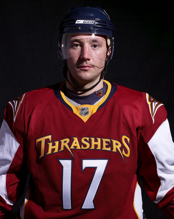
”¦ or does it just seem that way? Definitely a disaster for the ages — the wordmark is pathetic, the chest number belongs in the NBA, the shoulder logos look like they’re lifted from the San Diego Chargers, and the socks are embarrassing-and-a-half. Lots more photos here, if you dare.
Lots more NHL news in my annual season-preview column over on Page 2.
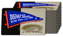
Big Membership News: See that over there on the right? That’s a stack of $10 gift cards from our friends at Distant Replays. Okay, it’s actually an illustration of a stack of $10 gift cards, but whatever. The point is, starting right now, all new enrollees in the Uni Watch membership program will receive one of those $10 cards as a membership benefit (only one card per person, and the card can’t be used on clearance items). It’s a pretty sweet deal when you consider that the enrollment fee is only $15 to begin with. Hell, given what’s happening to the economy, our entire economic system could be running on Distant Replays gift cards within a few weeks.
I figure a few of you have questions, so this seems like a good time for one of my little imaginary press conferences:
Aw man, I signed up for the membership program just a few days ago! Can I get a gift card?
Nope — sorry.
I signed up way back at the beginning of the membership program. It doesn’t seem fair to reward to people who are just getting around to signing up now while giving nothing to people who supported the site early on.
No, it’s not fair, but circumstances change. Back when you signed up, Distant Replays hadn’t given me a bunch of gift cards to bestow upon new enrollees; now they have. Simple as that.
I’m already a member, but I plan to order a new card design. Will I qualify for the gift card?
Yes.
Will this be a permanent addition to the membership benefits, or is it only for a specific time window?
That’s completely up to Distant Replays. As long as they make the gift cards available, I’ll keep offering them as a benefit. And I’ll try to give you some advance warning if this benefit is going to be discontinued.
I think that covers it. OK? OK.
Uni Watch News Ticker: New jerseys for the Indiana Ice of the USHL (with thanks to David Soline). ”¦ Interesting jersey worn by North Point High School in southern Maryland, whose chest wordmark is cursive, presumably to mimic their helmet logo, although the two scripts don’t quite match (with thanks to Jason Walker). ”¦ Remember when we were doing logo mashups earlier this year? Louis Crawford saw something similar in the window of a Philly men’s boutique. Turns out that the logos are supposed to spell out “Ubiq,” which refers to this T-shirt line. ”¦ It’s tough to see, but if you look at the right outside heel of Jason Bay’s cleats, there’s a “Playoffs 2008” logo, like the one shown here (with thanks to Ken Weimer). ”¦ According to the second item on this page, the Syracuse Crunch (the Blue Jackets’ AHL affiliate) will be retiring No. 7. Why? Because Paul Newman wore it in Slapshot (with thanks to Doug Mooney). ”¦ Small item here about Maryland’s merit decals. ”¦ I can’t get into all the corporate machinations, but Riddell’s Revo Speed helmet was originally an Easton design. Here’s a slideshow of pics of a rare Easton sample, courtesy of Ken Weimer. ”¦ You don’t often see color pics of the Blackhawks’ barber pole design (nice find by Jen Muller). ”¦ “My boss pointed me toward this site, and it’s pretty impressive,” says Greg Riffenburgh. “Among some of the crazy new models, they’ve got a bunch of classic (and apparently original) hat designs. Some designs look to be from the 1980s and early ’90s from old brands like Logo Athletic, plus some MLB replicas.” ”¦ Kentucky will unveil new hoops uniforms on Friday. ”¦ Kenn Tomasch works at the Phoenix Chamber of Commerce, where he recently found some good photos in the archives. “This one, from 1948, is from a ‘world’ softball tournament that used to be held here regularly. This one is from the fall of 1948. I thought the pants of the player from the Milwaukee team were interesting. And this one is from the 1949 Salad Bowl, a little-known bowl game played on New Year’s Day here in Phoenix. This one was between the University of Arizona and Drake University (Drake won 14-13). Note the A on the front of the U of A’s helmets (and no facemasks, obviously). Drake was in all white. The stadium was on a high school campus but sat 23,000 people, if you can believe that.” ”¦ Fun note from Amanda St. John, who writes: “The ADHD-tastic children’s web site made by the folks at MLB.com includes a uni-design game in which the only options for stockings include stirrups! It’s super-cartoony, but there are quite a few mix-and-match pieces to choose from. Go to here, click on the ‘game dome,’ then ‘suit ’em up,’ and try not to let the maddening music get the best of you.” ”¦ Reprinted from last night’s comments: Nice 10-minute video clip here about the advent of the Seattle Pilots. … Randy Williams got a nice screen grab of Mitch Williams with “No Fear” written on his glove.
My favorite month in my favorite place: By the time most of you read this, I’ll be on my way to the Midwest. Tonight I’ll be making a pilgrimage to Ricko’s house, tomorrow and Saturday will mark the world debut of the Forewords (hope to see some of you in Minneapolis and/or Madison), and then I’ll be knocking around Wisconsin for a few days.
So Bryan will be running the show from now through next Wednesday or so (except for this Saturday, when Vince will pinch-hit while Bryan is off on a cycling race). All Ticker contributions to the Uni Watch e-mail address will automatically be forwarded to him. Treat him right, make me proud, etc., etc. See you all in about a week.
AWFUL! Just awful!
No, the Mighty Ducks “WildWing” emerging from the Ice is the worst ever….this is a distant 2nd….
or even the old Cincinatti Mighty Ducks….
how about the NEW Iowa Chops? (AHL)
A fierce pig….c’mon
link
link
The Cursive High School Helmets have a bigger problem:
link
#1 has a DNA facemask on the Schutt Air XP helmet.
Also, Mitch Williams was definitely NOT in tune with Phillies fans who definitely had MANY fears when he took the mound!
link
****Ken Weimer, Nice Easton stuff! That’s not Inside information, is it?******
On Point as usual, KWeimer!
Lets not forget the 95-96 Kings
link
or
lets praise Mike Keenan for stopping this:
link
or this Terrible (AHL Milwaukee Admirals) promo
link
So, as terrible as the Thrashers jersey is…I have easily *saved* it from the bottom…not that their regular jerseys have been any good…
[quote comment=\”294093\”]The Cursive High School Helmets have a bigger problem:
link
#1 has a DNA facemask on the Schutt Air XP helmet.
Thet are also wearing an Under Armour uniform template, Maryland\’s to be exact.
link
quote]
Thrashers unis look like a poor marriage of the XFL and McDonalds.
I guess the Thrashers want to tap into that football jersey wearing market. Although at least they didn’t put the team’s shorthand nickname on the front like the link. I’m highly amused that the leak image Icethetics is using has Lecavalier’s name misspelled.
In that photo of the world softball tournament, the umpire is Emmett Ashford, who I think ended up being the first black major league umpire.
Syracuse retiring Paul Newman’s number is cool, but it would make a lot of sense for the Johnstown Chiefs to do that. The movie Chiefs were from a fictionalized Johnstown, and the team’s whole image is an homage to the movie. (Their phone number is 1-800-SLAPSHOT, for cryin’ outs.)
PK already beat me to the punch on some of the sweaters that are much worse than the current thrasher’s version…
link
perhaps we will need to actually see the atlanta jersey on ice before final judgment can be passed, but i, for one, do not believe it’s the worst ever…not by a long shot
These helmets are amazing! link
link
and what photo accompanies the story?
link
…*sigh*
lets try that again…
link
I didn’t realize the Thrashers opened up the design to children.
Also, does anyone know the status of a possible Flyers alternate?
[quote comment=”294104″]Also, does anyone know the status of a possible Flyers alternate?[/quote]
link
Why do the Thrashers need five alternate captains? You can only have two players wearing an “A” in any game. Including the captain that makes 6 captains. I’d be insulted if I was left out of the equation.
If a Maple Leafs jersey traumatized Roch Carrier as a child, that jersey would have given him a heart attack.
*Sigh* Poor Army….I knew it wouldn’t end well when he was traded to Atlanta.
The shoulder kinda has a Ravens thing happening, too. Ugh.
The Bolts thing doesn’t bother me all that much, ‘cept the “Tampa Bay” wordmark on the butt. WTF?
On that note, is there anything better in hockey than the Habs logo? I vote no
A bit off-topic, but has anyone noticed the significant lack of “fashion police” fines coming from the NFL this season? Seems like every few games each year we hear of some ridiculous fine or uni stunt. But his year – nothing. I’m wondering if the NFL is not publicizing these as often. Maybe a calculated PR decision.
In the Jason bay shot it seems like his pants are patched on the back of his right leg… do they still do that in the big leagues?!
With a league minimum pay of about 2300$ per game, you’d think a pair of pants would be replaced.
And let’s forget one of the biggest f*ups in Jersey
History link
and the new short hand version of the BOLTS and new flyers alt
link
(oops…sorry dgc….I hadn’t realized you posted that earlier…my bad)
Today’s ESPN column is up:
link
Off to the airport,
Paul
I was reading the comics this morning, and look what I found: a swoosh!
link
The Seattle Pilots link at the end of the ticker goes to a 404.
Maybe a silly question, but I’m wondering what words or images used to be on the rear of most batting helmets back in the 1980s and 1990s? Does anyone have a good photograph of these? I figured this is the place to get answer to this. Thanks.
In the ticker: Ketucky will unveil new hoops uniforms on Friday. …
Is that a new state in the South?
Also, I’m new to hockey, so I’d never seen the Blackhawks barber pole design until it came up in the past few days. Clearly they inspired these Wisconsin jerseys that were worn for one game last season
link
[quote comment=”294109″]On that note, is there anything better in hockey than the Habs logo? I vote no[/quote]
I vote yes!
link
[quote comment=”294116″]The Seattle Pilots link at the end of the ticker goes to a 404.[/quote]
Last two ticker items were messed up. Now fixed. Thanks for letting me know!
OK, really off to the airport now,
Paul
[quote comment=”294115″]I was reading the comics this morning, and look what I found: a swoosh!
link
Ummm … why were you reading Luann, dude?
Oh, and I’m actually doing a running race this weekend. Team relay from Omaha to Lincoln. Gonna be a long day.
[quote comment=”294093″]The Cursive High School Helmets have a bigger problem:
link
#1 has a DNA facemask on the Schutt Air XP helmet.
Also, Mitch Williams was definitely NOT in tune with Phillies fans who definitely had MANY fears when he took the mound!
link
****Ken Weimer, Nice Easton stuff! That’s not Inside information, is it?******
On Point as usual, KWeimer![/quote]
No thats a DNA helmet
New Kentucky basketball uniforms will be released tomorrow at a press conference at the Keeneland Race track prior to Midnight Madness.
link
[quote comment=”294096″]Thrashers unis look like a poor marriage of the XFL and McDonalds.[/quote]
F-ing nailed it!
And Paul, if you get a chance to come down to Janesville (just 30 min. directly south of Mad Town) please let me know.
Also, if you decide to head up to Green Bay and want to stop by Lambeau Field and check out the Hall of Fame let me know. I have a college friend who works there and I could set you up with a free pass.
P.S. You are gonna be in Madison on Badger Game Day! And it’s a night game. Whoah nelly is Mad Town gonna be rockin’ for you!
[quote comment=”294103″]lets try that again…
link[/quote]
When was that photo taken?
McCain better not hope it’s a trend – he can’t afford to be pushed out of Pennsylvania, too.
Let’s rename them the Trashers. Okay, so it’s not as glaringly bad as the Ducks, Kings, etc., but it just has so many nagging little things wrong with it that they add up to one big disgrace.
And what’s with that neck design?!?! That blue and yellow doesn’t look like part of the jersey; it looks like the jersey has too big of a neck and ends where the red ends, and the blue and yellow looks like his shoulder pads are exposed!!!!
-Jet
ahhhh…the Trashers…..too bad it was already taken
(and not by just the FBI)
link
You know the Trashers were doomed when they had the owners son, at 19 years of age, be the GM. Also the GM was getting into fights with fans, opposing players, refs, you name it. Bad all the way around
Does anybody know if any pictures have leaked showing the new Kentucky uniforms? As a Cat’s fan I can’t wait to see them.
A fierce slapshooting trashcan as a logo? They should have relocated to Mt. Trashmore, VA.
At the very least we can say that the Blues ALT that was vetoed had something to do with the team, though the music coming from the horns didnt look very bluesy to me.
[quote comment=”294112″]And let’s forget one of the biggest f*ups in Jersey
History link
[/quote]
PK, the Islanders Fisherman jersey was decades ahead of its time. link, dammit! LOL
Re: trashers
Yes, that’s all true, but for a trash can jersey, it was bad-ass
link
link
and back to worse Jersey’s ever…I love MInor Leauge Hockey…but some of these should have never been produced
link
Committ to the fisherman?!? how about they re-committ to winning first…Let’s go Rangers!
Yep, the Islanders “Fish Sticks” jersey is truly the worst, ever. The nickname will always be with the Islanders, especially when they play against the team whose home is the round building named after a square some 30 miles to the west.
paul does easton make helmets
Wow. Those ATL unis bring one word to mind:
Craptastic
Holy shit those things are bad. I agree with other posters that there have been worse, but what sucks more is that those others lasted only one year, this might be around for a while.
I am very saddened to see the trend that hockey socks are taking. ATL is now doing it and CAL and TB have been doing it.
link
link
Why would you want to get away from this?
link
link
link
[quote comment=”294133″][quote comment=”294112″]And let’s forget one of the biggest f*ups in Jersey
History link
[/quote]
PK, the Islanders Fisherman jersey was decades ahead of its time. link, dammit! LOL[/quote]
I love the Fisherman jersey too, Teebz. The wavy numbers were cool.
I also liked the brown & gold Padres unis & the rainbow Astos jerseys.
I likes what I likes.
Marketing….
Poking around one of the links that PK posted, for the Albany Choppers, I found this on the baseball jersey portion of the website – a jersey from the Expos affiliate in the NY/Penn league… too hideous to describe, you’ll just have to click the link… you’e been warned…
link
-Jet
[quote comment=”294135″]Yep, the Islanders “Fish Sticks” jersey is truly the worst, ever. The nickname will always be with the Islanders, especially when they play against the team whose home is the round building named after a square some 30 miles to the west.[/quote]
NOOOOOOOOOO!!!!!
fishsticks rawks!
you don’t mess with the linkohan
Oops, that link I posted above takes you back to the Choppers home page – just scroll down a bit and click on the link, “Other Baseball Jerseys” and you’ll see the Expos one I’m referring to…
-Jet
Non-uni related, but what is that song in the Seattle Pilots film clip that starts at 7:40? There’s “The Good, the Bad, and the Ugly” at 3:10 and then some organ jazz and then the song in question. I think it’s also from a late ’60s movie, but I can’t put my finger on it.
Semi-uni related: was there ever a better poncho than the one Clint Eastwood wore in his spaghetti westerns?
[quote comment=”294109″]On that note, is there anything better in hockey than the Habs logo? I vote no[/quote]
I do like the Habs logo, but my favorite is this….
link
[quote comment=”294137″]W
I am very saddened to see the trend that hockey socks are taking. [/quote]
Oh please, don’t even get me started on hockey socks! How can the beauty and simplicity of some of the Original Six team socks be in the same league with the atrocities you posted?!?!?
-Jet
[quote comment=”294127″]Let’s rename them the Trashers. Okay, so it’s not as glaringly bad as the Ducks, Kings, etc., but it just has so many nagging little things wrong with it that they add up to one big disgrace.
And what’s with that neck design?!?! That blue and yellow doesn’t look like part of the jersey; it looks like the jersey has too big of a neck and ends where the red ends, and the blue and yellow looks like his shoulder pads are exposed!!!!
-Jet[/quote]
My first thought (colored by the fact that I work in a hospital no doubt) was that the yellow portion looked like a stethoscope tucked into the sweater.
i miss the green in the rays unis ..
link
though, they are adding to the history of success for team after a uni change.
[quote comment=”294144″][quote comment=”294109″]On that note, is there anything better in hockey than the Habs logo? I vote no[/quote]
I do like the Habs logo, but my favorite is this….
link
MON has my favorite logo and uni. Classic
My favotire out of the Defunct NHL teams is:
link
Beautiful
(non-uni related)
No Brett! No!! Didn’t you see MAJOR LEAGUE!!
link
we can win without the voodoo!!
interesting choices for “best hockey logo”…
imo do my 3 major sports “best logos”, plus the nhl
(this has NOTHING to do with liking the team or anything else…simply MHO of the best of each sport)
link
(tie) link
link
link
link
remember, these are just my opinions…feel free to disagree
I know I’m gonna get absolutely clobbered for this, but most of these new unis (esp. NHL alts and their SOCKS) made me feel like it’s about 1962 and someone said, “Hey, I got an idea! Let’s have the girls in art class design our uniforms!”
Cuz when you get the final result you want ask the designer, “Have you ever even SEEN a hockey game?”
—Ricko
[quote comment=”294150″]interesting choices for “best hockey logo”…
imo do my 3 major sports “best logos”, plus the nhl
(this has NOTHING to do with liking the team or anything else…simply MHO of the best of each sport)
link
(tie) link
link
link
link
remember, these are just my opinions…feel free to disagree[/quote]
My 4:
NHL
link
MLB
link
NBA
link
NFL
link
[quote comment=”294150″]
imo do my 3 major sports “best logos”, plus the nhl
[/quote]
Phil, I’ll hunt you down for that comment. ;o)
The Buffalo Sabres original logo rules.
[quote comment=”294150″]interesting choices for “best hockey logo”…
imo do my 3 major sports “best logos”, plus the nhl
(this has NOTHING to do with liking the team or anything else…simply MHO of the best of each sport)
link
(tie) link
link
link
link
remember, these are just my opinions…feel free to disagree[/quote]
Hockey: logo & uniform link
Baseball: I’ll cede, link
Football: Really, you can’t beat link
Basketball: There really isn’t an iconic logo there, but I’ll use this as a defaut: link
Re: Indiana Ice new unis. Didn\’t they used to be the Indianapolis Ice? I like the new look, although it\’s tough to make out the chest logo in those pics. And for some reason, I especially like this \”fire & ice\” pic ;-)
link
Shout out to Jim MI…Have you ever been to Play Ball in Westland? They have a HUGE selection of NHL jerseys. Could probably find a Hartford one there I\’d gather. I live in Pontiac, we could make a roadtrip out of it.
Best NHL logos are the Blackhawks’ secondary (sleeve patch) logos
link
link
link.
Oops.
link
link
Answering my own question, it’s “Classical Gas” playing in that Seattle Pilots clip. Serenity regained.
[quote comment=”294094″]
or this Terrible (AHL Milwaukee Admirals) promo
link
Not bad, but apparently link.
[quote comment=”294150″]interesting choices for “best hockey logo”…
imo do my 3 major sports “best logos”, plus the nhl
(this has NOTHING to do with liking the team or anything else…simply MHO of the best of each sport)
link
(tie) link
link
link
link
remember, these are just my opinions…feel free to disagree[/quote]
i’ll just give you my favorite baseball logo link
my fave Hockey Jersey of all leagues (and logo)
link
link
and even their alt is simple, yet effective
link
(rugby plaid….yeesh….thanks shane)
[quote comment=”294156″]Re: Indiana Ice new unis. Didn\’t they used to be the Indianapolis Ice? I like the new look, although it\’s tough to make out the chest logo in those pics. And for some reason, I especially like this \”fire & ice\” pic ;-)
link
Shout out to Jim MI…Have you ever been to Play Ball in Westland? They have a HUGE selection of NHL jerseys. Could probably find a Hartford one there I\’d gather. I live in Pontiac, we could make a roadtrip out of it.[/quote]
I’ve never been there. I actually work like 2 miles from there. (where I curently am)lol I’ll have to check them out at lunch today!!
[quote comment=”294163″][quote comment=”294156″]Re: Indiana Ice new unis. Didn\’t they used to be the Indianapolis Ice? I like the new look, although it\’s tough to make out the chest logo in those pics. And for some reason, I especially like this \”fire & ice\” pic ;-)
link
Shout out to Jim MI…Have you ever been to Play Ball in Westland? They have a HUGE selection of NHL jerseys. Could probably find a Hartford one there I\’d gather. I live in Pontiac, we could make a roadtrip out of it.[/quote]
I’ve never been there. I actually work like 2 miles from there. (where I curently am)lol I’ll have to check them out at lunch today!![/quote]
Wait is that the store inside Westland Mall?
[quote comment=”294131″]Does anybody know if any pictures have leaked showing the new Kentucky uniforms? As a Cat’s fan I can’t wait to see them.[/quote]
I’ve read that they are going to be very similar to the FB unis, complete with the new striping.
[quote comment=”294123″][quote comment=”294093″]The Cursive High School Helmets have a bigger problem:
link
#1 has a DNA facemask on the Schutt Air XP helmet.
Also, Mitch Williams was definitely NOT in tune with Phillies fans who definitely had MANY fears when he took the mound!
link
****Ken Weimer, Nice Easton stuff! That’s not Inside information, is it?******
On Point as usual, KWeimer![/quote]
No thats a DNA helmet[/quote]
Thanks, Jordan…you’re right, my mistake…the earhole made me think of the XP:
DNA, complete with awful new Lax facemask:
link
XP:
link
Check out the funky new Ion versions of facemasks:
link
BTW, Minneapolis to see Ricko, Paul?
I thought Del Boca Vista was in Florida!
link
[quote comment=”294163″][quote comment=”294156″]Re: Indiana Ice new unis. Didn\’t they used to be the Indianapolis Ice? I like the new look, although it\’s tough to make out the chest logo in those pics. And for some reason, I especially like this \”fire & ice\” pic ;-)
link
Shout out to Jim MI…Have you ever been to Play Ball in Westland? They have a HUGE selection of NHL jerseys. Could probably find a Hartford one there I\’d gather. I live in Pontiac, we could make a roadtrip out of it.[/quote]
I’ve never been there. I actually work like 2 miles from there. (where I curently am)lol I’ll have to check them out at lunch today!![/quote]
Jim, if you can get any older-style jerseys, I’ll forward you a pile of money to pick one or two up!
[quote comment=”294160″][quote comment=”294094″]
or this Terrible (AHL Milwaukee Admirals) promo
link
Not bad, but apparently link.[/quote]
That plaid Admirals jerseys was done for Bob Uecker night.
[quote comment=”294161″][quote comment=”294150″]interesting choices for “best hockey logo”…
imo do my 3 major sports “best logos”, plus the nhl
(this has NOTHING to do with liking the team or anything else…simply MHO of the best of each sport)
link
(tie) link
link
link
link
remember, these are just my opinions…feel free to disagree[/quote]
i’ll just give you my favorite baseball logo link[/quote]
That’s harsh, but appropriate.
BTW, my faves:
NHL
:
link
MLB:
link
link
NBA:
link
NFL:A Tie:
link
link
link
NCAA:Another Tie:
link
More of a mascot, but still:
link
link
As usual, the NHL is messed up:
1. link
2.link
“BTW, Minneapolis to see Ricko, Paul?”
Our Flounder will be stopping by my disheveled digs tonight. Maybe I’ll have him sit in the hall and pass manila folders out to him.
Thinking about opening the door wearing a bathrobe, old “NUKE ‘EM TIL THEY GLOW” t-shirt, lounging pants (way too short, of course), ratty slippers, smoking a cheap cigar…just the scare the crud out of him.
—Ricko
[quote comment=”294168″][quote comment=”294160″][quote comment=”294094″]
or this Terrible (AHL Milwaukee Admirals) promo
link
Not bad, but apparently link.[/quote]
That plaid Admirals jerseys was done for Bob Uecker night.[/quote]
And you don’t mess with the Ueck.
[quote comment=”294171″]”BTW, Minneapolis to see Ricko, Paul?”
Our Flounder will be stopping by my disheveled digs tonight. Maybe I’ll have him sit in the hall and pass manila folders out to him.
Thinking about opening the door wearing a bathrobe, old “NUKE ‘EM TIL THEY GLOW” t-shirt, lounging pants (way too short, of course), ratty slippers, smoking a cheap cigar…just the scare the crud out of him.
—Ricko[/quote]
You’ll be the headliner picture on Thursday for sure, Ricko. LOL
I am guessing idiot that designed the Thrashers sweater was the same moron that did Dallas’ home sweater (the away whites are cool), Buffalo’s primary sweaters and the uniforms for Vancouver. They are AWFUL!!!!!
Lesson from this is you should never do drugs and design unforms at the same time.
I like the design of the Blues third sweater, EXCEPT, the circle in the middle looks too much like a Minnesota Wild rip off.
[quote comment=”294148″][quote comment=”294144″][quote comment=”294109″]On that note, is there anything better in hockey than the Habs logo? I vote no[/quote]
I do like the Habs logo, but my favorite is this….
link
MON has my favorite logo and uni. Classic
My favotire out of the Defunct NHL teams is:
link
Beautiful[/quote]
On that note, I was walking through the Minneapolis airport this morning and stopped in the Minnesota/Wisconsin Sports store that they have. There was an entire rack of old North Stars jerseys. It was such a beautiful site that I almost stopped and bought one. Alas, the economic woes/ Winged Wheel allegiance stopped me. However, we all deserve this site after looking at those horrible ATL jerseys.
link
link
[quote comment=”294156″]Re: Indiana Ice new unis. Didn\’t they used to be the Indianapolis Ice? I like the new look, although it\’s tough to make out the chest logo in those pics. And for some reason, I especially like this \”fire & ice\” pic ;-)
link
Yes, they used to be the Indianapolis Ice in the CHL. Horn Chen, who owned the Ice, moved the franchise to Topeka, and sold the lease for the Pepsi Coliseum and the rights to the “Ice” name to Paul Skjodt. Skjodt started a USHL (Tier I junior) franchise with the name and changed it to Indiana Ice.
Here’s a better look at the chest logo.
link
Here’s an older jersey of theirs.
link
When evaluating “worst” jerseys, I think you have to DQ minor-league one-time special jerseys. In a way, they’re meant to be cheesy and bad. I have an Indianapolis Ice jersey from one of their Pack the House nights when all the profits go to charity. The jersey looks like it was drawn by 10 year-olds because…IT WAS DRAWN BY 10 YEAR-OLDS!
link
link
The Ice let kids in local hospitals design the jersey, then the jerseys are sold to raise money for the hospital.
[quote comment=”294174″]you should never do drugs and design unforms at the same time.[/quote]
but link to drugs
[quote comment=”294167″][quote comment=”294163″][quote comment=”294156″]Re: Indiana Ice new unis. Didn\’t they used to be the Indianapolis Ice? I like the new look, although it\’s tough to make out the chest logo in those pics. And for some reason, I especially like this \”fire & ice\” pic ;-)
link
Shout out to Jim MI…Have you ever been to Play Ball in Westland? They have a HUGE selection of NHL jerseys. Could probably find a Hartford one there I\’d gather. I live in Pontiac, we could make a roadtrip out of it.[/quote]
I’ve never been there. I actually work like 2 miles from there. (where I curently am)lol I’ll have to check them out at lunch today!![/quote]
Jim, if you can get any older-style jerseys, I’ll forward you a pile of money to pick one or two up![/quote]
I actually just got back from there :)
Neat place. Lots of framed autograghed stuff, memoribilla, hats, and more. They had more Red Wings Jerseys than anything else. Must have been more of a selection when Patrick was there. But today is the banner raising for DET, so maybe that’s why there are mostly just DET jerseys there. Few Crosbys and Ovechkins, some Olympic ones. Couple old actual ‘sweaters’ of TOR and DET. They did have a Colorado Rockies (NHL)shirt that I am already regreting not picking up…
Had MLB, NFL, and NBA stuff too. Really cool place.
One thing that caught my eye was an actual NFL, Pat the Patriot Helmet. Sweet.
Also, they had a framed Racer’s Gretzky jersey with all his stats. Sweetest Thing in there I think.
[quote comment=”294167″][quote comment=”294163″][quote comment=”294156″]Re: Indiana Ice new unis. Didn\’t they used to be the Indianapolis Ice? I like the new look, although it\’s tough to make out the chest logo in those pics. And for some reason, I especially like this \”fire & ice\” pic ;-)
link
Shout out to Jim MI…Have you ever been to Play Ball in Westland? They have a HUGE selection of NHL jerseys. Could probably find a Hartford one there I\’d gather. I live in Pontiac, we could make a roadtrip out of it.[/quote]
I’ve never been there. I actually work like 2 miles from there. (where I curently am)lol I’ll have to check them out at lunch today!![/quote]
Jim, if you can get any older-style jerseys, I’ll forward you a pile of money to pick one or two up![/quote]
Sorry Teebz, no older style jerseys there. But there is an ice rink in Troy Mi, that in the pro shop I have seen alot of NHL throwbacks. Next time I play there I’ll check it out.
Here’s a photo gallery from the preseason game the Pacers played at Pepsi Coliseum last night.
link
They warmed up with the ABA “moneyball,” but the NBA wouldn’t let them play with it.
link
ABA Pacer coach Bobby “Slick” Leonard coached the first quarter and the Pacers wore retro uniforms.
link
Also, Mike Dunleavy Jr. was injured, so he found another type of retro gear to rock.
link
but they said no to drugs
They would have been better off saying no to the sweaters.
[quote comment=”294125″][quote comment=”294096″]Thrashers unis look like a poor marriage of the XFL and McDonalds.[/quote]
F-ing nailed it!
And Paul, if you get a chance to come down to Janesville (just 30 min. directly south of Mad Town) please let me know.
Also, if you decide to head up to Green Bay and want to stop by Lambeau Field and check out the Hall of Fame let me know. I have a college friend who works there and I could set you up with a free pass.
P.S. You are gonna be in Madison on Badger Game Day! And it’s a night game. Whoah nelly is Mad Town gonna be rockin’ for you![/quote]
And the UW Band will be there! (U of Wisconsin, not Uni-Watch…:)
Paul – any trips to Milwaukee?
I don’t hate the Thrashers as much as some of the others. Not beautiful, but okay. The socks? Horrendous.
I like the Tampa Alt. – just replace “BOLTS” with the Lightning shield (oh, and remove the “Tampa Bay” wordmark), and you have a great jersey. You also use the dark blue instead of black – big improvement.
NHL overall — can we go back to a straight hem at the bottom of the jersey and horizontal stripes on the hockey socks?! The horizontal stripes on retro (and traditional) jerseys continue to look silly with the “dress shirt hem” at the bottom. With that, we can get back to classy horizontal socks. Change it up if you want, but I think you’ve got to keep to some of the basics. Enough already. Thanks!
[quote comment=”294175″]
On that note, I was walking through the Minneapolis airport this morning and stopped in the Minnesota/Wisconsin Sports store that they have. There was an entire rack of old North Stars jerseys. It was such a beautiful site …
link
link
*sniffle*…almost brings a tear to the eye…they are indeed magnificent…I’d consider a flight to Minny just to buy those at the airport – I wonder if they mail-order?
-Jet, sighing loudly
[quote comment=”294183″]
NHL overall — can we go back to a straight hem at the bottom of the jersey and horizontal stripes on the hockey socks?! [/quote]
Amen, and amen.
-Jet
[quote comment=”294171″]”BTW, Minneapolis to see Ricko, Paul?”
Our Flounder will be stopping by my disheveled digs tonight. Maybe I’ll have him sit in the hall and pass manila folders out to him.
Thinking about opening the door wearing a bathrobe, old “NUKE ‘EM TIL THEY GLOW” t-shirt, lounging pants (way too short, of course), ratty slippers, smoking a cheap cigar…just the scare the crud out of him.
—Ricko[/quote]
The mental image alone, did it for me!
The Lightning jersey would be badass if it had their logo instead of Bolts. Love the Flyers and I had Uniwatch tarnish my judgment before I could generate my own opinion on the Thrashers.
Hey, if Paul is going to Minneapolis, can he take orders for vintage North Stars jerseys from that airport shop Leo mentioned????
-Jet
[quote comment=”294179″][quote comment=”294167″][quote comment=”294163″][quote comment=”294156″]Re: Indiana Ice new unis. Didn\’t they used to be the Indianapolis Ice? I like the new look, although it\’s tough to make out the chest logo in those pics. And for some reason, I especially like this \”fire & ice\” pic ;-)
link
Shout out to Jim MI…Have you ever been to Play Ball in Westland? They have a HUGE selection of NHL jerseys. Could probably find a Hartford one there I\’d gather. I live in Pontiac, we could make a roadtrip out of it.[/quote]
I’ve never been there. I actually work like 2 miles from there. (where I curently am)lol I’ll have to check them out at lunch today!![/quote]
Jim, if you can get any older-style jerseys, I’ll forward you a pile of money to pick one or two up![/quote]
Sorry Teebz, no older style jerseys there. But there is an ice rink in Troy Mi, that in the pro shop I have seen alot of NHL throwbacks. Next time I play there I’ll check it out.[/quote]
Seeing I already have my ‘Ultimate Jersey’, a period correct Bobby Orr Bruins Jersey. Next on my list is:
Ciccarelli North Stars
Kocur New York Rangers w/’94 Stanley Cup Patch
Plus getting names on my current blank ones. Wow, I have a lot of work to do haha.
[quote comment=”294156″]Re: Indiana Ice new unis. Didn\’t they used to be the Indianapolis Ice?
[/quote]
yeah, when they were in the IHL and were the Blackhawks affiliate.
[quote comment=”294176″]The jersey looks like it was drawn by 10 year-olds because…IT WAS DRAWN BY 10 YEAR-OLDS!
link
[/quote]
That is so bad that it’s brilliant! I want one!
The thing that is so alarming with Hockey sweaters is that there are so many great examples of what a good design is (habs, pens, bruins, old northstars and whalers, old cannucks, old sabers, red wings, and i’m partial to the retro caps design that they’ve gone back to) but its like they decide to trash all that, take every trend that is wrong in uni design and multiply it times ten.
To be fair, a number of teams have finally gone more old school. Remember the weird pens close up logo?
While griping about logo design, i have to say that i perfer the old orange NHL logo, it always reminds me of the smell of the rubber puck, as opposed to the shiny silver logo, which reminds me of that stinky aliminium bat smell.
link
link
[quote comment=”294192″]The thing that is so alarming with Hockey sweaters is that there are so many great examples of what a good design is (habs, pens, bruins, old northstars and whalers, old cannucks, old sabers, red wings, and i’m partial to the retro caps design that they’ve gone back to) but its like they decide to trash all that, take every trend that is wrong in uni design and multiply it times ten.
To be fair, a number of teams have finally gone more old school. Remember the weird pens close up logo?[/quote]
This?:
link
[quote comment=”294152″][quote comment=”294150″]interesting choices for “best hockey logo”…
imo do my 3 major sports “best logos”, plus the nhl
(this has NOTHING to do with liking the team or anything else…simply MHO of the best of each sport)
link
(tie) link
link
link
link
remember, these are just my opinions…feel free to disagree[/quote]
My 4:
NHL
link
MLB
link
NBA
link
NFL
link
Wow… I really expected Jim’s last one to be Green Bay – too bad the Giants didn’t have a circular red and blue logo!
[quote comment=”294171″]”BTW, Minneapolis to see Ricko, Paul?”
Our Flounder will be stopping by my disheveled digs tonight. Maybe I’ll have him sit in the hall and pass manila folders out to him.
Thinking about opening the door wearing a bathrobe, old “NUKE ‘EM TIL THEY GLOW” t-shirt, lounging pants (way too short, of course), ratty slippers, smoking a cheap cigar…just the scare the crud out of him.
—Ricko[/quote]
You’ve GOT to do that, Ricko!!
Almost as disgusting as those new Thrashers sweaters…if they deserve to be called that.
link
i like characters (images not letters), so i will go with:
MLB: link
NBA: link
NHL: link
and saving the best for last, NFL: link
[quote comment=”294195″][quote comment=”294152″][quote comment=”294150″]interesting choices for “best hockey logo”…
imo do my 3 major sports “best logos”, plus the nhl
(this has NOTHING to do with liking the team or anything else…simply MHO of the best of each sport)
link
(tie) link
link
link
link
remember, these are just my opinions…feel free to disagree[/quote]
My 4:
NHL
link
MLB
link
NBA
link
NFL
link
Wow… I really expected Jim’s last one to be Green Bay – too bad the Giants didn’t have a circular red and blue logo![/quote]
lol I noticed that when I checked my links after I posted it. In my defense, I could pick a number of logos for NBA, MLB, AND NFL seeing I am not the biggest fan of those leagues.
The Indiana Ice were once, as mentioned, the Indianapolis Ice (at least they can trace their lineage…for all intents and purposes, it’s the same club, though franchises were folded and leagues swapped). You could make the case that they go back to the Indianapolis Checkers, there was a reorganization and a league jump there, too.
I have an old Indianapolis Ice jersey from 93-94 AND a tie-dyed number they did a couple of years later for a special promotion.
As for the Pacers’ retro night, if you notice, these:
link
are the “new” ABA balls, which have a slightly different color pattern than the link.
The “new” ABA balls are used by the league that came into being in 2000 and which has had its issues, to say the least. Lots of the new balls are available, but not a lot of the originals are floating around. I have one (not an original ABA ball, but a more recent ball in the original style) signed by some Pacer legends.
Paul here, checking in from O’Hare, with a small bit of fine print about the Distant Replays gift cards: Turns out you have to be making at least a $20 purchase in order to use the $10 card. It’s mostly a moot point, since almost everything they sell is at least $20 (except for a few clearance items), but I apologize for not conveying this point until now — they just told me about it.
If this queers the deal for anyone who already signed up today, get in touch with me and I’ll make it right.
Yet another update: Those who’ve already signed up today (you know who you are, and so do I) can use the gift card with no strings attached.
The jersey its-self is awfl, the coloring and wordmark specifically, but the front number is fantastic. NCAA hockey teams having been using this style for ages (Boston University has done it for a long time). The large number on the center of the front looks sharp. Much better than having a tiny number on the front corner.
[quote comment=”294203″]The jersey its-self is awfl, the coloring and wordmark specifically, but the front number is fantastic. NCAA hockey teams having been using this style for ages (Boston University has done it for a long time). The large number on the center of the front looks sharp. Much better than having a tiny number on the front corner.[/quote]
True, the front number is pretty much the only visually-appealing aspect of that jersey. And I suppose that if you’re going to put a number on the front, you probably should make it legible.
There’s something that really rubs me the wrong way about the giant front number, though. It pretty much guarantees that anyone buying one of those eyesores will have to go the full name/number route rather than just buying a blank one.
[quote comment=”294203″]The jersey its-self is awfl, the coloring and wordmark specifically, but the front number is fantastic. NCAA hockey teams having been using this style for ages (Boston University has done it for a long time). The large number on the center of the front looks sharp. Much better than having a tiny number on the front corner.[/quote]
That’s why Boston University plays in the NCAA, and the Atlanta Thrashers play in the NH… er, NCAA?
The logo is a brand identifier. McDonald’s relies on its golden arches as much as it does its name. As an sports franchise, you want your logo to mean something.
And JTH has it exactly right: you’re buying an expensive polyester sweater if you don’t get it customized. It will look ridiculous without the number on the front.
I’m sorry everyone but I believe those are some of the best uniforms in the entire NHL. Atlanta is a new team, without a tradition or anything to base themselves off of. They’re possibilities for a third jersey was wide open. They could’ve given us a boring old, cookie-cutter hockey jersey with the normal horizontal stripes but they didn’t. They went fresh, brand new, and gave us something we’ve never seen before. Whether it be the socks, the arm stripes (more of a patch of color) or the NFL styled numbers, the look is brand new and perfect for their franchise. Don’t get me wrong, my two favorite NHL jerseys are Chicago’s and Boston’s, but these have the potential to take third. lol. I just love them!
Wow. Seriously lengthy NOB on Chris Douglas-Roberts in the preseason game in France. No pic, sorry.
So, Cowboys fans … how big a fan ARE you?
link
“More Blades! Better Shave!”
(doesn’t really make it better)
Justin, you make a valid point, I just have never liked the graphics/jereseys that Atlanta has EVER done….not they have stayed consistently with ANY logo that their “College” grad designers have come up with long enough to brand themselves with…to create an identity…hockey failed in Atlanta once and is heading to fail again….
If anything, Atl. should create a template of a classic look for themselves instead of trying to change every other season…maybe then the city would identify better with the team…
Atl. Falcons: Yes, they have changed their logo, but for many years, the falcon remained unchanged
Hawks: Changed colors recently, but Again pretty much remained within the similar template for years
Braves: Seriously, how much have they changed in the last 20-25 years (with the exception of the Braves baby blue jerseys)
Branding is important…the thrashers lack that
[quote comment=”294206″]I’m sorry everyone but I believe those are some of the best uniforms in the entire NHL. Atlanta is a new team, without a tradition or anything to base themselves off of. They’re possibilities for a third jersey was wide open. They could’ve given us a boring old, cookie-cutter hockey jersey with the normal horizontal stripes but they didn’t. They went fresh, brand new, and gave us something we’ve never seen before.[/quote]
Mmm, I don’t know, Justin. They’ve been around since 1997, not exactly “new.” And if you watched the slide show link for the new alt jersey, it also included ALL of the previous permutations of jerseys and alternates for the franchise since 1997. And there have been many, WAY too many design changes and color combinations in those ten years.
I don’t like when teams are this schizophrenic in forging an identity. Make a decent jersey right out of the starting gate, and stick to those basic colors and design.
The Senators, on the other hand, have pretty much stuck with the same “basic” look since their inception, just making refinements and alterations along the way, but still always identifiable at a glance as the Ottawa Senators…
-Jet
PK posted the same time as me but he’s making the same point. Just look at all the different looks Atlanta has had since 1997 – no identity to this team.
-Jet
[quote comment=”294206″]I’m sorry everyone but I believe those are some of the best uniforms in the entire NHL. Atlanta is a new team, without a tradition or anything to base themselves off of. They’re possibilities for a third jersey was wide open. They could’ve given us a boring old, cookie-cutter hockey jersey with the normal horizontal stripes but they didn’t. They went fresh, brand new, and gave us something we’ve never seen before. Whether it be the socks, the arm stripes (more of a patch of color) or the NFL styled numbers, the look is brand new and perfect for their franchise. Don’t get me wrong, my two favorite NHL jerseys are Chicago’s and Boston’s, but these have the potential to take third. lol. I just love them![/quote]
Well, you really don’t need to defend your opinion, but the “innovations” you’re lauding are really nothing new in the NHL. Take a look link and you can see some early uses of numbers on the front. As for the sleeves/socks, check out last year’s link unis.
Gee, I miss this uniform…
link
Let’s try it this way…
link
[quote comment=”294206″]I’m sorry everyone but I believe those are some of the best uniforms in the entire NHL. [/quote]
Absolutely no one is surprised you feel that way.
Syracuse should be retiring the number 9 in honor of \”Captain Hook\” Tim McCracken.
As Reggie Dunlop says: I am personally placing a hundred-dollar bounty on the head of Tim McCracken. He\’s the head coach and chief punk on that Syracuse team.
I’ll go against the grain here: I like the Thrashers new jersey. I can’t say exactly why, but they just look good to me. They’re certainly an link. The socks are unfortunately ugly, but they could be fixed by changing the red to blue and white to red, link.
As has been said above, though, they don’t look like a hockey jersey. They look like what a link All-American link would wear.
[quote comment=”294180″]Here’s a photo gallery from the preseason game the Pacers played at Pepsi Coliseum last night.
link
They warmed up with the ABA “moneyball,” but the NBA wouldn’t let them play with it.
link
ABA Pacer coach Bobby “Slick” Leonard coached the first quarter and the Pacers wore retro uniforms.
link
Also, Mike Dunleavy Jr. was injured, so he found another type of retro gear to rock.
link
I like Mike Dunleavy, Jr a whole lot more now.
[quote comment=”294207″]Wow. Seriously lengthy NOB on Chris Douglas-Roberts in the preseason game in France. No pic, sorry.[/quote]
Same as this, but with 17 instead of 8.
link
Wow! that is an awful jersey. Rule #1 don’t use all the primary colors for a jersey. It never works.
Rule #2 don’t try to look like the Minnesota Timberwolves of the NHL.
you can’t stop manram
you can only hope to contain him
[quote comment=”294216″][quote comment=”294206″]I’m sorry everyone but I believe those are some of the best uniforms in the entire NHL. [/quote]
Absolutely no one is surprised you feel that way.[/quote]
Insult? I’m not sure..
[quote comment=”294212″][quote comment=”294206″]I’m sorry everyone but I believe those are some of the best uniforms in the entire NHL. Atlanta is a new team, without a tradition or anything to base themselves off of. They’re possibilities for a third jersey was wide open. They could’ve given us a boring old, cookie-cutter hockey jersey with the normal horizontal stripes but they didn’t. They went fresh, brand new, and gave us something we’ve never seen before. Whether it be the socks, the arm stripes (more of a patch of color) or the NFL styled numbers, the look is brand new and perfect for their franchise. Don’t get me wrong, my two favorite NHL jerseys are Chicago’s and Boston’s, but these have the potential to take third. lol. I just love them![/quote]
Well, you really don’t need to defend your opinion, but the “innovations” you’re lauding are really nothing new in the NHL. Take a look link and you can see some early uses of numbers on the front. As for the sleeves/socks, check out last year’s link unis.[/quote]
And for this, the Senators socks do have the new Edge style, but the Thrashers show us a new take on that with the solid blue in the back instead of the sloping red and black. The central number on the front is “fresh” because we haven’t seen those in 60 years. It’s a nice change, show me one NHL team whose uniforms look like these ones. (The Chargers or Flying Elvis Patriots of the 90’s don’t count (-; )
At least they’re not purple?
CATALOG PICS OF THE REVO SPEED
pics are from a camera phone
I cant seem to figure out the links but here are the
link
link
I once had a brown 76ers T shirt, dark brown, with the star circle and “76ers” in it. it was beautiful. i lost it. has anyone ever seen this kind of shirt, where i could buy it in brown. please help me!
[quote comment=”294223″][quote comment=”294216″][quote comment=”294206″]I’m sorry everyone but I believe those are some of the best uniforms in the entire NHL. [/quote]
Absolutely no one is surprised you feel that way.[/quote]
Insult? I’m not sure..
[quote comment=”294212″][quote comment=”294206″]I’m sorry everyone but I believe those are some of the best uniforms in the entire NHL. Atlanta is a new team, without a tradition or anything to base themselves off of. They’re possibilities for a third jersey was wide open. They could’ve given us a boring old, cookie-cutter hockey jersey with the normal horizontal stripes but they didn’t. They went fresh, brand new, and gave us something we’ve never seen before. Whether it be the socks, the arm stripes (more of a patch of color) or the NFL styled numbers, the look is brand new and perfect for their franchise. Don’t get me wrong, my two favorite NHL jerseys are Chicago’s and Boston’s, but these have the potential to take third. lol. I just love them![/quote]
Well, you really don’t need to defend your opinion, but the “innovations” you’re lauding are really nothing new in the NHL. Take a look link and you can see some early uses of numbers on the front. As for the sleeves/socks, check out last year’s link unis.[/quote]
And for this, the Senators socks do have the new Edge style, but the Thrashers show us a new take on that with the solid blue in the back instead of the sloping red and black. The central number on the front is “fresh” because we haven’t seen those in 60 years. It’s a nice change, show me one NHL team whose uniforms look like these ones. (The Chargers or Flying Elvis Patriots of the 90’s don’t count (-; )
At least they’re not purple?[/quote]
Uh…did you see a NHL game last year? The Dallas Stars in black? Ringing any bells?
(Don’t like those either. I hate front hockey numbers in general, torso or shoulder. And
pleaseUni Watch implores you, unless you’re the New York Rangers or the Washington Capitals, please have a crest. That means you too, AnaheimMightyDucks. How about taking the D in Ducks, enlarging it, and voilà ?)Are there going to be new Oregon Ducks helmet(black), or uniforms, or unitards this weekend? any idea?
[quote comment=”294224″]CATALOG PICS OF THE REVO SPEED
pics are from a camera phone[/quote]
powers just came a little
In reference to the ESPN article, Carolina could always fix their third sweater problem by moving back to Hartford and becoming the Whalers again. Imagine the possibilities for all the sweaters! Return of the final version of the (WHITE) home sweater, and make a green away sweater (instead of the silly blue one). For a third sweater… why, Pucky of course! Maybe make that sweater blue.
And Cooperalls! Bring back the Cooperalls! Ok, maybe not.
[quote comment=”294222″]you can’t stop manram
you can only hope to contain him[/quote]
He stops when he’s bitching about something. That is also when his right and or left knee hurts.
[quote comment=”294228″]Are there going to be new Oregon Ducks helmet(black), or uniforms, or unitards this weekend? any idea?[/quote]
all speculation and rumor, of course, but the tea leaves (and phil knight) point to a) black helmets; b) camo; c) duck feathers :(
knowing oregon…it’s prolly one of the three
…a unitard (which PL hinted we may see “sooner than later”)…hmmmm
perhaps mr. redemske will feature the new uni on sunday, if he can stay up late enough ;)
/good luck in teh bike race, bry
In the first time in history, a team opened the NHL season in their alternate jerseys.
The Maple Leafs took the ice against Detroit in their new alternates. And then DEFEATED the Red Wings 3-2.
Welcome to Bizarro-NHL.
[quote comment=”294233″]In the first time in history, a team opened the NHL season in their alternate jerseys.
The Maple Leafs took the ice against Detroit in their new alternates. And then DEFEATED the Red Wings 3-2.
Welcome to Bizarro-NHL.[/quote]
link
will it be another41 years till the leafs (leaves?) have link?
Phillies wearing “harkbacks” next time?
these are the pics of the replicas of kentucky’s new bball jerseys… note the subtle checkerboard pattern in the jerseys and the additional checkerboard on the waistband with the years in which uk has won ncaa titles…the black “k” is to honor bill keightley….
link
link
link
link
also… these are new shoes that uk will be wearing…
link
[quote comment=”294227″][quote comment=”294223″][quote comment=”294216″][quote comment=”294206″]I’m sorry everyone but I believe those are some of the best uniforms in the entire NHL. [/quote]
Absolutely no one is surprised you feel that way.[/quote]
Insult? I’m not sure..
[quote comment=”294212″][quote comment=”294206″]I’m sorry everyone but I believe those are some of the best uniforms in the entire NHL. Atlanta is a new team, without a tradition or anything to base themselves off of. They’re possibilities for a third jersey was wide open. They could’ve given us a boring old, cookie-cutter hockey jersey with the normal horizontal stripes but they didn’t. They went fresh, brand new, and gave us something we’ve never seen before. Whether it be the socks, the arm stripes (more of a patch of color) or the NFL styled numbers, the look is brand new and perfect for their franchise. Don’t get me wrong, my two favorite NHL jerseys are Chicago’s and Boston’s, but these have the potential to take third. lol. I just love them![/quote]
Well, you really don’t need to defend your opinion, but the “innovations” you’re lauding are really nothing new in the NHL. Take a look link and you can see some early uses of numbers on the front. As for the sleeves/socks, check out last year’s link unis.[/quote]
And for this, the Senators socks do have the new Edge style, but the Thrashers show us a new take on that with the solid blue in the back instead of the sloping red and black. The central number on the front is “fresh” because we haven’t seen those in 60 years. It’s a nice change, show me one NHL team whose uniforms look like these ones. (The Chargers or Flying Elvis Patriots of the 90’s don’t count (-; )
At least they’re not purple?[/quote]
Uh…did you see a NHL game last year? The Dallas Stars in black? Ringing any bells?
(Don’t like those either. I hate front hockey numbers in general, torso or shoulder. And
pleaseUni Watch implores you, unless you’re the New York Rangers or the Washington Capitals, please have a crest. That means you too, AnaheimMightyDucks. How about taking the D in Ducks, enlarging it, and voilà ?)[/quote]^Touche, Mike.^
And yes, I did see an NHL game last year. In fact, I attended all 7 of the Bruins-Habs playoff series if you could believe it.
[quote comment=\”294229\”][quote comment=\”294224\”]CATALOG PICS OF THE REVO SPEED
pics are from a camera phone[/quote]
powers just came a little[/quote]
I’m glad I’m not his keyboard….
[quote comment=”294236″]these are the pics of the replicas of kentucky’s new bball jerseys… note the subtle checkerboard pattern in the jerseys and the additional checkerboard on the waistband with the years in which uk has won ncaa titles…the black “k” is to honor bill keightley….
link
link
link
link
Wow. Such a dichotomy — they’re equal parts classy and over-the-top obnoxious. I admire them and at the same time they make me want to puke.
is link…last year’s link?
[quote comment=”294237″]also… these are new shoes that uk will be wearing…
link
I like
[quote comment=”294243″][quote comment=”294237″]also… these are new shoes that uk will be wearing…
link
I like[/quote]
seems like too much black but I don’t care
screw kentucky
[quote comment=”294232″][quote comment=”294228″]Are there going to be new Oregon Ducks helmet(black), or uniforms, or unitards this weekend? any idea?[/quote]
all speculation and rumor, of course, but the tea leaves (and phil knight) point to a) black helmets; b) camo; c) duck feathers :(
knowing oregon…it’s prolly one of the three
…a unitard (which PL hinted we may see “sooner than later”)…hmmmm
perhaps mr. redemske will feature the new uni on sunday, if he can stay up late enough ;)
/good luck in teh bike race, bry[/quote]
Dude, that’s going to be a sobriety issue, not a staying up late issue. 86 miles, all day in a van with coworkers. I might be loaded before I run my last leg.
[quote comment=”294112″]And let’s forget one of the biggest f*ups in Jersey
History link
and the new short hand version of the BOLTS and new flyers alt
link
Am I the only Islanders fan who likes that jersey… ok let me clarify: the colors are shit, the wavy pattern is shit, the piss off captain gordon is awesome.
In the first time in history, a team opened the NHL season in their alternate jerseys.
Didn’t the Penguins wear alts in their opener against Colorado in 2001?
Ok, no doubt that’s a terrible jersey. But my votes for the top 3 worst hockey jerseys (or sweaters, if you prefer) are:
1) Gretzy-“era” Blues. Downright stupid.
2) mid-90’s Kings alternate – although the “king” would maybe have made a good shoulder patch.
3) mid-90’s Canucks alternate. Over-the-top alternate of a pretty garish basic uniform.
That’s even worse than their regular home jersey (which is pretty hideous itself)!