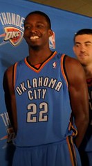
The long-awaited Oklahoma City Thunder uniforms were finally unveiled yesterzzzzzzzzzzzzzz”¦.
Okay, so I pulled that same joke when the Rays’ uniforms were unveiled, but c’mon — these things are so generic, they might as well just have “Basketball Team” printed on the front and then they could have a cameo scene in Repo Man. It’s not like they’re ugly, mind you. Au contraire, the colors are reasonably pleasing, the road jersey typography would look pretty cool on a 1960s NCAA team, and the whole package is admirably gewgaw-free. But for an NBA team rebranding itself? It’s tempting to call it a joke, except jokes are funny. This is just sad.
The most inexplicable part is the heavy use of sky blue, which is called “sky blue” because it refers to, y’know, the sky. Which you see on a clear day. When there’s no thunder. I mean, seriously, it doesn’t take a meteorology degree to figure out that there’s some sort of disconnect going on here.
Eyesore? Nope. More like eyesnooze. I’ll let you decide which is worse. (Additional pics here and here, and a video of the unveiling is available here.)

Uni Watch Site Protocol Question: As you all know, I tend to list contributors’ names in boldface in the Ticker. Truth to tell, I’ve never been in love with this protocol. I only got in the habit of it because someone at ESPN.com took it upon him- or herself to start bold-ifying the name of any reader mentioned in one of my columns, so I went along with it and stuck with it when I started this site.
But the bold thing has always struck me as visually jarring and borderline pretentious. I’ve started phasing it out of my ESPN columns (where readers no longer get mentioned very often anyway, because most reader contributions end up over here on this site), and nobody seems to have noticed or minded. Should I do away with it here too? Such an earthshaking issue of such monumental import — what to do, what to do.
Here’s what I’ll do: Today I’m going to run a boldface-free Ticker, just to see how it looks. Consider it a provisional experiment. Feedback welcome, although all the usual “This isn’t a democracy” caveats apply. Further policy updates to follow.
Uni Watch News Ticker: Was DeMarcus Ware wearing the wrong pants on Sunday? Sure looks that way (great catch by L.I. Phil). … Michigan Stadium celebrated its 500th game on Saturday and marked the occasion on the field. Craig Barker notes that the typeface for the on-field logo was based on the stadium’s exterior signage. ”¦ According to a small item in this article, Reebok will soon unveil a new shoe “called ATR Talkin’ Krazy, which will come with a dry-erase marker that easily wipes clean after writing a message on the shoe” (with thanks to Seth Horowitz). ”¦ Casey Wurzbach reports that Jeopardy! recently trotted out a new category, featuring clues only slightly more difficult than “What does a ‘Stop’ sign mean?” The contestants “breezed right through it,” says Casey. ”¦ I don’t think I’ve ever written about jai-alai, in large part because I know so little about it (other than it’s wicked fast and even wickeder hard to spell). But here’s a tutorial from Steve Bevacqua: “Years back, before the fronton in Milford, Connecticut, closed for good, I used to love going over there and catching the games. When they switched uniform styles to a new, more modern look, they gave away ALL the old jerseys to the crowd, and I wound up with one of my most favorite items in my closet — a game-worn jai-alai jersey [here’s the rear view]. It’s a Champion nylon mesh. The 5 is on the front, as it is on all black jerseys, 72 is the individual player number. Much like horse racing has standardized color-and-number matching, so does jai-alai — black and 5 always go together, as do red and 1, blue and 2, all the way up to purple and 8 (ick!), so each player would have eight different jerseys depending on which place he drew in the match, with his own number on the back. Does Champion still make jerseys like this?” Good question. Anyone..? ”¦ Do-over from yesterday, cuz I botched the link: FNOB being worn by BJ Scott. ”¦ Really interesting note from Michael Belling, who writes: “I work for a fireworks company and was up on the roof at Shea for Sunday’s game and ceremonies (no I didn’t jump, although I can’t say anyone would blame me). I got some good pictures from up there, one place most Mets fans never get to see. It’s definitely an experience to be up there. There are no real railings or protection from the edges, and the Mets kind of leave us on our own. Very few people outside of the Mets organization know that during Game 7 of the NLCS in 2006, we were up on the roof setting up an enormous fireworks display all around the stadium, which we would have fired had the Mets been able to clinch a spot in that year’s World Series. I had my finger on the button during Beltran’s game-ending final at-bat in that game. Alas, I was then there until about 3am removing all of the fireworks, repacking them and bringing them home.” Check out his full slideshow here. ”¦ Also from Michael: Hanley Ramirez’s batting helmet still had its All-Star Game decal all the way through the end of the season. ”¦ eBay stuff: Nice old flannel jerseys here and here, old hoops uniforms here and here, a Tiger Stadium usher’s uni here, and a different kind of tiger here. ”¦ New hoops uniforms for Wichita State (men’s on left, women’s on right). “These will also come in black version, which was worn last year, and a yellow version, which will be new,” says Patrick Chippeaux. “Also the school will be placing WU Shock at mid-court.” ”¦ The Blazers will wear a memorial strip for Kevin Duckworth this season. Here’s a closer look (with thanks to Travis Demers). ”¦ Soccer note from Max Levy, who writes: “West Ham United, who went briefly with blank spots where their bankrupt sponsor’s logo used to be, now have filled the empty space with panels featuring the player’s number. The numbers are in black, on a white panel, which is unusual for two reasons: First, teams typically do not display the player’s number on the front of his shirt in club soccer (although national teams do); and second, the white panel and black type do not have any visual relation to the West Ham United, whose colors are claret and blue with white shorts.” ”¦ Most beautiful Jets photo ever? Could be. “It was in the Mets’ final-week program, thoroughly a history-of-Shea publication,” says Scott Turner. “Amazingly for the Mets (their programs have always kinda stunk), there are lots of gorgeous photos in this one.” He promises to feed us more of them in the coming days. ”¦ Hahahaha (as forwarded by Jeff Landset). ”¦ Reprinted from yesterday’s comments: Maryland has started using merit decals. ”¦ Also from yesterday: Michael Huff wore a black chinstrap on Sunday. ”¦ Tod Meisner reports that Tulsa stuck with their throwback helmets on Saturday, even though they went back to their regular uniforms. Also: The “TTH” on the nose bumper stands for “Tougher Than Hell” ”¦ I want to take a minute to discuss, in all seriousness, the financial crisis. As many of you know, I can actually see Wall Street from the roof of my building, so I feel I have a pretty good grip on the situation. Okay, not really, but I can see my friend Amy’s parents’ house, and they can see Wall Street from the roof of their building (even though they’re old and probably don’t climb up on the roof too often), so I figure that should count for something. Anyway, I’m not too worried, because most of my holdings are in stirrups, which I figure should be the nation’s new monetary unit in another day or three. For those who wish to barter, the going rate is currently 10 gallons of gas per stirrup, which I assure you will seem like a bargain once I’ve cornered what remains of the hosiery market. ”¦ Happy New Year to those who are celebrating (esp. Ma & Pa Uni Watch).
Things on an NFL Helmet:
It is a type of mask that guards your face….
As for the non-bold face, first half of ticker had trouble determining between the readers and the actual people in the story. Thought DeMarcus Ware was a reader for a sec…
Anyways, by the end of the ticker I was used to it and didn’t even notice the bold face was gone. It’ll just take some getting used too.
Also, wasn’t the ‘Anti-spam word’ supposed to be a temporary thing? It’s fine and I don’t mind it, just wanting to know if my memory failed me (which it probably did)…
FYI the Shea Stadium roof picture individual links didn’t work, but the slideshow link did. Great set of pics.
De-bolding works fine. Sort of a “Ditch the Black” for text, eh?
I don’t mind the non-bold version, but one thing it did for me (that I now realize) is provide somewhat of a starting and ending point for each individual ticker item, so much that I never really noticed the ellipses before.
I liked the BOLD because it helped me determine the break between two ticker items. I’d be for the non-bold if the elipses were larger.
The blue on the OKC uniforms is the same blue as on the Oklahoma state flag. This was also the same blue as was used on lapel ribbons following the Murrah Building bombing in 1995. I am not asking one to like it, just providing context.
i vote to keep the bold only to make the ticker easier to read
if you decide against the bold, make the ticker bullet points instead of ellipses, although technically, it wouldn’t be a news ticker in that format.
I’m with Paulio. Bold helps note the break between ticker items. If I seem that User has an item about something I don’t care about, I can see that in a split second and skip to user2 without much thought. The ellipses don’t provide the same visual break and don’t guarantee you’ve moved on from User to User2. I’ve always seen it as more functional than pretentious. If you didn’t want to bold names, you could do something like this between entries: “// but I think the names are fine.
As a graphic designer, I liked the bold because it determined where ticker topics were clearly.
Personally, I skim quickly and look for names and ticker topics that interest me. Soccer? No interest. Nose bumpers? No. Baseball anything? YES. No bolding means, GASP, I can’t easily as skim and I have to slow down.
On an unrelated note, I missed the commie references today.
Why not a new paragraph for each ticker item?
If you take the “?a=0” off the Shea roof links they work.
What the six MON unis will look like for their 100 year celebrations.
link
Love the blue one that Saku is wearing to the left…
Nice Repo Man referrence. My personal favorite was the can of food Emillio was eating that just said “food”.
I prefer the bolded names for two reasons.
First, it is good for the egos of readers whose contributions are mentioned.
Second, and more importantly, the bold names break up the lengthy ticker. Sans bold, the ticker is a big giant paragraph that is tougher to read. This may just be a trick played on the eye, but I really see a difference in readability.
[quote]the road jersey link would look pretty cool on a 1960s NCAA team[/quote]
should say “home” jersey
i, too, vote for the use of bold if only to break up the ticker items…i also use them as “bookmarks” if you will when clicking on links…
Agree on the bold. It breaks up the ticker and makes it easier to read. If you dont want to bold names, could the ticker be in bullet list form? Would make it longer, but easier to read.
Call me a heretic, but I actually kind of like the OKC uniforms. Nice colors, clean lines. Considering all the crap that appears on some NBA uniforms a simple, unconstructed uniform like this is actually a refreshing change. No, there’s no logo on them. But then again, didn’t Toronto once have a dribbling dinosaur logo on their unis? Sometimes simpler is better.
I didn’t have a problem with the non-bolded ticker. Whatever you choose, your readers will adjust.
On a uni note: I am an Angels fan and I have (thankfully) not seen the garish red alt of theirs for a little while now. Maybe they’ve gone Scott Proctor and burned all of them. One can hope. Anyway, I am hoping for an alt-free LAA-BOS division series (BOS’ red alt is even worse). I like both those teams’ regular unis just fine.
I also missed the commie references, but the Wall St./Palin one was funny.
3. I dont have a photo of it, but during the MNF intro when the Steelers and Ravens helemts were flying through the air, over the city…the Steelers helmet was on the right side of you TV screen facing the Ravens helmet, the Steelers logo was on the left side of the helmet, not the right (correct).
2. Ray Lewis had a visor on with the Ravens wordmark on it, ala Redskins
link
3. Checkout these sweet Cooperalls for sale.
link
The “Stover Sleeve” that I found last week
link
made it’s first live game appearance last night.
link
Screen grab courtesy of the board from last night
Please bring back the bold. Without the boldface, its hard to tell where you were when you come back after looking at the pics.
Champion is still in the team supply business, though not as heavy as they once were … providing the unis for the Jets and Bills … only fitting as they were based near Rochester NY and had those great outlet stores all over the place upstate, where one could buy a slightly-misprinted reverse-weave hoodie for next to nothing.
Champion was sold around 15 years ago to the folks who make Hanes … and production like most in the rag industry was taken overseas. IMHO they haven’t recovered as a brand since.
How about a compromise for the bold face. Instead of highlighting the names of the contributors, just bold face the first couple of words of each new entry?
I’m with Scott. Its easier to find your place when you return from a link when the contributors name is bolded.
Plus, I hate when stuff changes.
[quote comment=”292445″]I liked the BOLD because it helped me determine the break between two ticker items. I’d be for the non-bold if the elipses were larger.[/quote]
I agree, it seperates it by subject easily & quickly.
link
if the bold must go (no biggie), i do think a suitable replacement may be needed…2 thoughts (one already stated)…how about bullet points or, failing that, is it possible to simply use another color (say,
purplered)…to designate the contributor’s name?[quote comment=”292466″][quote comment=”292445″]I liked the BOLD because it helped me determine the break between two ticker items. I’d be for the non-bold if the elipses were larger.[/quote]
I agree, it seperates it by subject easily & quickly.
link
Agreed.
I vote to keep the bold, just because I’ve always liked putting bold (or underlined) text in parentheses. It’s like your messing with the reader: this isn’t that important, but I want to draw attention to it.
I had the pleasure of watching the game last night at Raven’s Stadium…
link
link
…and saw this great chin-strap sign in the locker room!
link
The away OKC uniforms would be better if CITY was negatively arched below the number. That being said, I give the uniforms a B. It’s great to see basketball uniforms with normal striping.
[quote comment=”292460″]3. I dont have a photo of it, but during the MNF intro when the Steelers and Ravens helemts were flying through the air, over the city…the Steelers helmet was on the right side of you TV screen facing the Ravens helmet, the Steelers logo was on the left side of the helmet, not the right (correct).
2. Ray Lewis had a visor on with the Ravens wordmark on it, ala Redskins
link
3. Checkout these sweet Cooperalls for sale.
link
I just so happened to have taken that pic last night!
link
Thanks for all the feedback re: the bold. I agree — in the midst of what’s essentially a very long paragraph, the bold serves a useful place-finding function. I’ll bring it back tomorrow.
Tulsa’s helmet was a hybrid of their “throwback” and regular helmet. The regular TU helmet has the script Tulsa logo with no stripes and the “throwback” had the stripes with no logo. The helmet they wore on Saturday had both the stripes and the logo.
link of photos at this link that show the different helmets.
[quote comment=”292461″]The “Stover Sleeve” that I found last week
link
made it’s first live game appearance last night.
link
Screen grab courtesy of the board from last night[/quote]
Joe, what was the deal with the sleeve? At my house we figured it was out of respect for the TB kicker who lost his son, or was it another Upshaw memorial?
BTW great pix at M&T. I have the same one from a Spring Festival game we went to. A little purple on the old Uniwatch every now and again is not a bad thing.
This is very cool…
link
My grandma said this was her cousin. She remembers watching him play when she was little. I highly enjoy vintage hockey photos/drawings.
I didn’t know the Knicks were moving to Oklahoma City! Seriously, could these unis be any more similar to NY’s?
Frankly I am shocked that we won’t see “OKC” used on the road jersey, ala “PHX” on the Suns jersey. I was hoping their jerseys would make me forget how awful their logo is…that didn’t happen.
The OKC uniforms design is listless.
How many colors? And colors which induce sleep? How many borders around the numbers and wordmark? A wordmark which may as well say “I DON’T KNOW.”
NBA uniforms have reached their nadir. (At least until the next unveiling.)
Oh…that Jets picture is glorious.
Anyone else notice that it looked as though Walter McFadden was wearing white biker shorts last night? I hope he was fined for that, b/c it looked ridiculous.
link
Middle Tennessee State University (MTSU) is going “blackout” tonight for their game again Florida Atlantic on ESPN 2. They are busting out black jerseys. It’s their first national television game at home in Murfreesboro (30 miles SE of Nashville)
link
The West Ham box matches their shorts perfectly, same color scheme there, so I don’t consider it abstract. It actually manages to tie the white shorts, which normally would contrast heavily, to the rest of the kit.
As for the bold, it really does make it easier to see who has contributed what.
[quote comment=”292474″]Thanks for all the feedback re: the bold. I agree — in the midst of what’s essentially a very long paragraph, the bold serves a useful place-finding function. I’ll bring it back tomorrow.[/quote]
If you wanted something a little more subtle and still stands out a bit, italics could work, though I know that’s typically reserved for book and movie titles in some style guides.
And in other blackout news, the White Sox want everyone to wear black tonight…
“Hopefully, it will be pretty darn intimidating, and the Twins can see how it’s done Chicago style.”
…because the Crimson Tide were so obviously intimidated in Athens on Saturday.
[quote comment=”292476″][quote comment=”292461″]The “Stover Sleeve” that I found last week
link
made it’s first live game appearance last night.
link
Screen grab courtesy of the board from last night[/quote]
Joe, what was the deal with the sleeve? At my house we figured it was out of respect for the TB kicker who lost his son, or was it another Upshaw memorial?
BTW great pix at M&T. I have the same one from a Spring Festival game we went to. A little purple on the old Uniwatch every now and again is not a bad thing.[/quote]
It is 100% Upshaw related, but I don’t know what the heck it is???
[quote comment=”292487″][quote comment=”292476″][quote comment=”292461″]The “Stover Sleeve” that I found last week
link
made it’s first live game appearance last night.
link
Screen grab courtesy of the board from last night[/quote]
Joe, what was the deal with the sleeve? At my house we figured it was out of respect for the TB kicker who lost his son, or was it another Upshaw memorial?
BTW great pix at M&T. I have the same one from a Spring Festival game we went to. A little purple on the old Uniwatch every now and again is not a bad thing.[/quote]
It is 100% Upshaw related, but I don’t know what the heck it is???[/quote]
I just emailed a query to the Ravens’ PR guy. Will advise.
[quote comment=”292482″]Anyone else notice that it looked as though Walter McFadden was wearing white biker shorts last night? I hope he was fined for that, b/c it looked ridiculous.
link
Thank you for noticing that as well. I caught that at the begining of the broadcast and thought it looked horrible…is this something he is doing every week?
[quote comment=”292476″][quote comment=”292461″]The “Stover Sleeve” that I found last week
link
made it’s first live game appearance last night.
link
Screen grab courtesy of the board from last night[/quote]
Joe, what was the deal with the sleeve? At my house we figured it was out of respect for the TB kicker who lost his son, or was it another Upshaw memorial?
BTW great pix at M&T. I have the same one from a Spring Festival game we went to. A little purple on the old Uniwatch every now and again is not a bad thing.[/quote]
What’s interesting is that while Stover was leading a campaign to REPLACE Upshaw, he’s the only one doing a special tribute to the man.
[quote comment=”292458″]Call me a heretic, but I actually kind of like the OKC uniforms. Nice colors, clean lines. Considering all the crap that appears on some NBA uniforms a simple, unconstructed uniform like this is actually a refreshing change. No, there’s no logo on them. But then again, didn’t Toronto once have a dribbling dinosaur logo on their unis? Sometimes simpler is better.[/quote]
Yes simpler is better…but the design looks like it’s missing something. It seems a little uninspired. More generic than anything.
This…
link
falls short of these…
link
link
link
link
Was that Lions Preseason Champs tshirt that was posted yesterday for real or a joke? I have a buddy from Detroit who wants to buy one.
[quote comment=”292486″]And in other blackout news, the White Sox want everyone to wear black tonight…
“Hopefully, it will be pretty darn intimidating, and the Twins can see how it’s done Chicago style.”
…because the Crimson Tide were so obviously intimidated in Athens on Saturday.[/quote]
Wouldn’t it make more sense to have a “Whiteout”, since the team is called the “WHITE SOX”.
[quote comment=”292493″][quote comment=”292486″]And in other blackout news, the White Sox want everyone to wear black tonight…
“Hopefully, it will be pretty darn intimidating, and the Twins can see how it’s done Chicago style.”
…because the Crimson Tide were so obviously intimidated in Athens on Saturday.[/quote]
Wouldn’t it make more sense to have a “Whiteout”, since the team is called the “WHITE SOX”.[/quote]
Can we start a “ditch the blackouts” campaign yet?
I still wished OKC went with “Barons” instead of “Thunder” and wore black and gold. These would have been so awesome to see..it could use some tweaking but these are very sharp!
link
[quote comment=”292494″][quote comment=”292493″][quote comment=”292486″]And in other blackout news, the White Sox want everyone to wear black tonight…
“Hopefully, it will be pretty darn intimidating, and the Twins can see how it’s done Chicago style.”
…because the Crimson Tide were so obviously intimidated in Athens on Saturday.[/quote]
Wouldn’t it make more sense to have a “Whiteout”, since the team is called the “WHITE SOX”.[/quote]
Can we start a “ditch the blackouts” campaign yet?[/quote]
Yes, but only if you ditch whiteouts & stripeouts (and really anything-outs) as well.
Forgive me, but what link is in this picture? Thanks!
[quote comment=”292497″]Forgive me, but what link is in this picture? Thanks![/quote]
Isn’t that where they play the US Open for tennis?
[quote comment=”292498″][quote comment=”292497″]Forgive me, but what link is in this picture? Thanks![/quote]
Isn’t that where they play the US Open for tennis?[/quote]
Yes, the Arthur Ashe Stadium
It looked like a dreary day for the Mets game. Apparently God wasn’t rooting for the Mets.
Just heard back from the Ravens. Matt Stover will be wearing that black sleeve and patch all season long (which means they must have gotten a special dispensation from the league or something). I’ve asked to interview Stover and have been told I’ll probably get to speak with him on Thursday.
Is Stover the Ravens’ union rep? Was he particularly close with Upshaw? The Ravens are kinda giving me info in very small doses, so I’m trying to fill in a few blanks here.
[quote comment=”292501″]Just heard back from the Ravens. Matt Stover will be wearing that black sleeve and patch all season long (which means they must have gotten a special dispensation from the league or something). I’ve asked to interview Stover and have been told I’ll probably get to speak with him on Thursday.
Is Stover the Ravens’ union rep? Was he particularly close with Upshaw? The Ravens are kinda giving me info in very small doses, so I’m trying to fill in a few blanks here.[/quote]
From last year, “I feel that the board must begin to prepare for a change in leadership immediately,” Stover said in an e-mail to the union’s executive board and player representatives that was obtained Tuesday by ESPN. “I believe we have the proper environment with our teammates and leadership within the board to execute the process of this selection.”
link
[quote comment=”292502″][quote comment=”292501″]Just heard back from the Ravens. Matt Stover will be wearing that black sleeve and patch all season long (which means they must have gotten a special dispensation from the league or something). I’ve asked to interview Stover and have been told I’ll probably get to speak with him on Thursday.
Is Stover the Ravens’ union rep? Was he particularly close with Upshaw? The Ravens are kinda giving me info in very small doses, so I’m trying to fill in a few blanks here.[/quote]
From last year, “I feel that the board must begin to prepare for a change in leadership immediately,” Stover said in an e-mail to the union’s executive board and player representatives that was obtained Tuesday by ESPN. “I believe we have the proper environment with our teammates and leadership within the board to execute the process of this selection.”
link
Sorry, earlier this year, not last.
It seems really strange to me that he’d be the one with the tribute to Upshaw on his uni.
[quote comment=”292503″][quote comment=”292502″][quote comment=”292501″]Just heard back from the Ravens. Matt Stover will be wearing that black sleeve and patch all season long (which means they must have gotten a special dispensation from the league or something). I’ve asked to interview Stover and have been told I’ll probably get to speak with him on Thursday.
Is Stover the Ravens’ union rep? Was he particularly close with Upshaw? The Ravens are kinda giving me info in very small doses, so I’m trying to fill in a few blanks here.[/quote]
From last year, “I feel that the board must begin to prepare for a change in leadership immediately,” Stover said in an e-mail to the union’s executive board and player representatives that was obtained Tuesday by ESPN. “I believe we have the proper environment with our teammates and leadership within the board to execute the process of this selection.”
link
Sorry, earlier this year, not last.
It seems really strange to me that he’d be the one with the tribute to Upshaw on his uni.[/quote]
Damage control? He wants to let it be known that it was just business and not personal, perhaps?
Kind of off the wall question..
Does anyone have a blue old school dymo tape labeler, such as the kind the Cowboys use of their helmets?
Thanks
[quote comment=”292503″][quote comment=”292502″][quote comment=”292501″]Just heard back from the Ravens. Matt Stover will be wearing that black sleeve and patch all season long (which means they must have gotten a special dispensation from the league or something). I’ve asked to interview Stover and have been told I’ll probably get to speak with him on Thursday.
Is Stover the Ravens’ union rep? Was he particularly close with Upshaw? The Ravens are kinda giving me info in very small doses, so I’m trying to fill in a few blanks here.[/quote]
From last year, “I feel that the board must begin to prepare for a change in leadership immediately,” Stover said in an e-mail to the union’s executive board and player representatives that was obtained Tuesday by ESPN. “I believe we have the proper environment with our teammates and leadership within the board to execute the process of this selection.”
link
Sorry, earlier this year, not last.
It seems really strange to me that he’d be the one with the tribute to Upshaw on his uni.[/quote]
OK, that’s officially weird. It’s also weird that the NFL would allow any player to freestyle like this, even if it is for Upshaw. Very odd.
I can’t believe that the biggest flaw in the OKC unis hasn’t been mentioned yet: radial arching! A vertical arch would have been a simple way to make the unis more ‘pro’ and less ‘high school’. The ‘City’ looks to be ever-so-slightly arched and that’s a problem as well. It’s not arched enough to stand out and at the same time draws one’s attention to it because it’s not horizontal either.
A second point is that the blue/orange/black color scheme is now on its third team: Knicks, Bobcats and Thunder. It seems derivative to me and that’s a shame given that they had the chance to be quite original.
[quote comment=”292507″]I can’t believe that the biggest flaw in the OKC unis hasn’t been mentioned yet: radial arching! A vertical arch would have been a simple way to make the unis more ‘pro’ and less ‘high school’. The ‘City’ looks to be ever-so-slightly arched and that’s a problem as well. It’s not arched enough to stand out and at the same time draws one’s attention to it because it’s not horizontal either.
A second point is that the blue/orange/black color scheme is now on its third team: Knicks, Bobcats and Thunder. It seems derivative to me and that’s a shame given that they had the chance to be quite original.[/quote]
Is that black or dark blue? The photos look black, but the drawings look blue.
[quote comment=”292494″][quote comment=”292493″][quote comment=”292486″]And in other blackout news, the White Sox want everyone to wear black tonight…
“Hopefully, it will be pretty darn intimidating, and the Twins can see how it’s done Chicago style.”
…because the Crimson Tide were so obviously intimidated in Athens on Saturday.[/quote]
Wouldn’t it make more sense to have a “Whiteout”, since the team is called the “WHITE SOX”.[/quote]
Can we start a “ditch the blackouts” campaign yet?[/quote]
I heard the two Sox radio announcers proclaim this “black out” late in the game last night on XM Radio and the conversation went something like this:
Guy #1 – “We were just told to announce that everyone coming to tomorrow’s game should wear silver and black. This will make the stadium very intimidating for the Twins. Granted, it didn’t work for Georgia this past week, but we are going to try to make it work anyways.”
Guy #2: – “No, no, no, no, no! We want everyone JUST to wear ALL BLACK… no silver!” The owners made it very clear to just wear all black”
Anyways, I just thought it was funny that the announcers were very adamant about the all black situation, and I immediately thought of Uni Watch.
As far as the OKC Thunder unis go… I do agree with Paul. They are called the Thunder. What goes with thunder? Black sky, lightning, storm clouds… and their colors are “sky blue” and “happy orange”? Come on. I think all people designing new uniforms should run them by this board first. Is that too much to ask for?
[quote comment=”292505″]Kind of off the wall question..
Does anyone have a blue old school dymo tape labeler, such as the kind the Cowboys use of their helmets?
Thanks[/quote]
You can still find them. We have a few at work. I can orger them from industrial-type supply companies. I’m sure somewhere like Michael’s, Hobby Town, or similar arts & crafts store would have them in stock.
[quote comment=”292509″][quote comment=”292494″][quote comment=”292493″][quote comment=”292486″]And in other blackout news, the White Sox want everyone to wear black tonight…
“Hopefully, it will be pretty darn intimidating, and the Twins can see how it’s done Chicago style.”
…because the Crimson Tide were so obviously intimidated in Athens on Saturday.[/quote]
Wouldn’t it make more sense to have a “Whiteout”, since the team is called the “WHITE SOX”.[/quote]
Can we start a “ditch the blackouts” campaign yet?[/quote]
I heard the two Sox radio announcers proclaim this “black out” late in the game last night on XM Radio and the conversation went something like this:
Guy #1 – “We were just told to announce that everyone coming to tomorrow’s game should wear silver and black. This will make the stadium very intimidating for the Twins. Granted, it didn’t work for Georgia this past week, but we are going to try to make it work anyways.”
Guy #2: – “No, no, no, no, no! We want everyone JUST to wear ALL BLACK… no silver!” The owners made it very clear to just wear all black”
Anyways, I just thought it was funny that the announcers were very adamant about the all black situation, and I immediately thought of Uni Watch.
As far as the OKC Thunder unis go… I do agree with Paul. They are called the Thunder. What goes with thunder? Black sky, lightning, storm clouds… and their colors are “sky blue” and “happy orange”? Come on. I think all people designing new uniforms should run them by this board first. Is that too much to ask for?[/quote]
On TV, Hawk Harrelson waved a black t-shirt to demonstrate. Y’know, in case you weren’t sure what he meant by “wear black.”
FYI, the radio announcers’ names are Ed Farmer (deeper voice, monotone delivery) and Steve Stone.
After watching last night’s Ravens / Steelers game…There must be something done to rid the NFL of the Leotard effect when teams wear their black pants with black socks.
The Ravens and Jaguars could use their pants striping on their white pants and apply it to their socks…like this.
link
link
How much better does that look?!
The Saints and Chargers could do the same.
[quote comment=”292509″][quote comment=”292494″][quote comment=”292493″][quote comment=”292486″]And in other blackout news, the White Sox want everyone to wear black tonight…
“Hopefully, it will be pretty darn intimidating, and the Twins can see how it’s done Chicago style.”
…because the Crimson Tide were so obviously intimidated in Athens on Saturday.[/quote]
Wouldn’t it make more sense to have a “Whiteout”, since the team is called the “WHITE SOX”.[/quote]
Can we start a “ditch the blackouts” campaign yet?[/quote]
I heard the two Sox radio announcers proclaim this “black out” late in the game last night on XM Radio and the conversation went something like this:
Guy #1 – “We were just told to announce that everyone coming to tomorrow’s game should wear silver and black. This will make the stadium very intimidating for the Twins. Granted, it didn’t work for Georgia this past week, but we are going to try to make it work anyways.”
Guy #2: – “No, no, no, no, no! We want everyone JUST to wear ALL BLACK… no silver!” The owners made it very clear to just wear all black”
Anyways, I just thought it was funny that the announcers were very adamant about the all black situation, and I immediately thought of Uni Watch.
As far as the OKC Thunder unis go… I do agree with Paul. They are called the Thunder. What goes with thunder? Black sky, lightning, storm clouds… and their colors are “sky blue” and “happy orange”? Come on. I think all people designing new uniforms should run them by this board first. Is that too much to ask for?[/quote]
Since they are the “White Sox”, wouldn’t a white out make more sense? (yes, yes I know their affliction for black but still…)
[quote comment=”292496″]
Yes, but only if you ditch whiteouts & stripeouts (and really anything-outs) as well.[/quote]
Phoenix pretty much killed the white-out in hockey. Thanks, Phoenix.
Although, the Flyers still uses the link during playoff games, and it’s different. The link in Calgary is also one of the originators of the -out, and it is still going strong today. The Kings tried a “Black-Out” and it made the arena look empty.
Word of wise to organizers of these events? Pick a colour that is bright and will stand out. Otherwise, your franchise comes off as “stupid”.
[quote comment=”292514″][quote comment=”292496″]
Yes, but only if you ditch whiteouts & stripeouts (and really anything-outs) as well.[/quote]
Phoenix pretty much killed the white-out in hockey. Thanks, Phoenix.
Although, the Flyers still uses the link during playoff games, and it’s different. The link in Calgary is also one of the originators of the -out, and it is still going strong today. The Kings tried a “Black-Out” and it made the arena look empty.
Word of wise to organizers of these events? Pick a colour that is bright and will stand out. Otherwise, your franchise comes off as “stupid”.[/quote]
You’re Welcome Teebz :-)
[quote comment=”292514″]…the originators of the (insert colour here)-out…[/quote]
Damn HTML. But at least it makes sense now. :o)
[quote comment=”292515″]
You’re Welcome Teebz :-)[/quote]
I guess I should watch how I frame that rant. I didn’t mean the entire population of the city! LOL
Too funny, Rodd. Well-played, sir!
[quote comment=”292511″][quote comment=”292509″][quote comment=”292494″][quote comment=”292493″][quote comment=”292486″]And in other blackout news, the White Sox want everyone to wear black tonight…
“Hopefully, it will be pretty darn intimidating, and the Twins can see how it’s done Chicago style.”
…because the Crimson Tide were so obviously intimidated in Athens on Saturday.[/quote]
Wouldn’t it make more sense to have a “Whiteout”, since the team is called the “WHITE SOX”.[/quote]
Can we start a “ditch the blackouts” campaign yet?[/quote]
I heard the two Sox radio announcers proclaim this “black out” late in the game last night on XM Radio and the conversation went something like this:
Guy #1 – “We were just told to announce that everyone coming to tomorrow’s game should wear silver and black. This will make the stadium very intimidating for the Twins. Granted, it didn’t work for Georgia this past week, but we are going to try to make it work anyways.”
Guy #2: – “No, no, no, no, no! We want everyone JUST to wear ALL BLACK… no silver!” The owners made it very clear to just wear all black”
Anyways, I just thought it was funny that the announcers were very adamant about the all black situation, and I immediately thought of Uni Watch.
As far as the OKC Thunder unis go… I do agree with Paul. They are called the Thunder. What goes with thunder? Black sky, lightning, storm clouds… and their colors are “sky blue” and “happy orange”? Come on. I think all people designing new uniforms should run them by this board first. Is that too much to ask for?[/quote]
On TV, Hawk Harrelson waved a black t-shirt to demonstrate. Y’know, in case you weren’t sure what he meant by “wear black.”
FYI, the radio announcers’ names are Ed Farmer (deeper voice, monotone delivery) and Steve Stone.[/quote]
Thanks for the info. Brewers fan here who was listening last night because of the significance of the game. The only thing I know about the announcers is that they say, “You can put it on the boarrrrrrrrrrrrrd… YES!”.. after a home run.
And honestly, do people think that insert color here-outs work? Do visiting teams really say, “Holy shit, I’m too scared to go out there tonight because all the fans are wearing black!!!”
Oh i’ve seen you rant on it before, and it doesn’t bother me. Hockey when it is 100 degrees outside doesn’t make much sense to me, but then I am a football man.
Seeing as The Coyotes never makes the playoffs anymore anyway, i guess the point is (sarcasm) mute (/sarcasm)
[quote comment=”292514″][quote comment=”292496″]
Yes, but only if you ditch whiteouts & stripeouts (and really anything-outs) as well.[/quote]
Phoenix pretty much killed the white-out in hockey. Thanks, Phoenix.
Although, the Flyers still uses the link during playoff games, and it’s different. The link in Calgary is also one of the originators of the -out, and it is still going strong today. The Kings tried a “Black-Out” and it made the arena look empty.
Word of wise to organizers of these events? Pick a colour that is bright and will stand out. Otherwise, your franchise comes off as “stupid”.[/quote]
But on the other hand, didn’t understand this:
link|1&axs=0|81777542%2c81777540%2c81777538%2c81777530%2c81777528%2c81777526%2c81777523%2c81777519%2c81777516%2c81637615%2c81637612%2c81637611%2c81637610%2c81637608%2c81637603%2c81637602%2c81637601%2c81637600%2c81637589%2c81637585%2c81637581%2c81637561%2c81637537%2c81637527%2c81637521%2c81637508%2c81637495%2c81637483%2c81637480%2c81637477%2c81637473%2c81637470%2c81637467%2c81637463%2c81637451%2c81637448%2c81637445%2c81637443%2c81637442%2c81637440%2c81637438%2c81637437%2c81637431%2c81637430%2c81637427%2c81637422%2c81637420%2c81637418%2c81637416%2c81637413%2c81637411%2c81637410%2c81637409%2c81637408%2c81637407%2c81637406%2c81637399%2c81637395%2c81637391%2c81637388|0&id=81637416
PIT’s white out made it look like DET was at home with their white unis. They should have done a yellow out or something. Black does make the place look empty.
[quote comment=”292518″]
And honestly, do people think that insert color here-outs work? Do visiting teams really say, “Holy shit, I’m too scared to go out there tonight because all the fans are wearing black!!!”[/quote]
Yes and no. I don’t think the players care too much, but it brings the fans together as one monsterous entity. They’ll be louder and more engaging in terms of their support which can, in turn, make the team play harder (in theory).
But from experience, that Sea of Red is wholly intimidating as a fan. You literally look around and all you see is red and a thundering noise. It kind of runs a few chills up and down your spine when you hear how loud 16,000 people can be as one entity.
And just as an aside, during the Jets’ days in the NHL, the crowd racked up a decibel level of 142 during introductions in the playoffs. That’s louder than a jet engine at 100-feet away or a gunshot right beside you, and is over the “loudest recommended exposure WITH hearing protection” of 140 dB.
Can it be intimidating? Probably. But the team has to respond for it to be effective.
[quote comment=”292520″][quote comment=”292514″][quote comment=”292496″]
Yes, but only if you ditch whiteouts & stripeouts (and really anything-outs) as well.[/quote]
Phoenix pretty much killed the white-out in hockey. Thanks, Phoenix.
Although, the Flyers still uses the link during playoff games, and it’s different. The link in Calgary is also one of the originators of the -out, and it is still going strong today. The Kings tried a “Black-Out” and it made the arena look empty.
Word of wise to organizers of these events? Pick a colour that is bright and will stand out. Otherwise, your franchise comes off as “stupid”.[/quote]
But on the other hand, didn’t understand this:
link|1&axs=0|81777542%2c81777540%2c81777538%2c81777530%2c81777528%2c81777526%2c81777523%2c81777519%2c81777516%2c81637615%2c81637612%2c81637611%2c81637610%2c81637608%2c81637603%2c81637602%2c81637601%2c81637600%2c81637589%2c81637585%2c81637581%2c81637561%2c81637537%2c81637527%2c81637521%2c81637508%2c81637495%2c81637483%2c81637480%2c81637477%2c81637473%2c81637470%2c81637467%2c81637463%2c81637451%2c81637448%2c81637445%2c81637443%2c81637442%2c81637440%2c81637438%2c81637437%2c81637431%2c81637430%2c81637427%2c81637422%2c81637420%2c81637418%2c81637416%2c81637413%2c81637411%2c81637410%2c81637409%2c81637408%2c81637407%2c81637406%2c81637399%2c81637395%2c81637391%2c81637388|0&id=81637416
PIT’s white out made it look like DET was at home with their white unis. They should have done a yellow out or something. Black does make the place look empty.[/quote]
As a WashCaps season ticket holder I liked the “Rock the Red” which was used in the playoffs last year, but this year they have changed it to “Unleash the Red”……enh…”Rock the Red” just sounded cooler. I will say for a town where hockey is at the bottom of the sports list, LOTS of people showed up in red.
[quote comment=”292514″][quote comment=”292496″]
Yes, but only if you ditch whiteouts & stripeouts (and really anything-outs) as well.[/quote]
Phoenix pretty much killed the white-out in hockey. Thanks, Phoenix.
Although, the Flyers still uses the link during playoff games, and it’s different. The link in Calgary is also one of the originators of the -out, and it is still going strong today. The Kings tried a “Black-Out” and it made the arena look empty.
Word of wise to organizers of these events? Pick a colour that is bright and will stand out. Otherwise, your franchise comes off as “stupid”.[/quote]
I would offer that any franchise/university pushing a ______out (insert color of choice) is “stupid.” Forced events and tradition is just so contrived.
[quote comment=”292520″][quote comment=”292514″][quote comment=”292496″]
Yes, but only if you ditch whiteouts & stripeouts (and really anything-outs) as well.[/quote]
Phoenix pretty much killed the white-out in hockey. Thanks, Phoenix.
Although, the Flyers still uses the link during playoff games, and it’s different. The link in Calgary is also one of the originators of the -out, and it is still going strong today. The Kings tried a “Black-Out” and it made the arena look empty.
Word of wise to organizers of these events? Pick a colour that is bright and will stand out. Otherwise, your franchise comes off as “stupid”.[/quote]
But on the other hand, didn’t understand this:
link|1&axs=0|81777542%2c81777540%2c81777538%2c81777530%2c81777528%2c81777526%2c81777523%2c81777519%2c81777516%2c81637615%2c81637612%2c81637611%2c81637610%2c81637608%2c81637603%2c81637602%2c81637601%2c81637600%2c81637589%2c81637585%2c81637581%2c81637561%2c81637537%2c81637527%2c81637521%2c81637508%2c81637495%2c81637483%2c81637480%2c81637477%2c81637473%2c81637470%2c81637467%2c81637463%2c81637451%2c81637448%2c81637445%2c81637443%2c81637442%2c81637440%2c81637438%2c81637437%2c81637431%2c81637430%2c81637427%2c81637422%2c81637420%2c81637418%2c81637416%2c81637413%2c81637411%2c81637410%2c81637409%2c81637408%2c81637407%2c81637406%2c81637399%2c81637395%2c81637391%2c81637388|0&id=81637416
PIT’s white out made it look like DET was at home with their white unis. They should have done a yellow out or something. Black does make the place look empty.[/quote]
Hey! Maybe that’s the strategy. The Sox are accustomed to playing in front of a lot of empty seats. The stands weren’t even packed yesterday (don’t know if that’s because it didn’t sell out or if the 3-hour rain delay chased off a lot of the paying customers).
Tonight’s game is sold out, but if the park looks empty, the team will feel more at home.
[quote comment=”292522″][quote comment=”292520″][quote comment=”292514″][quote comment=”292496″]
Yes, but only if you ditch whiteouts & stripeouts (and really anything-outs) as well.[/quote]
Phoenix pretty much killed the white-out in hockey. Thanks, Phoenix.
Although, the Flyers still uses the link during playoff games, and it’s different. The link in Calgary is also one of the originators of the -out, and it is still going strong today. The Kings tried a “Black-Out” and it made the arena look empty.
Word of wise to organizers of these events? Pick a colour that is bright and will stand out. Otherwise, your franchise comes off as “stupid”.[/quote]
But on the other hand, didn’t understand this:
link|1&axs=0|81777542%2c81777540%2c81777538%2c81777530%2c81777528%2c81777526%2c81777523%2c81777519%2c81777516%2c81637615%2c81637612%2c81637611%2c81637610%2c81637608%2c81637603%2c81637602%2c81637601%2c81637600%2c81637589%2c81637585%2c81637581%2c81637561%2c81637537%2c81637527%2c81637521%2c81637508%2c81637495%2c81637483%2c81637480%2c81637477%2c81637473%2c81637470%2c81637467%2c81637463%2c81637451%2c81637448%2c81637445%2c81637443%2c81637442%2c81637440%2c81637438%2c81637437%2c81637431%2c81637430%2c81637427%2c81637422%2c81637420%2c81637418%2c81637416%2c81637413%2c81637411%2c81637410%2c81637409%2c81637408%2c81637407%2c81637406%2c81637399%2c81637395%2c81637391%2c81637388|0&id=81637416
PIT’s white out made it look like DET was at home with their white unis. They should have done a yellow out or something. Black does make the place look empty.[/quote]
As a WashCaps season ticket holder I liked the “Rock the Red” which was used in the playoffs last year, but this year they have changed it to “Unleash the Red”……enh…”Rock the Red” just sounded cooler. I will say for a town where hockey is at the bottom of the sports list, LOTS of people showed up in red.[/quote]
DET did a red-out years ago, and in an arena that has red seats, made it look empty in my opinon. They tried it during playoff serires with WIN/PHX who did white outs, so even though THEN home wore white, they did a red out.
[quote comment=”292523″]Forced events and tradition is just so contrived.[/quote]
Don’t all traditions start as a “forced event”? The Sea of Red, the Orange Crush, the White-Out… all organized by someone at some point.
I think the key is that it has to continue annually for it to be accepted as tradition, and not a one-off event. If your team is a perennially a bottom-feeder and you squeak into the playoffs by some miracle, it’s probably not a good idea to start a brand-new “tradition”.
[quote comment=”292526″][quote comment=”292523″]Forced events and tradition is just so contrived.[/quote]
Don’t all traditions start as a “forced event”? The Sea of Red, the Orange Crush, the White-Out… all organized by someone at some point.
I think the key is that it has to continue annually for it to be accepted as tradition, and not a one-off event. If your team is a perennially a bottom-feeder and you squeak into the playoffs by some miracle, it’s probably not a good idea to start a brand-new “tradition”.[/quote]
I would counter that if you are a perennial bottom feeder who seems to be turning it around, via an infusion of youth and/or a better brain trust, then why not try something? Maybe not color-out, but something? That being said if you tank the next couple years, then don’t try to bring that “tradition” back 5 years down the road when you do make it back in.
Now this from the Ravens:
“wanted to clarify…All player union reps wore the band on their sleeve for the first week of the season, Stover has just extended that.”
Really? Each team’s union rep wore a black sleeve in Week 1? I don’t recall this at all. Anyone..?
Paul, I know this isn’t on your recent articles, but you posted once about the University of Miami having black alternate jersey’s this year, much like the doomsday threads that have recently plagued UGA.
Down here at the U we have been told that this is rumor by grad assistants in the Athletic Department. This was seconded by the store next door to campus called AllCanes (www.allcanes.com), which has been selling canes merchandise for something like 30 years. They arn’t getting any shipments.
Can you confirm?
There was something written about a designated player on each team wearing a band in week 1 but I never remember seeing it.
So….let me make sure I’m crystal clear on this:
Johnny Unitas dies and Peyton Manning and Chris Redman can’t wear black high-tops for one game without getting fined.
Gene Upshaw dies and Matt Stover can wear a black sleeve and patch all season.
Just so I’m sure where the consistent NFL line is drawn on this.
[quote comment=”292506″][quote comment=”292503″][quote comment=”292502″][quote comment=”292501″]Just heard back from the Ravens. Matt Stover will be wearing that black sleeve and patch all season long (which means they must have gotten a special dispensation from the league or something). I’ve asked to interview Stover and have been told I’ll probably get to speak with him on Thursday.
Is Stover the Ravens’ union rep? Was he particularly close with Upshaw? The Ravens are kinda giving me info in very small doses, so I’m trying to fill in a few blanks here.[/quote]
From last year, “I feel that the board must begin to prepare for a change in leadership immediately,” Stover said in an e-mail to the union’s executive board and player representatives that was obtained Tuesday by ESPN. “I believe we have the proper environment with our teammates and leadership within the board to execute the process of this selection.”
link
Sorry, earlier this year, not last.
It seems really strange to me that he’d be the one with the tribute to Upshaw on his uni.[/quote]
OK, that’s officially weird. It’s also weird that the NFL would allow any player to freestyle like this, even if it is for Upshaw. Very odd.[/quote]
I agree Paul. When John Unitas died Chris Redman of the Ravens and Payton Manning wanted to wear black hightops in honor of the greatest QB. The No Fun League told them no, as it would violate the uni rules (both team wore white cleats at the time). IIRC they both wore them anyway and paid the fine. Now the league is allowing for individual memorials. I liked this better when I thought it was some kicker solidarity, instead of politics.
Thanks, KT. Great minds think alike.
Perhaps it is just coincidence, but the one difference I have noticed as far as the memorials go is there is a different man in the big seat now. It seems that since Goodell took over the allowance for memorials has become much more lax.
[quote comment=”292533″]IIRC they both wore them anyway and paid the fine.[/quote]
Redman did (without asking permission) and paid the $5,000 fine. Manning asked, was denied, and opted not to wear them as he felt the brou-ha-ha over what would be a fine of more than $25,000 (because he had been denied) would be a dishonor to Johnny U.
And I didn’t notice any mourning bands on the player reps (to include Stover) who I saw at the Stadium on Week one.
[quote comment=”292536″]Perhaps it is just coincidence, but the one difference I have noticed as far as the memorials go is there is a different man in the big seat now. It seems that since Goodell took over the allowance for memorials has become much more lax.[/quote]
One might say too lax.
The Taylor thing was way overdone. The Upshaw thing was way overdone and then scaled back (“No, really, we always planned for it to be a helmet thing after week one, really, ooh, look, there’s a Ferrari!”).
Simple and understated and then you move on is almost always the way to go with a memorial, IMHO.
Hey Paul, here’s more on your boy Pierre-Luc Letourneau-Leblond: link
Looks like if he doesn’t put on the Devils Horns this year, he will next.
I totally agree with the non-boldface. Its a throwback to how newspapers do it- and it never works on the web IMHO.
However- personal opinion here- I wish there was some better way to organize the ticker. Specifically, marking the beginning of a new item. The ellipses are hard to see, the whole thing looks like one paragraph.
Reason being I tend to look at parts of the ticker throughout the day (don’t have time to do it all at once). Maybe an image? A big dot?
Total personal opinion, apologies if the comments section is not the place for this.
[quote comment=”292538″]And I didn’t notice any mourning bands on the player reps (to include Stover) who I saw at the Stadium on Week one.[/quote]
This is the first time it has made it to the game…he wore it in warm-ups before. Maybe that is what all of the other player reps did?
[quote comment=”292525″]
DET did a red-out years ago, and in an arena that has red seats, made it look empty in my opinon. They tried it during playoff serires with WIN/PHX who did white outs, so even though THEN home wore white, they did a red out.[/quote]
I thought the same thing too. The thing is now that most teams do it (The Canucks did a “Believe in Blue” thing two years ago link). It just comes off as forced and unoriginal.
The best traditions come from real events. The Canucks towel power came from Roger Neilson “surrendering” to the refs in the 1982 semi-finals. link (this is no way denigrates the Steelers Terrible Towel – which came first, under different circumstances). Manufactured “spontaneity” comes across as fake.
Another idea Paul: why not bold the links? Contibutors names are generally sprinkled randomly throughout the ticker. But each item has a link- and the text of the link is often a nice short description of what’s going on. It would achieve the “nice marker” concept much better.
Just an idea.
[quote comment=”292529″]Now this from the Ravens:
“wanted to clarify…All player union reps wore the band on their sleeve for the first week of the season, Stover has just extended that.”
Really? Each team’s union rep wore a black sleeve in Week 1? I don’t recall this at all. Anyone..?[/quote]
The Bengals’ rep is T.J. Houshmanzadeh (I believe). The only pic from the first week (v. Baltimore) that I can find with him is this one ( link), his left sleeve is unadorned. I would think that all the reps would have done this on the left sleeve for some consistency …
[quote comment=”292542″][quote comment=”292538″]And I didn’t notice any mourning bands on the player reps (to include Stover) who I saw at the Stadium on Week one.[/quote]
This is the first time it has made it to the game…he wore it in warm-ups before. Maybe that is what all of the other player reps did?[/quote]
I don’t even know who the player reps are (though the executive committee – which you’d think would be made up of player reps – includes, apparently, Domonique Foxworth of the Atlanta Falcons, Drew Brees of the New Orleans Saints, Mike Vrabel of the New England Patriotsm, Brian Dawkins of the Philadelphia Eagles, Jeff Saturday of the Indianapolis Colts, Mark Bruener of the Houston Texans, Tony Richardson of the New York Jets and Kevin Carter of the Tampa Bay Buccaneers.) (thanks, Wikipedia, which is never wrong)
So they’re trying to tell us that in addition to every player in the league in week 1 wearing the big-ass GU 83 patch and playing on fields with a big-ass GU 83 marking in front of coaches wearing GU 83 buttons and patches and zipper pulls, the player reps also wore black sleeves?
“Hey, I don’t mind you pulling my leg, but don’t lie to me like I’m Montel Williams. I am not Montel Williams.”
[quote comment=”292541″]
Reason being I tend to look at parts of the ticker throughout the day (don’t have time to do it all at once). Maybe an image? A big dot?
[/quote]
How about that little Uni Watch stirrup? Like the icon you see in the browser’s address bar.
[quote comment=”292545″]
The Bengals’ rep is T.J. Houshmanzadeh (I believe). The only pic from the first week (v. Baltimore) that I can find with him is this one ( link), his left sleeve is unadorned. [/quote]
How the hell can you tell? ;)
[quote comment=”292528″]
I would counter that if you are a perennial bottom feeder who seems to be turning it around, via an infusion of youth and/or a better brain trust, then why not try something? Maybe not color-out, but something? That being said if you tank the next couple years, then don’t try to bring that “tradition” back 5 years down the road when you do make it back in.[/quote]
But then it’s not a “tradition”. Traditions tend to happen year after year after year over a period of time.
If your team has done a “tradition” before entering a “rebuilding phase” where they miss the playoffs for a number of years, bring it back by all means when they return to the playoffs.
But if you’ve never done it before, you can’t claim it to be a “tradition” if you make the playoffs once in a decade. It’s just an “event”.
See, I think the Thunder managed to somehow pull off super-boring and overdone on the SAME JERSEY. It’s a sleep inducing design, and yet they felt the need to add FOUR different colors. I mean, really? Sky blue, orange, yellow and dark blue? Frankly, their generic NBA summer league uniforms with that “OKC” were superior.
Not sports-related at all, but here are link.
Nike comes in at #29 behind such powerhouses as NesCafé and Gillette.
[quote comment=”292548″][quote comment=”292545″]
The Bengals’ rep is T.J. Houshmanzadeh (I believe). The only pic from the first week (v. Baltimore) that I can find with him is this one ( link), his left sleeve is unadorned. [/quote]
How the hell can you tell? ;)[/quote]
KT, I’m working on the assumption that the whole sleeve would be black … it isn’t in that picture
[quote comment=”292483″]Middle Tennessee State University (MTSU) is going “blackout” tonight for their game again Florida Atlantic on ESPN 2. They are busting out black jerseys. It’s their first national television game at home in Murfreesboro (30 miles SE of Nashville)
link
The sad part about this is that MTSU is the Blue Raiders, not the Black Raiders. I’m not looking forward to seeing this tonight. They could have atleast done a “White Out” and just wear their away jerseys. Besides, as Bryan pointed out over the weekend, black doesn’t show well at night on TV.
perhaps to denote reader contributions in the ticker, we could use a symbol…link
[quote comment=”292549″][quote comment=”292528″]
I would counter that if you are a perennial bottom feeder who seems to be turning it around, via an infusion of youth and/or a better brain trust, then why not try something? Maybe not color-out, but something? That being said if you tank the next couple years, then don’t try to bring that “tradition” back 5 years down the road when you do make it back in.[/quote]
But then it’s not a “tradition”. Traditions tend to happen year after year after year over a period of time.
If your team has done a “tradition” before entering a “rebuilding phase” where they miss the playoffs for a number of years, bring it back by all means when they return to the playoffs.
But if you’ve never done it before, you can’t claim it to be a “tradition” if you make the playoffs once in a decade. It’s just an “event”.[/quote]
I suppose my thoughts were scrambled here. I agree that when you begin something it is not a tradition. I think teams should be allowed to try to start something, but they should not call it a tradition just because it happens twice a decade.
hopefully that makes a little more sense.
[quote comment=”292492″]Was that Lions Preseason Champs tshirt that was posted yesterday for real or a joke? I have a buddy from Detroit who wants to buy one.[/quote]
It is for sale… link
[quote comment=”292513″][quote comment=”292509″][quote comment=”292494″][quote comment=”292493″][quote comment=”292486″]And in other blackout news, the White Sox want everyone to wear black tonight…
“Hopefully, it will be pretty darn intimidating, and the Twins can see how it’s done Chicago style.”
…because the Crimson Tide were so obviously intimidated in Athens on Saturday.[/quote]
Wouldn’t it make more sense to have a “Whiteout”, since the team is called the “WHITE SOX”.[/quote]
Can we start a “ditch the blackouts” campaign yet?[/quote]
I heard the two Sox radio announcers proclaim this “black out” late in the game last night on XM Radio and the conversation went something like this:
Guy #1 – “We were just told to announce that everyone coming to tomorrow’s game should wear silver and black. This will make the stadium very intimidating for the Twins. Granted, it didn’t work for Georgia this past week, but we are going to try to make it work anyways.”
Guy #2: – “No, no, no, no, no! We want everyone JUST to wear ALL BLACK… no silver!” The owners made it very clear to just wear all black”
Anyways, I just thought it was funny that the announcers were very adamant about the all black situation, and I immediately thought of Uni Watch.
As far as the OKC Thunder unis go… I do agree with Paul. They are called the Thunder. What goes with thunder? Black sky, lightning, storm clouds… and their colors are “sky blue” and “happy orange”? Come on. I think all people designing new uniforms should run them by this board first. Is that too much to ask for?[/quote]
Since they are the “White Sox”, wouldn’t a white out make more sense? (yes, yes I know their affliction for black but still…)[/quote]
You honestly can’t think of the problem with having a whiteout at a baseball game?
[quote comment=”292555″][quote comment=”292549″][quote comment=”292528″]
I would counter that if you are a perennial bottom feeder who seems to be turning it around, via an infusion of youth and/or a better brain trust, then why not try something? Maybe not color-out, but something? That being said if you tank the next couple years, then don’t try to bring that “tradition” back 5 years down the road when you do make it back in.[/quote]
But then it’s not a “tradition”. Traditions tend to happen year after year after year over a period of time.
If your team has done a “tradition” before entering a “rebuilding phase” where they miss the playoffs for a number of years, bring it back by all means when they return to the playoffs.
But if you’ve never done it before, you can’t claim it to be a “tradition” if you make the playoffs once in a decade. It’s just an “event”.[/quote]
I suppose my thoughts were scrambled here. I agree that when you begin something it is not a tradition. I think teams should be allowed to try to start something, but they should not call it a tradition just because it happens twice a decade.
hopefully that makes a little more sense.[/quote]
Ahhh… gotcha, and I thoroughly agree, Rodd. :o)
[quote comment=”292552″]KT, I’m working on the assumption that the whole sleeve would be black … it isn’t in that picture[/quote]
I was kidding.
The Bengals’ unis are giving Kramer seizures.
[quote comment=”292551″]Not sports-related at all, but here are link.
Nike comes in at #29 behind such powerhouses as NesCafé and Gillette.[/quote]
I found it interesting that Apple, Nike, and Shell were the only three that are just symbols yet we all know exactly what they are.
[quote comment=”292559″][quote comment=”292552″]KT, I’m working on the assumption that the whole sleeve would be black … it isn’t in that picture[/quote]
I was kidding.
The Bengals’ unis are giving Kramer seizures.[/quote]
I got ya, I didn’t see the ;) the first time … long day at work considering I am in the financial field.
I would read the ticker while at my desk at work between emails and such and the boldface names helped me “bookmark” where i left off. I answer a phone and come back and remember that I just read something that Jeremy Braum had left or something of that nature.
Just a thought, but i say bring back the bold.
link
Check out this pic…Jamal’s jersey used the kiss-cut technique of lettering and the other jersey is the normal method of stacking the color layers…very strange
[quote comment=”292545″][quote comment=”292529″]Now this from the Ravens:
“wanted to clarify…All player union reps wore the band on their sleeve for the first week of the season, Stover has just extended that.”
Really? Each team’s union rep wore a black sleeve in Week 1? I don’t recall this at all. Anyone..?[/quote]
The Bengals’ rep is T.J. Houshmanzadeh (I believe). The only pic from the first week (v. Baltimore) that I can find with him is this one ( link), his left sleeve is unadorned. I would think that all the reps would have done this on the left sleeve for some consistency …[/quote]
Don’t forget Jake Plummer and his desire to wear Pat Tillman’s number on his helmet for the rest of the season and was denied…..
[quote comment=”292444″]I don’t mind the non-bold version, but one thing it did for me (that I now realize) is provide somewhat of a starting and ending point for each individual ticker item, so much that I never really noticed the ellipses before.[/quote]
Well said, same for me.
I’ve skimmed the comments, so I think I am jumping on a bandwagon.
I found the bold helpful when I wanted to skim the ticker or skip an item and move on to the next time. I know the ellipses are there, but I liked the bold’s visibility.
Good call on keeping the bold – don’t move my cheese!
[quote comment=”292562″]I would read the ticker while at my desk at work between emails and such and the boldface names helped me “bookmark” where i left off. I answer a phone and come back and remember that I just read something that Jeremy Braum had left or something of that nature.
Just a thought, but i say bring back the bold.[/quote]
I just read the comments from Commrade Lukas. Thanks!
[quote comment=”292526″][quote comment=”292523″]Forced events and tradition is just so contrived.[/quote]
Don’t all traditions start as a “forced event”? The Sea of Red, the Orange Crush, the White-Out… all organized by someone at some point.
I think the key is that it has to continue annually for it to be accepted as tradition, and not a one-off event. If your team is a perennially a bottom-feeder and you squeak into the playoffs by some miracle, it’s probably not a good idea to start a brand-new “tradition”.[/quote]
No, all traditions do not start as a forced event. I can cite you to some examples with which I am familiar.
Nebraska’s Sea of Red (the name given it is fairly new) began decades ago, when people simply wore red to support the team. No one instructed them to do it. Over time, more and more people did so, until someone noticed and mentioned it.
There is also a tradition at Nebraska pursuant to which fans buy red balloons before the game, and then release them simultaneously after the team’s first score. Again, no one came up with the idea and forced it on people. It just sort of evolved over many years.
(It should be noted that the balloon release has lost much of its popularity in recent years. Environmental reasons? Maybe.)
I am sure that a Texas Aggie could chime in with a dozen traditions that came out of nowhere (though we all know that Aggies do tend to overdue the tradition thing just a tad.)
[quote comment=”292474″]Thanks for all the feedback re: the bold. I agree — in the midst of what’s essentially a very long paragraph, the bold serves a useful place-finding function. I’ll bring it back tomorrow.[/quote]
Paul:
If you are thinking of format changes you could go with a bullet pointed format. Most newspapers use it in their ‘Team Notes’ packages.
[quote comment=”292514″][quote comment=”292496″]
Yes, but only if you ditch whiteouts & stripeouts (and really anything-outs) as well.[/quote]
Phoenix pretty much killed the white-out in hockey. Thanks, Phoenix.
Although, the Flyers still uses the link during playoff games, and it’s different. The link in Calgary is also one of the originators of the -out, and it is still going strong today. The Kings tried a “Black-Out” and it made the arena look empty.
Word of wise to organizers of these events? Pick a colour that is bright and will stand out. Otherwise, your franchise comes off as “stupid”.[/quote]
While you may be right with your ‘Phoenix killed the white-out’ theory. Try to remember who link
Bold the player and/or team name about which the reader contributed. Not the contributor himself or herself.
Not uni related, but Kiffin is out as Raiders head coach… he was fired by Al Davis via the telephone. That organization is a joke. INHO.
keep the mets jets shea pics coming. a daily dose of one per day forever would work. agree with previous poster, jets pic wow.
[quote comment=”292572″]Bold the player and/or team name about which the reader contributed. Not the contributor himself or herself.[/quote]
I disagree…I’ve come to know what certain readers post about and during a skim the bold helps me see an item by them that I may normally skim past…bold is good!
[quote comment=”292569″]
No, all traditions do not start as a forced event. I can cite you to some examples with which I am familiar.
Nebraska’s Sea of Red (the name given it is fairly new) began decades ago, when people simply wore red to support the team. No one instructed them to do it. Over time, more and more people did so, until someone noticed and mentioned it.[/quote]
By noticing it and mentioning it, that’s the organization of having everyone do the same thing. The Jets’ White-Out started by having a number of people in the stands wear their white Winnipeg Jets jerseys because “good guys wear white”, and the home team wore white. Once the Jets noticed this trend, they asked everyone to get involved. It was at that point that the “Winnipeg White-Out” was officially coined, and everyone wore white in the playoffs as tradition.
I get that some people wore the colours to support the team in Nebraska, but as soon as someone entices the entire crowd to do it, that’s where a “tradition” is started via a “forced event”. You have the option of not going along with the crowd, but you’ll most likely be asked why you’re not supporting the team if/when everyone knows you’re supposed to.
[quote comment=”292569″]There is also a tradition at Nebraska pursuant to which fans buy red balloons before the game, and then release them simultaneously after the team’s first score. Again, no one came up with the idea and forced it on people. It just sort of evolved over many years.
(It should be noted that the balloon release has lost much of its popularity in recent years. Environmental reasons? Maybe.)[/quote]
But not everyone does this action. Not everyone brings red balloons. This one would qualify as something that is a tradition because it was started way back when, and has evolved into something larger today (like all traditions do).
[quote comment=”292571″][quote comment=”292514″][quote comment=”292496″]
Yes, but only if you ditch whiteouts & stripeouts (and really anything-outs) as well.[/quote]
Phoenix pretty much killed the white-out in hockey. Thanks, Phoenix.
Although, the Flyers still uses the link during playoff games, and it’s different. The link in Calgary is also one of the originators of the -out, and it is still going strong today. The Kings tried a “Black-Out” and it made the arena look empty.
Word of wise to organizers of these events? Pick a colour that is bright and will stand out. Otherwise, your franchise comes off as “stupid”.[/quote]
While you may be right with your ‘Phoenix killed the white-out’ theory. Try to remember who link[/quote]
I’m well aware of who started it. I participated in it. And I know it was a response to Calgary’s Sea of Red. :o)
link
Davis fires kiffin
did it really happen this time?
[quote comment=”292560″][quote comment=”292551″]Not sports-related at all, but here are link.
Nike comes in at #29 behind such powerhouses as NesCafé and Gillette.[/quote]
I found it interesting that Apple, Nike, and Shell were the only three that are just symbols yet we all know exactly what they are.[/quote]
And McDonalds
[quote comment=”292577″][quote comment=”292571″][quote comment=”292514″][quote comment=”292496″]
Yes, but only if you ditch whiteouts & stripeouts (and really anything-outs) as well.[/quote]
Phoenix pretty much killed the white-out in hockey. Thanks, Phoenix.
Although, the Flyers still uses the link during playoff games, and it’s different. The link in Calgary is also one of the originators of the -out, and it is still going strong today. The Kings tried a “Black-Out” and it made the arena look empty.
Word of wise to organizers of these events? Pick a colour that is bright and will stand out. Otherwise, your franchise comes off as “stupid”.[/quote]
While you may be right with your ‘Phoenix killed the white-out’ theory. Try to remember who link[/quote]
I’m well aware of who started it. I participated in it. And I know it was a response to Calgary’s Sea of Red. :o)[/quote]
You spelt ‘color’ wrong Teebz :)
(Friendly little jab from your UW hockey wing American roomie)
Today’ Boston Globe gave a second chance to see a uni gaffe by the backup QB, Kevin O;Connell. her’s the apology:
Editor’s note: A photo on Page C6 in Sunday’s Sports section showed Patriots rookie quarterback Kevin O’Connell wearing a wristband with inappropriate language written on it. The photo did not meet the Globe’s journalistic standards and should not have been published.
I have the Sunday paper, but can’t read what he wrote (and the image does not accompany the online article. Anyone? All I can see is “My ______ is TINY too”. Maybe a Cooley reference?
You know what really used to look good on those unis? Green and gold.
[quote comment=”292576″][quote comment=”292569″]
No, all traditions do not start as a forced event. I can cite you to some examples with which I am familiar.
Nebraska’s Sea of Red (the name given it is fairly new) began decades ago, when people simply wore red to support the team. No one instructed them to do it. Over time, more and more people did so, until someone noticed and mentioned it.[/quote]
By noticing it and mentioning it, that’s the organization of having everyone do the same thing. The Jets’ White-Out started by having a number of people in the stands wear their white Winnipeg Jets jerseys because “good guys wear white”, and the home team wore white. Once the Jets noticed this trend, they asked everyone to get involved. It was at that point that the “Winnipeg White-Out” was officially coined, and everyone wore white in the playoffs as tradition.
I get that some people wore the colours to support the team in Nebraska, but as soon as someone entices the entire crowd to do it, that’s where a “tradition” is started via a “forced event”. You have the option of not going along with the crowd, but you’ll most likely be asked why you’re not supporting the team if/when everyone knows you’re supposed to.
[quote comment=”292569″]There is also a tradition at Nebraska pursuant to which fans buy red balloons before the game, and then release them simultaneously after the team’s first score. Again, no one came up with the idea and forced it on people. It just sort of evolved over many years.
(It should be noted that the balloon release has lost much of its popularity in recent years. Environmental reasons? Maybe.)[/quote]
But not everyone does this action. Not everyone brings red balloons. This one would qualify as something that is a tradition because it was started way back when, and has evolved into something larger today (like all traditions do).[/quote]
Maybe I did not explain the wearing of red thing very well. There still isn’t anyone telling Nebraska fans to wear red to a game. Never has been. They just do it.
Teebz said, “By noticing it and mentioning it, that’s the organization of having everyone do the same thing.” Not true. Some writer noting that 80,000 people all seem to be wearing the same color shirt and that it looks kind of cool does not constitute organization.
Coincidentally, some twits tried to organize a blackout earlier this season, and it failed miserably.
Yea, but Rutgers is playing WVU on saturday and wore all black against them last year.
I actually really like the Thunder’s homes, aside from the out-of-place feel of the navy trim. Reminds me of the San Diego Clippers look. The road looks crappy; I would have put more orange on it & less navy, and put “CITY” under the number.
If you want to look at a treasure trove of uni-centric items, look at the Tony Tomsic sports photos at Getty Images. I can’t link it right now, but you’ll be glad you did.
In that great old Jets photo, the refs are wearing red stripes rather than the traditional black. Was that the case for all AFL refs?
[quote comment=”292587″]In that great old Jets photo, the refs are wearing red stripes rather than the traditional black. Was that the case for all AFL refs?[/quote]
Yeah, as far as I know. The AFL had some WEIRD uniforms… vertical stripes!
[quote comment=”292587″]In that great old Jets photo, the refs are wearing red stripes rather than the traditional black. Was that the case for all AFL refs?[/quote]
Yep.
[quote comment=”292506″][quote comment=”292503″][quote comment=”292502″][quote comment=”292501″]Just heard back from the Ravens. Matt Stover will be wearing that black sleeve and patch all season long (which means they must have gotten a special dispensation from the league or something). I’ve asked to interview Stover and have been told I’ll probably get to speak with him on Thursday.
Is Stover the Ravens’ union rep? Was he particularly close with Upshaw? The Ravens are kinda giving me info in very small doses, so I’m trying to fill in a few blanks here.[/quote]
From last year, “I feel that the board must begin to prepare for a change in leadership immediately,” Stover said in an e-mail to the union’s executive board and player representatives that was obtained Tuesday by ESPN. “I believe we have the proper environment with our teammates and leadership within the board to execute the process of this selection.”
link
Sorry, earlier this year, not last.
It seems really strange to me that he’d be the one with the tribute to Upshaw on his uni.[/quote]
OK, that’s officially weird. It’s also weird that the NFL would allow any player to freestyle like this, even if it is for Upshaw. Very odd.[/quote]
Maybe this means the league doesn’t officially consider kickers to be football players.
keep the mets jets shea pics coming. a daily dose of one per day forever would work. agree with previous poster, jets pic wow.
muddlehead is not at all muddled on this subject. I second (third?) the motion. That photo is a thing of beauty. More, please.
[quote comment=”292590″][quote comment=”292506″][quote comment=”292503″][quote comment=”292502″][quote comment=”292501″]Just heard back from the Ravens. Matt Stover will be wearing that black sleeve and patch all season long (which means they must have gotten a special dispensation from the league or something). I’ve asked to interview Stover and have been told I’ll probably get to speak with him on Thursday.
Is Stover the Ravens’ union rep? Was he particularly close with Upshaw? The Ravens are kinda giving me info in very small doses, so I’m trying to fill in a few blanks here.[/quote]
From last year, “I feel that the board must begin to prepare for a change in leadership immediately,” Stover said in an e-mail to the union’s executive board and player representatives that was obtained Tuesday by ESPN. “I believe we have the proper environment with our teammates and leadership within the board to execute the process of this selection.”
link
Sorry, earlier this year, not last.
It seems really strange to me that he’d be the one with the tribute to Upshaw on his uni.[/quote]
OK, that’s officially weird. It’s also weird that the NFL would allow any player to freestyle like this, even if it is for Upshaw. Very odd.[/quote]
Maybe this means the league doesn’t officially consider kickers to be football players.[/quote]
No, they occasionally make tackles… punters on the other hand…
[quote comment=”292583″]
Maybe I did not explain the wearing of red thing very well. There still isn’t anyone telling Nebraska fans to wear red to a game. Never has been. They just do it.[/quote]
Ok, that’s different. :o)
[quote comment=”292583″]Teebz said, “By noticing it and mentioning it, that’s the organization of having everyone do the same thing.” Not true. Some writer noting that 80,000 people all seem to be wearing the same color shirt and that it looks kind of cool does not constitute organization.[/quote]
Some writing about it draws attention to it, though. While it’s not organization per se, 80,000 people wearing the same colour shirt is a form of organization.
Uni Watch isn’t an organization either, but we’re all people of like aesthetics, correct? The fact that we’re all here for the same thing makes us an unofficial organization. Putting things into categories of similar attributes constitutes organization by definition.
[quote comment=”292583″]Coincidentally, some twits tried to organize a blackout earlier this season, and it failed miserably.[/quote]
Black-outs are simply dumb.
[quote comment=”292554″]perhaps to denote reader contributions in the ticker, we could use a symbol…link[/quote]
Shouldn’t there be a logo of some sort in the middle?
[quote comment=”292569″](though we all know that Aggies do tend to overdue the tradition thing just a tad.)[/quote]
Ya think? Also note: the sky is blue, grass is green, sun rises in east and sets in west, etc. etc.
[quote comment=”292590″][quote comment=”292506″][quote comment=”292503″][quote comment=”292502″][quote comment=”292501″]Just heard back from the Ravens. Matt Stover will be wearing that black sleeve and patch all season long (which means they must have gotten a special dispensation from the league or something). I’ve asked to interview Stover and have been told I’ll probably get to speak with him on Thursday.
Is Stover the Ravens’ union rep? Was he particularly close with Upshaw? The Ravens are kinda giving me info in very small doses, so I’m trying to fill in a few blanks here.[/quote]
From last year, “I feel that the board must begin to prepare for a change in leadership immediately,” Stover said in an e-mail to the union’s executive board and player representatives that was obtained Tuesday by ESPN. “I believe we have the proper environment with our teammates and leadership within the board to execute the process of this selection.”
link
Sorry, earlier this year, not last.
It seems really strange to me that he’d be the one with the tribute to Upshaw on his uni.[/quote]
OK, that’s officially weird. It’s also weird that the NFL would allow any player to freestyle like this, even if it is for Upshaw. Very odd.[/quote]
Maybe this means the league doesn’t officially consider kickers to be football players.[/quote]
Disagree. It’s definitely a Tagliabue/Goodell thing. No black hi-tops for Manning or Redman? Tagliabue enforcing the white shoes/black shoes rule in the uniform policy. Pat Tillman’s ASU and Cardinals roommate and teammate (Jake Plummer, a Bronco at the time) being unable to wear the #40 sticker while the then-Cardinals got to keep them on their helmets? Tagliabue noticing that a #40 on non-Cardinals helmets would be a uniform violation after Week 1. No #27 jerseys for Champ Bailey or John Lynch in the Pro Bowl? Tagliabue calling a rule on merchandising: everybody keeps the same numbers for a rotten exhibition, even though the jerseys are ugly and everybody plays half-heartedly.
In the Goodell era, we’ve seen “keep your Taylor 21 stickers if you want,” three too many #21 jerseys in the Pro Bowl, and now an extra GU63 armband. I’m not sure I like it too much. Almost seems like Goodell is announcing “I’m not Tagliabue” just for the sake of announcing “I’m not Tagliabue. Anyone agree? Or am I way off base?
Following up myself at #151: Looks like I missed a sarcasm tag. But the point still stands: memorials were much more tightly controlled under Tagliabue than with Goodell, and I feel that if Tagliabue were in charge, we wouldn’t have gotten sick of the Sean Taylor memorials too quickly.
I vote for bullet points in the ticker
[quote comment=”292594″][quote comment=”292554″]perhaps to denote reader contributions in the ticker, we could use a symbol…link[/quote]
Shouldn’t there be a logo of some sort in the middle?[/quote]
I wonder how long it would take for an NFL QB to get on the site and ask the purpose of the green dot.
As for ____ outs, I thought about that around the time they were in planning stages for Busch III, and took an online fan poll for green seats or red in the new place. Since fans here usually wear red anyway, I couldn’t decide if the final choice was a dumb one because it makes the place look empty when it’s full, or if it’s brilliant because it makes the place look full when it’s empty.
[quote comment=”292532″]So….let me make sure I’m crystal clear on this:
Johnny Unitas dies and Peyton Manning and Chris Redman can’t wear black high-tops for one game without getting fined.
Gene Upshaw dies and Matt Stover can wear a black sleeve and patch all season.
Just so I’m sure where the consistent NFL line is drawn on this.[/quote]
Must The Man continue to keep Lithuanians down???
My instantaneous reaction to not having names in bold face in the ticker is a negative one. Aside from the ego-boost of having my name look important now and again, the bold face names help break up the large grey block of type and that it acts as a wonderful separator for the individual items. If I start to read something that I don’t particularly find of interest, it makes it much easier to find the start of the next one. Keep ’em bold!
The Rangers just slaughtered the Swiss Elite League team SC Bern 8-1 and linkdid in their game vs Berlin , they wearing an NHL Premiere patch anywhere.
that ugly post was supposed to say the rangers were not wearing an NHL Premiere patch like the Lightning did….
Those colors wouldn’t look good with “Oklahoma City” or “Thunder” on them. I hope they’re as successful as the Pilots have been. Which reminds me….. Go Jamie Moyer and the Phillies!
[quote comment=”292603″]The Rangers just slaughtered the Swiss Elite League team SC Bern 8-1 and linkdid in their game vs Berlin , they wearing an NHL Premiere patch anywhere.[/quote]
I hope they sew up those diapers for the regular season.
(Speaking of “preseason only” uni shenanigans, do the NYR still heat-press the pre-season jerseys and save the sewn-on jobs for the regular season?)
This is very cool…
link…
My grandma said this was her cousin. She remembers watching him play when she was little. I highly enjoy vintage hockey photos/drawings.
The player pictured, Larry Aurie, is also the mysterious #6 of the Red Wings. The current Wings brass haven’t officially recognized the retired #6, but it has not been worn by a Wing in many, many years.
per Wikipedia
Aurie’s No. 6 jersey was officially retired by Wings owner James Norris after the 1938—39 season, and his retired jersey was displayed in the Olympia Stadium lobby during the 1960s. However, current Red Wings owner Mike Ilitch has for some unknown reason refused to hang Aurie’s No. 6 from the rafters at Joe Louis Arena with the other six retired numbers. Aurie’s No. 6 was reissued only once, to his nephew Cummy Burton, with the family’s blessing
[quote comment=”292607″]This is very cool…
link…
My grandma said this was her cousin. She remembers watching him play when she was little. I highly enjoy vintage hockey photos/drawings.
The player pictured, Larry Aurie, is also the mysterious #6 of the Red Wings. The current Wings brass haven’t officially recognized the retired #6, but it has not been worn by a Wing in many, many years.
per Wikipedia
Aurie’s No. 6 jersey was officially retired by Wings owner James Norris after the 1938—39 season, and his retired jersey was displayed in the Olympia Stadium lobby during the 1960s. However, current Red Wings owner Mike Ilitch has for some unknown reason refused to hang Aurie’s No. 6 from the rafters at Joe Louis Arena with the other six retired numbers. Aurie’s No. 6 was reissued only once, to his nephew Cummy Burton, with the family’s blessing[/quote]
Yeah the papers here in DET do a story on that every now and then…
link
[quote comment=”292532″]So….let me make sure I’m crystal clear on this:
Johnny Unitas dies and Peyton Manning and Chris Redman can’t wear black high-tops for one game without getting fined.
Gene Upshaw dies and Matt Stover can wear a black sleeve and patch all season.
Just so I’m sure where the consistent NFL line is drawn on this.[/quote]
Preach on, brother!
VAN just named Luongo team Captain.
But by league rule he can’t wear the ‘C’ and they are saying all his captain responsabilities are being pawned off on other players. Than what’s the point?
link
By your calculations you owe me about 20 gallons of gas for the stirrups I sent to you. Yesssss.
[quote comment=”292540″]Hey Paul, here’s more on your boy Pierre-Luc Letourneau-Leblond: link
Looks like if he doesn’t put on the Devils Horns this year, he will next.[/quote]
I was at the Rangers-Devils game on Saturday, and unfortunately, his nameplate read only “Leblond.” (sorry, no photographic proof)
[quote comment=”292610″]VAN just named Luongo team Captain.
But by league rule he can’t wear the ‘C’ and they are saying all his captain responsabilities are being pawned off on other players. Than what’s the point?
link
So that means Mitchell, Ohlund and Kesler will all wear A’s, right?
[quote comment=”292610″]VAN just named Luongo team Captain.
But by league rule he can’t wear the ‘C’ and they are saying all his captain responsabilities are being pawned off on other players. Than what’s the point?
link
And in logo news … is TSN somehow linked to ESPN, or are they just waiting for a call to their lawyers?
[quote comment=”292613″][quote comment=”292610″]VAN just named Luongo team Captain.
But by league rule he can’t wear the ‘C’ and they are saying all his captain responsabilities are being pawned off on other players. Than what’s the point?
link
So that means Mitchell, Ohlund and Kesler will all wear A’s, right?[/quote]
Yeah, and Mitchell will deal with the refs and Ohlund will do ceremonal stuff like faceoffs.
[quote comment=”292614″][quote comment=”292610″]VAN just named Luongo team Captain.
But by league rule he can’t wear the ‘C’ and they are saying all his captain responsabilities are being pawned off on other players. Than what’s the point?
link
And in logo news … is TSN somehow linked to ESPN, or are they just waiting for a call to their lawyers?[/quote]
ESPN owns 25% of TSN.
[quote comment=”292614″][quote comment=”292610″]VAN just named Luongo team Captain.
But by league rule he can’t wear the ‘C’ and they are saying all his captain responsabilities are being pawned off on other players. Than what’s the point?
link
And in logo news … is TSN somehow linked to ESPN, or are they just waiting for a call to their lawyers?[/quote]
Nah, they use a lot of the same programming, et al, they’re definitely partners.
[quote comment=”292604″]that ugly post was supposed to say the rangers were not wearing an NHL Premiere patch like the Lightning did….[/quote]
Well, the “premiere” doesn’t take place until the 4th and 5th, so the Rangers must have their equipment guy with them. By the way, how is Acacio Marques doing?
[quote comment=”292581″]Today’ Boston Globe gave a second chance to see a uni gaffe by the backup QB, Kevin O;Connell. her’s the apology:
Editor’s note: A photo on Page C6 in Sunday’s Sports section showed Patriots rookie quarterback Kevin O’Connell wearing a wristband with inappropriate language written on it. The photo did not meet the Globe’s journalistic standards and should not have been published.
I have the Sunday paper, but can’t read what he wrote (and the image does not accompany the online article. Anyone? All I can see is “My ______ is TINY too”. Maybe a Cooley reference?[/quote]
I think you’ll find the answer here:
link
The Chattanooga Lookouts (AA baseball, Southern League) have previewed their new uniform look for 2009; they recently changed their affiliation from the Cincinnati Reds to the Los Angeles Dodgers.
The cap can be seen here…
link
…and sketches of the proposed uniforms are available here…
link
[quote comment=”292620″]The Chattanooga Lookouts (AA baseball, Southern League) have previewed their new uniform look for 2009; they recently changed their affiliation from the Cincinnati Reds to the Los Angeles Dodgers.
The cap can be seen here…
link
…and sketches of the proposed uniforms are available here…
link
That’s Dodgers and not Cubs, eh? You’d never know from a distance!
[quote comment=”292474″]Thanks for all the feedback re: the bold. I agree — in the midst of what’s essentially a very long paragraph, the bold serves a useful place-finding function. I’ll bring it back tomorrow.[/quote]
Paul,
whats the deal comrade? What you did with “the bold” issue was very democratic. I just spoke with the ghosts of Lennon and Stalin, and they are not happy.
[quote comment=”292620″]The Chattanooga Lookouts (AA baseball, Southern League) have previewed their new uniform look for 2009; they recently changed their affiliation from the Cincinnati Reds to the Los Angeles Dodgers.
The cap can be seen here…
link
…and sketches of the proposed uniforms are available here…
link
Not bad at all. I really like these. And Lookouts has always been one of the best names in the minors.
[quote]I just spoke with the ghosts of Lennon and Stalin, and they are not happy.[/quote]
all we are saying…is give peace a chance
Canucks name Goaltender Luongo captain of team – bummer that no “C” will be on the jersey
link
Man I didn’t hear about the Lookouts changing to the Dodgers, they are(now were) one of my favorite minor league teams, but why do they have to use dodger colors, I mean barely any teams go by their pro team’s colors and they had killer unis. And also how does it work when teams just change affiliates? What do they do with players and teams that replace tmem?
Shana Tovah to you Mr. Lucas
Got a chuckle from the Syracuse “black-out” piece, partly because ANY team that wears black unis or jerseys when it isn’t a traditional prime color for them is a SAD JOKE.
Seriously, am I the only one who’s tired of the utter lack of creativity it takes to say “Hey, lets wear black shirts. Then we’ll be just as unique as everyone else!”
I mean, you can debate the relative merits of stripes or no stripes (stripes in moderation), stirrups vs socks (stirrups, of course) or the use of purple (I kinda like it, actually), but the blackification of every frickin’ uniform is just pathetic.
[quote comment=”292447″]i vote to keep the bold only to make the ticker easier to read
if you decide against the bold, make the ticker bullet points instead of ellipses, although technically, it wouldn’t be a news ticker in that format.[/quote]
I just find it funny that bold is “visually Jarring”, but bouncing in and out of an article due to the proliferation of hyperlinks in each paragraph is not…
SB
Forget about the merit stickers, is Maryland really rocking a black kicker? That’s not something you see, ever. Oh yeah and the bold thing isn’t a big deal, how could you not expect ugly uniforms with a name like “Thunder” and that wack logo they debuted first.
I prefer the bold type, which makes it easier to scan and pick out items of particular interest more quickly.
[quote comment=”292569″][quote comment=”292526″][quote comment=”292523″]Forced events and tradition is just so contrived.[/quote]
Don’t all traditions start as a “forced event”? The Sea of Red, the Orange Crush, the White-Out… all organized by someone at some point.
I think the key is that it has to continue annually for it to be accepted as tradition, and not a one-off event. If your team is a perennially a bottom-feeder and you squeak into the playoffs by some miracle, it’s probably not a good idea to start a brand-new “tradition”.[/quote]
No, all traditions do not start as a forced event. I can cite you to some examples with which I am familiar.
Nebraska’s Sea of Red (the name given it is fairly new) began decades ago, when people simply wore red to support the team. No one instructed them to do it. Over time, more and more people did so, until someone noticed and mentioned it.
There is also a tradition at Nebraska pursuant to which fans buy red balloons before the game, and then release them simultaneously after the team’s first score. Again, no one came up with the idea and forced it on people. It just sort of evolved over many years.
(It should be noted that the balloon release has lost much of its popularity in recent years. Environmental reasons? Maybe.)
I am sure that a Texas Aggie could chime in with a dozen traditions that came out of nowhere (though we all know that Aggies do tend to overdue the tradition thing just a tad.)[/quote]
At A&M a tradition is anything you do twice. ;-)
I dont think anyone has mentioned this yet, but I wonder if the “sky blue” of the Thunder uniforms is some sort of reference to the Hornets. If you think about it, the two colors are pretty similair. I know they are saying that the blue is from the flag of Oklahoma, but I’m just saying its a pretty interesting coincidence…
Looks like it’s a “black-out” for the one-game playoff in Chicago tonight. I actually think it’s pretty cool in a baseball setting.
Couple things about the black-out at U.S. Cellular Field:
1. While the fans are all decked out in black, the White Sox are wearing–of course–their white unis.
2. The sea of black in the stands really makes the radioactive green shirts on the vendors stand out. (Wanna bet that’s the true motivation behind the black-out?)
Middle Tennessee, whose colors are silver and blue is wearing black jerseys and pants. And boy, do they look hideous. Blue numbers on black jerseys must be hard to see from a distance.
i know it’s been said a thousand times before…but i HATE HATE HATE pinstriped jerseys with NAMPLATES (like link, but in this case, the away)…it just RUINS the continuity of the striping…the letters should be sewn-on individually, IMHO
i know there is a reason for the nameplates, but they just don’t look right on pins
Can we get some screen shots from the white sox blackout?
[quote comment=”292637″]i know it’s been said a thousand times before…but i HATE HATE HATE pinstriped jerseys with NAMPLATES (like link, but in this case, the away)…it just RUINS the continuity of the striping…the letters should be sewn-on individually, IMHO
i know there is a reason for the nameplates, but they just don’t look right on pins[/quote]
Makes it look even worse when your opponent does the lettering the right way.
BTW, I think road pinstripes are just plain stupid.
[quote comment=”292639″][quote comment=”292637″]i know it’s been said a thousand times before…but i HATE HATE HATE pinstriped jerseys with NAMPLATES (like link, but in this case, the away)…it just RUINS the continuity of the striping…the letters should be sewn-on individually, IMHO
i know there is a reason for the nameplates, but they just don’t look right on pins[/quote]
Makes it look even worse when your opponent does the lettering the right way.
BTW, I think road pinstripes are just plain stupid.[/quote]
The Twins, for some reason, have used nameplates on their uniforms for a long time. Seems like most of the major league teams with pinstripes do it right, i.e. the letters are stitched on indivdually.
What bothers you about pinstripes on a gray uniform? Looks fine and classy to me.
paul:
i take back anything bad i’ve ever thought of you (e.g. how can you play softball in sweatpants and copa mundials) based on that ridiculous, and decidedly apropos, repo man reference.
“What’s your name kid?”
“Otto”
“Otto parts?”
That picture of Demarcus Ware sure looks pretty doctored to me. Theres something fishy about his wrists and hands and how they look…
Also with how the pic is kinda blurry… that happens when you edit pics on Microsoft Paint or something like it.
Anyone else noticing that possibly?
[quote comment=”292640″][quote comment=”292639″][quote comment=”292637″]i know it’s been said a thousand times before…but i HATE HATE HATE pinstriped jerseys with NAMPLATES (like link, but in this case, the away)…it just RUINS the continuity of the striping…the letters should be sewn-on individually, IMHO
i know there is a reason for the nameplates, but they just don’t look right on pins[/quote]
Makes it look even worse when your opponent does the lettering the right way.
BTW, I think road pinstripes are just plain stupid.[/quote]
The Twins, for some reason, have used nameplates on their uniforms for a long time. Seems like most of the major league teams with pinstripes do it right, i.e. the letters are stitched on indivdually.
What bothers you about pinstripes on a gray uniform? Looks fine and classy to me.[/quote]
It’s just not natural. Pinstripes are for home unis. There are probably some teams way back when that had road pinstripes but the first in the modern era was the Padres, I believe, with their brown on gray stripes – awful. I’m sorry I can’t make a more compelling argument. Just have never liked the Twins aways.
The worst of all time?
link
[quote comment=”292626″]Man I didn’t hear about the Lookouts changing to the Dodgers, they are(now were) one of my favorite minor league teams, but why do they have to use dodger colors, I mean barely any teams go by their pro team’s colors and they had killer unis. And also how does it work when teams just change affiliates? What do they do with players and teams that replace tmem?[/quote]
Well, as I guessed earlier, the Lookouts certainly weren’t going to stick with uniforms that were clones of the Reds. And while many minor league teams now have unique names from their major league affiliates, the uniforms do often resemble the big-league team. I’m glad the team didn’t change its familiar logo.
The Lookout players from 2008 who continue to play at the double-A level in 2009 will be playing for the Carolina Mudcats – who, incidentally, also have a great logo.
[quote comment=”292644″][quote comment=”292640″][quote comment=”292639″][quote comment=”292637″]i know it’s been said a thousand times before…but i HATE HATE HATE pinstriped jerseys with NAMPLATES (like link, but in this case, the away)…it just RUINS the continuity of the striping…the letters should be sewn-on individually, IMHO
i know there is a reason for the nameplates, but they just don’t look right on pins[/quote]
Makes it look even worse when your opponent does the lettering the right way.
BTW, I think road pinstripes are just plain stupid.[/quote]
The Twins, for some reason, have used nameplates on their uniforms for a long time. Seems like most of the major league teams with pinstripes do it right, i.e. the letters are stitched on indivdually.
What bothers you about pinstripes on a gray uniform? Looks fine and classy to me.[/quote]
It’s just not natural. Pinstripes are for home unis. There are probably some teams way back when that had road pinstripes but the first in the modern era was the Padres, I believe, with their brown on gray stripes – awful. I’m sorry I can’t make a more compelling argument. Just have never liked the Twins aways.
The worst of all time?
link
Lots of teams have worn road pinstripes, though you are right it was mostly pre-1940. Still, that’s about as classic as it gets, isn’t it? ’29-’38 Indians, ’31-’33 Tigers, ’23-’29 Giants, ’27-’28 White Sox, etc. And I’ll give bonus points to the Twins for being unique in having road pnstripes right now.
[quote comment=”292646″]And I’ll give bonus points to the Twins for being unique in having road pnstripes right now.[/quote]
Not quite unique – Rockies have road pins as well.
Unique in the AL, I guess.
[quote comment=”292642″]That picture of Demarcus Ware sure looks pretty doctored to me. Theres something fishy about his wrists and hands and how they look…
Also with how the pic is kinda blurry… that happens when you edit pics on Microsoft Paint or something like it.
Anyone else noticing that possibly?[/quote]
im the one that sent that pic to paul, straight from reuters, so i doubt it was doctored…i guess anything is possible, but i doubt the photo agencies are in that business
here’s the link (note the properties…’reuters.com’)
and here’s the photo credit:
caption: (L-R) Dallas Cowboys linebacker Bradie James, linebacker DeMarcus Ware and defensive end Chris Canty catch their breath during a stop in play in the second half of their NFL football game in Irving, Texas September 28, 2008. REUTERS/Mike Stone (UNITED STATES)
Here’s a link of the “blackout” I made.
I gotta say that it actually looks surprisingly cool on TV, especially in HD. These pics don’t do it any justice
ok…found it…full reuters photo & caption
link
Oh, and I just want to point out that I screwed up when I mentioned that the Steve Stone was on the radio last night at the end of the Sox-Tigers game.
Yes, he is their radio color man, but he had to cut out of the broadcast before sundown last night. Chris Rongey finished the game in his place.
[quote comment=”292649″]Here’s a link of the “blackout” I made.
I gotta say that it actually looks surprisingly cool on TV, especially in HD. These pics don’t do it any justice[/quote]
agreed that the pics don’t do it justice…it almost seems like the lights are down low (if that’s the proper phraseology) on the fans/in the stands…anyone else agree? i don’t think that’s the case, it just appears that way
…”the” Steve Stone?
Gotta proofread these before I submit them.
congrats to the pale hose…look for link shit now
[quote comment=”292654″]congrats to the pale hose…look for link shit now[/quote]
goddamit
link
[quote comment=”292652″][quote comment=”292649″]Here’s a link of the “blackout” I made.
I gotta say that it actually looks surprisingly cool on TV, especially in HD. These pics don’t do it any justice[/quote]
agreed that the pics don’t do it justice…it almost seems like the lights are down low (if that’s the proper phraseology) on the fans/in the stands…anyone else agree? i don’t think that’s the case, it just appears that way[/quote]
Yeah, it definitely looks that way.
That was a hell of a game, by the way (and this is coming from a Cubs fan.) Sure as hell didn’t expect a pitchers’ duel tonight.
Seems like pretty much all the action happened in center field (Griffey’s throw, Thome’s moonshot, Anderson’s catch to end the game.)
Toby Hall appears to be wearing ski goggles rather than swim goggles as his celebration goggles.
I used the word “goggles” thrice in that sentence and four times in this post. Brutal.
[quote comment=”292655″][quote comment=”292654″]congrats to the pale hose…look for link shit now[/quote]
goddamit
link[/quote]
Yes, I’m sure many fathers are kissing their sons right about now.
I’d always heard these games referred to as a 1-game playoff. This one was, apparently, a “Tiebreaker Game”. TBS had a logo for it and everything. Did I miss the memo?
what are the chances now that every sox home game is going to be a “blackout”?
I guess tiebreaker is appropriate since the stats from the game count towards the regular season i.e. Mauer’s quest for the batting title. Also, even though I’m from Minnesota and a huge Twins fan, I don’t really see the point in a “black out”. Sure it’s fun for the fans but wouldn’t they all pretty much dress alike anyways? It’s not like we’re dealing with a huge color spectrum in the south-side.
[quote comment=”292661″]I guess tiebreaker is appropriate since the stats from the game count towards the regular season i.e. Mauer’s quest for the batting title. Also, even though I’m from Minnesota and a huge Twins fan, I don’t really see the point in a “black out”. Sure it’s fun for the fans but wouldn’t they all pretty much dress alike anyways? It’s not like we’re dealing with a huge color spectrum in the south-side.[/quote]
[quote comment=”292659″]I’d always heard these games referred to as a 1-game playoff. This one was, apparently, a “Tiebreaker Game”. TBS had a logo for it and everything. Did I miss the memo?[/quote]
I don’t think there’s an actual name for it. Officially, it’s just an extra regular-season game. All day, I was hearing it referred to as a “play-in” game, a “playoff” game, an “extra” game, an “elimination” game. So I guess TBS can call it whatever tehy feel like calling it.
I was watching the Wings-Canadiens preseason game tonight, and I saw the Canadiens link. Only problem is, when I first glanced at it, not knowing what it was, I thought it said Toilets, not Étoiles. Did anyone else have to do a double take the first time you look at that logo? It’s like one of those word-recognition mind tricks.
Some t-shirts to add to your collections:
link
link
[quote comment=”292512″]After watching last night’s Ravens / Steelers game…There must be something done to rid the NFL of the Leotard effect when teams wear their black pants with black socks.
The Ravens and Jaguars could use their pants striping on their white pants and apply it to their socks…like this.
link
link
How much better does that look?!
The Saints and Chargers could do the same.[/quote]
a lot better!!
[quote comment=”292665″]Some t-shirts to add to your collections:
link
link
Those are funny… and I need the second one, being in a college town and all.
… I need to get one… that was an incomplete thought.
Not sure if this has been mentioned yet, but the New York Dragons of the Arena Football League have updated their look. Their logo has gone from this:
link
to this:
link
I think it’s a major downgrade, but I’ll have to see in on the unis before I decide for sure.
[quote comment=”292659″]I’d always heard these games referred to as a 1-game playoff. This one was, apparently, a “Tiebreaker Game”. TBS had a logo for it and everything. Did I miss the memo?[/quote]
It’s used to break a tie, is it not? What’s not factual about the name?
There’ve now been 8 of the things in MLB history, five of them since the wild card came into being, BTW.
[quote comment=”292669″]Not sure if this has been mentioned yet, but the New York Dragons of the Arena Football League have updated their look. Their logo has gone from this:
link
to this:
link
I think it’s a major downgrade, but I’ll have to see in on the unis before I decide for sure.[/quote]
With them going from orange and black to green and black, I’ll bet they come out with something like the Southlake Carrol Dragons (a high school near me that dominated the national prep polls for a few years recently)
I really hate to say it but the Chi Sox “black out” was really sweet.
I’m not crazy about the full “Oklahoma City” on the front of the jerseys, but it’s nice to see a new uniform that’s understated instead of looking like it was designed by a twelve year old on acid or worse, a marketing committee.
I actually LIKE the new OKC b-ball unis. I guess it’s nice to have a “generic” uniform when everyone else is getting to tricked out. It actually stands out for its simplicty.
I like the blue OKC uniforms too, yeah there’s a fair few colours on the trim, but it’s not quite the gay pride flag people make it out to be.
Simple and effective, and it doesn’t have that sorry excuse of a logo on it.
I like the bold names for people who contribute. That’s because I like to scan through the ticker and go to the next bold item if I’m not particularly interested in that person’s contribution.