Stop me if you’ve heard this one before”¦ Four or five years ago I was bidding on these two uniform swatch books on eBay. I didn’t win, but I had a hunch that the winner might be a dealer, so I e-mailed him and asked if he was looking to sell them. “I’m a collector, not a dealer,” replied the guy, whose name was Mike Hersh. He explained that he worked in the design department for Ralph Lauren/Polo and used old sports catalogs for research, reference, and inspiration. Although he didn’t specify, I got the impression that he had quite a few of these catalogs — a lot more than I did.
Mike lived here in NYC, so I suggested that we get together for a little show-and-tell with our catalog collections. As I recall, he was a bit stand-offish, saying something like, “I’m a little busy right now — maybe later on.” He gave me his phone number, so I called him a month or two later. Got his voicemail, left a message, but never heard back from him. I figured it just wasn’t in the cards, but I kept his phone number on a Post-it stuck to my computer monitor for at least the next two years, maybe three (I even got a new computer during this period and actually transferred the Post-it from the old monitor to the new one), just to remind myself that there was a guy out there with a way better uniform catalog collection than mine.
When I wrote this entry about my uni catalogs in July of 2006, I included a little shout-out to Mike (see the third-to-last graf before the Ticker), hoping it might draw him out of the woodwork. Never heard from him, though. A few weeks after that, I regretfully discarded the Post-it with his phone number, which had morphed from motivational to just annoying.
Now fast-forward to last month — a full two years after that entry about my catalogs. Out of the blue I get a note from Mike Hersh, inviting me to come over and see his stash. Amazing! Had he been following Uni Watch all this time and finally decided it was worth his while?
Actually, no. In fact, Mike says he didn’t even know Uni Watch existed until a month or so ago (when we first corresponded several years back, I apparently told him I was obsessed with uniforms but didn’t mention that I wrote about them). So why’d he decide to get in touch? Turns out a friend of his was googling Mike’s name and stumbled across the little shout-out I had put in that 2006 entry. The friend told Mike, who realized the author of the entry was the same guy who’d been bugging him years earlier (i.e., me). He began reading some material on the site, liked it, and decided it was finally time for us to have a sit-down.
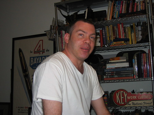
So I recently went over to Mike’s apartment, and lemme tell ya, it was worth the wait — he’s got some seriously amazing stuff. In addition to hundreds of uniform catalogs (we’ll get to those in a sec), he has some great vintage jerseys (I’ve gathered some of the nicest ones into a slideshow here), a super-cool price tag printer (inner view, front plate), a nifty little letterpress (note to Joe Hilseberg: Look what it’s called), tons of old block prints (see also here, here, and here), one of those totally boss Blatz displays (always wanted one of those myself), and a shitload of other stuff. Basically, if it’s related to sports and/or design, he collects it. He’s even got a bunch of Aussie rules football scarves (additional examples here, here, and here).
Some quick background on Mike: He’s 40 years old and grew up in Philly, where his parents were sports fans (“My father had all these old autographed leather chinstraps from the Eagles,” he says). They eventually got into the memorabilia biz, so Mike has spent plenty of time setting up tables and booths at collectibles shows, where he’s developed a good eye and a good feel for prices, appraisals, and so on. It’s also where he developed the collecting bug.
Mike studied design and illustration in school and has worked for a variety of clothing companies, including Polo, Abercrombie, and Hilfiger (at the moment he’s the director of men’s and women’s graphics for Polo’s rugby brand). All of those lines are fairly sporty, and Mike has specialized in coming up with graphics for T-shirts, hats, labels, hang tags, etc. — that’s where the old catalogs come in.
“If I want to design something, I’ll look at these old catalogs for inspiration,” he explains. “So if we want to do something based on, say, a 1930s football jersey, it’ll look authentic, instead of just mixing together various ‘retro’ elements from different eras. And if someone else at the company needs some visual reference, I’ll bring in one of my catalogs and charge them a usage fee.” (Man, I gotta get in on that racket.)
I don’t have the time or space to give the full scope of Mike’s knowledge and expertise, but trust me, this is all just a snapshot of the Mike Hersh Experience. His various collections offer a nearly inexhaustible supply of potential Uni Watch content (he’s like Ricko, only about 1200 miles closer to my house), but for now we’ll just stick to those catalogs, several of which he let me take home so I could scan and photograph them.
I’d love to give you a page-by-page breakdown of these gorgeous publications, but that would be too involved. Instead, I’ve chosen six catalogs and created a slideshow for each one. Here they are in chronological order: Wilson, 1939-40 (slideshow here, or you click on these thumbnails and then click on “All Sizes” to see super-sized versions); Lowe & Campbell, 1952-53 (slideshow, thumbnails); Southern, 1959 (slideshow, thumbnails); Wilson, 1960-61 (slideshow, thumbnails); Sand-Knit, 1972 (slideshow, thumbnails); and Champion, circa 1980 (slideshow, thumbnails). In addition, I scanned a bunch of pages from this old Rawlings fitting guide (slideshow, thumbnails), which isn’t really a catalog, but it’s certainly related. And how can you resist illustrations like this?
As for the catalogs that first led me to cross paths with Mike — the ones he outbid me on years ago — they’re nice but not particularly amazing. Good thing I didn’t win that auction — if I had, Mike and I would probably never have met.
Raffle Reminder: Today’s the last day to enter the raffle for 1996 Atlanta Olympics banner. For details, look here.
Uni Watch News Ticker: Spent last weekend in and around Binghamton. Amidst all the spiedies, shuffle-bowl, diners with great signs, amazing bars with friendly dogs, time-warped department stores, ice cream stands, state border markers (that’s the Pennsylvania side; here’s the New York side), and town line markers, I was very happy to find an entire wall of old baseball photos from the region. The Binghamton-Endicott-Johnson City area used to be home to the Triple Cities Triplets, a Yankees farm team, so many of the pics were of players who eventually made it to the Bronx, like Clete Boyer. There were also older shots from the pre-Triplets days, and this one, from the days when Johnson City was known as Lestershire. (All pics by Collateral Gammage, who saved the day when my camera went on the fritz.) ”¦ Tony DeLaTorre — whose name presents endless NOB possibilities, no? — notes that Orioles rookie Lou Montanez’s NOB is rather straight (“and no, it’s not because his arms are raised,” he adds). ”¦ Yesterday I asked if anyone knew more about this sleeve patch, which prompted a near-immediate response from Todd Radom: “The patch celebrates Detroit’s 250 anniversary. It’s the same one that the Tigers wore in 1951.” ”¦ Speaking of Todd, there’s a good interview with him here. ”¦ Tons of Nike art files available for download here, and Nike’s autumn catalogs can be accessed here (with thanks to Joe Hilseberg, who also pointed me toward the latest dispatch from the Color Mafia). ”¦ Here’s a 1980 Inside Sports article about the Durham Bulls’ uniforms (with thanks to Mike Pinkowski). ”¦ More uni-numbered Red Sox stirrups here and here (with thanks to Gabe Butler). ”¦ This photo from Houston’s Fan Day was posted in yesterday’s comments. Note that Johnson (second row from the back, far right) has a different nameplate typeface than everyone else. ”¦ As many of you know, the California Seals debuted in 1967 with a “C”-based logo and then became the Oakland Seals in December of that year, switching to an “O”-based logo. All of that is explained here. What’s not explained, however, and what I’ve never seen before, is the road jersey shown here (taken from this eBay listing), with the big “Seals” lettering. “I’m guessing that picture was taken before the season started,” says Teebz. “As far as I can tell, that road jersey was never actually worn in an NHL game. If it was, I’ve never seen a picture of it.” Must have been a prototype. ”¦ Insta-photoshopping in response to breaking news is fine, but not if you’re putting a defunct cap design on a traded player (good catch by Michael Miller). ”¦ Next year’s All-Star Game logo has already been turned into a patch. No stupid “TM” or ” ®” marks, either (with thanks to Jonathan Chin). ”¦ Oh man, this is soooooo gorgeous. ”¦ This one isn’t quite as nice but is still interesting. ”¦ Jeffrey Moulden notes that Brady Quinn has been practicing in a Schutt helmet, instead of his usual Riddell Revolution. ”¦ New helmet for Carson Palmer, too (compare to his old model). ”¦ I’d give anything for one of these (circa-1910 photo courtesy of Antonio Bradley). ”¦ Eric Longenhagen is a sophomore at Saint Joseph’s University in Philadelphia, an intern with the Lehigh Valley IronPigs, and an avid Uni Watch reader. He checks in with the following story: “Phillies reliever Rudy Seanez was scheduled to make a rehab appearance for us on Monday. He needed a size 7-1/4 home hat, but the merch. dept. was out of it. We called all over the Lehigh Valley, looking for a sporting goods store that had the right hat in the right size. No dice. So we tried to give him a flex-fit hat that looks exactly like the home hat — almost (the New Era logo is white instead of red, and the MiLB logo is all blue instead of red/blue). Seanez noticed these differences and refused to wear the hat. I have been openly nerdy when it comes to uniform-related topics, so I was told to ‘fix it.’ I took the flex-fit hat and Sharpied the white New Era flag red — simple enough. The problem was the blue embroidery on the MiLB logo. I eventually ook a small tack from an office bulletin board and used it to spread red tempera paint over the blue area. As far as I know, Mr. Seanez had no clue I had doctored his hat, and he pitched a perfect 8th inning.” ”¦ Best example ever of a two-part insignia creating the illusion of a typo (with thanks to Mike Petriello). ”¦ SI has five different covers for its college football preview issue, all viewable here. As Brent Hardman points out, all five covers feature teams sponsored by the same sportswear maker. Coincidence? … Mike Kemezis notes that Chinese Taipei’s batting helmets appear to have a raised logo patch (additional views here and here), similar to what the Cubs wear. ”¦ The Braves unveiled their Skip Caray memorial patch yesterday. It didn’t get to make its on-field debut, however, because the Braves/Cubs game was rained out. ”¦ Tom Farley sent along some absolutely incredible color football photos from the 1930s. This one is from the Marquette/Wisconsin game on 10/1/32 and shows that monochromatic uniforms go back further than we think. Can anyone tell me more about what the ref is holding? The next one shows a Packers/Cardinals game from either 1935 or ’36. And here’s the most astonishing one of the bunch: a Milwaukee high school team, circa mid-1930s. Great stuff.
“– notes that Orioles rookie Lou Montanez’s NOB is rather straight”
Thus another example of how a nameplate would benefit the consistency of NOB arches. Also the way the announcers pronounce it, there should be a tilde over the N.
…and love that letter press!!!!!
Check out this video from the 1993 Rose Bowl:
link
Notice that Michigan players are actually wearing two different styles of jerseys. Quarterbacks and some skill players are wearing the normal sleeves with the larger stripes, and everybody else seems to be wearing jerseys with much tighter fitting sleeves with elastic, smaller stripes, more akin to the away jerseys worn in the 70’s. Now, I know that Michigan always used a different jersey supplier for the bowl games than they did for the regular season, and it looks like the looser-fitting normal ones are Russell while the tighter ones are SandKnit or something like that.
Has anyone else ever seen anything like this from Michigan? It’s pretty bizarre to see two different jersey styles for one team… Also bizarre to see so many empty seats in the Rose Bowl.
I must know: What is the origin of that Rogers jersey in Mike Hersh’s collection? Anybody have any clues?
Also, I wonder if the Bpt. Nationals jersey has anything to do with the old national fishing championship in Bayport? Whatever the backstory, that script is almost exactly what the Washington Nationals should wear.
Nike has outdone themselves with the Korean baseball uniforms for the olymics: link
Interesting to see an older Packers team wearing green and gold – they would do that sometimes although they normally wore blue and gold until the 50s.
But oh, that Sand-Knit catalog! I remember going through one in high school (when I was a basketball manager and had reason to hang around the coach’s office) that was probably a year or two after that. That was the one with the iridescent colors. In fact, one of the schools in our conference – whose colors were maroon and gold – got one in hot pink instead of maroon. Those were the days…
[quote]And here’s the most astonishing one of the bunch: link, circa mid-1930s.[/quote]
wow…incredible shot
does that look like a scrimmage to anyone? seems offense and defense are wearing identical unis, but it’s hard to tell
…and what incredible unis those are!
Chad Johnson wants to legally be Chad Ocho Cinco.
link
That would mean a whole season of this…
link
Figured someone in the design department of Ralph Fn Lauren would wear a bit more than a white tee when having company over. Must be a NY thing.
[quote comment=”284505″]Figured someone in the design department of Ralph Fn Lauren would wear a bit more than a white tee when having company over. Must be a NY thing.[/quote]
It’s probably a 30-dollar white tee.
[quote comment=”284503″][quote]And here’s the most astonishing one of the bunch: link, circa mid-1930s.[/quote]
wow…incredible shot
does that look like a scrimmage to anyone? seems offense and defense are wearing identical unis, but it’s hard to tell
…and what incredible unis those are![/quote]
Awesome unis, but they look like seniors in college
On the SI covers…
THE Ohio State players have black socks (topic of discussion last week).
USC has both black and white.
UGA’s #33 has black gloves which aren’t legal.
[quote comment=”284504″]Chad Johnson wants to legally be Chad Ocho Cinco.
link
[/quote]
I think the most ironic last name to have or to change to would be “Anonymous”. There used to be an ad for Zellers (Canadian Wal-Mart-esque store) in the mid 90s where a kid said he did that.
The story about Rudy Seanez was interesting. Before and after photos would have made it awesome
[quote comment=”284505″]Figured someone in the design department of Ralph Fn Lauren would wear a bit more than a white tee when having company over. Must be a NY thing.[/quote]
Dude, you are WAY out of line. It had been 90something degrees that day, so he wore shorts and a tee. More to the point, he’s the host, it’s his house, he was doing me a favor by having me over — he can wear what he wants.
[quote comment=”284502″]Interesting to see an older Packers team wearing green and gold – they would do that sometimes although they normally wore blue and gold until the 50s.
[/quote]
True enough – as a collector of Lambeau-era Packers stuff, I’m entranced by photos like this one. So rare to see them in green (they also wore white with green in their 1939 championship season, but changed back to their traditional navy and gold for the title game itself.
The Milwaukee paper – think it might be the Sentinel, but it could have been the Journal – is a treasure trove of 1930s color sport photos. I particularly like these shots of the link at Spring Training in link).
[quote comment=”284503″][quote]And here’s the most astonishing one of the bunch: link, circa mid-1930s.[/quote]
wow…incredible shot
does that look like a scrimmage to anyone? seems offense and defense are wearing identical unis, but it’s hard to tell
…and what incredible unis those are![/quote]
Safe bet that’s a posed (or at least orchestrated) shot. Camera is on the ground and all the action is playing to it. That was done a lot back then, when lens length and shutter speeds were nothing like they are today, especially when involved with color photography. Players probably even moved in somewhat slo-mo to allow the lens to be closed down enough to get depth of field, but still stay open long enough the capture the color AND give the illusion of catching the action. Over the years, have come across many photos of this ilk. That’s why the teams in same unis…cuz wasn’t shot during a game. This almost certainly was a photographic exercise far more than shooting a sporting event, and probably was for a yearbook, or for advertising/commerical purposes.
—Ricko
[quote comment=”284504″]Chad Johnson wants to legally be Chad Ocho Cinco.
link
[/quote]
If he does that, I hope the Bengals trade him to the Rams.
[quote comment=”284504″]Chad Johnson wants to legally be Chad Ocho Cinco.
link
That would mean a whole season of this…
link
I don’t take Spanish classes (taking French against my will), but isn’t “Ocho Cinco” simply eight five? Does anybody know why he chose Spanish over any other language? If it says Ocho Cinco on his jersey in the Spanish version of Madden, how long before somebody messes it up and puts Eight Five or Eighty Five as his name in English?
[quote comment=”284512″][quote comment=”284503″][quote]And here’s the most astonishing one of the bunch: link, circa mid-1930s.[/quote]
wow…incredible shot
does that look like a scrimmage to anyone? seems offense and defense are wearing identical unis, but it’s hard to tell
…and what incredible unis those are![/quote]
Safe bet that’s a posed (or at least orchestrated) shot. Camera is on the ground and all the action is playing to it. That was done a lot back then, when lens length and shutter speeds were nothing like they are today, especially when involved with color photography. Players probably even moved in somewhat slo-mo to allow the lens to be closed down enough to get depth of field, but still stay open long enough the capture the color AND give the illusion of catching the action. Over the years, have come across many photos of this ilk. That’s why the teams in same unis…cuz wasn’t shot during a game. This almost certainly was a photographic exercise far more than shooting a sporting event, and probably was for a yearbook, or for advertising/commerical purposes.
—Ricko[/quote]
Cutline sounds like its from a football instructional book.
[quote comment=”284510″][quote comment=”284505″]Figured someone in the design department of Ralph Fn Lauren would wear a bit more than a white tee when having company over. Must be a NY thing.[/quote]
Dude, you are WAY out of line. It had been 90something degrees that day, so he wore shorts and a tee. More to the point, he’s the host, it’s his house, he was doing me a favor by having me over — he can wear what he wants.[/quote]
Paul, that was probably a joke.
[quote comment=”284508″]Next year’s All-Star Game logo has already been turned into a patch. No stupid “TM” or “®” marks, either[/quote]
Today’s e-mail from MLB refers to the game as “2009 Major League Baseball® All-Star Game® at Busch Stadium(TM) in St. Louis”
[quote comment=”284510″][quote comment=”284505″]Figured someone in the design department of Ralph Fn Lauren would wear a bit more than a white tee when having company over. Must be a NY thing.[/quote]
Dude, you are WAY out of line. It had been 90something degrees that day, so he wore shorts and a tee. More to the point, he’s the host, it’s his house, he was doing me a favor by having me over — he can wear what he wants.[/quote]
Of course he can. I just think its funny someone in the clothing industry has someone over who reports on clothing with the goal to look at books about clothing chose to wear a plain white tee. I find it ironic.
For some reason I’ve always hated multiple covers for a single issue of a magazine. I think it does a disservice to the reader. A single cover edits the story down to one point. Don’t send me (here in Louisiana) an LSU cover, and send my friend in St. Louis a Mizzou cover. Make an editorial decision and stick with it!
I could go on and on, but I’m getting off topic here…
TAIWAN TAIWAN TAIWAN. It had to be said. As someone of Taiwanese descent, it irks me more than you know that the team from Taiwan has to be called ‘Chinese Taipei’. It’s like calling America ‘British Washington D.C.’, but much worse.
That gripe aside, the vertical Brooklyn placard is magnificent, and, strangely arousing.
I’ve been watching the Olympics, and it’s funny that many teams outside the US don’t go with the plain last name on back of their unis–especially in volleyball. The Japanese women’s team had one woman with her first name on it (Erika) and another with a nickname (Shin). The Venezualean men’s team had their first names on it with a last initial if needed. The Chinese men’s basketball team had last name, but with a first initial after if needed, whilst Yao Ming had, well, Yao Ming on his uni. Very amusing.
As to why Kerri Walsh wore her wedding ring whilst playing, it was of sentimental value to her, and women rarely take off their wedding rings (from what I’ve been told).
[quote comment=”284514″][quote comment=”284504″]Chad Johnson wants to legally be Chad Ocho Cinco.
link
That would mean a whole season of this…
link
I don’t take Spanish classes (taking French against my will), but isn’t “Ocho Cinco” simply eight five? Does anybody know why he chose Spanish over any other language? If it says Ocho Cinco on his jersey in the Spanish version of Madden, how long before somebody messes it up and puts Eight Five or Eighty Five as his name in English?[/quote]
Sounds catchier and actually fits on a nameplate.
Also, it’s essentially vernacular to call a number by its digits nowadays (though I’m not a fan and don’t do it). Examples: Shortly after leaving the Vikings, Randy Moss made a TV spot where he said, “This is Randy Moss, number one-eight for the Oakland Raiders, and you’re watching SportsCenter.” When Chris Henry got arrested (don’t remember which time, but he had his jersey on at the time), he was quoted as saying, “Do you have any idea who I am? I’m Chris Henry, number one-five for the Cincinnati Bengals! Don’t believe me? Look. It says right here. H-E-N-R-Y.”
“Ocho Cinco” is like how you say the area code. “I got my peeps in the 4-1-5.”
“I’m Tuala Manunupalolalalo, I play center for University of Hawaii. Says so right here on my jersey: ‘Hawaii five-oh.'”
Sorry. Couldn’t resist a groaner nice and early in the a.m.
–Ricko
(I’ll go back and lie by my bowl now.)
“Steve Heinz, 5-7” just doesn’t have the right ring to it.
[quote comment=”284518″][quote comment=”284510″][quote comment=”284505″]Figured someone in the design department of Ralph Fn Lauren would wear a bit more than a white tee when having company over. Must be a NY thing.[/quote]
Dude, you are WAY out of line. It had been 90something degrees that day, so he wore shorts and a tee. More to the point, he’s the host, it’s his house, he was doing me a favor by having me over — he can wear what he wants.[/quote]
Of course he can. I just think its funny someone in the clothing industry has someone over who reports on clothing with the goal to look at books about clothing chose to wear a plain white tee. I find it ironic.[/quote]
Whats funny, is that both you and Paul jumped all over Mike K for something that wasn’t even a slight. He never said that the guy couldn’t or shouldn’t wear the T-shirt, he just pointed out that it was a casual look for someone in his position at RL. Maybe we would have been less surprised if he had been photographed in a white tie, shorts, and a tennis racket. I have to say learning he is from Philly, I think he could pull off the black Rocky short brimmed fedora — In the T-Shirt!
[quote comment=”284502″]Interesting to see an older Packers team wearing green and gold – they would do that sometimes although they normally wore blue and gold until the 50s.
But oh, that Sand-Knit catalog! I remember going through one in high school (when I was a basketball manager and had reason to hang around the coach’s office) that was probably a year or two after that. That was the one with the iridescent colors. In fact, one of the schools in our conference – whose colors were maroon and gold – got one in hot pink instead of maroon. Those were the days…[/quote]
I love the tri-color vertically striped basketball warmup pants.
And did you notice the “basketball hose”? Just like baseball stirrups!
I wonder if the football referee is holding some sort of stake used to mark the position of a football for the next play (before the head linesman started using the foot to spot the ball)?
[quote comment=”284510″][quote comment=”284505″]Figured someone in the design department of Ralph Fn Lauren would wear a bit more than a white tee when having company over. Must be a NY thing.[/quote]
Dude, you are WAY out of line. It had been 90something degrees that day, so he wore shorts and a tee. More to the point, he’s the host, it’s his house, he was doing me a favor by having me over — he can wear what he wants.[/quote]
was prolly a joke, albeit one in which he could take a shot a “Ralph Fn Lauren”
just like the unnecessary shots at the swoosh, why the jab at RL?
[quote comment=”284522″]”Ocho Cinco” is like how you say the area code. “I got my peeps in the 4-1-5.”[/quote]
Or like how many athletes refer to one another, “Great catch eight-five!”
[quote comment=”284528″]I wonder if the football referee is holding some sort of stake used to mark the position of a football for the next play (before the head linesman started using the foot to spot the ball)?[/quote]
Off topic, but I always found it funny that the exact spot to the inch is so important on all those plays being measured with the sticks but most plays seem rather arbitrarily placed. And whose to say the guy with at the start of the chain is standing at the right spot to begin with?
[quote comment=”284529″][quote comment=”284510″][quote comment=”284505″]Figured someone in the design department of Ralph Fn Lauren would wear a bit more than a white tee when having company over. Must be a NY thing.[/quote]
Dude, you are WAY out of line. It had been 90something degrees that day, so he wore shorts and a tee. More to the point, he’s the host, it’s his house, he was doing me a favor by having me over — he can wear what he wants.[/quote]
was prolly a joke, albeit one in which he could take a shot a “Ralph Fn Lauren”
just like the unnecessary shots at the swoosh, why the jab at RL?[/quote]
Sorry if I was offensive. I just meant to put ironic emphasis on the perceived “hoity-toityness” of Ralph Lauren vs the plain white tee. Honestly didn’t think I was out of the normal cynical nature of the blog, but I can understand maybe its bad form to be cynical towards the blogger’s interview subject that he met personally as opposed to perhaps some corporate entity like Nike.
I believe Ochenta y Cinco (literally eighty and five) would be the appropriate translation. Talk about a wacky nameplate.
[quote comment=”284511″][quote comment=”284502″]Interesting to see an older Packers team wearing green and gold – they would do that sometimes although they normally wore blue and gold until the 50s.
[/quote]
True enough – as a collector of Lambeau-era Packers stuff, I’m entranced by photos like this one. So rare to see them in green (they also wore white with green in their 1939 championship season, but changed back to their traditional navy and gold for the title game itself.
The Milwaukee paper – think it might be the Sentinel, but it could have been the Journal – is a treasure trove of 1930s color sport photos. I particularly like these shots of the link at Spring Training in link).[/quote]
Chance,
As I am obsessed as well by ANY pre-1970 NFL photo and based on my own research, I taking a stab and saying the color shot is from the 9/13/36 game between the Chi Cardinals and the Packers. Note the Cardinals with white stripes on the red helmet, the NW sleeve stripes and I had the pants as khaki with rear stripes (I’ll explain someday) and socks to match the sleeves.
It looks to be a nice sunny early season day in GB, so I would say with 90% certainty that this game is 9/13/36.
[quote comment=”284534″][quote comment=”284529″][quote comment=”284510″][quote comment=”284505″]Figured someone in the design department of Ralph Fn Lauren would wear a bit more than a white tee when having company over. Must be a NY thing.[/quote]
Dude, you are WAY out of line. It had been 90something degrees that day, so he wore shorts and a tee. More to the point, he’s the host, it’s his house, he was doing me a favor by having me over — he can wear what he wants.[/quote]
was prolly a joke, albeit one in which he could take a shot a “Ralph Fn Lauren”
just like the unnecessary shots at the swoosh, why the jab at RL?[/quote]
Sorry if I was offensive. I just meant to put ironic emphasis on the perceived “hoity-toityness” of Ralph Lauren vs the plain white tee. Honestly didn’t think I was out of the normal cynical nature of the blog, but I can understand maybe its bad form to be cynical towards the blogger’s interview subject that he met personally as opposed to perhaps some corporate entity like Nike.[/quote]
What really set me off was the “Must be a NY thing” line, as if we’re all slobs here… And yes, I thought it was bad form to mock someone who basically opened his home to me (and, by extension, to all of us).
Understood. My apologies to you and Mr Hersh.
Paul, hey thanks for the interview and a thanks to Mr Hersh for sharing some of his cool collection with all of us. Really neat that he is using the history of sports wear and apparral for modern day inspriration / interpretation.
–SS
paul I might have just been imagining but I was watching the redskin/bills game and chris cooley also had on a new helmet any pictures or information at first it looked like the ion but not sure sorry no pics yet
They may lack the flair of the high schoolers, but love those Chicago Cardinal unis: powder blues beneath the cardinal red, bold stripes on the socks. The Packers, however, look prophetic of the current disasters with the silly sheen on the gold pants (see 49ers and Rams as the worst offenders). And no stripes?
[quote comment=”284536″][quote comment=”284511″][quote comment=”284502″]Interesting to see an older Packers team wearing green and gold – they would do that sometimes although they normally wore blue and gold until the 50s.
[/quote]
True enough – as a collector of Lambeau-era Packers stuff, I’m entranced by photos like this one. So rare to see them in green (they also wore white with green in their 1939 championship season, but changed back to their traditional navy and gold for the title game itself.
The Milwaukee paper – think it might be the Sentinel, but it could have been the Journal – is a treasure trove of 1930s color sport photos. I particularly like these shots of the link at Spring Training in link).[/quote]
Chance,
As I am obsessed as well by ANY pre-1970 NFL photo and based on my own research, I taking a stab and saying the color shot is from the 9/13/36 game between the Chi Cardinals and the Packers. Note the Cardinals with white stripes on the red helmet, the NW sleeve stripes and I had the pants as khaki with rear stripes (I’ll explain someday) and socks to match the sleeves.
It looks to be a nice sunny early season day in GB, so I would say with 90% certainty that this game is 9/13/36.[/quote]
Don’t know about that – in 1935 the Packers played the Cardinals at home on link, so link could easily be either year. The caption isn’t much help – Field and Nichelini played for the Cards both seasons.
[quote comment=”284541″]They may lack the flair of the high schoolers, but love those Chicago Cardinal unis: powder blues beneath the cardinal red, bold stripes on the socks. The Packers, however, look prophetic of the current disasters with the silly sheen on the gold pants (see 49ers and Rams as the worst offenders). And no stripes?[/quote]
The Packers experimented with many different link in those days. Sort of the precursor to Dri-FIT and ClimaLite.
And while stripes are good in general, my link didn’t have them, either.
[quote comment=”284542″][quote comment=”284536″][quote comment=”284511″][quote comment=”284502″]Interesting to see an older Packers team wearing green and gold – they would do that sometimes although they normally wore blue and gold until the 50s.
[/quote]
True enough – as a collector of Lambeau-era Packers stuff, I’m entranced by photos like this one. So rare to see them in green (they also wore white with green in their 1939 championship season, but changed back to their traditional navy and gold for the title game itself.
The Milwaukee paper – think it might be the Sentinel, but it could have been the Journal – is a treasure trove of 1930s color sport photos. I particularly like these shots of the link at Spring Training in link).[/quote]
Chance,
As I am obsessed as well by ANY pre-1970 NFL photo and based on my own research, I taking a stab and saying the color shot is from the 9/13/36 game between the Chi Cardinals and the Packers. Note the Cardinals with white stripes on the red helmet, the NW sleeve stripes and I had the pants as khaki with rear stripes (I’ll explain someday) and socks to match the sleeves.
It looks to be a nice sunny early season day in GB, so I would say with 90% certainty that this game is 9/13/36.[/quote]
Don’t know about that – in 1935 the Packers played the Cardinals at home on link, so link could easily be either year. The caption isn’t much help – Field and Nichelini played for the Cards both seasons.[/quote]
chance,
You could be right (note I did allow myself a 10% error margin!!). :)
I have the Cardinals wearing the same style unis in 1935, too. Did the Packers wear the exact same style unis in 35 as they did in 36??
Not really sports related at all, but NBC (the Olympic uberstation) has unveiled link.
Does the team formerly known as the Seattle SuperSonics have a new name and identity yet? Is there a date when this is supposed to be announced? When Paul said in his ESPN article, “Any minute now, the team will announce its new name, new colors and new uniform set,” I thought he meant there was literally going to be a press conference in a few minutes or hours, where the new name and digs would all be showcased.
[quote comment=”284545″]Not really sports related at all, but NBC (the Olympic uberstation) has unveiled link.[/quote]
My bad: they unveiled them months ago, but have not implemented the change due to costs, etc… Too bad, they look nicer.
Any timeline for the College Football uniform changes rundown?
I know that Michigan State has continued its tradition of change by adding a thick green stripe to their pants. Looks bad IMO.
[quote comment=”284543″]And while stripes are good in general, my link didn’t have them, either.[/quote]
that curly & don hutson?
freakin’ BEAUTIFUL picture
[quote comment=”284549″][quote comment=”284543″]And while stripes are good in general, my link didn’t have them, either.[/quote]
that curly & don hutson?
freakin’ BEAUTIFUL picture[/quote]
Colors look a lot different in some of the really old photos, almost colorized. Are they or was film just developed differently back then. It looks as if the saturation levels are turned way up.
[quote comment=”284549″][quote comment=”284543″]And while stripes are good in general, my link didn’t have them, either.[/quote]
that curly & don hutson?
freakin’ BEAUTIFUL picture[/quote]
Yeah, it is. Was just thinking about that, in fact. We see so much of b&w footage and photos, and so many images of snowy, rainy games in old-time stadia that I think sometimes we forget that those guys playing in autumn sunshine, too, and on those days the colors were bright and vivid. That aspect we rarely get to see.
Something new like a red helmet with a white stripe or two must have been electric after all those years of canvas pants and leather helmets. And as much as I’d love to go back in time for memorable championships games, the perfect day really might be Green Bay under a blue September sky, watching Don Huston in classic navy and yellow-gold beat somebody in a red jersey deep on green-green grass.
—Ricko
The vast majority of teams in college football wear Nike jerseys, I’m not sure why there needs to be a conspiracy theory about the teams featured on SI.
I normally believe Nike placement conspiracy theories, but not in the case of those SI covers. If Nike was involved, you know the players would have been covered in wrist bands, arm bands, tribal undershirts, do-rags, visors, and anything else with swooshes.
re: Packers-Cardinals color photo. I’d be willing to bet serious money the Cardinals pants were silver-gray (well, gray, most likely) and not “powder blue”? Having trouble imagining a pro team in the mid-30’s going to powder blue. Gray seems a heckuva lot more likely.
It appears that whoever wrote the cutline was going by what he thought he saw in the photo, not by what he’d have seen had he actually been at the game.
After all, I keep reading how the WHA Chicago Cougars wore “dark green”, which I think comes from people id’ing colors from old photos, and perhaps not realizing they had a set of black breezers, too. No sir, was Kelly. I saw them play enough times to know that for sure.
Timmy B., YOUR thoughts on the silver or powder blue?
—Ricko
I am just flabbergasted by the abundance of riches in today’s post. Unbelievable.
Long live the Union Hotel!
Saw this picture of link and immediately thought of FNOB.
Also Paul, good to see you were kicking around my old stomping grounds. I haven’t had spiedies in a while.
[quote comment=”284554″]re: Packers-Cardinals color photo. I’d be willing to bet serious money the Cardinals pants were silver-gray (well, gray, most likely) and not “powder blue”? Having trouble imagining a pro team in the mid-30’s going to powder blue. Gray seems a heckuva lot more likely.
Timmy B., YOUR thoughts on the silver or powder blue?
—Ricko[/quote]
Ricko,
I’m with ya on the silver-gray for the 35-36 Cardinals! No way would they be powder blue. In this era, i think color football pants were just starting to flower from the days of khaki.
BTW, in 1937, the Cardinals would break into the basic design that held them over for decades to come: white “hat”/plain red jerseys/white pants/plain red socks.
[quote comment=”284557″][quote comment=”284554″]re: Packers-Cardinals color photo. I’d be willing to bet serious money the Cardinals pants were silver-gray (well, gray, most likely) and not “powder blue”? Having trouble imagining a pro team in the mid-30’s going to powder blue. Gray seems a heckuva lot more likely.
Timmy B., YOUR thoughts on the silver or powder blue?
—Ricko[/quote]
Ricko,
I’m with ya on the silver-gray for the 35-36 Cardinals! No way would they be powder blue. In this era, i think color football pants were just starting to flower from the days of khaki.
BTW, in 1937, the Cardinals would break into the basic design that held them over for decades to come: white “hat”/plain red jerseys/white pants/plain red socks.[/quote]
In that photo the Cardinals look a lot like the Calgary Stampeders of a few years later.
I assume you noticed the red stripes on back of pantlegs show on a couple of the players in that photo?
Clicking on a link today from your post I noticed a little something… The link, which is trying to become the premiere women’s tackle football league now that the WPFL is gone (which actually was professional), has a link that looks remarkably like that link on the link. Yea, I know what you are saying about women’s tackle football… but can you really complain about link or link?
Oh.. and an AWESOME jpb on today’s post!!!
[quote comment=”284544″][quote comment=”284542″][quote comment=”284536″]
It looks to be a nice sunny early season day in GB, so I would say with 90% certainty that this game is 9/13/36.[/quote]
Don’t know about that – in 1935 the Packers played the Cardinals at home on link, so link could easily be either year. The caption isn’t much help – Field and Nichelini played for the Cards both seasons.[/quote]
chance,
You could be right (note I did allow myself a 10% error margin!!). :)
I have the Cardinals wearing the same style unis in 1935, too. Did the Packers wear the exact same style unis in 35 as they did in 36??[/quote]
Aaaargh! Curse my faulty memory.
Just checked link, and the Packers adopted the raglan sleeve style during the 1935 season. Given that the Cards were the 1935 season opener, I have to say with some conviction that you were right the first time, it’s September 13, 1936.
[quote comment=”284549″][quote comment=”284543″]And while stripes are good in general, my link didn’t have them, either.[/quote]
that curly & don hutson?
freakin’ BEAUTIFUL picture[/quote]
Yep, that’s Don with Curly, circa 1944.
As to the colors, there’s another copy of the same picture link with a different saturation level.
[quote comment=”284557″]I’m with ya on the silver-gray for the 35-36 Cardinals! No way would they be powder blue. In this era, i think color football pants were just starting to flower from the days of khaki.
[/quote]
The Packers have been wearing color pants since the 1920s. Of course, it helps that their color is gold…. :P
Sunday, January 18, 2009 will see Glenn Anderson’s jersey raised to the rafters at Rexall Place in Edmonton.
What seems odd to me is that of all the jersey banners hanging from the ceiling in Rexall Place, four of seven of them (including Anderson’s) have been done in front of the Phoenix Coyotes. Is Gretzky’s presence really needed?
Al Hamilton – October 10, 1980 vs Quebec Nordiques
Wayne Gretzky – October 1, 1999 vs New York Rangers
Jari Kurri – October 6, 2001 vs Phoenix Coyotes
Grant Fuhr – October 9, 2003 vs San Jose Sharks
Paul Coffey – October 18, 2005 vs Phoenix Coyotes
Mark Messier – February 27, 2007 vs Phoenix Coyotes
Glenn Anderson – January 18, 2009 vs Phoenix Coyotes
[quote comment=”284560″][quote comment=”284544″][quote comment=”284542″][quote comment=”284536″]
It looks to be a nice sunny early season day in GB, so I would say with 90% certainty that this game is 9/13/36.[/quote]
Don’t know about that – in 1935 the Packers played the Cardinals at home on link, so link could easily be either year. The caption isn’t much help – Field and Nichelini played for the Cards both seasons.[/quote]
chance,
You could be right (note I did allow myself a 10% error margin!!). :)
I have the Cardinals wearing the same style unis in 1935, too. Did the Packers wear the exact same style unis in 35 as they did in 36??[/quote]
Aaaargh! Curse my faulty memory.
Just checked link, and the Packers adopted the raglan sleeve style during the 1935 season. Given that the Cards were the 1935 season opener, I have to say with some conviction that you were right the first time, it’s September 13, 1936.[/quote]
I would agree that it’s Sept. 13, 1936, given all that gold in the Packers’ uniform.
From the Packers’ 2008 media guide: “1935-36: Team introduced green (as primary color) and changed jerseys during (1935) season; began with plain dark green jersey with gold numbers and green pants, then shifted to green-vested shirts with bright gold sleeves (from neck to wrist), number and pants, and tall, plain green socks.”
[quote comment=”284519″]For some reason I’ve always hated multiple covers for a single issue of a magazine. I think it does a disservice to the reader. A single cover edits the story down to one point. Don’t send me (here in Louisiana) an LSU cover, and send my friend in St. Louis a Mizzou cover. Make an editorial decision and stick with it!
I could go on and on, but I’m getting off topic here…[/quote]
It’s a business. You sell more magazines (in theory) in St. Louis if Mizzou is on the cover than if LSU is on the cover, and vice versa. That’s the whole point.
Murrow died a long time ago. The media is about making money now, pure and simple.
[quote comment=”284531″][quote comment=”284522″]”Ocho Cinco” is like how you say the area code. “I got my peeps in the 4-1-5.”[/quote]
Or like how many athletes refer to one another, “Great catch eight-five!”[/quote]
True, but Chad calls himself “Eighty Five”
Vid: link
Also: He says that he used Spanish because of Spanish Heritage Month (October) being celebrated in the NFL a couple of years.
[quote comment=”284532″][quote comment=”284528″]I wonder if the football referee is holding some sort of stake used to mark the position of a football for the next play (before the head linesman started using the foot to spot the ball)?[/quote]
Off topic, but I always found it funny that the exact spot to the inch is so important on all those plays being measured with the sticks but most plays seem rather arbitrarily placed. And whose to say the guy with at the start of the chain is standing at the right spot to begin with?[/quote]
Shhhhh. You’ve discovered one of the dirty little secrets of football officiating. I won’t tell you the other one.
[quote comment=”284553″]I normally believe Nike placement conspiracy theories, but not in the case of those SI covers. If Nike was involved, you know the players would have been covered in wrist bands, arm bands, tribal undershirts, do-rags, visors, and anything else with swooshes.[/quote]
I also doubt that SI ranks the schools based on their apparell affiliation. The five teams on the covers are also the top 5 teams in SI’s preseason poll, and they just so happen to be Nike schools. I don’t think there are any shenanigans invovled.
[quote comment=”284566″][quote comment=”284531″][quote comment=”284522″]”Ocho Cinco” is like how you say the area code. “I got my peeps in the 4-1-5.”[/quote]
Or like how many athletes refer to one another, “Great catch eight-five!”[/quote]
True, but Chad calls himself “Eighty Five”
Vid: link
Also: He says that he used Spanish because of Spanish Heritage Month (October) being celebrated in the NFL a couple of years.[/quote]
Also in that vid: He has the other non-Revo facemask he wears in the backgroung in his locker next to his standard helmet.
[quote comment=”284566″][quote comment=”284531″][quote comment=”284522″]”Ocho Cinco” is like how you say the area code. “I got my peeps in the 4-1-5.”[/quote]
Or like how many athletes refer to one another, “Great catch eight-five!”[/quote]
True, but Chad calls himself “Eighty Five”
Vid: link
Also: He says that he used Spanish because of Spanish Heritage Month (October) being celebrated in the NFL a couple of years.[/quote]
Sorry wrong vid. Proper vid: link
[quote comment=”284570″][quote comment=”284566″][quote comment=”284531″][quote comment=”284522″]”Ocho Cinco” is like how you say the area code. “I got my peeps in the 4-1-5.”[/quote]
Or like how many athletes refer to one another, “Great catch eight-five!”[/quote]
True, but Chad calls himself “Eighty Five”
Vid: link
Also: He says that he used Spanish because of Spanish Heritage Month (October) being celebrated in the NFL a couple of years.[/quote]
Sorry wrong vid. Proper vid: link
I don’t know why this isn’t working right: link
[quote comment=\\\”284570\\\”][quote comment=\\\”284566\\\”][quote comment=\\\”284531\\\”][quote comment=\\\”284522\\\”]\\\”Ocho Cinco\\\” is like how you say the area code. \\\”I got my peeps in the 4-1-5.\\\”[/quote]
Or like how many athletes refer to one another, \\\”Great catch eight-five!\\\”[/quote]
True, but Chad calls himself \\\”Eighty Five\\\”
Vid: link
Also: He says that he used Spanish because of Spanish Heritage Month (October) being celebrated in the NFL a couple of years.[/quote]
Sorry wrong vid. Proper vid: link
I don\\\’t know why this isn\\\’t working right: link
Okay my computer is screwed up…
[quote]You’ve discovered one of the dirty little secrets of football officiating. I won’t tell you the other one.[/quote]
42 was fixed?
/err…SBXLII
[quote comment=”284523″]“I’m Tuala Manunupalolalalo, I play center for University of Hawaii. Says so right here on my jersey: ‘Hawaii five-oh.'”[/quote]
Um, Ricko. You do know there’s plans for a new version of that series. Wonder who’ll play Kam Fong as Chin Ho? And play the son of Jack Lord’s iron helmet hair? Or Zulu as Kono? (BTW, the helmet comment was uni related.)
[quote comment=”284574″][quote]You’ve discovered one of the dirty little secrets of football officiating. I won’t tell you the other one.[/quote]
42 was fixed?
/err…SBXLII[/quote]
News to me. But SB XL was.
[quote comment=”284563″]Sunday, January 18, 2009 will see Glenn Anderson’s jersey raised to the rafters at Rexall Place in Edmonton.
What seems odd to me is that of all the jersey banners hanging from the ceiling in Rexall Place, four of seven of them (including Anderson’s) have been done in front of the Phoenix Coyotes. Is Gretzky’s presence really needed?
Al Hamilton – October 10, 1980 vs Quebec Nordiques
Wayne Gretzky – October 1, 1999 vs New York Rangers
Jari Kurri – October 6, 2001 vs Phoenix Coyotes
Grant Fuhr – October 9, 2003 vs San Jose Sharks
Paul Coffey – October 18, 2005 vs Phoenix Coyotes
Mark Messier – February 27, 2007 vs Phoenix Coyotes
Glenn Anderson – January 18, 2009 vs Phoenix Coyotes[/quote]
I somewhat agree, but you gotta think, he’s getting his number retired for his days as an Oiler. Winning all those cups and games you want members of those teams there and not to have him there would blatenly (sp?) obvious because he was a huge part of those teams. Plus he’s there anyways coaching a couple times a year, so just schedule it while he’s there it’s like killing two birds with one stone.
Is this really what the world needs:
link
[quote comment=”284578″]Is this really what the world needs:
link[/quote]
Certainly from the fashion department, because they’d never be able to hang their hat on “authentic”.
(pun intended)
—Ricko
Looking at this baseball image from the 1972 Sand-Knit catalogue:
link
I’m astounded by the big uniform on the left page. It looks a lot more like a Roller Derby jersey than a baseball jersey. If the number were in a circle, this guy could’ve been playing for the Bay Area Bombers or the Northeast Braves … Jammer helmet, anyone? And do any real samples of this uni exist?
“What really set me off was the “Must be a NY thing” line, as if we’re all slobs here… ”
you mean you’re not? huh, who knew? just kidding – that was a layup!
The referee is holding the “down box,” the predecessor of the sideline stake that shows the number of the down and the yard line of the snap. Each of the four sides of the box has a number — 1, 2, 3, or 4 — and the number facing the field is that of the down. Officiating mechanics have long since moved the “box,” which is what officials usually call it even though no one has used an actual box in probably 40 years, off the field.
link
has anyone ever seen a team wear anything like those?! on ANY level??? If anyone has, i would LOVE to see an on-field photo of that.
[quote comment=”284583″]http://www.flickr.com/photos/65516705@N00/2744540036/sizes/l/in/set-72157606612748559/
has anyone ever seen a team wear anything like those?! on ANY level??? If anyone has, i would LOVE to see an on-field photo of that.[/quote]
A team in the old Continental Football League of the early 60s had sleeves stripes something like the one on the lower right. Not the shoulder pattern, just the sleeves. Remember thinking they looked like sergeant’s stripes. This is first I’ve seen since then.
Wanna say…Indianapolis Capitals, maybe?
[quote comment=”284583″]http://www.flickr.com/photos/65516705@N00/2744540036/sizes/l/in/set-72157606612748559/
has anyone ever seen a team wear anything like those?! on ANY level??? If anyone has, i would LOVE to see an on-field photo of that.[/quote]
Reminds me of this:
link
I know it’s hockey and not football, but that’s they way my hockey obsessed mind works…
Lots of Continental Football League stuff here, I guess. If you become a member. May look into that. There’s video, too.
link
[quote comment=”284564″][quote comment=”284560″][quote comment=”284544″][quote comment=”284542″][quote comment=”284536″]
It looks to be a nice sunny early season day in GB, so I would say with 90% certainty that this game is 9/13/36.[/quote]
Don’t know about that – in 1935 the Packers played the Cardinals at home on link, so link could easily be either year. The caption isn’t much help – Field and Nichelini played for the Cards both seasons.[/quote]
chance,
You could be right (note I did allow myself a 10% error margin!!). :)
I have the Cardinals wearing the same style unis in 1935, too. Did the Packers wear the exact same style unis in 35 as they did in 36??[/quote]
Aaaargh! Curse my faulty memory.
Just checked link, and the Packers adopted the raglan sleeve style during the 1935 season. Given that the Cards were the 1935 season opener, I have to say with some conviction that you were right the first time, it’s September 13, 1936.[/quote]
I would agree that it’s Sept. 13, 1936, given all that gold in the Packers’ uniform.
From the Packers’ 2008 media guide: “1935-36: Team introduced green (as primary color) and changed jerseys during (1935) season; began with plain dark green jersey with gold numbers and green pants, then shifted to green-vested shirts with bright gold sleeves (from neck to wrist), number and pants, and tall, plain green socks.”[/quote]
jeff, chance & ricko,
great great info! I will tweak my 1935 records accordingly.
thanks!
Hoping I can figure out how to post a link of an amusing/horrifying example of “logo creep.”
The Oregon Commentator – a student publication at the University of Oregon – released a summer issue titled “Hot Sexy Summer Issue Featuring Uncle Phil.”
The cover photo(shop) is aptly described as “[p]ossibly our most disturbing cover ever.”
The cover photo is here(?): link
If that didn’t work, the journal’s website/blog can be found at link (where there are also some interesting striped socks about 1/4 down the page.
No problem. What records are you keeping?
[quote comment=”284559″]Clicking on a link today from your post I noticed a little something… The link, which is trying to become the premiere women’s tackle football league now that the WPFL is gone (which actually was professional), has a link that looks remarkably like that link on the link. Yea, I know what you are saying about women’s tackle football… but can you really complain about link or link?
Oh.. and an AWESOME jpb on today’s post!!![/quote]
Speaking as someone who has to listen to Anita Marks on his way home from work everyday if he wants sports-talk radio, I say you can have her! I wish she would go back to Miami.
[quote comment=”284576″][quote comment=”284574″][quote]You’ve discovered one of the dirty little secrets of football officiating. I won’t tell you the other one.[/quote]
42 was fixed?
/err…SBXLII[/quote]
News to me. But SB XL was.[/quote]
God, this sh** again.
Look, you push off and get separation right before you catch a touchdown pass, that’s offensive pass interference every day of the week, every game of the year, first preseason game to Super Bowl. Those who wrote and pontificated that “you don’t make that call there” know absolutely nothing about how it works. A foul is there, you call the foul or you’re not there to call the next one.
Sean Locklear was holding. Plain as day. He had the defender’s arm wrapped up in his arm, up and under the armpit, and delayed his pursuit to the quarterback. That’s a hold. Today, tomorrow, Sunday, next year, last year, tonight.
Big Ben’s touchdown was a bad call, and the linesman came in and first raised one arm (the signal for “play over”) before raising the other one. And the Hasselbeck block thing was a missed call.
But mistaking ineptitude for game-fixing is the height of immaturity. Surpassed possibly only by people who refuse to let it go years after the fact.
About Lorenzo Neal’s new number with the Raven’s….
“Neal, who is wearing No. 42, would like to get his old No. 41. The only problem is that number currently belongs to cornerback Frank Walker. “I’ve probably got to spend some money to get my old number back,” Neal said with a smile.”
BTW, in the FC Twente-Arsenal Third Qualifying Round UEFA Champions League match, the Gooners are wearing their EPL player identifacation lettering and numbers on their yellow clash kits.
[quote comment=”284576″][quote comment=”284574″][quote]You’ve discovered one of the dirty little secrets of football officiating. I won’t tell you the other one.[/quote]
42 was fixed?
/err…SBXLII[/quote]
News to me. But SB XL was.[/quote]
Somebody out their has to have the video that they showed where he was asked what was it like to win the Super Bowl. It aired during the game, part of an interview about his career. Some people thought it was a mistake, and that the question was supposed to be what would it be like, what was it like, but then all of the big fixed plays started happening soon after that.
check out this picture –
link
shows a great detail of the letter and number stitching, and also shows how bad the art of stitching has gotten. It looks terrible! And that kiss cut technique has got to go.
link
link
I know, Phil, cats aren’t funny, but there was a point to be made about the first photo.
[quote comment=”284591″][quote comment=”284559″]Clicking on a link today from your post I noticed a little something… The link, which is trying to become the premiere women’s tackle football league now that the WPFL is gone (which actually was professional), has a link that looks remarkably like that link on the link. Yea, I know what you are saying about women’s tackle football… but can you really complain about link or link?
Oh.. and an AWESOME jpb on today’s post!!![/quote]
Speaking as someone who has to listen to Anita Marks on his way home from work everyday if he wants sports-talk radio, I say you can have her! I wish she would go back to Miami.[/quote]
I saw that a lot out on a few blogs when I was looking for the pic… In person, I can say she blew in thinking her team would dominate our league and got their a**es handed to them, and then they were gone!
[quote comment=”284586″]Lots of Continental Football League stuff here, I guess. If you become a member. May look into that. There’s video, too.
link
Becoming a member takes all of 37 seconds (probably less if you’re not loopy after waking up from a nap like I just was when I signed up).
Not sure if anyone has posted this or seen this before…but product placement done run amok. From a recent field upgrade at Shenandoah University in Winchester VA (D3 athletics).
link
Here is the close up view of the corner
link
[quote comment=”284601″]Not sure if anyone has posted this or seen this before…but product placement done run amok. From a recent field upgrade at Shenandoah University in Winchester VA (D3 athletics).
link
That’s logo creep, not product placement. Product placement would be having the coach use a Sprint phone to call in a play to the quarterback, who would also use a Sprint phone.
[quote comment=”284597″]check out this picture –
link
shows a great detail of the letter and number stitching, and also shows how bad the art of stitching has gotten. It looks terrible! And that kiss cut technique has got to go.[/quote]
Good to see that the Ravens are keeping their helmets up to date: New NFL logo sticker. And, although that jersey is white (defense), anybody else think that the red jerseys the QBs are wearing for the Ravens look better than the purple jerseys (other than Paul)?
Red: link
Purple: link (And yes, I chose that pic because he is always on the ground.)
[quote comment=”284604″][quote comment=”284597″]check out this picture –
link
shows a great detail of the letter and number stitching, and also shows how bad the art of stitching has gotten. It looks terrible! And that kiss cut technique has got to go.[/quote]
Good to see that the Ravens are keeping their helmets up to date: New NFL logo sticker. And, although that jersey is white (defense), anybody else think that the red jerseys the QBs are wearing for the Ravens look better than the purple jerseys (other than Paul)?
Red: link
Purple: link (And yes, I chose that pic because he is always on the ground.)[/quote]
Goes better with the other local teams and the state flag. They might have to change their name to the Sparrows, or another Maryland area bird that is red(-ish), if they changed to red.
Without it becoming too much of a commercial showcase I would be really interested in seeing some of the designs Mr Hersh has created for the companies hes worked for.
[quote comment=”284591″][quote comment=”284559″]Clicking on a link today from your post I noticed a little something… The link, which is trying to become the premiere women’s tackle football league now that the WPFL is gone (which actually was professional), has a link that looks remarkably like that link on the link. Yea, I know what you are saying about women’s tackle football… but can you really complain about link or link?
Oh.. and an AWESOME jpb on today’s post!!![/quote]
Speaking as someone who has to listen to Anita Marks on his way home from work everyday if he wants sports-talk radio, I say you can have her! I wish she would go back to Miami.[/quote]
Joe, I agree about Anita. Her show is pretty horri-awful.
Western Carolina University unveiled its new athletics link at a link this afternoon. Also, the schools will be reverting back to the original shades of purple and gold, replacing the more brightly colored purple and yellow (athletic gold) they have used for years now.
No doubt this should result in new unis and helmets for the football team.
[quote comment=”284605″][quote comment=”284604″][quote comment=”284597″]check out this picture –
link
shows a great detail of the letter and number stitching, and also shows how bad the art of stitching has gotten. It looks terrible! And that kiss cut technique has got to go.[/quote]
Good to see that the Ravens are keeping their helmets up to date: New NFL logo sticker. And, although that jersey is white (defense), anybody else think that the red jerseys the QBs are wearing for the Ravens look better than the purple jerseys (other than Paul)?
Red: link
Purple: link (And yes, I chose that pic because he is always on the ground.)[/quote]
Goes better with the other local teams and the state flag. They might have to change their name to the Sparrows, or another Maryland area bird that is red(-ish), if they changed to red.[/quote]
Heh heh. Ain’t gonna happen. I’d rather my Ravens played on looking like a bruise than go to the trendy move of changing to a red-based color scheme (i.e. Astros, Diamondbacks, Raptors, Bucks).
[quote comment=”284605″][quote comment=”284604″][quote comment=”284597″]check out this picture –
link
They might have to change their name to the Sparrows ….[/quote]
As in “Sparrows Point”? :)
[quote comment=”284605″][quote comment=”284604″]
anybody else think that the red jerseys the QBs are wearing for the Ravens look better than the purple jerseys (other than Paul)?
Red: link
Purple: link
Goes better with the other local teams and the state flag…if they changed to red.[/quote]
why would paul prefer a purple jersey?
why don’t they just put a link on the helmet and wear it with link…you know…to match the link?
/bam…2 dead birds, one stone
[quote comment=”284611″][quote comment=”284605″][quote comment=”284604″]
anybody else think that the red jerseys the QBs are wearing for the Ravens look better than the purple jerseys (other than Paul)?
Red: link
Purple: link
Goes better with the other local teams and the state flag…if they changed to red.[/quote]
why would paul prefer a purple jersey?
why don’t they just put a link on the helmet and wear it with link…you know…to match the link?
/bam…2 dead birds, one stone[/quote]
I don’t think they need to make themselves look more like the Terps. It’s bad enough both teams have black alternates.
[quote comment=”284600″][quote comment=”284586″]Lots of Continental Football League stuff here, I guess. If you become a member. May look into that. There’s video, too.
link
Becoming a member takes all of 37 seconds (probably less if you’re not loopy after waking up from a nap like I just was when I signed up).[/quote]
LOL, not sure I had 37 seconds at the time. Just bookmarked it, copied the link and posted it. Plus, all this newfangled interspacecybernet stuff is, y’know….
(Sorry I made it sound difficult, or commercial. Learned how easy it was when I finally had a chance to go back later. Been busy trying to be wildly creative for a group of Central PA Auto dealers. Imagine the thrill).
[quote comment=”284583″]http://www.flickr.com/photos/65516705@N00/2744540036/sizes/l/in/set-72157606612748559/
has anyone ever seen a team wear anything like those?! on ANY level??? If anyone has, i would LOVE to see an on-field photo of that.[/quote]
Just had another memory flash about those unis with “sergeant’s stripes” sleeves.
I’m thinking The Citadel maybe, late 50s, early 60s…
Someone in that part of country anyway.
Hmmmm…
—Ricko
[quote comment=”284578″]Is this really what the world needs:
link[/quote]
I saw those weeks ago (posted on them as well, if memory serves) and I say now what I said then:
It’s the absolute dumbest sports related apparel I’ve ever seen, bar none.
[quote comment=”284590″]No problem. What records are you keeping?[/quote]
chance,
i have each team’s unis documented to the best of my ability in the NFL from 1933 thru 1958. it’s a simple text description for each team.
[quote comment=”284615″][quote comment=”284578″]Is this really what the world needs:
link[/quote]
I saw those weeks ago (posted on them as well, if memory serves) and I say now what I said then:
It’s the absolute dumbest sports related apparel I’ve ever seen, bar none.[/quote]
actually…
the concept is pretty neat…allowing you to change the color on your cap to match your apparel (if that’s your thing)
however…
i’ve said it before and i’ll say it again…
DON’T FUCK WITH THE TEAM COLORS! that’s GODDAM BLASPHEMY
you wanna make the velcro attachment a swoosh, be my guest…kinda cool idea if you think about it…just DO NOT, UNDER ANY CIRCUMSTANCES, DO IT WITH MLB (OR ANY SPORT, BUT ESPECIALLY MLB) CAPS!
/offrant
watching this mournings mens soccer game against Nigeria. it seems that usa put white tape over their badges
link
Hey Paul,
Any word on the name of Oklahoma’s basketball team? Seems like they’ve had ample time to come up with an identity– given the ‘premeditated’ nature of the relocation.
And I know you’re a sucker for a name based on heritage. But where do you draw the line? The ‘Settlers’ playing the Knicks? There has to be a cool factor that a baller from Queens might aspire to be playing for. And lets face it, Oklahoma as an NBA market has about as much sex appeal as Bea Arthur.
[quote comment=”284618″]watching this mournings mens soccer game against Nigeria. it seems that usa put white tape over their badges
link
link
[quote comment=”284620″][quote comment=”284618″]watching this mournings mens soccer game against Nigeria. it seems that usa put white tape over their badges
link
link[/quote]
…some web checking says that the USA soccer logo isn’t Olympic compliant, thus the tape. Here ya go …link It USA soccer really that strapped for cash that it couldn’t get some new kits for the Olympics?
…whoa, here’s the link in linky form.
The Oklahoma City NBA team will be called the Thunder. They accidentally had it posted on the team’s schedule page on NBA.com. They have since edited it to just say “Oklahoma City” instead of “Oklahoma City Thunder” as it used to.
[quote comment=”284617″][quote comment=”284615″][quote comment=”284578″]Is this really what the world needs:
link[/quote]
I saw those weeks ago (posted on them as well, if memory serves) and I say now what I said then:
It’s the absolute dumbest sports related apparel I’ve ever seen, bar none.[/quote]
actually…
the concept is pretty neat…allowing you to change the color on your cap to match your apparel (if that’s your thing)
however…
i’ve said it before and i’ll say it again…
DON’T FUCK WITH THE TEAM COLORS! that’s GODDAM BLASPHEMY
you wanna make the velcro attachment a swoosh, be my guest…kinda cool idea if you think about it…just DO NOT, UNDER ANY CIRCUMSTANCES, DO IT WITH MLB (OR ANY SPORT, BUT ESPECIALLY MLB) CAPS!
/offrant[/quote]
Reminds me of when I was a kid and I would take my LL cap and (depending on the color) “convert” it to a MLB cap with a Fleer cloth logo patch
link
To me….there’s only one #85 for the Bengals- and that’s Isaac Curtis. Chad Johnson is a showboat what-about-me egohead.
Period.
[quote comment=”284622″]…whoa, here’s the link in linky form.[/quote]
Funny, that doesn’t seem to work for every team:
link\
[quote comment=”284626″][quote comment=”284622″]…whoa, here’s the link in linky form.[/quote]
Funny, that doesn’t seem to work for every team:
link\[/quote]
link
got $65?
link
/seems a fair price
65 for a yankees cap with little iron on patches? Remind me to laugh at anybody I see wearing that…
If you’re going to spend that much for a hat, at least get something nice: link
I caught a few minutes of the Australian softball game last night vs. U.S. Does any other team wear link? Look just like basketball tops. Its a weird look. (that linked gallery shows Aussies ve China, better pics).
carson palmer shows up during a chad johnson interview wearing a lions turtleneck. doesn’t that guarantee doom for the upcoming season? link