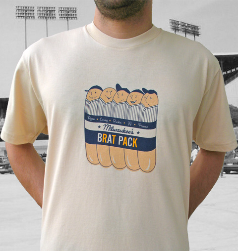
Now that, my friends, is a T-shirt. That design (here’s a closer view) is one of three superb Brewers-centric tees being offered by reader David Tuttle via his new site, Tararrel & Sons. For the Wisconsin-illiterate, “tararrel” rhymes with “barrel,” which is why it’s found in the lyrics to “The Beer Barrel Polka.”
But I digress. The real story here is Tuttle’s T-shirts, which include a Rob Deer tribute and the obligatory vanity design rendered in a Yount-era motif. Get ’em all here.
New ESPN column today (here’s the link) — see you over there.
Uni Watch Northwest Road Trip: I’ll be in Portland next month and am looking to have a Uni Watch gathering, probably on August 15th. Haven’t settled on a venue yet, but I’m leaning toward this place. Details to follow as the date draws nearer.
Uni Watch News Ticker: Lots of old sports photos from the University of Wisconsin-River Falls here. Steven Brown is particularly fond of this one — note how the second guy from the left in the back row has a different jersey insignia than the other players. ”¦ We’ve talked a lot about first initials on NOBs, but here’s a question from Tyler Kepner: “Does anybody in MLB wear an initial on the back anymore? I thought of this the other day when I was watching O’s/Red Sox at a restaurant in Toronto, and a guy named Cabrera was pitching for the Orioles. He didn’t look tall enough to be Daniel, plus his uni number was wrong, and I was just so bothered that he didn’t have a first initial (F., in his case). Two RHPs on the same staff, at least the younger guy should have the initial.” I can’t think of any initials at the moment — anyone..? ”¦ Aaron Kamsler sent along his favorite jersey tag, from a 1994 Lions throwback gamer worn by Chris Spielman. ”¦ I’ll be doing another full-blown Ricko Files entry next week (and the week after that, and the week after that”¦), but here’s a quick dispatch from him: Check out this shot of Blue Moon Odom — never seen the 1969 anniversary patch on a windbreaker like that. Also, note the black spikes (“Not uncommon for the A’s during spring training,” says Ricko) and white sanitaries (“Less common”). ”¦ Shorpy for President (with thanks to Brinke Guthrie). ”¦ There’s a new book coming out about the old AFL, and the publisher has been nice enough to provide me with a dozen sample pages, which you can see in this slideshow. I’ll have a copy to raffle off next month. ”¦ Bill Mauldin reports that Southern Miss will apparently be adding facemask decals to the mix this fall. Details here. Note that both the text and the embedded video (skip ahead to the 3:10 mark) mention that Southern Miss will be “one of only two teams” doing this, but it’s not clear, at least to me, who the other team is. Anyone..? ”¦ No photos yet, but Florida International is apparently going to have a Broncos-esque design this season. Details here. ”¦ This trend of presenting jerseys to coaches is lame enough to begin with, but as Chris Crater noted in last night’s comments, the two numerals on Terry Murray’s jersey aren’t even the same size — the zero’s way bigger than the eight. Nice job, guys. ”¦ Also from last night: Most injured MLBers who go on minor league rehab assignments bring their single-flapped helmets with them, but not Big Papi, who’s currently rehabbing with Pawtucket. And while the Pawsox usually wear that Red Sox font for their rear uni numbers, Keith Thibault notes that Big Papi’s number was rendered in standard block numerals. ”¦ Utah unveiled their new football design yesterday. Full coverage here, here, and here. … Mickel Yantz has been working on a new site devoted to Seahawks uni history. … Ryan Ludwick’s All-Star Game helmet snafu is explained toward the bottom of this page (with thanks to Elena Elms).
I saw Ludwick’s helmet at that ASG on TV, and I thought to myself “Oh, my- Uni Watch is gonna be all over this!”
Amazing T-shirts from Tararrel and Sons. Keep up the good work.
Check out the link
That’s some dedication to the Yankees right there.
Awesome Brewers shirts! I have an awesome CC shirt that I’m going to take some pic of and post. But i have to get one of those brat shirts
I don’t see the need for initials on players’ NOBs. If you can’t tell the difference between two very different guys with different numbers but the same last name…well, that’s your fault, isn’t it?
Still a step up from the Yankee$ insistence that you memorize their entire 40-man roster, as they’re not going to provide NOB at all!
How stupid! Why does the Rob Deer shirt have a picture of an elk!?
The picture of Blue Moon Odom is from 1968, not 69.
link
It’s a Red Deer, not an elk … see the link here:
link
Paul, that Shorpy link is MIA.
I am looking for a pic, but after his recent acqusition, I believe Pirates’ P Denny Bautista has “D.Bautista” for his NOB. The Bucs, of course, already have Jose Bautista on their roster. Jose continues with only his last name for his NOB.
try this one;
link
I don’t know, it sure looks like an elk to me. Why would he search for a red deer from Europe and Asia when Wisconsin is crawling with deer? Probably just s simple mistake but it looks cool anyway, and many people won’t even notice.
Rob Ullman has a new girlie up with some great stirrup detail.
[url]
link\]
[quote comment=\”280618\”]Check out the hair on this vendor at the All-Star Game
That\’s some dedication to the Yankees right there.[/quote]
The Jersey of the Week
category at that Home Run Derby site is a hoot. Even if it\’s rarely an actual Jersey
Gawd, that AFL book is the nuts! The helmet quiz page, oh what a beautiful day this has become!
Paul, any idea when the book is due to ship from Amazon?
Is there a real need for the initials? Not really. And yet, I’ve always thought they were cool, but can’t really explain why. I even made sure the guys on my rec hockey team with matching last names got them when I ordered our jerseys.
Outstanding shirts – just bought the “TARARREL” one. Don’t see it as a vanity so much, since it won’t be recognized as the company name but a reference to the song.
It makes up for the Brewers’ style “OBAMA” shirt that I got stiffed on….
[quote comment=”280633″]Is there a real need for the initials? Not really. And yet, I’ve always thought they were cool, but can’t really explain why. I even made sure the guys on my rec hockey team with matching last names got them when I ordered our jerseys.[/quote]
I love it too. Probably stems from seeing so many brothers on softball teams, etc. It also really helps indentify pro players years down the road when going thru pictures and video.
If I remember correctly, wasn’t Utah the school that was making all the fuss about not getting treated the right way by Nike? I seem to remember an article where they were talking about mismatched colors and not enough product when they were looking to switch suppliers. Why then, would on the page announcing their switch to UA and the link for the photos, would there be a link for Comcast’s Utah games on demand, featuring a player clearly wearing the swoosh? UA’s gotta be happy about that…….
on espn.com’s front page it shows david wright with a blue coolflo helmet and carlos beltran with what appears to be a black one
“I am looking for a pic, but after his recent acqusition, I believe Pirates’ P Denny Bautista has “D.Bautista” for his NOB. The Bucs, of course, already have Jose Bautista on their roster. Jose continues with only his last name for his NOB”
beat me to that. i know he had the “D” in his first game. i’m sure it’s still there!
Regarding Big Papi’s hastily-made, wrong-font jersey — I imagine that the link had to give his number up for a day so that Mr. Big League Rehabber could have it.
You’d think that Ortiz would have just taken whatever number was available. It’s not like he’s a permanent member of the Pawtucket team.
[quote comment=”280637″]on espn.com’s front page it shows david wright with a blue coolflo helmet and carlos beltran with what appears to be a black one[/quote]
It’s the Mets’ link helmet.
[quote comment=”280622″]The picture of Blue Moon Odom is from 1968, not 69.
link
1968 Uni, 1969 photo. Almost all clubs carried over the previous year’s set for spring training.
Speaking of fan made shirts for sale, I found these shirts made by a couple of met fans, who happen to be sisters.
link
[quote comment=”280641″][quote comment=”280622″]The picture of Blue Moon Odom is from 1968, not 69.
link
1968 Uni, 1969 photo. Almost all clubs carried over the previous year’s set for spring training.[/quote]
Correct, it’s GOTTA be from ’69 cuz he’s wearing the Centennial patch!!!
-Jet
Don’t know if anyone happened to notice last night, but both Doug Mientkiewicz and Freddy Sanchez were sporting black undershirts without the Pirate logo on the left sleeve.
Would have snagged pics, but the batteries in the camera were dead *grr*
Can someone contact the guy that created the Seattle Seahawk uniform history page? Tell him that Pittsburgh has an “h” at the end of it. He has it wrong in the Super Bowl XL section.
At least there’s still one kind of sports-themed Obama shirt you can still buy:
link
Maybe the NBA isn’t as vigilant as MLB.
[quote comment=”280633″]Is there a real need for the initials? Not really. And yet, I’ve always thought they were cool, but can’t really explain why. I even made sure the guys on my rec hockey team with matching last names got them when I ordered our jerseys.[/quote]
While nobody would have confused 5’11”, 150-lb. link with 6’6″, 225-lb. link when both were with the Cardinals, they dutifully wore “O. Smith” and “L. Smith” NOBs…
These days, the father-son combination of pitching coach link and outfielder link both simply wear “Duncan” as NOBs. Oh, well…
BTW, if you’re looking for an NFL jersey with the new shield on the NFL Equipment logo, be paitent. Many stores still have the older shield on it, and as soon as they go out the door, newer ones will come in. The new hats already have the new insignia on it.
Hmmmm…
link
[quote comment=”280645″]Can someone contact the guy that created the Seattle Seahawk uniform history page? Tell him that Pittsburgh has an “h” at the end of it. He has it wrong in the Super Bowl XL section.[/quote]
That’s ‘h’ as in ‘holding’, or in this case, bogus holding call ;-)
[quote comment=”280649″]Hmmmm…
link
That’s Jim Harbaugh blasphemy!
[quote comment=”280644″]Don’t know if anyone happened to notice last night, but both Doug Mientkiewicz and Freddy Sanchez were sporting black undershirts without the Pirate logo on the left sleeve.
Would have snagged pics, but the batteries in the camera were dead *grr*[/quote]
When I saw the Pittsburgh in June to see the Yankee games I also caught the Friday night Rays game. link, link, link and link were all without logos. They also appeared to be wearing different types of undershirts than the rest of the team because I couldn’t see any grey showing.
D. Bautista also pitched in that game, but I didn’t get a shot of the back of his jersey.
While getting psyched over another upcoming great Western Michigan football season, I came across one of those 20-question articles about Broncos QB Tim Hiller. Most of it’s prettty bland stuff, but he did say what his favorite number is.
“I like 3 because that is what I was given my freshman year at WMU and I am rolling with it.”
Deep thinker that kid.
Oh, and that should read “When I went to Pittsburgh”. Coffee hasn’t kicked in yet.
Ryan Zimmerman was on rehab with Columbus last night. He rocked high socks, #14, and a dual flapped helmet.
link
Bengie Molina NOB with intial(Angels):
link
[quote comment=”280643″][quote comment=”280641″][quote comment=”280622″]The picture of Blue Moon Odom is from 1968, not 69.
link
1968 Uni, 1969 photo. Almost all clubs carried over the previous year’s set for spring training.[/quote]
Correct, it’s GOTTA be from ’69 cuz he’s wearing the Centennial patch!!!
-Jet[/quote]
Back then teams never introduced new unis in spring training. Would save that for opening day. Not saying was an official policy, and can’t say when MLB made any kind of policy one way or another but, yeah, spring training sometimes was a hodge-podge. I know the expansion Senators in ’61 wore jerseys left behind by the Griffith Senators (navy script lettering and “pitching Senator” logo patch on sleeve). Calvin Griffith probably sold them to the new club. And in ’61, the A’s wore unstriped socks (which they would wear with their new pins that season) with their ’60 unis in spring training. As a result there are many, many baseball cards that give a thoroughly erroneous impression of what the team actually wore that year.
High number ’61, shot in spring training that year:
link
Another high number ’61. Same deal.
link
The Orioles really haven’t used first initials on the backs of jerseys in at least the last 20 years. The Ripken brothers & dad never did anyway, and I’m sure there were others with the same last name without that initial.
[quote comment=”280650″][quote comment=”280645″]“Can someone contact the guy that created the Seattle Seahawk uniform history page? Tell him that Pittsburgh has an ‘h’ at the end of it. He has it wrong in the Super Bowl XL section.”[/quote]
“That’s ‘h’ as in ‘holding’, or in this case, bogus holding call.” ;-)[/quote]
OH SNAP!
You mean the same bogus holding call on Mickey Marvin “The Martian” on Claude Humphrey during Super Bowl XV on the first Plunkett to branch TD as well?
I’m a Iggles fan and man, was I fucking pissed off when I saw the highlight film from that game and saw that non-call.
[quote comment=”280649″]Hmmmm…
link
If they were really good they would have photoshopped the new NFL shield onto the jersey
Has any thought been given to the possibility that the reason for the decline and fall of high socks and stirrups is modern footwear?
Today’s baseball cleats are large clunky things … link
… that look like Pontiac Aztecs … link
… that look like Voltron’s Foot … link
If I had to wear those hideous things, I might cover them up, too.
link
Uni-Watch has groupies?
Or are they Paul Lukas groupies?
I know, I know. None of the above. Just saying, is good to take into account the surroundings when selecting the place for an event.
[quote comment=”280639″]Regarding Big Papi’s hastily-made, wrong-font jersey — I imagine that the link had to give his number up for a day so that Mr. Big League Rehabber could have it.
You’d think that Ortiz would have just taken whatever number was available. It’s not like he’s a permanent member of the Pawtucket team.[/quote]
The Paw Sox usually make a big deal out of the Red Sox stars coming down to play with them. Most of the time giving them uniforms with the correct numbers, so that makes sense for the number situation. I’m sure Ortiz wouldn’t care.
The wrong font situation is a situation I can’t explain though. Especially since the paw Sox have known since at least Sunday that Ortiz would be making a trip to McCoy (a great place to watch a game, by the way).
went to malaysia for beer barrel lyrics?
Do you know college football helmets like the back of your hand?
Prove it: link
for me: 50/50 on my first try
(one of the names is misspelled, just a fair warning)
Awesome job with that Seahawks uniform history site Mickel. Just to add, Mark Verlander did not re-design the 2002 logo, simply the wordmark/font. Very similar to the Falcons, Cardinals, and Texans wordmark, which he also designed. The NFL in house design studio did the logo, colors, unis, etc.
I’ve been wanting to add a detailed Seahawks uniform link to my site for a while now. Thank you.
cool skating signs in the background of the shorpy pic
[quote comment=”280636″]If I remember correctly, wasn’t Utah the school that was making all the fuss about not getting treated the right way by Nike? I seem to remember an article where they were talking about mismatched colors and not enough product when they were looking to switch suppliers. Why then, would on the page announcing their switch to UA and the link for the photos, would there be a link for Comcast’s Utah games on demand, featuring a player clearly wearing the swoosh? UA’s gotta be happy about that…….[/quote]
So Utah goes from a Nike template to a UA template. Yay rah.
link
[quote comment=”280665″]Do you know college football helmets like the back of your hand?
Prove it: link
for me: 50/50 on my first try
(one of the names is misspelled, just a fair warning)[/quote]
That was fun. I got only 41.
[quote comment=”280670″][quote comment=”280665″]Do you know college football helmets like the back of your hand?
Prove it: link
for me: 50/50 on my first try
(one of the names is misspelled, just a fair warning)[/quote]
That was fun. I got only 41.[/quote]
47. The ones I missed made me feel dumb.
And, yeah, one is misspelled. Drove me a little goofy til I figured that out.
[quote comment=”280671″][quote comment=”280670″][quote comment=”280665″]Do you know college football helmets like the back of your hand?
Prove it: link
for me: 50/50 on my first try
(one of the names is misspelled, just a fair warning)[/quote]
That was fun. I got only 41.[/quote]
47. The ones I missed made me feel dumb.
And, yeah, one is misspelled. Drove me a little goofy til I figured that out.[/quote]
46. Is there an answer key anywhere (the last four are gonna bug me)?
I got all 50…well, took me a few tries to figure out the spelling mistake. There was one I had to think about and guess(was a tossup), got it though.
[quote comment=”280672″][quote comment=”280671″][quote comment=”280670″][quote comment=”280665″]Do you know college football helmets like the back of your hand?
Prove it: link
for me: 50/50 on my first try
(one of the names is misspelled, just a fair warning)[/quote]
That was fun. I got only 41.[/quote]
47. The ones I missed made me feel dumb.
And, yeah, one is misspelled. Drove me a little goofy til I figured that out.[/quote]
46. Is there an answer key anywhere (the last four are gonna bug me)?[/quote]
you can find them all at the helmet project
[quote comment=”280665″]Do you know college football helmets like the back of your hand?
Prove it: link
for me: 50/50 on my first try
(one of the names is misspelled, just a fair warning)[/quote]
49/50, only because the Penn St is the wrong blue…
New Tennessee football uniforms?
link
If the specs are correct, it appears that the old-school orange pants from the days of Johnny Majors may make a big comeback for the road games this season. That’s a HUGE change seeing how the Vols haven’t worn the orange pants with the white stripes since 1992. They’ve always worn the white-on-white under Fulmer, but apparently, the buzz surrounding the orange-on-orange that UT wore in the SEC Championship Game last year was considerable enough for adidas to make some changes.
Also, noticeably absent from these specs are the black uniforms that all the youngsters/Georgia wannabes want the Vols to adopt.
The other subtle but welcome changes are as follows:
1.) The name on the back of the road jerseys will now be in orange (according to the specs) – just like the old days – rather than the black that UT has sported in the recent past.
2.) The numbers will be on the sleeves rather than the shoulders.
Again, notice the adidas logo on the bottom. These are authentic specs, and while we here at 3SIB cannot guarantee that the orange pants will ever be worn on the field, they are assuredly an option since adidas has made them.
Apparently, the rumors are that Phillip Fulmer isn’t completely sold on the orange pants yet, but I would expect UT to at least wear them once. Fulmer had the Vols go white-on-white in ‘92 when he filled in for Majors, and then they went back to orange when Majors came back. When Fulmer took over for good, the white-on-white was here to stay. So, this should be interesting to see how it all plays out.
Good for Tennessee, staying away from black alts, that is. If your colors are orange and white, what logic would get you to a black jersey?
Orange pants. I was think of Willie Gault in those things, in white shoes era. Yeah, been a while.
Just a question…howcum nobody mocks Tennessee orange but there’s no shortage of jokes about old Tampa Bay Buc unis? Same freakin’ color.
[quote comment=”280675″][quote comment=”280665″]Do you know college football helmets like the back of your hand?
Prove it: link
for me: 50/50 on my first try
(one of the names is misspelled, just a fair warning)[/quote]
49/50, only because the Penn St is the wrong blue…[/quote]
It’s still ugly.
NFL Uniform Police. See last item in this column . . .
link
link
Ask and ye shall receive.
[quote comment=”280677″]Good for Tennessee, staying away from black alts, that is. If your colors are orange and white, what logic would get you to a black jersey?
Orange pants. I was think of Willie Gault in those things, in white shoes era. Yeah, been a while.
Just a question…howcum nobody mocks Tennessee orange but there’s no shortage of jokes about old Tampa Bay Buc unis? Same freakin’ color.[/quote]
Could’ve been the jaunty pirate on the helmet, or the red accent color. Could’ve just been that Tampa Bay really sucked in those unis, so it was an easy target.
[quote comment=”280639″]Regarding Big Papi’s hastily-made, wrong-font jersey — I imagine that the link had to give his number up for a day so that Mr. Big League Rehabber could have it.
You’d think that Ortiz would have just taken whatever number was available. It’s not like he’s a permanent member of the Pawtucket team.[/quote]
Your attempt to make one of the most beloved players in the league look like a horrible, unappreciative, demanding person was quite feeble.
[quote comment=”280679″]NFL Uniform Police. See last item in this column . . .
link
The columnist writes: “Though it seems ridiculous to me and likely hard-working people all over the country that Smith would waste thousands of dollars just to have the right amount of color in his socks”
Or, it might occur to him that the fact Smith is willing to pay for it could be a measure of how important–and very real–it is for athletes to feel they look good, and are comfortable with the way they look…especially something as trivial as how high he pulls up his socks.
My feeling? Hey, if SOME of that purple sock is showing, he’s in uniform.
Ironic that Greg Coleman, who preferred his socks pulled up pretty damn high when he punted for the Vikings, is the pre-game uni snitch for games at the Metrodome.
re: NCAA Helmet Quiz.
Navy? How could I miss Navy.
(major forehead slap)
Although, the facemask IS the wrong color blue.
[quote comment=”280685″]re: NCAA Helmet Quiz.
Navy? How could I miss Navy.
(major forehead slap)
Although, the facemask IS the wrong color blue.[/quote]
I thought it was Notre Dame. But I know jackshit about football. My score of 28 will attest to that. Give me a hockey quiz!!!
Jack Clark was the only man in Major League history who had stirrups thinner than his eyebrows…
link
Boavista FC of Porto, Portugal, home of the most beautiful football shirts in the world, has unveield their new kits for the 2008/09 season on their website.
link
The left design is their primary kit. The other two are only worn for away matches when the primary shirt would conflict too much with their opponents’ kits. Haven’t found any pics of anyone wearing the new kits yet.
Nice to see they have new kits, but wouldn’t it be nice to know in which league they will be playing this upcoming season? Their latest appeal is to be heard shortly.
[quote comment=”280676″]New Tennessee football uniforms?
link
If the specs are correct, it appears that the old-school orange pants from the days of Johnny Majors may make a big comeback for the road games this season. That’s a HUGE change seeing how the Vols haven’t worn the orange pants with the white stripes since 1992. They’ve always worn the white-on-white under Fulmer, but apparently, the buzz surrounding the orange-on-orange that UT wore in the SEC Championship Game last year was considerable enough for adidas to make some changes.
Also, noticeably absent from these specs are the black uniforms that all the youngsters/Georgia wannabes want the Vols to adopt.
The other subtle but welcome changes are as follows:
1.) The name on the back of the road jerseys will now be in orange (according to the specs) – just like the old days – rather than the black that UT has sported in the recent past.
2.) The numbers will be on the sleeves rather than the shoulders.
Again, notice the adidas logo on the bottom. These are authentic specs, and while we here at 3SIB cannot guarantee that the orange pants will ever be worn on the field, they are assuredly an option since adidas has made them.
Apparently, the rumors are that Phillip Fulmer isn’t completely sold on the orange pants yet, but I would expect UT to at least wear them once. Fulmer had the Vols go white-on-white in ‘92 when he filled in for Majors, and then they went back to orange when Majors came back. When Fulmer took over for good, the white-on-white was here to stay. So, this should be interesting to see how it all plays out.[/quote]
Bringing back the stripes on the pants, too. Tennesse had one season (2002) with a solid orange stripe (really thick), but that was soon gone.
link
Otherwise, they’ve worn plain white pants for quite some time now.
link
link
Why did the Mariners, in the turn ahead the clock game, where road gray pants, while the Royals wore home white pants?
Oh man!!! The one time you come to Portland and I’ll be out of state for a Tom Petty concert! Argh! But since you’re making the trek out here, might I suggest link for a meeting. And yes, it’s a real lounge!
And in regards to the Page 2 column, I have that entire Mariners game on video tape — that was a great broadcast. The M’s production team did some cool simultaneous 3-camera shots, odd graphics… it was a blast (or should I say blast off) to watch.
Well, I guess they had the 2 stripes last season on the white pants:
link
I got a 44…not too shabby.
I happened across this today:
College football face mask decals:
link
[quote]Bill Mauldin reports that Southern Miss will apparently be adding facemask decals to the mix this fall. Details here. Note that both the text and the embedded video (skip ahead to the 3:10 mark) mention that Southern Miss will be “one of only two teams†doing this, but it’s not clear, at least to me, who the other team is. Anyone..?
[quote comment=\”280694\”]I happened across this today:
College football face mask decals:
link
[/quote]
Not reading the blog today Shawn?
I recently bought a complete set of Topps baseball cards from 1970, which feature pictures mostly taken in 1969 and was checking locations of the centennial patch on each teams uniform. I could not find one card that showed the Pirates wearing the patch. In checking the Hall of Fame website, it too did not show a patch on the Pirates uniform. Does anyone know if they did wear the patch, and if so, where was it? In 1969, they were one of three teams wearing vests. The other two, the Indians and the A’s, had the patch on the front of the uniform. But I can’t find any evidence that the Pirates wore the patch.
[quote comment=”280642″]Speaking of fan made shirts for sale, I found these shirts made by a couple of met fans, who happen to be sisters.
link
Well, they have a Pedro silhouette t-shirt, and I don’t see any representation of an unbuttoned second button, so they’re not very accurate…
;)
-Jet
[quote comment=”280696″]I recently bought a complete set of Topps baseball cards from 1970, which feature pictures mostly taken in 1969 [/quote]
Good observation about the Bucs, hope someone solves the mystery. Incidentally, how much did you pay for a complete set? I wish Topps would just reprint those old sets for those of us with not much fun money….
-Jet
[quote comment=”280690″]Why did the Mariners, in the turn ahead the clock game, where road gray pants, while the Royals wore home white pants?[/quote]
Things will be be much wackier in the future.
Today’s ESPN column is up:
link
[quote comment=”280692″]Well, I guess they had the 2 stripes last season on the white pants:
link
Probably due to both being prominent Adidas schools, Tennessee and Nebraska’s uniforms have changed in tandem (or nearly so) over the past twenty years.
For ages, both had stripes on their pants. In the mid-90s, each fell victim to Colorado syndrome and removed the stripes.
In the early ’00s, each had a one-year disaster with thick stripes on their pants and jerseys.
They learned their lesson, returning to a pair of stripes, and each has looked good since.
[quote comment=”280701″][quote comment=”280692″]Well, I guess they had the 2 stripes last season on the white pants:
link
Probably due to both being prominent Adidas schools, Tennessee and Nebraska’s uniforms have changed in tandem (or nearly so) over the past twenty years.
For ages, both had stripes on their pants. In the mid-90s, each fell victim to Colorado syndrome and removed the stripes.
In the early ’00s, each had a one-year disaster with thick stripes on their pants and jerseys.
They learned their lesson, returning to a pair of stripes, and each has looked good since.[/quote]
One more thing about striped pants (my pet subject) and I’ll shut up. Inexplicably, Nebraska dropped their classic twin-striped pants in favor of solid whites the year after winning a National Championship. It made no sense to me.
Great article, Paul. Funny how in the 10 years following that event, both the Astros and D-Backs have changed their color scheme to something similar to the 2027 Mariners.
I never saw that tattoo on Junior before. Damn that’s ugly.
[quote comment=”280698″][quote comment=”280696″]I recently bought a complete set of Topps baseball cards from 1970, which feature pictures mostly taken in 1969 [/quote]
Good observation about the Bucs, hope someone solves the mystery. Incidentally, how much did you pay for a complete set? I wish Topps would just reprint those old sets for those of us with not much fun money….
-Jet[/quote]
Good observation about the Bucs, hope someone solves the mystery. Incidentally, how much did you pay for a complete set? I wish Topps would just reprint those old sets for those of us with not much fun money….
The set cost about $450 and was in ex condition. I think I got a pretty good deal.
[quote comment=”280700″]Today’s ESPN column is up:
link
The link in my email and on the board didn’t work but I found it through Page 2.
[quote comment=”280704″]I never saw that tattoo on Junior before. Damn that’s ugly.[/quote]
HOT LAVA!!!
that is one huge tat junior’s rockin!!
link
Re: MLB NOB initials — I believe Horacio Ramirez with the Royals has an H with his NOB, but I haven’t found any online photo proof (the other Ramirez being Ramon, both of them in the pen). Horacio was picked up relatively recently and Ramon started the season with KC, so the H is new (or new-ish).
[quote comment=”280707″][quote comment=”280704″]I never saw that tattoo on Junior before. Damn that’s ugly.[/quote]
HOT LAVA!!!
that is one huge tat junior’s rockin!!
link
I wonder if the tattoo has a little tattoo on the arm. Like the Dolphin helmet or Bill Madlock watching himself on TV in a laundry room…
[quote comment=”280632″]Gawd, that AFL book is the nuts! The helmet quiz page, oh what a beautiful day this has become!
Paul, any idea when the book is due to ship from Amazon?[/quote]
KJ – I work for the publisher of Remember The AFL and I just heard from them that the book will be available on Amazon at the end of August/early September. But you can pre-order now and get it as soon as it’s in. That’s all the info I have right now.
FYI – the cover on Amazon is an older version, the actual cover is included in the slide show Paul put together.
[quote comment=”280697″][quote comment=”280642″]Speaking of fan made shirts for sale, I found these shirts made by a couple of met fans, who happen to be sisters.
link
[/quote]
I miss Professor Reyes :-(
[quote comment=”280710″][quote comment=”280707″][quote comment=”280704″]I never saw that tattoo on Junior before. Damn that’s ugly.[/quote]
HOT LAVA!!!
that is one huge tat junior’s rockin!!
link
I wonder if the tattoo has a little tattoo on the arm. Like the Dolphin helmet or Bill Madlock watching himself on TV in a laundry room…[/quote]
A tattoo of his own silloutte swinging? Wow…. lost a little respect there.
Tampa Bay must have known way back in ’99 that they would be dropping the ‘Devil’ from their name in the future.
link
[quote comment=”280714″]Tampa Bay must have known way back in ’99 that they would be dropping the ‘Devil’ from their name in the future.
link
Hmmm, Anaheim logo slighty canted suggests a memorable moment:”Angles in the Outfield”
(wait for it)
rimshot
You’d think that there wouldn’t be any merch left from a 10-year-old promotion right?
You’d be wrong – link
[quote comment=”280665″]Do you know college football helmets like the back of your hand?
Prove it: link
for me: 50/50 on my first try
(one of the names is misspelled, just a fair warning)[/quote]
What’s up with the Connecticut helmet. I’ve tried every combination I can think of. I doesn’t work.
I’ll always have a soft spot in my heart for the TATC promotion.
If only because it featured the return of the link, which can’t come again soon enough….
I do not see a purpose for having the first initial on NOB’s with players with the same last name. Isn’t that what the numbers are for? If they did not have numbers, you would need to differentiate between the players, but the numbers are the reason why some teams do not have any NOB.
BBM in link.
[quote comment=”280716″]You’d think that there wouldn’t be any merch left from a 10-year-old promotion right?
You’d be wrong – link
Damn. If I wore a 7 I would totally snatch that up.
[quote comment=”280716″]You’d think that there wouldn’t be any merch left from a 10-year-old promotion right?
You’d be wrong – link
One would hope at some point in the future the Cleveland team would ditch the racist name and logo.
[quote comment=”280717″][quote comment=”280665″]Do you know college football helmets like the back of your hand?
Prove it: link
for me: 50/50 on my first try
(one of the names is misspelled, just a fair warning)[/quote]
What’s up with the Connecticut helmet. I’ve tried every combination I can think of. I doesn’t work.[/quote]
Wow, I’m a retard. Let me try that again. What’s up with the Connecticut helmet? I’ve tried every combination I can think of. It doesn’t work.
There.
[quote comment=”280717″][quote comment=”280665″]Do you know college football helmets like the back of your hand?
Prove it: link
for me: 50/50 on my first try
(one of the names is misspelled, just a fair warning)[/quote]
What’s up with the Connecticut helmet. I’ve tried every combination I can think of. I doesn’t work.[/quote]
Conetitcut. (yes, I know.)
One of my softball teams had a “Turn the Clock Ahead Night” that year.
We didn’t have money for special unis, though, so we had to think small. Like, an hour. We each just brought one watch to reset to Daylight Time three days in advance.
It was kind of a flop, actually. No one really noticed. But I’m told a couple of the guys did show up at work for an hour early the next day.
More people paid attention when we had “Helmet Night”. I bought—and wore—a crappy kid’s football helmet at the Goodwill that about destroyed my ears.
Some guys wore motorcycle helmets. One had a Jungle Jim pith helmet. My best friend did best, though. Ever watched a guy play an entire game in left field wearing one of those pointy Kaiser Wilhelm things? He should have added a chin strip, though, it kept tilting cuz of its weight. Side to side. Sometimes forward, sometimes back.
He threatened to slide headfirst if nescessary. Imagine playing third base with a 220-lb. Narwal coming at you shouting “Defend the Fatherland” in his best Sgt. Schultz imitation?
That was one crazy team.
Or Coneticut…sorry…I should Mis-Spell correctly.
[quote comment=”280714″]Tampa Bay must have known way back in ’99 that they would be dropping the ‘Devil’ from their name in the future.
link
Not exactly because they have always been called the Rays, D-Rays or Devil Rays by fans. Those were basically batting practice jerseys that they used for that design. I had one (bp jersey) that looked just like that from 98-99.
[quote comment=”280726″]Or Coneticut…sorry…I should Mis-Spell correctly.[/quote]
Actually: Conneticut (two n’s)
Been sitting on this personal anecdote for a couple days, but since we’re talking about the Brewers, maybe this is the time to share.
I’ve always loved the old Beer Barrel Man logo, because of its roots in Milwaukee baseball. A couple years ago, I even created a link about the logo’s history, and updated the link to link.
So, last month the Brewers gave out a promotional bobblehead featuring the Beer Barrel Man, and on the box they used link!
I know it’s mine because – and I’m embarrassed about this – I put the stirrups on backwards. Hey, we were all young once….
Anyway, I corrected the problem in a link – hopefully the team will notice. I think he’d make a great sleeve patch.
It says that the Orioles participated in the TATC promotion when they played the Angels on 7/25/99. I don’t remember that and I can’t seem to find any pictures of the O’s TATC uniforms. Does anybody have any pics of that?
[quote comment=”280722″][quote comment=”280716″]You’d think that there wouldn’t be any merch left from a 10-year-old promotion right?
You’d be wrong – link
One would hope at some point in the future the Cleveland team would ditch the racist name and logo.[/quote]
How is ‘Indian’ Racist? Please let’s not get into a race debate, I’m just curious. I understand ‘Redskins’ being racist, but not Indian.
[quote comment=”280730″]It says that the Orioles participated in the TATC promotion when they played the Angels on 7/25/99. I don’t remember that and I can’t seem to find any pictures of the O’s TATC uniforms. Does anybody have any pics of that?[/quote]
link.
Black jerseys, white lettering. Black caps with black-and-white bird.
No orange.
[quote comment=”280728″][quote comment=”280726″]Or Coneticut…sorry…I should Mis-Spell correctly.[/quote]
Actually: Conneticut (two n’s)[/quote]
Actually: Connecticut
[quote comment=”280731″][quote comment=”280722″][quote comment=”280716″]You’d think that there wouldn’t be any merch left from a 10-year-old promotion right?
You’d be wrong – link
One would hope at some point in the future the Cleveland team would ditch the racist name and logo.[/quote]
How is ‘Indian’ Racist? Please let’s not get into a race debate, I’m just curious. I understand ‘Redskins’ being racist, but not Indian.[/quote]
Always had a vision of the Sons of Norway organization protesting at Vikings headquarters. “They’re saying early Scandanavians were strong, fearless, brave, worthy adversaries; that they should be admired and revered. How DARE they.”
I lovvvve this uniform. Did the moment I first saw it, still do. Love the narrower blue circle, elegantly understanded.
Can’t identify all the guys, but first four (l to r) are, of course, Ernie Banks, Billy Williams, George Altman and Ron Santo.
link Cubs Spring Training – 1962
[quote comment=”280735″]I lovvvve this uniform. Did the moment I first saw it, still do. Love the narrower blue circle, elegantly understanded.
Can’t identify all the guys, but first four (l to r) are, of course, Ernie Banks, Billy Williams, George Altman and Ron Santo.
link Cubs Spring Training – 1962[/quote]
underSTATED. Duh
[quote comment=”280735″]I lovvvve this uniform. Did the moment I first saw it, still do. Love the narrower blue circle, elegantly understanded.
Can’t identify all the guys, but first four (l to r) are, of course, Ernie Banks, Billy Williams, George Altman and Ron Santo.
link Cubs Spring Training – 1962[/quote]
Thanks, Ricko, for giving me something to do (browse NYT photos) for the rest of a Friday afternoon at work.
[quote comment=”280733″][quote comment=”280728″][quote comment=”280726″]Or Coneticut…sorry…I should Mis-Spell correctly.[/quote]
Actually: Conneticut (two n’s)[/quote]
Actually: Connecticut[/quote]
Yes, I know. But not on the link we are talking about. The “correct” mis-spelling is Conneticut (or Coneticut…it turns out I jumped the gun on the correction and both mistakes work — sorry Steven)
Welcome to our Friday afternoon Misspelling Bee.
[quote comment=”280737″][quote comment=”280735″]I lovvvve this uniform. Did the moment I first saw it, still do. Love the narrower blue circle, elegantly understanded.
Can’t identify all the guys, but first four (l to r) are, of course, Ernie Banks, Billy Williams, George Altman and Ron Santo.
link Cubs Spring Training – 1962[/quote]
Thanks, Ricko, for giving me something to do (browse NYT photos) for the rest of a Friday afternoon at work.[/quote]
You, too, huh.
[quote comment=”280739″]Welcome to our Friday afternoon Misspelling Bee.[/quote]
Welkum won ant awl!
Seeking stirrups for your team (min. order 12 pair) ?
link
[quote comment=”280732″][quote comment=”280730″]It says that the Orioles participated in the TATC promotion when they played the Angels on 7/25/99. I don’t remember that and I can’t seem to find any pictures of the O’s TATC uniforms. Does anybody have any pics of that?[/quote]
link.
Black jerseys, white lettering. Black caps with black-and-white bird.
No orange.[/quote]
The color scheme was black and silver actually, not white. It was probably the most simplistic and unimaginative TATC uniform designed.
[quote comment=”280744″][quote comment=”280732″][quote comment=”280730″]It says that the Orioles participated in the TATC promotion when they played the Angels on 7/25/99. I don’t remember that and I can’t seem to find any pictures of the O’s TATC uniforms. Does anybody have any pics of that?[/quote]
link.
Black jerseys, white lettering. Black caps with black-and-white bird.
No orange.[/quote]
The color scheme was black and silver actually, not white. It was probably the most simplistic and unimaginative TATC uniform designed.[/quote]
Giants black SF on white vests and hats was also pretty unimaginative.
[quote comment=”280745″][quote comment=”280744″][quote comment=”280732″][quote comment=”280730″]It says that the Orioles participated in the TATC promotion when they played the Angels on 7/25/99. I don’t remember that and I can’t seem to find any pictures of the O’s TATC uniforms. Does anybody have any pics of that?[/quote]
link.
Black jerseys, white lettering. Black caps with black-and-white bird.
No orange.[/quote]
The color scheme was black and silver actually, not white. It was probably the most simplistic and unimaginative TATC uniform designed.[/quote]
Giants black SF on white vests and hats was also pretty unimaginative.[/quote]
No orange in Mets, either.
Hmmm, evidently someone was projecting the color orange would be extinct by 2027.
Verrrrrrry INTEResting.
Hey, Chris, you think the Orioles were stealing from the White Sox?
[quote comment=”280731″][quote comment=”280722″][quote comment=”280716″]You’d think that there wouldn’t be any merch left from a 10-year-old promotion right?
You’d be wrong – link
One would hope at some point in the future the Cleveland team would ditch the racist name and logo.[/quote]
How is ‘Indian’ Racist? Please let’s not get into a race debate, I’m just curious. I understand ‘Redskins’ being racist, but not Indian.[/quote]
Are you being serious or just being a jackass? What is racist about it? For starters that logo couldn’t be more offensive if they tried. It’s the Native American equivalent of Amos and Andy. Would you find it racist if there was a team called the Cleveand Negroes? Of course you would. How about the Cleveland Jews? Again I’m sure you find that offensive too. It’s racist and I doubt there is an argument you could propsoe to the contrary.
[quote comment=”280734″][quote comment=”280731″][quote comment=”280722″][quote comment=”280716″]You’d think that there wouldn’t be any merch left from a 10-year-old promotion right?
You’d be wrong – link
One would hope at some point in the future the Cleveland team would ditch the racist name and logo.[/quote]
How is ‘Indian’ Racist? Please let’s not get into a race debate, I’m just curious. I understand ‘Redskins’ being racist, but not Indian.[/quote]
Always had a vision of the Sons of Norway organization protesting at Vikings headquarters. “They’re saying early Scandanavians were strong, fearless, brave, worthy adversaries; that they should be admired and revered. How DARE they.”[/quote]
There difference between the Vikings and Indians, is that the Viking were not a race of people. Yes ALL Vikings were Scandinavians, but not all Scandinavians were Vikings.
I commend you also for revering the Vikings, Ricko. Are rape and pillaging qualities you admire? To compare the nickname Vikings to the Indians or the Redskins was shortsighted at best.
[quote comment=”280639″]Regarding Big Papi’s hastily-made, wrong-font jersey — I imagine that the link had to give his number up for a day so that Mr. Big League Rehabber could have it.
You’d think that Ortiz would have just taken whatever number was available. It’s not like he’s a permanent member of the Pawtucket team.[/quote]
nicely worn stirrups on the baserunner
[quote comment=”280746″][quote comment=”280745″][quote comment=”280744″][quote comment=”280732″][quote comment=”280730″]It says that the Orioles participated in the TATC promotion when they played the Angels on 7/25/99. I don’t remember that and I can’t seem to find any pictures of the O’s TATC uniforms. Does anybody have any pics of that?[/quote]
link.
Black jerseys, white lettering. Black caps with black-and-white bird.
No orange.[/quote]
The color scheme was black and silver actually, not white. It was probably the most simplistic and unimaginative TATC uniform designed.[/quote]
Giants black SF on white vests and hats was also pretty unimaginative.[/quote]
No orange in Mets, either.
Hmmm, evidently someone was projecting the color orange would be extinct by 2027.
Verrrrrrry INTEResting.[/quote]
That video is an INCREDIBLE find by UW standards!
Rich Eisen should be awarded an honorary membership!
[quote comment=”280731″][quote comment=”280722″][quote comment=”280716″]You’d think that there wouldn’t be any merch left from a 10-year-old promotion right?
You’d be wrong – link
One would hope at some point in the future the Cleveland team would ditch the racist name and logo.[/quote]
How is ‘Indian’ Racist? Please let’s not get into a race debate, I’m just curious. I understand ‘Redskins’ being racist, but not Indian.[/quote]
[quote comment=\”280731\”][quote comment=\”280722\”][quote comment=\”280716\”]You\’d think that there wouldn\’t be any merch left from a 10-year-old promotion right?
You\’d be wrong – link
One would hope at some point in the future the Cleveland team would ditch the racist name and logo.[/quote]
How is \’Indian\’ Racist? Please let\’s not get into a race debate, I\’m just curious. I understand \’Redskins\’ being racist, but not Indian.[/quote]
I\’m guessing you probably wouldn\’t have problem with the Adidas Smart Sports logo either.
link
[quote comment=”280749″][quote comment=”280734″][quote comment=”280731″][quote comment=”280722″][quote comment=”280716″]You’d think that there wouldn’t be any merch left from a 10-year-old promotion right?
You’d be wrong – link
One would hope at some point in the future the Cleveland team would ditch the racist name and logo.[/quote]
How is ‘Indian’ Racist? Please let’s not get into a race debate, I’m just curious. I understand ‘Redskins’ being racist, but not Indian.[/quote]
Always had a vision of the Sons of Norway organization protesting at Vikings headquarters. “They’re saying early Scandanavians were strong, fearless, brave, worthy adversaries; that they should be admired and revered. How DARE they.”[/quote]
There difference between the Vikings and Indians, is that the Viking were not a race of people. Yes ALL Vikings were Scandinavians, but not all Scandinavians were Vikings.
I commend you also for revering the Vikings, Ricko. Are rape and pillaging qualities you admire? To compare the nickname Vikings to the Indians or the Redskins was shortsighted at best.[/quote]
I was using a broad brush to make the valid and inarguable point that team nicknames are NOT chosen as a form of derision. It isn’t about making fun of a person or group, it’s about seeing the things in them that someone admires.
And, for the record, I don’t think much of scalping, either (but as far as all-inclusive accuracy goes, eagles are nothing majestic; basically, they are oversize scavengers. And a seahawk really is a little piss ant of a bird. But I digress into Animal Planet).
That being said, and this is the single most thing for everyone to remember in all this: It is impossible to tell someone when they should, and should not, be offended. If they are, they are.
All in all, I agree with you about the inappopriateness of picking an entire race as opposed to indivduals or sects. Cleveland Jews, no. Cleveland Macabees? Possibly. Chiefs and Braves would also pass that muster, because, as you say, not all Indians were Braves or Chiefs. Same thing for Seminoles or Illini. Again, using your “Viking” criterion.
What I have always found fascinating in all this, though, is that no one bitches about Jeep Cherokee. Or Pontiac, for that matter.
Redskins? Sucks. Hate it. Have since I first heard it as a kid, particularly for a team playing in the nation’s capital. Dangerously close to the “N” word. Especially if you grew up as a kid watching old cowboy flicks on TV where “The only good Redskin…”, etc.
Chief Wahoo? Yeah, he’s an ethnically stilted 1930s-40s cartoon. Don’t know that it’s a racist image–in the sense that team management is racist—but more that it is embarrassingly outdated.
My point? Righfully object to those names because they are the product of another time, when people didn’t stop to think about the effect of their actions, no matter how good their intentions (in this case, to express admiration) might have been.
Now, you wanna talk serious, enduring pop culture racism? Watch the original KING KONG. When you start to see the racist tones—both overtones and undertones—it becomes uncomfortable to think it has been around and praised for so long.
[quote comment=”280742″]Seeking stirrups for your team (min. order 12 pair) ?
link
THOSE ARE INCREDIBLE!!! I need those Pirate stirrups for my softball team!
Ricko, you sent along a link of some some good ones last night,
link
but these blow them away!
Actually, they’re the same company!
[quote comment=”280724″][quote comment=”280717″][quote comment=”280665″]Do you know college football helmets like the back of your hand?
Prove it: link
for me: 50/50 on my first try
(one of the names is misspelled, just a fair warning)[/quote]
What’s up with the Connecticut helmet. I’ve tried every combination I can think of. I doesn’t work.[/quote]
Conetitcut. (yes, I know.)[/quote]
What’s funny is that cuz I’ve been out all day, I was catching up with the board from the last comments up.
I’ve been reading all this ridiculous chatter about spelling bees an the spelling of a certain state within the New York metropolitan area, not NY and not NJ.
I finally figures out what it was!
BTW…48/50 for me…It took me awhile to figure out Arkansas State and what is the Aggies below Connecticut(sp?)?
New Mexico State
[quote comment=”280673″]I got all 50…well, took me a few tries to figure out the spelling mistake. There was one I had to think about and guess(was a tossup), got it though.[/quote]
USF and UCF I bet!
Ricko,
Its Friday night…why on Earth are we both sitting in front of our computer screens?
On that note, I;m goin to hang out wiuth my wife and read my kids a bedtime story…probably Sidd Finch!
Great job by Under Armor on the new Utah uniforms. They didn’t show off the alternate black one, though. Under Armor, unlike Nike, can make uniforms with weird pipings and striping and still make them look nice (i.e Texas Tech, Maryland). Looks like Adidas and Under Armor are the current best uniform makers.
[quote comment=”280753″][quote comment=”280749″][quote comment=”280734″][quote comment=”280731″][quote comment=”280722″][quote comment=”280716″]You’d think that there wouldn’t be any merch left from a 10-year-old promotion right?
You’d be wrong – link
One would hope at some point in the future the Cleveland team would ditch the racist name and logo.[/quote]
How is ‘Indian’ Racist? Please let’s not get into a race debate, I’m just curious. I understand ‘Redskins’ being racist, but not Indian.[/quote]
Always had a vision of the Sons of Norway organization protesting at Vikings headquarters. “They’re saying early Scandanavians were strong, fearless, brave, worthy adversaries; that they should be admired and revered. How DARE they.”[/quote]
There difference between the Vikings and Indians, is that the Viking were not a race of people. Yes ALL Vikings were Scandinavians, but not all Scandinavians were Vikings.
I commend you also for revering the Vikings, Ricko. Are rape and pillaging qualities you admire? To compare the nickname Vikings to the Indians or the Redskins was shortsighted at best.[/quote]
I was using a broad brush to make the valid and inarguable point that team nicknames are NOT chosen as a form of derision. It isn’t about making fun of a person or group, it’s about seeing the things in them that someone admires.
And, for the record, I don’t think much of scalping, either (but as far as all-inclusive accuracy goes, eagles are nothing majestic; basically, they are oversize scavengers. And a seahawk really is a little piss ant of a bird. But I digress into Animal Planet).
That being said, and this is the single most thing for everyone to remember in all this: It is impossible to tell someone when they should, and should not, be offended. If they are, they are.
All in all, I agree with you about the inappopriateness of picking an entire race as opposed to indivduals or sects. Cleveland Jews, no. Cleveland Macabees? Possibly. Chiefs and Braves would also pass that muster, because, as you say, not all Indians were Braves or Chiefs. Same thing for Seminoles or Illini. Again, using your “Viking” criterion.
What I have always found fascinating in all this, though, is that no one bitches about Jeep Cherokee. Or Pontiac, for that matter.
Redskins? Sucks. Hate it. Have since I first heard it as a kid, particularly for a team playing in the nation’s capital. Dangerously close to the “N” word. Especially if you grew up as a kid watching old cowboy flicks on TV where “The only good Redskin…”, etc.
Chief Wahoo? Yeah, he’s an ethnically stilted 1930s-40s cartoon. Don’t know that it’s a racist image–in the sense that team management is racist—but more that it is embarrassingly outdated.
My point? Righfully object to those names because they are the product of another time, when people didn’t stop to think about the effect of their actions, no matter how good their intentions (in this case, to express admiration) might have been.
Now, you wanna talk serious, enduring pop culture racism? Watch the original KING KONG. When you start to see the racist tones—both overtones and undertones—it becomes uncomfortable to think it has been around and praised for so long.[/quote]
I completely agree with you about King Kong. How it was remade only a few years ago is mindboggling.
Wether or not Indians management is racist or not, still doesn’t make Cheif Wahoo acceptable. If one were to wear a Nazi armband because I thought the design was cool, yet wasn’t an anti-semite still wouldn’t make that acceptable.
I would love to see the day when someone is drafted in the first round by the Redskins and takes the NFL to court. How could the NFL force someone to wear a uniform and play for an organization he finds racist.
“Wether or not Indians management is racist or not, still doesn’t make Cheif Wahoo acceptable.”
I didn’t say Wahoo was acceptable. I said the current management was NOT racist but the logo was “embarrassingly outdated.” That would imply, I thought, get rid of a logo that embarrasses you cuz it sends the wrong message. Sorry I was wasn’t as clear on that as I could have been.
The new ESPN column reminds me of how much the Mariners screw throw away all their good talent.
Nice work on the Seahawks history. I always wondered why they didn’t just wrap around the Seahawk logo from one side to the other. Also; are you sure they had Nike on their jerseys? Don’t recall that. I remember Wilson and Puma.
[quote comment=”280695″]
Not reading the blog today Shawn?[/quote]
Obviously, I didn’t. I was in a hurry when I did that and just came to the site and threw that post up figuring it was news.
Shoulda known better….
I’ve always loved the old Beer Barrel Man logo, because of its roots in Milwaukee baseball.
Right there with you, Chance. I loved the Beer Barrel Man cutouts on the exterior of County Stadium when I was a kid, and was disappointed when they were taken down in ’84, when the message board went up.
I wish the Barrel Man bobbleheads the Brewers gave away looked more like your graphic.
[quote comment=”280676″]New Tennessee football uniforms?
link
If the specs are correct, it appears that the old-school orange pants from the days of Johnny Majors may make a big comeback for the road games this season. That’s a HUGE change seeing how the Vols haven’t worn the orange pants with the white stripes since 1992. They’ve always worn the white-on-white under Fulmer, but apparently, the buzz surrounding the orange-on-orange that UT wore in the SEC Championship Game last year was considerable enough for adidas to make some changes.
Also, noticeably absent from these specs are the black uniforms that all the youngsters/Georgia wannabes want the Vols to adopt.
The other subtle but welcome changes are as follows:
1.) The name on the back of the road jerseys will now be in orange (according to the specs) – just like the old days – rather than the black that UT has sported in the recent past.
2.) The numbers will be on the sleeves rather than the shoulders.
Again, notice the adidas logo on the bottom. These are authentic specs, and while we here at 3SIB cannot guarantee that the orange pants will ever be worn on the field, they are assuredly an option since adidas has made them.
Apparently, the rumors are that Phillip Fulmer isn’t completely sold on the orange pants yet, but I would expect UT to at least wear them once. Fulmer had the Vols go white-on-white in ‘92 when he filled in for Majors, and then they went back to orange when Majors came back. When Fulmer took over for good, the white-on-white was here to stay. So, this should be interesting to see how it all plays out.[/quote]
Orange pants are a huge plus. White strips are great. I love pants strips like Paul loves stirups. White on white is old.
The only reason I didn’t mind the black trim too much is because the shade of orange Tennessee uses is very light. If the numbers didn’t have the black trim, they would be hard to read. Hopefully, these new Adidas uniforms, the orange is darkened a little.
The Angels have an infield utility man named Sean Rodriguez who wears S. Rodriguez on his jersey. (Frankie is the other Rodriguez) I believe he got sent back down to triple AAA though.
just a thought on the initials… when the Red Sox had two Martinezs, younger brother Pedro wore just Martinez while older brother Ramon wore R. Martinez on the Sox’ road unis.