Got a note recently from Brandon Garrett, who said he’d been looking through a photo archive called “Vanishing Georgia” and stumbled upon a huge trove of old sports pics. I haven’t done one of these region-specific photo surveys in a while, so let’s check out some highlights:
• I really like the simple color-blocked design used by this 1916 basketball team.
• “This shot is described as being a Fitzgerald, Georgia, baseball team from 1897,” writes Brandon. The interesting thing is how each player seems to have a different local sponsor — never seen anything like that before.
• Note the “4” sleeve patches. Memorial gesture? Repeated uni numbers? Nope — this shot shows the Fourth District A&M School baseball team, which I assume is what the numeral refers to.
• A shot of “Bobby Jones, Ty Cobb, and ‘an unidentified man,’ ca. 1940s.”
• Caption to this 1920 photo, as quoted by Brandon: “D. Hodge poses for a photograph in his baseball uniform. He was a catcher for the Unity Spinning Mill team from Newnan.” Too bad about the mismatched socks, but it is SO DAMN COOL to see one of those hoop-striped undershirts in its entirety, without a jersey covering up part of it.
• Fascinating shot here of a co-ed 1910 baseball team.
• Here are two shots of the 1907 baseball team at the Georgia School of Technology (now Georgia Tech). Quite the fearsome mascot in that last shot — rrrrooowwrrrr! (Looks like this 1920s team had a slightly more appropriate mascot.)
• Yeah, the stripes are cool, but what really interests me is the dark pants. I’m assuming that the collars were the same color as the britches. Note that the jersey logo is positioned on a chest pocket, too.
• Simple rule: If you play in Dublin — even Dublin, Georgia — you’re gonna have a shamrock on your uniform.
Suitable for Framing Dept.: Last Monday I got an e-mail from reader Mike Menner, which read as follows:
Hiya Paul,
Greetings from Minneapolis!
On Saturday we celebrated the 18th annual Fiesta de Béisbol here, a two-day celebration of all that is good and right about baseball. We led off the party Friday night watching the Twins battle back to beat the Brewers, thanks to Joe Mauer’s 8th inning homer. Then Saturday had US playing ball, followed by a grand feast, contests, prizes and a live music hootenanny winding up the night.
As part of the proceedings, we chose to honor your with our “Catbird’s Seat Award” (named in honor of Red Barber) for “acting in the best interests of baseball.” (I have a certain issue with authority figures–popes, presidents, archbishops, commissioners, and have long felt that this current commissioner has shirked that longtime duty of acting in the best interests of the game. So we award the Catbird’s Seat to those who do.)
Thanks for fighting the good fight of calling ballplayers to look like ballplayers.
All the best,
Mike
Now there’s a genuine honor! Although I’ve never attended an installment of Mike’s long-running Fiesta project, I’ve long been aware of it and know what a labor of love it is for him and many others (for details, look here and here), so I was proud to be on the receiving end of such a prestigious award.
A few days later, a package arrived at my house. Inside was a nice variety of items, including really nice cover letter from Mike, the aforementioned award certificate, two awesome baseball-themed poems from Mike’s official poet laureate, Anna Meek, an official Fiesta shirt, and a bottle of Stadium Mustard, all of which was packed in some gorgeous Ebbets Field Flannels tissue paper. And in a nice touch, the whole shebang was shipped in a Vienna Beef hot dog box. Now that, my friends, is a fully integrated approach to kissing my ass award presentation.
Big thanks to Mike and his posse. I’m fully aware that sitting in the catbird’s seat is a privilege, not a right, and I hereby promise to do my utmost to be worthy of the responsibilities that come with this fine award.
Get Shorty: Got the following note yesterday from Mark Rybczyk: “I remember seeing a picture in The Sporting News back when I was a kid about the Sacramento Solons of the Pacific Coast League wearing short pants. I did a little searching and found this.” I in turn poked around the Sporting News archives and found this.
The game-used uni that Mike found is obviously from 1976 (note the sleeve patch), but the archival article is from ’75, which means the shorts were worn for at least two seasons (unless the ’76 jersey in that auction listing was mixed/matched with a pair of shorts from the previous season, although that seems unlikely). Also, the ’75 article quotes minor league manager Del Wilber claiming that the Houston Buffaloes wore shorts in 1949 — a year prior to the famous Hollywood Stars shorts, which I had always thought were the first shorts to appear on a professional baseball diamond. But a subsequent search of TSN‘s archives found no mention of a shorts-clad Houston team.
As an aside, while looking for that ’75 article, I stumbled across a small item from March of 1976 about the White Sox’s shorts.
And as a much bigger aside, check out this note from the 1975 article: “Little Leaguers were admitted at a reduced price, and every feminine customer over 18 received a grocery order for a free chicken.” There are SO many things to love about that sentence (my favorite being the use of “feminine” rather than “female”), but let’s just say they don’t write sports items like that anymore.
Quick Research Query: If anyone DVR’d the FSN Rocky Mountain broadcast of last night’s Rockies/Brewers game, please drop me a line.
Uni Watch News Ticker: We begin today’s ticker with two great slideshows. The first one comes from Claude Jacques, who recently visited the baseball and soccer halls of fame took a slew of tremendous jersey photos — check out his gallery here. Meanwhile, Nicole Haase is the latest reader to have visited the Packers Hall of Fame, and her photos are tremendous. You can see her excellent gallery here. ”¦ Wanna read a really interesting little item about Mike Schmidt and Nike? Check out the first few grafs of this story (nice find by Shawn Sweeney). ”¦ Dueling managerial windbreakers from the 1989 World Series. ”¦ This audio file is an interview with former A’s great Joe Rudi. There’s some good uni-related chatter at the 7.5-minute mark, or here on the progress bar (with thanks to Jonna Pedrioli). ”¦ Yesterday I linked to this New Yorker cartoon. Turns out I wasn’t the only one who noticed it. ”¦ Cardinals Hall of Fame registrar Jennifer Jackson has come up with additional info about that helmet decal (which, as you’ll recall, was worn by Lou Brock during the 1975 All-Star Game, but I wasn’t sure if it had been worn at other times and/or by other players). “I have found pictures of several players taken during the 1975 season where the sticker is on the helmet,” she writes. “Those players include Ted Simmons, Reggie Smith, Bake McBride, Hector Cruz, Keith Hernandez, Ron Fairly, Ed Brinkman, Mario Guerrero, Luis Melendez, Jerry Mpmphrey, Ted Sizemore, and Luis Melendez. Some other players, including Bob Forsch and Mike Tyson, did not wear the sticker. I have not found anything explaining why some players wore the helmet with the sticker and why some did not.” So, basically, it sounds like most St. Looie players wore the helmet decal in 1975 (which I don’t remember at all) and that it was a one-year thing. ”¦ Hey only two to a customer, buddy! That ad ran in The Sporting News in 1949. ”¦ Awesome old uniform advertising banner here. ”¦ And here’s a fascinating item: a Sand-Knit promotional jersey. ”¦ Ryan Rodriguez reports that the Air Force is changing its uniforms from this to this. ”¦ Wal-Mart has a new logo. Analysis here (with thanks to Robert Tusso). ”¦ While looking for something else, I came across this shot of Sandy Alomar from the 1997 All-Star Game. Look familiar? ”¦ Chris Ruebel recently spotted the world’s worst Little League uniform in Breckenridge, Colorado. ”¦ Another Pedro Martinez start, another sighting of the Pedro porthole, which is such a bizarre affectation that it’s keeping me awake at night. ”¦ Cardinals pitcher Ron Villone’s kid has an odd hosiery superstition. Details here (with thanks to Tyler Kepner). ”¦ Last night’s comments had some good chatter about Charlie Finley’s innovations while the A’s were still in KC, including Harvey (the mechanical rabbit who delivered balls to the home plate ump) and the Pennant Porch (for entertaining details, look here).
Any word on when NHL teams will releasing their possible turd, i mean third, jersey designs for this year. Are they still planning on having third jerseys? God I hope not.
With the worst kept secret in hockey being the DET vs CHI game outdoors this up and coming season, it’d be nice to see the teams the teams wear actual sweaters like the old times.
link
link
But I am guessing RBK would have a hissy fit if someone brought that up.
I noticed that Aaron Heilman (sp?) had the “Pedro Porthole” thing going last night as well. At least the two of them got off the mound before completely blowing that game…
I was watching Vintage Games on the NHL Network the other night. It was Game 3 of the 1959 Stanley Cup Finals – Montreal at Toronto. As CBC was scrolling through the Maple Leafs roster, I noticed that BOTH goalies were wearing number 1. Taking a look through the Maple Leafs website, having both goalies wear number 1 seemed to be a common occurrence in the ’50s and ’60s. Anyone know if the other 5 teams also followed that practice, or was it contained to Ontario?
[quote comment=”278810″]I was watching Vintage Games on the NHL Network the other night. It was Game 3 of the 1959 Stanley Cup Finals – Montreal at Toronto. As CBC was scrolling through the Maple Leafs roster, I noticed that BOTH goalies were wearing number 1. Taking a look through the Maple Leafs website, having both goalies wear number 1 seemed to be a common occurrence in the ’50s and ’60s. Anyone know if the other 5 teams also followed that practice, or was it contained to Ontario?[/quote]
MON goalie Plante is listed as wearing #1
CHI goalie Hall is listed as #1
I know TOR goalie Bower wore #1
DET goalie Sawchuk wore #1
Can’t find BOS and NYR goaile numbers right now, or each team’s backup numbers, will keep looking.
Back then it was very common for goalies to wear #1, don’t know about both starting and backup wearing #1 though…
Hey kids, need some gloves? (from NHL.com)
“White Gloves For A Day” contest — Free pairs of white gloves will be distributed at the Hockey Hall of Fame throughout the summer. 600 pairs will be enclosed with a winning ticket for various prizes. One of the lucky winners will win the ultimate prize of living a day in the life of “White Gloves” — the Hockey Hall of Fame individual who chaperones the biggest trophies to exotic locations and celebrity parties. The winner will receive VIP treatment as they slip on the white gloves, take centre stage and escort hockey’s treasures to a premiere event.
[quote comment=”278811″][quote comment=”278810″]I was watching Vintage Games on the NHL Network the other night. It was Game 3 of the 1959 Stanley Cup Finals – Montreal at Toronto. As CBC was scrolling through the Maple Leafs roster, I noticed that BOTH goalies were wearing number 1. Taking a look through the Maple Leafs website, having both goalies wear number 1 seemed to be a common occurrence in the ’50s and ’60s. Anyone know if the other 5 teams also followed that practice, or was it contained to Ontario?[/quote]
MON goalie Plante is listed as wearing #1
CHI goalie Hall is listed as #1
I know TOR goalie Bower wore #1
DET goalie Sawchuk wore #1
Can’t find BOS and NYR goaile numbers right now, or each team’s backup numbers, will keep looking.
Back then it was very common for goalies to wear #1, don’t know about both starting and backup wearing #1 though…[/quote]
Here’s a pic of 1959 NYR goalie Gump Worsley wearing #1, don’t know what year it was taken though..
link
59 Bruins goalie, Don Simmons wearing #1
Once again, don’t know when pic was taken.
link
At the bottom of these notes on the Reds, it is mentioned that the Reds caught hell from some fans because the flags on their camo jerseys last weekend were “backward.”
link
During one of the games, the announcers mentioned as well that they had heard complaints about the flags from many fans, who thought that the team was showing disrespect for the flag for displaying it incorrectly. They explained at length that the “backwards” flag was accurate, and cited an army general as authority on the subject.
[quote]And as a much bigger aside, check out this note from the 1975 article: “Little Leaguers were admitted at a reduced price, and every feminine customer over 18 received a grocery order for a free chicken.”[/quote]
NTTAWWT
Yesterday I linked to this New Yorker cartoon. Turns out I wasn’t the only one who noticed it.
HA! Like when Elaine ripped off a Ziggy!
Love the Soccer HOF pix. Thanks for including a stop at the lesser-known upstate attraction.
The “Early 90s?” national team jerseys are from the ’94 World Cup hosted in the US. Yes, we invited all of the world over to our place and dressed up in a pair of clown suits.
In the dueling windbreaker pic of Tony LaRussa and Roger Craig, their jerseys are sporting black mourning bands.
link
Are these in relation to the San Fransisco earthquake?
link.
The White Sox hosted the inaugural “link” at U.S. Cellular yesterday, commemorating the 75th anniversary of the Negro League East-West All-Star Game, and featuring inner-city high school ballplayers from around the midwest.
The Tribune has a link up, and there’s a handful of good uni shots…
[quote comment=”278818″]In the dueling windbreaker pic of Tony LaRussa and Roger Craig, their jerseys are sporting black mourning bands.
link
Are these in relation to the San Fransisco earthquake?[/quote]
not if they were playing in oakland
those two games came before the quake…
good thought tho
one of the best quotes ever came from al michaels during that event
[quote comment=”278821″][quote comment=”278818″]In the dueling windbreaker pic of Tony LaRussa and Roger Craig, their jerseys are sporting black mourning bands.
link
Are these in relation to the San Fransisco earthquake?[/quote]
not if they were playing in oakland
those two games came before the quake…
good thought tho
one of the best quotes ever came from al michaels during that event[/quote]
damn…hit enter too early
was for bart giamatti
[quote comment=”278821″][quote comment=”278818″]In the dueling windbreaker pic of Tony LaRussa and Roger Craig, their jerseys are sporting black mourning bands.
link
Are these in relation to the San Fransisco earthquake?[/quote]
one of the best quotes ever came from al michaels during that event[/quote]
Don’t remember exactly, but was it something about Dave Parker?
[quote comment=”278823″][quote comment=”278821″]one of the best quotes ever came from al michaels during that event[/quote]
Don’t remember exactly, but was it something about Dave Parker?[/quote]
i assume you’re talking about al michaels’ quote, not the armbands…if so…
al said: i’ll tell you what — we’re having an earth–. …then the audio was lost, and we got something that sounded like i recorded it in my parents basement in 1978 with a handheld recorder…al continued…well folks, that’s the greatest open in the history of television, bar none!
i saved that audio and used it on several bar party tapes later on
link
Notice in the background of that photo. That’s the Oakland Coliseum pre-Mount Davis. I know I didn’t remember what that looked like.
The baseball and soccer halls are a great double, I did that back in November. My pictures probably aren’t of the same quality, but they start link.
[quote comment=”278819″]link.[/quote]
Some more pics:
link
link
And it seems that Derric Rose signed with Adidas and Beasley with Jordan/Nike:
link
The guy in the front row holding the dog in this photo…
link
…looks an awful lot like Shoeless Joe Jackson
link
[quote comment=”278824″][quote comment=”278823″][quote comment=”278821″]one of the best quotes ever came from al michaels during that event[/quote]
Don’t remember exactly, but was it something about Dave Parker?[/quote]
i assume you’re talking about al michaels’ quote, not the armbands…if so…
al said: i’ll tell you what — we’re having an earth–. …then the audio was lost, and we got something that sounded like i recorded it in my parents basement in 1978 with a handheld recorder…al continued…well folks, that’s the greatest open in the history of television, bar none!
i saved that audio and used it on several bar party tapes later on[/quote]
OK, I do remember that too. But I was thinking of after that, I’m pretty sure he said something regarding Dave Parker and his size but I can’t remember exactly what it was.
Regarding Nicole’s Packer Hall of Fame pics – linkis probably for East High School. Curly Lambeau was an East graduate, and City Stadium (where the Packers played from 1925 to 1956) was built right behind East High School. East still uses that field for its home games, and the Packers held a practice there last trianing camp to mark the 50th anniversary of the move to Lambeau Field.
from today’s Baltimore Sun about Aubrey Huff…didn’t know this about the number….
“And he showed up at Fort Lauderdale Stadium still grieving the loss of close friend Joe Kennedy, the former Tampa Bay Rays pitcher who died unexpectedly in November – leading Huff to change his uniform number to 17 as a tribute.”
My favorite Giants uniform of all time:
link
Will the Thrill Clark, 1989 NLCS MVP, wore that uni. I prefer the simplified “SF” logo, too, without all the serifs.
[quote comment=”278828″]The guy in the front row holding the dog in this photo…
link
…looks an awful lot like Shoeless Joe Jackson
link
Is my current team missing the boat by not having a small ankle biter/dog in our team picture?
With the “World’s Worst Little League” uniform, I think most of that is just a poor choice in pants by the parents and/or child. Even though I (thankfully!) cannot find those pants on the store websites, I know 100% that I’ve seen those exact pants in a Dick’s Sporting Goods and MC Sports store. I’ve always cringed everytime I’ve seen them hanging on the rack, thinking of somebody actually wearing them, then I just kind of laughed because I never saw it ever happening. I stand corrected.
[quote comment=”278827″][quote comment=”278819″]link.[/quote]
Some more pics:
link
link
And it seems that Derric Rose signed with Adidas and Beasley with Jordan/Nike:
link
What is the logo on the Pacers player’s jersey? It doesn’t look the same as the “P” logo on the shorts in that photo?
The Brewcrew/Rox game from last night will be rebroadcast at 12 MST on FSN. Alas, I’m at work.
I was watching the player introductions at the 1977 All-Star game last night on YES network. Two Indians reserves (I don’t remember who) were wearing different color uniforms, one had red and the other had black. I thought that was quite unusual that the team and/or league couldn’t coordinate the correct color to wear.
[quote comment=”278834″]With the “World’s Worst Little League” uniform, I think most of that is just a poor choice in pants by the parents and/or child. Even though I (thankfully!) cannot find those pants on the store websites, I know 100% that I’ve seen those exact pants in a Dick’s Sporting Goods and MC Sports store. I’ve always cringed everytime I’ve seen them hanging on the rack, thinking of somebody actually wearing them, then I just kind of laughed because I never saw it ever happening. I stand corrected.[/quote]
at the risk of sounding like marty, those are SWEET pants
however…they belong on the course and not the diamond…making them possibly the worst baseball pants in the history of organized ball
[quote comment=”278837″]I was watching the player introductions at the 1977 All-Star game last night on YES network. Two Indians reserves (I don’t remember who) were wearing different color uniforms, one had red and the other had black. I thought that was quite unusual that the team and/or league couldn’t coordinate the correct color to wear.[/quote]
i GOTTA catch that rebroadcast sometime…of course, the yankees are promo-ing the shit out of the ASG during all of their telecasts, and always show some memorable moments from 1977…looks like the AL had many softball tops for that game…including a great scene of jim palmer serving up a gopher ball (forget to whom) in his orange jammy-top…and then there’s reggie in RF (in of course, the best uni in baseball, dammit), watching it sail over his head into the stands
good stuff
Sports Center made mention of the Oklahoma City NBA Team’s practice jerseys this morning… Plain Black with “Oklahoma City” written on them with an NBA logo. Despite my pity for Seattle’s fans, I eagerly await the pending uniform disaster from OKC, and I thought the plain black jerseys are great, very reminiscent for me of a time when Baltimore had logo issues with our short-lived CFL team, which started as the Colts, then became the CFL Colts, then blank (have a shirt with a Baltimore CFL logo), and then eventually became the Stallions, which would then move to Montreal and I believe become the Alouettes.
[quote comment=”278840″]Sports Center made mention of the Oklahoma City NBA Team’s practice jerseys this morning… Plain Black with “Oklahoma City” written on them with an NBA logo. Despite my pity for Seattle’s fans, I eagerly await the pending uniform disaster from OKC, and I thought the plain black jerseys are great, very reminiscent for me of a time when Baltimore had logo issues with our short-lived CFL team, which started as the Colts, then became the CFL Colts, then blank (have a shirt with a Baltimore CFL logo), and then eventually became the Stallions, which would then move to Montreal and I believe become the Alouettes.[/quote]
I meant to mention that the period with just a blank name, Baltimore was known as the “CFL” or “CFLers” because all of our logos just had a city name and CFL logo, much like the OKC practice jerseys.
Also, the Baltimore CFL experience is quite interesting. Only a few years, a few title shots, a championship, and then a move to Montreal. It’s a great wikipedia read if you’re unaware.
YES is showing the ’77 ASG again this Wednesday at 930pm. I watched it last night and there are quite a few “gems” that take place throughout the game. It’s worth the watch.
That little kid looks like he is wearing a pair of mens league softball pants. I see guys wearing stuff like that at tournaments all the time.
Super ugly.
[quote comment=”278841″][quote comment=”278840″]Sports Center made mention of the Oklahoma City NBA Team’s practice jerseys this morning… Plain Black with “Oklahoma City” written on them with an NBA logo. Despite my pity for Seattle’s fans, I eagerly await the pending uniform disaster from OKC, and I thought the plain black jerseys are great, very reminiscent for me of a time when Baltimore had logo issues with our short-lived CFL team, which started as the Colts, then became the CFL Colts, then blank (have a shirt with a Baltimore CFL logo), and then eventually became the Stallions, which would then move to Montreal and I believe become the Alouettes.[/quote]
I meant to mention that the period with just a blank name, Baltimore was known as the “CFL” or “CFLers” because all of our logos just had a city name and CFL logo, much like the OKC practice jerseys.
Also, the Baltimore CFL experience is quite interesting. Only a few years, a few title shots, a championship, and then a move to Montreal. It’s a great wikipedia read if you’re unaware.[/quote]
I remember being in Ocean City, MD back in ’94 and seeing a t-shirt in a shop that had the logo on it and said “A Horse With No Name” and I thought it was cool. I should have bought it.
…instead, I bought a Bob Marley shirt! Oh the mistakes of my youth!!!
Or when the Browns moved to Baltimore. They had the name, Ravens, but they did not have a logo or color scheme yet at the time of the draft so Jonathan Ogden was introduced as the first ever pick of the Ravens with a non-descipt black and white hat with Ravens in a generic font.
[quote comment=”278844″]I remember being in Ocean City, MD back in ’94 and seeing a t-shirt in a shop that had the logo on it and said “A Horse With No Name” and I thought it was cool. I should have bought it.
…instead, I bought a Bob Marley shirt! Oh the mistakes of my youth!!![/quote]
yeah…but america wasn’t as cool as bob…so…you’re forgiven
as a side note…i saw america in concert in the 1990’s (some kind of revival)…opened for the beach boys…sadly…they blew the boys away
[quote comment=”278843″]That little kid looks like he is wearing a pair of mens league softball pants. I see guys wearing stuff like that at tournaments all the time.
Super ugly.[/quote]
Worth and Powers-Boombah-Betlin make those. I’m guessing the ones shown are Worth from Dicks’s. Saw them there a few days ago; was first time I knew they were available in kids’ sizes. Dick’s also carries them in white with Texas Orange stripes edged in black. Almost bought a pair for annual company softball game (just to be exceedingly stupid) cuz our jerseys are bb undersleeves with white body and Texas Orange sleeves.
Yeah, lots of adult softball players and teams DO wear those pants, esp. from Powers/Betlin, in unbelieveably overdone stripes and color combinations. Seen them all over the country. Usually it’s the big bopper teams, with guys built like walking sofas who wouldn’t look good no matter what they wore anyway. It is, however, a disturbing trend in the “ugly-is-cool” category.
Love those guys. “Yes, I hit 227 home runs last year, and once I almost bent over far enough to field a hot grounder.”
Watching their games is like to watching teams play hockey with no goalie…and then having them tell you what great goal-scorers they are.
Dull. Dull. Dull. Might as well watch guys ringing the bell at the county fair. Over and over and over.
And those travelling softball hitting contests at MLB ballparks? The ball they use is SOOOO juiced. It’s about a 50 core, or more. Typical leagues use a 44 or 40 core. That thing will carry damn near twice the distance of a normal recreational ball. Might as well hit a Titleist. Granted, they’re powerful guys, but the whole thing is an incredible sham.
[quote comment=”278846″][quote comment=”278844″]I remember being in Ocean City, MD back in ’94 and seeing a t-shirt in a shop that had the logo on it and said “A Horse With No Name” and I thought it was cool. I should have bought it.
…instead, I bought a Bob Marley shirt! Oh the mistakes of my youth!!![/quote]
yeah…but america wasn’t as cool as bob…so…you’re forgiven
as a side note…i saw america in concert in the 1990’s (some kind of revival)…opened for the beach boys…sadly…they blew the boys away[/quote]
Yeah, the Beach Boys never could harmonize live the way they could on vinyl. It’s a shame. I saw them at Candlestick Park back in the 80s after a Giants game and they were awful.
[quote comment=”278834″]With the “World’s Worst Little League” uniform, I think most of that is just a poor choice in pants by the parents and/or child. Even though I (thankfully!) cannot find those pants on the store websites, I know 100% that I’ve seen those exact pants in a Dick’s Sporting Goods and MC Sports store. I’ve always cringed everytime I’ve seen them hanging on the rack, thinking of somebody actually wearing them, then I just kind of laughed because I never saw it ever happening. I stand corrected.[/quote]
Those are the Worth Mayhem pants…I’ve seen them on Eastbay, they run like $80/pair. And all the styles are just as ugly as those.
link
The Philadelphia Flyers have already confirmed an orange alternate jersey for this coming season.
The St. Louis Blues have also confirmed an alternate jersey for this season, compliments of Dave Checketts – kind of from the horse’s mouth, so to speak.
We’ve seen video of one of Boston’s four potential alternates, so be prepared for a Bruins alternate jersey as well.
There were a reported 18 teams interested in an alternate jersey for this season, but I’m guessing that might be reduced to a mere handfu. Otherwise, the league might as well have all the teams make an alternate. Unfortunately, no dates have been released regarding the first looks at these confirmed new outfits.
Lastly, regarding the outdoor game in Chicago, I would venture a guess and say that Rbk will go retro with those jerseys, much like they did with Pittsburgh and Buffalo. Of course, that’s up to the NHL and the teams to decide, but I cannot see them throwing the historical aspect aside, especially between two Original Six teams.
[quote comment=”278849″][quote comment=”278834″]With the “World’s Worst Little League” uniform, I think most of that is just a poor choice in pants by the parents and/or child. Even though I (thankfully!) cannot find those pants on the store websites, I know 100% that I’ve seen those exact pants in a Dick’s Sporting Goods and MC Sports store. I’ve always cringed everytime I’ve seen them hanging on the rack, thinking of somebody actually wearing them, then I just kind of laughed because I never saw it ever happening. I stand corrected.[/quote]
Those are the Worth Mayhem pants…I’ve seen them on Eastbay, they run like $80/pair. And all the styles are just as ugly as those.
link
I saw them at Dicks’ for $40. Was surprised were that low, esp. cuz was same price as last year. The adult sizes, I mean; didn’t look at tags on kids’ sizes.
From the ticker: “Those players include Ted Simmons, Reggie Smith, Bake McBride, Hector Cruz, Keith Hernandez, Ron Fairly, Ed Brinkman, Mario Guerrero, Luis Melendez, Jerry Mpmphrey, Ted Sizemore, and Luis Melendez.”
Mumphrey, perhaps?
With the “World’s Worst Little League” uniform, I think most of that is just a poor choice in pants by the parents and/or child. Even though I (thankfully!) cannot find those pants on the store websites, I know 100% that I’ve seen those exact pants in a Dick’s Sporting Goods and MC Sports store. I’ve always cringed everytime I’ve seen them hanging on the rack, thinking of somebody actually wearing them, then I just kind of laughed because I never saw it ever happening. I stand corrected.
These pants seem to be the pants of choice of all the meat head softball players in my hometown league. You dont hit bombs unless you are wearing black pants with red pin-stripes
[quote comment=”278848″]Yeah, the Beach Boys never could harmonize live the way they could on vinyl. It’s a shame. I saw them at Candlestick Park back in the 80s after a Giants game and they were awful.[/quote]
the giants or the boys?
link
Must be for team team. Too many of ’em to be The Fantastic Four.
[quote comment=”278849″][quote comment=”278834″]With the “World’s Worst Little League” uniform, I think most of that is just a poor choice in pants by the parents and/or child. Even though I (thankfully!) cannot find those pants on the store websites, I know 100% that I’ve seen those exact pants in a Dick’s Sporting Goods and MC Sports store. I’ve always cringed everytime I’ve seen them hanging on the rack, thinking of somebody actually wearing them, then I just kind of laughed because I never saw it ever happening. I stand corrected.[/quote]
Those are the Worth Mayhem pants…I’ve seen them on Eastbay, they run like $80/pair. And all the styles are just as ugly as those.
link
Remember…with Eastbay, you need to:
1. Click on the item to enlarge it,
2. Right click properties,
3. Highlight the url, then paste that in your post!
3.
More or less what we saw in 1991-92 with the Blackhawkis and Red Wings; the Wings with the 1928 “DETROIT” red-and-white striping and the Blackhawks with the black barber pole with tyhose funky red and white stripes.
[quote comment=”278853″]These pants seem to be the pants of choice of all the meat head softball players in my hometown league. You dont hit bombs unless you are wearing black pants with red pin-stripes[/quote]
so…those pants are to softball what link are to steakhead lifters?
[quote comment=”278854″][quote comment=”278848″]Yeah, the Beach Boys never could harmonize live the way they could on vinyl. It’s a shame. I saw them at Candlestick Park back in the 80s after a Giants game and they were awful.[/quote]
the giants or the boys?[/quote]
If it was the mid-80s, probably both.
[quote comment=”278858″][quote comment=”278853″]These pants seem to be the pants of choice of all the meat head softball players in my hometown league. You dont hit bombs unless you are wearing black pants with red pin-stripes[/quote]
so…those pants are to softball what link are to steakhead lifters?[/quote]
Yup.
“The Pants That Say, Strong As A Ox and Almost as Smart.”
[quote comment=”278850″]The Philadelphia Flyers have already confirmed an orange alternate jersey for this coming season.
The St. Louis Blues have also confirmed an alternate jersey for this season, compliments of Dave Checketts – kind of from the horse’s mouth, so to speak.
We’ve seen video of one of Boston’s four potential alternates, so be prepared for a Bruins alternate jersey as well.
There were a reported 18 teams interested in an alternate jersey for this season, but I’m guessing that might be reduced to a mere handfu. Otherwise, the league might as well have all the teams make an alternate. Unfortunately, no dates have been released regarding the first looks at these confirmed new outfits.
Lastly, regarding the outdoor game in Chicago, I would venture a guess and say that Rbk will go retro with those jerseys, much like they did with Pittsburgh and Buffalo. Of course, that’s up to the NHL and the teams to decide, but I cannot see them throwing the historical aspect aside, especially between two Original Six teams.[/quote]
Agreed, I’ve heard those teams and the rumored alt jerseys, just didn’t know if there was a date set yet.
I also expect retro jerseys for the outdoor game. Hopefully something of this nature:
link
AND
link
[quote comment=”278857″]More or less what we saw in 1991-92 with the Blackhawkis and Red Wings; the Wings with the 1928 “DETROIT” red-and-white striping and the Blackhawks with the black barber pole with tyhose funky red and white stripes.[/quote]
The jerseys commemorating the NHL’s 75th birthday, you mean. ;o)
I’d approve of those. They are fantastic! Good idea, James!
[quote comment=”278861″][quote comment=”278850″]The Philadelphia Flyers have already confirmed an orange alternate jersey for this coming season.
The St. Louis Blues have also confirmed an alternate jersey for this season, compliments of Dave Checketts – kind of from the horse’s mouth, so to speak.
We’ve seen video of one of Boston’s four potential alternates, so be prepared for a Bruins alternate jersey as well.
There were a reported 18 teams interested in an alternate jersey for this season, but I’m guessing that might be reduced to a mere handfu. Otherwise, the league might as well have all the teams make an alternate. Unfortunately, no dates have been released regarding the first looks at these confirmed new outfits.
Lastly, regarding the outdoor game in Chicago, I would venture a guess and say that Rbk will go retro with those jerseys, much like they did with Pittsburgh and Buffalo. Of course, that’s up to the NHL and the teams to decide, but I cannot see them throwing the historical aspect aside, especially between two Original Six teams.[/quote]
Agreed, I’ve heard those teams and the rumored alt jerseys, just didn’t know if there was a date set yet.
I also expect retro jerseys for the outdoor game. Hopefully something of this nature:
link
AND
link
Last pic didn’t work….
link
[quote comment=”278846″][quote comment=”278844″]I remember being in Ocean City, MD back in ’94 and seeing a t-shirt in a shop that had the logo on it and said “A Horse With No Name” and I thought it was cool. I should have bought it.
…instead, I bought a Bob Marley shirt! Oh the mistakes of my youth!!![/quote]
yeah…but america wasn’t as cool as bob…so…you’re forgiven
[/quote]
True, but I have the Legend CD in the car for every road trip I make so I keep it real on that end. That shirt hasn’t seen the light of day in close to ten years!
I’d rather have the Stallions shirt as a piece of cool sports memoriabilia to go along with my Pittsburgh Maulers (and other USFL) stuff. Love the defunct teams/leagues.
Those pants on the little leaguer are definitely softball pants. I didn’t realize they made them in kids sizes too. Boombah is the manufacturer they make some decent pants but then they have the horrendous ones like that kid was wearing. Go to link to see all of the styles. The pants will drive Paul crazy because they’re all designed to be baggy and go over the shoe. No stirrups with those pants.
[quote comment=”278859″][quote comment=”278854″][quote comment=”278848″]Yeah, the Beach Boys never could harmonize live the way they could on vinyl. It’s a shame. I saw them at Candlestick Park back in the 80s after a Giants game and they were awful.[/quote]
the giants or the boys?[/quote]
If it was the mid-80s, probably both.[/quote]
Yeah … both were pretty awful.
[quote comment=”278811″][quote comment=”278810″]I was watching Vintage Games on the NHL Network the other night. It was Game 3 of the 1959 Stanley Cup Finals – Montreal at Toronto. As CBC was scrolling through the Maple Leafs roster, I noticed that BOTH goalies were wearing number 1. Taking a look through the Maple Leafs website, having both goalies wear number 1 seemed to be a common occurrence in the ’50s and ’60s. Anyone know if the other 5 teams also followed that practice, or was it contained to Ontario?[/quote]
MON goalie Plante is listed as wearing #1
CHI goalie Hall is listed as #1
I know TOR goalie Bower wore #1
DET goalie Sawchuk wore #1
Can’t find BOS and NYR goaile numbers right now, or each team’s backup numbers, will keep looking.
Back then it was very common for goalies to wear #1, don’t know about both starting and backup wearing #1 though…[/quote]
Wasn’t there a time when goalies were required to be either #1 or #30?
[quote comment=”278867″][quote comment=”278811″]
Back then it was very common for goalies to wear #1, don’t know about both starting and backup wearing #1 though…[/quote]
Wasn’t there a time when goalies were required to be either #1 or #30?[/quote]
There was no set time period for this, from what I’ve read. It was just as accepted practice, much like in soccer where they assigned jersey numbers as to the position played. Goaltenders either took the lowest number or the highest number. Usually your starter took #1 and the backup (when they finally were accepted) took the highest number.
[quote comment=”278868″][quote comment=”278867″][quote comment=”278811″]
Back then it was very common for goalies to wear #1, don’t know about both starting and backup wearing #1 though…[/quote]
Wasn’t there a time when goalies were required to be either #1 or #30?[/quote]
There was no set time period for this, from what I’ve read. It was just as accepted practice, much like in soccer where they assigned jersey numbers as to the position played. Goaltenders either took the lowest number or the highest number. Usually your starter took #1 and the backup (when they finally were accepted) took the highest number.[/quote]
“an accepted practice”… can some page Mavis Beacon for me, please? :o)
[quote comment=”278869″][quote comment=”278868″][quote comment=”278867″][quote comment=”278811″]
Back then it was very common for goalies to wear #1, don’t know about both starting and backup wearing #1 though…[/quote]
Wasn’t there a time when goalies were required to be either #1 or #30?[/quote]
There was no set time period for this, from what I’ve read. It was just as accepted practice, much like in soccer where they assigned jersey numbers as to the position played. Goaltenders either took the lowest number or the highest number. Usually your starter took #1 and the backup (when they finally were accepted) took the highest number.[/quote]
“an accepted practice”… can some page Mavis Beacon for me, please? :o)[/quote]
Holy eff… someone. :o|
I’m done commenting for the week.
Are there any good baseball card sites out there that have photos of cards in a database format (i.e. organized by year/company)? The few I’ve come across are pretty incomplete.
The logo of the new Russian hockey league that will start play next season (KHL) was recently announced by its prez, A. Medvedev – link
[quote comment=”278871″]Are there any good baseball card sites out there that have photos of cards in a database format (i.e. organized by year/company)? The few I’ve come across are pretty incomplete.[/quote]
This is the one I always start with, although there are some years missing…
link
The ‘Unidentified Man’ in the photo with Ty Cobb and Bobby Jones might be Cliff Roberts, who along with Jones founded Augusta National and The Masters, but I’m not positive.
RE: Sandy Alomar’s Patriotic Chest Protector.
If I recall, Alomar only donned the red, white & blue chest protector AFTER hitting the eventual game winning 2-run HR in the 7th inning. Up until that point he wore his standard red chest protector. Almost as if Rawlings knew he’d be voted the MVP and wanted to maximize the exposure.
[quote comment=”278839″][quote comment=”278837″]I was watching the player introductions at the 1977 All-Star game last night on YES network. Two Indians reserves (I don’t remember who) were wearing different color uniforms, one had red and the other had black. I thought that was quite unusual that the team and/or league couldn’t coordinate the correct color to wear.[/quote]
i GOTTA catch that rebroadcast sometime…of course, the yankees are promo-ing the shit out of the ASG during all of their telecasts, and always show some memorable moments from 1977…looks like the AL had many softball tops for that game…including a great scene of jim palmer serving up a gopher ball (forget to whom) in his orange jammy-top…and then there’s reggie in RF (in of course, the best uni in baseball, dammit), watching it sail over his head into the stands
good stuff[/quote]
Joe Morgan was the recipient of the gopher ball.
[quote comment=”278874″]The ‘Unidentified Man’ in the photo with Ty Cobb and Bobby Jones might be Cliff Roberts, who along with Jones founded Augusta National and The Masters, but I’m not positive.[/quote]
I’m glad that someone had the initiative to attempt to figure that out!
For us at UW to allow that person, standing next to sports giants, to go unnamed, would be criminal!
[quote comment=”278876″][quote comment=”278839″][quote comment=”278837″]I was watching the player introductions at the 1977 All-Star game last night on YES network. Two Indians reserves (I don’t remember who) were wearing different color uniforms, one had red and the other had black. I thought that was quite unusual that the team and/or league couldn’t coordinate the correct color to wear.[/quote]
i GOTTA catch that rebroadcast sometime…of course, the yankees are promo-ing the shit out of the ASG during all of their telecasts, and always show some memorable moments from 1977…looks like the AL had many softball tops for that game…including a great scene of jim palmer serving up a gopher ball (forget to whom) in his orange jammy-top…and then there’s reggie in RF (in of course, the best uni in baseball, dammit), watching it sail over his head into the stands
good stuff[/quote]
Joe Morgan was the recipient of the gopher ball.[/quote]
I am surprised to have never heard about that feat during any of his telecasts!
Just a tad bit over the top here on the first pitch in a minor league game in Korea!
link
Apparently they wear caps and sleeves but no pants with the first pitch.
I went to the White Sox game this past Sunday with my dad (Father’s Day gift) and besides recieving a hat like link on the way in, we also started talking about the ball kid who runs out to the ump. He seemed to remember that at the old Comiskey Park, they had a cart that drove out to the ump and delivered balls to him. Does anyone remember this or have pictures of it? He says that UPS now owns the cart and had it repainted in brown and things.
[quote comment=”278875″]RE: Sandy Alomar’s Patriotic Chest Protector.
If I recall, Alomar only donned the red, white & blue chest protector AFTER hitting the eventual game winning 2-run HR in the 7th inning. Up until that point he wore his standard red chest protector. Almost as if Rawlings knew he’d be voted the MVP and wanted to maximize the exposure.[/quote]
Seriously?! Wow — I don’t recall that. Can anyone confirm?
One thing I do know: That photo is from the ninth inning. But that doesn’t answer the question of what he was wearing earlier in the game.
[quote comment=”278880″]I went to the White Sox game this past Sunday with my dad (Father’s Day gift) and besides recieving a hat like link on the way in, we also started talking about the ball kid who runs out to the ump. He seemed to remember that at the old Comiskey Park, they had a cart that drove out to the ump and delivered balls to him. Does anyone remember this or have pictures of it? He says that UPS now owns the cart and had it repainted in brown and things.[/quote]
During the game? I don’t remember that (been to many Sox games, but only since 1982- so if it was earlier than that I don’t know).
There is a mini UPS truck that delivers the balls before the game, during the first pitch ceremony.
[quote comment=”278832″]My favorite Giants uniform of all time:
link
Will the Thrill Clark, 1989 NLCS MVP, wore that uni. I prefer the simplified “SF” logo, too, without all the serifs.[/quote]
As a lifelong Giants fan, I have always prefered the “diamond cut” or fancier serifed SF to the “block style” of the 80’s.
However, I always loved those roadies; especially the piping on the placket . . .
[quote comment=”278882″][quote comment=”278880″]I went to the White Sox game this past Sunday with my dad (Father’s Day gift) and besides recieving a hat like link on the way in, we also started talking about the ball kid who runs out to the ump. He seemed to remember that at the old Comiskey Park, they had a cart that drove out to the ump and delivered balls to him. Does anyone remember this or have pictures of it? He says that UPS now owns the cart and had it repainted in brown and things.[/quote]
During the game? I don’t remember that (been to many Sox games, but only since 1982- so if it was earlier than that I don’t know).
There is a mini UPS truck that delivers the balls before the game, during the first pitch ceremony.[/quote]
I knew the Sox used various bullpen carts/cars, which had a nice coat of beer on them via Paul’s bullpen cart article, but I was hoping my dad was onto something. I’m now looking into the specialty trucks UPS has to see if they mention something of it.
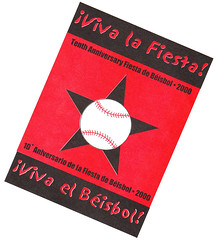
Any way for us non-Catbirders to get one of those swell Los Beisbolistas T-shirts?
[quote comment=”278881″][quote comment=”278875″]RE: Sandy Alomar’s Patriotic Chest Protector.
If I recall, Alomar only donned the red, white & blue chest protector AFTER hitting the eventual game winning 2-run HR in the 7th inning. Up until that point he wore his standard red chest protector. Almost as if Rawlings knew he’d be voted the MVP and wanted to maximize the exposure.[/quote]
Seriously?! Wow — I don’t recall that. Can anyone confirm?
One thing I do know: That photo is from the ninth inning. But that doesn’t answer the question of what he was wearing earlier in the game.[/quote]
I’m sure he never wore in a game but this reminds me of the gear Bill Freehan wore on the SI cover April 14, 1969.
link
[quote comment=”278878″][quote comment=”278876″][quote comment=”278839″][quote comment=”278837″]I was watching the player introductions at the 1977 All-Star game last night on YES network. Two Indians reserves (I don’t remember who) were wearing different color uniforms, one had red and the other had black. I thought that was quite unusual that the team and/or league couldn’t coordinate the correct color to wear.[/quote]
i GOTTA catch that rebroadcast sometime…of course, the yankees are promo-ing the shit out of the ASG during all of their telecasts, and always show some memorable moments from 1977…looks like the AL had many softball tops for that game…including a great scene of jim palmer serving up a gopher ball (forget to whom) in his orange jammy-top…and then there’s reggie in RF (in of course, the best uni in baseball, dammit), watching it sail over his head into the stands
good stuff[/quote]
Joe Morgan was the recipient of the gopher ball.[/quote]
I am surprised to have never heard about that feat during any of his telecasts![/quote]
Um . . .they talked about it AND showed the clip Sunday night . . .
There’s a new New Orleans Hornets logo:
link
link
From GCO: “This is likely a preview of the new uniforms. The fonts have changed a bit and the colors are darker and richer. Supposedly, the darker teal is called Mardi Gras Blue, even though the Mardi Gras colors are Purple, Green and Gold. So it looks like the Hornets new uniforms colors will be mainly blue and purple. I like the look, but I hope they don’t get confused with Dallas or Utah, who have similar color schemes.
Other changes include NOLA on the bug’s chest instead of New Orleans, which was so small before that it was hard to read. The Hornets head has been changed as well with a new grimmace on his face, updated eyes & antennea, different wings and colored in shoes.”
[quote comment=”278886″][quote comment=”278881″][quote comment=”278875″]RE: Sandy Alomar’s Patriotic Chest Protector.
If I recall, Alomar only donned the red, white & blue chest protector AFTER hitting the eventual game winning 2-run HR in the 7th inning. Up until that point he wore his standard red chest protector. Almost as if Rawlings knew he’d be voted the MVP and wanted to maximize the exposure.[/quote]
Seriously?! Wow — I don’t recall that. Can anyone confirm?
One thing I do know: That photo is from the ninth inning. But that doesn’t answer the question of what he was wearing earlier in the game.[/quote]
I’m sure he never wore in a game but this reminds me of the gear Bill Freehan wore on the SI cover April 14, 1969.
link
link
[quote comment=”278887″][quote comment=”278878″]looks like the AL had many softball tops for that game…including a great scene of jim palmer serving up a gopher ball (forget to whom) in his orange jammy-top…and then there’s reggie in RF (in of course, the best uni in baseball, dammit), watching it sail over his head into the stands[/quote]
Joe Morgan was the recipient of the gopher ball.[/quote]
I am surprised to have never heard about that feat during any of his telecasts![/quote]
Um . . .they talked about it AND showed the clip Sunday night . . .[/quote]
apparently matt was absent for that one
I should have the Brewers/Rox game on my DVR at home (unless my fiancee deleted it)… But of course it is the FSN Wisconsin broadcast. What exactly are you looking for??
[quote comment=”278890″][quote comment=”278887″][quote comment=”278878″]looks like the AL had many softball tops for that game…including a great scene of jim palmer serving up a gopher ball (forget to whom) in his orange jammy-top…and then there’s reggie in RF (in of course, the best uni in baseball, dammit), watching it sail over his head into the stands[/quote]
Joe Morgan was the recipient of the gopher ball.[/quote]
I am surprised to have never heard about that feat during any of his telecasts![/quote]
Um . . .they talked about it AND showed the clip Sunday night . . .[/quote]
apparently matt was absent for that one
now fixed?
[quote comment=”278881″][quote comment=”278875″]RE: Sandy Alomar’s Patriotic Chest Protector.
If I recall, Alomar only donned the red, white & blue chest protector AFTER hitting the eventual game winning 2-run HR in the 7th inning. Up until that point he wore his standard red chest protector. Almost as if Rawlings knew he’d be voted the MVP and wanted to maximize the exposure.[/quote]
Seriously?! Wow — I don’t recall that. Can anyone confirm?
One thing I do know: That photo is from the ninth inning. But that doesn’t answer the question of what he was wearing earlier in the game.[/quote]
OK, couldn’t save the photo right now, but this is true. For proof, follow these steps:
Go to gettyimages.com – type in “sandy alomar 1997 all-star” and make sure the editorial images box is checked, date doesn’t matter since you already put 1997. In the top row is a photo of Alomar wearing just red and it says it is from the 7th inning.
[quote comment=”278892″][quote comment=”278890″][quote comment=”278887″][quote comment=”278878″]looks like the AL had many softball tops for that game…including a great scene of jim palmer serving up a gopher ball (forget to whom) in his orange jammy-top…and then there’s reggie in RF (in of course, the best uni in baseball, dammit), watching it sail over his head into the stands[/quote]
Joe Morgan was the recipient of the gopher ball.[/quote]
I am surprised to have never heard about that feat during any of his telecasts![/quote]
Um . . .they talked about it AND showed the clip Sunday night . . .[/quote]
apparently matt was absent for that one
now fixed?[/quote]
Or maybe forgot the tags.
link
[quote comment=”278892″][quote comment=”278890″][quote comment=”278887″][quote comment=”278878″]looks like the AL had many softball tops for that game…including a great scene of jim palmer serving up a gopher ball (forget to whom) in his orange jammy-top…and then there’s reggie in RF (in of course, the best uni in baseball, dammit), watching it sail over his head into the stands[/quote]
Joe Morgan was the recipient of the gopher ball.[/quote]
I am surprised to have never heard about that feat during any of his telecasts![/quote]
Um . . .they talked about it AND showed the clip Sunday night . . .[/quote]
apparently matt was absent for that one
now fixed?[/quote]
Unfortunate for me, I was still unpacking from the trip to Cape Cod and missed it!
And no, I didn’t stay in P-Town…NTTATWWT!
[quote comment=”278827″][quote comment=”278819″]link.[/quote]
Some more pics:
link
link
And it seems that Derric Rose signed with Adidas and Beasley with Jordan/Nike:
link
it could just be that Beasley hasn’t signed yet and is wearing what he wants, because it is well known the guy is a huge jordanhead
[quote comment=”278893″][quote comment=”278881″][quote comment=”278875″]RE: Sandy Alomar’s Patriotic Chest Protector.
If I recall, Alomar only donned the red, white & blue chest protector AFTER hitting the eventual game winning 2-run HR in the 7th inning. Up until that point he wore his standard red chest protector. Almost as if Rawlings knew he’d be voted the MVP and wanted to maximize the exposure.[/quote]
Seriously?! Wow — I don’t recall that. Can anyone confirm?
One thing I do know: That photo is from the ninth inning. But that doesn’t answer the question of what he was wearing earlier in the game.[/quote]
OK, couldn’t save the photo right now, but this is true. For proof, follow these steps:
Go to gettyimages.com – type in “sandy alomar 1997 all-star” and make sure the editorial images box is checked, date doesn’t matter since you already put 1997. In the top row is a photo of Alomar wearing just red and it says it is from the 7th inning.[/quote]
Shit, I was looking in the Getty archive and totally missed that shot. Thanks!!
[quote]Or maybe forgot the tags.[/quote]
took out one too many “quote” tags, yes :(
[quote comment=”278865″]Those pants on the little leaguer are definitely softball pants. I didn’t realize they made them in kids sizes too. Boombah is the manufacturer they make some decent pants but then they have the horrendous ones like that kid was wearing. Go to link to see all of the styles. The pants will drive Paul crazy because they’re all designed to be baggy and go over the shoe. No stirrups with those pants.[/quote]
Like so:link
[quote comment=”278900″][quote comment=”278865″]Those pants on the little leaguer are definitely softball pants. I didn’t realize they made them in kids sizes too. Boombah is the manufacturer they make some decent pants but then they have the horrendous ones like that kid was wearing. Go to link to see all of the styles. The pants will drive Paul crazy because they’re all designed to be baggy and go over the shoe. No stirrups with those pants.[/quote]
Like so:link
or link
i am SO gonna have to see if i can score a pair or 3 of those from dicks when they (inevitably) hit the discount rack…those will absolutely ROCK on the links
[quote comment=”278843″]That little kid looks like he is wearing a pair of mens league softball pants. I see guys wearing stuff like that at tournaments all the time.
Super ugly.[/quote]
You put all 12 kids together and it looks like a Harlem Globetrotters game! Don’t get me wrong – I love the Globetrotters but little kids standing on a diamond looking like that is just wrong. We may be talking scarred for life.
Those pants arent going to hit the discount rack. There will always be a roided up softball player willing to buy those. And the only way you can wear them is if you do roids and scream while swinging a softball bat.
[quote comment=”278839″][quote comment=”278837″]I was watching the player introductions at the 1977 All-Star game last night on YES network. Two Indians reserves (I don’t remember who) were wearing different color uniforms, one had red and the other had black. I thought that was quite unusual that the team and/or league couldn’t coordinate the correct color to wear.[/quote]
i GOTTA catch that rebroadcast sometime…of course, the yankees are promo-ing the shit out of the ASG during all of their telecasts, and always show some memorable moments from 1977…looks like the AL had many softball tops for that game…including a great scene of jim palmer serving up a gopher ball (forget to whom) in his orange jammy-top…and then there’s reggie in RF (in of course, the best uni in baseball, dammit), watching it sail over his head into the stands
good stuff[/quote]
Best Uni in baseball???? Reggie wasn’t with the A’s in ’77
Is it customary for the basecoaches in the Minors to wear the parent teams helmets?
link
Inland Empire 66ers(Dodgers). Also on the photostream, though I’m sure it’s been mentioned, the Quakes hat appears to include a fault line on the brim. Nice touch.
[quote comment=”278903″]Those pants arent going to hit the discount rack. There will always be a roided up softball player willing to buy those. And the only way you can wear them is if you do roids and scream while swinging a softball bat.[/quote]
who says i don’t? ;)
[quote comment=”278895″]http://inventorspot.com/articles/the_10_worst_sports_logos_15358[/quote]
Brownie doesn’t belong on that list! And, I think I might argue that there are worse logos than the original Tampa Bay Buc and The Cubs with the bear in the middle of the C.
[quote comment=”278907″][quote comment=”278895″]http://inventorspot.com/articles/the_10_worst_sports_logos_15358[/quote]
Brownie doesn’t belong on that list! And, I think I might argue that there are worse logos than the original Tampa Bay Buc and The Cubs with the bear in the middle of the C.[/quote]
yeah, like the New York Rangers “sheild” logo.
THE MYSTERY OF THE GREEN BAY FIVE! 1992 EDITION
Hi.
I know the Green Bay 5 (the 5 used on the uniform numbers) has been covered before in detail because it looks so weird, but I think I bring something new to the boards with these caps.
Having recently watched Green Bay @ Cincinnati from 1992, I took the following caps.
To sum up my findings, different players have different number fonts on their jerseys, with no apparant logic to this. Were Green Bay recycling their shirts, having recently acquired a new uniform supplier, and were too cheap to match uniform fonts?
Check the following photos
link
link
link
link
link
Notice the pointed out differences?
Number 75(LT): Square on back and front
Number 65(RG): Rounded on back and square on the front. (see 1 and 3)
Number 50(LB): Rounded on back and front
Number 56(LB): Rounded on back and front
Number 57(LG): Square on the back and front
Number 95(DE): Rounded on back and front
So, some of the players have square angle 5s, and some have rounded, angular 5s on their jerseys. In all of the jerseys, the numerals are the same on the front and back, except from #65 who from various photos, appears to have different numerals on the front and back.
Just thought that was quite interesting.
Ta
Elliott
[quote comment=”278879″]Just a tad bit over the top here on the first pitch in a minor league game in Korea!
link
Apparently they wear caps and sleeves but no pants with the first pitch.[/quote]
If you watch the second video, you can tell she is wearing shorts, extremely short ones, but none the less, shorts. Also interesting that the batter from the opposing team was in the batter’s box and actually swung at the pitch.
Also, who is the girl?
[quote comment=”278837″]I was watching the player introductions at the 1977 All-Star game last night on YES network. Two Indians reserves (I don’t remember who) were wearing different color uniforms, one had red and the other had black. I thought that was quite unusual that the team and/or league couldn’t coordinate the correct color to wear.[/quote]
I noticed that, too – the two Cleveland Indians reserves were pitchers Dennis Eckersley and Jim Kern – both appeared in that game.
link
Benfica (Portuguese soccer club) released their 2008/2009 jerseys today:
link
[quote comment=”278910″][quote comment=”278879″]Apparently they wear caps and sleeves but no pants with the first pitch.[/quote]
who is the girl?[/quote]
does it matter?
[quote comment=”278908″][quote comment=”278907″][quote comment=”278895″]http://inventorspot.com/articles/the_10_worst_sports_logos_15358[/quote]
Brownie doesn’t belong on that list! And, I think I might argue that there are worse logos than the original Tampa Bay Buc and The Cubs with the bear in the middle of the C.[/quote]
yeah, like the New York Rangers “sheild” logo.[/quote]
but that link logo IS HORRIBLE…definitely deserves the worst spot
[quote comment=”278893″][quote comment=”278881″][quote comment=”278875″]RE: Sandy Alomar’s Patriotic Chest Protector.
If I recall, Alomar only donned the red, white & blue chest protector AFTER hitting the eventual game winning 2-run HR in the 7th inning. Up until that point he wore his standard red chest protector. Almost as if Rawlings knew he’d be voted the MVP and wanted to maximize the exposure.[/quote]
Seriously?! Wow — I don’t recall that. Can anyone confirm?
One thing I do know: That photo is from the ninth inning. But that doesn’t answer the question of what he was wearing earlier in the game.[/quote]
OK, couldn’t save the photo right now, but this is true. For proof, follow these steps:
Go to gettyimages.com – type in “sandy alomar 1997 all-star” and make sure the editorial images box is checked, date doesn’t matter since you already put 1997. In the top row is a photo of Alomar wearing just red and it says it is from the 7th inning.[/quote]
[quote]http://cache1.asset-cache.net/xc/52023687.jpg?v=1&c=NewsMaker&k=2&d=F8518A8D4148124669EADFDA451E5FC1284831B75F48EF45]7th Inning[/quote]
[quote]http://cache1.asset-cache.net/xc/51651685.jpg?v=1&c=NewsMaker&k=2&d=AE5E3E7DB8E314177E30AF553E092563284831B75F48EF45]9th Inning[/quote]
And that wasn’t his typical catchers mask either. I’m thinking that was a gimmick helmet cam, you can kind of see the camera in the top of the helmet.
[quote comment=”278914″][quote comment=”278908″][quote comment=”278907″][quote comment=”278895″]http://inventorspot.com/articles/the_10_worst_sports_logos_15358[/quote]
Brownie doesn’t belong on that list! And, I think I might argue that there are worse logos than the original Tampa Bay Buc and The Cubs with the bear in the middle of the C.[/quote]
yeah, like the New York Rangers “sheild” logo.[/quote]
but that link logo IS HORRIBLE…definitely deserves the worst spot[/quote]
Is that even really an alternate logo for them? I have never seen that. If it is that is truly piss poor.
One more try…
9th inning
link
7th inning
link
[quote comment=”278907″][quote comment=”278895″]http://inventorspot.com/articles/the_10_worst_sports_logos_15358[/quote]
Brownie doesn’t belong on that list! And, I think I might argue that there are worse logos than the original Tampa Bay Buc and The Cubs with the bear in the middle of the C.[/quote]
Two comments:
1. When/where have the Jets ever used that logo?
2. Am I the only person on Earth who doesn’t hate that Islanders logo?
[quote comment=”278916″][quote comment=”278914″]but that link logo IS HORRIBLE…definitely deserves the worst spot[/quote]
Is that even really an alternate logo for them? I have never seen that. If it is that is truly piss poor.[/quote]
according to the story:
[quote]Worst Sports Logo #10. The Idea Was There…
Believe it or not, this interesting design has been used as the New York Jets alternate logo since 2002. From one point of view it looks like an angry face, but others have said it’s actually an airplane (curvy line) landing on a football. Go figure.[/quote]
so…yeah…i guess…i aint never seen it neither tho
[quote comment=”278918″][quote comment=”278907″][quote comment=”278895″]http://inventorspot.com/articles/the_10_worst_sports_logos_15358[/quote]
Brownie doesn’t belong on that list! And, I think I might argue that there are worse logos than the original Tampa Bay Buc and The Cubs with the bear in the middle of the C.[/quote]
Two comments:
1. When/where have the Jets ever used that logo?
2. Am I the only person on Earth who doesn’t hate that Islanders logo?[/quote]
Mr. Brian, meet Mr. Teebz…
Thank you for the baseball card project link.
I wonder if anyone else noticed that the two brothers on this card are mixed up?
link
I knew Rick was 48 so that forced me to take a closer look.
[quote comment=”278920″][quote comment=”278918″][quote comment=”278907″][quote comment=”278895″]http://inventorspot.com/articles/the_10_worst_sports_logos_15358[/quote]
Brownie doesn’t belong on that list! And, I think I might argue that there are worse logos than the original Tampa Bay Buc and The Cubs with the bear in the middle of the C.[/quote]
Two comments:
1. When/where have the Jets ever used that logo?
2. Am I the only person on Earth who doesn’t hate that Islanders logo?[/quote]
Mr. Brian, meet link…[/quote]
fixed
[quote comment=”278922″][quote comment=”278920″][quote comment=”278918″][quote comment=”278907″][quote comment=”278895″]http://inventorspot.com/articles/the_10_worst_sports_logos_15358[/quote]
Brownie doesn’t belong on that list! And, I think I might argue that there are worse logos than the original Tampa Bay Buc and The Cubs with the bear in the middle of the C.[/quote]
Two comments:
1. When/where have the Jets ever used that logo?
2. Am I the only person on Earth who doesn’t hate that Islanders logo?[/quote]
Mr. Brian, meet link…[/quote]
fixed[/quote]
Thanks, Phil. Much more effective.
Two thoughts from what I’ve seen today …
1. A little kid wears a horribly chosen little league jersey and not ONE comment from Bryan? Anyone check to see if he’s OK?
2. I found it interesting that LaRussa wore 10 with Oakland. It was widely reported (especially a couple years ago, for some reason) that he wears 10 in St. Louis, since his goal was to bring the team its 10th championship. Now we know it’s just a representation of his blood alcohol level.
[quote comment=”278909″]THE MYSTERY OF THE GREEN BAY FIVE! 1992 EDITION
Hi.
I know the Green Bay 5 (the 5 used on the uniform numbers) has been covered before in detail because it looks so weird, but I think I bring something new to the boards with these caps.
Having recently watched Green Bay @ Cincinnati from 1992, I took the following caps.
To sum up my findings, different players have different number fonts on their jerseys, with no apparant logic to this. Were Green Bay recycling their shirts, having recently acquired a new uniform supplier, and were too cheap to match uniform fonts?
Check the following photos
link
link
link
link
link
Notice the pointed out differences?
Number 75(LT): Square on back and front
Number 65(RG): Rounded on back and square on the front. (see 1 and 3)
Number 50(LB): Rounded on back and front
Number 56(LB): Rounded on back and front
Number 57(LG): Square on the back and front
Number 95(DE): Rounded on back and front
So, some of the players have square angle 5s, and some have rounded, angular 5s on their jerseys. In all of the jerseys, the numerals are the same on the front and back, except from #65 who from various photos, appears to have different numerals on the front and back.
Just thought that was quite interesting.
Ta
Elliott[/quote]
Nice work, Elliott!
[quote comment=”278912″]Benfica (Portuguese soccer club) released their 2008/2009 jerseys today:
link
So now we know what Freddy Adu will be wearing next year(well, in the portugesse cup or reserve league). Different sponsors for home and away(alt)? interesting. Not a bad look though.
[quote comment=”278924″] I found it interesting that LaRussa wore 10 with Oakland. It was widely reported (especially a couple years ago, for some reason) that he wears 10 in St. Louis, since his goal was to bring the team its 10th championship. Now we know it’s just a representation of his blood alcohol level.[/quote]
i think the league disallowed link more reflective jersey
[quote comment=”278922″][quote comment=”278920″][quote comment=”278918″][quote comment=”278907″][quote comment=”278895″]http://inventorspot.com/articles/the_10_worst_sports_logos_15358[/quote]
Brownie doesn’t belong on that list! And, I think I might argue that there are worse logos than the original Tampa Bay Buc and The Cubs with the bear in the middle of the C.[/quote]
Two comments:
1. When/where have the Jets ever used that logo?
2. Am I the only person on Earth who doesn’t hate that Islanders logo?[/quote]
Mr. Brian, meet link…[/quote]
fixed[/quote]
Should I even ask who that is?
[quote comment=”278868″][quote comment=”278867″][quote comment=”278811″]
Back then it was very common for goalies to wear #1, don’t know about both starting and backup wearing #1 though…[/quote]
Wasn’t there a time when goalies were required to be either #1 or #30?[/quote]
There was no set time period for this, from what I’ve read. It was just as accepted practice, much like in soccer where they assigned jersey numbers as to the position played. Goaltenders either took the lowest number or the highest number. Usually your starter took #1 and the backup (when they finally were accepted) took the highest number.[/quote]
Wasn’t that back when teams carried only one goalie and a standby goalie was in the stands in case one of the goalies got hurt? A Ranger game program from the 70s or 80s had a story on Joe Schafer, an off-ice official who became the Ranger goalie for a day after the starter got hurt. IIRC he wore the number 1 as well.
[quote comment=\”278918\”][quote comment=\”278907\”][quote comment=\”278895\”]http://inventorspot.com/articles/the_10_worst_sports_logos_15358[/quote]
Brownie doesn\’t belong on that list! And, I think I might argue that there are worse logos than the original Tampa Bay Buc and The Cubs with the bear in the middle of the C.[/quote]
Two comments:
1. When/where have the Jets ever used that logo?
2. Am I the only person on Earth who doesn\’t hate that Islanders logo?[/quote]
1) Never. I Hope…
2) No. It’s never going to make my top 5, but I’ve always had a special place in my heart for that logo. Makes me think of fish sticks.
More importantly though, that Tigers design is maybe my favorite uniform that the Ol’ D ever wore. Especially when it went onto the back of the shirt. This poor photo doesn’t do it any justice.
Pens signed forward Janne Pesonen from the Finnish Elite League. There is something i never seen before, a collar on a hockey jersey. Plus, look at that gold helmet, its like their skating pimps.
link
[quote comment=”278931″]Pens signed forward Janne Pesonen from the Finnish Elite League. There is something i never seen before, a collar on a hockey jersey. Plus, look at that gold helmet, its like their skating pimps.
link
“they’re”, not “their”. I need to go back to the 4th grade.
its been awhile since i’ve been to the site, but i was wondering if the follwing pic of the new nike uniforms for the track and field team has been brought up…
link
track and field athletes or american gladiators? i guess it’s up to us to decide…
[quote comment=”278931″]Pens signed forward Janne Pesonen from the Finnish Elite League. There is something i never seen before, a collar on a hockey jersey. Plus, look at that gold helmet, its like their skating pimps.
link
what collar?
[quote comment=”278862″][quote comment=”278857″] (On the unis to be worn in the Chicago Winter Classic:)
“More or less what we saw in 1991-92 with the Blackhawks and Red Wings; the Wings with the 1928 “DETROIT” red-and-white striping and the Blackhawks with the black barber pole with those funky red and white stripes.”[/quote]
“The jerseys commemorating the NHL’s 75th birthday, you mean.”[/quote]
You would be correct, but the Blackhawks and Red Wings brought them back out again in 1994 for a “Turn Back The Clock Game” in Chicago Stadium’s final season.
[quote comment=”278933″]its been awhile since i’ve been to the site, but i was wondering if the follwing pic of the new nike uniforms for the track and field team has been brought up…
link
track and field athletes or american gladiators? i guess it’s up to us to decide…[/quote]
Thanks for the reminder … American Gladiators vs. The Office on celebrity Family Feud tonight … must set Tivo now.
[quote comment=”278934″][quote comment=”278931″]Pens signed forward Janne Pesonen from the Finnish Elite League. There is something i never seen before, a collar on a hockey jersey. Plus, look at that gold helmet, its like their skating pimps.
link
what collar?[/quote]
Now that’s what I call Jersey sponsorship overkill.
[quote comment=”278931″]Plus, look at that gold helmet, its like their skating pimps.
link
Gold helmet = team’s leading scorer
[quote comment=”278937″][quote comment=”278934″][quote comment=”278931″]Pens signed forward Janne Pesonen from the Finnish Elite League. There is something i never seen before, a collar on a hockey jersey. Plus, look at that gold helmet, its like their skating pimps.
link
what collar?[/quote]
Now that’s what I call Jersey sponsorship overkill.[/quote]
Ah, a NASCARHL jersey.
ok…i just walked outside my office and there’s the goodyear blimp…
i can’t think of anything going on this week in the greater NYC area of interest, so im guessing it’s gotta be here for the ASG next week…hmmmm
at least, that’s all i can think of…any other ideas? (not that it’s a big deal)
[quote comment=”278940″]ok…i just walked outside my office and there’s the goodyear blimp…
i can’t think of anything going on this week in the greater NYC area of interest, so im guessing it’s gotta be here for the ASG next week…hmmmm
at least, that’s all i can think of…any other ideas? (not that it’s a big deal)[/quote]
Maybe they are just qualifying?
[quote comment=”278931″]Pens signed forward Janne Pesonen from the Finnish Elite League. There is something i never seen before, a collar on a hockey jersey. Plus, look at that gold helmet, its like their skating pimps.
link
That’s to indicate that he’s the leading scorer. Team or league, I don’t remember. He was both.
As for the Goalie number discussion, back in the day a team kept 29 players on it’s roster, and the goalie (there was only one) was always issued number one. When they added a second Goalie, the next number was 30. That’s how 30 became the de facto goalie number now- 1’s got retired, players thought they look presumptuous, so on and so forth.
And there are some college teams that still insist on the traditional numbering- Boston College coming to mine.
[quote comment=”278941″][quote comment=”278940″]ok…i just walked outside my office and there’s the goodyear blimp…
i can’t think of anything going on this week in the greater NYC area of interest, so im guessing it’s gotta be here for the ASG next week…hmmmm
at least, that’s all i can think of…any other ideas? (not that it’s a big deal)[/quote]
Maybe they are just qualifying?[/quote]
I was driving home the other day and saw the Goodyear blimp up here (south of Boston). My 6-year old son wasn’t nearly as impressed as i was . . .
Here is a picture of Jonathan Ogden on draft day with the generic Raven’s hat and logo.
link
[quote comment=”278944″]Here is a picture of Jonathan Ogden on draft day with the generic Raven’s hat and logo.
link
Love the black socks and white shoes on the guy on his right side.
[quote comment=”278945″][quote comment=”278944″]Here is a picture of Jonathan Ogden on draft day with the generic Raven’s hat and logo.
link
Love the black socks and white shoes on the guy on his right side.[/quote]
art modell looks pretty fuckin happy to be there too
link in blank helmet/jersey (donruss rookie card)
In the 1970s, the A’s used to have players wear multiple jerseys at All-Star Games (white, gold, and green). They usually had five to seven players on the team.
[quote comment=”278850″]The Philadelphia Flyers have already confirmed an orange alternate jersey for this coming season.
The St. Louis Blues have also confirmed an alternate jersey for this season, compliments of Dave Checketts – kind of from the horse’s mouth, so to speak.
We’ve seen video of one of Boston’s four potential alternates, so be prepared for a Bruins alternate jersey as well.
There were a reported 18 teams interested in an alternate jersey for this season, but I’m guessing that might be reduced to a mere handfu. Otherwise, the league might as well have all the teams make an alternate. Unfortunately, no dates have been released regarding the first looks at these confirmed new outfits.
Lastly, regarding the outdoor game in Chicago, I would venture a guess and say that Rbk will go retro with those jerseys, much like they did with Pittsburgh and Buffalo. Of course, that’s up to the NHL and the teams to decide, but I cannot see them throwing the historical aspect aside, especially between two Original Six teams.[/quote]
The exact list of teams with proposed third jerseys for next season are:
Atlanta Thrashers (More maroon)
Boston Bruins (Black with shoulder patch as main chest insignia)
Buffalo Sabres (Blue Vintage sweaters)
Carolina Hurricanes (Black with secondary logo on front)
Chicago Blackhawks (Black)
Dallas Stars (White version of current black one)
Edmonton Oilers (Vintage with lace collar)
Los Angeles Kings (Purple…sorry Paul)
Minnasota Wild (Green with Minnasota accross the chest al la New York Rangers)
New York Islanders (Vintage)
Ottawa Senators (Gold with SENS across the front)
Philadelphia Flyers (Orange…not sure about the logo)
Phoenix Coyotes (Black with full-body Coyote)
Pittsburgh Penguines (Blue Winter Classic jerseys)
San Jose Sharks (Black with secondary logo)
St. Louis Blues (Navy with new logo featuring the Gateway arch)
Tampa Bay Lightning (Navy with BOLTS across the front)
Toronto Maple Leafs (Vintage)
Vancouver Canucks (Vintage blue stick-in-the-rink)
That’s what I know for now. Most are confirmed by higher ups and I will update the list if I learn more or less about other teams
Since I usually read the site so late in the evening, I don’t get a chance to post much. But I just saw this for the OKC duds. Has this been seen before or confirmed? Sorry if it’s old news. And of course I can’t link.
link
[quote comment=”278948″]In the 1970s, the A’s used to have players wear multiple jerseys at All-Star Games (white, gold, and green). They usually had five to seven players on the team.[/quote]
And Chuck Norris used to bat clean-up for both teams simultaneously.
But seriously, about these “worst” logos, I think we’ve come far enough as a society in our acceptance of sexual choices that we no longer have to make fun of the Tampa Bay pirate. And the Cleveland Brownie, are they kidding, that’s one of the BEST logos ever. Missing in action: the Buffaslug, the Tennessee flaming tack, any animal portrayed as angry that does not naturally get angry, the old Atlanta Hawks’ Pacman. Or just for amount of confusion inspired, the Montreal Expos’ “M,” or “eMb,” or “cdMb,” or whatever you wish it to be.
Some of their choices were good, though: the lumpy bear cub; the confused, chocolate tiger of Detroit.
[quote comment=”278951″][quote comment=”278948″]In the 1970s, the A’s used to have players wear multiple jerseys at All-Star Games (white, gold, and green). They usually had five to seven players on the team.[/quote]
And Chuck Norris used to bat clean-up for both teams simultaneously.
But seriously, about these “worst” logos, I think we’ve come far enough as a society in our acceptance of sexual choices that we no longer have to make fun of the Tampa Bay pirate. And the Cleveland Brownie, are they kidding, that’s one of the BEST logos ever. Missing in action: the Buffaslug, the Tennessee flaming tack, any animal portrayed as angry that does not naturally get angry, the old Atlanta Hawks’ Pacman. Or just for amount of confusion inspired, the Montreal Expos’ “M,” or “eMb,” or “cdMb,” or whatever you wish it to be.
Some of their choices were good, though: the lumpy bear cub; the confused, chocolate tiger of Detroit.[/quote]
Pitt’s horrible ink blot Panther ranks up there for me too.
Charley Finley was a misunderstood genius. Another of his ideas was an air blower that popped out of the center of home plate and automatically blew the dirt off it. It was activated by the ump stepping on a button of some sort embedded in the dirt. Obviously the idea was to eliminate the need for the ump to wisk it. I remember one night watching on TV (likely a Yankees-A’s game) when the ump accidentally stepped on the button as a better was stepping into the box and the air release startled him into tossing his bat back over his shoulder. I wish I could find a reference to it.
[quote comment=”278953″]Charley Finley was a misunderstood genius…[/quote]
Mike Andrews might beg to differ on that one.
[quote comment=”278933″]its been awhile since i’ve been to the site, but i was wondering if the follwing pic of the new nike uniforms for the track and field team has been brought up…
link
track and field athletes or american gladiators? i guess it’s up to us to decide…[/quote]
Holy mother of…yikes! What is the deal with the detached compression sleeves? I’m not a runner, does maximum efficiency and/or aerodynamics in the forearm really make you faster?! And did ya notice that the back is the same pattern as the back of the basketball jerseys?
The exact list of teams with proposed third
jerseyssweaters for next season are: [with my personal comments]Atlanta Thrashers (More maroon) [Ugh.]
Boston Bruins (Black with shoulder patch as main chest insignia) [Eh.]
Buffalo Sabres (Blue Vintage sweaters) [Good.]
Carolina Hurricanes (Black with secondary logo on front) [Meh.]
Chicago Blackhawks (Black) [White reversed.]
Dallas Stars (White version of current black one) [BOR-ING!]
Edmonton Oilers (Vintage with lace collar)
Los Angeles Kings (Purple…sorry Paul)
Minnesota Wild (Green with Minnesota across the chest a la New York Rangers) [Ho Ho Ho! Merry Christmas!]
New York Islanders (Vintage) [Make ’em permement!]
Ottawa Senators (Gold with SENS across the front) [Ugh.]
Philadelphia Flyers (Orange…not sure about the logo) [It’s the 1974 sweaters!]
Phoenix Coyotes (Black with full-body Coyote)
Pittsburgh Penguines (Blue Winter Classic
jerseyssweaters) [Nice.]San Jose Sharks (Black with secondary logo)
St. Louis Blues (Navy with new logo featuring the Gateway arch)
Tampa Bay Lightning (Navy with BOLTS across the front) [Ugh.]
Toronto Maple Leafs (Vintage) [Good.]
Vancouver Canucks (Vintage blue stick-in-the-rink) [With purple pants?]
I am watching my newly acquired pitcher pitch for the Brew Crew tonight, and noticed behind home plate, the Brewers have the “Hart” logo in reference to the “I Hart NY” slogan in order to get people to vote for Corey Hart for the All-Star game. The logo is this:
link
Pretty cool slogan if you ask me. I have already voted for Hart a few hundred times in the past few days. I hope he makes it. He is one of the best Brewers, and is very underrated.
GO BREWERS!
PS – I will get a screen grab of the “Hart” logo in the dirt when I get home.
[quote comment=”278953″]Charley Finley was a misunderstood genius. Another of his ideas was an air blower that popped out of the center of home plate and automatically blew the dirt off it. It was activated by the ump stepping on a button of some sort embedded in the dirt. Obviously the idea was to eliminate the need for the ump to wisk it. I remember one night watching on TV (likely a Yankees-A’s game) when the ump accidentally stepped on the button as a better was stepping into the box and the air release startled him into tossing his bat back over his shoulder. I wish I could find a reference to it.[/quote]
The ump ‘accidentally’ stepping on the air plate is an old Ron Luciano story – done on purpose as a joke!
[quote comment=”278957″]I am watching my newly acquired pitcher pitch for the Brew Crew tonight, and noticed behind home plate, the Brewers have the “Hart” logo in reference to the “I Hart NY” slogan in order to get people to vote for Corey Hart for the All-Star game. The logo is this:
link
Pretty cool slogan if you ask me. I have already voted for Hart a few hundred times in the past few days. I hope he makes it. He is one of the best Brewers, and is very underrated.
GO BREWERS!
PS – I will get a screen grab of the “Hart” logo in the dirt when I get home.[/quote]
I think “Punch A.J.” for Pierzynski in ’06 was brilliant. Think of the timing: earlier that year was the Barrett incident against the Cubs.
[quote comment=”278918″][quote comment=”278907″][quote comment=”278895″]http://inventorspot.com/articles/the_10_worst_sports_logos_15358[/quote]
Brownie doesn’t belong on that list! And, I think I might argue that there are worse logos than the original Tampa Bay Buc and The Cubs with the bear in the middle of the C.[/quote]
Two comments:
1. When/where have the Jets ever used that logo?
2. Am I the only person on Earth who doesn’t hate that Islanders logo?[/quote]
I’ve always been a huge fan of that Islanders logo. I always thought it looked pretty cool and it never made me think of “fishsticks.” I always hate to see it on the worst logos of all-time list.
A few days (weeks ago) there was discussion about an ambidextrous glove. One popped up on eBay
link
[quote comment=”278960″][quote comment=”278918″][quote comment=”278907″][quote comment=”278895″]http://inventorspot.com/articles/the_10_worst_sports_logos_15358[/quote]
Brownie doesn’t belong on that list! And, I think I might argue that there are worse logos than the original Tampa Bay Buc and The Cubs with the bear in the middle of the C.[/quote]
Two comments:
1. When/where have the Jets ever used that logo?
2. Am I the only person on Earth who doesn’t hate that Islanders logo?[/quote]
I’ve always been a huge fan of that Islanders logo. I always thought it looked pretty cool and it never made me think of “fishsticks.” I always hate to see it on the worst logos of all-time list.[/quote]
I don’t think the logo itself is bad. My two least favorite things about that identity package were the addition of teal and the typography.
If the teal alone wasn’t enough, the curved lines made it really unbearable to me. The blue, orange, and teal together in that pattern always reminded me of Aquafresh toothpaste.
The curved lines then led to the unique typography, which I really didn’t like. It is too busy for my taste. I much prefer simpler geometry. I love vertical arches, and I didn’t find the Gretzky Blues jerseys too offensive (How can a musician not appreciate the fact that the five red lines form a staff line?), but the Islanders’ calligraphy left me a little seasick.
(Teebz, I hope I’m not criticizing your beloved Kasparaitis jersey too unfairly.)
The Giants broadcast just showed Pedro in the dugout. All buttons properly fastened. I guess the Porthole is only for days he pitches.
[quote comment=”278918″][quote comment=”278907″][quote comment=”278895″]http://inventorspot.com/articles/the_10_worst_sports_logos_15358[/quote]
Brownie doesn’t belong on that list! And, I think I might argue that there are worse logos than the original Tampa Bay Buc and The Cubs with the bear in the middle of the C.[/quote]
Two comments:
1. When/where have the Jets ever used that logo?
2. Am I the only person on Earth who doesn’t hate that Islanders logo?[/quote]
Show me some proof of that NYJ logo. I don’t think so.
[quote comment=”278959″][quote comment=”278957″]I am watching my newly acquired pitcher pitch for the Brew Crew tonight, and noticed behind home plate, the Brewers have the “Hart” logo in reference to the “I Hart NY” slogan in order to get people to vote for Corey Hart for the All-Star game. The logo is this:
link
Pretty cool slogan if you ask me. I have already voted for Hart a few hundred times in the past few days. I hope he makes it. He is one of the best Brewers, and is very underrated.
GO BREWERS!
PS – I will get a screen grab of the “Hart” logo in the dirt when I get home.[/quote]
I think “Punch A.J.” for Pierzynski in ’06 was brilliant. Think of the timing: earlier that year was the Barrett incident against the Cubs.[/quote]
The Red Sox host the Yankees in late July. If I am a fan in Boston, I am whipping up Madonna masks to pass out RIGHT NOW.
[quote]I guess the Porthole is only for days he pitches.[/quote]
or catches
NTTAWWT
From today’s post: “Here are two shots of the 1907 baseball team at the Georgia School of Technology (now Georgia Tech). Quite the fearsome mascot in that last shot – rrrrooowwrrrr! (Looks like this 1920s team had a slightly more appropriate mascot.)”
I am sure that last part was supposed to read “less appropriate mascot”, as the pooch in the 1920s picture appears to be a bulldog- a symbol of tech’s most hated rival…
[quote comment=”278964″][quote comment=”278918″][quote comment=”278907″][quote comment=”278895″]http://inventorspot.com/articles/the_10_worst_sports_logos_15358[/quote]
Brownie doesn’t belong on that list! And, I think I might argue that there are worse logos than the original Tampa Bay Buc and The Cubs with the bear in the middle of the C.[/quote]
Two comments:
1. When/where have the Jets ever used that logo?
2. Am I the only person on Earth who doesn’t hate that Islanders logo?[/quote]
Show me some proof of that NYJ logo. I don’t think so.[/quote]
I remember a few years ago that the Jets website started with a flash into of that “mouth” chomping. I don’t see it now, but someone else has to remember that.
Random, but I was watching some old episodes of Square One on youtube, and noticed that Mathman wears a Princeton/Michigan style football helmet.
link
[quote comment=”278820″]The White Sox hosted the inaugural “link” at U.S. Cellular yesterday, commemorating the 75th anniversary of the Negro League East-West All-Star Game, and featuring inner-city high school ballplayers from around the midwest.
The Tribune has a link up, and there’s a handful of good uni shots…[/quote]
mucked the last one up sorry for the double post, but those uniforms are gorgeous the East is nicer then the West but both are awesome.
[quote comment=”278965″][quote comment=”278959″][quote comment=”278957″]I am watching my newly acquired pitcher pitch for the Brew Crew tonight, and noticed behind home plate, the Brewers have the “Hart” logo in reference to the “I Hart NY” slogan in order to get people to vote for Corey Hart for the All-Star game. The logo is this:
link
Pretty cool slogan if you ask me. I have already voted for Hart a few hundred times in the past few days. I hope he makes it. He is one of the best Brewers, and is very underrated.
GO BREWERS!
PS – I will get a screen grab of the “Hart” logo in the dirt when I get home.[/quote]
I think “Punch A.J.” for Pierzynski in ’06 was brilliant. Think of the timing: earlier that year was the Barrett incident against the Cubs.[/quote]
The Red Sox host the Yankees in late July. If I am a fan in Boston, I am whipping up Madonna masks to pass out RIGHT NOW.[/quote]
Here is photo evidence of the “I Hart NY” logo behind the plate at the Brewers game this evening:
link
[quote comment=”278964″][quote comment=”278918″][quote comment=”278907″][quote comment=”278895″]http://inventorspot.com/articles/the_10_worst_sports_logos_15358[/quote]
Brownie doesn’t belong on that list! And, I think I might argue that there are worse logos than the original Tampa Bay Buc and The Cubs with the bear in the middle of the C.[/quote]
Two comments:
1. When/where have the Jets ever used that logo?
2. Am I the only person on Earth who doesn’t hate that Islanders logo?[/quote]
Show me some proof of that NYJ logo. I don’t think so.[/quote]
It’s listed on Chris Creamer’s Logo site as an alternate even though I’ve never seen it before.
link
[quote comment=”278972″]I am watching my newly acquired pitcher pitch for the Brew Crew tonight[/quote]
better chance brett will be playing in october than cc
[quote comment=”278931″]Pens signed forward Janne Pesonen from the Finnish Elite League. There is something i never seen before, a collar on a hockey jersey. Plus, look at that gold helmet, its like their skating pimps.
link
The gold helmet indicated the team’s leading goal-scorer.
Brian, I am Teebz, and I consider hockey my religion. And the Isles’ Fisherman is awesome. Decades ahead of its time.
Nice to meet you, sir. :o)
COlorado Rapids introduced their new 3rd shirts today, ahead of tomorrow’s friendly vs Mexican side Tigres. White tops/burgundy bottoms. With “Arsenal” red piping.
link
Oh, and one more note: The Trademark monster is alive and well in New England.
link
In the dueling windbreaker pic of Tony LaRussa and Roger Craig, their jerseys are sporting black mourning bands.
Are these in relation to the San Fransisco earthquake?
Most likely for Bart Giamatti.
[quote comment=”278885″]Any way for us non-Catbirders to get one of those swell Los Beisbolistas T-shirts?[/quote]
A couple Beisbolista designs are available at:
link