Back in August of 2005, when this site didn’t yet exist and the Uni Watch News Ticker ran as part of my ESPN column every two weeks, I wrote an article that included this little nugget (which originally included some photo links that have long since expired):
The Marlins recently tried a bit of team uni-ty by agreeing to have everyone cuff their pants up high. “I heard Paul LoDuca started it, to give the team a spark,” reports Marlins fan and Uni Watch reader Kevin Sorg. “Todd Jones won’t wear it on the mound when he closes, but the second he gets the last out, he pulls up the pant legs to show the socks up.”
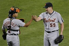
Three seasons later, Todd Jones once again finds himself on a team looking to strike a note of hosiery-based solidarity. This time it’s the Tigers, who went high-cuffed on Saturday (additional info in the sixth graf of this story, and note that Miguel Cabrera’s socks were logo emblazoned).
Just as he did with the Marlins, Jones chose to stay low-cuffed when he entered the game and then hiked up his pants after getting the final out. But that’s where the similarity ends. Back in Florida, Jones had full-length socks under his pants (no pics, but I saw video of it at the time, trust me). But when he pulled up his pant legs on Saturday, he revealed something else altogether — ewwwww. And although it’s tough to see in that screen grab, those are official NBA quarter-socks — a rare (and, in this instance, rather off-putting) case of cross-league apparel.
In addition to adjusting his cuffs at the game’s conclusion, Jones also went untucked. Unfortunately, no single shot showed the full bare-legged, shirttails-a-flappin’ effect, presumably because no camera was capable of capturing such an image without exploding.
And yet Jones didn’t seem the least bit ashamed of his appearance. In fact, you might say he looked proud out there, almost like he was rubbing the victory in the D-backs’ faces. Why be confrontational like that? See Todd Jones, hear him roar.
But I guess he’s got rights, or whatever.
Jones, incidentally, isn’t the only player wearing teeny little ankle socks. Reader Laren Richardson informs me that Jim Edmonds fouled a ball off his ankle during last night’s Cubs/Astros game and then rolled up his cuff to reveal this. Is this the new trend in baseball? Dainty little sockie-poos instead of gloriously full-fledged hose? And people wonder why this country’s going down the crapper.
Uni Watch News Ticker: While poking around in the Sporting News archives, I came across an incredible article about the Cubs’ 1937 uniforms. The Cubbies made a lot of changes that year, going from this to this (which featured, among other things, history’s first zipper-front jersey). Stop whatever you’re doing and read this — you won’t be sorry. ”¦ Bit of a javelin mishap in Utah the other day. Details here. ”¦ The Duke lacrosse team is wearing American flag left-sleeve patches — execept for Zack Greer, who’s from Ontario, so he has the Canadian flag (with thanks to Cosmo Santullo). ”¦ George Sherrill’s flat-brim look is catching on (with thanks to Jeffrey Soderberg). ”¦ Not uni-related, but I’ve been meaning to mention that when I was in Seattle a while back, Ebbets Field Flannels prexy Jerry Cohen took me to this amazing sandwich shop, which has its own curing room (in case you hadn’t figured it out, about the only thing I love more than design minutiae is meat). ”¦ John Lüders found a nice gallery focusing on corporate sponsorships in German and European soccer. “This shot shows something I’ve never heard of before in Germany,” he writes. “In 1988 FC Homburg wanted to advertise condoms (the brand was called London Rubber Company), but the German football league wouldn’t let it pass — too raunchy for the times apparently (personally, I think the overall jersey design is the far worse crime). And this one shows Eintracht Braunschweig in 1976. Back then, advertising was basically forbidden in German football, so what did the club, very high in debt, simply changed their whole emblem into the Jägermeister sign. The jersey now has reached cult status among supporters (similar to the Commodore shirt Bayern Munich was sporting in the early ’80s).” ”¦ My recent material about smoking athletes led Dan Jeffers to inform me that Leo Durocher once had Dodgers pitcher Tom Seats drink some brandy before a game, to settle his (the Seats’s) nerves. GM Branch Rickey was outraged by this impromptu bartending, so what did he do? He released Seats. Details here. ”¦ Matt Ryburn reports that the Rancho Cucamonga Quakes ran an American Gladiator Night promotion over the weekend, complete with AG-styled uniforms (additional pics here and here). ”¦ Ryan Connelly notes that Marty Biron has something written on the inner back panel of his mask. Anyone know what that’s about? ”¦ I grew up watching Thurman Munson wearing orange gear without thinking twice about it. But as Clark Farrand notes, that’s an odd color choice for a Yankees catcher. Anyone know the story behind that? ”¦ While researching something else, I stumbled upon something I’d forgotten about: When the Mets introduced their black jerseys in 1997, they sometimes paired them with blue sleeves. ”¦ The Lions have added a “75 Seasons” patch (with thanks to Eric Szczesny, who notes that this is the Lions 75th year in Detroit but actually their 79th year in the league). ”¦ Buried in last night’s AP beat story about the Yankees (with thanks to Bryan, who noticed it): “The Yankees will switch equipment sponsorship from Adidas to Nike next year under a five-year deal that has been agreed to in principle, Sports Business Journal reported. Nike spokesman Dean Stoyer said the company wouldn’t confirm or discuss the report until after the season and Yankees spokesman Howard Rubenstein said he wasn’t able to reach any team officials for comment. Adidas has sponsored the Yankees since 1997. All big league teams’ on-field apparel, however, is covered by Major League Baseball’s agreements.” ”¦ NASL-o-rama on eBay (with thanks to Bob Saietta). ”¦ College football query from Matt Powers, who writes: “Circa 1999, the NCAA instituted the rule governing the use of gray receiver’s gloves for all players, to make infractions such as holding more visible to officials. In 1998, my teammates and I were still allowed to wear non-gray gloves, as were the athletes at the major schools. I believe the rule is still in effect, although I still don’t know the particulars. Today, I received my Eastbay catalogue, which included this page. The gloves shown on the page are also linked on the Eastbay site. My question is this: There’s an all-gray model for sale, but all of the gloves are majority gray, with an accent color. Would all of these gloves be legal under current NCAA regulations?” Matt lost me about two sentences in, but I trust someone out there can help him out, yes? ”¦ John Hansen notes that Anika Sorentsam is apparently trying to max out her sponsorship $$$ before her retirement kicks in. Cool Swedish belt, though. ”¦ Erik Johns has found a site featuring some incredible Russian posters, several of which are sports-related (at least tangentially). I particularly like this one. ”¦ The additional site-anniversary announcement will have to wait an extra day — more details tomorrow.
In regards to the orange catching equipment, as an old backstop myself I know that matching colors were not completely in vogue at that time and orange was generally used as a high visability color. My Orioles looked good in the orange but the shinguards were blue & orange not black.
The guy in the Jagermeister uniform reminds me of Will Ferrell as Jackie Moon in Semi-Pro, but without the ‘stache.
As Mr. Williams pointed out, the navy and orange shin guards and orange chest protector were standard issue in the ’70s. Add to that, the “Bob Boone” style mask with a “Steve Yeager” throat protector and orange outline on the catchers mitt, and you would get the majority of Little League and High School catchers in the ’70s.
I’m an old catcher from the early 70’s. The Orange chest protector and blue/orange shin guards were the default colors straight out of the Rawlings catalog. Major league catchers were just starting to wear their gear in team colors, but Thurman’s stuff was right off the shelf. Every Little League, American Legion, and high school catcher of the time wore the same stuff, myself included.
“George Sherrill’s flat-brim look is catching on”
Flat brim looks so wrong, it’s not funny. HATE IT HATE IT HATE IT! Add uncuffed long pants, sunglasses on top of the caps and tons of jewelry on the field and you have the reason for the decline of western civilization!
A note: Teflon Yankee captain Derek Jeter lost a pop fly in the sun while his sungalsses were on top of his cap. He returned to his position, but the shades stayed on his cap. Unforgivable! He should have been ripped a new one for that, but no mention in the papers about it.
I’m pretty sure the rest of the O’s only flip their brim after Sherrill gets the final out. I haven’t noticed any of them wearing it like that during actual game action, aside from GS of course.
To continue a discussion from yesterday:
Lidstrom did not touch the Clarence S. Campbell Bowl last night in the DET win over DAL.
link|1&axs=0|81160596%2c81160401%2c81160400%2c81160395%2c81160352%2c81160351%2c81160295%2c81160294%2c81160050%2c81159811%2c81159063|0&id=81160401
Also, did see Hasek wearing a Western Conference Champions Hat on the ice. No Pic though.
Stupid, he must be content by just making it this far. Maybe that’s why he’s not playing…
Lets hope all this turns out in a Wings Stanley Cup Victory.
GO WINGS!
So what you’re all saying is that Jerry Grote, who always wore a link, was way ahead of his time?
[quote]in case you hadn’t figured it out, about the only thing I love more than design minutiae is meat[/quote]
it’s becoming ever more clear
[quote]Anika Sorentsam is apparently trying to link before her retirement kicks in. Cool Swedish belt, though.[/quote]
the only ad on that ensemble (except for perhaps the sleeve, which i can’t make out) is the “lexus”…cutter & buck is NOT an ad, as that is her shirt manufacturer, and as such, is NOT advertising…despite what PL calls ‘logo creep’, i disagree…i don’t think the “anika” on her sleeves nor the swedish flag belt buckle count as advertising or “sponsorship $$$” either, unless she’s advertising herself or the swedish board of tourism is ponying up the bucks to her already sizeable bank
Maybe Jerry was only halfway ahead of his time.
link
Somebody please find something out about Biron’s mask!! I asked here in the comments way back during the Caps series and still have not been able to find anything out.
[quote comment=”272063″]Maybe Jerry was only halfway ahead of his time.
link
interesting…looks like the amazin’s had the 100th anniversary patch on their left sleeve (as seen on jerry), but the dodgers (i think) had it on their right…also…
link shows tom terrific’s patch on the right sleeve…i wonder which is correct *cough*
Nice to see all those NASL kits available on eBay. I am still holding out hope that a Colorado Caribou kit will be available sometime.
I am not a fan of the team but I have always liked the Hansa Rostock logo (without sponsor, thank you).
link
link
FYI — Salumi Artisan Cured Meats is owned and operated by the father of one Mario Batali, he of Food Network (Molto Mario, Iron Chef America, etc.) fame.
[quote comment=”272060″]To continue a discussion from yesterday:
Lidstrom did not touch the Clarence S. Campbell Bowl last night in the DET win over DAL.
link|1&axs=0|81160596%2c81160401%2c81160400%2c81160395%2c81160352%2c81160351%2c81160295%2c81160294%2c81160050%2c81159811%2c81159063|0&id=81160401
Also, did see Hasek wearing a Western Conference Champions Hat on the ice. No Pic though.
Stupid, he must be content by just making it this far. Maybe that’s why he’s not playing…
Lets hope all this turns out in a Wings Stanley Cup Victory.
GO WINGS![/quote]
I noticed that too. Someone must have said something to him as he was not wearing it during the postgame handshakes with the Stars. Lidstrom also slipped one on briefly before “accepting” the Clarence Campbell trophy.
Uni Controversy for the European cup final in Rugby.
link
Toulouse to wear red, Munster (whose fans are known as the Red army) to wear Blue. Munster Officals state that the red uni that Toulouse will wear is not a registered uni (link), but Toulouse say that it is and have worn it in the competition. link
Uni mind games, don’t ya love it. Guess Munster want them to wear Pink for the final!!
[quote comment=”272070″]Uni Controversy for the European cup final in Rugby.
link
Toulouse to wear red, Munster (whose fans are known as the Red army) to wear Blue. Munster Officals state that the red uni that Toulouse will wear is not a registered uni (link), but Toulouse say that it is and have worn it in the competition. link
Uni mind games, don’t ya love it. Guess Munster want them to wear Pink for the final!![/quote]
sorry, screwed up link for theregistered unit
link
I miss the link button……
[quote comment=”272071″][quote comment=”272070″]Uni Controversy for the European cup final in Rugby.
link
Toulouse to wear red, Munster (whose fans are known as the Red army) to wear Blue. Munster Officals state that the red uni that Toulouse will wear is not a registered uni (link), but Toulouse say that it is and have worn it in the competition. link
Uni mind games, don’t ya love it. Guess Munster want them to wear Pink for the final!![/quote]
sorry, screwed up link for the registered uni
link
I miss the link button……[/quote]
and the non-existent spell check…..
[quote comment=”272062″][quote]in case you hadn’t figured it out, about the only thing I love more than design minutiae is meat[/quote]
it’s becoming ever more clear
[quote]Anika Sorentsam is apparently trying to link before her retirement kicks in. Cool Swedish belt, though.[/quote]
the only ad on that ensemble (except for perhaps the sleeve, which i can’t make out) is the “lexus”…cutter & buck is NOT an ad, as that is her shirt manufacturer, and as such, is NOT advertising…despite what PL calls ‘logo creep’, i disagree…i don’t think the “anika” on her sleeves nor the swedish flag belt buckle count as advertising or “sponsorship $$$” either, unless she’s advertising herself or the swedish board of tourism is ponying up the bucks to her already sizeable bank[/quote]
and the Tretorn belt buckle.
[quote comment=”272064″]Somebody please find something out about Biron’s mask!! I asked here in the comments way back during the Caps series and still have not been able to find anything out.[/quote]
I can’t be certain with out seeing it close up, but the inscription on Biron’s mask reminds me of the inscription the manufacture puts on there when they’re custom made. Being a goalie myself I don’t have one of these custom mask, rather a stock one with a kick ass custom paint job though, but I’ve skated with enough guys in college that did have a custom made mask. Usual the inscription has the goalie’s name, the model shell they’ve asked for, the date it’s finished and the name of the guy who made it.
Now that is certainly descriptive. Clearly the man knew something about style. Great find Paul.
I can’t explain how much I wish I hadn’t opened that javelin accident pic. I figured it would be someones track shorts falling off during a throw or something.
In regards to the link newspaper story from 1937 … I’d LOVE to read it, after the page loads up, it shrinks down to a size that, while not totally impossible to read, would certainly cause a brain seizure if one were to attempt making it through the entire thing.
Any suggestions, anyone?
[quote comment=”272077″]In regards to the link newspaper story from 1937 … I’d LOVE to read it, after the page loads up, it shrinks down to a size that, while not totally impossible to read, would certainly cause a brain seizure if one were to attempt making it through the entire thing.
Any suggestions, anyone?[/quote]
You need to change your browser preferences so that jpg’s aren’t automatically resized to fit the window size. The actual jpg size is plenty legible.
If anyone’s still having problems reading this, e-mail me privately and I’ll fix you up.
With regard to the football gloves.
From the NCAA rulebook:
If worn, gloves or hand pads must be gray in color. The recommended shades of gray are Pantone Cool Gray 8C, Cool Gray 9C, 423C and 430C.
…
Illegal Equipment
Gloves or hand pads that are not gray in color or not in conformance with Rule 1-4-5-b. A glove is a fitted covering for a hand having separate
sections for each finger and thumb, without any additional material that connects any of the fingers and/or thumb, and that completely covers
each finger and thumb.
It may be just me, but in reading this, I don’t think the black on the gloves would be permitted, let alone the wrist strap coloring.
I’m gonna look through recent college FB pics to see if there’s any black on the gloves…
quote comment=”272062″]
[quote]Anika Sorentsam is apparently trying to link before her retirement kicks in. Cool Swedish belt, though.[/quote]
the only ad on that ensemble (except for perhaps the sleeve, which i can’t make out) is the “lexus”…cutter & buck is NOT an ad, as that is her shirt manufacturer, and as such, is NOT advertising…despite what PL calls ‘logo creep’, i disagree…i don’t think the “anika” on her sleeves nor the swedish flag belt buckle count as advertising or “sponsorship $$$” either, unless she’s advertising herself or the swedish board of tourism is ponying up the bucks to her already sizeable bank[/quote]
While “Cutter & Buck” may be the manufacturer of her shirt, the fact that the logo is so big, and that she is wearing the shirt at all, tells you that it is a sponsorship. Professional Golfers, especially of Anika Sorenstam’s level, do not wear anything ot the course that they are not being paid to wear. Also, the “Annika” on her sleave is probably some reference to her personal web site.
Walaitis, with Internet Explorer a small icon should appear at the bottom right of the picture after a few seconds; click it to enlarge the picture. I think in Safari you can just click on the picture to enlarge it, or control-click to bring up a contextual menu that will let you save it to disk, from which you can open it at full size using some other program.
The article is really good, so do what you need to in order to read it! (I love how the authorial asides in parentheses every few paragraphs are actually serious and genuine and not the insulting sarcasm that you might expect from something written today!)
I wish the article mentioned the backs of the uniforms. IIRC, the Cubs first had block numerals on the backs, but very early on, they switched to the rounded block font that they use to this day. I wonder if it was in 1937, with this new design, that this began. I’ve seen clips of the 1945 World Series, and they’ve go the current font on their backs; the only difference is that at some point in the 1930s or ’40s, the “1” got a hook at the top and a base at the bottom. Before that, it was a straight vertical line like the Phillies used to have.
Well, in regards to the “no gray gloves” rule for the NCAA, I know Auburn University players wear gloves that are basically entirely gray.
link
link
the grey gloves..here is the story..yes you had a year or so to get it together then you had to have your entire team (lineman included) wearing grey gloves..logos aside. rumor has it a prominent university had gone out and bought team colored gloves of their opponents to wear on the road and white at home. ncaa got wind and said ixnay. so there has been no change in the rule as far as my sources tell me.being a former equipment manager-i of course have sources inside.
Alright, I don’t think the “black” on the gloves is “black,” it’s a darker gray.
Still don’t think the wristband is allowed, though.
[quote comment=”272080″]quote comment=”272062″]
[quote]Anika Sorentsam is apparently trying to link before her retirement kicks in. Cool Swedish belt, though.[/quote]
the only ad on that ensemble (except for perhaps the sleeve, which i can’t make out) is the “lexus”…cutter & buck is NOT an ad, as that is her shirt manufacturer, and as such, is NOT advertising…despite what PL calls ‘logo creep’, i disagree…i don’t think the “anika” on her sleeves nor the swedish flag belt buckle count as advertising or “sponsorship $$$” either, unless she’s advertising herself or the swedish board of tourism is ponying up the bucks to her already sizeable bank[/quote]
While “Cutter & Buck” may be the manufacturer of her shirt, the fact that the logo is so big, and that she is wearing the shirt at all, tells you that it is a sponsorship. Professional Golfers, especially of Anika Sorenstam’s level, do not wear anything ot the course that they are not being paid to wear. Also, the “Annika” on her sleave is probably some reference to her personal web site.[/quote]
of course she’s being PAID to wear C&B…i wasn’t arguing that…i guess tiger just wears nike cuz of the cool colors too…but…and mr. lukas (so i guess then so too must everyone who reads/posts here) argues that the swoosh (or C&B) is logo creep or advertising…and i personally disagree
link may be offensive to some, as are all the 3 stripes sergio and the adidas boys wear, but if they are the uni manufacturer, they are NOT LOGO CREEP or ADVERTISING to ME
especially in INDIVIDUAL SPORTS…team sports are another beast entirely, and if you want to argue that the swoosh doesn’t belong on your teams college jersey, fine…but in golf or tennis, i welcome the logo of the manufacturer, although i don’t necessarily agree that bigger is better
you call it sponsorship…i call it the shirt on her back…if the shirt on her back was made by lexus, then i’d agree the C&B logo was advertising
we’ll agree to disagree
The Seibu Lions throwback Nishitetsu Lions unis look fantastic… except for the Nike logo creep…
link
My last on the gloves. Note that these golves meet “NF/NCAA Specifications”:
link
these don’t:
link
In regards to the short socks under the baseball unis…
I play in a couple adult baseball leagues. Before I realized the error of my ways (and began donning stirrups) I went with the low cuff look. I wore white ankle socks, because no one would see my socks. I figured it was cooler than wearing tall socks.
But now, I’m strictly a stirrups man. Sorry…no photos.
The orange is to frame a good target for the pitcher. Like this glove …
link
It helps. I coach kids softball, and with all the yelling and over coaching from the parent section, every little bit helps when it comes to focusing on the target.
Notice how just the tops of his shin guards are orange. That’s because when he assumes the position, it falls inline with the chest protector to form a solid orange target.
[quote comment=”272086″]The Seibu Lions throwback Nishitetsu Lions unis look fantastic… except for the Nike logo creep…
link
here we go again
i guess it would be better with the MLB’s majestic “logo creep”?
[quote comment=”272058″]”George Sherrill’s flat-brim look is catching on”
A note: Teflon Yankee captain Derek Jeter lost a pop fly in the sun while his sungalsses were on top of his cap. He returned to his position, but the shades stayed on his cap. Unforgivable! He should have been ripped a new one for that, but no mention in the papers about it.[/quote]
His teammate in right field was notorious for doing that while playing for the Phillies. He’d keep his shields propped up on his cap then loose a catchable fly ball in the sun. Now cut to the end of the inning and the TV camera finds him sitting on the bench WEARING the shades. Yeah that Bobby Abreu, what a fashion-plate.
Very true on the blue sleeves with black jerseys, Paul. I even think they may have gone with the blue hat with the black jerseys at one point. I’m trying to find visual evidence of that now, but I’m pretty sure it’s true. They only had those and the black and blue brimmed hats until 1999 when they introduced the all black alternate hat. But here’s a good one, too. I remember watching this game like it was yesterday. Rick Reed pitched a game where the Mets wore their all black alternate cap with the snow whites. Here’s visual proof, albeit small:
link
[quote comment=”272064″]Somebody please find something out about Biron’s mask!! I asked here in the comments way back during the Caps series and still have not been able to find anything out.[/quote]
If you’re wondering about the lumberjack, that is the “Great Gaston”. As Marty tells it, his middle name is Gaston and his brother-in-law always ribbed him about it. So he decided to turn it into a positive and had the figure added to the mask. The emblem on the chin area is the coat of arms for Quebec City
[quote comment=”272078″][quote comment=”272077″]In regards to the link newspaper story from 1937 … I’d LOVE to read it, after the page loads up, it shrinks down to a size that, while not totally impossible to read, would certainly cause a brain seizure if one were to attempt making it through the entire thing.
Any suggestions, anyone?[/quote]
You need to change your browser preferences so that jpg’s aren’t automatically resized to fit the window size. The actual jpg size is plenty legible.
If anyone’s still having problems reading this, e-mail me privately and I’ll fix you up.[/quote]
Worked like a charm! Awesome article too.
I’m almost positive that Salumi shop was featured on Anthony Bourdain’s “No Reservations”.
[quote comment=”272077″]In regards to the link newspaper story from 1937 … I’d LOVE to read it, after the page loads up, it shrinks down to a size that, while not totally impossible to read, would certainly cause a brain seizure if one were to attempt making it through the entire thing.
Any suggestions, anyone?[/quote]
If you’re using IE as a browser, just put your mouse on the lower corner of the image and you should have either a magnifying glass or a square with arrows in it. Click on that symbol and the image will re-size.
[quote comment=”272093″][quote comment=”272064″]Somebody please find something out about Biron’s mask!! I asked here in the comments way back during the Caps series and still have not been able to find anything out.[/quote]
If you’re wondering about the lumberjack, that is the “Great Gaston”. As Marty tells it, his middle name is Gaston and his brother-in-law always ribbed him about it. So he decided to turn it into a positive and had the figure added to the mask. The emblem on the chin area is the coat of arms for Quebec City[/quote]
Thanks, Hank. That stuff I knew. It’s the handwriting-esque stuff inside the helmet that’s been puzzling me.
I’m willing to accept Mr. Drennan’s explanation in #21 just to be done with it!
The ’37 Cubs uniform article was very informative from the way the colors and patterns are chosen to minor, but important nuance, plus it’s humourous. Loved the line that “Shephard is no he dressmaker. Not that he dressmakers aren’t alright.” Seinfeld before there was Seinfeld (not that there’s anything wrong with that.)
I’ve emailed the Flyers regarding the mask again. With them being out the playoffs now, I’d assume that they may have more time to get to emails.
If I get a response, I’ll post it here.
This site is pretty informative on goalie masks and the meaning behind the designs: link
[quote comment=”272099″]I’ve emailed the Flyers regarding the mask again. With them being out the playoffs now, I’d assume that they may have more time to get to emails.
If I get a response, I’ll post it here.[/quote]
If the Flyers don’t respond, try contacting one of the teams beat-writers!
I did that when trying to figure out about Bobby Abreu’s cleats!
[quote comment=”272090″][quote comment=”272086″]The Seibu Lions throwback Nishitetsu Lions unis look fantastic… except for the Nike logo creep…
link
here we go again
i guess it would be better with the MLB’s majestic “logo creep”?[/quote]
Nope, that sucks too.
Good on the Yankees.
In regards to the orange catcher’s gear…
The idea was that the pitcher would see the orange better and therefore throw the ball there. Basically like a target. That’s why the top of shin guards (knees) and the chest are orange… throw strikes.
There were even Rawlings catchers mitts that had an orange ring added to the outside of the glove.
Here’s one:
link
[quote comment=”272087″]My last on the gloves. Note that these golves meet “NF/NCAA Specifications”:
link
these don’t:
link
Thanks a ton, Jay!
Anyone look at the “second six” NHL magazine that Paul posted yesterday? Great article on the California seals, who wore White, Gold and Green skates.
From the first inning of last night’s KTRS Cardinals-Padres radio broadcast [loosely transcribed]:
John Rooney: “I did some investigative reporting today. Remember Skip Schumaker was wearing high socks Saturday? He wore the uniform pants bloused out at the knees, to break out of slump. He got 2 hits. Sunday he was wearing his pants back at the shoe tops. I asked him, ‘so why didn’t you wear them that way Sunday’…He said ‘Well, Lohse was pitching. Lohse said, ‘Don’t wear your pants like that.’ ”
Mike Shannon: “It WAS distracting, wasn’t it?”
Rooney, quoting Schumaker quoting Lohse: “You shouldn’t wear your socks like that. Brendan Ryan wears them like that.”
Schumaker went on to get a walk-off double in that game. On the day Schumaker wore his striped stirrups showing, Brendan Ryan did not.
[quote comment=”272079″]With regard to the football gloves.
From the NCAA rulebook:
If worn, gloves or hand pads must be gray in color. The recommended shades of gray are Pantone Cool Gray 8C, Cool Gray 9C, 423C and 430C.
…
Illegal Equipment
Gloves or hand pads that are not gray in color or not in conformance with Rule 1-4-5-b. A glove is a fitted covering for a hand having separate
sections for each finger and thumb, without any additional material that connects any of the fingers and/or thumb, and that completely covers
each finger and thumb.
It may be just me, but in reading this, I don’t think the black on the gloves would be permitted, let alone the wrist strap coloring.
I’m gonna look through recent college FB pics to see if there’s any black on the gloves…[/quote]
Believe me, I have conducted extremely thorough research on the matter and have found that grey is grey is grey. Not Black! The Nikes I posted are the first accented with Team Bank(TB) colors with a large amount of grey hence the question!
[quote]Schumaker went on to get a walk-off double in that game.[/quote]
walk off?
[quote comment=”272106″]From the first inning of last night’s KTRS Cardinals-Padres radio broadcast [loosely transcribed]:
John Rooney: “I did some investigative reporting today. Remember Skip Schumaker was wearing high socks Saturday? He wore the uniform pants bloused out at the knees, to break out of slump. He got 2 hits. Sunday he was wearing his pants back at the shoe tops. I asked him, ‘so why didn’t you wear them that way Sunday’…He said ‘Well, Lohse was pitching. Lohse said, ‘Don’t wear your pants like that.’ ”
Mike Shannon: “It WAS distracting, wasn’t it?”
Rooney, quoting Schumaker quoting Lohse: “You shouldn’t wear your socks like that. Brendan Ryan wears them like that.”
Schumaker went on to get a walk-off double in that game. On the day Schumaker wore his striped stirrups showing, Brendan Ryan did not.[/quote]
Apology ahead of time …
But … as discussed ad nauseum before …
Unless one is talking about the pitcher, there is no such thing as a ‘walk off double’.
Just a pet peeve of mine. Not your fault.
[quote comment=”272081″]Walaitis, with Internet Explorer a small icon should appear at the bottom right of the picture after a few seconds; click it to enlarge the picture. I think in Safari you can just click on the picture to enlarge it, or control-click to bring up a contextual menu that will let you save it to disk, from which you can open it at full size using some other program.
The article is really good, so do what you need to in order to read it! (I love how the authorial asides in parentheses every few paragraphs are actually serious and genuine and not the insulting sarcasm that you might expect from something written today!)
I wish the article mentioned the backs of the uniforms. IIRC, the Cubs first had block numerals on the backs, but very early on, they switched to the rounded block font that they use to this day. I wonder if it was in 1937, with this new design, that this began. I’ve seen clips of the 1945 World Series, and they’ve go the current font on their backs; the only difference is that at some point in the 1930s or ’40s, the “1” got a hook at the top and a base at the bottom. Before that, it was a straight vertical line like the Phillies used to have.[/quote]
Thank you! Thank you! Thank you! That is one of those things I SHOULD be well aware of doing, but have never figured it out until just now (i.e., when it was really important).
BTW, I’m in total agreement with you about the backs of uniforms being sorely ignored in regards to baseball history. Not quite sure why, other than I Get It®, but I’ve always cared as much (or more) about the look of the uniform numbers, names, fonts, arching (or lack thereof) as the fronts of the uniforms.
[quote comment=”272091″][quote comment=”272058″]”George Sherrill’s flat-brim look is catching on”
A note: Teflon Yankee captain Derek Jeter lost a pop fly in the sun while his sungalsses were on top of his cap. He returned to his position, but the shades stayed on his cap. Unforgivable! He should have been ripped a new one for that, but no mention in the papers about it.[/quote]
His teammate in right field was notorious for doing that while playing for the Phillies. He’d keep his shields propped up on his cap then loose a catchable fly ball in the sun. Now cut to the end of the inning and the TV camera finds him sitting on the bench WEARING the shades. Yeah that Bobby Abreu, what a fashion-plate.[/quote]
This is a pet peeve of Cubs color guy and former manager Bob Brenly. He constantly gets on the players who wear their shades atop their hat…I guess you could put them on between pitches but it seems silly to me. Kosuke Fukudome is the latest victim of Brenly’s criticism.
Several years ago (2001)I was coaching at a small school in Texas. On Friday night, in the middle of the first quarter, the referees informed us that all our offensive linemen, who were wearing black, leather padded gloves, had to remove their gloves due to the gray glove rule. We had never heard of the gray glove rule, but the opposing coach, ever mindful of what the OTHER team was doing wrong, insisted that the refs enforce the rule to the letter of the law.
Chicken-spit, if you ask me.
[quote comment=”272109″][quote comment=”272106″]From the first inning of last night’s KTRS Cardinals-Padres radio broadcast [loosely transcribed]:
John Rooney: “I did some investigative reporting today. Remember Skip Schumaker was wearing high socks Saturday? He wore the uniform pants bloused out at the knees, to break out of slump. He got 2 hits. Sunday he was wearing his pants back at the shoe tops. I asked him, ‘so why didn’t you wear them that way Sunday’…He said ‘Well, Lohse was pitching. Lohse said, ‘Don’t wear your pants like that.’ ”
Mike Shannon: “It WAS distracting, wasn’t it?”
Rooney, quoting Schumaker quoting Lohse: “You shouldn’t wear your socks like that. Brendan Ryan wears them like that.”
Schumaker went on to get a walk-off double in that game. On the day Schumaker wore his striped stirrups showing, Brendan Ryan did not.[/quote]
Apology ahead of time …
But … as discussed ad nauseum before …
Unless one is talking about the pitcher, there is no such thing as a ‘walk off double’.
Just a pet peeve of mine. Not your fault.[/quote]
Whether you like or dislike, agree or disagree with the entire concept of a “walk-off …”, isn’t there only two types of walk-offs? Either a single or a home run? Even if the runner is on first and you hit a ball in the gap, I thought you were only awarded one base (as touching first in combination with the runner[s] going home is enough to win the game).
The only exception I can think of is in the case of a ground-rule double.
[quote comment=”272085″][quote comment=”272080″]quote comment=”272062″]
[quote]Anika Sorentsam is apparently trying to link before her retirement kicks in. Cool Swedish belt, though.[/quote]
the only ad on that ensemble (except for perhaps the sleeve, which i can’t make out) is the “lexus”…cutter & buck is NOT an ad, as that is her shirt manufacturer, and as such, is NOT advertising…despite what PL calls ‘logo creep’, i disagree…i don’t think the “anika” on her sleeves nor the swedish flag belt buckle count as advertising or “sponsorship $$$” either, unless she’s advertising herself or the swedish board of tourism is ponying up the bucks to her already sizeable bank[/quote]
While “Cutter & Buck” may be the manufacturer of her shirt, the fact that the logo is so big, and that she is wearing the shirt at all, tells you that it is a sponsorship. Professional Golfers, especially of Anika Sorenstam’s level, do not wear anything ot the course that they are not being paid to wear. Also, the “Annika” on her sleave is probably some reference to her personal web site.[/quote]
of course she’s being PAID to wear C&B…i wasn’t arguing that…i guess tiger just wears nike cuz of the cool colors too…but…and mr. lukas (so i guess then so too must everyone who reads/posts here) argues that the swoosh (or C&B) is logo creep or advertising…and i personally disagree
link may be offensive to some, as are all the 3 stripes sergio and the adidas boys wear, but if they are the uni manufacturer, they are NOT LOGO CREEP or ADVERTISING to ME
especially in INDIVIDUAL SPORTS…team sports are another beast entirely, and if you want to argue that the swoosh doesn’t belong on your teams college jersey, fine…but in golf or tennis, i welcome the logo of the manufacturer, although i don’t necessarily agree that bigger is better
you call it sponsorship…i call it the shirt on her back…if the shirt on her back was made by lexus, then i’d agree the C&B logo was advertising
we’ll agree to disagree[/quote]
I was not at all commenting on the “logo creep”. But I took Paul’s initial comment as just an observation of all of the sponsor’s crammed on to her shirt (and one on her hat no less.) And my only point was that even if they make her shirt, Cutter and Buck was a sponsor. I think we’re agreeing to agree here.
Re: high pants hems vs. shoe-top hems in baseball uniforms; high socks and low socks
My son’s baseball team voted (not unanimously, but uniformly)to go with the loose, low, Manny style of game pants this season. So now I get to watch a bunch of sixteen-year-olds look sloppy and play sloppy (I am convinced there is a correlation). My son hates it. He has always sported the snug pants, high socks look. But being part of the team, he went along with it, best he could. Last night, however, during BP, he pulled his pants up because it was hot, and he didn’t pull them down. He went 3-for-3, and he told me after the game, “It was the socks!”
Now, if I could just convince him that stirrups would land him on the All-Star Team ….
[quote comment=”272111″][quote comment=”272091″][quote comment=”272058″]”George Sherrill’s flat-brim look is catching on”
A note: Teflon Yankee captain Derek Jeter lost a pop fly in the sun while his sungalsses were on top of his cap. He returned to his position, but the shades stayed on his cap. Unforgivable! He should have been ripped a new one for that, but no mention in the papers about it.[/quote]
His teammate in right field was notorious for doing that while playing for the Phillies. He’d keep his shields propped up on his cap then loose a catchable fly ball in the sun. Now cut to the end of the inning and the TV camera finds him sitting on the bench WEARING the shades. Yeah that Bobby Abreu, what a fashion-plate.[/quote]
This is a pet peeve of Cubs color guy and former manager Bob Brenly. He constantly gets on the players who wear their shades atop their hat…I guess you could put them on between pitches but it seems silly to me. Kosuke Fukudome is the latest victim of Brenly’s criticism.[/quote]
I agree that it does just seem silly. I think you should just wear it or not have it out there at all.
ah hem … AREN’T there only two types of walk-offs.
Sorry on behalf of myself and all other (former) newspaper editors in the world.
Yesterday while reading a Dodger Blog called Blue Heaven, there was an entry on the exhibition baseball game between the Long Beach Armada, an independent team, and the Chinese National Team
link
Check out the vents in the helmet from one of the pics taken.
Ok, its my first ever post here in the year-ish that I have been to this site, so cut me some slack….
In talking about Todd Jones going high cuffed, I’m assuming that all the pictures there are from the same game, especially when talking about Miguel Cabrera’s socks having the logo on them. In that picture, the 1st base umpire is wearing his standard black shirt. In the picture of Todd Jones on the mound with his low cuffs, the second base umpire in the background is wearing powder blue.
Were these pictures from different games? Or, was there some crazy umpire story going on here? As an umpire myself, I care much more about them than the vast majority of players:)
Black Shirt
link
Powder Blue Shirt
link
Sorry, haven’t figured out the tags yet
[quote comment=”272114″][quote comment=”272085″][quote comment=”272080″]quote comment=”272062″][quote]Anika Sorentsam is apparently trying to link before her retirement kicks in. Cool Swedish belt, though.[/quote]
the only ad on that ensemble (except for perhaps the sleeve, which i can’t make out) is the “lexus”…cutter & buck is NOT an ad, as that is her shirt manufacturer, and as such, is NOT advertising…despite what PL calls ‘logo creep’, i disagree…i don’t think the “anika” on her sleeves nor the swedish flag belt buckle count as advertising or “sponsorship $$$” either, unless she’s advertising herself or the swedish board of tourism is ponying up the bucks to her already sizeable bank[/quote]
While “Cutter & Buck” may be the manufacturer of her shirt, the fact that the logo is so big, and that she is wearing the shirt at all, tells you that it is a sponsorship. Professional Golfers, especially of Anika Sorenstam’s level, do not wear anything ot the course that they are not being paid to wear. Also, the “Annika” on her sleave is probably some reference to her personal web site.[/quote]
of course she’s being PAID to wear C&B…i wasn’t arguing that…i guess tiger just wears nike cuz of the cool colors too…but…and mr. lukas (so i guess then so too must everyone who reads/posts here) argues that the swoosh (or C&B) is logo creep or advertising…and i personally disagree
link may be offensive to some, as are all the 3 stripes sergio and the adidas boys wear, but if they are the uni manufacturer, they are NOT LOGO CREEP or ADVERTISING to ME
especially in INDIVIDUAL SPORTS…team sports are another beast entirely, and if you want to argue that the swoosh doesn’t belong on your teams college jersey, fine…but in golf or tennis, i welcome the logo of the manufacturer, although i don’t necessarily agree that bigger is better
you call it sponsorship…i call it the shirt on her back…if the shirt on her back was made by lexus, then i’d agree the C&B logo was advertising
we’ll agree to disagree[/quote]
I was not at all commenting on the “logo creep”. But I took Paul’s initial comment as just an observation of all of the sponsor’s crammed on to her shirt (and one on her hat no less.) And my only point was that even if they make her shirt, Cutter and Buck was a sponsor. I think we’re agreeing to agree here.[/quote]
we’re agreeing on that C&B is a sponsor yes
is it logo creep or “maxing out her sponsorship $$$”??? not in my opinion, it is not
anyone who wears a shirt is going to have a logo of that shirtmaker…and of course they are being paid to wear said shirt…i don’t find anything wrong with that nor do i feel she should NOT have the shirt maker’s name on the SHIRT…that’s like saying the yankees shouldn’t have “yankees” on their apparel
NOW…if she were playing for team sweden, and the shirt had “SWEDEN” on it AND the shirt maker’s logo, then one could (but not i) argue THAT is logo creep
i may not LIKE it (although i don’t mind), but it’s NOT in my opinion logo creep or sponsorship $$$ maximization
anyway, i’ve said my piece, im done with this
cool… they worked on their own!!
[quote comment=”272120″][quote comment=”272114″][quote comment=”272085″][quote comment=”272080″][quote comment=”272062″][quote]Anika Sorentsam is apparently trying to link before her retirement kicks in. Cool Swedish belt, though.[/quote]
the only ad on that ensemble (except for perhaps the sleeve, which i can’t make out) is the “lexus”…cutter & buck is NOT an ad, as that is her shirt manufacturer, and as such, is NOT advertising…despite what PL calls ‘logo creep’, i disagree…i don’t think the “anika” on her sleeves nor the swedish flag belt buckle count as advertising or “sponsorship $$$” either, unless she’s advertising herself or the swedish board of tourism is ponying up the bucks to her already sizeable bank[/quote]
While “Cutter & Buck” may be the manufacturer of her shirt, the fact that the logo is so big, and that she is wearing the shirt at all, tells you that it is a sponsorship. Professional Golfers, especially of Anika Sorenstam’s level, do not wear anything ot the course that they are not being paid to wear. Also, the “Annika” on her sleave is probably some reference to her personal web site.[/quote]
of course she’s being PAID to wear C&B…i wasn’t arguing that…i guess tiger just wears nike cuz of the cool colors too…but…and mr. lukas (so i guess then so too must everyone who reads/posts here) argues that the swoosh (or C&B) is logo creep or advertising…and i personally disagree
link may be offensive to some, as are all the 3 stripes sergio and the adidas boys wear, but if they are the uni manufacturer, they are NOT LOGO CREEP or ADVERTISING to ME
especially in INDIVIDUAL SPORTS…team sports are another beast entirely, and if you want to argue that the swoosh doesn’t belong on your teams college jersey, fine…but in golf or tennis, i welcome the logo of the manufacturer, although i don’t necessarily agree that bigger is better
you call it sponsorship…i call it the shirt on her back…if the shirt on her back was made by lexus, then i’d agree the C&B logo was advertising
we’ll agree to disagree[/quote]
I was not at all commenting on the “logo creep”. But I took Paul’s initial comment as just an observation of all of the sponsor’s crammed on to her shirt (and one on her hat no less.) And my only point was that even if they make her shirt, Cutter and Buck was a sponsor. I think we’re agreeing to agree here.[/quote]
we’re agreeing on that C&B is a sponsor yes
is it logo creep or “maxing out her sponsorship $$$”??? not in my opinion, it is not
anyone who wears a shirt is going to have a logo of that shirtmaker…and of course they are being paid to wear said shirt…i don’t find anything wrong with that nor do i feel she should NOT have the shirt maker’s name on the SHIRT…that’s like saying the yankees shouldn’t have “yankees” on their apparel
NOW…if she were playing for team sweden, and the shirt had “SWEDEN” on it AND the shirt maker’s logo, then one could (but not i) argue THAT is logo creep
i may not LIKE it (although i don’t mind), but it’s NOT in my opinion logo creep or sponsorship $$$ maximization
anyway, i’ve said my piece, im done with this[/quote]
fixed?
[quote comment=”272116″][quote comment=”272111″][quote comment=”272091″][quote comment=”272058″]”George Sherrill’s flat-brim look is catching on”
A note: Teflon Yankee captain Derek Jeter lost a pop fly in the sun while his sungalsses were on top of his cap. He returned to his position, but the shades stayed on his cap. Unforgivable! He should have been ripped a new one for that, but no mention in the papers about it.[/quote]
His teammate in right field was notorious for doing that while playing for the Phillies. He’d keep his shields propped up on his cap then loose a catchable fly ball in the sun. Now cut to the end of the inning and the TV camera finds him sitting on the bench WEARING the shades. Yeah that Bobby Abreu, what a fashion-plate.[/quote]
This is a pet peeve of Cubs color guy and former manager Bob Brenly. He constantly gets on the players who wear their shades atop their hat…I guess you could put them on between pitches but it seems silly to me. Kosuke Fukudome is the latest victim of Brenly’s criticism.[/quote]
I agree that it does just seem silly. I think you should just wear it or not have it out there at all.[/quote]
I disagree. I have very sensitive eyes when it comes to sun and sunlight. It drives my wife crazy when we’re in a car together because I constantly take my sunglasses on and off. I cannot have shades on when sun is NOT present.
That being said, it is quite silly if you forget to put the shades back on once the sun comes back out!
Never though “walkoff” referred to one team or the other, and don’t think it ever did. It simply derives from the fact that there’s no need to finish the inning because the game is over.
So everyone just walks off. Both teams. Say good night, everyone; the totals on the board are correct.
It’s baseball’s equivalent of sudden death, sorta. If someone scores a touchdown in overtime and the PAT’s not necessary, then isn’t that (technically speaking) a “walkoff,” too?
[quote comment=”272117″]ah hem … AREN’T there only two types of walk-offs.
Sorry on behalf of myself and all other (former) newspaper editors in the world.[/quote]
What about this type pf walk-off?
link
[quote comment=”272120″][quote comment=”272114″][quote comment=”272085″][quote comment=”272080″]quote comment=”272062″][quote]Anika Sorentsam is apparently trying to link before her retirement kicks in. Cool Swedish belt, though.[/quote]
the only ad on that ensemble (except for perhaps the sleeve, which i can’t make out) is the “lexus”…cutter & buck is NOT an ad, as that is her shirt manufacturer, and as such, is NOT advertising…despite what PL calls ‘logo creep’, i disagree…i don’t think the “anika” on her sleeves nor the swedish flag belt buckle count as advertising or “sponsorship $$$” either, unless she’s advertising herself or the swedish board of tourism is ponying up the bucks to her already sizeable bank[/quote]
While “Cutter & Buck” may be the manufacturer of her shirt, the fact that the logo is so big, and that she is wearing the shirt at all, tells you that it is a sponsorship. Professional Golfers, especially of Anika Sorenstam’s level, do not wear anything ot the course that they are not being paid to wear. Also, the “Annika” on her sleave is probably some reference to her personal web site.[/quote]
of course she’s being PAID to wear C&B…i wasn’t arguing that…i guess tiger just wears nike cuz of the cool colors too…but…and mr. lukas (so i guess then so too must everyone who reads/posts here) argues that the swoosh (or C&B) is logo creep or advertising…and i personally disagree
link may be offensive to some, as are all the 3 stripes sergio and the adidas boys wear, but if they are the uni manufacturer, they are NOT LOGO CREEP or ADVERTISING to ME
especially in INDIVIDUAL SPORTS…team sports are another beast entirely, and if you want to argue that the swoosh doesn’t belong on your teams college jersey, fine…but in golf or tennis, i welcome the logo of the manufacturer, although i don’t necessarily agree that bigger is better
you call it sponsorship…i call it the shirt on her back…if the shirt on her back was made by lexus, then i’d agree the C&B logo was advertising
we’ll agree to disagree[/quote]
I was not at all commenting on the “logo creep”. But I took Paul’s initial comment as just an observation of all of the sponsor’s crammed on to her shirt (and one on her hat no less.) And my only point was that even if they make her shirt, Cutter and Buck was a sponsor. I think we’re agreeing to agree here.[/quote]
we’re agreeing on that C&B is a sponsor yes
is it logo creep or “maxing out her sponsorship $$$”??? not in my opinion, it is not
anyone who wears a shirt is going to have a logo of that shirtmaker…and of course they are being paid to wear said shirt…i don’t find anything wrong with that nor do i feel she should NOT have the shirt maker’s name on the SHIRT…that’s like saying the yankees shouldn’t have “yankees” on their apparel
NOW…if she were playing for team sweden, and the shirt had “SWEDEN” on it AND the shirt maker’s logo, then one could (but not i) argue THAT is logo creep
i may not LIKE it (although i don’t mind), but it’s NOT in my opinion logo creep or sponsorship $$$ maximization
anyway, i’ve said my piece, im done with this[/quote]
Also it looks like the belt buckle is the logo of Swedish sports wear/sneaker company Tretorn
[quote comment=”272095″]I’m almost positive that Salumi shop was featured on Anthony Bourdain’s “No Reservations”.[/quote]
It was indeed. And Bourdain was able to check out the shop’s backroom lunch — which is only done a couple of times a week, and you have to make reservations months in advance for it. Well worth it, though. You get an incredible assortment of food over a span of a couple of hours. Definitely an experience.
Paul — care to tell us what you had at Salumi? I don’t get over there much, so I’ve got to live vicariously.
[quote comment=”272125″][quote comment=”272117″]ah hem … AREN’T there only two types of walk-offs.
Sorry on behalf of myself and all other (former) newspaper editors in the world.[/quote]
What about this type pf walk-off?
link
…only if you can’t turn left
[quote comment=”272125″][quote comment=”272117″]ah hem … AREN’T there only two types of walk-offs.
Sorry on behalf of myself and all other (former) newspaper editors in the world.[/quote]
What about this type pf walk-off?
link
The best type of walk-off there is. He should have listened to Billy Zane. He’s a cool guy.
[quote comment=”272108″][quote]Schumaker went on to get a walk-off double in that game.[/quote]
walk off?[/quote]
Aww Geez…. here we go.
[quote comment=”272128″][quote comment=”272125″][quote comment=”272117″]ah hem … AREN’T there only two types of walk-offs.
Sorry on behalf of myself and all other (former) newspaper editors in the world.[/quote]
What about this type pf walk-off?
link
…only if you can’t turn left[/quote]
I’m so confused.
Call it what you like, Schumaker’s hit that drove in the winning run in the bottom of the 9th officially is listed in the box as a double.
[quote comment=”272129″][quote comment=”272125″][quote comment=”272117″]ah hem … AREN’T there only two types of walk-offs.
Sorry on behalf of myself and all other (former) newspaper editors in the world.[/quote]
What about this type pf walk-off?
link
The best type of walk-off there is. He should have listened to Billy Zane. He’s a cool guy.[/quote]
Billy Zane? You mean Biff’s right hand man?
[quote comment=”272120″]anyone who wears a shirt is going to have a logo of that shirtmaker…and of course they are being paid to wear said shirt…i don’t find anything wrong with that nor do i feel she should NOT have the shirt maker’s name on the SHIRT…that’s like saying the yankees shouldn’t have “yankees” on their apparel[/quote]
Actually, it’s like saying the Yankees shouldn’t have the Majestic logo on their jerseys. Which they don’t.
The shirtmaker’s logo is not the team logo. Big difference.
[quote comment=”272126″][quote comment=”272120″][quote comment=”272114″][quote comment=”272085″][quote comment=”272080″]quote comment=”272062″][quote]Anika Sorentsam is apparently trying to link before her retirement kicks in. Cool Swedish belt, though.[/quote]
the only ad on that ensemble (except for perhaps the sleeve, which i can’t make out) is the “lexus”…cutter & buck is NOT an ad, as that is her shirt manufacturer, and as such, is NOT advertising…despite what PL calls ‘logo creep’, i disagree…i don’t think the “anika” on her sleeves nor the swedish flag belt buckle count as advertising or “sponsorship $$$” either, unless she’s advertising herself or the swedish board of tourism is ponying up the bucks to her already sizeable bank[/quote]
While “Cutter & Buck” may be the manufacturer of her shirt, the fact that the logo is so big, and that she is wearing the shirt at all, tells you that it is a sponsorship. Professional Golfers, especially of Anika Sorenstam’s level, do not wear anything ot the course that they are not being paid to wear. Also, the “Annika” on her sleave is probably some reference to her personal web site.[/quote]
of course she’s being PAID to wear C&B…i wasn’t arguing that…i guess tiger just wears nike cuz of the cool colors too…but…and mr. lukas (so i guess then so too must everyone who reads/posts here) argues that the swoosh (or C&B) is logo creep or advertising…and i personally disagree
link may be offensive to some, as are all the 3 stripes sergio and the adidas boys wear, but if they are the uni manufacturer, they are NOT LOGO CREEP or ADVERTISING to ME
especially in INDIVIDUAL SPORTS…team sports are another beast entirely, and if you want to argue that the swoosh doesn’t belong on your teams college jersey, fine…but in golf or tennis, i welcome the logo of the manufacturer, although i don’t necessarily agree that bigger is better
you call it sponsorship…i call it the shirt on her back…if the shirt on her back was made by lexus, then i’d agree the C&B logo was advertising
we’ll agree to disagree[/quote]
I was not at all commenting on the “logo creep”. But I took Paul’s initial comment as just an observation of all of the sponsor’s crammed on to her shirt (and one on her hat no less.) And my only point was that even if they make her shirt, Cutter and Buck was a sponsor. I think we’re agreeing to agree here.[/quote]
we’re agreeing on that C&B is a sponsor yes
is it logo creep or “maxing out her sponsorship $$$”??? not in my opinion, it is not
anyone who wears a shirt is going to have a logo of that shirtmaker…and of course they are being paid to wear said shirt…i don’t find anything wrong with that nor do i feel she should NOT have the shirt maker’s name on the SHIRT…that’s like saying the yankees shouldn’t have “yankees” on their apparel
NOW…if she were playing for team sweden, and the shirt had “SWEDEN” on it AND the shirt maker’s logo, then one could (but not i) argue THAT is logo creep
i may not LIKE it (although i don’t mind), but it’s NOT in my opinion logo creep or sponsorship $$$ maximization
anyway, i’ve said my piece, im done with this[/quote]
Also it looks like the belt buckle is the logo of Swedish sports wear/sneaker company Tretorn[/quote]
I don’t think the same old “logo creep” argument can be made with individual sports.
I think the more important question to Paul, or more accurately to John Hansen who I’m guessing submitted the item to the ticker, is: Is there photographic evidence that Annika didn’t wear as many sponsorship logos BEFORE the retirement announcement?
I know I mentioned the belt buckle in a comment a few weeks back but I can’t remember whether her shirts had more/less sponsor logos on it.
It can be a double (or a triple) only if two factors exist. One, the winning run must have advanced from second on the hit (or first, for a triple). Two, the batter must round first and physically touch second base (plus third for a triple).
I don’t see why non-homers wouldn’t be called walk-offs, either. But I guess I missed out on those arguments already.
[quote comment=”272133″][quote comment=”272129″][quote comment=”272125″][quote comment=”272117″]ah hem … AREN’T there only two types of walk-offs.
Sorry on behalf of myself and all other (former) newspaper editors in the world.[/quote]
What about this type pf walk-off?
link
The best type of walk-off there is. He should have listened to Billy Zane. He’s a cool guy.[/quote]
Billy Zane? You mean Biff’s right hand man?[/quote]
Yes! Another Back to the Future reference. I love it.
link
[quote comment=”272134″][quote comment=”272120″]anyone who wears a shirt is going to have a logo of that shirtmaker…and of course they are being paid to wear said shirt…i don’t find anything wrong with that nor do i feel she should NOT have the shirt maker’s name on the SHIRT…that’s like saying the yankees shouldn’t have “yankees” on their apparel[/quote]
Actually, it’s like saying the Yankees shouldn’t have the Majestic logo on their jerseys. Which they don’t.
The shirtmaker’s logo is not the team logo. Big difference.[/quote]
see…this is why we need a “edit” button…because i keep sucking, to quote bryan
i knew when i hit “Say It” someone would take that comment to task…i meant to rephrase it and didnt
my bad
the point i wanted to make, and failed so miserably at doing, is that annika isn’t playing for a team, she’s playing for herself…so there should be one logo, and that is of the shirt manufacturer…without it, it would be like the yankees having NOTHING on their shirt…i realize the team and the manufacturer are NOT one in the same (although i have a poor way of conveying that)…
now…could she have a completely blank shirt? i spose…but having the shirtmaker’s name on the shirt isn’t “maximizing corporate $$$” in my opinion, that’s all…i seriously doubt she’d be paid less by C&B if she wore a shirt with a smaller logo, and if that is indeed the case, then good for C&B for having the logo bigger…unless and until adidas takes their ridiculous 3 stripes off everything, i don’t mind the other makers announcing their presence with authority as well
just shoot me now…i’m REALLY done
The Stanley Cup Finals patches are going to ridiculously huge this year as can be seen here…
link
The patch is in an awkward spot for the wings jerseys seeing how that the patch is placed where the captain or alternate letter would be placed.
[quote comment=”272065″][quote comment=”272063″]Maybe Jerry was only halfway ahead of his time.
link
interesting…looks like the amazin’s had the 100th anniversary patch on their left sleeve (as seen on jerry), but the dodgers (i think) had it on their right…also…
link shows tom terrific’s patch on the right sleeve…i wonder which is correct *cough*[/quote]
First thing I thought of seeing the picture was the guy’s wearing #42. And if its 42 it couldn’t be the Dodgers.
Maybe it’s the Cubs?
Or a Dodger wearing #12?
This inquiring mind wants to know who that mystery player is.
[quote comment=”272120″][quote comment=”272114″][quote comment=”272085″][quote comment=”272080″]quote comment=”272062″][quote]Anika Sorentsam is apparently trying to link before her retirement kicks in. Cool Swedish belt, though.[/quote]
the only ad on that ensemble (except for perhaps the sleeve, which i can’t make out) is the “lexus”…cutter & buck is NOT an ad, as that is her shirt manufacturer, and as such, is NOT advertising…despite what PL calls ‘logo creep’, i disagree…i don’t think the “anika” on her sleeves nor the swedish flag belt buckle count as advertising or “sponsorship $$$” either, unless she’s advertising herself or the swedish board of tourism is ponying up the bucks to her already sizeable bank[/quote]
While “Cutter & Buck” may be the manufacturer of her shirt, the fact that the logo is so big, and that she is wearing the shirt at all, tells you that it is a sponsorship. Professional Golfers, especially of Anika Sorenstam’s level, do not wear anything ot the course that they are not being paid to wear. Also, the “Annika” on her sleave is probably some reference to her personal web site.[/quote]
of course she’s being PAID to wear C&B…i wasn’t arguing that…i guess tiger just wears nike cuz of the cool colors too…but…and mr. lukas (so i guess then so too must everyone who reads/posts here) argues that the swoosh (or C&B) is logo creep or advertising…and i personally disagree
link may be offensive to some, as are all the 3 stripes sergio and the adidas boys wear, but if they are the uni manufacturer, they are NOT LOGO CREEP or ADVERTISING to ME
especially in INDIVIDUAL SPORTS…team sports are another beast entirely, and if you want to argue that the swoosh doesn’t belong on your teams college jersey, fine…but in golf or tennis, i welcome the logo of the manufacturer, although i don’t necessarily agree that bigger is better
you call it sponsorship…i call it the shirt on her back…if the shirt on her back was made by lexus, then i’d agree the C&B logo was advertising
we’ll agree to disagree[/quote]
I was not at all commenting on the “logo creep”. But I took Paul’s initial comment as just an observation of all of the sponsor’s crammed on to her shirt (and one on her hat no less.) And my only point was that even if they make her shirt, Cutter and Buck was a sponsor. I think we’re agreeing to agree here.[/quote]
we’re agreeing on that C&B is a sponsor yes
is it logo creep or “maxing out her sponsorship $$$”??? not in my opinion, it is not
anyone who wears a shirt is going to have a logo of that shirtmaker…and of course they are being paid to wear said shirt…i don’t find anything wrong with that nor do i feel she should NOT have the shirt maker’s name on the SHIRT…that’s like saying the yankees shouldn’t have “yankees” on their apparel
NOW…if she were playing for team sweden, and the shirt had “SWEDEN” on it AND the shirt maker’s logo, then one could (but not i) argue THAT is logo creep
i may not LIKE it (although i don’t mind), but it’s NOT in my opinion logo creep or sponsorship $$$ maximization
anyway, i’ve said my piece, im done with this[/quote]
I don’t have a problem with it either. I’m just stating that “Cutter & Buck” is a sponsor, whether they make the shirt or not.
I have no problem with sponsorships. I coach a local youth swim team. And if I can get the team T-shirts cheaper by letting a local business put their logo on it.. I’m gonna do it. There’s nothing wrong with sponsorships…
[quote comment=”272119″]Ok, its my first ever post here in the year-ish that I have been to this site, so cut me some slack….
In talking about Todd Jones going high cuffed, I’m assuming that all the pictures there are from the same game, especially when talking about Miguel Cabrera’s socks having the logo on them. In that picture, the 1st base umpire is wearing his standard black shirt. In the picture of Todd Jones on the mound with his low cuffs, the second base umpire in the background is wearing powder blue.
Were these pictures from different games? Or, was there some crazy umpire story going on here? As an umpire myself, I care much more about them than the vast majority of players:)
Black Shirt
link
Powder Blue Shirt
link
Sorry, haven’t figured out the tags yet[/quote]
Good catch. Different games, but Cabrera’s socks had logos in both instances.
[quote comment=”272140″][quote comment=”272065″][quote comment=”272063″]Maybe Jerry was only halfway ahead of his time.
link
interesting…looks like the amazin’s had the 100th anniversary patch on their left sleeve (as seen on jerry), but the dodgers (i think) had it on their right…also…
link shows tom terrific’s patch on the right sleeve…i wonder which is correct *cough*[/quote]
First thing I thought of seeing the picture was the guy’s wearing #42. And if its 42 it couldn’t be the Dodgers.
Maybe it’s the Cubs?
Or a Dodger wearing #12?
This inquiring mind wants to know who that mystery player is.[/quote]
well, in link, according to baseball almanac, the dodgers hadn’t retired #42 (i thought about that too…that’s why i couched my first comment with “i think”)…and #42 was pitcher link…#12 was outfielder link
i honestly don’t know who it is, nor if it is even a dodger (i THINK it is), or if the player is #42 or #12…
UWers…time to start the mystery machine
[quote comment=”272132″]Call it what you like, Schumaker’s hit that drove in the winning run in the bottom of the 9th officially is listed in the box as a double.[/quote]
The play does not end when the winning run crosses the plate, if that were the case many walk off homers would only be singles. The play ends just like any other play. When all runners have reached a base and stopped moving. So A walk-off single, double, triple are all possible. You just don’t see many of them, because the batter knows he doesn’t have to hustle for a double or triple.
There was a play years ago in a Mets game. Todd Pratt (I believe could be wrong) hit a walk-off home run. However, he was mobbed by his teammates before reaching second base and was only credited with a single.
Similar situation, but in reverse.
[quote comment=”272139″]The Stanley Cup Finals patches are going to ridiculously huge this year as can be seen here…
link
The patch is in an awkward spot for the wings jerseys seeing how that the patch is placed where the captain or alternate letter would be placed.[/quote]
Looks ridiculous being more to the center, probably that way because of the damn seams of the RBK jersey. Which makes no sense seeing they already proved they can stitch patches over the seam.
link|1&axs=0|80846465%2c80846464%2c80846463%2c80846462%2c80846460%2c80846458%2c80846456%2c80846454%2c80846453%2c80846452%2c80846451%2c80846450%2c80846449%2c80846447%2c80846445%2c80846443%2c80846442%2c80846441%2c80846440%2c80846439%2c80846438%2c80846437%2c80846435%2c80846433%2c80846403%2c80846400%2c80846396%2c80846382%2c80846381%2c80846379%2c80846377%2c80846375%2c80846373%2c80846371%2c80846370%2c80846367%2c80846365%2c80846362%2c80846357%2c80846356%2c80846355%2c80846353%2c80846352%2c80846351%2c80846348%2c80846346%2c80846344%2c80846342%2c80790752%2c80790751%2c80790459%2c80790454%2c80790452%2c80790450%2c80790449%2c80790446%2c80790443%2c80790441%2c80790440%2c80790439|0&id=80846453
At least move the patch to the shoulders like they have in the past.
link|1&axs=0|51427431%2c50598623%2c50598622%2c234386%2c228746%2c228655%2c228653%2c237716%2c72462307%2c56436618%2c237831%2c234805%2c234450%2c228691%2c222451%2c56437408%2c56437405%2c56437229%2c72560290%2c72525607%2c72358879%2c72305402%2c56613606%2c360244%2c334728%2c334725%2c334724%2c334317%2c334314%2c334312%2c334308%2c280234%2c56436636%2c51472437%2c51472434%2c72536630%2c72480345%2c72474797%2c237788%2c220939%2c56800672%2c56799449%2c79651353%2c79650502%2c79648428%2c1633022%2c227275%2c56801976%2c56800530|0&id=334308
Hopefully it is a bad cut and paste job digitally and the patch will be smaller. Doubt it.
[quote comment=”272144″]There was a play years ago in a Mets game. Todd Pratt (I believe could be wrong) hit a walk-off home run. However, he was mobbed by his teammates before reaching second base and was only credited with a single.
Similar situation, but in reverse.[/quote]
link
I think there shoule be a wall of fame for “retired” uniwatch arguments. Like this walk-off conversation that never seems to end. You put up a Green circle with “Walk-off” in the center to show that the argument has been retired, and therefore will no longer be brought up. Any thought?
I’m guessing (based on the American Flag on the back) this is a game used Pat Rapp jersey? He was only on the Angels in 2001, so this must’ve been from sometime after 9/11/01…….
At least he named his son Nolan Ryan Rapp. That’s pretty cool….
link
[quote comment=”272147″]I think there shoule be a wall of fame for “retired” uniwatch arguments. Like this walk-off conversation that never seems to end. You put up a Green circle with “Walk-off” in the center to show that the argument has been retired, and therefore will no longer be brought up. Any thought?[/quote]
surround it with a yellow c and the number 21 in outline boxing it?
[quote comment=”272117″]ah hem … AREN’T there only two types of walk-offs.
Sorry on behalf of myself and all other (former) newspaper editors in the world.[/quote]
On behalf of a current newspaper editor, there are NO types of walk-offs. It’s an ESPN phrase, made up to sound good when Stuart Scott yells it at you. Yeah, I know Eckersley said it first, but he didn’t scream it on SportsCenter every night.
[quote comment=”272078″][quote comment=”272077″]In regards to the link newspaper story from 1937 … I’d LOVE to read it, after the page loads up, it shrinks down to a size that, while not totally impossible to read, would certainly cause a brain seizure if one were to attempt making it through the entire thing.
Any suggestions, anyone?[/quote]
You need to change your browser preferences so that jpg’s aren’t automatically resized to fit the window size. The actual jpg size is plenty legible.
If anyone’s still having problems reading this, e-mail me privately and I’ll fix you up.[/quote]
They generally load tiny for me, too, but when I move my mouse over them the mouse symbol becomes a little “+”. Clicking anywhere on the document makes it re-size to a readable size.
[quote comment=”272150″][quote comment=”272117″]ah hem … AREN’T there only two types of walk-offs.
Sorry on behalf of myself and all other (former) newspaper editors in the world.[/quote]
On behalf of a current newspaper editor, there are NO types of walk-offs. It’s an ESPN phrase, made up to sound good when Stuart Scott yells it at you. Yeah, I know Eckersley said it first, but he didn’t scream it on SportsCenter every night.[/quote]
Thank you Sir Bryan.
Now, go beat up a kid and take away her ice cream. :)
[quote comment=”272149″][quote comment=”272147″]I think there shoule be a wall of fame for “retired” uniwatch arguments. Like this walk-off conversation that never seems to end. You put up a Green circle with “Walk-off” in the center to show that the argument has been retired, and therefore will no longer be brought up. Any thought?[/quote]
surround it with a yellow c and the number 21 in outline boxing it?[/quote]
DAMMIT PHIL!
You are correct as always. I apoligize for bringing it up. I absolutely promise to never bring it up again.
The “Walk-off grand slam single” wins my vote for quote of the day though.
[quote comment=”272109″][quote comment=”272106″]From the first inning of last night’s KTRS Cardinals-Padres radio broadcast [loosely transcribed]:
John Rooney: “I did some investigative reporting today. Remember Skip Schumaker was wearing high socks Saturday? He wore the uniform pants bloused out at the knees, to break out of slump. He got 2 hits. Sunday he was wearing his pants back at the shoe tops. I asked him, ‘so why didn’t you wear them that way Sunday’…He said ‘Well, Lohse was pitching. Lohse said, ‘Don’t wear your pants like that.’ ”
Mike Shannon: “It WAS distracting, wasn’t it?”
Rooney, quoting Schumaker quoting Lohse: “You shouldn’t wear your socks like that. Brendan Ryan wears them like that.”
Schumaker went on to get a walk-off double in that game. On the day Schumaker wore his striped stirrups showing, Brendan Ryan did not.[/quote]
Apology ahead of time …
But … as discussed ad nauseum before …
Unless one is talking about the pitcher, there is no such thing as a ‘walk off double’.
Just a pet peeve of mine. Not your fault.[/quote]
Any game-ending hit (or error, or walk) is a “walk-off” as far as I’m concerned. One is always speaking of the pitcher, who walks off afterward. The term was coined by Dennis Eckersley, AFAIK (and before the Gibson homer, although that was an example).
[quote comment=”272131″][quote comment=”272128″][quote comment=”272125″][quote comment=”272117″]ah hem … AREN’T there only two types of walk-offs.
Sorry on behalf of myself and all other (former) newspaper editors in the world.[/quote]
What about this type pf walk-off?
link
…only if you can’t turn left[/quote]
I’m so confused.[/quote]
Halfway down the page: link
[quote comment=”272150″][quote comment=”272117″]ah hem … AREN’T there only two types of walk-offs.
Sorry on behalf of myself and all other (former) newspaper editors in the world.[/quote]
On behalf of a current newspaper editor, there are NO types of walk-offs. It’s an ESPN phrase, made up to sound good when Stuart Scott yells it at you. Yeah, I know Eckersley said it first, but he didn’t scream it on SportsCenter every night.[/quote]
Thanks, Paul, that’s what I figured. Just means, “We’re done. Everyone go sit down.”
[quote comment=”272153″][quote comment=”272149″][quote comment=”272147″]I think there shoule be a wall of fame for “retired” uniwatch arguments. Like this walk-off conversation that never seems to end. You put up a Green circle with “Walk-off” in the center to show that the argument has been retired, and therefore will no longer be brought up. Any thought?[/quote]
surround it with a yellow c and the number 21 in outline boxing it?[/quote]
DAMMIT PHIL!
You are correct as always. I apoligize for bringing it up. I absolutely promise to never bring it up again.
The “Walk-off grand slam single” wins my vote for quote of the day though.[/quote]
i think that should be “DAMMIT DUCKS” ;)
[quote comment=”272143″][quote comment=”272140″][quote comment=”272065″][quote comment=”272063″]Maybe Jerry was only halfway ahead of his time.
link
interesting…looks like the amazin’s had the 100th anniversary patch on their left sleeve (as seen on jerry), but the dodgers (i think) had it on their right…also…
link shows tom terrific’s patch on the right sleeve…i wonder which is correct *cough*[/quote]
First thing I thought of seeing the picture was the guy’s wearing #42. And if its 42 it couldn’t be the Dodgers.
Maybe it’s the Cubs?
Or a Dodger wearing #12?
This inquiring mind wants to know who that mystery player is.[/quote]
well, in link, according to baseball almanac, the dodgers hadn’t retired #42 (i thought about that too…that’s why i couched my first comment with “i think”)…and #42 was pitcher link…#12 was outfielder link
i honestly don’t know who it is, nor if it is even a dodger (i THINK it is), or if the player is #42 or #12…
UWers…time to start the mystery machine[/quote]
Anyone check the Cubs numbers from 1969?
For ’69 Cubs, catcher Gene Oliver was #12, outfielder Jim Qualls was #42. Runner doesn’t look hefty enough–or old enough–to be Oliver (who’d been around since the late 1950s). If it’s a Cub, it’s probably Qualls.
[quote comment=”272158″][quote comment=”272143″][quote comment=”272140″][quote comment=”272065″][quote comment=”272063″]Maybe Jerry was only halfway ahead of his time.
link
interesting…looks like the amazin’s had the 100th anniversary patch on their left sleeve (as seen on jerry), but the dodgers (i think) had it on their right…also…
link shows tom terrific’s patch on the right sleeve…i wonder which is correct *cough*[/quote]
First thing I thought of seeing the picture was the guy’s wearing #42. And if its 42 it couldn’t be the Dodgers.
Maybe it’s the Cubs?
Or a Dodger wearing #12?
This inquiring mind wants to know who that mystery player is.[/quote]
well, in link, according to baseball almanac, the dodgers hadn’t retired #42 (i thought about that too…that’s why i couched my first comment with “i think”)…and #42 was pitcher link…#12 was outfielder link
i honestly don’t know who it is, nor if it is even a dodger (i THINK it is), or if the player is #42 or #12…
UWers…time to start the mystery machine[/quote]
Anyone check the Cubs numbers from 1969?[/quote]
any way anyone can ‘reproduce’ that first link for me??? i keep getting “forbidden” codes…im at work, but i should still be able to view it…it’s telling me it’s a dead link
can someone put it into flickr or webshots or something? thanks
[quote comment=”272159″]For ’69 Cubs, catcher Gene Oliver was #12, outfielder Jim Qualls was #42. Runner doesn’t look hefty enough–or old enough–to be Oliver (who’d been around since the late 1950s). If it’s a Cub, it’s probably Qualls.[/quote]
…and since he’s wearing a “lefty” batting helmet, and Qualls was a switch-hitter (NTTAWTT)…..pains me to write about the guy who broke up Tom Seaver’s perfect game in ’69
[quote comment=”272158″][quote comment=”272143″][quote comment=”272140″][quote comment=”272065″][quote comment=”272063″]Maybe Jerry was only halfway ahead of his time.
link
interesting…looks like the amazin’s had the 100th anniversary patch on their left sleeve (as seen on jerry), but the dodgers (i think) had it on their right…also…
link shows tom terrific’s patch on the right sleeve…i wonder which is correct *cough*[/quote]
First thing I thought of seeing the picture was the guy’s wearing #42. And if its 42 it couldn’t be the Dodgers.
Maybe it’s the Cubs?
Or a Dodger wearing #12?
This inquiring mind wants to know who that mystery player is.[/quote]
well, in link, according to baseball almanac, the dodgers hadn’t retired #42 (i thought about that too…that’s why i couched my first comment with “i think”)…and #42 was pitcher link…#12 was outfielder link
i honestly don’t know who it is, nor if it is even a dodger (i THINK it is), or if the player is #42 or #12…
UWers…time to start the mystery machine[/quote]
Anyone check the Cubs numbers from 1969?[/quote]
As so makes sense the 100th patch is on the right since the Cubbie bear is on the left. I don’t know of any clubs that patched the right with nothing on the left in 1969.
[quote comment=”272157″][quote comment=”272153″][quote comment=”272149″][quote comment=”272147″]I think there shoule be a wall of fame for “retired” uniwatch arguments. Like this walk-off conversation that never seems to end. You put up a Green circle with “Walk-off” in the center to show that the argument has been retired, and therefore will no longer be brought up. Any thought?[/quote]
surround it with a yellow c and the number 21 in outline boxing it?[/quote]
DAMMIT PHIL!
You are correct as always. I apoligize for bringing it up. I absolutely promise to never bring it up again.
The “Walk-off grand slam single” wins my vote for quote of the day though.[/quote]
i think that should be “DAMMIT DUCKS” ;)[/quote]
Maybe a club and a picture of Eight Belles
………too soon?
[quote]Maybe a club and a picture of Eight Belles
………too soon?[/quote]
nah…ted kennedy jokes would be too soon
[quote comment=”272164″][quote]Maybe a club and a picture of Eight Belles
………too soon?[/quote]
nah…ted kennedy jokes would be too soon[/quote]
I am not a Ted Kennedy fan, but, I am sorry for Mr. Kennedy and his family. My mother-in-law succumed from brain cancer and it wasn’t pretty.
[quote comment=”272163″][quote comment=”272157″][quote comment=”272153″][quote comment=”272149″][quote comment=”272147″]I think there shoule be a wall of fame for “retired” uniwatch arguments. Like this walk-off conversation that never seems to end. You put up a Green circle with “Walk-off” in the center to show that the argument has been retired, and therefore will no longer be brought up. Any thought?[/quote]
surround it with a yellow c and the number 21 in outline boxing it?[/quote]
DAMMIT PHIL!
You are correct as always. I apoligize for bringing it up. I absolutely promise to never bring it up again.
The “Walk-off grand slam single” wins my vote for quote of the day though.[/quote]
i think that should be “DAMMIT DUCKS” ;)[/quote]
Maybe a club and a picture of Eight Belles
………too soon?[/quote]
Never too soon in Kazakhstan: link
[quote comment=”272149″][quote comment=”272147″]I think there shoule be a wall of fame for “retired” uniwatch arguments. Like this walk-off conversation that never seems to end. You put up a Green circle with “Walk-off” in the center to show that the argument has been retired, and therefore will no longer be brought up. Any thought?[/quote]
surround it with a yellow c and the number 21 in outline boxing it?[/quote]
What are those green dots on the helmet for again? :)
[quote comment=”272145″][quote comment=”272139″]The Stanley Cup Finals patches are going to ridiculously huge this year as can be seen here…
link
The patch is in an awkward spot for the wings jerseys seeing how that the patch is placed where the captain or alternate letter would be placed.[/quote]
Looks ridiculous being more to the center, probably that way because of the damn seams of the RBK jersey. Which makes no sense seeing they already proved they can stitch patches over the seam.
link|1&axs=0|80846465%2c80846464%2c80846463%2c80846462%2c80846460%2c80846458%2c80846456%2c80846454%2c80846453%2c80846452%2c80846451%2c80846450%2c80846449%2c80846447%2c80846445%2c80846443%2c80846442%2c80846441%2c80846440%2c80846439%2c80846438%2c80846437%2c80846435%2c80846433%2c80846403%2c80846400%2c80846396%2c80846382%2c80846381%2c80846379%2c80846377%2c80846375%2c80846373%2c80846371%2c80846370%2c80846367%2c80846365%2c80846362%2c80846357%2c80846356%2c80846355%2c80846353%2c80846352%2c80846351%2c80846348%2c80846346%2c80846344%2c80846342%2c80790752%2c80790751%2c80790459%2c80790454%2c80790452%2c80790450%2c80790449%2c80790446%2c80790443%2c80790441%2c80790440%2c80790439|0&id=80846453
At least move the patch to the shoulders like they have in the past.
link|1&axs=0|51427431%2c50598623%2c50598622%2c234386%2c228746%2c228655%2c228653%2c237716%2c72462307%2c56436618%2c237831%2c234805%2c234450%2c228691%2c222451%2c56437408%2c56437405%2c56437229%2c72560290%2c72525607%2c72358879%2c72305402%2c56613606%2c360244%2c334728%2c334725%2c334724%2c334317%2c334314%2c334312%2c334308%2c280234%2c56436636%2c51472437%2c51472434%2c72536630%2c72480345%2c72474797%2c237788%2c220939%2c56800672%2c56799449%2c79651353%2c79650502%2c79648428%2c1633022%2c227275%2c56801976%2c56800530|0&id=334308
Hopefully it is a bad cut and paste job digitally and the patch will be smaller. Doubt it.[/quote]
This could get scary.
[quote comment=”272147″]I think there shoule be a wall of fame for “retired” uniwatch arguments. Like this walk-off conversation that never seems to end. You put up a Green circle with “Walk-off” in the center to show that the argument has been retired, and therefore will no longer be brought up. Any thought?[/quote]
Hah, I like it. Retired threads. No argument is safe for long. We can even start a monument park with cyber-plaques. Eventually the comment section will be one question, one answer.
Q – hey, anyone notice that jones’ helmet was dirty?
A – (43)
[quote comment=”272169″][quote comment=”272147″]I think there shoule be a wall of fame for “retired” uniwatch arguments. Like this walk-off conversation that never seems to end. You put up a Green circle with “Walk-off” in the center to show that the argument has been retired, and therefore will no longer be brought up. Any thought?[/quote]
Hah, I like it. Retired threads. No argument is safe for long. We can even start a monument park with cyber-plaques. Eventually the comment section will be one question, one answer.
Q – hey, anyone notice that jones’ helmet was dirty?
A – (43)[/quote]
My favorite was a simple comment about stacking cups turned into a heated debate about what makes a sport, which turned into another heated debate about dodgeball in school, in to how our ‘lazy’ kids are taught physical education. That one was classic.
Logo for Indianapolis Super Bowl in 2012
link
[quote comment=”272170″][quote comment=”272169″][quote comment=”272147″]I think there shoule be a wall of fame for “retired” uniwatch arguments. Like this walk-off conversation that never seems to end. You put up a Green circle with “Walk-off” in the center to show that the argument has been retired, and therefore will no longer be brought up. Any thought?[/quote]
Hah, I like it. Retired threads. No argument is safe for long. We can even start a monument park with cyber-plaques. Eventually the comment section will be one question, one answer.
Q – hey, anyone notice that jones’ helmet was dirty?
A – (43)[/quote]
My favorite was a simple comment about stacking cups turned into a heated debate about what makes a sport, which turned into another heated debate about dodgeball in school, in to how our ‘lazy’ kids are taught physical education. That one was classic.[/quote]
Oh yeah, Instant Classic :)
#21. cup stacking is not a sport
[quote comment=”272150″][quote comment=”272117″]ah hem … AREN’T there only two types of walk-offs.
Sorry on behalf of myself and all other (former) newspaper editors in the world.[/quote]
On behalf of a current newspaper editor, there are NO types of walk-offs. It’s an ESPN phrase, made up to sound good when Stuart Scott yells it at you. Yeah, I know Eckersley said it first, but he didn’t scream it on SportsCenter every night.[/quote]
If the term is defined on Wikipedia, then there are walk-offs. And what are these “newspapers” you old people keep talking about?
link
[quote comment=”272171″]Logo for Indianapolis Super Bowl in 2012
link
Hmm…close to this:link
Yes? No? Talking out my @$$?
[quote comment=”272174″][quote comment=”272150″][quote comment=”272117″]ah hem … AREN’T there only two types of walk-offs.
Sorry on behalf of myself and all other (former) newspaper editors in the world.[/quote]
On behalf of a current newspaper editor, there are NO types of walk-offs. It’s an ESPN phrase, made up to sound good when Stuart Scott yells it at you. Yeah, I know Eckersley said it first, but he didn’t scream it on SportsCenter every night.[/quote]
If the term is defined on Wikipedia, then there are walk-offs. And what are these “newspapers” you old people keep talking about?
link
I don’t know why people trust Wikipedia, if the damn thing can be edited, then I can go on there and change it to say a sport is “anything activity that Jim says” and it will rein true until they change it back. Don’t get me wrong, it has a lot of info on it, but I never trust it or base an argument off of it.
“Hey, what’s defines a sport?”
“Well according to Wiki, it’s “anything activity that Jim says”
Sweet, I’m going to go change it….
[quote comment=”272173″]#21. cup stacking is not a sport[/quote]
#3 – Stock car racing is not a sport
[quote comment=”272177″][quote comment=”272173″]#21. cup stacking is not a sport[/quote]
#3 – Stock car racing is not a sport[/quote]
Uh-oh here comes the debate.
I’ll see what Wiki says :)
[quote comment=”272161″][quote comment=”272159″]For ’69 Cubs, catcher Gene Oliver was #12, outfielder Jim Qualls was #42. Runner doesn’t look hefty enough–or old enough–to be Oliver (who’d been around since the late 1950s). If it’s a Cub, it’s probably Qualls.[/quote]
…and since he’s wearing a “lefty” batting helmet, and Qualls was a switch-hitter (NTTAWTT)…..pains me to write about the guy who broke up Tom Seaver’s perfect game in ’69[/quote]
A Met fan bitter about something done by the Cubs in ’69?
GOOD!
;)
#5. hockey is not a major sport
(ducks)
Don’t know if this has been linked before:
[quote comment=”272171″]Logo for Indianapolis Super Bowl in 2012
link
That logo was COOL!
(in 1982)
[quote comment=”272181″]Don’t know if this has been linked before:
[/quote]
link
[quote comment=”272179″][quote comment=”272161″][quote comment=”272159″]For ’69 Cubs, catcher Gene Oliver was #12, outfielder Jim Qualls was #42. Runner doesn’t look hefty enough–or old enough–to be Oliver (who’d been around since the late 1950s). If it’s a Cub, it’s probably Qualls.[/quote]
…and since he’s wearing a “lefty” batting helmet, and Qualls was a switch-hitter (NTTAWTT)…..pains me to write about the guy who broke up Tom Seaver’s perfect game in ’69[/quote]
A Met fan bitter about something done by the Cubs in ’69?
GOOD!
;)[/quote]
I know….it’s usually the other way around ;-)
Think Ron Santo will shed a tear when they knock down Shea? After all, he almsot lost his “gamer” there – link
[quote]
I don’t know why people trust Wikipedia, if the damn thing can be edited, then I can go on there and change it to say a sport is “anything activity that Jim says” and it will rein true until they change it back. Don’t get me wrong, it has a lot of info on it, but I never trust it or base an argument off of it.
“Hey, what’s defines a sport?”
“Well according to Wiki, it’s “anything activity that Jim says”
Sweet, I’m going to go change it….
[/quote]
And what makes encyclopaedias or other sources more trustworthy?
What’s to stop Mr. Britannia Editor from changing the definition of something or being the be all and end all?
You can go change it to whatever you want, but it will likely be corrected because enough people have concluded that the meaning on there is “correct”.
I don’t know why people trust any information blindly without questioning it. It should go for any source, not just Wikipedia. Just because “anyone can edit it” doesn’t mean it’s wrong.
Which reminds me to show everyone link.
[quote comment=”272176″][quote comment=”272174″][quote comment=”272150″][quote comment=”272117″]ah hem … AREN’T there only two types of walk-offs.
Sorry on behalf of myself and all other (former) newspaper editors in the world.[/quote]
On behalf of a current newspaper editor, there are NO types of walk-offs. It’s an ESPN phrase, made up to sound good when Stuart Scott yells it at you. Yeah, I know Eckersley said it first, but he didn’t scream it on SportsCenter every night.[/quote]
If the term is defined on Wikipedia, then there are walk-offs. And what are these “newspapers” you old people keep talking about?
link
I don’t know why people trust Wikipedia, if the damn thing can be edited, then I can go on there and change it to say a sport is “anything activity that Jim says” and it will rein true until they change it back. Don’t get me wrong, it has a lot of info on it, but I never trust it or base an argument off of it.
“Hey, what’s defines a sport?”
“Well according to Wiki, it’s “anything activity that Jim says”
Sweet, I’m going to go change it….[/quote]
I’ve got to disagree, I use wikipedia to settle arguments all the time, but when it comes to the type of arguments we get here, when Sem and his antics get involved, well then maybe not.
By that reckoning, the guy at the far end of the bar would be considered a reliable un-named source.
Or would that be souse?
[quote comment=”272187″][quote comment=”272176″][quote comment=”272174″][quote comment=”272150″][quote comment=”272117″]ah hem … AREN’T there only two types of walk-offs.
Sorry on behalf of myself and all other (former) newspaper editors in the world.[/quote]
On behalf of a current newspaper editor, there are NO types of walk-offs. It’s an ESPN phrase, made up to sound good when Stuart Scott yells it at you. Yeah, I know Eckersley said it first, but he didn’t scream it on SportsCenter every night.[/quote]
If the term is defined on Wikipedia, then there are walk-offs. And what are these “newspapers” you old people keep talking about?
link
I don’t know why people trust Wikipedia, if the damn thing can be edited, then I can go on there and change it to say a sport is “anything activity that Jim says” and it will rein true until they change it back. Don’t get me wrong, it has a lot of info on it, but I never trust it or base an argument off of it.
“Hey, what’s defines a sport?”
“Well according to Wiki, it’s “anything activity that Jim says”
Sweet, I’m going to go change it….[/quote]
I’ve got to disagree, I use wikipedia to settle arguments all the time, but when it comes to the type of arguments we get here, when Sem and his antics get involved, well then maybe not.[/quote]
Maybe we go with this: link
Oh, wait…..
[quote comment=”272186″]Which reminds me to show everyone link.[/quote]
Great line on The Simpsons a while back: Homer and Bart are driving in the car somewhere. Homer says something (I forget exactly what), and then Bart says, “Yeah, but Wikipedia says [essentially the exact opposite],” to which Homer laughs and replies: “Don’t worry about Wikipedia — we’ll just change it when we get home.”
[quote comment=”272062″][quote]in case you hadn’t figured it out, about the only thing I love more than design minutiae is meat[/quote]
it’s becoming ever more clear
[quote]Anika Sorentsam is apparently trying to link before her retirement kicks in. Cool Swedish belt, though.[/quote]
the only ad on that ensemble (except for perhaps the sleeve, which i can’t make out) is the “lexus”…cutter & buck is NOT an ad, as that is her shirt manufacturer, and as such, is NOT advertising…despite what PL calls ‘logo creep’, i disagree…i don’t think the “anika” on her sleeves nor the swedish flag belt buckle count as advertising or “sponsorship $$$” either, unless she’s advertising herself or the swedish board of tourism is ponying up the bucks to her already sizeable bank[/quote]
I sent in the note originally, as I saw Anika on TV and noted the logos. There was something else on her collar, both sides and back, which I’m fairly sure was the Kraft company logo, but I couldn’t make it out and couldn’t find an image. In any event, I simply thought it was a funny coincidence that she had more logos than most/all of the other ladies on the course that day as she gets ready to retire, and will no longer be on TV 2-3 days every weekend (even though its likely simply due to her fame on the LPGA). But I don’t fault her for it in the least, just a funny instance…
So now that Piazza retired the debate begins…if/when Piazza goes into the Hall is it as a Met or Dodger. I am hoping for Marlin.
[quote comment=”272171″]Logo for Indianapolis Super Bowl in 2012
link
Looks more like a host committee logo.
[quote comment=”272171″]Logo for Indianapolis Super Bowl in 2012
link
Isn’t that just the logo for the committee, not the actual game?
[quote comment=”272192″]So now that Piazza retired the debate begins…if/when Piazza goes into the Hall is it as a Met or Dodger. I am hoping for Marlin.[/quote]
I suspect as a Met. I know there’s the sentimental ties to LA, but he won the pennant in New York, and he played a couple more seasons in blue and orange than in Dodger Blue alone.
[quote comment=”272190″][quote comment=”272186″]Which reminds me to show everyone link.[/quote]
Great line on The Simpsons a while back: Homer and Bart are driving in the car somewhere. Homer says something (I forget exactly what), and then Bart says, “Yeah, but Wikipedia says [essentially the exact opposite],” to which Homer laughs and replies: “Don’t worry about Wikipedia — we’ll just change it when we get home.”[/quote]
we’ll change a lot of things
Looks like you beat me to it chance. Need to refresh this page more often.
[quote comment=”272192″]So now that Piazza retired the debate begins…if/when Piazza goes into the Hall is it as a Met or Dodger. I am hoping for Marlin.[/quote]
Padre – definitely as a Padre
Hoping he gets in, and the same class as Clemens, so he can whack the Rocket with the shattered bat from the 2000 WS.
And maybe tip off some more pitches during the HoF Game
Great socks!
link
(NSFW if your office is prude)
[quote comment=”272198″][quote comment=”272192″]So now that Piazza retired the debate begins…if/when Piazza goes into the Hall is it as a Met or Dodger. I am hoping for Marlin.[/quote]
Padre – definitely as a Padre
Hoping he gets in, and the same class as Clemens, so he can whack the Rocket with the shattered bat from the 2000 WS.
And maybe tip off some more pitches during the HoF Game[/quote]
Isn’t it all up to the selection committee now anyways after the whole Wade Boggs/Tampa Bay Devil Rays contract fiasco?
5 years ago if you said piazza, bonds and clemens will all retire in the same calendar year…are they all first ballot HOFers???…
you may have said “yes” to two of them
10 years ago…you would have said yes to all 3
now…two will never see those hallowed halls without a ticket
[quote comment=”272200″]Isn’t it all up to the selection committee now anyways after the whole Wade Boggs/Tampa Bay Devil Rays contract fiasco?[/quote]
Yep.
Once players started selling their cap space, the Hall stepped in and took away the right to choose.
Not saying this cuz I live in Twin Cities, but if Piazza belongs in the Hall, then certainly so does Burt Blyleven. Both had long, statistically significant careers and, if I’m not mistaken (and lord knows I could be), Blyleven was a key contibutor to two World Series winners; Piazza only the one.
[quote comment=”272203″]Not saying this cuz I live in Twin Cities, but if Piazza belongs in the Hall, then certainly so does Burt Blyleven. Both had long, statistically significant careers and, if I’m not mistaken (and lord knows I could be), Blyleven was a key contibutor to two World Series winners; Piazza only the one.[/quote]
Piazza never won a Series, only a pennant.
Tough to compare pitchers with position players – the statistics judt don’t line up.
[quote]Blyleven was a key contibutor to two World Series winners; Piazza only the one.[/quote]
huh?
was there a WS i missed somewhere?
blyleven and santo both belong in…i’d say ron even has a leg up on piazza
[quote comment=”272195″][quote comment=”272192″]So now that Piazza retired the debate begins…if/when Piazza goes into the Hall is it as a Met or Dodger. I am hoping for Marlin.[/quote]
I suspect as a Met. I know there’s the sentimental ties to LA, but he won the pennant in New York, and he played a couple more seasons in blue and orange than in Dodger Blue alone.[/quote]
Much like another HoF backstop, Gary Carter, Piazza had his greatest team success as a Met but had his best numbers during the pre-Mets portion of his career. Look at those two chapters of his career — the Dodgers numbers and the Mets numbers — and it’s no contest. He staked his claim to greatness as a Dodger, just as Carter did as an Expo.
As I said, could be wrong. Didn’t Blyleven win one with Pirates and one with Twins?
Honestly couldn’t remember about Piazza’s series wins. The last 15 years or so the World Series all kinda run together for me. When you’ve been watching them since 1954 that kinda thing can happen.
Wasn’t meaning to compare their stats to each other, just to others of their respective positions, and that they both have numbers that hold up quite well.
[quote comment=”272205″][quote]Blyleven was a key contibutor to two World Series winners; Piazza only the one.[/quote]
huh?
was there a WS i missed somewhere?
blyleven and santo both belong in…i’d say ron even has a leg up on piazza[/quote]
two – both fake [RIMSHOT]
[quote comment=”272205″][quote]Blyleven was a key contibutor to two World Series winners; Piazza only the one.[/quote]
huh?
was there a WS i missed somewhere?
blyleven and santo both belong in…i’d say ron even has a leg up on piazza[/quote]
Gonna have to say no on that argument, Phil. If Santo was a hall-of-famer, he’d be in already. But let’s not bring legs into it. Same with Blyleven — his numbers aren’t getting any better as they age, are they?
Piazza, on the other hand, is the greatest offensive catcher in history. You could also make a case for him being one of the worst defensive catchers in history, but there are plenty of players of that ilk in the Hall.
[quote comment=”272209″]Gonna have to say no on that argument, Phil. If Santo was a hall-of-famer, he’d be in already. But let’s not bring legs into it.[/quote]
dont you think he would if he could?
seriously though…phil rizzuto is in the HOF for chrissakes…i think if scooter is in then so should cap’n bly & pizza
[quote comment=”272185″]
What’s to stop Mr. Britannia Editor from changing the definition of something or being the be all and end all?[/quote]
The fact that Britannica is an encyclopedia, not a dictionary.
Anyway…
I was at a high school game today, and before the game, I asked one of the players if he knew what socks looked like. He decided to make them visible on the spot. Alas, we lost. (Beggars can’t be choosers, I guess.)
[quote comment=”272211″][quote comment=”272185″]
What’s to stop Mr. Britannia Editor from changing the definition of something or being the be all and end all?[/quote]
The fact that Britannica is an encyclopedia, not a dictionary.[/quote]
rule britannica!
Biron’s helmet says “I suck and I can’t even lift Marc-Andre Fleury’s jock”.
[quote comment=”272158″][quote comment=”272143″][quote comment=”272140″][quote comment=”272065″][quote comment=”272063″]Maybe Jerry was only halfway ahead of his time.
link
interesting…looks like the amazin’s had the 100th anniversary patch on their left sleeve (as seen on jerry), but the dodgers (i think) had it on their right…also…
link shows tom terrific’s patch on the right sleeve…i wonder which is correct *cough*[/quote]
First thing I thought of seeing the picture was the guy’s wearing #42. And if its 42 it couldn’t be the Dodgers.
Maybe it’s the Cubs?
Or a Dodger wearing #12?
This inquiring mind wants to know who that mystery player is.[/quote]
well, in link, according to baseball almanac, the dodgers hadn’t retired #42 (i thought about that too…that’s why i couched my first comment with “i think”)…and #42 was pitcher link…#12 was outfielder link
i honestly don’t know who it is, nor if it is even a dodger (i THINK it is), or if the player is #42 or #12…
UWers…time to start the mystery machine[/quote]
Anyone check the Cubs numbers from 1969?[/quote]
here’s a link from 1969…still hard to tell if the one in question is a cub or a dodger…
on a side note…tip of the cap to link
Eric Gagne is wearing high socks/pants and looks even more ridiculous than Prince Fielder did earlier in the season.
As I typed that, he gave up a 2-run home run in the bottom of the ninth – guess their mojo didn’t work.
link
Gagne’s “look”
Paul Lukas look-alike Steve Morrow has been fired as coach of MLS side FC Dallas.
link
[quote comment=\”272217\”]Paul Lukas look-alike Steve Morrow has been fired as coach of MLS side FC Dallas.
link
That guy’s too bald to be a Lukas look-alike, n’est-ce pas?
[quote comment=”272206″][quote comment=”272195″][quote comment=”272192″]So now that Piazza retired the debate begins…if/when Piazza goes into the Hall is it as a Met or Dodger. I am hoping for Marlin.[/quote]
I suspect as a Met. I know there’s the sentimental ties to LA, but he won the pennant in New York, and he played a couple more seasons in blue and orange than in Dodger Blue alone.[/quote]
Much like another HoF backstop, Gary Carter, Piazza had his greatest team success as a Met but had his best numbers during the pre-Mets portion of his career. Look at those two chapters of his career — the Dodgers numbers and the Mets numbers — and it’s no contest. He staked his claim to greatness as a Dodger, just as Carter did as an Expo.[/quote]
Paul- I agree with your comments, but in a statement today, Mike P said he had his fondest memories playing in NY. I am a Dodger fan and wish he would go in the HOF as a Dodger, but I also think it will be as a Met. Either way, he’ll be in and those other two chuckleheads won’t, unless they get in line with the rest of us and buy a ticket.
For the rest of the readers, what is you opinion of the Duke lacrosse player sporting a Canadian flag on his uni? I’m of the opinion that his flag should be an American flag. Not because of his nationality, but because of where he is playing.
MLB teams wear American flags on their caps and unis. I an unsure of what the Toronto Jays do and don’t have time to do much looking. I know Canadian teams do sport the Canadian flag on Canada Day.
link
But individually, players of different nationalities wear the American flag when it is featured on the uni. They have individualized gloves and cleats, which Paul covered here.
link
(Sorry- cant get my links to work and its time to get the kids in bed…)
[quote comment=”272219″][quote comment=”272206″][quote comment=”272195″][quote comment=”272192″]So now that Piazza retired the debate begins…if/when Piazza goes into the Hall is it as a Met or Dodger. I am hoping for Marlin.[/quote]
I suspect as a Met. I know there’s the sentimental ties to LA, but he won the pennant in New York, and he played a couple more seasons in blue and orange than in Dodger Blue alone.[/quote]
Much like another HoF backstop, Gary Carter, Piazza had his greatest team success as a Met but had his best numbers during the pre-Mets portion of his career. Look at those two chapters of his career — the Dodgers numbers and the Mets numbers — and it’s no contest. He staked his claim to greatness as a Dodger, just as Carter did as an Expo.[/quote]
Paul- I agree with your comments, but in a statement today, Mike P said he had his fondest memories playing in NY.[/quote]
Mike Piazza’s fondest memories, I’m fairly certain, are of cashing his checks. I really don’t care what his preference is (Carter wanted to wear a Mets cap on his HoF plaque too, but the HoF chose to put an Expos cap on him). Personally, I’ve always seen him as a huge hypocrite and a major disappointment on many, many levels, so I kinda don’t want to see him enshrined in a Mets cap, but that’s ultimately neither here nor there. The only thing that matters is his career, and if you look at the numbers, the reason he’s Coop-bound is because of the numbers he put up in L.A.
[quote comment=”272220″][quote comment=”272219″][quote comment=”272206″][quote comment=”272195″][quote comment=”272192″]So now that Piazza retired the debate begins…if/when Piazza goes into the Hall is it as a Met or Dodger. I am hoping for Marlin.[/quote]
I suspect as a Met. I know there’s the sentimental ties to LA, but he won the pennant in New York, and he played a couple more seasons in blue and orange than in Dodger Blue alone.[/quote]
Much like another HoF backstop, Gary Carter, Piazza had his greatest team success as a Met but had his best numbers during the pre-Mets portion of his career. Look at those two chapters of his career — the Dodgers numbers and the Mets numbers — and it’s no contest. He staked his claim to greatness as a Dodger, just as Carter did as an Expo.[/quote]
Paul- I agree with your comments, but in a statement today, Mike P said he had his fondest memories playing in NY.[/quote]
Mike Piazza’s fondest memories, I’m fairly certain, are of cashing his checks. I really don’t care what his preference is (Carter wanted to wear a Mets cap on his HoF plaque too, but the HoF chose to put an Expos cap on him). Personally, I’ve always seen him as a huge hypocrite and a major disappointment on many, many levels, so I kinda don’t want to see him enshrined in a Mets cap, but that’s ultimately neither here nor there. The only thing that matters is his career, and if you look at the numbers, the reason he’s Coop-bound is because of the numbers he put up in L.A.[/quote]
paul’s absolutely correct based on link
clearly, a much better player as a dodger than a met (although he sure didn’t suck as a met)…carter had many reasons for wanting to go in with an interlocking ny, including 1986 and the fact that, and im paraphrasing here, ‘some kid’s gonna see my bust with that “M” and wonder who the hell that team was’
piazza never won a world series for the franchise and, in fact, lost to the yankees in his only trip to the championship round…here’s a player who had 655 RBI, 1,028 hits, 220 home runs in 972 games for the Mets and it wasn’t good enough for some fans…i guess paul’s one of them, but i don’t argue with his logic…my preference would be for piazza to go in as a met, but ultimately, in 2013 we’ll find out…
I was watching the Celtics-Pistons game tonight and was curious as to what the memorial on their jersey is for.
link
[quote comment=”272222″]I was watching the Celtics-Pistons game tonight and was curious as to what the memorial on their jersey is for.
link
the link is for 50 seasons in detroit and the memorial is for basketball pioneer will robinson…detroit will wear a black band on their uniforms in honor of his memory for the rest of the season..