I generally don’t like the term mashup, which has become so ridiculously overused that it’s been rendered almost meaningless. But it occurred to me the other day when I received the following note from Michael Princip:
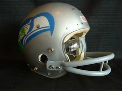
I love clear shell-type football helmets, the Seattle Seahawks, and Joe Washington’s style (running and uniform). So what did I do about it? I developed the Joe Washington tribute Seahawks clear-shell helmet. The notion of this project was so eccentric, I had to see it through to fruition.
For those who aren’t aware of the uniqueness of a Macgregor/Kelley clear-shell helmet: All of the decals, as well as the paint, were applied from the inside (note the rivets on top of the decal). These helmets were truly unique because logo and paint were permanently protected by the outside surface of the clear plastic shell.
For this custom project, I got the clear-shell helmet through a Yahoo helmet collectors group, where I sent out an e-mail request. I got one reply from someone who had two shells, which he sold me. Only thing is, one shell had paint still applied on both sides, and the other had paint recently removed, leaving cloudiness from the paint remover. So I had to put a lot of work into sanding/polishing and taking the cloudiness out of that shell. Never really got it crystal clear, just good enough.
I developed the Seahawks logo decal using clear waterslide paper (think model kit decals). White paint was applied on the back (non-adhesive) side of the decals, to fill out and solidify the colors. Also, I used clear acrylic paint for added strength on the very delicate waterslide paper. I then applied the silver paint from the inside of the shell and finished with a nice gray flexible primer.
Other notable players who wore clear-shell helmets: Billy Sims, Roger Staubach, Charlie Waters, Archie Manning, and various Steelers players back in the 1970s. One of the most interesting clear shell helmets I’ve ever seen would have to be John Simmons’s Bengals helmet.
Thanks, Michael, for the excellent primer on clear-shell helmets, and kudos on your cool art project. At the risk of opening a Pandora’s Box of major silliness, are there other good uni mashups (for lack of a better term) waiting to happen? I’ll set one basic rule: Keep all the elements within a given sport, as Michael did (i.e., don’t propose a Brett Favre Dodgers jersey with a fight strap). Or if you insist on mixing sports, keep them all within a given city, as Roger Faso has done with his all-purpose Oakland sports logo (see comment No. 7 for details). OK? Let’s hear — or, better yet, see — whatcha got.
Uni Watch News Ticker: Faaaascinating article here about Japanese school uniforms (courtesy of, of course, Jeremy Brahm). … Also from Jeremy: The Seibu Lions will wear this design for their Japanese interleague games this season. The wording on the back of the jersey reads, “No Limit 2008, Aim for the Championship Again.” … Check out this video clip of Roger Goodell, and note the difference between the NFL logos in the background and the one on his microphone (good catch by Brian Corbett). ”¦ More on the Twins’ base coaches wearing the 1970s helmets: First read this, then read the first graf of this, and then the third graf of this (great work by Karl G. Anderson). ”¦ Last Friday I asked why the Rangers never wear their official road cap. Got the following response from someone connected to the team (who prefers to remain nameless): “We haven’t worn that cap since I started working for the team in 2003. I’m not sure who effectively eliminated it, but we keep no inventory of them.” Wow, you mean the team couldn’t wear the official road cap even if they wanted to, because there’s literally no such cap kept on hand? “Correct, which is why I would assume someone decided that we would stop wearing them, since we stopped ordering them from New Era. Definitely agree that it’s weird MLB still lists it as the official road cap. Also note that the Rangers used to have a black-billed alternate cap with a white T, which we also no longer wear, not sure if that cap is still official also [it is — PL].” This same source also weighed in on the Rangers’ seemingly endless red-vs.-blue debate: “Most people involved in the organization preferred the red, but owner Tom Hicks doesn’t like red, so he encouraged the switch to blue. Some fans think that switch has cursed the team, since we haven’t been to the playoffs since the switch! Personally, I preferred the red, but switching back would look awkward now that the Angels wear very similar jerseys to the old reds.” ”¦ Excellent overview of the Brewers’ racing sausages here (with thanks to Dana “It’s Just Business” Prey). ”¦ My friend Steve Heller has an interesting piece here about political campaign typography (thanks, Kirsten). ”¦ Bruce Menard found this great shot of Casey Stengel during the 1955 Goodwill Tour of Japan. Dig that patch! ”¦ Speaking of patches, several French athletes want to wear a protest patch at the Olympics (with thanks to Jonathon Binet). ”¦ The Titans have unveiled a really weak 10th-season logo, which will be worn as a jersey patch next season. Details here. ”¦ Several people told me that John Danks wore his undershirt backwards last Thursday, but David Chisholm is the only one who came up with a good screen shot. ”¦ We’ve all seen the 1976 pillbox caps that several National League teams wore. But Aaron Steele found something I hadn’t noticed before: Ted Simmons wearing one of the pillbox caps under his catcher’s mask. ”¦ Good article here about attire at the Masters (with thanks to Mark Coale). ”¦ Next year’s NHL All-Star Game logo looks like this. ”¦ Tyson Moll reports that Cyprus High in Magna, Utah, wear some awesome striped stirrups. ”¦ Interesting photo here of BYU’s 1951 NIT championship team during a preseason tour of Brazil. Dig those “Mormons” warm-ups! Additional info in this PDF file (with thanks to Spencer Hall). ”¦ Toronto native Chris Creamer notes that the Blue Jays’ retro helmets use a uni number font that’s never been part of the team’s design scheme. And although it doesn’t really look that way in the photo, he says the left portion of the helmet’s MLB logo decal is graphite, not red. ”¦ Speaking of Chris, someone over on his board noted that the Texans are starting to make more frequent use of the “HT” logo seen at the bottom of this page. I had literally never seen that logo before. ”¦ Bobby Cox has been managing the Braves forever, but don’t tell that to Fox (good catch by Zack Bennett). ”¦ Lots of 1983 Phillies commercials compiled in this YouTube video (nice find by Morris Levin). ”¦ Richard Giron noticed another example of co-branded boxing gloves during Saturday’s Felix Sturm/Jamie Pittman bout. “Paffen Sport makes its own gloves in Germany,” he writes. “But their logo is partially covering a pair of Grant Gloves. It doesn’t happen anywhere else except in Germany and England. Lonsdale, Paffen Sport, Top Ten, and Adidas slap their logos on top of existing brands such as Reyes, Everlast, or Grant.” ”¦ The Johns Hopkins lacrosse teams wore 1980s throwbacks on Saturday (with thanks to Michael Brand). ”¦ Amidst all the other birthday presents I recently received, I’ve shamefully neglected to mention that Scott Turner and Diane George generously gave me a gorgeous old hooded varsity volleyball jacket, with a chenille volleyball on one sleeve, a uni number on the other sleeve, and nice “Army” lettering on the back. This jacket kept me toasty yesterday morning as I shopped through a cold, blustery flea market, where I found, among other treasures, this TruByte sample kit, filled with artificial teeth and super-cool labels. ”¦ Reprinted from Sunday’s comments: Good article here about the Jazz’s uni numbers. ”¦ Also from Sunday: Brinke Guthrie noted that Barry Zito was having some undershirt tag issues, which led Nicole Haase to respond, “I was at the game and you could see the tag from the seats. And when they showed replays and close-ups on the video screen at Miller Park — ARG! I pointed it out to my boyfriend, who just looked at me.” ”¦ The Altoona Curve wore very old-school throwbacks for last Thursday’s home opener. Additional views here, here, here, and here, plus there’s a dozen pages of photo galleries here (with thanks to Timothy Welsh). ”¦ Curiouser and curiouser: The front uni numbers on the Twins’ navy jerseys, which unexpectedly switched from white to red last week, were white again yesterday. But I’m not sure if the NOB lettering, which had gone from white outlined in red to just white, has also changed back. Take a look here and here — red outline or pure white? Depending on how I squint, I can see it either way. Did any actually, y’know, watch the game, instead of just scavenge through photos on the web? Anyway, the obvious solution, of course, would be for them to stop wearing to stupid-ass navy jerseys in the first place. ”¦ Cubs’ blue alts made their first appearance since 2006 yesterday. … Uniform? What uniform? Boy, that camouflage uni is so effective I can barely see it. … Awesome 1957 article about football uniforms and equipment here. ”¦ Lots of good info about the Indians’ jersey options here (with thanks to Michael Burnett). ”¦ Accoding to this story, the Rams wanted to wear 1999 throwbacks this fall but were turned down by the league because they didn’t start the paperwork early enough. They’re also planning to wear a memorial patch for Georgia Frontiere (with thanks to Mike Engle).
I’m glad I only caught highlights of the Cubs-‘Stros game. Red vs Blue, echhh.
Watching the Mets/Braves game yesterday, I saw a guy sitting behind home plate in a neon yellow Braves jersey.
Did anyone see it/get a screenshot?
I see a red outline in the Twins NOB
I seem to recall the black billed Rangers cap being a favorite of Kenny Rogers: he always had the team wear it when he was the starter. Might the Rangers have make a uniform change out of spite?
I watched the Twins game. Unfortunately, it wasn’t broadcast in HD. It is really hard to tell whether the NOB is outlined in red or not. I want to say that it is, but I think that’s just because I want it to be there.
What did “mashup” mean originally? Or as bastardized? I don’t get out much, and am unfamiliar with it.
I know I’m breaking the “one basic rule,” but this isn’t really a uni-mashup, it’s a link.
I’m from the East Bay and I love the A’s, Raiders and Warriors. So, I made a logo that represents all of them. It’s easy to tell wear the shield, eyepatch and elephant come from. The font is the one used by the Warriors in the 70s and 80s. The stars represent the 7 titles collectively won by those teams, while they called Oakland home.
Way too much time on my hands.
That article about the Masters’ outfits is very interesting. By looking through Sergio Garcia’s collection, you can see that adidas, TaylorMade and Trophy (the brand of the belt) all use a 3-stripe logo.
[quote comment=”248450″]I know I’m breaking the “one basic rule,” but this isn’t really a uni-mashup, it’s a link.
I’m from the East Bay and I love the A’s, Raiders and Warriors. So, I made a logo that represents all of them. It’s easy to tell wear the shield, eyepatch and elephant come from. The font is the one used by the Warriors in the 70s and 80s. The stars represent the 7 titles collectively won by those teams, while they called Oakland home.
Way too much time on my hands.[/quote]
Putting all of a city’s teams into one logo (or uni) is a worthy concept. I’ll adjust the wording of the one basic rule.
May we covered this already…let me start by saying that I only watched the last 7 seconds of the Tennessee Womens NCAA game last night. That was all I needed to see a poorly defenced winning layup…BUT what the heck is going on with The Lady Vols Unis. I just wanted to know if they can fit more logos on thier jersey. {Rolling eyes}
Sorry for no picture…
Another Pink tribute coming up next week, Rugby Union premiership clubs in England will all be doing something, details link. (Great slogan btw)
Also at the European cup match this weekend, a rare sighting of NOBOH (link), you can see the beginning in the pic, just the Ko part Player is Lesley Vainikolo. He has ‘Kolo’ spelled with his braids.
Pink and Lesley, great Rugby traditions!!
I’m very curious as to why you were compelled to buy a case of replacement/fake teeth. Any reason in particular… or just interested in the packaging?
[quote comment=”248445″]I seem to recall the black billed Rangers cap being a favorite of Kenny Rogers: he always had the team wear it when he was the starter. Might the Rangers have make a uniform change out of spite?[/quote]
Kenny Rogers also always opted to wear the blue alts whenever he started.
[quote comment=”248458″]I’m very curious as to why you were compelled to buy a case of replacement/fake teeth. Any reason in particular… or just interested in the packaging?[/quote]
[quote comment=”248460″][quote comment=”248458″]I’m very curious as to why you were compelled to buy a case of replacement/fake teeth. Any reason in particular… or just interested in the packaging?[/quote][/quote]
Marv Albert?
Anyway, on a serious note, I love the logo concoction. Nice work, Roger.
And I apologize in advance for this repost from last night but I didn’t get a definitive answer:
The Old English D on the Tigers jerseys is different than those on the caps.
Check the two horizontal arcs? on the D ofthe jersey. Has it always been this
way or is that the “stylized” D that we saw on the M&M’s the other
day?
Paul,
While watching those Phillies’ commercials from 1986, I came across this video of Peter Capolino from Mitchell & Ness giving a tour of all the Phillies’ jerseys since 1883.
Very cool…
link
How great is it that it will be a NON-NIKE final in the NCAA championship?!? Love that both Memphis and Kansas are adidas schools so we can get a break from the swoosh invasion….
[quote comment=”248458″]I’m very curious as to why you were compelled to buy a case of replacement/fake teeth. Any reason in particular… or just interested in the packaging?[/quote]
I collect, among other things, salesman sample catalogs, and that’s what this essentially is.
Also: It’s just so fucking cool!
[quote comment=”248453″]That article about the Masters’ outfits is very interesting. By looking through Sergio Garcia’s collection, you can see that adidas, TaylorMade and Trophy (the brand of the belt) all use a 3-stripe logo.[/quote]
Of Course. Adidas owns TaylorMade.
John Danks start last week was easilly the best of his career, it’ll be interesting to see if he wears his undershirt backwards again.
[quote comment=”248466″][quote comment=”248458″]I’m very curious as to why you were compelled to buy a case of replacement/fake teeth. Any reason in particular… or just interested in the packaging?[/quote]
I collect, among other things, salesman sample catalogs, and that’s what this essentially is.
Also: It’s just so fucking cool![/quote]
Cool wasn’t the word I was thinking…more like kinda gross…but hey to each their own
I watched the Twins’ game, too, but I was too dazzled by Bert’s cake-hat (it was his birthday) to notice whether the NOB had red outlining or not. Plus, as Jim mentioned, no HD.
Wow. That promo for pink rugby night was pretty damn patronizing. The only way I’ll go to a rugby game is if the All-Black are playing–and not wearing pink or white.
[quote comment=”248465″]How great is it that it will be a NON-NIKE final in the NCAA championship?!? Love that both Memphis and Kansas are adidas schools so we can get a break from the swoosh invasion….[/quote]
Oh yeah, because a three stripes invasion is soooooo much different than a swoosh invasion. I mean, no other company than the evil swoosh empire puts there logo everywhere. I’m going to sleep easy tonight knowing I didn’t just watch a game where everyone had adidas logos all over their shoes, shorts, jerseys, warm ups, wrist bands, under shirts, etc. etc, because of course Nike is the only company with the common sense to do that.
If the Rangers don’t have those hats in their clubhouse, maybe they should check their own ballpark gift shop. They have a ton of both of the authentic alternate hats. They’re even made of the new material that MLB started using last year.
[quote comment=”248470″][quote comment=”248466″][quote comment=”248458″]I’m very curious as to why you were compelled to buy a case of replacement/fake teeth. Any reason in particular… or just interested in the packaging?[/quote]
I collect, among other things, salesman sample catalogs, and that’s what this essentially is.
Also: It’s just so fucking cool![/quote]
Cool wasn’t the word I was thinking…more like kinda gross…but hey to each their own[/quote]
Much like Uni Watch, this is one of those things that you either get or you don’t….
[quote comment=”248463″][quote comment=”248460″][quote comment=”248458″]I’m very curious as to why you were compelled to buy a case of replacement/fake teeth. Any reason in particular… or just interested in the packaging?[/quote][/quote]
Marv Albert?
Anyway, on a serious note, I love the logo concoction. Nice work, Roger.
And I apologize in advance for this repost from last night but I didn’t get a definitive answer:
The Old English D on the Tigers jerseys is different than those on the caps.
Check the two horizontal arcs? on the D ofthe jersey. Has it always been this
way or is that the “stylized” D that we saw on the M&M’s the other
day?[/quote]
Paul did an entire entry on this I believe about a year ago. Paul?
[quote comment=”248473″][quote comment=”248465″]How great is it that it will be a NON-NIKE final in the NCAA championship?!? Love that both Memphis and Kansas are adidas schools so we can get a break from the swoosh invasion….[/quote]
Oh yeah, because a three stripes invasion is soooooo much different than a swoosh invasion. I mean, no other company than the evil swoosh empire puts there logo everywhere. I’m going to sleep easy tonight knowing I didn’t just watch a game where everyone had adidas logos all over their shoes, shorts, jerseys, warm ups, wrist bands, under shirts, etc. etc, because of course Nike is the only company with the common sense to do that.[/quote]
I was about to write pretty much the same exact thing. Adidas’ logo placement is just as egregious as Nike’s… if not more. In fact, I hate the fact that adidas will work the three stripes into the design of the uniform… which I think is MUCH worse than just branding the uniform like Nike does.
I think the twins have a home and a road version of the navy alternates. could thatv be the reason for the different # colors?
[quote comment=”248479″]I think the twins have a home and a road version of the navy alternates. could thatv be the reason for the different # colors?[/quote]
According to the MLB Style Guide, the road navy should have a “Minnesota” chest insignia (and, yes, it should have a red uni number on the front). But the one that the Twins wore on the road last week had “Twins” on the front.
I posted a picture of Candace Parker last night wearing the long-sleeved white undershirt, but link is a much better photo. Note the Adidas logo featured prominently at the neckline. Seemed like it would’ve made more sense to wear something tighter if her concern was over her injured shoulder.
I also noticed that The Lady Vols have a 3-stripe feature on the side of their jerseys. Isn’t that a mark of Adidas and therefore against the NCAA rule of having no corporate logos on a jersey?
God, those Seibu jersey are ugly.
[quote comment=”248474″]If the Rangers don’t have those hats in their clubhouse, maybe they should check their own ballpark gift shop. They have a ton of both of the authentic alternate hats. They’re even made of the new material that MLB started using last year.[/quote]
The last few years of the Devil Rays, they “officially” used and sold 3 hats. All black (I think this was suppose to be home), all green (road?), and black w/green bill (alt?). However they always only wore the all green hat.
To make things worse, they always wore an all black batting helmet. On top of that, in last year’s All Star Game, Carl Crawford wore an all black hat despite the team wearing all green for all 162 games that season (minus the St. Pete Saints throwback day).
I’m still not big on the new Rays uniform, but I’m thankful that their hat now matches their batting helmet.
I also noticed that The Lady Vols have a 3-stripe feature on the side of their jerseys. Isn’t that a mark of Adidas and therefore against the NCAA rule of having no corporate logos on a jersey?
As long as the stripes are not all one color, they are okay. Tennessee uses two orange, and one light blue.
Liverpool fans will be so happy to learn that Tom Hicks dislikes the color red.
Any update on the NCAA contest going into tonight?
[quote comment=”248466″][quote comment=”248458″]I’m very curious as to why you were compelled to buy a case of replacement/fake teeth. Any reason in particular… or just interested in the packaging?[/quote]
I collect, among other things, salesman sample catalogs, and that’s what this essentially is.
Also: It’s just so fucking cool![/quote]
Yes, it really is that.
[quote comment=”248473″][quote comment=”248465″]How great is it that it will be a NON-NIKE final in the NCAA championship?!? Love that both Memphis and Kansas are adidas schools so we can get a break from the swoosh invasion….[/quote]
Oh yeah, because a three stripes invasion is soooooo much different than a swoosh invasion. I mean, no other company than the evil swoosh empire puts there logo everywhere. I’m going to sleep easy tonight knowing I didn’t just watch a game where everyone had adidas logos all over their shoes, shorts, jerseys, warm ups, wrist bands, under shirts, etc. etc, because of course Nike is the only company with the common sense to do that.[/quote]
Ugh here we go…again…
I was at the Twins game yesterday and noticed the change in number color, but forgot about Paul’s previous note about the missing red outline on the NOB so I didn’t notice whether it was there or not.
I DID notice that the souvenir stands at the Dome are now selling replicas of the helmets worn by the base coaches and the catchers. That’s probably why MLB approved the non-matching helmets for the base coaches. Can’t pass up a good merchandising opportunity!
link
Blue Jays helmet numbering … a tribute to the Expos, perhaps?
[quote comment=”248475″][quote comment=”248470″][quote comment=”248466″][quote comment=”248458″]I’m very curious as to why you were compelled to buy a case of replacement/fake teeth. Any reason in particular… or just interested in the packaging?[/quote]
I collect, among other things, salesman sample catalogs, and that’s what this essentially is.
Also: It’s just so fucking cool![/quote]
Cool wasn’t the word I was thinking…more like kinda gross…but hey to each their own[/quote]
Much like Uni Watch, this is one of those things that you either get or you don’t….[/quote]
Sorry Paul, but I guess that kinda just grosses me out…not passing any judgement though, it’s nice to see people still have a passion for something that is unusual and not scared to share it…it’s not like enjoy link
I think the twins have a home and a road version of the navy alternates. could thatv be the reason for the different # colors?
According to the MLB Style Guide, the road navy should have a “Minnesota” chest insignia (and, yes, it should have a red uni number on the front). But the one that the Twins wore on the road last week had “Twins” on the front.
The Twins have yet to play a road game, so a home/road mix-up isn’t a legit clue/idea/whatever.
Rare find from Japan:
There’s a “Masters League” in which ex-professionals in their 50s or so play a short schedule of games, generally in domed stadiums.
One team is the Osaka Romans, and this Kozo Kawato jersey has the great combination of a link. Here’s the sponsor-defiled link
Yes, they’re all long-sleeve, sweatshirt-style. Whether this is because the old guys want to keep warm, or whether they don’t want fans looking at their chubby arms, I could not say!
[quote comment=”248442″]Watching the Mets/Braves game yesterday, I saw a guy sitting behind home plate in a neon yellow Braves jersey.
Did anyone see it/get a screenshot?[/quote]
Saw the guy, but no screenshot. You know, even my in-laws noticed that guy while we were watching the game. And they definitely don’t “Get It.” I can’t remember any reason why the Braves would have a yellow jersey.
~E~
man those black-brimmed texas hats are awful!
[quote comment=”248493″]Liverpool fans will be so happy to learn that Tom Hicks dislikes the color red.[/quote]
So Liverpool in black from now on? also on the same subject Bayren Munich’s black kit just doesn’t work. It’s ugly and it’s not a traditonal color for them “werden Sie das Schwarze los”
[quote comment=”248506″]Rare find from Japan:
There’s a “Masters League” in which ex-professionals in their 50s or so play a short schedule of games, generally in domed stadiums.
One team is the Osaka Romans, and this Kozo Kawato jersey has the great combination of a link. Here’s the sponsor-defiled link
Yes, they’re all long-sleeve, sweatshirt-style. Whether this is because the old guys want to keep warm, or whether they don’t want fans looking at their chubby arms, I could not say![/quote]
This might have been asked before so I apologize:
But why are the names on the Japanese jerseys not written using the Japanese alphabet?
[quote comment=”248473″][quote comment=”248465″]How great is it that it will be a NON-NIKE final in the NCAA championship?!? Love that both Memphis and Kansas are adidas schools so we can get a break from the swoosh invasion….[/quote]
Oh yeah, because a three stripes invasion is soooooo much different than a swoosh invasion. I mean, no other company than the evil swoosh empire puts there logo everywhere. I’m going to sleep easy tonight knowing I didn’t just watch a game where everyone had adidas logos all over their shoes, shorts, jerseys, warm ups, wrist bands, under shirts, etc. etc, because of course Nike is the only company with the common sense to do that.[/quote]
Hey it’s not about Nike or Adidas, we all know what sports brands are about, but it just feels good to be reminded this is not 1984, or Soviet Union, or Palpatine Empire… yet
[quote comment=”248483″]I posted a picture of Candace Parker last night wearing the long-sleeved white undershirt, but link is a much better photo. Note the Adidas logo featured prominently at the neckline. Seemed like it would’ve made more sense to wear something tighter if her concern was over her injured shoulder.
my first thought when i saw it was that she was trying to conceal the injury to avoid any intentional shots
Does Roy Williams (the coach) always wear such putrid link?
[quote comment=”248512″][quote comment=”248483″]I posted a picture of Candace Parker last night wearing the long-sleeved white undershirt, but link is a much better photo. Note the Adidas logo featured prominently at the neckline. Seemed like it would’ve made more sense to wear something tighter if her concern was over her injured shoulder.[/quote]
my first thought when i saw it was that she was trying to conceal the injury to avoid any intentional shots[/quote]
wouldn’t that kinda advertise the fact that she has an injury?
[quote comment=”248515″]Does Roy Williams (the coach) always wear such putrid link?[/quote]
Does the putrid tie equal a purtid (for the most part) performance?
I am sure this has already been addressed, but I hope that someone will indulge me. I was watching the Yankees/Rays game yesterday and noticed that the ‘Rays’ still have a Devil Ray logo on their left sleeve. Any explanations?
[quote comment=”248501″][quote comment=”248473″][quote comment=”248465″]How great is it that it will be a NON-NIKE final in the NCAA championship?!? Love that both Memphis and Kansas are adidas schools so we can get a break from the swoosh invasion….[/quote]
Oh yeah, because a three stripes invasion is soooooo much different than a swoosh invasion. I mean, no other company than the evil swoosh empire puts there logo everywhere. I’m going to sleep easy tonight knowing I didn’t just watch a game where everyone had adidas logos all over their shoes, shorts, jerseys, warm ups, wrist bands, under shirts, etc. etc, because of course Nike is the only company with the common sense to do that.[/quote]
Ugh here we go…again…[/quote]
you know what I said is true, so I was expecting a response exactly like this instead of actual constructive criticism of my post.
[quote comment=”248519″][quote comment=”248515″]Does Roy Williams (the coach) always wear such putrid link?[/quote]
Does the putrid tie equal a purtid (for the most part) performance?[/quote]
It was a bad weekend for neckwear. Check out link with his homage to Seattle.
Reminds me of the days when Don Nelson used to wear the classic link in his first stint with the Warriors.
[quote comment=”248520″]I am sure this has already been addressed, but I hope that someone will indulge me. I was watching the Yankees/Rays game yesterday and noticed that the ‘Rays’ still have a Devil Ray logo on their left sleeve. Any explanations?[/quote]
It has been discussed, but not resolved. Keep in mind, it’s a “manta ray” (not a Devil Ray) on the sleeve … but it still doesn’t match their suggestion within the logo their name now refers to SUN Rays.
The University of Cincinnati is currently auctioning off the link the team wore during the 2007-2008 season. These were a tribute to the 1960-1961 team that won the first of two back to back National Championships.
Check out some amateur uni-watching link. It’s a weekly uniform column for a student-run college online magazine. We could really use the site traffic, so check it out and surf the rest of the site if you have time. Thanks!
[quote comment=”248526″][quote comment=”248520″]I am sure this has already been addressed, but I hope that someone will indulge me. I was watching the Yankees/Rays game yesterday and noticed that the ‘Rays’ still have a Devil Ray logo on their left sleeve. Any explanations?[/quote]
It has been discussed, but not resolved. Keep in mind, it’s a “manta ray” (not a Devil Ray) on the sleeve … but it still doesn’t match their suggestion within the logo their name now refers to SUN Rays.[/quote]
Actually a Manta Ray and a Devil Ray are the same thing. It gets the nickname Devil Ray because it rolls the extensions on its mouth up and they look like horns. Also nowhere does it say the new logo refers to SUN Rays. It’s Sternberg’s idea to try to get more people in the Central Florida area to follow the team (all though I will agree it does look like a Sun Burst).
[quote comment=”248526″][quote comment=”248520″]I am sure this has already been addressed, but I hope that someone will indulge me. I was watching the Yankees/Rays game yesterday and noticed that the ‘Rays’ still have a Devil Ray logo on their left sleeve. Any explanations?[/quote]
It has been discussed, but not resolved. Keep in mind, it’s a “manta ray” (not a Devil Ray) on the sleeve … but it still doesn’t match their suggestion within the logo their name now refers to SUN Rays.[/quote]
To confuse things more, you’ll notice on the Ray (manta or devil, whatever) it has some yellow on it; one assumes from the sun ray burst.
[quote comment=”248510″]
This might have been asked before so I apologize:
But why are the names on the Japanese jerseys not written using the Japanese alphabet?[/quote]
At least two reasons: there are many more Japanese characters than there are Roman letters, so you oculdn’t exactly make templates in advance. (Though with computer auto-cutting technology, now you can.) And Roman letters are more distinguishable from a distance.
Another problem is that you might not know how to pronounce a name just from the characters. For ecample, the character meaning “east” is usually pronounced “higashi”, but when it’s a surname, there are a few who say it “Higashi” but quite a few who say “Azuma”. If you use the Roman alphabet, you always know how to say it, even if you can’t guess which characters you’d be using.
The other big reason is that sports were imported from the West, and from the beginning English was widely used. They also used link and even link, but after WWII, when the government anti-foreign probaganda subsided, things became almost completely Anglicized. You still see high school team names in Japanese, but even they use English about half the time.
[quote comment=”248519″][quote comment=”248515″]Does Roy Williams (the coach) always wear such putrid link?[/quote]
Does the putrid tie equal a purtid (for the most part) performance?[/quote]
I noticed that the other night as well. I want to buy him a subscription to GQ. Perhaps Paul can help him out with that.
If I can say ONEgood think about link tenure at UNC: He was link nattily dressed, very often complete with linkcolored ties.
[quote comment=”248534″][quote comment=”248510″]
This might have been asked before so I apologize:
But why are the names on the Japanese jerseys not written using the Japanese alphabet?[/quote]
At least two reasons: there are many more Japanese characters than there are Roman letters, so you oculdn’t exactly make templates in advance. (Though with computer auto-cutting technology, now you can.) And Roman letters are more distinguishable from a distance.
Another problem is that you might not know how to pronounce a name just from the characters. For ecample, the character meaning “east” is usually pronounced “higashi”, but when it’s a surname, there are a few who say it “Higashi” but quite a few who say “Azuma”. If you use the Roman alphabet, you always know how to say it, even if you can’t guess which characters you’d be using.
The other big reason is that sports were imported from the West, and from the beginning English was widely used. They also used link and even link, but after WWII, when the government anti-foreign probaganda subsided, things became almost completely Anglicized. You still see high school team names in Japanese, but even they use English about half the time.[/quote]
Thanks, Mark.
The Nats base coaches are wearing flapless helmets, but they have a link. It’s like the flapped helmet, just no flaps.
Good to see a helmet issue for today’s post, because I heard a good one this weekend. Anyways, I was watching a replay of Super Bowl XX with Da Bears, and Enberg made a comment about Walter Payton’s nicked-up helmet and then said he was wearing the same helmet he got as a rookie in 1975! After rewinding the DVR to make sure I heard him correctly (I did), I figured that this is the only place somebody can confirm this, so, guys, help! And if this is the case, there’s got to be others with helmet longevity like this, right? Thanks, fells!
[quote comment=”248537″]The Nats base coaches are wearing flapless helmets, but they have a link. It’s like the flapped helmet, just no flaps.[/quote]
Check out the shoes on the base coach! Those are the “New Prototype” by Under Armour, which have not even been released to the general public as of yet.
[quote comment=”248509″][quote comment=”248493″]Liverpool fans will be so happy to learn that Tom Hicks dislikes the color red.[/quote]
So Liverpool in black from now on?[/quote]
not a chance. football fans are fickle creatures.
[quote comment=”248519″][quote comment=”248515″]Does Roy Williams (the coach) always wear such putrid link?[/quote]
Does the putrid tie equal a purtid (for the most part) performance?[/quote]
hmmm…link
Off Topic:
With softball season around the corner, its time to buy stirrups. Anyone remember what that link was that Paul posted a while ago, or can vouch for credibility?
Just because I’m excited that the Pirates are only 78 wins away from respectability (yet knowing that we’re only 79 losses away from another losing season), I’m going to go out out on a limb and assume noone has posted this yet.
link
Who wears white tonight, Memphis or Kansas?
People may not like Trajan, but in its first year as the official font of KU athletics, the football team has had its best season ever, and the basketball team is in the finals. Coincidence? Probably (football team had some great players and a soft schedule, and the basketball team is always good). But I’m just saying . . .
. . . A fight broke out among youngsters trying to get Rashard Lewis’ autograph at Medieval Times restaurant in Kissimmee on Monday night, the Magic star forward said. Lewis was not injured in the melee and got his family out of the facility without harm.
NBA Cares
[quote comment=”248547″]Who wears white tonight, Memphis or Kansas?[/quote]
I believe Memphis is the number 2 overall seed, so they would wear white.
[quote comment=”248542″][quote comment=”248519″][quote comment=”248515″]Does Roy Williams (the coach) always wear such putrid link?[/quote]
Does the putrid tie equal a purtid (for the most part) performance?[/quote]
hmmm…link[/quote]
That’s hilarious Phil. So the answer to my original question is ‘Yes, he does always wear putrid ties’.
I thought the Kansas unis looked awesome in HD the other night.
[quote comment=”248548″]People may not like Trajan, but in its first year as the official font of KU athletics, the football team has had its best season ever, and the basketball team is in the finals. Coincidence? Probably (football team had some great players and a soft schedule, and the basketball team is always good). But I’m just saying . . .[/quote]
I think this is the same situation as the Cubs winning the division last year after putting those god-awful names on the backs of the home jerseys — the correct phrase is “in spite of”, not “because of”.
(I loved that classic KU font!)
[quote comment=”248548″]People may not like Trajan, but in its first year as the official font of KU athletics, the football team has had its best season ever, and the basketball team is in the finals. Coincidence? Probably (football team had some great players and a soft schedule, and the basketball team is always good). But I’m just saying . . .[/quote]
Some people may not like Trajan. I think it’s pretty sharp. Beats the stuffing out of yet another drop-shadow.
[quote comment=”248556″][quote comment=”248548″]People may not like Trajan, but in its first year as the official font of KU athletics, the football team has had its best season ever, and the basketball team is in the finals. Coincidence? Probably (football team had some great players and a soft schedule, and the basketball team is always good). But I’m just saying . . .[/quote]
I think this is the same situation as the Cubs winning the division last year after putting those god-awful names on the backs of the home jerseys — the correct phrase is “in spite of”, not “because of”.
(I loved that classic KU font!)[/quote]
From last night…
link link
link
link
Beautiful
Good to see a helmet issue for today’s post, because I heard a good one this weekend. Anyways, I was watching a replay of Super Bowl XX with Da Bears, and Enberg made a comment about Walter Payton’s nicked-up helmet and then said he was wearing the same helmet he got as a rookie in 1975! After rewinding the DVR to make sure I heard him correctly (I did), I figured that this is the only place somebody can confirm this, so, guys, help! And if this is the case, there’s got to be others with helmet longevity like this, right? Thanks, fells!
I thought I heard somewhere that Walter wore the same helmet his whole career.
[quote comment=”248558″][quote comment=”248548″]People may not like Trajan, but in its first year as the official font of KU athletics, the football team has had its best season ever, and the basketball team is in the finals. Coincidence? Probably (football team had some great players and a soft schedule, and the basketball team is always good). But I’m just saying . . .[/quote]
Some people may not like Trajan. I think it’s pretty sharp. Beats the stuffing out of yet another drop-shadow.[/quote]
But it pales in comparison to the incumbant font that WAS in place! If it wasn’t broke, why’d they have to go and fix it?
In regards to the Walter Payton helmet I can only confirm that he wore the same model, a Wilson F2002, his entire career. According to Helmet Hut the Bears bought out the remainder of the stock of this particular Wilson model when it was discontinued in the early 80’s.
I doubt that it was the same exact helmet, considering that the leather interior would probably have rotten through and that the exterior shell would have been in serious disrepair.
One finally factor is that there was an infamous story in which a young intern at the reconditioner of the Bears helmets destroyed one of Payton’s last helmets when he put it in the same wash cycle with the plastic lined helmets. (check out HelmetHut for the article in the ‘Ask Dr. Del Rye’ section.)
[quote comment=”248541″][quote comment=”248509″][quote comment=”248493″]Liverpool fans will be so happy to learn that Tom Hicks dislikes the color red.[/quote]
So Liverpool in black from now on?[/quote]
not a chance. football fans are fickle creatures.[/quote]
Not only that but it’d be unwise to change the colors when Liverpool is commonly referred to as the Reds…I did like the black against Arsenal the other day though.
Got it, xyz.
In case anybody else is interested in Sweetness’ helmet, here’s the link:
link
As far as my original question, it sounds more like the same type of helmet, not the same helmet.
Love the clear shell helmet look, and I’m glad to see somebody else has an affinity for it. I’ve got a ’70s-era Washington State University helmet in my collection at home, and I absolutely love the look of it. It’s also easier to care for than the other helmets, since the clear shell provides a nice protection for the logos.
[quote comment=”248556″][quote comment=”248548″]People may not like Trajan, but in its first year as the official font of KU athletics, the football team has had its best season ever, and the basketball team is in the finals. Coincidence? Probably (football team had some great players and a soft schedule, and the basketball team is always good). But I’m just saying . . .[/quote]
I think this is the same situation as the Cubs winning the division last year after putting those god-awful names on the backs of the home jerseys — the correct phrase is “in spite of”, not “because of”.
(I loved that classic KU font!)[/quote]
Along those lines … In a way only other Uniwatch readers could understand, I was actually kind of hoping the Cubs would have gotten blown out yesterday, maybe even by some monumental 50-0 score, just so the blue jerseys would be seen as bad luck and put back in the closet.
Guess that ain’t gonna happen.
[quote comment=”248563″][quote comment=”248558″][quote comment=”248548″]People may not like Trajan, but in its first year as the official font of KU athletics, the football team has had its best season ever, and the basketball team is in the finals. Coincidence? Probably (football team had some great players and a soft schedule, and the basketball team is always good). But I’m just saying . . .[/quote]
Some people may not like Trajan. I think it’s pretty sharp. Beats the stuffing out of yet another drop-shadow.[/quote]
But it pales in comparison to the incumbant font that WAS in place! If it wasn’t broke, why’d they have to go and fix it?[/quote]
im no fan of trajan either…link was soooo recognizable as “rock chalk”
[quote comment=”248483″]I posted a picture of Candace Parker last night wearing the long-sleeved white undershirt, but link is a much better photo. Note the Adidas logo featured prominently at the neckline. Seemed like it would’ve made more sense to wear something tighter if her concern was over her injured shoulder.
The NCAA rules on braces and such read like this:
Art. 3. The prohibition of the use of hard-substance material does not apply to
the upper arm, shoulder or leg when the material is padded so as not to create
a hazard for other players.
Art. 5. Equipment that could cut or cause an injury to another player shall be
prohibited, without respect to whether the equipment is hard. Excessively long
fingernails shall be prohibited.
The brace that she was wearing on her shoulder might have had a sharp edge or something of that sort. The loose shirt could have been a way of getting around that rule and avoid scratching or cutting other players.
[quote]I was actually kind of hoping the Cubs would have gotten blown out yesterday, maybe even by some monumental 50-0 score, just so the blue jerseys would be seen as bad luck and put back in the closet.
Guess that ain’t gonna happen.[/quote]
give it time…the winds aren’t blowing out…yet
[quote comment=”248548″]People may not like Trajan, but in its first year as the official font of KU athletics, the football team has had its best season ever, and the basketball team is in the finals. Coincidence? Probably (football team had some great players and a soft schedule, and the basketball team is always good). But I’m just saying . . .[/quote]
if you believe you’re playing well because you’re getting laid, or because you’re not getting laid, or because you wear trajan, then you ARE! and you should know that!
[quote comment=”248572″][quote comment=”248563″][quote comment=”248558″][quote comment=”248548″]People may not like Trajan, but in its first year as the official font of KU athletics, the football team has had its best season ever, and the basketball team is in the finals. Coincidence? Probably (football team had some great players and a soft schedule, and the basketball team is always good). But I’m just saying . . .[/quote]
Some people may not like Trajan. I think it’s pretty sharp. Beats the stuffing out of yet another drop-shadow.[/quote]
But it pales in comparison to the incumbant font that WAS in place! If it wasn’t broke, why’d they have to go and fix it?[/quote]
im no fan of trajan either…link was soooo recognizable as “rock chalk”[/quote]
“Poitendly Mad” looked very neat on the uniforms, and it certainly was traditional. But if you are going to use one font university wide, the font itself is a little frivoulous, while the font’s name totally frivoulous.
Plus, if you are going to change the whole look, you have to change the basketball team because it is the most visible part of the athletic program.
Sorry to bounce around topic wise, but I finally checked out some of the helmet pics from the opening thread and those of Joe Washington fascinated me.
I am a huge fan of anything Bike/Air/Schutt related, thus Washington’s helmets were very interesting.
The link atop the crown of the helmet look to be the precursor to the Schutt helmets of the link and present.
Not only the vent holes, but both the extension of the link(forehead pad) and the link seem to be link link of todays gear.
[quote comment=”248533″][quote comment=”248526″][quote comment=”248520″]I am sure this has already been addressed, but I hope that someone will indulge me. I was watching the Yankees/Rays game yesterday and noticed that the ‘Rays’ still have a Devil Ray logo on their left sleeve. Any explanations?[/quote]
It has been discussed, but not resolved. Keep in mind, it’s a “manta ray” (not a Devil Ray) on the sleeve … but it still doesn’t match their suggestion within the logo their name now refers to SUN Rays.[/quote]
To confuse things more, you’ll notice on the Ray (manta or devil, whatever) it has some yellow on it; one assumes from the sun ray burst.[/quote]
It’s the exact same sleeve logo as they wore last season, just recolored.
What a supremely half-assed rebranding, trying to be all things to all people.
[quote comment=”248577″]Sorry to bounce around topic wise, but I finally checked out some of the helmet pics from the opening thread and those of Joe Washington fascinated me.
I am a huge fan of anything Bike/Air/Schutt related, thus Washington’s helmets were very interesting.
The link atop the crown of the helmet look to be the precursor to the Schutt helmets of the link and present.
Not only the vent holes, but both the extension of the link(forehead pad) and the link seem to be link link of todays gear.[/quote]
link
[quote comment=”248520″]I am sure this has already been addressed, but I hope that someone will indulge me. I was watching the Yankees/Rays game yesterday and noticed that the ‘Rays’ still have a Devil Ray logo on their left sleeve. Any explanations?[/quote]
Holy shit seriously?!? I guess we have our new green dot issue
[quote comment=”248509″][quote comment=”248493″]Liverpool fans will be so happy to learn that Tom Hicks dislikes the color red.[/quote]
So Liverpool in black from now on? also on the same subject Bayren Munich’s black kit just doesn’t work. It’s ugly and it’s not a traditonal color for them “werden Sie das Schwarze los”[/quote]
That black kit is Bayern’s UEFA Cup kit. Their Bundesliga kit is the traditional red (this year, it’s red and white horizontal stripes).
[quote comment=”248578″][quote comment=”248533″][quote comment=”248526″][quote comment=”248520″]I am sure this has already been addressed, but I hope that someone will indulge me. I was watching the Yankees/Rays game yesterday and noticed that the ‘Rays’ still have a Devil Ray logo on their left sleeve. Any explanations?[/quote]
It has been discussed, but not resolved. Keep in mind, it’s a “manta ray” (not a Devil Ray) on the sleeve … but it still doesn’t match their suggestion within the logo their name now refers to SUN Rays.[/quote]
To confuse things more, you’ll notice on the Ray (manta or devil, whatever) it has some yellow on it; one assumes from the sun ray burst.[/quote]
It’s the exact same sleeve logo as they wore last season, just recolored.
What a supremely half-assed rebranding, trying to be all things to all people.[/quote]
I don’t see a problem with the Rays keeping the “Devil Ray” sleeve patch. I actually really like the idea of keeping something from a uniform redesign going on the new style. It kind of reminds me of link evolving from link.
I’m not saying the Rays have the cute story behind the Ray as the Athletics do behind the elephant, but it’s still a way for people to know the history of the team through the uniform. The new Rays uniforms are not great, not bad but not great, but I love that aspect of them.
Something just struck me about the current link. Is the bird head-J combination supposed to look like a cursive T, or is it just a vague coincidence? If this was intended, it’s a cool idea, but I think it’s way too understated and should have been made more obvious. Any thoughts?
I’ve been searching, but I cannot find a picture of Josh Bard’s camouflage helmet from yesterday’s Padres game. Anybody?
The Rockies have an all purple Alternative cap that is at least 3 years old that to my knowledge has never been worn in a regular season game.
Its a nice hat, IMO.
Maybe the Rox should shake things up and wear it to get out of the opening week funk they’re in.
[quote comment=”248588″][quote comment=”248578″][quote comment=”248533″][quote comment=”248526″][quote comment=”248520″]I am sure this has already been addressed, but I hope that someone will indulge me. I was watching the Yankees/Rays game yesterday and noticed that the ‘Rays’ still have a Devil Ray logo on their left sleeve. Any explanations?[/quote]
It has been discussed, but not resolved. Keep in mind, it’s a “manta ray” (not a Devil Ray) on the sleeve … but it still doesn’t match their suggestion within the logo their name now refers to SUN Rays.[/quote]
To confuse things more, you’ll notice on the Ray (manta or devil, whatever) it has some yellow on it; one assumes from the sun ray burst.[/quote]
It’s the exact same sleeve logo as they wore last season, just recolored.
What a supremely half-assed rebranding, trying to be all things to all people.[/quote]
I don’t see a problem with the Rays keeping the “Devil Ray” sleeve patch. I actually really like the idea of keeping something from a uniform redesign going on the new style. It kind of reminds me of link evolving from link.
I’m not saying the Rays have the cute story behind the Ray as the Athletics do behind the elephant, but it’s still a way for people to know the history of the team through the uniform. The new Rays uniforms are not great, not bad but not great, but I love that aspect of them.[/quote]
To my knowledge, the A’s never tried to distance themselves from their elephant because it had Satanic connections….
[quote]To my knowledge, the A’s never tried to distance themselves from their elephant because it had Satanic connections…[/quote]
or the GOP
[quote comment=”248595″][quote comment=”248588″][quote comment=”248578″][quote comment=”248533″][quote comment=”248526″][quote comment=”248520″]I am sure this has already been addressed, but I hope that someone will indulge me. I was watching the Yankees/Rays game yesterday and noticed that the ‘Rays’ still have a Devil Ray logo on their left sleeve. Any explanations?[/quote]
It has been discussed, but not resolved. Keep in mind, it’s a “manta ray” (not a Devil Ray) on the sleeve … but it still doesn’t match their suggestion within the logo their name now refers to SUN Rays.[/quote]
To confuse things more, you’ll notice on the Ray (manta or devil, whatever) it has some yellow on it; one assumes from the sun ray burst.[/quote]
It’s the exact same sleeve logo as they wore last season, just recolored.
What a supremely half-assed rebranding, trying to be all things to all people.[/quote]
I don’t see a problem with the Rays keeping the “Devil Ray” sleeve patch. I actually really like the idea of keeping something from a uniform redesign going on the new style. It kind of reminds me of link evolving from link.
I’m not saying the Rays have the cute story behind the Ray as the Athletics do behind the elephant, but it’s still a way for people to know the history of the team through the uniform. The new Rays uniforms are not great, not bad but not great, but I love that aspect of them.[/quote]
To my knowledge, the A’s never tried to distance themselves from their elephant because it had Satanic connections….[/quote]
That’s true. I never heard of the Rays attempting to disconnect from the ray because of satanic connections. They just wanted to get rid of the ‘Devil’ part of their nickname. Sure they came up with a new uniform design that didn’t feature the ray image as prominently but it’s still paying tribute to their history (no matter how little they have). I think it’s a great idea. Just because the name change was pointless doesn’t mean everything that has to do with it is.
[quote comment=”248597″][quote]To my knowledge, the A’s never tried to distance themselves from their elephant because it had Satanic connections…[/quote]
or the GOP[/quote]
The GOP has satanic connections? No….
[quote comment=”248595″][quote comment=”248588″][quote comment=”248578″][quote comment=”248533″][quote comment=”248526″][quote comment=”248520″]I am sure this has already been addressed, but I hope that someone will indulge me. I was watching the Yankees/Rays game yesterday and noticed that the ‘Rays’ still have a Devil Ray logo on their left sleeve. Any explanations?[/quote]
It has been discussed, but not resolved. Keep in mind, it’s a “manta ray” (not a Devil Ray) on the sleeve … but it still doesn’t match their suggestion within the logo their name now refers to SUN Rays.[/quote]
To confuse things more, you’ll notice on the Ray (manta or devil, whatever) it has some yellow on it; one assumes from the sun ray burst.[/quote]
It’s the exact same sleeve logo as they wore last season, just recolored.
What a supremely half-assed rebranding, trying to be all things to all people.[/quote]
I don’t see a problem with the Rays keeping the “Devil Ray” sleeve patch. I actually really like the idea of keeping something from a uniform redesign going on the new style. It kind of reminds me of link evolving from link.
I’m not saying the Rays have the cute story behind the Ray as the Athletics do behind the elephant, but it’s still a way for people to know the history of the team through the uniform. The new Rays uniforms are not great, not bad but not great, but I love that aspect of them.[/quote]
To my knowledge, the A’s never tried to distance themselves from their elephant because it had Satanic connections….[/quote]
Am I the only one here that doesn’t know the “cute story” behind the A’s Elephant? Anyone who knows, do tell.
[quote comment=”248601″]Am I the only one here that doesn’t know the “cute story” behind the A’s Elephant? Anyone who knows, do tell.[/quote]
link
[quote comment=”248601″][quote comment=”248595″][quote comment=”248588″][quote comment=”248578″][quote comment=”248533″][quote comment=”248526″][quote comment=”248520″]I am sure this has already been addressed, but I hope that someone will indulge me. I was watching the Yankees/Rays game yesterday and noticed that the ‘Rays’ still have a Devil Ray logo on their left sleeve. Any explanations?[/quote]
It has been discussed, but not resolved. Keep in mind, it’s a “manta ray” (not a Devil Ray) on the sleeve … but it still doesn’t match their suggestion within the logo their name now refers to SUN Rays.[/quote]
To confuse things more, you’ll notice on the Ray (manta or devil, whatever) it has some yellow on it; one assumes from the sun ray burst.[/quote]
It’s the exact same sleeve logo as they wore last season, just recolored.
What a supremely half-assed rebranding, trying to be all things to all people.[/quote]
I don’t see a problem with the Rays keeping the “Devil Ray” sleeve patch. I actually really like the idea of keeping something from a uniform redesign going on the new style. It kind of reminds me of link evolving from link.
I’m not saying the Rays have the cute story behind the Ray as the Athletics do behind the elephant, but it’s still a way for people to know the history of the team through the uniform. The new Rays uniforms are not great, not bad but not great, but I love that aspect of them.[/quote]
To my knowledge, the A’s never tried to distance themselves from their elephant because it had Satanic connections….[/quote]
Am I the only one here that doesn’t know the “cute story” behind the A’s Elephant? Anyone who knows, do tell.[/quote]
Click on the FAQ link at the top of the page
Speaking of distancing yourself from satanic references, Colorado and New Mexico shared highway 666 and the number of the beast being either bad luck or scaring people eventually caused them to switch the number, but among the reasons for changing the highway number was that the highway signs kept getting stolen by people that liked the pop culture association of the devils’ number.
The Rays are still named after the animal the “Devil Ray” or “Manta Ray”. They just dropped the Devil from their official name. Nothing changed about their mascot. They will still have the huge touch tank at the games filled with cow nosed rays. Basically Sternbery changed the official name and team colors to get totally away from everything Maimoli had put into place.
Check out this video clip of Roger Goodell, and note the difference between the NFL logos in the background and the one on his microphone
The logo on the microphone is that of the NFL Network, not the NFL. You see it all the time on NFL Network broadcasts.
The Pirates are wearing a gold “Pittsburgh 250 anniversary” patch in their home opener against the Cubs this afternoon.
[quote comment=”248537″]The Nats base coaches are wearing flapless helmets, but they have a link. It’s like the flapped helmet, just no flaps.[/quote]
It’s the link(link) that he wore at the end of his career. The regular models without the extension fall off easily… see link.
Another Raines linkobviously batting left handed and wearing a helmet with the rear extension but no right ear protection.
He wore that model with the A’s, Yanks, Expos, Sox… now he’s a coach with the Nats, so the base coaches wearing them is obviously the work of Raines.
[quote comment=”248450″]I know I’m breaking the “one basic rule,” but this isn’t really a uni-mashup, it’s a link.
I’m from the East Bay and I love the A’s, Raiders and Warriors. So, I made a logo that represents all of them. It’s easy to tell wear the shield, eyepatch and elephant come from. The font is the one used by the Warriors in the 70s and 80s. The stars represent the 7 titles collectively won by those teams, while they called Oakland home.
Way too much time on my hands.[/quote]
I’m from the South Bay. Any chance of a NorCal/Bay Area/California Uni Watch gathering?
[quote comment=”248606″]Check out this video clip of Roger Goodell, and note the difference between the NFL logos in the background and the one on his microphone
The logo on the microphone is that of the NFL Network, not the NFL. You see it all the time on NFL Network broadcasts.[/quote]
True, but the point was that the microphone still has the old font while the one on the banner in the background has the new logo with new font. The link has been updated as well.
Regarding football helmets, can someone tell me when the ‘metallic’ colour craze began? I first noticed it a few years ago when Virginia Tech, home of such a great defence, full of 300+ pound behemoths, playing such a ‘manly’ game, ran onto the field sporting sparkly helmets that look like they were painted with some hideous nail polish colour.
If the team wears silver, gold, silver/blue (Dallas Cowboys), or pewter (Tampa Bay Bucs), fine, those colours are metallic by their very nature. (Although the Ohio State helmets are way too sparkly. Almost like they’re covered in sequins.) But lately, we’ve seen the Packers, Dolphins, Vikings, and countless other teams choose the metallic hemet colour.
Isn’t football supposed to be masculine? What’s the fascination with the glitter?
[quote comment=”248605″]The Rays are still named after the animal the “Devil Ray” or “Manta Ray”. They just dropped the Devil from their official name. Nothing changed about their mascot. They will still have the huge touch tank at the games filled with cow nosed rays. Basically Sternbery changed the official name and team colors to get totally away from everything Maimoli had put into place.[/quote]
Owning a MLB franchise is a rare and awesome thing. It’s a shame that it’s wasted on a crappy name, color scheme and uniform. The only thing that could make the name Rays appealing is if they only signed and drafted guys named Ray.
I understand wanting to name yourself after something that is identified with the region. They could go is so many other directions. Tampa Bay Gators? Tampa Bay Manatees? Tampa Bay Snowbirds? Tampa Bay Dollar Drink Nights? Something more charming than Rays.
[quote comment=”248605″]The Rays are still named after the animal the “Devil Ray” or “Manta Ray”. They just dropped the Devil from their official name. Nothing changed about their mascot. They will still have the huge touch tank at the games filled with cow nosed rays. Basically Sternbery changed the official name and team colors to get totally away from everything Maimoli had put into place.[/quote]
I think that they should change the name to Tampa Cow Nosed Rays.
Don’t know if it was mentioned yet, but Seattle announced the name of their MLS franchise as:
Seattle Sounders FC
[quote]the Ohio State helmets are way too sparkly. Almost like they’re covered in sequins.[/quote]
not sequins…those are link
;)
link
[quote comment=”248614″][quote comment=”248606″]Check out this video clip of Roger Goodell, and note the difference between the NFL logos in the background and the one on his microphone
The logo on the microphone is that of the NFL Network, not the NFL. You see it all the time on NFL Network broadcasts.[/quote]
True, but the point was that the microphone still has the old font while the one on the banner in the background has the new logo with new font. The link has been updated as well.[/quote]
So, the NFL changed their logo to have 8 stars, representing the 8 divisions. Why does the NFL Network logo have 5 stars?
[quote comment=”248507″][quote comment=”248442″]Watching the Mets/Braves game yesterday, I saw a guy sitting behind home plate in a neon yellow Braves jersey.
Did anyone see it/get a screenshot?[/quote]
Saw the guy, but no screenshot. You know, even my in-laws noticed that guy while we were watching the game. And they definitely don’t “Get It.” I can’t remember any reason why the Braves would have a yellow jersey.
I saw it also, but I don’t have a screen shot either. That guy was on tv like 50 times! That jersey looked like something the hot dog vendor would wear!
~E~[/quote]
[quote comment=”248626″]link[/quote]
Looks alot like George Karl’s necktie.
[quote comment=”248622″]Don’t know if it was mentioned yet, but Seattle announced the name of their MLS franchise as:
Seattle Sounders FC[/quote]
Do you mean to tell me that we, UniWatch addicts, actually made an impact on the name of a professional sports team??
The Phillies tried to distance themselves from being the Phillies and went with Blue Jays from 1943-1945. Then reverted back to it afterwards. Its not uncommon that teams try to pull some sort of marketing trick. Look at two the Buffalo teams that don’t use their own nickname but instead a buffalo for logos.
Look — a link!
Amazing that Tucker and Caitlin haven’t removed the ball from the track and deposited it under the refrigerator or some such place. My cats won’t leave it in there for more than a couple minutes after I replace it.
[quote comment=”248627″][quote comment=”248614″][quote comment=”248606″]Check out this video clip of Roger Goodell, and note the difference between the NFL logos in the background and the one on his microphone
The logo on the microphone is that of the NFL Network, not the NFL. You see it all the time on NFL Network broadcasts.[/quote]
True, but the point was that the microphone still has the old font while the one on the banner in the background has the new logo with new font. The link has been updated as well.[/quote]
So, the NFL changed their logo to have 8 stars, representing the 8 divisions. Why does the NFL Network logo have 5 stars?[/quote]
One star for each of their viewers. ;)
[quote comment=”248546″]Just because I’m excited that the Pirates are only 78 wins away from respectability (yet knowing that we’re only 79 losses away from another losing season), I’m going to go out out on a limb and assume noone has posted this yet.
link[/quote]
link. Very lame, in my opinion. I hate patches on vests in the first place (they always mess up the balance of the jersey), and while I’d like to get a close-up view of the patch, it just looks like a gold name tag from far away.
But as for just having the patch in the first place… while it’s nice for the Pirates to do something for Pittsburgh, come on. The 250th anniversary of naming the city? What does that have to do with baseball?
Anybody see that the headline picture for the NHL playoffs on ESPN.com has Thornton wearing an link? C’mon ESPN, I know no one cares about hockey but you can at least get THAT right.
[quote comment=”248615″]Regarding football helmets, can someone tell me when the ‘metallic’ colour craze began? I first noticed it a few years ago when Virginia Tech, home of such a great defence, full of 300+ pound behemoths, playing such a ‘manly’ game, ran onto the field sporting sparkly helmets that look like they were painted with some hideous nail polish colour.
If the team wears silver, gold, silver/blue (Dallas Cowboys), or pewter (Tampa Bay Bucs), fine, those colours are metallic by their very nature. (Although the Ohio State helmets are way too sparkly. Almost like they’re covered in sequins.) But lately, we’ve seen the Packers, Dolphins, Vikings, and countless other teams choose the metallic hemet colour.
Isn’t football supposed to be masculine? What’s the fascination with the glitter?[/quote]
Once football went with spandex, then the metallic helmets were inevitable. Dull helmets look terrible when the jerseys and pants are shiny.
[quote comment=”248626″]link[/quote]
Good, that was a great name, a great way to keep a little tradition in a young league that has very little. I’ll even go as far to say that I don’t mind the FC branding(we call it soccer last time I checked). Also good to see they kept up with the local color scheme, green and blue. Hopefully they use the green as the main color. I was really sad to see the old Galaxy unis/colors get the axe once Beckham was signed. Green deserves some love too.
[quote comment=”248644″][quote comment=”248615″]Regarding football helmets, can someone tell me when the ‘metallic’ colour craze began? I first noticed it a few years ago when Virginia Tech, home of such a great defence, full of 300+ pound behemoths, playing such a ‘manly’ game, ran onto the field sporting sparkly helmets that look like they were painted with some hideous nail polish colour.
If the team wears silver, gold, silver/blue (Dallas Cowboys), or pewter (Tampa Bay Bucs), fine, those colours are metallic by their very nature. (Although the Ohio State helmets are way too sparkly. Almost like they’re covered in sequins.) But lately, we’ve seen the Packers, Dolphins, Vikings, and countless other teams choose the metallic hemet colour.
Isn’t football supposed to be masculine? What’s the fascination with the glitter?[/quote]
Once football went with spandex, then the metallic helmets were inevitable. Dull helmets look terrible when the jerseys and pants are shiny.[/quote]
Agreed, matched it to the uni. I like the glittery helmets on some teams/in some colors. I think it looks great on the Packers, it really pops under the stadium lights. But the Giants really need a flat or satin helemt to match theirs.
[quote]C’mon ESPN, I know no one cares about hockey but you can at least get THAT right.[/quote]
teebz…your thoughts?
[quote comment=”248645″][quote comment=”248626″]link[/quote]
Good, that was a great name, a great way to keep a little tradition in a young league that has very little. I’ll even go as far to say that I don’t mind the FC branding(we call it soccer last time I checked). Also good to see they kept up with the local color scheme, green and blue. Hopefully they use the green as the main color. I was really sad to see the old Galaxy unis/colors get the axe once Beckham was signed. Green deserves some love too.[/quote]
Personally, I like the fact that the futbol team loves baseball so much, their logo is hugging home plate!
As part of a promotional event/recon laps for the Red Bull GP motorcycle race in Indianapolis, former world champ Nicky Hayden fired up the track museum’s 1909 Indian racing bike and donned some period appropriate duds. link.
The green text on the sweater says “Indianapolis Speedway”, and it’s directly sewn into both sides of the sweater.
so…wait
does link have anything to do with link?
both were posted today
or was that pure coinkiedink?
[quote comment=”248654″][quote comment=”248645″][quote comment=”248626″]link[/quote]
Good, that was a great name, a great way to keep a little tradition in a young league that has very little. I’ll even go as far to say that I don’t mind the FC branding(we call it soccer last time I checked). Also good to see they kept up with the local color scheme, green and blue. Hopefully they use the green as the main color. I was really sad to see the old Galaxy unis/colors get the axe once Beckham was signed. Green deserves some love too.[/quote]
Personally, I like the fact that the futbol team loves baseball so much, their logo is hugging home plate![/quote]
If they really wanted to stick with tradition, they should have gone with Sonics. That name will be available before they begin playing…. And now I’ve made myself sad.
[quote comment=”248605″]The Rays are still named after the animal the “Devil Ray” or “Manta Ray”. They just dropped the Devil from their official name. Nothing changed about their mascot. They will still have the huge touch tank at the games filled with cow nosed rays. Basically Sternbery changed the official name and team colors to get totally away from everything Maimoli had put into place.[/quote]
The touch tank for the rays is pretty cool. A lot of people give the Rays crap but they should field a decent team this year (they just have a horrible division to play in) and the Trop isn’t a bad park. Once you get over the fact of baseball being played inside, its not so bad. The seats are good and cheap, the sightlines are fairly decent. There aren’t too many MLB teams with plenty of free parking and $8 seats with not bad views. I moved to the St. Pete area last summer. If I didn’t work as many nights as I do, I’d get season tickets in a heartbeat. And season tickets for the Rays would still be cheaper than a few weekends at my beloved Fenway!
[quote comment=”248515″]Does Roy Williams (the coach) always wear such putrid link?[/quote]
Roy is dressed by a Chapel Hill designer names link. His website credits him with also designing several sprts unifroms including former carolina basketball uniforms and the original link complete with link. I have two authentic Charlotte Hornets home jerseys and wow are they awful.
[quote comment=”248666″][quote comment=”248605″]The Rays are still named after the animal the “Devil Ray” or “Manta Ray”. They just dropped the Devil from their official name. Nothing changed about their mascot. They will still have the huge touch tank at the games filled with cow nosed rays. Basically Sternbery changed the official name and team colors to get totally away from everything Maimoli had put into place.[/quote]
The touch tank for the rays is pretty cool. A lot of people give the Rays crap but they should field a decent team this year (they just have a horrible division to play in) and the Trop isn’t a bad park. Once you get over the fact of baseball being played inside, its not so bad. The seats are good and cheap, the sightlines are fairly decent. There aren’t too many MLB teams with plenty of free parking and $8 seats with not bad views. I moved to the St. Pete area last summer. If I didn’t work as many nights as I do, I’d get season tickets in a heartbeat. And season tickets for the Rays would still be cheaper than a few weekends at my beloved Fenway![/quote]
Free parking at a MLB game? Are you serious? I’ve never heard of such a thing.
[quote comment=”248666″]
The touch tank for the rays is pretty cool. A lot of people give the Rays crap but they should field a decent team this year (they just have a horrible division to play in) and the Trop isn’t a bad park. Once you get over the fact of baseball being played inside, its not so bad. The seats are good and cheap, the sightlines are fairly decent. There aren’t too many MLB teams with plenty of free parking and $8 seats with not bad views. I moved to the St. Pete area last summer. If I didn’t work as many nights as I do, I’d get season tickets in a heartbeat. And season tickets for the Rays would still be cheaper than a few weekends at my beloved Fenway![/quote]
I went to one game at the Trop, and mostly enjoyed it. However, seeing the scoreboard from the upper level was a joke because a catwalk crossed in front of it. It looked like they forgot to leave space for the scoreboard and stuck it on the only empty wall.
Also, the link still use the old name and color scheme. That might be due to the rule that minor league teams must keep things the same for three years before making changes. I think. This is their second season in Vero since the Dodgers moved their A team out west.
[quote comment=”248674″][quote comment=”248666″][quote comment=”248605″]The Rays are still named after the animal the “Devil Ray” or “Manta Ray”. They just dropped the Devil from their official name. Nothing changed about their mascot. They will still have the huge touch tank at the games filled with cow nosed rays. Basically Sternbery changed the official name and team colors to get totally away from everything Maimoli had put into place.[/quote]
The touch tank for the rays is pretty cool. A lot of people give the Rays crap but they should field a decent team this year (they just have a horrible division to play in) and the Trop isn’t a bad park. Once you get over the fact of baseball being played inside, its not so bad. The seats are good and cheap, the sightlines are fairly decent. There aren’t too many MLB teams with plenty of free parking and $8 seats with not bad views. I moved to the St. Pete area last summer. If I didn’t work as many nights as I do, I’d get season tickets in a heartbeat. And season tickets for the Rays would still be cheaper than a few weekends at my beloved Fenway![/quote]
Free parking at a MLB game? Are you serious? I’ve never heard of such a thing.[/quote]
There’s free parking around Wrigley Field … if you’re willing to walk far enough!
[quote comment=”248674″][quote comment=”248666″][quote comment=”248605″]The Rays are still named after the animal the “Devil Ray” or “Manta Ray”. They just dropped the Devil from their official name. Nothing changed about their mascot. They will still have the huge touch tank at the games filled with cow nosed rays. Basically Sternbery changed the official name and team colors to get totally away from everything Maimoli had put into place.[/quote]
The touch tank for the rays is pretty cool. A lot of people give the Rays crap but they should field a decent team this year (they just have a horrible division to play in) and the Trop isn’t a bad park. Once you get over the fact of baseball being played inside, its not so bad. The seats are good and cheap, the sightlines are fairly decent. There aren’t too many MLB teams with plenty of free parking and $8 seats with not bad views. I moved to the St. Pete area last summer. If I didn’t work as many nights as I do, I’d get season tickets in a heartbeat. And season tickets for the Rays would still be cheaper than a few weekends at my beloved Fenway![/quote]
Free parking at a MLB game? Are you serious? I’ve never heard of such a thing.[/quote]
Actually, the free parking (in stadium lots) ends tomorrow after two seasons except if you have four passengers in the car. One more use for that blow up doll ;-)
[quote comment=”248674″][quote comment=”248666″][quote comment=”248605″]The Rays are still named after the animal the “Devil Ray” or “Manta Ray”. They just dropped the Devil from their official name. Nothing changed about their mascot. They will still have the huge touch tank at the games filled with cow nosed rays. Basically Sternbery changed the official name and team colors to get totally away from everything Maimoli had put into place.[/quote]
The touch tank for the rays is pretty cool. A lot of people give the Rays crap but they should field a decent team this year (they just have a horrible division to play in) and the Trop isn’t a bad park. Once you get over the fact of baseball being played inside, its not so bad. The seats are good and cheap, the sightlines are fairly decent. There aren’t too many MLB teams with plenty of free parking and $8 seats with not bad views. I moved to the St. Pete area last summer. If I didn’t work as many nights as I do, I’d get season tickets in a heartbeat. And season tickets for the Rays would still be cheaper than a few weekends at my beloved Fenway![/quote]
Free parking at a MLB game? Are you serious? I’ve never heard of such a thing.[/quote]
Yeah baby, free parking and you’re no more than 300 yards from the main gate. If you arrive by 6pm for a 7:05 start, you can park within 100 yards of the gate! For $30 you can have not bad seats, a couple of beers and a “stinger” hot dog. The neat thing with the Rays for me is that before I moved to St. Pete I lived in Raleigh, NC. I saw almost all of the Rays play in AAA for the Durham Bulls. I’m one of the few humans that can say he watched Rocco Baldelli play almost an entire season not on the DL! I watched BJ Upton attempt to play SS and make 3 errors in one game. I saw Elijah Dukes actually smile!
[quote comment=”248683″][quote comment=”248674″][quote comment=”248666″][quote comment=”248605″]The Rays are still named after the animal the “Devil Ray” or “Manta Ray”. They just dropped the Devil from their official name. Nothing changed about their mascot. They will still have the huge touch tank at the games filled with cow nosed rays. Basically Sternbery changed the official name and team colors to get totally away from everything Maimoli had put into place.[/quote]
The touch tank for the rays is pretty cool. A lot of people give the Rays crap but they should field a decent team this year (they just have a horrible division to play in) and the Trop isn’t a bad park. Once you get over the fact of baseball being played inside, its not so bad. The seats are good and cheap, the sightlines are fairly decent. There aren’t too many MLB teams with plenty of free parking and $8 seats with not bad views. I moved to the St. Pete area last summer. If I didn’t work as many nights as I do, I’d get season tickets in a heartbeat. And season tickets for the Rays would still be cheaper than a few weekends at my beloved Fenway![/quote]
Free parking at a MLB game? Are you serious? I’ve never heard of such a thing.[/quote]
Actually, the free parking (in stadium lots) ends tomorrow after two seasons except if you have four passengers in the car. One more use for that blow up doll ;-)[/quote]
Damn greedy bastards, I take back all the nice things I said about them!
can someone explain brian barton’s socks? instead of the real stirrups, he’s got a fake stirrup sock which looks absolutly horrible for a cardinal uniform. dude, you’re in the majors, dress like it.
Uni-stuff from this weekend.
Watched Leatherheads ,and thought the uniforms were great. Especially the Princeton one in the beginning. The refs’ unis were just awesome.
Also, went to see Andy and the boys at Distant Replays (uniwatch sponsor!). I wear an unpopular-sized hat, and couldn’t find a hat that i liked, until I spotted a 1957 Atlanta Crackers cap. Biggest reason i bought the cap? Satin green underbrim! It looks great, and had never seen that on a hat before.
Anyway, the service is great, so pretty please, clicky-clicky in the upper-left of this site and check out their gear!
Oh man, I would LOVE on of those Altoona Curve jerseys and hats…. but in wool or cotton, not that freakin’ awful polyester that I’ve loathed since the early 70’s………..
Jet
Couple of points:
Those Altoona unis might be the best baseball unis on the planet right now.
I don’t remember Tim Raines wearing a flapless helmet with back whilst with the ‘Spos, first stint. Wouldn’t surprise me if I was wrong, though.
Twins helmets for base coaches – this ws teh group that talked about uniforms being uniform. Nobody’s concerned that they’re out of uniform, regardless of how cool the lids are?
Hicks dislikes red? Yet another reason why he should have never been allowed near the city of Liverpool, let alone own the club.
SB
UNC recently ran link in the New York Times and other newspapers, highlighting its general awesomeness, academic and otherwise (Saturday night’s game notwithstanding, of course). It features Nobel Prize winner Prof. Smithies in what looks to be an actual Tyler Hansbrough jersey — note the presence of the “EVE” patch, memorializing UNC’s student body president who was murdered several weeks ago.
Off topic. Has anyone seen those commercials for the Major League Baseball Fan Association? It seems a bit sketchy.
Is it owned by MLB? It does have “Major League Baseball” in its name. And the bottom of the website has it copyright “MLBFA Inc.” making it a for-profit business and not a nonprofit organization for fans. If MLB doesn’t own it, who does? I’d highly doubt that MLB would allow its name to be used in a campaign for “lower ticket prices”, “decently priced concessions”, etc, unless its an inside job…
[quote comment=”248597″][quote]To my knowledge, the A’s never tried to distance themselves from their elephant because it had Satanic connections…[/quote]
or the GOP[/quote]
I’m pretty sure Bush is the Anti-Christ
[quote comment=”248645″][quote comment=”248626″]link[/quote]
Good, that was a great name, a great way to keep a little tradition in a young league that has very little. I’ll even go as far to say that I don’t mind the FC branding(we call it soccer last time I checked). Also good to see they kept up with the local color scheme, green and blue. Hopefully they use the green as the main color. I was really sad to see the old Galaxy unis/colors get the axe once Beckham was signed. Green deserves some love too.[/quote]
As a pretty big Portland Timbers fan, and definitely no fan of the Sounders (USL or MLS), I will admit that I’m glad they were able to keep the name. There was no reason to even consider not taking it with them to MLS. Plus, now 3 years from now when Portland enters MLS, the Timbers and Sounders heated rivalry will continue at the next level…
I just pray Henry isn’t playing for SEA at the time…
[quote comment=”248626″]link[/quote]
Looks like George Karl’s tie. Any connection?
Hiya Paul…
I must be missing something (at my advanced age, that’s nothing new) but I don’t understand the take on the FOX Bobby Cox logo. Are you suggesting they should have posted his combined MLB managerial stats?
Please bear with my ignorance — it’s been a long day… :)
Cheers…!
Sorry, scrolled through the comments and didn’t see this mentioned. Mea culpa on the double post.
Also, I thought I posted this this morning, but I don’t see it…
The thing about that Racing Sausage info page is that the Chorizo has existed for almost 2 years but still only has a cartoon mug shot on the page while the other 4 have actual pictures.
[quote comment=”248732″]Hiya Paul…
I must be missing something (at my advanced age, that’s nothing new) but I don’t understand the take on the FOX Bobby Cox logo. Are you suggesting they should have posted his combined MLB managerial stats?
Please bear with my ignorance — it’s been a long day… :)
Cheers…![/quote]
There’s a Mets logo in the graphics instead of a Braves logo.
[quote comment=”248634″][quote comment=”248546″]Just because I’m excited that the Pirates are only 78 wins away from respectability (yet knowing that we’re only 79 losses away from another losing season), I’m going to go out out on a limb and assume noone has posted this yet.
link[/quote]
link. Very lame, in my opinion. I hate patches on vests in the first place (they always mess up the balance of the jersey), and while I’d like to get a close-up view of the patch, it just looks like a gold name tag from far away.
But as for just having the patch in the first place… while it’s nice for the Pirates to do something for Pittsburgh, come on. The 250th anniversary of naming the city? What does that have to do with baseball?[/quote]
I wouldn’t worry too much about it. I don’t know if you’re from the region, but there was never a real “founding” of Pittsburgh – it was originally Fort Duquesne until the English took it over during the French and Indian War and it was settled as a permanent colony in 1758.
The Penguins have been wearing a “Pittsburgh 250” patch all season, too, and I would assume the Steelers and Pitt will do the same. Pitt also has the dilemma of also being renamed the “University of Pittsburgh” 100 years ago (1908), and two patches would look terrible.
I watched both of the Navy Alternate Twins games. I couldn’t tell yesterday if the NOB had red or not. Sometimes I thought is did, and other times not. The Twins road jerseys look the same on the back (or have before this year), so maybe we can tell in Boof’s next start on Friday in KC….
[quote comment=”248742″]I watched both of the Navy Alternate Twins games. I couldn’t tell yesterday if the NOB had red or not. Sometimes I thought is did, and other times not. The Twins road jerseys look the same on the back (or have before this year), so maybe we can tell in Boof’s next start on Friday in KC….[/quote]
I should say the Twins road alternate and home alternate look the same from the back…
[quote comment=”248573″][quote comment=”248483″]I posted a picture of Candace Parker last night wearing the long-sleeved white undershirt, but link is a much better photo. Note the Adidas logo featured prominently at the neckline. Seemed like it would’ve made more sense to wear something tighter if her concern was over her injured shoulder.
The NCAA rules on braces and such read like this:
Art. 3. The prohibition of the use of hard-substance material does not apply to
the upper arm, shoulder or leg when the material is padded so as not to create
a hazard for other players.
Art. 5. Equipment that could cut or cause an injury to another player shall be
prohibited, without respect to whether the equipment is hard. Excessively long
fingernails shall be prohibited.
The brace that she was wearing on her shoulder might have had a sharp edge or something of that sort. The loose shirt could have been a way of getting around that rule and avoid scratching or cutting other players.[/quote]
I think that the decision to wear a shirt was to cover the brace, but wearing long sleeves would’ve been Candace’s personal choice. It could be to protect her arms from opponents hacking her, or she could’ve wanted to keep her arms warm, since they are playing on top of a hockey rink down in Tampa.
[quote comment=”248650″][quote]C’mon ESPN, I know no one cares about hockey but you can at least get THAT right.[/quote]
teebz…your thoughts?[/quote]
When John Buccigross is a top “hockey analyst” for your website, you might as well bring in Chris Berman as your baseball expert and Joe Morgan as a SportsCenter host.
‘Nuff said.
I don’t have a pic yet but the Mr. Met that you can make at Build-a-Bear has kinda neat looking socks! I will get a picture as soon as I can
The “Pittsburgh 250” is also on the Penguins’ sweaters/jerseys/edge crap.
[quote comment=”248738″][quote comment=”248732″]Hiya Paul…
I must be missing something (at my advanced age, that’s nothing new) but I don’t understand the take on the FOX Bobby Cox logo. Are you suggesting they should have posted his combined MLB managerial stats?
Please bear with my ignorance — it’s been a long day… :)
Cheers…![/quote]
There’s a Mets logo in the graphics instead of a Braves logo.[/quote]
Yep, sure is. Like I said, a long day. Thanks. :)
Seriously, how many warmup jackets does Memphis have? I don’t think any starter wore the same as any other. I do like the “March is a Brotherhood” and “Believe in We” written on one, though.
[quote]Sorry, scrolled through the comments and didn’t see this mentioned. Mea culpa on the double post. [/quote]
great minds (well, yours anyway, nicole) must think alike…
im just glad someone besides me even remotely connected george’s tie and the sounders logo…i guess im not completely losing my mind
[quote comment=”248696″]Uni-stuff from this weekend.
Watched Leatherheads ,and thought the uniforms were great. Especially the Princeton one in the beginning. The refs’ unis were just awesome.
Also, went to see Andy and the boys at Distant Replays (uniwatch sponsor!). I wear an unpopular-sized hat, and couldn’t find a hat that i liked, until I spotted a 1957 Atlanta Crackers cap. Biggest reason i bought the cap? Satin green underbrim! It looks great, and had never seen that on a hat before.
Anyway, the service is great, so pretty please, clicky-clicky in the upper-left of this site and check out their gear![/quote]
No store that charges $48 for a t-shirt will ever get my business, friendly service or not.
[quote comment=”248771″][quote]Sorry, scrolled through the comments and didn’t see this mentioned. Mea culpa on the double post. [/quote]
great minds (well, yours anyway, nicole) must think alike…
im just glad someone besides me even remotely connected george’s tie and the sounders logo…i guess im not completely losing my mind[/quote]
holy christ…talk about mea culpas…stuby said the same thing about 10 posts before me…and i never saw his post…
sorry stuby…
that’s what 3 hours of sleep and a full day of work plus 2 hours of tennis will do for ya
[quote]No store that charges $48 for a t-shirt will ever get my business, friendly service or not.[/quote]
well then…be sure to visit the new sponsor, jews for jeter…upper right hand corner…they can’t charge that much, can they?
It looks like Kansas has a similar banner on their shoes, like what Indiana also has.
I’m posting from Augusta, Georgia. I attended an awesome,logo creep free practice round today. They even make you take the label off any bottle of water you bring in. There really is no other sporting event so logo free.
[quote comment=”248766″]Seriously, how many warmup jackets does Memphis have? I don’t think any starter wore the same as any other. I do like the “March is a Brotherhood” and “Believe in We” written on one, though.[/quote]
I was thinking the same thing. It’s really beginning to annoy me.
[quote comment=”248776″][quote comment=”248771″][quote]Sorry, scrolled through the comments and didn’t see this mentioned. Mea culpa on the double post. [/quote]
great minds (well, yours anyway, nicole) must think alike…
im just glad someone besides me even remotely connected george’s tie and the sounders logo…i guess im not completely losing my mind[/quote]
holy christ…talk about mea culpas…stuby said the same thing about 10 posts before me…and i never saw his post…
sorry stuby…
that’s what 3 hours of sleep and a full day of work plus 2 hours of tennis will do for ya[/quote]
No problem, Phil. Just hope the NCAA Final doesn’t go into overtime so you can get some sleep.
[quote comment=”248739″]
The Penguins have been wearing a “Pittsburgh 250” patch all season, too, and I would assume the Steelers and Pitt will do the same. Pitt also has the dilemma of also being renamed the “University of Pittsburgh” 100 years ago (1908), and two patches would look terrible.[/quote]
As if Pitt needs any help looking terrible.
“The Rams wanted to wear 1999 throwbacks this fall…”
Better idea…Bring them back permanently!
Not uni-related, but logo-related. The first blog entry on link shows a Flyers ice painter placing the Stanley Cup Playoffs logo on the ice at the Wachovia Center. Thought it was kinda cool
[quote comment=”248590″]Something just struck me about the current link. Is the bird head-J combination supposed to look like a cursive T, or is it just a vague coincidence? If this was intended, it’s a cool idea, but I think it’s way too understated and should have been made more obvious. Any thoughts?[/quote]
it looks like a cusive T to me.
oops, I meant cursive……..
Just a note from Houston, the Texans have been using the “HT” type font at least for a year now. It’s on several shirts and caps you can buy at the team store at Reliant and other stores in town. Just thought I share that.
[quote comment=”248766″]Seriously, how many warmup jackets does Memphis have? I don’t think any starter wore the same as any other. I do like the “March is a Brotherhood” and “Believe in We” written on one, though.[/quote]
Drake Bulldogs had the exact same “Believe in We” and “March is a Brotherhood” writing
[quote comment=”248785″]Just hope the NCAA Final doesn’t go into overtime so you can get some sleep.[/quote]
I believe the word you’re looking for is “oops”.
Did anyone notice that Kansas, who wears adidas was wearing their national championship shirts and caps…made by Nike?
link
[quote comment=”248801″]“The Rams wanted to wear 1999 throwbacks this fall…”[/quote]
Complete with those high school press-on numbers? No thanks.
The current Schutt Air helmets (think pre-DNA model)are based on the Bike company’s model which was first introduced in the mid 70’s. Tenn and Michigan were two of the first to use these helmets. (The Bike company was based in Tennessee.)
I don’t understand this business of the Rams not being permitted to wear throwbacks because the application has to be in a year before. The 49ers wore the 80’s throwbacks on opening day 2007, ostensibly a tribute to Bill Walsh, who died in July 2007.
Anyway, I’d love to see the Rams back in royal blue and yellow/gold, it was that uniform that made me fall in love with the Rams back in the late 80’s (it sure wasn’t the football) so I’d love to see it’s return. The current Rams uniforms are ok but I yearn to see some colour rather than the muted tones most NFL teams play in nowadays.
[quote comment=”248450″]I know I’m breaking the “one basic rule,” but this isn’t really a uni-mashup, it’s a link.
I’m from the East Bay and I love the A’s, Raiders and Warriors. So, I made a logo that represents all of them. It’s easy to tell wear the shield, eyepatch and elephant come from. The font is the one used by the Warriors in the 70s and 80s. The stars represent the 7 titles collectively won by those teams, while they called Oakland home.
Way too much time on my hands.[/quote]
check this out
link
[quote comment=”250862″][quote comment=”248450″]I know I’m breaking the “one basic rule,” but this isn’t really a uni-mashup, it’s a link.
I’m from the East Bay and I love the A’s, Raiders and Warriors. So, I made a logo that represents all of them. It’s easy to tell wear the shield, eyepatch and elephant come from. The font is the one used by the Warriors in the 70s and 80s. The stars represent the 7 titles collectively won by those teams, while they called Oakland home.
Way too much time on my hands.[/quote]
check this out
link
I like the Baltimore sports shield, nice job.
I made this to kickoff the Zorn era Redskins:
link
I looked at the video of Goddell and the two different logos. The one on the microphone is the NFL Networks logo and the one in the backround is the actual NFL logo. That’s why they are different.