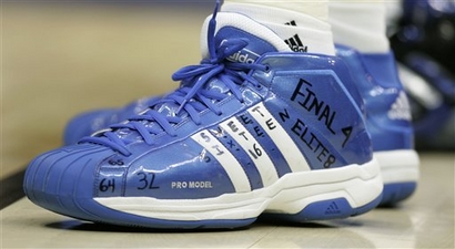
If schools would just do this to a pair of shoes each year, they could save a TON of time trying to get stuff hung from the rafters. Think of how many pairs of shoes you could get into a decent-sized trophy case, too. 30 years’ worth, easy.
These shoes belong to Kevin Love, who now has more free time if you’d like him to come mark up your shoes, too. And in other UCLA news, Lorenzo Mata-Real’s headgear seems to have taken a less creative tone than last week’s edition. I guess we can’t be on all of the time, can we? —Bryan
Is this the 1st year Adidas outnumbers Nike in a final four? They had 4 teams in elite 8, and 7 in sweet 16 (Russell had WSU), now they ousted swoosh from the title game.
Was the “65” necessary? It’s not like UCLA won the play-in game.
[quote comment=”248184″]Was the “65” necessary? It’s not like UCLA won the play-in game.[/quote]
Is the “65” unnecessary? Why is “64” necessary then? They didn’t beat 64 teams right?
The point is, the field started at 65. Then 64. Then 32. Then 16. Then 8. Then 4. Obviously it was a record of the tournament as a whole, not just of UCLA’s individual accomplishments.
[quote comment=”248185″][quote comment=”248184″]Was the “65” necessary? It’s not like UCLA won the play-in game.[/quote]
Is the “65” unnecessary? Why is “64” necessary then? They didn’t beat 64 teams right?
The point is, the field started at 65. Then 64. Then 32. Then 16. Then 8. Then 4. Obviously it was a record of the tournament as a whole, not just of UCLA’s individual accomplishments.[/quote]
Good thing Memphis booted them from the tournament because it doesn’t look like Love had left himself enough space for his team to advance. Unless, of course, it is actually a record of the tournament as a whole in which case he’ll have to write championship game and champion on the heel. That would be pretty pathetic though I think.
I have to go ahead and point this out. I was watching the Big Ten network yesterday (yes myself and most likely 12 other people in the country) and tOSU was playing Minnesota in baseball. It was just one big nike logo creep cluster fuck! Both teams were sponsored by Nike whenever there was a player at the plate I counted all together on just the left side of their uniform i counted 6 nike swooshes! one on the helmet, one on the chest, one on the bat, on the batting glove, above the left pocket and then on the shoes. I love my buckeyes but seriously that is a little overkill. (no pictures sorry, I’m sure it is on either of the schools websites.)
UCyaLAter
too bad UNC didn’t make the comeback…then the headlines today would have said
ROCK CHOKE
UW project alert?
in 1973, charley o “fired” mike andrews (his second baseman) trying to get manny trillo added to the roster
while browsing for something else, i came across this blurb:
[quote]The mood of the A’s players took a dark and ugly turn as they flew into New York. Player representative Reggie Jackson was going to file a grievance on Andrews’ behalf and the A’s were talking about striking. The A’s players taped “17” — Andrews’ number — on their uniform sleeves as a protest. Some wanted to outright strike, and others wanted to give Finley a hard time in next year’s contract negotiations. Once cooler heads prevailed, The A’s realized by striking, it would hurt their obligations to the fans, so they decided to play.[/quote]
link
does ANYONE have any visual evidence of this? it was very late last night, so i only checked a few sources, but i was unable to find any world series photos from 1973 showing this…
can anyone confirm this via visual evidence?
the story from which this article comes is well documented (the ‘firing’ of andrews)…i had never heard of the a’s putting a 17 on their sleeves however…and i don’t remember this ever being posted on UW before (please forgive me if it was)
is it safe to assume we’ll see memphis in white and kansas in blue on monday night? UNC was the overall #1 seed, making kansas the overall #4, and making memphis the overall #2 seed since they were the home team as well. not a bad looking final either way. i’m just glad we don’t have to look at florida for the third year in a row.
[quote comment=”248185″][quote comment=”248184″]Was the “65” necessary? It’s not like UCLA won the play-in game.[/quote]
Is the “65” unnecessary? Why is “64” necessary then? They didn’t beat 64 teams right?
The point is, the field started at 65. Then 64. Then 32. Then 16. Then 8. Then 4. Obviously it was a record of the tournament as a whole, not just of UCLA’s individual accomplishments.[/quote]
So I guess he’ll put a 2 on there today, and a 1 on Monday night?
Is Canseco wearing a baseball batting glove for a golf glove in this photo at the playboy tourny?
link
[quote comment=”248194″]Is Canseco wearing a baseball batting glove for a golf glove in this photo at the playboy tourny?
link
[/quote]
For what it’s worth, Mizuno makes link, as well as baseball equipment.
It just looks more bulky like a baseball glove than a golf glove. sorry the link is wrong it is the picture before.
[quote comment=”248190″]UW project alert?
in 1973, charley o “fired” mike andrews (his second baseman) trying to get manny trillo added to the roster
while browsing for something else, i came across this blurb:
[quote]The mood of the A’s players took a dark and ugly turn as they flew into New York. Player representative Reggie Jackson was going to file a grievance on Andrews’ behalf and the A’s were talking about striking. The A’s players taped “17” — Andrews’ number — on their uniform sleeves as a protest. Some wanted to outright strike, and others wanted to give Finley a hard time in next year’s contract negotiations. Once cooler heads prevailed, The A’s realized by striking, it would hurt their obligations to the fans, so they decided to play.[/quote]
link
does ANYONE have any visual evidence of this? it was very late last night, so i only checked a few sources, but i was unable to find any world series photos from 1973 showing this…
can anyone confirm this via visual evidence?
the story from which this article comes is well documented (the ‘firing’ of andrews)…i had never heard of the a’s putting a 17 on their sleeves however…and i don’t remember this ever being posted on UW before (please forgive me if it was)[/quote]
Here is a link to an link from the time that goes into good detail about the incident and the No. 17. Unfortunately, after some brief searching, I’ve still been unable to find any good pictures.
Hey todd krevanchi,
Good thing we only have to see those Memphis uniforms in one more game.
Leo,
Great link! … that picture in that SI article is awesome. Thank God for Walter Iooss Jr.
Whoops, Paul, go ahead and take down comment 12, I’m an idiot.
Sorry I missed Saturday’s discussion, but let me voice my support for the Blue Jays powder blues. I think they look great, and prefer those over their current home & road uniforms.
Guess the Blue Jays will have to be moved out of Category 2 and into Category 1.
[quote comment=”248193″][quote comment=”248185″][quote comment=”248184″]Was the “65” necessary? It’s not like UCLA won the play-in game.[/quote]
Is the “65” unnecessary? Why is “64” necessary then? They didn’t beat 64 teams right?
The point is, the field started at 65. Then 64. Then 32. Then 16. Then 8. Then 4. Obviously it was a record of the tournament as a whole, not just of UCLA’s individual accomplishments.[/quote]
So I guess he’ll put a 2 on there today, and a 1 on Monday night?[/quote]
Uh…no, because it’s over?
No fan of UCLA or Kevin Love, but I like what he did. A good way to help succeed in any major task, sports or otherwise, is to break it into individual steps (you know, “we play one game at a time”).
[quote comment=”248214″][quote comment=”248193″][quote comment=”248185″][quote comment=”248184″]Was the “65” necessary? It’s not like UCLA won the play-in game.[/quote]
Is the “65” unnecessary? Why is “64” necessary then? They didn’t beat 64 teams right?
The point is, the field started at 65. Then 64. Then 32. Then 16. Then 8. Then 4. Obviously it was a record of the tournament as a whole, not just of UCLA’s individual accomplishments.[/quote]
So I guess he’ll put a 2 on there today, and a 1 on Monday night?[/quote]
Uh…no, because it’s over?[/quote]
I think he was kidding
Good article link about the Utah Jazz and how several of them ended up with the uni numbers that they currently wear. It also says Ronnie Brewer may change his number next year from 9 to 10 after the Gordan Giricek trade.
[quote comment=”248209″]Sorry I missed Saturday’s discussion, but let me voice my support for the Blue Jays powder blues. I think they look great, and prefer those over their current home & road uniforms.
Guess the Blue Jays will have to be moved out of Category 2 and into Category 1.[/quote]
I agree the ‘Blue’ Jays powder blues are alright with me. I liked them when I was a kid and still do. I think what brings me back though is the white front hat. True Toronto look to me. But hey, what do I know? I was a sucker for the Expos pinwheel hat growing up, too.
[quote comment=”248223″]Good article link about the Utah Jazz and how several of them ended up with the uni numbers that they currently wear. It also says Ronnie Brewer may change his number next year from 9 to 10 after the Gordan Giricek trade.[/quote]
Utah + Jazz. One of those geographic nicknames they shoulda changed. (This opens up an entire thread.) Same for Memphis Grizzlies. Tho LA Lakers seems to work.
[quote comment=”248225″][quote comment=”248223″]Good article link about the Utah Jazz and how several of them ended up with the uni numbers that they currently wear. It also says Ronnie Brewer may change his number next year from 9 to 10 after the Gordan Giricek trade.[/quote]
Utah + Jazz. One of those geographic nicknames they shoulda changed. (This opens up an entire thread.) Same for Memphis Grizzlies. Tho LA Lakers seems to work.[/quote]
Betcha didn’t know Utah is The Beehive State. Agreed, the Utah and New Orleans squads could swap jerseys and identities and it would make perfect sense.
A few baseball high and lowlights from this past week, with some thanks thrown to a friend for finding the pics before me!
link
and the
link
There are so many things wrong with how Rivas looks, I don’t know where to begin. Perhaps, he is as inept at dressing himself as the Pirates are at actually Playing baseball.
BTW, some cool new spikes for Junior
[quote comment=”248228″]A few baseball high and lowlights from this past week, with some thanks thrown to a friend for finding the pics before me!
link
and the
link
There are so many things wrong with how Rivas looks, I don’t know where to begin. Perhaps, he is as inept at dressing himself as the Pirates are at actually Playing baseball.
BTW, some cool new spikes for Junior[/quote]
Sorry to quote myself, but there’s some more:
link
link
Rivas is wearing cleated basketball shoes, which look ridiculous. Silly when Nike now makes those shoes with cleat midsoles available in Player Exclusive colors.
His look ruins a beautiful uniform, just like their play ruins their chances at winning an actual baseball game!
As someone who is a fan of tattoos, I find myself not approving of them on the baseball diamond. I might be in the minority here but in basketball:OK, in football:great, but baseball: I find them out of place!
What do y’all think?
[quote comment=”248231″][quote comment=”248228″]A few baseball high and lowlights from this past week, with some thanks thrown to a friend for finding the pics before me!
link
and the
link
There are so many things wrong with how Rivas looks, I don’t know where to begin. Perhaps, he is as inept at dressing himself as the Pirates are at actually Playing baseball.
BTW, some cool new spikes for Junior[/quote]
Sorry to quote myself, but there’s some more:
link
link
Rivas is wearing cleated basketball shoes, which look ridiculous. Silly when Nike now makes those shoes with cleat midsoles available in Player Exclusive colors.
His look ruins a beautiful uniform, just like their play ruins their chances at winning an actual baseball game!
As someone who is a fan of tattoos, I find myself not approving of them on the baseball diamond. I might be in the minority here but in basketball:OK, in football:great, but baseball: I find them out of place!
What do y’all think?[/quote]
I have two tats myself, and am generally a fan of them, but I don’t like seeing them on athletes. Double-standard? Yeah. Rooted in some retro-minded sensibility (i.e., preferring the era when players didn’t have tats)? Probably, yeah.
[quote comment=”248225″][quote comment=”248223″]Good article link about the Utah Jazz and how several of them ended up with the uni numbers that they currently wear. It also says Ronnie Brewer may change his number next year from 9 to 10 after the Gordan Giricek trade.[/quote]
Utah + Jazz. One of those geographic nicknames they shoulda changed. (This opens up an entire thread.) Same for Memphis Grizzlies. Tho LA Lakers seems to work.[/quote]
Everytime I see the words Utah Jazz I’m reminded of the opening scene of BaseKetball, “The New Orleans Jazz moved to Utah, where they don’t allow music…”
don’t the braves look lovely in their sunday reds today
[quote comment=”248233″][quote comment=”248231″][quote comment=”248228″]A few baseball high and lowlights from this past week, with some thanks thrown to a friend for finding the pics before me!
link
and the
link
There are so many things wrong with how Rivas looks, I don’t know where to begin. Perhaps, he is as inept at dressing himself as the Pirates are at actually Playing baseball.
BTW, some cool new spikes for Junior[/quote]
Sorry to quote myself, but there’s some more:
link
link
Rivas is wearing cleated basketball shoes, which look ridiculous. Silly when Nike now makes those shoes with cleat midsoles available in Player Exclusive colors.
His look ruins a beautiful uniform, just like their play ruins their chances at winning an actual baseball game!
As someone who is a fan of tattoos, I find myself not approving of them on the baseball diamond. I might be in the minority here but in basketball:OK, in football:great, but baseball: I find them out of place!
What do y’all think?[/quote]
I have two tats myself, and am generally a fan of them, but I don’t like seeing them on athletes. Double-standard? Yeah. Rooted in some retro-minded sensibility (i.e., preferring the era when players didn’t have tats)? Probably, yeah.[/quote]
There’s another one aside from the Brannock Device?
[quote comment=”248233″][quote comment=”248231″][quote comment=”248228″]A few baseball high and lowlights from this past week, with some thanks thrown to a friend for finding the pics before me!
link
and the
link
There are so many things wrong with how Rivas looks, I don’t know where to begin. Perhaps, he is as inept at dressing himself as the Pirates are at actually Playing baseball.
BTW, some cool new spikes for Junior[/quote]
Sorry to quote myself, but there’s some more:
link
link
Rivas is wearing cleated basketball shoes, which look ridiculous. Silly when Nike now makes those shoes with cleat midsoles available in Player Exclusive colors.
His look ruins a beautiful uniform, just like their play ruins their chances at winning an actual baseball game!
As someone who is a fan of tattoos, I find myself not approving of them on the baseball diamond. I might be in the minority here but in basketball:OK, in football:great, but baseball: I find them out of place!
What do y’all think?[/quote]
I have two tats myself, and am generally a fan of them, but I don’t like seeing them on athletes. Double-standard? Yeah. Rooted in some retro-minded sensibility (i.e., preferring the era when players didn’t have tats)? Probably, yeah.[/quote]
Brannock Device, correct?
Very interesting choice. I myself have always been enamored with the idea but had never thought of anything so important as to mark my body for eternity in honor of…until a few years ago when I decided that I would love the names and birthdays of my children. Considering my profession as an educator and of course, my children, they would obviously be tasteful. Well, they have yet to materialize because of some diagreement over principle, not my Principal, with my wife!
BTW, my friend literally got link the other day, and it is not helping my cause ONE BIT!
As for any Uni-relation, with so many athletes being inked-up, the truly unique seem to be those without it. As stated before, I don’t know whether I mind them on athletes in sports like baseball of football or whether I have just grown so accustomed to seeing them. I still, however, do not like seeing them visible on baseball players.
[quote comment=”248237″]don’t the braves look lovely in their sunday reds today[/quote]
Not really…sorry. Scrap the Red jerseys for the blue one (just tweak the numbers and we’re set).
[quote comment=”248233″][quote comment=”248231″]As someone who is a fan of tattoos, I find myself not approving of them on the baseball diamond. I might be in the minority here but in basketball:OK, in football:great, but baseball: I find them out of place!
What do y’all think?[/quote]
I have two tats myself, and am generally a fan of them, but I don’t like seeing them on athletes. Double-standard? Yeah. Rooted in some retro-minded sensibility (i.e., preferring the era when players didn’t have tats)? Probably, yeah.[/quote]
i have link myself…but im with PL here…perhaps because the ‘kids today’ have like 900 seemingly random (and yes, i know there is usually some deep meaning in each and every piece of ink one has) tats…they just look like shit…but you don’t spend a grand and 9 hours under the needle because it’s fun, so i don’t begrudge their so doing…i just think NOW it is almost a contest to see who has more
imho, in the case of ink…less is more
[quote comment=”248242″][quote comment=”248237″]don’t the braves look lovely in their sunday reds today[/quote]
Not really…sorry. Scrap the Red jerseys for the blue one (just tweak the numbers and we’re set).[/quote]
dammit paulie…i forgot the sarcasm tags
[quote comment=”248244″][quote comment=”248242″][quote comment=”248237″]don’t the braves look lovely in their sunday reds today[/quote]
Not really…sorry. Scrap the Red jerseys for the blue one (just tweak the numbers and we’re set).[/quote]
dammit paulie…i forgot the sarcasm tags[/quote]
dammit phil, I thought exclamation would only apply to you…and pick up your phone
[quote comment=”248175″]Is this the 1st year Adidas outnumbers Nike in a final four? They had 4 teams in elite 8, and 7 in sweet 16 (Russell had WSU), now they ousted swoosh from the title game.[/quote]
A victory all around in my opinion. I detest Nike and am a lover of the three stripes.
[quote comment=”248231″][quote comment=”248228″]A few baseball high and lowlights from this past week, with some thanks thrown to a friend for finding the pics before me!
link
and the
link
There are so many things wrong with how Rivas looks, I don’t know where to begin. Perhaps, he is as inept at dressing himself as the Pirates are at actually Playing baseball.
BTW, some cool new spikes for Junior[/quote]
Sorry to quote myself, but there’s some more:
link
link
Rivas is wearing cleated basketball shoes, which look ridiculous. Silly when Nike now makes those shoes with cleat midsoles available in Player Exclusive colors.
His look ruins a beautiful uniform, just like their play ruins their chances at winning an actual baseball game!
As someone who is a fan of tattoos, I find myself not approving of them on the baseball diamond. I might be in the minority here but in basketball:OK, in football:great, but baseball: I find them out of place!
What do y’all think?[/quote]
In the case of customize Basketball shoes on the diamond…They look better with the pant leg down.
I agree with Mr. Lukas on this one. I think athletes look odd with tattoos…I grew up not seeing that and when Dennis Rodman joined the Bulls in the mid 90’s…I had some mixed feelings on that one. He had such a unique look I enjoyed but..it still looked odd to me.
[quote comment=”248244″][quote comment=”248242″][quote comment=”248237″]don’t the braves look lovely in their sunday reds today[/quote]
Not really…sorry. Scrap the Red jerseys for the blue one (just tweak the numbers and we’re set).[/quote]
dammit paulie…i forgot the sarcasm tags[/quote]
Sarcasm gets lots in translation on these sites. I’ll take my comment back….and resume business as usual.
Ugh. The Cubs’ blue alternates have returned.
The front uniform numbers on the Twins’ home alternates are back to being white today.
Zito having some serious link issues. But at least he survived the first inning.
[quote comment=”248234″][quote comment=”248225″][quote comment=”248223″]Good article link about the Utah Jazz and how several of them ended up with the uni numbers that they currently wear. It also says Ronnie Brewer may change his number next year from 9 to 10 after the Gordan Giricek trade.[/quote]
Utah + Jazz. One of those geographic nicknames they shoulda changed. (This opens up an entire thread.) Same for Memphis Grizzlies. Tho LA Lakers seems to work.[/quote]
Everytime I see the words Utah Jazz I’m reminded of the opening scene of BaseKetball, “The New Orleans Jazz moved to Utah, where they don’t allow music…”[/quote]
I agree, it doesn’t fit. But the fans would never let it change now. People in this state eat, sleep and breathe (but not drink) the Jazz. I once heard Frank Layden explain the reason for the NON-name change. He said that upon leaving New Orleans and coming to Salt Lake, nobody thought they would last longer than 1 year, including the front office and ownership. So they decided to wait until they ended up in their ‘final’ destination before changing the name (sacramento being the market they were looking at). And each year after, for several years, they still weren’t sure they were going to stay. After a few years the name became a non issue.
The Trajan Invasion missed a spot. (link)
Imagine if the Washington Senators moved to Dallas and became…The Texas Senators?
[quote comment=”248259″]Imagine if the Washington Senators moved to Dallas and became…The Texas Senators?[/quote]
speaking of teams moving to texas…did i dream this, or was there at one time talk of changing the north stars to the lone stars, before just ultimately settling upon stars?
admittedly, lone stars sounds stupid (since, by definition lone=one)
[quote comment=”248260″][quote comment=”248259″]Imagine if the Washington Senators moved to Dallas and became…The Texas Senators?[/quote]
speaking of teams moving to texas…did i dream this, or was there at one time talk of changing the north stars to the lone stars, before just ultimately settling upon stars?
admittedly, lone stars sounds stupid (since, by definition lone=one)[/quote]
I’m no astronomist, but isn’t there only one north star as well?
[quote comment=”248262″][quote comment=”248260″][quote comment=”248259″]Imagine if the Washington Senators moved to Dallas and became…The Texas Senators?[/quote]
speaking of teams moving to texas…did i dream this, or was there at one time talk of changing the north stars to the lone stars, before just ultimately settling upon stars?
admittedly, lone stars sounds stupid (since, by definition lone=one)[/quote]
I’m no astronomist, but isn’t there only one north star as well?[/quote]
heh…i no astronomer myself…and i didn’t coin the minnesota team nickname…but now that i think about it…yer right
[quote comment=”248257″]The Trajan Invasion missed a spot. (link)[/quote]
ESPN is kinda slow with getting new logos for colleges it seems. This is coming from a University of Pittsburgh fan – I think the dinocat is still up some places, even though we don’t use it anymore. Don’t get me started on Pitt vs. Pittsburgh either.
[quote comment=”248252″]Ugh. The Cubs’ blue alternates have returned.[/quote]
Zambrano loved wearing the Cubbie Blue’s two seasons ago, but they stopped wearing them last season. Obviously today they’re back. Interestingly, Zambrano wore the white pinstripes at home on Opening Day. link
Also, the Astros are AGAIN wearing their “Alternate” Reds, which gives us blue jerseys, red jerseys, white pants, and grey pants…
I assume the Cubs denied Zambrano the opportunity to don the blue unis on Opening Day to keep the traditional look.
[quote comment=”248263″][quote comment=”248262″][quote comment=”248260″][quote comment=”248259″]Imagine if the Washington Senators moved to Dallas and became…The Texas Senators?[/quote]
speaking of teams moving to texas…did i dream this, or was there at one time talk of changing the north stars to the lone stars, before just ultimately settling upon stars?
admittedly, lone stars sounds stupid (since, by definition lone=one)[/quote]
I’m no astronomist, but isn’t there only one north star as well?[/quote]
heh…i no astronomer myself…and i didn’t coin the minnesota team nickname…but now that i think about it…yer right[/quote]
Well, the North Stars were not named after the north star. They were named after Minnesota’s state motto “L’Etoile du Nord” which is French for “The Star of the North”. Insinuating that Minnesota itself is the star of the north. So you could look at it as if they were calling the players on the team the “Stars of the North” rather than the “North Stars”.
Personally, I never really liked the name for the very same reason you stated. It’s awkward and weird. I’ll tell you what though, I’d rather have them than the Wild :)
[quote comment=”248266″]I assume the Cubs denied Zambrano the opportunity to don the blue unis on Opening Day to keep the traditional look.[/quote]
The Braves and Blue Jays must have missed the memo that Opening Day should be special. Alts shouldn’t be worn on Opening Day.
No picture but at the Cubs game today versus the Astros, Bud Light and the Cubs did something totally ridiculous. The two guys who do the “Real Men of Genius” ad campaign went on the field with Cubs jerseys, one with ‘Real Men’ as a NOB while the other finished it off with ‘Of Genius’ on the back of his jersey. Can you say logo creep? They then preceded to do a live version of the commercial for the entire stadium and then did another one in the WGN booth (the local station that broadcasts the games) for everyone at home. The commercials are really funny but I don’t think the Cubs need to be putting slogans on the back of their jerseys.
[quote comment=”248271″]No picture but at the Cubs game today versus the Astros, Bud Light and the Cubs did something totally ridiculous. The two guys who do the “Real Men of Genius” ad campaign went on the field with Cubs jerseys, one with ‘Real Men’ as a NOB while the other finished it off with ‘Of Genius’ on the back of his jersey. Can you say logo creep? They then preceded to do a live version of the commercial for the entire stadium and then did another one in the WGN booth (the local station that broadcasts the games) for everyone at home. The commercials are really funny but I don’t think the Cubs need to be putting slogans on the back of their jerseys.[/quote]
I saw that and thought it was idiotic. The thing that made me mad was when they were on the field (or at least walking off) they were walking side by side flip flopped so it said “Of Genius” “Real Men”.
I would think if you went through the work to get those done you would know which side of the other to stand on.
[quote comment=”248273″][quote comment=”248271″]No picture but at the Cubs game today versus the Astros, Bud Light and the Cubs did something totally ridiculous. The two guys who do the “Real Men of Genius” ad campaign went on the field with Cubs jerseys, one with ‘Real Men’ as a NOB while the other finished it off with ‘Of Genius’ on the back of his jersey. Can you say logo creep? They then preceded to do a live version of the commercial for the entire stadium and then did another one in the WGN booth (the local station that broadcasts the games) for everyone at home. The commercials are really funny but I don’t think the Cubs need to be putting slogans on the back of their jerseys.[/quote]
I saw that and thought it was idiotic. The thing that made me mad was when they were on the field (or at least walking off) they were walking side by side flip flopped so it said “Of Genius” “Real Men”.
I would think if you went through the work to get those done you would know which side of the other to stand on.[/quote]
Not if you were using tth product correctly.
[quote comment=”248234″]“Every time I see the words Utah Jazz I’m reminded of the opening scene of BaseKetball, ‘The New Orleans Jazz moved to Utah, where they don’t allow music…'”[/quote]
And every time I hear “Utah Jazz”, I’m reminded of when a local overnight DJ when WIP did music said “Utah Jazz. That sounds like the Mormon Tabernacle Choir singing Lawrence Welk.” A Wunnerful, a-wunnerful!
What was the horizontal black strip on the back of the UNC uni’s, below the neckline??
Covering an unapproved logo???
[quote comment=”248190″]UW project alert?
in 1973, charley o “fired” mike andrews (his second baseman) trying to get manny trillo added to the roster
while browsing for something else, i came across this blurb:
[quote]The mood of the A’s players took a dark and ugly turn as they flew into New York. Player representative Reggie Jackson was going to file a grievance on Andrews’ behalf and the A’s were talking about striking. The A’s players taped “17” — Andrews’ number — on their uniform sleeves as a protest. Some wanted to outright strike, and others wanted to give Finley a hard time in next year’s contract negotiations. Once cooler heads prevailed, The A’s realized by striking, it would hurt their obligations to the fans, so they decided to play.[/quote]
link
does ANYONE have any visual evidence of this? it was very late last night, so i only checked a few sources, but i was unable to find any world series photos from 1973 showing this…
can anyone confirm this via visual evidence?
the story from which this article comes is well documented (the ‘firing’ of andrews)…i had never heard of the a’s putting a 17 on their sleeves however…and i don’t remember this ever being posted on UW before (please forgive me if it was)[/quote]
Phil, I’ve been scouring “the archives” and can’t find it, but there is unquestionably a shot of two players (one being Manny Trillo) with white tape “17” on the left sleeve.
I know Sporting News had it back then and I was pretty sure they re-ran it in one of their publications. I have the TSN Trivia Book and used to have the TSN Trivia Book 2 and would bet that is where I saw it last but I don’t seem have it anymore.
If any thinks they have this book, perhaps they could scan through it. It was a big deal back then and I know this group would have gone wild if UW were alive in 1973.
[quote comment=”248275″][quote comment=”248273″][quote comment=”248271″]No picture but at the Cubs game today versus the Astros, Bud Light and the Cubs did something totally ridiculous. The two guys who do the “Real Men of Genius” ad campaign went on the field with Cubs jerseys, one with ‘Real Men’ as a NOB while the other finished it off with ‘Of Genius’ on the back of his jersey. Can you say logo creep? They then preceded to do a live version of the commercial for the entire stadium and then did another one in the WGN booth (the local station that broadcasts the games) for everyone at home. The commercials are really funny but I don’t think the Cubs need to be putting slogans on the back of their jerseys.[/quote]
I saw that and thought it was idiotic. The thing that made me mad was when they were on the field (or at least walking off) they were walking side by side flip flopped so it said “Of Genius” “Real Men”.
I would think if you went through the work to get those done you would know which side of the other to stand on.[/quote]
Not if you were using tth product correctly.[/quote]
Like I am now!
[quote comment=”248279″]What was the horizontal black strip on the back of the UNC uni’s, below the neckline??
Covering an unapproved logo???[/quote]
That’s the Virginia Tech memorial black decal. ACC teams all have it and may choose its uniform location. UNC just happened to pick the rear neckline, above the NOB.
[quote comment=”248271″]No picture but at the Cubs game today versus the Astros, Bud Light and the Cubs did something totally ridiculous. The two guys who do the “Real Men of Genius” ad campaign went on the field with Cubs jerseys, one with ‘Real Men’ as a NOB while the other finished it off with ‘Of Genius’ on the back of his jersey. Can you say logo creep? They then preceded to do a live version of the commercial for the entire stadium and then did another one in the WGN booth (the local station that broadcasts the games) for everyone at home. The commercials are really funny but I don’t think the Cubs need to be putting slogans on the back of their jerseys.[/quote]
I’ve actually seen those guys in the WGN booth a couple of times. I would have thought their 15 were up.
I don’t know what the Twins were wearing earlier this week, because their navy home alternate jerseys are back to normal (numbers are white w/ red trim and the NOB is white w/ red trim). Wonder if the Tuesday jerseys were a mistake???
Much to Paul’s disgust, the Padres are wearing their camo’s (now the Sunday uni) today, and catcher Josh Bard has on some new gear. A camo hockey style mask and green chest and leg protectors. Along with the batting helmets, and green undershirts, at least the Pad’s try to commit to the Sunday Alt’s (the pants still have the blue stripe, maybe they can get those taken care of next year). I like the look and know that several vets in the area appreciate what the Pads are doing on Sundays this year..
Paul you absolutely need to interview link guy. Wow.
HA! That’s the weather forecast. Take TWO on the link. (Requires log-in to NYT.com)
link
link Tuck your jersey in above your skivvies!
I do not like seeing baseball players with tattoos, because . . . well, it just doesn’t look right. This would be a good topic for a Uni Poll.
Uniwatchblog was featured on the Knoxville News Sentinel’s “Mixed Media” watch on Friday.
wow did those atlanta braves look sharp in their sunday reds. o yea and they also beat your mets, paul
[quote comment=”248225″][quote comment=”248223″]Good article link about the Utah Jazz and how several of them ended up with the uni numbers that they currently wear. It also says Ronnie Brewer may change his number next year from 9 to 10 after the Gordan Giricek trade.[/quote]
Utah + Jazz. One of those geographic nicknames they shoulda changed. (This opens up an entire thread.) Same for Memphis Grizzlies. Tho LA Lakers seems to work.[/quote]
I’m not really sure how the Lakers work for LA, as there are no natural lakes there.
[quote comment=”248308″][quote comment=”248225″][quote comment=”248223″]Good article link about the Utah Jazz and how several of them ended up with the uni numbers that they currently wear. It also says Ronnie Brewer may change his number next year from 9 to 10 after the Gordan Giricek trade.[/quote]
Utah + Jazz. One of those geographic nicknames they shoulda changed. (This opens up an entire thread.) Same for Memphis Grizzlies. Tho LA Lakers seems to work.[/quote]
I’m not really sure how the Lakers work for LA, as there are no natural lakes there.[/quote]
Maybe the alliteration?
Take out the K and it’s perfect, if not stupid. (LA LA’ers? Basically Miami Floridians…)
Nicely done Kevin Love… does the next line say “NBA” or does it say “One More Year”… I’m guessing NBA as he now needs the money for a new pair of shoes…
[quote comment=”248260″]
speaking of teams moving to texas…did i dream this, or was there at one time talk of changing the north stars to the lone stars, before just ultimately settling upon stars?
admittedly, lone stars sounds stupid (since, by definition lone=one)[/quote]
I remember that too.
[quote comment=”248310″][quote comment=”248308″][quote comment=”248225″][quote comment=”248223″]Good article link about the Utah Jazz and how several of them ended up with the uni numbers that they currently wear. It also says Ronnie Brewer may change his number next year from 9 to 10 after the Gordan Giricek trade.[/quote]
Utah + Jazz. One of those geographic nicknames they shoulda changed. (This opens up an entire thread.) Same for Memphis Grizzlies. Tho LA Lakers seems to work.[/quote]
I’m not really sure how the Lakers work for LA, as there are no natural lakes there.[/quote]
Maybe the alliteration?
Take out the K and it’s perfect, if not stupid. (LA LA’ers? Basically Miami Floridians…)[/quote]
This logic is quite interesting… Perhaps the Phoenix Phoes??
[quote comment=”248313″][quote comment=”248310″][quote comment=”248308″][quote comment=”248225″][quote comment=”248223″]Good article link about the Utah Jazz and how several of them ended up with the uni numbers that they currently wear. It also says Ronnie Brewer may change his number next year from 9 to 10 after the Gordan Giricek trade.[/quote]
Utah + Jazz. One of those geographic nicknames they shoulda changed. (This opens up an entire thread.) Same for Memphis Grizzlies. Tho LA Lakers seems to work.[/quote]
I’m not really sure how the Lakers work for LA, as there are no natural lakes there.[/quote]
Maybe the alliteration?
Take out the K and it’s perfect, if not stupid. (LA LA’ers? Basically Miami Floridians…)[/quote]
This logic is quite interesting… Perhaps the Phoenix Phoes??[/quote]
or the philidelphia phillies
[quote comment=”248308″][quote comment=”248225″][quote comment=”248223″]Good article link about the Utah Jazz and how several of them ended up with the uni numbers that they currently wear. It also says Ronnie Brewer may change his number next year from 9 to 10 after the Gordan Giricek trade.[/quote]
Utah + Jazz. One of those geographic nicknames they shoulda changed. (This opens up an entire thread.) Same for Memphis Grizzlies. Tho LA Lakers seems to work.[/quote]
I’m not really sure how the Lakers work for LA, as there are no natural lakes there.[/quote]
But there are in Minneapolis, which is where the Lakers moved from.
[quote comment=”248319″][quote comment=”248308″][quote comment=”248225″][quote comment=”248223″]Good article link about the Utah Jazz and how several of them ended up with the uni numbers that they currently wear. It also says Ronnie Brewer may change his number next year from 9 to 10 after the Gordan Giricek trade.[/quote]
Utah + Jazz. One of those geographic nicknames they shoulda changed. (This opens up an entire thread.) Same for Memphis Grizzlies. Tho LA Lakers seems to work.[/quote]
I’m not really sure how the Lakers work for LA, as there are no natural lakes there.[/quote]
But there are in Minneapolis, which is where the Lakers moved from.[/quote]
Just like there is Jazz in New Orleans, which is NOT coincidentally, the Utah NBA team’s former home. Which is in turn precisely the point. Names that make less than perfect sense after a relocation.
Looks like they went all out for the court at the Women’s Final Four. There is the required logo at center court, but they stained all the wood inside the 3 point arc to resemble an orange. Kinda cool.
BTW, when did Stanford decide that black was their primary color? Odd, considering they are the CARDINAL.
[quote comment=”248282″][quote comment=”248190″]UW project alert?
in 1973, charley o “fired” mike andrews (his second baseman) trying to get manny trillo added to the roster
while browsing for something else, i came across this blurb:
[quote]The mood of the A’s players took a dark and ugly turn as they flew into New York. Player representative Reggie Jackson was going to file a grievance on Andrews’ behalf and the A’s were talking about striking. The A’s players taped “17” — Andrews’ number — on their uniform sleeves as a protest. Some wanted to outright strike, and others wanted to give Finley a hard time in next year’s contract negotiations. Once cooler heads prevailed, The A’s realized by striking, it would hurt their obligations to the fans, so they decided to play.[/quote]
link
does ANYONE have any visual evidence of this? it was very late last night, so i only checked a few sources, but i was unable to find any world series photos from 1973 showing this…
can anyone confirm this via visual evidence?
the story from which this article comes is well documented (the ‘firing’ of andrews)…i had never heard of the a’s putting a 17 on their sleeves however…and i don’t remember this ever being posted on UW before (please forgive me if it was)[/quote]
Phil, I’ve been scouring “the archives” and can’t find it, but there is unquestionably a shot of two players (one being Manny Trillo) with white tape “17” on the left sleeve.
I know Sporting News had it back then and I was pretty sure they re-ran it in one of their publications. I have the TSN Trivia Book and used to have the TSN Trivia Book 2 and would bet that is where I saw it last but I don’t seem have it anymore.
If any thinks they have this book, perhaps they could scan through it. It was a big deal back then and I know this group would have gone wild if UW were alive in 1973.[/quote]
thanks for the help, larry…i’ve been off the grid since early afternoon, so i haven’t had a chance to check…not sure if paul would deem this ticker-worthy, but maybe it’ll warrant a mention as im sure more people read his entries than the sunday comments…i remember (as best a 7 year old can) the ‘firing’ of andrews very vaguely, but it was like a big deal at the time (i remember my dad being fairly pumped about it)…but not having the unisense i do now, i surely wouldn’t have paid any mind to such a ‘tribute’ of solidarity
hopefully someone will be able to find a pic, even if it is only for my own edification
Will the White Sox ever ditch that tired black and silver?
I know that everyone has been in agreement on how bad those split uniform replicas look but I do believe that I have found every Uni-Watch nightmare in this link
[quote comment=”248327″]I know that everyone has been in agreement on how bad those split uniform replicas look but I do believe that I have found every Uni-Watch nightmare in this link[/quote]
Correction: you’ve given Uni Watch a nightmare by revealing that hideous thing nobody could have imagined themselves!
[quote comment=”248329″][quote comment=”248327″]I know that everyone has been in agreement on how bad those split uniform replicas look but I do believe that I have found every Uni-Watch nightmare in this link[/quote]
Correction: you’ve given Uni Watch a nightmare by revealing that hideous thing nobody could have imagined themselves![/quote]
I like how they describe it as “RARE”. No shit.
[quote comment=”248255″]Zito having some serious link issues. But at least he survived the first inning.[/quote]
I was at the game and you could see the tag from the seats and when they showed replays and up close on the video screen at Miller Park – ARG! I pointed it out to my boyfriend who just looked at me
[quote comment=”248271″]No picture but at the Cubs game today versus the Astros, Bud Light and the Cubs did something totally ridiculous. The two guys who do the “Real Men of Genius” ad campaign went on the field with Cubs jerseys, one with ‘Real Men’ as a NOB while the other finished it off with ‘Of Genius’ on the back of his jersey. Can you say logo creep? They then preceded to do a live version of the commercial for the entire stadium and then did another one in the WGN booth (the local station that broadcasts the games) for everyone at home. The commercials are really funny but I don’t think the Cubs need to be putting slogans on the back of their jerseys.[/quote]
Here’s to you, Mr. Pro Sports Heckler guy.
[quote]The thing that made me mad was when they were on the field (or at least walking off) they were walking side by side flip flopped so it said “Of Genius” “Real Men”.[/quote]
indeed
[quote comment=”248321″]Looks like they went all out for the court at the Women’s Final Four. There is the required logo at center court, but they stained all the wood inside the 3 point arc to resemble an orange. Kinda cool.
BTW, when did Stanford decide that black was their primary color? Odd, considering they are the CARDINAL.[/quote]
idk, matbe i’m just being stupid but I’ve known Tampa to be famous for its oranges. But then the games not even in Tampa. I feel sorry for St. Pete so times.
[quote comment=”248311″]Nicely done Kevin Love… does the next line say “NBA” or does it say “One More Year”…[/quote]
“wear more socks”
[quote comment=”248334″][quote comment=”248321″]Looks like they went all out for the court at the Women’s Final Four. There is the required logo at center court, but they stained all the wood inside the 3 point arc to resemble an orange. Kinda cool.
BTW, when did Stanford decide that black was their primary color? Odd, considering they are the CARDINAL.[/quote]
idk, matbe i’m just being stupid but I’ve known Tampa to be famous for its oranges. But then the games not even in Tampa. I feel sorry for St. Pete so times.[/quote]
Guess it would have been bad to have a big ol’ cigar painted on the court.
[quote comment=”248321″]“Looks like they went all out for the court at the Women’s Final Four. There is the required logo at center court, but they stained all the wood inside the three-point arc to resemble an orange. Kinda cool.”[/quote]
Something the Men’s Final Four floor designers can learn from.
[quote comment=”248330″][quote comment=”248329″][quote comment=”248327″]I know that everyone has been in agreement on how bad those split uniform replicas look but I do believe that I have found every Uni-Watch nightmare in this link[/quote]
Correction: you’ve given Uni Watch a nightmare by revealing that hideous thing nobody could have imagined themselves![/quote]
I like how they describe it as “RARE”. No shit.[/quote]
Rare, indeed. I was on eBay trying to find a Rockies jersey for my nephew (big Todd Helton fan) and when that popped up, I had to share the pain of it with my Uni-Watch brethren.
There are are so many things wrong with that hideous POS, but having Patrick Roy’s full name and half of Larry Walker’s name was probably the best (i.e. worst) part of it. Of course, if my last name was Royker, I would probably be all over it…
Also, you may notice a grapefruit is in the logo.
Go Stanford Black!!!
[quote comment=”248262″][quote comment=”248260″][quote comment=”248259″]Imagine if the Washington Senators moved to Dallas and became…The Texas Senators?[/quote]
speaking of teams moving to texas…did i dream this, or was there at one time talk of changing the north stars to the lone stars, before just ultimately settling upon stars?
admittedly, lone stars sounds stupid (since, by definition lone=one)[/quote]
I’m no astronomist, but isn’t there only one north star as well?[/quote]
It could work though as in Lone Star Staters as opposed to referencing the actual star itself.
[quote comment=”248341″][quote comment=”248330″][quote comment=”248329″][quote comment=”248327″]I know that everyone has been in agreement on how bad those split uniform replicas look but I do believe that I have found every Uni-Watch nightmare in this link[/quote]
Correction: you’ve given Uni Watch a nightmare by revealing that hideous thing nobody could have imagined themselves![/quote]
I like how they describe it as “RARE”. No shit.[/quote]
Rare, indeed. I was on eBay trying to find a Rockies jersey for my nephew (big Todd Helton fan) and when that popped up, I had to share the pain of it with my Uni-Watch brethren.
There are are so many things wrong with that hideous POS, but having Patrick Roy’s full name and half of Larry Walker’s name was probably the best (i.e. worst) part of it. Of course, if my last name was Royker, I would probably be all over it…[/quote]
Dishonorable mentions all over the place. At the very least…
1) Roy’s NOB not VAL-ed like it should
2) In both cases, the 3 digits need some extra color, namely metallic silver and a blue layer for the Avs.
3) Rockies use Athletic Block for numbers, not Wilson Varsity
4) Typeface for KER made to match front, when it shouldn’t
5) COLORADO front word mark totally wrong: Rockies wear ROCKIES on the white pinstripes, and Avalanche use a crest.
6) Where’s Bigfoot?
7) The hockey jersey part is short-sleeved. Actually, thank G-d they took that artistic liberty.
I hope that’s it…
[quote comment=”248342″]Also, you may notice a grapefruit is in the logo.[/quote]
except that it’s a link
Few tidbits:
1. @ the Women’s Final Four, inside the arc looks very cool.
2. Stanford Cardinal: Ditch the Black
3. White Sox/Tigers:
a. Verlander works very quickly almost at
Jimmy Key speed
[quote comment=”248349″]Few tidbits:
1. @ the Women’s Final Four, inside the arc looks very cool.
2. Stanford Cardinal: Ditch the Black
3. White Sox/Tigers:
a. Verlander works very quickly almost at
Jimmy Key speed[/quote]
b. The Old English D on the Tigers jerseys
is different than those on the caps.
Check the two horizontal arcs? on the D of
the jersey. Has it always been this
way or is that the “stylized” D
that we saw on the M&M’s the other
day?
[quote comment=”248348″][quote comment=”248342″]Also, you may notice a grapefruit is in the logo.[/quote]
except that it’s a link[/quote]
dammit phil, it’s an orange
If only link were going to look like linktomorrow evening!
Candace Parker of Tennessee is wearing a long sleeved white T-shirt under her jersey, presumably to aid her shoulder injury. I have the sound off on the TV.
[quote comment=”248352″]If only link were going to look like linktomorrow evening![/quote]
OK, good. You’re lamenting the font change, and not praying for Bleeding Red. I’m with you, sir.
[quote comment=”248357″][quote comment=”248352″]If only link were going to look like linktomorrow evening![/quote]
OK, good. You’re lamenting the font change, and not praying for Bleeding Red. I’m with you, sir.[/quote]
I was, and am a fan of their red Nike alts. I still regret not snatching up a pair when I had the chance.
I think that Adidas has bastardized their beautiful uniforms although they have not looked bad throughout the tournament.
[quote comment=”248357″][quote comment=”248352″]If only link were going to look like linktomorrow evening![/quote]
OK, good. You’re lamenting the font change, and not praying for Bleeding Red. I’m with you, sir.[/quote]
i don’t think he’s rueing the trajan
he wants the red
[quote comment=”248359″][quote comment=”248357″][quote comment=”248352″]If only link were going to look like linktomorrow evening![/quote]
OK, good. You’re lamenting the font change, and not praying for Bleeding Red. I’m with you, sir.[/quote]
i don’t think he’s rueing the trajan
he wants the red[/quote]
dammit phil,
I am a soldier in the Trajan sucks army. but I so miss the Nike red as well as link. They were always outfitted with some of the coolest Player exclusives in the NCAA.
[quote comment=”248331″][quote comment=”248255″]Zito having some serious link issues. But at least he survived the first inning.[/quote]
I was at the game and you could see the tag from the seats and when they showed replays and up close on the video screen at Miller Park – ARG! I pointed it out to my boyfriend who just looked at me[/quote]
I think that’s due to the fact that he doesn’t
Get Itâ„¢….
[quote comment=”248334″][quote comment=”248321″]Looks like they went all out for the court at the Women’s Final Four. There is the required logo at center court, but they stained all the wood inside the 3 point arc to resemble an orange. Kinda cool.
BTW, when did Stanford decide that black was their primary color? Odd, considering they are the CARDINAL.[/quote]
idk, matbe i’m just being stupid but I’ve known Tampa to be famous for its oranges. But then the games not even in Tampa. I feel sorry for St. Pete so times.[/quote]
The game is at the St. Pete Times Forum, which is located in downtown Tampa. The Tampa Bay Rays, well, they of course play in St. Pete.
[quote comment=”248362″][quote comment=”248331″][quote comment=”248255″]Zito having some serious link issues. But at least he survived the first inning.[/quote]
I was at the game and you could see the tag from the seats and when they showed replays and up close on the video screen at Miller Park – ARG! I pointed it out to my boyfriend who just looked at me[/quote]
I think that’s due to the fact that he doesn’t
Get Itâ„¢….[/quote]
that’s a rather personal assumption to be making, dontcha think? ;)
Candace Parker wearing the link. Right above the SEC 75th anniversary patch you can sorta see the mark of the 3-stripes poking out.
Here’s a shot of the link at the Women’s Final four. At least they were more creative than the Men’s side.
[quote comment=”248358″][quote comment=”248357″][quote comment=”248352″]If only link were going to look like linktomorrow evening![/quote]
OK, good. You’re lamenting the font change, and not praying for Bleeding Red. I’m with you, sir.[/quote]
I was, and am a fan of their red Nike alts. I still regret not snatching up a pair when I had the chance.
I think that Adidas has bastardized their beautiful uniforms although they have not looked bad throughout the tournament.[/quote]
I don’t know. I can’t dig the alts. I look at them, and all I can think about is the Bleeding Kansas episode I learned in middle school history. Not the greatest karma in the world, if you get my drift.
This is slightly off topic, but it is something that bugs me every year around Opening Day in the MLB…. is there a Canadian version of bunting? I’ve always seen it as Red, White and Blue, and it never looks right to me in Toronto (as a Canadian, who has attended the Jays home opener for the past 4 or 5 years)
[quote comment=”248368″]Here’s a shot of the link at the Women’s Final four.
At least they were more creative than the Men’s side.[/quote]
that floor is just awful. a court should never overshadow the game being played on it!
When are the Blue Jays going to break out their home whites?
[quote comment=”248372″]is there a Canadian version of bunting? [/quote]
link
pretty much the same as in the states
[quote comment=”248368″]Here’s a shot of the link at the Women’s Final four.
At least they were more creative than the Men’s side.[/quote]
That’s pretty darn cool.
[quote comment=”248379″][quote comment=”248372″]is there a Canadian version of bunting? [/quote]
link
pretty much the same as in the states[/quote]
Absolutely perfect!
[quote comment=”248233″]
I have two tats myself, [/quote]
Stirrups on each leg?
[quote comment=”248370″][quote comment=”248358″][quote comment=”248357″][quote comment=”248352″]If only link were going to look like linktomorrow evening![/quote]
OK, good. You’re lamenting the font change, and not praying for Bleeding Red. I’m with you, sir.[/quote]
I was, and am a fan of their red Nike alts. I still regret not snatching up a pair when I had the chance.
I think that Adidas has bastardized their beautiful uniforms although they have not looked bad throughout the tournament.[/quote]
I don’t know. I can’t dig the alts. I look at them, and all I can think about is the Bleeding Kansas episode I learned in middle school history. Not the greatest karma in the world, if you get my drift.[/quote]
I wish i could see those Kansas PE XIII
Straight sick
Titans will wear a link
[quote comment=”248408″]Titans will wear a link[/quote]
Looks like they’re not recognizing the move to Tennessee (to Memphis in 1997) or even the move to Nashville (to Vanderbilt Stadium in 1998) but rather the opening of their new stadium and the introduction of their hideous uniforms in 1999.
[quote comment=”248415″][quote comment=”248408″]Titans will wear a link[/quote]
Looks like they’re not recognizing the move to Tennessee (to Memphis in 1997) or even the move to Nashville (to Vanderbilt Stadium in 1998) but rather the opening of their new stadium and the introduction of their hideous uniforms in 1999.[/quote]
uh…no…the patch is being worn for the 2008 season…that means that ten years previous would be 1998.