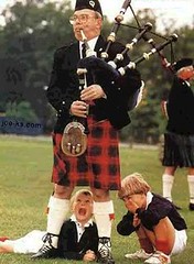
I tend not to write about ice dancing outfits, in part because they’re ridiculous, and in larger part because the entire “sport” is even more ridiculous. But it’s worth making an exception for the British sibling team of Sinead and John Kerr, who pulled quite a stunt at the World Figure Skating Championships in Sweden last Thursday.
The Kerrs aren’t just British — they’re Scottish. So they decided to honor their heritage by wearing traditional Scottish plaids — including a kilt for John. Even better, check out his socks and his faux-gaiters skates (not to be confused with his faux-lapel shirt). And what’s he got on underneath the kilt, you ask? Don’t ask.
This wasn’t the fist time the Kerrs had worn these costumes, as you can see in this video clip from the recent European championships. But lest you think they’re one-trick ponies, last Tuesday they dressed like this (have bras made it to Scotland yet?), and by Friday they were going with — brace yourselves — this, which looks like an outtake from Sleeper. Suddently the kilt doesn’t look so bad, right?

Or as the NBA would say, “El Chat-o”: As you may have seen at the end of yesterday’s Page 2 column, I’ll be doing a live web chat on ESPN.com this Friday at 1pm eastern. It should last about an hour. To participate, go to this page at the appointed time.
I figure some casual Page 2 readers will toss out all the usual boilerplate questions (“So what’s your all-time favorite uniform? ”¦ Why do you hate purple so much? … Why does the UCLA’s yellow ‘C’ have a green dot?”), but anyone who reads this blog on a daily basis should be able to do a lot better than that, so bring your “A” game. I’m sure you won’t disappoint me, right? Right.
Uni Watch News Ticker: Check out this awesome sign that Alan Kreit saw outside a store in Montauk. ”¦ Robin Fishbein notes that several members of the 1992 Oilers wore a red “Oilers” flag. Doesn’t look big enough to have been a towel, so what exactly was the point? ”¦ That patch looks ready to fall off (good spot by Tom Konecny). ”¦ Birthday wrap-up: I got all kinds of nice presents from all sorts of great people, but two members of the mighty Susquehanna Industrial Tool & Die Co. (whose western swing stylings are available for your enjoyment here) really outdid themselves. First, frontman Michael McMahon presented me with a personalized canned ham (note that it’s Grade B; and yes, there’s a real ham in there), along with a recipe booklet of serving suggestions. And guitarist Jon Hammer and his lovely co-conspirator Karen McBurnie (co-founder of the Dames of Beef, don’tcha know). gave me this little box, which got better and better as I delved into it. It turned out to be a deck of cards documenting the history of the American labor movement. The back of each card looks like this, and the fronts feature capsule biographies of labor stalwarts, featuring such descriptors as “Militant organizer; aggressive leader” and — get this — “Missionary in overalls.” And check out the jokers! ”¦ And although Paul Wiederecht didn’t realize it was my birthday, he sent me this pair of 1980 Miami Dolphins socks. “My brother Donald told me he thinks that Dwight Stephenson may have used these during the 1980 training camp at Biscayne College,” he writes. ”¦ Compare this shot of Manny Ramirez, taken on March 14th, to this one, taken yesterday. Looks like he got a new helmet logo applied over his pine tar gunk. ”¦ Donovan Moore recently came across an old NBA logo guide that featured, among other things, an unused Clippers logo prototype. ”¦ The Padres will wear first responder caps, honoring those who fought and survived last fall’s wildfires, for this Friday’s exhibition game (with thanks to Brian Hilemon). ”¦ Some interesting historical info regarding Wake Forest hoops unis and floor designs here (with thanks to Zach Smith). ”¦ Remember that rather revealing swimsuit that I wrote about last month? Turns out it may be too good for its own good. ”¦ Are you wearing drunk glasses, or just looking at Italy’s new uni number design? (With thanks to Douglas Mulliken.) ”¦ Meanwhile, Portugal has a new national soccer set (courtesy of Jeremy Brahm). ”¦ And the new U.S. road jersey will look like this (with thanks to Scott Yager). ”¦ Lots of “sneaker art” on display here (thanks, Vince). … Civil Rights Games caps will look like this and this (as spotted by Ed Ra).
Grade B ham and grade A ham come from the same pigs, it’s just slowly more unmentionable… Just me, but I like it when teams wear different caps to commemorate causes that deserve it, e.g. after 9/11.
Those Clippers logos were used when the team first moved from Buffalo – around the time they signed Walton.
I seem to remember that Clippers logo being used for a season or two after they moved to San Diego.
Patrick Roy’s son must’ve seen that there vintage sign as well
link
This is from Aaron Portzline of the link about the Columbus Blue Jackets in regards to last night’s game against the Nashville Predators:
[quote]There was a really touching moment midway through the second period. Earlier this month, 10-year-old Chase Donnell died after a long fight with cancer. Chase was a big Predators fans, and lots of players grew to know him and spend lots of time with him the last few years. For tonight’s game, there was a Predators sweater with the number `10′ and `Donnell’ on the back, hung near the Nashville bench in his honor. On both benches, players leaned forward to tap their sticks on the wall. The crowd gave a long standing ovation. Chase’s parents were visibly touched. Pretty amazing.[/quote]
Black? Seriously? Since when has the United States ever been represented by black?
Wouldn’t the NBA call it:
Los Chat
Since they think anything with Los in it is Hispanic.
[quote comment=”242407″]Black? Seriously? Since when has the United States ever been represented by black?[/quote]
That’s not black, it’s just a dark and flat blue.
From the BBC article about the swimsuits:
“It would be great to see the final of the Olympics just basically be people and their talent, like Alexander Popov when he was just swimming in his briefs.
“That is true testament to an individual’s work ethic and ability – more than the suit to help correct any imperfections.”
Is it just me, or is it kind of refreshing to hear someone referring to a former athlete’s achievements with awe and respect, and without any reference to any other ‘assistance’.
[quote comment=”242407″]Black? Seriously? Since when has the United States ever been represented by black?[/quote]
Yeah in ever olympics, the NBA…etc
Call me crazy, but the Texas Longhorns drive me insane. Burnt orange isn’t a common color, especially for sneakers, but the team should make an effort at being, um, UNIFORM!
This link is a great example of how un-uniform they are!
1. Orange? Air Jordan VIII’s
2. Black BB1’s with white laces
3. BB2’s and Huarache Elite’s in Burnt Orange
4. White and Black BB2’s
Either wear black, white and black, or at like a Nike Elite school and get everyone some burnt orange team exlusives, similar to what Georgetown did the other day with their link!
Arizona, Uconn, and Syracuse have always been bad with this as well, although Texas has the only viable excuse.
[quote comment=”242409″][quote comment=”242407″]Black? Seriously? Since when has the United States ever been represented by black?[/quote]
That’s not black, it’s just a dark and flat blue.[/quote]
Let’s pray you’re right.
[quote comment=”242409″][quote comment=”242407″]Black? Seriously? Since when has the United States ever been represented by black?[/quote]
That’s not black, it’s just a dark and flat blue.[/quote]
While I really liked the last US national away jersey, I also like this new one. I will miss the striping on the old jerseys, but the new slightly darker navy is a nice upgrade.
It’s a lot more than I can say for their new home jerseys. I can’t stand the pinstriped jersey.
[quote comment=”242409″][quote comment=”242407″]Black? Seriously? Since when has the United States ever been represented by black?[/quote]
That’s not black, it’s just a dark and flat blue.[/quote]
It’s actually link.
Where is the news about the Yankees patches in the ticker?
Those new US road jerseys are LAME-O. I long for the days of link.
Here’s some link of the Clippers using that logo.
Bill Walton and Shamu, does it get any better?
…and then the other Scottish farmer says “Hey McCloud, get off of my ewe.”
We have a piper down!
Those new US road jerseys are LAME-O. I long for the days of these.
While i don’t miss the drunk flag jerseys, i thought the last template had a classic look, and we shouldn’t absolutely scrap everything at Nike’s whim every couple of years. Could we have a basic stripe on there somewhere
Looks like the Kerrs were inspired by the outfits in the finals of “Blade of Glory”
Here’s a link:
[quote comment=”242431″]Those new US road jerseys are LAME-O. I long for the days of these.
While i don’t miss the drunk flag jerseys, i thought the last template had a classic look, and we shouldn’t absolutely scrap everything at Nike’s whim every couple of years. Could we have a basic stripe on there somewhere[/quote]
And I’ve never heard of them referred to as “Officially Licensed Numbers” before. That just sounds odd.
Can’t get it to work, but I’m sure you know what I mean.
I don’t think I would call it dark blue. The picture at ussoccer link. Some of the detail shots look grayish, not like that is much better. The back side detail looks very gray. Even the NYTimes finds time to talk about link though.
Does the USOC have anything to say about what the teams and athletes wear in Beijing?
The lead pictue today reminds me of the Brian Bowers song “The Scotsman”. Well worth your time to fnd it.
The new US Soccer away jersey is pretty weak. It’s not that it’s bad, it’s not, kinda classic actually. But, the old chest stripe had more character. Given the fact that the new home jersey’s have barely visable stripes as it is, that leaves us with basically two plain colored jerseys. That’s whack I say, whack!
Those gifts from your musician friends are priceless. Just beautiful.
The Kerrs look like link.
[quote comment=”242441″]I don’t think I would call it dark blue. The picture at ussoccer link. Some of the detail shots look grayish, not like that is much better. The back side detail looks very gray. Even the NYTimes finds time to talk about link though.
Does the USOC have anything to say about what the teams and athletes wear in Beijing?[/quote]
There’s no way it’s black, at least I hope not….please God/Nike, say it ain’t so. From first glance I thought it was dark blue, I still do. Let’s hope it just a bad lighting deal with the picture, or bad moniter settings for some people. I’d have to think that Nike would be talking up a black jersey like crazy seeing as how much the big uni manufacturers loves shoving black down our throats because of how much “we” love black jerseys.
[quote comment=”242448″]The Kerrs look like link.[/quote]
That’s what I’m talking about!
Rumor leaking here in OKC that the team that may be formerly known as the Sonics will be called the “Thunderbirds” if and when the move (T-Birds would be a decent pro sports nickname, wouldn’t it?) and the color scheme is going to closely resemble Arizona State, with an orangier red to appease both Oklahoma and Oklahoma State fans.
Looks like the NBA fashion police have their eye on Gilbert:
link
[quote comment=”242444″]The new US Soccer away jersey is pretty weak. It’s not that it’s bad, it’s not, kinda classic actually. But, the old chest stripe had more character. Given the fact that the new home jersey’s have barely visable stripes as it is, that leaves us with basically two plain colored jerseys. That’s whack I say, whack![/quote]
I agree, the horizontal Northwestern chest stripe was the best look we’ve had in a long time. And does any team overhaul their kit as often as the US and A? They turn out plenty of decent kits. We should stick to the dark blue w/ horizontal stripes as a primary, and maybe the retro red w/ diagonal stripe as the alternate? Unless the whites are “traditional” or something.
actually the link is anthracite, so greyish not navy, according to the official link
as for its looks, it fits with the rest of nike’s kits this year, ie plain and clean, see portugal’s kit in the ticker and also link, link, link, and link (notice that the kit is turquoise, not a color that has anything to do with the national colors).
and for those complaining that Nike changes the shirt too much, i doubt its nike. within soccer, its common place for constant change. most bigger clubs change their shirts every year. within national teams, its every 2 years. this way, you get a new one for the world cup, and a new one for the bigger competitions that, normally, take place 2 years after/before the world cup (at least the Euro championships do, and soccer is still very eurocentric). and this is made known when the new kit arrives. the kits released this year are the 08-09 kit. just as the last one was the 06-07 kit. it has alot to do with the clubs/national associations trying to make money.
Those new Italy kits remind me of the hazy t shirts that were popular in the mid to late 90’s with sayings like “I’m not as think as you drunk I am”.
oh and i forgot to ad. though the horizontal stripe looked decent. it forced fans (and in soccer, fans purchasing the kits is a much bigger phenomenon than in most other sports, and thus carries more weight) it forced you to pay the extra money to get it personalized. because otherwise the stripe just stopped in the middle of your torso. it was a huge flaw in the design.
Check out these vintage hockey goalie gloves on ebay, classic!
link
Let me try this again…
[quote comment=”242460″]Looks like the NBA fashion police have their eye on Gilbert:[/quote]
link
[quote comment=”242466″]Let me try this again…
[quote comment=”242460″]Looks like the NBA fashion police have their eye on Gilbert:[/quote]
link[/quote]
What, did he show up at the arena in his uniform?? Wouldn’t it make sense to either A) Arrive at the arena in the league required attire or B) Always have a suit hanging in your locker?
Why am I trying to apply logic to Gilbert Arenas?
I assume that the new helmet logo on Manny Ramirez’ helmet is his way of getting around the new MLB mandata that all helmets be “wiped down” each night so that the logos are always visible…as mentioned in Paul’s ESPN column.
The new US MNT uniforms suck. The last set was fantastic–a great step up from those stupid circle ones. I almost bought one or the other. The new two are just stupid. I realize this isn’t adding much to the conversation, but geez.
Also, there’s no rule that you have to overhaul your uniforms every couple of years. Most places stick with a pretty basic template, all told. Look at England. Their jerseys look like crap, but they stay generally the same. We’re changing design, colors, etc. How many other teams, period, change their *colors* every two years?
Ugh.
[quote comment=”242469″]
Also, there’s no rule that you have to overhaul your uniforms every couple of years. Most places stick with a pretty basic template, all told. Look at England. Their jerseys look like crap, but they stay generally the same. We’re changing design, colors, etc. How many other teams, period, change their *colors* every two years?
[/quote]
Home colors? None. Neither does the US.
Some International teams tend to change their change colors every now and then, usually rotating within a traditional palette (Germany uses red change kits some years, green in others).
As far as club teams go, they change their “away” colors all the time. Every other year at least. Sometimes every year. Some of those teams have an established palette from which they choose, others go crazy.
Seeing the kilt reminds me of the Rule of Thumb: “A guy is not wearing a ‘skirt’ when one of the things they do for fun is link
The “Scots” of Lyon College in Batesville, Arkansas, play “Highland Games” each spring; including “tossing the caber”!
[quote comment=”242469″]The new US MNT uniforms suck. The last set was fantastic–a great step up from those stupid circle ones. I almost bought one or the other. The new two are just stupid. I realize this isn’t adding much to the conversation, but geez.
Also, there’s no rule that you have to overhaul your uniforms every couple of years. Most places stick with a pretty basic template, all told. Look at England. Their jerseys look like crap, but they stay generally the same. We’re changing design, colors, etc. How many other teams, period, change their *colors* every two years?
Ugh.[/quote]
the white kit stayed primarily white.
as for other countries that change their colors. France’s away shirt went from white to red. Germany’s recently went from green to red/black. Hollland went from white to a teal in its new kit. spain went from white to yellowish. Wales went from yellow (a color chosen to look like brazil), to white with different colored sleeves i could go on, thats just off the top of my head of countries that have changed the color of their secondary kit color recently.
what matters, for the most part, is the color of the home kit, which for the US has stayed primarily white for many years. the secondary kit color doesnt matter as much, and will change (almost yearly for club teams, less often for national teams) because it is less important. france is blue, italy is blue, ireland is green, england is white, the US is white, brazil is yellow, argentina is skyblue/white striped, etc. thats the important part, the secondary kit is there only to be warn when the primary shirt clashes with the home team’s colors.
[quote comment=”242420″]Call me crazy, but the Texas Longhorns drive me insane. Burnt orange isn’t a common color, especially for sneakers, but the team should make an effort at being, um, UNIFORM!
This link is a great example of how un-uniform they are!
1. Orange? Air Jordan VIII’s
2. Black BB1’s with white laces
3. BB2’s and Huarache Elite’s in Burnt Orange
4. White and Black BB2’s
Either wear black, white and black, or at like a Nike Elite school and get everyone some burnt orange team exlusives, similar to what Georgetown did the other day with their link![/quote]
The kid on the left doesnt have the Grey Jordans on
Way to go, Major League Baseball. You’ve done what all the corrupt southern sherrifs and judges of the 50’s and 60’s could not do. You’ve successfully sucked the very life out of the civil rights movement.
Judging by the font on the Civil Rights Game caps, I am going to assume that the same boring, lifeless uniforms will be worn again.
Sigh. I was all excited for my White Sox to have yet another uni in their storied history.
[quote comment=”242467″][quote comment=”242466″]Let me try this again…
[quote comment=”242460″]Looks like the NBA fashion police have their eye on Gilbert:[/quote]
link[/quote]
What, did he show up at the arena in his uniform?? Wouldn’t it make sense to either A) Arrive at the arena in the league required attire or B) Always have a suit hanging in your locker?
Why am I trying to apply logic to Gilbert Arenas?[/quote]
Well said. You’d think the Wizards would be handling this stuff too, so their star player isn’t running around town during a game looking for a jacket.
Ghana changed its primary kit from link to link a few years back. The change gets my goat to this day!
Some additional shots of the new Netherlands home soccer shirt:
One
link
link
Unfortunately I haven’t yet seen a good picture of the text inside the collar, so I’m not sure what it says.
About the additional discussion on new shirts, most teams (The U.S. excluded) keep their primary color from year to and are more radical with the away shirt. Netherlands being a good example, as mentioned, the away shirt introduced last year is light blue, a change from white before, but has been many colors. The home shirts, however are always Orange (one of the historical colors of the country, used to be on the flag, but it was changed to red).
As others have said, the U.S. really needs to settle on a primary color/design for their home kit and stick with it. Especially in International soccer, this seems to be the strongest way of identifying the team. Pretty much every country does it, but the U.S. decides to introduce new, radical changes every few months it seems.
[quote comment=”242430″]…and then the other Scottish farmer says “Hey McCloud, get off of my ewe.”
We have a piper down![/quote]
Coulda been link.
[quote comment=”242478″][quote comment=”242420″]Call me crazy, but the Texas Longhorns drive me insane. Burnt orange isn’t a common color, especially for sneakers, but the team should make an effort at being, um, UNIFORM!
This link is a great example of how un-uniform they are!
1. Orange? Air Jordan VIII’s
2. Black BB1’s with white laces
3. BB2’s and Huarache Elite’s in Burnt Orange
4. White and Black BB2’s
Either wear black, white and black, or at like a Nike Elite school and get everyone some burnt orange team exlusives, similar to what Georgetown did the other day with their link![/quote]
The kid on the left doesnt have the Grey Jordans on[/quote]
Good call, however all of the Hoyas shoes are Jordan Brand and share the color Navy.
Rivers and the player to his right were wearing the Jordan Brand B’Loyals, which to me are bastardized versions of the Air Jordan line.
The Texas players were wearing various color combinations and looked very disjointed, as do the two Hoyas not wearing the “Trash Talk” XV’s.
[quote comment=”242485″]Some additional shots of the new Netherlands home soccer shirt:
One
link
link
Unfortunately I haven’t yet seen a good picture of the text inside the collar, so I’m not sure what it says.
About the additional discussion on new shirts, most teams (The U.S. excluded) keep their primary color from year to and are more radical with the away shirt. Netherlands being a good example, as mentioned, the away shirt introduced last year is light blue, a change from white before, but has been many colors. The home shirts, however are always Orange (one of the historical colors of the country, used to be on the flag, but it was changed to red).
As others have said, the U.S. really needs to settle on a primary color/design for their home kit and stick with it. Especially in International soccer, this seems to be the strongest way of identifying the team. Pretty much every country does it, but the U.S. decides to introduce new, radical changes every few months it seems.[/quote]the oranje isnt for the old flag color, but for the royal family. the house of oranje. similar to the reasoning behind italy being blue
Hey, is that vintage sign for sale? I’d be interested in purchasing something like that!
Like others have said, that Clippers logo was used from ’78-79 (first season in SD) until ’81-82, when they switched to the current logo.
[quote comment=”242485″]Some additional shots of the new Netherlands home soccer shirt:
One
link
link
[/quote]
Those new Dutch kits are nice, but would look better if the red white and blue collar stripe went all the way around.
the clippers would be a lot better off going back to the old 80s look.
for my take on the clippers and all the other nba teams’ uniforms, click on Forbesy…comments welcome. many thanks!
[quote comment=”242491″]the oranje isnt for the old flag color, but for the royal family. the house of oranje. similar to the reasoning behind italy being blue[/quote]
Yes, hence why I said it is a historical color. It being the royal color, and representing the House of Orange, which is why it was used on the old flag in the first place. I figured most people may not be aware that it was ever used on the flag, although most probably don’t know what the current design looks like.
I went to Celtics games with my father throughout the ’80s. My “thing” in the early part of the decade was using my allowance to amass a collection of NBA logo fridge magnets. They were the cheapest thing sold at the souvenir stand, and most of them adorn my fridge to this day.
Getting to the point, I have a magnet of the Clippers logo featured in today’s post. In addition I have a New Orleans Jazz, Washington Bullets, and (I think) a KC-Omaha Kings magnet.
My heart aches with each soccer-related comment. We’re FOUR friggin’ days from opening day, people! We’ve got Phillies without pin stripes! We’ve got base coaches with helmets (yet, oddly enough, not a one with a little green circle in it), we have patches that change as the season progesses, we have the return of the powder blues (at home, none the less!).
We’re sitting here, and this is supposed to be the pinacle of uniform talk,, and we’re talking about soccer. I mean listen, we’re sitting here talking about soccer, not baseball, not baseball, not baseball, but we’re talking about soccer. Not the game that I go out there and watch daily and observe every game like it’s my last but we’re talking about soccer, man. How silly is that?
I’m not digging the green border around the crest on Portugal’s home and away shirts, it adds way too much bulk. Oh well…
[quote comment=”242475″][quote comment=”242469″]The new US MNT uniforms suck. The last set was fantastic–a great step up from those stupid circle ones. I almost bought one or the other. The new two are just stupid. I realize this isn’t adding much to the conversation, but geez.
Also, there’s no rule that you have to overhaul your uniforms every couple of years. Most places stick with a pretty basic template, all told. Look at England. Their jerseys look like crap, but they stay generally the same. We’re changing design, colors, etc. How many other teams, period, change their *colors* every two years?
Ugh.[/quote]
the white kit stayed primarily white.
as for other countries that change their colors. France’s away shirt went from white to red. Germany’s recently went from green to red/black. Hollland went from white to a teal in its new kit. spain went from white to yellowish. Wales went from yellow (a color chosen to look like brazil), to white with different colored sleeves i could go on, thats just off the top of my head of countries that have changed the color of their secondary kit color recently.
what matters, for the most part, is the color of the home kit, which for the US has stayed primarily white for many years. the secondary kit color doesnt matter as much, and will change (almost yearly for club teams, less often for national teams) because it is less important. france is blue, italy is blue, ireland is green, england is white, the US is white, brazil is yellow, argentina is skyblue/white striped, etc. thats the important part, the secondary kit is there only to be warn when the primary shirt clashes with the home team’s colors.[/quote]
These new USNT jerseys look like training tops or warm-up shirts. This is what really represents us?
link link
[quote comment=”242501″]My heart aches with each soccer-related comment. We’re FOUR friggin’ days from opening day, people! We’ve got Phillies without pin stripes! We’ve got base coaches with helmets (yet, oddly enough, not a one with a little green circle in it), we have patches that change as the season progesses, we have the return of the powder blues (at home, none the less!).
We’re sitting here, and this is supposed to be the pinacle of uniform talk,, and we’re talking about soccer. I mean listen, we’re sitting here talking about soccer, not baseball, not baseball, not baseball, but we’re talking about soccer. Not the game that I go out there and watch daily and observe every game like it’s my last but we’re talking about soccer, man. How silly is that?[/quote]
“Not a sport… Not a sport… Not a sport… We talkin’ about link.”
[quote comment=”242501″]My heart aches with each soccer-related comment. We’re FOUR friggin’ days from opening day, people! We’ve got Phillies without pin stripes! We’ve got base coaches with helmets (yet, oddly enough, not a one with a little green circle in it), we have patches that change as the season progesses, we have the return of the powder blues (at home, none the less!).
We’re sitting here, and this is supposed to be the pinacle of uniform talk,, and we’re talking about soccer. I mean listen, we’re sitting here talking about soccer, not baseball, not baseball, not baseball, but we’re talking about soccer. Not the game that I go out there and watch daily and observe every game like it’s my last but we’re talking about soccer, man. How silly is that?[/quote]
But only 3 days til the MLS season starts. Soccer, soccer, joy, joy!!!
Call me crazy, but the Texas Longhorns drive me insane. Burnt orange isn’t a common color, especially for sneakers, but the team should make an effort at being, um, UNIFORM!
This pic is a great example of how un-uniform they are!
1. Orange? Air Jordan VIII’s
2. Black BB1’s with white laces
3. BB2’s and Huarache Elite’s in Burnt Orange
4. White and Black BB2’s
Either wear black, white and black, or at like a Nike Elite school and get everyone some burnt orange team exlusives, similar to what Georgetown did the other day with their grey Jordans!
I seem to remember Georgetown breaking out some gray Jordans in last year’s tournament as well and changing them at halftime of the Carolina game when they were getting smoked. Fool me once shame on you, fool me twice shame on me?
Also, looking at the old NC State court with the baseline facing centercourt logo reminds me of how I’ve always noticed and wondered about the Maryland logo being the same way back in the day. Everytime I see highlights of the Kentucky-Texas Western final at Cole Fieldhouse I wonder why the M is facing the baseline. Anyone know why?
[quote comment=”242495″][quote comment=”242485″]Some additional shots of the new Netherlands home soccer shirt:
One
link
link
[/quote]
Those new Dutch kits are nice, but would look better if the red white and blue collar stripe went all the way around.[/quote]
I disagree. I’m a big fan of the KNVB, and I think those are the sharpest kits they’ve had in a long time. The two part collar is sweet. Ruud looks good in that.
I thought that the Clips logo looked pretty familiar .
As far as the MNT jersey goes I think it’s pretty boring. I wish they would adopt the link from 2 years ago.
Speaking of soccer the unnamed Seattle team is letting fans link
Yawn… I would like to see some better (more creative) names, or maybe see if they can work something out to use the “sounders” name.
[quote comment=”242501″]My heart aches with each soccer-related comment. We’re FOUR friggin’ days from opening day, people! We’ve got Phillies without pin stripes! We’ve got base coaches with helmets (yet, oddly enough, not a one with a little green circle in it), we have patches that change as the season progesses, we have the return of the powder blues (at home, none the less!).
We’re sitting here, and this is supposed to be the pinacle of uniform talk,, and we’re talking about soccer. I mean listen, we’re sitting here talking about soccer, not baseball, not baseball, not baseball, but we’re talking about soccer. Not the game that I go out there and watch daily and observe every game like it’s my last but we’re talking about soccer, man. How silly is that?[/quote]
someone miss their nap time?
[quote comment=”242511″][quote comment=”242501″]My heart aches with each soccer-related comment. We’re FOUR friggin’ days from opening day, people! We’ve got Phillies without pin stripes! We’ve got base coaches with helmets (yet, oddly enough, not a one with a little green circle in it), we have patches that change as the season progesses, we have the return of the powder blues (at home, none the less!).
We’re sitting here, and this is supposed to be the pinacle of uniform talk,, and we’re talking about soccer. I mean listen, we’re sitting here talking about soccer, not baseball, not baseball, not baseball, but we’re talking about soccer. Not the game that I go out there and watch daily and observe every game like it’s my last but we’re talking about soccer, man. How silly is that?[/quote]
someone miss their nap time?[/quote]
Give me soccer over baseball any day of the week.
[quote comment=”242485″]
About the additional discussion on new shirts, most teams (The U.S. excluded) keep their primary color from year to and are more radical with the away shirt.
As others have said, the U.S. really needs to settle on a primary color/design for their home kit and stick with it. Especially in International soccer, this seems to be the strongest way of identifying the team. Pretty much every country does it, but the U.S. decides to introduce new, radical changes every few months it seems.[/quote]
Totally disagree with you here. The US’s primary home uniform/kit has been white, with the exception of the 1994 World Cup, when it had stripes. There have been stripes added, deleted, altered, but it’s been white. It’s really no different than any other country’s changes.
The road has generally been blue, except when they listened to Sams Army and went red for a bit, fell on their faces in France and went back to blue.
The US changes it’s uniforms every two years (the Euro and WC cycle) just like everyone else. Occasionally, they’ll throw in a third jersey.
[quote comment=”242513″][quote comment=”242511″][quote comment=”242501″]My heart aches with each soccer-related comment. We’re FOUR friggin’ days from opening day, people! We’ve got Phillies without pin stripes! We’ve got base coaches with helmets (yet, oddly enough, not a one with a little green circle in it), we have patches that change as the season progesses, we have the return of the powder blues (at home, none the less!).
We’re sitting here, and this is supposed to be the pinacle of uniform talk,, and we’re talking about soccer. I mean listen, we’re sitting here talking about soccer, not baseball, not baseball, not baseball, but we’re talking about soccer. Not the game that I go out there and watch daily and observe every game like it’s my last but we’re talking about soccer, man. How silly is that?[/quote]
someone miss their nap time?[/quote]
Give me soccer over baseball any day of the week.[/quote]
There is room for both here.
Besides, Paul covered baseball in depth in yesterday’s ESPN column.
The NBA Latino jerseys are los worst. Ranks high in the most uninspired uni promotion…ever.
Let’s say Primera Division soccer from Mexico decides to allow “American Friendship” uniforms.
Get ready to get excited about soccer Americans! This uni inclination will surely make you fans!!!
Here,
link
[quote comment=”242506″]Call me crazy, but the Texas Longhorns drive me insane. Burnt orange isn’t a common color, especially for sneakers, but the team should make an effort at being, um, UNIFORM!
This pic is a great example of how un-uniform they are!
1. Orange? Air Jordan VIII’s
2. Black BB1’s with white laces
3. BB2’s and Huarache Elite’s in Burnt Orange
4. White and Black BB2’s
Either wear black, white and black, or at like a Nike Elite school and get everyone some burnt orange team exlusives, similar to what Georgetown did the other day with their grey Jordans!
I seem to remember Georgetown breaking out some gray Jordans in last year’s tournament as well and changing them at halftime of the Carolina game when they were getting smoked. Fool me once shame on you, fool me twice shame on me?
Also, looking at the old NC State court with the baseline facing centercourt logo reminds me of how I’ve always noticed and wondered about the Maryland logo being the same way back in the day. Everytime I see highlights of the Kentucky-Texas Western final at Cole Fieldhouse I wonder why the M is facing the baseline. Anyone know why?[/quote]
In last year’s game, alot of the Hoyas, Jeff Green included, were wearing link, and switched at halftime into either link or link.
Carolina was also wearing Grey and Carolina Blue XXII’s that game.
[quote comment=”242483″][quote comment=”242467″][quote comment=”242466″]Let me try this again…
[quote comment=”242460″]Looks like the NBA fashion police have their eye on Gilbert:[/quote]
link[/quote]
What, did he show up at the arena in his uniform?? Wouldn’t it make sense to either A) Arrive at the arena in the league required attire or B) Always have a suit hanging in your locker?
Why am I trying to apply logic to Gilbert Arenas?[/quote]
Well said. You’d think the Wizards would be handling this stuff too, so their star player isn’t running around town during a game looking for a jacket.[/quote]
He should have just worn his uniform/warm ups. It would have been much easier, much more comfortable, and all the talk about why he was in uniform but not playing would have set him up perfectly for a blog post.
link link two pics of the Carolina XXII’s.
[quote comment=”242519″][quote comment=”242513″][quote comment=”242511″][quote comment=”242501″]My heart aches with each soccer-related comment. We’re FOUR friggin’ days from opening day, people! We’ve got Phillies without pin stripes! We’ve got base coaches with helmets (yet, oddly enough, not a one with a little green circle in it), we have patches that change as the season progesses, we have the return of the powder blues (at home, none the less!).
We’re sitting here, and this is supposed to be the pinacle of uniform talk,, and we’re talking about soccer. I mean listen, we’re sitting here talking about soccer, not baseball, not baseball, not baseball, but we’re talking about soccer. Not the game that I go out there and watch daily and observe every game like it’s my last but we’re talking about soccer, man. How silly is that?[/quote]
someone miss their nap time?[/quote]
Give me soccer over baseball any day of the week.[/quote]
There is room for both here.
Besides, Paul covered baseball in depth in yesterday’s ESPN column.[/quote]
So very true. I’m just shocked that with what is normally such a strongly baseball-supportive crowd, that soccer would be so popular so close to opening day (and, no, I don’t count those exibition games in Japan as “regular season”).
Now, does it count as a uniform change if, after one year properly stored out of public sight, the Cubs plan to pull out their softball jerseys … I, uh, mean, blue alternates again for select games in 2008. As much as I am a Cubs traditionalist, I would really like to see a more legitimate attempt at an alternate jersey. Somehow I picture the same bear walking through the “C” graphic, but with a solid white jersey and some piping (per Atlanta). THAT’S a jersey I’d shell out $150 for!
[quote comment=”242521″]The NBA Latino jerseys are los worst. Ranks high in the most uninspired uni promotion…ever.
Let’s say Primera Division soccer from Mexico decides to allow “American Friendship” uniforms.
Get ready to get excited about soccer Americans! This uni inclination will surely make you fans!!!
Here,
link[/quote]
Done with about as much fore-thought, time, and attention as the NBA version!
and Turkey’s away kit (notice that the kit is turquoise, not a color that has anything to do with the national colors).
But the first time the word “turquoise” was used was in the 15th-16th Centuries — pierre turquoise — the “Turkish stone.” The stone was discovered in Turkmenistan, then part of Persia.
Are you wearing drunk glasses, or just looking at Italy’s new uni number design
That’s the standard font that Puma is using for this year’s new designs.
Anyone with close-cropped white hair and a beard to match? Got some garish jackets (preferably link, though that can be link)? Then you too can star in your own link.
Sorry if this has been discussed, but the NFL is reportedly considering a ban of long hair. I think they at least need to make a rule that the name plate be readable.
link
[quote comment=”242527″][quote comment=”242519″][quote comment=”242513″][quote comment=”242511″][quote comment=”242501″]My heart aches with each soccer-related comment. We’re FOUR friggin’ days from opening day, people! We’ve got Phillies without pin stripes! We’ve got base coaches with helmets (yet, oddly enough, not a one with a little green circle in it), we have patches that change as the season progesses, we have the return of the powder blues (at home, none the less!).
We’re sitting here, and this is supposed to be the pinacle of uniform talk,, and we’re talking about soccer. I mean listen, we’re sitting here talking about soccer, not baseball, not baseball, not baseball, but we’re talking about soccer. Not the game that I go out there and watch daily and observe every game like it’s my last but we’re talking about soccer, man. How silly is that?[/quote]
someone miss their nap time?[/quote]
Give me soccer over baseball any day of the week.[/quote]
There is room for both here.
Besides, Paul covered baseball in depth in yesterday’s ESPN column.[/quote]
So very true. I’m just shocked that with what is normally such a strongly baseball-supportive crowd, that soccer would be so popular so close to opening day (and, no, I don’t count those exibition games in Japan as “regular season”).
Now, does it count as a uniform change if, after one year properly stored out of public sight, the Cubs plan to pull out their softball jerseys … I, uh, mean, blue alternates again for select games in 2008. As much as I am a Cubs traditionalist, I would really like to see a more legitimate attempt at an alternate jersey. Somehow I picture the same bear walking through the “C” graphic, but with a solid white jersey and some piping (per Atlanta). THAT’S a jersey I’d shell out $150 for![/quote]
Couple of things in play here.
1. This site is too good. Most MLB changes were documented and discussed months ago.
2. With the European Championships this summer, and World Cup Qualifying starting up for the US, there’s plenty of soccer uni-news, as both sets of teams roll out new uniforms for the exposure.
Opening days have become meaningless in terms of uni-news. It’s really tough for a team to hold off on a secret and unveil it (like the Phillies did when they started the 1993(?) season with new uniforms). It’s nearly April, we’ll be talking about the NFL’s new stuff in a few weeks, and then any new NHL and NBA stuff before Labor Day. Baseball talk now goes into a ‘detail’ mode, where we nitpick on pants, stirrups, windbreakers, and who has what written on their hats.
good use of the “kilt?”
[quote comment=”242506″]Call me crazy, but the Texas Longhorns drive me insane. Burnt orange isn’t a common color, especially for sneakers, but the team should make an effort at being, um, UNIFORM!
This pic is a great example of how un-uniform they are!
1. Orange? Air Jordan VIII’s
2. Black BB1’s with white laces
3. BB2’s and Huarache Elite’s in Burnt Orange
4. White and Black BB2’s
Either wear black, white and black, or at like a Nike Elite school and get everyone some burnt orange team exlusives, similar to what Georgetown did the other day with their grey Jordans!
I agree, burnt orange and white is too good of a color combo to ruin with black anything. In fact, it ruins alot of classic, great looking uniforms. (Mets, Royals, Longhorns, etc.)
[quote comment=”242501″]My heart aches with each soccer-related comment. We’re FOUR friggin’ days from opening day, people! We’ve got Phillies without pin stripes! We’ve got base coaches with helmets (yet, oddly enough, not a one with a little green circle in it), we have patches that change as the season progesses, we have the return of the powder blues (at home, none the less!).
We’re sitting here, and this is supposed to be the pinacle of uniform talk,, and we’re talking about soccer. I mean listen, we’re sitting here talking about soccer, not baseball, not baseball, not baseball, but we’re talking about soccer. Not the game that I go out there and watch daily and observe every game like it’s my last but we’re talking about soccer, man. How silly is that?[/quote]
What exactly about Opening Day means the “pinnacle of uniform talk”? Why is it that we only get to talk about what you want to talk about?
And really, why is it always soccer that has to get slammed? Every time soccer comes up there are plenty of people that chime in to discuss it, implying that it’s a pretty popular sport among Uni Watchers.
We get that you don’t like it, but I’m fairly certain no one asked your personal opinion on it. Your bashing it just really uncalled for.
This is a uniform website and a major uniform change was made today that people want to discuss. If you have something else you’d like to discuss, bring it up. I can almost guarantee no one will put down your choice of discussion topic.
But your examples of coaches in helmets and powder blues have been discussed more than once, so aren’t timely and have already been discussed in detail here – that’s why we’re not talking about them today.
I just find the bashing disrespectful and uncalled for.
Yeah – all the baseball uniforms have been unveiled long before Opening Day.
Now, once we see them in action, we’ll have a lot to talk about. But I see no reason to put a lid on the discussions about new developments merely because baseball is but days away.
What exactly about Opening Day means the “pinnacle of uniform talk”? Why is it that we only get to talk about what you want to talk about?
And really, why is it always soccer that has to get slammed? Every time soccer comes up there are plenty of people that chime in to discuss it, implying that it’s a pretty popular sport among Uni Watchers.
We get that you don’t like it, but I’m fairly certain no one asked your personal opinion on it. Your bashing it just really uncalled for.
This is a uniform website and a major uniform change was made today that people want to discuss. If you have something else you’d like to discuss, bring it up. I can almost guarantee no one will put down your choice of discussion topic.
But your examples of coaches in helmets and powder blues have been discussed more than once, so aren’t timely and have already been discussed in detail here – that’s why we’re not talking about them today.
I just find the bashing disrespectful and uncalled for.[/quote]
… wimpering …
Did I forget my sarcasm marks?
I was actually parodying Allen Iverson there … sorry if that was lost on you. However, I would like to mention that your own statement, “I can almost guarantee no one will put down your choice of discussion topic”, actually contradicts itself (not easily done!).
What I AM intrigued by, I will admit, is a statement I heard on ESPN radio yesterday that across the globe, soccer and tennis are undoubtedly the two most popular spectator sports in 2008 … until you cross US borders. Are we (and I’m including myself here) that egocentric that generally speaking, Americans don’t care about the two sports followed like religions once you cross the big ponds?
I posted this yesterday, but there wasn’t really any response, so I’ll try again today:
I don’t know if anyone has noticed this already, but monday night I was watching sportscenter and they had womens tourney highlights and I realized the the linkare wearing a nike link. I didn’t know they were making them for the women. Does anyone know if they have been wearing these uni’s all season or if any other womens teams are wearing the SOD.
P.S. The Stanford men don’t even wear the SOD, theyre stuck with the link.
[quote comment=”242536″]good use of the link[/quote]
God bless the kilt!!!!!
[quote comment=”242501″]My heart aches with each soccer-related comment. We’re FOUR friggin’ days from opening day, people! We’ve got Phillies without pin stripes! We’ve got base coaches with helmets (yet, oddly enough, not a one with a little green circle in it), we have patches that change as the season progesses, we have the return of the powder blues (at home, none the less!).
We’re sitting here, and this is supposed to be the pinacle of uniform talk,, and we’re talking about soccer. I mean listen, we’re sitting here talking about soccer, not baseball, not baseball, not baseball, but we’re talking about soccer. Not the game that I go out there and watch daily and observe every game like it’s my last but we’re talking about soccer, man. How silly is that?[/quote]
Yawn..
[quote comment=”242459″]Rumor leaking here in OKC that the team that may be formerly known as the Sonics will be called the “Thunderbirds” if and when the move (T-Birds would be a decent pro sports nickname, wouldn’t it?) and the color scheme is going to closely resemble Arizona State, with an orangier red to appease both Oklahoma and Oklahoma State fans.[/quote]
Maybe link color scheme will bring more fans to the OKC arena.
re: kerrs
at first i thought it was cole hammels ice dancing
re: college kicks
this is a major pet peeve of mine. in my opinion, it should be decided before the season that there will be a single base color, a primary, and secondary color for shoes. i dont care if each player has a different model on, at least be consistent with the colorways.
adidas schools are super notorius for this due to the fact that many base colors are available for the pro-model series of shoes.
the US blue-gray kit doesnt look bad in ation to be honest. would look much better with red shorts or the white shorts from the promotional photos, but but that would have caused a problem with poland’s kit.
[quote comment=”242405″]This is from Aaron Portzline of the link about the Columbus Blue Jackets in regards to last night’s game against the Nashville Predators:
[quote]There was a really touching moment midway through the second period. Earlier this month, 10-year-old Chase Donnell died after a long fight with cancer. Chase was a big Predators fans, and lots of players grew to know him and spend lots of time with him the last few years. For tonight’s game, there was a Predators sweater with the number `10′ and `Donnell’ on the back, hung near the Nashville bench in his honor. On both benches, players leaned forward to tap their sticks on the wall. The crowd gave a long standing ovation. Chase’s parents were visibly touched. Pretty amazing.[/quote][/quote]
Great story. Thanks for posting that, Ryan.
That Chase sounded like a pretty wonderful kid. My condolences and prayers go out to his family and friends.
[quote comment=”242561″]the US blue-gray kit doesnt look bad in ation to be honest. would look much better with red shorts or the white shorts from the promotional photos, but but that would have caused a problem with poland’s kit.[/quote]
I’m assuming you’re watching the game….Is it gray, or blue-gray? What socks are they wearing? Are they all blue-gray?
[quote comment=”242555″]re: kerrs
at first i thought it was cole hammels ice dancing
re: college kicks
this is a major pet peeve of mine. in my opinion, it should be decided before the season that there will be a single base color, a primary, and secondary color for shoes. i dont care if each player has a different model on, at least be consistent with the colorways.
adidas schools are super notorius for this due to the fact that many base colors are available for the pro-model series of shoes.[/quote]
i agree wholeheartedly, isn’t that the idea behind the Nike Team Elite series or whatever they call it? Different models with the same colors
the socks are def gray. the rest of the kit is anthracite (official color). so its a really dark gray, but it doesnt look gray when compared with the socks and gloves being a lighter shade of gray. looks more like a dark amorphous color. not really gray, not black, not navy. somewhere in between the three.
[quote comment=”242568″]the socks are def gray. the rest of the kit is anthracite (official color). so its a really dark gray, but it doesnt look gray when compared with the socks and gloves being a lighter shade of gray. looks more like a dark amorphous color. not really gray, not black, not navy. somewhere in between the three.[/quote]
Hmmmm, thanks for the live uni update.
not unirelated, but can’t stop laughing every time kaz matsui’s on the espn ticker. out for 2 weeks due to surgery for an anal fissure. Research tells me “The wound itself is often caused either by a very large and hard motion, or by several bouts of diarrhea.”
[quote comment=”242573″][quote comment=”242568″]the socks are def gray. the rest of the kit is anthracite (official color). so its a really dark gray, but it doesnt look gray when compared with the socks and gloves being a lighter shade of gray. looks more like a dark amorphous color. not really gray, not black, not navy. somewhere in between the three.[/quote]
Hmmmm, thanks for the live uni update.[/quote]
although after seeing it in a commercial against the navy, its definitely not navy. nevertheless. i still like it overall.
[quote comment=”242575″]not unirelated, but can’t stop laughing every time kaz matsui’s on the espn ticker. out for 2 weeks due to surgery for an anal fissure. Research tells me “The wound itself is often caused either by a very large and hard motion, or by several bouts of diarrhea.”[/quote]
Probably from pulling his playoff performance out of his ass last year….
Sorry – Mets fan who got real tired of him real quick.
[quote comment=”242567″][quote comment=”242555″]re: kerrs
at first i thought it was cole hammels ice dancing
re: college kicks
this is a major pet peeve of mine. in my opinion, it should be decided before the season that there will be a single base color, a primary, and secondary color for shoes. i dont care if each player has a different model on, at least be consistent with the colorways.
adidas schools are super notorius for this due to the fact that many base colors are available for the pro-model series of shoes.[/quote]
i agree wholeheartedly, isn’t that the idea behind the Nike Team Elite series or whatever they call it? Different models with the same colors[/quote]
as far as my understanding of the nike elite idea goes, was that nike schools who reached the final four level from 1994 (nikes debut in outfitting schools) to the present would be labeled an “elite school”.
once an elite school, the existing apparel package (for hoops only) would be upgraded from whatever level they were, to a complete apparel contract. this would provide the top of the line uni, apparel, and sneakers to the school, with an additional kick to the coach.
i, like most of you, have yet to see elite status placed on george mason.
[quote comment=”242583″][quote comment=”242567″][quote comment=”242555″]re: kerrs
at first i thought it was cole hammels ice dancing
re: college kicks
this is a major pet peeve of mine. in my opinion, it should be decided before the season that there will be a single base color, a primary, and secondary color for shoes. i dont care if each player has a different model on, at least be consistent with the colorways.
adidas schools are super notorius for this due to the fact that many base colors are available for the pro-model series of shoes.[/quote]
i agree wholeheartedly, isn’t that the idea behind the Nike Team Elite series or whatever they call it? Different models with the same colors[/quote]
as far as my understanding of the nike elite idea goes, was that nike schools who reached the final four level from 1994 (nikes debut in outfitting schools) to the present would be labeled an “elite school”.
once an elite school, the existing apparel package (for hoops only) would be upgraded from whatever level they were, to a complete apparel contract. this would provide the top of the line uni, apparel, and sneakers to the school, with an additional kick to the coach.
i, like most of you, have yet to see elite status placed on george mason.[/quote]
Makes it even worse because all of the schools MPowers mentioned are “Elite” schools and presumably have plenty of matching shoes at their disposal.
I noticed today that Coco Crisp is link, a departure from his link. This is a sad development–especially since the Sox released Doug Mirabelli, the only other guy on the team to routinely go link.
What does that kid under the piper think this is- UNIT Watch??
[quote comment=”242589″][quote comment=”242480″]“Then the other Scottish farmer says ‘Hey McCloud, get off of my ewe.’
“We have a piper down!”
“What does that kid under the piper think this is- UNIT Watch??”[/quote][/quote]
Rowdy Roddy Piper…paging Rowdy Roddy Piper!
Just heard on PTI that the NCAA will be getting rid of the NCAA logos on the courts this weekend for safety purposes. Too many players were slipping and sliding on them.
[quote comment=”242596″]Just heard on PTI that the NCAA will be getting rid of the NCAA logos on the courts this weekend for safety purposes. Too many players were slipping and sliding on them.[/quote]
Quoting myself…Hasn’t the NCAA recently started putting in all new courts for the Regional sites, which would negate the need for a temporary decal? I guess this is kind of a non-story, then.
Now if they would just get rid of those temporary uni patches…
[quote comment=”242459″]Rumor leaking here in OKC that the team that may be formerly known as the Sonics will be called the “Thunderbirds” if and when the move (T-Birds would be a decent pro sports nickname, wouldn’t it?).[/quote]
they already got link
[quote comment=”242575″]kaz matsui’s out for 2 weeks due to surgery for an anal fissure.[/quote]
Most anal fissures are caused by stretching of the anal mucosa beyond its capability...(link)
i am so not going there
what is up with the this new secondary logo for the Charlotte Bobcats?
link
link
[quote comment=”242611″]Remember that rather revealing swimsuit that I wrote about last month?[/quote]
I originally read “Remember that rather revealing swimsuit that I wore last month?” I love you Paul, but I was afraid to click the link.
And speaking of the swimsuits and that they’re “too good for their own good,” couldn’t the broken records simply be because the swimmers wearing the suits are some of the top swimmers in the world to begin with, and swimmers in general are getting faster nowadays due to training (and “other means”)? As much as I love uniforms (would I come to this site if I didn’t?), I don’t believe that they can significantly improve performance. Sorry Nike SOD.
[quote comment=”242496″]the clippers would be a lot better off going back to the old 80s look.
for my take on the clippers and all the other nba teams’ uniforms, click on Forbesy…comments welcome. many thanks![/quote]
Clippers current set is by far the worst in the NBA; the logo looks handmade by a 5 year old.
link
Concerning the “Opening Day” banter, check linkvid out.
[quote comment=”242589″]What does that kid under the piper think this is- UNIT Watch??[/quote]
OUTSTANDING!!!!
[quote comment=”242625″]link[/quote]
The only good part about being a Knick.
[quote comment=”242585″][quote comment=”242583″][quote comment=”242567″][quote comment=”242555″]re: kerrs
at first i thought it was cole hammels ice dancing
re: college kicks
this is a major pet peeve of mine. in my opinion, it should be decided before the season that there will be a single base color, a primary, and secondary color for shoes. i dont care if each player has a different model on, at least be consistent with the colorways.
adidas schools are super notorius for this due to the fact that many base colors are available for the pro-model series of shoes.[/quote]
i agree wholeheartedly, isn’t that the idea behind the Nike Team Elite series or whatever they call it? Different models with the same colors[/quote]
as far as my understanding of the nike elite idea goes, was that nike schools who reached the final four level from 1994 (nikes debut in outfitting schools) to the present would be labeled an “elite school”.
once an elite school, the existing apparel package (for hoops only) would be upgraded from whatever level they were, to a complete apparel contract. this would provide the top of the line uni, apparel, and sneakers to the school, with an additional kick to the coach.
i, like most of you, have yet to see elite status placed on george mason.[/quote]
Makes it even worse because all of the schools MPowers mentioned are “Elite” schools and presumably have plenty of matching shoes at their disposal.[/quote]
That is exactly my point!
That is one thing that Oregon does extremely well. All of their kicks, no matter what model, are in the stated colorways, including the embroidered “O”.
On a serious note, the piece about the Blue Jackets, Predators and most importantly, Chase Donnell was extremely poignant. That is a good reminder of why sports are revered the way they are.
[quote]i, like most of you, have yet to see elite status placed on george mason.[/quote]
is it at all possible that g-mase doesn’t WANT the sod?
or are they being given the proverbial royal shaft?
[quote comment=”242634″][quote]i, like most of you, have yet to see elite status placed on george mason.[/quote]
is it at all possible that g-mase doesn’t WANT the sod?
or are they being given the proverbial royal shaft?[/quote]
It sounds like Kaz Matsui has gotten the proverbial shaft
[quote comment=”242635″][quote comment=”242634″][quote]i, like most of you, have yet to see elite status placed on george mason.[/quote]
is it at all possible that g-mase doesn’t WANT the sod?
or are they being given the proverbial royal shaft?[/quote]
It sounds like Kaz Matsui has gotten the proverbial shaft[/quote]
Considering that big wigs in big-time university athletics don’t have the term “corporate sellout” in their vocabularies, why WOULDN’T you want the Jocks in Frocks?
[quote comment=”242533″]Sorry if this has been discussed, but the NFL is reportedly considering a ban of long hair. I think they at least need to make a rule that the name plate be readable.
link[/quote]
I can’t believe Minna H. hasn’t posted in horror and despair yet. Knowing her love of Troy Polamalu and his hair, she could be sobbing herself to sleep right now…
[quote comment=”242459″]“Rumor leaking here in OKC that the team that may be formerly known as the Sonics will be called the ‘Thunderbirds’ if and when the move (T-Birds would be a decent pro sports nickname, wouldn’t it?) and the color scheme is going to closely resemble Arizona State, with an orangier red to appease both Oklahoma and Oklahoma State fans.”[/quote]
Okay, I’ll bite with the news.
THUNDERBIRDS…ARE…GO!
But, will their game be telecast in Super MarionVision?
[quote comment=”242506″]Call me crazy, but the Texas Longhorns drive me insane. Burnt orange isn’t a common color, especially for sneakers, but the team should make an effort at being, um, UNIFORM!
This pic is a great example of how un-uniform they are!
1. Orange? Air Jordan VIII’s
2. Black BB1’s with white laces
3. BB2’s and Huarache Elite’s in Burnt Orange
4. White and Black BB2’s
Either wear black, white and black, or at like a Nike Elite school and get everyone some burnt orange team exlusives, similar to what Georgetown did the other day with their grey Jordans!
I seem to remember Georgetown breaking out some gray Jordans in last year’s tournament as well and changing them at halftime of the Carolina game when they were getting smoked. Fool me once shame on you, fool me twice shame on me?
Also, looking at the old NC State court with the baseline facing centercourt logo reminds me of how I’ve always noticed and wondered about the Maryland logo being the same way back in the day. Everytime I see highlights of the Kentucky-Texas Western final at Cole Fieldhouse I wonder why the M is facing the baseline. Anyone know why?[/quote]
Great point there! Nike should know better.
Georgetown was on point with those Grey XV SE’s. I think the shoe is hideous but I really dig the Georgetown monogram design thing on the midsole.
I LOVE THE NEW USA ROAD JERSEY. I really dig the font too…..but I guess you can’t please everybody.
I shake my head at Italy and Puma for changing to such a eye sore font.
Didn’t the old Milwaukee Arena (pre-MECCA) have a small “M” facing a baseline as well?
[quote comment=”242649″][quote comment=”242459″]“Rumor leaking here in OKC that the team that may be formerly known as the Sonics will be called the ‘Thunderbirds’ if and when the move (T-Birds would be a decent pro sports nickname, wouldn’t it?) and the color scheme is going to closely resemble Arizona State, with an orangier red to appease both Oklahoma and Oklahoma State fans.”[/quote]
Okay, I’ll bite with the news.
THUNDERBIRDS…ARE…GO!
But, will their game be telecast in Super MarionVision?[/quote]
link is what I think of when I hear “Thunderbirds”.
You’ve got a point there, Stuby.
I used to root for the Philadelphia Warriors myself. But will the Oklahoma Thunderbirds be shown in Videcolour?
[quote comment=”242649″]THUNDERBIRDS…ARE…GO!
[/quote]
james got it right…link is what i think of when i hear ‘thunderbirds’
that old clippers logo is on a shirt being sold by adidas
link
not sure if anyones said anything about this…but its looking like the long-rumored university of miami black football uniform will be ready to go for 08 as an alternate.
link
[quote comment=”242619″]Clippers current set is by far the worst in the NBA; the logo looks handmade by a 5 year old.[/quote]
what?
you don’t see link link in link link?
Maybe no new Uni for kenny Lofton?
link
Giants removing all park traces of link.
[quote comment=”242662″]not sure if anyones said anything about this…but its looking like the long-rumored university of miami black football uniform will be ready to go for 08 as an alternate.
link
Thank goodness.
PS
I don’t know if it’s a site change or what; usually I just copy a URL and paste it on here.
Last nite it didn’t work 2x..and tonite it didn’t, either. #134 is the first time I’ve included a hyperlink in proper HTML – has there been some technical issue, Paul? Each time I have posted a post with a URL—it just does not appear. The way I did it on #134, does work.
OK, last two posts—never showed. Nite nite.
… wimpering …
Did I forget my sarcasm marks?
I was actually parodying Allen Iverson there … sorry if that was lost on you. However, I would like to mention that your own statement, “I can almost guarantee no one will put down your choice of discussion topic”, actually contradicts itself (not easily done!).
What I AM intrigued by, I will admit, is a statement I heard on ESPN radio yesterday that across the globe, soccer and tennis are undoubtedly the two most popular spectator sports in 2008 … until you cross US borders. Are we (and I’m including myself here) that egocentric that generally speaking, Americans don’t care about the two sports followed like religions once you cross the big ponds?[/quote]
You didn’t actually introduce a topic, thus I didn’t put down your choice. You’d have had to make one first instead of just making fun of what other people had chosen to talk about.
[quote comment=”242658″][quote comment=”242649″]THUNDERBIRDS…ARE…GO!
[/quote]
“James got it right…link is what i think of when i hear ‘Thunderbirds'”.[/quote]
Damn straight, LI Phil. Damn straight!
have bras made it to Scotland yet?
Her boob is about to fall out of her costume. Why do seem to think this is a bad thing?
[quote comment=”242658″][quote comment=”242649″]THUNDERBIRDS…ARE…GO!
[/quote]
james got it right…link is what i think of when i hear ‘thunderbirds'[/quote]
Well, when I think of thunderbirds, I think of link
Joe, just do us all a favor.
Go away. Just go away and don’t come back.
Any D.C. United fans notice the longer shorts and new shirts this year in the champions cup games?