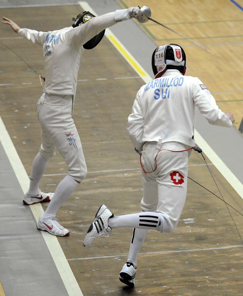
I’m a simple guy. I like to ride my bike, I like to run. I drive a Camry. I wear a T-shirt and jeans pretty much every day. And at the end of those days, I like to sit down and tune into the Ocho for some fencing.
I like the simplicity of the sport — don’t get stabbed — as well as its ancient roots. And I kinda dig the fact that everyone wears white. You see a dude dressed in white with a mask and a funny sword and you instantly think: FENCER.
Now, I’m not a prude — I realize some sports need to be subsidized. But Adidas, you’ve gone too far. You put your damn three stripes on everything as a “design element,” making even Nike’s small-by-comparison swoosh seem tame. Well I cry BS, Fritz. If I remembered anything other than random phrases from freshman German class (Wohen geht Paul? — Where’s Paul going?), I’d express my feelings in your native tongue.
Yes, I do see the swoosh on the U.S. fencer, but it’s pretty subtle compared to Valentin Marmillod’s getup. And that Adidas thing has been percolating for a while. Anyway, I feel better now. — Bryan
Wow even the fencers aren’t safe from the swoosh/three stripes it has gone way to far.
Now that I’ve seen the three-stripes on a fencer from Switzerland I’m .000000000000000000002% more likely than I was yesterday to pick up a pair of Adidas on my way to the grocery store today. Awesome marketing.
One way to get Adidas (and the other jersey sponsors) to stop — the teams and leagues would need to step in and say no. If the leagues said that the logos cannot be bigger than 1.5 inches by 1.5 inches, and there cannot be more than 2 logos on the entire uniform, that would greatly cut down on the 3-stripe “design”.
I liked it better when each team did it’s own thing, and everyone didn’t have the same cookie-cutter design for basketball warmups or Batting Practice Jerseys….
The 3-stripe world domination has made in-roads on more small-sport fronts than fencing. On NBC yesterday was the Tyson American Cup Gymnastics event, with different national teams competing at Madison Square Garden.The link for the U.S. Women relied heavily on the 3-stripe design as well as a Tyson Chicken corporate logo. I think they may have had a U.S.A. patch on the sleeve, but it was definitely featured less prominently than the chicken logo.The Men’s uniforms also had some stripes, but had the chicken mark featured right below the U.S.A. patch on the front.Also, and I don’t think there is a picture in the linked gallery, but the Chinese uniforms are again made out of some disgusting velour/terry cloth crap that looks like it could fall apart any minute – oh, and they are a putrid yellow.
Sorry, my “Paragraph Creator” isn’t working this morning…
This is one instance in which I’m willing to overlook the logo creep, cuz those vertical sock stripes look so fucking rad!
I’m not too sure about the vertical stripes. I would prefer the horizontal, just for continuity. I think they would have been better if he had the stripes on the both sides. I’m not against corporate branding completely, I just hate how gaudy the stripes/swoosh/leaping cougar/et all can be.
[quote comment=”232619″]Now that I’ve seen the three-stripes on a fencer from Switzerland I’m .000000000000000000002% more likely than I was yesterday to pick up a pair of Adidas on my way to the grocery store today. Awesome marketing.[/quote]
two nitpick items:
1. Advertising, in my understanding, doesn’t equal marketing. I believe in this case it’s advertising, which doesn’t want to entice the consumer to go buy something, like sportswear, but rather maintain the awareness of the consumer of a certain brand so that if he at some point does actually need a pair of shoes for example, he will more likely choose a pair of said particular brand because it’s image is more appealing than that of another brand.
(Just my opinion, please no lengthy arguments and splitting hairs.)
2. It’s “Wohin…”
Cheers
On a tagent, I like the Swiss flag “design element” on the pants. It even looks like a battle wound.
On a tangent, I like the Swiss flag “design element” on the pants. It even looks like a battle wound.
You forgot to mention the Swiss Army ad on the guy’s pants.
maybe im not looking at the same headline photo that everyone else is.
logo creep? where?
logo creep, as i understand it, is when company logo’s have crept their way onto a uniform in places where they really shouldnt be…
now todays piece is about how adidas has “gone to far”, and the responses talk about getting this “to stop”, and how even fencing “isnt safe”.
where is the adidas on the uniform? nowhere!
PL has stated that he tends not to write about sneakers BECAUSE he doesnt consider it part of the uniform, but an accesory. so that eliminates the sneakers from this photo/uniform having “logo creep”.
i dont know much about fencing at all. but i would assume that the required uniform for the sport is the pants, shirt and mask portion of what they wear. i would say they probably allow the competitor to choose his own footwear and socks.
i mean, the guys have to wear some kind of footwear and some kind of sock, right? and it looks to me that in this pic, one fencer likes nike and plain white socks and the other likes both adidas shoes and adidas socks.
this is not an example of logo creep.
[quote comment=”232640″]maybe im not looking at the same headline photo that everyone else is.
logo creep? where?
logo creep, as i understand it, is when company logo’s have crept their way onto a uniform in places where they really shouldnt be…
now todays piece is about how adidas has “gone to far”, and the responses talk about getting this “to stop”, and how even fencing “isnt safe”.
where is the adidas on the uniform? nowhere!
PL has stated that he tends not to write about sneakers BECAUSE he doesnt consider it part of the uniform, but an accesory. so that eliminates the sneakers from this photo/uniform having “logo creep”.
i dont know much about fencing at all. but i would assume that the required uniform for the sport is the pants, shirt and mask portion of what they wear. i would say they probably allow the competitor to choose his own footwear and socks.
i mean, the guys have to wear some kind of footwear and some kind of sock, right? and it looks to me that in this pic, one fencer likes nike and plain white socks and the other likes both adidas shoes and adidas socks.
this is not an example of logo creep.[/quote]
Agreed…if anything this is an example of a fencer not looking like a complete tool by wearing Adidas shoes with Nike socks or some other combination that doesnt match.
I read this board everyday and laugh at what people consider logo creep…
If you owned a company that made products for a certain industry and that industry was seen by the eyes of the public consumer who could choose your product over a competitors you would be dumb not to advertise your products/name/logo/etc.
Not for going overboard on it and making athletes look like billboards…but a small swoosh on the sleeve of a jersey or three stripes on some socks is far from overboard.
Hey thanks to Paul, Bryan and everyone else yesterday for clearing up my stirrup confusion. Maybe now my superior legwear and the fact that I Get It will prevent my ankle giving out and producing a loud pop next time I go into 2B. Another stirrup related question: I had a little bit of difficulty keeping the loop hooked under my foot, anyway to solve this? Thanks
THANK YOU, Bryan, for this! I’ve been whining forever about it. Anyone seen the link recently? Count the Adidas logos on the Dynamo player: shoulder stripes, chest logo, shorts stripes, (unseen) shorts logo (on the back), socks stripes, socks logo. That’s SIX Adidas marks on ONE uniform. We get it! You make the uniforms, Adidas! I like stripes as much as the next guy (maybe not you, Paul, but you know…), but this is simply overkill. Adidas needs to chill with the stripes/logo combinations. Yes, Nike puts the swoosh on everything (EVERYTHING!), but they don’t add a secondary logo to most of their pieces like Adidas does. Some subtlety would be nice.
[quote comment=”232642″][quote comment=”232640″]maybe im not looking at the same headline photo that everyone else is.
logo creep? where?
logo creep, as i understand it, is when company logo’s have crept their way onto a uniform in places where they really shouldnt be…
now todays piece is about how adidas has “gone to far”, and the responses talk about getting this “to stop”, and how even fencing “isnt safe”.
where is the adidas on the uniform? nowhere!
PL has stated that he tends not to write about sneakers BECAUSE he doesnt consider it part of the uniform, but an accesory. so that eliminates the sneakers from this photo/uniform having “logo creep”.
i dont know much about fencing at all. but i would assume that the required uniform for the sport is the pants, shirt and mask portion of what they wear. i would say they probably allow the competitor to choose his own footwear and socks.
i mean, the guys have to wear some kind of footwear and some kind of sock, right? and it looks to me that in this pic, one fencer likes nike and plain white socks and the other likes both adidas shoes and adidas socks.
this is not an example of logo creep.[/quote]
Agreed…if anything this is an example of a fencer not looking like a complete tool by wearing Adidas shoes with Nike socks or some other combination that doesnt match.
I read this board everyday and laugh at what people consider logo creep…
If you owned a company that made products for a certain industry and that industry was seen by the eyes of the public consumer who could choose your product over a competitors you would be dumb not to advertise your products/name/logo/etc.
Not for going overboard on it and making athletes look like billboards…but a small swoosh on the sleeve of a jersey or three stripes on some socks is far from overboard.[/quote]
Methinks I spy the minute beginnings of a swoosh on the back of our American friends’ left leg!
[quote comment=”232648″]THANK YOU, Bryan, for this! I’ve been whining forever about it. Anyone seen the link recently? Count the Adidas logos on the Dynamo player: shoulder stripes, chest logo, shorts stripes, (unseen) shorts logo (on the back), socks stripes, socks logo. That’s SIX Adidas marks on ONE uniform. We get it! You make the uniforms, Adidas! I like stripes as much as the next guy (maybe not you, Paul, but you know…), but this is simply overkill. Adidas needs to chill with the stripes/logo combinations. Yes, Nike puts the swoosh on everything (EVERYTHING!), but they don’t add a secondary logo to most of their pieces like Adidas does. Some subtlety would be nice.[/quote]
Not to mention ridiculous “color by numbers” templates that can only mean one manufacturer…
Whoops. Guess my link didn’t work. link A pic of several Dynamo players; you can see all the Adidas business all over the unis.
“the ocho”…classic dodgeball reference!
I was at the SAP Open in San Jose a week ago and the doubles championship featured the Bryan brothers who are sponsored by addidas, I counted at least 15 “three stripes” on each brother!
I wonder what Lady Marmillod has to say about that.
(.. Lord, I apologize…)
bryan did you see this nice run-down the peloton’s uniforms at ATOC? Similar discussion of the national champion kits this year as yours, but also a good discussion of the changes from black to white backgrounds.
[quote comment=”232625″]This is one instance in which I’m willing to overlook the logo creep, cuz those vertical sock stripes look so fucking rad![/quote]
I’m inclined to agree this time. In fact, “cool socks!” was the first thing I thought when I looked at the pic.
Nice job today, Bryan.
whoops! here’s the link
link
Ok, clearly, I do not understand how to put in links.
link
[quote comment=”232648″]THANK YOU, Bryan, for this! I’ve been whining forever about it. Anyone seen the link recently? Count the Adidas logos on the Dynamo player: shoulder stripes, chest logo, shorts stripes, (unseen) shorts logo (on the back), socks stripes, socks logo. That’s SIX Adidas marks on ONE uniform. We get it! You make the uniforms, Adidas! I like stripes as much as the next guy (maybe not you, Paul, but you know…), but this is simply overkill. Adidas needs to chill with the stripes/logo combinations. Yes, Nike puts the swoosh on everything (EVERYTHING!), but they don’t add a secondary logo to most of their pieces like Adidas does. Some subtlety would be nice.[/quote]
for the sake of the remainder of the day and for when this topic comes up in the future, i want to officially issue my stance on this.
i am not a fan of the term logo creep.
i dont know who created the term, when it was created, or if a concrete definition of it was issued when it was coined (which should have occured if we are now adding terms to the lexicon).
i stated earlier what my “impression” of logo creep was, and to be perfectly honest it doesnt bother me one bit when i see it.
that being said though, anthony provided us a good example as to what is actaully logo creep vs. what today was innacurately described as logo creep.
outside of the players shoes, the required mls uni is the issued shirt, shorts and socks. this is of no debate so whenever you see the “brand id” on any of those items, it should be viewed as logo creep.
Did anyone catch the USC/Southern baseball game on ESPN2 late last night? Southern’s head coach left the circular gold sizing sticker on the top of the bill of his New Era cap, in the same way that many young people do today in an odd fashion statement. None of the players did, obviously, but it just kinda cracked me up. The man had to be 50+ years old . . .
Carmel (Ind.) High School won their 100th overall state championship last night, winning the girls’ 4A basketball title.
This, of course, means they can make the “C” on their unis gold, inspiring lots of repetitive questions. :)
[quote comment=”232650″]Not to mention ridiculous “color by numbers” templates that can only mean one manufacturer…[/quote]
…one manufacturer who paid the league $150 million over 10 years or something.
So it’s 3 stripes on a pair of socks if the Adidas logo was a giant penis… OK then I would be shocked.
I actually like fencing, and I love Adidas (I’ve never owned a pair of Nikes) I don’t see any problem with 3 stripes or a swoosh or anything else on a uniform. Compared to other leagues like the NBA all star jersey this year which was too much even for me those 3 stripes on the socks look classy.
[quote comment=”232639″]You forgot to mention the Swiss Army ad on the guy’s pants.[/quote]
Swiss army!?
He’s representing his country Switzerland in an international event (the Swiss flag is a red square with a white cross on it) if you look at his jacket you will see SUI thats for Switzerland also the guy he’s fighting his pants have an USA on his pants and a USA on his jacket.
[quote comment=”232678″][quote comment=”232639″]You forgot to mention the Swiss Army ad on the guy’s pants.[/quote]
Swiss army!?
He’s representing his country Switzerland in an international event (the Swiss flag is a red square with a white cross on it) if you look at his jacket you will see SUI thats for Switzerland also the guy he’s fighting his pants have an USA on his pants and a USA on his jacket.[/quote]
Turn on your sarcasm radar ;)
[quote comment=”232668″][quote comment=”232648″]THANK YOU, Bryan, for this! I’ve been whining forever about it. Anyone seen the link recently? Count the Adidas logos on the Dynamo player: shoulder stripes, chest logo, shorts stripes, (unseen) shorts logo (on the back), socks stripes, socks logo. That’s SIX Adidas marks on ONE uniform. We get it! You make the uniforms, Adidas! I like stripes as much as the next guy (maybe not you, Paul, but you know…), but this is simply overkill. Adidas needs to chill with the stripes/logo combinations. Yes, Nike puts the swoosh on everything (EVERYTHING!), but they don’t add a secondary logo to most of their pieces like Adidas does. Some subtlety would be nice.[/quote]
for the sake of the remainder of the day and for when this topic comes up in the future, i want to officially issue my stance on this.
i am not a fan of the term logo creep.
i dont know who created the term, when it was created, or if a concrete definition of it was issued when it was coined (which should have occured if we are now adding terms to the lexicon).
i stated earlier what my “impression” of logo creep was, and to be perfectly honest it doesnt bother me one bit when i see it.
that being said though, anthony provided us a good example as to what is actaully logo creep vs. what today was innacurately described as logo creep.
outside of the players shoes, the required mls uni is the issued shirt, shorts and socks. this is of no debate so whenever you see the “brand id” on any of those items, it should be viewed as logo creep.[/quote]
Wow, so glad we got that cleared up!
if anyone watched the kansas/k-state game last night, there was a crowd shot at the end before they went off the air.
there were 2 fans wearing the yellow kansas jerseys. the jerseys were plenty large and oversized so they werent from 20 years ago and pulled out of the mothballs.
im wondering if there is a store in lawrence selling them.
Just wondering…has anyone else had trouble accessing this site? It was impossible last night, say around 9pm PT. It just keet loadingloadingloadingloading……………….
I think the worst part of this picture is not the three stripes on the socks (which technically are part of the uniform of fencing without being part of the uniform – they are required to be pulled all the way up under the knickers, but no other requirements), but the poor fencing technique displayed by these two competing in what has to be an international event.
Our American friend there will have any point he lands from that position nulled because he is standing off the strip, and with the way his back hand is, that is a horrendous lunge.
The Swiss fencer, on the other hand, just makes me cringe. His blade is pointed to the floor, which is just Learning To Fence 101, as is keeping both feet on the floor and keeping your back arm from coming forward to cover target area.
Poor fencing in the photo, but I think that is the only really big issue with the picture. I agree with the others that say that this is not an issue of logo creep, since it isn’t actually part of the uniform.
now…to me…link
those duelers in the photo…were they using foil, sabre or Épée?
click thru linkif you want to see a lot of real logo creep. i especially dislike the underarmour logo on the middle of the socks. that alone would make me wear my pants low. the unis aren’t bad but i’m growing to hate the underarmour logo.
If the first thing you notice when you look at today’s photo is the adidas striping, that’s both effective marketing and a case of the equipment manufacturer overwhelming the sport.
And yes, the site has been slow this weekend.
if anyone may have missed it, or wasn’t a reader of UW at the time, link
it’s a great read, even if you don’t necessarily agree with it…it explains what logo creep actually is, at least as we use the term here on UW
[quote comment=”232625″]This is one instance in which I’m willing to overlook the logo creep, cuz those vertical sock stripes look so fucking rad![/quote]
Paul, I fence and own a pair.
This has little to do with logo creep or adidas’ striping, but the Manitoba Moose held their Military Tribute night last night, and wore some link. And the Moose did it right by providing link so that they were color coordinated.
Does anyone know the story behind the decal that the NY Rangers are wearing on the back left of their helmets? Many teams wear a flag decal in that spot, but it appears as though it is some sort of “19”. It’s a little more visible on TV, which I saw today against the Flyers, but this is the best photo I have of it from their recent game against the San Jose Sharks:
link
Bryan, think the Spam Monster gobbled my post..
yup, tried to post again, it said ‘you’ve already said that,’ -neither shows. I emailed it to Paul. I think it’s interesting; a comparison of the logos used in the major campaigns for Super Tuesday.
As I said in the gobbled post, no political bias implied or intended;
BO- barackobama dot com; clean, simple, elegant.
HC- hillary clinton dot com; boring, photoshoppy.
JM- johnmccain dot com; boring, simplistic.
I’m sure its been said before but Adidas, is on a lot of Dale Earnhardt Jr’s stuff, including gloves. Yesterday, after he car (one of the ones he owns)won the race, and he had on some Adidas, and an Adidas hat to congratulate his driver. I’m also pretty sure that Adidas sponsers the whole Rick Hendrick team, they always seem to have an Adidas logo some where. Mr. Hendrick himself is usually in a jackets with an Adidas logo on the left, and his own logo on the right.
This is one instance in which I’m willing to overlook the logo creep, cuz those vertical sock stripes look so fucking rad!
Before I saw that comment, I was thinking “If only those stripes were horizontal, Paul would love them.” But I guess you’re cool as-is.
if you look closely at the back of the USA guy’s left sock, you can see the tail end of the Nike swoosh. So he’s got his socks all done up, too.
The Cubs radio crew was just commenting on how difficult it is to read the Giants’ orange-trimmed black numbers on the black jerseys.
sorry – but I’m very okay with Adidas and the three stripes because three stripes don’t make me think of Adidas at all. I am sure corporate wouldn’t like that but it’s just true. I never noticed the stitching on Dale Jr.’s race suit being in threes, and the three stripes on the gym outfits linked above just looked to me like, well, stripes. same for the fencer boy above – he’s got stripes on his socks which look to me like stripes. they just don’t blare COMMERCIAL ENDORSEMENT like that swoosh does. would be interested to see how many Americans look at the fencer guys’ socks and think of a sneaker company.
Just saw a commercial for Leon’s Furniture link.
[quote comment=”232723″]The Cubs radio crew was just commenting on how difficult it is to read the Giants’ orange-trimmed black numbers on the black jerseys.[/quote]
He’s right. They oughta go with Orange BP’s with black numbers/white trim. They don’t even have a reg season alt, either.
denis hoists the cup at the ceremonies honoring the link…the isles who were on all four stanley cup winners
this was, imho, the BEST isles sweater of them all
[quote comment=”232723″]The Cubs radio crew was just commenting on how difficult it is to read the Giants’ orange-trimmed black numbers on the black jerseys.[/quote]
I was there. It was link.
Then again, it was Aaron Rowand and a bunch of guys no one has ever heard of, so it didn’t really matter much.
Looks like Clemson’s wearing purple tonight at Maryland…when was the last time they wore purple?
[quote comment=”232689″]click thru linkif you want to see a lot of real logo creep. i especially dislike the underarmour logo on the middle of the socks. that alone would make me wear my pants low. the unis aren’t bad but i’m growing to hate the underarmour logo.[/quote]
That photo gallery is good for something else too…to see just how terrible the Under Armour cleats are that all of the players arent even wearing them.
[quote comment=”232707″]Does anyone know the story behind the decal that the NY Rangers are wearing on the back left of their helmets? Many teams wear a flag decal in that spot, but it appears as though it is some sort of “19”. It’s a little more visible on TV, which I saw today against the Flyers, but this is the best photo I have of it from their recent game against the San Jose Sharks:
link
Looks like the logo for their charitylink
try the link again;
link
Striped stirrups for the Oregon State baseball team today against Georgia. (and no Adidas tie-in) Too bad those hideous jerseys ruin what could be a beautiful thing.
link
This is after orange jerseys with (stripe-less) orange stirrups on Friday. Can’t find a decent pic, but it was bad.
[quote comment=”232762″]Striped stirrups for the Oregon State baseball team today against Georgia. (and no Adidas tie-in) Too bad those hideous jerseys ruin what could be a beautiful thing.
link
This is after orange jerseys with (stripe-less) orange stirrups on Friday. Can’t find a decent pic, but it was bad.[/quote]
Unprecedented comment, so drum roll, please…
I think Nike did a good job with this batch of Oregon State baseball uniforms. I really dig the way the letter and number fonts play off of each other, and because the number font is the same on the football jerseys, it helps reinforce the school’s identity. Sarcastic bonus points for not borrowing the Eugene rival’s colors (the reverse happens all of the time…WTF?). All in all, a modern classic.
Plus, it helps that there is a hint of masculinity in these threads. As a heterosexual male, I know I’d rather wear a necktie than a sports bra.
Nike? The uniform was Wilson, and they also wear adidas cleats (the old Orioles and Giants orange-on-black to be exact.)
Somehow, one thinks Oregon State GETS IT(TM)! Now if the Athletic Department can switch away from Oregon Duck Phil Knight…and I apologize if I called their rad old school (early 20th Century) as a Nike design earlier this week.
[quote comment=”232772″]Nike? The uniform was Wilson, and they also wear adidas cleats (the old Orioles and Giants orange-on-black to be exact.)
Somehow, one thinks Oregon State GETS IT(TM)! Now if the Athletic Department can switch away from Oregon Duck Phil Knight…and I apologize if I called their rad old school (early 20th Century) as a Nike design earlier this week.[/quote]
What pic are you looking at? Adidas cleats? Wilson uniforms?
[quote comment=”232755″]try the link again;
link[/quote]
Sorry, not good at linkslink
Oregon seems to be wearing something close to these for tonight’s game against Oregon State (Civil War in the gym). The camo is barely visible on the green jerseys tonight, as are the NOBs on the back (much like their black jerseys). I don’t have HDTV yet, but my theory is that these jerseys were made for it.
Duh…something close to link…
[quote comment=”232746″][quote comment=”232689″]click thru linkif you want to see a lot of real logo creep. i especially dislike the underarmour logo on the middle of the socks. that alone would make me wear my pants low. the unis aren’t bad but i’m growing to hate the underarmour logo.[/quote]
That photo gallery is good for something else too…to see just how terrible the Under Armour cleats are that all of the players arent even wearing them.[/quote]
In half of the pics, the players are wearing New Balance cleats, which the football team also wore for one season in 2006. In one shot, the shortstop, it seems, is wearing all black or anniversary edition Nike Air Zoom Clippers.
I don’t mind the logo creep on the socks nearly as much as the useless Orange patch under the arms. It might serve a functional purpose, but not aesthetically! Definitely a Buffalo Bill type situation going on!
I rescind my former statement regarding the Auburn shortstop, #16, in the Nike spikes.
His jersey is AWFUL. Asymmetrical numbers and letters and UA overkill on the front of the jersey as well as the center of the undershirt collar.
At least place the logo discreetly on the sleeve.
I am usually not a antagonist of logo creep, but that example was way too much!
[quote comment=”232686″]I think the worst part of this picture is not the three stripes on the socks (which technically are part of the uniform of fencing without being part of the uniform – they are required to be pulled all the way up under the knickers, but no other requirements), but the poor fencing technique displayed by these two competing in what has to be an international event.
Our American friend there will have any point he lands from that position nulled because he is standing off the strip, and with the way his back hand is, that is a horrendous lunge.
The Swiss fencer, on the other hand, just makes me cringe. His blade is pointed to the floor, which is just Learning To Fence 101, as is keeping both feet on the floor and keeping your back arm from coming forward to cover target area.
Poor fencing in the photo, but I think that is the only really big issue with the picture. I agree with the others that say that this is not an issue of logo creep, since it isn’t actually part of the uniform.[/quote]
1. Both feet are on strip. It’s fine. As long as parts of even one foot are on, even toes, it counts.
2. You can’t judge positions out of context. The angle doesn’t give a good idea of distance, IMHO. I think this explains the lackadaisical look on the part of the Swiss fencer. He could be out of distance.
3. The Swiss fencer is lefthanded, something I just realized. The rather unorthodox, in a way, attack from the American could be a very ugly attempt to attack the left arm.
For those uninitiated in the realm of Olympic fencing, your opponent’s handedness drastically changes the strategy. The attack options are all different for each hand, and whichever hand you fence with.
[quote comment=”232682″]if anyone watched the kansas/k-state game last night, there was a crowd shot at the end before they went off the air.
there were 2 fans wearing the yellow kansas jerseys. the jerseys were plenty large and oversized so they werent from 20 years ago and pulled out of the mothballs.
im wondering if there is a store in lawrence selling them.[/quote]
K-State looked OUTSTANDING in their new SOD gear.
They mad the Jayhawks look ragtag and bush league.
It is official…I love the SOD gear!
[quote comment=”232720″]if you look closely at the back of the USA guy’s left sock, you can see the tail end of the Nike swoosh. So he’s got his socks all done up, too.[/quote]
Check out post #16. I am in total agreement!
[quote comment=”232771″][quote comment=”232762″]Striped stirrups for the Oregon State baseball team today against Georgia. (and no Adidas tie-in) Too bad those hideous jerseys ruin what could be a beautiful thing.
link
This is after orange jerseys with (stripe-less) orange stirrups on Friday. Can’t find a decent pic, but it was bad.[/quote]
Unprecedented comment, so drum roll, please…
I think Nike did a good job with this batch of Oregon State baseball uniforms. I really dig the way the letter and number fonts play off of each other, and because the number font is the same on the football jerseys, it helps reinforce the school’s identity. Sarcastic bonus points for not borrowing the Eugene rival’s colors (the reverse happens all of the time…WTF?). All in all, a modern classic.
Plus, it helps that there is a hint of masculinity in these threads. As a heterosexual male, I know I’d rather wear a necktie than a sports bra.[/quote]
that design just screams classic i believe
[quote comment=”232791″][quote comment=”232682″]if anyone watched the kansas/k-state game last night, there was a crowd shot at the end before they went off the air.
there were 2 fans wearing the yellow kansas jerseys. the jerseys were plenty large and oversized so they werent from 20 years ago and pulled out of the mothballs.
im wondering if there is a store in lawrence selling them.[/quote]
K-State looked OUTSTANDING in their new SOD gear.
They mad the Jayhawks look ragtag and bush league.
It is official…I love the SOD gear![/quote]
i agree the K-State SOD Uni is up there are the best one yet
[quote comment=”232786″]Oregon seems to be wearing something close to these for tonight’s game against Oregon State (Civil War in the gym). The camo is barely visible on the green jerseys tonight, as are the NOBs on the back (much like their black jerseys). I don’t have HDTV yet, but my theory is that these jerseys were made for it.[/quote]
OK, apparently I’ve been out of the loop for a while; looks like they used these on February 21 at USC.
Cristobal Huet was sporting a “modified” mask when he played his first game for the Capitals a couple of nights ago.
link
[quote comment=”232790″][quote comment=”232686″]I think the worst part of this picture is not the three stripes on the socks (which technically are part of the uniform of fencing without being part of the uniform – they are required to be pulled all the way up under the knickers, but no other requirements), but the poor fencing technique displayed by these two competing in what has to be an international event.
Our American friend there will have any point he lands from that position nulled because he is standing off the strip, and with the way his back hand is, that is a horrendous lunge.
The Swiss fencer, on the other hand, just makes me cringe. His blade is pointed to the floor, which is just Learning To Fence 101, as is keeping both feet on the floor and keeping your back arm from coming forward to cover target area.
Poor fencing in the photo, but I think that is the only really big issue with the picture. I agree with the others that say that this is not an issue of logo creep, since it isn’t actually part of the uniform.[/quote]
1. Both feet are on strip. It’s fine. As long as parts of even one foot are on, even toes, it counts.
2. You can’t judge positions out of context. The angle doesn’t give a good idea of distance, IMHO. I think this explains the lackadaisical look on the part of the Swiss fencer. He could be out of distance.
3. The Swiss fencer is lefthanded, something I just realized. The rather unorthodox, in a way, attack from the American could be a very ugly attempt to attack the left arm.
For those uninitiated in the realm of Olympic fencing, your opponent’s handedness drastically changes the strategy. The attack options are all different for each hand, and whichever hand you fence with.[/quote]
That isn’t the way I was trained. I was trained that if one foot was off the back end of the strip, as soon as part of the other crossed off, it was over.
As far as distance, it is fairly easy to judge, since the American is fully extended and the tip seems to be at the head of the Swiss fencer.
Since it is epee, the attack is very strange. The right handed American probably should have been going at the Swiss’s left hand… though context and previous attempts could have played a role in not attacking there.
link
Adidas actually manufactures a full line of fencing equipment, including stripes all the way up the sleeves and pant legs. They also make fencing shoes which bear the three stripe logo.