By Bryan Redemske
As expected, the Tour of California unleashed a new wave of champions kits from various countries. Rather than detail every one, because even I don’t have the patience for that, I pulled a few of interest.
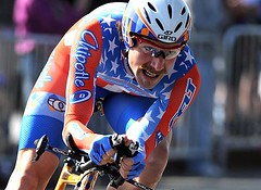
First there’s the unfortunate fall from grace of the last two U.S. road champions, George Hincapie and Levi Leipheimer. Both members of Discovery Channel last year, they looked like this and this. Since Hincapie is on High Road now (formerly T-Mobile) and Leipheimer is on Astana, they wear this and this now. Ouch.
David Zabriskie wore this last year with CSC as the U.S. time trial champion. Now he’s in this as a member of Slipstream-Chipotle. I can’t decide if it’s good or bad, or if he’s trying to look like Val Kilmer as Doc Holliday.
And here’s Paolo Bettini, proving again that if you’re Italian, you can wear anything.
Black Plague: If you’re not a weekend comments reader — and I gotta say you’re missing a huge party — Oregon’s black System of Dress uniform was the hot topic. I’ve had my say (baaaaad), but I’m sure Paul will have something for us tomorrow. Of course, there’s always the possibility he’ll refuse to say anything at all, and that wouldn’t be a bad thing, either. Actually, that might be better.
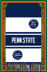
Travel and Membership News: Paul here. I’m on the road today (so be nice to Bryan) but wanted to check in on a few things. First, as you can see at right, we’ve done our first vertical membership card design, based on the scarf worn by the Penn State mascot. I frankly didn’t know Penn State even had a mascot, or that he wears a scarf, or that the scarf is adorned with buttons, or that the messages on the buttons are always changing (here’s a larger view of the card, so you can see the specific buttons we were asked to reproduce). The buttons even have their own web site! This was all news to me — if anyone knows more about this phenomenon, feel free to share.
The vertical design, incidentally, was a source of intense deliberation and negotiation between Scott and myself. In the end, I decided going with the portrait orientation was the best way to do justice to the scarf concept (if we’d stuck with horizontal, the buttons would’ve been either too small to read or not as spread out as they are in real life). For now, we’re treating this as a one-time exception to our usual rule — a special design challege that required a special solution. So don’t all start asking for regular jersey-based designs to be vertically oriented.
Meanwhile: Looks like I’m gonna be in Seattle next month, and I’ll definitely convene a Uni Watch party while I’m there. Not sure of the exact dates yet, but it’ll probably be on the 12th, 13th, 17th, or 18th. (Actually, when it comes to Really Bad Ideas, holding a party in a bar on St. Paddy’s Day is probably right up there with shoving a lit M-80 up your ass, so strike the 17th from that list.) I’ll keep you posted as my plans firm up.
Uni Watch News Ticker: Today’s Ticker is a joint effort between Paul and Bryan. ”¦ Tremendous little video clip here about the Cardinals’ spring training laundry staff (with thanks to Elena Elms). ”¦ Reprinted from Friday’s comments: Add Chris Brown to the list of MLBers who’ve worn mask attachments on their helmets. ”¦ In a vaguely related item, Brian Giles was running around in a Chargers helmet the other day — and look, it turns out that Giles is still mourning Sean Taylor. No word on whether he had an American flag decal. ”¦ Oregon’s continued use of green NOB on a green jersey is baffling. ”¦ Mets by the Numbers editor Jon Springer has conducted a great numbers-centric interview with longtime Mets beat reporter Marty Noble. Check it out here. ”¦ Mike Monaghan was recently checking out some old Sabres footage and came across a fight between Shjon Podein and Dane Jackson from March 29, 1996. “Podein actually ripped the nameplate off Jacksons jersey and ended up holding it in his hand,” he writes. ”¦ I don’t mind purple so much when it represents grape junk food (with thanks to Robert Purvis). ”¦ Broncos founder and former Reds exec Bob Howsam died last Tuesday. The last four paragraphs of this obit are of uni interest. ”¦ Scroll down to the “Blue Jersey?” section of this page for some Braves rumor-mongering. ”¦ UMich swimming caps: blue with gold wings or gold with blue wings (good find by Daniel Weimann). ”¦ Here’s a drop-shadow configuration you don’t often see: ten o’clock (with thanks to Marc Rabinowitz). ”¦ “I was in New Orleans for the NBA All-Star weekend,” writes Ben Kramer. “They had a little exhibit from the Hall of Fame. I paticularly loved the 1967 East All-Star jersey, based on ‘The City.’ I also think you’d like the old Celtics championship sweater.” … On the logo front — this one corporate — a good, quick read here on how Google got its iconic wordmark. … Here’s ManRam reporting for duty, still wearing his snood thinger from the World Series. Thanks to Mark Mihalik. … Luke Pellegra has checked in with a look at Tennessee’s new hats and batting helmets, the latter changing from black to orange. “If that isn’t just atrocious, I don’t know what is,” Luke writes. Also, the Vols will go from black hats to white. Kentrail Davis needs a tutor to get that bill rounded into shape. … David Arnott took in Friday’s Winthrop-Davidson basketball game, complete with refs in mismatched tops. … Pro wrestling alert: San Diego native Rey Mysterio Jr. had Chargers-style lightning bolts on his pants on Friday in his hometown. Good spot by Cory Lewis. … Tricia Polley notes the Cardinals will be wearing the letter “K” on their lids during Wednesday’s exhibition against St. Louis University in honor of the victims of the city council shooting in Kirkwood, Mo. … Tom Glavine and John Smoltz were spotted wearing throwbacks for some promo shots last week. Hope those shots are only waist-up — they’re both wearing the regular road pants. Good find by Mike Rich. … Pretty cool program from the 1940 College All-Americans vs. Green Bay Packers matchup up for auction here. And here’s a closer look, with thanks to Richard Canulli. … Numerous mentions about the Canadiens retiring Bob Gainey’s No. 23 on Saturday night. Gainey suited up — in the period-correct CCM jersey — and took a few turns around the ice during the ceremony. … Notre Dame honored its 1978 Final Four team on Sunday. Digger Phelps probably should have left the jersey wearing to the players, though. Speaking of the players, the members of the 1978 team wore their old jerseys, while team managers and support staff wore the No. 78 like Digger. That’d be Michael Alper on that find. … Les Holmlund found a couple of cool eBay auctions. The first is a team photo of the 1936-37 Philadelphia Ramblers hockey team, though a color version would be cooler. The second, however, is awesome.
Here’s ManRam reporting for duty, still wearing his snood thinger from the World Series. Thanks to Mark Mihalik.
Is there supposed to be a link here??
Bettini is the World Champion, thus the rainbow jersey. linkwore the same kit a few years back when he was the World Champion, and he is Belgian. So it really has nothing to do with being Italian.
Oregon’s black System of Dress uniform was the hot topic.
Oregon’s “black unis” are not unis at all–they are mere costumes that simply disrespect the game.
Is the Penn State Scarf card the first example of Logo Creep on a membership card?
Anything Shjon Podein related doesn’t phase me anymore. Rumor has it the Avs went out for dinner after their last Stanley Cup win, and Podien showed up in complete uni (including skates) because he hadn’t had time to change.
I frankly didn’t know Penn State even had a mascot
Wow, just wow……
Have you never watched a Penn State football game Paul?
There’s even a 160 page book on the Penn State football buttons:
link
link
LOGO CREEP ON A MEMBERSHIP CARD???? I never thought I would see the day.
FYI…
Gainey suited up does not open in a new window
syracuse wore link yesterday vs notre dame instead of their normal link. link is not awful, but when your nickname is “the orange” you should have some of that color in the uniform
[quote comment=”229940″]Bettini is the World Champion, thus the rainbow jersey. linkwore the same kit a few years back when he was the World Champion, and he is Belgian. So it really has nothing to do with being Italian.[/quote]
I think he means the sandwich in his mouth and cell phone in his hand.
[quote]holding a party in a bar on St. Paddy’s Day is probably right up there with shoving a lit M-80 up your ass[/quote]
point?
[quote comment=”229961″][quote comment=”229940″]Bettini is the World Champion, thus the rainbow jersey. linkwore the same kit a few years back when he was the World Champion, and he is Belgian. So it really has nothing to do with being Italian.[/quote]
I think he means the sandwich in his mouth and cell phone in his hand.[/quote]
Cyclist eat during thier races (which are efforts sometimes 5 to 6 hours long) since they burn through so many calories, as many as 7500 for one day. There are “feed zones” in races where all the riders grab a bag of food for replenishment. Bettini is eating a sandwich, again, very typical of all riders. There is a wrapper in his hand, not a cell phone.
Tennessee last year had two helmets…all black and black with an orange brim…this year they will still have two…all black and all orange. They still have the black with an orange brim i they want to break them out at some point as well.
San Deigo should be San Diego.
Hincapie has no choice in what he wears, really. He can’t wear the stars and stripes because he isn’t the sitting national champion, that’s why he has the bands around his arms. There isn’t an established prescident for US or Canadian National Champion bands like there are for a lot of countries.
As for Zabriskie, his skinsuit isn’t that bad, the weave of the fabric makes it look worse than it should be. It’s pretty much the same design as his CSC skinsuit with the different sponsors.
And the national champions aren’t that new. Millar is the brit champ, and he won those jerseys last June. Levi has been national champion since last september, same as Zabriskie.
Just picked up my copy of the WVU edition frocks for jocks jersey. $75 bucks but so beautiful and so comfortable they may look boring on tv but they are sweet
In the end, I decided going with the landscape orientation was the best way to do justice to the scarf concept (if we’d stuck with horizontal, the buttons would’ve been either too small to read or not as spread out as they are in real life).
I think “landscape orientation” is horizontal, and that the innovative vertical orientation is called “portrait”. Could be wrong though.
And regarding Oregon’s same-color NOBs, from a distance it looks like there are no names and that they just put the numbers too far down their backs. The invisible NOBs would be more tolerable if they arranged the numbers as if there were no NOBs and then squeezed the invisiblae NOBs in between the collar and the number.
The pic of Smoltz and Glav wearing throwbacks is probably just a waist-up promo. The 70’s jersey that Glavine is wearing is usually paired with white pants. Also, check out Smoltz with the throwback glove to match his Boston Braves uni – that thing is tiny.
rc: Only the jersey is required for world champions. Boonen wore his with a somewhat tasteful variation of the standard Quickstep shorts rather than go full white.
link
Dave Z’s kit looks pretty good. Unfortunately because it’s a skinsuit without pockets, it doesn’t have the burrito.
link
‘David Zabriskie wore this last year … I can’t decide if it’s good or bad, or if he’s trying to look like Val Kilmer as Doc Holliday.’
Or link. Yikes!
Brand New has a story about the process South Dakota State went through in getting a new Jackrabbit logo done, which was discussed here last week or so.
link
Seriously. I thought Penn State had one of the more recognizable mascots.
Paul,
Good news maybe coming out of Pittsburgh, Pirates hopefully will ditch the red vests, look at the last item on this page
link
Paul/Bryan,
In the discussion about the vertical membership card you mentioned that the landscape orientation was chosen to best highlight the scarf. Landscape=Horizontal
Portrait=Vertical
I’m actually surprised Oregon hasn’t sported the long sleeve look to go with the SOD jersey. If I recall last year when Ohio State, Florida, and Syracuse came out with the tighter look, they modeled the jersies with long undershirts that made them look even more ridiculous. That may be next.
Man, I would like that throwback hat Smoltz is wearing – it’s nice!
[quote comment=”229938″]Here’s ManRam reporting for duty, still wearing his snood thinger from the World Series. Thanks to Mark Mihalik.
Is there supposed to be a link here??[/quote]
Yes. There is now. Thanks.
[quote comment=”229965″]San Deigo should be San Diego.[/quote]
Yes it should. And it is now. Thank you, too.
[quote comment=”229966″]Hincapie has no choice in what he wears, really. He can’t wear the stars and stripes because he isn’t the sitting national champion, that’s why he has the bands around his arms. There isn’t an established prescident for US or Canadian National Champion bands like there are for a lot of countries.
And the national champions aren’t that new. Millar is the brit champ, and he won those jerseys last June. Levi has been national champion since last september, same as Zabriskie.[/quote]
Hincapie does have a bit of a choice in what he wears. For starters, he doesn’t have to wear the stripes at all if he doesn’t want to. Second, they should be stripes, not little flags. They just don’t look good.
I’m aware of the championship jersey and stripe rules, too. I had a big post on it about a week ago.
As for the newness of the jerseys … Leipheimer and Zabriskie won them in September, raced once, and changed teams. So, yeah, the jerseys are pretty new. Millar also changed teams, and therefore changed designs. The Tour of California was the first big stage race of the year for the European peloton — and therefore the coming-out party for most of the national champs.
[quote comment=”229942″]Oregon’s black System of Dress uniform was the hot topic.
Oregon’s “black unis” are not unis at all–they are mere costumes that simply disrespect the game.[/quote]
I normally love the Oregon football and basketball uniforms, but hated the black SOD, because I thought they were boring. But they are no more disrespectful than Penn States ugly football uniforms.
Penn State’s button tradition dates back to the 1970s. Not sure if any other schools do anything similar. If you check out the book you’ll find that the slogans are pretty clever for the most part — no mean feat since the Nittany Lions play many of the same opponents year after year.
The Nittany Lion mascot is one of THE best costumed college mascots — first ballot hall-of-fame worthy — and this is praise from a Pitt fan. Like most everything else connected with Penn State, he’s Old School, very 50’s-ish with the scarf and the retro outfit.
link
why cycling fans shouldn’t make signs
Interesting to note that at Bob Gainey’s retirement ceremony, the opposing Columbus Blue Jackets also wore #23 jerseys for the ceremony. This is the first time I’d ever seen the opposing team suit up in this manner.
Maize, not gold.
[quote comment=”229974″]Brand New has a story about the process South Dakota State went through in getting a new Jackrabbit logo done, which was discussed here last week or so.
link
Great stuff. I preferred the Bugs Bunny logo, but I must say that the final version of the mean rabbit looks better than all of the proposals that they rejected.
[quote comment=”229956″]syracuse wore link yesterday vs notre dame instead of their normal link. link is not awful, but when your nickname is “the orange” you should have some of that color in the uniform[/quote]
Here’s a SWAG (Scientific Wild-A** Guess)… it’s possible the ‘Cuse was trying to be “politically correct”. They used to be “Orangemen,” which is also the name used by (some) Protestant Irish in Northern Ireland. Maybe they thought orange unis could be “offensive” when worn at a Catholic school with an “Irish” mascot. (“They’re hangin’ men and women for The Wearin’ Of The Green!”)
Or maybe the equipment manager just packed the blue unis for the hell of it!
[quote comment=”229975″]
Seriously. I thought Penn State had one of the more recognizable mascots.[/quote]
If Paul said that he didn’t know Portland State (the other PSU) didn’t have a mascot, I could let that slide, because I don’t know if they do either.
SU has worn orange unis @ ND for many years. It was reported before the season started that they were going to wear blue for one game (so Nike can sell more unis, natch), and they probably chose this one because it was a national CBS game. Thus, more exposure.
[quote comment=”229989″][quote comment=”229956″]syracuse wore link yesterday vs notre dame instead of their normal link. link is not awful, but when your nickname is “the orange” you should have some of that color in the uniform[/quote]
Here’s a SWAG (Scientific Wild-A** Guess)… it’s possible the ‘Cuse was trying to be “politically correct”. They used to be “Orangemen,” which is also the name used by (some) Protestant Irish in Northern Ireland. Maybe they thought orange unis could be “offensive” when worn at a Catholic school with an “Irish” mascot. (“They’re hangin’ men and women for The Wearin’ Of The Green!”)
Or maybe the equipment manager just packed the blue unis for the hell of it![/quote]
Or an alternative guess: Nike made the blue jerseys for them, so the team wore them to satisfy the sponsor, even though Boeheim hates the blue jerseys with a passion. Kind of like the red Kansas jerseys.
[quote comment=”229989″][quote comment=”229956″]syracuse wore link yesterday vs notre dame instead of their normal link. link is not awful, but when your nickname is “the orange” you should have some of that color in the uniform[/quote]
Here’s a SWAG (Scientific Wild-A** Guess)… it’s possible the ‘Cuse was trying to be “politically correct”. They used to be “Orangemen,” which is also the name used by (some) Protestant Irish in Northern Ireland. Maybe they thought orange unis could be “offensive” when worn at a Catholic school with an “Irish” mascot. (“They’re hangin’ men and women for The Wearin’ Of The Green!”)
Or maybe the equipment manager just packed the blue unis for the hell of it![/quote]
Given that the Syracuse nickname was modified from Orangemen to Orange to be politically correct they might have also wore the blue unis to be politically correct.
[quote comment=”229977″]Paul,
Good news maybe coming out of Pittsburgh, Pirates hopefully will ditch the red vests, look at the last item on this page
link
I don’t quite get that – why would they have to apply to discontinue an alternate jersey? Why not just stop using it?
A bit of a trademark (Cardinals design) and trade dress infringement (all teams) issue brewing with the Obama t-shirts shortly one would think???
link
The buttons are a popular tradition, and are pretty collectable.
The are only 2 uni-notes I can think of with respect to them;
[1] The special occasion white button, usually for the bowl game; and
[2] In the 1980’s the buttons were sposored by Mellon Bank, which is based out of Pittsburgh. During that time, they omitted their word mark for the Pitt game buttons, lest they alienate the home town fans.
[quote comment=”229987″]Maize, not gold.[/quote]
You call it maize, we call it corn.
Microscopically small reader “survey” on the NFL’s best unis. Three choices: 49ers, Chargers and Steelers
link
[quote comment=”229998″][quote comment=”229987″]Maize, not gold.[/quote]
You call it maize, we call it corn.[/quote]
It’s yellow.
[quote comment=”229996″]A bit of a trademark (Cardinals design) and trade dress infringement (all teams) issue brewing with the Obama t-shirts shortly one would think???
link
I believe that it was posted earlier that the designer got approval from both MLB and Obama to make the shirts.
[quote comment=”229995″][quote comment=”229977″]Paul,
Good news maybe coming out of Pittsburgh, Pirates hopefully will ditch the red vests, look at the last item on this page
link
I don’t quite get that – why would they have to apply to discontinue an alternate jersey? Why not just stop using it?[/quote]
they may indeed ‘stop using it’, but it’s still an “official” alternate…until they “officially” retire it (by filing for uniform changes)
it will prolly go the way of the KC royals black alternates in ’06
[quote comment=”229985″]link
why cycling fans shouldn’t make signs[/quote]
Dude, that’s a T for the umbrella. Granted, it’s not a very well-formed T, but it’s there. Well, I think. Maybe it is Jour.
I don’t quite get that – why would they have to apply to discontinue an alternate jersey? Why not just stop using it?
Surely they could do this — the Cubs never once wore their alternate blue jerseys in 2007 despite making several sets of them.
Anytime I read anything about Team link, I think of link.
Sad state of affairs — I suppose the whole purpose of a Kazakh outfit sponsoring a race team is so that people will have something other than a fictitious charater to associate with their country.
[quote comment=”230004″][quote comment=”229985″]link
why cycling fans shouldn’t make signs[/quote]
Dude, that’s a T for the umbrella. Granted, it’s not a very well-formed T, but it’s there. Well, I think. Maybe it is Jour.[/quote]
no…it’s a fucking j
i have 20 umbrellas, and only ONE of them has the “hook”…if i wanted to graphically represent the letter “j” i would pick that one to reproduce
if i wanted to represent the letter “t”, i would pick one of the others
did the sign-maker think we wouldn’t know it was an umbrella he was representing (cuz, the open canopy juxtaposed with the raincloud wouldn’t be enough of a tipoff???)…
no…dude…it was a link
[quote comment=”230006″]I don’t quite get that – why would they have to apply to discontinue an alternate jersey? Why not just stop using it?
Surely they could do this — the Cubs never once wore their alternate blue jerseys in 2007 despite making several sets of them.[/quote]
They just can’t replace it with something else until next year.
[quote comment=”229989″][quote comment=”229956″]syracuse wore link yesterday vs notre dame instead of their normal link. link is not awful, but when your nickname is “the orange” you should have some of that color in the uniform[/quote]
Here’s a SWAG (Scientific Wild-A** Guess)… it’s possible the ‘Cuse was trying to be “politically correct”. They used to be “Orangemen,” which is also the name used by (some) Protestant Irish in Northern Ireland. Maybe they thought orange unis could be “offensive” when worn at a Catholic school with an “Irish” mascot. (“They’re hangin’ men and women for The Wearin’ Of The Green!”)
Or maybe the equipment manager just packed the blue unis for the hell of it![/quote]
I think you’re digging way too deep on this one. Notre Dame is not an “Irish” school, is it? They got the nickname from a sportswriter or something. In fact, one could argue that the Fighting Irish mascot is offensive. I don’t think it is, but some might.
[quote comment=”230004″][quote comment=”229985″]link
why cycling fans shouldn’t make signs[/quote]
Dude, that’s a T for the umbrella. Granted, it’s not a very well-formed T, but it’s there. Well, I think. Maybe it is Jour.[/quote]
Odd that who ever made the sign, has well drawn letters… but used the bottom of a cardboard box. Couldn’t afford the $0.99 for a piece of poster Board?
[quote comment=”230010″][quote comment=”230006″]I don’t quite get that – why would they have to apply to discontinue an alternate jersey? Why not just stop using it?
Surely they could do this — the Cubs never once wore their alternate blue jerseys in 2007 despite making several sets of them.[/quote]
They just can’t replace it with something else until next year.[/quote]
I’m guessing because maybe MLB.com wants to know so they can stop ordering those jerseys to sell on their website? If you sold jerseys, wouldn’t you want to know beforehand that one of them wasn’t going to be worn by a team anymore?
[quote comment=”230007″]Anytime I read anything about Team link, I think of link.
Sad state of affairs — I suppose the whole purpose of a Kazakh outfit sponsoring a race team is so that people will have something other than a fictitious charater to associate with their country.[/quote]
Seeing Team Astana in Stars & Stripes really disturbs me. (Wait a minute, this isn’t right!) It would be like seeing Team Tokyo in solid green.
[quote comment=”230011″][quote comment=”229989″][quote comment=”229956″]syracuse wore link yesterday vs notre dame instead of their normal link. link is not awful, but when your nickname is “the orange” you should have some of that color in the uniform[/quote]
Here’s a SWAG (Scientific Wild-A** Guess)… it’s possible the ‘Cuse was trying to be “politically correct”. They used to be “Orangemen,” which is also the name used by (some) Protestant Irish in Northern Ireland. Maybe they thought orange unis could be “offensive” when worn at a Catholic school with an “Irish” mascot. (“They’re hangin’ men and women for The Wearin’ Of The Green!”)
Or maybe the equipment manager just packed the blue unis for the hell of it![/quote]
I think you’re digging way too deep on this one. Notre Dame is not an “Irish” school, is it? They got the nickname from a sportswriter or something. In fact, one could argue that the Fighting Irish mascot is offensive. I don’t think it is, but some might.[/quote]
Possibly, but it is a fact that the Irish Orangemen were protestant and Notre Dame is a Catholic school.
Paul in Seattle?! I am going to have to make sure I have the time to go to this illustrious event because I know he’ll never come back…
And just for point of reference I’m going shopping to make sure I wear all of the following:
1. link
2. link
3. link
4. link”
Granted, he’ll probably puke at the site of me, and then the party would be cancelled…
But even I have my limits.. I thought about including something from link.
“between Scott and myself. In the end, I decided going with the landscape orientation was the best way to do justice to the scarf concept”
should read
“between Scott and myself. In the end, I decided going with the portrait orientation was the best way to do justice to the scarf concept”
I know it’s a tiny detail, but isn’t everything on this blog. :-)
[quote comment=”229946″]Anything Shjon Podein related doesn’t phase me anymore. Rumor has it the Avs went out for dinner after their last Stanley Cup win, and Podien showed up in complete uni (including skates) because he hadn’t had time to change.[/quote]
Podein is an interesting person. He does things like showing up to a Cup dinner in full gear, yet in the off season he does all that he can to raise money and awareness for diseases that affect children.
He’s from Rochester, MN, not far from where I went to college and one of our school’s administrative assistants had a son that was stricken with some rare degenerative desiease. Podein was always checking in on the kid, offering all kinds of memorabilia from him and teammates for fundraisers and even started a golf tournament to raise money for research for the particular desiease. For that I like the guy.
Hey, Paul/Bryan/Scott.
What’s the significance of the scarf to the ‘Watcher that requested it?
Are they just a Penn State fan with an interesting request, or is there a story behind it?
Soccer Questions
Okay, I admit, I’m an idiot when it comes to British Premiership soccer. But I happened to watch the West Ham United v. Fulham match with a friend on Saturday. Did anyone else catch this? The first uni-related question I have is: what is the link for that both teams wore?
The second question, which I may be wrong on, but I SWEAR that Fulham player Leon Andreasen was wearing a jersey without a number on the back. Maybe I was seeing things, but can anyone confirm this? I have scoured the ‘net and found no visual evidence supporting what I thought I saw. Anyone?
I like the black Oregon unis, which is both a surprise and not a surprise. It’s not a surprise because black is my favorite color. It is a surprise because I hate Nike. Then, it was pointed out to me that the lettering was in black, and that just seemed silly and gratuitous. So, if they would get rid of the black lettering or make it visible, then I would actually like the unis. Unsettling.
Oh, and, I want the Pirates to keep the ketchup vests. I like ’em.
The new helmets for Tennessee baseball are good. At the very least, they make sense. Black in UT’s stuff has always looked especially bad to me. The white crown on their cap looks great, but a white cap is super tough to keep decent-looking.
Orange and white can be a tough look to pull off, but I’m a member of “Ditch the Black” like most folks here.
link
Cycling…snooze…..skip to the ticker…..
[quote comment=”230017″]And just for point of reference I’m going shopping to make sure I wear all of the following:
1. link
2. link
3. link
4. link”
Granted, he’ll probably puke at the site of me, and then the party would be cancelled…[/quote]
Easy, those are BP jerseys… the alts are midnight blue with no side panels and numbers on the front.
I agree, though, Paul venturing so close to the UW campus is opening himself up for a lot of pain… Don’t worry, Paul, I’m not a Huskies fan, you’ll at least get one non-purple attendee!
Rob Kurz wore the blood jersey for Notre Dame in the second half against Syracuse on Sunday; it was Number 22. I was too high up to get a picture, sorry.
And I remember being thoroughly unimpressed by those “It’s a Dame Shame” buttons at Penn State this year.
The 78 Jerseys were very cool, and I didn’t think the Syracuse jerseys looked bad at all. I don’t like Marquette or DePaul’s side striping, but this looks good. I also liked that they lost in them… Go Irish!
[quote comment=”230024″]The new helmets for Tennessee baseball are good. At the very least, they make sense. Black in UT’s stuff has always looked especially bad to me. The white crown on their cap looks great, but a white cap is super tough to keep decent-looking.
Orange and white can be a tough look to pull off, but I’m a member of “Ditch the Black” like most folks here.[/quote]
What about “link? I’ve always thought the blue on the Lady Vol’s unis looked like crap. Looks like other female sports at the school wear link as an accent color.
it’ll be ok minna…
you replaced link with link
on a separate note, goddam is that a beautiful uni johan is sporting
Bryan,
Any idea who picks the design for the US Championship kits? The design had always been about the stars-and-stripes, but Levi’s Astana kit looks like it came off the Toy’s R Us shelf.
1998 Hincapie:
2004 Fred Rodriguez
2007 Hincapie
2007 Leipheimer
link
[quote comment=”230021″]Soccer Questions
Okay, I admit, I’m an idiot when it comes to British Premiership soccer. But I happened to watch the West Ham United v. Fulham match with a friend on Saturday. Did anyone else catch this? The first uni-related question I have is: what is the link for that both teams wore?
The second question, which I may be wrong on, but I SWEAR that Fulham player Leon Andreasen was wearing a jersey without a number on the back. Maybe I was seeing things, but can anyone confirm this? I have scoured the ‘net and found no visual evidence supporting what I thought I saw. Anyone?[/quote]
The armbands for both teams were to honor Bobby Moore (details link As for Andreasen, are you sure the lack of a number wasn’t after he was link
[quote comment=”230032″]it’ll be ok minna…
you replaced link with link
on a separate note, goddam is that a beautiful uni johan is sporting[/quote]
They need to get rid of the black drop shadows and then it will be PERFECT!!
As far as the buttons are concerned, lots of Ivy League schools have buttons that are similar. Perhaps the reason PSU started the buttons in the 70’s was because Joe-Pa brought them over from his days at Brown?
test
[quote comment=”230036″][quote comment=”230032″]it’ll be ok minna…
you replaced link with link
on a separate note, goddam is that a beautiful uni johan is sporting[/quote]
They need to get rid of the black drop shadows and then it will be PERFECT!![/quote]
Agreed. Thing of beauty, marred only by the messy black drop-shadow.
Check those above links
link
link
link
2007 Leipheimer with Discovery
link
[quote comment=”230032″]it’ll be ok minna…
you replaced link with link
on a separate note, goddam is that a beautiful uni johan is sporting[/quote]
LI Phil, if you ever make that comparison again or make me click on that pick again, I will disembowel you–or defenestrate you (and I will make you choose). Got it? Yes, the pain is still very, very fresh.
Stuby, I am in your corner one-hundred percent as to the “Ditch the Powder Blue” campaign–especially if it’s replaced with black.
Possibly, but it is a fact that the Irish Orangemen were protestant and Notre Dame is a Catholic school.
Syracuse’s nickname has nothing to do with any origins with Irish Protestants.
link
They are the Orange because of the color they adopted. Nothing more than that.
Um, I meant to say pic (short for picture), but I was so distraught, that it came out pick. I apologize.
[quote comment=”230021″]Soccer Questions
Okay, I admit, I’m an idiot when it comes to British Premiership soccer. But I happened to watch the West Ham United v. Fulham match with a friend on Saturday. Did anyone else catch this? The first uni-related question I have is: what is the link for that both teams wore?
The second question, which I may be wrong on, but I SWEAR that Fulham player Leon Andreasen was wearing a jersey without a number on the back. Maybe I was seeing things, but can anyone confirm this? I have scoured the ‘net and found no visual evidence supporting what I thought I saw. Anyone?[/quote]
Here is a quote about the armbands, but did not see match, so can’t say about the number missing,
for a player who was on both squads
West Ham United go to Fulham with the memory of Bobby Moore looming large over the Barclays Premier League fixture. The legendary defender served the club between 1958 and 1974 before a three-year stint with Fulham. During his Hammers career, Moore helped the club to FA Cup and European Cup Winners’Cup glory as well as winning 108 England caps and lifting the World Cup trophy.
damn, Mike E beat me to it!!!
[quote comment=”230022″]I like the black Oregon unis, which is both a surprise and not a surprise. It’s not a surprise because black is my favorite color. It is a surprise because I hate Nike. Then, it was pointed out to me that the lettering was in black, and that just seemed silly and gratuitous. So, if they would get rid of the black lettering or make it visible, then I would actually like the unis. Unsettling.
Oh, and, I want the Pirates to keep the ketchup vests. I like ’em.[/quote]
Finally someone that agrees with that the black oregon jerseys are awesome.
Not a fan of red pirates things though.
[quote comment=”229983″][quote comment=”229942″]Oregon’s black System of Dress uniform was the hot topic.
Oregon’s “black unis” are not unis at all–they are mere costumes that simply disrespect the game.[/quote]
I normally love the Oregon football and basketball uniforms, but hated the black SOD, because I thought they were boring. But they are no more disrespectful than Penn States ugly football uniforms.[/quote]
The black jeresey can be summed up in one word,
awsome
[quote comment=”230006″]I don’t quite get that – why would they have to apply to discontinue an alternate jersey? Why not just stop using it?
Surely they could do this — the Cubs never once wore their alternate blue jerseys in 2007 despite making several sets of them.[/quote]
They used to let the day’s starting pitcher choose the unis the team would wear that day and Zambrano always went for the blue.
They got rid of the blue alternates last year for more of a traditional look, but there is talk they may be brought back this season.
If you’d officially ditched them, you wouldn’t be able to put them on hiatus and then change your mind if circumstances warrant.
To me (though I’m not a big fan of the blues, partially because I don’t like the big-ass Cub inside the C), it’s better to have a true “alternate” jersey that you wear occasionally than it is to have this Sunday-home-only bullshit among your seven uniform combinations like some teams have.
[quote comment=”230050″]awsome[/quote]
Are we really going to start this again?
Anyone know where (or if) I can buy the pre-2007 (100% wool) 5950 caps? I buy a new one every year and break it in, but I had heard that the new ones don’t shrink down as nice as the wool ones. Hopefully there are some floating around…
[quote comment=”230055″][quote comment=”230050″]awsome[/quote]
Are we really going to start this again?[/quote]
until you admit defeat, we are.
[quote comment=”230043″][quote comment=”230032″]it’ll be ok minna…
you replaced link with link
on a separate note, goddam is that a beautiful uni johan is sporting[/quote]
LI Phil, if you ever make that comparison again or make me click on that pick again, I will disembowel you–or defenestrate you (and I will make you choose). Got it? Yes, the pain is still very, very fresh.
Stuby, I am in your corner one-hundred percent as to the “Ditch the Powder Blue” campaign–especially if it’s replaced with black.[/quote]
link.
Michigan’s official colors are Maize and Blue. Not gold, not yellow, maize! nd is gold and wvu is yellow. the info is below and you can check the address below it if you dont believe me.
Name of School University of Michigan
City/Zip Ann Arbor/48109
Founded 1817
Enrollment 38,006 (undergrad and grad)
Nickname Wolverines
School Colors Maize and Blue
Arena Name Crisler Arena
Affiliation NCAA Division I
Conference Big Ten
link
You’re like 12, right?
minna
i’ve never been thrown out a winder, but i’d be willing to try
spencer
are you seven? or maybe a cat?
[quote comment=”230039″]test[/quote]
Damn…a test? i didnt study!
no, you guys are just wrong.
Maize is the indian word for corn. If I ever see an ear of corn that is link color, I will send it back.
[quote comment=”230065″]no, you guys are just wrong.[/quote]
Well, there you have it.
[quote comment=”230059″][quote comment=”230043″][quote comment=”230032″]it’ll be ok minna…
you replaced link with link
on a separate note, goddam is that a beautiful uni johan is sporting[/quote]
LI Phil, if you ever make that comparison again or make me click on that pick again, I will disembowel you–or defenestrate you (and I will make you choose). Got it? Yes, the pain is still very, very fresh.
Stuby, I am in your corner one-hundred percent as to the “Ditch the Powder Blue” campaign–especially if it’s replaced with black.[/quote]
link.[/quote]
As a Giants fan, it makes me feel like crap.
[quote comment=”230067″][quote comment=”230065″]no, you guys are just wrong.[/quote]
Well, there you have it.[/quote]
that’s good enough for me
[quote comment=”230065″]no, you guys are just wrong.[/quote]
Actually, Spencer, you’re wrong. It’s not up for debate. You. Are. Wrong.
Best to just accept it and get on with things.
[quote comment=”230070″][quote comment=”230065″]no, you guys are just wrong.[/quote]
Actually, Spencer, you’re wrong. It’s not up for debate. You. Are. Wrong.
Best to just accept it and get on with things.[/quote]
I think you wrong yet again, those jerseys are amazing and they should wear them all the time.
[quote comment=”230051″][quote comment=”230006″]I don’t quite get that – why would they have to apply to discontinue an alternate jersey? Why not just stop using it?
Surely they could do this — the Cubs never once wore their alternate blue jerseys in 2007 despite making several sets of them.[/quote]
They used to let the day’s starting pitcher choose the unis the team would wear that day and Zambrano always went for the blue.
They got rid of the blue alternates last year for more of a traditional look, but there is talk they may be brought back this season.
If you’d officially ditched them, you wouldn’t be able to put them on hiatus and then change your mind if circumstances warrant.
To me (though I’m not a big fan of the blues, partially because I don’t like the big-ass Cub inside the C), it’s better to have a true “alternate” jersey that you wear occasionally than it is to have this Sunday-home-only bullshit among your seven uniform combinations like some teams have.[/quote]
John McDounagh who was Cubs president for a year wasn’t a fan of the blue so he didn’t use them. The marketing guy he is though, didn’t officialy put an end to them so that they could still sell them as official jerseys. I know, i asked him about it. But he only lasted a year as he’s now the president of the Blackhawks. This makes me think we don’t have to worry about the Black alternate Blackhawks returning next year.
link, #8, etc. above:
Logo Creep has made an appearance on at least one other card, in the form (believe it or not!) of a link. Note that card is cycling-themed, and the comments note that both the pattern and even the color of the number plate on that card honor sponsors.
[quote comment=”230057″]Anyone know where (or if) I can buy the pre-2007 (100% wool) 5950 caps? I buy a new one every year and break it in, but I had heard that the new ones don’t shrink down as nice as the wool ones. Hopefully there are some floating around…[/quote]
New Era’s website has or had them. I asked the wife for one for Chriostmas and somehow I got the poly one. *sigh*
[quote comment=”230043″][quote comment=”230032″]it’ll be ok minna…
you replaced link with link
on a separate note, goddam is that a beautiful uni johan is sporting[/quote]
LI Phil, if you ever make that comparison again or make me click on that pick again, I will disembowel you–or defenestrate you (and I will make you choose). Got it? Yes, the pain is still very, very fresh.
Stuby, I am in your corner one-hundred percent as to the “Ditch the Powder Blue” campaign–especially if it’s replaced with black.[/quote]
Minna, I’m not really a fan of the black accent either, I just think they should have consistency. I was more a fan of the plain ol’ orange and white, especially on the road football unis.
[quote comment=”230027″]Cycling…snooze…..skip to the ticker…..[/quote]
Exactly my sentiments. I think I’d rather read about soccer! At least that’s a sport!
[quote comment=”230070″][quote comment=”230065″]no, you guys are just wrong.[/quote]
Actually, Spencer, you’re wrong. It’s not up for debate. You. Are. Wrong.
Best to just accept it and get on with things.[/quote]
Spencer = idiot
Seriously, how could you like a jersey where you couldn’t even read the college name on the front OR the NOB on the back????
Some folks make me long for the comedy stylings of Joe Johnson.
[quote comment=”230078″][quote comment=”230070″][quote comment=”230065″]no, you guys are just wrong.[/quote]
Actually, Spencer, you’re wrong. It’s not up for debate. You. Are. Wrong.
Best to just accept it and get on with things.[/quote]
Spencer = idiot
Seriously, how could you like a jersey where you couldn’t even read the college name on the front OR the NOB on the back????[/quote]
Did Paul tell us to play nice while he was gone?
[quote comment=”230021″]Soccer Questions
Okay, I admit, I’m an idiot when it comes to British Premiership soccer. But I happened to
The second question, which I may be wrong on, but I SWEAR that Fulham player Leon Andreasen was wearing a jersey without a number on the back. Maybe I was seeing things, but can anyone confirm this? I have scoured the ‘net and found no visual evidence supporting what I thought I saw. Anyone?[/quote]
I saw the same thing but it was only in the first half. Andreasen was wearing a normal jersey in the second half. As I missed the start, I don’t know if Andreasen had no number at the start. My guess would be the no number jersey was simply a “blood jersey” (he got blood on his regular jersey) and he did not get a spare until halftime.
[quote comment=”230078″][quote comment=”230070″][quote comment=”230065″]no, you guys are just wrong.[/quote]
Actually, Spencer, you’re wrong. It’s not up for debate. You. Are. Wrong.
Best to just accept it and get on with things.[/quote]
Spencer = idiot
Seriously, how could you like a jersey where you couldn’t even read the college name on the front OR the NOB on the back????[/quote]
How could not like such a simple and nice looking jersey?
[quote comment=”230029″]Rob Kurz wore the blood jersey for Notre Dame in the second half against Syracuse on Sunday; it was Number 22. I was too high up to get a picture, sorry.
And I remember being thoroughly unimpressed by those “It’s a Dame Shame” buttons at Penn State this year.
The 78 Jerseys were very cool, and I didn’t think the Syracuse jerseys looked bad at all. I don’t like Marquette or DePaul’s side striping, but this looks good. I also liked that they lost in them… Go Irish![/quote]
I was going to make a comment about Kurz’z jersey swap too. Figure somebody beat me to it.
Those Syracuse jerseys were not bad at all. the last time they were in town (January 2006), they wore all orange like the current football uniforms. The video highlights don’t work at espn, but the preview image shows McNamara’s orange uni: link
I didn’t go the game yesterday. I gave my ticket to a colorblind Syracuse alumnus. I figure that’s the only way he can wear orange all the time and not go insane. (Same goes for Tennessee, Clemson, Oklahoma State, Oregon State and Illinois)
[quote comment=”230082″][quote comment=”230078″][quote comment=”230070″][quote comment=”230065″]no, you guys are just wrong.[/quote]
Actually, Spencer, you’re wrong. It’s not up for debate. You. Are. Wrong.
Best to just accept it and get on with things.[/quote]
Spencer = idiot
Seriously, how could you like a jersey where you couldn’t even read the college name on the front OR the NOB on the back????[/quote]
How could not like such a simple and nice looking jersey?[/quote]
spencer
link
im only going to ask you once
Not a data point for both-team black armbands, but
can anyone find an earlier example of black armband tribute than this
link
March 1921, wearing armband in tribute to Ray Chapman.
[quote comment=”229942″]Oregon’s black System of Dress uniform was the hot topic.
Oregon’s “black unis” are not unis at all–they are mere costumes that simply disrespect the game.[/quote]
Good LORD! I am out of the country again for work and finally found the net. And that’s what I ‘come back to’?! Ugh. Again, lifelong Duck fan, football season ticket holder, etc. Just. Plain. Pathetic. Same color team and last names? A diamond plated “O”? And probably worst of all, a hint of CAMMO?? Oh yeah, and a PG who can’t control a game to save his life. Wait, that’s not uni related. Nevermind.
He black ones make them look like a city league team who thinks they’re the shit…but are actually just shitty and want to at least try to look ‘hip’.
Let us not pick on people with special needs.
[quote comment=”230086″][quote comment=”230082″][quote comment=”230078″][quote comment=”230070″][quote comment=”230065″]no, you guys are just wrong.[/quote]
Actually, Spencer, you’re wrong. It’s not up for debate. You. Are. Wrong.
Best to just accept it and get on with things.[/quote]
Spencer = idiot
Seriously, how could you like a jersey where you couldn’t even read the college name on the front OR the NOB on the back????[/quote]
How could not like such a simple and nice looking jersey?[/quote]
spencer
link
im only going to ask you once[/quote]
If by simple you are referring to link
[quote comment=”230076″][quote comment=”230043″][quote comment=”230032″]it’ll be ok minna…
you replaced link with link
on a separate note, goddam is that a beautiful uni johan is sporting[/quote]
LI Phil, if you ever make that comparison again or make me click on that pick again, I will disembowel you–or defenestrate you (and I will make you choose). Got it? Yes, the pain is still very, very fresh.
Stuby, I am in your corner one-hundred percent as to the “Ditch the Powder Blue” campaign–especially if it’s replaced with black.[/quote]
Minna, I’m not really a fan of the black accent either, I just think they should have consistency. I was more a fan of the plain ol’ orange and white, especially on the road football unis.[/quote]
I’m with you on this. I think the black on the road jerseys looks very bad given that they pants and helmets don’t have any black outlines. With today’s technology and all of the cameras and monitors in the TV booths (as well as spotters), the same excuse just doesn’t work anymore.
I wish the Black Oregon unis would keep the black lettering on the front and back, but add a electric yellow outline and that’s it
[quote comment=”230079″]“Some folks make me long for the comedy stylings of Joe Johnson.”[/quote]
link
[quote comment=”230095″][quote comment=”230079″]“Some folks make me long for the comedy stylings of Joe Johnson.”[/quote]
link[/quote]
[quote comment=”230071″][quote comment=”230070″][quote comment=”230065″]no, you guys are just wrong.[/quote]
Actually, Spencer, you’re wrong. It’s not up for debate. You. Are. Wrong.
Best to just accept it and get on with things.[/quote]
I think you wrong yet again, those jerseys are amazing and they should wear them all the time.[/quote]
Fine, they’re amazing… now fuck off.
[quote comment=”230066″]Maize is the indian word for corn. If I ever see an ear of corn that is link color, I will send it back.[/quote]
Especially if that corn is named:
TISHIMANGA BIAKABUTAKA!
From an ESPN.com Page 2 article “Pros and Cons of Bonds,” link
I thought the “O’s” cap was only worn with the black tops. Help? (Paging Joe Hilseberg…)
Oregon’s black System of Dress uniform was the hot topic.
Oregon’s “black unis” are not unis at all—they are mere costumes that simply disrespect the game.
Marty Met wrote:
I normally love the Oregon football and basketball uniforms, but hated the black SOD, because I thought they were boring. But they are no more disrespectful than Penn States ugly football uniforms.
Surely you jest. Boring, perhaps, I’ll grant you that much. But PSU’s plain, simple, “old school” football unis just drip with “respect” for the game. They exude the confidence one would expect from a multiple national champion. Oregon’s no-class disgrace, by contrast, befits some aging hag desperate for people to look at her showing up at the Oscars wearing a dress more appropriate for a teenager, at best.
[quote comment=”230081″][quote comment=”230021″]Soccer Questions
Okay, I admit, I’m an idiot when it comes to British Premiership soccer. But I happened to
The second question, which I may be wrong on, but I SWEAR that Fulham player Leon Andreasen was wearing a jersey without a number on the back. Maybe I was seeing things, but can anyone confirm this? I have scoured the ‘net and found no visual evidence supporting what I thought I saw. Anyone?[/quote]
I saw the same thing but it was only in the first half. Andreasen was wearing a normal jersey in the second half. As I missed the start, I don’t know if Andreasen had no number at the start. My guess would be the no number jersey was simply a “blood jersey” (he got blood on his regular jersey) and he did not get a spare until halftime.[/quote]
Fox Soccer Channel is re-showing Fulham – West Ham today at 3PM Eastern, too late for me to ti-vo….
Not sure if this came up in the weekend thread but Virginia Tech’s basketball teams will be wearing NIU patches. VT men had them on vs. Georgia Tech.
[quote comment=”230035″][quote comment=”230021″]Soccer Questions
Okay, I admit, I’m an idiot when it comes to British Premiership soccer. But I happened to watch the West Ham United v. Fulham match with a friend on Saturday. Did anyone else catch this? The first uni-related question I have is: what is the link for that both teams wore?
The second question, which I may be wrong on, but I SWEAR that Fulham player Leon Andreasen was wearing a jersey without a number on the back. Maybe I was seeing things, but can anyone confirm this? I have scoured the ‘net and found no visual evidence supporting what I thought I saw. Anyone?[/quote]
The armbands for both teams were to honor Bobby Moore (details link As for Andreasen, are you sure the lack of a number wasn’t after he was link[/quote]
Thanks Mike Edgerley and John T for the info on the black armbands. About the numberless jersey, I may have to find a way to rewatch the match from Saturday and know for sure. I remember seeing it on the field, so it was before Andreasen’s red card. My friend didn’t know why, of course, he was more interested in the actually game being played, while I marveled at the simplicity of soccer uniforms. I love the crests and the number fonts – so cool. Although I could do without the collars on Fulham’s kits. I’m still getting used to sponsors on jerseys too.
[quote comment=”230097″][quote comment=”230071″][quote comment=”230070″][quote comment=”230065″]no, you guys are just wrong.[/quote]
Actually, Spencer, you’re wrong. It’s not up for debate. You. Are. Wrong.
Best to just accept it and get on with things.[/quote]
I think you wrong yet again, those jerseys are amazing and they should wear them all the time.[/quote]
Fine, they’re amazing… now fuck off.[/quote]
link taken to new heights
[quote comment=”230080″]“Did Paul tell us to play nice while he was gone?”[/quote]
Guys, link just called…
So what color highlighter does Digger use when he wears his Irish jersey?
[quote comment=”230100″]Surely you jest. Boring, perhaps, I’ll grant you that much. But PSU’s plain, simple, “old school” football unis just drip with “respect” for the game.[/quote]
MH…just so you know…for the future
don’t discuss or rebut penn state or the yankmee unis with marty
thanks, and have a great day
[quote comment=”230100″]
Oregon’s black System of Dress uniform was the hot topic.
Oregon’s “black unis” are not unis at all—they are mere costumes that simply disrespect the game.
I normally love the Oregon football and basketball uniforms, but hated the black SOD, because I thought they were boring. But they are no more disrespectful than Penn States ugly football uniforms.
Surely you jest. Boring, perhaps, I’ll grant you that much. But PSU’s plain, simple, “old school” football unis just drip with “respect” for the game. They exude the confidence one would expect from a multiple national champion. Oregon’s no-class disgrace, by contrast, befits some aging hag desperate for people to look at her showing up at the Oscars wearing a dress more appropriate for a teenager, at best.[/quote]
The only team that should be in link
(don’t worry Minna, it is safe)
[quote comment=”229997″]The buttons are a popular tradition, and are pretty collectable.
The are only 2 uni-notes I can think of with respect to them;
[1] The special occasion white button, usually for the bowl game; and
[2] In the 1980’s the buttons were sposored by Mellon Bank, which is based out of Pittsburgh. During that time, they omitted their word mark for the Pitt game buttons, lest they alienate the home town fans.[/quote]
Yes, Mellon Bank. That really burned me up back in the day. When I learned Mellon was sponsoring Penn State football, I switched to Pittsburgh National Bank… (Not that Mellon flinched one iota at losing my meager savings, you understand.) Mellon, the bank, no longer exists as we knew it in Da Burgh. There’s a lesson in there somewhere…. For years I wouldn’t use Quaker State Oil because of their sponsorship ties to PSU. But nowadays, everyone sponsors everyone; it’s all marketing and I can’t keep track.
[quote comment=”230100″]
Oregon’s black System of Dress uniform was the hot topic.
Oregon’s “black unis” are not unis at all—they are mere costumes that simply disrespect the game.
Marty Met wrote:
I normally love the Oregon football and basketball uniforms, but hated the black SOD, because I thought they were boring. But they are no more disrespectful than Penn States ugly football uniforms.
Surely you jest. Boring, perhaps, I’ll grant you that much. But PSU’s plain, simple, “old school” football unis just drip with “respect” for the game. They exude the confidence one would expect from a multiple national champion. Oregon’s no-class disgrace, by contrast, befits some aging hag desperate for people to look at her showing up at the Oscars wearing a dress more appropriate for a teenager, at best.[/quote]
Or, looking like a Christmas tree link
Now, if we could had someone show up at the Oscars wearing the new Oregon schmatte, well..
LI Phil wrote:
MH…just so you know…for the future don’t discuss or rebut penn state or the yankmee unis with marty
thanks, and have a great day
Thanks, LI Phil. Ironically, I’m not even a PSU fan. That said, disparaging drive-by comments about their classic unis struck me as almost bizarre. Although I’ve been on this blog since its inception, “marty’s” perspective simply escaped me. I’ll be more discerning in the future.
wow, i didn’t think the link existed any more, that picture is from today
[quote comment=”230060″]Michigan’s official colors are Maize and Blue. Not gold, not yellow, maize! nd is gold and wvu is yellow. the info is below and you can check the address below it if you dont believe me.
Name of School University of Michigan
City/Zip Ann Arbor/48109
Founded 1817
Enrollment 38,006 (undergrad and grad)
Nickname Wolverines
School Colors Maize and Blue
Arena Name Crisler Arena
Affiliation NCAA Division I
Conference Big Ten
link[/quote]
Hold on there Graham.
From the WVU Alumni website….
West Virginia University’s official school colors – gold and blue – were adopted by the school’s upperclassmen in 1890, according to West Virginia University: A Pictorial History, 1867-1979. The color choices were taken from the West Virginia state seal. The correct reference to West Virginia University’s color scheme is “Old Gold and Blue”, not Blue and Gold.
Additionally, from WVU’s Communications Guide….
“For most printing purposes, use Pantone Matching System (PMS) 124 gold and PMS 286 blue. The official colors for West Virginia University licensed products are PMS 295 navy blue and PMS 124 gold.”
Not yellow.
[quote comment=”230100″]
Oregon’s black System of Dress uniform was the hot topic.
Oregon’s “black unis” are not unis at all—they are mere costumes that simply disrespect the game.
Marty Met wrote:
I normally love the Oregon football and basketball uniforms, but hated the black SOD, because I thought they were boring. But they are no more disrespectful than Penn States ugly football uniforms.
Surely you jest. Boring, perhaps, I’ll grant you that much. But PSU’s plain, simple, “old school” football unis just drip with “respect” for the game. They exude the confidence one would expect from a multiple national champion. Oregon’s no-class disgrace, by contrast, befits some aging hag desperate for people to look at her showing up at the Oscars wearing a dress more appropriate for a teenager, at best.[/quote]
Drip with respect? They’re just old, ugly and should be retired along with their coach. If Oregon had been wearing the Black SOD for 75 years you would be saying the same thing about the Ducks.
The letter “a” in the Rays new jersey is going to bug me all season. Thanks, Paul.
link
Marty Met wrote: Drip with respect? They’re just old, ugly and should be retired along with their coach. If Oregon had been wearing the Black SOD for 75 years you would be saying the same thing about the Ducks.
“If?” Why speculate. We know the Ducks didn’t, so I’m not.
[quote comment=”230109″][quote comment=”230100″]
Oregon’s black System of Dress uniform was the hot topic.
Oregon’s “black unis” are not unis at all—they are mere costumes that simply disrespect the game.
I normally love the Oregon football and basketball uniforms, but hated the black SOD, because I thought they were boring. But they are no more disrespectful than Penn States ugly football uniforms.
Surely you jest. Boring, perhaps, I’ll grant you that much. But PSU’s plain, simple, “old school” football unis just drip with “respect” for the game. They exude the confidence one would expect from a multiple national champion. Oregon’s no-class disgrace, by contrast, befits some aging hag desperate for people to look at her showing up at the Oscars wearing a dress more appropriate for a teenager, at best.[/quote]
The only team that should be in link
(don’t worry Minna, it is safe)[/quote]
And link as well. Does the Cricket team perform the Haka before a match also?
The Dodgers have it figured out – don’t double-up on the lettering. Also, you can see what the new commemorative patch looks like on the jersey.
link
[quote comment=”230116″]LI Phil wrote:
MH…just so you know…for the future don’t discuss or rebut penn state or the yankmee unis with marty
thanks, and have a great day
Thanks, LI Phil. Ironically, I’m not even a PSU fan. That said, disparaging drive-by comments about their classic unis struck me as almost bizarre. Although I’ve been on this blog since its inception, “marty’s” perspective simply escaped me. I’ll be more discerning in the future.[/quote]
I’m just saying sports should be fun and so should the uniforms. Just because it’s old doesn’t make it good. Likewise just because it’s new doesn’t make it good or bad. The designs should stand on their own merit.
Penn State and the Yankees and Notre Dame all have ugly boring uniforms.
[quote comment=”230124″]The letter “a” in the Rays new jersey is going to bug me all season. Thanks, Paul.
link
link on friday:
[quote comment=”229167″]as if we need any additional reasons to hate the new rays unis, link with the link being link is going to PISS ME OFF ALL SEASON[/quote]
[quote comment=”230030″][quote comment=”230024″]The new helmets for Tennessee baseball are good. At the very least, they make sense. Black in UT’s stuff has always looked especially bad to me. The white crown on their cap looks great, but a white cap is super tough to keep decent-looking.
Orange and white can be a tough look to pull off, but I’m a member of “Ditch the Black” like most folks here.[/quote]
What about “link? I’ve always thought the blue on the Lady Vol’s unis looked like crap. Looks like other female sports at the school wear link as an accent color.[/quote]
Good question, Stuby.
I’m back and forth about it. Sometimes I think it’s cool that the Lady Vols are distinctive from the other programs at UT, and other times I’m like you; I think it looks pretty lame.
If I had to pick one or the other, I’d say stick with it due to it being kinda unique.
Remember: there are no opinions. Only the truth.
As for the Dodgers, man, there’s nothing quite like Dodger whites, is there. Simple, classic. Kind of like Penn State football. :)
When I was in college, Florida had a set of whites that mimicked the Dodger whites, with FLORIDA in blue script, blue socks and blue hats with the orange F. Good times.
[quote comment=”230130″][quote comment=”230124″]The letter “a” in the Rays new jersey is going to bug me all season. Thanks, Paul.
link
link on friday:
[quote comment=”229167″]as if we need any additional reasons to hate the new rays unis, link with the link being link is going to PISS ME OFF ALL SEASON[/quote][/quote]
RAAYS, just like the DBAACKS
[quote comment=”230129″][quote comment=”230116″]LI Phil wrote:
MH…just so you know…for the future don’t discuss or rebut penn state or the yankmee unis with marty
thanks, and have a great day
Thanks, LI Phil. Ironically, I’m not even a PSU fan. That said, disparaging drive-by comments about their classic unis struck me as almost bizarre. Although I’ve been on this blog since its inception, “marty’s” perspective simply escaped me. I’ll be more discerning in the future.[/quote]
I’m just saying sports should be fun and so should the uniforms. Just because it’s old doesn’t make it good. Likewise just because it’s new doesn’t make it good or bad. The designs should stand on their own merit.
Penn State and the Yankees and Notre Dame all have ugly boring uniforms.[/quote]
I guess to each their own, Marty.
I’m not a fan of the Yankees, Penn State, or ND, but I’ve always thought they had some of the best uniforms. Why? Because as soon as you see ’em, you know what team it is instantly without needing to see any logo or emblem.
One man’s “ugly boring” is another man’s timeless.
[quote comment=”230129″]Penn State and the Yankees and Notre Dame all have ugly boring uniforms.[/quote]
In your opinion.
One man’s boring is another man’s classic.
There is no right or wrong. Only personal preference.
If you’re a Penn State fan, chances are you love the tradition being followed. If not, you’re probably either ambivalent or just don’t care.
I’m not a fan of the Cardinals (though I live here now), but I don’t think their uniform re-design, as “boring” as their former unis were, was an improvement. But that’s just me. I like uncomplicated uniforms (why I don’t like wordmarks or the NFL Equipment logo or the Dolphins’ multi-colored numbers with a drop shadow and the like).
That said, there are certain tenets that most people seem to think you should abide by, those include:
1. Only your ACTUAL team/club/school colors should be in the color scheme of your uniform.
2. It’s not just aesthetically more pleasing to most people to have a contrast between light and dark in terms of numbers and NOB and stuff like that – it just makes sense in terms of identifying players. The Raiders’ old silver numbers on white jerseys were a nightmare for anyone trying to identify the players at a distance. And Oregon’s black on black was just pointless. Obviously, you’re closer to basketball players and they’re easier to identify, but colors that don’t contrast mean you’re wasting your time putting the team name or NOB on.
3. Garish colors hurt the eyes.
[quote comment=”230122″][quote comment=”230100″]
Oregon’s black System of Dress uniform was the hot topic.
Oregon’s “black unis” are not unis at all—they are mere costumes that simply disrespect the game.
Marty Met wrote:
I normally love the Oregon football and basketball uniforms, but hated the black SOD, because I thought they were boring. But they are no more disrespectful than Penn States ugly football uniforms.
Surely you jest. Boring, perhaps, I’ll grant you that much. But PSU’s plain, simple, “old school” football unis just drip with “respect” for the game. They exude the confidence one would expect from a multiple national champion. Oregon’s no-class disgrace, by contrast, befits some aging hag desperate for people to look at her showing up at the Oscars wearing a dress more appropriate for a teenager, at best.[/quote]
Drip with respect? They’re just old, ugly and should be retired along with their coach. If Oregon had been wearing the Black SOD for 75 years you would be saying the same thing about the Ducks.[/quote]
Gentlemen – consider the link – scroll down to “ATHLETIC DEPARTMENT INFORMATION”. Not that it matters much, but I don’t see “PANTONE® Black 3” anywhere
[quote comment=”230135″][quote comment=”230129″][quote comment=”230116″]LI Phil wrote:
MH…just so you know…for the future don’t discuss or rebut penn state or the yankmee unis with marty
thanks, and have a great day
Thanks, LI Phil. Ironically, I’m not even a PSU fan. That said, disparaging drive-by comments about their classic unis struck me as almost bizarre. Although I’ve been on this blog since its inception, “marty’s” perspective simply escaped me. I’ll be more discerning in the future.[/quote]
I’m just saying sports should be fun and so should the uniforms. Just because it’s old doesn’t make it good. Likewise just because it’s new doesn’t make it good or bad. The designs should stand on their own merit.
Penn State and the Yankees and Notre Dame all have ugly boring uniforms.[/quote]
I guess to each their own, Marty.
I’m not a fan of the Yankees, Penn State, or ND, but I’ve always thought they had some of the best uniforms. Why? Because as soon as you see ’em, you know what team it is instantly without needing to see any logo or emblem.
One man’s “ugly boring” is another man’s timeless.[/quote]
Exactly, the hole point of a uniform is to identify what that individual is representing. When you see a PSU football player you know automatically that is Penn State. This is what makes no sense about Oregons new BBall unis, Unless you are right up close at first glance one has absolutely no clue what team they are.
[quote comment=”230128″]The Dodgers have it figured out – don’t double-up on the lettering. Also, you can see what the new commemorative patch looks like on the jersey.
link
Seems like they would’ve gone with a “So Long to Vero Beach” patch for Spring Training – since this is their last year training in Florida, then switched over to the “50 Years in L.A.” patch once they reached L.A.
[quote comment=”230139″][quote comment=”230135″][quote comment=”230129″][quote comment=”230116″]LI Phil wrote:
MH…just so you know…for the future don’t discuss or rebut penn state or the yankmee unis with marty
thanks, and have a great day
Thanks, LI Phil. Ironically, I’m not even a PSU fan. That said, disparaging drive-by comments about their classic unis struck me as almost bizarre. Although I’ve been on this blog since its inception, “marty’s” perspective simply escaped me. I’ll be more discerning in the future.[/quote]
I’m just saying sports should be fun and so should the uniforms. Just because it’s old doesn’t make it good. Likewise just because it’s new doesn’t make it good or bad. The designs should stand on their own merit.
Penn State and the Yankees and Notre Dame all have ugly boring uniforms.[/quote]
I guess to each their own, Marty.
I’m not a fan of the Yankees, Penn State, or ND, but I’ve always thought they had some of the best uniforms. Why? Because as soon as you see ’em, you know what team it is instantly without needing to see any logo or emblem.
One man’s “ugly boring” is another man’s timeless.[/quote]
Exactly, the hole point of a uniform is to identify what that individual is representing. When you see a PSU football player you know automatically that is Penn State. This is what makes no sense about Oregons new BBall unis, Unless you are right up close at first glance one has absolutely no clue what team they are.[/quote]
The only clue that they are Oregon is that the uniforms are link
[quote comment=”230139″][quote comment=”230135″][quote comment=”230129″][quote comment=”230116″]LI Phil wrote:
MH…just so you know…for the future don’t discuss or rebut penn state or the yankmee unis with marty
thanks, and have a great day
Thanks, LI Phil. Ironically, I’m not even a PSU fan. That said, disparaging drive-by comments about their classic unis struck me as almost bizarre. Although I’ve been on this blog since its inception, “marty’s” perspective simply escaped me. I’ll be more discerning in the future.[/quote]
I’m just saying sports should be fun and so should the uniforms. Just because it’s old doesn’t make it good. Likewise just because it’s new doesn’t make it good or bad. The designs should stand on their own merit.
Penn State and the Yankees and Notre Dame all have ugly boring uniforms.[/quote]
I guess to each their own, Marty.
I’m not a fan of the Yankees, Penn State, or ND, but I’ve always thought they had some of the best uniforms. Why? Because as soon as you see ’em, you know what team it is instantly without needing to see any logo or emblem.
One man’s “ugly boring” is another man’s timeless.[/quote]
Exactly, the hole point of a uniform is to identify what that individual is representing. When you see a PSU football player you know automatically that is Penn State. This is what makes no sense about Oregons new BBall unis, Unless you are right up close at first glance one has absolutely no clue what team they are.[/quote]
I disagree that you can’t identify Oregon, Oregon is the anti-Penn State, always changing, as flashy and fancy as possible, something new every week. It’s quite distinctive actually.
Every team is searching for their visual identity, once you find it, you should keep it forever. Oregon found theirs, I don’t like it, but crazy always changing uniforms are their thing. Just like “Amish sheik” is Penn State’s, the block “N” is Nebraska’s, and those lame ass stickers are Ohio State’s.
[quote comment=”230083″][quote comment=”230029″]Rob Kurz wore the blood jersey for Notre Dame in the second half against Syracuse on Sunday; it was Number 22. I was too high up to get a picture, sorry.
And I remember being thoroughly unimpressed by those “It’s a Dame Shame” buttons at Penn State this year.
The 78 Jerseys were very cool, and I didn’t think the Syracuse jerseys looked bad at all. I don’t like Marquette or DePaul’s side striping, but this looks good. I also liked that they lost in them… Go Irish![/quote]
I was going to make a comment about Kurz’z jersey swap too. Figure somebody beat me to it.
Those Syracuse jerseys were not bad at all. the last time they were in town (January 2006), they wore all orange like the current football uniforms. The video highlights don’t work at espn, but the preview image shows McNamara’s orange uni: link
I didn’t go the game yesterday. I gave my ticket to a colorblind Syracuse alumnus. I figure that’s the only way he can wear orange all the time and not go insane. (Same goes for Tennessee, Clemson, Oklahoma State, Oregon State and Illinois)[/quote]
As a Syracuse Alum, I actually suprprisingly like the Blue getups, even though I know Boeheim has traditionally shunned them after the blue debacle vs. Kentucky in 1988. Being 0-2 in Blue will probably shelve them permanently.
I always thought they should have three sets (white, orange, blue), and that they should wear orange at home sometimes (like ND with gold).
Their whole System of Dress wouldn’t be half bad if they (1) got rid of the silver, and (2) ran the stripes up the sides of the jersey, a la their 70’s unis. I hate the overly-billowy-baggy shorts look, but that battle has been lost, I am afraid…
[quote comment=”230002″][quote comment=”229996″]A bit of a trademark (Cardinals design) and trade dress infringement (all teams) issue brewing with the Obama t-shirts shortly one would think???
link
I believe that it was posted earlier that the designer got approval from both MLB and Obama to make the shirts.[/quote]
Actually, I don’t think it was. There was a lot of conjecture over if they actually needed permission. Nowhere on the site does it state that the portions used were used with permission, which is at least customary, it not required. Perhaps someone could find where it states they have or were given permission?
[quote comment=”230118″]wow, i didn’t think the link existed any more, that picture is from today[/quote]
If he eventually signs with someone, Kenny Lofton will no doubt wearing them. He loves those things.
[quote comment=”230143″][quote comment=”230139″][quote comment=”230135″][quote comment=”230129″][quote comment=”230116″]LI Phil wrote:
MH…just so you know…for the future don’t discuss or rebut penn state or the yankmee unis with marty
thanks, and have a great day
Thanks, LI Phil. Ironically, I’m not even a PSU fan. That said, disparaging drive-by comments about their classic unis struck me as almost bizarre. Although I’ve been on this blog since its inception, “marty’s” perspective simply escaped me. I’ll be more discerning in the future.[/quote]
I’m just saying sports should be fun and so should the uniforms. Just because it’s old doesn’t make it good. Likewise just because it’s new doesn’t make it good or bad. The designs should stand on their own merit.
Penn State and the Yankees and Notre Dame all have ugly boring uniforms.[/quote]
I guess to each their own, Marty.
I’m not a fan of the Yankees, Penn State, or ND, but I’ve always thought they had some of the best uniforms. Why? Because as soon as you see ’em, you know what team it is instantly without needing to see any logo or emblem.
One man’s “ugly boring” is another man’s timeless.[/quote]
Exactly, the hole point of a uniform is to identify what that individual is representing. When you see a PSU football player you know automatically that is Penn State. This is what makes no sense about Oregons new BBall unis, Unless you are right up close at first glance one has absolutely no clue what team they are.[/quote]
I disagree that you can’t identify Oregon, Oregon is the anti-Penn State, always changing, as flashy and fancy as possible, something new every week. It’s quite distinctive actually.
Every team is searching for their visual identity, once you find it, you should keep it forever. Oregon found theirs, I don’t like it, but crazy always changing uniforms are their thing. Just like “Amish sheik” is Penn State’s, the block “N” is Nebraska’s, and those lame ass stickers are Ohio State’s.[/quote]
I am going to sum the amazing black Oregon jersey.
Love em or hate em
[quote comment=”230145″][quote comment=”230002″][quote comment=”229996″]A bit of a trademark (Cardinals design) and trade dress infringement (all teams) issue brewing with the Obama t-shirts shortly one would think???
link
I believe that it was posted earlier that the designer got approval from both MLB and Obama to make the shirts.[/quote]
Actually, I don’t think it was. There was a lot of conjecture over if they actually needed permission. Nowhere on the site does it state that the portions used were used with permission, which is at least customary, it not required. Perhaps someone could find where it states they have or were given permission?[/quote]
he may have been referring to link and those which followed
i can assure you i was NOT speaking for mr. levin and his company when i posted this:
[quote comment=”228730″][quote comment=”228728″][quote comment=”228722″]I don’t like the idea of turning Baseball jerseys into ads for political candidates no matter what the party.[/quote]
They arent endorsed by MLB or anything, the guy just made his own shirts and is selling them[/quote]
true that…and im sure mr. levin got permission from MLB and mr. obama to produce and sell them[/quote]
I think Tennessee’s orange helmet looks twice as good as the black. I am definitely for replacing black with powder blue as the Vols’ accent color. I would say ditch the accent color altogether but link look like link enough already.
[quote comment=”230024″]The new helmets for Tennessee baseball are good. At the very least, they make sense. Black in UT’s stuff has always looked especially bad to me. The white crown on their cap looks great, but a white cap is super tough to keep decent-looking.
Orange and white can be a tough look to pull off, but I’m a member of “Ditch the Black” like most folks here.[/quote]
Tried a White Helmet with an orange brim but it looked terrible.
Wow. Such a fracas! First of all, spencer, I do not think the Oregon unis are amazing. I simply like the color black and have a plan to make every team in every league wear all black (and yes, I know the logistic nightmares inherent in such a plan). Besides the color, however, there is little of merit to the unis, and I really don’t like the fact that they have invisible lettering. So, I am amending my statement to, “I like the color of the Oregon unis” and leave it at that.
Stuby, one man’s pain, is another woman’s joy. However, I need to see Liriano healthy and throwing the heat before I harbor any hope that the Twins will not finish last in their division, if not the league. Thanks for the pic of the All-Black cricket team, though. Much appreciated. Oh, and thanks, John T. for the pic of the All-Black wearing, oddly enough, all black.
LI Phil, defenestration it is.
Oh, and as to the Vols–I would prefer orange and white to orange and powder blue. In conjunction to my affinity for the color black is a strong loathing for anything pastel.
wow, simply amazing NY Giants link
worn by Rogers H!
Check out the socks on Nyjer Morgan of the Pirates… now those are stirrups
link
[quote comment=”230152″]I think Tennessee’s orange helmet looks twice as good as the black. I am definitely for replacing black with powder blue as the Vols’ accent color. I would say ditch the accent color altogether but link look like link enough already.[/quote]
maybe it’s just my 20 year old monitor at work, but i fail to see how creamsickle looks like burnt orange
[quote comment=”230150″][quote comment=”230145″][quote comment=”230002″][quote comment=”229996″]A bit of a trademark (Cardinals design) and trade dress infringement (all teams) issue brewing with the Obama t-shirts shortly one would think???
link
I believe that it was posted earlier that the designer got approval from both MLB and Obama to make the shirts.[/quote]
Actually, I don’t think it was. There was a lot of conjecture over if they actually needed permission. Nowhere on the site does it state that the portions used were used with permission, which is at least customary, it not required. Perhaps someone could find where it states they have or were given permission?[/quote]
he may have been referring to link and those which followed
i can assure you i was NOT speaking for mr. levin and his company when i posted this:
[quote comment=”228730″][quote comment=”228728″][quote comment=”228722″]I don’t like the idea of turning Baseball jerseys into ads for political candidates no matter what the party.[/quote]
They arent endorsed by MLB or anything, the guy just made his own shirts and is selling them[/quote]
true that…and im sure mr. levin got permission from MLB and mr. obama to produce and sell them[/quote][/quote]
And I’m sure somebody got permissions to sell link as well
[quote comment=”230162″][quote comment=”230152″]I think Tennessee’s orange helmet looks twice as good as the black. I am definitely for replacing black with powder blue as the Vols’ accent color. I would say ditch the accent color altogether but link look like link enough already.[/quote]
maybe it’s just my 20 year old monitor at work, but i fail to see how creamsickle looks like burnt orange[/quote]
20 year old monitor? link….
[quote comment=”230160″]Check out the socks on Nyjer Morgan of the Pirates… now those are stirrups
link
despite being a White Sox fan, link stirrups are even better !
scratch that props to Banks, Yaz’ link beat the cubs pair.
Michigan’s official colors are Maize and Blue. Not gold, not yellow, maize!
Oh really? Well, then, let’s sing along to the University of Michigan alma mater, you know the words, so join in!
Sing to the colors that float in the light;
Hurrah for the Yellow and Blue!
Yellow the stars as they ride through the night
And reel in a rollicking crew;
Yellow the field where ripens the grain
And yellow the moon on the harvest wain;
Hail!
Hail to the colors that float in the light
Hurrah for the Yellow and Blue!
Blue are the billows that bow to the sun
When yellow-robed morning is due.
Blue are the curtains that evening has spun
The slumbers of Phoebus to woo;
Blue are the blossoms to memory dear
And blue is the sapphire and gleams like a tear;
Hail!
Hail to the ribbons that nature has spun;
Hurrah for the Yellow and Blue!
Michigan’s official colors are Maize and Blue. Not gold, not yellow, maize!
Oh really? Well then, let’s sing along to the University of Michigan alma mater, you know the words, so join in!
Sing to the colors that float in the light;
Hurrah for the Yellow and Blue!
Yellow the stars as they ride through the night
And reel in a rollicking crew;
Yellow the field where ripens the grain
And yellow the moon on the harvest wain;
Hail!
Hail to the colors that float in the light
Hurrah for the Yellow and Blue!
Blue are the billows that bow to the sun
When yellow-robed morning is due.
Blue are the curtains that evening has spun
The slumbers of Phoebus to woo;
Blue are the blossoms to memory dear
And blue is the sapphire and gleams like a tear;
Hail!
Hail to the ribbons that nature has spun;
Hurrah for the Yellow and Blue!
“Pro wrestling alert: San Diego native Rey Mysterio Jr. had Chargers-style lightning bolts on his pants on Friday in his hometown. Good spot by Cory Lewis.”
Senor Mysterio Jr was also sporting the “619” San Diego area code on his pant leg.
Reggie Bush approves of this.
[quote comment=”230170″]”Pro wrestling alert: San Diego native Rey Mysterio Jr. had Chargers-style lightning bolts on his pants on Friday in his hometown. Good spot by Cory Lewis.”
Senor Mysterio Jr was also sporting the “619” San Diego area code on his pant leg.
Reggie Bush approves of this.[/quote]
Ah, but does link?
Rey Mysterio Jr. should just be Rey Mysterio.
[quote comment=”230110″][quote comment=”229997″]The buttons are a popular tradition, and are pretty collectable.
The are only 2 uni-notes I can think of with respect to them;
[1] The special occasion white button, usually for the bowl game; and
[2] In the 1980’s the buttons were sposored by Mellon Bank, which is based out of Pittsburgh. During that time, they omitted their word mark for the Pitt game buttons, lest they alienate the home town fans.[/quote]
Yes, Mellon Bank. That really burned me up back in the day. When I learned Mellon was sponsoring Penn State football, I switched to Pittsburgh National Bank… (Not that Mellon flinched one iota at losing my meager savings, you understand.) Mellon, the bank, no longer exists as we knew it in Da Burgh. There’s a lesson in there somewhere…. For years I wouldn’t use Quaker State Oil because of their sponsorship ties to PSU. But nowadays, everyone sponsors everyone; it’s all marketing and I can’t keep track.[/quote]
If it makes you feel better, Mellon aquired a bank that supported Penn State football.They couldn’t kill the pins because they are really popular, they have to hand out at least a hundred thousand of them over a weekend. That’s something that may have been lost in the discussion today. They aren’t a niche item, everybody wears them at home football games.
[quote comment=”230172″][quote comment=”230170″]”Pro wrestling alert: San Diego native Rey Mysterio Jr. had Chargers-style lightning bolts on his pants on Friday in his hometown. Good spot by Cory Lewis.”
Senor Mysterio Jr was also sporting the “619” San Diego area code on his pant leg.
Reggie Bush approves of this.[/quote]
Ah, but does link?[/quote]
link
Hey, Paul/Bryan/Scott.
What’s the significance of the scarf to the ‘Watcher that requested it?
Are they just a Penn State fan with an interesting request, or is there a story behind it?
Hi my name is Joel and I am the fan who requested the PSU mascot card. When I was in school at PSU I used to grab the buttons on game day and when I decided to make a card I knew it had to be PSU related. PSU football uniforms are great (too plain for a card though) but I had to come up with something cool for the card. I always loved passing the lion at PSU games and thought it would be cool to celebrate that. I racked my brain for a Joe Pa card idea, but nothing jumped out. So I went with the scarf and I think it looks amazing.
[quote comment=”230177″]Hey, Paul/Bryan/Scott.
What’s the significance of the scarf to the ‘Watcher that requested it?
Are they just a Penn State fan with an interesting request, or is there a story behind it?
Hi my name is Joel and I am the fan who requested the PSU mascot card.
When I was in school at PSU I used to grab the buttons on game day and when I decided to make a card I knew it had to be PSU related. PSU football uniforms are great (too plain for a card though) but I had to come up with something cool for the card. I always loved passing the lion at PSU games and thought it would be cool to celebrate that. I racked my brain for a Joe Pa card idea, but nothing jumped out.
So I went with the scarf and I think it looks amazing.[/quote]
Awesome!
The card does look amazing.
[quote comment=”230162″][quote comment=”230152″]I think Tennessee’s orange helmet looks twice as good as the black. I am definitely for replacing black with powder blue as the Vols’ accent color. I would say ditch the accent color altogether but link look like link enough already.[/quote]
maybe it’s just my 20 year old monitor at work, but i fail to see how creamsickle looks like burnt orange[/quote]
They are way different from the Burnt Orange for Texas…can take a side by side picture if anyone wants to see the differences
link link of link link
[quote comment=”230149″]
I am going to sum the amazing black Oregon jersey.
[/quote]
You’re going to what?
Not bad…
But nothing compared to link and link
I forgot to quote LI Phil, but thats in response to him
As a PSU student (and lifelong PSU football fan) I can tell you that the buttons are a huge deal among alumni and fans. At the games you’ll see almost everyone sporting the newest version, and some people go all out, covering their hats, scarves, shirts, jackets, etc. with buttons they’ve collected through the years. Since I’m up at school, my somewhat meager button collection isn’t with me (I pin them to the PSU pennant on my wall at home), or else I would share some more wonderful sayings. The button phrases are much wittier than the more recent slogans that students have come up with (speaking specifically of “you have Jesus, we have JoePa” and “Rudy was offsides”).
[quote comment=”230179″][quote comment=”230177″]Hey, Paul/Bryan/Scott.
What’s the significance of the scarf to the ‘Watcher that requested it?
Are they just a Penn State fan with an interesting request, or is there a story behind it?
Hi my name is Joel and I am the fan who requested the PSU mascot card.
When I was in school at PSU I used to grab the buttons on game day and when I decided to make a card I knew it had to be PSU related. PSU football uniforms are great (too plain for a card though) but I had to come up with something cool for the card. I always loved passing the lion at PSU games and thought it would be cool to celebrate that. I racked my brain for a Joe Pa card idea, but nothing jumped out.
So I went with the scarf and I think it looks amazing.[/quote]
Awesome!
The card does look amazing.[/quote]
I love it! 1999 PSU grad here…..
[quote comment=”230192″]Not bad…
But nothing compared to link and link[/quote]
[quote comment=”230194″]I forgot to quote LI Phil, but thats in response to him[/quote]
nice park c-dub
i look forward to clinching the NL east there on or about september 15th ;)
[quote comment=”230198″][quote comment=”230192″]Not bad…
But nothing compared to link and link[/quote]
[quote comment=”230194″]I forgot to quote LI Phil, but thats in response to him[/quote]
nice park c-dub
i look forward to clinching the NL east there on or about september 15th ;)[/quote]
Maybe, or maybe they’ll blow it that day that ;). but either way I’ll be there. I’m gonna be living in Nats Park this year.
Coming to Seattle? I’ll make the trek. It’s about 100 miles, but a world closer than New York. Oddly though, my only two jerseys contain purple. Maybe I’ll go shopping.
[quote comment=”230094″]I wish the Black Oregon unis would keep the black lettering on the front and back, but add a electric yellow outline and that’s it[/quote]
My thoughts exactly….and I bet they’ll still have a problem with it. It seems that a majority of people on this site hate the idea of neon/bright colors on any kind of jersey…even when used in moderation.
Hate it or Love it…
The University of Hawaii signed a deal to be outfitted by UnderArmour starting this coming football season
[quote comment=“230072”][quote comment=”230051″][quote comment=”230006″]I don’t quite get that – why would they have to apply to discontinue an alternate jersey? Why not just stop using it?
Surely they could do this — the Cubs never once wore their alternate blue jerseys in 2007 despite making several sets of them.[/quote]
They used to let the day’s starting pitcher choose the unis the team would wear that day and Zambrano always went for the blue.
They got rid of the blue alternates last year for more of a traditional look, but there is talk they may be brought back this season.
If you’d officially ditched them, you wouldn’t be able to put them on hiatus and then change your mind if circumstances warrant.
To me (though I’m not a big fan of the blues, partially because I don’t like the big-ass Cub inside the C), it’s better to have a true “alternate” jersey that you wear occasionally than it is to have this Sunday-home-only bullshit among your seven uniform combinations like some teams have.[/quote]
John McDounagh who was Cubs president for a year wasn’t a fan of the blue so he didn’t use them. The marketing guy he is though, didn’t officialy put an end to them so that they could still sell them as official jerseys. I know, i asked him about it. But he only lasted a year as he’s now the president of the Blackhawks. This makes me think we don’t have to worry about the Black alternate Blackhawks returning next year.[/quote]
The Cubbies WILL be wearing the Blue Alternates this year…I believe they will be seen when Zambrano takes the mound.
I personally don’t care for them either…well I just dont like the logo on the front.
Instead of link
I rather see link or link
Or just the standard primary “Cubs” logo would be fine.
link?.v=36
Jeff: National championship jerseys are left to the riders/teams to design. I believe that some national federations have stricter guidelines than others. I don’t know why Levi didn’t go with the classic stars and stripes:
link
[quote comment=”230060″]Michigan’s official colors are Maize and Blue. Not gold, not yellow, maize! nd is gold and wvu is yellow. the info is below and you can check the address below it if you dont believe me.
Name of School University of Michigan
City/Zip Ann Arbor/48109
Founded 1817
Enrollment 38,006 (undergrad and grad)
Nickname Wolverines
School Colors Maize and Blue
Arena Name Crisler Arena
Affiliation NCAA Division I
Conference Big Ten
no one cares….you’re a douche
Checkout under “Throwback Style”
link
I see that the Nat’s new digs won’t have a retractable roof, but will Citi Field???
P.S. Anyone see the Nat’s new stadium up close yet? I saw a piece on it on Modern Marvels or Mega Structures or something, and from that show I gathered it is going to be a great place to watch a ball game. However, I still think one of the best venues in baseball has to be link, and SI.com agrees, scoring it the “Best Fan Value” in link and #4 in link. I don’t know if the 2007 numbers were out yet or not.
[quote comment=”230190″]link link of link link[/quote]
LI Phil, you are almost making me decide to root against Johan and the Mets–but not quite.
Looks like Kansas St. is outfitted in some new SOD unis. I’m no fan of the SOD, but this is a much improved look for Kansas St. than their previous things.
[quote comment=”230218″]I see that the Nat’s new digs won’t have a retractable roof, but will Citi Field???[/quote]
nope…open air baby
[quote comment=”230220″]Looks like Kansas St. is outfitted in some new SOD unis. I’m no fan of the SOD, but this is a much improved look for Kansas St. than their previous things.[/quote]
Yeah, I gotta be with you there. These SOD jerseys are much better than the ones with the cat scratch looking marks on the side.
[quote comment=”230211″]
The Cubbies WILL be wearing the Blue Alternates this year…I believe they will be seen when Zambrano takes the mound.[/quote]
Last I heard, that hadn’t been determined officially yet. At least, it hadn’t been announced as having been determined. Only that they were considering it.
[quote comment=”230218″]I see that the Nat’s new digs won’t have a retractable roof, but will Citi Field???
P.S. Anyone see the Nat’s new stadium up close yet? I saw a piece on it on Modern Marvels or Mega Structures or something, and from that show I gathered it is going to be a great place to watch a ball game. However, I still think one of the best venues in baseball has to be link, and SI.com agrees, scoring it the “Best Fan Value” in link and #4 in link. I don’t know if the 2007 numbers were out yet or not.[/quote]
link
link
throw me the money
link is a very rare sight.
I know that citiField’s renderings were mentioned earlier, but not it’s logo.(I don’t think?)
Be glad that Paul isn’t here to see the monstrosity of the new citiField logo. Gag me with a spoon. Bleaggh!!!!
[quote comment=”230237″]link is a very rare sight.[/quote]
wow
maybe that’s just for show…im pretty sure that disgusting pinetar job will reappear come the reglar season…he and vlad the impaler love them some lucky lids
[quote comment=”230009″][quote comment=”230004″][quote comment=”229985″]link
why cycling fans shouldn’t make signs[/quote]
Dude, that’s a T for the umbrella. Granted, it’s not a very well-formed T, but it’s there. Well, I think. Maybe it is Jour.[/quote]
no…it’s a fucking j
i have 20 umbrellas, and only ONE of them has the “hook”…if i wanted to graphically represent the letter “j” i would pick that one to reproduce
if i wanted to represent the letter “t”, i would pick one of the others
did the sign-maker think we wouldn’t know it was an umbrella he was representing (cuz, the open canopy juxtaposed with the raincloud wouldn’t be enough of a tipoff???)…
no…dude…it was a link[/quote]
Hey angry umbrella guy…why do you have 20 umbrellas?
[quote comment=”230239″]link [/quote]
For those of you outside The Big Apple, the Mets charge the highest admission, parking and concession prices in the National League, hence what Keith Olbermann had fans changing the name and telling them “See if you can guess!”
[quote comment=”230243″][quote comment=”230239″]link [/quote]
“For those of you outside The Big Apple, the Mets charge the highest admission, parking and concession prices in the National League, hence what Keith Olbermann had fans changing the name and telling them “See if you can guess””![/quote]
that’s pretty funny james…especially since that’s like the third time you’ve called it “shitty” field…well
would you laugh if we called your park “shitizens bank park”? no…of course not…why?
because it’s not fuckin funny…especially not the second or third time you say it
please stop
thank you
[quote]Hey angry umbrella guy…why do you have 20 umbrellas?[/quote]
my ex-wife worked in the “city”…that’s manhattan for those of you outside the big apple, as james would say…
and she was lazy and never brought an umbrella from home…so every time it rained, she’d buy one of those cheapass things that pass for totes to the touristas (after telling him: “20 bucks? fuckyou…i’ll give you a dollar”)…well…she ended up with about 20 of them…and i kept them after we split…i keep like 5 in my jeep in case i’m too lazy to bring one with me to work
so…that’s how i have 20 umbrellas
[quote comment=”230100″]
Oregon’s black System of Dress uniform was the hot topic.
Oregon’s “black unis” are not unis at all—they are mere costumes that simply disrespect the game.
Marty Met wrote:
I normally love the Oregon football and basketball uniforms, but hated the black SOD, because I thought they were boring. But they are no more disrespectful than Penn States ugly football uniforms.
Surely you jest. Boring, perhaps, I’ll grant you that much. But PSU’s plain, simple, “old school” football unis just drip with “respect” for the game. They exude the confidence one would expect from a multiple national champion. Oregon’s no-class disgrace, by contrast, befits some aging hag desperate for people to look at her showing up at the Oscars wearing a dress more appropriate for a teenager, at best.[/quote]
Man, you have to be the most over dramatic person I’ve ever come across. It’s a damn jersey. You can love it like it hate it or despise it, whatever, but how in the blue hell does a black jersey with black letters disrespect the game?? They don’t disresepct the game any more than PSU respects the game…its just different colors, different styles. No class?? How you get that conclusion from a jersey confounds me.
[quote comment=”230246″][quote]Hey angry umbrella guy…why do you have 20 umbrellas?[/quote]
my ex-wife worked in the “city”…that’s manhattan for those of you outside the big apple, as james would say…
and she was lazy and never brought an umbrella from home…so every time it rained, she’d buy one of those cheapass things that pass for totes to the touristas (after telling him: “20 bucks? fuckyou…i’ll give you a dollar”)…well…she ended up with about 20 of them…and i kept them after we split…i keep like 5 in my jeep in case i’m too lazy to bring one with me to work
so…that’s how i have 20 umbrellas[/quote]
Gotcha. Oh, and just to let you know, there is such a thing as the “Tour of California”…its sponsored by Amgen, and it finished yesterday. (they rode through my hometown yesterday)
They still might have meant “Jour” though…
[quote comment=”230244″][quote comment=”230243″][quote comment=”230239″]link [/quote]
“For those of you outside The Big Apple, the Mets charge the highest admission, parking and concession prices in the National League, hence what Keith Olbermann had fans changing the name and telling them “See if you can guess””![/quote]
that’s pretty funny james…especially since that’s like the third time you’ve called it “shitty” field…well
would you laugh if we called your park “shitizens bank park”? no…of course not…why?
because it’s not fuckin funny…especially not the second or third time you say it
please stop
thank you[/quote]
At least the corporate sponsor of my favorite ball club’s stadium is a great tasting and less filling beer. Plus, looking at Citi Field’s logo, doesn’t it make you want to order a link
[quote comment=”230254″]At least the corporate sponsor of my favorite ball club’s stadium is a great tasting and less filling beer. Plus, looking at Citi Field’s logo, doesn’t it make you want to order a link[/quote]
no man…it makes me want to invest in t-bills and munis
Or at least embezzle funds from an energy company… *rimshot of truth*
Oh, and LI Phil, I wasn’t the one who started that “Shitty Field” stuff. Just a few angry Mets fans.
[quote comment=”230259″]LI Phil, I wasn’t the one who started that “Shitty Field” stuff. Just a few angry Mets fans.[/quote]
i never said you started it…im asking you not to say it anymore
and…tomorrow (well…on tomorrow’s boards)…i’d like some proof of these ‘few angry Mets fans’ … because i don’t recall ever hearing that, and i’d be curious as to where you did
I’ll call, LI Phil…and provide you with a link. Scroll down to “Worst Person in the World”:
link
[quote comment=”230195″]As a PSU student (and lifelong PSU football fan) I can tell you that the buttons are a huge deal among alumni and fans. At the games you’ll see almost everyone sporting the newest version, and some people go all out, covering their hats, scarves, shirts, jackets, etc. with buttons they’ve collected through the years. Since I’m up at school, my somewhat meager button collection isn’t with me (I pin them to the PSU pennant on my wall at home), or else I would share some more wonderful sayings. The button phrases are much wittier than the more recent slogans that students have come up with (speaking specifically of “you have Jesus, we have JoePa” and “Rudy was offsides”).[/quote]
You forgot the worst of all: “Rudy sucks.”
That’s the point! Rudy wouldn’t have been Rudy if he were a five-star recruit and academic standout!
Sadly the series seems to have ended, so we can’t pay you guys back by both winning and by not throwing eggs at you on the way into the stadium.
The same year he entered the Big Leagues, Glavine apparently was also drafted by the LA Kings! Now that combo puts Bo Jackson to shame Anyone have a pic of him with skates on? Also anyone know of any other hockey/baseball players?