[Editor’s Note: As many of you know, I’m a huge fan of the writings of Dave “Large” Larzelere, which appear daily on the No Mas blog. He e-mailed me during yesterday’s Giants/Packers tilt to say he was feeling rather uni-inspired and asked if he could pen today’s lead entry, an offer I was only too happy to accept. Here’s his essay; my own report follows after his. — PL]
By Large
Could any true football fan of a certain age who watched the Packers/Giants game last night honestly say that their enjoyment wasn’t keenly heightened by the mere sight of those two iconic uniforms doing battle against the freezing backdrop of Lambeau Field? The way the colors and logos so vividly hearkened to championship games played by these same two teams in the NFL’s glory years lent an inescapable air of nostalgia to the contest and a powerful sense of the sport’s past being present, a feeling that all too often seems lacking in this day and age of the league’s generally wretched marketing aesthetic.
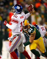
The fact that the Giants wore their whites and the Packers their home green-and-yellows made for an interesting historical note, for it gave them a striking likeness to their 1961 NFL Championship showdown at Lambeau (then called City Stadium), which the Pack won in a Paul Hornung-fest, 37-0. That was an important year for Green Bay, marking the first NFL title of the Lombardi era, and it was also an important year for both the Packers’ and Giants’ uniforms, with each team wearing helmet logos for the first time — the very same logos they wore last night. Of course, the Packers only ever have sported one logo on their helmets, while that classic Giants helmet logo survived until 1975 and made its triumphant return in 2000.
For a generational uni-comparison, check out this shot of Frank Gifford and this shot of Hornung in their teams’ respective ’60s road and home looks, and then move on to Lawrence Tynes and Brett Favre yesterday. The colors are certainly brighter now, particularly with the Packers, and there are many subtle differences that I’m sure the average Uni Watch devotee is far more hip to than I am. The overall similarity is amazing, though. So when, I wonder, is the last time that an NFL playoff game was reprised almost a half century later and saw the two teams looking so similar to their bygone editions?
Well, if it had been left up to the Chargers, the answer to that question might have been “Oh, a couple hours earlier.” The championship game history between the Packers and Giants got a lot of press last week, while the same history between San Diego and the Pats was largely ignored. The great Chargers of the John Hadl-to-Lance Alworth era beat the then-Boston Patriots 51-10 in the 1963 AFL Championship Game at San Diego’s great Balboa Stadium. I managed to find only one picture of a Pats/Bolts game from that season, but it’s from an exhibition played in August. Anybody out there have pictures from the 1963 AFL title game? Of course, even if the Chargers were in white for that game — a uniform whose jersey and helmet would at least bear a passing resemblance to they sported yesterday the Pats couldn’t hold up their end of the time-travel bargain in any way whatsoever. Such a shame that the best of yesterday’s four teams was by far the weakest link in the uniform department. To that, I say: Help them, Pat Patriot, you’re their only hope.
Chip Off the Old Blockhead: Paul here. Gotta love how the paint and decals were flying yesterday at Lambeau. Brandon Jacobs’s “ny” logo got seriously torn, but we’ve seen that happen a jillion times this season. The real story was Ahmad Bradshaw, who not only lost one of his front helmet numerals but also had a helmet collision for the ages in the fourth quarter, when a big chip of paint, decal, and maybe brain matter came loose, peeled off, and went flying (here’s another view), leaving Bradshaw with a badly scarred lid (additional pics here, here, and here).
Better yet, in case you missed the play, we’ve got it on video. Check it out here.
Coupla other NFL notes:
• How much do I love stripes? So much that I kinda dig those undershirts that the teams were wearing yesterday.
• What the hell was Favre using on his nose?
• For those who are wondering: Pats are the designated home team for the Super Bowl, and will presumably wear their blue jerseys, meaning the Jints will wear white.
(Extra-special thanks to Ryan Whitacre, James Wortham, and Bobby O’Brien for their screen grabs, and to Matt Moschella for the video clip.)
Raffle Results: The winner of the $250 gift card from Distant Replays is Patrick Stickney, who should contact me to claim his prize. Thanks to all who entered, and watch for more raffles coming soon.
Friendly Reminder for NYCers: I’ll be presenting a lecture/performance on the pleasures of obscure trade magazines (like, say, this, this, this, this, and this) tomorrow nite at 8 p.m. at Union Hall in Park Slope. Four other people will be discussing similarly eccentric and entertaining topics (like this one), and the event is free. Hope to see lots of you there.
Uni Watch News Ticker: By now most of you know that many Cowboys players tie their jerseys to their shoulder pads. But that’s nothing compared to this old high school shot. Love the Band-Aid on the forehead, too (with thanks to Steven Brown). ”¦ Our recent discussion of prototypes prompted JD Denison to send along this. I have my doubts as to its authenticity, but it’s still pretty cool. ”¦ The Air Jordan XXIII will apparently feature an argyle pattern, presumably as part of a UNC tribute (with thanks to Seth Snyder). ”¦ Larry Weiderecht sent along some vintage uniform ads the other day. First there’s this one, for Rawlings youth football attire. Love how the text mentions that the jerseys “are great for just knocking around in between games” — still a novel concept at that time. Then there’s this one. Interestingly, the text notes that “16 major league teams suit up in Wilson uniforms ”¦ 9 for both home and road.” It had never occurred to me that a team might have different outfitters for their home and road unis. Why would that be the case? Anyone..? ”¦ Speaking of kids’ uniforms and related merchandising, check out all the great material Jon Helfenstein has assembled here (click on the individual images for larger versions) — addictive stuff. ”¦ Jeremy Brahm is intrigued by the logo for the 2008 FIVB World Congress: “The panels form a U, an A, and an E, for ‘United Arab Emirates,’ where the Congress will be held.” ”¦ Also from Jeremy: a gallery of Naomi Yotsumoto’s table tennis outfits (she’s featured in the shots with the green boxes). ”¦ Jeremy also notes that Ricoh is sponsoring MLB’s season-opening series between the Red Sox and A’s, which presumably means we’ll be seeing advertising on the sleeves and helmets again — ugh. ”¦ Lots of new MLS uniforms were unveiled at Friday’s draft (with thanks to Steven Lewis). ”¦ According to this item, the Raptors are working on an alternate jersey for next season. ”¦ The Bobcats wore special NASCAR-themed alternate uniforms on Saturday (additional views here and here). I’d been told about these before the season started but wasn’t allowed to talk about them and had forgotten about the whole thing until I saw the pics. I generally like checkerboard patterns, but the NASCAR connection is way too forced. And besides, shouldn’t the Pacers have first dibs on racing-related tie-ins? Not one of the NBA’s better ideas. ”¦ Reprinted from Saturday’s comments: North Dakota State had a really interesting football uni back in the late ’60s. On first glance it looks like they’re wearing short white sleeves with longer-sleeved undershirts, but it’s actually all one piece with contrast-colored upper sleeves. ”¦ Roman Karmazin, fighting on the Trinidad/Jones undercard, wore the name of slain NYPD officer Ruslan Timoshenko on his trunks Saturday night. ”¦ Karmazin’s opponent, Alex Bunema, was wearing one of those annoying loincloth/skirt getups, and so did another undercard fighter, DeMarcus Corley. ”¦ And let’s not even get into this guy (although it’s worth noting that he had a Yankees logo on his trunks). ”¦ “The U.S. men’s national soccer team beat Sweden, 2-0, on Saturday night,” writes Andrew Ghassemian. For some reason, Landon Donovan (our captain) decided to go with the orange cleats.” ”¦ Japanese golfer Ryo Ishikawa, who wore camouflage pants as an amateur last year, will not be allowed to wear them on the Japanese pro tour (with thanks to, of course, Jeremy Brahm). ”¦ Good article here about QBs and gloves (with thanks to David Sonny). ”¦ Faaaascinating article here about how Flying Elvis was designed, although the designer and the guy who wrote the article both seem to think that Elvis is cool and that Pat Patriot was lame, which should give you an idea of how clueless they both are. ”¦ Chris Yandle reports that Louisiana’s basketball team wore NOBs on Saturday night, after going NNOB this season up until then. ”¦ UConn wore silver-gray alternates yesterday. … Happy MLK Day, folks. I have a dream of a world without logo creep, of a Mets uniform set featuring only orange, blue, and white, and of the New York Football Giants winning one more championship for my old man, a lifelong Jints fan who turns 84 this week and probably never thought he’d get to see his team in another Super Bowl. Whoo-hoo, Big Blue!
What the hell was Favre using on his nose
Looks like a chemical hand warmer that he stuck in his head wrap on the sidelines fairly often in the second half.
Why different suppliers home and away? I noticed the Cubs only got the road blues from Wilson, so I’m guessing their primary supplier couldn’t get the right shade of blue for them. That type of thing seems like a ready reason. Then again, maybe hamartia on my part.
Wow, my brother and I had a ton of stuff from those Sears and JC Penney Catalogs. I had the NFL bedding, he had a wastebasket, we both had the pajamas. Great stuff.
I am pretty sure that Jaguars helmet is legit – they were going to go with that logo until the car maker of the same name threatened to sue. Said the logo was too similar.
That’s when they went with the head logo and switched to a black helmet.
Sure, Indy has the Indy 500 and the Brickyard 400, but Charlotte is home to just about every NASCAR team in the sport. Plus you have quite a few tracks around that area.
Landon Donovan was wearing the new Nike Mercurial Vapor boots.
link
They only come in a couple color options. Honestly I kind-of like the color, but do you think they could make the manufacturer logo a little larger?
“Faaaascinating article here about how Flying Elvis was designed, although the designer and the guy who wrote the article both seem to think that Elvis is cool and that Pat Patriot was lame, which should give you an idea of how clueless they both are.”
You’re absolutely right on this, and the story was written by Bill Plaschke. ‘Nuff said.
“So when, I wonder, is the last time that an NFL playoff game was reprised almost a half century later and saw the two teams looking so similar to their bygone editions?”
great point!
nhl offers that quite a bit…
p.s.
anyone catch the bruins @ rangers yesterday? classic unis… even though they are the edge system… great colors up and down the ice though!
Links in that top article are screwy.
And Lance Alworth has one l, not two, in his last name.
“The Bobcats wore special NASCAR-themed alternate uniforms on Saturday”
it would kind of be cool if the uniform numbers were the same font as earnhardt’s, petty’s or *sigh* gordon’s (not robby!). haha. either way, catchy jerseys!!!
– What the hell was Favre using on his nose?
It was a hand warmer.
The Wilson ad incorrectly labels the brown Padre jersey as their home uni and the white as the road outfit.
[quote comment=”207472″]Links in that top article are screwy.
And Lance Alworth has one l, not two, in his last name.[/quote]
Mea culpa. All links now fixed. Thanks for the heads-up.
oh…
“I generally like checkerboard patterns, but the NASCAR connection is way too forced…”
it gets hot down there in charlotte in the summer… so what a better way for rednecks to buy nba apperal to use as tank-tops??? damn sleeves get in the way while flippin’ burgers and chugging bush pounders anyway… just a thought…
maybe not enough sponsor patches on those uni’s though…
Lots of link were unveiled at Friday’s draft (with thanks to Steven Lewis). …
Anyone else notice that the horizontal Adidas stripes that have been on D.C. United’s shirts basically since their inception were missing from that pic?
Makes me wonder if they don’t have a shirt sponsorship deal in the works, and they can’t display it because it hasn’t been finalized.
I always kinda assumed that “Adidas” was their shirt sponsor; those stripes are a darn find advertisement, and everyone knows what they mean.
check out this weird tulsa basketball t-shirt
link
Aren’t those “stripes” more like unecessary piping that detracts from the uniform?
Holy boring, DC United. No stripes across the shirt anymore?
yesterday during the football games there was a commercial with a lot of old football footage. One thing of note I saw in there was a clip of a Bengals with the number 68 (i think) hand-drawn on his helmet, but his jersey was a different number. I can’t remember the product it was pitching for but if anyone saw it, can you let me know. It’d be a good little research project…
Charlotte is homoe of the NASCAR hall of fame. That is the connection
I like UConn’s new jerseys. I already comes self-diagrammed for everything that’s wrong with it!
Anybody out there have pictures from the 1963 AFL title game?
Keith Lincoln wearing the most awesome Chargers Uni Ever in link.
Remember, the Chargers lost the first 2 AFL title games, then had a, injury-ruined 1962. They followed up the Championship by losing the next two AFL title games to Buffalo, including linkt, which is the AFL equivalent to Gifford/Bednarik.
Let’s try that 2nd link again.
link.
Anybody notice the QB’s in each game yesterday had a green dot on the back of their helmet?
|sarcasm|
[quote comment=”207499″]Anybody notice the QB’s in each game yesterday had a green dot on the back of their helmet?
|sarcasm|[/quote]
Anyone notice that this isn’t funny anymore?
|serious|
Please excuse me if I have an attitude problem today, I’m a Packer fan. But seriously, can we give the green dot thing a rest?
[quote comment=”207493″]Charlotte is homoe of the NASCAR hall of fame. That is the connection[/quote]
It’s really so much more than that. Other than the soon to be built NASCAR Hall of Fame, there’s the fact that one of NASCAR’s nicest tracks is there, it’s All-Star Race, and almost all racing teams have their headquarters in Charlotte. It’s considered stock car racing’s home. The Pacers would get dibs on Indy Racing League tie-ins, sure, but, when it comes to NASCAR, its certainly Charlotte.
[quote comment=”207459″]Wow, my brother and I had a ton of stuff from those Sears and JC Penney Catalogs. I had the NFL bedding, he had a wastebasket, we both had the pajamas. Great stuff.[/quote]
i link oh…35 years ago…
[quote]I have a dream of a world without logo creep, of a Mets uniform set featuring only orange, blue, and white, and of the New York Football Giants winning one more championship for my old man, a lifelong Jints fan who turns 84 this week and probably never thought he’d get to see his team in another Super Bowl. Whoo-hoo, Big Blue![/quote]
wow paul…ditto on both accounts…my dad just turned 80 and *snif* i went over to his house yesterday to watch the game…maybe i should have checked the attic to see if my parents saved link
[quote comment=”207493″]Charlotte is homoe of the NASCAR hall of fame. That is the connection[/quote]
freudian slip?
I guess I’m clueless too, because I find the “Flying Elvis” superior to Pat Patriot.
“And besides, shouldn’t the Pacers have first dibs on racing-related tie-ins? Not one of the NBA’s better ideas.”
I would say no. Indianapolis may have one big race (which has suffered a major decline in importance over the past two decades), but the NASCAR teams are all based in North Carolina and are a major source of jobs and tax revenue for the area. Thus, Charlotte is the logical team to cross-promote NASCAR.
Pretty sure it’s been rehashed here regularly, but:
Worst. Super Bowl Logo. Ever!
The only thing those colors remind me of are Loyola Marymount basketball in the early 90’s.
Alot of Packers had built in jersey hand warmers yesterday. It also looked like some players might have had solid body fabric instead of mesh below the yoke. I’m not sure but it looked dull and I didn’t see the normal mesh look?????? What can you find out Paul? Also, what was with black thermal head covers for the Packers- why not Dark Green?????
No credit for my Bradshaw screencap? ;( How do I file a lawsuit, anyone know?
Just kidding.
Nick Hanson
[quote comment=”207491″]yesterday during the football games there was a commercial with a lot of old football footage. One thing of note I saw in there was a clip of a Bengals with the number 68 (i think) hand-drawn on his helmet, but his jersey was a different number. I can’t remember the product it was pitching for but if anyone saw it, can you let me know. It’d be a good little research project…[/quote]
That was Anthony Munoz. I saw that #68 sharpied between the stripes too.
[quote comment=”207515″][quote comment=”207491″]yesterday during the football games there was a commercial with a lot of old football footage. One thing of note I saw in there was a clip of a Bengals with the number 68 (i think) hand-drawn on his helmet, but his jersey was a different number. I can’t remember the product it was pitching for but if anyone saw it, can you let me know. It’d be a good little research project…[/quote]
That was Anthony Munoz. I saw that #68 sharpied between the stripes too.[/quote]
fantastic, thank you. any idea as to why 68 was sharpied on there?
“Louisiana’s basketball team”
should read Louisiana-Lafayette’s basketball team
In 1971 I so wanted one of those Wilson football uniforms for my team (Vikings), but living in the Bay Area all you could get was the 49er or Raiders and maybe the Rams if you looked hard enough. Xmas morning came and I got a 49er helmet, to add insult to injury the 49ers upset the Vikings that year in the playoffs. I immediately peeled off all the decals and painted the helmet purple.
[quote comment=”207516″]
fantastic, thank you. any idea as to why 68 was sharpied on there?[/quote]
Not yet. But you can kinda see something written above Munoz’s ear hole on this page:
link
I also LOVE collingsworth’s picture. ha ha
link
It looks like Tynes has a Zipper-fly? I’ve never seen that in football.
link
The MLS jerseys, I can’t figure out a couple of the teams with sponsors.
Best Buy = Chicago Fire
Glidden Paint = Columbus Crew
Amigo Energy = ?
Xango = ?
Comex = ?
The teams unaccounted for are Toronto, Salt Lake City, Houston, Colorado, LA, and Chivas USA. iirc, LA signed some deal with Herbalife last year, so I don’t think they have a redesign.
So, the old pics prove that the NYG have had red prominent in their unis before and that yesterday was not an aberration. Good. I like the fact that my preference (red over blue) has historical background.
I am also clueless because I don’t like Pat Patriot. I don’t like the Flying Elvis, either, though–so I guess they cancel each other out.
As for the UConn alts, I give them a thumbs up. The silver is a nice change, and I like that it’s being used as a dominant color for once.
I have no interest in the Super Bowl now (though I would like the Giants to win just to see Peyton’s head explode when his little brother wins a Super Bowl earlier in his career than Peyton did in his), but based on unis alone and the fact that I normally root for the underdog, I am slightly leaning towards the Giants.
Re-try
It looks like Tynes has a Zipper-fly? I’ve never seen that in football.
The MLS jerseys, I can’t figure out a couple of the teams with sponsors.
Best Buy = Chicago Fire
Glidden Paint = Columbus Crew
Amigo Energy = ?
Xango = ?
Comex = ?
The teams unaccounted for are Toronto, Salt Lake City, Houston, Colorado, LA, and Chivas USA. iirc, LA signed some deal with Herbalife last year, so I don’t think they have a redesign.
The MLS jerseys seem to be a marginal improvement, but I don’t get why that “REVOLUTION” font keeps getting used. If timelessness is a hallmark of great design, that font guarantees an expiration date for any style.
–link
Not sure if anyone’s mentioned it here the past day or so…but Sunday’s Outside the Lines featured how teams deal with cold weather. It even had an interview with, I believe, the Bills’ equipment manager on the snowy sidelines of an empty stadium in Buffalo. Does anyone have a link or anything to this that I missed?
[quote comment=”207522″][quote comment=”207516″]
fantastic, thank you. any idea as to why 68 was sharpied on there?[/quote]
Not yet. But you can kinda see something written above Munoz’s ear hole on this page:
link
I also LOVE collingsworth’s picture. ha ha[/quote]
The Bengals of the late 80s often paid tribute to injured teammates by writing their uniform numbers on their helmets. I believe #68 was for Joe Walter, an OL that was injured earlier in the season. That was before the NFL put the kibosh on such things.
I don’t care what Joe Skiba says this still looks like an armband tribute to me and once again Aaron Ross was wearing one as well as Corey link
[quote] I immediately peeled off all the decals and painted the helmet purple.[/quote]
forever cementing the viking super bowl jinx
[quote] based on unis alone and the fact that I normally root for the underdog, I am slightly leaning towards the Giants.[/quote]
oh c’mon minna, join the dark side for real ;)
Yesterday in either the New York Daily News or The Post had an interview with RW McQuarters. I didn’t get a chance to read it, maybe some other UWer did. One interesting tidbit I heard concerning him on ESPN radio last night is that his three children all share differing variations of his RW initials.
As for his two bonehead plays in the game…I wanted to put Spongebob band-aids OVER both of my eyes when he fumbled!
By the way, THAT was a football game, dirt hot breath, decals and paint akimbo.
There was one pass play where Farvaruh threw to Driver and he zinged it so hard in combination to the bitter cold, he had to seek attention from the trainers on the sidelines!
[quote comment=”207511″]”And besides, shouldn’t the Pacers have first dibs on racing-related tie-ins? Not one of the NBA’s better ideas.”
I would say no. Indianapolis may have one big race (which has suffered a major decline in importance over the past two decades), but the NASCAR teams are all based in North Carolina and are a major source of jobs and tax revenue for the area. Thus, Charlotte is the logical team to cross-promote NASCAR.[/quote]
Indianapolis has more importance in the larger scale of motor sport. It is the home of the oldest and most attended race (the 500), NASCARs 2nd most important race (Brickyard 400), drag racing’s largest event, the U.S. Nationals, one of two U.S. rounds of MotoGP, the top class of motorcycle racing, and until recently, home of the U.S. Grand Prix in Formula 1. If Indianapolis Motor Speedway weren’t located in the middle of a neighborhood, they would probably have some LeMans type race as well. But if it was strictly a NASCAR promotion, then yeah, Charlotte gets the nod.
[quote comment=”207499″]Anybody notice the QB’s in each game yesterday had a green dot on the back of their helmet?
|sarcasm|[/quote]
Good stuff. I was gonna ask if anyone noticed Jacobs’ N was missing….but figured the humor would have been lost.
And about that commercial, if it was the “salute to the linemen” commercial, it was for State Farm. Lots of neat old uni stuff in that.
Comex is the shirt sponsor for link.
ZANGO is link.
Amigo Energy is link.
Toronto has a shirt sponsor deal with BMO, and as a second-year team, I doubt there are any changes for them. Colorado, shirt-sponsorless (as far as I know), also redesigned last year and seems unlikely for a new design.
Man, those old catalogs brought back some memories.
I still have a Steelers knit hat (as featured on link, although the top tassel has long since disappeared.
Incidentally, I used to use a Sears catalog as a “template” for when I’d do my old tracing paper football uniform designs…
To be honest, from what I could tell, Farve was just using a Kleenex or a hanky to wipe his nose because of the cold. There were a couple of shots throughout the game of his face with snot all over his upper lip, gross as as that sounds…or looks.
Here’s link
What a treat to look through those Christmas catalogues 35 years later. Thanks you. Those annuals were the motherlode for a logo inclined boy. I owned evrything from NFL belt buckles to replica helmets to bed spreads to waste baskets, et al. My parents lovingly indulged me in my obsession.
[quote comment=”207491″]yesterday during the football games there was a commercial with a lot of old football footage. One thing of note I saw in there was a clip of a Bengals with the number 68 (i think) hand-drawn on his helmet, but his jersey was a different number. I can’t remember the product it was pitching for but if anyone saw it, can you let me know. It’d be a good little research project…[/quote]
It was a commercial for an insurance company. It focused on linemen (protection). Think it was State Farm, but I can’t be sure, and I can’t find the video.
~E~
[quote comment=”207470″]“Faaaascinating article here about how Flying Elvis was designed, although the designer and the guy who wrote the article both seem to think that Elvis is cool and that Pat Patriot was lame, which should give you an idea of how clueless they both are.”
You’re absolutely right on this, and the story was written by Bill Plaschke. ‘Nuff said.[/quote]
Plaschke is the king of Doesn’t Get It. He should be the next staffer pushed overboard in Tribune Co’s ongoing purge of the L.A. Times.
[quote comment=”207540″]Yesterday in either the New York Daily News or The Post had an interview with RW McQuarters. I didn’t get a chance to read it, maybe some other UWer did. One interesting tidbit I heard concerning him on ESPN radio last night is that his three children all share differing variations of his RW initials.
As for his two bonehead plays in the game…I wanted to put Spongebob band-aids OVER both of my eyes when he fumbled![/quote]
From here on, he is R.W. McButterfingers.
[quote comment=”207549″]To be honest, from what I could tell, Farve was just using a Kleenex or a hanky to wipe his nose because of the cold. There were a couple of shots throughout the game of his face with snot all over his upper lip, gross as as that sounds…or looks.[/quote]
i don’t think it’s a handwarmer either…on the OT interception, in one of the myriad replays, you can see whatever it is fall to the ground…
when i saw him using that (ostensibly, i believe, to keep his lungs from freezing between plays), i thought, ‘god…he’s human and he’s old’
it was a great game, don’t get me wrong, but was there really any question as to who was the better team yesterday? the zebras did all they could to keep the pack in the game in the second half
For those of us that love all aspects of our football tradition rich, yesterdays New York vs Green Bay game was the greatest.
And, for those of us that love the tradition and history of our football played on real grass, yesterdays game was a big sigh of relief.
I was somewhat expecting the field to be a frozen rock with players struggling just to stand up and announcers clamouring for Lambeau field to finally come into this century and switch to Field Turf.
However, Lambeau Fields newly installed DD Grassmaster system, and redone underground heating system (that this time promised to keep the would be frozen tundra to a balmy 55 degrees), worked like a charm.
The field only had some superficial icing, but never once was the playing surface an issue, and it remained soft enough for players cleats to work properly.
For all the bad press, that was recieved at Heinz field this year, and Foxboro last year, what a relief.
Aren’t those “stripes” more like unecessary piping that detracts from the uniform?
If you like the stripes on the sleeves of the players yesterday in Green Bay, then you’ve also got to like the stripes that run down the side of the Patriots’ jerseys. I personally don’t have a problem with them, but I could see some people arguing that they are unnecessary piping.
We all love old Pat Patriot, but I remember being so happy when the Patriots put him in mothballs. He represented a lot of bad things (i.e., 46-10 in Super Bowl XX, the Sullivan family, Victor Kiam and Shaffer Stadium) and fewer good things (Steve Grogan).
[quote]If you like the stripes on the sleeves of the players yesterday in Green Bay, then you’ve also got to like the stripes that run down the side of the Patriots’ jerseys.[/quote]
um…no…not at all
personally i don’t think the pats newest uni’s are all that bad, but the side piping is totally unnecessary and the shoulder and sleeve stripes still rock (although, the truncated shit today compared to years back sucks)
[quote comment=”207512″]Pretty sure it’s been rehashed here regularly, but:
Worst. Super Bowl Logo. Ever!
The only thing those colors remind me of are Loyola Marymount basketball in the early 90’s.[/quote]
Agreed. Looks very cheap and amateurish, not to mention it resembles a car-door. Not sure why they curved Arizona like that. The fonts don’t go together and the colors are horrible.
This will be the longest 2 weeks ever looking at that damn thing. I guess the upside is that it really would have clashed with the Packers unis.
[quote comment=”207460″]I am pretty sure that Jaguars helmet is legit – they were going to go with that logo until the car maker of the same name threatened to sue. Said the logo was too similar.
That’s when they went with the head logo and switched to a black helmet.[/quote]
Was link in use back in 1993? For some reason that seems like a more recently introduced logo.
[quote comment=”207528″]Not sure if anyone’s mentioned it here the past day or so…but Sunday’s Outside the Lines featured how teams deal with cold weather. It even had an interview with, I believe, the Bills’ equipment manager on the snowy sidelines of an empty stadium in Buffalo. Does anyone have a link or anything to this that I missed?[/quote]
here you go buddy
link
[quote comment=”207567″][quote]If you like the stripes on the sleeves of the players yesterday in Green Bay, then you’ve also got to like the stripes that run down the side of the Patriots’ jerseys.[/quote]
um…no…not at all
personally i don’t think the pats newest uni’s are all that bad, but the side piping is totally unnecessary and the shoulder and sleeve stripes still rock (although, the truncated shit today compared to years back sucks)[/quote]
although link is infinitely better than link
Favre was using pure rock cocaine.
Just kidding.
WHO DEY
I know its not really uni-related, but did anyone else notice the frostbite on Tom Coughlin’s face last night? Holy man, you could see it slowly get worse as the game went on and then during the press conference there were some spots that were pretty bad. There hasn’t been any good photos that I have seen, but if anyone has a screen shot from ESPN or something, you can really see how bad it was.
Karl
[quote comment=”207502″][quote comment=”207499″]Anybody notice the QB’s in each game yesterday had a green dot on the back of their helmet?
|sarcasm|[/quote]
Anyone notice that this isn’t funny anymore?
|serious|
Please excuse me if I have an attitude problem today, I’m a Packer fan. But seriously, can we give the green dot thing a rest?[/quote]
Pipe down, Junior. It was a joke. I’m sure someone was going to ask it as a serious question today, since every Monday it’s been asked since week 1, so I wanted to beat that person to the punch, so hopefully they don’t ask it today.
[quote comment=”207550″]Here’s link[/quote]
That’s not an armband… Ross dislocated his shoulder (twice!) the previous week against Dallas. What you see is part of the “harness” he was wearing to keep that shoulder from dislocating again…
The pictures of the Wish Books brought back great memories. I’d spend hours just looking at all the “cool stuff” in the book, whether I actually wanted it or not! Back in the days before replica jerseys, we’d get “team” sweatshirts and Magic Marker numbers on the back…
Paul, I’m surprised that you didn’t mention the packers’ built in hand warmers, here’s a pretty good picture
link
I’m not sure why baseball teams used different manufacturers for home and road jerseys during the late-flannel era, but it led to another oddity – different number fonts on home and road jerseys. If you look at film of the 1969 World Series, you will notice that Mets wore block fonts at home:
link
and varsity fonts on the road:
link
The Orioles were just the opposite, wearing the block number font on the road and the varsity font at home. The reason – different manufacturers made the home and road jerseys for each team. The Minnesota Twins and the Seattle Pilots were two other teams that wore different number fonts home and road because the home jerseys were made by different manufacturers than the road jerseys. Up until the 1990s, the manufacturer of a jersey usually determined what number font was used. Wilson used a varsity font that is still used today on Yankees and Braves jerseys. The Yankees and the Braves were the last teams to stop wearing Wilson jerseys after MLB started making exclusive deals – first with Rawlings, then Russell Athletic and now Majestic – to supply uniforms. Rawlings jerseys usually had block fonts.
Thanks, fellas, for the Ahmed Bradshaw screen grabs. Very Zapruder-like!
i immediately thought: “Back….and to the Left!”
[quote comment=”207483″]Lots of link were unveiled at Friday’s draft (with thanks to Steven Lewis). …
Anyone else notice that the horizontal Adidas stripes that have been on D.C. United’s shirts basically since their inception were missing from that pic?
Makes me wonder if they don’t have a shirt sponsorship deal in the works, and they can’t display it because it hasn’t been finalized.
I always kinda assumed that “Adidas” was their shirt sponsor; those stripes are a darn find advertisement, and everyone knows what they mean.[/quote]
While DCU was always an Adidas-dressed team (they did not always outfit the entire league) they never paid extra. DCU has had two paying shirt sponsors, MasterCard in the early years and Sierra Mist for the second Adu year. In both cases the sponsor was relegated to the shirttail and shorts.
I heard last fall that DCU was getting a front-of-shirt sponsor. The hot rumor is Verizon, but it is just a rumor for now. This will be announced (whoever it is) very soon or DCU will look pretty spartan this year. After all training camp is two weeks away.
As a DCU die-hard I am torn. Sure the 3 stripes look is just free advertising for Adidas but at least our kits have been classic looking and consistent for 12 years. But the idea that more money will be available to buy better players is also really appealing.
one word link
link of the OT interception…at about 1:00, you can see whatever favre was wearing (handwarmer, kleenex?) fall out
[quote comment=”207578″][quote comment=”207502″][quote comment=”207499″]Anybody notice the QB’s in each game yesterday had a green dot on the back of their helmet?
|sarcasm|[/quote]
Anyone notice that this isn’t funny anymore?
|serious|
Please excuse me if I have an attitude problem today, I’m a Packer fan. But seriously, can we give the green dot thing a rest?[/quote]
Pipe down, Junior. It was a joke.
I’m sure someone was going to ask it as a serious question today, since every Monday it’s been asked since week 1, so I wanted to beat that person to the punch, so hopefully they don’t ask it today.[/quote]
shut up, its stupid.
did anyone notice early in the game, 1st quarter I think, there was a hit and 3 white piece went flying in different directions? I’m guessing it was a shattered chinstrap, I love high def.
Just got back from Green Bay, and I am just about thawed out completely. As a lifelong Packers fan, I am obviously kind of pissed off today and not in a very good mood.
Yesterday’s game had just about everything. Great uni’s, great players, great ambiance. You couldn’t have scripted it better. Missed FG, Favre with the ball in OT… and then complete disappointment. I have never seen Lambeau Field clear out quicker than it did last night.
The scene was pretty amazing. My fiance and I were not terribly cold as we were bundled up like an Eskimo, or Inuit. The scene in the bathroom was something else. Dozens of kids bawling their eyes out with their fathers rubbing hand warmers all over them trying to get them warm. So many people were not dressed properly, and they paid for it.
All in all, I am glad I went, but of course very mad at the result. This is going to be the worst two weeks of my life. Two weeks of ESPN talking heads and local news broadcasters saying how they can’t believe the Packers lost, and yadda, yadda, yadda.
Oh well, I am out. Don’t count on me being happy for a few weeks on here.
[quote comment=”207583″]I’m not sure why baseball teams used different manufacturers for home and road jerseys during the late-flannel era, but it led to another oddity – different number fonts on home and road jerseys. If you look at film of the 1969 World Series, you will notice that Mets wore block fonts at home:
link
and varsity fonts on the road:
link
The Orioles were just the opposite, wearing the block number font on the road and the varsity font at home. The reason – different manufacturers made the home and road jerseys for each team. The Minnesota Twins and the Seattle Pilots were two other teams that wore different number fonts home and road because the home jerseys were made by different manufacturers than the road jerseys. Up until the 1990s, the manufacturer of a jersey usually determined what number font was used. Wilson used a varsity font that is still used today on Yankees and Braves jerseys. The Yankees and the Braves were the last teams to stop wearing Wilson jerseys after MLB started making exclusive deals – first with Rawlings, then Russell Athletic and now Majestic – to supply uniforms. Rawlings jerseys usually had block fonts.[/quote]
I’d have to go back and check the archives, but I’m sure that at some point there were MLB-approved suppliers prior to there being MLB-exclusive suppliers.
On the same note, I’d be interested in knowing the history of the MLB design department and how they played into the various manufacturers. I bet that at some point someone said “it sure would be easier to only have to order these jerseys from one company and look through one catalog.”
[quote comment=”207511″]”And besides, shouldn’t the Pacers have first dibs on racing-related tie-ins? Not one of the NBA’s better ideas.”
I would say no. Indianapolis may have one big race (which has suffered a major decline in importance over the past two decades), but the NASCAR teams are all based in North Carolina and are a major source of jobs and tax revenue for the area. Thus, Charlotte is the logical team to cross-promote NASCAR.[/quote]
Indianapolis has two big races. And used to have three.
[quote comment=”207598″]Just got back from Green Bay, and I am just about thawed out completely. As a lifelong Packers fan, I am obviously kind of pissed off today and not in a very good mood.
Yesterday’s game had just about everything. Great uni’s, great players, great ambiance. You couldn’t have scripted it better. Missed FG, Favre with the ball in OT… and then complete disappointment. I have never seen Lambeau Field clear out quicker than it did last night.
The scene was pretty amazing. My fiance and I were not terribly cold as we were bundled up like an Eskimo, or Inuit. The scene in the bathroom was something else. Dozens of kids bawling their eyes out with their fathers rubbing hand warmers all over them trying to get them warm. So many people were not dressed properly, and they paid for it.
All in all, I am glad I went, but of course very mad at the result. This is going to be the worst two weeks of my life. Two weeks of ESPN talking heads and local news broadcasters saying how they can’t believe the Packers lost, and yadda, yadda, yadda.
Oh well, I am out. Don’t count on me being happy for a few weeks on here.[/quote]
i was thinkin about ya the whole game johnny…tought loss and great game…had you won, i would have been a packer fan two weeks hence…every time they showed a crowd shot, i was thinking “where’s johnny, and will he be holding a ‘uniwatch’ banner?”
ah well…thaw out my friend and join the g-men fans in our quest to return the link to the nfc
/any pics from the game?
[quote comment=”207563″][quote comment=”207549″]To be honest, from what I could tell, Farve was just using a Kleenex or a hanky to wipe his nose because of the cold. There were a couple of shots throughout the game of his face with snot all over his upper lip, gross as as that sounds…or looks.[/quote]
i don’t think it’s a handwarmer either…on the OT interception, in one of the myriad replays, you can see whatever it is fall to the ground…
when i saw him using that (ostensibly, i believe, to keep his lungs from freezing between plays), i thought, ‘god…he’s human and he’s old’
it was a great game, don’t get me wrong, but was there really any question as to who was the better team yesterday? the zebras did all they could to keep the pack in the game in the second half[/quote]
Actually I’m almost positive they were handwarmers. I aksed a guy here in the office who’s also a Packer fan, he siad he used the exact same warmers in teh same way when he deer hunts. He said bretahing hot air thru them really helps keep you warm. And on the game, are you kidding me!?? Keeping the Packers in the game? There were 5 or 6 terrible calls in the Giants favor. That BS rough call that lead to a TD, when like 2 series later Favre gets drilled like 2 seconds after a throw, and guess what, no call. Give me a break. Were the Giants better yesterday, no question, the Pack played terrible. But don’t start the ref nonsense, as far as I could tell, not to mention a couple Bears fans I watched the game with, the calls were definitly on the Giants side.
[quote comment=”207466″]Landon Donovan was wearing the new Nike Mercurial Vapor boots.
link
They only come in a couple color options. Honestly I kind-of like the color, but do you think they could make the manufacturer logo a little larger?[/quote]
The orange also happens to be one of the colors for Donovan’s club team, the LA Galaxy. It’s pretty common for players to not change cleats when they play for their national team.
[quote comment=”207587″]DCU has had two paying shirt sponsors, MasterCard in the early years and Sierra Mist for the second Adu year. In both cases the sponsor was relegated to the shirttail and shorts.[/quote]
As they were on all MLS teams.
Because they weren’t team “shirt sponsors” in the way we normally think of them for soccer teams. They were league sponsors who were doled out among the league’s teams to give them some additional exposure. I’m guessing the back-of-the-jersey things have gone away now that there are sponsors on the front.
[quote comment=”207603″]There were 5 or 6 terrible calls in the Giants favor. That BS rough call that lead to a TD, when like 2 series later Favre gets drilled like 2 seconds after a throw, and guess what, no call. Give me a break. Were the Giants better yesterday, no question, the Pack played terrible. But don’t start the ref nonsense, as far as I could tell, not to mention a couple Bears fans I watched the game with, the calls were definitly on the Giants side.[/quote]
God, grow up.
[quote comment=”207604″]The orange also happens to be one of the colors for Donovan’s club team, the LA Galaxy. It’s pretty common for players to not change cleats when they play for their national team.[/quote]
I do not believe orange is in the Galaxy’s color palette.
[quote comment=”207600″][quote comment=”207511″]”And besides, shouldn’t the Pacers have first dibs on racing-related tie-ins? Not one of the NBA’s better ideas.”
I would say no. Indianapolis may have one big race (which has suffered a major decline in importance over the past two decades), but the NASCAR teams are all based in North Carolina and are a major source of jobs and tax revenue for the area. Thus, Charlotte is the logical team to cross-promote NASCAR.[/quote]
Indianapolis has two big races. And used to have three.[/quote]
The point I was making is that the Pacers actually named after a racing-related term. Pace car, y’know? So they would seem to be the natural team for a racing-related uni pattern.
[quote comment=”207548″]Man, those old catalogs brought back some memories.
I still have a Steelers knit hat (as featured on link, although the top tassel has long since disappeared.
Incidentally, I used to use a Sears catalog as a “template” for when I’d do my old tracing paper football uniform designs…[/quote]
oh my gosh, I had that Cowboys jacket and stocking cap too!
here’s a pic of us at a link in 1979
and my brother’s link. —NFL comforter, Dolphins trash can with hot Charlie’s Angels stickers on it.
[quote comment=”207607″][quote comment=”207603″]There were 5 or 6 terrible calls in the Giants favor. That BS rough call that lead to a TD, when like 2 series later Favre gets drilled like 2 seconds after a throw, and guess what, no call. Give me a break. Were the Giants better yesterday, no question, the Pack played terrible. But don’t start the ref nonsense, as far as I could tell, not to mention a couple Bears fans I watched the game with, the calls were definitly on the Giants side.[/quote]
God, grow up.[/quote]
Care to elaborate, smartass? Phil commoented that it went one way, I rebuffed. So what exactly is your beef?
ducks…
i’ll grant there was ONE call (late hit) that went in the giants favor…but please explain to me the third down penalty for “personal foul” which let the pack get a first down (4th quarter) where it happened so far from the action that NO CAMERA EVEN CAPTURED IT…talk about a phantom foul…that shit happens all the time (like hockey players who rough it up down rink while the action has moved to the other end)…
i guess depending upon your rooting interests you’d think the refs were jobbing you (i thought it was the pack getting the calls, you thought the calls went the g-men’s way)
but i have NEVER seen a phantom call (i think it was on spongebob) like the one made yesterday
Landon Donovan also usually wears blue boots when playing for the Galaxy.
I have one of those Jacksonville helmets. They aren’t really an authentic helmet, but they were padded with something different than other replica helmets (no pictures, its in my parents garage). They had it at a Champs Sports the year before the team began play. If that guy is getting that much for it, I might be digging through their garage to try and find it.
[quote comment=”207609″][quote comment=”207604″]The orange also happens to be one of the colors for Donovan’s club team, the LA Galaxy. It’s pretty common for players to not change cleats when they play for their national team.[/quote]
I do not believe orange is in the Galaxy’s color palette.[/quote]
I think orange was Nike’s color of choice for player’s wearing them this weekend. Christiano Ronaldo for Manchester United was wearing them in orange. He’s in the background link. Nicklas Bendtner for Arsenal didn’t get off the subs bench but he was wearing them in orange also.
No more quibbling about the refs. Not uni-related, not relevant, not conducive to civil discourse. Stop it. Now.
[quote comment=”207587″]
I heard last fall that DCU was getting a front-of-shirt sponsor. The hot rumor is Verizon, but it is just a rumor for now. This will be announced (whoever it is) very soon or DCU will look pretty spartan this year. After all training camp is two weeks away.
As a DCU die-hard I am torn. Sure the 3 stripes look is just free advertising for Adidas but at least our kits have been classic looking and consistent for 12 years. But the idea that more money will be available to buy better players is also really appealing.[/quote]
Thanks, Mark. I hadn’t heard anything about United’s potential shirt sponsor, but it does make sense, having seen that the front Adidas stripes aren’t there.
Of course, I totally missed Chicago getting a front sponsor until late last week. So I’m not completely and totally on the ball.
[quote comment=”207610″][quote comment=”207600″][quote comment=”207511″]”And besides, shouldn’t the Pacers have first dibs on racing-related tie-ins? Not one of the NBA’s better ideas.”
I would say no. Indianapolis may have one big race (which has suffered a major decline in importance over the past two decades), but the NASCAR teams are all based in North Carolina and are a major source of jobs and tax revenue for the area. Thus, Charlotte is the logical team to cross-promote NASCAR.[/quote]
Indianapolis has two big races. And used to have three.[/quote]
The point I was making is that the Pacers actually named after a racing-related term. Pace car, y’know? So they would seem to be the natural team for a racing-related uni pattern.[/quote]
according to wiki:
According to Indianapolis attorney, Richard D. Tinkham, the nickname “Pacers” was decided on through a collective decision of the original investors. Tinkham, one of those investors, recalled that the nickname was a combination of the state’s rich history with the harness racing pacers and the pace car used for the running of the Indianapolis 500. Investor Chuck Barnes was a horse racing enthusiast in addition to being business manager of Mario Andretti, A.J. Foyt and Roger Ward. Barnes’ wife, Lois, suggested the name over dinner.
Tinkham said the “Pacers” decision was an easy one, but the real debate was whether the team should be called the Indiana Pacers or the Indianapolis Pacers. Since one of the original ideas for the team was to have it playing throughout the state with its base in Indianapolis, the official team name became the Indiana Pacers.
link
[quote comment=”207601″][quote comment=”207598″]Just got back from Green Bay, and I am just about thawed out completely. As a lifelong Packers fan, I am obviously kind of pissed off today and not in a very good mood.
Yesterday’s game had just about everything. Great uni’s, great players, great ambiance. You couldn’t have scripted it better. Missed FG, Favre with the ball in OT… and then complete disappointment. I have never seen Lambeau Field clear out quicker than it did last night.
The scene was pretty amazing. My fiance and I were not terribly cold as we were bundled up like an Eskimo, or Inuit. The scene in the bathroom was something else. Dozens of kids bawling their eyes out with their fathers rubbing hand warmers all over them trying to get them warm. So many people were not dressed properly, and they paid for it.
All in all, I am glad I went, but of course very mad at the result. This is going to be the worst two weeks of my life. Two weeks of ESPN talking heads and local news broadcasters saying how they can’t believe the Packers lost, and yadda, yadda, yadda.
Oh well, I am out. Don’t count on me being happy for a few weeks on here.[/quote]
i was thinkin about ya the whole game johnny…tought loss and great game…had you won, i would have been a packer fan two weeks hence…every time they showed a crowd shot, i was thinking “where’s johnny, and will he be holding a ‘uniwatch’ banner?”
ah well…thaw out my friend and join the g-men fans in our quest to return the link to the nfc
/any pics from the game?[/quote]
Here are just a few pics from the game. Forgive me for not posting more, but as you can imagine I am not really wanting to re-live last night at all.
link
link
link
link
link
[quote comment=”207611″][quote comment=”207548″]Man, those old catalogs brought back some memories.
I still have a Steelers knit hat (as featured on link, although the top tassel has long since disappeared.
Incidentally, I used to use a Sears catalog as a “template” for when I’d do my old tracing paper football uniform designs…[/quote]
oh my gosh, I had that Cowboys jacket and stocking cap too!
here’s a pic of us at a link in 1979
and my brother’s link. —NFL comforter, Dolphins trash can with hot Charlie’s Angels stickers on it.[/quote]
Awesome pictures!
I had the Cowboys jacket on the left, with the full helmet logo patch, with matching stocking hat.
link
Very disappointed in the new adidas template.
[quote comment=”207610″]
The point I was making is that the Pacers actually named after a racing-related term. Pace car, y’know? [/quote]
so theyre NOT named after this?
link
Anyone notice the shirts that were worn under the uniforms Paul mentioned he liked looked almost as if they were just a sleeve? When certain players lifted their arms in the air there was no fabric in the under-arm area. It may not have been all players, but I did notice at least a couple.
[quote comment=”207625″]Of course, I totally missed Chicago getting a front sponsor until late last week. So I’m not completely and totally on the ball.[/quote]
It didn’t happen until late last week. You’re fine.
NFL JERSEY TV NUMBERS QUESTION
Could sonebody please tell me why some NFL teams place the tv numbers too far toward the front of of the jersey. In other words, if it is a two-number player, e.g. #20 Dawkins on the Philadelphia Eagles, on the left shoulder the zero would be placed directly over the Reebok logo and the two would be place up toward the yoke/neck of the jersey (rather than the #20 being centered over the Reebok logo). Here is an example of what I am talking about:
link…
AND WITH REGARD TO THE NY FOOTBALL GIANTS:
Manning had the OPPOSITE placement of his TV numbers last night; the zero on the left shoulder was BEHIND the Reebok logo and the one right above it (rather than the zero being over the Reebok logo and the one to the front of it):
link
see also the photo at the top of today’s UniWatch blog entry.
link
link
DAWKINS TV numbers PHOTO
You can sort of see what im talking about link
about the under shirts. Just look at the underarm of the guy on the far left of the picture. You can barely make it out
Here is a NOT totally authentic ebay item:
link
But it could be made authentic if you removed the American Flag on the back.
What’s the PK Memorial decal on the back of that faux Colts helmet from eBay?
Is that in memory of the demise of the career of their former Place Kicker Mike Vanderjagt?
[quote comment=”207610″][quote comment=”207600″][quote comment=”207511″]”And besides, shouldn’t the Pacers have first dibs on racing-related tie-ins? Not one of the NBA’s better ideas.”
I would say no. Indianapolis may have one big race (which has suffered a major decline in importance over the past two decades), but the NASCAR teams are all based in North Carolina and are a major source of jobs and tax revenue for the area. Thus, Charlotte is the logical team to cross-promote NASCAR.[/quote]
Indianapolis has two big races. And used to have three.[/quote]
The point I was making is that the Pacers actually named after a racing-related term. Pace car, y’know? So they would seem to be the natural team for a racing-related uni pattern.[/quote]
It’s funny, but I never made the connection between the Pacers’ name and auto racing. I always assumed that it had to do with horseracing only. However, now that you mention it, the dual connection is apparent. I need to start eating Wheaties or something . . . .
Orange? They look yellow to me…
Large’s post illustrates a widespread problem on this page with folks who believe old uniforms are better just because they are old.
Case in point: Large’s preference for the hideous, red-with-blue-and-white-shoulder-striped Boston Patriots unis over the current ones. As a Bostonian who grew up watching the Pats wear the red duds, I am so thankful they eventually changed to what they have now (the 1993-1999 royal blue spacemen suits notwithstanding).
Clearly going by aesthetic value and not childhood romance, there is no comparing the iconic uniforms the Patriots now wear to the bargain-basement sweats supplied by a cheap owner and franchise in the 1960s.
The Giants’ away unis are just as bad. I don’t care if Big Blue wore them for a while back in the day. They are supposed to be BIG BLUE, and the jerseys should at least have SOME blue in them. Instead, they look like the Niners’ away jerseys from the 1980s (someone find a photo and tell me they don’t).
In both these cases, conservative types long for a bygone era that really wasn’t as golden as they remember. In the case of the Patriots, change is very, very good. In the case of the Giants, can we invest in some blue dye? Please?
I’ve been looking for the link online for a long time. Glad someone has some up. Had pajamas, bedspread, sheets & pillowcase and, sad to say, the zip-front cardigan. Never got a jacket or jersey.
I had been wondering if numbers on the jerseys were authentic or not. Turns out they just went with simple white numbers. Probably no one would have paid attention back then.
Don’t know if Wyoming’s own JC Penney was screwy or prescient in showing a blue Bronco jersey twenty-odd years before we saw one elsewhere.
[quote comment=”207644″]What’s the PK Memorial decal on the back of that faux Colts helmet from eBay?
[/quote]
I’m guessing it’s a Promise Keepers (Christian men’s organization) sticker. I’m surprised the NFL allowed it without having a hemorrhage.
Yesterday I posted that someone had his zipper unzipped during the game (disclaimer: a female friend noticed it and pointed it out). The Ahmad Bradshaw Helmet Explosion play is the moment I was referring to.
If you watch the video, you can see the upper part of his zipper is undone. It’s not quite as undone as some other examples we’ve seen from the past, but it’s there. Bradshaw unintentionally made himself well-known yesterday, uni-wise.
There needs to be seperate soccer page. Especially the day after NFL conference championships. Maybe the two guys talking soccer should exchange emails?
The Packers ‘sewn ins’ looked like two access holes to a “muff” rather than the classic Farve pocket jersey.
Bradshaw also lost one of his “4”s on the front of his helmet during, I believe, the Buffalo game, the Giants’ second to last game of the season. At first, I thought I remembered it was the Patriots game, but he didn’t play in that game at all.
[quote comment=”207611″][quote comment=”207548″]Man, those old catalogs brought back some memories.
I still have a Steelers knit hat (as featured on link, although the top tassel has long since disappeared.
Incidentally, I used to use a Sears catalog as a “template” for when I’d do my old tracing paper football uniform designs…[/quote]
oh my gosh, I had that Cowboys jacket and stocking cap too!
here’s a pic of us at a link in 1979
and my brother’s link. —NFL comforter, Dolphins trash can with hot Charlie’s Angels stickers on it.[/quote]
Was your brother on the tv show “Eight Is Enough”?
link
[quote comment=”207563″][quote comment=”207549″]To be honest, from what I could tell, Farve was just using a Kleenex or a hanky to wipe his nose because of the cold. There were a couple of shots throughout the game of his face with snot all over his upper lip, gross as as that sounds…or looks.[/quote]
i don’t think it’s a handwarmer either…on the OT interception, in one of the myriad replays, you can see whatever it is fall to the ground…
when i saw him using that (ostensibly, i believe, to keep his lungs from freezing between plays), i thought, ‘god…he’s human and he’s old’
it was a great game, don’t get me wrong, but was there really any question as to who was the better team yesterday? the zebras did all they could to keep the pack in the game in the second half[/quote]
In every cold game I’ve ever watched, QB’s and other players have always used hand warmers in their muffs. Why is everyone debating what fell from Favre’s muff? Of course it was a hand warmer. That’s what players use to stay warm! And that was also a hand warmer that he was putting by his face.
[quote comment=”207660″]
Was your brother on the tv show “Eight Is Enough”?
link
Hilarious! He got that a lot back then, for real!
Picture clipping copy.pictClipping
this is my idea for cold weather games, a one piece long sleeve soccer style with under armer sleeve taylored on. mid arm strips, 3 quarter sleeves…ahh
hopefully the picture works
Lots of people were first exposed to Tomlinson’s ‘Vader’ mask last night as seen link action shot from yesterday’s game.
Somewhat uni-related. Enjoy.
Somewhat uni-related. Enjoy.
link
[quote comment=”207527″]The MLS jerseys seem to be a marginal improvement, but I don’t get why that “REVOLUTION” font keeps getting used. If timelessness is a hallmark of great design, that font guarantees an expiration date for any style.
–link[/quote]
According to this, Joba is 12. Good job.
Aw, c**p! Forgot to fix the formatting.
Anyway, to go back to a topic Paul raised last week, I tracked down two English soccer clubs that started off life with brown and light blue jerseys! According to the book Club Colours, both Northampton Town and Rotherham United played in these colors (colours?) in the 1880’s. I can’t yet find a non-copyrighted illustration to share (which is why this response is so delayed) but I’m still looking.
Great guest entry today. It echos my feelings exactly, a couple of classic unis with the NYG road white/red being perhaps my favorite football uni ever. I don’t care for the sparkly paint but I guess you can’t have everything. They remind me of the YA Tittle/Sam Huff days of watching football with my father. I could just about hear Marty Glickman and Ray Scott. Oh, and you can add my father to the list of 80-something lifelong Giants fans who is pretty happy today.
[quote comment=”207577″]I know its not really uni-related, but did anyone else notice the frostbite on Tom Coughlin’s face last night? Holy man, you could see it slowly get worse as the game went on and then during the press conference there were some spots that were pretty bad. There hasn’t been any good photos that I have seen, but if anyone has a screen shot from ESPN or something, you can really see how bad it was.
Karl[/quote]
I did see that and I noticed it too. His face was so red.
I think that he may have had some kind of vaseline all over it though.
The old catalog sites are fantastic! Looking at 78 and 79 in particular, I keep seeing stuff and saying, “I had that!” Probably everyone here between 33 and 40 looked at that hat/coat combo and said “I had a ___________ one!” It was the Bills for me.
It had never occurred to me that a team might have different outfitters for their home and road unis. Why would that be the case?
My father was a college coach for a very long time and when I was a kid he also managed a team in a summer college league like the cape cod. Well, their set of home uniforms was made by wilson and their set of road uniforms was made by rawlings. I know the reason my father did this was because he felt wilson made the best quality uniform but he didnt like their shade of grey and their grey uniform was heavier than rawlings, thus alot of hotter to wear during the summer. Conversely, at the school he coached at, the weight of the uniform was one of the reasons they were wilson because the heavier material was better for the cold weather and being a northeast school, they played most of their games in the cold. I dont know if this has anything to do with the MLB uniform choices but I do know there are (or at least used to be) a number of difference in each manufacturer’ uniform.
[quote comment=”207656″]There needs to be seperate soccer page. Especially the day after NFL conference championships. Maybe the two guys talking soccer should exchange emails?[/quote]
This is idiotic, especially given that there seem to be more books and sites devoted to soccer uniforms than to any other sport. Remember back when Paul caught flak from Cowboy “fans” because he wrote a detailed article about their uniforms? There isn’t a soccer fan alive who would ever question such an article.
The story on those Orange Soccer boots is that they are a crazy concept shoe that Nike has made for a few players. The entire boot is made of carbon fiber and weighs less than 190 grams. Not for sale to the public. link. Worth a look:
[quote]The Packers ’sewn ins’ looked like two access holes to a “muff”[/quote]
i have wondered why players prefer the fanny pack-type muff to the sewn-in muff, especially when you can have mishaps like the seattle-pack game (see: hasselback, matt)…either they’re warmer, or they simply don’t have the sewn-in muff on their jersey
but think about it…whom amongst us wouldn’t prefer clothing with two access holes to a muff?
Okay, before we go any further, I will answer the two most important questions for you.
First, that golden “C” on UCLA marks the one hundred NCAA Cha,mpionships they have won.
Second, you know that green dot on the back of the quarterback’s helmet? It’s not an ad for a financial company that makes credit cards. It tells the referee that he has the radio communications with the coaches.
Okay, no more asking those questions for today, and hopefully, never again. You may continue with your inquiries of other uniform-related stuff.
Thank you.
[quote comment=”207656″]There needs to be seperate soccer page. Especially the day after NFL conference championships. Maybe the two guys talking soccer should exchange emails?
The Packers ‘sewn ins’ looked like two access holes to a “muff” rather than the classic Farve pocket jersey.[/quote]
As a soccer fan I’m going to have to disagree with that completly, much less popular sports get discussed here all the time.
I’m just as curious as a lot of folks on here about the muff/sew-in pockets the Packers Had. i mena what did Driver have in his link(no pun intend) that would make it droop so much?
[quote comment=”207686″][quote]The Packers ’sewn ins’ looked like two access holes to a “muff”[/quote]
i have wondered why players prefer the fanny pack-type muff to the sewn-in muff, especially when you can have mishaps like the seattle-pack game (see: hasselback, matt)…either they’re warmer, or they simply don’t have the sewn-in muff on their jersey
but think about it…whom amongst us wouldn’t prefer clothing with two access holes to a muff?[/quote]
Amen.
New link? Not sure how credible this is though.
New School Marketing for the Old School (link) fan…
Go Giants!
The outstanding Wilson baseball uniform ad shows the Padres 1978 home white uniform in which they also had a brown road version and a gold alternate – which was usually worn only at home that season. It was a one year only style with the all star game patch on the left sleeve, marking the first time the ASG patch was worn by the host team. The jersey was also one of the few in MLB history to have both the city and nickname on it. Mitchell & Ness incorrectly has never put a uniform number on its replica model of the 1978 home jersey. The brown road jersey shown in the ad was the Padres 1977 road jersey.
I think the ugly filter ate my post. Can’t say that I blame it…
again, Go Giants!
Some link of its uniforms for everyone today.
From left to right: US Army Air Corps circa 1917, US Army Air Force OD Green and Khaki circa 1945, US Air Force Class B Duty Uniform circa early 1950’s, USAF Class A Service Dress “Silver Tan” circa 1950-1970, USAF Dress Whites 1960-1990, USAF Dress Blue circa 1980s
All these uniforms are obsolete. I’ll send out current uniforms later, along with some US Military related sports stuff. Maybe someone will notice this and make it an article on the webstie. :)
[quote comment=”207688″][quote comment=”207656″]There needs to be seperate soccer page. Especially the day after NFL conference championships. Maybe the two guys talking soccer should exchange emails?
The Packers ‘sewn ins’ looked like two access holes to a “muff” rather than the classic Farve pocket jersey.[/quote]
As a soccer fan I’m going to have to disagree with that completly, much less popular sports get discussed here all the time.
I’m just as curious as a lot of folks on here about the muff/sew-in pockets the Packers Had. i mena what did Driver have in his link(no pun intend) that would make it droop so much?[/quote]
It comes with old age
Anyways, I would prefer a muff over a sewn in…I played tight end and would just rather have the option of twisting it so it was behind during the play. It seems that if I had like Driver did it would be very annoying.
Love the classic look of the Giants and Pack (and congratulations to the Giants, whom I feared would collapse back around Week 16), but the Giants really need to do something about how their jersey numbers are positioned over their guts and not their chests. Push those things up three inches! That team logo above the number really throws everything off. The “C” captain logo is even positioned too low — look at other teams and you’ll see that logo up closer to the shoulders.
Am I the only one that finds the Giants unis some of the worst in the NFL?
They look three teams had leftover pants, helmets and jerseys and then gave them to the Giants.
If you have a triple stripe on the jersey and also on the pants, wouldnt you want them to match?
Also the white jerseys + gray pants are awful. IMO. makes them look slow as ridiculous as that sounds.
[quote comment=”207614″]ducks…
i’ll grant there was ONE call (late hit) that went in the giants favor…but please explain to me the third down penalty for “personal foul” which let the pack get a first down (4th quarter) where it happened so far from the action that NO CAMERA EVEN CAPTURED IT…talk about a phantom foul…that shit happens all the time (like hockey players who rough it up down rink whie the action has moved to the other end)…
i guess depending upon your rooting interests you’d think the refs were jobbing you (i thought it was the pack getting the calls, you thought the calls went the g-men’s way)
but i have NEVER seen a phantom call (i think it was on spongebob) like the one made yesterday[/quote]
it does not matter if the PF was away from the play, it happened and its against the rules, its a legit penalty.
[quote comment=”207483″]Lots of link were unveiled at Friday’s draft (with thanks to Steven Lewis). …
Hey San Jose Earthquakes: DITCH THE BLACK
[quote comment=”207483″]Lots of link were unveiled at Friday’s draft (with thanks to Steven Lewis). …[/quote]
Hey San Jose Earthquakes: DITCH THE BLACK
[quote comment=”207470″]“Faaaascinating article here about how Flying Elvis was designed, although the designer and the guy who wrote the article both seem to think that Elvis is cool and that Pat Patriot was lame, which should give you an idea of how clueless they both are.”
You’re absolutely right on this, and the story was written by Bill Plaschke. ‘Nuff said.[/quote]
where’s the article?
NFL JERSEY TV NUMBERS QUESTION
Could sonebody please tell me why some NFL teams place the tv numbers too far toward the front of of the jersey. In other words, if it is a two-number player, e.g. #20 Dawkins on the Philadelphia Eagles, on the left shoulder the zero would be placed directly over the Reebok logo and the two would be place up toward the yoke/neck of the jersey (rather than the #20 being centered over the Reebok logo). Here is an example of what I am talking about:
link…
AND WITH REGARD TO THE NY FOOTBALL GIANTS:
Manning had the OPPOSITE placement of his TV numbers last night; the zero on the left shoulder was BEHIND the Reebok logo and the one right above it (rather than the zero being over the Reebok logo and the one to the front of it):
link…
see also the photo at the top of today’s UniWatch blog entry.
YOU CAN SEE THE TV NUMBER PLACEMENT ON THIS SHELDON BROWN EAGLES JESREY. CAN SOMEBODY PLEASE TELL ME WHY THE NUMBERS ARE LITERALLY ON THE FRONT OF THE JERSEY RATHER THAN THE SHOULDER?
link
PS
HOLY CRAP. LOOKIT those catalog ads will you.
I had ALL that stuff. WOW. thanks very much.
Sorry. Fixed that italics for you.
a muff is loose and can be switched to the players backside during a play if he chooses…
[quote comment=”207702″]Some link of its uniforms for everyone today.
From left to right: US Army Air Corps circa 1917, US Army Air Force OD Green and Khaki circa 1945, US Air Force Class B Duty Uniform circa early 1950’s, USAF Class A Service Dress “Silver Tan” circa 1950-1970, USAF Dress Whites 1960-1990, USAF Dress Blue circa 1980s
All these uniforms are obsolete. I’ll send out current uniforms later, along with some US Military related sports stuff. Maybe someone will notice this and make it an article on the webstie. :)[/quote]
That is a pretty interesting photo, since usually you see those unis in black and white. However, I’m pretty sure it was never OK to cock your hat to the side like an asshole.
[quote comment=”207635″]NFL JERSEY TV NUMBERS QUESTION
Could sonebody please tell me why some NFL teams place the tv numbers too far toward the front of of the jersey. In other words, if it is a two-number player, e.g. #20 Dawkins on the Philadelphia Eagles, on the left shoulder the zero would be placed directly over the Reebok logo and the two would be place up toward the yoke/neck of the jersey (rather than the #20 being centered over the Reebok logo). Here is an example of what I am talking about:
link…
AND WITH REGARD TO THE NY FOOTBALL GIANTS:
Manning had the OPPOSITE placement of his TV numbers last night; the zero on the left shoulder was BEHIND the Reebok logo and the one right above it (rather than the zero being over the Reebok logo and the one to the front of it):
link
see also the photo at the top of today’s UniWatch blog entry.[/quote]
Another thing that drives me crazy!
I think it is just sloppy lettering from the manufacturer. From my experiences the manufacturer lettered gamers (as opposed to ones lettered at the team’s local supplier) always are terrible. They take no pride in their work.
I used to always make sure the TV numbers were lined up with the sleeve patch and the brand logo when I used to do the Ravens…but they weren’t always lined up themselves. They only reason to off-center them sometimes was with very small jerseys…they cause the nameplate to encroach on the TV numbers space forcing you to move them forward.
Where is the photo or comments on Bart Starr handling the coin flip in his green throwback jersey?
[quote comment=”207688″][quote comment=”207656″]There needs to be seperate soccer page. Especially the day after NFL conference championships. Maybe the two guys talking soccer should exchange emails?
The Packers ‘sewn ins’ looked like two access holes to a “muff” rather than the classic Farve pocket jersey.[/quote]
As a soccer fan I’m going to have to disagree with that completly, much less popular sports get discussed here all the time.
I’m just as curious as a lot of folks on here about the muff/sew-in pockets the Packers Had. i mena what did Driver have in his link(no pun intend) that would make it droop so much?[/quote]
I don’t post much, but I feel like I should chime in and say that although I am not one of the two people talking soccer, I enjoy reading the comments about it. Maybe you were just joking, but if not it seems a bit arrogant to expect people on an open forum to only talk about subjects you are personally interested in.
[quote comment=”207605″][quote comment=”207587″]DCU has had two paying shirt sponsors, MasterCard in the early years and Sierra Mist for the second Adu year. In both cases the sponsor was relegated to the shirttail and shorts.[/quote]
As they were on all MLS teams.
Because they weren’t team “shirt sponsors” in the way we normally think of them for soccer teams. They were league sponsors who were doled out among the league’s teams to give them some additional exposure. I’m guessing the back-of-the-jersey things have gone away now that there are sponsors on the front.[/quote]
I think you might be wrong about this.
I have heard that this was additional money going to the specific owners rather than the league office simply giving more play to their sponsors. I am pretty sure some teams never had them as one would expect if the former were the case.
Regardless of the reasoning, this positioning is new and had never happened in MLS until the Red Bulls appeared on the chests of the swamp scum.
I know I should ignore this, but why is talking about soccer unis any less relevant today than than talking about baseball unis? There was substantial news on this front Friday. Those who care are free to discuss it. Others can skim, like I do over hockey sweaters vs. jersey arguments.
No one has to like soccer, but why pick on it just because you know you won’t be shouted down? Pretty petty I’d say.
So who thinks this is real? Game used Jaguars helmet, with a Pat Tillman tribute sticker on it. We all know that those stickers were only worn for one game. What are the odds this helmet is from that exact game?
link
Re: North Dakota State-style uniforms.
I saw a few of these in use back in the ’60s. In at least one case (Azle HS near Fort Worth) the sleeve insert was in a wide diamond pattern.
The first Dallas jerseys were similar except that the insert went up the shoulder to the neckline.
[quote comment=”207721″]a muff is loose and can be switched to the players backside during a play if he chooses…[/quote]
I couldn’t help but let loose a Beavis and Butthead chuckle when I read this comment. :>
[quote comment=”207712″][quote comment=”207483″]Lots of link were unveiled at Friday’s draft (with thanks to Steven Lewis). …[/quote]
Hey San Jose Earthquakes: DITCH THE BLACK[/quote]
Ditch the black and the AYSO-esque logo!
Never was a fan of the MLS and their uni choices.
I do like new Columbus Crew uni though and Chivas new joints look much better than the Mexican league’s. Chicago Fire, Real Salt Lake and DC United aren’t bad either. I don’t mind brands placing their logos on a uniform, as long as its small & doesn’t obstruct the design, but Adidas needs to stop placing their triple stripe everywhere.
[quote comment=”207516″][quote comment=”207515″][quote comment=”207491″]yesterday during the football games there was a commercial with a lot of old football footage. One thing of note I saw in there was a clip of a Bengals with the number 68 (i think) hand-drawn on his helmet, but his jersey was a different number. I can’t remember the product it was pitching for but if anyone saw it, can you let me know. It’d be a good little research project…[/quote]
That was Anthony Munoz. I saw that #68 sharpied between the stripes too.[/quote]
fantastic, thank you. any idea as to why 68 was sharpied on there?[/quote]
As a life long Bengals fan, there are a couple of things to comment on today. First off, yes that was Anthony Munuz but I think (not sure) the number sharpied on his helmet was 63, not 68. Joe Walter was number 63 and I do remember them honoring him with the sharpies. I think that it had something to do with Mike Brown screwing him somehow but it may have just been becasue of injury. As far as cold, I live through the link. Game time temperature was -9 with a -59 windchill. It was fun watching the Giants/Packers and reliving the game–although alot warmer this time. I still believe that my toes were very close to needing to be amputated!
Large here, author of the lead post by the good grace of King Paul. Want to address Tobi’s assessment of my preference for old uniforms merely because they are old. I’m very aware of how this type of nostalgia acts upon me – it’s an impulse that I am constantly trying to balance in all sorts of writing that I do. Though it can certainly be short-sighted, I don’t think it is necessarily a bad impulse, particularly in the NFL where, as I said in my piece, I feel like the richest eras of the league’s past often get short shrift in its present.
That said, I was most aware of this purely nostalgic edge to my enjoyment yesterday in regards to the Packers uniforms and not the Giants. I’m not sure if, stripped of the Lombardi and frozen tundra associations, that I would feel such attachment to the Pack’s green and yellow. The Giants’ away strip is unquestionably sharp to me aesthetically, and I say that as someone who is too young to have seen it in its original incarnation and also as a born and bred Eagles fan who HATES the freakin Giants. If you’re hating on that away look because it somehow betrays the essential Big Blue-osity of the team, I think you’ve got it all wrong. It’s a great uniform, first of all, and it should fill you with pride to celebrate a connection to Gifford and Huff and Summerall and Conerly and a whole glorious era of Giants history.
As for the Patriots, to me they look like an expansion team. I don’t know exactly what the Boston Pats uni looked like, but the Steve Grogan-era N.E. uni with ole Pat on the helmet was legitimately weird. Not tremendously manly or fear-inspiring I grant you, but I’ll take weird over “sleek” any day.
Thanks again to Paul for letting me sub in today.
link
[quote comment=”207711″][quote comment=”207483″]Lots of link were unveiled at Friday’s draft (with thanks to Steven Lewis). …
Hey San Jose Earthquakes: DITCH THE BLACK[/quote]
Talking about styling cues from in house any one else thing the new Revolution shirts look alot like the Patriots shirt? Seems to me to have similar piping and side panels.
Of course it could just be that since addias owns Reebok that they took the cues from there.
[quote comment=”207714″][quote comment=”207470″]“Faaaascinating article here about how Flying Elvis was designed, although the designer and the guy who wrote the article both seem to think that Elvis is cool and that Pat Patriot was lame, which should give you an idea of how clueless they both are.
“You’re absolutely right on this, and the story was written by Bill Plaschke. ‘Nuff said.”[/quote]
“Where’s the article?”[/quote]
First, it was in yesterday’s threads, and second, you had to register to the LA Times’ website. Not that there was anything to around…
THE HOOOOOOOOORN!
(See what I did there?)
[quote comment=”207736″]So who thinks this is real?
Game used Jaguars helmet, with a Pat Tillman tribute sticker on it.
We all know that those stickers were only worn for one game.
What are the odds this helmet is from that exact game?
link
it does not claim to be game used.
[quote comment=”207753″][quote comment=”207711″][quote comment=”207483″]Lots of link were unveiled at Friday’s draft (with thanks to Steven Lewis). …
Hey San Jose Earthquakes: DITCH THE BLACK[/quote]
Talking about styling cues from in house any one else thing the new Revolution shirts look alot like the Patriots shirt? Seems to me to have similar piping and side panels.
Of course it could just be that since addias owns Reebok that they took the cues from there.[/quote]
The Kraft family, that owns the Patriots, also owns the Revs. The Revs and Pats both play at Gillette stadium. Patriots… Revolution… seem to link quite nicely, eh? The two teams having the same color scheme and similar looking uniforms makes sense in that way.
[quote comment=”207731″]
Maybe you were just joking, but if not it seems a bit arrogant to expect people on an open forum to only talk about subjects you are personally interested in.[/quote]
I wish.
Looks like linkis going with the Wrangler jeans this year. Also the Blue Whale Smokeless red chaps.
What was Rolando Bianchi of Manchester City wearing around his neck yesterday against West Ham? Looked like a headband, but he already seemed to have one on. The one around his neck disappeared at half time.
I agree with Large, Pat the Patriot may not have struck fear in the hearts of the opponent but at least they don’t look like an Arena League team (the silver elvis helmet with RED masks!!!!). Today too many teams change their unis because of a lack of success on the playing field and/or to create more money.
[quote comment=”207571″][quote comment=”207460″]I am pretty sure that Jaguars helmet is legit – they were going to go with that logo until the car maker of the same name threatened to sue. Said the logo was too similar.
That’s when they went with the head logo and switched to a black helmet.[/quote]
The Jags helmet is legit and they had to change it based upon complaints. My in-laws live in J’ville and we have a mug and a shirt with the “wrong” logo. I’ll take some pictures and post.
I’m a Giants fan this may be biased, but I love all three Giants jerseys. It’s old school, yet modern.
[quote comment=”207736″]So who thinks this is real?
Game used Jaguars helmet, with a Pat Tillman tribute sticker on it.
We all know that those stickers were only worn for one game.
What are the odds this helmet is from that exact game?
link
Doesn’t say anything in here about being game used.
This morning in the ticker, there was a tidbit concerning the 23rd edition of the Air Jordan and it’s argyle pattern based on UNC Chapel Hill’s basketball unis. On the 25th of this month at only 23 Nike stores worldwide, Nike and Jordan brand are releasing these blue tinged shoes to also tip their hat to the Tar Heels.
Anything else you need to know can be found here on Niketalk.
link
Not related to anything today but I’m looking for royal stirrups with northwestern stripes. I figured this would be the place to ask. Can anyone point me in the right direction?
[quote comment=”207774″][quote comment=”207571″][quote comment=”207460″]I am pretty sure that Jaguars helmet is legit – they were going to go with that logo until the car maker of the same name threatened to sue. Said the logo was too similar.
That’s when they went with the head logo and switched to a black helmet.[/quote]
The Jags helmet is legit and they had to change it based upon complaints. My in-laws live in J’ville and we have a mug and a shirt with the “wrong” logo. I’ll take some pictures and post.[/quote]
no on is denying that it is a real logo, the question is is this a mockup someone made, or is it truly a company produced item.
[quote comment=”207749″]link[/quote]
link
link
[quote comment=”207776″]I’m a Giants fan this may be biased, but I love all three Giants jerseys. It’s old school, yet modern.[/quote]
I’m gonna go ahead and agree with you… and I’m a Packers fan.
It had never occurred to me that a team might have different outfitters for their home and road unis. Why would that be the case? Anyone..?
dosn’t oregon state beavers do something like that? don’t they wear their nike jersey’s on the road and their wilson ones at home?
Drogba’s got the link on too but they match his digs a bit better.
Has anyone seen this yet?
Pretty funny considering the game yesterday…
link
Not a big fan of Pat Patriot myself. I guess I like my football logos to be simple and easily identifiable when you’re in the stands. Pat looked like something out of a 19th Century woodcut. It looks strange on a football helmet. The Flying Elvis looks a little too sleek, but it does fit the contour of the helmet well and looks less out of place compared with other NFL logos.
But that’s just me.
Airness made both the Eagles (Mali) and Squirrels (Benin) kits for CAN 2008. link.
[quote comment=”207534″]I don’t care what Joe Skiba says this still looks like an armband tribute to me and once again Aaron Ross was wearing one as well as Corey link[/quote]
‘
both had shoulder problems…. believe it
[quote comment=”207710″][quote comment=”207614″]ducks…
i’ll grant there was ONE call (late hit) that went in the giants favor…but please explain to me the third down penalty for “personal foul” which let the pack get a first down (4th quarter) where it happened so far from the action that NO CAMERA EVEN CAPTURED IT…talk about a phantom foul…that shit happens all the time (like hockey players who rough it up down rink whie the action has moved to the other end)…
i guess depending upon your rooting interests you’d think the refs were jobbing you (i thought it was the pack getting the calls, you thought the calls went the g-men’s way)
but i have NEVER seen a phantom call (i think it was on spongebob) like the one made yesterday[/quote]
it does not matter if the PF was away from the play, it happened and its against the rules, its a legit penalty.[/quote]
i don’t question that it was a legit penalty-i question what exactly happened (since not even one of the 723 cameras at the game didn’t catch it)…if you want to argue that ALL penalties should be called, regardless of where they occur, i’ll agree with that too…but we ALL know there are infractions which are NOT CALLED which should be, and others which ARE called which should not be…my point was that like in hockey, if a play occurs SO FAR AWAY from the action such that it does not affect the play on the filed, in a close (playoff) game, it should NOT be called
imho, the play in question resulted in a bullshit call and could have cost the giants the game
I was at the Bobcats-Grizzlies game and my buddies and I talked about the unis. The main suggestion we had to improve the look was to make the checker pattern only on the jersey side panel or only on the shorts side panel. Putting them on both was a bit much. The Bobcats’ jerseys were different from their “regular” blue alternates in that they say “Charlotte” on the front, instead of “Bobcats”, and it’s in a different font. link is from the home opener. Now, check out the Cats’ uniforms from the game on Saturday. I think this is a sneak peek at next year’s road uniforms, since the Bobcats are phasing out the orange look and are planning on going to link. Also, because the Cats’ unis were blue alternates, the Grizzlies wore their whites, which say “Grizzlies” on the front. That means the home team wore their city name on their chests, and the road team wore their nickname. Odd.
best. link ever.
[quote comment=”207694″]New link? Not sure how credible this is though.[/quote]
Ives Galarcep is one of the top soccer writers in the country. Hes also on ESPN. If you like soccer, bookmark that site. Updated numerous times a day
[quote comment=”207666″]Lots of people were first exposed to Tomlinson’s ‘Vader’ mask last night as seen link action shot from yesterday’s game.[/quote]
Anyone find it funny that the Oakley “O” isn’t blacked out on LT’s visor? I know I read on an earlier post there that a lot of the equipment managers have to cover these up with old decals. Anyone?
I know I’m probably the ONLY one anywhere, but I still love link Probably because I grew up with that, but I just love it. Hell, I wish I could find an authentic one of these.
And I don’t see how you can’t like the side piping on the Pats jersey. It’s much less tacky than the weird lettering/numbering and silver/blue triangular stripe, and it really makes the jersey come together. It’d be boring without it. To each his own, I guess.
[quote comment=”207797″]Drogba’s got the link on too but they match his digs a bit better.[/quote]
I’ve behaved todayrather well, but this opportunity has presented itself, so let me get it out of my system:
“These are the most orange soccer cleats That I have ever seen. I link not”!
But seriously, today I along with my wife and two young daughters visited friends in Manhattan. Befroe we left, we took the girls to the link store. We UniWatchers and our attention to detail pale in comparison to these little girls and what they know about these toys. I was dragged through three floors of this place for just under an hour nodding, paying attention to every Daddy, Daddy, look at this one.
My wife put in great perspective when we were walking out when she said to me, “Now you know how we feel, when you go on your rants about jerseys, cleats, and patches of paint flying off of football helmets!”
And because I was a “good boy”, I was granted permission to make the short hajj to the NBA Store, Niketown, and Kenneth Cole!
All in all, a great day!
Had a quick scan of the comments so far and didn’t see mention of this, but Eli Manning, a Reebok sponsored player like his brother, was wearing a Nike glove on his left (non-throwing) hand during the NFC Championship game, it was one of the older style Magngrip Threats from before the new licencing agreement that lets Nike put their logo back on their gloves in the NFL, but it’s a very distinctive Nike Glove. I’d have thought if Reebok went to the trouble of making up special Reebok fingerless gloves, with Oreo logos replacing the NFL equipment logos, for that stupid Oreo licking commercial Eli and Peyton are in, then making sure one of their big name guys wore a Reebok glove for a nationally televised game would be pretty undemanding. Then again maybe it’s only me that noticed?
i dont know if anyone else got this youtube in their inbox last week, but i just got it today.
now, the main character is a less than desirable figure in world history, but please, simply take this for what it is… content to make you laugh.
link
[quote comment=”207849″]Had a quick scan of the comments so far and didn’t see mention of this, but Eli Manning, a Reebok sponsored player like his brother, was wearing a Nike glove on his left (non-throwing) hand during the NFC Championship game, it was one of the older style Magngrip Threats from before the new licencing agreement that lets Nike put their logo back on their gloves in the NFL, but it’s a very distinctive Nike Glove. I’d have thought if Reebok went to the trouble of making up special Reebok fingerless gloves, with Oreo logos replacing the NFL equipment logos, for that stupid Oreo licking commercial Eli and Peyton are in, then making sure one of their big name guys wore a Reebok glove for a nationally televised game would be pretty undemanding. Then again maybe it’s only me that noticed?[/quote]
I was always under the impression that although the gloves are CLEARLY> Nike Magnigrip Threats that because of the liscensing agreement with the NFL, Reebok would just manufacture their own VERY close versions of that glove. Naive as it may sound I thought it more plausible than Nike just removing their logo. It may sound backwards but think of Nike and their creeping tendenceies!
Here check out link who has been wearing this style of glove since his days in Ann Arbor.
Browns: link
Michigan: link
Sorry, Tags got me:
Here check out Braylon Edwards, who has been wearing this style of glove since his days in Ann Arbor.
Browns:
link
Browns:
Michigan: link
[quote comment=”207857″]i dont know if anyone else got this youtube in their inbox last week, but i just got it today.
now, the main character is a less than desirable figure in world history, but please, simply take this for what it is… content to make you laugh.
link
There are some extremely clever people out in the world with ALOT of spare time on their hands. That bit reminds me of one of my alltime favorite TV shows: link!
MST3K
[quote comment=”207859″][quote comment=”207849″]Had a quick scan of the comments so far and didn’t see mention of this, but Eli Manning, a Reebok sponsored player like his brother, was wearing a Nike glove on his left (non-throwing) hand during the NFC Championship game, it was one of the older style Magngrip Threats from before the new licencing agreement that lets Nike put their logo back on their gloves in the NFL, but it’s a very distinctive Nike Glove. I’d have thought if Reebok went to the trouble of making up special Reebok fingerless gloves, with Oreo logos replacing the NFL equipment logos, for that stupid Oreo licking commercial Eli and Peyton are in, then making sure one of their big name guys wore a Reebok glove for a nationally televised game would be pretty undemanding. Then again maybe it’s only me that noticed?[/quote]
I was always under the impression that although the gloves are CLEARLY> Nike Magnigrip Threats that because of the liscensing agreement with the NFL, Reebok would just manufacture their own VERY close versions of that glove. Naive as it may sound I thought it more plausible than Nike just removing their logo. It may sound backwards but think of Nike and their creeping tendenceies!
Here check out link
link who has been wearing this style of glove since his days in Ann Arbor.
Browns: link
Michigan: link
I think Nike still do the manufacturing of non-branded Nike style gloves. I buy in all the equipment for my football team and the NFL Equipment logo is noticeably different on an official Reebok glove (flocked material sheild with hard rubber raised logo) and on Nike style (solid soft rubber logo and shield) also the Reebok gloves are actually manufactured by Saranac and thier logo is on the inner label, but there’s no such logo on the Nike style ones.
I’ve seen this exact style up close in both NFL spec’ and NCAA grey glove style complete with swoosh. It’s the same glove I’m sure of it.
Of course in Eli’s case I doubt much thought went into it. He asked for a glove and Joe Skiba handed him one in his size, if he regularly wore gloves I’d bet Reebok would insist he wear theirs.
[quote comment=”207864″]MST3K[/quote]
Not to be confused with link
I’m now done hogging the board…The Conch is yours!
[quote comment=”207499″]Anybody notice the QB’s in each game yesterday had a green dot on the back of their helmet?
|sarcasm|[/quote]
I don’t know why people still bring this up. I guess just to get an argument going. Whatever.
[quote comment=”207796″]It had never occurred to me that a team might have different outfitters for their home and road unis. Why would that be the case? Anyone..?
dosn’t oregon state beavers do something like that? don’t they wear their nike jersey’s on the road and their wilson ones at home?[/quote]
Yes, they do. Sadly, though theyre trying to completely switch to nike, and the link look waaaaay better than the link.
[quote comment=”207841″]But seriously, today I along with my wife and two young daughters visited friends in Manhattan. Befroe we left, we took the girls to the link store. We UniWatchers and our attention to detail pale in comparison to these little girls and what they know about these toys. I was dragged through three floors of this place for just under an hour nodding, paying attention to every Daddy, Daddy, look at this one.
My wife put in great perspective when we were walking out when she said to me, “Now you know how we feel, when you go on your rants about jerseys, cleats, and patches of paint flying off of football helmets!”
And because I was a “good boy”, I was granted permission to make the short hajj to the NBA Store, Niketown, and Kenneth Cole!
All in all, a great day![/quote]
So, did you make your daughter pick up one of link for her doll? You’re worlds can collide.
[quote comment=”207888″][quote comment=”207841″]But seriously, today I along with my wife and two young daughters visited friends in Manhattan. Befroe we left, we took the girls to the link store. We UniWatchers and our attention to detail pale in comparison to these little girls and what they know about these toys. I was dragged through three floors of this place for just under an hour nodding, paying attention to every Daddy, Daddy, look at this one.
My wife put in great perspective when we were walking out when she said to me, “Now you know how we feel, when you go on your rants about jerseys, cleats, and patches of paint flying off of football helmets!”
And because I was a “good boy”, I was granted permission to make the short hajj to the NBA Store, Niketown, and Kenneth Cole!
All in all, a great day![/quote]
So, did you make your daughter pick up one of link for her doll? You’re worlds can collide.[/quote]
Make that YOUR worlds can collide
It had never occurred to me that a team might have different outfitters for their home and road unis. Why would that be the case?
I’m not sure, but there’s some consistency issues with this ad. I think the home Twins jersey had the # on the front as well, no? What most stuck out was the Giants mix ‘n match. This piping and stripes were used from ’77 to ’82 (i believe) but with a cursive script. The script shown was used from ’58 to ’72 (then in ’73-’76 the reverse was used-orange characters with black outline). It looks like maybe this could have come from a concept design. Odd, but interesting, though.
[quote comment=”207889″][quote comment=”207888″][quote comment=”207841″]But seriously, today I along with my wife and two young daughters visited friends in Manhattan. Befroe we left, we took the girls to the link store. We UniWatchers and our attention to detail pale in comparison to these little girls and what they know about these toys. I was dragged through three floors of this place for just under an hour nodding, paying attention to every Daddy, Daddy, look at this one.
My wife put in great perspective when we were walking out when she said to me, “Now you know how we feel, when you go on your rants about jerseys, cleats, and patches of paint flying off of football helmets!”
And because I was a “good boy”, I was granted permission to make the short hajj to the NBA Store, Niketown, and Kenneth Cole!
All in all, a great day![/quote]
So, did you make your daughter pick up one of link for her doll? You’re worlds can collide.[/quote]
Make that YOUR worlds can collide[/quote]
Not yet…Today we were just browsing for upcoming birthdays, plus we have to go to the bank and take out a second mortgage to afford that stuff!
And to quote link once again on the topic of worlds colliding:
“You see, right now, I have Relationship George, but there is also Independent George. That’s the George you know, the George you grew up with — Movie George, Coffee shop George, Liar George, Bawdy George.
If he walks through Jerry’s door,he will kill Independant George,which is the George we all know and love best.”
Brett Farve was using a hand warmer packet on his nose.
[quote comment=”207857″]i dont know if anyone else got this youtube in their inbox last week, but i just got it today.
now, the main character is a less than desirable figure in world history, but please, simply take this for what it is… content to make you laugh.
link
maybe eli is better than peyton
what color uni’s were link wearing tonight?
‘Member the Spirits of St. Louis? Great logo.
And here’s a scary lil’ guy.
link
when the pirates went to the mix and match look in 1977, they may have been the only team in mlb history to have the japanese firm descente make their unis. descente (sp?) made the black and white “pinstriped” unis, while rawlings made the yellow unis. you can tell the differecne in the lettering, numerals, and trim.
[quote comment=”207822″]best. link ever.[/quote]
I second that.
The Conundrum which is George said best by none other than George…uni-related since he was, in fact, as assistant to the traveling secretary of the New York Yankees, once wore Babe Ruth’s uniform during a meeting, smearing strawberries across the chest. By the way I passed the Yankees new home today…it is going to be amazing, but I digress:
link link
[quote comment=”207491″]yesterday during the football games there was a commercial with a lot of old football footage. One thing of note I saw in there was a clip of a Bengals with the number 68 (i think) hand-drawn on his helmet, but his jersey was a different number. I can’t remember the product it was pitching for but if anyone saw it, can you let me know. It’d be a good little research project…[/quote]
The hand drawn # on the helmet was a 69, which I originally thought was an unofficial tribute to Tim Krumrie who suffered a horrific broken leg in SB XXIII. Although, further research shows that Krumrie never missed a regular season game. A google image search will bring up a photo with the handwritten #.
hey guys, i’m confused about this: link
any explanation of the sticker on the white stripe?
[quote comment=”207916″]hey guys, i’m confused about this: link
any explanation of the sticker on the white stripe?[/quote]
link
Call me crazy, but…
Pat Patriot is a work of art, but does he look good on a helmet? I say no, because there are too many details that are washed out from a reasonable distance. I like link. Nice, large decal that screams out “Patriots,” and might even come across as clever (“Oh, it’s the guy’s hat!”). Plus, I’m a bit of a sucker for big helmet numbers on the sides. Alabama? Old school Chargers? Browns throwbacks? Love them all for the same reason.
[quote comment=”207918″][quote comment=”207916″]hey guys, i’m confused about this: link
any explanation of the sticker on the white stripe?[/quote]
link[/quote]
ah, now it all makes sense!
link
Tom Brady is link.
Elvis is cool and the Packers are not.
(- What the hell was Favre using on his nose?)
he had a hot hands packet to his nose.
Anyone know what kind of undershirt the teams were wearing under their pads on Sunday?
What was up with the black head covers the Packers were wearing??????? It looks like they were bought at a ski store???????
What was up with the black head covers the Packers were wearing??????? It looks like they were bought at a ski store???????
I wholeheartedly agree with Larzalere’s “Winter Classic” post.
As a kid growing up with the NFL in the 1960s, I had to marvel at how authentic Sunday’s NFC championship game felt to watch – the classic unis and the sub-zero temperatures enhanced a dramatic, back-and-forth contest, complete with all the redemptive storylines.
But I kept coming back to the teams’ uniforms and how friggin’ cool they are.
Now if only the AFC title game had brought such a pleasing old-school aesthetic to the table. The only way that would have happened would have been if the Colts had been playing the Browns along the wind-swept shores of Lake Erie.
Check out Milwaukee Journal Sentinel today for great shot of Bradshaw’s helmet damage.
link
Best, Kurt Tausche/Atlanta