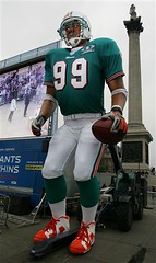
See that photo of Jason Taylor over there? It’s not really him — it’s an “8-metre, animatronic version of [him], the biggest animated human figure ever made,” at least according to the photo’s caption. That photo and this one (also of the “animatronic version”) began circulating on the AP wire on Monday, in advance of this weekend’s Giants/Dolphins game in London.
As you can see in the pics, the jersey features a patch — presumably the one that the two teams will be wearing on Sunday. But I couldn’t make out the wording underneath the NFL logo until Tuesday, when the New York Times ran a much larger version of one of the photos. That’s when I saw this.
I knew Bridgestone was sponsoring the game, but would the teams actually be wearing the company’s wordmark this Sunday? If so, it would mark the first appearance of uniform advertising in an NFL game. Temples pounding, palms sweating, I checked with Giants equipment director Joe Skiba, who reassured me that the teams would indeed be wearing a patch similar to the one shown in the photos but that it would not feature the Bridgestone logo.
After I got back down off the ledge, I wondered why games played overseas always seem to present these sorts of problems. Remember, the only time advertising has appeared in MLB uniforms was when regular-season games were played in Japan — first in 2000, when the Mets and Cubs wore AIU sleeve patches and am/pm helmet decals, and then again in 2004, when the Yankees and Devil Rays wore the Ricoh logo on their sleeves and helmets.
The answer, of course, is that most other parts of the world are much more comfortable with uniform advertising than we are here in North America. Hell, the ad patches used in the now-defunct NFL Europe make that Bridgestone patch look almost quaint by comparison (additional examples here, here, here, and here).
I suppose you could say there’s a “When in Rome”¦” factor at work here, but I think it should be the other way around. The whole point of playing these games overseas is to help promote our culture in foreign lands, right? So as long as we’re teaching them about football (or baseball, or whatever), why not teach them that ads have no place on a team uniform — even when it’s on an 8-metre animatronic figure.
Uni Watch News Ticker: Big congrats to longtime Uni Watch contributor Joe Hilseberg, who recently got married and, as promised, prepared uniform-style vests for himself and his groomsmen. “And on my honeymoon in Aruba,” he adds, “we rode a party bus one night and you have to see the sock action on this crazy woman who was the guide!” ”¦ On Monday I passed along a reader query about Kevin Youkilis possibly having the Majestic wordmark under his Majestic sleeve logo. Upon closer inspection, however, it appears that it was just a shadow. ”¦ There’s been a discussion of helmet memorial decals over on the Chris Creamer board, including a link to something I had completely forgotten about: the Pete Rozelle memorial worn in Super Bowl XXXI. ”¦ The Nationals have unveiled a new radio network logo (with thanks to Kyle Donnelly). ”¦ Minor league hockey note from Jeff Seals, who writes: “I went to the Las Vegas Wranglers’ home opener on Sunday night and they broke out their new home jerseys. The front features a poker chip design with the individual player’s number inside the chip. On the outside of the chip it says, ‘Las Vegas Wranglers.’ What’s different is that the left shoulder has big TV numbers, but the numbers are non-existent on the right arm. The back of the jersey has a black nameplate with white lettering.” ”¦ Blake Meyer, who runs the superb TwinsCards.com site, informs me that several of his contributors have banded together to create the very similar (and similarly excellent) VikingsCards.com, which features all sorts of old cards, old photos, and so on. Highly recommended. ”¦ WFAN radio clown Chris Russo, who’s already shown himself to have a single-digit IQ on umpteen occasions, further undermined his own credibility yesterday when he opined that Joe Giarardi might not be the right guy for the Yankees managerial job because “he’s one of those managers that worry about how the players wear their socks.” ”¦ Sure is weird to see Big Papi with a glove. ”¦ Speaking of gloves, Kaz Matsui was using at least two different ones during yesterday’s workouts, as seen here and here (with thanks to Bryan Redemske). ”¦ Kudos to the Missouri State High School Activities Association, which recently determined that “it is evident there is a problem with numerous schools wearing illegally-styled uniforms” and then prepared “[a]n extensive power point presentation” to help address the problem. Details here (with thanks to John Vernickas). ”¦ Good roundup of San Antonio-area high school football helmets available for download in this PDF file (courtesy of Blain Fowler). ”¦ Reprinted from last night’s comments: Looks like some of the Rangers are having their rounded shirttails modified to straight horizontal hems. ”¦ Brian Schulz recently reminded me of a phenomenon I’d largely forgotten about: semi-pro football, a subculture comprising over 700 teams nationwide. Some of the uniforms and logos are simply copies from pro or college teams, but others are more original. You can access a bunch of semi-pro helmet designs here, and lots of additional semi-pro info is available here. ”¦ Those of you who think I engage in gratuitous Nike-bashing certainly won’t change your minds now (nice find by Jeff Farrell). ”¦ The Bears will be wearing their orange alternate jerseys this Sunday.
Huzzah for my first mention on the blog! I really want to see if the Nats or 3WT Radio (the flagship station) are making patches of the logo or something. If I worked for the network, I’d totally go old school and sew it onto a blue blazer to wear for the games.
Also, big shout out to Joe for the totally slick groom/groomsmen uniforms. When I clicked on the link, though, I was half expecting the names and numbers to be orange to reflect his team loyalty.
I’m surprised that the NFL let ginormous Jason Taylor wear his link and not give him some league-approved Reeboks.
link, getting married while tailgating.
The hit and run idiot should have been wearing a RBK edge hockey jersey. He could have run 9 percent faster, and might have escaped :)
Washington State Police named best dressed…. link
[quote comment=”160267″]I’m surprised that the NFL let ginormous Jason Taylor wear his link and not give him some league-approved Reeboks.[/quote]
just like you, that was the first thing i noticed miggy!
[quote comment=”160272″]Big congrats to longtime Uni Watch contributor Joe Hilseberg, who recently got married and, as promised, prepared uniform-style vests for himself and his groomsmen.[/quote]
joe, just make sure those vests are dry cleaned and shipped to boston in time for tonight… the rockies will need their lucky vests back…
ps. great idea! id love to use that some day! and congratulations!
[quote comment=”160272″]WFAN radio clown Chris Russo, who’s already shown himself to have a single-digit IQ on umpteen occasions, further undermined his own credibility yesterday when he opined that Joe Giarardi might not be the right guy for the Yankees managerial job because “he’s one of those managers that worry about how the players wear their socks.”[/quote]
well, it seems all insiders and info out of the yankee new york and tampa factions seem to lead to mattingly. first major job is the yankees! i mean, i know that his whole career was in NY and he knows how to handle that whole new york “thing”. i have 2 words for you yankee management, gerry faust. just ask the domers out in south bend.
[quote comment=”160272″]Kudos to the Missouri State High School Activities Association, which recently determined that “it is evident there is a problem with numerous schools wearing illegally-styled uniforms” and then prepared “[a]n extensive power point presentation” to help address the problem. Details here (with thanks to John Vernickas).[/quote]
i wish there was text with that ppt. presentation… id love to see what that whole thing meant…
So as long as we’re teaching them about football (or baseball, or whatever), why not teach them that ads have no place on a team uniform –
Let me be the European disagreeing with you here. I prefer modest uniform ads to the kind of advertisements you see in American sports coverage. At least we get to watch an entire half of soccer without any commercial breaks; the line-ups are brought to us by the coaches with some assistance of the announcers and not by a fast-food chain; and a player substitution is just that and not an opportunity to drop in a mention of a soda manufacturer.
Sad thing is that TV makers do seem to ‘learn’ and adopt American advertising habits.
The basis of the difference must have something to do with the difference in organizational structure most sports here have compared to the American model: uniform ads bring money directly to the teams and not to the TV stations broadcasting the games.
Paul,
Great article on Joe Skiba and the various helmets!!! Loved the details, like the various colored rubber bumper logos, etc. Also, I appreciate that the Giants use the grey masks (are you listening Jets equipment manager!?!) but if only the Giants could ditch the metallic blue (and red stripe) paint and go back to flat royal and red it would be even better.
Also, I don’t know if you noticed but the exterior rivets from the jaws pads are painted on the Air Advantage and they aren’t on the XP. I assume it is because the helmet is brand new, from the factory and it has not been reconditioned (repainted, etc.) as yet. It seems like almost every NFL and major college program now paint their helmets (exterior rivets included) regardless of the helmet shell impregnated color. To see an exposed jaw pad exterior rivet is rare. When impregnated colored helmets first emerged they were supposed to eliminate the maintenance of painting a helmet because of paint chipping off.
The Kitchener Rangers are going to wear a special Remembrance Day jersey on Nov. 2. No photo, but here’s the description:
Apparently it is an annual thing, here is link.
Here is the link story.
Ok, if you look at Jason Taylor in the Animitronic picture. Note his shoes are the actual ones he wears for games. The football version of the Air Jordan 6. Jason Taylor belongs to the Jordan “family”. Also, in a past SI magazine article about Colt Brennan, there is a picture of him wearing 2 different pairs of cleats in the picture. If I can find an online one I will try to send it.
I like Kaz’s shirt, “octobeR” with the R the rockies logo.
This pic is a few weeks old, but it’s a good one for Paul…….
link
From yesterday’s comments:
Oddly enough, the Tyler Morning Telegraph is running a series of old articles to commemorate the 30th anniversary of Campbell winning the Heisman. This is from link they are re-running today:
Hahaha…I JUST realized how much my vests look like the Rockies vests!
If any of you want to do the same for your wedding just ask Paul for my email and I’ll let you know how I hooked it up!
[quote comment=”160281″]
The basis of the difference must have something to do with the difference in organizational structure most sports here have compared to the American model: uniform ads bring money directly to the teams and not to the TV stations broadcasting the games.[/quote]
That’s a great point.
I can’t speak to the rest of Europe, but I am given to understand that televised games didn’t really take off in England until the advent of pay television. So the economic model couldn’t be more different – the network is already getting paid by its viewers, whereas American networks needed ad revenue.
Soccer fans, link in the Batman/Rip Hamilton face gear and why?
[quote comment=”160283″]Also, I appreciate that the Giants use the grey masks (are you listening Jets equipment manager!?!) but if only the Giants could ditch the metallic blue (and red stripe) paint and go back to flat royal and red it would be even better.[/quote]
Just offering a dissenting view – I love the metallic shells. Flat shells look odd when combined with the shiny jersey and pant fabric.
[quote comment=”160295″]Soccer fans, link in the Batman/Rip Hamilton face gear and why?[/quote]
Well, according to the article, that’s Czech phenom link.
It’s some kind of link.
Dammit! Frigging Rangers have to be the first to go and do something smart like that. Stop doing things that make me not hate you!
Oh, and rest of the league (teams such as Columbus who’ve modified their striping not included)? See that? DO IT.
I like the design of the LV Wranglers jersey, with the number inside the poker chip. If you go to their website to order a replica, however, the number is replaced with a cowboy character (The “Wrangler”, I’m guessing). Not so good.
[quote comment=”160296″][quote comment=”160283″]Also, I appreciate that the Giants use the grey masks (are you listening Jets equipment manager!?!) but if only the Giants could ditch the metallic blue (and red stripe) paint and go back to flat royal and red it would be even better.[/quote]
Just offering a dissenting view – I love the metallic shells. Flat shells look odd when combined with the shiny jersey and pant fabric.[/quote]
I have to agree with XYZ here; the metallic paint clashes with the retro uniform design. IMO it’s the uniform’s only flaw (although both jerseys, particularly the blues, would look better with the TV numerals on the sleeves instead of the shoulders). The Giants’ jersey and pant fabric are not “shiny” like other teams’ (compare the Giants’ gray pants with the Jets’ greens, for example).
Today’s link is great! I’m sure Paul will want to checvk it out.
[quote comment=”160296″][quote comment=”160283″]Also, I appreciate that the Giants use the grey masks (are you listening Jets equipment manager!?!) but if only the Giants could ditch the metallic blue (and red stripe) paint and go back to flat royal and red it would be even better.[/quote]
Just offering a dissenting view – I love the metallic shells. Flat shells look odd when combined with the shiny jersey and pant fabric.[/quote]
Have to agree with Chance. I’m a Jets fan but love the Giants helmets – I couldn’t stop looking at the close ups of the nose bumpers yesterday.
In reference to the Rangers’ straight hems…that is Nigel Dawes who was just recalled last week from Hartford. I wonder if they actually went through the trouble for him or if there is another explanation…
I don’t see how complaints can be made about what appears in a mugshot. As someone who had one taken once, they don’t exactly let you choose how you look. You pretty much get told to stand at the line and look forward.
Considering how much you distain logo creep and ads on unis, I am surprised whenever you feature soccer and rugby unis, which are nothing but walking billboards. Even American soccer unis have gotten into the act, particularly the New York Red Bulls and the LA Galaxy. I saw a Galaxy jersey in a local store, and I thought the name of the team was the LA Herbalife. Then I noticed the teensy LA Galaxy patch. Sell outs, all of ’em.
It’s surprising to see that Riddell would go to the trouble of making a giant helmet for Taylor but not make the correct face mask to go with it.
here’s a link on the Jason Taylor thing.
It WALKS.
that jason taylor thing is pretty creepy
Bears orange alternates – ugh. Hideous look taking away from one of the game’s best unis.
did you guys actually watch that missouri basketball link? holy crap, there are some ridiculous rules on there. i’m all for simplicity sometimes, but it seems like missouri teams are regulated to the indiana/ucla solid color style. what good are unis if you can’t have ugly ones to bitch about?
This is a bit unrelated, but I have a uni-related question. This may have been brought up, but I can’t find it.
I was watching some Mariners clips, and I realized that their navy alts have a completely different number/letter font than every other uniform they wear.
Regular: link
Alt: link
As far as I know this is the only “Big 4 sports” team in the US that is currently doing this. However, I’m sure this isn’t the case. Can anyone else find a team doing something similar?
Ah yeah, I could have read the article (although I know sometimes Yahoo eurosport picks weird photos to go with stories and the fact that they don’t caption them doesn’t help).
Interesting that he seems to cover link. Here it is link. I don’t read German, but it is either the web address for his doctor or whoever makes the mask.
[quote comment=”160312″]here’s a link on the Jason Taylor thing.
It WALKS.[/quote]
man, thats REALLY creepy…
See that photo of Jason Taylor over there? It’s not really him – it’s an “8-metre, animatronic version of [him], the biggest animated human figure ever made,” at least according to the photo’s caption.
What about this guylink…
See that photo of Jason Taylor over there? It’s not really him – it’s an “8-metre, animatronic version of [him], the biggest animated human figure ever made,” at least according to the photo’s caption.
What about link… Sorry bout the link.
[quote comment=”160315″]Bears orange alternates – ugh. Hideous look taking away from one of the game’s best unis.[/quote]
Agreed. The Bears would definitely not be well on their way to the championship of the link in link!
[quote comment=”160315″]Bears orange alternates – ugh. Hideous look taking away from one of the game’s best unis.[/quote]
I don’t like the orange alts either, but at least they’re wearing them aroudn Halloween which makes sense.
Hey, Joe Hilseberg, was that the Kukoo Kanooku bus? Was her name “Mama”? If so, I’ve been on that, and man is that fun! Congrats on the wedding, and good job with the vests and jerseys!
Schindler-ot is and orthopedics company. They make protheses and orthopedic supports. The website has a little link on the Suchy story:
He broke his nose shortly before the under20 world cup in Canada, and that is when he got the protective mask.
[quote comment=”160317″]This is a bit unrelated, but I have a uni-related question. This may have been brought up, but I can’t find it.
I was watching some Mariners clips, and I realized that their navy alts have a completely different number/letter font than every other uniform they wear.
Regular: link
Alt: link
As far as I know this is the only “Big 4 sports” team in the US that is currently doing this. However, I’m sure this isn’t the case. Can anyone else find a team doing something similar?[/quote]
If you count throwbacks as alternates then, yes, there are many that do it. The best example I can think of, though, is the Brewers Friday night uniforms that are retro-inspired. they feature a different number font as well as a different everything else.
[quote comment=”160316″]did you guys actually watch that missouri basketball link? holy crap, there are some ridiculous rules on there. i’m all for simplicity sometimes, but it seems like missouri teams are regulated to the indiana/ucla solid color style. what good are unis if you can’t have ugly ones to bitch about?[/quote]
No, those aren’t the rules in Missouri. Those are the NFHS (National Federation) rules. Now, Missouri is actually choosing to enforce them, but the only new thing for this year is that home teams must be in white for varsity (and that rule change was announced 4 years ago so that schools could replace their uniforms on a normal replacement schedule and not have to incur additional costs. At this point, if schools are wearing non-white uniforms at home, it is their fault, and they should be penalized). And the way high schools filter their uniforms down to JV and freshman teams, this will eventually be in effect for all levels of high school play.
[quote comment=”160295″]Soccer fans, link in the Batman/Rip Hamilton face gear and why?[/quote]
Marek Suchy of Slavia Prague. The game didn’t work out for them so well, as Arsenal beat them 7-0, but (obligatory uni comment) their road strip looked sharp. Not sure about the contraption, I’d assume a broken nose or some such.
The Ranger’s straight hem jerseys looked great in their not so great effort against the Penquins last night.
Joe congrats on pulling off the sports theme while keeping the wedding classy.
[quote comment=”160277″]Washington State Police named best dressed…. link
link is one of the best looking state police cruisers out there.
Something I’ve been holding onto since July and haven’t found the right time to share … my father passed away on July 2nd, and while we were cleaning his apartment (he was a packrat, to say the very least), I came across a very unusual t-shirt (I’ve mentioned it before but never submitted photos). I figured today would be the day for this unusual submission:
link
[quote comment=”160325″]Hey, Joe Hilseberg, was that the Kukoo Kanooku bus? Was her name “Mama”? If so, I’ve been on that, and man is that fun! Congrats on the wedding, and good job with the vests and jerseys![/quote]
Paul – Right on both! Mama is one cray lady!!! It was an awesome time…I woke up at 3:30 the next day!
[quote comment=”160277″]Washington State Police named best dressed…. link
Are they wearing friggin’ bow ties? But hey, the dog looks sharp.
[quote comment=”160334″]Something I’ve been holding onto since July and haven’t found the right time to share … my father passed away on July 2nd, and while we were cleaning his apartment (he was a packrat, to say the very least), I came across a very unusual t-shirt (I’ve mentioned it before but never submitted photos). I figured today would be the day for this unusual submission:
link
Wow, I’m very sorry for your loss, but what an incredible find.
RE: the snap on clips for the facemasks
What is the procedure when an injured player’s facemask has to be removed? Usually they would just unscrew it, but it looks like there would be some head/neck movement with these new snap-on clips. I would be interested to know.
The Bears will be wearing their orange alternate jerseys this Sunday
SHIT!!!
[quote comment=”160308″]In reference to the Rangers’ straight hems…that is Nigel Dawes who was just recalled last week from Hartford. I wonder if they actually went through the trouble for him or if there is another explanation…
I don’t see how complaints can be made about what appears in a mugshot. As someone who had one taken once, they don’t exactly let you choose how you look. You pretty much get told to stand at the line and look forward.[/quote]
it wasn’t just that one guy, almost every Rangers jersey was that way. I remember commenting here when the jerseys first came out asking who would be the first to have the equipment manger cut the hem off straight, looks like the rangers whole team
Regarding the NFL-in-Europe advertising-on-unis problem, I’d wager that teams and sponsors use Europe-based personnel in working out the details of the sponsorship packages, marketing, etc., at least until close to the event deadline. Since these people are used to European-style uni advertising, they may tend to forget US expectations and guidelines. E.g., the sponsorship agreement says, “Bridgestone wordmark in all game-related marketing,” and the European marketing guy sometimes forgets that uniforms are excluded.
[quote comment=”160272″]link, getting married while tailgating.[/quote]
Now see that at least is tactful. The other thing a formal vest like that…Dude, your wife actually allowed something like that? That is the marrying type (as they say in the south) I think it is original, though maybe a little silly for a formal occasion….JMHO
If it was the whole team, they must have been rolling it out as they tailored them, because link and link are both from Oct 18.
It is hard to see what is going on with the Rangers because it seems like they have their jerseys tucked in a lot.
link
link
link
Most eveyone on the Ranger except for Jagr that is.
I saw DarkAudits pic of the police cruiser in Washington but have to say link has a pretty nice one too.
As a proud Theodore Roosevelt High alum, glad to see their helmet get some U-W love.
Whenever there is a risk of catastrophic head/neck injury, they will normally cut the facemask clips using a dremel… not sure if that will work with the revolution facemask clips, although I’m sure they thought about it…
[quote comment=”160338″]RE: the snap on clips for the facemasks
What is the procedure when an injured player’s facemask has to be removed? Usually they would just unscrew it, but it looks like there would be some head/neck movement with these new snap-on clips. I would be interested to know.[/quote]
[quote comment=”160317″]This is a bit unrelated, but I have a uni-related question. This may have been brought up, but I can’t find it.
I was watching some Mariners clips, and I realized that their navy alts have a completely different number/letter font than every other uniform they wear. At least this year, there are no more alt jerseys in the NHL.
Regular: link
Alt: link
As far as I know this is the only “Big 4 sports” team in the US that is currently doing this. However, I’m sure this isn’t the case. Can anyone else find a team doing something similar?[/quote]
The link did it for the past few years — that photo shows link alt type and link regular type.
[quote comment=”160343″][quote comment=”160272″]link, getting married while tailgating.[/quote]
Now see that at least is tactful.
The other thing a formal vest like that…Dude, your wife actually allowed something like that? That is the marrying type (as they say in the south) I think it is original, though maybe a little silly for a formal occasion….JMHO[/quote]
god that reminded me of an email i got months ago.
guys took jerseys and incorporated them into their tuxedos and their dates did similarly with their dresses. it was ridiculous.
link
link
link
link
[quote comment=”160349″]I saw DarkAudits pic of the police cruiser in Washington but have to say link has a pretty nice one too.[/quote]
As far as police uniforms, I like link.
[quote comment=”160354″][quote comment=”160343″][quote comment=”160272″]link, getting married while tailgating.[/quote]
Now see that at least is tactful.
The other thing a formal vest like that…Dude, your wife actually allowed something like that? That is the marrying type (as they say in the south) I think it is original, though maybe a little silly for a formal occasion….JMHO[/quote]
god that reminded me of an email i got months ago.
guys took jerseys and incorporated them into their tuxedos and their dates did similarly with their dresses. it was ridiculous.
link
link
link
link
Classy, especially the bare-midriffed Pacer girl.
link.
[quote comment=”160358″][quote comment=”160354″][quote comment=”160343″][quote comment=”160272″]link, getting married while tailgating.[/quote]
Now see that at least is tactful.
The other thing a formal vest like that…Dude, your wife actually allowed something like that? That is the marrying type (as they say in the south) I think it is original, though maybe a little silly for a formal occasion….JMHO[/quote]
god that reminded me of an email i got months ago.
guys took jerseys and incorporated them into their tuxedos and their dates did similarly with their dresses. it was ridiculous.
link
link
link
link
Classy, especially the bare-midriffed Pacer girl.[/quote]
Ughhhh…my wife would have never let that happen, and I wouldn’t want it to!
[quote comment=”160357″][quote comment=”160349″]I saw DarkAudits pic of the police cruiser in Washington but have to say link has a pretty nice one too.[/quote]
As far as police uniforms, I like link.[/quote]
And l’m happy toreport Charlie got promoted to Lieutenant… in the greatest law enforcement agency in the land. The Rhode lsland State Police.
[quote comment=”160314″]that jason taylor thing is pretty creepy[/quote]
I’m thrilled. You know how football players always use the most inane things as motivation? Where’s Umenyiora’s huge animatronic recreation? I predict at least three sacks on whoever takes over for Cleo in the second half.
Nike’s newest acquisition. Interested to see how this affects the English National Team.
link
Opps. Here’s the link.
[quote comment=”160353″][quote comment=”160317″]This is a bit unrelated, but I have a uni-related question. This may have been brought up, but I can’t find it.
I was watching some Mariners clips, and I realized that their navy alts have a completely different number/letter font than every other uniform they wear. At least this year, there are no more alt jerseys in the NHL.
Regular: link
Alt: link
As far as I know this is the only “Big 4 sports” team in the US that is currently doing this. However, I’m sure this isn’t the case. Can anyone else find a team doing something similar?[/quote]
The link did it for the past few years — that photo shows link alt type and link regular type.[/quote]
Thanks for that. From the past, I just remembered that the Red Sox did it in the 1980s, when they used their traditional font at home, and Varsity on the road.
[quote comment=”160338″]RE: the snap on clips for the facemasks
What is the procedure when an injured player’s facemask has to be removed? Usually they would just unscrew it, but it looks like there would be some head/neck movement with these new snap-on clips. I would be interested to know.[/quote]
Actually there are two different schools of thought on this. I was a student trainer in college and our head trainer (who also was the certified who covered football) had a pair of “trainer’s angels” (one version seen link). The other school of thought was to unscrew the facemask using a small cordless screwdriver (like the dremel Henry said in post #60). Either one is considered acceptable however I tend to lean towards the “trainer’s angels” method as it is quicker and results in minimal movement.
[quote comment=”160322″][quote comment=”160315″]Bears orange alternates – ugh. Hideous look taking away from one of the game’s best unis.[/quote]
Agreed. The Bears would definitely not be well on their way to the championship of the link in link![/quote]
Is it just me, or is there a prevailing trend that everything “old-school” is always good, and everything “new” always sucks? I mean, the Browns uniforms are traditional, but they are still ugly as hell, and there helmet is boring and looks like a pumpkin on a scarecrow. IMO the Browns unis are easily in the lower 25% of the league. They were a bit better in the Brian Sipe Greg Pruitt days of orange pants, especially the white road unis.
[quote comment=”160349″]I saw DarkAudits pic of the police cruiser in Washington but have to say link has a pretty nice one too.[/quote]
But does your Police Dept. have a racing team? link
[quote comment=”160332″][quote comment=”160277″]Washington State Police named best dressed…. link
link is one of the best looking state police cruisers out there.[/quote]
Oh boy, now we are getting in to police (car) uniforms!
How about this as a topic of discussion: anyone making any cool sports-themed costumes for Halloween parties?
[quote comment=”160317″]This is a bit unrelated, but I have a uni-related question. This may have been brought up, but I can’t find it.
I was watching some Mariners clips, and I realized that their navy alts have a completely different number/letter font than every other uniform they wear.
Regular: link
Alt: link
As far as I know this is the only “Big 4 sports” team in the US that is currently doing this. However, I’m sure this isn’t the case. Can anyone else find a team doing something similar?[/q
The Milwaukee Brewers have their own letter and number font for their home, road, and blue alternates, but their pinstripe alternates have the standard block font.
And l’m happy toreport Charlie got promoted to Lieutenant… in the greatest law enforcement agency in the land. The Rhode lsland State Police.
I waswondering if I was the only one that thought of that movie when I saw that picture
[quote comment=”160328″]
No, those aren’t the rules in Missouri. Those are the NFHS (National Federation) rules. Now, Missouri is actually choosing to enforce them, but the only new thing for this year is that home teams must be in white for varsity (and that rule change was announced 4 years ago so that schools could replace their uniforms on a normal replacement schedule and not have to incur additional costs. At this point, if schools are wearing non-white uniforms at home, it is their fault, and they should be penalized). And the way high schools filter their uniforms down to JV and freshman teams, this will eventually be in effect for all levels of high school play.[/quote]
NFHS is also making uniforms their top point of emphasis this year. link The good part of it is enforcing the proper wearing of the uniform, meaning if the short isn’t tucked in, the player cannot participate.
Texas is enforcing the rules too. And according to the rules, should a team wear illegal jerseys despite all the notice given to the schools, the proper punishment is one technical foul per player who participates. That means you start off with 5 technicals, and for a sub to come in you have to ‘buy’ their entry with another technical. As an official however, I think most of us are just going to report the team to the state office and let them take care of it.
[quote comment=”160371″]How about this as a topic of discussion: anyone making any cool sports-themed costumes for Halloween parties?[/quote]
yes!
i was able to score an augusta national patch on ebay a while back and was able to find a kelly green sport coat at the salvation army.
easy costume, masters champion!
it was either that or get the wire rimmed glasses, black “o” hat, white shirt, thin black tie, and red nylon jacket and go as woody hayes. but then id have to punch everyone at the party in the face.
ive also gone as a referree and harry caray in years past.
i remember dpnation saying months ago that she was going to go as a michael vick conglomeration.
i remember because my suggestion was to whip the finger to everyone and to pass out business cards with the word “herpes” on it. that way you could “give” herpes to those you came in contact with…
[quote comment=”160369″][quote comment=”160322″][quote comment=”160315″]Bears orange alternates – ugh. Hideous look taking away from one of the game’s best unis.[/quote]
Agreed. The Bears would definitely not be well on their way to the championship of the link in link![/quote]
Is it just me, or is there a prevailing trend that everything “old-school” is always good, and everything “new” always sucks? I mean, the Browns uniforms are traditional, but they are still ugly as hell, and there helmet is boring and looks like a pumpkin on a scarecrow. IMO the Browns unis are easily in the lower 25% of the league. They were a bit better in the Brian Sipe Greg Pruitt days of orange pants, especially the white road unis.[/quote]
I’m with you on the Brown’s unis. I’ve never liked them. They break my major rule for football uniforms, the helmet doesn’t match the pants or jersey. The orange pants could be better.
[quote comment=”160369″][quote comment=”160322″][quote comment=”160315″]Bears orange alternates – ugh. Hideous look taking away from one of the game’s best unis.[/quote]
Agreed. The Bears would definitely not be well on their way to the championship of the link in link![/quote]
Is it just me, or is there a prevailing trend that everything “old-school” is always good, and everything “new” always sucks? I mean, the Browns uniforms are traditional, but they are still ugly as hell, and there helmet is boring and looks like a pumpkin on a scarecrow. IMO the Browns unis are easily in the lower 25% of the league. They were a bit better in the Brian Sipe Greg Pruitt days of orange pants, especially the white road unis.[/quote]
If you read the comments here regularly, you really should have seen that coming. I’ve always been a Packer fan, but I never really liked the colors. I think it was mostly because I never wanted to wear them myself. However, in reading uniwatch and the comments from people, I think I have learned to appreciate uniforms strictly as uniforms and have come to love the Packers colors on the field.
I think my point is that people who Don’t Get Itâ„¢ like the teams with flashy new colors and designs which look cool now but those who Get Itâ„¢ think that those new designs are probably going to be ugly in a few years. Whenever I think about this, I think of the Great Teal Explosion of the 1990s (Hornets, Sharks, Panthers, etc.) I now hate teal. So, I don’t think that something is just bad because it is new, but people here tend to like the classic looks, so they are not going to like newer looks as much – not because they are new, but because they don’t have that classic feel.
Oh, and of course I made some generalizations there, don’t jump all over me because you Get It and like teal. That is also possible.
[quote comment=”160294″][quote comment=”160281″]
The basis of the difference must have something to do with the difference in organizational structure most sports here have compared to the American model: uniform ads bring money directly to the teams and not to the TV stations broadcasting the games.[/quote]
That’s a great point.
I can’t speak to the rest of Europe, but I am given to understand that televised games didn’t really take off in England until the advent of pay television. So the economic model couldn’t be more different – the network is already getting paid by its viewers, whereas American networks needed ad revenue.[/quote]
Not only that, but soccer is a fluid game, with little to no time for advertising breaks. There are n timeouts, or between innings, or between quarters to run advertisements. ITs a model the NHL should try if they ever get back from the strike….
This is a bit unrelated, but I have a uni-related question. This may have been brought up, but I can’t find it.
I was watching some Mariners clips, and I realized that their navy alts have a completely different number/letter font than every other uniform they wear. At least this year, there are no more alt jerseys in the NHL.
Regular: link….
Alt: link…
As far as I know this is the only “Big 4 sports” team in the US that is currently doing this. However, I’m sure this isn’t the case. Can anyone else find a team doing something similar?
The Ottawa Senators and Edmonton Oilers did it for the past few years – that photo shows Ottawa’s alt type and Edmonton’s regular type.
The Minnesota Wild use a different number font on their home and away jerseys – their current home was their alt last year
[quote comment=”160349″]I saw DarkAudits pic of the police cruiser in Washington but have to say link has a pretty nice one too.[/quote]
The car is from the West Virginia State Police.
[quote comment=”160386″][quote comment=”160294″][quote comment=”160281″]
The basis of the difference must have something to do with the difference in organizational structure most sports here have compared to the American model: uniform ads bring money directly to the teams and not to the TV stations broadcasting the games.[/quote]
That’s a great point.
I can’t speak to the rest of Europe, but I am given to understand that televised games didn’t really take off in England until the advent of pay television. So the economic model couldn’t be more different – the network is already getting paid by its viewers, whereas American networks needed ad revenue.[/quote]
Not only that, but soccer is a fluid game, with little to no time for advertising breaks. There are n timeouts, or between innings, or between quarters to run advertisements. ITs a model the NHL should try if they ever get back from the strike….[/quote]
The NHL has been reducing time between some faceoffs, and Olympic hockey has precious few seconds between faceoffs. It does work well.
[quote comment=”160400″][quote comment=”160349″]I saw DarkAudits pic of the police cruiser in Washington but have to say link has a pretty nice one too.[/quote]
The car is from the West Virginia State Police.[/quote]
Yea? West Virginia has the “Old Man on the Mountain” on their trooper cars?
[quote comment=”160311″]It’s surprising to see that Riddell would go to the trouble of making a giant helmet for Taylor but not make the correct face mask to go with it.[/quote]
That’s exactly the type of thing that bugs me. I remember as a kid being pissed to buy a Starting Lineup figure and the facemask was never close. Same things in many videogames up until the past couple years. I guess it’s just part and parcel of being an OCD NFL equipment fanatic.
[quote comment=”160404″][quote comment=”160400″][quote comment=”160349″]I saw DarkAudits pic of the police cruiser in Washington but have to say link has a pretty nice one too.[/quote]
The car is from the West Virginia State Police.[/quote]
Yea? West Virginia has the “Old Man on the Mountain” on their trooper cars?[/quote]
I meant the picture I linked earlier. It’s West Virginia, not Washington.
link
[quote comment=”160370″][quote comment=”160349″]I saw DarkAudits pic of the police cruiser in Washington but have to say link has a pretty nice one too.[/quote]
But does your Police Dept. have a racing team? link[/quote]
Beat this cop car:
link
Rocky Mountain News has link on this year’s World Series clubs.
Then they toss in some bizarre ones at the end:
[quote comment=”160411″]
Beat this cop car:
link
link
[quote comment=”160400″][quote comment=”160349″]I saw DarkAudits pic of the police cruiser in Washington but have to say link has a pretty nice one too.[/quote]
The car is from the West Virginia State Police.[/quote]
Considering the car says New Hampshire on the side, i’m gonna have to say you’re wrong on this one
[quote comment=”160413″]
– Rob Murphy: Former Reds reliever wore a pair of women’s black silk panties under his athletic supporter.[/quote]
The rose goes in the front Meat.
[quote comment=”160416″][quote comment=”160400″][quote comment=”160349″]I saw DarkAudits pic of the police cruiser in Washington but have to say link has a pretty nice one too.[/quote]
The car is from the West Virginia State Police.[/quote]
Considering the car says New Hampshire on the side, i’m gonna have to say you’re wrong on this one[/quote]
The car in question can be found in comment #45. A West Virginia state police car.
Not exactly uni related, but link Doesn’t he know what tears tatooed to your face mean?
in case you don’t know: One tear for every kill, as in murder.
[quote comment=”160417″][quote comment=”160413″]
– Rob Murphy: Former Reds reliever wore a pair of women’s black silk panties under his athletic supporter.[/quote]
The rose goes in the front Meat.[/quote]
Why does he keep calling me ‘Meat’? I’m the one with Porsche.
[quote comment=”160334″]Something I’ve been holding onto since July and haven’t found the right time to share … my father passed away on July 2nd, and while we were cleaning his apartment (he was a packrat, to say the very least), I came across a very unusual t-shirt (I’ve mentioned it before but never submitted photos). I figured today would be the day for this unusual submission:
link
Thats got to be really rare.
I have a friend who got an Ohio St. BCS Champions shirt after they lost to Florida and he brought it to the Final 4 and was waving it the Buckeyes fans faces lol
[quote comment=”160384″][quote comment=”160369″][quote comment=”160322″][quote comment=”160315″]Bears orange alternates – ugh. Hideous look taking away from one of the game’s best unis.[/quote]
Agreed. The Bears would definitely not be well on their way to the championship of the link in link![/quote]
Is it just me, or is there a prevailing trend that everything “old-school” is always good, and everything “new” always sucks? I mean, the Browns uniforms are traditional, but they are still ugly as hell, and there helmet is boring and looks like a pumpkin on a scarecrow. IMO the Browns unis are easily in the lower 25% of the league. They were a bit better in the Brian Sipe Greg Pruitt days of orange pants, especially the white road unis.[/quote]
If you read the comments here regularly, you really should have seen that coming. I’ve always been a Packer fan, but I never really liked the colors. I think it was mostly because I never wanted to wear them myself. However, in reading uniwatch and the comments from people, I think I have learned to appreciate uniforms strictly as uniforms and have come to love the Packers colors on the field.
I think my point is that people who Don’t Get Itâ„¢ like the teams with flashy new colors and designs which look cool now but those who Get Itâ„¢ think that those new designs are probably going to be ugly in a few years. Whenever I think about this, I think of the Great Teal Explosion of the 1990s (Hornets, Sharks, Panthers, etc.) I now hate teal. So, I don’t think that something is just bad because it is new, but people here tend to like the classic looks, so they are not going to like newer looks as much – not because they are new, but because they don’t have that classic feel.[/quote]
Actually Joe my comment was more directed at the general readership (and voters in your poll, than you speciafically. Just seems whenever a team goes “retro” with their look, there is jubilation, and whenever they try and do anything different and out of the norm (Broncs in 97 for example, but far from the only example), it is usually hit with hate. I don’t like some of the new changes, and I also like some of the retro and tradtional looks, but for many it seems like a hard and fast rule.
PS, I agree on the teal. I HATE the color of the Jaguars and the Sharks. Looks OK I guess as a comp color, but the Jags home jerseys make me ill.
[quote comment=”160425″][quote comment=”160384″][quote comment=”160369″][quote comment=”160322″][quote comment=”160315″]Bears orange alternates – ugh. Hideous look taking away from one of the game’s best unis.[/quote]
Agreed. The Bears would definitely not be well on their way to the championship of the link in link![/quote]
Is it just me, or is there a prevailing trend that everything “old-school” is always good, and everything “new” always sucks? I mean, the Browns uniforms are traditional, but they are still ugly as hell, and there helmet is boring and looks like a pumpkin on a scarecrow. IMO the Browns unis are easily in the lower 25% of the league. They were a bit better in the Brian Sipe Greg Pruitt days of orange pants, especially the white road unis.[/quote]
If you read the comments here regularly, you really should have seen that coming. I’ve always been a Packer fan, but I never really liked the colors. I think it was mostly because I never wanted to wear them myself. However, in reading uniwatch and the comments from people, I think I have learned to appreciate uniforms strictly as uniforms and have come to love the Packers colors on the field.
I think my point is that people who Don’t Get Itâ„¢ like the teams with flashy new colors and designs which look cool now but those who Get Itâ„¢ think that those new designs are probably going to be ugly in a few years. Whenever I think about this, I think of the Great Teal Explosion of the 1990s (Hornets, Sharks, Panthers, etc.) I now hate teal. So, I don’t think that something is just bad because it is new, but people here tend to like the classic looks, so they are not going to like newer looks as much – not because they are new, but because they don’t have that classic feel.[/quote]
Actually Joe my comment was more directed at the general readership (and voters in your poll, than you speciafically. Just seems whenever a team goes “retro” with their look, there is jubilation, and whenever they try and do anything different and out of the norm (Broncs in 97 for example, but far from the only example), it is usually hit with hate. I don’t like some of the new changes, and I also like some of the retro and tradtional looks, but for many it seems like a hard and fast rule.
PS, I agree on the teal. I HATE the color of the Jaguars and the Sharks. Looks OK I guess as a comp color, but the Jags home jerseys make me ill.[/quote]
Obviously, my sensibilities run toward old-school looks. But as I’ve said many times before, I love — LOVE — the Jaguars’ aqua-over-white home design. If they can manage not to tinker with it fr another 15 yrs or so (which is unlikely), it’ll be viewed as a classic. Trust me.
[quote comment=”160279″][quote comment=”160267″]I’m surprised that the NFL let ginormous Jason Taylor wear his link and not give him some league-approved Reeboks.[/quote]
just like you, that was the first thing i noticed miggy!
[quote comment=”160272″]Big congrats to longtime Uni Watch contributor Joe Hilseberg, who recently got married and, as promised, prepared uniform-style vests for himself and his groomsmen.[/quote]
joe, just make sure those vests are dry cleaned and shipped to boston in time for tonight… the rockies will need their lucky vests back…
ps. great idea! id love to use that some day! and congratulations!
[quote comment=”160272″]WFAN radio clown Chris Russo, who’s already shown himself to have a single-digit IQ on umpteen occasions, further undermined his own credibility yesterday when he opined that Joe Giarardi might not be the right guy for the Yankees managerial job because “he’s one of those managers that worry about how the players wear their socks.”[/quote]
well, it seems all insiders and info out of the yankee new york and tampa factions seem to lead to mattingly. first major job is the yankees! i mean, i know that his whole career was in NY and he knows how to handle that whole new york “thing”. i have 2 words for you yankee management, gerry faust. just ask the domers out in south bend.
[quote comment=”160272″]Kudos to the Missouri State High School Activities Association, which recently determined that “it is evident there is a problem with numerous schools wearing illegally-styled uniforms” and then prepared “[a]n extensive power point presentation” to help address the problem. Details here (with thanks to John Vernickas).[/quote]
i wish there was text with that ppt. presentation… id love to see what that whole thing meant…[/quote]
Krev –
Re: Gerry Faust/Donnie Baseball. From your keyboard to God’s ears, my friend. :)
[quote comment=”160425″]
Actually Joe my comment was more directed at the general readership (and voters in your poll, than you speciafically. [/quote]
I took no offense or anything, I just think that every now and then someone posts something like, “Why does everyone on here think something is good just because it is old…” and I don’t think that is the case. I think it is more a matter of the fact that a lot of readers tend to agree on the styles they like. And that style is “classic”, so it seems like every likes stuff because it is classic, but correlation does not imply causation.
[quote comment=”160376″]And l’m happy toreport Charlie got promoted to Lieutenant… in the greatest law enforcement agency in the land. The Rhode lsland State Police.
I waswondering if I was the only one that thought of that movie when I saw that picture[/quote]
Nah, yer not alone. My mind automatically went to the Steely Dan coversong soundtrack!
Anyone know why players dont wer the Bike brand helmets anymore>?
[quote comment=”160435″][quote comment=”160376″]And l’m happy toreport Charlie got promoted to Lieutenant… in the greatest law enforcement agency in the land. The Rhode lsland State Police.
I waswondering if I was the only one that thought of that movie when I saw that picture[/quote]
Nah, yer not alone. My mind automatically went to the Steely Dan coversong soundtrack![/quote]
My favorite police uniform is probably link.
Anyone find the JFK “Jets” helmet a little ironic?
[quote comment=”160438″][quote comment=”160435″][quote comment=”160376″]And l’m happy toreport Charlie got promoted to Lieutenant… in the greatest law enforcement agency in the land. The Rhode lsland State Police.
I waswondering if I was the only one that thought of that movie when I saw that picture[/quote]
Nah, yer not alone. My mind automatically went to the Steely Dan coversong soundtrack![/quote]
My favorite police uniform is probably link.[/quote]
I thought it was going to be link. Nicely played.
[quote comment=”160429″]
[quote comment=”160272″]well, it seems all insiders and info out of the yankee new york and tampa factions seem to lead to mattingly. first major job is the yankees! i mean, i know that his whole career was in NY and he knows how to handle that whole new york “thing”. i have 2 words for you yankee management, gerry faust. just ask the domers out in south bend.”[/quote]
Krev –
Re: Gerry Faust/Donnie Baseball. From your keyboard to God’s ears, my friend. :)[/quote]
i guess we’ll have to wait and see…
[quote comment=”160442″][quote comment=”160429″]
[quote comment=”160272″]well, it seems all insiders and info out of the yankee new york and tampa factions seem to lead to mattingly. first major job is the yankees! i mean, i know that his whole career was in NY and he knows how to handle that whole new york “thing”. i have 2 words for you yankee management, gerry faust. just ask the domers out in south bend.”[/quote]
Krev –
Re: Gerry Faust/Donnie Baseball. From your keyboard to God’s ears, my friend. :)[/quote]
i guess we’ll have to wait and see…[/quote]
I’m a little surprised Dave Righetti isn’t getting an interview. I thought he should have gotten the job in SF when Felipe Alou was axed.
[quote comment=”160438″][quote comment=”160435″][quote comment=”160376″]And l’m happy toreport Charlie got promoted to Lieutenant… in the greatest law enforcement agency in the land. The Rhode lsland State Police.
I waswondering if I was the only one that thought of that movie when I saw that picture[/quote]
Nah, yer not alone. My mind automatically went to the Steely Dan coversong soundtrack![/quote]
My favorite police uniform is probably link.[/quote]
That is that stupid a$$ who is now ‘starring’ in those STUPID Miller Piss, err Lite ads as the COMMISH….Nothing says crappy watered down overated warm piss like Miller…or bud
[quote comment=”160444″][quote comment=”160438″][quote comment=”160435″][quote comment=”160376″]And l’m happy toreport Charlie got promoted to Lieutenant… in the greatest law enforcement agency in the land. The Rhode lsland State Police.
I waswondering if I was the only one that thought of that movie when I saw that picture[/quote]
Nah, yer not alone. My mind automatically went to the Steely Dan coversong soundtrack![/quote]
My favorite police uniform is probably link.[/quote]
That is that stupid a$$ who is now ‘starring’ in those STUPID Miller Piss, err Lite ads as the COMMISH….Nothing says crappy watered down overated warm piss like Miller…or bud[/quote]
Different guy. The guy in the ads is John C. McGinley of ‘Scrubs’ and just about every Oliver Stone movie ever made.
Another example of ads on MLB uniforms in Japan was the series last year of “MLB All-stars vs Japan”, where all of the MLB players wore a link on their helmets.
Maybe not more expensive than the Italian Lambo, but certainly better looking. Not bad in the exclusivity deaprtment, either.
[quote comment=”160445″][quote comment=”160444″][quote comment=”160438″][quote comment=”160435″][quote comment=”160376″]And l’m happy toreport Charlie got promoted to Lieutenant… in the greatest law enforcement agency in the land. The Rhode lsland State Police.
I waswondering if I was the only one that thought of that movie when I saw that picture[/quote]
Nah, yer not alone. My mind automatically went to the Steely Dan coversong soundtrack![/quote]
My favorite police uniform is probably link.[/quote]
That is that stupid a$$ who is now ‘starring’ in those STUPID Miller Piss, err Lite ads as the COMMISH….Nothing says crappy watered down overated warm piss like Miller…or bud[/quote]
Different guy. The guy in the ads is John C. McGinley of ‘Scrubs’ and just about every Oliver Stone movie ever made.[/quote]
Quoting myself, how could I forget that he played one of the Bobs in ‘Office Space’.
Trying the link again
link
[quote comment=”160445″][quote comment=”160444″][quote comment=”160438″][quote comment=”160435″][quote comment=”160376″]And l’m happy toreport Charlie got promoted to Lieutenant… in the greatest law enforcement agency in the land. The Rhode lsland State Police.
I waswondering if I was the only one that thought of that movie when I saw that picture[/quote]
Nah, yer not alone. My mind automatically went to the Steely Dan coversong soundtrack![/quote]
My favorite police uniform is probably link.[/quote]
That is that stupid a$$ who is now ‘starring’ in those STUPID Miller Piss, err Lite ads as the COMMISH….Nothing says crappy watered down overated warm piss like Miller…or bud[/quote]
Different guy. The guy in the ads is John C. McGinley of ‘Scrubs’ and just about every Oliver Stone movie ever made.[/quote]
Yeah, but he does have a point about the crappy beer. Alaskan Amber is the only way to go…thats real beer.
[quote comment=”160438″][quote comment=”160435″][quote comment=”160376″]And l’m happy toreport Charlie got promoted to Lieutenant… in the greatest law enforcement agency in the land. The Rhode lsland State Police.
I waswondering if I was the only one that thought of that movie when I saw that picture[/quote]
Nah, yer not alone. My mind automatically went to the Steely Dan coversong soundtrack![/quote]
My favorite police uniform is probably link.[/quote]
Before I clicked on the link, I correctly surmised that I was going to see a photo of Dangle. Nicely done.
[quote comment=”160369″][quote comment=”160322″][quote comment=”160315″]Bears orange alternates – ugh. Hideous look taking away from one of the game’s best unis.[/quote]
Agreed. The Bears would definitely not be well on their way to the championship of the link in link![/quote]
Is it just me, or is there a prevailing trend that everything “old-school” is always good, and everything “new” always sucks? I mean, the Browns uniforms are traditional, but they are still ugly as hell, and there helmet is boring and looks like a pumpkin on a scarecrow. IMO the Browns unis are easily in the lower 25% of the league. They were a bit better in the Brian Sipe Greg Pruitt days of orange pants, especially the white road unis.[/quote]
That’s the way it is. If something’s been a round a long time people feel like they have to LOVE it. The Yankees and Penn State’s football uniforms are examples of this. If anyone dares to say that they don’t like them or that the uniforms are ugly and boring, well that person just doesn’t Get It TM.
[quote comment=”160450″][quote comment=”160445″][quote comment=”160444″][quote comment=”160438″][quote comment=”160435″][quote comment=”160376″]And l’m happy toreport Charlie got promoted to Lieutenant… in the greatest law enforcement agency in the land. The Rhode lsland State Police.
I waswondering if I was the only one that thought of that movie when I saw that picture[/quote]
Nah, yer not alone. My mind automatically went to the Steely Dan coversong soundtrack![/quote]
My favorite police uniform is probably link.[/quote]
That is that stupid a$$ who is now ‘starring’ in those STUPID Miller Piss, err Lite ads as the COMMISH….Nothing says crappy watered down overated warm piss like Miller…or bud[/quote]
Different guy. The guy in the ads is John C. McGinley of ‘Scrubs’ and just about every Oliver Stone movie ever made.[/quote]
Yeah, but he does have a point about the crappy beer. Alaskan Amber is the only way to go…thats real beer.[/quote]
Piss-beer, yes. But Miller Lite has always had the best sports related ads.
Is it just me, or are other people bothered that the Captain’s patch for the Bengals is a different shade of orange than their uniform?
link
[quote comment=”160454″][quote comment=”160450″][quote comment=”160445″][quote comment=”160444″][quote comment=”160438″][quote comment=”160435″][quote comment=”160376″]And l’m happy toreport Charlie got promoted to Lieutenant… in the greatest law enforcement agency in the land. The Rhode lsland State Police.
I waswondering if I was the only one that thought of that movie when I saw that picture[/quote]
Nah, yer not alone. My mind automatically went to the Steely Dan coversong soundtrack![/quote]
My favorite police uniform is probably link.[/quote]
That is that stupid a$$ who is now ‘starring’ in those STUPID Miller Piss, err Lite ads as the COMMISH….Nothing says crappy watered down overated warm piss like Miller…or bud[/quote]
Different guy. The guy in the ads is John C. McGinley of ‘Scrubs’ and just about every Oliver Stone movie ever made.[/quote]
Yeah, but he does have a point about the crappy beer. Alaskan Amber is the only way to go…thats real beer.[/quote]
Piss-beer, yes. But Miller Lite has always had the best sports related ads.[/quote]
Very true. Although I don’t like the McGinley ones that much. I don’t know, I always find it weird when legit actors star in ads (not endorsing them, acting in them).
[quote comment=”160455″]Is it just me, or are other people bothered that the Captain’s patch for the Bengals is a different shade of orange than their uniform?
link
On this site, I would suppose that you’re not the only one bothered by it.
Kyle O,
They do wear ‘Bike’ helmets it is just under the name ‘Schutt’ now. The original Bike company from Tennessee has been resold numerous times throughout the late 1980’s and into the 1990’s and now they are owned (and renamed) by the same company that was primarily known for facemasks prior to the turn of the century. In fact the Air Power IV (which I believe has recently been discontinued and replaced with the XP) was the fourth generation of the original Bike Air Power helmet.
[quote comment=”160455″]Is it just me, or are other people bothered that the Captain’s patch for the Bengals is a different shade of orange than their uniform?
link
I’m just bothered by the Bengals’ uniform. When Uni Watch reported the captain C coming into the NFL Paul suggested teams should have their own designed C, like the NHL does, the Colorado Avalanche C for example, which is a brilliant idea. IMO, it shouldn’t be a patch but just a stand alone C.
All these posts about classic unis, and nobody mentions the vests in the weddings?
Some Falkirk FC trivialities:
The team is sporting two different crests on its kits this season. (Sorry for some of the small pics) The link is sporting the “Highlander Badge” to commemorate the 50th anniversary of their winning the Scottish Cup. link
Their home shorts are link the traditional Steeple crest though, same as the link and link kits.
And, just as an aside, always love the link in link when the Dons and Inverness get together at the Caledonian.
I, for one, hate the Avalanche “C.” However, if they are going to continue w/ the captaincy designations on NFL Jerseys, I too believe they should get a little leeway w/ their design(s).
[quote comment=”160448″]Quoting myself, how could I forget that he played one of the Bobs in ‘Office Space’.[/quote]
umm, stuby, that would be bob slidell. and he celebrates michael bolton’s entire catalog…
[quote comment=”160450″][quote comment=”160445″][quote comment=”160444″][quote comment=”160438″][quote comment=”160435″][quote comment=”160376″]And l’m happy toreport Charlie got promoted to Lieutenant… in the greatest law enforcement agency in the land. The Rhode lsland State Police.
I waswondering if I was the only one that thought of that movie when I saw that picture[/quote]
Nah, yer not alone. My mind automatically went to the Steely Dan coversong soundtrack![/quote]
My favorite police uniform is probably link.[/quote]
That is that stupid a$$ who is now ‘starring’ in those STUPID Miller Piss, err Lite ads as the COMMISH….Nothing says crappy watered down overated warm piss like Miller…or bud[/quote]
Different guy. The guy in the ads is John C. McGinley of ‘Scrubs’ and just about every Oliver Stone movie ever made.[/quote]
Yeah, but he does have a point about the crappy beer. Alaskan Amber is the only way to go…thats real beer.[/quote]
…as is Alaskan Smiked Porter……or Brooklyn Black Chocolate Stout…….or Three Floyd’s Robert the Bruce……or New Belgium 1554 Ale.
As a card-carrying certified beer geek, I can heartily concur about the inherent crappiness of all things Swiller and Butt. Pauls’ Nike-bashing pales in comparison for my personal disdain for folks who believe that Budweiser and/or MGD represent the pinnacle of American brewing excellence.
[quote comment=”160411″][quote comment=”160370″][quote comment=”160349″]I saw DarkAudits pic of the police cruiser in Washington but have to say link has a pretty nice one too.[/quote]
But does your Police Dept. have a racing team? link[/quote]
Beat this cop car:
link
That’s top notch…makes it an even better story of how they got it
Not sure if the actual high school uniform code has been posted, but can be found link. The rule should be followed by all state associations, but I’m sure some states exempt. In the case of an inter-state game, this rule would apply based on the individual state’s policy (for instance, if a team from Oklahoma is the declared home team against a team from California in a game played in New Jersey, and Oklahoma does not require white at home, then the New Jersey officials should not punish the team.)
[quote comment=”160468″][quote comment=”160450″][quote comment=”160445″][quote comment=”160444″][quote comment=”160438″][quote comment=”160435″][quote comment=”160376″]And l’m happy toreport Charlie got promoted to Lieutenant… in the greatest law enforcement agency in the land. The Rhode lsland State Police.
I waswondering if I was the only one that thought of that movie when I saw that picture[/quote]
Nah, yer not alone. My mind automatically went to the Steely Dan coversong soundtrack![/quote]
My favorite police uniform is probably link.[/quote]
That is that stupid a$$ who is now ‘starring’ in those STUPID Miller Piss, err Lite ads as the COMMISH….Nothing says crappy watered down overated warm piss like Miller…or bud[/quote]
Different guy. The guy in the ads is John C. McGinley of ‘Scrubs’ and just about every Oliver Stone movie ever made.[/quote]
Yeah, but he does have a point about the crappy beer. Alaskan Amber is the only way to go…thats real beer.[/quote]
…as is Alaskan Smiked Porter……or Brooklyn Black Chocolate Stout…….or Three Floyd’s Robert the Bruce……or New Belgium 1554 Ale.
As a card-carrying certified beer geek, I can heartily concur about the inherent crappiness of all things Swiller and Butt. Pauls’ Nike-bashing pales in comparison for my personal disdain for folks who believe that Budweiser and/or MGD represent the pinnacle of American brewing excellence.[/quote]
Ahh refreshing to hear that. As an underage college student I generally have to make do with total crap “It’ll get you drunk” beer. I’m eagerly looking forward to the day I can easily dabble in real beer without going to Europe.
[quote comment=”160421″]Not exactly uni related, but link Doesn’t he know what tears tatooed to your face mean?
in case you don’t know: One tear for every kill, as in murder.[/quote]
depends if its filled or empty
[quote comment=”160468″][quote comment=”160450″][quote comment=”160445″][quote comment=”160444″][quote comment=”160438″][quote comment=”160435″][quote comment=”160376″]And l’m happy toreport Charlie got promoted to Lieutenant… in the greatest law enforcement agency in the land. The Rhode lsland State Police.
I waswondering if I was the only one that thought of that movie when I saw that picture[/quote]
Nah, yer not alone. My mind automatically went to the Steely Dan coversong soundtrack![/quote]
My favorite police uniform is probably link.[/quote]
That is that stupid a$$ who is now ‘starring’ in those STUPID Miller Piss, err Lite ads as the COMMISH….Nothing says crappy watered down overated warm piss like Miller…or bud[/quote]
Different guy. The guy in the ads is John C. McGinley of ‘Scrubs’ and just about every Oliver Stone movie ever made.[/quote]
Yeah, but he does have a point about the crappy beer. Alaskan Amber is the only way to go…thats real beer.[/quote]
…as is Alaskan Smiked Porter……or Brooklyn Black Chocolate Stout…….or Three Floyd’s Robert the Bruce……or New Belgium 1554 Ale.
As a card-carrying certified beer geek, I can heartily concur about the inherent crappiness of all things Swiller and Butt. Pauls’ Nike-bashing pales in comparison for my personal disdain for folks who believe that Budweiser and/or MGD represent the pinnacle of American brewing excellence.[/quote]
I was recently in Cleveland for a friend’s wedding and another friend of mine had some Great Lakes Brewing’s Nosferatu, which was fantastic. I miss Great Lakes Brewing. We even took a ride to the restaurant and hung out at the bar one night watching baseball with some damn fine beer.
[quote comment=”160453″][quote comment=”160369″][quote comment=”160322″][quote comment=”160315″]Bears orange alternates – ugh. Hideous look taking away from one of the game’s best unis.[/quote]
Agreed. The Bears would definitely not be well on their way to the championship of the link in link![/quote]
Is it just me, or is there a prevailing trend that everything “old-school” is always good, and everything “new” always sucks? I mean, the Browns uniforms are traditional, but they are still ugly as hell, and there helmet is boring and looks like a pumpkin on a scarecrow. IMO the Browns unis are easily in the lower 25% of the league. They were a bit better in the Brian Sipe Greg Pruitt days of orange pants, especially the white road unis.[/quote]
That’s the way it is. If something’s been a round a long time people feel like they have to LOVE it. The Yankees and Penn State’s football uniforms are examples of this. If anyone dares to say that they don’t like them or that the uniforms are ugly and boring, well that person just doesn’t Get It TM.[/quote]
I love the Yankees uniforms, I love retro/traditional uniforms. I have never liked Penn State’s uniforms, not 30 years ago, not 20 years ago, not 10 years ago, and certainly not now. They are just way too bland, they look like practice uniforms.
[quote comment=”160475″][quote comment=”160468″][quote comment=”160450″][quote comment=”160445″][quote comment=”160444″][quote comment=”160438″][quote comment=”160435″][quote comment=”160376″]And l’m happy toreport Charlie got promoted to Lieutenant… in the greatest law enforcement agency in the land. The Rhode lsland State Police.
I waswondering if I was the only one that thought of that movie when I saw that picture[/quote]
Nah, yer not alone. My mind automatically went to the Steely Dan coversong soundtrack![/quote]
My favorite police uniform is probably link.[/quote]
That is that stupid a$$ who is now ‘starring’ in those STUPID Miller Piss, err Lite ads as the COMMISH….Nothing says crappy watered down overated warm piss like Miller…or bud[/quote]
Different guy. The guy in the ads is John C. McGinley of ‘Scrubs’ and just about every Oliver Stone movie ever made.[/quote]
Yeah, but he does have a point about the crappy beer. Alaskan Amber is the only way to go…thats real beer.[/quote]
…as is Alaskan Smiked Porter……or Brooklyn Black Chocolate Stout…….or Three Floyd’s Robert the Bruce……or New Belgium 1554 Ale.
As a card-carrying certified beer geek, I can heartily concur about the inherent crappiness of all things Swiller and Butt. Pauls’ Nike-bashing pales in comparison for my personal disdain for folks who believe that Budweiser and/or MGD represent the pinnacle of American brewing excellence.[/quote]
I was recently in Cleveland for a friend’s wedding and another friend of mine had some Great Lakes Brewing’s Nosferatu, which was fantastic. I miss Great Lakes Brewing. We even took a ride to the restaurant and hung out at the bar one night watching baseball with some damn fine beer.[/quote]
Son(s), the best AMERICAN Beer out there is YUENGLING from PA…
Next, Miller Lite USUALLY does a lot better for there ad campaign. This Commish thing is just stupid, annoying, boring, predictable and plainly just like the beer…anything for nothing
[quote comment=”160467″][quote comment=”160448″]Quoting myself, how could I forget that he played one of the Bobs in ‘Office Space’.[/quote]
umm, stuby, that would be bob slidell. and he celebrates michael bolton’s entire catalog…[/quote]
Post of the day!
I’ll be honest with you, I love his music, I do, I’m a Michael Bolton fan. For my money, I don’t know if it gets any better than when he sings “When a Man Loves a Woman”.
[quote comment=”160475″][quote comment=”160468″][quote comment=”160450″][quote comment=”160445″][quote comment=”160444″][quote comment=”160438″][quote comment=”160435″][quote comment=”160376″]
That is that stupid a$$ who is now ‘starring’ in those STUPID Miller Piss, err Lite ads as the COMMISH….Nothing says crappy watered down overated warm piss like Miller…or bud[/quote]
Different guy. The guy in the ads is John C. McGinley of ‘Scrubs’ and just about every Oliver Stone movie ever made.[/quote]
Yeah, but he does have a point about the crappy beer. Alaskan Amber is the only way to go…thats real beer.[/quote]
…as is Alaskan Smiked Porter……or Brooklyn Black Chocolate Stout…….or Three Floyd’s Robert the Bruce……or New Belgium 1554 Ale.
As a card-carrying certified beer geek, I can heartily concur about the inherent crappiness of all things Swiller and Butt. Pauls’ Nike-bashing pales in comparison for my personal disdain for folks who believe that Budweiser and/or MGD represent the pinnacle of American brewing excellence.[/quote]
I was recently in Cleveland for a friend’s wedding and another friend of mine had some Great Lakes Brewing’s Nosferatu, which was fantastic. I miss Great Lakes Brewing. We even took a ride to the restaurant and hung out at the bar one night watching baseball with some damn fine beer.[/quote]
Good times….I’m hoping that my beloved Mets put in some REAL beer at CitiField for when I make my pilgrimage out there in summer 2009….and that they are wearing the pinstriped uni’s with the blue caps, as God intended them to
Son(s), the best AMERICAN Beer out there is YUENGLING from PA…
Next, Miller Lite USUALLY does a lot better for there ad campaign. This Commish thing is just stupid, annoying, boring, predictable and plainly just like the beer…anything for nothing[/quote]
Ben, you and your wife Eileen need to get out more…..at least try some Stoudt’s, for cryin’ in a hankie ;-)
You know waht? You want the best idea for Beer? In NYC in NOHO, there is a joint called “The Pecular Pub” 146 Bleeker St…I havent been there in about 5 years, but they have IN STOCK in BOTTLES 300+ beers from every where. There ain’t no way you leave that place without drinking something good!
apologies for all the italics – can’t stop ’em
AAAARRGGHHH!!!
For sale on MLB.com. Espanol Rangers jersey:
[quote comment=”160428″][quote comment=”160425″][quote comment=”160384″][quote comment=”160369″][quote comment=”160322″][quote comment=”160315″]Bears orange alternates – ugh. Hideous look taking away from one of the game’s best unis.[/quote]
Agreed. The Bears would definitely not be well on their way to the championship of the link in link![/quote]
Is it just me, or is there a prevailing trend that everything “old-school” is always good, and everything “new” always sucks? I mean, the Browns uniforms are traditional, but they are still ugly as hell, and there helmet is boring and looks like a pumpkin on a scarecrow. IMO the Browns unis are easily in the lower 25% of the league. They were a bit better in the Brian Sipe Greg Pruitt days of orange pants, especially the white road unis.[/quote]
If you read the comments here regularly, you really should have seen that coming. I’ve always been a Packer fan, but I never really liked the colors. I think it was mostly because I never wanted to wear them myself. However, in reading uniwatch and the comments from people, I think I have learned to appreciate uniforms strictly as uniforms and have come to love the Packers colors on the field.
I think my point is that people who Don’t Get Itâ„¢ like the teams with flashy new colors and designs which look cool now but those who Get Itâ„¢ think that those new designs are probably going to be ugly in a few years. Whenever I think about this, I think of the Great Teal Explosion of the 1990s (Hornets, Sharks, Panthers, etc.) I now hate teal. So, I don’t think that something is just bad because it is new, but people here tend to like the classic looks, so they are not going to like newer looks as much – not because they are new, but because they don’t have that classic feel.[/quote]
Actually Joe my comment was more directed at the general readership (and voters in your poll, than you speciafically. Just seems whenever a team goes “retro” with their look, there is jubilation, and whenever they try and do anything different and out of the norm (Broncs in 97 for example, but far from the only example), it is usually hit with hate. I don’t like some of the new changes, and I also like some of the retro and tradtional looks, but for many it seems like a hard and fast rule.
PS, I agree on the teal. I HATE the color of the Jaguars and the Sharks. Looks OK I guess as a comp color, but the Jags home jerseys make me ill.[/quote]
Obviously, my sensibilities run toward old-school looks. But as I’ve said many times before, I love — LOVE — the Jaguars’ aqua-over-white home design. If they can manage not to tinker with it fr another 15 yrs or so (which is unlikely), it’ll be viewed as a classic. Trust me.[/quote]
Paul:
Classic, kinda like the creamsicle Buccaneer uni is a classic, maybe. That is the only way for me. :)
Me being a Vikings fan, we will never agree on Purple, and you being a fan of the Jags teal, we will never agree on that one either. Which, BTW, is just fine and actually nice. Not everyone likes the same thing. Redheads need love too. :)
Any of the “classic” NFL unis you don’t like?
I really do like the classic, traditional looks for baseball unis (nothing better than the Yankees or Tigers to me), but in football I like a wide range of unis, with one unilateral rule, all white with non-white helmet sucks.
Any idea if you can find out if the Vikes ever plan to wear their purple pants on the road again? I’ve tried to contact them but have failed.
link
link
Please work…..
Sponsorship on uniforms? Let’s hope that the major sports never allow sponsor logos on any uniform. European Hockey sponsorship has gone way out of control. Logos on the helmets, pants, and gloves. Even the goaltender’s pads have advertisements.
link
link
Just Crazy.
Yuengling’s widely overrated. Tastes just like any other American lager. I’d rather pay $20 for PBR tally.
I’d take Red Hook’s ESB as a class American brew, along with Duck Rabbit’s Brown Ale and Milk Stout, a top localish flavor (Smoky Mountain area).
Make that $2. $20 for a Pib should get me a share of the brewery.
Here ya go, fixed. If you ever go to Austria make sure to hit up Josef’s…its a cool little brewery in Linz that serves up the best ale I’ve ever had.
[quote comment=”160481″]Son(s), the best AMERICAN Beer out there is YUENGLING from PA…
[/quote]
being from easter pa, i grew up drinking yuengling, and now i cant stand it at all. im not a beer “aficianado” by any means, but i love the taste of blue moon. and miller lite? i cant see me ever getting tired of the taste of it…
Found via Deadspin: Chicago Bears 2007 link Gear in Zambia.
Definitely an interesting read…and the pictures are pretty surreal.
Here’s a cop link for you.
No more beer commentary here, OK? Thanks.
Great snippet on the Vikings cards. I remember owning some of the players cards like Bill Brown, Grady Alderman, and Mick Tingelhoff.
…just noticed that the AA Birmingham Barons have introduced a link:
On the whole, pretty dang classy. I’m particularly fond of the
[quote comment=”160509″]…just noticed that the AA Birmingham Barons have introduced a link:
On the whole, pretty dang classy. I’m particularly fond of the[/quote]
Digging the road grays! NICE!!
As for having advertisements on N.American/European sports uniforms if the hosting country is welcoming ‘them’ with open arms then ‘they’ might as well plug the economy. But to bathe in ads is an overdose.
[quote comment=”160510″][quote comment=”160509″]…just noticed that the AA Birmingham Barons have introduced a link:
On the whole, pretty dang classy. I’m particularly fond of the[/quote]
Digging the road grays! NICE!![/quote]
Guess someone warned them of the danger of a “D-baacks” dilemma … they took it too far and may spend times as the Birmngham Barons” in those road greys.
Here is a link to a patch sale…..online.
link
[quote comment=”160455″]Is it just me, or are other people bothered that the Captain’s patch for the Bengals is a different shade of orange than their uniform?
link
I don’t think the orange is a different shade, actually. I think it just appears that way because of the white “C” and the yellow border. If you look at the middle of the “C” where there is the largest continuous patch of orange it appears the same as the jersey color. The yellow and white make the patch appear lighter.
Now, the shade of orange of the helmet not matching the jersey/socks is a totally different matter, they aren’t even close
Has anyone else noticed that the World Series hats are supposedly made of wool? Kinda interesting after MLB’s flap about the new polyester caps.
link
All year Papelbon has been wearing last year’s hat (grey underbill). I wonder if they put a 2007 WS logo on last year’s hat as well. We shall see……
patches look awful on the black vest. looks fine on the RS.
hey whats u guys favorite beers? i like corona!
HI PAUL!
[quote comment=”160509″]…just noticed that the AA Birmingham Barons have introduced a link:
On the whole, pretty dang classy. I’m particularly fond of the[/quote]
I gotta say, I liked the old ones better, and I’m not particularly fond of the red jerseys. It doesn’t look too bad as an accent color on the whites, though.
IMO, it’s just another example of “fixing what ain’t broke”, but it’s not too bad.
I like to think that I “Get it”…I’m the most odd ball guy on here! I’M A NIKE HEAD!!! (sneaker collector & have enjoyed alot of the product that Nike has put out). I’m one of the handful of people who actually like the OREGON DUCKS uniforms. Adidas is a brand I really have disdain for (the infestation of 3 stripes on anything and everything kills me!)
I also like TEAL, I loved the Charlotte Hornets uni’s of the early-mid 90’s. Being from Chicago (born & raised on the West side) our Teams have some the most original & beloved uniforms in all of sports, regardless of how bad & underachieving they may be haha! So I ABSOLUTELY LOVE THE BEARS UNI’s!!! & ADORE the orange alternates. A perfect combination of contrasting colors. GO BEARS!!!
Those World Series patches on the Rockies’ chests look terrible! It’s supposed to be a sleeve patch. Couldn’t they have been sewn onto the sleeves of the players’ undershirts?
Are you saying the carpet doesn’t match the drapes?
link
i guess we know who mlb shop thinks is gonna win….
stop
Looking at those old Vikings cards- am I the only one who found it annoying that the helmet logos were airbrushed out of the cards back in the 70’s and early 80’s?
Does anyone know the exact story as to why they had to be removed? Licensing perhaps??
Just turned on the game, and have not had a chance to read all of the posts yet (so I apologize if this has already been brought up)…but Manny’s head “thing” (the thing he covers the dreads with, and under his hat) has the world series logo.
You can see it after his double in the bottom of the 4th.
Is that an official “logo creep” ????
I think these two jack asses calling the game need to tone down the Red Sox “man crush” they have going on here. Learn the Rockies players a little better and did I hear McCarver call the Padres the Packers? I will watch the rest of this series on mute.
I think we just saw the death of the ugliest vest ever in baseball.
Hmm. For some reason, the screenshot of the new Barons uniforms is giving a 403 error, even though I have it on Photobucket.
Anyhow, you can see it in the big Flash animation on their link, too, but you have to wait a bit for it.
Upside: good odds on standard road grays tomorrow.
Would these Rockies uniforms tonight win the “Ugliest World Series Uniform, Ever” award? I would say it’s a tie between these and the Marlins black jerseys from 2003 but I think that hideous patch puts the Rockies over the top. Quite a contrast between those and the classic Red Sox home jerseys. If the Rockies thought those vests were good luck this postseason then perhaps this blowout tonight will be the last we’ll see of these.
[quote comment=”160584″]Would these Rockies uniforms tonight win the “Ugliest World Series Uniform, Ever” award? I would say it’s a tie between these and the Marlins black jerseys from 2003 but I think that hideous patch puts the Rockies over the top. Quite a contrast between those and the classic Red Sox home jerseys. If the Rockies thought those vests were good luck this postseason then perhaps this blowout tonight will be the last we’ll see of these.[/quote]
I’m not a fan of the Houston Astros’ current home jerseys. Very busy. Pinstripes, triple outlines, a hard to read red front number, and the seemingly obligatory Texas-related sleeve patch. Somebody needs to learn that at times, less is more.
[quote comment=”160354″][quote comment=”160343″][quote comment=”160272″]link, getting married while tailgating.[/quote]
Now see that at least is tactful.
The other thing a formal vest like that…Dude, your wife actually allowed something like that? That is the marrying type (as they say in the south) I think it is original, though maybe a little silly for a formal occasion….JMHO[/quote]
god that reminded me of an email i got months ago.
guys took jerseys and incorporated them into their tuxedos and their dates did similarly with their dresses. it was ridiculous.
link
link
link
link
Are you sure that wasn’t a pimp and whore party?
What do you all think the Chargers inevitable “Wildfires” remembrance patch will look like?
[quote comment=”160507″]No more beer commentary here, OK? Thanks.[/quote]
Why? Morality watch is at it again! You do not like purple, you do not like Nike, but we are subjected to reading your rants about it. People want to goof about a stupid ad and talk about beer and you expect everyone to follow your lead and talk about socks with stripes.
Check out what whoever this goober is at SI had to say. Look at his answer to the “angry email of the week” regarding Oregon’s all whites (bottom of the page).
link
Sorry…link issues
link
I’m an idiot
[quote comment=”160552″]Looking at those old Vikings cards- am I the only one who found it annoying that the helmet logos were airbrushed out of the cards back in the 70’s and early 80’s?
Does anyone know the exact story as to why they had to be removed? Licensing perhaps??[/quote]
Noticed that and it bugs me, too. I’ll check and see if I can find out.