New ESPN column today — here’s the link.
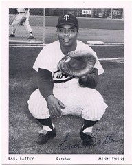
Meanwhile: When Gary Gaetti retired early in the 2000 MLB season, it appeared that he was the last hitter to have worn a no-earflap batting helmet (a distinction he later lost, but we’ll deal with that in a minute), so I wrote a short column about earflaps. In that column, I wrote that an early earflap breakthrough came in 1963, when “Earl Batty of the Twins created a makeshift flap by attaching a metal plate to the side of his batting helmet.”
Coupla problems there: For starters, the proper spelling is “Battey.” Secondly, I should mentioned that he’d twice had his cheekbones broken by pitches, which is why he became an earflap pioneer. Worst of all, I couldn’t find a photo of Batt(e)y’s improvised flap, so I was kinda operating in the dark there. I still hadn’t found a photo as of August 2006, when I mentioned Battey in this blog entry and asked if anyone could provide an image. That prompted the following response from Ralph Swan in the comments section:
If you can get your hands on a Twins 1963 or ’64 yearbook, I vividly remember a shot of Earl Battey circling the bases after a home run with a very weird ear flap sticking out from his helmet. ”¦ I’m sure I have this yearbook somewhere in my attic, but it’s probably 140 degrees up there (Oklahoma heat), and I’m not motivated enough to find it for you.
I meant to call the Twins and ask if they’d be willing to look through their yearbooks for me, but I was busy, so I put it off. Then I forgot about it. And then another year passed. And then, a couple of days ago, I got a note from reader Gil Batzri, who pointed me toward … wait for it … this.
Halle-fucking-lujah! Okay, so it’s an illustration, not a photo, but it’ll do. Now we can finally see what Battey was up to. Gotta love how endearingly makeshift it was, much like this.
Incidentally, the site where Gil discovered this image, TwinsCards.com, is a major find — loads of images from old baseball cards, magazines, scorecards, and lots more. They’ve got dozens of additional pics of Battey, one of which has a hint of an odd-looking earflap, although it’s tough to be sure. I’d like to see more, so hey, Ralph Swan, has your attic cooled off yet? Let’s see that yearbook photo!
As for Gaetti, he and Tim Raines were the last two players to go sans earflaps. When Raines retired after the 1999 season, it appeared that Gaetti was the last man standing, by virtue of the handful of games he played in 2000. But Raines came out of retirement in 2001 and continued to play the season after that. His 2002 campaign with the Marlins was the last gasp of resistance against the revolution that Earl Battey had begun nearly 40 years earlier.
ALL MEMBERS, PLEASE READ: Big thanks to the many of you who responded to yesterday’s call to help restore missing names to the membership roster. To those who missed it: A recent software glitch caused about 90 names to be deleted from the roster, so I’m trying to restore them. If you’re a member in good standing, please go to the roster listing and see if your name is there. If it’s missing, please e-mail me with your name, membership uni number, membership level, and why you chose your number. If your name linked to a photo, please re-send it. If you want to help speed up the process even more, pick out your card design from the card gallery and send me the URL for that as well. Thanks!
Uni Watch News Ticker: The Rockies appear to be determined to stick with their black vests (with thanks to Doug Mooney). ”¦ The Jets will be wearing their Titans throwbacks this Sunday, and they look pretty sharp (except for, of course, the truncated shoulder stripes). Details and lots more photos here. ”¦ Chad Cate sent along this photo of a long-ago baseball team. That’s his great-grandfather at top-center. ”¦ Reprinted from yesterday’s comments: If you’ve been dying to see a video showing how the Detroit Lions’ uniforms get laundered, here’s your chance. ”¦ Also from yesterday: Lots of great old Lions pics, including this killer shot of Bobby Layne (although I think that’s actually from his Steelers days). What’s that sleeve patch? And what’s all the fine print on his helmet –a primitive warning decal? Meanwhile, look at this. Can’t decide what I like better — the jacket or that square-toed kicker’s shoe. And man, I always loved those old ponchos. ”¦ The State of Tennessee is very 10-centric lately. ”¦ Apparently this was worn by a Quebecois rock star in the 1960s (with thanks to Zach Parrott). ”¦ Amusing rant here about the new NHL uniforms (with thanks to Matt Sapanara). ”¦ More player complaints of the NHL unis, too — check out the second entry on this Q&A page (Doug Mooney again). ”¦ Reprinted from last night’s comments, a report from Mike from Queens: “During the Islanders/Rangers game tonight, Eddie Olczyk said that Jaromir Jagr used to use CCM sticks but is now using a Reebok stick. Since the Reebok sticks are thinner, the team’s trainer had to add extra padding to Jagr’s gloves to offset the new feel. I find it hard to believe that a Hall of Fame scorer like Jagr would consent to using a different stick for marketing reasons, but that’s what I get out of it. Uni and logo-creep implications abound.” ”¦ Scott Turner took time out from designing membership cards to find some great old uniforms for sale on eBay — look here, here, here, here, here, here, here, and here. ”¦ Reprinted from last night’s comments: If you saw an article whose headline included the words “stirrups” and “Mets,” you’d figure it’d be right up my alley, right? Wrong. ”¦ Also from last night: Habs netminder Carey Price made his NHL debut last night but apparently his new mask hasn’t yet been painted, because he wore a all-white model. Meanwhile, Sens goalie Brian Elliot made his NHL debut while wearing his U. of Wisconsin mask. ”¦ One of the Rockies made a photocopy of an NFL captain’s patch and taped it to Troy Tulowitzki’s batting practice jersey. Details (but no photo, alas) about halfway through this article (with thanks yet again to Doug Mooney).
Senators goalie Brian Elliot.
It’s OK, you were in a hurry to finish up…..
Possible uni-shenanigans in the Rox-Dbacks series:
link
link for yourself.
[quote comment=”155236″]link for yourself.[/quote]
I cannot believe that the Habs are losing this vote.
Actually, I think the all-white goalie mask looks pretty sharp. Some painted masks kinda suck.
Love the Bobby Layne pic…. Would have REAL appropriate if Bobby was the one smoking the cig on sideline
The Layne photo is definitely from the Steelers era – I don’t think the Lions ever had numbers on their helmets, and that looks like the helmets they wore (along with the jerseys similar to the throwbacks they wore recently).
Anyone ever try and contact a team about unis? I ran across a number for the Vikings yesterday, had a few spare minutes, called and asked to talk to someone about whether they were wearing the purple pants this weekend, got sent to the equipment manager, whose mailbox was full. I think she thought I was nuts. :) Nope, just a uni-watch afficiando.
[quote comment=”155239″]Actually, I think the all-white goalie mask looks pretty sharp. Some painted masks kinda suck.[/quote]
I disagree… MOST painted masks suck.
That white mask looks good with the Canadiens uni. I know Chris Osgood always seems to wear a plain helmet with a cage. Sometimes less is more.
[quote comment=”155235″]Possible uni-shenanigans in the Rox-Dbacks series:
link
Sorry — posted this before I read today’s ticker.
That Twins site is fantastic!
I have been searching for a while, so I figured I would propose the problem on here. I am looking to get a pattern for a vintage (19th century preferably) baseball uniform. Mostly just the shirt, but pants would be nice. I’ve contacted a number of vintage baseball uniform providers including K&P Weaver Ebbets Flannels and offered to pay for a pattern. Not surprisingly, they turned me down. I’ve tried getting cheap vintage jersey’s on eBay but I don’t want to spend more than like $10 on a shirt that I am probably going to take apart to figure out how it’s made.
Anybody know of a place I can get something?
Following up on yesterdays discussion about Matt Holliday and his seed addiction:
Someone is selling what they claim to be link.
Anyone know where to find (sorry not uni related) which announcing team is calling which football game each week? Tired of tuning in on Sunday to Fox’s attempt at football and hearing morons like Tony Boselli and Joe Buck
The stirrups article thing is hilarious….I got more than I bargained for a couple of weeks ago, when I did a Google Image search for “stirrups.”
Just a tip, especially if you are at work, add “baseball” to your stirrup search string…
~E~
[quote comment=”155239″]Actually, I think the all-white goalie mask looks pretty sharp. Some painted masks kinda suck.[/quote]
You beat me to the punch, so permit me to echo the sentiment. Way too many of the painted masks are busy and overwrought. The white looks good.
[quote comment=”155243″][quote comment=”155239″]Actually, I think the all-white goalie mask looks pretty sharp. Some painted masks kinda suck.[/quote]
I disagree… MOST painted masks suck.[/quote]
Does anyone know of a site with images of custom painted masks used by NHL goalies?
Anyone watch the Navy football game last night? I’d like to see a picture or screen grab of Navy quarterback link. Now thats a long nameplate. That’s also not including his middle name Hiwahiwa Akahi.
[quote comment=”155252″]Anyone know where to find (sorry not uni related) which announcing team is calling which football game each week? Tired of tuning in on Sunday to Fox’s attempt at football and hearing morons like Tony Boselli and Joe Buck[/quote]
link
Broadcast coverage maps for the week, with broadcaster information.
Does anyone know of a site with images of custom painted masks used by NHL goalies?
I don’t if it was a post here on Uniwatch, but I remember reading an article about the goalie masks. If I remember right, a lot of the goalies use this one old guy who has been painting custom masks for years- and that’s why a lot of times it will be a week or two after a goalie gets traded before he gets a new one, or at the begining of the season you see some guys with the white ones; the painter is busy!
Oh, I found some pics of masks too.
link
[quote comment=”155255″][quote comment=”155243″][quote comment=”155239″]Actually, I think the all-white goalie mask looks pretty sharp. Some painted masks kinda suck.[/quote]
I disagree… MOST painted masks suck.[/quote]
Does anyone know of a site with images of custom painted masks used by NHL goalies?[/quote]
link
link
link
link
link
just to name a few
[quote comment=”155256″]Anyone watch the Navy football game last night? I’d like to see a picture or screen grab of Navy quarterback link. Now thats a long nameplate. That’s also not including his middle name Hiwahiwa Akahi.[/quote]
Cracked me up that his name was so compressed. They easily could’ve fit a couple more letters on there.
Closing italics?
Ohh, I like those Jets/Titans throwbacks, especially that the jerseys have a “flat” look (though maybe it’s just the dark color). Very nice.
[quote comment=”155238″][quote comment=”155236″]link for yourself.[/quote]
I cannot believe that the Habs are losing this vote.[/quote]
I cannot believe the didn’t include the Devils. Their sweaters are one of the best in the NHL
[quote comment=”155263″][quote comment=”155255″][quote comment=”155243″][quote comment=”155239″]Actually, I think the all-white goalie mask looks pretty sharp. Some painted masks kinda suck.[/quote]
I disagree… MOST painted masks suck.[/quote]
Does anyone know of a site with images of custom painted masks used by NHL goalies?[/quote]
link
link
link
link
link
just to name a few[/quote]
to quote myself, I sent my mask here link
[quote comment=”155257″][quote comment=”155252″]Anyone know where to find (sorry not uni related) which announcing team is calling which football game each week? Tired of tuning in on Sunday to Fox’s attempt at football and hearing morons like Tony Boselli and Joe Buck[/quote]
link
Broadcast coverage maps for the week, with broadcaster information.[/quote]
Boy, that is a fantastic resource. You never know what you’ll find on Uni Watch…
(Joe Buck is terrible, and his influence on Aikman has totally stunted his progress as a broadcaster.)
I really liked the paint jobs of the modern goalie mask during early 1990’s. It seemed like all masked had were more vivid, yet looked simple by only feature the real team colors. Nowadays, masks are extremely busy and don’t match the uniform well. I also think chrome cages look bad, but i’ll attribute that to the fact that i’m biased toward anything modern.
[quote comment=”155273″]I really liked the paint jobs of the modern goalie mask during early 1990’s. It seemed like all masked had were more vivid, yet looked simple by only feature the real team colors. Nowadays, masks are extremely busy and don’t match the uniform well. I also think chrome cages look bad, but i’ll attribute that to the fact that i’m biased toward anything modern.[/quote]
I was against the chrome at first, but then got one myself and they’re much nicer as you don’t notice them as much as say a white cage. It’s a great change for the better.
That photo of the two Jets on a New York City street looks out of place, no matter what uniform they wear. It really should have been taken in the middle of a swamp in New Jersey.
-Steve!
New ESPN column link.
They mentioned on TSN last night during the Oilers/Wild mismatch that Price’s debut had a precedent: 22 years ago to the day, link made his Habs debut, also wearing an all-white mask.
[quote comment=”155271″](Joe Buck is terrible, and his influence on Aikman has totally stunted his progress as a broadcaster.)[/quote]
I was just going to say the only thing worse than Joe Buck is having Troy F’ing Aikman with him.
On a related note, whenever I hear Jay Glazer mentioned on Fox, I shout at the TV: JAKE LASER! Just me?
Watched the Ranger-Icelander game last night. Those Icelander unis were such an eyesore that I woke up this morning with a migraine.
Congrats to Martin Brodeur for having the only mask in that gallery that isn’t a complete mess. Luongo’s white mask would have been better if it just looked like a white mask with decals rather than a toasted marshmallow, but it isn’t that bad either.
In any case, at least the NHL still allows a fun tradition, even if most of them look like they are keeping 70’s kustom van painters in business.
[quote comment=”155257″][quote comment=”155252″]Anyone know where to find (sorry not uni related) which announcing team is calling which football game each week? Tired of tuning in on Sunday to Fox’s attempt at football and hearing morons like Tony Boselli and Joe Buck[/quote]
link
Broadcast coverage maps for the week, with broadcaster information.[/quote]
That is a fantastic site…gonna keep that one…and the only thing worse than listening to Joe SHM-uck and Troy FAKE-man is listening to Joe Buck and TIM MCWINDBAG
[quote comment=”155269″][quote comment=”155238″][quote comment=”155236″]link for yourself.[/quote]
I cannot believe that the Habs are losing this vote.[/quote]
I cannot believe the didn’t include the Devils. Their sweaters are one of the best in the NHL[/quote]
My guess is that this is the first in a series. At the bottom there are links to critiques that include The Guy, The Chick, and the The Collector viewpoints – pretty interesting.
[quote comment=”155278″]New ESPN column link.[/quote]
Thmubs up! :-)
[quote comment=”155291″][quote comment=”155278″]New ESPN column link.[/quote]
Thmubs up! :-)[/quote]
Nice collum Lucas!!!
I saw an error jersey for the NYY, here’s a posting of it:
Maybe it’s not an error?
[quote comment=”155253″]The stirrups article thing is hilarious….I got more than I bargained for a couple of weeks ago, when I did a Google Image search for “stirrups.”
Just a tip, especially if you are at work, add “baseball” to your stirrup search string…
~E~[/quote]
Yeah well just don’t do a google search for “fuck face”
Haha.
[quote comment=”155293″]I saw an error jersey for the NYY, here’s a posting of it:
Maybe it’s not an error?[/quote]
Wow, bad joke, but an inspiration for a column, Mr. Lukas. One-time jersey messages. Not a patch or a special jersey design, but a one-time manipulation of the standard design. Examples: the Mariners with the white SEATTLE home jerseys, the Rangers’ THANK YOU jerseys after the lockout, the Hornets’ OKLAHOMA CITY jersey for the home finale of the 05-06 season. Got any others?
[quote comment=”155290″][quote comment=”155269″][quote comment=”155238″][quote comment=”155236″]link for yourself.[/quote]
I cannot believe that the Habs are losing this vote.[/quote]
I cannot believe the didn’t include the Devils. Their sweaters are one of the best in the NHL[/quote]
My guess is that this is the first in a series. At the bottom there are links to critiques that include The Guy, The Chick, and the The Collector viewpoints – pretty interesting.[/quote]
No, unfortunately the guy specifies that he put the Original 6 in by default, then added 10 teams that had the most drastic changes. So no Canes, Oilers (who would finish last anyway), or Senators.
[quote comment=”155243″][quote comment=”155239″]Actually, I think the all-white goalie mask looks pretty sharp. Some painted masks kinda suck.[/quote]
I disagree… MOST painted masks suck.[/quote]
What about the NFL? Are there many masks out there that are an odd color, much like the one link used to wear with the Bucs? That thing is just an odd color of orange that doesnt match. Nice pants though.
[quote comment=”155298″][quote comment=”155293″]I saw an error jersey for the NYY, here’s a posting of it:
Maybe it’s not an error?[/quote]
Wow, bad joke, but an inspiration for a column, Mr. Lukas. One-time jersey messages. Not a patch or a special jersey design, but a one-time manipulation of the standard design. Examples: the Mariners with the white SEATTLE home jerseys, the Rangers’ THANK YOU jerseys after the lockout, the Hornets’ OKLAHOMA CITY jersey for the home finale of the 05-06 season. Got any others?[/quote]
The Rangers and Sabres New York jerseys after 9/11 that were auctioned off.
[quote comment=”155293″]I saw an error jersey for the NYY, here’s a posting of it:
Maybe it’s not an error?[/quote]
Ladies and Gentlemen, the next jerry seinfeld
[quote comment=”155298″][quote comment=”155293″]I saw an error jersey for the NYY, here’s a posting of it:
Maybe it’s not an error?[/quote]
Wow, bad joke, but an inspiration for a column, Mr. Lukas. One-time jersey messages. Not a patch or a special jersey design, but a one-time manipulation of the standard design. Examples: the Mariners with the white SEATTLE home jerseys, the Rangers’ THANK YOU jerseys after the lockout, the Hornets’ OKLAHOMA CITY jersey for the home finale of the 05-06 season. Got any others?[/quote]
Anyone got a link to the Rangers Thank You jerseys?
OK, this is probably the best place I know of to ask this question. I won a game-issued NFL jersey online, and when it got to me, one of the heat-screened numbers on the sleeve was starting to separate from the rest of the jersey at the corner. Does anyone know of a particularly good way to seal down the corner, so that the number won’t end up falling off?
[quote comment=”155278″]New ESPN column link.[/quote]In a sad bit of irony, both the “Fergosi” and “Preconte” mistakes were made by the 1986 White Sox.
Of course, the letters involved are the ones needed to spell “err”.
[quote comment=”155307″]OK, this is probably the best place I know of to ask this question. I won a game-issued NFL jersey online, and when it got to me, one of the heat-screened numbers on the sleeve was starting to separate from the rest of the jersey at the corner. Does anyone know of a particularly good way to seal down the corner, so that the number won’t end up falling off?[/quote]
As a collector of such things, I would recommend not altering any game issued or game worn jersey.
Love the Twins site, of course. I also can’t believe that Columbus is leading the hockey uni poll. That’s sacrilege! I gotta say, the Jets throwbacks look like the Rams’ unis to me.
Now, I will read Paul’s column.
I love how this misspelled linkillustrates how letters on a vertically arched nameplate are cut according to their placement. Notice how the KZ takes a little dip down because the steep angle of the K, which should be further from center.
[quote comment=”155279″]They mentioned on TSN last night during the Oilers/Wild mismatch that Price’s debut had a precedent: 22 years ago to the day, link made his Habs debut, also wearing an all-white mask.[/quote]
Patrick Roy also played his first NHL game against the Penguins, much like Price did.
Someone asked yesterday about the KD and JC decals on USF helmets.
The KD is for Keeley Dorsey, a freshman running back who died while lifting weights last January. The autopsy revealed an undiagnosed heart condition.
The JC is for alumnus Javan Camon, who died after an on-field collision playing arena football for Daytona Beach.
And that is absolutely Bobby Layne with the Steelers, who wore the rounded numbers during the early ’60s.
[quote comment=”155313″]I love how this misspelled linkillustrates how letters on a vertically arched nameplate are cut according to their placement. Notice how the KZ takes a little dip down because the steep angle of the K, which should be further from center.[/quote]
That’s a great observation!
And a great Page 2 column today, Paul — one of your best ever.
[quote comment=”155310″]Love the Twins site, of course. I also can’t believe that Columbus is leading the hockey uni poll. That’s sacrilege! I gotta say, the Jets throwbacks look like the Rams’ unis to me.
Now, I will read Paul’s column.[/quote]
Agreed. They are VERY similar to the Rams unis. Everyone on here seems to love the throwbacks, however is there a lot of love for the Rams unis?
Nice article link on local (southern Arizona) HS Football helmuts. I teach at Sunnyside HS. Very Uniwatch!
Some items from the New York Times archives:
Brian Kelley, Rookie Linebacker, Makes Giants Even if Name Is Misspelled on His Uniform (September 11, 1973)
Steve Alatorre’s name was misspelled on the back of his orange jersey, but it was the only noticeable imperfection associated with the Tennessee quarterback, who knew exactly how to spell victory for the Volunteers in the fourth annual Garden State Bowl today. (December 14, 1981)
Jose Maria Olazabal was asked if he had been given the same green jacket that he received when he won the Masters in 1994. “Yep, it’s the same one,” Olazabal said with a smile. How did he know? “Because the name is still misspelled inside,” he said. Sure enough, it was spelled “Olazabel.” (April 12, 1999)
Robbie Alomar, a 12-time All-Star and 10-time Gold Glove winner, looked sheepish today as he twirled his personalized black bat. In his first day in a Mets uniform, he was hoping no one would notice that the bat manufacturer had spelled his last name wrong: Alomr. (February 21, 2002)
Lockers:
“It was up there, but it was misspelled,” [Rookie Ranger Center Manny] Malhotra said today, smiling, after practice. “They’re redoing it. I’ve seen every spelling of it, and we’ve heard every pronunciation. So it doesn’t really bother me.” (October 22, 1998)
[Kelly] Hrudey is still getting acquainted with his teammates. His blue-and-orange Islander goalie pads are sprayed with black paint. His name is misspelled above his locker. (April 13, 1989)
His name was misspelled above his locker – YAZTRZEMSKI, perhaps on purpose. (July 14, 1982)
Other non-uni misspellings from the NYT archives:
Some people will still confuse [Lance Parrish] with Larry Parrish of the Texas Rangers, and it’s true that his All-Star ring was misspelled “Parris.” (July 26, 1982)
“He’s so even-keeled and so unexcitable and so consistent in his approach,” [Indians’ general manager Mark] Shapiro added of [Jhonny] Peralta, whose parents misspelled his first name on his birth certificate. (August 28, 2005)
The International Tennis Hall of Fame’s exhibit at Louis Armstrong Stadium includes a permanent silver trophy for mixed doubles. It lists the names of all of the champions since the Open era began in 1968. The most recent entry: 1998 SERENA WILLIAMS MAX MIMYI [Should be Max Mirnyi] (September 8, 1999)
Joyner-Kersee is the training mate of Griffith Joyner, who last October married Al Joyner, Joyner-Kersee’s older brother and the 1984 Olympic champion in the triple jump. Today, Joyner wore a T-shirt bearing his wife’s likeness and the words: F GRIFFEN JOYNER GOING 4 THE GOLD IN 88 “Her name is misspelled,” someone told Joyner. “Only her name,” he said with a laugh, “not the Joyner.” (July 18, 1988)
[quote comment=”155317″][quote comment=”155310″]Love the Twins site, of course. I also can’t believe that Columbus is leading the hockey uni poll. That’s sacrilege! I gotta say, the Jets throwbacks look like the Rams’ unis to me.
Now, I will read Paul’s column.[/quote]
Agreed. They are VERY similar to the Rams unis. Everyone on here seems to love the throwbacks, however is there a lot of love for the Rams unis?[/quote]
I personally love the “Titans” throwbacks, alomost perfect, don’t even mind the chopped shoulder stripes. However the Ram’s unis are a mess. The gold color in general is a little off, to deep if you ask me. It could be fixed with a 2-color stripe though. Their helemt logo is also ugly, looks too fat and has no outline. You should put 2 deep colors up top of each other without an outline, looks like it was drawn by a 5 year old with a Sharpie Magnum. Jersey’s are a beaut though.
I can’t say where – I believe it was in one of his books – but didn’t Bill Veeck say he had put the Z in Kluszewski backwards on purpose to draw attention to the addition of names? (Veeck also said that somebody from the AFL called and asked if they could have his permission to put names on the back of uniforms; he was flattered.)
[quote comment=”155278″]New ESPN column link.[/quote]
In line with the fans with incorrect jerseys, I still wish I’d snapped a picture of the guy at an Albany River Rats game last year with a Keith Aucoin jersey. He had “Aucion” on it, pretty embarassing.
[quote comment=”155332″][quote comment=”155317″][quote comment=”155310″]Love the Twins site, of course. I also can’t believe that Columbus is leading the hockey uni poll. That’s sacrilege! I gotta say, the Jets throwbacks look like the Rams’ unis to me.
Now, I will read Paul’s column.[/quote]
Agreed. They are VERY similar to the Rams unis. Everyone on here seems to love the throwbacks, however is there a lot of love for the Rams unis?[/quote]
I personally love the “Titans” throwbacks, alomost perfect, don’t even mind the chopped shoulder stripes. However the Ram’s unis are a mess. The gold color in general is a little off, to deep if you ask me. It could be fixed with a 2-color stripe though. Their helemt logo is also ugly, looks too fat and has no outline. You should put 2 deep colors up top of each other without an outline, looks like it was drawn by a 5 year old with a Sharpie Magnum. Jersey’s are a beaut though.[/quote]
I agree that they are damn sharp.
The new question of the week is… What team has the best uni’s when you include their throwback’s? I would put the Jet’s/Titans at the top of this list.
[quote comment=”155314″][quote comment=”155279″]They mentioned on TSN last night during the Oilers/Wild mismatch that Price’s debut had a precedent: 22 years ago to the day, link made his Habs debut, also wearing an all-white mask.[/quote]
Patrick Roy also played his first NHL game against the Penguins, much like Price did.[/quote]
Another link, Habs debutant who faced the Penguins in his first game. Also one who spoke at length about the less is more mask paint theory.
No pressure, Carey…
SB
Sorry those of us whose families dropped the Old-Country spelling have mucked everything up for you, Paul.
-Mike Lucas
More Typo:
What about West Virginia’s t-shirts from the NIT Tourney.
link
[quote comment=”155295″]Everyone is vulnerable, from journeymen to superstars…
5. Wayne Gretzky, Oct. 30, 1997. You’re the greatest player in the history of the sport, you’re playing for the league’s marquee franchise, and your name is synonymous with hockey, so you’d think they could at least spell it correctly. But you — and whomever lettered your jersey — would be wrong.
[/quote]
is it safe to assume that these favorites are not listed in any order? because i’d have to say that the gretzky misspelling would have to be the cream of the crop.
[quote comment=”155292″]It’s worth noting, incidentally, that there’s at least one team that’s never had a uniform misspelling: the Yankees. With a simple logo on the front and no player names on the back, they’re typo-proof. And that seems somehow appropriate, because uniform typos are fun, playful, and human — all things that the Yanks refuse to allow themselves to be.
[/quote]
how can you be sure the yanks have never had a uni misspelling and that they are typo-proof? couldnt the road “new york” uni’s ever have been mispelled similar to #2 and #7 in the list?
[quote comment=”155300″]What about the NFL? Are there many masks out there that are an odd color, much like the one link used to wear with the Bucs? That thing is just an odd color of orange that doesnt match. Nice pants though.[/quote]
debergh. i always thought he was just chicago frontman link playing quarterback.
[quote comment=”155313″]I love how this misspelled linkillustrates how letters on a vertically arched nameplate are cut according to their placement. Notice how the KZ takes a little dip down because the steep angle of the K, which should be further from center.[/quote]
you can see the same phenomena in the aaron harang picture as well.
I was looking at the shoulder patch on the “Gretkzy” and noticed the Rangers had a different crest that usual. How many logos and different shades of blue have they used in the past 10 years. Seems like 3 crests, 6 jerseys, 3 different shades of blue and sometimes silver, sometimes not. Oy Vey. They are worse than the Mets and Diamondbacks put together.
Teebz, I read your article about Nike stepping away from the NHL. I believe Reebok became too powerful what with slapping their logo all over the league. Nike either said” ah screw it” or RBK paid them a lot of cash to get out. If it were really up to Nike, they’d still be there.
[quote comment=”155343″]More Typo:
What about West Virginia’s t-shirts from the NIT Tourney.
link
A buddy of mine got his hands on several UCLA Basketball Camp t-shirts that say “Baseketball”. It’s a great shirt to wear.
There was another Earl Battey controversy this past summer. After the Red Sox hit four consecutive homers against the Yanks (with me in the bleachers–yes, it was awesome), there was a lot of talk about the other times that teams had hit four in a row. One tale told of how, after four Twins went deep in 1964, one Earl Battey came up and hit one deep to right field, off the wall, narrowly missing what would’ve been the fifth round-tripper in a row. Aaron Gleeman called bullshit, and as it turns out, Battey actually struck out. However, based on the story-teller’s description of a ball that went “two-thirds up the wall,” I tried to figure out if that could’ve meant it was a deep foul ball, which occurred during the at bat, before he eventually struck out. I never did figure it out, but I did find out that Earl Battey died in 2003, so I couldn’t ask him.
[quote comment=”155314″][quote comment=”155279″]They mentioned on TSN last night during the Oilers/Wild mismatch that Price’s debut had a precedent: 22 years ago to the day, link made his Habs debut, also wearing an all-white mask.[/quote]
Patrick Roy also played his first NHL game against the Penguins, much like Price did.[/quote]
You frighten me, Teebz. (But in a good way.)
the shot of bobby layne and buddy parker is from 1959, and layne is with the steelers. the main indicator is the round patch on the left sleeve, which commemorated pittsburgh’s bicentennial in 59. it was worn only on the left sleeve of the steelers black (home) jerseys. also, note the steelers round numerals, which were worn on the home jerseys in 1959.
if only anybody could get a zoom in on the patch layne is sporting, that would be sooo awesome.
great find!!
In the photo of Brian Elliot making his debut – the Thrashers player (Slater?) has tape around his socks – thought the new socks prevented the use of tape? Superstition or actually keeping the socks up?
Just wonderin’!
[quote comment=”155348″]is it safe to assume that these favorites are not listed in any order? because i’d have to say that the gretzky misspelling would have to be the cream of the crop.[/quote]
As usual, I think the name on the front of the jersey is more important than the name on the back. So I think the first three examples on the list are actually more egregious than the Gretzky example.
[quote comment=”155292″]how can you be sure the yanks have never had a uni misspelling and that they are typo-proof? couldnt the road “new york” uni’s ever have been mispelled similar to #2 and #7 in the list?[/quote]
I’m such a moron. I somehow completely overlooked that possibility.
I liked the time former Dodgers Orel Hershiser went out on the field with the “r” missing from the end of his name and Vin Scully or some other announcer started calling him “Hershis-ay.” The clip ended up on This Week in Baseball sometime in the late 1980s or early 1990s.
When Nikoli Kahbibulin (SP is certainly wrong) first got his Bulin Wall mask in Tampa it had Bulin spelt wrong. I don’t remember the specifics of it, but they mentioned it on the old show Cool Shots.
[quote comment=”155372″]In the photo of Brian Elliot making his debut – the Thrashers player (Slater?) has tape around his socks – thought the new socks prevented the use of tape? Superstition or actually keeping the socks up?
Just wonderin’![/quote]
I’m guessing it has something to do with the feel. Sure, the new socks may hold everything in place, but when you’ve been playing hockey for your whole life, you probably get used to having that hockey tape in the same place every time you suit up. It may just feel more right for a guy like that.
I’ve tried playing with tape in a different way than how I was used to, and it really threw me off. It just didn’t feel right at all.
ESPN ran a link today in which they misspell Vinny Testaverde’s name. In the title of the article it is spelled Testeverde, but in the first paragraph its Testaverde.
As usual, I think the name on the front of the jersey is more important than the name on the back. So I think the first three examples on the list are actually more egregious than the Gretzky example.
Then surely the Ilanders Cup typo is the most egregious. After all, not only is it the team name, but it is placed on a memorial “in perpetuity” to commemorate an achievement. You can’t just change the Stanley Cup after the first period when you notice a misspelling.
[quote comment=”155363″][quote comment=”155314″][quote comment=”155279″]They mentioned on TSN last night during the Oilers/Wild mismatch that Price’s debut had a precedent: 22 years ago to the day, link made his Habs debut, also wearing an all-white mask.[/quote]
Patrick Roy also played his first NHL game against the Penguins, much like Price did.[/quote]
You frighten me, Teebz. (But in a good way.)[/quote]
Ken Dryden also played his first NHL game vs. PIT. Also I believe Price, Roy, and Dryden all played first NHL games AT PIT.
Question for Paul:
Since you’ve compromised your anti-purple principles for an advertiser (Jersey Joe), would you allow me to pay that same advertisers rate for a Phoenix Suns themed membership card?
Just asking . . .
[quote comment=”155396″]Question for Paul:
Since you’ve compromised your anti-purple principles for an advertiser (Jersey Joe), would you allow me to pay that same advertisers rate for a Phoenix Suns themed membership card?
Just asking . . .[/quote]
interesting proposal!!!
notice the misspelling on the jersey joe advert as well, where they spell indians, a-n-g-e-l-s.
[quote comment=”155277″]That photo of the two Jets on a New York City street looks out of place, no matter what uniform they wear. It really should have been taken in the middle of a swamp in New Jersey.
-Steve![/quote]
That’s not Downtown East Rutherford?
On the nfl.com site today they have a link to the 12 best NFL nicknames, with pictures. Sure enough one of the 12 is Chad, 85, Johnson wearing the Ocho Cinco jersey, the same jersey that the NFL fined him for wearing.
Seems a little hyocritical to me.
Watching the Raptors on TV right now, and where the black is on their normal road jersey, they have yellow because they are playing in Spain. I’ll try to find pics later. Look pretty sharp IMO.
[quote comment=”155405″]On the nfl.com site today they have a link to the 12 best NFL nicknames, with pictures. Sure enough one of the 12 is Chad, 85, Johnson wearing the Ocho Cinco jersey, the same jersey that the NFL fined him for wearing.
Seems a little hyocritical to me.[/quote]
I agree…. and I remember ‘Neon Deion’ moreso than “Primetime”
[quote comment=”155402″][quote comment=”155277″]That photo of the two Jets on a New York City street looks out of place, no matter what uniform they wear. It really should have been taken in the middle of a swamp in New Jersey.
-Steve![/quote]
That’s not Downtown East Rutherford?[/quote]
Well, the NY Titans did play at the Polo Grounds, so perhaps the shots in NYC are appropriate.
[quote comment=”155391″]As usual, I think the name on the front of the jersey is more important than the name on the back. So I think the first three examples on the list are actually more egregious than the Gretzky example.
Then surely the Ilanders Cup typo is the most egregious. After all, not only is it the team name, but it is placed on a memorial “in perpetuity” to commemorate an achievement.
You can’t just change the Stanley Cup after the first period when you notice a misspelling.[/quote]
Its actually their regular practice to “re-engrave” the misspellings as best they can.
[quote comment=”155405″]On the nfl.com site today they have a link to the 12 best NFL nicknames, with pictures. Sure enough one of the 12 is Chad, 85, Johnson wearing the Ocho Cinco jersey, the same jersey that the NFL fined him for wearing.
Seems a little hyocritical to me.[/quote]
What’s also odd is they they chose to show Namath as a Ram and Stabler and Ditka as Saints instead of the teams they are most commonly associated with.
MESSAGE FROM RALPH SWAN:
OK – you motivated me. It was a balmy 54 degrees when I drove my son to school this morning, and I had a break in the action, so I ventured up to the attic. I’ll be sneezing for a week now, with little to show for it. Alas, I couldn’t find the old Twins yearbooks. This bums me to no end. I have no idea where they may be. I found some other things I saved as a child. For some reason, I guess I determined the 1972 SI with Willie Mays on the cover in a Mets uniform (The Amaysing Mets) to be archive-worthy. I also found the 9.8.67 LIFE Mag with Yaz on the cover, and a good pictorial inside on the 1967 AL pennant race, complete with Killebrew swinging the bat, and Al Kaline hurling his helmet in disgust after being thrown out stealing. A good shot of Gary Peters (W Sox) from the umpire’s perspective; of Ken Berry in a home plate collision with R Sox catcher…Elston Howard; and a good tight shot of Eddie Stanky. You’d think the W Sox had won the pennant with all of the pics in this piece…
Sorry about the Earl Battey pic. As I recall, there was also a great shot of him crashing the side of his head against a metal folding chair while going after a foul ball included in this same yearbook. He as always getting hurt. No surprise that he pioneered the ear flap. He would have worn a hockey mask if he had thought of it. Sadly, these pics will have to be archived in the recesses of my memory. Sigh.
RS
That Stanley Cup error site has an error of it’s own. Manny Legace’s name was misspelled “Legacy”, not Lagace—->Legace as they state.
link
BATTING HELMET // BROOKS ROBINSON // SHORT BRIM
link
I get many emails and whenever I do speaking engagements almost every question is: Why did I have a short brim? I think I was the only player that wore “Brooksswing” the short brim in the Majors and I never realized it got that much attention until I left the game. But back in the early ’70s, the Commissioner’s Office made it mandatory for anyone coming into the big leagues to wear a flap on your hat. If you were already in Major League Baseball you had a choice whether to do that or not. Of course, I wanted to wear the flap because it gave me more protection. I had been hit 3 or 4 times in the head and so the more protection, the better for me. When I got the helmet with the flap and put it on, it seemed like the bill was a little longer than my normal hat. The flap was a little longer and consequently when I went up to hit I could see the brim and part of the flap. It made me lose my concentration. I took care of it by taking a hacksaw blade and cut off about 1 ½ inches off the brim and about ½ off the flap. That’s how I got my short brim.
I love the photo of the old football poncho. Anyone know when those things went out of style? It seems I remember seeing a photo of a Browns player wearing a poncho during the last game at the old Cleveland Stadium
while doing some brooks robinson research, i came across this team site, which has a player with an unfortunate name…
link
[quote comment=”155421″]http://brooks.mlblogs.com/my_weblog/2006/02/pete_rose.html
BATTING HELMET // BROOKS ROBINSON // SHORT BRIM
link
I get many emails and whenever I do speaking engagements almost every question is: Why did I have a short brim? I think I was the only player that wore “Brooksswing” the short brim in the Majors and I never realized it got that much attention until I left the game. But back in the early ’70s, the Commissioner’s Office made it mandatory for anyone coming into the big leagues to wear a flap on your hat. If you were already in Major League Baseball you had a choice whether to do that or not. Of course, I wanted to wear the flap because it gave me more protection. I had been hit 3 or 4 times in the head and so the more protection, the better for me. When I got the helmet with the flap and put it on, it seemed like the bill was a little longer than my normal hat. The flap was a little longer and consequently when I went up to hit I could see the brim and part of the flap. It made me lose my concentration. I took care of it by taking a hacksaw blade and cut off about 1 ½ inches off the brim and about ½ off the flap. That’s how I got my short brim.[/quote]
better shot of the short brim.
link
link
once again, new uniforms for north carolina basketball. they lost the infamous nike shoulder stripes.
system of dress? i can’t tell.
[quote comment=”155429″]http://northcarolina.scout.com/2/689582.html
once again, new uniforms for north carolina basketball. they lost the infamous nike shoulder stripes.
system of dress? i can’t tell.[/quote]
thats def SoD.
some notes.
looks like the heels will be wearing that black strip (i still dont get why all acc sports teams have to wear this) above the nameplates
link
now that wes miller graduated, wayne ellington has changed back to 22, what he wore in HS.
link
[quote comment=”155376″][quote comment=”155348″]is it safe to assume that these favorites are not listed in any order? because i’d have to say that the gretzky misspelling would have to be the cream of the crop.[/quote]
As usual, I think the name on the front of the jersey is more important than the name on the back. So I think the first three examples on the list are actually more egregious than the Gretzky example.
[quote comment=”155292″]how can you be sure the yanks have never had a uni misspelling and that they are typo-proof? couldnt the road “new york” uni’s ever have been mispelled similar to #2 and #7 in the list?[/quote]
I’m such a moron. I somehow completely overlooked that possibility.[/quote]
Paul,
I can think of one MLB uniform that could not have a typo- the LA Dodgers before 2006.
No names on back, and the home “Dodgers” and away “Los Angeles” were all one single patch (because they were in cursive).
[quote comment=”155376″][quote comment=”155292″]how can you be sure the yanks have never had a uni misspelling and that they are typo-proof? couldnt the road “new york” uni’s ever have been mispelled similar to #2 and #7 in the list?[/quote]
I’m such a moron. I somehow completely overlooked that possibility.[/quote]
Don’t let logic get in the way of badmouthing the Yankees, god knows no one else worries about that.
-Steve!
Thanks for that article on the new NHL jerseys. I take alot of Stats and research methods classes and we are taught to critically think about information, something most news sources don’t seem to do.
[quote comment=”155429″]http://northcarolina.scout.com/2/689582.html
once again, new uniforms for north carolina basketball. they lost the infamous nike shoulder stripes.
system of dress? i can’t tell.[/quote]
I’m wondering how it’ll take before a team is just wearing full length warm-up pants instead of the shants, shorts whatever you want to call the ridiculous oversized monstrosities. I thought shorts were finally starting to level out at about knee level a few years back, then this system of a dress BS comes along and ruins everything. Literally everything, just made a pot of coffee, tastes like shit….fuckin Nike.
[quote comment=”155406″]Watching the Raptors on TV right now, and where the black is on their normal road jersey, they have yellow because they are playing in Spain. I’ll try to find pics later. Look pretty sharp IMO.[/quote]
Ha, quoting my own comment. Anyways, here link link.
Thought link might humor Mr. Lukas.
[quote comment=”155255″][quote comment=”155243″][quote comment=”155239″]Actually, I think the all-white goalie mask looks pretty sharp. Some painted masks kinda suck.[/quote]
I disagree… MOST painted masks suck.[/quote]
Does anyone know of a site with images of custom painted masks used by NHL goalies?[/quote]
link
This guy does incredible work. Go to the “DaveArt” section, and the “MaskGallery”
[quote comment=”155455″][quote comment=”155255″][quote comment=”155243″][quote comment=”155239″]Actually, I think the all-white goalie mask looks pretty sharp. Some painted masks kinda suck.[/quote]
I disagree… MOST painted masks suck.[/quote]
Does anyone know of a site with images of custom painted masks used by NHL goalies?[/quote]
link
This guy does incredible work. Go to the “DaveArt” section, and the “MaskGallery”[/quote]
BTW, the video of him painting the Stefan Liv HV71 mask on there is awesome. I strongly recommend, even if it is in Swedish.
link…. video is NSFW
Not sure if this has been covered or not, but link.
[quote comment=”155271″][quote comment=”155257″][quote comment=”155252″]Anyone know where to find (sorry not uni related) which announcing team is calling which football game each week? Tired of tuning in on Sunday to Fox’s attempt at football and hearing morons like Tony Boselli and Joe Buck[/quote]
link
Broadcast coverage maps for the week, with broadcaster information.[/quote]
Boy, that is a fantastic resource. You never know what you’ll find on Uni Watch…
(Joe Buck is terrible, and his influence on Aikman has totally stunted his progress as a broadcaster.)[/quote]
Troy can’t hear you- his three Super Bowl rings are plugging up his ears…
[quote comment=”155506″][quote comment=”155271″][quote comment=”155257″][quote comment=”155252″]Anyone know where to find (sorry not uni related) which announcing team is calling which football game each week? Tired of tuning in on Sunday to Fox’s attempt at football and hearing morons like Tony Boselli and Joe Buck[/quote]
link
Broadcast coverage maps for the week, with broadcaster information.[/quote]
Boy, that is a fantastic resource. You never know what you’ll find on Uni Watch…
(Joe Buck is terrible, and his influence on Aikman has totally stunted his progress as a broadcaster.)[/quote]
Troy can’t hear you- his three Super Bowl rings are plugging up his ears…[/quote]
They’re in his ears because he couldn’t find them after Lavar Arrington knocked his face off.
Separate note, here’s a neat link from last season. Nice shoulder stripes.
On YouTube, I came across hilarious clips of Bill Murray filling for Harry Caray as Cubs TV color commentator at the April 17, 1987 game versus the Expos. What makes this somewhat relevant to Uni Watch (other than the Expos unis) is what happened to the umpires.
In link, at 4:40 (4:28 is the start of this portion), Steve Stone says that the game has been delayed because of “some changing problems with the umpire” At 6:37, Murray and Stone riff on possible reasons why the umps could be delayed.
At 6:44 in link, 2 of the umps finally make it onto the field. Then another one appears, then Eric Gregg (after a great insult by Murray) appears in… a Cubs jacket. and shin guards on the outside.
Steve Stone finally reveals at 8:30 that the umps’ gear had been delayed in reaching Wrigley.
In link, at the beginning, still before the game, Gregg is having trouble with his shin guards (and endures more Murray insults) and with finding a mask.
Gregg starts the game in the Cubs jacket.
At the beginning of link (in the bottom of the 2nd), however, Gregg has finally claimed his jacket.
(For completion’s sake, here’s the link to link.)
I love the photo of the old football poncho. Anyone know when those things went out of style? It seems I remember seeing a photo of a Browns player wearing a poncho during the last game at the old Cleveland Stadium
The Browns wore ponchos with the brownie on the back last year at the Thursday night game at Heinz Field.
Good video link featuring San Jose Sharks Equipment Manager Mike Aldrich on the art of skate sharpening. Bonus: Aldrich talks a little trash about Eddie Belfour!
I saw the habs picture in the ticker today and it reminded me of link. Shania did it at a few different places and even had a matching thong to go with it.
while doing some brooks robinson research,
Huh?
Awww, my Shania in sports jerseys post didn’t work.
link
Forget the good or bad luck…all five Rockies jerseys are hideous. The D-Backs just as gruesome.
Looks like Nike may not be out of hockey – particularly if a substantive offer is not forthcoming from anyone other than Reebok link
[quote comment=”155539″]Looks like Nike may not be out of hockey – particularly if a substantive offer is not forthcoming from anyone other than Reebok [quote]
Link here: Globe and Mail
I’m wondering if anyone has a photo of the Team Iceland jerseys from D2: The Mighty Ducks. Any help would be very appreciated. Thank you!!
By the looks of it, looks like the Rockies are gonna stick with the black vests, why change? I guess.
Wake Forest wore a “SKIP” patch in memory of Skip Prosser on Thursday night versus Florida State.
link
link
link
[quote comment=”155432″][quote comment=”155429″]http://northcarolina.scout.com/2/689582.html
once again, new uniforms for north carolina basketball. they lost the infamous nike shoulder stripes.
system of dress? i can’t tell.[/quote]
thats def SoD.
some notes.
looks like the heels will be wearing that black strip (i still dont get why all acc sports teams have to wear this) above the nameplates
link
now that wes miller graduated, wayne ellington has changed back to 22, what he wore in HS.
link
the black strip is honoring the victims of the VT shooting. teams can wear it where ever they want on the uni, UNC chose above the nameplates for both bball and football
[quote comment=”155510″]On YouTube, I came across hilarious clips of Bill Murray filling for Harry Caray as Cubs TV color commentator at the April 17, 1987 game versus the Expos. What makes this somewhat relevant to Uni Watch (other than the Expos unis) is what happened to the umpires. […][/quote]
I hate to be the one to break it to you, but this video was already featured link on Uniwatch. I’m sure Frank Mercogliano will just be happy you finally got to see it, heh.
[quote comment=”155274″][quote comment=”155273″]I really liked the paint jobs of the modern goalie mask during early 1990’s. It seemed like all masked had were more vivid, yet looked simple by only feature the real team colors. Nowadays, masks are extremely busy and don’t match the uniform well. I also think chrome cages look bad, but i’ll attribute that to the fact that i’m biased toward anything modern.[/quote]
I was against the chrome at first, but then got one myself and they’re much nicer as you don’t notice them as much as say a white cage. It’s a great change for the better.[/quote]
=====================
The chrome masks are easier to look through. I switched to a chrome cage on my helmet and it makes a big difference.
[quote comment=”155376″]
[quote comment=”155292″]how can you be sure the yanks have never had a uni misspelling and that they are typo-proof? couldnt the road “new york” uni’s ever have been mispelled similar to #2 and #7 in the list?[/quote]
I’m such a moron. I somehow completely overlooked that possibility.[/quote]
We forgive you, Paul, but it’s true about the Yankee road unis. In fact, link is way off.
[quote comment=”155531″]while doing some brooks robinson research,
Huh?[/quote]
exactly what it says. you gave a link to an article on brooks short brim helmet, but included a pic of his regular batting helmet.
i was doing some “brooks robinson research” to find a pic of his short brim.
i found the pic and posted it.
and “while doing some brooks robinson research”, i found out that other info.
anything else i should justify for you tom?
After watching the first NLCS game last night I noticed that if the DBacks hadn’t changed the purple color scheme, this might possibly the first Purple vs Purple conference championship in any major sport. Can you think of any else?
[quote comment=”155642″]After watching the first NLCS game last night I noticed that if the DBacks hadn’t changed the purple color scheme, this might possibly the first Purple vs Purple conference championship in any major sport. Can you think of any else?[/quote]
2002 nba western conference championship
lakers v. kings
[quote comment=”155658″][quote comment=”155642″]After watching the first NLCS game last night I noticed that if the DBacks hadn’t changed the purple color scheme, this might possibly the first Purple vs Purple conference championship in any major sport. Can you think of any else?[/quote]
2002 nba western conference championship
lakers v. kings[/quote]
wow, that was a quick season, didn’t they just start their preseason?? :-)
[quote comment=”155565″][quote comment=”155510″]On YouTube, I came across hilarious clips of Bill Murray filling for Harry Caray as Cubs TV color commentator at the April 17, 1987 game versus the Expos. What makes this somewhat relevant to Uni Watch (other than the Expos unis) is what happened to the umpires. […][/quote]
I hate to be the one to break it to you, but this video was already featured link on Uniwatch. I’m sure Frank Mercogliano will just be happy you finally got to see it, heh.[/quote]
Thanks for overcoming your hatred! I was worried about repetition, but not enough. And to think that I can remember reading the other items in that ticker.
And now, a (modified) message from late soap maven E.H. “Dr.” Bronner:
DILUTE!SEARCH!DILUTE!SEARCH! OK!sorry but that is the worst headline ive ever read
Hey, Ray Crump is taking credit for this bit of history…according to an interview with “Twins Junkie” a few years back, the former Twins equipment manger discussed……”When Earl Battey was hit in the ear with a pitch, Mr. Crump needed a solution. He put an ear flap on the helmet; the first of its kind. Of course, at the time it didn’t seem like something that should be patented.” Ray would be happy to take credit for this happening, I’m sure. Knowing Ray, though, he probably nailed the flap on while the player was still wearing the helmet.
Plus, this bit of history from “Cool of the Evening,” I believe, elsewhere on the web: “In 1964, three Minnesota Twins players began wearing a special modified helmet, with an attached ear flap, on an experimental basis. Earl Battey, Jimmie Hall, and Tony Oliva all used the helmet, after Battey and Hall had been plunked in the head.” And this is where the reference to “Doc” Lentz, team physician, as being the inventor came into being.
Thanks for the link site mention. It’s a labor of love from many different fan collections — cards, photos, autographs, publications. My own is autographs arranged in a year-to-year roster format (check it out).
Why don’t the NFL teams coordinate when they wear throwback uniforms (seems like a bunch of teams are doing it this year). So they both wear throwbacks in the same game. I would love that and I think it would look even better.
Speaking of the Earl Battey makeshift earguard on his helmet, I found a card on the twins baseball card website that there was a link to: Guess what i found…
OK, the first comment had no link… Hopefully this one does…
Speaking of the Earl Battey makeshift earguard on his helmet, I found a card on the twins baseball card website that there was a link to: Guess what i found…
link
Question: Regarding Notre Dame’s green jerseys. 1. What is the first time (year and game) they were used and by which coach?
2. Which coach (I think it was Lou Holtz, but I’m not sure) said he would never use the green jerseys because they were too “gimmicky” for a team like Notre Dame?