Yesterday’s entry about inconsistent number typography prompted good assortment of follow-up contributions, most of them involving the numeral 2. Check it out:
• The Florida Gators’ 2 has a bottom serif when appearing on the shoulder (home, road), but the serif vanishes when the numeral is used on the chest (home, road). They used to have a similar problem with their 5s — compare the top of the numerals here to the one here — but that’s now been remedied.
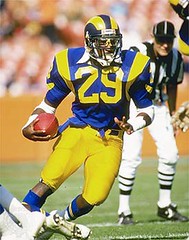
• The Florida situation was reversed on the Rams’ pre-2000 jerseys: The 2 had a lower serif when used on the chest (home, road) but not when used on the sleeve (home, road).
• Same thing for the Bradshaw-era Steelers: Compare the assorted 2s visible in this photo, and in this one.
• The Griese-era Dolphins used a 2 with a lower serif on the front of their jerseys, but the 2 was often serif-free on the back (often — but not always).
• The 1982-83 Sixers were notoriously inconsistent with their 2. Compare Moses Malone and Bobby Jones in this shot, and compare Earl Cureton (front row, third from left) to all the other 2-inclusive uni numbers in this team portrait.
• There’s also some indication that the Namath-era Jets used different 2s on their home and road jerseys, although I’m not yet convinced that this ever happened in the same season. But there definitely appears to have been some 2-related confusion on the white jersey in 1968, as seen in this team photo — check out 42 and 23 in the front row, for example.
Interesting to see that all of yesterday’s and today’s examples have involved 2 and/or 5. Those numbers are obviously typographically related, but why the inconsistencies? Why use one 2 on the chest and a different one on the sleeve? All you type-inclined folks out there (Todd, Scott, Eriq, Original Jim, Steve, Steve’s nephew, etc.), please fill us in.
(Thanks to all contributors, especially Todd Krevanchi, Michael Lewis, Jeff Sandman, and Mike Engle.)
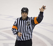
NHL Update: As promised, I called the NHL yesterday to inquire about whether the refs’ armbands would be changing to silver, as the league had announced back in January, or if they’d be staying orange, as suggested by first few preseason games. Here’s the response I got from Dave Baker, the league’s Officiating Manager: “It is my understanding that [Officiating Director] Stephen Walkom is working with CCM/Reebok to re-design the officials’ uniform for the 2008-2009 season. What that will look like, I cannot say, as Stephen is involved in this and not me.” Okay, but what about this season? “Well, all the jerseys were distributed at camp for this season,” wrote Baker, “so I believe any changes were put off for this season until the 2008-2009 season to allow CCM/Reebok to design something that is acceptable by Stephen and the League.” In other words, he had no idea what the hell I was talking about (neither did the publicist who forwarded my query to him), which shows once again how the NHL is really on top of things.
I also posted a query to the message board at nhlofficials.com, where linesman Jean Morin posted a reply late last night: “The referees will wear the orange armbands for the regular season. There were a lot of rumors about this change last year, but that’s all they were, rumors.” That’s untrue — the league office specifically told me back in January that they’d be making the switch to silver this season. Looks like we’ve got serious case of confusion with a side order of revisionist history.
Meanwhile, Dave Delisle has provided the closest thing to a rational explanation for the new rounded hemlines:
I work at EA Canada, where NHL 08 is produced. After implementing the new jerseys into the game, I noticed the hemline’s intended effect: They raised the sides to accommodate the skating stride. The old jerseys would ride upwards when the stride was extended. Some players tucked their jerseys in to accommodate a better stride. Remember, the new jerseys were originally intended to be entirely tucked in, until the players cried foul.
Incidentally, when I saw all the jerseys, I cringed at two-thirds of them. Everyone here groaned at the Canucks jerseys — the fallout was what we predicted.
Uni Watch Bonus Material: As most of you know, I occasionally contribute non-uni material to ESPN.com. Every now and then, however, they somehow fail to recognize the genius in the nuggets I send their way. One such item was a little missive about Barry Bonds, which I rather liked but they chose not to publish. Rather than let it die a quiet death, I’m gonna publish it here:
Call it the Prodigal Slugger Syndrome: If you’re a serious home run hitter, you end up back where you started. Take Babe Ruth — he began his career with the Boston Red Sox and ended it with the Boston Braves. Jimmy Foxx was a two-time MVP with the Philadelphia A’s but didn’t call it quits until he’d played one last season with the Phillies. Willie Mays first patrolled center field for the New York Giants, and then limped into retirement after a year and a half with the Mets. And Hank Aaron broke in with the Milwaukee Braves, so where did he play his final two seasons? With the Brewers, of course.
So it seems inevitable that Barry Bonds will be heading back to Pittsburgh, where his tumultuous career began. Only problem is, the Prodigal Slugger Syndrome dictates that you must return to your original city but to not to your original team. Since there’s only one baseball team in Pittsburgh, here are some other Steel City teams Bonds could play for:
Pittsburgh Steelers
Pros: Everyone’s head looks big in a football helmet. ”¦ Compared to most NFL players, Bonds is a model citizen. ”¦ A 16-game season is about all he’s capable of handling these days anyway. ”¦ New sensation at halftime: home run derby!Cons: New teammates might not be too understanding about some of Barry’s, um, proclivities. ”¦ “So what are these ‘two-a-days’ I keep hearing about?”
Pittsburgh Penguins
Pros: Pens desperately in need of good attendance draw. ”¦ Hot new broadcast slogan: “He shoots up, he scores!” ”¦ Admit it, you’ve always wanted to see Bonds get punched in the face.Cons: Major potential for controversy if Bonds tries to drink steroids straight from the Stanley Cup. ”¦ “Wait a minute, you mean this game is actually played on ice?”
Pitt Panthers Basketball Team
Pros: All the coeds, keggers, and “Girls Gone Wild” DVDs one aging athlete can handle.Cons: All the coeds, keggers, and “Girls Gone Wild” DVDs one aging athlete can handle. ”¦ Frat-house hazing could take further toll on already declining skills. ”¦ Slight NCAA eligibility problem.
Uni Watch News Ticker: On-site report from Bob Weston, who sent me the following text message from Monday night’s Reds/Cubs game: “I swear it looks like there’s’ a space between the E and the R on Ryan Theriot’s jersey. No camera.” ”¦ Rumor-mongering note from a reader who didn’t give his full name, as follows: “I’ve heard from a few friends that, at one point, the Bengals were thinking of switching from the striped helmets to ones with two airbrushed tiger eyes (one on each side).” I’ve never heard about this. Anyone else? ”¦ This is just too funny. ”¦ Those new NHL practice socks are, um, not a good idea (as spotted by Chris O’Connor). ”¦ Our recent mentions of college/pro all-star games led to this note from Jay Danbom: “My grandfather played in the 1937 game against the Green Bay Packers. I have his all-star game uni. I’m on the road right now for my job, but I did happen to scan pictures from the program about a year ago and meant to email them to you, so here they are.” ”¦ A reader who prefers to remain anonymous recently visited the Hockey Hall of Fame and forwarded two photos of interest: this gorgeous 1923-24 Ottawa Senators jersey, and Wayne Gretzky’s Team Canada jersey, adornd with a little Canadian flag pin. ”¦ Shane Pappas notes that Arizona State’s Troy Nolan has been doing the striped belt routine. ”¦ Can’t keep the old-school facemask brigade down. Yesterday it was Morten Andersen; today it’s Scott Player, the man whose facemask can double as a chinstrap. ”¦ Good catch by Bryan Redemske, who notes that Carlos Silva has been wearing vertically ribbed socks. … Nice rundown of World Series rings here. … Derek Hinson notes that the Crimson Tide, who wore white shoelaces last year, have switched to black this season. … Reprinted from last night’s comments: Here’s the red “no contact” jersey that Derek Lowe recently wore in pregame warmups. … Richard Craig has found the perfect Uni Watch stocking stuffer: uniform history fridge magnets (additional examples here and here).
OK, Paul … explain the No Mas “ad” (quotes since it doesn’t refer to an event that is yet to take place).
It always looked to me that the Gators at some point early on in the Spurrier era had flopped the 2s and 5s, using upside-down 2s for 5s and vice versa.
I can’t explain why shoulder/sleeve numbers would be completely different from their front/back counterparts. I know that shoulder/sleeve numbers tend to be wider proportionally than the others, but that doesn’t explain the lack of a serif on the 2’s or the extra notch on the bowl of the 5’s.
The NHL practice socks kind of look like the color-reverse of those cheap skeleton link…only with skates for footies instead of some cool kicks.
If the 82-83 Sixers were inconsistent in their use of 2’s, you sure can’t tell from the two pictures provided. The team photo is so small it’s hard to tell – but the more I look at the two pictures and the more I think that all the 2’s had serifs.
[quote comment=”144447″]OK, Paul … explain the No Mas “ad” (quotes since it doesn’t refer to an event that is yet to take place).[/quote]
It’s sort of an all-purpose No Mas ad — it’s more about enhancing their brand visibility than anything else. I actually suggested that they make it more about their T-shirts, but they resisted that idea.
Also: If you’re using Firefox on a Mac, the ad doesn’t link to anything (an odd bug that we tried and failed to fix). Any other browser (including, I think, Firefox on a PC) and it links to the No Mas home page.
I’ve said it before, but it bears repeating: No Mas totally rocks. The t-shirts, the blog, the basic thinking behind the project. I remain a big fan, and not just because they chose to advertise.
B[quote comment=”144451″]If the 82-83 Sixers were inconsistent in their use of 2’s, you sure can’t tell from the two pictures provided. The team photo is so small it’s hard to tell – but the more I look at the two pictures and the more I think that all the 2’s had serifs.[/quote]
Both the Sixers and Knicks did have serifs. The difference is that some of the 2’s were “block” and some were “slanted”
If the 82-83 Sixers were inconsistent in their use of 2’s, you sure can’t tell from the two pictures provided. The team photo is so small it’s hard to tell – but the more I look at the two pictures and the more I think that all the 2’s had serifs.
I think that there are two issues at play: serifs v. sans serif, and diagonal line v. a more blocked style (like an upside down 5).
With Sidney Crosby, Evgeni Malkin and Jordan Staal the Penguins are hardly in need of a “good attendance draw.”
Ok, I see it now. Thanks for pointing that out. With all the serif/no serif examples before that, that’s what I was looking for, not noticing the slant/block inconsistencies.
This section of the post is a bit confusing, and, I think, erroneous:
Meanwhile, Dave Delisle has provided the closest thing to a rational explanation for the new rounded hemlines:
“I work at EA Canada, where NHL 08 is produced. After implementing the new jerseys into the game, I noticed the hemline’s intended effect: They raised the sides to accommodate the skating stride. The old jerseys would ride upwards when the stride was extended. Some players tucked their jerseys in to accommodate a better stride. Remember, the new jerseys were originally intended to be entirely tucked in, until the players cried foul.”
If the jerseys were originally intended to be tucked-in, clearly the purpose of the hemline was to accomodate the tuck — not the skating stride, as claimed.
Additionally, during my hockey days, I tucked one side of my jersey in to better accomodate the body twisting motion involved in shooting (to keep the jersey from “catching” on the breezers a bit). Jersey discomfort from the skating stride, however, was never a concern for me and I never heard it from other players as a concern. I guess that theory doesn’t hold much water for me.
[quote comment=”144455″]With Sidney Crosby, Evgeni Malkin and Jordan Staal the Penguins are hardly in need of a “good attendance draw.”[/quote]
I was going to say the same thing. They actually sold out most of their games last year, and I can’t imagine there are going to be a ton of empty seats this year.
[quote comment=”144457″]This section of the post is a bit confusing, and, I think, erroneous:
Meanwhile, Dave Delisle has provided the closest thing to a rational explanation for the new rounded hemlines:
“I work at EA Canada, where NHL 08 is produced. After implementing the new jerseys into the game, I noticed the hemline’s intended effect: They raised the sides to accommodate the skating stride. The old jerseys would ride upwards when the stride was extended. Some players tucked their jerseys in to accommodate a better stride. Remember, the new jerseys were originally intended to be entirely tucked in, until the players cried foul.”
If the jerseys were originally intended to be tucked-in, clearly the purpose of the hemline was to accomodate the tuck — not the skating stride, as claimed.
Additionally, during my hockey days, I tucked one side of my jersey in to better accomodate the body twisting motion involved in shooting (to keep the jersey from “catching” on the breezers a bit). Jersey discomfort from the skating stride, however, was never a concern for me and I never heard it from other players as a concern. I guess that theory doesn’t hold much water for me.[/quote]
I’m guessing the EA guy dones’t play much hockey, but he kind of hit on the reason for the rounded hemline, I think you just gave the best example though. Even me as a goalie, found it better to tuck a side in to allow for better twisting movement as you described. This explination does make sense to me, but I’ll wait till I tray on such a jersey to descide if the change really makes much difference.
yea[quote comment=”144459″][quote comment=”144455″]With Sidney Crosby, Evgeni Malkin and Jordan Staal the Penguins are hardly in need of a “good attendance draw.”[/quote]
I was going to say the same thing. They actually sold out most of their games last year, and I can’t imagine there are going to be a ton of empty seats this year.[/quote]
yeah they sold out their whole season this year…
Ok, were can I find those magnets?!?
Sorry if this was posted before, but a nice history of the NFL-College All-Star game is herelink
Oops.link
[quote comment=”144466″]yea[quote comment=”144459″][quote comment=”144455″]With Sidney Crosby, Evgeni Malkin and Jordan Staal the Penguins are hardly in need of a “good attendance draw.”[/quote]
I was going to say the same thing. They actually sold out most of their games last year, and I can’t imagine there are going to be a ton of empty seats this year.[/quote]
yeah they sold out their whole season this year…[/quote]
Sorry Paul…I almost never say this, but ESPN was right. If you were going for sarcasm, it didn’t come across. And if you weren’t…well, that’s just wrong!
Wait, when did Pittsburgh get a professional baseball team?
I use Firefox on a PC and the No Mas link does not work.
While doing some research on Ray Bourque I came across a youtube video of the famous scene on Dec. 3, 1987 where Ray Bourque takes off his #7 jersey at Phil Esposito’s #7 jersey retirement and reveals to all his new number of 77.
link
The remarkable thing about the video is that the announcer introduces Bourque as “Ray Bourque, the Captian of the Bruins” and Bourque immediately skates out wearing an “A” on his jersey.
Not only that, wearing the “A” isn’t apparently some sort of tribute to Esposito either, since from 28-36 seconds into the video, just after the crowd shot applauding Bourque’s change to #77, you can clearly see a Bruin in the background with the “C” on his chest. Again, as Esposito speaks to the crowd at 2:41 in the video, you can make out the player with the “C” standing next to the two alternate captains, one of whom is Bourque and the other who is wearing a helmet, putting any end to the idea that the wearer of the “C” might have been an old-timer with a jersey on who was there for the ceremony. At 3:42 & 4:00 you get two more pretty clear looks at him, but at no point can his jersey number be seen.
Does anyone have any idea why “Ray Bourque, the Captian of the Bruins” isn’t the Captian that day and who the mystery Captian might be and why?
the use of dickerson brings up a shot of my favorite facemask.
link as shown above
i dont know the stock name for this style, and it is continued to be used today however with link attaching it to the helmet. ive always like the way this exact one looked with the way its connected as highlighted link
ive always felt that newer reproductions (like the colts one above) looked “cheaper”.
this facemask was made popular collegiately by dickerson in his last year at smu (notice the variations of facemasks he used at this link) link
and in the nfl by james brooks when he began with the chargers. the one link i believe is the earliest incarnation of this model as seen by the way its connected at the side and its blocky nature. I believe that pic is from 81. link is another photo, with an updated version i think also from 81.
i remember an interview with dickerson early in his career when someone asked about his goggles. and his issues with wanting to be the most protected person. thats why he wore the necky, the goggles, that model facemask. and in a pic not used by PL today, the link on his arms.
[quote comment=”144470″][quote comment=”144466″]yea[quote comment=”144459″][quote comment=”144455″]With Sidney Crosby, Evgeni Malkin and Jordan Staal the Penguins are hardly in need of a “good attendance draw.”[/quote]
I was going to say the same thing. They actually sold out most of their games last year, and I can’t imagine there are going to be a ton of empty seats this year.[/quote]
yeah they sold out their whole season this year…[/quote]
Sorry Paul…I almost never say this, but ESPN was right. If you were going for sarcasm, it didn’t come across. And if you weren’t…well, that’s just wrong![/quote]
Yeah … how DARE you speak the truth! Shame on you. You obviously know nothing about journalism in 2007. Don’t ask any tough questions (especially to the actual source of the controversy), and don’t tell the truth in a way that makes it obvious that’s what you’re talking about. It’s all about skirting the issues, that way he won’t try to sue you (not that he would anyway, you know, since it’s the truth … but most journalists have missed out on this little tibit of information). Keep it up! Speak the truth! I get it!tm
I may be wrong, but I believe Alabama is using link lettering this year versus link from all previous years. The numbers just seem to be a lot brighter this season.
A typographic argument for excluding the “spur” of the numeral 2 on the smaller sleeve number could be made. (Simplified characters = better legibility for smaller type.) But it seems more often it’s the other way around. It doesn’t make typographic sense.
Leftwich will wear #4 with the Falcons, not his customary (and Vick-like) #7.
See roster here: link
The Griese-era Dolphins often sported multiple jersey styles in the same game. Bob Griese favored the one you showed with the thick block numerals and no sleeve stripes. The numbers were the same, front and back. The jersey worn by Paul Warfield bears a thinner font; jerseys with this font sometimes had plain sleeves (as in the photo), and sometimes had the 5-stripe pattern. Check old football card photos online; you’ll see what I mean.
Also, the Dallas Cowboys’ shoulder numerals and jersey numbers differed back in the Staubach era when they wore those cool, old-style numbers with the square seriphs. The sleeve numerals were different. Any photo of Staubach or Dorsett would confirm that.
In the 70s, Pittsburgh, Washington and Cincinnati, among other NFL teams, wore the unique Green Bay “5” with the deep angle cut that you described yesterday.
Just read that Chicago is going to unveil their new 2016 Olympic bid logo today.
[quote comment=”144473″]
Does anyone have any idea why “Ray Bourque, the Captian of the Bruins” isn’t the Captian that day and who the mystery Captian might be and why?[/quote]
Per link, Borque was splitting the captaincy with Rick Middleton.
Re: Jerseys tucked in and reasoning.
Those of you who said you did tuck jerseys in have basically proven the EA Sports guys point. You tuck it in to get better movement (in a nutshell, not necessarily for skating as he claimed), and they designed the jerseys to accommodate that. Yes, they did it on both sides, but I venture a guess the only reason you didn’t tuck your jersey in on both sides is because it makes you look like a goof (see Jagr last season), or because the benefit is minimal because you only shoot from one side.
Having the jersey pulled up on the sides eliminates the need to tuck for players who who shoot either way. Part of the trend towards more uniformity in uniforms, which the NHL seems to be shooting strongly for.
Plus, like I said yesterday – the rear hem flaps nicely when someone is flying.
[quote comment=”144472″]I use Firefox on a PC and the No Mas link does not work.[/quote]
Same here. Just for laughs, I tried loading the page in IE7, and the link wasn’t working there, either. I can’t even right-click on it and attempt to open the link in a new tab/window, since it’s a Flash animation.
And, for the record, I have no idea why teams use different 5’s and 2’s. I figure that sometimes, it’s just a case of shoddy quality control (that’s what I attribute that Jets team photo to), but when it’s clearly intentional, like the Packers, I have no idea.
Could link be one of the new alternate logos for the Bobcats? That logo would help tie in more of the blue which is rumored to take the place of orange as the more dominant color.
[quote comment=”144472″]I use Firefox on a PC and the No Mas link does not work.[/quote]
Same here…it shows the URL down in the bottom left of the browser window, but doesn’t take you to the site when you click the link.
I’m I getting old?
When did a basketball team called the “Bobcats” start playing?
Pens desperately in need of good attendance draw.
The article was amusing, but this is not at all the case. The Pens are one of the best draws in the league. One of the biggest complaints about the schedule is that Western conference teams don’t all get to host the Penguins every year. Things have changed in Pittsburgh the last two seasons since the arrival on Crosby.
[quote comment=”144492″]Could link be one of the new alternate logos for the Bobcats? That logo would help tie in more of the blue which is rumored to take the place of orange as the more dominant color.[/quote]
for crissake morrison, clean yourself up. at least look like you are a professional.
[quote comment=”144485″][quote comment=”144473″]
Does anyone have any idea why “Ray Bourque, the Captian of the Bruins” isn’t the Captian that day and who the mystery Captian might be and why?[/quote]
Per link, Borque was splitting the captaincy with Rick Middleton.[/quote]
Note Middleton’s classic stash and balding hair.
God I miss the Garden. First class all the way with the organ and the mis-configured rink.
I wish the NHL would allow teams to have some ability to modify their rinks like baseball does.
Fast team? Bigger surface. Slow? smaller. etc.
I know that the NHL has no character anymore – but I can dream.
Man! Look at those old Rams uniforms…Absolutely beautiful. The best uniforms in the the NFL. Here’s hoping they go back to that….(Even better, here’s hoping they go back to the classic blue and white uniforms).
I’m not sure if you didn’t mention it because it’s very obvious, but in case you didn’t: during a FOX-broadcasted Cubs game this year, a very annoying Cubs employee who introduced the lineups by nickname only made sure to pronounce Theriot’s name as “The Riot”. Perhaps this is being institutionalized?
The Dickerson faceguard was originally known as the “EGOP” by Schutt. (Eye Guard Oral Protection) The Dickerson version has the 1980’s attatchment for the helmet while the James Brooks used the 1970’s version. You are correct in that Dickerson used the EGOP in his senior season at SMU and the “NOPO”(Nose Oral Protection) mask in his previous seasons at SMU. You are also correct that many contemporary players wear a version of the EGOP.
[quote comment=”144501″]The Dickerson faceguard was originally known as the “EGOP” by Schutt. (Eye Guard Oral Protection) The Dickerson version has the 1980’s attatchment for the helmet while the James Brooks used the 1970’s version. You are correct in that Dickerson used the EGOP in his senior season at SMU and the “NOPO”(Nose Oral Protection) mask in his previous seasons at SMU. You are also correct that many contemporary players wear a version of the EGOP.[/quote]
thanks. a good tutorial. so when was the egop introduced? 1982?
The last four shots MAY be NSFW…but who cares?
While I agree that the NHL practice socks look terrible, I chose to focus on the black nameplate with white lettering on the Bruins’ jerseys. I love that look, and it reminds me of the old warm up jackets for the link.
Links aren’t working???
I couldn’t notice anything about the Ram’s jerseys because I was too distracted by the REC SPECS!!!!!
link so its blasphemy – check the last four before you say that! Might be NSFW…
duh….finally remembered proper html….
Could this be one of the new alternate logos for the Bobcats? That logo would help tie in more of the blue which is rumored to take the place of orange as the more dominant color.
Does anyone else think the Bobcats stole their secondary logo style of from the Mavericks? When I saw it yesterday, I immediately thought of the horse head in the basketball.
[quote comment=”144490″]Re: Jerseys tucked in and reasoning.
Those of you who said you did tuck jerseys in have basically proven the EA Sports guys point. You tuck it in to get better movement (in a nutshell, not necessarily for skating as he claimed), and they designed the jerseys to accommodate that. Yes, they did it on both sides, but I venture a guess the only reason you didn’t tuck your jersey in on both sides is because it makes you look like a goof (see Jagr last season), or because the benefit is minimal because you only shoot from one side.
Having the jersey pulled up on the sides eliminates the need to tuck for players who who shoot either way. Part of the trend towards more uniformity in uniforms, which the NHL seems to be shooting strongly for.
Plus, like I said yesterday – the rear hem flaps nicely when someone is flying.[/quote]
But with the old jerseys, the sides flapped too. That’s one of my biggest beefs with the new ones. These guys aren’t speed skaters, the rink’s only 200 ft long.
Man! Look at those old Rams uniforms…Absolutely beautiful. The best uniforms in the the NFL. Here’s hoping they go back to that
Orange and Blue
I distinctly remember when the Rams changed from the Blue and Yellow to Blue and Gold (I actually think they call it Notre Dame Gold, but not sure). I do know one of the reasons they changed, other than $, was they wanted the blue of the helmet to match the blue of the jersey. They did not match in the Blue and Yellow scheme.
“Admit it, you’ve always wanted to see Bonds get punched in the face.”
Um, yes.
I was going to point out a misspelling of link name, but then I found out it’s spelled “Jimmy” on his link. (It’s spelled “Jimmie” in every other instance I’ve ever seen.) Also note the Boston cap despite playing 3 more years with the Athletics than the Red Sox.
As the late, great Rich Ashburn used to say, “Hard to believe, Harry.”
Anyone else notice on the second college/pro All Star Game image that it says “Sam Francis Nebraska Full Back”? He might be a fullback, but he seems to be punting (drop-kicking?)…I know a lot of players did double-duty, but you’d think the guy writing the copy would have maybe mentioned if he were a punter, kicker, etc. Could just be me…..
As for Ryan Theriot – the TV booth announcers, Len Kasper and Bob Brenly (mostly Brenly) consistently call him “the riot”. So it doesn’t surprise me nicknames were used in the lineup. Besides, as stuffy and stodgy as the networks are, sometimes something a bit different is welcome. Gives the home fans something to smile about since they’re about to be disgusted hearing the network call of the game. As for it being institutionalized, I don’t think so. I was at the game last night and his name on his jersey looked normal. But, I’ll keep my peepers on it tonight….
re: Uni Watch Bonus Material… One word: Horrible. This time, your editors at ESPN.com got it right.
Sorry man, no one is perfect.
-Lee
One thing I noticed about the Reebok Edge hockey equipment is that the pants are much bulkier around the hips than the standard. So it makes sense that the jersey is cut to accommodate the extra padding. You want the longer hem to avoid the hockey equivalent of plumber-crack.
[quote comment=”144513″]But with the old jerseys, the sides flapped too. That’s one of my biggest beefs with the new ones. These guys aren’t speed skaters, the rink’s only 200 ft long.[/quote]
I actually find it more noticeable with the new jerseys. With the old jerseys, Mike Modano was the only player you could guarantee would have his jersey flapping. Whether it was how he skated, or how big he wore his jersey, I’m not sure. With the new style, more of the guys have their tail flapping. Maybe its the 12% improvement in speed.
Also, the new jerseys will catch on to the point where the old ones look ridiculous. Team Canada has worn Nike’s SWIFT jerseys for the past couple of seasons. In the recently completed junior Super Series, they switched back to old style jerseys to commemorate the 1972 Summit Series for one game. Those kids looked like they were swimming in material with the old jerseys. It was almost comical.
Good photo gallery of the new NHL sweaters in action
link
Anyone know what the “Pittsburgh 250” Patch means?
I hate how the Panthers, and Oilers have those horizontal half stripes on their inner arms, and I especially hate how the Ducks stripes, if you can call them that, don’t go all the way around and start and end at the under arm section of the sweater.
so is the football stadium in chicago soldier field or soldiers field like the program says…
Jennifer:
The taxonomy of ‘punter’ and ‘kicker’ as separate positions was not practiced in collegiate football until 1941 when the first open substition rules were established. Until then, players withdrawn during the first half could not return to play until the second half and those withdrawn during the second half were done for the game. Therefore, one of the regular 11 had to punt before taking a defensive spot.
Some players, like Sammy Baugh, were called triple threats because they could run, pass and kick. But while Baugh may have punted (and he was very good at it), he would not have been the “punter” at TCU since that really wasn’t a “position” at the time.
[quote comment=”144521″]re: Uni Watch Bonus Material… One word: Horrible. This time, your editors at ESPN.com got it right.
Sorry man, no one is perfect.
-Lee[/quote]
Man, tough crowd. The truth: I’m fascinated by how Ruth, Foxx, Mays, and Aaron all ended up back in the cities where they started, and I wanted to find a way to write about that. Tried to do it this way. Didn’t work? OK — no biggie. I’ll stick to uniforms. Mostly.
Personally, I don’t think the article was that bad, and think some of these comments are pretty rough. It wasn’t ground breaking or anything, but certainly and entertaining read.
As far as the article goes, it is a friggen gem campared to most of the slop on page 2 nowadays.
Further Jets-related “2” issues:
In the mid-to-late ’80s, the Jets had two sets of white jerseys; I believe they were warm-weather and cold-weather variations. These each had slightly different typefaces for both numerals and lettering, as well as different sleeve-stripe thickness. The warm-weather jerseys were the same as the ones they wore from 1978 onward, with diagonal 2’s and thick, rounded lettering; the cold-weather variation had square 2’s and thinner, squared lettering, plus thinner sleeve stripes.
When I get a chance I’ll capture some stills from the DVD, but take a look at the link. Note Mickey Shuler on the left in the cold-weather jersey, and Erik McMillan on the right in the warm-weather version.
(Note also that the Jets wore white at home from 1985-89; coach Joe Walton felt that the white jerseys made his players look bigger. They only wore green a few times during those years, in road games where the opponent chose white, e.g., at Miami and Cleveland. As such, I don’t recall seeing a set of green jerseys with the different typefaces.)
[quote comment=”144533″]Personally, I don’t think the article was that bad, and think some of these comments are pretty rough. It wasn’t ground breaking or anything, but certainly and entertaining read.[/quote]
I thought it was interesting as well but focusing on the wrong person in MLB because there is really no way he can go back to the Pirates.
So the real question is… Who in the 4 major sports (yes, I still count the NHL as a major) has been traded/left from one team to another and might have the ability to go back to another team from that metropolitan area? I can’t think of any of of the top of my head, but you guys are much more resourceful than me
[quote comment=”144520″]Anyone else notice on the second college/pro All Star Game image that it says “Sam Francis Nebraska Full Back”? He might be a fullback, but he seems to be punting (drop-kicking?)…I know a lot of players did double-duty, but you’d think the guy writing the copy would have maybe mentioned if he were a punter, kicker, etc. Could just be me…..
[/quote]
in those days of yore, there was a lot of quick kicking in a game. A LOT. plus the kickers were not specialized as they are today. virtually any player on the field was adept at least at punting.
i think qb sammy baugh still holds the nfl regular season record for punting average, many of which came off of quick kicks.
drop kicking was starting to phase out by the 30’s in football due to the streamlining of the football.
but those all-star unis are dandy!!
[quote comment=”144529″]Good photo gallery of the new NHL sweaters in action
link
Anyone know what the “Pittsburgh 250” Patch means?
[/quote]
250th anniversary of the founding of the city of Pittsburgh.
[quote comment=”144498″]Man! Look at those old Rams uniforms…Absolutely beautiful. The best uniforms in the the NFL. Here’s hoping they go back to that….(Even better, here’s hoping they go back to the classic blue and white uniforms).[/quote]
I’ll second that. I thought that it was a huge mistake when the Rams switched to gold. Blue and yellow would be great, but blue and white would be the best.
[quote comment=”144540″][quote comment=”144533″]Personally, I don’t think the article was that bad, and think some of these comments are pretty rough. It wasn’t ground breaking or anything, but certainly and entertaining read.[/quote]
I thought it was interesting as well but focusing on the wrong person in MLB because there is really no way he can go back to the Pirates.
So the real question is… Who in the 4 major sports (yes, I still count the NHL as a major) has been traded/left from one team to another and might have the ability to go back to another team from that metropolitan area? I can’t think of any of of the top of my head, but you guys are much more resourceful than me[/quote]
for a while, people thought bill parcells did just that, until dallas.
i guess theoretically alonzo mourning or baron davis could return to charlotte.
[quote comment=”144497″][quote comment=”144485″][quote comment=”144473″]
Does anyone have any idea why “Ray Bourque, the Captian of the Bruins” isn’t the Captian that day and who the mystery Captian might be and why?[/quote]
Per link, Borque was splitting the captaincy with Rick Middleton.[/quote]
Note Middleton’s classic stash and balding hair.
God I miss the Garden. First class all the way with the organ and the mis-configured rink.
I wish the NHL would allow teams to have some ability to modify their rinks like baseball does.
Fast team? Bigger surface. Slow? smaller. etc.
I know that the NHL has no character anymore – but I can dream.[/quote]
How was the Garden’s rink misconfigured? That had never been brought to my attention before… now I’m thuroughly intrigued!
[quote comment=”144540″]So the real question is… Who in the 4 major sports (yes, I still count the NHL as a major) has been traded/left from one team to another and might have the ability to go back to another team from that metropolitan area? I can’t think of any of of the top of my head, but you guys are much more resourceful than me[/quote]
As for the NHL, here are all the cities with multiples franchises in the history.
Minnesota (North Star, Wild)
New York (Americans, Rangers, Islanders)
Atlanta (Flames, Thrashers)
Colorado (Rockies, Avalanche)
Pittsburgh (Pirates, Penguins)
Philadelphia (Quakers, Flyers)
St. Louis (Eagles, Blues)
Montreal (Wanderers, Maroons, Canadiens)
Quebec (Bulldogs, Nordiques)
Sure, for some of thoses combinations, players would have need to play for 80 years. :D
Paul, that article you wrote is complete shit.
Few things. It is Solider Field, not Soldiers.
I know the old Chicago Stadium rink was smaller than regulation, shrinking the neutral zone. I think it was something like 15 feet shorter.
Onto Paul and his piece. Add Sammy Sosa to a guy who is ending where he started, that is if he doesn’t leave the Rangers. At the same time we as writers need to go with what we believe is good work and stick with it. Somebody out there will like what we have to say. If we just kept things to ourselves who knows what we’d be missing out on.
[quote comment=”144534″]As far as the article goes, it is a friggen gem campared to most of the slop on page 2 nowadays.[/quote]
This is so painfully true. (I liked Paul’s rejected contribution, for the most part. I can’t stand most of Page 2 any more, for the most part.)
[quote comment=”144548″]Few things. It is Solider Field, not Soldiers.
I know the old Chicago Stadium rink was smaller than regulation, shrinking the neutral zone. I think it was something like 15 feet shorter.
Onto Paul and his piece. Add Sammy Sosa to a guy who is ending where he started, that is if he doesn’t leave the Rangers. At the same time we as writers need to go with what we believe is good work and stick with it. Somebody out there will like what we have to say. If we just kept things to ourselves who knows what we’d be missing out on.[/quote]
Paul was going for players that ended up in the same city that they started but for different teams.
(ie
St. Louis – Browns/Cardinals
Seattle – Pilots/Mariners
New York – Mets/Yankees/Dodgers/Giants
Oakland/San Fran – A’s/Giants
Chicago – Cubs/White Sox
Boston – Red Sox/Braves
Philadelphia – A’s/Phillis
Kansas City – A’s/Royals
…and the list goes on.)
[quote comment=”144539″]Further Jets-related “2” issues:
In the mid-to-late ’80s, the Jets had two sets of white jerseys; I believe they were warm-weather and cold-weather variations. These each had slightly different typefaces for both numerals and lettering, as well as different sleeve-stripe thickness. The warm-weather jerseys were the same as the ones they wore from 1978 onward, with diagonal 2’s and thick, rounded lettering; the cold-weather variation had square 2’s and thinner, squared lettering, plus thinner sleeve stripes.
When I get a chance I’ll capture some stills from the DVD, but take a look at the link. Note Mickey Shuler on the left in the cold-weather jersey, and Erik McMillan on the right in the warm-weather version.
(Note also that the Jets wore white at home from 1985-89; coach Joe Walton felt that the white jerseys made his players look bigger. They only wore green a few times during those years, in road games where the opponent chose white, e.g., at Miami and Cleveland. As such, I don’t recall seeing a set of green jerseys with the different typefaces.)[/quote]
The reason there are two different typefaces is because the jerseys were made by two different manufacturers. The jersey Shuler is wearing was made by Sand Knit while the “22” jersey was made by Champion. In the 60’s, 70’s and 80’s, the number font on the jerseys was often determined by which company manufactured it. In that era, Sand Knit, Russell Athletic and Champion were the primary suppliers (with King O’Shea, Southland Athletic and Wilson supplying a couple of teams). A Champion jersey was usually identifiable by the slanted middle of the 2s and the curved 7’s. Sand Knit and Russell used standard block fonts, but there were slight differences. Sand Knit produced the jerseys with the notched 5’s used by Green Bay, Pittsburgh, Cincinnati, etc… The Russell jerseys were somewhat narrower than the Sand numbers, particularly on the sleeves.
Per the late 1930s college/pro football all-star games…
1) Many teams ran single and double wing formations where the halfback also did most of the passing and kicking. The QB called the plays as the coach was not allowed to signal plays in and subs weren’t allowed. The QB was often a blocking back on a running play.
2) Anyone else find it funny that so many of the ads for football games at the time showed someone in an exaggerated kicking extension? Yes, it was used to score more then than now, where it looks like a boring old punt. Passing wasn’t as big then but why now show a player running or plowing into people? The dramatic kick pose looks like a merger of a drop-kick and a cheerleading cheer…
I know it’s not really uni related, but it’s something that’s been on my mind for years and I suspect you guys are the only ones I can talk about it without ending up in a psychiatric ward.
So here I go : Back in the 80’s when I started following Football, I remember being amazed that a guy named “Marino” would play for a team named “the Dolphins”. In fact it was such a perfect match that I thought at the time that it was some kind of stage name.
Since then, I’ve been thinking about what would be the perfect name for the star player on each and every NFL Team. I’ve come up with a little list and I’d like your collective two cents on that :
49ers : Ted Goldmine, Saul Nugget
Rams : Albert Fleece, Shaun Battering
Cardinals : Andrew Bishop, Al Loser
Seahawks : Jonathan Livingstone
Giants : Lemuel Gulliver
Cowboys : Todd Brokeback
Redskins : Paul Slur (son of Rachel), Teddy N****r
Eagles : James Talon, Booh Menot
Buccaneers : Edward Teach
Falcons : AJ Hawk (could’ve happened), Ron Mexico
Saints : Henry Katrina, Buddy Holy, Peter Devil
Panthers : Alfredo Bagheera
Vikings: Harald Gunnalfredson, JoeHorn(s)
Bears : Winnie Hunny
Lions: Billy Cowardly
Packers : Ted Cheesehead
Steelers : Ed Foundry, Larry Ingot
Browns : Al Orange
Bengals : Calvin Hobbes, Matmatah Kashmir
Ravens : Ray Corax
Bills : William Cody
Patriots : Franklin Benjamin, Abraham Zapruder, Dick Tricky
Dolphins: Harry Flipper
Jets : Steve Afterburner, Arthur Crashenburn
Chargers : Will Lightning
Raiders : John Looter, Bill Twix
Broncos : Pete Stallion
Chiefs : Ettore Boyardee, Fred Flintstone
Colts : Bob Barbaro
Texans : Staten Obvious, Cleveland Ohioan
Titans : DeShawn Cronos
Jaguars : Bob Typehe
[quote comment=”144561″]I know it’s not really uni related, but it’s something that’s been on my mind for years and I suspect you guys are the only ones I can talk about it without ending up in a psychiatric ward.
So here I go : Back in the 80’s when I started following Football, I remember being amazed that a guy named “Marino” would play for a team named “the Dolphins”. In fact it was such a perfect match that I thought at the time that it was some kind of stage name.
Since then, I’ve been thinking about what would be the perfect name for the star player on each and every NFL Team. I’ve come up with a little list and I’d like your collective two cents on that :
49ers : Ted Goldmine, Saul Nugget
Rams : Albert Fleece, Shaun Battering
Cardinals : Andrew Bishop, Al Loser
Seahawks : Jonathan Livingstone
Giants : Lemuel Gulliver
Cowboys : Todd Brokeback
Redskins : Paul Slur (son of Rachel), Teddy N****r
Eagles : James Talon, Booh Menot
Buccaneers : Edward Teach
Falcons : AJ Hawk (could’ve happened), Ron Mexico
Saints : Henry Katrina, Buddy Holy, Peter Devil
Panthers : Alfredo Bagheera
Vikings: Harald Gunnalfredson, JoeHorn(s)
Bears : Winnie Hunny
Lions: Billy Cowardly
Packers : Ted Cheesehead
Steelers : Ed Foundry, Larry Ingot
Browns : Al Orange
Bengals : Calvin Hobbes, Matmatah Kashmir
Ravens : Ray Corax
Bills : William Cody
Patriots : Franklin Benjamin, Abraham Zapruder, Dick Tricky
Dolphins: Harry Flipper
Jets : Steve Afterburner, Arthur Crashenburn
Chargers : Will Lightning
Raiders : John Looter, Bill Twix
Broncos : Pete Stallion
Chiefs : Ettore Boyardee, Fred Flintstone
Colts : Bob Barbaro
Texans : Staten Obvious, Cleveland Ohioan
Titans : DeShawn Cronos
Jaguars : Bob Typehe[/quote]
You sir, get an A++ for being able to avoid your boss and be able to do that. Bravo.
[quote comment=”144532″]Man, tough crowd. The truth: I’m fascinated by how Ruth, Foxx, Mays, and Aaron all ended up back in the cities where they started, and I wanted to find a way to write about that. Tried to do it this way. Didn’t work? OK — no biggie. I’ll stick to uniforms. Mostly.[/quote]That’s actually really fascinating, though baseball teams just don’t move like they used to. Montreal was, IMHO, the exception that proves the rule about relocations.
You won’t see high-value franchises like the Giants or the White Sox flirting with moves to Florida, and now that Washington has the Nationals, I can’t think of any current or former MLB city getting another franchise.
For what it’s worth, neither Sadaharu Oh, the international home run champ, nor his Yomiuri Giants left Tokyo, whatever that means to Bonds or the slugger parallel.
[quote comment=”144548″]Few things. It is Solider Field, not Soldiers.
[/quote]
ive seen many accounts (mostly pre 60’s) of it referred to as soldiers’ field, wonder why?
[quote comment=”144540″]So the real question is… Who in the 4 major sports (yes, I still count the NHL as a major) has been traded/left from one team to another and might have the ability to go back to another team from that metropolitan area? I can’t think of any of of the top of my head, but you guys are much more resourceful than me[/quote]
Alonzo Mourning could end his career back in Charlotte playing for the Bobcats.
[quote comment=”144559″]
The reason there are two different typefaces is because the jerseys were made by two different manufacturers. The jersey Shuler is wearing was made by Sand Knit while the “22” jersey was made by Champion. In the 60’s, 70’s and 80’s, the number font on the jerseys was often determined by which company manufactured it. In that era, Sand Knit, Russell Athletic and Champion were the primary suppliers (with King O’Shea, Southland Athletic and Wilson supplying a couple of teams). A Champion jersey was usually identifiable by the slanted middle of the 2s and the curved 7’s. Sand Knit and Russell used standard block fonts, but there were slight differences. Sand Knit produced the jerseys with the notched 5’s used by Green Bay, Pittsburgh, Cincinnati, etc… The Russell jerseys were somewhat narrower than the Sand numbers, particularly on the sleeves.[/quote]
damn sj, you know your shit! how bout dropping some more knowledge on us!
[quote comment=”144540″]So the real question is… Who in the 4 major sports (yes, I still count the NHL as a major) has been traded/left from one team to another and might have the ability to go back to another team from that metropolitan area? I can’t think of any of of the top of my head, but you guys are much more resourceful than me[/quote]
Doug Gilmour kind of did it. He started with the Flames, but he made his mark with the Maple Leafs. He made various other stops through the league, but he returned to the Leafs in a trade and was injured in his first game, and retired after that.
I can’t see the flash presentation, but check out soldierfield.net as I’m sure they explain the reasons there.
Paul
I liked your prodigal son rule…maybe Barry could end up with the D-Backs since he played college ball at Arizona State…just a suggestion
[quote comment=”144545″]
How was the Garden’s rink misconfigured? That had never been brought to my attention before… now I’m thuroughly intrigued![/quote]
The rink was approx. 190 x 83 ft., which is smaller than the regulation 200 x 85 ft.
[quote comment=”144540″]So the real question is… Who in the 4 major sports (yes, I still count the NHL as a major) has been traded/left from one team to another and might have the ability to go back to another team from that metropolitan area? I can’t think of any of of the top of my head, but you guys are much more resourceful than me[/quote]As others have mentioned, any former Charlotte Hornet can play for the Bobcats. Likewise, a former old Browns left in the NFL (Testaverde could still be a backup for the new Browns, no?).
Then, there’s Anaheim/LA (I count Orange County as LA area), as well as SF/Oakland and NY in MLB, and NY/NJ (or soon to be Brooklyn) in NHL and NBA.
And in Major League Soccer, which is as major league as the NHL these days, San Jose Earthquakes are popping up next year after the previous Earthquakes became the Houston Dynamo (this would be the third rendition of the Quakes, if you count the NASL team from the 70s/80s).
I love that Senators’ jersey. Why have so many NHL team lost their way in the last decade?
[quote comment=”144572″][quote comment=”144540″]So the real question is… Who in the 4 major sports (yes, I still count the NHL as a major) has been traded/left from one team to another and might have the ability to go back to another team from that metropolitan area? I can’t think of any of of the top of my head, but you guys are much more resourceful than me[/quote]
Doug Gilmour kind of did it. He started with the Flames, but he made his mark with the Maple Leafs. He made various other stops through the league, but he returned to the Leafs in a trade and was injured in his first game, and retired after that.[/quote]
How about Casey Stengel who started his career with the Brooklyn Dodgers (1912-1917) and finished with the New York Mets (1962-1965)
[appearing in between with..
as a player
Pittsburgh Pirates (1918-1919
Philadelphia Phillies (1920-1921)
New York Giants (1921-1923)
Boston Braves (1924-1925)
and as a manger with the
Brooklyn Dodgers (1934-1936)
Boston Braves (1938-1943)
New York Yankees (1949-1960)]
He is also the only person to have appeared in uniform for all 4 of the NY teams.
[quote comment=”144562″][quote comment=”144561″]I know it’s not really uni related, but it’s something that’s been on my mind for years and I suspect you guys are the only ones I can talk about it without ending up in a psychiatric ward.
So here I go : Back in the 80’s when I started following Football, I remember being amazed that a guy named “Marino” would play for a team named “the Dolphins”. In fact it was such a perfect match that I thought at the time that it was some kind of stage name.
Since then, I’ve been thinking about what would be the perfect name for the star player on each and every NFL Team. I’ve come up with a little list and I’d like your collective two cents on that :
49ers : Ted Goldmine, Saul Nugget
Rams : Albert Fleece, Shaun Battering
Cardinals : Andrew Bishop, Al Loser
Seahawks : Jonathan Livingstone
Giants : Lemuel Gulliver
Cowboys : Todd Brokeback
Redskins : Paul Slur (son of Rachel), Teddy N****r
Eagles : James Talon, Booh Menot
Buccaneers : Edward Teach
Falcons : AJ Hawk (could’ve happened), Ron Mexico
Saints : Henry Katrina, Buddy Holy, Peter Devil
Panthers : Alfredo Bagheera
Vikings: Harald Gunnalfredson, JoeHorn(s)
Bears : Winnie Hunny
Lions: Billy Cowardly
Packers : Ted Cheesehead
Steelers : Ed Foundry, Larry Ingot
Browns : Al Orange
Bengals : Calvin Hobbes, Matmatah Kashmir
Ravens : Ray Corax
Bills : William Cody
Patriots : Franklin Benjamin, Abraham Zapruder, Dick Tricky
Dolphins: Harry Flipper
Jets : Steve Afterburner, Arthur Crashenburn
Chargers : Will Lightning
Raiders : John Looter, Bill Twix
Broncos : Pete Stallion
Chiefs : Ettore Boyardee, Fred Flintstone
Colts : Bob Barbaro
Texans : Staten Obvious, Cleveland Ohioan
Titans : DeShawn Cronos
Jaguars : Bob Typehe[/quote]
You sir, get an A++ for being able to avoid your boss and be able to do that. Bravo.[/quote]
Ditto….great stuff!
You sir, get an A++ for being able to avoid your boss and be able to do that. Bravo.
Actually I live in France, so we’re already past office hours. But Thanks anyway.
that small topic that PL was fascinated with got me thinking.
what small uni/sports topics are you guys fascinated with.
for me its tim mcauliffe sports.
if you take a look at the auctions that sell old jerseys, you will notice this boston athletic supply house as the manufacturer of jerseys and hats for teams like the a’s, ny giants, and red sox among other teams.
what happened to this guy?
and since he was from boston, and did the red sox, did he create the numeral font styling for the red sox?
i mean, it is currently called mcauliffe font.
when he did the a’s uni’s this font carried over for a period time as well.
id be interested to hear any info on this…
[quote comment=”144570″][quote comment=”144559″]
The reason there are two different typefaces is because the jerseys were made by two different manufacturers. The jersey Shuler is wearing was made by Sand Knit while the “22” jersey was made by Champion. In the 60’s, 70’s and 80’s, the number font on the jerseys was often determined by which company manufactured it. In that era, Sand Knit, Russell Athletic and Champion were the primary suppliers (with King O’Shea, Southland Athletic and Wilson supplying a couple of teams). A Champion jersey was usually identifiable by the slanted middle of the 2s and the curved 7’s. Sand Knit and Russell used standard block fonts, but there were slight differences. Sand Knit produced the jerseys with the notched 5’s used by Green Bay, Pittsburgh, Cincinnati, etc… The Russell jerseys were somewhat narrower than the Sand numbers, particularly on the sleeves.[/quote]
damn sj, you know your shit! how bout dropping some more knowledge on us![/quote]
The reason that you see two different number fonts in the 1968 Jets team photo is that the Jets changed from the font similar to what the Cowboys used to wear to the font you see the Jets wear in Super Bowl III in 1968. In that era, it was common for jerseys from previous seasons to be worn, usually as a backup. I have never seen evidence of Namath wearing the 1967 jersey in 1968, but looking at the 1968 Highlight film, I did notice Larry Grantham, Verlon Biggs and Johnny Sample wearing the old jerseys during the season. The Sample one sticks in my memory because they were playing Houston in a rain storm at Shea and I noticed he had on the Cowboy-font jersey. I wondered whether he went to the old-style jersey because the new one got wet in the first half and he changed to a dry one at halftime.
I like how, on the Mets’ uniform history magnet, the 1999 jersey has number 69 on it. I wonder how that got by the licensing people at MLB.
[quote comment=”144561″]I know it’s not really uni related, but it’s something that’s been on my mind for years and I suspect you guys are the only ones I can talk about it without ending up in a psychiatric ward.
So here I go : Back in the 80’s when I started following Football, I remember being amazed that a guy named “Marino” would play for a team named “the Dolphins”. In fact it was such a perfect match that I thought at the time that it was some kind of stage name.
Since then, I’ve been thinking about what would be the perfect name for the star player on each and every NFL Team. I’ve come up with a little list and I’d like your collective two cents on that :
49ers : Ted Goldmine, Saul Nugget
Rams : Albert Fleece, Shaun Battering
Cardinals : Andrew Bishop, Al Loser
Seahawks : Jonathan Livingstone
Giants : Lemuel Gulliver
Cowboys : Todd Brokeback
Redskins : Paul Slur (son of Rachel), Teddy N****r
Eagles : James Talon, Booh Menot
Buccaneers : Edward Teach
Falcons : AJ Hawk (could’ve happened), Ron Mexico
Saints : Henry Katrina, Buddy Holy, Peter Devil
Panthers : Alfredo Bagheera
Vikings: Harald Gunnalfredson, JoeHorn(s)
Bears : Winnie Hunny
Lions: Billy Cowardly
Packers : Ted Cheesehead
Steelers : Ed Foundry, Larry Ingot
Browns : Al Orange
Bengals : Calvin Hobbes, Matmatah Kashmir
Ravens : Ray Corax
Bills : William Cody
Patriots : Franklin Benjamin, Abraham Zapruder, Dick Tricky
Dolphins: Harry Flipper
Jets : Steve Afterburner, Arthur Crashenburn
Chargers : Will Lightning
Raiders : John Looter, Bill Twix
Broncos : Pete Stallion
Chiefs : Ettore Boyardee, Fred Flintstone
Colts : Bob Barbaro
Texans : Staten Obvious, Cleveland Ohioan
Titans : DeShawn Cronos
Jaguars : Bob Typehe[/quote]
Who/what is Teddy N****r?
[quote comment=”144575″][quote comment=”144545″]
How was the Garden’s rink misconfigured? That had never been brought to my attention before… now I’m thuroughly intrigued![/quote]
The rink was approx. 190 x 83 ft., which is smaller than the regulation 200 x 85 ft.[/quote]
Its common to have misconfigured rinks in college hockey. In the CCHA i know that Alaska and Northern Michigan both play on international size rinks (much bigger) while Ferris State plays on a smaller one (i think). I dont like it at all. Sports in the same league need to be played on the same field everywhere. Of course I have no problem with and like different fences in baseball, but you would never consider having different length basepaths in MLB stadiums.
To touch on what post #27 mentioned, the Dolphins did wear 2 types of Jerseys during the ’72 (and I think ’71) seasons. Check out photos of SB VII against the Redskins (particularly sideline shots) and you’ll see it. You’ll also notice that the uniforms that didn’t have the serif on the 2 also didn’t have it on the front of those uniforms. And you’ll have to check me on this, but I believe the inconsistent uniform look may have lead to, uh, “uniformity” in NFL dress code.
I third the motion that Paul’s article was better than most of the crap on Page 2 now.
Going back to yesterday for a minute:
Teebz, I am not sure how I would feel if the Twins got an alternate black uni. Obviously, I would be elated because I love black, but I would also be deeply disappointed because black is not a team color.
For any non-MN teams, however, I am ALL about the black. All-black all-the-time is still a dream of mine. Speak to me not of practicality–I can dream, can’t I?
[quote comment=”144467″]Ok, were can I find those magnets?!?[/quote]
You can find them at certain NFL team shops and on eBay (here are examples for the link, link, and link). The baseball ones may not be officially on the market yet.
Sorry I forgot to put this in yesterday when people were talking about the Redskins and their possibly mismatched colors. The Packers had a definite 2 tone green jersey in the mid 90’s. I never noticed it on TV, but in person during day and night games it was very noticable that the shoulders were much darker than the lower section. It was definitly a case of 2 different materials, but ridiculous non-the-less. This also carried true with the replica jerseys from that time. Sorry I don’t have time to post a pic since I’m at work.
Chicago 2016’s new logo has been unveiled:
The Chicago Star:
link
[quote comment=”144598″]Chicago 2016’s new logo has been unveiled:
The Chicago Star:
link
Not bad … but the original version was MUCH better.
I like how, on the Mets’ uniform history magnet, the 1999 jersey has number 69 on it. I wonder how that got by the licensing people at MLB.
The Mets are associated with ’69 for their “Miracle” championship that year. For those of you too young to remember, it was the equivalent of the Rays winning the World Series next year.
New Chicaog Olympic Bid logo out link
I like that they took the star off the Chicago flag and incorperated it. After that I’m neutral on it.
[quote comment=”144598″]Chicago 2016’s new logo has been unveiled:
The Chicago Star:
link
Feh…..I liked the link better – I get teh whole thing about the star being iconic, but how many folks in Chicago know what the points on the star stand for? I live in the far west burbs of Chicagoland, and I have no friggin’ idea….but I can pick off the John Hancock building silhouette in the top part of the “flame” logo
For all of you people who claimed to have tucked in your hockey jerseys to gain better movement, STOP KIDDING YOURSELVES! It does no more good to tuck in a jersey. The only thing it makes you do is look like you are wearing an adult diaper. The new hemline is just for show. Bright Idea! If any minor league teams do a tuxedo jersey, they can use the RBK Edge uniform and make it look super-spiffy and white tie!
To clarify, Gretzky in fact did tuck in his jersey, but that was because he was so much younger than everybody else on his team that they didn’t have a jersey to fit him. Not because it gave him better range of motion. He ended up scoring a lot of goals, and you know hockey players and their superstitions…
[quote comment=”144576″][quote comment=”144540″]So the real question is… Who in the 4 major sports (yes, I still count the NHL as a major) has been traded/left from one team to another and might have the ability to go back to another team from that metropolitan area? I can’t think of any of of the top of my head, but you guys are much more resourceful than me[/quote]As others have mentioned, any former Charlotte Hornet can play for the Bobcats. Likewise, a former old Browns left in the NFL (Testaverde could still be a backup for the new Browns, no?).
quote]
I dont think Cleveland would count since there are no “new” Browns and “old” Browns. Cleveland kept all their records. The team that moved to Baltimore may have been the Browns players, but it was not the Browns.
I’m personally fascinated by Arena Football League jerseys…which are some of the most creatively designed (if nothing else) uniforms in all of professional sports.
In what other league would it be acceptable for a team to take the field wearing a Zubaz-inspired getup like the Tampa Bay Storm did in the early ’90s.
[quote comment=”144589″][quote comment=”144575″][quote comment=”144545″]
How was the Garden’s rink misconfigured? That had never been brought to my attention before… now I’m thuroughly intrigued![/quote]
The rink was approx. 190 x 83 ft., which is smaller than the regulation 200 x 85 ft.[/quote]
Its common to have misconfigured rinks in college hockey. In the CCHA i know that Alaska and Northern Michigan both play on international size rinks (much bigger) while Ferris State plays on a smaller one (i think). I dont like it at all. Sports in the same league need to be played on the same field everywhere. Of course I have no problem with and like different fences in baseball, but you would never consider having different length basepaths in MLB stadiums.[/quote]
Also in the minors. ECHL for example: Augusta and Columbia are far smaller. In Columbia, the players can skate through the neutral zone in about 3 strides. Before the 2 line pass died, it was brutal to watch a game there. Whistle every 20 seconds, almost literally.
[quote comment=”144496″][quote comment=”144492″]Could link be one of the new alternate logos for the Bobcats? That logo would help tie in more of the blue which is rumored to take the place of orange as the more dominant color.[/quote]
for crissake morrison, clean yourself up. at least look like you are a professional.[/quote]
well he is a self-proclaimed fan of che guevara so my guess is he’s just trying to look the part.
Re: Is it Soldier or Soldiers Field?
Depends on how long you’ve been a Chicagoan. Long-timers can call it Soldiers.
And the baseball stadium on the North Side? Cubs Park.
The old one on the South Side? Sox Park.
It’s almost an air of authenticity: just call it by its former name.
49ers still play at Candlestick right?
[quote comment=”144467″]Ok, were can I find those magnets?!?[/quote]
On the Mets magnet, why would they use #14 that is retired on a jersey Hodges never wore?
My wife noticed the space on Theriot’s jersey as well. She wanted to why they had “The Riot” on the back of his jersey. My son and I looked at each other and cringed.
I am quite sure this has been mentioned already, but maybe this example has not been used. Greg Jennings has different “5’s” on his shoulder #’s then on the front/back of the uni.
link
[quote comment=”144592″][quote comment=”144467″]Ok, were can I find those magnets?!?[/quote]
You can find them at certain NFL team shops and on eBay (here are examples for the link, link, and link). The baseball ones may not be officially on the market yet.[/quote]
link the Packers magnet set.
[quote comment=”144591″]
Going back to yesterday for a minute:
Teebz, I am not sure how I would feel if the Twins got an alternate black uni. Obviously, I would be elated because I love black, but I would also be deeply disappointed because black is not a team color.
For any non-MN teams, however, I am ALL about the black. All-black all-the-time is still a dream of mine. Speak to me not of practicality–I can dream, can’t I?[/quote]
I suppose you’re right, Minna. Dreams are certainly allowed, but I dream in technicolor, not black-and-white. ;o)
[quote comment=”144601″]New Chicaog Olympic Bid logo out link
I like that they took the star off the Chicago flag and incorperated it. After that I’m neutral on it.[/quote]
The Chicago flag star is a good touch. The rest of it is a pile of made up new age touchy-feely shite. I liked it more when I didn’t know what thye pretended various aspects of the logo meant.
SB
[quote comment=”144581″]that small topic that PL was fascinated with got me thinking.
what small uni/sports topics are you guys fascinated with.
Easy – Goalie masks. The designs, styles, evolution, backplates, cages, and, of course, the paint jobs. When we were kids, goalie cards were the diamonds in a hockey card pack, especially if the goalie was in action. The maskless pics (usually a national anthem or bench pic were tremendous let-downs for my friends and me.
SB
Some inconsistent Cowboys numbers:
link
link
link
link
link
Dennis
Not quite uniform related, but I thougth this would be the best place to ask for help.
Can anyone provide photographic evidence of a Scott Pippen candy bar?
[quote comment=”144542″][quote comment=”144529″]Good photo gallery of the new NHL sweaters in action
link
Anyone know what the “Pittsburgh 250” Patch means?
[/quote]
250th anniversary of the founding of the city of Pittsburgh.[/quote]
I guess DW needs to add that to his FAQs.
[quote comment=”144533″]Personally, I don’t think the article was that bad, and think some of these comments are pretty rough. It wasn’t ground breaking or anything, but certainly and entertaining read.[/quote]
It basically called the kettle black, raised an eyebrow – but I had no problem with it. Shoot it to the moon!
Regarding the two’s and the five’s: equipment managers probably preferred the boxy two’s, without the serif. In a pinch, an upside down, inside out two can be sown on a jersey in place of a five, and vice versa.
James P – about the uniform magnets – I saw some here in Chicago at Jewel food store. Go to a large chain store grocery in your town and look around the front on the store. They’re probably near any sport related stuff- mugs, cheap hats, impulse buy stuff. Limited to local teams, I bet.
[quote comment=”144512″]Could this be one of the new alternate logos for the Bobcats? That logo would help tie in more of the blue which is rumored to take the place of orange as the more dominant color.
Does anyone else think the Bobcats stole their secondary logo style of from the Mavericks? When I saw it yesterday, I immediately thought of the horse head in the basketball.[/quote]
The logo is similar, yes, but the typeface of “Carolina Caravan” is almost identical to the Mavericks’ typeface. I saw that immediately, but had to think about the logo after you mentioned it.
I’ve never seen the Mavs’ font anywhere else. Why would another NBA team use it?
re: 95
The only year the Dolphins wore 2 styles of jerseys was 1972. 1971 was stripeless, and 1973 was with stripes. In 1972 they introduced a new striped jersey, but many players chose to wear their 1971 shirts.
The helmet decal is another story, now don’t get me started…
This was a bit odd, seeing Ireland Rugby in a link. Just for practice but a double take nonetheless.
You would thinnk the Tribune Co would know their own products uniform? link Notice Lou has a road hat on with his home jersey.
Joe B. I did play hockey and I did tuck in my jersey for function. I was a goalie and found if I tucked in the jersey on my stick side I had better movement of that arm than if the jersey was untucked.
The squared serifs of the 1970’s Cowboys jerseys are my all-time favorite. Here’s another pic, this time of link showing the difference between the chest/shoulder number. This is a good shot of link and the “5” treatment. I know it was mentioned the Jets had this style number but it looks like the link did too at one time.
I watched the movie Invincible for the first time last weekend and I was pleased to see they made an effort to try and re-create the uniforms shown, even the detail of having the top helmet stripe of the 1976 Cowboys as red-white-blue (to commemorate the Bicentennial) instead of the usual blue-white-blue. But the Cowboys jerseys themselves were link and looked like they got them made at K-Mart.
Finally, I know a lot of you must be familiar with this series of link which depicts the histories of a team’s unis but as a Cowboys fans, when I first bought this I was really appalled at the egregious typeface error they made on the #52 jersey right in the middle – correct squared serifs on the #5 with a mismatched #2. UGH!
I don’t knbow if the is uniform related…. They released Dale Jr.’s new paint scheme today! Pretty ugly if you ask me….
try this agian….link
The Edmonton Oilers were also culprits of the upside-down-two-as-five situation. Their 1984-85 Smythe Division Champions banner that hung in the rafters at Rexall Place had an upside-down two as the five. When the team replaced and auctioned off the old banners, they actually had the new banner sewn the same way, with the upside-down two intact.
[quote comment=”144572″][quote comment=”144540″]So the real question is… Who in the 4 major sports (yes, I still count the NHL as a major) has been traded/left from one team to another and might have the ability to go back to another team from that metropolitan area? I can’t think of any of of the top of my head, but you guys are much more resourceful than me[/quote]
Doug Gilmour kind of did it. He started with the Flames, but he made his mark with the Maple Leafs. He made various other stops through the league, but he returned to the Leafs in a trade and was injured in his first game, and retired after that.[/quote]
Actually, Doug Gilmour started with St. Louis….he was traded to the Flames…
Junior’s new car looks awful. But I’ll bet that diecast will still outsell all the others in 2008 just because of who he is.
[quote comment=”144532″][quote comment=”144521″]re: Uni Watch Bonus Material… One word: Horrible. This time, your editors at ESPN.com got it right.
Sorry man, no one is perfect.
-Lee[/quote]
Man, tough crowd. The truth: I’m fascinated by how Ruth, Foxx, Mays, and Aaron all ended up back in the cities where they started, and I wanted to find a way to write about that. Tried to do it this way. Didn’t work? OK — no biggie. I’ll stick to uniforms. Mostly.[/quote]
Hey Man,
I dug the article.
You forgot Reggie (I know, technically he started in KC, but it was the KC A’s.
Roger
Interesting to note that Comiskey Park was originally called “Sox Park” when it opened in 1910. In 1913 it was changed to Comiskey Park. When Bill Veeck sold the team for the first time in 1959, it reverted back to “Sox Park” until Veeck again purchased the team in 1975 and changed it back to “Comiskey Park.” He also tore out the infield astroturf. As far as I know, “Soldier Field” has always been “Soldier Field.”
[quote comment=”144616″][quote comment=”144467″]Ok, were can I find those magnets?!?[/quote]
On the Mets magnet, why would they use #14 that is retired on a jersey Hodges never wore?[/quote]
Same with the Phillies #20
As a JR fan that paint scheme is pretty dissappointing.
Well, Sports Illustrated has a photo gallery of of famous folds come pennant time. Did anyone else notice the Phillies batting helmet seems to have a link like the Cubs do?
On ESPN Classic right now, UCLA at Washington, 1988. UCLA does the same thing with the serif-less 2 on the sleeve, while it’s serif-mania on the chest.
I also thought maybe for a smaller font, the serif disappears. Like the way the hole in the R is filled in on the back of Butterfield’s Blue Jays jersey due to a longer name, hence a smaller font size. But I guess not if some unis have chest without serif and sleeve with.
It also looks like Washington may be leaving a serif off the 7 on their sleeves, but not sure.
I hope I don’t get my membership revoked for this, but…
I don’t really mind the new RBK Edge jerseys. I don’t like the new Canucks sweater, and I could care less about the Isles’ or Panthers’, and it’s also given way to some link new link (even linkone). Plus the Ree-Box sucks, but it could be link.
My biggest beef with them is that the sleeves below the elbow look too damn tight. When I was in high school, we had practice jerseys. I kept the same one freshman year through senior year (superstition… never washed it either, it’s pretty rank), and as my pads and I grew bigger, the lower parts of the sleeves got uncomfortably tight (especially because of the forearm guard on my elbow pads. Being a center I got slashed a lot, so they were necessary). Our game jerseys were nice and roomy, but that practice sweater felt restrictive.
The Edge jersey sleeves look just like that old jersey of mine. If I felt limited wearing it in practice in high school, I couldn’t imagine playing a whole NHL season with it. Does the new material give more? Do they players not care?
Of all the design aesthetics, I think this sucks the biggest; after all, how aerodynamic do your arms need to be?
[quote comment=”144628″]Not quite uniform related, but I thougth this would be the best place to ask for help.
Can anyone provide photographic evidence of a Scott Pippen candy bar?[/quote]
See this completed ebay auction
link
dissapointed that Alabama switched to black laces, always thought the white laces with the black shoes gave them and USC a very sharp unique look
Uni and O.J. Simpson related:
Taft High School in Cincinnati lost their uniforms in a fire at the school last week. Colerain High School loaned them uniforms for them to play their game last weekend.
Cincinnati restaurateur Jeff Ruby stepped up and bought Taft HS all new uniforms that will be debuted at their game this week.
If you remember, during this years Kentucky Derby in Louisville, KY, O.J. Simpson was refused service at a steakhouse by the owner.
That owner: Jeff Ruby
[quote comment=”144661″]Well, Sports Illustrated has a photo gallery of of famous folds come pennant time. Did anyone else notice the Phillies batting helmet seems to have a link like the Cubs do?[/quote]
Never noticed it did in ’64, but it link.
[quote comment=”144661″]Well, Sports Illustrated has a photo gallery of of famous folds come pennant time. Did anyone else notice the Phillies batting helmet seems to have a link like the Cubs do?[/quote]
I think the logo might be peeling off.
[quote comment=”144671″]Uni and O.J. Simpson related:
Taft High School in Cincinnati lost their uniforms in a fire at the school last week. Colerain High School loaned them uniforms for them to play their game last weekend.
Cincinnati restaurateur Jeff Ruby stepped up and bought Taft HS all new uniforms that will be debuted at their game this week.
If you remember, during this years Kentucky Derby in Louisville, KY, O.J. Simpson was refused service at a steakhouse by the owner.
That owner: Jeff Ruby[/quote]
What the hell does that have to do with O.J Simpson?
Ruby put O.J. out of his steakhouse. And refused him service.
Read it again…slowly.
Jr picks 88
link
[quote comment=”144673″][quote comment=”144661″]Well, Sports Illustrated has a photo gallery of of famous folds come pennant time. Did anyone else notice the Phillies batting helmet seems to have a link like the Cubs do?[/quote]
I think the logo might be peeling off.[/quote]
And, looks like Johnny’s got the hat under the helmet thing going. I always thought that was an underrated look.
[quote comment=”144666″][quote comment=”144628″]Not quite uniform related, but I thougth this would be the best place to ask for help.
Can anyone provide photographic evidence of a Scott Pippen candy bar?[/quote]
See this completed ebay auction
link
i used to get michael jordan fruit snacks
they were 10 times better than gummi bears
see ended auction
link
Always nice to see some pictures of Eric Dickerson back in his SMU days. With the TCU game this weekend–and it being thoroughly possible we’ll end up giving the Iron Skillet back to the frogs–it helps to remember that our program was top 25 at one time.
[quote comment=”144678″][quote comment=”144673″][quote comment=”144661″]Well, Sports Illustrated has a photo gallery of of famous folds come pennant time. Did anyone else notice the Phillies batting helmet seems to have a link like the Cubs do?[/quote]
I think the logo might be peeling off.[/quote]
And, looks like Johnny’s got the hat under the helmet thing going. I always thought that was an underrated look.[/quote]
Brian Hausberg, Ridgefield High School, 1992: First person I ever saw who wore his hat backwards under his helmet when he batted. Can anyone beat this?
About the Pippen bar, looks like the company that made the Cal Bar. Very similar packaging. My dad got me a Cal Bar on a trip to Baltimore. I left it in a box after a move, and a mouse found it. I should’ve just eaten the damn thing in the first place.
[quote comment=”144680″]Always nice to see some pictures of Eric Dickerson back in his SMU days. With the TCU game this weekend–and it being thoroughly possible we’ll end up giving the Iron Skillet back to the frogs–it helps to remember that our program was top 25 at one time.[/quote]
Normally I would say change your wording from “thoroughly possible” to “100% likely” of a TCU win this weekend, but after 2 losses to Texas (who almost lost to UCF) and Air Force, who knows really? All I know is I won’t be in attendance this time, making 2 straight Iron Skillet matchups that I’ve missed (and you know the other one).
To digress for a moment…now that I live in Dallas I ventured up to Ford Stadium to see the SMU/Texas Tech crowd and tailgate. Nice area, and great idea having all the college girls wear white dresses on a rainy Labor Day. Genius planning there. But at least you beat UNT. Keep them in their place as the #3 college football program in the Metroplex.
FWIW: The Harvard [football] Stadium was/still is known as “Soldiers Field.”
[quote comment=”144644″]I don’t knbow if the is uniform related…. They released Dale Jr.’s new paint scheme today! Pretty ugly if you ask me…. [/quote]
Why did they just stick the other sponsor’s stickers on there just seemingly random?
Its like 3M gave them a $1.50 bumper sticker, and they just pasted it on where it fit?
Half of the stickers have different background colors, and end up just a slapped-on square.
[quote comment=”144644″]I don’t knbow if the is uniform related…. They released Dale Jr.’s new paint scheme today! Pretty ugly if you ask me…. [/quote]
Also, I figured he’d just use the exact same “8” font. That way all the people who purchased stickers, could just buy another one and slap it next to the original…
[quote comment=”144685″][quote comment=”144680″]Always nice to see some pictures of Eric Dickerson back in his SMU days. With the TCU game this weekend–and it being thoroughly possible we’ll end up giving the Iron Skillet back to the frogs–it helps to remember that our program was top 25 at one time.[/quote]
Normally I would say change your wording from “thoroughly possible” to “100% likely” of a TCU win this weekend, but after 2 losses to Texas (who almost lost to UCF) and Air Force, who knows really? All I know is I won’t be in attendance this time, making 2 straight Iron Skillet matchups that I’ve missed (and you know the other one).
To digress for a moment…now that I live in Dallas I ventured up to Ford Stadium to see the SMU/Texas Tech crowd and tailgate. Nice area, and great idea having all the college girls wear white dresses on a rainy Labor Day. Genius planning there. But at least you beat UNT. Keep them in their place as the #3 college football program in the Metroplex.[/quote]
True, we lost to Arkansas State last weekend and we beat them like a red headed step child last year. It’s either going to be a high scoring, exciting game, or a low scoring boring one. We did beat NTCC, er UNT, but gave up 600 yards of passing in the process. That gave me sick feeling just typing that again.
Ah yes the Boulevard for Tailgate. More people go to this than the actual games unfortunately. I’m glad you’ve gotten to see the Boulevard in all it’s gameday glory. The trick is to find the tents that give away free food and beer, just don’t mention that you went to TCU though.
I will actually be in Ft. Worth for the game this year. This will only be the second road game I’ve gone to, and both have been after graduation.
The sororities actually wore white against Tech because we wanted to stand out against the waves of Red Raiders fans. That it rained that day was just a happy coincidence.
watching old episodes of friday night lights today, noticed the Dillon Panthers switched their jerseys on the series after the pilot episode.
link
link
I always thought that Miroslav Satan should have played for the New Jersey Devils, Martin St. Louis for the Blues, and Jeremy Shockey for the San Diego Chargers.
link worn by Barcelona in the UEFA Champions League today. Apart from the awful logo creep, that is.
[quote comment=”144687″][quote comment=”144644″]I don’t knbow if the is uniform related…. They released Dale Jr.’s new paint scheme today! Pretty ugly if you ask me…. [/quote]
Why did they just stick the other sponsor’s stickers on there just seemingly random?
Its like 3M gave them a $1.50 bumper sticker, and they just pasted it on where it fit?
Half of the stickers have different background colors, and end up just a slapped-on square. /quote]
They get paid bonus from those companies during the races for different things. If they want to included in those side competions they need the stickers on the car. Example Petty doesn’t have the link on there cars, so they are not able to win the “Bud Pole Award”.
[quote comment=”144644″]I don’t knbow if the is uniform related…. They released Dale Jr.’s new paint scheme today! Pretty ugly if you ask me…. [/quote]
It is the ugliest car ever! Nondescript, nothing unique, and red to compliment green??? OMG – I think the Reebok Edge Jerseys might rate above this paint scheme… Really though, shouldn’t Amp Energy Drink have an AMPED UP paint scheme????
you may not be a lacrosse fan but you have to love this jersey (especially the socks)
link
[quote comment=”144688″][quote comment=”144644″]I don’t knbow if the is uniform related…. They released Dale Jr.’s new paint scheme today! Pretty ugly if you ask me…. [/quote]
Also, I figured he’d just use the exact same “8” font. That way all the people who purchased stickers, could just buy another one and slap it next to the original…[/quote]
Eeeew… I’m not big into NASCAR nor am I big into beer stuff, but going from the Budweiser car to driving a Mt. Dew car that looks that bad is (preemptive pardons for this analogy) like going from a Nike car one year to a LA Gear car the next. It’s a pretty noticeable step backwards if you ask me, and it’s hilarious to watch Jr. speaking through his teeth and act like he’s enjoying the change.
…but now that I think about it, maybe the back wheels of the car could have radical-cool lights in them if it were sponsored by LA Gear. Hmmmm…
[quote comment=”144664″]I hope I don’t get my membership revoked for this, but…
I don’t really mind the new RBK Edge jerseys. I don’t like the new Canucks sweater, and I could care less about the Isles’ or Panthers’, and it’s also given way to some link new link (even linkone). Plus the Ree-Box sucks, but it could be link.
My biggest beef with them is that the sleeves below the elbow look too damn tight. When I was in high school, we had practice jerseys. I kept the same one freshman year through senior year (superstition… never washed it either, it’s pretty rank), and as my pads and I grew bigger, the lower parts of the sleeves got uncomfortably tight (especially because of the forearm guard on my elbow pads. Being a center I got slashed a lot, so they were necessary). Our game jerseys were nice and roomy, but that practice sweater felt restrictive.
The Edge jersey sleeves look just like that old jersey of mine. If I felt limited wearing it in practice in high school, I couldn’t imagine playing a whole NHL season with it. Does the new material give more? Do they players not care?
Of all the design aesthetics, I think this sucks the biggest; after all, how aerodynamic do your arms need to be?[/quote]
I read an article today where the author was speculating about how the tightness of the sweaters could cutdown on some physical play (aka fighting).
[quote comment=”144529″]Good photo gallery of the new NHL sweaters in action
link
Anyone know what the “Pittsburgh 250” Patch means?
I hate how the Panthers, and Oilers have those horizontal half stripes on their inner arms, and I especially hate how the Ducks stripes, if you can call them that, don’t go all the way around and start and end at the under arm section of the sweater.[/quote]
You can kinda see Atlanta’s All-Star patch in the one pic of their game.
The 1960s and 1970s Cowboys jerseys were made by Southland Athletic, which also made all of the basketball uniforms for the Dallas School District high school teams in the early ’70s. The shoulder/arm number font was on every one of those Dallas high school jerseys so it’s very familiar to me.
I suspect Southland either used different fonts for convenience’s sake or because the smaller serifed numbers didn’t work as well in that size.
Todd,
Various versions of the EGOP mask have been around from the time of the earliest metal facemasks (1950’s). However the James Brooks style has only been around since the seventies. Also, I believe you are correct that the Dickerson style EGOP model began around 81 or 82.(Around the same time time they started to produce the ‘double wire’ version of the OPO, NOPO, JOPO, etc.)
[quote comment=”144650″][quote comment=”144572″][quote comment=”144540″]So the real question is… Who in the 4 major sports (yes, I still count the NHL as a major) has been traded/left from one team to another and might have the ability to go back to another team from that metropolitan area? I can’t think of any of of the top of my head, but you guys are much more resourceful than me[/quote]
Doug Gilmour kind of did it. He started with the Flames, but he made his mark with the Maple Leafs. He made various other stops through the league, but he returned to the Leafs in a trade and was injured in his first game, and retired after that.[/quote]
Actually, Doug Gilmour started with St. Louis….he was traded to the Flames…[/quote]
Pat LaFontaine. Mainly a Buffalo Sabre, but his tenure there was sandwiched by his first and last teams: the NY Islanders and the NY Rangers.
Totally 100% off every single topic and maybe a little too obscure, but Jean-Claude Darcheville of Glasgow Rangers had his Under Armour undershirt on backwards tonight in the game against Stuttgart. Sort of visible here (It’s the bluish patch at the top of his collar, on TV the UA Locker Tag was clearly visible because of the v-neck on the Ger’s shirt) link
He removed the shirt at half time and scored the winning penalty, coincidence? link
[quote comment=”144711″][quote comment=”144650″][quote comment=”144572″][quote comment=”144540″]So the real question is… Who in the 4 major sports (yes, I still count the NHL as a major) has been traded/left from one team to another and might have the ability to go back to another team from that metropolitan area? I can’t think of any of of the top of my head, but you guys are much more resourceful than me[/quote]
Doug Gilmour kind of did it. He started with the Flames, but he made his mark with the Maple Leafs. He made various other stops through the league, but he returned to the Leafs in a trade and was injured in his first game, and retired after that.[/quote]
Actually, Doug Gilmour started with St. Louis….he was traded to the Flames…[/quote]
Pat LaFontaine. Mainly a Buffalo Sabre, but his tenure there was sandwiched by his first and last teams: the NY Islanders and the NY Rangers.[/quote]
Good call.
Links don’t seem to be working for me but noticed that Jean-Claude Darcheville of Glasgow Rangers was wearing his Under Armour undershirt backwards against Stuttgart tonight. It looked like he removed the shirt at half-time and then he went on to score the winning penalty, coincidence?
The pics I linked to didn’t show it really well anyway, but on TV the locker room tag (which is always on the back just below the collar) was clearly visible under his chin, especially with the Ger’s v-neck jersey.
I was just looking at the rbk edge gallery, I really enjoy the new Blue Jackets homes. That’s a good looking sweater.
You can find all of the Uniform History Magnets here…
link
They make all of those uniform history plaques that I always thought were sorta cheesy, but on are actually pretty cool.
Just watching Sportsnet, and they showed a “historical” clip of a team called North Bay Centennials. They were a team that wore link while , just like the Flyers did.
Scratch that “while”
That shot was cut to lay over the SI logo (however they did it exactly back then). It could be a case of the person laying out the cover cutting around the brighter P but trimming off the edge of the helmet in shadow.
I don’t know if this has been mentioned already, but I see that some NHL teams are adhering rather loosely to the regulations about white jerseys on the road and darks at home. There have already been three games this preseason where the teams were wearing the wrong unis: Colorado at Phoenix on Tuesday, Toronto at Edmonton yesterday, and Calgary-Florida at a neutral site yesterday. (Florida was technically the home team.)
I may hate ManU but next year is the 50 year anniversary of the Munich plane crash that killed most of the team that they called “Busby’s babes.” I’m wondering if they are planning on have a memorial patch or special shirt for the weekend closest?
[quote comment=”144711″][quote comment=”144650″][quote comment=”144572″][quote comment=”144540″]So the real question is… Who in the 4 major sports (yes, I still count the NHL as a major) has been traded/left from one team to another and might have the ability to go back to another team from that metropolitan area? I can’t think of any of of the top of my head, but you guys are much more resourceful than me[/quote]
Doug Gilmour kind of did it. He started with the Flames, but he made his mark with the Maple Leafs. He made various other stops through the league, but he returned to the Leafs in a trade and was injured in his first game, and retired after that.[/quote]
Actually, Doug Gilmour started with St. Louis….he was traded to the Flames…[/quote]
Pat LaFontaine. Mainly a Buffalo Sabre, but his tenure there was sandwiched by his first and last teams: the NY Islanders and the NY Rangers.[/quote]
Bill Ranford did it twice. He was drafted by the Boston Bruins and was traded to the Edmonton Oilers. He was later traded back to the Bruins, and after quick stints with Washington, Tampa Bay, and Detroit, he finished his career with the Oilers.
DEAL OR NO DEAL….
tonight on Deal or No Deal, it is a NFL special. And guess what? There are something like 7 ex-NFLers on the show, in their teams’ old uniform. And guess what again? Eric Dickerson is on with his old LA Rams jersey….with the serif on the front 2 and no serif on the shoulder
[quote comment=”144701″][quote comment=”144644″]I don’t knbow if the is uniform related…. They released Dale Jr.’s new paint scheme today! Pretty ugly if you ask me…. [/quote]
It is the ugliest car ever! Nondescript, nothing unique, and red to compliment green??? OMG – I think the Reebok Edge Jerseys might rate above this paint scheme… Really though, shouldn’t Amp Energy Drink have an AMPED UP paint scheme????[/quote]
Junior has stated that he doesn’t like fancy paint schemes, so the guy who designed them took that advice to heart.
[quote comment=”144738″][quote comment=”144711″][quote comment=”144650″][quote comment=”144572″][quote comment=”144540″]So the real question is… Who in the 4 major sports (yes, I still count the NHL as a major) has been traded/left from one team to another and might have the ability to go back to another team from that metropolitan area? I can’t think of any of of the top of my head, but you guys are much more resourceful than me[/quote]
Doug Gilmour kind of did it. He started with the Flames, but he made his mark with the Maple Leafs. He made various other stops through the league, but he returned to the Leafs in a trade and was injured in his first game, and retired after that.[/quote]
Actually, Doug Gilmour started with St. Louis….he was traded to the Flames…[/quote]
Pat LaFontaine. Mainly a Buffalo Sabre, but his tenure there was sandwiched by his first and last teams: the NY Islanders and the NY Rangers.[/quote]
Bill Ranford did it twice. He was drafted by the Boston Bruins and was traded to the Edmonton Oilers. He was later traded back to the Bruins, and after quick stints with Washington, Tampa Bay, and Detroit, he finished his career with the Oilers.[/quote]
John Vanbiesbrouck…
started with NY Rangers.
After Florida & Philly, he went to the NY Islanders, then the NJ Devils to complete the NY Metro Area trifecta, AND end in the same area.
Did you know Soldier Field in Chicago used to be link It once held over 100,000, and seemed to be the length of two football fields. The Bears would play at one end, the Cardinals at the…- Ok, I’m kidding about that. But this is link
It’s morphed alot before it’s current “George Jetson meets the Acropolis” form. Which I like.
The Pens’ “Pittsburgh 250” patch brings up an interesting question: will other teams in Pittsburgh follow suit for 2008 seasons? And if so, will they use the same design and city colors (black and gold), or will they adapt it to their own schemes? The colors would match a link or link jersey, but if, say, link or link did it, it wouldn’t look too good.
[quote comment=”144671″]Uni and O.J. Simpson related:
Taft High School in Cincinnati lost their uniforms in a fire at the school last week. Colerain High School loaned them uniforms for them to play their game last weekend.
Cincinnati restaurateur Jeff Ruby stepped up and bought Taft HS all new uniforms that will be debuted at their game this week.
If you remember, during this years Kentucky Derby in Louisville, KY, O.J. Simpson was refused service at a steakhouse by the owner.
That owner: Jeff Ruby[/quote]
The Ruby-doo! Does he still serve Macademia Nut Pie @ The Waterfront?
[quote comment=”144581″]that small topic that PL was fascinated with got me thinking.
what small uni/sports topics are you guys fascinated with.
quote]
To this day I’m still fascinated by the CFL and when it expanded to the US. As I recall, the team in Baltimore was going to be called the Colts until the NFL put the kibosh on that. So they temporarily named them the CFL’s! Eventually, they renamed them the Stallions and I think may have even won the Grey Cup. Blasphemous! I also recall the team in Memphis(?) had a huge logo on the front of their jerseys, not even sure if they had numbers there. Paul, you should do an article about these teams.
[quote comment=”144643″]The squared serifs of the 1970’s Cowboys jerseys are my all-time favorite. Here’s another pic, this time of link showing the difference between the chest/shoulder number. This is a good shot of link and the “5” treatment. I know it was mentioned the Jets had this style number but it looks like the link did too at one time.
I watched the movie Invincible for the first time last weekend and I was pleased to see they made an effort to try and re-create the uniforms shown, even the detail of having the top helmet stripe of the 1976 Cowboys as red-white-blue (to commemorate the Bicentennial) instead of the usual blue-white-blue. But the Cowboys jerseys themselves were link and looked like they got them made at K-Mart.
Finally, I know a lot of you must be familiar with this series of link which depicts the histories of a team’s unis but as a Cowboys fans, when I first bought this I was really appalled at the egregious typeface error they made on the #52 jersey right in the middle – correct squared serifs on the #5 with a mismatched #2. UGH![/quote]
URP. is that…..the 67 Ice Bowl I think?
Sore point (to this day) for Cowboys.
Damn quotes!
Watching the Jays-Red Sox game. Mike Timlin came in for the Sox in the 8th, and in close-ups there were two or three clearly visible holes in his cap (sorry, no image). I know a lot of guys stick with a cap even once the sweat stains set in and the shape is lost, but does anybody know of any other MLBers with actual holes in their hats?
[quote comment=”144637″]re: 95
The only year the Dolphins wore 2 styles of jerseys was 1972. 1971 was stripeless, and 1973 was with stripes. In 1972 they introduced a new striped jersey, but many players chose to wear their 1971 shirts.
The helmet decal is another story, now don’t get me started…[/quote]
A quick uni-history of the Dolphins (60s and 70s):
1966-1969: Wilson uniforms, stripes on sleeves
1970-1971: Wilson uniforms, no stripes on sleeves
1972: A “mish-mash” of Wilson with stripes (Vern den Herder); Wilson without stripes (Bob Griese); Sand Knit with stripes (Nick Buoniconti). And that’s just the white uniforms, which they wore, home and away. The aqua uniforms, which they rarely wore, were all Wilson without stripes.
1973: Russell uniforms, stripes on sleeves (thru 1986)
I gave it a couple of run-throughs in Photoshop using a blank car template from the Indianapolis Motor Speedway site (not COT though), just for fun. One thing I noticed right away is that it is hard to try to unclutter all of those sponsors, especially since the colors of the two major sponsors do not really work well together (part of the reason that I bet the official version has so much white). I used a different Mountain Dew logo for the rear fenders, because the stretched font on the real car looks impossible to read or recognize.
I also threw on some different scallops behind the number to sort of pay homage to the old design, which is likely trademarked by his step-mother (like the old 8).
Sorry about the large file sizes.
link
link
(Having the same logo on the rear fender and behind the door number on the NG car strikes me as stupid, so I changed it.)
link
[quote comment=”144684″]About the Pippen bar, looks like the company that made the Cal Bar. Very similar packaging. My dad got me a Cal Bar on a trip to Baltimore. I left it in a box after a move, and a mouse found it. I should’ve just eaten the damn thing in the first place.[/quote]
Same thing happened to me with a Reggie Bar. Despite what the critics said, I found the Reggie Bar to be quite tasty.
Yep, Dale Jr.’s new paint scheme is very ugly all right. Magnifying the problem is the stubby front end of the Car-of-Tomorrow cars. Those cars do not do any favors to questionable paint schemes.
[quote comment=”144766″]
I gave it a couple of run-throughs in Photoshop using a blank car template from the Indianapolis Motor Speedway site (not COT though), just for fun. One thing I noticed right away is that it is hard to try to unclutter all of those sponsors, especially since the colors of the two major sponsors do not really work well together (part of the reason that I bet the official version has so much white). I used a different Mountain Dew logo for the rear fenders, because the stretched font on the real car looks impossible to read or recognize.
I also threw on some different scallops behind the number to sort of pay homage to the old design, which is likely trademarked by his step-mother (like the old 8).
Sorry about the large file sizes.
link
link
(Having the same logo on the rear fender and behind the door number on the NG car strikes me as stupid, so I changed it.)
link[/quote]
I don’t mean to be mean, but that’s not an improvement from what was shown today. Personally I think Kevin King did a fantastic job working with the sponsors and the COT.
Earnhardt couldn’t have kept the same “style” of the 8s on his new car. Dale Earnhardt Incorporated owns the trademark on that particular style of 8 used on the car. It is made to look like the Intimidator’s #3 (the joke is that “3 and 3 make 8.”) Thus, unless Hendrick or Dale Jr. was willing to pay off DEI, that 8 design was going to have to stay with DEI.
I’ve been away from the site for a few days as work has been a killer, sorry if this has already been covered. But I have been looking forward to what the New Jersey Devils new sweaters (jerseys) may look like and doing a google search turned up link on AOL and they link to a link that shows the new sweater from a bunch of different angles.
I’m very happy that Lou didn’t mess with a good design. Shoulder yokes, full sleeve striping and a hemline stripe! This is how hockey should look.
So the real question is… Who in the 4 major sports (yes, I still count the NHL as a major) has been traded/left from one team to another and might have the ability to go back to another team from that metropolitan area? I can’t think of any of of the top of my head, but you guys are much more resourceful than me
Doug Gilmour kind of did it. He started with the Flames, but he made his mark with the Maple Leafs. He made various other stops through the league, but he returned to the Leafs in a trade and was injured in his first game, and retired after that.
Actually, Doug Gilmour started with St. Louis….he was traded to the Flames…
Pat LaFontaine. Mainly a Buffalo Sabre, but his tenure there was sandwiched by his first and last teams: the NY Islanders and the NY Rangers.
Bill Ranford did it twice. He was drafted by the Boston Bruins and was traded to the Edmonton Oilers. He was later traded back to the Bruins, and after quick stints with Washington, Tampa Bay, and Detroit, he finished his career with the Oilers.
John Vanbiesbrouck…
started with NY Rangers.
After Florida & Philly, he went to the NY Islanders, then the NJ Devils to complete the NY Metro Area trifecta, AND end in the same area.
Guy Lafleur Played his first career with the Canadiens, retired long enough to be inducted into the Hall of Fame, then came back with Rangers before finishing with the Nordiques.
A couple things–has anybody pointed out that Michigan’s fb jerseys have a white swoosh on them this year instead of yellow? Obviously, this is the real reason for their poor performance.
Also, Greg Maddox is the only ML baseball player I’ve noticed who does not wear an undershirt beneath his jersey. Are there others?
Finally, if anybody hears what Barry Melrose has to say about the new NHL jerseys (and I’m sure he’ll have a few words), please pass them on to the rest of us, as his opinions are often astute and always entertaining.
Many thanks and good evening!
Paul,
Sand-Knit (Medalist) football jerseys underwent a major change in 1974, with the advent of the World Football League. NFL uniforms (Packers, Bengals, Lions, to name a few) changed, too; the font for every number (not just 2 and 5) was different.
I don’t have a lot of pics, but you can see the difference linkand link. (The Lions also wore Wilson jerseys at that time, but the font was the same as that on a Sand-Knit jersey.)
Both the blue/white and the blue/yellow Rams unis were great. Also loved the yellow jerseys worn in the late 50’s by Norm Van Brocklin (seen in photos, not live!) Didn’t the Rams were those yellow jerseys when all teams wore throwbacks? I’ll have to click on Paul’s link.
In the mid-70’s I discovered that mask worn by Dickerson and Brooks in an old sporting goods store. I actually played against Brooks in 1976, but I can’t remember if he wore it in high school, or at Auburn. Great athlete.
If I were Dale Jr. I would have gone with #38. Both his Dad’d number and Jr’s number. To me it says Dale Jr. just lookin at it. Thats just my opinion. As far as the cars go I’m neutral on them though I like the Amp car a bit more than the N/G car.
[quote comment=”144520″]Anyone else notice on the second college/pro All Star Game image that it says “Sam Francis Nebraska Full Back”? He might be a fullback, but he seems to be punting (drop-kicking?)…I know a lot of players did double-duty, but you’d think the guy writing the copy would have maybe mentioned if he were a punter, kicker, etc. Could just be me…..[/quote]
Ya back then they did everything, once you went into a game you couldn’t come out for the quarter unless you were hurt, so everybody had an offensive, defensive and multiple special teams positions. My grandfather who was a fullback for Notre dame also place-kicked, punted and kick offed for Notre Dame in ’36.One time I asked him about Sam Francis (since my grandfather was the backup fullback in the ’37game), and he said Sam was the man that year, he did it all.
[quote comment=”144735″]I may hate ManU but next year is the 50 year anniversary of the Munich plane crash that killed most of the team that they called “Busby’s babes.” I’m wondering if they are planning on have a memorial patch or special shirt for the weekend closest?[/quote]
Probably not. It’s not really a football thing to put memoril patches on. More likely will be the usual balck armbands closest to Feb 6.
Another likely twist will be a probably kit change The current one is a one-year job, apparently. link was a semi-comemoratitive of the ’56 league champions, so odds are they will put together something that “captures the spirit of ’58” for next year.
SB
[quote comment=”144783″]A couple things–has anybody pointed out that Michigan’s fb jerseys have a white swoosh on them this year instead of yellow? Obviously, this is the real reason for their poor performance.
Also, Greg Maddox is the only ML baseball player I’ve noticed who does not wear an undershirt beneath his jersey. Are there others?
Finally, if anybody hears what Barry Melrose has to say about the new NHL jerseys (and I’m sure he’ll have a few words), please pass them on to the rest of us, as his opinions are often astute and always entertaining.
Many thanks and good evening![/quote]
PJ, I think you are mistaken, it is link
[quote comment=”144801″]Probably not. It’s not really a football thing to put memoril patches on. More likely will be the usual balck armbands closest to Feb 6.
Another likely twist will be a probably kit change The current one is a one-year job, apparently. link was a semi-comemoratitive of the ’56 league champions, so odds are they will put together something that “captures the spirit of ’58” for next year.
SB[/quote]They don’t do memorial patches, but they do do embroideries, like this link.
Also, Nike puts “expiration dates” on their jerseys and this year’s kits are indeed link.
It wouldn’t surprise me if they have special European kits to commemorate the anniversary in addition to regular kits for domestic matches.
During the Padres/Pirates game tonight Tony Gwynn was commenting about the Gold Glove patch that Nyjer Morgan is wearing on his glove. They then showed the glove that actual Gold Glove winner Cesar Izturis wears with the label. Gwynn referred to Morgans glove as the “cheaters glove” because Morgan isn’t a Gold Glove winner. Obviously there are those of us out here that didn’t knowthis.
I like celebrating the fiftieth anniversary of the award, but I think it makes it cheap if anyone can wear the Gold Glove labels.
[quote comment=”144783″]A couple things–has anybody pointed out that Michigan’s fb jerseys have a white swoosh on them this year instead of yellow? Obviously, this is the real reason for their poor performance.
Also, Greg Maddox is the only ML baseball player I’ve noticed who does not wear an undershirt beneath his jersey. Are there others?
Finally, if anybody hears what Barry Melrose has to say about the new NHL jerseys (and I’m sure he’ll have a few words), please pass them on to the rest of us, as his opinions are often astute and always entertaining.
Many thanks and good evening![/quote]
Ricky Ledee
[quote comment=”144806″][quote comment=”144801″]Probably not. It’s not really a football thing to put memoril patches on. More likely will be the usual balck armbands closest to Feb 6.
Another likely twist will be a probably kit change The current one is a one-year job, apparently. link was a semi-comemoratitive of the ’56 league champions, so odds are they will put together something that “captures the spirit of ’58” for next year.
SB[/quote]They don’t do memorial patches, but they do do embroideries, like this link.
Also, Nike puts “expiration dates” on their jerseys and this year’s kits are indeed link.
It wouldn’t surprise me if they have special European kits to commemorate the anniversary in addition to regular kits for domestic matches.[/quote]
Celtic’s current kit includes such an embroidery to commerate their 1967 European Cup victory.
…
[quote comment=”144561″]So here I go : Back in the 80’s when I started following Football, I remember being amazed that a guy named “Marino” would play for a team named “the Dolphins”. In fact it was such a perfect match that I thought at the time that it was some kind of stage name.
Since then, I’ve been thinking about what would be the perfect name for the star player on each and every NFL Team. I’ve come up with a little list and I’d like your collective two cents on that :
[/quote]
Earthwind Moreland, who spent a couple of seasons with the New England Pstriots, also played in NFL Europe for the Rhein Fire.
And yes, they were his mother’s favourite band.
On the topic of Celtic again, this is one impressive last name on the back of a jersey:
Jan Vennegoor of Hesselink
[quote comment=”144666″][quote comment=”144628″]Not quite uniform related, but I thougth this would be the best place to ask for help.
Can anyone provide photographic evidence of a Scott Pippen candy bar?[/quote]
See this completed ebay auction
link
You rock, thanks for the link.
Speaking of inconsistent number 2’s, the cup year Pittsburgh Penguins had different twos than were what was on the sleeves.