Scott Turner and I took an upstate road trip last Thursday, capped off by a double-A ballgame between the Binghamton Mets and the New Britain Rock Cats. And therein lies a tale.
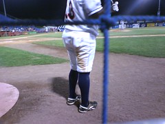
The Mets are one of those franchises that require all their minor league affiliates to hike up their pant cuffs, so we enjoyed the sight of the B-Mets in all their navy-socked glory. But then I noticed something odd about third baseman Vince Harrison: His pants weren’t just hiked up to his calves — they were above his knees, like a baseball version of Dre Bly‘s biker shorts. I’d never seen anything like it on a baseball diamond.
My camera’s batteries had gone dead earlier in the day, but Scott pointed out that I could probably still get some decent pics with my cell phone if I got right next to Harrison while he was on deck. So when Harrison’s next turn in the on-deck circle came up, I scooted down to the front row (ah, the pleasures of a double-A ballpark) and snapped a bunch of shots, which I’ve gathered into a slide show here.
Unfortunately, Harrison wouldn’t turn around while he was on deck, so I couldn’t get a decent photo from the front, where the effect was much more pronounced (best I could do was this this). But at one point I yelled, “Hey, Harrison, what’s the deal with the super-high cuffs?” and he quickly turned his head and said, “Just changin’ it up. Tryin’ somethin’ new, y’know.” And that was that.
My feelings about high-cuffed baseball pants are well-documented. But if you made me choose between Harrison’s look and the pajama style, I’d be hard-pressed to say which was worse. Seeing a ballplayer’s knees just doesn’t feel right. It also appeared to be a high-maintenance operation, because he was fidgeting with his pant cuffs all night. Manwhile, just how long were his socks? Like, was he wearing thigh-high stockings, or pantyhose, or what?
In an apparently unrelated development, there was a bat — the kind with wings and teeth — flying around the field the entire night. It mostly stayed near the field’s perimeter, but every now and then it would dart toward an ump or a player (it almost made one of the New Britain pitchers balk). At one point the bat flitted right past Harrison while I was photographing him in the on deck circle. He damn near jumped out of those super-short pants — and then he readjusted them one more time.
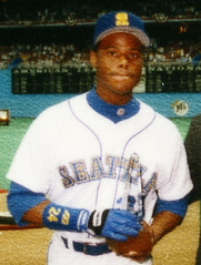
Mariners Mystery Solved: Last week I ran the following note from Jon Buerstatte:
In 1992, when the new owners completed their purchase [of the Mariners] in mid-season, the M’s had an “opening day” celebration. To mark the occasion, the M’s wore their usual white home uniforms, but with “Seattle” on the jerseys instead of “Mariners.” That had great significance at the time, because the team was constantly the subject of relocation rumors and the new ownership wanted to send a strong message that the team was the Seattle Mariners, not just the Mariners.
Unfortunately, Buerstatte didn’t have any photos from this game, and I wasn’t able to come up with one either. But then Mariners marketing VP Kevin Martinez got in touch and provided me with this and this. Big thanks to Kevin, and to everyone else who provided tips and leads on this one.
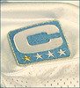
C-ing Stars: An NFL spokesman told me on Friday that the new captains’ patches (first discussed here) would feature “a C with some stars underneath.” And now, thanks to an item on the Lions’ web site, we finally have our first look at what that means, as seen here (and you can sort of see the jersey placement here). As I understand it, each team’s patches will be color-coordinated — i.e., the Lions’ version is blue, but the Cardinals’ will be red, and so on. Not sure why there are four stars, or why one of them is gold, but I’m hoping to get more info today. Update: According to the Detroit Free Press, “The first star is gold. A player will get a gold star for each year he is a captain in the future.” (Thanks to Mike Schmansky for that info.)
Personally, I wish they’d let the teams come up with their own “C” styles, like the NHL and MLB do, instead of imposing a league-wide protocol. But I’m surprised — and relieved — to see that the patch doesn’t include the NFL logo, or a little Lombardi Trophy graphic, or anything else that smells like corporate branding. Verdict: Silly but harmless. Prediction: A one-year experiment that ends up being abandoned next season.
Incidentally, someone over on the Creamer boards said that the Bucs used to designate their captains via shoulder “netting.” I’d never heard this before. Can anyone confirm?
Uni Watch News Ticker: The Penguins will unveil their new uniforms on Wednesday. Details here. … Mike Nolan’s and Jack Del Rio’s sideline suits will be designed by Joseph Abboud. … This eBay auction has ended, but check out those illustrations — great stuff. Anyone ever seen those before? (Nice find by Roger Faso.) … Speaking of eBay, check out this bizarre AHL all-star jersey that Stuart Greenlee found. Never mind the Blues-ish diagonal number — what’s with that misplaced star? … This has resulted in this (with thanks to Chris Flinn). … Did you know that one Vanderbilt player — and only one — wears a special memorial patch every year, in memory of former tailback Kwane Doster? Details here (with thanks to Daniel Brown). … Liverpool FC played a champions league game last Tuesday and they wore a black armband in memory of 11 year old Rhys Jones, who was killed last week,” reports Ed Rickert. “Does the armband look like black duct tape, or is it just me?” … Some uni-related MLB chatter in the seventh question of this Q&A session (with thanks to Laura Koenig). … Marcus Ramsey notes that Brad Johnson’s preseason sleeve stylings have ranged from no stripes to two stripes to one stripe. … As they’ve frequently done for early-season games in recent years, the Chargers will wear white at home for Week 1, to help beat the heat. … Pat Kelly has noticed something interesting about the Redskins: The sleeve numbers for eligible receivers are much thicker than the ones used for linemen and linebackers. “I’ve noticed it for a while,” says Pat, “and a little checking shows that it’s been going on at least as far back as ’03 [thin numbers, thick numbers], and maybe ’02. That’s the year Reebok began making the unis for every team, and is also when the ’Skins went from screen-printed numbers to sewn numbers, so it may have something to do with that.” I’m fairly certain it also has something to do with sleeve tailoring for players who handle the ball vs. those who don’t. … Here’s something interesting: You probably know that all National League teams wore this sleeve patch design in 1976. But Braden Wheeler recently sent me a bunch of patches, and I was surprised to find that the N.L. centennial patch included a tone-on-tone copyright line. … Everyone talks about the Celtics’ parquet floor as the gold standard for classic inlaid-wood court designs. But check out this 1928 photo of a game between Princeton and West Point — now that’s a floor design. … Marquette is switching to Converse’s Dwyane Wade sneakers. … “English Championship soccer side Queens Park Rangers played Saturday’s game with all players having the name ‘Ray Jones’ on their back,” writes Florian Zenger. “This was in tribute to QPR’s youth international, who died last week in a car crash.” … Uni Watch founding girlfriend Alleen Barber notes that James Blake and Stefan Koubek were wearing the exact shame shirt while playing each other on Saturday night. “It looks like they’re on the same team!” says Alleen. “That’s fucked.” … Michael Romero provided a good screen grab of USC’s Mario Danelo memorial decal. … Elena Elms notes that Jim Edmonds has added a “43” wristband (in addition to his own No. 15) for injured teammate Juan Encarnacion. … Now there‘s a nameplate. … Best. Haircut. Ever. (Thanks, Vince.) … New UConn hoops uniforms on the way. Details here. … While researching something else, I came across this photo of Ozzie Guillen wearing a photo of his former teammate Jerry Royster, who’d just been traded. … William F. Yurasko notes that Florida International uses two different kinds of “2”s on their jerseys: this kind on the front and back, and this kind on the sleeves. Odd. … Good point by Gale Reed, who writes: “With 99.9999% of NFL games being viewed on color TVs, why does one team still need to wear white jerseys? Okay, if, say, the Eagles were playing the Jets, the home team would get first dibs on wearing their color, but why can’t the Giants wear their blue jerseys against the 49ers in their red?” … Alan Kreit was recently up in Cooperstown, where he took lots of cool uniform photos. From there he went to the New York State Fair in Syracuse, where he documented uniforms of a different sort: “At the State Troopers exhibition, a trooper was kind enough to show me his personal collection, including a 1940s uniform. This included a purple tie, vintage pants, and the manufacturer’s label. These were all wool and probably were brutally hot during the summer.” You can see all of Alan’s photos here. … Jay Braiman has been obsessively research the history of the Jets’ logo. Among many other interesting finds, he’s come up with this awesome yearbook cover. … Jim Mellett notes that the drop shadows on Pitt’s new jersey are in the uncommon down and to the left configuration. … Nice to see that the halftime entertainment at last night’s Clemson/FSU game included a taffy pull. … Royce Clayton has changed his uni number to 11, to mark his 11th major league stop. … Interesting find by Chris Manes, who writes: “According to a Spirit Magazine pic I found a few months back, Phil White of the Giants was the first to wear No. zero in 1925.” Slight bit of additional info here. … That’s enough for today. I’ll save my comments on the new NFL logo for tomorrow.
That’s enough for today. I’ll save my comments on the new NFL logo for tomorrow.
A cliffhanger, huh?
While it gives me a headache to see that guy’s baseball pants hiked above the knee, at least they weren’t skin-tight. Imagine how it would look if Alfonso Soriano pulled his up that high. Dre Bly indeed.
one team most likely still has to wear white to make players and teams more easily identifiable to referees…and for the sake of tradition…red lines in hockey used to be broken in the days of black and white tv, but they still have the different patterns and lines today in the days of HDTV….
link
Flyers Uniform LEAKED!!!!!
link
Sorry…here is the URL
Aren’t black armbands usually worn on the left arm? Just askin’…
Yecch. Flyer’s uni looks just about as bad as the Islander’s. Only good thing about both unis is the logo.
Regarding the similar unis for opposing tennis players: I watched match on Saturday featuring a young black tennis player (last name: Young) losing to a European in which both players wore the same shirt, which had a similar pattern but different colors to the shirt pictured in today’s Uni Watch. Maybe a pattern in this year’s US Open?
link a haircut.
The Seattle pics remind me how horrible the Kingdome was for watching baseball. The world will not be right until Tampa and Minnesota replace their airplane hangars aka baseball stadia.
[quote comment=”140229″]Aren’t black armbands usually worn on the left arm? Just askin’…[/quote]
Good question- In soccer the team captain is indicated with a link. This band is usually worn on the link, I think (although link; I don’t remember exactly what the rule is).That would automatically leave the right arm for the occasional black band.
I only found photos of the Yankees wearing a black armband in baseball, and there it in on the left arm. Maybe it has something to do with not weighing down the throwing arm for most players.
In soccer, you can see black armbands from any available material, and black tape is not really an uncommon choice. I have also seen them made from black elastic bands (which are usually used in the waistline of athletic shorts), or just a strip of cloth tied around the arm. In soccer I have never seen them stitched onto the shirt or incorporated in the design (again, I may have missed that.)
[quote comment=”140233″]Regarding the similar unis for opposing tennis players: I watched match on Saturday featuring a young black tennis player (last name: Young) losing to a European in which both players wore the same shirt, which had a similar pattern but different colors to the shirt pictured in today’s Uni Watch. Maybe a pattern in this year’s US Open?[/quote]
I think so. It’s not the first time tennis players dressed in the same shirt/outfit.
The Blake match featured the same Nike shirt, and there’s also a yellow one I noticed with the same pattern.
[quote comment=”140231″]Yecch. Flyer’s uni looks just about as bad as the Islander’s. Only good thing about both unis is the logo.[/quote]
I don’t think it’s as bad as the Isles, whose sleeves go orange, blue, orange. The Flyers just have one section of each team color, white, orange, and black.
I’d classify this new hockey jersey as OK. Not a solid winner like the Bruins or Red Wings, but not monstrosities like the Panthers or Islanders.
Though it would have been nice if they just went back to orange.
I don’t think the Shoulder stiching on the old Bucs uniforms was for captians. I remember a lot of stiffs having that back in the day. I know they were bad but Charles McCrae? Charles Dimry? Casey Weldon? Come on!!!!
Paul, that picture of Phil White wearing #0 for the Giants looks to be later than 1925.
Vince, Awesome shot of Colt Brennan’s Hawaii haircut. Maybe Chad Henne should get link died into his hair to change Michigan’s fortunes.
Isn’t that George Plimpton sporting the number 0 for the Lions??
I wonder what kind of logo the Marquette shorts will have. The one on link or like the Wade logo link?
[quote comment=”140249″][quote comment=”140231″]Yecch. Flyer’s uni looks just about as bad as the Islander’s. Only good thing about both unis is the logo.[/quote]
I don’t think it’s as bad as the Isles, whose sleeves go orange, blue, orange. The Flyers just have one section of each team color, white, orange, and black.
I’d classify this new hockey jersey as OK. Not a solid winner like the Bruins or Red Wings, but not monstrosities like the Panthers or Islanders.
Though it would have been nice if they just went back to orange.[/quote]
I may have read it…but I don’t believe it. Was the Flyers’ Uni just compared to the Islander’s. That, my friend, is a stretch.
Canadians and Flames are coming out with their new jerseys today, lets hope they come out looking good. That goes double for the canadians………
[quote comment=”140252″]Paul, that picture of Phil White wearing #0 for the Giants looks to be later than 1925.
Vince, Awesome shot of Colt Brennan’s Hawaii haircut. Maybe Chad Henne should get link died into his hair to change Michigan’s fortunes.[/quote]
well if he gets lake michigan dyed in his head, he better be prepared for the “dick-head” comments.
[quote comment=”140254″]I wonder what kind of logo the Marquette shorts will have. The one on link or like the Wade logo link?[/quote]
i just hope that converse does a bit better this time around with their uni design. their first go round was brutal with the indian/tire tread pattern.
So not so long ago, or maybe a while ago, there was a screenshot of the Appalachian State website after the Mountaineers won the I-AA title. (Don’t remember which year, sorry).
Anyways, the photo the school’s website used to document the victory appeared to be someone taking a picture of his or her television screen as the team celebrated.
Can anyone find this or at least remember it?
[quote comment=”140253″]Isn’t that George Plimpton sporting the number 0 for the Lions??[/quote]
I think you’re right. If you read the article with the picture, it mentions who it is. Although the first line mentions 1925.
[quote comment=”140256″]Canadians and Flames are coming out with their new jerseys today, lets hope they come out looking good. That goes double for the canadians………[/quote]
It’s Canadiens…even in English. Yes, I’m a fan and a stickler.
I love all the hustle and pure awesome that Jacoby Ellsbury is bringing to my Sawx, but his uni style is WEIRD. He’s wearing a long sleeve on his left arm, but the right one is completely bare.
He’s also wall maintenance.
[quote comment=”140265″]I love all the hustle and pure awesome that Jacoby Ellsbury is bringing to my Sawx, but his uni style is WEIRD. He’s wearing a long sleeve on his left arm, but the right one is completely bare.
He’s also wall maintenance.[/quote]
Please don’t spell it “Sawx.” It just doesn’t make any sense.
[quote comment=”140252″]Paul, that picture of Phil White wearing #0 for the Giants looks to be later than 1925.
Vince, Awesome shot of Colt Brennan’s Hawaii haircut. Maybe Chad Henne should get link died into his hair to change Michigan’s fortunes.[/quote]
i know it isnt uni related….but i dont think its chad henne (or any of the offence) that need that haircut….im thinking special teams and defence
does anybody have that picture/link of the minnisota wild jersey…it was on here like 2/3 days ago
[quote comment=”140263″][quote comment=”140253″]Isn’t that George Plimpton sporting the number 0 for the Lions??[/quote]
I think you’re right. If you read the article with the picture, it mentions who it is. Although the first line mentions 1925.[/quote]
I’m looking at a copy of Paper Lion, and the photo on the back, while not the same, is very similar. Clearly taken very close in time to the posted picture. The leapin’-lion helmet logo appears to have been air-brushed away.
[quote comment=”140258″][quote comment=”140254″]I wonder what kind of logo the Marquette shorts will have. The one on link or like the Wade logo link?[/quote]
i just hope that converse does a bit better this time around with their uni design. their first go round was brutal with the indian/tire tread pattern.[/quote]
But wouldn’t it be sweet if they brought back link?
The Canadiens jerseys are up on the new web site..
These have to be considered the best of the new jerseys.. Plain and Simple.. just the way the NHL and RBK dont like it….
link
[quote comment=”140272″]The Canadiens jerseys are up on the new web site..
These have to be considered the best of the new jerseys.. Plain and Simple.. just the way the NHL and RBK dont like it….
link
Whew. Looks good.
[quote comment=”140271″][quote comment=”140258″][quote comment=”140254″]I wonder what kind of logo the Marquette shorts will have. The one on link or like the Wade logo link?[/quote]
i just hope that converse does a bit better this time around with their uni design. their first go round was brutal with the indian/tire tread pattern.[/quote]
But wouldn’t it be sweet if they brought back link?[/quote]
i actually sent an email to PL with pics from georgia, new mexico, and minnesota, all who used that disgusting converse template… i dont think i have it in my sent box anymore or id link them.
[quote comment=”140272″]The Canadiens jerseys are up on the new web site..
These have to be considered the best of the new jerseys.. Plain and Simple.. just the way the NHL and RBK dont like it….
link
God Bless the Habs.
Is it a rule that only Original 6 teams can’t screw up the new uniforms?
[quote comment=”140272″]The Canadiens jerseys are up on the new web site..
These have to be considered the best of the new jerseys.. Plain and Simple.. just the way the NHL and RBK dont like it….
link
If they had the lace up collar like the link they would be the best. Except I do love the fact that the home jersey is an off white color (right? or is it just my eyes playing tricks on me).
[quote comment=”140272″]The Canadiens jerseys are up on the new web site..
These have to be considered the best of the new jerseys.. Plain and Simple.. just the way the NHL and RBK dont like it….
link
Agreed. My only minor quibble would be the neckline.
I had the same thought about NFL teams always wearing their color jersey (unless it’s too close to the home team’s) while watching the World Cup last year. I’m all for it. If it works in international football, why can’t it work in American football?
Paul:
According to the Detroit Free Press, the stars signify years as a captain. The stars will change from Silver to gold for every year that the player is a captain.
link
New Pirates call-up Nyjer Morgan was sporting stirrups during the weekend series against the Brewers. Couldn’t find a great picture but you can see them here:
link
[quote comment=”140278″][quote comment=”140272″]The Canadiens jerseys are up on the new web site..
These have to be considered the best of the new jerseys.. Plain and Simple.. just the way the NHL and RBK dont like it….
link
If they had the lace up collar like the link they would be the best. Except I do love the fact that the home jersey is an off white color (right? or is it just my eyes playing tricks on me).[/quote]
The Home Jersey looks red to me.
Well, judging by the teaser on the flames’ link, their new jersey will have the lace up collar.
Re: Liverpool – The main significance of the event was the playing of Everton (cross-town rival)’s anthem at Annfield that night ‘cos the lad was an Everton fan.
AS for the armbands – the usual over here is Black electrical insulation tape – used by Rugby players everywhere for anything that most sane people use athletic tape for. The major variation I’ve seen is whether it’s done before or after the shirt is donned – normally most guys do it themselves to get it comfortable but, on the DVD of the 2001 British Lions tour (rugby) there’s a shot of the kit manager taping up the shirts as they’re being numbered on the afternoon before the game (one of the local staff with the tour party had a heart-attack).
I don’t know if it’s done in the US, but in British Football guys tend to put a black stripe over their helmet Decals as a memorial – You can just make it out in this photo on the helmet of the receiver blocking.
[quote comment=”140284″]New Pirates call-up Nyjer Morgan was sporting stirrups during the weekend series against the Brewers. Couldn’t find a great picture but you can see them here:
link
I like how the caption says its Ronny Paulino.
[quote comment=”140264″][quote comment=”140256″]Canadians and Flames are coming out with their new jerseys today, lets hope they come out looking good. That goes double for the canadians………[/quote]
It’s Canadiens…even in English. Yes, I’m a fan and a stickler.[/quote]
If you’re gonna be a stickler. It’s sweater not jersey… even in the Sates.
[quote comment=”140280″]I had the same thought about NFL teams always wearing their color jersey (unless it’s too close to the home team’s) while watching the World Cup last year. I’m all for it. If it works in international football, why can’t it work in American football?[/quote]
My guess is that it would be difficult to decide how close is too close for colors.
Bucs red vs. 49ers red? Redskins dark red vs. 49ers red?
Who decides?
I like the idea of cutting your hair into a design of where you are from. NOTHING will ever beat this one:
link
[quote comment=”140277″][quote comment=”140272″]The Canadiens jerseys are up on the new web site..
These have to be considered the best of the new jerseys.. Plain and Simple.. just the way the NHL and RBK dont like it….
link
God Bless the Habs.
Is it a rule that only Original 6 teams can’t screw up the new uniforms?[/quote]
Apparently you never saw those Rangers Statue of Liberty sweaters. YUCK!!!!!!!!!!!!!!!!!!
link to photo gallery of Habs new sweaters.
New Calgary sweater photo gallery.
link
(Can’t get actual link in comments to work for this one)
[quote comment=”140285″][quote comment=”140278″][quote comment=”140272″]The Canadiens jerseys are up on the new web site..
These have to be considered the best of the new jerseys.. Plain and Simple.. just the way the NHL and RBK dont like it….
link
If they had the lace up collar like the link they would be the best. Except I do love the fact that the home jersey is an off white color (right? or is it just my eyes playing tricks on me).[/quote]
The Home Jersey looks red to me.[/quote]
Good call. My bad, I probably know and care the least about hockey of anyone on here. Basketball is my sport so when I see white I immediately think home. The away jerseys look off white to me then.
I have a gripe that, if you stretch it, is kind of uni related. I used to like that the NHL teeams’ websites were different, designed by the team, unlike MLB, where they all use the same template. Then, a few months ago, all the sites were “redesigned” and now they all look alike. I feel like it’s a case of “insert your logo here”, and it takes away from teams’ indiviuality (I especially notice it because the internet is where I get virtually all of my updates.)
I have a gripe that, if you stretch it, is kind of uni related. I used to like that the NHL teeams’ websites were different, designed by the team, unlike MLB, where they all use the same template. Then, a few months ago, all the sites were “redesigned” and now they all look alike. I feel like it’s a case of “insert your logo here”, and it takes away from teams’ indiviuality (I especially notice it because the internet is where I get virtually all of my updates.)
sorry ’bout the double post.
Is that former Yankee 2nd Baseman Pat Kelly sending stuff to Paul?
I’m kind of confused, apparently the independent league Brockton Rox have identical home jerseys that say both link, and players can wear either during the game? Not sure if/how thats even legal..
[quote comment=”140299″]New Calgary sweater photo gallery.
link
(Can’t get actual link in comments to work for this one)[/quote]
The back of that sweater/jersey looks like fallopian tubes.
[quote comment=”140281″]Paul:
According to the Detroit Free Press, the stars signify years as a captain. The stars will change from Silver to gold for every year that the player is a captain.
link
Anybody else thinking “McDonalds name tag”?
As for the NFL (or any sport) going white vs. color, you have to remember, it isn’t just for TV… there are color blind people out there, including color blind athletes.
Wouldn’t you hate for your QB to think that guy in the green jersey was his teammate in red?
I think the NFL should actually be more stringent on this… with so many teams wearing dark pants, often the white team has a much dark on as the dark team.
[quote comment=”140304″]Is that former Yankee 2nd Baseman Pat Kelly sending stuff to Paul?[/quote]
pat kelly from catasauqua pa. my hometown…
[quote comment=”140306″]I’m kind of confused, apparently the independent league Brockton Rox have identical home jerseys that say both link, and players can wear either during the game? Not sure if/how thats even legal..[/quote]
What is interesting is that the ROX jersey appears to have a ROCKS shadow underneath and vice versa.
As far as legality, I don’t see anyone committing any crimes?
[quote comment=”140299″]New Calgary sweater photo gallery.
link
(Can’t get actual link in comments to work for this one)[/quote]
ohhh no no no :( what a steaming pile of poop those are… The shoulder patches have so much class that they don’t go with the rest of it at all.
[quote comment=”140299″]New Calgary sweater photo gallery.
link
(Can’t get actual link in comments to work for this one)[/quote]
IMHO, worst jersey/sweater yet.
Habs jerseys are just about perfect, imo.
I’m not sure the Redskins’ number thickness has anything to do with eligible receivers, as London Fletcher is wearing the larger, better-looking numbers this pre-season. Other than him, it does seem to be a lineman / linebacker thing.
Also, the Redskins switched back to sewn-on numbers before the Reebok contract. I think they went back to them starting with Shottenheimer’s year as coach, IIRC.
What’s with so many NHL teams lately compensating for ugly sweaters with otherwise awesome shoulder patches?
Unlike the parent club, the B-Mets have made some pretty good Uni choices through the years…for example, instead of adding black, they just darkened the blue a little. MUCH BETTER!
[quote comment=”140314″][quote comment=”140299″]New Calgary sweater photo gallery.
link
(Can’t get actual link in comments to work for this one)[/quote]
IMHO, worst jersey/sweater yet.[/quote]
OH MY…congratulations to the Islanders for finally being deposed as the Worsed-Dressed
[quote comment=”140306″]I’m kind of confused, apparently the independent league Brockton Rox have identical home jerseys that say both link, and players can wear either during the game? Not sure if/how thats even legal..[/quote]
ugly jerseys but kinda cool concepts that the Rox ones have rocks shadow and the rocks have rox shadows.
I wonder if the National League had a tie-in with link for their centennial patch.
[quote comment=”140313″][quote comment=”140299″]New Calgary sweater photo gallery.
link
(Can’t get actual link in comments to work for this one)[/quote]
ohhh no no no :( what a steaming pile of poop those are… The shoulder patches have so much class that they don’t go with the rest of it at all.[/quote]
Couldn’t have said it better. Perhaps they plan on winning by nauseating their opponents into submission.
The Edmonton Oilers are teasing the debut of their new jersey (their word, not mine), but aren’t yet releasing the debut date.
link
[quote comment=”140277″][quote comment=”140272″]The Canadiens jerseys are up on the new web site..
These have to be considered the best of the new jerseys.. Plain and Simple.. just the way the NHL and RBK dont like it….
link
God Bless the Habs.
Is it a rule that only Original 6 teams can’t screw up the new uniforms?[/quote]
I just hope that they don’t mess up the Leafs sweater too much.
[quote comment=”140313″][quote comment=”140299″]New Calgary sweater photo gallery.
link
(Can’t get actual link in comments to work for this one)[/quote]
ohhh no no no :( what a steaming pile of poop those are… The shoulder patches have so much class that they don’t go with the rest of it at all.[/quote]
The Canadian flag seems out of place on those. Almost like overkill. Like, we know they are from Calgary, right?
[quote comment=”140327″][quote comment=”140277″][quote comment=”140272″]The Canadiens jerseys are up on the new web site..
These have to be considered the best of the new jerseys.. Plain and Simple.. just the way the NHL and RBK dont like it….
link
God Bless the Habs.
Is it a rule that only Original 6 teams can’t screw up the new uniforms?[/quote]
I just hope that they don’t mess up the Leafs sweater too much.
[quote comment=”140313″][quote comment=”140299″]New Calgary sweater photo gallery.
link
(Can’t get actual link in comments to work for this one)[/quote]
ohhh no no no :( what a steaming pile of poop those are… The shoulder patches have so much class that they don’t go with the rest of it at all.[/quote]
The Canadian flag seems out of place on those. Almost like overkill. Like, we know they are from Calgary, right?[/quote]
Oh yeah. I’m Canadian so it’s not like I’m against the flag.
[quote comment=”140287″]
I don’t know if it’s done in the US, but in British Football guys tend to put a black stripe over their helmet Decals as a memorial – You can just make it out in this photo on the helmet of the receiver blocking.[/quote]
i cant seem to find a picture, but the eagles most definitely wore a black stripe (of what looked to be electrical tape) across their helmet wings. i believe it was one of the jerome brown tributes.
[quote comment=”140302″]I have a gripe that, if you stretch it, is kind of uni related. I used to like that the NHL teeams’ websites were different, designed by the team, unlike MLB, where they all use the same template. Then, a few months ago, all the sites were “redesigned” and now they all look alike. I feel like it’s a case of “insert your logo here”, and it takes away from teams’ indiviuality (I especially notice it because the internet is where I get virtually all of my updates.)[/quote]
In the early days of the internet, MLB sites were different, too. I’m having trouble loading it in the internet archive at the moment, but the White Sox used to be “chisox.com” and had some pretty interesting designs (not very WELL designed by today’s standards, but it was the late 90s, got to cut them some slack).
damn…
[quote comment=”140273″][quote comment=”140272″]The Canadiens jerseys are up on the new web site..
These have to be considered the best of the new jerseys.. Plain and Simple.. just the way the NHL and RBK dont like it….
link
Whew. Looks good.[/quote]
I say second place, those bruins are just damn sharp
I was horrified by the new Flyers sweaters, but after seeing the Flames redesign, I feel better. McDonald’s uniform indeed. Horrific. That useless piping all around the sides is Niketastic!
[quote comment=”140328″][quote comment=”140327″][quote comment=”140277″][quote comment=”140272″]The Canadiens jerseys are up on the new web site..
These have to be considered the best of the new jerseys.. Plain and Simple.. just the way the NHL and RBK dont like it….
link
God Bless the Habs.
Is it a rule that only Original 6 teams can’t screw up the new uniforms?[/quote]
I just hope that they don’t mess up the Leafs sweater too much.
[quote comment=”140313″][quote comment=”140299″]New Calgary sweater photo gallery.
link
(Can’t get actual link in comments to work for this one)[/quote]
ohhh no no no :( what a steaming pile of poop those are… The shoulder patches have so much class that they don’t go with the rest of it at all.[/quote]
The Canadian flag seems out of place on those. Almost like overkill. Like, we know they are from Calgary, right?[/quote]
Oh yeah. I’m Canadian so it’s not like I’m against the flag.[/quote]
What’s great is that it’s Craig Conroy (an American) modelling the Flames’ jerseys in that slideshow.
[quote comment=”140310″]As for the NFL (or any sport) going white vs. color, you have to remember, it isn’t just for TV… there are color blind people out there, including color blind athletes.
Wouldn’t you hate for your QB to think that guy in the green jersey was his teammate in red?
[/quote]
No, I’d hate my team for having a color blind QB.
[quote comment=”140330″][quote comment=”140287″]
I don’t know if it’s done in the US, but in British Football guys tend to put a black stripe over their helmet Decals as a memorial – You can just make it out in this photo on the helmet of the receiver blocking.[/quote]
i cant seem to find a picture, but the eagles most definitely wore a black stripe (of what looked to be electrical tape) across their helmet wings. i believe it was one of the jerome brown tributes.[/quote]
That was actually for assistant coach Doug Scovill, circa 1990. The team wore a “JB” jersey patch for Brown.
[quote comment=”140330″][quote comment=”140287″]
I don’t know if it’s done in the US, but in British Football guys tend to put a black stripe over their helmet Decals as a memorial – link[/quote]
i cant seem to find a picture, but the eagles most definitely wore a black stripe (of what looked to be electrical tape) across their helmet wings. i believe it was one of the jerome brown tributes.[/quote]
[closing link]
That was actually for assistant coach Doug Scovill, circa 1990. The team wore a “JB” jersey patch for Brown.
[quote comment=”140330″]i cant seem to find a picture, but the eagles most definitely wore a black stripe (of what looked to be electrical tape) across their helmet wings. i believe it was one of the jerome brown tributes.[/quote]
I thought it was the J.B. tribute too, but I’m looking at photos from the fall of ’92 (Jerome died in June ’92) and they’re not there…
[quote comment=”140331″][quote comment=”140302″]I have a gripe that, if you stretch it, is kind of uni related. I used to like that the NHL teeams’ websites were different, designed by the team, unlike MLB, where they all use the same template. Then, a few months ago, all the sites were “redesigned” and now they all look alike. I feel like it’s a case of “insert your logo here”, and it takes away from teams’ indiviuality (I especially notice it because the internet is where I get virtually all of my updates.)[/quote]
In the early days of the internet, MLB sites were different, too. I’m having trouble loading it in the internet archive at the moment, but the White Sox used to be “chisox.com” and had some pretty interesting designs (not very WELL designed by today’s standards, but it was the late 90s, got to cut them some slack).[/quote]
Way back when one could surf to padres.org — I know they weren’t the richest team, but .org? Really?
Nice work Graf.
Those short pants on Vince Harrison remind me alot of link hideous look.
[quote comment=”140344″][quote comment=”140330″][quote comment=”140287″]
I don’t know if it’s done in the US, but in British Football guys tend to put a black stripe over their helmet Decals as a memorial – link[/quote]
i cant seem to find a picture, but the eagles most definitely wore a black stripe (of what looked to be electrical tape) across their helmet wings. i believe it was one of the jerome brown tributes.[/quote]
[closing link]
That was actually for assistant coach Doug Scovill, circa 1990. The team wore a “JB” jersey patch for Brown.[/quote]
they actually wore 2 different patches…
link
link
Actually Royce Clayton has worn number 11 before. he wore it in st. louis as well as for part of his time in Texas. he used to live next door to my grandmother so i have followed very closely and i believe it is because his childhood favorite player was barry larkin
As a Culpeper County High School Grad, I have to say that I’ve never seen that logo. The one that existed when I was there (in the 90s) was a strait on face. I remember this because a lot of our (round ball) sports teams used the ball leading into half of the face as an unofficial logo (sort of like link).
Oh Calgary.
At least I’m the only Calgary Flames fan in Indiana, which means I won’t have to explain to anyone how I can still be a fan with them wearing those terrible monstrosities.
I don’t mind the sleeve coloring, but the side panels and ridiculous piping are atrocious. Whoever said “fallopian tubes” above is totally right.
A very sad day for me indeed.
[quote comment=”140292″][quote comment=”140280″]I had the same thought about NFL teams always wearing their color jersey (unless it’s too close to the home team’s) while watching the World Cup last year. I’m all for it. If it works in international football, why can’t it work in American football?[/quote]
My guess is that it would be difficult to decide how close is too close for colors.
Bucs red vs. 49ers red? Redskins dark red vs. 49ers red?
Who decides?[/quote]
In that case, the road team would probably wear white. But when its Buffalo Navy vs. Green Bay Green theres no problem.
About the Canadiens, those sleeve stripes don’t look parallel to me. maybe its the way the jersey hangs that makes it appear that way, but i think it might be due to teh rbk cut.
[quote comment=”140346″]
Way back when one could surf to padres.org — I know they weren’t the richest team, but .org? Really?[/quote]
I don’t get this comment. dot-org domains aren’t cheaper than dot-com domains are they? It’s not like either of them are (or were) expensive anyway.
Since it’s common baseball parlance to use the word “organisation” referring to the major league club and its minor league affiliates, perhaps someone decided that padres.org was a better choice than padres.com
[quote comment=”140358″][quote comment=”140346″]
Way back when one could surf to padres.org — I know they weren’t the richest team, but .org? Really?[/quote]
I don’t get this comment. dot-org domains aren’t cheaper than dot-com domains are they? It’s not like either of them are (or were) expensive anyway.
Since it’s common baseball parlance to use the word “organisation” referring to the major league club and its minor league affiliates, perhaps someone decided that padres.org was a better choice than padres.com[/quote]
Isn’t .org reserved for non-profits though?
re. colour vs. colour in the NFL.
They have done it in NFL Europe (RIP). In World Bowl XIII and IV, both teams wore their coloured “home” shirts”.
link
[quote comment=”140359″][quote comment=”140358″][quote comment=”140346″]
Way back when one could surf to padres.org — I know they weren’t the richest team, but .org? Really?[/quote]
I don’t get this comment. dot-org domains aren’t cheaper than dot-com domains are they? It’s not like either of them are (or were) expensive anyway.
Since it’s common baseball parlance to use the word “organisation” referring to the major league club and its minor league affiliates, perhaps someone decided that padres.org was a better choice than padres.com[/quote]
Isn’t .org reserved for non-profits though?[/quote]
That’s what I was getting at, though apparently none too clearly.
[quote comment=”140327″][quote comment=”140277″][quote comment=”140272″]The Canadiens jerseys are up on the new web site..
These have to be considered the best of the new jerseys.. Plain and Simple.. just the way the NHL and RBK dont like it….
link
God Bless the Habs.
Is it a rule that only Original 6 teams can’t screw up the new uniforms?[/quote]
I just hope that they don’t mess up the Leafs sweater too much.
[quote comment=”140313″][quote comment=”140299″]New Calgary sweater photo gallery.
link
(Can’t get actual link in comments to work for this one)[/quote]
ohhh no no no :( what a steaming pile of poop those are… The shoulder patches have so much class that they don’t go with the rest of it at all.[/quote]
The Canadian flag seems out of place on those. Almost like overkill. Like, we know they are from Calgary, right?[/quote]
That’s what i was saying, those patches are great but belong on a classier simpler sweater. I think they’d look fine on the Flames sweater from 20 years ago.
[quote comment=”140352″]Actually Royce Clayton has worn number 11 before. he wore it in st. louis as well as for part of his time in Texas. he used to live next door to my grandmother so i have followed very closely and i believe it is because his childhood favorite player was barry larkin[/quote]
He had to wear #21 when he broke in with the Giants because #11 is retired for Carl Hubbell. He later switched to #10. Scroll down for the link. He probably wore #2 with the Reds becuase its 1+1 for Larkin.
Was Brian Holman with the 92 Mariners? Thought he hung it up in ’91, but he is shown in the “Seattle” uni pic.
Anybody notice how the Habs hid the rounded hemline from the sweater by making sure the sweater’s height over the table was perfect? The jersey hangs in such a way that the midpoint of the hemline gets folded underneath the rest of the sweater and you can’t see the non-traditional hemline at all.
link
[quote comment=”140300″][quote comment=”140285″][quote comment=”140278″][quote comment=”140272″]The Canadiens jerseys are up on the new web site..
These have to be considered the best of the new jerseys.. Plain and Simple.. just the way the NHL and RBK dont like it….
link
If they had the lace up collar like the link they would be the best. Except I do love the fact that the home jersey is an off white color (right? or is it just my eyes playing tricks on me).[/quote]
The Home Jersey looks red to me.[/quote]
Good call. My bad, I probably know and care the least about hockey of anyone on here. Basketball is my sport so when I see white I immediately think home. The away jerseys look off white to me then.[/quote]
I agree, it does look off white. Not sure if the photo is making it that way.
[quote comment=”140298″]link to photo gallery of Habs new sweaters.[/quote]
I see they didn’t put a French “LNH” shield on there…
[quote comment=”140363″][quote comment=”140359″][quote comment=”140358″][quote comment=”140346″]
Way back when one could surf to padres.org — I know they weren’t the richest team, but .org? Really?[/quote]
I don’t get this comment. dot-org domains aren’t cheaper than dot-com domains are they? It’s not like either of them are (or were) expensive anyway.
Since it’s common baseball parlance to use the word “organisation” referring to the major league club and its minor league affiliates, perhaps someone decided that padres.org was a better choice than padres.com[/quote]
Isn’t .org reserved for non-profits though?[/quote]
That’s what I was getting at, though apparently none too clearly.[/quote]
Web site extensions (.org, .com, .net ….) don’t have too many rules any more because there are so many out there. In fact, some sites have both .com and .org addresses. A local government site here even has the .org instead of the usual .gov extension.
[quote comment=”140372″][quote comment=”140298″]link to photo gallery of Habs new sweaters.[/quote]
I see they didn’t put a French “LNH” shield on there…[/quote]
Nice catch.
The Mario Danelo decal is one of the better memorials I’ve seen. It’s more than just initials or a number. It was also a nice gesture when USC lined up for their first PAT without a kicker and intentionally took the delay of game penalty to pay tribute to thier late teammate.
[quote comment=”140256″]Canadians and Flames are coming out with their new jerseys today, lets hope they come out looking good. That goes double for the canadians………[/quote]
link
Royce Clayton can’t have 10 with the Jays; Vernon Wells wears it. So it appears that there are at least 3 justifications for his number change, heh.
[quote comment=”140380″]Royce Clayton can’t have 10 with the Jays; Vernon Wells wears it. So it appears that there are at least 3 justifications for his number change, heh.[/quote]
He’s on the Sox. The Jays let go of him.
[quote comment=”140277″][quote comment=”140272″]The Canadiens jerseys are up on the new web site..
These have to be considered the best of the new jerseys.. Plain and Simple.. just the way the NHL and RBK dont like it….
link
God Bless the Habs.
Is it a rule that only Original 6 teams can’t screw up the new uniforms?[/quote]
Thou shalt not lie,
Thou shalt not steal,
Thou shalt not FUCK with the Dudley Boyz Original Six
that should’ve been a strikethrough on the Dudleyz
link
Calgary number changes
[quote comment=”140281″]
According to the Detroit Free Press, the stars signify years as a captain. The stars will change from Silver to gold for every year that the player is a captain.
As for Why 4 stars: airline captains wear 4 stripes: perhaps it’s related: possibly a military connection/reason for the number 4 (stripes)?
link
Color versus color looks tacky in baseball, and I’d imagine it would look just as bad if the NFL did it. There is just something pleasaing about seeing white uniforms for one team and dark (or gray) for the other.
Seems the Calgary link doesn’t work anymore…. anyone have a different link?
The links to the Flames sweaters don’t seem to be working for me, I get this:
“Oops! A system error has occurred.
Sorry for the inconvenience. Please click here to continue.
If problem persists, please try again later.”
I’m guessing this isn’t just my problem, but maybe so. Anyone know of an alternate link?
In response to Florida International’s multiple styles of “2”, the Packers also use differing 5’s on their torsos and sleeves.
link.
And they’ve been doing it that way for link, too.
I’m dying to see how bad the Calgary sweaters are! I wish the link was working!
[quote comment=”140386″][quote comment=”140380″]Royce Clayton can’t have 10 with the Jays; Vernon Wells wears it. So it appears that there are at least 3 justifications for his number change, heh.[/quote]
He’s on the Sox. The Jays let go of him.[/quote]
Don’t say “The Sox”. For a second I was afraid he was back on the White Sox.
It’s not suppose to be announced until 1:30 MT so I’m guessing someone got in trouble for that one. Here it’s on link
RE: Mike Nolan’s and Jack Del Rio’s sideline suits will be designed by Joseph Abboud.
On Mike Nolan’s weekly radio show this morning he mentioned that the dress shirts he received were too large. He believe he may have gotten Coach Del Rio’s dress shirts by mistake. Coach Nolan when trying on the dress shirts made him look that boy in the final scene of Big, starring Tom Hanks.
The suit fits fine, but if you see Coach Nolan’s sleeve 5 inches longer than usual and Coach Del Rio with a tight dress shirt on you can at least blame the mailroom at Joseph Abboud
The Canadiens jerseys are up on the new web site..
These have to be considered the best of the new jerseys.. Plain and Simple.. just the way the NHL and RBK dont like it….
link…
The Canadiens jersey wins because…it’s still a Canadiens jersey. Messing with that would be like taking the Yankees out of pinstripes
I’m surprised link rarely comes up in “worst jersey” talks.
I know that in the 1995 NFL rule book, they made mention about both teams being able to wear their team color uniform as long as there was a lot of contrast between the two uni’s. I know that they pulled that off often during the Thanksgiving Classics in the early 2000’s with Denver at Dallas — Orange Crush against Navy. Another reason that might be important is that one in seven men are colorblind. I don’t know how they view things, honestly, but the stronger the contrast the better.
MLB just recently took over the Hall of Fame site and homogenized/ruined it,too.
Comic strip “Get Fuzzy” for today is uni-related:
link
[quote comment=”140409″]The Canadiens jerseys are up on the new web site..
These have to be considered the best of the new jerseys.. Plain and Simple.. just the way the NHL and RBK dont like it….
link…
The Canadiens jersey wins because…it’s still a Canadiens jersey. Messing with that would be like taking the Yankees out of pinstripes[/quote]
Looks like uni- and logo re-design has spread to the link as well
Dang, Elena – you beat me to the “Get Fuzzy” post ;-)
Gentlemen.
Start your engines.
Burger King has the most uni-related kidmeal promo ever. link!
Finally, something to go along with link.
[quote comment=”140419″]Gentlemen.
Start your engines.
Burger King has the most uni-related kidmeal promo ever. link!
Finally, something to go along with link.[/quote]
I sense some BK Kid’s meals in my near future.
[quote comment=”140419″]Gentlemen.
Start your engines.
Burger King has the most uni-related kidmeal promo ever. link!
Finally, something to go along with link.[/quote]
NICE!! I like the fact that BK color-coordinated the suction cup do-hickey to match the jerseys, but what’s up with the under-arm green panels on the Jets jersey?
[quote comment=”140414″]MLB just recently took over the Hall of Fame site and homogenized/ruined it,too.
Comic strip “Get Fuzzy” for today is uni-related:
link
Get Fuzzy is the best comic strip out there.
The link is messed up. Instead of going down and left diagonally, it goes down and it goes left. For example, the white at the northwest corner of the T goes straight left, and the white at the southeast corner of the T goes straight down. It should not be able to do that.
Another thing wrong is that the shadows are drawn with respect to the angle of each letter — if you draw a straight line from the bottom left gold to the bottom left white, the angle changes for each letter. If done correctly, these lines would all be parallel.
[quote comment=”140419″]Gentlemen.
Start your engines.
Burger King has the most uni-related kidmeal promo ever. link!
Finally, something to go along with link.[/quote]
I just ran a search for them on Ebay. You can already by them by the set.
Coolest thing about them … link
[quote comment=”140421″][quote comment=”140419″]Gentlemen.
Start your engines.
Burger King has the most uni-related kidmeal promo ever. link!
Finally, something to go along with link.[/quote]
I sense some BK Kid’s meals in my near future.[/quote]
I think I will be checking eBay to get the jerseys I want…
I wonder how big they actually are…and I wish something like this was done for MLB…
Youth Scrabble is on ESPN2!!
I like option D on this page for a new NFL logo:
link
[quote comment=”140357″]About the Canadiens, those sleeve stripes don’t look parallel to me. maybe its the way the jersey hangs that makes it appear that way, but i think it might be due to teh rbk cut.[/quote]
They always have been like this.
And here are direct link to the slide shows for link and
link
[quote comment=”140433″][quote comment=”140421″][quote comment=”140419″]Gentlemen.
Start your engines.
Burger King has the most uni-related kidmeal promo ever. link!
Finally, something to go along with link.[/quote]
I sense some BK Kid’s meals in my near future.[/quote]
I think I will be checking eBay to get the jerseys I want…
I wonder how big they actually are…and I wish something like this was done for MLB…[/quote]
I was just checking ebay for them and discovered that Upper Deck made mini-jerseys for baseball, football and hockey. They look really cool too.
Sorry about Calgary link, i put a strikethru but the link tag overrule it.
The one thing I’m starting to not like with the NHL redesign is those teams choosing to have two different color schemes for their team logo on the home and away jerseys. I was kinda put off by the Canucks, but that was subtle. The Flames is too blatant to be agreeable. I thought it might just be a western Canada thing, but of course the Rangers do it as well.
[quote comment=”140435″]I like option D on this page for a new NFL logo:
link
That’s classic…I like “C” myself
link and laugh at another lame, pretentious attempt to promote the Edge jersey system.
Anyway, the actual Flames jerseys don’t look so bad to me, judging just from the two pictures I’ve seen. Maybe they’ll be worse (or better) in action, like all of the new designs.
[quote comment=”140422″][quote comment=”140419″]Gentlemen.
Start your engines.
Burger King has the most uni-related kidmeal promo ever. link!
Finally, something to go along with link.[/quote]
NICE!! I like the fact that BK color-coordinated the suction cup do-hickey to match the jerseys, but what’s up with the under-arm green panels on the Jets jersey?[/quote]
How did BK decide which player would be each team’s mini-representative? Most of them make sense but Richard Seymour, Robert Gallery and Jeremy Shockey. Wow.
As for the Jets jersey, I think they started doing that last year…link
[quote comment=”140253″]Isn’t that George Plimpton sporting the number 0 for the Lions??[/quote]
Yeah, that’s clearly Plimpton in the photo, from the scrimmage game he was allowed to play as the “last string quarterback” while researching Paper Lion. I guess they just used it as a handy illustration of the “wearing 0” concept. The text doesn’t claim the photo is White in 1925, and it obviously isn’t. By the way, if you haven’t read it (or even if you have), Paper Lion is still on the very short list of best sports books ever.
[quote comment=”140419″]Gentlemen.
Start your engines.
Burger King has the most uni-related kidmeal promo ever. link!
Finally, something to go along with link.[/quote]
McDonald’s Canada has been doing this for years with hockey. In 2003 they released mini link, Sakic, Ryan Smyth, Danny Alfredsson, Yzerman, Saku Koivu, Mats Sundin, and Markus Naslund. (that’s captains of all the Canadian teams plus Colorado & Detroit). Then more recently they’ve done a set of link mini jerseys, Brodeur, Nash, Sakic, Iginla, Thornton, and Lecavalier. They’re great quality and come with little stands. Since I’m in the states though I have to get them from ebay.
[quote comment=”140445″]link and laugh at another lame, pretentious attempt to promote the Edge jersey system.
Anyway, the actual Flames jerseys don’t look so bad to me, judging just from the two pictures I’ve seen. Maybe they’ll be worse (or better) in action, like all of the new designs.[/quote]
The only thing that strikes me as weird or bad about the Flames jerseys are the side panels which look like they were rotated 90 degrees.
Also, the two flags could be a touch smaller. It’s a nice idea, though.
I dont think the Calgary jersey is that bad…take away the piping and all of you would agree with me too.
In other news, if you go to link and click on the “Pre-order the new sharks jersey now” link and then open the file it shows a template similar to the Florida panthers design. Don’t know if this is a sign or not…
[quote comment=”140455″]I dont think the Calgary jersey is that bad…take away the piping and all of you would agree with me too.
In other news, if you go to link and click on the “Pre-order the new sharks jersey now” link and then open the file it shows a template similar to the Florida panthers design. Don’t know if this is a sign or not…[/quote]
Damn, damn, damn.
[quote comment=”140419″]Gentlemen.
Start your engines.
Burger King has the most uni-related kidmeal promo ever. link!
Finally, something to go along with link.[/quote]
Is there a mini-Ditka jersey?
I still firmly believe that this is the ultimate sports haircut.
link
I can see why some people don’t like the Flames swearter, but I kind of like it. I don’t know why but it feels like some of their older sweaters and just works for me. I saw it and thought to myself, “self, that just might look cool in action.”
The Habs couldn’t change their sweater otherwise The Rocket would have come back from the dead and played for the Leafs just to spite them.
[quote comment=”140279″][quote comment=”140272″]The Canadiens jerseys are up on the new web site..
These have to be considered the best of the new jerseys.. Plain and Simple.. just the way the NHL and RBK dont like it….
link
Agreed. My only minor quibble would be the neckline.[/quote]
As much as I hate the Habs, I have to admit that their unis are just about perfect and always have been. At least they did not screw that up.
My only problem with the RBK Edge version is the angled elbow stripes; I know that the Reebok template has issues there, but the Bruins and Red Wings managed to get around that, didn’t they?
Just good to see they didn’t ruin a great look that has been around since the dawn of the team, really.
Small uni-change at The University of Arizona
Can’t believe we missed it.
link
UA gear includes swoosh, but toned-down splash
Arizona will take the field today sporting a slight uniform change.
Good luck finding it.
The UA has eliminated white from the color splash located on its pants, behind the knee.
The red part of the splash will remain, giving the Wildcats some flow between their socks, which are red on top, and pants.
The white-and-red splash had been a part of Arizona’s uniforms since 2005, when the team switched to a Nike uniform system that included red, white and blue jerseys, and white and blue pants.
Wendell Neal, the UA’s uniform guru, admits the change is small. Earlier this summer, Neal challenged McKale Center employees to spot the difference. Most failed.
The article talks about the blue pants but they haven’t worn the new ones yet. link are the old blues. But they also changed the away pants. Aways went from link to link.
[quote comment=”140459″][quote comment=”140419″]Gentlemen.
Start your engines.
Burger King has the most uni-related kidmeal promo ever. link!
Finally, something to go along with link.[/quote]
Is there a mini-Ditka jersey?[/quote]
Awesome, Eric. Just awesome.
does anybody have that picture/link of the minnisota wild jersey…it was on here like 2/3 days ago
.. here’s a couple. link
RBK Edge unis come to the American Hockey League . .
link
Gallery with designs to be added as they become available. . .
link
Assuming the Sound are the Islanders afiliate (I think they are as I remember watching the Wolves beat them for the title a few years back with DiPiatro in the nets for the Sound), but it’s gott be nice for islanders players to know that the minor league team has better looking sweaters and those are still terrible thanks to the odd color splotches and bib piping.
[quote comment=”140468″]RBK Edge unis come to the American Hockey League . .
link
Gallery with designs to be added as they become available. . .
link
oh boy, i can’t wait to see how the rbk jersey designers have a field day experimenting with some of the lower budget teams.
I dont think the Dallas mockups that have been thrown around would be so bad, I kind of think the whole “name of the number” translates well to hockey. My hometown college team has link like link and we all love them. Plus we have link link.
link
Opps…
[quote comment=”140413″]I know that in the 1995 NFL rule book, they made mention about both teams being able to wear their team color uniform as long as there was a lot of contrast between the two uni’s. I know that they pulled that off often during the Thanksgiving Classics in the early 2000’s with Denver at Dallas — Orange Crush against Navy. Another reason that might be important is that one in seven men are colorblind. I don’t know how they view things, honestly, but the stronger the contrast the better.[/quote]
Here’s a link of that Denver-Dallas Thanksgiving Day game in 2001.
[quote comment=”140455″]I dont think the Calgary jersey is that bad…take away the piping and all of you would agree with me too.[/quote]
Actually, while dropping the piping would help a lot, I still wouldn’t like it. The black on there just looks like shit. Calgary needs to ditch the black as much if not more than Los Mets.
BTW, today Sevilla played a game that was delayed due to the death of its player, Antonio Puerta. On their black jerseys, their armband was white:
link
link
link
It also looks like a band of material with velcro.
[quote comment=”140489″][quote comment=”140413″]I know that in the 1995 NFL rule book, they made mention about both teams being able to wear their team color uniform as long as there was a lot of contrast between the two uni’s. I know that they pulled that off often during the Thanksgiving Classics in the early 2000’s with Denver at Dallas — Orange Crush against Navy. Another reason that might be important is that one in seven men are colorblind. I don’t know how they view things, honestly, but the stronger the contrast the better.[/quote]
Here’s a link of that Denver-Dallas Thanksgiving Day game in 2001.[/quote]
Whoops, lets try link again
Wow, so who here is glad they’re not a Flames fan?
::raises hand::
If anyone has descended upon their local Burger King in search of an NFL mini jersey, please file a report. Are they all available, or only the local team?
I’m at a new job and haven’t yet located my local Burger King, and I think I might like to decorate my workspace with some tiny NFL jerseys. Maybe I could make a little mockup of my fantasy team.
These features that the Flames added are ok in my books. If only it was the link on its own instead block look. I’m not sure, but these patches indicating the exact territory of the team link in the NHL. I wouldn’t mind if my team had them.
Im shocked that no one has said this yet, but I believe the main reason there is never a color on color NFL game is that for the small population of the country that is colorblind will not be able to distinguish the teams apart.
[quote comment=”140327″][quote comment=”140277″][quote comment=”140272″]The Canadiens jerseys are up on the new web site..
These have to be considered the best of the new jerseys.. Plain and Simple.. just the way the NHL and RBK dont like it….
link
God Bless the Habs.
Is it a rule that only Original 6 teams can’t screw up the new uniforms?[/quote]
I just hope that they don’t mess up the Leafs sweater too much.
[quote comment=”140313″][quote comment=”140299″]New Calgary sweater photo gallery.
link
(Can’t get actual link in comments to work for this one)[/quote]
ohhh no no no :( what a steaming pile of poop those are… The shoulder patches have so much class that they don’t go with the rest of it at all.[/quote]
The Canadian flag seems out of place on those. Almost like overkill. Like, we know they are from Calgary, right?[/quote]
I totally agree. The jerseys is great… but get rid of that ridiculous piping. The Calgary and Canadian patch just don’t match at all on the jersey/sweater. I like them, but yes, we know you are from Canada, so why the overkill, eh?
[quote comment=”140505″]If anyone has descended upon their local Burger King in search of an NFL mini jersey, please file a report. Are they all available, or only the local team?
I’m at a new job and haven’t yet located my local Burger King, and I think I might like to decorate my workspace with some tiny NFL jerseys. Maybe I could make a little mockup of my fantasy team.[/quote]
They probably are distributing them regionally. I would imagine some areas like DC/Philly/NYC would have a couple different ones, but down here in Charlotte for example we should only get the Panthers.
[quote comment=”140512″][quote comment=”140505″]If anyone has descended upon their local Burger King in search of an NFL mini jersey, please file a report. Are they all available, or only the local team?
I’m at a new job and haven’t yet located my local Burger King, and I think I might like to decorate my workspace with some tiny NFL jerseys. Maybe I could make a little mockup of my fantasy team.[/quote]
They probably are distributing them regionally. I would imagine some areas like DC/Philly/NYC would have a couple different ones, but down here in Charlotte for example we should only get the Panthers.[/quote]
Correction, I just found this on a message board (so take it for what its worth)…but I buy it.
They are bringing out 8 per week nation wide. This week’s 8 are
TB-Williams
Indy-Manning
Chi-Urlacher
Cin-Palmer
SD-Tomlinson
SF-Smith
Dal-Jones
Mia-Taylor
Sounds like 8 per week for 4 weeks.
link
In memorium for assistant coach Doug Scovill, 1989.
Great photos from Alan Kreit.
The photo labeled Johnny Kling is actually Evers (note also that it’s a 1909 uni, and Kling was not on the team in 1909)
[quote comment=”140517″]link
In memorium for assistant coach Doug Scovill, 1989.[/quote]
That is almost tacky… like a “no smoking” circle-slash on top of your logo?
Unless Scovill hated eagles as a species?
[quote comment=”140512″][quote comment=”140505″]If anyone has descended upon their local Burger King in search of an NFL mini jersey, please file a report. Are they all available, or only the local team?
I’m at a new job and haven’t yet located my local Burger King, and I think I might like to decorate my workspace with some tiny NFL jerseys. Maybe I could make a little mockup of my fantasy team.[/quote]
They probably are distributing them regionally. I would imagine some areas like DC/Philly/NYC would have a couple different ones, but down here in Charlotte for example we should only get the Panthers.[/quote]
Maybe. I remember as a kid a local ice cream shop (Chicago ‘burbs) called Zips that carried all the team helmets and you got to choose the one(s) you wanted.
The whole point being you can “collect them all”.
I gotta believe there are enough “obsessed” uni fans who would find a way to get 30 kids meals…
[quote comment=”140508″]Im shocked that no one has said this yet, but I believe the main reason there is never a color on color NFL game is that for the small population of the country that is colorblind will not be able to distinguish the teams apart.[/quote]
Isn’t it rare for someone to be completely, 100% colorblind?
Aren’t the sheer majority blind to one (or two contrasting) color(s)?
And usually those contrasting colors are red/green. Even then, I bet a “colorblind” person could easy tell between Packers in green vs. Bucs in red.
I don’t know… I think its more complex than that…
[quote comment=”140524″][quote comment=”140508″]Im shocked that no one has said this yet, but I believe the main reason there is never a color on color NFL game is that for the small population of the country that is colorblind will not be able to distinguish the teams apart.[/quote]
Isn’t it rare for someone to be completely, 100% colorblind?
Aren’t the sheer majority blind to one (or two contrasting) color(s)?
And usually those contrasting colors are red/green. Even then, I bet a “colorblind” person could easy tell between Packers in green vs. Bucs in red.
I don’t know… I think its more complex than that…[/quote]
a guy i went to college with was 100% color blind. saw only in shades of black, white, and gray. dressed sharply, but had to have someone tell him if what he wore went together. when someone would lie to him and he found out, it wasn’t preaty.
Watching FSU and Clemson last night I was reminded of recent comments here directed towards the state of Texas’s use of screened on numbers (and also that crook in Clemson’s paw logo – I will NEVER not see that again!). Both teams had screened on numbers… contiuing my thought process I wondered if it was a southern thing – just too damn hot for sewn on numbers. Does anyone have a listing of pro and/or NCAA football teams that use sewn on numbers?
[quote comment=”140468″]RBK Edge unis come to the American Hockey League . .
link
Gallery with designs to be added as they become available. . .
link
I find it interesting how Boston picked jerseys for their AHL team in Providence that are complete opposites of there own. I guess these were the alternate design for Boston’s jerseys.
So I was wandering around my Oakland University bookstore today, and in the apparel section, I noticed what was either terrible Logo Creep, or an indication that the school is in the process of changing its name to Oakland X University.
This was not the only piece of clothing that was ruined like that.
Test: Did I turn the link off properly?
[quote comment=”140372″][quote comment=”140298″]link to photo gallery of Habs new sweaters.[/quote]
I see they didn’t put a French “LNH” shield on there…[/quote]
Surprising since the link have the LCF logo on their collar. One thinks this was the NHL’s call and not the Habs.
[quote comment=”140533″]Watching FSU and Clemson last night I was reminded of recent comments here directed towards the state of Texas’s use of screened on numbers (and also that crook in Clemson’s paw logo – I will NEVER not see that again!). Both teams had screened on numbers… contiuing my thought process I wondered if it was a southern thing – just too damn hot for sewn on numbers. Does anyone have a listing of pro and/or NCAA football teams that use sewn on numbers?[/quote]
No list but maybe we can start one…
NFL: off the top of my head, I dont think any NFL teams have screened on numbers anymore
NCAA: Washington State, Hawaii, Mississippi State, Arkansas (I think), Texas…
[quote comment=”140482″]I dont think the Dallas mockups that have been thrown around would be so bad, I kind of think the whole “name of the number” translates well to hockey. My hometown college team has link like link and we all love them. Plus we have link link.[/quote]
Nanooks have great unis. Not quite as good as the link, though.
[quote comment=”140542″][quote comment=”140533″]Watching FSU and Clemson last night I was reminded of recent comments here directed towards the state of Texas’s use of screened on numbers (and also that crook in Clemson’s paw logo – I will NEVER not see that again!). Both teams had screened on numbers… contiuing my thought process I wondered if it was a southern thing – just too damn hot for sewn on numbers. Does anyone have a listing of pro and/or NCAA football teams that use sewn on numbers?[/quote]
No list but maybe we can start one…
NFL: off the top of my head, I dont think any NFL teams have screened on numbers anymore
NCAA: Washington State, Hawaii, Mississippi State, Arkansas (I think), Texas…[/quote]
Sorry messed that up…thats a start up list of team that DO NOT have sewn on numbers.
[quote comment=”140545″][quote comment=”140482″]I dont think the Dallas mockups that have been thrown around would be so bad, I kind of think the whole “name of the number” translates well to hockey. My hometown college team has link like link and we all love them. Plus we have link link.[/quote]
Nanooks have great unis. Not quite as good as the link, though.[/quote]
Brings up a good point. Everyone loves that jersey, with a logo under a name, but bash the Vancouver one. Why? (I like em both)
[quote comment=”140545″][quote comment=”140482″]I dont think the Dallas mockups that have been thrown around would be so bad, I kind of think the whole “name of the number” translates well to hockey. My hometown college team has link like link and we all love them. Plus we have link link.[/quote]
Nanooks have great unis. Not quite as good as the link, though.[/quote]
….which arent as good as link
[quote comment=”140549″][quote comment=”140545″][quote comment=”140482″]I dont think the Dallas mockups that have been thrown around would be so bad, I kind of think the whole “name of the number” translates well to hockey. My hometown college team has link like link and we all love them. Plus we have link link.[/quote]
Nanooks have great unis. Not quite as good as the link, though.[/quote]
Brings up a good point. Everyone loves that jersey, with a logo under a name, but bash the Vancouver one. Why? (I like em both)[/quote]
because it says the team’s name, not its location.
[quote comment=”140534″][quote comment=”140468″]RBK Edge unis come to the American Hockey League . .
link
Gallery with designs to be added as they become available. . .
link
I find it interesting how Boston picked jerseys for their AHL team in Providence that are complete opposites of there own. I guess these were the alternate design for Boston’s jerseys.[/quote]
What’s more interesting is that there is no serif in the P.
anyone know where i could find a galley of college hockey uniforms?
[quote comment=”140287″]Re: Liverpool – The main significance of the event was the playing of Everton (cross-town rival)’s anthem at Annfield that night ‘cos the lad was an Everton fan.
AS for the armbands – the usual over here is Black electrical insulation tape – used by Rugby players everywhere for anything that most sane people use athletic tape for. The major variation I’ve seen is whether it’s done before or after the shirt is donned – normally most guys do it themselves to get it comfortable but, on the DVD of the 2001 British Lions tour (rugby) there’s a shot of the kit manager taping up the shirts as they’re being numbered on the afternoon before the game (one of the local staff with the tour party had a heart-attack).
I don’t know if it’s done in the US, but in British Football guys tend to put a black stripe over their helmet Decals as a memorial – You can just make it out in this photo on the helmet of the receiver blocking.[/quote]
Wow Vince will love that pic. Football players wearing his beloved stirrups.
Ou tof the unveiled and leaked NHL jerseys, here’s how I think I would rank them so far
Bruins
Canadiens
Red Wings
Rangers
Blue Jackets
Senators
Wild
Capitals
Flyers
Lightning
Kings
Canucks
Flames
Islanders
Predators
Panthers
Those captain’s patches are ridiculous. They would look so much better if the “C” was just sown on, without the stars.
[quote comment=”140508″]Im shocked that no one has said this yet, but I believe the main reason there is never a color on color NFL game is that for the small population of the country that is colorblind will not be able to distinguish the teams apart.[/quote]
See post #57 by Kyle K.
Anywho, those Detroit Lions stars remind me of the aprons that the waitresses at link wear.
It’s bad enought that football pants have been creeping up above the knee, but baseball uniforms? Man, that is just *wrong*
[quote comment=”140482″]I dont think the Dallas mockups that have been thrown around would be so bad, I kind of think the whole “name of the number” translates well to hockey. My hometown college team has link like link and we all love them. Plus we have link link.[/quote]
I’m a Michigan Hockey season ticket holder (and football but i don’t wanna talk about that right now) I was really praising those new Alaska Nanook sweaters last year, i love that sky blue and yellow. They could be my favorite if it weren’t for that god awful black. Still I like them a lot better than the ones from the previous years.
[quote comment=”140550″][quote comment=”140545″][quote comment=”140482″]I dont think the Dallas mockups that have been thrown around would be so bad, I kind of think the whole “name of the number” translates well to hockey. My hometown college team has link like link and we all love them. Plus we have link link.[/quote]
Nanooks have great unis. Not quite as good as the link, though.[/quote]
….which arent as good as link[/quote]
Neither of which is as good as link
Great last line in this article about the Canadiens new jersey.
link
Implying that only wussy baby hockey players would need quick drying fabric, because they can’t handle the extra wtv % of weight.
[quote comment=”140603″][quote comment=”140550″][quote comment=”140545″][quote comment=”140482″]I dont think the Dallas mockups that have been thrown around would be so bad, I kind of think the whole “name of the number” translates well to hockey. My hometown college team has link like link and we all love them. Plus we have link link.[/quote]
Nanooks have great unis. Not quite as good as the link, though.[/quote]
….which arent as good as link[/quote]
Neither of which is as good as link[/quote]
None of which are as good as link
[quote comment=”140549″][quote comment=”140545″][quote comment=”140482″]I dont think the Dallas mockups that have been thrown around would be so bad, I kind of think the whole “name of the number” translates well to hockey. My hometown college team has link like link and we all love them. Plus we have link link.[/quote]
Nanooks have great unis. Not quite as good as the link, though.[/quote]
Brings up a good point. Everyone loves that jersey, with a logo under a name, but bash the Vancouver one. Why? (I like em both)[/quote]
Everyone loves the Fighting Sioux logo/jersy, it’d be a shame if nike got a hold of it and put some ugly soccer stripes on it. link
[quote comment=”140245″]The Seattle pics remind me how horrible the Kingdome was for watching baseball. The world will not be right until Tampa and Minnesota replace their airplane hangars aka baseball stadia.[/quote]
2010 — and the Twins will be back outdoors.
[quote comment=”140482″]I dont think the Dallas mockups that have been thrown around would be so bad, I kind of think the whole “name of the number” translates well to hockey. My hometown college team has link like link and we all love them. Plus we have link link.[/quote]
Actually, that’s my beef with the Dallas black sweater – it looks college. Rah rah? Blah.
NCAA teams have looked that way, for as long as I can remember, so it is waht it is – kinda like sponsors on Euro soccer shirts – it’s been there so long, the team that doesn’t have one looks odd. But if I were to kit up a team today, I’d be stepping far away from name and number on the front. Boring as hell
SB
[quote comment=”140571″][quote comment=”140508″]Im shocked that no one has said this yet, but I believe the main reason there is never a color on color NFL game is that for the small population of the country that is colorblind will not be able to distinguish the teams apart.[/quote]
See post #57 by Kyle K.
Anywho, those Detroit Lions stars remind me of the aprons that the waitresses at link wear.[/quote]
Can’t believe the cracker barrel stars actually came up, but just in case anyone was wondering, the number of stars on the aprons are part of the “par” program- personally achievement responsibility (i know, it’s stupid). Basically, you start out as a “rising star;” after a month, you take a tes. If you pass it and an eval from ur boss, you get a star. You take these tests every so often, getting a new star each time, up to 4 stars.
BTW, the company has a ridiculously strict uniform policy that many pro sports teams should learn from.
[quote comment=”140507″]These features that the Flames added are ok in my books. If only it was the link on its own instead block look. I’m not sure, but these patches indicating the exact territory of the team link in the NHL. I wouldn’t mind if my team had them.[/quote]
The link is synonomous with the link , and prominently deisplayed on the old linksweaters. Not a direct flag depiction. Pretty close though.
SB
My bad. I wanted to mention link & the link too.
And link‘ link…
[quote comment=”140623″][quote comment=”140571″][quote comment=”140508″]Im shocked that no one has said this yet, but I believe the main reason there is never a color on color NFL game is that for the small population of the country that is colorblind will not be able to distinguish the teams apart.[/quote]
See post #57 by Kyle K.
Anywho, those Detroit Lions stars remind me of the aprons that the waitresses at link wear.[/quote]
Can’t believe the cracker barrel stars actually came up, but just in case anyone was wondering, the number of stars on the aprons are part of the “par” program- personally achievement responsibility (i know, it’s stupid). Basically, you start out as a “rising star;” after a month, you take a tes. If you pass it and an eval from ur boss, you get a star. You take these tests every so often, getting a new star each time, up to 4 stars.
BTW, the company has a ridiculously strict uniform policy that many pro sports teams should learn from.[/quote]
Thanks, Terri. I always assumed the stars on the apron correlated to years of service.
My bad. I also wanted to mention link & the link too.
And link‘ link…
[quote comment=”140549″][quote comment=”140545″][quote comment=”140482″]I dont think the Dallas mockups that have been thrown around would be so bad, I kind of think the whole “name of the number” translates well to hockey. My hometown college team has link like link and we all love them. Plus we have link link.[/quote]
Nanooks have great unis. Not quite as good as the link, though.[/quote]
Brings up a good point. Everyone loves that jersey, with a logo under a name, but bash the Vancouver one. Why? (I like em both)[/quote]
Team name AND logo may work in college, but not in the NHL. Which is probably why link was scrapped after a couple of seasons.
I like that Vancouver went with their original colors, but chose to keep the orca logo and add the unnecessary “Vancouver” text. A variation of something like link, but with “Canucks” inside would have been sharp.
[quote comment=”140615″][quote comment=”140603″][quote comment=”140550″][quote comment=”140545″][quote comment=”140482″]I dont think the Dallas mockups that have been thrown around would be so bad, I kind of think the whole “name of the number” translates well to hockey. My hometown college team has link like link and we all love them. Plus we have link link.[/quote]
Nanooks have great unis. Not quite as good as the link, though.[/quote]
….which arent as good as link[/quote]
Neither of which is as good as link[/quote]
None of which are as good as link[/quote]
Bet linkhave a fighting chance against those last ones….
That is cold, Trump…
[quote comment=”140628″][quote comment=”140623″][quote comment=”140571″][quote comment=”140508″]Im shocked that no one has said this yet, but I believe the main reason there is never a color on color NFL game is that for the small population of the country that is colorblind will not be able to distinguish the teams apart.[/quote]
See post #57 by Kyle K.
Anywho, those Detroit Lions stars remind me of the aprons that the waitresses at link wear.[/quote]
Can’t believe the cracker barrel stars actually came up, but just in case anyone was wondering, the number of stars on the aprons are part of the “par” program- personally achievement responsibility (i know, it’s stupid). Basically, you start out as a “rising star;” after a month, you take a tes. If you pass it and an eval from ur boss, you get a star. You take these tests every so often, getting a new star each time, up to 4 stars.
BTW, the company has a ridiculously strict uniform policy that many pro sports teams should learn from.[/quote]
Thanks, Terri. I always assumed the stars on the apron correlated to years of service.[/quote]
Nope, but you can kind of judge- in order to be eligible for 4 stars, you have to have been there for a little less than a yr and a half.
[quote comment=”140630″][quote comment=”140615″][quote comment=”140603″][quote comment=”140550″][quote comment=”140545″][quote comment=”140482″]I dont think the Dallas mockups that have been thrown around would be so bad, I kind of think the whole “name of the number” translates well to hockey. My hometown college team has link like link and we all love them. Plus we have link link.[/quote]
Nanooks have great unis. Not quite as good as the link, though.[/quote]
….which arent as good as link[/quote]
Neither of which is as good as link[/quote]
None of which are as good as link[/quote]
Bet linkhave a fighting chance against those last ones….[/quote]
Nicely played, dude.
[quote comment=”140605″]Great last line in this article about the Canadiens new jersey.
link
Implying that only wussy baby hockey players would need quick drying fabric, because they can’t handle the extra wtv % of weight.[/quote]
Frankly, I have no idea how hockey players got by with such outdated jerseys over the years. We should all bow down before Reebok for saving us from the dark ages……
[quote comment=”140419″]
Burger King has the most uni-related kidmeal promo ever. link!
[/quote]
noticing each team is represented by the number of ‘face of the franchise’, you can just imagine the frantic board room when trying to decide to drop the #7 Falcons for #83.
[quote comment=”140492″]BTW, today Sevilla played a game that was delayed due to the death of its player, Antonio Puerta. On their black jerseys, their armband was white:
link
link
link
It also looks like a band of material with velcro.[/quote]
Did you catch the UEFA Supercup, where Sevilla players all lined up in “PUERTA 16” jerseys, and all players wore PUERTA under their uniform numbers?
link
link
Also, Liverpool went sponsor-free in the first leg of the qualifier against Toulouse because of French advertising laws:
link
I don’t think any Blake “uniform” story will top him wearing the throwback neon Nike gear in tribute to Agassi last year. Meanwhile, Agassi wore a very subdued adidas outfit: link