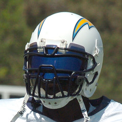
LaDainian Tomlinson doesn’t play in preseason games. But that doesn’t mean he isn’t doing anything uni-notable — it just means most of us can’t see what he’s up to. Fortunately, reader Ryan Luz — who happens to be an assistant equipment manager at U. of San Diego — has been paying close attention, and he’s noticed a some interesting new developments regarding LT’s headwear:
Okay, so you know what LT’s normal facemask and visor look like — just the standard dark tint and a standard three-bar facemask, like this. Within the last week or two, however, he began wearing a new at training camp. This new visor was reflective and blue.
Then he did something I’ve never seen before — well, two things, actually. First, he wore this new facemask that’s like nothing I’ve seen before. Just very odd, very unique, something I’ve never seen in all of my football equipment managing days.
But the weirdest thing isn’t the facemask. If you look closely at this photo again, you’ll see he’s wearing TWO visors. It appears as though he’s wearing the new blue, reflective visor underneath the old standard tinted visor. This is another thing I’ve never seen before.
Since LT doesn’t play preseason games, it’s not yet clear if this is just some practice thing, or if he will use this configuration in games. Meanwhile, I’m currently scouring the internet trying to find what type of facemask that is, but neither Schutt nor Adams shows that mask on their sites, and I’m 90% sure it isn’t a Riddell, because they stick mostly with the traditional masks.
Some quick background: Wearing a tinted visor requires special permission from the NFL (in Tomlinson’s case, it’s because he has a light-sensitivity condition that can lead to migraines), but nobody is allowed to wear a colored or reflective visor. Ronnie Brown, for example, was fined for wearing this sunburst-patterned visor in 2005. So is Tomlinson’s dual-visor setup a way for him to hide the contraband visor behind the kosher one? Bizarre.
Tampa Struck by Lightning Crummy Uniforms Again: The Lightning unveiled their new jerseys over the weekend (there’s a slideshow here and a short video clip here). No question that the new chest logo is better than the old one, if only because it’s more legible, but it still looks like clip art. This isn’t so much an upgrade as a correction — it’s what the original design should have looked like in the first place. The rear view is neither wonderful nor objectionable — compared to the old version, it strikes me as a wash. The really weird thing, which nobody has yet adequately explained: The road jerseys have front uni numbers, but the home set doesn’t. Is this the NHL version of the Red Sox wearing player names on their road jerseys but not at home? Very strange. All in all: Still a dreadful-looking team, although marginally less dreadful than before.
Oh, and in case you’re wondering, the armpit “victory stripes” are included in the new design.
Uni Watch News Ticker: Can’t understand why I make such a fuss over corporate sponsorships? Look here. … Must be a real joker in the ESPN.com art department. As of about midnight eastern last night, the site’s front page looked like this. Take a closer look at the photo composite — credited as an “ESPN.com illustration” — and tell me what you see under the dog’s eye (good spot by Erik Kenerson). … As you may recall, about 10 days ago Jeff Francoeur began a game with his name misspelled on his back and then switched to a properly spelled jersey later in the game. David Sonny reports that similar situation unfolded yesterday in Cincinnati, where Ryan Jorgensen came to the plate in the 1st inning with his name misspelled as ‘Jorgenson.’ After hitting a grand slam, he returned to the game with his name spelled correctly. … Nice site here devoted to soccer footwear (with thanks to Brad Elliott). … Classic promo giveaway at last Thursday’s Tigers game: a cap with an attached wig, in honor of Magglio and his locks. … Interesting sponsorship-logo dispute unfolding in NASCAR. … MLB coaches may start wearing helmets next season. … Good vs. Stupid Alert: According to a small item buried in this blog entry, the Blues’ new uniforms will have “stripes on the front of the pants” (good find by Kyle Joecken). … This trend of teams wearing BP jerseys for actual games is getting way out of hand. … Two Bears observations from Chris Radford: “(1) Rex Grossman is buckling both chin straps this preseason. The first time ever (including college). (2) Devin Hester has switched to a Schutt/AHIR style helmet after wearing a Riddell his rookie year. Most likely due to the fact that University of Miami players wore Schutt/AHIR style helmuts in college and he finally felt comfortable to ask for that style of helmet.” … The Red Wings wore this throwback jersey back in 1993. But John Baranowski was looking at this photo and noticed that the top stripe appears to have been a lighter color. Anyone know more about this? … Some really cool Blackhawks patches here (as found by Mike Priest). … A little “Los” goes a long way. … Luke Larson was clicking through GoalieCards.com (which looks like a really great site) and came across this. Was it common for practice jerseys to have corporate sponsors back then? … Here’s a bit of Mariners news I hadn’t heard before, from Jon V. Buerstatte: “In 1992, when the new owners completed their purchase in mid-season, the M’s had an ‘opening day’ celebration. To mark the occasion, the M’s wore their usual white home uniforms, but with ‘Seattle’ on the jerseys instead of ‘Mariners.’ That had great significance at the time, because the team was constantly the subject of relocation rumors and the new ownership wanted to send a strong message that the team was the Seattle Mariners, not just the Mariners.” I’ve never seen these “Seattle”-ized home whites, and they’re not shown in either the Okkonen or Henderson guides. Buerstatte hasn’t been able to provide a photo yet, but he did come up with this article, which confirms his account. Anyone got a photo? … On Friday I mentioned that the Steelers used block lettering for their nameplates for the first game of the 1997, before switching to their rounded font. That prompted the following from Ryan Hemminger: “In a related tidbit, the Steelers also used black type for the names, instead of their customary gold, for their road jerseys during the entire 1997 season. I was excited to see them return to the gold names in 1998.” … My recent ESPN column about uniform prototypes included coverage of the black helmets that the Saints wore during the 1969 preseason. Now Tim Fesmire has found this poster — check out the Saints player at lower left. You can bid on that poster here. … In 1964, the Jets wore this helmet design, with a white logo decal instead of the more familiar green decal they began using the following year. I’d never seen any photos or video of the ’64 design until Saturday, when Jay Braiman sent a bunch of screen grabs from the new Jets Complete History DVD. “It’s no wonder they reversed the colors of the decal the following year,” says Jay. “Whether because of the film quality or otherwise, it’s barely visible. Unfortunately, no footage on the DVD of the 1963 jet-plane helmets.” You can see a slide show of Jay’s screen grabs here. … The Astros retired Jeff Bagwell’s number yesterday, and Nicholas Roznovsky got some good pics of the three jerseys Bagwell was presented with, his number inscribed in the infield dirt, and the great little jersey pin that all fans received. As for Bags himself, nice to see him dressing so formally for the occasion. … Speaking of retired numbers, great story here from my friend George Ferrandi, who grew up in Baltimore and attended the game when Brooks Robinson’s number was retired: “They gave out little ‘one size fits all’ jerseys for kids. Alas, I don’t have mine anymore, unless it’s buried in my mom’s attic. This was during my high fandom period, when I went to every home game and wore a hoodie covered with O’s buttons to middle school. (O yeah. “O” was also my rating on the coolness and popularity meter.) This was also the period when I personally took in a wounded Baltimore oriole and named it Brooks. I nursed it back to health but then tried to make it a pet — with tragic results. A traumatic story for another day.” … If you go to this page and scroll down the section headed “The Longest Name” (it begins two paragraphs from the bottom), you’ll find some excellent info about how the Rangers’ equipment manager handled the challenge of fitting Jarrod Saltalamacchia’s name on a jersey. … Reprinted from yesterday’s comments: a Bengals-themed corn maze. Details here. … The Wisconsin Historical Museum in Madison is currently running an exhibit called World Series Wisconsin, with special emphasis on the 1957 Milwaukee Braves (who won the World Series) and the 1982 Brewers (who won the A.L. pennant). Plenty of uniforms and other memorabilia. There’s a really good video clip about the exhibit here (with big thanks to Uni Watch organic farming priestess and Badger State booster Julie Lindemann). … Braves pitcher Jose Ascaino had some serious undershirt tag issues yesterday (screen grab provided by Jeff Scott, who says, “How could you not feel that on your neck? Wouldn’t it be a distraction?”). … Scott Turner and I were playing softball yesterday, and he mentioned how the Mets used to suit up at their hotel during spring training, take taxis to Al Lang Field, and then climb out of the cabs in full uniform. This was all news to me, so Scott provided this photo. How cool is that?! … Wisconsin isn’t the only school policing its school logo (with thanks to Andrew Flynn). … Not uni-related, but Brett Myers’s latest attempt at community building is too good not to mention. Priceless audio link (NSFW) here.
Man, that facemask reminds me of this:
link
I’m embarassed to be a Lightning fan. What makes it worse? I read in an article that the team worked on the new jerseys for TWO FULL YEARS, and that’s what they came up with.
Wow.
[quote comment=”136876″]I’m embarassed to be a Lightning fan. What makes it worse? I read in an article that the team worked on the new jerseys for TWO FULL YEARS, and that’s what they came up with.
Wow.[/quote]
I wonder if the new ownership has had any say? Or if we’re gonna get new Uni’s again sometime soon (much like the Anahiem (Used to be Mighty) Ducks and their new ownership…
LT looks like Darth Vader.
As a Bolts fan who liked the old jerseys, I can only say this. The new one is bad, but it could have been a lot worse. See the Isles new jersey…
That said, you think this uniform will last? The old one made it through 14 years, with only lettering changes. I hope this is a phase, but I think most of these new uniforms blow. Hard.
Manchester United has brought out their new away kit, big surprise with the colour (insert sarcasm here!!)
link
link
link
link
Piping is dreadful and and wraps around. Being a Manu fan I was hoping for better as the red kit was a disappointment to say the least.
I used to like Jeff Bagwell until he started growing facial like ZZTop and wearing his uniform like an oversized hefty bag. The lack of respect that he showed for the Astros organization by dressing like a pig for this weekend’s ceremony makes me crazy.
Meanwhile, the Reds retired future Hall of Famer Dave Concepcion’s number this weekend as well, and I happy to report that he dressed appropriately.
link
Re: Babes Love Baseball. How can you promote a site that sells MLB “fashion” caps with the wrong color???
On that pic of the Mets leaving the cab, I love the fact that they are all wearing slippers with their full uniform.
I think Tampa’s old logo looked better, actually.
That LT helmet is sweet.
[quote comment=”136884″]I used to like Jeff Bagwell until he started growing facial like ZZTop and wearing his uniform like an oversized hefty bag. The lack of respect that he showed for the Astros organization by dressing like a pig for this weekend’s ceremony makes me crazy.
[/quote]
You’re just sad Baggy looks good as a metro…
Bagwell’s power gotee is almost as iconic as Rollie Finger’s ‘stach. And as for his “lack of respect for the Astros” because he dressed “like a pig”…you really have no freaking clue about anything. Sure he wasn’t wearing a suit, but he’s always dressed like that unless he was at a black tie function. Hell, Mike Scott was wearing nearly the same outfit (jeans/Hawaiian shirt), so was he disrespecting the Astros too?
As for LT, I think he watched linka few too many times…though that facemask and the blue eye-shield looks kind of cool.
Anybody catch the LLWS final yesterday? And if you did were you as annoyed as I was that the starting pitcher for Warner Robbins, GA was wearing the tails of his jersey hanging out? But somehow the front was tucked in . . .
Bad habits now, bad habits later!
MSG network is running a series called MSG vault with old Knicks and Ranger videos. Yesterday they showed a very grainy 1971 Ranger/Maple Leaf playoff game with Paul Henderson wearing a very strange face guard helmet. It had a double colored stripe running from the back, over the top, to the front.
What happened to Matty’s Cardinal sticker…..? Did he take a hit or something?
link
I’m a longtime Astro’s fan, and I’ve attended many games at Minute Maid Park. It has always bugged me how th retired numbers use a goofy font that has never been on an Astros uniform. Which #5 would you want hanging on a wall representing you: link or link
Do other teams do this? Usa a fifferent number font for retired numbers?
how about this for a anahiem ducks logo?
An interesting tid-bit from last nights Sunday Night Football (American) Game, Eagles v. Steelers (or if you are from the respective areas Iggles v. Stillers.) Notice that both teams are wearing a 75th Anniversary patch….AND they BOTH look nice and “respectful.” I am from Philly so I noticed right away.
More interests…Has anyone seen two teams play each other with looooonger anniversary patches…I don’t think…and I could be wrong…
And Finally, Paul and many others picked up on the fact that all the Pittsburgh teams where Black and Gold…Why??…because they are the colors of Steel City. Some people may have seen the Eagles 1933 throw-backs, that they are wearing on Sept 23, and they are Gold and Baby-Blue, Why??, you ask…because they are the Colors on the Flag of the City of Brotherly Love…
Two teams linking in history for more ways than uniforms, as they came into the league in the same year, they merged the two teams in 1943 to form the Steegles, due to the shortage of manpower from WWII, and both their original uniform colors are chosen from the City’s colors.
[quote comment=”136896″]What happened to Matty’s Cardinal sticker…..? Did he take a hit or something?
link
It’s probably just a reflection of the sky.
Look at Rackers’ helmet link, doing something similar.
My kids saw an unusual bird in the backyard yesterday, so we pulled out our “bird watching book” and, while paging through, my 3 year old son asked “what’s that?” … I was rather intrigued to see the following bird represented:
link
I know see the obvious reason for the name of the MLB team, but now I have to ask this question: Are there any other professional (and, no doubt there will be “minor league” options as well) sports teams where using the city and team name together actually represent the full name of an animal, vegetable, or mineral?
I’ve always thought it would be cool to start up a new team in Phoenix, and simply use “Phoenix” as the team name (insert Cher/Rosanne/Biance jokes here) … the logo could be of a flaming bird in flight. I think it’d be rather cool, but I didn’t think a team identity and location could be combined into one entity … until my son showed me otherwise!
Paul: You may want to address the Patch history…
I was reading the Boston Globe’s sports section yesterday and it had a picture of a “Babe Ruth impersonator.” Now, as bad as it is to have a person like this travelling in and around the Boston area, he made himself look like even more of a doofus by using modern pinstriped pants with a big Wilson logo on the butt. I can almost guarantee that Babe Ruth never wore a pair of pants with link on the back. Embarrassing.
Plus, correct me if I’m wrong, but I thought that Babe Ruth threw righty even though he batted lefty. This guy had a lefty’s glove with him.
Basically, this guy isn’t paid by anyone and marches around town as a “Babe Ruth impersonator” going to different base ball related events trying to draw attention to himself and has quite a few flaws in his impersonation.
I’ll see if I can supply a scanned copy of the picture when I get home from work. I can’t find one online.
[quote comment=”136897″]I’m a longtime Astro’s fan, and I’ve attended many games at Minute Maid Park. It has always bugged me how th retired numbers use a goofy font that has never been on an Astros uniform.[/quote]
Actually, what’s bothered me most about the retired numbers at MMP is the “banners” themselves. I wish they’d get some real banners and hang them from some rafters as opposed to just link in a link of the stadium. They look like an afterthought.
[quote comment=”136890″]Bagwell’s power gotee is almost as iconic as Rollie Finger’s ‘stach. And as for his “lack of respect for the Astros” because he dressed “like a pig”…you really have no freaking clue about anything. Sure he wasn’t wearing a suit, but he’s always dressed like that unless he was at a black tie function. Hell, Mike Scott was wearing nearly the same outfit (jeans/Hawaiian shirt), so was he disrespecting the Astros too?[/quote]
As iconic as Fingers’ mustache? Maybe in Houston, but in the rest of the world, not even close.
“You really have no freaking clue about anything.” Thank you for the insightful analysis.
“He’s always dressed like that . . . .” So he’s consistently a slob? Does that make it ok?
As for Mike Scott, he was not there to have his number retired.
I suspect that you are a hardcore Astros fan and that you do not like having your heroes criticized. Try looking at this objectively.
[quote comment=”136897″]I’m a longtime Astro’s fan, and I’ve attended many games at Minute Maid Park. It has always bugged me how th retired numbers use a goofy font that has never been on an Astros uniform. Which #5 would you want hanging on a wall representing you: link or link
Do other teams do this? Usa a fifferent number font for retired numbers?[/quote]
Hey now … Wasn’t Enron … I, uh, mean Minute Maid opened about the same time Milwaukee switched to their current uniforms? It’s an obvious tribute to the number font currently used in Wisconsin. Who said OJ and Dairy products don’t mix well??? (now that I say that, is it too early for a dreamsicle?)
[quote comment=”136901″]My kids saw an unusual bird in the backyard yesterday, so we pulled out our “bird watching book” and, while paging through, my 3 year old son asked “what’s that?” … I was rather intrigued to see the following bird represented:
link
I know see the obvious reason for the name of the MLB team, but now I have to ask this question: Are there any other professional (and, no doubt there will be “minor league” options as well) sports teams where using the city and team name together actually represent the full name of an animal, vegetable, or mineral?
I’ve always thought it would be cool to start up a new team in Phoenix, and simply use “Phoenix” as the team name (insert Cher/Rosanne/Biance jokes here) … the logo could be of a flaming bird in flight. I think it’d be rather cool, but I didn’t think a team identity and location could be combined into one entity … until my son showed me otherwise![/quote]
how about the buffalo bills, using the city name as the logo (a buffalo) but the team name is based on the man?
There is no way that the Reggie Lemelin jersey was worn in a game. It is either a practice jersey (which I doubt) or from a special event.
[quote comment=”136903″]I was reading the Boston Globe’s sports section yesterday and it had a picture of a “Babe Ruth impersonator.” Now, as bad as it is to have a person like this travelling in and around the Boston area, he made himself look like even more of a doofus by using modern pinstriped pants with a big Wilson logo on the butt. I can almost guarantee that Babe Ruth never wore a pair of pants with link on the back. Embarrassing.
Plus, correct me if I’m wrong, but I thought that Babe Ruth threw righty even though he batted lefty. This guy had a lefty’s glove with him.
Basically, this guy isn’t paid by anyone and marches around town as a “Babe Ruth impersonator” going to different base ball related events trying to draw attention to himself and has quite a few flaws in his impersonation.
I’ll see if I can supply a scanned copy of the picture when I get home from work. I can’t find one online.[/quote]
Ruth was a lefty but often (when younger) had to use a righty glove, because he was a catcher at St. Mary’s, and even today lefty catcher gloves are in short supply (if you can find one).
WVU practice uniforms are more like their old solid blue and gold uniforms….which I personally like better…..
link
[quote comment=”136910″][quote comment=”136903″]I was reading the Boston Globe’s sports section yesterday and it had a picture of a “Babe Ruth impersonator.” Now, as bad as it is to have a person like this travelling in and around the Boston area, he made himself look like even more of a doofus by using modern pinstriped pants with a big Wilson logo on the butt. I can almost guarantee that Babe Ruth never wore a pair of pants with link on the back. Embarrassing.
Plus, correct me if I’m wrong, but I thought that Babe Ruth threw righty even though he batted lefty. This guy had a lefty’s glove with him.
Basically, this guy isn’t paid by anyone and marches around town as a “Babe Ruth impersonator” going to different base ball related events trying to draw attention to himself and has quite a few flaws in his impersonation.
I’ll see if I can supply a scanned copy of the picture when I get home from work. I can’t find one online.[/quote]
Ruth was a lefty but often (when younger) had to use a righty glove, because he was a catcher at St. Mary’s, and even today lefty catcher gloves are in short supply (if you can find one).[/quote]
I realize why he ended up throwing righty. My point was that this guy was clearly carrying around a glove when went on the right hand and, from what I remember, Ruth threw with his right hand, even when he pitched.
At Willi Plett’s old Bar, Grill and Mini Golf place, he had a collection of his old jerseys hanging in the rafters including what looked like an authentic red Flames jersey with his name and #25… and a BUDWEISER logo screened on the back below the numbers.
Helmets for first and third base coaches? Absurd. Talk about an overreaction to one fatality (and, according to the coroner, not something that would have saved Coolbaugh’s life).
Looks like McFarlane Toys has captured LT in full preseason mode.
link
[quote comment=”136915″]Helmets for first and third base coaches? Absurd. Talk about an overreaction to one fatality (and, according to the coroner, not something that would have saved Coolbaugh’s life).[/quote]
Good point. Giant plexiglass bubbles. They’re really the only answer … of course, they’d have to be able to move around … giant hamster balls. Imagine how many life that could save!
[quote comment=”136915″]Helmets for first and third base coaches? Absurd. Talk about an overreaction to one fatality (and, according to the coroner, not something that would have saved Coolbaugh’s life).[/quote]
Just curious, but what specifically did the coroner say? Can you link us to an article?
[quote comment=”136905″]As iconic as Fingers’ mustache? Maybe in Houston, but in the rest of the world, not even close.[/quote]
Players known for their facial hair. If it wasn’t something he was known for, link?
[quote comment=”136905″]”You really have no freaking clue about anything.” Thank you for the insightful analysis.[/quote]
Hey, just look at this objectively.
[quote comment=”136905″]”He’s always dressed like that . . . .” So he’s consistently a slob? Does that make it ok?[/quote]
At least he didn’t have flip-flops on. You have to ask yourself, if he was told to dress in a shirt and tie, don’t you think he would have?
[quote comment=”136905″]I suspect that you are a hardcore Astros fan and that you do not like having your heroes criticized. Try looking at this objectively.[/quote]
Dude, what got your sturups on a bunch? You start off by saying you respected the guy befor he grew facial hair and wearing a “baggy” uni. Then when someone takes issue with your objectivity, you decide to make this personal? Yeah, I am an Astros fan, and I grew up watching Bagwell and Biggio. Sure, I would have rather seen Bagwell wearing something else as they retired his number, but he wore what he wanted and it could have been a lot worse. You said he was showed a lack of respect for the Astros organization because of how he dressed. He owes everything to the Astros, and has more respect for the organization then you will ever know.
[quote comment=”136904″]Actually, what’s bothered me most about the retired numbers at MMP is the “banners†themselves. I wish they’d get some real banners and hang them from some rafters as opposed to just painting faux ones in a bad corner of the stadium. They look like an afterthought. [/quote]
I agree. When they started placing the retired numbers there, it was odd, and the more they have up there, they more they need to move them to a different area and have something better than that number font.
The facemask is a variation of Schutt’s Bulldog ROPO face mask. It looks like it has been modified somewhat. As far as the shield, it is probably a visor insert that is commonly found on Ebay. You just place it over an Oakley visor and it comes in many different colors.
unreal.
i listened to the brett myers clip and laughed because he flew off the handle, lost control of himself, and challenged a reporters competance by using profanity towards him and called him names.
then i read one of the above posts and saw almost the same thing happen.
i mean, comon. our opinions may differ but must we challenge intelligence here?
it just clutters up the blog and lowers the credibility of us all.
[quote comment=”136913″][quote comment=”136910″][quote comment=”136903″]I was reading the Boston Globe’s sports section yesterday and it had a picture of a “Babe Ruth impersonator.” Now, as bad as it is to have a person like this travelling in and around the Boston area, he made himself look like even more of a doofus by using modern pinstriped pants with a big Wilson logo on the butt. I can almost guarantee that Babe Ruth never wore a pair of pants with link on the back. Embarrassing.
Plus, correct me if I’m wrong, but I thought that Babe Ruth threw righty even though he batted lefty. This guy had a lefty’s glove with him.
Basically, this guy isn’t paid by anyone and marches around town as a “Babe Ruth impersonator” going to different base ball related events trying to draw attention to himself and has quite a few flaws in his impersonation.
I’ll see if I can supply a scanned copy of the picture when I get home from work. I can’t find one online.[/quote]
Ruth was a lefty but often (when younger) had to use a righty glove, because he was a catcher at St. Mary’s, and even today lefty catcher gloves are in short supply (if you can find one).[/quote]
I realize why he ended up throwing righty. My point was that this guy was clearly carrying around a glove when went on the right hand and, from what I remember, Ruth threw with his right hand, even when he pitched.[/quote]
link, link link link link.
tucked
link
or untucked
link
you make the call
[quote comment=”136907″][quote comment=”136901″]My kids saw an unusual bird in the backyard yesterday, so we pulled out our “bird watching book” and, while paging through, my 3 year old son asked “what’s that?” … I was rather intrigued to see the following bird represented:
link
I know see the obvious reason for the name of the MLB team, but now I have to ask this question: Are there any other professional (and, no doubt there will be “minor league” options as well) sports teams where using the city and team name together actually represent the full name of an animal, vegetable, or mineral?
I’ve always thought it would be cool to start up a new team in Phoenix, and simply use “Phoenix” as the team name (insert Cher/Rosanne/Biance jokes here) … the logo could be of a flaming bird in flight. I think it’d be rather cool, but I didn’t think a team identity and location could be combined into one entity … until my son showed me otherwise![/quote]
how about the buffalo bills, using the city name as the logo (a buffalo) but the team name is based on the man?[/quote]
Cool one. I was thinking Texas Rangers as being a real thing, but then I also remembered Florida Panthers, which are also actual animals.
[quote comment=”136919″][quote comment=”136915″]Helmets for first and third base coaches? Absurd. Talk about an overreaction to one fatality (and, according to the coroner, not something that would have saved Coolbaugh’s life).[/quote]
Just curious, but what specifically did the coroner say? Can you link us to an article?[/quote]
“It hit him in the back of the left side of his neck, kind of right below the ear,” Pulaski County coroner Mark Malcolm said.
I apologize. link I was link about the hand Ruth pitched with. Any idea where I heard that he threw righty? Maybe as an outfielder?
I also found link, which kind of proves my point. Clicking through the slide show tells you that is Babe’s glove. A righty ‘s glove.
Which was it?
We have discovered what LT was hiding.
Click for noisy Flash version.
links…
We have discovered what LT was hiding.
Click for noisy Flash version.
I found this ebay auction that’ seems kinda link.
Has anyone ever seen a reversed logo patch like this? (See normal link.) I know it’s a kids jersey, but that’s still weird.
Actually, LT has worn that particular shield (blue tint) at the Chargers practice facility in the past few years as well. With his light sensitivity issue, he’s almost always wearing his helmet as the particular area where the practice facility is located rarely has any cloud cover.
I will say that I haven’t seen the double visor thing before or the odd facemask. Looks even more weird than Chargers fullback Lorenzo Neal’s facemask:
link
[quote comment=”136929″]I apologize. link I was link about the hand Ruth pitched with. Any idea where I heard that he threw righty? Maybe as an outfielder?
I also found link, which kind of proves my point. Clicking through the slide show tells you that is Babe’s glove. A righty ‘s glove.
Which was it?[/quote]
That’s not a righty’s glove . . . look at the thumb . . . Look at your hands palm up, like the glove is pictured. That glove goes ON your right hand meaning you’d have to throw with your left.
(Of course the mental image of everyone sitting reading this palms to the sky at their desks is amusing.)
Was reading BBC and saw where Everton players paid tribute to a young fan of theirs who was shot and killed last week. Even Wayne Rooney (who played for Everton before switching to Man United) was classy enough to present a floral display at the site in the shape of an Everton shirt.
Logo creep on a memorial. Words fail me.
[quote comment=”136920″][quote comment=”136905″]As iconic as Fingers’ mustache? Maybe in Houston, but in the rest of the world, not even close.[/quote]
Players known for their facial hair. If it wasn’t something he was known for, link?
[quote comment=”136905″]”You really have no freaking clue about anything.” Thank you for the insightful analysis.[/quote]
Hey, just look at this objectively.
[quote comment=”136905″]”He’s always dressed like that . . . .” So he’s consistently a slob? Does that make it ok?[/quote]
At least he didn’t have flip-flops on. You have to ask yourself, if he was told to dress in a shirt and tie, don’t you think he would have?
[quote comment=”136905″]I suspect that you are a hardcore Astros fan and that you do not like having your heroes criticized. Try looking at this objectively.[/quote]
Dude, what got your sturups on a bunch? You start off by saying you respected the guy befor he grew facial hair and wearing a “baggy” uni. Then when someone takes issue with your objectivity, you decide to make this personal? Yeah, I am an Astros fan, and I grew up watching Bagwell and Biggio. Sure, I would have rather seen Bagwell wearing something else as they retired his number, but he wore what he wanted and it could have been a lot worse. You said he was showed a lack of respect for the Astros organization because of how he dressed. He owes everything to the Astros, and has more respect for the organization then you will ever know.
[quote comment=”136904″]Actually, what’s bothered me most about the retired numbers at MMP is the “banners†themselves. I wish they’d get some real banners and hang them from some rafters as opposed to just painting faux ones in a bad corner of the stadium. They look like an afterthought. [/quote]
I agree. When they started placing the retired numbers there, it was odd, and the more they have up there, they more they need to move them to a different area and have something better than that number font.[/quote]
“Yeah, I am an Astros fan.” That’s all we needed to know.
“Then when someone takes issue with your objectivity, you decide to make it personal.” Huh? First, I have never made it personal. I simply (and correctly) predicted that your opinions were swayed by your status as an Astros fan. Second, how did you take issue with my objectivity? That doesn’t even make sense.
Does anyone else not see what’s so amusing about the picture of the dog from ESPN.com’s homepage? I don’t see anything. Can someone clue me in?
[quote comment=”136938″]Second, how did you take issue with my objectivity? That doesn’t even make sense.[/quote]
Can I ask, nay demand, that you take this personal bullshit on down the hall?
According to a few posts in link, we can say that the Blues’ jerseys will be released before September 15th (when the Blues are having some sort of Fan Day), and that the new jerseys will NOT have either numbers on the front or any red.
So there is at least one link link we can rule out.
I was looking at this site and came across this link
[quote comment=”136941″]Does anyone else not see what’s so amusing about the picture of the dog from ESPN.com’s homepage? I don’t see anything. Can someone clue me in?[/quote]
So, when you finally see it, will you pass your hand over your head and say, embarrassed, “SWOOSH!”?
[quote comment=”136929″]I apologize. link I was link about the hand Ruth pitched with. Any idea where I heard that he threw righty? Maybe as an outfielder?
I also found link, which kind of proves my point. Clicking through the slide show tells you that is Babe’s glove. A righty ‘s glove.
Which was it?[/quote]
That is not a righty glove. That is a glove for a left handed thrower.
This is a righty’s link
[quote comment=”136941″]Does anyone else not see what’s so amusing about the picture of the dog from ESPN.com’s homepage? I don’t see anything. Can someone clue me in?[/quote]
The dog has what appears to be a scar in the shape of a “swoosh” on its snout below it’s right eye . . .
[quote comment=”136937″]Was reading BBC and saw where Everton players paid tribute to a young fan of theirs who was shot and killed last week. Even Wayne Rooney (who played for Everton before switching to Man United) was classy enough to present a floral display at the site in the shape of an Everton shirt.
Logo creep on a memorial. Words fail me.
Nothing to get excited about, it is just authentic reproduction of the shirt. The sponsors name is also there and on this occasion all of these things should be overlooked. The 11 yr that was killed was a massive fan and was always at their matches, I think that the floral arrangement was a nice thing. The squad went to the site where this occured today
link
[quote comment=”136946″][quote comment=”136941″]Does anyone else not see what’s so amusing about the picture of the dog from ESPN.com’s homepage? I don’t see anything. Can someone clue me in?[/quote]
So, when you finally see it, will you pass your hand over your head and say, embarrassed, “SWOOSH!”?[/quote]
Is the Nike symbol all there is to it? That I saw right away, but I thought there was something more perverse. Why would someone think it would be amusing to put that there?
[quote comment=”136927″][quote comment=”136907″][quote comment=”136901″]My kids saw an unusual bird in the backyard yesterday, so we pulled out our “bird watching book” and, while paging through, my 3 year old son asked “what’s that?” … I was rather intrigued to see the following bird represented:
link
I know see the obvious reason for the name of the MLB team, but now I have to ask this question: Are there any other professional (and, no doubt there will be “minor league” options as well) sports teams where using the city and team name together actually represent the full name of an animal, vegetable, or mineral?
I’ve always thought it would be cool to start up a new team in Phoenix, and simply use “Phoenix” as the team name (insert Cher/Rosanne/Biance jokes here) … the logo could be of a flaming bird in flight. I think it’d be rather cool, but I didn’t think a team identity and location could be combined into one entity … until my son showed me otherwise![/quote]
how about the buffalo bills, using the city name as the logo (a buffalo) but the team name is based on the man?[/quote]
Cool one. I was thinking Texas Rangers as being a real thing, but then I also remembered Florida Panthers, which are also actual animals.[/quote]
New Jersey Devils
[quote comment=”136942″][quote comment=”136938″]Second, how did you take issue with my objectivity? That doesn’t even make sense.[/quote]
Can I ask, nay demand, that you take this personal bullshit on down the hall?[/quote]
I have never said anything personal. Go back and read my posts. James P. got all bent out of shape that I criticized Bagwell. I merely pointed out that his attacks on me didn’t make sense.
re: seattle on the home jersey.
i know that someone here linked to that seattle home jersey in the past (months ago) and didnt know the story behind it…
[quote comment=”136946″][quote comment=”136941″]Does anyone else not see what’s so amusing about the picture of the dog from ESPN.com’s homepage? I don’t see anything. Can someone clue me in?[/quote]
So, when you finally see it, will you pass your hand over your head and say, embarrassed, “SWOOSH!”?[/quote]
After much staring the only thing I could come up with was a ‘V.’ However, this can be equated to seeing the Virgin Mary on a grilled cheese sandwich. In other words, people see what they want to see.
[quote comment=”136953″][quote comment=”136927″][quote comment=”136907″][quote comment=”136901″]My kids saw an unusual bird in the backyard yesterday, so we pulled out our “bird watching book” and, while paging through, my 3 year old son asked “what’s that?” … I was rather intrigued to see the following bird represented:
link
I know see the obvious reason for the name of the MLB team, but now I have to ask this question: Are there any other professional (and, no doubt there will be “minor league” options as well) sports teams where using the city and team name together actually represent the full name of an animal, vegetable, or mineral?
I’ve always thought it would be cool to start up a new team in Phoenix, and simply use “Phoenix” as the team name (insert Cher/Rosanne/Biance jokes here) … the logo could be of a flaming bird in flight. I think it’d be rather cool, but I didn’t think a team identity and location could be combined into one entity … until my son showed me otherwise![/quote]
how about the buffalo bills, using the city name as the logo (a buffalo) but the team name is based on the man?[/quote]
Cool one. I was thinking Texas Rangers as being a real thing, but then I also remembered Florida Panthers, which are also actual animals.[/quote]
New Jersey Devils[/quote]
its pushing it, but there is the Louisville Bats(AAA, Reds)
Re: LT’s new facemask
This gets met to wondering: when might we have “facemask talk” on UniWatch? Is this perhaps a topic Paul would be willing to include in his ESPN column?
Personally, I find the football facemask fascinating. Why does LT fell compelled to have so many bars all over this mask, and what’s with the peephole in the center? How long before Scott Player’s face gets broken, since he’s wearing the equivalent of no facemask? And whose are the favorite facemasks of the UniWatch faithful?
[quote comment=”136961″][quote comment=”136953″][quote comment=”136927″][quote comment=”136907″][quote comment=”136901″]My kids saw an unusual bird in the backyard yesterday, so we pulled out our “bird watching book” and, while paging through, my 3 year old son asked “what’s that?” … I was rather intrigued to see the following bird represented:
link
I know see the obvious reason for the name of the MLB team, but now I have to ask this question: Are there any other professional (and, no doubt there will be “minor league” options as well) sports teams where using the city and team name together actually represent the full name of an animal, vegetable, or mineral?
I’ve always thought it would be cool to start up a new team in Phoenix, and simply use “Phoenix” as the team name (insert Cher/Rosanne/Biance jokes here) … the logo could be of a flaming bird in flight. I think it’d be rather cool, but I didn’t think a team identity and location could be combined into one entity … until my son showed me otherwise![/quote]
how about the buffalo bills, using the city name as the logo (a buffalo) but the team name is based on the man?[/quote]
Cool one. I was thinking Texas Rangers as being a real thing, but then I also remembered Florida Panthers, which are also actual animals.[/quote]
New Jersey Devils[/quote]
its pushing it, but there is the Louisville Bats(AAA, Reds)[/quote]
I’d buy your reasoning if they called themselves the Louisville Sluggers.
Can’t understand why I make such a fuss over corporate sponsorships? Look here.
Has anyone done a study as to whether or not people actually respond to corporate sponsored things? I mean, I know that NASCAR fans are lemmings for that sort of thing, but do people buy more of whatever their teams venues namesake sells?
Who the hell is going to buy something because it sponsors an effing bridge?!
Bags wore cowboy boots, jeans, and a collared shirt to a baseball game in Houston. He is dressed appropriately. So what if he isn’t dressed to the nines? It’s HIS day, he can do whatever he wants.
[quote comment=”136960″][quote comment=”136946″][quote comment=”136941″]Does anyone else not see what’s so amusing about the picture of the dog from ESPN.com’s homepage? I don’t see anything. Can someone clue me in?[/quote]
So, when you finally see it, will you pass your hand over your head and say, embarrassed, “SWOOSH!”?[/quote]
After much staring the only thing I could come up with was a ‘V.’ However, this can be equated to seeing the Virgin Mary on a grilled cheese sandwich. In other words, people see what they want to see.[/quote]
The best I could come up with was a wrinkle in the shape of a ‘7’. I see it now though.
[quote comment=”136965″]Can’t understand why I make such a fuss over corporate sponsorships? Look here.
Has anyone done a study as to whether or not people actually respond to corporate sponsored things? I mean, I know that NASCAR fans are lemmings for that sort of thing, but do people buy more of whatever their teams venues namesake sells?
Who the hell is going to buy something because it sponsors an effing bridge?![/quote]
The NASCAR sponsorship that kills me is the U.S. Army (I think there’s a National Guard car also). I was in the Army, but I enlisted for the college money. Can’t imagine someone enlisting because of a paint scheme on a car.
On the subject of facemasks two NY Giants (Amani Toomer and Brandon Jacobs) seem to be wearing 2 new style facemasks with what appears to be (to me) a new style of clips connecting it to the helmet. Toomer and Jacobs are wearing what appears to be the Adams “DNA” helmet (think of last years MSU / Drew Stanton’s crushed helmet) but both players have strange looking masks and this strange mask clip set up. The clips appear to be fit into a molded section on the side of the helmet and it reminds me of an air duct on the side of a car. Anybody can clue me into what is happening?
[quote comment=”136967″]Bags wore cowboy boots, jeans, and a collared shirt to a baseball game in Houston. He is dressed appropriately. So what if he isn’t dressed to the nines? It’s HIS day, he can do whatever he wants.[/quote]
Thank you.
“Mike Scott was wearing nearly the same outfit (jeans/Hawaiian shirt), so was he disrespecting the Astros too?”
Well, considering Mike Scott was cheater and a fraud, he pretty much showed his disrespect to the Astros and the game a long time ago.
There is no way that the Reggie Lemelin jersey was worn in a game. It is either a practice jersey (which I doubt) or from a special event.
Those are 1983-84 O-Pee-Chee cards – issued only in Canada – Topps didn’t make a set that year. Half of the Flames pictured in the set are wearing the Molson practice jersey and the shots appear to have been taken at a Flames practice so I’d guess that they were regular practice jerseys. Molson was (and still is) a huge sponsor of the Canadian NHL teams and it wouldn’t surprise me if they were on the jerseys. I still have a poster from when I was a kid of the Canucks’ Molson Cup winners through the years (determined by most “3 star selections”). Some teams still award it. See here: Molson_Cup.
[quote comment=”136955″][quote comment=”136942″][quote comment=”136938″]Second, how did you take issue with my objectivity? That doesn’t even make sense.[/quote]
Can I ask, nay demand, that you take this personal bullshit on down the hall?[/quote]
I have never said anything personal. Go back and read my posts. James P. got all bent out of shape that I criticized Bagwell. I merely pointed out that his attacks on me didn’t make sense.[/quote]
If you thought I was talking about you, you were probably right. link
[quote comment=”136885″]Re: Babes Love Baseball. How can you promote a site that sells MLB “fashion” caps with the wrong color???[/quote]
…because everytime a metrosexual fan clicks on it, we smile.
Thanks for the link. :)
[quote comment=”136960″][quote comment=”136946″][quote comment=”136941″]Does anyone else not see what’s so amusing about the picture of the dog from ESPN.com’s homepage? I don’t see anything. Can someone clue me in?[/quote]
So, when you finally see it, will you pass your hand over your head and say, embarrassed, “SWOOSH!”?[/quote]
After much staring the only thing I could come up with was a ‘V.’ However, this can be equated to seeing the Virgin Mary on a grilled cheese sandwich. In other words, people see what they want to see.[/quote]
You could also make the case that there is NOTHING amusing about a picture of a dog that was pitted against another in a death match for the amusement of wealthy barbarians.
With regards to corporate sponsorship of Bridges and Tunnels I am all for it if it helps improve the infrastructure without a toll hike. I understand the Golden Gate and George Washington bridge are iconic symbols and should probably be untouchable but at least in the New York area do you think anyone cares if it is the Holland Tunnel or Verizon Tunnel? how about the Mid Town Tunnel or Citibank tunnel? The number of times the name is mentioned on morning radio traffic reports just helps increase brand recognition. The only drawback I see for the companies is the potential negative connection between being backed up every morning at your tunnel or bridge due to traffic.
[quote comment=”136964″][quote comment=”136961″][quote comment=”136953″][quote comment=”136927″][quote comment=”136907″][quote comment=”136901″]My kids saw an unusual bird in the backyard yesterday, so we pulled out our “bird watching book” and, while paging through, my 3 year old son asked “what’s that?” … I was rather intrigued to see the following bird represented:
link
I know see the obvious reason for the name of the MLB team, but now I have to ask this question: Are there any other professional (and, no doubt there will be “minor league” options as well) sports teams where using the city and team name together actually represent the full name of an animal, vegetable, or mineral?
I’ve always thought it would be cool to start up a new team in Phoenix, and simply use “Phoenix” as the team name (insert Cher/Rosanne/Biance jokes here) … the logo could be of a flaming bird in flight. I think it’d be rather cool, but I didn’t think a team identity and location could be combined into one entity … until my son showed me otherwise![/quote]
how about the buffalo bills, using the city name as the logo (a buffalo) but the team name is based on the man?[/quote]
Cool one. I was thinking Texas Rangers as being a real thing, but then I also remembered Florida Panthers, which are also actual animals.[/quote]
New Jersey Devils[/quote]
its pushing it, but there is the Louisville Bats(AAA, Reds)[/quote]
I’d buy your reasoning if they called themselves the Louisville Sluggers.[/quo[quote comment=”136964″][quote comment=”136961″][quote comment=”136953″][quote comment=”136927″][quote comment=”136907″][quote comment=”136901″]My kids saw an unusual bird in the backyard yesterday, so we pulled out our “bird watching book” and, while paging through, my 3 year old son asked “what’s that?” … I was rather intrigued to see the following bird represented:
link
I know see the obvious reason for the name of the MLB team, but now I have to ask this question: Are there any other professional (and, no doubt there will be “minor league” options as well) sports teams where using the city and team name together actually represent the full name of an animal, vegetable, or mineral?
I’ve always thought it would be cool to start up a new team in Phoenix, and simply use “Phoenix” as the team name (insert Cher/Rosanne/Biance jokes here) … the logo could be of a flaming bird in flight. I think it’d be rather cool, but I didn’t think a team identity and location could be combined into one entity … until my son showed me otherwise![/quote]
how about the buffalo bills, using the city name as the logo (a buffalo) but the team name is based on the man?[/quote]
Cool one. I was thinking Texas Rangers as being a real thing, but then I also remembered Florida Panthers, which are also actual animals.[/quote]
New Jersey Devils[/quote]
its pushing it, but there is the Louisville Bats(AAA, Reds)[/quote]
I’d buy your reasoning if they called themselves the Louisville Sluggers.[/quote]
“Missed it by that much”.
Would you believe the Stockton Ports(A,Athletics)? Huh?
Watching Canada/Russia Jr. Hockey Super Series. Russia seems to be wearing a link than I have seen, complete with corporate sponsorship (sorry about bad pic). I know they have link, like Canada is wearing. Do they not use those for the Junior competitions?
I remember playing little league ball, and players would be the first base coach and we’d have to wear batting helmets. I remember getting so mad about that.
As for the majors, change = bad. The game is plenty safe.
look at these anahiem duck jersey concepts…
[quote comment=”136915″]Helmets for first and third base coaches? Absurd. Talk about an overreaction to one fatality (and, according to the coroner, not something that would have saved Coolbaugh’s life).[/quote]
Glenallen Hill wears one as the Rockies’ first base coach. I was at a spring training game on March 9 this year (vs. Seattle in Peoria AZ) where he was hit in the head with a foul line drive. Not absurd in his case. Not sure if he wore it before the Coolbaugh incident or not.
Just correcting my previous postin regards to the NY Giants facemasks and helmets (#71). Toomer and Jacobs appear to be wearing an Adams helmet but it was Schutt (NOT Adams) that made the “DNA” helmet I referred to in the MSU / Drew Stanton crushed helmet.
[quote comment=”136980″]With regards to corporate sponsorship of Bridges and Tunnels I am all for it if it helps improve the infrastructure without a toll hike. I understand the Golden Gate and George Washington bridge are iconic symbols and should probably be untouchable but at least in the New York area do you think anyone cares if it is the Holland Tunnel or Verizon Tunnel? how about the Mid Town Tunnel or Citibank tunnel? The number of times the name is mentioned on morning radio traffic reports just helps increase brand recognition. The only drawback I see for the companies is the potential negative connection between being backed up every morning at your tunnel or bridge due to traffic.[/quote]
The most obvious one: Brooklyn Battery Tunnel becoming the Energizer or Duracell Battery Tunnel.
I know you probably hate it Paul, but I like the LT facemask. Looks like he’s pissed and he’s frowning at anyone gettin in his way.
[quote comment=”136970″]On the subject of facemasks two NY Giants (Amani Toomer and Brandon Jacobs) seem to be wearing 2 new style facemasks with what appears to be (to me) a new style of clips connecting it to the helmet. Toomer and Jacobs are wearing what appears to be the Adams “DNA” helmet (think of last years MSU / Drew Stanton’s crushed helmet) but both players have strange looking masks and this strange mask clip set up. The clips appear to be fit into a molded section on the side of the helmet and it reminds me of an air duct on the side of a car. Anybody can clue me into what is happening?[/quote]
I noticed that too when I was looking at pictures on Wyoming’s website. It is only on Schutt DNA helmets but there is nothing on the Schutt website that shows it.
in today’s post is a screen-grab of the Jets and their white logo. (link)
Take a look at the team their playing….is that the Cleveland Browns wearing their shortlived link on their helmets?
[quote comment=”136987″]
look at these anahiem duck jersey concepts…[/quote]
I really like those, Jacob! WAY better than the jerseys they sported last year.
here’s that Browns logo again. and I meant to type “they’re”. not “their”.
link
scroll down to see the logo.
After looking on the Giants website and getting a closer look at the whole helmet, the shell design is different too. I was at a convention with all the equipment manufactures in late July and did not see this model. What is the story on it?
[quote comment=”136987″]
look at these anahiem duck jersey concepts…[/quote]
I thought under rbk UGLY uniform system there would be no alternates, the home and away are bad enough.
[quote comment=”136996″]in today’s post is a screen-grab of the Jets and their white logo. (link)
Take a look at the team their playing….is that the Cleveland Browns wearing their shortlived link on their helmets?[/quote]
I believe that was the link. The Browns were in the NFL and the Jets were an AFL team.
[quote comment=”136913″][quote comment=”136910″][quote comment=”136903″]I was reading the Boston Globe’s sports section yesterday and it had a picture of a “Babe Ruth impersonator.” Now, as bad as it is to have a person like this travelling in and around the Boston area, he made himself look like even more of a doofus by using modern pinstriped pants with a big Wilson logo on the butt. I can almost guarantee that Babe Ruth never wore a pair of pants with link on the back. Embarrassing.
Plus, correct me if I’m wrong, but I thought that Babe Ruth threw righty even though he batted lefty. This guy had a lefty’s glove with him.
Basically, this guy isn’t paid by anyone and marches around town as a “Babe Ruth impersonator” going to different base ball related events trying to draw attention to himself and has quite a few flaws in his impersonation.
I’ll see if I can supply a scanned copy of the picture when I get home from work. I can’t find one online.[/quote]
Ruth was a lefty but often (when younger) had to use a righty glove, because he was a catcher at St. Mary’s, and even today lefty catcher gloves are in short supply (if you can find one).[/quote]
I realize why he ended up throwing righty. My point was that this guy was clearly carrying around a glove when went on the right hand and, from what I remember, Ruth threw with his right hand, even when he pitched.[/quote]
You’re mistaken. Ruth pitched lefty.
link
link
[quote comment=”137002″][quote comment=”136996″]in today’s post is a screen-grab of the Jets and their white logo. (link)
Take a look at the team their playing….is that the Cleveland Browns wearing their shortlived link on their helmets?[/quote]
I believe that was the link. The Browns were in the NFL and the Jets were an AFL team.[/quote]
Yeah those are definitely 60’s Broncos helmets. I had totally forgotten about those.
[quote comment=”136929″]I apologize. link I was link about the hand Ruth pitched with. Any idea where I heard that he threw righty? Maybe as an outfielder?
I also found link, which kind of proves my point. Clicking through the slide show tells you that is Babe’s glove. A righty ‘s glove.
Which was it?[/quote]
That’s a lefty’s glove. The palm’s up. Goes on the right hand.
[quote comment=”136957″]re: seattle on the home jersey.
i know that someone here linked to that seattle home jersey in the past (months ago) and didnt know the story behind it…[/quote]
I remember that…someone found and eBay auction for a game worn jersey with Seattle on the front. I think we all pretty much concluded that it was a fake…oops.
My kids saw an unusual bird in the backyard yesterday, so we pulled out our “bird watching book†and, while paging through, my 3 year old son asked “what’s that?†… I was rather intrigued to see the following bird represented:
link….
I know see the obvious reason for the name of the MLB team, but now I have to ask this question: Are there any other professional (and, no doubt there will be “minor league†options as well) sports teams where using the city and team name together actually represent the full name of an animal, vegetable, or mineral?
I’ve always thought it would be cool to start up a new team in Phoenix, and simply use “Phoenix†as the team name (insert Cher/Rosanne/Biance jokes here) … the logo could be of a flaming bird in flight. I think it’d be rather cool, but I didn’t think a team identity and location could be combined into one entity … until my son showed me otherwise!
how about the buffalo bills, using the city name as the logo (a buffalo) but the team name is based on the man?
Cool one. I was thinking Texas Rangers as being a real thing, but then I also remembered Florida Panthers, which are also actual animals.
New Jersey Devils
its pushing it, but there is the Louisville Bats(AAA, Reds)
Colorado Rockies
Texas Rangers (not a plant, animal or mineral, but still a team name/formal name pairing)
I’m suprised no one picked up on this. I think the second visor you are seeing on LT is just the shadow from the sun, based upon the other shadows that he has on him.
I think the only reason the new Tampa Bay Lightning jersey logo is better is that they removed the word “Lightning” from the logo. When I played hockey in high school we voted on what we wanted on our jerseys and the winner had the Schools name above an eagle (the mascot) and the word “hockey” underneath it. It seemed to be from the department of redundancy department to put “hockey” on a hockey uniform…it always bugs me when a hockey team insists on having a logo as well as words explaining what the logo is. For example it would be really lame if the Blackhawks had the name “Blackhawks” above or below the logo… It just seemed lame to have a lightning bolt and have the word lightning next to it…sorry just had to vent
[quote comment=”137001″][quote comment=”136987″]
look at these anahiem duck jersey concepts…[/quote]
I thought under rbk UGLY uniform system there would be no alternates, the home and away are bad enough.[/quote]
The third or alternate jerseys will be resurrected as of next season. Philly has already confirmed that they will introduce another orange alternate next season.
[quote comment=”137009″]I’m suprised no one picked up on this. I think the second visor you are seeing on LT is just the shadow from the sun, based upon the other shadows that he has on him.[/quote]
It’s a tinted film that covers the visor. Look at it closely
[quote comment=”136962″]Re: LT’s new facemask
This gets met to wondering: when might we have “facemask talk” on UniWatch? Is this perhaps a topic Paul would be willing to include in his ESPN column?
Personally, I find the football facemask fascinating. Why does LT fell compelled to have so many bars all over this mask, and what’s with the peephole in the center? How long before Scott Player’s face gets broken, since he’s wearing the equivalent of no facemask? And whose are the favorite facemasks of the UniWatch faithful?[/quote]
I’m a big facemask fan myself. I think LaVarr Arrington wore a similar facemask to LT’s last year b/f he got hurt. I don’t think he had the nose guard, though.
Any link to Brandon Jacobs helmet?
how do i make a .tif image into a .jpg or .gif file??
[quote comment=”137015″]how do i make a .tif image into a .jpg or .gif file??[/quote]
Try link, its easy and free. Once you get it installed, just open the file and save it as a different file type.
That goalie card site is great. I think modern day designers ought to look at the Atlanta Flames uniforms and note the simplicity, composition, elegance and imagination (what a brilliant logo).
did my post get eaten?
[quote comment=”136980″]The only drawback I see for the companies is the potential negative connection between being backed up every morning at your tunnel or bridge due to traffic.[/quote]
I can just see Jill Nicolini on the CW11 give this report: “And there is a 20-minute delay at the Fiber One Tunnel. Make sure you start each day with a bowl of Fiber One, so that you don’t feel backed up while sitting in a back-up. Now over to Linda Church with the weather.”
I’m reminded of the following for LT’s helmet:
link
[quote comment=”137002″][quote comment=”136996″]in today’s post is a screen-grab of the Jets and their white logo. (link)
Take a look at the team their playing….is that the Cleveland Browns wearing their shortlived link on their helmets?[/quote]
I believe that was the link. The Browns were in the NFL and the Jets were an AFL team.[/quote]
There weren’t interleague exhibition games until 1967 or 1968, I believe. Those are Broncos uniforms with the deformed horse.
[quote comment=”137018″]That goalie card site is great. I think modern day designers ought to look at the Atlanta Flames uniforms and note the simplicity, composition, elegance and imagination (what a brilliant logo).[/quote]
The Flames considered that when they designed the link.
Jerico, I can tell you a few of my posts were eaten (all with the same one smartass comment).
[quote comment=”137021″][quote comment=”136980″]The only drawback I see for the companies is the potential negative connection between being backed up every morning at your tunnel or bridge due to traffic.[/quote]
I can just see Jill Nicolini on the CW11 give this report: “And there is a 20-minute delay at the Fiber One Tunnel. Make sure you start each day with a bowl of Fiber One, so that you don’t feel backed up while sitting in a back-up. Now over to Linda Church with the weather.”[/quote]
This reminds me of the link skit from SNL.
Well, my source came through. Athletic Communications Assistant Rudy Nigl of the University of Wisconsin has sent me a great pic of QB Darrell Bevell in that infamous one and done uni the Badgers wore for one game vs. Colorado in 1995. They got their butts kicked and never wore them again. Rudy said more pics will follow soon. But if anyone is in the Madison area and goes to Wando’s Bar downtown, they have a framed jersey like this in the upstairs part of that bar.
link
[quote comment=”137007″] My kids saw an unusual bird in the backyard yesterday, so we pulled out our “bird watching book†and, while paging through, my 3 year old son asked “what’s that?†… I was rather intrigued to see the following bird represented:
link….
I know see the obvious reason for the name of the MLB team, but now I have to ask this question: Are there any other professional (and, no doubt there will be “minor league†options as well) sports teams where using the city and team name together actually represent the full name of an animal, vegetable, or mineral?
I’ve always thought it would be cool to start up a new team in Phoenix, and simply use “Phoenix†as the team name (insert Cher/Rosanne/Biance jokes here) … the logo could be of a flaming bird in flight. I think it’d be rather cool, but I didn’t think a team identity and location could be combined into one entity … until my son showed me otherwise!
how about the buffalo bills, using the city name as the logo (a buffalo) but the team name is based on the man?
Cool one. I was thinking Texas Rangers as being a real thing, but then I also remembered Florida Panthers, which are also actual animals.
New Jersey Devils
its pushing it, but there is the Louisville Bats(AAA, Reds)
Colorado Rockies
Texas Rangers (not a plant, animal or mineral, but still a team name/formal name pairing)[/quote]
Aren’t they just the ‘Rocky Mountains’ and not the ‘Colorado Rocky Mountains’? Again, I would buy the reasoning if the team were the Colorado Rivers.
I really dislike those proposed “teal and orange” ducks unis. Actually, I love what they currently have, they could even make the “web-foot” D more prominent.
i guess the north carolina tar heels is along the same lines as texas rangers
The Atlanta Thrashers would fall in line with the Baltimore Orioles. The thrasher is Atlanta’s state bird.
[quote comment=”137024″][quote comment=”137018″]That goalie card site is great. I think modern day designers ought to look at the Atlanta Flames uniforms and note the simplicity, composition, elegance and imagination (what a brilliant logo).[/quote]
The Flames considered that when they designed the link.[/quote]
I thought the Flames were smart to continue wearing the Atlanta jersey when they moved to Calgary, with the conversion of the flaming A to a flaming C seamless. Then, however, they felt they had to toy with perfection and ended up with the busy mess the have today.
[quote comment=”136936″][quote comment=”136929″]I apologize. link I was link about the hand Ruth pitched with. Any idea where I heard that he threw righty? Maybe as an outfielder?
I also found link, which kind of proves my point. Clicking through the slide show tells you that is Babe’s glove. A righty ‘s glove.
Which was it?[/quote]
That’s not a righty’s glove . . . look at the thumb . . . Look at your hands palm up, like the glove is pictured. That glove goes ON your right hand meaning you’d have to throw with your left.
(Of course the mental image of everyone sitting reading this palms to the sky at their desks is amusing.)[/quote]
Good call. I was thinking that was the back of the glove. I stand doubly corrected.
[quote comment=”137032″]The Atlanta Thrashers would fall in line with the Baltimore Orioles. The thrasher is Atlanta’s state bird.[/quote]
.. Georgia state bird…
[quote comment=”137032″]The Atlanta Thrashers would fall in line with the Baltimore Orioles. The thrasher is Atlanta’s state bird.[/quote]
Teebz, I hate to sound like a dick, but Altanta is not a state. The thrasher is however the Georgia state bird.
[quote comment=”137035″][quote comment=”137032″]The Atlanta Thrashers would fall in line with the Baltimore Orioles. The thrasher is Atlanta’s state bird.[/quote]
.. Georgia state bird…[/quote]
Yeah… Georgia. I stand corrected. I let that one get away from me. :o)
no worries Teebz..
[quote comment=”137036″][quote comment=”137032″]The Atlanta Thrashers would fall in line with the Baltimore Orioles. The thrasher is Atlanta’s state bird.[/quote]
Teebz, I hate to sound like a dick, but Altanta is not a state. The thrasher is however the Georgia state bird.[/quote]
Yeah, I’m aware. I was on the phone while writing that, and let my mind wander.
RE: drop shadow discussion from Friday.
I attended the “races” in my hometown on Friday night (sprint cars, late models and the like), and noticed that on a couple of the cars, the numbers on the sides had drop shadows corresponding to the direction the car was going.
On the driver’s side, the drop shadow was the in the traditional bottom-right location. On the “passenger” side, however, the shadow was to the bottom-left. The shadows made the numbers look like they were traveling forward. Is this common in NASCAR or Indy racing?
I pointed this out to my wife, who rolled her eyes and shook her head…
L.T.’s facemask is from the Schutt DNA helmet. MSU used it last year and I believe LaRon Landry of the Redskins is also wearing the helmet.
Here’s the link
link
[quote comment=”137028″][quote comment=”137007″] My kids saw an unusual bird in the backyard yesterday, so we pulled out our “bird watching book†and, while paging through, my 3 year old son asked “what’s that?†… I was rather intrigued to see the following bird represented:
link….
I know see the obvious reason for the name of the MLB team, but now I have to ask this question: Are there any other professional (and, no doubt there will be “minor league†options as well) sports teams where using the city and team name together actually represent the full name of an animal, vegetable, or mineral?
I’ve always thought it would be cool to start up a new team in Phoenix, and simply use “Phoenix†as the team name (insert Cher/Rosanne/Biance jokes here) … the logo could be of a flaming bird in flight. I think it’d be rather cool, but I didn’t think a team identity and location could be combined into one entity … until my son showed me otherwise!
how about the buffalo bills, using the city name as the logo (a buffalo) but the team name is based on the man?
Cool one. I was thinking Texas Rangers as being a real thing, but then I also remembered Florida Panthers, which are also actual animals.
New Jersey Devils
its pushing it, but there is the Louisville Bats(AAA, Reds)
Colorado Rockies
Texas Rangers (not a plant, animal or mineral, but still a team name/formal name pairing)[/quote]
Aren’t they just the ‘Rocky Mountains’ and not the ‘Colorado Rocky Mountains’? Again, I would buy the reasoning if the team were the Colorado Rivers.[/quote]
link
My kids saw an unusual bird in the backyard yesterday, so we pulled out our “bird watching book†and, while paging through, my 3 year old son asked “what’s that?†… I was rather intrigued to see the following bird represented:
link;….
I know see the obvious reason for the name of the MLB team, but now I have to ask this question: Are there any other professional (and, no doubt there will be “minor league†options as well) sports teams where using the city and team name together actually represent the full name of an animal, vegetable, or mineral?
I’ve always thought it would be cool to start up a new team in Phoenix, and simply use “Phoenix†as the team name (insert Cher/Rosanne/Biance jokes here) … the logo could be of a flaming bird in flight. I think it’d be rather cool, but I didn’t think a team identity and location could be combined into one entity … until my son showed me otherwise!
how about the buffalo bills, using the city name as the logo (a buffalo) but the team name is based on the man?
Cool one. I was thinking Texas Rangers as being a real thing, but then I also remembered Florida Panthers, which are also actual animals.
New Jersey Devils
its pushing it, but there is the Louisville Bats(AAA, Reds)
Colorado Rockies
Texas Rangers (not a plant, animal or mineral, but still a team name/formal name pairing)
Aren’t they just the ‘Rocky Mountains’ and not the ‘Colorado Rocky Mountains’? Again, I would buy the reasoning if the team were the Colorado Rivers.
The Colorado Rockies are a distinct region and are referred to by that name: link
i guess the north carolina tar heels is along the same lines as texas rangers
Except that “tar heel” is a nickname for a North Carolina resident, while the Texas Rangers are an actual law enforcement agency.
[quote comment=”137046″]i guess the north carolina tar heels is along the same lines as texas rangers
Except that “tar heel” is a nickname for a North Carolina resident, while the Texas Rangers are an actual law enforcement agency.[/quote]
would it be possible to change their name to the Walker Texas Rangers?
[quote comment=”137043″][quote comment=”137028″][quote comment=”137007″] My kids saw an unusual bird in the backyard yesterday, so we pulled out our “bird watching book†and, while paging through, my 3 year old son asked “what’s that?†… I was rather intrigued to see the following bird represented:
link….
I know see the obvious reason for the name of the MLB team, but now I have to ask this question: Are there any other professional (and, no doubt there will be “minor league†options as well) sports teams where using the city and team name together actually represent the full name of an animal, vegetable, or mineral?
I’ve always thought it would be cool to start up a new team in Phoenix, and simply use “Phoenix†as the team name (insert Cher/Rosanne/Biance jokes here) … the logo could be of a flaming bird in flight. I think it’d be rather cool, but I didn’t think a team identity and location could be combined into one entity … until my son showed me otherwise!
how about the buffalo bills, using the city name as the logo (a buffalo) but the team name is based on the man?
Cool one. I was thinking Texas Rangers as being a real thing, but then I also remembered Florida Panthers, which are also actual animals.
New Jersey Devils
its pushing it, but there is the Louisville Bats(AAA, Reds)
Colorado Rockies
Texas Rangers (not a plant, animal or mineral, but still a team name/formal name pairing)[/quote]
Aren’t they just the ‘Rocky Mountains’ and not the ‘Colorado Rocky Mountains’? Again, I would buy the reasoning if the team were the Colorado Rivers.[/quote]
link[/quote]
How about the link?
[quote comment=”137037″][quote comment=”137035″][quote comment=”137032″]The Atlanta Thrashers would fall in line with the Baltimore Orioles. The thrasher is Atlanta’s state bird.[/quote]
.. Georgia state bird…[/quote]
Yeah… Georgia. I stand corrected. I let that one get away from me. :o)[/quote]
I don’t think it falls in line. Baltimore Oriole is an actual species, whereas the Thrasher is a bird.
As much as I hate them: link
[quote comment=”137047″][quote comment=”137046″]i guess the north carolina tar heels is along the same lines as texas rangers
Except that “tar heel” is a nickname for a North Carolina resident, while the Texas Rangers are an actual law enforcement agency.[/quote]
would it be possible to change their name to the Walker Texas Rangers?[/quote]
It would be easier to go with George Herbert Walker Texas Rangers…
[quote comment=”137046″]i guess the north carolina tar heels is along the same lines as texas rangers
Except that “tar heel” is a nickname for a North Carolina resident, while the Texas Rangers are an actual law enforcement agency.[/quote]
Actually its a nickname for link. We are not currently referred to as Tarheels (particularly not those of us who hate Carolina). :)
I noticed last night that Kevin Kolb, in his headshot for graphics/features on the NBC telecast, was clearly wearing a Puma Eagles jersey! You could see the logo above the Eagles patch on his left sleeve. They haven’t work Puma since 1999 — I wonder why they’d have dressed him in this. I found that fascinating. Unfortunately, I do not have a screenshot.
[quote comment=”137036″][quote comment=”137032″]The Atlanta Thrashers would fall in line with the Baltimore Orioles. The thrasher is Atlanta’s state bird.[/quote]
Teebz, I hate to sound like a dick, but Altanta is not a state. The thrasher is however the Georgia state bird.[/quote]
…which would NOT put it in the same category as the “Baltimore Oriole”.
I don’t know if this is even worth mentioning, but on ESPN’s front page, on their rotating articles list right underneath the big header, they’ve got a picture of New Zealand’s Sevens rugby team playing South Africa, not New Zealand’s 15s (which is what the World Cup will be). For the benefit of non rugby fans, this is akin to maybe putting up a picture of a coach-pitch game when you’re advertising the Little League World Series. Do your research, ESPN!
P.S. The way you can tell is the the 15s All Blacks never wear white trim on their game jerseys (and hopefully never will…), only on their Sevens. The bizarrer jersey designs have always been reserved for 7s, which is a much more carnivalesque atmosphere.
This isn’t uni-related, but it’s something that I find about as appalling as the explosion of logo creep: apparently there’s a new birth control pill out there that shares its name with one of the greatest outfielders in basball history. If you’ve ever wondered why certain athletes trademark their names, this is it. But I’m sure Yaz didn’t think about that back in ’59 . . . he was just wondering how he could possibly follow in the footsteps of the Greatest Hitter Who Ever Lived.
Just looked up other link:
Delaware Blue Hens
Louisville Cardinals (technically the Kentucky Cardinal)
link
And 2 legitimate ones: The link > link
link
[quote comment=”137047″]
would it be possible to change their name to the Walker Texas Rangers?[/quote]
Shut up Chip, or I’ll go ape shit on your ass!
Yeah, Chip, Momma says I should kick you in the back of the head! I’m gonna come at you like a spider monkey! I may be 10 years old but I’ll beat your ass! I’m all hopped up on Mountain Dew!
Paul, the picture link in this auction doesn’t work any more but here’s an eBay sale of a Dave Cochrane 1992 “SEATTLE” home jersey. I remember being pretty confused when I first saw it, too.
link
[quote comment=”137061″][quote comment=”137047″]
would it be possible to change their name to the Walker Texas Rangers?[/quote]
Shut up Chip, or I’ll go ape shit on your ass!
Yeah, Chip, Momma says I should kick you in the back of the head! I’m gonna come at you like a spider monkey! I may be 10 years old but I’ll beat your ass! I’m all hopped up on Mountain Dew![/quote]
I picture my Jesus wearing a tuxedo shirt, like he’s saying “I wanna be formal, but I’m here to party.”
[quote comment=”137058″]This isn’t uni-related, but it’s something that I find about as appalling as the explosion of logo creep: apparently there’s a new birth control pill out there that shares its name with one of the greatest outfielders in basball history. If you’ve ever wondered why certain athletes trademark their names, this is it. But I’m sure Yaz didn’t think about that back in ’59 . . . he was just wondering how he could possibly follow in the footsteps of the Greatest Hitter Who Ever Lived.[/quote]
Not Earl (and “Earl” is created by this man: link), the problem there is famousness of a mark and industry. Also, would the trademark of a person be in use after death? It’d depend if there was a corporation set up to sell Yaz’s memorabilia, etc. It’s not so cut-and-dried even if he HAD registered his name as a trademark.
(Also, I’m not too familiar with many athletes who did do this, do you any?)
In regards to the mention of the Mets players dressing for spring training games at Al Lang Field in the 1960’s, here’s a little bit of
info… Players did not dress at a local hotel, they dressed at the Payson complex or at Huggins-Stengel field, both of which were located away from downtown. They had light morning workouts
at those locations then boarded cabs to the ballpark.
As Casey used to say – you can “look it up!”
rumour around Auburn was that underarmour was swithing to tackle twill numbers for the tiger’s football jerseys. this would be the first time that Auburn didn’t have screen-printed numbers in recent memory. that rumour was proven false as auburn practiced in its game uniforms on sunday. pictures link and link
you can also see the 75th year SEC patch on the right chest in those pictures.
[quote comment=”137059″]Just looked up other link:
Delaware Blue Hens
Louisville Cardinals (technically the Kentucky Cardinal)
link
And 2 legitimate ones: The link > link
link[/quote]
West Virginia Mountaineers is most appropriate…especially since the state motto is Montani semper liberi (Latin, “Mountaineers are Always Free”)
[quote comment=”137045″]
My kids saw an unusual bird in the backyard yesterday, so we pulled out our “bird watching book†and, while paging through, my 3 year old son asked “what’s that?†… I was rather intrigued to see the following bird represented:
link;….
I know see the obvious reason for the name of the MLB team, but now I have to ask this question: Are there any other professional (and, no doubt there will be “minor league†options as well) sports teams where using the city and team name together actually represent the full name of an animal, vegetable, or mineral?
I’ve always thought it would be cool to start up a new team in Phoenix, and simply use “Phoenix†as the team name (insert Cher/Rosanne/Biance jokes here) … the logo could be of a flaming bird in flight. I think it’d be rather cool, but I didn’t think a team identity and location could be combined into one entity … until my son showed me otherwise!
how about the buffalo bills, using the city name as the logo (a buffalo) but the team name is based on the man?
Cool one. I was thinking Texas Rangers as being a real thing, but then I also remembered Florida Panthers, which are also actual animals.
New Jersey Devils
its pushing it, but there is the Louisville Bats(AAA, Reds)
Colorado Rockies
Texas Rangers (not a plant, animal or mineral, but still a team name/formal name pairing)
Aren’t they just the ‘Rocky Mountains’ and not the ‘Colorado Rocky Mountains’? Again, I would buy the reasoning if the team were the Colorado Rivers.
The Colorado Rockies are a distinct region and are referred to by that name: link
I stand corrected. Actually, I’m sitting.
[quote comment=”137055″][quote comment=”137036″][quote comment=”137032″]The Atlanta Thrashers would fall in line with the Baltimore Orioles. The thrasher is Atlanta’s state bird.[/quote]
Teebz, I hate to sound like a dick, but Altanta is not a state. The thrasher is however the Georgia state bird.[/quote]
…which would NOT put it in the same category as the “Baltimore Oriole”.[/quote]
The actual bird called the oriole does exist in and around the Baltimore area just as the thrasher lives in and around the Atlanta area.
Where the fallacy lies is how it got it’s name. This bird received its name from the fact that the male’s colors resembled those on the coat of arms of Lord Baltimore, not from where it is found. It was adopted as the state bird of Maryland much in the same way that the thrasher was adopted as the state bird of Georgia. The Baltimore oriole has recently been combined with the Bullock’s oriole to be called the Northern Oriole due to the two sub-species interbreeding. Since the Baltimore Oriole fails to exist any longer, the Baltimore Orioles and Atlanta Thrashers would be the same.
I fail to see where the comparison falls short. Who knew my zoology and taxonomy background would come in handy! :o)
I don’t think L.T. is wearing the Schutt “DNA” helmet model, just a basic Schutt Air model. The “DNA” model has the strange (not round) ear hole shape(s) while L.T.’s has a traditional round hole. Finally, the Giants (Toomer and Jacobs) helmet appears to be an Adams not Schutt (“DNA” model or otherwise).
[quote comment=”137071″][quote comment=”137055″][quote comment=”137036″][quote comment=”137032″]The Atlanta Thrashers would fall in line with the Baltimore Orioles. The thrasher is Atlanta’s state bird.[/quote]
Teebz, I hate to sound like a dick, but Altanta is not a state. The thrasher is however the Georgia state bird.[/quote]
…which would NOT put it in the same category as the “Baltimore Oriole”.[/quote]
The actual bird called the oriole does exist in and around the Baltimore area just as the thrasher lives in and around the Atlanta area.
Where the fallacy lies is how it got it’s name. This bird received its name from the fact that the male’s colors resembled those on the coat of arms of Lord Baltimore, not from where it is found. It was adopted as the state bird of Maryland much in the same way that the thrasher was adopted as the state bird of Georgia. The Baltimore oriole has recently been combined with the Bullock’s oriole to be called the Northern Oriole due to the two sub-species interbreeding. Since the Baltimore Oriole fails to exist any longer, the Baltimore Orioles and Atlanta Thrashers would be the same.
I fail to see where the comparison falls short. Who knew my zoology and taxonomy background would come in handy! :o)[/quote]
I’m such a geek. I’m totally thrilled that I started a string of conversation that’s carried so far through the day! It also offers some hope that I’m not the only one who thinks about these things.
My wife would be so proud (and scared for the rest of you).
[quote comment=”137072″]I don’t think L.T. is wearing the Schutt “DNA” helmet model, just a basic Schutt Air model. The “DNA” model has the strange (not round) ear hole shape(s) while L.T.’s has a traditional round hole. Finally, the Giants (Toomer and Jacobs) helmet appears to be an Adams not Schutt (“DNA” model or otherwise).[/quote]
Yeah, LT is just wearing a Schutt AirPro helmet, not the bigger DNA. As for Toomer, he is wearing a Schutt, but the shell design is not that of the regular DNA. It may be something new, maybe even a prototype.
The actual bird called the oriole does exist in and around the Baltimore area just as the thrasher lives in and around the Atlanta area.
Where the fallacy lies is how it got it’s name. This bird received its name from the fact that the male’s colors resembled those on the coat of arms of Lord Baltimore, not from where it is found. It was adopted as the state bird of Maryland much in the same way that the thrasher was adopted as the state bird of Georgia. The Baltimore oriole has recently been combined with the Bullock’s oriole to be called the Northern Oriole due to the two sub-species interbreeding. Since the Baltimore Oriole fails to exist any longer, the Baltimore Orioles and Atlanta Thrashers would be the same.
No, no, no… from
The Baltimore Oriole hybridizes extensively with the Bullock’s Oriole where their ranges overlap in the Great Plains. The two species were considered the same for a while and called the Northern Oriole, but recently, they were separated again. Molecular studies of the oriole genus indicate that the two species are not very closely related.
apparently my sources are saying that all the SEC teams will be wearing the patches on their right chest this year. since the patches are blue nad yellow in color, they will look terrible on Miss. St’s unis and Alabama’s, but who cares about alabama anyway. the logo in the top left of this page is the patch link
[quote comment=”136927″][quote comment=”136907″][quote comment=”136901″]My kids saw an unusual bird in the backyard yesterday, so we pulled out our “bird watching book” and, while paging through, my 3 year old son asked “what’s that?” … I was rather intrigued to see the following bird represented:
link
I know see the obvious reason for the name of the MLB team, but now I have to ask this question: Are there any other professional (and, no doubt there will be “minor league” options as well) sports teams where using the city and team name together actually represent the full name of an animal, vegetable, or mineral?
I’ve always thought it would be cool to start up a new team in Phoenix, and simply use “Phoenix” as the team name (insert Cher/Rosanne/Biance jokes here) … the logo could be of a flaming bird in flight. I think it’d be rather cool, but I didn’t think a team identity and location could be combined into one entity … until my son showed me otherwise![/quote]
how about the buffalo bills, using the city name as the logo (a buffalo) but the team name is based on the man?[/quote]
Cool one. I was thinking Texas Rangers as being a real thing, but then I also remembered Florida Panthers, which are also actual animals.[/quote]
How about the Ohio State link
[quote comment=”137056″]I don’t know if this is even worth mentioning, but on ESPN’s front page, on their rotating articles list right underneath the big header, they’ve got a picture of New Zealand’s Sevens rugby team playing South Africa, not New Zealand’s 15s (which is what the World Cup will be). For the benefit of non rugby fans, this is akin to maybe putting up a picture of a coach-pitch game when you’re advertising the Little League World Series. Do your research, ESPN!
P.S. The way you can tell is the the 15s All Blacks never wear white trim on their game jerseys (and hopefully never will…), only on their Sevens. The bizarrer jersey designs have always been reserved for 7s, which is a much more carnivalesque atmosphere.[/quote]
Actually, that’s standard kit for all of New Zealand’s other teams, including the junior All Blacks and the New Zealand Maori. Only the top XV gets to wear the all-black kit.
[quote comment=”137069″][quote comment=”137059″]Just looked up other link:
Delaware Blue Hens
Louisville Cardinals (technically the Kentucky Cardinal)
link
And 2 legitimate ones: The link > link
link[/quote]
West Virginia Mountaineers is most appropriate…especially since the state motto is Montani semper liberi (Latin, “Mountaineers are Always Free”)[/quote]
I thought that translated to “We ain’t got no idea what that means” in West Virginian.
[quote comment=”137077″]The actual bird called the oriole does exist in and around the Baltimore area just as the thrasher lives in and around the Atlanta area.
Where the fallacy lies is how it got it’s name. This bird received its name from the fact that the male’s colors resembled those on the coat of arms of Lord Baltimore, not from where it is found. It was adopted as the state bird of Maryland much in the same way that the thrasher was adopted as the state bird of Georgia. The Baltimore oriole has recently been combined with the Bullock’s oriole to be called the Northern Oriole due to the two sub-species interbreeding. Since the Baltimore Oriole fails to exist any longer, the Baltimore Orioles and Atlanta Thrashers would be the same.
No, no, no… from
The Baltimore Oriole hybridizes extensively with the Bullock’s Oriole where their ranges overlap in the Great Plains. The two species were considered the same for a while and called the Northern Oriole, but recently, they were separated again. Molecular studies of the oriole genus indicate that the two species are not very closely related.[/quote]
Granted that being true, indicate to me how the city of Baltimore and the oriole are related outside of a baseball team’s name. That was the argument. The city of Baltimore has as much claim to the oriole as the city of Atlanta does to the thrasher.
[quote comment=”137079″][quote comment=”136927″][quote comment=”136907″][quote comment=”136901″]My kids saw an unusual bird in the backyard yesterday, so we pulled out our “bird watching book” and, while paging through, my 3 year old son asked “what’s that?” … I was rather intrigued to see the following bird represented:
link
I know see the obvious reason for the name of the MLB team, but now I have to ask this question: Are there any other professional (and, no doubt there will be “minor league” options as well) sports teams where using the city and team name together actually represent the full name of an animal, vegetable, or mineral?
I’ve always thought it would be cool to start up a new team in Phoenix, and simply use “Phoenix” as the team name (insert Cher/Rosanne/Biance jokes here) … the logo could be of a flaming bird in flight. I think it’d be rather cool, but I didn’t think a team identity and location could be combined into one entity … until my son showed me otherwise![/quote]
how about the buffalo bills, using the city name as the logo (a buffalo) but the team name is based on the man?[/quote]
Cool one. I was thinking Texas Rangers as being a real thing, but then I also remembered Florida Panthers, which are also actual animals.[/quote]
How about the Ohio State link[/quote]
But its the Ohio STATE Buckeyes, not the Ohio Buckeyes. Why do I have a feeling we’re about to get into the ‘Texas A&M Aggies’ vs. just plain ‘Texas Aggies’ debate again.
[quote comment=”137082″][quote comment=”137077″]The actual bird called the oriole does exist in and around the Baltimore area just as the thrasher lives in and around the Atlanta area.
Where the fallacy lies is how it got it’s name. This bird received its name from the fact that the male’s colors resembled those on the coat of arms of Lord Baltimore, not from where it is found. It was adopted as the state bird of Maryland much in the same way that the thrasher was adopted as the state bird of Georgia. The Baltimore oriole has recently been combined with the Bullock’s oriole to be called the Northern Oriole due to the two sub-species interbreeding. Since the Baltimore Oriole fails to exist any longer, the Baltimore Orioles and Atlanta Thrashers would be the same.
No, no, no… from
The Baltimore Oriole hybridizes extensively with the Bullock’s Oriole where their ranges overlap in the Great Plains. The two species were considered the same for a while and called the Northern Oriole, but recently, they were separated again. Molecular studies of the oriole genus indicate that the two species are not very closely related.[/quote]
Granted that being true, indicate to me how the city of Baltimore and the oriole are related outside of a baseball team’s name. That was the argument. The city of Baltimore has as much claim to the oriole as the city of Atlanta does to the thrasher.[/quote]
He’s just saying that the species name is Baltimore Oriole, the species name is not Atlanta Thrasher. He asked what other examples are of complete city/nicknames also being proper nouns in their own right.
This isn’t exactly uni-related, but I am sick of team logos on the backs of pitching mounds. Some seriously unneccesary logo creep!
[quote comment=”137091″]
He’s just saying that the species name is Baltimore Oriole, the species name is not Atlanta Thrasher. He asked what other examples are of complete city/nicknames also being proper nouns in their own right.[/quote]
Ok, I see where you’re coming from. I had misread the entire thing. Clarity… it makes everything clear except to me. :o)
Sorry for dragging that out all! Resume your normal chatter without my misunderstanings.
[quote comment=”137009″]I’m suprised no one picked up on this. I think the second visor you are seeing on LT is just the shadow from the sun, based upon the other shadows that he has on him.[/quote]
I’m going to second this idea. If you look at the left side of link (LDT’s right side), you can see the shadow from the visor creeping out and moving towards the center of the helmet. On the right side of the photo (LDT’s left), however, the shadow is moving AWAY from the center of the helmet, just like a shadow would. If it really was a second visor, and one side was creeping towards the center, then the other side would creep towards the center also. Unless, of course, it really is two visors and one was put on off center. I’m sticking with the shadow idea though.
Follow up… the shadow on LDT’s chest is coming from a light source on the left side of the photo, in just about the exact same fashion as the shadow from the visor.
[quote comment=”137092″]This isn’t exactly uni-related, but I am sick of team logos on the backs of pitching mounds. Some seriously unneccesary logo creep![/quote]
Team logos can NOT be considered “logo creep” (as much as I hate that phrase). “Logo creep” is when a corporate logo is placed somewhere it doesn’t belong.
The big problem with these instances, according to Mr. Lukas, is that it seems that this logo is trying to become more important than the product it is being placed on, especially if it is not meant to be an advertisement, like a team uniform.
The overall idea of this “logo creep” is that people connect with the team logo, not the corporate logo and there is a conflict of interest when both logos are displayed prominently on the item.
[quote comment=”137051″][quote comment=”137047″][quote comment=”137046″]i guess the north carolina tar heels is along the same lines as texas rangers
Except that “tar heel” is a nickname for a North Carolina resident, while the Texas Rangers are an actual law enforcement agency.[/quote]
would it be possible to change their name to the Walker Texas Rangers?[/quote]
It would be easier to go with George Herbert Walker Texas Rangers…[/quote]
Wasn’t it George Walker Bush (as opposed to George Herbert Walker Bush) that owned the Rangers?
[quote comment=”137083″][quote comment=”137079″][quote comment=”136927″][quote comment=”136907″][quote comment=”136901″]My kids saw an unusual bird in the backyard yesterday, so we pulled out our “bird watching book” and, while paging through, my 3 year old son asked “what’s that?” … I was rather intrigued to see the following bird represented:
link
I know see the obvious reason for the name of the MLB team, but now I have to ask this question: Are there any other professional (and, no doubt there will be “minor league” options as well) sports teams where using the city and team name together actually represent the full name of an animal, vegetable, or mineral?
I’ve always thought it would be cool to start up a new team in Phoenix, and simply use “Phoenix” as the team name (insert Cher/Rosanne/Biance jokes here) … the logo could be of a flaming bird in flight. I think it’d be rather cool, but I didn’t think a team identity and location could be combined into one entity … until my son showed me otherwise![/quote]
how about the buffalo bills, using the city name as the logo (a buffalo) but the team name is based on the man?[/quote]
Cool one. I was thinking Texas Rangers as being a real thing, but then I also remembered Florida Panthers, which are also actual animals.[/quote]
How about the Ohio State link[/quote]
But its the Ohio STATE Buckeyes, not the Ohio Buckeyes. Why do I have a feeling we’re about to get into the ‘Texas A&M Aggies’ vs. just plain ‘Texas Aggies’ debate again.[/quote]
Well, we’ve already had this entire discussion anyway(quite some time ago), as I recall, so I guess it doesn’t really matter.
Carry on.
[quote comment=”137096″][quote comment=”137009″]I’m suprised no one picked up on this. I think the second visor you are seeing on LT is just the shadow from the sun, based upon the other shadows that he has on him.[/quote]
I’m going to second this idea. If you look at the left side of link (LDT’s right side), you can see the shadow from the visor creeping out and moving towards the center of the helmet. On the right side of the photo (LDT’s left), however, the shadow is moving AWAY from the center of the helmet, just like a shadow would. If it really was a second visor, and one side was creeping towards the center, then the other side would creep towards the center also. Unless, of course, it really is two visors and one was put on off center. I’m sticking with the shadow idea though.[/quote]
I disagree. The “top” visor is a grayish brown, kind of like really cheap sunglasses you buy in the 7-11, or at the pharmacy. The “covered” visor looks blue and can be seen through the other visor because it’s turning the top visor from that grayish brown to a blue color as soon as they overlap.
But, the blue visor doesn’t appear to be casting a shadow, so your solution is still viable that the blue visor IS the shadow.
[quote comment=”137092″]This isn’t exactly uni-related, but I am sick of team logos on the backs of pitching mounds. Some seriously unneccesary logo creep![/quote]
I second that. It looks ridiculous, espcially because the logo isn’t even centered on the back fo the mound, usually.
[quote comment=”137099″][quote comment=”137051″][quote comment=”137047″][quote comment=”137046″]i guess the north carolina tar heels is along the same lines as texas rangers
Except that “tar heel” is a nickname for a North Carolina resident, while the Texas Rangers are an actual law enforcement agency.[/quote]
would it be possible to change their name to the Walker Texas Rangers?[/quote]
It would be easier to go with George Herbert Walker Texas Rangers…[/quote]
Wasn’t it George Walker Bush (as opposed to George Herbert Walker Bush) that owned the Rangers?[/quote]
Yes.
[quote comment=”137101″][quote comment=”137096″][quote comment=”137009″]I’m suprised no one picked up on this. I think the second visor you are seeing on LT is just the shadow from the sun, based upon the other shadows that he has on him.[/quote]
I’m going to second this idea. If you look at the left side of link (LDT’s right side), you can see the shadow from the visor creeping out and moving towards the center of the helmet. On the right side of the photo (LDT’s left), however, the shadow is moving AWAY from the center of the helmet, just like a shadow would. If it really was a second visor, and one side was creeping towards the center, then the other side would creep towards the center also. Unless, of course, it really is two visors and one was put on off center. I’m sticking with the shadow idea though.[/quote]
I disagree. The “top” visor is a grayish brown, kind of like really cheap sunglasses you buy in the 7-11, or at the pharmacy. The “covered” visor looks blue and can be seen through the other visor because it’s turning the top visor from that grayish brown to a blue color as soon as they overlap.
But, the blue visor doesn’t appear to be casting a shadow, so your solution is still viable that the blue visor IS the shadow.[/quote]
However, there’s a third visor tab between the two forehead screws, which has a gray outline that is the same thickness all the way around. If it were a shadow, the gray and blue would be offset, like on the other two tabs.
[quote comment=”137009″]I’m suprised no one picked up on this. I think the second visor you are seeing on LT is just the shadow from the sun, based upon the other shadows that he has on him.[/quote]
Not only do I think that is unlikely, I am fairly certain it would be impossible for the visor to cast a shadow onto a surface it’s physically touching.
I’m not convinced it’s a shadow. Are you saying the “blue” visor is a shadow of the larger “grey” visor? What about in the middle of the helmut? Also, isn’t the facemask and the visor pretty snug to the helmut?
That should say “helmet”, not “helmut” which I believe is the German spelling.
[quote comment=”137102″][quote comment=”137092″]This isn’t exactly uni-related, but I am sick of team logos on the backs of pitching mounds. Some seriously unneccesary logo creep![/quote]
I second that. It looks ridiculous, espcially because the logo isn’t even centered on the back fo the mound, usually.[/quote]
it probably is centered, but because the centerfield camera is off to the side, it doesn’t look centered.
[quote comment=”137110″][quote comment=”137102″][quote comment=”137092″]This isn’t exactly uni-related, but I am sick of team logos on the backs of pitching mounds. Some seriously unneccesary logo creep![/quote]
I second that. It looks ridiculous, espcially because the logo isn’t even centered on the back fo the mound, usually.[/quote]
it probably is centered, but because the centerfield camera is off to the side, it doesn’t look centered.[/quote]
Which in itself doesn’t make any sense … I mean, who is supposed to see the logo if not the TV audience? If you’re going to bother messing up the simplicity of baseball, at least do it right and offer the illusion that it IS centered to the 99.9% of fans that will see it!
Re: LT’s Shadow.
Shadow’s rarely appear in colour so the grey portion must be the ‘shadow’
The light source in the photo is clearly above and to the left as we view it. As such how could the shadow extend upwards on to the front of his helment? I think it is either 2 visors or a visor with 2 seperate colour glazes. Since he can’t wear a coloured visor in games perhaps he slides one in when practicing on a sunny day to provide more protection for his photo-sensitive eyes.
I’ll explain this again. It is a visor cover. You simply put it over your Oakley visor and it gives you a tinted look. Here is a link to it: link
[quote comment=”137116″]I’ll explain this again. It is a visor cover. You simply put it over your Oakley visor and it gives you a tinted look. Here is a link to it: link
I appreciate what you’re saying but let’s think about it. That ebay auction appears to be a solution the seller came up with and is selling to others, right? LT is a multi-million dollar athlete who plays for the largest, most powerful league in the US. Could it be, just maybe, a second visor from oakley?
[quote comment=”137098″]”Logo creep” is when a corporate logo is placed somewhere it doesn’t belong.
[/quote]
does it? im not sure what it means anymore.
it is used so many ways here.
i think ive seen it used in reference to a person too (as in, say a man had a nike hat, shirt and shoes on, “with all the swooshes on his body, that guy is a total logo creep.”)
that made me always think of the most famous creeps of all…
link
[quote comment=”136996″]in today’s post is a screen-grab of the Jets and their white logo. (link)
Take a look at the team their playing….is that the Cleveland Browns wearing their shortlived link on their helmets?[/quote]
That would be the Denver Broncos. The Jets (AFL) and the Browns (then-NFL) would never have played pre-merger.
Is it true the Bucs are getting new uniforms in the near future?
[quote comment=”137048″][quote comment=”137043″][quote comment=”137028″][quote comment=”137007″] My kids saw an unusual bird in the backyard yesterday, so we pulled out our “bird watching book†and, while paging through, my 3 year old son asked “what’s that?†… I was rather intrigued to see the following bird represented:
link….
I know see the obvious reason for the name of the MLB team, but now I have to ask this question: Are there any other professional (and, no doubt there will be “minor league†options as well) sports teams where using the city and team name together actually represent the full name of an animal, vegetable, or mineral?
I’ve always thought it would be cool to start up a new team in Phoenix, and simply use “Phoenix†as the team name (insert Cher/Rosanne/Biance jokes here) … the logo could be of a flaming bird in flight. I think it’d be rather cool, but I didn’t think a team identity and location could be combined into one entity … until my son showed me otherwise!
how about the buffalo bills, using the city name as the logo (a buffalo) but the team name is based on the man?
Cool one. I was thinking Texas Rangers as being a real thing, but then I also remembered Florida Panthers, which are also actual animals.
New Jersey Devils
its pushing it, but there is the Louisville Bats(AAA, Reds)
Colorado Rockies
Texas Rangers (not a plant, animal or mineral, but still a team name/formal name pairing)[/quote]
Aren’t they just the ‘Rocky Mountains’ and not the ‘Colorado Rocky Mountains’? Again, I would buy the reasoning if the team were the Colorado Rivers.[/quote]
link[/quote]
How about the link?[/quote]
or the Macon Music
or the Nashville Sounds!
Kirk Herbstreet has released his seventh annual “Herbies” on espn.com. Basically awards for different categories in college football. Among the categories is the “All-Uni” team. He gives no explanation other than this is “how a football team should look.” Here’s the link You have to scroll most of the way down the page.
I’ve been watching pre-season football, and noticed green stickers on some helmets, what gives.
[quote comment=”137124″]I’ve been watching pre-season football, and noticed green stickers on some helmets, what gives.[/quote]
Those are for the Refs to see the one player on the field with a helmet-mic system.
[quote comment=”137126″][quote comment=”137124″]I’ve been watching pre-season football, and noticed green stickers on some helmets, what gives.[/quote]
Those are for the Refs to see the one player on the field with a helmet-mic system.[/quote]
Kind of dumb. Aren’t the QBs the only ones with communication equipment?
[quote comment=”137124″]I’ve been watching pre-season football, and noticed green stickers on some helmets, what gives.[/quote]
They identify which helmets have communication equipment. Paul did a write up about them a couple of weeks ago.
[quote comment=”137123″]Kirk Herbstreet has released his seventh annual “Herbies” on espn.com. Basically awards for different categories in college football. Among the categories is the “All-Uni” team. He gives no explanation other than this is “how a football team should look.” Here’s the link You have to scroll most of the way down the page.[/quote]
Yeah, no explanation given = worthless list used to only list the same freaking players/universities again so they can have more print time…
[quote comment=”137009″]I’m suprised no one picked up on this. I think the second visor you are seeing on LT is just the shadow from the sun, based upon the other shadows that he has on him.[/quote]
All the shadows on LT are below the items casting the shadows but you thing somehow the visor is casting a shadow up?
[quote comment=”137114″][quote comment=”137110″][quote comment=”137102″][quote comment=”137092″]This isn’t exactly uni-related, but I am sick of team logos on the backs of pitching mounds. Some seriously unneccesary logo creep![/quote]
I second that. It looks ridiculous, espcially because the logo isn’t even centered on the back fo the mound, usually.[/quote]
it probably is centered, but because the centerfield camera is off to the side, it doesn’t look centered.[/quote]
Which in itself doesn’t make any sense … I mean, who is supposed to see the logo if not the TV audience? If you’re going to bother messing up the simplicity of baseball, at least do it right and offer the illusion that it IS centered to the 99.9% of fans that will see it![/quote]
What is messing up the “simplicity of baseball?” If you ask me this is a rather “simple” (another word that gets used way too much on here) way to alter the pitchers mound. Sure it’s completely unnecessary and superfluous but it’s a rather “simple” process. If this is screwing up the “simplicity” of baseball then so is mowing hash-marks, logos and images into the outfield grass.
Also, why put the logo off-center on the actual mound. Fair territory on a baseball field is very symmetrical. Home plate, pitcher’s rubber and second base all line up. Why put something out there that affects the symmetry of the playing field. If you are going to have it out there it can’t be off to the side, it wouldn’t make sense.
[quote comment=”137123″]Kirk Herbstreet has released his seventh annual “Herbies” on espn.com. Basically awards for different categories in college football. Among the categories is the “All-Uni” team. He gives no explanation other than this is “how a football team should look.” Here’s the link You have to scroll most of the way down the page.[/quote]
I think that is just a list of the the top players on onw roster cause ohio state would surely be there for herbie.
I always figured that a great design for the TB Lightning would incorporate a sash of some sort, either with a lightning bolt within the sash or with the bolt as the sash. Then, you could work a simple logo or lettering around that.
[quote comment=”137133″][quote comment=”137123″]Kirk Herbstreet has released his seventh annual “Herbies” on espn.com. Basically awards for different categories in college football. Among the categories is the “All-Uni” team. He gives no explanation other than this is “how a football team should look.” Here’s the link You have to scroll most of the way down the page.[/quote]
I think that is just a list of the the top players on onw roster cause ohio state would surely be there for herbie.[/quote]
What’s happened to college football? I used to be able to to count on at least 5 really strange spellings of ‘Antoine’ per season. Been kinda lacking lately.
“Is it true the Bucs are getting new uniforms in the near future?”
I don’t know, but let’s hope so. One of ugliest uniforms in the NFL. One of those that is so ugly that it is almost hard to watch the game.
Does anyone think the sabres will change uniforms? I wil be upset if they do because i waited 8 months to get one.
[quote comment=”137141″]“Is it true the Bucs are getting new uniforms in the near future?”
I don’t know, but let’s hope so. One of ugliest uniforms in the NFL. One of those that is so ugly that it is almost hard to watch the game.[/quote]
They’re still better than old ones with the terrible bright orange and the gay pirate logo.
[quote comment=”136887″]On that pic of the Mets leaving the cab, I love the fact that they are all wearing slippers with their full uniform.[/quote]
Hey isn’t one of those Mets Tim McGraw’s long lost daddy [#45]?
[quote comment=”137130″][quote comment=”137009″]I’m suprised no one picked up on this. I think the second visor you are seeing on LT is just the shadow from the sun, based upon the other shadows that he has on him.[/quote]
All the shadows on LT are below the items casting the shadows but you thing somehow the visor is casting a shadow up?[/quote]
The upper grey is the white of the helmet seen throught the visor. The visor has a gap between it and the helmet. It gets blue where the shadow of the visor on the helmet is seen throught the visor. A small piece of the dropshadow can be seen to the right of the left visor tab.
[quote comment=”137099″][quote comment=”137051″][quote comment=”137047″][quote comment=”137046″]i guess the north carolina tar heels is along the same lines as texas rangers
Except that “tar heel” is a nickname for a North Carolina resident, while the Texas Rangers are an actual law enforcement agency.[/quote]
would it be possible to change their name to the Walker Texas Rangers?[/quote]
It would be easier to go with George Herbert Walker Texas Rangers…[/quote]
Wasn’t it George Walker Bush (as opposed to George Herbert Walker Bush) that owned the Rangers?[/quote]
Yep, the current President of the United States used to own the Rangers, along with the older brother of CBS Newsman Bob Schieffer.
Plus Herbert Walker Jr. [uncle of George Herbert Walker Bush] was one of the three original owners of the Mets … along with Joan Whitney Payson and her husband, Charles.
Almost makes you want to go out and get some Johnnie Walker … or Harry “The Hat” Walker.
Get your ugly jerseys here:
link
link
And your rare jersey here:
link
The actual bird called the oriole does exist in and around the Baltimore area just as the thrasher lives in and around the Atlanta area.
Where the fallacy lies is how it got it’s name. This bird received its name from the fact that the male’s colors resembled those on the coat of arms of Lord Baltimore, not from where it is found. It was adopted as the state bird of Maryland much in the same way that the thrasher was adopted as the state bird of Georgia. The Baltimore oriole has recently been combined with the Bullock’s oriole to be called the Northern Oriole due to the two sub-species interbreeding. Since the Baltimore Oriole fails to exist any longer, the Baltimore Orioles and Atlanta Thrashers would be the same.
No, no, no… from
The Baltimore Oriole hybridizes extensively with the Bullock’s Oriole where their ranges overlap in the Great Plains. The two species were considered the same for a while and called the Northern Oriole, but recently, they were separated again. Molecular studies of the oriole genus indicate that the two species are not very closely related.
Granted that being true, indicate to me how the city of Baltimore and the oriole are related outside of a baseball team’s name. That was the argument. The city of Baltimore has as much claim to the oriole as the city of Atlanta does to the thrasher.
He’s just saying that the species name is Baltimore Oriole, the species name is not Atlanta Thrasher. He asked what other examples are of complete city/nicknames also being proper nouns in their own right.
Actually, I was trying to correct the mistaken fact that the Baltimore Oriole was no longer a distinct species. It is, as indicated at the link from Cornell I so haphazardly pasted in. As a longtime Baltimore Oriole fan (the team, not the bird), I’ve already been through this debate.
Incidentally, don’t you love the term that was created when the O’s went from the cartoon bird to the new version? “Ornithologically correct.” Even some guy names Lukas used that term in a Village Voice article in 1999. link, except he’s omitting a particularly ugly version of the Oriole cap used sometime around 1995-1996 that I can’t find a picture of…
So there is a bird called the Baltimore Oriole (the state bird), there is a large endangered cat called the Florida Panther (the state animal), and there is a fictional beast called the Jersey Devil. They fit the criteria.
The state bird of Georgia is the Brown Thrasher, not the Atlanta Thrasher. So it doesn’t fit.
If only we had teams called the Washington Monuments, the Indiana Joneses, or the New York Stateofminds… and personally, instead of Bluejays, I always thought Creighton Univ. should be called the Barrels.
link
And for the fan of no black drop shadows on Mets jerseys:
link
Astros fired Phil Garner and GM Tim Purpura link.
[quote comment=”136915″]Helmets for first and third base coaches? Absurd. Talk about an overreaction to one fatality (and, according to the coroner, not something that would have saved Coolbaugh’s life).[/quote]
Kind of like the NHL overreacting to the death of a girl at a Blue Jackets’ game by putting up nets behind the goals league-wide. The girl didn’t even die from the puck itself, it was due to a freak injury that occured as part of her reaction to the puck.
Why in the world is it a chore to leave a comment on this site? The cursor can’t keep up with my keyobard.
OMG, I know I’m late today, but check out this local highschool football photo. Forgetting that the QB is wearing no. 20, look how link it is. It looks like they link on the front and back
Seems like there are way too many ‘play on word’ type Team/City names being brought up in the Baltimore Oriole comments. Just ask yourself…Did that combination of words exist before the team did?
The teams look more like this:
Baltimore Orioles
New Jersey Devils( link )
Colorado Rockies
Buffalo Bills ( link )
Texas Rangers
Florida Panthers
Charolotte Raes
Anymore non-ncaa??
“They’re still better than old ones with the terrible bright orange”
Y’know…Call me crazy….But I kinda liked those old uniforms. They were Florida-y….The colors on the current uniforms are so dull and drab, they suck the life out of the TV screen and the game.
[quote comment=”137092″]This isn’t exactly uni-related, but I am sick of team logos on the backs of pitching mounds. Some seriously unneccesary logo creep![/quote]
Put me in the column of the people who like the logo on the pitching mounds. I also like the occasional BoSox logo and Mets logo cut in the outfield grass.
[quote comment=”137163″]Seems like there are way too many ‘play on word’ type Team/City names being brought up in the Baltimore Oriole comments. Just ask yourself…Did that combination of words exist before the team did?
The teams look more like this:
Baltimore Orioles
New Jersey Devils( link )
Colorado Rockies
Buffalo Bills ( link )
Texas Rangers
Florida Panthers
Charolotte Raes
Anymore non-ncaa??[/quote]
How about “New York Islanders”? I’m from New York and I’m an Islander. Would you count this?
[quote comment=”137169″][quote comment=”137163″]Seems like there are way too many ‘play on word’ type Team/City names being brought up in the Baltimore Oriole comments. Just ask yourself…Did that combination of words exist before the team did?
The teams look more like this:
Baltimore Orioles
New Jersey Devils( link )
Colorado Rockies
Buffalo Bills ( link )
Texas Rangers
Florida Panthers
Charolotte Raes
Anymore non-ncaa??[/quote]
How about “New York Islanders”? I’m from New York and I’m an Islander. Would you count this?[/quote]
New York Islanders and Washington Capital(s) were 2 I wrestled with as they are oft heard together…Long Islanders (like the cool Pheonix reference) would be better
[quote comment=”137148″][quote comment=”136887″]On that pic of the Mets leaving the cab, I love the fact that they are all wearing slippers with their full uniform.[/quote]
Hey isn’t one of those Mets Tim McGraw’s long lost daddy [#45]?[/quote]
Was that a rhetorical question? Yes, that’s Tug.
[quote comment=”137127″][quote comment=”137126″][quote comment=”137124″]I’ve been watching pre-season football, and noticed green stickers on some helmets, what gives.[/quote]
Those are for the Refs to see the one player on the field with a helmet-mic system.[/quote]
Kind of dumb. Aren’t the QBs the only ones with communication equipment?[/quote]
Yeah, but if the backup QB goes in at WR or something for some kind of trick play, only one radio would be allowed. Sounds pretty farfetched in the No Fun League, but Boise State did it in the Fiesta Bowl.
On a new Chevy commericial about Cal Ripken Jr. it shows him in an Orange jersey I thought the O’s only wore orange twice and not while Ripken was there any explanation Paul??
Off the wall here but, do any Yankees wear the new Cool-Flow Batting helmets? Anyone?
This post is way late, but to comment on the Babe Ruth lefty/righty thing. As others have stated he was a lefty, and pitched lefty. Most likely you thought he through righty from the link outside of Oriole Park at Camden Yards in which he’s holding a rightys glove (goes on the left hand).
link (kinda) explains why he has a rightys glove:
On the street there is also a statue, created in 1996 by sculptor Susan Luery[4], of left-handed Babe Ruth holding a right-handed fielder’s glove. The statue is entitled, “Babe’s Dream”, and shows him at the beginning of his career, before left-handed gloves (for the right hand of a fielder) were an option. [5]
I don’t know how accurate the last part is the biblo link for #5 was dead. I heard that it was possible to get lefty gloves but most schools just had righty gloves.
[quote comment=”137177″]On a new Chevy commericial about Cal Ripken Jr. it shows him in an Orange jersey I thought the O’s only wore orange twice and not while Ripken was there any explanation Paul??[/quote]
Their alts were link for quite a while while Cal was there.
[quote comment=”137163″]Seems like there are way too many ‘play on word’ type Team/City names being brought up in the Baltimore Oriole comments. Just ask yourself…Did that combination of words exist before the team did?
The teams look more like this:
Baltimore Orioles
New Jersey Devils( link )
Colorado Rockies
Buffalo Bills ( link )
Texas Rangers
Florida Panthers
Charolotte Raes
Anymore non-ncaa??[/quote]
link.
[quote comment=”137174″][quote comment=”137127″][quote comment=”137126″][quote comment=”137124″]I’ve been watching pre-season football, and noticed green stickers on some helmets, what gives.[/quote]
Those are for the Refs to see the one player on the field with a helmet-mic system.[/quote]
Kind of dumb. Aren’t the QBs the only ones with communication equipment?[/quote]
Yeah, but if the backup QB goes in at WR or something for some kind of trick play, only one radio would be allowed. Sounds pretty farfetched in the No Fun League, but Boise State did it in the Fiesta Bowl.[/quote]
The Seahawks and backup QB Seneca Wallace did it in the NFC Championship a couple years ago against the Panthers.
[quote comment=”137180″]Off the wall here but, do any Yankees wear the new Cool-Flow Batting helmets? Anyone?[/quote]
Nope . . .there are no Cool-Flo helmets in the Yankees’ equipment bag . . .
[quote comment=”137189″][quote comment=”137180″]Off the wall here but, do any Yankees wear the new Cool-Flow Batting helmets? Anyone?[/quote]
Nope . . .there are no Cool-Flo helmets in the Yankees’ equipment bag . . .[/quote
None in the St.Louis Cardinals bag either……right on…old school….
Amani Toomer is the only player I have seen with that helmet and facemsk.
[quote comment=”136898″]
how about this for a anahiem ducks logo?[/quote]
am i weird for really liking this?
I came up with a new stirrup/sanitary combo for me to wear to my softball games. The only problem right now is that I don’t have a proper sanitary in this color yet so I’m using a soccer sock under the stirrup. Here’s the link. Let me know what you guys think.
[quote comment=”137192″][quote comment=”137189″][quote comment=”137180″]Off the wall here but, do any Yankees wear the new Cool-Flow Batting helmets? Anyone?[/quote]
Nope . . .there are no Cool-Flo helmets in the Yankees’ equipment bag . . .[/quote
None in the St.Louis Cardinals bag either……right on…old school….[/quote]
The San Francisco Giants are another team that does not wear the cool-flo helmets.
[quote comment=”137172″][quote comment=”137169″][quote comment=”137163″]Seems like there are way too many ‘play on word’ type Team/City names being brought up in the Baltimore Oriole comments. Just ask yourself…Did that combination of words exist before the team did?
The teams look more like this:
Baltimore Orioles
New Jersey Devils( link )
Colorado Rockies
Buffalo Bills ( link )
Texas Rangers
Florida Panthers
Charolotte Raes
Anymore non-ncaa??[/quote]
How about “New York Islanders”? I’m from New York and I’m an Islander. Would you count this?[/quote]
New York Islanders and Washington Capital(s) were 2 I wrestled with as they are oft heard together…Long Islanders (like the cool Pheonix reference) would be better[/quote]
I would say no on the Washington Capitals. If you’re referring to DC’s status as the seat of the federal government, the term is the nation’s capital. If you refer to the building the Congress convenes it, it is the Capitol building. However, there is no such thing as a Washington Capital, unless you’re counting Amazin’ Alex Ovechkin Plus Twenty-Two. (Yeah. Takes someone who lives here to be this pedantic about it.)
I am glad that Bagwell dressed up for his number retirement ceremony. What a slob. That shows that he has no respect for himself, much less the Astros organization that chose to honor him…
Years from now, when people remember the ceremony, that is what they will remember, an untucked Hawaiian shirt and blue jeans. Now that is a way to be remembered!
At least Davey Concepcion had enough class to wear a shirt, tie and coat for his ceremony. But there is a big, big difference in a member of The Big Red Machine and a member of the Houston Astros.
Can you imagine how ridiculous Manny Ramirez is going to look when his number is retired? Boy, I can’t wait for that………
It’s not uniform related but check out this photograph: link
“So you got fired today also?”
[quote comment=”136920″]Players known for their facial hair. If it wasn’t something he was known for, link?[/quote]
Maybe it’s just me, but that “toy/satue” is not Jeff Bagwell. It is, in fact, Roger Clemens. Notice how it looks like he’s about to pitch? Even if you argue that it may just be Bagwell throwing, why the heck would there be a figurine of Jeff Bagwell THROWING?
All of the Bagwell figurines made by McFarlane that I’ve seen have been of him sitting on an invisible porcelain throne.
[quote comment=”137207″][quote comment=”136920″]Players known for their facial hair. If it wasn’t something he was known for, link?[/quote]
Maybe it’s just me, but that “toy/satue” is not Jeff Bagwell. It is, in fact, Roger Clemens. Notice how it looks like he’s about to pitch? Even if you argue that it may just be Bagwell throwing, why the heck would there be a figurine of Jeff Bagwell THROWING?
All of the Bagwell figurines made by McFarlane that I’ve seen have been of him sitting on an invisible porcelain throne.[/quote]
Welp, I’m an idiot. I actually thought that the picture on the right was of the actual Jeff Bagwell and just realized my mistake after seeing one of the Bagwell figurines. Just goes to show how well done those McFarlane figurines are.
My deepest appologies. I shall now hang my head in shame.
[quote comment=”137205″]It’s not uniform related but check out this photograph: link
“So you got fired today also?”[/quote]
Classic.
[quote comment=”137201″]I am glad that Bagwell dressed up for his number retirement ceremony. What a slob. That shows that he has no respect for himself, much less the Astros organization that chose to honor him…
Years from now, when people remember the ceremony, that is what they will remember, an untucked Hawaiian shirt and blue jeans. Now that is a way to be remembered!
At least Davey Concepcion had enough class to wear a shirt, tie and coat for his ceremony. But there is a big, big difference in a member of The Big Red Machine and a member of the Houston Astros.
Can you imagine how ridiculous Manny Ramirez is going to look when his number is retired? Boy, I can’t wait for that………[/quote]
I kind of doubt that anybody will remember that for too long, but regardless of whether that’s true or not, can we PLEASE not have that discussion again? (Check above posts.)
[quote comment=”137195″][quote comment=”136898″]
how about this for a anahiem ducks logo?[/quote]
am i weird for really liking this?[/quote]
I like the designs, but not the colours. put those designs in the new colour scheme and you’re golden.
SB
[quote comment=”137117″][quote comment=”137116″]I’ll explain this again. It is a visor cover. You simply put it over your Oakley visor and it gives you a tinted look. Here is a link to it: link
I appreciate what you’re saying but let’s think about it. That ebay auction appears to be a solution the seller came up with and is selling to others, right? LT is a multi-million dollar athlete who plays for the largest, most powerful league in the US. Could it be, just maybe, a second visor from oakley?[/quote]
Actually, I think the visor cover makes good sense if he’s popping it on and off depending on practise vs game use.
Bagwell is the shit and he could have worn a wife beater and fans woulda been happy..who cares ab ppl who arent Astros fans they dont know. Its fuckin retarted that you come on here and complain about things that dont even affect your life.
Carson Palmer’s nameplate seems to be sewn on so that it extends past the ‘orange’ upper part of the Bengals jersey. This leads to an (even more)amateurish appearing jersey. I’ve noticed it on a few other Bengal players tonight. Yet to find any evidence.
[quote comment=”137200″][quote comment=”137172″][quote comment=”137169″][quote comment=”137163″]Seems like there are way too many ‘play on word’ type Team/City names being brought up in the Baltimore Oriole comments. Just ask yourself…Did that combination of words exist before the team did?
The teams look more like this:
Baltimore Orioles
New Jersey Devils( link )
Colorado Rockies
Buffalo Bills ( link )
Texas Rangers
Florida Panthers
Charolotte Raes
Anymore non-ncaa??[/quote]
How about “New York Islanders”? I’m from New York and I’m an Islander. Would you count this?[/quote]
New York Islanders and Washington Capital(s) were 2 I wrestled with as they are oft heard together…Long Islanders (like the cool Pheonix reference) would be better[/quote]
I would say no on the Washington Capitals. If you’re referring to DC’s status as the seat of the federal government, the term is the nation’s capital. If you refer to the building the Congress convenes it, it is the Capitol building. However, there is no such thing as a Washington Capital, unless you’re counting Amazin’ Alex Ovechkin Plus Twenty-Two. (Yeah. Takes someone who lives here to be this pedantic about it.)[/quote]
Wouldn’t the Washington Capital be link? HA HA HA…uh.
[quote comment=”137197″]I came up with a new stirrup/sanitary combo for me to wear to my softball games. The only problem right now is that I don’t have a proper sanitary in this color yet so I’m using a soccer sock under the stirrup. Here’s the link. Let me know what you guys think.[/quote]
i think it looks really great
[quote comment=”137228″][quote comment=”137197″]I came up with a new stirrup/sanitary combo for me to wear to my softball games. The only problem right now is that I don’t have a proper sanitary in this color yet so I’m using a soccer sock under the stirrup. Here’s the link. Let me know what you guys think.[/quote]
i think it looks really great[/quote]
why would u embarass yourself like that
Livan Hernandez was wearing earrings in the first inning of the D-Backs/Padres game, but he removed them before coming out for the second inning. Pics to come…
Watching the US Open- Serena’s got some big hideous orange velcro bow on her dress; and I notice that her oppoonent, also a Nike contract player, has a pair of sponsor patches on the chest of her dress- I always thought Nike prohibited any of their players from patch deals, which are always so tacky, and prevelant, @ the Open.
[quote comment=”137229″][quote comment=”137228″][quote comment=”137197″]I came up with a new stirrup/sanitary combo for me to wear to my softball games. The only problem right now is that I don’t have a proper sanitary in this color yet so I’m using a soccer sock under the stirrup. Here’s the link. Let me know what you guys think.[/quote]
i think it looks really great[/quote]
why would u embarass yourself like that[/quote]
What in particular do you not like about it?
[quote comment=”137234″][quote comment=”137229″][quote comment=”137228″][quote comment=”137197″]I came up with a new stirrup/sanitary combo for me to wear to my softball games. The only problem right now is that I don’t have a proper sanitary in this color yet so I’m using a soccer sock under the stirrup. Here’s the link. Let me know what you guys think.[/quote]
i think it looks really great[/quote]
why would u embarass yourself like that[/quote]
What in particular do you not like about it?[/quote]
I myself would have preferred a yellow colored stripe in between the white, or something along those lines. Good color scheme.
Nothing wrong, really.
[quote comment=”137235″][quote comment=”137234″][quote comment=”137229″][quote comment=”137228″][quote comment=”137197″]I came up with a new stirrup/sanitary combo for me to wear to my softball games. The only problem right now is that I don’t have a proper sanitary in this color yet so I’m using a soccer sock under the stirrup. Here’s the link. Let me know what you guys think.[/quote]
i think it looks really great[/quote]
why would u embarass yourself like that[/quote]
What in particular do you not like about it?[/quote]
I myself would have preferred a yellow colored stripe in between the white, or something along those lines. Good color scheme.
Nothing wrong, really.[/quote]
Uh, ribbed socks?
Don’t be stupid. Tomlinson is only wearing ONE visor. The precieved second visor, is a shadow. You can use the other shadows to extrapilate the approximate angle of the sun, and (surprise) the so called second visor lines up perfectly.
(On a side note… LT will forever be Lawrence Taylor. A running back for the chargers will never be as imfamous as a drugged up g-man that broke Theisman’s leg)
-V
[quote comment=”137235″][quote comment=”137234″][quote comment=”137229″][quote comment=”137228″][quote comment=”137197″]I came up with a new stirrup/sanitary combo for me to wear to my softball games. The only problem right now is that I don’t have a proper sanitary in this color yet so I’m using a soccer sock under the stirrup. Here’s the link. Let me know what you guys think.[/quote]
i think it looks really great[/quote]
why would u embarass yourself like that[/quote]
What in particular do you not like about it?[/quote]
I myself would have preferred a yellow colored stripe in between the white, or something along those lines. Good color scheme.
Nothing wrong, really.[/quote]
I’m limited to what I can find that’s already manufactured on the Internet. I can’t really afford to have them custom made because you have to buy a dozen of them. Striped stirrups in certain color combos are a bitch to find.
[quote comment=”137240″]Don’t be stupid. Tomlinson is only wearing ONE visor. The precieved second visor, is a shadow. You can use the other shadows to extrapilate the approximate angle of the sun, and (surprise) the so called second visor lines up perfectly.
[/quote]
I really don’t think something that close to the helmet that is that thin and transparent could make a shadow like that. I just don’t buy it.
[quote comment=”137241″][quote comment=”137235″][quote comment=”137234″][quote comment=”137229″][quote comment=”137228″][quote comment=”137197″]I came up with a new stirrup/sanitary combo for me to wear to my softball games. The only problem right now is that I don’t have a proper sanitary in this color yet so I’m using a soccer sock under the stirrup. Here’s the link. Let me know what you guys think.[/quote]
i think it looks really great[/quote]
why would u embarass yourself like that[/quote]
What in particular do you not like about it?[/quote]
I myself would have preferred a yellow colored stripe in between the white, or something along those lines. Good color scheme.
Nothing wrong, really.[/quote]
I’m limited to what I can find that’s already manufactured on the Internet. I can’t really afford to have them custom made because you have to buy a dozen of them. Striped stirrups in certain color combos are a bitch to find.[/quote]
It looks good.
[quote comment=”137246″][quote comment=”137240″]Don’t be stupid. Tomlinson is only wearing ONE visor. The precieved second visor, is a shadow. You can use the other shadows to extrapilate the approximate angle of the sun, and (surprise) the so called second visor lines up perfectly.
[/quote]
I really don’t think something that close to the helmet that is that thin and transparent could make a shadow like that. I just don’t buy it.[/quote]
Not to mention the ‘shadow’ doesn’t angle correctly with the middle tab of the visor.
link
Look at that small tab in the middle of the visor. That is not a shadow. If it was, it would ‘align’ with the angle of the sun.
[quote comment=”137251″]http://i38.photobucket.com/albums/e142/leftyflecken/1232659842_8706405701_o.jpg
Look at that small tab in the middle of the visor. That is not a shadow. If it was, it would ‘align’ with the angle of the sun.[/quote]
Forgot to add the mandatory “Girls like guys with [Photoshop] skills”
[quote comment=”136987″]
look at these anahiem duck jersey concepts…[/quote]
Looks great, but I think a different color pant would work better.
[quote comment=”137118″][quote comment=”137098″]”Logo creep” is when a corporate logo is placed somewhere it doesn’t belong.
[/quote]
does it? im not sure what it means anymore.
it is used so many ways here.
i think ive seen it used in reference to a person too (as in, say a man had a nike hat, shirt and shoes on, “with all the swooshes on his body, that guy is a total logo creep.”)
that made me always think of the most famous creeps of all…
link
creepy, very creepy.
Did they really need three different uni’s at the Bagwell retirement ceremony? Why not just use the one he most recently wore?
Adding to the Baltimore Oriole list…
L.A. Express, the USFL team
L.A. Xpress, the adult newspaper in Los Angeles
and
Scottish Claymores, the WLAF team and the name of a sword.
I don’t want to sound mean (although I probably will)
Paul, it’s rediculous to think that an ESPN artist put a Nike logo underneath the dog’s eye. We understand you don’t like Nike, but assuming every quasi-swoosh IS the Nike logo is just plain dumb.
Did it ever cross your mind it was just a coincidence?
Please, use logic and reason before you fly off the handle at something that looks like the “swoosh”
[quote comment=”137263″]I don’t want to sound mean (although I probably will)
Paul, it’s rediculous to think that an ESPN artist put a Nike logo underneath the dog’s eye. We understand you don’t like Nike, but assuming every quasi-swoosh IS the Nike logo is just plain dumb.
Did it ever cross your mind it was just a coincidence?
Please, use logic and reason before you fly off the handle at something that looks like the “swoosh”[/quote]
Ah, yes, you are clearly more logical and reasonable than I am. Here’s my logical and reasonable suggestion for you: Stop and pet every dog you see on the street. Report back to us on how many of them have a mark on their face like that one. I will be wating, eagerly (and logically and reasonably), to hear the results.
Hey there.
The LT facemask reminds me of one used by a defensive tackle of the Oakland Raiders, Grady Jackson (I am not sure, but I am positive it was a Raider), I think, whose facemask was also quite unique (at least, I have not seen another like it). It was like a regular lineman facemask, with 4 horizontal lines, but the middle part, the ‘nose’ part, instead of having the regular three vertical post, had two X’s. Quite peculiar. Also, I remembered the few NFL players that still use carbon fiber facemasks. I also remembered Dave Brown, a career backup quarterback, who used a commercially available facemask, that I have never seen in any other pro player since. It was a normal three horizontal bars facemask, but two long, wave-like, sectioned vertical bars, kinda making a Y. Or Steve Beurlein, a good now retired quarterback, who, despite not being particularly mobile, used, at least once, a full lineman facemask, huge for a quarterback.
Very disappointed with the ripping of the Lightning jersey. Love the blue. How can you rip the victory arm pits? There’s a name that those would be called for any team around before say 1980 “classy”. But since the Lightning haven’t been around that long, it’s not classy, it’s just stupid. How do you expect team’s to build traditions and quirks if everything that’s different gets shot down?
[quote comment=”137272″]Very disappointed with the ripping of the Lightning jersey. Love the blue. How can you rip the victory arm pits? There’s a name that those would be called for any team around before say 1980 “classy”. But since the Lightning haven’t been around that long, it’s not classy, it’s just stupid. How do you expect team’s to build traditions and quirks if everything that’s different gets shot down?[/quote]
Your underlying point is well taken. But where did I “rip” the victory stripes?
I stand corrected, Mr. Lukas
I agree that the mark in question IS similar to Nikes logo, I just think it wasn’t put there intentionally.
And, I would like to apologize for undermining your intelligence, Paul.
[quote comment=”137183″][quote comment=”137163″]Seems like there are way too many ‘play on word’ type Team/City names being brought up in the Baltimore Oriole comments. Just ask yourself…Did that combination of words exist before the team did?
The teams look more like this:
Baltimore Orioles
New Jersey Devils( link )
Colorado Rockies
Buffalo Bills ( link )
Texas Rangers
Florida Panthers
Charolotte Raes
Anymore non-ncaa??[/quote]
link.[/quote]
New Orleans Jazz
[quote comment=”137252″][quote comment=”137251″]http://i38.photobucket.com/albums/e142/leftyflecken/1232659842_8706405701_o.jpg
Look at that small tab in the middle of the visor. That is not a shadow. If it was, it would ‘align’ with the angle of the sun.[/quote]
Forgot to add the mandatory “Girls like guys with [Photoshop] skills”[/quote]
Yes, but you’re forgetting that a helmet bumper is thicker than the helmet shell itself. The shadow on the middle tab looks different because the it has something closer to cast itself onto like it ‘hugging’ closer to the bumper where as the left and right tabs are more elevated away from the shell, casting a more visible shadow. So if you’re wondering where the matching shadow of the middle tab is, it’s essentially link, being the shadow of the elevated surface it’s resting on.
Another thing to look at is link. It doesn’t seem very likely that the other ‘visor’ would be cut in such a way to were LT’s right tab is right up on the bumper and his left tab stretches well away from bumper while the middle tab is aligned almost identically as the ‘top’ visor.
[quote comment=”137246″][quote comment=”137240″]
I really don’t think something that close to the helmet that is that thin and transparent could make a shadow like that. I just don’t buy it.[/quote][/quote]
I would be so quick to call those eye shields ‘thin’. I mean, if you punch a guy with regular sunglasses on, the lens will probably break. But these things are link and are thick enough not to snap the second a linemen clubs you on the second play of a game. And the reason that it can cast a shadow is that it’s not transparent. In order for something like that to be totally transparent, it’d have to be clear. It’s blue. Look at a car that have that streak of translucent, blue-tinted glass across the top of the windshield: when the sun hit’s it at the right angle, you can see the blue being cast on your dashboard or your arms, or whatever. This is the same thing here.
Paul I thought you were a New Yorker? How can you call Tomlinson LT? The real LT played for the Giants a while back.
I am 100% positive he is wearing two visors in that photo. Just look at the fact that one is the old one he wore, the classic tinted, and the other is CLEARLY the blue reflective one in the OTHER photo. It’s obvious. I promise he is wearing two.
[quote comment=”137216″][quote comment=”137201″]I am glad that Bagwell dressed up for his number retirement ceremony. What a slob. That shows that he has no respect for himself, much less the Astros organization that chose to honor him…
Years from now, when people remember the ceremony, that is what they will remember, an untucked Hawaiian shirt and blue jeans. Now that is a way to be remembered!
At least Davey Concepcion had enough class to wear a shirt, tie and coat for his ceremony. But there is a big, big difference in a member of The Big Red Machine and a member of the Houston Astros.
Can you imagine how ridiculous Manny Ramirez is going to look when his number is retired? Boy, I can’t wait for that………[/quote]
I kind of doubt that anybody will remember that for too long, but regardless of whether that’s true or not, can we PLEASE not have that discussion again? (Check above posts.)[/quote]
Nope.
I’ll bring it up again if I want to.
[quote comment=”137222″]Bagwell is the shit and he could have worn a wife beater and fans woulda been happy..who cares ab ppl who arent Astros fans they dont know. Its fuckin retarted that you come on here and complain about things that dont even affect your life.[/quote]
I am so glad that you have such a command of the English language. I bet your folks are very proud of the way that you express yourself so fluidly.
[quote comment=”137283″][quote comment=”137183″][quote comment=”137163″]Seems like there are way too many ‘play on word’ type Team/City names being brought up in the Baltimore Oriole comments. Just ask yourself…Did that combination of words exist before the team did?
The teams look more like this:
Baltimore Orioles
New Jersey Devils( link )
Colorado Rockies
Buffalo Bills ( link )
Texas Rangers
Florida Panthers
Charolotte Raes
Anymore non-ncaa??[/quote]
link.[/quote]
New Orleans Jazz[/quote]
Milwaukee Brewers?
[quote comment=”137295″]I am 100% positive he is wearing two visors in that photo. Just look at the fact that one is the old one he wore, the classic tinted, and the other is CLEARLY the blue reflective one in the OTHER photo. It’s obvious. I promise he is wearing two.[/quote]
I hate to argue this in fear of sounding like a dick-hole, but that doesn’t really prove much of anything. There is no fact that he’s wearing the same old dark visor because the old dark visor he wore isn’t even the same model the blue one. link: The tabs on the new visor are way more angular than the one he wore in practice this year, nor is it consistent with what he’s worn in link. The angles of both the visor and the shadow/second visor are identical, which begs the question I brought up earlier: If he was wearing two and the middle tabs were aligned as well as they are, why would the other two tab’s angles be so out of whack and misaligned? If it were two visors, the bottom visor must be shaped like a mutant, with one side longer than the other, for it to fit in the same screw-on mask holders as the blue one. Hell, wearing two visors of two different sizes or models doesn’t even seem like it’s safe to do. And just because the tabs of the visor look gray does not, by any means, prove that it’s gray. Depending on light, angle, and perspective, there’s no telling what kind of link you can get out of those visor surfaces. Parts of a dark blue, translucent lens, shaped the way that visor is, curved the way that visor is, and at the perspective and angle the picture was taken, can play tricks on the eye and make it look like a different color or shade (in this instance a dull blue or a gray). That’s part of their appeal and why some players want to wear them, they’re more dynamic than a clear or a tinted shield.
Sorry for being difficult, but it just looks like a high-noon shadow to me.
[quote comment=”137306″][quote comment=”137222″]Bagwell is the shit and he could have worn a wife beater and fans woulda been happy..who cares ab ppl who arent Astros fans they dont know. Its fuckin retarted that you come on here and complain about things that dont even affect your life.[/quote]
I am so glad that you have such a command of the English language. I bet your folks are very proud of the way that you express yourself so fluidly.[/quote]
Did you mean fluently? If you are referring to the ability to speak the English language you should use fluently.
[quote comment=”137246″][quote comment=”137240″]Don’t be stupid. Tomlinson is only wearing ONE visor. The precieved second visor, is a shadow. You can use the other shadows to extrapilate the approximate angle of the sun, and (surprise) the so called second visor lines up perfectly.
[/quote]
I really don’t think something that close to the helmet that is that thin and transparent could make a shadow like that. I just don’t buy it.[/quote]
Have you ever seen your sunglasses make a shadow. The thin-ness of a material does not affect its ability to cast a shadow, only its ability to prevent light from passing through it. Which is the point of the tinted visor in the first place.
What I can’t seem to figure out is, why wear something for practice that you can’t wear for a game?
Tampa Struck by Lightning Crummy Uniforms Again: The Lightning unveiled their new jerseys over the weekend (there’s a slideshow here and a short video clip here).
Having no stripping at the bottom of the new NHL jersey silhouette is a huge omission that Reebok should be embarrassed over.
while it might look like LT is wearing 2 separate visors i think hes actually wearing just one. it looks as if hes wearing a nike brand visor which i also where and i noticed that there tends to be a gap between the visor tabs in the helmet so i think what youre actually seeing is the shadow of the visor tabs on the helmet
YOU IDIOTS, LaDainian Tomlinson is wearing a clear NIKE visor, with a blue iridium visor insert. These inserts can be easily found on ebay.