Last Tuesday morning I drove out to Seaford, Long Island, home of the sports memorabilia auction house Lelands (I’m writing a business story about them for the Financial Times). I’ve devoted several blog entries to Lelands’ auction offerings — you can see examples here and here — so I was all pumped up to see some of their stuff in person.
As it turned out, most of the best items for their next auction weren’t available, because they were out being photographed for the next catalog. But there was still plenty of good material on hand — much of it hockey-related — and Lelands prexy Mike Heffner was nice enough to let me photograph a bunch of it. Here are some highlights:
• Although technically not uni-related, the single most affecting thing I saw was this Puerto Rican winter league contract, which was signed by Josh Gibson.
• Here’s Elston Howard’s catcher’s mitt. Dig that torn label!
• I loved all the chain-stitching on this 1970 Phillies jersey (worn by Byron Browne). Check out the chest emblem, the front number, and the back number (which was starting to fray — here’s a closer view).
• There was very little NFL stuff on hand. The primary exceptions: these Bills helmets.
• When I first saw this, my initial thought was, “Cool, a 1980 U.S. Olympic hockey jersey.” Then I turned it over and learned that it was actually an early Nordiques design, from the franchise’s WHA days. (I was apparently so flabbergasted by this discovery that I neglected to snap a photo of the front side.)
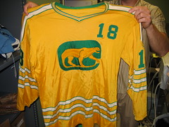
• My love of green and gold found Shangri-la in this Chicago Cougars jersey. And here’s the home version. Note the front jersey numbers, similar to what the Sabres did last year and what the Islanders have just unveiled.
• Here’s another great WHA design, from the New Jersey Knights (worn by Harry Howell!).
• There was also a really cool set of WHA pennants (additional pics here, here, here, here, and here). I especially liked this one — like, is that logo an all-time classic or what? Let me go on record right here: I’d gladly pay an extra $10 per ticket to see hockey players smoking pipes while they played.
• Not quite WHA, but close: a pair of California Golden Seals jerseys, home and road.
• Here’s a minor league team I hadn’t been aware of: the Cincinnati Swords.
• My biggest nightmare was embodied in this Nordiques jersey. “I didn’t realize they had purple trim,” I said to Mike. “They didn’t,” he said. “But some of the blue turned purple in the laundry. Look, it happened on the back, too.” At this point I ran screaming from the room.
• My favorite item in the entire place: Tom Seaver’s toothpick, complete with an affadavit of authenticity.
Big, big thanks to Mike for his hospitality. And when my Lelands article is published (probably early next month), I’ll link to it here.
Research Project: Last week’s ESPN column about uniform prototypes led many readers to suggest a related topic: uniforms that made it onto the field (or court, or ice) but were worn only once. Classic examples would include the Phillies’ solid-maroon design shown at left (worn on May 19th, 1979, and then quietly abandoned after intensely negative fan reaction) and the Mavericks’ silver ensemble (October 28th, 2003). I agree that this is a good topic, and I’m going to write an ESPN column about it for later this week, as a follow-up to the prototypes column.
Before you flood me with additional examples, let me spell out what I’m not looking for. I don’t want throwbacks, commemoratives, MLB’s futuristic jerseys, special designs created for particular bowl games, or anything else that was only supposed to have been worn once in the first place. I’m also not interested in uni elements that are technically active today but rarely worn (I already devoted a column to that topic two winters ago).
What I want here are designs that were supposed to be full-fledged components of a team’s wardrobe but barely got out of the starting gate before being mothballed. Limiting the project to things that were worn only once would probably make for a very small list, so let’s expand the parameters to include things that were worn, say, up to three or four times. This would allow us to include the Orioles in solid orange (worn twice in 1971, according to this page from Bill Henderson’s CD, although I’d prefer to know the exact dates), the Twins’ Dairy Queen jerseys (worn on April 6th and 21st, 1997, according to reader Tim McCabe), the Mets’ white caps, which were worn just a handful of times in early 1997 (anyone know exactly how many, or when?), and the Phillies’ “bad luck” 1994 blue caps. But it would not include designs that were worn for an entire season before being abandoned, like the Lions’ blue pants (with gray socks!), which were worn for all of team’s 1998 road games.
One thing that should definitely be included: N.C. State’s unitards. As many of you know, I’m weak on college hoops — when exactly was this design worn, and how often? Also: What year was it that Jim Boeheim had Syracuse dress up in blue for one game, and does anyone have a photo of that?
Got more contributions? Let’s have ’em. And don’t delay — I’ll be delivering this column to my ESPN editors on Wednesday afternoon.
Membership News: About 40 membership kits went out in yesterday’s mail, and another dozen or so should be ready by the end of the week. Almost caught up! My continued thanks to everyone for your patience.
Incidentally, there’s an absolute doozy of a raffle coming up next month — one for which you’ll definitely want those three extra raffle entries that come with membership. Can’t tell you the details just yet, but a hint is lurking somewhere on this page.
And speaking of raffles, remember that entries are currently being accepted for the football helmet from Helmet Hut. The drawing is Thursday, 10 p.m., so e-mail your name to uniraffle at earthlink dot net by then. One entry per person, but membership enrollees automatically get three extra entries.
Uni Watch News Ticker: Yesterday’s entry prompted a couple of great follow-ups. First, as you’ll recall, yesterday’s post made prominent mention of Helen Robinson, the Red Sox’s switchboard operator who did double-duty as the team’s emergency seamstress. Jere Smith provided a photo of her. And second, the upside-down 8 on Fenway’s exterior facade can be seen in this photo, which was linked in yesterday’s comments by Rick Schoffelen (if you squint hard enough, you can see that the upper opening in the 8 is larger than the lower). … Several sources inform me that Reebok is poised to acquire Mitchell & Ness, with the deal slated to become public in about two weeks. … Latest example of NFL’s miraculous disappearing sleeves: the Ravens (here’s another shot). “What’s next, wife-beater tees?” asks Tim Walsh. … “Julio Franco reported to the Rome Braves, the Class A minor league affiliate for Atlanta, to finish out the month of August before being recalled to the big leagues in September when the rosters expand,” writes Jonathon Binet. “All of the Braves’ minor league teams where home whites identical to what the big league club wears. But it’s clear that Franco is wearing his Atlanta Braves jersey, and not a jersey issued by Rome. This photo gallery shows that Franco’s jersey has the MLB logo on the back collar, not the MiLB logo. Also, his jersey lacks the American flag patch that the other players are wearing. Finally, Franco’s jersey still has the Lew Burdette/Johnny Sain memorial patch that Atlanta is wearing this year, while none of the Rome players have such a patch.” … I love Tom Bachtell’s illustrations in The New Yorker‘s “Talk of the Town” section, but why the hell did he depict Barry Bonds wearing a double-earflapped helmet? … Great photo gallery here of the UCF staff applying decal’s to the football team’s helmet (with thanks to Kyle Mas). … Rugby news from Eric Bangeman, who writes: “England has unveiled their alternate World Cup uniforms. It looks like another bad Nike idea from the world of college football (think Florida and Va. Tech) has been transplanted across the Atlantic. Here’s a photo gallery. In this shot, you can see the different shades of red in the shorts; there’s at least 3 different shades of red in the uniform.” … No photos yet, but 20-year-old Tigers call-up Cameron Maybin wears braces. I can’t think of any other brace-faced MLBers — or NFLers, NHLers, or NBAers, for that matter. Anyone..? … Amusing gallery here of Evel Knievel uniforms (with thanks to Knievel-phile Steve Mandich, who also notes that the CBA team from Evel’s hometown of Butte, Montana, is called the Daredevils). … Todd Burus notes that Kevin Cash is back in the majors — and so is his front-facing helmet brim. … There’s been lots of chatter in the comments about the inconsistencies in how Mark DeRosa’s name has been styled on his jerseys, but I think Chris Andringa is the first to offer visual proof. Here’s DeRosa as DE ROSA at home, and here he is as DEROSA on the road. Andringa says he’s seen both typographic styles on both jerseys at various points, meaning DeRosa has worn four different jersey/name combos. … Ohio University has unveiled a line of “heritage logos” (details here), and their new uniforms are out too (with thanks to Tim Burke).
interesting article in the Vancouver Province today talking about the Canucks’ new unis…
link
Randy Moss wore braces his first few years with the Vikings.
Another addition to the worn only once club is the Florida Gators. Last year they wore their Gator print uniforms once and got beat by Tennessee so didn’t wear them again. They wore a blue version of link
LSU’s football team wore purple pants with its white jerseys only once: in a 1995 (I think) loss at Kentucky. They also wore white helmets, gold jerseys, and gold pants against Notre Dame in the Independence Bowl (1996 or ’97, I think). Can’t find pics of either.
Terrell Davis of the Broncos (hock ptooey) wore braces.
Go Raiders.
Jays wore an SP patch last night to honour the passing of former Jays’ CEO/chairman Sam Pollock.
Not the best picture, but it’s something.
[quote comment=”134584″]LSU’s football team wore purple pants with its white jerseys only once: in a 1995 (I think) loss at Kentucky. They also wore white helmets, gold jerseys, and gold pants against Notre Dame in the Independence Bowl (1996 or ’97, I think). Can’t find pics of either.[/quote]
Ahem, as stated above: Not interested in things that were trotted out specifically for a bowl game. Interesting, yes, but not what this project is about.
And here it is:
link
WOW!!! Those were some great pics of the WHL pennants. I have to get me some Fighting Saints stuff. I also saw a lot of Pens jerseys, looked like some early (link and even some of their link. Paul can you confirm who’s jerseys they were by any chance? Also, I am surprised that it looks like they just have some of the jerseys thrown on the shelf, i could be wrong.
Illinois wore all orange for the 2003 opener against Missouri. I’m pretty sure they were never worn again, thankfully.
It’s kind of tough to see in this link, but the jersey top was a different shade of orange than the pants.
The “Island if Misfit Unis” was the first article of yours that I had read. And I’m still here. Cheers!
Former LSU Tiger and soon to be Boston Celtic Glen “Big Baby” Davis currently (at least as of his press conference) wears braces. I couldn’t find a good picture, except link.
[quote comment=”134590″]Illinois wore all orange for the 2003 opener against Missouri. I’m pretty sure they were never worn again, thankfully.
It’s kind of tough to see in this link, but the jersey top was a different shade of orange than the pants.[/quote]
That’s the differance between mesh and licra. My alma mater, Louisiana Tech, has worn a blue on blue uni in the past and they had the same issue with the colors not matching exactly under stadium lights.
Didn’t Terrell Owens wear those ‘Invisalign’ braces for a while?
Also, I never see the Padres wear their full sand-colored road unis anymore. They usually wear the dark blue jerseys. Do they still wear them? I know they have worn them way more than 3-4 times, but its interesting nonetheless.
The Red Sox had a White Hat with either a red or blue brim (can’t remember) which was worn just a handful of times before being retired… I remember the white hats with the home uniforms being called the Good Humor uniform… but I can’t even find a picture of the hats now.
Did anyone else notice that the San Diego Mariners mascot on the pennant is using a right handed stick but is holding it left handed?
Syracuse wore the blue uniforms against Kentucky in the late 80’s sorry no pictures.
i noticed on the california golden seals road jersey, there’s a tag that says link.
The only reason that interests me is a hockey store outside of Chicago, called link Very cool that the store might have been around that long and made some minor league jerseys.
Also, those are awesome colors especially for that era.
link had braces for awhile – I don’t know if he still does, though.
link, too.
The picture of the Mavs silver uni reminded me of a rumor I heard (can’t remember where) about Bob Kraft and Patriots wearing red. The Pats alternate “silver” jersey, IMHO, looks too much like their white jersey. One would think that red would be the logical color for an alternate jersey, but supposedly Kraft doesn’t like red, because it is associated with so many poor Patriot’s teams. Anyone confirm this?
Former Howard teammate Marquis Daniels also wore braces as a Mav. You can find both of them discussing their braces experience/promoting their orthodontist link.
In regards to the Lehigh Valley Ironpigs #26 on the mascot from a few days ago: It was confirmed to me by a team employee that #26 does represent the 26th man on the roster.
Paul,
The Cincinnati Swords, the former affiliate of the Buffalo Sabres, were the only minor league hockey team, of the seven total teams, to win a championship in their respective league. They won the 1972-73 AHL Championship. Their 72-73 banner still hangs in the dormant Cincinnati Gardens. Amazingly enough, the Swords folded after only three seasons in the AHL.
Hope that helps.
[quote comment=”134604″]Former Howard teammate Marquis Daniels also wore braces as a Mav. You can find both of them discussing their braces experience/promoting their orthodontist link.[/quote]
Wearing braces was a life changing experience for Josh Howard. Wow, over-dramatic much?
Those new Ohio unis look great. Very classy.
After looking at the motorcycle daredevils leathers, I couldn’t believe that somebody used the name “Johnny Airtime”. Whatta maroon!
In 1995, UMass basketball broke out an alternate black road uniform, lost the game to George Washington and Coach Calipari mothballed the uniforms for the remainder of the season. The uniforms did reappear a couple of times the following season, but were still considered bad luck for the team.
Love the bent L’s in the Golden Blades pennant – I thought it was for the New York Gocden Bcades!
Re: 1 time unis – I believe the Cardinals wore Red jerseys against the Cubs in the final series of ’98 or ’99 – anyone confirm this? It may have been their BP jerseys, so it may not count for the article, but my $.02 anyway.
[quote comment=”134605″]In regards to the Lehigh Valley Ironpigs #26 on the mascot from a few days ago: It was confirmed to me by a team employee that #26 does represent the 26th man on the roster.[/quote]
Someone said, on the day the article was written, that 26 represented the atomic number for iron. Whoever said it also had a source that I don’t remember. Wonder which it really is?
I seem to remember those NC State unitard were worn a few games at the beginning of the 89-90 season. I remember Chris Corchiani having them. They were a one piece top and biking short thing wtih regular shorts over them. I THINK Seton Hall might have worn them too. It was a Nike thing.
On a related basketball note, if you watch the movie “Hoop Dreams”, one of the main carachter’s teams plays King High School in Chicago. King’s colors are black and gold. They wear regular jerseys, black biking shorts with yellow stripes down the sides, but NO SHORTS over the biking shorts. I do not know how to do the screen grab thing but I saw that movie recently and I am almost positive that was the case. I have never seen that basketball uniform combo before or since.
Hmm. As an Ohio alum, I’m sort of torn about the new uniforms. Actually, no, I don’t like them. The sleeve/shoulder areas look goofy, and, frankly, the old uniforms were pretty classy like they were. The shoulder stripes go different directions–look at #52 and #86. Bah.
I am glad to see that they bowed to popular demand and brought back the pawprint, even as a money-grad, er, heritage line. Now if only they’d play a game or two in the original colors, that’d be a sight to see.
Also, can I nominate the couches in the background of that UCF slideshow as the most garish furniture ever?
The only reason that interests me is a hockey store outside of Chicago, called “Gunzo’s Hockey Headquarters†Very cool that the store might have been around that long and made some minor league jerseys.
Yeah, Gunzo’s has been–and remains–a hockey player’s mecca for equipment for the Chicago-land area. And it has been around for a long time.
[quote comment=”134605″]In regards to the Lehigh Valley Ironpigs #26 on the mascot from a few days ago: It was confirmed to me by a team employee that #26 does represent the 26th man on the roster.[/quote]
interesting, because the day after the unveiling, a team employee told me it was because the atomic number for iron is 26.
today’s ironpigs visitation was already postponed due to the weather here in the lehigh valley, however i will be in attendance at saturdays visitation
didn’t brett favre also wear the clear looking, but still can see, kind of braces???? For a few years I belive…
I seem to remember Mike Martz ridiculing the St. Louis Rams’ blue jersey-blue pants combination after the team switched from blue and yellow to blue and gold. I don’t know if that particular color combination ever made it to the field or not… maybe a preseason game?
An obscure one that got mentioned a LOT on the Creamer boards is a one-time 90s Wisconsin uni – think the Cowboys’ “double star” design in red and white with black trim and the Motion W where the stars would be. Worn once, in a rout against Colorado and never again. There are even darn few photographs.
The Lions’ blue pants are what sent Barry Sanders into retirement.
[quote comment=”134620″]didn’t brett favre also wear the clear looking, but still can see, kind of braces???? For a few years I belive…[/quote]
link.
On the site for daredevil uniforms, i notice they left the most celebrated daredevil off the list, Super Dave Osborn
One I know was worn only once was Colorado’s “piss yellow” jerseys (gold tops, silver numbers) with black helmets, worn for the 75th anniversary of Folsom Field in 1998. I believe they were playing Baylor. I can’t seem to find a photo online, but I have a small one I stole from the wire service. Maybe someone actually has pictures of that game. Or maybe they broke all the cameras.
The other jersey that comes to mind is the original black Rockies jersey from 1993, which was to be worn at home Sunday games. Problem was, they kept getting blown out on Sunday. I think link was the last game they played in black, so I think that gives them four times they wore it. I actually have a black sunday Rockies jersey if I can just remember which box it’s in….
[quote comment=”134613″]I seem to remember those NC State unitard were worn a few games at the beginning of the 89-90 season. I remember Chris Corchiani having them. They were a one piece top and biking short thing wtih regular shorts over them. I THINK Seton Hall might have worn them too. It was a Nike thing.
On a related basketball note, if you watch the movie “Hoop Dreams”, one of the main carachter’s teams plays King High School in Chicago. King’s colors are black and gold. They wear regular jerseys, black biking shorts with yellow stripes down the sides, but NO SHORTS over the biking shorts. I do not know how to do the screen grab thing but I saw that movie recently and I am almost positive that was the case. I have never seen that basketball uniform combo before or since.[/quote]
you are correct. king, which featured future wisconsin star rashard griffith, and lsu star jamie brandon, was one of the most feared city teams of that era. they were a controversial team as well, based on their shady coach.
here is a photo
link
the photo is from the ihsa website, which was referenced here months ago.
here are the all time boys records which includes team photos.
link
According to the Henderson CD, the Anaheim Angels’ Black/Light Blue uniforms were worn only on July 2, 1997.
link
[quote comment=”134622″]An obscure one that got mentioned a LOT on the Creamer boards is a one-time 90s Wisconsin uni – think the Cowboys’ “double star” design in red and white with black trim and the Motion W where the stars would be. Worn once, in a rout against Colorado and never again. There are even darn few photographs.[/quote]
I sent it to Paul last night, including the only photos I’ve ever seen – a B&W scan from the newspaper and a color photo of the jersey alone. ;)
Maybe your seconding will get it mentioned in his article….
[quote comment=”134626″]One I know was worn only once was Colorado’s “piss yellow” jerseys (gold tops, silver numbers) with black helmets, worn for the 75th anniversary of Folsom Field in 1998. I believe they were playing Baylor. I can’t seem to find a photo online, but I have a small one I stole from the wire service. Maybe someone actually has pictures of that game. Or maybe they broke all the cameras.[/quote]
I don’t think that one would count, as from your description it was intended to only be worn once.
Hey Paul! You should do a feature on the history of the little league world series jerseys.
[quote comment=”134608″]Those new Ohio unis look great. Very classy.
After looking at the motorcycle daredevils leathers, I couldn’t believe that somebody used the name “Johnny Airtime”. Whatta maroon![/quote]
I agree that the Ohio State uniforms look alright and everything but can someone explain to me what this word “classy” means that I see thrown out around here. It seems to me it’s kind of become like saying something is “interesting.” It’s a vague term that gets used when people don’t know what else to say about something that is simple but looks good.
To me, classy says designer clothes, posh restaurants, elegant gowns and things of that nature. Classy has never said football jersey to me. It means something on the higher end of life. Upscale if you will. But it gets thrown around on these comment boards about uniforms and logos.
Can’t we come up with something more to say. People like to point out that they notice these little, what would be insignificant details to most people, but, words are used pretty generically. Instead of saying that the new Ohio university uniforms are “classy” and leaving it at that, point out what it is that makes them “classy,” if you really can’t find a more appropriate word. For instance, I’m not a huge fan of them, but I like the shoulder areas in particular. I like the fact that they have big thick stripes and clunky numbers on the outside of the sleeves. Seems like a very classic football move. Kind of a throwback the late 70s and early 80s, which was the peak of uniform design, in my opinion.
I am not just attacking this one guy today. It’s something that has been bugging me for a while. I’ve seen people insulted and ridiculed for bringing up stuff that is “old news” to loyal uni watch readers. But, a lot of the time the same old tired compliments are paid to uniforms that, often, won’t do the uniform (or logo) justice.
That’s my rant for today. Sorry to do it, but I had to get it out there. I just can’t understand how a community of people that prides themselves on their knowledge of uniform history and a sports “fashion sense” can’t come up with better words sometimes.
I only remember them wearing them once or twice but the cleveland browns link and their link
Hate to contradict Mr. Binet, but the Myrtle Beach Pelicans are a Braves affiliate and they do not wear Braves home jerseys. Of course, they’re the only Braves affiliate not named Braves to my knowledge.
link
Also from the Henderson CD, the Kansas City Royals’ 2006 black alts were worn for three games, and never again, thank god.
Incidentally, thanks for the awesome membership card. :D
Didn’t Miami and Chicago wear orange jerseys for a short time?
link
link
What’s the story with Kevin Cash and his “front-facing helmet brim”? I’ve never heard of the guy, and I’m not quite sure I understand what that means. A quick google image search didn’t turn up anything interesting.
Any help?
A good one time wear was the Winnipeg Jets wearing red helmets one game against the red wings and the announcers legitimatley thinking they had forgotten their helmets in winnipeg and had borrowed the red wings road helmets.
[quote comment=”134619″][quote comment=”134605″]In regards to the Lehigh Valley Ironpigs #26 on the mascot from a few days ago: It was confirmed to me by a team employee that #26 does represent the 26th man on the roster.[/quote]
interesting, because the day after the unveiling, a team employee told me it was because the atomic number for iron is 26.
today’s ironpigs visitation was already postponed due to the weather here in the lehigh valley, however i will be in attendance at saturdays visitation[/quote]
I e-mailed the PR department asking if the 26 was for the 26th player. He could have just went along with it because it was easier that way.
The easy and obvious jerseys that did not make the cut after one wear the ducks and Kings third jerseys from 1996.
link
link
[quote comment=”134638″]What’s the story with Kevin Cash and his “front-facing helmet brim”? I’ve never heard of the guy, and I’m not quite sure I understand what that means. A quick google image search didn’t turn up anything interesting.
Any help?[/quote]
Kevin Cash just got called up to the Red Sox and last night started in place of Doug Mirabelli to catch Tim Wakefield. I’m assuming that the front facing helmet brim is talking about the helmet he wears under his catcher’s mask. Most of the time it is worn link. I’m assuming this means he wears his frontwards (couldn’t find a picture).
Sorry if this has been posted before.
Iowa State is letting their fans choose which helmet the football team will wear this season.
link
Those white Mets caps are still my favorite to this day. I still have one that I bought in 1997. Its kind of off white now, and I can’t find a dry cleaner who will do wool caps. Any ideas? I’m in the Lehigh Valley of PA, but I go to Jersey and Manhattan quite a bit, so I’m open to suggestions…
[quote comment=”134638″]What’s the story with Kevin Cash and his “front-facing helmet brim”? I’ve never heard of the guy, and I’m not quite sure I understand what that means. A quick google image search didn’t turn up anything interesting.
Any help?[/quote]
From: Page2 Archives on 5/11/06
Uni Watch has written previously about the unusual phenomenon of catchers who wear their helmets with the link. Uni Watch had been aware of only two MLB backstops favoring this style: link and link, neither of whom is currently in the bigs. But it turns out there’s another front-brimmer, one Uni Watch had overlooked: link, whose brim is particularly easy to spot link when he wears link.
[quote comment=”134637″]Didn’t Miami and Chicago wear orange jerseys for a short time?
link
link[/quote]
Doesn’t count. Those are just alternates. Almost every NFL team has one now.
The second version of the Browns’ orange pants counts, at least I think so. But of course, the Browns did wear the orange pants regularly during the late 70s and early 80s.
Speaking of the Browns, lets hope that the return of the striped socks (which sadly weren’t worn last week) doesn’t fall into this category. OK, enough from me.
[quote comment=”134584″]LSU’s football team wore purple pants with its white jerseys only once: in a 1995 (I think) loss at Kentucky. They also wore white helmets, gold jerseys, and gold pants against Notre Dame in the Independence Bowl (1996 or ’97, I think). Can’t find pics of either.[/quote]
The Independence Bowl was in 1997, but LSU wore white helmets, gold jerseys and WHITE pants – NOT gold pants. As seen link.
[quote comment=”134633″][quote comment=”134608″]Those new Ohio unis look great. Very classy.
After looking at the motorcycle daredevils leathers, I couldn’t believe that somebody used the name “Johnny Airtime”. Whatta maroon![/quote]
I agree that the Ohio State uniforms look alright and everything but can someone explain to me what this word “classy” means that I see thrown out around here. It seems to me it’s kind of become like saying something is “interesting.” It’s a vague term that gets used when people don’t know what else to say about something that is simple but looks good.
To me, classy says designer clothes, posh restaurants, elegant gowns and things of that nature. Classy has never said football jersey to me. It means something on the higher end of life. Upscale if you will. But it gets thrown around on these comment boards about uniforms and logos.
Can’t we come up with something more to say. People like to point out that they notice these little, what would be insignificant details to most people, but, words are used pretty generically. Instead of saying that the new Ohio university uniforms are “classy” and leaving it at that, point out what it is that makes them “classy,” if you really can’t find a more appropriate word. For instance, I’m not a huge fan of them, but I like the shoulder areas in particular. I like the fact that they have big thick stripes and clunky numbers on the outside of the sleeves. Seems like a very classic football move. Kind of a throwback the late 70s and early 80s, which was the peak of uniform design, in my opinion.
I am not just attacking this one guy today. It’s something that has been bugging me for a while. I’ve seen people insulted and ridiculed for bringing up stuff that is “old news” to loyal uni watch readers. But, a lot of the time the same old tired compliments are paid to uniforms that, often, won’t do the uniform (or logo) justice.
That’s my rant for today. Sorry to do it, but I had to get it out there. I just can’t understand how a community of people that prides themselves on their knowledge of uniform history and a sports “fashion sense” can’t come up with better words sometimes.[/quote]
interesting. ive never looked at the term classy, when referenced as the “look of something”, to have anything to do with money, wealth or social class.
when describing the “look of something”, i see classy as the opposite of tacky or visually obnoxious. not going to far to make a visual statement. simple and understated “garments” which pack a visual punch and make a statement.
a man at my sisters wedding (who was a painter by trade) wore a rented navy suit with a white shirt and gold tie and pocket square and looked classy because it was a solid look, not because he was a member of a high social class. now his behavior after 8 hours of solid liquor drinking was anything but classy!
i see the term classy, when used throughout language almost to mean, a throwback… when times were simple, people showed respect, men were polite, etc.
anyone understand that?
[quote comment=”134647″][quote comment=”134637″]Didn’t Miami and Chicago wear orange jerseys for a short time?
link
link[/quote]
Doesn’t count. Those are just alternates. Almost every NFL team has one now.[/quote]
They were alternates, but weren’t they canned because of poor response? Alternates that teams like do get worn twice a year for multiple years.
[quote comment=”134637″]Didn’t Miami and Chicago wear orange jerseys for a short time?
link
link[/quote]
The Bears have Orange as their alternate jersey. I’m not a fan of it, but it’s a tribute to a jersey they wore in their earlier years.
[quote comment=”134652″][quote comment=”134647″][quote comment=”134637″]Didn’t Miami and Chicago wear orange jerseys for a short time?
link
link[/quote]
Doesn’t count. Those are just alternates. Almost every NFL team has one now.[/quote]
They were alternates, but weren’t they canned because of poor response? Alternates that teams like do get worn twice a year for multiple years.[/quote]
I thought both the Dolphins and Bears still used their alternate orange moneygrabs jerseys.
I think ‘Strikethru’ is busted.
[quote comment=”134599″]i noticed on the california golden seals road jersey, there’s a tag that says link.
The only reason that interests me is a hockey store outside of Chicago, called link Very cool that the store might have been around that long and made some minor league jerseys.
Also, those are awesome colors especially for that era.[/quote]
Gunzo’s was doing NHL uni’s too, the Hawks were done by them for a long time before it became an NHL thing. Find from early 80’s vids, you’ll see the gunzo’s labels on the hemline
[quote comment=”134641″]The easy and obvious jerseys that did not make the cut after one wear the ducks and Kings third jerseys from 1996.
link
link
Both of those jerseys were worn on Sundays during the entire NHL season. They didn’t make it into the following season.
[quote comment=”134651″][quote comment=”134633″][quote comment=”134608″]Those new Ohio unis look great. Very classy.
After looking at the motorcycle daredevils leathers, I couldn’t believe that somebody used the name “Johnny Airtime”. Whatta maroon![/quote]
I agree that the Ohio State uniforms look alright and everything but can someone explain to me what this word “classy” means that I see thrown out around here. It seems to me it’s kind of become like saying something is “interesting.” It’s a vague term that gets used when people don’t know what else to say about something that is simple but looks good.
To me, classy says designer clothes, posh restaurants, elegant gowns and things of that nature. Classy has never said football jersey to me. It means something on the higher end of life. Upscale if you will. But it gets thrown around on these comment boards about uniforms and logos.
Can’t we come up with something more to say. People like to point out that they notice these little, what would be insignificant details to most people, but, words are used pretty generically. Instead of saying that the new Ohio university uniforms are “classy” and leaving it at that, point out what it is that makes them “classy,” if you really can’t find a more appropriate word. For instance, I’m not a huge fan of them, but I like the shoulder areas in particular. I like the fact that they have big thick stripes and clunky numbers on the outside of the sleeves. Seems like a very classic football move. Kind of a throwback the late 70s and early 80s, which was the peak of uniform design, in my opinion.
I am not just attacking this one guy today. It’s something that has been bugging me for a while. I’ve seen people insulted and ridiculed for bringing up stuff that is “old news” to loyal uni watch readers. But, a lot of the time the same old tired compliments are paid to uniforms that, often, won’t do the uniform (or logo) justice.
That’s my rant for today. Sorry to do it, but I had to get it out there. I just can’t understand how a community of people that prides themselves on their knowledge of uniform history and a sports “fashion sense” can’t come up with better words sometimes.[/quote]
interesting. ive never looked at the term classy, when referenced as the “look of something”, to have anything to do with money, wealth or social class.
when describing the “look of something”, i see classy as the opposite of tacky or visually obnoxious. not going to far to make a visual statement. simple and understated “garments” which pack a visual punch and make a statement.
a man at my sisters wedding (who was a painter by trade) wore a rented navy suit with a white shirt and gold tie and pocket square and looked classy because it was a solid look, not because he was a member of a high social class. now his behavior after 8 hours of solid liquor drinking was anything but classy!
i see the term classy, when used throughout language almost to mean, a throwback… when times were simple, people showed respect, men were polite, etc.
anyone understand that?[/quote]
Classy link
Classic
link
As noted in Bill Henderson’s guide, the 1971 O’s wore a double knit version of their road jersey. It was only used in one game and then shelved.
Here is the normal flannel link, and you can see Brooks Robinson in the 1 time jersey in link. The first clip is of Clemente sliding into 3rd…check out Brooks and the big white sleeve bands on those things!
RyanB (post 55):
The voting is for the 2008 season. The only change for 2007 is gold pants. The entire uniform will change in ’08.
“Instead of saying that the new Ohio university uniforms are “classy” and leaving it at that, point out what it is that makes them “classy,” if you really can’t find a more appropriate word…I like the fact that they have big thick stripes and clunky numbers on the outside of the sleeves. Seems like a very classic football move.”
“Classy” is not okay, but “classic” is? I would think that there is a correlation between the two.
[quote comment=”134651″][quote comment=”134633″][quote comment=”134608″]Those new Ohio unis look great. Very classy.
After looking at the motorcycle daredevils leathers, I couldn’t believe that somebody used the name “Johnny Airtime”. Whatta maroon![/quote]
I agree that the Ohio State uniforms look alright and everything but can someone explain to me what this word “classy” means that I see thrown out around here. It seems to me it’s kind of become like saying something is “interesting.” It’s a vague term that gets used when people don’t know what else to say about something that is simple but looks good.
To me, classy says designer clothes, posh restaurants, elegant gowns and things of that nature. Classy has never said football jersey to me. It means something on the higher end of life. Upscale if you will. But it gets thrown around on these comment boards about uniforms and logos.
Can’t we come up with something more to say. People like to point out that they notice these little, what would be insignificant details to most people, but, words are used pretty generically. Instead of saying that the new Ohio university uniforms are “classy” and leaving it at that, point out what it is that makes them “classy,” if you really can’t find a more appropriate word. For instance, I’m not a huge fan of them, but I like the shoulder areas in particular. I like the fact that they have big thick stripes and clunky numbers on the outside of the sleeves. Seems like a very classic football move. Kind of a throwback the late 70s and early 80s, which was the peak of uniform design, in my opinion.
I am not just attacking this one guy today. It’s something that has been bugging me for a while. I’ve seen people insulted and ridiculed for bringing up stuff that is “old news” to loyal uni watch readers. But, a lot of the time the same old tired compliments are paid to uniforms that, often, won’t do the uniform (or logo) justice.
That’s my rant for today. Sorry to do it, but I had to get it out there. I just can’t understand how a community of people that prides themselves on their knowledge of uniform history and a sports “fashion sense” can’t come up with better words sometimes.[/quote]
interesting. ive never looked at the term classy, when referenced as the “look of something”, to have anything to do with money, wealth or social class.
when describing the “look of something”, i see classy as the opposite of tacky or visually obnoxious. not going to far to make a visual statement. simple and understated “garments” which pack a visual punch and make a statement.
a man at my sisters wedding (who was a painter by trade) wore a rented navy suit with a white shirt and gold tie and pocket square and looked classy because it was a solid look, not because he was a member of a high social class. now his behavior after 8 hours of solid liquor drinking was anything but classy!
I see the term classy, when used throughout language almost to mean, a throwback… when times were simple, people showed respect, men were polite, etc.
anyone understand that?[/quote]
Todd, thank you for that explanation of the term “classy” as used in reference to sports uniforms. How you described it is exactly how I feel, especially this part….
“when describing the “look of something”, i see classy as the opposite of tacky or visually obnoxious. not going to far to make a visual statement. simple and understated “garments” which pack a visual punch and make a statement.”
Quite literally, I couldn’t have said it any better myself.
[quote comment=”134639″]A good one time wear was the Winnipeg Jets wearing red helmets one game against the red wings and the announcers legitimatley thinking they had forgotten their helmets in winnipeg and had borrowed the red wings road helmets.[/quote]
The Jets wore those red helmets multiple times for one season. There was talk in Winnipeg about ways to change their uniforms due to the colour of their road helmets not matching the colour of their road uniforms. Someone in the Jets’ franchise did notice these things. Switching to red was an obvious choice as it was one of their main colours, however, it lasted only one season.
One of the bars in Winnipeg has a red Jets’ helmet under glass with Selanne’s autograph on it.
[quote comment=”134661″]”Instead of saying that the new Ohio university uniforms are “classy” and leaving it at that, point out what it is that makes them “classy,” if you really can’t find a more appropriate word…I like the fact that they have big thick stripes and clunky numbers on the outside of the sleeves. Seems like a very classic football move.”
“Classy” is not okay, but “classic” is? I would think that there is a correlation between the two.[/quote]
Yup – see #69
The colts wore blue pants for the first 2-3 games in 1994 or 1995. However, Irsay changed his mind and they was banished.
[quote]interesting. ive never looked at the term classy, when referenced as the “look of somethingâ€Â, to have anything to do with money, wealth or social class.
when describing the “look of somethingâ€Â, i see classy as the opposite of tacky or visually obnoxious. not going to far to make a visual statement. simple and understated “garments†which pack a visual punch and make a statement.
a man at my sisters wedding (who was a painter by trade) wore a rented navy suit with a white shirt and gold tie and pocket square and looked classy because it was a solid look, not because he was a member of a high social class. now his behavior after 8 hours of solid liquor drinking was anything but classy!
i see the term classy, when used throughout language almost to mean, a throwback… when times were simple, people showed respect, men were polite, etc.
anyone understand that[/quote]
I get you. I wasn’t trying to make it seem like I was grouping “classy” and money together. A lot of things can be classy, regardless of money. I guess I gave bad examples which may have hidden the overall meaning of my message.
My point wasn’t that a football jersey can’t necessarily be “classy” (even though I wouldn’t use that word). What I am saying is that that word seems to have been diluted on this page. It doesn’t mean anything anymore. When someone makes a statement “I like this. It’s classy.” That’s very uninformative to me. Tell me what it is you like about it. Tell me what it is you don’t like. Tell me why it looks “classy.”
When I was in college and would paint for my art classes people would come by the dorm and take a look at what I was doing. When I asked their opinion, if it was an uninformed person, or someone unfamiliar with art in general they would all give me a similar answer.
“I like it. It’s interesting” Or, “The way you did *blah blah blah* is interesting.” That told me nothing about their opinion of the painting. It told me that this person either didn’t get what I was doing (which is often the case with “abstract” (for lack of a better word) art) didn’t like what I was doing, or didn’t care enough to give me an honest assessment of what I had presented to them.
This isn’t meant to be insulting to you or anyone else on this site. Just asking why it has become acceptable to give a very vague and “blah” word to describe a uniform which has obviously struck some sort of cord with your tastes. It immediately made you say “I like that.” (at least enough to post on the comments section)
I’m not asking you or anyone else to change. I wanted to bring up a trend I saw. This is a unique community of people. A lot of the people on this site have an appreciation for the design of something that means a great deal to a lot of people. There are a lot of people that will be cheering for the uniforms that the Ohio University football team will be wearing this year, but only someone will think to criticize their uniforms. Seems to me, those select few can come up with a few reasons why they like it. Or at least why it’s classy.
[quote comment=”134661″]”Instead of saying that the new Ohio university uniforms are “classy” and leaving it at that, point out what it is that makes them “classy,” if you really can’t find a more appropriate word…I like the fact that they have big thick stripes and clunky numbers on the outside of the sleeves. Seems like a very classic football move.”
“Classy” is not okay, but “classic” is? I would think that there is a correlation between the two.[/quote]
I guess I should pick my battles. It’s not the word classy I had issue with (well, not in the grand scheme of things).
But, I do dispute the fact that I used classic in the same way he used classy. I was using it in the description and he was using it to describe.
Read my post in #77. My issue was not with the word in general but with the use of the word.
I cannot for the life of me understand why more teams don’t link.
[quote comment=”134652″][quote comment=”134647″][quote comment=”134637″]Didn’t Miami and Chicago wear orange jerseys for a short time?
link
link[/quote]
Doesn’t count. Those are just alternates. Almost every NFL team has one now.[/quote]
They were alternates, but weren’t they canned because of poor response? Alternates that teams like do get worn twice a year for multiple years.[/quote]
I believe they intended to only wear it once per season (2 seasons? Still wearing them? I forget).
Its not an alternate as much as it is a throw-back (even though its not accurate to the original all-orange).
Its all kinda silly, but I love all-orange for any team that can pull it off. Including the Orioles!
Good call on the Cardinals one-game use of an alternate red uniform. I remember a Cardinal fan I ran into in New Britain, Conn. that same day griping about it.
Don Baylor did put an end to those black alts in 1993. I thought it was more because he was a home white/ road gray sort of guy, though.
The Expos one year broke out their blue mesh batting jerseys for a regular season game, though that’s not quite the same.
That DeRosa/DE ROSA thing reminds me of the McGwire deal back in the day. With the A’s, the little c was superscript at home and in line with the bottom on the road. Or was it the other way around? Of course, once he went to the Cards it was MC GWIRE which makes all kinds of no sense at all.
dude!
pat!
not insulting at all man!
dont apologize!
this blog is for discussions like this!
i have a similar dislike for when forms of the words monstrosity or abomination are used…
your background in art, when an opinion is given, almost demands reasons for said opinion!
tell me why, in other words… right?
i totally get your opinion.
in reference to wilbon’s rant yesterday on pti about the chargers new white helmets, he went on and on about how they shouldnt have them unless they have the powder blues… i guess he didnt bother to check that they are using a revised powder blue this season…
Dwight Howard of the Orlando Magic wears braces. As seen here.
link
I’m sure there are some out there who know more about this than I, but in the late 80’s/early 90’s, I believe Notre Dame’s basketball team wore some very odd alternate uniforms in a game against Syracuse. They were lime (almost fluorescent) green with dark green trim. I remember seeing a picture of them when I was young, but I have never been able to find one online. It might be a job for Notre Dame photo archivist.
[quote comment=”134635″]Hate to contradict Mr. Binet, but the Myrtle Beach Pelicans are a Braves affiliate and they do not wear Braves home jerseys. Of course, they’re the only Braves affiliate not named Braves to my knowledge.
link[/quote]
You are correct. Throughout history the vast majority of Boston/Milwaukee/Atlanta affiliates have been Braves teams. Off the top of my head, other exceptions are the Durham Bulls, Eugene Emeralds, Danville 97s, Sacramento Solons.
Also, one cannot forget about Kansas’ yellow alternate basketball uniforms in the Larry Brown era. You can see a video of them in action here:
link
Fans were outraged because they looked too much like Mizzou.
linkthe colts blue pants – which I actually liked. They were worn for part of the 1995 season.
The photo is of Marshall Faulk.
from ESPN: Canes to leave Orange Bowl for Dolphin Stadium in 2008.
“the stadium’s facade is rusting, upgrades are needed and the building lacks many amenities that modern stadiums have — such as the luxury suites and video replay screens”
I’m guessing it was more of a liability issue..”but this move could generate $2 million or more in extra revenue annually for the Hurricanes’ athletic department”. crazy. Why don’t they just build.
I don’t know if you guys will find this of interest or not, but seeing that blue and gold Oakland Seals jersey reminded me of link of the late guitarist Mick Ronson wearing one, in the A’s green-and-gold colors the team changed to when Charlie Finley owned them.
U of Minnesota hockey wore a special player-designed jersey in 97-98. It was ugly, the players hated it, and they switched back to their old style. Click link and scroll down to the Jason Godbout jersey. I’ve heard the link from the players was that it was too hot on the ice.
So, Ohio University can get jersey stripes that go all the way around the shoulder, but the World Champion Colts can’t?
I hesitate to even mention this, but would the Vikings’ October 11, 1964 game against the Lions count toward one-time-only status? This was the game where both teams showed up with white jerseys and the Vikings changed after the first quarter, resulting in them wearing purple on purple for three quarters? (I can see Paul foaming at the mouth already…)
[quote comment=”134682″]U of Minnesota hockey wore a special player-designed jersey in 97-98. It was ugly, the players hated it, and they switched back to their old style. Click link and scroll down to the Jason Godbout jersey. I’ve heard the link from the players was that it was too hot on the ice.[/quote]
When you say it was “player-designed,” do you mean one specific player designed it, or that the players had input on it?
I know the Twins wore a sleeveless jersey a few years back and I only remember seeing them a few games. They may have worn them more than that though.
Discussion of Milwaukee Brewers helmets can be found link written by former Milwaukee Journal Sentinel’s beat writer for the Brewers, Drew Olson.
[quote comment=”134688″][quote comment=”134682″]U of Minnesota hockey wore a special player-designed jersey in 97-98. It was ugly, the players hated it, and they switched back to their old style. Click link and scroll down to the Jason Godbout jersey. I’ve heard the link from the players was that it was too hot on the ice.[/quote]
When you say it was “player-designed,” do you mean one specific player designed it, or that the players had input on it?[/quote]
Right from the site he linked to:
“Jason Godbout – Gemini Dazzle knit, size 56. This style was worn only for a few games, because the players thought they were hideous. It was designed by Gopher player Casey Hankinson. Purchased directly from the Golden Gophers.”
[quote comment=”134688″][quote comment=”134682″]U of Minnesota hockey wore a special player-designed jersey in 97-98. It was ugly, the players hated it, and they switched back to their old style. Click link and scroll down to the Jason Godbout jersey. I’ve heard the link from the players was that it was too hot on the ice.[/quote]
When you say it was “player-designed,” do you mean one specific player designed it, or that the players had input on it?[/quote]
I’m no expert on U of M stuff, but everything I’ve read from Gopher experts is that it was designed by link. There’s a brief description in the original link I posted.
Those WHA pennants are great. The Golden Blades skate depicted is white and looks like a figure skate…the “ers” coming out of the backside of the whale…the aformentioned pipe smoker…the freckles and dangling skate lace of the boy-saint…the generic Yellow Page Jet….Simple, whimsical, hand-drawn, funny, weird, innocent. I miss that.
By the way, those Lions blue pants look pretty good. And no black in sight.
Damned Post Monster.
Vince Carter also was a member of the braces club…can’t find any pix
Matt Murphy is selling the Jose Reyes Mets jersey that he was wearing when he caught Bonds #756. Are you kidding me?
link
Since it was my “classy” that started the discussion, let me weigh in a little more.
Pat, when I used “classy” it was my assumption that whoever read that would “Get” (as in Get It) what I meant. It is my contention that most here know what I meant about classy without having to explain about why it’s classy (i.e. simple design, classic football shoulder stripes, block numbers, one color on the jersey w/ solid white numerals & no extranious crap).
Now, occasionally if you want someone to expound on why they think it’s classy, if you asked them, I think they (or I) would be happy to oblige.
Colts blue pants probably fit Paul’s criteria, but the Cardinals alt red unis (September, 2001 I believe) were part of some “shirts off our backs” promotion. They looked just like the BP jerseys at the time, but I believe Paul pointed out one time that they were actually double knit, and made for that promo.
Mariners in teal? Or did they wear them more often than I remember?
And the best bace-faced baseball card of all time… a young Gary Sheffield on the Brewers.
Marcus Washington of the Redskins recently got his braces removed after 2 years and recent signee Corey Bradford (also of the Redskins) wears them.
link
austin
please repost that link to the vid on the yellow kansas unis…
i just recieved a response from the iron pigs…
Todd —
You are CORRECT!
26 is the number on the pig logo because it is indeed the Atomic Number for Iron…(Fe)…
Matt Provence
Director, Media Relations
Lehigh Valley IronPigs
P.O. 90220
Allentown, PA
610-435-3001 x31005
link
[quote comment=”134700″]Colts blue pants probably fit Paul’s criteria, but the Cardinals alt red unis (September, 2001 I believe) were part of some “shirts off our backs” promotion. They looked just like the BP jerseys at the time, but I believe Paul pointed out one time that they were actually double knit, and made for that promo.
Mariners in teal? Or did they wear them more often than I remember?
And the best bace-faced baseball card of all time… a young Gary Sheffield on the Brewers.[/quote]
Didn’t the Mariners have a black alternate as well as the Athletics?
[quote comment=”134637″]Didn’t Miami and Chicago wear orange jerseys for a short time?
link
link[/quote]
the bears still wear them as there alternate
i know that for one year the red sox had 3 different baseball caps, they had a red one (with a WHITE “b”) and a White one w/ a red “b”.
that evel knievel stuff is the JAM, man!!!
i LOVE that dude! how sick was that Wembley Stadium uni?!!?
After viewing that pic at the top of the page I was immediately transported back to my youth on Long Island, where I watched the link play at the link – link, same colors, and an affiliate of the Chicago team.
Man, I’d love to get me an LI jersey!
My mistake. Here’s the link for the yellow KU unis:
link
Torri Hunter wore braces for some time as well-but I haven’t found any pictures.
Article on MLB.com about players who don’t wear batting gloves:
link
I was bored last night and just looking at some uniform related topics, and one that caught my attention was on wikipedia on the steelers uniforms, saying that there have been reports of them wearing the throwback uniforms they are going to wear twice this year, as there full time jersey in 08 minus the gold helmet. wikipedia also had something on how the seahawks were considering a neon jersey for 05. and something i saw on ssur.org had that the steelers wanted a gold jersey to wear on the road when teams in hot climates like jacksonville dallas or san diego wears their away jerseys and makes them wear there home. but that was at the time wear u werent allowed to wear alternates on the road, but then the panthers did it, so they became able to wear them, still dont know if they are going to break them out any time soon
[quote comment=”134708″]After viewing that pic at the top of the page I was immediately transported back to my youth on Long Island, where I watched the link play at the link – link, same colors, and an affiliate of the Chicago team.
Man, I’d love to get me an LI jersey![/quote]
The LI jerseys are actually the same as the Chicago’s. Chicago used to send the old jerseys down to LI to be used.
[quote comment=”134708″]After viewing that pic at the top of the page I was immediately transported back to my youth on Long Island, where I watched the link play at the link – link, same colors, and an affiliate of the Chicago team.
Man, I’d love to get me an LI jersey![/quote]
I never saw a Cougars game, but I was taken to an L.I. Ducks game at Comack Arena in the early ’70s. I can barely remember it. One of the first sporting events I ever attended.
[quote comment=”134704″][quote comment=”134700″]Colts blue pants probably fit Paul’s criteria, but the Cardinals alt red unis (September, 2001 I believe) were part of some “shirts off our backs” promotion. They looked just like the BP jerseys at the time, but I believe Paul pointed out one time that they were actually double knit, and made for that promo.
Mariners in teal? Or did they wear them more often than I remember?
And the best bace-faced baseball card of all time… a young Gary Sheffield on the Brewers.[/quote]
Didn’t the Mariners have a black alternate as well as the Athletics?[/quote]
I don’t think so. They’ve had dark blue alternates that could look black, but I don’t think they had an actual black alternate.
[quote comment=”134700″]Colts blue pants probably fit Paul’s criteria, but the Cardinals alt red unis (September, 2001 I believe) were part of some “shirts off our backs” promotion. They looked just like the BP jerseys at the time, but I believe Paul pointed out one time that they were actually double knit, and made for that promo.
Mariners in teal? Or did they wear them more often than I remember?
And the best bace-faced baseball card of all time… a young Gary Sheffield on the Brewers.[/quote]
I believe he had a gold “GS” on his two front teeth, not braces. (can’t find a good pic but you can see it on pretty clear on his ’89 Topps rookie)
Didn’t Tracy Mcgrady have braces?
[quote comment=”134630″][quote comment=”134622″]An obscure one that got mentioned a LOT on the Creamer boards is a one-time 90s Wisconsin uni – think the Cowboys’ “double star” design in red and white with black trim and the Motion W where the stars would be. Worn once, in a rout against Colorado and never again. There are even darn few photographs.[/quote]
I sent it to Paul last night, including the only photos I’ve ever seen – a B&W scan from the newspaper and a color photo of the jersey alone. ;)
Maybe your seconding will get it mentioned in his article….[/quote]
This is the only picture I can find so far. I can’t believe I forgot about this debacle. Maybe I wanted to shut out that terrible loss in the back of my head.
link
How long did the Washington Capitals wear link?
SB
How about the Broncos’ nikified blue pants? I think they’ve been worn three times.
Manchester United had gray uniforms that they wore for only 4 1/2 games. Their manager, Alex Ferguson, made them change at half-time of a match against Southampton in 1996. United were trailing 3-0 at halftime & in Lee Sharpe’s words, Fergie ‘just stormed in and said “Get that kit off. You’re getting changed.” United lost the game 3-1 & never wore them again.
United had 4 losses & 1 tie in the gray uniforms.
More details here: link,,1754460,00.html?gusrc=rss
How often did the Rockies wear their black unis in their inaugural season?
link
Stirrups: Source?
I am playing in a fall baseball (not softball) League that starts up this weekend. I’ve found a number of sources for traditional solid stirrups, but does anyone here know of a source to purchase the striped stirrups (like Anthony Reyes’)?
[quote comment=”134724″]Stirrups: Source?
I am playing in a fall baseball (not softball) League that starts up this weekend. I’ve found a number of sources for traditional solid stirrups, but does anyone here know of a source to purchase the striped stirrups (like Anthony Reyes’)?[/quote]
Go link (scroll down a little) for custom stirrups, there is a minimum purchase however. You might also get lucky and find the right color combo on Amazon.
Yellow KU basketball unis[/quote]
fantastic!
that reminded me of the many colors maryland had in the early 80s
link
link
link
link
aside from the Independence Bowl, LSU has altered its uniform twice
in 199, LSU was allowed to wear its traditional white at home if the opposing team agreed (home team now can wear it at their discretion). we had just hired Gwerry Dinardo away from Vandy the year before, so Vandy refused to let us wear white. So LSU broke out yellow jerseys with white pants, while the crowd all wore white. The numbers were white, making it very difficult to see them on the yelloe jerseys
here
link
LSU also wore yellow jerseys vs florida in the swamp. spurrier decided to use some gamesmanship and wear white and home. so we broke the yellow out again, withpurple bordering around the numbers to make them easier to read
link
[quote comment=”134718″][quote comment=”134630″][quote comment=”134622″]An obscure one that got mentioned a LOT on the Creamer boards is a one-time 90s Wisconsin uni – think the Cowboys’ “double star” design in red and white with black trim and the Motion W where the stars would be. Worn once, in a rout against Colorado and never again. There are even darn few photographs.[/quote]
I sent it to Paul last night, including the only photos I’ve ever seen – a B&W scan from the newspaper and a color photo of the jersey alone. ;)
Maybe your seconding will get it mentioned in his article….[/quote]
This is the only picture I can find so far. I can’t believe I forgot about this debacle. Maybe I wanted to shut out that terrible loss in the back of my head.
link[/quote]
P.S. the game was September 2, 1995 in Madison
“Stay classy, San Diego.”
– Ron Burgundy
wow, I thought I was the only bobcat that read Uni Watch, but am pleasantly surprised I am not. When I first saw the new jerseys I immediately thought of the colts, but the jersey is growing on me. I am pumped that they brought the paw back. When I was little,my dad and I would always go to Football games and i used to love the paw on the green helmet.
damm i could get the links to post
LSu Vandy 1996
link
LSU florida 1998
link
That pic I sent in of Helen Robinson is copyright William Jaspersohn. It’s from a 1980 book called “The Ballpark” which I had as a kid and reviewed on my blog on August 8th. I couldn’t believe it when I saw her mentioned here–TWO Helen Robinson mentions on the internet within two weeks!
Nice job, Johnny O – that’s a picture of them I hadn’t seen before.
[quote comment=”134718″][quote comment=”134630″][quote comment=”134622″]An obscure one that got mentioned a LOT on the Creamer boards is a one-time 90s Wisconsin uni – think the Cowboys’ “double star” design in red and white with black trim and the Motion W where the stars would be. Worn once, in a rout against Colorado and never again. There are even darn few photographs.[/quote]
I sent it to Paul last night, including the only photos I’ve ever seen – a B&W scan from the newspaper and a color photo of the jersey alone. ;)
Maybe your seconding will get it mentioned in his article….[/quote]
This is the only picture I can find so far. I can’t believe I forgot about this debacle. Maybe I wanted to shut out that terrible loss in the back of my head.
link[/quote]
That’s great!
Here’s one of the pics I sent to Paul:
link
And a link.
[quote comment=”134734″]damm i could get the links to post
LSu Vandy 1996
link
LSU florida 1998
link
nice. 2 different pant styles and jerseys.
The White Sox wearing shorts for one game in 1976 seems like an obvious example of something that was consigned to oblivion after one wearing, but I haven’t seen anything about it yet in today’s comments. I don’t think they were designed as a one-shot, were they?
The Red Sox wore red caps and white caps in 1997. The white ones were only worn once or twice. Here are a couple of links:
link
link
and a couple of pics from a previous Uniwatch thread:
link
link
[quote comment=”134739″]The White Sox wearing shorts for one game in 1976 seems like an obvious example of something that was consigned to oblivion after one wearing, but I haven’t seen anything about it yet in today’s comments. I don’t think they were designed as a one-shot, were they?[/quote]
Actually worn twice. And yes, they’ll be included in the column.
Neat link, including some unirelated stuff.
I don’t want to put a damper on a good find, but I seem to remember those Badgers uniforms against Colorado differently.
I believe they were intended to be used for their Jan 2, 1995 Hall of Fame Bowl (now the Outback Bowl) appearance against Duke. However, those uniforms weren’t ready in time for the game, which is why they were used for the Colorado game.
[quote comment=”134737″][quote comment=”134718″][quote comment=”134630″][quote comment=”134622″]An obscure one that got mentioned a LOT on the Creamer boards is a one-time 90s Wisconsin uni – think the Cowboys’ “double star” design in red and white with black trim and the Motion W where the stars would be. Worn once, in a rout against Colorado and never again. There are even darn few photographs.[/quote]
I sent it to Paul last night, including the only photos I’ve ever seen – a B&W scan from the newspaper and a color photo of the jersey alone. ;)
Maybe your seconding will get it mentioned in his article….[/quote]
This is the only picture I can find so far. I can’t believe I forgot about this debacle. Maybe I wanted to shut out that terrible loss in the back of my head.
link[/quote]
That’s great!
Here’s one of the pics I sent to Paul:
link
And a link.[/quote]
Nicely done on the mock-up and scan.
Your caption says the Badgers were embarrassed by Colorado in the game, but they may have been embarrassed by those unis first. ;-)
[quote comment=”134703″]i just recieved a response from the iron pigs…
Todd —
You are CORRECT!
26 is the number on the pig logo because it is indeed the Atomic Number for Iron…(Fe)…
Matt Provence
Director, Media Relations
Lehigh Valley IronPigs
P.O. 90220
Allentown, PA
610-435-3001 x31005
link[/quote]
That is so cool. I love it when teams put some extra thought into the details.
I dont know if it was mentioned but over the weekend Jose Cruz Jr signed a minor league contract with the Yankees. How sweet would his stirrups be in a Yankee uniform?
link
Lenn Sakata wore braces when he first came up. I believe I remember that because it was the back of a baseball card factoid.
Did the Red Sox ever wear the cap with red panels on the front and navy blue panels on the rear, similar to the 1970s-era Orioles caps? Or was that just a test design that never made it?
[quote comment=”134731″]”Stay classy, San Diego.”
– Ron Burgundy[/quote]
I knew someone would throw that line in…good thing I scrolled.
[quote comment=”134748″]Lenn Sakata wore braces when he first came up. I believe I remember that because it was the back of a baseball card factoid.[/quote]
wow! a lenn sakata ref!
whose next
sixto lezcano?
tito landrum?
[quote comment=”134752″][quote comment=”134748″]Lenn Sakata wore braces when he first came up. I believe I remember that because it was the back of a baseball card factoid.[/quote]
wow! a lenn sakata ref!
whose next
sixto lezcano?
tito landrum?[/quote]
Ivan DeJesus?
[quote comment=”134753″][quote comment=”134752″][quote comment=”134748″]Lenn Sakata wore braces when he first came up. I believe I remember that because it was the back of a baseball card factoid.[/quote]
wow! a lenn sakata ref!
whose next
sixto lezcano?
tito landrum?[/quote]
Ivan DeJesus?[/quote]
Steve Yzerman, for a brief amount of time late in his career after taking a puck to the face. No picture available that I know of, but I definitely read about it.
[quote comment=”134745″]
Nicely done on the mock-up and scan.
Your caption says the Badgers were embarrassed by Colorado in the game, but they may have been embarrassed by those unis first. ;-)[/quote]
As an alum, I actually like them. The motion W doesn’t match the rest of the uniform (one of the reasons I hate it). These jerseys have the same updated vibe to them.
Drop the shoulder Ws, and I’d love to see them on the field on Saturdays.
[quote comment=”134725″][quote comment=”134724″]Stirrups: Source?
I am playing in a fall baseball (not softball) League that starts up this weekend. I’ve found a number of sources for traditional solid stirrups, but does anyone here know of a source to purchase the striped stirrups (like Anthony Reyes’)?[/quote]
Go link (scroll down a little) for custom stirrups, there is a minimum purchase however. You might also get lucky and find the right color combo on Amazon.[/quote]
You can’t buy stirrups with the Cardinals striping pattern anywhere. At least no where that I know of. Thats why they’re so special, you can only get them if you’re in the cardinal organization.
Nebraska’s basketball team wore black uniforms for a small number of games in 1991 (I think), before coming to their senses. It made me crazy, since black is not a school color.
I will start researching for a photo.
[quote comment=”134650″][quote comment=”134584″]LSU’s football team wore purple pants with its white jerseys only once: in a 1995 (I think) loss at Kentucky. They also wore white helmets, gold jerseys, and gold pants against Notre Dame in the Independence Bowl (1996 or ’97, I think). Can’t find pics of either.[/quote]
The Independence Bowl was in 1997, but LSU wore white helmets, gold jerseys and WHITE pants – NOT gold pants. As seen link.[/quote]
Are you sure that LSU did not replace their Purple home jersey with a yellow/gold one for a season?
[quote comment=”134755″][quote comment=”134745″]
Nicely done on the mock-up and scan.
Your caption says the Badgers were embarrassed by Colorado in the game, but they may have been embarrassed by those unis first. ;-)[/quote]
As an alum, I actually like them. The motion W doesn’t match the rest of the uniform (one of the reasons I hate it). These jerseys have the same updated vibe to them.
Drop the shoulder Ws, and I’d love to see them on the field on Saturdays.[/quote]
agreed…
if the motion w is the basis of the uni, then all numbers and lettering should be in the “motion” font as well.
it doesnt mix well.
Paul, it was 1988 when Syracuse wore blue basketball jerseys. After a 62-58 loss on national TV, those uni’s were retired.
The Red Sox wore their white hats (with blue brim) exactly once…the same day that Wally the Green Monster was introduced in 1997. They wore the red hats with the white “B” a couple of times, the same year. I have never been able to find a picture of either.
Also, the first year the Bruins wore their alternate jerseys, they wore them with white helmets at home. This would eventually switch to black hemlets with the alternates regardless of where they played.
[quote comment=”134759″][quote comment=”134650″][quote comment=”134584″]
Are you sure that LSU did not replace their Purple home jersey with a yellow/gold one for a season?[/quote]
No, that never happened.
The Mets wore the white caps a few times, most memorably on the night of the 50th anniversary of Jackie Robinson’s first game. Preisdent Clinton spoke at home plate that game. I was there (there was incredible security at the game, it took us a half hour just to get into the stadium.) And the Mets wore the snow white caps. Good riddance.
I was just perusing Metsblog.com and came across this doozy: The Mets will wear Los Mets jerseys for Fiesta Latina night versus the Dodgers….last time I checked the name on the jersey was Mets not The Mets but I guess since there is no Spanish equivalent of Mets they will throw in Los to “Latina” the name.
Also in response to the old Commack Arena I remember going to roller skating parties there in my youth, unfortunately it is now a Target and Sports Authority shopping center.
Nike tried this (as I’m sure many of you recall) with a variety of schools in 2005. They all looked hideous.
Here’s link, and link
I could have sworn Miami had it too (Green home jerseys with the orange shoulder) but I might be wrong.
I know that this was mentioned a few weeks ago, but Auburn football team wore an extremely short-lived all-orange jersey during the forgettable and underwhelming Doug Barfield era of the late 70s. It’s the only time that Auburn has worn a jersey color other than blue or white in [sarcasm] approximately 1 Million years [/sarcasm]. I’ve grown up on all things Auburn and I’m a student at Auburn, however to this day I have only seen one picture of the team with them on. If I’m remembering right, I saw it on the cover of game program a year or two later. Unfortunately I can’t find a picture on the internet for the life of me. If I get some extra time this week, I may go down to the campus library and see if they have anything I can dig up.
[quote comment=”134718″][quote comment=”134630″][quote comment=”134622″]An obscure one that got mentioned a LOT on the Creamer boards is a one-time 90s Wisconsin uni – think the Cowboys’ “double star” design in red and white with black trim and the Motion W where the stars would be. Worn once, in a rout against Colorado and never again. There are even darn few photographs.[/quote]
I sent it to Paul last night, including the only photos I’ve ever seen – a B&W scan from the newspaper and a color photo of the jersey alone. ;)
Maybe your seconding will get it mentioned in his article….[/quote]
This is the only picture I can find so far. I can’t believe I forgot about this debacle. Maybe I wanted to shut out that terrible loss in the back of my head.
link[/quote]
I e-mailed the University of Wisconsin Football Equipment Manager (Mark Peeler) and he said he is going to try and dig up more pictures for me in the archives and then send them to me ASAP.
“The main reason we never wore those jerseys again was because we lost.”
Mark Peeler E.M.,C.
Football Equipment Manager
University of Wisconsin
(They got crushed actually) It was the first game of the year that they wore them. I will ask about intending to wear them for their bowl game the previous year and get back to all of you soon.
I seem to remember the Pirates wearing grey hats, but I don’t know if that was for a few seasons, or something.
Johnny, thanks for that.
Let us know what he’s able to send you….
I can host the pics, if you like….
Sorry for veering off topic, but I have a question and did not know where else to turn…like a beacon in the night, however, the Uniwatch blog is my salvation!
I will be playing fall ball and simply won’t take to the diamond without striped stirrups. Does anyone know where I can score some? Google searches only yield a few Amazon.com offerings. Thanks in advance.
pretty nice gift ehh?
link
[quote comment=”134606″]Paul,
The Cincinnati Swords, the former affiliate of the Buffalo Sabres, were the only minor league hockey team, of the seven total teams, to win a championship in their respective league. They won the 1972-73 AHL Championship. Their 72-73 banner still hangs in the dormant Cincinnati Gardens. Amazingly enough, the Swords folded after only three seasons in the AHL.
Hope that helps.[/quote]
The Swords left town because the WHA Cincinnati Stingers were to begin play in 1975-1976.
Rick Dudley, John Gould, Bill Hajt, & Billy Inglis
were players on that team.
The 1972-1973 Calder Cup banner was not raised at The Gardens until they began the Cincinnati Hockey Hall of Fame there. That night of the banner raising and first HoF inductions, the Cincinnati Mighty Ducks wore throwback Swords jerseys also. But I believe they were the blue ones.
Also, Northwestern wore a black jersey with no “N” and white numerals for the last three or four home games of 1994, seen link
Details of the NU jerseys are at link
[quote comment=”134765″]The Mets wore the white caps a few times, most memorably on the night of the 50th anniversary of Jackie Robinson’s first game. Preisdent Clinton spoke at home plate that game. I was there (there was incredible security at the game, it took us a half hour just to get into the stadium.) And the Mets wore the snow white caps. Good riddance.[/quote]
Good riddance to Pres. Clinton or the snow white caps? :)
[quote comment=”134719″]How long did the Washington Capitals wear link?
SB[/quote]
link says mid-season in 74-75.
Another good article link – but not firm date – they “didn’t last long”
[quote comment=”134774″]Sorry for veering off topic, but I have a question and did not know where else to turn…like a beacon in the night, however, the Uniwatch blog is my salvation!
I will be playing fall ball and simply won’t take to the diamond without striped stirrups. Does anyone know where I can score some? Google searches only yield a few Amazon.com offerings. Thanks in advance.[/quote]
Check post #127. Stripped stirrups in the right colors are hard to find. I’ve been looking for a while now.
“Are you sure that LSU did not replace their Purple home jersey with a yellow/gold one for a season
positive. they may have worn yellow a few times in the 50s, but those 2 games are the only ones i know of we wore yellow
LSU tradition is white at home. Since our opponents often wear dark jerseys at their home, we wear white on the road usually as well. we now tend to wear purple at home in non conference, non season opening games for some variety
quote comment=”134700″]Colts blue pants probably fit Paul’s criteria, but the Cardinals alt red unis (September, 2001 I believe) were part of some “shirts off our backs” promotion. They looked just like the BP jerseys at the time, but I believe Paul pointed out one time that they were actually double knit, and made for that promo.
Mariners in teal? Or did they wear them more often than I remember?
And the best bace-faced baseball card of all time… a young Gary Sheffield on the Brewers.[/quote]
heres that sheffield card. ive got it, and laugh every time i see it
Two years ago, the University of Texas came out with a special black jersey to celebrate 100 years of their basketball program. The one game they wore the jerseys for was when they had their asses handed to them by Duke in the Meadowlands. Thank god the team now thinks those uniforms are bad luck and chose to ‘ditch the black.’
With as much pride as the university has with the color of burnt orange, I’m really surprised they celebrated a milestone with a uniform color that isn’t even part of the school’s color scheme.
here’s a link
[quote comment=”134749″]Did the Red Sox ever wear the cap with red panels on the front and navy blue panels on the rear, similar to the 1970s-era Orioles caps? Or was that just a test design that never made it?[/quote]
The Red Sox occasionally wore paneled caps at home in 1974.
And the best bace-faced baseball card of all time… a young Gary Sheffield on the Brewers.
heres that sheffield card. ive got it, and laugh every time i see it
..still for waiting for the laugh.
[quote comment=”134770″][quote comment=”134718″][quote comment=”134630″][quote comment=”134622″]An obscure one that got mentioned a LOT on the Creamer boards is a one-time 90s Wisconsin uni – think the Cowboys’ “double star” design in red and white with black trim and the Motion W where the stars would be. Worn once, in a rout against Colorado and never again. There are even darn few photographs.[/quote]
I sent it to Paul last night, including the only photos I’ve ever seen – a B&W scan from the newspaper and a color photo of the jersey alone. ;)
Maybe your seconding will get it mentioned in his article….[/quote]
This is the only picture I can find so far. I can’t believe I forgot about this debacle. Maybe I wanted to shut out that terrible loss in the back of my head.
link[/quote]
I e-mailed the University of Wisconsin Football Equipment Manager (Mark Peeler) and he said he is going to try and dig up more pictures for me in the archives and then send them to me ASAP.
“The main reason we never wore those jerseys again was because we lost.”
Mark Peeler E.M.,C.
Football Equipment Manager
University of Wisconsin
(They got crushed actually) It was the first game of the year that they wore them. I will ask about intending to wear them for their bowl game the previous year and get back to all of you soon.[/quote]
I e-mailed Mark Peeler again and asked him about the intention of wearing the jerseys for Wisconsin’s bowl game the season before they wore them vs. Colorado… he stated:
“To my knowledge, there were no plans for that.”
Mark Peeler E.M.,C.
Football Equipment Manager
University of Wisconsin
I’m still waiting on the photos… but you all will be the first to see them as soon as I get them.
[quote comment=”134788″]And the best bace-faced baseball card of all time… a young Gary Sheffield on the Brewers.
heres that sheffield card. ive got it, and laugh every time i see it
..still for waiting for the laugh.[/quote]
it has to be either link or link.
great call on the texas black d!
here is a game pic
link
These guys are fit, they’re athletes, so show the product. There are a lot of girls who like to watch hockey.” -from the link in the first post
wow, i have reached a whole new level of ticked off at RBK, talk about misplaced priorities
and my god, Paul you lucky piece of crap, i think i would’ve needed a few changes of pants seeing all those game worn classic hockey sweaters close up.
link what are the other jerseys there?! 80s-90s penguins jersey to the right?? flyers vintage jersey to the top left? is that a devils jersey in the upper right corner??? what’s under the pens jersey?! you’re killing me here!
Phil Knight has donated 100 million to the University of Oregon …i guess we can expect that eye burning uni’s go along with the 100 mill check.
The hockey expert at Leland’s is a guy named Casey Samuelson. He’s a HUGE Pens collector and runs link. That’s why people are noticing so many Pens shirts in Paul’s pics.
The caption on this pic indicates that the NC State were worn twice during the 88-89 season. I thought it was ’89-90.
link
Lenn Sakata wore braces when he first came up. I believe I remember that because it was the back of a baseball card factoid.
wow! a lenn sakata ref!
whose next
sixto lezcano?
tito landrum?
Ivan DeJesus?
Steve Yzerman, for a brief amount of time late in his career after taking a puck to the face. No picture available that I know of, but I definitely read about it.
I am almost certain Yzerman never wore braces while playing. He was hit in the face with the puck at the end of a playoff run and didn’t play again until the begining of the following season. Only difference is he started wearing a visor.
[quote comment=”134799″]The caption on this pic indicates that the NC State were worn twice during the 88-89 season. I thought it was ’89-90.
link[/quote]
link
Maybe I’m going nuts, but I remember Florida State wearing an all gold uniform sometime in the early 80’s. The only thing I remember is that a running back named Homes Johnson had a big game in them. I looked on some FSU sites, they show Johnson playing in ’78 and ’80, so I may be a few years early. No pictures, of course, in the pre-internet years.
I’m pretty sure that they were not commemorative like last year’s link uni’s.
I may try to get a hold of someone in Tallahasee to see if I’m not going nuts. Can any FSU fanatics give a little help?
I believe the just-released Jeremiah Trotter wore braces on his lower teeth, but not his uppers, during his first stint with the Eagles.
Apart from those gold beauties in ’87, Larry Brown also broke out some red Kansas basketball uniforms in ’86. I know they were worn in the National Semifinal loss to Duke (the beginning of Duke’s favorable treatment from the refs on a national level, btw.), and they may have been worn one other time. (I’m trying to find a picture online, but am having no luck.)
KU didn’t wear red again until the 2003-04 season, when Bill Self (who was a grad assistant on that 85-86 team) introduced a red alternate. The reds are now used once or twice a season.
[quote comment=”134782″]“Are you sure that LSU did not replace their Purple home jersey with a yellow/gold one for a season
positive. they may have worn yellow a few times in the 50s, but those 2 games are the only ones i know of we wore yellow
LSU tradition is white at home. Since our opponents often wear dark jerseys at their home, we wear white on the road usually as well. we now tend to wear purple at home in non conference, non season opening games for some variety[/quote]
Right, I know that, but if they replaced purple with yellow for a season, then they would have only worn it once or twice that year.
Hypothetically, if there was a season where they wore a yellow jersey, but not a purple one, then they would have switched for a year. If you say this never happened I have no reason to doubt it though.
[quote comment=”134806″]Lenn Sakata wore braces when he first came up. I believe I remember that because it was the back of a baseball card factoid.
wow! a lenn sakata ref!
whose next
sixto lezcano?
tito landrum?
Ivan DeJesus?
Steve Yzerman, for a brief amount of time late in his career after taking a puck to the face. No picture available that I know of, but I definitely read about it.
I am almost certain Yzerman never wore braces while playing. He was hit in the face with the puck at the end of a playoff run and didn’t play again until the begining of the following season. Only difference is he started wearing a visor.[/quote]
On link, Yzerman was smacked hard in the face by a careless high-stick from Avalanche defenseman Adam Foote. Yzerman lost one tooth, had two others damaged, needed eight stitches to close a gash on his lip and wore braces for six weeks, but he didn’t miss a game. In fact, he scored two goals in a 4-2 victory against San Jose after the five-day NHL All-Star break.
My beloved Everett AquaSox (Mariners short season A affiliate) are at it again, this time its link.
On the Calgary Flames’ message board it’s been reported that the secondary logo will feature the link
as the horse head logo with the flaming nostrils will bite the dust.
[quote comment=”134596″]Did anyone else notice that the San Diego Mariners mascot on the pennant is using a right handed stick but is holding it left handed?[/quote]
It could be a result of whatever he has in his pipe!
not sure if these qualify, because i know they were referred to as alternates,
but how many games did…
the kings wear these checkerboard assymetrial unis
link
the bucks wear these hunters targets…
link
link
[quote comment=”134759″][quote comment=”134650″][quote comment=”134584″]LSU’s football team wore purple pants with its white jerseys only once: in a 1995 (I think) loss at Kentucky. They also wore white helmets, gold jerseys, and gold pants against Notre Dame in the Independence Bowl (1996 or ’97, I think). Can’t find pics of either.[/quote]
The Independence Bowl was in 1997, but LSU wore white helmets, gold jerseys and WHITE pants – NOT gold pants. As seen link.[/quote]
Are you sure that LSU did not replace their Purple home jersey with a yellow/gold one for a season?[/quote]
110% sure. LSU broke out gold jerseys against Vanderbilt in 1996 when Vandy refused to allow LSU to wear their normal home whites.
In 1997, LSU lost a home game to Notre Dame 24-6. As a motivator, DiNardo once again broke out the gold jerseys and white pants (with purple and gold stripes down the side) and a WHITE helmet. Apparently it worked as the Tigers defeated the Irish 27-9.
I believe the gold jerseys against Florida were in 1998 (a year after LSU SHOCKED the #1 Gators in Baton Rouge).
So they wore the gold jerseys only-once-a-year in 3 consecutive years.
[quote comment=”134828″]http://ext2.blogharbor.com/sites/metsblog/Apparel/LosMetsLarge.jpg[/quote]
is that really necessary?
Here’s an article with a pic of Cameron Maybin’s braces:
link
[quote comment=”134605″]In regards to the Lehigh Valley Ironpigs #26 on the mascot from a few days ago: It was confirmed to me by a team employee that #26 does represent the 26th man on the roster.[/quote]
I hope he’s giving Dusty Wathan a watch or something, because he currently is wearing 26 for the Lynx/Iron Pigs :)
[quote comment=”134828″]http://ext2.blogharbor.com/sites/metsblog/Apparel/LosMetsLarge.jpg[/quote]
Just dumb! I’m all for Latino night. I’ve been to it many times and have thoroughly enjoyed it. But the link and link have the right idea in translating their name. With the Met’s it just looks too forced.
[quote comment=”134833″][quote comment=”134828″]http://ext2.blogharbor.com/sites/metsblog/Apparel/LosMetsLarge.jpg[/quote]
is that really necessary?[/quote]
Yeah, thats pretty lame.
[quote comment=”134827″]the bucks wear these hunters targets…
link
The Bucks also had an alt that was designed but never actually worn, AFAIK it only showed up as a chase Michael Redd action figure.
The uniform was green with “Milwaukee” in script across the front (same script as the Brewers’ 1978-1993 road uniforms).
[quote comment=”134842″][quote comment=”134827″]the bucks wear these hunters targets…
link
The Bucks also had an alt that was designed but never actually worn, AFAIK it only showed up as a chase Michael Redd action figure.
The uniform was green with “Milwaukee” in script across the front (same script as the Brewers’ 1978-1993 road uniforms).[/quote]
Found a pic:
link;
[quote comment=”134793″][quote comment=”134788″]And the best bace-faced baseball card of all time… a young Gary Sheffield on the Brewers.
heres that sheffield card. ive got it, and laugh every time i see it
..still for waiting for the laugh.[/quote]
it has to be either link or link.[/quote]
The second card…you can see on link that it is not braces
[quote comment=”134836″][quote comment=”134605″]In regards to the Lehigh Valley Ironpigs #26 on the mascot from a few days ago: It was confirmed to me by a team employee that #26 does represent the 26th man on the roster.[/quote]
I hope he’s giving Dusty Wathan a watch or something, because he currently is wearing 26 for the Lynx/Iron Pigs :)[/quote]
[quote comment=”134703″]i just recieved a response from the iron pigs…
Todd —
You are CORRECT!
26 is the number on the pig logo because it is indeed the Atomic Number for Iron…(Fe)…
Matt Provence
Director, Media Relations
Lehigh Valley IronPigs
P.O. 90220
Allentown, PA
610-435-3001 x31005
link[/quote]
in addition, no #1 will be issued to any iron pig player. at the uni unveiling, each modeled uni was adorned with the #1. an auction was held to buy these #1 jerseys. so im assuming that the fans will be considered #1. currently, the available numbers for sale at the merch shop are 6, 8, 11 and 26 number which were selected because they corresponde with the highest selling phillies numbers.
similarly, in college our football team did not issue a #1 however a locker with a complete uniform and helmet was set up. in order to give the feeling that no one player is #1 on the team,
and that the team is the whole, or is as 1.
This has probably already been brought up and answered, but I wonder what the BP jerseys for next years MLB All Star Game will look like, primarily whether or not it will have names on the back.
[quote comment=”134675″]Dwight Howard of the Orlando Magic wears braces. As seen here.
link
You beat me to it. But he doesn’t wear them anymore.
link
Trying to find the number of times the A’s wore link. I remember the all whites were for Sundays at home and the all yellows were a big hit, but I recall the greens were *very* rare — maybe only once? Lil’ help?
[quote comment=”134837″][quote comment=”134828″]http://ext2.blogharbor.com/sites/metsblog/Apparel/LosMetsLarge.jpg[/quote]
Just dumb! I’m all for Latino night. I’ve been to it many times and have thoroughly enjoyed it. But the link and link have the right idea in translating their name. With the Met’s it just looks too forced.[/quote]
My instinctive reaction is, “I agree.”
HOWEVER… let me play devil’s advocate here. We’re reacting to these promotions as English-speaking Americans, but the whole point of the promotions is that they’re aimed at Latinos. I’d be interested in hearing the opinion of a Hispanic, esp. one who speaks little or no English. It’s possible that the simple gesture of the “Los” on the Mets jersey goes a long way to such a fan (and, possibly, to such a player as well — 12 of the players on the Mets’ 25-man roster are Latino).
Just back from my first ever visit to the Hockey Hall of Fame. All I can say is WOW! Each of the jerseys Paul linked to from Lelands — and so much more — is on display. Any hockey or uni fan should make it a priority to pay a visit.
[quote comment=”134637″]Didn’t Miami and Chicago wear orange jerseys for a short time?
link
link[/quote]
Chicago wears their orange on the closest home game to Halloween
[quote comment=”134861″][quote comment=”134837″][quote comment=”134828″]http://ext2.blogharbor.com/sites/metsblog/Apparel/LosMetsLarge.jpg[/quote]
Just dumb! I’m all for Latino night. I’ve been to it many times and have thoroughly enjoyed it. But the link and link have the right idea in translating their name. With the Met’s it just looks too forced.[/quote]
My instinctive reaction is, “I agree.”
HOWEVER… let me play devil’s advocate here. We’re reacting to these promotions as English-speaking Americans, but the whole point of the promotions is that they’re aimed at Latinos. I’d be interested in hearing the opinion of a Hispanic, esp. one who speaks little or no English. It’s possible that the simple gesture of the “Los” on the Mets jersey goes a long way to such a fan (and, possibly, to such a player as well — 12 of the players on the Mets’ 25-man roster are Latino).[/quote]
It would make more sense if they say “Los Metros”. If I remember correctly, that’s what the sports guy would call them on the Spanish channel news when doing highlights.
[quote comment=”134866″][quote comment=”134861″][quote comment=”134837″][quote comment=”134828″]http://ext2.blogharbor.com/sites/metsblog/Apparel/LosMetsLarge.jpg[/quote]
Just dumb! I’m all for Latino night. I’ve been to it many times and have thoroughly enjoyed it. But the link and link have the right idea in translating their name. With the Met’s it just looks too forced.[/quote]
My instinctive reaction is, “I agree.”
HOWEVER… let me play devil’s advocate here. We’re reacting to these promotions as English-speaking Americans, but the whole point of the promotions is that they’re aimed at Latinos. I’d be interested in hearing the opinion of a Hispanic, esp. one who speaks little or no English. It’s possible that the simple gesture of the “Los” on the Mets jersey goes a long way to such a fan (and, possibly, to such a player as well — 12 of the players on the Mets’ 25-man roster are Latino).[/quote]
It would make more sense if they say “Los Metros”. [/quote]
Agreed.
Julio Franco is also wearing a helmet with the number “11” instead of “14” in one of those photos.
[quote comment=”134715″][quote comment=”134708″]After viewing that pic at the top of the page I was immediately transported back to my youth on Long Island, where I watched the link play at the link – link, same colors, and an affiliate of the Chicago team.
Man, I’d love to get me an LI jersey![/quote]
I never saw a Cougars game, but I was taken to an L.I. Ducks game at Comack Arena in the early ’70s. I can barely remember it. One of the first sporting events I ever attended.[/quote]
I played on a men’s league team in the mid-90’s that used a variation of the link – still have the sweater if you want a pic!
[quote comment=”134714″][quote comment=”134708″]After viewing that pic at the top of the page I was immediately transported back to my youth on Long Island, where I watched the link play at the link – link, same colors, and an affiliate of the Chicago team.
Man, I’d love to get me an LI jersey![/quote]
The LI jerseys are actually the same as the Chicago’s. Chicago used to send the old jerseys down to LI to be used.[/quote]
Didn’t know that, possum – thanks!
This settles it:
link
Clearly, the Mets have been using Los Mets for some time, as this website has been up for a while. So throwing it on their jersey is part of their brand-marketing to the huge spanish-speaking population in the NY area. Evidently, many MLB teams have Spanish websites, all in markets with a sizable Hispanic population. So teams like the Cubs, Diamondback, Dodgers do, but teams like the Twins, Brewers, and Reds don’t. But then Milwaukee had their Spanish jerseys, so I don’t know why they don’t have a Spanish website. Although I still think Los Metros makes more sense.
The Texas Rangers have worn link in the past.
wordreference.com translates “ranger” to “guarda”, but that’s when referring to forest rangers, not law enforcers. So apparently Texas went with adding the definite article “los”, as the Mets will too.
[quote comment=”134633″][quote comment=”134608″]Those new Ohio unis look great. Very classy.
After looking at the motorcycle daredevils leathers, I couldn’t believe that somebody used the name “Johnny Airtime”. Whatta maroon![/quote]
I agree that the Ohio State uniforms look alright and everything but can someone explain to me what this word “classy” means that I see thrown out around here. It seems to me it’s kind of become like saying something is “interesting.” It’s a vague term that gets used when people don’t know what else to say about something that is simple but looks good.
To me, classy says designer clothes, posh restaurants, elegant gowns and things of that nature. Classy has never said football jersey to me. It means something on the higher end of life. Upscale if you will. But it gets thrown around on these comment boards about uniforms and logos.
Can’t we come up with something more to say. People like to point out that they notice these little, what would be insignificant details to most people, but, words are used pretty generically. Instead of saying that the new Ohio university uniforms are “classy” and leaving it at that, point out what it is that makes them “classy,” if you really can’t find a more appropriate word. For instance, I’m not a huge fan of them, but I like the shoulder areas in particular. I like the fact that they have big thick stripes and clunky numbers on the outside of the sleeves. Seems like a very classic football move. Kind of a throwback the late 70s and early 80s, which was the peak of uniform design, in my opinion.
I am not just attacking this one guy today. It’s something that has been bugging me for a while. I’ve seen people insulted and ridiculed for bringing up stuff that is “old news” to loyal uni watch readers. But, a lot of the time the same old tired compliments are paid to uniforms that, often, won’t do the uniform (or logo) justice.
That’s my rant for today. Sorry to do it, but I had to get it out there. I just can’t understand how a community of people that prides themselves on their knowledge of uniform history and a sports “fashion sense” can’t come up with better words sometimes.[/quote]
“Classy” has become the most annoying word in the English language. Why? Because message board and blog users have jammed this word down everyone’s throats for the last decade. Want to come across as self-righteous and conceited? Don’t just compliment something or someone…call it or them classy! Want to judge someone else’s behavior in the most condescending way possible? Call them classless!
Try having an original thought instead of trotting out a line you’ve seen from hundreds of others on the internet. I’ve grown to hate this word thanks to these people…
Add “Wow. Just wow.” to the list.
Not sure if this was mentioned but SI had an link about Iowa State letting fans help choose the new football helmet design and there is an auction for link
As someone mentioned above, that Seals jersey is for the oakland Seals, not the California Golden Seals as renamed by Charlie Finley. Like the A’s, he changed the team colors to Green and Gold (probably “California Gold”), and I think even had them wear white skates. He also bought the Memphis Pros of the ABA, renamed them the “TAMS” (for Tennessee-Arkansas-Mississippi” and I thinkk changed their colors too.
The Jersey Knights (not New Jersey, IIRC), were the unwanted New York Raiders/Golden Blades, who were dumped in Cherry Hill at an arena that didn’t have locker rooms. It was the WHA, after all… from someone whose first hockey game was the NE Whalers vs. the Phoenix Roadrunners at the “Big E” arena is West Springfiled, MA. Sat on cane chairs.
[quote comment=”134897″]As someone mentioned above, that Seals jersey is for the oakland Seals, not the California Golden Seals as renamed by Charlie Finley. Like the A’s, he changed the team colors to Green and Gold (probably “California Gold”), and I think even had them wear white skates.[/quote]
um…no, the two pics posted
link
link
are both from the link and not the link
from nhluniforms.com:
“On December 8, 1967, the California Seals (as they were originally called) changed their name to the Oakland Seals. To accomodate the name change, the ends of the “C” on the crest were closed together, turning it into an “O.” This was, by no means, the last name change for this franchise. In 1970, Charlie O. Finley bought the team, changed its name to the California Golden Seals, and changed the colors to (what else) kelly green and gold, with white skates.”
i wish the quality was better, but here’s the link
if you’d like more photographic evidence of the difference, check out link and link
[quote comment=”134594″]Didn’t Terrell Owens wear those ‘Invisalign’ braces for a while?
Also, I never see the Padres wear their full sand-colored road unis anymore. They usually wear the dark blue jerseys. Do they still wear them? I know they have worn them way more than 3-4 times, but its interesting nonetheless.[/quote]
The Padres are wearing the full sand uniforms tonight against the Mets.
The DeRosa Chronciles.
There’s been lots of chatter in the comments about the inconsistencies in how Mark DeRosa’s name has been styled on his jerseys, but I think Chris Andringa is the first to offer visual proof. Here’s DeRosa as DE ROSA at home, and here he is as DEROSA on the road. Andringa says he’s seen both typographic styles on both jerseys at various points, meaning DeRosa has worn four different jersey/name combos
I’m adding what I’ve learned re: DeRosa.
On the Braves: DEROSA
On the Rangers: DeROSA
On the Cubs Home and Road Doubleknit: DeROSA
On the Cubs Home and Road Cool Base: DEROSA
I was in the Cubs locker room when they were on the road filming the Cubs “Ultimate 7th Inning Stretch Competition” and noticed differences.
I assume the Cubs Cool Base jerseys are fabricated in a different area/location of the Majestic production cycle than the regular double knits…
While we’re on the subject, can anyone explain to me what the eff “Touch of Class” means?
Because I’m pretty sure it has nothing to do with anything it’s applied to.
Except maybe airbrushed license plates.
Here’s some outstanding reference on the Golden Seals skate colors from the early ’70’s.
Green and Gold skates (beautiful)…
White Skates (beautiful)…
link
Bauer Supreme made colored skates for the Seals, the Blues and the Penguins. I’ll check to see if I can find examples of those.
Sweet.
[quote comment=”134903um…no, the two pics posted
link
link
are both from the link and not the link
[/quote]
Better yet:
link
I had thought that Finley had killed the team…
I moved to Cincinnati in the fall of 72, right as the Swords season was starting. I moved from Dallas (a Dallas Black Hawks fan) so I was into minor league hockey, and I really took to the Swords. That 72-73 season? They DESTROYED everyone. It was one of those “it’s not that IF they’ll win, but by how many goals” teams. Just a great franchise. I think they only lasted three seasons due eto the Stingers of the WHA (all-time great logo) moving in.
link
Paul- This might be of help for the article.
Mets wore their white caps on Sunday home games as well as Jackie Robinson night.
Brandon Wright of the Warriors wears braces.
[quote comment=”134858″]Trying to find the number of times the A’s wore link. I remember the all whites were for Sundays at home and the all yellows were a big hit, but I recall the greens were *very* rare — maybe only once? Lil’ help?[/quote]
Man, I don’t EVER recall all-yellow or all green.
[quote comment=”134689″]I know the Twins wore a sleeveless jersey a few years back and I only remember seeing them a few games. They may have worn them more than that though.[/quote]
Doesn’t count. The sleeveless jersey is still technically an active alternate (just like the red TC cap that’s only been worn a few times the last 2 1/2 years)
link
Taking a page from your page…the Sox wore these very very seldom in 2001…and the 1906 World Series jersey from 2006…
This was very very very very clean…
link
For the record, the Reds are retiring Dave Concepcion’s #13 on August 25th (1st #13 retired in MLB history).
Check out these sanitary hose…
As someone who has a sibling who has gone to each of the schools, I can say those new OU uniforms look like the old Marshall ones.
Those Ohio Jerseys SCREAM NY Jets.
[quote comment=”134809″]I believe the just-released Jeremiah Trotter wore braces on his lower teeth, but not his uppers, during his first stint with the Eagles.[/quote]
I must be in a grumpy mood tonight, but this obsession with players wearing braces borders on psychosis.
If a guy wears stirrups or not, or his pants legs pulled down is one thing, but delving into one’s orthodontics’s is just so out of bounds, it is just not normal.
And, who cares if a guy wears braces or not.
Surprised not to see more reaction to the amazing disappearing sleeves.
I think that Ravens pic is bad, but not as bad as others. The Broncos’ current jersey seems like one of the first that appeared to be designed specifically for shorter sleeves. The Chargers’ new jersey looks like it, too.
Possibly the most infuriating lately is the new A&M jersey that was referenced a couple of days ago. Does that jersey even HAVE a sleeve? I cannot stand it.
I’m not looking for a return to Johnny Unitas-era long sleeves, or even Terry Bradshaw’s elbow-length look, but can we get some balance?
Whatever happened to the twins red hat?
link
and sleeveless jersey they rarely wore last year
link
and whatever happened to these?
link
what about these marlins jersey’s
link
or even the blue dodgers?
link
Please, it’s Fort Knox Gold, Kelly Green, and Wedding Gown White.
Another Ohio alum here, chiming in on the new Bobcat football unis.
I really like the addition of the Colts-style striping to the jerseys. However, I’m not sure if it’s because of the thickness of the stripes, or if it’s just the angle at which the picture is taken, but it looks like the TV numbers on the sleeves are kind of crammed within that semi-circle provided by the stripes.
I am surprised that the link has been removed from the pants. It was a simple, yet nice touch that added to the uniform as a whole, in my opinion.
In any event, as long as Coach Solich keeps improving the program, they can wear whatever they want, for all I care. :) Go Bobcats!
Big sports auction at U of M. Some neat stuff.
link
[quote comment=”134928″][quote comment=”134858″]Trying to find the number of times the A’s wore link. I remember the all whites were for Sundays at home and the all yellows were a big hit, but I recall the greens were *very* rare — maybe only once? Lil’ help?[/quote]
Man, I don’t EVER recall all-yellow or all green.[/quote]
Paul did a column recently where the all yellows figured prominently: a number of A’s wore them to the All-Star game — I think in ’75. (That look was also popular link.) I’m bidding for the all greens — like the Phillies’ maroons — to be worn (maybe) once.
Already mentioned Temple’s new uniforms, but check out Bill Cosby.
link
Might qualify for the one time wear project. They lost this game and were 7-6 for the season with an Emerald bowl win. It was their worst record since 1976 under Bowden. Don’t see these making a comeback.
link
[quote comment=”134808″]Maybe I’m going nuts, but I remember Florida State wearing an all gold uniform sometime in the early 80’s. The only thing I remember is that a running back named Homes Johnson had a big game in them. I looked on some FSU sites, they show Johnson playing in ’78 and ’80, so I may be a few years early. No pictures, of course, in the pre-internet years.
I’m pretty sure that they were not commemorative like last year’s link uni’s.
I may try to get a hold of someone in Tallahasee to see if I’m not going nuts. Can any FSU fanatics give a little help?[/quote]
Yes, the Noles wore those jerseys in 1983; against whom, I cannot remember. I remember them being mustard-looking (the pants were not gold back then…more mustard-looking).
The detroit lions sported blue pants during the 1998 season, as seen link. this lasted only for this season.
when is this auction? My desire for the Indianapolis Racers pennant is killing me.
You know why Franco is wearing his Braves Uniform from MLB? B/c AOL TIME WARNER IS too cheap to change it out for him…they are still tyring to save money for the AOL merger
[quote comment=”135283″]You know why Franco is wearing his Braves Uniform from MLB? B/c AOL TIME WARNER IS too cheap to change it out for him…they are still tyring to save money for the AOL merger[/quote]
Sorry, we washed our hands of that mess:
link
I don’t know if it’s been mentioned yet, but the San Diego Chargers wore an all-blue combo in 2003 on a Monday Nighter against the Dolphins. This was supposed to be a home game for the Chargers, but it was moved to Tempe due to wildfires in the San Diego area. I think this is the only time that they’ve worn the all-blues.
Syracuse wore the blue unis on February 28, 1988 in a 62-58 loss in Kentucky.