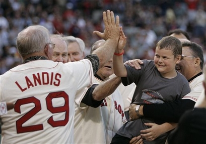
Tremendous feel-good story behind this photo: Jordan Leandre, the kid in the picture, is a cancer survivor and sang the national anthem at Fenway the other night. He first sang the national anthem when he was 4 years-old and stricken with the disease, which had left him debilitated. For his remarkable recovery, he got to meet members of the 1967 Red Sox team this time around.
Why is this important to us (other than the obvious reasons)? Take a look at the No. 9 in the jersey of Bill Landis. I wonder whose autograph he sought out that day. —Vince
Re the picture: maybe they signed their own jerseys and they will auction them afterwards?
I am amazed how many of the English Premier League soccer teams have switched to Umbro as kit manufacturers this year, Umbro had become a minority in the premier league but this year they may well be the most represented marque. I have no clue why this might be!
Vince:
Can you post a link to a hi-res version of the pic?
It looks like Iowa State is changing their game-day uniform and helmet for the 2008 season. They are allowing the fans to vote on which helmet design they like best. Article link
Each separate design below.
link
link
link
[quote comment=”133764″]
I am amazed how many of the English Premier League soccer teams have switched to Umbro as kit manufacturers this year, Umbro had become a minority in the premier league but this year they may well be the most represented marque. I have no clue why this might be![/quote]
Umbro really doesnt have many teams in the premiership. Off the top of my head I can think of 3 (birmingham, sunderland, everton?) and 2 of those were promoted. Umbros far from being the most represented company in the league.
[quote comment=”133778″][quote comment=”133764″]
I am amazed how many of the English Premier League soccer teams have switched to Umbro as kit manufacturers this year, Umbro had become a minority in the premier league but this year they may well be the most represented marque. I have no clue why this might be![/quote]
Umbro really doesnt have many teams in the premiership. Off the top of my head I can think of 3 (birmingham, sunderland, everton?) and 2 of those were promoted. Umbros far from being the most represented company in the league.[/quote]
Edit: Now that I think about it there is a pretty even mixture amongst the major brands in the premiership.
Yeah they had a link in yesterdays comments. I voted for the script cyclones because that was the style they wore when I grew up watching them play against OU.
[quote comment=”133777″]It looks like Iowa State is changing their game-day uniform and helmet for the 2008 season. They are allowing the fans to vote on which helmet design they like best. Article link
Each separate design below.
link
link
link[/quote]
I was just reading my local paper and came across this and came on here to post that. Even though I’m a loyal Univ of Iowa fan, I like the new ISU unis. I hope they go with the block ISU helmet. And kudos for ditching the navy blue and sticking with their real colors.
Now if Iowa would go back to the Old Gold…
according to link
umbro: 6 (birmingham, blackburn, everton, sunderland, west ham, wigan)
nike: 4 (arsenal, villa, fulham, man u)
reebok: 1 (bolton)
adidas: 4 (chelsea, derby, liverpool, newcastle)
puma: 2 (spurs, reading)
le coq sportif: 1 (man city)
canterbury: 1 (portsmouth)
errea (?): 1 (boro)
so yeah, umbro wasn’t in the premiership last year, and they’re the most represented now. although it seems they went for quantity over quality.
Nah, Umbro had Everton last year.
That’s a Red Sox home jersey, so it shouldn’t have his name on it.
To make it a geniune feel good story to all degrees, I know what name should be autographed on that jersey:
Jordan Leandre
That said – Landis should NOT be one of the names on that jersey (and I’m not talking about the hand-written name, either).
[quote comment=”133787″]That’s a Red Sox home jersey, so it shouldn’t have his name on it.[/quote]
I know, but the ’67 team has been appearing at the stadium a few times this year. I guess since they’re old-timers and the like, the fans want to be able to make out who is who.
Some of them don’t look quite like they did 40 years ago.
I was watching the highlights of the panthers/eagles game last night and i was looking at the panthers light blue jerseys. Did they change something with them because it seems like there is more black than usual… Maybe its the black socks and low whites or something. Or just me.
[quote comment=”133783″]Now if Iowa would go back to the Old Gold…[/quote]
BOOOOOOOO!
This is the big weekend for the Jimmy Fund in Boston; the ’67 team usually shows up in great numbers for the event.
not uni-specific, but aesthetic-related: link on the Packers’ changes to Lambeau Field:
# The field’s new playing surface of natural grass has been stitched with artificial GrassMaster fibers. It’s meant to improve footing and reduce tearing clumps of sod from the surface late in the season. The turf-rebuilding project that began in January also included installing a rubberized surface on top of a new concrete apron on the field perimeter and an improved drainage and heating system.
# A 2½-foot-high concrete barrier has been built around the stadium’s west side as part of improved security. The $1 million project was based on a request from the National Football League to boost security on game days, Green Bay Packers officials say. …
Along the perimeter planters, there are 12 monuments, each 12 feet tall and 4 feet square at the base. The monuments will feature pieces of Packers’ history.
No kidding on the “no” for Iowa and an old gold helmet. Don’t screw with something that works.
Speaking of PL shirts, though, I love Everton’s away. I can’t remember whether that’s a new color scheme or not for the away shirts, but it’s really striking.
[quote comment=”133793″][quote comment=”133783″]Now if Iowa would go back to the Old Gold…[/quote]
BOOOOOOOO![/quote]
You mean metallic beige? I’m a fan of gold but too many teams that wear it just wear it way too light. ND’s pants, which are about 3 shades lighter than their helmets, are the worst.
Plus I don’t see Iowa changing. What they have now has become a pretty traditional look. But good on all counts for ISU. No blue, more yellow, and the white helmet is a great contrast, especially with the dark jerseys. Can’t wait to see them on the field.
I definitely think gold helmets for the Hawks would be a huge step back. Why mess with success? Remember the winged jerseys from the mid-90s? The throwbacks they wore in 2004 against Kent State were pretty sharp though…
Even though I’m a huge Iowa Hawkeye fan, as a Uni Watch reader, I feel like I can say that they’re new Uni’s look really sharp. Big improvement dropping the navy.
link
seriously? is that inside-out?
(sry if this was posted before)
better pic (a pic, rather):
link
Some pretty bad logo creep in the Little League World Series. All of the under-shirts have an “X” logo on them, although I don’t know what the brand is. Could the Russell logo on the jerseys be any bigger?
[quote comment=”133793″][quote comment=”133783″]Now if Iowa would go back to the Old Gold…[/quote]
BOOOOOOOO![/quote]
agreed
Noticed something from the LLWS:
A lot of the kids have their New Era logo stickers on the underside of their brims. Could this be a new trend?
I was watching the little league games on and off and I think I noticed something. It seems like the jerseys match a college team in that region. I wonder if they meant for that to happen or if it just happens that way with color combinations.
So far I’ve seen the Northwest in green and yellow (university of oregon) Southeast in garnett and gold (florida state) Northeast in maroon grey black (UMass) and Great Lakes in gold and black (Purdue)
Anyone else see teams that match a college in that region?
link
[quote comment=”133816″]better pic (a pic, rather):
link
Can you blame him? I mean, really, with the new/old trend of coaches wearing suits on the sideline, I’m sure he’s been pressured to change his approach. You KNOW he won’t being suit shopping any time soon, so this was the most significant change he could come up with on minimal effort.
[quote comment=”133832″][quote comment=”133816″]better pic (a pic, rather):
link
Can you blame him? I mean, really, with the new/old trend of coaches wearing suits on the sideline, I’m sure he’s been pressured to change his approach. You KNOW he won’t being suit shopping any time soon, so this was the most significant change he could come up with on minimal effort.[/quote]
Wont being??? Guess my English is as good as his fashion sense!
Two interesting Youtube links to the entire player introductions from the 1983 MLB All-Star game. Plenty of interesting Uni stuff..
link
link
Speaking of YouTube and uniform oddities … check out the 2:24 mark of this video (the entire thing is pretty amusing, especially for Cub fans) … Mike Fontenot with blue pinstripes and a script “Cubs” on his chest (like the road unis of the late 90s). It looks interesting … could that be from his Triple A days?
link
i give up?
whose autograph?
all the LLWS kids are wearing pajama pants! it’s upsetting.
[quote comment=”133840″]i give up?
whose autograph?[/quote]
It would be nice if a player (even a retired player) would ask for an autograph from the kid with cancer battling back to do things like sing the national anthem at an MLB game.
Iowa’s official colors are Old Gold and Black. I don’t want gold helmets (like Army, Notre Dame, et al). I like the Old Gold like they wore against Kent State a couple of years ago.
I have no problems with the helmets they wear today, but the home blacks are direct ripoffs of the Steelers, especially the pants.
Heck, I’d even be happy to see the ANF sticker make an appearance.
Maybe the kid signed it…
[quote comment=”133845″]Iowa’s official colors are Old Gold and Black. I don’t want gold helmets (like Army, Notre Dame, et al). I like the Old Gold like they wore against Kent State a couple of years ago.
I have no problems with the helmets they wear today, but the home blacks are direct ripoffs of the Steelers, especially the pants.
Heck, I’d even be happy to see the ANF sticker make an appearance.[/quote]
long time ago, my dad explained that to me. apparently, the people in charge were upset with how bad iowa’s football team was. so they said “what’s the best football team in the country right now?” and since it was the 70s, the answer was the steelers, so they copied everything they could get away with.
[quote comment=”133836″]Speaking of YouTube and uniform oddities … check out the 2:24 mark of this video (the entire thing is pretty amusing, especially for Cub fans) … Mike Fontenot with blue pinstripes and a script “Cubs” on his chest (like the road unis of the late 90s). It looks interesting … could that be from his Triple A days?
link
If you look at the video in full screen, you might see the link logo on the helmet.
My alma mater Western Kentucky just signed a deal with Russell and they unveiled the uniforms for football and basketball recently. Woof.
The uniforms at Little League World Series were redone this year to better match colors of the particular region/country that they are from.
Japan is now Red, Mexico is Green, Canada is Red, etc…there were a few that just couldnt be done and were just improvised…
As you mentioned the Domestic (US) teams were paired with a college from the region…Northwest has the Ducks colors, West has the Bruins, etc.
The X on the undershirts is a brand from Russell. Russell is the official supplier of uniforms and wristbands, New Era is the official cap, Wilson is the official ball and helmet, Easton is the official footwear and catcher’s gear.
Thanks KW. I had not even thought of UCLA being the colors for the West. It’s all coming together now……..I still think the X looks terrible.
[quote comment=”133777″]It looks like Iowa State is changing their game-day uniform and helmet for the 2008 season. They are allowing the fans to vote on which helmet design they like best. Article link
Each separate design below.
link
link
link[/quote]
The all-white helmet is an under-rated look and it’s fine with any of the uniform combinations proposed.
None of them though have any bearing on Iowa State’s traditional look. (Yes, I know, ISU’s tradition is to change every three or four years.)
I think Iowa State should go back to its link gold helmet. Cy is the one element of continuity the school has had through the years.
That said, the white shell and face mask is a handsome look. Of the three, I voted for link one.
But really, has one who doesn’t have a dog in this hunt, why should my vote count for anything?
Heard on the FSN broadcast yesterday of Cards-Cubs that STL rookie Brendan Ryan wears his pants legs up — showing classic STL stripes — when he starts and wears them down to the ankles when he’s on the bench. He’s superstitious.
Thanks Jeag (post #8) Agree that they went for quantity over quality and I am an Everton fan!
Last year Everton were indeed Umbro and Wigan wore the JJB logo although I suspect the kits were Umbro manufactured. Umbro seemingly decided to get a presence back.
It’s a couple of seasons since Chelsea axed their Umbro contract early and went for Adidas, a state of affairs that leaves the “Big 4” evenly split between Nike and Adidas.
Manchester United also used to be Umbro in the 90s before switching to Nike.
It seems that Umbro suffers from not being a global brand and so the biggest clubs, who want to sell their merchandise worldwide i.e. sweatshirts, T-shirts etc. want a global marque on them as if the swoosh or three stripes counts as much as the club logo.
Sorry to double post but I also noticed as I am watching EPL highlights that the officials kit is also manufactured by Umbro this season!
The thing that draws your attention is they are all a very similar style.
looks like more little league uni ties to regional colleges.
Midwest has the Kansas blue and red
the Southwest team from Texas looks an awful lot like college baseball power Rice
What kind of link was Kyle Farnsworth wearing during today’s game? Weird.
[quote comment=”133874″]What kind of link was Kyle Farnsworth wearing during today’s game? Weird.[/quote]
He’s been wearing that ugly camo undershirt for a while now. I don’t get it.
During the Mets-Nationals broadcast in the top of the 3rd, the announcers (Gary Cohan and Keith Hernandez) were commenting on Nationals pitcher John Lannan’s stirrups. Keith hated them because they barely showed any white sock. They also mentioned Lastings Milledge’s stirrups from last week.
[quote comment=”133848″][quote comment=”133845″]Iowa’s official colors are Old Gold and Black. I don’t want gold helmets (like Army, Notre Dame, et al). I like the Old Gold like they wore against Kent State a couple of years ago.
I have no problems with the helmets they wear today, but the home blacks are direct ripoffs of the Steelers, especially the pants.
Heck, I’d even be happy to see the ANF sticker make an appearance.[/quote]
long time ago, my dad explained that to me. apparently, the people in charge were upset with how bad iowa’s football team was. so they said “what’s the best football team in the country right now?” and since it was the 70s, the answer was the steelers, so they copied everything they could get away with.[/quote]
When Hayden Fry tookover in 1979, he did a major rehaul. That included getting permission from the Steelers to ‘borrow’ their uniform design. That, and he painted the visitor’s locker room pink…
Anyone see the double stripes in the Cards/Cubs game today, both the Cards starter Reyes, and the 2B Ryan had them on! It was a double dose of striped goodness! Also, Tony La Russa had the pitcher batting eighth, I would say it was a bonus for the stripes except that he had the 2B batting ninth….sorry for no pic.
Just realized that the lettering on the Netherlands caps in the LLWS reads “EMEA” which I guess stands for Europe, Middle East, and Africa. That would explain why they’re wearing blue, s the color of Europe. Initially I was frustrated with the organizers, who had gotten Mexico’s green with red correctly but hadn’t bothered to put the Dutch in orange. The regionality of the US teams with colleges doesn’t make sense when they have a team from Arizona wearing UCLA colors, though.
[quote comment=”133878″][quote comment=”133848″][quote comment=”133845″]Iowa’s official colors are Old Gold and Black. I don’t want gold helmets (like Army, Notre Dame, et al). I like the Old Gold like they wore against Kent State a couple of years ago.
I have no problems with the helmets they wear today, but the home blacks are direct ripoffs of the Steelers, especially the pants.
Heck, I’d even be happy to see the ANF sticker make an appearance.[/quote]
long time ago, my dad explained that to me. apparently, the people in charge were upset with how bad iowa’s football team was. so they said “what’s the best football team in the country right now?” and since it was the 70s, the answer was the steelers, so they copied everything they could get away with.[/quote]
When Hayden Fry tookover in 1979, he did a major rehaul. That included getting permission from the Steelers to ‘borrow’ their uniform design. That, and he painted the visitor’s locker room pink…[/quote]
Ah, the link lockers.
have been off of Uniwatch for a couple of weeks. has anyone posted/discussed the green circle sticker on the back of NFL QB’s helmets? what’s up with that?
Not sure if anyone cares but according to the Helmet Project Bowling Green will be sporting a helmet similar to the Cleveland Browns helmet that was featured in the ESPN article the day.
[quote comment=”133895″]have been off of Uniwatch for a couple of weeks. has anyone posted/discussed the green circle sticker on the back of NFL QB’s helmets? what’s up with that?[/quote]
Welcome to the site! The long and short of it is, is that those green dots indicate to the officials what players is wearing a headset to communicate with the sidelines. And I believe only one player at a time can use a headset in their helmet at a time.
here is the link to Paul’s commentaries a week or two ago…
link
[quote comment=”133778″][quote comment=”133764″]
I am amazed how many of the English Premier League soccer teams have switched to Umbro as kit manufacturers this year, Umbro had become a minority in the premier league but this year they may well be the most represented marque. I have no clue why this might be![/quote]
Umbro really doesnt have many teams in the premiership. Off the top of my head I can think of 3 (birmingham, sunderland, everton?) and 2 of those were promoted. Umbros far from being the most represented company in the league.[/quote]
Here’s the breakdown:
Umbro: 6 teams (Birmingham City, Blackburn Rovers, Everton, Sunderland, West Ham, Wigan)
Nike: 4 teams (Arsenal, Aston Villa, Fulham, Manchester United)
adidas: 4 teams (Chelsea, Derby County, Liverpool, Newcastle)
Puma: 2 teams (Reading, Tottenham Hotspur)
Canterbury: 1 team (Portsmouth)
Errea: 1 team (Middlesbrough)
Le Coq Sportif: 1 team (Manchester City)
From the Chicago Tribune 11 minutes ago (Daryl Ward on hitting a grand slam today) …
“I’ve been trying to do everything I can to get my first [home run with the Cubs],” Ward said. “I tried different T-shirts and everything and I finally got one and it came at a pretty good spot.”
From the Chicago Tribune 11 minutes ago (Daryl Ward on hitting a grand slam today) …
“I’ve been trying to do everything I can to get my first [home run with the Cubs],” Ward said. “I tried different T-shirts and everything and I finally got one and it came at a pretty good spot.”
was reading SI today–apparantly Lane Kiffen, new Ray-duhz coach, starts off the morning meeting by announcing the jersey numbers of the guys just cut, to offer them to veterans in order of seniority.
Just win, baby.
[quote comment=”133891″]Anyone see the double stripes in the Cards/Cubs game today, both the Cards starter Reyes, and the 2B Ryan had them on! It was a double dose of striped goodness! Also, Tony La Russa had the pitcher batting eighth, I would say it was a bonus for the stripes except that he had the 2B batting ninth….sorry for no pic.[/quote]
It was even better with the Card’s bat boy who also wore the striped stirrups. I was at the game and it was a nice sight when Reyes got an out, was running back to the dugout with Ryan and the bat boy coming out. The bat boy was wearing stirrups with wider stripes than the players. His own pair?
Not sound like a perv but it looks like on of those old guys has a handful of that little boy if you know what I mean.
I swear I have better grammar than what I have shown tonight. Sorry about the typos.
[quote comment=”133834″]Two interesting Youtube links to the entire player introductions from the 1983 MLB All-Star game. Plenty of interesting Uni stuff..
link
link
Wow, the limitations of the television graphics when it came to team logos at the time. Some of them, they didn’t even bother filling in the colors or matching them. Always an interesting snapshot in time. Advances in technology have led to more accuracy.
[quote comment=”133911″]Not sound like a perv but it looks like on of those old guys has a handful of that little boy if you know what I mean.[/quote]
Yeah, I noticed the same, but I really didn’t want to be the first to point it out. I’ve been waiting all day…
Anyway, a couple of weeks ago, a link was posted for a logo contest to for some Hawaiian college that I don’t feel like looking up the spelling of again. Well, I took the opportunity to make a logo of a silversword plant while rolling with the current trend of making inanimate objects look mean and angry. Basically it’s an excuse for me to goof off a little. link. I did enter it into the contest, but I’m not expect to win at all. Just having a little fun with it and thought I’d share.
[quote comment=”133854″]My alma mater Western Kentucky just signed a deal with Russell and they unveiled the uniforms for football and basketball recently. link.[/quote]
My impressions from the WKU uni unveiling phtoto gallery:
1] Men’s basketball unis are actually OK
2] Volleyball unis are OK
3] Burn everything else.
[quote comment=”133892″]Just realized that the lettering on the Netherlands caps in the LLWS reads “EMEA” which I guess stands for Europe, Middle East, and Africa. That would explain why they’re wearing blue, s the color of Europe. Initially I was frustrated with the organizers, who had gotten Mexico’s green with red correctly but hadn’t bothered to put the Dutch in orange. The regionality of the US teams with colleges doesn’t make sense when they have a team from Arizona wearing UCLA colors, though.[/quote]
Man, you are demanding
they have to have the unis before they know what little league team is playing. Thats why its a college in that region, not that particular state. The team from Ohio is playing in Purdue colors…the team from Georgia is playing in Florida State colors…and like you said the team from Arizona is in UCLA colors.
[quote comment=”133913″][quote comment=”133834″]Two interesting Youtube links to the entire player introductions from the 1983 MLB All-Star game. Plenty of interesting Uni stuff..
link
link
Wow, the limitations of the television graphics when it came to team logos at the time. Some of them, they didn’t even bother filling in the colors or matching them. Always an interesting snapshot in time. Advances in technology have led to more accuracy.[/quote]
How about the Expos having four starters in the game? Best classic uni in my opinion. Too bad baseball killed Les Expos.
[quote comment=”133854″]My alma mater Western Kentucky just signed a deal with Russell and they unveiled the uniforms for football and basketball recently. Woof.[/quote]
GOOD HEAVENS !!!
These football unis are pitiful.
Not long ago WKU had sensible UCLA striped jerseys that were classy and traditional – and even unique for he times.
This stuff is dreck.
My bet is they’ll be radically changed and unceramoneously dumped in less than 3 years.
Jordan Leandre was in Fever Pitch. He was shown singing the national anthem on Opening Day 2004.
It was certainly baseball and not Montreal that killed the Expos. Montreal has American suburbs in Burlington, VT and Plattsburgh, NY, about an hour awat from Montreal.
But MLB refused to allow local broadcasts there, opting to make them extentions of the Boston and NY markets, 5 hours away. The NHL does the same thing with the Habs.
[quote comment=”133919″][quote comment=”133913″][quote comment=”133834″]Two interesting Youtube links to the entire player introductions from the 1983 MLB All-Star game. Plenty of interesting Uni stuff..
link
link
Wow, the limitations of the television graphics when it came to team logos at the time. Some of them, they didn’t even bother filling in the colors or matching them. Always an interesting snapshot in time. Advances in technology have led to more accuracy.[/quote]
How about the Expos having four starters in the game? Best classic uni in my opinion. Too bad baseball killed Les Expos.[/quote]
[quote comment=”133841″]all the LLWS kids are wearing pajama pants! it’s upsetting.[/quote]
link
[quote comment=”133951″]Jordan Leandre was in Fever Pitch. He was shown singing the national anthem on Opening Day 2004.[/quote]
I knew I had heard that name before!!
He was only 4 when he appeared in Fever Pitch and sang The Anthem on opening day??!!?? Wow!
Sounds like a pretty amazing kid.