I’d planned to use today’s entry to write about my visit yesterday to Lelands auction house. But now I’ve decided to save that for later in the week, because I want to talk about last night’s Brewers/Cardinals throwback game.
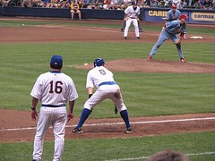
The basics: The Brewers hosted a 25th-anniversary reunion of their 1982 pennant-winning team last night (note how there appears to be some dispute amongst the oldsters regarding the tucked vs. untucked protocol, with tucked apparently winning). Since the Cardinals were in town, they re-created the ’82 World Series by having both teams wear ’82 throwbacks.
It’s nice that the that the Brewers wore pullovers with no names on the back (instead of their regular Friday throwbacks, which are based on the ’82 design but have button-fronts and names), and that both teams had period-appropriate elastic waistbands. But there were also several things that were, well, not so nice.
And no, I’m not referring to the obvious problems like the jerseys being too baggy, the sleeves being too long, or most of the players leaving their pants at their ankles (with some welcome exceptions on each side) — that’s all pretty much par for the throwback course these days.
What I’m talking about is this:
• The Ken Boyer memorial armband that the Cardinals wore in ’82 was missing last night. Very simple detail, very easy to see in any photo of the 1982 team. Why not include it?
• The striping at the base of the Cardinals’ sleeves was comically oversized. C’mon, people, how can you look at this and come up with this? The stripes were almost as thick as the waistband!
• They used the wrong version of the Cardinals’ birds on the bat. The tail feathers should have been like this — in front of the bat on the left, behind the bat on the right. They got it backwards.
• Most damningly, whose bright idea was it to have the Cards insignia on a white-outlined patch — a format they have never worn at any time in their history — instead of directly embroidered? (Over on the Chris Creamer boards, someone pointed out that the Cards were stuck with insignia patches one other time this season [I think that was for a throwback game in San Diego], but a previous set of ’82 throwbacks, worn for a 2005 game in against the Devil Rays, came a lot closer to getting it right.)
Actually, I know whose idea it was: I’d been told a while back that the Brewers ordered up the uniforms this way (the home team is usually in charge of both sets of unis for throwback games) and refused to budge even when the problems were brought to their attention by people in the Cardinals’ offices. Lame-o, Brew Crew.
(Special thanks to Nicole Haase, who attended the game and provided many of the photos seen above. Check out her full photo gallery here.)
Membership News: After a lot of hard work (most of it by Scott, let it be duly noted), we’ve just about caught up with all the membership orders. Except for Alan Saunders (we’re making a slight tweak to your design — should be done later today or tomorrow), Ben Hixon (ditto), and Taha Jamil (I’m still waiting to hear what design treatment you want), every entry on the active roster is now linked to a finished design. Check out the full slate of cards in the design gallery.
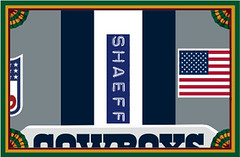
The design shown above is probably my favorite of the entire membership project. I thought long and hard when considering whether to honor the request — after all, it shows the back of a helmet, not the back of a jersey (and as many of you have learned, I’ve turned down quite a few requests that didn’t match our basic design format). But it was just too good a treatment to pass up. Plus it honors one of the uniform world’s subtlest and most enduring details. Great idea by member Casey Shaeffer, great execution by Scott. Just don’t get any bright ideas about asking us to reproduce the airbrushed design on NHL goalie backplates — that’s beyond our reach.
Uni Watch News Ticker: The Yankees have added a “10” sleeve memorial for Phil Rizzuto. … The latest development in the skirmish over NFL photographers’ logo-creeped vests is reported here. … Forgot to mention yesterday that the Eagles’ 75th-anniversary patch looks pretty good. … Lots of uni-related minor league promotions listed here (with thanks to Dan Sherman). … Speaking of which, Natron reports that the Rochester Red Wings did the Hawaiian shirt thing on Sunday. … And in still more minor league news, the Lehigh Valley IronPigs unveiled their new uniforms yesterday. “My boss says to tell you that the new unis are nothing but a cash-grab,” says Kora Manheimer, who works for Minor League Baseball and provided the images I’m about to link to. “They have home, road, Saturday, Sunday, and alternate!” A bit excessive, I agree, but you’ve gotta like that Sunday uni, what with the pig’s head chest logo and the piggy tail cap (too bad they didn’t put the tail on the back of the cap, though). Additional images here, here, and here. Oh, and here’s my favorite. … Way back in December, I wrote an entry about the profusion of NCAA mascots who are depicted wearing sailor’s caps. Now Tim Donovan, while poking around the excellent Victory Pennants site, has found another: the Penn State lion. … Cool eBay item here (good find by Jeremy Brahm). … The Astros will wear a different uniform from each era of Craig Biggio’s career on the season’s final weekend. Details here (with thanks to Ryan Patrick).
Thanks for the close ups of the LV Ironpigs jerseys. I couldnt see the detail of them from the offering on the teams site. Aside from the Saturday hat, which I just don’t like, the unis aren’t bad. I much prefer the Away cap to the Home, and wish they had gone with the LV on the home as well. That Sunday hat is classic, and the first thing my wife said was “The tail should be on the back”. Maybe she does get it after all….
too bad they’ll only use the rainbow sleeves instead of these
whoops, these: link
Scott is the Man!! Thanks for the hard work…
Not sure if anyone has posted this yet but USC is going to honor their kicker (Mario Danelo) who died tragically in the offseason…
I’m feeling the piggy tail hat…but how many jerseys does one team need?
Most minor league teams do a lot of one-off jerseys (i.e.- the flower shirt). And then I’m sure they will pull out a throwback or 3. That just seems to be a bit of overkill…
The Trojans will pay tribute to Danelo in many ways this season. They painted a cardinal and gold 19 in the practice field end zone where he kicked most of his field goals. No player will wear the No. 19 this season and for the foreseeable future. A chair is left empty for Danelo during team meetings. There will be a banner above the tunnel at the Coliseum with Danelo’s name and number. The goal-post pads will also bear his name and number and every USC player will wear a custom helmet sticker with Danelo’s No. 19. “I think it’s a nice tribute to somebody that we really miss and love, and we hate the thought he’s not with us,” Carroll said. “In some ways, it’s just a demonstration of his spirit and that he’s with us and we want to recognize it. Every time we kick one, it goes right over 19, so it’s kind of cool.”
[quote comment=”132595″]whoops, these: link
This may have been discussed at one point or another, if it has I apologize for bringing it up. Is there any significance to the pattern of the stripes on those things? They almost seem randomly placed.
Does anybody know the significance of the “26” on the “Swinging Pig” seems odd they would use an actually jersey number on the design. Plus shouldn’t the pig have the swinging pig patch on its sleeve? I guess that would have cause and ifinite progression (is that the right word?)problem.
link
i remember these as the 84 olympic jackets
link
link
link
[quote comment=”132592″]Thanks for the close ups of the LV Ironpigs jerseys. I couldnt see the detail of them from the offering on the teams site. Aside from the Saturday hat, which I just don’t like, the unis aren’t bad. I much prefer the Away cap to the Home, and wish they had gone with the LV on the home as well. That Sunday hat is classic, and the first thing my wife said was “The tail should be on the back”. Maybe she does get it after all….[/quote]
Isn’t it obvious? The piggy tail should go on the back of the PANTS! Somehow I don’t see that happening though! ^_^
The 26 probably has something to do with the fact that there are 25 guys on a team, and the mascot is seen as the “26th man” (or pig, in this case), much as fans are seen as the “12th man” in football (case in point: the Angels have #26 retired for Gene Autry)
I’m pleasantly surprised by the quality of the work done on the Iron pigs uniforms. When I heard cash grab I was thinking really cheesy with a squiggly tailed wordmark on the front or numbers on the back. I abslutely love the bat swinging pigs whether it is a little bit of a link, just a little bit.
Even though it has a more modernized feel than any of the link link logos the “character” (for lack of a better word) doesn’t look too forced.
Basically what I am saying is, when I heard “cash-grab” I was expecting full on cheese. Whether they went straight for the pig farm reference and wore plaid shirts or went the cutesy route and did the squiggly tails 20 times over on the jerseys, I was expecting something awful.
I am pleasantly surprised.
[quote comment=”132605″]i remember these as the 84 olympic jackets
link
link
link
Yeah, that velour was a really good look. Unfortunately, one of the greatest moments in Olympic History had them link.
Wouldn’t it be crazy if the University of Arkansas (they of Calling the Hogs) decide that the Iron Pig logo looks too much like their Razorback logo and try to sue, much like the Badgers did when all those schools decided to use the Motion W?
Worse than the link.
Looks a little too much like link.
(You’d be suprized at how difficult it is to find a decent t-shirt tag sticking out photo).
Was watching the Phillies-Nationals game last night on Philadelphia feed. At the end of the game, during the post-game handshakes, I noticed Cole Hamels (not scheduled to pitch until Thursday) wearing plain gray sneakers, not regulation red spikes. Don’t have a screen shot.
The way the Phillies pitching staff has picked up injuries this year, I’m just happy he didn’t slip on the grass.
Back of the Helmet design. It seems that each new member is trying to out do each other with either a wacky design or some obscure team..
Today’s Indianapolis Star has details on the memorial patch for Indiana U’s Terry Hoeppner.
link
They show the “HEP” patch on the jersey. No visuals on the back of the helmet inspiration.
[quote comment=”132617″]Was watching the Phillies-Nationals game last night on Philadelphia feed. At the end of the game, during the post-game handshakes, I noticed Cole Hamels (not scheduled to pitch until Thursday) wearing plain gray sneakers, not regulation red spikes. Don’t have a screen shot.
The way the Phillies pitching staff has picked up injuries this year, I’m just happy he didn’t slip on the grass.[/quote]
Too bad Eaton didn’t slip on the grass. He’s gonna tank what little chance this team has at the playoffs.
Also, I agree the card designs are moving into the “Hey, I can outdo that!” stage. The next level is a blank white card for the time before uniform numbers.
[quote comment=”132621″][quote comment=”132617″]Was watching the Phillies-Nationals game last night on Philadelphia feed. At the end of the game, during the post-game handshakes, I noticed Cole Hamels (not scheduled to pitch until Thursday) wearing plain gray sneakers, not regulation red spikes. Don’t have a screen shot.
The way the Phillies pitching staff has picked up injuries this year, I’m just happy he didn’t slip on the grass.[/quote]
Too bad Eaton didn’t slip on the grass. He’s gonna tank what little chance this team has at the playoffs.
Also, I agree the card designs are moving into the “Hey, I can outdo that!” stage. The next level is a blank white card for the time before uniform numbers.[/quote]
Someone will probably want a chest protector with their link on it for a card design next.
[quote comment=”132618″]Back of the Helmet design. It seems that each new member is trying to out do each other with either a wacky design or some obscure team..[/quote]
Who cares
[quote comment=”132621″][quote comment=”132617″]Was watching the Phillies-Nationals game last night on Philadelphia feed. At the end of the game, during the post-game handshakes, I noticed Cole Hamels (not scheduled to pitch until Thursday) wearing plain gray sneakers, not regulation red spikes. Don’t have a screen shot.
The way the Phillies pitching staff has picked up injuries this year, I’m just happy he didn’t slip on the grass.[/quote]
Too bad Eaton didn’t slip on the grass. He’s gonna tank what little chance this team has at the playoffs.
Also, I agree the card designs are moving into the “Hey, I can outdo that!” stage. The next level is a blank white card for the time before uniform numbers.[/quote]
Again who cares
[quote comment=”132623″][quote comment=”132621″][quote comment=”132617″]Was watching the Phillies-Nationals game last night on Philadelphia feed. At the end of the game, during the post-game handshakes, I noticed Cole Hamels (not scheduled to pitch until Thursday) wearing plain gray sneakers, not regulation red spikes. Don’t have a screen shot.
The way the Phillies pitching staff has picked up injuries this year, I’m just happy he didn’t slip on the grass.[/quote]
Too bad Eaton didn’t slip on the grass. He’s gonna tank what little chance this team has at the playoffs.
Also, I agree the card designs are moving into the “Hey, I can outdo that!” stage. The next level is a blank white card for the time before uniform numbers.[/quote]
Someone will probably want a chest protector with their link on it for a card design next.[/quote]
Also who cares
Maybe I’ll get link next year
Nice photo gallery from the Cardinals-Brewers game, Nicole.
the iron pigs will play at coca cola park (literally 2 miles from my house) so i will be heavily supporting them (of course my company has season tix too, and that helps)
how bout on bronx is burning last night, the care they took in filming and showing how players (or in this case martin) cuffed his pants.
pulling them up,
then back down,
taping them,
then pulling them back up.
it was suck a conscious effort that they focussed on this process for a good 20 seconds of the show.
[quote comment=”132624″][quote comment=”132618″]Back of the Helmet design. It seems that each new member is trying to out do each other with either a wacky design or some obscure team..[/quote]
Who cares
[quote comment=”132621″][quote comment=”132617″]Was watching the Phillies-Nationals game last night on Philadelphia feed. At the end of the game, during the post-game handshakes, I noticed Cole Hamels (not scheduled to pitch until Thursday) wearing plain gray sneakers, not regulation red spikes. Don’t have a screen shot.
The way the Phillies pitching staff has picked up injuries this year, I’m just happy he didn’t slip on the grass.[/quote]
Too bad Eaton didn’t slip on the grass. He’s gonna tank what little chance this team has at the playoffs.
Also, I agree the card designs are moving into the “Hey, I can outdo that!” stage. The next level is a blank white card for the time before uniform numbers.[/quote]
Again who cares
[quote comment=”132623″][quote comment=”132621″][quote comment=”132617″]Was watching the Phillies-Nationals game last night on Philadelphia feed. At the end of the game, during the post-game handshakes, I noticed Cole Hamels (not scheduled to pitch until Thursday) wearing plain gray sneakers, not regulation red spikes. Don’t have a screen shot.
The way the Phillies pitching staff has picked up injuries this year, I’m just happy he didn’t slip on the grass.[/quote]
Too bad Eaton didn’t slip on the grass. He’s gonna tank what little chance this team has at the playoffs.
Also, I agree the card designs are moving into the “Hey, I can outdo that!” stage. The next level is a blank white card for the time before uniform numbers.[/quote]
Someone will probably want a chest protector with their link on it for a card design next.[/quote]
Also who cares
Maybe I’ll get link next year[/quote]
I’m of the ‘who cares’ mindset also. I was just trying to come up with the most ridiculous way to display one’s last name, and well, Posada’s chest protector fits that bill. Doubt the giant Swoosh would ever make it onto a card, however.
Lost in some of the baseball talk today was another ugly incident in minor-league ball last night.
From the Associated Press:
“BRIDGEPORT, Conn. (AP) – Former major league all-star Jose Offerman was arrested Tuesday night after charging the mound and hitting the pitcher and catcher with his bat during an independent minor league game.
Offerman, playing for the Long Island Ducks in the Atlantic League, homered in the first inning. The next inning, he was hit by a pitch from Bridgeport’s Matt Beech and charged the mound with his bat.
Offerman hit Beech in the hands and struck catcher John Nathans in the head.”
What the hell is wrong with Offerman? You take a bat out to the mound after getting beaned?
link for the Houston Dynamo of MLS.
A quick note about the Penn State pennant link, you forgot the NITTANY!
“Lions” is only used when the “Penn State” is left off.
-“Nitt”-picky Happy Valley resident
Another note on the Cardinals’ throwbacks — the front number was too small; it was larger back in the day. And the name on the back was also done differently back then (slightly different font). I’m also guessing that they used the current shade of red, which is different from 1982. I can live with those differences, but the rest were inexcusable! I just wish more players from both teams would have worn more era-appropriate hosiery.
“I can live with those differences, but the rest were inexcusable! I just wish more players from both teams would have worn more era-appropriate hosiery.”
Although I guess that everyone who wore their pants down to their shoes could technically claim that they were honoring George Hendrick.
Stuby-
wasn’t callin’ anyone out. I’d actually like to see the chest protector design, it would probably look pretty cool.
mark me down for liking the Cards/Brewers throwbacks sans white outline that is
The ’82 Brewers unis are cool every once in a while, but they’d look ridiculous to wear everyday. Go Harvey’s Wallbangers!
WIll the Nationals ever don the Expos’ powder blue?
Doesn’t look like the Brewers used the correct number font on the jerseys as seen link. Did they at least wear batting helmets with the white panel in the front?
[quote comment=”132641″]WIll the Nationals ever don the Expos’ powder blue?[/quote]
I doubt it. That seems like something they would like to forget.
Man, how dissapointing. I pointed out all the flaws with the Cardinals throwbacks in last night’s comments, and not even a mention.
I like how the NFL logo is cut off on the membership card pictured above. I am guessing this was intentional because if you did put it on 1) you do not have official league consent to place it on items 2) and if you did, that would perhaps make the membership card official NFL merchandise, and since the NFL is not getting a cut of any money, they might come and take Paul and execute him in one of three ways
1. Take him and put him in a club with Pacman Jones, where they will force Paul to try and pick up Pacman’s money that he just made it rain with.
2. Take Paul and dump him in a fight pit in the back of Michael Vick’s house.
3. Take Paul and have him spend a night with the Cincinnati Bengals.
[quote comment=”132643″]Doesn’t look like the Brewers used the correct number font on the jerseys as seen link. Did they at least wear batting helmets with the white panel in the front?[/quote]
The font is wrong (should’ve been full varsity block) and also seems too small. Then again, maybe it just looks smaller because of how baggy the jerseys are now.
Good to see them wearing “real” throwbacks instead of the bogus completely-wrong ones that they had been using all season long, though.
Did anyone get a good look at Johnny Estrada’s socks? I was there, but couldn’t tell if he was wearing Frank Robinson-style stirrups or the “stirrup-socks” he wears on off days pulled way high.
[quote comment=”132631″]link for the Houston Dynamo of MLS.[/quote]
Is that logo supposed to be a sombrero, or a spaceship?
I may be mistaken but I thought I remember reading that an NHL team would be unvailing their new look today, the Senators perhaps?…anyone have any info if there is an unvailing today or when the next one is
[quote comment=”132647″][quote comment=”132643″]Doesn’t look like the Brewers used the correct number font on the jerseys as seen link. Did they at least wear batting helmets with the white panel in the front?[/quote]
The font is wrong (should’ve been full varsity block) and also seems too small. Then again, maybe it just looks smaller because of how baggy the jerseys are now.
Good to see them wearing “real” throwbacks instead of the bogus completely-wrong ones that they had been using all season long, though.[/quote]
It was indeed nice to see the Brewers wear the real throwbacks. It was also nice to see the Cardinals in throwbacks, even if they were flawed.
[quote comment=”132650″]Did anyone get a good look at Johnny Estrada’s socks? I was there, but couldn’t tell if he was wearing Frank Robinson-style stirrups or the “stirrup-socks” he wears on off days pulled way high.[/quote]
According to Jim Powell on the Brewers Radio Network Estrada had on the stirrups. Even the Cardinals stirrups got mention on the Brewers Radio Network from Bob Uecker and Powell.
Wasn’t George Hendrick (circa 1982, Cardinals) one of the first, if not THE first, to wear his pants down to his shoes? Seems like I remember that.
[quote comment=”132652″]I may be mistaken but I thought I remember reading that an NHL team would be unvailing their new look today, the Senators perhaps?…anyone have any info if there is an unvailing today or when the next one is[/quote]
Senators and Lightning are next week.
[quote comment=”132627″]the iron pigs will play at coca cola park (literally 2 miles from my house) so i will be heavily supporting them (of course my company has season tix too, and that helps)
[/quote]
I’ll see you at some of those games Todd… I live not too far away either… . I’m actually considering picking up a part time usher gig or something.
The link a few days back about fonts on the interstate signs reminded me of link. Sorta like uniwatch for scientists.
Will there be an NYC unicentric party this labor day weekend? I know PL has hosted one in the past, but if that’s not in the works then maybe just meeting at a watering hole that Sunday afternoon…
Estrada’s were stirrup socks. Unfortunately I get Cardinals tv in my area and they did a close up of his socks. The Card’s color commentator (Horton?) mentioned that the stirriups were “painted on”. And they obviously were since they fit snuggly along the curves of his ankle to knee.
That Dallas helmet card design is very good.
I like it.
[quote comment=”132646″]…they might come and take Paul and execute him in one of three ways
1. Take him and put him in a club with Pacman Jones, where they will force Paul to try and pick up Pacman’s money that he just made it rain with.
2. Take Paul and dump him in a fight pit in the back of Michael Vick’s house.
3. Take Paul and have him spend a night with the Cincinnati Bengals.[/quote]
4. Make Paul attend the Falcons-Cardinals game on Dec. 23.
[quote comment=”132643″]Doesn’t look like the Brewers used the correct number font on the jerseys as seen link. Did they at least wear batting helmets with the white panel in the front?[/quote]
At least the Brewers are making an effort. I’ve been bugging the Blue Jays to try this, but they are a hard nosed closed doors operation. The whole league should have a throwback day, pick a year, and have the league go by it for a day or even a series.
[quote comment=”132660″]That Dallas helmet card design is very good.
I like it.[/quote]
Where’s the warning sticker?
Fake stirrups in the Biggio pic on that article…
So in the write-up about Biggio, he says he prefers the “shooting star” jersey.
If I’m not mistaken, that’s the jersey the Astros wore before they switched to the rainbows in the 70s. He never wore it, but he prefers that look.
That should tell Astros management all they need to know about their uniform mistakes…er, choices over the years.
Johnny Estrada had the stirrup look, but on my HDTV it looked like they had been stitched into a pair of white socks. He wore the pants legs at the knees, and the width of the stirrup seemed to be consistent from ankle to knee.
Although I had pointed out to my wife that the Cardinals uniforms looked horrible (a caught many of the same reasons that Paul did), my biggest complaint was the bagginess of the uniform. Why bother with the look (loved the sans-a-belt) when you have no real intention of carrying off the look? Details are one thing, but to screw up the basics. The teams did not wear V-neck uniforms, they wore V-sternums.
[quote comment=”132663″][quote comment=”132643″]Doesn’t look like the Brewers used the correct number font on the jerseys as seen link. Did they at least wear batting helmets with the white panel in the front?[/quote]
At least the Brewers are making an effort. I’ve been bugging the Blue Jays to try this, but they are a hard nosed closed doors operation. The whole league should have a throwback day, pick a year, and have the league go by it for a day or even a series.[/quote]
The Jays are wearing throwbacks for Friday home games next year.
[quote comment=”132663″][quote comment=”132643″]Doesn’t look like the Brewers used the correct number font on the jerseys as seen link. Did they at least wear batting helmets with the white panel in the front?[/quote]
At least the Brewers are making an effort. I’ve been bugging the Blue Jays to try this, but they are a hard nosed closed doors operation. The whole league should have a throwback day, pick a year, and have the league go by it for a day or even a series.[/quote]
I agree. It would make for a lot of marketing opportunities, and we know how much MLB likes to market itself.
I would also like to see more teams have “Throwback Friday” every Friday or something along those lines. I would love to see the Reds do that with their 1950s uniforms, which were among the first throwbacks that the team wore back in the early 1990s.
Here’s hoping that on the “gold star” jersey night, the Astros wear that hideous, putrid alternate cap that had the metallic gold brim.
[quote comment=”132664″][quote comment=”132660″]That Dallas helmet card design is very good.
I like it.[/quote]
Where’s the warning sticker?[/quote]
I’m not sure they existed until several years ago.
[quote comment=”132671″]Here’s hoping that on the “gold star” jersey night, the Astros wear that hideous, putrid alternate cap that had the metallic gold brim.[/quote]
Putrid? I love that hat.
One of my favorite Astros uniforms is the plain navy/black jersey with just the star on the front. That with the gold-billed hat would look perfect.
[quote comment=”132665″]Fake stirrups in the Biggio pic on that article…[/quote]
Ouch!
[quote comment=”132662″][quote comment=”132646″]…they might come and take Paul and execute him in one of three ways
1. Take him and put him in a club with Pacman Jones, where they will force Paul to try and pick up Pacman’s money that he just made it rain with.
2. Take Paul and dump him in a fight pit in the back of Michael Vick’s house.
3. Take Paul and have him spend a night with the Cincinnati Bengals.[/quote]
4. Make Paul attend the Falcons-Cardinals game on Dec. 23.[/quote]
are the ravens playing the vikings anytime this year, b/c i think paul would claw his eyes out if he had to watch that game
In other news, link. You probably knew that, but this is the first photo I’ve seen of the patch.
Re: Out doing each other with Membership Designs
The prevailing opinion on this site is usually that simple, tastefull, uniforms are the best. Outlandish designs, Oregon, the Fisherman Islanders jersey etc. are widely (though not universally) reviled.
The funny thing is, is when it’s their name on the card so many people have gone out of their way to be distinctive. Oregon’s coach has always said his player love the uniforms they wear, becasue they are so crazy, and they change every week.
I think that it is almost the same sort of thing.
[quote comment=”132621″]I agree the card designs are moving into the “Hey, I can outdo that!” stage. The next level is a blank white card for the time before uniform numbers.[/quote]
Well, actually, it would be more of an oatmeal-ish tone, because uniforms weren’t truly white back then.
But if someone does want that, so what? I’m genuinely surprised by the amount of vitriol being directed at certain members. If you don’t like someone’s card design choice, well, OK, but exactly what bearing does it have on you? None. Are some people are trying to “outdo” each other with “obscure” design choices? Maybe, although I’d be careful about mind-reading — the guy who chose the San Diego Chicken design, e.g., is actually from San Diego and loves the Chicken. So his card is a genuine expression of a uni-related passion that’s important to him. But even if he was just trying to “out-do” everyone else (whatever that even means — there’s no rating, no score, etc.), so what?
I’ve rejected lots of design requests for various reasons, so it’s not like we’re just rubber-stamping everyone’s application. And I assure you that the “obscure” ones are a lot more work for us, in terms of research and execution. I frankly think the Cowboys helmet treatment was a brilliant request. If you disagree, fine — but again, what exactly does it have to do with you anyway? Assuming you’re happy with your own card, isn’t that the only thing that really matters?
Jeez.
I haven’t felt the need (until today) to chime in and say “I don’t care what other people have on their cards – in fact I like seeing peoples’ creativity (and with I got some of it)”. But I guess its time. I suspect that those of use who enjoy the creative card ideas or are at least indifferent are in the quiet majority.
How can we get someone to actually produce that “To Be Determined” jacket? I need one of those.
I would enjoy reviewing a list of the rejected card requests. Just to satisfy a general sense of curiosity, it would be interesting to see which ones were rejected, the reason given by the requestors for wanting the designs, and the reasons for the rejections.
Also, I wonder whether Paul has become more lenient with the passage of time. Would the first rejected card still be rejected if it was submitted today?
Again, I have no dog in this fight and do not care whether anyone is trying to outdo anyone else. I am simply intrigued by the card designs that members desire.
[quote comment=”132680″]Re: Out doing each other with Membership Designs
The prevailing opinion on this site is usually that simple, tastefull, uniforms are the best. Outlandish designs, Oregon, the Fisherman Islanders jersey etc. are widely (though not universally) reviled.
The funny thing is, is when it’s their name on the card so many people have gone out of their way to be distinctive. Oregon’s coach has always said his player love the uniforms they wear, becasue they are so crazy, and they change every week.
I think that it is almost the same sort of thing.[/quote]
Just to be clear, I could care less what designs people pick. I just thought this was interesting observation as to what people picked versus what people say they like.
Oh, and I should mention that the coolest thing about the Cowboys helmet design card is that all of us no doubt immediately recognized what was on the card and the unique feature that prompted it to be requested. Would that have been the case a year ago? Certainly not. Very cool.
[quote comment=”132684″]I haven’t felt the need (until today) to chime in and say “I don’t care what other people have on their cards – in fact I like seeing peoples’ creativity (and with I got some of it)”. But I guess its time. I suspect that those of use who enjoy the creative card ideas or are at least indifferent are in the quiet majority.[/quote]
ditto.
I actually check everyday for new card designs because I love seeing the ideas that people come up with and the work that has been done to fulfill those ideas. It’s great.
So whatever the reason – genuine interest in the team or simply to out-do someone – keep it up. That’s part of what makes the membership so cool…
Also, why is it that everytime a new batch of cards is put up in the gallery that we have to hear about how they’re just out-doing someone? You wouldn’t just come out at blast someone and say something like “whoever did that such and such card is stupid because it’s ugly,” would you? Because, even indirectly, you’re insulting that person’s creativity and desire to have an original card…regardless of the motive behind the card.
[quote comment=”132594″]too bad they’ll only use the rainbow sleeves instead of these [/quote]
Give the Astros credit for trying to go with authenticity. I’s pretty sure that the Astros stopped wearing the full-on striped uniform after Game 6 of the 1986 NCLS. They are at least focusing on the uniforms that Biggio actually wore. If they were in for crass marketing, they would toss in the Colts uni, or the shooting star uni.
In light of Paul’s mentioning of mascots wearing a sailor’s cap, I think the Fighting Gobbler head might be one of the link of all time. But I love the audacity to use such an ugly creature to represent your athletics program.
[quote comment=”132682″]Well, actually, it would be more of an oatmeal-ish tone, because uniforms weren’t truly white back then.
But if someone does want that, so what? I’m genuinely surprised by the amount of vitriol being directed at certain members. If you don’t like someone’s card design choice, well, OK, but exactly what bearing does it have on you? None. Are some people are trying to “outdo” each other with “obscure” design choices? Maybe, although I’d be careful about mind-reading — the guy who chose the San Diego Chicken design, e.g., is actually from San Diego and loves the Chicken. So his card is a genuine expression of a uni-related passion that’s important to him. But even if he was just trying to “out-do” everyone else (whatever that even means — there’s no rating, no score, etc.), so what?
I’ve rejected lots of design requests for various reasons, so it’s not like we’re just rubber-stamping everyone’s application. And I assure you that the “obscure” ones are a lot more work for us, in terms of research and execution. I frankly think the Cowboys helmet treatment was a brilliant request. If you disagree, fine — but again, what exactly does it have to do with you anyway? Assuming you’re happy with your own card, isn’t that the only thing that really matters?
Jeez.[/quote]
I apologize for daring to make a comment on an obviously divisive issue. I know now that I should keep my opinions to myself.
In other news, I loved the helmet design, and the chicken, and the guy who did the Bayern Muenchen design (it had a backstory at least). The oatmeal blank card would be pretty sweet actually.
I don’t even know what to say.
[quote comment=”132654″]Wasn’t George Hendrick (circa 1982, Cardinals) one of the first, if not THE first, to wear his pants down to his shoes? Seems like I remember that.[/quote]
KT, I was thinking the same thing, but I was pretty young at the time so I don’t know if there may have been others previously who did this. Certainly one of the first, don’t know if he was THE first, though.
[quote comment=”132696″]I don’t even know what to say.[/quote]
You know what? I do.
I apologize.
Also, I agree the card designs are moving into the “Hey, I can outdo that!” stage. The next level is a blank white card for the time before uniform numbers.
Commie.
[quote comment=”132686″]I would enjoy reviewing a list of the rejected card requests. Just to satisfy a general sense of curiosity, it would be interesting to see which ones were rejected, the reason given by the requestors for wanting the designs, and the reasons for the rejections.
Also, I wonder whether Paul has become more lenient with the passage of time. Would the first rejected card still be rejected if it was submitted today?
Again, I have no dog in this fight and do not care whether anyone is trying to outdo anyone else. I am simply intrigued by the card designs that members desire.[/quote]
I guarantee you there is a ton of purple on that list.
[quote comment=”132699″]Also, I agree the card designs are moving into the “Hey, I can outdo that!” stage. The next level is a blank white card for the time before uniform numbers.
Commie.[/quote]
Awesome.
[quote comment=”132686″]Again, I have no dog in this fight and do not care whether anyone is trying to outdo anyone else. I am simply intrigued by the card designs that members desire.[/quote]
Interesting choice of words (especially if you’re a Falcon’s fan . . . .)
On a sad, yet appropriate, note . . .I got my link on Monday. R.I.P Scooter . . .We miss you already.
[quote comment=”132680″]
The prevailing opinion on this site is usually that simple, tastefull, uniforms are the best. Outlandish designs, Oregon, the Fisherman Islanders jersey etc. are widely (though not universally) reviled.
[/quote]
The Fisherman jersey is awesome. Especially when I roll it out in public. :o)
[quote comment=”132646″]I like how the NFL logo is cut off on the membership card pictured above. I am guessing this was intentional because if you did put it on 1) you do not have official league consent to place it on items 2) and if you did, that would perhaps make the membership card official NFL merchandise, and since the NFL is not getting a cut of any money, they might come and take Paul and execute him in one of three ways…[/quote]
We showed a sliver of the NFL shield, and partial views of the flag and the neck bumper, because that’s what fell into the frame. If part of the fine-print warning decal had been in the area we were showcasing, we would have included that too. But we were, frankly, kinda relieved that it was link to be included.
I like how these elements bleed off the edge — even though you only see a smidge of the NFL logo, you know what it is. Same with the Cowboys wordmark — your mind’s eye fills in the rest of it. Scott really outdid himself on this one.
[quote comment=”132666″]So in the write-up about Biggio, he says he prefers the “shooting star” jersey.
If I’m not mistaken, that’s the jersey the Astros wore before they switched to the rainbows in the 70s. He never wore it, but he prefers that look.
That should tell Astros management all they need to know about their uniform mistakes…er, choices over the years.[/quote]
He actually has “worn” the link…
[quote comment=”132704″][quote comment=”132680″]
The prevailing opinion on this site is usually that simple, tastefull, uniforms are the best. Outlandish designs, Oregon, the Fisherman Islanders jersey etc. are widely (though not universally) reviled.
[/quote]
The Fisherman jersey is awesome. Especially when I roll it out in public. :o)[/quote]
I think this is my point exactly. I hate that jersey. But if I had an authentic one, all of the strange details would be really neat, and I would like it a lot.
RE: Pig Iron mascot #26
On the Periodic Chart (remember this from chemistry class? Buehler? Buehler?), the atomic number for iron is….26. Just a guess, but it makes sense. Reality will probably be something very mudane, like the day of the month the logo was created.
Additionally, the teams colors Brick Red (PMS 187), Furnace Blue (PMS 282) and IronPigs Steel (Cool Grey 6 C) are colors of the old Bethlehem Steel mills.
[ Logo/mascot: link
Uniform info: link ]
Great uniform moment in last night’s episode of “The Bronx is Burning” on ESPN. Billy Martin dressing for Game 5 of the ALCS and folding his pants under the tops of his stirrups and then taping the pants and stirrups to his legs. He even stops half way through the procedure to start over and make sure that the pants on both legs end at the exact same spot on the leg.
A true committment to sartorial excellence! I wonder what he would think of today’s managers wearing warm up smocks instead of proper jerseys.
[quote comment=”132666″]So in the write-up about Biggio, he says he prefers the “shooting star” jersey.
If I’m not mistaken, that’s the jersey the Astros wore before they switched to the rainbows in the 70s. He never wore it, but he prefers that look.
That should tell Astros management all they need to know about their uniform mistakes…er, choices over the years.[/quote]
The shooting star is considered the one from the 90’s. Also, this may the first time that the Astros have ever worn those since 1999.
[quote comment=”132710″]RE: Pig Iron mascot #26
On the Periodic Chart (remember this from chemistry class? Buehler? Buehler?), the atomic number for iron is….26. Just a guess, but it makes sense. Reality will probably be something very mudane, like the day of the month the logo was created.
Additionally, the teams colors Brick Red (PMS 187), Furnace Blue (PMS 282) and IronPigs Steel (Cool Grey 6 C) are colors of the old Bethlehem Steel mills.
[ Logo/mascot: link
Uniform info: link ][/quote]
Pretty cool connection, too bad the current color of Bethlehem Steel is RGB(183, 65, 14), a.k.a. “rust”.
pigs merch is up…
hats and jerseys
I’m surprised the gentleman who visited the Victory Pennants site didn’t notice it, but Michigan once used a logo with a sailor’s cap as well:
link
I only know this because Michigan State still uses in on their scoreboard in Spartan Stadium when reporting out-of-town scores. I think it’s done quite disparagingly, actually, which is fine with me (Go Green!).
[quote comment=”132671″]Here’s hoping that on the “gold star” jersey night, the Astros wear that hideous, putrid alternate cap that had the metallic gold brim.[/quote]
Those hats were awesome
I just noticed that in today’s Liverpool Champions League match, the reds’ jerseys had the Carlsberg sponsor logo missing. Thought if I would find a quick answer why, it would be here.
I’m sure this has been discussed at some point, but Kevin Millar looks like a clown the way he puts on his eye black. Can anyone get a screen shot of this ocular tragedy?
Anybody want a “Jarimor Jagr” jersey?
link
Paul,
How come link for this trip?
Glove designs have always intrigued me. We don’t talk about them enough here.
[quote comment=”132618″]Back of the Helmet design. It seems that each new member is trying to out do each other with either a wacky design or some obscure team..[/quote]
I’ve already decided what my design is going to be for next year….
[quote comment=”132715″]pigs merch is up…
hats and jerseys[/quote]
They should have at least positioned the jerseys so the team name is link bit better.
[quote comment=”132715″]pigs merch is up…
hats and jerseys[/quote]
They have a merch storefront set up on Catasauqua Road, off of Airport. Thinking about heading over there now on my lunch break….
[quote comment=”132682″][quote comment=”132621″]I agree the card designs are moving into the “Hey, I can outdo that!” stage. The next level is a blank white card for the time before uniform numbers.[/quote]
Well, actually, it would be more of an oatmeal-ish tone, because uniforms weren’t truly white back then.
But if someone does want that, so what? I’m genuinely surprised by the amount of vitriol being directed at certain members. If you don’t like someone’s card design choice, well, OK, but exactly what bearing does it have on you? None. Are some people are trying to “outdo” each other with “obscure” design choices? Maybe, although I’d be careful about mind-reading — the guy who chose the San Diego Chicken design, e.g., is actually from San Diego and loves the Chicken. So his card is a genuine expression of a uni-related passion that’s important to him. But even if he was just trying to “out-do” everyone else (whatever that even means — there’s no rating, no score, etc.), so what?
I’ve rejected lots of design requests for various reasons, so it’s not like we’re just rubber-stamping everyone’s application. And I assure you that the “obscure” ones are a lot more work for us, in terms of research and execution. I frankly think the Cowboys helmet treatment was a brilliant request. If you disagree, fine — but again, what exactly does it have to do with you anyway? Assuming you’re happy with your own card, isn’t that the only thing that really matters?
Jeez.[/quote]
As a member with a little buyer’s remorse, I have to admit that I thought about trying to outdo everyone! Never could come up with that unique design (I used the Whalers, circa 1990)- like the Cowgirl’s helmet! Personally, I doubt that one will be ” outdone” Until next year, by me!!! Maybe we should have a poll on our faves
Oh, by the way, I am far too computer deficient to link my card. Or I would have!
Interestingly, Sebastian the Ibis didn’t always have the sailor cap. link, he wears a more conventional ballcap. The link with the sailor cap came later in 1983. Eventually, Sebastian was cleaned up and got link for a time before reverting back to a somewhat link persona, albeit with an updated jersey.
Which leads me to ask, have any other mascots (besides those based on Native Americans) been cleaned up image wise?
[quote comment=”132630″]Lost in some of the baseball talk today was another ugly incident in minor-league ball last night.
From the Associated Press:
“BRIDGEPORT, Conn. (AP) – Former major league all-star Jose Offerman was arrested Tuesday night after charging the mound and hitting the pitcher and catcher with his bat during an independent minor league game.
Offerman, playing for the Long Island Ducks in the Atlantic League, homered in the first inning. The next inning, he was hit by a pitch from Bridgeport’s Matt Beech and charged the mound with his bat.
Offerman hit Beech in the hands and struck catcher John Nathans in the head.”
What the hell is wrong with Offerman? You take a bat out to the mound after getting beaned?[/quote]
Just to update the situation, Offerman was charged with two counts of second-degree assault, and posted $10,000 for bail.
link.
[quote comment=”132650″]Did anyone get a good look at Johnny Estrada’s socks? I was there, but couldn’t tell if he was wearing Frank Robinson-style stirrups or the “stirrup-socks” he wears on off days pulled way high.[/quote]
I don’t think there was any way they were real stirrups because there was SO MUCH white showing. They would have had to have had the longest stirrup portion known to man. You saw nothing but white from the bottom of his pants to his ankles on his calf and shin and a small strip of blue on the inside and outside. I’ll go back and see if I have a pic of him, though, for verification purposes.
Also, thanks for the shoutout Elena!
[quote comment=”132696″][quote comment=”132682″]Well, actually, it would be more of an oatmeal-ish tone, because uniforms weren’t truly white back then.
But if someone does want that, so what? I’m genuinely surprised by the amount of vitriol being directed at certain members. If you don’t like someone’s card design choice, well, OK, but exactly what bearing does it have on you? None. Are some people are trying to “outdo” each other with “obscure” design choices? Maybe, although I’d be careful about mind-reading — the guy who chose the San Diego Chicken design, e.g., is actually from San Diego and loves the Chicken. So his card is a genuine expression of a uni-related passion that’s important to him. But even if he was just trying to “out-do” everyone else (whatever that even means — there’s no rating, no score, etc.), so what?
I’ve rejected lots of design requests for various reasons, so it’s not like we’re just rubber-stamping everyone’s application. And I assure you that the “obscure” ones are a lot more work for us, in terms of research and execution. I frankly think the Cowboys helmet treatment was a brilliant request. If you disagree, fine — but again, what exactly does it have to do with you anyway? Assuming you’re happy with your own card, isn’t that the only thing that really matters?
Jeez.[/quote]
I apologize for daring to make a comment on an obviously divisive issue. I know now that I should keep my opinions to myself.
In other news, I loved the helmet design, and the chicken, and the guy who did the Bayern Muenchen design (it had a backstory at least). The oatmeal blank card would be pretty sweet actually.
I don’t even know what to say.[/quote]
The “guy” who did Bayern Munich was me. Not so much a guy. Just to be clear. But I’m glad you liked it!
link
A quick note about the Penn State pennant link, you forgot the NITTANY!
“Lions†is only used when the “Penn State†is left off.
Do the same rules apply for the link?
I was at the Cards-Brewers game last night, and yeah, that white outline on the Cardinals logo sure did look odd. I was sitting behind the plate, and I think it even stood out on the outfielders some 300-400 feet away.
Other than that, though, it was still pretty cool to see powder blues in person for the first time in 21 years (last time I was at a game with a team wearing powder blues was a Twins-Brewers game in ’86). Here’s hoping the Brewers find some way to add their powder blues as, of, a “Retro Friday” road uniform.
I just noticed that in today’s Liverpool Champions League match, the reds’ jerseys had the Carlsberg sponsor logo missing. Thought if I would find a quick answer why, it would be here.
I noticed that, too. Is there a ban on alcohol sponsorship of jerseys in France, perhaps?
Marc Andre-Fluery’s new helmet design:
link
The warm up jackets for the upcoming NBA season have been released.
More templated crap from adidas with their three stripes prominently placed on the back of the neck.
When will the NBA learn?
Suns jacket
[quote comment=”132747″]The warm up jackets for the upcoming NBA season have been released.
More templated crap from adidas with their three stripes prominently placed on the back of the neck.
When will the NBA learn?
link[/quote].
At least the back doesn’t look like a sports bra like this year’s did.
My hometown ECHL Charlotte Checkers have released their link. As a long time season ticket holder, I could not be more excited about these. So much better than the old link link.
[quote comment=”132745″]Marc Andre-Fluery’s new helmet design:
link
That is too sweet, and its nice to see him keeping with his own tradition of having his grandparents initials on the back of his helmet.
[quote comment=”132752″][quote comment=”132747″]The warm up jackets for the upcoming NBA season have been released.
More templated crap from adidas with their three stripes prominently placed on the back of the neck.
When will the NBA learn?
link[/quote].
At least the back doesn’t look like a sports bra like this year’s did.[/quote]
Not too bad.
I wished though that they go back to the warm-ups that Jordan wore or with Bird with the Celtics. I’m sure someone here can provide photos of these. Each team had their own designs of their warm-ups
[quote comment=”132745″]Marc Andre-Fluery’s new helmet design:
link
If only they could have painted over the RBK…regardless, that’s one of the best masks I’ve seen in a long time.
My all time favorite mask? Brian Hayward seen here:
link
link
Ok, too dumb to post a link, but you can google it
Who came up with the name Iron Pigs?
I do like Andre-Fleury’s new helmet though
link Brian Hayward’s mask
[quote comment=”132745″]Marc Andre-Fluery’s new helmet design:
link
It’ll look good on the ice. One question though,, did RBK actually create/design the mask, or did they just slap their signature on it. I don’t think RBK has enough knowledge/skill to create something like that in terms of safety.
[quote comment=”132759″]Who came up with the name Iron Pigs?
I do like Andre-Fleury’s new helmet though[/quote]
Possible names were submitted through the local newspaper, and then the team owners narrowed it down to eight finalists that were then voted on. The finalists were – Crushers, Gobblers, Keystones, Phantastics, Phillies. Vulcans, Woodchucks and IronPigs. Looking back, Iron Pigs probably was the best choice…
[quote comment=”132745″]Marc Andre-Fluery’s new helmet design:
link
That is soooo wicked sweet. I can’t wait to look at that 41 times this year in person. Fluery, you my BOY!!!
I’m still waiting for the moment when I will be able to support my college Alma Mater on a Uni Watch membership card. Until then, I will have to remain on the outside looking in.
[quote comment=”132692″][quote comment=”132594″]too bad they’ll only use the rainbow sleeves instead of these [/quote]
Give the Astros credit for trying to go with authenticity. I’s pretty sure that the Astros stopped wearing the full-on striped uniform after Game 6 of the 1986 NCLS. They are at least focusing on the uniforms that Biggio actually wore. If they were in for crass marketing, they would toss in the Colts uni, or the shooting star uni.[/quote]
1986 as indeed the last year that the Astros wore the full rainbow design (aside from the three or four times they’ve worn them as throwbacks since then). When Biggio came up to the majors, the Astros were in the process of switching from the pullover jersey to the button down.
link
So Biggio never actually wore the full tequila sunrise jersey outside of throwback games: link
And Biggio did have a chance to wear the shooting star jersey from the late 1960s and early 70s in 1999, when the Astros wore them towards the end of the season as part of the festivities surrounding their last season in the Astrodome.
And yes I know that’s Adam Everett in the picture and not actually Biggio.
[quote comment=”132763″][quote comment=”132745″]Marc Andre-Fluery’s new helmet design:
link
That is soooo wicked sweet. I can’t wait to look at that 41 times this year in person. Fluery, you my BOY!!![/quote]
By the way….DAMN YOU LOGO CREEP!!!! DAMN YOU TO HELL!!!!
[quote comment=”132753″]My hometown ECHL Charlotte Checkers have released their link. As a long time season ticket holder, I could not be more excited about these. So much better than the old link link.[/quote]
I think I have to disagree with you on this one. While I don’t really have any problem with the new logo, I absolutely love the first linked “cartoony” logo. I almost always like the more cartoony logos than more serious ones. Especially for minor league or college teams of any sport. I think logos in general have recently gone away from the cartoon look because they are designed on a computer as opposed to designed by hand.
[quote comment=”132710″]RE: Pig Iron mascot #26
On the Periodic Chart (remember this from chemistry class? Buehler? Buehler?), the atomic number for iron is….26. Just a guess, but it makes sense. Reality will probably be something very mudane, like the day of the month the logo was created.
Additionally, the teams colors Brick Red (PMS 187), Furnace Blue (PMS 282) and IronPigs Steel (Cool Grey 6 C) are colors of the old Bethlehem Steel mills.
[ Logo/mascot: link
Uniform info: link ][/quote]
Thanks for the suggestions (not Earl too, don’t know how to quote 2 comments)
[quote comment=”132756″][quote comment=”132745″]Marc Andre-Fluery’s new helmet design:
link
If only they could have painted over the RBK…regardless, that’s one of the best masks I’ve seen in a long time.
My all time favorite mask? Brian Hayward seen here:
link[/quote]
I have to say my favorite of all time is link. I mean, how intimidating would that be to see that face as you are coming down the ice.
[quote comment=”132769″][quote comment=”132753″]My hometown ECHL Charlotte Checkers have released their link. As a long time season ticket holder, I could not be more excited about these. So much better than the old link link.[/quote]
I think I have to disagree with you on this one. While I don’t really have any problem with the new logo, I absolutely love the first linked “cartoony” logo. I almost always like the more cartoony logos than more serious ones. Especially for minor league or college teams of any sport. I think logos in general have recently gone away from the cartoon look because they are designed on a computer as opposed to designed by hand.[/quote]
I linked them in reverse chronological order. The one on “cartoony” is our current logo, the one on “logos” is our original ECHL logo. I like the first one w/ the orange and blue. I think the red/blue that we currently use (or last year I should say) is over the top cartoony. Plus, Chubby (the mascot) has a mullet which is not really cool. :D
I just noticed that in today’s Liverpool Champions League match, the reds’ jerseys had the Carlsberg sponsor logo missing.
Because competing brewer Heineken is a UEFA CL Sponsor?
>Because competing brewer Heineken is a UEFA CL Sponsor?
Hmm. Didn’t stop ’em from sporting Carlsberg in years past….
[quote comment=”132774″][quote comment=”132769″][quote comment=”132753″]My hometown ECHL Charlotte Checkers have released their link. As a long time season ticket holder, I could not be more excited about these. So much better than the old link link.[/quote]
I think I have to disagree with you on this one. While I don’t really have any problem with the new logo, I absolutely love the first linked “cartoony” logo. I almost always like the more cartoony logos than more serious ones. Especially for minor league or college teams of any sport. I think logos in general have recently gone away from the cartoon look because they are designed on a computer as opposed to designed by hand.[/quote]
I linked them in reverse chronological order. The one on “cartoony” is our current logo, the one on “logos” is our original ECHL logo. I like the first one w/ the orange and blue. I think the red/blue that we currently use (or last year I should say) is over the top cartoony. Plus, Chubby (the mascot) has a mullet which is not really cool. :D[/quote]
I like ’em all, I just like the mullet one more. By the way, does the name Checkers have anything to do with polar bears or is that just the mascot they chose?
[quote comment=”132774″][quote comment=”132769″][quote comment=”132753″]My hometown ECHL Charlotte Checkers have released their link. As a long time season ticket holder, I could not be more excited about these. So much better than the old link link.[/quote]
I think I have to disagree with you on this one. While I don’t really have any problem with the new logo, I absolutely love the first linked “cartoony” logo. I almost always like the more cartoony logos than more serious ones. Especially for minor league or college teams of any sport. I think logos in general have recently gone away from the cartoon look because they are designed on a computer as opposed to designed by hand.[/quote]
I linked them in reverse chronological order. The one on “cartoony” is our current logo, the one on “logos” is our original ECHL logo. I like the first one w/ the orange and blue. I think the red/blue that we currently use (or last year I should say) is over the top cartoony. Plus, Chubby (the mascot) has a mullet which is not really cool. :D[/quote]
Liking the new logos a lot – and I like the color scheme – goes with the rest of the Rangers colors (Hartford has the same colors as well.)
Interesting though – which franchise has the best logo chain throughout their major and minor league afiiliations? Discuss…
[quote comment=”132777″][quote comment=”132774″][quote comment=”132769″][quote comment=”132753″]My hometown ECHL Charlotte Checkers have released their link. As a long time season ticket holder, I could not be more excited about these. So much better than the old link link.[/quote]
I think I have to disagree with you on this one. While I don’t really have any problem with the new logo, I absolutely love the first linked “cartoony” logo. I almost always like the more cartoony logos than more serious ones. Especially for minor league or college teams of any sport. I think logos in general have recently gone away from the cartoon look because they are designed on a computer as opposed to designed by hand.[/quote]
I linked them in reverse chronological order. The one on “cartoony” is our current logo, the one on “logos” is our original ECHL logo. I like the first one w/ the orange and blue. I think the red/blue that we currently use (or last year I should say) is over the top cartoony. Plus, Chubby (the mascot) has a mullet which is not really cool. :D[/quote]
I like ’em all, I just like the mullet one more. By the way, does the name Checkers have anything to do with polar bears or is that just the mascot they chose?[/quote]
Weird. I thought polar bears preferred chess.
[quote comment=”132738″]The “guy” who did Bayern Munich was me. Not so much a guy. Just to be clear. But I’m glad you liked it![/quote]
Of course I meant it in a general person sense. . .
Right? :)
I was thinking of doing their uni when I get my membership, but I could never finalize the number I would get. 11? 13? 18? 21? 5? 9?
Too many favorite players to cover.
I also like the fact that you explained it a little in the gallery. I wish more people would do that.
I checked out the link site for the first time, it’s pretty cool, there is a couple of clips of the jerseys getting made (the All Star jerseys). In one interview, there is a good 5-10 seconds view of a new RBK Rangers jersey in the backround, and behind is another newly made jersey, but I couldn’t make it out to which team it was, check it out. My work computer has no sound, so I have no idea what was said in the interviews with the ‘engineers’..
just got back from the iron pigs merch store.
spoke with the merchandise guy for a bit.
the 26 on the swinging pig is most definitely for the atomic number of iron.
also,
jersey’s are currently being sold with numbers 6, 8, 11, and 26. the numbers were selected based on the sales of phillies jerseys/t shirts and whose sells the most. i guess victorino is outselling burrell.
I don’t know if this has been mentioned before, but I found a picture of Bucky Badger in a sailor hat. It is really hard to see, but it is on the left side of this t-shirt. Underneath it says “1940”. I have done a lot of searchign for a better picture but I can’t. At least I found out Bucky did wear a sailor hat (which I thought was the case when this issue came up last December)
link
..look at link be careful not to hit the “Add To Cart” button!!!
Looking at the same website, I found this sweet picture of an Old School Bucky logo for the Wisconsin boxing team (the sport in which the Badgers have the most national titles in)
link
[quote comment=”132782″]I checked out the link site for the first time, it’s pretty cool, there is a couple of clips of the jerseys getting made (the All Star jerseys). In one interview, there is a good 5-10 seconds view of a new RBK Rangers jersey in the backround, and behind is another newly made jersey, but I couldn’t make it out to which team it was, check it out. My work computer has no sound, so I have no idea what was said in the interviews with the ‘engineers’..[/quote]
It appears to be the same red-and-gray collar of the All-Star uniform.
–I just noticed that in today’s Liverpool Champions League match, the reds’ jerseys had the Carlsberg sponsor logo missing.
Because competing brewer Heineken is a UEFA CL Sponsor? —
More likely because of restrictions against alcohol advertising.
[quote comment=”132788″][quote comment=”132782″]I checked out the link site for the first time, it’s pretty cool, there is a couple of clips of the jerseys getting made (the All Star jerseys). In one interview, there is a good 5-10 seconds view of a new RBK Rangers jersey in the backround, and behind is another newly made jersey, but I couldn’t make it out to which team it was, check it out. My work computer has no sound, so I have no idea what was said in the interviews with the ‘engineers’..[/quote]
It appears to be the same red-and-gray collar of the All-Star uniform.[/quote]
eh Teebz,
did you try and click the ‘latest updates’ link? what a tease,,,f’ers.
[quote comment=”132743″]I just noticed that in today’s Liverpool Champions League match, the reds’ jerseys had the Carlsberg sponsor logo missing. Thought if I would find a quick answer why, it would be here.
I noticed that, too. Is there a ban on alcohol sponsorship of jerseys in France, perhaps?[/quote]
Bingo.
[quote comment=”132783″]just got back from the iron pigs merch store.
spoke with the merchandise guy for a bit.
the 26 on the swinging pig is most definitely for the atomic number of iron.
also,
jersey’s are currently being sold with numbers 6, 8, 11, and 26. the numbers were selected based on the sales of phillies jerseys/t shirts and whose sells the most. i guess victorino is outselling burrell.[/quote]
The Aberdeen Ironbirds first mascot (link) has the number 26 on his sleeve for the same reason.
[quote comment=”132790″][quote comment=”132788″][quote comment=”132782″]I checked out the link site for the first time, it’s pretty cool, there is a couple of clips of the jerseys getting made (the All Star jerseys). In one interview, there is a good 5-10 seconds view of a new RBK Rangers jersey in the backround, and behind is another newly made jersey, but I couldn’t make it out to which team it was, check it out. My work computer has no sound, so I have no idea what was said in the interviews with the ‘engineers’..[/quote]
It appears to be the same red-and-gray collar of the All-Star uniform.[/quote]
eh Teebz,
did you try and click the ‘latest updates’ link? what a tease,,,f’ers.[/quote]
I saw the link, and then the “coming soon” appears when you mouse over it. Jerks. :o)
I guess Reebok doesn’t want to give anything away. You’d think they’d have a full rundown of those teams who have already unveiled their jerseys.
[quote comment=”132793″][quote comment=”132790″][quote comment=”132788″][quote comment=”132782″]I checked out the link site for the first time, it’s pretty cool, there is a couple of clips of the jerseys getting made (the All Star jerseys). In one interview, there is a good 5-10 seconds view of a new RBK Rangers jersey in the backround, and behind is another newly made jersey, but I couldn’t make it out to which team it was, check it out. My work computer has no sound, so I have no idea what was said in the interviews with the ‘engineers’..[/quote]
It appears to be the same red-and-gray collar of the All-Star uniform.[/quote]
eh Teebz,
did you try and click the ‘latest updates’ link? what a tease,,,f’ers.[/quote]
I saw the link, and then the “coming soon” appears when you mouse over it. Jerks. :o)
I guess Reebok doesn’t want to give anything away. You’d think they’d have a full rundown of those teams who have already unveiled their jerseys.[/quote]
100% in agreement. sons of b*****s. they oughta be sleeping with da fishes..hahaha
My hometown ECHL Charlotte Checkers have released their link. As a long time season ticket holder, I could not be more excited about these. So much better than the old link link.[quote comment=”132777″][quote comment=”132774″][quote comment=”132769″][quote comment=”132753″]My hometown ECHL Charlotte Checkers have released their link. As a long time season ticket holder, I could not be more excited about these. So much better than the old link link.[/quote]
I think I have to disagree with you on this one. While I don’t really have any problem with the new logo, I absolutely love the first linked “cartoony” logo. I almost always like the more cartoony logos than more serious ones. Especially for minor league or college teams of any sport. I think logos in general have recently gone away from the cartoon look because they are designed on a computer as opposed to designed by hand.[/quote]
I linked them in reverse chronological order. The one on “cartoony” is our current logo, the one on “logos” is our original ECHL logo. I like the first one w/ the orange and blue. I think the red/blue that we currently use (or last year I should say) is over the top cartoony. Plus, Chubby (the mascot) has a mullet which is not really cool. :D[/quote]
I like ’em all, I just like the mullet one more. By the way, does the name Checkers have anything to do with polar bears or is that just the mascot they chose?[/quote]
Quick history:
In early 1956 the EHL Baltimore Clippers’ arena burned to the ground. They moved to Charlotte and kept the nickname. In 58 they won the championship and in 60 they changed to the Charlotte Checkers. I’ve heard there were two reasons. First is obviously the checking aspect of hockey. Secondly, in 1955 Charlotte built the largest domed structure in the world, the Charlotte Coliseum. Chubby Checker opened the arena and was very popular at the time. I’ve heard it was both, I’ve heard it was a combo of the two. By 1977 the EHL had split into 2 leagues and we were in the SHL. The SHL folded midseaon 76-77. We were resurrected in 93 in the ECHL and that’s when they started using the bear. I don’t know why they chose a bear.
Incidentally, the Clippers moving to Charlotte was the first time a pro hockey league experimented south of DC. With the success we had in the late 50s and early 70s, hockey in the south was born.
Paul, you keep telling us that you have rejected many card designs. You think you could write a blog or a little blurp talking about the some of the rejected designs and why they were rejected? Maybe some of the craziest designs rejected?
[quote comment=”132786″]..look at link be careful not to hit the “Add To Cart” button!!![/quote]
Wow – sweet jersey – but I would never pay more for a sweater than I did for my first car!
There sure is a lot angst about people trying to “outdo” each other with their membership cards. I may be going out on a limb here, but aren’t unique cards far superior to the disastrous templates that link favor?
Keep the unique designs comin’ people…
(Which reminds me, I need to get a membership)
[quote comment=”132797″][quote comment=”132786″]..look at link be careful not to hit the “Add To Cart” button!!![/quote]
Wow – sweet jersey – but I would never pay more for a sweater than I did for my first car![/quote]
crazy eh? Actually that price is more than my first car too. insane. Why is it so much??!
[quote comment=”132766″]1986 is indeed the last year that the Astros wore the full rainbow design (aside from the three or four times they’ve worn them as throwbacks since then).[/quote]
… If I remember correctly, I was listening to Vin Scully during a late 80s broadcast saying that the reason why the Astros stopped wearing the full rainbow design is because the players felt the umpires were calling a higher strike on Astro hitters; in effect, umpires were basing the top of the strike zone at the top of the rainbow design.
I wonder if any long-time Astro fans can verify that; it sounds reasonable to me, actually.
[quote comment=”132803″][quote comment=”132797″][quote comment=”132786″]..look at link be careful not to hit the “Add To Cart” button!!![/quote]
Wow – sweet jersey – but I would never pay more for a sweater than I did for my first car![/quote]
crazy eh? Actually that price is more than my first car too. insane. Why is it so much??![/quote]
Is it in pesos?
quote comment=”132743″]I just noticed that in today’s Liverpool Champions League match, the reds’ jerseys had the Carlsberg sponsor logo missing. Thought if I would find a quick answer why, it would be here.
I noticed that, too. Is there a ban on alcohol sponsorship of jerseys in France, perhaps?[/quote]
Correct.
The Welsh Rugby team is sponsored by Brains – a brewery in Cardiff, I think.
But when they go into France, they slap link across their jersey.
Apparently the St. Lucie Mets’ (Single A) caps have link. Hadn’t seen that one before.
[quote comment=”132803″][quote comment=”132797″][quote comment=”132786″]..look at link be careful not to hit the “Add To Cart” button!!![/quote]
Wow – sweet jersey – but I would never pay more for a sweater than I did for my first car![/quote]
crazy eh? Actually that price is more than my first car too. insane. Why is it so much??![/quote]
That’s actually a fairly reasonable price for a Nords Sakic. He started with a different number (81?) in Quebec and those are worth much more.
[quote comment=”132666″]So in the write-up about Biggio, he says he prefers the “shooting star” jersey.
If I’m not mistaken, that’s the jersey the Astros wore before they switched to the rainbows in the 70s. He never wore it, but he prefers that look.
That should tell Astros management all they need to know about their uniform mistakes…er, choices over the years.[/quote]
Gold Astros Cap
link
[quote comment=”132808″]Apparently the St. Lucie Mets’ (Single A) caps have link. Hadn’t seen that one before.[/quote]
Just to clarify, that cap is for the Gulf Coast Mets which is Rookie ball. That’s who Pedro pitched for yesterday. His first start was with the St. Lucie Mets and they wear link Specifically he wore the link in that start.
[quote comment=”132811″][quote comment=”132666″]So in the write-up about Biggio, he says he prefers the “shooting star” jersey.
If I’m not mistaken, that’s the jersey the Astros wore before they switched to the rainbows in the 70s. He never wore it, but he prefers that look.
That should tell Astros management all they need to know about their uniform mistakes…er, choices over the years.[/quote]
Gold Astros Cap
link
I know this is revisiting yesterday’s Texas discussion, but is it a state law for a star to appear somewhere on the uniform of every professional sports teams in the state?
[quote comment=”132810″][quote comment=”132803″][quote comment=”132797″][quote comment=”132786″]..look at link be careful not to hit the “Add To Cart” button!!![/quote]
Wow – sweet jersey – but I would never pay more for a sweater than I did for my first car![/quote]
crazy eh? Actually that price is more than my first car too. insane. Why is it so much??![/quote]
That’s actually a fairly reasonable price for a Nords Sakic. He started with a different number (81?) in Quebec and those are worth much more.[/quote]
He wore both 8 and 88 in his rookie year.
In terms of another jersey you rarely see, Francis won the Cup in 1991 with the Penguins wearing #9. I have only seen one person with a properly-customized #9 Francis jersey.
[quote comment=”132815″][quote comment=”132810″][quote comment=”132803″][quote comment=”132797″][quote comment=”132786″]..look at link be careful not to hit the “Add To Cart” button!!![/quote]
Wow – sweet jersey – but I would never pay more for a sweater than I did for my first car![/quote]
crazy eh? Actually that price is more than my first car too. insane. Why is it so much??![/quote]
That’s actually a fairly reasonable price for a Nords Sakic. He started with a different number (81?) in Quebec and those are worth much more.[/quote]
He wore both 8 and 88 in his rookie year.
In terms of another jersey you rarely see, Francis won the Cup in 1991 with the Penguins wearing #9. I have only seen one person with a properly-customized #9 Francis jersey.[/quote]
I thought it was 88, but didn’t remember if I was getting him confused with a Lindros jersey I’ve seen. Teebz, are you a game worn collector?
[quote comment=”132819″][quote comment=”132815″][quote comment=”132810″][quote comment=”132803″][quote comment=”132797″][quote comment=”132786″]..look at link be careful not to hit the “Add To Cart” button!!![/quote]
Wow – sweet jersey – but I would never pay more for a sweater than I did for my first car![/quote]
crazy eh? Actually that price is more than my first car too. insane. Why is it so much??![/quote]
That’s actually a fairly reasonable price for a Nords Sakic. He started with a different number (81?) in Quebec and those are worth much more.[/quote]
He wore both 8 and 88 in his rookie year.
In terms of another jersey you rarely see, Francis won the Cup in 1991 with the Penguins wearing #9. I have only seen one person with a properly-customized #9 Francis jersey.[/quote]
I thought it was 88, but didn’t remember if I was getting him confused with a Lindros jersey I’ve seen. Teebz, are you a game worn collector?[/quote]
I would be if I could afford it on my modest salary. :o)
[quote comment=”132813″][quote comment=”132808″]Apparently the St. Lucie Mets’ (Single A) caps have link. Hadn’t seen that one before.[/quote]
Just to clarify, that cap is for the Gulf Coast Mets which is Rookie ball. That’s who Pedro pitched for yesterday. His first start was with the St. Lucie Mets and they wear link Specifically he wore the link in that start.[/quote]
You’re right, my mistake.
[quote comment=”132768″][quote comment=”132763″][quote comment=”132745″]Marc Andre-Fluery’s new helmet design:
link
That is soooo wicked sweet. I can’t wait to look at that 41 times this year in person. Fluery, you my BOY!!![/quote]
By the way….DAMN YOU LOGO CREEP!!!! DAMN YOU TO HELL!!!![/quote]
It’s just a hockey mask, calm down. It’s not like more than 50 people will see it at any given moment.
The Red Wings just unveiled their new link
[quote comment=”132804″][quote comment=”132766″]1986 is indeed the last year that the Astros wore the full rainbow design (aside from the three or four times they’ve worn them as throwbacks since then).[/quote]
… If I remember correctly, I was listening to Vin Scully during a late 80s broadcast saying that the reason why the Astros stopped wearing the full rainbow design is because the players felt the umpires were calling a higher strike on Astro hitters; in effect, umpires were basing the top of the strike zone at the top of the rainbow design.
I wonder if any long-time Astro fans can verify that; it sounds reasonable to me, actually.[/quote]
I ahve heard this before, but I am not sure if that is the reason.
[quote comment=”132824″]The Red Wings just unveiled their new link[/quote]
What’s up with the weird spot at the bottom of the 5? Looks like something sewn to the inside of the jersey.
[quote comment=”132826″][quote comment=”132824″]The Red Wings just unveiled their new link[/quote]
What’s up with the weird spot at the bottom of the 5? Looks like something sewn to the inside of the jersey.[/quote]
It’s the fight strap
[quote comment=”132826″][quote comment=”132824″]The Red Wings just unveiled their new link[/quote]
What’s up with the weird spot at the bottom of the 5? Looks like something sewn to the inside of the jersey.[/quote]
Fighting strap. Very poor job done on these jerseys.
In regards to the captain’s C and alternate captain’s A being moved, this statement pisses me off like no other:
“The letters had to be moved because the new jerseys are made of multiple panels, and there wasn’t room for them above the tip of the Winged Wheel on the left side without hitting a seam. And if you look at some old Wings photos, that’s actually been done before, too.”
There wasn’t room? you sacrifice aesthetics for a frigging seam? Nice job, Reebok. Maybe you could hire a few more monkeys for your design team?
[quote comment=”132814″][quote comment=”132811″][quote comment=”132666″]So in the write-up about Biggio, he says he prefers the “shooting star” jersey.
If I’m not mistaken, that’s the jersey the Astros wore before they switched to the rainbows in the 70s. He never wore it, but he prefers that look.
That should tell Astros management all they need to know about their uniform mistakes…er, choices over the years.[/quote]
Gold Astros Cap
link
I know this is revisiting yesterday’s Texas discussion, but is it a state law for a star to appear somewhere on the uniform of every professional sports teams in the state?[/quote]
unless they have a sleeve patch with one, I don’t think the current Rangers uniforms have a star on them.
Cool Item listed on Ebay for any Phillies fans
[quote comment=”132832″][quote comment=”132814″][quote comment=”132811″][quote comment=”132666″]So in the write-up about Biggio, he says he prefers the “shooting star” jersey.
If I’m not mistaken, that’s the jersey the Astros wore before they switched to the rainbows in the 70s. He never wore it, but he prefers that look.
That should tell Astros management all they need to know about their uniform mistakes…er, choices over the years.[/quote]
Gold Astros Cap
link
I know this is revisiting yesterday’s Texas discussion, but is it a state law for a star to appear somewhere on the uniform of every professional sports teams in the state?[/quote]
unless they have a sleeve patch with one, I don’t think the current Rangers uniforms have a star on them.[/quote]
Never mind, they have the texas state flag as a sleeve patch. However, the Dallas Mavericks and Houston Rockets both lack a star on their uniforms.
oops, here is the link
[quote comment=”132783″]just got back from the iron pigs merch store.
spoke with the merchandise guy for a bit.
the 26 on the swinging pig is most definitely for the atomic number of iron.
also,
jersey’s are currently being sold with numbers 6, 8, 11, and 26. the numbers were selected based on the sales of phillies jerseys/t shirts and whose sells the most. i guess victorino is outselling burrell.[/quote]
Currently, on the team that will become the Iron Pigs, those numbers belong to:
6 Joe Thurston 2B
8 Unassigned
11 Carlos Leon SS
26 Dusty Wathan C
source…www.ottawalynx.com
Tonight is the Old Time Baseball Game in Cambridge,Massachusetts. Check out the website
link
[quote comment=”132604″]Does anybody know the significance of the “26” on the “Swinging Pig” seems odd they would use an actually jersey number on the design. Plus shouldn’t the pig have the swinging pig patch on its sleeve? I guess that would have cause and infinite progression (is that the right word?)problem.
link[/quote]
It may be like the Cincinnati Reds 1970s Mr. Red wore #27 on the logo and the mascot’s jersey that wandered Riverfront Stadium.
[quote comment=”132836″]oops, here is the link[/quote]
As a Braves fan named Campbell, I find it appalling that they would accuse the Campbell Kids of associating with such a franchise! LOL
[quote comment=”132835″][quote comment=”132832″][quote comment=”132814″][quote comment=”132811″][quote comment=”132666″]So in the write-up about Biggio, he says he prefers the “shooting star” jersey.
If I’m not mistaken, that’s the jersey the Astros wore before they switched to the rainbows in the 70s. He never wore it, but he prefers that look.
That should tell Astros management all they need to know about their uniform mistakes…er, choices over the years.[/quote]
Gold Astros Cap
link
I know this is revisiting yesterday’s Texas discussion, but is it a state law for a star to appear somewhere on the uniform of every professional sports teams in the state?[/quote]
unless they have a sleeve patch with one, I don’t think the current Rangers uniforms have a star on them.[/quote]
Never mind, they have the texas state flag as a sleeve patch. However, the Dallas Mavericks and Houston Rockets both lack a star on their uniforms.[/quote]
Mavericks definitely DO have a star on their uniform and logo. The star is on the back of the neck above the names. Rockets, probably not.
[quote comment=”132831″][quote comment=”132826″][quote comment=”132824″]The Red Wings just unveiled their new link[/quote]
What’s up with the weird spot at the bottom of the 5? Looks like something sewn to the inside of the jersey.[/quote]
Fighting strap. Very poor job done on these jerseys.
In regards to the captain’s C and alternate captain’s A being moved, this statement pisses me off like no other:
“The letters had to be moved because the new jerseys are made of multiple panels, and there wasn’t room for them above the tip of the Winged Wheel on the left side without hitting a seam. And if you look at some old Wings photos, that’s actually been done before, too.”
There wasn’t room? you sacrifice aesthetics for a frigging seam? Nice job, Reebok. Maybe you could hire a few more monkeys for your design team?[/quote]
And if you look closely at the captain’s C, it looks like there is a seam running through the top of it anyway. I guess they didn’t want to split the entire letter in half or something with it being on the other side.
[quote comment=”132662″][quote comment=”132646″]…they might come and take Paul and execute him in one of three ways
1. Take him and put him in a club with Pacman Jones, where they will force Paul to try and pick up Pacman’s money that he just made it rain with.
2. Take Paul and dump him in a fight pit in the back of Michael Vick’s house.
3. Take Paul and have him spend a night with the Cincinnati Bengals.[/quote]
4. Make Paul attend the Falcons-Cardinals game on Dec. 23.[/quote]
Or, make Paul attend a Vikings-Ravens football game.
[quote comment=”132811″][quote comment=”132666″]So in the write-up about Biggio, he says he prefers the “shooting star” jersey.
If I’m not mistaken, that’s the jersey the Astros wore before they switched to the rainbows in the 70s. He never wore it, but he prefers that look.
That should tell Astros management all they need to know about their uniform mistakes…er, choices over the years.[/quote]
Gold Astros Cap
link
Wow! Being from Houston, I consider myself lucky to say I don’t ever remeber seeing that ballcap! Of course, I did slightly abandon the team when they went navy and gold…
[quote comment=”132711″]Great uniform moment in last night’s episode of “The Bronx is Burning” on ESPN. Billy Martin dressing for Game 5 of the ALCS and folding his pants under the tops of his stirrups and then taping the pants and stirrups to his legs. He even stops half way through the procedure to start over and make sure that the pants on both legs end at the exact same spot on the leg.
A true committment to sartorial excellence! I wonder what he would think of today’s managers wearing warm up smocks instead of proper jerseys.[/quote]
I agree, That was awesome. But something still looks wrong with Reggie’s strirrups.
[quote comment=”132824″]The Red Wings just unveiled their new link[/quote]
Nice job! No puppet strings!
[quote comment=”132828″][quote comment=”132826″][quote comment=”132824″]The Red Wings just unveiled their new link[/quote]
What’s up with the weird spot at the bottom of the 5? Looks like something sewn to the inside of the jersey.[/quote]
It’s the fight strap[/quote]
OK, I’ve never known what a fight strap is. I’ve heard the term but had no idea what they are for. After seeing this I’m assuming they are to keep your jersey from being pulled over your head in a fight. Is that correct or am I way off?
[quote comment=”132815″][quote comment=”132810″][quote comment=”132803″][quote comment=”132797″][quote comment=”132786″]..look at link be careful not to hit the “Add To Cart” button!!![/quote]
Wow – sweet jersey – but I would never pay more for a sweater than I did for my first car![/quote]
crazy eh? Actually that price is more than my first car too. insane. Why is it so much??![/quote]
That’s actually a fairly reasonable price for a Nords Sakic. He started with a different number (81?) in Quebec and those are worth much more.[/quote]
He wore both 8 and 88 in his rookie year.
In terms of another jersey you rarely see, Francis won the Cup in 1991 with the Penguins wearing #9. I have only seen one person with a properly-customized #9 Francis jersey.[/quote]
Is that Sakic jersey game worn? Good grief that is alot of money.
Heres an interesting eBay item:
link
[quote comment=”132850″][quote comment=”132828″][quote comment=”132826″][quote comment=”132824″]The Red Wings just unveiled their new link[/quote]
What’s up with the weird spot at the bottom of the 5? Looks like something sewn to the inside of the jersey.[/quote]
It’s the fight strap[/quote]
OK, I’ve never known what a fight strap is. I’ve heard the term but had no idea what they are for. After seeing this I’m assuming they are to keep your jersey from being pulled over your head in a fight. Is that correct or am I way off?[/quote]
You got it. The strap attaches to a loop on the pants so that the jersey can’t be pulled over your head.
[quote comment=”132753″]My hometown ECHL Charlotte Checkers have released their link. As a long time season ticket holder, I could not be more excited about these. So much better than the old link link.[/quote]
Apparently I jumped the gun on the announcement of some of the logos I posted earlier, so I pulled them down. link is what has been released.
OK the picture is still there. Let’s pretend we don’t see it.
The Sakic is game worn, as are all jerseys Meigray sells.
The Diamondbacks are wearing their red jerseys, which are only supposed to be worn on Tuesday and Sunday. Probably because they don’t have grey Cool Base unis.
[quote comment=”132739″]link[/quote]
Whew, for a minute there, I thought you were talking about link.
In the past, there have been a number of links to sites with steps to customize the old wool 5950’s to fit one’s melon.
link a link to shrinking the new poly ones. A little drastic in my estimation, but chacun àson goût.
Re: The Liverpool shirts today. Could this have something to do with it:
link
Could someone please take that Oregon jersey off the College Jeresy ad!!
The redwings C used to be on the right shoulder back in the 50’s..
I’m ok with the sweater, except i want to straighten out that bottom with a papercutter.
I wonder what goalies will look like in these things…
[quote comment=”132831″][quote comment=”132826″][quote comment=”132824″]The Red Wings just unveiled their new link[/quote]
What’s up with the weird spot at the bottom of the 5? Looks like something sewn to the inside of the jersey.[/quote]
Fighting strap. Very poor job done on these jerseys.
In regards to the captain’s C and alternate captain’s A being moved, this statement pisses me off like no other:
“The letters had to be moved because the new jerseys are made of multiple panels, and there wasn’t room for them above the tip of the Winged Wheel on the left side without hitting a seam. And if you look at some old Wings photos, that’s actually been done before, too.”
There wasn’t room? you sacrifice aesthetics for a frigging seam? Nice job, Reebok. Maybe you could hire a few more monkeys for your design team?[/quote]
seams didn’t affect jerseys before, two pics (sorry for the blur, bad camera
+ glass = crappy) of 1967 jerseys, pens and blues, check the numbers on the shoulder seams
link
link
but i’m really glad that the article went out of their way to justify historically that the C movement isn’t new, because i’m sure many people in detroit flipped out when seeing that.
“And if you look at some old Wings photos — Ted Lindsay, for example — it’s actually been done that way before, too.”
link ted lindsay
and hopefully the white is no different than before (except collar and rounded bottom, of course)
[quote comment=”132863″]In the past, there have been a number of links to sites with steps to customize the old wool 5950’s to fit one’s melon.
link a link to shrinking the new poly ones. A little drastic in my estimation, but chacun àson goût.[/quote]
I wore mine to a softball practice (I’ve given up on it looking not goofy enough to wear elsewhere) where it got soaked with sweat. I then left in my car all day in the 90 degree heat. The circumference of the hat shrunk but the crown is still too big. This also made the hat really stiff. I’d say the process on that page would work, but that’s a lot of trouble to go through.
dbacks/marlins tonight…hp umpire rob drake (a minor league replacement/vacation guy) just got hit on the knee with a fastball…so we get some close ups of him and i see he has an adjustable hat–not fitted. has the mlb logo above the adjustment strap. has this been covered somewhere before?
Watching the Rockies game and I know it has been mentioned before but Ubaldo Jimenez does have his stirrups on backwards. Somebody tell this kid how to wear them the right way! At least he is wearing them though.
Also on “The Bronx is Burning” Reggie Jackson is consistently depicted with the opposite batting helmet ear flap. They shown him as a left handed batter, which is right, with a left ear flap, which is backward. In addition to that, I think they were wearing flapless helmets in 1977 anyway?
I know this is revisiting yesterday’s Texas discussion, but is it a state law for a star to appear somewhere on the uniform of every professional sports teams in the state?
Is there a star featured on the Spurs’ uniform?
[quote comment=”132712″][quote comment=”132666″]So in the write-up about Biggio, he says he prefers the “shooting star” jersey.
If I’m not mistaken, that’s the jersey the Astros wore before they switched to the rainbows in the 70s. He never wore it, but he prefers that look.
That should tell Astros management all they need to know about their uniform mistakes…er, choices over the years.[/quote]
The shooting star is considered the one from the 90’s. Also, this may the first time that the Astros have ever worn those since 1999.[/quote]
No it’s not. The shooting star is the one from the late 60s/early 70s, with a star on the left shoulder and three lines depicting its movement…hence, “shooting star.”
The navy/gold star jersey is usually just referred to as the “navy/gold star jersey.” Or in some places, “that thing.”
[quote comment=”132887″]Also on “The Bronx is Burning” Reggie Jackson is consistently depicted with the opposite batting helmet ear flap. They shown him as a left handed batter, which is right, with a left ear flap, which is backward. In addition to that, I think they were wearing flapless helmets in 1977 anyway?[/quote]
Reggie, at least, wore a no-flapper his entire career. Single flappers were quite common in 1977, though.
[quote comment=”132892″]I know this is revisiting yesterday’s Texas discussion, but is it a state law for a star to appear somewhere on the uniform of every professional sports teams in the state?
Is there a star featured on the Spurs’ uniform?[/quote]
Only if you count the spur itself as forming a star. Which you could make an argument for.
The MLS Houston Dynamo and FC Dallas are more or less star-free, though there is a star present in their crests.
cub’s pitching coach larry rothschild seems to be wearing stirrups this evening and with the pants resting 6 inches or so above the ankle.
Shane Victorino is rehabbing with the Reading Phillies this week, and I was sent to cover his first game last night for the tv station I work for. I haven’t gotten my photos back yet, but I noticed that he was wearing his major league Phillies jersey because his name was directly sewn onto the jersey, as opposed to the nameplates like the AA phillies use (which additionally are in a different font). Also, he wore his regular number (8) which looked a little odd when he and Greg Jacobs were standing together in warmups (Jacobs regularly wears #8 for the R-Phils). He also wore his double-flap batting helmet. I will try to have the photos tommorow.
[quote comment=”132718″]I just noticed that in today’s Liverpool Champions League match, the reds’ jerseys had the Carlsberg sponsor logo missing. Thought if I would find a quick answer why, it would be here.[/quote]
It is because Liverpool was playing Tolouse in the Champions League, and the French government has a ban against alcohol or tobacco sponsors on athletic clubs.
In addition, here’s another weird Champions League rule. If two teams have the same sponsor, only one is allowed to wear it – which means the other team has to go blank or substitute it with another logo. link from ’97 has an interesting story about a team wearing “organ donor” shirts because both clubs were sponsored by Opel.
[quote comment=”132720″]Anybody want a “Jarimor Jagr” jersey?
link
That shirt is a piece of shit
i know it’s late so i’ll probably end up reposting this tomorrow if it isn’t in the ticker.
NEW ISLANDERS JERSEY
link
other than the number on the front, i actually like it
[quote comment=”132925″]i know it’s late so i’ll probably end up reposting this tomorrow if it isn’t in the ticker.
NEW ISLANDERS JERSEY
link
other than the number on the front, i actually like it[/quote]
its better than most of the new NHL jerseys, but I hate that shoulder pad look. the Kings have that on their new uni’s too. Bugs the hell out of me.
[quote comment=”132897″][quote comment=”132892″]I know this is revisiting yesterday’s Texas discussion, but is it a state law for a star to appear somewhere on the uniform of every professional sports teams in the state?
Is there a star featured on the Spurs’ uniform?[/quote]
Only if you count the spur itself as forming a star. Which you could make an argument for.
The MLS Houston Dynamo and FC Dallas are more or less star-free, though there is a star present in their crests.[/quote]
But the crest is worn on the jersey, so I’m counting it. If you do count the Spur as a star, then the Rockets are the only team without. Surely there was a star or two hidden on those striped cartoon uniforms of a few years ago.
[quote comment=”132942″][quote comment=”132925″]i know it’s late so i’ll probably end up reposting this tomorrow if it isn’t in the ticker.
NEW ISLANDERS JERSEY
link
other than the number on the front, i actually like it[/quote]
its better than most of the new NHL jerseys, but I hate that shoulder pad look. the Kings have that on their new uni’s too. Bugs the hell out of me.[/quote]
I actually like the faux lace-up collar, but the rest is kinda….eh…..coulda been worse