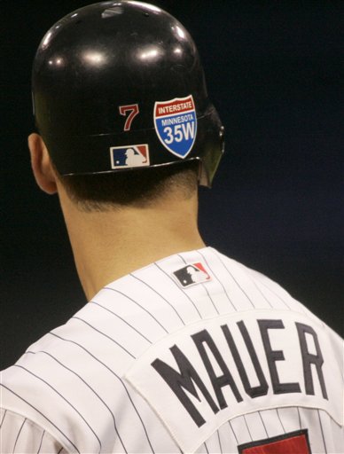
The Minnesota Twins wore Interstate 35W decals on the backs of their helmets last night to honor the victims of Wednesday’s catastrophic bridge collapse, and the team is waiting to hear from the MLB offices if they can also wear a special cap patch. We have several readers in the Minneapolis area, and we’re glad to hear they’re alright, but our thoughts are with the victims and their families this weekend. — Vince
It’s a nice tribute.
It is a nice tribute & I would like to see if the logo would be as big on the hats, but why is Mauer’s number font on the helmet the Red Sox font?
It is a nice tribute. Why does baseball wait to approve? I understand that teams and players would put everything link on their unis. But in situations like this, why the delay?
[quote comment=”128370″]It is a nice tribute. Why does baseball wait to approve? I understand that teams and players would put everything link their unis. But in situations like this, why the delay?[/quote]
link Sorry, botched link.
While I get the spirit of the sticker, it still looks like Mauer is paying tribute to the highway rather than the victims of the collapse.
Perhaps MLB wants to make sure that the official tribute is clearer.
(I sometimes feel like people lose relation to horrific events by the way they are packaged).
I didn’t care for the pink bats to honor Breast Cancer Awareness, and I don’t think this is a particularly good idea either.
I think it’s melodramatic to look at every disaster as an opportunity to say “we’re sympathetic”
I saw that yesterday, and I’m still trying to figure out of all of the Twins’ helmet numbers are in the Red Sox font or just Joe Mauer’s..
There’s a large version of the memorial sticker on
one of the Metrodome walls – I’m pretty sure that’s the first base side of home plate near link.
[quote comment=”128385″]I didn’t care for the pink bats to honor Breast Cancer Awareness, and I don’t think this is a particularly good idea either.
I think it’s melodramatic to look at every disaster as an opportunity to say “we’re sympathetic”[/quote]
for those that don’t know, the 35W bridge was a few blocks from the Metrodome, and several of the Twins players and coaches drove over it daily.
link
The bridge is used by probably 50% of Twins fans going to the dome. I’d have to say the percentage would be even higher for Viking games.
It’d be like if the 4 Train to Yankee Stadium or the Red Line at Wrigley had a disaster.
Could someone give an organized rundown of NHL rbk edge team sweaters that have been unveiled, and any info for future unveilings?
not to be jackass, but if you don’t know where the bridge is in relation to the ‘dome then you haven’t been listening to the news. every time i hear a story about it they make sure to mention that its only a few blocks from it. and the tribute could’ve been worse: could end up being just another black patch with white lettering.
Does it make me heartless if I point out that the memorial sticker uses the wrong font? Looks like that’s bold Arial or something like that, and I believe the official Interstate highway logo uses one of the link.
That is nice… I am glad not to see a black oval with white text or a ribbon. But it seems kinda ungodly big and showy.
some funny pictures in si gallery
link
link
link
Yeah, that definately is the Red Sox “7.” And I couldnt disgree more with this:
#6 by Kings33 on 08.04.07 10:04 am | Quote
I didn’t care for the pink bats to honor Breast Cancer Awareness, and I don’t think this is a particularly good idea either.
I think it’s melodramatic to look at every disaster as an opportunity to say “we’re sympatheticâ€Â
If a disaster hits your home city, it is ENTIRELY appropriate. But I guess cynics exist everywhere.
Does this mean the Twins won’t try to swindle the state for more money, and instead let the state spend it to fix the highway?
Yankees rookie pitcher Phil Hughes is wearing last year’s hat. Can anyone get a screen shot?
A-Rod hit number 500 on the first pitch he saw today….while wearing sunglasses at the plate.
[quote comment=”128428″]Does this mean the Twins won’t try to swindle the state for more money, and instead let the state spend it to fix the highway?[/quote]
They already got their money. In fact, I believe the groundbreaking was delayed due to the accident.
The Vikings are the only team without a new stadium approved by the legislation.
Rangers are wearing their away vest in Toronto this afternoon. If anyone wants to see long names squeezed on to vests, you got Frank Catalanotto (link)batting lead off and Salty is playing first base.
[quote comment=”128438″]Rangers are wearing their away vest in Toronto this afternoon. If anyone wants to see long names squeezed on to vests, you got Frank Catalanotto (link)batting lead off and Salty is playing first base.[/quote]
I think all this chatter about long names fitting onto a vest (as opposed to a regular jersey) is misguided. Years ago, vests were specially tailored, kinda like a tank top — very link, not full-breadth across the back. But today’s vests are simply regular jerseys without sleeves — there’s the exact same amount of space on the back as there would be on a normal jersey. So while Saltalamacchia is tough to fit on any jersey, it’s no tougher to fit on the Rangers’ vest than it is on their other jerseys.
Does anybody know about what’s going on on ESPN right now? It’s something about amateur baseball but I don’t know why it’s on. Some of the dudes on Puerto Rico are wearing their pants correctly and have a good green and gold color scheme but are getting crushed by South Carolina. Anybody have any knowledge on this?
In the SI picture, Ernie Sims looks like the offspring of Bob Marley and Pebbles Flintstone.
hey Paul or Vince,
i had a rather lengthy post eaten by the spam filter with all the new nhl jerseys, think you could retrieve it for me?
thanks!
[quote comment=”128448″]Does anybody know about what’s going on on ESPN right now? It’s something about amateur baseball but I don’t know why it’s on. Some of the dudes on Puerto Rico are wearing their pants correctly and have a good green and gold color scheme but are getting crushed by South Carolina. Anybody have any knowledge on this?[/quote]
It appears to be the Big League World Series. Another thing I just noticed at the game: the coaches of the South Carolina team has blue jerseys while the team has white jerseys. Also, the manager of the South Carolina team appears to have one had his last name (Powell) on the jersey but it has been removed (with the glue remaining on the jersey).
New shirts for sale from Mitchell and Ness…does this remind anyone else of the “turn ahead the clock” uniforms from 1999?
link
link
[quote comment=”128453″]hey Paul or Vince,
i had a rather lengthy post eaten by the spam filter with all the new nhl jerseys, think you could retrieve it for me?
thanks![/quote]
John–
A hearty apology on my part. Your post was accidentally included in a mass “Delete” of the thousands of spam comments we get.
Once again, I’m sorry.
–Vince
[quote comment=”128471″]New shirts for sale from Mitchell and Ness…does this remind anyone else of the “turn ahead the clock” uniforms from 1999?
link
link
SIXTY DOLLARS for a T-SHIRT!? Think again, MLB; think again.
[quote comment=”128479″][quote comment=”128471″]New shirts for sale from Mitchell and Ness…does this remind anyone else of the “turn ahead the clock” uniforms from 1999?
link
link
SIXTY DOLLARS for a T-SHIRT!? Think again, MLB; think again.[/quote]
You’d be suprised how well these over priced “fashion statements” sell
let’s try this, see if it works
[quote comment=”128397″] Could someone give an organized rundown of NHL rbk edge team sweaters that have been unveiled, and any info for future unveilings?[/quote]
i’ll do the best i can, i have everything in a word document, but that doesn’t exactly transfer all that well, so i’m building from scratch
Boston Bruins
link
link link
The Bruins will have separate shoulder logos for home and away. Two secondary logos obviously means they can have more variety for gear like shirts and hats. Now the name of the team is emphasized to the home fans, with the name of the city emphasized to the road fans. Pretty smart.
link link
Calgary Flames
This photo is of the Calgary Flames’ AHL affiliate’s new jersey. This might be a hint to the Calgary Flames’ new jersey. Note the logo is of the AHL’s Quad City Flames (QC). It has been confirmed that the horsehead will no longer appear as the Calgary Flames’ shoulder patch. THE FINAL CALGARY FLAMES JERSEY MAY NOT LOOK LIKE THIS. TAKE THIS WITH A GRAIN OF SALT
link link
link is a photoshop job someone did to make a mockup of the above jersey
Carolina Hurricanes
link link
the cover photo for the game confirms these new jerseys, can’t seem to find that though
Colorado Avalanche
POSSIBLE DESCRIPTION, TAKE THIS WITH A GRAIN OF SALT
“i seen the digital draw up of the jerseys at a friends today who sculpts toys for a big company (these drawings all come from a website that holds logos.. password protected for certain companies use, etc). like the previous description said.. theyre pretty close to the same thing as the last ones but have some of the added “space age” piping/stripes (didnt look the same as the panthers piping though down the chest) down the sides of the front. they have blue going down the arms.
the helmet / gloves / pants color is still black for the home
hard to remember from memory but expect mostly the same thing with just a pinch of the Reebok Butcher job added in.”
Columbus Blue Jackets
link
Dallas Stars
this drawing was done by someone who had seen the jerseys
link
link
Florida Panthers
link link
link
Los Angeles Kings
link link
Nashville Predators
nasville gets an anniversary link
jersey pic link link link
New York Islanders
THIS PHOTO IS OF PROTOTYPE ISLANDER JERSEYS. THE FINAL JERSEY MAY NOT LOOK LIKE THIS. TAKE THIS WITH A GRAIN OF SALT.
link
New York Rangers
THE PICS WERE LEAKED ON THEIR OFFICIAL SITE THEN REMOVED
link
old on the left, new on the right
Ottawa Senators
logo leaked on a link
as a reference, here’s the link
Philadelphia Flyers
a video with simon gagne had a jersey hanging in the background
link
people have been speculating since then. the flyers’ site mentioned that they would be based on the old sweaters. i found this link, and i agree with it
there’s another pic out there, i think it’s just a game mod, could link be the new jerseys?
Pittsburgh Penguins
THIS PHOTO HAS BEEN LEAKED, BUT HAS NEITHER BEEN VERIFIED NOR DENIED. THE FINAL JERSEY MAY NOT LOOK LIKE THIS. TAKE THIS WITH A GRAIN OF SALT.
link link link
San Jose Sharks
link link link
link
Tampa Bay Lightning
link link
Toronto Maple Leafs
THIS IMAGE HAS NOT BEEN CONFIRMED NOR DENIED, TAKE IT WITH A GRAIN OF SALT especially since the logo was supposed to change and that logo looks the same
link
Vancouver Canucks
THESE HAVE NOT BEEN CONFIRMED NOR DENIED, TAKE THEM WITH A GRAIN OF SALT
link link
link
Washington Capitals
link link link
the home jersey has so much red in it, that i think it looks SOO much better with the pants and socks
link link
notice that the captain’s C doesn’t fit
alright, i think that’s all of them, and i hope the links work.
[quote comment=”128472″][quote comment=”128453″]hey Paul or Vince,
i had a rather lengthy post eaten by the spam filter with all the new nhl jerseys, think you could retrieve it for me?
thanks![/quote]
John–
A hearty apology on my part. Your post was accidentally included in a mass “Delete” of the thousands of spam comments we get.
Once again, I’m sorry.
–Vince[/quote]
i posted it again (i was smart enough to copy my post to a word document), and again the filter got it, if it’s there, rescue it please, if not, that’s alright, i give up lol
thanks for trying!
I think all this chatter about long names fitting onto a vest (as opposed to a regular jersey) is misguided. Years ago, vests were specially tailored, kinda like a tank top — very narrow across the shoulders, not full-breadth across the back. But today’s vests are simply regular jerseys without sleeves — there’s the exact same amount of space on the back as there would be on a normal jersey. So while Saltalamacchia is tough to fit on any jersey, it’s no tougher to fit on the Rangers’ vest than it is on their other jerseys.
Actually, I would think that it would be harder to put on the back of the Rangers’ vests because they have the braid that goes around the arm holes.
Mike Redmond’s wearing an interesting helmet with his catcher’s mask in today’s Indians-Twins game. I can’t quite make out if there’s a logo on the helmet, or what it is, but it’s got a white front.
link
Anyone know what’s with Redmond’s helmet?
[quote comment=”128502″]Mike Redmond’s wearing an interesting helmet with his catcher’s mask in today’s Indians-Twins game. I can’t quite make out if there’s a logo on the helmet, or what it is, but it’s got a white front.
link
Anyone know what’s with Redmond’s helmet?[/quote]
Its a twins helmet from 20+ years ago. I think every Twins catcher wears one.
Mauer and Redmond had link made last season. Mauer grew up in the Twin Cities and always liked that older design.
[quote comment=”128402″]not to be jackass, but if you don’t know where the bridge is in relation to the ‘dome then you haven’t been listening to the news. every time i hear a story about it they make sure to mention that its only a few blocks from it. and the tribute could’ve been worse: could end up being just another black patch with white lettering.[/quote]
I didn’t until today. Does that make me insensitive?
Not everyone likes to view/read every single detail about every accident that happens all over the country.
That being said, I can understand the tribute *in Minnesota*.
A millions players wearing Virginia Tech gear for weeks was just over the top.
I’m from New Orleans, and I thought the massive red cross signs on the helmets was over the top also. Simple black armband or a small patch does the trick. Anything beyond that, especially in photos years after the tragedy, looks more like “look at me, I care!”
What is the significance of Willie Randolph’s “B.R.” hat inscription? I don’t know how long it’s been there nor do I know what it means.
[quote comment=”128404″]Does it make me heartless if I point out that the memorial sticker uses the wrong font? Looks like that’s bold Arial or something like that, and I believe the official Interstate highway logo uses one of the link.[/quote]
Actually, I think it is correct. The font you linked to was for text on street signs and the big green signs on a highway.
The Interstate shield uses another font. MIN’s tribute is pretty close (looks a bit bolder than the real deal, but clearly the same font):
link
That link even has a 3 and a 5.
willie randolph has a (B.R.) on the left side of his cap above the ear.
Watching today’s Cubs-Mets game, I noticed something interesting. When Ramon Castro went to visit John Maine on the mound in the third, the camera showed Castro from the back, showing the front of his helmet. It was a regular catcher’s flapless helmet (not CoolFlo; the smooth, pre-CoolFlo style), but had the Mets’ CoolFlo blue-and-black burst-like pattern, with the blue stripes extending to the back and cut off abruptly, just like on a CoolFlo. I don’t have any pics, unfortunately.
This has probably been mentioned here somewhere here before, but I figured I should mention it in case it hasn’t.
[quote comment=”128505″][quote comment=”128502″]Mike Redmond’s wearing an interesting helmet with his catcher’s mask in today’s Indians-Twins game. I can’t quite make out if there’s a logo on the helmet, or what it is, but it’s got a white front.
link
Anyone know what’s with Redmond’s helmet?[/quote]
Its a twins helmet from 20+ years ago. I think every Twins catcher wears one.[/quote]
But only for home games.
I wish they would color in the T (it’s outlined in navy, but it’s hard to see). Something tells me that if the T were navy, it would be an illegal manipulation of the official logo, which might explain why it looks the way it does.
[quote comment=”128512″]What is the significance of Willie Randolph’s “B.R.” hat inscription? I don’t know how long it’s been there nor do I know what it means.[/quote]
according to link, it’s in honour of bill robinson.
[quote comment=”128517″][quote comment=”128512″]What is the significance of Willie Randolph’s “B.R.” hat inscription? I don’t know how long it’s been there nor do I know what it means.[/quote]
according to link, it’s in honour of bill robinson.[/quote]
good call luke, thanks….
[quote comment=”128486″][quote comment=”128472″][quote comment=”128453″]hey Paul or Vince,
i had a rather lengthy post eaten by the spam filter with all the new nhl jerseys, think you could retrieve it for me?
thanks![/quote]
John–
A hearty apology on my part. Your post was accidentally included in a mass “Delete” of the thousands of spam comments we get.
Once again, I’m sorry.
–Vince[/quote]
i posted it again (i was smart enough to copy my post to a word document), and again the filter got it, if it’s there, rescue it please, if not, that’s alright, i give up lol
thanks for trying![/quote]
Rescued the post from spam hell.
Comment #30.
[quote comment=”128516″]I wish they would color in the T (it’s outlined in navy, but it’s hard to see). Something tells me that if the T were navy, it would be an illegal manipulation of the official logo, which might explain why it looks the way it does.[/quote]
Ah, maybe that’s why I was confused – all I could see was a wishbone C and that didn’t make any sense.
Thanks.
was this posted yet? a pic of a canucks’ new uni:
link
link
[quote comment=”128535″]http://img217.imageshack.us/img217/9761/newunimm6zs9.gif[/quote]
that’s the supposed new canuck jersey, leaked on a canucks message board… I’m just a retard withh the links.
[quote comment=”128534″]was this posted yet? a pic of a canucks’ new uni:
link[/quote]
[quote comment=”128535″]http://img217.imageshack.us/img217/9761/newunimm6zs9.gif[/quote]
Skeptical. The RBK Edge template has a seam that goes all the way down the side (hence the long, lengthwise sleeve stripe). Why does this sleeve stripe curl?
[quote comment=”128511″][quote comment=”128402″]not to be jackass, but if you don’t know where the bridge is in relation to the ‘dome then you haven’t been listening to the news. every time i hear a story about it they make sure to mention that its only a few blocks from it. and the tribute could’ve been worse: could end up being just another black patch with white lettering.[/quote]
I didn’t until today. Does that make me insensitive?
Not everyone likes to view/read every single detail about every accident that happens all over the country.
That being said, I can understand the tribute *in Minnesota*.
A millions players wearing Virginia Tech gear for weeks was just over the top.
I’m from New Orleans, and I thought the massive red cross signs on the helmets was over the top also. Simple black armband or a small patch does the trick. Anything beyond that, especially in photos years after the tragedy, looks more like “look at me, I care!”[/quote]
Black armbands are a subtle way to show respect and should be allowed to be worn at anytime without mlb approval.
The custom patches and stickers can sometimes seem opperunistic.
The first responder caps after 9/11 was touching. These bridge tribute stickers don’t really have the same improvised feel.
I wouldn’t be suprized if they sold them at the dome with proceeds going to some obligatory education fund.
You can call it cynical, I’ll call it cyclical.
Another big news day and here we go again.
ted lilly had a white undershirt for the first 7 innings but when he came out for the 8th he was wearing a blue shirt.
a game worn link on ebay (with a ‘7’ missing from his 77) shows the Twins helmet stickers from last season. Much different.
[quote comment=”128486″][quote comment=”128472″][quote comment=”128453″]hey Paul or Vince,
i had a rather lengthy post eaten by the spam filter with all the new nhl jerseys, think you could retrieve it for me?
thanks![/quote]
John–
A hearty apology on my part. Your post was accidentally included in a mass “Delete” of the thousands of spam comments we get.
Once again, I’m sorry.
–Vince[/quote]
i posted it again (i was smart enough to copy my post to a word document), and again the filter got it, if it’s there, rescue it please, if not, that’s alright, i give up lol
thanks for trying![/quote]
I dont see the difference between link and link
Also, theirlink and link
[quote comment=”128553″][quote comment=”128486″][quote comment=”128472″][quote comment=”128453″]hey Paul or Vince,
i had a rather lengthy post eaten by the spam filter with all the new nhl jerseys, think you could retrieve it for me?
thanks![/quote]
John–
A hearty apology on my part. Your post was accidentally included in a mass “Delete” of the thousands of spam comments we get.
Once again, I’m sorry.
–Vince[/quote]
i posted it again (i was smart enough to copy my post to a word document), and again the filter got it, if it’s there, rescue it please, if not, that’s alright, i give up lol
thanks for trying![/quote]
I dont see the difference between link and link
Also, theirlink and link[/quote]
Well, except for the shoulder piping…
Sometimes it’s perfectly okay to link.
[quote comment=”128524″][quote comment=”128486″][quote comment=”128472″][quote comment=”128453″]hey Paul or Vince,
i had a rather lengthy post eaten by the spam filter with all the new nhl jerseys, think you could retrieve it for me?
thanks![/quote]
John–
A hearty apology on my part. Your post was accidentally included in a mass “Delete” of the thousands of spam comments we get.
Once again, I’m sorry.
–Vince[/quote]
i posted it again (i was smart enough to copy my post to a word document), and again the filter got it, if it’s there, rescue it please, if not, that’s alright, i give up lol
thanks for trying![/quote]
Rescued the post from spam hell.
Comment #30.[/quote]
thanks Vince! much appreciated!
[quote comment=”128365″]It is a nice tribute & I would like to see if the logo would be as big on the hats, but why is Mauer’s number font on the helmet the Red Sox font?[/quote]
PLEASE…PLEASE…PLEASE!!!
Don’t turn this into a “Have you seen the new fonts on the Bucs practice jerseys?” situation.
I am a Minnesotan, and I am torn. I like the idea of a tribute, but I agree with John in Athens that it looks like they are paying tribute to the road, not the victims.
King33, I dislike the pink bats, too, but this is different. Any person living in the Twin Cities (dare I say in Minnesota) has driven that bridge hundreds of times. It is THE major road in MN, and the fact that it collapsed will damage the economy of MN, not to mention the daily lives of many Minnesotans. It is entirely appropriate for the local teams to pay tribute to the victims of this tragedy–I just wish the tribute was not so big.
link
link one for Minna.
In the Astros-Marlins game, catcher Eric Munson of the Astros is wearing Brad Ausmus’s hockey-style cather’s mask-helmet. He used to wear the more conventional separate mask and backwards flapless batting helmet. The Astros announcers, Bill Brown and Jim Deshaies mentioned that he had recently decided to try Ausmus’s gear and thought it gave him a better field of vision than his mask.
In the Rockies-Braves game, Colorado pitcher Jimenez is wearing stirrups. However, he has them on backward!
[quote comment=”128578″]In the Astros-Marlins game, catcher Eric Munson of the Astros is wearing Brad Ausmus’s hockey-style cather’s mask-helmet. He used to wear the more conventional separate mask and backwards flapless batting helmet. The Astros announcers, Bill Brown and Jim Deshaies mentioned that he had recently decided to try Ausmus’s gear and thought it gave him a better field of vision than his mask.[/quote]
Yeah, I noticed that a couple weeks ago, too. That used to be an easy way of telling them apart at first glance. Well, other than the socks Munson wears. Kudos for that.
Rumor out of MLB Offices is that light blue jerseys will be reintroduced to the Majors in 2008 starting with the Kansas City Royals. Just a well sourced rumor but certainly cause for hope…
[quote comment=”128572″]link[/quote]
I love that the petition includes a plea that the petitioners be taken seriously!
I love the apple, but I loved Greg Jefferies too.
[quote comment=”128574″]link one for Minna.[/quote]
um… is Troy sporting some gray beard there? Is this an Orlando Hernandez situation? Dude’s only 26.
[quote comment=”128580″]In the Rockies-Braves game, Colorado pitcher Jimenez is wearing stirrups. However, he has them on backward![/quote]
Yeah, J has been backward for all four ML starts, so he’s obviously in a rut.
Fair warning – the Rockies are in Atlanta tomorrow (Sunday) and we could easily get a ghastly red v. purple game now that the Rocks are getting spanked in the Blacks and Aaron Cook is on the hill.
I am watching the Phils/Brewers game and newly acquired reliever Scott Linebrink has changed his number after coming off bereavement because he went home to Texas for the birth of his first child. He is wearing #71 in honor of hi bullpen catcher back in San Diego who is fighting cancer.
[quote comment=”128448″]Does anybody know about what’s going on on ESPN right now? It’s something about amateur baseball but I don’t know why it’s on. Some of the dudes on Puerto Rico are wearing their pants correctly and have a good green and gold color scheme but are getting crushed by South Carolina. Anybody have any knowledge on this?[/quote]
I don’t know that much about it, I just know that I flipped through the game and did a double take; I grew up fifteen minutes from that ballfield, and have actually played games on it before. What really surprised me is the color that the South Carolina team was wearing. Unless they were mandated to wear blue, I would imagine that a ball team from Easley would wear green uniforms, as the town’s high school mascot is the Green Wave, and the whole town celebrates green as a favorite color, as well as the fact that their main rival, Pickens, is the BLUE Flame.
I’m sure noone cares, but I’m watching the Colorado Rapids/FC Dallas MLS match. Some of the Rapids names are outlined in white…others are not. I found that a bit odd.
[quote comment=”128572″]link[/quote]
Thanks for this post! I just signed the petition.
Although its a cheesy remnant of the Mets 1980(?) “The Magic is Back” promo, no Met home run is official until the apple pops up.
In reagards to the Met’s home run apple… Back when the Giants played at Candlestick (as it will always be called by the faithful; none of that 3 Com or Monster Park crap) they had a foghorn with their logo on it that went off after every homerun. The foghorn was absent when Pac Bell opened (now SBC Park), but by the request of numerous fans, they foghorn was retreived from candelstick and now resides next to the scoreboard in centerfield at SBC.
My third try at avoiding “spam hell”…
Arkansas State University unveiled their link at today’s Media Day, after switching from Russell to adidas…
Fans should have link telling the players, even without a scorecard…
There were some link to the side striping, and this year’s link features a “3-D” look on the “STATE” logo, and what I can only call “sparklies” on the rest of the otherwise-black helmet.
All-in-all, the link wasn’t too bad, either.
While A-State remains the “Indians” for one final season, you’ll notice that absolutely nothing on this uniform uses, depicts, or even hints at the “Indians” nickname. That will be changed (most likely) by this time next year… meaning Arkansas State will field an entire Team “To Be Named Later”!
Paul, I hope you don’t mind, but (in addition to my broadcasting “credentials”) I identified myself as the Jonesboro, Arkansas correspondent for UniWatch to my fellow reporters! They were quite impressed with my membership card, and some of ’em even already knew about the site!
[quote comment=”128612″]I’m sure noone cares, but I’m watching the Colorado Rapids/FC Dallas MLS match. Some of the Rapids names are outlined in white…others are not. I found that a bit odd.[/quote]
Good eye… I caught that, too.
[quote comment=”128612″]I’m sure noone cares, but I’m watching the Colorado Rapids/FC Dallas MLS match. Some of the Rapids names are outlined in white…others are not. I found that a bit odd.[/quote]
I do care!
[quote comment=”128625″][quote comment=”128612″]I’m sure noone cares, but I’m watching the Colorado Rapids/FC Dallas MLS match. Some of the Rapids names are outlined in white…others are not. I found that a bit odd.[/quote]
I do care![/quote]
The same Peter Noone of Herman’s Hermits?
Back on recent topic, Bernie Brewer got a new slide when the crew moved to Miller Park, but I prefer the link.
link, including the shield.
I think the font is close, but the relative scale is off – “Minnesota” should be a lot smaller.
Ka-Boom, #755 for Barry. If the Pads had worn throwbacks tonight, they might’ve stopped it!
(Even though he’s had 87 HRs against SD.)
[quote comment=”128637″]Ka-Boom, #755 for Barry. If the Pads had worn throwbacks tonight, they might’ve stopped it!
(Even though he’s had 87 HRs against SD.)[/quote]
*
His father was a good player.
[quote comment=”128581″][quote comment=”128578″]In the Astros-Marlins game, catcher Eric Munson of the Astros is wearing Brad Ausmus’s hockey-style cather’s mask-helmet. He used to wear the more conventional separate mask and backwards flapless batting helmet. The Astros announcers, Bill Brown and Jim Deshaies mentioned that he had recently decided to try Ausmus’s gear and thought it gave him a better field of vision than his mask.[/quote]
Yeah, I noticed that a couple weeks ago, too. That used to be an easy way of telling them apart at first glance. Well, other than the socks Munson wears. Kudos for that.[/quote]
And Munson got hit on the throat late in the game when a ball bounced up off the ground and under the bottom of the hockey style mask. Wonder if he’ll keep using Ausmus’s gear now….
Ding. *
oops. figures.
link. *
In regards to the helmets worn by Mauer and Redmond when did the Twins where a hat with a white front, I searched “Dressed to the Nines” and didn’t see them
[quote comment=”128666″]In regards to the helmets worn by Mauer and Redmond when did the Twins where a hat with a white front, I searched “Dressed to the Nines” and didn’t see them[/quote]
It’s link
[quote comment=”128666″]In regards to the helmets worn by Mauer and Redmond when did the Twins where a hat with a white front, I searched “Dressed to the Nines” and didn’t see them[/quote]
i don’t know if the team has actually ever regularly worn them, but i found link and link i can’t find any pictures of any players wearing them as a hat or a helmet.
(there was never a corresponding field hat, so it probably wouldn’t display in Dressed To The Nines. The field cap of that era was the red with blue bill.
also, while searching for twins pics, i found link, which i enjoyed very much.
[quote comment=”128672″]also, while searching for twins pics, i found link, which i enjoyed very much.[/quote]
Fairly sure that’s from the 1993 All Star Game at Camden Yards. Puck was the MVP with a homer and a double in that one.
[quote comment=”128674″][quote comment=”128672″]also, while searching for twins pics, i found link, which i enjoyed very much.[/quote]
Fairly sure that’s from the 1993 All Star Game at Camden Yards. Puck was the MVP with a homer and a double in that one.[/quote]
you’re right. the game was in baltimore, so the AL wore home whites, and link (hate those hats) was one of link (love those hats) coaches.
[quote comment=”128560″]Sometimes it’s perfectly okay to link.[/quote]
Notice how his sleeve is turned up so you can just see a sliver of the armband. Its probly so he can fit his elbow pad on his arm.
The closest commercial font to highway & road signs is Font Bureau’s Interstate. The freeware knockoff versions are called Blue Highway and Road Geek.
The Twins used Arial, the PC-bastardized version of Helvetica, for the lettering on the tribute sticker.
I will cut them some slack for using Arial while hastily putting together the sticker to memorialize such a horrific event.
New helmets for Syracuse this season.
Trying again
link
link are the ‘cuse helmets
The new Syracuse helmets are looking sharp.
[quote comment=”128574″]link one for Minna.[/quote]
Dave A., thanks, man. I hadn’t seen that. TD, I don’t care how much gray Troy is sporting–he’s fine. I am ready for some football!
I gotta say, though, he looks better in his uni than in street clothes. I’m just saying I like his bad-ass look the best.
[quote comment=”128572″]link[/quote]
umm the apple is being moved to the new stadium not only is it in the sketches on their website, wilpon said the apple goes to citifield.
[quote comment=”128700″]link are the ‘cuse helmets[/quote]
GOOD ONE! way better then the number ones and those unis need to change too GOD those are horrid. i love the little NY on the back i might even have to watch them play this season.
[quote comment=”128439″][quote comment=”128438″]Rangers are wearing their away vest in Toronto this afternoon. If anyone wants to see long names squeezed on to vests, you got Frank Catalanotto (link)batting lead off and Salty is playing first base.[/quote]
I think all this chatter about long names fitting onto a vest (as opposed to a regular jersey) is misguided. Years ago, vests were specially tailored, kinda like a tank top — very link, not full-breadth across the back. But today’s vests are simply regular jerseys without sleeves — there’s the exact same amount of space on the back as there would be on a normal jersey. So while Saltalamacchia is tough to fit on any jersey, it’s no tougher to fit on the Rangers’ vest than it is on their other jerseys.[/quote]
I’ve actually seen at the minor league level where vest-style jerseys aren’t actually vests, just regular jerseys with different colored sleeves. That would certainly render name length issues moot.
John Baranowski,
Thanks for the organized post, it’s hard to keep up with everything with limited computer access. I really like the canuck sweater on the wall mural, i’d love to see that, and those dallas sweaters have potention(horizontal stripes) if real.
I’ve actually seen at the minor league level where vest-style jerseys aren’t actually vests, just regular jerseys with different colored sleeves. That would certainly render name length issues moot.
Like the Angels wore in the mid 1990s?
[quote comment=”128525″][quote comment=”128516″]I wish they would color in the T (it’s outlined in navy, but it’s hard to see). Something tells me that if the T were navy, it would be an illegal manipulation of the official logo, which might explain why it looks the way it does.[/quote]
Ah, maybe that’s why I was confused – all I could see was a wishbone C and that didn’t make any sense.
Thanks.[/quote]
The Twins batting helmet in the 70’s had the white T outlined in navy (with the red interlocking C) — not a navy T. I agree that a navy T would look better, but the navy outlined white T is more authentic to what was worn in the 70’s.
[quote comment=”128568″]I am a Minnesotan, and I am torn. I like the idea of a tribute, but I agree with John in Athens that it looks like they are paying tribute to the road, not the victims.
King33, I dislike the pink bats, too, but this is different. Any person living in the Twin Cities (dare I say in Minnesota) has driven that bridge hundreds of times. It is THE major road in MN, and the fact that it collapsed will damage the economy of MN, not to mention the daily lives of many Minnesotans. It is entirely appropriate for the local teams to pay tribute to the victims of this tragedy–I just wish the tribute was not so big.[/quote]
FAir enough… I’m not heartless, and I know enough about Minnesota to understand how impactful this can be on the state. Maybe it’s the giant size of it that set me off… more than anything I’m just weary of the trend of memorializing everything. To me, it seems sports has gone literal with “wearing your heart on your sleeve” (or helmet, or multicolored bat), where what they really need to do is wear their heart, in their heart… I’d rather hear 10 years later about all the wonderful things teams and players do behind the scenes (and they do – a lot!) than hear their immediate response in a well formed press release.