Man, I go away for a week and an entire league goes down the toilet.
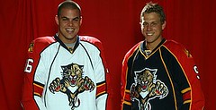
The trouble started just a few hours after I put up the “Gone Fishing” sign, when the Predators unveiled their new jerseys. I don’t mind the stripes on the sleeves so much (indeed, I’m on record as being a fan of this), but the piping down the front of the jersey is ridiculous. Even worse, check out the back. Oh, great — as if a big Reebok logo weren’t bad enough, now it has to be showcased in its own contrast-colored panel (you can bet someone at Reebok got a nice Christmas bonus for coming up with that one). What an embarrassment.
Bad went to worse a few days ago, when the new Panthers jerseys were bestowed upon an unwitting populace. Hmmm, look familiar? Same utterly pointless piping down the front, same contrast-colored logo creep on the back. And can someone please explain the point of having horizontal sleeve stripes that don’t even wrap all the way around the sleeve?
Unfortunately, there’s more to come. I’ve seen another team’s new design that’s based on exactly the same template (sorry, I’m not at liberty to disclose which team, but it’ll be unveiled soon enough). When I first saw it, I thought, “Man, you’ve gotta work pretty hard to come up with something that stupid,” but that was before I’d seen the new Preds and Panthers jerseys.
The thing that makes all of this unforgivable is that it’s empirically unnecessary — despite Reebok’s new tailoring, the Bruins are going with an old-school design, and the Blue Jackets concept is a case study in how to modern can still be tasteful. So don’t blame this one on Reebok. Blame the teams for being too weak and lemming-like to come up with anything decent, and blame the league for allowing this template nonsense.
Oh what the hell, let’s blame Reebok too.
I’d like to come up with a good name for this front piping. Some folks are already referring to it as an “apron,” but I think we can do better than that. Anyone care to contribute another term?
![842976[1].gif](https://farm2.static.flickr.com/1263/939708218_fb62fa86d3_t.jpg)
Uni Watch Demographic Study: Many of you folks are apparently very nosy curious about each other, so Joe Drennan has generously volunteered to compile a Rolodex-style spreadsheet of the site’s readership. Completely voluntary, natch. If you’d like to participate, please list your name, the name you use when posting comments (if applicable), occupation, and location. If you want to include your e-mail address, and/or if you have a personal web site, feel free to include that info as well. Send all of this data to Joe (not to me, please) at jpdren99 at smumn dot edu. A copy of the resulting file will be sold to every marketing firm I can think of made available to all participants.
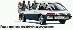
Indy Frock: Got an interesting membership card request the other day from Dan Netser, who wants his design patterned after the 1973 Indiana Pacers. This presented something of a challenge: Should the center and outer stripes be truncated (which matches their height on the actual jersey but looks kinda weird on a rectangular card) or extended (which looks less awkward but doesn’t really match the original design)? Scott prefers the former, I’d go with the latter, but we both agree that each option has its pros and cons, so we’ve decided to get input from you folks. What say ye, people — which option do you prefer? Is there some other solution we’re overlooking?
As long as we’re on the topic: Last week’s travels have left me a bit behind on mailing out membership kits, but I expect to catch up this week — thanks in advance for your patience. Meanwhile, there’s lots of good new stuff in the membership design gallery, including this (based on the early-’60s Reds) and this (mid-’90s Canucks alt, don’tcha know). Check out the full gallery here, and remember, you can click on any design to add a comment, read others’ comments, or explain what the design is based on.
Meanwhile, congrats to Vernona Elms, who on Friday became our 300th member. We probably won’t get to 500 before A-Rod does, but maybe we can beat him to 756. Friendly reminder: If you join by tomorrow (or if your snail-mailed order is postmarked by then), you’ll have a “Charter Member” seal added to your card when you renew next year.
Uni Watch News Ticker: Remember our rundown of all-stars who wore the wrong helmet? Here’s another one: Johnny Callison of the Phillies wearing a Mets helmet while winning the 1964 ASG with a 9th-inning homer. … Spectacular shot here of the 1921 Seattle Metropolitans. Dig that chest insignia! … Good two-minute video segment here about how the Tour de France jerseys are stocked with drugs in secret pockets prepared for each rider (with thanks to Brendan Hunt). … Big surprise. … Annual AIDS awareness game in San Francisco last Friday, with the Giants and Marlins wearing red ribbons. … Reprinted from Saturday: The Pirates style John Van Benschoten’s two-word surname as one word on his nameplate (presumably because they don’t have room to add a space). Turns out they’ve done this consistently throughout his career, as seen here and here. Poor guy can’t even have his accurate name on his jersey. … In a related item, check out this note from Todd Davis (reprinted from yesterday’s comments): “[According to] the Cubs/Reds WGN broadcast, Reds SS Dave Concepcion was issued jersey number 57 when he came up in 1970, but they couldn’t fit his name around the 57 (the Reds had those massive name letters) so they changed it to 13 in order to have enough room.” The thing is, lots of other Venezuelan players have worn 13 in honor of Concepcion (including Edgardo Alfonzo, Ozzie Guillen, several others), so the Reds’ early-’70s player-name typography had a ripple effect that was felt for decades. … Matthew Lepke notes that the Vikings are wearing gray facemasks, but it’s just a training camp thing. In a related item, the Vikes will be wearing throwback attire on Sept. 30th, to coincide with Chuck Foreman’s induction into the team’s ring of honor. … Reprinted from Saturday’s comments: Looks like Vlad Guerrero is slitting his right sleeve. … Ken Tobler reports that the U. of North Texas will have a new uniform this season. They’re revealing the various components one element at a time, and gee, do you think you can figure out who the manufacturer is? … “Eat my bike shorts!” (Thanks, Vince.) … Vince also found this photo of Liverpool goaltender Bruce Grobbleaar, who wore a mask when he played with Southampton after breaking his nose. … Yesterday’s Mariners/A’s throwback game was a mix of good and bad (additional pics here, here, here, here, and here, plus Beau Lynott sent along a bunch of screen grabs, which you can see in this slideshow). Most obvious mistake: Both teams should’ve been wearing elasticized waistbands, not belts. Subtlest mistake: The A’s player names should have been straight, not arched. Nicest touch: The A’s coaches wore white caps. … NFL note from Lee Wilds, who writes: “The Titans have added a fourth jersey color this year [for training camp]. They have previously worn navy for defense and white for the offense while QBs wore red, but this year the defensive unit is rotating in a light blue version.” And yes, that’s an advertising patch on the Titans’ practice attire — nothing new there, as they’ve been wearing it for several years now. … Tom K notes that Alex Cintron had helmet decal issues yesterday (and that was his first at-bat, which means the equipment staff was totally asleep at the switch). … The always excellent Helmet Hut has just come out with a line of Florida State reproductions, including several designs I’d never seen before. The full listing is here.
Seattle Metropolitans
Unfortunately, there’s more to come. I’ve seen another team’s new design that’s based on exactly the same template
My guess would be Dallas.
Regarding the Pacers jersey/memebership card, to me the obvious solution wasn’t shown. Curve all 3 stripes just like the one on the left.
[quote comment=”125942″]Regarding the Pacers jersey/memebership card, to me the obvious solution wasn’t shown. Curve all 3 stripes just like the one on the left.[/quote]
TURN THE CARD SIDEWAYS, DUH…
TURN THE CARD SIDEWAYS, DUH…
Sure, it would be a uniwatch membership card first, but to truly appreciate the original design, turning the card sideways would be the most beneficial way to make it, at the very least, look good.
Awesome Florida State Helmets. Cool that they had three different designs in one season alone (1975).
Also, someone pointed this out yesterday and you can see it one of today’s linked pics, but Dan Johnson of the A’s is wearing FAKE stirrups. Why were these even made available to the players?
[quote comment=”125948″]TURN THE CARD SIDEWAYS, DUH…
Sure, it would be a uniwatch membership card first, but to truly appreciate the original design, turning the card sideways would be the most beneficial way to make it, at the very least, look good.[/quote]
I was thinking this same thing. However, I’m not sure it would fix the problem. The proportions would be more accurate but the stripes would still end in nothingness. You could end the stripes into the banner in the corner which would kind of give the same look as the jersey.
A few thoughts.
Florida’s jersey… I don’t know how they did it, but they made me hate it even more than I did before.
As to the team that is based on the template, I have a nasty suspicion, based on the screenshot in this link: that it just might be the Flyers. I hope, at least, our jersey is subtler.
As for the Pacer jersey challenge, I agree with turning the card sideways, as the simplest elegant solution, but it might also be possible to leave the top right corner of the card the same color as the background on the front, to mimic the cutout for the arms.
[quote comment=”125949″]Also, someone pointed this out yesterday and you can see it one of today’s linked pics, but Dan Johnson of the A’s is wearing FAKE stirrups. Why were these even made available to the players?[/quote]
I noticed that, too. I forgave the belt, but the stirrups are probably the best part of throwbacks. Offensive color schemes are easy (Rockies, I’m looking at you and your “vests”), but the fake stirrups killed the motif.
I know I posted these Friday, but I didn’t get ny responses (that I know of). I’m thinking of getting stirrups for my fencing team, and a kind soul provided a link to a site that does custom stirrups. I Photoshopped in our colors, and want to know what you guys think. They have letter designations, so let me know.
link
link
I’d be really interested in what Paul thinks. *wink, wink, nudge, nudge, say no more*
Aaand… I screwed up the tags. Go me. I hope this doesn’t cause the same kind of infinite loop the italics bug causes, but just in case I’ll try and close it here.
Anyway, having seen the A’s yellow uni in action, with a truer color to the picture, I have to say I like it a lot more than I thought, and wouldn’t mind it coming back more regularly.
Regarding the “apron” on the hockey sweater template. Perhaps “bib” (which I certainly recall being mentioned before in other contexts here)? Or “dribble bib” or “neck napkin” if we want to be more pejorative?
ed
The Pirates sent John Van Benschoten to the minors on Saturday. I will have to check to see if Indianapolis (AAA) puts a space in his name of not…
[quote comment=”125952″][quote comment=”125949″]Also, someone pointed this out yesterday and you can see it one of today’s linked pics, but Dan Johnson of the A’s is wearing FAKE stirrups. Why were these even made available to the players?[/quote]
I noticed that, too. I forgave the belt, but the stirrups are probably the best part of throwbacks. Offensive color schemes are easy (Rockies, I’m looking at you and your “vests”), but the fake stirrups killed the motif.
I know I posted these Friday, but I didn’t get ny responses (that I know of). I’m thinking of getting stirrups for my fencing team, and a kind soul provided a link to a site that does custom stirrups. I Photoshopped in our colors, and want to know what you guys think. They have letter designations, so let me know.
link
link
I’d be really interested in what Paul thinks. *wink, wink, nudge, nudge, say no more*[/quote]
I like pattern F or G. I probably prefer G to F, I’ve always loved that stripe pattern.
Re: The Florida State helmets, state-outline-decal version
The QB dropping back to pass in the photo is Gary Huff. FSU is playing the Pitt Panthers at Pitt Stadium on 9/9/72 — a game won by the Seminoles, 19-7. Note the dark blue/old gold jersey on the Pitt lineman.
I vote link.
The “A” on the A’s hats and jerseys were all wrong.
Grrr.
Texas A&M officialy unveiled their new uniforms this weekend. There isn’t a good close up view. They look silly without pads.
Overall I think it’s a good update for the Ags.
link
[quote comment=”125964″]The “A” on the A’s hats and jerseys were all wrong.
Grrr.[/quote]
How so?
My post keeps getting eaten, so I’ll try without the hyperlink.
Texas A&M officialy unveiled their new uniforms this weekend. There isn’t a good close up view. They look silly without pads.
Overall I think it’s a good update for the Ags.
link
The truncated version of the card is the best look. I do not think turning it sideways would be better at all, I feel you would still run into the same problems. The truncated version is true to the jersey and looks great.
Thanks for the links Paul. I wrote up a diary on the M’s-A’s throwbacks link.
[quote comment=”125977″]Thanks for the links Paul. I wrote up a diary on the M’s-A’s throwbacks link.[/quote]
“…Konichiwa, bitches.” = Awesome!
Regarding the Concepcion jersey number, when did they give him 57? Was it as a late-season call-up? I can’t imagine that he would have stuck with such a high number once his spot on the roster was secure, so it’s not like we would have had a generation of Venezuelan infielders all wanting 57.
It seems that even players are fans of the Royals’ old powder blue uniforms. Check out the back-and-forth between Ken Griffey, Jr. and Jeff Conine at the bottom of this Reds blog from yesterday.
link
The e-mail address for the demographic study doesn’t seem to work.
[quote comment=”125978″][quote comment=”125977″]Thanks for the links Paul. I wrote up a diary on the M’s-A’s throwbacks link.[/quote]
“…Konichiwa, bitches.” = Awesome![/quote]
Great photos, and I just noticed that the Mariners’ caps have that silly raised 3-D logo that they started using in the late 1990s. Couldn’t they have given them a proper flat M?
The pacers jersey should be extended. The easiest way to think about it would be, if the stripe had not run into an armhole, would the stripes have continued?
There is no way they would end stripes in the middle of nowhere, so the stripes should continue on the card as they would have on the jersey.
[quote comment=”125987″]The pacers jersey should be extended. The easiest way to think about it would be, if the stripe had not run into an armhole, would the stripes have continued?
There is no way they would end stripes in the middle of nowhere, so the stripes should continue on the card as they would have on the jersey.[/quote]
But part of the charm of the jersey is the stripes ending as they do.
Did any player at the Marlins-Giants AIDS awareness game not wear a ribbon?
Sorry, link didn’t get posted
link
With the Panthers design, I don’t have a problem with the concept of partial stripes around the sleeves, but to be partial on the inside? It could work if the stripes were on the red or outside portion of the stripes.
But the Panthers and Predators designs are pretty much the worst case scenario of the whole new uniform template. Not only is it a template for these teams, they’ve gone the ‘cookie cutter’ route with a bunch of bad elements.
[quote comment=”125946″][quote comment=”125942″]Regarding the Pacers jersey/memebership card, to me the obvious solution wasn’t shown. Curve all 3 stripes just like the one on the left.[/quote]
TURN THE CARD SIDEWAYS, DUH…[/quote]
Here you go … link.
It’s a little sloppy, but you get the idea.
First time I’ve noticed this: link. That and the Cubs’ regular number font are the two best in baseball — the Sox’ one always looks old-fashioned no matter what year it is, and the Cubs’ always looks modern.
[quote comment=”125987″]The pacers jersey should be extended. The easiest way to think about it would be, if the stripe had not run into an armhole, would the stripes have continued?
There is no way they would end stripes in the middle of nowhere, so the stripes should continue on the card as they would have on the jersey.[/quote]
Perhaps the stripes ending in the middle of nowhere signifies Indiana.
Before I get bombarded with hate-mail, I live in Indiana
[quote comment=”125992″]With the Panthers design, I don’t have a problem with the concept of partial stripes around the sleeves, but to be partial on the inside? It could work if the stripes were on the red or outside portion of the stripes.
But the Panthers and Predators designs are pretty much the worst case scenario of the whole new uniform template. Not only is it a template for these teams, they’ve gone the ‘cookie cutter’ route with a bunch of bad elements.[/quote]
I think a lot of you guys are being too hard on the panthers and preds,I don’t love em, but I have seen much link jerseys in the nhl… besides very few of you Americans watch hockey on a consistent basis, so they won’t be driving you nuts all that much will they?
[quote comment=”125993″][quote comment=”125946″][quote comment=”125942″]Regarding the Pacers jersey/memebership card, to me the obvious solution wasn’t shown. Curve all 3 stripes just like the one on the left.[/quote]
TURN THE CARD SIDEWAYS, DUH…[/quote]
Here you go … link.
It’s a little sloppy, but you get the idea.[/quote]
While rendering that, I realized that a sideways card totally screws with the uniformity of the membership cards.
Uniformity. Isn’t that what it’s all about?
Anyone remember flipping through a stack of cards and coming across a horizontal card? The 1974 Topps set was loaded with link.
I vote extended.
[quote comment=”126001″][quote comment=”125993″][quote comment=”125946″][quote comment=”125942″]Regarding the Pacers jersey/memebership card, to me the obvious solution wasn’t shown. Curve all 3 stripes just like the one on the left.[/quote]
TURN THE CARD SIDEWAYS, DUH…[/quote]
Here you go … link.
It’s a little sloppy, but you get the idea.[/quote]
While rendering that, I realized that a sideways card totally screws with the uniformity of the membership cards.
Uniformity. Isn’t that what it’s all about?
Anyone remember flipping through a stack of cards and coming across a horizontal card? The 1974 Topps set was loaded with link.
I vote extended.[/quote]
I’d vote truncated but I agree horizontal is the way to go.
The worst thing about the throwbacks being worn throughout the Bigs this year is the waaaay oversized jerseys. It was the same thing earlier when the Padres played the Red Sox and Maddux took the mound in some sort of mustard and brown smock. link.
Oh, and I vote for truncated on the Pacers card and especially vote against sideways, in the interest of preserving the coolness of the card gallery.
Also, before we get too hard on the NHL teams, let’s keep in mind that the Preds’ jerseys are much better than link and, aside from the useless piping, the Panthers’ threads are, at worst, a slight downgrade from link. I actually like the stripes that don’t go all the way around the arm. No need to stick to tradition when you have little to no tradition to speak of. That being said, templates are stupid. From the look of the back of that Flyers jersey, it seems they may have maintained the basic design of the old jerseys (albeit on black instead of the appropriate orange). Let’s hope that’s the case, and that the embossed P is a thing of the past.
[quote comment=”125972″][quote comment=”125964″]The “A” on the A’s hats and jerseys were all wrong.
Grrr.[/quote]
How so?[/quote]
Check out photos of the A’s from 1977. The “A” is thinner.
[quote comment=”126001″][quote comment=”125993″][quote comment=”125946″][quote comment=”125942″]Regarding the Pacers jersey/memebership card, to me the obvious solution wasn’t shown. Curve all 3 stripes just like the one on the left.[/quote]
TURN THE CARD SIDEWAYS, DUH…[/quote]
Here you go … link.
It’s a little sloppy, but you get the idea.[/quote]
While rendering that, I realized that a sideways card totally screws with the uniformity of the membership cards.
Uniformity. Isn’t that what it’s all about?
Anyone remember flipping through a stack of cards and coming across a horizontal card? The 1974 Topps set was loaded with link.
I vote extended.[/quote]
If it was all about uniformity, everybody would have the same original card.
Paul got so wrapped up in the name arching on the A’s retro jerseys that he didn’t mention that the throwback jerseys use MLB’s link, when the actual jerseys used a different, link.
Oh what the hell, let’s blame Reebok too.
Reebok designers are just as clueless and tasteless as Nike designers, they just don’t provide the bloated, pompous explanations (excuses) every time they launch shitty designs.
I’d like to come up with a good name for this front piping. Some folks are already referring to it as an “apron,†but I think we can do better than that. Anyone care to contribute another term?
Okay, sure to slam Reebok, in no particular order:
In honor of Perrault, Martin and Robert…
The “Stench” (French) Connection Line.
The Uggla Lines (in honor on Dan Uggla/Marlins).
“Committees” (because you know these were designed a “committee” of visually challenged buffoons).
Sinstripes (a condemnation of pinstripes)…
Hell, let’s not call them anything, let’s just ignore them and maybe they’ll go away.
For the Pacers jersey, I vote truncated, but with a twist. The reason the stripes stopped is because the arm-hole for the jersey is there. So, why not mimic that happening on the actual card by filling in white (or a complimentary color). My 2-minute MS Paint explanation link.
The Preds and Panters jerseys look as though they started out OK, but then they added the bib piping. I think minus the piping the Panthers jersey isn’t too bad. Some aren’t fond of the half stripe on the arm, but the Bruins had that on their old uni, just on the outside of the arm. I agree it’s not normal, but it doesn’t kill the jersey. The preds though, they have more problems with the bib and long sleevs under a t-shirt look.
I may be an American, but I will be watching these new montrosoties regularly as I’m an avid hockey fan and plan to have the NHL Center Ice pacakge this season since I’m taking a year off from coaching at the high school level.
[quote comment=”126001″][quote comment=”125993″][quote comment=”125946″][quote comment=”125942″]Regarding the Pacers jersey/memebership card, to me the obvious solution wasn’t shown. Curve all 3 stripes just like the one on the left.[/quote]
TURN THE CARD SIDEWAYS, DUH…[/quote]
Here you go … link.
It’s a little sloppy, but you get the idea.[/quote]
While rendering that, I realized that a sideways card totally screws with the uniformity of the membership cards.
Uniformity. Isn’t that what it’s all about?
Anyone remember flipping through a stack of cards and coming across a horizontal card? The 1974 Topps set was loaded with link.
I vote extended.[/quote]
oy vey…
Those Florida Panthers jerseys…. AAARRRRRGGGGGHHHHH!!!
I’m hoping my beloved Blues don’t muck up their sweaters too much… (although the franchise’s link isn’t very reassuring…)
I really hope teams like the Montreal Canadiens don’t ruin the link they’ve worn since, oh, link (or since the 1910’s, anyway!) Follow the Bruins’, lead, Habitants!
Our favorite surname in baseball will soon be gracing a Texas Rangers uniform, here’s to hoping the Rangers equipment managers has studied the Braves uniform and don’t screw up a great name!
[quote comment=”126021″]Our favorite surname in baseball will soon be gracing a Texas Rangers uniform, here’s to hoping the Rangers equipment managers has studied the Braves uniform and don’t screw up a great name![/quote]
Don’t the Rangers wear a vest from time to time? This should be interesting.
I hate to say it, but i think the other nhl jerseys Paul was talking about might be the Pens. From the looks of those leaked photos (i can’t find them anymore) the gold & white coloring was blocked along the sides and sleeves just like Nashville’s jersey’s coloring. I can just picture the front looking like Nashville’s too, using the appendix lines (thats my submission because they do nothing for the jersey, but yet are still there)and how they have their logo on top of a triangle as well. Oh the utter lack of humanity!!!
When there is a throwback game like this, who is responsible for providing the jerseys? Does the home team staff get them ready? Both teams independently? MLB/Third-Party provided?
I suspect the deal with the belts is a performance issue for the players. Just a hunch.
I’d like to see the M’s wear a button-front version of that jersey, or the mid-80’s All-Star jersey.
Paul was apparently too wrapped up in the incorrect arching of the A’s names that he failed to make a note of the fact that the uniform is also using the incorrect number font.
[quote comment=”126000″]
I think a lot of you guys are being too hard on the panthers and preds,I don’t love em, but I have seen much link jerseys in the nhl… besides very few of you Americans watch hockey on a consistent basis, so they won’t be driving you nuts all that much will they?[/quote]
Charlie, I’m Canadian, but there’s no reason to rip the Americans. And I’ll pretend you didn’t even mention that Islanders jersey as being a bad thing.
Casey, there was nothing wrong with the old Predators jersey. In fact, of all the old-style jerseys, that one could have fit the template without any stupid “improvements”.
The new Panthers’ jerseys are plain dumb. The players look like they are wearing a cloak, the half-stripes around the elbows make zero sense, and the highlighted link on the neck is a kick to the groin for all that love hockey. It’s not a billboard for Rbk Hockey, it’s an NHL uniform!
[quote comment=”126025″]When there is a throwback game like this, who is responsible for providing the jerseys? Does the home team staff get them ready? Both teams independently? MLB/Third-Party provided?
I suspect the deal with the belts is a performance issue for the players. Just a hunch.
I’d like to see the M’s wear a button-front version of that jersey, or the mid-80’s All-Star jersey.[/quote]
Someone posted yesterday and said that Majestic does not make baseball pants with a stretch waistband. Pretty damn weak excuse in my opinion.
[quote comment=”126003″]The worst thing about the throwbacks being worn throughout the Bigs this year is the waaaay oversized jerseys. It was the same thing earlier when the Padres played the Red Sox and Maddux took the mound in some sort of mustard and brown smock. link.
[/quote]
As much as we would all like to see the players wearing extremly tight jerseys, Majestic uses the same sizes each player wears now.
And the players shouldn’t play uncomfortable just for the sake of some silly promotion.
[quote comment=”126004″][quote comment=”125972″][quote comment=”125964″]The “A” on the A’s hats and jerseys were all wrong.
Grrr.[/quote]
How so?[/quote]
Check out photos of the A’s from 1977. The “A” is thinner.[/quote]
Ever since the A’s changed the “A” on their logo in 1995, almost every piece of retro/vintage/throwback merchandise has been innaccurate.
[quote comment=”125983″][quote comment=”125978″][quote comment=”125977″]Thanks for the links Paul. I wrote up a diary on the M’s-A’s throwbacks link.[/quote]
“…Konichiwa, bitches.” = Awesome![/quote]
Great photos, and I just noticed that the Mariners’ caps have that silly raised 3-D logo that they started using in the late 1990s. Couldn’t they have given them a proper flat M?[/quote]
the trident M was always a raised logo, to my link.
[quote comment=”126019″][quote comment=”126001″][quote comment=”125993″][quote comment=”125946″][quote comment=”125942″]Regarding the Pacers jersey/memebership card, to me the obvious solution wasn’t shown. Curve all 3 stripes just like the one on the left.[/quote]
TURN THE CARD SIDEWAYS, DUH…[/quote]
Here you go … link.
It’s a little sloppy, but you get the idea.[/quote]
While rendering that, I realized that a sideways card totally screws with the uniformity of the membership cards.
Uniformity. Isn’t that what it’s all about?
Anyone remember flipping through a stack of cards and coming across a horizontal card? The 1974 Topps set was loaded with link.
I vote extended.[/quote]
oy vey…[/quote]
Agreed.
The Vikings were not wearing grey facemasks as a “training camp thing”. The Vikings were breaking-in their Sept 30 throwback helmets over the weekend. Look at the old-school horn logo and the dull purple helmets (instead of the current “metallic” lids) as your big clues.
link
[quote comment=”126025″]When there is a throwback game like this, who is responsible for providing the jerseys? Does the home team staff get them ready? Both teams independently? MLB/Third-Party provided?
I suspect the deal with the belts is a performance issue for the players. Just a hunch.
I’d like to see the M’s wear a button-front version of that jersey, or the mid-80’s All-Star jersey.[/quote]
the home teams pay for and provide the uniforms for both teams, so the M’s bought both jerseys.
As bad as Florida’s are, Nashville’s are worse. The home jerseys look like someone is wearing a blue tee shirt over the white jersey.
As for the name of piping, they remind me of Miami’s football jerseys. I would call those “backpack piping”, but I’m sure that’s the only backpack any of the Miami players wore in college.
I’d vote extended, and I’d also vote that his name is spelled properly, whether it be Nester or Netser :-P
I think the vertical is way cool.
Those A’s socks are all fake stirrups, aren’t they… bastards! Even if they wore them that way in 77, it’s still unholy.
a lot of good topics today….
Gabe you beat me to it…I was going to suggest mimicking the armhole with authentic, member specific skin color (you could even include freckles, birthmarks, and tattoos. This opens a whole new area of customization.
I have to say, the new panthers jerseys look awful. Casey, you have a point that the preds jerseys had a number of bad elements that made for an even worse whole design. but the panthers had a simple neo-traditional design that wasn’t that bad…and now they’ve ruined it. I really don’t like the half horizontal stripes, they took what was a very traditional element and screwed it up. I don’t like the alternative idea of putting the stripes in the arm panel on the outside either. The Bruins did something similar with their jerseys from 1996-2006, and it didn’t work. either use horizontal striping or vertical, don’t try to mix them.
Sure there are worse looking jerseys, but is that the assignment? don’t be the worst jersey ever created?
Finally…great looking throwbacks (except for the horrendous fake stirrups), but I also agree, the baggy pajamas look doesn’t suit the uniforms. The old uniforms had the arms cut 1/2 way across the bicep and were tailored pretty trim. I can understand pitchers wanting something looser, but the long baggy arms just make the uniforms look stupid, and don’t do justice to the originals.
Speaking of ‘Fat A’ vs. ‘Skinny A’, this has started to bother me recently…
The A on the Braves link doesn’t match the A on the link. The one on the helmet is smaller and the lines are fatter. Plus the tail on each side of the A have a different curl.
My name is Stuby, and I’m a Uni-holic.
The Houston Chronicle’s Crossword has uniform clue today.
A 10 letter word for “These are not part of a Chicago teams’ uniform”
Answer: Whitesocks
For those that have the power, my posts keep getting eaten.
As afr as Reebok designing jerseys go, they have a history of designing some serious fugliness. A couple of seasons ago the CFL signed a contract with them to do new jerseys and for the most part they were all hideous…
Has anyone checked out the “frozen image” on NHL.com today? One of the best helmets in league history is front and center…
Over at Retrocrush they have a feature on the San Diego Comic-Con. He reports on a new set of action figures from the movie “Warriors”.
Check out the stirrups on one of the figures:
link
[quote comment=”126033″][quote comment=”126004″][quote comment=”125972″][quote comment=”125964″]The “A” on the A’s hats and jerseys were all wrong.
Grrr.[/quote]
How so?[/quote]
Check out photos of the A’s from 1977. The “A” is thinner.[/quote]
Ever since the A’s changed the “A” on their logo in 1995, [/quote]
Actually it was 1993. And I think both teams looked great. Kelly green and royal, what a concept!
And I vote horizontal truncated.
FYI
Jarrod Saltalamacchia was just traded to the Rangers!
link
The Pacers card must feature truncated stripes. It’s too charming to do otherwise.
Look, the Predators and the Panthers uniforms are both a mess, but the problem begins with the logos. Both are examples of horrendous excess: busy, over-the-top, yellow page illustrations that never should have seen the light of day. You can try to distract the eye with piping and incomplete horizontal stripes, but it all comes back to the mutated, zombie-like beasts which adorn the chest.
Well, if they’re not apron-strings, maybe they’re satan piping (as opposed to the totally oustanding Satin Piping Uniwatch membership level).
[quote comment=”126055″]
Look, the Predators and the Panthers uniforms are both a mess, but the problem begins with the logos. Both are examples of horrendous excess: busy, over-the-top, yellow page illustrations that never should have seen the light of day. You can try to distract the eye with piping and incomplete horizontal stripes, but it all comes back to the mutated, zombie-like beasts which adorn the chest.[/quote]
The logos have absolutely zero to do with ridiculous piping, incomplete stripes, and a general “who gives a damn” attitude in the design of the jersey surrounding the logo.
If the NHL is allowing the Original Six teams to incorporate traditional elements in their designs, I’d be the first design team to stand up and give Bettman the finger when it comes to using the new template design if the result was what Florida and Nashville have produced.
[quote comment=”125992″]besides very few of you Americans watch hockey on a consistent basis, so they won’t be driving you nuts all that much will they?[/quote]
I watch it on a consistent basis.
[quote comment=”126030″][quote comment=”126000″]
I think a lot of you guys are being too hard on the panthers and preds,I don’t love em, but I have seen much link jerseys in the nhl… besides very few of you Americans watch hockey on a consistent basis, so they won’t be driving you nuts all that much will they?[/quote]
Charlie, I’m Canadian, but there’s no reason to rip the Americans. And I’ll pretend you didn’t even mention that Islanders jersey as being a bad thing.
Casey, there was nothing wrong with the old Predators jersey. In fact, of all the old-style jerseys, that one could have fit the template without any stupid “improvements”.
The new Panthers’ jerseys are plain dumb. The players look like they are wearing a cloak, the half-stripes around the elbows make zero sense, and the highlighted link on the neck is a kick to the groin for all that love hockey. It’s not a billboard for Rbk Hockey, it’s an NHL uniform![/quote]
How am I ripping on americans? I am merely stating the fact that americans don’t watch hockey which is clearly displayed in attendance and TV ratings. By the way I just saw the new rangers jerseys but i cant find the link, Ill post it when i get it….i think they are legit
No matter what the tag on the jersey says, you cannot convince me that the throwback jerseys are not baggier than regular jerseys. This was especially evident in link. Regular uniform comparisons to images from today’s ticker and the previously posted Maddux XXXXL video.
Exhibit A: link. B: link. C: link. D: link.
Not asking to make them tighter than usual, just the same cut as usual instead of super-huge. Maddux could turn his throwback jersey backwards and star in a Kriss Kross video.
When someone in the front office said the Capitals spent something like 2 or 3 years coming up with their jersey design, I felt that was BS.
After seeing the Preds and Panthers jerseys, I’m not saying the Caps jerseys are masterpieces by any means. But I can now buy they spent a hell of lot more thought on the jersey than the two teams mentioned above.
[quote comment=”126062″][quote comment=”126030″][quote comment=”126000″]
I think a lot of you guys are being too hard on the panthers and preds,I don’t love em, but I have seen much link jerseys in the nhl… besides very few of you Americans watch hockey on a consistent basis, so they won’t be driving you nuts all that much will they?[/quote]
Charlie, I’m Canadian, but there’s no reason to rip the Americans. And I’ll pretend you didn’t even mention that Islanders jersey as being a bad thing.
Casey, there was nothing wrong with the old Predators jersey. In fact, of all the old-style jerseys, that one could have fit the template without any stupid “improvements”.
The new Panthers’ jerseys are plain dumb. The players look like they are wearing a cloak, the half-stripes around the elbows make zero sense, and the highlighted link on the neck is a kick to the groin for all that love hockey. It’s not a billboard for Rbk Hockey, it’s an NHL uniform![/quote]
How am I ripping on americans? I am merely stating the fact that americans don’t watch hockey which is clearly displayed in attendance and TV ratings. By the way I just saw the new rangers jerseys but i cant find the link, Ill post it when i get it….i think they are legit[/quote]
It’s the way you said it. It is somewhat condescending. I’m not disagreeing with you that few Americans watch hockey when comparing it to the other major sports leagues. However, there are very passionate American NHL fans in the USA (and on here). The problem is that the media never talks about them.
As for the NHL piping down the front of the jersey, I suggest “wife beater piping”.
Also, a chicken vs. egg dilemma: Is Van Benschoten pitching like crap because his nameplate has no space (and is thus distracted), or does he not deserve the space because he’s pitching like crap? I vote the latter. At any rate, if he keeps going on like this, we’ll quickly figure out if he has a space on his nameplate in AAA.
the sleeve stripes look incorrect on the A’s throwbacks, too. i remember the middle stripe being slighty wider as in this photo:
link
[quote comment=”126056″]Well, if they’re not apron-strings, maybe they’re satan piping (as opposed to the totally oustanding Satin Piping Uniwatch membership level).[/quote]
I think we have a winner!
I also watch the NHL on a consistent basis (NHL Center Ice is the best invention ever!).
Salty will be missed by us Braves fans. Tex better provide a huge bat in the cleanup spot.
new rangers jerseys
link
Front piping = suspenders
[quote comment=”126066″][quote comment=”126062″][quote comment=”126030″][quote comment=”126000″]
It’s the way you said it. It is somewhat condescending. I’m not disagreeing with you that few Americans watch hockey when comparing it to the other major sports leagues. However, there are very passionate American NHL fans in the USA (and on here). The problem is that the media never talks about them.[/quote]
Slightly off topic: I just realized one of the reasons I love uniwatch is that it is one of the few American based sports sites that isn’t afraid to put hockey in the forefront on a consistent basis.
And the Panthers unis are horrible. I won’t go into my reasons as others have pretty much already voiced my opinions.
Ah crap.
I made things go italics.
Sorry all.
[/quote]
Maybe not. I’ll shut up now.
[quote comment=”126070″]new rangers jerseys
link
Here’s the linktoo.
My only complaint is that the “R” starts too close to the v-neck (presumably caused by the shirts) so it looks like it’s starting in the middle rather than top right hand side.
Other than that, they look nice.
[quote comment=”126078″][quote comment=”126070″]new rangers jerseys
link
Here’s the linktoo.
My only complaint is that the “R” starts too close to the v-neck (presumably caused by the shirts) so it looks like it’s starting in the middle rather than top right hand side.
Other than that, they look nice.[/quote]
If you look closely at the uniform you can see the front panel outline and how they had to adjust the word to make it fit on the panel
[quote comment=”126075″][quote comment=”126066″][quote comment=”126062″][quote comment=”126030″][quote comment=”126000″]
It’s the way you said it. It is somewhat condescending. I’m not disagreeing with you that few Americans watch hockey when comparing it to the other major sports leagues. However, there are very passionate American NHL fans in the USA (and on here). The problem is that the media never talks about them.[/quote]
Slightly off topic: I just realized one of the reasons I love uniwatch is that it is one of the few American based sports sites that isn’t afraid to put hockey in the forefront on a consistent basis.
And the Panthers unis are horrible. I won’t go into my reasons as others have pretty much already voiced my opinions.[/quote]
I agree I think thats amazing that they talk hockey just about as much as the other 3 major sports, also the odd CFL reference is great too…
damn…i did it too
[quote comment=”126079″]If you look closely at the uniform you can see the front panel outline and how they had to adjust the word to make it fit on the panel[/quote]
Who’s to say they couldn’t put one letter outside that panel?
Well… maybe the NHL… and Reebok.
[quote comment=”126082″][quote comment=”126079″]If you look closely at the uniform you can see the front panel outline and how they had to adjust the word to make it fit on the panel[/quote]
Who’s to say they couldn’t put one letter outside that panel?
Well… maybe the NHL… and Reebok.[/quote]
I don’t think the “R” could go on that material, as it’s different material than the rest of the front “bib.” (I believe I’m speaking correctly from memory.)
[quote comment=”126080″][quote comment=”126075″][quote comment=”126066″]
It’s the way you said it. It is somewhat condescending. I’m not disagreeing with you that few Americans watch hockey when comparing it to the other major sports leagues. However, there are very passionate American NHL fans in the USA (and on here). The problem is that the media never talks about them.[/quote]
Slightly off topic: I just realized one of the reasons I love uniwatch is that it is one of the few American based sports sites that isn’t afraid to put hockey in the forefront on a consistent basis.
And the Panthers unis are horrible. I won’t go into my reasons as others have pretty much already voiced my opinions.[/quote]
I agree I think thats amazing that they talk hockey just about as much as the other 3 major sports, also the odd CFL reference is great too…[/quote]
The CFL references are great. Good point there, Charlie. It’s the other “Canadian” league that gets no attention south of the border by the media despite the amazing athletes that have played there (the NHL would be the first). :o)
[quote comment=”126084″][quote comment=”126082″][quote comment=”126079″]If you look closely at the uniform you can see the front panel outline and how they had to adjust the word to make it fit on the panel[/quote]
Who’s to say they couldn’t put one letter outside that panel?
Well… maybe the NHL… and Reebok.[/quote]
I don’t think the “R” could go on that material, as it’s different material than the rest of the front “bib.” (I believe I’m speaking correctly from memory.)[/quote]
yea it’s the “stretch mesh” or whatever BS that supposedly makes the jersey superior to the old ones
i like the armhole idea for the pacers jersey, but do it on both sides so it doesn’t look like the florida/vtech monstrosities.
and besides the piping on the white preds sweater i think its pretty good looking. maybe if i get one i’ll just get white strips to sew over them.
[quote comment=”126063″]No matter what the tag on the jersey says, you cannot convince me that the throwback jerseys are not baggier than regular jerseys. This was especially evident in link. Regular uniform comparisons to images from today’s ticker and the previously posted Maddux XXXXL video.
Exhibit A: link. B: link. C: link. D: link.
Not asking to make them tighter than usual, just the same cut as usual instead of super-huge. Maddux could turn his throwback jersey backwards and star in a Kriss Kross video.[/quote]
My biggest gripe about the baggy uniform tops is seeing the player’s undershirts that don’t match the uniforms.
I don’t have time to find a pic to link, but the Brewers Bill Hall is one of the biggest offenders.
[quote comment=”126037″]The Vikings were not wearing grey facemasks as a “training camp thing”. The Vikings were breaking-in their Sept 30 throwback helmets over the weekend. Look at the old-school horn logo and the dull purple helmets (instead of the current “metallic” lids) as your big clues.
link
I miss the “dull” helmets so bad. Seeing the Vikings wearing their glorious throwbacks will make it all the more painful to watch them play in their current monstrosities during the rest of the season.
I’d have to say the CFL gets a decent amount of coverage here. We have games on TV all the time, and the Daily News here in NY has scores and standings in the sports section every day. It gets just as much (if not more) coverage than any other sport that does not have any of it’s member clubs in the States.
And I do think that there is stretch material by the shoulders that you can not sew anything on to, which is why unfortunately they had to move over the R. It seems less obvious on the road jersey, however. I’m interested to see what comes of the Rangers link, since it will no longer be on their unis.
There seems to be a trend in the Southern teams making their jerseys flashy, ie Predators and Panthers. Personally, I think too flashy.
[quote comment=”126092″]And I do think that there is stretch material by the shoulders that you can not sew anything on to, which is why unfortunately they had to move over the R. It seems less obvious on the road jersey, however. I’m interested to see what comes of the Rangers link, since it will no longer be on their unis.[/quote]
If they’re anything like the link from last season, you’re right about that stretchy material. I don’t know what material it is and its easier to see in person than in pictures, but there is a significant difference in the type and elasticity of material.
Nice to see Mark Kotsay teaching his wife how to properly dress for baseball. Nice socks!
link
These last two NHL unveilings have just been sooo disappointing. When the Bruins unveiled the jersey, I was so optimistic, and while I wasn’t overyly enthralled with Washington (especially the home red) I didn’t mind it. The Preds just brought it down, although I will say that I liked the road white with the grey stripes, but the piping was so stupid, your eye goes right there. And now to see the Panthers following an actual template just makes the stomach go queesy. Now each unveiling will be a moment of trepidation, not joy. Thank god that rangers jersey looks right, even if the R is to close to the neck.
[quote comment=”126000″][quote comment=”125992″]With the Panthers design, I don’t have a problem with the concept of partial stripes around the sleeves, but to be partial on the inside? It could work if the stripes were on the red or outside portion of the stripes.
But the Panthers and Predators designs are pretty much the worst case scenario of the whole new uniform template. Not only is it a template for these teams, they’ve gone the ‘cookie cutter’ route with a bunch of bad elements.[/quote]
I think a lot of you guys are being too hard on the panthers and preds,I don’t love em, but I have seen much link jerseys in the nhl… besides very few of you Americans watch hockey on a consistent basis, so they won’t be driving you nuts all that much will they?[/quote]
At least it still LOOKS like a hockey jersey! Instead of a basketball warm-up.
Reds equipment manager said he has actual stirrups in case anyone wants them.
The following is a post from the Cincy Post beat writer Trent Rosecrans’ blog from Thursday’s Reds-Brew Crewy game. The post is here under Top 2.
“I forgot to pass on the good news. I said something to Freel about the high socks = base knocks, and he said he liked the way it looked and was keeping the high socks for now. He’s got them up today, which is good to see. Also, asked Rick Stowe about actual stirrups — he said he has some just in case, but nobody’s asked for them for a while. He couldn’t remember the last player to use them.”
As reported a few months ago, the Redskins are going to be wearing 75th Anniversary throwbacks this year. Has anyone seen these unis yet? I’ve seen the patch, but it’s nothing too special.
[quote comment=”126071″]Front piping = suspenders[/quote]
I like “bib” piping – it is demeaning like that stupid plastic one they try and make you wear to eat lobster or crab.
[quote comment=”126079″][quote comment=”126078″][quote comment=”126070″]new rangers jerseys
link
Here’s the linktoo.
My only complaint is that the “R” starts too close to the v-neck (presumably caused by the shirts) so it looks like it’s starting in the middle rather than top right hand side.
Other than that, they look nice.[/quote]
If you look closely at the uniform you can see the front panel outline and how they had to adjust the word to make it fit on the panel[/quote]
I know that the jersey is lying flat on a table, but damn, if the writing doesn’t look off-center… what is up with these new panel restrictive NHL jerseys?
300 members x $60 (minimum) a member
$18,000 bucks
perhaps salty could be the first professional athlete to be added as an honorary member.
I have to wonder if the NHL teams that got “templated” were aware of the other designs, and are now a little peeved that their jersey is “less than unique” to put it mildly….
Anyone with inside contacts hearing any rumblings???
[quote comment=”126101″]These last two NHL unveilings have just been sooo disappointing. When the Bruins unveiled the jersey, I was so optimistic, and while I wasn’t overyly enthralled with Washington (especially the home red) I didn’t mind it. The Preds just brought it down, although I will say that I liked the road white with the grey stripes, but the piping was so stupid, your eye goes right there. And now to see the Panthers following an actual template just makes the stomach go queesy. Now each unveiling will be a moment of trepidation, not joy. Thank god that rangers jersey looks right, even if the R is to close to the neck.[/quote]
So, how will they do throwbacks with the new template? Will Reebook ALLOW them to use CCM jerseys to accomplish the look? Or will there be no throwbacks, similar to no “third” jersey? Maybe there is no third jersey this year because they have not worked out those details…
There is no 3rd jersey this year because RBK simply cannot produce all those jerseys for each team.
i didn’t know that the nashville jerseys had the rbk different color tag (we need a name for that too), but i do indeed feel like i got kicked in the jimmies over it.
i keep thinking if there’s something we the fans can do…but there are too many stupid people out there who will suck up these garbage jerseys (this coming from a jersey collector) for anything to work…and then the morons give bettman a contract extension…F@$*!
Paul or Vince,
I haven’t gotten my membership card yet, i wondered if it was sent out. thanks!
[quote comment=”126119″][quote comment=”126101″]These last two NHL unveilings have just been sooo disappointing. When the Bruins unveiled the jersey, I was so optimistic, and while I wasn’t overyly enthralled with Washington (especially the home red) I didn’t mind it. The Preds just brought it down, although I will say that I liked the road white with the grey stripes, but the piping was so stupid, your eye goes right there. And now to see the Panthers following an actual template just makes the stomach go queesy. Now each unveiling will be a moment of trepidation, not joy. Thank god that rangers jersey looks right, even if the R is to close to the neck.[/quote]
So, how will they do throwbacks with the new template? Will Reebook ALLOW them to use CCM jerseys to accomplish the look? Or will there be no throwbacks, similar to no “third” jersey? Maybe there is no third jersey this year because they have not worked out those details…[/quote]
i imagine that there’ll be “re-imaginings” of many throwbacks when/if that time comes around. probably not gonna happen, the nhl no longer cares about old-school (remember the good ol’ days when vintage jerseys were the cool thing and even the allstar jerseys looked vintage? all the way back in 2003)
i imagine that there’ll be “re-imaginings” of many throwbacks when/if that time comes around. probably not gonna happen, the nhl no longer cares about old-school (remember the good ol’ days when vintage jerseys were the cool thing and even the allstar jerseys looked vintage? all the way back in 2003)
Remember when the NHL cared about its fans?
[quote comment=”126123″]There is no 3rd jersey this year because RBK simply cannot produce all those jerseys for each team.[/quote]
As a die hard toronto maple leafs fan I will be VERY upset if I have seen the last of link
my post got destroyed.
If not satan piping, what about jugular pointers?
[quote comment=”126127″][quote comment=”126119″][quote comment=”126101″]These last two NHL unveilings have just been sooo disappointing. When the Bruins unveiled the jersey, I was so optimistic, and while I wasn’t overyly enthralled with Washington (especially the home red) I didn’t mind it. The Preds just brought it down, although I will say that I liked the road white with the grey stripes, but the piping was so stupid, your eye goes right there. And now to see the Panthers following an actual template just makes the stomach go queesy. Now each unveiling will be a moment of trepidation, not joy. Thank god that rangers jersey looks right, even if the R is to close to the neck.[/quote]
So, how will they do throwbacks with the new template? Will Reebook ALLOW them to use CCM jerseys to accomplish the look? Or will there be no throwbacks, similar to no “third” jersey? Maybe there is no third jersey this year because they have not worked out those details…[/quote]
i imagine that there’ll be “re-imaginings” of many throwbacks when/if that time comes around. probably not gonna happen, the nhl no longer cares about old-school (remember the good ol’ days when vintage jerseys were the cool thing and even the allstar jerseys looked vintage? all the way back in 2003)[/quote]
Actually as recent as 2004 when the all stars wore link Those are the only all star jerseys I have ever considered buying.
New Logo and New Uni for Stingrays of the CHL
link
[quote comment=”126100″]Nice to see Mark Kotsay teaching his wife how to properly dress for baseball. Nice socks!
link
what socks?
Just a thought to ponder…. They are called throwback uniforms not exact replica uniforms.
[quote comment=”126139″]New Logo and New Uni for Stingrays of the CHL
link
That would be the IceRayz. Note the Z and inappropriate use of the word “ice.” LOL The Stinkrays are ECHL.
[quote comment=”126130″]i imagine that there’ll be “re-imaginings” of many throwbacks when/if that time comes around. probably not gonna happen, the nhl no longer cares about old-school (remember the good ol’ days when vintage jerseys were the cool thing and even the allstar jerseys looked vintage? all the way back in 2003)
Remember when the NHL cared about its fans?[/quote]
No, I’m a Blackhawks fan and 34 years old, I can’t remember a time when I felt wanted by the league.
[quote comment=”126143″][quote comment=”126130″]i imagine that there’ll be “re-imaginings” of many throwbacks when/if that time comes around. probably not gonna happen, the nhl no longer cares about old-school (remember the good ol’ days when vintage jerseys were the cool thing and even the allstar jerseys looked vintage? all the way back in 2003)
Remember when the NHL cared about its fans?[/quote]
No, I’m a Blackhawks fan and 34 years old, I can’t remember a time when I felt wanted by the league.[/quote]
I too am a Blackhawks fan and the reason we’ve never felt apprechiated as fans is because Bill Wirtz owns the team we love.
[quote comment=”126100″]Nice to see Mark Kotsay teaching his wife how to properly dress for baseball. Nice socks!
link
And yet another Case Western graduate (the comedian who runs that website).
When it comes to the butchering of the NHL uniform designs, blame it on Reebok.
They re-designed the CFL’s uniforms 3 years ago. link at what link to link
It’s a damn shame
[quote comment=”125981″]It seems that even players are fans of the Royals’ old powder blue uniforms. Check out the back-and-forth between Ken Griffey, Jr. and Jeff Conine at the bottom of this Reds blog from yesterday.
link
I can’t believe Conine would even think of going into the Hall (if he makes it) as a Royal. He should go in exactly link.
Blackhawks fans, link looks real.
[quote comment=”126153″][quote comment=”125981″]It seems that even players are fans of the Royals’ old powder blue uniforms. Check out the back-and-forth between Ken Griffey, Jr. and Jeff Conine at the bottom of this Reds blog from yesterday.
link
I can’t believe Conine would even think of going into the Hall (if he makes it) as a Royal. He should go in exactly link.[/quote]
If Dave Parker and Andre Dawson are not in the hall, how on earth will Jeff Conine make it. Jeff Conine?
And Oilers fans: link
[quote comment=”126156″]Blackhawks fans, link looks real.[/quote]
Shouldn’t the tag on the inside have a Canadian flag on it?
Somebody is definitely link
[quote comment=”126159″][quote comment=”126156″]Blackhawks fans, link looks real.[/quote]
Shouldn’t the tag on the inside have a Canadian flag on it?[/quote]
Not on a replica. Reebok is using their own tag on the replicas.
[quote comment=”126159″][quote comment=”126156″]Blackhawks fans, link looks real.[/quote]
Shouldn’t the tag on the inside have a Canadian flag on it?[/quote]
Exactly what I thought.
[quote comment=”126159″][quote comment=”126156″]Blackhawks fans, link looks real.[/quote]
Shouldn’t the tag on the inside have a Canadian flag on it?[/quote]
Both the Canadian’s and Oiler’s ones don’t have the rounded hemline…they are both squared off.
IMHO: Fake
[quote comment=”126164″][quote comment=”126159″][quote comment=”126156″]Blackhawks fans, link looks real.[/quote]
Shouldn’t the tag on the inside have a Canadian flag on it?[/quote]
Both the Canadian’s and Oiler’s ones don’t have the rounded hemline…they are both squared off.
IMHO: Fake[/quote]
They are replicas. Check the sizing on the hip tag.
[quote comment=”126156″]Blackhawks fans, link looks real.[/quote]
Are you kidding? My cat has better PhotoShop skills!
don’t know if its been said yet but does anyone else like the Titan’s practice jerseys A LOT more than their actual jerseys with the stupid contrasting shoulder panels?
[quote comment=”125977″]Thanks for the links Paul. I wrote up a diary on the M’s-A’s throwbacks link.[/quote]
Wouldn’t the M’s jerseys be seen outdoors during an All-Star Game? I guess that still wouldn’t be full sunlight, but anyway…
[quote comment=”126166″][quote comment=”126156″]Blackhawks fans, link looks real.[/quote]
Are you kidding? My cat has better PhotoShop skills![/quote]
Seconded.
And I don’t have a cat.
[quote comment=”126123″]There is no 3rd jersey this year because RBK simply cannot produce all those jerseys for each team.[/quote]
I belived this at first.
But I have a feeling the thirds will return just as soon as the number of uniforms sold dips.
Since they are all new – no need for thirds. So they state that they “can’t produce them all” and hold them until needed.
We’re not talking about some mom&pop company here folks…. IT’S REEBOK!
[quote comment=”126166″][quote comment=”126156″]Blackhawks fans, link looks real.[/quote]
Are you kidding? My cat has better PhotoShop skills![/quote]
I said it looks real, take a pill
[quote comment=”126108″]As reported a few months ago, the Redskins are going to be wearing 75th Anniversary throwbacks this year. Has anyone seen these unis yet? I’ve seen the patch, but it’s nothing too special.[/quote]
It was leaked here a while back…then pulled. It’s the yellow helmet with the “R” in the circle, and the feathers…and the white jersey with alternating red (more reddish than burgundy) and yellow stripes on the sleeve (similar to the Packers). I’m guessing gold/yellow pants? That wasn’t released.
They’re the Lombardi-era unis.
[quote comment=”126175″][quote comment=”126123″]There is no 3rd jersey this year because RBK simply cannot produce all those jerseys for each team.[/quote]
I belived this at first.
But I have a feeling the thirds will return just as soon as the number of uniforms sold dips.
Since they are all new – no need for thirds. So they state that they “can’t produce them all” and hold them until needed.
We’re not talking about some mom&pop company here folks…. IT’S REEBOK![/quote]
Dunno. The Caps unveiled on draft day and they are only taking pre-orders of the replicas. The jerseys don’t even ship until September. The jersey preorder FAQ the Caps have says that authentics aren’t even available for pre-order. They’ll show up at Verizon Center in October.
You figure you would want to put the new jerseys into stores ASAP. Especially for a team like the Caps, which did a total makeover.
Sad day for football, especially in SF as legendary Niners coach Bill Walsh passed away. With the passing of Walsh, I will be interested to see if the Niners can come up with a fitting tribute patch or decal that is better than just initials.
[quote comment=”126188″]Sad day for football, especially in SF as legendary Niners coach Bill Walsh passed away. With the passing of Walsh, I will be interested to see if the Niners can come up with a fitting tribute patch or decal that is better than just initials.[/quote]
i would assume stanford would do something similar as well…
[quote comment=”126175″][quote comment=”126123″]There is no 3rd jersey this year because RBK simply cannot produce all those jerseys for each team.[/quote]
I belived this at first.
But I have a feeling the thirds will return just as soon as the number of uniforms sold dips.
Since they are all new – no need for thirds. So they state that they “can’t produce them all” and hold them until needed.
We’re not talking about some mom&pop company here folks…. IT’S REEBOK![/quote]
One report I read a while back said there simply wouldn’t be any 3rds this year as they revamp all jerseys, but they’d slowly introduce 3rds after that.
[quote comment=”126175″][quote comment=”126123″]There is no 3rd jersey this year because RBK simply cannot produce all those jerseys for each team.[/quote]
I belived this at first.
But I have a feeling the thirds will return just as soon as the number of uniforms sold dips.
Since they are all new – no need for thirds. So they state that they “can’t produce them all” and hold them until needed.
We’re not talking about some mom&pop company here folks…. IT’S REEBOK![/quote]
I had a nice sarcastic remark for this, but then I read about Bill Walsh. :( The 3rds will return in 08-09, that is the word.
Blackhawks fans, this looks real
Except the striping is reversed from what the Hawks currently wear. I would hope that the Hawks go old-school (they are an Original Six team, after all) and go with the solid black collar (home and away), and the tie-down collar.
I vote for Truncated – but I think you should “cut off” the corner of the card to match the shape of the jersey.
This is taken from the 10 Spot Blog on SI.com:
A Washington state American Legion team had two victories turned into forfeits because the American Legion Baseball logo on their uniforms was silk-screened, not sewn on. Now that’s a new wardrobe malfunction. A team that was defeated 14-0 on the field launched the protest.
Looking at those Rangers Jerseys and seeing how they had to jam the Words in tight because of the different fabric, what are they going to do for “C”s and “A”s? Those would be positioned on that mesh Fabric.
Oh and I would like to be one of the few who prefers the Panthers Jersey over the Predators Jersey. I actually like the underarm stripes. Way better than the T-Shirt effect of the Preds.
Either way, templetes are a no-no.
I’m with Joe Drennan & Casey Hart – I think that, aside from the horrible bib piping (apron piping, satan piping, etc.), the jersey’s aren’t bad. Same goes for Nashville. If they could somehow get rid of that piping, I’d be okay with the jerseys from both teams. Granted, I don’t LOVE them, but I think they’d be a decent improvement… it’s just the piping that ruins it for me.
Which jerseys come out next? :)
[quote comment=”126203″]I’m with Joe Drennan & Casey Hart – I think that, aside from the horrible bib piping (apron piping, satan piping, etc.), the jersey’s aren’t bad. Same goes for Nashville. If they could somehow get rid of that piping, I’d be okay with the jerseys from both teams. Granted, I don’t LOVE them, but I think they’d be a decent improvement… it’s just the piping that ruins it for me.
Which jerseys come out next? :)[/quote]
I agree with you that the piping kills the uniforms for me. I thought I heard a while back that Vancouver was supposed to do something on August 1, but I haven’t heard any hype recently, so I’m not sure if that’s happening or not.
[quote comment=”126201″]Looking at those Rangers Jerseys and seeing how they had to jam the Words in tight because of the different fabric, what are they going to do for “C”s and “A”s? Those would be positioned on that mesh Fabric.
Oh and I would like to be one of the few who prefers the Panthers Jersey over the Predators Jersey. I actually like the underarm stripes. Way better than the T-Shirt effect of the Preds.
Either way, templetes are a no-no.[/quote]
The Rangers have always put the A/C on the left breast because of the letters.
I really like those photoshopped Stars jerseys though. I would actually buy one of those. I really like the incorporation of the old North Stars logo in to it.
[quote comment=”126203″]I’m with Joe Drennan & Casey Hart – I think that, aside from the horrible bib piping (apron piping, satan piping, etc.), the jersey’s aren’t bad. Same goes for Nashville. If they could somehow get rid of that piping, I’d be okay with the jerseys from both teams. Granted, I don’t LOVE them, but I think they’d be a decent improvement… it’s just the piping that ruins it for me.
Which jerseys come out next? :)[/quote]
Retailers have been lauding the Vancouver Canucks jersey orders which are supposed to arrive in stores by August 1st. The problem is that the Canucks have said nothing about an unveiling, and the retailers were told to order the jerseys sight unseen.
[quote comment=”126200″]This is taken from the 10 Spot Blog on SI.com:
A Washington state American Legion team had two victories turned into forfeits because the American Legion Baseball logo on their uniforms was silk-screened, not sewn on. Now that’s a new wardrobe malfunction. A team that was defeated 14-0 on the field launched the protest.[/quote]
so is it “against the spirit” of the american legion and what it represents to have its logo displayed as a silk screen vs. a patch, or is it “against the spirit” of the american legion and what it represents to protest a game after getting clobbered 14-0 on the basis of that criteria?
[quote comment=”126209″][quote comment=”126200″]This is taken from the 10 Spot Blog on SI.com:
A Washington state American Legion team had two victories turned into forfeits because the American Legion Baseball logo on their uniforms was silk-screened, not sewn on. Now that’s a new wardrobe malfunction. A team that was defeated 14-0 on the field launched the protest.[/quote]
so is it “against the spirit” of the american legion and what it represents to have its logo displayed as a silk screen vs. a patch, or is it “against the spirit” of the american legion and what it represents to protest a game after getting clobbered 14-0 on the basis of that criteria?[/quote]
Yes.
0=)
I’ve only got one thing to say to Casey Hart:
EAST IS THE BEAST!
I realize that this will not make any sense to the rest of you.
[quote comment=”126203″]Which jerseys come out next? :)[/quote]
Vancouver Canucks – August 1
Tampa Bay Lightning – August 25
Dallas Stars – September 14
Philadelphia Flyers – September 16
[quote comment=”126212″][quote comment=”126209″][quote comment=”126200″]This is taken from the 10 Spot Blog on SI.com:
A Washington state American Legion team had two victories turned into forfeits because the American Legion Baseball logo on their uniforms was silk-screened, not sewn on. Now that’s a new wardrobe malfunction. A team that was defeated 14-0 on the field launched the protest.[/quote]
so is it “against the spirit” of the american legion and what it represents to have its logo displayed as a silk screen vs. a patch, or is it “against the spirit” of the american legion and what it represents to protest a game after getting clobbered 14-0 on the basis of that criteria?[/quote]
Yes.
0=)[/quote]
intersting because according to this link
link
it states nothing about having the logo displayed as a patch…
in fact…
Q. Uniforms. Players and coaches must be in uniforms of the same color and style when competing in
Department (State) and National Tournaments.
1. Any player, coach or manager who does not have an American Legion Baseball insignia on either
the left sleeve or left chest of his uniform shirt will be removed from the game.
2. The front of the uniform shirt may carry lettering that identifies the Post, Department, town,
city, community or sponsor that the team represents. Such lettering must be acceptable to the
sponsoring Department.
[quote comment=”126214″][quote comment=”126203″]Which jerseys come out next? :)[/quote]
Vancouver Canucks – August 1
Tampa Bay Lightning – August 25
Dallas Stars – September 14
Philadelphia Flyers – September 16[/quote]
Any word on the Devils’ sweaters?
[quote comment=”126166″][quote comment=”126156″]Blackhawks fans, link looks real.[/quote]
Are you kidding? My cat has better PhotoShop skills![/quote]
what’s his hourly rate? we need freelance help…
[quote comment=”126221″][quote comment=”126166″][quote comment=”126156″]Blackhawks fans, link looks real.[/quote]
Are you kidding? My cat has better PhotoShop skills![/quote]
what’s his hourly rate? we need freelance help…[/quote]
1/2 oz. of catnip an hour?
[quote comment=”126171″][quote comment=”125977″]Thanks for the links Paul. I wrote up a diary on the M’s-A’s throwbacks link.[/quote]
Wouldn’t the M’s jerseys be seen outdoors during an All-Star Game? I guess that still wouldn’t be full sunlight, but anyway…[/quote]
consider me standing corrected, assuming a Mariner from those early days made the team when the game was in an AL park. (Bruce Bochte? Ruppert Jones?)
as a team, the old colors looked duller in the Kingdome. like everything else.
[quote comment=”126222″][quote comment=”126221″][quote comment=”126166″][quote comment=”126156″]Blackhawks fans, link looks real.[/quote]
Are you kidding? My cat has better PhotoShop skills![/quote]
what’s his hourly rate? we need freelance help…[/quote]
1/2 oz. of catnip an hour?[/quote]
Throw in some Fancy Feast and we might have a deal!
Bengals would honor Walsh too
[quote comment=”126156″]Blackhawks fans, link looks real.[/quote]
I doubt the lace up
[quote comment=”126156″]Blackhawks fans, link looks real.[/quote]
Plus the red stripes are orangy red, its not the right colors. I’m willing ot bet the new ones will look very similar to that, but thats a fan made mock up.
[quote comment=”126237″][quote comment=”126156″]Blackhawks fans, link looks real.[/quote]
I doubt the lace up[/quote]
I’m actually inclined to believe those are real. If this is a photoshop job, then the Edmonton (quite liking that mock-up) and Chicago jerseys would likely be using the same base template and therefore there’d be no shifting when you flip between the two. But look at the rbk logo on the arm and the shape of the strings as they are different.
Of course, there is the possiblity that the phtoshopper used two templates, so I could be wrong.
ESPN is reporting that National Guard is in the running to sponsor Dale Earnhardt Jr.
link
[quote comment=”126198″]Blackhawks fans, this looks real
Except the striping is reversed from what the Hawks currently wear. I would hope that the Hawks go old-school (they are an Original Six team, after all) and go with the solid black collar (home and away), and the tie-down collar.[/quote]
The tie collar would be cool, except for that stupid shield that makes the tie just for looks since the area above it is solid.
[quote comment=”126217″][quote comment=”126212″][quote comment=”126209″][quote comment=”126200″]This is taken from the 10 Spot Blog on SI.com:
A Washington state American Legion team had two victories turned into forfeits because the American Legion Baseball logo on their uniforms was silk-screened, not sewn on. Now that’s a new wardrobe malfunction. A team that was defeated 14-0 on the field launched the protest.[/quote]
so is it “against the spirit” of the american legion and what it represents to have its logo displayed as a silk screen vs. a patch, or is it “against the spirit” of the american legion and what it represents to protest a game after getting clobbered 14-0 on the basis of that criteria?[/quote]
Yes.
0=)[/quote]
intersting because according to this link
link
it states nothing about having the logo displayed as a patch…
in fact…
Q. Uniforms. Players and coaches must be in uniforms of the same color and style when competing in
Department (State) and National Tournaments.
1. Any player, coach or manager who does not have an American Legion Baseball insignia on either
the left sleeve or left chest of his uniform shirt will be removed from the game.
2. The front of the uniform shirt may carry lettering that identifies the Post, Department, town,
city, community or sponsor that the team represents. Such lettering must be acceptable to the
sponsoring Department.[/quote]
The state rules require the patch, all the teams were told this ahead of time. The state rules like laws can be stricter than the national rules but not looser. There is actually some controversy about exactly how and when the protest was lodged, and the teams that lost the close game did not protest at all but was awarded a victory for the same reason once this protest was approved. Its stinks for the team that won and forfeited, but follow the rules. Life tough, get a helmet.
Calling them apron strings should be perjorative enough.
I’m sensing a trend here: Add apron strings and only a large (oversized?) logo and numbers will keep a new sweater from looking like a basketball warmup.
Oh, and as a Pacer fan since both they, and their unis, pretty much blew chunks, I favor the truncated version of the ’73’s stripes.
Hey…does anybody have a screenshot of SNY from Saturday when Gary and Keith were talking about Feliciano’s jersey tag?
While I was watching the game I had a Uniwatch moment as they talked about uniform tags and such…
[quote comment=”126240″]ESPN is reporting that National Guard is in the running to sponsor Dale Earnhardt Jr.
link
They may be a part-time sponsor, which means their logo would be on his car for a few races. Mountain Dew is still in the hunt to be the primary sponsor.
He may drive #8 next year, but if he doesn’t, he’ll probably drive #81.
[quote comment=”126205″][quote comment=”126201″]Looking at those Rangers Jerseys and seeing how they had to jam the Words in tight because of the different fabric, what are they going to do for “C”s and “A”s? Those would be positioned on that mesh Fabric.
Oh and I would like to be one of the few who prefers the Panthers Jersey over the Predators Jersey. I actually like the underarm stripes. Way better than the T-Shirt effect of the Preds.
Either way, templetes are a no-no.[/quote]
The Rangers have always put the A/C on the left breast because of the letters.[/quote]
I am aware of that, but I mean since they seem to be avoiding putting the “R” in Rangers onto the Mesh Fabric, would they be doing the same with the “C” or “A”, would they be lower into the Jersey like where the “R” in Rangers starts? If so, that would look Odd.
Ugh. Looks like we’ve entered soccer territory with the NHL: one bland template for non-original six teams (at least so far) and just a couple of variations. Geez, remember when uniforms used to be original?
[quote comment=”126251″]Hey…does anybody have a screenshot of SNY from Saturday when Gary and Keith were talking about Feliciano’s jersey tag?
While I was watching the game I had a Uniwatch moment as they talked about uniform tags and such…[/quote]
I don’t have a screen shot but they were actually being reminded of Jorge Sosa a few days earlier with the same problem.
Todd McFarlane just announced the 20th series of MLB figures.
link
Unfortunately if you scroll to the bottom of the page he is offering two three-packs of three inch figures, the Boston Red Sox in red alternate jerseys and the New York Mets in black jerseys.
Sorry Paul, I guess Todd didn’t get the “Ditch the Black” memo.
Re Dan Netser – Go with the truncated design. It follows the true form of the jersey.
Forgive me if this has been posted, but what’s the deal with those numbers on the Bucs practice jerseys?!
link
[quote comment=”126272″]Forgive me if this has been posted, but what’s the deal with those numbers on the Bucs practice jerseys?!
link
It’s been posted a few times. They’re just practice jerseys and the typeface matches that used in the team wordmark.
The reason you’re seeing NHL teams with those weird half-stripes on the sleeves is because the new jerseys have a different stretchy fabric in the elbow area. It separates the upper sleeve and lower sleeve materials as well as the fabric piece that runs from the collar down the shoulder to the sleeve cuff (that’s why your’re seeing several teams with those horizontal shoulder stripes like the Blue jackets).
Obviously, you can extend the stripes around the entire sleeve as shown by the Bruins and the NY Rangers. But if you look closely at the stripes you can see the stitching cutting through it. I’ve got a feeling we will see more teams with variations on this.
I’ve seen the new Blue Jackets jerseys up close and they are made up of a hodge-podge of different fabric swathes that makes it look like something made during the Great Depression.
[quote comment=”126279″]The reason you’re seeing NHL teams with those weird half-stripes on the sleeves is because the new jerseys have a different stretchy fabric in the elbow area. It separates the upper sleeve and lower sleeve materials as well as the fabric piece that runs from the collar down the shoulder to the sleeve cuff (that’s why your’re seeing several teams with those horizontal shoulder stripes like the Blue jackets).
Obviously, you can extend the stripes around the entire sleeve as shown by the Bruins and the NY Rangers. But if you look closely at the stripes you can see the stitching cutting through it. I’ve got a feeling we will see more teams with variations on this.
I’ve seen the new Blue Jackets jerseys up close and they are made up of a hodge-podge of different fabric swathes that makes it look like something made during the Great Depression.[/quote]
I think this new era of NHL jerseys should be referenced as the great depression.
[quote comment=”125954″]Regarding the “apron” on the hockey sweater template. Perhaps “bib” (which I certainly recall being mentioned before in other contexts here)? Or “dribble bib” or “neck napkin” if we want to be more pejorative?
ed[/quote]
I suggest “smock”.
As it relates to the Pacers uni card, it appears to me that the detailing and the name are slanted relative to the jersey, so can you slant the detailing and the name on the membership card so that the two lines that end on the jersey also run off of the card on the right side? Sure it would look odd, but it appears from my perspective that his is what happens on the uni itself.
[quote comment=”126006″]Paul got so wrapped up in the name arching on the A’s retro jerseys that he didn’t mention that the throwback jerseys use MLB’s link, when the actual jerseys used a different, link.[/quote]
Whats the difference?
Could these be the Canucks new jerseys?
link
[quote comment=”126157″][quote comment=”126153″][quote comment=”125981″]It seems that even players are fans of the Royals’ old powder blue uniforms. Check out the back-and-forth between Ken Griffey, Jr. and Jeff Conine at the bottom of this Reds blog from yesterday.
link
I can’t believe Conine would even think of going into the Hall (if he makes it) as a Royal. He should go in exactly link.[/quote]
If Dave Parker and Andre Dawson are not in the hall, how on earth will Jeff Conine make it. Jeff Conine?[/quote]
A Marlins fan can dream, can’t he?
smapron? smockron?
actually, that ‘couv jersey looks pretty good. i wouldn’t doubt if it were the real thing.
Marge: Sorry, Homey, but you promised to take me to the apron
expo today.
Homer: Just give me ten more hours. [rolls over to go back to
sleep]
Marge: Come on, you and the kids always want to do fun stuff.
But today we’re doing something I like.
[Homer groans sleepily]
They’re unveiling a combination apron-smock. [unfolds a
brochure from the expo and shows it to Homer] It’s called
a “smapron.”
Homer: Did you say, “smockron?”
Marge: No, “smapron.”
Homer: Oh. [goes back to sleep]
I’d like to come up with a good name for this front piping. Some folks are already referring to it as an “apron,†but I think we can do better than that. Anyone care to contribute another term?
Bra straps.
(Sorry for being so late to the game.)
[quote comment=”126294″]Could these be the Canucks new jerseys?
link
No it cant because its been stated many a time that the orca is no more…ca. I think they will go to the old colors and old, or some variation of the old logo. On a mascot related note the Canucks mascot is called “orca” i wonder if a name change will go for him. I hope they go back to Johnny Canuck!
[quote comment=”126309″][quote comment=”126294″]Could these be the Canucks new jerseys?
link
No it cant because its been stated many a time that the orca is no more…ca. I think they will go to the old colors and old, or some variation of the old logo. On a mascot related note the Canucks mascot is called “orca” i wonder if a name change will go for him. I hope they go back to Johnny Canuck![/quote]
Quite the contrary, in a radio interview (I read this somewhere, I forgot), the owner or GM or somebody big with the Canucks said the Orca WOULD remain the team’s primary logo. However, a change back to the classic blue/green color scheme would be welcomed.
Regarding the Devils, my guess/hope is that they won’t change much, if anything, that they don’t have to.
Reportedly, KG has been traded to the Celtics. First thing I did when I found out was check if he can wear 21. link.
Has anyone seen the numbers on the Tampa Bay Bucs’ practice jerseys?
here’s a picture: link
mo, i don’t think that anybody has posted that yet. good find.
[quote comment=”126294″]Could these be the Canucks new jerseys?
link
Looks an awful lot like a photoshopped version of the leaked Capitals uni
[quote comment=”126311″]Reportedly, KG has been traded to the Celtics. First thing I did when I found out was check if he can wear 21. link.[/quote]
Not a whole lot left to choose from. He should wear Pi.
[quote comment=”126337″]Has anyone seen the numbers on the Tampa Bay Bucs’ practice jerseys?
[/quote]
Holy Kenny Rogers’ hat, Batman . . . .what’s up with those??
With the way that some of NHL Franchises are being dictated to I think it would be appropriate to call the piping “Puppet Strings” with RBK seemingly being the ones pulling them!
[quote comment=”126353″][quote comment=”126337″]Has anyone seen the numbers on the Tampa Bay Bucs’ practice jerseys?
[/quote]
Holy Kenny Rogers’ hat, Batman . . . .what’s up with those??[/quote]
they’ve been doing it for years, just a font that matches their team font.
[quote comment=”126054″]FYI
Jarrod Saltalamacchia was just traded to the Rangers!
link
I wonder how they’ll squeeze “SALTALAMACCHIA” on those sleeveless Texas unis.
a half-decent action look at the Broncos’ link
[quote comment=”126364″][quote comment=”126054″]FYI
Jarrod Saltalamacchia was just traded to the Rangers!
link
I wonder how they’ll squeeze “SALTALAMACCHIA” on those sleeveless Texas unis.[/quote]
well, they could get his name legally changed to “Salty”. We saw with that guy on the Pirates that long name + vest = catastrophe.
The Fox Sports Radio guy today was pronouncing Saltalamacchia’s name as ‘Tall-ee-uh-MAH-chee-uh’. Nice try, buddy. Ever hear of a media guide?
What is up with those kooky Nike made U of Oregon football unis? Sorry, I am Waaaay late to this party.
I bet the Sharks are the “lucky” team to be like Florida. Checked their website a few days ago, and they had an Edge template (for jersey FAQs, not an actual jersey) that matched Florida’s. If I’m right, let me know. Any info yet on the Blues?
Im going to go completely insane if I hear about the Buccaneers practice jerseys again
welcome to what? 3 years ago? 4 years ago? How long have they had them? Yet, every couple days once football comes back to the forefront more about those damn practice jerseys
[quote comment=”126381″]Im going to go completely insane if I hear about the Buccaneers practice jerseys again
welcome to what? 3 years ago? 4 years ago? How long have they had them? Yet, every couple days once football comes back to the forefront more about those damn practice jerseys[/quote]
amen
[quote comment=”126343″][quote comment=”126294″]Could these be the Canucks new jerseys?
link
Looks an awful lot like a photoshopped version of the leaked Capitals uni[/quote]
regardless…if that’s real, i’ll take it…the canucks have a history of doing soooo much worse…canucks jersey history + rbk = link lol
Reggie Willits has an all-red bat which matches the red tops the Angels are wearing today.
Question – who’s got the best looking bat out there? the wildest/most colorful? Tell me someone has a gallery of this stuff.
[quote comment=”126385″][quote comment=”126381″]Im going to go completely insane if I hear about the Buccaneers practice jerseys again
welcome to what? 3 years ago? 4 years ago? How long have they had them? Yet, every couple days once football comes back to the forefront more about those damn practice jerseys[/quote]
amen[/quote]
Chill, guys.
The Canucks are staying with a version of the the Orca and their mascot is called FIN. And they should be reveiling them sometime around training camp
[quote comment=”125959″]Re: The Florida State helmets, state-outline-decal version
The QB dropping back to pass in the photo is Gary Huff. FSU is playing the Pitt Panthers at Pitt Stadium on 9/9/72 — a game won by the Seminoles, 19-7. Note the dark blue/old gold jersey on the Pitt lineman.[/quote]
Great FSU helmet designs!!!
By the way, I got one of those old navy/gold Pitt Panthers jerseys on EBAY some time back. A MESH jersey with long sleeves. Very unique, and classier than alot of stuff we see today.
[quote comment=”126381″]Im going to go completely insane if I hear about the Buccaneers practice jerseys again
welcome to what? 3 years ago? 4 years ago? How long have they had them? Yet, every couple days once football comes back to the forefront more about those damn practice jerseys[/quote]
If the BUCS basic block numbers didn’t look so incredibly boring, and the practice numbers did not look so unique, you wouldn’t be plagued with this problem.
regarding North Texas’ new jerseys, their new head coach, Todd Dodge, just took the job after leading Southlake Carroll high school (located Northeast of Ft. Worth) to numerous state championships. looks like he’s taking his old team’s link with him.
[quote comment=”126369″][quote comment=”126364″][quote comment=”126054″]FYI
Jarrod Saltalamacchia was just traded to the Rangers!
link
I wonder how they’ll squeeze “SALTALAMACCHIA” on those sleeveless Texas unis.[/quote]
well, they could get his name legally changed to “Salty”. We saw with that guy on the Pirates that long name + vest = catastrophe.[/quote]
I like “La Macchia” better, it sounds like a much more believable name – which would you prefer “Jarrod Salty” or “Jarrod La Macchia?”
[quote comment=”126459″][quote comment=”126369″][quote comment=”126364″][quote comment=”126054″]FYI
Jarrod Saltalamacchia was just traded to the Rangers!
link
I wonder how they’ll squeeze “SALTALAMACCHIA” on those sleeveless Texas unis.[/quote]
well, they could get his name legally changed to “Salty”. We saw with that guy on the Pirates that long name + vest = catastrophe.[/quote]
I like “La Macchia” better, it sounds like a much more believable name – which would you prefer “Jarrod Salty” or “Jarrod La Macchia?”[/quote]
well, Jarrod La Macchia would be preferable if he planned on joining the mafia at some point.
[quote comment=”126485″][quote comment=”126459″][quote comment=”126369″][quote comment=”126364″][quote comment=”126054″]FYI
Jarrod Saltalamacchia was just traded to the Rangers!
link
I wonder how they’ll squeeze “SALTALAMACCHIA” on those sleeveless Texas unis.[/quote]
well, they could get his name legally changed to “Salty”. We saw with that guy on the Pirates that long name + vest = catastrophe.[/quote]
I like “La Macchia” better, it sounds like a much more believable name – which would you prefer “Jarrod Salty” or “Jarrod La Macchia?”[/quote]
well, Jarrod La Macchia would be preferable if he planned on joining the mafia at some point.[/quote]
I like ‘The Salty Lama’.
2 things:
1) Those new City of Tampa Bucs jerseys are awful.
2) Did we reach a consensus on the old Pacers membership card? Any feedback on my pseudo-truncated offering?
As far as nicknames go, I think we should go with Jared “The Karate Kid, Ralph” (Saltala) “Macchio”
What’s with the art teacher smock look to these new jerseys?
They look like they’re in kindergarten and getting ready to finger paint. I can’t wait until the Preds move to Canada so new ownership can get some real jerseys going with proper fan support.
for the striping on the new nhl jerseys. i’d call it the jock. especially if you contrast the back of the jersey with the front.
[quote comment=”125995″]First time I’ve noticed this: link. That and the Cubs’ regular number font are the two best in baseball — the Sox’ one always looks old-fashioned no matter what year it is, and the Cubs’ always looks modern.[/quote]
The name of the “Red Sox” font used for their uniform numbers is: Bank Gothic. You can find it at most font websites (fonts.com, adobe.com, etc.).