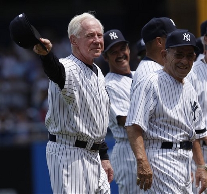
Whitey Ford was among the former Yankees to play in the Old Timer’s game on Saturday. —Vince
Tired of seeing annoying ads (like this one!) on Uni Watch? There’s a simple solution: Join Uni Watch Plus. You’ll get an ad-free site experience, plus exclusive access to our UW+ discussion forums, push notifications whenever a new blog post has been published, a special UW+ badge accompanying all your comments on the blog, and a 20% discount on our Teespring merchandise.
Already a member? Sign in here.
Whitey Ford was among the former Yankees to play in the Old Timer’s game on Saturday. —Vince
Good to see Homer Bush back yesterday… he’s what? 21?
Mike Timlin is now using a link glove.
[quote comment=”115428″]Good to see Homer Bush back yesterday… he’s what? 21?[/quote]
hes 34
[quote comment=”115429″]Mike Timlin is now using a link glove.[/quote]
hes always used a camoflauge under armour that u can see but i dont have any pics yet
[quote comment=”115467″][quote comment=”115429″]Mike Timlin is now using a link glove.[/quote]
hes always used a camoflauge under armour that u can see but i dont have any pics yet[/quote]
Yeah and he often wears a camo Red Sox hat during interviews, but the glove is a bit far.
that glove is hideous…does it say franklin along it?
I was surprised by the lack of stirrups in the Yankee old timers game. The only one off the top of my head I remember wearing them was Dr Bobby Brown
[quote comment=”115480″]that glove is hideous…does it say franklin along it?[/quote]
So is his pitching!
=/
Mike Timlin is a politically-conservative guy, which is just fine by me. He’s worn a camo t-shirt before, also. And with those high “Red Sox,” he is a totally cool dude!
[quote comment=”115429″]Mike Timlin is now using a link glove.[/quote]
I’m mildly surprised he’s being allowed to use it… I guess the umpires have decided that the “camo” is subtle enough not to be considered a “distraction” to the hitter, under the same rule that forced pitchers to ditch those gawd-awful Nike “dot-matrix” sleeves.
If Timlin wants a “shout-out” to members of our Armed Forces, I’m certainly on board with that… but one wonders what howls of outrage woulda come from Billy Martin in the Yankee dugout! ;-)
[quote comment=”115487″]Mike Timlin is a politically-conservative guy, which is just fine by me. [/quote]
Supporting the troops is neither conservative nor liberal – it is simply American.
This does seem to go against the spirit of the law, if not the letter. Not to mention one more way for a player to make his team’s uniform less uniform.
Individual political statements do not belong on a player’s uniform. Period. Not even the political statements with which I agree.
On the cap he wears for press conferences, what we wears in locker-room interviews, those are all the place for him to put his stamp. A team’s uniform is about eliminating all individual expression and joining something bigger than one’s self. Or ought to be. It once was, in a time not too long ago when players put the team before their own egos.
Bravo for the high socks, but a solid boo for altering the classic Red Sox uniform to satisfy his own ends.
Whitey Ford was among the former Yankees to play in the Old Timer’s game on Saturday. –Vince
Is that a gray underbill?
With all this camo talk has anyone checked out the MLL allstar game they are all wearing camo jerseys. These 40 jerseys are the only ones that will ever be made and will be auctioned off on the MLL’s website. And newbalance will match the earnings to be given to a charity.
Looks like the “oldtimers” are wearing new eras “new timer’s” hats with the black underbill
If you look past the glove for a quick second, look at the big smudge on his cap brim. Is it just an awkward shadow or glare or could he be doing a little doctoring while he adjusts his hat.
News about the Flyers new jerseys from their beat writer:
“About those new NHL sweaters – or jerseys as so many people now call them … If you log onto the Flyers website link and click onto “SHOP†you can place an order now. The jerseys will come in road white and home black. You can also order the practice jersey in orange. I am told the new look only varies slightly from the older-style sweaters”
link
The New NHL jerseys will cost $350 for an authentic:
link
Speaking of camouflage, is anybody watching the Pro Lacrosse all-star game on ESPN 2? Is that really camouflage–orange (officially “sand”) and green? Hideous! The sand looks like they fell sideways on a clay tennis court, and the green looks like an overgrowth of kudzu. And, if it’s not enough of a treat to see them on tv, you can also win one of them in a silent auction to be held later! A nice tribute gone awry.
During the Cubs-Pirates game today Bob Brenley and Len Kasper had a nice little conversation about the sunglasses the Cubs were wearing. The camera showed all the player’s glasses on the diamond. It was pretty cool. Only Soriano had the flip downs, the rest were wrap arounds.
[quote comment=”115498″]This does seem to go against the spirit of the law, if not the letter. Not to mention one more way for a player to make his team’s uniform less uniform.
A team’s uniform is about eliminating all individual expression and joining something bigger than one’s self. Or ought to be. It once was, in a time not too long ago when players put the team before their own egos.
Bravo for the high socks, but a solid boo for altering the classic Red Sox uniform to satisfy his own ends.[/quote]
Does that also go for when “Manny is being Manny”? He is a disgrace.
I’ve been finding a lot of “authentic” hats on eBay…they look exactly correct, except for silver brims. I have spotted these silver brims on Indians, Braves, White Sox, and Orioles hats. Given that these hats are all dated as 1999, is it possible that these are “Turn Ahead the Clock” hats?
(I’ll follow up with links shortly, but not now: I don’t want this to get eaten up by the spam filter.)
[quote comment=”115523″]I’ve been finding a lot of “authentic” hats on eBay…they look exactly correct, except for silver brims. I have spotted these silver brims on Indians, Braves, White Sox, and Orioles hats. Given that these hats are all dated as 1999, is it possible that these are “Turn Ahead the Clock” hats?
(I’ll follow up with links shortly, but not now: I don’t want this to get eaten up by the spam filter.)[/quote]
link
Has anyone seen the FOX commercial for the All-Star game? in the last seen for half a second a fan in a kyak has on a red “American” jersey. If this is the All-Star jersey YUCK! it’ll be bad
mike timlin just came in. he’s wearing that ugly camo glove again.
I haven’t seen the commercials for the All Star game yet, but if you go to the MLB website, you can order the workout day jerseys(used in batting practice, home run derby, etc.)
The bad news is that they decided to go with the cool base (pit stain) template, again. link is the American League jersey. And link is the National League Jersey.
Personally, I hate those fonts. And the Golden Gate bridge motif would be cool, but in a sea of small letters, a huge one just looks awkward. Or is that just me? I just can’t stand these jerseys in general. Almost makes me thrilled we once saw link
[quote comment=”115531″]I haven’t seen the commercials for the All Star game yet, but if you go to the MLB website, you can order the workout day jerseys(used in batting practice, home run derby, etc.)
The bad news is that they decided to go with the cool base (pit stain) template, again. link is the American League jersey. And link is the National League Jersey.
Personally, I hate those fonts. And the Golden Gate bridge motif would be cool, but in a sea of small letters, a huge one just looks awkward. Or is that just me? I just can’t stand these jerseys in general. Almost makes me thrilled we once saw link[/quote]
It still looks to me like “Nathonal.” At least the National league got the darker jerseys this time.
[quote comment=”115532″][quote comment=”115531″]I haven’t seen the commercials for the All Star game yet, but if you go to the MLB website, you can order the workout day jerseys(used in batting practice, home run derby, etc.)
The bad news is that they decided to go with the cool base (pit stain) template, again. link is the American League jersey. And link is the National League Jersey.
Personally, I hate those fonts. And the Golden Gate bridge motif would be cool, but in a sea of small letters, a huge one just looks awkward. Or is that just me? I just can’t stand these jerseys in general. Almost makes me thrilled we once saw link[/quote]
It still looks to me like “Nathonal.” At least the National league got the darker jerseys this time.[/quote]
And why are the numbers in Cubs font, when the game is in the Giants’ backyard?
the fox commercial is interesting for another reason – Roy Halladay is in it and he didn’t make the team!
[quote comment=”115524″][quote comment=”115523″]I’ve been finding a lot of “authentic” hats on eBay…they look exactly correct, except for silver brims. I have spotted these silver brims on Indians, Braves, White Sox, and Orioles hats. Given that these hats are all dated as 1999, is it possible that these are “Turn Ahead the Clock” hats?
(I’ll follow up with links shortly, but not now: I don’t want this to get eaten up by the spam filter.)[/quote]
link[/quote]
Woo! I owned the adjustable version of that hat! Black and silver is easily my favorite color (or shade) combination, and that was back in the days when I liked the O’s (I was too young to realize that Angelos had no idea what he was doing).
Strange deal in Chicago, as the Sox are wearing black and the Twins are wearing dark blue. The worst part is that it’s at least 90 degrees and sunny…those guys must be dying out there.
[quote comment=”115534″]the fox commercial is interesting for another reason – Roy Halladay is in it and he didn’t make the team![/quote]
Roger Clemens was in last year’s commercial and didn’t make the team.
This goes back to Paul’s column showing players in uniforms we forgot about (like Curt Schilling as an Astro). Here’s former Oklahoma great QB link in the link (well, almost).
Chance, it sounds like you have more of a problem with Timlin being a patriotic-type guy, then you do with “uniformity.” Also, the “ego problem” appears to be yours, not Timlin’s.
Futures Game on ESPN. Looks like the only option for the young kids get is the two-flap batting helmets. Cool-Flo model with the Futures Game logo on front. Looking good to me. World and USA jerseys look the crappy BP unis the major leaguers use. Boring.
[quote comment=”115487″]Mike Timlin is a politically-conservative guy, which is just fine by me. He’s worn a camo t-shirt before, also. And with those high “Red Sox,” he is a totally cool dude![/quote]
I’m not sure it’s a political statement. As far as I know his camo shirt was his lucky shirt because he is an avid hunter. I could be wrong on that, but that’s what I remember.
I am watching the Phils play the Rockies and the announcers pointed out Jimmy Rollins’ new look. He brought up his pants and has some new cleats. Looks really different from what I usually see on him. Doesn’t look right.
I just found a blog entry back on June 28, 2006 that mentions Timlin’s Camo glove. Look link and scroll down to where it says “Rollin” (with a picture of Jon Lester). Is it possible he’s been wearing this glove for over a year and we all missed it?
link
carolina hurricanes white jersey (blah, it was a busy jersey before, now they’re getting experimental? i love the idea…but not for this jersey)
link
senators new logo, a slight change from this
link
personally, i think it’s an awesome logo…but it doesn’t look hockey-ish, and i think it’ll look weird on a jersey…maybe it’s just me
anybody watching the futures game notice the microsoft windows error beep that keeps coming through? the first time it happened, i thought that i was just hearing things, but i’ve caught it like 6 times now.
link from June 25.
[quote comment=”115557″]anybody watching the futures game notice the microsoft windows error beep that keeps coming through? the first time it happened, i thought that i was just hearing things, but i’ve caught it like 6 times now.[/quote]
nevermind… it’s just the noise that it makes each time that the bottm line starts over.
Phillies broadcast just reported that Ramon Henderson has modified a Phillies hat to include the VUK tribute patch to wear while pitching in the home run derby tomorrow night.
[quote comment=”115524″][quote comment=”115523″]I’ve been finding a lot of “authentic” hats on eBay…they look exactly correct, except for silver brims. I have spotted these silver brims on Indians, Braves, White Sox, and Orioles hats. Given that these hats are all dated as 1999, is it possible that these are “Turn Ahead the Clock” hats?
(I’ll follow up with links shortly, but not now: I don’t want this to get eaten up by the spam filter.)[/quote]
link[/quote]
You are correct, sir – the O’s hat is indeed a TATC cap.
[quote comment=”115551″]Chance, it sounds like you have more of a problem with Timlin being a patriotic-type guy, then you do with “uniformity.” Also, the “ego problem” appears to be yours, not Timlin’s.[/quote]
Simple rule, people: Critique each other’s arguments, not each other. No personal invective. And that means no comments like the one quoted above.
I was listening to the end of the Mets-Astros game on the radio last night (while driving home from the Tigers-Red Sox game), and during the 16th inning, Howie and Tom were laughing about a teddy bear that Keith Hernandez brought into the TV booth, saying things like, “I can bring a teddy bear into the booth, I’m Keith Hernandez”. It was allegedly between Keith and Gary Cohen. Is there visual evidence of this bear? The radio guys didn’t elaborate much in terms of description. Was it wearing a “Vets” uniform?
Interesting non uniform related note here, but did anyone else watching the Rockies and the 9,999 loss Phillies notice how the Phillie players jumped out and helped put the tarp on the field during the rain delay? High class move there, and they jumped ahead by three soon afterwards. Good baseball karma move.
[quote comment=”115577″]Interesting non uniform related note here, but did anyone else watching the Rockies and the 9,999 loss Phillies notice how the Phillie players jumped out and helped put the tarp on the field during the rain delay? High class move there, and they jumped ahead by three soon afterwards. Good baseball karma move.[/quote]
Yeah I liked Harry Kalas’ comment on that. “I have never been more proud to be part of this organization then today.”
[quote comment=”115429″]Mike Timlin is now using a link glove.[/quote]
That’s sweet! Where can I get one?
[quote comment=”115482″]I was surprised by the lack of stirrups in the Yankee old timers game. The only one off the top of my head I remember wearing them was Dr Bobby Brown[/quote]
Youre right, that was it,
I was there and I was thinking uniwatch would not be happy here lol
[quote comment=”115592″][quote comment=”115482″]I was surprised by the lack of stirrups in the Yankee old timers game. The only one off the top of my head I remember wearing them was Dr Bobby Brown[/quote]
Youre right, that was it,
I was there and I was thinking uniwatch would not be happy here lol[/quote]
Also they all had adidas cleats, a nice sponsor move lol
[quote comment=”115534″]the fox commercial is interesting for another reason – Roy Halladay is in it and he didn’t make the team![/quote]
Same goes for Jason Bay!
Nice to see Whitey Ford again. When are the Yankees going to sign him?
[quote comment=”115593″][quote comment=”115592″][quote comment=”115482″]I was surprised by the lack of stirrups in the Yankee old timers game. The only one off the top of my head I remember wearing them was Dr Bobby Brown[/quote]
Youre right, that was it,
I was there and I was thinking uniwatch would not be happy here lol[/quote]
Also they all had adidas cleats, a nice sponsor move lol[/quote]
I have pics of Brown’s stirrups (and Bullet Bob Turley’s mismatched pant leg heights) but my computer with the ability to download my digital camera pics is on the fritz. I should have them up early tomorrow when I get to work.
It was interesting that Bobby Murcer wore #1 yesterday (since retired for Billy Martin) instead of #2, which he wore in the latter years of his career with the Yanks.
another point about the all-star game commercials…. both the national league players and american league players on on the trolleys in their home whites. obviously the americans should be in their away colors, as they are away.
Does anyone want that Quebec Nordiques jersey that was never worn in 1996? Only $160. Found Here: link (scroll down a bit)
Here’s a direct link to what the lettering would’ve looked like:
link
link
^^^^^^^^^^^^^
Also found here:
link
Timlin’s camouflage glove has been talked about before on here. Definitely not something we missed, as for it being “patriotic” I wouldn’t go that far. It certainly is not reason for any type of heated debate on here. A few of the Red Sox just happen to be rednecks and like to wear camo undershirts, gloves and even camo Phiten necklaces.
This is an interesting looking QMJHL Lemieux jersey:
link
[quote comment=”115639″]Timlin’s camouflage glove has been talked about before on here. Definitely not something we missed, as for it being “patriotic” I wouldn’t go that far. It certainly is not reason for any type of heated debate on here. A few of the Red Sox just happen to be rednecks and like to wear camo undershirts, gloves and even camo Phiten necklaces.[/quote]
Here is a mention of Timlin’s glove from an link
[quote comment=”115532″][quote comment=”115531″]It still looks to me like “Nathonal.” At least the National league got the darker jerseys this time.[/quote]
Why would they make the word National look lispy for a game held in San Franthisco?
[quote comment=”115640″]This is an interesting looking QMJHL Lemieux jersey:
link
That’s the Laval Titan. I always thought that 80s 3D L was a simple yet interesting logo. Nothing too fancy or over the top (link, I was talking to you until you thankfully moved to Niagra Falls).
BTW, anyone know why Whitey was wearing long sleeves underneath his uni? Seemed odd, its a hot day, everyone just has a tee or going sans undershirt and Whitey is dressed like its a cool spring/autum afternoon.
[quote comment=”115551″]Chance, it sounds like you have more of a problem with Timlin being a patriotic-type guy, then you do with “uniformity.” Also, the “ego problem” appears to be yours, not Timlin’s.[/quote]
Nope, not at all. I’m as patriotic as the next fella, and I have relatives in uniform. The service uniform, I mean.
Somebody asked above about Manny being Manny – I have a problem with anybody who makes alterations to a uniform, or wears personalized accessories.
That goes for Roger Clemens and his silly glove patches, everyone who wears the horrible Nike dots, and Timlin’s silly camo.
So, is there NO ROOM for individuality? And if so, what?
Add the AAA Omaha Royals to the list of minor league teams that appear to require stirrups for their players. I’m watching them play the Round Rock Express right now and every single Omaha player is wearing high sock stirrups with a small amount of white sanitary sock showing underneath.
[quote comment=”115583″][quote comment=”115577″]Interesting non uniform related note here, but did anyone else watching the Rockies and the 9,999 loss Phillies notice how the Phillie players jumped out and helped put the tarp on the field during the rain delay? High class move there, and they jumped ahead by three soon afterwards. Good baseball karma move.[/quote]
Yeah I liked Harry Kalas’ comment on that. “I have never been more proud to be part of this organization then today.”[/quote]
I definitely can’t feel bad that the Rockies lost today after that move. Hopefully Paul mentions it tomorrow, and everyone tells their friends, because that kind of thing really makes you want the team to do well. I guess I’ll be a fan for the Phillies after this; well done men, well done.
link.
[quote comment=”115651″]So, is there NO ROOM for individuality? And if so, what?[/quote]
In a uniform? No. By definition. That’s the whole point.
The extent of individuality is, or ought to be, limited to adding the player’s last name across the shoulders, for teams that so choose.
[quote comment=”115508″]Looks like the “oldtimers” are wearing new eras “new timer’s” hats with the black underbill[/quote]
Not too surprising – I seem to recall that the Old-Timers always wear the “modern” Yankee uniform, as strange as that phrase may seem.
They all have the Cory Lidle black armband that the club is wearing this season….
Just got back from the All Star Weekend Fan Fest in San Francisco. They had a great display of uniforms on loan from the baseball hall of fame, the best one being a link. There was also a display of link. Closer views link and link.
Here are some more pictures from the uniform display: link, link, link, link, and link.
[quote comment=”115556″]
link
senators new logo, a slight change from this
link
personally, i think it’s an awesome logo…but it doesn’t look hockey-ish, and i think it’ll look weird on a jersey…maybe it’s just me[/quote]
I think that’s a major upgrade. Don’t know – I think it’ll look really sharp on the front of a sweater.
Reportedly, the Senators are revamping the 2D logo as well (for use as an alternate?).
I saw on the local news that the Flyers first round pick Van Riemsdyk is wearing John Leclair’s old number when he was here, #10. I also saw our pick last year Steve Downie wearing #25, Keith “Suprimeau”‘s number. Not to happy about that I love both of them.
link of just-run-from-the-game Blanton in the M’s-A’s game today has generated some discussion on the Mariners blog link. i watched the MLB replay and can’t find any indication that Blanton had somehow affixed his lid to his glove… just a weird instance of timely photography, apparently. what i can’t figure out is why his cap would be flying off his head at that moment, to his glove-hand side. funky.
Why are people saying Timlin is altering the uniform?
First of all if it’s a camo undershirt, it’s not likely to be that visible. If he wears a long sleeve jersey, then it’s red and there’s no problem at all.
As far as the glove goes, it’s not really art of the uniform. And as long as the pattern is not distracting (which it’s really not unless you view it up close), it’s fine to be used.
At least it’s not an obnoxious white patch like a certain backstabbing Rocket wears.
[quote comment=”115572″][quote comment=”115551″]Chance, it sounds like you have more of a problem with Timlin being a patriotic-type guy, then you do with “uniformity.” Also, the “ego problem” appears to be yours, not Timlin’s.[/quote]
Simple rule, people: Critique each other’s arguments, not each other. No personal invective. And that means no comments like the one quoted above.[/quote]
once again this is uniwtch not MORALITY watch!
[quote comment=”115532″][quote comment=”115531″]I haven’t seen the commercials for the All Star game yet, but if you go to the MLB website, you can order the workout day jerseys(used in batting practice, home run derby, etc.)
The bad news is that they decided to go with the cool base (pit stain) template, again. link is the American League jersey. And link is the National League Jersey.
Personally, I hate those fonts. And the Golden Gate bridge motif would be cool, but in a sea of small letters, a huge one just looks awkward. Or is that just me? I just can’t stand these jerseys in general. Almost makes me thrilled we once saw link[/quote]
It still looks to me like “Nathonal.” At least the National league got the darker jerseys this time.[/quote]
The AL ones look like AmeriTan to me. I don’t really see how this is “Cubs font”. Example?
I think the Giants jerseys have one of the coolest fonts in the game. Why not apply them to the All-Star BP jerseys?
[quote comment=”115673″]Just got back from the All Star Weekend Fan Fest in San Francisco. They had a great display of uniforms on loan from the baseball hall of fame, the best one being a link. There was also a display of link. Closer views link and link.
Here are some more pictures from the uniform display: link, link, link, link, and link.[/quote]
Those are great pics. I imagine, though, that the Phillies jersey in the photo would belong to Steve Carlton, as he wore number 32. Mike Schmidt wore number 20. If the people running the display made that mistake it’s indefensable.
BTW, judging by what the kids were wearing for the futures game, it looks like the Mets All-Stars will be going with the black hat, jersey, and socks with solid white pants. That’s disappointing.
You know Paul – I feel your purple bias is seeing a bit of overkill as it pertains to the membership program. I understand your hatred for it, and I think in most cases it’s warranted – such as the Rockies, old D-backs, Raptors, and various other expansion atrocities, (remember the first Devil Rays jerseys?! No purple involved there, but plenty of hideousness) etc.
Unfortunately (as far as you’re concerned), I attended a college that features purple as a primary uniform color, and has for decades. Despite (if you say so), our reliance on purple, the U of W often features some of the classiest sports uniforms on the field. Our football team, with solid matte purple unis over gold pants with gold helmets with but a simple “W” on the side? The (pre-team Nike) basketball unis (save for the gold ats, maybe)?
After all, under the current system, those that want the replication of the atrocity of a uniform sported by the Oregon (as brought to you by Nike) Ducks will be accomodated, but alas, we por Huskies will not.
Anyway, my long winded point is that I’ve been reading Uni Watch since its inception, and I’d love to join the club, but unfortunately the only team I feel a strong enough tie to to choose is UW. But I guess I can’t get a purple-oriented card.
If you feel like you can make an exception for those of us who might bleed a little purple, be it for those of us who moved too many times as a kid to make any real connection to any pro franchise, or perhaps even the 15 year old who was born in Denver and simply doesn’t know any better, please let me know.
Respectfully Yours…
[quote comment=”115718″]You know Paul – I feel your purple bias is seeing a bit of overkill as it pertains to the membership program. I understand your hatred for it, and I think in most cases it’s warranted – such as the Rockies, old D-backs, Raptors, and various other expansion atrocities, (remember the first Devil Rays jerseys?! No purple involved there, but plenty of hideousness) etc.
Unfortunately (as far as you’re concerned), I attended a college that features purple as a primary uniform color, and has for decades. Despite (if you say so), our reliance on purple, the U of W often features some of the classiest sports uniforms on the field. Our football team, with solid matte purple unis over gold pants with gold helmets with but a simple “W” on the side? The (pre-team Nike) basketball unis (save for the gold ats, maybe)?
After all, under the current system, those that want the replication of the atrocity of a uniform sported by the Oregon (as brought to you by Nike) Ducks will be accomodated, but alas, we por Huskies will not.
Anyway, my long winded point is that I’ve been reading Uni Watch since its inception, and I’d love to join the club, but unfortunately the only team I feel a strong enough tie to to choose is UW. But I guess I can’t get a purple-oriented card.
If you feel like you can make an exception for those of us who might bleed a little purple, be it for those of us who moved too many times as a kid to make any real connection to any pro franchise, or perhaps even the 15 year old who was born in Denver and simply doesn’t know any better, please let me know.
Respectfully Yours…[/quote]
This is the best entry that I have seen on the subject. I graduated from Holy Cross and I’m in the same boat. We wear purple the way purple should be worn – with class?
>Anyway, my long winded point is that I’ve been reading Uni Watch since its inception, and I’d love to join the club, but unfortunately the only team I feel a strong enough tie to to choose is UW. But I guess I can’t get a purple-oriented card.
I thought college squads weren’t available, period?
The AL ones look like AmeriTan to me. I don’t really see how this is “Cubs fontâ€Â. Example?
The font used for the numbers seems to be that used by the Cubs.
[quote comment=”115762″]The AL ones look like AmeriTan to me. I don’t really see how this is “Cubs fontâ€Â. Example?
The font used for the numbers seems to be that used by the Cubs.[/quote]
The Giants have a perfectly good font of their own, but link.
Do my eyes deceive me, or are the pinstripes on Whitey’s uniform doubled?
[quote comment=”115718″]Unfortunately (as far as you’re concerned), I attended a college that features purple as a primary uniform color, and has for decades. Despite (if you say so), our reliance on purple, the U of W often features some of the classiest sports uniforms on the field. Our football team, with solid matte purple unis over gold pants with gold helmets with but a simple “W” on the side? The (pre-team Nike) basketball unis (save for the gold ats, maybe)?[/quote]
eloquently stated. i think it’s a moot point as to the membership cards (no college), but as a Seattle-area native and lifelong UW fan i am thankful for the defense of a great school’s color scheme ‘despite’ the use of purple.
the combination of purple and gold is classic and distinctive as far as UW is concerned, and goes back all the way to 1892. the combination was indebted to the first stanza of Lord Byron’s The Destruction of Sennacherib:
The Assyrian came down like the wolf on the fold,
And his cohorts were gleaming in purple and gold;
And the sheen of their spears was like stars on the sea,
When the blue wave rolls nightly on deep Galilee.
and who but a link would argue that our Apple Cup rivals actually look link?
therefore, on behalf of Dawgs everywhere, i hereby formally request an exception be made for the purple-and-gold-clad-since-1892 University of Washington Huskies.
thank you. Lakers and Vikings fans: you’re on your own.
“Supporting the troops is neither conservative nor liberal – it is simply American.”
not really
[quote comment=”115806″][quote comment=”115762″]The AL ones look like AmeriTan to me. I don’t really see how this is “Cubs fontâ€Â. Example?
The font used for the numbers seems to be that used by the Cubs.[/quote]
The Giants have a perfectly good font of their own, but link.[/quote]
Right… I noticed the numbers were in Cubs font. I thought the commenter was talking about the lettering. Oh well…
commentor? commentator? haha, whatever…