By Vince Grzegorek
By now most of you have probably heard about Scott Proctor’s equipment bonfire after Saturday night’s game at Yankee Stadium. (In a world of cell phone cameras, no one got a picture of this? Come on!)
Usually it’s the other way around, with the fans burning a jersey in effigy. But Proctor is the latest example of an athlete who, faced with the proverbial last straw, decides to hold an imprompty uniform cremation ceremony. Let’s take a look at some other torch bearers (pun intended) who’ve used their uniforms as tinder.
- In 1982, Frank LaCorte of the Houston Astros set his #31 uniform on fire after a game in which he walked the bases loaded in a relief appearance. Why? The 31 reminded him of a 3-1 count.
- Jose Mesa claimed last year that he’d matured throughout his years in the big leagues. His explanation: “I used to rip my uniform and everything. I’d throw the shoes in the garbage, I’d burn the hat.”
- Ernie Broglio supposedly burned his entire uniform in 1966 after taking too much heat from his teammates and the Cubs fans for his dismal performance.
- According to this page, “Toronto fans were particularly harsh with [Damaso] Garcia, especially after he burned his uniform in the clubhouse after one of his poorer performances.”
- Former US National Team member Jeff Agoos didn’t react well to being cut from the 1994 World Cup squad and responded by torching his jersey (supposedly in a fireplace).
- Then there’s the most coordinated and entertaining uniform bonfire of all time: the actual bonfire held by the Denver Broncos in 1962 to forever rid themselves of their infamous vertically striped socks. (And according to Paul, ” This looks like any other bonfire photo but is really and truly the Broncos vertically striped socks bonfire [indeed it is — PL].”)
- Gino Odjick of the QMJHL didn’t do it himself, but according to this message board, his jersey was lit on fire by a fan during a game while Odjick was sitting in the penalty box. (And yes, it says he had to roll around on the ice to put it out.)
And just to give equal time to the opposite end of the temperature spectrum, Cardinals shortstop Brendan Ryan fell victim to a classic prank the other day when his uniform was frozen by some of his teammates (details here). When he tried to thaw it out with a hair drier, he ended up blowing a fuse and knocking out the power in Tony LaRussa’s office. At least he didn’t start a fire.
Over to you, Paul…
July Party Itinerary: I’ll be in St. Louis one week from today, July 10th, and will be convening a Uni Watch party for the occasion. Our venue will be McGurks — let’s shoot to meet there at 8pm.
Precisely two weeks later, on July 24th, Uni Watch will go international with our first-ever Canadian party, in Toronto. Festivities will commence at 8pm upstairs at the Imperial Pub and Library. And for those of you with stalker-ish tendencies, I am tentatively slated to “perform” the following evening at the Pontiac Quarterly, which is curated by Uni Watch Ontario bureau chief Liz Clayton, who’s a bit of a stalker herself.
Membership Update: I mailed out more membership kits yesterday and am now completely caught up with everything that’s been printed. So except for members King, Patterson, Lee, Bridgett, Versel, Brandt, Hart, and Eckensberger (whose cards have been designed but not yet printed — soon, soon), if your membership card is linked on the active roster and shown in the card gallery, then it’s either in your hands by now or on its way. As for the handful of you whose cards haven’t yet been designed, Scott’s working on those right now. And those of you who’ve joined at Level Four or above should expect to hear from Scott shortly regarding your logo designs.
We’re now up to 199 enrollees — not bad for the first month. Friendly reminder: All members who join by the end of July will have a special “Charter Member” designation added to their membership cards when they renew next year.
Uni Watch News Ticker: “I was at the Cedar Rapids Kernels game Friday night and saw a couple of things,” writes Joe Wagner. “First, the Kernels (class-A affiliate of the Anaheim Angels) wore special jerseys to pay tribute to veterans. They actually didn’t look that bad in person. They were playing the Kane County Cougers — an Oakland A’s farm team — and apparently the parent club requires their affiliates to wear white shoes as well. They looked awful, especially with the couple of guys who wore their pants high to show off the black socks.” … I’ve previously shown illustration templates of the new Texas A&M uniforms. Now, thanks to Glenn Stern, we have photos — look here, here, here, here, and here. … Ronnie Poore reports that there’s yet another movie in production featuring period uniforms. This one is Our Lady of Victory, based on girls’ basketball team from a Catholic school winning a championship in 1972. “Not much uniform detail in the photo gallery so far,” says Ronnie, “but the players do wear skirts [and striped tube socks! — PL]. Some shots of the real team, from the school’s web site, are here.” Yee-fucking-haw! … “During Glen Davis’s introduction to the Boston media, I saw that his left sleeve still had the designer tag that you ordinarily remove when you buy the suit,” writes Matt Englander. “I once did the same thing while wearing a new suit to a job interview. In the middle of the interview, and without missing a beat, the guy opened his drawer and handed me a pair of scissors to cut the thing off. Pretty mortifying.” … Good spot by Matt Mitchell, who writes: “Vince Young made an appearance last week at Ladainian Tomlinson’s annual summer football camp here at Baylor Stadium. I thought the Pro Bowl jersey was Young’s (I thought somebody else may have had dibs on No. 10), but if you look closely you can make out ‘McNair’ across his back, so this was apparently a shout-out to Vince’s boyhood idol, former Titans QB Steve McNair.” … Great find by Matt Olson, who stumbled across this page devoted to NCAA equipment trucks. … Aaron Peters recently attended a Myrtle Beach Pelicans game and got some nice pics, including this shot of an Astros-inspired throwback design that the team wore last year. … Great scene yesterday in New York, where the Rangers introduced new signees Chris Drury and Scott Gomez, both of whom were wearing No. 23 jerseys. Both players have worn 23 in the past, so they flipped a puck to determined who’d get to wear it with the Rangers. Drury won. Details here. … Lots of excitement in the soccer world yesterday, as the L.A. Galaxy’s new jersey was apparently leaked. … Classic moment during last night’s Mets/Rockies game, as the ever-alert Keith “I Love Keith Hernandez” Hernandez forcefully opined that MLB players “should wear their regular team uniforms” in the All-Star Game, “instead of those league uniforms.” When play-by-play man pointed out that the league jerseys are only worn during the home run derby, His Keithness replied, “Oh, that’s right.” I’d love to put Hernandez in the same booth with Ron Santo, but the space-time continuum might never recover.
Hey, just found your page and I never knew there were people out there like me who go crazy over unifroms. I intend to send out for a membership here by the end of the week. Great site and I will be reading all the time now, thanks.
P.S.- I was wondering if I joined I could get a ’79 pirates inspired card?
The Kernels’ jerseys are terrible. The stripes don’t line up, the sleeves look stupid, and the hat doesn’t match (though I’m sure that’s more of a budget issue). They look like a mid-90’s NBA jersey.
The Warriors have had their link with 2 of their 3 draft picks.
The Kernels’ jerseys are terrible. The stripes don’t line up, the sleeves look stupid, and the hat doesn’t match (though I’m sure that’s more of a budget issue). They look like a mid-90’s NBA jersey.
When I saw it was going to be a tribute to vets night, I was assuming we’d get camo unis like the Padres do. Maybe I was happy to no see that.
And yes, they wore their regular hats (which has an insipid new logo, IMHO). Their old logo was much better:
link
Compare their new uni here:
link
With last year’s here:
link
I much prefer last year’s.
The Dodgers had a bonfire, too. Back when they had white mesh BP caps (first or second year of that program, so … 99 or 2000?), Kevin Brown and the boys got sick of them, so they had a bonfire in one of the bullpens. No links yet, because I actually have things to do. Someone with more time/energy: go find it.
McGurk’s is cool, but it will get packed on the inside quick. The outside has plenty of room and a cool outdoor bar. I will try to make it with my orange 1971 era Astros hat.
Saw Transformers last night . . . Anthony Anderson’s character wears a red Clinton Portis Redskins jersey. Would have been much cooler had he been wearing, say, a Sam Huff throwback.
[quote comment=”112848″]Saw Transformers last night . . . Anthony Anderson’s character wears a red Clinton Portis Redskins jersey. Would have been much cooler had he been wearing, say, a Sam Huff throwback.[/quote]
Too bad he didn’t wear one of these Clinton Portis outfits:
link
link
I really like those Immaculata women’s basketball uniforms! Skirts look great; nice colors. These need to be brought back!
And they’re link
The USA Today Sports section yesterday featured an article on the rebound of former Cardinals phenom Rick Ankiel as an outfielder in the minors. They had a picture of him from his pitching days featuring the Cards striped stirrups and they were FAKE!
After a quick search, I found link shot that clearly shows him wearing the faux stirrups. Kinda weak, but still better than PJ pants, I guess.
[quote comment=”112841″]I was wondering if I joined I could get a ’79 pirates inspired card?[/quote]
Yes, we can do that.
[quote comment=”112850″][quote comment=”112848″]Saw Transformers last night . . . Anthony Anderson’s character wears a red Clinton Portis Redskins jersey. Would have been much cooler had he been wearing, say, a Sam Huff throwback.[/quote]
Too bad he didn’t wear one of these Clinton Portis outfits:
link
link
Hey…take it easy on Southeast Jerome & Sherrif Gonna Getcha. It’s been about all that Skins fans have had to smile about in 15 years!
link
I really like the new Galaxy jerseys, seems more modern. I always thought the old/current ones reminded me of a soccer jersey i would have seen in the 70’s.
[quote comment=”112861″]The USA Today Sports section yesterday featured an article on the rebound of former Cardinals phenom Rick Ankiel as an outfielder in the minors. They had a picture of him from his pitching days featuring the Cards striped stirrups and they were FAKE!
After a quick search, I found link shot that clearly shows him wearing the faux stirrups. Kinda weak, but still better than PJ pants, I guess.[/quote]
Ankiel always, ALWAYS wore the fake stirrups. Never wore the real thing.
[quote comment=”112861″]After a quick search, I found link shot that clearly shows him wearing the faux stirrups. Kinda weak, but still better than PJ pants, I guess.[/quote]
I don’t know… I’d rather see pajama pants than fake stirrups.
I LOVE that the link looks like the helmet! Add that to the list of link link.
Classic moment during last night’s Mets/Rockies game, as the ever-alert Keith “I Love Keith Hernandez†Hernandez forcefully opined that MLB players “should wear their regular team uniforms†in the All-Star Game, “instead of those league uniforms.†When play-by-play man pointed out that the league jerseys are only worn during the home run derby, His Keithness replied, “Oh, that’s right.†I’d love to put Hernandez in the same booth with Ron Santo, but the space-time continuum might never recover.
Paul,
While watching the Met’s game I heard the same thing but Keith redeemed himself when they started talking about football. He grew up a Chargers fan and said that he has a “special place in his heart” for the powder blue uni’s and wished that they would go back to them. All is forgiven.
[quote comment=”112869″]Classic moment during last night’s Mets/Rockies game, as the ever-alert Keith “I Love Keith Hernandez†Hernandez forcefully opined that MLB players “should wear their regular team uniforms†in the All-Star Game, “instead of those league uniforms.†When play-by-play man pointed out that the league jerseys are only worn during the home run derby, His Keithness replied, “Oh, that’s right.†I’d love to put Hernandez in the same booth with Ron Santo, but the space-time continuum might never recover.
Paul,
While watching the Met’s game I heard the same thing but Keith redeemed himself when they started talking about football. He grew up a Chargers fan and said that he has a “special place in his heart” for the powder blue uni’s and wished that they would go back to them. All is forgiven.[/quote]
I guess he doesn’t realize that they are going back to them this season, in a sense.
[quote comment=”112871″][quote comment=”112869″]Classic moment during last night’s Mets/Rockies game, as the ever-alert Keith “I Love Keith Hernandez†Hernandez forcefully opined that MLB players “should wear their regular team uniforms†in the All-Star Game, “instead of those league uniforms.†When play-by-play man pointed out that the league jerseys are only worn during the home run derby, His Keithness replied, “Oh, that’s right.†I’d love to put Hernandez in the same booth with Ron Santo, but the space-time continuum might never recover.
Paul,
While watching the Met’s game I heard the same thing but Keith redeemed himself when they started talking about football. He grew up a Chargers fan and said that he has a “special place in his heart” for the powder blue uni’s and wished that they would go back to them. All is forgiven.[/quote]
I guess he doesn’t realize that they are going back to them this season, in a sense.[/quote]
Not any more than they have been. They are still going to be worn only twice (maximum) during the season. He was just being nostalgic about the Raiders and Chargers (he grew up in California)
Now a better question is…why am I being a link apologist?
Didn’t Larry Brown burn Kansas’ red unis after losing to Duke in the 1985 Final Four?
[quote comment=”112878″][quote comment=”112871″][quote comment=”112869″]Classic moment during last night’s Mets/Rockies game, as the ever-alert Keith “I Love Keith Hernandez†Hernandez forcefully opined that MLB players “should wear their regular team uniforms†in the All-Star Game, “instead of those league uniforms.†When play-by-play man pointed out that the league jerseys are only worn during the home run derby, His Keithness replied, “Oh, that’s right.†I’d love to put Hernandez in the same booth with Ron Santo, but the space-time continuum might never recover.
Paul,
While watching the Met’s game I heard the same thing but Keith redeemed himself when they started talking about football. He grew up a Chargers fan and said that he has a “special place in his heart” for the powder blue uni’s and wished that they would go back to them. All is forgiven.[/quote]
I guess he doesn’t realize that they are going back to them this season, in a sense.[/quote]
Not any more than they have been. They are still going to be worn only twice (maximum) during the season. He was just being nostalgic about the Raiders and Chargers (he grew up in California)
Now a better question is…why am I being a link apologist?[/quote]
You’re right. For some reason, I was thinking the new Chargers unis had more powder blue than they actually do.
[quote comment=”112867″][quote comment=”112861″]After a quick search, I found link shot that clearly shows him wearing the faux stirrups. Kinda weak, but still better than PJ pants, I guess.[/quote]
I don’t know… I’d rather see pajama pants than fake stirrups.[/quote]
While the classic (read: real) stirrup look is always preferred, I’ll take just about anything over the “pajama” pants. Hell, even if you’re going to ditch the stirrups altogether and go with a full-length pant, at least have common decency to them tapered, not just baggy and drooping below the ankle. It just looks sloppy.
[quote comment=”112868″]I LOVE that the link looks like the helmet! Add that to the list of link link.[/quote]
Am I the only one that remembers the NCAA trucks being heavily discussed on this Uni Watch Blog in March 2007 when that link came out?
call me cray, and I know many don’t agree, but I prefer link to the new jersey. But I will admit that I like the new Crest better, more classic. I like the 70’s throwback “sash” style and prefer it to the cookie cutter Adidas template of the new…I guess it shows my age.
[quote comment=”112880″]Didn’t Larry Brown burn Kansas’ red unis after losing to Duke in the 1985 Final Four?[/quote]
i remember that, but it was 1986.
Now linkteam could have some interesting sweaters.
I like the 70’s throwback “sash†style and prefer it to the cookie cutter Adidas template of the new…I guess it shows my age.
I could do without the templated piping, but the color scheme and logo are nice. Besides, sash = link = wankers.
[quote comment=”112878″][quote comment=”112871″][quote comment=”112869″]Classic moment during last night’s Mets/Rockies game, as the ever-alert Keith “I Love Keith Hernandez†Hernandez forcefully opined that MLB players “should wear their regular team uniforms†in the All-Star Game, “instead of those league uniforms.†When play-by-play man pointed out that the league jerseys are only worn during the home run derby, His Keithness replied, “Oh, that’s right.†I’d love to put Hernandez in the same booth with Ron Santo, but the space-time continuum might never recover.
Paul,
While watching the Met’s game I heard the same thing but Keith redeemed himself when they started talking about football. He grew up a Chargers fan and said that he has a “special place in his heart” for the powder blue uni’s and wished that they would go back to them. All is forgiven.[/quote]
I guess he doesn’t realize that they are going back to them this season, in a sense.[/quote]
Not any more than they have been. They are still going to be worn only twice (maximum) during the season. He was just being nostalgic about the Raiders and Chargers (he grew up in California)
Now a better question is…why am I being a link apologist?[/quote]
Because you just never hear Keith Hernandez talking about Keith Hernandez or his appearances on “Seinfeld” or about just how important first base is defensively.
I much prefer the old Galaxy jersey, if only because it has less disgusting advertising on it.
Another lame attempt at uni-watch esque banter:
link
the other day, (week?) someone posted a great piece about pinstriped unis and how the template of the uni relates to the shoulder transition.
in watching last nights twins/yanks game, i was going nuts inside my head in viewing the twins pinstripe transition vs. that of the yankees. i guess i was wondering why every pinstriped team wouldnt use the same jersey template?
whomever this pinstriped poster was, could you either redirect me to the post, or repost it here?
that was really great stuff…
[quote comment=”112892″][quote comment=”112878″][quote comment=”112871″][quote comment=”112869″]Classic moment during last night’s Mets/Rockies game, as the ever-alert Keith “I Love Keith Hernandez†Hernandez forcefully opined that MLB players “should wear their regular team uniforms†in the All-Star Game, “instead of those league uniforms.†When play-by-play man pointed out that the league jerseys are only worn during the home run derby, His Keithness replied, “Oh, that’s right.†I’d love to put Hernandez in the same booth with Ron Santo, but the space-time continuum might never recover.
Paul,
While watching the Met’s game I heard the same thing but Keith redeemed himself when they started talking about football. He grew up a Chargers fan and said that he has a “special place in his heart” for the powder blue uni’s and wished that they would go back to them. All is forgiven.[/quote]
I guess he doesn’t realize that they are going back to them this season, in a sense.[/quote]
Not any more than they have been. They are still going to be worn only twice (maximum) during the season. He was just being nostalgic about the Raiders and Chargers (he grew up in California)
Now a better question is…why am I being a link apologist?[/quote]
Because you just never hear Keith Hernandez talking about Keith Hernandez or his appearances on “Seinfeld” or about just how important first base is defensively.[/quote]
Paul already yelled at me last week for my link quotes so I won’t get into that. But say you can say what you want about link, except that he’s works well with link and link and when I listen to a game on link I always enjoy the game and usually learn something about the history of the game as well.
More happenings in the CHL.
link
Supposed to say…
[quote comment=”112898″][quote comment=”112892″][quote comment=”112878″][quote comment=”112871″][quote comment=”112869″]Classic moment during last night’s Mets/Rockies game, as the ever-alert Keith “I Love Keith Hernandez†Hernandez forcefully opined that MLB players “should wear their regular team uniforms†in the All-Star Game, “instead of those league uniforms.†When play-by-play man pointed out that the league jerseys are only worn during the home run derby, His Keithness replied, “Oh, that’s right.†I’d love to put Hernandez in the same booth with Ron Santo, but the space-time continuum might never recover.
Paul,
While watching the Met’s game I heard the same thing but Keith redeemed himself when they started talking about football. He grew up a Chargers fan and said that he has a “special place in his heart” for the powder blue uni’s and wished that they would go back to them. All is forgiven.[/quote]
I guess he doesn’t realize that they are going back to them this season, in a sense.[/quote]
Not any more than they have been. They are still going to be worn only twice (maximum) during the season. He was just being nostalgic about the Raiders and Chargers (he grew up in California)
Now a better question is…why am I being a link apologist?[/quote]
Because you just never hear Keith Hernandez talking about Keith Hernandez or his appearances on “Seinfeld” or about just how important first base is defensively.[/quote]
Paul already yelled at me last week for my link quotes so I won’t get into that. But you can say what you want about link, but he does work well with link and link and when I listen to a game on link I always enjoy the game and usually learn something about the history of the game as well.[/quote]
[quote comment=”112862″][quote comment=”112841″]I was wondering if I joined I could get a ’79 pirates inspired card?[/quote]
Yes, we can do that.[/quote]
Thank you, my money order will be out this week.
[quote comment=”112897″]the other day, (week?) someone posted a great piece about pinstriped unis and how the template of the uni relates to the shoulder transition.
in watching last nights twins/yanks game, i was going nuts inside my head in viewing the twins pinstripe transition vs. that of the yankees. i guess i was wondering why every pinstriped team wouldnt use the same jersey template?
whomever this pinstriped poster was, could you either redirect me to the post, or repost it here?
that was really great stuff…[/quote]
Are you talking about link versus link?
I usually prefer the set in sleeves (creates a stronger shoulder line), but for pinstripes I think raglan looks much better, because you don’t have that awkward link look. Clean from all sides. Of course, link.
As for why not every team uses the exact same jersey template, would we really want them to? No other major sport requires all the teams to wear the exact same jersey cut.
Scott Gomez wore #11 with Team USA. However, since Messier’s number has been retired, that’s not going to happen. He wore #22 in the CHL All-Star, but defenseman Thomas Pock already wears #22.
#32 maybe?
[quote comment=”112897″]the other day, (week?) someone posted a great piece about pinstriped unis and how the template of the uni relates to the shoulder transition.
in watching last nights twins/yanks game, i was going nuts inside my head in viewing the twins pinstripe transition vs. that of the yankees. i guess i was wondering why every pinstriped team wouldnt use the same jersey template?
whomever this pinstriped poster was, could you either redirect me to the post, or repost it here?
that was really great stuff…[/quote]
I don’t remember the source of that original discussion. But what you’re basically describing is the difference between a link (which is what the Yankees use) and a set-in sleeve (which is what the Twins use). There are some non-pinstriped teams that use raglan sleeves as well (the Red Sox and Tigers, e.g.), but it’s not as noticeable if there are no pinstripes.
[quote comment=”112898″]you can say what you want about link, except that he’s works well with link and link…[/quote]
I respectfully but firmly disagree.
[quote comment=”112904″][quote comment=”112897″]the other day, (week?) someone posted a great piece about pinstriped unis and how the template of the uni relates to the shoulder transition.
in watching last nights twins/yanks game, i was going nuts inside my head in viewing the twins pinstripe transition vs. that of the yankees. i guess i was wondering why every pinstriped team wouldnt use the same jersey template?
whomever this pinstriped poster was, could you either redirect me to the post, or repost it here?
that was really great stuff…[/quote]
Are you talking about link versus link?
I usually prefer the set in sleeves (creates a stronger shoulder line), but for pinstripes I think raglan looks much better, because you don’t have that awkward link look. Clean from all sides. Of course, link.
As for why not every team uses the exact same jersey template, would we really want them to? No other major sport requires all the teams to wear the exact same jersey cut.[/quote]
yup thats exactly what i wanted!
i know that sports historically dont use the same template (heck in football there are many different jersey templates on the same team based on skill position).
and of course i wouldnt expect teams to use a universal cut. but when, in baseball, the raglan sleeves look so much better on a pinstriped uniform, why wouldnt all teams using pinstripes use the raglan sleeved template?
in this situation, yes i want these select teams to use that template.
I’ve posted the Minnesota high school hockey jerseys found hanging inside the Xcel Energy Center – well link are bunch more Minnesota jerseys that are not hanging inside “The X”.
Highlights include some all-time classics in Minnesota hockey, including the link, link, link, and link. Once again, I feel as though I should note that the link have always been the best looking team in the state of Minnesota (although not quite as nice since I no longer wear the uni!).
[quote comment=”112907″][quote comment=”112898″]you can say what you want about link, except that he’s works well with link and link…[/quote]
I respectfully but firmly disagree.[/quote]
Good thing we agree on the changes need for the uni’s then. DITCH THE BLACK.
Speaking of which…is the petition going to be back online soon?
I would tend to agree – as I said above, I think the raglan looks a lot better with pinstripes.
Drove me crazy in the early 1990s when the Brewers switched from pull-overs to button-ups, they lost the link. Even as a kid, link really bothered me.
[quote comment=”112911″]I’ve posted the Minnesota high school hockey jerseys found hanging inside the Xcel Energy Center – well link are bunch more Minnesota jerseys that are not hanging inside “The X”.
Highlights include some all-time classics in Minnesota hockey, including the link, link, link, and link. Once again, I feel as though I should note that the link have always been the best looking team in the state of Minnesota (although not quite as nice since I no longer wear the uni!).[/quote]
The best part is that they’re showing vintage jerseys and some teams haven’t changed them in years like Cloquet, Morehead and Blaine
[quote comment=”112904″]No other major sport requires all the teams to wear the exact same jersey cut.[/quote]
The RbK Edge NHL jersey is the same for all.
[quote comment=”112905″]Scott Gomez wore #11 with Team USA. However, since Messier’s number has been retired, that’s not going to happen. He wore #22 in the CHL All-Star, but defenseman Thomas Pock already wears #22.
#32 maybe?[/quote]
I would think that Pock would show respect to the seniority and give up #22 if Gomez wanted it. Should be interesting.
Was looking at the two #23 jerseys yesterday – could you tell if they were the new jerseys? I couldn’t – so if they were, that’s a good sign.
[quote comment=”112923″][quote comment=”112905″]Scott Gomez wore #11 with Team USA. However, since Messier’s number has been retired, that’s not going to happen. He wore #22 in the CHL All-Star, but defenseman Thomas Pock already wears #22.
#32 maybe?[/quote]
I would think that Pock would show respect to the seniority and give up #22 if Gomez wanted it. Should be interesting.
Was looking at the two #23 jerseys yesterday – could you tell if they were the new jerseys? I couldn’t – so if they were, that’s a good sign.[/quote]
Not new. There is no NHL shield at the neck.
[quote comment=”112923″][quote comment=”112905″]Scott Gomez wore #11 with Team USA. However, since Messier’s number has been retired, that’s not going to happen. He wore #22 in the CHL All-Star, but defenseman Thomas Pock already wears #22.
#32 maybe?[/quote]
I would think that Pock would show respect to the seniority and give up #22 if Gomez wanted it. Should be interesting.
Was looking at the two #23 jerseys yesterday – could you tell if they were the new jerseys? I couldn’t – so if they were, that’s a good sign.[/quote]
Seniority has little to do with a guy who came over from the Rangers’ biggest rival. If I were Pock, I’d be demanding some retribution (re: cash) if Gomez asks for his number.
It’s not like Gomez doesn’t have a few spare dollars to spend now.
Paul,
Is it just me or do Penn State’s Helmets look kind of I don’t know link
The Kane County Cougars look hideous in their uniforms – they wear white pinstripes at home with their white shoes but no socks are shown – they look ridiculous. Went to the game last week vs. the Burlington Bees – they wore their pantlegs up high – some even with some white sanitary showing. They looked like ballplayers – the Cougars looked (and played) like a joke. Just my 2 cents….
[quote comment=”112929″]Paul,
Is it just me or do Penn State’s Helmets look kind of I don’t know link[/quote]
Reminds me of link helmet
The worst helmet I’ve seen was worn by Orlandis Gary of the Broncos.
[quote comment=”112923″][quote comment=”112905″]Scott Gomez wore #11 with Team USA. However, since Messier’s number has been retired, that’s not going to happen. He wore #22 in the CHL All-Star, but defenseman Thomas Pock already wears #22.
#32 maybe?[/quote]
I would think that Pock would show respect to the seniority and give up #22 if Gomez wanted it. Should be interesting.
Was looking at the two #23 jerseys yesterday – could you tell if they were the new jerseys? I couldn’t – so if they were, that’s a good sign.[/quote]
Pock has seniority when it comes to wearing a Rangers jersey…
[quote comment=”112937″][quote comment=”112929″]Paul,
Is it just me or do Penn State’s Helmets look kind of I don’t know link[/quote]
Reminds me of link helmet[/quote]
That the Schutt DNA helmet, they’ve been wearing it for at least the past couple of years.
[quote comment=”112928″][quote comment=”112923″][quote comment=”112905″]Scott Gomez wore #11 with Team USA. However, since Messier’s number has been retired, that’s not going to happen. He wore #22 in the CHL All-Star, but defenseman Thomas Pock already wears #22.
#32 maybe?[/quote]
I would think that Pock would show respect to the seniority and give up #22 if Gomez wanted it. Should be interesting.
Was looking at the two #23 jerseys yesterday – could you tell if they were the new jerseys? I couldn’t – so if they were, that’s a good sign.[/quote]
Seniority has little to do with a guy who came over from the Rangers’ biggest rival. If I were Pock, I’d be demanding some retribution (re: cash) if Gomez asks for his number.
It’s not like Gomez doesn’t have a few spare dollars to spend now.[/quote]
I thought that the puck-flip was cute and lame at the same time.
It was odd, though, seeing Gomez in a Rangers’ jersey.
[quote comment=”112939″]The worst helmet I’ve seen was worn by Orlandis Gary of the Broncos.[/quote]
Ok, why?
When Michigan goes to bowl games, the football equipment truck gets a nice gigantic Christmas wreath affixed to the front grill. I think I have a picture around here somewhere of the Michigan and Nebraska trucks side by side at the Alamo Bowl.
[quote comment=”112944″]
It was odd, though, seeing Gomez in a Rangers’ jersey.[/quote]
Drury looked like he had just been drafted. The guy hasn’t aged in 20 years.
or in 18 yrs when he first BURST on the scene…
link
link
Someone explain to me why the Aggies now have silver in their uniforms. Yeah, it’s the silver anniversary of the 1957 team that won the Southwest Conference and had a Heisman Trophy winner, but that can’t be it.
The “girls” basketball team is the 1972 National Champion Imaculata Women’s Basketball team. They played before the NCAA even sanctioned women’s basketball and were the first ever women’s basketball powerhouse team. In the picture that Paul posted, former Penn State women’s coach Rene Portland is on the far left. Her politcal views however are to the far right.
[quote comment=”112907″][quote comment=”112898″]you can say what you want about link, except that he’s works well with link and link…[/quote]
I respectfully but firmly disagree.[/quote]
I Second That! Gary Cohen is fantastic, and Ron Darling is OK (a tad on the boring side) but I can do without Keith Hernandez
[quote comment=”112843″]The Warriors have had their link with 2 of their 3 draft picks.[/quote]
Forget the photo op with the guys click the next tab for the Warrior Girl tryouts and look at those socks. Also I like the new LA Galaxy unis, forget that the sponser is on the front thats how all soccer unis are.
[quote comment=”112944″][quote comment=”112928″][quote comment=”112923″][quote comment=”112905″]Scott Gomez wore #11 with Team USA. However, since Messier’s number has been retired, that’s not going to happen. He wore #22 in the CHL All-Star, but defenseman Thomas Pock already wears #22.
#32 maybe?[/quote]
I would think that Pock would show respect to the seniority and give up #22 if Gomez wanted it. Should be interesting.
Was looking at the two #23 jerseys yesterday – could you tell if they were the new jerseys? I couldn’t – so if they were, that’s a good sign.[/quote]
Seniority has little to do with a guy who came over from the Rangers’ biggest rival. If I were Pock, I’d be demanding some retribution (re: cash) if Gomez asks for his number.
It’s not like Gomez doesn’t have a few spare dollars to spend now.[/quote]
I thought that the puck-flip was cute and lame at the same time.
It was odd, though, seeing Gomez in a Rangers’ jersey.[/quote]
I guess Gomez didn’t like the playoffs interfering with his summer vacations, oh well he’ll have a couple of months more a year now to work on his golf game. He should have called Bobby Holik before he signed.
[quote comment=”112955″]Someone explain to me why the Aggies now have silver in their uniforms. Yeah, it’s the silver anniversary of the 1957 team that won the Southwest Conference and had a Heisman Trophy winner, but that can’t be it.[/quote]
Actually, it’s the GOLDEN anniversary. Silver = 25 years.
I like the photo of that jersey better than the mock-up.
Paul-
With the NFL folding NFL Europa last week this might be a good time to do a “tribute” to the WFL/NFL Europe with an overview of the good and bad uniforms used over the years.
Put me down for preferring the new Galaxy uni… especially the new crest. Far better than the old uni, which looked like a reject from the old NASL.
[quote comment=”112958″][quote comment=”112907″][quote comment=”112898″]you can say what you want about link, except that he’s works well with link and link…[/quote]
I respectfully but firmly disagree.[/quote]
I Second That! Gary Cohen is fantastic, and Ron Darling is OK (a tad on the boring side) but I can do without Keith Hernandez[/quote]
In my humble opinion, I enjoy Cohen and Darling together, but I think that Hernandez adds a level of stupidity at times and sheer brilliance at others. You can’t get the good without the bad, so I enjoy it when all three are in the booth together.
[quote comment=”112917″]is the [Ditch the Black] petition going to be back online soon?[/quote]
No. The point has been made.
Papelbon wears the old hat
link
[quote comment=”112969″][quote comment=”112917″]is the [Ditch the Black] petition going to be back online soon?[/quote]
No. The point has been made.[/quote]
… much like the point of sending Pedro Martinez the cheque that he didn’t cash.
What’s with the Mets organization? Do they not listen to their fans at all?!?
Just being a sarcastic jerk. Sorry Paul. ;o)
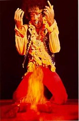
I don’t know if anyone’s said this yet but burning the Yankee uniform is the baseball equivalent of flag burning. Yeah, this is hyperbole, but he’s burning the uniform of Ruth, Gehrig, Mantle, Dimaggio, and other all-time greats. That uniform hasn’t changed in more than 70 years. If Proctor followed up his act with a comment like “I burned it because I’m not fit to wear it” and demoted himself to Scranton, that’d be different. But he called it a joke, and while I can’t speak for every Yankee fan I can say I find it bordering on the sacreligious.
Uh… a site re-design for the Baseball Hall of Fame seems to have Dressed to the Nines down and/or MIA??? I pray this just a bug for the moment!!!
Paul’s link (redirects to front page):
link
Link I had bookmarked (which shows error message):
link
Did the Yankees spend so much money on his contract that they couldn’t get Roger Clemens a uniform that fit properly?
[quote comment=”112974″]I don’t know if anyone’s said this yet but burning the Yankee uniform is the baseball equivalent of flag burning. Yeah, this is hyperbole, but he’s burning the uniform of Ruth, Gehrig, Mantle, Dimaggio, and other all-time greats. That uniform hasn’t changed in more than 70 years. If Proctor followed up his act with a comment like “I burned it because I’m not fit to wear it” and demoted himself to Scranton, that’d be different. But he called it a joke, and while I can’t speak for every Yankee fan I can say I find it bordering on the sacreligious.[/quote]
Proctor didn’t burn the uniform, just his equipment and hat.
did this get posted yet?
link
[quote comment=”112976″]Did the Yankees spend so much money on his contract that they couldn’t get Roger Clemens a uniform that fit properly?[/quote]
yes.
he has got to be in the top 5 of most overpaid players in mlb right now.
On the fire topic, don’t forget
its a shame that ray allen cant wear 21 for the celtics (its retired for bill sharman).
it would be neat to see on the floor at the same time,
allan ray 12
ray allen 21
[quote comment=”112979″][quote comment=”112976″]Did the Yankees spend so much money on his contract that they couldn’t get Roger Clemens a uniform that fit properly?[/quote]
yes.
he has got to be in the top 5 of most overpaid players in mlb right now.[/quote]
What, no special glove like he had for the 300 wins?
Oops
Disco Demolition Night
link
[quote comment=”112975″]Uh… a site re-design for the Baseball Hall of Fame seems to have Dressed to the Nines down and/or MIA??? I pray this just a bug for the moment!!!
Paul’s link (redirects to front page):
link
Link I had bookmarked (which shows error message):
link
Dressed to the Nines curator Tom Shieber is on vacation until July 13th. I suspect thing will be restored upon his return.
It seems the Oregon State Beavers are keeping up the tradition of Oregon football teams having really link. It almost looks they’re wearing bras or something.
[quote comment=”112984″][quote comment=”112975″]Uh… a site re-design for the Baseball Hall of Fame seems to have Dressed to the Nines down and/or MIA??? I pray this just a bug for the moment!!!
Paul’s link (redirects to front page):
link
Link I had bookmarked (which shows error message):
link
Dressed to the Nines curator Tom Shieber is on vacation until July 13th. I suspect thing will be restored upon his return.[/quote]
Thanks!
[quote comment=”112890″]I like the 70’s throwback “sash†style and prefer it to the cookie cutter Adidas template of the new…I guess it shows my age.
I could do without the templated piping, but the color scheme and logo are nice. Besides, sash = link = wankers.[/quote]
I disagree, the sash reminds me of link or link , which was used once and never seen again. Some nimrod at US Soccer thought link was a better looking third jersye…puke.
[quote comment=”112974″]I don’t know if anyone’s said this yet but burning the Yankee uniform is the baseball equivalent of flag burning. Yeah, this is hyperbole, but he’s burning the uniform of Ruth, Gehrig, Mantle, Dimaggio, and other all-time greats. That uniform hasn’t changed in more than 70 years. If Proctor followed up his act with a comment like “I burned it because I’m not fit to wear it” and demoted himself to Scranton, that’d be different. But he called it a joke, and while I can’t speak for every Yankee fan I can say I find it bordering on the sacreligious.[/quote]
Lighten Up, Francis
[quote comment=”112922″][quote comment=”112904″]No other major sport requires all the teams to wear the exact same jersey cut.[/quote]
The RbK Edge NHL jersey is the same for all.[/quote]
Actually not true. While the general paneling is the same on the new jerseys, I believe around the time of the All-Star game this past year RbK said they have a few different layout templates for the panels, so that it wouldn’t be cookie-cutter uniforms for each team.
Not withstanding, I think you’re thinking of the WNBA =P
Also, I saw in an e-mail I got from the Philadelphia Flyers mailing list that they will not reveal the look of the new uniform until September 16th, which I guess will be the first pre-season game.
[quote comment=”112889″]Now linkteam could have some interesting sweaters.[/quote]
I thought it would be pretty interesting to see that large “monster” logo on the front, but from what I hear, living just about an hour from Cleveland and being a huge hockey fan, they are putting the monster on the shoulder, and the M on the front. So it seems that the secondary logo is the primary logo on the jerseys, which will be odd.
On the Oregon State Football Uniforms, this is a quote from the article. You have to wonder if the author ever even saw the unis:
The new look is something we are proud of and provides us with a unique yet traditional appearance
Interesting little tid-bit. While reading the Denver Post, they mention the newly signed Ryan Smyth wears link because he was drafted in 1994 by Edmonton and that was the year he graduated high school.
[quote comment=”112992″][quote comment=”112890″]I like the 70’s throwback “sash†style and prefer it to the cookie cutter Adidas template of the new…I guess it shows my age.
I could do without the templated piping, but the color scheme and logo are nice. Besides, sash = link = wankers.[/quote]
I disagree, the sash reminds me of link or link , which was used once and never seen again. Some nimrod at US Soccer thought link was a better looking third jersye…puke.[/quote]
The Diplomats had a nice looking sash…
link
was this George Washington University uniform ever used or is it one of those bookstore models?
link
I said on Friday I’d get a picture of the Tribe-detailed Ford Mustang on display at the Jake, here it is:
link
[quote comment=”112894″]I much prefer the old Galaxy jersey, if only because it has less disgusting advertising on it.[/quote]
it doesnt, has the same sponsor, herbalife
[quote comment=”113010″]I said on Friday I’d get a picture of the Tribe-detailed Ford Mustang on display at the Jake, here it is:
link
Last year the Pirates gave away a boat, a snowmobile and a motorcycle in celebration for the All-Star game. I only got a picture of the motorcycle…
link
Heres a supposed prototype of what the vikings new jersey couldve looked like last year. Im glad they kept the horns.
link
[quote comment=”112958″][quote comment=”112907″][quote comment=”112898″]you can say what you want about link, except that he’s works well with link and link…[/quote]
I respectfully but firmly disagree.[/quote]
I Second That! Gary Cohen is fantastic, and Ron Darling is OK (a tad on the boring side) but I can do without Keith Hernandez[/quote]
I celebrate the days Fernandez has off and its just darling and cohen…. I like to think of Fernandez as the Marcelo Balboa of MLB.
[quote comment=”112992″][quote comment=”112890″]I like the 70’s throwback “sash†style and prefer it to the cookie cutter Adidas template of the new…I guess it shows my age.
I could do without the templated piping, but the color scheme and logo are nice. Besides, sash = link = wankers.[/quote]
I disagree, the sash reminds me of link or link , which was used once and never seen again. Some nimrod at US Soccer thought link was a better looking third jersye…puke.[/quote]
Cathy, seems liek we’re getting into it with the soccer talk but…. the red was never a third jersey, it was a tribut to Don’t Tread on Me and was worn only in a wamr up match for the 06 world cup. It hasn’t been worn since, and won’t be unless they bring it back. I do agree with you though, its a great jersey and I think should replace the blue jersey which is good, but not as good as DTOM
Can’t beat the Bruins link
[quote comment=”112974″]I don’t know if anyone’s said this yet but burning the Yankee uniform is the baseball equivalent of flag burning. Yeah, this is hyperbole, but he’s burning the uniform of Ruth, Gehrig, Mantle, Dimaggio, and other all-time greats. That uniform hasn’t changed in more than 70 years. If Proctor followed up his act with a comment like “I burned it because I’m not fit to wear it” and demoted himself to Scranton, that’d be different. But he called it a joke, and while I can’t speak for every Yankee fan I can say I find it bordering on the sacreligious.[/quote]
I hope you’re kidding. MORALITYWATCH is at it again!!!
[quote comment=”112946″][quote comment=”112939″]The worst helmet I’ve seen was worn by Orlandis Gary of the Broncos.[/quote]
Ok, why?[/quote]
Should be Olandis, but anyways I couldn’t get a pic of him wearing it, I’m on the work computer, (I swear these things are solar powered, and it’s a cloudy day), the helmet sat too low on his face, it covered his eyebrows, the front looked too large, he looked like a neanderthalshould see it.
[quote comment=”113008″][quote comment=”112992″][quote comment=”112890″]I like the 70’s throwback “sash†style and prefer it to the cookie cutter Adidas template of the new…I guess it shows my age.
I could do without the templated piping, but the color scheme and logo are nice. Besides, sash = link = wankers.[/quote]
I disagree, the sash reminds me of link or link , which was used once and never seen again. Some nimrod at US Soccer thought link was a better looking third jersye…puke.[/quote]
The Diplomats had a nice looking sash…
link
I have one of those Diplomats Jerseys….sweet. But, I grew up in DC going to their games (dating myself, I know), so I’m biased.
[quote comment=”113021″][quote comment=”112958″][quote comment=”112907″][quote comment=”112898″]you can say what you want about link, except that he’s works well with link and link…[/quote]
I respectfully but firmly disagree.[/quote]
I Second That! Gary Cohen is fantastic, and Ron Darling is OK (a tad on the boring side) but I can do without Keith Hernandez[/quote]
I celebrate the days Fernandez has off and its just darling and cohen…. I like to think of Fernandez as the Marcelo Balboa of MLB.[/quote]
It’s Hernandez man. His name is in the text you quoted. When Keith just started I didn’t really like him, but he’s grown on me. I don’t like it when the 3 of them are together though, cause Keith does try to out do Ron. But I like when it’s just Gary Cohen and one of them. I actually prefer the Hernandez/Cohen pairing to the Darling/Cohen pairing.
[quote comment=”113022″][quote comment=”112992″][quote comment=”112890″]I like the 70’s throwback “sash†style and prefer it to the cookie cutter Adidas template of the new…I guess it shows my age.
I could do without the templated piping, but the color scheme and logo are nice. Besides, sash = link = wankers.[/quote]
I disagree, the sash reminds me of link or link , which was used once and never seen again. Some nimrod at US Soccer thought link was a better looking third jersye…puke.[/quote]
Cathy, seems liek we’re getting into it with the soccer talk but…. the red was never a third jersey, it was a tribut to Don’t Tread on Me and was worn only in a wamr up match for the 06 world cup. It hasn’t been worn since, and won’t be unless they bring it back. I do agree with you though, its a great jersey and I think should replace the blue jersey which is good, but not as good as DTOM[/quote]
Patrick,
I’m a huge soccer fan. I loved the whole DTOM campaign (well, except for Dempsey’s rap video). At least we agree that the new third jersey needs to go…looks like the jersey my team of 6 and 7 year old girls wore a couple years ago.
[quote comment=”113021″][quote comment=”112958″][quote comment=”112907″][quote comment=”112898″]you can say what you want about link, except that he’s works well with link and link…[/quote]
I respectfully but firmly disagree.[/quote]
I Second That! Gary Cohen is fantastic, and Ron Darling is OK (a tad on the boring side) but I can do without Keith Hernandez[/quote]
I celebrate the days Fernandez has off and its just darling and cohen…. I like to think of Fernandez as the Marcelo Balboa of MLB.[/quote]
HERNANDEZ NOT FERNANDEZ
Just to get everyone in the link for the fourth. Festive, eh?
[quote comment=”112974″]I don’t know if anyone’s said this yet but burning the Yankee uniform is the baseball equivalent of flag burning. Yeah, this is hyperbole, but he’s burning the uniform of Ruth, Gehrig, Mantle, Dimaggio, and other all-time greats. That uniform hasn’t changed in more than 70 years. If Proctor followed up his act with a comment like “I burned it because I’m not fit to wear it” and demoted himself to Scranton, that’d be different. But he called it a joke, and while I can’t speak for every Yankee fan I can say I find it bordering on the sacreligious.[/quote]
You don’t burn the flag because people gave their lives defending what it represents. A Yankees uniform…sure has a lot of meaning to a lot of people, but not even on the same plane of existance as the US flag. I realize people are passionate about their teams, but let’s not trivialize teh flag that way, huh?
Anyone see link.
I thought you couldn’t participate in the HR Derby unless you were an All-star…? Anyone know if this has happened before?
[quote comment=”113025″][quote comment=”112946″][quote comment=”112939″]The worst helmet I’ve seen was worn by Orlandis Gary of the Broncos.[/quote]
Ok, why?[/quote]
Should be Olandis, but anyways I couldn’t get a pic of him wearing it, I’m on the work computer, (I swear these things are solar powered, and it’s a cloudy day), the helmet sat too low on his face, it covered his eyebrows, the front looked too large, he looked like a neanderthalshould see it.[/quote]
Here’s the best closeup of Olandis Gary I could find: link
What exactly is the criticism again? The helmet looks fine to me. Maybe it’s just not a great picture, but that’s all I got.
[quote comment=”113032″][quote comment=”112974″]I don’t know if anyone’s said this yet but burning the Yankee uniform is the baseball equivalent of flag burning. Yeah, this is hyperbole, but he’s burning the uniform of Ruth, Gehrig, Mantle, Dimaggio, and other all-time greats. That uniform hasn’t changed in more than 70 years. If Proctor followed up his act with a comment like “I burned it because I’m not fit to wear it” and demoted himself to Scranton, that’d be different. But he called it a joke, and while I can’t speak for every Yankee fan I can say I find it bordering on the sacreligious.[/quote]
You don’t burn the flag because people gave their lives defending what it represents. A Yankees uniform…sure has a lot of meaning to a lot of people, but not even on the same plane of existance as the US flag. I realize people are passionate about their teams, but let’s not trivialize teh flag that way, huh?[/quote]
yeah, and besides, we’d never let hideki irabu wear an american flag… the yankee uniform has been disgraced numerous times….
[quote comment=”113027″][quote comment=”113021″][quote comment=”112958″][quote comment=”112907″][quote comment=”112898″]you can say what you want about link, except that he’s works well with link and link…[/quote]
I respectfully but firmly disagree.[/quote]
I Second That! Gary Cohen is fantastic, and Ron Darling is OK (a tad on the boring side) but I can do without Keith Hernandez[/quote]
I celebrate the days Fernandez has off and its just darling and cohen…. I like to think of Fernandez as the Marcelo Balboa of MLB.[/quote]
It’s Hernandez man. His name is in the text you quoted. When Keith just started I didn’t really like him, but he’s grown on me. I don’t like it when the 3 of them are together though, cause Keith does try to out do Ron. But I like when it’s just Gary Cohen and one of them. I actually prefer the Hernandez/Cohen pairing to the Darling/Cohen pairing.[/quote]
wow, brain fart… I’m reading about Mets minor league prospects and posting about Hernandez at the same time…
[quote comment=”113034″][quote comment=”113025″][quote comment=”112946″][quote comment=”112939″]The worst helmet I’ve seen was worn by Orlandis Gary of the Broncos.[/quote]
Ok, why?[/quote]
Should be Olandis, but anyways I couldn’t get a pic of him wearing it, I’m on the work computer, (I swear these things are solar powered, and it’s a cloudy day), the helmet sat too low on his face, it covered his eyebrows, the front looked too large, he looked like a neanderthalshould see it.[/quote]
Here’s the best closeup of Olandis Gary I could find: link
What exactly is the criticism again? The helmet looks fine to me. Maybe it’s just not a great picture, but that’s all I got.[/quote]
why is Olandis Gary in the same pose for practically every picture? i guess special teams
link
[quote comment=”113029″][quote comment=”113022″][quote comment=”112992″][quote comment=”112890″]I like the 70’s throwback “sash†style and prefer it to the cookie cutter Adidas template of the new…I guess it shows my age.
I could do without the templated piping, but the color scheme and logo are nice. Besides, sash = link = wankers.[/quote]
I disagree, the sash reminds me of link or link , which was used once and never seen again. Some nimrod at US Soccer thought link was a better looking third jersye…puke.[/quote]
Cathy, seems liek we’re getting into it with the soccer talk but…. the red was never a third jersey, it was a tribut to Don’t Tread on Me and was worn only in a wamr up match for the 06 world cup. It hasn’t been worn since, and won’t be unless they bring it back. I do agree with you though, its a great jersey and I think should replace the blue jersey which is good, but not as good as DTOM[/quote]
Patrick,
I’m a huge soccer fan. I loved the whole DTOM campaign (well, except for Dempsey’s rap video). At least we agree that the new third jersey needs to go…looks like the jersey my team of 6 and 7 year old girls wore a couple years ago.[/quote]
Cathy… you jsut crossed the line, I have the biggest man crush on clint dempsey. I think he’s everything US soccer should strive to be, but isnt. He’s fantastic on the ball, he finishes, and he has the cajones to take ANYONE on and go to goal… He can do no wrong in my book. Now Eddie Johnson on the other hand, well he should give back his jersey and go back to the MLS, hes just not ready for international yet. He can’t play with his back to the goal, something the US needs very much out of their forwards.
[quote comment=”113032″][quote comment=”112974″]I don’t know if anyone’s said this yet but burning the Yankee uniform is the baseball equivalent of flag burning. Yeah, this is hyperbole, but he’s burning the uniform of Ruth, Gehrig, Mantle, Dimaggio, and other all-time greats. That uniform hasn’t changed in more than 70 years. If Proctor followed up his act with a comment like “I burned it because I’m not fit to wear it” and demoted himself to Scranton, that’d be different. But he called it a joke, and while I can’t speak for every Yankee fan I can say I find it bordering on the sacreligious.[/quote]
You don’t burn the flag because people gave their lives defending what it represents. A Yankees uniform…sure has a lot of meaning to a lot of people, but not even on the same plane of existance as the US flag. I realize people are passionate about their teams, but let’s not trivialize teh flag that way, huh?[/quote]
Yes because burning the flag is the greatest sign of disrespect…but turning it into clothing is certainly ok:
link
link
And I’m fairly sure that the boxer Hector Camacho came out wearing an American flag (not just a smock, but an actual flag) as his warm up outfit before a match sometime in the late 90s.
I don’t mean to come off as snarky, just making a point.
By the way, you’d be surprised how many NSFW images come up when you google ‘american flag clothing’. I certainly was.
[quote comment=”113038″][quote comment=”113034″][quote comment=”113025″][quote comment=”112946″][quote comment=”112939″]The worst helmet I’ve seen was worn by Orlandis Gary of the Broncos.[/quote]
Ok, why?[/quote]
Should be Olandis, but anyways I couldn’t get a pic of him wearing it, I’m on the work computer, (I swear these things are solar powered, and it’s a cloudy day), the helmet sat too low on his face, it covered his eyebrows, the front looked too large, he looked like a neanderthalshould see it.[/quote]
Here’s the best closeup of Olandis Gary I could find: link
What exactly is the criticism again? The helmet looks fine to me. Maybe it’s just not a great picture, but that’s all I got.[/quote]
why is Olandis Gary in the same pose for practically every picture? i guess special teams
link
So the guy has a small face.
One different pose and helmet at link and another of link (requires some scrolling down).
And yes I realize the second link I provided is from the movie Napolean Dynamite, but the point is that clothing like that does exist, and while many people throw a fit when the American flag is burned (and rightfully so in my opinion), we all seem to be ok with it being turned into cheap, gaudy clothing. Anyway, back to the uniforms now.
the la kit is SHIT! the galaxy kit looks like every other kit in the league. the old jerseys had class. the stripe and even the banana yellow and green it worked somehow.
I never saw the “Rex Kwon Do” rules before (you have to look at the sign above Rex’s head. They are pretty funny.
I like the new LA kit
Don’t know if those GW unis were real, but what I remember more were the Mike Jarvis-era Colonials uniforms: very plain. Gold at home with navy letters, navy on the road with gold letters—and no trim or logos anywhere. They looked like elementary school uniforms.
With regards to the new LA Galaxy unis….has there ever been another professional team that has not only changed uniforms mid season but also their sheild/symbol and colors?
The one thing I do like about the Galaxy’s new uniform is that it no longer looks like they slapped a “Herbalife” link link on the chest.
Wow that brings back memories! I too grew up going to RFK for Dips games but, in my pre uni-watching days, I totally forgot about the adidas logo dotting the I in “DIPS”–has anyone else actually incorporated the corporate logo into the team logo like that?
[quote comment=”113026″][quote comment=”113008″][quote comment=”112992″][quote comment=”112890″]I like the 70’s throwback “sash†style and prefer it to the cookie cutter Adidas template of the new…I guess it shows my age.
I could do without the templated piping, but the color scheme and logo are nice. Besides, sash = link = wankers.[/quote]
I disagree, the sash reminds me of link or link , which was used once and never seen again. Some nimrod at US Soccer thought link was a better looking third jersye…puke.[/quote]
The Diplomats had a nice looking sash…
link
I have one of those Diplomats Jerseys….sweet. But, I grew up in DC going to their games (dating myself, I know), so I’m biased.[/quote]
The new Galaxy shirt pretty much sums up what’s wrong with American soccer.
1. Boring adidas template.
2. Boring new team crest.
3. Multi-level marketer for a sponsor.
Welcome to America, Mr. Beckham!
[quote comment=”112982″][quote comment=”112979″][quote comment=”112976″]
yes.
he has got to be in the top 5 of most overpaid players in mlb right now.[/quote]
What, no special glove like he had for the 300 wins?[/quote]
No he had a little patch on it.. you just can’t see it in that picture…
[quote comment=”113024″][quote comment=”112974″]I don’t know if anyone’s said this yet but burning the Yankee uniform is the baseball equivalent of flag burning. Yeah, this is hyperbole, but he’s burning the uniform of Ruth, Gehrig, Mantle, Dimaggio, and other all-time greats. That uniform hasn’t changed in more than 70 years. If Proctor followed up his act with a comment like “I burned it because I’m not fit to wear it” and demoted himself to Scranton, that’d be different. But he called it a joke, and while I can’t speak for every Yankee fan I can say I find it bordering on the sacreligious.[/quote]
I hope you’re kidding. MORALITYWATCH is at it again!!![/quote]
He’s not kidding. Yankees fans are weird like that.
[quote comment=”113068″]Don’t know if those GW unis were real, but what I remember more were the Mike Jarvis-era Colonials uniforms: very plain. Gold at home with navy letters, navy on the road with gold letters—and no trim or logos anywhere. They looked like elementary school uniforms.[/quote]
these…
link
link
(you can see the small nike swoosh on this one)
link
(and here)
link
link
as far as the flag and clothing goes.
it is illegal to use an american flag as clothing. (ie. take one out of a box and use it as a wrap or fashion the fabric into a garment)
it is not illegal to use the image of a flag on clothing (ie. kobe’s flag adidas in 01, an american flag print on a shirt, that bathing suit that was previously shown.)
Not all sashes are created equal. The DTOM kits’ sashes go from uppper left to lower right, while LA’s and River’s go from right to left. That’s a world of difference!
I kid of course. The Adidas bib templates look like ass because the sash is truncated prematurely. Good sashes go all the way to the top of the shirt.
[quote comment=”113081″][quote comment=”113068″]Don’t know if those GW unis were real, but what I remember more were the Mike Jarvis-era Colonials uniforms: very plain. Gold at home with navy letters, navy on the road with gold letters—and no trim or logos anywhere. They looked like elementary school uniforms.[/quote]
these…
link
link
(you can see the small nike swoosh on this one)
link
(and here)
link
link
as far as the flag and clothing goes.
it is illegal to use an american flag as clothing. (ie. take one out of a box and use it as a wrap or fashion the fabric into a garment)
it is not illegal to use the image of a flag on clothing (ie. kobe’s flag adidas in 01, an american flag print on a shirt, that bathing suit that was previously shown.)[/quote]
I know it’s not illegal to wear flag print, but my point–which was admittedly tangential to the original statement–was that people wring their hands about burning flags (which is also legal, if reprehensible), but somehow it’s no less a sign of disprespect to take the symobls (stars and strips) of the flag and put it on a bikini?
Yahoo! Uniwatch is Toronto bound! And at one of my fave pubs to boot! Hope to see you there Paul.
[quote comment=”113079″][quote comment=”112982″][quote comment=”112979″][quote comment=”112976″]
yes.
he has got to be in the top 5 of most overpaid players in mlb right now.[/quote]
What, no special glove like he had for the 300 wins?[/quote]
No he had a little patch on it.. you just can’t see it in that picture…[/quote]
While I still cannot see the patch, I also had not seen Roger had hiked up the socks. Has he been doing this since he came back?
link
[quote comment=”113086″]Yahoo! Uniwatch is Toronto bound! And at one of my fave pubs to boot! Hope to see you there Paul.[/quote]
Ah, that’s why we love you silly Maple Leafs, becasue you use phrases like “to boot” and “eh”
[quote comment=”113081″][quote comment=”113068″]Don’t know if those GW unis were real, but what I remember more were the Mike Jarvis-era Colonials uniforms: very plain. Gold at home with navy letters, navy on the road with gold letters—and no trim or logos anywhere. They looked like elementary school uniforms.[/quote]
these…
link
link
(you can see the small nike swoosh on this one)
link
(and here)
link
link
as far as the flag and clothing goes.
it is illegal to use an american flag as clothing. (ie. take one out of a box and use it as a wrap or fashion the fabric into a garment)
it is not illegal to use the image of a flag on clothing (ie. kobe’s flag adidas in 01, an american flag print on a shirt, that bathing suit that was previously shown.)[/quote]
Also Todd, can you find pictures of the uniforms GW wore during Tom Penders’s tenure? I seem to remember them being even more plain than those above. I think they (away uniforms maybe?) were dark navy with gold lettering and no trim whatsoever.
While looking for something else, I found this picture of Ashley Judd sporting a University of Kentucky Hockey jersey (or sweater if you prefer) on a season calendar.
link
Kentucky has hockey?
[quote comment=”113088″][quote comment=”113086″]Yahoo! Uniwatch is Toronto bound! And at one of my fave pubs to boot! Hope to see you there Paul.[/quote]
Ah, that’s why we love you silly Maple Leafs, becasue you use phrases like “to boot” and “eh”[/quote]
“To boot” and “about” don’t rhyme in this country. Just thought I’d throw that out there. :o)
[quote comment=”113090″]While looking for something else, I found this picture of Ashley Judd sporting a University of Kentucky Hockey jersey (or sweater if you prefer) on a season calendar.
link
Kentucky has hockey?[/quote]
They have club hockey. Many division 1 schools have club hockey. It’s quite a big deal, but the talent is not that of a DIII team.
I tend to make this clarity as I played DIII hockey and got tired of DI club guys trying to say how good they were, but if we had played each other it wouldn’t have been fait. It would be like the Colts playing a DIII football team.
My rants over, I’ll be quite now.
Burning an old American flag is completely link:
“(k) The flag, when it is in such condition that it is no longer a fitting emblem for display, should be destroyed in a dignified way, preferably by burning.”
[quote comment=”113090″]While looking for something else, I found this picture of Ashley Judd sporting a University of Kentucky Hockey jersey (or sweater if you prefer) on a season calendar.
link
Kentucky has hockey?[/quote]
Kentucky has a club hockey team. They are a Div. II team and are in the ACHA. They also have a rather large following with upwards of 600 people at home games. I’ve heard this is not typical of Div.II teams. Part of the reason for this is that the glass is very low. If you are in the front row the glass is down at your waist. This allows for a lot of interaction between the fans and players (namely opposing players). Ashley Judd is not the only beautiful Kentucky native to be on the poster. You can see the rest of them link
Bucky Dent (now relieved of his position) wearing the cross pin on his Reds cap.
link
[quote comment=”113090″]While looking for something else, I found this picture of Ashley Judd sporting a University of Kentucky Hockey jersey (or sweater if you prefer) on a season calendar.
link
Kentucky has hockey?[/quote]
It’s a club team . . . did you also happen to notice that the city in which UK is located is SPELLED WRONG on the poster?
The new HOF site just went live today. There are a bunch of broken links. (The research library, for one, no longer exists…)
They’ll be fixing stuff soon, they said.
[quote comment=”112937″][quote comment=”112929″]Paul,
Is it just me or do Penn State’s Helmets look kind of I don’t know link[/quote]
Reminds me of link helmet[/quote]
Or link helmet
[quote comment=”113100″][quote comment=”113090″]While looking for something else, I found this picture of Ashley Judd sporting a University of Kentucky Hockey jersey (or sweater if you prefer) on a season calendar.
link
Kentucky has hockey?[/quote]
It’s a club team . . . did you also happen to notice that the city in which UK is located is SPELLED WRONG on the poster?[/quote]
In all the times I’ve seen that poster of Ashley Judd, I never noticed Lexington was misspelled. Perhaps if it had been written on her leg I would have notice right away.
Matthew S. says:
[quote comment=”113095″]Burning an old American flag is completely respectful and proper:
“(k) The flag, when it is in such condition that it is no longer a fitting emblem for display, should be destroyed in a dignified way, preferably by burning.”[/quote]
We have talked about the use of flags on uniforms, etc. ad nauseum, so I am familiar with that. And my point seems to be misunderstood, not that it was that important in the first place, so I’ll drop it.
[quote comment=”113085″][quote comment=”113081″][quote comment=”113068″]Don’t know if those GW unis were real, but what I remember more were the Mike Jarvis-era Colonials uniforms: very plain. Gold at home with navy letters, navy on the road with gold letters—and no trim or logos anywhere. They looked like elementary school uniforms.[/quote]
these…
link
link
(you can see the small nike swoosh on this one)
link
(and here)
link
link
as far as the flag and clothing goes.
it is illegal to use an american flag as clothing. (ie. take one out of a box and use it as a wrap or fashion the fabric into a garment)
it is not illegal to use the image of a flag on clothing (ie. kobe’s flag adidas in 01, an american flag print on a shirt, that bathing suit that was previously shown.)[/quote]
I know it’s not illegal to wear flag print, but my point–which was admittedly tangential to the original statement–was that people wring their hands about burning flags (which is also legal, if reprehensible), but somehow it’s no less a sign of disprespect to take the symobls (stars and strips) of the flag and put it on a bikini?[/quote]
Because that bikini was never a flag to begin with, there’s no problem. If someone were to take scissors to an existing flag, that’s when people start to get mad.
[quote comment=”113107″][quote comment=”113100″][quote comment=”113090″]While looking for something else, I found this picture of Ashley Judd sporting a University of Kentucky Hockey jersey (or sweater if you prefer) on a season calendar.
link
Kentucky has hockey?[/quote]
It’s a club team . . . did you also happen to notice that the city in which UK is located is SPELLED WRONG on the poster?[/quote]
In all the times I’ve seen that poster of Ashley Judd, I never noticed Lexington was misspelled. Perhaps if it had been written on her leg I would have notice right away.[/quote]
If I am not mistaken, she did that shoot not only because she is an alum, but because her cousin or someone like that simply asked her to do it. All that being said, that is by far my favorite picture of her….and most other women.
[quote comment=”113118″][quote comment=”113107″][quote comment=”113100″][quote comment=”113090″]While looking for something else, I found this picture of Ashley Judd sporting a University of Kentucky Hockey jersey (or sweater if you prefer) on a season calendar.
link
Kentucky has hockey?[/quote]
It’s a club team . . . did you also happen to notice that the city in which UK is located is SPELLED WRONG on the poster?[/quote]
In all the times I’ve seen that poster of Ashley Judd, I never noticed Lexington was misspelled. Perhaps if it had been written on her leg I would have notice right away.[/quote]
If I am not mistaken, she did that shoot not only because she is an alum, but because her cousin or someone like that simply asked her to do it. All that being said, that is by far my favorite picture of her….and most other women.[/quote]
As I heard the story, the team sent her the jersey and asked if she would send back a picture of her in the jersey. They unexpectedly got that picture back and the rest is history. I’ve seen those posters sell for $50 bucks on ebay and they gave them out for free here (in Lex.) on more than one occasion over the years.
By the way I think this would be considered one of the best giveaway items at a sporting event ever.
[quote comment=”113100″][quote comment=”113090″]While looking for something else, I found this picture of Ashley Judd sporting a University of Kentucky Hockey jersey (or sweater if you prefer) on a season calendar.
link
Kentucky has hockey?[/quote]
It’s a club team . . . did you also happen to notice that the city in which UK is located is SPELLED WRONG on the poster?[/quote]
I actually had not noticed that, perhaps the person who laid out the poster design was so distracted by Ashley Judd that he didn’t notice the misspelling. I think it’s probably a miracle that he included all the ‘I’s in IUPUI.
[quote comment=”113115″][quote comment=”113085″][quote comment=”113081″][quote comment=”113068″]Don’t know if those GW unis were real, but what I remember more were the Mike Jarvis-era Colonials uniforms: very plain. Gold at home with navy letters, navy on the road with gold letters—and no trim or logos anywhere. They looked like elementary school uniforms.[/quote]
these…
link
link
(you can see the small nike swoosh on this one)
link
(and here)
link
link
as far as the flag and clothing goes.
it is illegal to use an american flag as clothing. (ie. take one out of a box and use it as a wrap or fashion the fabric into a garment)
it is not illegal to use the image of a flag on clothing (ie. kobe’s flag adidas in 01, an american flag print on a shirt, that bathing suit that was previously shown.)[/quote]
I know it’s not illegal to wear flag print, but my point–which was admittedly tangential to the original statement–was that people wring their hands about burning flags (which is also legal, if reprehensible), but somehow it’s no less a sign of disprespect to take the symobls (stars and strips) of the flag and put it on a bikini?[/quote]
Because that bikini was never a flag to begin with, there’s no problem. If someone were to take scissors to an existing flag, that’s when people start to get mad.[/quote]
And I understand the difference between an actual flag being used and a print being used instead, but with all the talk of what the flag represents and how thousands of American soldiers have died for what it represents, it seems like we could give the symbology of the flag–and with it that which it represents–better recognition than a bandana or a bikini.
link vs. link
Found Porto’s new jersey on their online store, not a very good photo, considering it’s an official team store, but whatever. Looks like they’re using a collar and more vertical stripes this season. I’ll try to find a better photo.
Serena is wearing what almost look like sweatpants right now. Of course when Hantuchova is in the near court, people might be otherwise distracted…
link Here’s some more Porto stuff, crappy images again, but looks like the away kit is pure white (a first as far as I recall) along with a new sponsor on the white kit that I can’t make out.
[quote comment=”112907″][quote comment=”112898″]you can say what you want about link, except that he’s works well with link and link…[/quote]
I respectfully but firmly disagree.[/quote]
You must have already forgotten the years of Fran Healy that Mets fans were subjected to on their telecasts
Last Porto link for now, I promise lol
Apparently the white kit has thin blue striping. Doesn’t look overdone. Although with the primary kit, I don’t really dig the solid blue back for numbering. Note the blurb about nike
link
[quote comment=”112975″]Uh… a site re-design for the Baseball Hall of Fame seems to have Dressed to the Nines down and/or MIA??? I pray this just a bug for the moment!!!
Paul’s link (redirects to front page):
link
Link I had bookmarked (which shows error message):
link
I navigated around the site and found it. Try this: link
For those people kvetching about Proctor burning a “sacred” Yankees jersey…from one Yankees fan to another, shut it. Seriously, it’s Scott Proctor. I mean, come on.
It might be the uniform of Ruth, Gehrig, et al – but it’s also the uniform of (at one time or another) Kingman, Canseco, Sax, and Steve Trout.
[quote comment=”113039″][quote comment=”113029″][quote comment=”113022″][quote comment=”112992″][quote comment=”112890″]I like the 70’s throwback “sash†style and prefer it to the cookie cutter Adidas template of the new…I guess it shows my age.
I could do without the templated piping, but the color scheme and logo are nice. Besides, sash = link = wankers.[/quote]
I disagree, the sash reminds me of link or link , which was used once and never seen again. Some nimrod at US Soccer thought link was a better looking third jersye…puke.[/quote]
Cathy, seems liek we’re getting into it with the soccer talk but…. the red was never a third jersey, it was a tribut to Don’t Tread on Me and was worn only in a wamr up match for the 06 world cup. It hasn’t been worn since, and won’t be unless they bring it back. I do agree with you though, its a great jersey and I think should replace the blue jersey which is good, but not as good as DTOM[/quote]
Patrick,
I’m a huge soccer fan. I loved the whole DTOM campaign (well, except for Dempsey’s rap video). At least we agree that the new third jersey needs to go…looks like the jersey my team of 6 and 7 year old girls wore a couple years ago.[/quote]
Cathy… you jsut crossed the line, I have the biggest man crush on clint dempsey. I think he’s everything US soccer should strive to be, but isnt. He’s fantastic on the ball, he finishes, and he has the cajones to take ANYONE on and go to goal… He can do no wrong in my book. Now Eddie Johnson on the other hand, well he should give back his jersey and go back to the MLS, hes just not ready for international yet. He can’t play with his back to the goal, something the US needs very much out of their forwards.[/quote]
Woah! Patrick, I LOVE Dempsey. His ability to go one on one with a little flash is what the US needs up front. Johnson, I agree, has been a bust and I’m sick of seing Beasley’s 110 lbs. fall to the ground. I was just commenting on Dempsey’s rapping skills… link was part of the DTOM Campaign. OK, I like it a little.
[quote comment=”113090″]While looking for something else, I found this picture of Ashley Judd sporting a University of Kentucky Hockey jersey (or sweater if you prefer) on a season calendar.
link
Kentucky has hockey?[/quote]
And I’m happy they do!
[quote comment=”113127″][quote comment=”112907″][quote comment=”112898″]you can say what you want about link, except that he’s works well with link and link…[/quote]
I respectfully but firmly disagree.[/quote]
You must have already forgotten the years of Fran Healy that Mets fans were subjected to on their telecasts[/quote]
Those were the years that I learned to appreciate Gary Cohen. I just turned down the sound and turned on the link.
Wohoo! I just got my card in the mail. It looks great. The best part, though, is the envelope Paul mailed it in. Specifically, the return address. My sister got the mail and was particularily intrigued upon reading it. I won’t spoil it for those who haven’t gotten theirs yet.
[quote comment=”113147″]Wohoo! I just got my card in the mail. It looks great. The best part, though, is the envelope Paul mailed it in. Specifically, the return address. My sister got the mail and was particularily intrigued upon reading it. I won’t spoil it for those who haven’t gotten theirs yet.[/quote]
I wouldn’t go so far as to say “best” part, but it is an outstanding business name.
They were playing the Kane County Cougers — an Oakland A’s farm team — and apparently the parent club requires their affiliates to wear white shoes as well. They looked awful, especially with the couple of guys who wore their pants high to show off the black socks.â€Â
We sent the “KC” Cougars a very cool brand identity to tie into the late ’60’s Kansas City A’s “The Swingin’ A’s” style look…
link
Basically, it looked like the SI cover… the jerseys were very cool, even shared with PL…
They didn’t get it…clueless in Kane County
[quote comment=”113122″][quote comment=”113115″][quote comment=”113085″][quote comment=”113081″][quote comment=”113068″]Don’t know if those GW unis were real, but what I remember more were the Mike Jarvis-era Colonials uniforms: very plain. Gold at home with navy letters, navy on the road with gold letters—and no trim or logos anywhere. They looked like elementary school uniforms.[/quote]
these…
link
link
(you can see the small nike swoosh on this one)
link
(and here)
link
link
as far as the flag and clothing goes.
it is illegal to use an american flag as clothing. (ie. take one out of a box and use it as a wrap or fashion the fabric into a garment)
it is not illegal to use the image of a flag on clothing (ie. kobe’s flag adidas in 01, an american flag print on a shirt, that bathing suit that was previously shown.)[/quote]
I know it’s not illegal to wear flag print, but my point–which was admittedly tangential to the original statement–was that people wring their hands about burning flags (which is also legal, if reprehensible), but somehow it’s no less a sign of disprespect to take the symobls (stars and strips) of the flag and put it on a bikini?[/quote]
Because that bikini was never a flag to begin with, there’s no problem. If someone were to take scissors to an existing flag, that’s when people start to get mad.[/quote]
And I understand the difference between an actual flag being used and a print being used instead, but with all the talk of what the flag represents and how thousands of American soldiers have died for what it represents, it seems like we could give the symbology of the flag–and with it that which it represents–better recognition than a bandana or a bikini.[/quote]
I think the reason people generally don’t get as offended when someone wears clothing that looks like the flag (gaudy or not) is because the person wearing it is usually showing their support for the flag and the country, not protesting it.
The new Galaxy shirt pretty much sums up what’s wrong with American soccer.
1. Boring adidas template.
2. Boring new team crest.
3. Multi-level marketer for a sponsor.
Welcome to America, Mr. Beckham!
I guess you have never watched soccer outside of the US? You pretty much just described soccer in general.
Which is why i am thankful nike is our sponsor to give us some original uniforms. Very nice original unis i might add(except for the Alternate, ew.)
Which is why im thankful nike is our sponsor for the US National Team*
I had just clicked on the Vince Young picture before reading after it and instantly recognized the stadium. But as I read on it was mentioned by the wrong name. It is not called “Baylor Stadium”, it is actually called “Floyd Casey Stadium”. Just thought I would throw that out there for those who never hear about Baylor.
I’m a Track coach at a High School, and was wondering what everyone’s opinions on corporate sponsors on Uniforms/Athletic Fields. The Corporation is willing to make a sizable donation (75%) of the cost of new unis, they just want their logo (2″x3″ patch) on the uniform top? What are your thoughts?
What do I have to do to get a Myrtle Beach Pelicans throwback jersey?
[quote comment=”112896″]Another lame attempt at uni-watch esque banter:
link
Sweet link jerseys. The pics of the Texas A&M uniforms are nice, too.
[quote comment=”113033″]Anyone see link.
I thought you couldn’t participate in the HR Derby unless you were an All-star…? Anyone know if this has happened before?[/quote]
yea
Raphael Palmiero in 2004
[quote comment=”113182″][quote comment=”113033″]Anyone see link.
I thought you couldn’t participate in the HR Derby unless you were an All-star…? Anyone know if this has happened before?[/quote]
yea
Raphael Palmiero in 2004[/quote]
Not unlike the NBA Slam Dunk or 3-Point contest. One doesn’t have to be an All Star to compete in those competetions.
[quote comment=”113143″][quote comment=”113090″]While looking for something else, I found this picture of Ashley Judd sporting a University of Kentucky Hockey jersey (or sweater if you prefer) on a season calendar.
link
Kentucky has hockey?[/quote]
And I’m happy they do![/quote]
Ashley Judd in a hockey jersey and (maybe) no panties. Too hot!
[quote comment=”113192″][quote comment=”113182″][quote comment=”113033″]Anyone see link.
I thought you couldn’t participate in the HR Derby unless you were an All-star…? Anyone know if this has happened before?[/quote]
yea
Raphael Palmiero in 2004[/quote]
Not unlike the NBA Slam Dunk or 3-Point contest. One doesn’t have to be an All Star to compete in those competetions.[/quote]
Perfect example is that of Damon Jones in the 3 point contest and he is no where near all star status.
Meanswear now on the 49ers site;
link
The Nolan Effect, maybe? Tho this stuff is not from RBK.
[quote comment=”113175″]I’m a Track coach at a High School, and was wondering what everyone’s opinions on corporate sponsors on Uniforms/Athletic Fields. The Corporation is willing to make a sizable donation (75%) of the cost of new unis, they just want their logo (2″x3″ patch) on the uniform top? What are your thoughts?[/quote]
I played High School Hockey in Ohio, and know from experience that the OHSAA (Ohio High School Athletic Association) prohibits the use of sponsorship logos of companys on jerseys. I think the only exception is that of the jersey company itself which normally has a tag on the bottom of the jersey. I don’t know if other states have the same rule.
[quote comment=”113142″][quote comment=”113039″][quote comment=”113029″][quote comment=”113022″][quote comment=”112992″][quote comment=”112890″]I like the 70’s throwback “sash†style and prefer it to the cookie cutter Adidas template of the new…I guess it shows my age.
I could do without the templated piping, but the color scheme and logo are nice. Besides, sash = link = wankers.[/quote]
I disagree, the sash reminds me of link or link , which was used once and never seen again. Some nimrod at US Soccer thought link was a better looking third jersye…puke.[/quote]
Cathy, seems liek we’re getting into it with the soccer talk but…. the red was never a third jersey, it was a tribut to Don’t Tread on Me and was worn only in a wamr up match for the 06 world cup. It hasn’t been worn since, and won’t be unless they bring it back. I do agree with you though, its a great jersey and I think should replace the blue jersey which is good, but not as good as DTOM[/quote]
Patrick,
I’m a huge soccer fan. I loved the whole DTOM campaign (well, except for Dempsey’s rap video). At least we agree that the new third jersey needs to go…looks like the jersey my team of 6 and 7 year old girls wore a couple years ago.[/quote]
Cathy… you jsut crossed the line, I have the biggest man crush on clint dempsey. I think he’s everything US soccer should strive to be, but isnt. He’s fantastic on the ball, he finishes, and he has the cajones to take ANYONE on and go to goal… He can do no wrong in my book. Now Eddie Johnson on the other hand, well he should give back his jersey and go back to the MLS, hes just not ready for international yet. He can’t play with his back to the goal, something the US needs very much out of their forwards.[/quote]
Woah! Patrick, I LOVE Dempsey. His ability to go one on one with a little flash is what the US needs up front. Johnson, I agree, has been a bust and I’m sick of seing Beasley’s 110 lbs. fall to the ground. I was just commenting on Dempsey’s rapping skills… link was part of the DTOM Campaign. OK, I like it a little.[/quote]
Cathy,
ordinarily i would agree with you about beasley, hwoever he played his heart out at the gold cup and really put on a show. I think that’s probably the best hes played since 02 or 03. I know the dempsey video, hes got a bunch more on his myspace (txdeuce) and on youtube…. Txdeuce. Check him out, hes really not that bad all things considered…