We have a lot to cover today, boys and girls, beginning with the Capitals’ uniform unveiling, which took place on Friday evening. Although I couldn’t make it down for the event, Uni Watch was nonetheless in the house, in the person of DC-area reader Mike Forgy, a longtime Caps season ticket holder who was generously provided with media credentials by the Caps PR office (thanks, Nate). Mike took several dozen photos, which you can access here, and filed the following report:
One of the first things that struck me when I walked in was that the staff already had polo shirts with the new logo. Meanwhile, I saw that face painters, magicians, and one of the facility’s two rinks were made available to fans as a pre-unveiling treat. (The unveiling would take place on the other rink.) Merchandise stands were being set up, and jerseys could be pre-ordered for a September delivery date for a pretty reasonable price of $99. It would cost another $60 if you wanted it personalized. A huge screen was also installed in the second rink, so people could watch the unveiling and draft as they skated.
I made my down to and across the ice (not easy with dress shoes on) and took my place with the rest of the photographers and videographers. Most had their super powerful digital SLRs with huge lenses. I was armed with my regular camera, which is about as small as a cell phone, and the camera my friend Jennifer loaned me, a Canon A620, which had a lot more zoom than mine.
The Caps play-by-play announcer came out and introduced some of the great Caps from years past: Yvon Labre, Rod Langway, Mike Gartner, Kelly Miller, and Sylvain Cote, all of whom wore the jerseys from their respective eras. I am not sure, but it looked like Rod Langway had a souvenir shop jersey, although at that distance it was hard to tell. The alumni were then shuffled off the stage.
Finally a large curtain fell and the new uniforms were there for everyone to see. The home reds were worn by Captain Chris Clark and Defenseman Jeff Shultz, while the away whites were worn by Brian Pothier and Ben Clymer, who then took to the ice and skated around.
Soon we made our way to a media area (which, unfortunately, wasn’t very well lighted) to interview the players. I talked to Pothier, Clymer, and Shultz, and they all said the same things: They love the feel of the jersey, though the underarm area seemed a little tight. They all loved the tight socks (here’s a rear view) and the garter system that attached inside the pants. The old socks were the heavy cotton, which did not breathe so well. Most thought this would be the biggest difference maker during games, more so than the jerseys. All the players said they preferred the white jersey to the red one, but all made the caveat that white is just more classic.
When asked what kind of input they had, Ben Clymer said, “When I put it on about 30 minutes ago ”¦ that”˜s my first input.” Even the Captain, Chris Clark, said he had not seen them before his arrival at the complex earlier in the evening.
While talking to Ben Clymer, I realized there was one thing I had completely forgotten about: helmets! I asked Ben if the color of the helmets would be red and white (for the respective jerseys) and he seemed shocked with the question, like maybe someone forgot about the helmets. At no point did anyone come out wearing one, nor were they alluded to. Ben informed me the red jerseys would get a blue helmet, and the white jerseys a white helmet.
The media kit provided a booklet on some of the features of the uniform and branding program (the eagle in the secondary logo must always face forward, for example) and some great pictures of Olie Kolzig, who is the only Caps player to wear all five uniforms.
The Caps made a killing that evening selling new merchandise to fans (myself included). One of the T-shirts they were selling featured numbers and letters that were printed to look sewn on, as if they actually had some raised stitching. What’s odd is that the number looks like the old jersey material — shouldn”˜t it look more like this?
First and foremost, thanks to Mike for representing Uni Watch at the event — much appreciated. As for the full uniforms, I still don’t like the new logo (that p is just a disaster), but the whites are clearly better than the reds, and the full treatment (name/number, breezers, socks) is better than the jersey by itself. I’m still not wowed, but it would be fair to say that if my initial assessment was, say, a solid C, I’d now upgrade that to a B-minus.
As you may be aware, several other teams unveiled (or leaked) new uniforms over the weekend, including the Blue Jackets, Hawks, and Kings (and, depending on whether you trust images of dubious origin, maybe the Islanders and Hurricanes too). I’ll have more to say about these in a few days on ESPN.
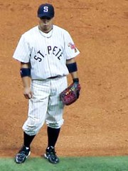
Meanwhile, this was also a good weekend for MLB throwbacks, and Uni Watch was in the house again — sometimes in more ways than one. Let’s start with Saturday’s Dodgers/Rays game in Tampa, where L.A. dressed as the 1955 Brooklyn Dodgers (a team that included current Devil Rays coach Don Zimmer) and the Rays became the old St. Petersburg Saints (complete with a totally cool flamingo sleeve patch). The big news here, which I didn’t even realize myself until yesterday, is that both teams’ uniforms were designed by Uni Watch’s own Scott M.X. Turner, who worked on the job for Ebbets Field Flannels. And as you can see in this shot they were indeed flannels, not just old graphics sewn onto polyester double-knits.
Designing the Dodgers’ duds wasn’t too hard (it’s not like there’s a shortage of old photos), but Scott says the St. Petersburg uniforms were trickier, because all he had to work with was a few photos from old newspaper clippings provided by the Rays (additional views here and here). “This is what companies like Ebbets Field, Mitchell & Ness, and AIS often have to dig through to recreate historic uniforms,” he says. “Sometimes we get crisp images or, rarely, actual garments. This wasn’t one of those times. In the end, though, I just did the designs. It was Jerry [Cohen, Ebbets Field’s owner/prexy] who single-handedly made the physical production happen, which was very, very hard, with hassles from all ends — MLB, the clubs, the various vendors, the shippers, customs, the whole thing.”
I hope to discuss all of this in an interview with Cohen in the near future, but for now we’ll make due with a note from Cohen that Scott passed along: “We pretty much made sure the teams would have to have stirrups (didn’t give ”˜em a choice). Also, we know perfectly well that the Dodgers didn’t wear ‘Brooklyn’ in ”˜55, but they wanted specifically to celebrate Brooklyn, so we did it that way.”
As it happens, reader Tim Burke was in the stands and snapped a lot of good pics, which you can see here.
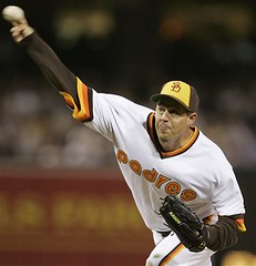
A Uni Watch reader was also in attendance for Friday night’s Padres/Bosox game, which featured 1980s attire for both teams. As was well documented in the weekend comments sections, the Padres’ uni numbers weren’t quite right and the lettering Boston’s jersey insignia was too thin, among other problems, but whatever — we can still enjoy Tim Stoops‘s slide show of the evening’s events.
Another thing that came up in the weekend comments: the question of how “BOSTON” should have broken across the Red Sox jersey plackets. Should it have been BOS TON or BO STON? This turns out to be something of a variable element in Bosox history, and reader Jere has just whipped up a treatise on the topic for his blog — recommended reading.
Finally, the Brewers and Royals wore Negro League unis on Friday night, and holy shit did they look awesome (additional pics here, here, here, and here). No Uni Watch readers were in attendance, at least not that I’m aware of, although Nicole Haase did provide a bunch of screen shots that provide better views of what the Royals were wearing. And if there’s one thing we learned, it’s that players can look equally lame-o in any era.
Membership Update: I mailed out about 60 membership kits on Saturday (would’ve been a few more except I botched a couple while trimming and laminating, so those will have to be redone), and Scott is busily working on the next batch. We hope to be caught up, or close to it, by the end of this week.
We now have 175 members, 143 of whose cards have been designed, and I don’t mind saying that I think it all looks pretty damn cool. Plus the card design process has taught me a lot about team colors, numeral typography, and so on, so it’s been, as Homer Simpson might say, an edumacational project, and those are always the best kind. Thanks again to all who’ve signed up.
Meanwhile I regret to report that laminating a Cheerio isn’t nearly as good an idea as I thought it would be.
Uni Watch News Ticker: Ever notice that after Bobby Richardson caught the last out of the 1962 World Series, he didn’t have his cap on? Some ace detective work by New York Times Yankees beat writer (and Uni Watch devotee) Tyler Kepner has turned up the bizarre explanation: The second base umpire asked if he could have Richardson’s cap just moments before Stretch McCovey hit the line drive that would end the Series, so Richardson gave it to him (look closely at the photo and you can see the ump carrying the cap). Full details here. ”¦ History was made Friday night in Seattle, as reliever Ryan Rowland-Smith — the first-ever MLBer with a hyphenated name — made his big league debut (with thanks to birthday boy Jeremy Brahm, who attended the game). ”¦ Always good to hear from Uni Watch baking consultant Elena Elms (she of the stirrup-frosted cookies), who writes: “The Raleigh News and Observer ran a small item in which Robert Woodard (6’2″ RHP, UNC-CH) explains why he wears high cuffs. I’ve seen most of his home starts in his four years here and never saw him wear them that way until about a month ago. The pale blue stockings give quite an colonial appearance to his uni, I think.” ”¦ Bob Weston reports that Cubs reliever Bobby Howry has “Phil. 4:13” inscribed on his undervisor. ”¦ Hahahahahahahaha. ”¦ Cycling note from Michael Rich, who reports that Fabian Cancellara of Team CSC wore his No. 13s upside-down during the Tour de Suisse, as a way of avoiding any 13-related bad karma. ”¦ Garrett Hipple reports that Oregon State pinch-runner Braden Wells had a Virginia Tech logo decal (presumably another memorial in response to the shootings) on the back of his helmet in last night’s CWS game. ”¦ This is almost too good to be true. ”¦ Couple uni-related entries in this Q&A blog entry by Curtis Granderson (good spot by intern Vince Grzegorek).
This coming Sunday, July 1st, the Cubs have a Michael Barrett bobble head day. I wonder what they’re going to do about it. Has a team ever had a bobble head day for a guy that has been traded prior to the giveaway???
Some of the links for the Caps uniforms are borked.
They talked about the Bobby Richardson hat thing yesterday during the Yanks-Giants game, in the 2nd inning, when he visited the tv booth for YES Network.
I love link Hate the uni, though.
…love the socks (circa 1970) on “Pistol Pete” in the Atlanta Hawks historical jersey slide show.
…and what’s up with the LA Kings jerseys? They look as though they were designed by gangbangers in South Central LA!
As someone pointed out this weekend, the Padres didn’t wear the belted pants until 1984, but I’m getting used to teams not doing their homework or just not giving a crap.
For example, When the Brewers finally went back to a button-front jersey in 1990, it looked like link. The throwback they wear on Fridays never existed.
That KC-Milwaukee game has the best throwbacks I’ve ever seen!
There don’t seem to bee too many shots of the Royals, though, particularly their backs. (I want to see the number font.)
When was the last time a team wore light pinstripes on a dark uniform? Maybe the medium-blue of the 1980-vintage Cubs comes close. It looks great and needs to come back!
Any word on whether the Phila. Flyers are getting new unis?
In regard to the the reversed 13 in the tour de suisse. This happens rather commonly. In cycling, numbers are assigned for each race. Each team will receive a series of numbers 1-9, 11-19, etc. If the winner of the previous year is racing, typically he will receive 1. The rest of the team will receive 2-9. Otherwise the numbers are assigned based on the alpabetical order of the team names. Within each team the designated team leader will receive the _1 number (1, 11, 21, …), the rest of the team have their numbers assigned based on the alphabetical order of last names for the team.
The other numbers are based on the alphabetical. Numbers are assigned by team.
…the Boston Red Sox jerseys from the Padres turn-back-the-clock night look like crap. The spacing is horrible.
The bad links have now been fixed. Sorry for the snafu.
Scott, Thanks a million for those St. Pete unis. They are a joy to look at!
Paul,
Do you know if it’s possible to purchase one of the St. Petersburg Saint flamingo patches? I’d buy one in a heartbeat.
Thanks!
[quote comment=”108265″]This coming Sunday, July 1st, the Cubs have a Michael Barrett bobble head day.
I wonder what they’re going to do about it.
Has a team ever had a bobble head day for a guy that has been traded prior to the giveaway???[/quote]
They are supposedly still going to give away the Barrett bobble head. There is also a Barrett jersey giveaway that is still going to happen. I don’t know what day that is though.
It seems pretty stupid to me especially with the lame response by Cubs promotional people, something like fans already got their tickets based on the promotional schedule so it would be a diservice to them to change it now. What a bunch of crap.
I pretty much agree with Paul completely on the Caps unis…and I think the red set needs more white…maybe the bottom horizontal stripe? It just seems too dark of a set and I can see getting tired of looking at it.
I do however understand why the “p” is pointed after seeing the link And now there is closure and I can live with it. My biggest problem with the whole uni though is that the wordmark is on a big patch instead of having individual letters sewn on…it’s cheap and shows a lack of craftsmanship. Also I hate when nameplates link in the jersey.
A few thoughts today.
1 – I hate the Caps socks. The blue at the top makes them look like unitards as they blend in with the pants/breezers. I feel the socks should differentiate from the breezers, not blend in. What ever happened to classic stripes like Chicago or Montreal? The breezers need stars on the side too.
2 – The new Hawks unis rock. Nuff said.
3 – The new Kings sweaters arent too different than the old ones. Not terrible, not great. They’ve certainly had worse.
4 – Islanders, let’s pray those aren’t the real ones. If they are, it’s just another reason not to be an Islanders fan.
5 – Canes, why add they white stripe around the shoulder? Other than that it’s the same sweater.
[quote comment=”108284″][quote comment=”108265″]This coming Sunday, July 1st, the Cubs have a Michael Barrett bobble head day.
I wonder what they’re going to do about it.
Has a team ever had a bobble head day for a guy that has been traded prior to the giveaway???[/quote]
They are supposedly still going to give away the Barrett bobble head. There is also a Barrett jersey giveaway that is still going to happen. I don’t know what day that is though.
It seems pretty stupid to me especially with the lame response by Cubs promotional people, something like fans already got their tickets based on the promotional schedule so it would be a diservice to them to change it now. What a bunch of crap.[/quote]
Will the bobble-head have a bloody lip?
[quote comment=”108265″]This coming Sunday, July 1st, the Cubs have a Michael Barrett bobble head day.
I wonder what they’re going to do about it.
Has a team ever had a bobble head day for a guy that has been traded prior to the giveaway???[/quote]
Last year the Pirates had a Sean Casey bobblehead night. Casey did not play that night and was traded to Detroit the next day.
Tony Kornheiser goes OFF on the new Caps unis…
link
I did not post this yesterday, because I was certain that Paul would pick this up (as he did the Bobby Richardson hat story). It is from Murray Chass’s column in Sunday’s NY Times:
“No Uniformity in Pullovers
“Worst baseball fashion trend of the year: the pullover shirts many managers wear instead of regular uniform shirts. The rulebook doesn’t prohibit the shirts — it governs only players’ uniforms — but Major League Baseball could declare the managers out of uniform and tell them to dress right.
“It’s highly unlikely that managers would want to be like Connie Mack and wear suits and ties, but they have taken their appearance to the other extreme. They are not only part of a team but also the team leader and would be wise to look like their players. Billy Martin, Earl Weaver and Sparky Anderson would never have worn the pullovers.
“’I like people wearing uniforms,’ Commissioner Bud Selig said. ‘It’s something we need to talk about. Being in a proper uniform is important.’â€Â
[quote comment=”108293″]Tony Kornheiser goes OFF on the new Caps unis…
link[/quote]
Amen. I just listened to that this morning on my iPod. The originals ARE classics.
[quote comment=”108288″]
Will the bobble-head have a bloody lip?[/quote]
they just need to paint the black eyes to go with that bloody lip and it will be a prized collectable in Chi-town…
MLB coaches and managers wearing the “Maternity shirts” [as we call them] seems to be a predominately AL phenomenon, though a few NL ones do it. My sister recently saw the Tigers in DC, and reported that all their coaches in the dugout wore them, except Andy van Slyke, who likes to show off his physique. A bad look–wish MLB would make them wear real uni’s.
So the Hawks do the opposite of everyone else and actually subtract red from their uniforms…
So if you order a Washington draft day hat from IceJerseys.com, do you get the old logo?
link
the fort wayne mad ants. that made me want to pack my life up and move to fort wayne. i need a jersey from that team… ohhh i smell a birthday gift.
[quote comment=”108265″]
Has a team ever had a bobble head day for a guy that has been traded prior to the giveaway???[/quote]
I’m not 100% positive of this, but I seem to recall the White Sox had a Esteban Loaiza bobblehead day in 2004 after he had been traded to the Yankees.
Rant time.
I went to the Cleveland-Washington game on Saturday, with the primary intention of seeing the Indians play, but also with my camera to get some photos of the unis (Indians – alternate blue, Nats – home whites).
On my way into the stadium, I was stopped. No “professional” cameras or lenses were allowed. No amount of discussion made the event staff budge. I even asked how I was supposed to know what a professional lens was, and the guy didn’t have an answer – but, no, still won’t let you in with it.
Maybe I shouldn’t be surprised…except that I’ve taken the exact same rig into a Nationals game before (including opening day 2006!).
Missed the pregame and first inning as a result – and no photos to share. (FWIW, Paul Byrd wears the socks high – goes well with his old school windup.)
Grr.
ed
Here’s a picture of the Oregon State guys with the VT logo on the back of their helmets:
link
It ran yesterday in the Raleigh News & Observer
[quote comment=”108271″]As someone pointed out this weekend, the Padres didn’t wear the belted pants until 1984, but I’m getting used to teams not doing their homework or just not giving a crap.
For example, When the Brewers finally went back to a button-front jersey in 1990, it looked like link. The throwback they wear on Fridays never existed.[/quote]
I don’t think that the Brewers have ever claimed it was a true throwback, but rather a uniform inspired by the old look.
There is a difference. Many of us speculate that the real difference is that this modern/retro look is a trial balloon for a complete redesign.
[quote comment=”108280″]Paul,
Do you know if it’s possible to purchase one of the St. Petersburg Saint flamingo patches? I’d buy one in a heartbeat.
Thanks![/quote]
They do look great, don’t they?
I imagine that Ebbets Field Flannels will offer the jerseys for sale soon (if not, they will make them custom).
[quote comment=”108313″]Rant time.
I went to the Cleveland-Washington game on Saturday, with the primary intention of seeing the Indians play, but also with my camera to get some photos of the unis (Indians – alternate blue, Nats – home whites).
On my way into the stadium, I was stopped. No “professional” cameras or lenses were allowed. No amount of discussion made the event staff budge. I even asked how I was supposed to know what a professional lens was, and the guy didn’t have an answer – but, no, still won’t let you in with it.
Maybe I shouldn’t be surprised…except that I’ve taken the exact same rig into a Nationals game before (including opening day 2006!).
Missed the pregame and first inning as a result – and no photos to share. (FWIW, Paul Byrd wears the socks high – goes well with his old school windup.)
Grr.
ed[/quote]
Is this the first time you’ve tried this @ RFK? RFK does have some goofy policies, but they’re randomly enforced. The best bet is to move along to another gate and you’re likely to find a less attentive goon/guard.
Has anyone seen the new Ben Stein Clear Eyes ad? In it, he wears a baseball uniform with the high cuffed pants and 1970’s ribbon stirrup socks.
All I can say is…W. T. F?
[quote comment=”108288″][quote comment=”108284″][quote comment=”108265″]This coming Sunday, July 1st, the Cubs have a Michael Barrett bobble head day.
I wonder what they’re going to do about it.
Has a team ever had a bobble head day for a guy that has been traded prior to the giveaway???[/quote]
They are supposedly still going to give away the Barrett bobble head. There is also a Barrett jersey giveaway that is still going to happen. I don’t know what day that is though.
It seems pretty stupid to me especially with the lame response by Cubs promotional people, something like fans already got their tickets based on the promotional schedule so it would be a diservice to them to change it now. What a bunch of crap.[/quote]
Will the bobble-head have a bloody lip?[/quote]
If the bobble head is of him catching, will the “C” on his helmet be peeling off? haha
after seeing a losing result by the heels in the CWS final series for the 2nd straight year, i looked back on the previous 10 days and smiled because on a daily basis, i got to see some great on field unis…
although this is not a conglomeration of the uni’s from this years CWS, it does celebrate the on field uni over the past few…
enjoy.
link
Thanks to Mike for his work at the Caps unveiling, and for important questions involving socks and helmets.
But back to the uniforms themselves, while I hate the wordmark (and I hated the original, too), the word that keeps popping into my head is underwhelming. There was just so much potential for the Caps, it’s not like this town doesn’t have iconic images, and they went with a total compromise/design by committee/focus group friendly route. It really looks like something on a video game that couldn’t get the actual league rights for logos.
But congrats to the Hawks, Kings, and Blue Jackets for not screwing up.
[quote comment=”108315″][quote comment=”108271″]As someone pointed out this weekend, the Padres didn’t wear the belted pants until 1984, but I’m getting used to teams not doing their homework or just not giving a crap.
For example, When the Brewers finally went back to a button-front jersey in 1990, it looked like link. The throwback they wear on Fridays never existed.[/quote]
I don’t think that the Brewers have ever claimed it was a true throwback, but rather a uniform inspired by the old look.
There is a difference. Many of us speculate that the real difference is that this modern/retro look is a trial balloon for a complete redesign.[/quote]
My Bad. Lets hope the Brew Crew goes to the Friday retro-inspired alts full time next year, with a powder blue road uni to go along with it. Dare to dream…
The Caps shoulder patch is bad.
I always liked this “W” as wings logo.
link
During Saturday’s Dbacks v. Orioles game special television commentator, former catcher and Today Show host (believe me they let you know he’s done all of this during the broadcast)Joe Garagiola commented on Orlando Hidson going with tall socks.
The exchange went something like:
Darren Sutton (PBP Man) Check out O Dawg with the tall socks!
Garagiola: Looks great they should all do that. In fact it can benefit them with the strike zone.
Sutton: Really?
Garagiola: Yeah the way they wera ’em nowadays you can tell wear the foot begins and the legs end. How can you tell wear the strike zone is?
No matter how many times I hear this conversation it makes me happy. A lot of Dbacks that usually go with pajama pants wore their pants cuffed high on Saturday. No reasoning that I can find. The guys allegedly love the Saturday black unis and maybe want to excentuate them…
Here is a photo of Conor Jackson going unusually high cuffed
link
link
All I can say about those St.Pete (Devil Ray throwbacks)unis are, “WOW!!!” I did notice on the Ebbets Field site that the Flamingo patch that Scott used for the St. Pete uni is also used on the Miami Flamingos uni. I really don’t care who used it or when…the damn bird rocks!!! I want one of those St. Pete Unis!!!!!
Great Job Scott!
Steve
Tampa, FL
Let’s try that again:
The Caps shoulder patch is bad.
I always liked this “W” as wings logo.
link
Paul & Scott…I just saw my membership card pop up on the collection of finished cards. Thanks for making the Redskins thing happen! You rock.
Caps…I’m still liking them. Happy with the overall uniform.
SIDEBAR!! (sorry)- So, last night, I was flipping around w/ the remote. Decided to try to catch some of the World Bowl on NFL Net. Well, Comcast has gone ahead and done it…blocked NFL Net from the basic digital package. I’m thinking that in this world where 90% of sports fans are connected by blogs…in a Kevin Bacon-esque spider-web fashion…we should be able to start a movement on the web here and create a backlash on Comcast. Thoughts? Spread the word! (Contact your local Comcast customer service and let them know that they suck…)
[quote comment=”108317″]
Is this the first time you’ve tried this @ RFK? RFK does have some goofy policies, but they’re randomly enforced. The best bet is to move along to another gate and you’re likely to find a less attentive goon/guard.[/quote]
No – I got the same rig in a RFK before.
FWIW, they have radios – by the third gate I tried, they were all over me. ;-)
ed
Granderson has added a new entry to his blog, you might want to direct people to the Friday edition.
Bobby Richardson wasn’t the only one who was asked for his hat at the end (or what turned out not to be the end) of a World Series. Wade Boggs was link by Hunter Wendelstedt in the tenth inning of Game 6 in 1986. (very bottom of page)
[quote comment=”108277″]…the Boston Red Sox jerseys from the Padres turn-back-the-clock night look like crap. The spacing is horrible.[/quote]
Again, the spacing did match the ’82 spacing. It was the thinness of the letters that made them look off…along with, of course, the fact that players wore them about ten sizes larger than they were worn back then….
[quote comment=”108327″]Let’s try that again:
The Caps shoulder patch is bad.
I always liked this “W” as wings logo.
link
“youre my boy blue”
Instead of a Michael Barrett bobblehead, they should have given away Barrett punching puppets…
Does the Mad Ants mark look a bit too much like the link? Since I’m probably one of three people who still remember AAF, this probably just slipped by.
[quote comment=”108328″]Paul & Scott…I just saw my membership card pop up on the collection of finished cards. Thanks for making the Redskins thing happen! You rock.
Caps…I’m still liking them. Happy with the overall uniform.
SIDEBAR!! (sorry)- So, last night, I was flipping around w/ the remote. Decided to try to catch some of the World Bowl on NFL Net. Well, Comcast has gone ahead and done it…blocked NFL Net from the basic digital package. I’m thinking that in this world where 90% of sports fans are connected by blogs…in a Kevin Bacon-esque spider-web fashion…we should be able to start a movement on the web here and create a backlash on Comcast. Thoughts? Spread the word! (Contact your local Comcast customer service and let them know that they suck…)[/quote]
Dan, it’s not Comcast making that call, it’s the NFL. I will bet within 10 years ALL regular season games will be on a pay per view system.
I am a UniWatch reader who was at the Kansas City/Milwaukee game on Saturday (not Friday) when they wore the Negro League throwbacks. Fans in attendance also got a Milwaukee Bears hat, somewhat similar to those worn on the field.
Unfortunately, I was up too high to really see the details in the uniforms, but both teams looked really sharp. One nice thing about it was all players and coaches were showing their hose. The black Kansas City Monarchs uniforms, black with white pinstripes, looked really sharp from the second deck, and the black flaps on the back pockets of the Milwaukee Bears uniforms were a really nice touch.
[quote comment=”108338″]Does the Mad Ants mark look a bit too much like the link? Since I’m probably one of three people who still remember AAF, this probably just slipped by.[/quote]
Didn’t they do a cover of Michael Jackson’s ‘Smooth Criminal’. It was way better than the original.
[quote comment=”108338″]Does the Mad Ants mark look a bit too much like the link? Since I’m probably one of three people who still remember AAF, this probably just slipped by.[/quote]
AAF is a very underrated band in my opinion. There first album was incredible.
Now back to unis. Why do they have to be the Mad Ants? It just seems kind of strange. Wouldn’t just the Ants be fine?
The two logos are similar, but how much can you really do with an ant.
[quote comment=”108340″][quote comment=”108328″]Paul & Scott…I just saw my membership card pop up on the collection of finished cards. Thanks for making the Redskins thing happen! You rock.
Caps…I’m still liking them. Happy with the overall uniform.
SIDEBAR!! (sorry)- So, last night, I was flipping around w/ the remote. Decided to try to catch some of the World Bowl on NFL Net. Well, Comcast has gone ahead and done it…blocked NFL Net from the basic digital package. I’m thinking that in this world where 90% of sports fans are connected by blogs…in a Kevin Bacon-esque spider-web fashion…we should be able to start a movement on the web here and create a backlash on Comcast. Thoughts? Spread the word! (Contact your local Comcast customer service and let them know that they suck…)[/quote]
Dan, it’s not Comcast making that call, it’s the NFL. I will bet within 10 years ALL regular season games will be on a pay per view system.[/quote]
No…the NFL wants NFl Network on the basic package, so it has more viewers. It’s charging Comcast more…because it knows that it brings X-number of viewers to the table. Comcast doesn’t want to pay that much for NFL Network, instead passing that cost on to us.
Verizon has it as part of the basic package, as does Millennium and DirectTV.
Comcast is being petty and cheap in this one…and if they can get us to pay for NFL Network (when we’re already getting over-charged for Comcast Digital to begin with!) then what’s to stop them from moving ESPN to a pay tier?
My reaction to the full caps uniform is split:
Overall, not bad, but I agree with the commenter above about the socks. Having Blue at the top extends the visual line of the breezers, making it look like they come down to the knee… Ugh. But the lower part of the sock is great.
On the White jersey, I really like that slash of red on the arms, but on the Red jersey, I can’t stand that slash of white.
I think the red jersey needs a white hemline stripe at the bottom, not more red.
For other NHL jersey changes, I think we need to differentiate between “new” jerseys, like the Caps, and jersey updates, like the Kings and Canes.
Some uni-related stuff in link slide show, especially #’s 9 (White Sox shorts), #8 (orange balls), and #2 (Turn Ahead the Clock uni)
For those that are curios, the Ft. Wayne Mad Ants are a round-about way of naming them after the city’s namessake – General “Mad” Anthony Wayne.
link
Too bad the Mad Ants aren’t a hockey team, I bet that would make for some badass jerseys.
I would prefer that managers wear a uniform, but I can live with them wearing a jacket. But I cannot live with the current trend of them hanging out. Jackets used to have a draw string or a hem at the bottom. The new fleece shirts most wear are designed to be “untucked” and that is what it ends up looking like: untucked and unprofessional.
The biggest mistake with the Red Sox 80’s uniforms from the SD series is probably the most important part of their uniform: their socks. Check out the solid red socks Varitek wore that night. Everyone who watched the Sox in the 80’s knows that the team wore socks (or stirrups) that were red on the lower part and blue and white striped on top. They were the most distictive in all of baseball.
[quote comment=”108346″]Some uni-related stuff in link slide show, especially #’s 9 (White Sox shorts), #8 (orange balls), and #2 (Turn Ahead the Clock uni)[/quote]
Looks like someone at AOL Sports needed content and decided to rip off other “Worst in Sports” lists and then toss in some others not caring if they were bad or not. Saying it was bad that the Seahawks named Jones Cola their offical soda provider because Jones is known for flavors such as Turkey? That’s like saying Pepsi is bad because of Crystal Pepsi. Granted the White Sox’s shorts and the Turn Ahead the Clock unis were bad, but saying the USFL unis were bad is ignorant of the time they were created. Hell, they looked better than some of the unis used now! (see modern Bronco’s uni, and the Seahawks neon green)
[quote comment=”108352″][quote comment=”108346″]Some uni-related stuff in link slide show, especially #’s 9 (White Sox shorts), #8 (orange balls), and #2 (Turn Ahead the Clock uni)[/quote]
Looks like someone at AOL Sports needed content and decided to rip off other “Worst in Sports” lists and then toss in some others not caring if they were bad or not. Saying it was bad that the Seahawks named Jones Cola their offical soda provider because Jones is known for flavors such as Turkey? That’s like saying Pepsi is bad because of Crystal Pepsi. Granted the White Sox’s shorts and the Turn Ahead the Clock unis were bad, but saying the USFL unis were bad is ignorant of the time they were created. Hell, they looked better than some of the unis used now! (see modern Bronco’s uni, and the Seahawks neon green)[/quote]
For the record, the Seahawks neon green is an accent color. They never made a jersey that color…a la Orlando Thunder…
I might be in the minority here, but i don’t think the caps jerseys look good with their socks. Just seems a little unbalanced to me.
Don’t know if this has been discussed before, so I apologize if this is a repeat…..
With the talk of the All-Star uni’s last week, I was wondering why the All-Star game is in a National League park two years in a row? Is it because of Barry Bonds? Is MLB going to do two in a row at an AL park to compensate? Anyone know what the story is on this?
[quote comment=”108356″]Don’t know if this has been discussed before, so I apologize if this is a repeat…..
With the talk of the All-Star uni’s last week, I was wondering why the All-Star game is in a National League park two years in a row? Is it because of Barry Bonds? Is MLB going to do two in a row at an AL park to compensate? Anyone know what the story is on this?[/quote]
Maybe it was to give the NL a chance to actually win a game.
From Wiki:
The venue is chosen by Major League Baseball and traditionally alternates between the two leagues every year (this tradition was first broken in 1951, when the Detroit Tigers were chosen to host the annual game as part of the city’s 250th birthday at Briggs Stadium, and will be broken again in 2007, when the San Francisco Giants will be the host for the 2007 All-Star Game).
[quote comment=”108353″][quote comment=”108352″][quote comment=”108346″]Some uni-related stuff in link slide show, especially #’s 9 (White Sox shorts), #8 (orange balls), and #2 (Turn Ahead the Clock uni)[/quote]
Looks like someone at AOL Sports needed content and decided to rip off other “Worst in Sports” lists and then toss in some others not caring if they were bad or not. Saying it was bad that the Seahawks named Jones Cola their offical soda provider because Jones is known for flavors such as Turkey? That’s like saying Pepsi is bad because of Crystal Pepsi. Granted the White Sox’s shorts and the Turn Ahead the Clock unis were bad, but saying the USFL unis were bad is ignorant of the time they were created. Hell, they looked better than some of the unis used now! (see modern Bronco’s uni, and the Seahawks neon green)[/quote]
For the record, the Seahawks neon green is an accent color. They never made a jersey that color…a la Orlando Thunder…[/quote]
it’s still neon!
I’m not sure that this it the right place to ask this question, but I’m fairly sure I saw the link I’m looking for in this comment section. I just purchased one of those new Reebok NHL hats that has the silly stand up lining in the front of the hat. I remember seeing a tutorial of how to remove this lining therefore creating a normal hat. I’m be greatly thankful if someone could connect me to that link.
[quote comment=”108344″]
No…the NFL wants NFl Network on the basic package, so it has more viewers. It’s charging Comcast more…because it knows that it brings X-number of viewers to the table. Comcast doesn’t want to pay that much for NFL Network, instead passing that cost on to us.
Verizon has it as part of the basic package, as does Millennium and DirectTV.
Comcast is being petty and cheap in this one…and if they can get us to pay for NFL Network (when we’re already getting over-charged for Comcast Digital to begin with!) then what’s to stop them from moving ESPN to a pay tier?[/quote]
Fair enough…f@#& Comcast!!
the barret jersey night is i think tuesday, i’m going to the game, so i’ll tell you how everyone reacts
[quote comment=”108364″]I’m not sure that this it the right place to ask this question, but I’m fairly sure I saw the link I’m looking for in this comment section. I just purchased one of those new Reebok NHL hats that has the silly stand up lining in the front of the hat. I remember seeing a tutorial of how to remove this lining therefore creating a normal hat. I’m be greatly thankful if someone could connect me to that link.[/quote]
link
Thanks a lot. I’m not sure if this is going to work on a Reebok hat, but the hat is just so ridiculous looking that it is worth a try.
dustin ackley wearing aj 11 space jams on saturday night…
link
[quote comment=”108374″]dustin ackley wearing aj 11 space jams on saturday night…
link
the link will direct you to a not found screen
just replace the letter x in between the 1024 and 768 and it will work…
paul
no pic of the laminated cheerio?!
I’m a little confused with these new NHL uniforms, I was under the impression that the NHL was switching back to home whites and away darks… Everything I have seen so far, however, has referred to the home sweaters being the darks. Am I wrong? Did I just dream this up, or are they staying with home darks and away whites? I hope they do home whites, that’s how it should be…
[quote comment=”108377″]I’m a little confused with these new NHL uniforms, I was under the impression that the NHL was switching back to home whites and away darks… Everything I have seen so far, however, has referred to the home sweaters being the darks. Am I wrong? Did I just dream this up, or are they staying with home darks and away whites? I hope they do home whites, that’s how it should be…[/quote]
Home darks, away whites
[quote comment=”108377″]I’m a little confused with these new NHL uniforms, I was under the impression that the NHL was switching back to home whites and away darks… Everything I have seen so far, however, has referred to the home sweaters being the darks. Am I wrong? Did I just dream this up, or are they staying with home darks and away whites? I hope they do home whites, that’s how it should be…[/quote]
The NHL decided to keep dark colors at home for the next season.
Did anyone else see Federer’s link as he came onto the court at Wimbledon? I say classic, and I like it.
[quote comment=”108265″]This coming Sunday, July 1st, the Cubs have a Michael Barrett bobble head day.
I wonder what they’re going to do about it.
Has a team ever had a bobble head day for a guy that has been traded prior to the giveaway???[/quote]
The Brewers went ahead with Bob Wickman poster night in July 2000, even though they had traded him to Cleveland.
I guess that Traded Player Jersey/Bobblehead/Whatever night sounds and plays better than “Help us get rid of this now-usesless crap Night”. I went to a minor-leage “Christmas in July Day” that really had that feel to it (outdated schedule magnets, mouse pads, etc.)
The new Hawks jerseys are terrible, IMHO. There is just so much to dislike, from the font & numbers, to the side piping/stripes, and lets not forget the little collar extension above the name on the back. Yuck.
Also, from the home photo gallery, it looks like they have the worst uni-related trend of recent years – ATL embroidered on the ass.
I love the new Columbus uniforms. The star at the cuffs is really nice. I like the whites a little better than the blues, but all in all a solid redesign.
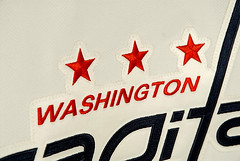
That maligned “p” in the Capitals crest has been bothering me since the unveiling, I knew I had seen it somewhere before. And my commute this morning confirmed this as I passed a Planned Parenthood clinic and noticed the organization’s logo on the building
link
Ladies and gentlemen, your Washington Abortions!
I can’t find an example, but didn’t the Padres hats/helmets that went with those jerseys have a little orange trim around the “SD” or on the edge of the yellow panel? Can’t tell from “Dressed to the Nines”.
I love the flamingo. Maybe Tampa Bay should stop worrying about use of the word “devil” and just go with “Flamingos” or better yet, “Pelicans”.
[quote comment=”108393″]That maligned “p” in the Capitals crest has been bothering me since the unveiling, I knew I had seen it somewhere before. And my commute this morning confirmed this as I passed a Planned Parenthood clinic and noticed the organization’s logo on the building
link
Ladies and gentlemen, your Washington Abortions![/quote]
Wow…feel like I need a shower after that post! Gah!
Living in the Atlanta area usually the Hawks don’t give me a reason to pay much attention because of the ownership mess, bad personal decisions & losing. My interest was peaked while reading some daily post by Paul while back that they were going to have new uni. Those mentioned they’d probably pay homage to the championship team by going back to the red, white & blue which presumably would be light based on the pics. The fact that ownership group owns the Thrasher as well I figured they’d go with some sort light blue (at least as a part of a new logo), darken up the red & yellow a little with the latter being mainly the accent color. Yellow would have also helped tie in the Atlanta era that did have some good playoff teams in the late 80’s & early 90’s. Then basically both franchises would have birds for mascots & similar colors with the same ownership group. That also would have meant that the Braves, Hawks & Thrashers would all have similar color schemes. The thought of that was cool because it provides symmetry when all the pro teams in a city have similar colors for example Pittsburg. (If the Hawks had gone with those colors then all that would have been needed was for the falcons to be bold & go with a new look with those colors when they’re eligible too.) Therefore I was surprised & mildly disappointed that silver was the 3rd color. The navy & red are fine, but don’t tell us we’re harking back to the championship era with these colors when from as far as I can tell the Championship St. Louis Hawks never wore any of these exact colors! Also if you’re going to role out a complete new look it would make sense to have the web site reflect that immediately after the announcement.
As far as the unis themselves go, there decent. They remind me of the Nets somewhat since the colors are similar, yet another reason a lighter blue would have been good, & the font seems to be oversized,. The striping looks fine, it’s not to over the top but you can tell Addias helped in the design by looking at them because there reminiscent of some of the college unis they produce. The new alternate logo is all right, I don’t like the fact that it points downward, hasn’t this franchise been going down for long enough? The only thing I really don’t get is the logo on the back of the neck, it looks like that should be a on the front. Based on recent NBA trends when they come out with an alternate it’s a good bet it’ll be sliver (or red) with ATL on the front. All in all they’re not a disaster & could provide a fresh look for a young team providing mgmt doesn’t screw up the draft (again!) & free agency.
I was at the St. Pete/Brooklyn game and I gotta tell you…those uniforms rocked. The pants were bloused, stirrups were worn by all and the overall look was awesome. Even my 78 year old father commented on how much better Tampa’s (St. Pete’s) uniforms looked than those worn in the previous night’s game that we attended. No coincidence that the St. Pete Saints won the game either.
The Zimmer bobbleheads were a great touch. I took pictures too, will try to post link later today.
When Ryan Dempster was traded from the Marlins to Reds, they had link.
Later that season, when the Reds were at Florida, they held a link (scroll down to The Dempster Doll section) , but Dempster was on the DL and did not travel with the team!
In Detroit they are link off parts of Tiger Stadium, similar to what the Cardinals did with Busch Stadium a few years ago. Lockers, signs, plaques, random stuff (such as a jar of infield dirt) likely to go on sale.
[quote comment=”108371″]Thanks a lot. I’m not sure if this is going to work on a Reebok hat, but the hat is just so ridiculous looking that it is worth a try.[/quote]
I would be very careful (obviously); I tried it with a Cooperstown Collection cap, and it totally did not work. This thing was horrendous, and made 59FIFTY conductor caps look like low profiles in comparison.
The logo was stitched on top of the “guts”, for lack of a better term, and in the process of trying to pull out the wires and threads, the seams came loose. Needless to say, the cap was totally destroyed (which really wasn’t so bad; I didn’t like the cap all that much).
Unless the wires and threads are stitched separate from the logo like 59FIFTY caps, you might have a difficult time pulling them out and not destroying the cap in the process.
It seems pretty stupid to me especially with the lame response by Cubs promotional people, something like fans already got their tickets based on the promotional schedule so it would be a diservice to them to change it now. What a bunch of crap.
Beyond the fact that the items are already ordered and paid for, there probably are people who bought tickets to get Michael Barrett bobbleheads; maybe he’s their favorite player. And it’s not like stadium personnel are going to force anyone who doesn’t want one to take it.
For the record, I think the Penguins handed out Alexei Kovalev bobbleheads after they traded him.
Can’t be sure, but it looks like Serena Williams is wearing a backless halter type dress with a sports bra underneath @ Wimbledon. A bizarre look.
[quote comment=”108418″][quote comment=”108371″]Thanks a lot. I’m not sure if this is going to work on a Reebok hat, but the hat is just so ridiculous looking that it is worth a try.[/quote]
I would be very careful (obviously); I tried it with a Cooperstown Collection cap, and it totally did not work. This thing was horrendous, and made 59FIFTY conductor caps look like low profiles in comparison.
The logo was stitched on top of the “guts”, for lack of a better term, and in the process of trying to pull out the wires and threads, the seams came loose. Needless to say, the cap was totally destroyed (which really wasn’t so bad; I didn’t like the cap all that much).
Unless the wires and threads are stitched separate from the logo like 59FIFTY caps, you might have a difficult time pulling them out and not destroying the cap in the process.[/quote]
The Cooperstown caps made by American Needle don’t need the white backing removed. They typically break down really fast and conform to your head.
You can speed up this process by soaking the hat and smashing it down. You can also pull on the button while holding the brim therefore forcing a few creases in the front part.
I have even used a litte downy fabric softener on it to help break it in. Also makes hat/hair smell really really nice.
The American Needle hats are a very nice product once they break in. Since they are only part wool, they will not shrink either (or smell). I think they are 80% synthetic fabric.
[quote comment=”108318″]Has anyone seen the new Ben Stein Clear Eyes ad? In it, he wears a baseball uniform with the high cuffed pants and 1970’s ribbon stirrup socks.
All I can say is…W. T. F?[/quote]
I saw it a few weeks ago and I posted a comment about it, but nobody said anything…..
[quote comment=”108407″]Living in the Atlanta area usually the Hawks don’t give me a reason to pay much attention because of the ownership mess, bad personal decisions & losing. My interest was peaked while reading some daily post by Paul while back that they were going to have new uni. Those mentioned they’d probably pay homage to the championship team by going back to the red, white & blue which presumably would be light based on the pics. The fact that ownership group owns the Thrasher as well I figured they’d go with some sort light blue (at least as a part of a new logo), darken up the red & yellow a little with the latter being mainly the accent color. Yellow would have also helped tie in the Atlanta era that did have some good playoff teams in the late 80’s & early 90’s. Then basically both franchises would have birds for mascots & similar colors with the same ownership group. That also would have meant that the Braves, Hawks & Thrashers would all have similar color schemes. The thought of that was cool because it provides symmetry when all the pro teams in a city have similar colors for example Pittsburg. (If the Hawks had gone with those colors then all that would have been needed was for the falcons to be bold & go with a new look with those colors when they’re eligible too.) Therefore I was surprised & mildly disappointed that silver was the 3rd color. The navy & red are fine, but don’t tell us we’re harking back to the championship era with these colors when from as far as I can tell the Championship St. Louis Hawks never wore any of these exact colors! Also if you’re going to role out a complete new look it would make sense to have the web site reflect that immediately after the announcement.
As far as the unis themselves go, there decent. They remind me of the Nets somewhat since the colors are similar, yet another reason a lighter blue would have been good, & the font seems to be oversized,. The striping looks fine, it’s not to over the top but you can tell Addias helped in the design by looking at them because there reminiscent of some of the college unis they produce. The new alternate logo is all right, I don’t like the fact that it points downward, hasn’t this franchise been going down for long enough? The only thing I really don’t get is the logo on the back of the neck, it looks like that should be a on the front. Based on recent NBA trends when they come out with an alternate it’s a good bet it’ll be sliver (or red) with ATL on the front. All in all they’re not a disaster & could provide a fresh look for a young team providing mgmt doesn’t screw up the draft (again!) & free agency.[/quote]
I agree, they remind me of the Nets. They should’ve stuck with the old school look…
link
[quote comment=”108268″]I love link Hate the uni, though.[/quote]
Agree with you 100%. Big chops rock. The Blue Jays need a new uniform in the worst way.
I’m not a hockey fan, and I don’t live in Chicago anymore, but I could barely even get myself to click on the “Hawks” new jersey link. I really, really hope the Blackhawks jerseys were given the same respect as the Bruins … but I was worried they’d get the Islander treatment instead!
I was kinda glad the link was for the Atlanta basketball team!
[quote comment=”108424″]
The American Needle hats are a very nice product once they break in. Since they are only part wool, they will not shrink either (or smell). I think they are 80% synthetic fabric.[/quote]
I only wear American Needle…they are far superior in quality, fit and looks to any New Era fitted hat.
My head is only a 7 1/8, and New Era hat look just plain stupid on a person with a smaller dome.
Interesting article on Barca’s new uni-kit
[quote comment=”108434″][quote comment=”108424″]
The American Needle hats are a very nice product once they break in. Since they are only part wool, they will not shrink either (or smell). I think they are 80% synthetic fabric.[/quote]
I only wear American Needle…they are far superior in quality, fit and looks to any New Era fitted hat.
My head is only a 7 1/8, and New Era hat look just plain stupid on a person with a smaller dome.[/quote]
I had an American Needle Red Sox hat with the “pair of socks” logo that I absolutely loved. Sadly, New Era only seems to use that logo when they’re slapping about ten different logos on each panel of the “fashion” 59Fifties
[quote comment=”108328″]Paul & Scott…I just saw my membership card pop up on the collection of finished cards. Thanks for making the Redskins thing happen! You rock.
Caps…I’m still liking them. Happy with the overall uniform.
SIDEBAR!! (sorry)- So, last night, I was flipping around w/ the remote. Decided to try to catch some of the World Bowl on NFL Net. Well, Comcast has gone ahead and done it…blocked NFL Net from the basic digital package. I’m thinking that in this world where 90% of sports fans are connected by blogs…in a Kevin Bacon-esque spider-web fashion…we should be able to start a movement on the web here and create a backlash on Comcast. Thoughts? Spread the word! (Contact your local Comcast customer service and let them know that they suck…)[/quote]
Interesting… I have never had NFL network and now do that Comcast selectively picked the Houston market to take from Time warner (Dallas was Comcast and now technically is Time Warner…???). However, I do have a sports package (Speed and Fox Sports stuff) – so maybe that is why I have NFL network.
[quote comment=”108341″]I am a UniWatch reader who was at the Kansas City/Milwaukee game on Saturday (not Friday) when they wore the Negro League throwbacks. Fans in attendance also got a Milwaukee Bears hat, somewhat similar to those worn on the field.
Unfortunately, I was up too high to really see the details in the uniforms, but both teams looked really sharp. One nice thing about it was all players and coaches were showing their hose. The black Kansas City Monarchs uniforms, black with white pinstripes, looked really sharp from the second deck, and the black flaps on the back pockets of the Milwaukee Bears uniforms were a really nice touch.[/quote]
Absolutely fantastic Negro League unis! Love the dark background pinstripes and the dark pocket flaps! Would have loved to sit and watch THAT game!
That Mike from Great Neck, NY who asked Curtis Granderson about the favorite hat? That’s me. Oh yeah. I feel special.
David Beckham in shoulder pads…..
An odd sight….
link
Caps Helmets/Breezers: What the hell washington? Solid blue breezers? If you are going to carry over elements from the original uni, than at LEASY carry over the stars on the breezers. Also, Red Jersey should have a Red helmet or a white helmet, Blue helmet looks odd to me.
LA Kings: Uhhh, I guess thats a new jersey. They cut off the points on the shoulders, which makes them look worse now. And they got rid of the lower stripe leaving the Los Angeles just hanging there. Way to take a pretty poor jersey to begin with and make it worse. And the mesh sides look really awful on the black jersey.
Isles: Other than the Number on the Chest (ditch that) I like the more orange sleeve. I KNOW I KNOW I KNOW, its not striped. Still think it looks nice. Seems like if it were up to everyone on here every team would be wearing color variations of the old Ottawa jerseys from the 1920’s link
[quote comment=”108454″]David Beckham in shoulder pads…..
An odd sight….
link
His arms look like toothpicks sticking out of those things. He’d get smashed in American Football.
In yesterday’s Angels-Pirates game Vladimir Guerrero started the game with high cuffs for his first couple at bats link
went hitless then pulled his pants down (sorry not pic)
Lets try it once more:
In yesterday’s Angels-Pirates game Vladimir Guerrero started the game with high cuffs for his first couple at
[quote comment=”108456″][quote comment=”108454″]David Beckham in shoulder pads…..
An odd sight….
link
His arms look like toothpicks sticking out of those things. He’d get smashed in American Football.[/quote]
He would also be the best kicker the NFL has ever seen.
How do you all feel about link?
I was looking at it frustrated that something was missing, then it hit me….more white highlights to break up the dark look of the total red and blue onslaught that the full uni is, and a horizontal stripe. I like it a ton better.
[quote comment=”108295″][quote comment=”108293″]Tony Kornheiser goes OFF on the new Caps unis…
link[/quote]
Amen. I just listened to that this morning on my iPod. The originals ARE classics.[/quote]
As I was listening to that , I was reminded why the Marlins changed from being predominantly teal to being predominany black was probably because of the merchandising tail wagging the on-field uniform dog. Also, how in the world does it take three years to design the Capitals’ new sweaters? They look like crap and the
blue looks like black (or is it how it’s suopposed to be?). Sorry for the double post. I’m not used to typing on a laptop.
[quote comment=”108466″][quote comment=”108295″][quote comment=”108293″]Tony Kornheiser goes OFF on the new Caps unis…
link[/quote]
Amen. I just listened to that this morning on my iPod. The originals ARE classics.[/quote]
As I was listening to that , I was reminded why the Marlins changed from being predominantly teal to being predominany black was probably because of the merchandising tail wagging the on-field uniform dog. Also, how in the world does it take three years to design the Capitals’ new sweaters? They look like crap and the[/quote]
I think the “three years of design” comments are for the entire system for the league.
[quote comment=”108464″][quote comment=”108456″][quote comment=”108454″]David Beckham in shoulder pads…..
An odd sight….
link
His arms look like toothpicks sticking out of those things. He’d get smashed in American Football.[/quote]
He would also be the best kicker the NFL has ever seen.[/quote]
To bend the ball around the blockers at the line of scrimmage and tuck it just inside the post and under the imaginary crossbar…YES. But I don’t think he could wear 23 as a kicker. He’d have to get back his old #7 that he used to wear for Manchester.
In an article on ESPN.com about Griffey’s return to Seattle and how the fans there still love him, Jim Caple wrote the following:
There’s a wonderful “Seinfeld” bit in which Jerry says that because players change teams so often, fans find themselves rooting for the uniform and not the athlete. “When you root for a team these days,” he says, “you’re mostly rooting for laundry.” This is almost always the case. But Seattle fans were most definitely not rooting for laundry over the weekend. They were rooting for the player.
Here’s the link.
[quote comment=”108471″][quote comment=”108464″][quote comment=”108456″][quote comment=”108454″]David Beckham in shoulder pads…..
An odd sight….
link
His arms look like toothpicks sticking out of those things. He’d get smashed in American Football.[/quote]
He would also be the best kicker the NFL has ever seen.[/quote]
To bend the ball around the blockers at the line of scrimmage and tuck it just inside the post and under the imaginary crossbar…YES. But I don’t think he could wear 23 as a kicker. He’d have to get back his old #7 that he used to wear for Manchester.[/quote]
I’m not sure the shape of a football would allow “bending”. I’d like to see how he would stack up against the kickers in the league.
The new Hawks jerseys are terrible, IMHO. There is just so much to dislike, from the font & numbers, to the side piping/stripes, and lets not forget the little collar extension above the name on the back. Yuck.
Also, from the home photo gallery, it looks like they have the worst uni-related trend of recent years – ATL embroidered on the ass.
How fuckin ugly are the new Atl Hawks unis? Yeah pretty horrid…especially when you look back and see that their visually uni history is rich with the unusual and bright red…
link
Garrett Hipple reports that Oregon State pinch-runner Braden Wells had a Virginia Tech logo decal (presumably another memorial in response to the shootings) on the back of his helmet in last night’s CWS game.
Everyone on their team has the VT logo on their helmets
NON-DISCLAIMER: I know you all know me as an Ohio guy, but I am a big Penguins fan because that’s the team I rooted for as a kid.
I’m surprised there hasn’t been more discussion of the Blue Jackets’ obvious triumph with these new jerseys.
It’s hard to call a new look classic, particularly one that uses four colors (red, white, blue, and silver), but I do believe it’s a simple, classy look. I think the state flag of Ohio becoming a “C” around the star is a pretty cool concept, and the shoulder patch which sheds some light on the name “Blue Jackets” and it’s Civil War origins is without equal among NHL shoulder patches.
On the downside, though, I’m not a fan of the font on the nameplate. The N’s, if you try different names on the customized jersey page, are lower case N’s. (I only found this while trying out the name “MICHIGANSUX,” which looked GREAT in spite of the typeface.) I think it’s too modern a look for unis that are an obvious attempt at a simple, classic look. The numbers rounded look with the flairing at the tips is very nice.
Overall, the jerseys get an A from me. Different typeface for the names in the future will allow me to upgrade it to an A+. As if anyone cares…
Can’t wait to see the SOCKS!!!
*its
I hate it when people do that, and now I am guilty.
[quote comment=”108393″]That maligned “p” in the Capitals crest has been bothering me since the unveiling, I knew I had seen it somewhere before. And my commute this morning confirmed this as I passed a Planned Parenthood clinic and noticed the organization’s logo on the building
link
Ladies and gentlemen, your Washington Abortions![/quote]
I don’t know if I’m allowed to laugh at that…but HAHAHAHA!
*numbers’
See above entry.
Proofread, Stupid!
[quote comment=”108478″]NON-DISCLAIMER: I know you all know me as an Ohio guy, but I am a big Penguins fan because that’s the team I rooted for as a kid.
I’m surprised there hasn’t been more discussion of the Blue Jackets’ obvious triumph with these new jerseys.
It’s hard to call a new look classic, particularly one that uses four colors (red, white, blue, and silver), but I do believe it’s a simple, classy look. I think the state flag of Ohio becoming a “C” around the star is a pretty cool concept, and the shoulder patch which sheds some light on the name “Blue Jackets” and it’s Civil War origins is without equal among NHL shoulder patches.
On the downside, though, I’m not a fan of the font on the nameplate. The N’s, if you try different names on the customized jersey page, are lower case N’s. (I only found this while trying out the name “MICHIGANSUX,” which looked GREAT in spite of the typeface.) I think it’s too modern a look for unis that are an obvious attempt at a simple, classic look. The numbers rounded look with the flairing at the tips is very nice.
Overall, the jerseys get an A from me. Different typeface for the names in the future will allow me to upgrade it to an A+. As if anyone cares…
Can’t wait to see the SOCKS!!![/quote]
Right on, I took a look at these unis in my blog (I posted a link to it in the Friday comments) as well . . . love them, I think they did the best that they could with the template.
AWESOME!
Maybe we can mount some kind of copyright infringement protest against the Capitals in cahoots with Planned Parenthood with the express purpose of getting the Caps to fix that damned “P.”
Let’s start the letter-writing campaign. Let PP know about this egregious act of infringement on the part of the Washington Capitals. Down with pointed P’s!!!
And in our national capital, too! I’m so disappointed.
Mark,
Never forget:
“You don’t live in Cleveland, you live in Cincinnati!”
God bless you, Sam Wyche, wherever you are.
[quote comment=”108470″][quote comment=”108466″][quote comment=”108295″][quote comment=”108293″]Tony Kornheiser goes OFF on the new Caps unis…
link[/quote]
Amen. I just listened to that this morning on my iPod. The originals ARE classics.[/quote]
As I was listening to that , I was reminded why the Marlins changed from being predominantly teal to being predominany black was probably because of the merchandising tail wagging the on-field uniform dog. Also, how in the world does it take three years to design the Capitals’ new sweaters? They look like crap and the[/quote]
I think the “three years of design” comments are for the entire system for the league.[/quote]
That, and they were doing tv tests. They’d go out at Verizon Center and skate in the prototypes, and record it on the real tv cameras. (I don’t know if they did Hi-Def tests too)…and see how it looked, how the stripes and logo and typeface of the players’ numbers and names looked…then go back and tweak.
My guess is that these would have been ready sooner…but once they figured out what they wanted to do…there was the added procedures of making it work with the new materials and fabric patterns of the RBK Edge jerseys.
[quote comment=”108485″]Mark,
Never forget:
“You don’t live in Cleveland, you live in Cincinnati!”
God bless you, Sam Wyche, wherever you are.[/quote]
Amen, a great football mind.
[quote comment=”108483″][quote comment=”108478″]NON-DISCLAIMER: I know you all know me as an Ohio guy, but I am a big Penguins fan because that’s the team I rooted for as a kid.
I’m surprised there hasn’t been more discussion of the Blue Jackets’ obvious triumph with these new jerseys.
It’s hard to call a new look classic, particularly one that uses four colors (red, white, blue, and silver), but I do believe it’s a simple, classy look. I think the state flag of Ohio becoming a “C” around the star is a pretty cool concept, and the shoulder patch which sheds some light on the name “Blue Jackets” and it’s Civil War origins is without equal among NHL shoulder patches.
On the downside, though, I’m not a fan of the font on the nameplate. The N’s, if you try different names on the customized jersey page, are lower case N’s. (I only found this while trying out the name “MICHIGANSUX,” which looked GREAT in spite of the typeface.) I think it’s too modern a look for unis that are an obvious attempt at a simple, classic look. The numbers rounded look with the flairing at the tips is very nice.
Overall, the jerseys get an A from me. Different typeface for the names in the future will allow me to upgrade it to an A+. As if anyone cares…
Can’t wait to see the SOCKS!!![/quote]
Right on, I took a look at these unis in my blog (I posted a link to it in the Friday comments) as well . . . love them, I think they did the best that they could with the template.[/quote]
I like the very simple striping across the bottom of the jersey. Subtle. Clean. Nice.
[quote comment=”108465″]How do you all feel about this slight tweak to the Caps Red Jersey?
I was looking at it frustrated that something was missing, then it hit me….more white highlights to break up the dark look of the total red and blue onslaught that the full uni is, and a horizontal stripe. I like it a ton better.[/quote]
it looks a little better…your blue is too light (it’s the original blue, i think) and you can see the difference when your stripe hits the underarm stripes. i made this mockup when we saw the white and everything but the bottom of the red, and personally i think something as small as a white stripe on the bottom of the red (how it should be and how i thought it would be) makes the jersey a whole heckuva lot better imo
link
i used the texans font by the way…i think it’s scarily close
[quote comment=”108489″][quote comment=”108465″]How do you all feel about this slight tweak to the Caps Red Jersey?
I was looking at it frustrated that something was missing, then it hit me….more white highlights to break up the dark look of the total red and blue onslaught that the full uni is, and a horizontal stripe. I like it a ton better.[/quote]
it looks a little better…your blue is too light (it’s the original blue, i think) and you can see the difference when your stripe hits the underarm stripes. i made this mockup when we saw the white and everything but the bottom of the red, and personally i think something as small as a white stripe on the bottom of the red (how it should be and how i thought it would be) makes the jersey a whole heckuva lot better imo
link
i used the texans font by the way…i think it’s scarily close[/quote]
I think that a single white stripe along the bottom of the jersey would be nice…instead of the thin white one, which leaves red below it. Red all the way down until it hits white…then the blue pants. That, to me, would have been a bit better.
But I still really like them.
[quote comment=”108432″][quote comment=”108268″]I love link Hate the uni, though.[/quote]
Agree with you 100%. Big chops rock. The Blue Jays need a new uniform in the worst way.[/quote]
There is some talks that the Blue Jays will be getting new uniforms for 2008. Teams cannot change their uni’s from within 3 years of first switching them. I believe the 3 years has expired. Talks are such that ‘Blue Jays’ will be in a written form on the homes. Toronto in block letters for away. Double blue and white racing stripes [shoulders] from neck to sleeves. ‘Toronto’ in blocks on road will be outlined in red and white (reflecting Canadian colors) with a touch of blue (of course). A patch on left sleeve will be a Blue Jay[full body]->ie.[see the Orioles cap]. Another patch is in the works also, maybe for an alternate or road games on weekends will have a shot of the link (see the white dome? that’s home for the birds) it would be more centered though.
On the ballcap will be a ‘J’ with a Blue Jay claw used as the apostrophe ‘s’ making J’s ->similar to the A’s. The ‘J’ on the cap will have a more traditional look, might be similar to Giants-Pirates font that they use for their caps. I’m happy to report the Blue Jays will have Ditched the Black by about 90% come new uni-time.
That’s all I got, for now.
[quote comment=”108489″][quote comment=”108465″]How do you all feel about this slight link?
I was looking at it frustrated that something was missing, then it hit me….more white highlights to break up the dark look of the total red and blue onslaught that the full uni is, and a horizontal stripe. I like it a ton better.[/quote]
it looks a little better…your blue is too light (it’s the original blue, i think) and you can see the difference when your stripe hits the underarm stripes. i made this mockup when we saw the white and everything but the bottom of the red, and personally i think something as small as a white stripe on the bottom of the red (how it should be and how i thought it would be) makes the jersey a whole heckuva lot better imo
link
i used the texans font by the way…i think it’s scarily close[/quote]
I know the blue is off…5 min photoshop job, but I really think a horizontal white makes it work so much better.
Having attended the Kansas City at Milwaukee game which Paul mistakenly said was Friday night (it was Saturday), the one thing I think they missed was the umpire uniforms. It would’ve been pretty sweet if they could’ve got period appropriate uniforms for the umps.
[quote comment=”108434″][quote comment=”108424″]
The American Needle hats are a very nice product once they break in. Since they are only part wool, they will not shrink either (or smell). I think they are 80% synthetic fabric.[/quote]
I only wear American Needle…they are far superior in quality, fit and looks to any New Era fitted hat.
My head is only a 7 1/8, and New Era hat look just plain stupid on a person with a smaller dome.[/quote]
New Era used to sell low profiles on their web site. They don’t look so bad. . .I have two of them (size 7 1/2 and 7 5/8). Not sure if they sell them anymore, though. Beats the heck out of the Pete Rose/Lou Pinella look anyway, if you can find one.
Am I the only person who really likes the Blue Jays’ unis? I love the font for front, back, numbers, cap, etc. Sure the black is played out but it goes so well with that grey-blue they use.
[quote comment=”108495″][quote comment=”108434″][quote comment=”108424″]
The American Needle hats are a very nice product once they break in. Since they are only part wool, they will not shrink either (or smell). I think they are 80% synthetic fabric.[/quote]
I only wear American Needle…they are far superior in quality, fit and looks to any New Era fitted hat.
My head is only a 7 1/8, and New Era hat look just plain stupid on a person with a smaller dome.[/quote]
New Era used to sell low profiles on their web site. They don’t look so bad. . .I have two of them (size 7 1/2 and 7 5/8). Not sure if they sell them anymore, though. Beats the heck out of the Pete Rose/Lou Pinella look anyway, if you can find one.[/quote]
They are still making them. I picked up a Charlotte Knights 5950 BP low-profile at the season opener this year. Fits great, no boxhead.
[quote comment=”108495″][quote comment=”108434″][quote comment=”108424″]
The American Needle hats are a very nice product once they break in. Since they are only part wool, they will not shrink either (or smell). I think they are 80% synthetic fabric.[/quote]
I only wear American Needle…they are far superior in quality, fit and looks to any New Era fitted hat.
My head is only a 7 1/8, and New Era hat look just plain stupid on a person with a smaller dome.[/quote]
New Era used to sell low profiles on their web site. They don’t look so bad. . .I have two of them (size 7 1/2 and 7 5/8). Not sure if they sell them anymore, though. Beats the heck out of the Pete Rose/Lou Pinella look anyway, if you can find one.[/quote]
Looks like they only have them for link…boo!
[quote comment=”108496″]Am I the only person who really likes the Blue Jays’ unis? I love the font for front, back, numbers, cap, etc. Sure the black is played out but it goes so well with that grey-blue they use.[/quote]
No. I like them too…I also liked the grey cap.
Watching the Cubs Sox series in Chicago this weekend (on the south side) I noticed that in shots of Cubs players on deck, the donuts they were using had the Sox logo on them. Is it customary for the home team to supply the on deck circle supplies? Is this just because it was easier since the Cubs really didnt really travel to this away series? What’s the deal?
King Kaufman discusses uniforms in link.
In his first NHL column in 6 years, Bill Simmons extolled the virtues of the Wild’s red jersey (“Very handsome. Have you seen those? That’s the first NHL jersey I’ve liked since the Original Six.”), as modeled by first-round pick link.
Jon Kitna’s 10-win prediction is ludicrous, but it’s not half as ludicrous as Peter King’s recent assertion that Kitna is a better quarterback than Donovan McNabb…
heres a better view of the VT on the helmet at the college world series
link
[quote comment=”108502″]In his first NHL column in 6 years, Bill Simmons extolled the virtues of the Wild’s red jersey (“Very handsome. Have you seen those? That’s the first NHL jersey I’ve liked since the Original Six.”), as modeled by first-round pick link.
Jon Kitna’s 10-win prediction is ludicrous, but it’s not half as ludicrous as Peter King’s recent assertion that Kitna is a better quarterback than Donovan McNabb…[/quote]
Peter King NEVER said that..
He said Kitna would have better STATS than Donovan, a better season.
He specifically states that in the article. Because Kitna is in a Martz offense is the reasoning.
Am I the only person who really likes the Blue Jays’ unis? I love the font for front, back, numbers, cap, etc. Sure the black is played out but it goes so well with that grey-blue they use.
The color combination (black, silver, slate gray, and electric blue) is nice in and of itself, and are nice “urban” colors, but they doesn’t work for the Toronto Blue Jays. Maybe if the blue had been the primary color, as opposed to the black…
Perhaps they should follow Geddy Lee’s advice and go back to the 92-93 World Series Winners look.
PTI just had a segment on the new Hawks’ unis in “Mail Time”…I don’t have TiVo, but Wilbon said something to the extent of “They’re a joke, they’re a JOKE! They’re HIDEOUS.” Then he brought up the fact that Dominique had blue unis (did he? The only time they wore blue was link) and blue should only be connected with ‘Nique…that MORON!
[quote comment=”108509″]PTI just had a segment on the new Hawks’ unis in “Mail Time”…I don’t have TiVo, but Wilbon said something to the extent of “They’re a joke, they’re a JOKE! They’re HIDEOUS.” Then he brought up the fact that Dominique had blue unis (did he? The only time they wore blue was link) and blue should only be connected with ‘Nique…that MORON![/quote]
Here are some good pics of Dominique in…not blue, but the McDonald’s unis (plus link)
link
link
link
And link he is on the rim with his jersey
[quote comment=”108455″]Caps Helmets/Breezers: What the hell washington? Solid blue breezers? If you are going to carry over elements from the original uni, than at LEASY carry over the stars on the breezers. Also, Red Jersey should have a Red helmet or a white helmet, Blue helmet looks odd to me.
[/quote]
First, the red jersey should NOT have a white helmet. The white helmet only goes with a team’s white jersey. The other thing to consider is that with only the Blue Jackets and Rangers as the exception, the rule of thumb is to match the color of the pants and helmets in the dark uniform.
The P on the new Caps unis does not bother me. What bothers me is the RED puck! Whats up with that?
Justin Germano is pitching for the Padres tonight. When he wears the dark alternate jersey, his jersey is the only one without the swinging friar patch.
In my never-ending quest to desperately promote my own blog through the Uniwatch comments section, I submit to you link of the Columbus Blue Jackets’ logo and uniform history and the new RBK Edge “system”.
Thanks for your patience with my shameless plugs.
Toronto Blue Jays should have a Blue Jersey, and Blue cap. Do what you want with the black and grey trim after, that but dominant colors should be Royal Blue and White. Maybe a black cap with a blue brim (mets)or vice versa? Geez, even go out and get a fourth alternate “blue” jersey. Be like the Rockies and get a vest, no wait… on second thought don’t. That little black vest looks stupid.
[quote comment=”108515″]Justin Germano is pitching for the Padres tonight. When he wears the dark alternate jersey, his jersey is the only one without the swinging friar patch.[/quote]
I don’t know if this was mentioned but when Jeff Suppan pitched in Milwaukee on Friday, he once again did not have his 1982 anniversary patch on his right sleeve of his retro jersey.
Those Toronto Blackbirds jerseys can go to hell. The new stuff better be blue. And a maple leaf somewhere would be nice.
[quote comment=”108297″]MLB coaches and managers wearing the “Maternity shirts” [as we call them] seems to be a predominately AL phenomenon, though a few NL ones do it. My sister recently saw the Tigers in DC, and reported that all their coaches in the dugout wore them, except Andy van Slyke, who likes to show off his physique. A bad look–wish MLB would make them wear real uni’s.[/quote]
Better than that, I’d love to see MLB let managers go back to wearing suits, a la Connie Mack. Of course, professional sports being what they are nowadays, MLB would probably go the NFL route and force its managers to wear ugly licensed apparel.
Texas A&M University will be wearing Adidas uniforms next year after having switched from Nike.
No official unveiling yet. However, here is a site that has leaked the photos. I’ll let the site’s source speak for itself.
link
It’s hard to tell from the photo. But I think it passes Paul’s “Is it good or is it stupid” test. It’s a pretty classic look. The only thing I’m not sure about is the pant stripe, but we’ll see.
About those Dodgers-Devil Rays throwbacks.
1. Is that not the perfect Don Zimmer picture?
2. Does anyone else look at Devil Rays manager Joe Maddon in the other picture and see Al Lopez instead?
3. Amen to all raves on the St. Pete unis.
link, a brand identity blog, on the Bruins and Caps.
Paul – Saw this rumor on the Hurricanes new patch and 3rd jersey. Heard anything to substantiate this?
Anyway…I just wanted to let everyone that was interested that I did ask about the 10th Anniversary patch. They are going to have one and it will be worn by every player this year. The patch has a roman numeral 10 (X) and will read something like “celebrating 10 years”. The patch will be on sale to the public in August. They will be selling a lot of merchandise and memorabilia in recognition of this year such as shirts, caps, mugs, pucks and ect.
The 3rd Jersey should come out next year. It was due this year but because of all the switches to the new jersey, it was put off. The look of the 3rd jersey is not official and could change. The rumor is it will be all black with the Hurricane flag on the front.
from link
Being a Caps fan, I feel kinda bad that I haven’t been around a computer to comment about those uniforms. My main comment comes from the standpoint of a consumer, and it is that the jerseys (I will NOT call the new Reebok things sweaters) look a ton better with names and numbers on them. The reason for this is the lack of striping on the sleeves. Between the eagle and the end of the sleeve, there is nothing to break up the monotony on the blank jersey. So, whenever I have $160 laying around waiting to be spent, I’ll probably plunk it down on a Kolzig or Ovechkin white jersey. Unfortunately, since I’m not in the DC area anymore, I have no clue when I’d get to wear the thing…
The Ft. Wayne Mad Ants! Since I can’t stand to go into Indy to watch the Pacers anymore, I may just make a pilgrimage up to the Memorial Coliseum and check those guys out. With a name like that, this team can’t go wrong!
The Hawks PR staff could have done a much better job on the Uni Timeline. It could have actually been a timeline, documenting all the jerseys and the years in which they were worn, instead of merely a collection of seemingly random photos with only a rough estimate of when they were worn. And the roughest of estimates comes on Pic 2, a picture of Lou Hudson going against the Jazz, which would have had to have been from between 1974, when the Jazz entered the league, and 1977, when Hudson left the Hawks. Instead, it’s labeled as circa 1968, which is a rather liberal application of the modifier circa. The picture also postdates the photo of the lime green jersey that follows, undermining what appears to be a chronological organization of the gallery.
[quote comment=”108502″]In his first NHL column in 6 years, Bill Simmons extolled the virtues of the Wild’s red jersey (“Very handsome. Have you seen those? That’s the first NHL jersey I’ve liked since the Original Six.”), as modeled by first-round pick link.
Jon Kitna’s 10-win prediction is ludicrous, but it’s not half as ludicrous as Peter King’s recent assertion that Kitna is a better quarterback than Donovan McNabb…[/quote]
That is a damn fine looking sweeater. Is that their primary uni this year?
[quote comment=”108535″][quote comment=”108502″]In his first NHL column in 6 years, Bill Simmons extolled the virtues of the Wild’s red jersey (“Very handsome. Have you seen those? That’s the first NHL jersey I’ve liked since the Original Six.”), as modeled by first-round pick link.
Jon Kitna’s 10-win prediction is ludicrous, but it’s not half as ludicrous as Peter King’s recent assertion that Kitna is a better quarterback than Donovan McNabb…[/quote]
That is a damn fine looking sweeater. Is that their primary uni this year?[/quote]
As a general rule, circular logos are AWESOME for hockey teams, and goalies love them because they can serve as subliminal bulls’ eyes. Yes, this is no exception, but as a Jew, I would be uneasy donning the Yuletide color scheme.
[quote comment=”108385″]Did anyone else see Federer’s link as he came onto the court at Wimbledon? I say classic, and I like it.[/quote]
So does Roger sit down and take off the pants or does he tear ’em off ala NBA warm-up suits?
Even when wearing shorts underneath, I always found it awkward taking off pants in public.
[quote comment=”108536″][quote comment=”108535″][quote comment=”108502″]In his first NHL column in 6 years, Bill Simmons extolled the virtues of the Wild’s red jersey (“Very handsome. Have you seen those? That’s the first NHL jersey I’ve liked since the Original Six.”), as modeled by first-round pick link.
Jon Kitna’s 10-win prediction is ludicrous, but it’s not half as ludicrous as Peter King’s recent assertion that Kitna is a better quarterback than Donovan McNabb…[/quote]
That is a damn fine looking sweeater. Is that their primary uni this year?[/quote]
As a general rule, circular logos are AWESOME for hockey teams, and goalies love them because they can serve as subliminal bulls’ eyes. Yes, this is no exception, but as a Jew, I would be uneasy donning the Yuletide color scheme.[/quote]
Huh? What? That’s like saying you can only wear KC Royals gear because they have the same colors as the Israeli flag. Its not like they’re wearing Santa Claus outfits or dressed as elves.
[quote comment=”108526″]Texas A&M University will be wearing Adidas uniforms next year after having switched from Nike.
No official unveiling yet. However, here is a site that has leaked the photos. I’ll let the site’s source speak for itself.
link
It’s hard to tell from the photo. But I think it passes Paul’s “Is it good or is it stupid” test. It’s a pretty classic look. The only thing I’m not sure about is the pant stripe, but we’ll see.[/quote]
When I heard Texas A&M was going to Adidas, I was scared of what could happen. But looking at the picture, they looks pretty good. I love the pant striping, but the silver outline around the number…I’m a little concerned about. I just hope they keep the white shoes and the white facemasks. The site said there are some throwback features that aren’t shown in the picture. I’m hoping for striped socks, and I’m almost certain that the white sleeve stripes will return.
[quote comment=”108537″][quote comment=”108385″]Did anyone else see Federer’s link as he came onto the court at Wimbledon? I say classic, and I like it.[/quote]
So does Roger sit down and take off the pants or does he tear ’em off ala NBA warm-up suits?
Even when wearing shorts underneath, I always found it awkward taking off pants in public.[/quote]
They zip all the way up the sides
[quote comment=”108485″]Mark,
Never forget:
“You don’t live in Cleveland, you live in Cincinnati!”
God bless you, Sam Wyche, wherever you are.[/quote]
Roger that, I was at that game as a 10th grader.
[quote comment=”108542″][quote comment=”108485″]Mark,
Never forget:
“You don’t live in Cleveland, you live in Cincinnati!”
God bless you, Sam Wyche, wherever you are.[/quote]
Roger that, I was at that game as a 10th grader.[/quote]
Which is about the peak year of intelligence for a Bengals fan, yes?
Oh, and, GO BROWNS!
[quote comment=”108535″][quote comment=”108502″]In his first NHL column in 6 years, Bill Simmons extolled the virtues of the Wild’s red jersey (“Very handsome. Have you seen those? That’s the first NHL jersey I’ve liked since the Original Six.”), as modeled by first-round pick link.
Jon Kitna’s 10-win prediction is ludicrous, but it’s not half as ludicrous as Peter King’s recent assertion that Kitna is a better quarterback than Donovan McNabb…[/quote]
That is a damn fine looking sweeater. Is that their primary uni this year?[/quote]
So I’ve heard.
I’m surprised there hasn’t been more discussion of the Blue Jackets’ obvious triumph with these new jerseys.
It’s hard to call a new look classic, particularly one that uses four colors (red, white, blue, and silver), but I do believe it’s a simple, classy look. I think the state flag of Ohio becoming a “C” around the star is a pretty cool concept, and the shoulder patch which sheds some light on the name “Blue Jackets” and it’s Civil War origins is without equal among NHL shoulder patches.
I never realized the Civil War reference in the name “Blue Jackets”. I always thought it referenced the Shawnee Indian Chief BlueJacket that lived in the area. This guy link
But I’m probably a history major thinking too much into it.
Check out this picture of Marquette men basketball’s link made to be worn untucked from the late 70s. Pretty sweet, actually.
[quote comment=”108547″]I’m surprised there hasn’t been more discussion of the Blue Jackets’ obvious triumph with these new jerseys.
It’s hard to call a new look classic, particularly one that uses four colors (red, white, blue, and silver), but I do believe it’s a simple, classy look. I think the state flag of Ohio becoming a “C” around the star is a pretty cool concept, and the shoulder patch which sheds some light on the name “Blue Jackets” and it’s Civil War origins is without equal among NHL shoulder patches.
I never realized the Civil War reference in the name “Blue Jackets”. I always thought it referenced the Shawnee Indian Chief BlueJacket that lived in the area. This guy link
But I’m probably a history major thinking too much into it.[/quote]
The team ownership have made it really clear from day one, that their name is all about the union army, and not at all about the native american, Blue Jacket (though I imagine the original intent of the fan who submitted the name in a ‘name the team contest’ was to honor the Shawnee Chief)
SIKids’ link
link the comments
And link SI’s top 10 WORST unis…I don’t agree on Utah, Clemson, or Wyoming
The Rhode Island unis remind me of a light-blue jersey someone linked before…is it link
link.
[quote comment=”108336″][quote comment=”108327″]Let’s try that again:
The Caps shoulder patch is bad.
I always liked this “W” as wings logo.
link
“youre my boy blue”[/quote]
almost like a reflex, isn’t it? i said the same thing when i saw that pic.
I am so glad that the Fort Wayne NBDL team is the Mad Ants. It would have been a tragedy if nickname gold like that were somehow passed up for something like the “Fort Wayne Coyotes” (What?; Also, that’s Phoenix’s NHL team for my brain), the “Fort Wayne Fire” (See above, Chicago MLS), or the “Fort Wayne Lightning” (See above, City of Tampa NHL).
Mad Ants– a fun nickname that is unique for Fort Wayne for the double entendre (Gen. “Mad” Anthony Wayne, as explained earlier)– sounds like a winner to me! Why couldn’t they have some fun like this when they were naming Fort Wayne’s former CBA team, the Fort Wayne Fury? Yeah, the alliteration is nice, but abstract nouns aren’t the way to go!
It’s too bad that I’m hardly ever in Fort Wayne anymore (used to go to high school there). I’ll need to at least score a uni.
[quote comment=”108544″][quote comment=”108542″][quote comment=”108485″]Mark,
Never forget:
“You don’t live in Cleveland, you live in Cincinnati!”
God bless you, Sam Wyche, wherever you are.[/quote]
Roger that, I was at that game as a 10th grader.[/quote]
Which is about the peak year of intelligence for a Bengals fan, yes?[/quote]
Fan or player?
Wait, is that Olaf Kolzig, the only person to have worn the five jerseys that were previously used, or would that include the current ones? I would assume that if we talk in terms of the current ones, he will have seven.
The A’s need new uniforms.
[quote comment=”108579″][quote comment=”108544″][quote comment=”108542″][quote comment=”108485″]Mark,
Never forget:
“You don’t live in Cleveland, you live in Cincinnati!”
God bless you, Sam Wyche, wherever you are.[/quote]
Roger that, I was at that game as a 10th grader.[/quote]
Which is about the peak year of intelligence for a Bengals fan, yes?[/quote]
Fan or player?[/quote]
Ya know, for a team that hasn’t done JACK SHIT in ages, it’s funny to hear Browns fan trash-talk.
Ah yes, Cleveland; if you ever wanted to give the United States an enema, you would stick the nozzle in Cleveland.
Speaking of the Brewers, they wore four different home uniforms on four consecutive days this past weekend.
Friday – link (with ball and glove logo)
Saturday – link
Sunday – link
Monday – link
[quote comment=”108544″][quote comment=”108542″][quote comment=”108485″]Mark,
Never forget:
“You don’t live in Cleveland, you live in Cincinnati!”
God bless you, Sam Wyche, wherever you are.[/quote]
Roger that, I was at that game as a 10th grader.[/quote]
Which is about the peak year of intelligence for a Bengals fan, yes?[/quote]
Oh Boy, i was living in Cinti at the time….that made a few headlines, it did.
PS-
What, no swoosh?
link
And I disagree about the players looking lame-o. I hope they keep doing that jumping thing through October.
dude as lions fans we know kitna may be over his heead but we dont appreciate the hahahaha
i think if the lions win at least 10 games this year you should make a appearence in detroit wearing a lions jersey at a pro lions rally
tell me what you think
[quote comment=”108508″]Am I the only person who really likes the Blue Jays’ unis? I love the font for front, back, numbers, cap, etc. Sure the black is played out but it goes so well with that grey-blue they use.
The color combination (black, silver, slate gray, and electric blue) is nice in and of itself, and are nice “urban” colors, but they doesn’t work for the Toronto Blue Jays. Maybe if the blue had been the primary color, as opposed to the black…
Perhaps they should follow Geddy Lee’s advice and go back to the 92-93 World Series Winners look.[/quote]
I completely agree with going back to the link (or something very similar), although I have no real problems with the jerseys they have now. The link is still one of my favourites although that could be a bit of a biased opinion.
Also, I know it was discussed before, but has it been officially announced whether the Leafs are using the classic Leaf logo or was that just a rumour?
[quote comment=”108465″]How do you all feel about link?
I was looking at it frustrated that something was missing, then it hit me….more white highlights to break up the dark look of the total red and blue onslaught that the full uni is, and a horizontal stripe. I like it a ton better.[/quote]
Exactly what it was missing. Sooooo much better.
[quote comment=”108501″]King Kaufman discusses uniforms in link.[/quote]
Contrary to what that guy says, I think the Men’s US soccer jersey with the vertical stripes are perfect. Absolutely perfect.
[quote comment=”108563″]SIKids’ link
link the comments
And link SI’s top 10 WORST unis…I don’t agree on Utah, Clemson, or Wyoming
The Rhode Island unis remind me of a light-blue jersey someone linked before…is it link[/quote]
While looking through the USFL’s uni’s I noticed that the Michigan Panthers color scheme and logo reminded me of the fictional “Cougars” in ESPN’s Playmakers. The series got canceled because the NFL thought it was portraying the league in a negative light, but that show was awesome, they should have claimed it was based on the USFL. I realize the Cougars wore blue jerseys, but picture the blue and the maroon link
I went to the Brewers game and they gave out free versions of the Milwaukee white hat, except they had a bid stupid Culver’s logo on the back.