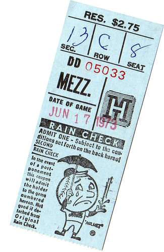
As you can see, the ticket stub shown at right is from 34 years ago, almost to the day. That date happened to be Father’s Day, 1973 — a day that my family spent at the ballpark.
Looking back, this could not have been much of a treat for my father. Egged on by one of those “Take Dad to Shea for Father’s Day!” ads, I had gotten the bright idea that I would pay for his ticket. But I was so pleased with myself for ponying up the entire $2.75 (no small sum for a nine-year-old whose weekly allowance was a quarter and who wasn’t yet big enough to make extra cash mowing lawns around the neighborhood) that I neglected to consider that he still had to pay for my ticket. And my Mom’s ticket. And parking, and gas, and hot dogs. Plus he had to deal with holiday traffic, which must have been a real bitch. Pop, if you’re reading this, I’m sorry — my heart was in the right place, honest. I just hadn’t thought it all through.
Anyway, the Mets won, thanks in part to recent call-up named Ron Hodges, who hit his first major league homer. I remember reading in the paper the next day that Yogi Berra — then the Mets’ manager — said, “The kid’s got some pop, he’ll hit some more of those,” or words to that effect. And he did — exactly 18 more over the course of a 12-year career, to be exact. To this day, I still don’t understand how such a marginal player managed to stay on a big league roster for more than a decade.
The ticket stub, as you can see, is light blue, which happens to be MLB’s designated Father’s Day color (to promote prostate cancer research, don’tcha know). Among yesterday’s highlights:
• Players have been wearing light blue sweatbands on Father’s Day for years now (I first recall seeing it in either ’99 or 2000), but I think this is the first year that the sweatbands were “DAD”-inscribed — sometimes lengthwise, sometimes crosswise.
• Big Papi really outdid himself with the wristbands: one on the left and two on the right (with a bracelet in between the latter two).
• Many umps wore the blue wristbands too.
• The blue ribbons are old hat by now, but I was mildly surprised to see that they even put one on Terry Francona’s pullover.
• Intern Vince Grzegorek (who took his dad to yesterday’s Indians/Braves game) spotted something I don’t recall having seen before: Santiago Casilla wore a ribbon on his cap.
• As has been the case for the past couple of years, several players also wore blue ribbon temporary tattoos, including Manny Delcarmen, J.D. Drew (who had them on both arms), and Hector Carrasco. (Big thanks to Kelly O’Connor for linking to the Drew and Delcarmen pics in yesterday’s comments.)
That’s all nice enough. But the best thing about this promotion has always been when players wear eye blue instead of eye black. The king of that style yesterday was Felix Pie. If that doesn’t stop prostate cancer, nothing will.
Capital Idea: Here’s a cool opportunity for someone in the DC area. The Capitals will be unveiling their new uniforms this Friday, June 22nd, at the Kettler Capitals Iceplex in Arlington. The event begins at 5:30 pm, with the actual unveiling slated for about 6:40. I’ve been invited to attend but am unable to make it, so Caps media director Nate Ewell has very graciously consented to allow a Uni Watch representative to attend in my stead.
The surrogate in question will be permitted (indeed, required) to take photos and notes, and will then prepare a summary report that I’ll post on the blog the following Monday. If you’d like to represent Uni Watch at this event, send me a note explaining why you’re the right person for the job. Please include your full name, address, phone number, and age. Thanks. No more applications, please — member Mike Forgy, a longtime Caps season ticket holder, has been selected for the job.

June Raffle: I’ve got an extra copy of the 2001 MLB Style Guide, which shows the official specs and colors for each team, and I’m going to raffle it off for free. This particular copy has a great history: It was raffled off once before, at the 2006 Uni Watch Athletics Aesthetics Party in Brooklyn, where it was won by Mets by the Numbers impresario Jon Springer, but he recently gave it back to me so I could give it away again. Since then, the cover has gotten some light scratches from Uni Watch mascot Tucker (I think he was expressing his displeasure with the Rockies’ solid-purple alternates), which is sort of the Uni Watch office equivalent of a grass stain on a game-used jersey.
This is a free raffle: Just send an e-mail to uniraffle at earthlink dot net by 10 pm eastern on Thursday, June 21st. One entry per person. But everyone who’s signed up for membership by 9 pm Thursday will automatically get three extra entries. If you’re a member and don’t bother to e-mail an entry to the raffle address, you’ll still get three entries. I’ll announce the winner on Friday, OK? OK!
Speaking of membership, Scott is busily catching up on the next batch of cards, and I should be able to add the rear designs to the roster page within a few days. I’ve also created a gallery of all the current back-card designs, which will be updated as Scott creates each new one.
As for the actual cards, just about everyone in the first batch should have received their cards by now. If you still haven’t received yours by, say, Wednesday, let me know. The new batch should start shipping out by the end of this week.
We’ve also decided upon a little bonus benefit that will come into play down the road: All members who join by the end of July will have a special “Charter Member” designation added to their cards when they renew next year.
Uni Watch News Ticker: A few of my recent ESPN columns have mentioned Chuck Kinder, who wore No. 100 for WVU in 1963, to celebrate the 100th anniversary of West Virginia’s statehood. Now Craig Mullen has turned up a video clip about Kinder — nice find. ”¦ Really interesting note from Chad Stegemiller, who writes: “Friday’s Indianapolis Star had an article about the 40th year of baseball having a state championship. They included a photo showing Arlington High School and Jasper High School playing in the 1967 state semifinals. I immediately noticed the Jasper players having ‘Jasper’ on their back instead of numbers (plus I am sure you will like their choice in hosiery). Unfortunately, there are no front views of Jasper’s jerseys.” ”¦ Reprinted from Friday’s comments: Good article here about the history of NASCAR uniforms. ”¦ Andrew Daull found some great Cooperalls footage at the 3:10 mark of this video. ”¦ On Friday I asked if anyone knew about the little gold circle on the back of Bobby Abreu’s belt. An inside source from an American League clubhouse responded thusly: “It’s a Phiten titanium disc that has become very popular around clubhouses. I’m not sure how well they would work being on the belt (and thus having several layers of clothing between it and the skin) but many players seem to like it, and I even know one photographer who has two on his elbow to help with some pain he was having — he says the stuff works.” And in a related item, several MLB players also believe in Santa Claus, the Tooth Fairy, and Barry Bonds’s negative drug tests. ”¦ Faaaaascinating note from Ryan Hemminger, who writes: “As I was sitting in the gallery at the 10th hole at Oakmont watching Tiger Woods line up a shot on the green, I noticed that he was wearing one black sock and one white sock. I thought that it was odd, and I figured it must be some sort of superstitious thing he does. However, later in the afternoon, at hole number 5, I noticed that Vijay Singh was also wearing two different colored socks — one navy blue and one white [as you can sort of see here — PL]. I can’t confirm with photographic evidence (the USGA is VERY strict about not allowing cameras on the course), but is this some sort of trend among pro golfers, or just an odd coincidence?” Anyone know more about this? ”¦ Lots to like in this photo of Dunbar High (Kentucky) baseball team (with thanks to Scot Williams). ”¦ Bizarre scene at Steelers fantasy camp, where one of the participants was an amputee with a prosthetic leg, which was emblazoned with a Steelers logo (nice find by Dennis O’Neil). ”¦ Redskins long snapper Ethan Albright gave up his uniform number to a teammate in what this article describes as a “private barter transaction” (with thanks to Tim Nichols). ”¦ Speaking of the ‘Skins, when Chris Cooley played with his fly unzipped last year, I figured it was an honest mistake. But having now seen the hot pants that he’s wearing during Redskins minicamp, I’m convinced that the guy is a serious fetishist (with thanks to Stewart Snelson). ”¦ Kudos to Chris Manes, who found this great old photo of the Suns’ 1960s cheerleading uniforms. ”¦ According to the second paragraph on this page (forwarded by Rory Gustison), the Patriots are considering “wearing the team’s throwback red jersey and old helmets for at least one game” in 2009. Yes, three seasons from now. ”¦ Very odd scene in Japan, where Warren Cromartie — who first played baseball for the Expos and then for the Yomiuri Giants in Japan — recently participated in a pro wrestling event and wore a Giants-style uniform for the occasion (it said “Samuraiman” across the chest). Afterward, he held a press conference, where, as Jeremy Brahm puts it, “he looked almost just like he did when he played in Japan.” ”¦ Fernando Rodney’s cap tag was sticking out yesterday. ”¦ Very odd find by Patrick Sharon, who was recently at the Pro Football Hall of Fame in Canton and noticed that a Lee Roy Selmon jersey on display had one orange letter. Just a hunch: I’m guessing that the original heat-pressed white letter peeled off, leaving some discolored fabric in its wake.
Slate.com has a great (and very critical) history of U.S. National team soccer unis link. Yes, the ’94 World Cup disaster is in there…
I posted the new blue WVU football jersey the other day only to find the new white and yellow jerseys are now for sale as well. I also grabbed a picture of the old jersey to compare/contrast.
link
Looks like both of Tiger’s socks were black.
link
left sock
Too bad the V striping on his shirt looked terrible.
I almost forgot, I was at the Orioles-Diamondbacks game on Friday and for the first 5 Arizona batters, the scoreboard guys put the wrong colored logo with the players pictures. At first I thought it a little odd they would use the purple and green logo, but then I looked back up and the new red logo was being used…..whoops.
The Rochester Red Wings wore the light blue yesterday, and then raffled them off to raise money for our local cancer center:
Let’s try that again:
link
How about this:link
Whats with the handwritten seat location on that Mets ticket stub?
[quote comment=”104034″]Slate.com has a great (and very critical) history of U.S. National team soccer unis link. Yes, the ’94 World Cup disaster is in there…[/quote]
Slate is critical of something? Whoa! Big surprise!
I think the best thing out of the patriots article is the silver alt. will be used this year. i love how that looks w/ the helmet
Singh didn’t have two opposite colored socks. He rolled his left(?) ankle on Monday(?) and had it taped/braced up pretty heavily through the week. They made mention of it during the telecast and said that he was using cryogenic therapy to try and make it better.
[quote comment=”104045″]Whats with the handwritten seat location on that Mets ticket stub?[/quote]
Things were a bit less automated in those days… Also, that MH logo on the ticket is for Manufacturer’s Hanover Bank, a now-defunct (or -merged) institution that was a Mets sponsor at the time. My memory on this is fuzzy, but I think maybe those tickets were ordered thru some sort of special MH deal (if you have a checking account, you get three tix for the price of two, or whatever), and maybe MH just got a bunch of blanks and then had to call the Mets to get the exact seat locations each time they made a sale.
Or maybe not.
[quote comment=”104040″]I almost forgot, I was at the Orioles-Diamondbacks game on Friday and for the first 5 Arizona batters, the scoreboard guys put the wrong colored logo with the players pictures. At first I thought it a little odd they would use the purple and green logo, but then I looked back up and the new red logo was being used…..whoops.[/quote]
Or maybe it’s just because we have an ancient scoreboard that our owner is link! The fans would enjoy it, so of course he wants no part of it.
[quote comment=”104035″]I posted the new blue WVU football jersey the other day only to find the new white and yellow jerseys are now for sale as well. I also grabbed a picture of the old jersey to compare/contrast.
link
Ugh…I just really hope we don’t see those gold jerseys actually hit the field.
add Melky Cabrera to the list of players who had the blue ribbon tattoo yeasterday.
Those hot pants are awesome.
Can someone please post or re-post a link where I can get me some of them toe socks? The pitty that gets all the roast beef doesn’t like rubbing up against the pitty that stays home all the time.
Thanks.
[quote comment=”104054″][quote comment=”104040″]I almost forgot, I was at the Orioles-Diamondbacks game on Friday and for the first 5 Arizona batters, the scoreboard guys put the wrong colored logo with the players pictures. At first I thought it a little odd they would use the purple and green logo, but then I looked back up and the new red logo was being used…..whoops.[/quote]
Or maybe it’s just because we have an ancient scoreboard that our owner is link! The fans would enjoy it, so of course he wants no part of it.[/quote]
The Orioles are Fredo Corelone — they are dead to me.
[quote comment=”104056″][quote comment=”104035″]I posted the new blue WVU football jersey the other day only to find the new white and yellow jerseys are now for sale as well. I also grabbed a picture of the old jersey to compare/contrast.
link
Ugh…I just really hope we don’t see those gold jerseys actually hit the field.[/quote]
Oh lord, let’s hope not, but I bet you will see them on any Thursday night game, or like the white pants, any “big game”…..feh
These are still the best WVU uniforms….being worn by the best WVU QB, of course
link
Fernando Rodney’s cap tag was sticking out yesterday. …
Fernando Rodney wears a “do-rag” or whatever they’re called. So it’s possible that part of it, or the tag from it, is hanging down. I think it falls out when his head snaps around to watch a home run go over the fence.
[quote comment=”104062″][quote comment=”104054″][quote comment=”104040″]I almost forgot, I was at the Orioles-Diamondbacks game on Friday and for the first 5 Arizona batters, the scoreboard guys put the wrong colored logo with the players pictures. At first I thought it a little odd they would use the purple and green logo, but then I looked back up and the new red logo was being used…..whoops.[/quote]
Or maybe it’s just because we have an ancient scoreboard that our owner is link! The fans would enjoy it, so of course he wants no part of it.[/quote]
The Orioles are Fredo Corelone — they are dead to me.[/quote]
Niiiiiiiiiice!
Regarding the Selmon jersey: yes, the white heat-pressed letter peeled off, but the orange L isn’t discolored fabric. It’s the orange base layer letter that you see as the outline for the rest of the lettering.
KC’s correct. Vijay had his ankle taped. He rolled on Monday’s practice round.
[quote comment=”104057″]add Melky Cabrera to the list of players who had the blue ribbon tattoo yeasterday.[/quote]
I swear the home plate umpire for the Mets/Yankees game also had a blue ribbon tattoo on his right forearm yesterday. I was like “The ump has a tattoo on his arm???”
NASCAR article about Dale Jr’s new team trying to keep him in the #8 car.
link
Two funny quotes from the article:
“The world will see that Junior could use mandarin Chinese numbers on the car and they would sell just as much souvenirs as the No. 8,” he said. “I personally think that the brand equity is with Junior.
“It’s like the Nike swoosh. There was a Nike before the swoosh, but everybody got to know the swoosh because there was marketing around it. Whatever number he has will take his character.”
hey guns,
great line about the “pink” in yesterdays blog entry… had me rolling, as i tend to use the term pink in that context,
…fan of the pink
…had me some pink time last night
Not that this is totally “uni” related, but I attended my sister’s dance recital yesterday, and during one of the dances, the dancers were all wearing shirts with only one sleeve, but one of them was missing the wrong sleeve. I thought it was interesting, and probably wouldn’t have noticed if I didn’t read this site regularly.
Check out our groovy new Watch Your Back ad, in the right-hand column!
As the Slate article states the men’s national team really needs to adopt an iconic look if it wants to be seen as a powerhouse on the international stage. Leading nations like Brazil, Italy etc only tweak their uniform designs not going for complete overhauls like Team USA does every year or so. Perhaps a red and white hoop design replicating the stripes of the flag, and something really needs to be done about the ball in motion crest currently used the old school crest used on the “Don’t Tread on Me” kits is far superior.
Ron Hodges.Called up because of injuries to Jerry Grote and Duffy Dyer. Career backup. Pretty good OBP, had a tendency to draw a lot of walks. Wore #42, btw.
Where’s the love? LOL. Seemed like in the 70’s there were a lot of his type in the majors..career back up catchers I mean.
it’s amazing that Hector Carrasco pitched with temporary tattoos on his arm yet he gave up a run. I figured the tattoo would be too distracting to the batters.
Is it just me or does Angel Cabrera look happy to have one, but scard that someone is going to steal his trophy?
link
[quote comment=”104034″]Slate.com has a great (and very critical) history of U.S. National team soccer unis link. Yes, the ’94 World Cup disaster is in there…[/quote]
Nice find Lockbull!
I have one of those 1950 USA shirts, still the best shirt ever worn for the National Team.
Go USA, Beat Canada!
obviously the above post should say scared, not scard
Intersting add-on about the tatoos from today’s Boston Globe
“Ink-stained wretches
Some members of the Red Sox, including David Ortiz, Delcarmen, and Crisp, wore temporary tattoos of the blue prostate cancer ribbon. Ortiz’s and Delcarmen’s were on the side of their necks; Crisp’s on the back of his neck. The only problem, Delcarmen said after the game, was the tattoo wasn’t proving so easy to remove . . . “
[quote comment=”104080″]As the Slate article states the men’s national team really needs to adopt an iconic look if it wants to be seen as a powerhouse on the international stage. Leading nations like Brazil, Italy etc only tweak their uniform designs not going for complete overhauls like Team USA does every year or so. Perhaps a red and white hoop design replicating the stripes of the flag, and something really needs to be done about the ball in motion crest currently used the old school crest used on the “Don’t Tread on Me” kits is far superior.[/quote]
I would think that the US Soccer team would have to start winning some games at the world cup if wants to be seen as a powerhouse on the international stage.
[quote comment=”104051″][quote comment=”104045″]Whats with the handwritten seat location on that Mets ticket stub?[/quote]
Things were a bit less automated in those days… Also, that MH logo on the ticket is for Manufacturer’s Hanover Bank, a now-defunct (or -merged) institution that was a Mets sponsor at the time. My memory on this is fuzzy, but I think maybe those tickets were ordered thru some sort of special MH deal (if you have a checking account, you get three tix for the price of two, or whatever), and maybe MH just got a bunch of blanks and then had to call the Mets to get the exact seat locations each time they made a sale.
Or maybe not.[/quote]
I believe Manny Hanny (thats how New Yorkers referred to it…)was one of the places you could make ‘seat reservations’ – my aunt lived in Jackson Heights in those days, and I remember her getting tickets that way, and having to stand in line at a special booth to get actual ducats. I THINK it worked like this: When you made your reservation at the bank, they called the Met ticket office, and got the seat numbers, which were put on a voucher. Then at the special booth, they filled in a blank ticket as shown. I believe the Yankees were the first team that sold tickets via some sort of Ticketron set-up….
Chris, have you seen the Calgary Flames AHL affiliate’s new jerseys? Its possible that the big club will be using this design as well:
link
Manufacturers Hanover.
Always liked the way Ralph Kiner would butcher that name each and every telecast.
MH is one of the many many banks that were merged into what now is JP Morgan Chase.
Manny Hanny, for sure.
And by the way…the Mets beat The Giants 4-1 – Felix Millan had 3 RBIs, including a dinger..Seaver won his 8th game of the year…
link
[quote comment=”104089″][quote comment=”104080″]As the Slate article states the men’s national team really needs to adopt an iconic look if it wants to be seen as a powerhouse on the international stage. Leading nations like Brazil, Italy etc only tweak their uniform designs not going for complete overhauls like Team USA does every year or so. Perhaps a red and white hoop design replicating the stripes of the flag, and something really needs to be done about the ball in motion crest currently used the old school crest used on the “Don’t Tread on Me” kits is far superior.[/quote]
I would think that the US Soccer team would have to start winning some games at the world cup if wants to be seen as a powerhouse on the international stage.[/quote]
I agree – we need to win more games outside of CONCACAF to be seen as a powerhouse. The jersey, frankly, has nothing to do with the performance.
With that said, I’d rather see the team wear something red rather than blue for the color jersey (and the horizontal stripe on the blue jersey is just bland and boring). I’m still a proponent of the current white jersey.
last weeks SI cover
link
reminded me of this SI cover (of arguably the, ahem, greatest infield of, cough, all time)
link
of course edgardo alfonzo was the best player in baseball for like a year…
Paul, thanks for the info on the Father’s Day game. My first Met game was Mother’s Day 1969, a doubleheader (for you young ‘uns, that’s 2 scheduled games in 1 day) against Houston. I clicked your link and now I know that the starting pitchers were Don Cardwell and Tug McGraw. I never knew that Tug was a starter.
Oh lord, let’s hope not, but I bet you will see them on any Thursday night game, or like the white pants, any “big gameâ€Â…..feh
I would bet anybody the first game you see those worn will be the Maryland game on Sept. 13 and then they will reappear on Nov. 8 for the Louisville game.
[quote comment=”104096″]last weeks SI cover
link
reminded me of this SI cover (of arguably the, ahem, greatest infield of, cough, all time)
link
of course edgardo alfonzo was the best player in baseball for like a year…[/quote]
Fun factoid: The caption on that earlier cover originally referred to “Ray Ordoñez” (instead of Rey, which is the proper spelling). They had to do a second print run to fix the error.
[quote comment=”104097″]Paul, thanks for the info on the Father’s Day game. My first Met game was Mother’s Day 1969, a doubleheader (for you young ‘uns, that’s 2 scheduled games in 1 day) against Houston. I clicked your link and now I know that the starting pitchers were Don Cardwell and Tug McGraw. I never knew that Tug was a starter.[/quote]
If you look at the Tugger’s link, you’ll see he made 39 big league starts — including one in 1983, his next-to-last season.
Very odd scene in Japan, where Warren Cromartie — who first played baseball for the Expos and then for the Yomiuri Giants in Japan — recently participated in a pro wrestling event and wore a Giants-style uniform for the occasion (it said “Samuraiman†across the chest).
Anybody notice the ref wearing a mask? Seems a bit opposite of what I know about professional wrestling where the wrestlers wear the masks. Maybe this is the next step for NBA refs???
[quote comment=”104096″]last weeks SI cover
link
reminded me of this SI cover (of arguably the, ahem, greatest infield of, cough, all time)
link
of course edgardo alfonzo was the best player in baseball for like a year…[/quote]
I know why Olerud wore the helmet in the field, but for a magazine shoot? Was he afraid a lamp or something might fall on his head?
There was a branch of Manufacturers Hanover at Fifth Avenue & Union St. in Park Slope, Brooklyn (Hi, Paul!). Now it’s a gym called Body Reserve. The bank had its windows smashed in by rioters during ethnic street-fighting in – get this – June 1973.
[quote comment=”104102″][quote comment=”104096″]last weeks SI cover
link
reminded me of this SI cover (of arguably the, ahem, greatest infield of, cough, all time)
link
of course edgardo alfonzo was the best player in baseball for like a year…[/quote]
I know why Olerud wore the helmet in the field, but for a magazine shoot? Was he afraid a lamp or something might fall on his head?[/quote]
he probably read of michael jacksons misfortune with his head (more specifically his hair) at a filming for a pepsi commercial, and johnny o didnt want anything to happen to his head for his first and only si cover shoot.
[quote comment=”104119″][quote comment=”104102″][quote comment=”104096″]last weeks SI cover
link
reminded me of this SI cover (of arguably the, ahem, greatest infield of, cough, all time)
link
of course edgardo alfonzo was the best player in baseball for like a year…[/quote]
I know why Olerud wore the helmet in the field, but for a magazine shoot? Was he afraid a lamp or something might fall on his head?[/quote]
he probably read of michael jacksons misfortune with his head (more specifically his hair) at a filming for a pepsi commercial, and johnny o didnt want anything to happen to his head for his first and only si cover shoot.[/quote]
I suppose, but if he was worried about SI shooting off fireworks near his head like Pepsi did for Jacko, he needn’t have worried……
[quote comment=”104120″][quote comment=”104119″][quote comment=”104102″][quote comment=”104096″]last weeks SI cover
link
reminded me of this SI cover (of arguably the, ahem, greatest infield of, cough, all time)
link
of course edgardo alfonzo was the best player in baseball for like a year…[/quote]
I know why Olerud wore the helmet in the field, but for a magazine shoot? Was he afraid a lamp or something might fall on his head?[/quote]
he probably read of michael jacksons misfortune with his head (more specifically his hair) at a filming for a pepsi commercial, and johnny o didnt want anything to happen to his head for his first and only si cover shoot.[/quote]
I suppose, but if he was worried about SI shooting off fireworks near his head like Pepsi did for Jacko, he needn’t have worried……[/quote]
tell that to casey kotchman…
I just wanna express my thanks to all you Yankee haters [about 85% of you all in here] for waking up the sleeping lions/giants of New York. link
[quote comment=”104122″]I just wanna express my thanks to all you Yankee haters [about 85% of you all in here] for waking up the sleeping lions/giants of New York. link[/quote]
Man, those wristbands look really weird in that pic
[quote comment=”104124″][quote comment=”104122″]I just wanna express my thanks to all you Yankee haters [about 85% of you all in here] for waking up the sleeping lions/giants of New York. link[/quote]
Man, those wristbands look really weird in that pic[/quote]
I wonder if you had to be a father to wear one?
[quote comment=”104122″]I just wanna express my thanks to all you Yankee haters [about 85% of you all in here] for waking up the sleeping lions/giants of New York. link[/quote]
No satin jacket? huh
interesting that PL still has that ticket.
like many probably, i try to keep every ticket/grounds pass for all events i go to, sporting/concerts/plays, etc.
i put them together chronologically in an album. and as i was doing so, there was a story for almost every ticket i looked at.
the one ticket i wish i had was phillies/reds either 6/15/79, 6/16/79 or 8/29/79…
it was my first mlb game ever.
retrosheet helped me figure the dates cuz i remember bench going deep…
my most prized are sixers/bulls tickets- games in which jordan got his 5000, 10,000, 15,000 points and when he became the bulls all time leading scorer.
as well as the game when dean smith broke adolph rupps record for career wins.
my ticket album is like a book of great memories…
[quote comment=”104075″]hey guns,
great line about the “pink” in yesterdays blog entry… had me rolling, as i tend to use the term pink in that context,
…fan of the pink
…had me some pink time last night[/quote]
Thanks, I thought it was pretty witty. I think Paula Creamer is pretty decent looking, actually.
Broker75- On your way to what? 2nd place. You have got to be kidding me with that comment! A few weeks ago all the Yankee fans were talking about getting rid of Joe and now you are “on your way.” Good god, no wonder so many people hate the yankees, including link
[quote comment=”104121″]tell that to casey kotchman…[/quote]
What happened to Casey Kotchman……?
link
[quote comment=”104091″]Chris, have you seen the Calgary Flames AHL affiliate’s new jerseys? Its possible that the big club will be using this design as well:
link
Ugh. Can’t stand vertical stripes like that. I think their jerseys are just fine the way they are.
[quote comment=”104102″][quote comment=”104096″]last weeks SI cover
link
reminded me of this SI cover (of arguably the, ahem, greatest infield of, cough, all time)
link
of course edgardo alfonzo was the best player in baseball for like a year…[/quote]
I know why Olerud wore the helmet in the field, but for a magazine shoot? Was he afraid a lamp or something might fall on his head?[/quote]
He wanted Rickey Henderson to see him with the helmet on again….
[quote comment=”104131″][quote comment=”104121″]tell that to casey kotchman…[/quote]
What happened to Casey Kotchman……?[/quote]
he is the guy from the angels who go hit in the head on a throw back to 2nd, rendereing a concussion… even with a helmet on… was it friday or saturday?
Regarding US Soccer unis, I thought the blue 94 jersey was quite cool (better than the awful adidas templates that year), but the US generally have had poor designs since going with nike, with the exception of the last world cup, I dig the white shirt with the vertical stripes.
Here’s an article about one of the 28 NCAA championship teams that are visiting the white house today:
link
The Commodores (Vanderbuilt bowling team) will deliver an authentic team jersey and a red, white and blue swirled bowling ball with the team logo to President Bush during today’s NCAA Division I Champions Day.
[quote comment=”104128″]interesting that PL still has that ticket.[/quote]
I have all my stubs from 1971 (first year I attended a game) thru ’83ish. Then, for reasons that aren’t really clear to me, I stopped saving them.
There is something VERY fucked up about these “tickets” that you can now print on your home printer — just a sheet of paper with a bar code. Where’s the collectible/memorabilia satisfaction in THAT? Convenient, yes, but at such a price….
[quote comment=”104148″][quote comment=”104128″]interesting that PL still has that ticket.[/quote]
I have all my stubs from 1971 (first year I attended a game) thru ’83ish. Then, for reasons that aren’t really clear to me, I stopped saving them.
There is something VERY fucked up about these “tickets” that you can now print on your home printer — just a sheet of paper with a bar code. Where’s the collectible/memorabilia satisfaction in THAT? Convenient, yes, but at such a price….[/quote]
Paul, I couldn’t agree more. I can’t STAND the new barcode piece of paper tickets, but the way technology moves, I believe it. I like the good old fashioned tickets. I collect all of my tickets also. I think I have all tickets from 1986 or so. I think I unfortunately even have 1 or 2 of those piece of paper bar codes.
BALTIMORE – Sam Perlozzo was fired as manager of the Baltimore Orioles on Monday with the last-place team in the midst of an eight-game losing streak.
I need that Kent Tekulve t-shirt from that Watch Your Back ad.
[quote comment=”104151″]BALTIMORE – Sam Perlozzo was fired as manager of the Baltimore Orioles on Monday with the last-place team in the midst of an eight-game losing streak.[/quote]
I think they should take a better look at the GMs, not Perlozzo. You’re giving a guy ground beef and asking him to cook Filet Mignon! Not gonna happen. They just cut loose a good manager. It’s not like he has control over how lousy the bullpen is! He didn’t sign them!
What were you saying earlier…Fredo!? Well, evidently, Ma Corleonne died, and Fredo (Perlozzo) just went out on the boat! LOUSY!
I work on the field at Rogers Centre (Blue Jays), and yesterday we had everyone on the field wearing the wristbands and many wearing the tats as well—security, grounds crew, ballboys, and of course the umps and players. Pretty sweet, and a nice souvenir.
[quote comment=”104143″]he is the guy from the angels who go hit in the head on a throw back to 2nd, rendereing a concussion… even with a helmet on… was it friday or saturday?[/quote]
Oh OK…. I thought maybe someone set off fireworks near his head at a photoshoot or something.
[quote comment=”104137″][quote comment=”104102″][quote comment=”104096″]last weeks SI cover
link
reminded me of this SI cover (of arguably the, ahem, greatest infield of, cough, all time)
link
of course edgardo alfonzo was the best player in baseball for like a year…[/quote]
I know why Olerud wore the helmet in the field, but for a magazine shoot? Was he afraid a lamp or something might fall on his head?[/quote]
He wanted Rickey Henderson to see him with the helmet on again….[/quote]
Good one.
I can just imagine Rickey looking at the cover and saying (aloud of course), “Rickey is amazed that someone would wear a batting helmt on a cover. Now that Rickey mentions it, Rickey played with some guy who wore a helmet in the field. These two cats should get together”.
[quote comment=”104161″][quote comment=”104137″][quote comment=”104102″][quote comment=”104096″]last weeks SI cover
link
reminded me of this SI cover (of arguably the, ahem, greatest infield of, cough, all time)
link
of course edgardo alfonzo was the best player in baseball for like a year…[/quote]
I know why Olerud wore the helmet in the field, but for a magazine shoot? Was he afraid a lamp or something might fall on his head?[/quote]
He wanted Rickey Henderson to see him with the helmet on again….[/quote]
Good one.
I can just imagine Rickey looking at the cover and saying (aloud of course), “Rickey is amazed that someone would wear a batting helmt on a cover. Now that Rickey mentions it, Rickey played with some guy who wore a helmet in the field. These two cats should get together”.[/quote]
“That guy i played with in toronto, and that other guy i played with while with the mets were the symbols of first basemen wearing helmets in the field. But today, I’m the greatest of all time. Thank you.”
i think that is EXACTLY what rickey said after breaking brock’s record…
[quote comment=”104101″]Very odd scene in Japan, where Warren Cromartie — who first played baseball for the Expos and then for the Yomiuri Giants in Japan — recently participated in a pro wrestling event and wore a Giants-style uniform for the occasion (it said “Samuraiman†across the chest).
Anybody notice the ref wearing a mask? Seems a bit opposite of what I know about professional wrestling where the wrestlers wear the masks. Maybe this is the next step for NBA refs???[/quote]
Looking at who he’s wrestling, the match took place in a puroresu (Japanese pro wrestling) promotion called HUSTLE. Part of their promotion, if I remember correctly, is that refs wear masks for some reason or another. HUSTLE pretty much has the single weirdest gimmicks you’ll ever see; the only American promotion that might compare to it is CHIKARA. I have seen some videos of it, and basically, the promotion is like Power Rangers but wrestling. It’s actually rather fun to watch just for the outlandish gimmicks and whatnot. link
[quote comment=”104148″][quote comment=”104128″]interesting that PL still has that ticket.[/quote]
I have all my stubs from 1971 (first year I attended a game) thru ’83ish. Then, for reasons that aren’t really clear to me, I stopped saving them.
There is something VERY fucked up about these “tickets” that you can now print on your home printer — just a sheet of paper with a bar code. Where’s the collectible/memorabilia satisfaction in THAT? Convenient, yes, but at such a price….[/quote]
I’ve always kept my ticket stubs from different events (somewhat randomly)over the years. About a year ago I was moving and found a baseball card tin that had a bunch of my old stubs in it. I started flipping thru them and came across two AHL Kentucky Thoroughblades ticket stubs. As I looked at the dates on the stubs, the signifigance of the stubs hit me like a Mack truck. At the time one of my brothers had Leukemia. We would all (my parents, me and my 3 brothers)go to Thoroughblade games as a distraction from everything else that was going on in our and particularly my brother’s life. During that time my brother passed away. One of the ticket stubs was from the last game we saw with him and the other was from the first game we saw without him. Now the mere sight of those stubs brings back more great memories than any sheet of paper with a barcode could ever do.
[quote comment=”104096″]last weeks SI cover
link
reminded me of this SI cover (of arguably the, ahem, greatest infield of, cough, all time)
link
of course edgardo alfonzo was the best player in baseball for like a year…[/quote]
I remeber being happy that Jose Reyes was replacing Rey Ordoñez, because this “Rey” could hit too.
Its entirely plausible/probable that the “one white sock” worn by these golfers, is an ankle brace of some sort.
[quote comment=”104130″]Broker75- On your way to what? 2nd place. You have got to be kidding me with that comment! A few weeks ago all the Yankee fans were talking about getting rid of Joe and now you are “on your way.” Good god, no wonder so many people hate the yankees, including link[/quote]
Whoever says ‘get rid of Joe Torre’ should be slapped upside the head with a trout..
I noticed yesterday during the Tigers-Phillies game that the Phillies, rather than go with the blue wristbands, wore their blue-brimmed alternate caps.
Pic Here:
link
[quote comment=”104153″][quote comment=”104151″]BALTIMORE – Sam Perlozzo was fired as manager of the Baltimore Orioles on Monday with the last-place team in the midst of an eight-game losing streak.[/quote]
I think they should take a better look at the GMs, not Perlozzo. You’re giving a guy ground beef and asking him to cook Filet Mignon! Not gonna happen. They just cut loose a good manager. It’s not like he has control over how lousy the bullpen is! He didn’t sign them!
What were you saying earlier…Fredo!? Well, evidently, Ma Corleonne died, and Fredo (Perlozzo) just went out on the boat! LOUSY![/quote]
Better yet, they hired Andy MacPhail…at least things are happening. If the buck can stop at him, rather than the small greek lawyer, for decision making this may be a landmark day in Baltimore Baseball.
And I’d love to see Davey Johnson back…no disrespect to Girardi, but he’s a Yankee. I don’t want a Yankee leading my team….we know how that link.
Both Tiger and, more recently, Vijay suffered ankle injuries. They were not wearing two different color socks…they’re ankles were wrapped. They made mention of Vijay’s noticable limp during the round yesterday.
I noticed yesterday during the Tigers-Phillies game that the Phillies, rather than go with the blue wristbands, wore their blue-brimmed alternate caps.
Pic Here:
link….
The Phillies always wear those hats for interleague games. Some of the players were wearing the blue wristbands, just none shown in this picture.
[quote comment=”104177″][quote comment=”104153″][quote comment=”104151″]BALTIMORE – Sam Perlozzo was fired as manager of the Baltimore Orioles on Monday with the last-place team in the midst of an eight-game losing streak.[/quote]
I think they should take a better look at the GMs, not Perlozzo. You’re giving a guy ground beef and asking him to cook Filet Mignon! Not gonna happen. They just cut loose a good manager. It’s not like he has control over how lousy the bullpen is! He didn’t sign them!
What were you saying earlier…Fredo!? Well, evidently, Ma Corleonne died, and Fredo (Perlozzo) just went out on the boat! LOUSY![/quote]
Better yet, they hired Andy MacPhail…at least things are happening. If the buck can stop at him, rather than the small greek lawyer, for decision making this may be a landmark day in Baltimore Baseball.
And I’d love to see Davey Johnson back…no disrespect to Girardi, but he’s a Yankee. I don’t want a Yankee leading my team….we know how that link.[/quote]
Until the Troll running the show sells off the team…they’re doomed. This would be a REALLY good time for Cal to come riding in to save the day. Broker some kind of buy-out, blow the team up (I’m talking failsafe keys and buttons that bring the house down) and rebuild it from scratch, the way it’s supposed to be.
[quote comment=”104171″][quote comment=”104148″][quote comment=”104128″]interesting that PL still has that ticket.[/quote]
I have all my stubs from 1971 (first year I attended a game) thru ’83ish. Then, for reasons that aren’t really clear to me, I stopped saving them.
There is something VERY fucked up about these “tickets” that you can now print on your home printer — just a sheet of paper with a bar code. Where’s the collectible/memorabilia satisfaction in THAT? Convenient, yes, but at such a price….[/quote]
I’ve always kept my ticket stubs from different events (somewhat randomly)over the years. About a year ago I was moving and found a baseball card tin that had a bunch of my old stubs in it. I started flipping thru them and came across two AHL Kentucky Thoroughblades ticket stubs. As I looked at the dates on the stubs, the signifigance of the stubs hit me like a Mack truck. At the time one of my brothers had Leukemia. We would all (my parents, me and my 3 brothers)go to Thoroughblade games as a distraction from everything else that was going on in our and particularly my brother’s life. During that time my brother passed away. One of the ticket stubs was from the last game we saw with him and the other was from the first game we saw without him. Now the mere sight of those stubs brings back more great memories than any sheet of paper with a barcode could ever do.[/quote]
isnt it amazing you got all that, just from the site of an old ticket stub?
we all have memories like that, (some more special than others, as youve stated)
they arent stubs, they are roadmaps to memory lane…
While looking for link pic of Ozzie Smith on google I stumbled across link article about link link in a Cooperstown old time recreation game, complete with era link
Check out the link Ozzie is throwing too.
I tried to search and see if this had been posted before, but I have only been reading this blog and Paul’s column for just over a year, so this could be very easily be a repost.
[quote comment=”104177″][quote comment=”104153″][quote comment=”104151″]BALTIMORE – Sam Perlozzo was fired as manager of the Baltimore Orioles on Monday with the last-place team in the midst of an eight-game losing streak.[/quote]
I think they should take a better look at the GMs, not Perlozzo. You’re giving a guy ground beef and asking him to cook Filet Mignon! Not gonna happen. They just cut loose a good manager. It’s not like he has control over how lousy the bullpen is! He didn’t sign them!
What were you saying earlier…Fredo!? Well, evidently, Ma Corleonne died, and Fredo (Perlozzo) just went out on the boat! LOUSY![/quote]
Better yet, they hired Andy MacPhail…at least things are happening. If the buck can stop at him, rather than the small greek lawyer, for decision making this may be a landmark day in Baltimore Baseball.
And I’d love to see Davey Johnson back…no disrespect to Girardi, but he’s a Yankee. I don’t want a Yankee leading my team….we know how that link.[/quote]
I some how don’t think it’s the coaching in Baltimore, it might have something to do with it, but the owner is ruining this franchise, same thing is happening in Chicago with the Blackhawks.
The Orioles need a face lift, and make it a five team AL East again. Right now there are only three teams worth noting, the Yankees, Red Sox and Blue Jays. And those Devil Eggs or Sunshine Rays[that team from Tampa], why are they so worried about changing their name and colors when they barely win 60 games a year, shouldn’t they be worried more about putting a decent product in one of the worst baseball stadiums in the game? I think the Orioles have the ‘Sosa jinx’.
Paul can we get a close up of Mr Met from your ticket stub? I have never seen that picture of him. It looks amazing! Or I guess I should say amazin’!
[quote comment=”104183″]While looking for link pic of Ozzie Smith on google I stumbled across link article about link link in a Cooperstown old time recreation game, complete with era link
Check out the link Ozzie is throwing too.
I tried to search and see if this had been posted before, but I have only been reading this blog and Paul’s column for just over a year, so this could be very easily be a repost.[/quote]
At the Sports Legends Museum, right there at Camden Yards, they sell replica turn of the century balls for about $9. They are made of one piece of leather and comein white and brown. I got a white one. It’s a bit bigger than a new one. They would go well with these unis:
link
[quote comment=”104177″][quote comment=”104153″][quote comment=”104151″]BALTIMORE – Sam Perlozzo was fired as manager of the Baltimore Orioles on Monday with the last-place team in the midst of an eight-game losing streak.[/quote]
I think they should take a better look at the GMs, not Perlozzo. You’re giving a guy ground beef and asking him to cook Filet Mignon! Not gonna happen. They just cut loose a good manager. It’s not like he has control over how lousy the bullpen is! He didn’t sign them!
What were you saying earlier…Fredo!? Well, evidently, Ma Corleonne died, and Fredo (Perlozzo) just went out on the boat! LOUSY![/quote]
Better yet, they hired Andy MacPhail…at least things are happening. If the buck can stop at him, rather than the small greek lawyer, for decision making this may be a landmark day in Baltimore Baseball.
And I’d love to see Davey Johnson back…no disrespect to Girardi, but he’s a Yankee. I don’t want a Yankee leading my team….we know how that link.[/quote]
see and i remember him only as a met…
and one who was unable to negotiate an agreement to get his old number 16 back upon his return to the mets in 86…
oh, and is there a difference between peter angelos and donald sterling?
[quote comment=”104144″]Regarding US Soccer unis, I thought the blue 94 jersey was quite cool (better than the awful adidas templates that year), but the US generally have had poor designs since going with nike, with the exception of the last world cup, I dig the white shirt with the vertical stripes.[/quote]
I have to beg to differ. To any football (soccer) fan, one glance at most national team’s unis tells you pretty much who’s playing, and by extension what to expect, whether it be Mexico, England, Italy, Brazil, etc. no matter if it’s today or 20-30 years ago. On the other hand, it’s hard to imagine anyone wearing the ’94 US kits anyplace outside of the Astrodome for a baseball game. The US had a grand opportunity in ’94 to project a lasting image to the world, and they absolutely blew it. Winning may solve the problem (see Bucs, Tampa Bay), but it may take another 20 years or so to get over the messy unis of the past. It’s too bad you can’t just glance at a US Soccer uni like you can a Penn State football uni and know what to expect.
The Harrisburg (PA) Senators, AAA affiliate of the Washington Nationals, wore some sort of special jersey this weekend, but I have not found any good pics which show them. All I found are these two:
link
link
link
[quote comment=”104193″]The Harrisburg (PA) Senators, AAA affiliate of the Washington Nationals, wore some sort of special jersey this weekend, but I have not found any good pics which show them. All I found are these two:
link
link
Whoops, my bad, AA Affiliate…
The CHL just announced their new All Star Game unis
link
Ps. I think Badds was the best dressed golfer yesterday. He style is sweet.
link
[quote comment=”104148″]
There is something VERY fucked up about these “tickets” that you can now print on your home printer — just a sheet of paper with a bar code. Where’s the collectible/memorabilia satisfaction in THAT? Convenient, yes, but at such a price….[/quote]
I had a print-at-home ticket to game 2 of the 2005 World Series (which would go on to be arguably the greatest game in White Sox history). I think lots of people did, because anybody who bought tickets from the public sale (as opposed to the season ticketholder sale) only had a choice of picking up the tickets at the ballpark in advance or printing at home, no mail or will call. The White Sox must have thought that wasn’t very fair either, because (I believe after the Series, although I’m not positive), they announced that everybody who had print-at-home tickets would be sent regular tickets. Sadly, they were ticketmaster printed tickets (although I they still had either a playoff of a World Series logo, I forget) and not the really neat custom season ticket holder ones, but I still thought it was a nice gesture (especially since they gave away ticketholders at the game).
[quote comment=”104148″][quote comment=”104128″]interesting that PL still has that ticket.[/quote]
I have all my stubs from 1971 (first year I attended a game) thru ’83ish. Then, for reasons that aren’t really clear to me, I stopped saving them.
There is something VERY fucked up about these “tickets” that you can now print on your home printer — just a sheet of paper with a bar code. Where’s the collectible/memorabilia satisfaction in THAT? Convenient, yes, but at such a price….[/quote]
Some friends of mine took me to a Rangers (hometown team) game against the Red Sox (my team). We got real tickets, which is good as I collect them, but then I found that the tickets could be redeemed for a meal (hot dog, soft drink and peanuts)at the concession stand…I had to do it but I figured they could just mark through it with a Sharpie to signify I had redeemed the ticket. Sadly, they persisted and I now have a ticket missing from my collection.
[quote comment=”104148″][quote comment=”104128″]interesting that PL still has that ticket.[/quote]
I have all my stubs from 1971 (first year I attended a game) thru ’83ish. Then, for reasons that aren’t really clear to me, I stopped saving them.
There is something VERY fucked up about these “tickets” that you can now print on your home printer — just a sheet of paper with a bar code. Where’s the collectible/memorabilia satisfaction in THAT? Convenient, yes, but at such a price….[/quote]
I too was an avid stub collector, and yes printing tickets on you home printer is quite odd; but at least you would have a souvenir… unlike this in Oakland. link
[quote comment=”104195″][quote comment=”104193″]The Harrisburg (PA) Senators, AAA affiliate of the Washington Nationals, wore some sort of special jersey this weekend, but I have not found any good pics which show them. All I found are these two:
link
link
Whoops, my bad, AA Affiliate…[/quote]
Yea I was confused, and only because I had just finished reading an link about some player from the Washington Nationals’ AAA affiliate Columbus Clippers who broke a 95 year old hit streak with his 43rd consecutive gave with a hit.
These claim to be the new NHL jerseys. I hope they are fake, my Lightning look gross. Plus, I dont remember Pitts moving to KC…
link
[quote comment=”104148″][quote comment=”104128″]interesting that PL still has that ticket.[/quote]
I have all my stubs from 1971 (first year I attended a game) thru ’83ish. Then, for reasons that aren’t really clear to me, I stopped saving them.
There is something VERY fucked up about these “tickets” that you can now print on your home printer — just a sheet of paper with a bar code. Where’s the collectible/memorabilia satisfaction in THAT? Convenient, yes, but at such a price….[/quote]
You’re telling me! I got to go to two World Series games in Chicago in 2005. Both tickets through TicketFast.
Cool thing they did… months later they sent us real tickets to the game for memorabillia purposes.
However the crappy thing was they sent normal, boring TicketMaster tickets… not the huge ones with the World Series logo.
Hey East Bay Uni-Watchers …
Check out this logo I made for us.
link
The US soccer kits do need to stay somewhat consistant, and if it were my choice, I’d go with the royal blue pinstripe with blue shorts and then the red DTOM kit. If we were to stay with these, they’d easily be recognized. How many teams have a pinstriped kit, and the DTOM one has such an iconic look to it.
Seriously, can’t get better than this:
[IMG]http://i147.photobucket.com/albums/r315/aawags11/Eddie.jpg[/IMG]
[IMG]http://i147.photobucket.com/albums/r315/aawags11/Johnson2.jpg[/IMG]
[quote comment=”104210″]These claim to be the new NHL jerseys. I hope they are fake, my Lightning look gross. Plus, I dont remember Pitts moving to KC…
link
That Capitals one has been floating around the net for months, so I doubt it is real….at least it is my hope they are not real……ew
“Redskins long snapper Ethan Albright gave up his uniform number to a teammate in what this article describes as a ‘private barter transaction'”
I think Ethan Albrigth was the lowest ranked player in Madden 2007. I think Gregg Easterbrook did a short deal about this in the winter just as the game was coming out. A reporter asked him how he felt about being the lowest ranked person (even below all the punters and kickers) in a video game, and he said “So? I’m a long snapper, what do you expect?” or something to that effect.
[quote comment=”104218″][quote comment=”104210″]These claim to be the new NHL jerseys. I hope they are fake, my Lightning look gross. Plus, I dont remember Pitts moving to KC…
link
That Capitals one has been floating around the net for months, so I doubt it is real….at least it is my hope they are not real……ew[/quote]
Yeah, really! I think we’re seeing the product of a bunch of people with good Photoshop ability and a lot of free time on their hands.
The ones at the top of the link…of the Original 6…I remember those were renderings that someone did of what MIGHT be. Paul had a link to them posted right after the new design templates were unveiled at the All-Star Game. So I’m fairly sure they’re not legit.
[quote comment=”104210″]These claim to be the new NHL jerseys. I hope they are fake, my Lightning look gross. Plus, I dont remember Pitts moving to KC…
link
These look like more of those fake photoshop jobs floating around, this time in a style guide format.
I’m pretty sure those Caps ones are from a year ago. And I think Ted is not going back to the old “stick as t” logo.
[quote comment=”104170″][quote comment=”104101″]Very odd scene in Japan, where Warren Cromartie — who first played baseball for the Expos and then for the Yomiuri Giants in Japan — recently participated in a pro wrestling event and wore a Giants-style uniform for the occasion (it said “Samuraiman†across the chest).
HUSTLE has been home to some very strange things over the years, many of which were more serious Japanese wrestling stars with outlandish gimmicks. Their most famous worker is probably Razor Ramon Hard Gay, who became a variety show superstar.
I wouldn’t compare HUSTLE to CHIKARA. I think HUSTLE is probably closer to Kaiju Big Battel. CHIKARA I prefer to call “American Lucha Libre.”
Anybody notice the ref wearing a mask? Seems a bit opposite of what I know about professional wrestling where the wrestlers wear the masks. Maybe this is the next step for NBA refs???[/quote]
Looking at who he’s wrestling, the match took place in a puroresu (Japanese pro wrestling) promotion called HUSTLE. Part of their promotion, if I remember correctly, is that refs wear masks for some reason or another. HUSTLE pretty much has the single weirdest gimmicks you’ll ever see; the only American promotion that might compare to it is CHIKARA. I have seen some videos of it, and basically, the promotion is like Power Rangers but wrestling. It’s actually rather fun to watch just for the outlandish gimmicks and whatnot. link[/quote]
Anyone else hate the Oregon State baseball road uni’s as much as I do? So much about the uni’s are nice, except for the white “OSU” that just blows the whole thing. The new interlocking “OS” on the caps is a HUGE improvement over the horizontal OSU of old (which for some reason is still on the batting helmets).
Link:
link
[quote comment=”104170″][quote comment=”104101″]Very odd scene in Japan, where Warren Cromartie — who first played baseball for the Expos and then for the Yomiuri Giants in Japan — recently participated in a pro wrestling event and wore a Giants-style uniform for the occasion (it said “Samuraiman†across the chest).
Anybody notice the ref wearing a mask? Seems a bit opposite of what I know about professional wrestling where the wrestlers wear the masks. Maybe this is the next step for NBA refs???[/quote]
Looking at who he’s wrestling, the match took place in a puroresu (Japanese pro wrestling) promotion called HUSTLE. Part of their promotion, if I remember correctly, is that refs wear masks for some reason or another. HUSTLE pretty much has the single weirdest gimmicks you’ll ever see; the only American promotion that might compare to it is CHIKARA. I have seen some videos of it, and basically, the promotion is like Power Rangers but wrestling. It’s actually rather fun to watch just for the outlandish gimmicks and whatnot. link[/quote]
HUSTLE has been home to some very strange things over the years, many of which were more serious Japanese wrestling stars with outlandish gimmicks. Their most famous worker is probably Razor Ramon Hard Gay, who became a variety show superstar.
I wouldn’t compare HUSTLE to CHIKARA. I think HUSTLE is probably closer to Kaiju Big Battel. CHIKARA I prefer to call “American Lucha Libre.”
[quote comment=”104213″]Hey East Bay Uni-Watchers …
Check out this logo I made for us.
link[/quote]
I don’t know what East Bay is, but looks nice!
Why “Warrior” and not “Warriors”?
[quote comment=”104194″]link[/quote]
When did Andy McPhail (“spelled F-A-I-L”, as they used to say in Chicago) become COO of the O’s?
[quote comment=”104201″][quote comment=”104148″]
There is something VERY fucked up about these “tickets” that you can now print on your home printer — just a sheet of paper with a bar code. Where’s the collectible/memorabilia satisfaction in THAT? Convenient, yes, but at such a price….[/quote]
I had a print-at-home ticket to game 2 of the 2005 World Series (which would go on to be arguably the greatest game in White Sox history). I think lots of people did, because anybody who bought tickets from the public sale (as opposed to the season ticketholder sale) only had a choice of picking up the tickets at the ballpark in advance or printing at home, no mail or will call. The White Sox must have thought that wasn’t very fair either, because (I believe after the Series, although I’m not positive), they announced that everybody who had print-at-home tickets would be sent regular tickets. Sadly, they were ticketmaster printed tickets (although I they still had either a playoff of a World Series logo, I forget) and not the really neat custom season ticket holder ones, but I still thought it was a nice gesture (especially since they gave away ticketholders at the game).[/quote]
Ha! We think alike. I pretty much posted the same thing below you word-for-word.
How bout the ol Jasper Wildcats ending up in the Ticker today? Just need to point out, the Cats didn’t win that game back in 67, but have become quite the Dynasty, winning 5 out of the past 10 IHSAA championships. All of those coming after the graduation of one Scott Rolen.
[quote comment=”104204″][quote comment=”104148″][quote comment=”104128″]interesting that PL still has that ticket.[/quote]
I have all my stubs from 1971 (first year I attended a game) thru ’83ish. Then, for reasons that aren’t really clear to me, I stopped saving them.
There is something VERY fucked up about these “tickets” that you can now print on your home printer — just a sheet of paper with a bar code. Where’s the collectible/memorabilia satisfaction in THAT? Convenient, yes, but at such a price….[/quote]
I too was an avid stub collector, and yes printing tickets on you home printer is quite odd; but at least you would have a souvenir… unlike this in Oakland. link
This article talks about that also:
link
People are using their driver’s licenses or credit cards as tickets.
[quote comment=”104189″][quote comment=”104144″]Regarding US Soccer unis, I thought the blue 94 jersey was quite cool (better than the awful adidas templates that year), but the US generally have had poor designs since going with nike, with the exception of the last world cup, I dig the white shirt with the vertical stripes.[/quote]
I have to beg to differ. To any football (soccer) fan, one glance at most national team’s unis tells you pretty much who’s playing, and by extension what to expect, whether it be Mexico, England, Italy, Brazil, etc. no matter if it’s today or 20-30 years ago. On the other hand, it’s hard to imagine anyone wearing the ’94 US kits anyplace outside of the Astrodome for a baseball game. The US had a grand opportunity in ’94 to project a lasting image to the world, and they absolutely blew it. Winning may solve the problem (see Bucs, Tampa Bay), but it may take another 20 years or so to get over the messy unis of the past. It’s too bad you can’t just glance at a US Soccer uni like you can a Penn State football uni and know what to expect.[/quote]
The only teams you can glance and know who is playing is really Brazil, however you coudl extend and say Italy, and perhaps argentina, but other than that you cant pick out many other countires, EVERYONE’S football kits change so much. Mexico used ot be in this category, but now theyre just another team wearing green….. unfortunate but true. I would like the US to keep their current white jersey as an alternate, and make their red “don’t tread on me” jersey as their primary. I thought that was probably the best jersey they’ve had… other than the 1950’s, which I hope, but doubt will make a comeback
The new Arsenal away kit is the one shown a few weeks ago. Here are some pics for those that can’t remember.
link
link
link
and pauls favorite: link
[quote comment=”104231″][quote comment=”104194″]link[/quote]
When did Andy McPhail (“spelled F-A-I-L”, as they used to say in Chicago) become COO of the O’s?[/quote]
About 3 hours ago
[quote comment=”104219″]”Redskins long snapper Ethan Albright gave up his uniform number to a teammate in what this article describes as a ‘private barter transaction'”
I think Ethan Albrigth was the lowest ranked player in Madden 2007. I think Gregg Easterbrook did a short deal about this in the winter just as the game was coming out. A reporter asked him how he felt about being the lowest ranked person (even below all the punters and kickers) in a video game, and he said “So? I’m a long snapper, what do you expect?” or something to that effect.[/quote]
You’re right!
Here’s the article:
link
and another:
link
and another (Gregg’s article – ESPN subscription required)
link
[quote comment=”104240″][quote comment=”104231″][quote comment=”104194″]link[/quote]
When did Andy McPhail (“spelled F-A-I-L”, as they used to say in Chicago) become COO of the O’s?[/quote]
About 3 hours ago[/quote]
Sorry, O’s Fans! Enjoy!
I have one of those Mets rain check tickets at home also. I believe it’s in color. (I could be wrong)
I’ll try to find it tonight.
the U.S. soccer team is the world equivalent of Oregon’s ever-changing football jerseys…boooo
[quote comment=”104096″]last weeks SI cover
link
reminded me of this SI cover (of arguably the, ahem, greatest infield of, cough, all time)
link
of course edgardo alfonzo was the best player in baseball for like a year…[/quote]
As a kid growing u watching the A’s, Olerud wearing his batting helmet on the feild always creeped me out
[quote comment=”104149″][quote comment=”104148″][quote comment=”104128″]interesting that PL still has that ticket.[/quote]
I have all my stubs from 1971 (first year I attended a game) thru ’83ish. Then, for reasons that aren’t really clear to me, I stopped saving them.
There is something VERY fucked up about these “tickets” that you can now print on your home printer — just a sheet of paper with a bar code. Where’s the collectible/memorabilia satisfaction in THAT? Convenient, yes, but at such a price….[/quote]
Paul, I couldn’t agree more.
I can’t STAND the new barcode piece of paper tickets, but the way technology moves, I believe it.
I like the good old fashioned tickets.
I collect all of my tickets also.
I think I have all tickets from 1986 or so.
I think I unfortunately even have 1 or 2 of those piece of paper bar codes.[/quote]
Real baseball fans don’t print their own tickets, its a shame families are allowed to do this
A little more eye blue and Felix Pie will rival William Wallace. link
Don’t get me wrong I don’t dislike the Mets or Minaya, but “melting pot” is not the right term. We all remember how Minaya wanted a Latin “Dream Team” link
Also I can’t wait until Friday to see those new Caps unis. Only a few more #1 picks and we might make the playoffs.
The only teams you can glance and know who is playing is really Brazil, however you could extend and say Italy, and perhaps Argentina, but other than that you cant pick out many other countries.
The list is longer than that. Portugal, Spain, France, Holland are pretty recognizable by their color schemes. Croatia has the checkerboard, and even the Aussies have a distinctive shade of green.
As for the US — the 1950 unis are very good, and were the basis for the current home and red DTOM jerseys, both of which are good, IMO. If I were in charge I’d use either the 1950 or current one as primary, and red DTOM as secondary (without the actual DTOM logo).
I guess there’s the chance of playing a red/white striped team, so a third kit would be in order. But I don’t like the royal blue pinstripe, and while the navy jersey currently serving as the 2nd shirt is nice, having a White/Red/Blue series of jerseys is just too “literal.” Besides, third kits really should be colorful. Bright orange or yellow. Powder blue?
And they need to change the crest. The flying ball is tacky and no stars should appear anywhere until we get a championship.
[quote comment=”104243″]I have one of those Mets rain check tickets at home also.
I believe it’s in color. (I could be wrong)
I’ll try to find it tonight.[/quote]
That is an awesome, though sad, Mr. Met
[quote comment=”104230″][quote comment=”104213″]Hey East Bay Uni-Watchers …
Check out this logo I made for us.
link[/quote]
I don’t know what East Bay is, but looks nice!
Why “Warrior” and not “Warriors”?[/quote]
I wanted it to be a little ambigous. We all know what teams are represented, but it stops short of naming them.
link is the East Bay.
[quote comment=”104252″]The only teams you can glance and know who is playing is really Brazil, however you could extend and say Italy, and perhaps Argentina, but other than that you cant pick out many other countries.
The list is longer than that. Portugal, Spain, France, Holland are pretty recognizable by their color schemes. Croatia has the checkerboard, and even the Aussies have a distinctive shade of green.
As for the US — the 1950 unis are very good, and were the basis for the current home and red DTOM jerseys, both of which are good, IMO. If I were in charge I’d use either the 1950 or current one as primary, and red DTOM as secondary (without the actual DTOM logo).
I guess there’s the chance of playing a red/white striped team, so a third kit would be in order. But I don’t like the royal blue pinstripe, and while the navy jersey currently serving as the 2nd shirt is nice, having a White/Red/Blue series of jerseys is just too “literal.” Besides, third kits really should be colorful. Bright orange or yellow. Powder blue?
And they need to change the crest. The flying ball is tacky and no stars should appear anywhere until we get a championship.[/quote]
yes but we are the starts and stripes, championship stars go above the crest. keep the pinstripe and dtom kit!
[quote comment=”104186″]Paul can we get a close up of Mr Met from your ticket stub? I have never seen that picture of him. It looks amazing! Or I guess I should say amazin’![/quote]
Look link and link.
[quote comment=”104242″][quote comment=”104240″][quote comment=”104231″][quote comment=”104194″]link[/quote]
When did Andy McPhail (“spelled F-A-I-L”, as they used to say in Chicago) become COO of the O’s?[/quote]
About 3 hours ago[/quote]
Sorry, O’s Fans! Enjoy![/quote]
hey, it can’t get worse than it is right now, so I’ll try anything at this point!
[quote comment=”104233″]Ha! We think alike. I pretty much posted the same thing below you word-for-word.[/quote]
We think even more alike, because I was about a second away from posting a comment just like this one. I had it written and everything, but decided not to bother at the last second.
[quote comment=”104257″][quote comment=”104242″][quote comment=”104240″][quote comment=”104231″][quote comment=”104194″]link[/quote]
When did Andy McPhail (“spelled F-A-I-L”, as they used to say in Chicago) become COO of the O’s?[/quote]
About 3 hours ago[/quote]
Sorry, O’s Fans! Enjoy![/quote]
hey, it can’t get worse than it is right now, so I’ll try anything at this point![/quote]
Funny…seems like EVERY TIME we get a new manager, I hear that phrase…and it DOES INDEED get worse!
I think we need to call the Vatican and get an exorcist into Camden or something. I don’t know. (We all know where the demon haunting the club is…he’s the little asbestos-headded ambulance-chaser in the owners box!)
yes but we are the starts and stripes, championship stars go above the crest. keep the pinstripe and dtom kit!
We’re in a bit of a gray area there. link explicitly puts them in, while link clearly integrates them with the crest, though above the shield. link does neither. But why tempt fate at all?
Check out this Met link.
cheesey
[quote comment=”104263″]Check out this Met link.
cheesey[/quote]
Oops. Wrong one.
Here you link.
Let’s try this again, first one did not post.
[quote comment=”104237″][quote comment=”104189″][quote comment=”104144″]Regarding US Soccer unis, I thought the blue 94 jersey was quite cool (better than the awful adidas templates that year), but the US generally have had poor designs since going with nike, with the exception of the last world cup, I dig the white shirt with the vertical stripes.[/quote]
I have to beg to differ. To any football (soccer) fan, one glance at most national team’s unis tells you pretty much who’s playing, and by extension what to expect, whether it be Mexico, England, Italy, Brazil, etc. no matter if it’s today or 20-30 years ago. On the other hand, it’s hard to imagine anyone wearing the ’94 US kits anyplace outside of the Astrodome for a baseball game. The US had a grand opportunity in ’94 to project a lasting image to the world, and they absolutely blew it. Winning may solve the problem (see Bucs, Tampa Bay), but it may take another 20 years or so to get over the messy unis of the past. It’s too bad you can’t just glance at a US Soccer uni like you can a Penn State football uni and know what to expect.[/quote]
The only teams you can glance and know who is playing is really Brazil, however you coudl extend and say Italy, and perhaps argentina, but other than that you cant pick out many other countires, EVERYONE’S football kits change so much. Mexico used ot be in this category, but now theyre just another team wearing green….. unfortunate but true. I would like the US to keep their current white jersey as an alternate, and make their red “don’t tread on me” jersey as their primary. I thought that was probably the best jersey they’ve had… other than the 1950’s, which I hope, but doubt will make a comeback[/quote]
link, link, and link are examples of keeping a general theme while allowing Nike or Adidas to sell more kits to fans, basically the theme is color. link link link link link link link link
In the link, link are my favorites. But, as it was said earlier, we need to reinstate link logo.
[quote comment=”104254″][quote comment=”104230″][quote comment=”104213″]Hey East Bay Uni-Watchers …
Check out this logo I made for us.
link[/quote]
I don’t know what East Bay is, but looks nice!
Why “Warrior” and not “Warriors”?[/quote]
I wanted it to be a little ambigous. We all know what teams are represented, but it stops short of naming them.
link is the East Bay.[/quote]
the only thing i know about the east bay, is its famous funk dunk.
link
[quote comment=”104249″]A little more eye blue and Felix Pie will rival William Wallace. link
[/quote]
Felix Pie is seven feet tall!
And I’ve heard he tracks down fly balls by the hundreds. And if Pie were here, he’d consume the NL Central with fireballs from his eyes, and bolts of lightning from his arse.
[quote comment=”104266″][quote comment=”104254″][quote comment=”104230″][quote comment=”104213″]Hey East Bay Uni-Watchers …
Check out this logo I made for us.
link[/quote]
I don’t know what East Bay is, but looks nice!
Why “Warrior” and not “Warriors”?[/quote]
I wanted it to be a little ambigous. We all know what teams are represented, but it stops short of naming them.
link is the East Bay.[/quote]
the only thing i know about the east bay, is its famous funk dunk.
link
[quote comment=”104249″]A little more eye blue and Felix Pie will rival William Wallace. link
[/quote]
Felix Pie is seven feet tall!
And I’ve heard he tracks down fly balls by the hundreds. And if Pie were here, he’d consume the NL Central with fireballs from his eyes, and bolts of lightning from his arse.[/quote]
??????????????????????????????????????
Are you trying to plant some Chuck Norris jokes on Mel Gibson? Hmmmmmm…
[quote comment=”104264″][quote comment=”104263″]Check out this Met link.
cheesey[/quote]
Oops. Wrong one.
Here you link.[/quote]
when i was little, i remember wpix had a yankees commercial with their own song,
hey look at that shot
they got it really groovin
wackin the horsehide harder
those yankees are alive
youtube doesnt have it though..
Not uni-related at all, but former Penn State star LaVar Arrington was just in a serious motorcycle accident. (He was wearing a helmet, at least)
link
[quote comment=”104252″]The only teams you can glance and know who is playing is really Brazil, however you could extend and say Italy, and perhaps Argentina, but other than that you cant pick out many other countries.
The list is longer than that. Portugal, Spain, France, Holland are pretty recognizable by their color schemes. Croatia has the checkerboard, and even the Aussies have a distinctive shade of green.
As for the US — the 1950 unis are very good, and were the basis for the current home and red DTOM jerseys, both of which are good, IMO. If I were in charge I’d use either the 1950 or current one as primary, and red DTOM as secondary (without the actual DTOM logo).
I guess there’s the chance of playing a red/white striped team, so a third kit would be in order. But I don’t like the royal blue pinstripe, and while the navy jersey currently serving as the 2nd shirt is nice, having a White/Red/Blue series of jerseys is just too “literal.” Besides, third kits really should be colorful. Bright orange or yellow. Powder blue?
And they need to change the crest. The flying ball is tacky and no stars should appear anywhere until we get a championship.[/quote]
Australia is less of a soccer powerhouse than the US, so I dont think you can put them in the category. And this isnt about colors perse, its about kits. And spain, portugal and france have all changed their jerseys in the past couple of years.
I have to disagree on the third jersey, third, silly colorful jerseys are for clubs, not national teams. A country should represent its colors.
[quote comment=”104269″][quote comment=”104264″][quote comment=”104263″]Check out this Met link.
cheesey[/quote]
Oops. Wrong one.
Here you link.[/quote]
when i was little, i remember wpix had a yankees commercial with their own song,
hey look at that shot
they got it really groovin
wackin the horsehide harder
those yankees are alive
youtube doesnt have it though..[/quote]
When I was growing up, I loved how Phil Rizzuto used to say his famous phrase after each Yankee hit a home run……
(insert name here), this Bud’s for you!
[quote comment=”104271″][quote comment=”104252″]The only teams you can glance and know who is playing is really Brazil, however you could extend and say Italy, and perhaps Argentina, but other than that you cant pick out many other countries.
The list is longer than that. Portugal, Spain, France, Holland are pretty recognizable by their color schemes. Croatia has the checkerboard, and even the Aussies have a distinctive shade of green.
As for the US — the 1950 unis are very good, and were the basis for the current home and red DTOM jerseys, both of which are good, IMO. If I were in charge I’d use either the 1950 or current one as primary, and red DTOM as secondary (without the actual DTOM logo).
I guess there’s the chance of playing a red/white striped team, so a third kit would be in order. But I don’t like the royal blue pinstripe, and while the navy jersey currently serving as the 2nd shirt is nice, having a White/Red/Blue series of jerseys is just too “literal.” Besides, third kits really should be colorful. Bright orange or yellow. Powder blue?
And they need to change the crest. The flying ball is tacky and no stars should appear anywhere until we get a championship.[/quote]
Australia is less of a soccer powerhouse than the US, so I dont think you can put them in the category. And this isnt about colors perse, its about kits. And spain, portugal and france have all changed their jerseys in the past couple of years.
I have to disagree on the third jersey, third, silly colorful jerseys are for clubs, not national teams. A country should represent its colors.[/quote]
But I think the point was that Australia is easily recognizable in a match because of their uniforms.
[/quote]
The only teams you can glance and know who is playing is really Brazil, however you coudl extend and say Italy, and perhaps argentina, but other than that you cant pick out many other countires, EVERYONE’S football kits change so much. Mexico used ot be in this category, but now theyre just another team wearing green….. unfortunate but true.[/quote]
Well, I’m not sure I agree with this statement. Brazil, Argentina, Mexico, Germany, Spain, Uruaguay, Portugal, Colombia, Sweden and to some extent, England, all have extremely distinct kits.
[/quote]
The only teams you can glance and know who is playing is really Brazil, however you coudl extend and say Italy, and perhaps argentina, but other than that you cant pick out many other countires, EVERYONE’S football kits change so much. Mexico used ot be in this category, but now theyre just another team wearing green….. unfortunate but true.[/quote]
Well, I’m not sure I agree with this statement. Brazil, Argentina, Mexico, Germany, Spain, Uruaguay, Portugal, Colombia, Sweden and to some extent, England, all have extremely distinct kits.[/quote]
Oh, and I forgot Holland.
[quote comment=”104275″][quote comment=”104271″][quote comment=”104252″]The only teams you can glance and know who is playing is really Brazil, however you could extend and say Italy, and perhaps Argentina, but other than that you cant pick out many other countries.
The list is longer than that. Portugal, Spain, France, Holland are pretty recognizable by their color schemes. Croatia has the checkerboard, and even the Aussies have a distinctive shade of green.
As for the US — the 1950 unis are very good, and were the basis for the current home and red DTOM jerseys, both of which are good, IMO. If I were in charge I’d use either the 1950 or current one as primary, and red DTOM as secondary (without the actual DTOM logo).
I guess there’s the chance of playing a red/white striped team, so a third kit would be in order. But I don’t like the royal blue pinstripe, and while the navy jersey currently serving as the 2nd shirt is nice, having a White/Red/Blue series of jerseys is just too “literal.” Besides, third kits really should be colorful. Bright orange or yellow. Powder blue?
And they need to change the crest. The flying ball is tacky and no stars should appear anywhere until we get a championship.[/quote]
Australia is less of a soccer powerhouse than the US, so I dont think you can put them in the category. And this isnt about colors perse, its about kits. And spain, portugal and france have all changed their jerseys in the past couple of years.
I have to disagree on the third jersey, third, silly colorful jerseys are for clubs, not national teams. A country should represent its colors.[/quote]
But I think the point was that Australia is easily recognizable in a match because of their uniforms.[/quote]
I would know who they were however, do you know alot of people that could decipher between Cameroon and Australia based on the uniforms alone?
Bay Area Toros of the Continental Baseball League – link!
[quote comment=”104279″][/quote]
The only teams you can glance and know who is playing is really Brazil, however you coudl extend and say Italy, and perhaps argentina, but other than that you cant pick out many other countires, EVERYONE’S football kits change so much. Mexico used ot be in this category, but now theyre just another team wearing green….. unfortunate but true.[/quote]
Well, I’m not sure I agree with this statement. Brazil, Argentina, Mexico, Germany, Spain, Uruaguay, Portugal, Colombia, Sweden and to some extent, England, all have extremely distinct kits.[/quote]
Oh, and I forgot Holland.[/quote]
Meixco has changed their uniform and it no longer includes the azteca design… I wouldnt say Uruguay, England, and colombia are distinct… Sweden and Portugal I can agree with.
[quote comment=”104127″][quote comment=”104122″]I just wanna express my thanks to all you Yankee haters [about 85% of you all in here] for waking up the sleeping lions/giants of New York. link[/quote]
Not with Don Mattingly in uniform. He’s a jinx. No playoff series wins when he was a player, he retires and BOOM 4 Worlds Series wins. He comes back as a coach and NOTHING. Wait until he becomes manager. Basement City.
[quote comment=”104271″][quote comment=”104252″]The only teams you can glance and know who is playing is really Brazil, however you could extend and say Italy, and perhaps Argentina, but other than that you cant pick out many other countries.
The list is longer than that. Portugal, Spain, France, Holland are pretty recognizable by their color schemes. Croatia has the checkerboard, and even the Aussies have a distinctive shade of green.
As for the US — the 1950 unis are very good, and were the basis for the current home and red DTOM jerseys, both of which are good, IMO. If I were in charge I’d use either the 1950 or current one as primary, and red DTOM as secondary (without the actual DTOM logo).
I guess there’s the chance of playing a red/white striped team, so a third kit would be in order. But I don’t like the royal blue pinstripe, and while the navy jersey currently serving as the 2nd shirt is nice, having a White/Red/Blue series of jerseys is just too “literal.” Besides, third kits really should be colorful. Bright orange or yellow. Powder blue?
And they need to change the crest. The flying ball is tacky and no stars should appear anywhere until we get a championship.[/quote]
Australia is less of a soccer powerhouse than the US, so I dont think you can put them in the category. And this isnt about colors perse, its about kits. And spain, portugal and france have all changed their jerseys in the past couple of years.
I have to disagree on the third jersey, third, silly colorful jerseys are for clubs, not national teams. A country should represent its colors.[/quote]
Not sure how Spain, France and Portugal have all changed their kits. Yes, they release new versions, but they still remain recognizable as the country they represent. The Red/Yellow/Blue combo of Spain or the Maroon/Green kit of Portugal are both classic, as are the kits of all the countries I mentioned previously. You would have a hard time convincing me that Brazil is the only one to be instantly recognizable.
[quote comment=”104282″][quote comment=”104279″][/quote]
The only teams you can glance and know who is playing is really Brazil, however you coudl extend and say Italy, and perhaps argentina, but other than that you cant pick out many other countires, EVERYONE’S football kits change so much. Mexico used ot be in this category, but now theyre just another team wearing green….. unfortunate but true.[/quote]
Well, I’m not sure I agree with this statement. Brazil, Argentina, Mexico, Germany, Spain, Uruaguay, Portugal, Colombia, Sweden and to some extent, England, all have extremely distinct kits.[/quote]
Oh, and I forgot Holland.[/quote]
Meixco has changed their uniform and it no longer includes the azteca design… I wouldnt say Uruguay, England, and colombia are distinct… Sweden and Portugal I can agree with.[/quote]
Boy, when was the last time the Azteca design was used? Not sure I know of any other international team that plays in blue/black/black like Uruguay. I suppose Colombia/Ecuador are similar, but I don’t classify Ecuador as a power yet. And it is rare to see a team in the same kit as England (I can’t think of one). And you will have done a great job if you can convince me that Holland isn’t distinct.
Has anyone ever commented on the strange logo creep in Formula One. I don’t have an image, but did anyone notice the Renault pit crew navy balaclava’s that have a white Puma logo over the mouth. Very strange and kind of scary.
oh, and i resent being called a “yes man”.
[quote comment=”104280″][quote comment=”104275″][quote comment=”104271″][quote comment=”104252″]The only teams you can glance and know who is playing is really Brazil, however you could extend and say Italy, and perhaps Argentina, but other than that you cant pick out many other countries.
The list is longer than that. Portugal, Spain, France, Holland are pretty recognizable by their color schemes. Croatia has the checkerboard, and even the Aussies have a distinctive shade of green.
As for the US — the 1950 unis are very good, and were the basis for the current home and red DTOM jerseys, both of which are good, IMO. If I were in charge I’d use either the 1950 or current one as primary, and red DTOM as secondary (without the actual DTOM logo).
I guess there’s the chance of playing a red/white striped team, so a third kit would be in order. But I don’t like the royal blue pinstripe, and while the navy jersey currently serving as the 2nd shirt is nice, having a White/Red/Blue series of jerseys is just too “literal.” Besides, third kits really should be colorful. Bright orange or yellow. Powder blue?
And they need to change the crest. The flying ball is tacky and no stars should appear anywhere until we get a championship.[/quote]
Australia is less of a soccer powerhouse than the US, so I dont think you can put them in the category. And this isnt about colors perse, its about kits. And spain, portugal and france have all changed their jerseys in the past couple of years.
I have to disagree on the third jersey, third, silly colorful jerseys are for clubs, not national teams. A country should represent its colors.[/quote]
But I think the point was that Australia is easily recognizable in a match because of their uniforms.[/quote]
I would know who they were however, do you know alot of people that could decipher between Cameroon and Australia based on the uniforms alone?[/quote]
That’s a good point. Most casual observers would probably have trouble distinguishing between the two. But, if people watching the match looked closer they would probably notice that the Cameroon players are mostly black and the Australian players are mostly caucasian. But that is a little disingenuous of me since I do understand and agree with your overrall point.
News from NFL Training Camp, courtesy of SI.com and AOL Sports: link
Just noticed that MLB 07 The Show whose cover man is David Wright, uses a picture from last years Father’s Day game for the first loading sequence. He is wearing two blue wrist bands, and a blue ribbon on his uniwatch favorite black jersey.
[quote comment=”104289″]your right it probably is more convenient.
but i like to live my time at that game, and have a ticket stub as a permanent record to jog memories about that day years down the road.
like a photograph does…
but then again, carrying the camera would probably be too inconvenient.[/quote]
Taking a camera has nothing to do with convenience. If I remember tro bring it with me I bring it. If not, I don’t. Simple as that.
Unless you were trying to be funny or sarcastic or something along those lines, in which case you need to work on your material.
Do I recall correctly that the Manufacturers Hanover sign on the Shea Stadium scoreboard had lights for the letters H and E to show the umpire’s decision of Hit vs. Error?
[quote comment=”104091″]Chris, have you seen the Calgary Flames AHL affiliate’s new jerseys? Its possible that the big club will be using this design as well:
link
Just thinking about farking with the NHL jersey makes me throw up a little in my mouth. Seeing the possibilities makes it even worse.
[quote comment=”104262″]yes but we are the starts and stripes, championship stars go above the crest. keep the pinstripe and dtom kit!
We’re in a bit of a gray area there. link explicitly puts them in, while link clearly integrates them with the crest, though above the shield. link does neither. But why tempt fate at all?[/quote]
argentina does put them above the crest on the jersey, and stars are incorporated into our flag, so we should use them in our crest. italy is the lone exception to where the put the stars. germany puts them above, brasil does too, above the crest on a sepertate crest. or some teams do it seperately, like juventus. you aren’t tempting fate if you are incorporating the flag into the crest.
italy is the lone exception to where the put the stars. germany puts them above, brasil does too, above the crest on a sepertate crest…you aren’t tempting fate if you are incorporating the flag into the crest.
Look at the crests on the link. Everywhere the shield goes the stars go. Conclusion: The stars are part of the crest. Furthermore, Brazil has stars on its flag, and I’ll bet dollars to donuts that they did not include them in the crest until after their first championship.
i noticed the talk about printing out your tickets from home and it seems worth mentioning that the pirates (not sure about any other MLB teams or other leagues) allow you to buy your tickets online and have them text messaged to your cell phone and that text contains a barcode that they scan at the gate
Good article about the current sad state of affairs with the Padres uniforms. SD Union Tribune- here’s the link:
link
I cant wait for this Friday’s 80’s retro night at Petco with the Pink Sox-
I mean Red Sox…
Regarding US Soccer unis, I thought the blue 94 jersey was quite cool (better than the awful adidas templates that year)
I can see where it was probably a good thing that after that World Cup most soccer jerseys went back to a more traditional format, but still as an isolated incident I thought they were pretty nice, plus they give me memories of us getting past the first round for the first time in I’m guessing most of our lifetimes.
As for paper tickets, It saddened me that the first MSG tickets I got were such but nonetheless I still have them around. Sort of sucks, but I guess you adapt and somehow keep something as a momento.
Oh yeah, and the ’94 US jersey, so happy it wasn’t a template. Templates in any event are probably the most frustrating thing for me.
[quote comment=”104256″][quote comment=”104186″]Paul can we get a close up of Mr Met from your ticket stub? I have never seen that picture of him. It looks amazing! Or I guess I should say amazin’![/quote]
Look link and link.[/quote]
Here’s my 1975 Mets rain check ticket stub:
link
Tom Seaver won his 21st game of the year that game. It’s my dad’s stub, I was born 2 years later.
Damn. And all this time I thought being a real baseball fan was about going to the games with your family and having a good time while learning to keep stats and commenting on the unis. Glad we got that cleared up!
[quote comment=”104311″]I must say that when I first read when whoever said “real fans don’t print their tickets” I was a bit offended and I don’t even remember if I’ve printed a ticket before. This is almost like saying “you’re not a real traveler if you print your boarding pass on-line”.
I go to baseball games to watch and enjoy the game. Maybe I’ll keep the ticket if a great moment happened, like a no-hiiter or a playoff game, but otherwise it doesn’t matter to me. Last wednesday I went to the Dodgers Mets game and I think the ticket is still on my coffee table, but I will probably throw it out when I do some cleaning.[/quote]
No doubt it’s nice to have a real ticket, and there are times when I’ve used real tickets as part of mementos and displays/picture frames, but honestly, if Paul hadn’t brought it up, no one would have even cared.
So someone comes on here and make a generality like “you’re not a real fan if you print your ticket at home”, as if he’s any more of a fan than anyone else because, oooooh, he gets real tickets. So when it gets pointed out how absurd and, quite frankly, stupid that line of thinking is, he has no response save for one so devoid of originality that my twelve-year old niece uses it on her friends.
I also found Todd’s whole “I like to have the ticket stub because I can look at it and reminisce about the game” bit humorous and absurd in its own right, because I have dozens and dozens of stubs, and I would be hard-pressed to look at any random one and remember what happened that day at the ball-park, unless it was something like a no-hitter or someone hit for the cycle, or a playoff game; besides, those would be labeled seperately from the others.
[quote comment=”104336″]Damn. And all this time I thought being a real baseball fan was about going to the games with your family and having a good time while learning to keep stats and commenting on the unis. Glad we got that cleared up![/quote]
You would think so, right?
I always keep the stubs from concerts I attend, but I don’t have many baseball ones. For one, they’re always destroyed after spending three hours in my back pocket in the blazing heat.
I can remember most games I’ve attended anyway, such as the one in which my team’s second baseman had a chance to turn an unassisted triple play (with Tony Gwynn at the plate, no less) and apparently link.
Scroll down to April 28, 1991.
[quote comment=”104286″][quote comment=”104282″][quote comment=”104279″][/quote]
The only teams you can glance and know who is playing is really Brazil, however you coudl extend and say Italy, and perhaps argentina, but other than that you cant pick out many other countires, EVERYONE’S football kits change so much. Mexico used ot be in this category, but now theyre just another team wearing green….. unfortunate but true.[/quote]
Well, I’m not sure I agree with this statement. Brazil, Argentina, Mexico, Germany, Spain, Uruaguay, Portugal, Colombia, Sweden and to some extent, England, all have extremely distinct kits.[/quote]
Oh, and I forgot Holland.[/quote]
Meixco has changed their uniform and it no longer includes the azteca design… I wouldnt say Uruguay, England, and colombia are distinct… Sweden and Portugal I can agree with.[/quote]
Boy, when was the last time the Azteca design was used? Not sure I know of any other international team that plays in blue/black/black like Uruguay. I suppose Colombia/Ecuador are similar, but I don’t classify Ecuador as a power yet. And it is rare to see a team in the same kit as England (I can’t think of one). And you will have done a great job if you can convince me that Holland isn’t distinct.[/quote]
1) Columbia, ecuador look pretty damn similar to brazil at first glance… the azteca[quote comment=”104292″][quote comment=”104280″][quote comment=”104275″][quote comment=”104271″][quote comment=”104252″]The only teams you can glance and know who is playing is really Brazil, however you could extend and say Italy, and perhaps Argentina, but other than that you cant pick out many other countries.
The list is longer than that. Portugal, Spain, France, Holland are pretty recognizable by their color schemes. Croatia has the checkerboard, and even the Aussies have a distinctive shade of green.
As for the US — the 1950 unis are very good, and were the basis for the current home and red DTOM jerseys, both of which are good, IMO. If I were in charge I’d use either the 1950 or current one as primary, and red DTOM as secondary (without the actual DTOM logo).
I guess there’s the chance of playing a red/white striped team, so a third kit would be in order. But I don’t like the royal blue pinstripe, and while the navy jersey currently serving as the 2nd shirt is nice, having a White/Red/Blue series of jerseys is just too “literal.” Besides, third kits really should be colorful. Bright orange or yellow. Powder blue?
And they need to change the crest. The flying ball is tacky and no stars should appear anywhere until we get a championship.[/quote]
Australia is less of a soccer powerhouse than the US, so I dont think you can put them in the category. And this isnt about colors perse, its about kits. And spain, portugal and france have all changed their jerseys in the past couple of years.
I have to disagree on the third jersey, third, silly colorful jerseys are for clubs, not national teams. A country should represent its colors.[/quote]
But I think the point was that Australia is easily recognizable in a match because of their uniforms.[/quote]
I would know who they were however, do you know alot of people that could decipher between Cameroon and Australia based on the uniforms alone?[/quote]
That’s a good point. Most casual observers would probably have trouble distinguishing between the two. But, if people watching the match looked closer they would probably notice that the Cameroon players are mostly black and the Australian players are mostly caucasian. But that is a little disingenuous of me since I do understand and agree with your overrall point.[/quote]
not onyl that, but you could really confuse MEXICO with those teams as well. Perhaps I should clarify. WHat I was intending to get across is that, like the Yankees pinstripes, there are VERY few jerseys that are instantly equated with the team/country. You see yellow, you assume brazil, you see light blue stripes, argentina, you see an azteca design? mexico. With most of these other countries that are being brought up, they just keep colors… that not a uniform, thats just their colors… I hope i made my point clear, its easy to show every country that has kept the same colors of its jerseys.
I did a little web-sleuthing, and I found this possible Caps jersey leak:
link
what does everyone think?
-Bryan
[quote comment=”104320″]italy is the lone exception to where the put the stars. germany puts them above, brasil does too, above the crest on a sepertate crest…you aren’t tempting fate if you are incorporating the flag into the crest.
Look at the crests on the link. Everywhere the shield goes the stars go. Conclusion: The stars are part of the crest. Furthermore, Brazil has stars on its flag, and I’ll bet dollars to donuts that they did not include them in the crest until after their first championship.[/quote]
ok well, to just end this, we are the STARS and stripes, therefore we have STARS and stripes on our crest.
[quote comment=”104210″]These claim to be the new NHL jerseys. I hope they are fake, my Lightning look gross. Plus, I dont remember Pitts moving to KC…
link
Those are awesome updates of the KC Scouts’ old jerseys — pity they’ll never be used. (I’m referring to the home and away jerseys, not the alts — those are just nasty.)
Anyone else from Western PA here find it not even a bit unusual that the amputee in that picture has a Steeler logo on his prosthetic leg? For outsiders, that’s like normal here.
At least two of my friends from high school have Steeler tattoos on their legs with the championship years as well…although one of my friends has XVI instead of XIV and I don’t have the guts to tell him…
Carlos Delgado has HIGH socks tonight and is 2 for 2 with a HR and a single……..
“Those socks are gonna stay high all year if he’s gonna hit the ball like this” – said by Ron Darling, 4th inning
[quote comment=”104096″]last weeks SI cover
link
reminded me of this SI cover (of arguably the, ahem, greatest infield of, cough, all time)
link
[/quote]
No, this is the best infield of all time.
link
[quote comment=”104349″]I did a little web-sleuthing, and I found this possible Caps jersey leak:
link
what does everyone think?
-Bryan[/quote]
I think Kenny Rogers is going to wear last year’s BP cap when he makes his first start of the season on Friday . . . .
[quote comment=”104372″][quote comment=”104349″]I did a little web-sleuthing, and I found this possible Caps jersey leak:
link
what does everyone think?
-Bryan[/quote]
I think Kenny Rogers is going to wear last year’s BP cap when he makes his first start of the season on Friday . . . .[/quote]
That Capitals jersey is bogus. It’s a Photoshop job, using the All-Star jerseys as a “color me in” template. It’s been floating around for a long time and linked to on this blog on several occasions. But fear not, the reak things will not be this lame.
About Kenny Rogers’ hat, there has to be a rule against that, right? Aren’t hats part of the uniform? I mean, you can’t wear a different hat than anybody else just because you like that one more. That’s why the Mets don’t wear all three hats at once on the field…Rogers once said he likes the BP hats because they do not shrink like the wool ones, while pessimists like Jim Rome surmised that Rogers preferred the black under-bill to inconspicuously grab a bit of pine tar on his left hand. Hand him a new 5950 like everybody else and that’s two birds with one stone. Sheesh.
[quote comment=”104369″][quote comment=”104096″]last weeks SI cover
link
reminded me of this SI cover (of arguably the, ahem, greatest infield of, cough, all time)
link
[/quote]
No, this is the best infield of all time.
link
Whoa, there . . .what about link?
Jesus Christ can somebody please tell Oregon State to figure out what the hell they want to do with their Uni’s at the CWS. The have Beavers on their jersey, OSU on their hats (which looks terrible) and OS on their dugout jackets. These guys look terrible!!!
[quote comment=”104374″][quote comment=”104372″][quote comment=”104349″]I did a little web-sleuthing, and I found this possible Caps jersey leak:
link
what does everyone think?
-Bryan[/quote]
I think Kenny Rogers is going to wear last year’s BP cap when he makes his first start of the season on Friday . . . .[/quote]
That Capitals jersey is bogus. It’s a Photoshop job, using the All-Star jerseys as a “color me in” template. It’s been floating around for a long time and linked to on this blog on several occasions. But fear not, the reak things will not be this lame.
About Kenny Rogers’ hat, there has to be a rule against that, right? Aren’t hats part of the uniform? I mean, you can’t wear a different hat than anybody else just because you like that one more. That’s why the Mets don’t wear all three hats at once on the field…Rogers once said he likes the BP hats because they do not shrink like the wool ones, while pessimists like Jim Rome surmised that Rogers preferred the black under-bill to inconspicuously grab a bit of pine tar on his left hand. Hand him a new 5950 like everybody else and that’s two birds with one stone. Sheesh.[/quote]
Apparently someone turned on the “Inside Joke Filter”
[quote comment=”104349″]I did a little web-sleuthing, and I found this possible Caps jersey leak:
link
what does everyone think?
-Bryan[/quote]
I swear to God…next time someone links to that, I’m probably going to blow my brains out.
[quote comment=”104366″]Carlos Delgado has HIGH socks tonight and is 2 for 2 with a HR and a single……..
“Those socks are gonna stay high all year if he’s gonna hit the ball like this” – said by Ron Darling, 4th inning[/quote]
update… 2 for 4, got robbed by the left fielder on one.
Carlos Gomez also rocking the high socks.
[quote comment=”104387″][quote comment=”104366″]Carlos Delgado has HIGH socks tonight and is 2 for 2 with a HR and a single……..
“Those socks are gonna stay high all year if he’s gonna hit the ball like this” – said by Ron Darling, 4th inning[/quote]
update… 2 for 4, got robbed by the left fielder on one.[/quote]
As sad as it is, a 1 for 4 night would’ve raised his average!
Something I wondered the other day: I saw a rerun of Ron Guidry’s 18 K day against the Angels, and I noticed their back-of-the-jersey number font was very reminiscent of the (modern day, at the very least) Boston Red Sox. Confirmation?
Follow up to my own comment: Dressed to the Nines is pretty cool, but it has a big gap–it does not picture the backs of the jerseys. Sometimes, no hint of number typography is visible. Any suggestions of good “style archives” to solve this problem?
I’ve been watching the Nationals game on tonight, and I noticed that reliever Winston Abreu has a light spot on the back of his jersey, on the upper right portion of the “6” of his number “63”. It looks similar to the titanium disc on the belt of Bobby Abreu (no relation) in today’s post. I don’t have a picture, but does anyone know more?
[quote comment=”104148″][quote comment=”104128″]interesting that PL still has that ticket.[/quote]
I have all my stubs from 1971 (first year I attended a game) thru ’83ish. Then, for reasons that aren’t really clear to me, I stopped saving them.
There is something VERY fucked up about these “tickets” that you can now print on your home printer — just a sheet of paper with a bar code. Where’s the collectible/memorabilia satisfaction in THAT? Convenient, yes, but at such a price….[/quote]
solid, solid point, Paul. I’m writing this on my family’s last night of vacation in Williamsburg. We bought 7-day passes to Busch Gardens before leaving, but only got printouts, not proper tickets. Nedless to say, I watched them very, very closely, especially around any water rides.
OK, can we all stop acting like 12-year-olds now? Look, it’s simple: Debating the virtues of ticket stubs vs. paper printouts = fine; insulting each other in the process = pathetic. I’ve deleted the (many) comments that featured the latter. Let’s please have no more of it.
Thanks.
Hey Mr. Lukas, there is no Wikipedia information on you, only Paul Lukas the dead actor. Care to write your own page?
[quote comment=”104401″]Hey Mr. Lukas, there is no Wikipedia information on you, only Paul Lukas the dead actor. Care to write your own page?[/quote]
Wikipedia frowns on that, no?
[quote comment=”104380″]Jesus Christ can somebody please tell Oregon State to figure out what the hell they want to do with their Uni’s at the CWS. The have Beavers on their jersey, OSU on their hats (which looks terrible) and OS on their dugout jackets. These guys look terrible!!![/quote]
I personally think the Beaver unis Oregon State has on tonight are classic! Obviously the hat is a little off… but most all the kids are even wearing their pants high AND baggy!
[quote comment=”104404″][quote comment=”104401″]Hey Mr. Lukas, there is no Wikipedia information on you, only Paul Lukas the dead actor. Care to write your own page?[/quote]
Wikipedia frowns on that, no?[/quote]
You could write it and have Mr. Grzegorek post it for you. Then, you didn’t “write” your own page.
Vijay Singh was also wearing two different colored socks — one navy blue and one white [as you can sort of see here — PL]. I can’t confirm with photographic evidence (the USGA is VERY strict about not allowing cameras on the course), but is this some sort of trend among pro golfers, or just an odd coincidence?†Anyone know more about this?
Vijay twisted his ankle practicing on monday and had it wrapped which is why there were two colors but i don’t know about tiger
Hmmmmm, distinctive national team uniforms. Off of the top of my head, Brazil, Argentina, England France, Belgium, Holland, Croatia, Mexico, Nigeria, Australia, Spain, Ireland, Sweden, Paraguay(especially the home ones), Columbia, Uruguay, Italy, Morocco, China, South Korea, and Germany. All these teams may make slight changes to their uniforms each year, but the basic color combos stay the same. The United States…we have MAJOR overhauls regularly. Obviously, it has nothing to do with being a powerhouse soccer nation. It’s all about consistentcy year in and year out.
[quote comment=”104364″]Anyone else from Western PA here find it not even a bit unusual that the amputee in that picture has a Steeler logo on his prosthetic leg? For outsiders, that’s like normal here.
At least two of my friends from high school have Steeler tattoos on their legs with the championship years as well…although one of my friends has XVI instead of XIV and I don’t have the guts to tell him…[/quote]
I just finished going to college in western PA, and when I saw prosthetic leg thing, my first thought was, “Well, obviously.”
My college bar regularly broke out in “Here we go Steelers” chants (and it didn’t have to be fball season), and I won’t even get started on the songs that play on the radio nonstop- all I can say is thank god they finally got “one for the thumb” so they can change the lyrics.
[quote comment=”104281″]Bay Area Toros of the Continental Baseball League – link![/quote]
that one dude had to mess it up… i would throw at him… prick.
[quote comment=”104404″][quote comment=”104401″]Hey Mr. Lukas, there is no Wikipedia information on you, only Paul Lukas the dead actor. Care to write your own page?[/quote]
Wikipedia frowns on that, no?[/quote]
Not sure about that one, Paul. I know someone who wrote his own page, he did it back in January.
link
Did anybody else notice in that Dunbar High picture that they had two runs with NO HITS?
[quote comment=”104432″]Did anybody else notice in that Dunbar High picture that they had two runs with NO HITS?[/quote]
6 walks???????
[quote comment=”104399″]OK, can we all stop acting like 12-year-olds now? Look, it’s simple: Debating the virtues of ticket stubs vs. paper printouts = fine; insulting each other in the process = pathetic. I’ve deleted the (many) comments that featured the latter. Let’s please have no more of it.
Thanks.[/quote]
Its was also quite annoying weeding through it all to find good stuff.
jd drew got a temporary tat and didn’t end up on the 15-day DL? amazing!
Yeah, as a Pittsburgh native, the prosthetic leg-thing doesn’t surprise me at all. Hell, I wouldn’t be too shocked if some yinzer lapped his own leg off with a machete just to score one for himself.
The zeal of a Steelers’ fan knows no bounds – link
patrick, you do know that Holland is not a country, right? North and South Holland are two provinces of the Netherlands. Calling the country Holland is like saying Dakota when you mean the United States.
[quote comment=”104375″][quote comment=”104369″][quote comment=”104096″]last weeks SI cover
link
reminded me of this SI cover (of arguably the, ahem, greatest infield of, cough, all time)
link
[/quote]
No, this is the best infield of all time.
link
Whoa, there . . .what about link?[/quote]
…what about link
I know I’m a day late, but thanks for the Abreu followup.