I’ve developed a soft spot for the Royals and their fans in recent years. The team’s home whites and road grays are among the best in the game (especially now that they’ve ditched the black) — plus Mike Sweeney’s captain’s C is smaller and more tasteful than Jason Varitek’s — but they’ve been so bad for so long that it seems like nobody ever pays any attention to them. I get the feeling that a KC pitcher could toss a perfect game nobody would even notice.
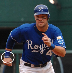
So maybe it’s not surprising that I (and apparently everyone else) completely missed a bit of uni-related Royals news from last Sunday — until Erik Wilhelmi brought it to my attention yesterday, that is. To wit: The team wore thin, light blue ribbons on their wrists (additional views here, here, and here) in memory of Kelsey Smith, the local teen who’d recently been kidnapped and murdered. According to this blog entry, “The decision to wear the ribbons was made after Manager Buddy Bell met with Kelsey’s relatives Sunday morning.”
Coupla thoughts here: First, I love the simplicity and subtlety of this tribute. No logos or inscriptions on the cap, no sleeve patch, not even a black armband — just a small, tasteful gesture. I realize this is at least partially due to the fact that the whole thing was done on very short notice (and some might also view it as a reflection of the Royals’ low-budget approach to everything), but I think it’s gorgeously understated.
Secondly, in an era when ribbons have become all-purpose symbols of anything and everything — and are usually represented by embroidered “ribbons” (which aren’t actually ribbons) and magnetic “ribbons” (which aren’t actually ribbons) — it’s a pleasure to see someone using ribbons that are actual, bona fide ribbons.
Only question now is why the Royals had a spool of light-blue ribbon floating around their clubhouse to begin with. Was somebody wrapping a birthday present? Or did they have to send out one of the clubbies to K-Mart?
Research Project: I’m compiling a list of unusual minor league uniforms — the wackier, the better. If you’ve got links or photos, let’s have ”˜em.
Uni Watch News Ticker: Hot off the presses: Reader J.J. Carton was at the UCF merch unveiling this morning and got these pics of the new helmets. … Just when Mike Nolan was about to tie his necktie into a noose, the clue train finally made a stop at the NFL’s offices yesterday, where it was announced that coaches will be allowed to wear suits for all home games. This landmark in sports decision making was achieved after several Reebok execs and NFL commish Roger Goodell locked themselves in a room with nothing but a case of Diet Coke and a 10-pack of Twinkies and vowed not to come out “until we’ve settled this, by god!” They were thisclose to hammering out language that would also have allowed coaches to wear suits during road games, but that part of the deal collapsed when they ran out of Twinkies.
Do any of you know of a site that chronicles MLB caps in a similar fashion to “Helmet Project?” I know about “Dressed to the Nines,” but I don’t like that particular site very much.
Thanks.
I think the Royals’ tribute to Kelsey Smith was beautifully done. They showed support and respect without the hype, and that speaks volumes for their credibility. Nicely done.
Nice call with the suits, NFL. Now get the other half of your head out of your ass and let the coaches wear suits on the road.
Fresno Grizzlies? Isn’t that the “Price Is Right” logo pattern?
/Users/admin/Desktop/images.jpg
Cheerleader Uni´s then and now on CNNSI.COM
Fresno Grizzlies? Isn’t that the “Price Is Right†logo pattern?
Anyone see the Yankees-Diamondbacks game last night? How may necklaces was Livan Hernandez wearing?
link
[quote comment=”102176″]Nice call with the suits, NFL. Now get the other half of your head out of your ass and let the coaches wear suits on the road.[/quote]
Baby steps, I guess?
And good thing it wasn’t link
Hurrah to the NFL for allowing the suits. Pray tell we can get some fedoras to be worn as well, and a s a bonus, in houndstooth too.
When I was a kid, the Royals used to have many skinny belt loops on their waists like the Detroit Tigers. I’m slightly disappointed that they do not have those anymore, but I do love the KC uniforms. The script KANSAS CITY on the roads, the KCR patch, the lovely colors…what’s not to like?
maybe this works better
link
Hey Paul, I was wondering if Pedro ever cashed the check you sent to him for his fine. I didnt see any updates and was just wondering.
[quote comment=”102185″]Hey Paul, I was wondering if Pedro ever cashed the check you sent to him for his fine. I didnt see any updates and was just wondering.[/quote]
He never cashed it, thereby ruining a perfectly good media prank. Fucker.
[quote comment=”102176″]Nice call with the suits, NFL. Now get the other half of your head out of your ass and let the coaches wear suits on the road.[/quote]
Bah, humbug. Mike Nolan has to wear the cap, polo shirt, and khakis some time. Stupid marketing. After all, the NFL doesn’t want any Cubs blue jerseys and A’s black hats (merchandise officially marketed as “authentic, alternate colors” but never worn, thus reducing “authenticity”).
[quote comment=”102186″][quote comment=”102185″]Hey Paul, I was wondering if Pedro ever cashed the check you sent to him for his fine. I didnt see any updates and was just wondering.[/quote]
He never cashed it, thereby ruining a perfectly good media prank. Fucker.[/quote]
What fine?
The Royals were a class organization when Mr. Kaufmann started them. You’re right, the uniforms are beautiful — the decision to add the black shadow, black alternate and, worst of all, the black crown on the logo, were disasterous. I’m glad a sense of decorum has returned. (I’m still holding out hope for powder blue road unis.)
The first 16 years of the Royals existence were terrific. It was a model expansion club. Then there were the spectacular battles with the Yankees. Finally a breakthrough and a World Series with the Phillies. But since the 1985 World Series with the Cardinals, fortune have gone south. It’s as though the blown Don Denkinger call at first base in the sixth game may have allowed KC to win the battle, and the series, but it’s been mostly downhill since.
Couple the 22 years since then and the awful years before the A’s went west, Kansas City fans have endured a lot of bad baseball. But, damned, they LOOK good. That KC logo is sweet. The crown logo is back to it’s proper gold. Names on the backs of the uniforms used to have vertical arching. I’m not so certain any more. Hopefully, these little classy things will translate into better baseball. KC deserves it.
Was watching the Twins-Braves game last night and noticed Atlanta was guilty of link on the front of the jersey.
[quote comment=”102191″]The Royals were a class organization when Mr. Kaufmann started them. You’re right, the uniforms are beautiful — the decision to add the black shadow, black alternate and, worst of all, the black crown on the logo, were disasterous. I’m glad a sense of decorum has returned. (I’m still holding out hope for powder blue road unis.)
Couple the 22 years since then and the awful years before the A’s went west, Kansas City fans have endured a lot of bad baseball. But, damned, they LOOK good. That KC logo is sweet. The crown logo is back to it’s proper gold. Names on the backs of the uniforms used to have vertical arching. I’m not so certain any more. Hopefully, these little classy things will translate into better baseball. KC deserves it.[/quote]
I went back down to Kansas City in April, and judging by what I saw, I would say you’re not the only fan holding out hope for the powder blues… they were all over the place in stands. It was kind of cool to see than many “retro” jerseys.
As far as the crown logo, I hear that when they do the renovations to Kauffman, they’re going to change the crown scoreboard to color. While I’d normally go along with something like that at some other parks, I’m really afraid it’ll lose it’s “kitchy-ness”. There’s a cool 70’s type of vibe there and that bigass scoreboard with the old school animation adds to it. I’d hate to see it go.
Paul,
Thanks so much for the Royals post. I completely agree that the simplicity was perfectly done by the team, the Kelsey Smith tragedy has been such a terrible story, and the ribbons were done in a very tasteful and understated fashion. As far as the powder blues go, the team revealed yesterday that MLB has denied the request by the Royals to wear the powder blues at home for selected games, and there are no plans at this moment to make them their regular road uni or even a alternate uni. Thanks again for focusing on my BELOVED Kansas City Royals!
As far as the crown logo, I hear that when they do the renovations to Kauffman, they’re going to change the crown scoreboard to color
It will be bigger (think Turner Field, ten-stories high big) and HD.
Love the Royals uniform, and the gesture to honor Kelsey Smith was simple and classy.
I honestly feel sorry for the Royals fans. There’s a bunch that does NOT deserve the product on the field they’ve been given.
Also, I really like the new UCF helmets!
[quote comment=”102197″]Paul,
Thanks so much for the Royals post. I completely agree that the simplicity was perfectly done by the team, the Kelsey Smith tragedy has been such a terrible story, and the ribbons were done in a very tasteful and understated fashion. As far as the powder blues go, the team revealed yesterday that MLB has denied the request by the Royals to wear the powder blues at home for selected games, and there are no plans at this moment to make them their regular road uni or even a alternate uni. Thanks again for focusing on my BELOVED Kansas City Royals![/quote]
Apparently, when you become a commissioner in a pro sports league, you immediately lose all common sense and stop being a fan of the game.
[quote comment=”102197″]As far as the powder blues go, the team revealed yesterday that MLB has denied the request by the Royals to wear the powder blues at home for selected games, and there are no plans at this moment to make them their regular road uni or even a alternate uni. [/quote]
Yet another intelligent move by the league under the keen leadership of Bud Selig. [/sarcasm]
Even when Mike Nolan dresses “down” he’s one of the better dressed, less sloppy coaches in the league.
link
link
As opposed to:
link
or
link
I find it beyond comprehension that the NFL “powers that be” would deny a coach wearing a suit. Maybe they need to look at the other end of the spectrum and get Belichek to dress in something other than his jammies.
Really. Unbelievable.
[quote comment=”102188″][quote comment=”102186″][quote comment=”102185″]Hey Paul, I was wondering if Pedro ever cashed the check you sent to him for his fine. I didnt see any updates and was just wondering.[/quote]
He never cashed it, thereby ruining a perfectly good media prank. Fucker.[/quote]
What fine?[/quote]
link
[quote comment=”102204″][quote comment=”102197″]As far as the powder blues go, the team revealed yesterday that MLB has denied the request by the Royals to wear the powder blues at home for selected games, and there are no plans at this moment to make them their regular road uni or even a alternate uni. [/quote]
Powder blue home uniforms would be a BAD idea. Their home unis are as good as it gets. Even the royal blue alt is good as far as alts go. (Love that deep royal blue.)
The powder blues should go to the road unis. Couple them with the royal blue KANSAS CITY script and you have a real winner.
Can’t wait to see Del Rio sporting a suit on the sideline for the Jags.
Also, the %*^($)@ Colts got their Super Bowl rings:
link
[quote comment=”102178″]Cheerleader Uni´s then and now on CNNSI.COM
[/quote]
It was discussed in yesterday’s comments. The problem that I have with SI’s “comparison” is that sometimes is doesn’t even pit cheerleader unis from the same sports.
[quote comment=”102178″]Cheerleader Uni´s then and now on CNNSI.COM[/quote]
Let’s try that without the link on all the text:
It was discussed in yesterday’s comments. The problem that I have with SI’s “comparison” is that sometimes is doesn’t even pit cheerleader unis from the same sports.
I noticed another odd thing about the D-Backs’ new uniforms yesterday. The road jerseys mix capital and lowercase letters within the word “Arizona.†After the huge capital A, you get a capital R and a lowercase I.
So I started looking around to see if this is common in around the league. And the D-Backs are the only team to do it!
Other discoveries:
The Angels, Cardinals, Orioles (though I know this is a debate right now) Phillies and Brewers have the same text on home and away jerseys.
Only the Tigers and Yankees (can that really be true?) include no team name at home. The Cubs and Reds feature team names at home only within the logo on one side of the chest.
The Diamondbacks, Devil Rays, and Blue Jays uniquely abbreviate team names at home (D-backs, Rays, Jays.) (Ugh.)
Teams generally use either script or block capital letters, except the Padres, Mets, and Twins, which feature upper and lowercase at home and block capitals on the road.
the Rays is the future name though? so would it still be considered an abbreviation?
I love the cheerleader outfits from the 60’s and 70’s. Does it get any better than a UCLA-USC football game in the 70’s? These days the girls dress like their at the beach or dancing with a pole – no self-respect. Let’s get rid of the dirty dancing, gymnastics, and cheer competitions and get back to the true purpose: cheering on the team!
Final Four 1993 in New Orleans: The beautiful Kansas and Kentucky cheerleaders were a sight to see on Bourbon Street; it was a major letdown when they both lost in the semis and left town early.
[quote comment=”102179″]
Fresno Grizzlies? Isn’t that the “Price Is Right†logo pattern?[/quote]
Yes, it was mentioned link. Look at the second-to-last item mentioned in the Ticker at the bottom of Paul’s post.
I’d like to add that I generally think that MLB teams are well-established enough that they don’t need to spell out team and city names as much as they do. Everybody knows the Dodgers left Brooklyn at this point. And yet they still strain to cram “Los Angeles” on the away jerseys. I like the simplicity of the Detroit D and Yankee NY and wish more teams would emulate it. Like a Braves jersey with just the script A.
Also, I really like the new UCF helmets!
Those helmets are a vast improvement, though I was kinda holding out for a return of link. (Yes I know black is bad in Florida). Also the Helmet Project has already updated the UCF section with the new helmets, talk about fast!
Nice Unis, Royals. Whites and Grays. You have not gone unnoticed. Maybe we can present them, or whoever is in charge of equipment or something, at this year’s annual uniwatch gala with an honor.
Now that I think of it, I think that an annual uniwatch bash at some swanky room in New York wouldnt be a bad idea, as a fund raiser for uniwatch or some other charity. There could be athletes, commissioners, speakers, sports media personalities…and instead of formal wear, eyeblack and throwbacks would be encouraged. And of course, readers could nominate award recipients, based on uni related acheivements. Anybody else?
OOPS Bad link, try link
I know various NHL teams have given dates when they’re planning on unveiling the new uniforms, but with the NHL awards ceremony tonight, you would think that the NHL would take the opportunity and show off some then.
And I don’t know about you all, but I love how the NHL presents their awards. Instead of just staggering it out every day and having a press conference for the individual winners, they have a black tie affar.
[quote comment=”102215″]I noticed another odd thing about the D-Backs’ new uniforms yesterday. The road jerseys mix capital and lowercase letters within the word “Arizona.†After the huge capital A, you get a capital R and a lowercase I.
So I started looking around to see if this is common in around the league. And the D-Backs are the only team to do it!
Other discoveries:
The Angels, Cardinals, Orioles (though I know this is a debate right now) Phillies and Brewers have the same text on home and away jerseys.
Only the Tigers and Yankees (can that really be true?) include no team name at home. The Cubs and Reds feature team names at home only within the logo on one side of the chest.
The Diamondbacks, Devil Rays, and Blue Jays uniquely abbreviate team names at home (D-backs, Rays, Jays.) (Ugh.)
Teams generally use either script or block capital letters, except the Padres, Mets, and Twins, which feature upper and lowercase at home and block capitals on the road.[/quote]
I am not seeing the Mixed Upper and Lower case in link
Anyone have a link that shows where MLB denied the Royals to wear powder blue unis at home?
[quote comment=”102228″]I know various NHL teams have given dates when they’re planning on unveiling the new uniforms, but with the NHL awards ceremony tonight, you would think that the NHL would take the opportunity and show off some then.
Have the Stars announced when they’re revealing theirs? I know the star template is gonna be messed up by the tighter sweaters, and I’m kind of nervous…I love their design now.
I can’t remember who said they had this same 1973 White Sox jersey at home yesterday, but the auction ended over $400!
link
[quote comment=”102220″]I love the cheerleader outfits from the 60’s and 70’s. Does it get any better than a UCLA-USC football game in the 70’s? These days the girls dress like their at the beach or dancing with a pole – no self-respect. Let’s get rid of the dirty dancing, gymnastics, and cheer competitions and get back to the true purpose: cheering on the team!
Final Four 1993 in New Orleans: The beautiful Kansas and Kentucky cheerleaders were a sight to see on Bourbon Street; it was a major letdown when they both lost in the semis and left town early.[/quote]
and donald williams tore up the nets leading the heels to victory… MOP for the donald.
as for the cheerleading as a sport debate. when i see cheerleaders (HS or college) they are at football and basketball games. they are at the same venue as the football and basketball game. and in most cases, are on the field/court or as close to it as you can get. my problem, is if its a sport, how can 2 different sports be going on simultaneously at the same place? isnt that a bit chaotic? and who is scoring these cheerleaders at the games? ive never seen a final cheerleading score after the football or basketball games.
in order for them to be competitors, they needed to create competitions off site from their regular duties of using using their flexibility and voices to create spirit amongst the fans. imagine that, an extra curricular activity (cheering competition) for an extracurricular activity (cheering)!
now, i know that many of the cheerleaders perform very athletic and gymnastic type moves. but all im saying is that what happens at a game is not what happens at a competition. the objectives are 2 different things. at a game, they create spirit, at a competition they show of their skills to be graded on performance.
[quote comment=”102226″]Nice Unis, Royals. Whites and Grays. You have not gone unnoticed. Maybe we can present them, or whoever is in charge of equipment or something, at this year’s annual uniwatch gala with an honor.
Now that I think of it, I think that an annual uniwatch bash at some swanky room in New York wouldnt be a bad idea, as a fund raiser for uniwatch or some other charity. There could be athletes, commissioners, speakers, sports media personalities…and instead of formal wear, eyeblack and throwbacks would be encouraged. And of course, readers could nominate award recipients, based on uni related acheivements. Anybody else?[/quote]
That’s a HELL of an idea. I’m a member of SAG (Screen Actors Guild) and only members who are up to date on dues are able to vote for the SAG Awards (yes, every member that’s paid up on dues gets a vote in those) so that would be another perk for being a member!
I think it’s a hell of an idea! Give out the Golden Stirrup…Award for Aesthetic Excellence in (sport). Best New Uniform. Worst New Uniform. We could have a BLAST with this!
[quote comment=”102229″][quote comment=”102215″]I noticed another odd thing about the D-Backs’ new uniforms yesterday. The road jerseys mix capital and lowercase letters within the word “Arizona.†After the huge capital A, you get a capital R and a lowercase I.
So I started looking around to see if this is common in around the league. And the D-Backs are the only team to do it!
Other discoveries:
The Angels, Cardinals, Orioles (though I know this is a debate right now) Phillies and Brewers have the same text on home and away jerseys.
Only the Tigers and Yankees (can that really be true?) include no team name at home. The Cubs and Reds feature team names at home only within the logo on one side of the chest.
The Diamondbacks, Devil Rays, and Blue Jays uniquely abbreviate team names at home (D-backs, Rays, Jays.) (Ugh.)
Teams generally use either script or block capital letters, except the Padres, Mets, and Twins, which feature upper and lowercase at home and block capitals on the road.[/quote]
I am not seeing the Mixed Upper and Lower case in link[/quote]
Never Mind…I miss read it.
[quote comment=”102188″][quote comment=”102186″][quote comment=”102185″]Hey Paul, I was wondering if Pedro ever cashed the check you sent to him for his fine. I didnt see any updates and was just wondering.[/quote]
He never cashed it, thereby ruining a perfectly good media prank. Fucker.[/quote]
What fine?[/quote]
Do you know about site search on google? You can use the regular google search engine to search just one specific website. In your search text box just type “site:” followed by the url of the website you want to search through.
So in this case, I had the same question. I went to google and typed “site:uniwatchblog.com pedro fine check”. link gave me all I needed to know.
YES! #45! That’s what I’m talking about.
Except I would call it “The Golden Striped Stirrup.”
Paul, are you listening?!
Since when did MLB give itself the right to refuse teams from wearing certain uniforms? Particularly uniforms, like the Royals’ powder blues, that were worn without complaint for over two decades and are enormously popular — don’t tell me MLB doesn’t make a bundle selling those George Brett throwbacks — even today?
Powder blue looks great when blue is already your main color, especially in these days of double-knits, in which gray is just plain dull. I’d love to see KC bring them back.
Regarding Mike Nolan’s suit…
Tastes change. Back in the day (1971-1975), the students in my dorm “house” always wore jackets and ties to Mizzou’s home football games. (This made a certain amount of sense, since many of the guys also brought their dates for the weekend to the games.) However, we “accessorized” ourselves with black-and-gold MU link-style hats, to show our loyalty to our Fighting Tigers… (sorry, no pics… I think somebody burned the negatives!) ;-)
[quote comment=”102176″]Nice call with the suits, NFL. Now get the other half of your head out of your ass and let the coaches wear suits on the road.[/quote]
Rumor has it that there was almost an agreement for the coaches to wear white suits at home & gray suits on the road, but the emergency shipment of Zingers never made it and the meeting ended.
That, and Tom Wolfe voiced strong opposition.
link
Washington Capitals have a new contest to be the first fan to wear the new sweater/jersey:
link
I heard a rumor that Cal will be wearing throwback unis for their season opener in football. Anyone else hear this??
[quote comment=”102241″]Except I would call it “The Golden Striped Stirrup.”
Paul, are you listening?![/quote]
Please — the SILVER striped stirrup. Gold is for suckers.
any chance we see Belichick in a suit?
New WVU Football jersey? I t certainly looks different than last years (yellow is toned down) and hte stripes up the body are not pointed. the WV logo on the neck is new too. I knew they were changing uni’s (AGAIN!), but had not seen anything other than the mock up posted on here some weeks back and the yellow jersey pic posted here as well. As a WVU alum, I implore you guys, quit changing uniforms already….
link
[quote comment=”102248″][quote comment=”102241″]Except I would call it “The Golden Striped Stirrup.”
Paul, are you listening?![/quote]
Please — the SILVER striped stirrup. Gold is for suckers.[/quote]
link
[quote comment=”102253″][quote comment=”102248″][quote comment=”102241″]Except I would call it “The Golden Striped Stirrup.”
Paul, are you listening?![/quote]
Please — the SILVER striped stirrup. Gold is for suckers.[/quote]
link[/quote]
Mr. T’s Star of David cracks me up.
VotePrime, WTF I was asking for an update because the last update I saw was from last season. It was one f’n question obviously Paul didn’t have a problem answering it. Sorry you where not interested and wanted to show your search engine talents. Don’t you have something better to do.
[quote comment=”102231″][quote comment=”102228″]I know various NHL teams have given dates when they’re planning on unveiling the new uniforms, but with the NHL awards ceremony tonight, you would think that the NHL would take the opportunity and show off some then.[/quote]
Have the Stars announced when they’re revealing theirs? I know the star template is gonna be messed up by the tighter sweaters, and I’m kind of nervous…I love their design now.[/quote]
Boston on the 21st.
Columbus and Washington on the 22nd.
No official announcement from any other team at this point.
[quote comment=”102257″]VotePrime, WTF I was asking for an update because the last update I saw was from last season. It was one f’n question obviously Paul didn’t have a problem answering it. Sorry you where not interested and wanted to show your search engine talents. Don’t you have something better to do.[/quote]
I think he was trying to help whoever asked about what you were referring to when you asked about the fine. I really don’t think he was trying to insult you.
The Royals unis are great — BECAUSE THEY ARE A RIP OFF OF THE DODGERS (without the cool red front number)!
Anyone have crowd shots of the Cardinals vs. Royals? Interested in the number of Cardinal Nation folks in KC – I know, not necessarily uni watch- but maybe uni-relevant? Thanks all. And from a STL fan, Kudos to KC for the Kelsey tribute.
[quote comment=”102260″][quote comment=”102257″]VotePrime, WTF I was asking for an update because the last update I saw was from last season. It was one f’n question obviously Paul didn’t have a problem answering it. Sorry you where not interested and wanted to show your search engine talents. Don’t you have something better to do.[/quote]
I think he was trying to help whoever asked about what you were referring to when you asked about the fine. I really don’t think he was trying to insult you.[/quote]
yeah, thats how i read it. not only did he provide a solution to this query, but he provided a new (i didnt know about it) tool for us to use when searching for info on a site.
give a man a fish, he’ll eat for a day. teach a man to fish, he’ll eat for a lifetime…
jeez… now i feel like im acting like dustin diamond does on celebrity fit club since he has found “peace”.
Personally I think UCF’s new helmets are simple & classic however I would have liked to seen the new Knight logo used with the nickname or UCF below it. Since O’Leary came from GT it makes you wonder if they saw the game they wore throwbacks last year because these look sort of similar to me. I’m surprised they went with a white shell but with abundance or black & gold shells these days it will help distinguish them from other schools with similar color schemes. Let’s just hope there’s new uni’s too with matching stripes on the pants!
Michael
Just got my membership card in the mail–now I see how laborious this process must have been. It’s even hand-signed by Paul. I couldn’t be prouder to be an official card-carrying member of the site. Thanks to all the Uni Watch gurus for making it happen!
[quote comment=”102271″]Personally I think UCF’s new helmets are simple & classic however I would have liked to seen the new Knight logo used with the nickname or UCF below it. Since O’Leary came from GT it makes you wonder if they saw the game they wore throwbacks last year because these look sort of similar to me. I’m surprised they went with a white shell but with abundance or black & gold shells these days it will help distinguish them from other schools with similar color schemes. Let’s just hope there’s new uni’s too with matching stripes on the pants!
Michael[/quote]
I agree. I have to say that I am pleasantly surprised by the new helmet (although it wouldn’t have been very hard to improve on the old one). Usually, I’m not a fan of white shells. But they make it work.
give a man a fish, he’ll eat for a day… teach a man to fish, who’s boat are we using not mine, and who is buying the beer cuz someone better bring some beer, and i hope this guy knows how to gut a fish, and…
[quote comment=”102176″]Nice call with the suits, NFL. Now get the other half of your head out of your ass and let the coaches wear suits on the road.[/quote]
I think if they are allowed to wear suits that’s fine, but the head sets look ridiculous with the suits on. Vince Lombardi and Tom Landry looked great in suits because they didn’t look like they were bringing in a 747.
Anyone else think that it’s really odd when the headsets are worn with suits? Or put another way, imagine your own suit-wearing boss coming in to give you a project with a headset on.
[quote comment=”102279″][quote comment=”102176″]Nice call with the suits, NFL. Now get the other half of your head out of your ass and let the coaches wear suits on the road.[/quote]
I think if they are allowed to wear suits that’s fine, but the head sets look ridiculous with the suits on. Vince Lombardi and Tom Landry looked great in suits because they didn’t look like they were bringing in a 747.
Anyone else think that it’s really odd when the headsets are worn with suits? Or put another way, imagine your own suit-wearing boss coming in to give you a project with a headset on.[/quote]
I don’t think the headsets look too bizarre — at my job we have dozens of telephone operators who wear similar headgear with their business suits. I imagine that in the next few years and decades those things will get smaller and less obtrusive, and we’ll be looking back at the massive headsets of the ‘turn of the century’ just like we look at 1980s cell phones.
I love how SI/CNN follows up the “Worst College Football Uniforms” with a “Best College Football Uniforms” and includes Notre Dame in both.
How is their standard uni one of ten best and the green one of the worst? They are practially the same save for jersey color.
[quote comment=”102256″][quote comment=”102253″][quote comment=”102248″][quote comment=”102241″]Except I would call it “The Golden Striped Stirrup.”
Paul, are you listening?![/quote]
Please — the SILVER striped stirrup. Gold is for suckers.[/quote]
link[/quote]
Mr. T’s Star of David cracks me up.[/quote]
Elvis Presley wore a Star of David, a cross, and the Hebrew letter “Chi” around his neck. Why? He said he didn’t want to miss out on heaven due to a technicality.
I saw highlights of a Northwoods League game played yesterday between the Madison Mallards and the Green Bay Bullfrogs, and the Green Bay team had pretty strange uni’s. They are a new team this year in the Northwoods League which is a professional league… they don’t get paid very well though. I can’t find any pics anywhere, but Green Bay’s away uni’s were a dark green with orange under the armpits (imagine the D-Rays dark green threads with the cool-base portion of the jersey a neon orange)
Like I said I can’t find any pics… if anyone out there could help that would be awesome.
Love the Royals whites and grays, but now crazy about their alternate blue jersey. I’m glad that they ditched the black, but why keep the black shoes? They should have gone back to blue. Too many teams have moved away from non-black shoes.
I just noticed something in the link. If you look really closely at the jerseys in the background, they have MAC patch sewn onto them, but UCF plays in Conference USA. Is this a major goof or a clearance of old jerseys?
[quote comment=”102279″][quote comment=”102176″]Nice call with the suits, NFL. Now get the other half of your head out of your ass and let the coaches wear suits on the road.[/quote]
I think if they are allowed to wear suits that’s fine, but the head sets look ridiculous with the suits on. Vince Lombardi and Tom Landry looked great in suits because they didn’t look like they were bringing in a 747.
Anyone else think that it’s really odd when the headsets are worn with suits? Or put another way, imagine your own suit-wearing boss coming in to give you a project with a headset on.[/quote]
While the suits look great, I’m not crazy about the idea. I LOVED it back in the day, like when link wore it with the KC patch or link
However, if I were coaching today, I would opt for the khakis and a polo with a team hat (for day games)…the coaches should not be allowed to look like they just rolled out of bed…it’s a job people! look at least somewhat professional
[quote comment=”102267″][quote comment=”102260″][quote comment=”102257″]VotePrime, WTF I was asking for an update because the last update I saw was from last season. It was one f’n question obviously Paul didn’t have a problem answering it. Sorry you where not interested and wanted to show your search engine talents. Don’t you have something better to do.[/quote]
I think he was trying to help whoever asked about what you were referring to when you asked about the fine. I really don’t think he was trying to insult you.[/quote]
yeah, thats how i read it. not only did he provide a solution to this query, but he provided a new (i didnt know about it) tool for us to use when searching for info on a site.
give a man a fish, he’ll eat for a day. teach a man to fish, he’ll eat for a lifetime…[/quote]
Yeah, I was aiming my google search thing at #15’s “what fine?” question because I asked myself the same thing and that’s how I got my answer.
I’m glad you brought up the fine & check though. I’ve been reading Lukas’s Page 2 columns for awhile but I’ve only been a loyal UniWatch Blog reader for a few months now. So it’s good to catch up on some of that in-joke back story; makes me feel like a part of the UniWatch team!
[quote comment=”102281″]I love how SI/CNN follows up the “Worst College Football Uniforms” with a “Best College Football Uniforms” and includes Notre Dame in both.
How is their standard uni one of ten best and the green one of the worst? They are practially the same save for jersey color.[/quote]
No Penn State? That list is awful. I think they could’ve easily left Wofford off and put PSU in….
link
[quote comment=”102257″]VotePrime, WTF I was asking for an update because the last update I saw was from last season. It was one f’n question obviously Paul didn’t have a problem answering it. Sorry you where not interested and wanted to show your search engine talents. Don’t you have something better to do.[/quote]
Plus, VotePrime was trying to assist the reader who asked, “What Fine?”, as to how to find that out.
[quote comment=”102195″]As far as the crown logo, I hear that when they do the renovations to Kauffman, they’re going to change the crown scoreboard to color. While I’d normally go along with something like that at some other parks, I’m really afraid it’ll lose it’s “kitchy-ness”. There’s a cool 70’s type of vibe there and that bigass scoreboard with the old school animation adds to it. I’d hate to see it go.[/quote]
Shea used to have an old link (in addition to the standard video board) that was replaced only a few years ago by a link, which was quite an improvement. (this of course is all after it started off looking like link.)
And as long as we’re talking about ribbons, I’d love to see where link falls on Paul’s list of non-ribbon ribbons. (And not that it matters, but link was the best cut field grass I’ve ever seen).
[quote comment=”102295″][quote comment=”102281″]I love how SI/CNN follows up the “Worst College Football Uniforms” with a “Best College Football Uniforms” and includes Notre Dame in both.
How is their standard uni one of ten best and the green one of the worst? They are practially the same save for jersey color.[/quote]
No Penn State?
That list is awful.
I think they could’ve easily left Wofford off and put PSU in….
link
But they did include Georgia Southern…hmmm…
The problem I see with the home suit away pajamas scenario is that at the end of the game you could have a guy looking stunning in a get up like this…
link
shaking hands with a guy who i dressed like this…
link
That would be ridiculous.
Also, while watching my poor Mets get bamboozled at Dodger Stadium I asked myself: “Does Grady Little even try anymore?” He’s like the Belichick of the MLB.
link
link
That looks so sloppy, especially in person.
If the royals were to wear the powder blues again, why would they were them at home? They were their road uniforms, and if brought back should be their road alternate.
SI just released their list of Ten Best College Uniforms and picked TExas as the best over second plance Michigan! Are they NUTS! Texas doesn’t even sew on their nombers-they are screenprinted for crying out loud. They look like a high school team. Also-someone at SI needs to get a talking to for some of the pics they used to show the best uniforms-you can’t tell me there isn’t a better picture of Georgia’s uni’s somewhere in their files.
I know this well after Paul wrote the column for ESPN about back-stories for every jersey number, but I wanted to add this tidbit I found on Maurice Jones-Drew’s blog for jaguars.com:
“Many of you know the story behind my wearing jersey number 32. Yes, I was not thrilled at all about being passed-up by all 32 teams in the first round of the 2006 NFL Draft. And, as a rookie, it was my goal each week to make teams regret having passed me up.”
Did anyone see link of this week’s SI?? It looks to me like Endy Chavez and John Maine are wearing last year’s caps with the grey underbill. The others look like they’re wearing the black underbilled ones. You know it.
[quote comment=”102231″][quote comment=”102228″]I know various NHL teams have given dates when they’re planning on unveiling the new uniforms, but with the NHL awards ceremony tonight, you would think that the NHL would take the opportunity and show off some then.
Have the Stars announced when they’re revealing theirs? I know the star template is gonna be messed up by the tighter sweaters, and I’m kind of nervous…I love their design now.[/quote]
Damn… you an me seemed to be completely in tune to another! I am avbsolutely terrified what may happen to the Dallas jerseys!
link Just goes to show how out of control Nike is, in addition to their absurd amount of Logo Creeps.
[quote comment=”102309″][quote comment=”102231″][quote comment=”102228″]I know various NHL teams have given dates when they’re planning on unveiling the new uniforms, but with the NHL awards ceremony tonight, you would think that the NHL would take the opportunity and show off some then.
Have the Stars announced when they’re revealing theirs? I know the star template is gonna be messed up by the tighter sweaters, and I’m kind of nervous…I love their design now.[/quote]
Damn… you an me seemed to be completely in tune to another! I am avbsolutely terrified what may happen to the Dallas jerseys![/quote]
link
=)
[quote comment=”102307″]Did anyone see link of this week’s SI?? It looks to me like Endy Chavez and John Maine are wearing last year’s caps with the grey underbill. The others look like they’re wearing the black underbilled ones. You know it.[/quote]
Yeah, it been mentioned for a day or two on here. Definitely some grey underbills.
Check this out, Mets rookie reliever Joe Smith was supposed to be in the shot also, but they cropped him out!
link
the sacramento kings should steal the color and design scheme of the Royals. One less purple out there
[quote comment=”102224″]Also, I really like the new UCF helmets!
Those helmets are a vast improvement, though I was kinda holding out for a return of link. (Yes I know black is bad in Florida). Also the Helmet Project has already updated the UCF section with the new helmets, talk about fast![/quote]
Yeah Helmet Project is one of the best uniform related sites out there but not better than Uni Watch of course! :)
[quote comment=”102309″][quote comment=”102231″][quote comment=”102228″]I know various NHL teams have given dates when they’re planning on unveiling the new uniforms, but with the NHL awards ceremony tonight, you would think that the NHL would take the opportunity and show off some then.
Have the Stars announced when they’re revealing theirs? I know the star template is gonna be messed up by the tighter sweaters, and I’m kind of nervous…I love their design now.[/quote]
Damn… you an me seemed to be completely in tune to another! I am avbsolutely terrified what may happen to the Dallas jerseys![/quote]
I know…and they could do so many gaudy things with stars and the color green…I’m keeping my fingers crossed that they have a uniwatch devotee on their design team…
and I have no idea why suddenly when I quote other comments it’s putting everything in italics.
I’ll add my voice to those congratulating the Royals for their understated tribute. So often these days “tributes” seem designed more to draw attention to those who are paying tribute rather than those actually being saluted.
As for the Royals’ powder blue jerseys, I don’t understand the desire to bring them back. Powder blue jerseys looked bad in the ’70s and they’ll look bad again if anyone brings them back.
I can’t put my finger on exactly why, but the color works for the San Diego Chargers (maybe it’s the combination with the yellow, or maybe it’s because it’s just on the jersey and an accent color) but not for a baseball uniform.
[quote comment=”102291″]it’s a job people! look at least somewhat professional[/quote]
tell that to allen iverson…
[quote comment=”102195″]
As far as the crown logo, I hear that when they do the renovations to Kauffman, they’re going to change the crown scoreboard to color. While I’d normally go along with something like that at some other parks, I’m really afraid it’ll lose it’s “kitchy-ness”. There’s a cool 70’s type of vibe there and that bigass scoreboard with the old school animation adds to it. I’d hate to see it go.[/quote]
I just wish they weren’t using my tax dollars to renovate the stadium lol (I’m a Boston native [Sox fan] living in Jackson County, so I don’t really care for the Royals). Sales taxes here are ridiculous. But I like the Royals unis.
[quote comment=”102305″]SI just released their list of Ten Best College Uniforms and picked TExas as the best over second plance Michigan! Are they NUTS! Texas doesn’t even sew on their nombers-they are screenprinted for crying out loud. They look like a high school team. Also-someone at SI needs to get a talking to for some of the pics they used to show the best uniforms-you can’t tell me there isn’t a better picture of Georgia’s uni’s somewhere in their files.[/quote]
Oooohhh…. I am about to get clobbered on this one. But I bet it is based simply on the helmets… ;) Actually, reagrdless of screenend on letters, UT’s unis are absolute classics – especially the link! (Although, I prefer them when the burnt oranges match!)
[quote comment=”102223″]I’d like to add that I generally think that MLB teams are well-established enough that they don’t need to spell out team and city names as much as they do. Everybody knows the Dodgers left Brooklyn at this point. And yet they still strain to cram “Los Angeles” on the away jerseys. I like the simplicity of the Detroit D and Yankee NY and wish more teams would emulate it. Like a Braves jersey with just the script A.[/quote]
I see your point, but I don’t see the Dodgers Away as being crammed. I actually really like the font and design of it. I recently went to LA for a game, and I would say that it’s 50/50 on the home/road jerseys that they fans wear. I own a Los Angeles road jersey and I am proud to wear my hometown on it. Even if it’s just to a Friday night poker game.
[quote comment=”102315″][quote comment=”102309″][quote comment=”102231″][quote comment=”102228″]I know various NHL teams have given dates when they’re planning on unveiling the new uniforms, but with the NHL awards ceremony tonight, you would think that the NHL would take the opportunity and show off some then.
Have the Stars announced when they’re revealing theirs? I know the star template is gonna be messed up by the tighter sweaters, and I’m kind of nervous…I love their design now.[/quote]
Damn… you an me seemed to be completely in tune to another! I am avbsolutely terrified what may happen to the Dallas jerseys![/quote]
link
=)[/quote]
Good God! Did you have to bring that up? I can vouch for every Stars ticket holder – we ALL hated them!
[quote comment=”102300″](And not that it matters, but link was the best cut field grass I’ve ever seen).[/quote]
i always liked this design,
well, the infield anyway…
link
a checkerboard outfield would have been fine with the sox logo on the infield.
[quote comment=”102311″]link Just goes to show how out of control Nike is, in addition to their absurd amount of Logo Creeps.[/quote]
That is absolutely disgusting!
Good to hear that Coach Nolan and Del Rio get to wear suits for home games. I wonder though if it is just limited to the two. I would like to see other coaches wear suits.
It would be interesting to see Jon Gruden wear a suit to go along with his visor and head set. Bill Belichick needs to wear a suit so that we don’t need to see the ripped up, outdated sweatshirt from two seasons ago.
Or possibly Reebok can design a cowboy hat for Wade Phillips to honor his dad Bum.
[quote comment=”102228″]http://nhl.imageg.net/graphics/product_images/pG01-1238758dt.jpg
=)[/quote]
Good God! Did you have to bring that up? I can vouch for every Stars ticket holder – we ALL hated them![/quote]
ughhh…the one time I’m happy to be a Stars fan living in PA- I never had to see that hideous creation.
A different take on old-timey vs. modern “uniforms”:
link.
Ok, calling it a uniform (or even a sport) is a stretch, but interesting, nonetheless. Modern trumps old-timey in this round.
[quote comment=”102330″][quote comment=”102315″][quote comment=”102309″][quote comment=”102231″][quote comment=”102228″]I know various NHL teams have given dates when they’re planning on unveiling the new uniforms, but with the NHL awards ceremony tonight, you would think that the NHL would take the opportunity and show off some then.
Have the Stars announced when they’re revealing theirs? I know the star template is gonna be messed up by the tighter sweaters, and I’m kind of nervous…I love their design now.[/quote]
Damn… you an me seemed to be completely in tune to another! I am avbsolutely terrified what may happen to the Dallas jerseys![/quote]
link
=)[/quote]
Good God! Did you have to bring that up? I can vouch for every Stars ticket holder – we ALL hated them![/quote]
I don’t think the design will resort to that. At least I hope.
Ideally the NHL should showcase the new jerseys on Draft Day as the new prospects don their new jerseys when they go on stage after getting selected.
[quote comment=”102215″]I noticed another odd thing about the D-Backs’ new uniforms yesterday. The road jerseys mix capital and lowercase letters within the word “Arizona.†After the huge capital A, you get a capital R and a lowercase I.
So I started looking around to see if this is common in around the league. And the D-Backs are the only team to do it!
Other discoveries:
The Angels, Cardinals, Orioles (though I know this is a debate right now) Phillies and Brewers have the same text on home and away jerseys.
Only the Tigers and Yankees (can that really be true?) include no team name at home. The Cubs and Reds feature team names at home only within the logo on one side of the chest.
The Diamondbacks, Devil Rays, and Blue Jays uniquely abbreviate team names at home (D-backs, Rays, Jays.) (Ugh.)
Teams generally use either script or block capital letters, except the Padres, Mets, and Twins, which feature upper and lowercase at home and block capitals on the road.[/quote]
The Tigers have names on both home and road jerseys. Yankees have no name on either.
The Giants have no name at home and do have the names on the road.
he’s at it again!
link
he must be studying at the “chris henry institute of behavioral athletes”. wait that is an acronym for chiba!
if im not mistaken, isnt that slang for marijuana?
god, trouble just follows these guys…
How’s that avatar problem going guys?
[quote comment=”102340″][quote comment=”102215″]I noticed another odd thing about the D-Backs’ new uniforms yesterday. The road jerseys mix capital and lowercase letters within the word “Arizona.†After the huge capital A, you get a capital R and a lowercase I.
So I started looking around to see if this is common in around the league. And the D-Backs are the only team to do it!
Other discoveries:
The Angels, Cardinals, Orioles (though I know this is a debate right now) Phillies and Brewers have the same text on home and away jerseys.
Only the Tigers and Yankees (can that really be true?) include no team name at home. The Cubs and Reds feature team names at home only within the logo on one side of the chest.
The Diamondbacks, Devil Rays, and Blue Jays uniquely abbreviate team names at home (D-backs, Rays, Jays.) (Ugh.)
Teams generally use either script or block capital letters, except the Padres, Mets, and Twins, which feature upper and lowercase at home and block capitals on the road.[/quote]
The Tigers have names on both home and road jerseys. Yankees have no name on either.
The Giants have no name at home and do have the names on the road.[/quote]
You misunderstood. The Tigers do not have a “Tigers” jersey, only a “D” home jersey and a “Detroit” road jersey. The Yankees’ jerseys say “NY” and “New York.” Finally, the Giants do have a “Giants” jersey: they wear it at home.
[quote comment=”102340″][quote comment=”102215″]I noticed another odd thing about the D-Backs’ new uniforms yesterday. The road jerseys mix capital and lowercase letters within the word “Arizona.†After the huge capital A, you get a capital R and a lowercase I.
So I started looking around to see if this is common in around the league. And the D-Backs are the only team to do it!
Other discoveries:
The Angels, Cardinals, Orioles (though I know this is a debate right now) Phillies and Brewers have the same text on home and away jerseys.
Only the Tigers and Yankees (can that really be true?) include no team name at home. The Cubs and Reds feature team names at home only within the logo on one side of the chest.
The Diamondbacks, Devil Rays, and Blue Jays uniquely abbreviate team names at home (D-backs, Rays, Jays.) (Ugh.)
Teams generally use either script or block capital letters, except the Padres, Mets, and Twins, which feature upper and lowercase at home and block capitals on the road.[/quote]
The Tigers have names on both home and road jerseys. Yankees have no name on either.
The Giants have no name at home and do have the names on the road.[/quote]
I Disagree with your statement regarding the link.
I was looking for what the Stars might do for their new jerseys, and i found these; the unis for their AHL team, the Iowa Stars. Now, I don’t like the logo, but I think the simple striping is nice.
link
[quote comment=”102342″]he’s at it again!
link
he must be studying at the “chris henry institute of behavioral athletes”. wait that is an acronym for chiba!
if im not mistaken, isnt that slang for marijuana?
god, trouble just follows these guys…[/quote]
Do you think the Rays will really miss him with this line:
“Dukes, who has started 46 games, is hitting .193 with 10 homers and 21 RBIs”?
[quote comment=”102335″][quote comment=”102228″]http://nhl.imageg.net/graphics/product_images/pG01-1238758dt.jpg
=)[/quote]
Good God! Did you have to bring that up? I can vouch for every Stars ticket holder – we ALL hated them![/quote]
ughhh…the one time I’m happy to be a Stars fan living in PA- I never had to see that hideous creation.[/quote]
Kinda reminds me an a anatomical diagram I used to see in sex ed class…
[quote comment=”102353″][quote comment=”102335″][quote comment=”102228″]http://nhl.imageg.net/graphics/product_images/pG01-1238758dt.jpg
=)[/quote]
Good God! Did you have to bring that up? I can vouch for every Stars ticket holder – we ALL hated them![/quote]
ughhh…the one time I’m happy to be a Stars fan living in PA- I never had to see that hideous creation.[/quote]
Kinda reminds me an a anatomical diagram I used to see in sex ed class…[/quote]
For those of us in the hockey circles, we called the Stars the “Dallas Fallopian Tubes” when they wore those jerseys.
I am watching the Yankees v D-Backs game and I’m almost positive the Arizona catcher is wearing a black hard hat with his mask, even though the D-Backs are the away team. This is highly unusual. The D-Backs only wear their black scheme on Saturdays and at the BOB (oh fine, Chase Field). I don’t have screen capturing technology, but trust me on this one.
[quote comment=”102351″][quote comment=”102342″]he’s at it again!
link
he must be studying at the “chris henry institute of behavioral athletes”. wait that is an acronym for chiba!
if im not mistaken, isnt that slang for marijuana?
god, trouble just follows these guys…[/quote]
Do you think the Rays will really miss him with this line:
“Dukes, who has started 46 games, is hitting .193 with 10 homers and 21 RBIs”?[/quote]
I find it odd that fewer people point out that Chris Henry and PacMan Jones were teammates at the same university. (which at this time will remain nameless).
That SI list is nonsense. Georgia Southern, Yale and Wofford? Give me a break.
Georgia and Auburn in the top ten is highly debatable.
The exclusion of Penn State and UCLA, is utter nonsense.
[quote comment=”102356″][quote comment=”102351″][quote comment=”102342″]he’s at it again!
link
he must be studying at the “chris henry institute of behavioral athletes”. wait that is an acronym for chiba!
if im not mistaken, isnt that slang for marijuana?
god, trouble just follows these guys…[/quote]
Do you think the Rays will really miss him with this line:
“Dukes, who has started 46 games, is hitting .193 with 10 homers and 21 RBIs”?[/quote]
I find it odd that fewer people point out that Chris Henry and PacMan Jones were teammates at the same university. (which at this time will remain nameless).[/quote]
Can you say “Pittsnogled?”
This isn’t uni-related in the strictest sense, but I thought this tidbit from Blue Notes (the Dodgers blog at the L.A. Times) was worth noting:
Should Penny ever need help to keep from blowing his stack, I recommend visualizing Takashi Saito in his current post-game garb. Black robe with gold dragons. White headband. Belt containing not one, but two small Samurai swords. I’m not quite sure why Sammy apparently donned the outfit after the first win against the Mets, but it seems to have become his equivalent of a “Don’t shave until we lose” beard. “Good luck,” said Saito with a big, goofy grin. “Three days, three wins.”
link
With so many NHL teams switching jerseys, do we know for certain that there will be no league wide template like the MLL or national soccer teams?
I’m scared for the original six.
Oops… Left off the link in my last comment…
link
[quote comment=”102361″]With so many NHL teams switching jerseys, do we know for certain that there will be no league wide template like the MLL or national soccer teams?
I’m scared for the original six.[/quote]
Oh dear God, I hope not, hockey’s got enough problems as it is…
[quote comment=”102359″][quote comment=”102356″][quote comment=”102351″][quote comment=”102342″]he’s at it again!
link
he must be studying at the “chris henry institute of behavioral athletes”. wait that is an acronym for chiba!
if im not mistaken, isnt that slang for marijuana?
god, trouble just follows these guys…[/quote]
Do you think the Rays will really miss him with this line:
“Dukes, who has started 46 games, is hitting .193 with 10 homers and 21 RBIs”?[/quote]
I find it odd that fewer people point out that Chris Henry and PacMan Jones were teammates at the same university. (which at this time will remain nameless).[/quote]
Can you say “Pittsnogled?”[/quote]
Wasn’t that school listed as a top party school in Playboy? Seems like I remember this but I could be wrong.
That Price is Right uni is pure genius.
So I guess some guys link…
[quote comment=”102356″][quote comment=”102351″][quote comment=”102342″]he’s at it again!
link
he must be studying at the “chris henry institute of behavioral athletes”. wait that is an acronym for chiba!
if im not mistaken, isnt that slang for marijuana?
god, trouble just follows these guys…[/quote]
Do you think the Rays will really miss him with this line:
“Dukes, who has started 46 games, is hitting .193 with 10 homers and 21 RBIs”?[/quote]
I find it odd that fewer people point out that Chris Henry and PacMan Jones were teammates at the same university. (which at this time will remain nameless).[/quote]
I believe that would be a university in this neck of the “woods” (said the Terps fan!)
[quote comment=”102330″][quote comment=”102315″][quote comment=”102309″][quote comment=”102231″][quote comment=”102228″]I know various NHL teams have given dates when they’re planning on unveiling the new uniforms, but with the NHL awards ceremony tonight, you would think that the NHL would take the opportunity and show off some then.
Have the Stars announced when they’re revealing theirs? I know the star template is gonna be messed up by the tighter sweaters, and I’m kind of nervous…I love their design now.[/quote]
Damn… you an me seemed to be completely in tune to another! I am avbsolutely terrified what may happen to the Dallas jerseys![/quote]
link
=)[/quote]
Every team that has announced their date so far (Washington, Columbus that I know of) has named June 22nd – which co-incidentally happens to be the first night of the Entry Draft.
Looks like the draft picks will be the first to wear the new jerseys.
[quote comment=”102364″][quote comment=”102359″][quote comment=”102356″][quote comment=”102351″][quote comment=”102342″]he’s at it again!
link
he must be studying at the “chris henry institute of behavioral athletes”. wait that is an acronym for chiba!
if im not mistaken, isnt that slang for marijuana?
god, trouble just follows these guys…[/quote]
Do you think the Rays will really miss him with this line:
“Dukes, who has started 46 games, is hitting .193 with 10 homers and 21 RBIs”?[/quote]
I find it odd that fewer people point out that Chris Henry and PacMan Jones were teammates at the same university. (which at this time will remain nameless).[/quote]
Can you say “Pittsnogled?”[/quote]
Wasn’t that school listed as a top party school in Playboy? Seems like I remember this but I could be wrong.[/quote]
WVU is not the link Because there is no such thing, and there pretty much never was.
Elvis Presley wore a Star of David, a cross, and the Hebrew letter “Chi†around his neck. Why? He said he didn’t want to miss out on heaven due to a technicality.
“Chi” is a Greek letter (written somewhat like this: X). “Chai” is a Hebrew word made up of the letters chet and yud.
i love how the amount of money you make in jobs is exactly disproportionate with acceptable public character and behavioral expectations.
me- average salary/only the highest level of professionalism, integrity… all that, in and out of work.
them- set for life/free for all…
and its not just athletes either…
[quote comment=”102371″][quote comment=”102330″][quote comment=”102315″][quote comment=”102309″][quote comment=”102231″][quote comment=”102228″]I know various NHL teams have given dates when they’re planning on unveiling the new uniforms, but with the NHL awards ceremony tonight, you would think that the NHL would take the opportunity and show off some then.
Have the Stars announced when they’re revealing theirs? I know the star template is gonna be messed up by the tighter sweaters, and I’m kind of nervous…I love their design now.[/quote]
Damn… you an me seemed to be completely in tune to another! I am avbsolutely terrified what may happen to the Dallas jerseys![/quote]
link
=)[/quote]
Every team that has announced their date so far (Washington, Columbus that I know of) has named June 22nd – which co-incidentally happens to be the first night of the Entry Draft.
Looks like the draft picks will be the first to wear the new jerseys.[/quote]
A local radio show here in DC (Elliot in the Morning), is conducting a contest with the Capitals where the winners get to go to the draft-day party at the teams’ practice facility AND get a new Caps jersey as well. Elliot (who is an avid hockey fan) claims to have not seen it yet, but stated that “it better look good if I’m going to spend that kind of money to update all of team gear!” … Well put.
[quote comment=”102300″]Shea used to have an old link (in addition to the standard video board) that was replaced only a few years ago by a link, which was quite an improvement. (this of course is all after it started off looking like link.)
[/quote]
Those are some great old photos! I have vivid memories of the monochrome ’80s-’90s scoreboard. Looking at that one from the Seaver era, I see that the Mets used to use the system of indicating pitchers not by the numbers on their backs, but using numbers printed in the score book. Was that just a ploy to sell more scorecards, or was it because they couldn’t always get the numbers of new call-ups?
(And notice that the Cubs have no hits in the 9th inning of that game? Seaver didn’t get the no-hitter, though, because the Cubs have broken up every no-hitter attempt against them since Koufax in 1965. Small compensation for the other thing that the Cubs haven’t done in a while.)
[quote comment=”102350″]I was looking for what the Stars might do for their new jerseys, and i found these; the unis for their AHL team, the Iowa Stars. Now, I don’t like the logo, but I think the simple striping is nice.
link[/quote]
I am pretty sure that is what they used to look like before they introduced the star alternate jersey (which of course was so wildly popular it became the standard jerseys).
re: si.com best college uni’s…
i always thought harvards use of tan football pants was clever…
kinda like they were going business casual even on the gridiron.
khakis and either a link shirt or link shirt.
[quote comment=”102372″][quote comment=”102364″][quote comment=”102359″][quote comment=”102356″][quote comment=”102351″][quote comment=”102342″]he’s at it again!
link
he must be studying at the “chris henry institute of behavioral athletes”. wait that is an acronym for chiba!
if im not mistaken, isnt that slang for marijuana?
god, trouble just follows these guys…[/quote]
Do you think the Rays will really miss him with this line:
“Dukes, who has started 46 games, is hitting .193 with 10 homers and 21 RBIs”?[/quote]
I find it odd that fewer people point out that Chris Henry and PacMan Jones were teammates at the same university. (which at this time will remain nameless).[/quote]
Can you say “Pittsnogled?”[/quote]
Wasn’t that school listed as a top party school in Playboy? Seems like I remember this but I could be wrong.[/quote]
WVU is not the link Because there is no such thing, and there pretty much never was.[/quote]
Correct, however they do feature different college town bars… For some reason they included my alma mater, Trinity College, and The Tap in lovely Hartford.
[quote comment=”102381″][quote comment=”102350″]I was looking for what the Stars might do for their new jerseys, and i found these; the unis for their AHL team, the Iowa Stars. Now, I don’t like the logo, but I think the simple striping is nice.
link[/quote]
I am pretty sure that is what they used to look like before they introduced the star alternate jersey (which of course was so wildly popular it became the standard jerseys).[/quote]
Yep, you’re right; maybe that means they’ll try to come up wtih something else then?
link
[quote comment=”102307″]Did anyone see link of this week’s SI?? It looks to me like Endy Chavez and John Maine are wearing last year’s caps with the grey underbill. The others look like they’re wearing the black underbilled ones. You know it.[/quote]
Shouldn’t Willie Randolph be sitting in the center of the photo as opposed to the side?
[quote comment=”102372″][quote comment=”102364″][quote comment=”102359″][quote comment=”102356″][quote comment=”102351″][quote comment=”102342″]he’s at it again!
link
he must be studying at the “chris henry institute of behavioral athletes”. wait that is an acronym for chiba!
if im not mistaken, isnt that slang for marijuana?
god, trouble just follows these guys…[/quote]
Do you think the Rays will really miss him with this line:
“Dukes, who has started 46 games, is hitting .193 with 10 homers and 21 RBIs”?[/quote]
I find it odd that fewer people point out that Chris Henry and PacMan Jones were teammates at the same university. (which at this time will remain nameless).[/quote]
Can you say “Pittsnogled?”[/quote]
Wasn’t that school listed as a top party school in Playboy? Seems like I remember this but I could be wrong.[/quote]
WVU is not the link Because there is no such thing, and there pretty much never was.[/quote]
That article says Playboy had a list in 1987 and 2002. WVU was #7 and #5, respectively.
[quote comment=”102355″]I am watching the Yankees v D-Backs game and I’m almost positive the Arizona catcher is wearing a black hard hat with his mask, even though the D-Backs are the away team. This is highly unusual. The D-Backs only wear their black scheme on Saturdays and at the BOB (oh fine, Chase Field). I don’t have screen capturing technology, but trust me on this one.[/quote]
is and always will be the BOB
keep the faith!
[quote comment=”102373″]Elvis Presley wore a Star of David, a cross, and the Hebrew letter “Chi†around his neck. Why? He said he didn’t want to miss out on heaven due to a technicality.
“Chi” is a Greek letter (written somewhat like this: X). “Chai” is a Hebrew word made up of the letters chet and yud.[/quote]
You can smack me later for that typo. :)
Wow. Major love for the Royals abounds.
I could never get past the typeface on the cap monogram and the logo. The variance in the thickness of the letters is distracting. The serifs on the letters look to big for letters that thin. Also the twist on the lower leg of the K to become the bottom of the C is awkward.
[quote comment=”102394″][quote comment=”102372″][quote comment=”102364″][quote comment=”102359″][quote comment=”102356″][quote comment=”102351″][quote comment=”102342″]he’s at it again!
link
he must be studying at the “chris henry institute of behavioral athletes”. wait that is an acronym for chiba!
if im not mistaken, isnt that slang for marijuana?
god, trouble just follows these guys…[/quote]
Do you think the Rays will really miss him with this line:
“Dukes, who has started 46 games, is hitting .193 with 10 homers and 21 RBIs”?[/quote]
I find it odd that fewer people point out that Chris Henry and PacMan Jones were teammates at the same university. (which at this time will remain nameless).[/quote]
Can you say “Pittsnogled?”[/quote]
Wasn’t that school listed as a top party school in Playboy? Seems like I remember this but I could be wrong.[/quote]
WVU is not the link Because there is no such thing, and there pretty much never was.[/quote]
That article says Playboy had a list in 1987 and 2002. WVU was #7 and #5, respectively.[/quote]
I had always heard that WVU shouldn’t be included…..because professionals don’t count! :)
[quote comment=”102402″][quote comment=”102394″][quote comment=”102372″][quote comment=”102364″][quote comment=”102359″][quote comment=”102356″][quote comment=”102351″][quote comment=”102342″]he’s at it again!
link
he must be studying at the “chris henry institute of behavioral athletes”. wait that is an acronym for chiba!
if im not mistaken, isnt that slang for marijuana?
god, trouble just follows these guys…[/quote]
Do you think the Rays will really miss him with this line:
“Dukes, who has started 46 games, is hitting .193 with 10 homers and 21 RBIs”?[/quote]
I find it odd that fewer people point out that Chris Henry and PacMan Jones were teammates at the same university. (which at this time will remain nameless).[/quote]
Can you say “Pittsnogled?”[/quote]
Wasn’t that school listed as a top party school in Playboy? Seems like I remember this but I could be wrong.[/quote]
WVU is not the link Because there is no such thing, and there pretty much never was.[/quote]
That article says Playboy had a list in 1987 and 2002. WVU was #7 and #5, respectively.[/quote]
I had always heard that WVU shouldn’t be included…..because professionals don’t count! :)[/quote]
Precisely.
…and as a side note, WVU has in years past ranked on Princeton review’s list of top party schools at #1, at least I know they did my second sophmore year.
link and link just maybe the dorkiest coaches pictures I have ever seen, especially ol’ Wade in that jumpsuit. link in this pic isn’t far behind.
[quote comment=”102404″][quote comment=”102402″][quote comment=”102394″][quote comment=”102372″][quote comment=”102364″][quote comment=”102359″][quote comment=”102356″][quote comment=”102351″][quote comment=”102342″]he’s at it again!
link
he must be studying at the “chris henry institute of behavioral athletes”. wait that is an acronym for chiba!
if im not mistaken, isnt that slang for marijuana?
god, trouble just follows these guys…[/quote]
Do you think the Rays will really miss him with this line:
“Dukes, who has started 46 games, is hitting .193 with 10 homers and 21 RBIs”?[/quote]
I find it odd that fewer people point out that Chris Henry and PacMan Jones were teammates at the same university. (which at this time will remain nameless).[/quote]
Can you say “Pittsnogled?”[/quote]
Wasn’t that school listed as a top party school in Playboy? Seems like I remember this but I could be wrong.[/quote]
WVU is not the link Because there is no such thing, and there pretty much never was.[/quote]
That article says Playboy had a list in 1987 and 2002. WVU was #7 and #5, respectively.[/quote]
I had always heard that WVU shouldn’t be included…..because professionals don’t count! :)[/quote]
Precisely.
…and as a side note, WVU has in years past ranked on Princeton review’s list of top party schools at #1, at least I know they did my second sophmore year.[/quote]
Hey if you can’t be ranked Number One in football, you might as well shoot for something.
Does anybody know a website that sells link?
[quote comment=”102413″]Does anybody know a website that sells link?[/quote]
link might be able to hook you up.
never understood what the big deal about mrs. quinn-hawk was. i think she looks used, and by that i mean beat, and by that i mean beastly.
i dont want the terms “you” referring to me, “she” referring to her, and “hook up” in same sentence.
i think i’d feel obligated to pay her for services rendered afterwards.
[quote comment=”102411″][quote comment=”102404″]
Precisely.
…and as a side note, WVU has in years past ranked on Princeton review’s list of top party schools at #1, at least I know they did my second sophmore year.[/quote]
Hey if you can’t be ranked Number One in football, you might as well shoot for something.[/quote]
Ouch! At least we’ve won two consecutive bowl games finally. Next year, we get to look forward to rumored gold jerseys.
[quote comment=”102416″][quote comment=”102411″][quote comment=”102404″]
Precisely.
…and as a side note, WVU has in years past ranked on Princeton review’s list of top party schools at #1, at least I know they did my second sophmore year.[/quote]
Hey if you can’t be ranked Number One in football, you might as well shoot for something.[/quote]
Ouch! At least we’ve won two consecutive bowl games finally. Next year, we get to look forward to rumored gold jerseys.[/quote]
Won’t they be old gold (yellow)?
Do you have any pics of the WVU merrit sticker that was a long rifle like the Mountaineer carried. I remember that Major Harris had about 200 of them on his helmet, but since they were narrow they looked pretty cool.
Frankly, while I think I remember this, I may have simply dreamed it, kind of like SkittleBrau.
[quote comment=”102262″]The Royals unis are great — BECAUSE THEY ARE A RIP OFF OF THE DODGERS (without the cool red front number)![/quote]
link, link, link.
Yankees/D-Backs update: Arizona just called upon a reliever, #56, Tony Peña. The Yankees first-base coach is #56, Tony Peña. Just throwing that out there.
[quote comment=”102393″][quote comment=”102307″]Did anyone see link of this week’s SI?? It looks to me like Endy Chavez and John Maine are wearing last year’s caps with the grey underbill. The others look like they’re wearing the black underbilled ones. You know it.[/quote]
Shouldn’t Willie Randolph be sitting in the center of the photo as opposed to the side?[/quote]
Article is about Omar Minaya, not Randolph. I think the point is that Minaya brought all of them in , including Randolph.
Now can we just win a game, enough with the covers.
[quote comment=”102415″]never understood what the big deal about mrs. quinn-hawk was. i think she looks used, and by that i mean beat, and by that i mean beastly.
i dont want the terms “you” referring to me, “she” referring to her, and “hook up” in same sentence.
i think i’d feel obligated to pay her for services rendered afterwards.[/quote]
You took the words right out of my mouth….
[quote comment=”102430″][quote comment=”102415″]never understood what the big deal about mrs. quinn-hawk was. i think she looks used, and by that i mean beat, and by that i mean beastly.
i dont want the terms “you” referring to me, “she” referring to her, and “hook up” in same sentence.
i think i’d feel obligated to pay her for services rendered afterwards.[/quote]
You took the words right out of my mouth….[/quote]
I’m not commenting about HER, it’s just that some guy asked about a half-and-half jersey, which she was wearing in the picture I provided. That’s all. You want me to call her a butter face? Fine. I’ll do it. She’s a butter face. We now return to our regularly-scheduled Uni Watching discussion.
Awesome pics of the new UCF merch. Love those helmets too.
[quote comment=”102422″][quote comment=”102416″][quote comment=”102411″][quote comment=”102404″]
Precisely.
…and as a side note, WVU has in years past ranked on Princeton review’s list of top party schools at #1, at least I know they did my second sophmore year.[/quote]
Hey if you can’t be ranked Number One in football, you might as well shoot for something.[/quote]
Ouch! At least we’ve won two consecutive bowl games finally. Next year, we get to look forward to rumored gold jerseys.[/quote]
Won’t they be old gold (yellow)?
Do you have any pics of the WVU merrit sticker that was a long rifle like the Mountaineer carried. I remember that Major Harris had about 200 of them on his helmet, but since they were narrow they looked pretty cool.
Frankly, while I think I remember this, I may have simply dreamed it, kind of like SkittleBrau.[/quote]
Fine, I’ll just take a 6-pack and a bag of skittles!
I don’t recall ever seeing the merit stickers you speak of, but that may have been before my time…
[quote comment=”102435″][quote comment=”102422″][quote comment=”102416″][quote comment=”102411″][quote comment=”102404″]
Precisely.
…and as a side note, WVU has in years past ranked on Princeton review’s list of top party schools at #1, at least I know they did my second sophmore year.[/quote]
Hey if you can’t be ranked Number One in football, you might as well shoot for something.[/quote]
Ouch! At least we’ve won two consecutive bowl games finally. Next year, we get to look forward to rumored gold jerseys.[/quote]
Won’t they be old gold (yellow)?
Do you have any pics of the WVU merrit sticker that was a long rifle like the Mountaineer carried. I remember that Major Harris had about 200 of them on his helmet, but since they were narrow they looked pretty cool.
Frankly, while I think I remember this, I may have simply dreamed it, kind of like SkittleBrau.[/quote]
Fine, I’ll just take a 6-pack and a bag of skittles!
I don’t recall ever seeing the merit stickers you speak of, but that may have been before my time…[/quote]
I think that it would be the hit of your next party, and might even push you up a few more spots on the party school ranking.
The merrit stickers were from the mid to late 80’s.
[quote comment=”102435″]
Frankly, while I think I remember this, I may have simply dreamed it, kind of like SkittleBrau.[/quote]
Fine, I’ll just take a 6-pack and a bag of skittles!
I don’t recall ever seeing the merit stickers you speak of, but that may have been before my time…[/quote]
im not a simpsons savant, so i had to look this up. but jeez are there a ton of regular sites just dedicated to skittlebrau!
i guess its similar to the first guy who said, “hmm, i wonder if i should put an orange wedge in my pint of blue moon?”
Does minor leagues include Hockey minor league teams as well?
[quote comment=”102382″]re: si.com best college uni’s…
i always thought harvards use of tan football pants was clever…
kinda like they were going business casual even on the gridiron.
khakis and either a link shirt or link shirt.[/quote]
In fact, one might claim that Harvard’s “tan” pants are simply a bow to tradition; way back when, a good many [most?] teams wore tan, sometimes with colored elastic inserts in back of the legs or stripes down the side, but often completely unadorned.
[BTW Harvard’s official color is crimson, not burgundy. Some suspect that is why they are known as the Crimson (that’s also the name of the student newspaper).
[quote comment=”102449″]Does minor leagues include Hockey minor league teams as well?[/quote]
If it does, feel free to link my findings, Paul. Some of those jerseys on my “Are You Wearing That?” articles are hideous.
I have a question for those knowledgeable about cap surgery/fitted caps. Does anyone know a good way to shrink a fitted cap? I’m trying to get a 7 7/8 down to about 7 3/8 but I’m not sure if it’s possible. Any tips would be greatly appreciated.
[quote comment=”102450″][quote comment=”102382″]re: si.com best college uni’s…
i always thought harvards use of tan football pants was clever…
kinda like they were going business casual even on the gridiron.
khakis and either a link shirt or link shirt.[/quote]
In fact, one might claim that Harvard’s “tan” pants are simply a bow to tradition; way back when, a good many [most?] teams wore tan, sometimes with colored elastic inserts in back of the legs or stripes down the side, but often completely unadorned.
[BTW Harvard’s official color is crimson, not burgundy. Some suspect that is why they are known as the Crimson (that’s also the name of the student newspaper).[/quote]
hey, good lookin out warren! how could i have overlooked that and called it crimson!
i think stanford went with the tan pant look for a season within the last decade or so…
Royals fan in KC here. Let me see if I can help with a few of the questions.
1) I was at the StL game on Tuesday, and though I have no pictures of the crowd, I’d say it was roughly 1/3 Cardinals fans. And far from sold out.
2) I agree — I’m a bit concerned that the new crown scoreboard will lose a bit of the old-timey feel of the current B&W light-bulb scoreboard. But I bet the big video-board will be cool. I never liked the Jumbotron in left with the actual scoreboard in center.
3) Link about not wearing the powder blues at home: link
4) I much preferred the old, circular “KCR” patch to the new one with only the “KC” under the crown. It just looks wrong without the R.
5) I prefer the KC on the hats to the one with the rounded serifs on the helmets and in the crown on the sleeve patch.
6) Big upgrade going to the script “Kansas City” on the road jerseys from the vertically arched block letters. But both were better than “Royals” in script. I think the road jersey should have the city on it, IMO.
7) They should stick with only the solid-blue hats forever. The black hat — minor disaster. The gray hat (around 1996 or so??) — MAJOR disaster.
8) KC is still a good baseball town, despite how perenially crappy our team is. We’re just DYING for any hope, and if we get any, the city will rally behind the Royals big-time.
9) They should go back to putting serifs on the jersey numbers. Those looked much better.
10) Most importantly, the real decline of the franchise coincided with the change from vertically arched player names to radial arching (in roughly 1993). Coincidence? I think not.
Makes me wonder, though, why not make the powder blue an ‘alternate’ like countless other teams do with their colored jerseys?? Then they could wear them at home, though likely with white pants. I know it wouldn’t have the same appeal, but it’d still be cool. Many people in KC would like to see the powder blues back for the road, but I think they’d need white letters/numbers — just like old times. I’d love the current script “Kansas City”, in white with no outline, on the powder blues for the permanent road uni.
FWIW, I *LOVE* the Uni Watch awards idea…
Thank you for posting on the Royals, Paul — it’s always nice to read something that A) recognizes that the Royals exist, and B) doesn’t call them the Yankees’ AAA team or something. It was also awesome to read so many pro-Royals comments (especially Flip and Natron, I couldn’t have said it better myself).
I was in the stands during Sunday’s game, so I didn’t know anything about the wristbands until later, but it didn’t come as much of a surprise — it’s a good example of how connected the Royals are to this community. (There was a moment of silence for Kelsey and her family before Friday’s game too.)
Also, for Dwight, I don’t have any pictures but on TV there looked to be an awful lot of red in the crowd at the Royals-Cards game last night. The Cards fans definitely come out in force, but I should point out that in recent years, some of the red is actually Royals fans wearing Chiefs shirts, to express their desire to support Kansas City and disgust with the ownership at the same time.
[quote comment=”102290″]I just noticed something in the link. If you look really closely at the jerseys in the background, they have MAC patch sewn onto them, but UCF plays in Conference USA. Is this a major goof or a clearance of old jerseys?[/quote]
Hey I’m the guy that took the pics of the UCF stuff today, to shed a little light on jersey, They were doing a raffle to give a “vintage” game-worn jersey away back from the MAC days!
Go Knights!
[quote comment=”102458″]I have a question for those knowledgeable about cap surgery/fitted caps. Does anyone know a good way to shrink a fitted cap? I’m trying to get a 7 7/8 down to about 7 3/8 but I’m not sure if it’s possible. Any tips would be greatly appreciated.[/quote]
I performed the surery on one of those rather large hats. It shrunk it a bit – but not enough. I would welcome any suggestiond as well!
[quote comment=”102458″]I have a question for those knowledgeable about cap surgery/fitted caps. Does anyone know a good way to shrink a fitted cap? I’m trying to get a 7 7/8 down to about 7 3/8 but I’m not sure if it’s possible. Any tips would be greatly appreciated.[/quote]
No way you’re shrinking anythin a half inch. You could try sewing eleastic on the sweatband.
[quote comment=”102476″][quote comment=”102458″]I have a question for those knowledgeable about cap surgery/fitted caps. Does anyone know a good way to shrink a fitted cap? I’m trying to get a 7 7/8 down to about 7 3/8 but I’m not sure if it’s possible. Any tips would be greatly appreciated.[/quote]
I performed the surery on one of those rather large hats. It shrunk it a bit – but not enough. I would welcome any suggestiond as well![/quote]
Wow… I can’t type!
[quote comment=”102477″][quote comment=”102458″]I have a question for those knowledgeable about cap surgery/fitted caps. Does anyone know a good way to shrink a fitted cap? I’m trying to get a 7 7/8 down to about 7 3/8 but I’m not sure if it’s possible. Any tips would be greatly appreciated.[/quote]
No way you’re shrinking anythin a half inch. You could try sewing eleastic on the sweatband.[/quote]
Throw it in a drying machine? That might f*ck it up more than it’s worth.
[quote comment=”102465″]Royals fan in KC here. Let me see if I can help with a few of the questions.
1) I was at the StL game on Tuesday, and though I have no pictures of the crowd, I’d say it was roughly 1/3 Cardinals fans. And far from sold out.
2) I agree — I’m a bit concerned that the new crown scoreboard will lose a bit of the old-timey feel of the current B&W light-bulb scoreboard. But I bet the big video-board will be cool. I never liked the Jumbotron in left with the actual scoreboard in center.
3) Link about not wearing the powder blues at home: link
4) I much preferred the old, circular “KCR” patch to the new one with only the “KC” under the crown. It just looks wrong without the R.
5) I prefer the KC on the hats to the one with the rounded serifs on the helmets and in the crown on the sleeve patch.
6) Big upgrade going to the script “Kansas City” on the road jerseys from the vertically arched block letters. But both were better than “Royals” in script. I think the road jersey should have the city on it, IMO.
7) They should stick with only the solid-blue hats forever. The black hat — minor disaster. The gray hat (around 1996 or so??) — MAJOR disaster.
8) KC is still a good baseball town, despite how perenially crappy our team is. We’re just DYING for any hope, and if we get any, the city will rally behind the Royals big-time.
9) They should go back to putting serifs on the jersey numbers. Those looked much better.
10) Most importantly, the real decline of the franchise coincided with the change from vertically arched player names to radial arching (in roughly 1993). Coincidence? I think not.
Makes me wonder, though, why not make the powder blue an ‘alternate’ like countless other teams do with their colored jerseys?? Then they could wear them at home, though likely with white pants. I know it wouldn’t have the same appeal, but it’d still be cool. Many people in KC would like to see the powder blues back for the road, but I think they’d need white letters/numbers — just like old times. I’d love the current script “Kansas City”, in white with no outline, on the powder blues for the permanent road uni.
FWIW, I *LOVE* the Uni Watch awards idea…[/quote]
Hmmm…I distinctly remember seeing the Padres in a camouflage outfit. They wore their sand away pants…at home. DOUBLE STANDARD!
Chelsea FC unveiled their new away kits today. After having one of the link in the Premiership last season, they decided to roll out…well…link.
I’m just going to leave the judgment up to you.
[quote comment=”102512″]Chelsea FC unveiled their new away kits today. After having one of the link in the Premiership last season, they decided to roll out…well…link.
I’m just going to leave the judgment up to you.[/quote]
Well, obviously they have to make sure they can see each other when they play those midnight games with not stadium lights…
[quote comment=”102489″][quote comment=”102465″]Royals fan in KC here. Let me see if I can help with a few of the questions.
1) I was at the StL game on Tuesday, and though I have no pictures of the crowd, I’d say it was roughly 1/3 Cardinals fans. And far from sold out.
2) I agree — I’m a bit concerned that the new crown scoreboard will lose a bit of the old-timey feel of the current B&W light-bulb scoreboard. But I bet the big video-board will be cool. I never liked the Jumbotron in left with the actual scoreboard in center.
3) Link about not wearing the powder blues at home: link
4) I much preferred the old, circular “KCR” patch to the new one with only the “KC” under the crown. It just looks wrong without the R.
5) I prefer the KC on the hats to the one with the rounded serifs on the helmets and in the crown on the sleeve patch.
6) Big upgrade going to the script “Kansas City” on the road jerseys from the vertically arched block letters. But both were better than “Royals” in script. I think the road jersey should have the city on it, IMO.
7) They should stick with only the solid-blue hats forever. The black hat — minor disaster. The gray hat (around 1996 or so??) — MAJOR disaster.
8) KC is still a good baseball town, despite how perenially crappy our team is. We’re just DYING for any hope, and if we get any, the city will rally behind the Royals big-time.
9) They should go back to putting serifs on the jersey numbers. Those looked much better.
10) Most importantly, the real decline of the franchise coincided with the change from vertically arched player names to radial arching (in roughly 1993). Coincidence? I think not.
Makes me wonder, though, why not make the powder blue an ‘alternate’ like countless other teams do with their colored jerseys?? Then they could wear them at home, though likely with white pants. I know it wouldn’t have the same appeal, but it’d still be cool. Many people in KC would like to see the powder blues back for the road, but I think they’d need white letters/numbers — just like old times. I’d love the current script “Kansas City”, in white with no outline, on the powder blues for the permanent road uni.
FWIW, I *LOVE* the Uni Watch awards idea…[/quote]
Hmmm…I distinctly remember seeing the Padres in a camouflage outfit. They wore their sand away pants…at home. DOUBLE STANDARD![/quote]
KC needs to look up and schedule a retro night with an opponent. When Minnesota was in Baltimore a few years ago, they wore there link But maybe they didn’t arrange anything with Baltimore. I am sure some team would be more than wiling to do a retro night with KC.
Ok, I know my generation is supposed to know all the abbreviations for everything said on the internet, but what does FWIW mean?
Anyone know who the last coach before Nolan to go with a suit in the NFL? Dan Reeves right? Also when exactly did the trend of not wearing at least a tie (Mike Dikta with sweater over ties) start?
[quote comment=”102487″][quote comment=”102477″][quote comment=”102458″]I have a question for those knowledgeable about cap surgery/fitted caps. Does anyone know a good way to shrink a fitted cap? I’m trying to get a 7 7/8 down to about 7 3/8 but I’m not sure if it’s possible. Any tips would be greatly appreciated.[/quote]
No way you’re shrinking anythin a half inch. You could try sewing eleastic on the sweatband.[/quote]
Throw it in a drying machine? That might f*ck it up more than it’s worth.[/quote]
One of my friends threw their 5950 into the washing machine and when it came out it was much too small for him. So if it’s 1/2 inch too big and you don’t care that there is a chance of it getting ruined, you could try that.
shame on the marlins for not having the jackie robinson patch on their 97 throwbacks tonight.
Adam Melhuse was traded from the A’s to the Rangers a few days ago. He was interviewed by Rangers play-by-play man Josh Lewin before tonight’s game. When Lewin asked him what the biggest uniform thing for him to get used to was, Melhuse replied that it was weird for him to look down and not be wearing white cleats anymore.
Manny’s going with the high socks tonight!
[quote comment=”102530″]Ok, I know my generation is supposed to know all the abbreviations for everything said on the internet, but what does FWIW mean?[/quote]
For What It’s Worth.
[quote comment=”102540″][quote comment=”102530″]Ok, I know my generation is supposed to know all the abbreviations for everything said on the internet, but what does FWIW mean?[/quote]
For What It’s Worth.[/quote]
Ahhh, thanks!
A 2007 Opening Day game worn Jose Reyes hat is up for auction on the MLB website. As we all know, it has the grey underbill. haha
link
[quote comment=”102512″]Chelsea FC unveiled their new away kits today. After having one of the link in the Premiership last season, they decided to roll out…well…link.
I’m just going to leave the judgment up to you.[/quote]
GLOW IN THE DARK
D-Backs-Yanks today, Chris Snyder, the D-Backs catcher was wearing a black helmet behind the plate, while the team was wearing red helmets while batting. Does he always do this?
[quote comment=”102349″][quote comment=”102340″][quote comment=”102215″]I noticed another odd thing about the D-Backs’ new uniforms yesterday. The road jerseys mix capital and lowercase letters within the word “Arizona.†After the huge capital A, you get a capital R and a lowercase I.
So I started looking around to see if this is common in around the league. And the D-Backs are the only team to do it!
Other discoveries:
The Angels, Cardinals, Orioles (though I know this is a debate right now) Phillies and Brewers have the same text on home and away jerseys.
Only the Tigers and Yankees (can that really be true?) include no team name at home. The Cubs and Reds feature team names at home only within the logo on one side of the chest.
The Diamondbacks, Devil Rays, and Blue Jays uniquely abbreviate team names at home (D-backs, Rays, Jays.) (Ugh.)
Teams generally use either script or block capital letters, except the Padres, Mets, and Twins, which feature upper and lowercase at home and block capitals on the road.[/quote]
The Tigers have names on both home and road jerseys. Yankees have no name on either.
The Giants have no name at home and do have the names on the road.[/quote]
I Disagree with your statement regarding the link.[/quote]
great pic btw, thanks again for reminding me that he’s no longer on the team. makes me all fuzzy inside.
OK, I admit it.. I am watching game 4 of the NBA finals.. but I noticed something weird. The scorer’s table advertisements are advertising the MLB Home Run Derby. Is the NBA that bad that they advertise for other sports since theirs stinks? I don’t think I have seen this cross-sport advertising before. Is this fairly common?
[quote comment=”102553″]A 2007 Opening Day game worn Jose Reyes hat is up for auction on the MLB website.
As we all know, it has the grey underbill.
haha
link
The weird thing is, it almost looks like there’s a link. What’s that all about?
Maybe the string on the button is a tag?
[quote comment=”102283″]I saw highlights of a Northwoods League game played yesterday between the Madison Mallards and the Green Bay Bullfrogs, and the Green Bay team had pretty strange uni’s. They are a new team this year in the Northwoods League which is a professional league… they don’t get paid very well though. I can’t find any pics anywhere, but Green Bay’s away uni’s were a dark green with orange under the armpits (imagine the D-Rays dark green threads with the cool-base portion of the jersey a neon orange)
Like I said I can’t find any pics… if anyone out there could help that would be awesome.[/quote]
Actually the Northwoods League is a summer wooden bat collegiate league. Just like the Cape Cod League
Rockies are wearin the awful combo of pinstripe pants and purple softball jerseys. Didn’t someone link to a high school team doing that a week or so ago? Looked awful then, looks worse on the “pros”.
Also, Kaz Matsui is up for a fine by leaving his back left pocket untucked.
[quote comment=”102566″][quote comment=”102283″]I saw highlights of a Northwoods League game played yesterday between the Madison Mallards and the Green Bay Bullfrogs, and the Green Bay team had pretty strange uni’s. They are a new team this year in the Northwoods League which is a professional league… they don’t get paid very well though. I can’t find any pics anywhere, but Green Bay’s away uni’s were a dark green with orange under the armpits (imagine the D-Rays dark green threads with the cool-base portion of the jersey a neon orange)
Like I said I can’t find any pics… if anyone out there could help that would be awesome.[/quote]
Actually the Northwoods League is a summer wooden bat collegiate league. Just like the Cape Cod League[/quote]
I thought players in the Northwoods League got paid… maybe I am wrong but I could have sworn they did.
I just saw the the Crew will be wearing their Cerveceros uni’s July 15th vs. the Rockies. Conveniently enough it is Chorizo Racing Sausange Bobble Head night as well. (Yes, I know… we have bobble heads dedicated to our racing sausages. That is what makes Wisconsin…Wisconsin)
[quote comment=”102561″][quote comment=”102553″]A 2007 Opening Day game worn Jose Reyes hat is up for auction on the MLB website.
As we all know, it has the grey underbill.
haha
link
The weird thing is, it almost looks like there’s a link. What’s that all about?[/quote]
A lot of the hats on that auction site have strings. It must be their way to inventory them and identify them….
Here’s an Endy Chavez from 2007 opening day, also with the grey underbill…..and the string.
link
[quote comment=”102559″]OK, I admit it.. I am watching game 4 of the NBA finals.. but I noticed something weird. The scorer’s table advertisements are advertising the MLB Home Run Derby. Is the NBA that bad that they advertise for other sports since theirs stinks? I don’t think I have seen this cross-sport advertising before. Is this fairly common?[/quote]
Only on ABC/ESPN, which televises both events.
This is interesting too. The lineup cards from Mother’s Day were also pink. I thought it was just the bats and wrist bands, but I was wrong. They also have lineup cards from last year’s Father’s Day, and they’re light blue. All other lineup cards are white.
link
I see your point, but I don’t see the Dodgers Away as being crammed. I actually really like the font and design of it. I recently went to LA for a game, and I would say that it’s 50/50 on the home/road jerseys that they fans wear. I own a Los Angeles road jersey and I am proud to wear my hometown on it. Even if it’s just to a Friday night poker game.
Exactly why the O’s need to put “Baltimore” back on the road jerseys
Looks like on Arsenal’s new away jerseys there’s some writing, making the illusion of stripes…
link
[quote comment=”102536″][quote comment=”102487″][quote comment=”102477″][quote comment=”102458″]I have a question for those knowledgeable about cap surgery/fitted caps. Does anyone know a good way to shrink a fitted cap? I’m trying to get a 7 7/8 down to about 7 3/8 but I’m not sure if it’s possible. Any tips would be greatly appreciated.[/quote]
No way you’re shrinking anythin a half inch. You could try sewing eleastic on the sweatband.[/quote]
Throw it in a drying machine? That might f*ck it up more than it’s worth.[/quote]
One of my friends threw their 5950 into the washing machine and when it came out it was much too small for him. So if it’s 1/2 inch too big and you don’t care that there is a chance of it getting ruined, you could try that.[/quote]
That just might make it cool!
[quote comment=”102572″][quote comment=”102559″]OK, I admit it.. I am watching game 4 of the NBA finals.. but I noticed something weird. The scorer’s table advertisements are advertising the MLB Home Run Derby. Is the NBA that bad that they advertise for other sports since theirs stinks? I don’t think I have seen this cross-sport advertising before. Is this fairly common?[/quote]
Yeah, I guess I put two and two together a little while after the post. Makes sense they would advertise for the Home Run Derby since ABC/ESPN are the same. Good call.
And maybe it has been mentioned before, but is
it just me or is the NBA Championship trophy different?
P.S. Obviously tons of Adidas logo creep on the championship hats/shirts. But all in all pretty decent.
[quote comment=”102568″][quote comment=”102566″][quote comment=”102283″]I saw highlights of a Northwoods League game played yesterday between the Madison Mallards and the Green Bay Bullfrogs, and the Green Bay team had pretty strange uni’s. They are a new team this year in the Northwoods League which is a professional league… they don’t get paid very well though. I can’t find any pics anywhere, but Green Bay’s away uni’s were a dark green with orange under the armpits (imagine the D-Rays dark green threads with the cool-base portion of the jersey a neon orange)
Like I said I can’t find any pics… if anyone out there could help that would be awesome.[/quote]
Actually the Northwoods League is a summer wooden bat collegiate league. Just like the Cape Cod League[/quote]
I thought players in the Northwoods League got paid… maybe I am wrong but I could have sworn they did.[/quote]
If they wish to retain their NCAA eligibility, they can’t get paid.
[quote comment=”102283″]I saw highlights of a Northwoods League game played yesterday between the Madison Mallards and the Green Bay Bullfrogs, and the Green Bay team had pretty strange uni’s.[/quote]
This is the link they sell in their online store.
As a bonus, the link in their logo is not nearly as repulsive as you might think.
[quote comment=”102234″][quote comment=”102226″]Nice Unis, Royals. Whites and Grays. You have not gone unnoticed. Maybe we can present them, or whoever is in charge of equipment or something, at this year’s annual uniwatch gala with an honor.
Now that I think of it, I think that an annual uniwatch bash at some swanky room in New York wouldnt be a bad idea, as a fund raiser for uniwatch or some other charity. There could be athletes, commissioners, speakers, sports media personalities…and instead of formal wear, eyeblack and throwbacks would be encouraged. And of course, readers could nominate award recipients, based on uni related acheivements. Anybody else?[/quote]
That’s a HELL of an idea. I’m a member of SAG (Screen Actors Guild) and only members who are up to date on dues are able to vote for the SAG Awards (yes, every member that’s paid up on dues gets a vote in those) so that would be another perk for being a member!
I think it’s a hell of an idea! Give out the Golden Stirrup…Award for Aesthetic Excellence in (sport). Best New Uniform. Worst New Uniform. We could have a BLAST with this![/quote]
this is one of the best ideas i’ve heard in a while.
[quote comment=”102300″][quote comment=”102195″]As far as the crown logo, I hear that when they do the renovations to Kauffman, they’re going to change the crown scoreboard to color. While I’d normally go along with something like that at some other parks, I’m really afraid it’ll lose it’s “kitchy-ness”. There’s a cool 70’s type of vibe there and that bigass scoreboard with the old school animation adds to it. I’d hate to see it go.[/quote]
Shea used to have an old link (in addition to the standard video board) that was replaced only a few years ago by a link, which was quite an improvement. (this of course is all after it started off looking like link.)
And as long as we’re talking about ribbons, I’d love to see where link falls on Paul’s list of non-ribbon ribbons. (And not that it matters, but link was the best cut field grass I’ve ever seen).[/quote]
thanks andrew… i’ve been looking around for the grass cut out for a while. and i think the mets should bring the scoreboard to shityfield with them.
It appears that Iowa State is holding a contest to design their 2008 Football Uniforms.
link
link
[quote comment=”102559″]OK, I admit it.. I am watching game 4 of the NBA finals.. but I noticed something weird. The scorer’s table advertisements are advertising the MLB Home Run Derby. Is the NBA that bad that they advertise for other sports since theirs stinks? I don’t think I have seen this cross-sport advertising before. Is this fairly common?[/quote]
Maybe it’s one of those green boards that they use to chroma-key in different adverts. You wouldn’t seen that if you were there in person.
You’ve probably noticed that at many MLB ballparks, the adverts on the backstop behind the batter change frequently. I noticed during last year’s World Series that they must have gone green and inserted the ads electronically. In the UK we get the MLB International feed and we see ads for MLB’s multi-national sponsors. Watching the same game on MLB.TV which shows the FOX coverage has different adverts (lots of promos for FOX’s other shows).
The NBA finals are presumably also shown internationally, so they probably do the same thing.
[quote comment=”102512″]Chelsea FC unveiled their new away kits today. After having one of the link in the Premiership last season, they decided to roll out…well…link.
So Spurs and Chelsea have blue away kits, while Arsenal has white. WTF Puma, Nike and Adidas?!
I’m just going to leave the judgment up to you.[/quote]
[quote comment=”102636″]Maybe it’s one of those green boards that they use to chroma-key in different adverts. You wouldn’t seen that if you were there in person.
You’ve probably noticed that at many MLB ballparks, the adverts on the backstop behind the batter change frequently. I noticed during last year’s World Series that they must have gone green and inserted the ads electronically. In the UK we get the MLB International feed and we see ads for MLB’s multi-national sponsors. Watching the same game on MLB.TV which shows the FOX coverage has different adverts (lots of promos for FOX’s other shows).
The NBA finals are presumably also shown internationally, so they probably do the same thing.[/quote]
Probably, but they’re not doing it the same way. A lot of NBA and college arenas now have full-color LED displays on the front of their scorers’ tables instead of the classic rotating ads (examples link), so the networks are probably loading in their own ads into the things.
If you’ve seen the NCAA Final Four the last couple years, they’re using them there too.
[quote comment=”102605″]It appears that Iowa State is holding a contest to design their 2008 Football Uniforms.
link[/quote]
More like they held the contest and just haven’t announced results yet. Deadline for entries was 5/14.
I am glad that finally some attention is being paid to the Royals! I know that low payroll and small market equals no attention….but thank you for the remarks and too bad it had to come under such sad cirumstances.
My name is Chad and I don’t like Uniforms. I think all athletes should play naked