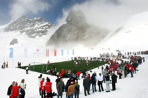
Nothing better than soccer at 3500 meters above sea level in Switzerland to get the blood going. More views of this exhibition game (marketing ploy) for Euro 2008 can be found here, here, here, here, and here.
“We got the idea for the game on the glacier after watching television pictures of Roger Federer’s exhibition tennis match against Andre Agassi on top of Dubai’s biggest hotel and thinking what we could do to make something similar,” Euro 2008 chief operating officer Martin Kallen told Reuters on Friday. –Vince
how did they possibly get all of the players to agree to this?
This reminds me of the exact opposite of link.
Perhaps also as a “marketing ploy,” Nike could have someone go over Niagara Falls in a barrel (said barrel to be suitably “swooshed,” of course).
still boring .. just less oxygen
I’m not a soccer fan, but excellent idea.
[quote comment=”99955″]I’m not a soccer fan, but excellent idea.[/quote]
Mmmm, I gotta agree with Broker75. Breathtaking view and a crisp game of soccer. A great marriage of ideas. I do feel sorry for the players, though.
Nothing to do with anything, but I watched the Royals take batting practice yesterday and the vast majority of them have ditched the stupid BP hats a la the Mets. There were still a few players & coaches wearing link, but most were wearing the regular 5950’s. We talked about the Mets getting rid of their BP hats, but have other teams done this too?
(Sorry if it’s been done to death already and I somehow missed it.)
Andy from KC, go to yesterday’s blog and click the ESPN column link…your questions will be answered :-) No need to apologize…not everyone has time to read this every day!
Paul has talked about players wearing buttons and guardian angel pins. Why hasn’t anybody talked about the pins that players wore on the back of their hats for the 125th anniversary of professional baseball in 1994? If I recall correctly, they were metal and kind of bronze colored. I had bought a few to put on my 5950s. They had four triangular-shaped points that you had to shove through and then hammer over. The hilarious part was the instructions that came with the pin. It stated “Do not attempt to install while cap is on head.”
Excellent. And if you pull a muscle, you don’t have to go far to ice it down.
[quote comment=”99960″]Andy from KC, go to yesterday’s blog and click the ESPN column link…your questions will be answered :-) No need to apologize…not everyone has time to read this every day![/quote]
Thanks! I read yesterday’s post before the column link went up and forgot about it. Things move awfully fast on this board!
Notre Dame announced Friday that the football team will wear green jerseys against USC this season, to honor the 1977 team that did the same and pulled off an upset of the Trojans.
See link.
Here’s a link on the green jerseys.
I’m among those that think the green jerseys look fantastic, though my preference is for navy blue.
Another interesting side note that passed my notice until now is the Irish switching to gold numbers with white trim, as seen in the link above. Compare that to link — white numerals with gold trim.
[quote comment=”99962″]Paul has talked about players wearing buttons and guardian angel pins. Why hasn’t anybody talked about the pins that players wore on the back of their hats for the 125th anniversary of professional baseball in 1994? If I recall correctly, they were metal and kind of bronze colored. I had bought a few to put on my 5950s. They had four triangular-shaped points that you had to shove through and then hammer over. The hilarious part was the instructions that came with the pin. It stated “Do not attempt to install while cap is on head.”[/quote]
I confess that I don’t remember this at all. Photos..?
I can’t find a picture of the pins on the caps, but this is the pin:
link
Linking doesn’t seem to be working, here’s the address:
link
I need to correct myself. I don’t believe ND has switched to gold numerals on their blue jeseys (although I think that would look cool).
The photo on the MSNBC article appears to be from last year’s game against Army, when the Irish wore green, albeit a much darker green. In that photo, the green jerseys looked a lot like blue to me. Here’s a gallery from the link.
This is ND from earlier the same season, with link.
Sorry for the earlier mixup.
Not sure you’ve heard about this, but right now FIFA and some of the South American countries are up in arms over playing soccer at high altitude. FIFA proposed a ban on playing over 2500mts, and Bolivia plays in La Paz (3600 mts, no snow), Ecuador and Colombia also play above the 2500mts mark. I’m sure it was to promote the European Championships, but could be to support the Andean Countries over this discriminatory ruling, proposed by Argentina and Brazil.
The 125th Anniversary pins can be see link. They look cheap (quality-wise). Replicas?
“When pulling groins, it’s oh so nice, to never have to send out for ice.”
–shamelessly adapted from Cole Porter
OK, a closer look at the 125th Anniversary pins I found and the eBAY auction and I can see the difference. The auctioned pin is an original back of the hat medallion.
heard on a radio show yesterday that the Devil Rays will be getting a new name and new unis next year, has this been mentioned on uniwatch? (probably has been)
They said the unis would be light blue and yellow, think UCLA.
you gotta know that the French Final between Nadal and Federer will be Swoosh City.
I was watching some college baseball yesterday. In North Carolina vs. South Carolina game, both teams’ jerseys said simply “Carolina.” I’ve never seen this before, where opposing teams have the same text on jerseys.
Watching the Yankee game. I noticed that Clemens had a grey shirt under his jersey in the first inning, which looked strange. The only Yankee I recall every wearing grey underneath was David Wells. But he came out for the second wearing a black undershirt. Maybe someone told him the grey looked weird.
[quote comment=”99985″]heard on a radio show yesterday that the Devil Rays will be getting a new name and new unis next year, has this been mentioned on uniwatch? (probably has been)
They said the unis would be light blue and yellow, think UCLA.[/quote]
For a while, they’ve been talking about dropping the DEVIL from the name. They might try to get a reference to the sun, which is likely why they’re adding in the yellow. There was Tarpon talk, but they might not wanna do that, what with those Dolphins and Marlins farther south.
since the yankee-pirate game is blacked out to the country except the new york and pittsburgh tv markets can someone answer the question whether or not clemens is “wearing ’em high” today??
he’s worn his pants at the appopriate height before, and I was curious if he was featuring that look this afternoon…
thanks for the help!
The University of California-Irvine/Wichita State game going on right now has many interesting elements:
-That field of 1/2 astroturf-1/2 regular grass.
-The names of the teams-Shockers for WSU and Anteaters for UCI, but shortened to ‘Eaters on the jerseys
-The colors of the teams-WSU is brown/yellow. (Not a fan, but not horrible. Irvine (I think) is supposed to be blue/gold, but the jerseys are blue/black (Ditch it!)On my TV, that combo makes the blue look purple. Maybe its just my tv.
-Irvine’s team appears to all be wearing real stirrups and showing a little sock.
I have no way of capturing a screen grab….
[quote comment=”99995″]since the yankee-pirate game is blacked out to the country except the new york and pittsburgh tv markets can someone answer the question whether or not clemens is “wearing ’em high” today??
he’s worn his pants at the appopriate height before, and I was curious if he was featuring that look this afternoon…
thanks for the help![/quote]
Nope. Pants are all the way to the ankles.
[quote comment=”99962″]Paul has talked about players wearing buttons and guardian angel pins. Why hasn’t anybody talked about the pins that players wore on the back of their hats for the 125th anniversary of professional baseball in 1994? If I recall correctly, they were metal and kind of bronze colored. I had bought a few to put on my 5950s. They had four triangular-shaped points that you had to shove through and then hammer over. The hilarious part was the instructions that came with the pin. It stated “Do not attempt to install while cap is on head.”[/quote]
I absolutely remember it, but it was not a league wide thing. I mostly remember a pitcher from the Reds wearing the bronzed pin where the MLB logo is on the back of the cap. I do not think any of the Indians wore them on their caps.
I wonder if Nike paid this photographer to snap the link of their shoe?
[quote comment=”99999″]
-The colors of the teams-WSU is brown/yellow. (Not a fan, but not horrible. Irvine (I think) is supposed to be blue/gold, but the jerseys are blue/black (Ditch it!)On my TV, that combo makes the blue look purple. Maybe its just my tv.
[/quote]
I think it’s just your TV. The Shockers are black and yellow. The only brown and yellow team I know is Wyoming, and even they’ve had the good sense to switch to a proper gold.
[quote comment=”100003″][quote comment=”99962″]Paul has talked about players wearing buttons and guardian angel pins. Why hasn’t anybody talked about the pins that players wore on the back of their hats for the 125th anniversary of professional baseball in 1994? If I recall correctly, they were metal and kind of bronze colored. I had bought a few to put on my 5950s. They had four triangular-shaped points that you had to shove through and then hammer over. The hilarious part was the instructions that came with the pin. It stated “Do not attempt to install while cap is on head.”[/quote]
I absolutely remember it, but it was not a league wide thing. I mostly remember a pitcher from the Reds wearing the bronzed pin where the MLB logo is on the back of the cap. I do not think any of the Indians wore them on their caps.[/quote]
Oh yeah, I totally forgot about those pins. I had a few of them as well. I have no idea where they are now, but I remember I lost one that fell off. Good catch remembering those!
Harlingen South baseball is wearing some funky unis for the 5A texas state championship. You can see them in the June 8th videos link. They’re orange on one side-front, green on the other, and white on the back. very strange.
[quote comment=”99995″]since the yankee-pirate game is blacked out to the country except the new york and pittsburgh tv markets can someone answer the question whether or not clemens is “wearing ’em high” today??
he’s worn his pants at the appopriate height before, and I was curious if he was featuring that look this afternoon…
thanks for the help![/quote]
Who cares?
link
Look on the lower left under “photos” … at least as of a couple minutes ago, they have a picture of Derek Jeter signing the back of some kid’s jersey, a white, pin-striped Yankees jersey, with a big numeral 2 and “JETER” spelled out above. Any self-respecting Yankee would refuse to even acknowledge the kid. What a shame.
[quote comment=”100026″][quote comment=”99995″]since the yankee-pirate game is blacked out to the country except the new york and pittsburgh tv markets can someone answer the question whether or not clemens is “wearing ’em high” today??
he’s worn his pants at the appopriate height before, and I was curious if he was featuring that look this afternoon…
thanks for the help![/quote]
Who cares?[/quote]
There is no “appropriate height”
I was at the A’s/Giants game last night – Bruce Bochy had used all of his catchers when link in the tenth inning. Alfonzo was link on the play and had to leave, leading to third baseman Pedro Feliz making his first ever MLB appearance behind the plate – see link and link. Randy Winn moved from the outfield to third base and pitcher link came in to play right field.
On thursday when the US faced Guatemela, the goalie, RIquonez (sp?) was wearing a jersey that read “foster”…. ill look for a pic
Jose Valentin wearing last year’s hat today against the Tigers.
[quote comment=”100027″]http://mlb.mlb.com/index.jsp
Look on the lower left under “photos” … at least as of a couple minutes ago, they have a picture of Derek Jeter signing the back of some kid’s jersey, a white, pin-striped Yankees jersey, with a big numeral 2 and “JETER” spelled out above. Any self-respecting Yankee would refuse to even acknowledge the kid. What a shame.[/quote]
TERRIBLE! I’ve always hated that. My friend owns a “22” white pinstripe jersey with “CANO” on the back. (He changed numbers this year, with the hope that Clemens would sign with them, and take his “22” back). If he would’ve just bought a “22” jersey, he could’ve said it was a Clemens jersey too. Idiot….
[quote comment=”99988″]Watching the Yankee game. I noticed that Clemens had a grey shirt under his jersey in the first inning, which looked strange. The only Yankee I recall every wearing grey underneath was David Wells. But he came out for the second wearing a black undershirt. Maybe someone told him the grey looked weird.[/quote]
haha I knew that I wouldn’t be the only person to notice that! I read once that Clemens changes his jersey a few times a game. I guess someone said “Lose the grey t-shirt, you’re not on the Astros anymore” haha
[quote comment=”100040″][quote comment=”100027″]http://mlb.mlb.com/index.jsp
Look on the lower left under “photos” … at least as of a couple minutes ago, they have a picture of Derek Jeter signing the back of some kid’s jersey, a white, pin-striped Yankees jersey, with a big numeral 2 and “JETER” spelled out above. Any self-respecting Yankee would refuse to even acknowledge the kid. What a shame.[/quote]
TERRIBLE!
I’ve always hated that.
My friend owns a “22” white pinstripe jersey with “CANO” on the back.
(He changed numbers this year, with the hope that Clemens would sign with them, and take his “22” back).
If he would’ve just bought a “22” jersey, he could’ve said it was a Clemens jersey too.
Idiot….[/quote]
FALSE ALARM!!! I’m so sorry. After my post, I was able to contact a good friend of mine, Jack, who works with a government agency, CTU in Los Angeles. He and his friends were able to do a super-zoom of the picture in question, and they discovered that Jeter was actually writing the following on the kid’s jersey:
“Dear Timmy,
Your parents hate you. Sorry to break the news, but they obviously have no love for you whatsoever. In fact, if they are ever spotted allowing you to wear a piece of shift (not sure if that word was correct) like this to the ballpark ever again, the Department of Children and Family Services will be contacted, and you will be taken to a place where people care about you. God Speed.
Your Friend,
2″
PS – Since you really don’t care what you look like when you go to the ballpark, would you like this hat?
[quote comment=”100035″]On thursday when the US faced Guatemela, the goalie, RIquonez (sp?) was wearing a jersey that read “foster”…. ill look for a pic[/quote]That’s because his name is link.
I am watching the Mets game and they showed Kenny Rogers in the dugout. The brim of his hat has a white line across it, like the spring training caps, expect it doesn’t have the do-rag. It looked like the mlb logo on the back was raised, like the new hats. Any ideas of what it could be?
[quote comment=”100006″]I wonder if Nike paid this photographer to snap the link of their shoe?[/quote]
That’s a really cool photo. I really appreciate the up close action shots of the smallest detail of a sport.
Whats wrong with a kid wanting his jersey autographed….?
Rogers is probably wearing last years BP cap…the one he colored in last yr
but Rogers cap looks like it has the mlb logo raised
[quote comment=”100065″]Whats wrong with a kid wanting his jersey autographed….?[/quote]
It’s not the kid … it’s the blasphomy of the Yankees jersey with a name printed on it. It would be like the Statue of Liberty given a new paint job to celebrate Lithuanian Americans (even though I am one, it’d still be horrible)… or someone fixing the crack in the Liberty Bell.
There are some things that just shouldn’t be done. It sickens me, and I have yet to cheer for ANY New York team (unless, of course, they’re playing the Cardinals).
Oh sorry… I’m not one of those world revolves around the Yankees and Red Sox baseball fans. If you had asked me five minutes ago I would have said they had their names on the back. And I love the pajama pants look!
Jim, good one!
Now we just need to get the Cubs back on the tradition train and get those ugly names off their game jerseys too.
I remember the 1994 bronze pins very well. They were all bronze-colored, with nored or blue paint like in the link a few posts up. When I bought a cap that year (the Marlins, teal-and-black; I had no idea what they’d inflict on my Cubs years later), I asked about getting a pin, and the person in the store said that the pins weren’t available to the public.
[quote comment=”99987″]I was watching some college baseball yesterday. In North Carolina vs. South Carolina game, both teams’ jerseys said simply “Carolina.” I’ve never seen this before, where opposing teams have the same text on jerseys.[/quote]
I think when the NY Nets jumped from the ABA to the NBA, they had “New York” on their road blues. Thus, when they played the Knicks at MSG, both teams had “New York” on their jerseys.
[quote comment=”99970″]Notre Dame announced Friday that the football team will wear green jerseys against USC this season, to honor the 1977 team that did the same and pulled off an upset of the Trojans.
See link.
Here’s a link on the green jerseys.
I’m among those that think the green jerseys look fantastic, though my preference is for navy blue.
Another interesting side note that passed my notice until now is the Irish switching to gold numbers with white trim, as seen in the link above. Compare that to link — white numerals with gold trim.[/quote]
No, the Irish wear Gold numbers on the green unis, but white on the navy unis. No change, its been that way a long time.
Also: single-digit pitcher sighting!
Josh Wilson pitched an inning for the Devil Rays yesterday in a blowout loss to the Marlins. He’s listed as number 9; anyone get any screen captures?
Was watching the HS All-American game on FSN earlier today, and the two teams are divided into an East and West. Each team has “All American” on the front of their uniform, and either “East” or “West” where names are usually located on the back. They also wore the game cap of the college that they have committed to.
Following my own posts here, but:
Andy Sonnanstine and Rick van den Hurk are due to face off in a battle of long-named pitchers this weekend. The Marlins’ van den Hurk link.
If you had clicked on that Yankees gallery – that kid may have actually been given the jersey sine the Yanks were honoring him for calling for help in a bank robbery.
Here’s Clemen’s link and link he is with the dark undershirt. Still has the patch on his glove also.
Do any other teams link like the Yanks do? A-Rod even gets his link for him.
Let’s just hope that the players don’t start wearing link come colder weather.
[quote comment=”100080″]Jim, good one!
Now we just need to get the Cubs back on the tradition train and get those ugly names off their game jerseys too.
I remember the 1994 bronze pins very well. They were all bronze-colored, with nored or blue paint like in the link a few posts up. When I bought a cap that year (the Marlins, teal-and-black; I had no idea what they’d inflict on my Cubs years later), I asked about getting a pin, and the person in the store said that the pins weren’t available to the public.[/quote]
I, a Bleacher Bum since age 10 (and, proud to say, the first fan in line to get in the park for the first night game ever on 8/9/88), am actually torn in regards to the concept of names on the backs of the jerseys. On one side (in reference to nameless jerseys): They’re Cubs Tradition. Then I realized, so is losing. And the closest they got to the World Series since 26 years before I was born was while wearing their names on their backs. Is change ALWAYS a bad thing? That said, I can’t say how happy I was with the new season to see the softball alternates go to the waste pile. If they’re HAVE to have an alternate, why not go white, with piping (no pinstripes) with the walking cub logo on the left chest? I think it’d be a great look (and a bit of a tribute from years WAY past … like when they would regularly head to the World Series!).
Just my two cents.
[quote comment=”99990″][quote comment=”99985″]heard on a radio show yesterday that the Devil Rays will be getting a new name and new unis next year, has this been mentioned on uniwatch? (probably has been)
They said the unis would be light blue and yellow, think UCLA.[/quote]
For a while, they’ve been talking about dropping the DEVIL from the name. They might try to get a reference to the sun, which is likely why they’re adding in the yellow. There was Tarpon talk, but they might not wanna do that, what with those Dolphins and Marlins farther south.[/quote]
Tampa Bay Sun Rays?….omg
Jim, I’d be happy with an alternate like that. They could put names on only the road jersey — the Giants and Red Sox do it this way and they both look great — or on only one of the home jerseys, so that both sides of the tradition debate could be happy.
I think the walking bear looks better on a blue background, though. With the blue bear blending into the shirt, the red C stands out a little more.
In fact, make those plain-white alternates into 1940s-style vests! The Cubs were the first team to wear vests; everybody forgets this!
Tigers pitcher Todd Jones was just sporting last year’s hat also. (As well as the short right sleeve)
This may have been discussed earlier in the tournament, but I just sat down to watch Canada and Guadeloupe in the Gold Cup. Guadeloupe has come out in some hideous unis. Red tops with green and yellow shorts.
The announcers on Canada’s Rogers Sportsnet describe it as a cross between Canadian and Jamacian unis.
I have no link to pass on, but these are cover-your-eyes awful.
It looks like the devil rays are link…..for now…
[quote comment=”100046″][quote comment=”100040″][quote comment=”100027″]http://mlb.mlb.com/index.jsp
Look on the lower left under “photos” … at least as of a couple minutes ago, they have a picture of Derek Jeter signing the back of some kid’s jersey, a white, pin-striped Yankees jersey, with a big numeral 2 and “JETER” spelled out above. Any self-respecting Yankee would refuse to even acknowledge the kid. What a shame.[/quote]
TERRIBLE!
I’ve always hated that.
My friend owns a “22” white pinstripe jersey with “CANO” on the back.
(He changed numbers this year, with the hope that Clemens would sign with them, and take his “22” back).
If he would’ve just bought a “22” jersey, he could’ve said it was a Clemens jersey too.
Idiot….[/quote]
FALSE ALARM!!! I’m so sorry. After my post, I was able to contact a good friend of mine, Jack, who works with a government agency, CTU in Los Angeles. He and his friends were able to do a super-zoom of the picture in question, and they discovered that Jeter was actually writing the following on the kid’s jersey:
“Dear Timmy,
Your parents hate you. Sorry to break the news, but they obviously have no love for you whatsoever. In fact, if they are ever spotted allowing you to wear a piece of shift (not sure if that word was correct) like this to the ballpark ever again, the Department of Children and Family Services will be contacted, and you will be taken to a place where people care about you. God Speed.
Your Friend,
2″[/quote]
Nice
The Yankees wouldn’t give this kid a jersey with “JETER” on the back, would they????
As a PSU alumni, this really annoys me too:
link
link
[quote comment=”100083″]Also: single-digit pitcher sighting!
Josh Wilson pitched an inning for the Devil Rays yesterday in a blowout loss to the Marlins. He’s listed as number 9; anyone get any screen captures?[/quote]
I don’t think he counts as a single digit pitcher since he is the short stop. I would never call Mark Grace or Doug Dacenzo (sp?) pitchers.
[quote comment=”100125″][quote comment=”100083″]Also: single-digit pitcher sighting!
Josh Wilson pitched an inning for the Devil Rays yesterday in a blowout loss to the Marlins. He’s listed as number 9; anyone get any screen captures?[/quote]
I don’t think he counts as a single digit pitcher since he is the short stop. I would never call Mark Grace or Doug Dacenzo (sp?) pitchers.[/quote]
Yeah, but he had the one digit on his back (just like the immortal Brent Mayne). Doug Dascenzo with his #29 looks pretty pitcher-like from a jersey number perspective.
some great retro tshirts here:
link
[quote comment=”100131″][quote comment=”100125″][quote comment=”100083″]Also: single-digit pitcher sighting!
Josh Wilson pitched an inning for the Devil Rays yesterday in a blowout loss to the Marlins. He’s listed as number 9; anyone get any screen captures?[/quote]
I don’t think he counts as a single digit pitcher since he is the short stop. I would never call Mark Grace or Doug Dacenzo (sp?) pitchers.[/quote]
Yeah, but he had the one digit on his back (just like the immortal Brent Mayne). Doug Dascenzo with his #29 looks pretty pitcher-like from a jersey number perspective.[/quote]
Doug Dascenzo did look pitcher-like until he threw the ball. Josh Wilson looked odd from all perspectives.
Nice
The Yankees wouldn’t give this kid a jersey with “JETER” on the back, would they????
As a PSU alumni, this really annoys me too:
link
link
I know the words “football tradition” don’t get quite the same brevity at my school (Indiana) as they do at yours, but I can’t say I was a huge fan of Coach Hoeppner’s idea of putting names on the jerseys. Luckily, “basketball tradition” has kept the names off of the roundball uniforms.
[quote comment=”100136″]some great retro tshirts here:
link
FORTY DOLLARS?! What a freakin’ joke…
[quote comment=”100142″][quote comment=”100136″]some great retro tshirts here:
link
FORTY DOLLARS?! What a freakin’ joke…[/quote]
Holy damn. Yeah, the shirts are nice, but when did it become OK to start charging $40 and $50 for a freakin t-shirt?!!?
MLB Shop’s cheap replicas all come with the base solid color number/name, with no account for font, outline, or multiple color. Including the Yankees.
I had a home Twins jersey that I ordered several years ago (that has since been stolen) that I ordered specifically so that I could remove the incorrect jersey number (plain dark blue) for the red with blue outline while keeping the properly stitched name. Sports shops tend to mess up name placement more than number spacing.
[quote comment=”100210″]MLB Shop’s cheap replicas all come with the base solid color number/name, with no account for font, outline, or multiple color. Including the Yankees.
I had a home Twins jersey that I ordered several years ago (that has since been stolen) that I ordered specifically so that I could remove the incorrect jersey number (plain dark blue) for the red with blue outline while keeping the properly stitched name. Sports shops tend to mess up name placement more than number spacing.[/quote]
Is it that hard to get the fonts right? Is it that hard to omit the last name on the Yankees jerseys? Is it that hard to do a simple double number (or outline, if you will) like the Yankees away jerseys? Is it that hard to include a front number, àla the Dodgers? Apparently, it is. I envy Tigers fans. Their replica home jerseys look the best because there is almost no error. Just cheaper materials. The way it should be.
[quote comment=”100217″]MLB Shop’s cheap replicas all come with the base solid color number/name, with no account for font, outline, or multiple color. Including the Yankees.
I had a home Twins jersey that I ordered several years ago (that has since been stolen) that I ordered specifically so that I could remove the incorrect jersey number (plain dark blue) for the red with blue outline while keeping the properly stitched name. Sports shops tend to mess up name placement more than number spacing.[/quote]
Is it that hard to get the fonts right? Is it that hard to omit the last name on the Yankees jerseys? Is it that hard to do a simple double number (or outline, if you will) like the Yankees away jerseys? Is it that hard to include a front number, àla the Dodgers? Is it that hard to include sleeve patches, like the Mets and the Reds? Apparently, it is.
I envy Tigers fans. Their replica home jerseys look the best because there is almost no error. Just cheaper materials. The way it should be.
Nice socks on Carrie Underwood:
link
[quote comment=”100090″]If you had clicked on that Yankees gallery – that kid may have actually been given the jersey sine the Yanks were honoring him for calling for help in a bank robbery.
Here’s Clemen’s link and link he is with the dark undershirt. Still has the patch on his glove also.
Do any other teams link like the Yanks do? A-Rod even gets his link for him.
Let’s just hope that the players don’t start wearing link come colder weather.[/quote]
The Mets do.
link
In the Chad Johnson vs. Horse race today, Chad was wearing black and orange jockey silks with orange shorts. The silks had an orange diagonal stripe on the front, tiger stripes on the sleeves and 85 and Ocho Cinco on the back
link
[quote comment=”100255″]In the Chad Johnson vs. Horse race today, Chad was wearing black and orange jockey silks with orange shorts. The silks had an orange diagonal stripe on the front, tiger stripes on the sleeves and 85 and Ocho Cinco on the back
link[/quote]
link
[quote comment=”99988″]Watching the Yankee game. I noticed that Clemens had a grey shirt under his jersey in the first inning, which looked strange. The only Yankee I recall every wearing grey underneath was David Wells. But he came out for the second wearing a black undershirt. Maybe someone told him the grey looked weird.[/quote]
Rent-a-Rocket seems to be having a lot of uni issues lately… first and foremost he happens to be wearing the wrong one! But maybe this one was just because he gave up three runs in the first inning!
[quote comment=”100149″][quote comment=”100142″][quote comment=”100136″]some great retro tshirts here:
link
FORTY DOLLARS?! What a freakin’ joke…[/quote]
Holy damn. Yeah, the shirts are nice, but when did it become OK to start charging $40 and $50 for a freakin t-shirt?!!?[/quote]
I would much rather have a orange on blue Uni Watch membership shirt!
[quote comment=”100083″]Also: single-digit pitcher sighting!
Josh Wilson pitched an inning for the Devil Rays yesterday in a blowout loss to the Marlins. He’s listed as number 9; anyone get any screen captures?[/quote]
Don’t forget about Josh Towers (Now back in the Jays’ rotation).
[quote comment=”100149″][quote comment=”100142″][quote comment=”100136″]some great retro tshirts here:
link
FORTY DOLLARS?! What a freakin’ joke…[/quote]
Holy damn. Yeah, the shirts are nice, but when did it become OK to start charging $40 and $50 for a freakin t-shirt?!!?[/quote]
I agree completely. I got excited when I saw the Expos and Dolphins t-shirts, but I could throw in a few more bucks and get a jersey. $49 for lightweight tee. That should be criminal.
[quote comment=”100103″][quote comment=”99990″][quote comment=”99985″]heard on a radio show yesterday that the Devil Rays will be getting a new name and new unis next year, has this been mentioned on uniwatch? (probably has been)
They said the unis would be light blue and yellow, think UCLA.[/quote]
For a while, they’ve been talking about dropping the DEVIL from the name. They might try to get a reference to the sun, which is likely why they’re adding in the yellow. There was Tarpon talk, but they might not wanna do that, what with those Dolphins and Marlins farther south.[/quote]
Tampa Bay Sun Rays?….omg[/quote]
During one of the 90s expansions, someone did propose Sunrays for a team that didn’t end up arriving. How about the nostalgic Tampa Smokers?
Can somebody back me up that the Phillies and Yankees are the only 2 MLB teams that don’t wear an alternate 3rd jersey?
There were a number of posts about pins in this thread, which reminded me…I was looking at pictures of the Ducks celebratory rally this weekend, and notice Rob Niedermeyer wearing what appears to be some sort of pin on his jersey. Can’t fnid any closeups, but you can at least see what I’m talking about
here. Any clues what that is?