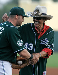
You probably know that the Devil Rays played a few “home” games in Orlando last week at the Disney Wide World of Sports Complex, which, despite having only 9000 seats, was no doubt an upgrade over Tropicana Field (and where, as you can see at right, Richard Petty threw out the first ball for one of the games). Reader Andrew Ranck attended one of the games and documented some interesting factoids regarding the 246th stadium to host an MLB game:
The field in front of the dugouts had logos commemorating the 10th anniversary of the complex (who knew). The on deck circles had MLB logos on them, and they seemed pretty worn. I’m guessing they may have been spring training holdovers, but they didn’t seem to get much use anyway.
Left field had a collection of pennants representing some of the Rays’ regular sponsors. Also the area beyond the left field fence was grassy, with families spread out on blankets and kids running around.
Center field was pretty bare, and the scoreboard gave little batter information. Besides the line score and the current count, we only saw the batter’s uniform number and batting average. Right field had a temporary Jumbotron, which only displayed the basic graphics from the player intros and whatnot. In the foreground of that last photo, you can see the soft drink race, which took place after the 4th inning.
The only beers for sale that I could find were 24-ounce cans (for $8.50!). The Anheiser-Busch products had Rays logos on them. This surprised me, because Disney is known for not selling that much in the way of A-B products, because Busch Gardens and Sea World are main competitors.
Thanks to Andrew for the first-hand report. Meanwhile, if anyone wants to give a similar account of the proceedings at the Trop, that might be amusing.
Uni Watch News Ticker: Big kudos and thanks to Trevor Williams of the Brainerd Dispatch, who attended the Uni Watch party in Minneapolis two Saturdays ago and then wrote this very nice article about it. … Lotsa stuff you might have missed over the weekend, beginning with Boise State’s new football jerseys, which were unveiled late on Friday. They’ll look like this, this, this, and this. Further details here. … Also from Friday: Roger Clemens warmed up for his minor league season debut wearing high cuffs and white-striped Adidas cleats but later switched shoes and pant styles. … Reprinted from Saturday’s comments: Friday’s blog entry about Chris Sampson being told to remove his hospital bracelet (in case you missed it, look here) should have included a reference to Rob Mackowiak, who hit two home runs while still wearing his hospital bracelet on the day his baby was born back in 2004 (full details here). … It was Armed Forces Night in Milwaukee on Saturday, with the Brewers and Twins wearing military-themed caps. … Interesting thread on the Chris Creamer boards regarding the Cincinnati Jungle Kats, an AF2 team with a pretty innovative helmet design. … More arena football news from Michael Alper, who notes that Kenny Higgins of the Nashville Kats (again with the stoopid spelling) is wearing red shoes, even though there’s virtually no red in the team’s uniform. … The Orioles are denying reports that they’ll put “Baltimore” on their road jerseys next year (as forwarded by Jason Reddish). … Antiques Roadshow recently had a nice little segment on this medal. Details here (with thanks to Jeremiah Conway). … Anyone know why a manufacturer would refer to this pant style as a “Clemson Cut”? Also, who knew there was a hidden interior stirrup in there? (Good find by Rick Subrizio.) … Grant Emerson notes that Angel Pagan’s helmet logo appliqué has been crooked lately. … Club Deportivo Chivas USA has a new jersey sponsor. Full details here (with thanks to Jeffrey Israel). … If you’re interested in Tennessee high school uniforms, tons of photos are available here (courtesy of Marc Walls). … Texans cornerback Jason Simmons came up with a novel way to sell his uniform number to new teammate Ahman Green. … Ronnie Poore noticed something interesting in this photo of the 1965 NFL draft: The little figurines on each desk are wearing stirrups, instead of football-style socks. Most NFL players did wear stirrups in those days, but they also wore shin-length white socks over them — odd that the figurines didn’t get that final finishing hosiery touch. … Good story here about this Texas company, which makes varsity/letterman jackets. Further background info here. (With thanks to Matt Mitchell.) … Follow-up report from Jen Muller, who recently provided the photo of Dane Richards with his name misspelled: “At a Red Bulls ‘meet the team’ event on Saturday, I had a chance to ask Richards if he knew his name was spelled incorrectly on his jersey. He said he had no idea until he saw it later on the internet. Maybe he’s a Uni Watch fan.” … Check out the socks on Dong Tam Long An of the Vietnamese soccer league, who’s been playing in the AFC Champions League this year (as spotted by Jeremy Brahm). … Can’t say I thought much of Cory Spinks’s trunks or glove colors during his fight against Jermain Taylor on Saturday night. Weirdest bit: When Spinks’s trunks started slipping down, his corner tried to secure them with tape around the waistband — never seen that maneuver before. Meanwhile, check out the fringe on Taylor’s trunks. … Former Knick John Starks is promoting a new line of basketball warm-up pants, which are supposedly easier to pull off in one motion. Details in the “Starks to NBA” section about two-thirds of the way down this page (with thanks to Eric Stangel). … Lots of great stripes on display in this rugby photo, taken by Rick Collins. … Odd logo/number format being worn by the Texas City Stings (good catch by Seth Harris). … A little birdie tells me that the U. of Texas hoops team will go to Nike’s tight-fit jerseys next season. … Matthew Lepke notes that as of yesterday, Ron Gardenhire was still wearing his Mother’s Day ribbon on his windbreaker. … Matt Meltzer and I both want to know what’s printed on Dice-K’s left undersleeve. … Seth Horowitz forwards the following, from yesterday’s NY Post: “Tom Nieto, the Mets’ catching instructor, now has a tilde over the ‘N’ in ‘ÑIETO’ on the back of his jersey. He didn’t have one in his previous two years with the Mets but had it switched this season so that it would be properly pronounced.” … Nike’s latest brainstorm: a new and “improved” design, featuring a black jersey, for the Miami baseball team. … Awesome stirrup display by Brian Garman of the UC Bearcats (with thanks to Buckeye Mike, who says he’s known Garman since they were both about five years old). … Uni Watch design director Scott M.X. Turner and I attended last night’s Yanks/Mets debacle. The shameful truth: I was cold, tired, and depressed by the game’s proceedings, so I left in the middle of the 8th inning. Let the record show that Scott stayed to the bitter end.
Such a no brainer for the O’s to put “Baltimore” back on the away unis.
With the Nationals in the neighborhood, I really wish the Orioles would just surrender and bring “Baltimore” back. It’d be a nice nod to the glory days.
Correction: It’s Club Deportivo Chivas USA, not just Club Deportivo Chivas. The former is the MLS team based in LA, the latter is a large club in Mexico that has Bimbo as a uni sponsor.
Was there ever any doubt that the Devil Rays are a “Mickey Mouse” operation?
Re: Dice K…I think it’s a clump of dirt falling down that just so happens to be in the right place at the right time. Just my guess.
Correction: It’s Club Deportivo Chivas USA, not just Club Deportivo Chivas. The former is the MLS team based in LA, the latter is a large club in Mexico that has Bimbo as a uni sponsor
Actually, it’s Club Deportivo Guadalajara. Their nickname is “Los Chivas” (the young goats).
link
link helmet for the Iowa Barnstormers of the Arena League was always my favorite helmet design. Creative, but not obnoxious.
The one time I get a virus and am laid up in bed for 3 days the story breaks about the O’s road jerseys!!! Why does God do this to me!
Whoo, I’m internet famous!
But wait…the new sponsored Chivas USA shirts are going to debut at halftime? Did I read that right? I guess they’ll play the first half in the old shirts then change?
8.50 for a beer is pretty reasonable by ball park standards. They are 6.50 for a 16 ounce Bud Light at PNC Park (which is on the cheap side of average) or roughly 40 cents per ounce. $8.50 for 24 ounces comes out to about 35 cents per ounce, so its actually cheaper.
I bet they pay about 8.50 for a 16 ounce beer in the more expensive ballparks. Could be worse.
FYI: Texas City’s mascot is the Stingaree, not the Sting.
[quote comment=”89671″]8.50 for a beer is pretty reasonable by ball park standards. They are 6.50 for a 16 ounce Bud Light at PNC Park (which is on the cheap side of average) or roughly 40 cents per ounce. $8.50 for 24 ounces comes out to about 35 cents per ounce, so its actually cheaper.
I bet they pay about 8.50 for a 16 ounce beer in the more expensive ballparks. Could be worse.[/quote]
I wouldn’t call for an $8.50 beer to be ‘reasonable’. Normal, typical, or standard, I’ll give you.
Lots of great stripes on display in this rugby photo, taken by Rick Collins
That picture was taken Saturday at the US Rugby Superleague quarterfinals in Chicago. The wonderfully striped black-and-red team is link, who defeated the link to move on to the semifinals. The Griffins will face cross-town rivals link (aka “The Black Army”) in the semi-finals, who took down traditional power link of San Diego.
There are some fantastic kits in the US SuperLeague, though the aforementioned link are the tops. Some others:
– link (in green and white)
– link – striped sock heaven!
Looks like Roger Clemens broke out a pair of Astro cleats for this years yankee debut …
yankees:
link
astros:
link
link
Nike must be doing the black jerseys for all their high-ranked college teams. UNC-CH wore a never-before seen black jersey with massive Carolina-blue armpit gussets on May 15. I asked a student assistant what was the deal. He first guessed they were BP jerseys, or maybe “special occasion” jerseys for their final home game in the old stadium. Have a look in the photo gallery: link
Why were the Mets wearing black cleats with a uniform that had no black in it last night? Blue cleats with blue socks would have been so much better.
[quote comment=”89679″]Nike must be doing the black jerseys for all their high-ranked college teams. UNC-CH wore a never-before seen black jersey with massive Carolina-blue armpit gussets on May 15. I asked a student assistant what was the deal. He first guessed they were BP jerseys, or maybe “special occasion” jerseys for their final home game in the old stadium. Have a look in the photo gallery: link
Ouch! That black jersey/white hat combo is atrocious.
“clemson cut” Clemson was the first team to go to the extra length pants. there players get their pants custom fit for extra length so they cant see any sock. they did this because they have always worn white cleats for as long as i have known. a lot better than this
Paul,
I just wanted to tell you (even though I am pretty sure you already know) that the Mets lost last night because you left early. I’m disappointed, not because I am not an Mets fan (go Indians!), but because I am a Yankee hater. Shame on you.
Please prove me wrong if you disagree.
8-D
Ran into this little tidbit today. Good stuff from Jason Simmons.
HOU – S Jason Simmons Has Unique Price For His Jersey Number To RB Green
Source: AP
Texans safety Jason Simmons said he’d gladly surrender the number if Ahman Green made the down payment on a home for a single parent.
“He said what he wanted to do and I said: ‘Yeah I’m all on board. That’s easy,”‘ Green said. “Tell me where to write the check to. So instead of putting the money into his pocket, he’s going to put in into somebody else’s home, house and help them get their life started.”
– Philadelphia Whitemarsh (in red and black) vs. San Francisco Golden Gate – striped sock heaven!
Correction to my own post: the team in green is Boston Wolfhounds, not SFGG.
I think the city has asked the Orioles to NOT put Baltimore on the road uniforms. The city doesn’t want to be associated with such an awful franchise ;)
Why does one Chivas USA player have white shoulders, and all the others have red?
Weird Number font on DeLand High School of Florida’s uniforms… link.
[quote comment=”89681″]Why were the Mets wearing black cleats with a uniform that had no black in it last night? Blue cleats with blue socks would have been so much better.[/quote]
As I recall, the Mets wore blue spikes with the blue caps and black spikes with the black caps during spring training in 1998. Very early during the ’98 regular season, the Mets realized the logistical problems of schlepping around different colored spikes, so they ditched the blue and went with black spikes full-time.
The Royals also went to black spikes when they added a black jersey. But then they ditched the black jerseys, but kept the black spikes.
POLL QUESTION: What is the consensus among Uni Watchers concerning black spikes paired with uniforms that don’t have any black?
I’ll answer my own question:
Wikipedia
says that the white shoulder are away jerseys.
[quote comment=”89632″]And any Mets fans out there, how long have they been wearing 3 different helmets, especially at home? They wore a different one every game of the subway series (black on friday, blue-black fade on saturday, all blue sunday), but at least they matched the caps.[/quote]
They wear the different helmets depending on the cap and uni combination. The all-black helmet for the all-black jerseys; the blue-black fade helmet with the pinstripe or snow white unis (and the road greys) if they’re wearing the blue-back caps (although the link does not match the link); and the blue helmet if they are wearing the blue caps. So as you pointed out, they could wear three different caps on one homestand with three different corresponding helmets.
Oddly enough, in the commercial for the new MLB videgame he is endorsing, David Wright is wearing the black jersey with the wrong (blue-black fade) helmet. It would kinda be like Albert Pujols filming a commercial in the home whites with the navy blue batting helmet.
[quote comment=”89697″][quote comment=”89681″]Why were the Mets wearing black cleats with a uniform that had no black in it last night? Blue cleats with blue socks would have been so much better.[/quote]
As I recall, the Mets wore blue spikes with the blue caps and black spikes with the black caps during spring training in 1998. Very early during the ’98 regular season, the Mets realized the logistical problems of schlepping around different colored spikes, so they ditched the blue and went with black spikes full-time.
The Royals also went to black spikes when they added a black jersey. But then they ditched the black jerseys, but kept the black spikes.
POLL QUESTION: What is the consensus among Uni Watchers concerning black spikes paired with uniforms that don’t have any black?[/quote]
Hey wearing black spikes with Sunday night’s Mets uniform is definitely old-school … back to when the only people who wore spikes [or cleats] in any other color besides black were the Oakland A’s and Joe Namath.
Now .. as its been said, if only Los Mets would drop the black drop shadow on those unis … it would be Flushing Fantabulous!
My favorite softball combination. white pants wore link with link and link
[quote comment=”89688″]Ran into this little tidbit today. Good stuff from Jason Simmons.
HOU – S Jason Simmons Has Unique Price For His Jersey Number To RB Green
Source: AP
Texans safety Jason Simmons said he’d gladly surrender the number if Ahman Green made the down payment on a home for a single parent.
“He said what he wanted to do and I said: ‘Yeah I’m all on board. That’s easy,”‘ Green said. “Tell me where to write the check to. So instead of putting the money into his pocket, he’s going to put in into somebody else’s home, house and help them get their life started.”[/quote]
Paul mentioned this today in his news ticket.
[quote comment=”89708″][quote comment=”89688″]Ran into this little tidbit today. Good stuff from Jason Simmons.
HOU – S Jason Simmons Has Unique Price For His Jersey Number To RB Green
Source: AP
Texans safety Jason Simmons said he’d gladly surrender the number if Ahman Green made the down payment on a home for a single parent.
“He said what he wanted to do and I said: ‘Yeah I’m all on board. That’s easy,”‘ Green said. “Tell me where to write the check to. So instead of putting the money into his pocket, he’s going to put in into somebody else’s home, house and help them get their life started.”[/quote]
Paul mentioned this today in his news ticket.[/quote]
oops, news ticker
Not sure if it has been mentioned before, but I’ve noticed that David Ortiz’s helmet “B” looks to be off center…
[quote comment=”89697″]What is the consensus among Uni Watchers concerning black spikes paired with uniforms that don’t have any black?[/quote]
Once upon a time, link spikes were link. I prefer that look. Has nothing to do with whether black is a team color — it just provides a solid grounding for the rest of the uniform.
Except for the A’s, of course.
oops… no link…
link
[quote comment=”89683″]”clemson cut” Clemson was the first team to go to the extra length pants. there players get their pants custom fit for extra length so they cant see any sock. they did this because they have always worn white cleats for as long as i have known. a lot better than this[/quote]
When I bought my last pair of baseball pants, I went pajama style(sorry sorry) because 285lbs in tight pants isn’t flattering. I bought them with the style “Crimson Cut” which I would believe is a nod to Alabama and the Crimson Tide. Could have been changed due to the words being similar.
[quote comment=”89697″]POLL QUESTION: What is the consensus among Uni Watchers concerning black spikes paired with uniforms that don’t have any black?[/quote]
Black is just a generic color for spikes, so I personally don’t consider it a big deal. As far as baseball goes, pretty much every team save for the Cardinals and A’s (off the top of my head) wears black spikes, right?
If we took it to the extreme (no black shoes unless you have black in your uni), more than a few NFL teams shouldn’t wear black cleats because they don’t have black in their uniform color scheme. And that would be a shame, because black cleats just look so much sharper than white.
[quote comment=”89719″][quote comment=”89683″]”clemson cut” Clemson was the first team to go to the extra length pants. there players get their pants custom fit for extra length so they cant see any sock. they did this because they have always worn white cleats for as long as i have known. a lot better than this[/quote]
When I bought my last pair of baseball pants, I went pajama style(sorry sorry) because 285lbs in tight pants isn’t flattering. I bought them with the style “Crimson Cut” which I would believe is a nod to Alabama and the Crimson Tide. Could have been changed due to the words being similar.[/quote]
Or maybe you bought them from an Asian?
Looking through that Tennessee high school picture gallery, I came across a photo of link. Needless to say, they have a familiar logo on their helmet…only it’s from another sport.
Does anyone know of any other football team, high school, college, semi-pro, pro that uses a MLB logo for the helmet decal?
[quote comment=”89723″][quote comment=”89719″][quote comment=”89683″]”clemson cut” Clemson was the first team to go to the extra length pants. there players get their pants custom fit for extra length so they cant see any sock. they did this because they have always worn white cleats for as long as i have known. a lot better than this[/quote]
When I bought my last pair of baseball pants, I went pajama style(sorry sorry) because 285lbs in tight pants isn’t flattering. I bought them with the style “Crimson Cut” which I would believe is a nod to Alabama and the Crimson Tide. Could have been changed due to the words being similar.[/quote]
Or maybe you bought them from an Asian?[/quote]
touche
Paul,
Once upon a time, there was going to be a Uniwatch Profile of you. You then said that you were holding it so that you would not jump out in front of a similar article that was going to appear in a different publication.
Did that ever appear? (If so, and I missed the reference on this site, my apologies for wasting people’s time.) If it did not, when can expect one or the other?
Those of us who graduated high school on Long Island in 1982 and watched Willie Mays with the Mets when we were 9 are particularly interested in the profile.
[quote comment=”89716″][quote comment=”89697″]What is the consensus among Uni Watchers concerning black spikes paired with uniforms that don’t have any black?[/quote]
Once upon a time, link spikes were link. I prefer that look. Has nothing to do with whether black is a team color — it just provides a solid grounding for the rest of the uniform.
Except for the A’s, of course.[/quote]
Yeah, look at the Reds. Back in the 70s and the Big Red Machine (when there wasn’t any black trim in the uni) they wore the black cleats. That didn’t switch to the red until the mid 80s. (It was ’86 at the earliest because I can remember Pete Rose wearing black mizunos when he broke Ty Cobb’s hit record).
I don’t think the A’s would look bad with black, but it’s a matter of tradition with them and would be too odd to see them NOT in the white. If my memory serves me correctly, I thought they were set to switch at one point in time but at the last minute the players voted it down.
The A’s are the only team where I don’t actually mind the players wearing the pants low, especially in the white homes, because it gives it a clean, symmetrical look. I appreciate guys wanting to throw back and wear the pants up high, but since so few seem to wear the yellow sani and the proper stirrup…. well, the solid green sock with white shoes and pants pulled up high just doesn’t do it for me.
[quote comment=”89715″]Not sure if it has been mentioned before, but I’ve noticed that David Ortiz’s helmet “B” looks to be off center…[/quote]
Maybe Big Papi wanted to wear his hat skewed to the side like all the homeboys do, but still have the “B” centered on his head, but didn’t realize he couldn’t pull it off with a batting helmet?
Question,
I don’t know how but maybe someone would want to put uni watch on wikipedia???
Just a thought
[quote comment=”89725″]When I bought my last pair of baseball pants, I went pajama style(sorry sorry) because 285lbs in tight pants isn’t flattering. I bought them with the style “Crimson Cut” which I would believe is a nod to Alabama and the Crimson Tide. Could have been changed due to the words being similar.
Or maybe you bought them from an Asian?[/quote]
Funny stuff.
Unfortunately, if you worked at a TV or radio station right now, you would probably get fired for that type of comment. What a sad world we live in.
[quote comment=”89683″]”clemson cut” Clemson was the first team to go to the extra length pants. there players get their pants custom fit for extra length so they cant see any sock. they did this because they have always worn white cleats for as long as i have known. link[/quote]
When I played high school ball a few years ago, I tried to wear my socks up, but my pant cuffs had no elastic in them. I complained to my coach, who said that the pants were “Clemson cut” and were supposed to be worn down (or something like that). I tried bunching them up so they’d stay put, but one leg would always fall completely down and the other would fall down to my ankle after about three steps. Very sad. Needless to say, I ran track instead the next spring.
Oh yeah, point of the story is I never exactly knew what “Clemson cut” meant, though I had a feeling it was something along those lines.
Whoops, forgot the final word of my post:
Thanks.
OK, I know this is WAY late, as the UniWatch birthday and membership announcement was ages ago: but in the spirit of a recent column, how about including the reason for choosing your membership number on the card? Or something like that…
[quote comment=”89735″]Question,
I don’t know how but maybe someone would want to put uni watch on wikipedia???
Just a thought[/quote]
Please note: this is NOT link.
[quote comment=”89730″][quote comment=”89715″]Not sure if it has been mentioned before, but I’ve noticed that David Ortiz’s helmet “B” looks to be off center…[/quote]
Maybe Big Papi wanted to wear his hat skewed to the side like all the homeboys do, but still have the “B” centered on his head, but didn’t realize he couldn’t pull it off with a batting helmet?[/quote]
What about Julian Tavarez and his link. How do we explain that one?
Here’s the link:
link
Yeah, look at the Reds of the 70s and the Big Red Machine. They were wearing black cleats long before black creeped into the uni as a secondary color. That last until the mid 80s. The switch to red cleats didn’t happen until ’86 at the earliest because I can recall Pete Rose wearing black Mizunos when he broke Ty Cobb’s hit record in 1985.
I don’t think the A’s would look bad in black, it’s just that out of tradition the white looks right. The A’s are the one team I’m OK with as fars as the long pants because with the home whites, it gives it a nice symmetrical look. I appreciate players wanting to throwback and wear the pants high, but with so few wearing the yellow sani and the proper stirrup… well, the white cleat, green sock and high pants don’t do it for me.
Weren’t the A’s actually going to change to black but then the players voted it down at the last minute?
[quote comment=”89728″]Once upon a time, there was going to be a Uniwatch Profile of you. You then said that you were holding it so that you would not jump out in front of a similar article that was going to appear in a different publication.
Did that ever appear? (If so, and I missed the reference on this site, my apologies for wasting people’s time.) If it did not, when can expect
one or the other?[/quote]
Neither one ever appeared. Both are now somewhat out of date. I might start from scratch later on.
[quote comment=”89741″]OK, I know this is WAY late, as the UniWatch birthday and membership announcement was ages ago: but in the spirit of a recent column, how about including the reason for choosing your membership number on the card? Or something like that…[/quote]
When joining up for membership, you’ll be asked to explain why you chose your number. That info will then be included on the “Active Roster” membership listing, once that page is configured.
The membership program is gonna be GREAT! Give us just a little more time to get all the pieces in place.
[quote comment=”89747″][quote comment=”89728″]Once upon a time, there was going to be a Uniwatch Profile of you. You then said that you were holding it so that you would not jump out in front of a similar article that was going to appear in a different publication.
Did that ever appear? (If so, and I missed the reference on this site, my apologies for wasting people’s time.) If it did not, when can expect
one or the other?[/quote]
Neither one ever appeared. Both are now somewhat out of date. I might start from scratch later on.
[quote comment=”89741″]OK, I know this is WAY late, as the UniWatch birthday and membership announcement was ages ago: but in the spirit of a recent column, how about including the reason for choosing your membership number on the card? Or something like that…[/quote]
When joining up for membership, you’ll be asked to explain why you chose your number. That info will then be included on the “Active Roster” membership listing, once that page is configured.
The membership program is gonna be GREAT! Give us just a little more time to get all the pieces in place.[/quote]
CAN’T WAIT!!!
link
Doesn’t anyone know the best baseball uniforms are white? Miami has nice lines and a great font. When paired with their white caps, they look almost good enough for me to pull for. Black? Good grief.
[quote comment=”89747″][quote comment=”89728″]Once upon a time, there was going to be a Uniwatch Profile of you. You then said that you were holding it so that you would not jump out in front of a similar article that was going to appear in a different publication.
Did that ever appear? (If so, and I missed the reference on this site, my apologies for wasting people’s time.) If it did not, when can expect
one or the other?[/quote]
Neither one ever appeared. Both are now somewhat out of date. I might start from scratch later on.
[/quote]
shoot!
mets looked good in their blue’s yesterday (even with the black warm-up coat) yesterday, but after i uttered “mets in thier blues” i always reminded myself that they often lose wearing them.
From reading this blog since its inception and following the ESPN articles closely, I’ve not only enhanced my uni obsession but also grown fond of Paul’s writing style. Occasionally I’ll run across uni pieces by Paul in other media, like GQ. In reading my issue of Fast Company magazine that arrived this weekend, I really enjoyed this article that Paul wrote. It’s a very interesting piece about the future of vending machines.
Keep up the good work in all subject matter!
link
On Saturday, we had a high school baseball game between Chelsea and Tecumseh. For some reason, Chelsea wore dark blue jerseys, and Tecumseh wore black jerseys. It was link.
I would have preferred that Chelsea wore white, but that’s mainly because it seems easier to photograph.
Ahman Green is the feel good story of the day. I wish we would hear that type of stuff all the time instead of all the arrests, drug busts, and other crap by the typical selfish athlete.
[quote comment=”89722″][quote comment=”89697″]POLL QUESTION: What is the consensus among Uni Watchers concerning black spikes paired with uniforms that don’t have any black?[/quote]
Black is just a generic color for spikes, so I personally don’t consider it a big deal. As far as baseball goes, pretty much every team save for the Cardinals and A’s (off the top of my head) wears black spikes, right?
If we took it to the extreme (no black shoes unless you have black in your uni), more than a few NFL teams shouldn’t wear black cleats because they don’t have black in their uniform color scheme. And that would be a shame, because black cleats just look so much sharper than white.[/quote]
I believe many of the MLB teams with blue in their schemes wear blue spikes i.e. Dodgers, Cubs, Padres, Rangers. Plus, the Phillies wear red spikes. Don’t watch the Nationals much, but don’t their spikes match the cap i.e. red at home, navy on the road?
Paul, I hope you’re feeling better. You must have been in a pretty bad way to leave a game in which the Mets were wearing the pinstripes and the blue caps.
[quote comment=”89742″][quote comment=”89735″]Question,
I don’t know how but maybe someone would want to put uni watch on wikipedia???
Just a thought[/quote]
Please note: this is NOT link.[/quote]
yea but how about making one
[quote comment=”89742″][quote comment=”89735″]Question,
I don’t know how but maybe someone would want to put uni watch on wikipedia???
Just a thought[/quote]
Please note: this is NOT link.[/quote]
I didn’t know Paul won an Oscar…
The BBC is doing a survey on link, nice gallery, but the Mexican teams definately have some interesting styles.
Another Tennessee high school football team using a non-football logo on their helmets: link – link.
I would classify this is as “old news” for this site, but last night, John Maine was wearing last season’s cotton 59Fifty, rather than this season’s poly 59Fifty, as evidenced by the link underbill.
What has this site done to me?!?!?
[quote comment=”89695″]Weird Number font on DeLand High School of Florida’s uniforms… link.[/quote]
The font is Habana and the manufacturer is link…font named after the street the factory is located on. Never liked it. Too thin.
Ummmmmm……link?!?!?!
[quote comment=”89789″]I would classify this is as “old news” for this site, but last night, John Maine was wearing last season’s cotton 59Fifty, rather than this season’s poly 59Fifty, as evidenced by the link underbill.
What has this site done to me?!?!?[/quote]
I was watching the game with my wife and mentioned the same thing. She gave me a weird look and I should have stopped. However, I went into the uni-bank and started explaining the differences between the new and old 5950’s, showed her one of my caps that I performed surgery on…it got very uni-ugly. I’m glad she just smiles at me like I’m a little kid asking for ice cream when I go off like that.
[quote comment=”89780″]The BBC is doing a survey on link, nice gallery, but the Mexican teams definately have some interesting styles.[/quote]
I actually really like the US 1994 world cup shirt, and it doesn’t look dated like the other adidas designs from that world cup.
NICE link!!!!
[quote comment=”89789″]I would classify this is as “old news” for this site, but last night, John Maine was wearing last season’s cotton 59Fifty, rather than this season’s poly 59Fifty, as evidenced by the link underbill.
What has this site done to me?!?!?[/quote]
Yup, I pointed that out last night and the wife simply said, “stop the Uni Watching now,” I guess she knew that I would continue to pick apart the unis.
[quote comment=”89789″]I would classify this is as “old news” for this site, but last night, John Maine was wearing last season’s cotton 59Fifty, rather than this season’s poly 59Fifty, as evidenced by the link underbill.
What has this site done to me?!?!?[/quote]
I was thinking the same thing when they showed Damion Easley.
Additionally, Easley wasn’t with the team last year, so you would think that he would have gotten one of the new caps instead of a leftover cap from last year……
[quote comment=”89802″]NICE link!!!![/quote]
The only thing that could make that better is replacing the silver with white a la Houston Oilers
Also the link has been released featuring Gilbert Arenas wearing the Gold/Black alternate
[quote comment=”89806″][quote comment=”89802″]NICE link!!!![/quote]
The only thing that could make that better is replacing the silver with white a la Houston Oilers[/quote]
unless they did it a la the link
Dice-K’s photo Paul mentioned with something on the undersleeve, I don’t think there is anything printed there. I watched the game and never saw anything. In this bigger photo, it appears to me that it’s just a chunk of mud that got kicked up, after all the rain here in Boston over the weekend.
(scroll down a little)
link
Also, don’t have a dvr or anything, so I can’t get a screen grab, but Dice-K wears one of those phiten titanium necklaces (link)
Other day in a close up shot I saw that it is personalized with “Dice-K” written on it. Can anyone help get a screen grab?
[quote comment=”89792″]Ummmmmm……link?!?!?![/quote]
On another note… doesn’t that helmet logo look like the Tampa Bay Buccaneers’?
[quote comment=”89736″][quote comment=”89725″]When I bought my last pair of baseball pants, I went pajama style(sorry sorry) because 285lbs in tight pants isn’t flattering. I bought them with the style “Crimson Cut” which I would believe is a nod to Alabama and the Crimson Tide. Could have been changed due to the words being similar.
Or maybe you bought them from an Asian?[/quote]
Funny stuff.
Unfortunately, if you worked at a TV or radio station right now, you would probably get fired for that type of comment. What a sad world we live in.[/quote]
I think it’s a sad world when that is considered funny.
I actually like the Miami baseball jerseys–Nike is wearing me down.
Not all of Nike’s teams have gotten that treatment. Florida State hasn’t (which is surprising, since they have for football and basketball in the past.)
Fellow Uni-Watchers: Looking at that picture of the football player with the striped socks, a thought occurred: Is it just me, or are striped athletic socks much more difficult to find nowadays than they were when we were kids? It seems that when I was a kid and my mom would buy me socks, they always had stripes on them. I could coordinate the stripes with my t-shirts, and they came in a rainbow of colors (my absolute favorite was a pair of white socks with black and powder blue stripes).
Today, it seems that every pair of socks comes with either no stripes, or a small company (think Reebok or Adidas) logo on the cuff. I think the last time I saw striped socks was at a flea market, many moons ago.
Any thoughts?
[quote comment=”89810″][quote comment=”89806″][quote comment=”89802″]NICE link!!!![/quote]
The only thing that could make that better is replacing the silver with white a la Houston Oilers[/quote]
unless they did it a la the link[/quote]
touche
although I prefer the link, something about remembering throwing 90 yard bombs to Haywood Jeffries in Tecmo Super Bowl – too bad the D couldn’t stop anyone!
[quote comment=”89822″]Fellow Uni-Watchers: Looking at that picture of the football player with the striped socks, a thought occurred: Is it just me, or are striped athletic socks much more difficult to find nowadays than they were when we were kids? It seems that when I was a kid and my mom would buy me socks, they always had stripes on them. I could coordinate the stripes with my t-shirts, and they came in a rainbow of colors (my absolute favorite was a pair of white socks with black and powder blue stripes).
Today, it seems that every pair of socks comes with either no stripes, or a small company (think Reebok or Adidas) logo on the cuff. I think the last time I saw striped socks was at a flea market, many moons ago.
Any thoughts?[/quote]
I was at Target about a year ago and they had tube socks with a simple orange double stripe on them in the $1 rack. Orange being one of my final colors, I snagged a few pairs and even wear them to work if I have an orange shirt on.
[quote comment=”89782″]Another Tennessee high school football team using a non-football logo on their helmets: link – link.[/quote]
When I saw it, I thought more a sideways logo of the old USFL link
[quote comment=”89808″]Also the link has been released featuring Gilbert Arenas wearing the Gold/Black alternate[/quote]
Notice the adidas logo – so it’s not a true game jersey he’s wearing.
Did anyone else notice that Boise State’s pants seem to be pretty loose fitting during the Fiesta Bowl?
Their new football jerseys look all right. If you don’t mind the side piping going into the strip on the pants then you might not like this change. However if you prefer a more traditional look this is a little closer with just the weird neck thing & some minimal piping the new look might be more appealing to you. It’s hard to tell about the overall new look without knowing what the pants look like & what the color combinations will be. All of this leads me to my questions:
Does anyone know what the pants will look like?
Also is the orange jersey an alternate they will ware or are they just selling it?
(For example you can buy a black replica Nike UGA jersey but they don’t ware them)
After those two are answered then we might be able to determine what the color combinations will be & decide if the new look is an improvement or not.
[quote comment=”89822″]Fellow Uni-Watchers: Looking at that picture of the football player with the striped socks, a thought occurred: Is it just me, or are striped athletic socks much more difficult to find nowadays than they were when we were kids? It seems that when I was a kid and my mom would buy me socks, they always had stripes on them. I could coordinate the stripes with my t-shirts, and they came in a rainbow of colors (my absolute favorite was a pair of white socks with black and powder blue stripes).
Today, it seems that every pair of socks comes with either no stripes, or a small company (think Reebok or Adidas) logo on the cuff. I think the last time I saw striped socks was at a flea market, many moons ago.
Any thoughts?[/quote]
Mr. Met, they’re almost extinct! I did see some on Ebay though. Check it out:
link
link
[quote comment=”89789″]I would classify this is as “old news” for this site, but last night, John Maine was wearing last season’s cotton 59Fifty, rather than this season’s poly 59Fifty, as evidenced by the link underbill.
What has this site done to me?!?!?[/quote]
You guys think that maybe these guys wearing the old hats are having trouble finding a new one that fits. I know a guy on here last week was saying that he was having trouble finding one that fits. The old hats you can customize the size somewhat by making them shrink. The new ones won’t do that. Just an idea. I would hope a professional baseball player wouldn’t have this problem but you never know.
[quote comment=”89806″][quote comment=”89802″]NICE link!!!![/quote]
The only thing that could make that better is replacing the silver with white a la Houston Oilers[/quote]
Looking at the sleeve, it’s a different spin on the Ohio State unis.
[quote comment=”89831″][quote comment=”89782″]Another Tennessee high school football team using a non-football logo on their helmets: link – link.[/quote]
When I saw it, I thought more a sideways logo of the old USFL link[/quote]
Good catch. It’s sort of a hybrid between the two.
link just for Paul.
[quote comment=”89816″][quote comment=”89792″]Ummmmmm……link?!?!?![/quote]
On another note… doesn’t that helmet logo look like the Tampa Bay Buccaneers’?[/quote]
It definitely is the same logo…but I’ve seen that on a lot of schools’ helmets. Also, you see many other NFL and NCAA logos being used by high schools. I’m really interested in the helmets that use logos from other sports.
The Nationals always wear black spikes.
[quote comment=”89817″]I think it’s a sad world when that is considered funny.
I actually like the Miami baseball jerseys–Nike is wearing me down.[/quote]
Then I’m a sad person I guess.
The thing is this: When someone uses an accent like that, I don’t get offended, and this is speaking as a Hispanic person who’s heard more than his share of other races’ attempts at a “Spanish accent”. Why? Because (a) I don’t sound like that and (b) there are actually people who do. I was born and raised here, and if anything, I have a New York accent; my aunt came over on the boat over 50 years ago and never bothered to learn the language properly, and when she speaks, well, she sounds much like what you would imagine.
I have many Asian friends and colleagues, and they all speak very eloquently, probably better than most native Americans (and no I don’t mean Indians), but by that same token, when was the last time I called a Chinese restaurant and the individual on the other end of the line answered with: “Thank you for calling Danny’s Szechuan Empire; how may I be of assistance”?
If you said “never” you would have been correct. And at least to me personally, it’s not meant to put down or belittle the people who can’t speak the language perfectly and I’ve never taken it that way; God knows, some of my own relatives never learned to speak the language. But I don’t think it’s this big controversial and horrible thing that people make it out to be when someone makes a joke like that, because look around you; some people do indeed sound like that!
[quote comment=”89842″]It definitely is the same logo…but I’ve seen that on a lot of schools’ helmets. Also, you see many other NFL and NCAA logos being used by high schools. I’m really interested in the helmets that use logos from other sports.[/quote]
Can’t think of a helmet logo off the top of my head, but how about this: Didn’t the Knicks used to have an intrlovcking “NY” on their warmups and/or unis at one point in time? I could have sworn watching a Knicks game as a kid and thinking that the NY looked identical to the Yankees’ NY. I could be going mad (which wouldn’t be a surprise, considering how much time I spend on this website), but someone out there must have a similar recollection……
Blech! Black Hurricane uniforms and caps?? What is this, 1998?? Once again Nike dumps a turd.
I like the new Miami uniforms…looks real nice. BTW, I love Nike!! Once again, they prove they are heads and shoulders above everyone else in terms of uniforms, design, footwear, etc..Long live the SWOOSH!!
[quote comment=”89849″][quote comment=”89842″]It definitely is the same logo…but I’ve seen that on a lot of schools’ helmets. Also, you see many other NFL and NCAA logos being used by high schools. I’m really interested in the helmets that use logos from other sports.[/quote]
Can’t think of a helmet logo off the top of my head, but how about this: Didn’t the Knicks used to have an intrlovcking “NY” on their warmups and/or unis at one point in time? I could have sworn watching a Knicks game as a kid and thinking that the NY looked identical to the Yankees’ NY. I could be going mad (which wouldn’t be a surprise, considering how much time I spend on this website), but someone out there must have a similar recollection……[/quote]
They definitely did. I saw something on here the other day where they had that logo on there shorts. I don’t remember exactly where I saw it but it was in a comments section from a few days ago. The post was nothing about them using that logo but the logo was visible in the picture linked in the post. I remember thinking that that was the Yankees logo on there shorts.
Found the Knicks shorts with the interlocking link
[quote comment=”89697″]What is the consensus among Uni Watchers concerning black spikes paired with uniforms that don’t have any black?[/quote]
I have no preference for most teams, but I do have to say that I always thought the Dodgers wearing blue shoes were very appropriate.
But my favorite uni / shoe combo HAS to be the A’s. Those bright white home unis and white shoes are by far one of my absolute favorites.
[quote comment=”89858″]Found the Knicks shorts with the interlocking link[/quote]
Yep. Post #47 (I think) on Friday.
It appears Torii Hunter has an assistant captain A on his jersey in the picture to linkstory.
Paul, I’d love to give a similar account of the proceedings at the Trop. Unfortunately, we’ve usually left before the end of the game. I took pics of this weekend’s giveaways. Saturday’s was the faux cowboy hat on Country Night (not too bad, but the logo kept falling off) and the 10-inch glove from Youth Baseball Day on Sunday (it was supposed to have the TB logo, but it didn’t). For some reason, the pictures won’t load and you can thank your lucky stars for that.
[quote comment=”89846″][quote comment=”89817″]I think it’s a sad world when that is considered funny.
I actually like the Miami baseball jerseys–Nike is wearing me down.[/quote]
Then I’m a sad person I guess.
The thing is this: When someone uses an accent like that, I don’t get offended, and this is speaking as a Hispanic person who’s heard more than his share of other races’ attempts at a “Spanish accent”. Why? Because (a) I don’t sound like that and (b) there are actually people who do. I was born and raised here, and if anything, I have a New York accent; my aunt came over on the boat over 50 years ago and never bothered to learn the language properly, and when she speaks, well, she sounds much like what you would imagine.
I have many Asian friends and colleagues, and they all speak very eloquently, probably better than most native Americans (and no I don’t mean Indians), but by that same token, when was the last time I called a Chinese restaurant and the individual on the other end of the line answered with: “Thank you for calling Danny’s Szechuan Empire; how may I be of assistance”?
If you said “never” you would have been correct. And at least to me personally, it’s not meant to put down or belittle the people who can’t speak the language perfectly and I’ve never taken it that way; God knows, some of my own relatives never learned to speak the language. But I don’t think it’s this big controversial and horrible thing that people make it out to be when someone makes a joke like that, because look around you; some people do indeed sound like that![/quote]
Yes people do talk like that, but mimicking it doesn’t make it funny. I don’t think it’s a big controversy, but I don’t think it’s funny. I think it’s a cheap shot at a group of people with very little visibility in this country. I also don’t think anyone would get fired by saying that because nobody gives a crap about Asians in this country.
You think it’s funny, that’s your prerogative. I don’t, that’s mine.
[quote comment=”89865″]It appears Torii Hunter has an assistant captain A on his jersey in the picture to linkstory.[/quote]
Huh. I wonder if that is just for one game? I didn’t see him wearing one yesterday.
What appears to be an “A” on Hunter’s jersey is the ribbon they wore on Mother’s Day
[quote comment=”89869″]Paul, I’d love to give a similar account of the proceedings at the Trop. Unfortunately, we’ve usually left before the end of the game. I took pics of this weekend’s giveaways. Saturday’s was the faux cowboy hat on Country Night (not too bad, but the logo kept falling off) and the 10-inch glove from Youth Baseball Day on Sunday (it was supposed to have the TB logo, but it didn’t). For some reason, the pictures won’t load and you can thank your lucky stars for that.[/quote]
Are you my cousin? :)
I think the following link is what we call a bad giveaway:
link
[quote comment=”89865″]It appears Torii Hunter has an assistant captain A on his jersey in the picture to linkstory.[/quote]
Not to open up wounds from last week, but isn’t that a breast cancer ribbon?
[quote comment=”89789″]I would classify this is as “old news” for this site, but last night, John Maine was wearing last season’s cotton 59Fifty, rather than this season’s poly 59Fifty, as evidenced by the link underbill.
What has this site done to me?!?!?[/quote]
More than a few players are still wearing the wool (not cotton) versions. And maybe this is just my imagination, but looking at the players (and managers) wearing new ones, a lot of them have kind of a weird baggy look to the back of the caps, almost like there is too much cloth in that area.
[quote comment=”89851″]I like the new Miami uniforms…looks real nice. BTW, I love Nike!! Once again, they prove they are heads and shoulders above everyone else in terms of uniforms, design, footwear, etc..Long live the SWOOSH!![/quote]
Pure blasphemy.
[quote comment=”89873″]What appears to be an “A” on Hunter’s jersey is the ribbon they wore on Mother’s Day[/quote]
Ah, well spotted, KW and Kek. I think you are correct as corroborated by the pink sweatbands.
[quote comment=”89851″]I like the new Miami uniforms…looks real nice. BTW, I love Nike!! Once again, they prove they are heads and shoulders above everyone else in terms of uniforms, design, footwear, etc..Long live the SWOOSH!![/quote]
What are the odds that this guy is a Nike rep.?
[quote comment=”89873″]What appears to be an “A” on Hunter’s jersey is the ribbon they wore on Mother’s Day[/quote]
Correct. Also observe the pink wristbands, which were only worn on Mother’s Day also.
Torii Hunter had 2 HR’s that day.
[quote comment=”89681″]Why were the Mets wearing black cleats with a uniform that had no black in it last night? Blue cleats with blue socks would have been so much better.[/quote]
blue cleats? are you joking? I hope so…
[quote comment=”89822″]Fellow Uni-Watchers: Looking at that picture of the football player with the striped socks, a thought occurred: Is it just me, or are striped athletic socks much more difficult to find nowadays than they were when we were kids? It seems that when I was a kid and my mom would buy me socks, they always had stripes on them. I could coordinate the stripes with my t-shirts, and they came in a rainbow of colors (my absolute favorite was a pair of white socks with black and powder blue stripes).
Today, it seems that every pair of socks comes with either no stripes, or a small company (think Reebok or Adidas) logo on the cuff. I think the last time I saw striped socks was at a flea market, many moons ago.
Any thoughts?[/quote]
I didn’t take the time to check their website but you could go to a Journey’s store at a mall and find some striped socks. I bought some on Saturday.
Here’s a video regarding ambidexterous pitcher Pat Venditte, from Creighton, who was featured on Uni Watch a few weeks ago.
link
This video just appeared on Deadspin.com.
[quote comment=”89849″][quote comment=”89842″]It definitely is the same logo…but I’ve seen that on a lot of schools’ helmets. Also, you see many other NFL and NCAA logos being used by high schools. I’m really interested in the helmets that use logos from other sports.[/quote]
Can’t think of a helmet logo off the top of my head, but how about this: Didn’t the Knicks used to have an intrlovcking “NY” on their warmups and/or unis at one point in time? I could have sworn watching a Knicks game as a kid and thinking that the NY looked identical to the Yankees’ NY. I could be going mad (which wouldn’t be a surprise, considering how much time I spend on this website), but someone out there must have a similar recollection……[/quote]
they wore the NY ont heir shorts through the 80’s, possibly early 90s
[quote comment=”89870″]Yes people do talk like that, but mimicking it doesn’t make it funny. I don’t think it’s a big controversy, but I don’t think it’s funny. I think it’s a cheap shot at a group of people with very little visibility in this country. I also don’t think anyone would get fired by saying that because nobody gives a crap about Asians in this country.[/quote]
JV & Elvis, former radio hosts on WFNY-FM in New York, would disagree with the notion that no one gets fired for something like that.
Minna, I’m not quite sure what you mean by “very little visibility” in this country; visbility for what? I’m not sure, maybe it’s a cultural thing, but here in New York, there is a huge number of Asians, yet they tend to concentrate in, or gravitate towards, two areas: Chinatown in Manhattan, and Flushing, Queens AKA Little Chinatown. You walk through those two neighborhoods, and you realize why they’re named what they are. Could the visbility problem be caused by Asians tending to move into predominantly Asian neighborhoods and basically keeping to themselves? In which case, wouldn’t the issue of visibility in this country be, at least to some degree, caused by and perpetuated by Asians themselves?
I’m not sure if this issue is dear to you because you are Asian (I saw the pix from the Uni-Watch party, and you look Asian, but I don’t want to make the assumption that you are), and I’m not being a wiseass about this, but I am interested in hearing your side of the issue.
Sorry to get sidetrackd from uni-discussions, I just find this issue interesting.
I was just on the Pirate’s Website earlier (GO BUCS!) and stumbled across the promotions section. I saw that they are having a Adam LaRoche Bobble head doll night on June 2nd against the Dodgers. So I clicked on the pic to see it, and it’s wearing the hideous red vest. see for yourself.
[quote comment=”89878″]More than a few players are still wearing the wool (not cotton) versions. And maybe this is just my imagination, but looking at the players (and managers) wearing new ones, a lot of them have kind of a weird baggy look to the back of the caps, almost like there is too much cloth in that area.[/quote]
I wonder about that myself. I bought three Mets 59FIFTY caps at the same time, all the same size. For some reason, the blue one fit me about a 1/4 size too big, so I wound up doing the “wet the sweatband so it shrinks” bit; it shrank and fits properly now, but the back of the cap, which doesn’t have the support like the front, got wet, literally collapsed and didn’t retain its shape. That would be something that I don’t think would happen to the new polyester caps, right?
Maybe that’s why the new caps have that permanently “poofy” look to them.
Regarding the “clemson cut” pants…Not suprised its called that considering that when I played against Clemson back in 1988-89, they were wearing the “pajama style” pants (albeit much tighter around the lower legs than today).
I also seem to recall 3 other uni-related topics; Apparantly,(following a lengthy discussion with a few of their players)they were not even issued any stirups for the uniform since they were not to be seen under the pants! They were also wearing pull-over jerseys (no button ups) that had a (3)striped waistband meant to be the “normal” striped waistband found on baseball pants at that time. The pant’s actual waistbands were solid white! Finally, they railed about having to religiously clean and polish their spikes daily to a spit shine finish to meet the demands of their long time coach who harbored all of these strange beliefs about uniforms. It was a very strange day of baseball not to mention uniforms…
Sorry no photos.
[quote comment=”89724″]Looking through that Tennessee high school picture gallery, I came across a photo of link. Needless to say, they have a familiar logo on their helmet…only it’s from another sport.
Does anyone know of any other football team, high school, college, semi-pro, pro that uses a MLB logo for the helmet decal?[/quote]
The Creighton Blue Jays use a helmet (and hat) decal that looks very very similar to the Reds logo:
link
link
[quote comment=”89901″][quote comment=”89849″][quote comment=”89842″]It definitely is the same logo…but I’ve seen that on a lot of schools’ helmets. Also, you see many other NFL and NCAA logos being used by high schools. I’m really interested in the helmets that use logos from other sports.[/quote]
Can’t think of a helmet logo off the top of my head, but how about this: Didn’t the Knicks used to have an intrlovcking “NY” on their warmups and/or unis at one point in time? I could have sworn watching a Knicks game as a kid and thinking that the NY looked identical to the Yankees’ NY. I could be going mad (which wouldn’t be a surprise, considering how much time I spend on this website), but someone out there must have a similar recollection……[/quote]
they wore the NY ont heir shorts through the 80’s, possibly early 90s[/quote]
they were also visible on the home and road warm up jackets retro’ed by mitchell and ness
link
link
[quote comment=”89762″]Ahman Green is the feel good story of the day. I wish we would hear that type of stuff all the time instead of all the arrests, drug busts, and other crap by the typical selfish athlete.[/quote]
Ahman Green is giving the money for the down payment on the house, but let’s not forget that the idea originated with Jason Simmons. He could have easily sold his uniform number to Green for a rolex, or a car, or hard cash, but instead chose to benefit a needy third party. All sports leagues could use more guys who follow this example.
[quote comment=”89724″]Looking through that Tennessee high school picture gallery, I came across a photo of link. Needless to say, they have a familiar logo on their helmet…only it’s from another sport.
Does anyone know of any other football team, high school, college, semi-pro, pro that uses a MLB logo for the helmet decal?[/quote]
What about the “C” on the Reds caps and the “C” on the Chicago Bears helmets? Which came first (the chicken, or the egg)?
[quote comment=”89909″][quote comment=”89724″]Looking through that Tennessee high school picture gallery, I came across a photo of link. Needless to say, they have a familiar logo on their helmet…only it’s from another sport.
Does anyone know of any other football team, high school, college, semi-pro, pro that uses a MLB logo for the helmet decal?[/quote]
The Creighton Blue Jays use a helmet (and hat) decal that looks very very similar to the Reds logo:
link
link
Cathedral High School in Springfield, Mass, has hockey uniforms similar to the Canadiens (but in purple and black). I have zero pics for the site!
[quote comment=”89912″][quote comment=”89724″]Looking through that Tennessee high school picture gallery, I came across a photo of link. Needless to say, they have a familiar logo on their helmet…only it’s from another sport.
Does anyone know of any other football team, high school, college, semi-pro, pro that uses a MLB logo for the helmet decal?[/quote]
What about the “C” on the Reds caps and the “C” on the Chicago Bears helmets? Which came first (the chicken, or the egg)?[/quote]
Don’t forget that the link used to use it as well.
clemson cut
khalil greene early 00’s
link
kris benson early to mid 90’s
link
link
jimmy key 80-82
link
link
Isn’t it a little hot in Miami for a black jersey?
[quote comment=”89905″]I was just on the Pirate’s Website earlier (GO BUCS!) and stumbled across the promotions section. I saw that they are having a Adam LaRoche Bobble head doll night on June 2nd against the Dodgers. So I clicked on the pic to see it, and it’s wearing the hideous red vest. see for yourself.[/quote]
He prolly swung and missed
[quote comment=”89921″][quote comment=”89905″]I was just on the Pirate’s Website earlier (GO BUCS!) and stumbled across the promotions section. I saw that they are having a Adam LaRoche Bobble head doll night on June 2nd against the Dodgers. So I clicked on the pic to see it, and it’s wearing the hideous red vest. see for yourself.[/quote]
He prolly swung and missed[/quote]
Do we think this would look better with a yellow undershirt or would that REALLY be too much?
[quote comment=”89912″][quote comment=”89724″]Looking through that Tennessee high school picture gallery, I came across a photo of link. Needless to say, they have a familiar logo on their helmet…only it’s from another sport.
Does anyone know of any other football team, high school, college, semi-pro, pro that uses a MLB logo for the helmet decal?[/quote]
What about the “C” on the Reds caps and the “C” on the Chicago Bears helmets? Which came first (the chicken, or the egg)?[/quote]
There’s a pretty funny/slightly dirty punchline for that question…
[quote comment=”89924″][quote comment=”89921″][quote comment=”89905″]I was just on the Pirate’s Website earlier (GO BUCS!) and stumbled across the promotions section. I saw that they are having a Adam LaRoche Bobble head doll night on June 2nd against the Dodgers. So I clicked on the pic to see it, and it’s wearing the hideous red vest. see for yourself.[/quote]
He prolly swung and missed[/quote]
Do we think this would look better with a yellow undershirt or would that REALLY be too much?[/quote]
oops (close Link)
The answer may be found offensive by some – so if you don’t want to be offended, skip the next post.
The rooster, obviously!
I have a question for whomever has an answer. Devin Hester of the Chicago Bears is #23 as a defensive back. If he were to become a wide receiver, would he need to need a new number to fit the system or would he keep the number he has had all along?
[quote comment=”89931″]I have a question for whomever has an answer. Devin Hester of the Chicago Bears is #23 as a defensive back. If he were to become a wide receiver, would he need to need a new number to fit the system or would he keep the number he has had all along?[/quote]
A) he will be playing offense this year, as Tubbie Smith and himself have mentioned.
B) To my knowledge, as long as he is LISTED as a DB he can wear a DB number. This is most likely what is going to happen, since he will still be used more on special teams than anything else. I remember reading that they were going to use him in nickel packages this year. After watching him at miami, I can tell you, hes not a good DB.
[quote comment=”89874″]I think the following link is what we call a bad giveaway:
link
The link! Another outfield assist yesterday…
In all seriousness, I had heard he didn’t want the “bobble figurine” to be wearing a grass skirt and instead it was gonna be clad in board shorts. He’s never gonna hear the end of this…
The figurine ought to have a link.
In looking for photos of Shane Victorino, I realized he changed his number from 18 to 8, most likely when link passed away. Vukovich wore 18 as a player and as the third-base coach, but I think had moved up the front office by the time Victorino made the team.
(We don’t get a lot of Phils games on TV down here in Texas — and the Phillies have NEVER played in Arlington — so forgive me for not noticing this before.)
[quote comment=”89931″]I have a question for whomever has an answer. Devin Hester of the Chicago Bears is #23 as a defensive back. If he were to become a wide receiver, would he need to need a new number to fit the system or would he keep the number he has had all along?[/quote]
From yesterday’s Chicago Tribune:
“Because he is listed as a running back/receiver, Hester will be allowed to keep his No. 23.”
[quote comment=”89874″][quote comment=”89869″]Paul, I’d love to give a similar account of the proceedings at the Trop. Unfortunately, we’ve usually left before the end of the game. I took pics of this weekend’s giveaways. Saturday’s was the faux cowboy hat on Country Night (not too bad, but the logo kept falling off) and the 10-inch glove from Youth Baseball Day on Sunday (it was supposed to have the TB logo, but it didn’t). For some reason, the pictures won’t load and you can thank your lucky stars for that.[/quote]
Are you my cousin? :)
I think the following link is what we call a bad giveaway:
link
HA! I’d gladly exchange that one for the TB cowbell we got a few weeks ago. Nothing like hearing cowbells in a domed (doomed) stadium. The sound has no where to go.
[quote comment=”89940″]In looking for photos of Shane Victorino, I realized he changed his number from 18 to 8, most likely when link passed away. Vukovich wore 18 as a player and as the third-base coach, but I think had moved up the front office by the time Victorino made the team.
(We don’t get a lot of Phils games on TV down here in Texas — and the Phillies have NEVER played in Arlington — so forgive me for not noticing this before.)[/quote]
Stoopid link doesn’t work… the photo is on this page:
link
Memo to PBS regarding Red Sox World Champs item: Whether or not it’s a fob, it’s clearly “metal.” Now, whether or not it’s a “medal” is another question.
[quote comment=”89934″][quote comment=”89874″]I think the following link is what we call a bad giveaway:
link
The link! Another outfield assist yesterday…
In all seriousness, I had heard he didn’t want the “bobble figurine” to be wearing a grass skirt and instead it was gonna be clad in board shorts. He’s never gonna hear the end of this…
The figurine ought to have a link.[/quote]
not only was victorino offered a baseball scholly at hawaii to play outfield, he was also offered one to play football there too at wide reciever and was granted permisson to play both sports should he accept. i think he was also a state record setting high school sprinter as well.
[quote comment=”89924″][quote comment=”89921″][quote comment=”89905″]I was just on the Pirate’s Website earlier (GO BUCS!) and stumbled across the promotions section. I saw that they are having a Adam LaRoche Bobble head doll night on June 2nd against the Dodgers. So I clicked on the pic to see it, and it’s wearing the hideous red vest. see for yourself.[/quote]
He prolly swung and missed[/quote]
Do we think this would look better with a yellow undershirt or would that REALLY be too much?[/quote]
LaRoche is currently batting .199. Hopefully he cracks the Mendoza line by the time of his own bobble head doll day!
On a side note, the Mets have having an Endy Chavez bobble head day on 7/13 against the Reds, and they’re giving away a bobble head of his great catch against the Cardinals in the NLCS last October. No pics.
[quote comment=”89934″][quote comment=”89874″]I think the following link is what we call a bad giveaway:
link
The link! Another outfield assist yesterday…
In all seriousness, I had heard he didn’t want the “bobble figurine” to be wearing a grass skirt and instead it was gonna be clad in board shorts. He’s never gonna hear the end of this…
The figurine ought to have a link.[/quote]
I thought to myself “two flaps” while at the massacre on Saturday night.
[quote comment=”89929″]The rooster, obviously![/quote]
I think link finally clears it up
[quote comment=”89941″][quote comment=”89931″]I have a question for whomever has an answer. Devin Hester of the Chicago Bears is #23 as a defensive back. If he were to become a wide receiver, would he need to need a new number to fit the system or would he keep the number he has had all along?[/quote]
From yesterday’s Chicago Tribune:
“Because he is listed as a running back/receiver, Hester will be allowed to keep his No. 23.”[/quote]
Deion Sanders was #21 when he was occasionally on offense. The same goes for Troy Brown, #80, when he was occasionally the nickle and dime back on defense.
[quote comment=”89941″][quote comment=”89931″]I have a question for whomever has an answer. Devin Hester of the Chicago Bears is #23 as a defensive back. If he were to become a wide receiver, would he need to need a new number to fit the system or would he keep the number he has had all along?[/quote]
From yesterday’s Chicago Tribune:
“Because he is listed as a running back/receiver, Hester will be allowed to keep his No. 23.”[/quote]
Thank you, sir.
[quote comment=”89865″]It appears Torii Hunter has an assistant captain A on his jersey in the picture to linkstory.[/quote]
That’s not an A that is a pin that every team wore for mother’s day
[quote comment=”89940″]In looking for photos of Shane Victorino, I realized he changed his number from 18 to 8, most likely when link passed away. Vukovich wore 18 as a player and as the third-base coach, but I think had moved up the front office by the time Victorino made the team.
(We don’t get a lot of Phils games on TV down here in Texas — and the Phillies have NEVER played in Arlington — so forgive me for not noticing this before.)[/quote]
some quick research…
phillies 2005 roster has him at #8, while in spring training, he was listed as #80 that season. phillies 2006 roster has him at #18, and finally this season back at #8.
with the padres he wore #7 and #3. and then with the dodgers while in spring training he was listed as #80
I just saw this odd Ebay auction.
link
Somebody sold a potato chip that sort of looked like a number 3, presumably to a Dale Earnhardt Sr. fan. The item only sold for $1.25, but shipping was $10!
i just thought this was funny…
photoshopped or not
link
is it just me or is there way too many advertisements at the hockey world championships? It looks like lehtonen has one on his blocker!
[quote comment=”89889″][quote comment=”89851″]I like the new Miami uniforms…looks real nice. BTW, I love Nike!! Once again, they prove they are heads and shoulders above everyone else in terms of uniforms, design, footwear, etc..Long live the SWOOSH!![/quote]
What are the odds that this guy is a Nike rep.?[/quote]
Oh man , do I wish…that would be awesome!!
[quote comment=”89960″]I just saw this odd Ebay auction.
link
Somebody sold a potato chip that sort of looked like a number 3, presumably to a Dale Earnhardt Sr. fan. The item only sold for $1.25, but shipping was $10![/quote]
I’m sure most of that $10 went towards bubble wrap. Lots and lots of bubble wrap.
What’s up with all the hate towards Jeff Gordon? *Sigh*
[quote comment=”89961″]i just thought this was funny…
photoshopped or not
link
Ronnie Coleman isn’t all that far from that……
[quote comment=”89969″]is it just me or is there way too many advertisements at the hockey world championships? link
I’ve always been bothered by the amount of ads on foreign uniforms. It’s always concerned me that uniforms here in the U.S. will evetually look like that.
[quote comment=”89672″]FYI: Texas City’s mascot is the Stingaree, not the Sting.[/quote]
the article lists them as stings and they go by STings most of the time now, although they are still “offically” the Stingaree’s
I’m trying to figure out if this video was shot at the Uni Watch party in Minneapolis. Gogol Bordello – Start Wearing Purple.
link
[quote comment=”89984″]I’m trying to figure out if this video was shot at the Uni Watch party in Minneapolis. Gogol Bordello – Start Wearing Purple.
link
I think the song says it best:
“All your wits and sanity will all vanish…”
I love that band though and that song has popped into my head several times while reading this blog. If Eugene Hutz (lead singer) had of been at the Uniwatch gathering, I’m sure it would have been an unforgettable event. That guy is nuts.
[quote comment=”89780″]The BBC is doing a survey on link, nice gallery, but the Mexican teams definately have some interesting styles.[/quote]
I noticed that a couple players on The Netherlands (second picture in the gallery) only have two stripes going down the sleeves, while everyone else 3 (obviously Adidas jerseys). Strange.
[quote comment=”89979″][quote comment=”89969″]is it just me or is there way too many advertisements at the hockey world championships? link
I’ve always been bothered by the amount of ads on foreign uniforms. It’s always concerned me that uniforms here in the U.S. will evetually look like that.[/quote]
Since European and Russian hockey teams, outside of the Russian Superleague, are not funded by multi-millionaires, the team raises money by selling spots on their jerseys to sponsors. The IIHF World Championships also do this because, again, the European cities and teams that host the championships are looking for ways to make money. Selling area on jerseys and equipment is an easy way to make money for fledgling teams.
[quote comment=”89958″][quote comment=”89940″]In looking for photos of Shane Victorino, I realized he changed his number from 18 to 8, most likely when link passed away. Vukovich wore 18 as a player and as the third-base coach, but I think had moved up the front office by the time Victorino made the team.
(We don’t get a lot of Phils games on TV down here in Texas — and the Phillies have NEVER played in Arlington — so forgive me for not noticing this before.)[/quote]
some quick research…
phillies 2005 roster has him at #8, while in spring training, he was listed as #80 that season. phillies 2006 roster has him at #18, and finally this season back at #8.
with the padres he wore #7 and #3. and then with the dodgers while in spring training he was listed as #80[/quote]
Victorino sold his #18 to new Phillies third baseman Wes Helms for a new watch. When Vuke died, Helms said he would give up the #18 if asked, but otherwise would retain it. No one asked, so he still wears it.
[quote comment=”89995″][quote comment=”89979″][quote comment=”89969″]is it just me or is there way too many advertisements at the hockey world championships? link
I’ve always been bothered by the amount of ads on foreign uniforms. It’s always concerned me that uniforms here in the U.S. will evetually look like that.[/quote]
Since European and Russian hockey teams, outside of the Russian Superleague, are not funded by multi-millionaires, the team raises money by selling spots on their jerseys to sponsors. The IIHF World Championships also do this because, again, the European cities and teams that host the championships are looking for ways to make money. Selling area on jerseys and equipment is an easy way to make money for fledgling teams.[/quote]
And correct me if I’m wrong Teebz, but doesn’t this also allow them to keep ticket prices down also? Not that I’m advocating that practice here, I’m just saying that even something grotesque like ads all over uniforms can have a positive outcome. Whether or not lower ticket prices justifies advertising on jerseys is a whole other argument however.
Just turned on ESPN Classic, where they were showing a replay of ArenaBowl 5 in 1991. I couldn’t find any photographic evidence to show, but the Tampa Bay Storm were wearing what could qualify as the worst football uniforms ever. Light blue helmets with no stripes, white mesh jerseys with a navy, red, and white Zubaz pattern on the shoulders and sleeves, and matching Zubaz pants. I stared at the screen in horror for close to ten minutes before I realized what I was looking at.
[quote comment=”90001″][quote comment=”89995″][quote comment=”89979″][quote comment=”89969″]is it just me or is there way too many advertisements at the hockey world championships? link
I’ve always been bothered by the amount of ads on foreign uniforms. It’s always concerned me that uniforms here in the U.S. will evetually look like that.[/quote]
Since European and Russian hockey teams, outside of the Russian Superleague, are not funded by multi-millionaires, the team raises money by selling spots on their jerseys to sponsors. The IIHF World Championships also do this because, again, the European cities and teams that host the championships are looking for ways to make money. Selling area on jerseys and equipment is an easy way to make money for fledgling teams.[/quote]
And correct me if I’m wrong Teebz, but doesn’t this also allow them to keep ticket prices down also? Not that I’m advocating that practice here, I’m just saying that even something grotesque like ads all over uniforms can have a positive outcome. Whether or not lower ticket prices justifies advertising on jerseys is a whole other argument however.[/quote]
It does help the league teams, but the IIHF sets the prices accordingly as they see fit. With corporations involved in the cost of covering the teams’ expenses, it makes it more affordable for the fans to go and watch.
And that is always a benefit.
[quote comment=”89940″]In looking for photos of Shane Victorino, I realized he changed his number from 18 to 8, most likely when link passed away. Vukovich wore 18 as a player and as the third-base coach, but I think had moved up the front office by the time Victorino made the team.
(We don’t get a lot of Phils games on TV down here in Texas — and the Phillies have NEVER played in Arlington — so forgive me for not noticing this before.)[/quote]
I don’t claim to know all the ins and outs of interleague play, but I thought each team played each opposite league team at least one series at home and one series on the road over every 6-year cycle. Is it just some ‘geographical oddity’?
[quote comment=”89791″][quote comment=”89695″]Weird Number font on DeLand High School of Florida’s uniforms… link.[/quote]
The font is Habana and the manufacturer is link…font named after the street the factory is located on. Never liked it. Too thin.[/quote]
Thanks for the infor Fredo…”you aren’t stupid….not like they say….you’re smart…” don’t take any boat rides from friends. I agree, the font is just silly looking on a jersey.
On the topic of baseball spikes, didn’t the Cleveland Indians around 1997 wear red spikes at home and black spikes on the road?
You know guys although that Victory Website considers the pajama style “Clemson Cut,” I think they got their names mixed up. The Clemson baseball team for years has worn long pants that show no sock, however they are very narrow and tight through the ankle. I think Victory just got it mixed up although ive seen many online dealers listing them the same way..therefore I could be wrong..
[quote comment=”89961″]i just thought this was funny…
photoshopped or not
link
Yep, I think that’s Photoshopped. link, however, is not.
Oops, that wasn’t uni-related. Oregon unis suck. There.
[quote comment=”90052″]You know guys although that Victory Website considers the pajama style “Clemson Cut,” I think they got their names mixed up. The Clemson baseball team for years has worn long pants that show no sock, however they are very narrow and tight through the ankle. I think Victory just got it mixed up although ive seen many online dealers listing them the same way..therefore I could be wrong..[/quote]
The pictures that Todd put up of the former Clemson players would seem to support your notion; it looks like every one of them is wearing tight pants and not pajama pants……
While this topic has nothing to do with the topic of the day (or anything else) I wanted to point this out.
The other day, Paul’s post pointed out the great job Majestic did with the Padres TBTC unis. I came across the pics of that game from the Cardinals perspective, and Majestic really fucked up.
link
#1 The Cardinals used on the logo are the current birds, not the birds from the 70’s that were much skinnier.
#2 The Cardinals logo is a freaking PATCH – not Chain Stitched like the Cardinals logo is SUPPOSED to be. Even worse, it’s got a white border around the logo.
Majestic took the Cardinals patch they use on their replica jerseys, threw it on these “throwbacks” and called it good.
Last year, the Cardinals did a turn back the clock day and used Mitchell & Ness to make the unis and they were done correctly. Majestic should be ashamed of themselves.
Ok- I’m off work so I can add my 2 cents to my poll question about spikes.
Here’s the Deal…
Baseball spikes come in Black, Blue, Red, and White.
The A’s are predominantly green, as are the Devil Rays, but the A’s go with white and the Rays go with black… No problem with either since there are no green spikes.
Teams that are predominantly navy, black, or have black alternates should wear black spikes.
Teams that are predominantly blue should wear blue spikes.
Teams that are predominantly red should wear black spikes.
Teams that have a combination of “dominant” colors should probably split the difference and wear black spikes.
Using these guidelines, there are some teams with the “wrong” spikes, such as the Angels and Royals.
Also, the Cardinals’ red spikes bother me when they’re wearing the navy road caps.
Correction… Red teams should wear Red Spikes.
[quote comment=”90072″]Ok- I’m off work so I can add my 2 cents to my poll question about spikes.
Here’s the Deal…
Baseball spikes come in Black, Blue, Red, and White.
The A’s are predominantly green, as are the Devil Rays, but the A’s go with white and the Rays go with black… No problem with either since there are no green spikes.
Teams that are predominantly navy, black, or have black alternates should wear black spikes.
Teams that are predominantly blue should wear blue spikes.
Teams that are predominantly red should wear black spikes.
Teams that have a combination of “dominant” colors should probably split the difference and wear black spikes.
Using these guidelines, there are some teams with the “wrong” spikes, such as the Angels and Royals.
Also, the Cardinals’ red spikes bother me when they’re wearing the navy road caps.[/quote]
What about when the Padres wore Brown? I think when they wore the Taco Bell unis, they had white spikes, but wore black spikes with the brown pinstripes. Isn’t it a fashion ‘don’t’ to wear black shoes with a brown suit?
Winston Abreu of The Nats is sporting some kind of weird shades in tonight’s game against The Reds.
They appear to be sunglasses, but with an amber or yellowish tint. link was probably the best screen grad I was able to get. This shot was from the Bottom of the fourth, approx. 8:30 EDT (which I believe is 7:30 in Cincy). He was still wearing them when he came to bat in the 6th, about 10 minutes ago.
link, but even stanger during a night game when it’s twilight to dark outside.
Anyone else catch this?
[quote comment=”90091″][quote comment=”90072″]Ok-
What about when the Padres wore Brown? I think when they wore the Taco Bell unis, they had white spikes, but wore black spikes with the brown pinstripes. Isn’t it a fashion ‘don’t’ to wear black shoes with a brown suit?[/quote]
It’s much worse to wear brown shoes with a black suit.
I did not notice Abreu’s sunglasses, but in the same game, Nook Logan was wearing something under his batting helmet that was not a cap. It was red and looked like it might have been a do-rag (how should I spell that?).
Alas, I have no screengrab skills, so I have no photo.
[quote comment=”89870″] Yes people do talk like that, but mimicking it doesn’t make it funny. I don’t think it’s a big controversy, but I don’t think it’s funny. I think it’s a cheap shot at a group of people with very little visibility in this country. I also don’t think anyone would get fired by saying that because nobody gives a crap about Asians in this country.
[/quote]
There is an Asian Watchdog group centred in Los Angeles that is very pro-active anytime there is an issue of “Asian bashing/stereotyping” in the news.
In the climate we are currently in, I would think any offense would be all over the media the next day and would likely result in some kind of discipline for those that made the remarks.
[quote comment=”90107″]I did not notice Abreu’s sunglasses, but in the same game, Nook Logan was wearing something under his batting helmet that was not a cap. It was red and looked like it might have been a do-rag (how should I spell that?).
Alas, I have no screengrab skills, so I have no photo.[/quote]
Yeah, that’s what it was–they showed him in the dugout with his hat removed.
P Darren Clarke came up from AA to pitch for the Rockies this weekend. He’s wearing #99, the second player (Turk Wendell) to wear #99 for the Rocks.
I’m trying to think of baseball examples where “distinctive” high numbers have been issued twice for the same team in regular season circumstances. The only one I can think of besides this one would be #88 for the Orioles (Rene Gonzalez and Albert Belle). Anyone?
[quote comment=”89904″]
JV & Elvis, former radio hosts on WFNY-FM in New York, would disagree with the notion that no one gets fired for something like that.
Minna, I’m not quite sure what you mean by “very little visibility” in this country; visbility for what? I’m not sure, maybe it’s a cultural thing, but here in New York, there is a huge number of Asians, yet they tend to concentrate in, or gravitate towards, two areas: Chinatown in Manhattan, and Flushing, Queens AKA Little Chinatown. You walk through those two neighborhoods, and you realize why they’re named what they are. Could the visbility problem be caused by Asians tending to move into predominantly Asian neighborhoods and basically keeping to themselves? In which case, wouldn’t the issue of visibility in this country be, at least to some degree, caused by and perpetuated by Asians themselves?
I’m not sure if this issue is dear to you because you are Asian (I saw the pix from the Uni-Watch party, and you look Asian, but I don’t want to make the assumption that you are), and I’m not being a wiseass about this, but I am interested in hearing your side of the issue.
Sorry to get sidetrackd from uni-discussions, I just find this issue interesting.[/quote]
Mr. Met, I’m going to keep this brief ‘coz, you know, I’m trying to be less political. Yes, I am Asian, which is probably part of the reason I found the comment not funny.
When I said Asians have less visibility, I meant in the national dialogue about race. Everything is couched in terms of black and white. Very rarely are Asians even mentioned, nor are there many visible on televisions/movie screens, etc. Again, I’m talking about nationally.
Of course, in NY or LA (thanks for pointing that out, alex, it’s good to know), there are large populations of Asians, so there is more visibility. That was one thing I liked about living in the Bay Area (along with the Raiders unis)–more Asians.
As for JV & Elvis getting fired, what they did was a lot more than tell a simple joke. Should they have gotten fired for it? Don’t know. What I DO know is that I don’t shed any tears for them.
On topic–while I like the Buffalo Sabres throwbacks, I don’t like the stripes on the bottom of the jerseys. Watching them fly on the ice makes me seasick.
[quote comment=”89993″][quote comment=”89780″]The BBC is doing a survey on link, nice gallery, but the Mexican teams definately have some interesting styles.[/quote]
I noticed that a couple players on The Netherlands (second picture in the gallery) only have two stripes going down the sleeves, while everyone else 3 (obviously Adidas jerseys). Strange.[/quote]
They had Puma contracts. This adi-puma war went to total anarchy in the 70s before tougher regulations brought some order in the early 90s. Then with Nike’s big $$$ came another big scandal about shoe contract while playing for national teams, including ripped off stripes and painted swooshes, as ugly as you can imagine. Finally the players are now allowed to wear whatever they want, on national teams like anywhere else, including armbands or undeshirts.
Here’s a link to my notes of my September 2006 Rays/Orioles game at Tropicana…
link
link
And I vote for black baseball spikes!
[quote comment=”90129″][quote comment=”89993″][quote comment=”89780″]The BBC is doing a survey on link, nice gallery, but the Mexican teams definately have some interesting styles.[/quote]
I noticed that a couple players on The Netherlands (second picture in the gallery) only have two stripes going down the sleeves, while everyone else 3 (obviously Adidas jerseys). Strange.[/quote]
They had Puma contracts. This adi-puma war went to total anarchy in the 70s before tougher regulations brought some order in the early 90s. Then with Nike’s big $$$ came another big scandal about shoe contract while playing for national teams, including ripped off stripes and painted swooshes, as ugly as you can imagine. Finally the players are now allowed to wear whatever they want, on national teams like anywhere else, including armbands or undeshirts.[/quote]
Good info, thanks.
I believe that those pants would actually be the “Crimson Cut” or something else…I am a former Clemson student, and still follow the athletic programs devotedly (my girlfriend thinks too much so, but that’s her problem)…as far as I can tell, our guys have always worn the pants down to the shoes, but also tight, rather than pajama style, at least since Coach Leggett took over the program…the official sock color for the baseball team is purple, rather than the preferred orange, so I guess Paul would probably prefer that we keep our pants down until they can start wearing the appropriate colors.
Trying (and failing) to not get into the short little convo b/t Minna and Mr. Met. Just wanted to say that the issue with a joke regarding the pronunciation of “r” by “Asians” is not whether or not it is true, but whether it is appropriate (or funny) to characterize a vast culture by that one thing. Which it isn’t.
Uni-related (wheeee!): While running/diving for a pop fly in tonight’s game, Manny “being Manny” Ramirez lost his baseball cap and his snood (and very nearly lost a headband of some kind, too). The YES broadcast team made note of how many things were falling off of him, and there was a very dramatic slow-mo of the snood’s graceful descent to the grass.
Rockies in the link
[quote comment=”89716″][quote comment=”89697″]What is the consensus among Uni Watchers concerning black spikes paired with uniforms that don’t have any black?[/quote]
Once upon a time, link spikes were link. I prefer that look. Has nothing to do with whether black is a team color — it just provides a solid grounding for the rest of the uniform.
Except for the A’s, of course.[/quote]
I agree, Paul. I’ve also never been a huge fan of St. Louis’s red cleats. I personally like white cleats versus black cleats, but I agree that it should be either black or white. Nothing else.
In last weekend’s Super 14 Final, the Bulls (Pretoria, South Africa) had two special modifications to their uniforms.
Players had their link on the back of the uniforms, the first time the Bulls have done this all season:
The Bulls commemorated the championship game on the link as well. On the left side was their first name and last initial (in the case of reserve Jaco Van Der Westhuyzen, his jersey read “Jaco VZW” — sorry, no picture). On the right side, it said “Finaal” (which I assume is Afrikaaner for Final) / Bulls vs. Sharks / Durban (where the Sharks franchise is located).
The best oddity about the Adam LaRoche bobbleheads: they’re sponsored by LaRoche College (no relation).
Regarding Asians (or for that matter, any so-called “minority”) taking offense at being made fun of: Everything offends Somebody. Unless it is affecting your freedom to live your life, Get Over Yourself. That is all.
What the heck is the point with CR wearing a black vest and a black undershirt? Don’t get me wrong, I don’t wish to see a purple vest or undersleeve but doesn’t it make more sense to have contrasting colors when you choose to do the vest?
[quote comment=”89688″]Ran into this little tidbit today. Good stuff from Jason Simmons.
HOU – S Jason Simmons Has Unique Price For His Jersey Number To RB Green
Source: AP
Texans safety Jason Simmons said he’d gladly surrender the number if Ahman Green made the down payment on a home for a single parent.
“He said what he wanted to do and I said: ‘Yeah I’m all on board. That’s easy,”‘ Green said. “Tell me where to write the check to. So instead of putting the money into his pocket, he’s going to put in into somebody else’s home, house and help them get their life started.”[/quote]
CLASS ACT! I love to hear stories about guys like this. Thanks!
[quote comment=”89697″][quote comment=”89681″]Why were the Mets wearing black cleats with a uniform that had no black in it last night? Blue cleats with blue socks would have been so much better.[/quote]
As I recall, the Mets wore blue spikes with the blue caps and black spikes with the black caps during spring training in 1998. Very early during the ’98 regular season, the Mets realized the logistical problems of schlepping around different colored spikes, so they ditched the blue and went with black spikes full-time.
The Royals also went to black spikes when they added a black jersey. But then they ditched the black jerseys, but kept the black spikes.
POLL QUESTION: What is the consensus among Uni Watchers concerning black spikes paired with uniforms that don’t have any black?[/quote]
I generally believe that all baseball shoes should be black. Think about how dumb the Yankees, Twins, Tigers, or Indians would look with blue shoes. Ugh.
[quote comment=”89851″]I like the new Miami uniforms…looks real nice. BTW, I love Nike!! Once again, they prove they are heads and shoulders above everyone else in terms of uniforms, design, footwear, etc..Long live the SWOOSH!![/quote]
You’re new here, aren’t you?
Does anyone know what whoes LeBron is wearing for the playoffs?? Look at link
wait i mean shoes on the last one not whoes
[quote comment=”90032″]On the topic of baseball spikes, didn’t the Cleveland Indians around 1997 wear red spikes at home and black spikes on the road?[/quote]
Yes, and it was awful.
[quote comment=”90239″]Regarding Asians (or for that matter, any so-called “minority”) taking offense at being made fun of: Everything offends Somebody. Unless it is affecting your freedom to live your life, Get Over Yourself. That is all.[/quote]
Well said.
The ECHL announced that the Wheeling Nailers and Johnstown Chiefs will don throwback jerseys on Opening Night to honor the 20th anniversary of the league. The Nailers will wear Carolina Thunderbirds jerseys.
link
Meant to include the link:
link
A bit of an old issue, but I think I’ve solved the mystery of why last year’s caps have those bulges in the back.
I had the same problem when I pulled out my Cubs hat to wear on my amateur team this year (we havde Cub-like uniforms). It baffled me until I realized where the hat had been all winter, and indeed any time I’m not wearing it: hanging on a hook. That little plastic nub had created a little bump in the back of the hat!
Now I let my baseball caps sit flat instead, and everything is fine. The bump isn’t gone yet, though.
And as for the joke about Asian pronunciation — sorry Minna and other PCers, but speaking as an American who lives in Asia, I don’t think it’s worth getting upset over. In China they tease Westerners who can’t get the subtleties of pronunciation down, and in Japan it can be worse — they shower you with flattery when you manage a mangled phrase or sentence, and then get suspicious when your pronunciation becomes too good!
[quote comment=”90353″]The ECHL announced that the Wheeling Nailers and Johnstown Chiefs will don throwback jerseys on Opening Night to honor the 20th anniversary of the league. The Nailers will wear Carolina Thunderbirds jerseys.
link[/quote]
I’m originally from Johnstown and still make it back for a few Chiefs games each year. Living in Pittsburgh now, it’s actually easier for me to travel to Wheeling to see them when they are in town because it’s a shorter drive.
Haven’t seen any of the throwback jersey but link shows the new logo for 20 years. The Chiefs are the lone league member that’s been in the league since inception in the same town and the same arena.
LET’S GO CHIEFS! LET’S GO CHIEFS!
By the way, I’m flipping through the BBC article about soccer jerseys, and can anyone explain why the US gets this sarcastic commentary:
“USA ’94 saw the hosts incorporate their famous stars and stripes flag into their kit in typically understated fashion”
…whereas Croatia’s blurb is more positive:
“Croatia lit up France ’98 with their red and white chequers – and with their football as they claimed third place”
…and yet the link link are almost identical in their “loudness”?
[quote comment=”90006″]I don’t claim to know all the ins and outs of interleague play, but I thought each team played each opposite league team at least one series at home and one series on the road over every 6-year cycle. Is it just some ‘geographical oddity’?[/quote]
Nope. It probably should be like that, but it’s evolved into a random mix that makes no sense. For the first few years, it was always east/east, west/west, central/central. Then they started rotating, but kept some matchups (Cubs/White Sox, Mets/Yankees, etc.), so so teams missed playing other teams. I’m not even sure they bother pretending it makes any sense anymore (this year, the White Sox play 3 central teams (Houston, Pittsburgh, and the Cubs) and 2 east teams (Philadelphia and Florida). Dumbest of all, they play AT Pittsburgh for the second straight year (and they haven’t played Milwaukee, a long-time rival, in like 5 years).
[quote comment=”89683″]”clemson cut” Clemson was the first team to go to the extra length pants. there players get their pants custom fit for extra length so they cant see any sock. they did this because they have always worn white cleats for as long as i have known. a lot better than this[/quote]
I played for a small Division III school about 5 miles from Clemson in the late 80’s. They copied the Clemson style and it was the first time I’d seen it, but apparently they’d been wearing them that way for years. The original Clemson cut was pegged at the ankle and not bunched like you see now. Made it look like we were wearing womens stretch pants. Very weird.