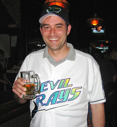
Reader John Borovicka bravely wore history’s ugliest MLB jersey — complete with extra-ugly inaugural season sleeve patch (note the totally bogus â„¢ mark) — at last night’s Uni Watch party in Chicago. The crowning touch of hideousness? Purple interior stitching. Full details on both of this weekend’s parties in the days to come.
Someone please tell me that the Mets are wearing their FUGLY blue caps today so the Brew Crew can beat the crap out of them again!!!!
[quote comment=”85312″]Someone please tell me that the Mets are wearing their FUGLY blue caps today so the Brew Crew can beat the crap out of them again!!!![/quote]
Those Blue caps are awesome! what the hell are you talking about?!
That is one truly ugly jersey. Being a well-trained uni-watcher, I couldn’t help notice something funky is going with the buttons on the jersey in the photo. The front of the jersey kinda looks taped shut. What gives?
[quote comment=”85314″][quote comment=”85312″]Someone please tell me that the Mets are wearing their FUGLY blue caps today so the Brew Crew can beat the crap out of them again!!!![/quote]
Those Blue caps are awesome! what the hell are you talking about?![/quote]
He’s a Brewers fan and he wants the Mets to lose. They lose when they wear the blue caps.
[quote comment=”85316″]That is one truly ugly jersey. Being a well-trained uni-watcher, I couldn’t help notice something funky is going with the buttons on the jersey in the photo. The front of the jersey kinda looks taped shut. What gives?[/quote]
Good eye! Some MLB jerseys — including that one — have a Velcro strip underneath the chest insignia region (since they can’t put a button in the middle of the logo). John didn’t have his jersey buttoned — he was wearing it open, casual-like — but when I grabbed my camera, he Velcro’d it shut.
It all just looks like a drunken, hazy hallucination. Somebody, anybody, make it go away.
[quote comment=”85320″][quote comment=”85316″]That is one truly ugly jersey. Being a well-trained uni-watcher, I couldn’t help notice something funky is going with the buttons on the jersey in the photo. The front of the jersey kinda looks taped shut. What gives?[/quote]
Good eye! Some MLB jerseys — including that one — have a Velcro strip underneath the chest insignia region (since they can’t put a button in the middle of the logo). John didn’t have his jersey buttoned — he was wearing it open, casual-like — but when I grabbed my camera, he Velcro’d it shut.[/quote]
John looks like he is at a press conference with the polo shirt under the jersey. John the jersey is ugly so you must have bigger ….. than I do to wear it in public.
[quote comment=”85332″]It all just looks like a drunken, hazy hallucination. Somebody, anybody, make it go away.[/quote]
The good news is… they did! The bad news? They replaced it with link!
Ah, well!
Isn’t Tampa slated to just become the Rays with some beachy yellow/blue color scheme next year or the year after?
I happen to think that the current Devil Rays jerseys are pretty good.
[quote comment=”85348″]I happen to think that the current Devil Rays jerseys are pretty good.[/quote]
I completely agree. I think a lot of the antipathy for the current design is based on the reflexive feeling that anything connected to this franchise has to suck. But I think their current home design is very good, bordering on great.
I know a while back a St. Louis get together was mentioned.. is this still goin to happen? I’d love to attend one of these…
[quote comment=”85359″]I know a while back a St. Louis get together was mentioned.. is this still goin to happen? I’d love to attend one of these…[/quote]
I’m trying to get the green light for an article that would entail some research/reporting in St. Louis. Not a done deal yet, but the signs look positive. Assuming I get the go-ahead, I’ll set up a St. Looooooie gathering based on my travel plans.
No words … no words for that pic …
But yes, I do like the Rays’ current jerseys, particularly link. I’m not a fan of green, but I am a sucker for jerseys that have a small logo only on one side, with the number on the opposite side. (Like link, but with sleeves.)
I put all my photos from Friday’s 70’s Retro Night in San Diego on a flickr link. Over 50 pictures in all (feel free to use any of them you’d like Paul).
Some highlights. Both teams were too link to wear their retros during batting practice (or too cheap to have retro warm-ups created). Even the link link retro uniforms. Horrible link. And finally, Mike Cameron’s doctored scoreboard link.
Happy Mother’s Day to all the mom’s!
great slideshow Tim, love the photoshopped scoreboard pics, especially Khalil Greene’s. It looks like they took Jeff Spicoli’s hair and pasted it right on.
[quote comment=”85373″]I put all my photos from Friday’s 70’s Retro Night in San Diego on a flickr link. Over 50 pictures in all (feel free to use any of them you’d like Paul).
Some highlights. Both teams were too link to wear their retros during batting practice (or too cheap to have retro warm-ups created). Even the link link retro uniforms. Horrible link. And finally, Mike Cameron’s doctored scoreboard link.
Happy Mother’s Day to all the mom’s![/quote]
Spiezio looks downright spooky.
Love the 70’s scoreboard pics… Great idea from the Pads!!! Can’t wait for an STL get together!
Paul, it was a pleasure meeting you as well as the rest of the guys who showed up last night. Thanks again for all the hard work you put into this site.
[quote comment=”85373″]I put all my photos from Friday’s 70’s Retro Night in San Diego on a flickr link. Over 50 pictures in all (feel free to use any of them you’d like Paul).
Some highlights. Both teams were too link to wear their retros during batting practice (or too cheap to have retro warm-ups created). Even the link link retro uniforms. Horrible link. And finally, Mike Cameron’s doctored scoreboard link.
Happy Mother’s Day to all the mom’s![/quote]
Those scoreboard pics are hysterical! They really went all-out with that promotion. Great job with the slideshow!
Mets rocking the pinstripes and blue caps today.
Crappy picture, but the best I could do. For yesterday’s Super 14 (southern hemisphere pro rugby) semifinal between the (Pretoria) Bulls and the Crusaders, the Bulls wore link On the left side above the manufacturer’s logo is the player’s first name and initial (in this case Derick H. for Bulls fly-half Derick Hougaard). On the right side above the Bulls logo it reads:
Semi Final
Crusaders Super 14
12 05 2007
The Bulls won 27-12, setting up the first all-South African final in Super 14 history.
The Mets and Brewers are wearing pink ribbons over the “heart” of their jerseys today. I am assuming this will be done all of today for all teams. The Mets, Brewers, Umpires, Bat Boys are all wearing pink armbands as well today.
[quote comment=”85373″]I put all my photos from Friday’s 70’s Retro Night in San Diego on a flickr link. Over 50 pictures in all (feel free to use any of them you’d like Paul).
Some highlights. Both teams were too link to wear their retros during batting practice (or too cheap to have retro warm-ups created). Even the link link retro uniforms. Horrible link. And finally, Mike Cameron’s doctored scoreboard link.
Happy Mother’s Day to all the mom’s![/quote]
Did St. Louis wear retro unis too? Of all the photos I’ve seen of the game, none showed what the Caridnals were wearing.
I knew I should have worn my black Devil Rays jersey to the Minny event. Paul would have gotten the home and away effect. :o)
[quote comment=”85411″]Did St. Louis wear retro unis too? Of all the photos I’ve seen of the game, none showed what the Caridnals were wearing.[/quote]
Hey Dave, yes the Cardinals wore link. Because their uniform history hasn’t been as colored and varied as the Padres, their throwbacks were not as shocking as the mustard Padres uniforms.
Haha, excellent D-Rays jersey. The hat is actually decent looking and a nice touch.
Loving the Mets pinstripes today. Actually, I saw a picture of a Mets minor leaguer wearing the snow white home jersey with the black cap link and it didn’t look too bad. Which is surprising because i’m a big supporter of ditch the black. I think I just hate the black jerseys, the hat isn’t that bad.
[quote comment=”85413″][quote comment=”85411″]Did St. Louis wear retro unis too? Of all the photos I’ve seen of the game, none showed what the Caridnals were wearing.[/quote]
Hey Dave, yes the Cardinals wore link. Because their uniform history hasn’t been as colored and varied as the Padres, their throwbacks were not as shocking as the mustard Padres uniforms.[/quote]
So they wore their white unis on the road?
Looks like Salty went all out for the Mother’s Day promotion. All of the trim on his chest protector and shin guards is pink. I’m guessing the initials on his shoulder extensions are his mother and grandmother as well.
Braves catcher is wearing pink accented gear today.
Also has the initials “A.S” on his right shoulder and “J.S.” on his left shoulder in Sharpie.
[quote comment=”85316″]That is one truly ugly jersey. Being a well-trained uni-watcher, I couldn’t help notice something funky is going with the buttons on the jersey in the photo. The front of the jersey kinda looks taped shut. What gives?[/quote]
would anyone say link were uglier? (You know how hard it is to find a picture of a Pilots jersey??)
[quote comment=”85443″][quote comment=”85316″]That is one truly ugly jersey. Being a well-trained uni-watcher, I couldn’t help notice something funky is going with the buttons on the jersey in the photo. The front of the jersey kinda looks taped shut. What gives?[/quote]
would anyone say link were uglier? (You know how hard it is to find a picture of a Pilots jersey??)[/quote]
Maybe someone would, but not me. Those are awesome, imho. And I like the link even better.
[quote comment=”85443″][quote comment=”85316″]That is one truly ugly jersey. Being a well-trained uni-watcher, I couldn’t help notice something funky is going with the buttons on the jersey in the photo. The front of the jersey kinda looks taped shut. What gives?[/quote]
would anyone say link were uglier? (You know how hard it is to find a picture of a Pilots jersey??)[/quote]
We recently moved to the Tampa Bay area from Atlanta. It was hard enough for me, a lifelong Braves fan, moving from the National to the American League. If the Rays had still been in that neon monstrosity, I don’t think I would have had the stomach to move. And yes, we’ll move again if they try to bring it back!!!
[quote comment=”85312″]Someone please tell me that the Mets are wearing their FUGLY blue caps today so the Brew Crew can beat the crap out of them again!!!![/quote]
Yes. The Mets wore their blue caps today.
:)
[quote comment=”85417″]Haha, excellent D-Rays jersey. The hat is actually decent looking and a nice touch.[/quote]
I agree. I love link.
I would have picked link if it hadn’t been a flex fit cap. I would have pulled out/off the Nike swoosh for a cleaner look.
[quote comment=”85380″][quote comment=”85373″]I put all my photos from Friday’s 70’s Retro Night in San Diego on a flickr link. Over 50 pictures in all (feel free to use any of them you’d like Paul).
Some highlights. Both teams were too link to wear their retros during batting practice (or too cheap to have retro warm-ups created). Even the link link retro uniforms. Horrible link. And finally, Mike Cameron’s doctored scoreboard link.
Happy Mother’s Day to all the mom’s![/quote]
Spiezio looks downright spooky.[/quote]
link would have looked much better
Mets TV commentary in the bottom of the first inning today:
Gary Cohen: “The Mets going with a traditional look today; pinstriped jerseys with blue hats and socks.”
Ron Darling: “A great looking uni.”
(Please note that this is a paraphrase. I am doing it from memory.)
Second note: Someone needs to teach Gary Cohen about parallel construction on both sides of a conjunction. I am pretty sure the Mets wear socks every day.)
Forgot to add that the home plate umpire in the Mets/Brewers game was wearing a pink sweatband on each wrist in support of the Mother’s Day cancer promo.
[quote comment=”85422″][quote comment=”85413″][quote comment=”85411″]Did St. Louis wear retro unis too? Of all the photos I’ve seen of the game, none showed what the Caridnals were wearing.[/quote]
Hey Dave, yes the Cardinals wore link. Because their uniform history hasn’t been as colored and varied as the Padres, their throwbacks were not as shocking as the mustard Padres uniforms.[/quote]
So they wore their white unis on the road?[/quote]
They were gray. Note the white outline on the lettering.
Kenny Lofton is wearing his pink mother’s day sweat band on his ankle, over his pant leg. Rangers broadcasters Josh Lewin and Tom Grieve pointed it out and the camera zoomed in out it twice. i think it looks dumb, but Grieve said he dug it.
[quote comment=”85358″][quote comment=”85348″]I happen to think that the current Devil Rays jerseys are pretty good.[/quote]
I completely agree. I think a lot of the antipathy for the current design is based on the reflexive feeling that anything connected to this franchise has to suck. But I think their current home design is very good, bordering on great.[/quote]
Color me not a fan of vest jerseys. I much prefer the Rays green home alts: link
But the wordmarking on both the home and road jerseys is excellent.
Also, David Wright kept showing sock throughout the series, and looked like an old-time ballplayer stealing three bases.
watching the LA -Cinn. game at the moment. While I like the Reds road grays, I think they would look much nicer if they ditched the white trim around the letters and went with solid red.
Cardinals announcers just tried to call Jose Cruz Jr’s stirrups a “2 in 1″ package.
And as I’m amount to hit ‘Say It!’ they have this conversation (paraphrased):
~~”Those really are stirrups!”
~~”Yep, you can see the day light at the ankle”
~~”I can’t tell you the last time I saw a Major League player wearing real stirrups”
~~”Must’ve gotten from his dad…”
Couple things; that TDR jersey is absolutely a candidate for worst-ever. Remember how jarring to see Wade Boggs in it?
ALso, and this is a real button for me-
Vest jerseys where the number on the L is not aligned with the logo on the R. It seems the Rockies were like that for years (I think?) but now they’re even. I think the Rangers are unbalanced- but the worst was AZ, where there was no # at all. It alwaysa looked unbalanced.
[quote comment=”85525″]Couple things; that TDR jersey is absolutely a candidate for worst-ever. Remember how jarring to see Wade Boggs in it?
ALso, and this is a real button for me-
Vest jerseys where the number on the L is not aligned with the logo on the R. It seems the Rockies were like that for years (I think?) but now they’re even. I think the Rangers are unbalanced- but the worst was AZ, where there was no # at all. It alwaysa looked unbalanced.[/quote]
Arizona’s unbalanced, yes; but they are following the lead of the Yankees, Tigers and Cubs, who also have no number opposite their logo on their home unis.
Arizona following the lead of another team? How odd.
well, true; but I was referring to vests. those others you mentioned are full jerseys. a vest clearly marks two seperate halves; it just looks funny. (to me.)
trying to repost Redwings pics
pink
I am being totally irresponsible by just saying this without checking the 50 posts behind me to see if this has already been said, and without checking the archives to see if this was done before, I think it would be cool to have one of the weekday blog posts be a more extensive analysis of the unis that are warn to the Uni Watch parties. (I am assuming someone takes pictures and there are more than 5 or 6 good items being warn?) It seems like it would be a good grab-bag that crosses the sports spectrum, and I am very interested to see what people have in their closets.
OK, I just needed to read the last sentence today, “Full details on both of this weekend’s parties in the days to come.”
I walk away in shame…
not sure of his name, but I’m watching the A’s/Indians game on FSN right now, and the A’s backup catcher was brought in during the 8th I think it was, and I’m not sure of his name, but I think he was wearing his helmet with the brim faceing front, not back. no pics now, but keep an eye open A’s fans
[quote comment=”85546″]I am being totally irresponsible by just saying this without checking the 50 posts behind me to see if this has already been said, and without checking the archives to see if this was done before, I think it would be cool to have one of the weekday blog posts be a more extensive analysis of the unis that are warn to the Uni Watch parties. (I am assuming someone takes pictures and there are more than 5 or 6 good items being warn?) It seems like it would be a good grab-bag that crosses the sports spectrum, and I am very interested to see what people have in their closets.[/quote]
OK, everyone submit a list of what’s in your closet..
Actual new Spurs shirts!
link
I’m HATING the chinese. WTF? It’s the English Premiership!
link
How can the Dodgers get the uniforms so right and then screw up the batting helmets with the metallic look. It looks horrible (especially with those ridiculous cool-flo helmets.
[quote comment=”85558″]Actual new Spurs shirts!
link
I’m HATING the chinese. WTF? It’s the English Premiership![/quote]
oh man, i dig the white/sky blue halved shirts though. very nice.
Can it be accurately be stated that the subject of today’s headline photo, John Borovicka, has a lampshade over his head?
[quote comment=”85575″][quote comment=”85558″]Actual new Spurs shirts!
link
I’m HATING the chinese. WTF? It’s the English Premiership![/quote]
oh man, i dig the white/sky blue halved shirts though. very nice.[/quote]
They’ll wear those exactly once.
Also note, every combination is same color shirt, socks and shorts (therefore no special all-white for Europe, because they’ll always be white/white) except for the halved one, which has white shorts.
Enjoy the column! Wanted to mention that you forgot to include Jaworski who played for the Dolphins his final years…
I think the Buccos should use those link for the rest of the season.
13-2 win over the Braves. Yowza!
[quote comment=”85580″]Enjoy the column! Wanted to mention that you forgot to include Jaworski who played for the Dolphins his final years…[/quote]
Nice catch, Ric.
Or Jaws’ last year with KC.
[quote comment=”85544″]trying to repost Redwings pics
pink[/quote]
Nice. I’m from Rochester (and currently live there too) and I never go to the games though, because the Wings always suck. But nice mothers day unis. Go Mets and their great unis!
What town do the “Evil Rays” play in? :-p
[quote comment=”85599″]What town do the “Evil Rays” play in? :-p[/quote]
They play in t. Petersburg!
I’m not sure if it was because of two games postponed in two days or that Mississippi State is too big to wear across a baseball jersey, the link played the link today in Athens.
Unfortunately, those are the only two photos that I could find of the game with an MSU player.
It was a well played and link series, especially for the link in red and white.
I got a home run ball hit by link who’s mother was in attendance on Mother’s Day. When his brother traded another ball for the home run so his mom could have it, I let him know that his brother that I appreciated the way Jonathan played the gamelink.
[quote comment=”85595″][quote comment=”85544″]trying to repost Redwings pics
pink[/quote]
Nice. I’m from Rochester (and currently live there too) and I never go to the games though, because the Wings always suck. But nice mothers day unis. Go Mets and their great unis![/quote]
I’m a transfer from New England, but love the AAA baseball and the $10 tix with $5 parking – better value than a day at fenway.
The Wings are actually pretty good – playoffs last year. 2nd place now. I just wish they would be more traditional with the unis. Every game I go to their standard home unis look like alts/BP jerseys (black). I think that is standard in the IL though.
I kinda get tired of explaining this to people I know from out of town.. the team represents the Metro Area. same as the NFL, NHL and other teams in the area. If the teams actually played in Tampa Bay it’d be on the water. there is no such city as Tampa Bay.
[quote comment=”85613″]I kinda get tired of explaining this to people I know from out of town.. the team represents the Metro Area. same as the NFL, NHL and other teams in the area. If the teams actually played in Tampa Bay it’d be on the water. there is no such city as Tampa Bay.[/quote]
Well, a couple years ago, a national crossword puzzle asked for the city where the Rays played. It was a 5-lettter word beginning with a T. They ran a correction a few days later saying that the Rays actaully played in St. Petersburg.
[quote comment=”85579″][quote comment=”85575″][quote comment=”85558″]Actual new Spurs shirts!
link
I’m HATING the chinese. WTF? It’s the English Premiership![/quote]
oh man, i dig the white/sky blue halved shirts though. very nice.[/quote]
They’ll wear those exactly once.
Also note, every combination is same color shirt, socks and shorts (therefore no special all-white for Europe, because they’ll always be white/white) except for the halved one, which has white shorts.[/quote]
i know it kind of doesn’t make sense, but I like the look of the Chinese characters. The fact that is puts the Mansion logo off-center is a little annoying though. Love the collars on the away and the 125 anniversary kits though!
I may be completely mixing up games having watched 3 at the same time while dozing off but I think Pittsburgh’s centerfielder was wearing his pink wristband over his long sleeve jersey. I couldn’t locate a pic of it too confirm my memory but I thought it was really weird to wear a sweatband over clothing. Also did anybody see in today’s Parade magazine they discussed where Isiah Thomas got his wardrobe ideas from and the pic of him had a pin shaped like a puzzle. This may have been discussed at some point but does anyone remember the meaning behind that pin?
[quote comment=”85613″]I kinda get tired of explaining this to people I know from out of town.. the team represents the Metro Area. same as the NFL, NHL and other teams in the area. If the teams actually played in Tampa Bay it’d be on the water. there is no such city as Tampa Bay.[/quote]
Weren’t the Devil Rays originally supposed to only represent St. Petersburg?
I read that there were actually quite a few people in St. Petes who were angry that they ended up going with “Tampa Bay.” Is there any truth to that?
[quote comment=”85626″]I may be completely mixing up games having watched 3 at the same time while dozing off but I think Pittsburgh’s centerfielder was wearing his pink wristband over his long sleeve jersey. I couldn’t locate a pic of it too confirm my memory but I thought it was really weird to wear a sweatband over clothing. Also did anybody see in today’s Parade magazine they discussed where Isiah Thomas got his wardrobe ideas from and the pic of him had a pin shaped like a puzzle. This may have been discussed at some point but does anyone remember the meaning behind that pin?[/quote]
Thomas’ pin is for the Autism Society of America
link
Sorry, I forgot the link. Is this it?
[quote comment=”85626″]I may be completely mixing up games having watched 3 at the same time while dozing off but I think Pittsburgh’s centerfielder was wearing his pink wristband over his long sleeve jersey. I couldn’t locate a pic of it too confirm my memory but I thought it was really weird to wear a sweatband over clothing. Also did anybody see in today’s Parade magazine they discussed where Isiah Thomas got his wardrobe ideas from and the pic of him had a pin shaped like a puzzle. This may have been discussed at some point but does anyone remember the meaning behind that pin?[/quote]
That’s an autism awareness pin. Insert horrible and tasteless yet mildly amusing and perhaps appropriate joke mocking Isiah Thomas’ connection with autism here.
By the way, Mr. Borovicka, did Mr. Lukas spill a drink on your shirt for the fugliness of purple (among other things)?
Jaye, at least they put out the correction.
Ryan, I haven’t exactly heard that down here but I assume there are some over in that city that say that… there is a little bit of jealosy I think… I look at it like this they got the beaches so STFU! back to the Uni part… I wish they could do more on the retro/throw back front, but I have only seen them do a retro night once against the Braves.. TB was in 1975 Tampa Tarpon unis and the Braves in the Road Unis from 75(i think). I wish the Tampa Yankees could revert to the Tarpon name. I don’t think Mr. Steinbrenner would do it…
GS’s unis are fresh.
link, but not for mother’s day.
[quote comment=”85605″]It was a well played and link series, especially for the link in red and white.[/quote]
UGA alum here… I’m sorry John, but I think those Georgia unis are the bloody pits (pun intended). If they could do away with that one detail, I’d be very satisfied (okay, just one more detail too; nix the swooshes on the ass of the pants as well).
[quote comment=”85413″][quote comment=”85411″]Did St. Louis wear retro unis too? Of all the photos I’ve seen of the game, none showed what the Caridnals were wearing.[/quote]
Hey Dave, yes the Cardinals wore link. Because their uniform history hasn’t been as colored and varied as the Padres, their throwbacks were not as shocking as the mustard Padres uniforms.[/quote]
Those Cardinals jerseys are bogus. First, that version of the birds-on-bat has only been in use for about the last 10 years or so. link, the birds were somewhat skinnier and less stern looking. Second, the Cards chain-stitch their logo–the one they used on Friday is clearly a patch.
Not sure if anybody said this yet, but the Kansas City Wizards wore special Lamar Hunt memorial jerseys that they auctioned off after their loss to FC Dallas last night. link. I’m a first time poster, so I hoped that worked. Also, had another quick note, I doubt you will see Mike Sweeney swing the pink bat again, on one of his first at bats today his bat ended up in the front row of seats. Poor guy didn’t have enough pine tar on the bat.
A final note, forget Stl. Come on over to KC.
Borovicka’s Pic and Paul’s description brought an old thought to my mind: WHAT ia with American phenomenon of wearing collared shirts under a sports jersey?!?!?!??!!??!
My dad is from Buffalo but we are in Canada now…when I went to a Sabres game or other Jersey-friendly event, I HAD to wear a golf shirt or dress shirt underneath. As I got older i noticed that this practice only happened across the Niagara River. What gives?? Does it show “Party on the outside…but im not a grub”?
Wow. Just, wow. That Devil Rays’ jersey is butt-ugly.
TD, thanks for noticing my earrings. Also, now that you mentioned your wife’s name, I feel free to repeat it. Melanie, I am glad you came to the party and that I got a chance to talk with you.
Teebz, long drive home, eh? I still want those Tandoori chips!
Tim, excellent photo album of the Padres’ throwbacks. I wish all the players had worn stirrups, though. It looks sloppy that a few of them went long.
Finally, Paul, I hope you have a safe flight back to NY, and thank you so much for coming to MN. I am really glad to have met you.
Just got home from alcohol-laden post-game Twins festivities, so bear with me.
uni-related content: Guillen (DET) and Morneau (MIN) had half-pink bats. Guillen’s was pink from the handle ring up with a black or brown handle, and Morneau’s was a standard ash handle. Guillen only used his for a single at-bat before going back to an all-black bat.
There were also two distinct different types of pink bats, a pepto darker pink and a whitish pink that usually had a black dot on the barrelhead top. The two halfsies were of the whitish-pink variety.
The Somerset Patriots of the Atlantic League wore pink jerseys and caps:
link
Yes, there were/are St. Pete residents who believe that the team should be named after St. Pete. There is a feud between Tampa and St. Pete that at least rivals Minneapolis and St. Paul. It is amazing to me that the bridge between the communities symbolizes the divide — as opposed to a link — between the two.
Speaking of horrible jerseys… I was walking through Wal-Mart over the weekend, and saw some poor kid walking around in a Damon Bailey – Indiana Pacers – replica jersey. The kid was probably to young to know any better, but that is the bottom of the Pacers’ barrel. The guy never even made the team. He was a charity pick.
Many thanks to all of you who posted about my hideous Devil Rays jersey. Part of the reason I wore it was to win a bet with my wife that the jersey would ever actually leave our closet. Clearly it was the best $10 I ever spent on eBay. The cap (which I actually don’t hate, but would still not voluntarily take out of said closet) cost me another $5 at a winter clearance at a store by Wrigley. And crap received for the polo shirt is fully acknowledged and agreed with.
Paul – Thanks for the trip into town. Good to hang with folk interested in talking about the minutia of uniforms. Hope you make it back to Chicago in the future.
Ron Darling: “A great looking uni.â€Â
Ron Darling does Mets’ games? You’d think the Mets could find somebody better. He was the color guy for the Nats in their first season and was dreadful. Did you know he went to Yale? He mentioned that at least once per game.