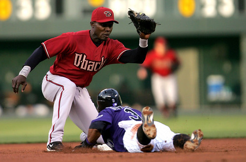
Well, that didn’t last long. Two games into the season and my Opening Day high has already been flushed down the crapper, thanks to what will probably go down as the ugliest game of the year. Or at least I hope it is, because if there’s anything worse than this, I might just have to pluck out my eyeballs.
I’m referring, of course, to yesterday’s retina-frying proceedings at Coors Field, where the Rockies were decked out in the you know what. In the opposing dugout: the Diamondbacks, debuting their red alts. Put these two together on the same field and we’re talking a major buzz-kill. Like, seriously, does this look like a major league ballgame to you? Or this? Or this? Or this? No wonder they were playing like Little Leaguers — they looked like Little Leaguers.
Things were almost as dire a few hours later in Anaheim, where the Angels unveiled their new red alts against the Rangers, resulting in an unseemly spectacle that was only slightly less garish than the scene in Colorado (and as an aside, whose bright idea was it to put big red numbers on a red jersey?.
Leaving aside the question of whether two teams wearing solid-colored jerseys in the same game should even be allowed, what’s the deal with a team wearing its alternate jersey in the second game of the year? The whole point of an alternate uni is that you wear it occasionally. With the bunting still hanging from the grandstand and those “Opening Day” logos still painted on the field, couldn’t these teams wait just a few days before changing up their looks? Grumble-grumble, stomp-stomp, and get the fuck off my lawn while you’re at it.
And Now a Word From Vince: The NCAA tournament has finally come to a close, which means the Uni Watch NCAA Distant Replays contest is also over. There were a variety of strategies involved from the over 300 entrants. Do you go with all upsets, or just a few (Winthrop, VCU, etc.)? Do you stick with mid-level seeded teams and hope they go on a winning streak (USC, Vandy, etc.)? Do you throw in a few 8 or 9 seeds, since that means big points without much risk (Michigan State, Purdue)?
The winning strategy turned out to be that of Eric Smallman, who took home first prize and a cool $200 Distant Replays gift card. If you’re curious, his five teams were UNLV (14 points), Kentucky (8), Michigan State (9), Vanderbilt (12), and Louisville (6), for a total of 49 points — not bad, considering the highest possible score was 58, which would have meant picking UNLV (14), Vanderbilt (12), VCU (11), Tennessee (10), and Winthrop (11).
Second place and a $150 Distant Replays gift card goes to Jonathan Gillis, who tallied 43 points. And third place and a $50 in Distant Replays card goes to Jon Smith with 42 points (just enough to edge out the minor logjam of people with 41 points, which would have put the tiebreaker into play.)
Thanks to all who entered. There’ll be another raffle next week.
Back to Paul for Today’s Uni Watch News Ticker: Extremely disappointing sight at yesterday’s Giants/Padres game, where Jose Cruz Jr.’s stirrups looked like this — not bad, but a far cry from the perfection of his spring training look. ”¦ Somehow those huge Giants uni numbers look even bigger when the number itself is a high number. ”¦ The little number tags on Justin Spier’s socks were clearly visible the other night, although it looks like his number isn’t actually written on them. ”¦ Hate to say it, but does Willie Mays look totally friggin’ diseased or what? ”¦ Reprinted from last night’s comments: Michigan State wore throwbacks (not sure what vintage) for a game against the Lansing Lugnuts last night. The “MAC” on the jersey and cap stands for Michigan Agricultural College, which was the school’s original name. ”¦ Bad; worse; worst. ”¦ Despite extensive Uni Watch coverage and a day off in between games, Shawn Green’s superscript “Y” still hadn’t been fixed for last night’s game.
I have to disagree on the Rox vs. D-Backs game. It looks terrific!
I love the red Angels jerseys — they just need to tone down that white shadowing. Maybe get rid of the barely-visible gold layer; no uniform needs four layers of lettering. (I’m looking at you too, Florida.)
Is it just an optical illusion, or are the white borders on the Rockies’ purple jerseys thicker than they would normally be? I think the purple shirts would look much better if the white borders around the black numbers were just a little thinner.
What’s with all the hate this morning?
What’s on the right wristband in the main photo today? Looks like a “TD”, but I am not sure.
Does Vlad Guerrero take a paint brush full of pine tar to his helmet? Game 2 and it looks like shite.
[quote comment=”66381″]What’s with all the hate this morning?[/quote]
Paul didn’t find the afikomen last night.
Is the Cool Flow hemet the standard for all teams now? I’m sure I’ll ge used to it, but man, they look like little spaceships
[quote comment=”66383″]Does Vlad Guerrero take a paint brush full of pine tar to his helmet? Game 2 and it looks like shite.[/quote]
My guess is that most likely he’s probably using last year’s helmet. He’s one of the guys in the league that loves having the pine tar caked onto his helmet.
Alot has been made of the NFL uniform police-the guys who come out before the game and check to be sure everybody’s jerseys, socks, etc are just right. I think it is high time that major league baseball come up with some standards regarding pants, socks, the fit of the uniforms, etc. The new baggy, long pants look is simply AWFUL and makes these guys look like clowns and not major league baseball players.
[quote comment=”66384″][quote comment=”66381″]What’s with all the hate this morning?[/quote]
Paul didn’t find the afikomen last night.[/quote]
or had Rutgers in his Women’s NCAA pool
[quote comment=”66380″]I love the red Angels jerseys — they just need to tone down that white shadowing. Maybe get rid of the barely-visible gold layer; no uniform needs four layers of lettering. (I’m looking at you too, Florida.)
Is it just an optical illusion, or are the white borders on the Rockies’ purple jerseys thicker than they would normally be? I think the purple shirts would look much better if the white borders around the black numbers were just a little thinner.[/quote]
I think red Angels jerseys are nice, but they need to make the digits a bit smaller!
As soon as I saw those D-backs/Rockies-highlights I KNEW there would be no other choice for te topic of today’s Uni Watch.
Apparently at the end of spring training Jose Vidro and Yuinesky Betancourt of the Mariners swapped numbers so Vidro could have his preferred “3”. I guess the guys at KSTW-TV are the last to know, because last night they still ID’ed those two with their old numbers.
According to link Michigan State’s MAC caps had a short brim.
There’s some game photos link but it’s through a flash gallery and you have to click on the photo gallery link.
So, do any other MLB teams,in addition to the Colorado Rockies change the MLB logo on the backs of their shirts to match the color scheme of the team? Did Colorado get special permission or is this a bold stand for independence on thier part?
Since a lot of teams have Red or Blue in their team colors, it would not be obvious for those teams.
I know you may not like the baggy pants but its time to move into the 21st century. Things change and you just have to get used to it, pants included. I fail to see how even baggier pants in the 1930’s etc. are classy but now they look like clowns.
[quote comment=”66395″]So, do any other MLB teams,in addition to the Colorado Rockies change the MLB logo on the backs of their shirts to match the color scheme of the team? Did Colorado get special permission or is this a bold stand for independence on thier part?
Since a lot of teams have Red or Blue in their team colors, it would not be obvious for those teams.[/quote]
The Royals have gold in theirs this season.
And when will the Reds break out link babies?
[quote comment=”66395″]So, do any other MLB teams,in addition to the Colorado Rockies change the MLB logo on the backs of their shirts to match the color scheme of the team? Did Colorado get special permission or is this a bold stand for independence on thier part?
Since a lot of teams have Red or Blue in their team colors, it would not be obvious for those teams.[/quote]
All the teams put their color scheme into the MLB logo, Paul had a link up last season sometime with pic of them all.
[quote comment=”66387″]My guess is that most likely he’s probably using last year’s helmet. He’s one of the guys in the league that loves having the pine tar caked onto his helmet.[/quote]
But, if you look under the gunk, Vlad is wearing a cool flow helmet.
The worst part about the Angels’ alternate red uniform is the red wording and numbers. Yeah, it is outlined in white, but it is still very hard to read, and doesn’t look good. It just looks like one giant red shirt, and I like red!!!
I have to agree with Paul. Both teams should not be allowed to wear colored alternate jerseys in the same game. It’s blinding on the eyes.
The solid color “alt” jerseys look like an unstoppable trend at this point. I suspect that they will eventually be considered to be typical of baseball in the early 2000s, the same way that the powder blue road unis were everywhere in the early ’80s. (BTW, I never liked the powder blue baseball uniforms, and personally would rather not see them return.) I don’t have a big issue with the solid-color jerseys, but the red that so many teams use seems too bright, almost fluorescent. And those purple Colorado jerseys…ugh. It’s time for some rules to keep both teams from wearing the solid colors on the same day, too. Ultimately, it’s probably just part of a plan to sell more jerseys.
[quote comment=”66401″][quote comment=”66387″]My guess is that most likely he’s probably using last year’s helmet. He’s one of the guys in the league that loves having the pine tar caked onto his helmet.[/quote]
But, if you look under the gunk, Vlad is wearing a cool flow helmet.[/quote]
Vlad wore the cool flow last year. Here’s a pic.
link
Leaving aside the question of whether two teams wearing solid-colored jerseys in the same game should even be allowed
MLB really should put a rule in place to prohibit this nonsense. Let the home team decide if it wants to wear a dark-colored alternate, and if it does, then the road team must wear gray.
[quote comment=”66395″]So, do any other MLB teams,in addition to the Colorado Rockies change the MLB logo on the backs of their shirts to match the color scheme of the team? Did Colorado get special permission or is this a bold stand for independence on thier part?
Since a lot of teams have Red or Blue in their team colors, it would not be obvious for those teams.[/quote]
The MLB logo is color-customized for each team. I think this is an unusually smart move by MLB — it lets the logo blend in instead of clashing.
I love all the alternate jerseyes. I think the new D-Backs uniforms are awesome. And the purple isn’t that bad. I was happy to see two games with teams wearing their alternate jerseys. Every team should have some out there alternate jerseys and every team should wear them often.
[quote comment=”66397″]
And when will the Reds break out link babies?[/quote]
Wow, the new/retro Mr. Red really has a case of the crazy eyes. Did he replace the link, or are they both around now?
Here’s a link to a pic of Vladimir from opening day 2006, with the cool flo helmet.
link
I hate to say it–I actually like the Rockies alt jerseys.
I’m a bit against the whole “alt jersey” thing altogether–the occaisonal turn-back-the-clock day is fun (if they get it right), but the solid color jerseys are overused just don’t seem as professional, IMO, to this fan of old school unis.
Having said that, as far as alts go, I don’t think the Rockies looked that bad; but I don’t share the same disdain for purple that Mr. Lukas does either.
link‘s the piece I wrote last year about MLB logo colors. It includes a link that shows the versions for each team.
[quote comment=”66395″]So, do any other MLB teams,in addition to the Colorado Rockies change the MLB logo on the backs of their shirts to match the color scheme of the team? Did Colorado get special permission or is this a bold stand for independence on thier part?
Since a lot of teams have Red or Blue in their team colors, it would not be obvious for those teams.[/quote]
The link link…which I performed surgery on last night
While I agree on a lot of things, count me as a guy who prefers the 50s-60s style of stirrups with the lower look, rather than the 70s-80s style showing the higher sanis.
Although I know I agree that the stripes on stirrups are classic, and I’d kill to see the Red Sox go against the team name and restore the kick ass stirrups with the red bottoms into the blue and white stripes. As good as the Sox uniforms are now, they’d be perfect if they went back to that.
Yeah, these are from the days of the link, but the elephant jersey would still be ten times better than the green alt the A’s currently sport.
[quote comment=”66407″][quote comment=”66395″]So, do any other MLB teams,in addition to the Colorado Rockies change the MLB logo on the backs of their shirts to match the color scheme of the team? Did Colorado get special permission or is this a bold stand for independence on thier part?
Since a lot of teams have Red or Blue in their team colors, it would not be obvious for those teams.[/quote]
The MLB logo is color-customized for each team. I think this is an unusually smart move by MLB — it lets the logo blend in instead of clashing.[/quote]
I agree. I actually like that the logo is modified for each team.
Pssssst…it’s like that on the hats too.
[quote comment=”66404″]The solid color “alt” jerseys look like an unstoppable trend at this point. I suspect that they will eventually be considered to be typical of baseball in the early 2000s, the same way that the powder blue road unis were everywhere in the early ’80s. . . . . It’s time for some rules to keep both teams from wearing the solid colors on the same day, too. Ultimately, it’s probably just part of a plan to sell more jerseys.[/quote]
I’m sure sales prompted the end of the brief hiatus from the purple jersey. Now the Rox have five game jerseys (white, gray, purple, white vest and black vest). That’s just too much. That gives three home and three road possibilities. I’d suggest no alts on the road and only one home alt per season.
Since the Rox won in purple and lost in white, guess what look is likely to be repeated?
Is the return of the purple cap next?
What is the point of stirups again?
When the D-Backs brought out their new unis I thought they were going to wear the red caps at home and black caps on the road, but so far just red caps in Colorado.
[quote comment=”66395″]So, do any other MLB teams,in addition to the Colorado Rockies change the MLB logo on the backs of their shirts to match the color scheme of the team? Did Colorado get special permission or is this a bold stand for independence on thier part?
Since a lot of teams have Red or Blue in their team colors, it would not be obvious for those teams.[/quote]
[quote comment=”66396″]I know you may not like the baggy pants but its time to move into the 21st century. Things change and you just have to get used to it, pants included. I fail to see how even baggier pants in the 1930’s etc. are classy but now they look like clowns.[/quote]
Interesting point, and that’s not sarcasm. I’m assuming the “classic” look is because then it was more of a league-wide thing. It was “uniform.” Now, when someone like Manny does it, it looks gimmicky and out of place.
link.
Hi
In a way we should be glad of alternate jerseys nomatter how awful some of them are ,because the alternative would me teams changing there uniforms more often breaking with there traditions, at least with alternates most traditions remain with eather in the background like the Mets or in the main like the Red Sox.
Also I just notice soething about the jersey the Brewers are using as there throwback alternate last year and this, when they used that jersey in the 80s it was a pullover but the one there using now is a button down. At least according to Dressed to the Nines.
Thanks for the info on the MLB logo custom colors. I do like the custom colors for the teams.
Since my team uses a red/blue MLB logo, I had made an un-informed assumption that all teams used the red/blue MLB logo. My bad.
Whatever happened to wearing alternates on Sundays and “special” games?
It’s no secret that alternates were created so teams can reel in some additional dough, and that’s fine, but there does need to be some type of policy drawn up regarding the wearing of them. Like Paul mentioned, these teams have to break them out for the 2nd game of the season????
[quote comment=”66421″]What is the point of stirups again?[/quote]
check link article out…and then read the article that’s referenced at the bottom – you might recognize the author from somewhere…
I like the idea of using the alts only on the road — fans could see different colors each time another team comes into town. If they wear them at home, then every team has to have a gray road uniform in case the home team wants to wear color. In the majors I think every team has gray, but in Japan, off the top of my head, half the teams don’t even have gray; they wear white at home and color on the road, as several MLB teams did in the 1980s and 1990s, such as link.
Forgive the personal rant, but I can’t get over why people like gray so much. My theory as to why teams started wearing colors as soon as baseball uniforms went to polyester in the early 1970s is that unlike gray flannel, which is actually made up of threads in several different shades, blending together to create a gray color that has some character. Gray polyester is just plain dull. More so when colored socks aren’t visible.
Ditch the gray!
[quote comment=”66402″]The worst part about the Angels’ alternate red uniform is the red wording and numbers. Yeah, it is outlined in white, but it is still very hard to read, and doesn’t look good. It just looks like one giant red shirt, and I like red!!![/quote]
Agreed. I feel sorry for the official scorers who have to try to read those numbers. Those shirts look like dollar store knockoffs.
Honestly, the Rockies game could’ve been worse.
I went to Dick’s Sporting Goods here in Columbus and for seem reason they had link with all of the Indians and Reds hats.
There is a black rim around the bill too, fashion hat style.
Finally, I am in love with the new 5950. It’s even more comfortable than the flex-fit BP hat.
the only time i like the stirrup look is when the pants are tailored to look baggy, and the stirrups are low cut (ie juan pierre, deion sanders)… that spartan team really looks sharp!
otherwise i’ll take david wright’s look…
is anyone else curious to see what each others slow pitch softball jerseys/shirts look like?
[quote comment=”66427″][quote comment=”66421″]What is the point of stirups again?[/quote]
check link article out…and then read the article that’s referenced at the bottom – you might recognize the author from somewhere…[/quote]
HA! i just found that and was going to link it, too. that entry is very interesting. i was wondering the same thing and figured it had something to do with high pants back in the 1800s.
With crappy uniforms on display yesterday, I think it is time for the “Ditch the Black” crew to rethink their stance (just a little bit).
IF the Mets only wear blue hats, blue sleeves, blue belts and blue socks at home with either the pinstripes or the all white unis, then I think the road greys with the black and blue hats and black socks, belts and sleeves works. It is sort of like the way the Cards do it with the red at home and the dark blue hats, sleeves, belts and socks with their road greys. No more black alts or that shitty all black hat and suddenly this home/away uni combo is one of the best in the league.
Maybe it’s just me, but does anyone else have the E from the ESPN logo as the icon next to the URL on their browser? Thought that was a little ironic/funny, since this isn’t the ESPN version of Uni Watch.
Also, can anyone advise me how to put some curve in the bill of a new 5950? I bought a Cubs one last weekend, and so far I’ve only been able to wear it backwards, since I’ll look like an idiot wearing it forwards, with an almost flat brim. I’ve tried to bend it a little bit, but I’m afraid I’ll end up putting a crease in it, and it will look like and upside down “V”, which is a look I hate. I just want a little bit of curve in it, nothing crazy.
I don’t like any of the alternate, colored jerseys. Looks like the Angels new one may beat out the Braves for ugliest (if you don’t count the rarely-used camo Padres one). Glad to see the Cubs lose their sleazy blue jersey. The fabric looked shiny and cheap. And they make the players’ derrieres look huge– a fashion ‘don’t’, wearing a dark top with white pants.
[quote comment=”66430″]I went to Dick’s Sporting Goods here in Columbus and for seem reason they had link with all of the Indians and Reds hats.[/quote]
Which Dick’s were you at? Because I’ve found my opinions of the two Columbus-area Dick’s I’ve been to to be very different. (Hint: One is nice, and the other just plain sucks.)
[quote comment=”66426″]Whatever happened to wearing alternates on Sundays and “special” games?
It’s no secret that alternates were created so teams can reel in some additional dough, and that’s fine, but there does need to be some type of policy drawn up regarding the wearing of them. Like Paul mentioned, these teams have to break them out for the 2nd game of the season????[/quote]
The Cincinnati Reds only wear their alternates for Sunday home games I believe, maybe a few holidays also. I would love to see the Reds wear a throwback from the 90’s, the unis with the white with red pinstripes hat and red brim, just because they were so ugly and it’d be funny to see them again.
Hate to say it, but does Willie Mays look link or what?
I think I’m missing something… What disease does it look like he has?
[quote comment=”66439″][quote comment=”66430″]I went to Dick’s Sporting Goods here in Columbus and for seem reason they had link with all of the Indians and Reds hats.[/quote]
Which Dick’s were you at? Because I’ve found my opinions of the two Columbus-area Dick’s I’ve been to to be very different. (Hint: One is nice, and the other just plain sucks.)[/quote]
I’m not a fan at all of Dick’s Sporting Goods. The stores were better as Galyan’s. The changes have sucked.
Hi
someone mentioned about the differance between authentic and replica jerseys on sale at MLB.com shop, if you look at the Mets replicas the “Mets” script is differant the “s” looks out of shape to the rest of the jersey ,also on the road jerseys the “NEW YORK” script is smaller on the replicas which dosent seem to be the same with other teams.
Les
You know, I’m tired of black alts. I like some of the colors in the alternate jerseys. I know it’s not traditional, but seeing a red jersey or a blue jersey does add some flavor to the game. (As long as my Phillies don’t add a blue alternate jersey!)
The link will most certainly result in a uni-related tribute.
Hopefully, it will be on unis that look better than link, link or link.
Maybe this will cheer everyone up today, everyone loves stripes! Taken from yesterdays Champions League game, where link. The stripes are nice, but Liverpool’s yellow uni is tough to look at.
The Angels’ alt unis looked great last night although I wish it was a button down rather than the pullover…also they shouldn’t wear them when the opponent is wearing a solid color as well (ie last night).
I was also wondering last night if any other team besides Texas has their state’s flag on their uni??…this may have been discussed in a previous article…..
Last, I still dont mind the D-bags new threads although again, two teams shouldn’t wear their solid colors in the same game. In fact, the Rox should put those Barney unis away for good…
Alex (hoping the Braves don’t roll out in their red alts today)
[quote comment=”66435″]Also, can anyone advise me how to put some curve in the bill of a new 5950? I bought a Cubs one last weekend, and so far I’ve only been able to wear it backwards, since I’ll look like an idiot wearing it forwards, with an almost flat brim. I’ve tried to bend it a little bit, but I’m afraid I’ll end up putting a crease in it, and it will look like and upside down “V”, which is a look I hate. I just want a little bit of curve in it, nothing crazy.[/quote]
i don’t know if this will work with the new caps but with my old ones, i used to soak the bill then wrap it around a 2-liter coke bottle and tie it down real tight. after it dried, it was perfect.
[quote comment=”66406″]Leaving aside the question of whether two teams wearing solid-colored jerseys in the same game should even be allowed
MLB really should put a rule in place to prohibit this nonsense. Let the home team decide if it wants to wear a dark-colored alternate, and if it does, then the road team must wear gray.[/quote]
personally, I think the home team should be required to wear white.
but I am also 100% against the use of “alt” jerseys at all during the regular or postseason. leave the spring training look to spring training, and look like damn professionals when you’re playing games that count.
[quote comment=”66443″]Hi
someone mentioned about the differance between authentic and replica jerseys on sale at MLB.com shop, if you look at the Mets replicas the “Mets” script is differant the “s” looks out of shape to the rest of the jersey ,also on the road jerseys the “NEW YORK” script is smaller on the replicas which dosent seem to be the same with other teams.
Les[/quote]
Also I don’t think that the Mets replicas use the “link” that the authentics do
also, the Angels’ red-on-red alt is horrific.
someone should call Michael Chertoff, because the Angels are terrorizing my retinas.
[quote comment=”66409″][quote comment=”66397″]
And when will the Reds break out link babies?[/quote]
Wow, the new/retro Mr. Red really has a case of the crazy eyes. Did he replace the link, or are they both around now?[/quote]
link is still around. link is just a new addition this year. The Reds also have one more mascot, link, who is terrible and needs to be taken to the mascot graveyard.
[quote comment=”66435″]Also, can anyone advise me how to put some curve in the bill of a new 5950?[/quote]
Rubber Bands and a Baseball under the brim.
To each their own..
I know it might be enough to make Mr. Lukas double over in pain, but link They kind of reflect that way under the lights. Those in Denver (or in Arizona watching the Dbacks the past couple of days) please chime in.
[quote comment=”66415″]While I agree on a lot of things, count me as a guy who prefers the 50s-60s style of stirrups with the lower look, rather than the 70s-80s style showing the higher sanis.
Although I know I agree that the stripes on stirrups are classic, and I’d kill to see the Red Sox go against the team name and restore the kick ass stirrups with the red bottoms into the blue and white stripes. As good as the Sox uniforms are now, they’d be perfect if they went back to that.[/quote]
count me in the lower stirrup school as well. when the stirrups are pulled too high they begin to look like the ribbon stirrups that we wore in the 80’s (the kind emulated in the one-piece stirrup sock)
[quote comment=”66428
Forgive the personal rant, but I can’t get over why people like gray so much. My theory as to why teams started wearing colors as soon as baseball uniforms went to polyester in the early 1970s is that unlike gray flannel
Actually – Deadball Era MLB teams did often wear dark colors (pants also). It seems to have fallen out of fashion post WWI.
[quote comment=”66457″]I know it might be enough to make Mr. Lukas double over in pain, but link They kind of reflect that way under the lights. Those in Denver (or in Arizona watching the Dbacks the past couple of days) please chime in.[/quote]
The Rockies use the two-toned cool-flo helmet. It is identical to the Mets’ helmets except in the places where the Mets have blue, the Rockies have purple.
Has there been any word yet on the new Jersey for Major league Soccer this season. I know that they can now put sponsors on the front of the jersey’s and that LA was coming up with a whole new scheme with the arrival on Beckham. Have there been many changes to other teams jerseys?
[quote comment=”66456″][quote comment=”66435″]Also, can anyone advise me how to put some curve in the bill of a new 5950?[/quote]
Rubber Bands and a Baseball under the brim.
To each their own..[/quote]
Ditto.
[quote comment=”66456″][quote comment=”66435″]Also, can anyone advise me how to put some curve in the bill of a new 5950?[/quote]
Rubber Bands and a Baseball under the brim.
To each their own..[/quote]
I always roll the bill of my 5950s and put it in a coffee mug. The curve will be drastic at first, but it will slowly bend back out to a more normal curve. It won’t bend back to Chad Cordero-flat though.
While I understand that most of you that don’t like the Alt’s are traditionalists at heart, I really like them. I like having multiple combinations. I also don’t have a problem with the frequency that they’re won. Often, the starting pitcher gets to choose what jersey they wear that day. That’s usually the source of the color on color match ups. I do agree that I think only one team should wear their color jerseys each game, and that the away team should only be allowed to wear them if the home team decides to go with their whites.
I would like to see some uniformity, though. I think every team should have one alternate jersey. It seems pointless to me to have a sleeveless version of the home/away jersey. As much as the yankees signify tradition, I think a solid blue top would look nice every once in a while. Instead of the Red Sox having the red jersey, make it blue.
The thing that annoys me most are the off-white, cream colored uniforms sported by my beloved Giants and those ridiculous San Diego road jerseys.
[quote comment=”66432″][quote comment=”66427″][quote comment=”66421″]What is the point of stirups again?[/quote]
check link article out…and then read the article that’s referenced at the bottom – you might recognize the author from somewhere…[/quote]
HA! i just found that and was going to link it, too. that entry is very interesting. i was wondering the same thing and figured it had something to do with high pants back in the 1800s.[/quote]
thanks for the info guys.
Sorry, purple is my favorite color…so go Rockies. Though I do think the alts should be used sparingly.
I really like the Angels red alts. Hate the lettering though.
It was a special occasion for the Angels. Last night was Tim Salmon night and it doesn’t take a marketing genius to figure out that parading Tim Salmon around Angel Stadium wearing the new jersey is going to be good for sales.
[quote comment=”66383″]Does Vlad Guerrero take a paint brush full of pine tar to his helmet? Game 2 and it looks like shite.[/quote]
To me, it just looks like he travels to the ballpark via sewer. I swear, when I see him come to bat I think “Vladimir crawled to the ballpark through 500 yards of shit-smelling foulness I can’t even imagine … or maybe I just don’t want to.”
Generally, I concur with Paul’s assessment of various and sundry uniforms, but I’m sorry, I actually think the Angels’ red alts and their red numbers ain’t too bad. Standing by for hate mail.
Wow, that Rox-D’backs game was beautiful. I love well-done alt jerseys because as a designer I love color, and those unis are two of the best. Can’t wait to see the Angels in their gorgeous new reds against the Mariners in their classy, minimal midnight blues. Those M’s blues are the best alternate jersy in the game. Sorry Paul, I love your site and your insight but boy do we disagree on this one!
[quote comment=”66465″][quote comment=”66456″][quote comment=”66435″]Also, can anyone advise me how to put some curve in the bill of a new 5950?[/quote]
Rubber Bands and a Baseball under the brim.
To each their own..[/quote]
I always roll the bill of my 5950s and put it in a coffee mug. The curve will be drastic at first, but it will slowly bend back out to a more normal curve. It won’t bend back to Chad Cordero-flat though.[/quote]
a 32 oz. cup works well too…but I always put the brim in soaking wet and let it dry for a couple of days in the cup.
Expect to see plenty of the Rangers’ alternate jersey, as it is the only one that uses the COOL BASE material.
Honestly, I think that the white/grey needs to be done in the majors. Now, obviously all the team color jerseys aren’t great, but I love the way Euro futbol teams do it. Always wear your team colors, unless they’re too much like the other team. Then you can have an alternate.
[quote comment=”66447″]
I was also wondering last night if any other team besides Texas has their state’s flag on their uni??…this may have been discussed in a previous article…..
[/quote]
Can’t think of any MLB teams, but the first professional team that comes to my mind is the Baltimore Ravens. Their link incorporates the very unique link. I think it’s better than the flag of my link and link (which borders on being overused).
The link also use the Ohio flag in their new alt logo.
Ok, maybe they don’t need to be done, but they’re getting kind of boring. Whites vs. Greys isn’t really all that exciting.
[quote comment=”66439″][quote comment=”66430″]I went to Dick’s Sporting Goods here in Columbus and for seem reason they had link with all of the Indians and Reds hats.[/quote]
Which Dick’s were you at? Because I’ve found my opinions of the two Columbus-area Dick’s I’ve been to to be very different. (Hint: One is nice, and the other just plain sucks.)[/quote]
I was at the Dick’s on Polaris. It’s new and isn’t haunted by the memories of my years working at Galyans.
I’ve always been a bigger fan of the low stirrups, too. link, to me, is the perfect way to wear them…
The split p looks like crap
[quote comment=”66484″][quote comment=”66447″]
I was also wondering last night if any other team besides Texas has their state’s flag on their uni??…this may have been discussed in a previous article…..
[/quote]
Can’t think of any MLB teams, but the first professional team that comes to my mind is the Baltimore Ravens. Their link incorporates the very unique link. I think it’s better than the flag of my link and link (which borders on being overused).
The link also use the Ohio flag in their new alt logo.[/quote]
The linkhave Long Island incorporated into the logo.
[quote comment=”66488″]The split p looks like crap[/quote]
But, I do love a good split pea soup…
Apparently the link missed the homes of the ump and Rockies 3B.
[quote comment=”66487″]I’ve always been a bigger fan of the low stirrups, too. link, to me, is the perfect way to wear them…[/quote]
AMEN!
On a side note, Travis calls Paul pathetic, but it seems like he just waits to jump on any little comment Paul makes, that is pathetic.
Travis, what you’ve just said is one of the most insanely idiotic things I have ever heard. At no point in your rambling, incoherent response were you even close to anything that could be considered a rational thought. Everyone in this room is now dumber for having listened to it. I award you no points, and may God have mercy on your soul.
Kenny/anyone who has done the “cap surgery”…how did the cap surgery work out on the new 5950s i just recently bought one but am affraid to use the water technique fearing that the new material wont shrink evenly like wool but will leave the hat wrinkled even if I’m wearing it at as it drys
[quote comment=”66494″][quote comment=”66487″]I’ve always been a bigger fan of the low stirrups, too. link, to me, is the perfect way to wear them…[/quote]
AMEN!
On a side note, Travis calls Paul pathetic, but it seems like he just waits to jump on any little comment Paul makes, that is pathetic.
Travis, what you’ve just said is one of the most insanely idiotic things I have ever heard. At no point in your rambling, incoherent response were you even close to anything that could be considered a rational thought. Everyone in this room is now dumber for having listened to it. I award you no points, and may God have mercy on your soul.[/quote]
Yeah Billy Madison!!!!!
That Diamondbacks/Rockies game is likely the worst uniclash since the 1979 Pirates/Orioles World Series. Pitting a very bright yellow against a very bright orange.
[quote comment=”66383″]Does Vlad Guerrero take a paint brush full of pine tar to his helmet? Game 2 and it looks like shite.[/quote]
he doesnt wear batting gloves, which allows more pine tar to build up on his bat/hands, and eventually his helmet. Its pretty easy when you touch your helmet as many times as he does…
[quote comment=”66447″]The Angels’ alt unis looked great last night although I wish it was a button down rather than the pullover…also they shouldn’t wear them when the opponent is wearing a solid color as well (ie last night).
I was also wondering last night if any other team besides Texas has their state’s flag on their uni??…this may have been discussed in a previous article…..
Last, I still dont mind the D-bags new threads although again, two teams shouldn’t wear their solid colors in the same game. In fact, the Rox should put those Barney unis away for good…
Alex (hoping the Braves don’t roll out in their red alts today)[/quote]
The link is a button down, not a pullover
Wow. I thought I was going to be crucified because I like the solid-colored alternates (though the Angels should change the white outlining the numbers to black), but it looks like the majority of people posting today like the bright unis as well.
However, I am all about the high sanis. Love the great expanse of white below the stirrups. I am not against baggy per se–just pants so long as they that don’t cover the socks. Derek, (from yesterday), this is one ‘lady’ who thinks the low-riding pants looks trashy.
Mark in Shiga, (also from yesterday), do you have any photos of the Japanese high school teams with vertical lettering? I would love to see that.
Burrill, (yes, from yesterday), that pic of the female…soccer player was it?…with the C on her chest looked strange indeed. They should put the whole name of the team or nothing.
Finally, I am still waiting for the all-black alternate. That would make me a very happy camper indeed.
We’ve been talking about the Angels, we’ve been talking about pine tar, we’ve talked about Kenny Rogers’ black-underbrim and the new 5950s… we’re dancing all around it, but it’s time to bring it on home:
Francisco Rodriguez is link!
[quote comment=”66385″]Is the Cool Flow hemet the standard for all teams now? I’m sure I’ll ge used to it, but man, they look like little spaceships[/quote]
No one on the Astros wears a Cool Flow. Aubrey Huff wore one a couple of times with the Astros last year, but wore a regular batting helmet other times.
Huff with a Cool Flow: link
Huff with a normal helmet: link
[quote comment=”66510″]Finally, I am still waiting for the all-black alternate. That would make me a very happy camper indeed.[/quote]
Dear UniFriend, I just think that it would be too much.
[quote comment=”66475″][quote comment=”66383″]Does Vlad Guerrero take a paint brush full of pine tar to his helmet? Game 2 and it looks like shite.[/quote]
To me, it just looks like he travels to the ballpark via sewer. I swear, when I see him come to bat I think “Vladimir crawled to the ballpark through 500 yards of shit-smelling foulness I can’t even imagine … or maybe I just don’t want to.”[/quote]
Craig Biggio is a pretty bad offender too: link
Found this article about players who let their helmets get nasty: link
[quote comment=”66513″][quote comment=”66510″]Finally, I am still waiting for the all-black alternate. That would make me a very happy camper indeed.[/quote]
Dear UniFriend, I just think that it would be too much.[/quote]
Dear Trademark Lawyer, you can’t steal my idea when it becomes a big hit.
Anthony, I know it will never happen, but a gal can dream, can’t she?
I am going to establish my own wing of the UniWatch Museum: the All-Black Uniform wing.
The Oregon women’s lacrosse team has new yellow unis that are using the Belotti number font used by the football team this year
link
[quote comment=”66500″][quote comment=”66494″][quote comment=”66487″]I’ve always been a bigger fan of the low stirrups, too. link, to me, is the perfect way to wear them…[/quote]
AMEN!
On a side note, Travis calls Paul pathetic, but it seems like he just waits to jump on any little comment Paul makes, that is pathetic.
Travis, what you’ve just said is one of the most insanely idiotic things I have ever heard. At no point in your rambling, incoherent response were you even close to anything that could be considered a rational thought. Everyone in this room is now dumber for having listened to it. I award you no points, and may God have mercy on your soul.[/quote]
Yeah Billy Madison!!!!![/quote]
Knibb High Football Rules!
[quote comment=”66441″]Hate to say it, but does Willie Mays look link or what?
I think I’m missing something… What disease does it look like he has?[/quote]
He just looks old to me.
Another kwiz kwestion drawing from yesterday:
Which MLB team spent more than twenty years from inception without having a city/state name on its uniform?
This shouldn’t be too difficult (unless I screwed up). (And I’m including “moving”, a la St Louis to Baltimore, as “inception”.)
[quote comment=”66475″][quote comment=”66383″]Does Vlad Guerrero take a paint brush full of pine tar to his helmet? Game 2 and it looks like shite.[/quote]
To me, it just looks like he travels to the ballpark via sewer. I swear, when I see him come to bat I think “Vladimir crawled to the ballpark through 500 yards of shit-smelling foulness I can’t even imagine … or maybe I just don’t want to.”[/quote]
Watch Shawshank last night, did we?
[quote comment=”66526″][quote comment=”66475″][quote comment=”66383″]Does Vlad Guerrero take a paint brush full of pine tar to his helmet? Game 2 and it looks like shite.[/quote]
To me, it just looks like he travels to the ballpark via sewer. I swear, when I see him come to bat I think “Vladimir crawled to the ballpark through 500 yards of shit-smelling foulness I can’t even imagine … or maybe I just don’t want to.”[/quote]
Watch Shawshank last night, did we?[/quote]
Heh … I knew someone would get that. Seriously, that’s the line that goes through my head whenever I see Vlad, Biggio, Thome, Man-Ram, et al.
[quote comment=”66461″][quote comment=”66428
Forgive the personal rant, but I can’t get over why people like gray so much. My theory as to why teams started wearing colors as soon as baseball uniforms went to polyester in the early 1970s is that unlike gray flannel
Actually – Deadball Era MLB teams did often wear dark colors (pants also). It seems to have fallen out of fashion post WWI.[/quote]
I do believe it’s because gray typically goes with every color when it’s on a jersey. It’s also a neutral color, so they wouldn’t have to worry about looking similar to the opposition. I personally love the color gray and enjoy when teams wear it very much
Semi uni-related note from Detroit. Didn’t see a decent photo anywhere, but the Tigers recently got their AL champs ring (seems weird to get a ring for losing the World Series, but whatever). I’m stretching a bit because you don’t actually wear the ring while playing, I know.
The freep has a story about other ring-wearers in link , which features a photo of Bill Laimbeer with link . Ol’ Bill is sporting rings from the ’89 and ’90 Pistons teams, plus rings for coaching the ’03 and ’06 Detroit Shock (WNBA). The thing that I noticed is that Laimbeer received a men’s ring AND A WOMEN’S RING for the ’03 Shock. What?! And he’s in posession of the Shock championship ring they won last year, even though the ring won’t be unveiled for a month (he’s wearing it backwards in the photo). What’s the point of that?
Favorite part of the article was something not seen in Detroit for 50 years now: link . As a lifelong fan, it’s reassuring to know that there is concrete evidence that the football Motor City Kitties were good once upon a time.
Weird that red is always the smaller of the two colors used on the MLB logo – even for Cincy. Why is that? I understand that big-blue/small-red matches the MLB logo, but I thought the point was to allow teams more individualized logos.
link
what the hell happened? Looks like I’m eating everyone’s comments from now on.
[quote comment=”66498″]Kenny/anyone who has done the “cap surgery”…how did the cap surgery work out on the new 5950s i just recently bought one but am affraid to use the water technique fearing that the new material wont shrink evenly like wool but will leave the hat wrinkled even if I’m wearing it at as it drys[/quote]
Unfortunately it was not a new 5950, it was an old wool one…
[quote comment=”66415″]Although I know I agree that the stripes on stirrups are classic, and I’d kill to see the Red Sox go against the team name and restore the kick ass stirrups with the red bottoms into the blue and white stripes. As good as the Sox uniforms are now, they’d be perfect if they went back to that.[/quote]
Personally, as a Sox fan, I’m sick of the Navy Blue. Their the Red Sox, not the Navy Blue Sox. I would love to see them go back to the 70’s style red hats. Aside from the stupid area above the ears, I thought the red BP hats they wore in spring training looked amazing!!!
Yikes, did I cause an html SNAFU? Apologies if so.
test
[/quote]
Kenny did it!
[quote comment=”66484″][quote comment=”66447″]
I was also wondering last night if any other team besides Texas has their state’s flag on their uni??…this may have been discussed in a previous article…..
[/quote]
Can’t think of any MLB teams, but the first professional team that comes to my mind is the Baltimore Ravens. Their link incorporates the very unique link. I think it’s better than the flag of my link and link (which borders on being overused).
The link also use the Ohio flag in their new alt logo.[/quote]
Hell, the link is a slight modification of the Texas flag.
Also, there are several college teams that wear helmet decals of their home state’s flag: link& linkboth come to mind off the top of my head.
[quote comment=”66468″] Instead of the Red Sox having the red jersey, make it blue.[/quote]
Again, personally they are not the Navy Blue Sox. They need to get rid of the Blue altogether and just go with Red.
[quote comment=”66380″]I love the red Angels jerseys — they just need to tone down that white shadowing. Maybe get rid of the barely-visible gold layer; no uniform needs four layers of lettering. (I’m looking at you too, Florida.)
Is it just an optical illusion, or are the white borders on the Rockies’ purple jerseys thicker than they would normally be? I think the purple shirts would look much better if the white borders around the black numbers were just a little thinner.[/quote]
Left a couple of links of pics from that ’97 Cubs / Sox series in yesterday’s comments. Awesome socks on my ChiSox.
[quote comment=”66525″]Another kwiz kwestion drawing from yesterday:
Which MLB team spent more than twenty years from inception without having a city/state name on its uniform?
This shouldn’t be too difficult (unless I screwed up). (And I’m including “moving”, a la St Louis to Baltimore, as “inception”.)[/quote]
The California Angeles
I meant Angels
thanks for fixing that…i was getting full after eating everyone’s comments
[quote comment=”66421″]What is the point of stirups again?[/quote] To Make people look cool.-DUH!
[quote comment=”66480″]Expect to see plenty of the Rangers’ alternate jersey, as it is the only one that uses the COOL BASE material.[/quote]
I think this is true for most, if not all teams.
My Padres wore their alternate blues almost more than the white or sand jerseys last year, and i figure it’s probably because of their “magical” temperature control features.
Honestly, can’t we make the real home and road unis CoolBase too, if that’s the issue.
I agree with Paul, alternate jerseys should be just that:alternates. (Unless we’re talking about the Chargers powder blue, which should be worn every week)
[quote comment=”66457″]I know it might be enough to make Mr. Lukas double over in pain, but link They kind of reflect that way under the lights. Those in Denver (or in Arizona watching the Dbacks the past couple of days) please chime in.[/quote]
The Rox have gone with the lame loook the Mets started sporting last year (a la softball and little league two tone batting helmet crap).
I noticed that Monday as well, as if they didn’t already have enough to worry about uni wise.
Uni number related note… Matt Cain of the Giants has switched his number from I believe 43 to 18 which was previously worn by Moises Alou. Also, Rich Aurillia was 35 when he came up with the Giants, but that number was taken by Matt Morris last year. Aurillia came back to the Giants this year and said he was going to ask Morris for his number back, but he was unsuccessful for he wore 33 during spring training. I was at opening day yesterday and they were selling Aurillia t-shirts with 33 on them. During the introduction of both temas rosters, however, Morris was wearing 22 and Aurillia was back to his original 35. Seems like Morris wanted to surprise Aurillia at the last minute. I’d be pissed if I had bought one of those 33 t-shirts though.
[quote comment=”66539″][quote comment=”66468″] Instead of the Red Sox having the red jersey, make it blue.[/quote]
Again, personally they are not the Navy Blue Sox. They need to get rid of the Blue altogether and just go with Red.[/quote]
Not going to happen. If you’re sporting the blue hat, the blue jersey would match better.
And just because they’re the “Red Sox” doesn’t mean they have to be the “Red all over” Sox
White Sox wear black
[quote comment=”66541″][quote comment=”66525″]Another kwiz kwestion drawing from yesterday:
Which MLB team spent more than twenty years from inception without having a city/state name on its uniform?
This shouldn’t be too difficult (unless I screwed up). (And I’m including “moving”, a la St Louis to Baltimore, as “inception”.)[/quote]
The California Angeles[/quote]
The Angels were the Los Angeles Angels at their inception, plus California is a state. I’d go with Washington Senators. Cause they didn’t play in Washington State and the city is Washington D.C., not just Washington.
Good and bad on the Rox: good – three in the lineup with proper pants (Helton, Taveras and Tulowitzki); bad – the straight black socks that replaced the cool stirrups that existed in early seasons.
As to state flags: the Colorado Rockies hockey logo was a crop of the state flag and the Phoenix Cardinals used to wear an Arizona flag on their sleeves.
Just watching the Tigers game today and I noticed during a pregame interview that Kenny Rogers is still wearing last years BP hat.
I just bought a 1974 Braves cap by American Needle. Does anyone know if it will shrink like a 59/50 cap? It’s 80% acrylic and 20% wool, so I don’t know if it will. I ordered it from Distant Replays, but I want to make sure I can get it to shrink before I make it nonreturnable. Any thoughts? Thanks
[quote comment=”66554″][quote comment=”66541″][quote comment=”66525″]Another kwiz kwestion drawing from yesterday:
Which MLB team spent more than twenty years from inception without having a city/state name on its uniform?
This shouldn’t be too difficult (unless I screwed up). (And I’m including “moving”, a la St Louis to Baltimore, as “inception”.)[/quote]
The California Angeles[/quote]
The Angels were the Los Angeles Angels at their inception, plus California is a state. I’d go with Washington Senators. Cause they didn’t play in Washington State and the city is Washington D.C., not just Washington.[/quote]
He said uniform not team name. The Angels have had Angels across the chest for both home and away every year but the original LA years, and the question specifies moving as inception, ie the San Francisco Giants were incepted in 1958.
Fenway Park is turning link.
[quote comment=”66538″][quote comment=”66484″][quote comment=”66447″]
I was also wondering last night if any other team besides Texas has their state’s flag on their uni??…this may have been discussed in a previous article…..
[/quote]
Can’t think of any MLB teams, but the first professional team that comes to my mind is the Baltimore Ravens. Their link incorporates the very unique link. I think it’s better than the flag of my link and link (which borders on being overused).
The link also use the Ohio flag in their new alt logo.[/quote]
Hell, the link is a slight modification of the Texas flag.
Also, there are several college teams that wear helmet decals of their home state’s flag: link& linkboth come to mind off the top of my head.[/quote]
In the past the Arizona Cardinals have had the AZ flag on a sleeve (seen link, and the Coyotes have anlink of the flag on their unis.
[quote comment=”66555″]As to state flags: the Colorado Rockies hockey logo was a crop of the state flag and the Phoenix Cardinals used to wear an Arizona flag on their sleeves.[/quote]
The link also wear a link that is apparently based on the link.
[quote comment=”66554″][quote comment=”66541″][quote comment=”66525″]Another kwiz kwestion drawing from yesterday:
Which MLB team spent more than twenty years from inception without having a city/state name on its uniform?
This shouldn’t be too difficult (unless I screwed up). (And I’m including “moving”, a la St Louis to Baltimore, as “inception”.)[/quote]
The California Angeles[/quote]
The Angels were the Los Angeles Angels at their inception, plus California is a state. I’d go with Washington Senators. Cause they didn’t play in Washington State and the city is Washington D.C., not just Washington.[/quote]
According to link, the Phillies have never put Philidelphia on their uni’s.
[quote comment=”66558″]I just bought a 1974 Braves cap by American Needle. Does anyone know if it will shrink like a 59/50 cap? It’s 80% acrylic and 20% wool, so I don’t know if it will. I ordered it from Distant Replays, but I want to make sure I can get it to shrink before I make it nonreturnable. Any thoughts? Thanks[/quote]
I have a couple of those American Needle “Cooperstown” caps. They don’t seem to break in like the wool New Era caps did (but I did like their original shape better than the 5950’s). They were a little too big when I bought them, and they are still a little too big. Getting them wet had no effect on the size or shape of the cap, as far as I could tell. I have given up on trying to break them in. (I didn’t try any “surgery,” though.)
[quote comment=”66558″]I just bought a 1974 Braves cap by American Needle. Does anyone know if it will shrink like a 59/50 cap? It’s 80% acrylic and 20% wool, so I don’t know if it will. I ordered it from Distant Replays, but I want to make sure I can get it to shrink before I make it nonreturnable. Any thoughts? Thanks[/quote]
matt, I had that hat for a longggggg time and while I didnt attempt ot shrink it, it never shrank on me, even after a 6week trek through italy. I would say go with the true fit. Enjoy it, its a great hat. might have to get another one…
Thanks guys, looks like I’m sending it back. Just hope it doesn’t take too long, I’m hoping to make the trek from Athens to Atlanta for next Thursday’s game. :)
[quote comment=”66559″][quote comment=”66554″][quote comment=”66541″][quote comment=”66525″]Another kwiz kwestion drawing from yesterday:
Which MLB team spent more than twenty years from inception without having a city/state name on its uniform?
This shouldn’t be too difficult (unless I screwed up). (And I’m including “moving”, a la St Louis to Baltimore, as “inception”.)[/quote]
The California Angeles[/quote]
The Angels were the Los Angeles Angels at their inception, plus California is a state. I’d go with Washington Senators. Cause they didn’t play in Washington State and the city is Washington D.C., not just Washington.[/quote]
He said uniform not team name. The Angels have had Angels across the chest for both home and away every year but the original LA years, and the question specifies moving as inception, ie the San Francisco Giants were incepted in 1958.[/quote]
I guess if you consider moving to a new stadium in the same general area “moving”
[quote comment=”66552″][quote comment=”66539″][quote comment=”66468″] Instead of the Red Sox having the red jersey, make it blue.[/quote]
Again, personally they are not the Navy Blue Sox. They need to get rid of the Blue altogether and just go with Red.[/quote]
Not going to happen. If you’re sporting the blue hat, the blue jersey would match better.
And just because they’re the “Red Sox” doesn’t mean they have to be the “Red all over” Sox
White Sox wear black[/quote]
I was wondering when someone was going to bring up the White Sox. I guess they should start wearing white all the time. I figure White Logo on White Jerseys. What could go wrong.
“Ditch the Black”
[quote comment=”66560″]Fenway Park is turning link.[/quote]
For the language buffs: Dunkin’ Donuts name text is changing to “Welcome to Fenway Park”!
Minna, I couldn’t find any photos yesterday but will certainly post one if I find one. The vertical Japanese is probably the rarest — nost teams have link and others have link (sometimes in great-looking calligraphy). In the meantime, why not gaze at this link? It’s much better looking than this link.
Concealed78, off to check out those photos now! Those Cubs throwbacks are the best ever!
[quote comment=”66396″]I know you may not like the baggy pants but its time to move into the 21st century. Things change and you just have to get used to it, pants included. I fail to see how even baggier pants in the 1930’s etc. are classy but now they look like clowns.[/quote]
No, I don’t have to “get used to it”. At least in the 1930’s, the pants were pulled up and the sock was shown. Pulling the pants down past the tops of shoes and over the heels and the crotch hanging down, that just looks sloppy.
question for the group (Paul, your opinion would be most helpful): stirrups and shorts, good or bad?
[quote comment=”66574″]question for the group (Paul, your opinion would be most helpful): stirrups and shorts, good or bad?[/quote]
bad…unless you play girls softball
[quote comment=”66575″][quote comment=”66574″]question for the group (Paul, your opinion would be most helpful): stirrups and shorts, good or bad?[/quote]
bad…unless you play girls softball[/quote]
that is what i thought, someone on the team i play for asked me that question, and bad was my answer
[quote comment=”66560″]Fenway Park is turning link.[/quote]
..but isn’t spanish the second language of the U.S.?
[quote comment=”66487″]I’ve always been a bigger fan of the low stirrups, too. link, to me, is the perfect way to wear them…[/quote]
I have that photo, autographed by all eight players[quote comment=”66575″][quote comment=”66574″]question for the group (Paul, your opinion would be most helpful): stirrups and shorts, good or bad?[/quote]
bad…unless you play girls softball[/quote]
Agreed. For some reason, the shorts/stirrups look really good on a comely lassie . . . .
Chad G.
Shaftman
JMB
That’ll learn me!
I love tricks as much as the next Pantonista, but this wasn’t intended to be a trick question. I will cop a plea to not checking things out enough with the BHOF site, though.
As I opened up this hornets’ nest, let me refine things:
I’ll count “Phila” as “Philadelphia”, as it’s not “Phillies”, and not a lettermark (i.e. interlocked, recognizable and often trademarked StL or NY letters for St. Louis or New York).
“Washington” is close enough to “Washington, DC” for my purposes.
For the whole Angels thing, I’m pleading ignorance, what with moving within a market (or did they) and changing geographic names 3x while staying almost in the same place.
So, we’re still not there. Hint: With the exception of color, this team wore identical road and home uniforms for the period in question.
I like the alternates. The red dbacks one isnt so bad. I like variety in uniforms and get bored of the same old grey and white.
Somewhat on the topic of flags, a lot of cities use the same color scheme (I guess city’s official colors or something). The islanders and mets and knicks in new york. The kings in sacramento. Dallas teams have stars (stars in hockey, cowboys). Atlanta teams usually have red (thrashers, falcons, hawks, braves). That one may be a bit of a stretch. Pittsburgh however all have yellow and black (penguins, steelers, pirates)
[quote comment=”66580″]Chad G.
Shaftman
JMB
That’ll learn me!
I love tricks as much as the next Pantonista, but this wasn’t intended to be a trick question. I will cop a plea to not checking things out enough with the BHOF site, though.
As I opened up this hornets’ nest, let me refine things:
I’ll count “Phila” as “Philadelphia”, as it’s not “Phillies”, and not a lettermark (i.e. interlocked, recognizable and often trademarked StL or NY letters for St. Louis or New York).
“Washington” is close enough to “Washington, DC” for my purposes.
For the whole Angels thing, I’m pleading ignorance, what with moving within a market (or did they) and changing geographic names 3x while staying almost in the same place.
So, we’re still not there. Hint: With the exception of color, this team wore identical road and home uniforms for the period in question.[/quote]
I’m guessing the Colt .45s and/or Astros?
[quote comment=”66558″]I just bought a 1974 Braves cap by American Needle. Does anyone know if it will shrink like a 59/50 cap? It’s 80% acrylic and 20% wool, so I don’t know if it will. I ordered it from Distant Replays, but I want to make sure I can get it to shrink before I make it nonreturnable. Any thoughts? Thanks[/quote]
No. the American Needle hats don’t shrink hardly at all.
[quote comment=”66463″]Has there been any word yet on the new Jersey for Major league Soccer this season. I know that they can now put sponsors on the front of the jersey’s and that LA was coming up with a whole new scheme with the arrival on Beckham. Have there been many changes to other teams jerseys?[/quote]
The Colorado Rapids have changed their look. The new jerseys are burgundy and sky blue (like the Avalanche hockey team; they’re owned by the same guy). There’s a new crest as well. There’s a rumor that they may change their name to Colorado Arsenal, since they’ve signed some sort of “alliance” with the English team, but that hasn’t happened yet. See coloradorapids.com for a look at new crest and kit.
[quote comment=”66582″][quote comment=”66580″]Chad G.
Shaftman
JMB
That’ll learn me!
I love tricks as much as the next Pantonista, but this wasn’t intended to be a trick question. I will cop a plea to not checking things out enough with the BHOF site, though.
As I opened up this hornets’ nest, let me refine things:
I’ll count “Phila” as “Philadelphia”, as it’s not “Phillies”, and not a lettermark (i.e. interlocked, recognizable and often trademarked StL or NY letters for St. Louis or New York).
“Washington” is close enough to “Washington, DC” for my purposes.
For the whole Angels thing, I’m pleading ignorance, what with moving within a market (or did they) and changing geographic names 3x while staying almost in the same place.
So, we’re still not there. Hint: With the exception of color, this team wore identical road and home uniforms for the period in question.[/quote]
I’m guessing the Colt .45s and/or Astros?[/quote]
Minnesota Twins, they wore just “Twins” from their inception/move in 61 to 86
[quote comment=”66574″]question for the group (Paul, your opinion would be most helpful): stirrups and shorts, good or bad?[/quote]
On link, very link; on baseball players, link.
[quote comment=”66586″][quote comment=”66582″][quote comment=”66580″]Chad G.
Shaftman
JMB
That’ll learn me!
I love tricks as much as the next Pantonista, but this wasn’t intended to be a trick question. I will cop a plea to not checking things out enough with the BHOF site, though.
As I opened up this hornets’ nest, let me refine things:
I’ll count “Phila” as “Philadelphia”, as it’s not “Phillies”, and not a lettermark (i.e. interlocked, recognizable and often trademarked StL or NY letters for St. Louis or New York).
“Washington” is close enough to “Washington, DC” for my purposes.
For the whole Angels thing, I’m pleading ignorance, what with moving within a market (or did they) and changing geographic names 3x while staying almost in the same place.
So, we’re still not there. Hint: With the exception of color, this team wore identical road and home uniforms for the period in question.[/quote]
I’m guessing the Colt .45s and/or Astros?[/quote]
Minnesota Twins, they wore just “Twins” from their inception/move in 61 to 86[/quote]
The Expos also just had the M sybol and “Expos” on their Unis from their beginning in ’69 thru ’91
[quote comment=”66525″]Another kwiz kwestion drawing from yesterday:
Which MLB team spent more than twenty years from inception without having a city/state name on its uniform?
This shouldn’t be too difficult (unless I screwed up). (And I’m including “moving”, a la St Louis to Baltimore, as “inception”.)[/quote]
Texas Rangers
[quote comment=”66590″][quote comment=”66525″]Another kwiz kwestion drawing from yesterday:
Which MLB team spent more than twenty years from inception without having a city/state name on its uniform?
This shouldn’t be too difficult (unless I screwed up). (And I’m including “moving”, a la St Louis to Baltimore, as “inception”.)[/quote]
Texas Rangers[/quote]
The Rangers put “Texas” on their roads Unis in their link
The Russian version of link.
[quote comment=”66576″][quote comment=”66575″][quote comment=”66574″]question for the group (Paul, your opinion would be most helpful): stirrups and shorts, good or bad?[/quote]
bad…unless you play girls softball[/quote]
that is what i thought, someone on the team i play for asked me that question, and bad was my answer[/quote]
cat osterman in stirrups?
link
very nice!
jennie finch in stirrups?
link
i like!
Anyone know about the 1976 alt. hat that the Reds may have worn, pictured link? I am assuming it is some sort of tribute/commemoration of their 100th anniversary, but I have never seen any pictures of anyone wearing it.
[quote comment=”66592″]The Russian version of link.[/quote]
is that lucy camden from 7th heaven?
Anyone have any information about link?
It is listed as part of the 1976 Reds uniform, but I haven’t seen pictures of anyone wearing it.
sorry about the double post.
[quote comment=”66594″]Anyone know about the 1976 alt. hat that the Reds may have worn, pictured link? I am assuming it is some sort of tribute/commemoration of their 100th anniversary, but I have never seen any pictures of anyone wearing it.[/quote]
Didn’t every team in the NL wear a pill box hat for at least one game in 76 because of the 100th anniversary of the National League?. A few teams (Pirates and Phillies) kept it for a while.
A couple of days ago, the discussion turned to the uniform of Charlie Sheen in the DirecTv ad. I just had the chance to see the commercial, not only is the uniform change rather noticeable, the batter goes from left handed one pitch to right handed the next.
[quote comment=”66596″]Anyone have any information about link?
It is listed as part of the 1976 Reds uniform, but I haven’t seen pictures of anyone wearing it.[/quote]
From link:
“In 1976, the nation celebrated its bicentennial, while the National League celebrated its 100th anniversary. In honor of the “Senior Circuit’s†birthday, a number of clubs wore old-fashioned caps. Inspired by uniforms worn by National League clubs in the 19th century, pill-box style caps with horizontal stripes were donned by the 1976 Cardinals, Mets, Reds, and Pirates. Each of these clubs returned to their modern caps the following season, except for the Pirates, who adopted the old-time cap style through the 1986 season.”
How long before the Red Sox’s or Mariners go to jerseys with Japanense on them? Like this except Japanese obviously.
link
[quote comment=”66582″][quote comment=”66580″]Chad G.
Shaftman
JMB
That’ll learn me!
I love tricks as much as the next Pantonista, but this wasn’t intended to be a trick question. I will cop a plea to not checking things out enough with the BHOF site, though.
As I opened up this hornets’ nest, let me refine things:
I’ll count “Phila” as “Philadelphia”, as it’s not “Phillies”, and not a lettermark (i.e. interlocked, recognizable and often trademarked StL or NY letters for St. Louis or New York).
“Washington” is close enough to “Washington, DC” for my purposes.
For the whole Angels thing, I’m pleading ignorance, what with moving within a market (or did they) and changing geographic names 3x while staying almost in the same place.
So, we’re still not there. Hint: With the exception of color, this team wore identical road and home uniforms for the period in question.[/quote]
I’m guessing the Colt .45s and/or Astros?[/quote]
My guess was also the Astros, but I forgot to post it. They wore the same ASTROS logo until at least 1994 when they went to the star-only hat logo with no H.
[quote comment=”66603″]
My guess was also the Astros, but I forgot to post it. They wore the same ASTROS logo until at least 1994 when they went to the star-only hat logo with no H.[/quote]
Upon further review, I’m incorrect. The link.
[quote comment=”66603″][quote comment=”66582″][quote comment=”66580″]Chad G.
Shaftman
JMB
That’ll learn me!
I love tricks as much as the next Pantonista, but this wasn’t intended to be a trick question. I will cop a plea to not checking things out enough with the BHOF site, though.
As I opened up this hornets’ nest, let me refine things:
I’ll count “Phila” as “Philadelphia”, as it’s not “Phillies”, and not a lettermark (i.e. interlocked, recognizable and often trademarked StL or NY letters for St. Louis or New York).
“Washington” is close enough to “Washington, DC” for my purposes.
For the whole Angels thing, I’m pleading ignorance, what with moving within a market (or did they) and changing geographic names 3x while staying almost in the same place.
So, we’re still not there. Hint: With the exception of color, this team wore identical road and home uniforms for the period in question.[/quote]
I’m guessing the Colt .45s and/or Astros?[/quote]
My guess was also the Astros, but I forgot to post it. They wore the same ASTROS logo until at least 1994 when they went to the star-only hat logo with no H.[/quote]
That’s partially correct. The Astros wore virtually identical home/road uniforms (but with some changes from year to year in that time span) from 1975-1994.
But as the Colt .45s from 1962-1965, and the Astros from 1965-1974, they did have distinct away jerseys with ‘Houston’ emblazoned across the front.
link
link
[quote comment=”66517″]
Dear Trademark Lawyer, you can’t steal my idea when it becomes a big hit.
Anthony, I know it will never happen, but a gal can dream, can’t she?
I am going to establish my own wing of the UniWatch Museum: the All-Black Uniform wing.[/quote]
At least the Sixers will be in there!
Re: Colorado Rapids or Colorado Arsenal
The new stadium, Dick’s Sporting Goods Park, is located on a portion of the former Rocky Mountain Arsenal. I hope the ad placement is either tasteful or full-on hilarious.
Third set of colors in about five years, and by far the worst of the lot.
Mr. or Ms. ? above, your question to Paul seems pretty rude.
[quote comment=”66559″][quote comment=”66554″][quote comment=”66541″][quote comment=”66525″]Another kwiz kwestion drawing from yesterday:
Which MLB team spent more than twenty years from inception without having a city/state name on its uniform?
This shouldn’t be too difficult (unless I screwed up). (And I’m including “moving”, a la St Louis to Baltimore, as “inception”.)[/quote]
The California Angeles[/quote]
The Angels were the Los Angeles Angels at their inception, plus California is a state. I’d go with Washington Senators. Cause they didn’t play in Washington State and the city is Washington D.C., not just Washington.[/quote]
He said uniform not team name. The Angels have had Angels across the chest for both home and away every year but the original LA years, and the question specifies moving as inception, ie the San Francisco Giants were incepted in 1958.[/quote]
[quote comment=”66580″]Chad G.
Shaftman
JMB
That’ll learn me!
I love tricks as much as the next Pantonista, but this wasn’t intended to be a trick question. I will cop a plea to not checking things out enough with the BHOF site, though.
As I opened up this hornets’ nest, let me refine things:
I’ll count “Phila” as “Philadelphia”, as it’s not “Phillies”, and not a lettermark (i.e. interlocked, recognizable and often trademarked StL or NY letters for St. Louis or New York).
When Todd Radom redesigned the “Anaheim Angels” uniforms, the road had “Anaheim” across the chest of the road jersey. They wore those for a few years, including their Championship season. They changed it back to “Angels” the year before the whole LAAofA fiasco.
So ThresherK was I correct with the link or the link
P.S. Mr. ?, go F*** yourself
I haven’t seen this answer given yet…but is the answer the Pirates?
Chad G
I was thinking of the Expos, whose uniforms I knew from personal suffering and long-bred enmity for Jeffrey Loria and Bud Selig.
And, with my failing to check beforehand, it looks like the Twins are also a correct answer, even corrector, having gone over a quarter century with the identical uniforms home v. road, and no geographic wordmark.
Given my mess-up, I’m refunding all wagers 110%. Thanks for playing!
don’t know if this has been posted yet, but i just found link about Ken Griffey Jr. and others changing their numbers for Jackie Robinson Day. a rather cool gesture IMHO
[quote comment=”66616″]I haven’t seen this answer given yet…but is the answer the Pirates?[/quote]
Wow, I didn’t even thing of that one. They didn’t wear link
[quote comment=”66600″]A couple of days ago, the discussion turned to the uniform of Charlie Sheen in the DirecTv ad. I just had the chance to see the commercial, not only is the uniform change rather noticeable, the batter goes from left handed one pitch to right handed the next.[/quote]
In the movie, he throws that pitch and it’s ball 4 to the batter. That’s why the batter went from left-handed to right handed
So I’m watching the Angels/Rangers game right now, and was extremely disappointed to learn that K-Rod has forgone the goggles this season. I’m sure this is old news though.
Ken Griffey Jr. got the league’s ok to wear #42 on April 15, the 60th anniversary of Jackie Robinson’s debut.
link
I’ve seen “Dressed to the Nines” referenced here quite a bit, and I’m just wondering how it can be counted as a reliable source when it lists link as the Mets’ uniforms for 2006…
I think the NHL regulates when and how many times an alternate uniform can be worn. I wished MLB would have at least some rules on it. While I wouldn’t go so far as require MLB appoval before using them, simple rules like a maximum use of alternate jerseys for 20-40 games and certain blackout dates would be nice.
[quote comment=”66613″]Re: Colorado Rapids or Colorado Arsenal
The new stadium, Dick’s Sporting Goods Park, is located on a portion of the former Rocky Mountain Arsenal. I hope the ad placement is either tasteful or full-on hilarious.
Third set of colors in about five years, and by far the worst of the lot.
[/quote]
Yes, the new stadium is near where the Rocky Mountain Arsenal was, but they’d never change the name for that; most people would like to forget it ever existed. (A former superfund cleanup site, it’s now so pristine it’s a wildlife refuge — no, I’m not making that up.) The rumored name change is due to the new partnership with the Premier League club (not sure you were implying otherwise).
I think the new colors are sharp, at least in photos. I’ll be seeing them live at the opener for the new stadium/season on Saturday.
RE: Dbacks Rockies
unis great seperate, terrible together
[quote comment=”66593″][quote comment=”66576″][quote comment=”66575″][quote comment=”66574″]question for the group (Paul, your opinion would be most helpful): stirrups and shorts, good or bad?[/quote]
bad…unless you play girls softball[/quote]
that is what i thought, someone on the team i play for asked me that question, and bad was my answer[/quote]
cat osterman in stirrups?
link
very nice!
jennie finch in stirrups?
link
i like![/quote]
except jennies not in stirrups
[quote comment=”66627″]RE: Dbacks Rockies
unis great seperate, terrible together
[quote comment=”66593″][quote comment=”66576″][quote comment=”66575″][quote comment=”66574″]question for the group (Paul, your opinion would be most helpful): stirrups and shorts, good or bad?[/quote]
bad…unless you play girls softball[/quote]
that is what i thought, someone on the team i play for asked me that question, and bad was my answer[/quote]
cat osterman in stirrups?
link
very nice!
jennie finch in stirrups?
link
i like![/quote]
except jennies not in stirrups[/quote]
look closely she is, they’re just low
[quote comment=”66628″][quote comment=”66627″]RE: Dbacks Rockies
unis great seperate, terrible together
[quote comment=”66593″][quote comment=”66576″][quote comment=”66575″][quote comment=”66574″]question for the group (Paul, your opinion would be most helpful): stirrups and shorts, good or bad?[/quote]
bad…unless you play girls softball[/quote]
that is what i thought, someone on the team i play for asked me that question, and bad was my answer[/quote]
cat osterman in stirrups?
link
very nice!
jennie finch in stirrups?
link
i like![/quote]
except jennies not in stirrups[/quote]
look closely she is, they’re just low[/quote]
you’re right, thought that was the tongue of her shoe
Paul, you’ve got to check out the photo gallery from the Michigan State game. Every MSU player has picture perfect stirrups on.
[quote comment=”66468″]
The thing that annoys me most are the off-white, cream colored uniforms sported by my beloved Giants and those ridiculous San Diego road jerseys.[/quote]
I love the Giants cream home uni’s. Also VERY glad they have ditched their Alt Black monstrosities of a couple of years ago. Not a huge fan of the nameless home unis, as I live out of area now and don’t follow the roster as closely, but it’s a nice look . . .
More pics of the Michigan State throwbacks that my friend took that attended the game.
herelink
[quote comment=”66624″]I’ve seen “Dressed to the Nines” referenced here quite a bit, and I’m just wondering how it can be counted as a reliable source when it lists link as the Mets’ uniforms for 2006…[/quote]
Because it’s run by the Baseball Hall of Fame isn’t good enough for you? It may not be as comprehensive as the annual MLB Style Guide in that it doesn’t usually show all the myriad alternate uniform possibilities, but even the Style Guide is usually made obsolete by teams getting creative during the year and trying things that had not been contemplated before the start of the season (the Nationals wearing their BP jerseys during a game in 2005 for example). So while Dressed to the Nines is not exhaustive, that doesn’t mean it’s incorrect. It’s especially helpful when looking up uniforms from 20-100+ years ago.
[quote comment=”66632″]More pics of the Michigan State throwbacks that my friend took that attended the game.
herelink
The only thing that bothers me about those uniforms is the hats are white and the jerseys are cream…sort of ruins the whole look for me.
Geez, I had to put my sun glasses on reading todays Uniwatch, so much color! Both teams wearing colored jerseys in baseball should be TABOO!
big league teams should always wear matching color jeseys and pants at home and gray road uniforms with city names on the front. This mixing and matching jerseys and pants looks like a beer league. And the “alternate uniform” has totally been overdone. I hate the Yankees, but at least they know how to dress like a big league ballclub. Maybe that’s why they have won more than anyone else. If baseball would go back to this thinking, our quality of life would improve.
In case anyone needed further confirmation (I know Paul mentioned he was going to look into it), Cubs broadcaster Len Kasper just said during the first inning of tonight’s broadcast that he got a lot of e-mails about Zambrano not wearing blue.
Kasper said “the blue alts are on the inactive list and will not be seen at all this year,” so the initial report apparently was accurate.
USHL refs wearing link
I actually think the following quote from Paul’s rant at the top of the page makes a very valid point:
“Leaving aside the question of whether two teams wearing solid-colored jerseys in the same game should even be allowed, what’s the deal with a team wearing its alternate jersey in the second game of the year? The whole point of an alternate uni is that you wear it occasionally.”
I’ve believed for years that MLB (and every other league) should adopt rules regulating how often a team can wear its alternate set(s).
I’d love to see MLB make each franchise choose one day per week (And yes, each team could opt for a different day of the week) during which they can don their alternative attire. I’d also allow teams to opt to wear their alts on certain special days during the season, such as on Memorial Day, July 4th (or Canada Day if you’re the Blue Jays), or Labor Day. BUT, that would be it!
It would certainly decrease the odds that we’d ever have to see a repeat of last night’s disaster in Denver.
[quote comment=”66623″]Ken Griffey Jr. got the league’s ok to wear #42 on April 15, the 60th anniversary of Jackie Robinson’s debut.
link[/quote]
Just heard the Cubs announcers talking about how
Griffey got Selig thinking, and Seling has officially sent all players an invitation to wear 42 on the 15th. Can anybody confirm this for me?
[quote comment=”66642″][quote comment=”66623″]Ken Griffey Jr. got the league’s ok to wear #42 on April 15, the 60th anniversary of Jackie Robinson’s debut.
link[/quote]
Just heard the Cubs announcers talking about how
Griffey got Selig thinking, and Seling has officially sent all players an invitation to wear 42 on the 15th. Can anybody confirm this for me?[/quote]
maybe i should have read that story, it says it in there.
wow, now i’m thinking, can you imagine 9 42’s out on the field. its a great honor for jackie, but this could be a mess
The Philadelphia Athletic’s wore the same uni, the one with the old english “A”, both home and away, for more than 50 years after the inception of the American League. Only the shade of blue changed, and one year with gold trim. Is this (also) correct?
Oops, the elephant appeared 19 years after inception. Still, no city/state name.
Yes!! Royals are in their white uni’s, no alt blue jerseys! I hope that they retire the blue and black alt jerseys and return to white at home and grey on the road. I heard a rumor that new GM Dayton Moore prefers the old style look.
[quote comment=”66570″]
Minna, I couldn’t find any photos yesterday but will certainly post one if I find one. The vertical Japanese is probably the rarest — nost teams have link and others have link (sometimes in great-looking calligraphy). In the meantime, why not gaze at this link? It’s much better looking than this link.
[/quote]
Mark in Shiga, you had to go there with the pink, didn’t you? Love the black version, though.
[quote comment=”66647″]Yes!! Royals are in their white uni’s, no alt blue jerseys! I hope that they retire the blue and black alt jerseys and return to white at home and grey on the road. I heard a rumor that new GM Dayton Moore prefers the old style look.[/quote]
Ditch the black, but not the blue — the Royals’ blue alt is one of the most beautiful things in all creation. And it’s the starting pitcher who picks their jerseys, not management.
[quote comment=”66638″]big league teams should always wear matching color jeseys and pants at home and gray road uniforms with city names on the front. This mixing and matching jerseys and pants looks like a beer league. And the “alternate uniform” has totally been overdone. I hate the Yankees, but at least they know how to dress like a big league ballclub. Maybe that’s why they have won more than anyone else. If baseball would go back to this thinking, our quality of life would improve.[/quote]
It would only look like a beer league if every player were wearing different pants.
[quote comment=”66636″]Geez, I had to put my sun glasses on reading todays Uniwatch, so much color! Both teams wearing colored jerseys in baseball should be TABOO![/quote]
Both teams wearing colored jerseys in baseball should be TABOO![/quote]
I have an idea lets make all the teams have team colors of White, Gray, and One Optional. The optional color can only be the color of the text or logo on the uniform. (If a team has color in the title that color must be the optional color) And Black must be outlawed. So the let see:
Orioles: White, Gray, Orange
Cubs: White, Gray, Blue
Mets: White, Gray, Blue
Rockies: White, Gray, Purple
Marlins: White, Gray, Teal
Angels: White, Gray, Red
Reds: White, Gray, Red
Astros: White, Gray, Red
DiamondBacks: White, Gray, Red
Red Sox: White, Gray, Red
Cardinals: White, Gray, Red
White Sox: White, Gray, White
Yeah, This is a great idea, let’s petition the commissioner’s office.
Michael Emody:
[quote comment=”66645″]The Philadelphia Athletic’s wore the same uni, the one with the old english “A”, both home and away, for more than 50 years after the inception of the American League. Only the shade of blue changed, and one year with gold trim. Is this (also) correct?[/quote]
Upon further review…Yep, it is also correct, and it didn’t say Philadelphia or Phila. Collect your winnings at the window!
That does it. No more quiz questions from me except strictly from my lifetime! (and even then maybe not.)
Agreed. I feel sorry for the official scorers who have to try to read those numbers.
What about the fans in the upper deck? The red-on-red, or black-on-purple, or old Giants black-on-black is ridiculously, and unnecessarily, hard to read.
I should also mention a Pirates-Padres doubleheader I saw at Three Rivers around 1997. In the first game, the Pirates wore white and the Padres were in gray, but for the nightcap, the Pirates wore their black jerseys while the Padres donned blue. I suppose I got to see four jerseys for the price of two.
[quote comment=”66431″]the only time i like the stirrup look is when the pants are tailored to look baggy, and the stirrups are low cut (ie juan pierre, deion sanders)… that spartan team really looks sharp!
otherwise i’ll take david wright’s look…
is anyone else curious to see what each others slow pitch softball jerseys/shirts look like?[/quote]
What is this slowpitch of which you speak?
on espn 2, they said that some players are wearing #42 in honor of jackie robinson, griffey asked mlb if he could and mlb said why not every team then, willie randolph is for the mets.
but why can mariano rivera wear it everyday? i think that isnt right
[quote comment=”66664″]on espn 2, they said that some players are wearing #42 in honor of jackie robinson, griffey asked mlb if he could and mlb said why not every team then, willie randolph is for the mets.
but why can mariano rivera wear it everyday? i think that isnt right[/quote]
Mo gets to wear it every day because he was wearing it 10 years ago, when MLB “retired” the number. He’s grandfathered in (as were Mo Vaughn and the immortal Butch Huskey).
According to Vin Scully on the Dodger telecast, EVERY SINGLE DODGER PLAYER will wear #42 on Jackie Robinson Day.
mariano rivera can wear 42 every night because he had the number before it was officially retired throughout baseball. if he were to change teams this offseason, however, he would have to change numbers.
man the Royals look good tonight in their uni’s.no pics though.what a difference ditching the black makes.
[quote comment=”66454″][quote comment=”66409″][quote comment=”66397″]
And when will the Reds break out link babies?[/quote]
Wow, the new/retro Mr. Red really has a case of the crazy eyes. Did he replace the link, or are they both around now?[/quote]
link is still around. link is just a new addition this year. The Reds also have one more mascot, link, who is terrible and needs to be taken to the mascot graveyard.[/quote]
Can’t argue with that at all. Gapper looks like a Fraggle gone horribly wrong.
out of respect for Jackie Robinson, Mariano Rivera should give up 42.
[quote comment=”66667″]mariano rivera can wear 42 every night because he had the number before it was officially retired throughout baseball. if he were to change teams this offseason, however, he would have to change numbers.[/quote]
Mo can actually petition the league to keep 42 if he does in fact change teams in the offseason.
[quote comment=”66484″][quote comment=”66447″]
I was also wondering last night if any other team besides Texas has their state’s flag on their uni??…this may have been discussed in a previous article…..
[/quote]
Can’t think of any MLB teams, but the first professional team that comes to my mind is the Baltimore Ravens. Their link incorporates the very unique link. I think it’s better than the flag of my link and link (which borders on being overused).
The link also use the Ohio flag in their new alt logo.[/quote]
Pardon me, but the Texas flag can never be overused. Only the American flag is better.
I miss this man in Chicago. Only partially for his pitching and personality, but mostly for his link.
[quote comment=”66672″][quote comment=”66667″]mariano rivera can wear 42 every night because he had the number before it was officially retired throughout baseball. if he were to change teams this offseason, however, he would have to change numbers.[/quote]
Mo can actually petition the league to keep 42 if he does in fact change teams in the offseason.[/quote]
is there a written document stating this ridiculous fact?
[quote comment=”66653″][quote comment=”66647″]Yes!! Royals are in their white uni’s, no alt blue jerseys! I hope that they retire the blue and black alt jerseys and return to white at home and grey on the road. I heard a rumor that new GM Dayton Moore prefers the old style look.[/quote]
Ditch the black, but not the blue — the Royals’ blue alt is one of the most beautiful things in all creation. And it’s the starting pitcher who picks their jerseys, not management.[/quote]
that was the case in years past, but after talking with a couple of team officials, they are going to limit how often the alts are worn, which is a big step in the right direction.
Re: Willie Mays.
What do you want from the guy? He’s 76 years old!!!!
If he still looked like he did when he was the greatest ballplayer ever (what did bother me was the sight of him with Barry Bonds, even if he is his godson), he’d still be out there!!!!
In any case, did anyone ever look better wearing a baseball uniform?
I noticed Shawn Green still has the big Y on his jersey during tonight’s blowout. Maybe he likes the look.
[quote comment=”66671″]out of respect for Jackie Robinson, Mariano Rivera should give up 42.[/quote]
After having worn it his whole career? C’mon.
[quote comment=”66675″][quote comment=”66672″][quote comment=”66667″]mariano rivera can wear 42 every night because he had the number before it was officially retired throughout baseball. if he were to change teams this offseason, however, he would have to change numbers.[/quote]
Mo can actually petition the league to keep 42 if he does in fact change teams in the offseason.[/quote]
is there a written document stating this ridiculous fact?[/quote]
I remember the grandfather clause with the #42 is written that the players wearing the number previous to its retirement may wear it through the remainder of their career. Evidence being Mo Vaughn who wore #42 with the Red Sox until 1998, then with the then Anaheim Angels through 2001 and the with the Mets until the end of his career in 2003.
Elijah, ridiculous fact? Not so much.
[quote comment=”66677″]Re: Willie Mays.In any case, did anyone ever look better wearing a baseball uniform?[/quote]
I would have to vote for Rickey Henderson.
Vin Scully just mentioned that Dodger closer Takashi Saito wears socks similar to link when he is on the mound…
Just did some searching, and it looks like its already been covered on this site in the last couple weeks…should have known. Gotta love it.
Personally, I like the new D-backs uniforms except for one thing, they needed to keep their old number font. If they just woulda kept that number font, they wouldn’t look like the Astros.
Paul
Going back to your post long ago about the cool-flo helmets, the Rockies have joined the Mets as teams that have two color tones on their helmet. I don’t have a picture, but it’s purple as the first color and black in the background. If anyone could post a pic it would be appreciated.
Best image I could find of the Rockies new two tone link. The Rockies is much better than the Mets as the purple to black is a much more subtle transition than royal to black, plus the purple is very, very dark.
[quote comment=”66673″][quote comment=”66484″][quote comment=”66447″]
I was also wondering last night if any other team besides Texas has their state’s flag on their uni??…this may have been discussed in a previous article…..
[/quote]
Can’t think of any MLB teams, but the first professional team that comes to my mind is the Baltimore Ravens. Their link incorporates the very unique link. I think it’s better than the flag of my link and link (which borders on being overused).
The link also use the Ohio flag in their new alt logo.[/quote]
Pardon me, but the Texas flag can never be overused. Only the American flag is better.[/quote]
How bout link one, that’s where Texas got their flag…
[quote comment=”66680″][quote comment=”66675″][quote comment=”66672″][quote comment=”66667″]mariano rivera can wear 42 every night because he had the number before it was officially retired throughout baseball. if he were to change teams this offseason, however, he would have to change numbers.[/quote]
Mo can actually petition the league to keep 42 if he does in fact change teams in the offseason.[/quote]
is there a written document stating this ridiculous fact?[/quote]
I remember the grandfather clause with the #42 is written that the players wearing the number previous to its retirement may wear it through the remainder of their career. Evidence being Mo Vaughn who wore #42 with the Red Sox until 1998, then with the then Anaheim Angels through 2001 and the with the Mets until the end of his career in 2003.
Elijah, ridiculous fact? Not so much.[/quote]
not one of these players, to my knowledge, have ever petitioned.
Lakers decided to wear white sneakers with the purple uniforms tonight, they usually wear balck. Supposedly they all decided as a team before the game.
I saw link on the outfield wall during highlights the Tigers-Jays game–and, i have to say, it’s easily one of my favorites of the corporate variety.
[quote comment=”66690″][quote comment=”66680″][quote comment=”66675″][quote comment=”66672″][quote comment=”66667″]mariano rivera can wear 42 every night because he had the number before it was officially retired throughout baseball. if he were to change teams this offseason, however, he would have to change numbers.[/quote]
Mo can actually petition the league to keep 42 if he does in fact change teams in the offseason.[/quote]
is there a written document stating this ridiculous fact?[/quote]
I remember the grandfather clause with the #42 is written that the players wearing the number previous to its retirement may wear it through the remainder of their career. Evidence being Mo Vaughn who wore #42 with the Red Sox until 1998, then with the then Anaheim Angels through 2001 and the with the Mets until the end of his career in 2003.
Elijah, ridiculous fact? Not so much.[/quote]
not one of these players, to my knowledge, have ever petitioned.[/quote]
Actually, several of them did — full details coming tomorrow. You’re out of line here, Elijah — don’t get all huffy about something if you haven’t done your homework.
I agree that the Royals ditching the black is one of the better ideas they have had recently. The home uni looks so much better without the black drop shadow behind the script. Traditional, just the way it should be. The blue alternate is not so bad, just as long as they only wear them on Sundays, which is what they used to do.
Also, towards the end of the game, I noticed when Jimmy Gobble was pitching that the MLB logo on the back of his uniform was still in the old color scheme of blue and silver instead of blue and gold. Can’t find any pictures, though.
I’m sure I’m too late to get an answer tonight, but what do the stars above club soccer teams crests mean?
I know national teams use it to signify World Cup wins, but do clubs use it for Champions League wins or their respective national cups?
Mike Cameron is going to wear 42 for the Padres. He said he’s going to cut up his pants and wear them really baggy too.
link
The following text I copied from very bottom of link. I’m wondering if anyone has pics to go with it?
SAN FRANCISCO: The commissioner’s office has asked Barry Zito to change his
glove because of its two-toned laces in black and tan. A picture was taken of
Zito’s glove during spring training for evaluation to determine whether it would
be a distraction to hitters. On Wednesday, Giants equipment manager Mike Murphy
was meticulously removing the tan laces and replacing them with black. “Can you
believe that?” Zito asked.
[quote comment=”66701″]I’m sure I’m too late to get an answer tonight, but what do the stars above club soccer teams crests mean?
I know national teams use it to signify World Cup wins, but do clubs use it for Champions League wins or their respective national cups?[/quote]
Ben
Your right the stars on the soccer shirts of national teams usually signify how many times a team has won the World Cup, 1 in Englands case ,4 Italy, 5 Brasil, 3 Germany and so on.
As far as club teams go its more of an individual league of club thing, Italy started it many years ago, they award 1 star for every 10 League Championships won, Juventus have won 20+ Serie A titles so they are the only team with 2 stars, Milan and Inter have one 10+ so 1 star for them ,Milan should be the next team to hit 20 so they will be awarded another star.
The rest if Europe is pretty randam, Celtic have 1 star for there European Cup win, Rangers have 5, 1 for each 10 of there League titles so 5 stars, Liverpool put 5 stars on some of the European stuff for the 5 European Cups, but the Premier League wont allow them to wear stars in the Premier League.Hope this helps.
Les
[quote comment=”66698″][quote comment=”66690″][quote comment=”66680″][quote comment=”66675″][quote comment=”66672″][quote comment=”66667″]mariano rivera can wear 42 every night because he had the number before it was officially retired throughout baseball. if he were to change teams this offseason, however, he would have to change numbers.[/quote]
Mo can actually petition the league to keep 42 if he does in fact change teams in the offseason.[/quote]
is there a written document stating this ridiculous fact?[/quote]
I remember the grandfather clause with the #42 is written that the players wearing the number previous to its retirement may wear it through the remainder of their career. Evidence being Mo Vaughn who wore #42 with the Red Sox until 1998, then with the then Anaheim Angels through 2001 and the with the Mets until the end of his career in 2003.
Elijah, ridiculous fact? Not so much.[/quote]
not one of these players, to my knowledge, have ever petitioned.[/quote]
Actually, several of them did — full details coming tomorrow. You’re out of line here, Elijah — don’t get all huffy about something if you haven’t done your homework.[/quote]
Jose Lima did in fact petition the league a couple of years ago to wear #42 since he wore it earlier in his career. MLB turned down his request since he didn’t wear #42 continuously and wore numbers like 27, 25, and 33 after he wore #42. So, like Pual said, players have petitioned the league to wear #42.
I personally wish they hadn’t retired #42 because players like Dave Henderson and Butch Huskey (and Mo Vaughn-I think) wore that number to honor Jackie Robinson and now players have no way of honoring Jackie Robinson other than on April 15th.
Thank you very much Les, I had been combing what i had thought to be every possible statistic trying to figure it out, but you explanation is far better
[quote comment=”66666″]According to Vin Scully on the Dodger telecast, EVERY SINGLE DODGER PLAYER will wear #42 on Jackie Robinson Day.[/quote]
it’s link.
I agree completely, Kenny. I think that players should be able to wear #42 for any reason they like, including to honor the great Robinson. Selig’s forcing every team to ban this number is overstepping his bounds, I think.
But I do like the idea of April 15 as Jackie Robinson Day in many ballparks besides Dodger Stadium. This is a great way to remember the man without infringing on players’ freedom.
[quote comment=”66663″][quote comment=”66431″]
is anyone else curious to see what each others slow pitch softball jerseys/shirts look like?[/quote]
What is this slowpitch of which you speak?[/quote]
Mine will be posted tonight. :o)
[quote comment=”66689″][quote comment=”66673″][quote comment=”66484″][quote comment=”66447″]
I was also wondering last night if any other team besides Texas has their state’s flag on their uni??…this may have been discussed in a previous article…..
[/quote]
Can’t think of any MLB teams, but the first professional team that comes to my mind is the Baltimore Ravens. Their link incorporates the very unique link. I think it’s better than the flag of my link and link (which borders on being overused).
The link also use the Ohio flag in their new alt logo.[/quote]
Pardon me, but the Texas flag can never be overused. Only the American flag is better.[/quote]
How bout link one, that’s where Texas got their flag…[/quote]
Actually nico, there is no relation between the flags of Texas and of Chile. It’s merely a coincidence that they look so similar.
Texas flag history: link
Chilean flag history: link
Since it’s so late in the day, I doubt anyone will actually read this, but oh well what the hell.
[quote comment=”66385″]Is the Cool Flow hemet the standard for all teams now? I’m sure I’ll ge used to it, but man, they look like little spaceships[/quote]
None of the Red Sox players wear those “Darth Vader” helmets. Are they even allowed to wear them? As a sox fan I would be so glad if they can’t.