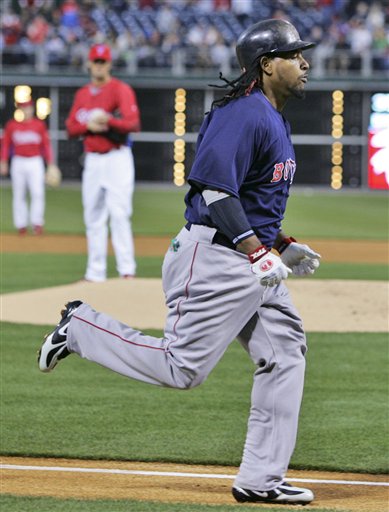
(AP Photo/Rusty Kennedy)
Manny’s baggy pants have reeeeeaaaaaally gotten out of hand. Meanwhile: No more snood!
Tired of seeing annoying ads (like this one!) on Uni Watch? There’s a simple solution: Join Uni Watch Plus. You’ll get an ad-free site experience, plus exclusive access to our UW+ discussion forums, push notifications whenever a new blog post has been published, a special UW+ badge accompanying all your comments on the blog, and a 20% discount on our Teespring merchandise.
Already a member? Sign in here.
(AP Photo/Rusty Kennedy)
Manny’s baggy pants have reeeeeaaaaaally gotten out of hand. Meanwhile: No more snood!
Aw nuts did Manny hit a tater off my boy Cole Hamels???
what in the hell does he carry around in there?
Is that a surgical mask tucked in his back pocket?
(It is, afterall, Manny…)
Craig Biggio was wearing his Sunshine Kids pin during the exhibition game with the Royals at Minute Maid last night. This means one of two things. Either Biggio did the right thing by ignoring the “ruling” from MLB or MLB did the right thing by allowing Biggio to wear the pin except during regular season games.
I havent found a photo yet, but am still looking
well this has no relation to todays post but it has to do with the final four. I just noticed that the final four this year is made up of 3 teams wearing nike and only 1 tem (ucla) wearing addidas
It looks like it’s hammer time for Manny! Geeze!
link
i gotta be honest, if i played in the pros, i’d porbably have my pants that baggy as well. I mean, baseball pants arent the most comfortable things in the world, and when you have to wear them everyday, you wanna be comfortable. Its like a big pair of functioning sweatpants…. it also seems like chewin tobacco (not dip) in his back pocket.
Didn’t we just have some article talking about how Manny likes to take other peoples stuff when he needs a jump in his game?
I will just assume he decided to swipe Big Papi’s pants for the game…
From the “Drat!” department, the St. Louis Cardinals have apparently rescinded their “dress code” for minor-leaguers in their system. Cards’ farmhands used to have to link of their stirrup socks; but sadly, this is link.
Sigh…
I know everyone’s concentrating on Manny’s pants, but he is also wearing football cleats.
Here’s a link to the cleats: link
I think the best part it the description: “Vaporize the competition with Nike’s lightest shoe to hit the field. The Vapor Jet TD football shoe is a high performance shoe for elite speed players to use on natural and artificial grass surfaces.”
Uh, Manny? Elite speed player? Get these shoes to Jose Reyes and give Manny his baseball cleats back.
Link wasn’t working. Here it is (I hope).
link
[quote comment=”64901″]Uh, Manny? Elite speed player? Get these shoes to Jose Reyes and give Manny his baseball cleats back.[/quote]
Quite the opposite–Manny needs every iota of speed visuals he can muster, even imaginary, a la Bob Uecker’s self-professed trick of knocking his cap off while baserunning or pursuing a fly ball.
#10- That’s the first thing I noticed as well. I haven’t noticed too much of that going around.
I have seen some football players wearing MCS plate spikes, but not baseball players wearing football cleats.
I just bought my son stirrups for little league. Cant wait to show them off when the season begins.
The Orlando Magic wore their throwback black pinstriped uniforms last night against the Pacers. They should adopt those as their current uniforms.
What’s the name of the partly blind pitcher that wears his cap crooked? I need his name and can’t come up with it for the life of me.
Abe Alvarez?
I probably missed the boat on this long ago, but when did Kobe start wearing #24?
[quote comment=”64912″]The Orlando Magic wore their throwback black pinstriped uniforms last night against the Pacers. They should adopt those as their current uniforms.[/quote]
I don’t think so. Pinstripes on basketball uniforms is not a good look.
[quote comment=”64921″]Abe Alvarez?[/quote]
yeh that’s him
[quote comment=”64933″]I probably missed the boat on this long ago, but when did Kobe start wearing #24?[/quote]
This is his first season as #24…but it was leaked that he was changing last year…the NBA needed to sell a few more jerseys…
Hi
I know there is a big campaigne on here for the Mets to “ditch the black” ,and beleave me no one loves to see the Mets in pinstipes ,blue caps more than me, and we should be wearing blue at least 80% of the time ,but black caps etc is as much a part of New York’s baseball history as the blue with the Giants wearing the black caps , so is it really that important to lose the black totally, I would personally be happy to see the black stay in the colour scheme ,as long as we wear blue 80% of the time at home and 50% of the time on the road ,I cant remember the last time I saw the team wear blue caps and undershirts on the road ,must have been pre98 I guess, but one good thing ,at least the team has kept the same unis for 10 years now ,after the constant tinkering of the unis in the 90s , who remembers the 93 and 94 unis where the team changed the Mets script with a underline tail. ,by my count the Mets had 6 differant styles of pinstipe jerseys in the 90s ,and 2 differant snow white styles.
cheers
Les
Some uni-related news in the world of soccer–seems that link.
hi
Smells of a Adidas counterstrike to me , Nike have been chasing the Germany contract recently which has been Adidas since forever and would be a major embarrisment if Adidas lost it , so I can see this as being a move in which if Nike back off Germany, Adidas will back off Brasil.
Les
Brasil has had adidas kits before, check out link, and link from the WC Argentina ’78.
Full description with photos link (in Portuguese).
[quote comment=”64884″]i gotta be honest, if i played in the pros, i’d porbably have my pants that baggy as well. I mean, baseball pants arent the most comfortable things in the world, and when you have to wear them everyday, you wanna be comfortable. Its like a big pair of functioning sweatpants…. it also seems like chewin tobacco (not dip) in his back pocket.[/quote]
I have to agree with you. I’d probably opt for comfort too, especially since if I was making 15 million bones a year.
That’s the one thing that bothered me about having the pants up when I played. It was just too much maintenance. Then you have to find pants that are short with wide enough openings to raise the pants up to your knees. It’s a preference thing, and I don’t think ALL players should go high. Big guys just don’t look right. I’ve also been opposed to wearing mid-high spikes with high pants. Gotta go with the low tops.
My biggest pet peeve about socks in the major leagues is just the lack of uniformity. It surprises me because of the strict regulations the league has on uniforms. You can in any game see a combination of low pants, high solid color socks, high stirrups, and the fake stirrups that Maddux and Smoltz prefer. The inconsistency bothers me
[quote comment=”64934″][quote comment=”64912″]The Orlando Magic wore their throwback black pinstriped uniforms last night against the Pacers. They should adopt those as their current uniforms.[/quote]
I don’t think so. Pinstripes on basketball uniforms is not a good look.[/quote]
With one exception. The Pacers didn’t look too bad in pinstripes.
[quote comment=”64901″]I know everyone’s concentrating on Manny’s pants, but he is also wearing football cleats.
Here’s a link to the cleats: link
I think the best part it the description: “Vaporize the competition with Nike’s lightest shoe to hit the field. The Vapor Jet TD football shoe is a high performance shoe for elite speed players to use on natural and artificial grass surfaces.”
Uh, Manny? Elite speed player? Get these shoes to Jose Reyes and give Manny his baseball cleats back.[/quote]
Clearly Manny is just trying to offset the wind resistance created by his MC Hammer-pants.
Hi
Here is an Intersting Adidas fact ,during the 1974 FIFA World Cup Holland (Neatherlands) kits where made by Adidas and had the 3 stripes down the sleeves ,that is except Johan Cruyff who only wore 2 stripes down his sleeves link , I have ever found an explanation for this ,I can only assume he had a rival personal sponsor.
Les
Cruyff rocked the link.
beat me to it Matt, well done…
CBF is a gold digger, nothing like DFB loyalty to fellow Adidas so it’s just a question of $$$ if Adi has any spare bucks left from last year RBK and NBA buyout. Puma takeover is a joke, more focused on how to rip off more 1/3 world countries so they can afford Italy for one more WC campain in their lousy 10 min soaked jerseys. + don’t underestimate the historical link between Adidas, IOC and FIFA (Brasil Havelange, German Swiss Blatter, etc), wich works more like a secret society.
[quote comment=”64936″][quote comment=”64933″]I probably missed the boat on this long ago, but when did Kobe start wearing #24?[/quote]
This is his first season as #24…but it was leaked that he was changing last year…the NBA needed to sell a few more jerseys…[/quote]
Nah, Kobe’s explanation was that he wanted to switch back to the number he wore back in High School. NBA jersey sales are pretty strong, Kobe number switch or no number switch.
Great column yesterday. There was a question in the comments regarding the A’s white shoes. Until they moved west, the A’s were my favorite team. I remember this link cover. Dig the stirrups? How ’bout the green laces in the shoes?
Last night I had a dream about football uniform numbers, specifically former Duck Bill Musgrave. In my dream he had two or three different numbers in the teens on his jersey. When I awoke it made me wonder if any players have ever gone on the field with a number on the sleeve that did not match the number on his chest or back. Does anyone know?
Found a story about the Reds possibly going to a “fake” stitching. They are using it for jerseys that fans can have customized on the spot, but the story says “the Reds plan to use it for players”. Yikes!
link
Just watching the Phillies- Red Sox exhibition game and Pat Burrell just hit a two run home run.
Afterwards, they showed him in the dugout yelling across the field to the Sox dugout and he gave old Phillies manager Terry Francona the old “one-finger salute,” albeit in a joking manner of course. haha
And one more thing…
That comment about the “Ditch the Black” campaign reminded me about the state of the Ditch the Black website. It still shows an error message.
I was just wondering what the situation is with that.
Manny’s pants arent as bad as the 2001 derek “operation shutdown” bell baggies, sadly I cant find a picture of them probably because the Pirates organization banned all mention of DB from history, although he probably has them on his yacht next to his crack pipe
Interesting article about UNH switching to Nike, on the flip-side a number of University of Southern California students have created a group in hopes of riding the the university of its ties with Nike. Citing unfair labor practices in Nike factories. Article here:
link
Good idea, I have some doubt that it will cause any widespread changes.
[quote comment=”64854″]what in the hell does he carry around in there?[/quote]
Coco Crisp.
in response to number 35, i know this is high school, but at my hs we had a hall of fame kind of thing that they would put the all state and all area players pictures on. one of the players in the early 90’s had 12 on the front of his jersey, and 15 on the sleeves. it was really weird, but nobody seemed to have an explanation of it.
Tom V., in his piece about being an ump for a day, used the phrase, “Manny being Manny,” which is like nails on the chalkboard to me. So, for those Red Sox fans out there, here’s a new drinking game: Any time you read or hear the phrase, “Manny being Manny”, you have to take a gulp of your drink. If the word “just” is included in the phrase (“That’s just Manny being Manny”), you have to finish your whole drink. You should be under the table by the end of a game or by the time you finish reading an article on the Red Sox.
P.S. Good for Biggio for continuing to wear the pin.
[quote comment=”64976″]When I awoke it made me wonder if any players have ever gone on the field with a number on the sleeve that did not match the number on his chest or back. Does anyone know?[/quote]
growing up in st louis, i only got to see football cardinal home games in the preseason due to blackout rules in the regular season. there was a time or two where i would see the cheap ass maroon jersey/white iron on number on some scrub where the poor sap would have different numbers on his arms versus his chest and back. seems like it was just a case of transposed numbers like 89/98, something like that. i only saw it once or twice. my guess is that it was some kid who was invited to camp a day or so before the game and the equipment manager just threw something together.
link
from link
Bluffton University link yesterday. The article shows the five memorialized jersey number banners in the outfield, five crosses along the fence, and the black jerseys they’re wearing this year.
Manny looks like a slob. A far cry from the lean, classic profile of Teddy Ballgame.
Does anyone have the link to the normal world vs Nikeworld article?
Here’s a link of Operation Shithead’s PJ bottoms.
So it’s official, the Final Four floor is infinitely better than the floors used in the Elite 8. Light floor, lighter wood contrast inside the 3 point line, same darker wood in the lane, green by the free throw lines, black fading into green along the sidelines. Great Final Four writing under the baskets, and the Final Four logo at midcourt. Nice!
Cool video link about the making and installing of the floor that gives a good look at it.
Sorry for the Triple post but link it is. I should do my research before I comment.
From Terry Pluto’s book Traded: The Cleveland Indian’s New Ballgame page 31 (from the chapter on the Manny negotiations/ fiasco) “Manny would wear his teammates’ uniform pants. The baggier they looked, the better he liked them.”
I just started reading the book today, and when I read that passage, I was going to post it here, the picture today seemed to make it more fitting.
On to current Indians news, the Indians Civil Rights game unis don’t bother me as much as the Cardinals do. At least the Indians have some piping on them. And the Cards hats are atrocious. I’m surprised they have a full complement of accessories for the one off unis- batting helmets, undershirts, etc.
Also, I know Sizemore would occasionally wear his socks high, he came out with that look today. No stirrups though. Hopefully he continues the look throughout the season.
Lastly, no matter what you guys think of Nike, they have some of the best soccer jerseys going now, way better than the adidas kits. I absolutely hate the MLS templates, they look so generic. Their bibs/ piping break up any team that tries to wear hoops or stripes. Aside from Liverpool and Chelsea I don’t see any adidas gear that could encourage a switch for any team. Although I am sure any manu would kowtow to Brazil’s wishes to be their kit supplier.
I just got the new issue of ESPN the Magazine, with Ryan Howard link. Two things struck me:
1) I love how his helmet is absolutely pristine. In a day and age where everybody’s link looks like link, Howard’s polished red helmet was nice to see. (Of course, the pine-tar thing was OK when link did it, but most guys just look like link now.
2) Howard’s name is on his bat, but there’s no trademark. Did ESPN airbrush it off? I can’t imagine why, because as the logo haters will point out, there are Majestic and Under Armour logos visible in the pic. I guess the trademark could be on the other side, but I’ve never seen a bat stamped that way (other than in the late ’80s, when some Louisville Sluggers had “LOUISVILLE” stamped on the underside).
anyone have the website that shows the step by step procedures of removing the stitching on the inside of a 5950? Thanks in advance
Trot Nixon was wearing #33 during Spring Training for the Indians, but he is wearing #70 in the Civil Rights game tonight.
Not uni-related but it is logo related. During halftime of the Georgetown/Ohio State game, they presented the player of the year and coach of the year awards. The problem, however, was when they presented Washington State coach Tony Bennett with the award, CBS showed the little stat bar thing Bennett’s name on it with a University of Washington logo instead of a WSU logo.
I’m sitting here flipping back and forth between my Ohio St Buckeyes and my Cleveland Indians, and I can’t help but think the jerseys in the Civil Rights Game look familiar. They seem to remind of the generic uniforms that you would find in the old baseball game from the original Nintendo, before they licenced games with MLB. St Louis’ uniforms really remind me of this with the very plain uniform design and stupid hat logo.
And on a side note, I caught a glimps of a St Louis batboy and he was wearing a Memphis Cardinals uniform and a batting helmet with a full face guard. Is this something new MLB is implementing this year for batboys or is this just a case of someone trying to be a little too safe?
and why are the unis the way they are? plain?
re: the Final Four court. I think the floors have looked good throughout the tournament. I do wonder why they made them all look the same this year. I don’t remember that being the case in the past, although I could be wrong.
Again, the court today looks great, with one exception. The have the scorer’s table there, which in the past has had the normal mesage board type display (light up, but not electronic). It’s now electronic, with only the names of the two schools participating instead of all four in the Final Four, amongst other changes. That, by itself, looks great. However, with the black surrounding the court, there is a big reflection, and you can hardly see the “NCAA” that’s written on the court. It’s a little disconcerting with the NCAA logo (times 2), “Ohio State” “Final Four”, and “Georgetown” all showing clearly, but upside down.
[quote comment=”65055″]I’m sitting here flipping back and forth between my Ohio St Buckeyes and my Cleveland Indians, and I can’t help but think the jerseys in the Civil Rights Game look familiar. They seem to remind of the generic uniforms that you would find in the old baseball game from the original Nintendo, before they licenced games with MLB. St Louis’ uniforms really remind me of this with the very plain uniform design and stupid hat logo.
And on a side note, I caught a glimps of a St Louis batboy and he was wearing a Memphis Cardinals uniform and a batting helmet with a full face guard. Is this something new MLB is implementing this year for batboys or is this just a case of someone trying to be a little too safe?[/quote]
Paul had a good blog a while back about the Cardinals and Indians uniforms for tonight’s game. I don’t remember details, but something about the Negro league unis were simple and basic, although tonight’s unis are a little too simple. I kinda like the StL that they have on the hats, but I like the regular connected one better.
And about the batboy, I didn’t see him, but nothing wrong with trying to prevent link from happening again.
[quote comment=”65050″]I just got the new issue of ESPN the Magazine, with Ryan Howard link. Two things struck me:
1) I love how his helmet is absolutely pristine. In a day and age where everybody’s link looks like link, Howard’s polished red helmet was nice to see. (Of course, the pine-tar thing was OK when link did it, but most guys just look like link now.
2) Howard’s name is on his bat, but there’s no trademark. Did ESPN airbrush it off? I can’t imagine why, because as the logo haters will point out, there are Majestic and Under Armour logos visible in the pic. I guess the trademark could be on the other side, but I’ve never seen a bat stamped that way (other than in the late ’80s, when some Louisville Sluggers had “LOUISVILLE” stamped on the underside).[/quote]
What about current players having pinetar on their helmets make them look less classy then when old school guys did it??? No difference at all. You’re just being picky.
collison for adidas sponsored UCLA is wearing a nike dri-fit undershirt with blue tape over the nike symbol near the collar
can we please see some more UCLA cheerleaders? thanks.
Is it just me or is UCLA wearing differnt uniforms than normal? just seems to be that the blue is darker and the gold is brighter.
Perhaps they are wearing the same unis, but they are brand new for the final four…no full year of washing machines
Chris, I have been thinking the same thing about UCLA’s uniforms. It seems like in year’s past, they wore either shiner uniforms or a lighter shade of blue.
Does anyone know if Florida wins, will Ohio State wear a red System of Dress, or their red uniforms they wore all year? I was just thinking about how we’ve only seen them in their whites, and the only team we saw 2 Systems of Dress from was the Syracuse Complainers.
[quote comment=”65077″]Is it just me or is UCLA wearing differnt uniforms than normal? just seems to be that the blue is darker and the gold is brighter.
Perhaps they are wearing the same unis, but they are brand new for the final four…no full year of washing machines[/quote]
I noticed that too…but everything seemed to be alot bolder to me(all colors in the shot). I think its the way CBS is broadcasting it. We’ll have to wait to see photos of the game.
Here is a photo from the UCLA Florida game.
That looks like the normal UCLA blue to me. Like I said before the fact that it looks darker is probably just due to the way CBS is broadcasting the game.
[quote comment=”65072″][quote comment=”65050″]I just got the new issue of ESPN the Magazine, with Ryan Howard link. Two things struck me:
1) I love how his helmet is absolutely pristine. In a day and age where everybody’s link looks like link, Howard’s polished red helmet was nice to see. (Of course, the pine-tar thing was OK when link did it, but most guys just look like link now.
2) Howard’s name is on his bat, but there’s no trademark. Did ESPN airbrush it off? I can’t imagine why, because as the logo haters will point out, there are Majestic and Under Armour logos visible in the pic. I guess the trademark could be on the other side, but I’ve never seen a bat stamped that way (other than in the late ’80s, when some Louisville Sluggers had “LOUISVILLE” stamped on the underside).[/quote]
What about current players having pinetar on their helmets make them look less classy then when old school guys did it??? No difference at all. You’re just being picky.[/quote]
Sure I’m being picky. That’s the point of this blog. I could have made my point clearer, though. Basically, I’d rather see a shiny new helmet than one smeared with pine tar (especially obscuring the team logo). I’m willing to turn a blind eye to George Brett doing it, because he was George Brett (I’m a Royals fan and therefore 100% biased). It seems to me that there’s more players doing it today, and it’s a trend I’m not particularly crazy about. (One of many.)
[quote comment=”65050″]I just got the new issue of ESPN the Magazine, with Ryan Howard link. Two things struck me:
1) I love how his helmet is absolutely pristine. In a day and age where everybody’s link looks like link, Howard’s polished red helmet was nice to see. (Of course, the pine-tar thing was OK when link did it, but most guys just look like link now.
2) Howard’s name is on his bat, but there’s no trademark. Did ESPN airbrush it off? I can’t imagine why, because as the logo haters will point out, there are Majestic and Under Armour logos visible in the pic. I guess the trademark could be on the other side, but I’ve never seen a bat stamped that way (other than in the late ’80s, when some Louisville Sluggers had “LOUISVILLE” stamped on the underside).[/quote]
(For #2) It seems that there is some writing in the glare on the bat. If you look close enough at the picture, there is some gold under Howard’s name, but it is impossible to make out with the way ESPN has the lighting in that photo. Intentional?
[quote comment=”65084″][quote comment=”65072″][quote comment=”65050″]I just got the new issue of ESPN the Magazine, with Ryan Howard link. Two things struck me:
1) I love how his helmet is absolutely pristine. In a day and age where everybody’s link looks like link, Howard’s polished red helmet was nice to see. (Of course, the pine-tar thing was OK when link did it, but most guys just look like link now.
2) Howard’s name is on his bat, but there’s no trademark. Did ESPN airbrush it off? I can’t imagine why, because as the logo haters will point out, there are Majestic and Under Armour logos visible in the pic. I guess the trademark could be on the other side, but I’ve never seen a bat stamped that way (other than in the late ’80s, when some Louisville Sluggers had “LOUISVILLE” stamped on the underside).[/quote]
What about current players having pinetar on their helmets make them look less classy then when old school guys did it??? No difference at all. You’re just being picky.[/quote]
Sure I’m being picky. That’s the point of this blog. I could have made my point clearer, though. Basically, I’d rather see a shiny new helmet than one smeared with pine tar (especially obscuring the team logo). I’m willing to turn a blind eye to George Brett doing it, because he was George Brett (I’m a Royals fan and therefore 100% biased). It seems to me that there’s more players doing it today, and it’s a trend I’m not particularly crazy about. (One of many.)[/quote]
So then it’s OK for me, as a Red Sox fan, to say I’m fine with Manny’s pants but hate how Eric Gagne’s pants look?
what was the link where you could design cutom baseball and football jerseys on nike? it was posted here a while back
The Angels BP tops have been bothering me all Spring Training. The color is almost orange, like a red t-shirt that’s faded after a 1,000 washes. Compared to the red caps and the red undershirts, it really looks weird.
Now tonight, while watching the Freeway Series, I noticed something else. Some players are wearing jerseys with one button, while others are wearing jerseys with two buttons.
Anybody else noticed this?
[quote comment=”65086″][quote comment=”65084″][quote comment=”65072″][quote comment=”65050″]I just got the new issue of ESPN the Magazine, with Ryan Howard link. Two things struck me:
1) I love how his helmet is absolutely pristine. In a day and age where everybody’s link looks like link, Howard’s polished red helmet was nice to see. (Of course, the pine-tar thing was OK when link did it, but most guys just look like link now.
2) Howard’s name is on his bat, but there’s no trademark. Did ESPN airbrush it off? I can’t imagine why, because as the logo haters will point out, there are Majestic and Under Armour logos visible in the pic. I guess the trademark could be on the other side, but I’ve never seen a bat stamped that way (other than in the late ’80s, when some Louisville Sluggers had “LOUISVILLE” stamped on the underside).[/quote]
What about current players having pinetar on their helmets make them look less classy then when old school guys did it??? No difference at all. You’re just being picky.[/quote]
Sure I’m being picky. That’s the point of this blog. I could have made my point clearer, though. Basically, I’d rather see a shiny new helmet than one smeared with pine tar (especially obscuring the team logo). I’m willing to turn a blind eye to George Brett doing it, because he was George Brett (I’m a Royals fan and therefore 100% biased). It seems to me that there’s more players doing it today, and it’s a trend I’m not particularly crazy about. (One of many.)[/quote]
So then it’s OK for me, as a Red Sox fan, to say I’m fine with Manny’s pants but hate how Eric Gagne’s pants look?[/quote]
Yes. Then, if Gagne gets traded to Boston tomorrow, his pants will look good and Ronnie Belliard’s pants will suck. And so on.
[quote comment=”65085″][quote comment=”65050″]I just got the new issue of ESPN the Magazine, with Ryan Howard link. Two things struck me:
1) I love how his helmet is absolutely pristine. In a day and age where everybody’s link looks like link, Howard’s polished red helmet was nice to see. (Of course, the pine-tar thing was OK when link did it, but most guys just look like link now.
2) Howard’s name is on his bat, but there’s no trademark. Did ESPN airbrush it off? I can’t imagine why, because as the logo haters will point out, there are Majestic and Under Armour logos visible in the pic. I guess the trademark could be on the other side, but I’ve never seen a bat stamped that way (other than in the late ’80s, when some Louisville Sluggers had “LOUISVILLE” stamped on the underside).[/quote]
(For #2) It seems that there is some writing in the glare on the bat. If you look close enough at the picture, there is some gold under Howard’s name, but it is impossible to make out with the way ESPN has the lighting in that photo. Intentional?[/quote]
Good eye, I wouldn’t have caught that just from the photo I linked to. It’s easier to see on the actual cover — the bat reads “Handcrafted for Ryan Howard,” and the line in the glare is “RH6 Custom Cut.” Still no brand name, though.
CIVIL RIGHTS GAME UNIS
These were pathetic efforts by both teams – particularly the Cards. The fonts were way too modern and basic, and I have seen much better throwback efforts from even AA teams.
The Cleveland Buckeyes and St. Louis Stars wore much more stylish and detailed unis, on their worst day.
If you are gonna make such a big deal about having a “Civil Rights” game, then go to a reputable uniform manufacterer and get some decent unis made. Otherwise, just play in your regular unis and honor the day with posters, etc.
As I understand it, there are actually rental companies that rent throwback and/or Negroe League uniforms to minor league teams during the regular season for their respective throwback games, saving the teams the cost of making their own. They would have every conceivable size. with about 100 sets of each throwback/Negroe League team, and the minor league team and coaches would then dress out in the rental unis, and after the game the company would move on and use the same unis next week in another city. That would be much better than the CHEAPY EFFORT seen by MLB today.
Interesting article about UNH switching to Nike, on the flip-side a number of University of Southern California students have created a group in hopes of riding the the university of its ties with Nike. Citing unfair labor practices in Nike factories. Article here:
link…
Good idea, I have some doubt that it will cause any widespread changes.
Not when Reebok and Adidas use similar types of labor to make their products; I do believe, however, schools like Georgia Tech and Washington State didn’t formally declare apparel allegiances because of this same issue.
Re: who wears white on Monday night? Florida–as the overall #1 seed and therefore the “home” team, I do believe they will go to the white unis and we’ll see OSU in red.
I do believe that’s a lot of “I do believe”s. :D
Pay attention to item number 5 in Grant Wahl’s column on SI link.
a takeover of Puma by adidas would be “keeping it in the family.” Puma was founded by Adi’s brother, Rudolf Dassler, and is still a German company (albeit the #2).
Manny’s shoes were mentioned at the start of spring training. They have the regular football plate on them. I also recall Ortiz wearing Nike football cleats (maybe the Blade?). Which football players wear baseball cleats/plates? I’ve never seen that except in HS.
I bought one of the new 5950’s tonight (Boston). I like the feel of the polyester, but it’s not that much of a lower profile as it still looks like a box on your head. The funniest thing about it is that New Era is calling them “Performance Headgear” instead of, you know, hats.
The stitching though is very nice.
[quote comment=”65078″]Chris, I have been thinking the same thing about UCLA’s uniforms. It seems like in year’s past, they wore either shiner uniforms or a lighter shade of blue.
Does anyone know if Florida wins, will Ohio State wear a red System of Dress, or their red uniforms they wore all year? I was just thinking about how we’ve only seen them in their whites, and the only team we saw 2 Systems of Dress from was the Syracuse Complainers.[/quote]
UofA wore a white and a blue one. Two losses. thanks for reminding me.
Hey. I got my link shoes. I like them very much, but they are a tad snug even though I bought wide. Anyone know how I can stretch them without ruining them? Metsfan? I know you just posted….
i generally buy NB a half size up because of that.
[quote comment=”65094″]CIVIL RIGHTS GAME UNIS
These were pathetic efforts by both teams – particularly the Cards. The fonts were way too modern and basic, and I have seen much better throwback efforts from even AA teams.
The Cleveland Buckeyes and St. Louis Stars wore much more stylish and detailed unis, on their worst day.
If you are gonna make such a big deal about having a “Civil Rights” game, then go to a reputable uniform manufacterer and get some decent unis made. Otherwise, just play in your regular unis and honor the day with posters, etc.
As I understand it, there are actually rental companies that rent throwback and/or Negroe League uniforms to minor league teams during the regular season for their respective throwback games, saving the teams the cost of making their own. They would have every conceivable size. with about 100 sets of each throwback/Negroe League team, and the minor league team and coaches would then dress out in the rental unis, and after the game the company would move on and use the same unis next week in another city. That would be much better than the CHEAPY EFFORT seen by MLB today.[/quote]
Neither the Cardinals or Indians designed those uniforms. It was done by MLB and the powers that be. Paul’s blog on it is link.
Paul, I know it’s late but can you clarify this sometime for those new around here?
[quote comment=”64893″]From the “Drat!” department, the St. Louis Cardinals have apparently rescinded their “dress code” for minor-leaguers in their system. Cards’ farmhands used to have to link of their stirrup socks; but sadly, this is link.
Sigh…[/quote]
Those of you who get the Bloomberg financial magazine need to check out last month’s issue. There’s a story about the Cardinals’ development camp in the Dominican Republic, and all the players have their pant legs pulled up like the dress code used to have it. (The stirrups are those fake drawn-on ones, though.)
[quote comment=”65109″]i generally buy NB a half size up because of that.[/quote]
Yeah, I already got a nine, which is half a step up for me. I got wide, but I should have gotten the extra-wide. Next time, I’ll know.
Minna, walk in them…they’ll probably wear in…
Oh, and the System of Dress unis have been mothballed by the Gators for a while know. Local retail places that stock them sold out their initial stock, but they’ve been moving slowly since everyone figured out that they weren’t being worn. I do like the black ones though. Maybe they’ll re-launch them for next season (which would be nice since they wouldn’t be saddled with generic Nike-world unis).
BTW, did anyone catch the “skills contest” on ESPN this afternoon (which was held the other day?). The guy from ‘Cuse was walking next to one of Oregon’s 6 foot guards, and even with the 6″ height difference, the hem of their shorts were the same distance from the floor. weird image.
#81
I just got one of the new 5950’s (ATL) and if you dont like them looking like a box on your head do what the pros do and wear your hat in the shower and it will mold to your head instantly.
[quote comment=”65118″]#81
I just got one of the new 5950’s (ATL) and if you dont like them looking like a box on your head do what the pros do and wear your hat in the shower and it will mold to your head instantly.[/quote]
Nice, thanks for the suggestion.
[quote comment=”65106″][quote comment=”65078″]Chris, I have been thinking the same thing about UCLA’s uniforms. It seems like in year’s past, they wore either shiner uniforms or a lighter shade of blue.
Does anyone know if Florida wins, will Ohio State wear a red System of Dress, or their red uniforms they wore all year? I was just thinking about how we’ve only seen them in their whites, and the only team we saw 2 Systems of Dress from was the Syracuse Complainers.[/quote]
UofA wore a white and a blue one. Two losses. thanks for reminding me.[/quote]
Ohio State has worn a red version of the new uniform. dont know what game but Im pretty sure they did
I just got one of the new 5950’s (ATL) and if you dont like them looking like a box on your head do what the pros do and wear your hat in the shower and it will mold to your head instantly.
Good tip butI Thought the new hats where not serpose to shrink ,so I thought molding them would be impossable now. Also how do the sizes run giving are they the same as the old wool cap?
Les
[quote comment=”65054″]Not uni-related but it is logo related. During halftime of the Georgetown/Ohio State game, they presented the player of the year and coach of the year awards. The problem, however, was when they presented Washington State coach Tony Bennett with the award, CBS showed the little stat bar thing Bennett’s name on it with a University of Washington logo instead of a WSU logo.[/quote]
My God, those assclowns did it again!?
[quote comment=”64952″][quote comment=”64884″]i gotta be honest, if i played in the pros, i’d porbably have my pants that baggy as well. I mean, baseball pants arent the most comfortable things in the world, and when you have to wear them everyday, you wanna be comfortable. Its like a big pair of functioning sweatpants…. it also seems like chewin tobacco (not dip) in his back pocket.[/quote]
I have to agree with you. I’d probably opt for comfort too, especially since if I was making 15 million bones a year.
That’s the one thing that bothered me about having the pants up when I played. It was just too much maintenance. Then you have to find pants that are short with wide enough openings to raise the pants up to your knees. It’s a preference thing, and I don’t think ALL players should go high. Big guys just don’t look right. I’ve also been opposed to wearing mid-high spikes with high pants. Gotta go with the low tops.
[/quote]
Can’t let you discriminate against the big guys! I’m 6’7″ 230… I did a fantasy camp a few years back, and I insisted on going the high socks route. I love the way the pics came out, even if theye were full blue socks, and not stirrups.
Frankly, I think the “shorter” pants negate some of my height, and make it less obvious that I’m a head and a half taller than everyone else on the team.
Don’t you understand, it’s important to have Manny being Manny like Manny has never been Manny before! !